Guest “Not the net-zero they were looking for” by David Middleton
One of my LinkedIn connections posted a very interesting map yesterday:

Using a baseline of 1979-2000, the global temperature anomaly on Saturday was…
The map is from the University of Maine’s ClimateReanalyzer.org. Today’s “climate” is a mere 0.1 °C above “normal” (normal is in quotation marks for a reason 😉)…

ClimateReanalyzer.org is a pretty interesting website and appears to be a useful addition to our climate data “tool kit”. Here’s an example of the sort of “fun” you can have with this:


According to Schwalm et al., 2020, cumulative CO2 emissions are tracking the bad science fiction RCP8.5 scenario, while the temperatures are tracking below RCP4.5 “stabilization scenario”…
The RCP 4.5 scenario is a stabilization scenario, which means the radiative forcing level stabilizes at 4.5 W/m2 before 2100 by employment of a range of technologies and strategies for reducing greenhouse gas emissions.
NOAA
When will they figure out that they have seriously overestimated the climate sensitivity to CO2?
Oddly enough, UAH 6.0’s latest monthly temperature anomaly relative to its 1991-2020 baseline period is also barely above the Dean Wormer line at +0.03 °C.
The global temperature departure from average in January fell from December to what is essentially zero, at +0.03 °C (+0.05 °F). Equatorial cooling associated with the on-going presence of La Niña continued and the tropics are now substantially below the 30-year average at -0.24 °C (-0.43 °F). As is often noted on these reports, the maximum cooling effect of La Niñas usually occurs sometime from February to May. The latest on this La Niña event can be found here.
https://www.cpc.ncep.noaa.gov/products/analysis_monitoring/lanina/enso_evolution-status-fcsts-web.pdf.
UAH January 2022 GTR

The really funny thing is that despite nearly 50 years of “catastrophic” climate change emergency crisis, it’s less than 1.0 °C warmer now than it was when “The Ice Age Cometh”…


Even if anthropogenic CO2 emissions are actually the cause of all of the warming since 1975…

Being a bit warmer than “The Ice Age Cometh” should be viewed as a good thing… Shouldn’t it?

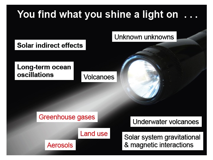
Of course, the modeled “natural” factors and forcings are strictly limited to what the modelers understand about “natural” factors and forcings.
P.S. If I have to tell you when I’m being sarcastic, it takes all of the fun out of sarcasm.
References
Schwalm, Christopher R., Spencer Glendon, Philip B. Duffy. RCP8.5 tracks cumulative CO2 emissions. Proceedings of the National Academy of Sciences Aug 2020, 117 (33) 19656-19657; DOI: 10.1073/pnas.2007117117
Terando, A., Reidmiller, D., Hostetler, S.W., Littell, J.S., Beard, T.D., Jr., Weiskopf, S.R., Belnap, J., and Plumlee, G.S., 2020, Using information from global climate models to inform policymaking—The role of the U.S. Geological Survey: U.S. Geological Survey Open-File Report 2020–1058, 25 p.,
https://doi.org/10.3133/ofr20201058.
The natural forcing graph has been shown to be incorrect by CERES data.
“… the root cause for the positive TOA net flux and, hence, for a further accumulation of energy during the last two decades was a declining outgoing shortwave flux and not a retained LW flux. “ – Hans-Rolf Dübal and Fritz Vahrenholt, October 2021, journal Atmosphere, Radiative Energy Flux Variation from 2001-2020.
Latest data now show 8 years since the PDO phase transition to its warm phase triggered some minor warming incorrectly claimed to be due to human emissions. Since then? NADA. This followed 18 years without any warming known as the hiatus/pause.
That puts us at 25 years with only natural warming during a 1 year transition. What happened 25 years ago to cause that warming event? It was the AMO transition from cold phase to warm phase.
https://woodfortrees.org/plot/uah6/from:1997/to/plot/uah6/from:1997/to:2015/trend/plot/uah6/from:2015/to/trend
AMO – Atlantic Multidecadal Oscillation
PDO – Pacific Decadal Oscillation
Both the AMO and PDO could switch back into their cool phases within the next 5 years. That’s exactly what led to the 1960-70s global cooling scare.
Bingo!
And given the level of UHI affecting surface temperatures, it could be slightly cooling.
…and subtract the data tampering and it is cooling.
Some folks think it should be slightly cooling. link Are we in for a longish period of cooling and will that put a dent in CAGW?
I track the output of another reanalyser, NCEP/NCAR, here. Every now and then there is a deep dip in their global temperature, and there is one such in recent days (though that source is only up to Feb 4). Here is the past 15 months of daily averages (to a 1994-2013 base), to give a better perspective.
Nick,
For the benefit of the unwashed, like me, what is a ‘reanalyser’ and how does it differ from, say, measured data?
A reanalyser, like the one cited in the head post, is basically a completion of a numerical weather forecast. For that, lots of recent data is “ingested” into a whole Earth model (like a GCM) to give a base state. It is then run into the future to provide the forecast. When the weather has unfolded, you can review and perhaps sharpen the state in the light of how the predictions went. That is the reanalysis. It gives the whole atmosphere field of a huge number of variables, from which you can extract surface temperature. If you go to the linked U Maine site, you can get maps of many variables at various altitudes.
It’s good because of the very up to date estimates, and the detail. It is not so good for long term trends etc, because the data is not easy to check for homogeneity.
Nick, you could just have said total crap.
David Middleton seems to think otherwise. This post is based on it.
Nick.
That is your assumption.
Here is a direct author quote:
P.S. It is my assumption that this statement applies to the whole of David’s post…
So here we are, it’s
assumptionsturtles all the way down.PPS. If I have to tell you when I’m being sarcastic, it also takes all of the fun out of sarcasm.
Well, he said that it “appears to be a useful addition to our climate data “tool kit””. Sounds like a perfectly sober recommendation. But yes, he does have a tendency to say, don’t take me seriously, I was just being sarcastic. But writes an awful lot of this stuff, and if it all has to be laughed off, that is a big waste of space.
Riposte Rating 3/10
You must try harder.
It wasn’t bad for Dr. Stokes… 🍻
Some things can be both useful and entertaining… 😎
Reanalyses have a lot of scientific value and they can also be fracking hilarious at the same time… 😄
https://www.zerohedge.com/political/scientists-conclude-dire-climate-change-models-were-wrong-now-what
“…zerohedge.com/political/…”
The fact this is under the political section and not the science section tells you all you need to know about this topic.
CAGW is a purely political entity under a thin “Sciency” veneer.
Exactly my point! Either someone didn’t understand it, or someone did and took offense.
If you don’t understand something somebody says, it’s a reflection on you. Better to remain silent and be thought a fool, than to open one’s mouth and remove all doubt.
Run Forest, run!
Old Nick takes every opportunity to remove all doubt. 😉
Bung fanciful data at a computer, when it’s found to be wrong, correct it, then bung more fanciful data at the computer.
This from the Neil Ferguson school of forecasting everything.
Mark your own homework as ‘acceptable’ when found to be orders of magnitude off, but corrected with observational data.
Computer forecasting isn’t a science, it’s guesswork dressed up as clever with expensive hardware.
“the Neil Ferguson school of forecasting”
The ghosts of a million cows cry out for vengeance.
JF
(One of NF’s less successful interventions — search on UK mad cow disease.)
NF has had one good effect, after the Omicron tsunami predictions being a total fail scepticism of Climate models has increased in the UK.
HPC guys say throw iron at the problem when the result is not expected. And indeed the EPA is doing that with exascale…
“A reanalyser, like the one cited in the head post, is basically a completion of a numerical weather forecast. For that, lots of recent data is “ingested” into a whole Earth model (like a GCM) to give a base state.”
The “base state” is the part I have a problem with. The “base state” shows 1998 to be much cooler than 2016.
The UAH satellite chart shows the correct “base state”, where 1998 and 2016 are statistically tied for the warmest year in the satellite era:
What kind of results can you get from a computer program that doesn’t represent reality?
“The UAH satellite chart shows the correct “base state”, where 1998 and 2016 are statistically tied for the warmest year in the satellite era:”
Well, you are showing global, not US. And the points are monthly, not annual. But, whatever…
You seem to think that earlier versions have more authority, eg Hansen 1999. So what about UAH5.6? That had Feb 1998 about the same, at 0.65°C. But Feb 2016 was 0.92°C, not a “statistical tie”. It took all the reworking of V6.0 to get it down to 0.7°C.
“You seem to think that earlier versions have more authority, eg Hansen 1999.”
Yes, I do. Why don’t you?
I think the “reworking” of UAH took the form of eliminating a satellite data set that was measuring too hot, according to Roy Spencer.
Spencer eliminates the too-hot data, and all the other data sets incorporate the too-hot data.
That’s the difference in the readings from the satellite era.
The data before the satellite era (1979) has just been plain bastardized by dishonest data manipulators.
Yes, I definitely give more authority to older temperature records. And why shouldn’t I? They are actual temperature readings as compared to the computer-generated trash that passes for the official temperature record. The computer-generated temperature profile looks nothing like the written, regional temperature profiles.
If it’s a choice between written temperature records and computer-generated alarmist fantasies, I’ll take the written record every time. I can’t imagine that a sensible person would do anything else.
So, I did some research and I looked into the NWS data for home, Salt Lake City. I looked at the data and I made an infographic with the average yearly temperatures. I started in the year 1996 and graphed all the way to the year 2021. How come the average temperatures don’t line up with the 1998 -2012 hiatus? 2012 is our warmest year on record (avg. temperature of 56.5 degrees) and ever since than our temperature has flattened. Additionally, the satellite temperatures show that ever since 2016, worldwide temperatures have been declining. Well, 2021 was our third warmest year on record. What would you guys think about this graph? I wanted to ask intelligent and logical people, because if I were to ask anyone else, I would get bombarded with “GLOBAL WARMING”, “IT’S MAKING US HOTTER”, “IT’S BEING CAUSED BY GREENHOUSE GAS EMISSIONS!!”.
Thanks,
Walter
2012 was also the warmest year in CONUS
“CONUS,” how appropriate.
So no warming since 1935?
OK
NOAA kindly offers a smooth average to show warming. About 1.3C since 1970.
Homogenized data?
Yes, for US surface temperature. It’s essential.
It’s essential – for the CAGW narrative.
Strange you don’t show the original NASA data Hansen presented to Congress in 1988, which had the 1930’s much hotter than today.
“ presented to Congress in 1988, which had the 1930’s much hotter than today”
How did he manage to do that in 1988?
Why don’t you show it?
Tony Heller nails it
https://www.youtube.com/watch?v=k1u4d-iKDvA
Note the huge difference between the graph Hansen showed in 1988 and the current version.
Why doesn’t it agree with satellite observations?
Data going back to the 60’s is little better than worthless. The Cutty Sark was sailing commercially in the 60’s, using a canvas bucket over the side, to no particular depth, to plot Sea Surface Temperatures.
And of course, most of the world wasn’t remotely interested in recording weather far less climate. Virtually all data then, and most of it today, is restricted to N. America and Europe.
Satellite’s aint perfect but at least they cover the planet measuring an uncontaminated source.
“Why doesn’t it agree with satellite observations?”
Satellites observe temperatures at thousands of metres altitude. It isn’t 11°C up there.
UAH anomalies for USA are available only since 1979. But they show plenty of warming; 0.18°C/decade according to UAH. That is a 0.77°C rise since 1979. Not quite as much as NOAA measured at surface, but still a lot.
As I mentioned, but you completely ignored, the troposphere is an uncontaminated source of measurements.
And, frankly, so what if there’s a 0.77ºC rise in global temperatures? What harm has it done?
The IPCC tell us ‘extreme’ weather is probably no worse than historically. The planet has greened by an extraordinary amount. Growing seasons are extended, extreme poverty is a fraction of what it was 50 years ago, the polar bears are fine, the penguin’s are fine, the GBR is fine, the Arctic, Greenland and Antarctic are fine, sea levels are rising no faster than in the last 1,000 years or so, and 50 years of catastrophic claims about the planet have come to naught.
You, on the other hand, have wasted years of your life fretting over 0.1ºC anomalies, one way or the other, and wasted everyone else’s time by promoting a phenomenon that’s completely natural and harmless, as negative.
“extreme poverty is a fraction of what it was 50 years ago…”
Fear not, we have top experts worldwide feverishly working to reverse this trend.
/sarc
“Plenty” — here’s a precise technical term.
As usual with Nick’s postings, one must put things in perspective: UAH6’s 43-year period of measurement includes an approximately 35-year period of cyclical warming during an approximately 75-year cycle of warming and cooling, possibly overlain on a gentle warming trend coming out of the Little Ice Age, as reflected in the other datasets.
The current UAH6 overall atmospheric trend globally is 0.13 C/decade with an over-ocean trend of 0.12 C/decade which, in the context of occurring during a cyclical period of temperature increases, is absolutely unremarkable. This implies a Transient Climate Response (TCR) in the very low end of estimates.
Additionally, the CliSciFi models shown above assert that the 1915 to 1945 surface warming of about 1 C is entirely natural. These same models, tuned to post-1975 temperatures, say that all of the post-1975 surface temperature increase of about 1 C is entirely caused by a combination of Man’s emissions of GHGs and aerosols. Live by data manipulation and modeling, die by data manipulation and modeling.
+/- 1 °C warmer than “The Ice Age Cometh” is bad? Or good?
“NOAA kindly offers a smooth average to show warming. About 1.3C since 1970.”
Well, if you look at a less bastardized version of the U.S. temperature chart (Hansen 1999), you will see that the U.S. is actually in a temperature downtrend and has been since the 1930’s.
Keep in mind that 1998, the warmest date shown on Hansen 1999, is tied with 2016 for the warmest year in the satellite era, so that makes both 1998 and 2016 cooler than the 1930’s.
That NOAA chart looks like evidence of fraud, to me.
The UAH chart showing a comparison of 1998 to 2016:
Warming as electronic telemetry took over, not much when real people read hi/lo thermometers….one really must question how that might be…maybe these fast acting electronic fan aspirated thermometers suck jet engine exhaust flowing over asphalt runways somewhat better than anticipated….but it should level off…they are all changed out now, and jet engines haven’t increased in HP much for 5 years….
NOAA has misrepreseted the data with that graph. The units of the abscissa and ordinate should be selected to illustrate the slope of any changes honestly– The data shows the temps have changed ~1 deg out of 50deg, ie- ~2% change, so the slope of the graph should also be ~2%…But, they’ve crammed 140 yrs of data into a short space and stretched put the temp data to render a graph with a 100% grade.. …The same deceitful trick is often used to show the slope of the [co2] graph and that of temps are “exactly” the same. How amazing!
“The data shows the temps have changed ~1 deg out of 50deg, ie- ~2% change, so the slope of the graph should also be ~2%”
If you look at the right axis, it is about 1.2 deg out of 12, or about 10%. That is why it is arithmetic nonsense to talk of percentages of temperature. It depends on where you set the zero. F does it one way, C another. It’s arbitrary, and you can get any % you want.
Common Nick, you just can’t even resist reading your own graph in your favor can you?
54 – 52 = 2 2 / 52 = 4%
12.22 – 11.11 = 1.11 1.11 / 11.11 = 10%
By using C, you are showing a much larger percent gain than when using F.
You do realize that by using C versus F that the difference in resolution also results in larger percent changes when using Celcius than when using Fahrenheit. Is it any wonder that climate mathematicians refer to changes in C rather than F?
Better yet, show the % change in Kelvin or Rankin (I.e., absolute scales) and get a consistent and small % change.
“By using C, you are showing a much larger percent gain than when using F.”
The gain in F was not my number. But the nonsense is that the result % depends on what units you use. You could make it anything.
Um, Nitpick, absolute ratios of temperature must be done in absolute temperature (Kelvin).
Well, they weren’t.
You are exactly correct. It is propaganda 101.
In addition, they show a “mean” anomaly with also quoting the standard deviation that goes along with it. Proper statistics require stating both together so people can understand the dispersion of data around the mean. It is like a teacher saying the average score is 75 out of 100 without also saying what the dispersion was.
Correct me if I’m understanding how anomalies are calculated, but if each weather station has its own 30-year baseline of average monthly temps, and its current month’s anomaly is the difference between the month’s average temp and the 30-year average, how can the anomalies different stations be used together in calculations of standard deviation and such?
It’s as though instead of each station’s monthly average temp being a shot clustered around a single bulls-eye, and those differences measured, each station’s monthly average is one shot near its own personal bulls-eye. We don’t know how far apart the individual bulls-eyes are, either.
How can that be useful data?
As I recall from my science classes, when dealing with temperature percentages, it should be done in K to have any value. If I did my conversions correctly, 1.1 K departure from 284.27 K is 0.4% change.
A HOCKEY SCHTICK!
OH NOES! ITS WORSE THAN WE THOUGHT!
“2012 was also the warmest year in CONUS”
Yes, 2011 and 2012 were about as hot as I’ve ever seen in Oklahoma. There was about a two-year drought going on at the time, and it was bad, and the temperatures were extremently hot, so hot the ticks disappeared in the fields.
There were high pressure systems hoving over the central U.S. for long periods of time, and this just made the temperatures get hotter and hotter.
But the rains finally came and relieved us of that drought and that heat and we haven’t had temperatures like that since, not even close.
It was a short-term weather event, not a long-term trend.
Per Ron Clutz today, the REAL pattern continues: Without El Ninos, global warming equals NADA.
https://rclutz.com/2022/02/08/no-global-warming-chilly-january-land-and-sea/
(a) The WSJ has a “below the fold” article titled “Climate Scientists Encounter Computer Models’ Limits
(b) Eric Lander, the director of the White House’s Office of Science and Technology Policy, stepped down amid mounting criticism of his alleged treatment of his subordinates.
Items posted without comment.
I posted a link to that WSJ article above, everyone should read it. They admit they “Don’t know clouds’….
Here’s the verse from Judy Collins 1968 video:
“I’ve looked at clouds from both sides now
“From up and down and still somehow
“It’s cloud’s illusions I recall
“I really don’t know clouds at all”
Right Willis?
Written by our libtard friend Joni Mitchell.
It’s common knowledge, outside of CAGW climatologists and associated rent seekers, that the GCM model jockeys have nowhere near enough computing power (1/1000 th?) to numerically ‘solve’ the Navier-Stokes equations for purpose of climate forecasting. Hence the piles of CMIP spaghetti that is periodically hauled out to support the narrative, while demonstrably overestimating actual atmospheric measurements from satellites and radio sondes. And hence the non-existent ‘tropospheric hot spot’, the continued divergence of ‘ECS’ estimates and the continued issue that the magnitude of forcing related to errors in cloud coverage vastly exceeds the magnitude of forcing attributed to GHG emissions. It would be entertaining if it wasn’t one of the left’s super highways to serfdom.
eh, let’s be clear. Even if they had sufficient computational power to solve the Navier-Stokes equations it wouldn’t matter all that much. The problem with solving them is that they are notably non-linear which results in minor changes to the initial conditions resulting in dramatic changes in your solutions. And unlike all the simple efforts to avoid the N-S equations a proper model of Earth’s climate can’t avoid the non-linearity. Any efforts to “solve” N-S at present are all but destined to failure. Most engineers that even attempt it are looking for exceedingly small scale solutions where they can either make simplifying assumptions or can properly control the input sufficiently (which you can’t do for Earth’s climate, and often you can’t even rely on properly knowing the inputs) that the chaotic variations induced by non-linear solutions can be … smoothed.
There is a reason why there is a $1,000,000 prize for solving N-S or simply proving it can’t be solved. And as yet nobody can do it. They are nigh impossible to deal with.
You may be right about the ultimate impossibility of modeling climate, but I don’t see any reason to move the goal posts, so am content with knowing that the modelers are woefully short of the computing power needed to do so. I am aware that the $1M prize to solve the NS equations is unclaimed, but that refers to a ‘closed form’ solution. Lack of such a solution doesn’t mean we can’t make gasoline, or any of millions of other useful products in the chemical process industries, where many sound empirical work arounds have been developed.
It would be like the health insurance lobby plotting US health expenditure trend against US life expectancy trend and then adding a counterfactual plot of what the life expectancy trend would have been without the increased expenditure.
Both variables are probably related but merely contriving a counterfactual plot proves nothing.
It’s more like not bothering to quantify adverse reactions to a vaccine because you don’t want to discourage people from getting jabbed… 😎
You just won the internet imo.
A day without global warming??
Well the climate changers have in mind starting off with a few hours in the day-
Trial scheme will pay householders to delay electricity use (msn.com)
and getting more progressive as progressives do.
A tacit admission that unreliables can’t cope with a normal level of demand. The wheels are starting to fall off…
Last weekend, wind power didn’t fail in Texas… Should have been headline news because it usually does fail during polar vortex episodes… 😉
Miracles do happen (sometimes)
Sometimes even on ice…
“When will they figure out that they have seriously overestimated the climate sensitivity to CO2?”
When they are paid to report the truth and not alarmism. And Not a minute sooner.
If I have to tell you when I’m being sarcastic… 😎
“When they are paid to report the truth and not alarmism.”
There is no money in reporting the truth. There is a LOT of money in knowing the truth and convincing everyone else of something other than the truth.
Most interestingly a big chunk of eastern Sahara Africa, Eastern Australia and other desert areas turn up blue. Not what one would expect given increased CO2 forcings in dry air. If anything it proves that modelling climate is a challenge we are not yet up to meeting. And modelling is the only approach to understanding.
“Eastern Australia and other desert areas”
Northern, Central and Eastern Australia have been anything but a desert during this summer period – there are floods all over the place as a result of the massive downpours received over the recent months. The Todd river has been gushing through Alice Springs in the red centre & Lake Eyre is filling up…
“A land of droughts and flooding rains”
These graph comparisons are highly misleading.
Among other things, the climate models are hindcast against known existing temperatures. AFAIK, this hindcasting is 10 years or less from present depending on model version and year.
So the “accuracy” shown is crap because they didn’t model from 1960, 1970, 1980 or even 1990 onwards – they tuned against actual temperatures (i.e. fitted to at least some extent) from “start” of model run to the end of the actual data used.
This matters because in the “models vs. reality” graph, a significant part of the black line is the hindcast portion.
I’ll also note that since the models are input dependent – the long the actual “unassisted” model run, the more errors are likely to propagate – so the relatively short interval between “hindcast” period and actual unassisted model run matters a lot.
Net net: it would be far more instructive to show the “hindcast” portion of the model run, vs. the “unassisted” portion.
A day without global warming is like a day without sunshine.
The 11th Commandment of the Climate Church is Do not make Fun of the first 10!
It is sarcrilige!
Suggestion – since there is no sarc font,
how abouT onE seNtENcE
(using https://www.browserling.com/tools/text-randomcase)
just in case, for the challenged?
Out of the park love your posts.
Why don’t they have UAH on that site? or did I miss something?
Hard to predict a correct global warming model when it would seem Earth is hitting a mean
temperature over a long period of time.
Who has a correctly predicted model for the weather since 2000?
Anybody?
One day of one dataset of global temperature dipping down to 1979-2000 average during a La Nina dip is not much of an argument against existence of global warming.
One month of UAH TLT dipping to only .03 degree C above its baseline of 1991-2020 (much warmer than 1979-2000) during a La Nina dip is not an argument against existence of global warming. One of the authors of that dataset publishes a graph of global temperature according to that dataset at https://www.drroyspencer.com/latest-global-temperatures/ That graph shows global warming.
As for climate models (especially the CMIP6 ones lately even getting criticism at Realclimate and the RCP8.5 CMIP5 ones that Dr. Roger Pielke Jr. has been criticizing) overpredicting warming, this merely means many (not all) models have been overpredicting warming. Global temperature has been falling behind the global temperature predictions of the CMIP5 RCP4.5 models to only a very slight extent. Even with the climate sensitivity figures from studies by Nic Lewis and by Nick Lewis & Judith Curry, which are around the low end of the range considered by IPCC, it looks like global temperature is going to almost keep up with the median of projections by the RCP4.5 subset of the CMIP5 models, especially if greenhouse gas concentration goes above RCP4.5 from fossil fuel burning by non-Western countries and from foolish natural gas hookup bans (in favor of using electricity for heating) and nuclear power plant shutdowns.