John Entwistle
A few months back one of the commenters on this WUWT article: https://wattsupwiththat.com/2021/07/12/the-truth-about-heat-waves/ posted a comment to the effect that the number of heatwaves is increasing, and cited this article on the EPA website: https://www.epa.gov/climate-indicators/climate-change-indicators-heat-waves . Embedded in the EPA article is this diagram:

I was disappointed that the article doesn’t provide data, methodologies, or calculations. It also used some terms such as “the local threshold” and “heat wave season” without defining them. I was prompted by this comment to channel my inner Willis to see if I could replicate this chart.
What is a heat wave?
I started with the definition of a heat wave. I found several delightfully ambiguous definitions on the internet. From Mirriam Webster we have: “a period of unusually hot weather”; Wikipedia defines it as: “A heat wave is a prolonged period of unusually hot weather.”; while from NOAA there is: “A heat wave is simply a period of unusually hot weather that typically lasts two or more days. The temperatures have to be outside the historical averages for a given area.” These definitions leave a lot of room for interpretation. Who gets to decide what is unusual? Historical averages over what period of time? Average over the whole period or a moving average? What is the local threshold and who determines its value? How far outside the historical averages?
Getting Some Data
I began my search for data by looking for some actual temperature records from my area. I wanted daily observed data, not monthly summaries or grid estimates. I live in central New Jersey, just outside of New York, and I was surprised to find that, despite the fact that there have been private colleges / universities and military bases from all branches within a stone’s throw of my house since the revolution, no local institution has recorded, or at least published, a historical daily temperature record. The best that Climate Data Online (https://www.ncdc.noaa.gove/cdo-web/ could offer was three discontinuous data sets from different locations, the oldest starting… in 1960! On WUWT it’s often been stated that “climate is 30 years.” If I was to look for heat waves from the ‘60s that meant that I needed to find data from at least 1930 in order to look for heat waves in the 60s.
I poked around the internet and found some sources that had daily temperature observations in New York starting in the late 1800s:
High Plains Regional Climate Center: High Plains Regional Climate Center – CLIMOD (unl.edu) at the University of Nebraska Lincoln. This site has a good data set for New York’s Central Park.
Cornell University: weather.nysaes.cals.cornell.edu/history/ has records taken at their experimental farm outside of Geneva, NY.
I used Python scripts to scrape or parse these data sets into CSV files. There was some missing data, particularly in the early years, so discarded the records from before 1900. The Cornell site seems to have stopped posting half way through 2020, so I dropped the last six months of that data set to align with the end of 2019. There were still a few holes, so I filled in the gaps by calculating the average of the ten days before each gap and plugged the hole with that average.
| Data Set | Date Range | Number of rows | Missing Highs | Missing Highs % | Missing Lows | Missing Lows % |
| New York Central Park | 1900 through 2020 | 44195 | 6 | 0 | 7 | 0 |
| Cornell | 1900 through 1999 | 43892 | 110 | .25% | 134 | .31% |
Back to the question of “usual temperature”. How do we determine the usual temperature for any given day of the year? It bothers me that we always think about usual / normal / average temperatures in terms of calendar months. A calendar month is a convenient fiction invented, in the case of our calendar, by the Romans. Months have little or nothing to do with actual climate related phenomena.
Rather than using an average of the days of a month, or the n days prior to a day, I thought it might make more sense to look at the temperatures for each individual day and location across the ~120 periods of each data set. This approach gives us a mean temperature for each day of the year that we can then use as the basis for our “two plus days above usual” evaluation. Using Python, Pandas, and Matplotlib I was able to quickly generate a data series for each day of the year over the ~120 years of each temperature record, calculate the mean, standard deviation, and a least squares trend line for each day, and plot these to see how the temperature has changed year over year for that day.
120 Years of Daily Temperatures
Every year citizens all across the US get together on the fourth of July, US Independence Day, to eat hot dogs, drink beer, and complain about how hot it is. A plot of the temperature on US Independence Day in Central Park from 1900 to 2020 looks like this:

The mean in this graph is the mean high temperature value for this day of the year, in this case day 185.
Cornell University has an experimental farm not too far from Geneva, NY, about midway between Rochester and Syracuse. They’ve been collecting temperature data since 1891, though they stopped updating their web site mid-way through 2020. If we look at July 4 in Geneva from 1900 through 2019 we get a slightly different picture than the one in Central Park:

It is interesting to note that the minimum temperatures in both locations have increased over the last 120 years.
I thought it might be fun to have a look at similar daily plots for some days that might actually be climate related – the solstices and equinoxes. Here is Central Park again:

The same four solstice / equinox days look like this in Geneva, NY:

Heat Waves
To find the heat waves we need to find two or more consecutive days above normal. I decided to use one standard deviation above the mean temperature for that day of the year as “normal” for that day. I will do this for the entire year, not an arbitrary “heat wave season”. After all, if it is really warm in the middle of winter, isn’t that a heat wave?
To start, I identified every day above this threshold value. Here is the count of these ‘hot days’ per year in Central Park:

The plot of hot days for Geneva, NY looks like this:

From here it’s a simple matter to count the number of consecutive hot days to find the heat waves:


Now let’s look at intensity and duration. I’ll choose intensity to mean the average temperature of all heat waves that year.


These are interesting pictures. Does it mean that heatwaves are getting cooler, or that the percentage of heat waves in the cooler months has increased in the latter half of the data period?
Finally, we can plot the average length of the heat waves each year over the same period:


Summarizing by Decade – The EPA Chart
Averaging the above heat wave numbers for each decade from 1900 – 2019 gives us charts similar to those provided by the EPA:


Interestingly, the number of heatwaves per decade in both Central Park and upstate New York in the period 1960 – 2019 show an increase in the number of heat waves each decade, similar to the EPA graph, though it looks like they used a higher threshold because the number of heatwaves they cite is much lower. The period from 1960 to 2020 doesn’t appear to tell the whole story, though, as we can see that there was a warmer period in both data sets in the 30s and 40s. The intensity and duration charts that I’ve produced are quite different from EPA’s in each location.
One Chart to Rule them All
The EPA only had one set of charts representing an unspecified region, I suppose the whole Earth? I have two sets of charts, one for the city and one for upstate. Combining the two by averaging the decadal values for each location gives these plots:


I’m not sure what these combined charts tell us. Averaging the counts of the heatwaves across the two locations does seem to mask the steady rise in the number of heatwaves in Central Park. The intensity and duration charts that we produced here bear no resemblance to those produced by the EPA. It would be nice to know what data they used to produce their charts.
What is clear is that a distance of approximately 300 miles and an altitude difference of 780 feet has produced very different temperature data in these two locations. The heatwave charts seem to show that even thirty years is not long enough to understand the climate in either location. It would be great to have another hundred years of data to see if that seemingly cyclical pattern in the number of heatwaves is real.
All data and calculations can be found here: https://github.com/jentwistle3/Heatwave_public
very good analysis. I wonder how this would look as compared to “urbanization” rate, because one would assume that an intensifying urban heat island would impact intensity and duration. Also interesting to note that the greatest increase was before the onset of most anthropogenic CO2: was this due to urbanization or was it natural?
That is an interesting question. I’ll have to follow up on that.
New York City looks like UHI, all the way down. The rising temperatures are higher lows.
Wouldn’t surprise me to find out that the Cornell University charts also have a UHI component.
I found this comment interesting, so I went hunting, looking for the site, as the article says the university farm is near Geneva. I couldn’t find the farm but I did find the university agricultural laboratory with what appears to be a Stevenson screen in a large grassy area at 42 deg 52 min 28.96 seconds N and 77deg 00 min 26.62 sec W. Th lab itself is well outside the urban area of Geneva. It seems to me that there would be little if any UHI at this location.
UHI can be spread a long way downwind by prevailing winds. UHI doesn’t much respect political boundaries.
New York City population in 1900 – 3,437,202, in 2020 – 8,804,190.
Geneva, NY population in 1900 – 10,433. Rose to peak at 17,286 in 1960, falling since to 12,812 in 2020.
Of course the EPA graphs don’t show 1900 to 1960.
And also , change to electronic sensors from manual ?
One thing about electronic sensors is that they have a much faster response time. So if their is a brief incidence of warming, say the sun breaks out during a cloudy day. Electronic sensors are much more likely to detect the spike compared to the older mercury type.
It’s an issue of resolution, much like appending yearly thermometer records to proxy records with century or longer resolutions.
Since we are still supposed to be coming out of the Little Ice Age we might expect a slow increase in heat and heatwaves, but what no-one seems to be able to do is link anything to the amount of CO2 in the atmosphere.
griff?
Well, you can run Modtran yourself on the UChicago website to see what the temp change due to doubling CO2 works out to be based on some humidity and sky characteristic assumptions. Then compare to UAH temperatures over decades. You should come to the conclusion that CO2 has less effect than other parameters you select, but a trend of about 1 degree per doubling at present 400 ppm levels….then try about 8 times as much CO2 as present, 3200 ppm, which is a couple of times times the amount fossil fuel on the planet, and come to your own conclusion….which is likely going to be “that’s not what I expected from the media articles”.
This means that according to MODTRAN, burning all of the fossil fuel on the planet would make atmospheric CO2 1600 PPM and global temperature 2 degrees C above where it is now, and boosting atmospheric CO2 to 800 PPM would make global temperature 1 degree C above where it is now. MODTRAN does not take into account the surface albedo feedback which amplifies this a little, about 10% as I figure from a past IPCC assessment report. MODTRAN (in my experience) also indicates slightly lower pre-feedback climate sensitivity than even a figure derived from a study cited by Christopher Monckton (Andrews et al. 2012), 1.02 degrees C/K per 2xCO2, apparently chosen by Monckton for being less than the IPCC’s figure of 1.1 degrees C per 2xCO2. Monckton mentions the Andrews et al. study in https://wattsupwiththat.com/2019/10/08/cmip6-models-overshoot-charney-sensitivity-is-not-4-1-k-but-1-4-k/
The MSM generally overstates manmade climate change (especially weather effects) and IPCC mostly overstates it, mostly from unrealistically great positive feedbacks indicated by climate models that were tuned while ignoring multidecadal oscillations being mostly upswinging during the last 30 years of the hindcast periods of these models. However, MODTRAN understates global warming by increase of CO2. I see that as being caused by MODTRAN (“moderate spectral resolution”) insufficiently accounting for increase of both optical density and bandwidth of narrowband spectral features of CO2.
Looks like the Urban Heat Island effect is likely causing the difference between the New York and Geneva trends. What is also evident in the longer temperature record is a cyclic effect when the hot decades of the ’20s and ’30s are included. That is why most alarmists use the trick of only assessing data from 1950 to present.
The Canadian data I have reviewed shows the ’20s and ’30s max temperatures hotter and hot days more frequent than in the last 3 decades.
What also can be noted in the Canadian data is that nights and winters are warming, but summer daytime temperatures are not increasing. Therefore, the AVERAGE temperature is increasing, but summer maximums and the number of hot days are not increasing, so summers are generally not hotter.
The Canadian data show similar results to this assessment. The lessons learned are that the UHI needs to be considered and station locations will bias results. Also, averaging across locations, across day and night and across seasons gives meaningless results.
A London heatwave is 3C warmer than a Scottish heatwave.
A heatwave in Sydney (Australia) is about 7C warmer than a London heatwave.
A heatwave in Penrith (NSW, Australia) is 10C warmer than in Sydney.
It’s all relative & we can adapt, especially with air conditioning.
Penrith is about 50km west of Sydney so you can easily travel 5km to 10km to change temperature by 1C. Richmond (NSW) is close to Penrith in distance to the coast, mountains, river & latitude but the lower urban density of Richmond is often cooler than Penrith.
Why do more people retire to areas with warmer climates than those moving to colder? Florida, Spain, Queensland, Islands in the tropics, Mediterranean. People vote with their feet & wallets.
The temperature needed to declare a “heat wave” also varies depending on the time of year.
Yes, and the reason the alarmists are crowing about “heat waves” is the usual threat of catastrophe. The claim is that increased Summer heat waves are going to kill people. I think that this analysis needs to be re-done to just look at summertime heat waves.
While it is true that people will remark about a “warm spell” in the Winter, the warmth isn’t an existential threat to anyone. (Just the opposite!) We have long known that the bulk of the warming is at night and in Winter. Therefore, the claimed heat waves in Summer should be examined in the context of revealing whether or not extreme heat is really increasing.
I had thought about dividing the year into seasons to see if the number of winter heatwaves had increased more than the summer ones. Now that I have all the data that should be quick to do.
“The claim is that increased Summer heat waves are going to kill people.”
There’s a lot more old people around now in Western Nations- and they are more likely to suffer from heat- so it’s not surprising more old people will die from heat waves- even if there has been no real change in “the climate”.
And of course both locations have barely changed over a 100 years – I think not!
Just 2 days seems an awfully short period for a ‘heatwave’. I would call it 2 days of nice weather but then I am not on the global warming gravy train.
The official German definition of a heat wave:
“A heat wave is established when the maximum temperature exceeds 30 °C for at least three consecutive days and continues as long as the mean maximum temperature remains above 30 °C for the entire period and does not fall below a maximum temperature of 25 °C on any day. “
Something like this was my first thought but I figured Griff would tell me that my threshold was arbitrary.
no mention of humidity? higher humidity makes the heat feel much worse, so a better definition of heat wave (being something relevant to human comfort) should include humidity
Your last chart shows hot 30’s cold 60-70’s which has been the known US historical trends before the climate tweakers messed things up.
Their chart starts in 60’s a cool regime and ends on a hot regime.
“It would be nice to know what data they used to produce their charts”
From here …..
https://www.ncdc.noaa.gov/societal-impacts/heat-stress/data
I think that a better choice would be:
https://www.ncdc.noaa.gov/extremes/streaks/mapping/NY/890/all-time
It strongly suggests that it is an urban problem, with Manhattan showing the most ‘heat streaks,’ despite being next to the ocean.
Thanks for putting this data together John, nicely presented. It’s very interesting to look at these charts and see that nothing much is going on with temperatures.
” …… and see that nothing much is going on with temperatures.”
So, he has investigated 3 stations …
NY Central park
Geneva, NY
Cornell Uni
And so it’s case dismissed for the who of the contiguous US?
I don’t think John is saying that.
You’re missing the obvious point, Bantam Weight. CO2 has increased equally in all 3 locations yet they exhibit fundamentally different trends over long times. This makes it highly unlikely that CO2 is the control knob on the climate. It’s far more likely that UHI explains these differences than anything to do with CO2.
CO2 might be a factor, but It simply cannot be the only factor and it’s highly unlikely to be the dominant factor.
One could refer to the Climate Reference Network for the contiguous US and see that from the time the network was set up in 2005 until now, the temperature has not changed. Would that do it for you Mr. Banton?
Data from the agacis site for stations in Iowa and Kansas show the exact same thing. They show longer growing seasons and later first-frost dates over the past several years. This indicates nighttime temps are increasing. Max temp graphs from the same sites actually show max temps have decreased also, but the nightime temps dominate.
If the temp profile for two stations are close to a sine wave then their correlation is approximately equal to cos(ⱷ) where ⱷ is the time difference (i.e. distance in longitude) between the stations. Stations more than about 50 miles (first level estimate) apart then show a correlation less than 0.8 – meaning correlation is questionable. Thus it is not surprising that the actual temps in the three stations studied are different. That means that geography, e.g. UHI, is a big factor in some of the different results.
I make no claims that nothing is going on. I’ve found another half dozen sites with reasonably decent temperature records. I’ll repeat this analysis across those locations and we can see what we shall see. I’m open to suggestions for data sets if anyone knows of one that is continuous from ~1900 ish on.
You are not looking at the data properly. What is the standard deviation of the GAT (Global Average Temperature)? The whole earth from the poles to the equator is NOT warming at GAT, even assuming it is worth looking at. The fact that three closely located sites can vary so much indicates to me that the standard deviation is pretty large when looking at the land in the whole world.
GAT is going to be less and less important as regions and localities are going to want to know what to expect. I suspect from my investigations many regions are going to say, “what the heck”, when they begin to figure out what global warming actually means. Many are going to learn that it is nighttime temps that are increasing which portends better growing seasons and more food. They are also going to learn that UHI makes cities less livable than rural locations.
CO2 is good.
IPCC AR5 says in Box 2.4
Warm days Days (or fraction of time) when daily maximum
temperature >90th percentile
A search in the article didn’t turn up “percentile”
There is also this ….

From here …..
https://www.globalchange.gov/browse/indicators/us-heat-waves
The variation in change is so scattershot around the US that it seems to indicate that nothing is happening globally, or atmospherically, but rather something locally. How else to explain the total lack of change in Jacksonville FL, and the extreme change in nearby Tampa FL? UHI perhaps?
The last real heatwave we had here in the central U.S. was around 2011-2012. It was one of the worst I’ve experienced. But since that time, it has been smooth sailing around here. When I was a kid, it seemed like every year had a heatwave of one degree or another. Not so much anymore. The weather is getting milder over the last few decades. Fewer heatwaves and fewer strong tornadoes.
Oh Noe! Climate Change is causing nice weather! We’re all gonna die! /sarc
We didn’t have a single day over 100F in East Central Kansas. 100F days have been getting fewer each year for the past decade.
I feel the same way which was one motivation for doing this. OTOH i also feel that the fall is warmer. That’s another opportunity for a post in the future.
Anthony, these data are from large, UHI-influenced cities and only beginning in the 1960s. These charts appear to bolster the premises that (1) much longer periods are needed to assess heat wave trends, (2) heat wave trends in cities are likely tied to the urban heat island effect, and (3) the effect of CO2 could be very minor and lost in the noise.
Please show comparable data from 1900-60.
One would expect heat waves to increase from the naturally cooler interval 1945-77 to the naturally warmer decades thereafter. But to get a climate signal, you need to look at the previous century.
Anthony,
Until you’re willing to look back to at least 1850, you are going to be viewed as merely a bantamweight!
If you really want to move up to the higher classes, like welter or middleweight, you are going to have add some more history to your diet. Personally, I recommend the Eocene Thermal Maximum, 50Mya, as a starting point; when temperatures started dropping down to our current, Ice Age levels!
That might get you up to cruiserweight if you trained at it really hard! If you want to go beyond that, you’d have to absorb the lessons of the last 570,000,000 years; that clearly show no correlation between CO2 and temps! Until then you are going to be seen as a lightweight at best, and a poor practitioner of the “Sweet Science!”
Hot town, summer in the city…
All in all a very nice piece of work. Two things no one else has mentioned.
First, New York City is subject to a substantial marine influence. They dock ocean liners a 20 minute walk SW of Central Park. The marine air will often tend to moderate temperatures there relative to inland locations like Geneva. (Except when it doesn’t.)
Second, much of the year, both NYC and Geneva are close to the boundary between cool, dry (well, drier anyway) air from Canada and warm moist air masses from the Gulf of Mexico. Thus, both locations are probably a bit less prone to the brutal mid-Summer heat of the American South and Middle-West. I’m not quite sure how that affects the statistics — if at all.
Ah, bro’, first post I’ve read this morning and “channel my inner Willis” had me rolling on the floor …
Thanks,
w.
John, regarding daily data:
Go to the marvelous site KNMI
Select “Daily Data”
Select “Maximum Temperature”, and type “New York” in the “station name” box
Scroll down and you’ll find “La Guardia” with data from 1939-1921. That data is here.
Take the La Guardia lat/long and put it into the previous page. Take out the station name. Select 10 stations near that lat/long. You can also specify number of years of data. That gives you Newark, Central Park, and JFK data.
My best to you, keep channeling,
w.
Thank you Willis!
From the article: “The period from 1960 to 2020 doesn’t appear to tell the whole story, though, as we can see that there was a warmer period in both data sets in the 30s and 40s.”
Any study done of temperatures like this will always show it was just as warm or warmer in the Early Twentieth Century as it is today.
This destroys the claims by alarmists that we are currently experiencing unprecededted warming, and therefore need to rein in CO2.
What was it Phil Jones said about getting rid of the 1940’s “blip” in the Climategate emails? Phil Jones thinks it is necessary to get rid of the hot periods in the ETC and all of a sudden we get the instrument-era Hockey Stick chart that minimizes the warmth of the 1930’s/1940’s.
Phil Jones won’t tell us how he created the instrument-era Hockey Stick chart. Why would he hide his methods if they were legitimate? Answer: No honest person would withhold his data. Only a person whose data doesn’t stand up to examination would withhold his data.
This bogus, Phil Jones, instrument-era Hockey Stick is the only thing pointing at unprecedented warming and it’s never been examined by neutral third parties, yet it is the basis for the claim that humans are experiencing unprecedented warming today. Based soley on Phil Jones assertions.
Those have proven to be very costly assertions. With no basis in fact. We are going over the cliff of CO2 mitigation based on a person’s opinion, and the person refuses to prove his case.
And he can’t prove his case, the written, historical temperature records refute the claim of unprecedented warming, by showing it was just as warm as today in the recent past.
This article adds to the evidence of no unprecedented warming today.
Do you think that the various vested interests wouldn’t have already noticed this if it were true?
It’s just silly.
You assume that if they notice it, they will allow it to change their results.
Certainly not if they have vested interests! That is the whole problem. They are NOT disinterested observers. They have a lot of skin in the game.
Phil Jones admitted in a 2010 BBC interview that there was no significant warming since 1995.
Various vested interests noticed and then promptly ignored it.
So we agree, the various vested interests are silly.
Not silly; greedy.
Jones has admitted that the 1930s were hotter and that he “adjusted” sea temps to align with his bogus land temps.
I can’t remember who to quote on this but if you compare models to actual data and they disagree, it must be the observations that are wrong!
If UHI is involved then two elements ome into play. Hours of sunshine and wind strength. I accept than most heatwaves involve long hours of sunshine, but there must be a variation in clouds. Wind will bring cooler air into the city. So the Central Park data may have an element of more sunxhine hours and lower windspeeds. Is there any data on this as in climate very rarely is a single variable involved.
There is no such thing as an average day.
No day has a certain percentage of wind, cloud, rain, sun, stillness etc.
When it is a hot day, is it hotter than other similarly sunny days at that time of the year?
4 charts using unidentified data and methods has nothing to do with a scientific approach – it’s just more propaganda. How can anyone take these charts seriously?
If they cannot bother to explain how the charts are produced, we should not be considering them anything but cartoons.
A “Heat Wave” is something you know when you experience it. It isn’t two days – that’s just weather. It’s a week or more. It isn’t just warm for the season, it’s hot. Here in Texas I would define it as over 100 F for a period of 7 or more days. I remember the summer of 1998 – THAT was a heat wave.
If you get to define a heat wave as anything you want while playing with the data, you can pretty much cherry pick the parameters to generate any chart you want. It needs a strong precise definition before looking into the data to find them.
One sure-fire method of finding a heat wave in Texas is to look at the electric grid consumption. When temperatures go up, so does people’s electric bills to provide cooling. It’s independent of the land temperature data sets so probably shows a more accurate wide scale picture – I say more accurate because it will likely not have been homogenized and “corrected” by climate scientists.
Although this is a good analysis, the EPA article has a link to their data and minimal methodology.
Their data comes from NOAA but is titled Societal Heat Stress Impacts. This doesn’t seem to be a heat wave because the Noaa data set is based on exceeding the 85th percentile.
This seems flawed as a heat wave definition/usage as it doesn’t take in to account a time frame greater than one day. Given the variability of day time temps say in Denver in the summer which can range from 75 to 105, the 85th percentile seems low. Incidentally, Denver is a terrible city for temperature measurements since the official location has changed from City Park to Stapleton in the 30’s to DIA in 1995. That’s 3 changes over 30 miles apart.
I like the analysis and do find it better than the article being critiqued, however, I find without merit to say the critiqued article (though lazy in it’s own right) is lacking data when the data is referenced in the References section as footnote 7.
Do you have pictures of the Stephenson screen locations to see if the data might be affected by proximity to concrete structures of heat sources?
Or runways and jet exhaust.
I do believe that New York’s Central Park would experience an urban heat island (UHI) effect much greater than that of Geneva, NY.
Consequently, the above article’s data mining (as great as it is) and comparisons of the two locations leaves much to be desired.
Not sure what you mean, but his treatment of the issue seems fairly scientific and rigorous. I can’t say he did it all correctly, but superficially it seems valid.
This post is a prime example of why I keep coming here. Thank you.
Here’s the EPA NOAA graph …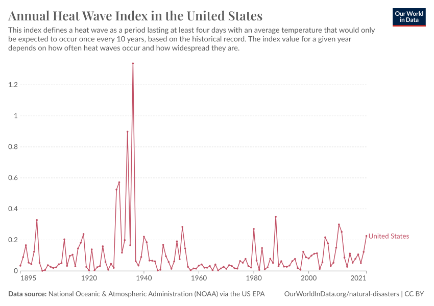 ?v=3
?v=3
If this graph doesn’t motivate one to go out and shoot the CliSciFi practitioners and profiteers I don’t know what would.
Problem is they are trained to ignore history and fabricate alarmism — a common practice used by those who wish control others.
John E,
Thank you for your findings, which are materially similar to those I reported for the 6 Australian State capital cities where most of the population lives.I showed this to my satisfaction about 7 years ago.
One cannot state that heat waves are becoming hotter, longer or more frequent as your exceptions and mine to the generalisation show without counter-argument possible.
Geoff S
http://www.geoffstuff.com/hw6capsjuly2021.docx
If readers want to get a stress headache, have a read of recent literature on marine heat waves. Unfettered alarmism seems to dominate cold, hard scientific assessment. Again. Geoff S
” I was prompted by this comment to channel my inner Willis to see if I could replicate this chart.”
Add a little back radiation here, a bit of back radiation there, maybe ramp up the ECS. Remember, it is imperative you don’t supply any evidence for any assertions you might make or else you will have the lukewarmists banging on your front door.
That should channel your inner Willis, John.
Don’t forget to delete my comment, though. That would not be inner Willis if you didn’t.
Typical Leitmotif. Full of personal attacks, plus lies that I don’t supply evidence, and without a single relevant scientific comment on the subject at hand.
And of course, the big lie, that I’ve deleted his comments. Despite being sorely tempted to place his trash in the appropriate receptacle, I can’t recall ever doing that.
Leitmotif, you are a lying sack of bovine-processed hay.
w.
Willis,
That’s an insult to sacks of bovine-processed hay!
At least THEY can be utilized for important things like methane digesters or compost piles!
Abolition Man is a Willis Groupie.
You obviously like junk science too.
“ Full of personal attacks, plus lies that I don’t supply evidence”
Erm… Well you don’t. You just utter BS about back radiation causing surface warming. You don’t even refer to any experimental evidence where this surface warming is measured.
You are also a serial liar, Willis. You have deleted many of my comments over the last year and those of rick will, eben and I also believe Zig Zag Wanderer. If you don’t believe me go back and check your blogs in the last 12 months.
If anyone is a lying sack of sh*t it’s you Willis.
Btw, I have background of STEM subjects to degree level. What is your background? Oh, wait a minute … psychology. Yes, that’s it. Not really a science, is it?
You need to be careful when using local observations to explain heatwave properties. For example, UHI effects and marine cooling in coastal towns.
For many cities, especially coastal ones, the heatwaves, however defined, originate away from the city. Example, Melbourne Australia gets many of its worst heat waves blown in from central Australia, more than 1,000 miles away. It is the weather and climate of central Australia, combined with wind strength and direction, that governs most heatwave properties in coastal cities to the S-E.
Probably the same with Florida. Does it get heat waves when central US is cool? Geoff S
Very well done analysis. The Urban Heat Island for New York has been commented on several time. I recently updated my Urban Heat Island web site with several more Land Surface Temperature maps, using Analysis Ready Data from the USGS Earth Explorer web site. Some of you might find the maps of interest.
http://www.urbanhi.net/uhi-cities/new-york.html
The problem with the whole “global warming” thing is that more than 200% of the data is fabricated either through manipulation of actual readings into homogeny or through fraudulent inputs to force table A to perform like expected table B. This means the margin of error on the output is up around 4000% Yes, that’s a four digit number indicating 40x as much error as the original individual data inputs.
This clearly indicates that most climatologists shouldn’t even be allowed to operate single-ply toilet paper.
John, that’s a nice piece of work. Many thanks. As mentioned, it would be great if you could extend it to as many other sites as possible.
When I looked at the four EPA graphs, two things were obvious – and they do not cast the EPA in a good light.
First, the graphs start in the 1960’s, although of course there is good data going back to at least the 1900’s. It’s obvious why they did this: the warm 1930’s is just too inconvenient, so they had to go. Sadly this fraudulent practice is common. Shortly after Biden became presiden, the US wildfire agency deleted all the wildfire data before 1980. Of course, the deleted data shows that US wildfires were far worse during the 1930’s and that today’s wildfires are fairly average.
Second, the graphs show no sign of the cooling in the 1970’s – another example of hiding inconvenient data. In contrast, your graphs clearly show a cool 1970’s. During those years many climate scientists were telling us we were doomed by global cooling. How quickly can climate science bandwagons change!
Still, we shouldn’t be surprised by this scientific malfeasance. In many areas, including climate and air particles, the EPA “science” is hopelessly corrupt.
Chris
Hi Chris
I am in the process of collecting data from other sites and will follow up with another post when I have the chance. Many of these older data sets have large gaps that I am loath to fill in so it takes a lot of surfing to find decent ones. Then too there is the problem that many are urban or airport, which may bias the results. That darned day job keeps intruding as well.
Regarding the claim that the EPA article “doesn’t provide data, methodologies, or calculations”: I saw these in the EPA article:
“For consistency across the country, Figures 1 and 2 define a heat wave as a period of two or more consecutive days when the daily minimum apparent temperature (the actual temperature adjusted for humidity) in a particular city exceeds the 85th percentile of historical July and August temperatures (1981–2010) for that city.”
Figure 2 has maps showing where these major cities are, and they can be identified.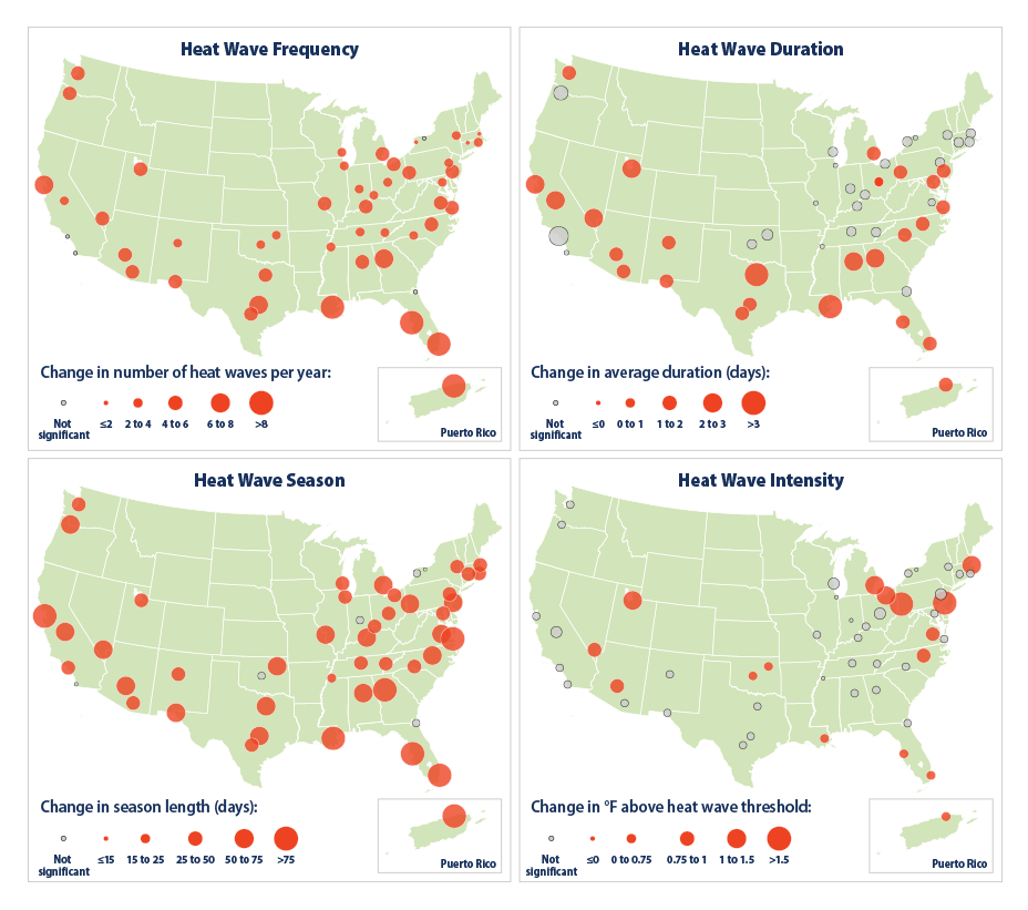
More methodology statements are in the article farther down.
I don’t see lack of stating methodology, etc. being the problem. I see the stated methodology, apparently chosen to maximize indication of increase of heatwaves, being the problem.
“I’m not sure what these combined charts tell us”
They tell us no more or no less than all the other charts used to demonstrate aspects of global climate change. They do seem to be honest representations of data available but as such only become confusing visuals.
Graphics are too often accepted as a true representation of reality which makes them effective for purposeful misdirection. To be believable they must use unassailable data. If such (observational or experimental) data exists (which I doubt) it can only pertain to the past. The chart may tell you what was, but that may have no relationship at all to what is or what may be.
Thanks for making an already confusing topic even more confusing. I am probably not helping.
She certainly can can-can.