Guest post by Geoff Sherrington
The global problem.
In response to the threat of a global viral epidemic, countries announced lockdowns at various times near 25th March 2020. https://en.wikipedia.org/wiki/COVID-19_pandemic_lockdowns
This caused a reduction of industrial activity and hence a lower rate of emission of anthropogenic carbon dioxide to the atmosphere. An example of reduction from aircraft is given at https://en.wikipedia.org/wiki/Impact_of_the_COVID-19_pandemic_on_aviation
Numerous sources asked if the reduction in CO2 emission could be detected in analysis of air for CO2 content, which had been done for decades. Early questions and speculative answers came from many sources including –
https://www.esrl.noaa.gov/gmd/ccgg/covid2.html
By late May 2020, the emerging consensus was that the reduction would be too small to show at the main measuring stations such as Mauna Loa, Hawaii.
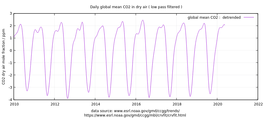
This CO2 event has some consequences for global warming alarmism. There has long been argument that the contribution of anthropogenic CO2 to air is tiny compared to natural sources and sinks. Another argument says that the decades-long increase in CO2, the Keeling Curve, is mainly due to mankind, because the estimated emissions from industry account for about double the increase measured each year. Here is part of that curve to mid-May 2020:

It follows that an absence of a fall in the curve in the 2020 lockdown could indicate that the emissions of mankind are dwarfed by natural emissions. Whereas, a fall can be interpreted as proof that atmospheric CO2 levels are directly and measurably influenced by man-made emissions.
In terms of global political action, there are numerous calls to lower CO2 emissions by reduction or removal of fossil fuel generators such as electric power plants, cement manufacturing, gas autos replaced by electric and so on.
If the lockdown causes a 10% reduction in man-made emissions and this does not show in measurements, what does this mean for models of global climate and their forecasts? How are we going to monitor progress from drastic cuts to fossil fuel use if we cannot see the result in the numbers?
CITIZEN SCIENCE INVESTIGATES.
You are an interested scientist seeking to do your own investigation of CO2 levels in 2020. You prefer daily reports of CO2 to preserve the fine texture of the measurements and their comparisons from one weather station to another. You seek data from other weather stations.
There are 4 stations typically listed as keys to the system. These are –
Barrow, Alaska
Mauna Loa, Hawaii
Cape Grim, Tasmania
The South Pole, Antarctica
There are many secondary stations such as these in the AGAGE (Advanced Global Atmospheric Gases Experiment https://agage.mit.edu/global-network
About 23rd March 2020 I started to download files of CO2 in air from some of these stations. There were problems. Almost none of them had daily data for year 2020, some had no 2020 data at all. NOAA, for example, had daily South Pole data to only 31st December 2019. Mauna Loa was the exception. It had data from two sets of instruments, one under the NOAA banner, the other from Scripps. I managed to download some NOAA daily data ending in March 2020, but when I tried again I could not find the original source. If I try the following URL, the data stop at 31st December 2019.
ftp://aftp.cmdl.noaa.gov/data/trace_gases/co2/in-situ/surface/
Ralph Keeling from Scripps was most helpful with data. By email of 27 April 2020, he sent a few years of past daily Mauna Loa data to 12th April 2020. I told him I would not use it unauthorised, but then later found it to be identical to data downloaded here.
https://scrippsco2.ucsd.edu/data/atmospheric_co2/mlo.html
This is the most up-to-date, comprehensive source of daily CO2 data that I have found for year 2020.
The other Mauna Loa people, NOAA, write in their read-me notes that –
These data are made freely available to the public and the
scientific community in the belief that their wide dissemination
will lead to greater understanding and new scientific insights.
The availability of these data does not constitute publication
of the data. NOAA relies on the ethics and integrity of the user to
ensure that ESRL receives fair credit for their work.
Sadly, I have not succeeded in finding daily CO2 data for Mauna Loa for much of 2020 despite perhaps 20 searches, except for the Scripps source and Ralph Keeling.
What did I do with the daily CO2 data from Mauna Loa, NOAA versus Scripps?
NOAA HAS A PROBLEM OR THREE.
First, I did a straight comparison. It was something of a shock, because it demonstrated there was strong circumstantial evidence that NOAA was making up numbers that went into their official historic record. I would not have detected this feature if I had not got daily data from Ralph Keeling, with gaps labelled NaN for missing data. Here is but one example of it.
YEAR MONTH DAY SCRIPPS CO2 NOAA CO2
2020 1 374 413.39 413.1
2020 1 375 413.46 413.15
2020 1 376 413.25 413.2
2020 1 377 413.23 413.25
2020 1 378 NaN 413.3
2020 1 379 NaN 413.35
2020 1 380 NaN 413.4
2020 1 381 NaN 413.45
2020 1 382 NaN 413.49
2020 1 383 NaN 413.54
2020 1 384 NaN 413.58
2020 1 385 NaN 413.62
2020 1 386 NaN 413.67
2020 1 387 NaN 413.71
2020 1 388 413.16 413.74
2020 1 389 412.58 413.78
2020 1 390 412.54 413.82
2020 1 391 413 413.85
2020 1 392 414.76 413.89
For reasons unknown to me, Scripps had 10 consecutive days when no data were reported. It seems like NOAA had a similar gap, because the NOAA numbers are a simple linear infill with synthetic numbers, each either 0.4 or 0.5 ppm apart.
It is reasonable to presume that some of the NOAA numbers are not real, but are guesses.
Here is another NOAA problem, problem number two, from a that graph follows with small annotations, from the public source https://www.co2.earth/daily-co2
Around 22nd March 2020, there is a gap of some 4-5 days of missing data. I have added pictorial yellow trend lines that indicate (roughly) that the observations had a step change of about 1 ppm CO2 over these 5 days. This type of change would alert any experienced analytical chemist, with a strong message like “What is going on here? The dots do not join.” This is rather significant jump when, as references above show, we are seeking a change of 0.2 ppm over some months as an indicator of an effect of the global lockdown.
Here we have a change of about 1 ppm in 5 days.

NOAA have a detailed explanation of how they manage their accuracy and errors at Mauna Loa.
https://www.esrl.noaa.gov/gmd/ccgg/about/co2_measurements.html
They note that
- The Observatory near the summit of Mauna Loa, at an altitude of 3400 m, is well situated to measure air masses that are representative of very large areas.
- All of the measurements are rigorously and very frequently calibrated.
- Ongoing comparisons of independent measurements at the same site allow an estimate of the accuracy, which is generally better than 0.2 ppm.
They have the following graph about rejection of observations that are unsuitable – or perhaps “inconvenient” as in truth?

The colour code for grey-blue, letter U, is said to represent
There is often a diurnal wind flow pattern on Mauna Loa driven by warming of the surface during the day and cooling during the night. During the day warm air flows up the slope, typically reaching the observatory at 9 am local time (19 UTC) or later. The upslope air may have CO2 that has been lowered by plants removing CO2 through photosynthesis at lower elevations on the island, although the CO2 decrease arrives later than the change in wind direction, because the observatory is surrounded by miles of bare lava. Upslope winds can persist through ~7 pm local time (5 UTC, next day, or local hour 19 in Figure 2). Hours that are likely affected by local photosynthesis (11am to 7pm local time, 21 to 5 UTC) are indicated by a “U” flag in the hourly data file, and by the blue color in Figure 2.
It is important to note that these words are conjecture. They are guesses at a mechanism. NOAA do not reference controlled experiments that confirm these conjectures. Another conjecture might be that the grey-blue dots are correct; and that higher values are from positive contamination of CO2 from elsewhere.
An important deduction is that NOAA have introduced subjective results into the official record. In hard analytical chemistry, this is not done. Some regard it as cheating. We have already seen an example of NOAA using invented numbers, another no-no. A double strike is hardly a compliment.
Three strikes and you are out? Yes, here is the third strike. It is about accuracy. NOAA claim that
Ongoing comparisons of independent measurements at the same site allow an estimate of the accuracy, which is generally better than 0.2 ppm.
The accuracy of measurements from a laboratory has long been calculated as if an unknown client walks off the street with a sample and asks the lab to analyse it. The lab does not have access to the history of the sample. In reference to the graph just above, selected hourly averages. you need to consider all of the colours of all of the points to calculate accuracy. If accuracy is expressed in customary terms of a normal distribution with 95% of measurements falling within the 2 sigmas of standard deviation either side of the mean, even a rough eyeball estimate puts the 2 sigmas at about +/- 2 ppm accuracy. This is really elementary, classical science. With extreme special pleading by NOAA, using only their black “accepted” points, we are looking at +/- 0.7 or so ppm 2 sigma. It is hard to fathom the source of their accuracy claim of 0.2 ppm, but then they might have created their own definitions for measurement and expression of accuracy.
Here is another graph, this one a comparison of Scripps and NOAA from the same location but using different instruments, calibration procedures and algorithms to treat data.

It is not hard to find reason to question both the NOAA claim of 0.2 ppm accuracy and the accuracy at Scripps. This graph shows results something similar to the “man off the street “ exercise noted above.
Three counts.
In the olden days, if my laboratory operators had these counts against them, they would have handed in their badges of professionalism and gone home before sunset. I see two factors at work here. First is a lack of accountability. My operators knew that they would be fired on the spot for transgressions like these, so they behaved in an accountable way. The performance of people in the work place improves when there are open measures of accountability. Second, there might be aspects of post-modern or post-normal science at work here. As Wiki explains it in summary – https://en.wikipedia.org/wiki/Post-normal_science
Post-normal science (PNS) represents a novel approach for the use of science on issues where “facts [are] uncertain, values in dispute, stakes high and decisions urgent”.[1] PNS was developed in the 1990s by Silvio Funtowicz and Jerome R. Ravetz.[2][3][1] It can be considered as a reaction to the styles of analysis based on risk and cost-benefit analysis prevailing at that time, and as an embodiment of concepts of a new “critical science” developed in previous works by the same authors.[4][5] In a more recent work PNS is described as “the stage where we are today, where all the comfortable assumptions about science, its production and its use, are in question”.[6]
WHAT OF LOCATIONS AWAY FROM MAUNA LOA?
By email of 3rd April 2020, I attempted to obtain CO2 results from the New Zealand Authority NIWA, for Baring Head near Wellington.
Hello from Melbourne,
Do you have a web site link from which I can download your daily measurements of the carbon dioxide concentration in the air as measured at Baring Head? I am seeking daily concentrations from about Jan 2015 to the present day or so, preferably in .csv of similar format Alternatively, can you advise me of the correct procedure to request this information, including that for recent weeks?
Thank you Geoffrey H Sherrington
Scientist
Their reply was –
Dear Geoff,
The Baring Head carbon dioxide data that are available publicly, on the World Data Centre for Greenhouse Gases (https://gaw.kishou.go.jp/), in our plots at https://niwa.co.nz/atmosphere/our-data/trace-gas-datasets and on our ftp site ftp://ftp.niwa.co.nz/tropac/, currently go through to the end of 2018.
Before we make our Baring Head CO2 data publicly available, we go through a very thorough validation process which is explained below. We do this annually and are very close to releasing the 2019 data. The above links will be updated with the 2019 data once it is available. The 2020 data will not be available until about this time next year as it needs to go through the same validation process before it is released.
Our data validation process involves scrutinising the calibration gas measurements for the previous year. Below is a quick description of the calibration process:
At Baring Head we have eight calibration gases that are used as long-term transfer standards providing a link for our measurements to the World Meteorological Organisation (WMO) mole fraction scale. The CO2 mole fractions for the eight long-term transfer standard calibration gases are determined by the WMO Central Calibration Laboratory (CCL), with an estimated uncertainty of ±0.07 ppm (1-sigma) with respect to the WMO scale. We use these eight calibration gases to determine the calibration response for our instrument. These eight calibration gases are usually run on a fortnightly basis. We also run another four calibration gases as short-term working standards, which are run several times each day. More details can be found in Brailsford et al., Atmos. Meas. Tech., 5, 3109–3117, 2012; www.atmos-meas-tech.net/5/3109/2012/ doi:10.5194/amt-5-3109-2012.
Kind regards, Caroline
By email of 30th March 2020, I requested daily data from CSIRO Australia, for Cape Grim.
Message: Can I please obtain data as .csv or similar, showing daily measurements of atmospheric carbon dioxide from start 2014 to today, or to the last day of measurement from Cape Grim? I have viewed some data for the years 2014-2019 incl., but the period of most interest is daily and it starts March 1 2020
There were several emails, the most recent from CSIRO being –
Hi Geoffrey,
Thanks for contacting CSIRO.
The Cape Grim monthly averaged baseline data is made available to the public on a monthly basis. It is provisioned at this frequency, rather than hourly or daily, because the high resolution data needs to be run through a process by our team that is not instant.
The monthly data is currently sufficient for all other publications, enquirers and users, and our robust and peer-reviewed data publishing process will not be changed based upon your request.
We trust that the recently published March 2020 monthly averaged data point will be of use to you.
These bodies seem keen to gatekeep their data for reasons unexplained. The Australian data are paid for by the Australian public, who have a reasonable expectation of being able to access the data. I know of no law or regulation that allows CSIRO to act as censor or gatekeeper against the public. Perhaps there are some acts & regs, but I have never found them or seen them quoted.
The whole sorry procedure takes me back to my friend Warwick Hughes, who received that shattering email from Prof Phil Jones back in 2004-5.
“Why should I make the data available to you,
when your aim is to try and find something wrong with it.”
Must one conclude, with a heavy heart, that there remain vested interests among the science community who simply do not know of the damage that can be done through failing to learn from the history of Science? And who are more willing to obscure than to learn?
And no, this essay is not a candidate for a formal, peer reviewed publication because it does not present any useful advance of Science. It uses methods little more complicated than addition and subtraction of simple numbers. It is not meant to advance understanding of Science, so much as to minimise the decline.
THE END.
Geoff Sherrington
Scientist
Melbourne, Australia.
21st May 2010.
Eisenhower had this all figured out sixty years ago. It’s very sad that no one heard the warning.
Eisenhower’s speech looks more and more prescient as decades go by. However, it’s important to remember his conclusion was not to avoid the military/industrial or political/science complexes. He seemed to accept they would continue to grow. He was simply noting the problems created by each; his final statement is critical: “It is the task of statesmanship to mold, to balance, and to integrate these and other forces, new and old, within the principles of our democratic system — ever aiming toward the supreme goals of our free society.”
Geoff, be very suspicious of these “quality” control processes. This period of global lockdown has already raised eyebrows in connection with there being no discernable change in CO2 so far.
This is not normal times, which are bad enough when it is. The warming warriors are already worrying that locking people up globally is going to show that the human contribution is markedly less than advertised.
We know how much we burn, but maybe most of it is sequestered, or perhaps there is something like the leChâtelier principle at work. Maybe the reduction in human CO2 invigorates bacteria and termite emissions to replace it?
Whatever the case, no detection will be the end of the whole climate CO2 debacle. Weve had 3 or 4 years of cooling and sea ice rebound, and they have been staggered by lefty Michael Moore’s documentary that renewables don’t work as a sub for fossil fuels. They virtually have no choice but to “homogenize” the data to fit the narrative. Please keep collecting the raw data!!!
Unlike NOAA with its vague statements about “accuracy”, the New Zealanders at least try to use the language of the Guide to the Expression of Uncertainty in Measurements (GUM). Their quoted +/-0.07 ppm (= 0.02%) uncertainty seems like only a single error source (the calibration transfer), and not a combined uncertainty of the entire CO2 measurement procedure, which probably should be quite a bit larger.
NOAA doesn’t even get basic use of significant figures correct.
It used to be that Scrips was the sole provider of CO2 reference gases for calibration. I don’t know if this is still the case but it would not be a good practice if it is because it would introduce bias into measurements.
As Scissor says, that is most likely the analytical accuracy of analysing one sample. It does not make any claims about how close any sample bottle is to the imaginary “average” of atmospheric CO2.
What does look more telling is the 1ppm jump. It is a shame you did not compare the same period to the Scripps data to see if there was a similar rise.
There are days when the wind (unusually) blows from the direction of the volcanic vents. Scripps carefully removed these as they do anything which deviated by more than 2 S.D. IIRC.
I think all this was discussed here a week or two ago
If the rising trend and the interannual variation is removed we see that even the annual cycle has quite a variable peak at about this time of year. It would be hard to see how anything less than 1ppm could be shown to outside normal, natural variations.
Scissor,
NOAA currently makes the calibration gases for most CO2 monitoring stations, but Scripps still uses its own calibration gases (and CO2 scale) and so doe the Japanese.
I am pretty sure that if NOAA would tamper with the calbration gases, that Scripps would be happy to bring that out. They still are very unhappy that their privilege was taken by NOAA (on order of the WMO)…
Talking about New Zealand. The longest running continuous record of daily CO2 measurements in the Southern Hemisphere is from NIWA’s atmospheric monitoring station at Baring Head (an extremely windy point in Cook Strait near Wellington). Perhaps Geoff would like to update his data gathering to include this set so that he can sit it alongside some of the shorter lived ones.
NIWA cannot be trusted and what’s more they were found by a high court judge to be beyond question. They can legally do whatever they want and there is no legal access to data or scientific validation of their results.
They are willfully and legal exempt from any auditing or validation, therefore NOT a scientific body.
Why would any have any interest in their bogus “data”?
Interesting topic. In a past job, I was responsible for quality-assuring continuous emission monitoring equipment that is very similar to the equipment used to measure CO2 at all of the stations listed. The monitoring equipment I worked with was used for monitoring emissions at power plants for EPA’s Acid Rain Program, Clean Air Interstate Rule and the Mercury and Air Toxics Rule. EPA requires daily calibration tests, quarterly linearity checks and annual “relative accuracy test audits” (comparing the instrument in the stack to a “reference” instrument owned by a 3rd party contractor).
The instruments are set up to measure at a certain range of concentrations, as one would expect. Calibration gasses used in daily and quarterly QA tests are spec’d out to EPA standards as prescribed in the rule to be representative of stack conditions. Calibrations are performed at a zero-level and a span level. Linearity tests are performed at a low (or zero), mid and span level. The specifications for passing these tests are +/-5% accuracy. Using EPA’s pass/fail criteria, 400 ppm +/- 5% = 20 ppm. I’m not sure what NOAA is using for their QA criteria, but I doubt it is 1 ppm or less. It’s impossible to keep a gas analyzer measuring that accurately.
Another topic I could go on for hours about is missing data. The March 7 spike to approximately 418 ppm is interesting. It appears to settle down to approximately 415 ppm in the following days. This looks to me like instrument drift more than a signal in the data. The break in the data starting on March 21 is likely due to a failed calibration. The daily calibration (if they are doing calibrations that frequently) probably failed, and the data was considered missing until someone went to the analyzer and recalibrated it. That may also explain the wonky data before the break in the data and the 1 ppm jump.
For a geek like me, this is interesting stuff. Maybe I should book a vacation to Hawaii to visit the NOAA instrument up on the mountain.
Would the EPA allow you to prepare and use your own calibration standards?
I believe that Scripps has a good business going being the primary supplier of reference standards. I don’t know details of the situation today.
Industry was required to use certified protocol gasses. EPA worked with NIST to develop standards that cal gas manufacturers (i.e. Airgas, Aire Liquide, etc) are required to use. Each gas bottle came with a certification sheet. Last I had checked, there were dozens of certified vendors. There is an entire program set up for this called the Protocol Gas Vendor Program (PGVP). PGVP participation was required to consider the cal gas “valid” for use in monitoring equipment. The cal gas bottle certification data was required to be required to be submitted on a quarterly basis for all emission units affected by EPA rules such as ARP/CAIR/MATS/NSPS/Boiler MACT, etc.
Thanks. I suspect that NOAA never had to do anything as rigorous even though their data goes into billion dollar decision making. I’d wager that they’ve never even had a third party audit.
Scissor: those who make the rules never follow the rules.
EPA CEMS cal regs are fairly stringent and I would guess practical since they use the data collected to persecute their cause. Doubtful that the CO2 crowd has to adhere to same.
Monitoring anything to ppm or less is easy to finagle, seen it done many times.
Introduce gov and msm agenda into a cal process…. at that point walking on water springs to mind.
I wonder if the “very thorough validation process” or the manipulation of the “high resolution data (that) needs to be run through a process by our team” will miraculously discover a significant drop in atmospheric CO2 due to the lock downs?? Or am I just being paranoid?
Yes, Aussie CSIRO are about as cagey and European data sentinels.
Though most of this is paid for by the tax payer they do not get the right of access, as is generally the case in the USA.
They are welcome to “put it through a process” but that should not prevent free access to raw data incase someone else wants to invent their own “process”.
“21st May 2010.”
?
Should be 2020. Apologies.
Any more errors? Geoff S
The very end of the article is dated 21st May 2010. Are we off by 10 years? With this Covid quarantine, I sometimes have trouble remembering what day of the week it is. 🙂
Clearly, it should have been marked March 82nd.
“Pay no attention to the raw data behind the curtain.”
🙂
“Data” continues to be one of the most frequently and egregiously misused words in climate science. Data, once “adjusted”, cease to be data and become merely estimates. Data, multiply “adjeusted” become deception.
“Oh the tangled web we weave when first we practice to deceive.” (HT: Sir Walter Scott)
Yes “constructs” would be a more accurate term than “data”
But hey, we’re talking about “climate science” here, so it’s mostly about contributing to “the movement”.
(Btw – “movement” is an apt description of what these jokers produce. I also have a movement. Every morning.)
Ed
It would be grammatically correct to distinguish between “raw data” and “adjusted data.” As long as the “adjusted data” are identified as such, and an explanation of the adjustments and the need for them are provided, it is acceptable. However, the “raw data” should be made available (archived!) so that the “adjusted data” can be verified independently.
Clyde –> There is no such thing as “adjusted data”. I always call it “results” of calculations. Interpolated and homogenized results should not be considered data nor should they published as data. Scientists are free to use “results” but need to justify why and what effects are experienced as compared to original, recorded data.
Jim
You said, “Scientists are free to use “results” but need to justify why and what effects are experienced as compared to original, recorded data.”
That is essentially what I said!
When I was in school, I was taught that if I made an obvious error in data entry, I wasn’t supposed to erase it. Instead, I was supposed to put a line through it and put the correct value near it. The purpose for this practice was the possibility that the first entry was actually correct, and it could be recovered after analysis.
Which is the “data,” the entry with the line through it (known to be wrong), or the second entry correcting it? I think that some flexibility is necessary in definitions. The important issue is not to give the impression that data points in a time-series are the original data when they aren’t.
I would consider “results” to be something like recording whatever the measuring instrument reads out in, such as degrees F, and then converting it to some other units such as Kelvin. It is the same information, and I would consider it to be data.
In any event, the important thing is to clearly define what information a data set carries, and to have an audit trail to track corrections and conversions to different units, and to detail the methodology used for derivative sets of information applying to the same physical phenomena, such as averaging.
See: https://www.merriam-webster.com/dictionary/data
I agree. Part of the problem is definitions. “Corrected” is not the same as “changed”. Yet too many official and semi-official organizations treat them the same.
The thing is I work with Relational Databases and this kind of presentation is trivial using a database. ie The data is stored “as is” in tables and at the most simple level if you need to make adjustments/corrections then you just present that as a View of the raw data. It is then easy to show multiple interpretations alongside the raw data as multiple views of the same raw data.
The thing is things like temperature data still seems to live in the world of spreadsheets and csv files rather than “trivially” available to the world in an online database. If the Views of the data are not want you want it is really easy to write your own your own SQL against all the “raw data” or reinterpret the data that has at least just been corrected in a reasonable way.
I still don’t understand why the science community doesn’t use databases more. R/Python type approaches definitely have very good uses but a lot of that calculation is much, much easier to do with a simple SQL query.
Geoff Sherrington – many thanks for taking the time to write about this.
I think what we are learning about the so called “gold standards” are they are made from iron pyrite. Just about all data these days is sloppily gathered and run through smoothing algorithms before entering the historical databases (but always to the hundredth of the unit being measured). Of course the algo’s are based more on politics than science but it’s all purported to be highly accurate and real. Good luck on finding the truth.
Will NOAA, NIWA, and CSIRO ever rise to BIPM’s international standard on uncertainty in measurements?
Thanks Geoff for exposing some of the major Type B (or Type 2) systematic errors in the “best” global CO2 data. The ~ +/- 1.5 ppm errors graphed are far larger than the NOAA’s amazing assertion:
I have yet to find IPCC making ANY reference to the BIPM international standard:
“GUM: Guide to the Expression of Uncertainty in Measurement” https://www.bipm.org/en/publications/guides/gum.html
Evaluation of Measurement Data: Guide to the Expression of Uncertainty in Measurement JCGM 100:2008 PDF
https://www.bipm.org/utils/common/documents/jcgm/JCGM_100_2008_E.pdf
See also NIST Uncertainty Machine
NIST Technical Note TN1297: Guidelines for Evaluating and Expressing the Uncertainty of NIST Measurement Results, Barry N. Taylor and Chris E. Kuyatt
https://www.nist.gov/pml/nist-technical-note-1297
NIST knows what they are doing with regard to measurements and statistics. It would be better to have NIST in charge of Mauna Loa at least instead of “scientists” from NOAA.
Adhering to the GUM is hard work requiring due diligence toward all error sources; it is way, way easier to hand-wave bad guesses about “accuracy”.
Geoff Sherrington,
You are trying to minimize the decline, whereas they are trying to ‘hide the decline’.
Sorry couldn’t resist. Great work. Interesting to see the true range of CO2 values measured, versus the smooth curves that are always shown for Mauna Loa.
Yes, good work by Mr. Sherrington!
Surely there is, somewhere, in this process criminal acts which are meant to deceive (possibly for financial gain) and some organisation, such as the FBI, should carry out an investigation and shine a light on it(?)
Or just common old “Noble Cause Corruption”
“…Nobel Cause Correption.”
FIFY. 🙂
Yes, surely, this should be thoroughly investigated to find out if such discrepancies serve to enable racketeering.
Have you followed the whole Russian collusion and Flynn cases? I ask because it shows just how much politics have corrupted the FBI and DOJ. Even with a change in leadership there is obvious stonewalling going on in those departments. Personally I suspect the swamp runs so deep that we’ll have to have massive firing of all management to see everything come to light that’s been asked for.
With CC being very political just how much could we trust an FBI led investigation of Big Climate Change?
What I see in climate science is the claim that there is a responsiveness of atmospheric composition to fossil fuel emissions at an annual time scale but I could not find evidence for that relationship in the data. Pls see
https://tambonthongchai.com/2020/05/18/12479/
Chaamjamal,
You are presenting important, innoivative work that more people might benefit from reading. Especially noted long ago the improper use of correlation analysis based on cumulative numbers.
But as we used to say, “You can lead a horse to drink, but you can’t make it water”.
There is an amorphous blob out there that is self-convinced it knows best, fails to respond to valid evidence that it does not and causes enormous economic harm through not much more than ignorance. It is full of followers when it needs new, original science researchers with sparkling ideas. We are stuck with monotonous repetition of wrong, 1980s concepts. Some stupid urge makes me think of Tom Lehrer singing about the old dope peddler “He gives the kids free samples because he knows full well that todays young innocent faces will be tomorrow’s clientele.” Regards Geoff S
Right off the bat:
If the lockdown causes a 10% reduction in man-made emissions…
Big fat “IF”. In my fast skim through the article, did I miss where the 10% figure was verified by means other than attempting to measure atmospheric CO2 concentration.
Besides that –
Ralph Keeling estimates that global fossil fuel use would have to decline by 10% for a full year to clearly impact CO2 concentrations in the atmosphere
It’s only a little over two months, so why should we see anything at all so far?
What “adjustments” are made for the adjacent volcanoes?
Am I repetitive?
Hasn’t the entire climate change debate been an endless 30 year loop of the same repetitive nobody listening and every body pushing their agendas?
By reflecting away 30% of the ISR the atmospheric albedo cools the earth much like that reflective panel behind a car’s windshield.
For the greenhouse effect to perform as advertised “extra” energy must radiate upwards from the surface. Because of the non-radiative heat transfer processes of the contiguous atmospheric molecules such ideal BB upwelling “extra” energy does not exist.
https://www.linkedin.com/posts/nicholas-schroeder-55934820_climatechange-globalwarming-carbondioxide-activity-6655639704802852864-_5jW
There is no “extra” energy for the GHGs to “trap” and “back” radiate and no greenhouse warming.
With no greenhouse effect what CO2 does or does not do, where it comes from or where it goes, is moot.
Equally moot are temperatures, ice caps, glaciers, polar bears, sea levels, hurricanes, nuclear power….
The Mauna Loa observatory sits right on top of a dormant volcano. Most geologists will tell you that such features are emitters of carbon dioxide.
It’s like a check valve…it keeps geothermal and solar trapped…just trying to figure out how a two way check valve knows which way the photons should go?
Nick Schroeder,
The CO2 data are mostly from the trade winds at Mauna Loa. If there are downslope winds from the fumaroles, that gives a huge variability in the hourly data and the result is marked and not used for daily to yearly averages. If there are upslope winds in the afternoon, which are slightly depleted of CO2, these are marked and not used for averages. Both raw and “cleaned” data are available for comparison…
Plotting all raw data or only the “cleaned” data doesn’t make any difference in trend with a maximum of 0.1 ppmv/year…
Geoff I have been looking into the same and working on a paper framework for this exact topic. Is there a way I can contact you off the site?
Guest,
You are most welcomed.
sherro1 at optusnet dot com dot au
Geoff S
“What is going on here?”
At a casual glance I would assume instrument drift to failure – data gap – replacement and calibration.
Probably nothing sinister – but the lack of explanation is !
At the very least questionable.
Fascinating that the very thing (CO2) that AGW is founded on is not an accurately known quantity in the atmosphere. Precise models have been built to quantify the temperatures based on this gas. Large sums have been spent on promoting and mitigating AGW but it appears that there is little science being applied to the real world. Thank you Geoff for your professional inquiry. I expect these agencies will quickly respond to set the record straight. Well maybe not quickly if ever.
Once again it sounds like some people out there in the climate measurement community have no idea of the difference between accuracy and precision.
Sure they do. Their data is precisely inaccurate.
It’s been said before, so I’ll say it again. You record the data exactly as it is measured. Whether you like the numbers or not. Even if the equipment is broken. Or out of calibration (unexpectedly). Etc. Later, you note that the equipment was found to be out of cal during the period blah blah, or was broken and subsequently repaired- found to have a defective umpty blah… You don’t monkey with the data and then record it AS IF that is what was measured. That’s what the words Measured Data mean.
Good luck.
Gerry Parker
Gerry
I agree with you completely. By selectively deleting, or otherwise editing, data points that are assumed to be unrepresentative, information is lost and the results are probably biased. As to information that is lost, we might be able to learn something about the rates of photosynthesis with respect to temperature, humidity, and wind speed if the raw data were available. Further, if the raw data were available, the assumptions about the reasons for wanting to treat the low CO2 readings as being unrepresentative could be verified independently. Geoff has demonstrated that, once again, researchers in the field of climatology are sloppy in their practices and there is a likelihood of the CO2 time-series being biased downward from actual average values.
Gerry,
It isn’t that simple. Suppose CO2 levels are measured by using a laser what is actually measured is
the number of electrons produced in a photodiode. But even this is usually not measured directly by
the current goes through a resistor and the voltage is measured after appropiate filtering etc. Supplying
that voltage against time to anyone would be useless. Then there is a huge amount of processing and assumptions go into converting the number of electrons observed into a measure of CO2. There is no
such thing as pure unmanipulated data.
Izaak –> Gerry was not discussing the mechanism of a measuring device. That is done thru calibration. What it means is that you record the data from the mechanism without change. You don’t replace it with what you think it should be. You then explain why it is not reliable due to *****”.
Jim,
The point is that people don’t measure temperature or CO2 or almost anything. The only
thing most people measure is the voltage across a resistor. However almost nobody in any scientific paper records measurements as ‘voltage’. Even time is actually measured in terms of an oscillating voltage. Do you really want all graphs in almost every paper to be just Voltage against Voltage? Or do you want researchers to do a minimal amount of processing and then present the result? And if you accept that then how exactly where do you draw the line?
There is no simple answer to that question just as there is no such thing as ‘raw data’.
Walton
You said, “Then there is a huge amount of processing and assumptions go into converting the number of electrons observed into a measure of CO2.” No, it is a process called “calibration” that all measuring devices should be subjected to.
I don’t think that you understand! What we are discussing here is whether it is appropriate to delete or ‘correct’ a measurement that is the output of a calibrated measuring instrument.
Clyde,
define ‘calibrate’? That is just data processing done by humans at a different lab often in a different country and then stored in a computer program that has been complied and is not accessible to independent verification. If you trust that process then why not trust the person
who performed the measurement to recognise when the instrument is faulty and discard the result?
Izaak,
Clyde said:
“I don’t think that you understand! What we are discussing here is whether it is appropriate to delete or ‘correct’ a measurement that is the output of a calibrated measuring instrument.”
I agree with Clyde, who put it very clearly.
Yes, every measuring system relies on calibration. If you use a simple mercury thermometer, you are really measuring a length of mercury and relying on the calibration between that and the temperature. Actually, what you are really measuring is a pattern imprinted onto your retina. And so on, all the way through your nervous system to your brain.
Suppose I measure the temperature at 20 degrees and write that down. That’s data. It’s what was measured.
But then suppose I decide I don’t like that figure. I cross it out and write down 20.5.
It’s no longer data. It’s adjusted data. It has nothing to do with the essential calibration of the thermometer. It has everything to do with the fact that I didn’t like the figure and I thought it was ok to change it.
Chris
Walton
You think you understand something, but your words demonstrate that you are fooling yourself.
To calibrate something means to compare the output of a measuring device with some standard. Today, that usually means converting a proxy, such as voltage or current, to the units of the physical manifestation. One ends up with a graph or equation defining the relationship between the proxy units and the desired units. Most notably, it reveals if there is a bias or systematic offset between the displayed units and some standard reference. This might be a two-step process where, for convenience, the proxy is immediately converted to a display, such as the travel time for a light beam to a speed on a radar gun. A secondary calibration verifies that there has been no offset or drift such that the measuring device displays incorrectly.
https://en.wikipedia.org/wiki/Calibration
You asked, “… why not trust the person …” Because, in formal comparison calibrations, there is a rigorous protocol that must be followed for certification that the measuring device matches a standard. In deciding whether to retain measured data, it may be a single person making an ad hoc decision based on subjective opinion, (e.g. variance > x) or an unverified hypothesis to ‘justify’ removal. The Scripps description of the data analysis conjectures that low CO2 values are the result of upslope winds bringing ocean air over photosynthetically active vegetation, depleting the ocean air of CO2. Nowhere do they present evidence that the conjecture has been proven, and more damning, they do not even attempt to provide a quantitative relationship between all the variables. They just delete the data.
Interestingly, those same parcels of air would be depleted of CO2 whether the monitoring station was there or not, and the air reaching high elevations would have reduced CO2 much of the time. That is, the natural state of air being supplied to the mountaintop is not the same as at the ocean surface (which might be increased by out-gassing), but is reduced by the natural vegetation. The unstated assumption is that the vegetation artificially modifies the air. That isn’t the case, and for that reason, treating readings as outliers artificially reduces the average values. Mauna Loa simply is part of the mixing mechanism that leads to a “well-mixed gas.”
As a mineral exploration geologist who discovered several scams involving analytical/assay manipulated data (by “consumers” not by labs) I was instantly alarmed by your statement “Some regard it as cheating.”. After the BREX scandal the Canadian Government put in place the National Instrument 43-101 rules, which are demands for quality control/quality assurance. This greatly reduced, but did not eliminate, scams and scandals. If the CO2 monitor values do not eventually reflect the substantial downturn in commercial production of CO2, either the impact of fossil fuel utilization will be shown to be insignificant, as regards atmospheric CO2, or a widespread cheating and/or manipulation of the data will be known. Thanks for the posting, Geoff.
It has been often pointed out that the non-human CO2 flux (ocean, termites, plants, etc.) is more than 20 times human emissions. The claimed increases due to human activity is only 2 or 3 ppm per year. The uncertainty and variability in normal non-human daily/ monthly/yearly flux could, it seems to me, easily obscure any changes in human emissions over a few months. Therefore, any variance due to recent human events might be well below the sensitivity of measurements.
AndyHce, I’m guessing here, but some trace atmospheric gas whose change “might well below the sensitivity of measurements” is probably not any calculable threat to humanity, so, no pasa nada.
Ron Long,
As once chief geochemist for a mining company that found several (multi-million ounce) gold mines from greenfields work, where I was responsible for chemical data quality, we were well aware of cowboys as competition for industry reputation. They are collectively not very smart and so are easy to unmask.
It worries me that there is a blurry line, getting worse, between criminal intent to deceive on one hand, and sloppy, ignorant science that has the capacity to deceive, on the other. I really dislike that phrase “Good enough for government work”. Overall, climate research needs both adoption of standards like BIPM have published and a regulatory enforcement that shuts down non-conformists. Geoff S
Hear! Hear!
If all the data logging is properly time coded, why would it take moths to calculate and filter the final data?
Most computer programs do things like these in seconds, assuming the program is well written.
Oh, I understand, they are using their fountain pen and their wooden calculator.
… moths to calculate and filter the final data?
Carl is trying to start a new scientific/computer myth with this reference to “moths.”
Obviously has a few bugs.
A myth is a female moth..
First reported computer bug was found in the 1940’s stuck in a mechanical relay inside the computer. It was a moth that supposedly was saved taped in a log book as part of the record. The first computer debugging.
Carl
I think that their abacus is now made of plastic.
Isn’t it only a fortnight if you’re actually, ya know, in a fort?
Okay, I’m a Science illiterate, so you have to explain things to me that more learned people might already understand, but what is special about the air of Mauna Loa that measurements of the concentration of carbon dioxide in it are proxies for the concentration of carbon dioxide in the Earth’s atmosphere? Is it true that the Earth’s atmosphere is a homogenous gas whose constituent gases appear in the same concentrations all over the world? This is a serious question; I really want to know the answer. I’m not just trying to be clever.
From what I’ve read, if China emits more carbon dioxide this causes global warming everywhere, and not just in China. That’s the tale I’ve been told. Which, now that I think about it, seems kind of odd. Obviously, the particulate air pollution in China’s cities doesn’t harm anyone in North America. But the carbon dioxide does, apparently. Am I getting that right?
I’m not being sarcastic I really don’t know, so somebody explain it, please.
Ian
While CO2 commonly is called a “well-mixed gas,” it is not as well mixed as oxygen and nitrogen. It tends to be more variable close to the surface, where most of the sources and sinks are located. Mauna Loa was selected as a sampling location to get higher up into the troposphere, where CO2 was expected to be more uniform. Unfortunately, there is reason to believe that it was a less than ideal location because of the abundant vegetation below the tree line. It doesn’t help that there is a small quantity of CO2 coming from vents on the volcano. If all the measured (raw) data were included, the standard deviation of the measurements would be larger and the uncertainty range would be larger. As it is, the ‘uncertainty’ is being reduced with subjective judgements about what adjusted data to present to the world.
Point Barrow measurements are nearly at sea level, but have their own problems because of the proximity of a small airport, and a town where almost everyone owns at least one snowmobile, and the army base has trucks and heavy equipment. Large ships also dock in the vicinity to provide supplies that can’t be delivered by air. In a manner similar to Mauna Loa, Point Barrow measurements are edited to remove high transient CO2 readings.
Clyde,
They have the South Pole where there is no volcano in over 1500 km and no vegetation at all…
Still the same trend as at Barrow and Mauna Loa, but less seasonal variability in the SH (less vegetation in the SH), only more mechanical problems of the equipment he long winters…
Ferdinand
I don’t doubt that the directionsof the tends are similar. However, what is germane is whether the absolute values are the same, and whether the slopes are the same, and whether the precisions (as indicated by the standard deviation) are the same. If not, then there are some questions begging to be answered, such as which time series is the most reliable and most precise. I suspect that, except for the down-times, the Antarctic data are going to be the best. If that is the case, then they might be able to infill with the second best data, adjusted to match the Antarctic data.
Clyde,
Why infill?
Infilling is an exercise on its own, one familiar to estimators of ore reserves from drilling sparse holes and analysing the core. Customary interploations were found lacking in the 1970s and the whole new branch of geostatistics emerged. The point of infilling in this case is eventually to assist in the calculation of uncertainty because it converts into $$$.
The infill with South Pole data that you mention seems more to make a pretty presentation, like a full set of teeth is a nicer look for a model than a jaw with several gaps. But can you make plastic infills as good as the original teeth? You are competing with Nature on Nature’s home ground. Thanks for your comments here and elsewhere. Geoff S
Geoff
Sometimes infilling is necessary with a discontinuous data series, such as when calculating an FFT. It won’t work if you leave the entries blank, and arbitrary dummy numbers are not much better. So, if you want to get a reasonable result, one has to use the best estimate available.
Yes, there is an issue of esthetics when graphing data. However, if the thing being measured is well characterized and changes slowly, a linear interpolation over a short range may be justifiable.
Let’s assume that what we are recording is the performance of an experimental aircraft under test. Perhaps the primary sensor(s) fails during the expensive test or just before it is destroyed in a crash. The missing data are important. The best data are recorded by the primary sensor. However, missing data tell one nothing. If a secondary sensor can be used as a proxy, it might enlighten the analysts as to what happened just before the crash. One doesn’t always have the data they want. But, the analysts have to work with what is available. The important thing is to be aware of the limitations and possible error in infilling from a secondary source.
Clyde,
There is very little difference between the slopes and only a small lag between Mauna Loa and the South Pole:
http://www.ferdinand-engelbeen.be/klimaat/klim_img/acc_co2_1960_cur.jpg
Needs some update…
The lag is from the fact that 90% of human emissions are in the NH and the ITCZ hinders the exchange of air between the NH and SH (about 10% per year is exchanged). As human emissions increased a 3 to 4 fold over the same period, the lag increased.
Although Mauna Loa and South Pole have the longest data series, these are not used as “average global” CO2 data. They use the average of several near-surface stations.
Mauna Loa has the longest series of continuous measurements (South Pole had a few years only bi-weekly flask samples) and therefore is mostly used as “the” Keeling curve, but the difference with the “global” CO2 curve is small…
As far as I remember, if they have to infill data due to failing equipment, they have an algorithm which takes the average slopes of the previous 3 or 4 years over the same period to calculate the in between data.
Ferdinand
So, you are confirming that the data sets from the various stations are not interchangeable.
You remarked, “… they have an algorithm which takes the average slopes …” That is basically substituting historical data for current data. Thus, if there were some event of significance, such as a major volcanic eruption or, god forbid, a decline in fossil fuel use, there would be no chance to observe it in the averaged historical-data used to infill the time series. Basically, that results in graphs that appear smooth and convey an unjustified accuracy. The time lag you mention probably precludes using any NH data for infilling, if one wants more than an aesthetically pleasing graph.
Clyde,
That is NOT what I said or implied. The differences between any CO2 monitoring station from near the North Pole to the South Pole are less than +/- 2% of full scale, despite a 20% per season (!) exchange of CO2 between atmosphere and other reservoirs, mainly oceans and vegetation…
Thus while there are small differences in level, it doesn’t matter at all if you take the data series from Barrow or the South Pole as base for the effect of the extra CO2 (which also is small, but that is another discussion)…
Further there is NO substitution whatever for any data, if any data (good or bad) are present. Only when there was an equipment failure (hard disk crash…), they infill the data with the average slopes of the previous 3-4 years at the same station.
All historical data are available as hourly averages + stdv over that hour. Sometimes with a delay, but they do publish them.
Ferdinand
You said, “… these are not used as “average global” CO2 data. They use the average of several near-surface stations.” I don’t recollect ever seeing anything in the news outlets other than what was recorded at Mauna Loa.
That is because MLO is about the symbol for the CO2 increase and the Keeling Curve…
But they have global surface CO2 data too:
https://www.esrl.noaa.gov/gmd/ccgg/trends/global.html
You can switch between the two via de top references. global is a few ppmv lower than MLO, but for the rest they parallel each other…
Ferdinand
You said, “Further there is NO substitution whatever for any data, if any data (good or bad) are present.” You ignored a very important point: How to convert a discontinuous time series into a continuous, recent time-series without relying on data much older than the range of the time-series. That is, how to make a continuous series where the infilled data are current. A similar problem is addressed frequently when a new satellite is launched, where there is overlap between the satellite observations. Slope, intercept, and amplitude can be adjusted to agree with what is considered the data set of highest quality. Typically, the data sets do not agree completely over the period of overlap. That is, the data sets are rarely, if ever, interchangeable. Without data sets that agree well enough to be interchangeable, then some other approach has to be resorted to. If you didn’t say or imply that the Mauna Loa and Antarctic time-series are not interchangeable, you should have, because while a 2% bias of full scale is small (10% of seasonal range), it is not zero. Not correcting for the difference would be obvious and require an explanation for the offset.
Clyde,
The difference between satellite measurements and CO2 measurements is that with esch satellite, new equipment with its own offset and slope must be calibrated with the old satellite over a sufficient overlap of time, while for CO2 it doesn’t matter as after a break, either the same equipment is used again or with a new instrument, the same calibration gases are used as before.
Then how to fill the gaps?
One can’t use the “best” data of the South Pole to infill the gaps of Mauna Loa, as the South Pole has hardly any seasonal variability and that is even opposite to the much larger seasonal variability at Mauna Loa in the NH.
The slope caused by the CO2 increase over a year is about 2.5 ppmv or 0.2 ppmv/month, about the detection limit at Mauna Loa. The maximum slope caused by the seasonal changes is 1.2 ppmv in one month (May). Thus infilling the average slope of previous years of the own site seems appropriate…
There is an offset between the different monitoring stations as the human emissions are for 90% in the NH and it takes time to equal the differences down to the South Pole, which doesn’t succeed, because human emissions still continue in the NH…
In fact it doesn’t matter, as the effect of a CO2 doubling is quite small, around 1 K, thus a difference of 8 ppmv on 120 ppmv is not measurable at all.
Ferdinand
You said, “… while for CO2 it doesn’t matter as after a break, either the same equipment is used again or with a new instrument, the same calibration gases are used as before.”
Do you have any thoughts as to why Geoff’s 4th figure above shows a jump of 1 PPMV over a period of 5 days, and an apparent change in slope between the pre- and post-gap data?
You also said, “Thus infilling the average slope of previous years of the own site seems appropriate…” But, that approach has no chance of capturing any significant changes that might take place during the gap! If one is only interested in long-term changes, and there is no interest in the short-term changes, then one only has to take a single reading at the beginning of an interval, and the end, and calculate the slope. Why waste the money on a continuously monitoring station if only the general trend is of interest?
Even if the entire economy shut down for an entire year and CO2 kept rising at 2+ ppm/year, the mass balancers still wouldn’t admit that the rise is natural. (lunacy)…
p.s. ~ ms. m., keep up the good work
RE: “It seems like NOAA had a similar gap, because the NOAA numbers are a simple linear infill with synthetic numbers, each either 0.4 or 0.5 ppm apart.”
Should be ” …each either 0.04 – 0.05 ppm apart”.
J Mac,
Apologies, my error, you are quite correct.
I wrote this essay in one day, which might help explain the lack of polish. I meant to include a reference to expert guidelines like BIPM France, but slipped up. Geoff S
Geoff,
No problem! That’s what peer review is for: “All have sinned and come short of the glory!” I fat finger typos a lot… and then can’t see them before I press ‘send’.
Keep up the good work!
Mac
Geoff,
I don’t think that are infilled data.
Scripps uses the same intake equipment as NOAA at Mauna Loa, but that are only flask samples at a certain moment of the day (*). If for some reason these samples weren’t taken, that doesn’t imply that the (unmanned) automatic equipment of NOAA didn’t work.
If NOAA has to infill some data, they us an algorithm that averages the slopes of the past 3-4 years over the same time period to calculate the probable data. Found it back where Pieter Tans showed what was done when they had a hard disk failure:
https://wattsupwiththat.com/2008/08/06/post-mortem-on-the-mauna-loa-co2-data-eruption/
(*) in the above story, Pieter Tans says that Scripps still runs its own continuous equipment? If that is right, it may have failed a few days, independent of the NOAA equipment…
Ferdinand,
When you compare NOAA and Scripps daily over a longer term, you can find many one-day missing data entries from Scripps as NaN. The same day data from NOAA is a simple arithmetic average of the days before and after. It is a logical thing to do if you want to do some later calculations on the data, but it is not a valid thing to do for a historic primary data set. It is wrong, wrong, wrong. If there is no data, you do not invent it for raw source files. Many experienced data people would agree.
Geoff S.
Geoff,
Do they show the stdev of the (hourly) samples over the same days of probable infill?
If they do, that are real measurements, not infilled data…
Good stuff, as far as it goes, pity you can’t access the data from other locations.
Have you considered using the global data measured by satellite? This is plotted on https://earth.nullschool.net/#current/chem/surface/level/overlay=co2sc/orthographic=-161.60,2.41,139
These plots show significant variations around the globe and with time, the distribution is a long way from being homogeneous. They do not appear to back-up the idea that CO2 concentrations are controlled by human emissions. Furthermore they show clearly that gor a reduction of emissions in China, or even the USA, to impact the records from Hawaii there would be a significant time lag. At some times of the year this location appears to be south of the effective boundary between winds in the northern and southern hemispheres such that changes due to reduced industrial activity may never be observed at all.
It also appears to me that any changes would be so small they would be lost in the background noise and would be indistinguishable from other changes that can be seen in the official records for previous seasons.
Conclusion – lots of people clutching at straws when expecting to see anything in the (dubious) official CO2 statistics.
https://earth.nullschool.net/
seems to be inconsistent with the measurements reported here :
https://www.climate4you.com/GreenhouseGasses.htm
The discrepancy clearly appears on this map :
It can be seen here that rainforests have a higher surface CO2 concentration than the average.
This is rather consistent with the fact that there is a high life density under the canopy that emits CO2 and that rainforests may be net CO2 emitters when all the ecosystem they induce is taken into account.
I don’t know if this is correct but it may be somewhat embarrassing for the climate show.
Petit_Barde,
You are right, the satellites measure the whole column and even can focus on near ground emissions for CO2. “Background” CO2 monitoring is done away from local sources, thus never in the first several hundred meters over land, which have their own “tall towers” to measure CO2 fluxes:
https://www.researchgate.net/publication/332445404_Tall_tower_eddy_covariance_for_monitoring_CO2_emissions_from_the_city_of_Vienna
The differences may be due to daily values Vs averaged monthly values?
Forest areas and areas similarly rich in biomass have ground-level and near-ground-level CO2 varying with sunlight, lower when the sun is shining (biomass is a net sink) and higher when the sun is not shining (biomass is a net source). Also, convection causes more mixing with air higher up when the sun is shining and lack of mixing (air is more stagnant) when the sun is not shining. This means moderation by convection of ground-level CO2 concentration deviations from the overall atmospheric background (in a given forested area) is disproportionately of downward deviations, while upward deviations of ground-level CO2 concentration deviate from overall local atmospheric background more freely. This causes ground-level CO2 concentration to average more than the local atmospheric background CO2 even when the biomass is not a net source over an average 24 hour period.
Tim Crone,
Tim Crone raises some good points. In response, from what I can deduce from a limited study of the satellite-based CO2 measurements, they lack comparable accuracy, they have problems being tied to land-based spot locations like Mauna Loa and they are hard to interpret. If your satellite work shows a positive blob over some place on land, how can you distinguish between the land emitting CO2 because a mechanism makes it in excess, as opposed to the blob being a store of CO2 created because the land sink below it is slower to absorb it and leads to a queue? Mainly, though, the satellite method seems to be working so close to the limits of performance that as always, near detection or performance limits, accuracy suffers,
More data manipulated into junk science by NOAA…
Color me surprised.
Not!
Proof positive that data engineers at NOAA are not doing their jobs.
False, fake, changed data are all illegal in government records. i.e. NOAA’s Inspector General is not performing their duties either.
Excellent investigation and analysis, Geoff!
Thank you.
Quite a few of the comments by gaseous and data experts are instructive and compelling too.
Thank you! To those commenters!
I should like to add that the Scripps process does not measure the CO2 fraction in the actual local atmosphere. Rather, it measures the fraction in a subsample that has the humidity removed.
It follows that in the subsample, not only is the component ratio different, it also varies with local atmospheric humidity.
We can see that the annual variation in the Scripps measurement at the various sites:
https://scrippsco2.ucsd.edu/graphics_gallery/other_stations/global_stations_co2_concentration_trends.html
…… matches the annual humidity variations at these sites:
https://www.timeanddate.com/weather
The consequences of the Scripps process measuring two variables instead of just one, casts doubts on the veracity of the ‘Keeling Curve’ and also the assumption behind the AGW conjecture that “temperature follows increases in CO2”
TonyN,
Sorry, all CO2 measurements all over the world are expressed as CO2 in dry air, as that is the only way to compare the ratio’s worldwide as water vapor is highly variable from sea level to Mauna Loa height and the bone dry dessert of the South Pole…
That is done by cooling the air over a cold trap, which freezes out most of all water vapor, but doesn’t include CO2, only a small adherence at the surface, for which is compensated by allowing several minutes of airflow before measurements are taken.
When temperatures change over the seasons, both vegetation and humidity do change, but that doesn’t imply that the CO2 measurements are influenced… South Pole measurements are the lowest, although water vapor there is the lowest too…
Ferdinand,
Thanks for joining in. Can you answer this possible contradiction? If the cold treatment to dry the air prior to analysis does not change the CO2 level, how do we have CO2 in glacial ice cores? Do people measure the CO2 in the ice that forms in the laboratory drying procedure? Geoff S
Geoff: removing the water from the “air” does not seem fair. Why don’t they remove the Oxygen, Nitrogen, Argon, etc while they are at it?
In, other words, remove all constituents of a given mass of “air” except CO2 and then tell us the alleged ppm relative to the lb of “air” at the beginning of the constituent removal process.
My measurements and experience along with alleged factual info on the www tell me: less water = more cold relative to the given environ in spite of alleged CO2 concentration.
meiggs,
The problem with water vapor is that it is highly variable which makes the absolute CO2 levels also variable, while the CO2/dry air ratio doesn’t change.
Therefore all CO2 levels are expressed in dry air to make world wide comparisons possible.
The only calculations where the absolute CO2 levels are important is for the calculation of the CO2 transfer between atmosphere and ocean surface, as the absolute partial pressure of CO2 is the driving force.
BTW, if they want to measure the different isotopes of CO2 and other gases in ice cores, they sublimate everything and with cryogenic separation measure CO2, O2, N2,… with all their isotopic variations…
Further, CO2 is a weak GHG compared to water vapor, but that doesn’t imply that its effect is zero, only small…
Ferdinand: Thanks for the information and I follow your points. The point I think I was trying to make is use of select scales tend to mislead casual viewers/readers of MSM. For example, thinking of global dT in F or C seems ominous to some but on an absolute scale it begins to become apparent R or K that there is not much to worry about. Precip data is always clear…datum is zero, so absolute scale by convention. I would guess that absolute pressure is used routinely even by the TWC as changes in atm pressure would seem insignificant to casual viewers if presented in “column of Hg gauge”. RH is obviously relative and (unlike precip) not an intuitive unit measure for most folks. If CO2 concentration included H2O affect on relative content of a given sample it might give the casual observer the impression that CO2 concentration varies wildly throughout the world which is at odds with the warmist agenda. In my rather sloppy backyard experiment with an IR camera, amb T and amb RH it became very clear that atm water vapor calls the shots in terms of overhead sky temperature. Dry sky = colder. Wet sky = warmer…but I assumed same CO2 concentration in both cases in the ensuing calculations. As you point out absolute CO2 levels vary for wet v dry…assuming wet air has less absolute CO2 than dry I then will point out to warmists that lower CO2 concentrations for a given location = warmer air…………
meiggs,
The error of looking at dry or wet CO2/air ratio levels indeed depends of water vapor content, but is only high at near sea surface. Higher in the atmosphere or latitudes, absolute humidity rapidly drops to low levels, with the exception of clouds, but that is a complete different story…
Geoff,
CO2 doesn’t fit in the ice matrix. All CO2 of ice cores is in the enclosed air bubbles, but there may be a little amount of CO2 in the near-liquid surface of unordered ice/water some 5 molecules thick and/or water around salt impurities, depending of temperature and amount of impurities.
At the start as snow, CO2 is in the 90% air and when compressed with depth, the density of the ice gets higher and the in-between pores get smaller. Until then, there is free exchange with the atmosphere, be it slower and slower as the pores get smaller. At a certain depth, there is no exchange anymore. The difference between atmosphere and 72 depth (at Law Dome) is only 7 ppmv or a difference of average 10 years in age.
When grated just under freezing and high vacuum, any liquid water is removed and freezed out over a cold trap. That forms a regular sheet of ice, where CO2 isn’t incorporated, but a very small quantity may adhere on the surface. That is compensated for by several minutes of passing by of a calibration gas through the whole equipment before the sample is measured…
Thanks, Ferdinand,
That is also my understanding. I raised the matter to help others understand the assumptions behind drying the CO2 before analysis.
As with all science, one makes assumptions that seem reasonable and hopes that they stand the test of time. My private view, as a non-profit expert, is that we should be cautious about firn mechanisms and expect some upsets. There is a lot going on over a long time in human terms, hard to observe, hard to set up experiments. Geoff S
I doubt you can compare CO2 in the air with historical glacial trapped CO2 extracted using the DRY method.
Anyone familiar with this?
https://www.sciencedirect.com/science/article/pii/004896979290428U
Zoe
Yes of course. It has been much discussed over the Years. I think you wrote once about the wet method of measuring co2 . Presumably you are aware of the work of the late Ernst beck?
Tonyb
Yes, I like Ernst Beck’s work.
Zoe and Tony,
Please let the late Dr. Jaworowski rest in peace, together with his impossible ideas about CO2 in ice cores. His remarks of 1992 were already refuted in 1996 by the work of Etheridge e.a. on three Law Dome ice cores. Jaworowski made some remarks like the migration of CO2 via cracks in the ice from low levels towards higher levels which are physically impossible and “shifts” in timing which didn’t exist, as he simply looked at the wrong column of the results…
See: http://www.ferdinand-engelbeen.be/klimaat/jaworowski.html
The same for the work of the late Ernst Beck, with whom I had several years of discussion. While he did a tremendous lot of work, he lumped all results together: the good, the bad and the ugly.
At last he removed the ugly, but still included a lot of bad data…
Not bad because of the wet method itself (which was accurate to +/- 10 ppmv), but bad because where was measured: within forests, towns, under, in-between and above growing crops, etc…
See: http://www.ferdinand-engelbeen.be/klimaat/beck_data.html
“His remarks of 1992 were already refuted in 1996 by the work of Etheridge e.a. on three Law Dome ice cores.”
Can you show me where Etheridge refuted Jaworowski’s notion that the DRY extraction method is fallacious?
Even if Etheridge rationalized the DRY method by his own decree, that doesn’t make it legitimate.
“Dry method good. Wet method bad. Jaworowski debunked!!!”
Is not a scientific argument.
Zoe,
For Antarctic ice cores, there is little difference in CO2 measured by wet or dry extraction methods, that gives about the same results. Modern equipment even uses a 100% sublimation technique, followed by mass spectroscopy, which measures everything, including the different isotopes. There is no difference at all between the dry grating technique (just below freezing) and mass spectroscopy, thus quite reliable.
Why then is the wet measuring technique abandoned for CO2 measurements? Because the results for Greenland ice cores were ambiguous: dependent of time one could find a doubling of CO2 levels over hours. Why? Greenland ice has frequent inclusions of highly acid dust from nearby Icelandic volcanoes. That reacts with sea salt dust from the Atlantic Ocean and sets CO2 free by the reaction between the carbonates in sea salt and the acid volcanic dust. Not only in-situ, which makes CO2 measurements in Greenland ice problematic, but a fortiori with the wet method, that mixes more dust layers and thus more CO2 release from momentary reactions…
Some background of 1995:
https://www.tandfonline.com/doi/pdf/10.3402/tellusb.v47i4.16061
Antarctic ice has 10 times less dust inclusions, both of carbonates and even less from volcanoes. The maximum error there would be about 3 ppmv.
Etheridge only worked with dry extraction and GC measurements, but answered many other objections that Jaworowski posed: he used different drilling methods, both wet and dry (no difference), measured CO2 top down in firn from the surface to bubble closing depth (only 7 ppmv difference in CO2 level between open air and closing depth) and no difference between still open pores and already closed bubbles. Thus no fractionation due to the closing process (but there is for the smallest molecules like Ar and O2).
The Tom Segalstad paper that I linked shows variations in DRY and WET technique in Antarctica.
You ignore all that and make it a Greenland/Antarctica issue.
Jaworowski did not write the paper I linked, but you attacked him anyway.
You’re some type of pathological apoligist for climate scam, and therefore I can’t take you seriously.
You did not read my material before you started fabricating stories.
Zoe Phin,
Did you read your own references? The title shows:
“Do glaciers tell a true atmospheric CO2 story?
Author Z. Jaworowski, T.V. Segalstad, N. Ono
As far as I can tell, Jaworowski was the lead author. Not only that, but he repeated his accusations in 2007, long after his objections were refuted…
http://www.warwickhughes.com/icecore/zjmar07.pdf
Nobody is perfect, myself included, but if you can’t admit that you are wrong when that is proved, you are no scientist…
Further, his remarks about high CO2 levels in Antarctic cores have no merit, as I wrote in my comment, which you have obviously not read, here what he wrote himself:
“both these deep cores were heavily fractured and contained drilling fluid”.
Thus they measured a very broad range of results in some parts of the ice core with the high CO2 levels in drilling fluid, not in the ice core bubbles. Neftel rejected all high outliers and only used the lowest values, as these were in line with measurements above and below the fractured and contaminated part. Neftel simply was right to reject the outliers and Jaworowski was wrong…
Thus sorry, Jaworowski may have been an excellent researcher about radio nucleides in ice cores, but for CO2 in ice cores he was totally wrong…
“Further, his remarks about high CO2 levels in Antarctic cores have no merit, as I wrote in my comment, which you have obviously not read”
Oh they have no merit because you say so?
There is a list of other papers in my link that shows a range for Antarctica.
The wet and dry method is compared with numerous papers. Greenland, Antarctica, doesn’t matter.
There’s over two dozen papers referenced.
I guess I should ignore all that and believe your ASSERTIONS?
“repeated his accusations in 2007, long after his objections were refuted”
You obviously don’t know what refuseted means. He answered all possible objections to his work, and his critics merely repeated the very things he debunked!
Come back when you can refute the dozens of papers that show variations of DRY vs. WET technique in Antarcrica. And by refute, I don’t mean dismiss and assert lies.
Wow Zoe,
If someone says that CO2 in ice cores migrates from inside the ice cores at 180 ppmv towards 380 ppmv during at least one year of cold storage (used for ice relaxation, the deep core ice expands with about 50%) through “cracks”, then I doubt that he knows what he is talking about.
If the same person looks at the wrong column of the age of the ice, instead of the average age of the included gas bubbles, and uses that to accuse others of fraud, then I doubt his knowledge of the air enclosing process.
When I wrote to him that he was wrong on that point, he assured that all ice cores show frequent layers of melted and refreezed ice, so that no exchange with the atmosphere is possible, but Neftel, the accused, did encounter only one layer of melt and refreezing in the depth, for which the average gas age was compensated for.
If the same person uses clearly contaminated samples of the ice cores, which are rightfully rejected as unreliable, as reason for accusing others of fraud, then that are false accusations.
Thus sorry, whatever his knowledge of radioactive fallout on ice cores was, his remarks on CO2 in ice cores are simply unreliable…
I have not the time or courage to read all the 100+ references in Jaworowski’s work, but if you have even one reference that the wet method for CO2 in Antarctic ice cores is preferential better than the dry method or the sublimation / mass spectrometer technique, I am very interested.
Here the latest techniques to measure CO2 in ice cores, even in bubble-free clathrate ice:
https://www.researchgate.net/publication/253089968_A_sublimation_technique_for_high-precision_measurements_of_d13CO2_and_mixing_ratios_of_CO2_and_N2O_from_air_trapped_in_ice_cores
If you want reliable data, go outside and guess.
Geoff,
Your next-to-last illustration, showing color-coded readings for 2014, is interesting. While most of the “U” coded readings are below the general trend, there appear to be some on the trend and included in the spikes above the trend. It isn’t clear whether Scripps handles all the grey-blue coded measurements the same. What do the red “V” dots represent?
Clyde,
The full explanation is at:
https://www.esrl.noaa.gov/gmd/ccgg/about/co2_measurements.html
The “V” is a label given to hourly data with a “huge” stdv (over 0.3 ppmv), mostly with downslope winds from the fumaroles, which can give several ppmv extra CO2 but also high variability in the readings.
Take a look at what Michael Mann had to say on MSNBC about this.
https://climatechangedispatch.com/michael-mann-hails-crushing-lockdown-co2-emissions-dropped/
Mann & Co = Carbon for them but not for you. Hypocrites all.
What an idiot.
AKA: your master
I referred to Mann, sorry.
Does Mann believe that crops and foodstuffs grow themselves, that products produce themselves? Apparently, yes he does: ergo he’s an idiot.
Carlo: He believes he is entitled and you are not. His pal Saul A. got rich telling others how to live as has gold bars Gore. These are not idiots, these are very rich, and very dangerous, sociopaths. As Bill Bonner oft quoted: “It’s all been said before and nobody was listening.” WUWT a perfect example. Suggest “Mobs, Messiahs, and Markets: Surviving the Public Spectacle in Finance and Politics” as particularly relevant to the ginned up CV19.
Thank you for your informative replies, Clyde and Tim. Like most people, I tend to read the simple version of the Science and assume that that is actually the reality. Until I thought about it, I just assumed that the atmosphere was a solution whose constituent gases quickly dispersed, leading to constant homogeneity all over the world. This is pretty much the idea that everybody else has too. Of course, if atmospheric carbon dioxide concentrations are variable and local, and atmospheric carbon dioxide really does cause warming, China’s emissions become China’s warming, and are of no concern to people on the opposite side of the world. Climate alarmists aren’t having any of that, I’d say.
As long as I’m here, global sea level is the same all over the Earth, right? The oceans are contiguous, and sea level can’t actually be higher in some places than others, surely. Once again, I really, really don’t know, and am sincerely asking for information.
Ian: global sea level is never the same any where any time measured on the scale of Planck Space & Time. It’s never even the same if measured with 12 inch ruler and a stop watch with a second hand. Reality does not stand still in spite of what the alarmists may say. https://en.wikipedia.org/wiki/Planck_units
I didn’t read a refutation of http://www.drroyspencer.com/2020/05/why-the-current-economic-slowdown-wont-show-up-in-the-atmospheric-co2-record/
Just some nitpicking on observations.
Hans Erren,
Are you suggesting that I should have arrempted to refute work by Dr Spencer? If so, why would I want to do that? Geoff S
Usualy 3 ppm CO2 is emittet in the months march, april and may (Scripps). That is 52 Gt CO2.
This year 17% down = 43 Gt, so 9 Gt less.
Of the usual 52 Gt only 23,5 Gt would have stayed in the atmosphere. Now it is only 14,5 Gt (9 down).
14,5 Gt CO2 is 1,85 ppm, but 3 ppm is measured. Something is wrong with the model (the IPCC’s model)
Bjarne: “Wrong” is a subjective term similar to “right.” What is wrong relative to what right?
Regarding: “If the lockdown causes a 10% reduction in man-made emissions and this does not show in measurements, what does this mean for models of global climate and their forecasts?”
One thing is that a few months of a 10% decrease of emissions is not going to do much against a buildup that has been in the making for decades.
One thing to note: Dr. Roy Spencer figures it would take a 43% decrease of manmade emissions to achieve a leveling off of atmospheric CO2, and that leveling off would be +/- regular seasonal variations, irregularities in seasonal variations and irregularities from one year to the next such as onces caused by ENSO. http://www.drroyspencer.com/2020/05/why-the-current-economic-slowdown-wont-show-up-in-the-atmospheric-co2-record/ In the past five years, atmospheric CO2 increased at an average rate of slightly over 2.6 PPMV per year. So, a 43% decrease in manmade emissions sustained for a year would cause atmospheric CO2 to be 2.6 PPMV less than if there was no decrease at all. A 10% decrease for two or three months would only make atmospheric CO2 .1-.2 PPMV less than emissions being unchanged. Note: On average, May runs about 3 PPMV above the longer term trend obtained by taking a 1-year average over the time period centered on a particular time.
Dr. Spencer’s analysis is incorrect. Dr. Berry explains why.
https://edberry.com/blog/climate/climate-physics/human-co2-has-little-effect-on-the-carbon-cycle/#comment-86023
Note that Mauna Loa’s daily measuremets is a speedometer, not a mileometer.
A decline in emission should be measured immediately or at least after only a few days of atmosphere mixing.
A 10% decline in emission, should cause a 22% decline in accumulation. A 20% emission decline should cause a 44% accumulattion decline, and a 45% emission decline should cause 100% accumulation decline.
Bjarne: velocity vs distance, I get that. Assuming what I’ve read here and other www sites there is no real change in the CO2 speedometer due to the lock down so far. Are you then implying the human CO2 is not significant compared to other sources?
Bjarne,
The decline of the emissions is about 11% or from the 4.5 ppmv/year 0.4 ppmv less emissions. From that figure only halve stays as mass in the atmosphere. The difference thus is 0.2 ppmv/year less increase. Or less than 0.02 ppmv/month. The accuracy of the measurement method at Mauna Loa is… 0.2 ppmv. That means that the change may be real, but not measurable until after a full year of measurements…
That something is too small to be measured by the current methods doesn’t imply that it doesn’t exist… Ask it at Lance Armstrong what that means…
Ferdinand:
I posted this on a recent (and interesting wuwt article about I think Mauna Loa Mar 2020 a month or two ago):
3) Based on gasoline price say in the last 2 months humans have emitted 1 Gt less than usual. 415*1/3260 ~= 0.1 ppm negative impact on atm CO2 concentration….too small to measure. In my world anyway.
4) And, that seems to be what the measurements are showing?
I love science…the real thing sorta like truth without BS.
But I’m not a scientist but have spent time atop both Mauna Loa and Mauna Kea, and many other such places…reality is always good to hold in mind. In the hills nearby my part of the world the darn Fir trees appear to be moving the wrong way on the mtn. But I recognize they can’t read and so don’t know which way to go.
Ferdinand,
How can you say that the accuracy at ML is 0.2 ppm, after I wrote a fairly inarguable essay showing by examples that that is WRONG? The correct value is almost certainly greater than 1 ppm. That was the main point of the essay. You need to show I am wrong if you persist with your 0.2 ppm assertion. Geoff S
Geoff,
The resolution of the method itself is better than 0.2 ppmv. That doesn’t imply that the measured air is always within that limit…
There is a larger difference between independent Scripps measurements and NOAA measurements, but then you need to compare the same samples at the same moment of the day taken from the same inlet (there are two inlet lines, which are switched after 20 minutes, followed by 20 minutes calibrating gases).
My impression was that Scripps did take multiple flask samples from one of the inlets to analyse them later at La Jolla. If that is the case, then they have discrete samples, presenting a full day, and you need to compare them with the values of Mauna Loa at exact the same time as sampling by Scripps…
Calibration gases have to be used with care. The partial pressures as measured with an RGA change from when the bottle is full to when the bottle is nearly empty . In a well run lab, the bottle is exchanged when half full. Any step changes are noted.
Better to change when half empty
Great work Geoff. Three strikes indeed.
Regarding the graph with the gap and a ~1 PPMV jump at the gap: I noticed that the curve after the gap is a little concave downward, and the curve before the gap is a little concave upward. This looks like it came from a weather pattern change. I was able to find a graph like this at:
http://web.archive.org/web/20200409184929/https://www.esrl.noaa.gov/gmd/ccgg/trends/monthly.html
More severe irregularities but without a 5 day gap show up in March 2019.
http://web.archive.org/web/20190331063422/https://www.esrl.noaa.gov/gmd/ccgg/trends/monthly.html
Two multiday gaps, neither with a jump, one with a slight drop happened in June 2019:
http://web.archive.org/web/20190704191803/https://www.esrl.noaa.gov/gmd/ccgg/trends/monthly.html
There was a roughly 2 PPMV drop over a few days in mid February 2020 that caused the period of 1/18 to 2/18 2020 to end about where it started around 413 PPMV. That drop undid a ~2 PPMV increase that was going on during that time, in a time of year when on average CO2 historically increases by about .8 PPMV.
http://web.archive.org/web/20200211232103/https://www.esrl.noaa.gov/gmd/ccgg/trends/monthly.html
These irregularities seem explainable by movements and changes of large scale weather patterns. Such weather pattern movements and shifts change wind transport of air from places with large seasonal sources/sinks.
Donald makes several good points. In response, generally, I am promoting experiment to identify concentration changes, rather than supposition or conjecture, no matter how logical the explanation seems. Geoff S
In case there are wrong inferences drawn, I make it clear that Ralph Keeling has been most cooperative and nothing I have written is intended to disrespect the value of the pioneering scientific work of the Keeling family in regard to CO2 at Mauna Loa. The climate research community shows a distinct lack of recent scientific breakthroughs, reflecting perhaps a lower quality of researcher joining the ranks. I recall Richard Lindzen saying much the same. We need more like the Keelings. Geoff S
Problem is, if lockdowns on the current scale have so little effect, the whole green agenda is fantasy. The level of lockdown it would take to do what they want would require the stopping of all human activity.
Exactly!
michel,
It is not because the current lockdown is too small to be measured in a few months of data, that it doesn’t exist. You need 1-2 years of data with the same emissions reduction to be sure of the difference.
Take sea level changes: you need 20-25 years of data to be sure that sea level increases with a few mm/year within the huge meters variation of waves and tides…
If humans halved their emissions, CO2 levels would stabilize, that too is economically imposible, but less impossible than zero emissions as the EU want to imply at 2050. That in any case is economical suicide…
The problem is, this level of lockdown we are now doing only produces a 17% fall in global emissions. To drop emissions by half would be what, exactly? Just about total end of all economic activity, and probably all domestic heating too?
michel: you are rather naive. It would most likely mean the end of your life. Forget heating and think about eating.
https://woodfortrees.org/plot/uah6/plot/esrl-co2/from:1978/mean:12/derivative/scale:4/offset:-0.5
The green is essentially the difference between values for the same month in consecutive years – 6 months before t and 6 months after, divided by 12 to be in units of ppm per month. It’s scaled by 4.
If measured to 0.2 ppm, that is an error of √ 0.04+0.04 /3 or 0.1 on the scale of the above graph for the green. There is also a 0.1 error for the red.
Rather than scaling so that they have similar lines of best fit. Detrending each independently and then normalizing before comparing would be the best way to approach this, but simple scaling and offsetting seems to the job.
I’ve read an article interviewing Charles Keeling where he claims to have best job in the world. Surf in the morning then work in the best view in the world.
Surely the Sahara or Atacama would have been more suitable?
I was OiC of Cape Grim for 18 months around 2008 – we reckoned AGAGE actually stood for “Another Gas – Another Golfing Expedition” as pretty much all those on the AGAGE gravy train were mad keen golfers and a global network gives you access to some really nice golf courses.
Geoff, I have written to both the Ministers in the NZG who have an interest or responsibility for NIWA asking them to release the data and set up a daily record live on line. If you send me you email I will copy you hearlek@eol.co.nz
“There has long been argument that the contribution of anthropogenic CO2 to air is tiny compared to natural sources and sinks.”
Made by disingenuous propagandists, cynically intent on creating doubt where none exists and then ofcourse repeated as fact by the ignorati. Resorting to this kind of hogwash, which you surely know is bunkum, unmasks your real motive. Shame.
True to tradition: Another hollow rant from the army of billionaire funded trolls.
Bottom Line: The COVID experiment has now rendered this lame claim as viable as the Democrats’ latest foray in legislation: “As dead as fried chicken”.
Loydo
You incautiously said, “Resorting to this kind of hogwash, which you surely know is bunkum, unmasks your real motive.” There is an old saying that when you point a finger at someone, there are three more pointing back at yourself. I suggest that you look at the numbers in the second illustration found here:
https://www.earthobservatory.nasa.gov/features/CarbonCycle
Note that all the estimates are only made to the nearest 10 gigatons, at best, except for the human emissions, which are to the nearest 1 gigaton. What does that tell you about the uncertainty in the estimates?
I do wish that you would read more and write less. Also, try thinking before you write. Your motive is showing.
I can’t tell whether you’re choosing to ignore the elephant or genuinely too blinkered to see it. Humans activity has resulted in the atmoshperic CO2 concentration rising *abruptly* from about 280ppm to 415.

Uncertainty? Really?
“anthropogenic CO2 to air is tiny” this is nothing but a tawdry lie repeated by die-hard disinformers.
So what’s your motive in promoting it?
Loydo,
Thank you, you raise some good points. One is accuracy of quotation. Indeed, I did write “There has long been argument that the contribution of anthropogenic CO2 to air is tiny compared to natural sources and sinks.” This is correct and there are numerous examples of other authors writing similarly. But nowhere did I write that I agree with this sentence.
I nalso wrote “Another argument says that the decades-long increase in CO2, the Keeling Curve, is mainly due to mankind, because the estimated emissions from industry account for about double the increase measured each year.”
What is the reason for your comment? You write “a tawdry lie repeated by die-hard disinformers. So what’s your motive in promoting it?” Loydo, where was I promoting it? Was it a sin for me to mention that there has been argument, then summarising the opposing views?
An apology from you would be decent, thank you. Geoff S
The “promoting” comment was directed at Clyde.
No I won’t apologise, these words are yours: “the contribution of anthropogenic CO2 to air is tiny compared to natural sources and sinks.”
“Another argument says that the decades-long increase in CO2, the Keeling Curve, is mainly due to mankind…”
Its a false premise, like saying: some have long argued the Earth is flat, another argument is that its actually round. Its what disinformers say to seed doubt where there is none.
So many posters here continue to repeat this same nonsense – that human contributions are too small to have any affect. If your goal is to perpetuate anti-science talking points like this then shame on you.
Loydo
Yes, really! The fossil fuel emissions are probably close to being accurate. However, had you looked and examined the NASA graphic, you would have observed that the natural fluxes are all rounded to the nearest 10’s or 100’s of gigatons. That means they are estimates where the uncertainty is in the same position, or 10-times larger, as/than the calculated human emissions! The human emissions are down at the level of natural variation or noise in the total fluxes.
If you look closely at the graphic that you linked to, it should be obvious that there is much more variability in the post-1958 data than in the pre-1958 data. That is explained partly by the general principle that the temporal resolution of pre-historic data is inversely proportional to the time elapsed. That is, very ancient data looks like data that has been low-pass filtered. One of the consequences of low-pass filtering is a reduction of peaks because they are averaged over a long time period.
It is a tenable hypothesis that the current abrupt rise is a result of anthropogenic influences. However, you are assuming that there is an elephant in the room when the elephant is not in evidence. However, that is the crux of the disagreement between the two camps. It is not clear whether CO2 is the cause or the effect of rising temperatures. The best that can be said is the there appears to be a correlation.
My motive is to support the best possible science arguments, by pointing out un-examined assumptions made by those who are unadvisedly playing in the deep end of the pool.
“a tenable hypothesis”?
Clyde, questioning the anthropogenic source of that CO2 spike is naked doubt-mongering.
Loydo
OK, if you insist, untenable. Thank you for the abundance of independently verified facts that conclusively prove your religious beliefs. Opinion rules, and hail Gaia.
Geoff,
Brilliant work!
The Scripps method provides a measure of CO2 in dried air at various sites, compared with CO2 in dried air from a lab. In the process, information about temperature and humidity is lost.
As varying air temperature causes humidity to vary, and humidity affects the ratio of atmospheric gases in a sample, it follows that the removal of H2O from the sample changes the ratio of the gases and so has a hidden effect on the CO2 readings of the Scripps process.
It follows that temperature changes precede humidity changes, and humidity changes affect CO2 measurements.
This can be illustrated by reference to NASA’s report of the ‘greening’ of the planet, yet this huge effect on the amplitude of the seasonal CO2 excursion does not appear in the Scripps record. Rather, the Scripps excursions appear to track the annual steady rise and fall of temperature and hence humidity at the various measuring sites.
Whilst this is no criticism of the Scripps process itself, it surely invalidates the hypothesis that increasing levels of atmospheric CO2 are the cause of climate-change. Rather, CO2 rises in response to temperature increases via the rise in humidity, and we must look elsewhere for the causes of ‘climate change’
Wasn’t there a satellite measuring co2 over the globe?
That one would be interesting.
Alex
Start here:
https://en.wikipedia.org/wiki/Orbiting_Carbon_Observatory_2
Geoff, my complete reaction doesn’t show up, so here a few remarks:
My impression is that you are too much comparing the data gathering at Mauna Loa and other stations with a lot of environmental and mechanical problems with the analytic possibilities of a clean laboratory…
About rejecting some measurements:
If you want to measure “background” CO2 levels, you MUST reject all data that are contaminated by local influences. Like downslope winds from the fumaroles or upslope winds in the afternoon, slightly depleted in CO2 by photosynthesis.
If you are interested in volcanic vent releases, then measure around volcanic vents, as was done around mount Etna, Italy.
If you are interested in CO2 fluxes by vegetation, then measure above vegetation, as is done worldwide with tall towers with intake at different heights.
In fact it is a luxury problem. In the old days there were some sporadic measurements once or a few times a day. Now there are 24 hourly averages per day. Even if half of them must be rejected, there still are 12 per day left for a maximum seasonal change of background CO2 of 0.03 ppmv/day. If you take a single sample every week (at the right moment of background air), you can plot exactly the same curve with the same slope.
At the South Pole they had several years of bi-weekly flask samples and that was already sufficient…
I have downloaded the 2004 hourly data some years ago and plotted both all raw data and only the non-flagged data, thus without the rejected data. There is near zero difference in amplitude or trend over a year:
Raw hourly data:
http://www.ferdinand-engelbeen.be/klimaat/klim_img/mlo2004_hr_raw.jpg
Selected only hourly data:
http://www.ferdinand-engelbeen.be/klimaat/klim_img/mlo2004_hr_selected.gif
The only difference is that there is less noise around the curve…
As long as there are stringent a priori criteria for inclusion or exclusion of data, I don’t see a real problem of rejecting data which don’t represent what you want to measure…
Ferninand,
After failures to convert people from belief in religion, I stopped trying when I realised that they would need a message from God to convince them, not a message from me, henceforth branded as a heretic.
You have made the mistake of equating NOAA’s work here, with the work of God. Take the scales from your eyes and believe what you see in front of them.
I feel so, so sorry for you, confusing belief with science. Belief has no place in science.
So, please tell me precisely what more you need to be shown to falsify your belief that the said accuracy is 0.2 ppm.
Geoff S
Geoff,
All I need is a comparison of samples taken by Scripps and NOAA at the same moment and from the same inlet…
Ferdinand
You remarked, “Even if half of them must be rejected, there still are 12 per day left for a maximum seasonal change of background CO2 of 0.03 ppmv/day.” You are presenting a strawman argument. No one, certainly not Geoff, has complained that there aren’t enough measurements.
What is at issue is the justification of deleting a large number of measurements, and impacting the average and standard deviation. Implicit in the procedure of deleting measurements suspected of being diminished in CO2 is that somehow those aren’t ‘real’ measurements or are unrepresentative of air that makes it from the ocean to the summit. What is retained is a subset that probably best represents what the air with a long fetch, rising off the ocean, is like. However, the reason for choosing ML was the claim that the high altitude best represented a large region. If that is a valid reason, then there shouldn’t be an effort to characterize the air at sea level! Almost certainly, the average CO2 concentration of air upwind from the summit is higher than what is downwind after the air parcels experience orographic uplift.
Clyde,
I made a full scale graph of a few days hourly averaged CO2 measurements (all raw data) at Barrow, Mauna Loa and the South Pole and compared them with the half hour data from a modern station in Giessen, Germany, one of the main places that provided the late Ernst Beck with a CO2 “peak” in 1939-1941. That illustrates the reason why Keeling did choose for SPO and MLO in first instance to have reliable “background” data and why Beck’s 1941 “peak” didn’t exist…
http://www.ferdinand-engelbeen.be/klimaat/klim_img/giessen_background_zero.jpg
As I said, the MLO data have a luxury problem…
Ferdinand
Thank you for the graph. It looks like Barrow is running consistently lower than MLO. I previously questioned whether it was appropriate to remove the MLO measurements that were presumed to be depleted in CO2, from passing over the upslope vegetation. The graph clearly shows Giessen source and sink periodicity. However, it is unclear from the graph when it might be human activity or vegetation respiration. Do the day marks start at local midnight?
Clyde,
The day marks indeed are at midnight. It was an exceptional situation those days at Giessen: no wind and a strong inversion in a semi-rural area. That makes that most variability is from vegetation, with some extra peak in morning rush hours. Interesting to see that photosynthesis depletes CO2 below background, despite more turbulence in sunlight and warmer temperatures… For the historical measurements, only three samples per day were taken at 7 am, 2 pm and 9 pm. The first and last were taken on the flanks of the decrease and increase and the middle in depleted air…
That made many historical measurements not fit for purpose (background CO2)…
And compared to history, we have a luxury problem at Mauna Loa…
Ferdinand
You remarked, ” Interesting to see that photosynthesis depletes CO2 below background, despite more turbulence in sunlight and warmer temperatures…” Not really surprising. In still air, one should expect that the plants would withdraw CO2, and the air in contact with the leaves would be depleted in CO2. With moving air, fresh, high-concentration CO2 air will be supplied, drawing down the CO2 in the whole air mass, instead of just the air immediately in contact with the leaves.
Hasn’t this global shutdown effectively falsified AGW theory? Despite the largest industrial collapse of all time global CO2 concentrations haven’t altered a jot.
1. Human influence is therefore exposed as absolutely irrelevant compared to natural variations.
2. This huge industrial and emissions collapse cannot simultaneously be too small to impact both global CO2 emissions and atmospheric concentrations while still being large enough to imperil the planet. It can only be one or the other.
3. Finally, if this unprecedented shutdown isn’t enough to even move the dial on global CO2, then what level of shutdown would be? The answer can only be the complete closure of the industrialised world, and that is NOT going to happen. Therefore whether scientifically or philosophically, AGW is dead as Monty Python’s parrot.
Nobody expected this real-time worldwide experiment to occur but it has, and it’s become the biggest real world falsification of CO2 theory anyone has ever seen. It trumps every pro-AGW computer model and ‘study’ ever created. Therefore the true implications of this shutdown and the total failure of CO2 to cooperate with the sacred theory should not be overlooked.
How this is anything other than game over?
Cheshire: Game ain’t over ’till their printing presses stop pumping out lies. And that’s ain’t gonna happen.
CheshireRed,
You need 20-25 years of good data to detect a few mm of sea level change in the meters of change by waves and tides. That doesn’t imply that there is no sea level change. Only that the change is small
You need 1-2 years of good data to detect a small change in emissions in the daily to yearly natural variability. That doesn’t imply that there is no human cause of the CO2 increase. Only that the change is small.
Dear Mr. Engelbeen,
You are completely right: “Only that the change is small”. However, your statement implies also that the EFFECT is also small (eventually negligible compared to the effects of the natural component(s) (for example to the effects of tides and waves). For this reason CheshireRed has also right (“Human influence is therefore exposed as absolutely irrelevant compared to natural variations.”), and the climate- and CO2-hysterics lie.
Hari Seldon,
The proven physical effect of a CO2 doubling (280 to 560 ppmv, expected at the end of this century) is about 1 degr.C. That is all. All the rest of the horror stories is based on failed climate models.
The warming caused by a CO2 doubling gives a shift in “climate” of about 350 km in the direction of the poles. Far more beneficial than that it would give any extra problems…
@ Ferdinand Engelbeen
Yep, all that’s fair enough, but what does this say about the real level of ‘threat’ we face by AGW? It’s a total nonsense when alarmists are using decades and centuries long projections in order to arrive at a figure that sounds scary enough. And that’s what’s happening here.
0.13C per decade of warming doesn’t merit ANY ‘climate action’ whatsoever. Literally none. Is it beneficial or detrimental or benign? Is it linear? Will it last? Will it slow, stop or even reverse? Nobody knows, not least the ‘scientists’ who pretend they do yet constantly amend their data or studies to wail ‘it’s worse than previously thought’! (ie we were wrong last time, but please believe us this time. Oh and send more money)
To be squandering precious resources on the Mother of all Precautionary Principles is off the scale bonkers.
Game, and Set ?
And to be sure of the Match, I should like to serve this one:
The Scripps record actually demonstrates that temperature leads CO2, and not the other way round.
JAPAN WINS VIRUS FIGHT BY IGNORING RULEBOOK
https://www.bangkokpost.com/world/1923028/japan-wins-virus-fight-by-ignoring-rulebook
[excerpt]
TOKYO: Japan’s state of emergency is nearing its end with new cases of the coronavirus dwindling to mere dozens. It got there despite largely ignoring the default playbook.
No restrictions were placed on residents’ movements, and businesses from restaurants to hairdressers stayed open. No high-tech apps that tracked people’s movements were deployed. The country doesn’t have a centre for disease control.
And even as nations were exhorted to “test, test, test”, Japan has tested just 0.2% of its population — one of the lowest rates among developed countries.
Yet the curve has been flattened, with just 17,000 cases and 826 deaths in a country of 126 million — by far the best numbers among the Group of Seven developed nations.
Allan
And, they have one of the oldest populations in the world and some of the most overcrowded mass transportation systems. There are a lot of things we still don’t understand about this virus!
Hi Clyde,
The Diamond Princess cruise ship in Yokohama provided excellent data on the morbidity of the Covid-19 illness for different age groups – it had little or no effect on the majority younger healthier population, but was highly dangerous to the old and infirm. That was my confident conclusion by mid-March. I wrote that the full-lockdown was NOT necessary on 21Mar2020.
I concluded then that there was little or no justification for the full lock-down, but an obvious need to over-protect the elderly and infirm. Countries that did so did very well. In contrast, Britain and New York State did the exact opposite and killed multitudes of their high-risk populations – one has to wonder how anyone could be so utterly dysfunctional.
Best regards, Allan
Allan,
Please compare with Brazil, who did reasonably similarly to Japan.
Geoff – Totally different cultures and economies. Brazil has huge slums, Japan does not.
More differences than similarities.
https://volcano.si.edu/gvp_currenteruptions.cfm
Could it be the fact there are now 45 ongoing eruptions instead of the usual 20-25?
That’s an increase of 120%…
Would that not be a cause?
From the site:
“ Overall there are 45 volcanoes with ongoing eruptions as of the Stop Dates indicated, and as reported through the last data update (17 April 2020), sorted with the most recently started eruption at the top. Information about more recently started eruptions can be found in the Weekly Report.
Although detailed statistics are not kept on daily activity, generally there are around 20 volcanoes actively erupting on any particular day. The Smithsonian / USGS Weekly Volcanic Activity Report (WVAR) for the week ending on 19 May 2020 includes the 13 volcanoes bolded and shown below in the WVAR column (rollover for report).
An eruption marked as “continuing” does not always mean that the activity is continuous or happening today, but that there have been at least some intermittent eruptive events at that volcano without a break of at least 3 months since it started. An eruption listed here also might have ended since the last public data update, or at the update time a firm end date had not yet been determined due to potential renewed activity.”
Something to dig i suppose
Frederik,
Given the frequent assumption that volcanos can emit significant CO2, this has relevance to the task of tracking possible Covid/lockdown CO2 changes in the air.
More food for thought about the natural variation that is so much downplayed.
One would have thought that those interested in CO2 would be sending teams to each volcano to measure CO2 outputs. The ones above ground, at least. Or has it been proven beyond reasonable doubt that volcanic CO2 emissions are all together too small to worry about? I have not kept up with the literature.,
Geoff S
Geoff, continuous measurements around mount Etna, one of the most active volcanoes of the world showed that all above ground volcanoes together emit about 1% of what humans emit… Even if that doubles, it still is not measurable.
Deep ocean volcanoes are unknown, but most of then are deep enough to have all their emissions dissolved in the enormous pressure of under saturated seawater for CO2 at that depth.
See: https://www.nature.com/articles/351387a0
Ferdinand
You remarked, “… most of then are deep enough to have all their emissions dissolved in the enormous pressure of under saturated seawater …” True enough. But, that means transient underwater activity hundreds of years ago could be impacting the CO2 brought to the surface by up-welling. OCO-2 measurements show significant out-gassing in the tropics; however, we have no synoptic measurements prior to 2014. That is, we have no baseline measurements to compare against. Historical measurements of pH are officially untrusted.
Clyde,
Sorry for the late reply,
There are a few possibilities to know the past pH of the ocean surface and the exchange with the surface and atmosphere:
– Historical pH levels can be calculated from other measurements in the water samples, like total alkalinity, pCO2 or others which are more reliable than the glass pH electrode methods of that time…
– The amount of CO2 passing the atmosphere from the deep upwelling near the equator and sinking near the poles can be estimated from the “thinning” of the drop in δ13C caused by human emissions. Human emissions have an average δ13C level around -25 per mil, CO2 from the deep oceans (taking into account the water-air and air-water shift in isotopic ratio) of around -6.4 per mil.
That makes that about 1/3 of the original human emissions stay in the atmosphere, the rest is exchanged with mainly deep ocean CO2:
http://www.ferdinand-engelbeen.be/klimaat/klim_img/deep_ocean_air_zero.jpg
That means that some 40 GtC as CO2 is exchanged each year between deep oceans and atmosphere. Until about 1980, the biosphere might have been a small source of CO2, which gives the discrepancy before 1980, from 1990 onward, vegetation is a small, but increasing sink of CO2. That is not included in the calculation…
It doesn’t looks like that there was a huge change in deep ocean CO2 flux, but in the total mass of CO2 and its derivatives, that needs a lot extra to be measurable…
Frederik,
I agree with your conjecture.
My own suspicion is that undersea volcanoes & vents are the prime cause of global warming, rather than CO2 emissions. We can see that atmospheric CO2 follows, rather than leads temperature rises, from looking at the Scripps process. The resulting ‘Keeling Curve’ for each site shows a steady increase in temperature, overlaid by an annual seasonal variation that tracks the humidity (and hence temperature) of the respective sites.
Indeed, the effect of CO2 emissions causing an added increase in air temperature and hence humidity and consequent increased cloud formation and hence albedo, may have the effect of increasing the radiation of this added heat to space. In other words increasing CO2 might be adding to the control feedback that moderates global warming, rather than being the demon that needs reducing.
Thank you Geoff for that revelation. Having retired from exploration geophysics, I have spent the past decade applying my experience and knowledge to an analysis of publically available climate data. In the process, I have accepted that the data was sound. In particular I have analysed the Scripps Institution of Oceanography CO2 data from a number of their stations and compared it with the UAH satellite lower troposphere temperature data.
My most recent study was an analysis of the Scripps Mauna Loa Observatory 62 year long weekly data file for CO2 concentration up to 25 April 2020. It did not show any change in the regular seasonal variation that could be attributed to the current worldwide industrial shutdown.
The autocorrelation function of the annual rate of change of CO2 concentration showed a very definite cyclic pattern of near constant wavelength which I attribute to the El Niño event. The average wavelength from weekly lags up to 1500 weeks was 1322 days.
The Discrete Fourier Transform was also dominated by a maximum at 1308 days again attributed to the El Niño event. My conclusion is that this major climate event determines the rate of change of CO2 concentration in the Equatorial zone, that is, CO2 does not cause climate change, it is climate that causes the change in the rate of generation of atmospheric CO2.
In addition, the DFT amplitude spectrum gave local peaks relating to the 27.21 day draconic period and the 29.53 day synodic period of the Moon and integer multiples thereof. In the case of the draconic period, Moon passes through the two nodes marking the intersection of the Moon’s elliptic around the Earth and the Earth’s elliptical plane around the Sun every 13.6 days. While the DFT spectrum does not reveal this period from weekly data, it did reveal its integer multiples.
My conclusion here is that the Scripps Institution data was reliable enough to show the small changes in temperature bought about by the Moon’s orbit around the Earth which, in turn shows that it is temperature change that determines the rate of generation of atmospheric CO2 not CO2 causing temperature change.
Bevan: Interesting. Have you considered posting an article on wuwt? Seems like it would be a very good read.
Bevan Dockery,
Your analysis of the regular seasonal max-min variation should show an increase in amplitude,
as according to the orthodoxy it is caused by plant growth and decay. In other words, we should see a increase in the size of the annual ‘green wave’ of 30% or so over the last ~30 years.
If it does not , then the hypothesis that rising CO2 precedes Global temperature rises is in question.
https://www.nature.com/articles/nclimate3004
From the abstract:
” We show a persistent and widespread increase of growing season integrated LAI (greening) over 25% to 50% of the global vegetated area, whereas less than 4% of the globe shows decreasing LAI (browning). Factorial simulations with multiple global ecosystem models suggest that CO2 fertilization effects explain 70% of the observed greening trend”
Yes, TonyN,
The seasonal variation definitely shows an increase in amplitude with time although in a very irregular manner. However any farmer knows that the seasons vary unpredictably.
Would it were that Loydo could write something like this, he/she might be taken more seriously.
Bevan
Do you have any thoughts on how the moon might be affecting Earth’s temperature? I’d also like to encourage you to write an article for WUWT, and provide some speculation on how these correlations provide a mechanism for impacting weather and/or climate.
Anyone who has experienced a lunar eclipse of the Sun has felt the marked fall and rise in the local temperature during the eclipse. The Moon is passing through one of the two nodal points of its orbit as an eclipse takes place. In so doing, it scatters the Sun radiation away from part of the Earth’s surface thereby decreasing the temperature.
At other times we are not consciously aware of the transit through a nodal point but it is apparent on the DFT amplitude spectrum, indicating that life on Earth is very sensitive to temperature changes and that the Scripps Institution is doing a good job in tracking the atmospheric CO2 concentration.
Has it occurred to you that they simply don’t have any data. That knowing what they know, they quit taking data points. They want an outcome and they don’t really care what the data is? Take a CO2 sample where you are, compare it to theirs. Sure, there is going to be a bit of difference but it will give you a start.
Donald: they do have data and that is exactly why they made this play. Desperate gambit that has failed to produce the desired results…in other words they proved them selves wrong. But that will be easy enough to paper away here on Planet Moron.
Come on gentlemen, the hourly data of several stations from the beginning of the measurements up to December 2019 are available on the NOAA and Scripps websites, including the standard deviation of the sampling over the past hour.
On simple request, I even received 10-second snapshots over the length of two days in 2006 from Pieter Tans, the head of the data management at Mauna Loa (at that time), so I could calculate the hourly averages and stdv myself with the methods used by NOAA, no difference with was reported…
Here how the hourly average was calculated for one hour sampling:
http://www.ferdinand-engelbeen.be/klimaat/mlo_raw_v_2006_11_17_00h.xls
As CO2 is measured at many “background” places in the world, by different people from different organizations from different countries, there is no way that one can tamper with the CO2 data…
We aren’t talking about temperature data here…
Geoff,
I had some spare time, so I downloaded the 2019 daily averages from MLO both from NOAA and Scripps.
So I compared them with each other and here are the conclusions:
– There are 33 NaN gaps in the Scripps data, thus without daily average
– There are 32 -999.99 value gaps in the NOAA data, thus without daily average
– Only 10 of these days were common for NOAA and Scripps.
That leaves 318 days with daily averages from NOAA and Scripps.
The average difference between these two data sets is 0.05 ppmv.
Wow! That difference for separate monitoring equipment, separate calibration gases, made by themselves (NOAA makes calibration gases for the whole world, Scripps makes their own) and own CO2 scales…
The standard deviation of the differences is 0.37 ppmv
If you leave out the 9 worst differences (> 1 ppmv), the stdv drops to 0.23 ppmv still over 309 days.
In near all cases, there is a difference in number of hours (deemed “background”) used to calculate the daily average between NOAA and Scripps. Even which hours were retained may be different, but that only can be checked in the hourly data of the same days. Anyway, that means that the daily averages from Scripps have not the same base as the daily averages from NOAA…
It seems to me that your stance against the CO2 data is not based on real problems with the methods used at NOAA or Scripps, but with the (a priori!) criteria used for retaining some data for averaging and others not.
I don’t have problems with that, as I am interested in real “background” CO2 data, not in what the Mauna Loa volcano does or what vegetation in the valleys of Hawaii do…
Geoff,
I have downloaded the daily data of Mauna Loa both by NOAA and Scripps for 2019.
What I have seen is:
– There are 32 data in the NOAA file with -999.99, that us their code for NaN
– There are 33 data with NaN in the Scripps file.
– There are only 10 days where both NOAA and Scripps have NaN
That gives that 318 days remain with daily data of both NOAA and Scripps.
If you take the difference between the two data sets, the average difference is 0,05 ppmv, despite difference in equipment, own calibration gases and CO2 scale.
The standard deviation of the difference is 0.37 ppmv
If you remove the 9 outliers with a difference > 1 ppmv. the stdev reduces to 0.23 ppmv for the remaining 309 daily averages.
Both datasets show the number of hours (deemed “background”) that they used to calculate the daily averages. Near always there is a difference in retained hours and retained hours are not necessary the same hours for both…
Conclusion, there is nothing that points to “infilling” of the data by NOAA. If they have no hourly data that fit the criteria, that day has no average.
NOAA and Scripps simply maintain their own equipment and criteria, which leads to differences in number of retained hours for the calculation of the daily average. That leads to small differences for the same days. For the bulk of the daily averages, that difference is below 0.2 ppmv (1 sigma). Only a few days give much larger (> 1 ppmv) differences…
My conclusion: much ado about nothing…
Geoff, the first of these two responses did remain in cyberspace for two days… So I prepared a second version and now they are there both…
Doesn’t matter…