UPDATE: Changed emphasis from Northern Hemisphere extratropics to entire Northern Hemisphere (h/t John Christy)
In April, 2020, the Northern Hemisphere experienced its 2nd largest 2-month drop in temperature in the 497-month satellite record.
The Version 6.0 global average lower tropospheric temperature (LT) anomaly for April, 2020 was +0.38 deg. C, down from the March, 2020 value of +0.48 deg. C.
The Northern Hemisphere temperature anomaly fell from +0.96 deg. C to 0.43 deg. C from February to April, a 0.53 deg. C drop which is the 2nd largest 2-month drop in the 497-month satellite record. The largest 2-month drop was -0.69 deg. C from December 1987 to February 1988.

The linear warming trend since January, 1979 has now increased to +0.14 C/decade (but remains statistically unchanged at +0.12 C/decade over the global-averaged oceans, and +0.18 C/decade over global-averaged land).
Various regional LT departures from the 30-year (1981-2010) average for the last 16 months are:
 YEAR MO GLOBE NHEM. SHEM. TROPIC USA48 ARCTIC AUST
 2019 01 +0.38 +0.35 +0.41 +0.36 +0.53 -0.15 +1.15
 2019 02 +0.37 +0.47 +0.28 +0.43 -0.02 +1.04 +0.06
 2019 03 +0.35 +0.44 +0.25 +0.41 -0.55 +0.97 +0.59
 2019 04 +0.44 +0.38 +0.51 +0.54 +0.49 +0.92 +0.91
 2019 05 +0.32 +0.29 +0.35 +0.40 -0.61 +0.98 +0.39
 2019 06 +0.47 +0.42 +0.52 +0.64 -0.64 +0.91 +0.35
 2019 07 +0.38 +0.33 +0.44 +0.45 +0.10 +0.33 +0.87
 2019 08 +0.39 +0.38 +0.39 +0.42 +0.17 +0.44 +0.24
 2019 09 +0.62 +0.64 +0.59 +0.60 +1.14 +0.75 +0.57
 2019 10 +0.46 +0.64 +0.28 +0.31 -0.03 +0.99 +0.50
 2019 11 +0.55 +0.56 +0.54 +0.55 +0.21 +0.56 +0.38
 2019 12 +0.56 +0.61 +0.50 +0.58 +0.92 +0.66 +0.94
 2020 01 +0.57 +0.60 +0.53 +0.62 +0.73 +0.12 +0.66
 2020 02 +0.76 +0.96 +0.55 +0.76 +0.38 +0.02 +0.30
 2020 03 +0.48 +0.61 +0.34 +0.63 +1.09 -0.72 +0.17
 2020 04 +0.38 +0.43 +0.34 +0.45 -0.59 +1.03 +0.97
The UAH LT global gridpoint anomaly image for April, 2020 should be available within the next week here.
The global and regional monthly anomalies for the various atmospheric layers we monitor should be available in the next few days at the following locations:
Lower Troposphere: http://vortex.nsstc.uah.edu/data/msu/v6.0/tlt/uahncdc_lt_6.0.txt
Mid-Troposphere: http://vortex.nsstc.uah.edu/data/msu/v6.0/tmt/uahncdc_mt_6.0.txt
Tropopause: http://vortex.nsstc.uah.edu/data/msu/v6.0/ttp/uahncdc_tp_6.0.txt
Lower Stratosphere: http://vortex.nsstc.uah.edu/data/msu/v6.0/tls/uahncdc_ls_6.0.txt
Source: Dr. Roy Spencer
From the Alabama State Climatologist, Dr. John Christy:
Global Temperature Report: April 2020

Global climate trend since Dec. 1 1978: +0.135 C per decade

April Temperatures (preliminary)
Global composite temp.: +0.38 C (+0.68 °F) above seasonal average
Northern Hemisphere: +0.43 C (+0.77 °F) above seasonal average
Southern Hemisphere: +0.34 C (+0.61 °F) above seasonal average
Tropics: +0.45 C (+0.81°F) above seasonal average
March Temperatures (Final)
Global composite temp.: +0.48 C (+0.86 °F) above seasonal average
Northern Hemisphere: +0.61 C (+1.10 °F) above seasonal average
Southern Hemisphere: +0.34 C (+0.61 °F) above seasonal average
Tropics: +0.63 C (+1.13°F) above seasonal average
Notes on data released May 1, 2020 (v6.0)
Seasonally-adjusted temperatures dropped a bit in the tropics and northern hemisphere from March values leading to a global temperature departure from average of +0.38 °C (+0.68 °F). As indicated last month we suggested that the drop is due in part to the cooling of the central Pacific Ocean. Recall that in the latter months of 2019, a weak, warm El Niño like event occurred which aided in warming up the atmosphere for a few months but that impact is mostly exhausted now. The two-month drop in the Northern Hemisphere temperature of -0.53 °C is rare – exceeded only once in the 497-month history when the hemisphere cooled between the 1987 warm El Niño and the cold 1989 La Niña. The NH temperature dropped -0.69 °C between December 1987 and February 1988.
The region with the warmest departure from average was a large hot spot in central Russia in the Krasnoyarsk Krai region. The peak occurred near Vorogovo at a remarkable +6.4 °C (+11.4 °F) above average. As is usual, when it’s very warm in one place, there are usually a series of alternating cold and warm regions in the same latitude belt, reflecting a somewhat
stationary pattern. This month the pattern indicates three warm peaks (Central Russia, Gulf of Alaska and Europe) with three cool areas in between (Sea of Japan, Canada and western Russia.) Moving eastward from the peak in central Russia to the cool area in central Canada we find the coldest departure from average near the Prince Albert National Park in
Saskatchewan with a -3.3 °C (-6.0 °F) anomaly.
Besides the locations mentioned above, warmer than average conditions prevailed in the Caribbean Sea, Eastern Antarctica and western Australia. Cooler than average temperatures were found in the southern oceans.
The conterminous U.S. experienced its coolest April since 1998 being -0.59 °C (-1.06 °F) below the seasonal average. April U.S. temperatures have a large range though, being as cool as -2.54 °C (1983) and as warm as +2.08 °C (1981). Alaska was warmer than average in April, so that the 49-state mean temperature departure was not quite as cold as the 48-state value being -0.24 °C (-0.43 °F). [We don’t include Hawaii in the US results because its
land area is less than that of a satellite grid square, so it would have virtually no impact on the overall national results.]
The remarkable warmth of the lower stratosphere that was linked to the aerosols from the Australian fires last year is apparently fading. The global departure from average for this layer was +0.00 °C in April, down from +0.32 °C last month. Even so, April’s temperature was the warmest since the volcanically-induced warming in 1993 after the eruption of Mt. Pinatubo in 1991.
Source: https://www.nsstc.uah.edu/climate/
Confirming downtrend since February 2016 remains intact. Four years, two months and counting.
When does it quit being just a random fluctuation? Will it take until the next super El Niño? The last wait was 18 years, from 1998 to 2016.
Looking at the entire graph (not just the past 4.2 years), I deem the most salient features to be:
(1) an uptrend.
(2) many sharp spikes at irregular intervals.
The spikes make difficult any conclusions based on short recent data.
What explanations are there for the spikes?
Usually El Ninos
El Niños cause the up spikes, La Niñas and volcanos cause the down spikes. Volcanos caused two major cooing events in the first half of the graph, El Chicon in 1982 and Pinitubo in 1991. If a volcano is strong enough to eject suffer dioxide into the stratosphere it can cool the entire plant for several years because suffer dioxide aerosols reflect sunlight. A graph of human emissions of sulfur dioxide is a near mirror image of the above graph—a steep decline since 1980—suggesting that a lack of volcanos, a reduction in human pollution, and several major El Niño events may be the true causes of the warming of the past several decades.
https://www.epa.gov/air-trends/sulfur-dioxide-trends
Your thoughts on contrails from airliners? A lot of planes up there.
The spikes correlate with El Niños (and the troughs with La Niñas), but I don’t think that they cause them.
Of course they do.
Los Niños.
Mi error.
Was in reply to NeedleFactory, not meant to be a grammatical quibble.
Creo que no. It refers to the Christ child. There was only one of him, but multiple ocean oscillation events named after him. Hence El Ninos.
I am gonna go with Els Nino from now on.
In English, speaking of “the Christchild” WX phenomenon, “El Niños” is correct. In Spanish, no. I’m in Chile typing on a Spanish keyboard, so replied to NeedleFactory in Spanish.
NeedleFactory
My understanding is the IPCC consider El Niño and La Niña phenomenons, weather events, not climate events.
Remove them from the equation and the graph will adopt a different complexion.
Shame they’re 100% insolation related and climate.
Someone should probably give the IPCC something really dangerous to play with in its spare time.
I am going to prove that to be wrong as the sun sparks back up this year. Sunspot dominance between the north and south hemisphere of the sun shifts temps in the ENSO regions. The ENSO regions are the primary climate driver which cause cooling and warming, and the changes are directly driven by the sun. Back on Feb 1st I forecast that the ENSO regions would move to neutral around Apr/May. The last several weeks have seen a strong cooling building up in coastal waters down south. Note the 7 day change, …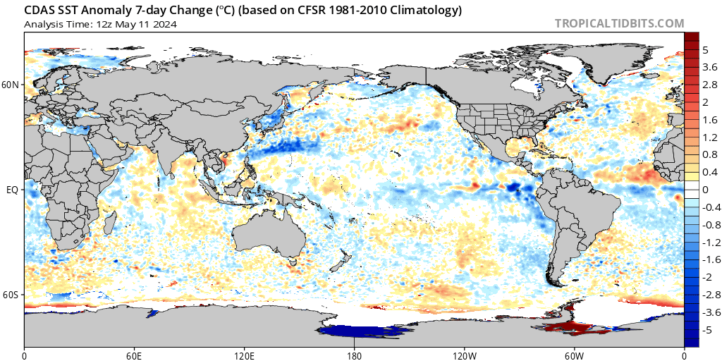
If sunspots stay dominant in the northern hemisphere as the minimum ends, then the ENSO regions will go negative, and then it should go strongly negative through the end of the year because the trend on the sun should favor more spots in the north.
well someone will need to give the enso meter a boot in the butt
its still at the +05;-(
Aus needs it to go to neutral or even please please to the _05
@ oz …this cooler(green) strip in the 3.4 region is now 6 days old. If the growth rate continues, then in several weeks it will be extended out past Hawaii along the equator. …
I can understand removing them to an extent, but surely they are influenced and in turn influence climate? This seems tome one of the fundamental problems with Climate science, it thinks of it as a car (pull here, gies faster) but it is not, it is a complex, non-linear chaotic system in which everything influences everything else and is in turn influenced.
Phoe: We’re mostly all grown ups. Just the data, no need to cook it to make it more palatable to a given political cause. In my career I’ve found that dismissing data out right based on one’s bias of the day leads to bad outcomes. Real data tells secrets, it’s just we can’t comprehend them, even when told. But, tamper with the data, things get confusing quick.
The recent spike was probably influenced by a polar stratospheric warming event thanks to the current solar minimum, which also has a lot to do with where the jet streams run during the seasons.. especially winter and going into and coming out of winter.
I think the temperatures are just coming back to where they would have been. The big question going forward of course will be will the trend continue down or plateau at this level?
Needle wrote:
What explanations are there for the spikes?
El Nino and La Nina is correct. More detail:
https://wattsupwiththat.com/2019/06/15/co2-global-warming-climate-and-energy-2/
5. UAH LT Global Temperatures can be predicted ~4 months in the future with just two parameters:
UAHLT (+4 months) = 0.2*Nino34Anomaly + 0.15 – 5*SatoGlobalAerosolOpticalDepth (Figs. 5a and 5b)
Note the suppression of air temperatures during and after the 1982-83 El Nino, due to two century-scale volcanoes El Chichon and Mount Pinatubo.
Much of the atmospheric warming from ~1982-1996 (blue trend) was a recovery from the two major volcanoes – Nino34 SST’s (purple trend) cooled slightly.
6. The sequence is Nino34 Area SST warms, seawater evaporates, Tropical atmospheric humidity increases, Tropical atmospheric temperature warms, Global atmospheric temperature warms, atmospheric CO2 increases (Figs.6a and 6b).
Other factors such as fossil fuel combustion, deforestation, etc. may also cause significant increases in atmospheric CO2. However, global temperature drives CO2 much more than CO2 drives temperature.
I’d rather see it declared a “normal slice of the organic natural sine wave.” That’s “like a random fluctionion,” but much better.
You are correct, w-sun – it IS a natural spiky ENSO ~sine wave in the equatorial Pacific Ocean with a period of ~3 years:
https://wattsupwiththat.com/2019/06/15/co2-global-warming-climate-and-energy-2/
[excerpts}
Atmospheric CO2 changes lag global temperature changes at all measured time scales.
The process that causes the ~9-month average lag of CO2 changes after temperature changes is hypothesized and supported by observations.
This ~9-month lag, +/- several months, averages 1/4 of the full-period duration of the variable global temperature cycle, which averages ~3 years.
Don’t forget 2010. That was also a strong El Nino. Indeed, the impact of that El Nino can be seen in the unadjusted temperature data for both Greenland and Iceland.
The unadjusted thermometer record for those 2 countries shows only 2010 warmer than 1940!!! And when I say that only the year 2010 is recorded warmer than 1940, I mean by fractions of a degree. With measurement error, probably it is impossible to tell which of those years is the warmest in the thermometer record.
And according to BOM, there was no following La Nina, between the 2010 El Nino and the very strong 2015/16 El Nino to which you refer.
Richard,
Interesting point about BOM not showing a La Niña following the 2009-2010 El Niño. From memory I think they use a more ‘sophisticated’ measure of ENSO than the Oceanic Niño Index (ONI):
https://ggweather.com/enso/oni.htm
which uses only SST anomaly data from the Niño 3.4 region. The ONI data classify the 2009-2010 El Niño as a moderate one, just hitting the ‘strong’ level (but not for long enough to be classified as such), but also fairly short-lived and switching to a strong La Niña in 2010-2011 followed up by a moderate La Niña in 2011-2012 (both of which appear to be captured by negative temperature anomalies on the UAH satellite data).
Note that I am not questioning your statements, Richard; I am just commenting on the differences in ENSO classification which I find to be interesting.
Where the hell do you see a downtrend?
The over all trend is up, the last four years is very similar to the oscillations seen since 1978, however the harmonic underlying those oscillations is rising. Hence a lot of blue in the first half of the graph, with all blue disappearing since mid-2012. And the switch from predominantly blue to predominantly red occurring between 1995 and 2000.
And the talk of a 2 month temperature drop? Belgium, France, Netherlands, Switzerland, and Germany have experienced their warmest 2nd half March and full April ever.
Bill: that wavy jet stream may explain regional hot and cold zones. It’s been very interesting to watch on nullschool this year. I’ve found in practice thermo-hydraulics to be counter intuitive more often than not. Wondering if the hot air pushing N from the equator means that ultimately the atm is being cooled. I’m certain it won’t cool much if it hangs in the tropics. Will be interesting to watch this over the next 5 years and see what happens.
Here we go … the mother of all accidental experiments shows that global temperature has actually been increasing due to real pollution …. not CO2.
This really would be the silver lining on this Covid problem.
No, that has no significant effect, CO2 has not measurably fallen since lockdown.
I’m not arguing; I’m just surprised!!
I would have expected a change, but no change?
Why?
Because you haven’t repented for your climate sins yet.
To whom do I repent of my climate sins?
If your repentance is in the form of liquid assets or hard currency, I can take those off your hands.
One of the few examples where purity is an orphan but sins have many fathers!
Because the anthropogenic contribution of CO2 is too puny to effect any short term changes in atmospheric concentration.
The main thing about pollution in AGW thesis is the aerosol pollution, the anthropogrnic one.
Very strongly played, to a point that the phrase “internal variation”, does not necessary mean only the natural.
A very used and abused “card”, relied upon in consideration of explaining away the observation lack of AGW, especially in consideration of special long enough periods,
where anthropogenic aerosol pollution as it “hides the increase” of the impact of that other EPA pollutant.
No wonder these guys running around like headless chickens in consideration of ElLa Corona, to whether utilized it, aka hijack it, or at least make a huge chaos to divert attention from the impact of ElLa Corona… 🙂
ElLa Corona kinda of kills the “aerosol card”, in consideration of the CO2 effect.
CO2 still up, temps still not following, where in the same time aerosol pollution very much taking a dive. 🙂
Just saying, kinda of naivete, but conclusion orientated, non hypothetical.
So am not going a do a “belly dancing”, as it is not required with naivete conclusions. 🙂
Very “expensive” outfits on that department… can’t afford it. 🙂
cheers
Because total fossil fuel usage hasn’t dropped that significantly.
A drop of 40 out of 100 million barrels per day is not significant?
Pls define significant for us. Thx.
Tet: probably bad math and bad inputs but small looks sorta like this:
1.15E+19 lbs atm
4.80E+08 lbs oil/day
9.60E+09 lbs CO2/day
8.35E-10 daily dACO2 relative to mass of atm
7.04E+15 lbs of CO2 said to be in the atm already
1.36E-06 daily dACO2 relative to mass of CO2 said to be in atm already
tetris, last time I checked transportation was only a portion of all the fossil fuels we humans use. And not the largest by any shot.
Because we still emit CO2. We might find that there is no increase (or even a slight fall) this year but a few months won’t make much difference. It took 170+ years to get from ~280 ppm to 410 ppm
Anthony, I don’t think that’s what ImranCan meant. I think he meant, perhaps the weather has been impacted by the lack of real pollutants. Especially I’m interested in the impact of the lack of pollution by air traffic. The sky has been extraordinarily blue here in our part of the UK – albeit quite close to Gatwick and Heathrow airport. But it seems to me to have been sunnier in the day and colder at night. I recall Minnis papers of 199? that suggested all the warming since 1970 could be attributed to air traffic.
i.e: https://agupubs.onlinelibrary.wiley.com/doi/epdf/10.1029/1999GL900358
and more specifically:
https://journals.ametsoc.org/doi/full/10.1175/1520-0442(2004)017%3C1671:CCTAC%3E2.0.CO;2
I can definnitely verify the clear skies near the London major airports. It has been quite stunning. I have never seen the skies so clear and there are far more stars visible thanthere was before.
Anthony .. I think you have misunderstood me. Apologies for the overly clever English.
What I was saying was that the drop in temperatures, without any change in CO2, might be due to the ‘clean-up due to Covid’ of REAL pollution (eg. smoke, soot, haze, whatever).
What this could then strongly imply is that the whole 3 decadal story of CO2 causing global temperatures to rise is demonstrably or even measurably false.
It would be a delicious irony if it turns out that the over-hyped ‘follow the Covid science’ which has caused these huge reactionary lockdowns has unwittingly created a huge global experiment that might demonstrate that CO2 has not been the main driver behind the last 3 or 4 decades of temperature increase. Two wrongs can indeed make a right !
Salute!
Anomaly, schmollamy!
BFD. Let’s look at raw temperature using whatever scale you wish – kelvin, centigrade, fahrenheit, whatever. The damned anomaly stuff is based on cherry-picked year groups, so we could easily see very high or very low anomalies. Just pick your baseline.
With raw, unadjusted temperatures we can all choose our baseline and claim warmer or cooler or out to lunch!
Gums sends….
Given that the lockdown has only been around 5 weeks, isn’t it a bit difficult to tell, especially given the inevitable lags in the process and the inevitable changes in CO2 which follow on from seasonal changes?
Let us wait until the lockdown is over, and when we are in a positin to properly assess how much less fossil fuels have been used during the period of lockdown, and hence how much less manmade CO2 emissions took place, before making any conclusion, which could easily be premature.
Something odd about it, in the UK we had well above average April temperatures, maybe the lack of industrial activity pollution in the atmosphere during CV lock-down throughout N. Hemisphere. Good time to look at sensors calibration against ground recorded data.
Don’t think the U.K. has a very big % of the worlds surface area. Also I was in the U.K. this month … it was very sunny but not very warm … where are you getting your data ? The Met Office haven’t released the April numbers yet.
It is not just the UK, most of the NH (excluding N. Canada and Arctic) was warmer than average in March, awaiting the April data next week.
https://www.nsstc.uah.edu/climate/
Vuk, “On record”, apparently the records start in 1929.
Hi A G
My comment was quoting MetOffice, and it clearly said there:
“All UK countries made it in the top five sunniest since records in a series from 1929.”
If you have a problem with it pick it up with MetOffice, here is the link for you
https://www.metoffice.gov.uk/about-us/press-office/news/weather-and-climate/2020/2020-april-stats
Vuk.
One thing,
being to sunny but not warming is actually the antithesis of AGW thesis…
Same I would say for the Sun is doing it.
And in the case of some warming in Arctic or Antarctic, no much weight there,
as in all summary of whole of thesis “universe” of climate,
such does not meet even the state of circumstance in its own alone,
just material for more unnecessary noise… exploited by the usual suspects at moments of desperation, for trolling the opposition of AGW.
Just saying, Vuk.
cheers
Sorry Vuk,
Not in the cental north of Spain.
Lot off rain and cool.
Nasty plant viruses.
But it’s just weather.
I hope.
Hi Jozzie
 /metofficegovuk%3Axsmall
You are in the wrong country, Brits won’t be going to Spain any longer if you talk down its weather.
“It was the sunniest April on record for the UK, according to a provisional analysis of the month’s climate statistics by the Met Office.
All UK countries made it in the top five sunniest since records in a series from 1929.”
Hi Vuk,
So there is no reply possibility on your reply to me, so I do it here.
I can also bluff that we had spring/summers/autumn’s without rain for 7 month on a row. Will the Brits come then.
Now there’s no tourism because of the severe lockdown, that’s going to be released in a month.
Beautiful area, but hard.(Weather/climate)
I am not complaining.
I could have sworn I learned as a kid that the rain in Spain falls mainly on the plain…..
The Rain In Spain
https://youtu.be/uVmU3iANbgk
To the extent there is any difference, the continental US has been mostly cooler for March. Certainly here in the Northeast.
UK did not have a particularly warm March…. mean T was bang on the 1981-2010 average.
met office dataset: http://www.metoffice.gov.uk
Hi IC
I said :”….. UK we had well above average April temperatures”, look it up again.
Some people around here have been known to get very irate when misquoted, but you are welcome to your interpretation right or wrong.
Your link for April quotes:
Record-breaking April sunshine
April 2020 has been a warm, dry and sunny month, and further on:
Tmax +2.7C, Tmin +1.7C, that would mean (AFAIK) the April temperature was + 2.2C above the average relative to a 1981-2010 baseline.
+2.2C is a global warming catastrophe 🙂
Intergovernmental Panel on Climate Change (IPCC) will be flabbergasted, but despite the lock-down, my family and I enjoyed warm sunshine and long bike rides at the large common nearby, . Keep safe.
Mean Temp Anomaly was +1.7 C
Vuk
Here is your post that I replied to :
”It is not just the UK, most of the NH (excluding N. Canada and Arctic) was warmer than average in March, awaiting the April data next week.”
You specifically said MARCH. And I pointed out that this was not true.
Hi again IC
“You specifically said MARCH. And I pointed out that this was not true.”
Data shows that it is true !
You obviously have not looked at the link you asked for:
” …. where are you getting your data ?”
here it is again
https://www.nsstc.uah.edu/climate/
zoom in on the UK, and look at the isotherms or read colour chart, both indicate that the month’s anomaly was in region of +0.5C to +1.5C and that in my book says: that the uK and most of the N. Hemisphere was warmer than average in March.
But again, if you like to have it the other way, you are welcome.
The met office has declared April 2020 was one of the sunniest on record, as a resident I can well believe that. The temps have been low and the lack of rain in what is traditionally a wet month has been noticeable.
https://www.metoffice.gov.uk/about-us/press-office/news/weather-and-climate/2020/2020-april-stats
I don’t know the differences UK/Germany exactly, but the first two weeks of April in Germany had night temperatures well below 0°C, while day temps ranged between +10 to +15°C, sunny and very dry air.
The UK was very sunny but very warm. It was decidedly cool at times on the east coast where I am
The major warmth anomalies in April were concentrated over Siberia and Antarctica.
According to the Dr. Roy’s graph
http://www.drroyspencer.com/wp-content/uploads/UAH-LT-global-thru-Apr-2020.jpg
if I read it correctly, the March temp was nearly 0.3C down, it only happened ones or twice before, while the April was down only 0.1C which is a normal month to month change.
It may be just one of those random occurrences, however it would be of interest if the March drop could be pinned down to a particular cause.
March and april in Calgary have been quite crappy, cold and windy. Hoping for better
May 1 and not one of my daffodils has come out of the ground, very unusual, usually in flower by now, and nothing even poking?
just my anecdotal “evidence”
Was the same in my hometown in Oregon. Blooming tulips suffered 20 degree lows and snow in mid-April.
Not a warmth anomaly in SE Oz
https://www.abc.net.au/news/2020-05-02/frost-and-sub-zero-temperatures-to-blast-south-east/12209138
Particulate carbon, sulphates and other pollutant emissions, but not CO2, create so-called solar gloom – a filtering out of a proportion of the solar radiation reaching the Earth’s surface. This leads to lower temperatures and was known as far back as the 70’s. Hansen, desperately wishing to explain The Pause, produced a Paper citing the massive industrialisation of China and other Developing Countries with massive increases in such emissions during that period, as the reason for The Pause. What he missed was, like now with the virus-driven lockdown/shutdown, that reductions in such emissions generates lower temperatures. This strongly suggests that, due to Clean Air Acts and Anti-Acid regulations in the West from the 50’s onwards, the reduction of these emissions increased global temperatures far more than CO2.
Correction Line 8 : higher, not lower!
PW:
Please rewrite the entire sentence for clarity.
Very interesting hypothesis. Are there monthly or daily measurements of these pollutants anywhere? Seems like something that should be studied.
Here in the Netherlands april has been warmer then normal for many years in the last 2 decades. It could be coincidence, but it could be a regional thing. May on the other hand… well lets say it is starting wet and cold.
Gee, this is just like the Corona virus death count: we now have a new data point that doesn’t match the model, and nobody can explain it (god forbid we question the model!).
Obviously this proves global warming due to CO2. Never mind that CO2 kept going up like it always does before going down when vegetation in the northern hemisphere fixes it.
No change of CO2 ’til now in the data, in so far, no proof at all.
Well that obviously means that cvd-19 is the direct cuase of the recent cooling.
Correlation is causation, I always say.
Our planet has been saved!
Is there nothing cvd-19 can’t do?
Yes – it cannot give me back April 2020.
Could this be related to lower temps in UHI and micro-UHI areas due to less activity during Coronavirus lock-down?
In other words, is this closer to the real temps poor siting and UHI effects are lessened?
That was the first thing that came to mind. Should be possible to do some analysis on it for someone so-inclined by looking at the raw measurement data (if available) for urban areas that had lockdowns versus the surrounding non-urban areas and see if locked down urban areas saw disproportionate decreases.
More people at home, more heating at home during daytime, sunshine heating of streets and buildings as usual, so I can’t imagine a Corona effect. Less airplanes maybe in the air, no orless contrails shadowing the earth, in so far, higher temps should follow, not colder.
The primary contributors to UHI are buildings, roads and parking lots. If asphalt is uncovered by cars, the UHI effect will increase. The effect from concrete will depend on the reflectivity of the concrete which varies over a wide range. The effects of buildings will be unchanged. Overall, I don’t think there’s much of a changing UHI influence either way. I suspect the record temperature decrease is more likely to be the response to a relatively quiet Sun.
“Could this be related to lower temps in UHI and micro-UHI areas…?
No, this is not surface data but lower troposhpere, I forget the altitude range but well above the surface.
What about the Mauna Loa CO2 levels NOT changing in last two months – rather continue on the same trajectory???
I would agree that CO2 levels (NOAA data) have been pretty flat through April, but they are certainly up on March. Eyeballing the daily values for April, it looks like the average for the month will be slightly above 416 ppm, possibly 416.2 ppm. Let’s say that it is 416 ppm, then this is 1.5 ppm above the March average for this year and 2.7 ppm above April of 2019. Nothing unusual in these figures at all, but it remains to be seen where the May peak ends up.
Look at the weekly data, plots as usual…
ftp://aftp.cmdl.noaa.gov/products/trends/co2/co2_weekly_mlo.txt
Weekly CO2, March 2019-actual, 04/19/20
Krishna,
I am not sure whether you are agreeing with my observations or not. Repeating your reference to weekly data (which I am very familiar with) does not illuminate the point that (I assume) you are trying to make. Do you agree with my observations or not? If not, what are you trying to say that is different?
To be clear, although I am resisting making any predictions for May, I completely agree with Samuel at this stage and I think it is highly likely that the May data will also be completely ‘normal’.
When I write, look at the weekly data, plots as usual, that means no changes ’til now, as repeated here aswell today as in earlier days. Look at my plot, a plot for ths time as usual.
So with some logical thinking you see an certain agreement, what I’m not agreeing with, because I hve no crystal ball are the values you try to guess.
In my response to Karen, there were no guesses. Nor was there any need for a crystal ball.
All data up to and including April 30th were available on the NOAA website. The only bit that was not ‘final’ was the official monthly value for April, so I calculated it using the daily data. I took a conservative value for this because I did not know if any of NOAA’s QC procedures may have a small effect. I did not use the weekly data for this purpose because you cannot calculate a monthly figure from weekly values which do not reflect a calendar month.
Karen engstrom – May 1, 2020 at 9:16 am
It has changed every month for the past 4 months, ….. and is still increasing right on schedule …. Like it does each and every year, to wit”
CO3.now …. 04-30-2020 … 417.31 ppm
And it will continue increasing for another 15+- days (mid-May) before it begins its summertime ‘decrease’.
Karen: I took a stab at this and estimate human CO2 may not have much, if any, effect on the ppm. From a prior post re Mauna Loa:
https://scrippsco2.ucsd.edu/data/atmospheric_co2/spo.html
Downloaded South Pole and Alaska data (aka “consider the extremes” and then guess what may be going on in the middle). Plots interesting, no surprise the SP is a fairly constant rise and AK is a saw tooth wave but following the same trend line. What is interesting is the amplitude of the saw tooth has gone from roughly 13 ppm ca 1962 to 20 ppm in 2020.
If we accept base line as 280 ppm and the Stokes assertion that humans account for the net gain of 1000 Gt in the past ~ 107 years then human influence is only ~10 Gt/yr.
Yet the saw tooth in AK is a nominal 124 Gt/yr that I will attribute to causes other than human.
Speculation:
1) Alleged human influence on CO2 atm concentration is around 1 order of magnitude less than seasonal fluctuations allegedly observed at the SP and AK.
2) Plant life and perhaps mollusks presently enjoy favorable conditions. Assuming 550 Gt of biomass on this planet I can say as one who watches nature closely that 124/550 saw tooth could be explained by biological activity but if the oceans are cooling, and based on the winter rain in my region they appear to be, then the oceans may be sponging up a bit of the 124 Gt as well, purely in solution, non-biologic.
That said, as a skeptic watching the CV19 show on TV and Mauna Loa as well it is still important to understand at this moment:
1) What is the human contribution to annual CO2 rise opposed to the alleged SP and AK data? 3%? 5%? 8% 30%? 50%? (8% seems credible based on a C14 paper that considers carbon cycle time constants)
2) Say the human nominal is around 10 Gt/yr then how much has the Coronasarus bit out of that? Should the price of gasoline be our metric, if so it’s dropped 50% during this scamdemic.
3) Based on gasoline price say in the last 2 months humans have emitted 1 Gt less than usual. 415*1/3260 ~= 0.1 ppm negative impact on atm CO2 concentration….too small to measure. In my world anyway.
4) And, that seems to be what the measurements are showing?
meiggs – May 1, 2020 at 10:12 am
Meiggs, don’t be comparing the measured Barrow Alaska CO2 ppm quantities with the measured Mauna Loa CO2 ppm quantities simply because the Barrow samples are collected at 10 feet elevation and the Mauna Loa samples are collected at 11,161 feet elevation.
Here, I will re-post this for your reading pleasure, to wit:
Posted by Donald L. Klipstein – January 9, 2020 at 10:43 am
I agreed with what Donald L. Klipstein stated because it has been my learned opinion for the past 20+ years that the temperature of the ocean surface water is the “control knob” for atmospheric CO2 ppm quantities as defined by NOAA’s Mauna Loa Record and/or Keeling Curve Graph.
So, getting a clue from what Klipstein stated above, I extracted 2 consecutive years of “monthly CO2 data” from NOAA’s data bases as noted below, to wit
NOAA monthly average CO2 ppm 1971 – 1972
@ Barrow, Alaska ……. @ Mona Loa, Hawaii …… BRW is > MLO
BRW 1972 1 333.49 —— MLO 1972 1 326.77 …….. 6.72 ppm difference
BRW 1972 2 334.17 —— MLO 1972 2 327.63 …….. 6.54
BRW 1972 3 334.11 —— MLO 1972 3 327.75 …….. 6.36
BRW 1972 4 334.52 —— MLO 1972 4 329.72 …….. 4.80
BRW 1972 5 335.58 —— MLO 1972 5 330.07 …….. 5.51
BRW 1972 6 333.54 —— MLO 1972 6 329.09 …….. 4.45
BRW 1972 7 324.88 —— MLO 1972 7 328.05 …….. -3.17 (BRW < MLO)
BRW 1972 8 318.78 —— MLO 1972 8 326.32 …….. -7.54 (BRW < MLO)
BRW 1972 9 321.86 —— MLO 1972 9 324.93 …….. -3.07 (BRW < MLO)
BRW 1972 10 327.08 —– MLO 1972 10 325.06 ……. 2.02
BRW 1972 11 330.51 —– MLO 1972 11 326.50 ……. 4.01
BRW 1972 12 333.37 —– MLO 1972 12 327.55 ……. 5.82
BRW 1973 1 334.67 —— MLO 1973 1 328.54 ……. 6.13
BRW 1973 2 335.34 —— MLO 1973 2 329.56 ……. 5.78
BRW 1973 3 336.44 —— MLO 1973 3 330.30 ……. 6.14
BRW 1973 4 336.94 —— MLO 1973 4 331.50 ……. 5.44
BRW 1973 5 336.54 —— MLO 1973 5 332.48 ……. 4.06
BRW 1973 6 334.28 —— MLO 1973 6 332.07 ……. 2.21
BRW 1973 7 327.83 —— MLO 1973 7 330.87 …… -3.04 (BRW < MLO)
BRW 1973 8 322.30 —— MLO 1973 8 329.31 …… -7.01 (BRW < MLO)
BRW 1973 9 323.48 —— MLO 1973 9 327.51 …… -4.03 (BRW < MLO)
BRW 1973 10 328.36 —– MLO 1973 10 327.18 ……. 1.18
BRW 1973 11 331.93 —– MLO 1973 11 328.16 ……. 3.77
BRW 1973 12 334.92 —– MLO 1973 12 328.64 ……. 6.28
According to the above “monthly” CO2 ppm data, both the Barrow and Mauna Loa data has an identical bi-yearly (seasonal) cycle, wherein the CO2 ppm increases from the end of month 9 (September) to mid-May (month 5), ….. at which time the CO2 ppm starts decreasing and will bottom out at the end of September, thus completing its “yearly cycle”.
Also according to the above “monthly” CO2 ppm data, the Barrow CO2 ppm is consistently greater than the Mauna Loa “monthly” CO2 ppm data, ….. with the difference denoted in the right-hand column.
Consistently greater than ….. except for the summer months of July (7), August (8) and September (9) …. at which time the Barrow atmospheric CO2 ppm “goes negative”, decreasing below the Mauna Loa CO2 ppm quantities.
And the only actual, factual, logical reason for the Barrow CO2 ppm to go “negative” (compared to Maun Loa) …… is exactly what Donald L. Klipstein stated in his above quoted comment.
Around the 1st of July, as soon as the sea ice melts at Barrow, the extremely cold surface water ….. “starts sucking up CO2 out of the lowest part of the troposphere in that area”, …. which causes the Barrow CO2 ppm to go “negative” relative to Mauna Loa CO2 ppm quantities.
”HA”, there sure nuff isn’t enough “green-growing biomass” in Barrow, Alaska to suck ¼ ppm CO2 out of the atmosphere, let alone 7.54 ppm (August 72).
And it is a biological impossibility for the wintertime microbial decomposition of dead biomass in the Northern Hemisphere to result in an average 8 ppm increase in Mauna Loa measured atmospheric CO2 quantities as defined by the MLR and/or KCG.
Live plants grow and dead plants decompose ….. in the warm, moist spring and summer months.
SamCC: Thanks, good info. I had glanced at SP and AK to see where MLO fell into the picture, seemed to fall in between on the scale I plotted. All gov data obtained from www so I have no way of knowing if any is factual but, it’s all I’ve got. So with more land and plants in the NH I read the saw tooth, particularly it’s increasing amplitude over time to be a function of biology. But the cold sea sucking up CO2 makes perfect sense, as does hot sea off gassing. (And I guess the SP is land locked/dry so no liquid water sink immediately present so no saw teeth.) I still think the greening (it’s real where I live, can’t say for the planet) if true does result in a carbon sink though I have no clue what the net gain of same would be nor what mollusks may lock up over time in CO2 enriched seas. Again, thanks, I look more at it when I get back from my weekend back pack in the hills of SC.
Meiggs, no matter where the atmospheric CO2 is measured, ….. there is a “seasonal” saw tooth when plotted, it just varies in amplitude depending on the location and altitude the sample was taken.
Take a look at this combined Monthly mean CO2 ppm graph and you can see the “saw tooth” of each one, even though the “seasonal” amplitude of Samoa and the South Pole is quite small.
Barrow —– 10 ft. altitude
Samoa —- 252 ft altitude
South Pole — 9,301 ft altitude
Mauna Loa — 11,161 ft. altitude
SamCC: Thanks for the plot. I had noticed the slight waviness of the SP but in my world we make big decisions bases on something called “ROM”. In the industry than is construed to mean “Rough Order of Magnitude” but I’ve always called it “Random Order of Magnitude.” Barrow fluctuations seem to be an order of magnitude greater than the SP but what is interesting is Samoa and SP seem to track together with (in my world) no significant saw teeth even though elevations are off set by 1 order of magnitude. Meanwhile, Barrow and MLO are off set by 3 elevation orders of magnitude, and yet both exhibit saw teeth relative to SP and Samoa. All sea water T driven? Samoa is a volcanic region similar to MLO…so local geothermal no influence…the curves imply not. Or the data rendered politically correct?
I don’t have an inkling of a clue, but meanwhile: record high in the hood:
2020: CO2 417 ppm, Asheville, NC ties record highs set in 1965, 1959, 1938 at 85F
1938: CO2 305 ppm
2020: Record hi in Greenville, SC on same day was 91F set in 1887, today, May 3 hi was 84F
1887: CO2 290 ppm
Strange isn’t it? Either CO2 was higher than advertised back then, or CO2 has not much affect on temperature, or there’s more to weather than CO2?
I’ll go with Michael Moore’s conclusion, CO2 is not the problem.
Meanwhile the weather is great. Had a great bushwhack, got lost on the return leg which I half expected as it’s easy to follow a ridge uphill but it’s not so easy (around here) to follow the same one down as the gradient (and rather complex horizon) can trick you into thinking you are headed the way you want…right idea, wrong ridge! But that was good, contoured back to camp, found much needed water along the way, stepped out out within 100′ ft of the tent, packed, bushwhacked some more and stepped out exactly where I left the trail though I wondered what it was when I first saw it…great weekend! Lightning bugs out, big fat gibbous moon, flame azaela blooming… evening breezes, morning breezes, peaceful, the dusk viewing was advanced well past sublime. And noted that the Al tent pegs were still cold when I pulled then out of the ground in the direct radiant shine of a warm day, never ever noticed that before. Speculated that all the rain has the humus below the leaf boundary insulated…the dirt is still cool, many extra inches of rain. I think precip tells us what’s up world wide given the vast amounts of latent HX, precip 1.79x up here this year and following a significant trend upward in the past 150 yrs (~1.36x). The corresponding sensible T upward trend, absolute is 1.004. That’s 1 in my world.
“ Samoa
and SP seem to track together with(in my world) no significant saw teeth even ”Meiggs, …… Samoa should not exhibit a significant “seasonal” CO2 saw tooth …. simply because it is located @ latitude 13.7590° S, …….. south of the equator. Which means that the temperature of the ocean water in that proximity of the equator remains fairly constant regardless of the “seasons”
“ I’ll go with Michael Moore’s conclusion, CO2 is not the problem. ”
Michael Moore is a proven problem of science education, …… only the lack of CO2 has never been a problem.
“ And noted that the Al tent pegs were still cold when I pulled then out of the ground in the direct radiant shine of a warm day, ”
😊 “HA”, ……. just “shows to go ya” that the (shiny) Al tent pegs were reflecting the Sunshine. As soon as the air molecules start “warming up”, conduction from them will “warm” the Al pegs.
Glad you had a great trip.
Samuel
It was nice to see you describing what was happening to our CO2 in the atmosphere exactly as I predicted it to be happening according to the relevant natural laws in operation,
http://breadonthewater.co.za/2019/12/15/greta-thunberg-the-savior-of-the-world/
Perhaps we can work together on an nice article for publishing on WUWT?
Henry, thanks for responding.
I would love to see you author such an article for publishing on WUWT?
It’s long, long past due that such an article be published hereon.
And Henry, you have my permission to copy, quote or paraphrase anything or all things that I have submitted (posted) on WUWT.
I’m old and I’m tired ….…. and it matters not if I am given credit for any of my original thoughts or hypothesis.
The younger generations need to start learning actual, factual science of the natural world.
The change/slope in atmospheric CO2 correlates with the global temperature indices.
https://woodfortrees.org/plot/hadcrut4gl/from:1955/normalise/plot/esrl-co2/mean:12/derivative/normalise
So when the temperature index drops, so does the change (derivative) of the CO2.
With an additional mean on both curves you can see it better:
https://woodfortrees.org/plot/hadcrut4gl/from:1955/normalise/mean:12/plot/esrl-co2/mean:12/derivative/normalise/mean:12
Does this mean that a higher temperature leads to an increased CO2 enrichment of the atmosphere?
Is this proof of what can be seen in the ice cores: the lag in CO2 after temperature?
JL: If by higher temps you mean the atm then if that correlates to warmer oceans then warm water holds less CO2 than cold and therefore, yes, warming oceans would liberate “a whole bunch” of CO2 into the atm.
What warms the oceans? Geothermal? UV? I don’t know. Both are plausible but no one has shown me the math (and it should be simple math) how atm CO2 can warm up the ocean to the point that atm CO2 is measurably affected.
Wrt ice cores: all those show is that the ice cores are not at absolute zero. It’s a “smoothed” curve if you will that tells us a bit about diffusion processes and quantum mechanics. Biology tells us there is nothing new under the sun in terms of atm CO2:
https://theearthintime.com/stomata-vs-ice.pdf
LOL. You were itching to post that link, meiggs. I was holding back, because this is a thread about troposphere results from satellite. I hereby grant permission to everyone to post it anywhere!
Ice is slushy. That’s a metaphor. Per that graph, Epica Dome barely notices the great upheavals in CO2 emissions during the glaciation melt and Young Dryas Event.
For the entire early Holocene (2200 years) it shows fluxing of only +/- 20 ppm.
Please.
David Middleton has also shown the non-resolution of ice cores vs other proxy reconstructions.
https://wattsupwiththat.com/2019/06/25/resolution-and-hockey-sticks-part-1/
Actually, David Middleton’s part 2 is more about CO2 than part 1
https://wattsupwiththat.com/2019/07/02/resolution-and-hockey-sticks-part-deux-carbon-dioxide/
Windlord: Good reads…I surveyed seismic lines out in the Rockies back in the ’88. Many of those lines produce to this day. What our client’s didn’t always realize is the lines were not as straight as specified and geophone placement not always on spec interval or pattern. The shot holes were not always perfect either. But flying hole to hole and shooting was always fun! Windy days affected data quality…but field conditions didn’t matter much for the very reasons DM points out, the clients knew how to read the signs.
Yes, but I didn’t want to smooth it too much. IMO, yes it means that a higher temperature leads to an increased CO2 enrichment of the atmosphere (and vice versa). The change in CO2 seems to be a function of global temperatures. I think CO2 level in the atmosphere is naturally variable and not constant at these timescales as it’s widely believed. The cause is the annual/seasonal cycle, which is not net zero, but there is a small residual every year. This residual (annual change) is affected by temperature…
I don’t have an opinion on ice cores and the lag in CO2 – I think ice core CO2 data is too unreliable.
J Lang wrote:
“Does this mean that a higher temperature leads to an increased CO2 enrichment of the atmosphere?”
YES – Higher Nino34 temperatures drive drive higher atmospheric CO2. This is a shallow ocean Sea Surface Temperature driven (SST-driven) phenomenon.
“Is this proof of what can be seen in the ice cores: the lag in CO2 after temperature?”
PROBABLY SIMILAR, but on a much longer time scale (~~ 800 year lag of atm. CO2 after atm. temperature observed in ice cores), due to deep ocean impacts on atm. CO2.
I proved that “atmospheric CO2 changes lag atmospheric Temperature changes by ~ 9 months” in Jan2008. My observation has largely been ignored since then, because it spoils the “CO2-drives-climate” circle-jerk of politicized academics and their devoted minions.
CARBON DIOXIDE IS NOT THE PRIMARY CAUSE OF GLOBAL WARMING, THE FUTURE CAN NOT CAUSE THE PAST
By Allan M.R. MacRae, January 2008
http://icecap.us/images/uploads/CO2vsTMacRae.pdf
Plot:
http://www.woodfortrees.org/plot/esrl-co2/from:1979/mean:12/derivative/plot/uah6/from:1979/scale:0.22/offset:0.14
In Jun2019 I demonstrated WHY atm. CO2 changes lag atm. Temperature changes by ~ 9 months here:
CO2, GLOBAL WARMING, CLIMATE AND ENERGY
by Allan M.R. MacRae, B.A.Sc., M.Eng., June 15, 2019
https://wattsupwiththat.com/2019/06/15/co2-global-warming-climate-and-energy-2/
Excel: https://wattsupwiththat.com/wp-content/uploads/2019/07/Rev_CO2-Global-Warming-Climate-and-Energy-June2019-FINAL.xlsx
Salby, Berry and Harde have all hypothesized about the longer-term, deep ocean phenomenon, and have been vilified for their efforts. While I remain officially agnostic on this point, some of the smartest people I know think that they are correct. I recently wrote:
If Ed Berry is correct in his paper, the observed increase in atmospheric CO2 is largely natural and human CO2 emissions play only a minor part in the increase of CO2. Therefore, any human-caused downturn due to the Covid-19-driven economic lockdown will be too small to detect. Check Reference #47. 🙂
From the Abstract:
“Human emissions through 2019 have added only 31 ppm to atmospheric CO2 while nature has added 100 ppm.”
PREPRINT: “THE PHYSICS MODEL CARBON CYCLE FOR HUMAN CO2”
by Edwin X Berry, Ph.D., Physics
https://edberry.com/blog/climate/climate-physics/human-co2-has-little-effect-on-the-carbon-cycle/
ABSTRACT
The scientific basis for the effect of human carbon dioxide on atmospheric carbon dioxide rests upon correctly calculating the human carbon cycle. This paper uses the United Nations Intergovernmental Panel on Climate Change (IPCC) carbon-cycle data and allows IPCC’s assumption that the CO2 level in 1750 was 280 ppm. It derives a framework to calculate carbon cycles. It makes minor corrections to IPCC’s time constants for the natural carbon cycle to make IPCC’s flows consistent with its levels. It shows IPCC’s human carbon cycle contains significant, obvious errors. It uses IPCC’s time constants for natural carbon to recalculate the human carbon cycle. The human and natural time constants must be the same because nature must treat human and natural carbon the same. The results show human emissions have added a negligible one percent to the carbon in the carbon cycle while nature has added 3 percent, likely due to natural warming since the Little Ice Age. Human emissions through 2019 have added only 31 ppm to atmospheric CO2 while nature has added 100 ppm. If human emissions were stopped in 2020, then by 2100 only 8 ppm of human CO2 would remain in the atmosphere.
Something is messing up the usual NIno34-atmospheric temperature relationship.
Possibly hot spots caused by subsea volcanic action.
Regards, Allan
https://saltbushclub.com/2020/04/28/south-pacific-blob/
Yes but a little too early to tell.
Wait for April and May. Should be interesting.
Also, look at the CO2 levels at the Mauna Loa site, starting with El Nino in 1996.
Use the Interactive Display and start the graph of monthly data in about 1992.
You will see that there is a change in the lower and higher monthly (September to May) when El Nino started in 1996. A possible indication that the raise in temperature is responsible for the raise in CO2, maybe due to raise in ocean surface temperature with El Nino.
http://temperature.global/
Nice link 😀
Just an informal question or poll. Look at the graph.
Do you think, say in the next 10 years we will see a negative anomaly the way we saw in years 1997, 200, 2008, and 2011? (on the running 13 month average).
There really does seem to be regular periodicity to the ocillations – about a 4 year cycle. Is that the la ninia-el ninio?
La Nina appears to finally be setting up for development though it’s too early to tell for sure. If a significant one forms, it would be the first since about 2011-12 I think. And if it does form, I bet we go even lower than 2011 due to the decreased solar activity of the last cycle.
A strong positive wind anomaly has formed in the far west Pacific north of New Guinea over the past month and is steady. The IOD appears set to flip negative. A cool pool continues to persist in the equatorial undercurrent. The SOI is slowly moving back positive. These are all signs that a La Nina could be favored sometime around July-November.
According to Mother Nature, the current downslope in TMAX will continue for another five years, and the next upslope will begin around 2025-2030 and last for about 35 years.
https://theearthintime.com
“Anomaly” is a dubious word. Mother Nature does not like it. She is curvy.
You named your crystal ball Mother Nature?
No crystal ball needed.
It’s only logical.
Per the plot of 50 million data points I linked.
The US is only 6% of earth’s surface.
That does not matter. The 50 million recordings of USCHN and 500 million recordings of GCHN are the authority of record for earth’s temperature. Even though they have been ‘adjusted’ by NOAA! There is no other such database. If the sine curve in those sets show normal flux, the default (by Occam) is that this is true for the world.
You can look at it from the above logic, and/or the following:
Anyone claiming abnormal warming is obliged to show how it does not show up in that database of millions of recordings over 120-150 years.
Windlord: What warming?
1933: atm CO2 allegedly 300 ppm
2020: atm CO2 allegedly 417 ppm and yet…
https://www.iceagenow.info/record-cold-in-alaskas-northernmost-town/
https://www.iceagenow.info/calgary-longest-longest-streak-of-below/
South Pole looking rather chilly this yr too. The ACO2 theory don’t hold water.
“The US is only 6% of earth’s surface.”
The hockey stick uses a single tree to represent the entire earth for some 400 years.
Good one, Mark.
The New Little Ice Age cometh.
If we are lucky, the puny little bit of warming that humans can contribute to total global warming and not just local warming, then the less the shock will be if natural variation does cause a signifiant cooling trend the next 30-40 years. Until we can identify, explain and predict natural variation, then everyone should be hoping that natural cooling doesn’t persistently keep getting worse. This is a later spring again for much of mid latitude crop growing North America, which would make for 3 years in a row as can be seen by when farmers get their crops planted in the spring, and when harvest is completed. Late spring melts and rainy cool springs also led to a lot of flooding.
Yup
===
“The linear warming trend since January, 1979 has now increased to +0.14 C/decade…”
79 ….when we were cooooold. The ice age cometh;)
What color is the sky in your world
Loydo doesn’t believe the earth existed prior to 1979.
So, it is population driving temperature after all.
Funny how no one ever mentions Population Explosion anymore. But 50 years ago the scientists and experts were all convinced it was the single most serious threat to our existence.
I wonder if in 50 years will global warming and climate change be the same as the population explosion. Only a dimly remembered memory from a time long past.
The “explosion” is over, and the “result” population is present. 😀
Wait until 9 months from now.. talk about a population explosion on the way.
Boomer mark2 generation…
OK Boomer 2!
ZZ: Taxation for WIC will be off the chain in the mk2 boom. The T word has been thrown around a lot recently, expect more and yo bank acct to go to O in the process.
Fits the whole dam scamdemic…mo’ gov, no freedom, no right to the sweat of one’s brow.
Brilliant plan though and, brilliant observation.
Apparently not.
Short crises cause babies. Protracted crises kill sex drive. Of all media, the WSJ has had several pieces on this.
Why moderation?
Is the word sex offensive?
It’s the k word. Even if the k word is merely part of a larger word.
[speculation] Because the big bad “West,” namely USA and Europe, are not exploding! Except for immigration, the West’s population is barely budding. The explosion is in Asia/3rd world, and they can not be criticized according to some belief systems. Not so with The West, which has capitalism, prosperity, relative freedom. Everything is the West’s fault. With no explosion, you don’t hear that discussed any more. [end speculation]
Windlord: I’d say dat be a fact Jack
Hah!
I’m Caucasian, a boomer, cis-gender, heterosexual, male, comfortably wealthy, well-educated, and obviously privileged. Basically absolutely everything is my fault.
It’s OK, I’m quite prepared to accept the blame. It won’t bother me in the slightest while I lounge next to my pool in my little tropical paradise 🙂
Meridional Distributions of Historical Zonal Averages and Their Use to Quantify the Global and Spheroidal Mean Near-Surface Temperature of the Terrestrial Atmosphere by Gerhard Kramm, Martina Berger, Ralph Dlugi, Nicole Mölders
I think, a worth read, or a subject for an article ?
Is here better placed as as OT in the “lost birds” blog article 😀
Certainly worth a read. Seems to confirm that over the years 97% of scientists have disagreed about the global temperature. I don’t suppose things have changed much in the ensuing years; particularly when you look at the tiny changes now being measured and politically being considered gospel.
A 0.7 C rise in 40 years with all those error bars to contend with to me looks boringly static.
Cant help but wonder if the reduced air traffic has been a trigger.
Agree, but can’t presently dream up any way to attempt to quantify it….few high altitude aerosols soaking up less heat and then falling to lower altitudes? A change in albedo? Don’t know.
Only less contrails shadowing / cooling earth, if anything.
Not really, high clouds don’t block out that much sun, but the small blanket during the right conditions can hold on to the heat over night. If annything the nights could become cooler without all the planes. Of course we only have one planet so testing is a bit hard.
If you look at the developpement of contrails under different weather conditions during daytime, mostly becoming larger and larger more the air is humid, than sunlight is filterd out.
The high clouds of frozen condesated humidity. Later in the afternoon / evening, the sky gets clearer again.
But during April in Germany, you had not contrails at all, the sky was deep blue, and as dry as possible, so that some special thinkng people were believing, no planes at all in the sky because of Coron, full BS.
So, we had daily sun warming and frozen, partly strong frozen nights for around two weeks.
The behaviour of contrails is strongly dominated by weather conditions and air humidity.
Agreed on your explanation. Had the same weather over here(NL) and did enjoy the no planes for a while, but want life to go back to normal again for the better.
It seems more and more that the “climate change” bullshit is being progressively replaced by another bullshit pandemic :
– Lockdownism
https://youtu.be/k0Q4naYOYDw?t=525
By reflecting away 30% of the ISR the atmospheric albedo cools the earth much like that reflective panel behind a car’s windshield.
For the greenhouse effect to perform as advertised “extra” energy must radiate upwards from the surface. Because of the non-radiative heat transfer processes of the contiguous atmospheric molecules such ideal BB upwelling “extra” energy does not exist.
There is no “extra” energy for the GHGs to “trap” and “back” radiate and no greenhouse warming.
With no greenhouse effect what CO2 does or does not do is moot.
Equally moot are temperatures, ice caps, glaciers, polar bears, sea levels, hurricanes, nuclear power….
What about penguins?
How does the greenhouse effect work in greenhouses?
The earth is not a greenhouse
Derg: non technical folks don’t always grasp the difference between open and closed systems.
Green house = closed
Planet = open
There is a difference.
Greenhouses still require heaters in them even though they have elevated CO2 levels (up to 1000ppm or more) to maintain a controlled temperature.
There was also the story of a major greenhouse in England a few years ago that lost many exotic plants because the heaters failed.
Bruce: we built a CC cogen in WI late 90’s that had a low pressure extraction from the ST to feed steam to a green house via a long run of pipe. I think the driver there at the time was FERC related tax breaks. Don’t know if the green house ever went into operation or remains in operation. I do know that without heat from a source other than sunshine plants typically grown in green houses would not survive the WI winter.
This is at 40N latitude and at 1800′ elevation in California. No where near as cold as WI, but there was snow on the ground outside of this protected area alongside my unit. The coldest part of the year was 22 F. Sometimes it has gotten into the teens. The tree is 9 years old. … https://goldminor.wordpress.com/2020/02/12/harvest-time/
goldm: what’s the lat to go w the 40N long? I often sleep in a small tent and usually get up to 2F above ambient in the night and obviously much more on a clear day in the direct sun light. The ACO2 is likely slightly above amb in the tent while I’m in it but rapidly equalizes with amb when I’m not. I’d guess it’s the plastic fabric that keeps most of the heat in (~closed system). And, when I’m in, my body mass and breath, and on some trips the warm ground below helps a bit.
How has the 9 yr old tree been sustained?
In North America mature palms can be found as far north as Gold Beach, Oregon (42.5º N) on the West Coast, and Wilmington, North Carolina (35.2 N) on the East Coast.
I’m inland 34.85° N, 82.31° W, 1000′ and though peeps plant palmettos here they don’t live long, too cold in a place thought of as too hot by most.
I live approximately one hundred miles inland from the Pacific ocean, and 100 miles south of Oregon. This last fall I bought a 40 foot x 28 foot length of 6 mil greenhouse sheeting. I have so many trees to protect now I had to get creative. I placed the two honey tangerines up against my unit. The lime has its own greenhouse. The 40 foot strip became a second greenhouse cover over everything including the roof of my unit and down to the ground. Heat emanating from my unit was enough to keep the citrus leaves from yellowing from the cold. My tangerines and the Rangpur are just reaching peak bloom now. Lots of fruit is setting on right now. My 2 dwarf peach trees will probably yield a 100 pounds this season. Wintering then under the cover gives them around a full month head start over the parent tree which my next door neighbor has.
Really? Are we going to start putting out headlines like:
“Largest drop in temperature ever in all the history of Mankind for the last 10 years”?
If this becomes a trend, then it is news worthy, otherwise its just another natural blip. Much more interesting is the CO2 concentration…If that fails to slow down we have strong evidence it isn’t man-made but natural – such are the ocean venting CO2.
So let me get this straight.
C02 graph hasn’t changed.
But temps went down.
Is that right?
Andrew
No idea if it’s right, but fact 😀
Based on the global climate models, can the global average temperature actually change that much in one month? How much difference in clouds or insolation is required to move the needle that much? If the required changes are significant, then this is a good way to test the models. To the GCM people in the readership, have you looked at the changes in the inputs required to produce the measured change?
I also thought of another test of UHI. With reduced activity in many city centers and in many airports (where accurate sensors are located), will we see any deflection in UHI or at the airport, due to fewer flights, etc.?
Anyone know a good resource to look at the annual global temperature “average” by a single month? February 1850 through February 2020, for example? In degrees Celsius, not anomaly…
NOAA might have something like that but numbers have likely been adjusted.
I use this to keep track of my hood:
https://www.weather.gov/media/gsp/Climate/AVL/newAVLmonthlyTobs.pdf
I’m waiting for the MSM to pick up on this ‘anomaly’ and assign a cause to it. Or not if they can’t come up with one that supports their narrative.
Get our economy up and running again before we plummet into another glacial period! It’s obviously the only thing staving off that dread eventuality.
And put bodies back on the beaches. Sand reflects solar radiation, bodies absorb it.
Every Fall, the CO2 increases, followed by very low temperatures, and then when the CO2 decreases the following Spring, the temperatures increase, thus proving that there is an inverse relationship between CO2 and temperature! 🙂
January is stinking hot where I live.
Loydo wrote:
“January is stinking hot where I live.”
A non sequitur attempt at conflating “January” (your word) with “Spring” (Clyde Spencer’s word). Not very ingenuous of you, eh?
Is your “Spring” (Clyde Spencer’s word) in “January” (your word), Loydo?
This is not the end of it either. I’ve been sounding off for a few years on a modified ENSO effect with large cold water “blobs” in the temperate zones in both hemispheres that slant down onto the equatorial band rather than the simple upwelling cold water source in the eastern Pacific. This gives a la Nina type recharge and enhancement from outside the system.
Even for the 2015-16 El Nino event I noted that the actual volume of warm water in the system was small and sure enough, the el Nino plummetted from its peak of 2.5C to -0.5C in the first half of 2016 – it ran out of “fuel”. This modified picture has persisted and there doesnt appear to be refurbishment of a good volume of warm water to the system.
Is this the anatomy of a switch to an extended period of cooling? If so, the entire climate science community has been missing out on another teaching moment, like the ~two decade “Pause” which was ignored for over half its existence, rationalized for a third and finally Karlized out of existence. Climateer existential panic is worse today, so itseems most likely to mean more rationalization and fiddling.
Headline should read
“NOAA Satellite records second largest 2-month temperature drop in [satellite] history”
As is can be criticized as implying forever.
Correct. They are always doing that!
mmmmmm – the sun moves into a full minimum phase and, “coincidently,” the average global temperature decreases while CO2 concentration is still on the increase. Is anyone really surprised this is happening?
All very nice, but what happened to CO2 levels while all this was going on?
Is the decrease mainly by day or night? Is this the influence of fewer contrails?
I see you haven’t received any answer. But I also have the same question. Did the anomaly in the average temperture occur because maximum temps went down or because minimum temps went down? It makes a big difference in what we perceive as “climate”.
Here is an interesting graph:
https://woodfortrees.org/plot/hadsst3gl/from:1979/to:2021/trend/plot/uah6/from:1979/to:2021/trend
It shows that the warming trend of the oceans is exactly the same as that of the air.
Because of the enormous size of the oceans, it follows that the heat moved from the oceans to the atmosphere and not the other way around. You get that?
As Einstein said:
Nothing happens until something moves.
100 ppm CO2 is not going to move anything much at all….
Great graph Henry!
Very good, Henry. The oceans have been the driver of the warming. Now, the tougher question. What has been warming the oceans
RM: As one who has a little exp with big fire and welding one possible answer might be our planet is a big glob of molten, hot, radioactive metal. Not to speak for Henry but I think he thinks it might be UV. In my world, both are very plausible plus whatever else we can’t imagine. What is not plausible is the Gore theory. No one has yet to show me the math on the Gore thing…they try but the energy never balances = numerical lie. Amusing that curious kids point out that the core of the planet matters to the surface. Most mass and heat balances of the “atm system” depict the ground as a field of zero energy flux. Never seen a field of zero engery flux anywhere in nature. And though I’ve not seen it I believe that those who say energy flux betwixt two planes separated by hard vacuum still exhibit quantum flux of energy, call that faith if you will but it fits the larger scheme that I can sense:
https://theconversation.com/curious-kids-what-would-happen-if-the-earths-core-went-cold-107537
meiggs,
Another possibility I’ve read about has to do with the planet’s global ocean circulation (MOC). If you change it in a way that reduces upwelling cold water then the mixed layer should warm. The SSTs in Henry’s graph are determined by the temperature of the mixed layer. In theory a slowdown in the current should accomplish this.
Naturally, this then would lead to the question of what causes the slowdown. One thought is changes in rainfall over the Amazon and Congo river basins leads to changes in the amount of fresh water that flows into the Atlantic driving down the salinity. Interesting topic. Too bad it will never be investigated by anyone associated with climate science.
RM: Good point. Mass and volume of the ocean compared size of the few thermo-meters stuck in it or looking at it from above may imply that observed warming does not represent heat addition from above or below. Simple mass flux in 3D field thats got a lot more time than human history to figure out what it’s gonna do next. I get that and realize that salt content can’t be neglected. But that said, I still that guy Arthur Viterito is still on to something. And, yes, no relevant study will be carried out by gov owned and operated researchers. I think that guy Darwin did good science because he was self funded for example.
Hi Richard
Julian Flood mentioned that in fish nurseries they add a small amount oil in the ponds to keep heat in.
I think this is what happened to our oceans.
Organic pollution.
We need a scientific institute investigating the problem.
The way I understand it, you only need a few molecules to prevent the heat from escaping the water.
On positive note:
It appears we are coming out of the SC24 solar minimum, roughly of the same length and depth as the last one.
http://www.vukcevic.co.uk/SSN-23-24-min.htm
Pacific is prepared to La Niña. It is just waiting for the solar wind to increase.
http://www.bom.gov.au/cgi-bin/oceanography/wrap_ocean_analysis.pl?id=IDYOC007&year=2020&month=04
ren
ENSO is an oceanic oscillation and is driven by internal coupled fluctuations. It does not require external forcing. It is however periodically forced by the annual cycle. But the Humboldt current is a bigger factor than solar.
https://science.sciencemag.org/content/264/5155/72
We also need a jet stream along the equator to lower the surface temperature.
I think people are erroneously trying to point at a single explanation for the drop. The measurement is a proxy of a wildy complex dynamic system, there is never a ‘single’ reason for any movement. The system also oscillates; so given the recent peak you would simply expect it to swing back towards the “average”.
https://en.wikipedia.org/wiki/Oscillation
In response to:
“I think people are erroneously trying to point at a single explanation for the drop.”
It is not a math problem. It is not a modeling problem.
We are ignoring the goal of ‘physics’… and we are ignoring physical changes that logically absolutely must be connected. i.e. No coincidences.
There must be a ‘physical’ explanation …. For everything that happens.
Park analyzing and modeling temperature. That path/task/strategy has not solved this problem.
Assume there is a physical cause for the temperature changes. The alternative is a model that has tipping points…
The cause of planetary temperature changes must be big, physical, and it is something that everyone has missed.
The sudden unexplained changes in surface temperature (which are regional) and cyclic…..
…. correlate in time, with sudden increases and decreases in the rate of spreading of the ocean tectonic plates at mid-ocean ridges all over the planet. Magma comes up out of the earth at many of the mid-ocean ridge zones. This up movement of magma is what creates the plates.
In fact, the rate of increase and decrease of the speed of spread of the mid-ocean ridges leads by two years the surface temperature changes.
Logically the fact that one large planetary change leads the surface temperature change by two years, tells us….
That the cause of the surface temperature changes….
….is what is physically causing the rate of spreading of the ocean plates to increase and decrease.
The force that is moving the plates must be big and due to the constraints of earth, it must be simple… to model unlike modeling the surface temperature.
The problem is not how to model the force that is moving the tectonic plates apart, but rather what is its nature.
And there has been as sudden unexplained changes to the geomagnetic field that correlates in time with the ocean plate movement changes.
https://www.omicsonline.org/open-access/have-global-temperatures-reached-a-tipping-point-2573-458X-1000149.pdf
Two previous studies, The Correlation of Seismic Activity and Recent Global Warming (CSARGW) and the Correlation of Seismic Activity and Recent Global Warming: 2016 Update (CSARGW16), documented a high correlation between mid-ocean seismic activity and global temperatures from 1979 to 2016 [1,2].
As detailed in those studies, increasing seismic activity in these submarine volcanic complexes is a proxy indicator of heightened underwater geothermal flux, a forcing mechanism that destabilizes the overlying water column.
This forcing accelerates the thermohaline circulation while enhancing thermobaric convection [3-6]. This, in turn, results in increased heat transport into the Arctic (i.e., the “Arctic Amplification”), a prominent feature of earth’s recent warming [7-9].
Clearer skys so more heat lost at night?
When it is warming, people call it weather.
When it is cooling, people call it climate…
Bass-ackwards.
What of those of us, that just sit back and enjoy the show.
Hoping to glean a bit of knowledge from all the machinations.
What is actually the uncertainty of these numbers? Especially given that Dr. Spencer doesn’t understand uncertainties, as it had become clear in his dispute with Dr. Frank.
Obviously then, the correct answer is “No one is sure.”
NM: I’m for sure that’s for sure.
Now is the time whem the people who argued “it is too short of a timeframe to see a difference in CO2 concentration” will suddenly claim “reduced CO2 during COVID-19 lockdowns cooled temperatures!”
Did I hear someone mention “repeat of Maunder Minimum”? Or perhaps it was “repeat of Little Ice Age”?
Does Wuhan virus cause Global Cooling?
Could someone explain to me why they think atmospheric CO2 levels would fall just because CO2 emissions have fallen.
If I turn on a tap (faucet?) full on to fill a bucket of water then turn it down to a slower flow – what happens?
1/ Does the level of the water fall.
2/ Does the level of water continue to rise – albeit at a slower rate.
Easy. We are not looking for the Keeling Upslope to stop going up. To “stop.” we are just saying there should be some abnormal “ding” in the upslope.
After 3-4 months?
The net effect of human CO2 emissions is a ~2 ppm increase per year. If emissions declined by 50% over the year (unlikely) it would reduce the increase to ~1 ppm. It would be virtually impossible to detect any slowdown in growth in April.
That amounts to an admission that human-release CO2 is so tiny a factor, all claims that it causes any disturbance to temperature, let alone catastrophic warming and climate emergency, are falsified. Do you agree?
Windlord: agreed, human CO2 amounts to a net zero in the great scheme of things. If it’s truly risen from the alleged base line of 280 ppm then: 417-280=137 ppm rise in ~150 yrs. 137/150 = 0.91 ppm/yr. Based on the C14 carbon cycle paper I accept 8% of human (ACO2) as part of that. So 0.91*0.08 = 0.073 ppm/yr ACO2. I think us monkeys are not much compared to other sources like the ocean full of cracks at the tectonic plates emitting vast quantities of natural (nCO2).
And if that’s not convincing enough even Michael Moore said CO2 was not the problem…strange days these.
Hi meiggs,
Now let’s get that guy to sanction safe modern fission reactors including thorium, and to tell all Greens to pour their hearts, souls, and money into realistic fusion. Bring our star to earth. To make energy too cheap to monitor.
Windlord: I’m all for it but as the lock down clearly shows the people are not in control.
Power will never be free. Taxation will never cease to be what it is, slavery.
Yeah, I got carried away there. I write fiction with positive attitudes and I depart the plane of reality often
Wishful thinking. Proving that a one month change is too small to see does not prove that the same rate of change continued over 50 years is also too small to see.
@ MarkW
“Proving that a one month change is too small to see does not prove that the same rate of change continued over 50 years is also too small to see.”
That is one of the craftiest sentences I ever read. Actually, I’ve read it about five times. It is dark to me. Therefore, I won’t respond to it. Say it another way if interested.
Meanwhile, if human release of CO2 is such a big deal, and humans abruptly cease 5-20% of their release for six weeks or so, then it should be reflected in the vaunted precision measurements at Mauna Loa and elsewhere. Just a ding. Just a tiny deviation, down in the deep noise which is so well documented, should be noticed.
The more time goes along and the reduction in human essissions remains repressed, the more dramatic that logic becomes.
I fail to see how you can’t understand the sentence, it’s quite clear.
Let’s try to simplify it.
Let’s say the change in rate of CO2 accumulation for April is 0.1ppm. On the chart in question, that large a difference can’t be seen.
Now extend that same rate change over 50 years. You now have a difference of 60ppm. That can easily be seen.
JF: it’s not that simple. Your bucket has trillions upon trillions or more moles of holes in it. What your thought experiment shows is human contribution to the bucket is irrelevant despite what ol’ Gold Bars Gore says.
The faucet is still ON minus close to zero ACO2.
CO2 in not static in the atm, that’s warmista propaganda. It’s part of a dynamic process driven by simple inorganic chemistry and complex biology and I am sure other variables. Look at the CO2 swings in the norther hemisphere, saw tooth. Those little teeth represent more C than humans emit in an entire year by an order of magnitude. And the amplitude of the teeth is increasing which I interpret to mean biomass on the the planet is doing quite well, thank you.
Sadly, this will be used to reinforce Climate Change Alarmism. The headline will read:
“Global Emissions Lockdown Ends Record Temperature Rise”
A tiny fluctuation and so much noise about nothing.
The warming trend is still accelerating.
Where ? Any source `?
“The linear warming trend since January, 1979 has now increased to +0.14 C/decade…”
“The linear warming trend since January, 1979 has now increased to +0.14 C/decade”
So it increased from 0.13C to 0.14C. I’m guessing that is within the margin of error of the measuring instrument. Not significant.
Tom A: using NOAA ave temp for my hood the T trend is flatter even than that:
I recognize that the NOAA numbers are doctored.
linear trend, Asheville NC ave T
yr
1869 54.7 F
2019 56.5 F
1.8 dT, F in 150 yrs
0.012 F/yr
Wow!
Alex, I see you are treating noise as signal. You are going to be so disappointed when the noise disappears.
NOAA is a proven manipulator of data along with many other monitors. The common goal is to show man made global warming. 2 month human activity curtailed = 2 months of lower temps. See proof! Problem is it would take months if not longer for ant like human activity to move the Earths temps. If anything this is caused by low solar activity, no sun flares.
Jack: 70’s last summer in Hotlanta happened b4 the crockdown. 13″ up on rain fall here for the year. The math on that latent cooling load is significant. It was cooling before the crockdown but, agreed, the spin will be dat da CV saved duh planet.
It’s cold in Ozzie
https://www.iceagenow.info/snow-piling-up-in-southeastern-australia/
https://www.iceagenow.info/record-cold-to-sweep-across-south-east-australia/
Apart from the last few days in the south east, for April most of the continent has been way above average.
http://www.bom.gov.au/jsp/awap/temp/index.jsp?colour=colour&time=latest&step=0&map=meananom&period=month&area=nat
Its getting cold folks. The new Grand Minimum seems to be upon us at last. Time for Renewables to show what they can do. I am looking forward to Climate Change activists freezing their behinds off while they loudly complain about global warming. You will come to wish we had more CO2 in the air.
RH: mo’ CO2 won’t matter. Less H2O would help cool things off but like CO2 hard to get by without that stuff.
Meanwhile here in Australia our winter is arriving early with snow falling on the alps and the coldest and wettest April for quite a long time. Mind you much needed rain fall though.
“the coldest and wettest April”
No it wasn’t, most of the country was much warmer than average.
The 2 sigma expression of measurement accuracy of the mole fraction of CO2 in air is unlikely to be better than +/- 1 deg C.
People seem to calculate 0.2 ppm as their expectation of the virus emission reduction effect.
Does not compute. Go back to start. Geoff S
GS: I got 0.1 ppm based purely on mass (independent of T) which is same number as 0.2 in context but I never left start from the git go.
I’m too dense to follow the 2 standard deviations as it relates to mole fraction CO2 and +/-1 deg C.
Please elucidate if you have the time, seems like an interesting point if I could only comprehend it…
Are you saying the mole fraction calcs used to arrive at alleged CO2 atm ppm are significantly skewed by errors in atm temperature assumptions/measurements (“corrected” or not)?
meiggs
Apologies, I wrongly used deg C units instead of ppm when describing the likely accuracy of measurements of CO2 in air. Geoff S
GS: 10-4, got it and agree, thanks. The resolution of ppm measurements is at best problematic even without the political bias. Sorta like atm temperatures quacked out by the TV. That’s why I have my own thermo-meter but don’t have the technology to monitor CO2 on my own or I probably would. That said, there’s nothing wrong with the weather, it’s been great for decades now.
Meigs & Windlord:
Michael Moore defended his movie’s takedown of the renewable industry in an interview where he
emphasized his ( and Jeff Gibbs & Ozzie Zehner) real reasons: anti-capitalism, anti-growth/consumption and over-population. He was always just using the “climate crisis” as a means to an end (kill Wall St).
He thinks COVID has shown the Greens how to destroy capitalism and reorder society: just
have government 1) shut the economy down, 2) give people only what they “need” rather than what they want, and limit population (although MM & JG seemed to profess not to want to actively depopulate the Earth the COVID lost of life was to them a plus).
The only thing missing from the interview was the word “comrade”. Scary stuff.
BZ: MM is a capitalist. No idea what his stance on pop control is.
The sacred cow in the room of this sort of discussion is only half the monkeys on the planet can give birth and that can’t be questioned or controlled acc to the msm.
So, the politics are irrelevant. The matri-arky rules. Yes, they occasionally liquidate their own kind but that is rare. Invasion of the Americas and fire raids in Germany and Japan spring to mind.
But, be that as it may, I’d guess with a name like Bill you and your kind are expendable. Comrade or not.
MM is only a capitalist if you believe that having money makes one a capitalist.
It is elementary that to do a scientific examination of CO2 in the air, you collect as much measured data as you reasonably can and need, probably starting with the most detailed data, in this case daily or hourly observations.
With considerable effort, I have obtained daily digital CO2 mole fractions from Mauna Loa personally from Ralph Keeling, for many years including 2020 to mid March. Also, about 22 March I downloaded similar data from an NOAA site that I can no longer find, presumed gone non-public.
That covers Mauna Loa, Ralph Keeling emails much appreciated.
I have been unable to access any other daily, digital CO2 data from other major locations for year 2020 to date, say to end of March. This includes Barrow Alaska, South Pole, Cape Grim Tasmania.
There are maybe 100 more locations where CO2 is measured routinely. I have tested some like Baring Head in New Zealand, no such data obtained.
It is easy to gain an impression that these measurement authorities (Ralph Keeling excepted) have no intention of letting scientists like me from the general public, have access to this type of data. Some have refused, using stupid reasons that might not stand a Court challenge.
So, when people here give their opinions about what Corona virus is doing to atmospheric CO2, I ask how they can possibly be wise and scientific when (unless they have special access to data) they have no useful numbers to work with. Many times I have castigated people for using belief instead of science. Is this another case of make believe science?
In any case, why have the authorities who curate their national CO2 measurements adopted this attitude of DO NOT RELEASE DATA TO THE PUBLIC. The public pays them to measure it, in the expectation that they can study it (with rare exceptions of national security).
I though that institutional scientists had learned a valuable lesson from the widespread backlash to that extraordinary email from Phil Jones in 2004-5 to my friend Warwick Hughes. You know, the one including “Why should I make my data available to you, when your aim is to find something wrong with it?
Is it time for others to ask the authorities why their measurements are being gatekeepered, not kept up to date, have unexplained missing data, have few proper error estimates, are generally useless to the inquiring public in the way that the institutions involved with the Corona virus outbreak were caught flat-footed, in the way that a number of named climate researchers are still resisting calls to release their data and so on?
What is wrong with these people? Why are they acting anti-science? Geoff S
Wonderful comment Geoff
Would the CO2 data be from something like this? https://www.esrl.noaa.gov/gmd/dv/data/index.php?category=Greenhouse%2BGases¶meter_name=Carbon%2BDioxide
Paul C,
Only if you have trouble understanding English language.
Show me how you downloaded daily digital CO2 mole fractions for Jan Feb Mar of 2020 for any station apart from Mauna Loa, the useful data for looking at theorised Corona virus related changes.
Oh, now you see the problem? Geoff S
I see a lot of folks are trying to tie this drop to the sun. The problem is there was a corresponding rise over the preceding 6 months. We are right back where we were last summer. And, last summer we were already in the current solar minimum.
More likely, this blip (rise and fall) is due to two unrelated factors:
1) The yearly bump seen during the NH winter months due to the reduction in Arctic sea ice.
2) The end of the Pacific Blob (the heat had to go somewhere).
Keep in mind that 1) still had some influence in April and will further drop over the next 5 months. we are also still under the influence of El Nino conditions in the Pacific which should lead to further drops when those conditions end.
Hopefully, the El Nino ends soon so we get a chance to see where the baseline climate sits. If it returns to where it was in September 2018 it will be very bad news for alarmists.
It’s flipping freezing in Victoria (by our standards). If it was the first of July, it wouldn’t raise an eyebrow, but this is early and it’s come on the broken back of a long drought. Of the last five weeks, only fourteen days have been free of rain, giving rise to local floods.
My father always spoke of 1956 being exceptionally wet with a brand new, massive irrigation reservoir filling far, far faster than was ever predicted. Of course, that can’t happen now, not because Professor Flannery said dams would never fill again thanks to anthropogenic climate change, but because we don’t build dams any more, drought or no drought. I guess that’s why we call ourselves the ‘clever country.’
The winter of 1955/56 was a big flood year for the Pacific Northwest. Heavy rains hit from San Francisco all the way up into Washington. The center of the storm was around Southern Oregon. Far Northern California rivers and streams raged high.
Funny if late 20th century warming turned out to be all about high altitude aircraft and not CO2, after all.
And right on que the all time CO2 high was broken yesterday and now stands at 418.02 – The Manmade theory must be busted by now as Zero effect from the Covid lockdowns
TimBo: Well, MM did say CO2 was not the problem….rather prophetic, eh?
From the very beginning on the msm this whole china virus thing smacks of a hustle/experiment run by the nwo.
Perhaps MM has insider info…
Hmm, sorta interesting, considering there’s hardly any change in the ENSO.
This can’t stand! It needs to be homogenized to show this didn’t really occur.
Some confusion
-“The Northern Hemisphere temperature anomaly fell from +0.96 deg. C to 0.43 deg. C from February to April, a 0.53 deg. C drop which is the 2nd largest 2-month drop in the 497-month satellite record. “
–
This article refers to the Northern Hemisphere drop but the graph is of the world anomaly, not the NH .
In other words the drop is a lot more than shown and yet most of the comments here are on the world anomaly.
–
The other interest is the Arctic ice extent and mass which seems to have run a narrative opposite to the NH temp at large with a rapid rise over the hotter months and a decline when the drop was greatest,
–
Curious.
Sea ice is going to regrow fir the next 3 years due to the coming ENSO region changes, imo.
Warmest Aprils in UAH anomaly data:
1998 0.74 (Super El Nino)
2016 0.71 (Super El Nino)
2019 0.44 (El Nino)
2020 0.38 (Data not available)
2005 0.33 (El Nino)
2010 0.32 (El Nino)
https://ggweather.com/enso/oni.htm
A technical question whose answer I genuinely do not know.
Labs analysing CO2 in air first freeze the sample to remove (variable) water. This makes about a 10 ppm difference between wet and dry air.
But, if the ice that forms and is removed has no CO2 left in it, how come ice cores from glaciers and ice sheets are analysed for historic CO2 levels?
Are there different ways for ice to form, with or without contained CO2?
Has anyone collected the ice from the lab procedure, melted it in nitrogen and looked for CO2? Geoff S
NOAA Satellite records second largest 2-month temperature drop in history
One way of spinning it I suppose, though not technically correct as we’re talking about anomalies not temperatures.
Another way of looking at it is that UAH had the 4th warmest April in their data set, following three months that have been between 1st and 3rd warmest. This has also been the 3rd warmest start (Jan-Apr) to a year, with the only warmer starts being the two super El Niño years.
And it is the CO2 that did it?
Give ’em hail, Henry!
Apparently high ACO2 causes hail as well, we’ve had it 2 days running in SC.
Well deflected, sir.
Yes I suspect it probably is increasing CO2 that is causing a rise in temperatures, but whatever’s causing the rise is irrelevant to the gist of my comment. You can accept that temperatures are rising and try to argue that something other than CO2 is the cause, but pretending there’s any sign of cooling in the current data is flying in the face of the evidence.
Bellman.
No it is probably not the CO2 that did it. I explained that earlier up thread.
Bellman.
No. It is probably not the CO2 that did it. I explained that earlier up thread.
Bellman: “You can accept that temperatures are rising and try to argue that something other than CO2 is the cause…”
Talk about deflection!
More like:
Temperatures are falling by direct measurement of surface air since 2000 and CO2 is not the cause when they go up or down. They’ll start to rise again in 5-15 years. Then down again. Nature, rocking in place.
“Temperatures are falling by direct measurement of surface air since 2000…”
Any evidence to support that claim?
UAH, the data set this post is about, shows warming at the rate of 0.15°C / decade since 2000. All surface data sets I know off show warming at least as fast, usually faster, than this. If you are saying UAH is wrong and you have data to prove it, maybe you should point out the errors to Dr Spencer.
And yes, I’m guessing you will switch to talking about USA only, maximum temperatures only, and using your own method to calculate temperatures. But again, all of this is a deflection from my point, that the data as presented in this article shows the world is warming, when the headline tries to imply the opposite.
It’s not “my method.” And it’s not “USA only.”*
It’s NOAA’s global data. 100 million recordings since 2000. The next 100 million recordings will show the curve bottoming out, then rising again. Temp fluxes 4F over a ~70 year cycle.
And yes, if satellite readings say warming, and direct measure of surface says cooling, then GHCN is superior.
*My graphs of TMAX from USCHN show the same thing, and prove the same claim.
I notice you used the softener “All surface data sets I know of…”
Fine. Now you know better. NOAA surface data for the globe shows cooling.
“It’s NOAA’s global data.”
All you’ve provided is a graph. No indication of the source beyond saying it uses NOAA’s ghcn data. But NOAA’s own data set’s show something completely different so I’m skeptical of this anonymous analysis – especially when it is claiming a drop of over 1.5°C in twenty years, mostly happening in a single year.
Go ahead and make it non-anonymous yourself. This data belongs to the people of the earth. NOAA provides access. Just download it, parse it, graph it, and you will see the same result. I am not going to do any of the work for you, for instance linking you to the datatable I parsed. That won’t be clean. You have to download and do the work yourself, to assure I have not put a finger on it. Here you go:
https://www.ncdc.noaa.gov/data-access/land-based-station-data/land-based-datasets/global-historical-climatology-network-ghcn
I asked for the source of the analysis not for the data. Working out the average global temperature is rather more than “parsing” the data. Lots of people have analyzed the data and come to similar conclusions, all completely at odds with yours.
“It also rose that fast between 1976 and 2000.”
Big news if correct. All the time people here where complaining that the data was being manipulated to show faster warming and it turns out the reverse is true. Whilst all the frauds where claiming warming between 1975 and 2000 was less than 2°C / century, according to your research the “real” rate of warming during that period was 6°C / century.
Temp dropped 1.5C previously that fast, between 1940 and 1975. It also rose that fast between 1976 and 2000. This is mother nature rocking gently over 4F in an organic sine wave, her favorite song.