Guest Post by Willis Eschenbach
Today I saw some scary headlines. I post them up along with snippets of the stories. First, from the BBC:
Greenland and Antarctica ice loss accelerating
Earth’s great ice sheets, Greenland and Antarctica, are now losing mass six times faster than they were in the 1990s thanks to warming conditions.
“That’s not a good news story,” said Prof Andrew Shepherd from the University of Leeds in the UK.
Next, from the NASA Jet Propulsion Laboratory (JPL)
Greenland, Antarctica Melting Six Times Faster Than in the 1990s
The two regions have lost 6.4 trillion tons of ice in three decades; unabated, this rate of melting could cause flooding that affects hundreds of millions of people by 2100.
Finally, from LiveScience:
Ice loss in Antarctica and Greenland increased sixfold in the last 30 years
The rapid ice loss puts the world right on track for the ‘worst case’ climate scenario.
Hmmm, sez I, the dreaded “worst-case” climate scenario … so I went to find the data. The articles are in Nature magazine, links are here (paywalled, I got the DOI and used it over at SciHub to get the papers). The study is done by a group of scientists who are part of a project called the “ice sheet mass balance inter-comparison exercise” (IMBIE).
Here is their money graph regarding Antarctica:

Figure 1. From Mass balance of the Antarctic Ice Sheet from 1992 to 2017. The purple at the bottom is the overall total loss for Antarctica
And here’s the corresponding graph for Greenland:

Figure 2. From Mass balance of the Greenland Ice Sheet from 1992 to 2018. Click to expand. Dark blue is the overall total loss for Greenland
OK, both of those look scary enough.
So I downloaded the data. Kudos to the Imbie folks who did the study. The data’s all available on two Excel spreadsheets, freely available here. Figure 3 shows my graph of their data corresponding to the “Antarctica” part of Figure 1:

Figure 3. Cumulative ice mass loss, Antarctica. The photo is penguins on surreal ice.
And Figure 4 shows the corresponding data from Greenland:

Figure 4. Cumulative ice mass loss, Greenland. Note the different vertical scales. Greenland loses more ice than Antarctica.
YIKES! The ice loss looks like it’s falling off of an ice cliff …
So those agree with the IMBIE study, and they are both adequately terrifying.
Having seen that, I thought “how does this compare to the total ice mass in the Greenland and Antarctica ice sheets? Their ice volumes are not exactly known but are on the order of thirty million cubic kilometres in Antarctica and a tenth of that, three million cubic kilometres, in Greenland.
Now, one cubic kilometre is about 0.95 gigatonnes of ice. Using those figures, I added the monthly Greenland ice mass loss shown in Figure 4 to the total mass of the ice in Greenland. That gives me the monthly total amount of Greenland ice. Figure 5 shows that result.

Figure 5. Monthly change in Greenland ice mass as calculated but not graphed by the IMBIE team.
See the blue/black line across the top? Yep, that’s the change in Greenland ice. The net change is so small that you can’t really see it even in a quarter century plus of data. It’s about five-thousandths of one percent (0.005%) of the total Greenland ice mass per year … be still, my beating heart.
And here’s the corresponding plot for Antarctica:

Figure 6. Change in Antarctic ice mass as calculated but not graphed by the IMBIE team.
As before, the blue/black line across the top is indeed the change in the total ice mass of Antarctica. The thing is, all of that terrifying ice loss shown in Figure 3 represents a total loss of three ten-thousandths of one percent (0.0003%) of the Antarctic ice mass per year … lost in the noise.
Next, the media, and to a lesser extent the scientists, waste a bunch of ink hyperventilating about the effect on sea-level rise. They imply, but don’t state, that this is increasing the overall rate of sea-level rise. However, what they fail to note is that in fits and starts, the polar ice caps have been melting since we came out of the last glacial period … so the effect of polar meltwater is not new. Meltwater has been included in the sea level rise data for centuries. And as I’ve shown here, we’re not seeing any acceleration in the rate of sea-level rise in the longest and best tide gauge records we have.
Finally, here’s probably the biggest thing that the studies revealed. Figure 7 shows the monthly ice loss from Greenland and Antarctica combined.

Figure 7. Total combined monthly ice loss from Antarctica and Greenland
Notice anything curious about that chart? I mean, other than the fact it has a map of Greenland, Antarctica, and the US in the background?
Yep, you’re right. In 2011, it started going the other way. The great ice caps were losing more and more ice each year from 1992 to 2011. By 2011 they were losing about fifty gigatonnes of ice each month.
In that year, something changed. Since 2011, Antarctica and Greenland have recovered to where the loss is less than half of the maximum loss of fifty gigatonnes per month. Seems to me that things are getting colder, not warmer as all the headlines are shouting. Most recently the loss is only on the order of twenty gigatonnes per month.
And why is that? Why is the rate changing? Why is even the sign of the rate changing, from more ice lost each month to less ice lost each month? And why did that change occur nine years ago, and not seven years or eleven years ago?
Simple answer. We don’t know.
Oh, they tell you in the studies that it’s from “ocean-driven melting” or the “North Atlantic Oscillation” or ” atmospheric circulation favoured cooler conditions” or that the “spatial pattern of accelerating mass changes reflects the geography of NAO-driven shifts in atmospheric forcing” … but those are just mechanistic correlations and relations. When they say “ocean-driven melting”, they’re just saying that when the water is warmer the ice melts more. Which is trivially true, and doesn’t answer the simple question—why did the trend reverse nine years ago, and not eleven years ago, or seven years ago, or not at all?
We don’t know.
My best to all,
w.
As Is My Wont: I ask people that when you are commenting please quote the exact words that you are discussing. This way, we can all understand just who and what you are referring to.
If Greenland and Antarctica ice fields were Schroeder’s cat he/she would be getting fatter.
Thank you for not putting penguins in your Greenland graphs.
I was tempted to do that very thing to see if anyone noticed …
w.
Alternately, you could have put polar bears on your Antarctic graphs. 🙂
No Polar Bears down South, Lottsa Penguins
Really?
No penguins in the arctic because the polar bears ate them, centuries ago. Antarctic has penguins because they learned to adapt and ate all the polar bears, at least that’s what I tell the grandkids.
Do you mean to tell us that the entire Antarctic population of polar bears has been wiped out by (sob) CO2-induced global warming?
Oh the humanity!!!
I am honestly surprised no one has taken some polar bears to Antarctica and penguins to the Arctic.
Of course, a land predator in Antarctica would be a Very Bad Thing for penguins.
I must say that the people responsible for these articles are absolutely lying and there is no excuse for it. Inexcusable.
Lies, Damned Lies, and Statistics! Said Mark Twain… or whomever coined the phrase. Holds true today too.
Thank you for displaying the appropriate context on these lies of omission Willis.
“I must say that the people responsible for these articles are absolutely lying and there is no excuse for it. Inexcusable.”
Yes, it is no wonder there are millions of people who are scared about the Earth’s climate because of distortions of the truth by scientists and the news media.
They all give the impression that the ice quantity is getting smaller when the exact opposite is the truth, the ice is increasing.
Here’s my advice to the fearful: When you read some sensationalized report about CO2 and the Earth’s climate in the news, come to WUWT and you will probably find a more detailed examination of the subject which will probably ease your fears.
What does this say for the scientists who published this study? They have to know very well that they are distorting the picture. They have to know that ice is increasing, not decreasing. Yet they tell us it is decreasing. They have completely distorted the truth, apparently, deliberately.
This Human-caused Climate Change scam has corrupted a lot of people, for one reason or another. It’s a terrible stain on climate science and science in general.
The melt is decreasing. So the ice is getting less more slowly – perhaps trivially slowly.
They are paid to lie…It is how funding is generated
A 20 year chart on ice sheets that have been there in excess of 2.5 million years. That fact alone should reveal to anybody with a brain that panic is not required quite yet.
They’re not lying, they’re stating the measured/estimated losses in ice.
What they’re no doing, as Willis has shown, is put these losses into context.
Lying by omission I believe it is called.
“Figures don’t lie, but liars figure.”- Unknown
You could have tried Polar Bears in Antarctica.
Penguin flightlessness appears to have evolved in New Zealand, ~62 Mya, during the balmy Paleocene Epoch.
https://www.youtube.com/watch?v=HMArjGQwLvY&t=2s
Their flying ancestors were related to albatrosses, shearwaters and petrels. Sacrificing flight for improved swimming and diving ability has clearly been a successful move on their part.
You must be wrong.
All of the smartest alarmists have been telling me that any changes in temperature result in species extinctions.
Now you’re trying to tell me that animals can change their characteristics over long periods of time to adapt to different environmental conditions? Somebody should write a book about that!
Yup. World climate was perfect and nothing changed or went extinct until manmade CO2 took off after WWII. Never mind that for the first 32 years after 1945, Earth cooled dramatically.
A quick quiz question. In which hemispheres do you find penguins?
Where is Pittsburgh?
Which one?
A few of them live on some islands north of the equator near the Galapagos. About 99% of penguins live in the SH, while 90% of humans in the NH.
They’re also found in the Western and Eastern Hemispheres. So … North, South, East, West. What’d I leave out?
Next question: Standing on the South Pole, which direction is north?
Yes.
Each direction is North of course, just like to the activists who are on the Left Pole and anything said contrary to their beliefs is right wing.
Down
OK then which direction is East and West?
All
down
I guess I should give up on putting sardines in the bird feeder, then?
I was hoping to attract some penguins to our backyard. I thought maybe the woodpeckers were scaring them off. Seems not to be the case.
John I did not know that! Seriously 90% of humans live in the northern hemisphere. So why does Australia cop so much flack for our part in destroying the world with our CO2 emissions? We only have a population of 25 million!
We are lucky enough to have small numbers of penguins living around our coastline, and we don’t get any snow or ice anywhere on the coast.
Small penguins.
We used to call them fairy penguins RoHa, but the PC brigade put a stop to it. How sad is that, it was a perfect and beautiful description.
Because it’s not about the emissions, but the control.
Oz could increase its emissions without having any measureable effect on the GHE.
SH is 81% water, and much of the land is covered with mile-thick ice. Good for penguins. Not so much for humans. NH is 61% water.
Much more than 99%, more like 99.99 %. A very few Galapagos Penguins do live just north of the Equator.
Robert B: Both. I gave taken photos of them on the Galápagos Islands, which of course sit astride the equator.
I thought it was a good trivia question. Still Wondering why some of the above replies.
eastern and western
You got things off to a great start, good job JP.
I didn’t set my alarm last night, so I’m not alarmed.
I am retire, alarms don’t have mush use to me anymore.
I love the look of rationality in the morning.
Looks like – honesty.
Thanks as always Willis. 👍
How dare you! Basing an argument upon rational thought and honesty rather than subjective preconceived hysteria. Oh, the humanity!
Much appreciated.
Thanks Willis, your a good writer, logically sound and a breath of fresh air. You have added a lot to this web site through the years.
“You have added a lot to this web site through the years.”
Yes, he has. Willis has added a lot of truth to the website and to our lives with his contributions. This article is a typical example of his debunking of the scaremongering. Somebody has to do it. Right, Willis? 🙂
Not gonna debunk itself …
w.
Note that the vast, thick East Antarctic Ice Sheet, repository of a majority of the fresh water on Earth, isn’t losing mass at all.
The EAIS quit retreating over 3000 years ago, after the Minoan Warm Period.
There has been no warming at the South Pole since records have been kept there.
The much smaller West Antarctic Ice Sheet covers erupting subglacial volcanoes.
Ugh…. the unfounded alarmism is criminal fraud.
Scaremongering is the rule of the times, so might as well quadruple-down on climate crap too. Get it while the gettin’ is good…..
Great stuff as usual – you old sea salt you Wills.
Being135, now come on make your mind up – the wee lassie says the world will end in 9 years (I’ ll be 87 then) so why should we worry about a bout of Chinese Flu.
Should the y-axis in figure 5 be: “Total Ice Mass (Million Gigatonnes”?
Meanwhile, Antarctic sea ice yesterday was tied with 2016 and well above 2017, 2018 and 2019, although below the record high min and max of 2014 and also high min of 2015. IOW, it has recovered nicely from the two freak WX events of the Super El Nino year 2016, which lowered it below average for the satellite era.
And at the moment, Antarctic sea ice extent is right on its 30-year average.
And if you look at the rate of growth this year , it appears to be far faster than in most previous years.
Alarmists will have a lot explaining to do if that rate keeps up. But that never stopped them before.
not explaining … deflecting, rationalizing, and then changing the scanario.
This is mostly natural variation at work and within a very, very tiny range compared to the volume of polar ice which is one of the main points of the post. What would be more surprising is if the ice mass balance remained unchanged over longer periods of time. And it is, except for the tiny amount we now think we can measure beyond any margin of error. I would expect it to be slightly increasing or decreasing over long periods of time just naturally as it always has, and we will certainly know more about natural variation in the decades to come. Until we understand natural variation much more, all of this is pure speculation.
The one thing we surely don’t need to panic about is rising sea levels. Even if there was a slight acceleration in our current ‘normal’ sea level rise, it will be on the scale of centuries and there is no guarantee that this slight beneficial warming we have had the last 150+ years will even last. But let us hope it does, since the small incremental warmth is much better than the average of the LIA temps just 200-300 yers ago.
IMHO, we should be aiming for a slow and steady gradual increase in CO2 concentration to 560 ppmv, which would be about a doubling of atmospheric CO2 concentrations since pre-industrial levels which would in theory only give us about an additional 1 degree C increase in temps. That is a mighty insurance policy on any natural variation that perhaps sees a 1.5 degree C in cooling over the next century which would be much more of a problem than some slight warming, mainly at night in the polar regions during winter. Just a little less cold making for a slightly increased global ‘average’ temp is not the same as the entire planet warming equally everywhere. Hopefully the world gets a grip about panicking after this current crisis is over, and the angst over dangerous climate change becomes more rational and subdued.
Earthling2 says:
The one thing we surely don’t need to panic about is rising sea levels.
Yeah, that has to be the lamest “scare” of all. SLR a couple inches a century? OMG!!! Run for the hills!
Seriously tho, if someone is actually scared about that, they’re always free to walk away from the ocean. But stop whining about it.
Thanks for all your work divining perspective. I like the take that if the ice sheet loss is what drives sea level, then how much ice was there 4Kya when the seas were six feet higher? In the long term, all the ice we are seeing is new, and it fluctuates above and below an increasing trend line over the last several thousand years.
Most people do not believe me when I repeat your sea level fact.
After they “google my ass” and find out the truth, not a single one has apologized for saying I was full of crap.
The X Files had it wrong, the truth IS NOT out there.
Nice work Willis!
Willis,
Thank you. For your inquisitive mind and your time, energy, and skepticism. I always appreciate your point of view even if I disagree with the conclusions at times …on rare occasions. You ask great questions. And then you attempt to find the answers with what we know to date. Nicely done…again.
Greg in CA
Fig. 5 ordinate is mislabeled.
Thanks, amigo, fixed.
w.
Good post, Willis–well documented, illustrated, and conclusive! Always nice to hear “the rest of the story!”
Something needs to be done about the sensationalistic Marxist Media! Perhaps exposing them is the only way!
“ice sheet mass balance inter-comparison exercise” (IMBIE).
IMBIE?
They had to have known they were setting themselves up to be called imbeciles. If not, they truly are.
Regards.
Bob
PS: Thanks for putting those losses in perspective, Willis.
Regards,
Bob
Ice-sheet Mass-Balance Inter Bull-dust Exercise.
IMBIBE.
I’ll drink to that – a lo-o-o-ong tonic, with quinine!
And, if I may, I would like to second Bob T’s thanks!
Auto
Bob, Good on ya for the IMBiEcile comment.
Willis,
I was just wondering if there was a peak in either AMO or AO near 1990 and a nadir near 2011, because that would match up with your Figure 7. You did, in fact, wonder why the ice melt direction appears to shift in 2011 and I want to address that.
I think I found a NOAA chart that agrees well with Figure 7. It shows the winter months of January through March standardized AO Index:
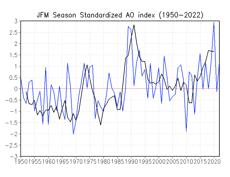
As for answering what influences the AO, well that’s another topic altogether, but there is accumulating evidence of polar winds having a relationship with geomagnetic field strength and that is modulated by (who would have guessed this?)…the Sun.
That USA map laid on the south pole – WOW! that is a lot of ice.
You ask “Why” and correctly answer “We don’t know”
If someone sends me a lot, and I mean 7 figures, of money, I will conduct a study to find out. I don’t know the answer because I haven’t decided what it will be yet, but when I do I’ll prove it using Earl Grey tea leaves and chicken wishbones.
Well it’s as good as some of the stuff you see churned out by some of the gravy train drinkers.
My best to you and your family from locked in Falkirk on a lovely crisp sunny March day. Stay safe.
I think you left the “million” out of the tonnes in the Greenland graph
Harlech castle sea gate, built 1000 years ago with paintings of it in use.
4 metres above present high tide….
We just went through Harlech … hang on … OK, see here for the discussion.
w.
Hi Willis,
In your linked reply you say that the UK wasn’t covered in ice. Not all of it but there was a fairly large ice sheet over Scotland and Northern England. Check out The Parallel Roads of Glen Roy, Gleann Ruaidh, created by ice-dam lakes in the Younger Dryas. Since the turn of the century there’s been some interesting research on tectonic activity in the Younger Dryas, something to do with isostatic rebound of the lake shorelines not agreeing with other published data; but I’ve only read newspaper reports.
True … but I also pointed out that even if postglacial rebound in that area were as large as Sweden, which it’s far from, it still doesn’t move the castle much vertically.
w.
In the same area check out Cantre’r Gwaelod.
Yeah, I went to Grammar School (High School equivalent) in Yorkshire and we learned about the carving of the beautiful Yorkshire Dales through glaciation, although it seems like the higher hills (which are not actually all that high on a scale of things) were not covered in the most recent glacial times:
https://en.wikipedia.org/wiki/Geology_of_Yorkshire
I also spent a lot of time more recently further south in Shropshire, and got fascinated by the geology of the lovely lakes around Ellesmere close to the Welsh border, also formed by recent glaciation.
In response to the disappearance of glaciers from Scotland 12,000 years ago, Scotland is rising and the south of England is sinking. From glacial rebound.
This is routinely trousered as sea level rise by Sassenachs in the south of England. Stranded beaches 3-4m above current Scottish sea level get less (i.e. zero) attention.
Yep, I became a skeptic when Dr. Mann tried to erase the Medieval Warm Period (MWP) with his fraudulent hockey stick.
One proof that the MWP was global is the lower world wide glacier extent and, as you point out, the resulting higher sea level.
King Edward built several castles on the North Wales coast, including Harlech, to enable re-supply by sea during sieges. None of the others is separated from the sea today, but there are shifting sands at Harlech.
‘Coastal landscape with a vast dune system of international importance’.
Morfa Harlech National Nature Reserve is one of the most important actively growing dune systems in Britain and one of only a handful in Wales. Dunes like these with bare sand areas are becoming increasingly rare.
https://naturalresources.wales/days-out/places-to-visit/north-west-wales/morfa-harlech-national-nature-reserve/?lang=en
I believe the inordinate axis of Figure 5 is labelled incorrectly.
Amazing how all of these dire warning are shown on a graph specifically constructed and scaled to prove the worst case scenario is upon us.
..with a floating x and y axis…you can show anything
just look at what they do with temp
I am pretty sure those are the same people making the current Coronavirus graphs.
I never thought I would say this – but hopefully they soon return to making fake global warming graphs!
What about the North hemisphere snow mass ?
Whatever happens, the models predicted it, it’s bad and it’s the fault of capitalism!
All that snow portends disastrous floods! Because of more water vapor in the air, the models forecast this catastrophe, due to climate change. Although of course the models also predict extreme drought.
Well doneWillis. Timely. To the point. Penetrating. Accessible. Nicely written. Quietly devastating.
Who could ask for anything more?
As a non scientist but educated and interested, Willis you are a “breath of fresh air”. Please keep going.
Realism must outway the distortion!u
Roger Welsh, well put. I often compare Wills to the late great John Daly. Another self educated scientist who put the charlatans to shame.
Interestingly both have sea going experiences. It would be immodest for me to compare my involvement in the global warming scam to theirs, but I was one of those tossing a bucket over the side to measure sea water temps many many moons ago.
Being a radio op. on Obs Ships makes me a global warming realist.
It’s interesting that a decrease in the rate of ice loss can be attributed to any number of natural factors, but as we’ve heard time and time again, an increase is proof of manmade global warming.
It will be interesting to compare the rate of change in atmospheric CO2 concentrations to the presumed decrease in manmade emissions due to the corona virus pandemic. I’m just curious if any inferences might be drawn about what percentage of atmospheric CO2 concentration can be attributed to manmade emissions.
If you make a graph of Global temp increase of say 1C over 150 years using the Kelvin scale, which is the correct one, then 1C is less than 0.5% which also doe not look very dramatic!
What have you people got against penguins??? There are bound to be some penguins in Greenland within a Zoo. Surely?
I love this analysis. It almost “flat lined” me.
I was suspicious the second I looked at the axis labels that the authors were being less-than-revealing with their graphs. Years of visiting this site (WUWT) has trained me to check axis, starting and ending points, and scan for the keyword “model”. LOL
Does Greenland have a zoo?
The penguins in the Arctic went extinct in about 1845, largely as a result of human predation.
I can put figure 7’s most recent year’s melt (~240 Gt) into perspective using a number, ~2.8 microns, derived in essay Pseudoprecision in my ebook Blowing Smoke. As you point out, a GT of ice is ~0.95 cubic kilometer of water (ice floats). Based on the estimated ocean surface, a Gt of ice will raise sea level ~ 2.8 microns (2.8E-6), so 240 GT contributes about 0.7 millimeters to recent annual sea level rise. (NASA’s own published conversion is 365Gt = 1mm, so 1 GT=3.65 microns. Dunno how they got that value, but it isn’t right. Lots of NASA’s other SLR stuff is also just ‘off’ because it does not close, as explained in guest post Sea Level Rise, Acceleration, and Closure.)
But coasts gonna drown anyway from global warming—IPCC and NASA’s Jim Hansen are certain.
Rud,
I think you and NASA are in close agreement. 362.5GT/mm when inverted turns into 2.8 microns/GT. BTW, the 362.5 figure is from IPCC5, Glossary page 1462 which assume a seawater density of 1T/m^3. In the Cryosphere Chapter, 317ff, they use a density of 1.028 instead, but for Rud’s calculation to 2 significant digits, it doesn’t matter.
Note to both of you, they use a density of 0.917 for land based ice, not that it matters to this calculation.
Actually ice melting in West Antarctica has even less effect since much of it was below sea-level to begin with. So this part is used up to fill out the space where the ice was. And glacier ice only has a density of 0.91, so it takes about 1.13 cubic kilometers of glacier ice to make 1 cubic kilometer of (cold, salty) Southern Ocean water.
NIMBIE. Just flashed across my mind as I read.
Now I Make Blah Into Existential
Since their charts are cumulative losses, I think if you dropped in two charts showing the annual first differences, it would improve the transition to the image background chart
D. F., I put in cumulative losses in Figs. 3 & 4 to parallel their cumulative losses in Figs. 1 & 2.
w.
Yep, that’s what confused me on first glance. I thought surely we can’t be seeing that level of additional loss each year. Then I saw it was cumulative- anything to create a panic. Next given the scales involved, I call BS on their margins of error.
And let us not forget this:
https://notalotofpeopleknowthat.wordpress.com/2019/10/22/western-antarctic-ice-sheet-growing-as-oceans-warm/
I would have linked to the original paper, but the summary at the above website makes very clear what the paper says.
Thank you Willis for another carefully researched post. Looking behind the curtain!
The use of “cumulative total” graphs is part of the standard toolkit for climate alarmists, and IMHO it borders on fraudulent. In the case of melting ice caps, as long as there’s any net ice loss at all, the cumulative total will always increase, and this is clearly the point of using cumulatives. Your figure 7, which shows the actual rate of ice loss changing over time, is the real story. Omitting this kind of plot from the paper clearly shows that the object of the publication is to frighten the children. Honest authors would have included a similar plot in the paper, and any honest referee would have insisted on it, because it conveys a much greater amount of relevant information at a single glance.
During last summer’s California fire season, Hayhoe used a plot of cumulative acres of the US burned by forest/brush fires. Look, it keeps going up! OMG we’re all going to die!
Misleading? Without a doubt. Deceptive? Definitely. In other words, normal for climate science – where the conclusions are arrived at before the research grant is approved, and before the data is collected.
Can they really measure the total mass of ice in those ice caps with that degree of accuracy? I am somewhat skeptical. A little discreet cherry-picking here, a thumb on the scales there, even at a subconscious level, would not surprise me one little bit. Science in the service of politics!
Doesn’t it make you proud to be living in the 21st century?
Willis Do you have any explanation of why the Cumulative uncertainty was passed by the cumulative loss ~ 1995? Up until then the uncertainty was larger. It probably has something to do with measurement of cumulative error but I cant think this late at night.
I’d love to hear what George Moonbat at the Grauniad has to say about this as it completely punctures the alarmist narrative.
Indeed – it seems most of the climate change panicmongers are more PR than science.
Bernays driven science…
Hi Willis….thanks for this. I was in a FB debate with a lecturer at Leeds Uni who was patronising us with his ‘my colleagues on the ice at the moment are shocked how bad it is’ warnings….he was ref to Shephards study of course. So its no surprise to find out his ‘colleagues on the ice’ are guilty of the same slieght of hand he tried to play us with. Arrogant & knew very little when pressed, just reverted to the usual talking points. Was quite shocking to find someone at Leeds Uni so full of it….!
So thanks for confirming my suspicions!
Willis “We don’t know”–yes we do:
Geological forces as described by J.E. Kamis in his seminal work plateclimatology.com.
Massive geological forces causes all atmospheric conditions and dwarf Atmospheric Bias theories.
Additionally GEOTHERMAL forces not acknowledged by those with limited knowledge of earth systems, i.e., submarine vents and sub-surface and terrestrial volcanoes reacting to plate movements.
And there is nothing we can do about it.
Willis—don’t respond unless you have read Kamis’s 66 page paper. And then only the specific sections of his paper that don’t agree with—touché!!
Bigfoot, I got this far and started laughing:
“Completely control earth’s climate”? Hyperbole much? Clouds have nothing to do with the climate?
So then I thought “Well, how much energy is he claiming comes up from below?”
I did a search on “W/m2” … nothing.
I did a search on “watt” … nothing.
I did a search on “joule” … nothing.
I did a search on “energy” … eight hits, three of which have nothing to do with it. The others are about El Nino/La Nina, which says in part:
I’m sorry, but that is total nonsense and indicates he doesn’t have a clue about the El Nino/La Nina pump. When a bunch of warm water piles up in the Central and Eastern Pacific, strong winds blow up that move the warm surface waters westward. So much water is moved that it actually lowers the sea surface level.
3D section of the Pacific Ocean looking westward alone the equator. Each 3D section covers the area eight degrees north and south of the equator, from 137° East (far end) to 95° West (near end), and down to 500 metres depth. SOURCE The Tao Of El Nino
Removing the warm upper waters exposes the cooler water underneath. So totally contrary to his bizarre assertions, nothing is warmed, and nothing is cooled, and there is no need for his imaginary heat source. The warm top layer is removed, exposing the cool layer underneath.
Sorry, Bigfoot, but your man is clueless. He hasn’t given one single estimate of the size of his imaginary heat source, nor even tried to estimate the geothermal energy flux he’s talking about.
w.
Willis Eschenbach
March 22, 2020 at 2:17 pm
“So much water is moved that it actually lowers the sea surface level.”
The October 2010 illustration makes it look like the sea surface is changed by about 70-100m…can this be right? I could believe 30-50m perhaps but they’re the ones making the measurements I guess. Or maybe I’m reading the scale wrong.
Beautiful picture, thank you. Much clearer than the one I had in my mind.
Willis,
FWIW, this geoscientist supports your questioning of this “maginaary heat source.”
Having said this, remember that accurate, relevant observations of the deep ocean floor are difficult, expensive and incomplete. Keep some room in the mind for future advances from more measurements – as I suspect you do.
This polar contribution to sea level change is restricted by errors that are plausibly much larger than stated officially, in particular, the weight of water, snow and ice deposited each year on land. Geoff S
As I expected you and others can’t see the forest for the trees. Suggest you take your sailboat to the Western Antarctic Rift. You can bath in the sauna water. Ice melts by 2200 deg. F. magna trumps over your teeny tiny watts. As always you cherry pick what justifies your misunderstanding of the Thermodynamics you never studied.
Bigfoot, you asked me for specific objections to Kamis’s work. I did so, detailing a number of specific flaws.
In response you accuse me of:
• Not seeing the forest for the trees.
• Talking about “teeny tiny watts”??
• Cherry picking data
• Misunderstanding thermodynamics
• Never studying thermodynamics
You sure you understand how this “scientific discussion” deal is supported work? It should go like this.
You say “find specific errors in Kamis’s work”. I find specific errors errors in his work and lay them out in full detail. So far, so good.
But then you’re supposed to come back and either agree that what I found were errors, or show us all where I’m wrong.
What you’re not supposed to do is what you’re doing, going into an incoherent spittle-flecked rant full of ugly personal accusations …
Come back when you’ve figure out how to play nice on a scientific blog.
Or don’t come back. Either one, I’m easy.
w.
You’re not a scientist. You’re not a computer programmer/modeler. You’re not an engineer. You’re not a climatologist. You don’t even have a BA in English. You do, however, have a ”certificate” from Aames School of Massage. That’s the point. I will say, your certitude is amusing, though. Is that overcompensation. Rhetorical question.
Willis <=== The wife and I hiked in Yellowstone National Park last July, and I was blown away by the thermal and chemical phenomena. I've read a lot since, and here's and example: https://agupubs.onlinelibrary.wiley.com/doi/full/10.1029/2012JB009463. It contains numerous references and their estimates of heat flux from the park. One in particular was 2.3 W/m^2, which is surprisingly close to the supposed radiation imbalance caused by CO2. I've not tried to find any world-wide data on the geothermal contribution to global temperature, but there must be some (data, that is). I did find (and subsequently lost) some college class notes on estimating the heat flux from magma emerging from the mid-Atlantic Ridge. It was huge, IIRC, and believably so given the evident magnitude of this: https://www.youtube.com/watch?v=HzwuTBx93uA
It would just be interesting to see what the relative contribution might be.
Michael, it is true that there is a large heat flux from those places where the lava comes out, or where there is a huge lava chamber just underground.
But think about it … how big is Yellowstone, and how many places like it are there in the US. Lassen Park has fumaroles and hot springs … where else? And of course, it’s only certain spots within the park that are hot.
Outside of those areas, the geothermal heat flux is on the order of a tenth of a watt per square metre.
Some diggingg finds a link saying that 13.1 km^3 of new lava came out of a 140 km spreading zone over 8,000 years. That’s about 12,410 m^3 per km of spreading zone per year.
Let’s say the lava comes out at 1,000°C. Lava is 3100 kg per m^3. So that’s about 38.5 million kg of lava.
Specific heat of lava is about 840 J/kg -°C. To cool a kg of lava from 1000°C to maybe 4°C releases 836 kilojoules.
So to cool the 38.5 million kg of lava releases 32.2 gigajoules of energy/year. That’s a constant energy release of about a thousand watts per kilometer of spreading zone. And that, of course, is about one watt per metre of spreading zone … and if the zone was only one metre wide, that’s about one watt per square metre.
But of course, it’s not one metre wide. Think about how far it is to the nearest spreading zone …
w.
Thanks for the link! I’ll delve into it a little more. In the meantime, here are two for you: http://magma.geol.ucsb.edu/papers/EoV%20chapter%205%20Lesher&Spera.pdf
http://www.science.smith.edu/geosciences/petrology/Assignments/Enthalpy.pdf
The first gives thermodynamic and transport properties of silica melts and magma. The second is a problem statement for a course in geosciences at Smith. It contains a simpler set of physical properties for lava, but they are close to the values one gets (with more effort) from the first link. I get a total value for lava cooling from 1350 C to 20 C of 2 MJ/kg. One thing I think is missing from your calculation is the latent heat of fusion. Another is dividing cooling the liquid to the solidification point, then subsequently to the final temperature – the specific heat capacities of the liquid and solid are different.
The lava flow video I linked was taken off the Kamokuna Lava Delta. I haven’t been able to get any hard data on the flow rate, but scaling from the height (70 feet), and the flow speeds over land quoted in some sources (17 mph), I estimate the mass flow rate to be 37,000 kg/s. At 2 MJ/kg heat released to the ocean, that’s about 74 GW. You’d think that would have some effect somewhere…
The work done by J.E. Kamis is valuable even though his conclusions that geological forces control climate are overstated. My understanding is that the IPCC models assume that geological energy inputs are either zero or negligible. Mr. Kamis’s work makes the very good point that those inputs may be real and have not been measured.
There is something wrong with their Antarctic ‘money graph’, this posts figure 1 (their figure 2). I have written about Antarctica here and at Climate Etc several times, so am very familiar with the continent and its ice sheets. East Antarctica is about 2/3 of the continent and more than 2/3 of the total ice mass because thicker. The dividing line is the Transantarctic mountain range. The Peninsula is, relatively speaking, rounding error.
The graph shows all of Antartica ice loss (magenta) about the same as West Antarctica (WAIS green). That is mathematically and physically impossible given the stability of EAIS (yellow).
Thanks, Rud, always good to hear from you.
You expect scientific accuracy in a climate science study published in the journals?
Stay well,
w.
Rud, I’m probably going to smack myself in the morning for writing something stupid but I cannot see what is impossible. W’s fig 1 is in amounts, the East Antarctic sheet is, as you say, stable, not losing ice. The West is where the ice is being lost and it follows that the total loss should be about the same as the loss from the west. The relative areas are irrelevant.
Yeah, it is a nit picking point but but if people who usually make sense say something I don’t understand it is sometimes a learning opportunity.
Compelling and convincing.
Just concerning data analysis in general. I have a Ph.D. in atmospheric science and do a lot of data analysis. The biggest changes over the years for researchers like myself is two fold. First, data is now readily and generally freely available to the general public. This was never the case many years back. So the data you used was generally your own and you did not really share it around. Secondly, the means to plot and analyze data is extremely easy now. It used to be very cumbersome to do this, and other researchers would generally accept your results as they were not going to spend the time to plot and analyze it. In other words, researchers could smoke through a lot of results because few others were going to do in depth checking.
So, many kudos to you for having such a keen interest in data and its analysis, and posing straight forward questions. You keep the marginal scientists from being able to push their questionable results upon the masses. Many of these “scientists” still do not realize that they are not the only ones who can analyze data any longer.
I’m not really sure why the melting flipped in 2011, but my guess it has to do with Sunspots. Like elementary physics, if you know F=MA and E=IR, you can figure most physical laws out and you can use Sunspots to determine the overall climate… always has, always will.
Also the fact that Jupiter, Saturn and Mars are currently in conjunction also probably has something to do with it, though I’m still trying to figure that one out.
Nope. It’s not sunspots. I’ve written about this at length. See here for my twenty-four posts on the subject.
w.
I should have put the /s tag on this, but Willis you have posted so many times on this I thought of all people, you would have picked up on it. Sorry you went back and counted all 24 articles, but I guess with all the time we have on our hands ……
‘Greenland’s melting ice raised global sea-level by 2.2mm in two months’ – Guardian headline March 19.
The article only claimed the ice loss was enough to raise sea levels by 2.2mm.
Mind you, either way I can’t get excited about a sea rise equivalent to a few bubbles.
Saw this story in several outlets, including Fox News web site. Fox will report every daft global warming alarm ever since the kids took over, they probably feel the heat at all the best soirees. Normally don’t look at comments, but on GW stories I look and am gratified to see 80-90% comments run skeptical.
I fail to see how these stories are considered “global” warming. Greenland and Antarctica? Michael Mann says it’s just regional. /sarc please.
all you Deniers, now is your opportunity to (a) Put your money where your mouth is, and (b) make a killing (opps!) in the real estate market.
If all the projections are so wrong, invest NOW in Florida Gulf Coast real estate! Sales are way down, and the properties are – I must say – very nice. Of course Florida is a hell hole 6 months of the year, nevertheless.
I have two sisters who own property on Sanibel Island. Mike Pence recently bought a multi-million dollar place near bye. Sales are slow because Sanibel’s height above mean sea level is dropping an inch a year below 4 ft (as of 5 years ago). But its all Fake News! buy now, avoid the rush!
Seriously, talk is cheap. Climate change is an Economic proposition. Put your money where you mouth is.
Great job of debunking as usual Willis. I looked at the Antarctica data and I’m even more skeptical. They report cumulative values to 0.01 gt – but their uncertainty says +/- 560 gt and that’s at 1 SD, so really +/- 1120 gt cumulative at 95% confidence. Clearly false precision. It’s hard to imagine how one could possibly determine an ice mass balance over 5 million Square miles to a precision of 0.003% in an environment like the antarctic. Oh, and the last 11 monthly (2016-17) are all identical 14.26 gt – odd that.
Willis, you asked: “why did the trend reverse nine years ago, and not eleven years ago, or seven years ago, or not at all?”
I would note that some folks looking into cycles have been postulating that a quasi-70 year cycle, perhaps related to ocean phases (e.g. NAO, PDO), could be at work here, and be the (partial) answer to your question. I’ve been looking at this cycle and trying to relate northeastern U.S. cold-season storminess to it. Most non-CAGW researchers agree that global temperatures warmed in the 1920s and 1930s, and cooled in the 1940s to the mid 1970s, and then warmed again. From the mid 70s (and I think 1976 was the turning point year) to 2011 is about 35 years, the warming half of the ~70 year cycle.
One can “kind of” see this cycle going backwards in time with “significant” northeastern U.S. winter storms. At least, I think I can see it, even back to the depths of the Little Ice Age; perhaps I’m seeing too much, especially with a dearth of data! I used a compilation of northeast U.S. winter storms from various sources, thinking that the NAO would be the operative influence on temperatures, with colder (warmer) temperatures leading to more (less) snowy and stormy winters. There may be a name for this putative 70-year cycle, but I like to call it the Ludlum cycle, after the late NJ State Climatologist, David Ludlum, who wrote books on northeast U.S. storms. Non-quantitatively (yet), and only subjectively, there does seem to me to be a weak correlation between “significant” winter storminess and this quasi-70 year cycle. So, when I started looking at this in the late 1990s, I began to think that the year 2010 should be an inflection point, where we might start to see some signs of global cooling.
Assuming this cycle is actually a phenomenon, I’ve been attempting to relate ~11 year sunspot cycles to these climate cycles. My thought is that groups of 3 sunspot cycles would operate this cycle. Noting that sunspot cycles reverse polarity each time, perhaps one 3-group, which is dominated by a negative polarity, 2-to-1, would have a warming effect (affecting upper atmospheric ozone, or chemistry, perhaps?), and that the next sunspot 3-cycle (another 30-35 year period) would be dominated by a positive polarity, 2-to-1, and this would have a cooling effect. Then, combining 3 groups of 3-sunspot cycles, this would comprise about 100 years. Each 100-year group would be (admittedly only slightly) dominated by one polarity, and the succeeding 100-year period would switch to the opposite polarity dominance. Well, of course, that’s just wild speculation, but something might be influencing this (these) cycle(s). Speculating even more wildly, it appeared to me that temperatures as inferred from winter storminess also varied by about 100 years, so on a quasi-200 year cycle. This would correlate to that ~200 year sunspot polarity cycle. And, perhaps not so wildly, as many researchers have previously noted, there is a much more dominant ~600-800 year cycle at work, which gives rise to our “Warm Periods” and “Little Ice Ages.” So, to conclude, I think there is a ~70 year cycle nesting within a ~200 year cycle nesting within a ~600 or ~800 year cycle, and the first two modulate the dominant longer-scale cycle.
It’s been about 300 years since the depths of the LIA, so we should be at about the peak of our Modern Warm Period now…or for maybe another 50-100 years as the dominant ~600 or ~800 year cycle peaks. The supposed ~200 year cycle would act in a negative way this century, though, and contribute to slight cooling for 2000-2100, so this might result in a century about the same or only slightly warmer than 1900-2000, before we start a more noticeable cooling after 2100. The ~70 year cycle seems like it may have changed about 2010 or so (your ice loss graph might be the canary in the coal mine), meaning this cycle will contribute to slight cooling in the period 2010-2045 (although it doesn’t seem to have done a whole lot yet from 2010-2020). The next 35 year period, 2045-2080, might then be the warmest peak of our Modern Warm Period. How’s that for some wild speculation?!
If you conclude, probably correctly, that most of the foregoing is just nonsense, then please just consider that a switch in the ~70 year cycle, as noted by many researchers, may be the operative mechanism with respect to the reduction of Antarctic and Greenland ice loss beginning about 2011. Thanks!
4caster, see above …
w.
Antarctica is a land of ice. But dive below the West Antarctic Ice Sheet, and you’ll find fire as well, in the form of subglacial volcanoes (livescience.com)
Willis,
Again and again you skillfully bring meaning to data and reveal the fakers and the foolish. Thanks for your hard work.
Willis
You gave them a good hiding. Thx. The divergence of heat more to the NH waters is strange.
It must be the CO2 that did it…
I think it was UK PM Disrelli who sais “”Statistics, damm statistics and plain lies “”
So today we are still been told that by year 2100 etc. is important to us.
The silver lining if any , about the vieus outbreak is that as the world goes into a big recession, our politicians will no longer have any spare money to throw at Green causes, to shut them up.
But the subsuidies for renewables is a harder problem, with South Australia with almost 50 % of windmills and solar panels being one of the worst examples.
The worlds economy wants cheap power to be able to recover.
VK5ELL MJE
‘There are three kinds of lies: lies, damned lies, and statistics’
This quotation is often attributed to Benjamin Disraeli, the 19th century British Prime Minister. The source for this view is the autobiography of Mark Twain, where he makes that attribution. Nevertheless, no version of this quotation has been found in any of Disraeli’s published works or letters. An early reference to the expression, which may explain Twain’s assertion is found in a speech made by Leonard H. Courtney, (1832-1918), later Lord Courtney, in New York in 1895:
‘After all, facts are facts, and although we may quote one to another with a chuckle the words of the Wise Statesman, “Lies – damn lies – and statistics,” still there are some easy figures the simplest must understand, and the astutest cannot wriggle out of.’
There’s no indication that by ‘Wise Statesman’ Courtney was referring to any specific person, although it may be that Twain thought that he meant Disraeli.
The earliest citation that known of of the current usage of the phrase, that is, “there are three kinds of falsehoods, lies, damned lies and statistics” is from Arthur James Balfour, 1st Earl of Balfour, as quoted in the Manchester Guardian, 29th June 1892.
https://www.phrases.org.uk/meanings/lies-damned-lies-and-statistics.html
Willis, you’re a star.
Take ten points and go to the top of the class.
Thank you.
If real (data from different methods?) the simple answer would be that the very fickle ice melts at a faster rate. The ice formed from 1959 to 1980 that had melted from 1900 to 1950 although melted is not the right word. It needs to flow to the coast.
“Dr. William S. Carlson, an Arctic expert, said to-night that the Polar icecaps were melting at anastonishingg and unexplained rate and were threatening to swamp seaports by raising the ocean levels.
February 16, 1952
More likely to be dodgy methodology. Whether Antarctica is gaining or losing ice overall depends on the method.
Great article.
The following link from the Danish Meteorological Institute shows that Arctic ice extent has remained about the same since 2007 for both annual maximums and minimums. Ignore the linear “trend of death” on the first graph, the DMI seems to think that climate is a linear process.
http://ocean.dmi.dk/arctic/icecover_30y.uk.php
The US NSIDC has two ice extent databases, SII and MASIE and both agree with the above.
For two of the last 3 years, Greenland ice accumulation has been above average and the two biggest glaciers, Petermann and Jacobshavn have been advancing for about 4 years.
i think humans are incredibly stupid and deserve what they get but their is hope after death you never know IF you never go hahahha cheers this coronavirus is just another normal flu virus bur humans are so stupid they are killing miilions (jobs money survival ) becuase they are the incredibly human stupIdity as Einstein said the virus rate is harmles its just anotjer flu coronavirus my 2 cents worthlooks atn teh statistics I think its 0,00001 death rate
Michael, I think that it was more like – Lies, damned lies, and statistics. As an old economist, I can only blush.
Tony.
If only we could report to the tax department like these guys
Nicely filleted.
These tricks are straight out of ‘How to lie with Statistics’ and are used so often by the other side that anyone with a functioning brain will lose patience with them eventually.
If their case really was ‘settled’ they wouldn’t need to resort to this type of sleight of hand, now would they?
“If their case really was ‘settled’ they wouldn’t need to resort to this type of sleight of hand, now would they?”
No, they wouldn’t.
One major point shown in Willis’ charts is the true relative size of land masses.
One could be worried looking at a Mercator projection of Earth as Greenland looks enormous from that perspective. Cumulative figures, selective graph axes and distorted land areas are all tools in the CAGW arsenal.
Using a site such as thetruesizeof.com shows a very different view of areas.
Nice Post Willis. The presentation of the data in the paper, like many climate science papers, is designed to mislead and motivate, not inform. An honest presentation would have been your year by year graphic, along with some effort to explain why the melt rate has been decelerating, not accelerating. But it is clear honesty was never the objective of the paper. I think your analysis shows (for about 50 thousandth time) that ‘climate science ‘ is mostly green/left advocacy, wrapping itself in a cloak of science to appear more legitimate. So it has always been, and likely always will be.
1. Figures 5 and 6 are misleading. They are almost certainly accurate but they are not meant to be informative – in fact the opposite. This trick is used repetitively by David Middleton with his silly thermometer graph.
It would be equally misleading and disinformative to plot sea-level change, for example, on a graph of the total average depth of the ocean (3.6km) – even a 100 metre rise would be barely be apparent; that would be just as ridiculous and just as misleading. Or to the absurd – plot the Earth’s distance from the sun as a variation of it’s distance from Alph Centauri. Apparent variation zero. Why on Earth bother unless your intent is to hide something?
Loydo March 22, 2020 at 6:16 pm
Hogwash. Loydo, let’s say you are going to graph your weight daily for a month, and your weight is quite stable. You rarely go up or down more than a pound or so. If you do NOT zero base the graph, that will be misleading. It will look like your weight is going up, down, and all over the place … when in fact it is hardly changing at all.
Sea level has no zero point. Antarctic ice mass does. Sorry, not parallel in any sense. You can only zero-base graphs that have a zero point.
I think the part you don’t understand is that anomaly graphs like Figs. 1 & 2 omit crucial information that people need to decide if the change is significant to our lives. Note that the media has all these screaming headlines designed to convince folks that a change of 2,000 gigatonnes of Antarctic ice means that the South Pole is melting away before our very eyes … when in fact, that 2,000 gigatonnes is less than one hundredth of one percent of the ice. If it continues at that rate, it will not be melted until the year 3086 … not so scary when you know that.
So me, I wouldn’t say that one graph is misleading and one graph is not. Instead, I’d say that we need both graphs in order to draw reasoned and reasonable conclusions from the data … which is why I’ve shown the data both ways. You can see that yes, it’s changing, you can investigate the changes, and you can also see that no, the ice caps are not going to melt away.
Regards, stay well,
w.
“your weight is going up, down, and all over the place … when in fact it is hardly changing at all.”
No, “hardly” is subjective. There need not be any ambuguity, if I want to know:
a. Is it going up or down?
b. Monthly rate
I need to use an appropriate scale or section of the range on the y-axis. If I design a graph the gives me a horizontal line then I’ve produced a useless graph that hides the change.
Claiming sea-level doesn’t have a zero point is splitting hairs. Go back far enough and it does. Antarctic ice’s zero point was 40+ million years ago. How far is too far and who decides?
If sea level doesn’t have a zero point then it difficult to argue temperature has any meaningful zero point either, that doesn’t stop Middleton trotting it out at every opportunity. But for the sake of the argument lets say temperature does have some zero point. If I want to track my body temperature over 24hrs for some significant medical research reason for example and I expect it to alter within < than a 0.1C range, a "zero point" scale is not only unnecessary it is completely unhelpful. I want to see a graph with a y-axis that is informative.
If "screaming" headlines are alarmist then isn't this statement:
"it will not be melted until the year 3086 … not so scary when you know that."
is equally as unhelpful given that sea level rise are likely to cause plenty of problems this century.
Producing a graph with what appears to be a horizontal line meant to communicate only one thing: zero change. If it is not true, then that is misleading. I understand you're going to cling onto this and defend it just like Middleton does. Fine, but I think it is msleading.
Loydo, I clearly said that for full understanding we need both types of graphs. You respond by defending one kind, as if I’d said it was useless. It’s not. Both kinds of graphs are needed.
Nope. It’s meant to communicate that the change is so small you can’t see it when you look at the big picture. I see your alarmism doesn’t like that … tough.
Despite being told for thirty years now that sea level rise will be going through the roof, we have no evidence at all that sea level rise is accelerating. Long term tide gauges don’t show it. Satellite data doesn’t show it. But you knew that. Re-read my post.
What you are trying to say is that crappy climate models claim that sea level rise will cause problems … and if you believe those models, you haven’t written enough computer programs.
w.
Can’t you do this without snark…
Btw over on the at the Daily Coronavirus page “I use a logarithmic scale…”
Fair enough but I think should show a linear as well because some are going to think the situation is better than it actually is. A linear graph shows that clearly. You were all for Gompertz curves a few days ago.
Loydo March 23, 2020 at 1:10 am
Loydo, you waltz in here and:
• Claim I’m being “misleading”.
• Say my graphs are “not meant to be informative – in fact the opposite”.
• State that I’m using a “trick”.
• Assert that I’m being “disinformative” …
And after all of that, you have the balls to accuse me of “snark”?
You can stuff your silly claims about your bizarre preference in graphs where the TSI is zero, and then go talk to someone else … me, I’ve taken all the unpleasant carp from you that I can stand.
Buh-bye …
w.
Hmm, you’re right. I guess I’d be a little snarky too, so I apologise.
Like they say in The Godfather, “Just when I thought I was out, they pull me back in” …
Loydo March 23, 2020 at 3:46 am
Sir, you are a gentleman. Apology gladly accepted.
w.
Hmmm, am I missing something. If both Greenland and Antarctica have separately lost ice mass since 2011, how can they be gaining mass when looked at in combination?
The different graphs Loydo, not the different land masses. You can’t show graphs that ‘only’ display cumulative losses. Add the gains and there is almost no loss.
Wait, did Lloydo just wonder aloud if he might have possibly missed anything?
*funniest darn thing I have heard in days and days*
Loydo March 24, 2020 at 1:11 am
The chart doesn’t show them gaining mass. It shows them losing less mass every year since 2011.
Regards,
w.
“Antarctic ice’s zero point was 40+ million years ago. ”
No, Loydo. The time when the East Antarctic ice cap became large enough to reach the coast was 40+ million years ago. The zero point was earlier. How much earlier we do not know.
https://www.nature.com/articles/nature25026?proof=trueIn
Even during the balmiest epochs of the Cretaceous and Paleogene, Antarctica might have had montane glaciers, but not a continental ice sheet.
One of the quotes at the top is:
“The rapid ice loss puts the world right on track for the ‘worst case’ climate scenario.”
So, Loydo, it seems you did not find this statement misleading.
I’m not even sure what it means. Do you?
Why do you make derogatory comments about folks that are trying to explain in a straightforward manner, but you have nothing to say about nonsense comments and headlines by activists and media?
Oh well. Here’s an idea: Stay safe and silent.
Loydo
Most interesting that you have not actually given the percentage change if the oceans gain 100m in depth.
The change is therefore 100/3600 = 1/36 = 0.0278 or +2.78%
Change in Greenland ice mass per year = -0.005%
The change you talk about is therefore 2.78/0.005 or 556 times bigger. Were the oceans to increase in depth at the same proportional rate Greenland is losing mass the increase in depth would therefore be 0.005% of 3600 or 18cm.
You clearly didn’t think this through, did you?
OK, I can officially say that I have now heard everything, now that a Warmista has complained about “deceptive” graphs or charts.
Extreme shades of Irony always make me hungry, so I am gonna have to go make breakfast.
Just like the misleading alarmist headline ”The rapid ice loss puts the world right on track for the ‘worst case’ climate scenario.” When in fact as Willis’s graphs show, its like piddling in the ocean.
The icy reality of antarctica
https://tambonthongchai.com/2020/03/22/10684/
There are some anecdotal signs of cooling of deep ocean currents at both poles:
https://ptolemy2.wordpress.com/2020/03/15/somethings-stirring-in-a-deep-atlantic-trench/
Great job Willis. Thanks
This is nothing but 100% SOP for government work.
Visit the CDC page on the flu.
They show a scary graph of flu deaths for the past 5 years or so, and note that in several of those years the death rate crossed “the threshold” and was an epidemic that year. All very worrisome. Then download the data from their link of all deaths, death by pneumonia, and death by flu. The flu deaths are almost nothing in the grand scheme of things.
We have accepted this sort of exaggeration for decades as just part of government. But, it is corruption, pure and simple. We can no longer afford it.
About the reduction in the rate of ice loss since 2011. I have noticed in doing this sort of data graphing that the Arctic ice summer minimum seems to have flattened out since about 2007. Anybody else notice this?
Yes. The summer minimum trend is sideways from 2007 and up from record low in 2012.
Low in winter maximum occurred in 2017, after Super El Nino. Max this year appears to have been 15.047 million sq km on March 5.
That record low in 2012 looks odd. That was a completely average year until the bottom fell out in June. Any ideas why that would have happened?
Over on NSIDC the comparative graph shows arctic sea ice at a six year high. I must have missed the headlines.
Day 82:
2020: 14.811 million sq. km.
2019: 14.595
2018: 14.279
2017: 14.195
2016: 14.499
2015: 14.401
2014: 14.886
1981-2010 Median: 15.455
At the 2017-20 rate, we’ll be back to the median in three more years. But short-term trends don’t usually last that long. In any case, a new 30-year median will come into effect next year, ie 1991 to 2020.
There is the oldest profession in the world…
… And there is the almost-as-old statistical trick in the world: playing with the scale.
Without actually reading the article (sorry), the mathematical lie is frequently in the choice of the denominator.
Relative changes in percentage rates will also confuse every BBC “science” journalist under the sun. On a bad day, I consider them shameless liars. On a good day, I realise they are just Arts graduates hopelessly out of their depth.
Willis
Brilliant stuff . I admire yr calm polite manner of responding .
I just wish that WUWT posts would reach a global audience .
Sure the Corona chaos should quieten the Alarmist narrative but dont be too sure .
Vested self-interest and pride have a huge stake in the panic . Governments are like sheep .
Money talks always but when the public begin to understand what all the Zero carbon targets mean they
will change politician’s minds .
What happens in China PRC is unknown , but surely corona deaths must the far more than the official figures ?
Great article, Willis!
You got my curiosity going.
Well, that and because the results smell of a model.
A model where miniscule percentages of the massive total Greenland or Antarctic ice yield alleged amounts of ice gain/loss.
Perhaps a level of ice loss/gain that is well within error bounds.
Imbie researchers obviously chose loss.
At the Imbie site there is this note:
IMBIE’s chart for Greenland:
 ?dl=0
?dl=0
IMBIE’s chart for Antarctica:
 ?dl=0
?dl=0
“MBIE is an international collaboration of polar scientists, providing improved estimates of the ice sheet contribution to sea level rise. Read more…”
I noticed they have a very slick web page showing a frozen landscape with a big melt area. They call this science.
I did notice their mission statement, pasted above.
They are going to find what they are paid to find.
What a corrupt pile of nonsense.
Simply, a Great Post Willis!!! Look, just see another way that these so called scientists (with their narrow minded agenda) try and deceive the rest of us. Yes, we only need to look closer, as Willis has done, to see how very little both Antarctica and Greenland have had ice mass changes (noise is correct). I think the track of Carbon dioxide is a very similar situation, whereby, the graphs that are touted appear to show very disconcerting increases, when in reality the increases have been extremely small, and even those are suspect, as many scientists believe that temperature actually precedes carbon dioxide changes. And yes, the graph that Willis depicts shows a turnaround is what should be expected, as again according to those wise and/or honest enough, state the climate is beginning to cool and is doing so because our Sun has been and continues to be in a quiet phase. Hold onto your snow shovels!
In that year, something changed. Since 2011, Antarctica and Greenland have recovered to where the loss is less than half of the maximum loss of fifty gigatonnes per month.
Anecdotally, some observed changes at both Greenland and Antarctica correlate with reversal of derivative of ice loss at both places.
Greenland’s biggest glacier Jacobshavn switched from thinning and retreat to thickening and advance ever since 2016. Sea temperatures in the surrounding Disko Bay have cooled by ~2 C over the same period.
https://www.nature.com/articles/s41561-019-0329-3
https://notrickszone.com/2020/02/24/new-study-a-massive-cooling-of-2c-in-8-years-2008-2016-has-jolted-large-regions-of-the-north-atlantic/
Secondly, strengthening cold deep outflow from Antarctic downwelling to north flowing Antarctic Bottom Water (AABW) has been detected around South Georgia. Again, a previous trend of warming in AABW reversed to cooling a decade or so ago:
https://m.phys.org/news/2019-09-dense-antarctic-atlantic.html
It came as a surprise to me to learn that AABW accounts for 35% of the volume of the ocean. A lot of cold water.
Willis, it occurred to me that you’re missing an AlGore opportunity. Mimic his “Inconvenient Truth” CO2 scissor lift stunt. Start at the floor (at zero), and ride the lift up to where you’re ice loss number are. If the 1992-2017 your change in Greenland ice graph at 10″ tall, the scissor lift would need to be able to climb to 1,000 feet high to get the same (AlGore) perspective. For Antarctic ice, it would need to be 5,556 feet high. Unfortunately, the world’s tallest scissor lift only has a 123′ reach:)