By Paul Dorian

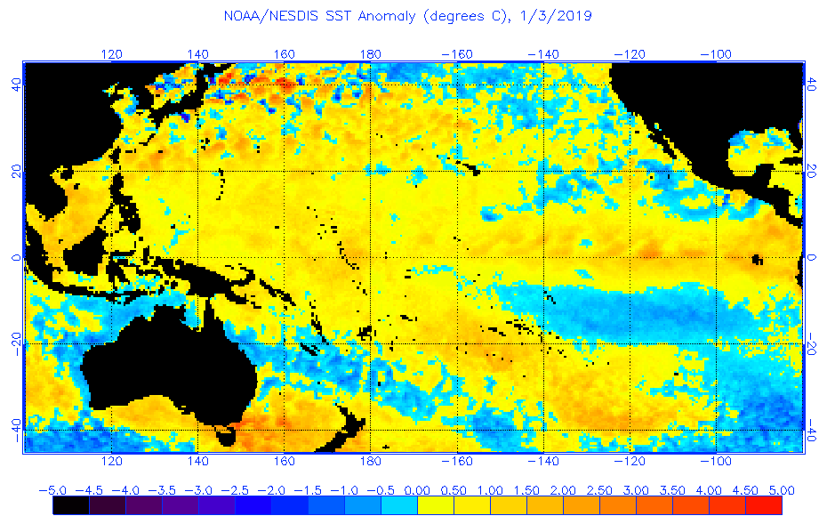
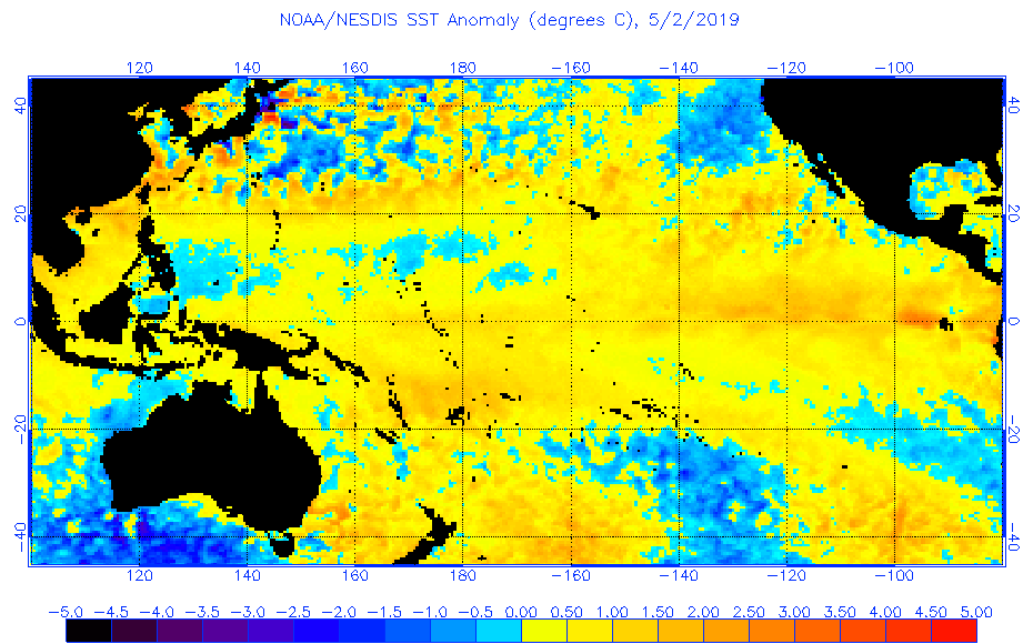
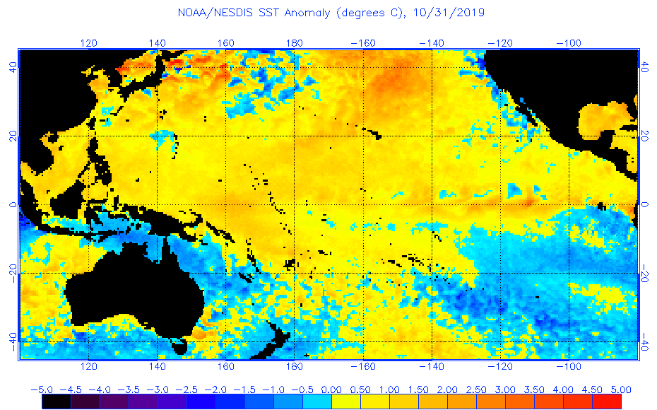
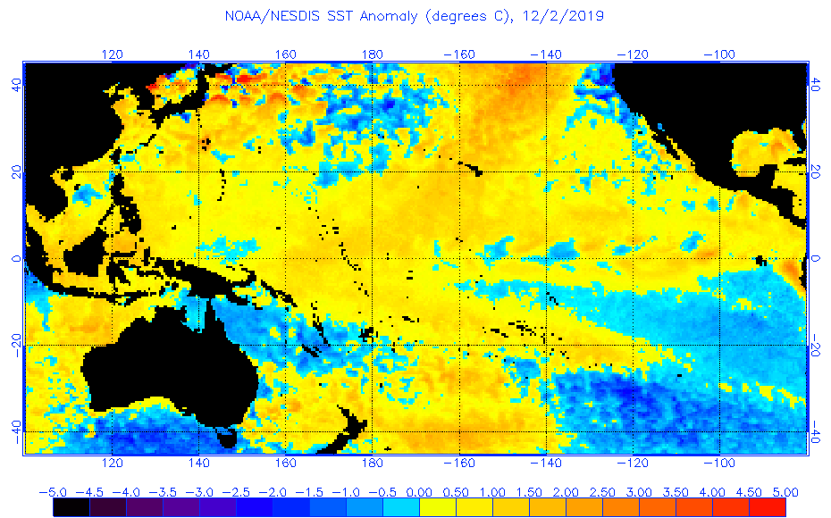
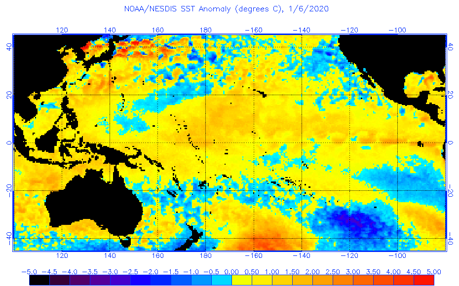
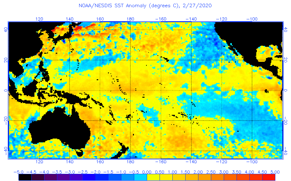
NOAA’s CFS v2 computer forecast model is predicting relatively strong La Nina conditions by later this summer (August/September/October); SST anomalies plot courtesy NOAA
*La Nina may form in the equatorial Pacific Ocean later this year and, if so, it could have wide-ranging ramifications*
Overview
It appears somewhat likely that the current weak El Nino in the equatorial part of the central Pacific Ocean will transition into La Nina conditions later this summer. La Nina is a naturally occurring oceanic cycle that produces colder-than-normal sea surface temperatures (SSTs) in the tropical Pacific Ocean whereas El Nino is associated with warmer-than-normal water. If indeed La Nina forms later this year, it could have ramifications on the upcoming Atlantic Basin tropical season, prospects for drought in California, and potentially on global temperatures in the lower atmosphere.

The plot shows forecasts made by dynamical and statistical models for sea surface temperatures (SST) anomalies in the “Nino 3.4” region for nine overlapping 3-month periods. Note that the expected skills of the models, based on historical performance, are not equal to one another. The skills also generally decrease as the lead time increases. Thirdly, forecasts made at some times of the year generally have higher skill than forecasts made at other times of the year–namely, they are better when made between June and December than when they are made between February and May. Differences among the forecasts of the models reflect both differences in model design, and actual uncertainty in the forecast of the possible future SST scenario.
Computer model forecasts generally support the formation of La Nina
Several independently-made computer forecast models support the idea of a change in the central part of the tropical Pacific Ocean from the current weak El Nino to La Nina conditions by the summer of 2020. The plume of El Nino Southern Oscillation (ENSO) model forecasts from mid-February indicate a transition to La Nina conditions are likely to take hold by later this summer. Indeed, some models (e.g., NOAA’s CFS v2) are predicting a fairly strong La Nina by the end of the summer season with sea surface temperatures as much as 1.5°C below-normal in the “Nino 3.4” region (i.e., central tropical Pacific Ocean).

Warm (red) and cold (blue) periods based on a threshold of +/- 0.5°C for the Oceanic Niño Index (ONI) [3 month running mean of ERSST.v5 SST anomalies in the “Niño 3.4” region (50°N-50°S, 120°-170°W)], based on centered 30-year base periods updated every 5 years.
Possible impact on the 2020 Atlantic Basin tropical season
One of the surprising side benefits of an El Nino event in the tropical Pacific Ocean is that this type of sea surface temperature pattern (i.e., warmer-than-normal) tends to result in less tropical activity in the Atlantic Basin when compared to normal. This tendency for reduced tropical activity in the Atlantic Basin is a result of higher-than-normal vertical wind shear in the breeding grounds region of the Atlantic Ocean during El Nino events. Higher-than-normal vertical wind shear tends to inhibit the formation or intensification of tropical systems.
On the contrary, La Nina is often associated with a more active Atlantic Basin tropical season as overall vertical wind shear is usually on the low side in the breeding grounds region. The last time there was a relatively strong La Nina event during the tropical season in the Atlantic Basin was in the year 2010. This particular year saw La Nina-induced sea surface temperature anomalies as low as -1.7°C in the central part of the equatorial Pacific and there was anomalously low vertical wind shear in the tropical Atlantic. As it turned out, the 2010 Atlantic tropical season was the first in a group of three very active seasons. It is tied alongside 1887, 1995, 2011, and 2012 for the third-most active Atlantic tropical season on record, with 19 tropical storms, only behind the 1933 and the 2005 seasons.

University of Alabama-Huntsville (UAH) satellite-based temperature data of the global lower atmosphere from 1979 to the present. Several El Nino episodes in the past couple of decades were associated with spikes in global temperatures and La Nina usually resulted in a drop in temperatures. Data courtesy UAH, Dr. Roy Spencer
Potential impact on global temperatures
What goes on in the Pacific Ocean in terms of sea surface temperatures can indeed have an impact around the world with respect to global temperatures in the lower part of the atmosphere. If indeed a La Nina does form later this year in the tropical Pacific Ocean and it is relatively strong and long-lasting, it can result in a drop of global temperatures after it becomes well-established. In recent years, the number of El Nino episodes have surpassed the number of La Nina events and global temperatures have often reacted with noticeable spikes (see UAH data temperature plot). For example, the strong El Nino events that centered on the years of 1997/1998, 2009/2010 and 2015/2016 were associated with sharp upticks in lower atmosphere global temperatures. In times of La Nina such as during 2007/2008 and 2010/2011, there have been noticeable downturns in global temperatures of the lower atmosphere.

Drought conditions have worsened across California during the past few week; map courtesy NOAA
California drought
After a long period with severe drought conditions dominating the scene in California, the winter season of 2018-2019 brought significant rainfall to the state and incredible amounts of snow piled up in the Sierra Nevada Mountains. In fact, the drought was officially declared over by the time spring season began last year. In subsequent months, there have been spurts of dry weather across California, but drought conditions did not really become persistent until a few weeks ago. Contrary to the winter of 2018-2019, this winter season has been rather dry across California and the amount of snow that has fallen in the Sierra Mountain range of eastern California has been below-normal. This reduction of snowfall in the higher elevation locations could very well lead to some problems later this summer as a melting snow pack is an important contributor of water for the state.
In terms of what kind of an impact La Nina conditions in the tropical Pacific Ocean could have on California’s weather, the results are rather mixed. La Nina tends to create a looping jet stream centered around high pressure in the Pacific Ocean. If the high pressure system anchors around the international dateline, La Nina tends to bring wetter weather to North America. However, if it centers itself in the eastern Pacific Ocean, it tends to bring drier weather. Finally, if the high pressure system meanders around, the results are often periods of wet and dry weather.
Stay tuned…we’ll continue to monitor the prospects for La Nina as we close in on the tropical season in the Atlantic Basin and certainly nothing is set in stone when it comes to long-range model forecasting of sea surface temperatures.
Meteorologist Paul Dorian
Perspecta, Inc.
perspectaweather.com
Follow us on Facebook, Twitter, YouTube
What – if anything – makes this model more reliable than climate models?
It wasn’t built to support a leftist agenda.
“What – if anything – makes this model more reliable than climate models?”
Not a lot, but it **IS** a different kind of modeling. Climate models try to predict the future by stepping forward from the past in small (but time consuming) steps. Typically that works for a while, but is subject to cumulative errors that get worse and worse the further one projects into the future.
This is more of a “when we’ve seen X pattern in the past, Y happened. X is happening again so maybe Y will happen” sort of thing. Probably worth keeping an eye on. It’s not like there are alternatives that are clearly better.
Yes! Few people understand that. When a forecaster says “30% chance of rain,” they aren’t declaring a confidence level, but a historical statistic. They are really saying “When we have seen similar conditions in the past, it rained 30% of those times.”
My understanding of a 30 percent rain prediction us that meteorologists are predicting that 30 percent of the area will see some rain. ?
Don, that’s what weather models do.
Climate models take a set of conditions and try to predict what the climate would look like under those conditions.
Weather models fail primarily because initial conditions of the atmosphere are not know with enough accuracy.
Climate models fail primarily because we don’t understand all of the interactions between all the things that impact climate well enough.
That it is testable and falsifiable. Wait for the next El Nino amd see what happens – wait for the next La Nina and see what happens. We’ve had plenty of cycles with that. We have not had instrumental observations of temperature with ups amd downs of CO2 so those models don’t have similarly suitable data for testing.
It’s simpler, it’s been properly validated, it produces predictions that actually come close to what actually happens.
Just because climate models have been misused is not evidence that all models are bad.
No singular ocean event is enough to make such conclusions. Considering that the Arctic Beaufort Gyre shift is overdue, the complete shutdown of the Atlantic conveyor will have a much more intense effect on weather. A grand solar minimum and its effect on climate forcing are rarely discussed. A weakening magnetosphere and interactions with solar electrical activity could force more volcanic activity in the ring of fire. Those magma vents are already producing 2000 degree rising thermal currents that are warming the Gulf of Alaska. You add all this together and Northern Europe may become uninhabitable, and food shortages could create some very serious problems for humans.
Mr. Dorian:
What could expect a country like Chile because of La Nina?
Good fishing.
Given that it will be winter, Chile could be a little chilly 🙂
(anchovy pizza)…
as a Chilean, the wisdom is that El Niño=wet, La Niña=dry, but as you probably know last year was incredibly dry without a Niña, and if I recall correctly in 2017 we didn’t get a Niño and it was wet…so nobody knows I guess. If 2020 is as dry as last year we’re [snip – let’s say “screwed” instead -mod] 🙁
(or how about done?)
…interstellar travel constant acceleration (without religious burning forests)… “those” religious-demented are burning the forests “infidels” in the entire World (in countries of “those” religious there is not fires), cheap religious-terrorism multi-focus obviously using tech-artefacts drones, balloons; and the religious-miserable occult-power Rome-saint (terror against reason, how thet did to Galileo Galilei, recent threat: “the III World War has already begun”) protects to “those” other credos and silences to politicians and Global Media (TV-news never says that are the incendiary-religious) for that the innocent people that still says “oh my god”, do not know it a fact already evident: IS TRUTH THAT RELIGION IS LIE
You should learn what a period(.) is Tonyon.
And might I suggest you then take some grammar lessons.
… and maybe some meds?
Can I get hash browns and bacon with those scrambled eggs
I don’t know exactly what drugs tonyon has been taking, but he needs to cut back.
Way, way back.
or share so the rest of us can make heads and tails of the statements made
Maybe he is an example of a “climate change Bot”.
I’ve never seen a climate change Bot, but his post is what I would expect from one: disjointed and making no sense. I mean, how intelligently can a machine post about “climate change”?
I think a regular troll would be able to put words together a little better than this one.
Maybe Tonyon is really a human and is just having a very bad day.
Obviously one of John Cook’s 97%
Tonyon makes more sense if read with a Yoda accent.
…and played backwards
all of my posts disappear
Only for an hour
Dunno Mark, looks like pretty good shit to me. 🙂
And btw, tonyon makes more sense than CAGWarmista rantings from the likes of Greta, Lewandowski and Cook etc not to mention Naomi O, Al G and the rest of the woke weather red brigades.
My thoughts exactly.
After tonyons post I have exactly Zero thoughts, all my logical circuits have fused!
You said it all tonyon. Absolute genius! Trees burning religious constants; truth drones silent credos and OMG (gosh) III World War saints…fires occult the lies of cheap news. Galileo’s miserable balloons innocent terror reason the multi-focus facts. Demented tech-artefatgirls scream for naked infidels, interstellar “those”. Obviously! Never mind there is not fires. It’s not important entire media and yes, against reason The sarcasm of the chasm ideology of commenters unworthy. Mind them not religiously but vigorously, indeed. Weeds burn brains true and bright in truth and intelligence. Peace!
Greta? Is that you??
Hmmm. Interesting that my posts are subject to moderation? > ; }
Tinyons post go right through. Hit the donation button.
A few predictions: drought in Western North American will become the “new norm” – replacing five years of wetter than normal conditions as the “new norm”, polar vortex will return as a climate buzzword next winter, and a new round of temperature adjustments will be needed to show that the past – especially the 2015 El Nino – was not as warm as we thought and the warming future is even worse than we thought.
I find NOAAs current drought map spurious because our drilling is currently being delayed due to mud in an area they call “abnormally dry”.
The map is a week behind in the Palmer drought index info.
I am curious about the graph of temperatures. In western WI I am struggling to notice the upward slant of that graph. The last 2 winters were cold and last summer was lousy except for July.
Please send that warming this way.
Please
Well the Socialist-hustlers out in California are already blaming the current Cal’s Sierra Nevada dry February on their favorite boogeyman. And we know what the name of that boogeyman is.
The previous wet winters though were weather.
Someone needs to explain what a “mean” is and what “reversion to mean” looks like… i.e. basic statistics.
I mean, now you’re just being mean…
The Pacific Decadal Oscillation (PDO) also affects El Nino/La Nina. A positive PDO is when warm water is around Alaska, British Columbia, and Washington surrounds a cool blob. A negative PDO is the reverse, cool water surrounding a warm blob. A positive PDO amplifies El Nino but mutes La Nina; a negative PDO amplifies La Nina but mutes El Nino.
The PDO is currently moderately negative. Any La Nina effects will be amplified.
https://www.ncdc.noaa.gov/teleconnections/pdo/
There are so many ocean patterns and cycles that affect climate. ENSO, MJO, PDO, AMO, NAO, AO, EPO, IOD — all acronyms you should look up. There are some ocean cycles I left off too. Despite this, we are told that something which is 0.041% of the atmosphere is the driver of climate, not the oceans. Uh-huh.
“The Pacific Decadal Oscillation (PDO) also affects El Nino/La Nina. A positive PDO is when warm water is around Alaska, British Columbia, and Washington surrounds a cool blob. A negative PDO is the reverse, cool water surrounding a warm blob. A positive PDO amplifies El Nino but mutes La Nina; a negative PDO amplifies La Nina but mutes El Nino.”
What forms a “warm blob” and what forms a “cool blob”?
But everything affects everything. That’s the trouble with weather and climate. Where do you start with the effects?
A La Nina might cause x, but the La Nina itself has a cause.
That graph looks fishy (irony).
What … no Ninas or Ninos prior to 1989?
That alone is enough to toss the entire analysis, and to discard the default of temp rising, which is casually embedded in the background.
Propaganda.
Not sure the scientific community even knew about ENSOs prior to 1989 and there wasn’t a way to measure them accurately.
True, in reality we have only relatively recently started throwing around these acronyms and being really clever about knowing whats going on in the oceans. Fairly new news in the scheme of things.
Oh yes they did. The El Nino phenomenon was first described by Spanish jesuit missionaries in the early 1500s who reported the devastation it brought to Peruvian fishing communities. They also noticed a quasi periodicity with a timescale of a few, up to 7, years; there may have been some biblical thinking leaked into the reporting. In the early 1900s the cycle was rumoured to be fading; at least when I read about it in the 1960s it was said that scientists better be quick in studying it because the phenomenon was on the wane. How wrong that assertion was was demonstrated by the 1982-83 El Nino which really came back with a vengeance (and I found myself at the receiving end of it).
Ed, Thanks for adding that info.
In 1982 I was in La Jolla, CA, watching El Nino smash into restaurant windows and cliff houses like the angry child it is.
That graph should have either posted proxy curve for endless N/N or not shown anything prior to 1889.
I’m claiming the maker of that graph did what he/she did in order to show a hockey stick of temperature masking as an N/N graph.
They just can’t resist the stick.
{repost, don’t know what happened …}
Ed, thanks for that info. I watched El Nino batter La Jolla, CA in 1982, smashing through restaurant windows and cliff houses.
The maker of that graph should have either 1) started the graph in 1989; or 2) added proxy curve for prior N/Ns.
But instead, this is a post of temperature … complete with hockey stick … masking as an N/N graph.
They just can’t resist The Stick.
Having a few locals know about it and documenting it’s impacts is not the same as having the scientific community acknowledge it’s existence and devoting efforts to study the wide spread impacts.
After tonyons post I have exactly Zero thoughts, all my logical circuits have fused!
Cutiously, that awareness is about when the melting world papers and “predictions” took off.
“In recent years, the number of El Nino episodes have surpassed the number of La Nina events and global temperatures have often reacted with noticeable spikes (see UAH data temperature plot). For example, the strong El Nino events that centered on the years of 1997/1998, 2009/2010 and 2015/2016 were associated with sharp upticks in lower atmosphere global temperatures. In times of La Nina such as during 2007/2008 and 2010/2011, there have been noticeable downturns in global temperatures of the lower atmosphere.”
Quite so, and I suggest that if the sun stays quiet for long enough then La Nina will dominate over El Nino and the Earth will cool.
The sun has been quiet enough (lower UV) for the past 10 months that a LaNina cooling period is certainly baked-in for the next 12 months due to system response lag. Maybe much longer if internal ocean cycles align to a negative phases as well.
Judith Curry’s post on her “semi-empirical approach to formulating 21st century climate change scenarios” was covered here at WUWT 2 weeks ago:
https://wattsupwiththat.com/2020/02/16/plausible-scenarios-for-climate-change-2020-2050/
Her 2nd conclusion was:
– “All three modes of natural variability – solar, volcanoes, internal variability – are expected to trend cool over the next 3 decades”
And her concluding discussion in that post:
“Apart from the ‘wild card’ of volcanic eruptions, the big uncertainty is solar indirect effects. Based on the literature survey that I’ve conducted, solar UV effects on climate seem to be at least as large as TSI effects. A factor of 2-4 (X TSI) seems completely plausible to me, and serious arguments have been presented for even higher values. I also note here that almost all estimates of ECS/TCR from observations do not include any allowances for uncertainties associated with solar indirect effects. Scafetta (2013) included solar indirect effects in an estimate of ECS, and determined an ECS value of 1.35 ºC.
Neither the effects of AMO or solar indirect effects have been included in attribution analyses of warming since 1950.”
I suspect James Hansen understood this as far back as the mid-1980’s. He thus knew he had a 30-35 year window to run a climate scam of warming with rising CO2 attribution by correlation from his perch atop GISS. That window is now closing rapidly only due to a strong 2016 El Nino that gave the climate hustlers a few years breathing room to keep the scam going after the 16 year hiatus of temperatures of 1999-2015.
All their 30 years of massive investments in the climate hustle as a path to political power are about to go down the drain unless they can seize complete power in DC this year to enable the continuance of the gaslighting campaign via strong-arm suppression via the powers of the state.
They’ll just claim that their carbon taxes and brilliant emission reduction strategies are working.
If you search for Keeling Curve on Google, you will get …. errrm, I don’t know, but I’m sure they have that one in hand. Parasites are always ahead of the target, otherwise they wouldn’t be parasites.
Corona Virus driven implosion of the Chinese economy and thus emissions decline would work to their advantage too.
Good post Joel.
Planting has been one month late across the Great Plains of North America in both 2018 and 2019. There was a warm summer and fall in 2018 and the grain crop was good. In 2019 the ground was so wet that 40% of the huge US corn crop never got planted. Summer was cold and winter came early and there was a massive crop failure across the Great Plains. That does not sound much like warming to me.
Joe and I wrote a paper about it here.
THE REAL CLIMATE CRISIS IS NOT GLOBAL WARMING, IT IS COOLING, AND IT MAY HAVE ALREADY STARTED
By Allan M.R. MacRae and Joseph D’Aleo, October 27, 2019
https://wattsupwiththat.com/2019/10/27/the-real-climate-crisis-is-not-global-warming-it-is-cooling-and-it-may-have-already-started/
BTW, ‘way back in 2002 I (we) predicted moderate global cooling to start by 2020-2030. Since 2013 or earlier, I’ve been predicting cooling to start closer to 2020, based on the end of very weak Solar Cycle 24. That is prediction 3.
My (our) two previous “outrageous-at-that-time” statements published in 2002 about global warming and green energy have already been proved correct.
1. “Climate science does not support the theory of catastrophic human-made global warming – the alleged warming crisis does not exist.”
2. “The ultimate agenda of pro-Kyoto advocates is to eliminate fossil fuels, but this would result in a catastrophic shortfall in global energy supply – the wasteful, inefficient energy solutions proposed by Kyoto advocates simply cannot replace fossil fuels.”
So if prediction 3 (moderate cooling starting in this decade) proves correct, the Swedes can pick up Al Gore’s Nobel Prize and deliver it to my place – just leave it in the blue dumpster next to the building. 🙂
And if it does cool there will be a drop in the rate of increase of atmospheric CO2.
My prediction is that if the UAH anomaly falls to below 0.3 the rate of increase of CO2 will fall to below 2.0ppm/year
Annual change in CO2 from NOAA is here.
ftp://aftp.cmdl.noaa.gov/products/trends/co2/co2_gr_mlo.txt
Agreed.
CO2 release from the oceans should drop with a series of dominant La Nina events. Eventually, a quiet sun should reduce atmospheric CO2 by such means.
The fact is that ice cores fail to reflect the huge scale of ocean driven short term variations in atmospheric CO2.
I don’t know how so called scientists ever came to a different conclusion.
Stephen Wilde – February 28, 2020 at 12:25 pm
OH MY GOSH, …… I’ve been claiming for the past 20 years that the temperature of the ocean surface water in the Southern Hemisphere is the “control knob” for atmospheric CO2 ppm …… (both the bi-yearly cycling and the average yearly increase) …… and I didn’t think anyone else believed the factual science.
La Ninas and large volcanic eruptions will also cause an atmospheric CO2 reduction, whereas an El Nino will cause an atmospheric CO2 increase, ….. if no large volcanic eruptions occur, that is, …. to wit:
1981 _ 5 _ 343.01 …. +1.54 __________ 9 … 336.92
1982 _ 5 _ 344.67 …. +1.66 El Niño __ 9 … 338.32 El Chichón
1983 _ 5 _ 345.96 …. +1.29 _________ 9 … 340.17
1984 _ 5 _ 347.55 …. +1.59 __________ 9 … 341.35
1985 _ 5 _ 348.92 …. +1.37 _________ 10 … 343.08
1986 _ 5 _ 350.53 …. +1.61 _________ 10 … 344.47
1987 _ 5 _ 352.14 …. +1.61 __________ 9 … 346.52
1988 _ 5 _ 354.18 …. +2.04 __________ 9 … 349.03
1989 _ 5 _ 355.89 …. +1.71 La Nina __ 9 … 350.02
1990 _ 5 _ 357.29 …. +1.40 __________ 9 … 351.28
1991 _ 5 _ 359.09 …. +1.80 __________ 9 … 352.30
1992 _ 5 _ 359.55 …. +0.46 El Niño __ 9 … 352.93 Pinatubo
1993 _ 5 _ 360.19 …. +0.64 __________ 9 … 354.10
O.K., Cogar, just thought i’d share with you something quite amazing that i found. (that is, if ferdinand doesn’t find a way to sabotage me first)
We’ll start with the derivative plot, accurately scaled:
http://www.woodfortrees.org/graph/plot/esrl-co2/from:1958/mean:12/derivative/plot/hadsst3sh/from:1958/scale:0.253/offset:0.099/plot/esrl-co2/from:1958/mean:12/derivative/trend/plot/hadsst3sh/from:1958/scale:0.253/offset:0.099/trend
The we’ll compare the integrals of both (nothing new here):
http://www.woodfortrees.org/graph/plot/esrl-co2/from:1958/mean:12/derivative/integral/plot/hadsst3sh/from:1958/scale:0.253/offset:0.099/integral/plot/esrl-co2/from:1958/mean:12/derivative/trend/plot/hadsst3sh/from:1958/scale:0.253/offset:0.099/trend
Next we go back to the derivative plot, but this time we extend the temperature data back to 1850:
http://www.woodfortrees.org/graph/plot/esrl-co2/from:1958/mean:12/derivative/plot/hadsst3sh/from:1850/scale:0.253/offset:0.099/plot/esrl-co2/from:1958/mean:12/derivative/trend/plot/hadsst3sh/from:1958/scale:0.253/offset:0.099/trend
And, we’ll take the integral of the temp data (back to 1850):
http://www.woodfortrees.org/graph/plot/hadsst3sh/from:1850/scale:0.253/offset:0.099/integral
Looks familiar, don’t it? Cores tell us that CO2 ppm was 287ppm in 1850. Add to that the 125ppm that you see in my wft graph and we get 412ppm. Let’s see how that compares with reality:
https://www.sealevel.info/co2.html
Oh my gosh(!!!) Not bad for a back of the envelope calculation by an idiot in a leather jacket, huh? But wait, there’s more:
Look very closely at the above (middleton) graph. For the last 500 years the temperature relationship still holds true. Higher temps produce accelerated carbon dioxide growth, lower temps slower growth, even declining at times. About five hundred years past, the relationship breaks down and abruptly stops. (which tells me it’s probably deforestation that done it; ‘nother topic, ‘nother day)…
fonzie – February 28, 2020 at 5:05 pm
Thank you for sharing, Fonzie, I appreciate your info.
Proxy studies of fossilized plant stomata agree with your calculations, …. see excerpt below, to wit:
We don’t necessarily even need stomata. Here’s another graph a la middleton (gawd, i luv dat guy) of ice cores verses cumulative emissions:
According to ice cores, from 1750 to 1900 atmospheric concentrations rose 20ppm while emissions were just 5ppm. Over the last 120 years, given population growth, we could at least double, triple or even quadruple that number. Say, land usage or natural sources could easily account for half of the observed rise. More if there happens to be a temperature component (there is). This is one paradigm that could unravel the agw ball of yarn and i intend to unravel it…
Hi Fonz – fun stuff – thank you!
You will find this paper by Ed Berry of interest.
Best, Allan
https://wattsupwiththat.com/2020/02/05/nature-has-been-removing-excess-co2-4x-faster-than-ipcc-models/#comment-2910436
Dr Ed Berry has this important paper in preprint, with interesting discussions. I am still digesting it, but some of the smartest people I know think he’s correct.
From the Abstract:
“Human emissions through 2019 have added only 31 ppm to atmospheric CO2 while nature has added 100 ppm.”
PREPRINT: “THE PHYSICS MODEL CARBON CYCLE FOR HUMAN CO2”
by Edwin X Berry, Ph.D., Physics
https://edberry.com/blog/climate/climate-physics/human-co2-has-little-effect-on-the-carbon-cycle/
ABSTRACT
The scientific basis for the effect of human carbon dioxide on atmospheric carbon dioxide rests upon correctly calculating the human carbon cycle. This paper uses the United Nations Intergovernmental Panel on Climate Change (IPCC) carbon-cycle data and allows IPCC’s assumption that the CO2 level in 1750 was 280 ppm. It derives a framework to calculate carbon cycles. It makes minor corrections to IPCC’s time constants for the natural carbon cycle to make IPCC’s flows consistent with its levels. It shows IPCC’s human carbon cycle contains significant, obvious errors. It uses IPCC’s time constants for natural carbon to recalculate the human carbon cycle. The human and natural time constants must be the same because nature must treat human and natural carbon the same. The results show human emissions have added a negligible one percent to the carbon in the carbon cycle while nature has added 3 percent, likely due to natural warming since the Little Ice Age. Human emissions through 2019 have added only 31 ppm to atmospheric CO2 while nature has added 100 ppm. If human emissions were stopped in 2020, then by 2100 only 8 ppm of human CO2 would remain in the atmosphere.
ALLAN MACRAE – February 29, 2020 at 7:30 pm
Allan, that doesn’t say much for you …. or …. “some of the smartest people you know ”.
“DUH”, ….. the IPCC doesn’t have a very good “track record” of being honest or of publishing factual science.
Anyway, there is no way in ell that anyone can correctly calculate the present day “human carbon cycle”, ….. let alone calculate it back to 1750.
And the reason that the IPCC assumed that the CO2 level in 1750 was 280 ppm is that it was a good “starting” CO2 ppm quantity to adjust upward to coincide with the factual 1958 Mauna Loa measurement of 315 ppm.
A 1750 “starting” ppm quantity of 250 …… or of 300, …… would have negated any and all anthropogenic claims ….. and CAGW ‘fearmongering’ would have died a quick death.
Cheers
Sam Cougar – your comments are routinely some of the most ignorant on wattsup.
Hi, Allan, very nice to see you. Fun stuff indeed(!) Ed Berry seems to be getting an awful lot of traction in the climate blogosphere these days. (very refreshing to see that) If i add a new wrinkle to things, it’s by going ahead and assuming that ice cores reflect reality. The rise could still be anthropogenic, but not due to human emissions. There is still land usage/ deforestation which, if the temperature relationship is not being properly accounted for, could be the culprit. It’s high time, i suppose, that we stop letting the ferdinands of the world get away with murder. With the temp relationship going on for 500 years now, i’m going to call them what they are — D*NIERS(!)
WOW, ……. “some of the most ignorant on wattsup.”
Allan MacRae, …… at least I acted as a Professional by explaining what was ignorant and/or delusional with the content/context of your posted comments. I expect the same from others who claim to be a Professional.
Allan, it appears your preference is to …… “attack the messenger, ….. instead of the message” ….. and most everyone knows your reason for doing that.
Hi again Fonz,
I think you are generally on the correct track with your post at
https://wattsupwiththat.com/2020/02/28/la-nina-may-form-in-the-equatorial-pacific-ocean-later-this-year-and-if-so-it-could-have-wide-ranging-ramifications/#comment-2927597
Specifically, I agree that there is a large natural component in the observed increase in atmospheric CO2 concentrations – and that the increase in atm. CO2 is primarily natural.
The “short-term” ~9-month lag of atm. CO2 after atm. temperature is primarily due to Henry’s Law and it is initiated primarily in the equatorial oceans. At this point, Ferdinand will jump in with the standard harridan’s complaint – “It’s not big enough.” The longer term lag of ~~700 years +/- ~~200 years as observed in the ice cores is probably due to deeper ocean circulation. That conclusion would be consistent with the work of Salby, Berry and Harde.
For the record, I’ve posted this and similar thoughts since 2009:
https://edberry.com/blog/climate/climate-physics/human-co2-has-little-effect-on-the-carbon-cycle/#comment-81937
I wrote my relevant paper in January 2008.
http://icecap.us/images/uploads/CO2vsTMacRae.pdf
That was 3+ years before Salby’s first presentation – I think to the Sydney Institute in August 2011.
https://www.youtube.com/watch?v=YrI03ts–9I&feature=youtu.be
Salby, Berry and Harde have developed the hypo that increasing atmospheric CO2 is not primarily humanmade, but is natural. That is a rational outcome of the observed lag of CO2 after temperature.
I have written that increasing CO2 is partly humanmade and partly natural but have not attempted to quantify the components as these fine gentlemen have done. I struggled with the data provided by Ernst Beck and still feel that he was badly treated by those who just KNEW that CO2 was the primary driver of temperature – pseudo-religious nonsense in my opinion (“imo”).
I have pondered this important scientific question since early 2008 and am still agnostic – I can’t seem to find the time to study it properly.
One reason is because I don’t need it to falsify the CAGW hypothesis – because climate sensitivity to increasing atmospheric CO2 is so low that there can be NO catastrophic global warming, regardless of increasing atmospheric CO2. The upper bound of climate sensitivity to CO2 is ~1C/(2xCO2), but the real number is probably near-zero or even non-existent, imo.
Regards, Allan
Allan, two things. One major and one minor…
Although the natural verses anthropogenic argument is an intriguing one, we don’t really need it in terms of policy. Bottom line is that carbon dioxide growth is set by temperature, period(.) Regardless of the source, nominal changes to human emissions won’t change that bottom line. Therefore, all this grandiose talk of RCPs is just that (grand). We couldn’t affect atmospheric carbon dioxide growth if we tried. i think that it’s appalling that at this late date the science is still discussing RCPs as though they still have any merit. (just appalling)…
Secondly, the Beck data appears to be inconsistent with the relationship of temperature and CO2. My little plot of the temperature integral going back to 1850 matches the keeling curve (mlo + law dome) graph that i also have posted, at its very worst, within 10ppm. Together, i believe, ice cores and the temp calculation falsify Beck…
post script ~ i agree that Beck was a very cool guy. (whoa… 👍)
So claimith did: ALLAN MACRAE – March 1, 2020 at 9:02 am
A 9 month lag, ….. HUH?
Here is a factually accurate graph of the measured Monthly Mean CO2 concentrations – Mauna Loa 1958 – 2019.
The above graph covers 61 years of continuous CO2 measurements, ….. wherein there are 6.7 segments of a duration of “~9-month” each, ……. but there is nothing in the plotted CO2 data that defines the aforesaid “~9-month CO2 lag time”. And there is nothing in the Official Mauna Loa Record that defines the aforesaid “~9-month CO2 lag time”.
But on the contrary, the included insert graph labeled “Seasonal variation” explicitly defines an average 6 month seasonal cycling of atmospheric CO2 ppm. An average 6 ppm seasonal increase during the SH summer and an average 6 ppm seasonal decrease during the SH winter.
There is also an average 2 ppm annual increase of atmospheric CO2 ppm due to the fact the ocean waters are “warming” from the “cold” of the LIA, therefore the total “seasonal” increase is a combined average 8 ppm, which is the reason the plotted data on the “Y” axis of the Keeling Curve Graph keeps increasing annually.
Allan MacRae, please cite a factually accurate graph that depicts your claimed ….. ~9-month lag of atm. CO2 after atm. Temperature, ……. with your “fuzzy” math calculations not included.
Regards, SamC, ….. AB Degrees in Biological and Physical Science, GSC 63′
comment stuck in moderation, too many links (hope it’s not lost for good)…
fonzie, Be careful with the data stored in WFT, it changes from time to time. I have observed the temperature data in WFT for around 15 years. Historic anomalies back to 1850 are continually altered down wards and the more recent anomalies adjusted up wards. I am not sure if this happens within WFT or the total update from NOAA.
WFT also displays a “Sunspot chart” that uses data from solar flux.
Peter K
“Historic anomalies back to 1850 are continually altered down wards and the more recent anomalies adjusted up wards. I am not sure if this happens within WFT or the total update from NOAA. ”
I use WFT like you since longer time (12 years) and would like to tell you that to suppose WFT’s creator and engineer Paul Clark would do such things is completely wrong.
In the time you played with WFT, all time series were subject to many changes, especially those about temperature, snow cover etc, due to
– extreme increase of stations absent from previous evaluations;
– very different processing methods.
*
For example, I started a layman evaluation of GHCN daily in 2017; the amount of temperature measuring stations grew in between from ~ 35000 up to ~ 40000.
The transition from CRUTEM3 tom CRUTEM4 induced an increase of hundreds of stations especially in the Arctic regions, what of course not only ‘made the past cooler’, but also ‘made the present warmer’, as the Arctic regions show since 40 years twice as much warming as does the Globe.
*
And of course: processing methods like infilling through kriging (in heaviest use by mining activities, highway design, statistical medicine, etc – but which are considered bad and ‘illegal’ by climate skeptics), have deeply modified the time series.
Even gridding, i.e. preliminary averaging of measurements in grid cells before time series construction, is considered as ‘data wrangling’ ! What a nonsense.
Some even suspect time series based on departures from a mean to be the cause of a warming allegedly inexistent within the absolute data they were generated out. This is really weird.
Good grief.
Rgds
J.-P. D.
fwiw, i use hadsst3 (southern hemisphere) because it is the best fit to mlo. And, its historic anomalies have been adjusted upward from the raw data:
http://1.bp.blogspot.com/-HGT605CXR7w/VNoo9mjLeuI/AAAAAAAAAg8/QK_0C_L-hYc/s1600/ocean%2Braw%2Badj.png
Plus it works for my purposes (☺️)…
“Sam Cougar – your comments are routinely some of the most ignorant on wattsup.”
You insult people with your demeaning, uninformed comments and when you get pushback you play the victim card. Poor you Sam. Mea maxima culpa.
@John in NZ thanks for the link with the annual CO2 increase.
Please compare the increase with the calculated difference (=increase ?) from that link:
ftp://aftp.cmdl.noaa.gov/products/trends/co2/co2_annmean_mlo.txt
this are the annual mean ppm.
@Krishna Gans. Yes. The differences between the annual averages don’t match the annual increments in the link I put up. There are a few ways of calculating the averages which I assume is the cause of the discrepancies. I am happy that the data is good enough to show a very good correlation between temp and change in atmospheric CO2.
More CO2 data here.
https://www.esrl.noaa.gov/gmd/ccgg/trends/data.html.
According to the article, La Nina (cooler water in the equatorial eastern Pacific) leads to increased hurricane activity in the Atlantic Ocean, and possibly droughts in California (with increased wildfires). Of course, the lame stream media will be quick to blame an active hurricane season and California wildfires on “global warming”, not cooler-than-normal water in the tropical Pacific!
Welcome to our Orwellian world, where cold water causes “global warming”!
Steve Z, the magical CO2 molecule causes the the glo-bull warming to hide in the oceans depths! It is the heresies of deniers and skeptics that bring this about; if they are purified with fire and ice they will recant their denial and the warmth will be revealed!
You gotta keep up with the fast moving dogma of St. Greta, the All-seeing and St. Albert the Stout. How dare you question or ridicule the most popular and expensive religion non Earth! It is for your own good that you are going to be taxed into poverty and serfdom. They don’t want the wealth and power for nefarious purposes; they just want to save us from a warmer planet covered with lush vegetation! Oh, the horrors!
“You gotta keep up with the fast moving dogma of St. Greta, the All-seeing and St. Albert the Stout”
Thanks for that laugh. 🙂
2010 is the beginning of the 24th solar cycle. Now we are waiting for an increase in solar activity.

2009 (2008/December) was the beginning of SC24. We’re at 11 years and 3 months now.
In 2009, the magnetic activity of the Sun was minimal. The solar wind only got stronger in February 2010.

After a long period with severe drought conditions dominating the scene in California, the winter season of 2018-2019 brought significant rainfall to the state and incredible amounts of snow piled up in the Sierra Nevada Mountains. In fact, the drought was officially declared over by the time spring season began last year. In subsequent months, there have been spurts of dry weather across California, but drought conditions did not really become persistent until a few weeks ago. Contrary to the winter of 2018-2019, this winter season has been rather dry across California and the amount of snow that has fallen in the Sierra Mountain range of eastern California has been below-normal. This reduction of snowfall in the higher elevation locations could very well lead to some problems later this summer as a melting snow pack is an important contributor of water for the state.
A CA drought is not reflected in the color coding on the map. What gives?
The a low Sierra snow pack predicts low spring-early summer river levels and thus diminished reservoir levels heading into a typical dry hot summer.
But future drought is not current drought.
The horror for the Alarmists will be that there will be less water to flush down the San Joaquin Delta to the ocean to help out a bait fish.
Three part forecast in next to last paragraph is going to be correct in the future.
‘You can blow with this,
or you can blow with that’
Fat boy Slim
https://m.youtube.com/watch?v=DB18chEn9CU
I guess they just never mustered the courage to write policies for insurance companies.
Strewth, even I think I’m getting cynical.
Cold early March in California.

By Paul Dorian
Normally, there is an average 6 ppm decrease in atmospheric CO2 from mid-May to end of September, ….. and an average 8 ppm increase in atmospheric CO2 from end of September to mid-May, as defined by the Keeling Curve Graph. A yearly average increase of 2 ppm (a 6 ppm decrease vrs an 8 ppm increase)
If a relatively strong La Nina does form it could also have ramifications (a decrease) on the bi-yearly September to May average 8 ppm increase in atmospheric CO2 that begins after the Autumnal equinox in September. Thus the 2020-21 average yearly increase might only be 6 or 6.5 ppm instead of 8 ppm.
Mid-May 2020-21 Mauna Loa data will provide the answer.
Samuel
See the chart in the link below. Note that the Nino 3.4 average temperature profile peaks in May (same as CO2 at Mauna Loa), and is at the lowest point exactly the same time as well. Then it rises in tandem with CO2.
Don’t you just love charts that line up perfectly that no one seems to notice or really understand. This one of the key contributers at the heart of the NH CO2 circulation pump.
Warmer 3.4 SST create increased NH troposphere circulation and ultimately volume retention.
Regards
https://origin.cpc.ncep.noaa.gov/products/analysis_monitoring/ensostuff/ONI_change.shtml
Martin Cropp, …… a beautiful graph, ….. I thank you much.
And “Yes”, …… I love it, love it, love it ……. because it confirms what I have been say for the past 20+ years.
The steady and consistent change of the Spring/Fall “equinoxes” determines the surface temperature of the Southern Hemisphere ocean surface waters ….. and thus control the ingassing/outgassing of atmospheric CO2, ….. per Henry’s Law.
Humans or green growing/decomposing biomass ….. don’t never do anything steady and consistent from one year to the next.
Dear Samuel
Always a pleasure. But there is more to consider.
Now go onto earthnull historical and look at the wind circulation patterns flowing toward Mauna Loa from April through October. These winds are primarily from the higher NH latitudes sweeping southward and moving east to west, bringing well mixed air. The low point in the ML curve is controlled by this.
There is a lot to the ML values, but your claim is fundamentally correct.
Is weather forecasting an art or a science?
“It appears somewhat likely that the current weak El Nino in the equatorial part of the central Pacific Ocean will transition into La Nina conditions later this summer.”
Somewhat likely? Does that mean 55/45 odds?
I don’t know about weather forecasting, but climate forecasting is pure magic.
Regarding ENSO, it is universally accepted that it is a natural climatic phenomenon.
I do not usually refer to Wikipedia but it has a reasonable summary of ENSO, which has been occurring for thousands of years.
The use of ‘El Niño’was noted as a reference to climate in Peru as long ago as 1892.
Others here have noted connections between ENSO and PDO and the IOD.
Importantly,ENSO affects the world climate and disrupts weather patterns.
There is NO consensus on whether climate change will have any effect on the occurrence strength or duration of El Niño events, as research supports El Niño events becoming stronger,longer,shorter and weaker.( Collins et al 2010).
Recently, I watched Michael Mann on the ABC in Australia (here on sabbatical) talking about climate change causing bushfires but then saying, without missing a beat, that the climate was influenced by the Indian Ocean Dipole.
No wonder people are confused about the climate issue.
“No wonder people are confused about the climate issue.”
It’s a deliberate effort on the part of alarmists. It’s why they started to use “climate change” instead of “global warming” to describe their CAGW hoax. “Climate change” is much more ambiguous and causes more confusion and that’s what alarmists want: Lots of confused people, easily led..
https://wattsupwiththat.com/2020/01/17/were-ipccs-1990-medium-term-warming-predictions-accurate-no/#comment-2895738
To be scientific, a hypothesis must be framed properly so that it can be falsified, and Lord Monckton is correct – the very-scary Catastrophic Anthropogenic Global Warming (CAGW) hypothesis has been falsified – because actual observed global warming is much less than predicted by the climate models of the IPCC and acolytes and is NOT dangerous.
The concept of falsifiability is important, because the very-scary humanmade “Climate Change“ hypothesis can mean anything and everything to climate alarmists – warmer, colder, wetter, drier, windier, calmer and thus cannot be falsified – it is Karl Popper’s “non-falsifiable hypothesis”, or in layman’s terms, it is non-scientific nonsense.
“A theory that is not refutable by any conceivable event is non-scientific.” – Karl Popper
When it is scientifically framed as a falsifiable hypothesis, the Catastrophic Humanmade “Climate Change” hypothesis can also be falsified, as it has been in the following treatises:
“Alarmist Claim Rebuttals”
https://alarmistclaimresearch.wordpress.com/
“Wrong Again: 50 Years of Failed Eco-pocalyptic Predictions”
By Myron Ebell and Steven J. Milloy, September 18, 2019
https://cei.org/blog/wrong-again-50-years-failed-eco-pocalyptic-predictions
The ability to correctly predict significant climate events is probably the best objective measure of scientific competence in the field of climate. It is important to note that every scary prediction made by the Global Warming/Climate Change alarmists has failed to materialize – they have a perfect negative predictive track record and thus perfect negative credibility.
In conclusion:
The Catastrophic Anthropogenic Global Warming hypothesis is falsified. There no CAGW crisis.
The Catastrophic Humanmade “Climate Change” hypothesis is also falsified.
Fortunately, California, knowing that droughts are frequent and sometimes severe, built considerable new water storage in time for the record wet winter of 18-19, thus has considerable surplus on hand with which to manage the expected dry conditions upcoming.
/sarc off
I have to say, the last paragraph underlines how “the science” confuses most of us. To paraphrase, it could be wet, or it could be dry, or it could be both.
Modelling results are entirely dependent on inputs, even assuming the model is “honest” (often not a given). The inputs are generally not known until after the fact. Thus models are useful for understanding what happened, generally pretty unreliable for predicting what will happen, even in the short term.
To base economic and social reforms with potentially devastating consequences (themselves not terribly predictable) on inherently unreliable modelling is foolish in the extreme.
What we know for certain is that vast amounts of money spent spent on mitigation measures of dubious efficacy, cannot be spent on real world issues that have known solutions eg energy poverty and resultant human misery. Not to mention the wonderful effects on population control that would result from raising the standard of living of 2/3 of the worlds population.
The most pressing problem facing Western culture isn’t climate change – it’s Hubris!
Good post David, except it’s not Hubris – it is deliberate political sabotage.
WHAT THE GREEN NEW DEAL IS REALLY ABOUT — AND IT’S NOT THE CLIMATE
By Allan M.R. MacRae, B.A.Sc., M.Eng., July 19, 2019
https://wattsupwiththat.com/2019/07/20/what-the-green-new-deal-is-really-about-and-its-not-the-climate/
[excerpt]
On July 4, 2019, I published the article “THE COST TO SOCIETY OF RADICAL ENVIRONMENTALISM”.
There was a reason why this article was published on July 4. My article begins:
Ever wonder why extremists attack honest scientists who oppose global warming and climate change hysteria? Ever wonder why climate extremists refuse to debate the science?
IT IS BECAUSE GLOBAL WARMING AND CLIMATE CHANGE ALARMISM WAS NEVER ABOUT THE SCIENCE – IT WAS ALWAYS A FALSE NARRATIVE, A SMOKESCREEN FOR THE TOTALITARIAN OBJECTIVES OF THE EXTREME LEFT.
THE COST TO SOCIETY OF RADICAL ENVIRONMENTALISM
By Allan M.R. MacRae, B.A.Sc., M.Eng., July 4, 2019
https://wattsupwiththat.com/2019/07/04/the-cost-to-society-of-radical-environmentalism/
Any significant effect on Hawaii in April?
JMA’s ENSO forecast has long been the one I preferred – because mostly what they predicted happened.
http://ds.data.jma.go.jp/tcc/tcc/products/elnino/elmonout.html#fig2
The model description is interesting:
http://ds.data.jma.go.jp/tcc/tcc/products/model/outline/cps2_description.html
Rgds
J.-P. D.
I’m watching UAH carefully as usual. A return to the ‘pause’? Or a cooling below the 30 year mean?
Coeur de Lion
“I’m watching UAH carefully as usual.”
Really? If you do: how do you imagine a ‘cooling below the 30 year mean’?
Did you ever count the number of monthly anomalies above/below that mean since 2012?
Rgds
J.-P. D.
Did you ever count the number of monthly anomalies above/below that mean since 2012?
NO (😉)
Hi fonzie
You are such a lazy guy 🙂
Rgds
J.-P. D.
+1
Seems just a month ago the same people were predicting an El Nino. Beware of any forecasts until after April.
That said, it does seem like we are due for a La Nina. However, I see no evidence in the current structure of the Pacific that would lead one to conclude a La Nina is going to occur. OTOH, the blob has been dissipating and the PDO could be going negative which would greatly increase the chances. However, having one month with a negative value is not a trend.
My own guess …. we stay neutral through the summer and then move into La Nina conditions next fall. I’m also think it will be a 2 year La Nina with the 21-22 cooling more significant.
Test
Here’s Javier’s (empirical) prediction from a post he did at Curry last September:
(it’s the sun stupid)…
If El Niño and La Niña simply followed the peak and trough of the sunspot cycle, then this would be obvious and ENSO would be a regular 11 year oscillation. It’s not.
Where can you go to get up to date solar data – graphs of TSI and sunspot number? Javier, Leif Svalgaard and others are predicting a brisk recovery and strong cycle 25. Prof Zakarova and her solar model on the other hand predict a prolonged minimum and very weak cycle 25. Finding out who’s right must be quite soon. They can’t both be.
Figure 5. a) Average (black line) and standard deviation (grey area) solar activity in monthly smoothed sunspot number (left scale) for the solar cycles between 1950-2018 divided in 22 fractions of a solar cycle. b) Average (dark red and blue areas) and standard deviation (pink and light blue areas) ONI values (right scale) for the same periods. The plot has been divided in five phases (dashed vertical lines) labeled in roman numbers (see text).
(hatter, this is javier’s explanation of his graph)…
Due to oceanic thermal inertia it takes multiple solar cycles to swing between dominant El Niño and dominant La Niña phenomena.
(also)…
Figure 2. Top: Six-month smoothed monthly sunspot number from SILSO. Bottom: Oceanic El Niño Index from NOAA. Red and blue boxes mark the El Niño and La Niña periods in the repeating pattern. This figure was published in July 2018 in an article at WUWT. Since then the Niño prediction has been confirmed.
https://wattsupwiththat.com/2019/09/04/enso-predictions-based-on-solar-activity/
My take of 5years ago was that the volume of warm water in the equatorial Pacific was comparatively small and I couldn’t see how an extended El NINO could develop. It frittered away in ENSO neutral conditions from 2014 and I admit I was surprized we had such a high peak in November 2015. But it didn’t stay there long and dropped like a rock into La Nina territory where it oscillated between the Nino/Nina thresholds.
The confounding unusual slanting of cold waters from “Cold Blobs” in both the NH and SH Pacific temperate zones into the equatorial band caused breakdown of the usual ENSO E-W equatorial flows of warm and cold waters. The Western Pacific warm pool also got diluted. NOAA’s call for a modest El Nino in 2019_20, I argued was more likely to become an extended La Nina. The warm water had shot its bolt. The La Nina developing is likely to be strong becaus it will benefit from addition of continuing flow from th large cold blobs (I wish I knew how to copy the Pacific SST map)
NOAA’s Model map is too conventional. It won’t look like that. The large cold blobs above and below the equator aren’t goin to be replaced quickly by hot water as shown. They need a model that takes in what is different. There isn’t enough hot water. It seems that we have shifted paradigms in Enso. Indeed, assisted by the persistent Cold Blobs the La Nina condition will be stronger than usual and California may continue to get some rain because of the cold water off the coast that usually isnt there with La Nina. The smaller snowpack remains a problem, of course. It is going to be interesting to see how this affects Atlantic huricanes. The eastern Pacific will be too cool for much cyclonic action there.
Gary, re your: (I wish I knew how to copy the Pacific SST map) – This may help.
https://www.ospo.noaa.gov/Products/ocean/index.html
Click -> SST Anomaly Charts -> Pacific
Here are Pacific Ocean temperature contours since January 2019:
Just copy the above series into a draft email or similar and then click on each date to watch the progression.
It seesawed back and forth for a while but equatorial SST cooling seems to be the current trend. No guarantees – we’ll see.
One of the many unanswered or not even considered variations between the El Nino and La Nina years, is…
What percentage of the total volume of heat presented at sea surface is actually removed in the form of convection / water vapor. My estimation is that the most efficient years are La Nina, and that El Nino years the transportation system chokes causing ocean heat retention.
If this was not the case, the oceans in the lower / mid latitudes would be stripped of heat.
Food for thought.
With regards.
The magnetic activity of the Sun is now similar to 2009.

A cold northern front will now reach California.
http://tropic.ssec.wisc.edu/real-time/mtpw2/webAnims/tpw_nrl_colors/namer/mimictpw_namer_latest.gif
2020 could be an exceptional year : new solar cycle, new AMO cycle (starting with La Nina) , end of temperature peaks , same as 1876 and 1944 . Between these last 2 years we can count 6 solar cycles and 7 between 1944 and 2020 . I can also add that Jupiter and Saturn will be aligned later this year too .
I don’t think the events are just coincidence , natural cycles still dominate Earth climate despite anthropogenic warming which is not yet correctly measured ( 2-3 watts/m2 compared to 158 watts/m2 for all GHG )
Very good summary.
“2020 could be an exceptional year.” Agreed, especially since 2019 was a powerful lead-in.
2019 was the second lowest Daily Maximum in history, 63.31 Fahrenheit.
http://theearthintime.com/
This is the elephant in the living room. The cooling curve on the downslope.
Hubert
Excellent.
There should also be a lower ACE in East Pacific, stronger in Atlantic. Interested to see the Antarctic Blozone area, most importantly the annual accumulated area, which should be in the median range. To me maximum area is less important than annual accumulated area as an energy transport measure.
Regards
Re: imminent global cooling starting circa 2020, that is my Prediction 3 published in 2002.
I really want to be wrong about that one – I’m getting old and hate the cold. 🙁
https://wattsupwiththat.com/2020/02/28/la-nina-may-form-in-the-equatorial-pacific-ocean-later-this-year-and-if-so-it-could-have-wide-ranging-ramifications/#comment-2928572
[excerpts]
Planting has been one month late across the Great Plains of North America in both 2018 and 2019. There was a warm summer and fall in 2018 and the grain crop was good. In 2019 the ground was so wet that 40% of the huge US corn crop never got planted. Summer was cold and winter came early and there was a massive crop failure across the Great Plains. That does not sound much like warming to me.
THE REAL CLIMATE CRISIS IS NOT GLOBAL WARMING, IT IS COOLING, AND IT MAY HAVE ALREADY STARTED
By Allan M.R. MacRae and Joseph D’Aleo, October 27, 2019
https://wattsupwiththat.com/2019/10/27/the-real-climate-crisis-is-not-global-warming-it-is-cooling-and-it-may-have-already-started/
… ‘way back in 2002 I (we) predicted moderate global cooling to start by 2020-2030. Since 2013 or earlier, I’ve been predicting cooling to start closer to 2020, based on the end of very weak Solar Cycle 24. That is prediction 3.
My (our) two previous “outrageous-at-that-time” statements published in 2002 about global warming and green energy have already been proved correct.
1. “Climate science does not support the theory of catastrophic human-made global warming – the alleged warming crisis does not exist.”
2. “The ultimate agenda of pro-Kyoto advocates is to eliminate fossil fuels, but this would result in a catastrophic shortfall in global energy supply – the wasteful, inefficient energy solutions proposed by Kyoto advocates simply cannot replace fossil fuels.”
So if prediction 3 (moderate cooling starting ~ now) proves correct, the Swedes can pick up Al Gore’s Nobel Prize and deliver it to my place – just leave it in the blue dumpster next to the building. 🙂
It very likely this year’s La Niña will be a strong one since there hasn’t been one since 2010, and on average there is a strong La Niña every 8~10 years with few exceptions.
This strong La Niña will finally help offset the 2015~16 Super El Niño global warming spike, which was likely the strongest in 100 years.
It’s also highly likely the Pacific and Atlantic oceans will soon enter their respective 30-year cool cycles, which will cause a 30-year global cooling period, and finally drive a stake through the heart of the CAGW Hoax—the most expensive Leftist hoax in human history.
It’s also likely the coming Grand Solar Minimum event will add additional cooling to the PDO/AMO 30-year global cooling cycle.
We’ll see soon enough.
4-month sequence of vertical temperature anomaly sections at the equator, Pacific for February 2020
http://www.bom.gov.au/archive/oceanography/ocean_anals/IDYOC007/IDYOC007.202002.gif
All these pretty nice La Nina forecasts look in my humble opinion like snow forecasts for my Northern Germany corner.
On Wednesday, for the very first time in this (non)winter, we got… 4 mm (yes: four millimeters) of snow, which disappeared within a few hours.
For last night, a lot of snow was predicted, but… zero millimeter! Poor children around us…
This is not only the third (non)winter in sequence, with two amazingly warm summers in between.
This 2019/20 edition is, after 2006/07, also the second warmest winter for whole Germany since 1881.
Oh don’t think I would worry! I have experienced enough of these cold, snowy winters in 1956, 1963, 1978, 1986… I enjoy this wonderful warming.
But when I read all these comments predicting The Global Cooling Coming Soon, I get a big, big laugh, especially when comparing the winter temperatures for CONUS and Europe during the last ten years. Oho!
Best regards from a (much too) warm Germoney
J.-P. Dehottay
More rain and snow will come to Europe this spring.
Bindidon, CONUS temps are dropping, rapidly, to new lows. What data did you use to make your claim for warm CONUS?
windlord-sun
I replied hours ago, but can’t see the reply, sorry.
J.-P. D.
Ok. But do you agree temperature is dropping, and 2019 had the 2nd lowest TMAX in history?
windlord-sun
(1) – “But do you agree temperature is dropping…”
– Maybe if you mean TMAX.
– No if you mean TAVG, let alone TMIN.
TAVG temperatures for CONUS show a high trend since 2000, even higher since 2010. The trend is negative only since 2016.
(2) – “… and 2019 had the 2nd lowest TMAX in history?”
Maybe, I didn’t check that using GHCN daily which has many more stations than has USHCN. But the computer generating data is down, I can only post existing data.
Anyway, the goal of my somewhat lenghty comment was so show that imho TMAX is not the right corner to decide upon cooling or warming.
I saved it before posting; I’ll try again. Maybe it disappeared into some spam corner.
Happens often at Roy Spencer’s blog…
J.-P. D.
But the computer generating data is down…
And that folks pretty much sums up the sad state of what passes for climate “science” today.
windlord-sun
Second try, hopefully it works this time.
***
I know that CONUS is currently cooling, but it does not as you show.
The current situation since 2014 seems to be due to the increase of the polar vortex weakening.
Here is a graph I made some weeks ago, using GHCN daily:
https://drive.google.com/file/d/1RL6dA_EtMkZPcMHk-fIwdTgt33JKZPip/view
This is a completely different view, based on the winter months, measured by all available GHCN daily stations in those 12 northern CONUS states, for which I saw in generation stats the lowest absolute temperatures at single stations:
IA, ID, IL, MI, MN, MT, ND, OR, SD, WA, WI and WY.
But the truth IMHO isn’t to find there, let alone in a graph showing yearly averages of daily maxima.
Both approaches exaggerate single aspects up to a whole.
The difference between the monthly average of daily average temperatures, for e.g. CONUS and Europe (all EU states + Belarus + Ukraine + Russia till the Ural), reflects the situation in a less one-sided way:
1900-2019
https://drive.google.com/file/d/1OZXjeZ00Ew5_JDZWVA2NE2kIooprQBY5/view
1979-2019
https://drive.google.com/file/d/1Si1bNPeiJ_QGZ2Zr0fsurKeflCCQBht_/view
2010-2019
https://drive.google.com/file/d/13FJCPoqwqm9BXqNBDE5cOYayevbsgpEw/view
You see that CONUS
– shows much more stable over the long term than your graph suggests;
– does not show cooling for the last decade, but only since 2016;
– was in 2019 less dramatic than your graph suggests.
The linear estimates show this very well (in °C / decade)
1900-2019
CONUS: 0.03 ± 0.01
EU+RS: 0.19 ± 0.01
1979-2019
CONUS: 0.19 ± 0.03
EU+RS: 0.39 ± 0.03
2000-2019
CONUS: 0.19 ± 0.10
EU+RS: 0.29 ± 0.09
2010-2019
CONUS: 0.48 ± 0.35
EU+RS: 0.51 ± 0.24
Where does such a discrepancy come from? It comes IMHO from the fact that you think that warming and cooling depend on solar radiation only.
May I suggest that you create a graph similar to the one you have shown here, but based on daily minima, and showing it to us here again?
*
Last not least, I‘d like to remind us that CONUS accounts for no more than 6% of the Globe’s land masses.
Two years ago, Roy Spencer presented on his blog a chart made by John Christy, showing the number of daily maxima per station per year for CONUS, using USHCN data. „No significant warming“.
If you want, I can show you a very similar graph for CONUS, and a much less similar graph for the Globe – both based on GHCN daily data.
Rgds
J.-P. D. in Germany aka Germoney
windlord-sun
As you can see below, one of us must be wrong.
Here is a chart made out the yearly averages of CONUS’ TMAX, out of all available GHCN daily stations:
https://drive.google.com/file/d/1PhQQpErrQtYRvxUW6znkRXofizfFb8VR/view
to be compared with yours:
http://theearthintime.com/
The TMIN stuff came together with TMAX. Since the time series are somewhat distant, plotting them in absolute mode in one graph makes few sense, thus departures wrt the mean of 1981-2010 instead:
https://drive.google.com/file/d/16wjA5rw2QZLNcha_UgHpNTyFmEBlIRJO/view
Here the plots for stations and encompassing grid cells in each year:
https://drive.google.com/file/d/1YtnJL4DsbCEMnRcL5RZzcESp3ETmypwc/view
In the sum, from 1900 till 2019, 18059 stations contributed to the series, and were located within between ~ 160 and ~ 170 2.5 degree grid cells.
All data of course is subject to grid averaging, in order not to distort the series due to extreme differences in the station population across CONUS: while many corners have less than 20 stations per grid cell, others have over 300. 19 of the 20 topmost grid cells worldwide are in the US, 4800 stations together.
Rgds
J.-P. Dehottay
Thanks to the moderation for having fished this out of dark spam waters…
J.-P. Dehottay
windlord-sun
Last ‘contribution’ from my side, which you might appreciate much more:
https://drive.google.com/file/d/1lSCB4ScZ_MF_LPhXwTjb5o-iFA0-15SG/view
This is the same source as in the previous comment, but… processed without grid averaging.
Now you have it as you like it:
– 2019 is now 2nd lowest TMAX behind 1993;
– the Golden Thirties are atop!
1934 19.638
1953 19.538
1921 19.439
1954 19.434
1931 19.388
1939 19.370
1946 19.162
1933 19.070
1938 19.050
1956 19.037
Not one year after 1999 in the top 10! Ha!
I leave it up to you to decide what is right and what isn’t.
Sure you will now understand why so many people consider grid averaging as evil stuff, ‘plain wrong’ as Tamino would say.
Rgds
J.-P. Dehottay
I miss a comment here. On another thread, the moderator reports hundreds of posts stored in the spam directory. What a lot of work! Jesus.
I didn’t save the previous comment, so I add at least the link to the gridded TMAX plot:
https://drive.google.com/file/d/1PhQQpErrQtYRvxUW6znkRXofizfFb8VR/view
The comment above makes few sense otherwise.
J.-P. D.
For us Aussies it cant happen soon enough
last really good wet yrs were 15/16 17 wasnt too bad last 2 winter/spring seasons have been bad
the ENSO dropped a bit and within days we started to get the early cyclones forming off the east of Aus and others from west and nth as the IOD dropped away
bliss;-)
there wasnt enough soil moisture to make it worth touching the soil last yr even in spring, hope this yrs better
Curious as to how these weather effects with ENSO may be affected by 1) Solar cycle and 2) a positive or negative AMO?
Haiku tributes to the ENSO meter
my ENSO meter
currents on a stormy sea
setting my soul free
cute little children
¿¿El Niño o La Niña??
great gender reveal
oh ENSO meter
exalted ENSO meter
dashboard of weather
primitive tribesmen
gaze at the ENSO meter
dream of things to come
windlord-sun
“Bindidon, CONUS temps are dropping, rapidly, to new lows. What data did you use to make your claim for warm CONUS?”
*
Our different view does not depend on data, but on how we look at it.
I know that CONUS is currently cooling, but it does, from my point of view, not as you show.
The current situation since 2014 seems to be due to the increase of the polar vortex weakening.
Here is a graph I made some weeks ago, using GHCN daily:
https://drive.google.com/file/d/1RL6dA_EtMkZPcMHk-fIwdTgt33JKZPip/view
This is a completely different view, based on the winter months, measured by all available GHCN daily stations in those 12 northern CONUS states, for which I saw in generation stats the lowest absolute temperatures at single stations:
IA, ID, IL, MI, MN, MT, ND, OR, SD, WA, WI and WY.
But the truth IMHO isn’t to find there, let alone in a graph showing yearly averages of daily maxima.
Both approaches exaggerate single aspects up to a whole.
The difference between the monthly average of daily average temperatures, for e.g. CONUS and Europe (all EU states + Belarus + Ukraine + Russia till the Ural), reflects the situation in a less one-sided way:
1900-2019
https://drive.google.com/file/d/1OZXjeZ00Ew5_JDZWVA2NE2kIooprQBY5/view
1979-2019
https://drive.google.com/file/d/1Si1bNPeiJ_QGZ2Zr0fsurKeflCCQBht_/view
2010-2019
https://drive.google.com/file/d/13FJCPoqwqm9BXqNBDE5cOYayevbsgpEw/view
You see that CONUS
– shows much more stable over the long term than your graph suggests;
– does not show cooling for the last decade, but only since 2016;
– was in 2019 less dramatic than your graph suggests.
Here are the 12 monthly anomalies wrt the mean of 1981-2010 for 2019:
2019 1 0.11
2019 2 -0.72
2019 3 -1.03
2019 4 0.47
2019 5 -0.24
2019 6 0.10
2019 7 0.35
2019 8 0.54
2019 9 1.31
2019 10 -0.31
2019 11 -0.90
2019 12 1.64
And here are the 10 lowest monthly anomalies for 1900-2019:
1936 2 -4.49
1977 1 -4.04
1978 2 -3.97
1905 2 -3.95
1979 1 -3.87
1940 1 -3.66
1918 1 -3.37
1929 2 -3.31
1979 2 -3.28
1989 12 -3.27
(January 2019 appears at position 194 of 1440).
The linear estimates show this very well (in °C / decade)
1900-2019
CONUS: 0.03 ± 0.01
EU+RS: 0.19 ± 0.01
1979-2019
CONUS: 0.19 ± 0.03
EU+RS: 0.39 ± 0.03
2000-2019
CONUS: 0.19 ± 0.10
EU+RS: 0.29 ± 0.09
2010-2019
CONUS: 0.48 ± 0.35
EU+RS: 0.51 ± 0.24
{ I hope you don’t think all that is due to anomaly-based processing, that would be weird.
Absolute data show nearly the same trends, but the graphs look horrible due to the annual cycles. }
*
Where does such a discrepancy come from? It comes from the fact that you think that warming and cooling depend on solar radiation only.
May I suggest that you create a graph similar to the one you have shown here, but based on daily minima, and showing it to us here again?
*
Last not least, I‘d like to remind us that CONUS accounts for no more than 6% of the Globe’s land masses.
Two years ago, Roy Spencer presented on his blog a chart made by John Christy, showing the number of daily maxima per station per year for CONUS, using USHCN data.
Expected result: „No significant warming“.
If you want, I can show you a very similar graph based on GHCN daily data for CONUS, and a much less similar graph for the Globe.
*
Data source
ftp://ftp.ncdc.noaa.gov/pub/data/ghcn/daily/
(from 1979 in each year on average: about 7000 CONUS stations, and 2000 stations for EU+RS)
Rgds
J.-P. Dehottay
For the moderation
Please remove this comment: it is a duplicate of the one above :
https://wattsupwiththat.com/2020/02/28/la-nina-may-form-in-the-equatorial-pacific-ocean-later-this-year-and-if-so-it-could-have-wide-ranging-ramifications/#comment-2928813
Rgds
J.-P. D.
Hi J.-P.D.
Here is my graph of TMIN.
http://theearthintime.com/minn.jpg
The only differences I see between Min/Max: TMIN has shallower flow to its sine wave – the bumps extend somewhat longer. Additionally, it does appear that the recent TMIN is both higher than the earlier 1930s-1950s wave, and that it is only now beginning to follow the TMAX sine curve down. From one angle, you could even say it is nearly flat.
I don’t know if that is enough hay to feed even one horse. Why am I dubious? When MIN does not retreat as expected, slowing over 120 years, one must honor the doubt that urbanization teases. Yes, I know, this data is claimed to be adjusted by NOAA for heat islands and other siting issues, but still … did they get that right? To the tune of a few tenths of degrees F?
Not to mention these two twisters:
1) they stopped reporting the readings of over 400 stations, beginning in 1989;
2) the rate of redacted/missing readings (-9999) in the TMIN data increased since that time.
I welcome your response, if you so choose.
To take up ghcn at this time … I have to think about it. I downloaded the data a month ago. There are 50 million daily records for CONUS in it. Its not the size of that table, its the challenge of fussing with “why is ghcn-CONUS better or worse than ushcn” back and forth back and forth.
Adding …
“Where does such a discrepancy come from? It comes from the fact that you think that warming and cooling depend on solar radiation only.”
No. I’m only saying that the direct measurement of surface air temperature in the United States over the last 120 years shows no abnormal warming or cooling, per 50 million recordings of TMAX and TMIN.
I have made no claim on what temperature ‘depends on.” That is an entirely different discussion.
Adding …
“{ I hope you don’t think all that is due to anomaly-based processing, that would be weird.
Absolute data show nearly the same trends, but the graphs look horrible due to the annual cycles. }”
Anomaly-based processing 1) requires the challenger to demand the measurement data underlying them anyway, so what’s the point?; 2) are too easily used for inciting by emotion, “Oh, look, it’s going way up, the earth is burning up” when the actual constructed upswing is tiny.
As for “looking horrible, this is why I always supply a sine wave curve. It does not hide the granular data, yet it suggests evaluation of nature’s favorite motion: the gentle rocking of reality.
[I would add that if anomaly mapping is excused on the basis of ‘looking good,’ that does not speak well for its treachery possibilities.]
Thank you for responding.
Short answer: (I just returned to this thread after a trip)
1) I will respond about TMIN;
2) I challenge your assertion that simply examining TMAX is wrong. I will elaborate soon;
3) ushcn TMAX contains 50 million data points 1900-2019, adjusted for bias by NOAA. Would you give your reason for trusting CONUS ghcn over it?
4) the “US is a small sliver” argument has a struggle when confronted with this: “If a person claims abnormal global warming over the last x-years, how do they explain that 50 million data recordings in the USA missed it?
windlord-sun
(3.1) Didn’t you not understand that I am no US person, and therefore at least 95% of my data processing has to do with either the Globe or regions / countries outside the US? Why should I use this provincial HCN / CRN stuff? Nonsense for me.
(3.2) GHCN daily CONUS has about 20000 stations, on average with 71 years life time. About 500 million daily records, over 1 billion when averaging TMIN, TMAX and TAVG, I don’t count them in my stats. What for?
(4) Simple: because
– the US IS a small sliver;
– avoiding area weighting in the US creates a cooling bias, especially for TMIN. How could you see what is missing?
I posted a comment about that, based on John Christy’s daily maxima/station/year stat for CONUS, but it was not published.
(next comment)
“From one angle, you could even say it is nearly flat.”
Forget your misleading sine waves, and please
– communicate linear trend & 2 sigma CI;
– use for your graphs a linear estimate and
– a quadratic fit or a 10 year running mean instead.
Processing the raw USHCN data in GHCN daily gave this (1218 stations):
https://drive.google.com/file/d/1D7fzJgQoKwj8qgUKNPmLOG9fthfnYtDS/view
*
“Oh, look, it’s going way up, the earth is burning up”
Sorry, but to deny the usefulness of anomalies with such blah blah is too stupid for me.
Moreover, I try to imagine the poor Roy Spencer being obliged by people like you to publish his 4 atmospheric layers (LT, MT, TP and LS) in absolute form (LT at ~ -9 ° C, LS at ~ -60). Incredible.
How do you want to explain to people
– the amazing similarity between land surface and LT above land other than using anomalies in monthly plots (24 °C difference plus season zigzags otherwise)?
or
– the difference between LT and LS over the satellite era?
I don’t publish here links to explaining graphs, that goes to spam anyway.
You manifestly did not understand the point ‘removing the annual cycles’. That is not at all the same as yearly averaging.
3.1 evading: If I were to make the “provincial argument” as you just did, I would reject all the (relatively sparse) global direct measurement, and simply declare the US record to be the final, settled, proof that there is no warming – because I live in California. Instead, I am challenging with the obverse: If someone claims the globe is experiencing abnormal warming, why does it not show up in the US record? I keep posing that challenge to people and, like you, they deny it. (None of them went so far as to make a chauvinistic-natalist argument such as yours, however.)
3.2 I am busy parsing out interesting results from the full GHCN-CONUS dailies, and will post about them in the near future. So far, here’s what I’ve found: a) the GHCN subset of stations marked HCN do not produce the same results as found in USCHN. I’ll be digging to tease out why; and b) the organic sine-wave trend is even more pronounced in its “no abnormal warming” than in USCHN. I am also expanding my analysis to the wider set of stations.
4.0 You repeat the sliver argument, which is a fallacy. See 3.1 above; ALSO: NOAA has adjusted many of the recordings in both G/U for gridding. They have also redacted many readings. Yet still, even with three types of influencing the historical record, the resulting organic sine wave (repeating that phrase to annoy) shows no abnormal warming.
I cordially reject your order to abandon organic sine curve analysis in favor of flatline/anomaly. The curving line serves to project the mean, and in a clearer manner, and the plot of actual data is as honest and naked a reveal as could be desired.
I would not challenge Mr. Spencer or anyone else inspecting satellite data to show their data points. However, I do challenge them in the same way as above. If the conclusion of satellite measurements that construct surface temps differs from GHCN or USHCN (which show no abnormal warming), how do they explain that?
~ windlord-sun
Adding …
You posted a TMIN from GHCN-CONUS. Interesting. The plotting generally agrees with mine from USHCN. My USHCN TMIN is posted at my site now,
http://theearthintime.com
Notice how your rigid trend line points up, while your mean reflects the sine wave. A sine curve is much richer, more truthful of flow. The line conveys “straight up, no nuance.” Curve says “natural organic flow.” NOTE: I won’t do this, but I challenge you to plot the TMAX and apply a rigid line over 120 years. It will be flat. Temp has NOT been flat — it has been oscillating up and down, over/in more than one cycle. A linear trend line is misleading to the initial impression of the eye.
Meanwhile, here is my original TMAX from USHCN, but with the GHCN-CONUS-HCN plotted and superimposed:
http://theearthintime.com/gray.jpg
Quite congruent, except over the last 30 years, during which GHCN shows less of a rebound up. I have not performed a precise data analysis to tease out the difference. I don’t know why NOAA would not have absolutely identical data for both. USHCN contains 4.7 Million more recordings.
~ windlord-sun
windlord-sun
“Instead, I am challenging with the obverse: If someone claims the globe is experiencing abnormal warming, why does it not show up in the US record? I keep posing that challenge to people and, like you, they deny it.”
No. Not the others deny (me included): you deny the simple fact that averaging all stations together without area weighting is the major flaw in your approach.
This is no sound skepticism: this is simple obstinated will to keep right, against all your odds.
1. Wrong: TMIN without area weighting
https://drive.google.com/file/d/1D7fzJgQoKwj8qgUKNPmLOG9fthfnYtDS/view
2. Correct: TMIN with area weighting
https://drive.google.com/file/d/1qLDGUSheO75T4icaycIRqh50zLlsm7sF/view
The very best here is that the weighted aka gridded variant of the TMIN time series much better shows how, between 2000 and 2014, the minimum temperatures have decreased in CONUS.
And this cooling phase imho is correct.
3. Wrong: TMAX without area weighting
https://drive.google.com/file/d/1RWU3xkLHI50WkCrLonkLNFDlvPTn0ZBA/view
4. Correct: TMAX with area weighting
https://drive.google.com/file/d/1CANp9w6jzzcz5NNyl6HeQ9qoeXclExH4/view
The same remark holds as for TMIN.
Feel free to continue ignoring the trivial fact that without area weighting, regions hosting a greater number of measurement points will obviously dominate regions hosting only a few, thus producing two warming or cooling bias:
– in the mean absolute temperature;
– in the linear estimates.
I have no problem at all with that.
If I had any interest to do, I would add a method to my ware, allowing for the generation of all separate grid cells out of the gridded variants, and compare them until I find the cells responsible for the bias.
Re: imminent global cooling starting circa 2020, that is my Prediction 3 published in 2002.
I really want to be wrong about that one – I’m getting old and hate the cold. 🙁
https://wattsupwiththat.com/2020/02/28/la-nina-may-form-in-the-equatorial-pacific-ocean-later-this-year-and-if-so-it-could-have-wide-ranging-ramifications/#comment-2928572
[excerpts]
Planting has been one month late across the Great Plains of North America in both 2018 and 2019. There was a warm summer and fall in 2018 and the grain crop was good. In 2019 the ground was so wet that 40% of the huge US corn crop never got planted. Summer was cold and winter came early and there was a massive crop failure across the Great Plains. That does not sound much like warming to me.
THE REAL CLIMATE CRISIS IS NOT GLOBAL WARMING, IT IS COOLING, AND IT MAY HAVE ALREADY STARTED
By Allan M.R. MacRae and Joseph D’Aleo, October 27, 2019
https://wattsupwiththat.com/2019/10/27/the-real-climate-crisis-is-not-global-warming-it-is-cooling-and-it-may-have-already-started/
… ‘way back in 2002 I (we) predicted moderate global cooling to start by 2020-2030. Since 2013 or earlier, I’ve been predicting cooling to start closer to 2020, based on the end of very weak Solar Cycle 24. That is prediction 3.
My (our) two previous “outrageous-at-that-time” statements published in 2002 about global warming and green energy have already been proved correct.
1. “Climate science does not support the theory of catastrophic human-made global warming – the alleged warming crisis does not exist.”
2. “The ultimate agenda of pro-Kyoto advocates is to eliminate fossil fuels, but this would result in a catastrophic shortfall in global energy supply – the wasteful, inefficient energy solutions proposed by Kyoto advocates simply cannot replace fossil fuels.”
So if prediction 3 (moderate cooling starting ~ now) proves correct, the Swedes can pick up Al Gore’s Nobel Prize and deliver it to my place – just leave it in the blue dumpster next to the building. 🙂