Gregory J. Rummo
On February 2, 1978—41 years ago!—The Wall Street Journal warned in a headline that “Low-Lying Lands Could Be Submerged by Climatic Disaster.”
Fears of apocalyptic sea-level rise are nothing new despite the fact that they seem to have recently taken on a new life of their own, especially in South Florida, where I live.
The only scientific correlation I can make with any certainty is that these fears rise in direct proportion to the number of socialists elected to Congress.
So, let’s first talk about the science of climate change as it pertains to sea-level rise.
Dr. Roy Spencer, who has a Ph.D. in meteorology, writing in An Inconvenient Deception, states that compared to Al Gore’s warnings of a sea-level rise of 20 feet, the actual measurement is one inch per decade for over 150 years with no observed acceleration.
This could not be true if it were anthropogenic (human-caused), since there has been ample time for acceleration since 1940, “which is the earliest that humanity’s greenhouse gas emissions could have had any substantial effect.” Sea-level rise is a process that is mostly natural since it “predates the Industrial Revolution,” Dr. Spencer explains.
This may be small comfort to the people living in Miami Beach, for example, where sea-level rise has been worse than the average. But a 2017 study reported that the land is sinking at a rate of 3 mm per year—equal to the sea-level rise—causing a doubling of the effect and magnifying the rise of water at lunar high tides.
No one should “deny” climate change per se. It is a characteristic of the planet upon which we live.
The argument boils down to how much of it is due to relatively recent anthropogenic increases of atmospheric carbon dioxide compared with the Earth’s natural climate fluctuations caused by other factors including solar activity.
And it’s not just the science that is on the side of those appealing for moderation. The Earth’s climate history also has a story to tell.
Spencer reproduces the graph below of the Earth’s mean temperature over the last 2,000 years that shows two previous periods when temperatures were warmer than they are now; from 1–200 A.D., an epoch called the Roman Warm Period, and more recently the Medieval Warm Period from 900–1100 A.D.

Historical records during the Medieval Warm Period report many benefits such as extended growing seasons, a reduction in infant mortality, and the explosive growth of Europe’s population. The Vikings colonized portions of Greenland and were able to plant warm-weather crops.
It is worth noting that both of these climate optima occurred centuries before the discovery of fossil fuels and the invention of the internal combustion engine.
Getting back to that 41-year-old Wall Street Journal headline, the article that accompanied it reported that the temperature rise due to the burning of oil and gas would result in a “sudden deglaciation of the West Antarctic, unfreezing enough water to raise world sea levels by five meters (about 16 feet).” It was further stated that such a sea-level rise could “result in the submergence of much of Florida, Holland and other low-lying areas in the next 50 years.”
That scenario, though, depended on the worst-case scenario for greenhouse gas emissions, the worst-case scenario for warming, and the worst-case scenario for the effect of warming on the ice. None of those was at all likely, and none of them happened.
It was far more likely that continental ice melt would continue at about the rate of the past thousands of years—about a foot per century, meaning it would take 1,600 years to achieve the feared 16-foot rise.
And indeed that’s what’s happened. Sea level has continued to rise at about the same rate of a foot per century, or 1.2 inches per decade. To achieve the 16 feet warned of 41 years ago in 50 years, the rate would now have to jump to 208 inches per decade—nearly 200 times as fast. Anyone want to put a bet on that?
If you’ve ever visited a new housing development, inland or along the coast, it doesn’t matter, you already know the sandy soil is littered with the shells of mollusks. Have you ever wondered why?
A December 3, 1993, article that appeared in The Sun Sentinel may have the grim news: “Rising and falling ocean levels complicate the geologic picture. The coast has shifted several times, which is why shells can be found far inland ….”
Apocalyptic sea-level rise may simply be just a thing of the past.
Gregory J. Rummo is a Visiting Instructor of Chemistry at Palm Beach Atlantic University and a Contributing Writer for The Cornwall Alliance for the Stewardship of Creation. The views expressed in this column are his own.
The only apocalypse I see are the RECORD $$$$$ prices Hollywooden elites are willing to pay for beachfront property in Malibu.
http://labusinessjournal.com/news/2018/apr/27/malibu-home-sold-record-110m/
They’re willing to throw $110M into the sea ? Yeah … right. Take your hockey stick graphs with intentionally distorted y-axes and shove em.
Yes.
Follow the money.
It’s about real estate prices and development in high-risk coastal areas, including barrier islands.
If you’re a developer and cry “OMG Global Warming did it!” and (in the USA) get FEMA or some other gov’t agency to provide your insurance “for free”, why not? Pocket the delta and run to the next scam.
Whyyyy yoouuuu! [SMACK!]
Insurance through the FEMA-administered National Flood Insurance Program (NFIP) is anything but “free.” In fact, under the Biggert-Waters Flood Insurance Reform Act of 2012:
1. Flood insurance rates were ruinously inflated, in an attempt to make it so profitable that future flood insurance purchasers in low-risk locations would effectively pay off the program’s enormous post-Katrina debt.
2. Purchase of that insurance was required by law, when borrowing money against properties in red-lined (my term) risk areas.
3. Huge fines were imposed on lenders, for lending against red-lined property which did not have the required, exorbitant flood insurance.
4. But to evade the constitutional protections to which accused criminals are entitled in the United States, the fines for violations of the mandatory insurance purchase requirements were called “civil monetary penalties.” Biggert-Waters provided for a 470% increase in “civil monetary penalty” for lending without flood insurance.
5. Encouraged siphoning of money from the NFIP to support parasitic giant reinsurance companies, like Munich Re (which, in turn, heavily funds the subversion of sound climate science by unscientific climate alarmism, through institutions like PIK).
Thankfully, the most onerous provisions of Biggert-Waters were later repealed. But NFIP flood insurance is still anything but “free.”
I wrote about this issue two years ago, here on WUWT. Excerpt:
Kinji, you meant “Hollowooden elites.”
Spiritual messages I’ve received since 2005; getting very specific last 5 years: There will be a decimation of the planet, which has already started, but extreme volcanic and earthquake activity unlike the world has seen for 100’s of millennia will happen between 2020-2030, gradually reducing for a couple decades. Coastal cities/major populated areas will be mostly destroyed, displacing billions of people inland. Prime farm land destroyed, seasons shortened, major flooding and storms getting much worse. Starvation, famine, and a major epidemic will reduce the world’s population up to or over 60% (worse case). Wars will cease, because there will be few armies to fight them – some regional conflicts may occur. Start preparations now and remember, even good people you once thought of will want to take what you have, so be able to arm and defend yourselves – if you don’t, you will likely not make it through this decimation.
Here’s the twist: In the same message, it was transmitted – “The oceans will rise 3 feet by 2050, inundating prime farm land, like in So CA up to 50 miles inland.” If there is freezing at the poles, how could this happen? Major volcanic eruptions around Greenland?
There are currently, two celestial staffs on the planet, each having separate missions, but working together to restore the planet after the decimation. In 2005/2006, the XO of one staff was asking for mortals to join and assist. “It will be unlike any interview you’ve ever had!” Her name is Sondjah. During prayer, I asked for an interview in early 2006. Two weeks later in a large Starbucks, my Devine Inner Guide said – “Your interviewer is here!” She had personalized as a woman. She walked over to me and asked me, what she was reading. I thought a second and replied – “It’s about Jesus, isn’t it.” She smiled and said – “Yes…you’re right!” She sat down and I asked her her name. She replied, “Sondjah.” She spoke in beautiful tongues many times and told me what God was saying about me and my future; the future of our planet. It was an incredible experience! She told me all about my life, my likes and dislikes, then the future. She told me about the Cascadia Fault and how it will rupture, but also everything West of the Cascades would be under water in the near future. “When you feel the rumblings, over and over, get your family packed up and over the mountains. If you don’t, you will all pass on!” It lasted for an hour and I walked her to her XB Toyota with Wisconsin plates, stuffed to the brim. She gave me a big hug, stared into my eyes and drove off. I’ve had 9 visitations since that day and they’ve told me to sell my home and move to Missouri. I just sold it and moving in 2 weeks. This is no BS, so prepare! If you don’t and pass on…have no fear! Anyway…if you knew me, you’ll take heed.
They won’t say how it will be so cold and the oceans will rise by 3 feet. Any clues?
Er, the Vikings had potatoes? They only came to Europe in the 16th century after the conquest of South America. Otherwise, good.
.
Reminds me of joke about the visitor to Hadrian’s wall pitying the Roman soldiers who had to cope with this bleak northern outpost and how they must have been desperate for a cigarette.
Nor are potatoes a warm weather crop. They grow in Northern Europe, Siberia and Canada. They originated on the Altiplano, where it freezes at night, despite being in the South American tropics.
Cold is relative. To Canadians ice worms are a cold weather crop.
Climate change will make it harder and harder to harvest the ice worm bounty of the Great White North!
I suppose that endagnered ice worms would constitute animal protein with the IPCC Good Housekeeping (Harp) Seal of Approval.
Sauteed in (PC) canola oil (aka rape seed oil).
Potatoes are a warm-weather crop? I doubt that…
Would have grown turnips.
Quite likely, and / or swedes.
I came here to say much the same, but Peter beat me. Just to clarify, though: it was potatoes that came from South America (where even Sven and Oley wouldn’t claim the Vikings set foot) to Europe in the 16th century. The Vikings were in Europe long before that :-).
There is a real possibility that Vikings made it to the north shore of South America. According to the local tribes, they were at perpetual war with each other. A ship arrived carrying fair skinned people with red hair. Their ship had scales on the outside “like the scales of fish”.
The person who led the expedition taught them two important things: to stop warring and how to cultivate food. From that time they engaged in agriculture and stopped fighting enough to build great civilizations.
Perhaps someone can provide the traditional name given to this “leader” who brought civilization. To me, it sounds like Viking missionaries of some sort. It was of course, centuries before the arrival of the Nina, the Pinta and the Santa Maria.
The name of this leader is “Quetzecoatl”, “Quetzalcoatl”.
Thing everybody knows that name already.
https://en.m.wikipedia.org/wiki/Feathered_Serpent?wprov=sfla1 Quetzalcoatl is a Mesoamerican figure: there’s a temple dedicated to him at Teotihuacan, near Mexico City, which dates from at least 200BCE. Nothing to do with Vikings or South America.
The Norse would be just about the last people to proselytize against warring and for growing food. Agriculture was very tenuous in the homeland, but trading, slave raiding and plundering were at the core of their culture. Farming, not so much. They did grow crops, obviously, but often more for their dairy and meat livestock than themselves. They were primarily pastoralists, fishers and plunderers.
Well, there are Viking Potatoes. 😉 Anyway, the vikings grew barley.
That error really bothers me. As you say they only came in the 16th century. Mistakes like that undercut the credibility of the article. Ashame as overall it seem to be correct.
Aha proof they visited South America?
“Apocalyptic sea-level rise” is definitely “a thing of the past”…
And not a thing of the near future…
Combining the Ljungqvist reconstruction with a Holocene sea level reconstruction adds a bit of context…
The Twentieth Century Warming does not show on the chart above, but if it were correctly represented, the TCWP would be on the same level as today’s warming and with the Roman Warm Period and the Midieval Warm Period. You could draw a straight line left to right that would connect all four periods.
There is no unprecedented warming today. It’s been just as warm in the past. And now it’s cooling (0.5C since Feb 2016).
Globally it’s probably a little warmer now than it was in the 1930’s. It’s about the same in the US.
The adjustments, particularly time of observation, are essential. That said, the difference between now and the 1930’s is about the same magnitude as the adjustments. Add in the margin of error, and it’s not possible to conclude anything with certainty about the relationship between the present and 1930’s.
David wrote: “Globally it’s probably a little warmer now than it was in the 1930’s. It’s about the same in the US.”
Probably, you say? Not very precise, I would say,
David wrote: “The adjustments, particularly time of observation, are essential.”
Why? You mean to say that before the adjustments, the temperature record was useless? Humans beings are not capable of reading a thermometer, but computers can correct this?
David: ” That said, the difference between now and the 1930’s is about the same magnitude as the adjustments. Add in the margin of error, and it’s not possible to conclude anything with certainty about the relationship between the present and 1930’s.”
Well, the Tmax charts show a different story. Some people claim Tmax is the best metric to measure whether it is hotter today than in the past.
Considering the bastardization (adjustments) of the temperature record (Climategate) I would say we cannot rely on this record and must go back to records that were not “adjusted” to find the true picture of the temperature record.
When you have Tmax charts from all over the world agreeing with each other that the recent past was as warm as today, I don’t see how you dismiss them with a wave of the hand.
And on top of that, we also have regular, unmodified surface temperature charts that show the very same thing as the Tmax charts, i.e., that the temperartures today are no warmer than in the past. So we have two records that show this same temperature profile, before adjustments.
Rather than answer these questions here, David, I would love to see you write up an article discussing the pros and cons of using Tmax charts and other regiional charts, to determine the temperature of the Earth and whether it is warmer today than yesterday.
When you can’t trust the NASA and NOAA temperature data, then you have to go to the fallback postion. That is the regional unmodfied temperature charts.
What do you think about NASA and NOAA disappearing the significance of the hot el nino year of 1998? In their latest chart, 1998 is an “also-ran”, an insignicant period. The UAH chart shows 1998 as the second-hottest year in the satellite record. Which one do you believe is correct?
Northern Hemisphere anomaly relative to 1961-1990 mean was 1.001 for 2015. That’s from temperature measurements at about ground / sea level. This is important, because if you are referring to UAH temperature, that series presents a tall air column of lower troposphere. That’s not what the original chart is about.
@ David Middleton – August 9, 2019 at 3:18 pm
According to your 1st graph above, ….. the earth started its recovery from the depth of the LIA about 1790, …… with the average temperature of the ocean surface waters still continuing to “warm up” (increase) to this very year, 2019.
Now, given the fact that …. “liquid water expands at an increasing rate as the temperature goes up”,
Then there are two (2) critical questions that need answered in order to determine:
1) What was the average temperature of the ocean surface waters in 1790?
2) How many degrees F has the ocean surface waters increased during the past 229 years?
Once the answers to 1) and 2) are known, the answer to 3) can be calculated, to wit:
3) How many inches/mms has the ocean surface (sea level) increased during the past 229 years?
And don’t let the “seasonal” temperature changes of the ocean surface waters confuse the issue.
“liquid water expands at an increasing rate as the temperature goes up”,
Is that really true? I don’t think. Ocean water at most is under high pressure
Try this one and correct me if you are right? 1 decibar corresponds to 1 meter depth.
In the last 50 years the ocean water has expanded approx 28000 km3 because of thermal expansion
http://www.csgnetwork.com/water_density_calculator.html
Bjarne Bisballe – August 10, 2019 at 10:48 am
Bjarne, that depends on the weather, …… a sunny or rainy day, …. a high or low pressure air mass.
Standard sea-level pressure, (cloudless sky/ high pressure air mass) by definition, equals 760 mm (29.92 inches) of mercury or 14.70 pounds per square inch,
And Bjarne, ……. please convert your “ocean water expansion of approx 28000 km3” …. to vertical millimeters or inches of ‘sea level rise’.
Samuel C Cogar wrote, “[whether] Ocean water at most is under high pressure … depends on the weather, …… a sunny or rainy day, …. a high or low pressure air mass. /
Standard sea-level pressure, (cloudless sky/ high pressure air mass) by definition, equals 760 mm (29.92 inches) of mercury or 14.70 pounds per square inch”
At a depth of just thirty feet, the pressure is twice that, and most ocean water is at depths much greater than that. The average pressure for ocean water is in the neighborhood of 400 Atm, not 1 Atm.
Also, I think Bjarne is correct that liquid water does not expand at an increasing rate as the temperature goes up, at least not appreciably.
Samuel continued, “please convert your “ocean water expansion of approx 28000 km3” [over 50 years] …. to vertical millimeters or inches of ‘sea level rise’.”
That’s a good question. So let’s answer it.
The oceans cover about 3.618e+8 km² (sq-km) = 3.618e+14 m². A one mm global average increase in sea-level requires 1/1000-th of a cubic meter of water for each square meter of ocean surface, so:
10-³ m³ × 3.618e+14 = 3.618e+11 m³ of water per mm SLR.
28,000 km³ = 2.8e+13 m³ of water.
Divide that by 3.618e+11 m³/mm SLR and get:
0.774e+2 = 77.4 mm.
That would mean thermal expansion has contributed 77.4 mm / 50 yr = an average of 1.548 mm/yr to global sea-level rise over the last 50 years.
However, it is important to recall that thermal expansion in the upper layer of the ocean (which is where it mostly occurs) has a strictly local effect on sea-level.
If you warm a section of the ocean’s surface layer, it will rise up, in place, just as happens if you freeze a section of it. The lower the density, the higher the sea-level. But that water does not “run downhill” and affect sea-level far away.
Along the boundaries of the warm section there will be a slight more-or-less rotational flow, a mixing action between the warm and cold waters. The warmer water flows away from the warm section at the surface, and the cooler return flow is toward the warm section farther down. That slight rotational flow works to very gradually spread the warm spot (as does normal ocean wind and wave action), but the flows to and from the warm section are balanced, so there’s no net flow of water away from the warm spot, and it does not affect sea-level at distant tide gauges (until and unless the water temperature there is affected).
Dave Burton – August 11, 2019 at 5:36 am
Now Dave B, that’s like saying …… “your feet is under high pressure”, ….. the high pressure exerted by the weight of your body. Normally, “under pressure” means ….. a gas in a pressurized container or the force exerted by one object on another object.
If the thermal warming is local, …. the thermal expansion will be local.
If the thermal warming is seasonal, …. the thermal expansion will be hemispheric.
If the thermal warming is globally, …. the thermal expansion will be globally.
Liquid water obeys the “laws” of gravitational attraction, …. be it the “attraction” of the earth, the moon and/or the Sun.
You did some fine calculating, ….. but, ….. when trying to calculate an increase in SLR due to expansion, its pretty much impossible, simply because any thermal expansion of the ocean waters will cause them to flow more horizontally onto the “floodplain” than to rise vertically.
I think it’s not about expansion of water but the adding of melted ice from Greenland and the Antarctic shelf?l haven’t seen any substantial increase in temperature though.
What I meant with water under pressure is water dep in the ocean, 28000 km3 corresponds to approx 70 millimeter sea level rise.
What is known:
The increase in Ocean Heat Content is well known from the last 50 years or so. It has gone up in a linear increase with approx 8 calories (=approx 34 Joule) followed by 22 zeroes, and the oceans holds 135 milliliters of 3,5% salty water followed by 22 zeroes, so it is easy to calculate that each calorie is shared by 17 milliliter sea water which give an average temperature increase of approx 0,06 degrees Celsius over 50 years for the whole ocean. (1 calorie warms 1 milliliter 1 deg Celsius – definition) This temperature increase has expanded the ocean water
Wayne Johnson
Both expansion and melt water, not much from Antarctica but a little from Greenland. (approx 250 Gigatons normaly each year corresponds to 0.6 mm sea level, some years nothing, some years more).
Best source for Greenland is here. Download reports in english (Engelsk)
http://polarportal.dk/nyheder/saesonrapport-2018/
Why not add the latest 10 year average temperature for NH extratropical?
http://postmyimage.com/img2/190_Ljungquistupdate.png
A Hockeystick!?
Sorry!
Evil spirit go away! The power of Christ compels You, the power of Christ compels You…
*Splashing Holy water*
Because there are fundamental resolution differences between instrumental and proxy data.
From Ljungqvist, 2010…
[…]
[…]
https://wattsupwiththat.com/2019/06/25/resolution-and-hockey-sticks-part-1/
It intrigues me how the CO2-induced exponential take-off point in these IPCC-based graphs is around 2000 when the CO2 supposed concentration trend took-off around 1880; the IPCC AR4 had a temperature past and prediction graph that looked similar — a linear trend up to around 1950 then exponential — in that case they did it by faking the pre-’50 supposed trend by eliminating the ~1945 peak.
Atmospheric CO2 was actually rising faster than anthropogenic emissions before 1960 and we had global cooling from 1945-1978. To the extent there is an anthropogenic signal, it shouldn’t have been detectable before it saved us from “the ice age cometh”…
 https://wattsupwiththat.com/2019/07/24/that-70s-climate-crisis-show/
Here’s a “CO2 forcing” graph (log-scale CO2 concentration):
https://www.sealevel.info/co2.html?co2scale=2
As you can see, there was a pretty sharp acceleration after WWII, but the upward trend has been only barely more than linear for the last forty years or so. (It is likely to drop below linear in coming decades.)
That’s why we should not expect a drastic acceleration in the current slight warming trend.
Hmm “Fears of apocalyptic sea-level rise are nothing new despite the fact that they seem to have recently taken on a new life of their own, especially in South Florida”
Here I thought folks were afraid apocalyptic land-subsidence in South Florida .
WIND FARM FAILURE CAUSED UK WORST BLACKOUT ?
(Did failure of a wind farm cause overload and shut down of nearby gas-fired power station ?)
Black(out) Friday: Simultaneous wind farm and gas-fired power station failures are blamed for one of Britain’s worst power cuts in years as millions are affected – with homes, airports, trains and even traffic lights going down
Large parts of England and Wales including the capital have been left without electricity following a major power cut, electricity network operators have said, with a serious impact reported on rail and road services, including city traffic lights.
https://www.dailymail.co.uk/news/article-7342803/Wind-farm-gas-fired-power-station-failure-blamed-one-Britains-worst-power-cuts-years.html
The graph indicates that the world was not as warm in the Roman Warm Period and the Medieval Warm Period as it is now. Note the temperatures and the statement that they’re deviations from the 1961-1990 average. Then check out modern temperatures, even accumulatiing to the CFSv2 reconstruction that Dr. Spencer recommended in his website last week.
If the graph indicates that, it’s wrong. The Holocene Optimum was toastier than the Roman Warm Period, which was balmier than the Medieval WP, which was warmer than the Modern WP so far.
There has not yet been a single 50 year interval in the Modern WP warmer than the three hottest half centuries of the Medieval WP. From AD 1951 to 2000 didn’t cut it because the first 26 years of that half century were so cold. The current half century, ie 2001 to 2050 might equal one of the three hottest 50-year intervals of the Medieval WP, but only if cyclical cooling doesn’t return. However 1978-2027 could possibly equal one of the three warmest 50-year intervals of the Medieval. We’ll have to wait and see.
Your calcs at the end are out. It’s not 208 inches per decade but 38
I think he meant that to achieve the predicted 50 year sea level rise in the remaining 9 years (prediction was 41 years ago) the rate of sea level rise would have to increase to 208 inches per decade.
OK, thanks 🙂 That makes sense now that I read the sentence properly. That would be catastrophic wouldn’t it?
Sadly it doesn’t matter talking facts. I recently spoke with a cousin who insisted that the sea level has risen 13 feet in the past century. When I asked for references she just got upset – sigh 🙁
“WUT: Elizabeth May Says Humanity Must “Transition Off Fossil Fuels” Before The (Canadian) October Election”
https://www.spencerfernando.com/2019/08/09/wut-elizabeth-may-says-humanity-must-transition-off-fossil-fuels-before-the-october-election/?fbclid=IwAR3aqryDcfQRJtuuj0kePTVaB1ezwuheGNB7Y4wNhgozaiYscUtO0sQn6SU
Seriously ? Now we only have 2 months left ?
If by some illegal miracle the liberals get re-elected, then America, i’m coming back home to Trump’s World…
Funniest-looking hockey stick I’ve ever seen.
Looks like if the predictions from almost 50 years ago would have come through, a good portion of the world’s population would need gills for breathing today. Let’s check what they use instead – good old lungs. Not good for breathing underwater but outstanding for above the waterline. It still startles that all those predictions continue to fail over and over again and people still lap them up like icecream. The majority of people either does not give a damn or they are plain dumb.
Actually, the globally averaged rate of coastal sea-level rise is only about 1½ mm/year, or six inches per century:
https://www.sealevel.info/avgslr.html
The represents a slight acceleration compared to the 19th century. But there’s been no significant, detectable acceleration since the 1920s.
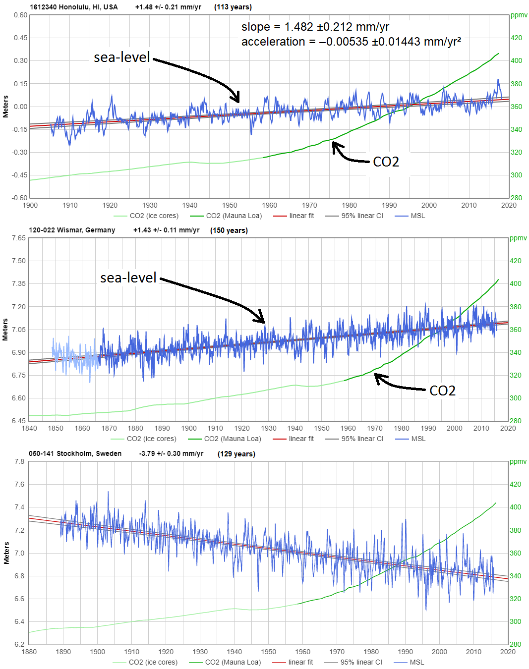
Other than being an especially high-quality, continuous measurement record, from a near-perfect measurement location, Honolulu is typical:
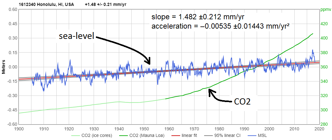
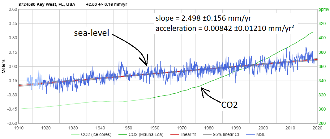
Key West’s sea-level trend is larger, at +2.42 mm/yr, but it, too, has seen no detectable acceleration in the last century:
Unfortunately, Miami Beach’s tide gauge has only 47 years data, ending in 1981, so the confidence interval on its trend is wide. But you can narrow it by comparison w/ Key West’s 105 year measurement record.
Comparing common intervals shows Miami Beach experiences 0.5 mm/year more subsidence than Key West, so the long term trend at Miami Beach is +2.9 mm/yr. That means Miami Beach should expect about 9¼ inches of sea-level rise by year 2100.
Building to withstand that small amount of sea-level rise is not difficult.
Dave, NOAA can’t even get their story straight….they have this little ditty on their sea level web page
“The pace of global sea level rise nearly doubled from 1.7 mm/year throughout most of the twentieth century to 3.1 mm/year since 1993.”
2018 – 1993 = 25 years X 3.1mm/yr = 77.5 mm of sea level rise in 25 years
..but when you use their interactive sea level graph, you get this…
1993…28.71mm
2018…52.63mm
..a increase in sea level of 23.92…..in 25 years….that’s 0.95mm/yr
using the sea level measurements they have on their graph…how did they end up getting 3.1mm/yr??
…I came up with 1/3 of that
Is the GIA adjustment fraudulent science involved here somewhere. They seem to forget to mention that and talk about sea level rise at if it is sea level rise.
NOAA sea level page > https://www.climate.gov/news-features/understanding-climate/climate-change-global-sea-level
Re: The NOAA-attributed climate.gov claim that, “The pace of global sea level rise nearly doubled from 1.7 mm/year throughout most of the twentieth century to 3.1 mm/year since 1993.”
The IPCC did the same thing in AR4. It’s what Tony Heller memorably called the “IPCC Sea Level Nature Trick.”
Q: Does 1993 seem like an odd year? Why do you suppose they chose it?
A: It’s because satellite radar altimetry measurements of sea-level began in 1993.
Yes, NOAA really did that: They compared apples to oranges. They spliced two very different sorts of measurements together, thereby creating the appearance of acceleration.
Sea-level trends vary considerably from one location to another. If you splice together measurements from two different locations, you can easily create the appearance of either acceleration of deceleration.
Tide gauges measure sea-level only at the coasts (where it matters). Satellite radar altimetry measures sea-level only far from the coast (where it doesn’t matter).
Also, sea-level measurements by satellite radar altimetry are generally much less accurate, and are subject to a great many more sources of error, and corrections, compared to coastal tide-gauge measurements.
So it should not surprise anyone that two completely different technologies, measuring sea-level at different locations, produce different numbers. That is not evidence that the rate of sea-level rise is accelerating.
Like NASA, NOAA is a mixed bag. On one hand, I’ve looked pretty closely at NOAA’s sea-level trend analyses for many individual tide gauges, and I’ve seen no evidence of anything other than good work by competent oceanographers; e.g.:
https://tidesandcurrents.noaa.gov/sltrends/sltrends_station.shtml?stnid=1612340
On the other hand, some of NOAA’s web pages are blatant climate alarmism propaganda, like these ridiculous pages:
● http://oceanservice.noaa.gov/facts/sealevel.html
● https://www.climate.gov/news-features/understanding-climate/climate-change-global-sea-level
Both of those pages were obviously written by “science communicators,” rather than scientists. (One of them apparently copied from the other.) Here’s how you can tell: they both say that sea level is primarily measured by tide stations “and satellite laser altimeters.”
If you believe THAT, you just might be a “science communicator.”
Obviously, the clueless, anonymous “science communicators” who wrote those page don’t even know how satellites measure sea-level. (Not by “laser altimetry!”)
Many studies & NOAA’s own measurements show that at the vast majority of locations there’s been no significant acceleration in the rate of sea-level rise since at least the 1920s.
Obviously, there’s a lot more swamp-draining needed at NOAA.
There might not be a Hockey stick trick here…
The rate seems to fluctuate on a ~60-yr cycle.
And 3.1 mm/yr is just not quite as insignificant as 1.7 mm/yr.
No hockey stick here, although UC is making one.
You have discovered the moon’s Nodal Precession, period = 18.6 years
Boston shows it clearly, with the curious fact that the the effect is X 4 years.
So the precession wave in the tide gauge data is 18.6 X 4 = 74.4 years. Do not ask me just why that is. Anyway, fitting some high order polynomial curves to capture the sine wave of the effect allows you to measure the precession to +/- 10 days. On monthly data, not bad. Some gauges show the effect, others not. As you know, tides go to near nothing as you head south from Boston into the tropics, so more southerly gauges will not show the effect.
Too bad we can not post graphics anymore. Anyway here is one I did a while back.

damn……Tony that’s a good fit
..and it perfectly shows NOAA”s recent claim to a 30 year increase in the rate
Quite so! And that’s the reason why fitting linear trends over shorter time-intervals is physically meaningless. The current acceleration seen in satellite data has not been demonstrated to have any staying power.
couple of quick points…
I like to use Key West…reason being….all the military that depends on accurate GPS
…the military tells me Key West is not moving in any direction…up, down, or sideways
so it’s one of the most accurate tide gauges on the planet
and every other tide gauge in Florida..including the pan handle…show the exact same rate of sea level rise
“Sea-level rise is only about 1½ mm/year”. That is the average from way back in 1922 to 2007.
http://sealevel.colorado.edu/files/2018_rel1/sl_ns_global.png
Climate-change–driven accelerated sea-level rise detected in the altimeter era
https://www.pnas.org/content/115/9/2022
“simple extrapolation of the quadratic implies global mean sea level could rise 65 ± 12 cm by 2100”
“simple extrapolation of the quadratic”
What a truly absurd idea; to fit a quadratic curve to a data set and then claim that this trend is a physical reality. Sea level rise is the result of a 3-dimensional volume increase in the quantity of water stored in the oceans and not a single dimension linear change. (Please don’t mention the red-herring about temperature rise. It is glacial melt-water that is the current bogeyman.) So, to be able to justify fitting a power law relationship to sea-level rise the cold fresh water that arrives in the ocean must necessarily increase itself. How does that happen? Is water a biological entity that breeds more of its kind?
Loydo wrote, “Climate-change–driven accelerated sea-level rise detected in the altimeter era
https://www.pnas.org/content/115/9/2022 “
You must be new around here, Loydo. Nerem et al 2017 has been extensively discussed here at WUWT.
In the first place, Nerem considered only low-quality, short-duration satellite altimetry, and ignored high-quality, long-duration coastal measurements, like these:
In the second place, Nerem found his “acceleration” in satellite altimetry data by slowing the rate of sea-level rise “measured” by Topex-Poseidon prior to 2003. What those revisions really proved is how malleable & unreliable satellite altimetry “measurements” are, compared to tide gauges—which show no sea-level rise acceleration since the 1920s.
You can see the effect of his group’s revisions to the fifteen year-old data in this graph, by Steve Case, which shows “the quadratic” fit that you cited, contrasted with the quadratic fit to the unrevised version:
http://sealevel.info/CU-2016-2018-With-Trend_with_caption.png
Nor is it the only example of such revisions, or even the most extreme. Satellite altimetry measurements of sea-level are endlessly malleable. You can learn more about the topic here:
https://sealevel.info/satellite_altimetry.html
Here’s how climate realists see sea-level:

Here’s the same data, but how climate activists see it:
http://www.sealevel.info/MSL_graph.php?id=Honolulu&quadratic=1&lin_ci=0&linear=0&g_date=1910/1-2099/12&c_date=1992/12-2018/5&s_date=1910/1-2019/12
There is a fine tide gauge index ‘Holgate-9’ following nine longtime used stations from differnt parts of the world.
https://www.sealevel.info/MSL_holgate9.html
The Champlain Sea was an inlet from the Atlantic ocean covered modern day western Vermont and parts of New York, Ontario and Quebec. Cod, mollusks and a beluga whale skeleton are among the marine fossils found well above sea level in Vermont when the Champlain Sea emerged 2,500 years after the last ice age. Lake Champlain averages 95-100 feet above MSL and the whale skeleton was found in a Charlotte farmers field above that level. No chance of beluga whales swimming around Lake Champlain anytime soon.
https://www.uvm.edu/perkins/charlotte-whale
Some fifty odd years ago I spent my holidays riding a motorcycle around Australia, carrying water fuel and camping gear. Oz then was sparsely populated long distances between drinks for both me and the cycle.
I remember camping in the desert in the middle of Oz sand forever 40C during the day 0C at night, pitched my tent and dug into the warm sand to stay warm. Surprise surprise the sand was full of sea shells mainly scallops the shells were not weathered at all but fresh as daisy.
It would seem that the middle of Oz was under ocean not that long ago.
The correlation between emissions and sea level rise
The Clark et al 2018 stupidity
https://tambonthongchai.com/2018/09/14/cumulativeslr/
The Reality
https://tambonthongchai.com/2019/02/20/csiroslr/
Other SLR issues
Early Holocene
https://tambonthongchai.com/2019/06/26/ehslr/
The Antarctica melting SLR obsession in climate science
https://tambonthongchai.com/2019/07/16/antarctica-slr/
There’s a lot of questionable statements in this blog. One is Vikings and potatoes…didnt happen. And a potato is a cold weather food. I was unable to find any support for Roy spencer suggesting that the sea level rose 1 inch per decade for 150 yrs. I was able to find a sea level graph from Dr spencer inline with global tide gauges showing about 8 inches since 1880. I was unable to find any reference to the suggest sea level rise rate in Miami of 6mm/ yr ( 3mm settlement, 3mm rise) a Miami tide gauge showed about 2.4mm/yr about 40 yrs ago. Key west tide gauge shows the same of about 2.4mm/yr. …
“shows two previous periods when temperatures were warmer than they are now”
The graph shows various proxies to 2000AD, with the MWP reaching a max of 0.2 °C on their 1961-90 scale. HADCRUT global, on the same base, is currently (June) 0.701 °C. But in fact, the graph is Northern Hemisphere.
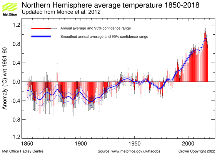
Even in 2000, Hadcrut was at 0.4°C. It has not dipped annually below 0.78 since 2013.
Nick. That is the same as Mann did. For a correct analysis the same proxies need to be used for the entire time period right up to the present. Simply stitching the instrumental record on is wrong. You know that.
“Simply stitching the instrumental record on is wrong.”
Well, it is in the plot that this article presents (up to decade 1990-1999).
We don’t have proxies right up to the present. And nobody claims that proxies are more accurate than thermometers. So how can you claim that MWP was warmer than present if you aren’t allowed to look at present?
Very briefly, Nick, proxies are calibrated using present measurements. The “Team” hid the decline by ditching then-present proxies. Your misdirection is becoming tedious.
Lungqvist (author of the graph displayed) himself in the paper addressed these issues:
“The decadal mean temperatures in the extratropical Northern Hemisphere seem to have equalled or exceeded the AD 1961–1990 mean temperature level during much of the Roman Warm Period and the Medieval Warm Period. The temperature since AD 1990 is, however, possibly higher than during any previous time in the past two millennia if we look at the CRUTEM3+HadSST2 90– 30°N instrumental temperature data (Brohan et al. 2006; Rayner et al. 2006) spliced to the proxy reconstruction. The proxy reconstruction itself does not show such an unprecedented warming but we must consider that only a few records used in the reconstruction extend into the 1990s.”
But I guess he’s just misdirecting.
Nick, do you understand what you read? “The temperature since AD 1990 is … spliced to the proxy reconstruction. The proxy reconstruction itself does not show such an unprecedented warming but we must consider that only a few records used in the reconstruction extend into the 1990s.””
But we must also consider that this is all B.S.
He also went on to discuss the resolution differences between instrumental and proxy data…
[…]
[…]
https://wattsupwiththat.com/2019/06/25/resolution-and-hockey-sticks-part-1/
“we must also consider that this is all B.S”
It is what Rummo posted to support his case.
“The temperature since AD 1990 is, however, possibly higher than during any previous time in the past two millennia if we look at the CRUTEM3+HadSST2 90– 30°N instrumental temperature data”
Well, there’s the problem: using bogus, bastardized temperature data.
Hansen said 1934 was 0.5C warmer than 1998. Spencer (UAH) says 1998 is 0.1C cooler than “The Hottest Year Evah!” 2016. That makes 1934 0.4C warmer than “The Hottest Year Evah!” of 2016.
Now those measurements only apply to the continental United States which shows the 1930’s to be warmer than subseqent years but regional temperature charts from all over the world show the same temperature profile as the U.S. surface temperature record, i.e., that the temperatures were just as warm in the 20th Century as they are today. They show there is no unprecedented warming today. No CAGW (Catastrophic Anthropogenic Global Warming).
Here are some regional charts (thanks to Bob Tisdale) that show it was just as warm in the recent past as it is today:
US chart:
China chart:
India chart:
Norway chart:
Australia chart:
Here below, is a bogus, bastardized Hockey Stick chart. Compare it to the charts above. They look nothing alike. The regional charts show the warming in the 20th Century whereas the bogus, bastardized Hockey Stick chart was created to erase the 20th Century warming and make it appear that the temperatures were getting hotter and hotter and hotter in order to sell the fraud that CO2 is causing the atmosphere to heat up in an unprecedented fashion.
You can find all sorts of unmodified charts that resemble the regional charts above where the 20th century shows to be as warm as today. You can’t find any unmodified regional charts that resemble the bogus, bastardized Hockey Stick chart. There’s a reason for that.
The point is that you can’t make any specific claims about the instrumental data vs the proxy data because the lower resolution of the proxy data attenuates the amplitude.
“the actual measurement is one inch per decade for over 150 years with no observed acceleration.”
“Sea level has continued to rise at about the same rate of a foot per century, or 1.2 inches per decade.”
Tide gauge at Key West slightly disagrees…..
2.42mm/yr +/- .14mm/yr = 9/10th inch per decade = 0.79 ft/100 yr
….9 inches in 100 years
“The relative sea level trend is 2.42 millimeters/year with a 95% confidence
interval of +/- 0.14 mm/yr based on monthly mean sea level data from
1913 to 2018 which is equivalent to a change of 0.79 feet in 100 years.”
https://tidesandcurrents.noaa.gov/sltrends/sltrends_station.shtml?id=8724580
Regardless, what’s wrong with NYC becoming the “Venice of the US NE”?
They’ll find a way to monetize travel, and will take a while before the Empire State Bldg and the Chrysler Bldg are submerged.
New business and market for Uber and Lyft.
And more local seafood for the Grand Central Oyster Bar.
Elon can invest in submarines (anyone else remember Tom Swift and his Jetmarine??)
What’s the down side?
“Getting back to that 41-year-old Wall Street Journal headline, the article that accompanied it reported that the temperature rise due to the burning of oil and gas would result “
It seems that was at the height of the supposed global cooling scare.
This bit doesn’t show up anywhere but this post in a Google search…
While I agree with Mr. Rummo’s premise, I think his citation is off by a decade and the wrong publication.
Getting your citations right is almost as important as plotting trend lines, or 2-sigma bounds on your graphs.
“I think his citation is off by a decade and the wrong publication”
Plus potatoes.
And ” two previous periods when temperatures were warmer than they are now”
Doesn’t care much about facts.
He’s fundamentally misunderstanding the relationship between instrumental and proxy data… Just in the opposite direction of how Mann and the Hockey team misuse that relationship.
The citation is correctly referenced. A month ago the Wall Street Journal published a special section celebrating some anniversary of their newspaper. It included a special section with news articles dating back to the early 20th century through the space age. One of those articles included in that special section is the one I referenced. No one has challenged the Sun Sentinel quote on sea shells being found inland. I was out on my bicycle this morning and picked up two conch shells and a handful of other mollusk shells. I am hoping to be on TV or radio at some point about this and wanted some physical evidence to back up what I said. The area is strewn with the shells of mollusks. And we live 10 miles form the ocean as the crow flies. All of these comments including yours are amazing. There are a lot of smart and passionate people here in this page. Thanks to all regardless of your take! – Greg
No way.
By 1978, Global Cooling was sooo yesterday.
Global Warming had been rattling around offstage (probably getting test marketed), and was just then starting to getting going in a big way. As we all know now, Global Warming would soon become all the rage.
(I was there, I remember.)
1978 was the year of the Nimoy Ice Age caper. And the year after the famous penguin. But it now seems not the year of the WSJ.
Nimoy?? You mean that TV show? So unhip, so uncool, so way behind the wave, so old it was square, like the 1950s square.
All the cool people were all onto the next big thing and Global Warming was where it was at. We sure did not care what was on the TV, that was for kids and old square dudes.
For the scientifically minded. Find a large glass jar fill it with water – leaving enough space to float some ice. Cap the jar to prevent evaporation loss then mark the water level both before and after the ice melts. You will find that water levels do not rise. Actually, water levels drop. Not by much, but scientifically measurable. Try it! That shows that floating ice begs and calving ice pose no danger to oceanic level rise.
The good thing is that those of us that have lived by the sea for over a half a century can tell you that there’s been no discernible sea level rise despite what our beliefs are. We’ve seen floods, high tides, king tides, hurricanes, and storms but weather has followed a natural path. So who’s making up the “Climate Change”?
From the article: “No one should “deny” climate change per se. It is a characteristic of the planet upon which we live.”
Here’s a little nitpik: We shouldn’t refer to sea level rise as “climate change”, it should be referred to as sea level change.
Yep. Calling sea level rise climate change is like calling a sneeze the flu.
Sea level rise and fall can be due to climate change. It can also be due to tectonics. The sea level rise since the 1800s is mostly due to climate change (the end of Neoglaciation) and partly due to tectonics (isostatic rebound).
From the article: “Spencer reproduces the graph below of the Earth’s mean temperature over the last 2,000 years that shows two previous periods when temperatures were warmer than they are now; from 1–200 A.D., an epoch called the Roman Warm Period, and more recently the Medieval Warm Period from 900–1100 A.D.”
Yeah, that chart doesn’t show the Twentieth Century Warm Period (the decade of the 1930’s) because it incorporates the bogus, bastardized Hockey Stick chart into the mix, which was created to erase the TCWP.
Making assumption using bogus data doesn’t lead to correct answers.
The very start of this article he decries left wing liberals. I understand ar that point he has thrown all science and objective out the window. The first climate change meeting was held by Ronald Reagan. I know Reagan was a extreme liberal I see he teaches chemistry according to the article well I’m a civil engineer and worked all my life in that field. Professors in my own field have little understanding of the impact of what they propose. The reason engineer license are not given to professors. You have to have real world knowledge and be able to evaluate things by numbers not by your beliefs. Co2 has risen almost 20 fold in the last 100 years does it play a part in global warming? Well yes but that is only part if it. Sunlight hitting our planet warms it but so does all the fossil fuels, nuclear plan, etc. We also have turned down forests and grasslands and placed black asphalt roads. We also have houses with asphalt shingles. The roofs and roads get really hot from sunlight that isnt normal. The rainwater that hits it runs off to storm sewers then to rivers and finally to oceans. The heat generated from this isnt man made according to this guy. He is also a chemist he should realize that it takes a lot of heat to get ice to melt. It also takes removing a lot of energy to get it to freeze again. If you simply run the numbers we generate enough energy every 10 years to move all the water on the planet up by 1c. The total energy will not go all into the water the earth will send some into space. However some remains saying humans are not causing global warming is crazy if you turn on a heater in a room eventually the room gets warm with the amount of energy we consume every year eventually the room is going to get warm. Look at Greenland this year. The melt there has been incredible. While it will take a long time for it to all to melt it will but the more wind and solar we do the slower it will get. The wind solar pulls energy from the environment and pumps it back into it. We have people say oh solar wind is expensive but that isnt true. The reason coal is declining is because solar and wind is way cheaper over a long period of time. It is all about money. No one is going to invest in more coal when a solar farm will produce the same amount of energy at less expensive. Battery technology will continue to improve. It is where it is today not because of climate change but we all want our smartphones and laptops to have long battery life. We are working on technology to get rid of rare earth metals to make even more powerful batteries than we have today. Ten or twenty years from now batteries will be far cheaper way more powerful last longer. There is only so much coal oil in the ground. Sunlight and wind never run out till the sun does and if the sun runs out we done anyway. Solar and wind we only need better storage and that will come in a few years. Electric cars today cost less than gas over 5 years. The maintenance on electric cars is far less than gas no oil changes no air oil filters etc. Batteries will improve and get cheaper. Ten years from now a electric car will go 1k miles on a charge cost less than gas. Will you buy gas guzzlers then? Oil knows its days is numbered and the industry doesnt like it. Most chemist have worked for oil might be the reason this guy writes a ridiculous article like this. Please go look at the world energy consumption a year then tell me we aren’t heating up the earth. The heat goes somewhere it doesnt magically disappears.
(Hard to read without PARAGRAPHS) SUNMOD
Randy wrote, “Co2 has risen almost 20 fold in the last 100 years does it play a part in global warming?”
As determined from ice core measurements, average atmospheric CO2 level in 1919 was about 303 ppmv. As determined by direct measurements at Mauna Loa, the 2019 average will come in at about 410 ppmv.
410 ÷ 303 = 1.353, not 20.
Randy wrote, “If you simply run the numbers we generate enough energy every 10 years to move all the water on the planet up by 1c.”
Wrong. You should actually run the numbers, instead of just talking about running the numbers, Randy.
This source says, “In 2016, world total final electricity consumption reached 20,863 TWh, 3.2% higher than 2015.” So, over the next ten years mankind will probably generate and use about 250,000 TWh of electricity.
1 TWh = 1e+12 Watt-hours, so
250,000 TWh = 2.5e+17 Watt-hours.
This source says, “According to the U.S. Geological Survey, there are over 332,519,000 cubic miles of water on the planet.”
Let’s assume that we’re just going to heat the water, and not heat the dissolved salts (physically impossible, but simplifies the arithmetic).
1 cubic foot of fresh water weighs 28.316494 kg, so
1 cubic mile of water weighs 28.316494×(5280^3) = 4.16813e+12 kg (= 4.16813 Gt).
So 3.32519e+8 cubic miles of water weighs = 13.8598e+8 Gt = 1.38598e+9 Gt.
You probably recall that it takes one Cal (kilocalorie) of energy to raise the temperature of 1 liter (1kg) of water by 1°C (or one “gram cal” to raise 1 ml=1g of water by 1°C).
One Gt = 1e+12 kg, so
1.386e+9 Gt = 1.386e+21 kg, and
raising its temperature would require 1.386e+21 Cal (kilocalories) of energy.
1 Cal = 1.16222 Watt-hrs, so raising the temperature of all the water in the world 1°C would require about 1.611e+21 Watt-hrs of electricity.
So, compare that to the amount of electricity generated and consumed in a decade:
1.611e+21 / 2.5e+17 = 6.443e+3
So you’re off by about 3½ orders of magnitude. Ten years of mankind’s entire electrical production is enough energy to raise all the water in the world by only 0.1552 thousandths of one degree Celsius.
Randy wrote, “Please go look at the world energy consumption a year then tell me we aren’t heating up the earth. The heat goes somewhere it doesnt magically disappears.”
The direct effect of world energy production & consumption on the temperature of the Earth is negligible, compared to other factors, like GHGs.
“As determined from ice core measurements, average atmospheric CO2 level in 1919 was about 303 ppmv. As determined by direct measurements at Mauna Loa, the 2019 average will come in at about 410 ppmv.
410 ÷ 303 = 1.353, not 20.”
410 – 303 = 107 / 303 = 0.3531 x 100 = 35.31% increase in CO2, vs. Randy’s 1900% delusion. Off by a factor of 53.81 times. Not good even for government work.
Randy: “Four years ago I couldn’t even spell ‘engineer,’ now I are one!
The name of this leader is “Quetzecoatl”, “Quetzalcoatl”.
Thing everybody knows that name already.
https://www.google.com/search?client=ms-android-huawei&ei=X6RPXc6SL-_LrgSzgbL4Bw&q=white+blonde-haired+visitors+indigenous+south+america&oq=white+blind-haired+visitors+indigenous+South+America&gs_l=mobile-gws-wiz-serp.
Just everyone answer my one simple layman’s question. What about the melting Artic? 70% of summer sea ice already gone. That 1970s article was kind of right about the melting Artic. Then there are the melting glaciers…
Jennifer, melting sea-ice does not affect sea-level (except, insignificantly, by affecting salinity).
Don’t feel too bad, it is a common confusion. In fact, even the NSF got it wrong:
https://wattsupwiththat.wordpress.com/2011/10/10/nsf-just-now-figures-out-archimedes-buoyancy-principle/
Also, it is unknown whether “70% of summer sea ice already gone” in the Arctic.
winter ice coverage is reduced by about 60% each summer. (It peaks around 15 million km³ of ≥15% ice coverage, and bottoms out around 6 million km³.) It used to bottom out around 8 million km³ in the summer, so that’s about a 25% reduction in summer sea ice coverage.
The PIOMAS folks estimate a larger reduction in sea ice volume, but that’s not measurement data, it’s computer model output.
The primary input to their model is sea ice extent. The model’s output is SIMULATED sea ice volume, supposedly derived from sea ice extent — a derivation which is not actually possible.
Arctic sea ice extent peaked in 1979, but there were NO Arctic sea ice volume measurements before 2003. There was nothing from which to estimate ice thickness except an occasional submarine transit.
PIOMAS graphs typically start in 1979. Why do you suppose that is?
This is from IPCC First Assessment Report, pp.224-225 (I added red circles); data starts in 1973 (Nimbus 5):
http://sealevel.info/ipcc_far_pp224-225_sea_ice2_1979circled.png
Awkward, eh?
Recent IPCC Reports start sea ice graphs @ 1979 (Nimbus 7). Problem solved.
Since 2003, we do have some satellite altimetry measurements from which it is possible to derive ice volume estimates. But PIOMAS before 2003 is absolute garbage. Most politely: it’s a WAG (Wild-Ass Guess).
Here are some Texans, who appear to be singing about PIOMAS:
Jennifer please learn how to spell ARCTIC.
I think you are confused by what is actually melting and what the normal summer melt is. ie u appear to think that there is 70% less ice in the arctic in the summer than there was in the past. What the 70 % actually represents is the difference between the maximum winter ice volume and the low in the summer which will occur in the next several weeks.
See here on DMI’s graph of arctic ice volume: http://ocean.dmi.dk/arctic/icethickness/images/FullSize_CICE_combine_thick_SM_EN_20190810.png
Also please note this graph from the Canadian Ice Services of the ice extent in the Hudson Bay region and pay attention this season’s ice melt and the 30 year average …. the melt is pretty close to the long term average ie there is no anomalous arctic melting. https://ice-glaces.ec.gc.ca/prods/CVCSWCTHB/20190805180000_CVCSWCTHB_0010707002.pdf
Thanks to all of you for your comments; pro and con but mostly pro. And sorry for the potatoes. Several readers explained on another site that I meant “like” potatoes as in no, not potatoes but “like” potatoes. Well, all I can say is my bad. And I go to Peru every year, the potato capital of the world. Many of you are very astute readers and it gives me some hope that there are still very intelligent people out there who understand the climate change apocalypse is not helpful to the discussion. If you follow me on Twitter @ProfeGreg you will find in the media section of my Twitter page, photos of the mollusk shells scattered everywhere throughout south Florida. The photos posted there were taken from a housing development that is directly behind my home 10 miles as the crow flies from the coast.
As I said in my comment on potatoes, the article as a whole is good. I wasn’t being pedantic (I think), but aiming to be helpful, because alarmists will use anything to discredit sound work. I’m British, and we Europeans tend to think that potatoes are naturally a part of our life, so it’s an easy mistake to make. JRR Tolkien, in “The Lord of the Rings”, has “taters” and “pipeweed” in Middle Earth! Thanks for the work.
Dave Burton (August 9, 2019 at 3:57 pm)
“Actually, the globally averaged rate of coastal sea-level rise is only about 1½ mm/year, or six inches per century:
https://www.sealevel.info/avgslr.html”
Agreed.
“… But there’s been no significant, detectable acceleration since the 1920s.”
Sorry, but this is not correct.
When you evaluate the PMSL tide gauge data located at
https://www.psmsl.org/data/obtaining/rlr.monthly.data/rlr_monthly.zip
and generate an anomaly time series out of a global average of all tide gauge data, you obtain the following trends for all consecutive periods, starting with 1883-2018 and ending with 2013-2018:
1883 0.87 ± 0.03
1888 0.91 ± 0.03
1893 1.05 ± 0.03
1898 1.28 ± 0.03
1903 1.49 ± 0.02
1908 1.58 ± 0.02
1913 1.55 ± 0.02
1918 1.57 ± 0.02
1923 1.64 ± 0.02
1928 1.67 ± 0.02
1933 1.60 ± 0.02
1938 1.49 ± 0.02
1943 1.49 ± 0.02
1948 1.53 ± 0.03
1953 1.74 ± 0.03
1958 1.86 ± 0.03
1963 1.94 ± 0.03
1968 1.90 ± 0.04
1973 1.95 ± 0.04
1978 2.20 ± 0.05
1983 2.44 ± 0.06
1988 2.68 ± 0.07
1993 3.07 ± 0.09
1998 2.96 ± 0.12
2003 3.63 ± 0.15
2008 2.83 ± 0.27
2013 3.33 ± 0.62
https://drive.google.com/file/d/1QwHCRa1ReAXa3WMoB0w0l-uZYgeU-Wsx/view
Let us ignore all trend computations following 1998, because a trend computation over a period smaller than 20 years isn’t very useful.
The trend for 1993-2018 (3.07 mm / yr) perfectly fits to that of satellite altimetry (3.0 mm / yr, no GIA):
https://drive.google.com/file/d/1rzU5uoo-JFQoFOvKFQfDQliS5P0-VeCC/view
I hope you will agree that if there was no acceleration since 1920, the trend time series would be flat.
The acceleration since 1883 is extremely small, but not negligible.
*
Here is a sorted trend list of PMSL tide gauges with an activity time over 50 years (spurious extremes removed):
https://drive.google.com/file/d/1MgguUuWLbJeUbVKjc3Fm8YkmXY70ZnW_/view
The list has a good fit to NOAA’s tide gauge info page (click on Global):
https://tidesandcurrents.noaa.gov/sltrends/sltrends.html
“All tide gauge data” refers to different sets of locations depending on what time period you’re discussing. So the data points in your graph are actually for measurements of sea-level trend at different locations.
Sea-level trends vary greatly from one location to another. So if you change your mix of measurement locations, as you have done, you’ll usually also change your average measured trend. That doesn’t mean there’s been any actual change in trend.
Additionally, the trends calculated from from measurements at locations with less than about sixty years of data will often be badly distorted by cyclical changes. So it is folly to use short sea-level measurement records for trend analysis.
Dave Burton
1. “‘All tide gauge data’ refers to different sets of locations depending on what time period you’re discussing. So the data points in your graph are actually for measurements of sea-level trend at different locations.”
When I write ‘all tide gauge data’, then I mean ‘all tide gauge data’, Dave Burton.
It is absolutely useless to consider 10, 20 or even 100 single sites.
The trend time series is computed out of for the entire tide gauge data since 1880 (PMSL has a directory of in the sum over 1570 gauges active since measurement begin).
2. “Sea-level trends vary greatly from one location to another. ”
A bit teachy! Didn’t you inspect the list?
https://drive.google.com/file/d/1MgguUuWLbJeUbVKjc3Fm8YkmXY70ZnW_/view
3. “Additionally, the trends calculated from from measurements at locations with less than about sixty years of data will often be badly distorted by cyclical changes.”
How do you know that? Did you compare all the gauges?
4. “So it is folly to use short sea-level measurement records for trend analysis.”
Sorry: it isn’t. Simply because one never considers single stations, but builds the average of lots of them, even of all of them if a global average is intended.
Most cycles cancel out, and most negative trends cancel out positives, up to a certain extent of course. Otherwise, sea levels wouldn’t increase at all.
Here is a graph showing the whole tide gauge average anomalies over the period 1880-2018:
https://drive.google.com/file/d/188SYA1fiQyAri1ZPfWZYyBd546MBvkJg/view
and out of which the trend information communicated above of course was generated.
Interest in a PMSL’s spatiotemporal distribution?
– Active PMSL tide gauges and encompassing 2.5 degree grid cells per year:
https://drive.google.com/file/d/1X3TlvgOQl_m2chV0RCmRlOkyNKZTbQG5/view
{ I hope that this dramatic station presence crash has nothing to do with savings. When you download data on August 12, 2019 and nothing is visible from the year 2019, you think about it … }
– Tide gauge grid cell distribution:
https://drive.google.com/file/d/1iCIoZqp0ImvktVLUkJ0yNet1DVVafhzG/view
This is evidently all layman’s work. Should you think I got it wrong, so I recommend you to do the same job, and to come back with your results, so we can compare. It’s a lot to do 🙂
Rgds
J.-P. D.
Bindidon wrote, “1. … When I write ‘all tide gauge data’, then I mean ‘all tide gauge data’, Dave Burton. It is absolutely useless to consider 10, 20 or even 100 single sites.”
Actually, it is absolutely useless to compare sea-level trends from different places at different times, if your goal is to try to learn whether sea-level rise is accelerating.
However, most of the factors which cause different locations to experience different sea-level trends are approximately linear, on centennial time scales. So even a very small number of high quality long measurement records can tell you whether or not the global trend is changing (“accelerating”) significantly:

Bindidon continued, “3. … How do you know that [the trends calculated from from measurements at locations with less than about sixty years of data will often be badly distorted by cyclical changes]? Did you compare all the gauges?”
That fact is well known in the community. I gave you a link to a long list of papers about it, but I guess you didn’t click it:
https://www.sealevel.info/papers.html#howlong
Example:
Douglas B (1997). Global Sea Rise: a Redetermination, Surveys in Geophysics, Vol. 18, No. 2-3 (1997), 279-292, doi:10.1023/A:1006544227856. Excerpt:
Bindidon continued, “4. … Sorry: it isn’t [folly to use short sea-level measurement records for trend analysis].”
Yes, it is:
Zervas, C. (2009), NOAA Technical Report NOS CO-OPS 053, Sea Level Variations of the United States, 1854 – 2006
Bindidon continued, “Most cycles cancel out, and most negative trends cancel out positives, up to a certain extent of course. Otherwise, sea levels wouldn’t increase at all.”
Not so, if you’re using stations with measurement records less than about sixty years, or if your station distribution is not uniform (and, of course, the tide gauge distribution is far from uniform), or both.
To learn about the problems, read some of the papers at that link I gave you, or read about the AMO, here:
http://sealevel.info/resources.html#amo
Bindidon closed, “Rgds
J.-P. D.”
What does “J.-P. D.” stand for?
loving the work all, please keep it up, As a geo I especially love David Middleton’s as it is written in a way that makes sense to the layman, a real geopoet.
One question I have for you David, is whether you (or anyone else) has a graph which has observed SLR plotted against the various IPCC RCP pathways, I am especially interested in seeing any divergence from about 1990 when they first started modelling this?
Much appreciated
An interesting paper and set of comments.
One point that readers may not be aware of appears in the second figure in David Middleton’s contribution. On this the Exponential line is shown with an equation which is as one would get using Microsoft’s Excel. There is a known error in Microsoft’s Excel when Trend Line equations are quoted on the graph. This is greatly exacerbated when using actual dates on the x axis like 1950. This can be worked round by reducing the x values by subtracting, say 1900, and so working with smaller numbers. Alternately the accurate values in the equation quoted can be obtained by clicking on the equation, formatting the Trend Line Labels via the category “Number” and setting a high number of decimal places, up to 30. Details are available on Google.
Many of the papers on sea levels use various curve fittings and a year or more ago the Nerem paper that quoted high accelerations (high that is for average sea levels) led me to study the CSIRO and NASA readings. I approached this as an engineer with no preconceptions and not knowing anything about items such as Decadal Oscillation. But as an engineer with over 40 years’ experience I know you cannot do quadratic fit over 25 years and extrapolate for over 80 years unless you are dealing with a very well-behaved system, which the sea is not.
I eventually produced a paper
https://drive.google.com/file/d/17lXnNtsLSlzSOx7tRvbDPwYMDibpvXKG/view?usp=sharing
this being a corrected version of an earlier version in which a few typos appeared – apologies for that.
The two main findings in the paper were
1 That having fitted best fit curves to the CSIRO and NASA results deviations (or residuals) of the actual results picked up effects of 57-year and 22-year decadal oscillations respectively.
2 Nerem’s acceleration was the result of the methodology employed and not inherent in the actual data.
Now, having read Gregory Rummo’s article I see a possible third finding. Whilst looking at best fit curves for the CSIRO data I tried quadratic, exponential and sinusoidal. The last of these, which resulted in a fit of a 770-year sinusoidal curve, was a “eyed in” curve and not mathematically optimised in any way. Now Rummo’s first figure shows a roughly sinusoidal curve of temperature anomalies over the last 2000 years or so. This as a period of about 900 years peaking at about 150AD 1050AD and now. Plotting the 770-year curve and it’s first (velocity) and second (acceleration) derivatives shows that whilst the sea level is still rising, and will peak 250mm higher in 2200, the velocity has peaked at about 2mm/year and the instantaneous acceleration is roughly zero. Going back a half cycle reaches a minimum velocity of -2mm/year and corresponds roughly with the Little Ice Age. If temperature is a major driving force in sea level rises these 2 extremes of sea level velocity rises coincide with maximum and minimum temperatures. The patterns will continue backwards with due allowance for the 770- and 900-year difference in periods.
The fitted sinusoidal curve is given by, in Excel format
y = 65+240*sin(((1100+2t)/770)*pi)
where t is the date with 1800 set at zero.
Alan,
Great comment. I recommend that you look at the work of Dr Nils-Axel Mörner.
For example Mörner, N.A., 2019. Rotational Eustasy as Observed in Nature. International Journal of Geosciences, 10(7), pp.745-757.