Guest eye-roll by David Middleton
From Yale Climate Connections
ASK SARA
‘How is climate change affecting summer weather?’
Look out for heat waves, dangerous deluges, and air pollution.
By Sara Peach
Monday, July 1, 2019
Dear Sara,
I would like to read your prediction of the effects of climate change on the traditional four weather seasons.[…]
I ask the question because I have some suspicion that that’s going to change in some way, shape, or form. And I don’t look forward to that.
– Claude in Durham, North CarolinaDear Claude,
Now that summer is upon us, I’m returning to your letter. As you’ll recall, there’s so much I can say in reply to your question that I’m breaking my answer into four parts – one for each season.[…]
Broiling, steamy weather
As the globe warms, summers are growing hotter. Humidity is also rising in many U.S. cities.[…]
How to protect yourself
Climate change is altering summer weather in ways that could be harmful to your health.[…]
Wondering how climate change could affect you or your loved ones? Send your questions to sara@yaleclimateconnections.org. Questions may be edited for length and clarity.
Yale Climate Connections
Explore the “Ask Sara” archive.
ASK SARA
How is climate change affecting summer weather?
– Sara pretending she’s Claude in Durham, North Carolina
As the globe warms, summers are growing hotter.
– Sara in Raleigh-Durham, North Carolina
Not in North Carolina

The slope of the average temperature is only 0.0055x… That’s 0.55 °F per century, with an R² = 0.0084… The slope of the high temperature is only 0.0011x… 0.11 °F per century, with an R² = 0.0003.
Dean Wormer would call this…
Not in the U.S. Southeast Region

Surely the Southeast Region’s summers must be getting hotter…

No! And don’t call me Shirley!
The maximum summer temperatures have actually decreased a wee bit since 1895: Slope = -0.0009x; but there’s no actual trend: R² = 0.0003.
Not in the Lower 48 United States

- R² Tmax = 0.011
- R² Tavg = 0.027
- R² Tmin = 0.051
The closest thing to a significant summer warming trend is in the minimum temperatures… Is an increase in the average summer low temperature from 58 °F in 1885 to 60 °F in 2025 really a transition from normal weather to “broiling, steamy weather”? Particularly since less than 50 years ago, we were here…

Who is “Sara”?
Hi, I’m Sara Peach.
For nearly a decade, I’ve reported on the most pressing environmental issues of our day, with a special focus on climate change. My work has appeared in National Geographic, HuffPost, Scientific American, Environmental Health News and Grist, among others. I’ve won awards!
Since 2016, I’ve been an editor at Yale Climate Connections, a climate news website and radio program that airs on more than 400 stations nationwide. I also write the “Ask Sara” climate advice column.
I’ve been a guest speaker, workshop leader and moderator in university and nonprofit settings. One client called me “the most well-prepared moderator we’ve ever had.” I’d be happy to chat with you about your event.
Previously, I taught for five years at the School of Media and Journalism at the University of North Carolina-Chapel Hill.
Sara Peach, Journalist/Speaker
Sara, you’ve earned eleventy gazillion Billy Madisons…
Warming is seen mostly in winter months and not in summer and mostly in nighttime daily tmin and not in daytime daily tmax.
In both hemispheres.
https://tambonthongchai.com/2019/02/12/australia-climate-change-daily-station-data/
https://tambonthongchai.com/2018/04/05/agw-trends-in-daily-station-data/
Bingo! Give this
manlady a cigar!Give this woman a cigar!
Cigars are ordered!!
Bill Clinton: “yes lemma give this woman a cigar.”
Cigars are ordered – someone’s have to behead them.
Fascinating how the new CO2 molecules know to interact with thermal radiation at night or deep in the Arctic, but during the daytime when much MORE thermal radiation is around they know to ignore it completely.
For a bit of balance have a look at Alaska.
One year makes it climate.
More like 5 days.
I hope you didn’t choose the SE US region just because it showed the lowest increase. Why not show the long-term trend in another similar sized slice that has experienced a strong warming signal?
Read the post.
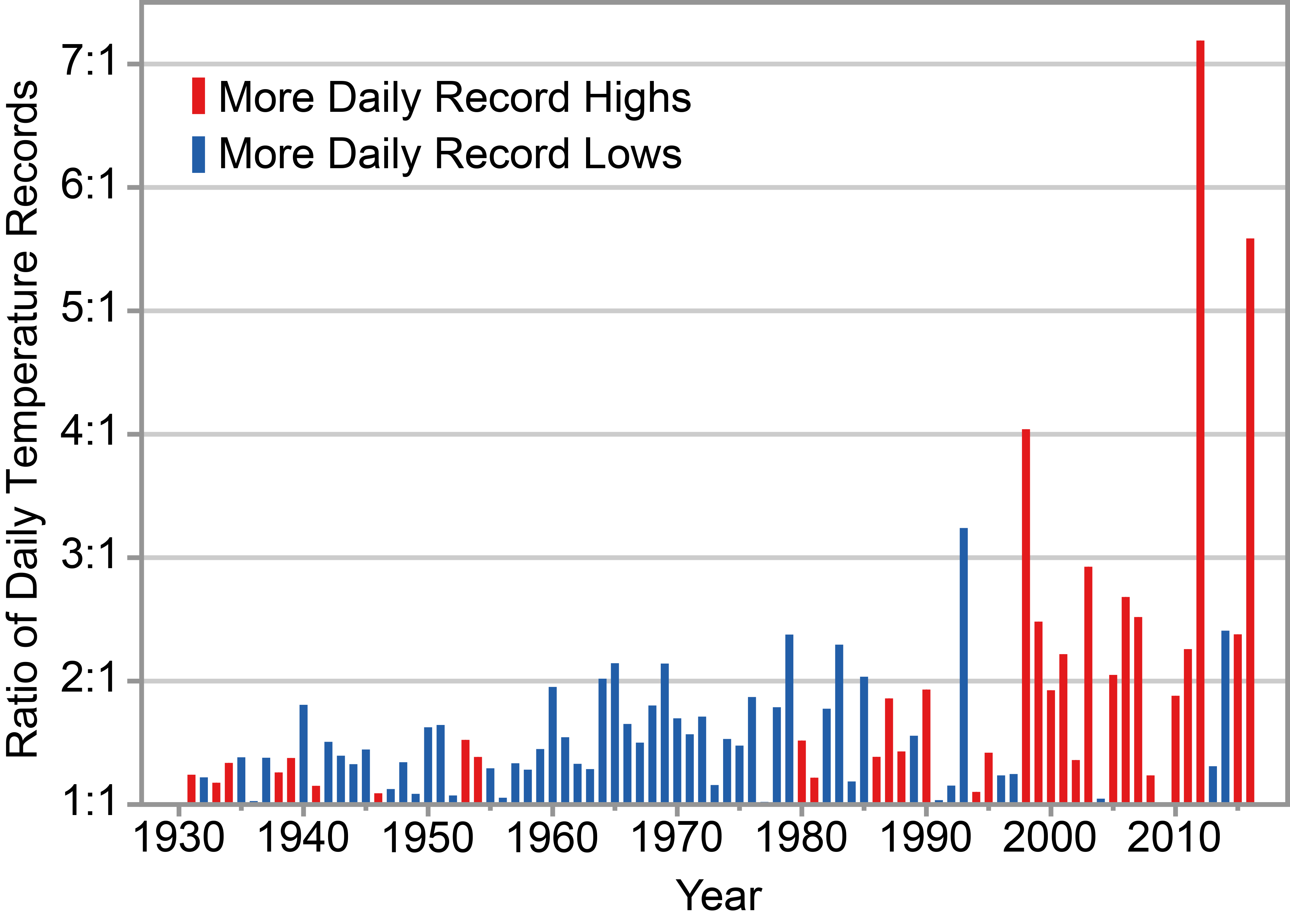
Ok, but maybe about a graph of record highs instead of averages is a little less “eye-rolling.
Balance. Right.
…where any warming would be fairly obviously beneficial.
Why ? Is Alaska about to tip over ?
😉
Yup, it’s still cold !
There’s no evidence whatever that any global or regional warming (or cooling, or wetter, or drier, or stormier, or calmer) is any of our doing, Loydo.
Given that, so what about Alaska?
There is ample evidence that the UHI effect is our doing.
And I suspect, given the great increase in air conditioning in the last seventy years, the actual natural trend is cooling. This would agree with the cyclic nature of climate for the last 10 millennia or so. We should expect a trend for the next 3-400 years of cooling down to ~2 degrees (centigrade) below 1600.
You know what?
I don’t care!
I’ll be dead.
Pat obviously meant by CO2 emissions imo
Tell us Pat Frank, that the mega-city that stretches from Boston to Washington DC doesn’t produce a UHI effect.
UHI warming is real. CO2 warming, not so much.
How much does total UHI raise the Earth’s temperature?
How much does CO2 raise the Earth’s temperature?
There may be an answer for the first question. There is no answer for the second.
“There is no answer for the second.”
.
What evidence do you have for this assertion?
“What evidence do you have for this assertion?”
What evidence do I have for the assertion that there is no answer for how much net heat CO2 adds to the atmosphere? Well, the ECS estimates range from less than zero (yes, cooling) to about 9C.
So what’s the answer to that question then, if you know it? How much net heat does CO2 add to Earth’s atmosphere?
I would think we should know this basic, essential number before we go making predictions about what CO2 may do in the atmosphere and we don’t know the answer.
If you have the answer then please give it to us and save a lot of people a lot of trouble.
If you don’t, then admit I’m correct in my statement.
“How much does total UHI raise the Earth’s temperature?”
Not a lot. Steven Mosher had a good article here within the last 6 weeks that covered the subject. There are many not urban measuring locations. In flyover land. How much do you think the UHIs raise the temperature at the South and North poles? In the Southern oceans?
What is a fair point is that many people live in the UHIs. Which is to say that because it is so much, something needs to be done about it. Moving to Red State is an option.
For a bit of balance don’t EVER read Loydo.
So open-minded of you Allan.
For a bit of reality, have a look at history.
Oh, for goodness sake, global climate changes take centuries and they are like, global. So how can a mere sub-regional dustbowl event in one part of the USA possibly be construed as a 1930s “climate change” event?
Give us a break, it’s just natural weather variability cycling and nothing more.
Don’t drag that rubbish in here.
Just finished reading a book called “In The Kingdom of Ice” that chronicles the exploratory voyage of the USS Jeannette to the North Pole in 1878.
They record the ice packs came and went above 70 latitude on a week to week basis. The poor Jeannette was still alternatively entombed and ultimately crushed & sank by the ice over a 3-year period.
Seems nothing different is happening today – some years you beat the ice, some years the ice beats you.
Sometimes you’re the windshield, and sometimes you’re the bug.
In what world would a warming Alaska be a bad thing? Certainly not this one. Are you ready to admit that the only places warming are those places that would benefit from warming?
Sure Loydo,
Look at Alaska – nothing new, not even s hot:
https://realclimatescience.com/2019/07/1934-100-degrees-in-alaska/
Almost as hot as it was a hundred years ago.
Loydo
For balance, let’s look at the whole Earth! Just as in Durham, the average is increasing because of an increase in the Winter and nighttime lows.
If Loydo had actually read the post, he would know why I picked North Carolina as the starting point.
Yes, I see, she lives in Notrth Carolina, thank you David.
Both Sara and her imaginary pen pal live in North Carolina. If I asked Sara how climate change was affecting summer weather, the logical presumption is that I was asking about Texas.
Loydo: Ill take your Alaska and raise you one Canada.
Alaska? In what century? Written records do not exist but there are intriguing glimpses of communities that thrived in Alaska several thousand years ago during the warmer (in many places) Bronze and or Roman period
https://anthrosource.onlinelibrary.wiley.com/doi/pdf/10.1525/aa.1941.43.3.02a00020
Quite a sophisticated and large culture who perhaps had the time to carve and expand due to a relatively benign climate. The link above is one of the first and most interesting references, there is plenty of later research but unfortunately the ship carrying the artefacts for examination in 1940 sank
tonyb
Alaska currently has anomalous warm water in the Gulf of Alaska that is leftover heat from the El Niño a while back. This basically causes a high pressure system to form deflecting the jet over the top and consequently Alaska is warm.
In a few years this warm water will be replaced by colder water and a low will form moving the jet south of Alaska. Then it will be colder than normal. However as in all things weather, where it is warm in one spot it is cold in another. But, of course, we will never hear about the cold.
The anomalously warm water, up to 6C, has very little to do with an El Nino 3 years ago. More to do with the Bering Sea being ice free. No ice to melt and that latent heat goes into warming the water instead. Exactly what is going to happen to the rest of the Arctic.

Is ‘Loydo’ really just Al-Gore tapping away in his underwear … again?
You decide.
NINO 3.4 had been mostly above 0.5c since September 2018 so this does have significant influence on the sea ice there.
It wasn’t that long ago when the situation was significantly different thanks to La Nina. (2011)
https://www.climatecentral.org/news/the-big-chill-in-the-bering-sea
This shift in the organization of ENSO (El Niño–Southern Oscillation) events has had a strong effect on the statistical correlation between the Southern Oscillation Index and Bering Sea ice cover.
https://pices.int/publications/scientific_reports/Report10/niebauer.pdf
I didn’t say there was no link, there appears to be one but a weak El Nono cannot account for this:
There is not enough solar heating coming into the Gulf of Alaska over a year to heat the water 6C. It gets transported there from the tropics. Always has, always will. And it takes a few years to get it there.
Well, ain’t that just peachy! She’s not ME!
How does she account for shorter spans or normal summer weather, or for snowfalls up to three inches in the Ohio Valley portion/IL (and elsewhere) three times in April 2019, and for several years prior? (Hint: cold air and snow are friends, NOT warm air and snow. Warm air MELTS snow.)
“Surly the Southeast Region’s summers must be getting hotter…”
Surly =
bad-tempered, ill-natured, grumpy, glum, crotchety, prickly, cantankerous, irascible, testy, ill-tempered, short-tempered, ungracious, splenetic, choleric, dyspeptic, bilious, crusty, abrupt, brusque, curt, gruff, blunt, churlish, ill-humoured, crabbed, crabby, uncivil, morose, dour, sullen, sulky, moody, moping, sour, unfriendly, unpleasant, scowling, unsmiling…
surely =
used to emphasize the speaker’s firm belief that what they are saying is true and often their surprise that there is any doubt of this.
Synonyms: firmly, steadily, confidently, solidly, securely, unhesitatingly, unfalteringly, unswervingly, determinedly, doggedly, assuredly
Fixed… Although I am often surly… 😎
Are you surly early?
24-7… 😠
Purely surly.
Surely.
As in schuali bua.
The closest thing to a significant summer warming trend is in the minimum temperatures…
which is exactly what UHI says it should do < that too
Funny thing about that though….real UHI is a lot more than the couple of degrees it shows
…makes you wonder if temps wouldn't be falling…except for UHI
An enhanced greenhouse effect should be most evident in the coldest air masses, in winter and mostly affect the low temperatures.
To some extent, this has actually been observed.
This post only ridicules Sara’s boiling hot summers
Business as usual: Invent whatever data your argument needs.
Wot? No hockey sticks?
My latest rationality test for my rusted-on climate catastrophist encounters is to say to them –
“just imagine for a second that the mainstream and social media outlets and politicians’ blah blah you are exposed to never occurred. What would you personally have experienced or felt differently in the way the weather conducts itself?”
*** crickets *** is the most common answer.
What a dumb argument in lack of other words. Whoever you ask must remain silent because they’re baffled by this level of thickness. Take another exemple shall we, to underline how silly your “argument” is: You can’t experience and see radiation, it means it doesn’t exist? You wouldn’t die or feel immediately by being exposed to “above normal” levels for a while. You might suffer from cancer ten years downs the line but you wouldn’t know either why. So why should you care…
@ Alexandre.
That’s moving the discourse to entirely different topics, and not a valid discussion tactic.
We can all play that game – “what do you think of the roast duck?” Response = “I don’t like boiled parsnips”
My point is, most AGW acolytes have no real experiences / knowledge to base their enthusiasm upon, just following the tribal call to arms heralded by the ‘progressive’ msm/political complex. Herd mentality in action.
“Scientist” these days is a license to pontificate. Even the Pope plays along with it.
It looks like SARA doesn’t look at actual data. Same with most of the CAGW crowd… probably 99% of them.
Surely 97%?
Great video clips – I hope Sara sees the blog.
Does Sara think we are NOT in an interstadial? Of course it is warm, dumb-a*!
Interesting. West Nile brain injury has made me less controlled…I Like It!
Mid Great Lakes region here. We had a very unusually cool, wet spring. No mid May heat wave that always kickstarted the lake warming for swim/boat season. Farmers are 4-5 weeks behind. Now we are hitting high 70’s low 80’s daytime. What is unusual is the overnight lows are cooler than I ever remember in my long life. Tonight’s low is predicted ( by a Government Agency that is just gaga over CO2 based Climate Change ) to be 59°F. This is different. And, not warmer different.
It’s very difficult to move those red lines upward. They have to fight against a factor of (T₁⁴-T₂⁴). This accounts for the decreasing values of R² with increasing temperature. This is in accord with IPCC statements and pretty much the direct opposite of “Sara’s” beliefs. Global warming will warm the cold spots, not the hot spots. Global warming is a good thing.
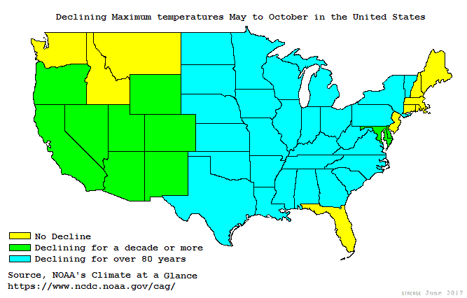
All of the graphs that Sara produced were for average temperatures. Dixie Lee Rae’s comment about averages, “Beware of averages. The average person has one breast and one testicle.” is appropriate. Were Sara to avail herself to NOAA’s Climate At A Glance
https://www.ncdc.noaa.gov/cag/national/time-series
she would find that for the United States NOAA supplies Minimum and Maximum temperatures. An you get some interesting results:
If you followed that link, the states east of the Rockies that have shown cooling summer afternoons for the past 80 years, for most of them the trend has been cooler summer afternoons since the 19th century.
“Look out for heat waves, dangerous deluges, and air pollution.”. Surly (surely) she meant dangerous delusions? This morning CBC noted with great reluctance that most of BC this summer has a normal risk of forest fire and/or flooding. A clear case of extreme normalcy. How ever will we cope?
In an earlier version of this post, I ridiculed that bit too… But “piling on” is a 15 yard penalty… Kind of pointless after you’ve already sacked the quarterback in the end zone for a safety.
Please don’t anybody forget that this was the forecast for BC that was made late in May–
“British Columbia
British Columbians can look forward to a very warm summer, with a “heightened risk” for extended periods of hot and dry weather—especially in the interior. Parts of the region have already experienced summer-like heat, which has resulted in an early start to wildfire season. However, because of this, The Weather Network says it’s a concern for what’s to come later this summer, as there’s a threat for wildfires and smoky conditions.”
https://dailyhive.com/calgary/weather-network-releases-canada-summer-forecast-2019
‘Jiss whan ah thank yew’ve sayed the stewpidist thang….yew keep tawkin’!’ That Sara’s right up there (the North Carolina one).
Ask Sarah ? Sounds pretty much like those magazines where:
Dear Sarah,
I am a bartender in Iceland.
When it’s warm I wear lighter more revealing polar jackets and get better tips by all those gentlemen.
Will global warming finally allow me to work in just a monokini and really boost my income all year long ?
It’s funny, because just yesterday I was asking my wife is she thought summers were getting warmer in our lifetimes where we live. I knew they weren’t, but I was curious about what she thought. She, of course, thought summer temperatures were steadily increasing. So, I found a listing for the high temperatures per year starting in 1893, with our highest recorded temperature in our area at 113 in 1936. Just eyeballing these numbers, it doesn’t appear to indicate a warming trend. In fact, like many places, it really shows a slight cooling trend. All I know is that I’m so blessed to be living now instead of suffering through a summer like 1936 without air conditioning. I think I’ll go make it a little cooler in my house as a tribute to all our ancestors who lacked this blessing brought to us by inexpensive fossil fuels.
100 July 12, 2018
98 July 22, 2017
99 June 22, 2016
96 July 14, 2015
97 August 23, 2014
100 September 08, 2013
106 July 25, 2012
107 August 02, 2011
103 August 13, 2010
97 August 08, 2009
97 August 04, 2008
102 August 15, 2007
104 August 06, 2006
99 August 03, 2005
95 August 03, 2004
106 August 21, 2003
103 July 26, 2002
100 August 21, 2001
106 September 02, 2000
103 July 30, 1999
98 July 21, 1998
98 July 27, 1997
97 July 19, 1996
99 July 11, 1995
97 August 12, 1994
98 July 31, 1993
93 August 08, 1992
103 August 02, 1991
102 September 01, 1990
99 July 07, 1989
105 August 08, 1988
104 August 03, 1987
97 July 30, 1986
98 July 13, 1985
109 August 29, 1984
105 August 17, 1983
101 August 03, 1982
96 July 12, 1981
106 July 30, 1980
94 August 07, 1979
100 July 05, 1978
97 June 10, 1977
104 August 10, 1976
103 August 11, 1975
107 July 21, 1974
97 August 25, 1973
– 1972 –
100 August 23, 1971
106 July 31, 1970
99 July 13, 1969
98 August 07, 1968
99 July 24, 1967
102 July 18, 1966
97 July 23, 1965
104 August 03, 1964
101 August 05, 1963
103 August 19, 1962
95 July 18, 1961
100 August 05, 1960
100 August 04, 1959
102 August 29, 1958
103 July 28, 1957
104 August 16, 1956
102 July 30, 1955
112 July 13, 1954
104 June 18, 1953
103 July 27, 1952
100 August 06, 1951
97 June 25, 1950
100 July 01, 1949
100 August 22, 1948
109 September 03, 1947
104 July 23, 1946
100 August 02, 1945
101 August 04, 1944
103 July 23, 1943
100 July 31, 1942
103 July 23, 1941
102 July 29, 1940
107 September 03, 1939
103 August 10, 1938
104 August 03, 1937
113 August 14, 1936
104 August 11, 1935
111 August 10, 1934
103 July 01, 1933
98 July 15, 1932
102 September 05, 1931
107 August 03, 1930
100 August 02, 1929
95 July 05, 1928
95 July 06, 1927
103 August 09, 1926
103 August 18, 1925
97 July 16, 1924
99 August 07, 1923
102 August 24, 1922
96 August 23, 1921
98 July 23, 1920
100 August 06, 1919
108 August 03, 1918
102 June 30, 1917
100 July 16, 1916
90 July 14, 1915
101 July 16, 1914
103 August 12, 1913
98 August 28, 1912
104 August 09, 1911
103 July 26, 1910
100 August 17, 1909
94 August 16, 1908
98 July 25, 1907
94 September 09, 1906
95 August 16, 1905
97 August 15, 1904
97 July 10, 1903
96 August 17, 1902
106 July 24, 1901
98 August 21, 1900
100 August 23, 1899
96 August 23, 1898
102 August 01, 1897
103 August 08, 1896
96 September 17, 1895
100 August 13, 1894
101 September 13, 1893
Good one….+10 – 100
I’ll see your Sara Peach and raise you (BBC Radio 3’s) Sara Mohr-Pietsch …
The number of hot days (over 95 degrees) has steadily declined in the US. In the 1930s on average, 7.5% of all days were over 95 degrees. In the last 20 years the percentage varied between 4 and 5 %.
Climate “regions”? When did that happen? It’s climate biomes – and it has more to do with latitude and altitude. Where did they get the idea to separate the states like that?
David Middleton: As a resident of Raleigh, North Carolina, I can confidently say Raleigh and Durham are two distinct cities. There is an airport in the middle of them called Raleigh-Durham International (RDU). There is no city called Raleigh-Durham.
Let’s Ask Sara…

Maybe she lives at the airport… 😎
Funny thing… Most of these climate “journalists” are 3rd connections… They have connections to people connected to people connected to me… like distant cousins!
Sounds like. Big Eyed Beans From Venus https://g.co/kgs/4NMddv
On the risk of repeating me.
Dallas and Fort Worth are two very distinct cities as well. But… When someone says they’re from the DFW area, it could be any one of dozens of cities, towns and unincorporated parts of several counties.
Summers can get very hot here in Oklahoma but we have not had a really serious heat wave here since about 2010.
The summer weather is definitely milder around here. Less heat and more moisture.
Back a decade or two ago we could count on this time of year being pretty dry, and would hope for a tropical storm like Barry to make its way up from the Gulf and relieve our drought.
Sometimes the storm would come up and miss us like it looks like it is going to do this time, which is pretty frustrating when you are bone dry. Of course, thankfully we have more than enough moisture in the ground right now so we don’t need any more for a while.
I’m loving this current Oklahoma weather. Not that it won’t get seriously hot but we are used to that, and lately the hot spells aren’t quite as hot and don’t last quite as long as they used to.
Any U.S. state chart will show the U.S. has been in a temperature decline since the 1930’s. According to the U.S. temperature chart, the year 1934 was 0.4C warmer than the year 2016, which NASA erroneously claims as being the “Hottest Year Evah!”. NASA is, as we speak, manipulating and bastardizing the U.S. surface temperature chart and individual state charts to make them conform to the bastardized Hockey Stick chart and eliminate the warmth of the 1930’s.
That’s why NASA claims the U.S. temperature record and the global temperature record are completely different animals. Does anyone believe that?
http://www.giss.nasa.gov/research/briefs/hansen_07/
NASA wants you to believe that the U.S. temperature profile looks like the chart on the left (with the 1930’s showing to be the warmest time period) while the temperature profile of the rest of the globe looks like the chart on the right.
NASA wants to hide the fact that unmodified charts from around the world resemble the U.S. temperature chart profile. They do not resemble the bogus, bastardized “hotter and hotter” Hockey Stick chart profile on the right.
So many expensive, hurtful lies coming out of NASA Climate. You can’t trust a thing they say.
https://notrickszone.com/2018/05/03/its-here-a-1900-2010-instrumental-global-temperature-record-that-closely-aligns-with-paleo-proxy-data/
The non UHI affected proxies retains the curve shape and correct proportions.
Tom Abbott
1. “Any U.S. state chart will show the U.S. has been in a temperature decline since the 1930’s. ”
Sorry: this is simply wrong.
Below is a chart made out of two plots for CONUS with temperature anomalies wrt 1981-2010, for the period between 1900 and today:
– one shows a time series made out of the data provided by over 8000 GHCN daily stations located in CONUS;
– the other shows a similar time series arising from 46 ‘well sited’ USHCN stations according to surfacestations.org, which are present in the GHCN daily station set as well.
https://drive.google.com/file/d/1grvRgz59y4Jqa3WrdOMkAUbukezUm_Mq/view
You see that already the raw data (GHCN daily contains no adjustments) shows no decline at all since the 1930’s.
2. “That’s why NASA claims the U.S. temperature record and the global temperature record are completely different animals. Does anyone believe that?”
Why should the two be similar? CONUS is no more than 6% of the Globe’s land surfaces, and these are no more than 30% of the whole.
3. “NASA wants to hide the fact that unmodified charts from around the world resemble the U.S. temperature chart profile.”
This again is simply wrong.
As you can see, the station set for CONUS and that for the Globe produce completely different plots:
https://drive.google.com/file/d/1grvRgz59y4Jqa3WrdOMkAUbukezUm_Mq/view
But this is not the point. The point is that the data you miss, like so many people, in fact still exists:
https://drive.google.com/file/d/1V8_PJ3UP2rvpkt4v6ya9AsdieuSXwukp/view
You just need to extract the summer month June, July and August out of the monthly time series.
Here is the top 20 of these warmest summer month anomalies:
1936 7 1.14
1934 7 1.04
1937 8 1.02
1901 7 0.97
1900 6 0.91
1931 7 0.88
1936 6 0.84
2018 6 0.84
2011 8 0.83
1931 6 0.81
2016 6 0.81
1934 6 0.80
1936 8 0.80
1933 6 0.76
2017 7 0.71
2016 7 0.70
1938 8 0.69
2006 7 0.69
1935 7 0.68
1994 6 0.68
11 of 20 top months come out of the Golden Thirties! Que voulez-vous de plus?
The global trend per decade for these summer months is, as usual for CONUS, insignificant: 0.03 °C. But for 1979-2018, it moves up to 0.15 °C, that is a bit more than insignificant.
Sorry Bindidon, I don’t trust the figures you use.
Here are a few references for you:
https://realclimatescience.com/2019/04/understanding-noaa-us-temperature-fraud-2/
and
Compare NASA 1999 with NASA 2016 (shows how they minimized the 1930’s)
and
NASA bastardizing individual state temperature records (shows the arrogance of NASA Climate)
https://realclimatescience.com/2019/04/plummeting-temperatures-in-ohio/#comments
Why should we trust Tony Heller’s work?
Tom Abbott
“Sorry Bindidon, I don’t trust the figures you use.”
And… why don’t you?
Don’t write ‘I don’t trust’, Tom Abbott, that is no answer I accept.
What I accept is that you download the data from
ftp://ftp.ncdc.noaa.gov/pub/data/ghcn/daily/
design, engineer, validate and verify a software package processing it, generate the time series as I did, and come back here with results we can compare.
Having heravily processed the GHCN V3 data set Mr Heller aka Goddard unduly criticised (I have shown that years ago), I see NO REASON to trust in anything written or generated by this person.
“Don’t write ‘I don’t trust’, Tom Abbott, that is no answer I accept.”
I didn’t just write “I don’t trust”, I also provided you with links to show you why I don’t trust the figures you use. If you choose to reject the information in the links, that’s up to you.
I choose to believe the information in the links because I have seen the unmodified historic temperature charts from around the world which show the 1930’s to be as warm as today. I have posted them numerous times on this website and I’m sure you have seen them. They all, more or less, resemble the U.S. surface temperature chart which shows the 1930’s to be as warm as today.
All the historic, unmodified charts support Tony Heller’s claims of data tampering by the Keepers of the Data and the links I provided show what the Keepers did with the data.
If you have temperature charts from all over the world showing the same temperature profile, i.e., the 1930’s were as warm as today, then why shouldn’t you assume this is a global temperature profile? That’s what I do.
None of the unmodified, historic surface temperature charts resemble the Bogus, Bastardized Modern-era Hockey Stick charts. What does that tell you? It tells me a lot.
And so everyone knows what we are referring to, here is the U.S. surface temperature chart, Hansen 1999, along side a Bogus, Bastardized Modern-era Hockey Stick chart. Notice how the Hockey Stick chart has cooled the 1930’s into insignificance. The Keepers of the Data did this because having the 1930’s be as warm as today means there is no unprecedented warmth today and blows up the CAGW claims:
http://www.giss.nasa.gov/research/briefs/hansen_07/
Hansen is on the left and the bogus Hockey Stick is on the right Read the text at the link. You will see that NASA claims it is plausible that the U.S. temperature chart looks completely different than the global temperature chart. But does that sound logical to you? Especially when you have examples from all around the world whose temperature profile resembles Hansen 1999, and you have no examples of unmodified temperature charts that resemble a Hockey Stick.
I’ll stick with unmodified history when I need facts about the Earth’s weather. I wouldn’t trust NASA Climate/NOAA as far as I could throw them when it comes to CAGW. They are doing promotion, not science. And that’s putting it mildly.
Los Angeles is having its first actual hot weather of the summer right now (haven’t had a day over 100 yet in the San Fernando Valley – highly unusual), and I heard a newscaster on the radio yesterday breathlessly say, “Coming up next…what’s causing this heat wave?” and I wanted to scream out, “SUMMER!!! Summer is causing a heat wave!” The newscast proceeded to tell me that a high pressure system was causing the heat wave. duh. (it’s 98 at my house today….going back down to the 80s in a few days. We’ve usually had at least 6-10 days over 100 by now)
“The newscast proceeded to tell me that a high pressure system was causing the heat wave. duh.”
Give them a hard time, Susan!
The Alarmists would be going nuts if we currently had weather like they had back in the 1930’s. They would be sure it was the end of the world and it’s all the fault of humans.
Admittedly, the 1930’s did look like the end of the world in some places, but surprise!, surprise!, it got cooler and much more pleasant, despite NASA Climate’s bogus claim we are currently experiencing the hottest temperatures ever.
Tom Abbott
1. “I also provided you with links to show you why I don’t trust the figures you use.”
And the reason for me NOT to trust in these links’ contents, Tom Abbott, is the fact that Goddard aka Heller repeatedly made unduly comparisons between GHCN V3’s unadjusted and adjusted variants, which led to his incorrect claims that GHCN V3 adjusted would show faked warmth.
Not only were his claims often absolutely wrong, as the adjustments were due to valuable corrections of measurement biases between consecutive periods; Goddard also restricted his claims solely to examples where the trend for adjusted data was higher than the unadjusted origin, and never showed any inverse case.
*
Now back to your wonderful NASA graph, which I know since at least 10 years:
http://www.giss.nasa.gov/research/briefs/hansen_07/
2. You write
“And so everyone knows what we are referring to, here is the U.S. surface temperature chart, Hansen 1999, along side a Bogus, Bastardized Modern-era Hockey Stick chart.”
I apologise for the remark, but… it seems to me that your competence in puncto time series is inversely proportional to your tendency to polemic.
2.1 Why do see a Hansen chart on the left, and some anonymous chart on the right? Jesus, Sir! Both were originating from the same source at the same time.
2.2 Didn’t you manage to see the great difference in scale between the two, chosen in order to adapt the plots’ deviations from their mean to the windows’ size?
While the US plot shows deviations between +1.5 and -1.5 °C, the Globe plot lies within +0.6 and -0.6 °C.
If the graphs were generated using the same scale, you hardly would be able to understand what happens on the right chart.
3. You write
“Especially when you have examples from all around the world whose temperature profile resembles Hansen 1999, and you have no examples of unmodified temperature charts that resemble a Hockey Stick.”
Where are these examples? When were these examples produced, and on the base of how many stations?
4. You write
“You will see that NASA claims it is plausible that the U.S. temperature chart looks completely different than the global temperature chart. But does that sound logical to you?”
Of course it does! Again I ask you: Why should the Globe look like USA’s backyard? CONUS is no more than 6 % of the land masses.
A propos: dis you have a closer look at Figure 2 on the NASA page?
Here is one more time a comparison of CONUS with the Globe, made out of GHCN daila daty, which is completely unadjusted (inlike GHCN V3 and V4, it even doesn’t contain any adjusted data variant).
4.1 CONUS
https://drive.google.com/file/d/1bHlDr8B8wl-Mg5DeWFyJT7aLkLTRoELx/view
As you can see, the CONUS deviations are here even double as high, dur to the lack of homogenisation.
No significant warming.
4.2 Globe, together with GISS land-only
https://drive.google.com/file/d/1tzLtqxUgJEhWhL-kAYYqIhxZF_5SZggr/view
Here too, higher deviations from the mean: no homogenisation.
The difference between GHCN daily’s raw data and GISS land is amazing (same trend for 1900-2018: 0.10 °C / decade; trends for 1979-2018: 0.19 resp 0.22 °C / decade).
If you now produce the graph anew with the same boundaries as for CONUS, you obtain this:
https://drive.google.com/file/d/1pSmIJKrCVXFmBKAe0tZDoA5cfTQ4JLDr/view
Well, this one is less ‘alarmistic’, but I like to look at small details, and thus prefer the other one.
5. Oh! Where is the hockey stick?
It is virtually present, but
– my windows have a very different with/height ratio compared with NASA’s above:
– there are many many more stations around the world, and completely different processing algorithms, making earlier graphs simply obsolete.
Take it or leave it! Sorry, but I don’t mind.