Global climate trend since Dec. 1 1978: +0.13 C per decade
March Temperatures (preliminary)
Global composite temp.: +0.34 C (+0.61 °F) above seasonal average
Northern Hemisphere.: +0.44 C (+0.79 °F) above seasonal average
Southern Hemisphere.: +0.25 C (+0.45°F) above seasonal average
Tropics.: +0.41 C (+0.74 °F) above seasonal average
February Temperatures (final)
Global composite temp.: +0.37 C (+0.67 °F) above seasonal average
Northern Hemisphere.: +0.47 C (+0.85 °F) above seasonal average
Southern Hemisphere.: +0.28 C (+0.50 °F) above seasonal average
Tropics.: +0.43 C (+0.77 °F) above seasonal average
Notes on data released March 1, 2019 (v6.0)
[Note that we have updated the merging process for the period since 2009 which has very slightly altered the recent values as discussed at the end.]
March’s globally-averaged, bulk-layer atmospheric temperature anomaly of +0.34°C (+0.61°F) changed little from February. Values for the large sections (NH, SH and Tropics) were also similarly unchanged from last month. As noted in last month’s report, the official El Niño is having minimal impact on global temperatures thus far.

The month’s coldest seasonally-adjusted temperature departure from average occurred just south of Greenland in the North Atlantic: -2.5°C (-4.5°F). The warmest spot, at +6.2°C (+11.2°F), is obvious on the map, occurring over Inuvik in the NW Territories of Canada. The NW section of North America, including Alaska, was so warm that the departure from average of the conterminous U.S. was -0.55°C (-0.99°F) but when Alaska is included, the U.S. average rises to +0.12 °C (+0.22°F).

The monthly map for March 2019 indicates the El Niño signature of warm tropical temperatures is weak but distinct in the eastern Tropical Pacific Ocean but does not follow the usual situation in which these above-average temperatures spread throughout the tropics. Cooler than normal conditions appear from the eastern mid-latitude Pacific NE all the way to the Barents Sea. Warmer than average temperatures paralleled this cool band and are seen from (generally) the El Niño region of the eastern Tropical Pacific NE to Russia. Unusually warm conditions appear along the dateline in the SH with cool, meridional bands on either side.
New Spoiler Alert: As noted over the past several months in this report, the drifting of satellites NOAA-18 and NOAA-19, whose temperature errors were somewhat compensating each other, will be addressed in this updated version of data released from March 2019 onward. As we normally do in these situations we have decided to terminate ingestion of NOAA-18 observations as of 1 Jan 2017 because the corrections for its significant drift were no longer applicable. We have also applied the drift corrections for NOAA-19 now that it has started to drift far enough from its previous rather stable orbit. These actions will eliminate extra warming from NOAA-18 and extra cooling from NOAA-19. The net effect is to introduce slight changes from 2009 forward (when NOAA-19 began) with the largest impact on annual, global anomalies in 2017 of 0.02 °C. The 2018 global anomaly changed by only 0.003°C, from +0.228°C to +0.225°C. These changes reduce the global trend by 0.0007 °C/decade (i.e. 7 ten-thousandths of a degree) and therefore does not affect the conclusions one might draw from the dataset. The v6.0 methodology is unchanged as we normally stop ingesting satellites as they age and apply the v6.0 diurnal corrections as they drift.
To-Do List: There has been a delay in our ability to utilize and merge the new generation of microwave sensors (ATMS) on the NPP and JPSS satellites. As of now, the calibration equations applied by the agency have changed at least twice, so that the data stream contains inhomogeneities which obviously impact the type of measurements we seek. We are hoping this is resolved soon with a dataset that is built with a single, consistent set of calibration equations. In addition, the current non-drifting satellite operated by the Europeans, MetOP-B, has not yet been adjusted or “neutralized” for its seasonal peculiarities related to its unique equatorial crossing time (0930). While these MetOP-B peculiarities do not affect the long-term global trend, they do introduce error within a particular year in specific locations over land.
As part of an ongoing joint project between UAH, NOAA and NASA, Christy and Dr. Roy Spencer, an ESSC principal scientist, use data gathered by advanced microwave sounding units on NOAA, NASA and European satellites to produce temperature readings for almost all regions of the Earth. This includes remote desert, ocean and rain forest areas where reliable climate data are not otherwise available.
The satellite-based instruments measure the temperature of the atmosphere from the surface up to an altitude of about eight kilometers above sea level. Once the monthly temperature data are collected and processed, they are placed in a “public” computer file for immediate access by atmospheric scientists in the U.S. and abroad.
The complete version 6 lower troposphere dataset is available here:
http://www.nsstc.uah.edu/data/msu/v6.0/tlt/uahncdc_lt_6.0.txt
Archived color maps of local temperature anomalies are available on-line at:
Neither Christy nor Spencer receives any research support or funding from oil, coal or industrial companies or organizations, or from any private or special interest groups. All of their climate research funding comes from federal and state grants or contracts.
–30–
And what do they show trendwise if UHI is accurately reflected at 3-4C rather than 1-1.5C .? What do they show if BOM (Australia) is corrected for their 1min maxima to become a WMO 5 min average , a lower figure?
My guess is they would reflect no statistically significant warming and more than likely a recent cooling trend as is reportedly found in most parts of the globe.
They would show exactly the same trend since the results here are for satellite measurements of the
bottom 8km of the atmosphere. The data is minimally adjusted apart from orbital corrections to ensure that measurements are taken at the same time of day.
BoM yesterday said March was the warmest ever. Based on – Drum Roll Please – ACORN2.;)
And the earth cooled .5 degrees from 1940 to 1979
That was about the T anomaly 1940 – 1970 according to the Hansen et al. back in 1981 for the NH.
The global anomaly was about half that -0.25:
https://pubs.giss.nasa.gov/docs/1981/1981_Hansen_ha04600x.pdf
1.3 C per century. CO2 is at 414 and rising steadily. Where’s the apocalypse?
Very well said Mark ,
Not as warm as the 1930/40s blip and how much CO2 were we emitting back then.
The global warming meme is a house of cards and it is rapidly falling down.
But but but the warmists will cry 2018 was the hottest year evaaa, this can’t be true.
It could snow in Dallas Tx on the 4th of July and they would tell me it was hot.
While it is interesting that the global temperature is not warming during a weak El Nino, I believe the cooling of the North Atlantic will have more immediate impacts On the global warming myth. It looks like the Atlantic Multidecadal Oscillation (AMO) is transitioning to its cool phase, which will likely result in an expansion of Arctic ice over the next few years.
The decrease in Arctic Sea ice has been the only thing the warmests have been able to point at to support their doomsday scenario. If the ice starts to expand while CO2 continues to increase, they will have nothing, and the climate realists who have always maintained that the power of natural climate variation is greater than CO2, will have all the evidence on their side.
Exactly right. The potential for the AMO to go negative and Arctic sea ice to increase right back to where it was in the 1980s is the biggest threat to the AGW bandwagon.
This would significantly lower the GAST as well since the Arctic has been the biggest source of higher anomalies. It may be a little premature though. The AMO went positive sometime in the early 1990s which means it probably won’t go negative until sometime in the 2020s. Could be as late as 2025. Let’s not get ahead of ourselves.
Perhaps I am getting ahead of myself, Richard. The AMO index is a running mean, so it will take several years for the index to go negative, even after the monthly readings drop below zero. Yet, there is no question that it is heading that way. The peak of the current warm phase appears to be around 2008, with a downward slope since then. 5 of the last 12 months appear to be negative, including the last 3 available (N,D,J), if I am reading the data correctly. Judging from Roy’s map above, the cooling of the North Atlantic continues through March.
Based on the data, it APPEARS that the AMO is transitioning to the cool phase, but it may take another 3-5 years to fully complete the change. Then it may take several more years to see any significant growth in Arctic Sea ice. I don’t know! The last time the AMO went from the warm phase to the cool phase was the mid-1960s, before we had satellites measuring the sea ice. We just don’t know how significant this will be, but it sure will be fun to watch.
Only 2 positive and one negative phase since data collection began in 1948. Can’t really date the start of the first positive phase, but the negative phase lasted from about 1964 to about 1997.
The current positive phase began around 22 years ago. Are the positive phases shorter than the negative?
Funny that the UAH and AMO warm periods are pretty well synced up
Some already beat me to it, but why does the temperature record always begin in the late ’70s when there was accurate temperature well before that? I suppose it is a rhetorical question, because we all know why.
Mr Wood,
The data shown are for satellite measurement of atmospheric temperature. The satellite capability only began in the ’70’s.
It’s very interesting that they’re having these instrumental problems after so many years/decades of doing these measurements.
Presumably the same problems affect sea level readings from Jason, Topex and their pals.
Give me tide gauges any day!
They have had to adjust for satellite decay since shortly after the project began. Weather satellites typically don’t carry much fuel for orbital corrections so after a couple of years with Newton in the driver’s seat, they begin to drift from their calibrated orbit. When the drift gets too large, they have to abandon that sensor. Luckily the orbital plan has always put the replacement satellite in place several years before the previous one becomes unusable. That gives them time to calibrate the new sensor and get it online before the corrections to the previous one gets too extreme. With that in mind, it is very important that NASA and NOAA keep funding the constellation to make sure a full compliment of fully functional satellites are maintained on orbit.
I look to our lake for “climate” readings. This year, the ice cleared the last week of March instead of the first week.
For some reason …. I just haven’t noticed any global warming in my 55+ years of being on this rock. Gets cold in the winter, turbulent in spring, hot in the summer, and cools down in the fall. Been doing that the whole time. Some summers we hit or top 100F …. some summers we don’t. Some winters it gets down in the single digits …. some winters it dont. I’ve been hearing it’s an early spring since I was a wee lad, and fall continues to be my favorite time of year.
Sure am glad I have all this fancy technology to tell me it’s actually warmer now than it was 30 yrs ago ….. cause without it, I’d just never know.
This anal infatuation with decimal per decade trends is a real waste of time.
Let’s cut to the chase.
One popular geoengineering strategy to counter global warming is increasing the earth’s albedo by injecting reflective aerosols and/or marine cloud brightening thereby reducing the amount of solar energy absorbed by the atmosphere and surface and cooling the earth.
More albedo and the earth cools.
Less albedo and the earth warms.
No atmosphere means no clouds, ice, snow, vegetation, oceans and near zero albedo.
Zero albedo and the earth roasts in that 250 F solar wind.
This geoengineering plan reveals the fundamental error and delusion of greenhouse theory which says the atmosphere warms the earth and with no atmosphere the earth becomes a frozen ball of ice.
A failure of greenhouse theory means no CO2 warming and no man caused climate change.
And the entire cabal of instantly unemployed faux experts, hack reporters and talking heads will have to go find something useful to do.
Perhaps not 0% albedo without atmosphere, but some 12% (the Moon’s albedo).
But the conclusion is the same :
– the atmosphere cools the Earth’s surface.
But (I’m sure you know) the atmosphere cools the Earth’s surface not only by scattering (Rayleigh scattering), clouds reflexion, but also by absorbing some of the incoming solar irradiance (which hence is not absorbed by the surface), by conduction (near the surface), evaporation, convection (until the tropopause) and last but not least, infrared radiative heat loss into space (all the heat transfer from the surface to the atmosphere by conduction, evaporation and convection is lost into space in this way).
This remind me a thought experiment which falsifies the belief that the atmosphere helps the surface stay warm (as a blanket) :
– take two identical spheres, warm them at 380 K,
– put one in the vacuum (a sealed box with a vacuum pump, which walls are kept at 100 K or less so that their radiation is negligible),
and put the other sphere in the laboratory ambient air (at 295 K),
– and wait until the first of them cools down to 330 K
I bet the first sphere to reach 330 K will be by far the one placed in the ambient air, and without any rain or evaporation 🙂
Petit,
The atmosphere obeys Q = U A dT just like the insulated walls of a house.
I didn’t do thought experiments I did real experiments.
https://www.linkedin.com/feed/update/urn:li:activity:6507990128915464192
https://principia-scientific.org/debunking-the-greenhouse-gas-theory-with-a-boiling-water-pot/
Nick S
There is but one error in your chain of argument.
“This geoengineering plan reveals the fundamental error and delusion of greenhouse theory which says the atmosphere warms the earth and with no atmosphere the earth becomes a frozen ball of ice.”
The argument, presented in each copy of the IPCC’s work and cited in thousands of places, has it that the Earth with no atmosphere is frozen, and that with an atmosphere containing GHG’s, it is warm. They do not consider the case of Earth with an atmosphere without any GHG’s. They cut straight from “frozen airless Earth” to “warm earth with atmosphere and all that warming is caused by the GHG’s”.
This sounds familiar, right?
But you hit the nail obliquely when you mention the 250 deg F wind…
The cold, airless surface is on average -18 C. During the day it is not cold at all so if there was an atmosphere the hot surface would heat the air (without any GHG’s) and thus the atmosphere would not be as cold (on average) as the bare surface (-18, we are told).
This is a fundamental error on the part of the IPCC. The “additional warming” supplied by the GHG is considered to be the difference between the initial naked planet the the final current temperature (Tf-Ti) divided by the CO2e concentration = temperature increase per 1 ppm CO2.
Well, the initial condition is air without GHG’s and the final condition is air with GHG’s, if the intention is to calculate the impact of GHG’s. That how experiments are constructed. We want to determine the impact of adding more CO2, not adding “an atmosphere”.
The air is heated by incoming solar radiation absorbed before it reaches the surface, by the surface directly heating the air (convection heat transfer), by radiation emitted by the surface, and heat emerging from within the Earth (negligible). Direct heating by the surface does not involve any GHG effect so right away the IPCC’s explanation is lacking, as they attribute ALL warming to GHG’s.
When considering the warming by the surface, one should remember that in the absence of GHG’s the energy reaching the surface would be twice what it is now, and that absent GHG’s, the atmosphere would have no means for radiating it into space so it would warm considerably (certainly higher than it is now).
My suggestion is to force all conversations to “with or without GHG’s” and avoid all false comparisons of “with GHG’s or without any atmosphere”.
Crispin,
Refer to the Dutton/Brune Penn State METEO 300 chapter 7.2: These two professors quite clearly assume/state that the earth’s current 0.3 albedo would remain even if the atmosphere were gone or if the atmosphere were 100 % nitrogen, i.e. at an average 240 W/m^2 OLR and an average S-B temperature of 255 K.
That is just flat ridiculous.
NOAA says that without an atmosphere the earth would be a frozen ice-covered ball.
That is just flat ridiculous^2.
Without the atmosphere or with 100% nitrogen there would be no liquid water or water vapor, no vegetation, no clouds, no snow, no ice, no oceans and no longer a 0.3 albedo. The earth would get blasted by the full 394 K, 121 C, 250 F solar wind.
The sans atmosphere albedo might be similar to the moon’s as listed in NASA’s planetary data lists, a lunarific 0.11, 390 K on the lit side, 100 K on the dark.
And the naked, barren, zero water w/o atmosphere earth would receive 27% to 43% more kJ/h of solar energy and as a result would be 19 to 33 C hotter not 33 C colder, a direct refutation of the greenhouse effect theory and most certainly NOT a near absolute zero frozen ball of ice.
Nick S.
https://sos.noaa.gov/Education/script_docs/SCRIPTWhat-makes-Earth-habitable.pdf
(slide 14)
With 30 % albedo: 957.6 W/m^2, 360.5 K, 87.5 C, 189.5 F
With 11% albedo: 1,217.5 W/m^2 (27.1%), 383.2 K, 109.8 C (22.3), 223.8 F
With 0% albedo: 1,367.5 W/m^2 (42.8%), 394.0 K, 121.0 C (33.5), 250.0 F
A decade ago, I authored a blog in which I explored many topics, including global warming (aka climate change).
One analysis I did (which has been updated and modified by others) was a look at maximum and minimum statewide records:
• https://hallofrecord.blogspot.com/2007/02/extreme-temperatures-wheres-global.html
• https://hallofrecord.blogspot.com/2009/01/decadal-occurrences-of-statewide.html
• https://hallofrecord.blogspot.com/2009/01/where-is-global-warming-extreme_19.html
This clearly shows no indication of higher temperatures in the recent decades.
The second analysis was of how temperatures might be warming:
• https://hallofrecord.blogspot.com/2007/02/global-warming-without-new-high.html
I’m not sure if the “global average” temperature has been dissected in this manner.
I also examined the possibility that we may have a short-term cyclical nature to our climate in which case we might expect a cooling period within a decade or so.
• https://hallofrecord.blogspot.com/2009/11/non-linear-perspective-of-climate.html
Addition posts available by clicking on the CLIMATE CHANGE and GLOBAL WARMING labels in the blog.
These links may not work in Safari, but they do work in Chrome.
Bruce, good work! I have kept 5 minute data at my location in Kansas since 2002. It show exactly what you are showing. A linear regression shows a slight upward trend. But maximums show a downward trend. Minimum temps, however, show about the same upward trend as the linear regression.
I would point out that the global average anomalies tell you exactly nothing. You simply cannot tell from the average, especially a global average, what is going on with temperatures. A average of 4 can be from a data set of 3,4,5. What does an increase of the average to 4.33 tell you? Nothing. It could be from a data set of 4,4,5 or from a data set of 3,4,6 or even from 2,3,8!
If these data sets are temperatures the average could be going up because minimums are going up, maximums are going up, or even minimums going down while maximums are going up.
The only true way to display what is happening with temperatures is what you did, track the minimums and the maximums and tell the public what is going on with those. Using averages is just plain lying to the people because they have no way of telling what is moving the averages!
We’re in a double-peak weak El Niño (Oct ‘18/March ‘19).
Given the 4~5-month lag between El Niño SSTs and Lower Troposphere global temp anomalies, UAH temps will likely fall for another 4 months, then rise again from the second El Niño peak, fall again and then remain relatively static until the next La Niña cycle starts ariund the end of next year.
On average, there is usually at least one strong La Niña every 10 years, and since the last strong one was in 2010/11, it’s highly likely the next La Niña will be a strong one, and this is where it gets really interesting.
Just from a strong La Niña, UAH temps will likely hit -0.3C in 2021. Moreover, the PDO/AMO/NAO will all be in (or near entering) their respective 30-year cool cycles, which add to global cooling (as observed from 1880~1910 and 1945~1975). In addition, a 50-year Grand Solar Minimum (GSM) started this year, so if the Svensmark Effect proves to be a real phenomenon, additional GSM global cooling may be observed.
There will continue to be occasional El Niño warming spikes, however, during 30-year PDO ocean cool cycles, El Niño events tend to be weaker and La Niña events tend to be stronger, which is why global cooling takes place during 30-year ocean cool cycles.
The end is near for the CAGW Hoax. It’ll soon be impossible for CAGW advocates to explain why CMIP 5 climate model average global temp projections have consistently been 2~3 standard deviations warmer than UAH and Radiosonde observations for almost 30 years.
According to Leftist hacks, the earth will be uninhabitable in just 12 years “from the ravages” CAGW…
Not so much…
Samurai,
Best that you start your remarks with a disclaimer, noting that what you write is just guesswork. Geoff
Empirical evidence show there are high levels of correlation between UAH/HADCRUT global temps and PDO/AMO/NAO 30-year ocean cycles and ENSO SSTs.
Granted, the Svensmark Effect is a hypothesis, which is why I use indefinite adverbs and conditional sentences.
Cheers!
Yep …. it is a fact that the global atmospheric temperature follows the SST. It is a near perfect correlation in real time. Given there is no lag between the two, the direction is SST to Atmosphere …. not atmosphere to SST.
If SST starts going down, global average temperature will go down with it. …. and the end to the CAGW scare will begin.
A stronger effect in 2021 will take place if the base period is then changed from 1981 – 2010 to 1991 to 2020. I assume (shame on me) that the UAH 6.0 dataset uses UAH data from 1981-2010 for its base. Anyone know?
Meanwhile, on the surface, where I live, this looks like the second warmest March on record, based on Nick Stokes analysis (https://moyhu.blogspot.com).
UHI affects surface-measured urban area temperature trends. UAH, RSS and STAR infer bulk atmospheric temperatures from satellite data.
Since I live in the CONUS, the world (to me) is cooling. In that respect, I am a nationalist.
When satellite data is adjusted to accommodate known errors and the conclusion comes out in ten thousandths of a degree. we have to start asking ourselves some basic questions about sanity and balance.
I am certain the math is correct. I am not criticising Spencer or Christy, both of whom I have great respect for.
I am pointing out the lunacy of any debate about change in world temperature, when we are at levels of measurement variation so small it is meaningless.
Plateauing?
Don’t know how they got all those pluses with the record cold we had – but then it only takes one really warm day to throw off a bitterly cold average for the month. If you haven’t tried playing with the numbers, please do.
Arctic sea ice extent now at lowest for date in satellite record for the fifth day running….
Take the bet or go away Griff
Griff, if you remember past years you know that a low ice level now is most likely wind driven compaction, not melting. This usually results in a higher minimum. A higher minimum would mean more multi-year ice which over time yields increasing extent.
There is no use to show a cooling from 2016 to 2019. Yes it’s cooling but the time of 3 years is too short to make a trend. And so some 1/100 C up and down dont tell us anything. (same for warming)
marty, the cooling from 2016-2019 does tell us some things.
1) The many claims that most of the 2015-16 warming was due to “climate change” were completely bogus.
2) The fact this cooling returned us back into the same range that had existed for the earlier part of the 21st century is a good indication that the pause is still in effect.
3) Using ENSO active years in any kind of trend is dangerous.
4. Short term trends can become long term trends. Don’t dismiss short-term trends merely because they are short.
Yes, sure, but if this will get a long trend, we will see some years in the future.
Just because the short trend comes after the El Nino 2016 you can make no prognosis out of it. It is just the normalization after the strong increase. Have patience, we will see in the future.
Roy Spencer has published some of the updated v6 data with some of the recent values, since Jan 2018, on his website. There are substantial changes to it, with most regions now showing cooler temperatures than they were in the previous version.
Most notably, the UAH update lowers the warming seen in Australia between Jan 2018 and Feb 2019 by -0.11 deg C (from +0.39 C in the previous version to +0.28 C in the update).
If an Australian BOM update had happened to ‘increase’ the warming seen in Australia over the past 14 months by +0.11 C, then I imagine some here might take issue with that change being described as ‘very slight’.
DWR54 ……. How often does the BOM show anything but warming in there changes? The UAH data shows cooling in some places and warming in other places as would be expected given the reason for the changes.
Why did you cherry pick just one small part of the planet?
“The NW section of North America, including Alaska, was so warm that the departure from average of the conterminous U.S. was -0.55°C”
I simply do not understand this. I have relation in Seattle. This has been the coldest winter they have seen in decades. The entire city was shutdown by snowfall in Feb. And March hasn’t been much warmer. Yet this satellite record shows the area was *warmer* than usual?
Nick Stokes says this of March ….
“The US was still cool, as was E Canada. But the NW of N America was very warm, as with the Arctic ocean above.”
Here….
https://moyhu.blogspot.com/2019/04/march-ncepncar-global-surface-anomaly.html?m=1
And actually it was just v cold Feb there. Both Dec and Jan were mild ….
All I know is that my relation says March of this year was far colder than normal. I find it hard to ignore their actual experience regardless of what NOAA has to say. This really makes me question the placement of the measurement devices.
No, Tim; it is the use to which the data from the measuring devices is put. Combining Alaska with the CONUS disguises the actual cooling of the CONUS, where I live.
Dave: OK, I understand now. The data presentation isn’t truly representative of what is happening in NW continental US. That I can agree with. Thanks. It’s the same problem I have with a “global average”. It tells you nothing about what is happening. The average can go up while the maximum values actually go down if the minimum values go up enough at the same time.
The alarmists like AOC and Beto would have you believe we are all going to boil in our own juices as maximum temperatures go up and up forever. How can you know that from an “average”?
To badly mangle an old pol’s saying: “All climate is local.”
I know, I know, I know; it is global averages that matter. Obscuring a nation-wide cooling trend will mislead the average American. We are not burning up; Northern Polar temperatures have an outsize impact on global averages. The Northern Polar region temperatures swing wildly (polar amplification) and should not be used in predicting doom.
It appears that minimum winter temperatures in the Northern Hemisphere are driving the officially observed global warming.
Global averages simply don’t matter. The first time I saw a NASA chart of global CO2 concentrations showing the US having a very high concentration coupled with a study showing much of the US as being a global warming “hole”, I knew all this global warming was all pretty much a hoax. Like I said, averages tell you nothing and global averages tell you even less!
It’s funny: America led the globe throughout most of the 20th and 21st Centuries. Is America (CONUS) leading the world to cooling in the near future?
To be fair to UAH, Seattle is shown just within the -0.5C from average contour line on their global image for March and it was within the -1.5C from average contour line for February. The anomalous warmth they refer to for the NW section of North America is centered on Alaska and northeast Canada.
Northwest Canada even….
Tim
You have to realise, it was only very warm where there was no one living, so no one could challenge the data via direct observation.
Now it is also worth noting, despite the contiguous states experiencing probably their coldest snowiest and most difficult winter in a very long time, which includes last years winter which was also harsh by anybodies standards, despite all that, it became a warm winter due to the impact of the Alaskan warm pockets where no one lives.
Takes some believing don’t it.
Bulk atmospheric temperature estimates do not depend on how many people occupy a given area of the globe. But, since I live in the CONUS, I’ll believe its colder.
Why are there no measurement error ranges shown? I can’t believe that these are considered absolutely accurate to +/- 0.005 degrees. The “Spoiler Alert” paragraph even talks about a temperature change of 0.0007 degrees! Are you kidding? I’ve looked everywhere I can but I can find no error budget calculations or statements about the errors associated with the temperatures quoted here.
I’ve been discussing this on my blog for the past week or so. I’ve researched several sources (usually university physics and other physical sciences departments) for detailed, yet readable, information on significant digits in measurements, calculations, and reporting, and also error propagation. Out of four interlocutors, two have stated they aren’t rules, more like guidelines (like the Pirate’s Code), one just quit posting, and one is still hanging in there
If there aren’t rules to follow regarding these things, what’s to prevent a researcher from publishing six decimal points of precision from measurements in the tenths, or worse? Apparently nothing, because we see reporting that Jim Gorman points out above all the time.
Error budgets that include measurement errors, significant digits, rounding, etc. are not just guidelines you can choose to ignore. Here is a link that will give you some idea of how important measurement errors can be.
https://www.ncbi.nlm.nih.gov/pmc/articles/PMC3387884/
There are all kinds of rules that have been published about how to treat these. If folks are trained in engineering, physics, or chemistry, they will tell you that errors and uncertainty are not optional.
This is another good site to read.
http://physics.unc.edu/files/2012/10/uncertainty.pdf
You’re preaching to the choir. But I’ll pass those links along on my blog for further erudition.
I’ll forward you a link one of my conversationalists passed on to me: in it, the author literally says to throw out the idea of significant digits, they ruin your data.
Ask an engineer designing a bridge if significant digits are important.
Yes. Let’s be clear, I’m not endorsing those statements. They were provided to me by participants in a conversation on my blog. They were supposed to be evidence that sig figs don’t matter. I provided links to university physical science departments, and “rebutted” by a link to that.
I was gobsmacked by the statement that 1.8 = 1.80 = 1.800000000.
I did ask the question why my interlocutors resisted these rules so much, but accepted things like the rules of the order of mathematical operations without question. Heck, who knows why 1 + 6 * 3 = 19 rather than 21, except that that’s what the rules say? (I’m no math theorist, someone probably knows.)
I have yet to get an answer. I think I know the reason, though. How else can one get thousandths of a degree precision in temperature anomaly out of measurements in tenths of a degree, if one doesn’t ignore the rules?
Here’s the link to which I was referring:
https://www.av8n.com/physics/uncertainty.htm#sec-execsum-sigfig
Here’s a few lines from it:
“No matter what you are trying to do, significant figures are the wrong way to do it.
“When writing, do not use the number of digits to imply anything about the uncertainty. If you want to describe a distribution, describe it explicitly, perhaps using expressions such as 1.234±0.055”
“Significant-digit dogma destroys your data and messes up your thinking in many ways”
“The “sig figs” rules that you find in chemistry books are not necessary and are not worthwhile, so the less said about them, the better.”
“In place of the “sig figs” rules, you can use the following guidelines:
“Keep all the original data. Do not round off the original data.
“1.80 may be rounded to 1.8, since that means the same thing.
Conversely, 1.8 can be represented as 1.80, 1.800, 1.8000000, et cetera.
James, 1.8 means to assert an accuracy of one-tenth. 1.80 means an accuracy of one-hundredths. 1.800 means an accuracy of one-thousandths. And so on.
As one adds digits after the period, one asserts increasing accuracy of the datum. If one wishes to publish deep ocean temperatures in 1950 to the accuracy of one-thousandths of a degree C, the rest of us cannot but laugh.
To: Jams Schrumph
brackets; of; mult’n/div’n; add’n/subt’n
From my HS algebra.
“The technique of propagating the uncertainty from step to step throughout the calculation is a very bad technique.”
Bloviating. If you are designing a bridge and ignore uncertainty when calculating load capacities you can kill people. Same for engineering the actual beam structure. Where girders have to be connected together using fish plates you better know the uncertainty in girder length or you are going to girders and fish plates that will simply be wasted because they can’t be connected!
“No matter what you are trying to do, significant figures are the wrong way to do it.”
Sorry, significant digits are used to indicate the precision of the measuring device. If you have a ruler marked only with inches, you can only say that it read the measurements in inches. You may estimate whether it is closer to one of the integer marks but that is all. That is why temperatures used to be recorded as 51 +/- 0.5 degrees. A recording of 51.0 indicates that the measuring device has a precision of 1 decimal place. A correct recording would be 51.2 +/- 0.05 or anywhere from 51.25 to 51.15.
“When writing, do not use the number of digits to imply anything about the uncertainty. If you want to describe a distribution, describe it explicitly, perhaps using expressions such as 1.234±0.055”
This is probably not a bad statement. However, it shouldn’t be misinterpreted. The way it is stated is that the precision of the measuring device is +/- 0.0005. In other words, 1.234 implies a precision of 3 decimal places with the 4th decimal place being estimated. However, by mentioning distribution, the person is referencing a “standard deviation” either of multiple measurements of the same thing, or multiple measurements of different things. So two different things going on here.
“Significant-digit dogma destroys your data and messes up your thinking in many ways”
“The “sig figs” rules that you find in chemistry books are not necessary and are not worthwhile, so the less said about them, the better.”
These people have never been employed in any job that requires accuracy and precision! Would you really want them controlling the production dosage of your medicine or perhaps mixing nitroglycerin for you, or machining the crankshaft for your championship NHRA top fueler. Come to think of it, they don’t work in the Boeing MAX manufacturing do they?
“In place of the “sig figs” rules, you can use the following guidelines:
“Keep all the original data. Do not round off the original data.
“1.80 may be rounded to 1.8, since that means the same thing.
Conversely, 1.8 can be represented as 1.80, 1.800, 1.8000000, et cetera.
Significant digit rules don’t require rounding of original data. Original data should never be modified. Significant digit rules deal with calculations using original data. The sig fig rules are designed to insure that precision of measurements is conserved and not inadvertently increased.
Last fall, the DMI reported that the northern summer was unusually cool with an unusually high albedo.
Also reported that 2017 was the same.
Similar conditions for the third summer would be interesting to those who look for a trend change.
Recently NASA said that the Upper Atmosphere has cooled due to the Quiet Sun.
This has caused the Atmosphere to shrink.
What affect does the shrinking have on Temperature Measurements and also the Drift problem?
As usual, I am struck by the relative scale proportions in these sorts of graphs.
A whole YEAR gets less distance on the x-axis than a FIFTH of a degree gets on the y-axis.
Here’s how I see it:
Should I really be alarmed? Best answer wins a prize.
No. Do I win the prize?
We have a winner. As for the prize, you already have it — common sense. (^_^) I can only add to this with a compliment. Thanks for playing.
Forty years.
The entire Earth.
Remaining within one degree.
How many jobs and professional activities depend on the frenzy of interest in this?
Think I’ll base my next career on measuring variations in the length of flea legs. This is a very important field of endeavor.
Yours truly,
C. Lee Snark
In cartography, what you describe regarding the relative scales of the X and Y axes is called “vertical exaggeration.” If one is displaying a cross-section profile of the Earth, it’s obvious that the ground distance scale — perhaps one mile per inch — can’t be used for the elevation scale, especially across relatively flat terrain.
It’s easy to calculate the vertical exaggeration in a profile section, because both X and Y axes are distances. But how to determine it when one axis is time and the other temperature? One way might be to use the full range of temperatures in a year, for the region being profiled, as the equivalent of a year in the X axis. If the temperature range was -20C to +38C, then a vertical scale of 58 degrees/inch would be considered a 1:1 vertical exaggeration for one year.
That’ll sure flatten a chart out.
RSS LT now out for March: http://images.remss.com/data/msu/graphics/tlt_v40/medium/global/ch_tlt_2019_03_anom_v04_0.png
Similar patterns to UAH in terms of the spread of global temperature anomalies, e.g. US lower 48 much colder than average and NW North America much warmer.
However, in terms of numbers, the recent differences between RSS LT and the latest version of UAH LT (as published at Roy Spencer’s site) remains stark. Here both are base lined to the UAH anomaly period, 1981-2010: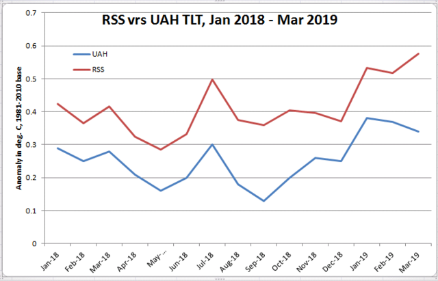
Did Mears ever respond to the criticisms of his latest version of RSS?
Were these criticisms ever formally submitted to the journal that published the article that describes the latest version of RSS? There’s no mention of any peer reviewed rebuttals or comments: https://journals.ametsoc.org/doi/10.1175/JCLI-D-16-0768.1
I get it now, DWR54; real CliScientists don’t look into substantive questions concerning their work unless they are published in journals run by like-minded CliScientists.
Are you related to R2D2? We don’t know who you are or where you are coming from. Why don’t you use your real name?
Well, from mid-August through mid-April, less sea ice across the Arctic Ocean means greater cooling from the Arctic Ocean to the infinite back cold of space.
It is only those few fleeting weeks of mid-April through mid-August that the Arctic Ocean absorbs enough heat from the sun to make up for the increased heat losses due to greater evaporation, greater thermal mixing of convection and conduction, greater long wave radiation losses.