Sheldon Walker – (agree-to-disagree.com)
The slowdown/pause/hiatus, would probably be only a dim memory, if Alarmists didn’t keep digging up the imaginary corpse, in order to show that it really is dead.
The website called “The Conversation”, recently featured an article called “Global warming ‘hiatus’ is the climate change myth that refuses to die”, by Stephan Lewandowsky and Kevin Cowtan.
It was dated “December 20, 2018”, and the web address is:
https://theconversation.com/global-warming-hiatus-is-the-climate-change-myth-that-refuses-to-die-108524
Both of the authors have also recently co-authored 2 scientific papers, with a large number of other well-known Alarmists (they now write scientific papers in “gangs”, to show how tough they are). The 2 scientific papers claim to “demonstrate convincingly that the slowdown/pause/hiatus wasn’t a real phenomenon”.
It is rare to find a “scientific” article, which features so much “woolly-headed” thinking. And so much misdirection.
It starts badly. Just reading the first 2 paragraphs made me annoyed. They used the word “denier” in the first sentence, and the phrase “science-denying” in the second paragraph.
When did the word “denier”, become a scientific term? What do these arrogant Alarmist jerks, think they are doing. I took a deep breath, and continued reading the article.
The third paragraph really made me sit up, and take notice.
They repeated a common Alarmist lie, about the slowdown, which I talked about in a recent article.
They said, “But, more importantly, these claims use the same kind of misdirection as was used a few years ago about a supposed “pause” in warming lasting from roughly 1998 to 2013.”
They talk about “deniers using misdirection”, and then THEY misdirect people to a false weak slowdown (1998 to 2013). This is part of an Alarmist myth, which claims that the recent slowdown only exists because of the 1998 super El Nino.
In my article, I said:
– The strongest slowdown (the one with the lowest warming rate), went from 2002 to 2012. It had a warming rate of +0.14 degrees Celsius per century. Because it went from 2002 to 2012, it had nothing to do with the 1998 super El Nino.
– The average warming rate from 1970 to 2018, is about +1.8 degrees Celsius per century. So the slowdown from 2002 to 2012, had a warming rate that was less than 8% of the average warming rate.
– If the average warming rate was a car travelling at 100 km/h, then the slowdown was a car that was travelling at less the 8 km/h. Doesn’t that sound like a slowdown?
– The strongest slowdown WHICH INCLUDED THE YEAR 1998 (the one with the lowest warming rate), went from 1998 to 2013. It had a warming rate of +0.96 degrees Celsius per century.
[this is the slowdown interval that Lewandowsky and Cowtan used]
– So the false Alarmist slowdown (1998 to 2013), had a warming rate which was 6.9 times greater than the warming rate of the real slowdown (2002 to 2012).
-If the real slowdown (2002 to 2012) was a car that was traveling at 100 km/h, then the false Alarmist slowdown (1998 to 2013), would be a car that was traveling at 690 km/h.
Perhaps this is one of the reasons why Alarmists don’t believe that there was a slowdown. They are not even looking at the real slowdown.
====================
Lewandowsky and Cowtan seem to be under the impression that, because “the past two years were two of the three hottest on record”, that there could NOT have been a slowdown. Have they never noticed, that when a person takes their foot off the accelerator in a car, the car keeps moving forward (but at a slower rate, i.e. a slowdown)? So the car is still setting records, becoming further from where it started, even though it has slowed down.
This “everyday” observation (about a person taking their foot off the accelerator of a car), appears to be too complicated for them to grasp. Perhaps they are chauffeur driven, everywhere.
====================
Lewandowsky and Cowtan say, “In a nutshell, if you select data based on them being unusual in the first place, then any statistical tests that seemingly confirm their unusual nature give the wrong answer.”
There is a well-known saying, “If it looks like a duck, and walks like a duck, and quacks like a duck, then it probably IS a duck”.
We could rephrase that as, “If it looks like a slowdown, and the warming rate is lower than normal, and the statistical test says that it COULD be a slowdown, then it probably IS a slowdown”.
But Lewandowsky and Cowtan want you to believe that, “If it looks like a slowdown, and the warming rate is lower than normal, and the statistical test says that it COULD be a slowdown, then it DEFINITELY IS NOT A SLOWDOWN”.
Lewandowsky and Cowtan don’t want skeptics to look for slowdowns in places that look like slowdowns. They want skeptics to only look for slowdowns in places that DON’T look like slowdowns.
I would like to suggest that skeptics start looking for slowdowns, on the moon. There isn’t much chance of finding one, but if you do find one, it is almost certainly real.
====================
I am amazed at how Lewandowsky and Cowtan don’t seem to be able to understand simple logic. They give an example, “If someone claims the world hasn’t warmed since 1998 or 2016, ask them why those specific years – why not 1997 or 2014?”
If somebody got run over by a truck in 1998, would you ask them, “Why 1998, why didn’t you get run over by a truck in 1997 or 1999”? If something happens in a particular year, or over a particular interval, then that is a fact. There is little point in questioning why it didn’t happen at a different time.
The reason that Lewandowsky and Cowtan ask, “Why those specific years – why not 1997 or 2014?”, is because they CAN’T PROVE that there wasn’t a slowdown since 1998, and they want to misdirect people, with a stupid question.
====================
Lewandowsky and Cowtan are concerned that skeptics will cherry-pick intervals which “look like” a slowdown, but are not really a slowdown.
I developed a method to analyse date ranges, for slowdowns and speedups, which does NOT cherry-pick date ranges. It does this, by giving equal weight to EVERY possible date range. So when I analyse 1970 to 2018, I calculate about 150,000 linear regressions (one for every possible date range). Then I look at which date ranges have a low warming rate. To make it easier, I colour code all of the results from the 150,000 linear regressions, and plot them on a single graph. I call this graph, a “Global Warming Contour Map”.
If I find that 2002 to 2012 has a low warming rate, then that means that it had a low warming rate, compared to the thousands and thousands of other date ranges that I checked. Every date range has an equal chance of being a slowdown or a speedup, based on its warming rate. The warming rate is an objective measurement, based on a temperature series.
But wait. I don’t stop there. I check every temperature series that I can find. This includes GISTEMP, NOAA, UAH, RSS, BEST, CLIMDIV, RATPAC (weather ballon data), etc.
But wait. I don’t stop there. I check every type of measurement that I can find. Land and Ocean. Land only. Ocean only. Lower troposphere. Upper troposphere, Stratosphere.
But wait. I don’t stop there. I check every region that I can find. Northern hemisphere. Southern hemisphere. Tropical. Extratropical. Polar.
But wait. I don’t stop there. I check every latitude that I can find. 90N to 48N. 48N to 30N. 30N to 14N. 14N to Equator. Equator to 14S. 14S to 30S. 30S to 48S. 48S to 90S
When I say that there was a slowdown, that means that I have found evidence of a slowdown, in most of the major temperature series, types of measurements, regions, and latitudes.
I have made literally hundreds of global warming contour maps, for nearly every type of global warming data, that you can imagine. Each one, based on about 150,000 linear regressions.
I have probably done more linear regressions, than any other person in the world. I may have even done more linear regressions, than everybody in the world, put together.
And all of those linear regressions, tell me that there was a slowdown, sometime after the year 2001. It was strongest from 2002 to 2012. You can measure it in different ways, and get slightly different results. But there is overwhelming evidence for the slowdown.
I didn’t cherry-pick 2002 to 2012. This interval leapt out of my computer screen, slapped me on the face, and yelled, “I am a slowdown, stop ignoring me !!!”
Alarmists, are the real “Deniers”. They ignore the evidence that they can’t explain away. They insult the people who try to show the truth. They lie, when other methods don’t work.
It is time for Alarmists to admit the truth. There was a slowdown. It was not enormously long. It was temporary. It is now over. The fact that it existed, didn’t prove that global warming isn’t happening.
My personal belief, is that the slowdown was caused by ocean cycles, like the PDO and AMO. There are climate scientists, who believe the same thing. We need to acknowledge the slowdown, so that we can learn more about climate. Lying about the slowdown, won’t solve global warming. Understanding the slowdown, might help us to understand global warming.
If anybody would like to learn more about my method, and “Global Warming Contour Maps”, then there are lots of them, on my website. I wrote a special article, called “Robot-Train contour maps”, which explains how contour maps work, using simple “train trips”, as an analogy for global warming.
Here is a small selection of articles about slowdowns, and “global warming contour maps”.
– No, I am not obsessed with slowdowns.
– I didn’t choose slowdowns, they chose me.
– Being the “proud father” of “global warming contour maps”, I am always happy to answer questions, and show you pictures, of my clever baby.
[ this article shows how “global warming contour maps” work ]
https://agree-to-disagree.com/robot-train-contour-maps
[ this article shows why Alarmist thinking on slowdowns, in one-dimensional ]
https://agree-to-disagree.com/alarmist-thinking-on-the-slowdown
[ this article investigates the Alarmist myth, that the slowdown was caused by the 1998 super El Nino ]
https://agree-to-disagree.com/was-the-slowdown-caused-by-1998
[ this article shows why the slowdown is so special (No, no, no, no, no! It only LOOKS special. It isn’t really special.) ]
https://agree-to-disagree.com/how-special-was-the-recent-slowdown
[ A guide to the CORRECT way to look for slowdowns. Please try to stay quiet. Slowdowns scare easily, and then they run away and hide. ]
https://agree-to-disagree.com/how-to-look-for-slowdowns
[ this article investigates warming in the USA, using NOAA’s new ClimDiv temperature series ]
https://agree-to-disagree.com/usa-warming
[ this article investigates regional warming, by dividing the earth into 8 equal sized areas, by latitude]
https://agree-to-disagree.com/new-regional-warming
[ this weather balloon article has global warming contour maps with very nice colours ]
https://agree-to-disagree.com/weather-balloon-data-ratpac
[ this article uses global warming contour maps to compare GISTEMP and UAH ]
https://agree-to-disagree.com/gistemp-and-uah
For the life of me, I can never understand why anybody who valued their reputation would want to attach their name to a paper co-authored by Lewandowsky. There must be some kind of reward we are not being made aware of for the people willing to take such a risk.
Stephan Lewandowsky is the Hank Johnson of climate science.
If it walks like a duck, quacks like a duck, and looks like a guy in a duck suit, it’s probably Lewandowsky.
I wonder if Lewandowski has psychoanalyzed Cook about his Nazi cross-dressing.
I tried to watch this but softball questions which give the answer required is no way to interview any one much less this guy. Why is it called Cook vs Lewandowsky why isn’t it called Cook sucks up to Lewandowsky?
Lewandowsky represents the 50+% of psychology that is junk science
he’s a chief hack in a field of hacks
The field of psychology has done more harm than good to date, the psychobabble has made the latest generations the most mentally fragile humans in history
Cook vs Lewandowsky – there is the fraud right up front.
Stephan Lewandowsky is not so much an CAGW ‘alarmist’ as an hystericist, imo.
I am still creeped out at his weird facial expressions in some videos he did years ago when I think he was still at the University of Western Australia.
Lysenko relied on the likes of Lewandowsky to enforce his politically correct version of evolution.
You can be a scientist or you can be an activist. You can’t be both.
If you use the term ‘denier’ in a paper purporting to examine the temperature record, you are clearly not someone dispassionately seeking the truth.
Why not? Pauling got both the Nobel Prize in Chemistry for his science and the Nobel
Peace prize for his activism against nuclear weapons.
Pauling wasn’t fighting against the science of nuclear power. He was fighting against the use. Not the same form of activism.
These people are fighting against the use of FFs, and for the destruction of the world’s economy.
Pauling didn’t put his activism into his science.
Wasn’t the analysis done by Lord Monkton a statistical one which is date independent? If so, doesn’t the set of data have to be changed to eliminate the pause his analysis showed?
You had me at Lew… Then I skipped that paragraph and read the rest for fun.
It does look like Sheldon Walker is taking the right approach, of using all the data bases available on a subject, so as to avoid any selection bias.
Not really. All these little 5, 10, 30 year blips are pretty meaningless.
You can’t know that a priori. Even if you suspect it, it’s simple honesty to run them all.
“I developed a method to analyse date ranges, for slowdowns and speedups, which does NOT cherry-pick date ranges. It does this, by giving equal weight to EVERY possible date range. So when I analyse 1970 to 2018, I calculate about 150,000 linear regressions (one for every possible date range). Then I look at which date ranges have a low warming rate. To make it easier, I colour code all of the results from the 150,000 linear regressions, and plot them on a single graph. I call this graph, a “Global Warming Contour Map”.”
What was the greatest rate and when was that?
Sheldon, trouble is you are playing with their loaded dice. The data you used has been Karlized, specifically to erase the pause by Tom Karl in 2015 on the eve of his retirement, no less! When you redo your analysis a few years hence, it will have shrunk further. Apples and blueberries.
Gary,
Except that Karl (2015) used the buoy trick to adjust ocean temperatures. Therefore, it only affects SST and composite land-water temperatures. The land only and atmospheric temperatures should be free of any influence by Karl.
Gary,
winning, when I am using their loaded dice, makes the win so much sweeter.
As I said elsewhere:
If I can show that there is a recent slowdown in the GISTEMP data, then nobody will accuse NASA, Gavin Schmidt, or James Hansen, of adjusting the data to create a slowdown. People may believe that NASA, Gavin Schmidt, or James Hansen, might adjust the data to hide a slowdown, but they wouldn’t adjust the data to create one. Therefore, if I can show that there is a recent slowdown in the GISTEMP data, then you can be fairly certain that it is real.
Even in RSSv$ ….
there is no warming from 1980-1997
And no warming from 2001-2015
UAH v6.0 data shows end of warming trend in about 2002-2005 temporarily interrupted in about 2013 by el Nino aberration that peaked Jan 2016.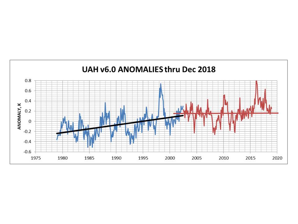
All the sea ice data sites shows a similar flat pattern from 2005
The Jason 3 sea level rise data since it has come online is also very flat
With world emission control basically dead and CO2 levels still rising it will be interesting to see what happens in the next few years.
As I have always said I am not concerned if there really is a problem proper hard sciences and engineers will get involved and there are plenty of options to tackle it if it is a problem.
Sheldon, aren’t you conflating “haitus” or “pause” with “slowdown”. They are different things.
Mat,
a slowdown doesn’t necessarily have a constant warming rate. For part of the time, the warming rate may be zero, or even cooling.
On top of that, the definitions of what a pause is, what a hiatus is, and what a slowdown is, are not clear.
I prefer the term slowdown, with the understanding that there may be short intervals when the warming rate is zero.
What would you call a 10-year interval, where the warming rate was a constant +0.1 degrees Celsius per century? (assume that the average warming rate is +1.8 degrees Celsius per century)
If the pause, hiatus, slowdown, deceleration, break in the action, whatever isn’t real, why were they coming with all those endless explanations for it? What about the missing heat hiding in the ocean. It’s not missing any more?
Why are they arguing for warming? If there is warming without evidence of the positive feedback mechanisms, they disprove their CO2 Armageddon hypothesis. If the world is warming, how is CO2 doing it?
If someone believed that climate change is a natural event, then the idea of a slowdown is just common sense. Sometimes the change will slow down, and sometimes it speeds up – sometimes it even reverses.
BUT…if someone is just plain determined to prove that climate change is caused by CO2 despite any rational argument otherwise, and if it were fairly clear that more and more CO2 is being added to the atmosphere per the measurements that are taken (showing the ppm of CO2 in the atmosphere)…then they would be determined to deny any slowdown as that disproves their belief in the CO2-controls-all scenario.
So, it is actually quite easy for me to belief that people refuse to accept a slowdown, even though it is a perfectly rational and natural event. They are fact-refusers! 🙂
It is always a mistake to closely examine Lew Paper.
Especially a used Lew Paper, Oh wait all Lew paper is used.
100% michael hart top comment in more ways than one.
The alarmists often want to cherry-pick a starting point for their regressions between the 1997-1998 El Niño and the 1999-2000 La Niña. If you start your regression either before or after that pair of ENSO events, there’s no avoiding the “slowdown.” But if you carefully choose a starting point just as ENSO transitioned from El Nino to La Nina, you’ll low-bias the left endpoint, and effectively hide the decline in the rate of warming.
A 2014 analysis by MIT’s Ben Santer et al found that, when the effects of ENSO cycles and volcanic aerosols are accounted for, there’d been no significant global warming since about 1993. Here’s a graph from their paper, which shows that:
http://sealevel.info/Santer_2014-02_fig2_graphC_1_100pct.png
Here’s the paper:
http://dspace.mit.edu/handle/1721.1/89054
They sought to subtract out the effects of ENSO (El Niño / La Niña) and the big Pinatubo (1991) & El Chichón (1982) volcanic eruptions, from measured (satellite) temperature data, to find the underlying temperature trends. In the graph, the black line is averaged CMIP5 models, the blue & red are measured temperatures.
Two things stand out:
1. The models run hot. The CMIP5 models (the black line) show a lot more warming than the satellites. The models show about 0.65°C warming over the 35-year period, and the satellites show only about half that. And,
2. The “pause” in global warming began around 1993. The measured warming is all in the first 14 years (1979-1993). Their graph (with corrections to compensate for both ENSO and volcanic forcings) shows no noticeable warming since then.
Note, too, that although the Santer graph still shows an average of almost 0.1°C/decade of warming, that’s partially because it starts in 1979. The late 1970s were the frigid end of an extended cooling period in the northern hemisphere. Here’s a graph of U.S. temperatures, from a 1999 Hansen/NASA paper:
http://www.sealevel.info/fig1x_1999_highres_fig6_from_paper4_27pct_1979circled.png
Christy & McNider (2017) (or preprint) did a similar exercise, and found a similar rate of warming (0.096°C/decade), and calculated a tropospheric TCR climate sensitivity of +1.10 ±0.26 °C per CO2 doubling, about half the average IPCC AR5 estimate. The paper is quite long, but here’s a readable discussion.
The fact that when volcanic aerosols & ENSO are accounted for the models run hot by about a factor of two is evidence that the IPCC’s estimates of climate sensitivity are high by about a factor of two, and it suggests that a substantial part, perhaps half, of the global warming since the mid-1800s was natural, rather than anthropogenic.
The maximum effect of CO2 since 1950 was 0.18C . It could be lower but that is the maximum.
http://applet-magic.com/cloudblanket.htm
Clouds overwhelm the Downward Infrared Radiation (DWIR) produced by CO2. At night with and without clouds, the temperature difference can be as much as 11C. The amount of warming provided by DWIR from CO2 is negligible but is a real quantity. We give this as the average amount of DWIR due to CO2 and H2O or some other cause of the DWIR. Now we can convert it to a temperature increase and call this Tcdiox.The pyrgeometers assume emission coeff of 1 for CO2. CO2 is NOT a blackbody. Clouds contribute 85% of the DWIR. GHG’s contribute 15%. See the analysis in link. The IR that hits clouds does not get absorbed. Instead it gets reflected. When IR gets absorbed by GHG’s it gets reemitted either on its own or via collisions with N2 and O2. In both cases, the emitted IR is weaker than the absorbed IR. Don’t forget that the IR from reradiated CO2 is emitted in all directions. Therefore a little less than 50% of the absorbed IR by the CO2 gets reemitted downward to the earth surface. Since CO2 is not transitory like clouds or water vapour, it remains well mixed at all times. Therefore since the earth is always giving off IR (probably a maximum at 5 pm everyday), the so called greenhouse effect (not really but the term is always used) is always present and there will always be some backward downward IR from the atmosphere.
When there isn’t clouds, there is still DWIR which causes a slight warming. We have an indication of what this is because of the measured temperature increase of 0.65 from 1950 to 2018. This slight warming is for reasons other than just clouds, therefore it is happening all the time. Therefore in a particular night that has the maximum effect , you have 11 C + Tcdiox. We can put a number to Tcdiox. It may change over the years as CO2 increases in the atmosphere. At the present time with 409 ppm CO2, the global temperature is now 0.65 C higher than it was in 1950, the year when mankind started to put significant amounts of CO2 into the air. So at a maximum Tcdiox = 0.65C. We don’t know the exact cause of Tcdiox whether it is all H2O caused or both H2O and CO2 or the sun or something else but we do know the rate of warming. This analysis will assume that CO2 and H2O are the only possible causes. That assumption will pacify the alarmists because they say there is no other cause worth mentioning. They like to forget about water vapour but in any average local temperature calculation you can’t forget about water vapour unless it is a desert.
A proper calculation of the mean physical temperature of a spherical body requires an explicit integration of the Stefan-Boltzmann equation over the entire planet surface. This means first taking the 4th root of the absorbed solar flux at every point on the planet and then doing the same thing for the outgoing flux at Top of atmosphere from each of these points that you measured from the solar side and subtract each point flux and then turn each point result into a temperature field and then average the resulting temperature field across the entire globe. This gets around the Holder inequality problem when calculating temperatures from fluxes on a global spherical body. However in this analysis we are simply taking averages applied to one local situation because we are not after the exact effect of CO2 but only its maximum effect.
In any case Tcdiox represents the real temperature increase over last 68 years. You have to add Tcdiox to the overall temp difference of 11 to get the maximum temperature difference of clouds, H2O and CO2 . So the maximum effect of any temperature changes caused by clouds, water vapour, or CO2 on a cloudy night is 11.65C. We will ignore methane and any other GHG except water vapour.
So from the above URL link clouds represent 85% of the total temperature effect , so clouds have a maximum temperature effect of .85 * 11.65 C = 9.90 C. That leaves 1.75 C for the water vapour and CO2. CO2 will have relatively more of an effect in deserts than it will in wet areas but still can never go beyond this 1.75 C . Since the desert areas are 33% of 30% (land vs oceans) = 10% of earth’s surface , then the CO2 has a maximum effect of 10% of 1.75 + 90% of Twet. We define Twet as the CO2 temperature effect of over all the world’s oceans and the non desert areas of land. There is an argument for less IR being radiated from the world’s oceans than from land but we will ignore that for the purpose of maximizing the effect of CO2 to keep the alarmists happy for now. So CO2 has a maximum effect of 0.175 C + (.9 * Twet).
So all we have to do is calculate Twet.
Reflected IR from clouds is not weaker. Water vapour is in the air and in clouds. Even without clouds, water vapour is in the air. No one knows the ratio of the amount of water vapour that has now condensed to water/ice in the clouds compared to the total amount of water vapour/H2O in the atmosphere but the ratio can’t be very large. Even though clouds cover on average 60 % of the lower layers of the troposhere, since the troposphere is approximately 8.14 x 10^18 m^3 in volume, the total cloud volume in relation must be small. Certainly not more than 5%. H2O is a GHG. Water vapour outnumbers CO2 by a factor of 50 to 1 assuming 2% water vapour. So of the original 15% contribution by GHG’s of the DWIR, we have .15 x .02 =0.003 or 0.3% to account for CO2. Now we have to apply an adjustment factor to account for the fact that some water vapour at any one time is condensed into the clouds. So add 5% onto the 0.003 and we get 0.00315 or 0.315 % CO2 therefore contributes 0.315 % of the DWIR in non deserts. We will neglect the fact that the IR emitted downward from the CO2 is a little weaker than the IR that is reflected by the clouds. Since, as in the above, a cloudy night can make the temperature 11C warmer than a clear sky night, CO2 or Twet contributes a maximum of 0.00315 * 1.75 C = 0.0055 C.
Therfore Since Twet = 0.0055 C we have in the above equation CO2 max effect = 0.175 C + (.9 * 0.0055 C ) = ~ 0.18 C. As I said before; this will increase as the level of CO2 increases, but we have had 68 years of heavy fossil fuel burning and this is the absolute maximum of the effect of CO2 on global temperature.
So how would any average global temperature increase by 7C or even 2C, if the maximum temperature warming effect of CO2 today from DWIR is only 0.18 C? This means that the effect of clouds = 85%, the effect of water vapour = 13.5 % and the effect of CO2 = 1.5%.
Sure, if we quadruple the CO2 in the air which at the present rate of increase would take 278 years, we would increase the effect of CO2 (if it is a linear effect) to 4 X 0.18C = 0.72 C Whoopedy doo!!!!!!!!!!!!!!!!!!!!!!!!!!
Alan, I didn’t understand all that, and I don’t know what “Tcdiox” is. But it sounds like you’re calculating the only direct effect of CO2, assuming that the effects of water vapor and clouds are independent of it. I doubt that assumption is correct.
I’ve attempted to calculate climate sensitivity by examining the result of the “experiment” which we’ve performed on the Earth’s climate, by raising the atmospheric CO2 level from about 316.91 ppmv in 1960 to about 398.65 in 2014. The strategy is to simply examine what happened to temperatures when the atmospheric CO2 level was raised by 25.79%, and extrapolate from those observations. (I chose 1960-2014 to cover most of the Mauna Loa measurement period, while avoiding distortions from major ENSO spikes.)
https://sealevel.info/sensitivity.html
If 57% of the warming is deemed anthropogenic (which is the “average” guess of American meteorologists, in the latest AMS survey, which is probably pretty realistic), and if we trust the surface temperature measurements (less realistic!), I calculate a TCR sensitivity of around 0.8 °C per doubling of CO2.
If 100% (instead of 57%) of the warming is deemed anthropogenic, I calculate TCR sensitivity of around 1.4°C per doubling.
ECS is usually estimated to be between 1.25× and 1.65× TCR, which would make its plausible range about 1.25×0.8=1.0°C to 1.65×1.4=2.3 °C per doubling of CO2.
One might object that we should expect a bit of delay in effect between CO2 increase and temperature response, so perhaps we should use an earlier pair of dates for the CO2 level. But it turns out not to matter much (except that Mauna Loa measurements only go back to 1958, and before that we have to use less accurate ice core data).
E.g., if we compare CO2 levels from two years earlier, i.e., from 1958 (315.97 ppmv) to 2012 (393.85 ppmv), then CO2 increased 24.65%; using those figures would increase the calculated sensitivity by less than 5%. Or if we compare CO2 levels from five years earlier, i.e., from 1955 (313.7 ppmv) to 2009 (387.43 ppmv), then CO2 increased 23.50%; using those figures would increase the calculated sensitivity by a little less than 10%.
Downwelling IR and longwave IR in general is absorbed by clouds, not reflected. A good emitter of longwave IR or any wavelength in question is a good absorber, not a good reflector of that wavelength.
Also, water vapor is often significant in deserts. The dewpoint is even often above freezing in many hotter deserts.
Dave Burton, I think this is key. If you look at trends of noisy data and that noise just happens to enhance warming, then no analysis is going to give you any idea what is really happening with the climate. This just happens to be the situation over the past 40 years.
1) Periods starts with the PDO just finishing 30+ years in negative mode.
2) The AMO and its effects are also in negative territory early in the data and then moves to positive.
3) Both major volcanoes happen early in the data which makes it look substantially cooler over 6 of the years. They also happen to coincide with strong El Nino events thus removing their effects.
4) A 2+ year super El Nino happens very near the end of the period.
The only way to understand what is actually happening is to remove the influence of this kind of noise. My attempt to do so ends up with an overall warming trend for UAH 6 of .06 C /decade with no warming at all this century. Hence, the pause/hiatus was real and it is still ongoing.
I think my analysis shows even a lower trend than the Santer et al and Christy/McNider papers because I also get a lot of the AMO effects out with my analysis.
“I am amazed at how Lewandowsky and Cowtan don’t seem to be able to understand simple logic.”
I’m not, as this is the modus operandi of all alarmists who claim to be scientists. If any of them did understand simple logic, climate alarmism would be a distant memory.
The inescapable logic that the climate scientists have locked themselves into is the graph that shows a straight line increase of net CO 2 in the atmosphere no matter whether man emits more or less per year. Looking at the non ice proxies of CO2 millions of years ago; being all over the map and then looking at the last 400000 years of ice proxies of CO2 being almost completely stable at 280 and then looking at the straight line upward increase since 1958 of Mauna Loa readings; doesnt allow any sense to be made of CO2 correlation emissions since 1958 with temperature increases. The relentless upward straight line increase of CO2 into the atmosphere doesn’t seem to depend on any variable we can measure. The alarmists are caught in their own assumption of net atmospheric CO2 causing warming . They are in a straightjacket which they can’t get out of. The relentless small increase of net CO2 in the atmosphere doesnt seem to be explained by anything and it itself doesn’t explain anything.
Alan,
“The relentless small increase of net CO2 in the atmosphere doesnt seem to be explained by anything and it itself doesn’t explain anything.”
The relentless increase in atmospheric CO2 is explained by burning fossil fuels. While this doesn’t explain any perceptible temperature trend, it does explain how climate alarmism has centered itself around windmill and solar cell idolatry.
The straight jacket is the IPCC which requires a massive effect from CO2 to justify the anti-west agenda of the UNFCCC. That the IPCC was allowed to maneuver itself to become the arbiter of what is and what is not climate science is so anti-science, all scientists, especially climate scientists, should be embarrassed.
The ice records over the past 400,000 years do not show CO2 being almost completely stable at 280 PPM, but bouncing up and down between 180-200 PPM and 280 PPM with global temperature. The usual argument I hear using ice records of the past 400,000 years against CO2 being a cause of warming is that CO2 lagged global temperature, did not lead global temperature, over the 400,000 year ice core record. (CO2 lagged temperature because back when the amount of carbon in the sum of the atmosphere, hydrosphere and biosphere was largely constant, atmospheric CO2 – along with water vapor – was a positive feedback that reinforced a temperature change started by something else.
DLK,
The lag is absolutely true, although the idea that positive feedback has anything to do with it is not. I’ve analyzed several ice core proxies and the lag is always present. The Vostok core shows a lag of about 800 years, although the resolution is not very good. The DomeC cores have much finer temporal resolution and shows about a 200 year lag.
The same kind of cross correlation analysis that identifies the delay between temperature and Co2 when applied to auto correlate the temperature proxy identifies many periodic influences with periods ranging from decades to millennia.
http://www.palisad.com/co2/docs/co2forcing.ppt
There are lots of notes in the powerpoint slide set that explain the many plots. This slide set was prepared over 10 years ago and may be a little out of date.
My hypothesis on the lag is biology, where it takes centuries for a forest to be established and once it is, CO2 will necessarily rise to support a larger planet wide biomass. As I see it, ice core CO2 levels are a proxy for the amount of biomass that the planet can support at a given temperature.
Temperature dependent absorbing and releasing CO2 from the oceans has a small effect, but it will be nearly instantaneous as compared to the multi-century lags observed in the ice cores.
” The relentless upward straight line increase of CO2 into the atmosphere doesn’t seem to depend on any variable we can measure.”
It primarily depends on sea surface warming via Henry’s Law, following Henry’s experimentally derived absorption of CO2 in water curve.
Except that the effect of Henry’e Law will not be delayed by centuries. This effect is concurrent with temperature change, relative to the sample period of the ice cores. The delayed increase in CO2 is significantly larger and the most likely explanation is biology. Moreover; only the top 100m or so of the oceans vary in temperature as the planets temperature changes.
Ice cores and stable 280 ppm. It should be noted that CO2 diffuses in ice. Its also a tad mobile in the firn as the ice forms and gets buried. In fact until the pressure get so high that it forms a clathrate it remains mobile. So at best any minor peaks and troughs would be smeared out and at worst it would be useless. Plant stomata are a better proxy for CO2. Add in the poor chronology of ice cores and I’m surprised they bother to bore them out
One point about the ice cores is that the D2O based temperature proxy has a much finer temporal resolution than the CO2 since it takes a bigger slice of snow/ice to get a CO2 data point. When I do my correlation analysis, I smooth out the temperature to have a resolution close to the CO2 measurements and limit the correlation to the last 100K years when the resolution is relatively good.
The ice cores also have variable length sample steps which need to be carefully normalized.
The cause of the pause and the status of the hiatus always makes me think of Danny Kaye in “ The Court Jester”-
“ The pellet with the poison’s in the vessel with the pestle;
the chalice from the palace has the brew that is true.”
Great comedy.
” Lying about the slowdown, won’t solve global warming”
Earth has ‘solved’ global warming many times perhaps its time for the ‘hairy apes’ to move on.
“… perhaps its time for the ‘hairy apes’ to move on.”
Surely they’re relatively hairless apes?
Or relatively hairless apes that dig-up the ground?
Or maybe ground excavating, hairless ape that like to sail on water?
Now where’s that banana?
There’s more to us than meets the eye,
or even brain
as thoughts will fly
in all directions, near & far,
to try decoding who we are.
Just bodies full of working parts?
Recycled spirits from the past?
Perhaps we might
just only be
a buzzing field of energy.
Experiments from an alien race,
who regularly check the pace
of how we’re getting on
& why their plan just went so wrong.
Children of God; the chosen ones
or hairless apes with big pink bums.
We try to add up all the parts
but somehow cannot do the sums.
You should always start your trend with 1998. When this El Nino year took place it was the “Canary-in-the-coal-mine event” that the alarmists were looking for. It became the seminal year for shoving CAGW down our throats. Over and over we were told that this was the warming that CAGW brought. It only lasted a year, but it was continous and it was loud.
So use it; just like the alarmists did twenty years ago.
“You should always start your trend with 1998. When this El Nino year took place it was the “Canary-in-the-coal-mine event” that the alarmists were looking for. It became the seminal year for shoving CAGW down our throats.”
And then temperatures cooled after 1998, and it took 18 years for temperatures to again reach the level of 1998, in 2016.
Now, after the high of 2016, temperatures are cooling. If this pattern follows the pattern from 1998, then it will take about 18 years to get back to the temperatures of 2016. Natural variation, natural cycles, up and down, up and down. Not up, up, up, up, up, up, up.
The UAH satellite chart:
http://www.drroyspencer.com/wp-content/uploads/UAH_LT_1979_thru_December_2018_v6.jpg
Yes!
On a more serious note,here is the abstract from England et al 2014 in Nature Climate Change.
I don’t intend to single out these 10 scientists but it is useful to remember what was being promulgated-
“Recent intensification of wind driven circulation in the Pacific and the ongoing warming hiatus.”
Abstract: “Despite ongoing increases in greenhouse gases,the Earth’s global surface air temperature has remained more or less steady since 2001.A variety of mechanisms has been proposed to account for this slowdown in surface warming.A key component of the global hiatus that has been identified is cool Eastern Pacific sea surface temperature, but it is unclear how the ocean has remained relatively cool in spite of ongoing increases in radiative forcing.Here we show that a pronounced strengthening in Pacific trade winds over the past two decades – unprecedented in observations / reanalysis data and not captured by climate models-is sufficient to account for the cooling of the tropical Pacific and a substantial slowdown in surface warming through increased subsurface ocean heat uptake.
The extra uptake has come about through increased subduction in the Pacific shallow overturning cells, enhancing heat convergence in the equatorial thermocline.At the same time the accelerated
trade winds have increased equatorial upswelling in the central and eastern Pacific, lowering sea surface temperature there, which drives further cooling in other regions.The net effect of these anomalous winds is a cooling in the 2012 global average surface air temperature of 0.1 to 0.2 C, which can account for much of the hiatus in surface warming since 2001.This hiatus could persist for much of the present decade if the trade wind trends continue, however rapid warming is expected to resume once the anomalous trade winds abate.”
No comment is necessary.
Sheldon: You didn’t look closely enough. Temperature fell at a rate of -28 K/century (+/-8 K/century)! It happened between 1/98 and 6/99 in the HadCRUT record. (I’m playing the devil’s advocate to get you to think about your data.)
Are you going to tell me that your 120 month period is more meaningful than my 18 month period? How long does a period does one need to be to be meaningful? Why?
You might want to say that the cooling after the 97/98 El Nino is merely noise and therefore not meaningful. I can say that your Pause is merely noise and therefore not meaningful. How do we know who is right about what is meaningful and what isn’t?
That is where statistics becomes important. To do statistics, you need a model. Since warming is supposed to be proportional to forcing and forcing has been increasing roughly linearly with time, my model is that temperature is increasing linearly with time. All of those other bumps are noise in the data. (In this case the noise could be due to chaotic fluctuations in the currents bringing cold deep water to the surface and burying warm surface water. El Nino involves a slowing of upwell of cold water off Peru and a slowing of subsidence in the Western Pacific. Its end produced -28 K/century of cooling for 18 months! There is a lot of noise in climate data.) Then I’m going to assume that my data has been displaced upward or downward by noise that has a normal distribution. (I can check both assumptions by looking at the distribution of the noise or the “residuals” when I have completed a linear fit. It turns out that the noise in temperature data is highly auto-correlated, not randomly distributed, and we need to correct for that problem too.)
When you do a linear fit, you get both a trend and a confidence interval for that trend. The reason you need a confidence interval is that the noise might be distributed differently; by definition it is random. In your Pause, there were several strong La Nina’s near the end of the period, reducing the trend. If those La Ninas had occurred earlier in the period, the trend would have been higher. If you added random noise 10,000 times to perfectly linear data and then did a least-squares fit, you will get 10,000 different trends. However, roughly 95% of those trends should lie within the 95% confidence interval obtained from one of those data sets. Therefore, when you have a trend, YOU KNOW IT IS LIKELY WRONG, because there is noise in the data. The 95% confidence interval tells you how much the observed noise could have distorted the observed trend SIMPLY BY CHANCE ARRANGEMENT OF THE NOISE IN THE DATA (including those La Ninas).
The 95% confidence interval for your 10-year trend is about +/-1 K/century – assuming you correct properly for auto-correlation in the noise. Nick Stokes trendviewer does. When you have an El Nino or a La Nina, more than a dozen consecutive data points all lie above above or below the trend line, they aren’t randomly distributed! So your 0.14 K/century Pause for 10 years turns out to be a trend ranging from -0.86 to +1.14 K/century. Accounting for the presence of noise, you can’t conclude whether it was warming, cooling or plateauing SIGNIFICANTLY during this period. Scientists don’t draw conclusions when statistics shows a reasonable possibility their conclusions may have been due to change arrangement of noise in the data. (Would you want to take medicine, when the efficacy seen in clinical trials might have been due to chance? The FDA usually demands two studies with less than 5% probability that the efficacy could be due to chance.)
Then there is the question of whether the trend has changed. Suppose you have two trends: 0.14 +/- 1.0 K/century and 1.0 +/- 1.0 K/century. These aren’t statistically significantly different from each other. If you compare 0.14 +/- 1.0 K/century and 1.8 +/- 0.4 K/century (the trend for the last 40 years), these will be significantly different statistically. (You use the test for the statistical significance of the difference between two means with confidence intervals.) So you could conclude there was a SLOWDOWN in warming (compared to the trend for the last half-century), but not a PAUSE (a period with no warming).
So, I’m a regular reader but not commenter. Why don’t we use 1936 as a starting date for measuring temperature anomalies? If I remember my reading correctly, at least in the NH we would have a reduction in temperature if we started in 1936. Nobody seems to mention that, so I’m wondering why.
“Why don’t we use 1936 as a starting date for measuring temperature anomalies?”
Because the Climategate manipulators spent a lot of time and effort erasing the warmth of the 1930’s from the surface temperature record, so if you use the official surface temperature charts there is no warmth showing in the 1930’s/40’s.
The Climategate conspirators were especially concerned with the “1940’s blip” because it put the lie to their claims that CO2 was heating up the atmosphere enough to cause unprecedented warming. You can’t claim unprecedented warming in 2018 if it was just as warm or warmer in the 1930’s. So they made the 1930’s warmth disappear.
Where they didn’t make the 1930’s warmth disappear is in all the numerous unmodified local surface temperature records from around the world which still show the 1930’s as being as warm or warmer than subsequent years. The Climategate conspirators modified many of these charts but they did not erase the original data so we still have that.
We are in a temperature downtrend from the 1930’s, but many scientists, including some skeptics still give credence to the Hockey Stick lie and act like it is a true representation of reality. And everyone of them knows about Climategate and the manipulation of the temperature record but they proceed as if it is accurate. Go figure.
Frank,
I look very closely at the data. I calculate 150,000 linear regressions, for the date range from 1970 to 2018.
I know that you are not serious, about a date range under 10 years. Yours is only about 1.5 years in length.
If you want to play it that way, then I have a truck load of cooling trends for you. Tell me your address, and I will send the truck around.
You said, “Are you going to tell me that your 120 month period is more meaningful than my 18 month period?”
Yes.
You said, “How long does a period need to be to be meaningful?”
It depends on the circumstances. In general, periods of less than 10 years are not meaninful. But if it begins to cool at over 10 degrees Celsius per century, then periods less than 10 years can become meaningful.
You said, “How do we know who is right about what is meaningful and what isn’t?”
It is simple. I am right, and you are wrong. Next question please.
====================
Alarmists DON’T understand statistical significance.
A slowdown is a “negative” event. You can’t get a statistically significant slowdown. That is why a slowdown must be specified as the null hypothesis. You accept the null hypothesis (and the slowdown), when you cannot accept the alternative hypothesis (that there is statistically significant warming).
Alarmists do NOT understand this. Alarmists don’t do hypothesis testing correctly. They don’t even specify a null hypothesis, most of the time. They consider the null hypothesis unnecessary, because they “KNOW” that global warming is happening.
Many Alarmists say that they won’t accept that there was a slowdown, unless it is statistically significant.
That is like saying, that you won’t accept that the apple barrel is empty, until there are a statistically significant number of apples in it.
Do you see how stupid that is?
Temperature data is very noisy. You often can’t get definite proof of something like a slowdown. Before you begin cheering, and claim that there was no slowdown, consider this:
Because the temperature data is very noisy, you can’t get definite proof that there wasn’t a slowdown.
So how do we decide whether there was a slowdown or not?
In the absence of statistical proof, for or against a slowdown, you must be guided by the calculated warming rate (calculated from a linear regression).
If the calculated warming rate is considerably less than the average warming rate, then there was a slowdown. Statistically significant proof, is for data that is not too noisy.
Variables calculated using linear regressions are BLUE. They are the Best Linear Unbiased Estimates. EVEN IN THE PRESENCE OF AUTOCORRELATION.
So the calculated warming rate, is the best estimate of the warming rate, that we can get. In other words, trust the results of a linear regression, because you can’t get a better estimate.
Alarmists want to ignore the results of linear regressions, when they don’t like the result. That is cheating. But of course, Alarmists are experts at cheating. They do it all of the time.
Ask a supposed statistics expert, like Tamino.
====================
I am not an “expert” in statistics, but I do have some experience. As part of a Bachelor of Commerce degree, majoring in Finance and Economics, I did the following papers:
Stage 2 – Introduction to Econometrics ……….. (grade for paper = A+)
Stage 2 – Mathematics for Commerce …………… (grade for paper = A+)
Stage 3 – Applied Econometrics ………………. (grade for paper = A+)
Stage 3 – Optimisation in Operations Research …. (grade for paper = A+)
In case you are not familiar with the term “econometrics”, it is the economics version of statistics.
I was also awarded the following scholarships and prizes:
The Senior Prize in Economics
The Senior Prize in Accounting and Finance
The Stock Exchange Prize
and 2 Scholarships in Finance, from private companies
====================
You might think that I am being boastful, because of my university marks. I am actually a modest person, but I want you to be aware, that I am not stupid.
I will repeat again, I am not an “expert” in statistics. I am well aware of my limitations.
I am not a climate scientist, or even a scientist. But I have a good science education, and I like science, mathematics, and computing. These skills allow me to produce “interesting” data visualisations.
I have another useful skill. Persistence. I don’t think that many people would spend the time that I have, collecting the temperature statistics for over 36,000 locations on the Earth.
My persistence is strengthened, when people call me a “denier”.
Another valuable attribute, is a good sense of humour. A love of Monty Python helps (it allows you to laugh at the absurdity of global warming, rather than get depressed).
Always remember the words from one of Monty Python’s famous songs, and “always look on the bright side of life”.
Also, never forget that the Hitchhiker’s Guide to the Galaxy has the words DON’T PANIC inscribed in large friendly letters on its cover.
Sheldon: I’m not an alarmist (IMO), nor an expert in statistics. I’m just trying to ask a few questions and provide a little information that may clarify our situation. As Steve McIntyre might say, a statistics expert like Tamino might “torture data until it confesses” what he wants it to say. Or cherry-pick it. Isn’t sorting through 150,000 regressions to publicize one of them a form of cherry-picking?
Don’t you find it uncomfortable to arbitrarily conclude that periods of 10-years are meaningful? Do you want the alarmists to also arbitrarily decide what is meaningful and what is not? I don’t! Shouldn’t the DATA ITSELF tell us what is meaningful and what is not?
After all, we are all flawed humans, a species that suffers from confirmation bias – a phenomena that makes it difficult to assimilate information that conflicts with our deeply held beliefs. By letting your beliefs, rather than the data, determine what is true, you are taking us back to the time when Galileo was imprisoned for contradicting the church – a forward to the time when those who doubt the consensus may be jailed, fired or fined for their beliefs! You can hear the rabble on the left calling for these things, can’t you?
In fact, the 95% confidence interval for a 10-year temperature trend is typically +/-1 K/century. For a trend of 2 K/century, that would be 1-3 K difference by 2100, a massive difference! If +/-1 K/century is all the accuracy you need, publicize the central estimate with the confidence interval. Don’t pretend the ci doesn’t exist or isn’t needed!
Sheldon wrote: “A slowdown is a “negative” event. You can’t get a statistically significant slowdown.”
Respectfully, this is total BS. I showed you that the warming rate for 2001-2012 was statistically significantly different from the overall warming rate for the last 40-years: 0.14 +/- 1.0 K/century vs. 1.8 +/- 0.4 K/century. I didn’t carry out the proper statistical test for the significance of the difference between two means (with confidence intervals), but the conclusion is obvious.
Sheldon wrote: “In the absence of statistical proof, for or against a slowdown, you must be guided by the calculated warming rate (calculated from a linear regression).”
Respectfully, no one wants to be guided conclusions from biased researchers that are statistical equivalent to flipping a coin or two and looking for heads. That is the kind of “more likely than not” and “likely” BS that the IPCC has been delivering. You can say the central estimate is +0.14 K/century, but you must be honest and say that the 95% confidence interval runs from -0.86 K/century to +1.14 K/century. Politicians and attorneys provide only the facts that agree with their position, but ethical scientists do not. This is supposed to be a science blog.
Sheldon writes: “Statistically significant proof, is for data that is not too noisy.”
Scientists don’t draw conclusions from data that is too noisy. Period. Despite the existence of a central estimate.
Sheldon writes: “I will repeat again, I am not an “expert” in statistics. I am well aware of my limitations.”
Neither am I. We all need to learn new things when we start working in new areas. Use your persistence! I wanted to know for myself if SLR data showed any statistically significant acceleration. So I did the linear regression to t and t^2 and the painful (and large!) correction for autocorrelation in the data and looked to see if the confidence interval for the coefficient for the t^2 term included zero. Or would you want me to simple declare SLR was accelerating because the central estimate for the coefficient for the t^2 term was positive? For temperature trends, I cheat and get confidence intervals from Nick Stokes trendviewer. You should too, or calculate them for yourself.
Sheldon wrote: “Many Alarmists say that they won’t accept that there was a slowdown, unless it is statistically significant. That is like saying, that you won’t accept that the apple barrel is empty, until there are a statistically significant number of apples in it.”
There is no significant noise in the data when you are talking about whether an apple barrel is empty!
Frank,
you said, “Isn’t sorting through 150,000 regressions to publicize one of them a form of cherry-picking?”.
Frank, if you lost a diamond, what would you do? Search for it in just a few places, and then give up. Or search for it everywhere that you could? Until you found it.
In statistics, unusual events, that probably wouldn’t have occurred by chance, are valued. They are called “statistically significant”. What are the chances of finding one of these rare events, if you don’t search exhaustively?
I do my 150,000 linear regressions, without showing any bias towards a particular date range. It is only AFTER I have done the calculations, that I look at the warming rates. So I don’t calculate the warming rate for only the date ranges that I think might be slowdowns. Every date range has an equal chance of being a slowdown or a speedup. This is the climate equivalent of democracy. Any person can be president, and any date range can be a slowdown (or a speedup).
If I find a slowdown with a certain warming rate, and there are a lot of other slowdowns with a similar warming rate, then that shows that slowdowns with that warming rate, are not unusual. They are probably a feature of the normal climate. If I don’t search exhaustively, and I find a potential slowdown, then I can’t tell how unusual it is. So exhaustive searching is necessary, to establish what the “normal” distribution is.
But we need to go further than just look at the warming rate. We need to also look at the “length” of each slowdown. The warming rate may not be unusual, but the length might be. See my article called “Alarmist thinking on the recent slowdown is one dimensional”. I show that the recent slowdown is the second longest climate event, since 1970. [a climate event is a period of warming (or cooling), that is considerably above or below, the long-term warming rate].
https://agree-to-disagree.com/alarmist-thinking-on-the-slowdown
You said, “Don’t you find it uncomfortable to arbitrarily conclude that periods of 10-years are meaningful?
I didn’t “arbitrarily conclude that periods of 10-years are meaningful”. The data did. Look at one of my Global Warming Contour Maps, and you will see why.
Frank, sometimes, when nobody is looking, I have a look at the date ranges under 10 years. They are actually quite interesting, You can see the short-term climate events, like El Nino’s and La Nina’s.
But I can’t tell people about the short-term climate events, because Alarmists attack me for looking at date ranges which are “too short”, and too variable.
So when I say that date ranges under 10 years are usually not meaningful, part of the reason that I say that, is because Alarmists don’t want me to look at date ranges under 30 years. I defy them, by publicly looking at date ranges down to 10 years, but I can only push the boundaries, so far.
====================
You said, “Sheldon wrote: “A slowdown is a “negative” event. You can’t get a statistically significant slowdown.” Respectfully, this is total BS.”
A statistically significant variable, is one that is statistically significantly different from zero.
By definition, a pause and a slowdown, have a warming rate that is NOT significantly different from zero.
The t-value, calculated for a t-test, divides the variable by the standard error, and compares it to the t-critical value.
When you divide a number near zero by the standard error, you get a number near zero, which is unlikely to be greater than the t-critical value.
So the variable fails the t-test, and is called NOT statistically significant.
I agree that you can statistically test for the “difference” from another warming rate, but the high noise level in temperature data makes even this test unlikely to give a significant result.
Alarms need to learn, that high noise levels mean that you cannot conclude ANYTHING, with confidence. You can not prove statistically that there WAS a slowdown, but you also can’t prove statistically that there WASN’T a slowdown.
====================
You said, “Respectfully, no one wants to be guided conclusions from biased researchers that are statistical equivalent to flipping a coin or two and looking for heads.”
So you want biased Alarmists to flip a coin or two, and tell us that a slowdown didn’t happen.
====================
You said, “Scientists don’t draw conclusions from data that is too noisy. Period. Despite the existence of a central estimate.”
Scientists who are HONEST, don’t draw conclusions from data that is too noisy. They advise people that the data does not support ANY conclusion.
Unfortunately, scientists who are honest, have trouble getting funding.
Alarmist scientists have no trouble getting funding, and are happy to draw conclusions from data that are not justified. Global warming will cause:
animals to shrink
maleria to spread
snow to disappear
drinking water to disappear
deserts to increase (the Sahara desert is “greener” than ever, thanks to CO2)
more rain to fall
less rain to fall
insects to disappear
dangerous bacteria to increase (global warming kills all the good bacteria, that is, the ones that survive the chemicals that humans use, which kill 99.9% of bacteria)
people to die from high temperatures (but it doesn’t save anybody from low temperatures)
fish to lose the ability to navigate
turtles to all become females
oceans to acidify dangerously
sea levels to rise excessively
weather to become extreme
hurricanes to become more frequent
hurricanes to become stronger
food will become less nutritious
the sperm count of male humans (and probably all other animals) will go down
monarch butterflies to die (they can’t find Swan plants any more, because global warming killed them all (or did humans spray them with herbicide?))
It seems odd to me, that everything that global warming does, is BAD. How does global warming know what is BAD. Is it sentient?
According to Alarmists, global warming has absolutely no GOOD consequencs. That seems strange, since CO2 is plant food (don’t deny it), and cold kills a lot of people.
Frank, how about some “balance”, when talking about global warming. Skeptics might actually believe some of the things that Alarmists say.
Sheldon wrote: “How about some “balance”, when talking about global warming. Skeptics might actually believe some of the things that Alarmists say.”
The problem is confirmation bias – how does one help someone learn something that conflicts with his deeply-held beliefs. Psychologists say this is nearly impossible for ordinary people, but scientific progress depends on people learning something new (or waiting for those incapable of learning to die off, which was too often the case with relativity and quantum mechanics). You obviously deeply believe the 10-year slowdown – but not halt – in warming is important to the skeptical position opposing the IPCC consensus. I believe it is merely random noise, but am nevertheless skeptical about the IPCC consensus. One of us is likely wrong about the slowdown, but we agree at least partially about the IPCC consensus. One of us may needs to learn something new or (less likely) this is one of those issues where there are multiple ways of looking at the problem. I need to learn from you or you need to learn from me, or we both need to learn from each other. The same goes for anyone still interested in our debate. Is “balance” really going to help us overcome our confirmation bias and learn, or is being confronted by uncomfortable information and challenging questions the right approach?
I think we both know that personal attacks won’t help. Bobbing and weaving, creating strawmen, and changing the subject don’t help. Agreeing to disagree doesn’t help. Complaining about the quality of climate science in general won’t help. Proposing a test that will clarify matters could help. Creating some artificial data with auto-correlated noise might help, but you rejected a paper that did that.
Frank,
you might not believe this, but I believe that the recent slowdown is NOT important, in terms of its effect on temperature.
The recent slowdown was not enormously long.
It was temporary.
It is now over.
The fact that it existed, didn’t prove that global warming isn’t happening.
The most important thing about the recent slowdown, is that it shows the lengths that Alarmists will go to, to avoid admitting the truth.
Would it hurt Alarmists to say, “Yes, there might have been a small, temporary slowdown, that doesn’t have any significant long-term implications for global warming”?
But no Alarmist will say this.
Why not?
I am happy to cooperate with honest people.
Sometimes I will even cooperate with people, when I think that they are wrong, but I think that they genuinely believe what they claim.
But I refuse to cooperate with liars. Especially when they spew nastiness at everyone who disagrees with them.
As I said before, Alarmists have shot themselves in both feet. By being nasty, and by calling everyone who disagrees with them, a “Denier”.
Frank,
do you think that it is me, who is suffering from “confirmation bias”, or you?
You have mentioned a paper several times. You said, “Creating some artificial data with auto-correlated noise might help, but you rejected a paper that did that.”
I don’t know what paper you are talking about. Please tell me, and I will have a look at it.
I started playing with generating temperature series with the same autocorrelation structure as real temperature data. But I got interested in something else. One day I might get back to it.
Sheldon wrote: “You have mentioned a paper several times. [Frank] said, “Creating some artificial data with auto-correlated noise might help, but [Sheldon] rejected a paper that did that.”
Sheldon’s post began with a disdainful comment about authors of a paper discussing their work at “The Conversation”. That paper – which created artificial data by adding noise to a linear trend I just describe in a comment – is found at this link:
http://iopscience.iop.org/article/10.1088/1748-9326/aaf342#erlaaf342fn1
The paper discusses the problem of intentionally or unintentionally “data mining” to find unusual events that might be due to chance. The warming trend for 2001-2012 is much less than for 1978-2017 (the last half century) and the 95% ci for the confidence interval for the difference in trends does not include 0. So the slowdown in warming appears to be meaningful – statistically significant.
However, a problem develops when we “data mine” for “unusual events” by picking 2001-2102 from thousands of other possible periods. With annual data and periods at least 10 years long, there are 40 possible starting years. For 11-year periods, 39 periods. Etc. 420 possibilities in all. 60,489 possible periods with monthly data. The width of a 95% confidence interval no longer has any meaning when you can cherry-picked a trend from hundreds or thousand of possibilities. With 420 trends and 95% confidence interval, you expect about 21 trends to lie outside the confidence interval PURELY BECAUSE OF CHANCE ARRANGEMENT OF THE NOISE IN THE DATA that was used to calculate a central estimate for the trend. By looking through many trends, you can “mine” or “cherry-pick” noise from data – events that have real significance because they occur by chance
The long term trend for the last half century is about 0.18 K/century. In Figure 11c of the paper linked above, the authors created 1000 sets of artificial data 50 years long with the same noise as in observations. (At least, I think this is what they did.) Then they asked what fraction of the time the artificial data contained a period (anywhere in the 50 years) with a lower trend than observed during a particular period. Look above the year 2011. In the artificial data, 7% of artificial data contained (at least one) 10-year period with a lower trend than observed for 2002 through 2011, 9% contained an 11-year period with a trend lower than observed for 2001 through 2011, 24% a 12-year period with a lower trend than for 2000 (La Nina ending) through 2011, and 35% lower than for 1999 (massive La Nina) through 2011. However, only 4% of the artificial data contained a 14-year period with a trend in the artificial data lower than observed for 1998 through 2011. In other words, given the typical noise in temperature trends and the long-term temperature, 4% of the time one would expect to find a trend as low as was observed for 1998 through 2011 somewhere in 50 years of HadCRUT record. (This was for HadCRUT before it was adjusted for ERSST4.) I think the correct interpretation of a 4% chance of being due to chance it that 1998 through 2011 was event sufficiently unlikely to be due to chance to call it statistically significant.
However, this wasn’t the case with GISS temperatures, nor HadCRUT4 after ERSST4, not with a more stringent test that requires the two trends to be “continuous – to intersect at the beginning of the second trend.
Sheldon: Thanks for the reply
When I said: “How long does a period need to be to be meaningful?”
You replied: “It depends on the circumstances. In general, periods of less than 10 years are not meaningful.”
I asked, “How do we know who is right about what is meaningful and what isn’t?”
You replied: “It is simple. I am right, and you are wrong. Next question please.”
That was purely arbitrary. Now you are trying to tell me: “I didn’t “arbitrarily conclude that periods of 10-years are meaningful”. The data did. Look at one of my Global Warming Contour Maps, and you will see why.”
The data determines the 95% confidence interval for the central estimate of the trend provided by linear regression. That determines what meaning you should apply the trend.
You, however, have moved into “data mining” – looking for unusual events in noisy data. The problem is that you will always find unusual events in noisy data. About 5% of events in random noise will lie outside of 2 standard deviations of the mean. About 0.3% will lie outside of 3 STDs. If you look at 10-year warming trends starting with every month, you will have about 1000 ten-year trends from a century. You will expect a few by chance to fall outside 3 STD. You will think these three events are “significant” even though you expect about 3 such events to occur purely by chance. If you work with annual data, then there will be about 100 trends. A few of those will fall outside 2 STDs and you may think those are “significant”. However, one expects about 5 such events to occur in any set of random data!
Now look at your graph where you have added lines for 1, 2 and 3 STDs. Is there really anything present in that data that one wouldn’t expect to find in 100 or 1000 data points composed of random noise with a high degree of auto-correlation? The problem is made more complex by autocorrelation. Large deviations are found next to each other, not randomly scattered.
If you go looking through enough data that is purely random noise, you will always find something that looks significant. The paper you complained about generated lots of pseudo-data with autocorrelated noise similar to that found in temperature records (Monte Carlo calculations) and looked to see how often events of a certain type occurred merely by chance.
Data miming can be useful under carefully controlled conditions. One can divide the data in half, look for relationships in one-half of the data, and then test the second half to determine if the relationship is found in the second half.
Consider a human clinical trial with a new drug that fails to show statistically significant efficacy. All companies look through the data for sub-populations of patients who responded well to a drug. Maybe women or less sick patients or younger patients or patients with a particular genetic marker responded much better than the whole treatment group. If you have 10 possible subpopulations of the treatment group and one of those subpopulations shows statistically significant efficacy (p less than 0.05), the p score is meaningless, because you had 10 chances to achieve that p score. If you have a 95% chance of failing and you try ten different times, you now have a 40% (1- 0.95^10) chance of one success. If you ask the FDA for permission to see to that subpopulation, the FDA will tell you to run another expensive clinical trial using only the patient population you expect to benefit.
Frank,
Did you look at a global warming contour map, to see why periods of less than 10 years are not as meaningful?
If you didn’t look, then you will not see the reason why.
Notice how a global warming contour map, shows you periods of many different lengths. The period lengths start at 1 or 2 months, and go up to the maximum possible for the data.
You can see that I am not hiding anything from you. I show you everything. It is up to you to decide which parts you want to use. You have to justify what you use.
====================
Frank, you talk about data mining, as if it was a bad thing. They find diamonds, by mining.
Who needs confidence intervals, when you know what all of the data is !!!
People use confidence intervals, because they don’t know what most of the data is.
I know exactly what all of the data is. I can give you an answer that is EXACT (the confidence interval is zero).
====================
I showed people that even though the warming rate is not unusual, a slowdown could be unusual because of its length. The recent slowdown was the second longest climate event, since 1970. A climate event being a period that has a warming rate considerably higher or lower than the long-term warming rate.
Note that I said “considerably higer or lower”, NOT “more than 3 standard deviations from the long-term warming rate.
Does the length of a slowdown mean nothing to you?
====================
You said, “If you go looking through enough data that is purely random noise, you will always find something that looks significant.”
If you find what looks like a meaningful event, how do you know whether it was caused by random, or non-random factors. Do you let your prejudices decide?
Are YOU needlessly throwing away real events, because you claim that they are random. That is very naughty. I can’t remember whether that is a type 1 error, or a type 2 error, but you are guilty of one of the worst crimes in statistics.
What you are doing, is judging data by what you expect, or want, to find. I don’t do that. I use all of the data.
Sheldon writes: “Who needs confidence intervals, when you know what all of the data is !!! People use confidence intervals, because they don’t know what most of the data is.”
This is wrong. Think of statistics (confidence intervals, hypothesis testing, etc.) as “getting meaning from data”.
Let’s ASSUME that temperature should be rising linearly with time because forcing is rising roughly linearly with time. However, we also know that El Ninos and La Ninas introduce noise in temperature data (because they are purely internal slowdowns and speed ups in mixing with cold deep water in the ocean. So we want to separate a linear temperature signal from this noise. Use the trend to calculate a “linear temperature” for each year, subtract the raw data and look at the “residuals” that we believe are noise. IF THEY ARE NOISE, THEN THESE DISPLACEMENTS FROM THE LINEAR TREND COULD HAVE HAPPENED DURING ANY YEAR.
For simplicity, let’s imagine that we are working with annual temperature data, in which case our residuals will turn out to be randomly distributed. (Monthly residuals are not random and show auto-correlation.) Write down the value of your 12 residuals for 2001-2012 on separate pieces of paper, put them in a hat, select them randomly and add them to the “linear temperature” for each year. The 2010 residual (a La Nina year) might be added by chance to the 2001 linear temperature, and the 2005 residual (an El Nino year) might be added by chance to the 2012 linear temperature. Now do another least-squares fit to this artificial data. Since we – by chance – started with a La Nina year and ended in an El Nino year, the trend for this artificial data will – by chance – be higher. Now repeat this process 100 times and get 100 artificial trends – all of which are perfectly consistent with the idea that the temperature is rising linearly with time and contain noise – exactly the same noise as found in your raw data.
Now let’s be more sophisticated and create 10,000 samples of noise for each of the 12 years with the same standard deviation (and mean = 0) as our residuals and repeat this process. All resulting trends will be consistent with the idea that there is a linear trend in the data with noise. About 9,500 of those trends will lie within the 95% confidence interval for the trend, 250 will be higher (by chance) and 250 will be lower (by chance). Now, in addition to the CENTRAL ESTIMATE for the trend we have some idea of how much NOISE MIGHT HAVE DISTORTED that central estimate. MEANING FROM DATA. Knowledge of the potential for such distortion will be critical, for example, if the alarmists try to tell us that the rate of warming has increased since the 2000s! We can use the formula for the difference of two means with confidence intervals and calculate the confidence interval for the difference between the trends. If that confidence interval includes zero, the difference isn’t statistically significant.
By not including confidence intervals along with the trends in your post, you are denying your readers access to critical information about the trends you report only as central estimates.
Above, you may have noticed the words “assume” and “if”. All statistical analyses start with some kind of assumption about noise in data (for example, random and normally distributed) and about what kind of signal (for example, linear) is present in the data. Those assumptions can be validated by testing the residuals.
Sheldon asked: “Are YOU needlessly throwing away real events, because you claim that they are random. That is very naughty. I can’t remember whether that is a type 1 error, or a type 2 error, but you are guilty of one of the worst crimes in statistics.”
No one is “throwing away data”. We do not want to draw conclusions from data that could be due to a chance arrangement of noise in the data. So, we generally conclude that a p score greater than 5% is significant. Nor is there a significant difference between to trends if the 95% confidence interval for the difference in trends includes zero.
However, when we sort through many possible events the above tests aren’t stringent enough. One rolls a pair sixes a pair of dice 1 in 36 times. However, in a game of backgammon with 100 rolls there is only a 6% chance {{35/36)^100} of not seeing a pair of six sometime in the game. So a statistically rare event – a pair of sixes – becomes commonplace in 100 rolls. The chances that any one datapoint will beat least 3 STDs from the mean is 0.3%, but given 10,000 data points you expect to find about 30 further from the mean than 3 STD. Finding a few such data points is meaningless because it is expected to happen by chance alone.
Sheldon asked: “do you think that it is me, who is suffering from “confirmation bias”, or you?” How can anyone be sure of the right answer to this question? Nothing you wrote – so far – convinced me I’m wrong, but effective communication is difficult via a blog. I’ve screwed up more than once. One supervisor once told me that 9 of 10 really good ideas are going to fail. The people who make discoveries are those who abandon the failures and get to the tenth idea. Another wise person wrote: I long to have my work judged by others, to discover whether an idea is right OR WRONG.
Sheldon brought up the difficult problem of proving that the temperature isn’t warming, when it might simply not be changing. Here is how you do that: First you need to define what you mean by “not warming” (so you have a null hypothesis that defines warming). Let’s say that the IPCC is projection warming at a rate of 3 K/century for a particular period. You can define “not warming” as being much less warming than the IPCC is expecting: You can choose a warming rate of 1.5 or 1.0 or 0.5 K/century and define that as “not warming at anything close to what the IPCC is predicting – in practical terms not the warming the way the IPCC is predicting. Then you can look at your trends and their confidence interval to decide whether it is not warming by your definition.
If you want to do it right, then you go into the IPCC’s model runs and see how often they show a ten-year warming rate of below 1.5, 1.0, 0.5 or even 0 K/century. Clearly, if those runs show frequent occurrences of warming rates of 1.5 K/century, no one is going to accept your definition for “no warming”. During the Pause, I saw output from one model saying that a warming rate of zero or less was encountered in about 25% of 5-year periods, and 6% of ten-year periods and never in a 20-year period. They didn’t disclose the results for 15-year periods, because the Pause was nearly 15 years long then (pre-ERSST4). So, if you want anyone to pay attention to your definition of “not warming”, you better pick something that is rarely encountered in model output. Someone has suggested that a 17-year period with no warming is necessary to prove that the IPCC’s models are wrong about warming rates. That seems absurdly long to me.
“…So you could conclude there was a SLOWDOWN in warming (compared to the trend for the last half-century), but not a PAUSE (a period with no warming)…”
Is “a period with no warming” the same as a period with a “lack of warming?”
“The fact is that we can’t account for the lack of warming at the moment and it is a travesty that we can’t.” – Dr. Kevin Trenberth (Oct 2009)
A few others…
BBC Question – “Do you agree that from 1995 to the present there has been no statistically-significant global warming”
“Yes, but only just.” – Dr. Phil Jones, 2010
“The 5-year mean global temperature has been flat for a decade” – Dr. James Hansen, 2013
“The recent pause in global warming, part 3: What are the implications for projections of future warming?” – Met Office, 2013
Some of it is semantics. Plenty of articles and quotes using “hiatus” instead of “pause” as well.
Michael: Yes, some – but not all- of this is semantics. The paper Sheldon is complaining about provides definitions for this terms, definitions that suit their purposes.
In science, we frequently initially find that noise might be overwhelming the signal we hope to observe. In that case we collect more data and try to reduce the noise. The absence of “conclusive evidence of warming” is not proof of the “absence of warming”. It is the “absence of conclusive evidence” worth drawing ANY conclusion from. Noise doesn’t interfere with concluding that it has warmed for the past half-century (1.7+/-0.4 K/century), it does interfere with drawing any conclusion about what happened between 2001 and 2011, but noise doesn’t interfere with the concluding there was rapid cooling for 18 months after 1/98. This is all perfectly normal for scientists – but people are trying to twist it into meaning something it does not. When the confidence interval includes zero, we don’t say its warming or cooling. Nothing ever remains exactly the same, but if you provide me a lower limit for temperature remaining the same (say warming less than 0.4 K/century, 20% of what the IPCC predicts), I can tell you when it wasn’t warming according to that definition.
If there is an imbalance at the TOA from rising GHGs, that heat must be accumulating somewhere. During the “slowdown in warming” it wasn’t in the atmosphere, so it must have been going into the ocean (or out to space, which would mean that climate sensitivity was lower than expected). These were the early years of ARGO and the data wasn’t good enough to account for the heat that wasn’t in the atmosphere. That was the “travesty”. The heat capacity of the top 50 m of the ocean (the mixed layer) is 10X greater than the heat capacity of the atmosphere, so a missing 0.2 K of warming that was missing from the atmosphere during the slowdown would be only 0.02 K of increased SST and that assumes none of that heat went below 50 m during that decade – which it would.
Phil Jones: The rate of warming for 1/1995 to 1/2010 is 1.41+/-0.86 and since the 95% Ci doesn’t include 0, we can conclude this warming is statistically significant. Before ERSST4, there was less warming and the 95% ci did include zero. So what? 1990-2010 was significant and 1995-2015 would also turn out to be significant. With any data set with noise, the trend becomes uncertain when you look at too short of a period. If we had a good reason (not just hope) to believe warming might have ceased and cooling had begun, it might have been interesting. When Lord Monckton would post every month and say that the Pause was now X+1 months long, I would say: Wait until the next El Nino and the Pause will die. Stop talking about something you know won’t last.
Yes Kym,
As a part of every analysis that I do, I calculate the warming rate from EVERY possible start month, to EVERY possible end month.
To analyse 1970 to 2018, I do about 150,000 linear regressions.
To analyse 1880 to 2018, I do about 350,000 linear regressions.
It takes a long time to read all of the results !!! (Just joking. I colour code the results, and plot them on a single graph. I call it a “Global Warming Contour Map”.)
If you follow the links at the bottom of my article, then you can see what Global Warming Contour Maps look like.
I don’t have the data on me at the moment, but I will look up when the stongest speedup was, and post it here.
Sheldon,
Sight unseen, I’ll put my money on immediately before the last two recent El Ninos. Or are we talking about some minimum number of years?
https://www.youtube.com/watch?v=HbkKwNLBb7Y
Mr L is absolutely obsessed with proving non-alarmists wrong
Michael Mann should have been on that list.
https://www.youtube.com/watch?v=xPkZXrFs5QY
Like this?
explained in terms of ocean heat content?
https://tambonthongchai.com/2018/10/06/ohc/
I know that this is the “Bleeding obvious” , but if CO2 is the gas responsible for Global warming, then as the percentage of CO2 in the vast atmosphere keeps on increasing, the graph as per Al Gore, should be going up and up, just like Al did on the folk lift in his film.
So how do the Alarmest explain why this increase in the temperature is not happening ?
MJE
Michael: The explanation for the Pause is simple. There is a huge amount of very cold water deep in the ocean. If the ocean were suddenly fully mixed the temperature of the whole planet would drop to about 5 degC. In polar regions, cold salty water sinks, pushing up cold water somewhere else. Fluid flow is chaotic and therefore the ocean currents bringing cold water up from the deep ocean fluctuate for no apparent reason. When upwelling increase, the planet cools and when it decreases it warms.
One important site of upwelling of cold water is off the West Coast of South America. Trade winds normally move that water across the Equatorial Pacific as it warms from about 24 degC to 30 degC. However when upwell slows, the Western Pacific gets much warmer and that warmth spreads through the air to much of the rest of the planet. We call that phenomena an El Nino and it can warm or cool the planet as much at 0.3 K in a little more than six months! When you are trying to detect 0.2 K of warming PER DECADE, the noise from El Nino and other forms of “internal variability” overwhelm the signal you are hoping to see for a decade or two.
How can we distinguish noise like ENSO from AGW? We can’t, for sure. However, we do have a century of decent data about “internal variability” like ENSO and 100 centuries of proxy data from the Holocene. The nearly 1 degC of warming in the past half-century is an unusual event in the Holocene proxy record.
Frank,
“That is where statistics becomes important. To do statistics, you need a model. Since warming is supposed to be proportional to forcing and forcing has been increasing roughly linearly with time, my model is that temperature is increasing linearly with time.”
You follow with a masterly exposition of statistics but leave yourself open to argument. If the residuals are highly correlated, does that not tell you that your assumption of a gaussian distribution is erroneous since the variable is no longer random?
How far back does your model go? If warming is proportional to forcing and forcing has been increasing linearly with time, when did forcing commence? And, if you agree that there have been periods of cooling during the Holocene era, what were the negative forcings? Or do only positive forcings count?
Incidentally if we have had nearly 1 degC of warming in the last half century, how does that fit in with the supposed 1.3 degC since 1850? 1 degC in 50 years following 0.3 degC in the previous 118 years. [figs from Wood for Trees – BEST] Does that suggest a linear trend?
I appreciate that you were only paying Devil’s advocate but some believers might take your arguments seriously.
Solomon asked: If the residuals are highly correlated, does that not tell you that your assumption of a gaussian distribution is erroneous since the variable is no longer random?
Exactly. So the confidence intervals you can get from EXCEL will be wrong. Some climate scientists use something called the Quenouille correction factor, which reduces the number of data points based on the average amount of correlation between the nth residual and the n+1th residual. (In random data, there should be no correlation. The correction factors is (r+1)/(r-1). So if there is a 90% lag1 correlation in your residuals after subtraction the best fit trend, you reduce the number of data points by a factor of 19. The width of the ci changes with the square root of the number of data points and the correction would widen the ci by a factor of 4.5.
Solomon: Here is the Figure that AR5 shows for the estimated change in forcing vs time, but the negative forcing from aerosol-cloud interactions (orange) is now believed to be too big by about 50% (and could even be zero). The thin red line ending at about 2.25 W/m2 is the total forcing. Studies on warming before 1950 show that most warming before this time (like the rise around 1940) is probably not due to anthropogenic forcing and therefore represents “internal (unforced) variability” associated with chaotic ocean currents. (ENSO is an example of this chaos.) So I prefer to focus on the last half-century, when the temperature data was more reliable and the trends not obscured by noise. (Also avoid starting points near volcanos.) Looking at the graph, you can see a somewhat linear growth in net forcing of 2-3 W/m2 per century and you’ve got a little less than 2 K/century of warming (complicated by the possibility that some of the change is the “unforced variability” seen before 1950). This data (with less influence from aerosol-cloud interactions) is what lead to the conclusion that TCR is around 1.35 K. Nic Lewis and many others have analyzed more of the temperature record and get similar results, but the last half-century is simpler to understand.
Solomon wrote: “I appreciate that you were only paying Devil’s advocate but some believers might take your arguments seriously.”
I didn’t take serious the argument cooling after the 97/98 was meaningful when we are discussing climate change. I used that absurdity to try to illustrate the folly of claiming a ten-year slowdown had any meaning – a ten-year slowdown with an uncertainty in its trend of +/-1 K/century.
I believe my other arguments were serious, including the possibility that the ecoNazis want to jail, censor or fine those who are skeptics of the “likely” (ie not statistically significant) conclusions that form the basis of the IPCC’s consensus. When “the truth” is determined by personal bias rather than data, that is religion. Sheldon’s personal revelation about the meaning of his ten-year slowdown isn’t going to become the dominant religion. Our academic institutions are filled with researchers who only look for data that agrees with their personal biases and who live in ivory tower echo chambers. They are mostly motivated by “social justice”, not a search for the truth.
Frank.,
Thanks for your explanations. I agree with all that you have written. Particularly
“Our academic institutions are filled with researchers who only look for data that agrees with their personal biases and who live in ivory tower echo chambers. They are mostly motivated by “social justice”, not a search for the truth.”
which is worth repeating ad nauseam.
Hi again Kym,
for my article called “Was the Slowdown caused by 1998?”, I calculated the warming rate for all date ranges of 10 years or more, from 1995 to 2017. (using the GISTEMP Global Land and Ocean Temperature Index (LOTI))
The Warming rates for periods shorter than 10 years are too variable, and just confuse the situation.
Note that the warming rates that I calculated, used monthly temperature data, but I only looked at date ranges which were a multiple number of whole years, which started in January. So I didn’t look at date ranges like June 2002 to June 2012.
Using these rules, I had to calculate the warming rate for 91 date ranges.
The lowest warming rate was +0.14 degrees Celsius per century, for 2002 to 2012. This is a 92% decrease from the average warming rate from 1966 to 2017 (which was +1.7524 degrees Celsius per century).
The highest warming rate was +3.65 degrees Celsius per century, for 2007 to 2017. This is a 109% increase from the average warming rate from 1966 to 2017 (which was +1.7524 degrees Celsius per century). When I say a 109% increase, I mean that the warming rate was just over 2x the average warming rate from 1966 to 2017.
If you want to see all of the warming rates, then look at this article:
https://agree-to-disagree.com/was-the-slowdown-caused-by-1998
Make sure that you look at the tables with headings starting with “True 1998”. These are:
“True 1998 – warming rates in degrees Celsius per century”
and
“True 1998 – percent slowdown from 1966 to 2017”.
The tables with headings starting with “False 1998”, are calculated using a false 1998 temperature anomaly, so they are not the real warming rates. I replaced the high 1998 super El Nino temperature anomaly, with an “average” temperature anomaly, to show that the slowdown was still present (i.e the slowdown didn’t depend on the 1998 super El Nino).
The minute you use temperature anomalies you are tacitly saying you believe the data to be correct and useful for a purpose. If that purpose is hypothetical musing within the realm of what is commonly called Pure science then have at it.
If you think this is “real” temperature and that variations of trends mean anything in the real world then you’ve just played yourself.
We don’t deem drinking water safe by just running Monte Carlo runs.
It is amazing the delusion here.
“My personal belief, is that the slowdown was caused by ocean cycles, like the PDO and AMO.”
That is correct Sheldon.
There was a slowdown.
It was caused primarily by the cool Pacific (vastly more influence on GSMTs than the Atlantic).
However you have to look at the whole climate system.
Here you find that the Oceans (93% of system heat) continued to warm unabated through the slowdown.
https://159.226.119.60/cheng/
Anthony Banton,
You are right about the oceans. They are the driving force of the warming. I suspect you are not aware they have been warming for over 400 years. Here’s one example.
https://www.nature.com/articles/s41467-018-02846-4/figures/2
They explain the recovery from the LIA plus the recent warming.
PS. It is always a hoot to see someone mention “the cool Pacific” without any thought that possibly a warm Pacific could also have an effect. We’ve only had a negative PDO from 2007-2013. Otherwise, it has been positive since 1977.
Richard,
you said, “You are right about the oceans. They are the driving force of the warming. I suspect you are not aware they have been warming for over 400 years.”
Except were they put Argo floats.
Either:
– scientists have been very unlucky, and have accidentally put Argo floats only into the bits of the ocean that are not warming
– or global warming is hiding the warming, in parts of the ocean where the Argo floats don’t go.
There are 2 other options:
– the oceans are not warming much
– or there is a huge conspiracy, hiding the fact that the oceans are warming.
Maybe it’s simplistic, but given that the WMO and others define a period of ‘climatology’ as being of 30-years duration, I would be inclined to look at the running 30 year trends. Using running centred 30-year trends with the last one ending 2017 in whole years, there are 16 that incorporate all or part of Sheldon’s observed 2002-2012 slowdown. The first of these 30-year periods is 1973-2002 and the last is 1988-2017. The question is, how has the 2002-12 slowdown affected the running 30-year trends over this period?
I used the WMO metric which is the average of HadCRUT, GISS and NOAA base-lined to 1961-90 (though the base doesn’t matter for the trends). I found that over the course of those 16 running 30-year periods, the 30-year trend ‘did’ decline overall. The slowest point is centred at 2003 (1.64 C/cent), which covers the 30-year period 1979-2008; so the first 7 years of the slowdown period. The 1997 centre point is also low (1.65C/cent) and this covers the 30-years 1983-2012, which includes the entire period of the slowdown. Lately the 30-year trends have picked up again, with 1988-2017 at 1.81 C/cent.
So I would say that the period 2002 to 2012 actually did have an observable dampening impact on the running 30-year trends, which is only to be expected I suppose. However, whether this is a ‘significant’ impact is another question. The range of 30-year trends for those 16 periods that incorporate all or part of the 2002-2012 slowdown is from 1.64 to 1.93 C/cent, with an average of 1.74 and the 2 sigma error is 0.17. In order for the slowdown period to have had a significant dampening impact on any of the encroaching 30-year trends, rates would have had to have fallen below 1.57 C/dec, which didn’t happen.
In summary I would say that Sheldon is right, the slowdown between 2002 and 2012 (especially the first 7 years of this period) is real and did have a dampening effect on the 30-year trends that incorporate the period. The Lewandowsky paper should have made this clear. However, the observed dampening effect was not statistically significant over any of the effected 30-year periods of climatology.
DWR54, the 30 year period was devised before any one understood the existence of the 60 year AMO cycle. It is of no use to anyone who really wants to understand climate.
We probably need around 120 years of data for a good understanding of climate but even then there are longer term cycles that need to be factored in.
“DWR54, the 30 year period was devised before any one understood the existence of the 60 year AMO cycle. It is of no use to anyone who really wants to understand climate.”
The AMO has but a small modulation on GMSTs superimposed on the GW signal ….
http://oi56.tinypic.com/25tdg60.jpg
The systems are so complex and the observations so scarce that we can have it any way we like:
https://twitter.com/ardo_i/status/1042590559616028672
Does the state of the art justify a central place for CO2 in the planet’s trillion $ policy space, at the expense of what has worked so well in the recent past, such as evading rising sea levels, agroscience, energy, education etc?
From the article: “They talk about “deniers using misdirection”, and then THEY misdirect people to a false weak slowdown (1998 to 2013). This is part of an Alarmist myth, which claims that the recent slowdown only exists because of the 1998 super El Nino.”
You can’t find a “1998 super El Nino” on any Hockey Stick chart.
Bogus, Bastardized Hockey Stick chart:
As you can see the Keepers of the Data have disappeared the warmth of the 1998 super El Nino and turned it into an “also-ran” year. This allowed CAGW zealots to claim it was getting hotter and hotter, year after year. Note, we haven’t heard that “hottest year evah!” meme in the last couple of years. That’s because the temperatures have been cooling since Feb. 2016. It’s not getting hotter and hotter. We are now about 0.6C cooler than it was in Feb. 2016, and that makes us about 1C cooler than 1934. We are not experiencing unprecedented warmth today. It was as warm or warmer in the 1930’s/40’s.
Here’s the UAH satellite chart. As you can see 1998 shows to be the second warmest year in the satellite record, with 2016 being just slightly warmer. You can’t use the “hotter and hotter” meme using the UAH satellite chart. That’s why the Climate Charlatans invented the fake Hockey Stick chart to give themselves some talking points.
1934 was not an especially hot year in global temperature, but US temperature. Pre-1970s global temperature peaked at or shortly after 1940.
“1934 was not an especially hot year in global temperature”
And how are you determining that, Donald?
Lewandowsky & Cowtan chose 1998 instead of 2002 as the start year of what they claim is lack of a slowdown/pause because most who talked up the slowdown/pause, especially most who did so in WUWT, claimed it did start in 1998 – or even earlier, for example Christoper Monckton in his monthly articles in WUWT about the pause before his determination of it ended.
Donald,
it is important to realise, that there is a WEAK slowdown starting from about 1998 (or even earlier). This weak slowdown, had a warming rate of about 55% of the average long-term warming rate.
But there is a STRONG slowdown starting from about 2001. This strong slowdown, had a warming rate of about 8% of the average long-term warming rate.
You can see why there is so much confusion. People have interpreted the data, to suit whatever they want to believe. To show the truth, I wrote an article called “Was the Slowdown caused by 1998?”.
https://agree-to-disagree.com/was-the-slowdown-caused-by-1998
“it is important to realise, that there is a WEAK slowdown starting from about 1998”
Christopher Monckton wasn’t interested in showing a slowdown, weak or otherwise, he was saying a pause, defined as a sub-zero trend. In order to do that he only used the slowest warming satellite data at the time, RSS. Moreover, he wanted to cherry-pick the longest possible length of time, so it was inevitable that this would start just before the big 1998 spike.
No matter what interval you use, the alarmist first reaction is to say you cherry picked it. It is not the same interval they cherry picked.
KT66,
I created “Global Warming Contour Maps” to avoid being accused of cherry-picking.
I don’t just look at the date ranges that I think might be a slowdown, I look at EVERY date range.
However, this didn’t stop alarmists from accusing me of cherry-picking. They now say, that I look at EVERY date range, so that I can cherry-pick the best date range for slowdowns.
In other words, they don’t want me to even attempt to look for slowdowns. People should realise that this applies to other things, and not just slowdowns. If you go looking for your lost wallet, you must NOT look in the places where you think that you might have lost it. There is too much risk that you would actually find it. You should search for your lost wallet, in places where it is NOT likely to be.
But I have found a solution, to avoid this criticism. I now search for slowdowns, with a paper bag over my head. That way, I can’t be accused of letting my bias affect the results.
Like the MWP and the LIA they need to get rid of the pause. Therefore they continue as if Bates blowing the whistle on Karl never happened.
A continue to be amazed at the ability of denizens to be unable conceive of natural variability conferred upon GMTs by the Pacific ocean, when it comes to cooling …. but are full of it when it comes to warming.
No, I’m being sarcastic – it’s entirely obvious why.
Here we have a fine example of it, as though CO2 is that “magical” it can erase that and force a monotonous rise in global temps.
“………….. that makes us about 1C cooler than 1934”

My goodness me, an amazingly bizarre statement, that is completely at odds with the data.
Vis:
Berekley Earth…..
http://berkeleyearth.org/wp-content/uploads/2018/01/TimeSeries2017.png
NASA/GISS….
Hadrcut4….
JMA (japan) ….
Eyeballing those series the Earth is 0.8C warmer than 1934.
“We are now about 0.6C cooler than it was in Feb. 2016
If you are referring to UAH – the MSU/AMSU radiance sensors are sensitive to atmospheric H2O.
An EN warms the trop AND injects more H2O.
““………….. that makes us about 1C cooler than 1934”
My goodness me, an amazingly bizarre statement, that is completely at odds with the data.”
Consider the source of the data: The imaginations of CAGW zealots. Climategate, Anthony. Think Climategate. You are putting your faith in a bunch of lies. It’s not hard to confirm the global warmth of the 1930’s. It happened less than 100 years ago. There are plenty of records of the time. Yet you ignore all that and accept a lie as reality.
Unmodified surface temperature charts from around the world resemble the trend of the US surface temperature chart, i.e., the 1930’s was as warm or warmer than subsequent years. You can’t refute this. This is the true surface temperature profile. The bogus Hockey Stick charts were dreamed up to sell humanity a Big Lie, which I guess you buy into..
“Consider the source of the data: The imaginations of CAGW zealots. Climategate, Anthony. Think Climategate. You are putting your faith in a bunch of lies.”
I nearly said in my post.
Que the “it’s a fraud” comments.
Well done, for not disappointing me.
Ad you “are putting your faith”, in a bizarre, down-the-rabbit-hole conspiracy theory.
Why it’s impossible to “talk” with your type.
Yes, yes, of course it is and we didn’t land on the Moon, or if we did we found Elvis there.
You wonder why there is a noun used that begins with “D” for you.
“Unmodified surface temperature charts from around the world resemble the trend of the US surface temperature chart, i.e., the 1930’s was as warm or warmer than subsequent years. You can’t refute this. ”
I can and I do.
But, hypothetically, OK – that being the case show me said global data (sorry the US is NOT the world).
You cant of course – but then that’ll be a scam too …. because no evidence is evidence for a conspiracy.
“But, hypothetically, OK – that being the case show me said global data (sorry the US is NOT the world). You cant of course”
Oh, but I can. I can show you unmodified surface temperature charts from all over the world that resemble the US surface temperature chart, i.e., the 1930’s were as warm or warmer than subsequent years.
Now, you are going to claim this does not represent the “global” trend because the data is coming from lots of separate sources. But where do you think the Climategate charlatans got their data? They got it from the very same local surface temperature charts from around the world, then the manipulated the figures to favor a CAGW forecast and called it a “global” temperature chart. The Hockey Stick “global” temperature is just a conglomeration of local surface temperature charts before the satellite era.
I have the advantage over the alarmists and their claims of legitimacy for the bogus, bastardized global Hockey Stick charts. History backs up my claim that the 1930’s was as warm or warmer than subsequent years as all the unmodified charts show this. OTOH, there are NO unmodified surface temperature charts which show the Hockey Stick configuration. The Hockey Stick is an invention of Alarmists to promote the CAGW lie.
MISDIRECTION & DIVERSION from a ?significant break? in
TOO MUCH brain power continues to be wasted foolishly disputing the fact temperature rose more slowly over a 10-15 year period starting around 1998 or 2002 than it did from 1970 to whichever starting year one prefers.
ENOUGH brain power has been used proving climate “models” grossly overestimated the temperature gain from the mid 1990s to the present. Model flaws causing the overestimation have been pointed out, and corrections suggested.
THUS, I respectfully suggest more attention be directed to the significance of the following. Global temperatures did NOT begin trending downwards after 2000 or 2010, or so. One might reasonably expect a downward trend since 2000 or 2010. Why? One routine temperature cycle spans 60-80 years. The warming phase of the current version of this cycle began 1970-1975. The cooling phase should have begun around 2000-2010. Instead, temperature has drifted sideways. Insights into this break from routine from this website’s brain trust are respectfully requested.
RSS has ended continuation of the v3.3 vs v4.0 temperature difference (v4.0 reports warmer) as discussed at https://wattsupwiththat.com/2018/10/16/the-new-rss-tlt-data-is-unbelievable-or-would-that-be-better-said-not-believable-a-quick-introduction/
They simply stopped reporting updates to v3.3.
The warming hiatus is only one of dozens of observations that disprove AGW.
Some other AGW disproving observations.
1) The 1940 to 1970’s cooling (See News week and National Geographic articles warning of global cooling.)
2) The 1930 to 1940 warming
The solution to 1 and 2 was for NASA, “James Hansen’s staff”, to change the data.
https://realclimatescience.com/wp-content/uploads/2017/02/Olympia-Washington-February-7-2017-3.pdf
“NASA Used To Show 1940 To 1970’s Cooling But Have Recently Removed It”
3) Medieval Warm period
Solution. Team up with CAGW friends to make it go away.
http://www.uoguelph.ca/~rmckitri/research/McKitrick-hockeystick.pdf
What is the ‘Hockey Stick’ Debate About?
… At the political level the emerging debate is about whether the enormous international trust that has been placed in the IPCC was betrayed. The hockey stick story reveals that the IPCC allowed a deeply flawed study to dominate the Third Assessment Report, which suggests the possibility of bias in the Report-writing…
…The result is in the bottom panel of Figure 6 (“Censored”). It shows what happens when Mann’s PC algorithm is applied to the NOAMER data after removing 20 bristlecone pine series. Without these hockey stick shapes to mine for, the Mann method generates a result just like that from a conventional PC algorithm, and shows the dominant pattern is not hockey stick-shaped at all. Without the bristlecone pines the overall MBH98 results would not have a hockey stick shape, instead it would have a pronounced peak in the 15th century.
Of crucial importance here: the data for the bottom panel of Figure 6 is from a folder called CENSORED on Mann’s FTP site. He did this very experiment himself and discovered that the PCs lose their hockey stick shape when the Graybill-Idso series are removed. In so doing he discovered that the hockey stick is not a global pattern, it is driven by a flawed group of US proxies that experts do not consider valid as climate indicators. But he did not disclose this fatal weakness of his results, and it only came to light because of Stephen McIntyre’s laborious efforts.
….In other words, MBH98 and MBH99 present results that are no more informative about the millennial climate history than random numbers. …”
“It is time for Alarmists to admit the truth. There was a slowdown. “
They can’t/won’t because the science on CO2 in control is “settled” according to climate scripture. Period. End of discussion stuff.
It would be like the Vatican admitting a miracle attributed to JC in the Gospel was merely a natural spontaneous healing event. They can’t do it, the laity’s faith in foundational dogma would be threatened.
The planet is cooling. We are heading into a Maunder Minimum type event.
When a significant number of scientist predicted this, against massive contrary opinion, they were attacked then ignored.
But it’s happening. And a million graphs and a billion words won’t stop it.
UAH shows a complte pause from 1995 to 2013.
http://woodfortrees.org/graph/uah6/from:1995/to:2013/plot/uah6/from:1995/to:2013/trend
“…then THEY misdirect people to a false weak slowdown (1998 to 2013). ”
Yes, Christopher Monckton’s “Great Pause” was false.
“The strongest slowdown (the one with the lowest warming rate), went from 2002 to 2012. It had a warming rate of +0.14 degrees Celsius per century.”
That’s just 10 years and not significantly different to the underlying warming rate.
“Have they never noticed, that when a person takes their foot off the accelerator in a car, the car keeps moving forward (but at a slower rate, i.e. a slowdown)? So the car is still setting records, becoming further from where it started, even though it has slowed down.”
Except it hasn’t slowed down. If we allow a ten year period as evidence of a warming rate the last ten years have warmed at the rate of 3.6°C / century. Either you accept that a short period is not relevant or you wonder why the rate of warming has doubled in the last 10 years. (Note also that the last ten years includes almost a 3rd or your slowdown.)
““If it looks like a slowdown, and the warming rate is lower than normal, and the statistical test says that it COULD be a slowdown, then it DEFINITELY IS NOT A SLOWDOWN”.”
The article doesn’t say anything of the sort. It says that there’s no compelling evidence that anything unusual happened.
“If I find that 2002 to 2012 has a low warming rate, then that means that it had a low warming rate, compared to the thousands and thousands of other date ranges that I checked.”
Which is your problem, and pretty much the definition of cherry-picking. If you look at thousands of pieces of random data you will find data that has a low probability of occurring.
Bellman,
Christopher Monckton’s “Great Pause” was WEAK, NOT false.
it is important to realise, that there is a WEAK slowdown starting from about 1998 (or even earlier). This weak slowdown, had a warming rate of about 55% of the average long-term warming rate.
But there is a STRONG slowdown starting from about 2001. This strong slowdown, had a warming rate of about 8% of the average long-term warming rate.
You can see why there is so much confusion. People have interpreted the data, to suit whatever they wanted to believe. To show the truth, I wrote an article called “Was the Slowdown caused by 1998?”.
https://agree-to-disagree.com/was-the-slowdown-caused-by-1998
====================
You said, “That’s just 10 years and not significantly different to the underlying warming rate.”
I will reduce your income to 8% of your present income, for 10 years, and then you can tell me if you think that is not significant.
8% is significantly less than 100%
====================
You said, “If we allow a ten year period as evidence of a warming rate the last ten years have warmed at the rate of 3.6°C / century.”
Yes, I do accept that the last ten years have warmed at the rate of +3.65 degrees Celsius per century.
I am not biased against speedups. I accept that both happen. It is a feature of our climate. There is no point in denying it. Accept it, and learn from it.
====================
Alarmists don’t seem to understand about “random” events. They claim that the recent slowdown was not significant, because it was probably just caused by “random” factors. They say that I should accept that there is a certain amount of natural variation in the temperature. It is to be expected, and that I should not make a big thing of it.
I don’t care whether it was “random”, or not. If you get chilled by a temperature of -20 degrees Celsius, it doesn’t really matter if that -20 degrees Celsius was caused by “random” factors, or “non-random” factors. The most important fact, is that the temperature is -20 degrees Celsius, not what caused it.
What caused the -20 degrees Celsius might be important for “solving” the cold temperatures. But the cold temperatures don’t “cease to be a problem”, just because they were caused by random factors.
Random events, are still REAL events.
“Christopher Monckton’s “Great Pause” was WEAK, NOT false.”
You used the word “false”. I’ve explained above why you cannot compare your slowdown with Monckton’s Great Pause, and why his required starting before 1998.
“You can see why there is so much confusion. People have interpreted the data, to suit whatever they wanted to believe.”
I agree completely. It’s been my contention for many years that people insisting the pause was a real thing, need to define exactly what they mean by the word.
“I will reduce your income to 8% of your present income, for 10 years, and then you can tell me if you think that is not significant.
8% is significantly less than 100%”
I should have said statistically significant. But we are not talking about income, we are talking about the rate of change and the rate of change of a quantity that varies from year to year.
“I am not biased against speedups. I accept that both happen. It is a feature of our climate. There is no point in denying it. Accept it, and learn from it.”
But what do you want to learn?
You seem to attach some importance to these varying rates of change whereas I say there is no reason to suppose these are any different to what you would expect over short periods of time given the variable nature of the data. Most people will point out that the only reason the last ten years have warmed at such a fast rate is because of the El Niño of 2016. In a few years time it’s likely there will be a ten year period of flat or cooling temperatures simply because the El Niño will have moved to the start.
“Alarmists don’t seem to understand about “random” events. They claim that the recent slowdown was not significant, because it was probably just caused by “random” factors.”
Any competent statistician should tell you that. The statistical approach is necessary to avoid alarmism. The statistical approach is to avoid drawing conclusions from data until there is significant evidence to support it.
“Random events, are still REAL events.”
True, but random events cannot be used to determine future events. If you roll a 1 on a die it doesn’t mean you are not going to roll a 6 next time.
Bellman,
I believe that Christopher Monckton looked back in time, as far as he could go, to the point where global warming just became statistically significant. He used the “confidence interval”, to determine how long we haven’t had warming for (i.e. for how long we haven’t had statistically significant warming, looking back).
I don’t necessarily agree with what he did, but it is nice to see a Skeptic using the methods that Alarmists use, when they try to “prove” that global warming is happening.
====================
You said, “It’s been my contention for many years that people insisting the pause was a real thing, need to define exactly what they mean by the word.”
I disagree. Alarmists and Skeptics together, must come up with a definition for the terms “pause” and “slowdown”. It must be acceptable to BOTH parties.
Since Alarmists and Skeptics refuse to talk to each other (apart from verbal abuse), an agreement on the definitions of terms, is unlikely to happen.
When I show evidence for the slowdown, Alarmists attack me, and my definition of what a slowdown is. But they don’t offer their definition of a slowdown, because they are scared that I might be able to “use it against them”.
Alarmists know, that by leaving the term “slowdown” undefined, they can always weasel their way out of admitting that there was a slowdown.
====================
You said, “I should have said statistically significant.”
I keep pointing out, that temperature data is very noisy, and that you can NOT rely on statistical significance.
You often can’t get definite proof that there WAS a slowdown.
But you also can’t get definite proof that there WASN’T a slowdown.
So how do we decide whether there was a slowdown or not?
In the absence of statistical proof, for or against a slowdown, you must be guided by the calculated warming rate (calculated from a linear regression).
If the calculated warming rate is considerably less than the average warming rate, then there was a slowdown. Statistically significant proof, is for data that is not too noisy.
Variables calculated using linear regressions are BLUE. They are the Best Linear Unbiased Estimates. EVEN IN THE PRESENCE OF AUTOCORRELATION.
So the calculated warming rate, is the best estimate of the real warming rate, that we can get. In other words, trust the results of a linear regression, because you can’t get a better estimate.
Alarmists want to ignore the results of linear regressions, when they don’t like the result. That is cheating. But of course, Alarmists are experts at cheating. They do it all of the time.
====================
We wouldn’t have this problem, if Alarmists weren’t so pig-headed.
A simple admission that there was a small, temporary slowdown, that doesn’t have any significant long-term implications for global warming, would end the debate.
But no. Alarmists will never admit that they were wrong. If they could be wrong about the recent slowdown, then they could be wrong about global warming.
Alarmists have shot themselves in both feet. Calling everybody who disagrees with them, a “Denier”, has created such ill-will, that many people will never support Alarmists.
I don’t mind. I am enjoying writing lots of articles about the recent slowdown, pointing out how stupid Alarmists are.
Please don’t spoil my fun, by admitting that there was a small, temporary slowdown, that doesn’t have any significant long-term implications for global warming.
I’ve replied to this below. Internet problems resulted in it being sent to the wrong place.
https://wattsupwiththat.com/2019/01/04/how-to-not-find-a-slowdown/#comment-2579042
Sheldon your graphics are interesting. Can you make one for HadSST3 please?
It’s hard to conduct science in a nutshell, because you are a nut.
Sheldon Walker,
“The average warming rate from 1970 to 2018, is about +1.8 degrees Celsius per century. So the slowdown from 2002 to 2012, had a warming rate that was less than 8% of the average warming rate.”
Taking 1970 as the starting point, the rate of warming up to 2002, the start of your slowdown, was 1.68°C / century.
The warming rate from 1970 to 2012, the end of your slowdown the rate of warming was effectively the same at 1.71°C / century.
How do you explain the paradox of 10 years of almost no warming having no effect on the underlying warming rate?
Bellman,
you said, “How do you explain the paradox of 10 years of almost no warming having no effect on the underlying warming rate?”
You have asked a very good question. Thank you.
I will look at this issue more closely, using linear regressions, graphs, LOESS curves, and global warming contour maps. I will post the answer here, and on my website, when I can give you a complete answer.
My suspicion, is that global warming is so pathetically weak, that even a slowdown to 8% is not “big”, in absolute terms.
I am sorry if this answer offends you. You asked the question.
Bellman,
I just thought of another reason why the 10 year recent slowdown, might not affect the underlying warming rate by much.
It is the way that you calculated it.
From 1970 to 2002 (the start of the recent slowdown), is 32 years, with a warming rate of about 1.68°C / century.
From 1970 to 2012 (the end of the recent slowdown), is 42 years, with a warming rate of about 1.71°C / century. This is almost the same warming rate as 1970 to 2002.
But the period of 42 years, is made up of 32 years with a “normal” warming rate, and only 10 years of a lower warming rate. i.e. it is still heavily weighted towards the “normal” warming rate, by a factor of nearly 3:1.
The way that linear regressions work, may also be an issue. They are affected by the end-points, more than the points in the middle.
Did you calculate your warming rates with monthly temperature data, or yearly temperature data. That might make a difference.
Again, I think that this issue is interesting enough, to investigate further. I am going to do some experiments with EXCEL, setting up a period of normal warming, followed by a period of slowdown, and see how the underlying warming rate is affected.
Thanks again, for asking the question. I welcome the chance to learn something new.
Sheldon,
There are 10-year variations within the 1970-2002 range too. For instance, according to GISS (which I think you are using?), between Jan 1987 – Dec 1996 global temperatures actually *cooled* at a rate of -0.28C/cent. So the period you refer to as having “a “normal” warming rate” actually contains a 10-year period of temperatures that were cooler than your 2002-2012 selection.
Sheldon Walker,
All nice theories, but I suspect the real reason is that you’re ignoring the position of the trends. If you draw your 10 year strong slowdown on a graph alongside the long term warming you will probably see that the slowdown trend starts somewhat warmer than the end of the previous period.
In other words the trend from 2002 to 2012 was slow, but it was already warmer at the start than would be expected, and at the end isn’t much cooler than would be expected. It’s a consequence of starting a trend at a warm point.
Americans “they are chauffeur driven,”
while we use clutch, throttle [pedal], brake and shift levers.
different worlds.
No intercommunication.
There is no ”slow down” in warming at the moment. There is a STOP to warming. (not that I care either way). That it’s WARMER now than in 1997 does not mean it’s warming now. We don’t know if it’s a pause or not so we should not use that word. Same with ”hiatus”.
This guest blogger may be a statistical wizard, but really needs to study the over-use of commas.
This chart shows GISS global surface temperatures from Jan 1987 to Dec 1996; 10 full years:-
http://www.woodfortrees.org/graph/gistemp/from:1987/to:1997/plot/gistemp/from:1987/to:1997/trend
How come no one ever mentions the great 1987-96 ‘pause’?
“I believe that Christopher Monckton looked back in time, as far as he could go, to the point where global warming just became statistically significant. ”
I think you’re wrong in that believe. Monckton never mentioned significance, he simple looked for the earliest date that would give him a non-positive trend.
“I don’t necessarily agree with what he did, but it is nice to see a Skeptic using the methods that Alarmists use, when they try to “prove” that global warming is happening.”
I’m puzzled why you use a term like Skeptic to refer to Monckton, yet attack anyone who is skeptical about the pause. Significance testing is all about skepticism. It says you cannot claim something is real until you have demonstrated that it is highly unlikely to have happened by chance.
And Monckton was not using the methods used to confirm global warming is happening. Warming over the last 40 years or so is statistically significant, and more detailed analysis can point to a change starting in the mid 70s.
“I disagree. Alarmists and Skeptics together, must come up with a definition for the terms “pause” and “slowdown”. It must be acceptable to BOTH parties.”
If you are making a claim the onus is on you to define what that claim is and show how it could be falsified. My complain about the lack of a clear definition is that pause advocates can never be shown to be wrong as the claim keeps changing.
“Since Alarmists and Skeptics refuse to talk to each other (apart from verbal abuse), an agreement on the definitions of terms, is unlikely to happen.”
Aside from complaining about abuse whilst using words like “alarmist”, I thought we were talking. People have been talking about a pause for at least 12 years now. And every year it seems to be a different pause. First it was global warming stopped in 1998, then there had been global cooling since 2002, then there had been no warming for 17 years, then the real pause was the lack of significant warming, then it was that the warming was less than predicted, and here it’s a slowdown of 10 years.
“When I show evidence for the slowdown, Alarmists attack me, and my definition of what a slowdown is. But they don’t offer their definition of a slowdown, because they are scared that I might be able to “use it against them”.”
I’m not the one claiming there has been a slowdown, but if you want my definition of a slowdown it would be a period of time where warming was statistically less than the underlying rate, but also a period that resulted in a significant reduction in the underlying rate of warming.
“I keep pointing out, that temperature data is very noisy, and that you can NOT rely on statistical significance.”
That makes no sense. It’s the very fact that the data is noisy that explains why you cannot use a 10 year period to demonstrate a slowdown or a speedup. If temperatures are rising at a consistent rate the noise means you will always be seeing changes in short term trends. They do not necessarily represent an actual change in the rate of warming.
“You often can’t get definite proof that there WAS a slowdown.
But you also can’t get definite proof that there WASN’T a slowdown.
So how do we decide whether there was a slowdown or not?”
Welcome to the world of skepticism. If you want to convince someone that something exists you need to provide good evidence for it (not “definite proof”).
“So the calculated warming rate, is the best estimate of the real warming rate, that we can get. In other words, trust the results of a linear regression, because you can’t get a better estimate.”
Yes, they are the best estimate, but with noisy data and a short time scale it is very probably that these estimates are wrong. How do you decide how good the estimate is? By using statistics. If the best estimate is zero but the confidence interval is plus or minus 2.5°C / century then you cannot tell very much from that best estimate.
“We wouldn’t have this problem, if Alarmists weren’t so pig-headed.”
Do you notice any irony here?
“But no. Alarmists will never admit that they were wrong. If they could be wrong about the recent slowdown, then they could be wrong about global warming.”
I don’t get it – you say the slowdown was not significant, how could it imply global warming is wrong. Moreover many of the people who have argued that it is worth looking at a possible slowdown are people you would probably classify as “Alarmists”.
“Please don’t spoil my fun, by admitting that there was a small, temporary slowdown, that doesn’t have any significant long-term implications for global warming.”
If you could show convincing evidence that there had been a slowdown, I’d happily admit it. I don’t deny the possibility of a slowdown, and if such a thing happens it will be important to investigate it and understand why it was happening. Even if there isn’t convincing evidence it might be worth investigating. It’s very likely there will be slowdowns and accelerations in global warming, and it’s important we understand as much as possible about what might cause them.
But just looking at ten year periods, and noticing differences cause by spikes and troughs doesn’t seem that useful.
Why is Lewandowsky coauthoring “climate” papers anyway?
from Karl 2015. I’m guessing that they neglected to mention that there was a pause that needed to be corrected out of history.
If they’re so keen to correct ‘pauses’ out of history, how come they left a fairly recent full 10-year warming trend in there?
http://www.woodfortrees.org/graph/gistemp/from:1987/to:1997/plot/gistemp/from:1987/to:1997/trend
It doesn’t make sense to edit a ‘slowdown’ out while leaving a 10-year cooling intact.
The contour maps are a novel and excellent approach. It’s not surprising that you would be accused of cherry-picking. It’s easy to say that the maps ASSIST you in picking the cherries. It shows you where the cherries are. The fact is, if there are slowdowns, there are slowdowns. If there are cherries, there are cherries.
Hundreds of thousands of regressions. Wow. Sorry, I wasn’t paying attention the first time. Would you run them all again? Thanks.