In this post, we’re going to present monthly TMIN and TMAX Near-Land Surface Air Temperature data for the Northern and Southern Hemispheres (not in anomaly form) in an effort to add a little perspective to global warming. And at the end of this post, I’m asking for your assistance in preparing a post especially for you, the visitors to this wonderful blog WattsUpWithThat.
INTRODUCTION FOR THE “GLOBAL WARMING IN PERSPECTIVE” SERIES
A small group of international unelected bureaucrats who serve the United Nations now wants to limit the rise of global land+ocean surface temperatures to no more 1.5 deg C from pre-industrial times…even though we’ve already seen about 1.0 deg C of global warming since then. So we’re going to put that 1.0 deg C change in global surface temperatures in perspective by examining the ranges of surface temperatures “we’ve been used to” on our lovely shared home Earth.
The source of the quote in the title of this post is Gavin Schmidt, who is the Director of the NASA GISS (Goddard Institute of Space Studies). It is from a 2014 post at the blog RealClimate, and, specifically, that quote comes from the post Absolute temperatures and relative anomalies (Archived here.). The topic of discussion for that post at RealClimate was the wide span of absolute global mean temperatures [GMT, in the following quote] found in climate models. Gavin wrote (my boldface):
Most scientific discussions implicitly assume that these differences aren’t important i.e. the changes in temperature are robust to errors in the base GMT value, which is true, and perhaps more importantly, are focussed on the change of temperature anyway, since that is what impacts will be tied to. To be clear, no particular absolute global temperature provides a risk to society, it is the change in temperature compared to what we’ve been used to that matters.
Anyone with the slightest bit of common sense knows that, annually, the local ambient temperatures where they live vary much more than the 1-deg C change in global surface temperatures that data show Earth has experienced since preindustrial times and way much more than the 0.5-deg C additional change in global mean surface temperatures the UN has set its sights on trying to prevent in the near future.
Please keep that 0.5-deg C in mind as you view the graphs and read the text that follow.
BTW, there were two posts at WattsUpWithThat about global mean surface temperatures in absolute form that preceded Dr. Schmidt’s post, and they may have prompted his post. The posts I’m referring to at WattsUpWithThat were Willis Eschenbach’s post CMIP5 Model Temperature Results in Excel and my post On the Elusive Absolute Global Mean Surface Temperature – A Model-Data Comparison. (WattsUpWithThat cross post is here.)
DATA SOURCE
The source of the data presented in this post is Berkeley Earth. WHY Berkeley Earth? In addition to furnishing their datasets in anomaly form, Berkeley Earth also provides monthly period-average surface temperatures in absolute form for the base period (1951-1980) they use for the anomalies. So with those monthly absolute values, it’s easy to convert the monthly long-term temperature anomaly data into absolute temperature values, which is what we want for this presentation. (And before someone complains about my use of the term absolute, it is commonly used by the climate science industry when describing temperatures in their observed, not anomaly, form.)
Near-land surface air temperature data for the Northern Hemisphere are found here, and for the Southern Hemisphere, they’re here.
Specifically, for this post, data for TMIN (Mean of Daily Low Temperatures) for the Northern Hemisphere are here, and for the Southern Hemisphere here. And for TMAX (Mean of Daily High Temperatures), the data for the Northern Hemisphere are here, and for the Southern Hemisphere here.
As a reference for a couple of graphs in this post, I’ve also included the curves of the monthly Berkeley Earth land+ocean surface temperature anomalies data…found here. There are two versions found on that webpage, I’ve used the data with air temperatures above sea ice.
AVERAGE ANNUAL CYCLES IN MONTHLY HEMISPHERIC TMAX AND TMIN
For the reference period of 1951-1980 used by Berkeley Earth, the average annual cycles in TMIN and TMAX for the Southern Hemisphere (90S-0) are shown in Figure 1. As noted below the graph, for the Southern Hemisphere and this time period, the difference between the highest TMAX and the lowest TMIN is 22.4 Deg C.
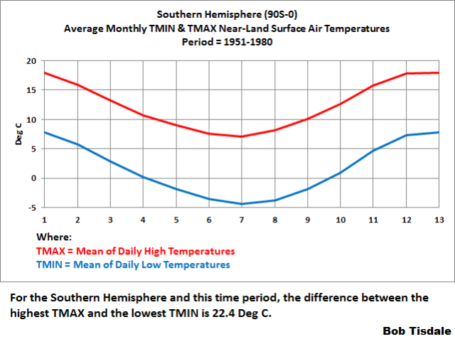
Figure 1
The average annual cycles in TMIN and TMAX for the Northern Hemisphere (0-83.5N), again for the reference period of 1951-1980, are shown in Figure 2. For the Northern Hemisphere and this time period, the difference between the highest TMAX and the lowest TMIN is 34.9 Deg C.

Figure 2
HOW SURFACE TEMPERATURE DATA ARE NORMALLY PRESENTED
Normally, global land+ocean surface temperature anomaly data are presented in anomaly form, with the scaling of the y-axis as tight as possible to make the long-term and short-term variations appear large, when, in reality, they’re very small…so small you’d never notice them if it wasn’t for the constant browbeating from politicians, the mainstream media, and members of the publically funded climate data and modeling businesses, which have to keep their funding alive.
AND NOW FOR SOMETHING COMPLETELY DIFFERENT (Thank you, Monty Python)
With that in mind, Figures 3 and 4 compare (First) the monthly global mean land+ocean surface temperature data in anomaly form (black curve straddling zero degrees C) with (Second) the monthly TMIN (Mean of Daily Low Temperatures) and TMAX (Mean of Daily High Temperatures) data in absolute form for the Southern Hemisphere (Figure 3) and the Northern Hemisphere (Figure 4). The TMAX curves are in red and the TMIN curves are in blue.

Figure 3
# # #
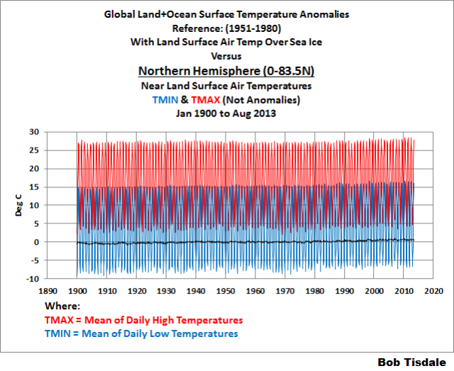
Figure 4
But, Bob, I can hardly see the long-term and short-term variations in the global mean surface temperature anomaly data.
Bingo! That’s precisely the reason I went to all the trouble to prepare and present these comparisons.
Important Note: The hemispheric data from Berkeley Earth end in 2013, while their global temperature datasets continue to be updated monthly. I’m not trying to hide anything by ending the graphs in 2013 as some of you were thinking.
The data in the graphs begin in 1900, because the year 1900 is the last year of the IPCC’s new definition of pre-industrial times, which runs from 1850-1900. See the IPCC’s Changes to the Underlying Scientific-Technical Assessment to ensure consistency with the approved Summary for Policymakers from their 2018 Special Report (SR15). [End note.]
That’s it for the primary content of this post.
A LITTLE HELP, PLEASE!
I’m planning to continue this series of posts with graphs like the ones in Figures 3 and 4, but providing them for individual countries. See the example for Canada in Figure 5. (Brrr.)

Figure 5
I’d like to begin with the countries that visitors to this blog call home. I believe most visitors are from Australia, Canada, France, Germany, India, Ireland, Japan, New Zealand, Nordic countries, South Africa, and, of course, the UK and USA, because, if memory serves, you’ve mentioned them all in comments at one time or another. (Sorry if I missed your country.) And many of the posts are written about The UK, USA, Germany, France, and so on. Please advise me in comments so I can include them in the upcoming post (or posts, if need be). Please do, because we should be able to have some fun with this, especially those of you who use social media. (Imagine all of the tired old arguments you’d see.) If the list gets long, beyond 22 countries for the sake of a number, we’ll spread them out over a couple of posts.
And I assume many of you less-verbose visitors may be from many other countries. Maybe this will be the first post on which you’ll offer a comment. If so, welcome aboard.
That’s all, folks. Have fun in the comments and enjoy the rest of your day.
STANDARD CLOSING REQUEST
Please purchase my recently published ebooks. As many of you know, this year I published 2 ebooks that are available through Amazon in Kindle format:
- Dad, Why Are You A Global Warming Denier? (For an overview, the blog post that introduced it is here.)
- Dad, Is Climate Getting Worse in the United States? (See the blog post here for an overview.)
And please purchase Anthony Watts’s et al. Climate Change: The Facts – 2017.
To those of you who have purchased them, thank you. To those of you who will purchase them, thank you, too.
Regards,
I didn’t feel it was appropriate to include this in the post itself.
And Now For Something Completely Different – Thank you, Monty Python!
https://www.youtube.com/embed/K2P86C-1x3o
Enjoy the “fish slapping dance” skit. It always makes me smile.
Cheers,
Bob
If I want to concentrate, I listen to instrumental music on my headphones. It’s always on and if I want to watch a video, I have to turn it off, which is what I did before watching the above video.
Having watched the video of two military guys, I turned the music back on. J.P. Sousa, how appropriate. The Pythons seemed to have a soft spot for Sousa.
MP, like Sousa, made the ludicrous wonderful…
Michael Palin says that this was always his favourite sketch but that by the time it was successfully completed, the water in the lock had dropped so far, his fall into the water was considerably more than they’d originally anticipated!
Bob, thanks for the post. I had actually planned to do exactly what you did for Canada… when I could find time. (Such analysis is not part of my day job.) Linear regression on the data for Calgary from 1885 to 2018 shows that summer daytime highs are decreasing, while winter daytime highs and all-year nighttime lows are increasing. Given that Calgary’s population has grown from about 5000 to about 1.3 million over the time spanned by the records, I expect that UHI plays a large role. I was going to separate the data into urban and rural locations and compare those trends. I don’t suppose you’ve done that already?
I had to “get used to” temperatures in Massachusetts for 9 years.
I moved to Arizona because I needed some global warming.
Tucson Arizona. The official Tucson temperatures are from the airport, where there has been substantial development in the last 30 years. Solar panels on every spot that isn’t paved with asphalt or has a building on with substantial A/C needs.
No coincidence that the NOAA/NWS and the liberal media here liked to trumpet the higher and higher summer and fall monthly average temps as recorded at the Tucson airport (ICAO: TUS).
On the other hand, the USCRN site NW of the city in the desert since 2003 has not seen any significant trends.
This morning it was just above freezing at the airport just before sunrise. The solar panels were producing not one watt of power for the grid. The nat gas fired power plant on the south side of town near I-10 was belching out 2 very large steam plumes into the morning air and against the crystal blue sky it was beautiful to know everyone was warm in their homes, with their gas and electric heating devices. Also a medium size coal power plant about 40 miles SW of Tucson no doubt was cranked up too. Renewables are a formula for energy disaster, even in the SW desert. Only in the lunatic liberal land of fairy dust and unicorns does solar at grid scale make sense.
We will need a Yellow Vest revolution here in the US too if the Democrats retake the WH in 2021.
Go figure.
USCRN shows 2005, 2006, 2012, 2015, 2016, 2017 were all warmer than 2018.
USCRN is the only series you can really trust.
https://www.ncdc.noaa.gov/temp-and-precip/national-temperature-index/time-series?datasets%5B%5D=uscrn¶meter=anom-tavg&time_scale=12mo&begyear=1895&endyear=2018&month=11
(for the year Dec-Nov)
Shows what a difference the instrument and environment make – I was driving down there (Alvernon and Valencia) right around 6:00 AM, and I keep an eye on the car outside temp thermometer as I do so. Never dropped below 47. Now, that thermometer is probably only good for +/- 3F, and is only about two feet above the ground, but the asphalt and construction around that area is obviously still radiating a large amount of heat even at the end of the night. I also see about a 7F difference between there and Golf Links / Kolb at the same time…
What convinced me about the serious problems with urban temperature measurements was way back around 2010, when I ran some comparative analyses of the trends between Tombstone (records back to 1880, same site that never had development around it) and Tucson International Airport. Tombstone – a very small negative trend (no, not statistically significant); TIA – classic “hockey stick” from about 1990 forward. The “UHI adjusted” numbers showed the same trend – which told me that the “adjustments” were hokum.
Yes, I have used my car thermometer to see UHI in action. The accuracy doesn’t matter as long as it is repeatable since it is being used as a comparator. I have seen a 5C drop in temperature when driving to my home in the country from the outer suburbs of London. Usually this difference is in the summer so it must be the heat storage of the buildings compared to the fields and woods. A drive recently showed the difference a change in altitude of just a few hundred feet makes in turning rain into wet snow. The difference between suburbs and home then was only 1C. Another winter drive showed another interesting result last year. I live 8 miles from London’s southern airport Gatwick. Surrounding the airport are industrial, business and retail buildings. I left my house and drove to a supermarket on the edge of the airport. Only when getting back into the car did I note it was now 3C where it had been -1C at my house. Watching closely as I drove home it slowly dropped back to -1C. I believe the likes of Jones of Climategate fame have claimed they allow a 1C correction for UHI.
+The accuracy doesn’t matter as long as it is repeatable since it is being used as a comparator.”
Not sure that is always right.
Consider, one day it is 80 degrees actual but over the blacktop your car reads 85. It rains that night, cooling that blacktop, and the next day while it is also 80 degrees actual, it is overcast/cloudy and the blacktop only gets to 80 or 81 or 82. Actual temp is 80 each day but you car shows it has cooled 3-5 degrees.
This is why I have a problem with those who don’t discard ALL sites affected by poor siting or UHI. Their readings, virtually always higher than actual, can be varying from 0 to maybe 5+ degrees depending on conditions that are not in the record.
I bought my Oxford BrightVest on Amazon already.
Around here, the characters are already stocked with Blaze Orange… and camo.
November and now December is cold in northern WI. But hey it’s weather 😉
We could use global warming.
Ditto, northeeastern Illinois. Could you just pack up some of that Globular Warming and ship it up here? Thanks!!!
On the proposal to do charts for certain countries, some of the countries are a bit large to have the same climate. California is not Texas (for that matter, Southern California is not Northern California, or the same for Texas). Or British Columbia and Alberta. Or Tasmania and the Northern Territories.
Tom, I understand, but Berkeley Earth provides data for countries, so it is my intent to post them.
Regards,
Bob
So it’s a problem with Berkeley Earth.
There’s no problem, Tom. A country is a country. And Berkeley Earth present data for countries. The temperatures in California, Texas, Southern California, Northern California, British Columbia, Alberta, Tasmania or the Northern Territories do not represent their respective countries. It’s a real easy concept to understand.
Berkeley Earth also present data for States and Provinces, and for Cities. But they are not on my list of things to do.
Adios,
Bob
Tom, PS: I guess I should’ve used the phrase “country mean land-surface air temperature”. I forgot to include the word mean. Sorry.
Bob
And I can be a bit of a pedant.
Thanks, Tom, because, with your comments, I noted I need to include the word “mean” on the graphs and in the text of the post.
Regards,
Bob
A country is a country, sure, but a mean temperature is an artificial construct with no value. Even in a place as small as Hong Kong the mean temperature that the Observatory publishes is nonsense. The annual variation in temperature is upwards of 30C, the diurnal variation is up to 10C on any day and the regional variation at any given time can be also up to 10C. So the published mean temperature (which is actually what is recorded at the Observatory in the heart of the urban area) bears no resemblance to the temperature I am used to. Scale that up to a USA-sized country, or the earth, and one has created a mathematical fiction.
In Summer in Melbourne, day to day, the maximum temperature can vary by over 20 C degrees and yet 5 million people still survive there and the population is increasing faster than in the rest of Australia. Thanks, Bob, for the very illuminating T Max and T Min graphs.
Day do day? Pretty much minute to minute!
I exaggerate, but not much 🙂
And try understanding the mean temperature of Australia itself. We have deserts, rainforests, dry coasts, wet coasts, bush, temperate weather (like England) to full on tropical.
In Melbourne the temperature can change 20 C in a couple of hours some days.
Thanks Bob. Gavin Schmidt gives the game away when he says: “no particular absolute global temperature provides a risk to society, it is the change in temperature compared to what we’ve been used to that matters.”
Surely that means the focus should be on adaptation, something we do every year from summer to winter, from location to location, some needing more adaptation than others?
Perhaps that’s why the shrieking seers seem to be focusing more on the catastrophes that might be caused by 6-8 degrees rather than the forecast 0.5-1.0 degrees
“compared to what we’ve been used to”
This is the key term, and it shows the futility of listing a whole lot of averages of absolute temperature. No-one gets used to, or is even affected by, a global or a hemisphere average. They are affected by their local temperature, and in particular by some seasonal aspect that becomes limiting for them. Weather is too hot or cold for health of humans, farm animals or crops. Heat extremes make wildfires destructive. It doesn’t happen everywhere, in the same way.
That is why average anomaly is actually meaningful, because of its homogeneity. If the anomaly is up, regionally or globally, that means the local temperature is likely to be affected to that extent, and that goes directly to those critical situations.
Even things that look like global consequences of warming are usually caused by some critical seasonal effect in a location. Sea level rise is affected by melting ice, which is actually set by summer temperatures in particular locations. Thermal rise is closer to a truly global cause. Even hurricanes are responding substantially to local seasonal temperatures.
For all these things, a global absolute average is useless, but an anomaly average can be related to the local seasonal critical effect.
You are absolutely correct that what matters is the local temperature — that’s what organisms experience, and they experience *much larger* changes locally than the global anomaly average. On average the global anomaly average has risen about 1C since not-really-pre-industrial latter half of the 19th century — but that is a very *small* change over a very long time, while local temperatures practically everywhere experience much larger changes from annual fluctuations, seasonal variations, and even daily variations. Global warming, such as it is, has been *trivial* at the local level, and the local level is what counts for actual organisms.
One thing displaying only anomalies does is allow the impression that the warming has been both rapid and large in scale — neither is actually true. It also hides the fact that the models aren’t consistent on absolute temperatures.
“is allow the impression that the warming has been both rapid and large in scale”
The numbers are there. Usually quoted as something like 0.2°C/decade. You may or may not think that is rapid or large, but it is clearly stated.
Nick Stokes
Anomalies are used because they look scary on graphs with inappropriate X & Y axis. The public don’t understand what anomalies are nor how they are being misrepresented.
And no one in their right mind would believe temperature measurements before digital instrumentation could be measured reliably to 0.1C, even then there’s an error margin.
But when was the last time you saw a BBC report showing temperatures with error margins? Or anomaly graphs presented in proportion?
Heat extremes do not make wildfires destructive. Forest fuel loads make wildfires destructive, as well as structures built where wildfires are likely.
You sound like the lying governor Moonbeam of California. This is a Liberal Media meme, with not a word, not a word, of truth.
Why would a sound technical mind such as yours put these words on the Internet?
Wow…
HotScot, you really hit the proverbial nail on the head with this statement: “Anomalies are used because they look scary on graphs with inappropriate X & Y axis.”
“Global warming, such as it is, has been *trivial* at the local level, and the local level is what counts for actual organisms.”
It’s not so trivial that organisms aren’t responding to it by changes in phenology, migration and range. And while some organisms can adapt quickly, others can’t. There is then a risk of ecological imbalance and disruption.
Example: Many insects are limited in range/reproduction by low winter temperatures. Raise those temperatures, and you get population explosions – the kind that kill millions of acres of forest. All that dead timber dramatically changes the potential for wildfires both by providing fuel and by a loss of canopy, which normally shades the ground and decreases wind speed at the ground level.
Mr. Stokes, you said:
“Even things that look like global consequences of warming are usually caused by some critical seasonal effect in a location.” and “For all these things, a global absolute average is useless, but an anomaly average can be related to the local seasonal critical effect.”
If I understand you correctly, you are saying things that look like they are caused by Global effects instead are usually caused by Local effects and that Averaged Absolute temperatures are useless but Average Anomalies have meaning. If I accept that this is true, doesn’t it also follow that Global Average Anomalies are meaningless and only Local Average Anomalies have meaning?
“doesn’t it also follow that Global Average Anomalies are meaningless and only Local Average Anomalies have meaning?”
No, by average anomaly I mean global (or large regional) average. And the point is that that maps onto local anomaly, because of homogeneity. If global anomaly has risen 1°, chances are that anomaly where you are has risen too. It might have risen less than 1, maybe more (that’s how averages work). That 1° is added to whatever you were used to. Added to a cold winter’s day and you’ll praise it. Added to a howling hot gale with fires everywhere, and you won’t.
I’ll praise 18 degrees over 17 degrees ?
I’ll curse fire winds at 96 degrees over fire winds at 95 degrees ?
Oh, come on ! These difference would be meaningless as far as “what we are used to”.
Mr. Stokes, you said: “That 1° is added to whatever you were used to.”
I’m sorry, but that makes no sense to me. Anomalies are not relative to what I am use to, they are relative to an average of some standard period. Also, a person is not used to an anomaly, they are use to an absolute temperature, so to determine if I am used to an anomaly, I would have to convert the anomaly to an absolute temperature then compare that to the absolute temperature I am used to in order to determine if I will or will not praise the temperature. Or to use one of your examples from a previous thread, if the threshold for the likelihood of severe Forest Fires in Victoria is 45c, an anomaly by itself tells you nothing about the likelihood of Forest Fires in Victoria. You have to convert the anomaly to an absolute temperature then compare that to 45c to determine if Forest Fires are likely.
” You have to convert the anomaly to an absolute temperature then compare that to 45c to determine if Forest Fires are likely.”
Yes, that is my point. With the anomaly information, you can do that. And 1°C anomaly makes them more likely.
Mr. Stokes, you said . . .
Always a pleasure to hear your logic on the subject at hand, RicDre!
Mr Stokes, you said:
1) “With the anomaly information, you can do that.”
True, but you could also do that with an Absolute Temperature, though if I understand you correctly, you feel that an average of Absolute Temperatures is not mathematically meaningful, but an average of Anomalies is mathematically meaningful.
2) “And 1°C anomaly makes them more likely.”
This is true if the base temperature used to convert the anomaly to an absolute temperature is close to 45C but not necessarily true if it is not close to 45C.
Also, I would add that if we agree that you have to convert the anomaly to an absolute temperature before we can compare it to what I am use to, I think we then agree with Bob Tisdale’s point that Mr. Schmidt is incorrect when he said “To be clear, no particular absolute global temperature provides a risk to society, it is the change in temperature compared to what we’ve been used to that matters.”
sycomputing: “Always a pleasure to hear your logic on the subject at hand, RicDre!”
Thank you, us grumpy old retired computer programmers like to be complemented on our logic. As an aside, during my working years I noticed that most of the good computer programmers I knew had also been good in High School at doing geometric proofs which are often as close to pure logic as one can get.
Nick, you wrote at the conclusion of your comment above, “That 1° is added to whatever you were used to. Added to a cold winter’s day and you’ll praise it. Added to a howling hot gale with fires everywhere, and you won’t.”
You’ve lost track of reality, Nick. The 1 deg C change in global mean surface temperature occurred over 100 YEARS.
Adios,
Bob
There’s a 3 degree C difference in maximum temperatures for the day here in the Adelaide greater metro area depending on where you live around Adelaide, Elizabeth, Noarlunga, Glenelg and Mt Barker so don’t be too hard on Nick-
http://www.bom.gov.au/sa/forecasts/elizabeth.shtml
I could ask my wife’s centenarian Aunt for her opinion on how Nick’s anomaly has impacted her over a lifetime but she’s in an airconditioned aged care facility now and she grew up as 1 of 8 country kids 250kms to the north of Adelaide in the southern Flinders Ranges so she might be a bit out of touch with the finer nuances of climatology.
“If global anomaly has risen 1°, chances are that anomaly where you are has risen too. It might have risen less than 1, maybe more (that’s how averages work). That 1° is added to whatever you were used to.”
Nick S, aren’t warming anomalies nearer the poles greater than nearer the equator? I thought that’s the main reason for angst about potentially detrimental sea level rise… as ice melts in Greenland and Antarctica.
With vastly more people dwelling at lower latitudes, chances are that anomaly where you and I and pretty much everyone else lives has risen less than 1°. For the average to work as you suggest, a further prerequisite would be land-based “population density homogeneity”.
” chances are that anomaly where you and I and pretty much everyone else lives has risen less than 1°”
In fact, although the poles are warming faster, the area is small, and so doesn’t take much away from anomalies elsewhere. But yes, I said “It might have risen less than 1, maybe more (that’s how averages work)”. The thing is that in a warming world as shown by anomalies, chances are your cold days and warm days will all get warmer. And hot days, which may matter.
“The thing is that in a warming world as shown by anomalies, chances are your cold days and warm days will all get warmer. And hot days, which may matter.”
I still don’t think that’s quite right. In business environments it would be characterized as a ‘peanut butter approach’.
First, for any given location or region there is an anomaly that may or may not be in sync with a global anomaly. That anomaly is what it is – positive or negative, not what chances are implied by a global number.
Second, the method used to calculate a global anomaly eliminates underlying information about the anomaly’s daily and seasonal origins. If the result shows one degree of warming globally, it doesn’t follow that temperatures throughout any particular day in any particular location are likely to be one degree warmer. Other possibilities exist: on average winter days might be two degrees warmer, spring and autumn days one degree warmer, and summer days essentially unchanged. Or perhaps overnight lows are two degrees warmer and daytime highs are unchanged, or vice versa, or any of many combinations and variations of the foregoing. And these may also vary from location to location based on factors such as distance to the moderating influence of oceans and other large bodies of water.
To put it another way, a global temperature anomaly is rather different from the house odds for blackjack, which are the same whether you’re in Las Vegas or Monte Carlo.
“In fact, although the poles are warming faster, the area is small…”
Not exactly… assuming the global anomaly being referred to is land-based. If you would characterize Australia as something other than small, compare its area to Antarctica, to Northern Canada plus Alaska and Greenland, or to Siberia.
So why should we be terrified of another 0.5 degrees warming?
For many in the US, the warming has been about 12-14 degrees C over the course of their lifetimes, and for many of those, the change took place in a day or two, when they moved from New England and the Great Lakes to the sunbelt. Aside from the added expense of golf balls, the change was extraordinarily beneficial for them!
Are there legitimate reasons to be very afraid of another half a degree warming?
The idea that ‘life’ cannot adapt to such a change is simply nonsense. Life is always adapting. Always has and always will, no matter what we do. When ‘save-the-Earth’ types arbitrarily label all change as bad, they are showing a profound ignorance of nature and the Earth. Change and adaptation is the driving force of Evolution. Are they suggesting that evolution is evil? Are they for Creationism, with themselves playing the role of God? The only constant in nature is change. The only stasis in nature is found in death, and environments that are unchanging, slowly weaken and die out. It is ironic and tragic that modern environmentalism has become a force against the actual environment, in favor of an Eden mythology of their own creation.
In absolute terms, the return of more CO2 to the atmosphere has been a huge boost to the Earth’s biosphere. The planet is literally greening. Animal life is reaping the benefits.
Humans are growing more food per acre than ever. If people were rational, there would be a global holiday celebrating the increase in atmospheric CO2. We would appropriately call it ‘Earth Day’ and celebrate it by burning fossil fuels!
Are we panicked because of the threat of increasing extreme weather events? Well, that isn’t happening, is it? Extreme weather events are only more impactful because of the increase in population and property in harm’s way. The events themselves, if anything, are a little less severe in many areas, or unchanged.
That leaves sea level rise as a cause for panic. Sea level rise is continuing at much the same pace as it has for hundreds of years, according to the measurement devices that have been measuring it for hundreds of years. All the Maldives are still there. Bangladesh is a bigger country now than it was 40 years ago. Water encroachment is usually a problem of ground water extraction, not rising seas. Coastlines are and always have been dynamic. The problem is not with changing coastlines. The problem is with the human idea that they should not change. When the next glaciation period begins, coastlines will expand, and we will move out to remain close to the sea. And when it ends, we will move up hill to not drown, just like we did 12,000 years ago.
In short, the real problem with climate change is human perception, not the tiny physical changes in the atmosphere, similar to or less than what has always happened and to which life has always adapted. The human ability to adapt has increased by orders of magnitude over the last few thousand years. Unfortunately, the human ability to be rational and not be subject to fear-mongering appears to be unchanged from our ancestors; dutifully offering sacrifices to imaginary gods to no avail. We remain like small children, terrified by stories of hobgoblins hiding in the closet. In that state, we make very poor decisions.
The modest warming of 1-degree C that has happened over the last 150 years appears to be a blessing, by all rational accounts. It is our irrational fears that truly threaten our existence.
Well said.
“That is why average anomaly is actually meaningful, because of its homogeneity. If the anomaly is up, regionally or globally, that means the local temperature is likely to be affected to that extent, and that goes directly to those critical situations.”
HOW meaningful, though ?
Show me the extent to which an anomaly, say of less than 1 degree C. on the warm side, affects any local temperature. How do you reason that this anomaly gets distributed back over the regions for which it was calculated to correspond to any effect whatsoever? That’s asking quite a bit of that 1 degree C. Simply magical !
“For all these things, a global absolute average is useless, but an anomaly average can be related to the local seasonal critical effect.”
Again, show me how an anomaly of say 1 degree C. relates back to any “critical effect” whatsoever on any local season. Again, simply magical !
Complete and utter nonsense, Nick.
What is it “that becomes limiting for” me? Is it the 80° F summer temperature? Is it the 20° F winter temperature? Or is it the 70-75° F temperature that I keep in my house where I spend most of my time?
What is useless is your comment. The fact you appear to think it is actually meaningful is quite hilarious. It shows the depths of your brainwashing and the degree of excuses you will create to maintain that belief system.
oh look.
you are hiding the warm 1930s with your data
presentation. Mannian.
Mr. Mosher:
This drive-by comment is rather disappointing especially given that in some recent threads you have made some very interesting comments which prove that you have much to offer to this site when you are willing to make useful comments.
No concern, RicDre. See my reply to Steven below.
Some people might think he set me up to furnish the graph with the comparison with the U.S. data.
Cheers,
Bob
..OMG ! Mosher collusion ? Now we’re done for…
Thanks, Marcus. That made me laugh!
Don’t worry, though. Much of Earth’s Northern Hemisphere would have freeze over before Mosher and I knowingly worked together on something.
Cheers,
Bob
Oh Bob and I already are working together. He is using our data.
I have no issues working with anyone on the planet who wants to do data analysis.
friends, enemies, kids, adults, amateurs, ect
Most skeptics dont dare to work together because I will ask them to show all the data in a variety of formats and they ( rather like mann) are scared to show data in formats that might undermine their agenda.
Bob Tisdale:
Not concerned, simply disappointed that we didn’t get a more interesting comment from Mr. Mosher, but as you say, it did prompt you to provide the additional graph.
There is no useful comment to make about a presentation that hides relavant information.
It’s a stupid trick that makes WUWT look bad.
Personally when I do temperature charts I actually start by plotting them just the way Bob does.
Its just the START however. A begining sanity check.
Then, since I am interested in Climate and Changes in temperature I do a better job.
1. I do annual charts, of temperature. I dont trust my eye to pick up long term trends in data with cycles. I do this whether I am look at temperatures or PRICES or anything with seasonality
2. This presentation allows me to see rises and falls and pauses. Remember the pause?
3. For temp Change? well there are a couple formats : monthly does not cut it.
A) Annual
B) an average of the later period minus an early period.
What about that global average?
The GLOBAL average is basically good for a couple things.
A) Evidence that we are coming out of an LIA. The best way to depict that is with an annual
or even a 5,10 30 year average. But hey if a couple degrees C is nothing in the warm direction, then a couple of C in the cold direction should not be noticable.
B) Used as a test of GCMs.
C) calculating ECS
For these it doesnt matter absolute or anomaly. A little alegbra doesnt tax the brain. The
amount of ink wasted on debating anomalies is crazy. Its a stupid discussion.
The “global” average also matters for the oceans, where an added C or 2 will increase sea levels.
If you live at the beach that added temp might be nice, but the increased sea level, not so nice.
Most folks live in areas where the daily change in temp is large and so you think, whats an added C or 2??? And for the most part that’s right. Unfortunately in some places we live closer
to temperature thresholds. If your lifestyle depends on ice, well ice is sensitive to a threshold:
big difference between freezing and thawing. Same for folks who have adapted to areas that
have permafrost. Building on permafrost that never thaws, suddenly becomes unwise if the temps increase just enough to thaw that permafrost. Same for farmers who farm at a threshold
temperature, a little change can cause a big effect. Same for people who have adapted to hot
areas. A little more heat, a few more heat waves, a little change can have a big effect.
Same for Hurricane formation areas, smal changes could drive big changes.
In any case if you wanted to look at this locally, if you wanted to understand it rather than hide it in a Mannian fashion, you’d do a annual chart separately, so that the change, small or large, was visible. And since there is a trend, you’d pick axis such that the trend was visible. That way you
could also spot pauses and dips. And gain understanding.
Once you had that local chart you could then understand.. Hey maybe 1C means nothing to me
locally. Lucky you ! Some other guy may say. wait, 1C really matters to me.
I can sum up my position like so.
1. Bobs monthly presentation Hides the very thing gavin suggests we look at. The
change. Its fine to show the monthly, but the annual needs to be on a seperate graph.
This is just Tufte. https://en.wikipedia.org/wiki/Edward_Tufte. This isnt a climate
science issue this is a DATA VIZ issue. Bob’s data viz sucks.
2. Will a small temperature change matter? Well, it depends where YOU live and what you
do. Surely the small change back to the LIA would be important, right? cold kills.
So rather than obscure the small change as Bob does, it makes more sense to show it clearly.
Most folks will say.. so what? Folks who live in other areas where temperature sensitive
processes concern them, may be less sanguine. The point is Bob’s presentation doesnt
do the best job of making the change clear. I can look at an annual chart that goes from 16C to 17C and still say “so what”. In fact it would be a stronger “so what ” if the annual change is shown clearly.
3. I think the responses to global warming should be local. The approach is called adaptive governance
https://www.amazon.com/Adaptive-Governance-Integrating-Science-Decision/dp/0231136250/ref=sr_1_1?ie=UTF8&qid=1544340749&sr=8-1&keywords=adaptive+governance
What I would say is this. Bob’s presentation really would not be of any help to a local community trying to decide if THEY were going to be impacted by a 1C change ( in either direction) His presentation hides inportant data – like the annual change, and long term trends.
And futher if he wants to show monthly data it’s better to show each individual month. or
seasons.
4. The focus on anomaly versus absolute is pretty silly. There was an LIA whether you plot
it in anomaly or Absolute. Its getting warmer. IF you believe that the response to AGW should
start with the individual and community , as I do, then you want to make sure you give them the information in the clearest form possible that hide nothing and obscures nothing. If the rise is only 1 c in annual, then you should be able to look at the chart and see that in one glance.
Again, see Tufte. This is not climate science, this is simple data viz.
Lets take an example. My hometown Seoul
http://berkeleyearth.lbl.gov/locations/37.78N-126.10E
Will an additional 1C matter to us? ya you bet it will. One of my friends did the modelling
for the heat wave warning system in Seoul. We are pretty lucky to have it, but folks still died
this past summer. it was brutal. Regardless of WHY we get heat waves, we need to be able
to prepare for more in the future. When that many people died, it showed me we are not
even prepared for the past.
https://www.theguardian.com/world/2018/aug/09/south-korean-heatwave-causes-record-deaths
We get warnings on our cell phones before the worst of it hits.
Anyway, looking to the future what can we expect??? Well, we could say “There is no way to know! do nothing!” Not very smart. We could look at the current trend and say “extrapolate”
or we could look at physical models and consider some sceanrios
https://link.springer.com/article/10.1007/s13143-017-0059-7
In every case the people of Seoul will get to decide how THEY want to respond to the risk.
Do they want to do nothing? plan for a continued rise ( extrapolating) or plan for more
severe cases? We will decide. Not you, not folks on WUWT, but the people of seoul will
decide. And to help them decide they should have good data and good data viz. Bob’s
monthly charts SUCK for this purpose. Our Annual chart is a little better: A seasonal chart would be much better to illustrate the heat wave risk. If you think there is no added heat risk for Seoul in the future, well, quite frankly, we dont care what you think. Not one bit.
Here is cool project, about 3-4C cooler than the rest of the city.
https://inhabitat.com/seoul-recovers-a-lost-stream-transforms-it-into-an-urban-park/
when it gets too frickin hot we head down to the river. So you might think 1C additional is no big deal.. well buzz off. It is a big deal for us. And as a resident of Seoul I look at Bobs style of chart and say, why is that guy trying to hide the increasing temperatures that all know about and feel?
Why is he trying to hide the increase in temps that drive our summer electric bills that we can see clearly. What’s his agenda?
Wow! A 1,200 word comment out of Steven Mosher. Unfortunately for you, Steven, your comment was irrelevant. You wasted your time.
You began your comment:
“There is no useful comment to make about a presentation that hides relavant [sic] information.
“It’s a stupid trick that makes WUWT look bad.”
My presentation clearly illustrated, and future posts with similar graphs will illustrate, what I wanted [want] to show, Steven. There’s no trick. If our host Anthony Watts felt my presentation made WUWT “look bad”, he would’ve commented to that effect on this thread, or written me an email, or called me on the phone to express his displeasure. I can assure you that none of those have happened, Steven.
Isn’t that interesting. You began, “There is no useful comment to make…”
So everyone reading this thread will understand that, according to you, the rest of your comment wasn’t “useful” [your word]. Apparently, you enjoy wasting your time writing comments that aren’t “useful”. That sounds like a trollish behavior to me.
Adios,
Bob
Mr. Tisdale
Welcome back as a WUWT contributor
this year — your clear easy to read charts
always give you away before I read the byline.
I didn’t read the long-winded Mosher comment
because just reading his name gives me a headache!
I do have a few comments about the article.
– The charts are clear, as usual, for Mr. Tisdale
– Many sentences are far too long.
Write as you talk, and sentences will be
shorter, and easier to read.
Southern hemisphere temperatures are
hindered by insufficient coverage
before World War II.
All surface data are severely hindered by
massive infilling, that can never be verified or falsified.
The use of surface data should stop when
satellite data become available.
They have far less infilling and the people in charge
don’t seem to have a “CO2 is Evil” agenda.
After saying all that, what difference does it make
if the average temperature has changed by 1 degree C.
in 138 years?
Why should anyone care?
That’s harmless*** climate change,
probably unusually stable compared
with ice core reconstructions.
( *** harmless except in the weak minds
of always frightened leftists ! )
Of course, if the world was getting COLDER,
perhaps meaning that we were
leaving the current interglacial,
that would be FAR MORE IMPORTANT.
As much as I would like to know the
average temperature trend in Bulgaria,
it seems that climate change from
greenhouse gases would have to be global,
not national.
But if there were a large number
of countries with little or no measured warming,
that would be evidence that whoever
compiles the global average temperature
may have “their thumb on the scale”.
My climate science blog:
http://www.elOnionBloggle.Blogspot.com
Interesting, Steve.
But not unprecedented? And this year’s heatwaves no doubt had a major UHI component?
And would the ‘unbearable’ nature of the heatwave be exacerbated, upon goings outdoors, to those who reside and work in air-conditioned premises and travel in air-conditioned cars?
” ….. Temperatures in the capital Seoul, which is home to about half the country’s population, reached 39.6 C last week, the hottest temperature in 111 years…..”
https://www.theguardian.com/world/2018/aug/09/south-korean-heatwave-causes-record-deaths
Stephen Mosher says:
“Personally when I do temperature charts I actually start by plotting them just the way Bob does. Oh really? This should be interesting.
“Then, since I am interested in Climate and Changes in temperature I do a better job. Oh really! This should be really interesting!
I am, as Stephen is, an uneducated, layman; a climate novice.
Neither of us have science degrees, or engineering degrees or even, as far as I’m aware, Marketing degrees. Stephen has an MA in English, in which case I sincerely hope he tapped this garbage out on a 1990’s mobile phone with text only facilities as it barely makes sense.
I’m not sure where to start…….but I’ll have a stab.
Few people live on climate thresholds Stephen. Most humans congregate where life is easiest, where there is plentiful food and water. Designing a climate change reactionary plan around marginal occupancy areas is like planning for Scotland to be a tropical paradise in the next Century and bikini’s mandated because it’s bound to get hot!
The IPCC and our global MSM present average global temperatures across the board, in the full knowledge that the areas likely to be most affected by their concept of global temperature change are the northern and southern hemispheres, in winter, and at night.
Mind you, no one has ever demonstrated any meaningful temperature change in the last 20 years or so, but never mind, lets continue as succinctly as possible, which is difficult considering the nonsense you posted.
It is, as it stands, utterly impossible to adopt adaptive governance when so little is known of climate temperatures. We were still chucking buckets over the sides of ships to gather water temperature data until the early 20th Century and local weather stations were just that, until the 1940’s or so. Mercury thermometers under those circumstances couldn’t possibly determine temperature measurements to within 0.1C so the baseline for any accurate measurements begins with digitalisation and I’m not sure that transformation is even complete now.
So as a starting point, we have 100 years of data contaminated by tea boys being sent out into the snow to record measurements from ill maintained, ill sited, ill maintained Stevenson screens, and cabin boys chucking buckets over the sides of ships, to no determined depth, along well worn trade routes, wholly ignoring the Southern Ocean unless by accident.
Right off the bat, any contention you make as to global temperature change is utter BS….you, and your climate scientist friends know nothing of temperatures out with the last 30 years or so. Even digital data is in its infancy, as are satellite observations.
As for climate temperature anomalies. I’ll take them seriously when you plot them on proportionate XY axis. As it is, anomalies are useful for nothing more than scientific naval gazing and frightening the horses. The public run around with their hair on fire because climate alarmist compress one axis or another to present a 1C increase over 100 years as a catastrophic rise in temperature. It is scientifically dishonest and as Bob’s graphs demonstrate, perceptibly inconsequential.
Heat waves in Seoul? Frankly, tough titties. You live there, there must be benefits of living there that far outweigh a heatwave. In the same way that living in the UK is worth it despite the miserable weather.
Swings and roundabouts mate. Don’t like it? Do something about it, move, don’t hog all the benefits then lumber the rest of the world with your personal perception of life’s miseries.
You’re a salesman Mosh, don’t pretend you’re anything but that. You don’t get the science because you’re no more a scientist than I am, you just talk a good game; well, you imagine you talk a good game, but you and I are the same, and I recognise your style.
“Why is he trying to hide the increase in temps that drive our summer electric bills that we can see clearly.” The summer temperatures in my neck of the woods (NE Calif.) have been very consistent over the last seven decades, the only problem with the electric bills has been the ever increasing costs per KWH.
Thanks for the setup, Steven. The 1930s elevated highs in the TMAX for the United States does show up quite plainly in the Berkeley Earth data. See below:
Can’t miss it.
Adios,
Bob
Sorry, not seeing it.
The other thing you can’t see with this presentation is the rate of increase from 1900 to 1930.
That’s totally gone missing. I also can’t see the flat part in the 50s to 70s.
So much detailed information is lost in this presentation. You are not trying to make things clear Bob, you are trying to hide things.
You are hiding the pause
you are hiding the interesting 1900 to 1930s rate of increase
All rather Mannian.
The worst part is you are working hard to misunderstand what gavin means.
I don’t think Bob T. is hiding anything. I can see all the things Steven Mosher is mentioning simply by enlarging his graphs on my screen. They are sharp and detailed. Not sure why Steven Mosher is not able to do that. I welcome the fact that Steven Mosher now recognize the warming up to the thirties (not CO2) and other variations. I think Bob Tisdale is on to something to display global and country temperatures as absolutes rather than anomalies.
I look forward to reading further contributions. Cannot understand the objections by Steven Mosher to this way of adding to our knowledge.
What did Gavin mean? It is difficult to know the meaning of the quote out of its context.
Is it just that anomaly changing from 0.2 to 1.0 is the same as anomaly changing from -0.2 to 0.6. Selection of reference is arbitrary. Change in both of these cases is 0.8.
Global Cooling, I provided a link to the post in which Gavin made that comment so that you could read it in context. The post is here:
http://www.realclimate.org/index.php/archives/2014/12/absolute-temperatures-and-relative-anomalies/
Regards,
Bob
Steve, in my opinion the things you say are missing are, in fact, the point Bob is trying to make. When those thing are put in the proper context they are meaningless. They show up as tiny variations which is what they really are.
IMO, Bob’s charts would be much better than what is typically shown today by the media to emphasize the tiny warming that has happened. The anomaly charts often leave people with the wrong impression. I plan on providing links to Bob’s work whenever I see someone ranting about the fast rate of warming.
“Sorry, not seeing it.”
A tip Steven. Look around the only place in the diagram where the max tops 30 C. Which decade?
Thank you, Bob. Gavin’s context is climate modelling, not the real world, as I guessed. No need to change my thoughts about anomalies, accuracy and precision.
Note that the uncertainties of your graphs are high. Gavin’s ±0.5ºC looks small to me.
To assess real world impacts, you need to use absolute values. For example melting point of ice is an absolute, not an anomaly. Antarctica will not melt with 1.5 ºC anomaly far below absolute melting point of ice.
Your graphs are useful for the political discussion. Laymen should not use anomalies.
Bob,
I guess if you charted the CMIP5 multi-model average data in ‘absolute’ terms (deg. C) alongside observations in absolute terms you would hardly notice the difference between the two either.
How come you’re monthly updates don’t usually contrast the CMIP5 MMM and observations in absolute terms? How come anomalies are fine by you in that case?
‘your’ (sigh)…
The 2 elephants in the room are :-
1) the Sun – specifically how much heat is being received from the Sun and when it’s being received. The amount of heat being output by the Sun, the amount of particles being output by the Sun, the orbit of the Earth and the tilt of the Earth being primary factors.
2) water – in all its various forms. Oceans store, convey and radiate heat. Clouds keep in and keep out heat. If there’s an increase in cloud cover and a corresponding decrease in rain the temperature will decrease.
Temperature measurement wise :-
Accuracy is the huge factor. This is determined by :-
1) resolution. If the thermometer can only measure to 0.1°C then there is no way that it can detect changes less than that.
2) error margins. Measuring to 0.1°C resolution is an accuracy of +/-0.1°C. There are further errors connected with the measuring equipment and the associated software.
3) how representative the figures are. This is a location issue. It is also an environment issue. You can have a hot sun and a cold wind and that can be very problematic as to the correct figure being determined.
Also – weather patterns often move around. So one part of the country may be in drought whilst the rain has moved north and another part is in surplus rain.
It is a balmy minus 12 in London, Ontario right now, up from minus 13 two hours ago…WoooHooo, I just love “Global Warming” ! Please send any extra, unwanted or cherry picked AGW you find towards London,Ontario so my cat can go outside again.. : )
Bob thank you very much for doing this! For several years I have speculated on what the surface temperature anomalies would look like if placed over a graph that shows min and max absolute temperatures, or even just on a scale that ranges from the coldest temperature on earth to the warmest. I live in Portland, OR and often bring this up when my lefty friends start going on about global warming. Temperatures here can swing 30F in a day. I ask them if they can even *tell* a 1F difference either way.
Question for you: why did you keep the Northern and Southern hemisphere data separate instead of merging them to show a graph for the globe?
Thank you for all of your amazing work over the years!
Derek
Derek, the Northern and Southern Hemisphere data overlap, making it impractical to show them on the same graph without manipulating one or both of them, and I didn’t want to do that.
Regards,
Bob
” … change in temperature to what we’ve been used to …. ” Yeah, right. On one occasion getting off a plane in Townsville NQ, cabin crew announced that the temperature outside the aircraft was 12°C. Locals started opening their hand luggage to get out anoraks, woollies etc. Someone from elsewhere said “Oooh it’s lovely and warm up here … ”
Except temperature isn’t the only thing that matters.
A week or so ago we had an announcement that there had been a “record” high temperature of 39 (°C). I went to check the records, and could only find 36.6 and 17%RH. That was more comfortable than the days when it was ~30 and 70%. Trying to explain why tends to go beyond many people’s attention span.
Here in coastal Portugal the humidity contribution is hard to miss. Between stiff breezes out of the NW and a high RL in the 80plus%, 10C can feel as cold as 20F in Virginia. But I toss another log on the fire and add two sweaters and seven cats and we are all comfy.
Bob, this is very illuminating
If you can offer this presentation for New Zealand, it will be of GREAT assistance in focussing (some of) our politicians on the difference between theory and actual observations. The ideal 100-year period would be 1909-2008. However, I understand that Berkeley’s grid adjustments produce some strange results so raw data is preferable.
Barry, New Zealand will be in the next post.
Cheers,
Bob
Could I have Sweden, please?
Thanks Bob. Please include Switzerland. Enjoy your posts.
Hi, Ted. Switzerland will be in the next post, too.
Regards,
Bob
Great snowstorm in North Carolina and Virginia.
One thing is certain, that the average temperature in the US in December will be below average, as in November.
49 of 50 States Have Had Snow This Season, and It’s Not Even Winter Yet
By Jonathan Erdman
November 29, 2018
Maybe this month should be called Novembuary?
https://www.wunderground.com/news/news/weather/news/2018-11-29-49-states-snow-already-november-2018
Good one ren.
Hi Bob,
Thanks for the nice presentation.
There is a six – seven year periodicity that shows up very clearly due to the way your presentation overlaps the TMAX and TMIN data. On closer examination the same periodicity can also be noticed when the TMAX and TMIN data are viewed separately.
Just wondering if there is an explanation for the apparent periodicity.
Kind regards, Ian Edmonds
Ian, you wrote, “Just wondering if there is an explanation for the apparent periodicity.”
I am not able to answer your question or to perform an analysis that might point in the right direction.
Regards,
Bob
lol
I like items like this,
just one more time I learn that my preconceived ideas are plain bunkum, and show me how fallible the brain is in that it can believe its own thoughts based upon lack of knowledge, the north/south split was enlightening.
thanks
But at least I`m re-assured my brain is capable of learning new things even at this age.
I think the graph style is good, I like the attempt to reduce the scare factor, just done that with a BMS system for one small part of the largest health care provider, taken all the shown space, services and building temperature data down from 1 to 0 decimal places, it was quite a shock for some people to loose such an “absolutely necessary” (aka “apparent”) degree of control, pointing out obvious drifts, offsets and tolerances in data didn`t really allay their fears of loss of control but I`m sure they will get used to it in due course.
Two questions have still to be answered:
(1) Is there an optimum global temperature anomaly?
(2) Is there an optimum global temperature?
Other than arbitrarily chosen figures:
(1) No
(2) No
Bob,
Good stuff.
Living in Norway, a long thin country with the most beautiful extremely long coastline exposed to the Gulf Stream, next door to Sweden, with no coast to the Atlantic, and coming from the UK, an island, separate from Europe, further south but also with an extensive Arlantic coast, I would find a comparison of these three countries very interesting (and if you add in Spain, further south but with a huge high altitude interior, so much the better!).
Thanks for your hard work.
Tim C.
Tim, great idea for a future post. Please give me some time to get to it, though.
Regards,
Bob
Bob,
Glad you appreciate the idea.
No hurry, these duscussions will continue for years (unfortunately).
Not true, 1C may make a huge difference. At 42c fever you are searisouly I’ll, at 43c you die. At 24C broccoli still grows, at 25C it doesn’t. At 0C (frost) crops dies, at 1C it doesn’t. You see, 1C may make a big difference, sometimes it’s good sometimes it’s bad. The difference between tmax and tmin is irrelevant, it does not tell us the consequences of 1C warming.
Peter, the 1 deg C warming occurred over 100+ years. In that time, people adapted; plants and animals did too.
And obviously, we all (people, animal and plant alike) adapt quite quickly because, daily, monthly and annually, ambient temperatures vary many times more than that paltry 1 deg C.
Adios,
Bob
Not only in America, a sharp winter began earlier this year.

For Nick Stokes who is a fan of the anomaly method (as I used to be a fan of the rhythm method of birth control until the kids educated me).
Nick, Bob notes that the difference of extremes in NH is 34.9C and in the SH is 22.4C.
Who would have thought the difference was so large?
What is the explanation for this fundamental observation? (More than just relative surface ocean areas).
Would it have been identified if the anomaly method was supreme over the absolute method?
(Anomaly and absolute are terrible terms for this application because the climate nomenclature differs from the norm).
Nick, there is a large place for the traditional ‘absolute’ method of presentation and a tiny place in the tiny minds of the climate glitterati for the ‘anomaly’ method.
The absolute method is far better placed to reveal matters that are new and of importance. The anomaly method is best for tweakers. Beware of tweakers.
……….
More seriously, we have touched on the way that some justify the ‘anomaly’ method because it ‘corrects’ in some way for effects like stations at different altitudes. Taking altitude as just one of the effects that is ‘corrected’ in some way by the anomaly method, might I ask again how this method gives more accurate outcomes that doing corrections on absolute data based on observed lapse rates? The lapse rate are in turn affected by other factors such as humidity and unless you incorporate these secondary factors you will get misleading answers. So how does the anomaly method avoid the introduction of large errors that have caused people to pause when trying to correct for altitude using observed data and effects? Is the claim that the anomaly method corrects for altitude differences nothing more than an illusory disappearing act? Geoff
Nick Stokes,
While we are on topic of absolute versus anomaly method, I have for many years been trying to get a scientific answer to this question, put in various ways.
Q: What are the full uncertainty numbers for historic daily temperature measurements for all stations in the ACORN_SAT group, including both accuracy and precision, for both Tmax and Tmin, preferably expressed as figures like “T +/- X degrees C”?
I’m not looking for an evasive answer because I already have one from Australia’s BOM.
Here it is,dated 28 November 2018.
Letter extract begins –
Question One: What are the full uncertainty numbers for historic temperature measurements for all stations in the ACORN_SAT group, including both accuracy and precision, for both Tmax and Tmin, preferably expressed as figures like “T +/- X degrees C”?
(BOM Answer): Uncertainty on measured values at each observation site, and the comparison between temperatures measured by different thermometers and automated instruments, is the subject of a number of upcoming publications by the Bureau of Meteorology. These are to be included in the supporting material for ACORN-SAT on the Bureau’s website, and the associated scientific papers are currently working their way through the peer review process. As part of the release of the next version of ACORN-SAT the Bureau is preparing a paper on uncertainty estimates for annual-mean Australian temperatures and trends. This uncertainty mostly relates to adjustment uncertainty, representative error and area averaging for monthly values.
The Bureau is working towards certification of its instrument calibration processes under the International Organization for Standardization (ISO). We have recently achieved certification to ISO17025 for pressure and we are now focusing on doing the same for temperature. We expect the certification process to be completed in the first half of 2019. Once certified for temperature, we will be able to provide you with more detailed information in relation to your questions on uncertainty.
(The relevant part of the letter ends here. There was another question addressed.)
…………..
To make this more clear, in an email dating back to 15 May 2018, I had narrowed the question down to Daily records – “1. A BOM estimate of the total error that should be used in conjunction with historic daily temperature readings; and” etc etc.
Currently, I am wondering what the significance is of “Annual-mean Australian temperatures and trends” plus “adjustment uncertainty” plus “averaging for monthly values”.
However, these are my personal views and I hereby invite all interested readers to submit the letter that they would write to the BOM in thanks for the updated information from a query commenced in March 2018.
Geoff
Bob, I will provide temps for Vila do Conde, Portugal, 20km north of Porto.
Thank you for the offer, Pamale. But I’d hesitate to plot and present it, because I’m using Berkeley Earth as the source of data for this series.
FYI, Berkeley Earth has data shown for Porto/Baaga/Coimbra:
http://berkeleyearth.lbl.gov/locations/40.99N-8.52W
Thanks again,
Bob
It is a joy to watch the wriggling and squirming over a possible 1 degree in a century of warming especially from Nick and Mosh. Gotta blame it on something.
The truth that everyone seems to ignore was first mooted by Darwin and his ilk.
Every 20 to 30 years a new generation is born. That generation will adapt to whatever temperature and weather it experiences for 70 to 100 years . The generation 20 years behind will adapt and so on and so forth.
It is completely and utterly ridiculous to assume that humanity is fixed in time and will not adapt naturally.
Humans use tools to adapt and hence are more efficient at adaption than other animals.
This whole global warming scam is a complete crock of sh*t as it assumes that we are identical to our forebears and will remain locked in the present forever.
Ivor, in the old days, we simply would’ve accepted the variations in daily, monthly and annual ambient temperatures as Mother Nature at work, and we would have gone on with our lives without a second thought. Too many whiners in the world right now.
Regards,
Bob
Just eyeballing your charts, it looks like daily variations in temperature average about the same throughout the year.
Based on greenhouse models, I suspect that with global warming due to additional greenhouse gases, average daily temperatures should trend up while average diurnal ranges should trend down- less of a diurnal swing in temperatures. In contrast, if temperature changes were caused by factors OTHER than greenhouse warming, diurnal temperature swings should stay the same or get larger. LOCALLY, there WAS greenhouse warming in California’s central valley- caused by irrigation. In THIS case, AVERAGE temperature went up, but temperatures in the DAYTIME actually went down thanks to plant transpiraton- matching my supposition that with greenhouse induced global warming, diurnal temperature differences should DROP.
http://digitalcommons.unl.edu/cgi/viewcontent.cgi?article=1195&context=natrespapers
As I said in my first sentence, average diurnal swings appear to have remained roughly constant. Has there been a swing in the RANGE of diurnal temperatures? As I said before, a DECREASING trend would imply warming caused by greenhouse gases. An INCREASING trend would be caused by something OTHER than greenhouse gases- such as fluctuations in sunlight, etc.
Bob, these graphs are excellent. A potential way to add further information and insight would be to include, for example, say the top 20 hottest Tmax temperatures in the data set (e.g., as solid dark red circles) and the lowest 20 T min temperatures (as solid dark blue circles). This sampling approach would indicate how extreme temperatures (hot and cold) are distributed over time — that is, do the data show a random pattern or a time-based trend, etc.
Bliss58, your suggestion would add complexity to the illustrations and take away from their intent.
Regards,
Bob
“To be clear, no particular absolute global temperature provides a risk to society, it is the change in temperature compared to what we’ve been used to that matters.”
Schmidt is indulging in mannsplaining.
Definition
mannsplain [man-spleyn] verb (used with or without object)
1. to pull something out of one’s arse and dogmatically assert it to be profound truth without reliable evidence for said claim.
e.g., Gavin mannsplained that change in temperature compared to what we’ve been used to is what matters.
Word Origin
Date of first use is unknown.
The term is a portmanteau of the words Mann and explain (similar to mansplain), which derives from the time Michael Mann pulled a hockey stick out of his arse and declared it to be proof of global warming.
Related forms mann·splain·er , noun
Thanks, icisil, I really enjoyed that. Made me laugh.
Especially, “…to pull something out of one’s arse and dogmatically assert it to be profound truth without reliable evidence for said claim.”
Cheers,
Bob
Bob (Tisdale), how much does humidity figure into what you are doing?
Just asking, becuase normally, winter humidity in the Midwest is low (+/-50%) but in the past few years it has steadily increased and stayed above that level, regardless of temperature. I keep track of this kind of thing.
Spring came VERY late this year.
Sara, sorry, I can’t answer your question with data because, as far as I know, it doesn’t exist in the same easy-to-use form and for the same locations. On the other hand, all of the hoopla is about temperature not humidity.
Cheers,
Bob
Sara,
PRISM climate explorer does vapour pressure here:
http://prism.oregonstate.edu/explorer/
Thanks. I keep track of both temperature and humidity.
What I notice is that now in the winter, as the temperature rises, humidity drops just slightly. The same thing happens in the summer.
This morning at 6:30AM CST, temperature was 14F and humidity 84%. I just took another reading at 10AM and temperatrure is 22F, humidity is 81%.
I find it to be true in the summer now, as well, so it may have some relevance to why things seem to be changing.
Wonderful thought provoking conversation that is essentially focused on data presentation and how it influences OPINIONS on the underlying data itself.
In that sense, I think Nick Stokes and Steve Mosher have the better argument here, IF we can only use one type of chart – but that Bob Tisdale’s charts ARE useful in a different way. Here’s why.
The single line anomaly chart preferred by Stokes/Mosher is by the far the best way to see trends, which is useful in many ways.
And Bob’s absolute TMIN-TMAS charts are by far the best way to understand the range of typical data values that have been occurring over time and whether or not that range is expanding or contracting. Bob’s chart is also useful if we know that the range of values is near some sort of “breaking point” in the environment where the data is being collected.
Do a mind game for a second and change the assumption on what is being measured from temperature to air pressure inside a sealed vessel of some sort, perhaps an airplane.
There is some upper limit on interior pressure in which the pressure vessel will burst from the inside. Likewise, there is a lower pressure limit in which it will be crushed from the outside. If we want to know how close we are to a catastrophe – AND IF WE KNOW THE BREAKING POINT OF THE SYSTEM WE ARE MEASURING – then Bob’s chart is clearly the best.
If we do NOT know the “breaking point”, however, then Nick and Steve’s is best, because it gives us a useful tool to see which direction change is moving and allows us to monitor for destructive changes, even if we do not know the exact breaking point of the system.
BOTH ways at looking at the data are valid. One is just more useful than the other depending upon our knowledge of the breaking points in the system we are studying.
In terms of the impact of Climate Change, I think we really don’t know for sure the breaking points of most things, including human life, animal life, plant life, ice sheets, coral reefs, etc., so therefore I like the anomaly method better.
The point goes to Stokes/Mosher, I think….
If I were an engineer, (and I was) this is the data presentation I would want to see first.
Useful conversation, though, and Bob is NOT wrong!
His chart is just useful in a different way……
Your idea of a “breaking point” in temps is frankly, retarded.
Isn’t the use of “breaking point” just another way to say the much feared “tipping point”?
Fun: Gavin’s own-goal about why it’s the “change in what we’re used to in temps” that’s the problem, not the measely 1 deg. rise in global temps since the LIA.
Funner: Nick and Mosh’s desperate attempts to climate-splain Gavin’s “logic”.
Funnest: Watching them dig themselves in deeper and deeper with each further attempt.
Bruce, fun, funner, and funnest! Made me laugh hard.
Nick and Mosh can’t seem to grasp that I am not preparing posts for them.
Cheers,
Bob
Thanks for the post Bob, it puts things into perspective a lot better. If you live in Finland like me then it is quite common to have max Summer temperatures of +30C and Winter temperatures of -30C. In fact the difference can be as much as 80C in some places. I don’t know what the average monthly min/max are but I would imagine the range to be quite high (>35C).
So perhaps another good measure would be to plot the min/max temperature differences by latitude (perhaps taking some key cities into consideration)?
Ouluman, that would be easier to do if the KNMI Climate Explorer website were to add the Berkeley Earth TMAX and TMIN data in absolute form, or if Berkeley Earth added some webpages that allowed users to select ranges of latitude and longitude like the KNMI Climate Explorer.
Maybe some time in the future.
Regards,
Bob
If have been a follower of this blog for over 10 Years and
I would love to see the Temp graph’s for The Netherlands.
jacques, the graph for the Netherlands will be in the next post.
Cheers,
Bob
It’s the change in temperature.
Oops, that didn’t work. Need to delete some of my wordpress shortcuts, which used to work. Maybe this will:
http://jonova.s3.amazonaws.com/graphs/lappi/gisp-last-10000-new.png
If a ~1 deg C rise over the last 100 years in surface air temperature has a very negative impact on earth’s living things and habitations (including people and their contrivances), would a 1 deg C decline have equally negative effects, even though they would be different effects ? Has anyone flipped the coin the other way and declare (with analysis), see, we would not be used to this either, and it is also very bad for reasons x,y,z ?
If so, then was the earth in a sort of ‘perfect’ state in terms of climate, 100 years ago, and either up or down is bad ? Context helps one’s thoughts on this.
Hi Bob,
Not sure if it is mentioned elsewhere in the comments, but when I see the Tmin and Tmax average graphs, it is apparent that the additional 0.5 degree rise means that the overwhelming majority of the time the “absolute” temperature will be within the range between them. You should run a calculation to quantify the percentage of time annually that will be outside of the present range of temperatures.
carbon-based life form, a great idea.
It should be relatively easy. I could add 0.5 deg C to annual cycle graphs, using 1981-2010 as the reference 30-year “climatological” reference period. Similar to Figure 2, but with “future” curves 0.5 deg C higher:
Easy to do.
Thanks for the idea. I’ll include those in my upcoming posts in this series.
Cheers,
Bob
carbon-based life form, below is a sample:
Comments?
Bob
Very appropriate start!
But, may I recommend the following? (Now, that’s not really a fair question, because I’m going to do it anyway, and there’s nothing you can do to stop me. But it is a polite fiction.)
Keep that graphic. Add a second graph with two year’s actual daily temperatures superimposed on those smooth “average” values. Show the wild temperature swings that actually occur every day, year after year, that nobody notices.
The vegetation in the southern hemisphere from May to September is inhibited.
Error bars at least 0.5 Deg C.
Beauty! The same way I consider sea level rise in relation to the current tides. The normal variation overwhelms the incremental changes. Looks like temperatures would exceed the upper bounds a few days each year, and the area under freezing would be slightly smaller. Not to say there isn’t a long-term effect, but certainly not imminent or catastrophic, I would think. And let me add my thanks for the time you spend on this important work!
Thanks Bob for the perspective.
Just because Gavin labels “Absolute temperature” as Celsius doesn’t make it so.
In science “absolute temperature” usually refers to the thermodynamic Kelvin temperature scale starting at absolute 0 K and the triple point of water as 273.16 K (recently redefined.)
See BIPM Thermodynamic Temperature
https://www.bipm.org/en/publications/si-brochure/kelvin.html
Natural blackbody radiation negative feedback varies as the absolute temperature to the 4th power.
I recommend showing graphs from zero Kelvin to ~350K to show how little Earth actually changes.
AND show blackbody radiation feedback as T^4th for perspective.
Similarly see Christopher Monckton’s correction to climate feedback equation back to the absolute scale.
Climatology’s startling error of physics: answers to comments
https://wattsupwiththat.com/2018/08/15/climatologys-startling-error-of-physics-answers-to-comments/
Note BIPM on Celsius:
Hi Bob
Guest Poster Kirye of Japan has some interest charts at the link provided below, showing an increase in the number of colder days in Japan – 1979 to 2018.
Regards
http://notrickszone.com/2018/12/08/surprise-co2-warming-signal-absent-in-japan-number-of-cold-days-rising-over-past-30-years/
If this simple sailor can clearly see the heightened temps in the 30’s and the pause, what does that say about Mr. Mosher’s eyesight and or his reactions to uncomfortable presentations that don’t meet his, apparently, preconceived notions of what is proper?
There is no escape from the winter stratospheric intrusion.

The stratospheric polar vortex is broken.
An excellent post.
To me the real comparison would take place in areas where there is a constant regional weather environment. Such an area could be Chicago urban area v the surrounding countryside. A similar areal example would be Melbourne, Australia where the CBD is known to be a ‘heat’ island compared to its hinterland. Both cities have condensed CBDs and both have extensive suburban (shoulder information) and non developed zones external to the main areas of development.
To fully cover the stated concern-
“To be clear, no particular absolute global temperature provides a risk to society, it is the change in temperature compared to what we’ve been used to that matters.”
I think a paper ought to be written that would address the various downsides for humanity if the temperature had swung negative the same amount instead of positive. Are there only upsides to slightly cooler weather ? I don’t think so, but the topic doesn’t get much treatment, since it is more of an academic exercise. But it still would still add to the discussion.
I’m not a climate scientist but I can read. So why does my climatology text book* take the exact opposite position to that of Nick Stokes and Steven Mosher above? They both have this whole tail wagging the dog thing going with their odd notion that a global statistic derived from local measurements is somehow forcing those same measurements!
Here are its conclusions, the concluding paragraph in fact [emphasis added]:
*Applied Climatology: Principles and Practice, By Allen Perry, Dr Russell Thompson, Publisher: Routledge Print ISBN: 9780415141000, 0415141001, eText ISBN: 9781134769124, 1134769121, Edition: 1st
I successfully read economic and financial charts, graphs, and diagrams. I left after figures 1 & 2 because I don’t know what 1 – 13 along the bottom means.
Hey Bob,
Talking about absolutes – below graph of daily Tmin for Boulder, CO, 1900-2018 (up to date) with superimposed range of trends based on the assumption that each reading has uncertainty +/- 0.5 deg C (instrument resolution, reading error, rounding error etc):
Boulder, CO 1900-2018. Daily Tmin. Possible trends within +/- 0.5 uncertainty
And for clarity, just possible trend for the same location and period – all within +/-0.5. uncertainty range:
Range of trends within +/- 0.5 uncertainty range
Bob, so long as you have Tmin and Tmax data, I kinda would like to see trends on each separate, rather than as an average. If the Tmin has an uptrend significantly larger than Tmax, that would tend to undercut the urgency of all the Alarmists’ cries for action.