I think I see some issues with this, but I had some preliminary vetting done to clear it for posting. Would love to see Mosh’s take~ctm
By Mark Fife,
I have been convinced for a long time there is something wrong with the theory of global warming. My initial response was based upon two factors. The first being in my youth I was a voracious reader. I was fascinated with history, archeology, and science. My interests varied wildly through the years. At times I was interested in the ancient peoples of South America. At other times I was interested in the Viking explorations. Obviously, the greatest wealth of actual historical material comes from Europe. Cutting to the point here, it seems obvious to me we are fortunate to be living in times where the climate is exceptionally good relative to what our ancestors endured in the past as well as what we have seen in the more recent past. I am old enough to remember the 60’s and I surely do remember the 70’s.
The other factor is the idea that CO2 going from 0.028% to 0.04% of the atmosphere would wreak doom and destruction upon the Earth just sounds ludicrous. What affect would that have on the emissivity or the heat capacity of a given volume of a gas mixture? I would think less than the measurement error and bias involved in trying to measure the difference.
Because of this, and because I am a real nerd when it comes to such things, I have been studying the issue as much as I can. What I found is the record of actual measurements is so poor, the majority are next to worthless. There are very few high-quality records which span the time frame necessary to put the current climate in its proper perspective. The rest are too short, too incomplete.
I have experimented with stringing different sets of data together, but that always creates uncertainty in the results. Unless two stations are reporting simultaneously for a good length of time you simply do not know how the two records relate. If you don’t have enough history from a single station you have no idea if it is warming from a relative cold period to a relatively normal. How do you even define what a normal range is?
I have long wondered how climatologists put all the fragments of data together to create such incontrovertible charts of impending doom to within 0.1° C going back to 1880. Especially when so few records go back that far. To be sure, I have confronted numerous climatologists and people claiming to be part of the group of people working on the data and models. I get nothing but generalities to my specific questions. Do you do area weighted averages? Have you applied spatial statistics? Did you see the study on starfish? That and silence. They just stop responding.
Though few in number, there are good quality, long term temperature records. What do they have to tell us about Global Warming or Climate Change and the role of CO2?
To begin putting this all together, I will look at the Central English Temperature records. According to HadCet, the data has been adjusted to account for urban heat island affects. I assume it has also been maintained to account for differing measurement devices. In any event, I am assuming it is as correct as they can make it.

The annual averages in the CET record show what has overall been a steady increase with shorter duration fluctuations since the lowest point of what is termed the Little Ice Age, which also corresponds to the Maunder Minimum. The Maunder Minimum is thought to have ended in 1715. The Little Ice Age is considered to have ended in 1850. This average warming has been 0.27° C per century.

When looking at the warmest month of each year the overall pattern remains the same as the annual average, except warming has only been 0.16° C per century.

Now looking at the coldest month of each year the over all pattern is again the same as the annual average, except warming has been 0.38° C per century.
It would seem to me milder, shorter winters would be a good thing. Especially compared to conditions around 1700.
I was fortunate to find two long term records from the Icelandic Met office. I also had the longest record from Greenland from a previous look at the GHCN network data. Let’s see how those records compare to the CET record. The graph below shows the absolute annual temperatures.

The following graph shows all four stations as temperature anomalies from their 1897 to 2007 stations average, which is the time frame where all four stations were reporting.

All four stations agree quite well in terms of the overall pattern. There is some variation in how much cooling or warming was experienced, which I would expect.

This graph shows the average of the four stations with the maximum and minimum annual average temperatures recorded amongst the four stations per year. It also shows a rolling five-year average. 95% of the annual averages fall within ± 1.0° C of the overall average.
As an aside, I will show the correlation of these temperature records to the record of CO2. The correlation coefficient of the overall average is .52 and that of Greenland is -.18.


I will now present the same type of data for the five longest records from the USHCN. The methodology of transcribing the data from absolute to relative anomalies is the same. Each station is shown relative to its 1874 to 2014 average.


As in the prior graph, these stations all follow the overall average within ± 1.0° C 90% of the time.
Now I will look at how well the average of the CET, Iceland, and Greenland records and the average of five long term records from the US match.

As shown in the graph above the two patterns are very similar, but there are significant differences. There are times when the amount of cooling and warming between the two is obviously different. Again, I would think that is the expected result. What was not expected, at least by me, is the timing of changes is out of phase. It appears the 30’s warming arrived and ended earlier in the US than in the other three locations. It also appears the 70’s cooling period ended earlier in the US. The following graph showing rolling five-year averages of the two averages demonstrates this apparent difference. It is a shame there are no records from the US prior to 1871.

As before, this is the correlation of the US long term station average to CO2. The correlation coefficient in this case is a definitive 0.14.

The question at this point is does it make sense to combine these long-term US station records with those of Iceland, Greenland, and the CET. The answer is yes and no. The combined average will create a reasonable approximation of the temperature record where the years being recorded are the same, but you will lose the data before 1871. The US record just doesn’t go back as far. When looking at records within a region the variation between stations stays within ± 1.0° C 90% of the time for over 120 years. However, when you combine two regions that boundary now becomes ± 3.5° C.
Based upon this limited look at just two regions it does make sense to combine records within a region where the records are similar as is the case here. Had one of these records been as dissimilar as the two overall regional averages it would not. The more dissimilar such records or averages of records are the less sense it makes to combine them into an average.
I am now going to take a brief look at the results from a previous study of records from Australia, which was covered in a previous article. Australia holds the only long-term records I have seen from the GHCN or any record set contained in the Berkeley Earth source data page in the Southern Hemisphere. I am only going to show those results from rural or small urban areas where the urban heat island affect is not evident.
At this point it should be obvious combining these records with those of the US and those from Iceland, Greenland, and the CET would not yield any useful information. The pattern of change is clearly and obviously different.

The correlation of this record from Australia to CO2 is as follows. The correlation coefficient is 0.14, which would indicate there is no correlation.

let’s see how these records compare to the GISS temperature record. All records are shown as temperature anomalies from their post 1960 average.


There are obviously substantial differences between the GISS temperature record and the long-term records I have presented. Lacking a detailed explanation of how GISS combined the many disparate and discontinuous records I can only speculate as to why those differences exist.
Now I am going to look at how well the GISS temperature record correlates to CO2. This is perhaps the most telling piece of evidence which shows just how different that record is from the long-term records both individually and as regional averages. The GISS record has a correlation coefficient of .92, which indicates a near perfect correlation. I would imagine many would find that near perfection to be suspect in and of itself as it would indicate there are no other major impactors of temperature. Which seems unlikely to say the least. This is in comparison to the individual records which range from .54 to -.18, which would seem a more reasonable outcome.

Conclusions:
We have looked at quality, long term records from three different regions. Two of these are on opposite sides of the North Atlantic, one is in the South Pacific. The two regions bordered by the North Atlantic are similar, but not identical. The record from Australia is only similar in that temperature has varied over time and has warmed in the recent past.
In all three regions there is no evidence of any strong correlation to CO2. There is ample evidence to support a conjecture of little to no influence.
There is ample evidence, widely shown in other studies, of localized influence due to development and population growth. The CET record has a correlation of temperature to CO2 of 0.54, which is the highest correlation of any individual record in this study. This area is also the most highly developed. While this does not constitute proof, it does tend to support the supposition the weak CO2 signal is enhanced by a coincidence between rising CO2 and rising development and population.
The efficacy of combining US records with those records from Greenland, Iceland, and the UK may be subject to opinion. However, there is little doubt combining records from Australia would create an extremely misleading record. Like averaging a sine curve and a cosine curve.
It appears the GISS data set does a poor job of estimating the history of temperature in all three regions. It shows a near perfect correlation to CO2 levels which is simply not reflected in any of the individual or regional records. There are probably numerous reasons for this. I would conjecture the reasons would include the influence of short-term temperature record bias, development and population growth bias, and data estimation bias. However, a major source of error could be attributed to the simple mistake of averaging regions where the records simply are too dissimilar for an average to yield useful information.
The final question, which I hinted at early on in this article, is how well these records reflect what we know of the history of people in these various regions. The regional records which I have put together appear accurate, based upon history. The cold period corresponding to the Maunder Minimum has been well documented in both Europe and in North America. The warm period of the 1930’s extending into the 1940’s is also well documented, not only in Europe and North America but also in other parts of the world at the end of the 2nd World War. The 1970s cooling which affected America and Europe has also been well documented. In Australia there are accounts of severe heat waves in the 1800’s, such as the 1896 heat wave. According to records and personal accounts Australia experienced a severe drought at the end of the 1800s into the beginning of the 1900s and another drought at the end of WWII in the 1940s. By all accounts, working conditions in the late 1800s in Australia were particularly brutal because of hot conditions for factory workers.
Based upon a purely historical perspective the GISS temperature simply does not reflect the very real, well documented history of changes in climate in all three regions. The long term regional based averages I have presented do a much better job of describing what is known to history.
“Mosh’s take” will most likely be totally unintelligible. Largely due to his ignorance of English.
Which is quite ironic given his college major.
Typical.
Well, we’ve learned what to expect.
never trust your expectations. be skeptical
hard not to trust our expectations when you meet them so perfectly every time.
Mosher,
OK, I got the word wrong, but I got the number of words right!
I can save Mosh’ the trouble. His typical response is: “Wrong”
You are expected to accept that as the final word on the subject. It is not open to clarification, discussion, or debate.
That’s all folks!
wrong.
Here is a hint.
When someone engages in argument by assertion, assertion with no citation, assertion that implies motive, assertion that generalizes, it is fitting to respond with a counter assertion.
in other words, if you give a well reasoned argument, you’ll get a well reasoned response.
if you merely assert, expect to be gainsayed
Mosher,
I don’t see any citations in your comment! OK, maybe you get a pass on this one as just being your personal MO.
However, you have seven other comments, and except for two links to databases, none of your numerous assertions have associated citations. What are your expectations?
Or even gainsaid.
If argument by assertion is so bad, why is it your primary means of argumentation?
simple mark, if you argue by assertion, expect to be answered in the same way
goose gander.
Wrong!
All you do is merely assert and everyone here keeps gainsaying you, so why don’t you take your own hint to heart.
Jimmy Haigh November 30, 2018 at 10:07 am
Clyde Spencer November 30, 2018 at 10:56 am
Oh, please. Look, I dislike Mosh’s posting style, which unfortunately is often laconic to the point of impenetrability. However, do NOT mistake that for ignorance. Mosh is a wicked-smart guy, and though I often disagree with him, his science-fu is strong. I always take his comments seriously, and though I may disagree with them, hey, that’s what science is all about.
Best to all,
w.
Did you mean fubar?
SM has no science.
Neither does Willis.
There, SGW, you are VERY wrong. See immediately following comment providing a sample size of 1 as to how wrong you are. Disappointing, since that is the losing argument Mann used against McIntyre on paleoclimate stuff.
JT, I second WE. Some personal data as to why, NOT presented as brag, just fact. I am an econ summa plus JD plus MBA all from a single famous University. Closest I get to science is the math and stats in econometrics (passed PhD level exams in that). So no real ‘science’ per se.
Yet hold or cohold fourteen issued US patents in four fields, all very sciency: RFID, wireless patient monitoring, topical antiseptics, and energy storage materials. The last also includes multiple rigorous disproofs of previously accepted science, a new rigorously derived intrinsic capacitance equation for DLC displacing some (not all) of the previous literature, plus two now globally issued fundamental patents on significantly better materials based on those insights, multiply experimentally validated including with a $2.8 million grant from Office of Navel Research.
Scientific ability may be evidenced by academic training—or not, as Mann proves. It can also be self taught with enough sweat equity. Science is a METHOD, not a thing. Good science produces things that are more true than not true. See The Arts of Truth chapter 1 for an epistimologic explanation.
SM has put in the sweat equity. He has earned his stripes, even if my examination of BEST finds it deficient. See, for example, footnote 25 to essay When Data Isn’t in ebook Blowing Smoke for two specific BEST related fundamental issues. Look at BEST Rutherglen (pristine long record Australian station for further data ingestion problems. Rutherglen covered in the main essay When Data Isn’t.
Where SM and I disagree is a basic simple thing: he thinks temperature records can cleverly be fixed. I think they are generally not fit for purpose and cannot be. The point of this interesting post is whether the few quality long record datasets can suffice for purpose.
That’s worthy of much contemplation.
Rud,
I have no problem with your lack of formal scientific education, since you’ve educated yourself and practice the scientific method.
I guess I was too Mosh-like in my dismissal.
I don’t refer to Mosh’s lack of formal scientific education.
I referred instead to his denial of what science is. He rejects the scientific method, in favor of Oreske’s bastardized version of consensus.
One of the few times when Mosh manages to achieve sustained coherence in comments is his attack on the scientific method as explicated by Feynman in his famous lecture. Followed up by charges that Feynman himself advocated against his own Popperian philosophy of science.
He is engaged in a fundamentally corrupt exercise which is destroying science, killing millions and squandering trillions in treasure. He and all his unindicted coconspirators are the enemies of humanity. They are as far from science as it’s possible to get. They are the Anti-Science.
Judith Miller on the result of BEST, to which she had contributed:
https://judithcurry.com/2012/07/30/observation-based-attribution/
She goes easy on them.
To a disinterested outside observer, BEST looks like nepotism and a trough-feeding scam, rather than a scientific endeavor. Elizabeth Muller, Richard Muller’s daughter, is executive director of the BEST gravy train.
verdeviewer November 30, 2018 at 3:49 pm
And lint-picking.
But I’m guessing another attack of the dreaded autofill monster.
The Office Of Navel Research? Is that where navel-gazing is specialized in?
Rud Istvan
Wasn’t Einstein a clerk of some description?
Clever people leave education in the dust.
Every single person who has discovered anything hitherto undiscovered, has reached well beyond their education.
To this layman, education isn’t about indoctrination, it’s about discovery. If one doesn’t discover something beyond our education, at whatever level, whilst going through life one has failed as a human being.
Sadly I didn’t discover this until later in life (you would imagine it would be hammered into schoolchildren) but am trying to make up for it now.
Every day’s a schoolday.
“Wasn’t Einstein a clerk of some description?
Clever people leave education in the dust.”
Such nonsense. Einstein had a PhD. Did he work as a clerk for awhile? Yes. So what? Lots of college students held mundane jobs while they were in university.
Chris
I guess by omission you agree with the rest of what I said.
It doesn’t matter whether one is a clerk or a professor, the fact still remains that we reach beyond our education. No one ever created anything without imagination. An apple rolling along the ground isn’t a wheel, until someone gives it an axle.
Einstein was a high school dropout. He later went on to become educated.
Abraham Lincoln was self educated in law.
Winston Churchill was hardly a scholar.
There is little evidence of Shakespeare attending school past 13 years old.
Henry Ford, Mark Twain, Steve Jobs and of course, a countryman of mine, Andrew Carnegie, none had meaningful educations.
A formal education is little more than a demonstration of ones ability to complete a task. It doesn’t teach one creative thought.
And truly educated people recognise the burden they bear; to advocate for those less fortunate than them, but those are few and far between.
Why is it that everyone forgets these guys? Two nobodies that outperformed the world’s smartest and best educated man who was financed and backed by the US…
https://www.youtube.com/watch?v=tGfE_SBr6eA
Screw degrees. Results matter.
Before we come to class and Range the Sciences, ’tis proper we should sift the merits of Knowledge, or clear it of the Disgrace brought upon it by Ignorance, wether disguised as (1.) the Zeal of the Divines, (2.) the Arrogance of Politicians, or (3.) the Errors of Men of Letters.
-Sir Francis Bacon, “Advancement of Learning”, 1605 (Father of the Scientific Method)
“I referred instead to his denial of what science is. He rejects the scientific method, in favor of Oreske’s bastardized version of consensus.”
Huh?
Not a fan of consensus.
I practice Science the same way feynman did
1. Skeptics theorized that if we looked at all the data the warming would disappear
I tested this. the theory was wrong
2. Skeptics theorized that UHI would explain all the warming. I tested this I looked at rural only. The theory was wrong
3. Skeptics theorized that microsite explained the warming. tested this, wrong
4. Skeptics theorized that adjustments explained the warming. I tested this, wrong.
5. Skeptics theorized that anomalies were somehow bad, We did our series in absolute T. Skeptical theory wrong.
Nope I pretty much use the scientific method. My work is focused in ONE AREA
temperature. My Co author Judith Curry semed to think we were doing science.
But apparently you know better.
you are also welcome to go look through work I did for DOD. They seem to have been willing to pay for the science.
When you actually have a publication of mine that shows the opposite go ahead and point it out
Steven Mosher
It seems you have done all the tests that sceptics asked of you and you still find that the earth is still warming.
Now I do remember I asked you to take a sample of weather stations
1) equal number of stations NH and SH
=eliminates bias towards NH –
2) all stations (minimum 100) balanced to zero latitude
=eliminates differences due to latitude
3) look at the derivatives of the least square equations (K/annum)
=eliminates differences due to altitude and differences in measurement and calibration techniques
Did you try this method?
Now if you do it right, like I did, you will also find that earth is globally cooling. Click on my name to find out how much earth is cooling.
Don’t you think that my method is at least worth giving a try?
BW
H.
Liars have to rely on locution tricks to avoid being caught, it’s where legalese and pidgeon come from and it’s why “street slang” changes so rapidly.
If a “highly intelligent” person cannot be bothered to apply grammar but claims to follow the scientific method then *one* of those things is a lie, if not both.
A person’s trustworthyness is often inversely proportional to their intelligence and linear to their logical capacity. Those that believe that CO2 causes world destruction have ZERO logical capacity immaterial of their ability with language and math. Math is an ordered system and does not denote intelligence, intellect OR Intelligence Quotient. The IQ is not a measurement of a person’s ability, it’s a measurement of the speed at which they can comply with their indoctrination.
Trustworthiness.
I actually like Mosh’s laconic-ness… makes me laugh… 😎
To add a concern I have.
The CET has been CORRECTED for UHI and therein lies my concern….. I believe from all I have read that the figure of around 1-1.5 C is used in this correction and I have a major problem with this number.
Why? Well simply because in our winter UK weather forecasts the forecasters routinely warn that temperatures in the rural areas outside of London will be 3-4C COLDER overnight than in the city.
If the weather forecasters and MET Office know that then why do CRU only use a 1.5C (at most) adjustment for UHI when using temps from urban stations. All it can do is create artificial warming and if used go ‘adjust’ earlier, recorded CET temps it will artificially cool them, and that it seems is what they gave done at CRU in producing HADCRUT.
“To add a concern I have.
The CET has been CORRECTED for UHI and therein lies my concern….. I believe from all I have read that the figure of around 1-1.5 C is used in this correction and I have a major problem with this number.
Why? Well simply because in our winter UK weather forecasts the forecasters routinely warn that temperatures in the rural areas outside of London will be 3-4C COLDER overnight than in the city.”
I agree with that, Old England. I live in a rural area just outside a small town, and the nearest large city (about 40 miles away) is always at least two degrees warmer than where I live.
Just use the Oxford raw measurement for CET. It is a high quality measurement spanning a good period. Last time I looked back in the 90s all I saw was noise about the mean. It was available uncorrected on the met office site back then. Using more than a single station data leads to error amplification which quickly dwarfs the fractions of degrees they are claiming to see. Only fools claim to see patterns in noise.
WE,
Laconic is acceptable, maybe even sometimes preferable. But, one word is less than laconic. It is simply him talking as an authoritarian, stating, at best, that he disagrees. No reasons, no explanations, no facts. It is basically a form of “Up yours!” It is not communication, it is expressing his disdain for anyone who he disagrees with.
I’ll have to take you word for it because it certainly doesn’t show in his drive-by posts.
Why would you care what “Mosh” thinks?
Do you consider him to be some kind of ‘authority’ on the subject?
He can be fun to argue with, if the subject interests him.
Charles Nelson November 30, 2018 at 11:58 am
Why would I care what Mosh thinks?
I’m interested in what all smart folks think, particularly those who don’t always agree with me. How else am I going to learn things?
Absolutely. He was one of the team that put together the Berkeley Earth dataset, and wrote much of the code for the analysis.
And you?
w.
Why would I care what you think w. ?
But thanks for letting us know know that you consider Berkeley Earth ‘authoritative’
and that you accept that they know the ‘Global Temperature’ in 1850 to an accuracy of 1/10th of a degree Centigrade.
c.
Charles Nelson November 30, 2018 at 2:22 pm
Because you asked. You said:
If you were asking someone else, it’s a good lesson for you that you should be clear about who you are addressing.
Since I said NOTHING about whether Berkeley Earth was “authoritative” or not, and I said NOTHING about whether or not I accept that they know the temperature to a tenth of a degree, I have to assume that you are listening to the voices in your head. That’s generally a bad idea …
w.
At a 1948 conference, the centigrade/Celsius scale was officially designated the Celsius scale in honor of Anders Celsius.
Time to catch up?
And that should be 1/10th of a Celsius degree.
“Time to catch up?”
Better centigrade than fahrenheit.
Since I said NOTHING about whether Berkeley Earth was “authoritative” or not
sorry Willis, but you kind of implied it in this exchange:
Do you consider him to be some kind of ‘authority’ on the subject?
Absolutely. He was one of the team that put together the Berkeley Earth dataset…
You used his being part of the Berkley Earth team as basis for considering him an authority there which implies that Berkley Earth is an authority (otherwise begin part of the team confers no authoritative status whatsoever).
So let’s be clear do you, Willis, consider Berkeley Earth to be authoritative?
do you, Willis, accept that they know the ‘Global Temperature’ in 1850 to an accuracy of 1/10th of a degree C?
John Endicott December 4, 2018 at 9:08 am
John, there were no fools on the Berkeley Earth team, no idiots, no placeholders. However, that does NOT mean, as you seem to assume, that their conclusions were correct. As Feynmann famously said, “Science is the belief in the ignorance of experts.”
I don’t think that they know the 1850 average to 0.1°C … but then neither do they. Their 95% uncertainty band for 1850 is 0.4°C wide.
Finally, I don’t look on any of the global temperature averages as “authoritative”. The data is far too fractured and fragmented to have great confidence in any historical averages.
Best regards,
w.
Willis – well said.
There’s nothing more boring than an echo chamber. No serious person wants to listen to a bunch of folks agreeing with each other.
Climate Science, like all science, is about debate and exchange. It’s not about consensus and elevated comfort levels.
Contrarians here sometimes get trashed when they deserve to be listened to.
+1 Willis
Berkeley Earth. BEST.
The so-called “surface data sets” are fabrications, works not even of science fiction but fantasy. They are faked, phony, corrupt and corrupting:
John Tillman, simple and compelling video. Thank you.
De nada.
Tony Hiller is widely attacked, but keeps on delivering the goods. An increasingly less lonely voice crying in the wilderness of rent-seeking hacks.
First of all, his name is “Tony Heller” get the spelling right
..
Second, he’s banned from this site which goes to his credibility.
What part of the video was wrong?
Second, he’s banned from this site which goes to his credibility.
People can be banned for many things, so no it does not go “to his credibility”. I noticed you didn’t address anything wrong with the video only attacked the person who created it. Now *THAT* goes to your credibility. Attack the message not the messenger if you wish to be taken seriously.
The .92 correlation in GISS between CO2 and temperature could b due to unconsious bias, as the correction process in not blind, and the expectations of the compilers at Goddard might very well enter into this anomaly.
As they “know” what the results should be, and as the adjustments and infills meet their expectations, of course they are “right”.
Tomm, too kind! These guys are the ‘experts’.
The correlation between GISS and the history of my weight would also be around 0.9. Correlations need to be applied to detrended data, and only start to make sense when there are several matching wiggles.
There is now a bit of a wiggle in temperatures (aka The Pause), but none in CO2, inconvenient for those who attribute rising CO2 to rising out-gassing from the oceans.
@climanrecon,
Either the oceans are getting warmer and not able to hold as much co2, or they are getting colder. Basic physics. Tell me about partial pressure from 0.0003 to 0.0004 by weight. Lots of acidic in the ocean right? AGW wants it both ways, the heat has to be somewhere, since they can’t find it, and also as a result of that enormous increase in co2, the oceans are becoming more acidic. If indeed humans added 0.0001, I point to 1998, we didn’t produce enough co2 in 1998 to drive the ppm/v to 2.91. Where did it come from? Left over from the year before, which was 1 and change? Think that’s a one off thing? I think that AGAW is lying about the temperature and the co2 record. I know for a fact the co2 record has been altered 3 times just since Dec 2014.
Oh one other thing, if the oceans were in fact holding heat, the direct result would be sea level rise. Even if it were only in the top layers…
I have noted an unfortunate correlation between CO2 levels and my weight.
If we can kill off coal mines, oil and gas fields and grazing cattle I might be able reach my target [younger] weight.
Tom,
It’s not an unconscious bias, it’s a very conscious bias as one of the ‘tests’ to the adjustments is how well it correlates to the models and for GISS Temp, this means conformance to ModelE. GISS produces both and it wouldn’t look good for them if GISS temp didn’t match their models that they claim are so perfect that trillions of dollars wasted on climate policy can be justified by their results.
The raw data should be used to validate a model and when it doesn’t match the model needs to be changed. Instead, they seem to consider the data too old to be accurate enough and since they consider the models are more ‘correct’, they consider it justifiable to adjust the data instead.
The evidence that they do this is clear as pointed out in this article and in many other places. It’s well known that GISS Temp matches the models, but doesn’t match reality, yet the alarmists consistently deny the dubiousness of the many adjustments to the raw data used to produce the required GISS Temp record.
No mention of the changes made to the record. Here’s a graphic of the changes made since 1997:
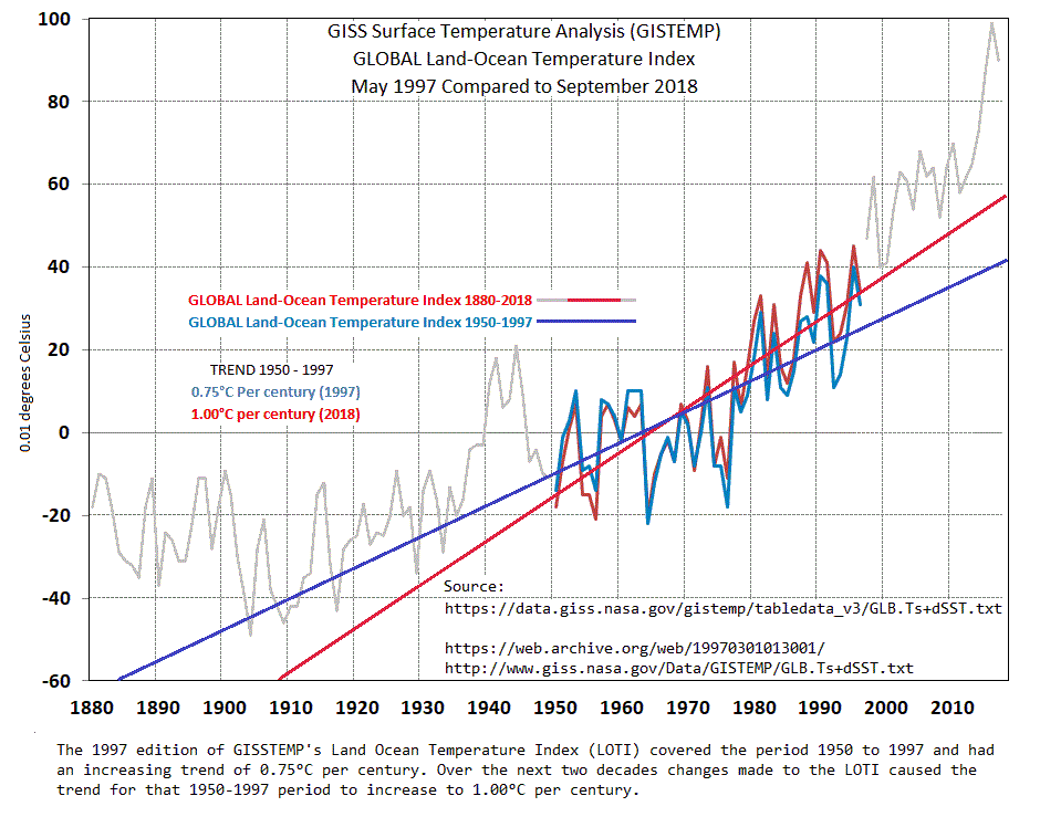
The trend over the last 20 years has as an artifact of adjustments increased 0.25°C per century.
I would be interested in knowing how “global” the warming is if the 15 or so stations above 70N are removed from the GISS calculation. There are no stations above 80N, with two exceptions all are coastal or are on islands. The temperature of island and coastal stations can be greatly influenced by wind direction. For example, we have seen persistent wind pushing ice northward away from Svalbard in recent years meaning the island is surrounded by open water which moderates the temperatures there. Ice in the arctic region, unlike Antarctic ice above 70S, floats and is subject to drifting and ablation due to storms.
My gut says that if those stations are removed, or even better, removed only from September through June, much of “global warming” goes away. I believe these few stations are greatly influencing the global average. Also, I notice that GISS does not include a single inland ground station for Greenland, they are all six stations coastal, even though there is a station at Summit Camp, it is not included.
crosspatch, you would find interesting a paper that analyzed stations around the Arctic circle. Arctic temperature trends from the early nineteenth century to the present W. A. van Wijngaarden, Theoretical & Applied Climatology (2015) http://wvanwijngaarden.info.yorku.ca/files/2015/11/Arctic-Europe-Paper-2015.pdf
Temperatures were examined at 118 stations located in the Arctic and compared to observations at 50 European stations whose records averaged 200 years and in a few cases extend to the early 1700s.
Some findings:
The Arctic has warmed at the same rate as Europe over the past two centuries. . . The warming has not occurred at a steady rate. . .During the 1900s, all four (Arctic) regions experienced increasing temperatures until about 1940. Temperatures then decreased by about 1 °C over the next 50 years until rising in the 1990s.
For the period 1820–2014, the trends for the January, July and annual temperatures are 1.0, 0.0 and 0.7 °C per century, respectively. . . Much of the warming trends found during 1820 to 2014 occurred in the late 1990s, and the data show temperatures levelled off after 2000.
My synopsis: https://rclutz.wordpress.com/2016/05/06/arctic-warming-unalarming/
Thanks Ron
“I would be interested in knowing how “global” the warming is if the 15 or so stations above 70N are removed from the GISS calculation.”
GISS tells you that here, or at least above 64N.
crosspatch November 30, 2018 at 10:25 am
Crosspatch, Nick Stokes just above has pointed to the data, so I did the math. It doesn’t make a whole lot of difference because the area is so small—the area above 64°N is only about 5% of the surface area.
As a result, the global trend is 0.72°C per century for the full dataset (1880-2017), and 0.66°C per century without the North polar area (north of 64°N).
w.
Just looking at the CET record, it seems clear to me that starting with a (naturally ocurring) trough ( the
Maunder minimum) and finishing with a (naturally ocurring) crest ( the recent warming) will create an ‘uptrend’ when you do the linear fit.. The conclusion? Fitting a line to such data is just dumbing it down. Yuo would get the same ‘uptrend’ if the data conformed to a pure sinusoid so it is obviousy a false summary.
That probably sums up the ‘science’ of CAGW.
they (the data manipulators) are all at it .
HadCrut4: http://www.vukcevic.co.uk/NH-Temp-Adj.htm
I have also noticed something interesting in the GISS data. There seems to be a huge “inflection point” in Southern Hemisphere data starting in 1977 where the Southern Hemisphere data takes a huge 20-30 degree jump up and stays there. The column marked J-D is the January-December annual average for the Southern Hemisphere:
Year Jan Feb Mar Apr May Jun Jul Aug Sep Oct Nov Dec J-D D-N DJF MAM JJA SON Year1961 -3 8 -13 11 28 3 -3 6 30 23 10 -7 8 8 0 8 2 21 1961
1962 -12 -8 -8 -14 -27 26 -32 -19 9 -11 3 -10 -9 -8 -9 -16 -8 0 1962
1963 -15 -5 -28 -31 -21 13 6 26 28 -22 -27 -9 -7 -7 -10 -27 15 -7 1963
1964 -9 -17 -14 -42 -54 -13 0 -30 -44 -37 -21 -35 -26 -24 -11 -37 -14 -34 1964
1965 -11 6 -24 -24 -17 -2 -26 7 -25 -10 -22 -17 -14 -15 -13 -21 -7 -19 1965
1966 -19 -17 29 8 -12 -8 13 -37 -13 -34 -7 -8 -9 -10 -18 9 -11 -18 1966
1967 5 -4 -12 -8 14 -15 3 1 7 -7 -4 -4 -2 -2 -3 -2 -4 -2 1967
1968 -12 -3 7 -14 -24 -8 -10 1 -43 13 9 -9 -8 -7 -6 -10 -6 -7 1968
1969 18 4 4 25 18 15 -12 -17 2 11 5 23 8 5 4 15 -5 6 1969
1970 18 12 23 20 -11 14 14 -12 32 32 -3 4 12 13 18 11 5 20 1970
1971 12 -2 -11 12 -1 -25 -7 23 11 5 -23 0 0 0 5 0 -3 -3 1971
1972 2 2 -9 14 19 31 15 45 41 1 21 41 18 15 1 8 30 21 1972
1973 38 15 27 39 55 32 27 5 24 36 26 -6 26 30 31 40 21 29 1973
1974 9 -12 -10 -13 17 15 9 29 -13 12 4 18 5 3 -3 -2 18 1 1974
1975 4 13 14 0 48 8 12 -42 -2 -3 9 -13 4 7 11 21 -7 1 1975
1976 -17 -12 -25 -36 -22 -16 -8 -23 -18 -15 9 26 -13 -17 -14 -28 -16 -8 1976
1977 43 28 23 24 36 33 45 48 -33 3 15 14 23 24 32 28 42 -5 1977
1978 10 31 26 39 36 14 38 -24 26 9 10 6 18 19 18 34 9 15 1978
1979 26 15 21 46 10 23 -6 19 36 19 30 40 23 21 16 26 12 28 1979
1980 48 44 62 61 60 15 53 50 49 23 27 32 44 44 44 61 39 33 1980
Year Jan Feb Mar Apr May Jun Jul Aug Sep Oct Nov Dec J-D D-N DJF MAM JJA SON Year
1981 26 27 37 40 41 34 77 72 32 -3 -1 27 34 35 28 39 61 9 1981
1982 37 27 -9 1 46 10 23 13 3 4 41 46 20 19 30 13 15 16 1982
1983 39 41 34 58 77 29 3 49 67 41 4 19 38 41 42 56 27 38 1983
1984 21 24 42 23 58 -17 14 30 50 26 26 32 27 26 21 41 9 34 1984
1985 47 25 43 41 23 44 7 57 40 13 19 12 31 33 35 36 36 24 1985
1986 29 60 44 56 42 7 24 29 7 17 22 26 30 29 34 47 20 16 1986
1987 54 38 37 54 36 80 74 17 23 42 48 51 46 44 39 43 57 38 1987
1988 65 44 63 46 63 65 41 76 73 75 31 20 55 58 54 58 61 60 1988
1989 31 32 35 37 8 -2 54 66 70 52 33 45 39 36 27 27 40 52 1989
1990 44 34 37 49 57 28 82 31 15 50 53 51 44 44 41 48 47 39 1990
1991 39 63 37 76 42 85 66 66 70 32 25 36 53 55 51 52 73 42 1991
1992 38 29 48 31 35 53 25 26 12 34 14 18 30 32 35 38 34 20 1992
1993 37 24 21 34 20 25 56 33 23 30 35 12 29 30 26 25 38 29 1993
1994 37 13 7 43 9 60 30 12 45 26 44 44 31 28 21 20 34 38 1994
1995 25 43 37 28 17 37 72 42 38 49 35 39 38 39 37 27 50 41 1995
1996 33 45 40 65 17 30 69 124 76 55 52 47 54 54 39 41 75 61 1996
1997 37 29 25 18 30 79 18 32 40 52 75 74 42 40 38 24 43 55 1997
1998 63 103 67 45 98 110 88 83 40 65 57 55 73 74 80 70 94 54 1998
1999 53 51 51 5 43 73 73 61 70 72 38 18 51 54 53 33 69 60 1999
2000 12 31 19 36 36 71 70 61 70 35 64 41 46 44 20 31 67 56 2000
Well, wordpress apparently doesn’t like the code tag to make a fixed spaced font.
Try using the “pre” stuff in Ric’s guide. https://werme.bizland.com/werme/wuwt/index.html
If you have table or whatever, the “pre” codes will preserve the formatting. (It may show up with scroll bars.)
There’s something wrong with your data. August 1996 average for the southern hemisphere could not have been 124° (either C or F or K) August is winter in the SH remember.
We complain about GISS being adjusted, but this is ridiculous. Go back, check your data.
Enter the address you where got that from into the “browse” section of TheWayBackMachine ( http://archive.org/web/web.php ) and you’ll likely find even more “inflection points”.
As Bob Dylan sang, “The past, it is a-change-in”.
There is a comparison of raw and ‘homogenized’ SH GISS data here:
http://euanmearns.com/how-hemispheric-homogenization-hikes-global-warming/
Are you sure that is real data?
The temperatures are all over the place.
R
The 1977 step was discussed by Earl happ. Here and in many other places of his 40 odd chapters. Qhttps://reality348.wordpress.com/2016/01/13/7-surface-temperature-evolves-differently-according-to-latitude/
Also charts temperature evolving by months, latitude, and altitude.
Macha
Oops. https://reality348.wordpress.com/2016/01/13/7-surface-temperature-evolves-differently-according-to-latitude/
As far as the GISS temperature record is concerned , how many ways can we say fraud?
European Languages Ways to say fraud
Albanian mashtrim
Basque iruzurra
Belarusian махлярства
Bosnian prevara
Bulgarian измама
Catalan frau
Croatian prevara
Czech podvod
Danish svig
Dutch bedrog
Estonian pettus
Finnish petos
French fraude
Galician fraude
German Betrug
Greek απάτη(apáti)
Hungarian csalás
Icelandic Svik
Irish calaois
Italian frode
Latvian krāpšana
Lithuanian sukčiavimas
Macedonian измама
Maltese frodi
Norwegian bedrageri
Polish oszustwo
Portuguese fraude
Romanian fraudă
Russian мошенничество(moshennichestvo)
Serbian превара(prevara)
Slovak podvod
Slovenian goljufije
Spanish fraude
Swedish bedrägeri
Ukrainian шахрайство(shakhraystvo)
Welsh twyll
Yiddish שווינדל
Russian : мошенничество (moshennichestvo)
no offence meant. 🙂 🙂
European ways to say fraud…Great! But what I really want to know is how to say fraud in ‘Murican. 🙂
Several different ways to say “fraud” in Murican:
Obama
Gore
Mann
Uranium One – Hillary and Bill Clinton
Solyndra – Barack Hussein Obama
If you are going to accuse people of fraud
use the specific name
detail the specific action and intent
and maybe you’ll get your ass sued.
but you wont because you have no evidence or guts.
If you don’t have enough history from a single station you have no idea if it is warming from a relative cold period to a relatively normal. How do you even define what a normal range is?
Hear! Hear!
Thank you for taking the time to write this. Some minor housekeeping issues for you to consider:
“It would see to me milder, shorter winters would be a good thing. Especially compared to conditions around 1700.”
“There is some variation in how much cooling or warming was experience, which I would expect.”
“When looking at records within a region the variation between stations stays within ± 1.0° C 90° of the time for over 120 years.”
“While this does not constitute proof, it does tend to support the supposition the weak CO2 signal is enhance by a coincidence between rising CO2 and rising development and population.”
“However, a major source of error could be attributed to the simple mistake of averaging regions where the records simply too dissimilar for an average to yield useful information.”
“The 1970s cooling which affected America and Europe has also been well document.“
Thank you! I don’t know if the corrections can be put into this post but I will correct my document and forward. My excuse is my degree is in mathematics and I have worked as an engineer for some 30 years. I also rely on spelling and grammar check in Word, which did not find any of these problems.
Fixed. I hate typos.
w.
Me to!
My excuse is . . .
You’re more than welcome, sir. We all make mitsakes every now and then!
🙂
https://www.nature.com/articles/s41612-018-0043-7
https://cpb-us-w2.wpmucdn.com/people.uwm.edu/dist/a/122/files/2016/05/main-252p99w.pdf
There have been a number of drafts of this study that have been published in the last 2 years.
The study looks at SST and compares the NINO 3.4 time series with computer simulations. It concludes that the computer simulations have no clue about El Nino or La Nina. However the study has major problems in it’s use of the “actual” SST observations. The Nino 3.4 time series are actually taken from the Hadley Centre Hadcrut data. Those data I will quote:
https://climatedataguide.ucar.edu/climate-data/sst-data-hadisst-v11
“Calculated from the HadISST1 , HadISST uses reduced space optimal interpolation applied to SSTs from the Marine Data Bank (mainly ship tracks) and ICOADS through 1981 and a blend of in-situ and adjusted satellite-derived SSTs for 1982-onwards. The bucket correction was applied to SSTs for 1871-1941. SSTs in boxes partially covered by sea ice were estimated from statistical relationships between SSTs and sea ice concentrations. SSTs were assigned a fixed value (-1.8°C) for areas with sea ice cover of greater than 90%. HadISST is primarily intended to be used as boundary conditions for atmospheric models.”
HADCRUT DOES NOT USE THE ARGO FLOATS WHICH ARE THE BEST MEASUREMENT OF SEA SURFACE TEMPERATURE.
In other words the Hadcrut SST temperature data are useless. They are homogenized data derived from satellites and bucket sea water measurements which do not have the accuracy of Argo floats. To top it all off, there is a great amount of made up data through interpolation of areas with no data. Again I quote:
“HadISST1 temperatures are reconstructed using a two stage reduced-space optimal interpolation procedure, followed by superposition of quality-improved gridded observations onto the reconstructions to restore local detail. ”
THAT MEANS THE RESEARCHERS IN THIS STUDY ARE TRYING TO TEASE OUT EL NINO PATTERNS by using only sea surface temperatures. What about wind patterns and precipitation patterns? Furthermore as explained above they ignore the mosta accurate measurement of sea water temperatures, the Argo floats.
This study has the audacity to suggest “Some of the interactions we identified rigorously here have been previously theorized to exist, but, to the best of our knowledge, were never detected in a data-driven way.”
The paper gives the statistical formulas used to produce the results in the supplementary materiel. However I quote from that:
“The above examples of causality estimation assumed that we have knowledge of the true periods of the coupled systems considered, which may not be the case
in real applications in which the underlying dynamical systems are unknown. The CCWT can still be used to construct the phase time series associated with the
variability for a range of central periods, and the CMI measure can be computed to identify causal connections within different pairs of phase time series; however, in
this case, care must be taken to ensure statistical significance of the causal connections so identified and to avoid false positives. This can be partially achieved via
Monte Carlo methodology, in which the whole causality identification procedure is applied to surrogate data sam-
ples that mimic the data but are by construction void of any causal relationships.”
The above admission taken together with my criticisms above, relegate this study to a useless exercise in naval gazing. They actually received grant money for this.
Alan, as you say, HADISST mixes too many things together to be trustworthy. I have more confidence in HadSST3 which is obtained from the global drifter array, and does not interpolate, ie. does not invent data for grid cells lacking sufficient measurements in a given month. I do a monthly update on HadSST3 reports, the most recent one being October results https://rclutz.wordpress.com/2018/11/09/ocean-ssts-keep-cool/
Interesting… I’ve read climate change proponents arguing that the Medieval Warming Period was regional in nature and not worldwide. Now I read above that although purported CO2-caused warming has been confirmed to be worldwide, it doesn’t appear to be occurring in any regions. It’s like the MWP in a mirror.
So… is there some form of statistical magic happening in climate science that makes the whole appear to be greater than the sum of its parts?
“Global warming” turns out to be not that global:
http://notrickszone.com/2018/11/22/2-more-new-sea-surface-reconstructions-indicate-rapid-cooling-in-the-last-100-years/
A regional MWP still increases the global average temperature.
However the MWP shows up in raw SH temp proxies.
“some form of statistical magic happening in climate science” ?
Yes, it’s spelled $$$
Some years ago I went through Hadcrut and GHCN data. I couldn’t believe how awful it was, how incomplete and how many obvious errors there were in the data analysis.
I commend your effort and it simply reinforces what most of us know: the data on which the Global warming scare has been founded is awful. The correlation of GISS temperature is extraordinary and appears to be a recent phenomenon possibly related to the multiple revisions of the temperature series (I am a Brit, so I tend to put things politely).
Unfortunately, having a conversation with those who believe implicitly in these data is less rewarding than talking to a tree.
…you mean like daily highs of 240
and lows of -120
Back in 2007, after Al’s “Incontinence”, I got the list of of record Highs and Lows for my little spot on the globe. I found WUWT and got them again in 2012 and compared them.
(crosstalk, I’m using the “pre” codes.)
Rocord Lows Comparison
Newer-’12 Older-’07 (did not include ties)
7-Jan -5 1884 Jan-07 -6 1942 New record 1 warmer and 58 years earlier
8-Jan -9 1968 Jan-08 -12 1942 New record 3 warmer and 37 years later
3-Mar 1 1980 Mar-03 0 1943 New record 1 warmer and 26 years later
13-Mar 5 1960 Mar-13 7 1896 New record 2 cooler and 64 years later
8-May 31 1954 May-08 29 1947 New record 2 warmer and 26 years later
9-May 30 1983 May-09 28 1947 New tied record 2 warmer same year and 19 and 36 years later
30 1966
30 1947
12-May 35 1976 May-12 34 1941 New record 1 warmer and 45 years later
30-Jun 47 1988 Jun-30 46 1943 New record 1 warmer and 35 years later
12-Jul 51 1973 Jul-12 47 1940 New record 4 warmer and 33 years later
13-Jul 50 1940 Jul-13 44 1940 New record 6 warmer and same year
17-Jul 52 1896 Jul-17 53 1989 New record 1 cooler and 93 years earlier
20-Jul 50 1929 Jul-20 49 1947 New record 1 warmer and 18 years earlier
23-Jul 51 1981 Jul-23 47 1947 New record 4 warmer and 34 years later
24-Jul 53 1985 Jul-24 52 1947 New record 1 warmer and 38 years later
26-Jul 52 1911 Jul-26 50 1946 New record 2 warmer and 35 years later
31-Jul 54 1966 Jul-31 47 1967 New record 7 warmer and 1 years later
19-Aug 49 1977 Aug-19 48 1943 New record 1 warmer and 10, 21 and 34 years later
49 1964
49 1953
21-Aug 44 1950 Aug-21 43 1940 New record 1 warmer and 10 years later
26-Aug 48 1958 Aug-26 47 1945 New record 1 warmer and 13 years later
27-Aug 46 1968 Aug-27 45 1945 New record 1 warmer and 23 years later
12-Sep 44 1985 Sep-12 42 1940 New record 2 warmer and 15, 27 and 45 years later
44 1967
44 1955
26-Sep 35 1950 Sep-26 33 1940 New record 2 warmer and 12 earlier and 10 years later
35 1928
27-Sep 36 1991 Sep-27 32 1947 New record 4 warmer and 44 years later
29-Sep 32 1961 Sep-29 31 1942 New record 1 warmer and 19 years later
2-Oct 32 1974 Oct-02 31 1946 New record 1 warmer and 38 years earlier and 19 years later
32 1908
15-Oct 31 1969 Oct-15 24 1939 New tied record same year but 7 warmer and 22 and 30 years later
31 1961
31 1939
16-Oct 31 1970 Oct-16 30 1944 New record 1 warmer and 26 years later
24-Nov 8 1950 Nov-24 7 1950 New tied record same year but 1 warmer
29-Nov 3 1887 Nov-29 2 1887 New tied record same year but 1 warmer
4-Dec 8 1976 Dec-04 3 1966 New record 5 warmer and 10 years later
21-Dec -10 1989 Dec-21 -11 1942 New tied record same year but 1 warmer and 47 years later
-10 1942
31
? Dec-05 8 1976 December 5 missing from 2012 list
Record Highs comparison
Newer-April ’12 Older-’07 (did not include ties)
6-Jan 68 1946 Jan-06 69 1946 Same year but “new” record 1*F lower
9-Jan 62 1946 Jan-09 65 1946 Same year but “new” record 3*F lower
31-Jan 66 2002 Jan-31 62 1917 “New” record 4*F higher but not in ’07 list
4-Feb 61 1962 Feb-04 66 1946 “New” tied records 5*F lower
4-Feb 61 1991
23-Mar 81 1907 Mar-23 76 1966 “New” record 5*F higher but not in ’07 list
25-Mar 84 1929 Mar-25 85 1945 “New” record 1*F lower
5-Apr 82 1947 Apr-05 83 1947 “New” tied records 1*F lower
5-Apr 82 1988
6-Apr 83 1929 Apr-06 82 1929 Same year but “new” record 1*F higher
19-Apr 85 1958 Apr-19 86 1941 “New” tied records 1*F lower
19-Apr 85 2002
16-May 91 1900 May-16 96 1900 Same year but “new” record 5*F lower
30-May 93 1953 May-30 95 1915 “New” record 2*F lower
31-Jul 100 1999 Jul-31 96 1954 “New” record 4*F higher but not in ’07 list
11-Aug 96 1926 Aug-11 98 1944 “New” tied records 2*F lower
11-Aug 96 1944
18-Aug 94 1916 Aug-18 96 1940 “New” tied records 2*F lower
18-Aug 94 1922
18-Aug 94 1940
23-Sep 90 1941 Sep-23 91 1945 “New” tied records 1*F lower
23-Sep 90 1945
23-Sep 90 1961
9-Oct 88 1939 Oct-09 89 1939 Same year but “new” record 1*F lower
10-Nov 72 1949 Nov-10 71 1998 “New” record 1*F higher but not in ’07 list
12-Nov 75 1849 Nov-12 74 1879 “New” record 1*F higher but not in ’07 list
12-Dec 65 1949 Dec-12 64 1949 Same year but “new” record 1*F higher
22-Dec 62 1941 Dec-22 63 1941 Same year but “new” record 1*F lower
29-Dec 64 1984 Dec-29 67 1889 “New” record 3*F lower
Who knows what changes were made to the averages for each day.
Who knows if the changes went into GISS or came from GISS?
Either way, look up the past records on the internet and you’ll only find what they say they are “today”, not what what they said they were “then”.
PS I found a list from 2002 and compared it to the 2007 list using TheWayBackMachine. No changes.
OOPS!
Either I made a typo or the “pre” stuff doesn’t work anymore.
That bothered me too years ago.
then I did an experiment. !!!!
1. I wrote code to emulate CRU averaging.
2. I randomly threw errors into the data
3. I randomly cut segments out of station data
4. I randomly decimated the dataset.
5. And after each of these tests I would compare the final result and ask the question
Did these randomly induced errors change any value that is relevant to climate science?
The answer was no.
In simple terms the global average is used for three purposes
A) to estimate sensitivity
B) to test models
C) to calibrate proxies for reconstructions
For “A” what we look at is Delta T, where the temperature is calculated for some past period, say 1860 to 1880 and then again for the present period 1995 to 2015. A difference is taken and uncertainities in this difference calcuated.
For B what we look at is how closely the temperature series of the models matches the observed. This is not a critical test of the models, as in some cases, early portions of the record may be used to “tune” the model.
For C some period of the record is used for calibration and some period is used for verification.
The bottomline is this. You have to look at the actual use to judge how adequate a metric is.
Then you can actually test how your metric maybe effected by errors, bith know and unknown.
Temperature data? Here is a clue. If you use raw data you get HIGHER values for sensitivity.
Wait, did you just admit that a global temperature is only useful for models, it has no relevance to the real world?
Random errors won’t change the RMS error but deliberate errors will.
One suggestion. It really isn’t right to look for temperature/CO2 before 1958 (Keeling Curve inception). Two reasons. First, not enough delta CO2. Keeling starts at 315 ppm versus preindustrial thought to be 280. So there should be no correlation. Second, pre Keeling, there really is not a reliable CO2 ppm metric due to sample site ‘pollution’. That is why Keeling chose the top of Mauna Loa as his sampling site.
So the correlations of potential interest are 1958 to present. BTW, this same observation suggests the pre1958 GISS correlation is highly suspect.
Rud, I disagree. The ice core records agree well, both with each other and with the Keeling data.
w.
Law Dome DE08 is a roxk star.
Willis, now there is a hockey stick! Given the GISS hockey stick of temperature adjustments to track CO2, I now understand how their models work.
Gary
It seems you live in Cape Town
I am from Pretoria
Did you notice my results on South Africa:?
click on my name
[my latest submission to Environmental Affairs is in the comments section]
we should start a ‘skeptical’ science blog in South Africa as well?
WE, with all respect your counter (well, if ice cores can be believed at the requsite temporal resolution [a complex matter of firn closure and such]) is two may second point, but not to my first point. There is a reason it was first.
Rud Istvan November 30, 2018 at 2:54 pm
First, the agreement between both the ice cores and between the ice cores and the Mauna Loa data provide support for the accuracy of the ice core measurements.
Second, your first point was as follows:
“It really isn’t right to look for temperature/CO2 before 1958 (Keeling Curve inception). Two reasons. First, not enough delta CO2. Keeling starts at 315 ppm versus preindustrial thought to be 280. So there should be no correlation.”
Depends … the canonical equation of mainstream climate science is that the change in temperature is equal to the change in forcing times the climate sensitivity. For those who speak Mathese, it is
∆T = λ ∆F
Obviously, if there is no change in forcing then we would expect that there would be no change in temperature …
HOWEVER, we know for a fact that there were large temperature excursions during that time, the Medieval Warm Period and the Little Ice Age.
Which of course means that CO2 is NOT, as is often claimed, the knob that controls the global temperature …
w.
You make Rud’s point exactly. There were thousands of real world CO2 measurements that were dutifully ignored in place of low resolution proxy data (Ice cores) that were tacked onto an instrumental record. If that technique sounds familiar, it’s because it’s great for creating hockey sticks! 😉
The point is that local measurements found great spatial and temporal fluctuations in CO2 concentrations. What you have now, is measurement for one “tree” on one “hill” and a perfectly smooth and untroubled past. It makes for a very neat picture but is it real?
Scott, those measurements were made at ground level, where the CO2 concentration varies widely due to a host of local conditions. Many of them were made by Ernst Beck. He actually commented on one of my posts that his measurements were NOT suitable for determining the background CO2 levels, which are what we are discussing.
w.
Willis, of course what you say is true!
I do particularly appreciate that you took the time to respond.
cheers,
Scott
1. you are looking at the wrong datasets , so it’s not suprising you come to wrong conclusions
2. How did you determine the majority are next to worthless
3. few? You need less than 100 stations to characterize the globale average. In GHCN v4 alone
there are over 120 stations spanning from 1860 to the current year
4. You dont need complete records. In fact shorter records can be better
1. All results from 2 station to the 43000 we use will have uncertainty
2. Normal is a defined by convention
1. read the papers and read the code.
2. Nobody argues the charts are Incontrovertible
3. Confronted? numerous? name one.
4. Area weighted averages ( CRU does, GISS does, Nick Stokes Does) Berkeley uses Krigging
5. Applied spatial stats? yup.
6. Starfish? nope I tend to focus on UHI studies and metadata
Oh, one other hint
dont use USHCN. it has been deprecated.
1. back in the 90s they tried to pick long stations to form a high quality station series.
2. some of the stations are actually splices.
3. A good portion of the stations have stopped reporting
There are several datasets that are larger than anything you have used. the easiest one to use is GHCN v4
its 27K stations. Or you could use the ISTI database, around 36K stations, or you could use berkeley earth
around 43K stations.
Here
http://static.berkeleyearth.org/papers/Methods-GIGS-1-103.pdf
http://berkeleyearth.org/wp-content/uploads/2015/08/Methods-Appendix-GIGS-13-103a.pdf
[Steve, I edited by using blockquotes for clarity, because I couldn’t figure out which were your words and which were from the author of the head post.
w.]
Wills no issue but a question. In Dr. Donald Rapp’s Ice Ages and Interglacials there is a section on ice cores. It seemed that he was describing numerous scientific challenges with ice core interpretation. Variation in location, temperatures in sections, mathematical adjustments for various oxygen’s. He seemed to say that Greenland cores were good but Antarctica cores were really difficult. Matching the regions was also challenging.
You seemed comfortable in a previous post with accuracy of ice cores or were you saying something else. I may also misunderstand the argument Rapp was making? There does seem to be agreement, that cores are gold standard. I remember this with biopsy results. There is also the argument that cores are the best standard at this moment in time with the given science.
Global temperatures, realy?
Land Surface Air Temperature Data Are Considerably Different Among BEST‐LAND, CRU‐TEM4v, NASA‐GISS, and NOAA‐NCEI
https://agupubs.onlinelibrary.wiley.com/doi/abs/10.1029/2018JD028355
…….this, and no one is paying attention
It’s so cute that they still think they can calculate an accurate average global temperature. Precious! I remember when I was young and ignorant, ah the unfounded infallibility delusions that creates. You go Mosher! LOL
USHCN depreciated???
Strange because all stations and measurements are identical in the GHCNM set. There is even a HCN flag in GHCND correlating them. (GHCND is common for both GHNCM v3 and v4)
In the larger data sets what % is representing the south hemisphere? Before 1950 is especially interesting.
yes MrZ
in 2014 it was replaced as the dataset of record
GISS stopped using it early than this.
I am just as sorry as I can be, but as someone with a BS in mathematics who has worked as an Engineer for over 30 years doing statistical analysis and studies of complex industrial processes I think you really do not have a grasp of how to perform a time series. Rule number one is you do not add and subtract measurement points. Measurement results are always a function of variability and change both inherent within the process and within the measurement process.
And that is exactly what looking at temperature over time is. A time series. And no, you do not do a time series by taking a huge pile of discontinuous, un-directly related measurements, try to run some type of algorithm to estimate the missing 70% (having gone through all the various data sets link as source by Berkeley Earth, 70% is a conservative estimate), then take an average. Do that and you have nothing more than a wild guess. You are far better off throwing out all incomplete data series. And you sure as hell do not include those consisting of a single year or a portion of a single year done.
As someone with a PhD in BS, I can tell you that the GISS record is a pile of steaming crap.
Mark Fife: I am just as sorry as I can be, but as someone with a BS in mathematics who has worked as an Engineer for over 30 years doing statistical analysis and studies of complex industrial processes I think you really do not have a grasp of how to perform a time series. Rule number one is you do not add and subtract measurement points. Measurement results are always a function of variability and change both inherent within the process and within the measurement process.
And that is exactly what looking at temperature over time is. A time series. And no, you do not do a time series by taking a huge pile of discontinuous, un-directly related measurements, try to run some type of algorithm to estimate the missing 70% (having gone through all the various data sets link as source by Berkeley Earth, 70% is a conservative estimate), then take an average. Do that and you have nothing more than a wild guess. You are far better off throwing out all incomplete data series. And you sure as hell do not include those consisting of a single year or a portion of a single year done.
We all have education and experience. I have a PhD in statistics and experience modeling and statistical analysis of non-stationary multivariate time series measurements on dynamic biological systems. Your description of the method used by BEST is perversely misleading (they use an Empirical Bayes method most likely beyond anything you mastered), and there is plenty of information in partial records. Steven Mosher has plenty of experience writing programs to handle complex time series data; his principle limit as an expositor of the BEST methodology is not understanding the mathematics of empirical Bayes methodology — that comes from the senior statisticians. He is very good on some of the fundamentals, such as this:
1. read the papers and read the code.
2. Nobody argues the charts are Incontrovertible
3. Confronted? numerous? name one.
4. Area weighted averages ( CRU does, GISS does, Nick Stokes Does) Berkeley uses Krigging
5. Applied spatial stats? yup.
6. Starfish? nope I tend to focus on UHI studies and metadata
Oh, one other hint
dont use USHCN. it has been deprecated.
1. back in the 90s they tried to pick long stations to form a high quality station series.
2. some of the stations are actually splices.
3. A good portion of the stations have stopped reporting
…
There are several datasets that are larger than anything you have used. the easiest one to use is GHCN v4
its 27K stations. Or you could use the ISTI database, around 36K stations, or you could use berkeley earth
around 43K stations.
Here
http://static.berkeleyearth.org/papers/Methods-GIGS-1-103.pdf
http://berkeleyearth.org/wp-content/uploads/2015/08/Methods-Appendix-GIGS-13-103a.pdf
But those 120 stations are not reasonably representative of the globe; they’re concentrated in well-developed countries.
Sheer fantasy in service of BEST’s “scalpel” methodology!
What is no less scandalous than GISS’ blatant global data manipulation to increase the correlation with the CO2 record is the geophysically blind methodology of BEST. It baldly ASSUMES a “red-noise” spectral structure for station records and universal spatial homogeneity that permits useful “krigging.” And to top it off, all of its numerical legerdemain–performed upon supernumerous UHI-corrupted records–is passed as scientifically superior to area-averaging long, vetted records. What a hoot!
I have a real problem with “you only need 100 stations to know the temperature of the Earth”. That is one station every 1600 miles or so. You are literally claiming you can get the average temperature of the continental US with a station in Salt Lake City, UT and one in Roanoke, VA. Are you sure you want to make that claim – that with just those two points (which, when the center of an 800 mile radius circle, pretty much covers everything from Seattle, WA to San Diego, CA, and Caribou, ME to Key West, FL).
To go further – a single station in Geneva, Switzerland, with an 800 mile radius, would effectively cover the entirety of continental Europe and the UK. Everything West of Lithuania and Ukraine: Poland to Portugal, Scotland to Greece. A single point for essentially the entire Continent.
Australia – two points to cover the entire continent. You can just about cover South America – from essentially “Antarctica-lite” in the South to the equatorial jungles – with just 3 points.
Seriously, is that what is considered “good coverage” data now?
There is also a habit that skeptics cant seem to break
Long ago when people looked at the old temperature records they saw a Falloff in station count
And skeptics argued that the Rise in temperature was a result of dropping stations.
The end result was they made a case that some independent group of people should look
at temperature and use ALL the data.
Judith Curry was a part of that effort
oh, ya.. and me too
Now, that we have more data than ever before, skeptics play a different game.
they demand we look at smaller and smaller datasets.
noise of course
wha?
Steven Mosher –
As a layman bystander, what stands out to me is that it seems you’ve maneuvered/manipulated the data to provide a result you can defend rather than provide a result that is accurate.
Maybe I’m the only one who interprets your comments thusly? Dunno.
JohnWho: As a layman bystander, what stands out to me is that it seems you’ve maneuvered/manipulated the data to provide a result you can defend rather than provide a result that is accurate.
BEST includes checks on the accuracy of its calculations, such as leaving 10% of observed data out of the estimation procedure and then computing the mean-squared-error of the estimates of those data points. This procedure and its results are among the reasons that the procedure is defensible.
Matt, I don’t understand this. I calculate the global average temperature with 10% left out. Then … what? You say you calculate the “mean-square-error” of those data points … the error compared to what?
w.
Mosher apparently doesn’t know what “E” stands for. Ah to be young and ignorant!
Mosher, because the warmer proponents show little difference among the group, you assume sceptics are singular minded. You know that ain’t so. You have to grudgingly admit that thoughtful sceptics literally drove and shaped the research agenda over the past two decades because of uncomfortable things they raised about the science. Remember the science was settled until sceptics began in the new millennium to find themselves at odds with the free-for-all that was going gangbusters largely unapposed – ‘the mice will play’ type of scenario. Be honest about this. You yourself were a strong contributor at one time. Yeah there are knee-jerks on both sides of the issue but don’t conflate.
Sceptics about what? An outbreak of life threatening mildness?
**Long ago when people looked at the old temperature records they saw a Falloff in station count
And skeptics argued that the Rise in temperature was a result of dropping stations.**
Most of the dropped stations were rural which did not have a UHI effect. This contributed to higher average temperatures.
1) 288 K – 255 K = 33 C warmer is rubbish.
2) up/down/”back” GHG LWIR 333 W/m^2 energy loop is thermodynamic nonsense.
3) BB upwelling 396 W/m^2 from the surface that powers 1 and 2 is not possible, nothing but a “what if” calculation.
1 + 2 + 3 = 0 RGHE & 0 CO2 warming & 0 man caused anything.
All the rest is moot, sound and fury signifying nothing.
“As an aside, I will show the correlation of these temperature records to the record of CO2. The correlation coefficient of the overall average is .52 and that of Greenland is -.18.”
Just a pet peeve, r2 has an actual interpretation, statistically, I.e., the percent of the dependent variable which is explained in terms of the independent variable. Correlation coefficient has no such statistical counterpart. In this cae 27% and 3%, respectively of one variable can be explained in terms of the other. Not so much, eh?
That is the percent of VARIATION explained in one by the VARIATION in the other.
Something I have been wondering – maybe it is good fodder for a post…
The ARGO data now include almost 2 decades of information. A substantial portion of the global warming over the last two decades has been conveniently located in the southern hemisphere’s oceans. I find this odd because the Antarctic sea ice extent hasn’t changed much in that time. Does anyone here have the knowledge needed to build a comparison of the 10m ARGO temperature, the southern hemisphere’s oceans as measured by satellites, and compare those to the global datasets?
I suspect we can find something fishy in the oceans.
Whilst the above article is very interesting, is it possible that the whole of the present so called science of climate is all about modelling.
So is it possible to do any meaningful research into climate without using the computers modelling.
I suspect that all of the Warmers “Save the Planet would simply disappear if we ceased to use computer models.
As our Australian ex PM Tony Abbott said” “Its all a load of Crap”
MJE
A crock of CACCA.
Garbage In Gospel Out
Steve,
I think you need to define what you mean by “skeptics”.
I live in central Ohio. There is no longer a mile of ice over my head. The climate has changed…for the better. It is warmer.
A multi-trillion dollar industry/power-grab has come up based on blaming Man for Global Warming\Climate Change etc.
Reliable past temperature records are important. None of which are “Global”. Reliable present temperature records are important. (Lot’s of siting issues) All that is “Global” are the satellite records and even they are a thin layer of this “Onion” we call the Globe.
We don’t have reliable past records or even reliable “adjusted” records of the records, past or present. And what we do have has become a political football. (multi-trillion dollar industry/power-grab)
The bottom line is:
Has (should have by now according to some) or will (computer models) Man’s CO2 emissions produce such a change as to validate the “CAGW” hype?
So, to repeat, “I think you need to define what you mean by ‘skeptics’.”
The majority of people in the developed world live in cities. They have experienced local climate change. Most of the time they live in an artificial climate in the temperature range 17 to 25C. That narrow range is predominantly achieved through burning carbon based fuels that emit CO2 to the atmosphere. All that local heat causes local outdoor temperature to rise. It is reasonable to expect that CO2 should have some positive correlation with temperature.
Long temperature records from locations remote from major population centres show little to no correlation between CO2 increase and temperature. So-named “Global Warming” is something solely related to the energy intensity of developed population centres. The homogenisation of temperature records has been a miserable failure to compensate for urban heat increase. (A temperature record from a remote airfield can also be influenced by the level and type of air traffic so needs care in application)
The best way to reduce “global warming” is to reduce the energy consumption in population centres – better insulated and naturally ventilated buildings to reduce heating and cooling requirements; human or electric powered transport; local solar collection to use natural energy for doing local work more trees to increase evaporative heat transport from ground level to the atmosphere and so on.
Climate change is real – most people in the developed world live in an artificial climate and have little tolerance for temperatures outside the range 17 to 25C. Global Warming is a misnomer; it is solely urban heat causing local temperature rise.
“I live in central Ohio. There is no longer a mile of ice over my head.”
Aren’t you being a bit picky?
“I live in central Ohio.”
As do I. The Banana Belt of the Great Lakes Region. Showing how little chance solar power has when you have 190 cloudy days a year.
Seems to me that Mark does not understand – as far as yet- that correlation does not mean causation
i.e.
it is indeed very likely that [CO2] and T[ avg global] must be related,
namely there are giga tons and gigatons of bicarbonates dissolved in the oceans
so if it gets hotter:
HCO3- + heat => CO2 (g) + OH-
Besides that,
my results also show that in the SH things are going not the same way [cooling!] as in the NH, so if you have 40000 weather stations in the NH and only 400 in the SH you are never going to get the right [average] global result.
Anyway, there is no man made global warming, as my experiments showed,
click on my name and read my final report on that
The funny thing about this issue is the Phil Jones of HadCRU once wrote a paper detailing all the long-term records. None of them showing warming.
Climate “Science” on Trial; Temperature Records Don’t Support NASA GISS
https://co2islife.wordpress.com/2017/03/12/climate-science-on-trial-temperature-records-dont-support-nasa-giss/
Here is Capetown South Africa’s raw temperature trace which matches US and the others you mention.
Also visit Paul Honewoods site for Paraguay and Ecuador for the same patterns. Even way out Australia had hot 1930s. I agree with Mosher that you dont need hundreds of stations to monitor potential danger from global warming. Also running down to the sea with a micrometer to detect dangerous SLR isnt necessary. A yardstick or an axhandle is sufficient.
90% of the actual temperature rise from 1860 to 2015 took place by the late 1930s. Who disputes this? Then the tempers declined in an alarming way for close to 40 yrs. It was broadly though5 we were heading for an ice age. Of course climateers argue this worrying cooling period didnt happen or at least the scientific community didnt think it was worrying. Heck, I’m 80 years old and I remember this concern. Iwas born in the late 30s and I heard about the dustbowl and heat waves for a couple of decades afterwards from family and others. No reasonable petson disputes this recent history. A warmist even diabolically created a phoney Time Magazine cover from the 70s showing the cold hype and then revealed it was a hoax to try to deligit the claims. WUWT!! Even the hoaxter obviously believed the claim.
The adjustment of the temperature record was precisely because sceptics had been hammering on the fact that most of the warming had occurred before delta CO2 could have been responsible for much. They left the longterm warming the same but pushed down the teaching moment of the 1930s-40s.
Nicely put
For those commenting upstream that they wanted a comparison of the Argo and the Reynolds OI sea surface temperatures, see my post here.
w.
Thank you for the read. I assume that Reynolds is used for the generally accepted SST measurements in the global data.
Do you know if there is any repository that performs the same analysis you presented over the entire ocean? If so has it been updated since March 2012?
Again, thank you
Chad, I don’t know if further work has been done, or if anyone has done the same analysis. Google is your friend …
All the best,
w.
Mark,
Who vetted your post?.
Have you sent it to any relevant scientific institutions?.
I live in Paraguay. Temps here have been 2 to 10 C below normal for six months I think WUWT really needs to revisit the Solar cycle meme which has been at 0 sunspots for months. NASA reported that November 2018 high atmospheric temps are declining dramatically lately but apparently this does not affect earth temps. Would like to have solar expert views on this because in the past it relates to ice ages.
“I have long wondered how climatologists put all the fragments of data together to create such incontrovertible charts of impending doom to within 0.1° C going back to 1880. Especially when so few records go back that far. To be sure, I have confronted numerous climatologists and people claiming to be part of the group of people working on the data and models. I get nothing but generalities to my specific questions. Do you do area weighted averages? Have you applied spatial statistics? “
I can’t see the point of these posts. You could read one of the many papers on the topic, eg Hansen and Lebedeff, 1987. GISS publish their code. You could even read WUWT, where I explain how I and others do it (with link to my code and explanation). Yes, we do use area weighting, in some form. What do you mean by “spatial statistics”? The problem is classic spatial numerical integration.
And then there are the endless special cases picked out. Trend of the coldest months in the CET, etc. And of course that isn’t the same as GISS global, or whatever. No surprises there. The special cases don’t agree with each other, let alone GISS. That is why people look for the most inclusive measure.
There is a spatial sampling aspect that goes well beyond such classical concerns. To obtain time-series of global temperatures, we need sufficiently dense sampling geographically to cover all the (coherence-wise) non-homogeneous climatic zones. Otherwise, natural spatial variability is aliased into unrealistic geographic dimensions. Unfortunately, no data base is available that provides reliable such coverage for the years prior to the advent of satellite sensing.
“There is a spatial sampling aspect”
There is. It is described in the literature under the heading of sampling error or coverage uncertainty, eg Brohan et al, 2006. My own take on that is here. There are far more stations than you really need, so you can look at all kinds of subsets to see how much station choice matters. And you can cull stations to about 500, in all sorts of ways, and get consistent answers.
Brohan et al. treat spatial sampling uncertainty in a very cursory, simplistic manner. Your “take” pertains not to my fundamental point, but only to the question of the consistency of sampled anomaly results for a given month as the number of available station records is culled. Neither addresses the critical issue of how REPRESENTATIVE the available station records are of ACTUAL spatial variability of ENTIRE time-series throughout the globe. It goes well beyond mere numerical consistency of results and involves questions of data bias inherent in available station records, which are seldom obtained outside urban centers of one size or another.
Let’s see if I have this straight, because what you describe is what I assume. This is what you said.
“I’ll illustrate with a crude calculation. Suppose we want the average land temperature for April 1988, and we do it just by simple averaging of GHCN V3 stations – no area weighting. The crudity doesn’t matter for the example; the difference with anomaly would be similar in better methods.
I’ll do this calculation with 1000 different samples, both for temperature and anomaly. 4759 GHCN stations reported that month. To get the subsamples, I draw 4759 random numbers between 0 and 1 and choose the stations for which the number is >0.5. For anomalies, I subtract for each place the average for April between 1951 and 1980.
The result for temperature is an average sample mean of 12.53°C and a standard deviation of those 1000 means of 0.13°C. These numbers vary slightly with the random choices.
But if I do the same with the anomalies, I get a mean of 0.33°C (a warm month), and a sd of 0.019 °C. The sd for temperature was about seven times greater. I’ll illustrate this with a histogram, in which I have subtracted the means of both temperature and anomaly so they can be superimposed:”
When you say “For anomalies, I subtract for each place the average for April between 1951 and 1980” are you saying you take an average for April from 1951 to 1980 for each station and subtract that from the 1988 April average for each station? I want to be clear here. Because that is what you should do. If you were to subtract the April average from all sampled stations or all stations, either way would make no difference at that point, you would be doing nothing more than translating your original average by a more or less random number.
Now you say that would give you the average anomaly for the month. Now what that means depends upon what you meant above, but I am going to assume you performed that calculation properly. In which case what you calculated would be an average temperature delta from each stations 1951 – 1980 average. Yes, you could make some kind of inference, depending upon sampling density, as to how that might relate to what happened around the world.
However, your discussion on the standard deviation is totally wrong. The standard deviation you want isn’t between the station averages or the station anomalies. You want the standard deviation of the resulting set of temperature deltas. You are counting oranges to see how many apples you have.
What you should have is a statement like “On average for our sample set, temperatures rose from a 1951 – 1980 baseline by 1.2° C with a standard deviation of 1°. Hence we conclude 90% of stations would fall within 1 ± 1.7° C with a 90% confidence interval of ± 1/SQRT(1000) for the average, assuming you sampled 1000 stations. Obviously I just made numbers up, but that is the output you should have.
In that manner you would be quantifying the true variability of what you are looking at.
And of course you should at a minimum take a look at a histogram of the temperature deltas to make sure what you are looking at is at least approximately a normal distribution. Because your results depend upon that for any validity they may have.
And if you do that for any decent sampling you will of course find half the stations you will find more variance than you probably expect.
Now, you will also have another problem. You should find a lot of stations in 1988 did not have complete records for 1951 – 1980. How would you handle those?
What about those with no record at all between 1951 – 1980?
Mark,
“are you saying you take an average for April from 1951 to 1980 for each station and subtract that from the 1988 April average for each station?”
Yes.
“You want the standard deviation of the resulting set of temperature deltas.”
I’ve said what I want “a standard deviation of those 1000 means of 0.13°C”. That is an estimator of the standard error of the mean, or at least the component due to sampling error. And that is the simple, direct way to measure it. Actually take samples and look at the spread of results. There is no requirement that the means are normally distributed, although they probably are.
“Hence we conclude 90% of stations”
No. Again I’ve said what I am calculating. It is the standard error of the global mean. Nothing to do with 90% of stations. Or any assumption about sqrt(1000). And I did say, upfront “I’ll illustrate with a crude calculation”. It is not a good way to compute a global average. But it does show the reduction in variability you get when you use anomalies. That would be similar with proper area weighting.
“How would you handle those?”
I explained how I do it in the link you quoted from (least squares). I think it is the best way. But many people do use a fixed interval to avoid having anomaly base values themselves take up part of the trend. Then they use other methods (for stations not in that interval) based on estimating from neighbouring stations, maybe incorporating comparative information where there is time overlap. These methods have names like Reference Stations Method (GISS), “First Difference Method”(Peterson), etc.
I don’t think you understand what I am saying. See my other replay. That might bring some understanding. I have actually completed the exercise for 1988 and 1998. I think you will enjoy it.
Here is an example from the GHCN data. There are 3174 stations with complete records from 1951 to 1980 which also have records from 1988.
On average these stations warmed by 0.34° C from their 1951 to 1980 baseline with a standard deviation of 1.17° C. 90% would fall between -1.58° C and 2.27° C. The maximum was 13.87° C and the minimum was -15.27°. The 90% confidence interval for the population mean is ± 0.02° C, because the sample size is quite large.
The underlying distribution isn’t precisely normal, but it is centrally tended and reasonably normal enough so the 90% population estimate is pretty accurate. If I were so inclined I could no doubt model the population a bit more accurately with a T distribution.
Now when I do the same thing for 1998 I get an average increase of 0.74° C with a standard deviation of 1.45°, meaning 90% would fall within ± 2.4° C. The number of stations drops to 2408, but that is still enough to get a 90% confidence interval of ± 0.02° C for the mean.
However, the distribution of the data is now decidedly not normal. The highest difference is over 27° C. The minimum is -7° C. There are some obviously out of line changes.
Now here is something interesting. I graphed the top 25 highest gainers. Every single one of them is absolute junk. By the graphs each one has a serious discontinuity which occurred suddenly. A sudden jump of 10° or 6° in one year indicates the station was moved or something.
I researched 10 long term stations in Australia, pulled up the box on Google satellite. 7 of the 10 had been hopelessly compromised. A couple were in courtyards next to AC units.
Now that is the real name of the game. To do a data analysis right you can’t just pistol whip a pile of numbers. You have to dig in deep and make sure your not just shoveling manure. That means examining everything you use. If your data is crap your analysis is crap.
And that is why I very carefully screen the data I use to make sure it makes sense and it isn’t a steaming pile of crap.
“You have to dig in deep”
I don’t think you have dug deep enough to figure out the flags in GHCN V3. I am sure all the outlying values you cite would have been flagged. I reject any flagged data.
Generally we are at cross purposes here.I chose the method of repeatedly sampling half the data, and calculating the spread of means. That is independent of any assumptions about normality (or iid). I did it so that I could use the same method for raw temperatures and anomalies. You have calculated a single mean with standard error, based on an iid assumption. In fact the numbers should be area weighted, which certainly busts iid. They would be correlated too.
But anyway, as I said from the outset, it is a very poor way of calculating global average anomaly. You have to do proper integration.
Did you notice everyone including Steve misssed the biggest elephant in the room in your second paragraph
“The other factor is the idea that CO2 going from 0.028% to 0.04% of the atmosphere would wreak doom and destruction upon the Earth just sounds ludicrous. What affect would that have on the emissivity or the heat capacity of a given volume of a gas mixture? I would think less than the measurement error and bias involved in trying to measure the difference.“
Add in the very active atmospheric water into the gas mixture and the measurement error is immense.
These discussions remind of Dr. Ole Humlum’s comments regarding Gistemp:
Dr. Humlum:
“Based on the above it is not possible to conclude which of the above five databases represents the best estimate on global temperature variations. The answer to this question remains elusive. All five databases are the result of much painstaking work, and they all represent admirable attempts towards establishing an estimate of recent global temperature changes. At the same time it should however be noted, that a temperature record which keeps on changing the past hardly can qualify as being correct. With this in mind, it is interesting that none of the global temperature records shown above are characterised by high temporal stability. Presumably this illustrates how difficult it is to calculate a meaningful global average temperature. A re-read of Essex et al. 2006 might be worthwhile. In addition to this, surface air temperature remains a poor indicator of global climate heat changes, as air has relatively little mass associated with it. Ocean heat changes are the dominant factor for global heat changes.”
As example of Gistemp instability, he provides this climate4you graph:
Of course, taking GISS temperature fluctuations in the context of a typical year’s fluctuations shows there’s not much warming in relative terms:
It is illuminating to review the history of the thermometer when reviewing the temperature instrumental record.
1593- thermoscope invented by Galileo. Un-scaled, un-calibrated.
1612-Santorio Santorio added a scale, still un-calibrated.
1654-Grand Duke of Tuscany, Ferdinand II created an enclosed alcohol instrument, scaled but un-calibrated.
1714-Fahrenheit first modern thermometer, the mercury thermometer with a standardized scale.
1742-Celsius invents ‘reversed’ centigrade scale w/ boiling point at 0.
1744-Linnaeus reverses Celsius scale with freezing point as 0.
1745-First known use of Celsius scale in scientific communication.
1848-Kelvin invents his scale with 0 being absolute lowest temperature, -273.15 °C.
1867-First practical medical thermometer.
1948-CGPM and CIPM adopt Celsius scale as international standard.
Any time I see a temperature record that extends back into the 1600’s I emit a loud ‘Guffaw’ followed by a snort. The ‘instrumental record’ is only slightly less tenuous than ‘proxy temperature reconstructions’.
In 1750 how many people in the entire world possessed accurate thermometers, let alone recorded temperatures in any kind of a standardized way? 1775? 1800?
There is no need to attribute errors in the record to malice. Sh*t Happens. Just don’t try to spin it into gold. On the other hand,
Mess With The Data and you are Messing With The Scientific Method.
“Mess With The Data and you are Messing With The Scientific Method.”
wrong
when the measurements of the orbit of the planets of jupiter contradicted newtons theory of gravity, the observations were adjusted. ask why?
Willis etc, so what about the Vinther et al 2006 Greenland study ( note Jones and Briffa listed as co authors) using instrumental data from the late 18th century until the then present day.
Certainly doesn’t seem to be any CAGW there either if you look at their Table 8 of the study. Anyway what will happen when the AMO changes back to the cool phase or has that started in 2015 as some scientists have asked recently? So what do you make of this very long Greenland instrumental record and the decade by decade table 8? I can’t find any post 1950 warming that seems to point to any scary CAGW, but perhaps I’m missing something? Anyone have a comment about Vinther et al.
https://crudata.uea.ac.uk/cru/data/greenland/vintheretal2006.pdf
There was an article a few years back which pointed out how good quality stations had all been “homogenized”, turning no warming trend into a significant warming trend.
Did I miss something in the reading or did Mark miss entirely the most obvious reason GISS correlates so well with CO2?
That is, their data set was DESIGNED to so correlate because that’s the agenda they are running.
The comments section on the emails article is not working properly so I want to post this here to get it down before it disappears this is a quote taken from Raymond Bradley in 2000:
But there are real questions to be asked of the paleo reconstruction. First, I should point out that we calibrated versus 1902-1980, then “verified” the approach using an independent data set for 1854-1901. The results were good, giving me confidence that if we had a comparable proxy data set for post-1980 (we don’t!) our proxy-based reconstruction would capture that period well. Unfortunately, the proxy network we used has not been updated, and furthermore there are many/some/ tree ring sites where there has been a “decoupling” between the long-term relationship between climate and tree growth, so that things fall apart in recent decades….this makes it very difficult to demonstrate what I just claimed. We can only call on evidence from many other proxies for “unprecedented” states in recent years (e.g. glaciers, isotopes in tropical ice etc..). But there are (at least) two other problems — Keith Briffa points out that the very strong trend in the 20th century calibration period accounts for much of the success of our calibration and makes it unlikely that we would be able be able to reconstruct such an extraordinary period as the 1990s with much success (I may be mis-quoting him somewhat, but that is the general thrust of his criticism). Indeed, in the verification period, the biggest “miss” was an apparently very warm year in the late 19th century that we did not get right at all. This makes criticisms of the “antis” difficult to respond to (they have not yet risen to this level of sophistication, but they are “on the scent”).
I’m not sure I agree with this. The 1700-1900 linear trend is essentially flat, i.e there is no trend. Even if the trend is extended to 1950 it still only shows a temperature increase of 0.2 deg. It’s only when the late 20th and early 21st century is included that a 0.8 deg increase is detected.
The inclusion of the early maunder minimum period confuses things a bit ( though the temp readings a probably a bit suspect) but even then it’s clear there is an acceleration in the late 20th/early 21st century.
Regarding the correlation regional temperatures to CO2, I’m not sure I’d expect a correlation. There is a lot more noise in regional data. Ocean oscillations and other factors result in periods of regional climate changes around the world. The CET record, for example, frequently shows year to year changes of +/- 1 deg. This is not seen in any of the global datasets.
“Based upon this limited look at just two regions it does make sense to combine records within a region where the records are similar as is the case here. Had one of these records been as dissimilar as the two overall regional averages it would not. The more dissimilar such records or averages of records are the less sense it makes to combine them into an average.”
Err wrong.
You miss the whole point of a spatial average.
The goal of a spatial average is to be able to predict values where you didnt sample with minimum error.
Start with the simple case where you have 1 data point in the plane or on the sphere. You can of course use that single point to estimate the entire surface and when you check whether it is accurate as a predictor you will find out how well it predicts. Now, add a second station. You dont check for consistency, if you only average in consistent values ( texas sharpshooter much?) then you wont be increasing your predictive power. In fact you probably want to do the opposite of what you suggest to reduce your error of prediction.
Remember the goal of spatial stats. Predict the unsampled from the sampled
(hint, create some hold out data to test your approach)
Lastly, please stop doing correlations to c02 until you understand what you are doing
Here is a direct comparison of AGW theory with data in terms of temperature trends.
https://tambonthongchai.com/2018/09/08/climate-change-theory-vs-data/
I see a lot of 100 years in between peaks in the historical graphs. If this is accurate, I would say we are at a peak right now and due for a flattening out ( like we are having at the moment) followed by a dip.
With respect to the correlation of GISS temperatures and CO2 this post has a correlation coefficient of only .92.
Tony Heller has already done this earlier. His correlation coefficient is .98 which shows how much they manipulate the data. See:
https://realclimatescience.com/100-of-us-warming-is-due-to-noaa-data-tampering/
Exactly.
GISS is a sadly disgrace, take away their adjustments and the correlation is gone.
Tony has done a good work to show how they continuously change the past. I guess they reprocess the data again and again through their model until it fits the narrative, each iteration bringing them closer to their target.
Reprocessed BS.
I stopped long ago to give them any credibility.
The only logical think to do is to defund and close this waste of money.
In addition, Steve McIntyre did a post a few years ago showing how many tines the temperature record has been “adjusted” in the last decade or so. WUWT may have done a similar post.
The adjustments are very consistent – downward for over 20 year ago and upward in the last 20 years. This is also shown clearly in the above post at Realclimatescience.
incorrect.
the last update to GHCN v4 halved the adjustment effect
Half of these correlations appear to violate the assumption of linearity of the data. If one is going to use statistics, one should know how to do it right.
More explanation needed.
This is late to the post, but it is germane to the topic.
I challenge anyone to show statistically that the anomalies by month from this NOAA page have any statistical relationship to CO2.
https://www.ncdc.noaa.gov/temp-and-precip/national-temperature-index/time-series?datasets%5B%5D=uscrn&datasets%5B%5D=climdiv&datasets%5B%5D=cmbushcn¶meter=anom-tavg&time_scale=1mo&begyear=1895&endyear=2018&month=1
The point of this post is that there is something wrong with our conception of how CO2 affects atmospheric temperature. You can argue about how best to fiddle with our lack of information. You can discuss Mr. Mosher’s personality and acuity. None of this addresses the blindingly obvious problem that by every proxy, temperature has driven CO2 concentration for the last 5 million years. Termperature still controls the recent variability around the trend in rising Atmospheric CO2. CO2 does not control the recent variability around the trend in temperature.
Rather than try to justify our misconception of how CO2 affects atmospheric temperature by limiting the scope to the boundary layer and epicycles of ever more arcane statistics and parameters; we should focus on correcting our misconception.
100%
I was waiting for someone to remark on this.
Most of the CO2 that we see is due to the temperature recovery from the Little Ice Age (LIA) with a lag of 300 years . Coincidentally, a much smaller amount is being added by humans. It’s an accident that warmists, the IPCC and their much-amplified propaganda machine have taken advantage of.
Well, let me try to rise to this challenge just for fun. Please forgive me, I’m a layman and first time poster of this sort of thing. I don’t mean this seriously, just as an example, and I hope I do the example correctly.
I used your noaa temperature deviation data (the third column in your link) from 1959 to 2017 because that period matches the Mauna Loa CO2 period.
During this period, whenever CO2 was less than 355 ppm, the mean and standard deviation of the temperature deviations (in degrees F) were -2.30 and 3.32.
Whenever CO2 was greater than 355 ppm, the mean and standard deviation of the temperature deviations (in degrees F) were 0.43 and 2.29.
A two-sided non-paired t-test comparing the two data sets gives a p-value of 0.0005.
This shows that, when CO2 concentration is “low”, so is the temperature deviation. And when CO2 concentration is “high”, so also is the temperature deviation. And the difference between the two mean temperature deviations is “statistically significant”.
Here’s what I can see wrong with what I did. And I’m sure there are other things wrong, too, these are just the obvious ones to me.
– I data dredged to get the 355 ppm value. Done just for fun and as an example, like I said.
– The data values in each group of bifurcated data were not independent, a requirement of the t-test. I’m sure the temperature deviations from year-to-year are correlated in some sense, although that is not obvious from the time plot.
How is this at all useful? Maybe just as an example of the misuse of statistics via data dredging which I suspect takes place a lot with the study of climate data.
I hope I haven’t detracted from everyone’s conversation too much.
JI
You do raise an interesting question. That is, can we expect the temperature change with a doubling of CO2 to be constant, or might it change with temperature?
The important question that needs to be answered is whether (when smoothed to allow for large year to year variations due to weather) the data from one small area of the globe is a reasonable proxy for global temperature. Certainly most of the long running temperature records show roughly the same pattern i.e. early century warming, followed by slight cooling mid century followed by warming after circa. 1975. However it is unfortunate that (apart from Australia) all the long term records are from areas surrounding the North Atlantic, and so could be unduly influenced by the Atlantic Multi Decadal Oscillation. In an ongoing discussion I’m having with an alarmist he claims that these regional records are not a good proxy due to the AMDO. Can anyone help me out by finding a long running data set from somewhere not bordering the Atlantic. I thought that there might be one from Japan or China, but couldn’t find one on their respective national meteorological websites. If areas not influenced by the Atlantic show a similar pattern then it supports the claim that any regional data set is a reasonable global proxy. My view is that regional data sets are a reasonable global proxy over the last 100 years, and it is therefore reasonable to assume that Greenland ice core data is a good proxy for global temperatures going back 1,000’s of years and the medieval warm period, roman warm period etc. were global and the current warm period is merely a continuation of that cyclical warming and cooling
From the article:
“The GISS record has a correlation coefficient of .92, which indicates a near perfect correlation. I would imagine many would find that near perfection to be suspect in and of itself as it would indicate there are no other major impactors of temperature. Which seems unlikely to say the least. This is in comparison to the individual records which range from .54 to -.18, which would seem a more reasonable outcome”.
I would not defend GISS, however my reasons are completely different to those. A much higher correlation coefficient IS what I would expect, for the world average, compared to any other regional record, because the world has atmospheric currents and ocean currents redistributing heat all the time and they are not static, they change, so the relationship between the temperature at a given place and the planetary average temperature can change. Some places warm while others cool based on the redistribution of the heat by those currents. However, redistribution of heat will only marginally affect the average of the planet (compared to how it affects the regional average). When the planet keeps more of the heat it receives, it is expected to warm. The planetary average will do so more consistently than any regional average. Hence the correlation to one of the things that we know help the planet keep more heat, will be better.
To me this is all moot.
Trying to figure “global temperature changes” from 8 ft off the planet’s surface is just so much ridiculous science, it’s not even funny.
That data might be useful in agriculture, but humans and animals survive wide ranges of temperatures, some plants will thrive better than others in different temperature ranges, as will some animals, but none of this will lead to a dead planet.
Imagine the millions of humans that could have life extending and saving electricity right now if we had spent all this money wasted on green energy helping those people instead?
Humans can be so dumb..
This result seems reasonable. And I think I know why. Let’s take seed plots. Start with plots all over the US. Take data. Over time encroach upon seed plots and allow a significant number of plots to be abandoned, especially in areas not close to urban centers. There is no way you can say anything intelligible about calculated anomalies over time. You have changed your research design in important ways that has allowed degradation in variable control.
This reminds me of the previous mishmash of solar data in which variable control had become seriously degraded. To correct these degradations, solar scientists focused on just a few fairly well controlled data series and made sure to control for variables that had gotten out of control. The result is now a defensible data series that more likely reflects true solar variability.
So too could we clean up the temperature data. We don’t need to combine data from poorly controlled sensors with better controlled sensors. We need only to find a select few with a well documented history of quality control, anomolize the data, and go forward with those sensors, protecting them on a national basis to prevent variable degradation from returning to the national data set.
Correlation statistics can be extremely misleading: http://amoleintheground.blogspot.com/2018/10/thoughts-on-climate-change-part-8-tale.html
The 200 year + or – data sets used in all of the analysis, both pro global warming and anti global warming, given the time since the last ice age and the age of the earth, are insignificant. Therefore all of the analysis are null and void. One supper volcanic eruption will toss the earth into a Nordic Winter. Get a life guys and gals.;-)
So there’s a “tend to support the supposition the weak CO2 signal is enhanced by a coincidence between rising CO2 and rising development and population.”
And maybe there’s a “tend to support the supposition the weak CO2 signal is enhanced by a coincidence between rising CO2 and” mountain bike conquests too.
Lots of labor ahead.