Guest context by David Middleton
The headlines…

What’s actually in the report
Volume I of NCA4 (Climate Science Special Report) features this nifty image of projected global temperatures (°F) for several Representative Concentration Pathway (RCP) scenarios. RCP2.6 is a drastic mitigation scenario, RCP4.5 is a strong mitigation scenario, RCP8.5 is bad science fiction and often described as “business as usual.” All the really bad stuff happens in an RCP8.5 world.

Figure 1.4 shows the projected changes in globally averaged temperature for a range of future pathways that vary from assuming strong continued dependence on fossil fuels in energy and transportation systems over the 21st century (the high scenario is Representative Concentration Pathway 8.5, or RCP8.5) to assuming major emissions reduction (the even lower scenario, RCP2.6). Chapter 4: Projections describes the future scenarios and the models of Earth’s climate system being used to quantify the impact of human choices and natural variability on future climate. These analyses also suggest that global surface temperature increases for the end of the 21st century are very likely to exceed 1.5°C (2.7°F) relative to the 1850–1900 average for all projections, with the exception of the lowest part of the uncertainty range for RCP2…
I downloaded HadCRUT4 and UAH 6.0 from our friends at Wood For Trees. After converting to Fahrenheit and applying static shifts to match NCA4’s baseline, I overlaid the real data on the NCA4 image and projected UAH 6.0 to the end of this century.

Looks like the forecast for 2100 is slightly warmer than RCP2.6. RCP2.6 is a world in which atmospheric CO2 tops out at just over 400 ppmv and the world runs out of oil…

Most of us look at temperatures on thermometers. A thermometer at the same scale as a typical temperature anomaly plot would be about 64′ tall. So, I took the liberty of reducing the temperature anomaly plot to the same scale as a thermometer, a genuine Texaco thermometer…

Volume II, Chapter 2 features this summary of what the climate would have done without Texaco…

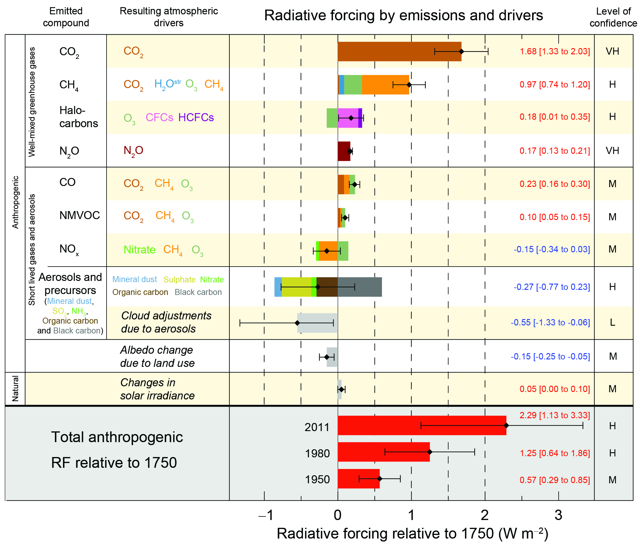
This what they say about the image above…
Figure 2.1: Both human and natural factors influence Earth’s climate, but the long-term global warming trend observed over the past century can only be explained by the effect that human activities have had on the climate.
Sophisticated computer models of Earth’s climate system allow scientists to explore the effects of both natural and human factors. In all three panels of this figure, the black line shows the observed annual average global surface temperature for 1880–2017 as a difference from the average value for 1880–1910.
The top panel (a) shows the temperature changes simulated by a climate model when only natural factors (yellow line) are considered. The other lines show the individual contributions to the overall effect from observed changes in Earth’s orbit (brown line), the amount of incoming energy from the sun (purple line), and changes in emissions from volcanic eruptions (green line). Note that no long-term trend in globally averaged surface temperature over this time period would be expected from natural factors alone.10
The middle panel (b) shows the simulated changes in global temperature when considering only human influences (dark red line), including the contributions from emissions of greenhouse gases (purple line) and small particles (referred to as aerosols, brown line) as well as changes in ozone levels (orange line) and changes in land cover, including deforestation (green line). Changes in aerosols and land cover have had a net cooling effect in recent decades, while changes in near-surface ozone levels have had a small warming effect.18 These smaller effects are dominated by the large warming influence of greenhouse gases such as carbon dioxide and methane. Note that the net effect of human factors (dark red line) explains most of the long-term warming trend.
The bottom panel (c) shows the temperature change (orange line) simulated by a climate model when both human and natural influences are included. The result matches the observed temperature record closely, particularly since 1950, making the dominant role of human drivers plainly visible.
Researchers do not expect climate models to exactly reproduce the specific timing of actual weather events or short-term climate variations, but they do expect the models to capture how the whole climate system behaves over long periods of time. The simulated temperature lines represent the average values from a large number of simulation runs. The orange hatching represents uncertainty bands based on those simulations. For any given year, 95% of the simulations will lie inside the orange bands. Source: NASA GISS.
This is what I think of panel (a), “All Natural Influences”…

Most of the serious banter has been about how Gorebal Warming will wreck our economy…
Climate Change Is Bad News for the Economy, U.S. Government Says
By BLOOMBERG November 24, 2018
The Trump administration just published a major report documenting the advance of climate change, weeks earlier than expected and on a day many Americans are occupied with family and holiday shopping. The news is predictably bad, but this time the tally comes with a pricetag—one significantly larger than you’ll find at the mall.The report catalogs the observed damage and accelerating financial losses projected from a climate now unmoored from a 12,000-year period of relative stability. The result is that much of what humans have built, and many of the things they are building now, are unsuited to the world as it exists. And as time goes on, the added cost of living in that world could total hundreds of billions of dollars—annually.
[…]
The rest of the article was even stupider.
Apparently, these dire economic forecasts are based on RCP8.5 and research funded by Tom Steyer…
4 Problems With the New Climate Change Report
Nov 27th, 2018
f you’re like me, you’re happy the White House released the latest version of the National Climate Assessment on Black Friday. Publishing the 1,700-page report the day after Thanksgiving saved me from unwanted dinner conversations about our planet’s impending climate doom.
But if your aunt calls you up this week spouting claims of mass deaths, global food shortages, economic destruction, and national security risks resulting from climate change, here’s what you need to know about this report.
1. It wildly exaggerates economic costs.
One statistic that media outlets have seized upon is that the worst climate scenario could cost the U.S. 10 percent of its gross domestic product by 2100. The 10 percent loss projection is more than twice the percentage that was lost during the Great Recession.
The study, funded in part by climate warrior Tom Steyer’s organization, calculates these costs on the assumption that the world will be 15 degrees Fahrenheit warmer. That temperature projection is even higher than the worst-case scenario predicted by the United Nations Intergovernmental Panel on Climate Change. In other words, it is completely unrealistic.
2. It assumes the most extreme (and least likely)climate scenario.
The scary projections in the National Climate Assessment rely on a theoretical climate trajectory that is known as Representative Concentration Pathway 8.5. In estimating impacts on climate change, climatologists use four representative such trajectories to project different greenhouse gas concentrations.
To put it plainly, Representative Concentration Pathway 8.5 assumes a combination of bad factors that are not likely to all coincide. It assumes “the fastest population growth (a doubling of Earth’s population to 12 billion), the lowest rate of technology development, slow GDP growth, a massive increase in world poverty, plus high energy use and emissions.”
[…]
3. It cherry-picks science on extreme weather and misrepresents timelines and causality.
[…]
4. Energy taxes are a costly non-solution.
The National Climate Assessment stresses that this report “was created to inform policy-makers and makes no specific recommendations on how to remedy the problem.” Yet the takeaway was clear: The costs pf action (10 percent of America’s GDP) dwarf the costs of any climate policy.
The reality, however, is that policies endorsed to combat climate change would carry significant costs and would do nothing to mitigate warming, even if there were a looming catastrophe like the National Climate Association says.
Just last month, the Intergovernmental Panel on Climate Change proposed a carbon tax of between $135 and $5,500 by the year 2030. An energy tax of that magnitude would bankrupt families and businesses, and undoubtedly catapult the world into economic despair.
These policies would simply divert resources away from more valuable use, such as investing in more robust infrastructure to protect against natural disasters or investing in new technologies that make Representative Concentration Pathway 8.5 even more of an afterthought than it already should be.
[…]
The Steyer-funded study is not pay-walled and it’s a doozy!
Abstract
Estimates of climate change damage are central to the design of climate policies. Here, we develop a flexible architecture for computing damages that integrates climate science, econometric analyses, and process models. We use this approach to construct spatially explicit, probabilistic, and empirically derived estimates of economic damage in the United States from climate change. The combined value of market and nonmarket damage across analyzed sectors—agriculture, crime, coastal storms, energy, human mortality, and labor—increases quadratically in global mean temperature, costing roughly 1.2% of gross domestic product per +1°C on average. Importantly, risk is distributed unequally across locations, generating a large transfer of value northward and westward that increases economic inequality. By the late 21st century, the poorest third of counties are projected to experience damages between 2 and 20% of county income (90% chance) under business-as-usual emissions (Representative Concentration Pathway 8.5).
They literally did refer to RCP8.5 as “business-as-usual emissions.”
Based on a realistic climate sensitivity (TCR = 1.5 K per doubling) and the simple projection of UAH 6.0 to the end of this century, we get about 1.5 to 1.9 °C of total warming by the end of this century. According to Hsiang et al., 2017, that equates to about a 1% reduction in US GDP from 2080-2099, relative to what it would be without any additional warming…

How much would you spend today to avert a 1% loss 80 years from now? Dean Wormer has the answer:
This is how President Trump should handle the purveyors of this crap…
References
Hsiang, S. et al. Estimating economic damage from climate change in the United States. Science. 356 , 1362–1369 (2017).
Jay, A., D.R. Reidmiller, C.W. Avery, D. Barrie, B.J. DeAngelo, A. Dave, M. Dzaugis, M. Kolian, K.L.M. Lewis, K. Reeves, and D. Winner, 2018: Overview. In Impacts, Risks, and Adaptation in the United States: Fourth National Climate Assessment, Volume II [Reidmiller, D.R., C.W. Avery, D.R. Easterling, K.E. Kunkel, K.L.M. Lewis, T.K. Maycock, and B.C. Stewart (eds.)]. U.S. Global Change Research Program, Washington, DC, USA. doi: 10.7930/NCA4.2018.CH1
USGCRP, 2017: Climate Science Special Report: Fourth National Climate Assessment, Volume I[Wuebbles, D.J., D.W. Fahey, K.A. Hibbard, D.J. Dokken, B.C. Stewart, and T.K. Maycock (eds.)]. U.S. Global Change Research Program, Washington, DC, USA, 470 pp.
Climate models are running around 1.5 to 2 degrees too hot…
..climate scientists are using those same models..to extend straight lines… to predict future catastrophes
Hi Climate models are running 1.5 to 2 degrees too hot how come in figure
1 above the climate models lie on the actual temperature line? The graphs
here show an excellent agreement between the models and measured temperatures.
Percy….those aren’t climate models
They also stopped the “current data” at the top of the recent El Nino spike.
Prior to the spike, it was below the line. After the spike, it’s back below the line.
Percy,
They start the climate models from the most recent data
so that they always match the observed data at the time
the report was published. Figure 1 is probably the one from
the most recent IPCC report which means that there are only
a few years of comparison of the data with the model. Not
sure if they re-did the model calculations starting from this
year when they did this last assessment. If they did, then there
is almost no comparison of actual temps with models.
“how come in figure 1 above the climate models lie on the actual temperature line? The graphs
here show an excellent agreement between the models and measured temperatures…..”
Percy,
They are probably quite recent climate models. For the sake of argument, let’s assume they were run in 2010. So, when they ran the models they already knew the answer. The graphs show a forecast of the past. Obviously, it’s pretty easy to forecast the past – it certainly doesn’t require billion dollar climate models.
Of course, if they had simply pasted the historical data into the models it would be pure fraud. But what happens has a similar result.
It is impossible for the models to use the laws of physics and nothing else. So, the models are packed full of arbitrary constants / parameters – referred to as “parameterisation”. This allows the modellers to tune the models so that they better reproduce the historic data. As Willis pointed out, parameter changes that make the match worse will be weeded out, while parameter changes that make the match better will be retained. It may well be a perfect equivalent of Darwinian natural selection.
So, to answer your question: the models match the historic data because they were adjusted to match the historic data. It’s no more than a sophisticated form of curve matching. There is a perfect test of this. The official length of time for climate is 30 years. So, check the models from 30 years ago and see how well they forecast the climate over that period up to today.
Of course, they are a hopeless failure, predicting far more warming than actually happened. Despite this failure they persist in forecasting the same warming today, in fact the CO2 sensitivity the models use is essentially unchanged since the seventies.
The peer-reviewed science is showing an ever smaller CO2 sensitivity, and yet the IPCC doggedly ignores this and sticks to the value from the seventies – a value that was dreamed up almost literally on the back of a fag packet. But here’s their problem: if they observed the science, as they claim to do, then they would be significantly reducing their predictions of future warming. Of course, that wouldn’t do at all as their whole purpose is to make it as alarming as possible.
The computer models are not just wrong – because they don’t simply rely on the physical laws and are driven by political needs, they are close to fraudulent.
Chris
Climate models run too hot because the IPCC models assume that the global temperature will always go up without considering cyclical events of which there are a number.
Spectral analysis of the almost 170 year long CRUTEM4 temperature data set
CRUTEM4 Spectrum
shows that there are five spectral components of approximately equal intensity, which control short and long term trends.
That’s because they have removed, “adjusted”, all traces of past cycles from their temperature data.
As long as they hindcast to Hadcrut or GISS, they will always end up aiming way high.
Easily done with a band-pass filter; it would explain why none of 5 components is dominant as opposite to what would be expected to be in an unadulterated temperature data set.
That is just nonsense. The source code for the major climate models are available on the
web and if they were programmed to ensure that the temperature always went up then you
would be able to point to the lines of code involved and show that there was an error.
All of the models assume that a small increase in temperature will result in an increase in water vapor in the atmosphere.
That has been shown to be false, but none of the models have removed that assumption.
Without that assumption it’s impossible to get the scary numbers that drive the scam.
Hi Mark,
Again can you prove that assertion — show me the lines if code where that is assumed.
And then show me the evidence that it is false.
Percy Jackson November 28, 2018 at 12:13 pm
Hello Percy, no need hunt through the code.
Instead look at the barometric pressure records.
Also YOU ( or your lords and masters) furnish the change in pressure that would be required for the CO2 driven temperature change theory to work. Also present us with the barometric pressure records going back to the mid 1850s. The device was created in 1850.
I eagerly await your submission.
michael 🙂
Oh as for your models, there is a reason that the CCCP and the USA never launched on warning. If they did we would not be have this discussion.
As usual, Percy demands that unless others can come up with the evidence to prove him wrong, he’s going to stick with what he was taught to believe.
“As usual, Percy demands that unless others can come up with the evidence to prove him wrong, he’s going to stick with what he was taught to believe.”
No, Percy is asking that you provide evidence for your assertion. Don’t you think that’s fair?
@Percy WRT code: the expectation to respect a million lines of code without, say ISO9000, standards is simply foolish. You regard, The Code as holy. Very strange that blind trust should be applied. Every single block of code should have a complete set comments, and if complicated an additional meta-file explaining what the code does.
The fact the following: while (/(]+>)|(]+>)|([^><]+)/go)
could be easily intelligible to a perl script writer is not very useful without explaination so that others can confirm the reasonability of the line of code.
If anyone expects people to believe then many people have to read the code.
Percy wants proof?
Nobody has proven that an increase in CO2 results in an increase in water vapor and this has NOT happened. It is a theory which is NOT working.
So the water vapor has not increased and neither has the temperature as a result.
But the media, politicians, pseudo-scientists and too many gullible readers have accepted this false theory.
So I have proven it wrong.
Simple
– Assemble the observed data
– Remove all natural oscillations with a band-pass filter (proof: strength of QBO = ENSO = HF AMO = SOLAR input = LF AMO)
– Construct a model to correctly back-cast adulterated data
– Forecast with such model
– Publish code for the model
Here are two ORIGINAL graphs of N. Hemisphere temperature published in 1970 and 2018.
Comparison graph updated with CRUTEM4 actual data (see the link above)
That is just nonsense. ….
What it is…is the best proof that the lower adjustments to past temperatures is f r a u d
They hindcast the models… tune them to those temperatures….which were adjusted down to show a faster rate of warming…
…so of course, the models show a faster rate of warming than what is real
I’ve read a review of that code. Apparently it’ rubbish. Tens of thousands of adjustable parameters that nobody knows the actual values to, so they adjust them until the model provides the answers they want. This is no way to do science.
And then there is the question of just what temps where entered as a “baseline”. Hansen’s most resent “adjustments”? Gavin’s? Temps before either got a hold of them?
And adjustments aside, just how valid are past (very) scattered local temp records of any kind of value to determine past GLOBAL measurements? (The best we have now for any true global measurements are satellites but even they only measure a layer or two of the “onion” that is our Globe.)
All of the foundations of all the models are sand.
Percy they are saying the problem isn’t a few lines of code it most of the lines of code because blocks of the code represent concepts believed true. Even a climate scientist if they agree the models are running warm has to figure how to adjust the underpinnings in the model and it is not likely to be a few lines but entire blocks of code.
There is a more fundemental problem that escapes most Climate Scientists because of their lack of science background. Go to any physics site and ask the question “what limits Numerical weather prediction” (so not even climate at this point) and why are they limited to around 3 days. There is one wrong answer that certain groups will give in chaos, it is wrong if it was chaos you could solve it but the problem is the other answer they will give you. Once you understand the problem it will dawn on you why you can’t fix the models :-).
Percy,
Here’s what happens when you run the models from, say, 1979 to now:
http://www.drroyspencer.com/2014/02/95-of-climate-models-agree-the-observations-must-be-wrong/
The reason the graphs always look good, is they re-run the models with post-dated data. Fitting a curve to existing data is easy (and that is what they do); getting the curve to match the future prior to collection of data is hard (and is what Dr. Spencer shows).
The chart you linked was the inspiration for the chart shown Here.
and here.
Look at my earlier post for the complete evaluation.
Sophisticated computer models of Earth’s climate system allow scientists to … e x p l o r e … the effects of both natural and human factors
Yep … explore … my emphasis. Explore new ways to separate $$$ from American Workers in the form of PUNISHMENT taxes. Moral $$ indulgence payments. Tithes to the church of Warmism. Punishment and destruction of Capitalism.
“..climate scientists are using those same models..to extend straight lines… to predict future catastrophes”
. . . a straight line forecasting a climate that is driven by multiple cycles of differing magnitudes and frequencies??? Sounds like multiple differential equations / Laplace Transforms may be needed here.
RCP 8.5 is bad disaster fiction.
I propose that we start using GACC temperature scale, G. I believe rather than using F or C, G scale will denote the real scare.
Freezing point of water in G will be at 100 and the boiling point will be 8100. Hence we can expect a warming of at least 60Gs but more likely 160Gs.
That will teach the skeptics
This is not a report from the “Trump” Administration.
Sarah Huckabee Sanders should make a strong statement regarding this stinky dead carp.
I don’t know if ‘The Donald’ could or should shut this foolishness down. Even if he wanted to, why do so?
The squawk from the cAGW cult would be like shock and awe — silence scientists (although most are not), freedom of speech being stomped, other similar stuff. Who wants that? Let them bloviate. Then poke them with a sharp stick.
Somewhere else I saw 15°F (correct notation is 15F°) rise in the next 80 years! Good grief!
Hypothetical projections are being treated as an unquestionable and certain future. Pseudo-science at it’s finest! Nobody knows what future conditions will be. Claiming otherwise is fortune telling.
These guys are more entertaining than those who calculate toxicity recommendations for EPA. Never mind that by 2088 our GDP would be far better able to afford mitigation (if any is needed). Further, no one can account for the fact that if warming continues as projected, we ingenious little 3rd chimpanzees will probably figure out novel ways to leverage that environmental condition into even higher level of GDP.
Is something missing ?
“[…]
3. It cherry-picks science on extreme weather and misrepresents timelines ( time lines ) and causality.
[…]
??
A bracketed ellipsis […] means that a section of text was not quoted.
Quoting entire articles can become a copyright issue. When I quote passages from articles, I generally use the bracketed ellipsis to indicate the omitted sections.
https://grammar.ccc.commnet.edu/grammar/marks/ellipsis.htm
“A bracketed ellipsis […] means that a section of text was not quoted.”
That’s a good way of distinguishing between one’s own ellipses and ellipses in the original—thanks!
“Both human and natural factors influence Earth’s climate, but the long-term global warming trend observed over the past century can only be explained by the effect that human activities have had on the climate.”
Statements like this always burn my butt. So these brainwaves MUST also know exactly what caused every temperature excursion across the Holocene, when all these human meatbags were not present and CO2 was apparently not a problem?? How many times had the temperature risen in the Holocene, 50?
If you ask them, they will admit that they don’t know what caused the past climate fluctuations, but they know that the current warming must be caused by CO2, because that’s what the models say.
The “funny” thing is that the models indicate steady global warming throughout the Holocene due to slowly increasing CO2 and retreating ice sheets… The Late Holocene exhibits a long-term cooling trend that can’t be explained by the models.
http://www.pnas.org/content/111/34/E3501
Basically, the models can’t explain 99% of the climatic variation over the past 10,000 years.
If their models can’t explain natural cooling, of course their models would be unable to explain the warming.
It should therefore be no surprise that models such as in figure 5 show no natural explanation for recent warming.
And then when models are tuned to CO2 being the primary driver of temperature, surprise surprise, temperature trends along with CO2 and results in humans being the cause, at 95% confidence.
So really, the only thing that backs up humans being the driver, is their assumption that they are correct.
And there is no evidence to assume they are correct.
“So really, the only thing that backs up humans being the driver, is their assumption that they are correct. And there is no evidence to assume they are correct.”
That sums it up pretty good.
Everything about the CAGW scare is based on assumptions. The Alarmists are seeing what they want to see, not what is there, or, in this case, not there.
I was doing a little digging yesterday, trying to find out what the review process is for reports like the National Climate Assessment (or as I like to call it, the National Climate Assassination of Rationality), and I came upon this interesting bit of information:
http://www.cfact.org/2017/12/30/biased-national-academies-review-taints-national-climate-assessment/
“The National Academies of Science, Engineering and Medicine (NASEM) have peer reviewed Volume 1 of the latest National Climate Assessment and they are scheduled to review Volume II, which will be the main volume. The Volume I review committee contained no skeptics, just well known alarmists. This is a direct violation of OMB’s [US Office of Management and Budget] rules for peer review of federal scientific assessments. NASEM should either shape up or ship out.”
Given that the NASEM [National Academies of Science, Engineering and Medicine] peer review fails to meet the Bulletin [OMB Bulletin] requirements, it follows that the required peer review has not been done for Volume I. Moreover, unless there is a big change at the NASEM, their review of Volume II will likewise fail to comply with the OMB [US Office of Management and Budget] Bulletin.
I do not know whether any changes to the review process occurred for Volume II — I’m doubting it — I haven’t found information discussing this yet.
This is a very interesting find and ounds like the sort of thing that could be its own article here on WUWT. If I had a twitter account I would message this to president Trump.
Can we generate a petition to demand that Steyer release his tax returns? I think that we would find that he falls under the famous Eisenhower warning in Ike’s 1961 Farewell Address at Dartmouth:
“The prospect of domination of the nation’s scholars by Federal employment, project allocation, and the power of money is ever present and is gravely to be regarded.
Yet in holding scientific discovery in respect, as we should, we must also be alert to the equal and opposite danger that public policy could itself become the captive of a scientific-technological elite.”
Hmm i like poker.
My bank was £200
then 196
then 190
then 183
then 176
then 192
then 218
then 208
then 201
then 222
then 217
then 200
It was a good game and the profit trend is looking good.
Reference period first 3 nights average bank was £195.33 = baseline session
2nd session of 3 i was trending down -£11.67 average bank £183.66
3rd session of 3 i was trending up £+13.67 average bank £209
4th session of 3 i was trending up £+17.67 average bank £213
Profit zero. but i’m trending a roll right.
Global mean average temperature of earths surfaces combined land sea and ice 14.4C 1850
14.9C 2017 El nino year.
Difference 0.5c higher. 2018 14.5C maybe 14.6C… 0.1/0.2C higher ?.
Because that is yer global warming .. the difference between the start and the end.
What is in the middle is meaningless.
Only what was, and what is now matters.
start £200 finish £200 warming zero.
Exactly. How do the climate clowns justify extending a trend linearly decades into the future?
Because they are mathematical inebriates.
Someone taught them a little bit of rote maths, but they are clueless how to use it.
Did you mean ‘invertebrates’?
Interpolation is fraught enough with potential errors but unless you are absolutely certain that you have an exquisitely accurate physical theory for the system under consideration, extrapolation is generally suicidal.
David, once again a fun post. The ridicule is more deserved now than ever. Are these people part of the human race? There will be no coordinated participation in climate action other than the carnival barking of the left and opportunistic 3rd World governments clamoring for cash (they think the шнутеs have gone crazy and hey, why not cash in?).
The cost, if their urgent demands were to be taken seriously, would be far worse than 10% of GDP and everybody, the butcher the baker and candlestick maker know the expenditure would be to no effect. The jig is up and the elites are in D*nile, the real psychological kind. People already voted on it in the US and in a growing number of countries.
For those who have until recently been unsure about our climate impact, the contrary evidence they really understand has come in in a flood. No, not the ‘sciencey’ stuff, although it toppled about a decade ago. It is the angst and shrill entreaties of the cynical billionaire elites who don’t know aerosols from snip. ‘Follow the money’ subsumes it will be somewhat hidden, but with these guys its now all hanging out in a last ‘Sauve qui peut!’ on a pockmarked battlefield. Steyer’s Deplorables plaid shirt and blue jeans seem somehow sad.
“….Figure 2.1: Both human and natural factors influence Earth’s climate, but the long-term global warming trend observed over the past century can only be explained by the effect that human activities have had on the climate…”
So there was no natural recovery from Little Ice Age of the previous 400-500 years? Were CO2 levels rising from human fossil fuel use or other human actions from 1900 onward? No UHI effects in the 20th century? No temperature station siting issues involving NOAA guidelines?
I wish Trump would pull the plug on the financing of this garbage. As I have said in the recent past though, he is being reactionary and taking no offensive action against any of this. If I were in his shoes, the alarmists at the U.N. and around the world would be on the run and dealing with the entire body of refuting evidence presented for the whole world to see and consider.
The best defense is a good offense.
Trump can’t “pull the plug” on these Climate Reports. They are required by Congress. He should have a say, however, on who puts them together. Reading the list of Lead Authors we see familiar alarmist names like Jim Kossin and Kathrine Hayhoe. It’s about a 2:1 ratio of Government to Academic people.
https://science2017.globalchange.gov/credits/
The list of who the authors and editors are should be within the purview of the White House, or at least WH has final approval. The addition of just a few skeptics would have a salutary effect on the final product. Right now, I bet the editorial meetings take place in a safe, warm alarmist bubble.
In the quote, “only” is misplaced. To mean what the author[s] want it to mean, the placement must be thus: “the long-term trend . . . can be explained only by”
As stated, the clause means “the trend can only be explained; it cannot be believed, it cannot be proven, it can’t be acted on, it can’t be tested; it can only be believed.” And that is a problem–the explanation is basically empty of significance.
Think about the differences among these sayings: “I only love you.” “Only I love you.” “I love only you.” “I love you only.” (The last two mean the same thing. The first two are very different from each other and from the last two.)
So many of these explanations and assertions are careless in their use of language, which makes one wonder how careless they also are in matters of science and of fact.
The phrase you object to reads: “the long-term global warming trend observed over the past century can only be explained by the effect that human activities have had on the climate.”
You write, “the placement must be thus: “the long-term trend . . . can be explained only by”
As stated, the clause means “the trend can only be explained; it cannot be believed, it cannot be proven, it can’t be acted on, it can’t be tested; it can only be believed. […] So many of these explanations and assertions are careless in their use of language,””
Henry Fowler, author of the authoritative Modern English Usage, disagrees with you, and so do subsequent usage authorities, mostly. He wrote (in a much longer passage):
“It may at once be admitted that there is an orthodox placing for only, but it does not follow that there are not often good reasons for departing from orthodoxy. For He only died a week ago no better defence is perhaps possible than that it is the order that most people have always used and still use, and that, the risk of misunderstanding being chimerical, it is not worthwhile to depart from the natural.” He adds at the end that the natural position may be “often demanded by rhetorical needs.”
@M McGuirk: I realize that the NCA report is required by Congress. If Trump can influence who prepares the report, then he should have an equal number of alarmists and climate realists (skeptics) on its panel and ensure that it is balanced. Right now it is anything but balanced from the looks of it.
When I said “pull the plug,” I guess I was thinking more in terms of the IPCC. Did the UNFCCC not admit the Palestinian Authority as a member some years back? If I recall correctly, there is a U.S. law that requires withholding U.S. funding of any U.N. organization that does that. So far as I know, Trump hasn’t done that….yet. In the absence of that balance, President Trump could (and perhaps should) put together a panel of scientists to show Congress why the NCA report is built on highly questionable science that might justify Congress’ repeal of the the law requiring the report.
Also, if climate models in academia and elsewhere in the U.S. are indeed running hot, then the funding for them also needs to be questioned by Congress and the President. If the modelers can’t explain why the models don’t agree with the satellite record, then the funding of the models should be difficult to justify.
I could go on, but I think you get the idea.
RE: a panel of scientists to show Congress why the NCA report is built on highly questionable science that might justify Congress’ repeal of the the law requiring the report.
Fat chance of that happening with the Dems running the House starting in January. A Dem majority that includes such paladins of scientific knowledge as Hank (Guam may capsize) Johnson and the Child legislator, Alexandria Ocasio-Cortez, who is actually going to Congress without Daddy holding her hand.
Reminds me of the Dilbert cartoon that proudly on display at work and at home.
“What if I don’t trust the economic models”
“Who hired the climate denier”
https://dilbert.com/strip/2017-05-14
David, those “simulation runs” are so good I’m utilizing them to substitute for my regular exercise. What a fracking great feeling sitting in front of the TV with chips and beer while “simulation runs” exercise for me. Meanwhile back in touch with Reality, I see several large areas of North America are off to the coldest start to winter ever recorded.
When a cause that is advanced by Progressives converges towards a socialitic solution far faster than it converges towards solving the issue they claim is urgent, then we can be at least 97% confident that we are dealing with ideology far more than we are dealing with honest science.
“But if your aunt calls you up this week spouting claims of mass deaths, global food shortages, economic destruction, and national security risks resulting from climate change,”
Especially if her name is Sally.
How does the atmospheric CO2 concentration of RCP2.6 compare to measured CO2 concentrations? I can’t find RCP2.6 CO2 concentrations vs. time in tabular form that would allow an accurate comparison with actual data. If actual CO2 concentration falls below projected levels and the resulting warming still matches projected warming, I would think the climatologists would be citing this as proof that “it’s worse than we thought”.
Perhaps this is why the data is presented on low resolution graphs.
Another observation I have is that the RCPs seem to run together until there is a divergence beginning somewhere between 2030 and 2040 (again based on low resolution graphs). So how can ANY conclusions be made about the accuracy or usefulness of the projections until that time period?
The more things change, the more they remain the same.
Here’s UAH 6.0 plotted at the same scale as a similar image in IPCC’s 2001 Third Assessment Report (TAR):
This was pre-RCP. They used “story line” scenarios (SRES) back then. Same result. UAH 6.0 tracked at the bottom of the range of model outputs.
David
Thanks for the post. I looked at what you presented here and in your post back in April. Here are a few points. I read in another article that the NCA was not based on the solid red line. Rather, it is based on 15F instead. Below is a quote form the article I read:
“That study only found substantial damage to the U.S. economy under an extreme global warming scenario of 15 degrees Fahrenheit by 2100 — twice the United Nations’ worst-case scenario called RCP8.5.”
Your figure 2 shows how it could be 15F if you use the maximum of the shaded area. This is what I would call extreme squared. I used 15F as the basis for what I document here.
Perhaps, this comment is more directed at what you posted back in April, but I hope it adds something.
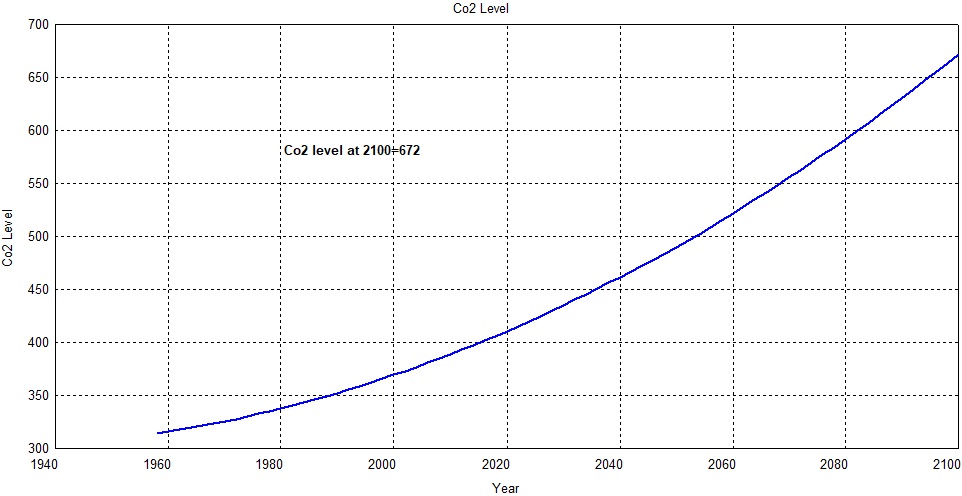
First, regarding CO2. As you can see in the figure below, I have a very precise fit to the Mauna Loa measurements.
Ignoring the yearly cycle, I get this rate of change until 2100.
Extending this out to 2100 I get this
.
I think in the April post you came up with 683 and I came up with 672. Not bad.
Now, onto 15F.
I wrote a little program for this evaluation. I can get to the final temperature of 15F two ways. I can find what ECS value gets me there or I can determine what the final value of CO2 must be with a given ECS value. That is what this little program does.
There you have it. If CO2 grows at its current pace as shown in the earlier figures the ECS value must increase to 8.56. If we use the worst-case IPCC value of 4.5 the final PPM value would have to be 1254. That is not too far from your value as I recall.
Now to illustrate just how foolish this report is I added a new line to my graphs in my cyclic analysis of UAH data. My cyclic analysis with a contribution from CO2 is a very good match to the measured data.
I performed a 5-year moving average of both the measured data and the cyclical data and essentially duplicated a familiar curve that included balloon data. You can see the lines are on top of one another. The figure also includes the Lewis and Curry estimate for ECS too. I added a new line for the NCA 15F estimate.
You will also find a line identified as rcp85. That is my digitation of the red line from your figure 2. You will see that the IPCC 4.5 line is a reasonable match for it. Make note of how well the Lewis and Curry value matches the data.
Now taken out to 2100 this is the result.
In my estimation, the people who wrote this report should be ashamed of themselves. It is truly extreme squared. It is fiction.
So the government climate weasels changed the BAU scenario for the science fiction scenario of RCP 8.5 and figured (correctly) that the climate concerned are too gullible to notice the difference.
And even then in their arrogance they managed to still over hype and make the outcome far worse than reality indicates.
Food shortages won’t be from warming, they’ll be from cooling. Warming increases the areas where we can grow food. And as the alarmist like to say that snow is caused by increased evaporation, it’s just as likely to rain than having droughts.
These “studies” all use the RCP8.5 projections because it’s the scariest. Despite all the chest-thumping about “government action” in the form of carbon taxes, wind and solar subsidies, prohibitions on fossil-fueled energy production and vehicles, especially by the most deluded of the progressive governments around the world, no one is actually doing anything substantial to “combat” so-called “climate change” so, in fact, the “do nothing” scenario is the most plausible as far as global action.
The irony, however, is that actual measured temperature trends so far barely reach to low end of the RCP2.6 scenarios; the balls-to-the-wall-damn-the-economy mitigation fantasies envisioned by the climatistas. Simply stated, the computer-generated Representative Concentration Pathway projections are spectacularly wrong.
US sceptics want to destroy theit country. EU leading the way: https://wp.me/p8BEgP-13a
Keep flogging that poor strawman there Comrade Ivan. We enjoy the entertainment.
… Sophisticated computer models of Earth’s climate system allow scientists to explore the effects of both natural and human factors …
=======================================================
Homicide detecting would be a lot easier if police could charge the first person they come across without an alibi.
Fig 2.1 is derived from IPCC report AR5 that clearly states that the ‘drivers of climate change’ since 1750 were overwhelming anthropogenic:
That’s an assumption contained in the models there is nothing sophisticated about it; it’s purely a deductive process, if practically all climate drivers are anthropogenic then it follows that practically all observed changes will be due to anthropogenic:
http://www.cfact.org/2018/03/01/circular-reasoning-with-climate-models/
Hah! So you used a fossil-fuel-funded thermometer? No wonder your denialist assertions are false!
/sarc for the humour-deficient
Back when there was REAL science, had I ever turned in a paper with a hockey stick on it, I would have been FAILED and rightly so. Now, it’s standard to use the failed paper as representing reality. Science is so destroyed.
I’m picking RCP 2.6 as the answer to the question of what’s ahead for the future environment.
This NCA s so Cherry Picked that it is indefensible. Plus it uses a deceptive twisting of some of their references to try to mislead their readers.
Their heat wave histogram starts in 1960. To anyone who knows better, that is a truncation of data. Their is high quality temp data across the the entire 20th Century for the US lower 48. That quality data that clearly shows the heat waves of the 1930s-40s were worse, so they truncated it.
Their use of Mann’s discredited hockey stick paleo-temperature reconstruction (in Figure 1.8) turns their report into more of a farce.
And then there is this steaming pile of poo where they write:
(paragraph 7, Section 1.6, Global Changes in Land Processes)
“Many studies have documented a lengthening growing season, primarily due to the changing climate, and elevated CO2 is expected to further lengthen the growing season in places where the length is water limited. (ref: 173) ”
Their Reference 173 is:
Reyes-Fox, M., H. Steltzer, M. J. Trlica, G. S. McMaster, A. A. Andales, D. R. LeCain, and J. A. Morgan, 2014: Elevated CO2 further lengthens growing season under warming conditions. Nature, 510, 259–262, doi:10.1038/nature13207.
where the final part of the Reyes-Fox, et al. abstract reads:
“Elevated CO2 further extended growing, but not reproductive, season length in the warmed grassland by conserving water, which enabled most species to remain active longer. Our results suggest that a longer growing season, especially in years or biomes where water is a limiting factor, is not due to warming alone, but also to higher atmospheric CO2 concentrations that extend the active period of plant annual life cycles.”(end of abstract)
(My bold to highlight the authors’ relevant findings.)
That NCA wording completely turns around the Nature paper’s wording in order to deceptively misrepresent what the authors said. That plants in water limited areas become more water efficient and continue growing is an inconvenient message they try to erase through misrepresentation.
Earth climate is regulated by water. The huge effective thermal capacitance, mostly due to oceans, prevents rapid sustained temperature changes. Reported short term (a year or so) SST changes result mostly from roiling of the ocean surface such as shown here: http://www.youtube.com/watch?v=1ir1w3OrR4U
The ghg water vapor has increased about 8% since 1960. About 96% of the increase appears to be from increased irrigation. The added water vapor has contributed to average global temperature increase.
Total Precipitable Water (TPW) has been measured by satellite since 1988 and is reported by NASA/RSS. Graphed through Oct, 2018 here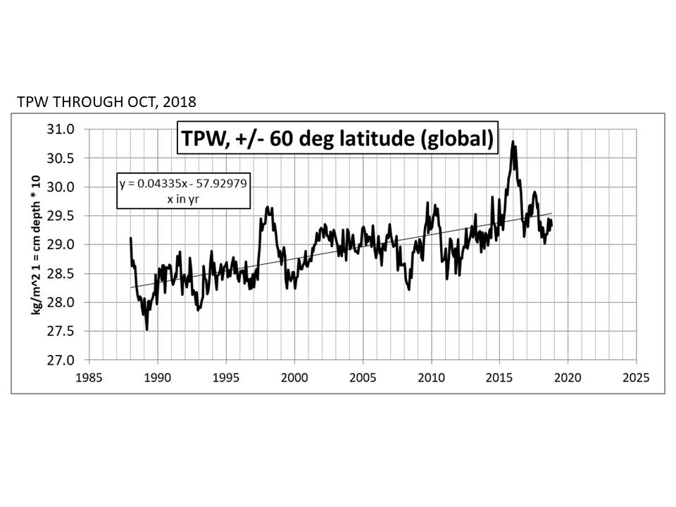
CO2 increase has little, if any, effect on climate according to the preponderance of evidence from paleo to present (click my name).
Dan,
The NCA authors clearly had an agenda. That agenda had to be:
Do not present any benefit from increased CO2 or resulting climate change that (supposedly) emanates from it to make it into the report’s wording.
An analogy to highlight:
Imagine a Roman Catholic Vatican-sponsored conclave to pontificate on the Devil and the evil he represents on humanity. Now imagine that conclave writing a scholarly theology report that says, “The Devil bad, but occasionally, just occasionally, the Devil does good.”
That of course would never happen. The Devil has to be evil and bad 24/7/365. It’s a religious dogma both in scripture and in church teachings.
Climate change is now firmly a religious dogma too. That dogma says, “More CO2 is evil and nothing good can come of it.”
That is why this NCA is nothing more than climate religion dogma. The senior authors/editors clearly could not allow the report to contain statements or sections on the beneficial things of more CO2 or a warmer climate.
And that is why this NCA must be dismissed by all rational scientists.
To even see some of my meteorologist colleagues fall for this crapola is disheartening. We-do-not-and-will-not-ever-control-global-climate-and-weather.
Some incredible cherry picking and biased stuff.
They predict that crop yields will fall 12.1% because of weather/climate change, crop disease and insects which is already adversely effecting food production according to them.
What about atmospheric fertilization from carbon dioxide from the law of photosynthesis?
From the report. “effects of CO2 on crops are highly uncertain”.
For soybeans, the 6 highest yielding years, have been the last 6 growing seasons. This is not in spite of climate change and the increase in CO2 but because of it:
https://www.nass.usda.gov/Charts_and_Maps/Field_Crops/soyyld.php
http://www.co2science.org/education/reports/co2benefits/MonetaryBenefitsofRisingCO2onGlobalFoodProduction.pdf
These scientists can’t even get the law of photosynthesis right. It’s not just crops but all plants:
http://www.co2science.org/data/plant_growth/dry/dry_subject.php
And it’s not just plants in thousands of studies but plants on the entire planet:
https://www.nasa.gov/feature/goddard/2016/carbon-dioxide-fertilization-greening-earth
That even affects deserts:
https://phys.org/news/2013-07-greening-co2.html
That doesn’t look highly uncertain to me.
They claim that the number of tornadoes in tornado outbreaks has increased because of climate change. They show a graph that has an increase since the 1990’s of tornado days that had 30 or more tornadoes on that day.
What a strange coincidence that this sudden bump up, coincided with the installation of the nation wide NEXRAD doppler radars at NWS sites in the 1990’s(last one in Indiana in 1997) which could now detect actual tornadoes that were not detected before!

Maybe they should have looked here and shown this graph instead:
They mention the possibility of the extreme cold from several Winters ago being caused by blocking from climate change. Yeah, we heard about that from the government before:
https://www.motherjones.com/politics/2014/01/john-holdren-video-polar-vortex/
“A growing body of evidence suggests that the kind of extreme cold being experienced by much of the United States as we speak is a pattern that we can expect to see with increasing frequency as global warming continues,” Holdren asserts. Watch it”
One can appreciate how powerful the brainwash is, when the brainwasher, tries to maintain the brainwash by convincing the brainwashed that extreme cold is being caused by global warming. ….and the brainwashed give a standing ovation to the presentation!!
They discuss atmospheric rivers and models forecasting a 50% to 600% increase in them for the West Coast……….but claim that there is no clear consensus on whether this increase in frequency and intensity will translate into increasing precipitation for California.
They discuss the 11 year major hurricane drought in the US, sort of in damage control mode. They are correct when they state that there has been no increase in number or strength of tropical cyclones……….from global warming/climate change so far, (even though models have predicted this). They site a study that suggests that climate change could result in less hurricanes striking the US. It sounds sort of objective………..but then claim that land falling major hurricanes is the wrong metric to use for measuring damage from hurricanes…………and they go ahead and use data from busted models for estimating economic losses from extreme weather from hurricanes being 10% stronger.
“I downloaded HadCRUT4 and UAH 6.0 from our friends at Wood For Trees. After converting to Fahrenheit and applying static shifts to match NCA4’s baseline, I overlaid the real data on the NCA4 image and projected UAH 6.0 to the end of this century.”
UAH starts during a cold AMO phase, that will artificially increase your trend projection. HADCRU4 shows about 0.5°C warming since the 1940’s. Continuing that trend to 2100 would be just over another 0.5°C.
http://www.woodfortrees.org/graph/hadcrut4gl/from:1900
the Fourth National Climate Assessment Report RCP 8.5 is a bad joke and useful only as a bad joke. It has no scientific basis, it exists only as a piece of ludicrous CAGW propaganda. Sadly no one is laughing much.
BTW, I have additional confirmation that they used 15F and not the 8F shown in the charts.
https://www.breitbart.com/politics/2018/11/28/delingpole-the-national-climate-assessment-is-a-national-joke/
I posted an earlier comment on this article with my analysis of what this means and how ridiculous this is.
I have never said anything like this before but I think the authors deserve public ridicule.
“The Climate Won’t Crash the Economy: A worst-case scenario projects annual GDP growth will be slower by 0.05 percentage point.” by Steven Koonin on Nov. 26, 2018
https://www.wsj.com/articles/the-climate-wont-crash-the-economy-1543276899
Mr. Koonin, a theoretical physicist, is a University Professor at New York University. He served as undersecretary of energy for science during President Obama’s first term.
* * *
The final figure of the final chapter shows that an increase in global average temperatures of 9 degrees Fahrenheit (beyond the 1.4-degree rise already recorded since 1880) would directly reduce the U.S. gross domestic product in 2090 by 4%, plus or minus 2%—that is, the GDP would be about 4% less than it would have been absent human influences on the climate. That “worst-worst case” estimate assumes the largest plausible temperature rise and only known modes of adaptation.
To place a 4% reduction in context, conservatively assume that real annual GDP growth will average 2% in the coming decades (it has averaged 3.2% since 1935 and is currently 3%). That would result in a U.S. economy roughly four times as large in 2090 as today. A 4% climate impact would reduce that multiple to 3.8—a correction much smaller than the uncertainty of any projection over seven decades.
* * *
If we take the new report’s estimates at face value, human-induced climate change isn’t an existential threat to the overall U.S. economy through the end of this century—or even a significant one.
* * *
How many years has WUWT now been saying the IPCC reports are fictional, contain errors, etc, etc. It’s all quite clearly wrong even to a common layman who can type a few lines on a keyboard.
Yet, all these brilliant retired engineers who so clearly know better than the established science haven’t made a dint in it – not one, not in any way. 30years in which the sceptics have got absolutely nothing right while the evidence for serious AGW risks has mounted and the pause blown away in a couple of years exactly as scientists said it would be.
Meanwhile Anthony Watts racks up the advertising revenu and his cronies sell books and calendars as part of his self-described “enterprise”.
This site is now a shrine to narcissistic, arrogant ignorance and pig-headed denial of truly astonishing proportions. And it will only get worse as the days, weeks and months tick by.
At what point are the sceptics here going to realise that Anthony Watts is the presiding Emperor of WUWT who has been swanning around naked here for years? At the same time, robbing readers of their dignity and stripping them of their cash. I guess it will go on for a while, given that sadly, there’s probably one of them born every minute.
Nice rant Donald.
A perfect example of how WUWT is starting to get through to policy makers, the general public and frustrating the environmental extremists in control of climate science who want us all to go back to living in caves.
To quote Steve Milloy…”Winning”.