Guest analysis by Sheldon Walker
Warmists and Alarmists are still fighting the idea, that there was a recent slowdown. In order to show just how “special” the recent slowdown was, I have created a new type of graph, which shows the warming rate plotted against the date range which was used to calculate the warming rate.
That may sound confusing, but when you look at the graph, it will become clear. The graph is based on very simple principles. A quick numerical example will show how the graph was made.
The warming rate (calculated using a linear regression), for the date range from 2002 to 2012, was 0.12 degrees Celsius per century. The graph is an X-Y graph. This calculated warming rate is plotted as a line, which runs from (2002, 0.12) to (2012, 0.12).
This is a horizontal line, which runs from 2002 to 2012 on the X-axis, at a height of 0.12 (the warming rate), on the Y-axis. Now just add more horizontal lines, for all of the other calculated warming rates, and you will have the finished graph.
Note that only date ranges which are greater than or equal to 10 years, have been used. Short date ranges tend to have very variable warming rates, so these have been ignored.
Have a look at the graph, and see what you think. I will give you my interpretation of the graph, after you have had a chance to look at it. Note that I have coloured the warming rate that I used as a numerical example above, in red. This is the lowest warming rate from 1980 to 2017, and it is therefore the strongest slowdown. All of the other warming rates are coloured blue.
A number of the lines have been labelled with the warming rate, in degrees Celsius per century, at the right-hand end of the line. This means that you can see what the warming rate is, without having to guess it from the Y-axis. There were too many lines to label them all, so I have tried to label the ones that are the most useful.

Note the red line near the bottom of the graph, which runs from 2002 to 2012 on the X-axis, at a height of 0.12 (the warming rate), on the Y-axis. This is the lowest warming rate, which is also the strongest slowdown.
The strongest slowdown is not all alone. It has some neighbours nearby. The closest is 2002 to 2013, with a warming rate of 0.22 (all warming rates are in degrees Celsius per century, I will not specify this each time that I give a warming rate).
Also nearby, is 2003 to 2013, with a warming rate of 0.35. As you might expect, warming rates which share a common date range, tend to have similar warming rates. The strongest slowdown comes from a “family” of date ranges, which go from about 2001 to 2013 or 2014.
What about the rest of the graph. The majority of warming rates fall in the dense central region, with warming rates from about 1.4 to 2.2. The overall average is about 1.75.
Then there are the departures from the central area. A speedup in the middle of the graph, from about 1992 to 2004 (about 12 years). This speedup reached a warming rate of 3.39.
There was a weaker slowdown, from about 1987 to 1997, with a warming rate of about 0.43.
Finally, there is a small number of speedups which end in 2016 and 2017. The 4 years from 2014 to 2017, are the warmest in the date range, from 1980 to 2017. So it is no surprise that the warming rates calculated using these years, will tend to have higher warming rates. This is another speedup, which started after the recent slowdown.
In summary, notice how clearly the slowdowns and speedups stand out from the dense central region. These are NOT vague climate events, which are hard to pick out from the other climate events. These are “in your face” climate events, which no intelligent person would deny.
But make no mistake, there are plenty of unintelligent, or deceitful, people out there, who will still deny the recent slowdown. These people have their own agenda, and scientific truth is not important to them.
Bear in mind that a slowdown of 0.12, compared to the average warming rate of about 1.75, is less than 7% of the average warming rate.
Imagine driving your car at 100 km/h on the motorway, and having to slow down to less than 7 km/h for 10 years!
Many Warmists and Alarmists would claim that you hadn’t even slowed down, and that 7 km/h and 100 km/h were statistically the same value.
However, reasonable people accept that there was a recent slowdown, and that it was “special”.
Accepting that there was a temporary slowdown, does not invalidate global warming. So Warmists and Alarmists can have their cake, and eat it too. They can still believe in global warming, but accept that there was a temporary slowdown in warming rates from about 2002 to 2012.
Was it special or was it what would be expected in a naturally varying climate?
We tend to regard the most extreme values as “special”.
e.g. first place in a competition, the strongest hurricane, the most rain in a time period.
2002 to 2012 is the lowest warming rate.
It wins the prize for warming the slowest.
It would be nice if people would be honest enough to acknowledge this fact.
But many people don’t appear to be honest.
I often don’t give an opinion on whether the slowdown was “natural”.
But I suspect that it was caused by ocean cycles, like the PDO and AMO.
So that would make it “natural”
But it certainly kicked AGW’s butt, for a while.
I will continue to taunt Warmists and Alarmists about it, until they are honest enough to acknowledge it.
A slowdown in man made global warming is perfectly reasonable and acceptable as there is no such thing as man made global warming. It is quite impossible for CO2, (man made or otherwise), of itself or in conjunction with water vapour to cause runaway or catestrophic global warming; and no-one has ever proved that it does.
My initial response is too small of a data set, you only used 38 years, I think we could claim at least reasonable coverage of the globe as far back as 1950(?), there is one dataset that goes back 350 years, but still only a whisker off the gnat on the elephant of 14,000(?) years since the onset of this interstadial. Already you can’t find your analysis in that data, and this Old Earth goes back some 4 billion(?) years. My question marks are because I didn’t stop to look up any of this, I’m going from memory, give me credit if I’m even in the ballpark, that’s not my point. My point is, temperatures go up, temperatures go down, temperatures stay steady, and it has always been thus. Man’s effect on the temperatures of this Earth are unknown, to the extent that we don’t even know what sign (positive/negative) to give it, but it is most likely small, probably so small as to be undetectable. In other words, just like weather, we might as well get used to it. That is all. Carry on.
…temperatures… should have been …climate…
If I’m reading your graph correctly the majority of the time we were having this unprecedented slowdown, we were also having an unprecedented speedup. Do you think this makes sense?
The effect that you have noticed, is caused by the way that linear regressions work. We are calculating using date ranges, rather than individual years. The results are affected by all of the years in the range.
2002 to 2012 are the core years of the slowdown.
But the slowdown can be considered to run from about 2001 to 2013.
But when you add the “extreme” warming years, 2014, 2015, 2016, and 2017, these increase the warming rate for the 10 or 11 year date ranges (2006 to 2017, and 2007 to 2017).
The warming rate for the overlap years (2006/2007 to 2013) have NOT actually changed, but the temperatures in 2014 to 2017 makes it appear that the warming rate for earlier years has increased.
e.g. if you measure the average income of 10 poor people. Then measure the average income of 10 poor people, plus a millionaire. The average income has increased, but the poor people are still just as poor as before.
“The warming rate for the overlap years (2006/2007 to 2013) have NOT actually changed, but the temperatures in 2014 to 2017 makes it appear that the warming rate for earlier years has increased.”
Yes, and by the same token the “slowdown” is based on unusually warm years around 2002 – 2006.
The trend from 1996 – 2006 was faster than the underlying trend, the trend since 2006 has been much faster. Join the two together and you get a trend less than either, though still a bit faster than the trend since the mid 70s. The moral is you cannot take trends, especially over such short periods, out of context. Low trends are often the result of starting high, fast trends of starting lower.
One test of this is to see what effect this slowdown has on the longer term trend. Starting like you in 1980 the trend from 1980 to 2002, the start of the slowdown was 1.33°C / century. By the end of the slowdown in 2012 the trend since 1980 has risen to 1.54°C / century.
” … “extreme” warming years, 2014, 2015, 2016, and 2017, … ”
—
This was the onset, peak and decline of an El-Nino … so why call it, “… “extreme” warming years …”?
It was a transient, a short-term cycle of warming followed by the steep cooling down period (which is apparently is still tapering-away, punctuated with natural-variability’s overprinting, along the way down).
It may turn out the ‘pause’ never ended because that El-Nino is clearly a noise transient, not a permanent warming.
But then again too, the whole 20th century ‘modern-warming’ phase is nothing but a blip of cyclic noise to anyone who’s familiar with actual climate data, in the form of the marks it leaves on the planet, rather than models and irrelevant (apparently poorly-calibrated and correctable to order) satellite transients. The whole thing is a political charade, including a pause, because not one bit of it is anything but noise.
And it’s clear irrelevant noise is the ONLY thing anyone’s interested in.
“Special” noise, i.e. its absence, which has a devastating effect on “Special” politics.
Children.
Typical global heating rates, as shown in the middle of the chart above, range from 1.4º to 2.2ºC per century, or 0.014 to 0.022ºC/year. [median = 0.018ºC/yr] Daily variations in land temperatures range from roughly 4ºC to 40ºC. [median = 22ºC] Climatologists are thus trying to tease out from background noise a global warming signal that is only about 0.08% of the daily variation in land temperature, based on median values. That’s roughly 1 part in a thousand.
Remember, these are global temperatures that don’t even take into account wind and humidity, that have been tampered with, and, in at least one case, the original data dumped. To sustain the claims of abnormal warming, failed models are in use. Small wonder that woo-woo methodology (bristlecone pine dildoclimatology, “novel” statistical methods, etc.) has been thought necessary to back up the models. Lysenko is alive and well in present-day academia.
What data set is this?
Is it global anomaly?
Land only?
SST only?
Also on your plot, many lines overlap. A heat map or contour plot of line density is needed to make any sense of it.
So far, I’m very un-impressed with this attempt at demonstration of the hiatus.
What temperature series?
GISTEMP Global Land and Ocean temperature series, using Yearly values.
I’d probably would have picked that one. I think it’s a good plot.
Thank you. I used my knowledge of Monty Python to pick the temperature series.
No one expects the Spanish Inquisition!!!
And no one expects a Slowdown in GISTEMP!!!
In contrast the UAH6.0 series indicates practically no net warming 1997 – 2016 as well as 1980 – 1994, not the sort of pattern one would expect from a monotonic predominant forcing factor:
http://woodfortrees.org/plot/uah6/from:1979/plot/uah6/from:1997/to:2016/trend/plot/uah6/from:1980/to:1994/trend
The GISS series has been carefully managed over time to present as constant a trend as possible in line with the models.
How about a spam sandwich?
Please dont keep analyzing with GISTEMP. Use the only database that both sides trust. The UAH database.
It would be useful to do the same treatment and graph data for longer time frame, like 1900-present.
I don’t think this graph make any sense.
tom t,
the graph makes sense, it is just that you don’t understand it.
What aspect doesn’t make sense.
I am happy to try and explain it.
I would be happier if I saw a graph from say 1880 to the present day, with the CO2 figures also in it. .
I realise that trying to figure out a “Worlds “average,especially back in 1880 is difficult, but perhaps a country by country chart would be of great interest, especially the period of the 1930 tees in the USA.
MJE
Yeah, what data was used? Most data sets are just tampered data with built-in bias, therefore masking possible real events.
I would need to see how this works against several generated known sets of data so that I could compare those against this graph. It could be there id nothing at all unusual in the graph and you are just focusing on what you want to see. If generated sets of “temperature-like data” look very different, then you move on to “this graph looks unusual, but why?” It could be artifacts of the data tampering or it could be because the “pause” is really unusual. Plot different periods of time and look for similar outcomes – if you can find them then this is not an unusual graph, you got fooled by bias-thinking.
I still applaud attempts to look at things in new ways. Just be careful jumping to conclusions.
However, surface temperature database is an unusable mass of propaganda, bias and pseudoscience. It’s a funding grant database, not a temperature database…. How many Ice Cream trucks does it take to make a hotter Summer?
“ Its a funding grant database …”
Truer words have never been typed.
I understand the graph and all it shows me is the adjusted data sets of temperature anomalies from about 2015, 2016 and 2017 artificially increased the warming rate for all the other data sets on the graph at about 2005/06.
I do not see how this advances our understanding much, nor whether the observation is significant in a dynamic climate system
At the crux of this is the key question: what period of time amounts to a significant period of time?
At one time.it was ‘thought’ that a period of 10 years with no warming would be significant, this period was then extended to 15 years, and then to 17 years, and even more than that. I recall that some years back, when warmists reluctantly were accepting the pause as real, Julia Slingo the head of the UK Met Office, even suggested that there may well be no return to warming before 2030, but that would not be significant.
Richard,
you need to understand that when you can’t SEE global warming happening, it is because global warming is hiding under rocks, behind trees, and in the ocean.
It is just waiting to get you, when you least expect it.
So you should be even more worried about global warming, when you CAN’T see it.
There is only one guaranteed solution. Send me a bucket load of money. Remember the precautionary principle. You had better make that 2 bucket loads of money.
According to Jim Hansen only 18 years.
https://video.foxnews.com/v/5851667173001/?#sp=show-clips
This chart could be used to show that the temperature record shoots up at the end of every pause.
That could be evidence of elasticity in the temperature record. A sign that the heat is stored somewhere and the released.
Or it could be evidence that when the world stops acting in an exciting way the people who are payed to monitor the world adjust the record to fit the expected outcome.
“How special was the recent warming slowdown a.k.a. “the pause” ?”
The graph doesn’t answer the question. It shows a whole lot of trends, and marks the minimum. But any finite set of numbers will have a minimum. The remarkable thing here is that if you look for a minimum over that nearly forty years, it is still positive.
There is a minimum. And that is special as it is the minimum.
And that is the Pause. It was Special, since a decade before the Rio conference.
Nick,
every competition has a winner. So we shouldn’t reward people for winning.
You said, “The remarkable thing here is that if you look for a minimum over that nearly forty years, it is still positive.”
My graphs don’t try to hide global warming. They try to show reality, or the truth.
People think that I don’t believe in global warming, because I constantly go on about the Slowdown.
But I believe in both, global warming and the Slowdown.
Global warming doesn’t need me as an advocate. It already has too many.
But the Slowdown does need help to be recognised.
Just because I believe in global warming, doesn’t mean that I am an Alarmist, or a Catastrophist. I think that there will be some problems, but also some benefits. Alarmists think that global warming is “pure evil”, with no good points. There are not many things in life which don’t have any good points.
Why is it “remarkable” (that the overall warming trend is positive)? The Earth naturally exited the last glacial period around 12,000 years ago. The historic warming period during interglacial periods, based on the last five or so, ranges from 10,000 to 20,000 years duration, more or less independent of atmospheric CO2 concentration levels.
Sort of puts the putative demon CO2 warming in perspective, doesn’t it?
This post got me interested in comparing my first snow record with this graph as they cover the same sort of date ranges (eg 1977-2018 and 1980-2017.
The results are rather a surprise. lt was during the pause from 2002-2015 where most of the latest first snows happen. With a run of mostly late first snows during 2002/3 to 2006/7 and a mini peak during 2013/4 to 2014/5.
While during the recent increased warming rate between 2015 to 2017 there has been a four season run of early first snows (2015/6 to 2018/9.
Not what l was expecting at all.
Latest BOM Pacific sub-surface temperature-anom chart:
4-month sequence of vertical temperature anomaly sections at the equator, Pacific for November 2018
http://www.bom.gov.au/cgi-bin/oceanography/wrap_ocean_analysis.pl?id=IDYOC007&year=2018&month=11
It’s clearly an atrophying rather than amplifying Nino trend so we can probably forget about an El-Nino for the time being.
Plus the sustained equatorial and trade winds are also contrary to El-Nino development—as you look forward the easterlies remain.
https://on.windy.com/1vaks
In fact the rain and storm activity in the far east Pacific is also tapering off to a much lower level.
https://on.windy.com/1vakt
SSTA also showing Nino trend dissipating:
https://earth.nullschool.net/#current/wind/surface/level/overlay=sea_surface_temp_anomaly/orthographic=-136.60,0.50,300
A couple of thoughts…
1. GISTEMP shows the most warming of the major temperature indices. Depending on whose temperature index you trust, over the last thirty years average temperatures have risen somewhere between about 0.3°C (UAH) and 0.5°C (GISS):
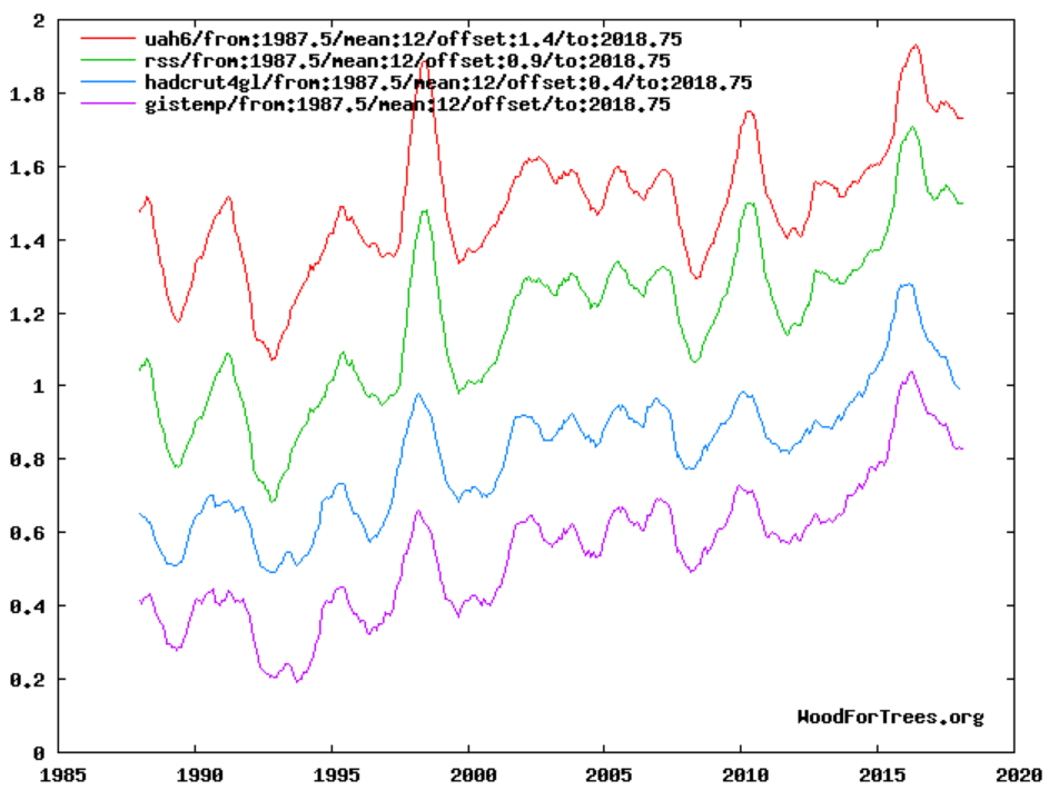
http://www.woodfortrees.org/plot/uah6/from:1987.5/mean:12/offset:1.4/to:2018.75/plot/rss/from:1987.5/mean:12/offset:0.9/to:2018.75/plot/hadcrut4gl/from:1987.5/mean:12/offset:0.4/to:2018.75/plot/gistemp/from:1987.5/mean:12/offset/to:2018.75
Screenshot here (in case images in comments get fixed someday):
2. Starting at 1980 means starting near the 1979 northern hemisphere temperature minimum. Here’s a graph of U.S. temperatures, from Hansen et al, 1999 (I added the red annotations):
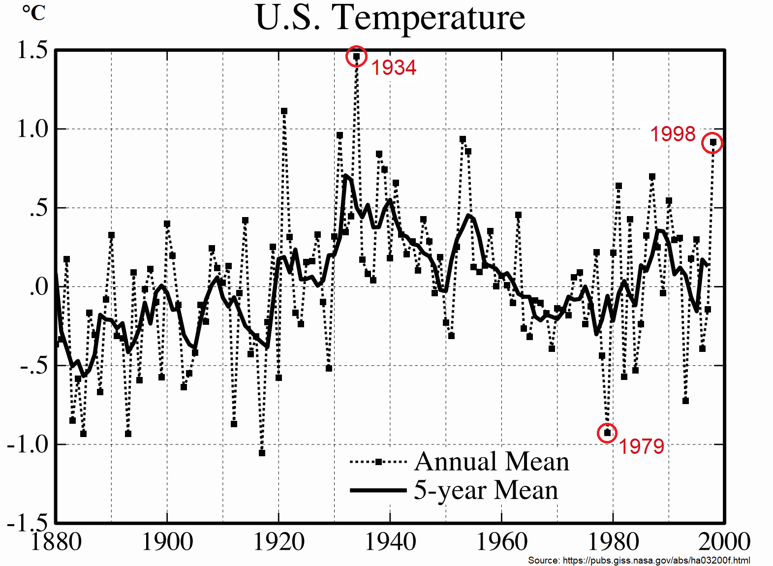
According to that paper, 1934 was the warmest year then on record, 1998 was the warm El Nino spike, and 1979 was the coldest year in the United States in over six decades.
By 1980, CO2 levels had been consistently rising for thirty years. Yet NH temperatures hadn’t bottomed out until the previous year.
The pause/slowdown would look less special, and the overall average rate of temperature rise would be lower, if your analysis started earlier.
The chart demonstrates that at no stage in the last 40 years has there been a cooling trend. Since we all agree that the climate is warming, let’s have a discussion about what to do about it.
I’ll start the discussion. Since the tropics are not warming and warming in the rest of the world is overwhelmingly beneficial to mankind, I say let’s enjoy it while it lasts.
What can we do about it? There are numerous research papers showing the ECS is pretty low per doubling of CO2, there’s another paper that shows atmospheric CO2 increase is statistically indistinguishable from variations and estimate ranges of natural sinks, and there’s no replacement for fossil fuel derived energy. Furthermore, it took us 300 years to get to this point (I’m counting from Watts development of a useable useful steam engine), so it would probably take 300 years to unwind it, and likely would not have an effect on global temperatures anyway, as I already said. So you might as well get used to it.
…shows Man’s contribution to atmospheric CO2 increase…
To simplify the image, and may be add a bit of clarity, how about just plotting the lines for each 10 year period.
Excellent visual and underlying concept.
Alarmist denial of the pause has diverted attention from what may be a matter more significant to the climate change debate. Temperature moved sideways, rather than trended downwards, from what might have been the end of a routine upward phase of a short term temperature cycle. The cycles span 60 years, approximately, split between an upward phase and a downward phase. The recent upward phase began around 1975-1980. 30 years later is 2005-2010–the core of the pause.
Is the break in routine significant to the climate change debate? “Break” means temperatures have been trending sideways rather than downwards since the early 2000s.
The correlation between temperatures and CO2 is utterly dependent on the stretching of the y axis of the anomaly graphs used. Utterly dependent
Stretch it up to much, warming overshoots and there is no correlation
Shrink it too much, warming undershoots and there is no correlation
This should be rammed home at every turn.
I am not sure that it benefits anyone to play with figures that are based on the fiction of a ‘global average atmospheric temperature’.
1. It is not based on an average it is based on the mean between highest reading and lowest reading of air temperature each day. Temperature does not follow a neat sine wave.
2. Atmospheric temperature is the wrong metric for energy content of the air, which is what the concern is supposedly about. As humidity greatly changes the atmospheric enthalpy the correct metric is kilojoules per kilogram. (air at 100% humidity and 75F holds twice the energy in KJ/Kg compared to air at 0% humidity and 100F)
3. Averaging ‘the means of daily temperature max and min’ in areas with different humidity is completely meaningless. Adjusting those temperatures based on other air temperatures hundreds of kilometers distant is compounding the error.
4. None of the values used and calculated show error bars if they did the error bars would force the scale of the Y axis to be so large that the meaningless precision of the values quoted in all these graphs would be glaringly obvious.
These are undergraduate level errors but they are being propagated and used as justification for hugely important decisions by far better qualified people. This can only be deliberate.
I was expecting some high lines in the graph for periods ending around 1998.
CO2 emissions (man made or otherwise) adding to the existing base-load of 380ppm cannot produce global warming. In conjunction with water vapour neither can they produce runaway or CAGW. So a 20 year flatlining of global temperature is perfectly reasonable and acceptable.
Sheldon, I do believe that your graph is an interesting, insightful new way to examine the characteristics of the time-period-dependent trends within a set of data covering a much larger overall time period. Thank you for that.
However, I believe there is one big caution that you should have included. Since you selected the simple linear regression method for examining periods of 10 years or longer (and kudos for not setting this criteria lower), you are probably aware—and indeed you comments above to Bellman indicate such—that linear regressions tend to be overly sensitive to both ends of a given data range. For example, single data points values of, say 10 and 1, in a data set also containing values 3, 3, 3, 4, 4, 4, 5, 5, and 5 will have much different linear regression fits (straight line equations) if those “outlier” data point are at the beginning and end points of the period being examined versus being consecutive in sequence in the middle of the period being examined.
I don’t know of an easy way around this issue, other than to alert people that the above issue means that a single line (and especially the lower and high warming rates) may not be statistically significant, but CLUSTERING of such lines with a high degree of overlap over a given time period are very significant. Hence, I agree with your conclusion that the period of 2001-2014 was an exceptionally lower warming rate compared to the obvious group average of 1.75 warming rate over the total data set time span.
Finally, need I mention that the 36:1 (face value) difference between the lowest and the highest warming rates in your graph all happened while average-annual atmospheric CO2 concentration was on a SMOOTH, EVER-INCREASING upward trend?
A followup observation: since there was a very strong El Nino during 2015-2016, lines in the article’s graph that include either or both of these years as the most recent end-points of the sampled range AND that also have a data sample range of less than 15 years should be considered as “not indicative of trend” due to the associated linear regression analyses being strongly affected by this transient perturbation.
Applying this “filter” means that all of the lines indicating above-average warming for intervals after year 2001 (that is, all lines in the upper right corner above the average clustering group that itself has a maximum value of 2.2) should be considered as having questionable validity. Therefore, one cannot conclude from Sheldon Walker’s graph that the global warming “pause” has recently ended.
Two more things can be inferred from this chart.
1. There was no “pause”. The climate was warming even between 2003 to 2013.
2. The mean rate of warming is around 1.7 degrees Celsius per century!
Well, Simon, do you consider an average warming rate of 0.5 C per century during the period of 2003-2013 as statistically different from zero, considering: (a) that is probably around the average uncertainty of the measurements comprising the data set, and (b) the fact that the GISTEMP dataset has been messaged time and again, as others have already noted above?
As to the mean rate of warming being 1.7 degrees per century for the period 1980 through 2016, as established from GISTEMP by Sheldon’s analytical/graphical technique above, I have no issue with that. After all, Earth just recently (geological time scale) naturally exited the last glacial period, and the last five interglacial periods say the warming period will typically last 10,000 to 20,000 years after exit from a glacial period.
A 10 year period is insufficient to determine a trend because of the inherent variability. You need about 30 years for climate data.
A mean rate of warming being 1.7 degrees per century is almost unprecedented in the paleo-climatic record. The last known comparable incidence was the peak of the Paleocene–Eocene Thermal Maximum.
Simon, I can only laugh at your first paragraph, because CAGW wasn’t even a meme 30 years ago.
As for your second paragraph: “almost unprecedented in the paleo-climatic record” leaves much room for discussion, especially given that we have obtained reliable, scientific measurements of Earth’s global warming only since about 1910, or less than .000004% of the paleoclimate record (noting that I have somewhat arbitrarily disregarded the first billion years of Earth’s history as being too unsettled to leave any reliable proxies for climate investigations during this period, even though some fossils do date back to this time).
Standard definition of paleoclimatology: the study of changes in climate taken on the scale of the entire history of Earth.
The NASA website has a graph that puts 5 different temperature datasets on a single graph from 1880 to 2017 or so (hard to tell what latest year is) . Of course all these datasets are fake because they have suppressed the warming of the 1930s. 3 other things stand out. 1) The data sets are almost exact matches of each other 2) One of the datasets is GISTEMP which includes water temperature data along with land air temperatures. 3) Another one of the datasets is called Cowtan and Way.
So I go to their website to find out what the heck is that dataset? Lo and behold I find this caveat on their website. I quote: “Maintaining a scientific data set to professional levels of quality assurance is beyond our resources. These results are therefore presented as a best effort. ”
So it seems that NASA will accept data submissions from private individuals even if you admit that you can’t keep the data up to professional standards. I guess this isnt too surprising in the climate science field when you realize that there isn’t any data standards in climate science. It is a wild west free for all of “HIDING THE DECLINE, JUXTAPOSING TEMPERATURE DATA FROM LAND STATIONS TO WILDERNESS AREAS 1000’S OF KM AWAY, USING PROXY DATA AND REAL DATA ON SAME TIMELINE IN A GRAPH, ADJUSTING TEMPERATURES DOWNWARDS 80 YEARS AGO SO THAT YOU CAN CLAIM AN INCREASE, USING 2 DIFFERENT TECHNIQUES TO MEASURE SEA RISE AND PUTTING THEM ON SAME TIME LINE, USING A BOGUS CONCEPT OF glacial isostatic adjustment TO ADJUST LAND LEVELS FOR SEA LEVEL MEASUREMENTS, MIXING SE WATER TEMPERATURE DATASETS WITH LAND AIR TEMPERATURE DATASETS, FAILING TO COMPLETELY ACCOUNT FOR UHI EFFECTS, AND WHOLESALE READJUSTMENT OF TEMPERATURES 20 YEARS LATER FROM GRAPHS THAT WERE ORIGINALLY PUBLISHED TO PRESENT NEW FRAUDULENT GRAPHS. Did I leave any other climate science data fraud procedures out?
To think that billions of dollars are being spent on this fraud and because of this fraud boggles the mind.
Very handy bit of research.
But agony to read. May I suggest that you get an editor to check your commas?
I’ve read it requires 30 years of temperatures to define a climate. What would your graph look like if you presented only time periods of 30 years or more? Seeing this graph for all of the 20th century would be very interesting.
“I’ve read it requires 30 years of temperatures to define a climate.”
One core issue here is that climate alarmists, most politicians and most MSM do not look at “climate” this way.
More importantly, if the PDO has a 60 year cycle, shouldn’t it take 60 years of data to establish a climate? Most important to this discussion, what the climate is doing right now should be compared to the same timeframe 60 years ago to see if 1) anything has changed and 2) if the current rate of change is extraordinary.
Very intuitive! Congratulations! I hope we will see this type of graph more often.
If I understand this correctly you are plotting warming rates for different periods of time AND different length of periods in the same graph. The point you want to make is that the 2002-2012 period is the lowest of all. And by making it red it stands out. That is all well.
But the graph itself is a mess. It really does not make sense to compare a 10-year rate to a 15-year rate. It would be much more informative to show only 10-year rates, then only 15-year rates, then only 20-year rates (and every one in between if you like). And of course 30-year trends, since that is the current manmade climate period.
Sheldon Walker, you might be interested in my recent, peer-reviewed research on the supposed CO2/warming mechanism. It was published in the September issue of the Asian Academic Research Journal, and it shows that CO2 not only doesn’t produce global warming, but that it can’t, and that chlorine depleting the ozone layer after being photodissociated on polar stratospheric clouds from anthropogenic CFCs is the most probable cause of warming. If you’d like a copy of the paper, please contact me at davidlaing[at]aol[dot]com.
I’m still amazed that NOAA just adjusted the pause away with absolutely no comeback from the scientific or journalism community. I had hoped at least a few of the pond scum would raise an objection to this obvious chicanery but I was wrong. Alarmists who had finally accepted after 15-20 years that there was indeed a case to answer just did a 180 and called skeptics liars or worse, despite the even-now active scientific endeavour to add to the 50+ excuses for the unadjusted pause, all of which can be filed under ‘the natural variation they denied was possible’. How is such large-scale dishonesty/groupthink even possible in science?
Because it’s not science. It’s politics and advocacy.
Interesting work Sheldon, good stuff. I’d recommend a couple of changes to make it even more useful, if you have the time:
If using GISTEMP, use data by year from the first revision in which it was published, as this is the most reliable figure compared to later revisions. The most recent revision was specifically to turn the “pause” into a “slowdown”, and retain a +ve figure for the period.
See if you can go back to at least 1950, preferably as far back as possible, as the period since 1980 is too short to show many cycles of warming/cooling. This should give more periods for comparison.