Guest Essay by Kip Hansen (with graphic data supplied by William Ward)
 One of the advantages of publishing essays here at WUWT is that one’s essays get read by an enormous number of people — many of them professionals in science and engineering.
In the comment section of my most recent essay concerning GAST (Global Average Surface Temperature) anomalies (and why it is a method for Climate Science to trick itself) — it was brought up [again] that what Climate Science uses for the Daily Average temperature from any weather station is not, as we would have thought, the average of the temperatures recorded for the day (all recorded temperatures added to one another divided by the number of measurements) but are, instead, the Daily Maximum Temperature (Tmax) plus the Daily Low Temperature (Tmin) added and divided by two. It can be written out as (Tmax + Tmin)/2.
Anyone versed in the various forms of averages will recognize the latter is actually the median of Tmax and Tmin — the midpoint between the two. This is obviously also equal to the mean of the two — but since we are only dealing with a Daily Max and Daily Min for a record in which there are, in modern times, many measurements in the daily set, when we align all the measurements by magnitude and find the midpoint between the largest and the smallest we are finding a median (we do this , however, by ignoring all the other measurements altogether, and find the median of a two number set consisting of only Tmax and Tmin. )
This certainly is no secret and is the result of the historical fact that temperature records in the somewhat distant past, before the advent of automated weather stations, were kept using Min-Max recording thermometers — something like this one:

Each day at an approximately set time, the meteorologist would go out to her Stevenson screen weather station, open it up, and look in at a thermometer similar to this. She would record the Minimum and Maximum temperatures shown by the markers, often she would also record the temperature at the time of observation, and then press the reset button (seen in the middle) which would return the Min/Max markers to the tops of the mercury columns on either side. The motion of the mercury columns over the next 24 hours would move the markers to their respective new Minimums and Maximums for that period.
With only these measurements recorded, the closest to a Daily Average temperature that could be computed was the median of the two. To be able to compare modern temperatures to past temperatures, it has been necessary to use the same method to compute Daily Averages today, even though we have recorded measurements from automated weather stations every six minutes.
Nick Stokes discussed (in this linked essay) the use and problems of Min-Max thermometers as it relates to the Time of Observation Adjustments. In that same essay, he writes
Every now and then a post like this appears, in which someone discovers that the measure of daily temperature commonly used (Tmax+Tmin)/2 is not exactly what you’d get from integrating the temperature over time. It’s not. But so what? They are both just measures, and you can estimate trends with them.
And Nick Stokes is absolutely correct — one can take any time series of anything, find all sorts of averages — means, medians, modes — and find their trends over different periods of time.
In this case, we have to ask the question: What Are They Really Counting? I find myself having to refer back to this essay over and over again when writing about modern science research which seems to have somehow lost an important thread of true science — that we must take extreme care with defining what we are researching — what measurements of what property of what physical thing will tell us what we want to know?
Stokes maintains that any data of measurements of any temperature averages are apparently just as good as any other — that the median of (Tmax+Tmin)/2 is just as useful to Climate Science as a true average of more frequent temperature measurements, such as today’s six-minute records. What he has missed is that if science is to be exact and correct, it must first define its goals and metrics — exactly and carefully.
So, we have raised at least three questions:
1. What are we trying to measure with temperature records? What do we hope the calculations of monthly and annual means and their trends, and the trends of their anomalies [anomalies here always refers to anomalies from some climatic mean], will tell us?
2. What does (Tmax+Tmin)/2 really measure? Is it quantitatively different from averaging all the six-minute (or hourly) temperatures for the day? Are the two qualitatively different?
3. Does the currently-in-use (Tmax+Tmin)/2 method fulfill the purposes of any of the answers to question #1?
I will take a turn at answering these question, and readers can suggest their answers in comments.
What are we trying to measure?
The answers to question #1 depends on who you are or what field of science you are practicing.
Meteorologists measure temperature because it is one of the key metrics of their field. Their job is to know past temperatures and use them to predict future temperatures on a short term basis — tomorrow’s Hi and Lo, weekend weather conditions and seasonal predictions useful for agriculture. Temperature predictions of extremes are an important part of their job — freezing on roadways and airport runways, frost and freeze warning to agriculture, high temperatures that can affect human health and a raft of other important meteorological forecasts.
Climatologists are concerned with long-term averages of ever changing weather conditions for regions, continents and the planet as a whole. Climatologists concern themselves with the long-range averages that allow them to divide various regions into the 21 Koppen Climate Classifications and watch for changes within those regions. The Wiki explains why this field of study is difficult:
“Climate research is made difficult by the large scale, long time periods, and complex processes which govern climate. Climate is governed by physical laws which can be expressed as differential equations. These equations are coupled and nonlinear, so that approximate solutions are obtained by using numerical methods to create global climate models. Climate is sometimes modeled as a stochastic [random] process but this is generally accepted as an approximation to processes that are otherwise too complicated to analyze.” [emphasis mine — kh]
The temperatures of the oceans and the various levels of the atmosphere, and the differences between regions and atmospheric levels, are, along with a long list of other factors, drivers of weather and the long-term differences in temperature are thus of interest to climatology. The momentary equilibrium state of the planet in regards to incoming and outgoing energy from the Sun is currently one of the focuses of climatology and temperatures are part of that study.
Anthropogenic Global Warming scientists (IPCC scientists) are concerned with proving that human emissions of CO2 are causing the Earth climate system to retain increasing amounts of incoming energy from the Sun and calculate global temperatures and their changes in support of that objective. Thus, AGW scientists focus on regional and global temperature trends and the trends of temperature anomalies and other climatic factors that might support their position.
What do we hope the calculations of monthly and annual means and their trends will tell us?
Meteorologists are interested in temperature changes for their predictions, and use “means” of past temperatures to set an expected range to know and predict when things are out of these normally expected ranges. Temperature differences between localities and regions drive weather which makes these records important for their craft. Multi-year comparisons help them to make useful predictions for agriculturalists.
Climatologists want to know how the longer-term picture is changing — Is this region generally warming up, cooling off, getting more or less rain? — all of these looked at in decadal or 30-year time periods. They need trends for this. [Note: not silly auto-generated ‘trend lines’ on graphs that depend on start-and-end points — they wish to discover real changes of conditions over time.]
AGW scientists need to be able to show that the Earth is getting warmer and use temperature trends — regional and global, absolute and anomalies — in the effort to prove the AGW hypothesis that the Earth climate system is retaining more energy from the Sun due to increasing CO2 in the atmosphere.
What does (Tmax+Tmin)/2 really measure?
(Tmax+Tmin)/2, meteorology’s daily Tavg, is the median of the Daily High (Tmax) and the Daily Low (Tmin) (please see the link if you are unsure why it is the median and not the mean). The monthly TAVG is in fact the median of the Monthly Mean of Daily Maxes and the Monthly Mean of the Daily Mins. The Monthly TAVG, which is the basic input value for all of the subsequent regional, statewide, national, continental, and global calculations of average temperature (2-meter air over land), is calculated by finding the median of the means of the Tmaxs and the Tmins for the month for the station, arrived at by adding all the daily Tmaxs for the month and finding their mean (arithmetical average) and adding all the Tmins for the month, and finding their mean, and then finding the median of those two values. (This is not by a definition that is easy to find — I had to go to original GHCN records and email NCEI Customer Support for clarification).
So now that we know what the number called monthly TAVG is made of, we can take a stab at what it is a measure of.
Is it a measure of the average of temperatures for the month? Clearly not. That would be calculated by adding up the Tavg for each day and dividing by the number of days in the month. Doing that might very well give us a number surprising close to the recorded monthly TAVG — unfortunately, we have already noted that the daily Tavgs are not the average temperatures for their days but at are the medians of the daily Tmaxs and Tmins.
The featured image of this essay illustrates the problem, here it is blown up:

This illustration is from an article defining Means and Medians, we see that if the purple traces were the temperature during a day, the median would be identical for wildly different temperature profiles, but the true average, the mean, would be very different. [Note: the right hand edge of the graph is cut off, but both traces end at the same point on the right — the equivalent of a Hi for the day.] If the profile is fairly close to a “normal distribution” the Median and the Mean are close together — if not, they are quite different.
Is it quantitatively different from averaging all the six-minute (or hourly) temperatures for the day? Are the two qualitatively different?
We need to return to the Daily Tavgs to find our answer. What changes Daily Tavg? Any change in either the daily Tmax or the Tmin. If we have a daily Tavg of 72, can we know the Tmax and Tmin? No, we cannot. The Tavg for the day tells us very little about the high temperature for the day or the low temperature for the day. Tavg does not tell us much about how temperatures evolved and changed during the day.
Tmax 73, Tmin 71 = Tavg 72
Tmax 93, Tmin 51 = Tavg 72
Tmax 103, Tmin 41= Tavg 72
The first day would be a mild day and a very warm night, the second a hot day and an average sort of night. The second could have been a cloudy warmish day, with one hour of bright direct sunshine raising the high to a momentary 93 or a bright clear day that warmed to 93 by 11 am and stayed above 90 until sunset with only a short period of 51 degree temps in the very early morning. Our third example, typical of the high desert in the American Southwest, a very hot day with a cold night. (I have personally experienced 90+ degree days and frost the following night.) (Tmax+Tmin)/2 tells us only the median between two extremes of temperature, each of which could have lasted for hours or merely for minutes.
Daily Tavg, the median of Tmax and Tmin, does not tell us about the “heat content” or the temperature profile of the day. If daily Tmaxs and Tmins and Tavgs don’t tell us the temperature profile and “heat content” of their days, then the Monthly TAVG has the same fault — being the median of the mean of Tmaxs and Tmins — cannot tell us either.
Maybe a graph will help illuminate this problem.

This graph show the difference between daily Tavg (by (Tmax+Tmin)/2 method) and the true mean of daily temperatures, Tmean. We see that there are days when the difference is three or more degrees with an eye-ball average of a degree or so, with rather a lot of days in the one to two degree range. We could punch out a similar graph for Monthly TAVG and real monthly means, either of the actual daily means or from averaging (finding the mean) of all temperature records for the month).
The currently-in-use Tavg and TAVG (daily and monthly) are not the same as actual means of the temperatures during the day or the month, they are both quantitatively different and qualitatively different — they tells us different things.
So, YES, the data are qualitatively different and quantitatively different.
Does the currently-in-use (Tmax+Tmin)/2 method fulfill the purposes of any of the answers to question #1?
Let’s check by field of study:
Meteorologists measure temperatures because it is one of the key metrics of their field. The weather guys were happy with temperatures measured to the nearest full degree. One degree one way or the other was not big deal (except at near freezing). Average weather can also withstand an uncertainty of a degree or two. So, my opinion would be that (Tmax+Tmin)/2 is adequate for the weatherman, it is fit for purpose in regards to the weather and weather prediction. For weather, the weatherperson knows the temperature will vary naturally by a degree or two across his area of concern, so a prediction of “with highs in the mid-70s” is as precise as he needs to be.
Climatologists are concerned with long-term ever changing weather conditions for regions, continents and the planet as a whole. Climatologists know that past weather metrics have been less-than-precise — they accept that (Tmax+Tmin)/2 is not a measure of the energy in the climate system but it gives them an idea of temperatures on a station, region, and continental basis, close enough to judge changing climates — one degree up or down in the average summer or the winter temperature for a region is probably not a climatically important change — it is just annual or multi-annual weather. For the most part, climatologists know that only very recent temperature records get anywhere near one or two degree precision. (See my essay about Alaska for why this matters).
Anthropogenic Global Warming scientists (IPCC scientists) are concerned with proving that human emissions of CO2 are causing the Earth climate system to retain increasing amounts of incoming energy from the Sun. Here is where the differences in quantitative values, and the qualitative differences, between (Tmax+Tmin)/2 and a true Daily/Montly mean temperature comes into play.
There are those who will (correctly) argue that temperature averages (certainly the metric called GAST) are not accurate indicators of energy retention in the climate system. But before we can approach that question, we have to have correct quantitative and qualitative measures of temperature reflecting changing heat energy at weather stations. (Tmax+Tmin)/2 does not tell us whether we have had a hot day and a cool night, or a cool day and a warmish night. Temperature is an intensive property (of air and water, in this case) and not properly subject to addition and subtraction and averaging in the normal sense — temperature of an air sample (such as in an Automatic Weather Station – ASOS) — is related to but not the same as the energy (E) in the air at that location and is related to but not the same as the energy in the local climate system. Using (Tmax+Tmin)/2 and TMAX and TMIN (monthly mean values) to arrive at monthly TAVG does not even accurately reflect what the temperatures were and therefore will not, and cannot, inform us properly (accurately and precisely) about the energy in the locally measured climate system and therefore when combined across regions and continents, cannot inform us properly (accurately and precisely) about the energy in regional, continental or the global climate system — not quantitatively in absolute terms and not in the form of changes, trends, or trends of anomalies.
AGW science is about energy retention in the climate system — and the currently used mathematical methods — all the way down to the daily average level — despite the fact that, for much of the climate historical record, they are all we have — are not fit for the purpose of determining changing energy retention by the climate system to any degree of quantitative or qualitative accuracy or precision.
Weathermen and women are probably well enough served by the flawed metric as being “close enough for weather prediction”. Hurricane prediction is probably happy with temperatures within a degree or two – as long as all are comparable.
Even climate scientists, those disinterested in the Climate Wars, are happy to settle for temperatures within a degree or so — as there are a large number of other factors, most which are more important than “average temperature”, that combine to make up the climate of any region. (see again the Koppen Climate Classifications).
Only AGW activists insist that the miniscule changes wrested from the long-term climate record of the wrong metrics are truly significant for the world climate.
Bottom Line:
The methods currently used to determine both Global Temperature and Global Temperature Anomalies rely on a metric, used for historical reasons, that is unfit in many ways for the purpose of determining with accuracy or precision whether or not the Earth climate system is warming due to additional energy from the Sun being retained in the Earth’s climate system and is unfit in many ways for the purpose of determining the size of any such change and, possibly, not even fit for determining the sign of that change. The current method does not properly measure a physical property that would allow that determination.
# # # # #
Author’s Comment Policy:
The basis of this essay is much simpler than it seems. The measurements used to form GAST(anomaly) and GAST(absolute) — specifically (Tmax+Tmin)/2, whether daily or monthly) are not fit for the purpose of determining those global metrics as they are presented to the world by AGW activist scientists. They are most often used to indicate that the climate system is retaining more energy and thus warming up….but the tiny changes seen in this unfit metric over climatically significant periods of time cannot tell us that, since they do not actually measure the average temperature, even as experienced at a single weather station. The additional uncertainty from this factor increases the overall uncertainty about GAST and its anomalies to the point that the uncertainty exceeds the entire increase since the mid-20th century. This uncertainty is not eliminated through repeated smoothing and averaging of either absolute values or their anomalies.
I urge readers to reject the ever-present assertion that “if we just keep averaging averages, sooner or later the variation — whether error, uncertainty, or even just plain bad data — becomes so small as not to matter anymore”. That way leads to scientific madness.
There would be different arguments if we actually had an accurate and precise average of temperatures from weather stations. Many would still not agree that the temperature record alone indicates a change in retention of solar energy in the climate system. Energy entering the system is not auto-magically turned into sensible heat in the air at 2-meters above the ground, or in the skin temperature of the oceans. Changes in sensible heat in the air measured at 2-meters and as ocean skin temperature do not necessarily equate to increase or decrease of retained energy in the Earth’s climate system.
There will be objections to the conclusions of this essay — but the facts are what they are. Some will interpret the facts differently, place different importance values on different facts and draw different conclusions. That’s science.
# # # # #
For climate, this is not very relevant because we only have long records from many stations of Tmax and Tmin. So, we are forced to use what we have. You can use hourlies over the last 40 to 50+ years or so if you want, but then the time of observation isn’t exactly on the hour, either…it varies. In fact, as a former NWS weather observer, I can tell you it’s generally not even at the reported time (e.g. 1753 GMT) because of observer laziness. And ALL results will change if the sensor height is only 1 meter rather than 2 meters. This stuff is splitting hairs. There are bigger issues to deal with (UHI) which are being ignored.
Roy ==> It is only relevant if we are concerned with whether or not the tiny change –< 1degree — is fit-for-purpose of judging AGW validity and its effects.
I really liked this essay. It’s a factor I have often thought about, but this is a good discussion of a very real issue
Anyone versed in the various forms of averages will know that this is a tie breaker solution where the MEAN is SUBSTITUTED for the median due to lack of data !!
When you have only two data points , talking of the median is meaningless. As anyone versed in the various forms of averages will recognize. Apparently the author is not so versed.
Greg,
You said, “…the MEAN is SUBSTITUTED for the median due to lack of data !!” it seems to me that you stated it backwards. Two points are selected from a much larger (potential) sample population (that could be used to calculate a useful mean), and used in lieu of the many points that could be used to construct a PDF. One goes from a collection of a large number of values, to two values, that are then further reduced to the mid-point of those two values!
Greg ==> In modern station records we have temperatures recorded every five minutes. Yet the same (Tmax+Tmin)/2 method is still used at GHCN to find Tavg. See my reply to RCS.
I fully agree, that taking (Tmax+Tmin)/2 is not the correct approach to modern records.
Kip, please go back to your Khan Academy definitions. They say a Median is: “Median: The middle number; found by ordering all data points and picking out the one in the middle (or if there are two middle numbers, taking the mean of those two numbers).” And, they are correct.
Please notice that even your source says that, if there are two middle numbers, then take the Mean of those two. For a two number set (Tmax & Tmin), it may be a difference without a distinction, but the proper naming of the process – either way – comes down to taking the Mean of the two numbers involved. You may call it what you like, but using Median when Mean is proper may devalue your essay in the eyes of many readers.
Bob ==> I’ll let you explain to the class what we should call the procedure actually followed:
1. Order all data points in the set
2. Throw out all but the highest and the lowest.
3. Find the middle point between the two remain data points.
PS: To call it the MEAN of the original set is obviously fallacious and easily misunderstood.
(PS: If you had read previous comment or the essay itself carefully, you would already know that this is my opinion.)
I think you were very clear that the data are:
1) fit for the purposes of the meteorologist; 2) fit for the purposes of the climatologist; but, 3) not fit for the purposes of those splitting hairs of fractions of a degree. Roy is correct that its all we have for long-term data but that doesn’t mean its fit for purpose. Similar argument: getting significant figures correct.
Clarification: The sentence “Roy is correct that its all we have for long-term data but that doesn’t mean its fit for purpose” should have said “fit for purpose for analyzing change in fractions of a degree.” My apologies.
Also, Kip, I see some discussion about median/not a median farther down and you were very clear also in stating you were talking about a median of a two-point dataset. People don’t read anymore.
tiny change?
hardly.
the LIA was only about 1.5c cooler than today. is it safe to go back to that cool time.
you sure?
show your work, if you answer
Mosher ==> All the absolute GAST values for the current century. We are currently still less than a single degree above the average for cited for the start of AGW — 1951-1980 average — 0.8K. And that’s with the wonky metrics….
We are certainly glad the LIA ended and things have warmed up.
Using Tmax NOAA says USA:
August 2011 is warmest August. only .04F warmer than 1936.
July 1936 is warmest July (followed by 1934 and 1901/2012 tied.)
It isn’t hotter than the 1930s.
—-seem to have truncated a sentence in mine above. The first sentence should read:
“All the absolute GAST values for the current century fall within the uncertainty range for GASTabsolute — thus cannot properly be said to be larger or smaller than one another.
Bruce ==> Quite right — current temperatures are about the same as the Dust Bowl days, but without the horrible drought in the midwest.
Says the man who never shows his work! And if you want us to answer a question, make it answerable – what is “safe”? How was it “cool”?
And you have to tell us then why you believe temperatures 20-50 years ago were optimum, since that is what your question implies.
Oh and show your working for your assumption.
All errors matter.
Having a large list of reasons why the numbers aren’t fit for the purpose they are being used for helps to drive home the point.
It’s true that the historical records are not what we would like. That doesn’t mean we should stay with the current system of measurement. We can create a better measurement system now even though we are stuck with Tmin and Tmax for the historical record. After all in 30 years the measurements we make now will be part of the history. Why not fix the issue since we have the capability?
You can get the data from the recently implemented USCRN on a 5-minute basis if you want, but the fact is, if you want to compare today to the same date in 1885, Tmax and Tmin are all you have to work with. Only Mosher or Stokes would claim you can “infill” or “reconstruct” a daily temperature profile from 133 years ago.
huh.
you can in fact estimate the second by second temperatures using tmin and tmax and an empirically derived diurnal cycle.
wont be especially accurate. isnt needed however
Mosher ==> Gonna quote you on that “wont be especially accurate. isnt needed however”
Let’s hope that all those every-six-minute data points have been archived as raw data and that no one has homogenized them. Then, if future researchers want to look at the actual average temperature, the data will be available.
Retired ==> Well, they are, in fact 5 minute data points (my error)…there is no telling if they have been adjusted and at what point. GHCN carries data but doesn’t guarantee that its “raw” version has not been adjusted before arrival at the GHCN.
tmaz = apples
tmin = oranges.
you don’t average them to get anything meaninful
you do 2 separate charts.
this is an example- not so well performed, but properly done
Roy,
“In fact, as a former NWS weather observer, I can tell you it’s generally not even at the reported time (e.g. 1753 GMT) because of observer laziness.”
Actually, DeGaetano made a neat study of observing times. In the US, the observers filled out (B-19) not only the min/max, but also the temperature at time of observation. Analysing the diurnal pattern, you can deduce the average time of obs and compare with the stated time. It compared pretty well.
Tosh.
As, proven by your following statement; “It compared pretty well”.
It is neither “pretty” nor “well”.
It is sloppy reasoning.
Here is the plot of trend of observations, using both stated times and times inferred from the temperature recorded. Judge for yourself. I think the match is good.
“…stated times and times inferred…”
What is missing is the actual time standard for comparison.
Even aside from that, your plot shows “Percent of HCN stations with morning and afternoon observation times.”
Nick, “It compared pretty well.”
I’d say that it was a bloody horrible result.
Also, it does not answer the criticism put.
Geoff
so lets add “observer laziness”
to the long list of reasons
not to trust surface temperatures,
not to mention more infilled grids
than those with actual data.
It’s too bad so many surface “thermometers”
do automatic readings now because if they were
still the old fashioned glass thermometers,
the global warmunists would be trying
get more “global warming”
by finding shorter and shorter people
to read those thermometers —
preferably dwarfs and midgets,
to get a sharper upward vision angle
= more global warming!
But seriously now:
we should all give Dr. Spencer three cheers
for being one of the last honest climate scientists left,
for providing unbiased estimates
of surface temperatures
that are real science,
not junk science
over-adjusted,
excessively infilled nonsense,
with a pro-warming bias,
political agenda.
It is a HUGE conflict of interest
that the same government bureaucrats
who make warming predictions,
also own the surface temperature
actuals, and can adjust them
at will, to make their predictions
come true.
Richard Greene
I’m not a climate scientist, nor a scientist, nor even well educated, but I am a keen observer of human activities.
I have posted time and again that the historic records of temperatures are wholly unreliable as human intervention was vital and as you pertinently pointed out, the height of the one reading the thermometer is but one interesting variable.
When the global significance of temperature data wasn’t quite as closely scrutinised by the media, the public and everyone with a profitable interest in climate change itself, record keeping would have been a hit and miss affair.
The scientist with the responsibility for reporting local temperature measurements over the last 100 years or so couldn’t possibly have been in attendance for every hourly measurement 24/7/365 so the job would have been delegated.
The delegated individual was probably not as conscientious as the reporting scientist, so he probably despatched the tea boy, who went out in the snow/wind/rain/heat for a quick ciggy in a sheltered place and recorded the temperature as it was the day before.
The guy who chucked the bucket overboard to sample water temperature wouldn’t have been the officer on watch, it would have been the cabin boy, when conditions allowed, with readings taken on a heaving deck, in the wind/snow/rain/heat when he would rather be having his tot of rum.
All this, of course, in addition to the other work they had to do.
Then there’s the condition of the screens themselves. Were they painted with the correct material. Highly doubtful as even localised paint makers had their own versions of white paint. Indeed, were they maintained at all, and if so, where’s the evidence of that?
We know that modern satellite data isn’t perfect. We know that modern land based temperature data is riddled with UHI distortions. And we know that modern ARGO buoy data isn’t conforming to the party line so is largely sidelined.
So why do we imagine that data from anything before satellite and digital data recordings should be accurate to within less than 1˚C? Instead, those calculations are, as far as I can gather, relied upon to within the margin of error reserved for contemporary digital, 24/7/365 measuring devices.
Do I see allowances for this made in historical data? Well, from a layman’s perspective, no I don’t, but perhaps allowances have been made, I just don’t see them in any error bars which should be enormous from 100 years ago.
Also, when we talk about temperature change, we talk about anomalies, right? So the actual composition
of the metric is less important. The factors that make the metric less accurate, like UHI and other poor siting, would seem more important.
Spalding Craft,
If you haven’t already, you might check out this page, some of which talks about siting issues:
https://www.ncdc.noaa.gov/monitoring-references/faq/temperature-monitoring.php
Roy,
At the National Centers for Environmental Information, ncei.noaa.gov, we are informed that the August 2018 Temperature across global land and ocean temperatures was 1.33 degrees Fahrenheit above the 20 th Century Average of 60.1 degrees Fahrenheit.
August is said to mark the 404th consecutive month above the 20th Century Average.
Does it matter if the stated 20th Century Average is wrong or only roughly correct?
What if,in terms of this post, the 20th Century Average is not exactly known but lies between 59.6 degrees Fahrenheit and 60.6 degrees Fahrenheit or some wider margin?
Is it just that we have a smaller or larger anomaly going forward,or are other issues in play?
+10
I’m obviously not Roy, but I might take a stab at this question.
It seems to me that since anomalies aren’t based on the global average, but on the difference between absolute temperatures and the local baseline average, that it would depend on whether the local averages are differently biased relative to each other.
The period taken as the baseline is largely irrelevant to the calculation of anomalies – whether the average is 15 or 16 C won’t make a difference to the slope or scatter (variance) of the trend as a whole. This would in turn imply that if all the averages (for whatever baseline period) for all the sites were off by 1.5 C due to error, the anomalies would still follow the same trend.
However, if only some of the baselines were off by 1.5 C, that could make a difference, as it would add to the error (variance) in the anomalies.
Actual baseline, station A: 15.5
Monthly mean, station A: 18
Anomaly: 2.5
Actual baseline, station B: 17
Error in baseline, station B: -1.5
Apparent baseline: 15.5
Monthly mean, station B: 19.5
Anomaly: 4.0
So, in reality the anomalies are the same for these two stations, and the apparent baseline is the same (due to error in measurement) but in station B the error in the baseline gets transferred to the anomaly. This would result in artificial scatter of the data, and a higher “error” (variance due to actual and measurement-error differences) calculated in the trend. If the baseline were off mainly in sites that only have older (or newer) measurements (i.e., the record is only for part of the time period), it could also change the trend of the line. If, on the other hand, all baselines had the same error, that error would be transferred to the anomalies across the board, and the slope of the trend would be the same (just offset by 1.5 degree).
So, baseline measurements do matter, not only to anomalies going forward but those in the past.
Does that make sense? Hopefully others will chime in.
“Does it matter if the stated 20th Century Average is wrong or only roughly correct?
What if,in terms of this post, the 20th Century Average is not exactly known but lies between 59.6 degrees Fahrenheit and 60.6 degrees Fahrenheit or some wider margin?”
Well, canonical answer to that is as follows: we may have significant measurement uncertainties indeed. However, having very large sample size all those errors should average and cancel out. Therefore we should be able to detect changes very accurately.
Paramenter ==> The assumption that “all those errors should average and cancel out. Therefore we should be able to detect changes very accurately.” does not hold and is a large part of what is allowing Climate Science (and a raft of other scientific endeavors) to fool themselves.
Kip,
Why does that not hold? Error does get smaller with a bigger sample size, which is one reason error bars are wider in the early part of the century – that and the less precise measurement instruments, but even before they were switched the error narrowed. As I understand it, one reason there are fewer stations in the U.S. than there were decades ago is because they found statistically that coverage was ample.
“The size of our sample dictates the amount of information we have and therefore, in part, determines our precision or level of confidence that we have in our sample estimates. An estimate always has an associated level of uncertainty, which depends upon the underlying variability of the data as well as the sample size. The more variable the population, the greater the uncertainty in our estimate. Similarly, the larger the sample size the more information we have and so our uncertainty reduces.”
https://select-statistics.co.uk/blog/importance-effect-sample-size/
When anomalies are calculated, there are two main sources of error: that associated with the baseline averages, and that of the monthly average of the station measurements. As I’ve said before, one of the purposes of using anomalies is that it reduces the variance due to geographic differences, decreasing the error that is simply a function of where on the globe the station is (latitude, altitude, proximity to ocean, etc.).
Maybe if you think error is incorrectly calculated you should analyze the methods given here https://www.ncdc.noaa.gov/monitoring-references/docs/smith-et-al-2008.pdf, (or in some other relevant paper) then write up and submit your results. If you are right, you should have no trouble publishing it, as scientists want to get their statistics correct – I imagine climate scientists in particular are worried enough about bad publicity that they don’t want to be caught doing things poorly. If rejected and you think it’s reviewed improperly, post the reviews or have a statistician look over it – that is the time to make accusations of wrongdoing. Until then, it may be a bit presumptuous to say that climate scientists are fooling themselves, especially since you have not shown in what way they are doing so without comparing their methods with yours. Or am I missing something here? Where have you actually calculated error based on real-world data or described how error is calculated by climate scientists?
(A related question: when did you compare statistically the results of your way of analyzing monthly means with their way, and find that their way results in significant bias or greater error? How do you know your way is better?)
Kristi ==>See my essay Durable Original Measurement Uncertainty: https://wattsupwiththat.com/2017/10/14/durable-original-measurement-uncertainty/
They are not “my way” and”their way” — if you still think that, you’ll have to read the essay and the entire comments section again. They are the historical method, which is acknowledged to be poor and the modern way — being instituted for newer records by such as USCRN but not in use by GHCN.
But Roy,
Was not the MaxMin thermometer designed to lesen, hopefully eliminate, the errors arising from the time of day that the observer acted?
One can understand the establishment description of TOBS corrections, but surely the time of day bias operated on only a few days while the MaxMin thermometer overcomes most or all of the problem on the many other days.
It is hard to understand a TOBS correction ap[plied on days when it is not needed.
Geoff.
I go into more below but if the thermometer record was good, the larger uncertainty is something that needs to be calculated, otherwise, its still a useful indicator.
The thermometer record is a dogs breakfast and getting a global average requires considering this mean/median as an intensive property, which its not.
Thanks Kip
Anthony ==> My pleasure and labor of love….
One would have to assume that in order to determine the maximum and minimum temperatures for each day that numerous measurements and recordings are made throughout the day and then reviewed for max/min values. To where did all the other measurements disappear, and why are they not used?
the longest-running technology was analog (obviously), and the liquid-in-glass thermometers had little tiny “sticks” in the liquid that got pushed up (for the Tmax) and down (for Tmin), showing the highest and lowest temperatures the thermometers experienced. There did not have to be any intermediate recording of temperatures.
Maximum thermometers used by the UKMO that I read back in the day were mercury-in-glass but instead of the an indicator being pushed up the stem by the mercury column, they had a constriction in the capillary that broke the mercury column when the max temp was passed.
Rocket: The min and max were read off a mechanical device which “records” them automatically. See the diagram and the text.
“She would record the Minimum and Maximum temperatures shown by the markers” – was it really necessary to follow the PC gender madness? I doubt that many maintainer were female.
Van Doren ==> Many volunteer weather stations are manned by women.
“Manned” by women?
Michael ==> cute!
Wouldn’t a median be the temperature where and equal number of samples are greater and less than that.
(Tmax + Tmin)/2.
ie. Not = (Tmax+Tmin)/2
Googling, I can’t find any definition of median that is other than the middle value in a set. example In particular, I focused on university sites in case there was a special meaning that I didn’t know about.
The article explains why the ‘average’ temperature matters for different applications. At the top of the article is an illustration that shows why the difference between mean and median may matter a lot depending on how the data is distributed.
(Tmax + Tmin)/2 is the mid-range value.
The median is the value is value with half the samples greater and half the samples less.
The mean is the arithmetic average.
For a two sample set, all three values are the same.
Kip, I got as far as the following comment and I stopped reading. You say:
I’m sorry, but the median is NOT the midpoint between the max and the min. It’s the value which half of the data points are above and half below.
For example, the median of the five numbers 1, 2, 3, 4, 41 is three. Two datapoints are larger and two are smaller.
The median is NOT twenty-one, which is the midpoint between the max and the min [(Tmax + Tmin)/2].
And since you started out by making a totally incorrect statement that appears to be at the heart of your argument … I quit reading.
Regards,
w.
Actually, if you have only 2 data points, then mean (average) and median are the same. This article was a little pointless and just added confusion. Mean (average) of TMAX and TMIN is what is used over ANY time frame.
I’m glad Willis and Dan said this because I was going to.
I think the explanation is more than vague… it is downright misleading.
First, as Dan points out, (Tmax + Tmin)/2 is BOTH the median AND the mean… but just for those two values.
The “illustrative” graph further confuses the issue. When you change the temperature profile, the position of the median doesn’t change, but it’s value can (as shown). That contradicts the statement that the median doesn’t change… it can. At least its value can. Only the position is necessarily the same.
The mean’s value can obviously change but its position can vary, with the caveat that it must lie somewhere on the curve.
The second part of the illustration that might confuse is that it’s stated that the right-hand endpoints correspond (and so they must if X is time)… but given the shape of the dashed profile, that endpoint must be some distance off the page, in order for the mean to be shown where it is.
Well if we are going to be annoyingly pedantic, an average is not ncessarily a mean:
Average
noun
1.
a number expressing the central or typical value in a set of data, in particular the mode, median, or (most commonly) the mean, which is calculated by dividing the sum of the values in the set by their number.
“the housing prices there are twice the national average”
synonyms: mean, median, mode; More
I see we responded to that at almost the same time (I was first).
It is called a mid-range.
Willis,
You said, “… the median is NOT the midpoint between the max and the min. It’s the value which half of the data points are above and half below.”
When one interpolates the midpoint between Tmax and Tmin, half the data points ARE above and below the interpolated median. As I have pointed out previously, when dealing with with a set of even numbered points, it will always be necessary to interpolate between the two innermost values in the sorted list. Tmax and Tmin can be thought of as a degenerate, even-numbered list consisting of only the two innermost intermediate values.
You complain that the median is “NOT twenty-one.” Yet, as a measure of central tendency, 21 is closer to the arithmetic mean of 25.5 than 3 is, which is what one would normally expect.
In your example, depending on just what is being measured, one might justifiably consider the “41” to be an outlier, and be a candidate for being discarded as a noise spike or malfunction in the measuring device.
I think that you are being unnecessarily critical. The point that Kip was making is that interpolating the midpoint between two extreme values (Whatever you want to call it!) results in a metric that is far more sensitive to outliers than an arithmetic mean of many measurements.
I don’t think it is unnecessarily critical to point out an error in his post. It should be easy to correct.
D. Anderson,
If it NEEDS to be corrected. Willis has yet to respond to defend his complaint.
w. ==> Nonsense — ANY time one arranges the data in a data set in value order, largest to smallest, and then finds the mid-point, one is finding the median. The median of a two value set is found by adding the two and dividing by two. It is the same as the mean of the two values, but not the same as the mean of the whole set. It is the MEDIAN of the Max and the Min. It is the procedure that tells us.
Ok, so the next question is, are two samples a day enough to characterize the daily temperature?
Andersen ==> Read the essay.
I got distracted by your bizarre definition of median,.
yes.
You have tmin
you have tmax
you have TAVG
you dont have TMEAN,
but the trend in TAVG is an unbiased estimator of the trend in TMEAN.
trend is what we care about.
would TMEAN be best? yup, but not needed.
we can after all test against TAVG.
Mosher,
On what do you base the claim that “the trend in TAVG is an unbiased estimator of the trend in TMEAN.”? Medians are not amenable to parametric statistical analysis. Variance and SD are not defined for a median. Yet, from what I have read here, the monthly ‘average’ is the median of the arithmetic mean of the monthly Tmax and the arithmetic mean of the monthly Tmin.
Thanks, Kip. In that case you really need to emphasize that that is only true for a two-point dataset. However, for most temperature datasets these days that is far from the truth. Most temperatures are taken with thermistors sampled at regular intervals, and in that case, your statement is far from true.
And as you yourself say:
However, given that there are a number of “temperatures recorded for the day”, then (Tmax + Tmin)/2 is NOT the median of the daily temperatures.
You then say:
“… we are only dealing with a Daily Max and Daily Min for a record in which there are, in modern times, many measurements in the daily set, when we align all the measurements by magnitude and find the midpoint between the largest and the smallest we are finding a median (we do this , however, by ignoring all the other measurements altogether, and find the median of a two number set consisting of only Tmax and Tmin. )
Here, you claim that when you “align all the measurements by magnitude and find the midpoint between the largest and the smallest we are finding a median”, but then you say you are only finding the median of a two number set. In that case, you are NOT finding a median of “all the measurements”. And you note this later, which makes your earlier statement very misleading.
Are your statements correct? I guess so, if you read them in a certain way and kinda gloss over parts of them. You say that “we are finding a median” of all of the measurements, and then immediately contradict that and say we are finding a median of just two points.
Are they confusing as hell? Yep, and if you look at the comments you’ll see that I’m not the only one who is confused.
OK, now that I understand your convoluted text, I’m gonna go back and read the rest.
My thanks for the very necessary clarification,
w.
w. ==> You have confused yourself.
lol @ convoluted…
fonzie says: w…w…w…willis
Kip, but in this case the two values are the whole set.
I don’t know why you insist on using the term “median” if it ends up being confusing for people.
“This illustration is from an article defining Means and Medians, we see that if the purple traces were the temperature during a day, the median would be identical for wildly different temperature profiles, but the true average, the mean, would be very different.[Note: the right hand edge of the graph is cut off, but both traces end at the same point on the right — the equivalent of a Hi for the day.] ”
This doesn’t make sense to me. The graph is of temperature on the X axis and frequency on the Y axis, right? Could you send the link? Take a look at this illustration, you might see my confusion: http://davidmlane.com/hyperstat/A92403.html (Another thing is that what you’re calling the high for the day can’t be right because the line on the more normal distribution drops to zero – the min and max for each line is different)
Tmax 73, Tmin 71 = Tavg 72
Tmax 93, Tmin 51 = Tavg 72
Tmax 103, Tmin 41= Tavg 72
Are these not all showing the same estimates of daily heat radiating from the Earth’s surface? Sometimes the heat is much higher during the day, sometimes it’s spread out. It’s not exact, no, but given the number of estimates it seems to me you get a pretty good total estimate.
I think there’s probably a reason monthly average is calculated the way it is. It surprises me that it’s the median of daily averages, and I can’t figure it out at the moment, but I’m inclined to give the experts the benefit of the doubt. Silly, huh? Naive to trust the researchers to know what they’re doing, rather than assume they’re frauds, eh?
“This graph show the difference between daily Tavg (by (Tmax+Tmin)/2 method) and the true mean of daily temperatures, Tmean. ”
How is the “true mean of daily temperatures” calculated in your graph with the blue lines?
……………………………………………..
“Anthropogenic Global Warming scientists (IPCC scientists) are concerned with proving that human emissions of CO2 are causing the Earth climate system to retain increasing amounts of incoming energy from the Sun and calculate global temperatures and their changes in support of that objective. ”
So those who worked on the IPCC are now “Anthropogenic Global Warming scientists” rather than climate scientists? All versions? That includes the skeptics?
The idea that climate scientists are out to “prove” (a completely non-scientific term) anything is just more propaganda, Kip. Scientists try to discover what is happening. What they are finding is that most of the warming in the last several decades is anthropogenic.
Scientists don’t prove a hypothesis, they test it. They accumulate evidence through hypothesis testing, and if enough evidence supports is, they eventually call it a theory.
If a scientist came up with a different explanation and had lots of supporting evidence for it, and others validated the results, he would be instantly famous. Nobody has.
Scientists have tested the theoretical foundations developed over a hundred years ago through satellites that measure outgoing radiation at the top of the atmosphere, statistical models that look at different forcing mechanisms that might account for global temperature change, paleoclimate reconstructions, and GCMs. Scientists have been working on this steadily for half a century. Researchers from Exxon and Shell were estimating the temperature increase due to anthropogenic fossil fuel emissions in the 1980s (and kept their findings from the public). Were they out to “prove” AGW, too?
You are trying to discredit the ability of 1000s of scientists and spread distrust of the science. Do you really think they are all idiots??? It’s either that or all frauds. I just don’t understand!!! This question is more important to me, and to our society as a whole, than whether AGW is a problem. When people distrust any scientist that believes AGW is true, and trusts anyone who thinks scientists are making things up, no matter how little evidence they can muster, it shows how little truth matters in society today and how driven we are to see the Other as the enemy. And it shows how pervasive and successful the propaganda has been. Likewise, the alarmist liberal media profit from spreading propaganda and hatred. What is the country coming to?
I don’t want my fellow Americans to be my enemies. I don’t want them to think of me as the enemy. I bet if I sat down with most of you (not all at once) over a beer or a coffee, we could have a nice chat. I like all kinds of people, and people generally like me (believe or not!). I DON’T like manipulation, which is rampant on both the right and the left. …Sigh. I’m sorry. This is off topic.
“If a scientist came up with a different explanation and had lots of supporting evidence for it, and others validated the results, he would be instantly famous. Nobody has.”
deliberate logical fallacy ^
your attempts to cause disturbance of sane consciousness is aggressively manipulative and disrespectful.
you are saying that truth = popularity.
i have an allergy to stupid.
don’t give me tourettes.
gnomish,
Logical fallacy? Where? It’s a simple “if…then” statement.
Kristi ==> The fallacy is that because someone hasn’t come up with a “better” explanation for the warming since the end of the LIA, the current obviously wrong explanation (pixies, unicorns, evil spirits, or CO2 concentrations) must be true.
Nonsense, no truer than your grandmother’s folk wart remedy, which, after all, “worked” for Uncle George in 1902.
Kip, to date, CO2 offers the best explanation for the current warming. If you have something better to offer that the majority of scientists will agree to/accept, please post it.
Remy,
You claimed, “…to date, CO2 offers the best explanation for the current warming.” There quite a number of people here who would disagree with your assertion. Can you succinctly make your supporting argument, or cite something that does? Myself, I tend to lean to Occam’s Razor.
Clyde, unless you can offer a “better” explanation than CO2, I’m not going to change my mind. You would need to provide an alternative theory, and data to back it up. I don’t care if you disagree with what I’ve said , if you can’t meet my challenge, go away.
Remy Mermelstein,
You said, “…unless you can offer a “better” explanation than CO2, I’m not going to change my mind. You would need to provide an alternative theory, and data to back it up. I don’t care if you disagree with what I’ve said , if you can’t meet my challenge, go away.”
I did offer an alternative theory. Perhaps it was too subtle for you. Occam’s Razor basically says that the simplest explanation is usually the best. Earth started warming after the end of the Maunder Minimum, well before CO2 from the industrial revolution and population exploded, and has continued warming. The simplest explanation is that whatever initiated the warming after the Little Ice Age, it continues to be at least the predominant driver of warming. There is no reason to believe that the natural cycles suddenly stopped working and were replaced exclusively by anthropogenic forcing.
If you don’t want to play nice, I’ll gladly go away.
Clyde:
1) I don’t have a wife.
2) Occam’s razor doesn’t explain the recent/current warming
Kip,
There is absolutely nothing in this statement:
““If a scientist came up with a different explanation and had lots of supporting evidence for it, and others validated the results, he would be instantly famous. Nobody has.”
to suggest:
“The fallacy is that because someone hasn’t come up with a “better” explanation for the warming since the end of the LIA, the current obviously wrong explanation (pixies, unicorns, evil spirits, or CO2 concentrations) must be true.”
That is YOUR logical fallacy!
Kristi ==> You are often way to literal, and can not, apparently, see analogies and parallels.
Alternate explanations are not required in real science to say or show that another hypothesis does not hold up to close scrutiny.
The method is used in pseudoscience to support quake cures, conspiracy theories, and the like.
Clyde:
.
1) Occams’s razor is not a “theory.”
..
2) The following is not a “theory”: “The simplest explanation is that whatever initiated the warming after the Little Ice Age, it continues”….. WHATEVER is not specified. For all we know “whatever” could be unicorns in your “theory.”
..
3) “natural cycles” is not an explanation. We have a “natural” 24 hour cycle, but that does not explain the recent warming. We have a “natural” 365.25 day cycle, but that doesn’t explain the recent warming. What “natural cycle” are you talking about?????
…
You have not provided a viable alternative to CO2 to explain the recent warming.
Clyde,
‘The simplest explanation is that whatever initiated the warming after the Little Ice Age, it continues to be at least the predominant driver of warming.”
“Whatever” is not an explanation. “Natural variation” is not an explanation. The null hypothesis is a randomly changing (or an unchanging) climate.
The best-supported hypothesis for the LIA that I know of is that it was triggered by a period of high volcanic activity and exacerbated by another big volcano. After that the influence of relatively strong solar radiation (in the absence of high aerosols) led to warming, but that ended in about 1940, and since then CO2 has been a main forcing agent. In mid-20th C there was a period of high aerosols due mostly to anthropogenic air pollution, leading to cooling, but in the ’70s several countries enacted pollution control measures, and that cooling decreased in importance.
This is not the definitive explanation, but it is Occam’s Razor. “Something did it” is not.
Kristi,
Carl Sagan was fond of saying, “Extraordinary claims require extraordinary evidence.” It isn’t necessary to look for new and different forcing agents if the climate is within the normal range of temperature changes, which it is. It has been much warmer in the past, before humans evolved. It was warmer during the Holocene Optimum than it currently is. There is poor to no correlation between CO2 and prehistoric temperature reconstructions. More recent temperature proxies from ice cores strongly suggest that temperature increases occur 800 years before CO2 increases.
The fact that we many not know the complex interrelationships between all the natural forcing agents, or have names for them, doesn’t make them any less real. Even the IPCC admits that climate may be chaotic and unpredictable. Basically, to apply Occam’s Razor simply requires one to accept that climate is what it is, and in the absence of unprecedented temperatures, or unusual rates of warming, there is no need to appeal to some new agent forcing temperatures. The most recent episode of warming started before humans began using large quantities of fossil fuels. If temperatures had been declining or flat until WWII, and then suddenly starting climbing, then I’d say that there was a need to explain the change. However, warming started a century before then, and was probably warmer in the 1930s than it currently is!
The impact of historic volcanic activity has been shown to only last two or three years, even for the largest such as Krakatoa. That hardly explains a period of exceptional cold that may have extended from 1300 to 1850. Many competing hypotheses have been offered. But, once again, just because we can’t be sure which one(s) is correct, doesn’t mean that they weren’t in play. Clearly, something happened for which we have multiple lines of evidence. Just because we can’t definitively assign the cold to something in particular, doesn’t mean that we can’t use a ‘place holder’ such as “natural variability” The question is whether recent changes are great enough to warrant a different explanation, such as anthropogenic influences. Looking at sea level rise for about the last 8,000 years strongly suggests a linear rise that doesn’t require “Extraordinary Claims.”
Kristi ==> You are arguing for the sake of arguing. Climate science has no supportable explanation for the advent or end of the LIA — they have some suggested possibilities, none with strong evidence. The LIA lasted, by some reckoning, 300 years…..
You are conflating “possible causes”, suggested “it might have been…causes” with proven or scientifically supported causes. You seem to grant these possibilities the value of proven due to coming from the right side of the Climate Divide.
The simple truth is we know far less about past and present climate shifts than is pretended — close reading of the actual science sections of the IPCC reports makes this plain.
Some day, we may get past the guessing stage….but it doesns’t look like anytime soon.
Thank you Kristi.
Hi Kristi,
Regarding CO2:
The ancient reconstruction from proxies shows that CO2 was between 7,000 – 12,000 PPM. Over 600 million years there appears to be no correlation between CO2 and temperature. See graph here:
No one knows how accurate the proxies are, but there is no evidence.
If we look at the 800k year ice core records from Vostok, we do see a correlation between CO2 and temperature, but the cause is the temperature and the effect is atmospheric CO2. Not the other way around. The lag for the effect is about 800 years. I assume you know this and know the reason, but let me know if my assumption is bad.
If we look at the modern instrument record, we see no correlation between CO2 and temperature. CO2 has been rising for 150 years with accelerations of rise in the past 20 years. During the 150 year we have 30-40-year cooling periods, warming periods and periods of “pause” or no upward or downward trend.
Climate sensitivity is defined as the expected increase in average global atmospheric temperature (degrees C) for a corresponding doubling of atmospheric CO2 (ppm). As it relates to the scientific thought around this, I can show you over 30 peer reviewed scientific papers that claim zero or near zero sensitivity. I can show you another 45 that claim a very low sensitivity (0.02C, 0.1C, 0.3C, etc.). I can show you a half dozen that claim the atmosphere will cool with increasing CO2 concentration. I’m sure there are hundreds more papers with higher figures. The IPCC probably gives us the maximum figure – which keeps changing – but I think they are up to 8C. So, the world of science gives us a 400:1 range of results as determined by their ”science”. Actually, the range is infinite if I include the papers claiming zero sensitivity. Darned divide by zero! This shows that the world of science doesn’t have a shadow of a clue about climate sensitivity. Man, who paid for all of these garbage papers?
When V=IR was derived by Ohm, how many papers did it take to finally know he was right? Were there hundreds of competing equations, like V=0.267IR, V=5.937IR, V=1×10^29IR? No. You can test this in any physics lab. When the charge of an electron was first measured, did other scientists come out with values that varied by 400:1? No. There are many, many more examples I could give. If you review the real world of repeatable science, we don’t have these problems that climate “science” brings to us.
There is no record (ancient, long ago or recent) that provides evidence to the theory that CO2 drives climate. We don’t even have an equation that tells us what the relationship is. Many scientists do tell us that CO2 drives climate, but if they are honest, they tell you it is a theory with no actual support. Many scientists speak but speak not in their capacity as scientist. Instead they speak as advocates for a social and political ideology. They propagate a narrative.
You don’t need to solve the riddle to point out that the theory is unsupported. A fair statement is that CO2 might drive climate, but we have no historical or current proof and have no mathematical relationship figured out that would define the process.
Kip,
” You are often way to literal, and can not, apparently, see analogies and parallels.”
When we are talking about a logical fallacy, the only way to address it is literally.
“Alternate explanations are not required in real science to say or show that another hypothesis does not hold up to close scrutiny.”
But when hypotheses do hold up to close scrutiny, both on theoretical and observational grounds, the burden is on the doubters to provide an alternative explanation. “Natural variation” and “coming out of the LIA” are not explanations.
“Climate science has no supportable explanation for the advent or end of the LIA — they have some suggested possibilities, none with strong evidence.”
Depends what you call “strong evidence.” I never suggested, and never will suggest anything is “proven.” That’s not a scientific word. It’s hard to demonstrate with confidence what happened in the distant past, there is no denying that. But there is the process of looking at what factors we know changed (and their effects in the modern record,) lining those up with the past temperature record, and making plausible, supported arguments. Aerosols, solar activity, ice extent, vegetation, written records…these are the kinds of things scientists can take into account. Then they can make a hypothesis. Then others can look at the hypothesis and debate it, come up with other hypotheses, debate those, etc. If over time and after debate a hypothesis is still the best explanation, one can take it as a “working hypothesis,” and build on it.
Considering all the evidence available, there is no better hypothesis for the events of the last 80 years than the one that was posited 120 years ago, despite work by many thousands of scientists over the last 50 years. The evidence keeps accruing. The alternate hypotheses offered have been refuted.
So when is the public going to accept the ideas of the vast majority of climate scientists? Even many “skeptic” scientists agree that AGW is the best explanation, they just don’t necessarily agree on the dangers or sensitivity.
“You are conflating ‘possible causes’, suggested ‘it might have been…causes’ with proven or scientifically supported causes. You seem to grant these possibilities the value of proven due to coming from the right side of the Climate Divide.”
That’s all nonsense! That’s what you want to think, what you assume. You think I’m just a brainless parrot because that makes you able to dismiss me. It says far more about you than about me.
I read your posts and I consider them carefully. Even if you are right about the error problem, you simply aren’t at all convincing because you don’t at any point demonstrate your hypotheses – you don’t do the statistics. You don’t show that the way scientists calculate error (or average) is statistically significantly different using the actual data. (You don’t even know that sometimes you CAN average averages! There is NOTHING WRONG with averaging the averages of sets of 30 (or 31 or 29) numbers – as long as the sets have the same number of values. Your way would be incorrect if even 1 5-minute reading was absent.) Without the statistics, you have nothing, but you still make firm conclusions: scientists are fools. All you are demonstrating is your own bias. It’s very odd.
Kristi ==> “the burden is on the doubters to provide an alternative explanation.” This idea is simply fallacious — wouldn’t it be nice to be able to just know the right answer to the complex scientific problems facing us today. The fact is, WE DON’T KNOW.
Pretending we know or continuing to use an idea that is demonstrably wrong or way to weak to to be granted the classification as Known Fact is just poor science and a lousy way to order one’s mind.
In the case of the AGW hypothesis, which is not the subject of this essay, there are many top flight scientists who consider it weakly supported and have written extensively on their views. You know this. AGW is a matter of scientific opinion — and valid opinions vary — not only in this field of study, but in many fields of study.
Remember, you have at least two heads of departments of atmospheric sciences (which is where Climate Science happens) at top state universities that are leading skeptics. They, too, are Authorities. (One, Dr.Curry, recently retired).
If Heads of University Departments of your subject can have their doubts and offer alternate hypotheses, then certainly others can too.
(One subject per reply…sorry)
The climategate emails prove you are wrong Kristi Silber. You should read them sometime.
Akan ==> You must be referring to my distinguishing bewteen Climate Scientists and AGW Scientists.
Alan, what proof do you have that the stolen emails have not been tampered with?
Remy,
What proof do you have that you have quit beating your wife? 🙂
Clyde, see my comment above re “wife beating.”
remy, being as how absolutely nobody disputes the veracity of the emails, your question is moot.
like a used condom kind of moot.
Gnomish, being that multiple authorities investigating the emails have found no fraud, deceit or deception on the part of the climate scientists, your response is also moot. If you have a point, could you please make it? For example, do you consider stolen property authoritative?
Alan,
What makes you think I haven’t?
Remy:
“Alan, what proof do you have that the stolen emails have not been tampered with?”
This is not a very good argument. What has been “tampered with” is the meaning and significance of the emails. Some of the worst accusations based on them are faulty. A few are legitimate. There was a lack of professionalism, but that doesn’t mean there was scientific misconduct.
do try to keep the focus, [pruned].
nobody disputes the emails veracity.
gish gallop right off, now.
[yes, it was pruned. .mod]
..
..
..
Sticks and stones.
…
Name calling is a logical fallacy.
…
Per our host:
..
https://www.realskeptic.com/2013/12/23/anthony-watts-resort-name-calling-youve-lost-argument/
…
Gnomish has lost the argument.
Kristi,
It concerns me that I have seldom seen a climate researcher delve into the fine detail of Tmax and Tmin in the way that Kip has here. I have the impression, be it right or wrong, that the topic is glossed over by establishment workers.
If you can show me publications where these points of Kip’s are dissected and discussed and conclusions drawn, then I might agree with you. Until then, I think you are being too kind to the assumption of logical processes in climate science.
It is a little like formal errors. Have you ever seen a (Tmax + Tmin)/2 with an associated error envelope? Ever read how the envelope was constructed? I have not, but there is a high probability that I have not read the appropriate papers. Geoff.
Geoff,
Here is Boulder last July using CRN 5 minute measurements. http://cfys.nu/graphs/Boullder_CRN_JulyFull_2018.png
As you can see (Tmax/Tmin)/2 is not very precise and the deviation is random. I am not sure it matters for trends over longer time periods but it does i, in my mind, disqualify adjustments like TOBS!
MrZ ==> Can I use your graph in the future?
If you have created it programmatically, I’d like to see the code — it is nice work.
You can email me at my first name at i4.net
Hi Kip!
You are welcome to use the graph. I have put the Excel here: http://cfys.nu/graphs/Boulder_July_2018.xls
Please note Excel does not like 8000 entries in a graph and it crashes sometimes if you edit too fast.
I”ll send you a hello mail later today.
MrZ ==> Thank you, very kind.
I am green with envy of your obvious skill with Excel.
Geoff,
Ascertaining the error in such a basic calculation is something that scientists would learn in school, not discuss in a research paper. The absence of such a discussion in the literature is no reason to assume that scientists don’t know how to do it. I, for one, and not going to ASSUME that scientists would make such a basic mistake, and in so doing, discredit all of climate science.
More difficult are calculating the errors in a reanalysis of the full dataset. My knowledge of statistics is not good enough to evaluate these. I rely on scientists who read these papers to do such evaluations, and where they find errors in the statistics or better ways of doing reanalysis to account for errors, to publish their results.
In other words, I have trust in the scientific community to make improvements or corrections where applicable. That’s what science is about: improvement. Even if I found an error somewhere, there is no guarantee that the error wouldn’t have already been corrected in another publication. This is why part of a scientist’s job is to keep up with the relevant literature. In my experience, it takes hundreds of hours/year to do so, and that is with the expertise to understand it all.
Am I being kind in trusting scientists? Not in my opinion. I just have the humility to realize that they know more than I do, and I’m not going to distrust them based on no evidence. Nor will I buy into the assumptions made by others that the whole profession is populated by fools and frauds. To me that doesn’t seem a reasonable assumption, especially coming from those who will use any means, however prejudicial, to convince others it’s true.
But that’s just me. Others are welcome to their own opinions.
Kisti Silber,
You said, “Am I being kind in trusting scientists? Not in my opinion. ”
The problem is, you have admitted that you don’t have experience in programming, and have a weak statistics background, so you trust published scientists. However, you dismiss scientists and engineers here who raise issues with what is being done. Implicitly, you are appealing to the authority of those who go through formal peer review because you are personally unable to critique what they are doing. That is unfortunate, because in science, an argument or claim should stand on its own merit and not be elevated unduly because someone is a recognized as an authority. There is the classic case of Lord Kelvin pronouncing the age of the Earth based on thermodynamic considerations, and his stature was such that no one would challenge him. It turns out he wasn’t even close!
Clyde,
It’s not that I automatically dismiss the scientists and engineers around here or I wouldn’t read and consider the arguments. However, when people have shown repeatedly that their arguments are intended to promote distrust in the majority of scientists, it diminishes their credibility.
I’m not devoid of ability to evaluate science. Kip’s analysis of anomalies, concluding, ” Thus, their use of anomalies (or the means of anomalies…) is simply a way of fooling themselves….’” (etc.) was not convincing to me because I know enough to realize that anomalies are a far better alternative to absolute temperatures for calculating trends, and Kip didn’t provide any better way of doing it.
Nor am I convinced that, “The methods currently used to determine both Global Temperature and Global Temperature Anomalies rely on a metric, used for historical reasons, that is unfit in many ways…”
simply because it is assumed that scientists don’t know how to handle error given the way the measurements were taken. If he had found a recent paper discussing methods of reanalysis and found statistical errors in it, that would be different.
Many of the posts here include assumptions about how the science is done while bearing little or no demonstrated relation to how it’s actually done. It’s not the same as critiquing a method described in a paper using scientific methods to show that it’s wrong.
There is also a lot of evaluation of science based not on an actual publication, but on press releases, and everyone here should know by now that press releases are not adequate representations of what’s in the original literature. This results in countless cases of erroneous dismissal based purely on assumption (I often do read the original, when available).
Although I’m not able to evaluate the more complex statistics, I do know something about simpler analyses. I am, for instance, aware that tests that are available in Excel (and elsewhere) rely on assumptions to be valid, a fact often ignored or unknown, resulting it the use of such tests indiscriminately and sometimes erroneously.
Unlike many here, I think there is reason to respect the “authority” (expertise) of the scientific community as a whole. I believe the vast majority of climate scientists have scientific integrity. That doesn’t mean I think scientists can’t be wrong – it’s a given that mistakes are made. But that just means taking individual results as “working hypotheses,” not “proof,” and certainly not *assuming* they are wrong or that scientists in general are idiots and frauds. Skepticism is fine; assumptions are not.
And yes, the formal peer review process does matter to me. I believe scientific debate is most productive when done by those who have demonstrated expertise in the field they are debating. Peer-reviewed papers put the research in context of the published literature, and often discuss caveats and limitations of the results.
This doesn’t mean others aren’t able to evaluate climate science, but it takes a lot of effort to educate oneself enough to do it well, and especially to say something original.
Thank you MrZ,
A picture worth 10 to the power of 3 words, as we scientists say. Geoff
Geoff,
I thought that it was 10^4 words! But, what’s an order of magnitude among friends? 🙂
Kristi ==> Again you have written a “comment” that is 1/4 as long as the original essay, asking questions about which the answer is already given in the essay itself, and repeated repeated in comments from others.
The (Tmax+Tmin)/2 is a median because of the procedure used to calculate it involves first ordering all the data in the set by magnitude, and then finding the middle value — where there is not a single middle value, as when there are an even number of data points, values, one then finds the mean (middle point) between the two. Anytime you must order the data set by magnitude, you know you are seeking a Median and not a true mean which does not involve any order of the data set at all.
Since the advent of automagic weather stations, we have records every 5 minutes, but modern use is to use ONLY the Max and the Min to find the value used upline as Tavg. Tavg is then used to compute the GHCN_Monthly TAVG (monthly average for the station — which is also the median/midpoint of the mean of Daily Maxes and the mean of Daily Mins. You’l find exactly the same explanation, twice, in the body of the essay.
There are always those who insist that the jargon version they remember from school is the only valid use of language — they use this to type of argument about the use of particular words to avoid the real issues of an essay.
My use of Median is perfectly acceptable and well-explained for anyone who actually reads the essay.
(I only respond to one issue per comment — so if you want another question answered, you’ll have to write another (shorter, please) comment.)
Kip
(I understand that your use of median for 2 numbers is technically correct, but that wasn’t my question, which is why you use the word in the first place. NCL uses “mean.”
https://www.ncl.ucar.edu/Document/Functions/Contributed/calculate_daily_values.shtml)
Regarding the illustration defining Means and Medians with the green a purple lines:
This doesn’t make sense to me. The graph is of temperature on the X axis and frequency on the Y axis, right? Axes are not labeled. This couldn’t be talking about the same day, since the highs and lows for each line are different.Could you send the link?
Take a look at this illustration, you might see my confusion: http://davidmlane.com/hyperstat/A92403.html
Or look at these two “temperature profiles.” Each has 13 numbers arranged in order, just for convenience of finding the median. They both have a high of 17 and and low of one, and both have the same mean, but the medians are different (unless defined as (Tmax-Tmin)/2. So what is your point in the graph you show?
1 1
1 2
1 4
3 4
3 4
4 4
6 4
6 7
6 7
7 7
10 7
13 10
17 17
Kristi ==> NCL may be calculating a daily mean. the GHCN, from which Stokes and so many others determine Global averages and anomalies uses what I have repeatedly explained in the essay and comments. USCRN calculates both the (Tmax+Tmin)/2 and a true mean for each day, but GHCN only uses the (Tmax+Tmin)/2 .
The illustration, as I have explained to others, is not a temperature graph, it is an illustration of how and why two data sets can have the same median and vastly different means.
That is the point of the illustration. How differences in the data set profile (you can think distribution if it is easier) affect the “(Tmax+Tmin)/2 median” and the mean.
Your two examples above will have the same (Tmax+Tmin)/2 median — and coincidentally have the same mean (by design I suppose.) Real temperature records do not … the (Tmax+Tmin)/2 median and the mean are quite different in many/most cases, and tell us something different about the temperatures at the recording station for the day.
Quite different meaning here on the scale of a degree or two or three. More than the total warming in degrees since the end of the LIA.
Kip,
I don’t know anything about programming, but this appears to use the daily temperature reanalysis dataset to calculate monthly means:
https://www.ncl.ucar.edu/Document/Functions/Contributed/calculate_monthly_values.shtml
Is the information you got based on what is done in reanalyses? Perhaps you could post the reply email you got so we can see just what they said, to avoid confusion?
Kristi ==> I have posted the link to the documentation for GHCN_Monthly several times in comments. Try here for data:
ftp://ftp.ncdc.noaa.gov/pub/data/ghcn/v3/
there are some explanatory files in the files structure there.
Each agency and organization uses it own processes and definitions, but must, in the end, comply with GHCN definitions to upload data to the Global datbase.
Kip,
Please explain how you would find daily and monthly averages.
Kristi ==> A daily average for a station would be the average of all the temperature records for the day — today, stations have a temperature record every 5 minutes, 24 hours a day.
A monthly average would average all the temperature records for the month for the station — all the 5 minute records.
(One should never average averages!)
Kip,
I agree that one should not average averages. However, isn’t the automatic output at 5 minute intervals an average of the temperatures over the 5 minute period? That would be in contrast to taking an instantaneous reading at 5 minute intervals.
Clyde ==> You are right, of course. While the actual procedure is to average the minute values to get five-minute values, it is a method of reducing instantaneous errors — min-spikes in temps — and includes, if I recall correctly, eliminating outliers.
Kip,
And in doing so, reduces the variance!
Kip,
Maybe you could also explain how you would find long-term (at least 30 years) trends using absolute temperatures. Would you account for the variance among stations and seasons (or months) in order to be able to quantify trends in annual temperatures? If so, how so? If not, how would you discern between spatial/temporal variance and the variance due to measurement error?
Kristi ==> well, that’s sort of like asking “If you were the King of the World, how would you end poverty?”
Long-term trends of individual stations can only be determined for as long as there is an adequately homogeneous reliable record.
It is questionable whether is it advisable to even try to combine records of temperature — an intensive property — across space. Intensive properties can neither be added, subtracted nor averaged…. see https://en.wikipedia.org/wiki/Intensive_and_extensive_properties and https://www.thoughtco.com/intensive-vs-extensive-properties-604133.
What we are looking at in this essay is fitness-for-purpose for local, regional, and global “averages” or “averages of anomalies” that are built from the base of inaccurate and imprecise, highly uncertain, unfit for purpose, (Tmax+Tmin)/2 records.
Clyde, Kip,
I also agree, we should not average averages.
For the USCRN, this link gives you the notes page (decoder ring) for the Sub-hourly records:
https://www1.ncdc.noaa.gov/pub/data/uscrn/products/subhourly01/README.txt
For the field “Air_Temperature” we are referred to notes “F” and “G”, which state respectively:
F: The 5-minute values reported in this dataset are calculated using multiple independent measurements for temperature and precipitation.
G: USCRN/USRCRN stations have multiple co-located temperature sensors that make 10-second independent measurements used for the average.
I suggest 2 alternate approaches, both better. 1) Filter the output of the thermocouples electrically in the analog domain to limit the bandwidth going into the A-D converter. This prevents aliasing. 2) Define and implement a standard thermal mass to the instrument front end. Thermal mass acts as a filter in the analog domain – actually the thermal domain. I don’t think this has been done. To minimize difference of results between the older records obtained with mercury in glass thermometers, electronic thermometers could be modeled to respond similarly. In both cases the sample would occur every 5 minutes without processing.
Kip,
The problem I see with your way of averaging is that then you are potentially computing the average for individual stations differently across time. That means calculating error differently. It also means you could not get a correct yearly average if the two different systems (5 min. intervals vs. min/max avg) are both used within the same year. Nor could you calculate a baseline average over 30 years.
It is fine to average averages as long as the averages have the same number of values (i.e., 2).
While I see your point, I’d guess it’s quite probable that scientists have tested to see whether various systems of averaging produce significantly different results for the intended use.
Another point is that just because one dataset uses a particular way of computing monthly averages doesn’t mean this same method is used in every study. For instance, if researchers are using NCL ( a computer language) and its way of computing monthly averages, the results could be different.
I’d already found the link ftp://ftp.ncdc.noaa.gov/pub/data/ghcn/v3/ on my own, but couldn’t find the documentation for averages (nor could I find the link you posted for GHCN_Monthly, but never mind).
You must feel frustrated getting the zillions of comments you have, often repeated. I admire your capacity for patience in answering them all.
Kristi ==> You have correctly identified that it is the past that is fooling with the present. I carefully explain in the essay what is wrong with (Tmax+Tmin)/2 for daily averages, how that is magnified by using the same method to arrive at TAVG (the GHCN_Monthly). Nearly everyone knows the problem, some try to ignore it or justify it away (the “it all averages out in the end” crowd).
Instead of shifting everywhere possible to a known better, more accurate, and actually fit for purpose methods, they stick with the old method — which they know measures the wrong thing.
The GHCN is the mother-load of data for climate studies. Nick’s comment here.
The way I see it, they all start with a metric that is not fit for purpose, for many reasons.
Kristi,
There is something seriously wrong if two different computer languages, implementing the same algorithm, get significantly different results!
Kip, regarding the comment about intensive properties…
Is the difference between August 1999’s average temperature and the average August temperature for 1950-1980 a meaningless property? This is not a temperature, but an index of change.
Anomalies are not temperatures.
Can we not average the changes?
I understand that each station is only really representative of a point. But it seems to me that when you have enough points, and enough change in temperature at those points over time, the average is a meaningful estimate of the total change.
Krisit ==> I may just be a curiosity. The problem is when “meaning” is assigned to a number, or a difference.
Almost all of the currently hot topic social issues– race, gender, etc — are based on meanings assigned to numbers that do not represent the thing claimed for them.
Your questions are starting too late in the chain of evidence — you can not, in a physically proper sense (according to physics) add and average intensive properties between different bits of the universe.
Intensive and extensive properties are a pretty deep physics concept — when I get a few moments, I will trey to find you a Physicist ranting about the idiocy of averaging intensive properties.
Kip,
Regarding your “feature illustration, you say in the text of your post, “the median would be identical for wildly different temperature profiles,” but as I (and perhaps others) have shown, it’s more accurate to say, “the median CAN be the same.” They are very different statements; the one in the post is very misleading. Perhaps you’d like to correct it.
Kristi ==> If the Max and Min are the same in both datasets, and the method used is (Tmax +Tmin)/2, then the medians of both will be identical. The true means of all values in the datasets could (coincidentally) be the same, but if the datasets are substantially different, as would be a temperature set of five minute values for different days, then the true means of all values will be different between datasets.
Clyde,
“Kristi,
There is something seriously wrong if two different computer languages, implementing the same algorithm, get significantly different results!”
1) They are not implementing the same “algorithm.”
2) The way averages are calculated may vary depending on the aim of the research. The computer language function is just a short cut; there is no rule that they have to use it.
3) It hasn’t been demonstrated in this post (or in the comments, as far as I’m aware) that the results would be statistically different the using real-world data.
Clyde Spence, Michael Moon, others –
I don’t mean to ignore any of your comments. Too tired and irritated right now.
Kristi Silber,
“What they are finding is that most of the warming in the last several decades is anthropogenic.”
They have found no such thing. They assume that, and cannot prove that their assumption is true. CO2 absorption of surface radiation has been saturated at less than 10 meters altitude since before the Industrial Revolution. The effect of increasing CO2 in the atmosphere occurs at the TOA, where the altitude at which the atmosphere is free to radiate to space increases, thus lowering the temperature at which the atmosphere radiates to space, thus retaining more energy in the atmosphere.
No one has ever calculated the magnitude of this effect from First Principles, so all the papers about Climate Sensitivity are based on the assumption that all warming since 1850, or 1880, or sometime, IS anthropogenic.
No one can prove that, though…
Clyde and William,
I’ve heard all those arguments. Have you heard all the counterarguments? Maybe you should do some investigating. I’m not going to get into a debate about CO2 right now. Maybe I should write a post I can refer to when these things come up.
Oy, the worst is the “no correlation between CO2 and temperature in historic times”! As if CO2 is the ONLY variable!
Hi Kristi,
You said: “Have you heard all the counterarguments?”
I have heard a lot of them, I assume all of them … but none that made any sense or that actually did anything to change the facts. I can forget the past records and just focus on the past 50-100 years. Still, no correlation – so no causation.
You said: “As if CO2 is the ONLY variable!”
Hey, you are starting to sound like us? Did you do that on purpose? That is what we are saying (and then some). The alarmist position is that CO2 is “*THE* climate control knob”. We are just pointing out that there is no evidence of it, nor any scientific agreement about the mathematical relationship that governs it. If CO2 is one of the variables, but other variables are dominating its effect, then it “ain’t *THE* control knob”.
Sadly, I don’t think many scientists are even looking to introduce other variables into their equations.
You mentioned in a recent post: “If a scientist came up with a different explanation and had lots of supporting evidence for it, and others validated the results, he would be instantly famous.”
I suspect it would go more like this: If a scientist came up with a different explanation and had lots of supporting evidence for it, then he(/she) would be ostracized by his peers, would lose his research funding, would be threatened with his job, perhaps a lawsuit, and have his name added to a dozen websites dedicated to profiling and doxing him as a climate and science denier. His excessive drinking in high school would also be documented. Sad but very true.
Kristi,
You said, ” As if CO2 is the ONLY variable!” As William has already remarked, that is the problem. Advocates of AGW behave as if CO2 is the primary driving force. The reality is, its absorption bands overlap with water vapor and instead of forecasting warming based on a doubling of CO2, the forecasts should be based on a doubling of the sum of ALL ‘greenhouse gases,’ including water vapor. But, there are other influences such as land use changes, which largely get ignored. You act as though us card-carrying skeptics are unaware of the big picture.
Clyde,
“Advocates of AGW behave as if CO2 is the primary driving force. The reality is, its absorption bands overlap with water vapor and instead of forecasting warming based on a doubling of CO2, the forecasts should be based on a doubling of the sum of ALL ‘greenhouse gases,’ including water vapor. But, there are other influences such as land use changes, which largely get ignored. You act as though us card-carrying skeptics are unaware of the big picture.”
“Reality”? Whose “reality”?
I don’t care what “advocates” say, I’m talking about science. Most climate researchers believe that CO2 is the primary (the one having more than half the influence) driving force at least since the 1970s, perhaps since the 1940s (it would depend on estimates of the relative forcing of aerosols vs. CO2; I don’t know the figures). That is not the same as saying CO2 and temperature should be directly correlated! There are other factors involved that affect the relationship. These can be statistically teased out.
Land use change is not ignored! What makes you think that???
CO2 absorbs infrared radiation at wavelengths where there is a “window” in the absorption spectrum of water vapor, which is why it’s important. This is why the atmospheric temperature warms, and that in turn affects the amount of water vapor it can hold. While most believe that water vapor will increase (creating a positive feedback), it is not likely to double because much of it will precipitate out. A rise in aerosols may interact with water vapor to enhance cloud cover, thereby having a cooling effect beyond the direct effects of the light-scattering properties of aerosols. It’s all very complex, but scientists are gradually understanding it better all the time as more data come in and are analyzed.
It’s not that skeptics aren’t aware of the big picture, but we all have varying degrees of understanding of the big picture. In addition, those who get their information primarily from sites like this may have a different version of the big picture from that held by most scientists. It pays to keep in mind that this site and the people who post here are dedicated to influencing opinion in a certain direction.
(It’s worth looking at this paper I found yesterday just for the photo of a volcanic eruption. My uncle is one of the authors; he’s a physicist who studies atmospheric aerosols https://agupubs.onlinelibrary.wiley.com/doi/full/10.1029/2010JD014447)
William,
“I can forget the past records and just focus on the past 50-100 years. Still, no correlation – so no causation.”
A direct correlation between CO2 and temp is not expected. There are other factors, which is why multivariate procedures are necessary to tease them out. All climate scientists recognize this. This doesn’t change the importance of CO2 in climate change.
You said: “As if CO2 is the ONLY variable!”
“Hey, you are starting to sound like us? Did you do that on purpose? That is what we are saying (and then some). The alarmist position is that CO2 is ‘*THE* climate control knob’”.
I don’t care what alarmists say, I’m interested in the science.
“We are just pointing out that there is no evidence of it”
Yes, there is. You know why I don’t provide evidence? I’m sick of people shrugging it off. “That’s not evidence!” “Scientists are frauds!” “It’s just natural variation!” “The error of satellite measurements of TOA radiation make it meaningless!” “Anyone can cherry-pick their studies!” etc. Plus, it’s not my job to teach people who could easily find the evidence if they actually were interested. “…nor any scientific agreement about the mathematical relationship that governs it.” Not sure what you mean by this. “If CO2 is one of the variables, but other variables are dominating its effect, then it “ain’t *THE* control knob”. I never liked the “control knob” metaphor.
“Sadly, I don’t think many scientists are even looking to introduce other variables into their equations.” This, more than anything else you’ve said, shows that you don’t know what climate scientists do. It is a huge false assumption.
Sadly, I think false assumptions about scientists are all too prevalent among skeptics. It demonstrates how they have been taught to think. This is a major problem! Skeptics are not dumb! Many of them are extremely intelligent. But anybody can be swayed by subtle (or not so subtle) forms of manipulation if they aren’t aware of it.
A great deal of effort goes into teaching scientists to be constantly aware of sources of bias, and ways to minimize it through the tools of science. That doesn’t mean they are immune, but it does make them different from the average.
“I suspect it would go more like this: If a scientist came up with a different explanation and had lots of supporting evidence for it, then he(/she) would be ostracized by his peers, would lose his research funding, would be threatened with his job, perhaps a lawsuit, and have his name added to a dozen websites dedicated to profiling and doxing him as a climate and science denier. His excessive drinking in high school would also be documented. Sad but very true.”
This is your second big assumption. This is mine: if someone really did demonstrate AGW was wrong, using high-quality science that was independently verified, he would be a hero. Think of the publicity! Think of the reaction from politicians! Skeptics would say, “I told you so!” And as long as it meant that the future was less troubling than people suspect, the world would breathe a sigh of relief. People are genuinely afraid! That is one thing many skeptics don’t seem to consider, instead pushing the idea that it’s all about money and politics.
I’ve looked into this question of retribution by going through lists of scientists who people say have suffered negative professional consequences and trying to see what really happened. I’m convinced it’s usually because of the way they have voiced their criticism. It’s not about disagreement, it’s about promoting the idea that scientists can’t be trusted. Dr. Ridd, for example, said on the TV news that whole institutions shouldn’t be trusted. Dr. Curry became active in skeptic blogs and testified to Congress that scientists were subject to all kinds of bias and cognitive errors. Patrick Michaels, Fred Singer, Sherwood Idso and Robert Balling were active in fossil fuel propaganda campaigns to spread distrust. And many of them were spokesmen for anti-AGW think tanks who spread distrust.
I don’t doubt that some vocal skeptics are not popular with their colleagues, but that’s a different thing from getting fired or losing funding. Besides, it goes both ways – look at all the complaints here about Gavin Schmidt and James Hansen and Michael Mann (whom everyone thinks committed fraud, when actually he’s just an unpleasant, unprofessional egotist, in my opinion. And yes, I have read the damaging emails.) I don’t doubt they have received threats – I know that Mann has.
…But maybe I shouldn’t be saying this. I often get attacked for writing what I think. I thank you very much for not making it personal and insulting me. We all have the right to express our opinions and ideas.
Kristi,
You said: “I don’t care what “advocates” say, I’m talking about science.”
Science is just a process. Science is carried out by humans who can and do inject their politics and religious dogma on their work. Calling something science doesn’t make it so.
You said: “Most climate researchers believe that CO2 is the primary (the one having more than half the influence) driving force at least since the 1970s…”
Belief and faith are for religion, not science. Scientists may have a theory, but when no evidence can be produced to support the theory, then its fair game for criticism. It doesn’t matter if you *believe* 2+2 = 4. It is so, whether you believe it or not. F=ma governs how force works whether you believe it or not. F=ma did not become true after a majority of scientists voted it into existence.
You said: [CO2 is > 50% of the climate driving force]…but “that is not the same as saying CO2 and temperature should be directly correlated!”
If one thing is a function of another – if their relationship behaves according to a mathematical equation, then by definition they are correlated.
Many relationships involve multiple variables:
PV=nRT for example. Any one of those qualities can be defined as a function of 3 variables and a constant. They are correlated. They are not “statistically” “teased out”. Either the variables and their relationship is understood, or it is not. With CO2 it is not.
You said: “It’s all very complex, but scientists are gradually understanding it better all the time as more data come in and are analyzed.”
I disagree. The more time goes on, the number of papers with competing models and predictions increases. We have no greater understanding of the effect of CO2 in the atmosphere today than we did 50 years ago. 0 = 0.
You said: “It pays to keep in mind that this site and the people who post here are dedicated to influencing opinion in a certain direction.”
It’s a site where anyone can express any opinion. Some here are dedicated to stopping people from hijacking science for the purpose of implementing their social and political agendas. But we don’t do so by lying and manipulating. We use the science that our opponents have abandoned.
Hi Kristi,
My reply of a few minutes ago was actually to what you said to Clyde, but it turns out that it covers some of what you said in your reply directly to me. Let me try to cover the things I missed because our posts “crossed in the mail”.
I’ll begin with your ending comment: “I thank you very much for not making it personal and insulting me.”
I appreciate you saying that. I’m pretty forceful with my views but it is not intended to be insulting. If I insult then I fail my own personal standards of conduct. But forceful statements can be perceived at insulting so I run that risk.
You said: “Not sure what you mean by this” [Referring to scientific agreement about a mathematical relationship that governs CO2 and climate].
Everything in science that is useful to humans eventually arrives at an understanding of a mathematical relationship – and equation. Example: F=ma. Force = mass times acceleration. If you lift a 10lb weight vertically, you must counter the “acceleration” of gravity. If you know the value of the acceleration (a) and you know the value of the mass of the object (m), then you can calculate the force (F). This is useful. We don’t have 100 scientists with competing views of this equation. (F=0.5ma) (F= square root of mass * 1/a), etc. With CO2 we want an equation that explains how it heats the atmosphere. T=(a)CO2(b)/(c) – with a, b and c being variables or constants. Of course this could be a differential equation, etc. We don’t have this with CO2. Nor can we see a distinct relationship with measurements that show CO2 and temperature acting in such a way that T looks to be a function of CO2. Yes, there could be other variables in the equation and if so, they appear to have a much larger effect on T such that CO2 and T don’t appear to be related. They might “dominate” the equation. If so, it shoots the CO2 theory.
CO2 is something that appears to be increasing because of humans. The view on that is not unanimous – nor is it proven. But, much of the climate alarmism thrust is around showing that humans are screwing up the works. The world would be such a nice paradise if humans would just go away – or at least use “green energy”. So there is definitely a strong current in the climate studies field to force the warming to be from CO2. Not all scientists do this, of course. But the current is strong in that direction.
Look into the cases of well-known scientists who have bucked the system and see what their peers did to them. I won’t expand here or mention names but I’m sure you can find them. Many have participated here and their stories are well documented. I read your comments on this and it is too big to address in one post. I suggest you search further. There are plenty of examples of losing jobs, losing funding, suffering lawsuits, being profiled on “denier” websites.
Many here have worked to do research or apply science for 3,4, 5 decades. We know a lot and have seen a lot. Our criticism is based upon substance. Not every “skeptic” is skeptical because of substance, just as not every alarmist is alarmed because of substance. I don’t consider myself a skeptic. I certainly don’t consider myself a “denier”. I don’t like labels but if someone has to give me one then I chose “climate lie rejector”. I have the background to evaluate the claims of climate alarmism and I reject it.
That’s it for now.
Willis: While I agree that the Tmax, Tmin average is properly a “mean” it is also true that it is the “median” when there are only two data points available. However, I was taught that use of the term mean is better in this situation. But I do agree with Kip’s main point that use of just the min, max average is a poor way to characterize a daily average temperature. This is just an issue of inadequate sample size. It certainly results in bias as it ignores the length of time during the diurnal cycle when temperatures are on the warm side vs. the cool side of the true average.
This would, I think, tend to bias daily averages lower during mid/upper latitudes in the summer and higher during the winter. Someone with access to high frequency temperature data should be able to compare daily averages using hourly or more frequent readings to the min/max average.
As long as the measurements are made according to a consistent method, it should not matter. Researchers don’t care about the temperature, per se. What researchers care about are how the measurements change over time.
If you use a thermometer that consistently adds 0.27 degrees to every measurement, the data will be just as useful to a researcher looking at the trends than if the thermometer was perfectly accurate.
Willis,
“I’m sorry, but the median is NOT the midpoint between the max and the min. It’s the value which half of the data points are above and half below.”
That was my reaction too, here. Some responded by pointing to a rule which is sometimes used to resolve a situation where there are even numbers of values, and there are two candidates for middle, so take the mean. But this is just something done in to resolve awkward situation, and usually has no real effect in a large set. It is not in the spirit of median, which should be a member of the set, and it is absurd to apply such an exception to sets with only two data.
Nick ==> You are not facing up to the actual procedure involved, but hung up half-way to the controlling factor of whether we are in fact finding a median.
Whenever one has to put a data set in order of magnitude first and then find the midpoint between the largest and smallest values, one is finding a Median, regardless of the number of data points in the set. It is coincidental that the median and the mean of a two value set are the same. But, it is the case that the two values are selected by ordering the set by magnitude/size, and taking the highest and lowest. This is the process of finding a median.
I explained this as many times as I could without insulting the average reader….
In modern meteorological use, it is the absurdity of throwing out/ignoring all the intermediate values that is the big point.
“In modern meteorological use, it is the absurdity of throwing out/ignoring all the intermediate values that is the big point.”
If the purpose is to preserve data for it’s own sake I think you have a case. However, your own conclusion in your essay is that for meteorological purposes, it is, in fact, good enough. I empathize with your distress at the binning of perfectly good data, but you can’t have it both ways. It either matters, or it doesn’t.
Hawkins ==> The records of temperatures throughout the day are important for weathermen too, but not how the daily avg is figured.
yup,
funny that he goes on to misquote nick
and then pound the issue about being precise
kip own goal hansen
Mosher ==> Thanks for driving by with a fake shot.
Mosher ==> Qouted in the essay, link to his post ” Every now and then a post like this appears, in which someone discovers that the measure of daily temperature commonly used (Tmax+Tmin)/2 is not exactly what you’d get from integrating the temperature over time. It’s not. But so what? They are both just measures, and you can estimate trends with them.“
wrong
YOU: “Stokes maintains that any data of measurements of any temperature averages are apparently just as good as any other — that the median of (Tmax+Tmin)/2 is just as useful to Climate Science as a true average of more frequent temperature measurements”
He never says both are equally useful.
never says EQUALLY.
YOU added that.
he says
“. It’s not. But so what? They are both just measures, and you can estimate trends with them”
you added a judgement not in his text.
not precise reading kip
Mosher ==> Now you’re quibbling…..he is talking specifically about the two daily average methods, and so am I.
In the US CRN Daily data sets they calculate 2 values:
Field 8 T_DAILY_MEAN [7 chars] cols 55 — 61
Mean air temperature, in degrees C, calculated using the typical
historical approach: (T_DAILY_MAX + T_DAILY_MIN) / 2. See Note F.
Field 9 T_DAILY_AVG [7 chars] cols 63 — 69
Average air temperature, in degrees C. See Note F.
In the US CRN Monthly data sets they also calculate 2 average/mean values.
Field 8 T_MONTHLY_MEAN [7 chars] cols 57 — 63
The mean air temperature, in degrees C, calculated using the typical
historical approach of (T_MONTHLY_MAX + T_MONTHLY_MIN) / 2. See Note
F.
Field 9 T_MONTHLY_AVG [7 chars] cols 65 — 71
The average air temperature, in degrees C. See Note F.
All Note F says is:
F. Monthly maximum/minimum/average temperatures are the average of all
available daily max/min/averages. To be considered valid, there
must be fewer than 4 consecutive daily values missing, and no more
than 5 total values missing.
So, Pick your poison.
8 is the blue ball. Swallow it and all is well.
9 is the red ball. swallow that and down the rabbit hole you go.
Joel ==> Stokes claims that in the work that he does, at least, they start with the GHCN Monthly figure TMAX , TMIN, and TAVG from the files available here:
ftp://ftp.ncdc.noaa.gov/pub/data/ghcn/v3/
The files are for the individual metrics in several versions:
” V3 contains two different dataset files per each of the three elements.
“QCU” files represent the quality controlled unadjusted data, and
“QCA” files represent the quality controlled adjusted data. “
With CRN, a GHCN read-out on paper is only about as useful as toilet paper.
I realize that is still what most of the world has, but the UHI and the adjustments applied to GHCN make it little more than dirty toilet paper even before the wipe.
I just wrote a Letter to Editor to make my local paper in response to an article they published today claiming September 2018 was the hottest September on record. They got that info of course from the NWS and their HCN station at Tucson International Airport.
Tucson has had a CRN station since late 2002.
here’s what I wrote the AZ Daily Star (aka the “AZ Red Star,” as it has long been known.:
“Pick your poison”
No, according to what is said there they will normally give the same answer. It’s just the order in which you do addition, which is commutative. The difference is in the treatment of missing values. If you calculate the daily averages and then average, you’ll discard both Tmax and Tmin for that day if either is missing. If you average separately, you probably won’t. There will be a certain number (for each of max and min) required for the month, but they might not match. This may occasionally cause digestive problems, but is unlikely to be fatal.
Nick,
How does this ‘fix’ cope with the problem when missing values arise because they are far enough from expected to be considered like outliers and culled?
If you are infilling in any way, you will get a potentially large error unless you sometimes infill with an implausible value similar to the one that got it culled in the first place, but was valid.
Geoff
Nick ==> Exactly how can the Tmax or Tmin be missing for a day? If there are the absolute minimum records for the day, it will be the Tmax and the Tmin — you can’t have a Tmax without a Tmin, unless there is only one recorded temp for the day, then it is “both” and the day must be discarded. Only if the entire day is missing….then both, not either, are missing.
Didn’t you say you started your program with the GHCN_Monthly TAVG data?
Kip,
“Didn’t you say you started your program with the GHCN_Monthly TAVG data?”
Yes I do. So do GISS and the others. But someone has to have done the monthly averaging, sometime.
Normally a max/min thermometer will return both values. However, pins stick, writing fails (can even be illegible). Etc. And if you read in the morning, a missed day will probably be spread over two, with yesterday’s max and today’s min missing.
Nick ==> Oh good, that means you will be adding the real world uncertainty about those aspects to your final estimate of uncertainty then?
Willis,
Quite by chance, I happen to have looked up the Python statistics package median function about six hours ago.
—-
“Return the median (middle value) of numeric data.
When the number of data points is odd, return the middle data point. When the number of data points is even, the median is interpolated by taking the average of the two middle values:”
>>> median([1, 3, 5])
3
>>> median([1, 3, 5, 7])
4.0
—-
OK,, let’s try R.
med print (med)
[1] 1 3 5 7
> median(med)
[1] 4
—-
Not exactly what I would have expected, but apparently we (you and I) have been going through life with a modestly incorrect understanding of “median”.
Don K,
Note also that Python reports an integer for the odd-number set (the original data), but reflects the interpolation step for the even-number set by adding a ‘decimal zero.’
Yep. Clearly Python has decided that the mean is a float. Which seems reasonable to me. I’m not very familiar with R, but here’s an example where the interpolated value has a fractional part.
> med median(med)
[1] 4.5
Don K ==> (To say I am sick of this little sticking point would be a great understatement…)
Khan Academy gives this method:
The fact of finding the median is somewhat disguised by ordering the data and throwing out all but the Max and Min.
Kip, It came to me after a while that the “median” temperature isn’t really a median if there are more than a high and low temperature available. Although it’s hopefully close enough for alarmist work. The difference being that the true median is either the middle value or the mean of the two middle values. The “climate median” is instead the mean of the two end points. To give it a name, I propose “naidem” — a “backwards” median. (It could have an actual name I suppose).
DonK ==> The (Tmax+Tmin)/2 method currently used is in fact the median/mean of the end points of the daily temperature set.
Past usage was forced by circumstance (and invention of the Min/Max thermometer) and measured something useful for thre science at the time.
Now it is an anachronism — being used for purposes for which it is not fit.
Kip,
You remarked, “Climatologists concern themselves with the long-range averages that allow them to divide various regions into the 21 Koppen Climate Classifications and watch for changes within those regions.” I have previously made the point that we should be looking at all the Koppen climate regions and looking for patterns of changes in temperature and precipitation. However, I’m unaware that anyone is actively looking at this in the context of a warming Earth. I have looked at the BEST database and don’t recollect seeing anything as granular as the 21 regions. Are you aware of any of the various databases addressing this concern?
Clyde ==> See the link for Koppen Climate Classifications .
Kip,
Okay, I went to the link, and it is, as I suspected, a description of the Koppen climate regions. I was asking if anyone is tracking global climate change at a finer granularity than land, SST, and Arctic, which is all that I have seen reference to.
Clyde ==> Dr. Uma Bhatt, at the University of Alaska Fairbanks did some work dividing Alaska into climate regions — my link to her presentation is currently broken, and I gave emailed her for a workable link.
Clyde, that analysis has been done by Swedish researchers (named Chen surprisingly)
The paper is: Using the Köppen classification to quantify climate variation and change: An example for 1901–2010
By Deliang Chen and Hans Weiteng Chen
Department of Earth Sciences, University of Gothenburg, Sweden
http://hanschen.org/uploads/Chen_and_Chen_2013_envdev.pdf
Their website is: http://hanschen.org/koppen/#home
My synopsis is https://rclutz.wordpress.com/2016/05/17/data-vs-models-4-climates-changing/
Ron Clutz,
Thank you for the link. It is good to know that someone is looking at the situation at a regional scale. Their conclusion is that there is an increase in desert and a decrease in Arctic/tundra zones. That is not surprising.
Ron and Clyde ==> Unfortunately, the devil is in the details for the Chen study.
The major problem with the Chen study is: “As has been pointed out earlier, all major groups except B are decided based on temperature only.” Not on whether the area or region has actually changed from one classification to another.
Ron Clutz,
I just read your synopsis at your website. I think that there is a problem with the color labels on the maps, particularly maps b and c.
For me that’s a new definition of “median.” Until today I’d have thought that it’s the value the temperature was below for a total of 12 hours and above for a total of 12 hours.
That’s why I come to this site. I learn new stuff all the time.
i don’t know what you would call your metric, but it would make sense if we could disregard fast moving storm systems. However since fast moving storm systems result in a rollercoaster ride of temperatures, your metric would not be sensible to use. It would also suffer from having to throw out the historical records as Roy Spencer has pointed out.
I don’t, either. I was just making an obviously too-obscure comment about how odd it was to introduce a discussion of median into this context.
However, if you did want to extend the concept to continuous quantities–and I can’t immediately supply a reason for wanting to–I do think the way I defined it seems pretty good.
The only issue I would raise is that even when speaking of “continuous quantities” you quickly discover you really aren’t. The best you can do is to pick a sample interval that is smaller than the rate at which the sampled quantity is changing. The Nyquist Sampling Theorem is useful here. However, I think that you are considering only the condition where the temperature is changing in a regular fashion over the diurnal period, where the lowest temperature is near midnight or sometime after. and the highest is in the early- to mid-afternoon. With a fast-moving weather front, it could be possible to have a double maximum or minimum for the day, like a two-humped camel. How do you derive the median in that case, since the rank ordering of values is definitely not in sync with their time order?
One has to look at the shape of the curve. One of the curve has a large portion of the entropy [ the energy of warmth under the curve] at a low temperature and the other has a large portion of the entropy at a point closer to the Median but still is not a good measurement of the entropy.
Experiment: take a large, very large set of random numbers, these numbers would be set of ten numbers with five numbers less than zero. and the other five numbers greater than zero. Now using the median of the Hi/Lo large set of numbers make a graph of the Median and the Mean using all numbers. Guaranteed that the Absolute Average of all numbers will be very,very, close to ZERO. However, the Graph of the Medians will look like the sawtooth graph above, and the graph of the means will look like a smoothed version of the median graph.
Years ago knew how to do that, back in the days of Lotus 123, but have not played with that kind of stuff for decades. Graph will amaze you about the farce of AGW and how it is all Chaos. Chaos on several levels.
Also found a lot of confusion on the issue of the true avg. When analysing data I stick with looking at maxims and minims. Too much variation in Tavg.
Click on my name to read my final report.
HenryP,
Personally, I think that it is more instructive to see what Tmax and Tmin are doing over time than to collapse the information into a single number, Tavg, and only use that. It may double the processing to work with both Tmax and Tmin, but that is what computers are for!
I agree (for what that’s worth). I do not know where I ran across it, but when someone pointed out that the GAST increase, such as it was, was mostly about warming nights and winters, suddenly I understood how the warmunists were trying to pull a fast one. But you could only see that by analyzing the separate trends of Tmax and Tmin.
thats why we look at both and discuss both tmin and tmax in ipcc reports
hey where is uah record of tmin?
Mosher,
You asked, “hey where is uah record of tmin?” You should ask that of my distant relative.
The information lost when tmin and tmax are combined
https://tambonthongchai.com/2018/04/05/agw-trends-in-daily-station-data/
Chaamjamal ==> Thanks for the link.
Kip breaking out “AGW scientists” as a separate and distinct cohort is wrong. They belong to the class of people you label “climatologists” Furthermore ascribing a per-determined result of their studies makes your categorization of them incorrect.
C. Paul Pierett ==> That’s one of the things that people may have differing opinions about.
Yeah: confirmation bias is the unfairly implied crime in that category. Confirmation bias is a temptation for all scientists – which they should resist of course. Many climate scientists genuinely believe that the recent recorded increase in temperature is driven by extra CO2 added to the atmosphere by us. And they’re as entitled to their theories/opinions/hypotheses as any other scientists, where the explanation isn’t known for certain. Implying confirmation bias is a pointless ad hominem that simply distracts from the job of identifying and evaluating the data effectively.
The essay raises a worthwhile question about whether or not the raw data is being used in the most accurate way. But as Mr Spencer pointed out at the top it’s difficult to see a better way that doesn’t invalidate earlier records.
Jim ==> There is appoint in time when we could start using the better data, even if it must be in parallel with the poor data. There is little modern excuse for continuing to use faulty data once it is possible to use good data.
The same applies to the continued attempts to use the problematic (being nice here) GAST Land and Sea when we have satellite temperature records — the satellites were sent up as a solution to the problem of troublesome surface data.
— a point in time —
At the risk of belaboring the obvious, satellites and surface measurements aren’t measuring the same thing. You shouldn’t switch data sets in mid series or all sorts of unfortunate things are likely to happen, as with Mann et. al. and that misbegotten hockey-stick.
Don K ==> If you are speaking to me, I am referring in the first paragraph to the fact the all automated weather stations keep five-minute temp records and have for twenty or so years. we could/should be using those, at the very minimum.
The second paragraph points out the satellites were meant to resolve all this carping about the lousy surface record and its myriad problems.
Kip
I guess I am speaking to you although at the time I posted, I thought I was responding to Jim. Anyway, the point I was trying to make was that satellite temperatures are atmospheric temperatures, not surface temperatures. The two sets are surely correlated. But they are not the same thing. Extrapolating the lowest altitude satellite temperature to the ground probably has some slop. The one isn’t a plug in replacement for the other. Or even necessarily better..
If satellite temperatures are a replacement for anything, it’s radiosondes.
BTW, satellites are complicated and don’t generally work the way people tend to assume. For example, one of the satellites with MSUs is Landsat. I looked it up. As I suspected, it’s in a sun synchronous orbit which means that at low latitudes you will get two relatively brief passes a day roughly 12 hours apart. High latitude locations will be oversampled. Except for the poles which probably won’t be sampled at all. There may be other satellites that do sample the poles.
There’s probably an article somewhere that goes into the situation in detail. Maybe someone can point us at it.
DonK ==> Most of the readers here — the knowledgeable ones — are quite familiar with the differences between sat and land station sets and what they measure.
In all honesty, for climate, 2-meter air temperatures are a “so what!” Climate does not happen at 2-meters above ground level — weather doesn’t even happen there. It is coincidentally “eye level” for weathermen to read thermometers.
To do real science, one has to start with “What question am I trying to answer?” “What data about the physical world will help me answer that?” “What exactly would be the right thing to measure and how would I measure it?”
The answers that were valid in 1890 are no longer valid — the questions are quite different — different fields have different question and need different answers.
All the nonsense that goes into finding “ONE NUMBER” to answer all questions is non-science — way way way too much attention is on changes in surface air temperature that are not climatically important.
Kip – “Most of the readers here — the knowledgeable ones — are quite familiar with the differences between sat and land station sets and what they measure.”
At one level, yes. At a lower level, no, with a few exceptions, they aren’t. Trouble is you’re dealing with a weak, noisy temperature signal and the numerous peculiarities of satellite temperature measurement may make a significant difference.
I’m not saying, don’t use satellite temperatures. I’m saying if you plan to do so to any great extent, take the time to learn quite a lot about them. If you want to discuss this further, let’s try email. You can get my email address from the second header line on my web site home page — http://donaldkenney.x10.mx/
Regards, Don
Kip,
Have you demonstrated statistically somewhere in the comments that some of the data (or the analysis) are faulty, using all the available data? My apologies if I missed it.
Kristi ==> The whole essay is an explanation as to why (Tmax+Tmin)/2 is “faulty” — as it does not supply a numerical picture of the temperatures experienced at the weather station during the day. This is not a statistical question.
Jim Hogg,
When you are uncertain of data quality for a given use, you turn to proper error estimation to assist your understanding of whether the numbers are fit for purpose.
We seldom see proper error analysis. Geoff.
Clyde
In fact I am not sure what is exactly happening at the moment as computers can now take a measurement every minute and report the true avg for the day.
That is why I said that you cannot really compare data from now with data from the past as per Kip’s min and max thermometer….which is a very relevant observation by Kip.
Every country makes his own rules??
So. I stick with minums and maxims.
Henry ==> Maxes and Mins are probably better than the fake Tavg — but still don’t tell us what we want to know about daily temperatures or about energy retention.
median not half max + min except on 2 pt data set.
median of 2 point data set = mean of two point data set.
you cannot say the ‘average temperature of the day is not the same as max + min over 2’, unless you have > 2point data set, at which point median of that set is NOT t max + t min /2
I know what you are saying, but you are using the wrong terms to say it.
Leo ==> That is rather pendantic.
For historic records, we have only a two-point data set — thus we find the median/mean which is the same — in this special case.
For modern records, for which there are 6-minute values for the whole 24-hour span, the procedure used is to take ONLY the Max and Min, ignore the rest of the set, and find the median of the fake two-value set and just call it the Average Daily Temperature.
Kip
Are you sure his is the same in every country of the world?
It is the standard for the GHCN.
Kip;
Are you sure about the 6-minute interval? The USCRN page says they use a 5-minute average of 2-second readings.
Hawkins ==> I may have that wrong — it might be Tide Gauges ]that averages six minutes intervals…. USCRN/USRCRN SUBHOURLY FILES do report five-minute intervals.
l think we get far to hung up on man made data like “global mean temps” been the here all and end all of climate and end up losing focus of what’s going on in the real world. According to the man made data there has been noticeable warming over recent years.
But what’s been happening in the real world does not support this claim as shown with the NH snow cover extent which has been tracking sidewards since the early 90’s. Also l myself have kept a 41 year old record of the date of the first snow of winter in my local area, and over that time this has shown no warming trend. lts things like this that makes me doubt just how much use things like “global mean temps” really are when it comes to understanding climate.
taxed ==> If you have your first snow date record in tabular form, I’d like to see it. (list, spreadsheet, csv, etc)
Kip Hansan
l have kept this record in a book so am only able to write it down as a list. The record is from my local area in North Lincolnshire England. lt is as follows
77/78 21st Nov 9.05am
78/79 27th Nov evening time
79/80 19th Dec night time
80/81 28th Nov early morning
81/82 8th Dec 11.15am
82/83 16th Dec 2.20pm
83/84 11th Dec 8.00pm
84/85 2nd Jan around 11.00pm
85/86 12th Nov morning
86/87 21st Nov around 1.00am
87/88 22nd Jan 1.05am
88/89 20th Nov about 12.30am
89/90 12th Dec dawn
90/91 8th Dec early morning
91/92 19th Dec 6.40pm
92/93 4th Jan early morning
93/94 20th Nov 10.30pm
94/95 31st Dec 10.50am [corrected per author, .mod]
95/96 17th Nov 10.27am
96/97 19th Nov 11.30am
97/98 2nd Dec 10.40pm
98/99 5th Dec 8.40am
99/00 18th Nov evening
00/01 30th Oct 9.00am
01/02 8th Nov morning
02/03 4th Jan early morning
03/04 22nd Dec early morning
04/05 18th Jan early morning
05/06 28th Nov afternoon
06/07 23rd Jan night
07/08 23rd Nov early morning
08/09 23rd Nov early morning
09/10 17th Dec morning
10/11 25th Nov about 9.30am
11/12 5th Dec morning
12/13 27th Oct 12.20am
13/14 27th Jan morning
14/15 26th Dec night
15/16 21st Nov morning
16/17 18th Nov morning
17/18 29th Nov 7.50am
taxed ==> Thank you…do I have permission to use it in a future essay? I will credit you if you wish to share your real world name.
Yes you can use the record for any future essay, just use my post name that will be OK.
P.S As you may wish to use it for a future essay, l rechecked the list for any errors and with the 94/95 31st Dec date the time should have been 10.50am rather 10.30am.
[Is not 10.50 am = 10:30 am ? 8<) .mod]
taxed ==> Thanks taxed! I have adjusted my copy.
As for the discussion of medians it is true that strictly mathematically ”median” cannot be used for a continuum (like temperatures) since there is an infinite number of values in any interval, no matter how small.
In the real world however it is not possible to measure anything with infinite precision. In any range there is therefore only a limited number of possible measurement values, and a value with an equal number of possible higher and lower values can safely be regarded as a median.
But there are much worse problems with temperatures as a measure of energy in the climate system, particularly that the proper measure is actually enthalpy, not temperature. The enthalpy of air for a given temperature can be very different depending on pressure and the amount of water vapor.
You cannot measure enthalpy directly. Enthalpy is equal to internal energy + (pressure* volume)
If the pressure and volume are constant you can then calculate the change in enthalpy by measuring the difference between heat absorbed or released as the case may be. Since the atmosphere is not a closed system at equilibrium, the pressure is different at all levels and the volume constantly expands and contracts. Thus you cannot measure the difference in enthalpy in the atmosphere at 2 different points in time. The previous sentence points up an extremely important point as to why the earth’s climate system can never result in runaway global warming. The earth has a constantly changing volume of it’s atmosphere with pressure differentials depending on altitude. Because our planet atmosphere is dominated by N2 and O2 (which for the most part are non radiating gases) and the other small planets’ atmospheres are dominated by greenhouse gases, the earth’s atmosphere has a much smaller diurnal change in temperature from night and day. The 2 large planets of Jupiter and Saturn have atmospheres of hydrogen and helium which are not greenhouse gases but that is because their size creates a huge gravitational field which locks in the hydrogen and helium from escaping. The only way that the earth system could have runaway global warming would be for the earth’s atmosphere to contain an extreme amount of a greenhouse gas. That clearly is not going to happen for 2 reasons . 1) The sinks of CO2 are too large, oceans and vegetation on land. 2) The earth’s gravity is large enough to keep in nitrogen and oxygen from escaping but small enough to be able to respond easily from changes in water vapour ( which is a potent greenhouse gas) content; so that the changing volume of the earth’s atmosphere acts as a pressure release of any increased temperature. The earth’s atmosphere is NOT a greenhouse in the traditional sense. If there is a temperature increase, the volume expands to keep the pressure differentials more or less constant , and with conduction the warm air rises to carry the energy higher to eventual outer space. The volume then retracts. Because water vapour vastly outnumbers and outpowers the other greenhouse gases in our atmosphere , the above process is dominant. Until greenhouse gases become the majority, the above process will not change. Don’t hold your breath or waste your time waiting for that to happen.
For atmospheric purposes, you can come pretty darn close by measuring the wet bulb temperature, or by using an enthalpy chart and measuring the dry bulb temperature and humidity. Stick in a correction for local barometric pressure and you should be golden. That would work for anywhere on the planet. Well, this one, anyway.
” or by using an enthalpy chart and measuring the dry bulb temperature and humidity.”
Dry bulb temperature is the actual air temperature as measured by climate scientists. The temperature stations are shielded from radiation and moisture. The wet bulb temperature measurement is no big deal. It is simply the lowest temperature that can be reached under the current ambient air conditions and still have evaporation. If the humidity is less than 100% then the wet bulb temperature will always be lower than the dry bulb temperature. When relative humidity is 100% the wet bulb temperature is the same as the dry bulb temperature. Dew point on the other hand is simply the lowest temperature to which the air can be cooled to before condensation happens at 100% relative humidity. Relative humidity (expressed as a %) is the ratio of the partial pressure of water vapour to the equilibrium vapour pressure of water at a given temperature. It depends both on temperature and pressure. 100% Relative humidity means that that parcel of air is saturated with water vapour and evaporation stops at that point. If the air cools below that point, condensation begins. Absolute humidity on the other hand is the actual density of the water content in air expressed in g/m^3 or g/kg. Specific humidity is the ratio of water vapour mass to the total mass of the moist air parcel.
All that to say, you won’t be able to calculate the enthalpy of the air parcel simply by taking wet bulb temperature measurements and using an enthalpy chart, because the atmosphere is 6200 miles high and has different pressures and temperatures all the way up. Interestingly, there are 5 layers of the atmosphere, troposphere,stratosphere, mesosphere, thermosphere and exosphere. Each successive layer behaves differently in temperature by switching the lapse rate from positive to negative or vice versa . The highest layer, exosphere is interesting . It is composed of hydrogen, helium, CO2, and O1. There has been very little research carried out of this layer. It is actually the largest layer and it is 10000 km thick or 6200 miles.
I should have said the total atmosphere is 6700 miles thick or 11000 km.
tty ==> “there are much worse problems with temperatures as a measure of energy in the climate system” — yes, of course there are….I am just pointing out this one, which is the metric on which ll Global Average Temperatures and Anomalies are based — not fit for purpose!
There are many errors in the essay. First, for the specific case of only two values, the mean and median are both given by the sum divided by two (as has been noted)(or to avoid possible overflow issues, the lower value plus one half the difference between the upper and lower values, or equivalently the upper value minus one half the difference). In the case of more than two values, it is absolutely not the case that the median is unchanged for a given range. Here are two sets of 5 values with the same range:
3, 4, 5, 6, 12 and
3, 9, 10, 11, 12
The medians are 5 and 10, respectively (and the means are 6 and 9, respectively). The midpoint of the range is 7.5 for both sequences. In this particular pair of data sets, the median shows greater variation than the mean.
One commenter remarked that in the sequence 1, 2, 3, 4, 41, the value 41 may be an outlier. The value of the true median is that it is insensitive to up to 50% outliers in the data (this is known as the breakdown point), whereas the mean is affected by any outlier (the breakdown point for the mean is 0%). The median of these five numbers remains 3 whether the 41 is changed to 4 or to 400; a single outlier has no effect on the median of 5 values. Likewise, the median is unchanged if the minimum value is changed from 1 to -100 or to 2. Indeed, the median remains unchanged if both of those values are changed, because those two values comprise less than 50% of the five data points.
Bruce Lilly,
You misrepresented what I claimed. What I said was, “… interpolating the midpoint between two extreme values (Whatever you want to call it!) results in a metric that is far more sensitive to outliers than an arithmetic mean of MANY measurements.”
Clyde Spencer,
I agree that the mid-range value is highly sensitive to outliers; somewhat more so than the mean (in the example set 1,2,3,4,41, the mid-range is 21.5 and the mean is 10.2).
I was referring to your comment:
In your example, depending on just what is being measured, one might justifiably consider the
“41” to be an outlier, and be a candidate for being discarded as a noise spike or malfunction in
the measuring device.
I was simply pointing out that the true median (not the mid-range value) is much less sensitive to outliers than the mean (the median of the full example set is 3, which is representative of the values with 41 excluded whereas neither the mean (10.2) nor the mid-range value (21.5) of the full set are representative of the values 1,2,3,4). The median can be used to filter outliers, either by a windowed median filter or by a repeated median filter, which is often used with noisy data.
Personally, I find the actual min and max more interesting and relevant than the median. Also e.g. no of days/year above/below x
In my latitude no of frosts recorded / year is worthwhile too
Cheers
M
100% agree.
lts things like the number of days of frost, sunshine hours, days of rain, and the number of days of snow cover. Are really the sort of things that we should be looking at. Rather then some man made figure like “global mean temp”.
A much better of the warming is Degree heating days and degree cooling days.
DHD alone would show if an area was warming or cooling. I have seen them on the internet going back to the early 40’s. Have tried in vain to find the DB again and have had no luck. Only trouble is that it was changed some time in the past. It now is the time below 65 degrees and I think it used to be used to be hours below 50 degrees. Also it is not a true measure of the area under the graph as it determined by simply taking the average (mean) of temperature below 65 degrees.
Eample: The high temperature for a particular day was 33°F and the low temperature was 25°F. The temperature mean for that day was: ( 33°F + 25°F ) / 2 = 29°F
Because the result is below 65°F: 65°F – 29°F = 36 Heating Degree Days.
Note that this example calls using only two numbers the mean and not the median.
I don’t believe the base was ever 50°F.
See below for the EIA’s databases, going back to 1949:
https://www.eia.gov/totalenergy/data/annual/index.php#summary
If a systematic error is assumed, the absolute numbers (taken as median, mean or other central tendency measurements) may very well be wrong BUT their variations (i.e. temperature increase / reduction) should be considered as valid (being the systematic error equally applied to all values).
From a climatological standpoint the “mortal sin” would be the occurence of a non-systematic error (i.e. unevenly distributed) with variable weight on the measured values so to result in a statistical significant trend of the time series.
I am not aware of any definitive argument that rejects the hypothesis of a significant increase of temperatures in the recent decades; I also do not think that changing the measurement method will affect the direction of the trend.
Of course on the causes of this warming the science is far to be settled too.
The meteorological surface air temperature (MSAT) is a measurement of the air temperature inside a ventilated enclosure placed at eye level above the ground. The minimum and maximum MSATs contain information about two very different physical processes. The minimum MSAT is a rather approximate measure of the bulk air temperature of the local weather system as it is passing through. The maximum MSAT is some measure of the mixing of the warm air produced at the surface with the cooler air at the level of the thermometer.
The proper way to analyze the temperature record is to consider the minimum MSAT and the delta or difference between min and max MSAT as evidence of separate physical process. The average of these two temperatures has little physical meaning.
Although the details are complex, the underlying physical processes are relatively straightforward to understand. At night, when the surface and air temperatures are similar, surface cooling is limited mainly to net long wave IR (LWIR) emission from the surface through the atmospheric LWIR transmission window. This is nominally 50 +/- 50 Watts per sq. m. The magnitude of the cooling flux increases with decreasing humidity and decrease with increasing cloud cover. This is a consequence of the surface exchange energy. The downward LWIR flux from the lower troposphere balances out most of the blackbody emission from the surface. Almost all of the downward LWIR flux from the troposphere to the surface originates from within the first 2 km layer in the troposphere. The LWIR emission to space is decoupled from the lower troposphere by convection and the decrease in molecular linewidth. The upward and downward LWIR fluxes through the atmosphere are not equivalent. The concept of radiative forcing of an equilibrium average climate state is invalid.
During the day, the troposphere acts as an open cycle heat engine that transports the solar heat from the surface to the middle troposphere by convection. As the air ascends from the surface it expands and cools. This establishes the local lapse rate. The so called ‘greenhouse effect’ temperature is just the cooling produced by the ascent of an air parcel to a nominal 5 km level at a lapse rate of about -6.5 K per km.
The troposphere is unstable to convection. When the surface temperature exceeds the air temperature, convection must occur. The land surface must warm up until the excess heat is dissipated by convection. Under dry, full summer or tropical solar illumination conditions, the land surface temperature may reach 50 C or more. The net LWIR flux may reach 200 W per sq. m, but this is insufficient to cool the surface. 80% of the daily land surface cooling flux can easily come from convection. In addition, the surface heating creates a subsurface thermal gradient that conducts heat below the surface. As the surface cools in the afternoon, this thermal gradient reverses and the subsurface heat is returned to the surface.
A key concept here is the night time transition temperature at which the air and surface temperatures equilibrate and convection more or less stops. Cooling can then only occur by net LWIR emission. The transition temperature is normally set by the bulk air temperature of the weather system as it is passing through. This may change with local conditions (for example adiabatic compression during Santa Ana conditions in S. California). In many regions of the world, the prevailing weather systems are formed over the oceans and ‘carry’ the information of the ocean surface temperature with them as they move overland. For example, the minimum MSAT in most of California is set by the Pacific Ocean and the fingerprint Pacific Decadal Oscillation (PDO) can be clearly seen in the weather station records.
There is also another piece of information in the MSAT record. This is the seasonal phase shift or time delay between the peak solar flux at summer solstice and the peak MSAT temperatures. This is normally 4 to 8 weeks after solstice. This phase shift can only come from the ocean temperature coupling. The penetration depth of the diurnal solar flux temperature change over land is only about 0.5 m. The land heat capacity in this case cannot produce the seasonal phase sift.
(There is also a phase shift or time delay of up to 2 hours or so between the peak solar flux at local noon and the maximum MSAT, but that is not recorded as part of the normal temperature record).
Over the last 200 years or so, the atmospheric concentration of CO2 has increased from about 280 to 400 ppm. This has produced an increase in downward LWIR flux to the surface of about 2 W per sq. m. It is simply impossible for this small change in LWIR flux to couple into the climate system in a way that can produce a measurable change in MSAT temperature. The penetration depth of the LWIR flux into water is less than 100 micron – the width of a human hair. The net cooling from the LWIR flux is mixed at the ocean surface with the cooling from the wind driven evaporation. There is almost no thermal gradient at the air-ocean interface to drive convection. The ocean surface must warm up until the water vapor pressure is sufficient to support the wind driven evaporation. The magnitude and variability in the wind speed is so large that it will obliterate any change in near surface temperature from 2 W per sq. m produced by CO2 – before it can couple into the bulk ocean below.
Please stop averaging temperatures. The climate information is in the minimum and delta (max-min) MSAT of each weather station in its local climate zone. The climate models must predict the real measurable variables at the station level – not some mythical average.
This is a rather short summary of a very complex topic. For further information please see:
Clark, R., 2013a, Energy and Environment 24(3, 4) 319-340 (2013) ‘A dynamic coupled thermal reservoir approach to atmospheric energy transfer Part I: Concepts’
http://venturaphotonics.com/files/CoupledThermalReservoir_Part_I_E_EDraft.pdf
Clark, R., 2013b, Energy and Environment 24(3, 4) 341-359 (2013) ‘A dynamic coupled thermal reservoir approach to atmospheric energy transfer Part II: Applications’
http://venturaphotonics.com/files/CoupledThermalReservoir_Part_II__E_EDraft.pdf
“The troposphere is unstable to convection. When the surface temperature exceeds the air temperature, convection must occur.”
That’s wrong; it’s quite stable. Convection occurs if the temperature gradient exceeds the dry adiabatic lapse rate, about 10°C/km. There is an exception where moisture is condensing, and so the latent heat component of vertical transport is significant. But otherwise convection is pretty much limited to local discrepancies which generate thermals.
This from an Engineering draftsman. i.e. a practical approach to design needs.
1. What are we trying to measure with temperature records?
I figure they started recording min/max because they had nothing else, and probably had no goal other than hope that it might be useful in the future for some reason.
2. What does (Tmax+Tmin)/2 really measure?
Nothing. It’s not a measurement of anything, and it doesn’t represent any temperature of any part of the day. I don’t know why they don’t do studies on the maximums and minimums. At least then they have real values to work with.
3. Does the currently-in-use (Tmax+Tmin)/2 method fulfill the purposes of any of the answers to question #1?
It’s a statistical curiosity only. Inferring any information from it at all is risky and likely to cause confusion.
Greg ==> “It’s a statistical curiosity only. ” +10
I have to agree with Greg: I don’t see the point in using the midpoint between Tmin and Tmax for anything. It would seem a poor estimator of any actual average temperature at any one spot, given the daily variation in the distribution of actual temperatures depending on clouds, fronts, etc. Apologies for any misconceptions, but out of curiosity I just checked the last two days at my closest weather station (Gympie, Qld) – they record temperature to the nearest 0.1 degree Celsius every half hour.
So 48 observations a day: (sum / 48) for the mean; the median must be inferred as the midpoint between the two central temperatures (I hope I have this right); and the midpoint is high+low/2. Daily mean temperature (C): [Daily midpoint between Tmax and Tmin]: Inferred median were (yesterday) 17.7: [18.2]: 16.5; (day before) 16.6: [17.4]: 16.4.
Small sample size, but in both cases [(Tmax-Tmin)/2] overestimates both the 48 sample mean and the inferred 48 sample median. So what is the purpose of using this measure and why call it a daily average? It is an average only of two non-randomly selected temperatures, so I can’t see any logic supporting calling it a mean temperature.
As median and midpoint are calculated the same way for a sample of two, then I guess it doesn’t matter which term you use, but I think ‘Daily Temperature Midpoint’ gives a clearer idea of what is actually being reported and used in calculations (‘median’ makes it sound more statistically relevant). Why anyone would care if the midpoint varied a few tenths of a degree, or even a degree, over time I have no idea. It seems a very poor estimator of even station daily average temperature let alone the heat content of the atmosphere.
“Maybe a graph will help illuminate this problem.”
That graph of Boulder data would illuminate better if the x-axis were clearer. It shows daily values. And there is a lot of scatter on that scale. But climate scientists deal with much longer period averages, and the scatter disappears. What could matter is a bias.
Well, there is some. I also analysed that Boulder data here, with a key plot here
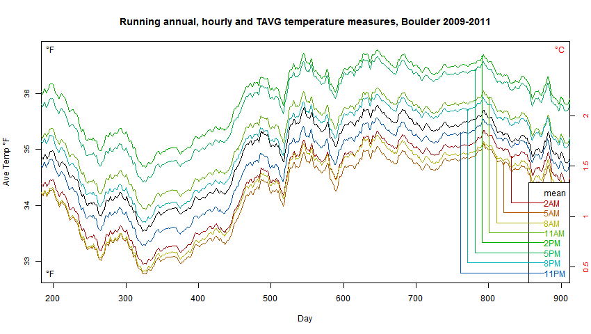
It shows running annual averages, compiled either as min/max average, or average of the hourly readings (in black). With min/max, it depends on when you do the reading. I showed the effects of reading at various times (notionally, picking 24-hour periods in the hourly data). It does make a difference – this is the well-known bias that requires that a correction be made if the time of observation changes. But there is no qualitative difference between black and colors; the black just sits in the middle and tracks with the others.
The bias from TOBS just corresponds to the change that you might get from putting the thermometer in a different nearby location. It subtracts out when you take the anomaly.
“The bias from TOBS just corresponds to the change that you might get from putting the thermometer in a different nearby location. It subtracts out when you take the anomaly.”
See below link as to why Nick Stokes is wrong again.
https://realclimatescience.com/2017/05/the-wildly-fraudulent-tobs-temperature-adjustment/
“The bias from TOBS just corresponds to the change that you might get from putting the thermometer in a different nearby location. It subtracts out when you take the anomaly”
Why bother with it then?
Especially since TOBS must be really difficult to accurately calculate when (MIN+MAX)/2 relates to a true Average like this.
http://cfys.nu/graphs/Boulder%20CRN%20July%202018.png.
RANDOM
i>”Why bother with it then?”
We don’t. There is just a requirement for an adjustment if it changes. Just as when a station moves.
“We don’t” ???
On GHCN I don’t know but for USHCN surely a huge % of the stations are TOBS adjusted, especially before 1970.
Yes, As I said, they are adjusted for known changes in TOBS. No change – no adjustment. Just as there is no adjustment for where a station is (except maybe UHI). Only if it moves.
Nick,
Having trouble comprehending your calcs.
Have you included the act of resetting the MaxMin thermometers at some time each day?
Geoff
I’m with Willis Eschenbach on this.
In a symmetric distribution the mean and median are identical (e.g.: Normal, rectangular) while in all other distributions (e.g.: Chi squared, exponential, etc), the mean and median will be different and the difference will depend on the distribution parameters (variance, degrees of freedom).
The argument when applied to temperature becomes slightly more complex because looking at Delta T , one is looking at the difference between samples from two different distributions. Depending on how the question is posed, this could tend towards a normal distribution with many samples as a result of the Central Limit Theorem. However, there is no reason to suppose that the median of the difference between a sample from two different distribution is any more informative than the mean.
Temperature is a time series and, while peak to peak differences tell one something about the signal,one cannot infer other measures, such as the mean without making some pretty wild assumptions.
I’m with Willis Eschenbach on this.
The Median is the value at which the integral of the probability distribution of a variable with respect to the variable.
I’m with Willis Eschenbach on this.
In a symmetric distribution the mean and median are identical (e.g.: Normal, rectangular) while in all other distributions (e.g.: Chi squared, exponential, etc), the mean and median will be different and the difference will depend on the distribution parameters (variance, degrees of freedom).
The argument when applied to temperature becomes slightly more complex because looking at Delta T , one is looking at the difference between samples from two different distributions. Depending on how the question is posed, this could tend towards a normal distribution with many samples as a result of the Central Limit Theorem. However, there is no reason to suppose that the median of the difference between a sample from two different distribution is any more informative than the mean.
Temperature is a time series and, while peak to peak differences tell one something about the signal,one cannot infer other measures, such as the mean without making some pretty wild assumptions.
RCS ==> Well,you can have your own definition if you want — I use standard everyday definitions and have relied on the Khan Academy to sully examples.
—to supply examples….
Thank you. I use Kendall and Stuart: “The advanced theory of statistics” or slightly easier: Hoel “Introduction to Mathematical Statistics”. It’s not my defiinition. It is the proper definition based on the integral of the probability distribution. From this follows the coincidence of the mean and median in symmetric distributions and difference that is a function of distribution parameters in non-symmetric distributions.
I think you will find that this definition is accepted by statisticians and it also the definition given in Wikipedia (which is probably not an authority).
when a man writes an essay and defines his terms so you know exactly what he means…
but you pick an argument over his choice of definitions…
is there a euphemism for that?
gnomish ==> There is an euphemism for that, but we don’t use that sort of language here.
RCS,
What is the shape of the probability distribution of Tmax and Tmin? What do these two samples tell us about the shape of the PDF of the population from which they were drawn?
RSC ==> For the rest of the world, the definitions and procedures used in the Khan Academy page are sufficient.
Distinguishing (Tmax+Tmin)/2 as the Median helps to disambiguate it, especially in modern records, from a true average (arithmetic mean). It is distinguished by the method of calculation:
In historic records, the number of data points is even (there are only two), Tmax and Tmin.
In modern records, there are often records every 5-minutes. The procedure used to find Daily Tavg is:
1. “Arrange the data points from smallest to largest”
2. Ignore all the intermediate data points, creating a new data set consisting of only two points, Tmax and Tmin.
3. Since the number of data points in this new data set is even, the median is the average of the two middle data points in the list, the only data points there are.
The procedure followed is that for finding a Median of a data set, not that for finding a mean. It is by procedure a median, and closely related to a “mid-point” if we were doing something a bit different with classes and histograms.
Kip,
Another argument for the naysayers is as follows:
Variance (s^2) is not defined for the median. However, for small samples (and two qualifies as small!), it is always recommended that the summation of differences squared, used to calculate variance from the mean, be divided by n-1, or in this case, 1. That is, in this case, the calculated variance would equal twice 1/2 the range squared. Which also is at odds with the Empirical Rule that the SD should be approximately range/4.
For example: Let’s assume that the daily Tmin and Tmax are 50 and 60, respectively. Assuming that we are calculating the mean, it would be 110/2, or 55. The variance would be ((50-55)^2 +(60-55)^2)/1 or 50. The SD would be ~7.1 The Empirical Rule would suggest that the SD should be about 10/4 or 2.5. It appears that the formula for calculating SD (s) is not applicable for only two samples. Thus, it loses its utility as being treated as a mean. For that reason, and others already given, I think that the interpolated mid-point of only two samples is best thought of as a median, rather than a mean.
Clyde ==> Thank you.
It depends on the dynamics of temperature during the day. The point is that temperature is a continuous signal and determining the mean (which requires knowledge of the signal over the period) cannot secessarily be infererred unless one knows the shape of the signal
(i.e. [max+min]/2 for a sine wave).
Astonishing!
This web page is aimed at 12 year olds as far as I can see. There is a little more underlying mathematics in statistics that you appear to imagine.
I wouldn’t worry about it though.
[Be specific. Which web page are you complaining about? .mod]
The Kahn Academy.
The median is a bit undefined with only two points. Think of if you add a third point inbetween.
The median would then be that point no matter where it is placed between the two original points.
The median and the average should be used carefully.
Svend ==> “The median is a bit undefined with only two points.” Yes, but originally they only had the two points, and modernly, they ignore all the other points and just use the two points, and find the mid-point between the two (or the median of the Max and Min of the whole set).
MY opinion is that the current method results in a metric unfit for some purposes.
Svend,
But the definition of “median” should be applicable to lists of any length equal to or greater than two elements, and work for lists with both even and odd numbers of elements. A mid-point value interpolated between two extremes is not a highly informative metric for a ‘distribution,’ and that is another criticism of using it (whatever you want to call it) instead of using an arithmetic mean of a large number of samples.
Kip, In addition to your Tavg – Tmean plot it would have been nice if you had provided a plot of both Tmin – Tmax/2 and the average of the 6 minute readings to go with your explanation. Two pictures are worth a bunch of words :<)
Joe ==> This has been hashed over many times from that viewpoint — there are essays here from others. It is not just that they are different, and my how much, but rather “What are they measuring?”.
I agree with you Kip that is the problem that is never addressed.
LdB ==> You would be surprised by how often errors like this occur in modern science — many fields — counting/measuring one thing then claiming it represents a totally different thing….the worst cases happen in instances like this, in which there is an existing data set gathered for one purpose being used years later for a much different purpose. The data was not selected for the modern purpose and is not actually a measure of the modern thing claimed fore it.
Health and diet studies are far far worse than CliSci.
Kip, The only reason I suggested graphing the two together is it might better show the difference between the two metrics than does your Tavg – Tmean graph of Boulder temperatures.
I agree with you when you say: “Changes in sensible heat in the air measured at 2-meters and as ocean skin temperature do not necessarily equate to increase or decrease of retained energy in the Earth’s climate system.” I would guess that while not perfect, the Argo system could come closer to measuring long term variations in the retained energy of the system than you will ever get from land based thermometers. If you view the Earth’s climate as an electrical circuit, the ocean is nothing but a huge capacitor that dampens any long term changes in retained energy. On land, the further you are from the seashore the wider the variations in temperature. Land temperatures may work for short term local weather and climate, but the ocean controls the long term.
Joe ==> ARGO will give us a better idea of the true drivers of climate and its changes, in about twenty years, maybe. It has next to nothing to do with “ocean heat content” — in my opinion– climate is driven by the barely understood dynamics (chaotic dynamics — as in chaos theory) of ocean currents, up-dwellings and down-dwellings.
AGW scientists use absurdly “precise” estimate of alleged ocean heat content to bolster their AGW hypothesis.
Of course, it would take an instantaneous reading of the temperature, mass and specific heat of each cubic meter of the ocean to know the actual ocean heat content. However, you can come quite a bit closer with the ARGO system than with the land based thermometers. For example, you have a lot better coverage of the ocean with ARGO than you have with land based thermometers. You don’t have assume one reading represents the temperature of several hundred square kilometers. And further, with the level of heat input to the system and average specific heat of ocean water you can assume that slightly differing times of measurement don’t present near as much of a problem as the differing times of observing the land based thermometers. Granted the ARGO system hasn’t been available long enough to determine long term changes but they have screwed up the data from land based thermometers to point where it is totally unreliable and personally I thing unusable.
If hourly records are available from some location or another, do they tell a different story than using (Tmax+Tmin)/2? Does a comparison of competing data sets really show that the (Tmax+Tmin)/2 is inappropriate?
Steve O ==> Comparing the numbers will not tell us which is appropriate. That is a prior step in the scientific process…in this case left undone. The Min/Max method had been in use for a long time, and to compare modern records to the past, they have continued to use a less appropriate method that is not a measure of the thing they want to know.
“…is not a measure of the thing they want to know.”
— I don’t see a shred of evidence that that’s really the case. If you were to measure the temperature at 10am every day you’d record neither the min, the max, nor the average. It wouldn’t be anything other than the 10am temperature. Every day. In a lot of locations. Creating a large set of data.
If what you’re interested in are trends, what difference does it make? If there is a 0.6 degree change in average temperatures over a period of time, won’t the change will be apparent in the data just as clearly as if you took hourly measurements? Where is the evidence that this is not the case? None is presented.
Here is my problem with this method. Are minimum temps trending upwards? Are maximum temperatures trending up? Is one changing while the other isn’t? Why are studies on flora and fauna not using min and max temps in the region being used to determine which or both are affecting the results. It is too simplistic to simply rely on some ephemerial, fudged up “global temperature” value to determine exactly what is happening.
Jim Gorman,
The answer to your question is “Yes.” See the max/min temperature graphs here:
http://wattsupwiththat.com/2015/08/11/an-analysis-of-best-data-for-the-question-is-earth-warming-or-cooling/
Steve O ==> I am rather puzzled by your comment. If there were only 10 am measurements, and one used that record to get a trend for the month/year, you would have a trend of 10 am temperatures for that station. True enough. It would tell you almost nothing about the climatic conditions surrounding the station but you’d sure see the seasonal change of 10 am temperatures.
In science, we take measurements that we have carefully considered and designed so that the measurements will tell us about the thing we are interested in find out.
I don’t think too many scientists want to know about 10 am temperatures, at any geographical level — station, county, state, region, continent, or global. 10 am temperatures would just be a curiosity.
What Climate Scientists want to know is if climate regions are shifting from one climate type to another, if there is a continental change of importance, will the monsoons depart from their historic patterns, big things about long-term conditions.
it does, however, give you the most accurate possible representation of trends in 10am temps at that location.
that’s all you can get and that’s how to get it.
making a stew of mud by averaging multivariate data gets you clisci.
is it numerological magic or illuuuuuuusion?.
as in the animation i linked above, you plot the individual locations
then you play it back at whatever speed you find convenient to watch the trend-
if you want to see seasons, you play it slow.
if you want to see decadal variation, you speed it up.
how is this not obvious and easy?
you can watch the whole world change by the day with the ultimate possible actual resolution.
it ain’t broke and there’s no sense trying to fix it till it is.
dammit… ima do splainin one time and never again.
there is a program called Faces used by law enforcement to produce the famous ‘artist rendering’ of suspects being sought. (metaphor for ‘global temperature)
the program is a kind of digital flip book that lets you select facial features from a catalog representing a range of such features (metaphor for local temperatures)
the distinction of the program is that it produces one single number that represents the entire face (metaphor for the statistics used to produce gta)
now – how do they do that?
you can just send the number over the phone and at the other end they can reproduce the exact likeness it defines – not represent- define. as in science, not story telling.
this is how:
each selection of hair has a distinct number. (metaphor for death valley noon temp)
each selection of forehead has a distinct number. (metaphor for vostok midnight temp)
each selection of eyebrows has a distinct number. (metaphor for airport at Tuvalu at 6am)
and so forth.
do the add them up and divide the way a climate scientist do?
how would you do it right?
the answer is easy and obvious.
you concatenate.
you make a representation that is a string of unaltered values:
hair.forrid.eyebrow.eye.nose.lips.chin.facialtopiary (metaphor for nonexistent display ‘atom’ of global temperature at a moment)
you plot the stuff separately and if you want local, you zoom in; if you want regional, you zoom out.
if you want to watch seasons, you play it slow. if you want to watch millenia, speed it up.
“Temperature predictions of extremes are an important part of their job…”
Temperature predictions must consider the enthalpy (the total energy content above absolute zero) of the observed air parcels. The essay covers well enough to concept that increasing the heat energy stored in air can be done in two ways: increasing the heat capacity of a parcel of air, or increasing its temperature.
Thermals are created by rising parcels of air. It may be surprising to some that just because it is rising, it does not have to be warmer. It may have more water vapour in it than the air nearby. Moist air weighs less than dry air but holds much more heat. The moist parcel of air might also be warmer, so it rises “faster” than it would if it were the same temperature. Buoyancy and all that.
So to calculate where rising air will rise to, and how quickly, and how the parcel will cool as it rises, it is necessary to consider the humidity and the temperature.
To quantify the energy in the atmosphere, the weather forecaster, the climatologist and the physicist studying the retention of heat by back-scattered IR – all these scientists have to consider the temperature and the humidity all the time. The high temp, the low temp, the average temp, the time-averaged temp are all part of any analysis, but convey no definitive information about the state of the system because temperature is only one of the two variables needed to consider to tell us anything meaningful.
Let’s look at the amount of energy involved:
It takes about 1000 Joules to heat a kg of dry air 1 degree C.
It takes about 77,000 Joules to heat a kg of saturated air from 25 Degrees to 26 degrees.
If you are concerned about “energy being stored” in the atmosphere or a change in that quantity, temperature has much less influence than humidity. If today was “going to 30” instead of 29 because of “global warming” and a small amount of moisture is added to the air, it will be 29: no change, but slightly more humid. You cannot lean that from the temperature.
If it is significantly drier then the max will be much warmer, which tells us absolutely nothing on its own.
It is interesting that Trenberth and others are concerned with the enthalpy of the oceans (bulk temperature, mass and specific heat) but not the atmosphere (temperature only).
The GISS enthalpy set is hardly the first thing on anyone’s list of demonstrations of global warming or cooling. I suspect it is because they don’t know, and have not known, what they are doing. It makes no sense to ignore some of the essential information. They are making claims for an increase in energy in the system without showing the change in enthalpy. Instead they show the change in the temperature.
Crispin ==> Interesting,but a bit wide of the point of the essay. 🙂
Crispin, your values for the heat capacity of dry and saturated air looked a bit off to me. The value for dry air is correct, with my database giving a heat capacity of 1001 J/kg-K. Air at one standard atmosphere pressure that is saturated with water at 25°C has about 3.13 mol% water in it (equal to the vapor pressure of water divided by the total pressure – ie ideal behavior, which is a good assumption here). This is equal to 1.97 mass% water. The heat capacity of water vapor is 1864 J/kg-K. We can add the heat capacities of the two components multiplied by their concentrations to get the heat capacity of the mixture, since it is a gas, and very close to ideal. Therefore, 1001*.9803 + 1864*0.0197 = 1018 J/kg-K for saturated air.
Kip
I am not sure whether all stations are reporting Tmean as you are suggesting
here I anlysed the daily data of 10 stations here in SA:
https://www.dropbox.com/s/h7944heslj7gg7q/summary%20of%20climate%20change%20south%20africa.xlsx?dl=0
if you scroll down you get to see the daily data averaged to annual data of one station (George)
in the column order
T mean/T max/Tmin
If I take ( Tmin +Tmax )/2 it does not give me Tmean….
so what did they do?
Henry ==> Where is the data from? Look at the GHCN monthly report for that station. These don’t seem to be standard USHCN, GHCN, or MET format — so I can’t tell what they’ve done.
If you give me al ink to the real original station reports, I’ll take a look.
https://www.tutiempo.net/clima/ws-688280.html
This is the original data for George [South Africa}
Sorry Kip
I am a bit late with this.
Are you still watching comments here?
Henry ==> https://www.tutiempo.net/clima/ws-688280.html is reporting:
T Temperatura media anual (Annual Average)
TM Temperatura máxima media anual (Tmax annual average)
Tm Temperatura mínima media anual (Tmin annual average)
This is not original data by any standard. I could not find any detailed monthly temperature data at the site.
There is no indication what methods they have used or the source for their data. Without knowing the definitions of the data, we are lost.
The methods described in the essay are for the international standard used at GHCN.
Kip
what do you mean? you cannot find the daily and monthly data?
just click on the year, scroll down and you will find the individual months,
then click on the month, for example enero (January) and find the daily data.
henryp ==> Try it today, I get “Debido al uso abusivo que algunos usuarios hacen de este servicio, nos hemos visto obligados a bloquear el acceso a los datos de forma directa.”
sorry
I am flabbergasted.
They want you to pay now to see the daily data….
This was not the way it was before.
Someone has recognized the data has meaning and value in the hands of others.
True enough.
also, without the daily data access you cannot do any filling in for the years with a few day’s data missing.
henryp ==> dang!
Kip
Luckily I saved all the data from the 54 stations that I looked at.
Anyway, it does not seem too expensive to buy a subscription to the premium website. It is better than relying on the US or UK data, which I don’t trust.
Anyway, have a look at my results for New York:
https://www.dropbox.com/s/lesioxrvh24a1on/NewYorkKennedyairport.xlsx?dl=0
I have added a 4th column (F) for (Tmax + Tmin)/2 and if you scroll down you see this plotted as the purple line together with Tmean (blue), Tmax (red) and Tmin (green)
Note that I record the following trends (in New York) from the trend lines
Tmax increasing by 0.027/annum, i.e. 1.2K since 1973
Tmin increasing by 0.005/annum, i.e. 0.2K since 1973
The increase in Tmax suggests that more heat is allowed through the atmosphere, leading to higher average temperatures:
Tmean rising by 0.022K/annum, i.e. 1.0K
(Tmax+Tmin)2 rising by 0.016K/annum i.e. 0.7K
Now, my question to you is: did it get 1 degree K warmer in NY since 1973 or is it 0.7K?
I hope you can tell me?
Henry ==> The size and complexity of NY Kennedy Airport quadrupled, air traffic increased exponentially, a million square feet of terminal space is air conditioned and that heat pumped into the, square miles of asphalt and concrete added to the very local environment.
Figure the corrections to Tmax for that and we’ll see. Oh, and don’t forget the general UHI for a ka-jillion New York homes and humans.
My guess — maybe NOT ANY real rise in temps there.
Kip
no. no. NY is one of my samples.It is relevant even for just looking at Tmin (click on my name to figure it out from my final report). Tmin did not really change that much over the past 44 years.. Anyway, I would not be surprised if one of the reasons for more energy coming through the atmosphere there, i.e. Tmax rising, also pushing up Tmean, is the cleaner air….less dust and carbon soot?
So, we never disregard a weather station that has good daily data.
However, I am bit confused now by your post. With the modern technology introduced in the 70’s I always thought that Tmean was calculated from all measurements over the day, equally spread, even once a minute is possible, {with the T recorders’ equipment that I know of] .
The way I summarize the data, I was not really bothered about differences in method of measurements between stations.
But now, my question remains, what is the correct warming for NY, or the closest in your opinion, is it 0.7 or is it 1.0K since 1973 as per the reported values.
Henry ==> I will try to be gentle….airports are notoriously affected by a special type of UHI….massive concrete runways, megatons of air conditioning, most have grown exponentially since the 1950s/1980s.
In moderate climates, Tmax climbs as the Sun warms and heat the runways. If you are using data unadjusted for UHI, it may well be responsible for ALL of the warming at Kennedy Airport.
Given that, a true Tmean (mean of all the recorded five-minute reading for the station) over the 24 hour period will always be a more accurate “average” than (Tmax+Tmin)/2 — but it will just be a mathematical result — it may not have the “physical meaning” of “the correct warming for NY” that you hope to ascribe to it.
The mathematical result is based on the simple rules of mathematics we all learned in elementary school — if you have calculated correctly, you have the correct mathematical (arithmetic) result and get a nice check mark for your answer. The math result is not the same as, and may be world’s different than, the physical understanding you are seeking.
There is the much deeper question of “Do either of these values, calculated for annual, tell us anything about weather or climate at that location?” “If yes, exactly what?” (Hint == neither will tell you if more energy from the Sun has been retained in the local weather/climate/environmental system. Neither of them is a measure of that.)
I do appreciate you hard work and calculations — they add a lot to the conversation.
Henry ==> For example:

@usurbrain, ASHRAE keeps a good dataset of DHD and DCD for the major world locations and a very good dataset for North America.
Regarding measuring energy in the atmosphere, as has been stated by Crispin, temperature is a poor measuring stick without at least 2 other properties in the standard Psychrometric Chart – RH%, Dry bulb, Wet bulb, Dew point, Specific Volume, Humidity Ratio.
https://www.engineeringtoolbox.com/docs/documents/816/psychrometric_chart_29inHg.pdf
Properties these were not recorded as often as temperature min/max but I did find historical records on evaporation rates which do help fill in some blanks.
https://www.engineeringtoolbox.com/evaporation-water-surface-d_690.html
Thanks.
Over my 75+ years I have noticed that rarely does the daily low temperature go below the dew point. And those occurrences are usually related to a weather front moving in. Note a climate scientist but there is a reason. Yet I see little discussed on climate sites.
The effect of the water vapor in the atmosphere has a much greater affect than it is given credit for I’M HOME.
Just a comment on median and mean. In mockery of statistics, it is sometimes said that the average person has one breast and one testicle. If you are looking at testicle numbers in a population, say, that can be useful information.
But the median person probably has two breasts and no testicle. That certainly describes a more well-rounded individual, but isn’t more informative about the population. There are times when only a histogram will do.
Nick ==> And I certainly agree — the “ONE NUMBER to rule them all” approach of some segments of the climate science world is mindbogglingly wrong-headed.
Climate scientists did not invent the notion of a mean. Or median.
Nick ==> They sure didn’t, they invented GLOBAL LAND-OCEAN TEMPERATURE INDEX — which I offer with no further comment.
Standing ovation and cheering.
*Shouts of “Exactly” heard throughout the stadium*
if you dont like the index dont combine sst and sat.
combine mnat and sat.
It’s not a mockery of statistics, it’s a question to see if a person understands statistics or just learnt the formulas. The distribution of breast and testicles is a bivariate distribution and if you start doing a mean on it, the statistics police come and arrest you.
LdB ==> Or at least, they ought to.
so the daytime temperature of death valley should be averaged with the night time temperature of vostok because they are not bivariate?
Don’t let the careless terminology of “climate science” confuse the issue: the average of Tmax and Tmin is neither the “mean” nor the “median” temperature; it’s actually the MID-RANGE temperature. Whatever convenience that may provide in simplifying calculation is entirely overshadowed by the fact that it’s a bastard statistic, with no unique analytic relationship to the entire population (profile) of daily temperatures or to their true median.
Why are comments disappearing?
1sky1 ==> It is a mystery and a conundrum….sometimes they go to moderation and appear later.
Good stuff too bad I’m 5 hours late (~:
Yes the night and day temps are averaged the the annual average of the cold months and warm months are averaged and then all those averages from stations in the tropics to the poles are averaged up into one anomaly from the 1950-1980 base year that we are supposed to believe actually means something
The average of 49 and 51 is 50, 25 and 75 is 50 and 1 and 99 is 50. The point is well made.
thats why we also look at tmax, tmin, diurnal range and varience.
kip just doesnt read the science
[Kip, I’ll try to bring some of the concepts from the previous post into this discussion. I’ll try to condense it and apply it directly this new discussion so as to not repeat the last one – except essential points.]
All,
I understand the desire to use the historical record (Tmax+Tmin)/2. As Roy said, “we are forced to use what we have.” Actually, we are not forced to do anything. We chose to use it. But should we?
There is a critical piece of math and science that seems to be missing from the toolbox of climate science and that is the sampling theory of signal analysis. Lacking this knowledge, I don’t think people understand just how far off the max/min record is from a properly sampled signal. I will try to refrain (probably fail) from offering my opinion about what we should really do with the historical max/min record. But I’d like to introduce into the discussion the failure of the max/min record to comply with the Nyquist Sampling Theorem and give some examples about the extent to which this introduces error into the data.
A few brief definitions – my apology to those who know and find this unnecessary.
Signal: The waveform of continuous, time varying effect in the natural world. When we measure temperature at a point in space and time we are measuring a signal.
Sample: Any measurement of that signal that results in a discrete value (decimal, binary, hexadecimal, etc.)
Nyquist Sampling Theorem: Requires that any band-limited signal be sampled at a frequency that is at least 2x the highest frequency component in the signal. This is the Nyquist frequency.
Aliasing: Sampling a signal creates a spectral image in the frequency domain of that signal and this image is located at the sample frequency. If the sample frequency is below the Nyquist frequency, then the spectral image overlaps the signal and the sample will contain error as a function of the overlap. This error is called aliasing.
Image below of what happens when a signal is sampled at Nyquist or above:
The blue signal shows the band-limited signal being sampled. Its bandwidth is “B”. Fs (fs) is the sample frequency. In this case Fs is > = 2B. So, Nyquist is satisfied. No overlap. No Aliasing.
A properly sampled signal has **ALL** of the information from the original signal. The digital sample can be used to perfectly reconstruct the original signal in the analog domain – although that is NOT the goal. Also, all digital signal processing (DSP) done on this properly sampled signal is valid mathematically.
The image below is what happens when a signal is sampled below the Nyquist rate:
This image shows two figures. The one on the left shows more extreme aliasing and the one on the right shows less aliasing. The solid blue line represents the signal being sampled and the dashed line represents the spectral image overlapping it. The sampled output of this signal will contain this error and this error can never be extracted after the fact. Any further mathematical operations (DSP) on the sampled data will have this error. Note: finding (Tmax+Tmin)/2 is a DSP operation, although a very simple one.
The point I will get to quickly is that (Tmax+Tmin)/2 is mathematically flawed. Let me develop this with an example. I’m using USCRN data, for the Cordova, AK station from 2017 (late July through December). This analysis works with any of the stations, this is just my specific example to illustrate the effects. The amount of error varies in each example, but the fundamentals are the same. The USCRN provides an automated sample every 5 minutes. (I won’t stray into the details about how this 5-minute sample is actually an average of 10 second samples, etc.) My research leads me to believe that this network uses high-quality instrumentation and practices – certainly relative to the dumpster fire of the non-USCRN instruments. 1 sample every 5 minutes equates to 288 samples per day. Based upon Nyquist it will not alias any signal that varies slower than once every 2.5 minutes. I think this rate is more than sufficient for a very accurate sampling result.
Using this data, I calculate the mean as generated by adding up all of the 5-minute samples over the 5-month period and divide by the number of samples. For my purpose the term “mean” is defined as follows. For any given period of time, the mean is the single value of constant temperature that results in the same area under the curve as the complex time varying curve. Said another way, if we calculate the area under the curve for the complex signal, the specified mean should exactly give us that same area. The area is a product of time and temperature. This is related to thermal energy delivered in the time period specified. The result created with 288 samples per day will be (and should be) considered the “gold standard”. Assuming the instruments are calibrated and working properly, the result is accurate and precise to the limit of the instrument, does not suffer reading error and is not subject to any TOB. I then calculate the mean by using a slower sample rate. The 288 samples per day is divided down by 4, 8, 12, 24, 48, 72, 144, corresponding to sample rates of 72, 36, 24, 12, 6, 4 and 2 samples per day. The sample rate decrease was achieved while maintaining a regular clock frequency – no “jitter” was added. This experiment allows us to see how aliasing error creeps into the sampled result as the sample rate is decreased. Fundamental to this is the understanding that the temperature signal on any given day has frequency content well above the 1 cycle/day fundamental – and we can see a lot of variation to this frequency profile from day to day.
Some graphs to illustrate.
Sampled signal in the time domain (288 samples/day):
Next, the FFT of the sampled signal showing the frequency spectral content. X-axis is in samples per day – showing the frequency bins. Y-axis shows the relative energy in each band. (Only displays results out to 52 samples/day)
The next figure is a table that shows how the mean varies as you go from 288 samples per day down to 2 samples per day. 2 samples/day means there is a lot of spectral content landing on the fundamental in the form of aliasing! You can see the extent of the degradation as sample rate decreases from 288/day. Now here is a kicker: Note the 2 values at the bottom of the table. Compare 2 samples/day to (Tmax+Tmin)/2. They are both technically 2 samples/day. However, the first value is generated by complying with a proper sampling clock: we have 2 regularly timed samples. The (Tmax+Tmin) takes 2 samples whenever they happen in time. Rarely are they well aligned to a clock. The max and min values are very good since they come from the high-quality instrument, but they are a disaster as it relates to the math governing sampling! 2 samples, that occur according to a valid sample clock, *usually* yield a result closer to the gold standard than the case of averaging the high quality max and min! (I say *usually* because there is a lot of randomness to the error – but not a Gaussian distribution just for the record). The sampling time variation is known as clock jitter and it creates an erroneous result.
The next graph shows the daily error of (Tmax+Tmin)/2 as compared to the “gold standard” 288 samples/day mean. If (Tmax+Tmin)/2 were correct, then this graph would show a horizontal line at y=0. It doesn’t show that. The red arrow shows the sampling error for 11/11/2017. Note the time-domain temperature profile for 11/11/2017 is not very typical. The sampling error is large, but not the largest. We see error that exceeds +/-2.5C at some points in the record.
(Tmax+Tmin)/2 measured from uncalibrated max/min instruments, with their associated reading, quantization and TOB error are expected to yield even far worse results.
If we are going to continue to use the historical (Tmax+Tmin)/2 data, we should do so knowing that this error is present. (In addition to calibration, reading, UHI, thermal corruption, quantization, siting, and data infill and manipulation.) Even modern (Tmax+Tmin)/2 measurements are loaded with error. This includes the satellite record, assuming my understanding of how the satellite measurements are made is correct.
Furthermore, what about the future? Each of the disciplines mentioned by Kip (Meteorologists, Climatologists, etc.) can benefit going forward from data that doesn’t violate basic mathematics of sampling. Nyquist came up with his theorem in 1928! Affordable converter technology and instrumentation has been available for 40 years!
Finally, Alarmists push “records” of 0.01C on us and trends of 0.1C/decade. As if all of the other errors were not enough to arm us to fight back, Nyquist is a cannon ball right through their hearts.
“that seems to be missing from the toolbox of climate science and that is the sampling theory of signal analysis”
It starts to seem as if you have a hammer, and are finding nails everywhere. But you still aren’t relating to what climate scientists actually do. What you are demonstrating is that if you want to use integral over 24 hours as the test, then the calculation of that will depend on sampling rate. And at 2 samples per day you’ll get a bias (which will change as you change that sampling time).
Well, we get a bias with min/max, depending on time, as is well known (TOBS). That is again what I was exploring at Boulder. And the bias is fairly stable over time, and so fades with using anomaly. If people chose to use twice/day sampling for an average, they would find the same. And they would again find it necessary to make a correction if the sampling time were changed.
Nick said: “It starts to seem as if you have a hammer, and are finding nails everywhere. But you still aren’t relating to what climate scientists actually do.”
Nick, what you are saying, apparently, is what climate scientists do is ignore the laws of mathematics. This might be the first time we agree in the short time we have been communicating.
Nick said: “What you are demonstrating is that if you want to use integral over 24 hours as the test, then the calculation of that will depend on sampling rate. And at 2 samples per day you’ll get a bias (which will change as you change that sampling time).”
No, I think you are confused. It doesn’t have to do with integrals, a test or bias. It has to do with understanding the physics and mathematics of sampling.
Just because one doesn’t understand sampling doesn’t excuse one from violating the laws of sampling. There are no footnotes to Nyquist. There isn’t a special exception for climate scientists. Higher frequencies cannot be ignored when sampling just because they are not needed for the analysis. If this is done, then aliasing occurs, and that frequency content comes right back and clobbers the fundamental. The data is wrong. A number can be obtained by using the incorrect process, but this number won’t accurately relate to the physical phenomenon that took place in the physical world. The only way to eliminate frequency content that you are not interested in is to filter it out in the analog domain before sampling or filter it out digitally after you sample. But I fail to see the “science” of ignoring significant energy in a daily temperature signal. If you grab a Tmax and Tmin and do math on it, you are going to have an even lower quality result than if you grab 2 samples properly. (Tmax+Tmin)/2 is literally the worst possible way to gain information from the temperature signal, except sampling 1x/day.
I’m trying to inform everyone about a fundament flaw in the methods. I’m actually shocked that what I’m presenting is novel and not known. I’m surprised that this information isn’t creating more curiosity. But I’d rather light a candle than curse your darkness. How can I help?
William,
Interesting!
What happens when you look on a month period? This would be like “62 samples of a very long day”. Will that decrease or increase this error?
Hello MrZ,
Thanks for your comment and question. I’m thinking about trying to put together a post on this subject, where I discuss it in more detail. It’s a big subject, so if you don’t mind, let’s connect again if/when I get that out here. Aside from responding to a few people who I already started to engage on another similar post, I think it might be good for me to not further dilute Kip’s core points on this essay. Okay for you?
“I’m trying to inform everyone about a fundament flaw in the methods. I’m actually shocked that what I’m presenting is novel and not known. I’m surprised that this information isn’t creating more curiosity. But I’d rather light a candle than curse your darkness. How can I help?”
Hey William, as humbly suggested under previous Kip essay write a proper article. With all necessary details, calculations and examples. Maybe will be published here, maybe in some technical journal. Comments usually are quickly lost among other more or less sensible ones. We’ve got highly-sampled data round the clock for last few years. Identified error drift between integral of the reference temperature (sampled often) and daily (Tmin+Tmax)/2, still used as the ‘basic unit’ for purpose of temperature tracking, will also help to estimate additional error which has to be associated with historical records.
Hi Paramenter,
I was perhaps too eager to continue to develop the points through this post. Your advice is wise and well received by me. The concepts I’m presenting are important, in my opinion, but they need to be developed in an essay specifically focused on that topic. I hope to do that and publish here if possible. To the extent my (far too long) post derailed the core points of Kip’s essay, I state my humble apology.
I do appreciate your reply. I’m enjoying the discussion and the interesting points and counter points offered by all.
William
“No, I think you are confused. It doesn’t have to do with integrals, a test or bias”
The narrowness of your focus on Nyquist is excessive. Climate scientists here are not trying to reconstruct a signal. It seems you are familiar with that and want to force everything into that framework. In fact, they are trying to compute a (monthly) average, and that is ideally an integral of temperature over the period divided by the time. As always, we have to deal with finitely many points, so it is numerical integration, and might as well be done with equally spaced intervals.
If you want to think of it as a Fourier decomposition, the signal is dominated by diurnal and its harmonics. So it makes sense to sample in fractions of a day. You then get beat frequencies. These should add, as sampled, to near zero, as should all the high frequency sinusoids, with maybe a small residue at the endpoints. But some harmonics will actually coincide with the sampling frequency (or its harmonics), and the beat frequency is zero. Or put another way, it returns the same value for each period, which adds up and the result isn’t zero.
In your 5 month calc, this happens with two per day sampling. The fundamental diurnal adds to zero, but the next harmonic has one sample per cycle, which will be constant and add up. The sum itself is a sine function of the phase of the sampling relative to diurnal. That is why your test showed a large difference with 2/cycle sampling. If you sample faster, that resolves that second harmonic, and the first such alignment will be for higher harmonics. Since the signal is reasonably smooth, these attenuate, and so the result converges with faster sampling.
Nick: “The narrowness of your focus on Nyquist is excessive.”
No narrower than insisting we don’t, for example, divide by zero.
Nick: “Climate scientists here are not trying to reconstruct a signal. It seems you are familiar with that and want to force everything into that framework.”
We agree that the goal is not to reconstruct the signal. But the goal is to accurately capture the signal so that the further work you do on it is not corrupted. It’s not about forcing something into a framework. I see it differently. Ignoring or hand-waiving away Nyquist is denial of the laws of mathematics that govern sampling.
Nick: “In fact, they are trying to compute a (monthly) average, and that is ideally an integral of temperature over the period divided by the time.”
Ok. I have no objection to highly weighting the importance of the monthly average, if that is what is important to climate science. You can get that by sampling properly. And I agree, the average over any period is the integral of the signal over that time-period. But the integral accuracy will be reduced proportionally to the error in the signal being integrated. You can have the benefit of working with any time-frame average you want if you sample properly.
Nick: “As always, we have to deal with finitely many points, so it is numerical integration, and might as well be done with equally spaced intervals.”
If samples are not equally spaced in time, this is (by definition) jitter. A reconstructed signal is reduced in accuracy as a function of the jitter. The samples don’t land in time where they are supposed to with jitter. Again, while the goal is not to reconstruct, the fact that you can’t accurately reconstruct is proof that your sampled signal has error.
Nick: “If you want to think of it as a Fourier decomposition, the signal is dominated by diurnal and its harmonics.”
Yes, the signal is a summation of a finite number of sinusoids (Fourier). Don’t forget there is actually a DC content to the signal, as seen in FFT results, but we can agree that this is not important. Next you have the diurnal (1 cycle/day), but there appears to be significant content in 2 cycles/day, 3 cycles per day and so on, up to 20-30 cycles/day. Different days have different content based upon the time domain profile of the signal. At a sample rate of 2 cycles/day (even assuming periodic clock), the spectral image is almost on top of the signal. It is only shifted by 2 frequency bins in the FFT. So, the 2, 3, 4, 5 cycle/day content clobbers the 1 and 2 cycle per day signal that is sampled.
Nick: “So it makes sense to sample in fractions of a day. You then get beat frequencies. These should add, as sampled, to near zero, as should all the high frequency sinusoids, with maybe a small residue at the endpoints. But some harmonics will actually coincide with the sampling frequency (or its harmonics), and the beat frequency is zero. Or put another way, it returns the same value for each period, which adds up and the result isn’t zero.”
I don’t see how the term “beat frequency” applies here, but I won’t get hung up on it. Per my comment directly above, I don’t agree with referring to the 2, 3, 4 and 5 cycle/day content as high frequency. I’m not sure where that threshold is. I would recommend we look at energy content in each frequency bin. Someone (perhaps a committee) needs to decide what percentage of energy is significant. As an engineer, who had to make things work so as to not kill people, I don’t like to throw anything away when it comes to accuracy. Especially when the technology gives it to us for free. But if a value is stated as the standard for required energy percentage, then the work can continue, and the results can take the criticism or praise that may be due appropriately. I don’t agree that the error zeros out, but I agree that the error distribution allow for some of the error to cancel out. More on that in a second.
Nick: “In your 5-month calc, this happens with two per day sampling. The fundamental diurnal adds to zero, but the next harmonic has one sample per cycle, which will be constant and add up. The sum itself is a sine function of the phase of the sampling relative to diurnal. That is why your test showed a large difference with 2/cycle sampling. If you sample faster, that resolves that second harmonic, and the first such alignment will be for higher harmonics. Since the signal is reasonably smooth, these attenuate, and so the result converges with faster sampling.”
I think you and I are saying some similar things but using a slightly different vocabulary. As the sample rate increases, the spectral image is pushed out in frequency. The overlap decreases with increasing sample rate. At the Nyquist rate the aliasing/overlap stops. I agree that as the overlap is constrained to parts of the spectrum with very “low” energy then the error is correspondingly “low”.
But we do see that (Tmax+Tmin)/2 does produce significant error compared to a Nyquist sampled signal over short time spans. Now, if this error value is plotted over a longer period, say several months or a year, then even without doing a mathematical analysis, it is apparent to the eye that the energy is somewhat symmetrical about the 0 value. It is not completely symmetrical because the error is not Gaussian. This is because the change in profile of a day does not behave according to a Gaussian function. The jitter of (Tmax+Tmin)/2 is also not Gaussian.
In summary, the key here is just how much error remains over longer periods of time. I have not proven this but think it is reasonable to assert that the remaining error will vary from sample set to sample set. We can probably find examples that show minimal residual error and we can find examples with a large amount of residual error.
2 things guide me that may not guide you. 1) An engineering career that depended upon using all of the accuracy that the technology and economics would allow. 2) The desire to inject some mathematical/science/instrumentation sanity into the alarming claims of climate science.
Has the gap in our views diminished any through this dialog?
William,
“Don’t forget there is actually a DC content to the signal, as seen in FFT results, but we can agree that this is not important”
We certainly don’t. The DC component is the answer. It is what you are seeking. You can think of your Fourier process (F Series over a month) as one of expressing the function in terms of a constant, and a set of sinusoids that are known to integrate to zero. And that is my point about forming a month average as being essentially different to reconstructing a signal. You create the sine components only to throw them away. If aliasing turns one sine into another, you don’t care, as long as its frequency is different from zero (which should be seen as, substantially greater than once a month). It is a sophisticated low pass filter.
That is why low frequency sampling can change the answer, as in your calculation. As I said, with 2/day sampling, the 2nd, fourth etc harmonics do not sum to zero, as they should. They alias to a constant, which is misidentified as a DC component.
I use that Fourier style of integration for spatial integration of the anomalies on a sphere. I have described it here. I decompose into spherical harmonics which, like the sinusoids on a line, are orthogonal, and in particular orthogonal to the zeroth order (constant). So the integral is just the integral of that constant. I have new ideas on this that I’ll be blogging about soon. I also use the SH fit as the monthly presentation of temperature anomalies.
“I don’t see how the term “beat frequency” applies here”
sampling is also the process of multiplying the signal by a Dirac comb and integrating. The Dirac comb, regularly spaced delta functions, also has a Fourier transform, which is just the summation of the harmonics of the sampling frequency. That multiplication, as in demodulation, generates sum and difference (“beat”) frequencies, of all the combinations of harmonics. Since they are all integer multiples of diurnal, the lowest non-zero frequency is diurnal. But the zeroes matter.
“the 2nd, fourth etc harmonics do not sum to zero”
That is, harmonics of diurnal frequency.
Hi Nick,
I can see, as others have said, you are extremely knowledgeable. I’m not quarreling with you for that sake alone. I see a lot of good things you write in your last post. At some points I couldn’t follow what you were saying – it’s not easy to get all of the points across in this format when things get very detailed unless you commit a lot of time to the effort. I’ll bet the conversation would be fun if we were in the same room, and using a white board to guide the discussion.
In some ways, I think we are saying the same thing but differently. But I still think we have a few key fundamental disagreements: You think the sampling error resolves itself over long averages and I do not think it does. Let me ask you a few questions to see where we agree and disagree.
1) Do you agree that sampling according to Nyquist (using a quality clock frequency) is the absolute best, most accurate method that will yield the best possible starting point with data? Furthermore, this method, follows all mathematical laws, is immune to TOB and reading error? And that with this method any analysis is possible (daily, monthly, yearly, etc.)?
2) Do you agree that the absolute worst method is 1 sample/day?
3) Do you agree that the next worst method is measuring Tmax and Tmin and doing calculations on those 2 measurements? (Please ignore whether or not this is adequate for the task – I’m not inferring any of that from your answer to the direct question).
4) Do you agree that a not so good method, but better than measuring Tmax and Tmin, is to sample 2x/day, but according to a periodic clock? In this method it is unlikely that either Tmax or Tmin will be captured (except by luck)?
5) Do you agree that increasing the sampling rate from 2x/day up to the Nyquist frequency increases the accuracy of the sample by reducing the effect of aliasing? And that there are no benefits to sampling above Nyquist?
The questions beyond this have to do with whether or not an averaged Tmax and Tmin are good enough, but if we can agree to shelve that for a moment, we can see if we have agreement on the other 5 listed questions.
Ps it was tempting to respond about AM modulation, heterodyning, etc. I could add some information about QPSK/QAM, PSK, etc., as it relates to sampling – but I’ll refrain from going full-blown geek. Also, regarding DC in the spectrum, I didn’t communicate my thought clearly. I was trying to acknowledge DC was present but was saying it wasn’t important to the particular point I was trying to make. I agree with some of what you said about that, to the extent I followed you – I lost your drift at a certain point – hence my desire to raise the altitude to find some common ground.
William,
I have done some calculations like yours. I didn’t use Cordova, which had a lot missing. I used 2017 (full year) from Cullman AL, as you did earlier. Firstly here are my sample results. The rows are sampling 6,4 and 2 times per year. The cols are phase of sampling, relative to sample period, starting at midnight. Soo for 2 samples, it is every 1.5 hrs, etc.
___0___45___90__135__180__225__270__315_range
6 16.3 16.2 16.2 16.3 16.4 16.4 16.3 16.3 0.1
4 16.1 16.1 16.2 16.4 16.5 16.5 16.4 16.2 0.4
2 15.3 15.4 16.1 16.7 17.0 17.1 16.8 16.2 1.8
Then I calculated the first 9 fourier coefficients (1, sin(x),cos(x),sin(2x)…)
16.30 -3.70 2.43 -0.45 -0.78 -0.28 0.25 -0.12 -0.18
or as RMS
16.30 4.43 0.90 0.38 0.21
This is for the average of each 5 min over the year.
Here is a plot of the fit
From the RMS, it is clear that the 2x sampling range of 1.8 corresponds to the RMS for the 2nd harmonic of 0.9, and likewise for 4x sampling, the 0.4 range corresponds to the 0.21 4th harmonic.
Then I tried to measure the jitter of min/max sampling. I first did the min/max average using midnight reset. The mean was 16.76°C (but depends on reset time – more to do here). Then I tried averaging the harmonics sampled at those min/max points of the day:
0.76, 0.09, -0.09, -0.01.
With the mean, these add up to 17.05. I had expected this to be close to the max/min mean of 16.76, and it isn’t that close. I’m not sure why. However, I think it is clear that the big contribution to the difference is the jitter effect on the first harmonic.
Nick,
I just read about the work you did with the 2017 Cullman AL data, where you were looking at the phase information and Fourier coefficients. I see you have a strength and clear proficiency with these tools. And it is quite logical to utilize our proficiencies for analysis. It looks interesting but I’m not sure how to fit it in exactly. This is probably my deficiency – not a problem with your analysis. However, I think it is simpler and more intuitive to just stick with Nyquist analysis. I think what I did to compare the increase in error as the sample rate decreases is easier to comprehend and better illustrates what is happening. Basically, as the sample rate decreases then the integral of the sampled waveform (the mean / the Temperature-Time product / the “area under the curve”) differs from the Nyquist sampled result.
Kip just issued his epilogue, so I think that is the “last call for alcohol” so to speak. So, I’m not sure how much further to take this here, but I do hope to publish an essay in the future to focus on Nyquist specifically. Before we close, would you be willing to kindly answer my 5 questions directly? I’m honestly interested to see how close we are on this. While we may differ on whether or not Tmax and Tmin are sufficient for the purpose, I’m starting to think/hope you actually agree with most of the 5 questions – meaning you would say “yes” to the questions. I would value the answers, and if any of them are “no”, we can agree to disagree and “park it” until the next time.
What do you think?
William,
I’ll look forward to reading what you have to say. On your 5 questions:
“1) Do you agree that sampling according to Nyquist …”
Nyquist is relevant if you have a desired frequency band that you want to resolve. Then you can say whether you are “according to Nyquist”. Here the frequency band is effectively zero (integration for monthly mean). It’s true that poorly resolved high frequency processes can give spurious low frequency effects, but I’m not sure Nyquist is the best way of thinking about that.
2. “the absolute worst method is 1 sample/day”
It would be very bad. The result would entirely depend on the time of sampling, building in the diurnal range as an error.
3. “the next worst method is measuring Tmax and Tmin”
No. It locates the main features of the distribution. Errors are then in the shape in between (1sky1’s asymmetry, or my second harmonic). I think it is better than sampling twice a day.
” but better than measuring Tmax and Tmin, is to sample 2x/day”
No, but anyway, it isn’t an option. For the past, we can’t redo; for the present, we can do much better than twice a day.
“Do you agree that increasing the sampling rate from 2x/day up to the Nyquist frequency”
I’ve asked several times – what do you think the Nyquist frequency actually is for monthly averaging, and how do you work it out? In fact you are trying to measure a slow process, with a fast process running interference. regular Nyquist analysis doesn’t really cover this. But yes, your calc and mine suggests that because the diurnal cycle is such a big intrusion, resolving it to better than two samples a day will help avoid spurious effects.
I think the best way is to try to identify cycles and subtract them out, on the basis that their integrals are known to be zero. Then you can deal with the smaller residues. You won’t be making errors from discretising the cycles.
Nick,
You said: “I’ve asked several times – what do you think the Nyquist frequency actually is for monthly averaging, and how do you work it out?”
Actually, I have answered this at least once. But let me add a few thoughts. Let’s assume an electronic instrument for this example: Basically, a thermocouple feeding an instrumentation amplifier which feeds an ADC (analog-to-digital converter). The thermal mass of the front-end (the physical front-end) will act as a filter. The larger the mass the slower the response time to temperature transients. A smaller mass will have the opposite effect. I’m sure you know this. Some thermal signal content gets filtered out by this mass – but I’ll ignore this for the moment. Let’s look at the signal that gets through the filter. This could easily be attached to a calibrated analog spectrum analyzer. Air temperature signal changes would be glacial to any spectrum analyzer. It would be easy to determine the content in the signal and you could denote this is bandwidth “B”. Nyquist would be 2B (2*B). I assume NOAA has already done exercises that have led to their 5-minute sample rate. Modern instrument converters can easily sample at hundreds of thousands of samples a second, so the only reason to go slower is to not drown in sample data. Also, sampling much above Nyquist doesn’t add any benefit. Nyquist sampled data allows you to completely reconstruct, as we have discussed. Properly sampled, you can then achieve any average you want (daily, monthly, yearly). Using Tmax and Tmin you get error and you have to hope it averages out over time.
You know about the TOB problems. Going forward why not use the method that eliminates TOB and all of the potential problems. All plusses – no minuses (except kicking the orthodoxy).
I appreciate you answering the questions, but I had hoped we were closer in our understandings. It appears a big gap still exists. We can agree to disagree for now. I don’t think we are going to be able to persuade each other further. It’s too bad. Nyquist is so elegant. With instrumentation technology, processing power and data storage being of such high quality and low cost we can literally record the entire signal of every day at every station. Who knows the value that could provide in the future? Maybe one day we will actually discover some mathematical relationships between climate variables and knowing the full signal will be valuable to that development.
Actually, the vagaries of irregular daily sampling of the mid-range value (Tmax+Tmin)/2 are far removed from the vagaries of spectral aliasing produced by overly-sparse periodic sampling of the signal. The latter simply fold the bilateral power spectrum S(f) around the Nyquist frequency fN in accordion-like fashion; the sample mean value is affected ONLY IF power is aliased into zero-frequency. Because the diurnal temperature cycle is consistently asymmetric, the former produce a statistic CONSISTENTLY different from the sample mean. Thus it is misleading to refer to the mid-range “error” or to explain the discrepancy as an aliasing effect.
” The latter simply fold the bilateral power spectrum S(f) around the Nyquist frequency fN in accordion-like fashion; the sample mean value is affected ONLY IF power is aliased into zero-frequency. Because the diurnal temperature cycle is consistently asymmetric”
Exactly so, as I’ve tried to explain above. And the asymmetry of the diurnal is primarily due to the second harmonic. This aliases to zero with sampling twice a day.
But there’s aliasing only if the sampling is strictly periodic, which is NOT the case with Tmax and Tmin.
Ultimately, lacking in the early years the technology to record complete thermograms everywhere, the resort to the mid-range value proves quite reasonable.
1Sky1 and Nick,
What you both said in the above 3 posts is simply wrong.
What you are calling “asymmetry” is jitter. Jitter does not somehow allow aliasing to disappear – not in the second harmonic or any harmonic. Jitter actually increases aliasing.
Spectral overlap (aliasing) is additive, it doesn’t cancel. The spectrum usually resembles a sinc-function, (looks like an oscillating decay). In the unique case where overlap is between a spectral component and its “bilateral” twin, then the magnitudes add (it becomes more negative or more positive – not zero). In all of the other cases it is very unlikely to overlap spectral content of equal magnitude but opposite signs. No cancellation. Aliasing = error. No special exceptions for climate scientists. You can’t divide by zero either.
For convenience I have referred to integer multiples of the fundamental frequency. But there is no evidence that we are dealing with harmonics of the fundamental. Frequency content appears to be spread out in the entire band.
Here is the fact that you must contend with. The (Tmax+Tmin)/2 shows a lot of error relative to a Nyquist sampled signal. *IF* you were to convert the digital samples back to the analog domain, the Nyquist sampled signal will exactly equal the original sampled signal. Your (Tmax+Tmin)/2 samples will not. Why do math on something that has little relationship to the climate you claim to be studying? Waive your hands all you want. That isn’t going to go away.
William Ward,
+1
William,
“What you are calling “asymmetry” is jitter. Jitter does not somehow allow aliasing to disappear”
What I understood 1sky1 to mean by asymmetry is in the diurnal pattern. You can sample, say, at noon and midnight, but if the dip in the morning is deeper than the rise in the afternoon, the sample mean will be biased high. In this sense the fundamental is symmetric, the second harmonic not.
Jitter does not make aliasing disappear; it is simply aliased itself. It is like ordinary heterodyne demodulation of AM radio. The audio isn’t periodic, but when you deliberately alias the carrier to zero, the audio is in the sidebands and can be recovered. The jitter will appear as low frequency noise affecting the integrated result somewhat.
William Ward:
By claiming that both Nick Stokes and I are “simply wrong,” you show a lack of basic comprehension of what is being asserted here.
The asymmetry of the diurnal cycle is an inherent feature of surface temperature signals, arising from unequal rates of daily heating and cooling. That is the mechanism which consistently produces a peaked wave-form, whose mid-range value is invariably higher than its temporal average. This has nothing to do with discrete, periodic sampling of the continuous signal–the prerequisite for potential aliasing. The determination of daily extremes Tmax and Tmin is by no means a “sampling” in the ordinary DSP-sense of the word; it’s a totally different metric.
Au contraire! The power spectrum of densely-sampled surface temperature signals typically shows a strong peak at T = 24 hours and rapidly declining peaks at the even-numbered harmonics. With quality records, the power content in the entire baseband is very strongly dominated by this harmonic structure.
1Sky1,
I don’t think you have any understanding of sampling theory. The symmetry of a signal or lack thereof does not affect whether or not Nyquist applies. You seem to not even understand the definition of sampling. If you are measuring a continuous, band limited signal and resolving it to a discrete value at a point in time, then you are sampling. If you sample below Nyquist you get aliasing – you get an erroneous result. You are simply arguing against basic laws of mathematics which is astounding to me. There are no special carve outs (exceptions) for sampling climate related signals. Whether it is a temperature measurement of the air, a temperature measurement in a reaction vessel, the angle of a control surface on a wing or an audio signal, Nyquist applies. It doesn’t just apply – it defines the laws of mathematics. We clearly see this when comparing mean results over a day.
Sampling theory governs the physics and mathematics. But Nyquist doesn’t have a swat team on-call to kick your door down and beat you into submission should you violate the theorem. You are free to violate the mathematics and carry on as if you have not. This is ok in climate science because its all about numbers on paper. The bridge never gets built and therefore never supports a load. The airplane never gets built and therefore never flies.
The only thing you have going for your case is that in some cases this error over time diminishes due to averaging.
How ironic that pretentious red herrings are being raised by someone who repeatedly fails to grasp that the CONTINUOUS-time determination of daily EXTREMA of the temperature signal has nothing in common with DISCRETE UNDERSAMPLING that leads to spectral aliasing and potential misestimation of the signal mean. I pointed to the vertical asymmetry of temperature signal wave-form solely for the purpose of emphasizing that the MID-RANGE value (Tmax+Tmin)/2 should NOT be confused with any mathematical estimate of the signal mean.
1sky1 said: “How ironic that pretentious red herrings are being raised by someone who repeatedly fails to grasp that the …”
I can feel your affection.
We disagree and I don’t think there is much more to say now that is constructive. Maybe in another post.
Best wishes to you.
My affection is for analytic insight–not blind postures .
“My affection is for analytic insight–not blind postures.”
It looks more like your affection is for ignoring mathematical laws and blind processing of badly sampled data that has a corrupted relationship to the physical phenomenon you claim to be studying.
I agree
========
❶①❶①❶①❶①
❶①❶①❶①❶①
❶①❶①❶①❶①
❶①❶①❶①❶①
========
.
This is what Global Warming looks like.
.
Warning – may cause nightmares.
.
https://agree-to-disagree.com/this-is-what-global-warming-looks-like
.
“Stokes maintains that any data of measurements of any temperature averages are apparently just as good as any other — that the median of (Tmax+Tmin)/2 is just as useful to Climate Science as a true average of more frequent temperature measurements, such as today’s six-minute records. ”
citation please.
precision matters
you misrepresent him.
good to see roy spencer comment.
do satellites measure temperature continously
no
twice a day per location.
you measure max, you predict max with a climate model. you compare.
usefull
you measure min, ……you compare
usefull.
you average both
usefull.
are other metrics more usefull. sure.
Mosher ==> Qouted in the essay, link to his post ” Every now and then a post like this appears, in which someone discovers that the measure of daily temperature commonly used (Tmax+Tmin)/2 is not exactly what you’d get from integrating the temperature over time. It’s not. But so what? They are both just measures, and you can estimate trends with them.“
if you took the time to research
we typically use Tmean to be the integrated
temperature over the day.
tmin
tmax
tavg
tmean
this is not rocket science, yet you screw it up
Tmean is a proxy for the integrated temperature over the day ONLY if the distribution is perfectly symmetrical, which it hardly ever is. Yet, you screw it up.
Mosher ==> That is not what is shown in the GHCN Monthly files — and not as clearly explained by Customer service at NCEI when I double-checked with them to make sure — I was having trouble believing that they do what they do. NCEI confirmed the calculation of TAVG (monthly station average) exactly as I have given it.
You can look at the GHCN mpnthlies here: ftp://ftp.ncdc.noaa.gov/pub/data/ghcn/v3/
Lot of hang down measuring contests going on. The crux of the matter is, whether two data points, (high and low) are a less reliable indicator of temperature trends than an, (extremely onerous) mean, over a 24 hour period?
To answer in the affirmative, we must prove how either, or the daily high, or low has deviated from historical trends. Since the length of sunlight at a given latitude and Julian date remains constant, I don’t see how 24 temperature readings over a day is superior to the daily high and low.
Furthermore, stations prone to UHI would carry more weight in summer days, due to extended length of sunlight.
We must not apply an infected bandage to the problem.
RobR ==> “a less reliable indicator of temperature trends ” That is only one of the questions….
The bigger question is if the (Tmax+Tmin)/2 method produces (at all later stages of calculation and interpolation)a metric that is fit for the purpose of determining AGW.
Kip,
Since, (as Dr. Spencer notes) Tmin and Tmax are the only historical data points available, there is no better existing alternative.
If you have proposal with a different strategy, by all means bring it forward. While historic twice-daily temperature were subject to the vagaries of; time, location, and paralax; I see no reason to toss them due to your statistics lesson on central tendency computation.
RobR,
You said, “Since, (as Dr. Spencer notes) Tmin and Tmax are the only historical data points available, there is no better existing alternative.”
Part of what is at issue is whether two points sampling a non-parametric temperature distribution warrants the kind of accuracy and precision claimed by NOAA and NASA with respect to how much global temperatures have increased in the last century. NOAA commonly claims two significant figures to the right of the decimal point, and NASA has claimed three!
Yes, we don’t have anything better, but that begs the question of whether it is good enough to make the claims for accuracy and precision that one commonly sees in headlines. For purposes of calculating anomalies, one can set a baseline arbitrarily, and define it as being exact. I’d suggest making the best possible estimate of pre-industrial GAST, and define it as the baseline.
I think that what Kip and William are arguing for is to stop handling the data in an anachronistic way, re-analyze the last 20 or so years,and do it properly. Admit that the historical data are inadequate to support the claims commonly made, and only make claims of high precision for modern data.
Clyde,
We have no grounds for argument, I would agree that the margin for error likely exceeds current warming.
However, this doesn’t render historic data completely useless. Any attempts to collect data using different metrics, must demonstrate superior precision. Additionally, a parallel data set of Tmax and Tmin must be concurrently maintained for fidelity with historical data.
RobR ==> There is no better existing alternative for those handicapped historical records.
There are better alternatives for modern records.
Continuing to use a metric that does not measure the thing we want to know, long after the necessity to do so has been obviated, is bad science.
What are these superior collection instruments?
Are you advocating for hourly, on the minute, or on the second data collection? If so, why is your choice more precise than thr 2x-daily method?
RobR ==> See the manual for ASOS stations: https://www.weather.gov/media/asos/aum-toc.pdf
My whole essay is about what is wrong with the Tmax/Tmin system.
Kip,
Can you not precisely explain your proposed solution in two sentences?
RobR ==> I am not King of the World — nor its Chief Scientist.
What is the problem to which you would like to to propose a solution?
Kip,
I’m simply pointing out, there’s no reason to question the utility of current methodology in the absence of a better alternative.
I’m not saying I blindly trust the precision of 2x daily collection. I’m just wondering what was the point of the statistics lesson?
What was the point of delving into your views on how different interest groups utilize temperature records. It seems like you made several loose inferences, without expressing how these problems can be fixed.
If that is the thrust of your essay: fine.
RobR ==> Oddly, the essay is about the use of a metric that is demonstrably unfit for the purposes for which it is often used.
The first step in self-correcting science is to recognize when we have something wrong. The next step is for the field to figure out how to fix it or start over and come up with a new hypothesis to test.
In Stevenson screen in met observatory, in addition to maximum and minimum thermometers, two other thermometers measure the dry and wet bulb temperatures. Up to 28.2.1949 morning observations were recorded at 0800 hr IST and there onwards it was recorded at 0830 hr IST [0300 hr GMT]; and afternoon observations were recorded at 1700 hr IST until 1-3-1949 and there onwards it was recorded at 1730 hr IST [1200 hr GMT].
Using dry and wet bulb temperatures relative humidity values for the respective times were computed using standard tables prepared by IMD.
The temperature observations are being recorded to the second place of decimal. They are adjusted to first place of decimal as follows:
If the numerical number in the first decimal is even [0, 2, 4, 6, 8], for example they are adjusted as: if the value is 0.45, it is adjusted as 0.5; if it is 0.46, it is adjusted as 0.5; if it is 0.44, it is adjusted as 0.4
If the numerical number in the first decimal is odd [1, 3, 5, 7, 9], for example they are adjusted as: if the value is 0.35, it is adjusted as 0.3; if it is 0.36, it is adjusted as 0.4; if it is 0.34, it is adjusted as 0.3.
That is: less than 0.5, 0.5 and more than 0.5 in second place follow the above rule.
These are daily mean temperature values. If we take the sum of such means over a month or year, they are monthly averages or yearly/annual averages.
Mean, Media and Mode are statistical parameters to define the homogeneity of the data series. If we have 101 data points, by plotting these from the lowest to the height, the value at 51 is the median. That is, on either side of the media 50 points will be there. If the mean of 101 points coincide with the median value, then we say that the data series are homogeneous and follow normal distribution. Then the values at different probability levels can be estimated using normal distribution test. If the mean is lower side of the media
Data set/Mean/probability level
[tmc ft]/[%]
78 year/ 2393/43
47 years /2578/58
114 years/2448/48
26 years/2400
30-years/3144 — central water commission estimated using thornthwaite water balance model — over estimate by around 20%
26 years = 1981-82 to 206-07 & 30 years = 1985-86 to 2014-15
114 years data series and 26 years data series are homogeneous as they follow normal distribution. 78, 47, 30 years data series are not homogeneous as they follow skewed distribution. This is basically because of the 132 year cyclic pattern.
Dr. S. Jeevananda Reddy
Dr. Reddy ==> And do you find that daily temperature profiles are what we would call a “normal distribution” around some central number?
How many temperatures actually occur at any weather station during the day? The physical reality is not different because we only record some of them. We acknowledge that the number of possible temperatures between Tmax and Tmin is infinite, therefore there will always be a middle value with half the set above and half the set below. This middle number will be found by (Tmax+Tmin)/2 — which gives the mid-point value.
This mid-point value (the Median) will not be the same as the true average temperature, the Mean, which is related to the amount of time each temperature was found during the day — the temperature profile.
I would be interested to know how temperatures were recorded to 2 decimal places from a Min/Max glass thermometer similar to the one pictured. …or have I misunderstood what you have said?
For the first point, it is yes. Maximum and minimum are points on the bellshape [on the left and right side]. Thermograph data can be used — you choose minute by minute or hour by hour. Try this.
Your second point — from the Stevenson Screen, four observations. Your argument shows you invented a great idea. Every meteorologist knew this. It is not a new idea. To represent local extremes, maximum and minimum are enough. Urban heat island effect — it is not difficult to remove the trend, if any.
When I was with IMD Pune in early 70s — we prepared formats to transfer the data on to puched cards. Later when IMD acquired computer, the punched cards data was transferred on to magnetic Tapes. —-. The averaging procedure , etc were programmed.
The observations and averaging pattern was decided by eminent meteorologists after detailed studies. They suggested the mean/average calculations for all stations around the world. The
daily temperature follows the Sine curve as it follows the Sun’s movement — in a daily, east to west; — in a year, south to north. The minimum occurs around just before sunrise and the maximum occurs around 3 pm.
Two places of decimal — it is the procedure followed all around the world. You can visit a met station to understand this. Even to get average: [25.5 + 34.6]/2 = 60.1/2 = 30.05 = 30.1 oC
Please visit a met station and learn how they are recording the data — averaging
Dr. Reddy ==> Averaging (or any other type of smoothing) does not increase precision or decrease uncertainty.
While the temperature profiles will be “generally” bell shaped (day night cycle, etc) the profiles will not be reliably “normal distributions” — some days, will have mornings that stay cool and only warm up in late afternoon, other heat up early and stay hot. One must not presume a normal distribution– a big error to do so.
Different climate regions (Koppen) have generally different profiles.
Most US stations are now ASOS automated stations and their records are programmatically determined.
Dr. S. Jeevananda Reddy,
But, one of the points of contention is how does one handle a set of 100 points, and more importantly, what is an appropriate name for finding the midpoint of 2 values?
Just plot on a graph the lowest to the heighest [now a days computers do this] and join them by a smooth curve. The starting point is 100% probability and the end point0% probability. 50% probability [median] gives the median. Take the sum of 100 points and divide it by 100 gives the mean/average. If the mean coincides the value at 50% probability value, median, then the it is normal distribution.
If you got data of thermograph [hourly or minute by minute], follow the above procedure. maximum and minimum are the end points. Generally the mean and median coincides as the daily graph follow sine curve.
Dr. S. Jeevananda Reddy
Dr. Reddy ==> There are comments here with data demonstrating that generalization not to be true.
Reddy,
You didn’t answer my second question.
Sorry, I answered your second question also: maximum and minimum are end points of the data set . You join the two points with a strait line. The midpoint between the two represents the median and this coincides with mean at 50% probability.
Dr. S. Jeevananda Reddy
Hi,
I think it is totally correct to say that (Tmax + Tmin)/2 is not the same as Tavg, may not vary in the same way, and may not vary the same as heat content which is yet another different thing. However, this is well known. Climate Change science needs to work on the assumption that they change in the same direction and approximately in the same magnitude in the long term, simply because we don’t have the necessary data to do the calculation correctly.
Proving that they are not the same over the short time span of a few days is trivially easy and not under discussion. It is, however, quite irrelevant. What would be interesting is to show that they vary significantly differently over a period of several years. I don’t think this has been done. Not here, for sure.
For me the discussion about why we are doing wrong by not using what we don’t have is a bit stupid, and discussing if an approximation is good enough or not without at least trying to prove that it is not in the appropriate time span is also pointless, but hey, that’s me. The key question should be why are we NOT focusing on what we DO have. That is more relevant. We do have Tmin and Tmax, SEPARATELY. Nobody is really affected by Tavg, alone. If any place in the world were to increase their Tavg by 2 degrees, but kept the temperature without variations (i.e. Tmin=Tavg=Tmax), it would be better. And if the same thing happened with Tavg reducing a bit, the same. We are affected mostly by extremes, not by the averages, we want the extremes to be less so. So I am way more interested in how Tmin evolves in cold places/months, and how Tmax evolves in hot places/months. THAT is the useful information for detecting a weather/climate crisis. And we have the data. Why do they keep insisting on focusing on Tavg without giving us Tmin, Tmax by latitude bands and months?
And this is where it gets political. They don’t give us what really affects us and they have because it would show that temperatures are getting LESS extreme, because Tmin increases way faster than Tmax, and both increase more in cold places, which is a good thing, which means no crisis. The bad (slight increase of high temperatures in hot places) is insignificant compared to the good (greater increase of low temperatures in cold places).
Nylo, pretty soon climate science will need to warn us about extreme mildness.
Nylo ==> Since the turn of the century, there is information on 5-minute intervals for most of the USHCN stations. Most of the CliSci Global numbers are still calculated from GHCN_Monthly TAVG itself calculated up from the old (Tmax_Tmin)/2 method.
For 20 years we have much better records, we just don’t use them. We could do fairly accurate temperature profiles for each day at each station…..
Those who wish ONLY to show “rising temperature trends” only care about long-term trends, pretending they have records from the 1890s/1900 to compare to.
Kip-
Thanks for bringing up this topic once again. As can be seen from the number of comments, it is a hot topic.
I am sorry to have joined the discussion so late, as it has always bothered me that we don’t accurately describe the daily temperature, yet we think we know the trend of daily temperatures.
In the middle of my engineering career, it was brought home to me that all data are samples of a distribution (As William Ward explains eloquently above). It is the shape of the distribution you need to define, if you are going to draw an inferences from the data.
I was surprised to learn from your post that the monthly Tmean was calculated from the monthly average Tmin and the monthly average Tmax. That means taking the average Tmin from (28, 30 or 31) different distributions and the average Tmax from those same distributions, and getting an average Tmean from these two numbers.
Next year when the same month is looked at, there will be a different set of (28,30 or 31) distributions. Since the average Tmean will not have been drawn from the same distributions, you would be fooling yourself to think that you could use these values to estimate the real trend.
old engineer ==> For an old guy, you have a sharp and discerning mind — and have hit the nail on the head — “you would be fooling yourself to think that you could use these values to estimate the real trend.”
People who use the historic land records of temperature, with a century or more based almost entirely on Tmax and Tmin measured by LIG thermometers in shelters, seem not to appreciate that they are not presented with a temperature that reflects the thermodynamic state of a weather site, but with a special temperature – like the daily maximum – that is set by a combination of competing factors.
Not all of these factors are climate related. Few of them can ever be reconstructed.
So it has to be said that the historic Tmax and Tmin, the backbones of land reconstructions, suffer from large and unrecoverable errors that will often make them unfit for purpose when purpose means reconstructing past temperatures for inputs into models of climate.
Tmax, for example, arises when the temperature adjacent to the thermometer switches from increasing to decreasing. The increasing component involves at least some of these:- incoming insolation as modified by the screen around the thermometer; convection of air outside and inside the screen allowing exposure to hot parcels; such convection as modified from time to time by acts like asphalt paving and grass cutting, changing the effective thermometer height above ground; radiation from the surroundings that penetrates necessary slots in the screen housing; radiation from new buildings if they are built; wind blowing from a hotter region and carrying its warming signal from afar.
On the other, cooling side of the ledger, the Tmax is set when the above factors and probably more are overcome by:- reduced insolation as the sun angle lowers; reduced insolation from clouds; reduction of radiation by shade from vegetation, if present; reduction of convective load by rainfall, if it happens; evaporative cooling of shelter, if it is rained on at critical times; cooler wind blowing from a cooler region and carrying its cooling signal from afar.
It does not seem possible to model the direction and magnitude of this variety of effects, some of which need metadata that were never captured and cannot now be replicated. Some of these effects are one-side biased, others have some possibility of cancelling of positives against negatives, but not greatly. The factors quoted here are in general not amenable to treatment by homogenization methods currently popular. Homogenization applies more to other problems, such as rounding errors from F to C, thermometer calibration and reading errors, site shifts with measured overlap effects, deterioration of shelter paintwork, etc.
The central point is that Tmax is not representative of the site temperature as would be more the case if a synthetic black body radiator was custom designed to record temperatures at very fast intervals, to integrate heat flow over a day for a daily record with a maximum. T max is a special reading with its own information content; and that content can be affected by acts like a flock of birds passing overhead. The Tmax that we have might not even reflect some or all of the UHI effect because UHI will generally happen at times of day that are not at Tmax time. And, given that the timing of Tmax can be set more by incidental than fundamental mechanisms, like time of cloud cover, corrections like TOBs for Time of Observation have no great meaning.
It seems that it is now traditional science, perceived wisdom, to ignore effects like these and to press on with the excuse that it is imperfect but it is all that we have.
The more serious point is that Tmax and Tmin are unfit for purpose and should not be used.
Geoff
Geoff ==> “The more serious point is that Tmax and Tmin are unfit for purpose and should not be used.” That’s what I think too.
We don’t need to use Tmax/Tmin for modern records. We mustn’t give Tmax/Tmin the same explanatory value we might give the data currently recorded by modern ASOS stations.
Kip,
By the time proper error bounds are put around these historic Tmax and Tmin figures, it becomes apparent that much of the sought signal is among a lot of noise, including noise where positive and negative excursions do not balance. People choose various ways to comfort themselves that there is meaning in the numbers and sometimes his becomes establishment gospel. You are quite correct, we must resist this false dogma by ways such as calling out the invalidity of the (Tmax +Tmin)/2 construct. Geoff
Geoff ==> Thank you, Geoff. A lot of kookiness going on here in comments.
Stokes et al. are ONLY looking for a trend that supports there version of climate truth and don’t seem to care that their results are a trend of something other than what their hypothesis requires. The justify this with — “but that’s all we have! anyway, it still gives us a trend.”
I became interested in this use
of the mean/median of tmax/tmin because of this
http://woodfortrees.org/graph/hadsst3nh/plot/hadsst3sh
If you look closely (or calculate SD) at the period between 1885 and 1920 and compare it with the next 40 years, you will see that the two hemispheres are closer to
being in sync when there was less data in the SH. Its hard to believe that it was an attempt at a genuine calculation of SH SST.
I pointed it out on another blog and was told that they used Krigging and asked if I don’t believe in Krigging. Silly comment but it did have me question how you can apply a method for a real intensive property to a make believe one. As an indicator of what the climate is doing, it might mean a greater error than 0.1 K if the thermometer record was adequate but of more concern is how valid is the method to get global averages from such a dogs breakfast if measurements.
Robert B ==> Haven’t heard the expression “dog’s breakfast”(outside of my immediate family) in twenty years!
A fiar description, though.
Apologies for being a bit OT here but, since you posted the data, Robert B, do you (or anyone else) have any thoughts about what happened to the NH dataset in 2003. Looks really odd to me with the apparent influence of the annual cycle showing on anomaly data from that date forwards. Probably just me being a bit thick!
http://www.woodfortrees.org/plot/hadsst3nh/from:1990/plot/hadsst3sh/from:1990
Jim Ross ==> That’s a good observation and a good question! The nature of the data changes drastically at that point…. hoipe someone has some ideas.
Kip,
Thanks very much for the response. I guess it is a bit too far off the current topic for most commenters here. For your information, it is clear from the following plot that the odd NH response is directly affecting the global data:
http://www.woodfortrees.org/plot/hadsst3nh/from:1990/plot/hadsst3sh/from:1990/plot/hadsst3gl/from:1990
What is even more bizarre is the same effect shows up on the SS2 data (which only goes to 2014):
http://www.woodfortrees.org/plot/hadsst2nh/from:1990/plot/hadsst2sh/from:1990
Why bizarre? Because this time it is the SH data that show the cyclic behaviour! I assume that this must be a labelling issue somewhere, but it does not explain the cyclic oddity.
I guess I am going to have to delve into the base data. I was just hoping that someone had already resolved this issue.
Jim Ross ==> Let me know what you find out!
Kip,
I downloaded the latest time series data (HadSST3.1.1.0) from here:
https://www.metoffice.gov.uk/hadobs/hadsst3/data/download.html
Using the monthly text files for Globe, NH and SH, copied into Excel, it is clear that for the recent data at least (1990-present, since the cyclic evidence starts in early 2003), the values provided by WFT accurately reflect the original published text data. Incidentally, I note the values quoted are the “Median global average sea-surface temperature anomaly”. The median!!
There are two linked papers available from the data download page (part I and part II), but these focus on the processes used for estimating the uncertainty ranges and these ranges track the quoted median values as would be expected. I guess that I will have to see if I can contact the Hadley Centre directly, but I was hoping that somone here at WUWT would have been familiar with this issue and could have stopped me from making a fool of myself!
Anyway, thank you for your interest, much appreciated.
Jim ==> I’d like to look at your stuff when you’ve got something to share.
Kip,
Will do (but note I am away for the next week or so). I have your email address so will use that if OK with you.
Jim
Jim==> Sure, look forward to it.
I’ve noticed the seasonal peaks start about then, years ago. Clearly not real but a poor job. Evidence of a conspiracy is not the mistake but a refusal to acknowledge and fix it (the method, not fudge it out)
Robert,
I appreciate your comment “clearly not real” as that was my initial view. I was looking for some independent confirmation of this or, alternatively, a valid explanation.
My primary reason for concern is that the global HadSST3 time series is a widely used dataset and the NH cylicity is clearly reflected in the global version (monthly), i.e. if the NH data are invalid from 2003, so are the global data.
http://www.woodfortrees.org/plot/hadsst3gl/from:1990/plot/hadsst3nh/from:1990/plot/hadsst3sh/from:1990
Jim ==> Satellite Sea Surface Temperature is NOT the same as sea surface water temperature as would be measured by boat or buoy. — some care is needed here. Satellite measures Sea SKIN Surface Temperature, the top 1-2 mm and when the sea is calm, that can be far different than the temperature of the surface (top 2 meters) of water.
Kip,
When I said I was looking for independent confirmation I was meaning by another individual who agreed that the data as published were “clearly not real”. Hence I was pleased to see Robert’s comment. I was not referring to a comparison with another dataset, e.g. satellite data, which would be based on different types of observations. So, sorry if that was unclear but thanks for the warning! For the moment, I am only interested in investigating what looks like it could be an internal bust in the HadSST3 dataset, which appears to have also been evident in the HadSST2 dataset, though likely labelled incorrectly at some point (NH vs. SH).
R Blair ==> The Mean/Median illustration is just an illustration of the idea of that the Mean of a data set varies with the profile of the data (the “distribution”) while the Median of the same data set (same max and min) does not.
It is not a graph of temperature data from anywhere — it is a general illustration of the point.
It occurs to me that the peak temperature in many locations will likely be in the form of a pulse, occurring when cloud cover parts to allow rapid solar heating. This pulse of heating may be in no way representative of the average daytime temperature. Night minima will will tend to be more of a realistic average since there is no intermittent sun to perturb the reading, and although breaks in cloud cover will allow radiative cooling, this will be a much slower process.
Thus, overall you might expect that (Tmax-Tmin)/2 will give a result warmer than the actual average temperature. Furthermore, the departure from a true average will be very dependent on cloud patterns.
-Didn’t I read somewhere that cloud patterns are (indirectly) dependent on solar particle emissions? (solar wind) This could be a link between solar activity and the perceived warming. Maybe it isn’t actual warming, but an effect of solar activity on the way that temperatures are measured.
Ian ==> Temperature profiles are much more of interest than simple Min/Maxor its median, Tavg.
” and although breaks in cloud cover will allow radiative cooling, this will be a much slower process.”
Actually no.
As someone who early routinely monitored temperatures professionally, I know a low can be quickly attained on radiation conditions occurring, especially in very dry air. Can just fall away.
You forget that hot air quickly convects aloft whilst cold air lies next the ground (2m is where a thermo is).
IOW: This is all very pedantic. There is just as much variation to the cold side of the mean as there is to the hot. So it ll “comes out in the wash”.
It is a measure that is consistent with historic records, and as such does the job well enough.
Anthony Banton,
You said, “There is just as much variation to the cold side of the mean as there is to the hot. So it ll “comes out in the wash”.” Can you justify your statement?
In my article ( https://wattsupwiththat.com/2017/04/23/the-meaning-and-utility-of-averages-as-it-applies-to-climate/ ) I claim that the global temperatures have a skewed distribution with a very long cold tail. See my graph and the comments where one of the readers duplicates my frequency distribution with some commercial software.
Clyde:
Only in that I watched it happen many times, and actually took account of it when considering conditions re ice/hoar frost formation when forecasting road conditions.
It seems intuitive to me anyway.
A sudden change in energy either sinking into the ground surface, or leaving it will impact on air above it.
Over grass and especially snow there is insulation from ground heat flux (remarkable falls in temp occur over fresh snow in radiation conditions) …. and that may happen in even a brief window of clear(er) skies.
Cold air is confined to the lowest few hundred feet (and in extreme cases the lowest 10’s feet).
Energy leaving that layer confines it’s temperature to that layer and maximises it’s effect, whereas high temps are mixed aloft via convection (height dependant on instability).
The reason is also why AGW is impacting night-time minima more than on daytime maxima.
That lowest layer of air trapped under a nocturnal inversion maximises it’s warming due to the non-condensing gas that is CO2.
https://www.sciencedaily.com/releases/2016/03/160310080530.htm
Anthony Banton ==> Agree,good enough for weathermen.
Many commentators are mostly concerned with semantics as ‘true meaning of median’ missing the point Kip (I reckon) is making that building time-series (‘anomalies’) of daily means/medians does not provide sufficient resolution to detect temperature changes over longer period of time. That may be perfectly fine for everyday usage but fancy charts that show global averaged temperature increase are questionable, at very least. I believe that is the crux of the problem. Would be nice to have this point either confirmed or falsified.
As per definition of median/mean. Apparently NCDC/NOAA does not bother much with this distinction simply calling (Tmin+Tmax)/2 as mean temperature, although arithmetic mean has a bit different definition. As per NOAA from their file specifications:
8 T_DAILY_MEAN
Mean air temperature, in degrees C, calculated using the typical historical approach: (T_DAILY_MAX + T_DAILY_MIN) / 2.
Source.
Paramenter ==> USCRN also calculates the real mean of daily temps — but this does not end up in GHCN_Monthly.
”
8 T_DAILY_MEAN [7 chars] cols 55 — 61
Mean air temperature, in degrees C, calculated using the typical
historical approach: (T_DAILY_MAX + T_DAILY_MIN) / 2. See Note F.
9 T_DAILY_AVG [7 chars] cols 63 — 69
Average air temperature, in degrees C. See Note F.”
Kip: “USCRN also calculates the real mean of daily temps”.
Yeah, I’ve noticed that. As arithmetic mean is usually synonymous with average looks like NOAA calls two different things with one description. And they don’t seems to be bothered by textbook definitions. Quite rightly so – debates about semantics are usual useless.
Thanks for another piece of interesting work. Please, keep pushing!
Paramenter ==> There is a defintions document — someone else linked it, — I have a copy I used for the essay somewhere, but I am ending off on this essay and its comments in the next few minutes. USCRN keeps both “averages” for daily values. That is a good sign. But GHCN_Monthly, used by all/most climate groups according to Nick Stokes, still sticks to the (Tmax+Tmin)/2 Tavg for the day, and TAVG for the month.
For what its worth, I had a set of 3 dataloggers. Still have.
When I first got them, one was set in the middle of a 100 acre grass field, another in a small woodland and the third in a cherry tree in my garden.
They were set to record every 5 minutes.
I have just revisited some of the data I collected and worked out some of the various ‘averages’ on this real actual data – as recorded in a field in North West England.
It really is quite amazing how small the differences are using the different averages, typically well less than 1 degC and this from dataloggers that only record to the nearest 0.5 degC.
I suggest visiting Wunderground to get more data, at 5 minute intervals. Maybe from somewhere near your home and, playing it around in Excel – maybe something odd happens in Cumbria.
What’s really needed is a comparison to somewhere that is ‘dry’ and compare it to somewhere that is ‘wetter’ – Cumbria obviously fits the latter requirement.
Is that it – thermal inertia due to water within the landscape – hence the ‘concern’ about UHI
Peta ==> Throw some 1 degree wide uncertainty bars on your averages and see if they overlap. Most will — meaning that you reallyc an’t tell if the values are different.
Remember though,that the entire claimed “anomaly”in Global Average Temp is only 0.8 degrees against 1951-1980, the start of “:AGW”. — the same less than 1 degree.
Mr MrZ: “As you can see (Tmax/Tmin)/2 is not very precise and the deviation is random. I am not sure it matters for trends over longer time periods but it does i, in my mind, disqualify adjustments like TOBS!”
I also have had a shot on that. Let see if comment frame likes images, if not link provided. Below the chart showing difference for Boulder (whole 2017) between integration of highly-sampled subhourly data set (temperature record every 5 min) and daily data set: (Tmax+Tmin)/2 provided for us by NOAA (subhourly and daily folders respectively – source). In this case error mean per year is 0.11 C.
Chart
Paramenter, depicting offset by read-hour but none of his lines cross his black true average line. If find that strange. However Nick has corrected me on several occasions before.
Looks right. If you plot both you’ll see that their trends are almost paralell. So (Tmin+Tmax)/2 is good enough for an overall trend when we know the true Tmin and Tmax.
My main issue is how a relevant TOBS adjustment can be calculated when the diff is so random.
Nick had a graph above
There is another plot here which shows the differences of max/min from hourly mean. It expands the scale to make that clearer. The offsets are fairly steady.
There is another plot here which shows that all the different ways look the same on the scale of seasonal variation.
Sorry for my language ignorance here.
With running annual, do you mean a 365 day sliding average or 12 months. Shouldn’t this be done for individual months?
Yes, 365 days. It was 2009-11 so no leap years.
Thanks,
I am coding a zealous weather observer here… Let’s see
One more Q, sorry.
How did you treat a reading at 08:00 vs20:00?
Logically a 20:00 reading could represent current day in terms of what the thermometer actually measured while a 08:00 reading is mostly good for current day MIN but only yesterdays MAX.
Should I care or just strictly use Time of Observation as the date for a comparable graph to yours?
“How did you treat a reading at 08:00 vs20:00?”
I just took the previous 24 hrs of the time stated, as would be done in the old days. It actually doesn’t really matter for a running annual average whether you consider 08:00 Mon to belong to Sunday or Monday, since all you do is add the results. It makes a tiny difference as to whether the 3-year sequence should start at 08:00 Jan 1 or Jan 2.
Thanks again Nick,
Agree for the month average it has a minimal impact. It is essential for the TOBS offset though.
I made my virtual weather observer a bit thick. It reads the Min/Max and notes them with the same time of observation then resets. That method confirms the offset you had in your graph. (I also changed to hourly because Boulder lacks 5min for the 2009-2011 period)
But,
would the real weather observer read the Min/Max and put them on the same line/date or would he/she put Max on the line above. The latter would be a logical rule to have if you read at 08:00. Max is yesterdays high and Min is todays min. Silly if they did not understand that.
I am struggling to understand how any TOBS adjustment can be correct with so many sources of error even though I appreciate the statistical offset we calculate is pretty stable.
Matz
“Silly if they did not understand that.”
Observers have instructions and follow them, else there is no knowing what their records mean. They are asked to write down at an agreed time, what the thermometer says. others can argue about the day.
“TOBS adjustment can be correct with so many sources of error”
There are no new sources of error here. With high frequency data, you can exactly emulate the observing procedure, and so assess the effect of the change. The argument about what day is what doesn’t enter; a convention is known, and you just use it.
But a month average is just 31 max’s and 31 min’s (or whatever number). It doesn’t matter what order you do the adding and generate AVG, and it doesn’t matter how you decide to pair them in days, except for a possible disagreement about the first and last day. But within the system, that will have been agreed.
Hi again Nick,
After integrating Min/Max on month rather than day with reading hour gaps remaining I finally understand that a Min/Max thermometer actually miss events. (admittedly a little bit thick)
Here is the scenario for a 17:00 Max reading
Day 1 25.0 at 17:00 and 26.0 at 18:00 – we record 25.0 and reset
Day 2 18.0 at 17:00 and 17.0 at 18:00 – we record 26.0 from yesterday and reset
Day 3 26.0 at 17:00 and 25.0 at 18:00 – we record 26.0 and reset
Day 2s low reading is lost. With Max there will ONLY be lower temperature events missing and hence a warming bias is created.
At the same time non of the high readings are actually wrong. They just mask a lower reading by getting double counted.
In the TOBS record NOAA just cuts this bias off of every reading which rightfully can be interpreted as cooling the past. (Assuming difference past vs. now is estimated Min/Max by thermometer reading vs true Min/Max automated reading)
I think this s what many people, including me, miss and object to.
Matz,
“In the TOBS record NOAA just cuts this bias off of every reading which rightfully can be interpreted as cooling the past. “
Not exactly, although your summary is right. They don’t do anything unless a change in TOBS is recorded. Then they adjust for the change, changing the old to be in line with the current. However, as I understand, with MMTS they adopt a standard midnight to midnight period, so most stations will at some stage have been converted to that when MMTS came. In effect, that becomes the standard for the past.
As I read it several years ago, Hansen’s NASA-GISS UHI algorithm took the most recent NASA “lights” image of the entire US, calculated the Urban Heat Islands by the relative amount of lights (cities) and dark (country) pixels, then re-calculated and reported the earlier temperature data by region going back in time to fit the light and dark areas. Exactly opposite what is correct: REDUCE the current (artificially higher) temperatures by the UHI increases that is caused by local heating and local man-caused hot spots. As a result, each time a new NASA night-light data set was fabricated, a new regional temperature record for the US was fabricated as well.
However, the re-processed historical temperature records then get artificially reduced by invoking multiple reduction instances across many areas by assuming TOBS changes. But, instead of one change in one spot one time in one year (the single time when the time of recording the daily temperature changed, the TOBS effect for a region changes many readings and many months over many areas.
Thanks for your patience Nick.
What are debates for if we can’t admit when we learn something new? I did this time (again)
Good thing though is that hard learning sticks.
As those who read my work know, I’m a data guy. So I took a one-year series of ten-minute temperature data from my nearest station, Santa Rosa in California. The daily median averages 5.8 ± 2.8°C cooler than the daily mean. However, they move very closely in sync, and the uncertainty reduces with monthly means.
Offhand, I can’t think of any kind of analysis where one would be inherently better than the other.
Best to all,
w.
Willis,
So, are you now accepting that “median” is a good description of how the Tmax and Tmin are handled?
Variance and Standard Deviation are not defined for Median. Whereas, Mean is usable for the entire statistics tool box. It seems clear to me that a multi-sample mean is far superior to a 2-sample median for statistical analysis.
Willis ==> Averaging always reduces variance. Do you really mean that the (Tmax+Tmin)/2 median differs from the Daily Mean (of all ten minute records) by 5.8°C +/- 2.8°C?
So, a range in the difference from from 9.6 degrees C to 3 degrees?
It is quite surprising to me to see people writing the deviations from [maximum + minimum]/2 with the daily median estimated from the 10 minute interval data set very high in oC — in a day we get 24 x 6 = 144 observations. These points lie between maximum and minimum only. The 144 values follow sine curce as the sun moves east to west and west to east in 24 hours . — day refers to previous days maximum and current day minimum recorded at 0300 GMT observation. 10 minute data starts from previous day 0300 GMT upto current day 0300 GMT. These points lie on the Sine curve of 144 minutes. All the values lie between the maximum and minimum. Here the mean and median coincide very closely. If it is not, there must be something wrong with thermograph.
Dr. S. Jeevananda Reddy
This is interesting.
GMT confuses me though maybe you are in UK.
Do you mean that what is written in for example GHCN_Daily_AVG as February 14th actually represents:
(at locations 14th 03:00 to 15th 03:00 MIN + at locations 13th 03:00 to 14th 03:00 MAX) /2.
I do agree that method would pick the most accurate MIN/MAX readings but is it reflected in the NOAA files?
Dr;
I think if you select a few stations and do the analysis yourself, you will see that the profile is not a perfect sine wave.
Addendum to the Epilogue
I’d like to add some thoughts to Kip’s epilogue. Some people have thought that it was a little compulsive or pedantic to argue about whether the mid-point of the daily range of temperatures (Tmax – Tmin) should be implied to be a mean (as has been traditional) or called a median instead. It is, however, an important distinction because the parametric statistical descriptors of variance and standard deviation are not defined for a median. Therefore, tests of statistical significance cannot be used with medians. In the comments above, I demonstrated that while it is technically possible to calculate the standard deviation of just two points, there is poor agreement with the Empirical Rule, which uses the range (e.g. Tmax – Tmin) to estimate a standard deviation.
Our resident proselytes of orthodoxy have assured us, however, that everything is well and good. That is because those responsible for the temperature databases actually compute the monthly, mean highs and lows, and take the mid-point of those two means to define an ‘average’ monthly temperature. That is, they calculate the monthly median from the mean of the monthly high and low temperatures, and in so doing, reduce the variance of the data, which has implications for doing tests of statistical significance comparing months or years.
Most of the dire predictions for the future are based on assumed increases of frequency, duration, and intensity of Summer heat spells. Basing those predictions on the annual, arithmetic-mean of monthly medians is less than rigorous! We actually have good historical records of daily high temperatures. Those are what should be used to predict future stressful temperatures. I think that what NOAA, NASA, and HADCRUT should be presenting to the public are the annual mean high and low temperatures, as calculated from the raw, daily temperatures. Those are the only valid original temperatures that we have!
Kip and William Ward have made a case that the modern automated (ASOS) weather stations provide adequate information for calculating a true, high-resolution temperature frequency distribution, from which a valid arithmetic mean, and all the other statistical parameters, can be derived. Unfortunately, that level of accuracy, precision, and detail is probably not available from Third World Countries, or very sparsely populated regions. Thus, Roy Spencer’s observation that historical min-max observations is all that we have to work with may well still be true for global analysis. That is another reason for presenting the only real data that we have ― high and low temperatures ― instead of heavily processed means of medians of means. Then we might be justified in the kinds of temperature precision routinely claimed by NOAA and others.
Clyde ==> Thank you.
Hey William,
“I was perhaps too eager to continue to develop the points through this post.”
Good comments are always welcomed, one doesn’t exclude the other, what I meant was putting all your thoughts not only in comments but also into something more tangible. It will have wider impact.
“In summary, the key here is just how much error remains over longer periods of time.”
I’ve run 3 year comparison for Boulder (2015-2017). (Tmin+Tmax)/2 versus Tmean, both from subhourly dataset which was sampled every 5 min, over 300k records in total. Curve represents deviation of (Tmin+Tmax)/2 from ‘true’ mean calculated from highly-sampled data.
Graph
To me error looks persistent, averaging to 0.1 C what is consistent with what I had previously per one year also for Boulder. Because we’re operating on good quality data we can securely assume that we captured actual Tmin and Tmax. For historical records we don’t have such luxury and an error may be larger.
Hi Paramenter,
Nice work. I had not yet tried 3 year examples. I analyzed 1-year records for different stations and years and got a variety of results regarding error. Some errors as high as 0.6C over a year. I get different results for (Tmax+Tmin)/2 by using daily vs monthly results in the USCRN. Both provide a “Tmean” value for each entry. But we get an accumulation of averaging an average as the record gets longer. Some here have argued it is all about using the monthly numbers. What do you get if you compare the averaged 5-minute samples to the monthly (Tmax+Tmin)/2? What if you accumulate over 1yr, 2yr and 3yr. That might be interesting to see how it progresses. We probably don’t need graphs, just a small table with the numbers.
You hinted at something that needs to be magnified. The historical record does not have Tmax and Tmin obtained from the 5-min sampling of high quality instruments. Daily error magnitude is likely larger and sample jitter is likely higher. Maybe this too will reduce by averaging. The only way to know would be to measure with the historical methods/instruments at the same site as a USCRN site. This probably wont happen.
Hey William,
“Some here have argued it is all about using the monthly numbers. What do you get if you compare the averaged 5-minute samples to the monthly (Tmax+Tmin)/2? What if you accumulate over 1yr, 2yr and 3yr.”
Sure thing. However, I believe monthly averages are calculated not by using monthly (Tmax+Tmin)/2 but by averaging daily (Tmax+Tmin)/2 medians. According to NOAA specs:
F. Monthly maximum/minimum/average temperatures are the average of all available daily max/min/averages. To be considered valid, there must be fewer than 4 consecutive daily values missing, and no more than 5 total values missing.
Thus, we’re interested in comparing monthly averages build on daily medians/midpoints with averaged 5-minute samples by month. For Boulder I’ve extended dates from 3 to 6 years (2012-2017). Mean of the error drift from reference temperature is 0.15 C, slightly more than I had for 3 years. Distribution is not symmetrical with skewness 0.35.
If for monthly averages we actually use monthly (Tmax+Tmin)/2 and compare it with integrated 5-minute sampled signal that yields larger error: 0.9 C for 2012-2017, Boulder.
Paramenter, can you share those error calculations?
I don’t get how the mean of the error can drift larger over time. Probably my ignorance..
Paramenter,
Can you share your error calculations for my education?
Hey MrZ,
Nothing sophisticated here: first you integrate or do arithmetic mean over daily 5-min temperature record and compare it with daily (Tmax+Tmin)/2. That yields significant difference, sometimes up to 3-4 C per the same day. For comparison of monthly means the procedure is the same: monthly ‘true’ mean from 5-min temperature record vs monthly average based on daily (Tmax+Tmin)/2. That also yields some differences: averaging (Tmax+Tmin)/2 deviates from more accurate 5-min records. Over the time one may hope that those differences become evenly distributed and eventually cancel themselves out. But this distribution is not perfectly symmetrical and this error still persists even over few years. One may argue that if we take into account several stations and longer periods all those errors eventually disappear. But I can already see that this hope is in vain. More about it in few minutes.
IC
Then I am doing the same thing. I thought you calculated some “sampling error bars” (lack a better description in English). I also see the diff is skewed but I don’t see that the diff increase over time. Maybe I read you wrong.
I think you get a more dramatic result if you run the series month by month ie Jan 2012-2015 vs
jJul 2012-2015
That way amplitude effects should be clearer.
Hey Paramenter,
I knew NOAA USCRN published daily and monthly (Tmax+Tmin)/2. I assumed the monthly data was derived from the daily data. I wanted to see if “averaging of the average” would have an effect on the accumulated error as compared to the 5-minute sampled data over time. So I wanted to see 5-minute sampled vs. monthly stated mean over time.
In some places you mentioned medians, but I think you mean “means”, correct?
Where you specify “monthly” data, can you advise what you did specifically? Did you use the “monthly” file and 1) take the Tmax and Tmin add and divide by 2? If so did you round each value to 0.1C precision before doing further steps? Or did you 2) use the data provided in the column labeled “T_MONTHLY_MEAN”. It appears that the data provided in the column “T_MONTHLY_MEAN” is equal to my calculation of (Tmax+Tmin)/2 using the daily data and then rounding up or rounding down. NOTE: NOAA is not consistent in their round-up and round-down rules!!!! Ex: 5.65 becomes 5.6; 7.55 becomes 7.5; 14.55 becomes 14.6. Go figure!
My hope is that you used the provided “T_MONTHLY_MEAN” as I suspect this contains more error from averaging the average. (And rounding eccentricity).
Wow! 0.9C for the 6 years 2012 – 2017! Is this with “T_MONTHLY_MEAN”?
So not all error averages away!
NOTE: NOAA is not consistent in their round-up and round-down rules!!!! Ex: 5.65 becomes 5.6; 7.55 becomes 7.5; 14.55 becomes 14.6. Go figure!
They’re absolutely consistent, that’s the proper way to do it. The difficulty in rounding when the last digit is ‘5’, in order to avoid shifting the mean the proper approach is to round up half the time and down half the time. The way it is usually done is to have a rule such as ’round up if the last digit becomes even and down if it becomes odd’. The is what they have have done here (you could use the opposite rule, the main thing is to be consistent).
Phil,
I suspect that what is really happening is not the rounding method you describe, but something different. Your comment made me look closer and I suspect the following. If so it is a credit to NOAA and my comment is wrong.
The record shows Tmax, Tmin and Tmean, all rounded to 1 decimal place. So Tmax and Tmin are shown rounded. But when NOAA calculates (Tmax+Tmin)/2 to get T_Monthly_Mean, they use the non-rounded Tmax and Tmin, as they should.
We can’t see the unrounded max/min values, so averaging them is inaccurate. Ex: I calculate 5.65 but what is shown is 5.6. This is because the correct calculation using the unrounded numbers might be, for example 5.648, which rounds to 5.6. So it isn’t that some strange rounding scheme is used. It has to do with not working with intermediate rounded values. I was doing this and that was wrong.
Good catch! Thanks.
The correct way to round is:
Round down to x: x.0, x.1, x.2, x.3, x.4
Round up to x+1: x.5, x.6, x.7, x.8, x.9
In my experience, all of the following computer languages round this way: Fortran, C, C++. QuickBASIC, VisualBASIC, TurboPascal, Microsoft Excel.
Hey William,
My hope is that you used the provided “T_MONTHLY_MEAN” as I suspect this contains more error from averaging the average. (And rounding eccentricity).
I’ve run comparison for two sites: Boulder and Spokane. Looks like NOAA calculates monthly averages by averaging (arithmetic mean) daily (Tmin+Tmax)/2. Repeating the same procedure directly from subhourly records yield the same values for monthly averages with occasional exceptions due to rounding. I’ve compared monthly averages from NOAA monthly folder with values calculated by integration of subhourly records (5-min sampling) per each month.
Boulder data behaves reasonably well. I’ve run comparison for 12 years (2006-2017). Delta between monthly averages based on daily (Tmin+Tmax)/2 and integrated subhourly records oscillates around 0.1 C. I cannot see any cumulative tendency.
Spokane looks worse in this respect. I’ve run comparison for 10 years (2008-2017). Delta between monthly averages based on daily (Tmin+Tmax)/2 and integrated subhourly records oscillates around 0.34 C (error per some months exceeds 1 C). I cannot see any cumulative tendency yet there is clear positive skew: see the graph for Spokane.
Study I mentioned earlier confirms that the error varies between sites and is quite persistent across years.
Next steps? I would assume that would be a question: is this error associated with avergaing/sampling procedure used for calculating monthly means from daily (Tmin+Tmax)/2? And if so, what is a nature of this error? And what is a potential impact on interpretation of historical records?
Paramenter ==> In you Spokane graph, the skew is positive when which is subtracted from which?
Hi Paramenter,
I’m sorry for the slow reply. I have been distracted with other work. Thanks for the follow-up analysis and running the additional data.
In my limited analysis of the USCRN data, I too find that averages/means using the 5-minute sampled data tend to show a higher (warmer) value than the (Tmax+Tmin)/2. However, not always. Also when I plot the daily error over time (not cumulative error – just daily error), I see it is distributed both above and below zero, meaning some days the 5-minute mean shows a warmer value and some days it shows a cooler value. I don’t usually see perfect symmetry – the daily error over time usually seems to land more to the positive y-axis (meaning the 5-minute samples show warmer means).
Based upon what you presented in your last post, I have also tried something, but I didn’t run it out in time as long. A simple 10 day analysis seems to show what I have seen when I have run it longer – but I didn’t save that data. If I compare 5-minute sampled data and average this over 1, 2, 3… 10 days and compare this to the NOAA daily (Tmax+Tmin)/2 data that corresponds to an average over the corresponding 1, 2, 3… 10 day period, then it looks like this:
Whether we average over 1 day or 10 days or any number of days between, there is error and its value seems to continually vary. Since the daily error continues to vary, I don’t think it is expected that the value of accumulated error would settle out. It will keep varying. Can you check the data you have to see if you agree? For example if you compare a 1-year, 2-year, 3-year … 10-year average, are the values different? I think you have this data and that is why I ask. If you did not do the intermediate steps and have only done the longer 10-year average then what I’m asking will probably require too much work.
As for the reason, I’m pretty certain that the error we see is simply the difference between averaging a max and a min vs. finding the average from area under the curve. So, the more the daily signal deviates from a pure sinusoid, the greater the difference will be relative to the simple max/min average. This graph shows that for Spokane on 1/13/2018:
The 5-minute samples are easy to identify. The orange line shows the more accurate mean derived from the full 288 samples at 5-minute intervals. The grey and yellow lines show the Tmax and Tmin (selected as max and min from the 288 5-minute samples). The light blue line is the (Tmax+Tmin)/2 average.
If the daily signal were a pure sinusoid then the orange and light blue lines would be identical.
From sampling theory (Nyquist) we know those 2 (max/min) samples are aliased. There is obviously frequency content above the daily signal. Throwing away 286 of the 288 samples causes aliasing. The fact that the 2 kept samples are not strictly periodic means they are jittered (by definition), which adds additional error.
Hi Paramenter,
More: See graph below for how this looks over 10 days. Data used was 2008 Spokane from 1/13/2008 – 1/22/2008.
It should be easy to identify the daily temperature signal over 10 days using 288 samples/day. The orange line is the accurate average using all of the samples. The grey and yellow lines are the average Tmax and Tmin over the 10 day period. The light blue line is the average of the averaged Tmax and Tmin values.
The error between the orange and light blue lines will continue to vary at we go out in time and this is because the daily signal is always varying (no 2 days are every alike).
Ps – in the post above, the first graph shows 2008 Spokane from 1/13/2018 – 1/22/2018. It shows the cumulative error starting with one day and then looking at the cumulative over 2 days, then over 3 days, etc, up to 10 days.
I could only read so much of the mean/median discussion, so I don’t know if the following is useful, as I just skipped to the end.
My father, in his youth (literally – like many young men of the time, he modeled his age), went to work for the Hudson’s Bay Company as a fur trader, in NW Ontario and Northern Manitoba, in the days of dog sled, canoe and Morse code. One of the duties was daily recording of the weather, including temperature, of course, which he did as accurately as possible. As I’m sure all realize the winter temperatures were quite frigid, and as the thermometers only went to -40 degrees, anything colder was estimated. A technological limitation on accuracy to be aware of.
No One ==> I’m with you here — anything under -40 –“Too Cold”.
IMO, this blog thread reflects the known divice between the academic, ivory tower approach and the real world parctical approach shown by some engineers with their comments.
The academic approach recognises that errors occur, describes their properties in minute detail, but is seemingly reluctant to post any figures about accuracy.
The engineering approach might say that the observed errors are so large that they swamp the academics’ errors, rendering the, well, academic.
So, I went chasing figures again. In the referenced 2012 publication from Australia’s BOM, which expends serious $$$ on the topic we find in Table 9 – http://www.bom.gov.au/climate/change/acorn-sat/documents/ACORN-SAT_Observation_practices_WEB.pdf
Table 9
95% uncertainty estimate for laboratory temperature measurements.
1908–1973 Largely unknown but likely > 0.2 °C Ice point and reference in-glass thermometers
So, each Tmax and each Tmin has a +/- 0.2 deg C envelope and the sum of half of them has correspondingly more. And that envelope relates to the small portion of the error that can be measured under the best lab conditions. It cannot get better than that. As many have stated before me, the overall error of a unit operating at a field station is likely to exceed =/- 1 deg C, is almost certainly worse than +/- 0.5 deg C for 1 sigma.
While grateful for the detailed discussions on averages, jitter, distributions, etc., is it not really the case that at least this pre-1972 data are absolutely unfit for the purpose of contributing to a ‘global surface air temperature average’ or whatever similar term you choose to use?
Please invalidate this proposition. If you can. Geoff.
Goeff,
There is one thing though.
However large the error range is it does not increase along the timeline. Compare a dice, the more times you throw it the closer the average of your throws will be 21/6. (The outliers 1 and 6 has less and less impact)
What is beyond me is how we can correct past readings with statistical offsets to make them more accurate. Those corrections alone represents at least 30% of the trend. Then we have changing station coverage and massive station swaps 1950-1993, and so on…
I arrive at the same conclusion .
MrZ ==> Information Theory — you can not recover data never recorded. There is no time machine — any and every “reconstruction”, “reanalysis” or other attempt at creating past information not recorded in some way is at BEST a GUESS. (in extraordinary cases, it may rise to a, “educated guess”.)
Geoff ==> Thanks for the good reference link!
Kip: A week ago, I tried to explain why a constant systematic difference between two thermometers or temperature indices doesn’t necessarily interfere with an accurate measurement of warming. There same thing applies to your comments in this article:
You will get different average daily temperatures if you average continuous readings, or average readings taken every six minutes, or average readings take once an hour, or average the min and max readings recorded every morning (about 7:00) or average the min and max recorded every afternoon (5:00). If I remember correctly, monthly averages of min-max thermometers read in the morning and averaged for the day are about 0.2 degC lower than when in the afternoon. However, if you produce your data in a constant manner, the warming (change) reported by all methods can agree more closely than the absolute temperatures agree. It is not particularly important which method produces the “best” GMST for Sept 2018. To accurately measure change (warming), it is critical that one not change how measurements are made.
Unfortunately, NOAA wanted more accurate data on rainfall. When readings are made once a day, evaporation is less of a problem if the reading are made in the morning than in the afternoon. So, sometime in the 1980s (?), they told the volunteers who collect our data they would prefer readings in the morning. That produced an artificial cooling in the US of about 0.2 degC.
Frank ==> There is here a philosophical problem — a problem dealing with experimental design, if you will.
One station: What practical good is Daily Average Temperature? What does it tell us? Scientifically what does it tells us? What does a year’s worth of Daily Averages tell us? A century’s worth?
Two stations: What practical use is the average between the Daily Averages for LA and NY? A day’s worth? a year’s worth? a century’s worth?
Continue to add stations all you want.
Getting a “better” or “more accurate” or
“less wrong”average is not a worthy goal if the data itself, the metric, isn’t going to tell us something scientifically useful.
1sky1:
” CONTINUOUS-time determination of daily EXTREMA of the temperature signal has nothing in common with DISCRETE UNDERSAMPLING that leads to spectral aliasing and potential misestimation of the signal mean.”
Why not, if I may ask? My understanding is that all we have left is effectively a record of maximal and minimal amplitude. We don’t know when those points were reached throughout a day and we don’t know how many times – at least one. So from continuous temperature signal we are left with 2 known samples of extremes taken at unknown times.
Aliasing is entirely an artifact of discrete undersampling of a continuous-time signal using a sampling interval, delta t, that is overly sparse for the spectral bandwidth of the signal The sampling scheme is always periodic and fixed in DSP practice, i.e., there’s no shift in times at which the discrete samples are obtained.
By contrast, the times at which Tmax and Tmin occur vary widely from day to day–and are unknown in practice. Although one might be tempted to call the recorded extrema “samples” in some vague statistical sense, they are exact, exhaustive readings of daily wave-form extrema –unrelated to the PERIODIC discrete samples of the underlying signal. It’s the continuous signal, not the intraday discrete samples, that is used to establish the extrema. Consequently, there’s no mathematical possibility of any aliasing effects corrupting the determination of the daily mid-range value. Calling the latter the “daily mean” is highly misleading.
“Although one might be tempted to call the recorded extrema “samples” in some vague statistical sense, they are exact, exhaustive readings of daily wave-form extrema –unrelated to the PERIODIC discrete samples of the underlying signal.”
This author who published in the Scientific Reports (Nature group) couldn’t resist the temptation use word ‘sampling’ with respect to (Tmax+Tmin)/2:
Kaicun Wang (2014) ‘Sampling Biases in Datasets of Historical Mean Air Temperature over Land’, Scientific Reports, volume 4, Article number: 4637.
Temptation was also too strong for those venerable authors of this article published in the Climate Journal:
P. D. JONES, T. J. OSBORN, AND K. R. BRIFFA, (1997) ‘Estimating Sampling Errors in Large-Scale Temperature Averages’, Climate Journal, vol 10.
Consequently, there’s no mathematical possibility of any aliasing effects corrupting the determination of the daily mid-range value.
Again, those authors clearly speak about aliasing effects on sampled historical temperature records: “There is no guarantee that a simple arithmetic mean of a cluster of monthly data could cancel out the alias and provides a clean annual mean. From the variance of the 12 monthly series shown in Fig. 3(c), we can see that the aliasing effects are pretty serious for part of the data especially at the beginning of the dataset.
And:
“We have used the HHT filter on the extremely important long-term (1856-2004) global monthly surface temperature anomaly data to produce a clean annual dataset by removing alias errors associated with down sampling before computing the mean“.
REDUCTIONS OF NOISE AND UNCERTAINTY IN ANNUAL GLOBAL SURFACE TEMPERATURE ANOMALY DATA, (2009), Advances in Adaptive Data Analysis (link).
So I’m not entirely convinced that DSP terminology as sampling and aliasing is not applicable here.
Aside of that: going through those papers I’ve learnt that first what they do is ‘removing higher frequency noise’. ‘Higher frequency noise’ in this context is for example sampled every 5 min data from temperature series. Apparently this most accurate measurement introduces significant problems for large-scales ‘anomalies’.
All that your citations reveal is a generally widespread carelessness in the use of technical terminology and of averaging schemes by climate scientists. None of it contradicts the analytic validity of the very specific assertions I made here about aliasing and the intrinsic mathematical properties of daily mid-range values. Those values are not subject to aliasing; they are neither random nor periodic samples of the temperature signal; and they are certainly not valid, consistent estimators of the signal mean.
All that your citations reveal is a generally widespread carelessness in the use of technical terminology and of averaging schemes by climate scientists.
Actually, they reveal much more than just carelessness in the use of technical terminology. They also reveal use of sampling-oriented working methodology. Sampling, undersampling, aliasing, anti-aliasing filtering, spectrum analyses, frequency filtering – we’re well into the signal processing playground. True, you may say that they’re all wrong with respect to that. Possibly. But would be nice to see at least some sort of evidence to support that.
Meanwhile, more of carelessness terminology. Very solid, Nyquist based article from Judith Curry’ blog: Does the Aliasing Beast Feed the Uncertainty Monster? by Richard Saumarez.
One of my favorite bits by Dr Saumarez:
When confronted with aproblem there are two approaches:
1) I’ve got a lot of data, I’ve analysed with “R” packages and I don’t think there isn’t a problem.
2) You analyse the problem from fundamentals.
Aliasing is a non-linear transformation of a continuous signal into a sampled signal.
I have to say that many of you sound very confident that you have the answer without a rigorous analysis. I was brought up in a hard school of engineering mathematics, and I am not convinced that you have made a serious analysis of the problem
It seems that, instead of comprehending the analytic issues I raise here, you’re simply googling to find key words you consider “evidence” for your views.
In reality, if you read the cited papers carefully, you’ll find that Wang (2014) uses only periodically sampled DIGITAL temperature records to establish daily extrema and mid-range values. That is NOT what is used in meteorological practice. There’s simply no way that sampling has ANY relevance to the accurate determination of (Tmax+Tmin)/2 from CONTINUOUS temperature signals on a daily basis. Likewise, the “aliasing” that Jones et al. (1997) refer to is SPATIAL, not temporal. That is apparent from the very first sentence of their Abstract: “A method is developed for estimating the uncertainty (standard error) of observed regional, hemispheric, and global-mean surface temperature series due to incomplete spatial sampling. ”
I fear you’ve fallen prey to the red herrings of Wiki-expertise.
[Ended blockquote at first paragraph. .mod]
Hi Paramenter,
I have been away from the computer all day. I see you have made several very good posts today! I’m now trying to catch up and I will respond as soon as I can digest all of the good information. I’m starting with this one first because it is the easiest.
The peer reviewed paper discussing the sampling related error in the temperature record is very good!
I’m not sure why 1sky1 and Nick take the positions they do. They cannot refer to any academic text books on signal analysis that support their climate-science-exception to Nyquist. 1sky1 seems to be stating that since Tmax and Tmin are not strictly periodic then we can’t refer to them as samples. However, what they are, clearly, are samples with a lot of jitter.
https://en.wikipedia.org/wiki/Jitter
There is a specific section on “sampling jitter”. It is a well understood part of sampling theory. Jitter adds broadband and errant spectral components. The jitter from Tmax and Tmin are quite large relative to anything you would encounter in a modern integrated circuit ADC, but it is still jitter. The result is that if you pass the samples through a DAC (digital to analog converter) the resulting analog signal deviates from the analog signal that was sampled.
Here is another way to look at the situation. If you are interested to study a lower frequency portion of a signal you can do it in several ways (but not by cherry picking Tmax and Tmin). You can filter out the higher frequencies in the analog domain before sampling and then sample properly. Or you can sample the full bandwidth properly and then digitally filter out the undesired higher frequencies. Once you filter out the frequencies digitally, then you can reduce the sample rate. This process of “sample-rate-conversion” to a lower rate is known as “decimation”.
https://en.wikipedia.org/wiki/Decimation_(signal_processing)
The signal can be decimated down to 2 samples per day, albeit with a loss of information in the original signal – but without aliasing. Compared to using the full sampled dataset we get a different, less accurate mean. But these 2 properly decimated samples will yield a more accurate result than using Tmin and Tmax. There is just no reason to use Tmin and Tmax.
Selecting Tmin and Tmax violates every principle of signal analysis. Unfortunately, the full effect of the error can be partially masked by averaging, providing some with the motivation to keep justifying practices that are violations of mathematical laws.
Regarding the paper you found: The last few sentences of the abstract: “The noise in the climate dataset is thus reduced by one-third and the difference between the new and the commonly used, but unfiltered time series, ranges up to 0.1506◦C, with a standard deviation up to 0.01974◦C, and an overall mean difference of only 0.0001◦C. Considering that the total increase of the global mean temperature over the last 150 years to be only around 0.6◦C, we believe this difference of 0.1506◦C is significant.”
The authors agree that the Tmax+Tmin derived mean produces significant error relative to the ideal Nyquist sampled data. Their calculations show 25% of the increase in global mean temperature to be a result of sampling problems. (What would it be if we added in quantization error, reading error, UHI, thermal corruption, data infill, etc, etc.).
You said: “Aside of that: going through those papers I’ve learnt that first what they do is ‘removing higher frequency noise’. ‘Higher frequency noise’ in this context is for example sampled every 5 min data from temperature series. Apparently, this most accurate measurement introduces significant problems for large-scales ‘anomalies’.”
Specifically, the paper says: “It should be noted that, in down sampling of data, higher frequency noise should always be removed first. As the data could contain noise, uneven distribution temporally and spatially, and the data also suffer incomplete removal of annual cycle; therefore, each of down sampled series would suffer from aliasing effects.”
I mentioned this above when I discussed decimation and down-sampling. Any time you sample you must first filter out frequencies above your sample rate (follow the Nyquist Theorem) or the result is aliasing. The authors must not know about the Stokes-Sky Climate-Science Sampling Exception. (Humor intended).
” They cannot refer to any academic text books on signal analysis that support their climate-science-exception to Nyquist.”
Despite claims to the contrary, you still haven’t answered my basic question. To get a monthly average of temperature, what is the Nyquist requirement from sampling frequency? Actual numbers please, with the Nyquist reasoning to justify it.
Hi Nick,
Nick said: “Despite claims to the contrary, you still haven’t answered my basic question. To get a monthly average of temperature, what is the Nyquist requirement from sampling frequency? Actual numbers please, with the Nyquist reasoning to justify it.”
Nick, I can’t responsibly give you an exact number without doing the measurements. But why are you hanging your argument on this? A first year engineering student could arrive at the number with some basic equipment. I’m retired from the industry and don’t have access to the lab equipment. Do you contest that with a basic thermocouple front-end, instrumentation amplifier, spectrum analyzer and power supply that the maximum bandwidth could be determined? To be responsible, a standards body should define a standard thermal mass, response time, etc. The thermal mass will act as a filter and eliminate some frequencies. Lacking these standards and measurements, I refer to NOAA. NOAA uses 288 samples/day. This is (1) sample every 5 minutes –> one sample every 300 seconds –> 3.33mHz. This is the Nyquist frequency. The maximum bandwidth that can be sampled without aliasing is 1.67mHz. The instrumentation should have a built in electrical filter, with a break frequency and slope that eliminates frequencies above this. Aliasing would be eliminated. Then, with the properly sampled signal you can do DSP to focus on any frequency or band of frequencies you desire. For each month you just add the samples for that month and divide by the number of samples. You get an accurate average that is equivalent to the single value that will yield the same temperature-time product or area under the curve – the same (approximation) of thermal energy read at the instrument. You could also do a running 30-day filter – which might be more valuable than 1 value for each of the 12 months. But people who study climate can decide this. All possibilities are available. You can decimate if for some reason you want to constrain to lower frequencies and lower sample rate. You can use any algorithm that provides value to your analysis – and do so accurately – your results will be representative of the actual temperature signal.
I’m not sure what you mean by “… with the Nyquist reasoning to justify it.” Nyquist says sample at a frequency that is > or = twice the bandwidth. What I described above does this. Filtering the signal in the analog domain ensures compliance. Did you have something else in mind or did I answer your question(s)?
William,
The thing is, you have a basic part of the Nyquist logic missing, which is the frequency range you are trying to recover. When you digitise voice on a line, you might use the Nyquist frequency of 8 kHz calculated relative to the expected range of voice content. It isn’t calculated relative to whatever else might be on the line. It’s relative to what you want to recover. That is why you should be able to provide numbers. The target is there – monthly averaging. So what sampling frequency do you need in order to reconstruct that part of the signal?
Nick,
You said: “When you digitise voice on a line, you might use the Nyquist frequency of 8 kHz calculated relative to the expected range of voice content. It isn’t calculated relative to whatever else might be on the line. It’s relative to what you want to recover.”
Yes, I agree with you Nick – and in your example, you must filter above 4kHz ***BEFORE*** you sample. This is done in the real world circuits you mention. If you sample at 8kHz but do not filter above 4kHz then you alias. Your voice signal has error that is a function of the amount of energy aliased back into the spectrum of interest.
You said: That is why you should be able to provide numbers. The target is there – monthly averaging. So what sampling frequency do you need in order to reconstruct that part of the signal?
I answered that. The frequency range I’m trying to recover is 1.67mHz, as I stated.
Therefore the Nyquist rate is (at least) 2x that, which is 3.33mHz. The circuit must filter all content above 1.67mHz. Then you can extract the monthly average any way your heart desired.
If you just want data that changes at 1 cycle/mo and slower, then, in our electronic thermometer, you need to provide an electrical filter to remove faster frequencies than this. So, 1 cycle/mo –> 1 cycle/2,678,400 seconds (for 31 days) –> 3.73×10^-7 Hz. You would need to sample at twice this rate –> 7.47×10^-7 Hz (twice a month).
It is just so much easier and more accurate to properly sample faster and then do DSP to get what you want.
Now let’s look at the case of reading a mercury-in-glass thermometer – meaning a human putting eyeballs on it and getting a reading. This is sampling. When you sample, determines your rate and amount of sample jitter. How do you filter before reading a thermometer? You can’t. A MIG thermometer is fine for instantaneous measurements but not useful for long term trends unless you can read it often and according to a set schedule (288 readings/day).
MIG thermometers have more thermal mass than electronic thermometers and that mass acts as a flywheel – slows response to transients and spreads energy out. I’m not furthering that analysis but mentioning it for completeness.
Does this answer your questions?
William,
“The frequency range I’m trying to recover is 1.67mHz, as I stated.”
Well, maybe you are, but they aren’t. They are looking in the sub μHz range, as you later say.
” This is done in the real world circuits you mention.”
Well, not in the 8kHz days. You can’t get that fast a roll-off in one octave without distortion. So you have a choice of suppressing over 8kHz and losing lots of sub-4kHz, or tolerating some alias.
“It is just so much easier and more accurate to properly sample faster and then do DSP”
Yes, I agree with that. But that is just providing an effective low pass filter. It isn’t Nyquist.
Nick,
I keep answering your responses, not for you, but for anyone else who may be reading. I figured out a few messages ago that you are stubbornly committed to being wrong on this subject. I don’t want you to mislead other readers, so I keep coming back to dissipate the chaff you keep releasing on the subject.
With your example voice circuit, the 3dB bandwidth is 3,300Hz. You can roll-off the frequencies above that quite fine. Whether it’s a 1st, 2nd or 3rd order filter is beyond the scope of this discussion – as is the architecture of the filter. Filters introduce phase shift, but the filters selected are not audibly disruptive to hearing the voice in the call. The filters do not introduce audible distortion. Every engineer knows that in the real world, the conditions are always non-ideal – but the science is applied to get to a result that achieves the task. There might be some trivial frequency content above 4kHz, but the resulting aliasing is not audible. The design is made with Nyquist in mind – not by ignoring it.
Here is an example from an engineering text book confirming what I say:
https://books.google.com/books?id=zBTUiIrb2WIC&pg=PA440&lpg=PA440&dq=filter+design+for+3.3kHz+voice+channel&source=bl&ots=8cOWQkgzfd&sig=UvqVnsf2fTlEQnPKu4hbjVE0sRM&hl=en&sa=X&ved=2ahUKEwjFoMC8kvLdAhXJhOAKHR47B_wQ6AEwAnoECAgQAQ#v=onepage&q=filter%20design%20for%203.3kHz%20voice%20channel&f=false
Sampling temperature at the rate we discussed *does comply with Nyquist*. Nyquist requires a band-limited signal by definition, so a filter is required by definition! All of the text book references show the spectrum enclosed by a filter function! If you want to accurately get to the uHz frequencies, then you do so as I have described many times. You don’t get it by ignoring the requirements of the Nyquist theorem.
I have said all that needs to be said on this Nick.
Now let’s look at the case of reading a mercury-in-glass thermometer – meaning a human putting eyeballs on it and getting a reading. This is sampling. When you sample, determines your rate and amount of sample jitter. How do you filter before reading a thermometer? You can’t. A MIG thermometer is fine for instantaneous measurements but not useful for long term trends unless you can read it often and according to a set schedule (288 readings/day).
This is not what is done when using a MIG thermometer at a weather station, a Max-Min thermometer is used. The Max-Min thermometer continuously monitors the temperature and ‘saves’ the maximum and minimum temperatures reached. So when the thermometer is read it reports the two temperatures for the past 24 hrs.
MIG thermometers have more thermal mass than electronic thermometers and that mass acts as a flywheel – slows response to transients and spreads energy out. I’m not furthering that analysis but mentioning it for completeness.
My recollection is that a mercury in glass thermometer has a response time of about 20 secs.
Phil,
You said: “This is not what is done when using a MIG thermometer at a weather station, a Max-Min thermometer is used. The Max-Min thermometer continuously monitors the temperature and ‘saves’ the maximum and minimum temperatures reached. So, when the thermometer is read it reports the two temperatures for the past 24 hrs.”
I agree. I understand this, but there are only so many details that can be laid out at once without making posts difficult to follow.
The way a max/min thermometer works actually makes the situation much worse, because we don’t even have a clue where to place the samples in time. All of the analysis I have done in this discussion (along with Paramenter and others) has used the 5-minute samples and the Tmax and Tmin that have resulted from the samples. Basically, we look at the list of samples and find the high and low. We get a time stamp of when the Tmax and Tmin occur with this process. So, we can place the samples in time. The net effect is the same as sampling using a clock with a lot of jitter, if you throw away all of the samples by Tmax and Tmin. A good min/max thermometer (if calibrated) should provide the same Tmin and Tmax as the 5-minute sampling method, but without the time information. [Note: I’m ignoring instrument precision, reading error, thermal mass induced changes, etc.] So, it is equivalent to using the 5-minute samples and throwing away the time-stamps that associate with the samples.
To be clear, the “continuous monitoring” and “saving” action of the max/min thermometer doesn’t change any of the analysis. But I appreciate you clarifying the point relative to my description of how it is read.
With the max/min thermometers you get 2 numbers per day. You can do lots of math on the numbers, but the way to find out if that is correct is to compare it to a properly sampled system and look at the short and long term differences.
The “exception” is amply clear to any professional in signal analysis: daily Tmax and Tmin are extrema of a diurnal cycle plus random weather signal. They are NOT estimated from any series of discrete samples, but are determined exactly from the continuous record.
Shannon’s original paper on aliasing and band-limited interpolation of sampled signals makes the periodic requirement of discrete sampling amply clear. It is Ward who cannot refer to any academic text books on signal analysis that support his notion of extrema being mere “samples with a lot of jitter” and subject to aliasing.
1sky1,
You said, “They are NOT estimated from any series of discrete samples, but are determined exactly from the continuous record.”
Which is why Tmin and Tmax should be kept separate and analyzed as individual data sets. One might infer what is happening with the average based on the two time-series, but the level of accuracy and precision claimed currently is not warranted.
Clyde Spencer:
Separate analysis of the daily pair of temperature extrema is often made. But once those extrema are established exactly, the analysis of the range, Tmax – Tmin, and the mid-range value, (Tmax + Tmin)/2, follows as a physically meaningful algebraic result.
What I have tried to emphasize throughout this thread is the intrinsic mathematical difference between the mean of the latter measure and the arithmetic mean of signal ordinates, continuous or discretely sampled. While aliasing may be of concern in estimating the signal mean, the intrinsic discrepancy, which is due to wave-form asymmetry, does NOT disappear with increasingly frequent sampling. Attempts to explain that discrepancy in terms of sampling rates are patently blind.
All,
Looks like the ‘battle for averages’ had been already fought. I’ve just noticed that in 2012 on this very blog this article was published: Errors in Estimating Temperatures Using the Average of Tmax and Tmin—Analysis of the USCRN Temperature Stations by Mr Lance Wallace. Records from 142 stations meteo and several years, so quite large sample size. Still, the deviation of (Tmax+Tmin)/2 from actual daily mean taken from 5-min records persists. My favorites from this article:
The questions asked in the Introduction to this paper can now be answered, at least in a preliminary way.
“What is the magnitude of this error?” We see the range is from -0.66 C to +1.38 C, although the latter value appears to be unusual, with the second highest value only +0.88 C.
Delta T averaged over all daily measurements for each station ranged from -0.66 C (Lewistowne, MT) to +1.38 C (Fallbrook, CA, near San Diego). (Figure 1). A negative sign means the minmax approach underestimated the true mean. Just about as many stations overestimated (58) as underestimated (63) the true mean.
Magnitude of error
Thank you for finding a study of the actual data from actual sites.
Paramenter – great find! I’ll take time this weekend to read through it carefully.
Paramenter – great find! I’ll take time this weekend to read through it carefully.
Hey William, the pleasure is mine. May I suggest another obligatory weekend reading? Solid-rock article from Judith Curry blog: Does the Aliasing Beast Feed the Uncertainty Monster? That may substantially contribute to your own work, if you decide to proceed.
Hey Paramenter – that JC essay is awesome! I scanned it briefly but will take in all in as soon as I can fit it in. Her conclusion appears to align with what we have said and shown in the limited examinations we have done. She appears to provide some sophisticated analysis. The good news to me is that this *IS* a known issue by at least some in the field of climate studies. (As it should be!) The bad news (for climate alarmism) is that it just adds to the heaping mound of scientific and mathematically valid reasons to consider the temperature record a dumpster fire.
Perhaps there is no need for me to write anything further… why reinvent the wheel… just reference the good work of others as I take up arms against the manipulation of climate alarmism. I’ll think about it…
Paramenter, if you keep coming up with so many good articles so fast, you are going to get a reputation! Your ability to find this information is impressive. We all have Google … but you found them. Thank you!
Ps – JC was at Georgia Tech – a good engineering school. I’m sure she had a lot of support from the engineering faculty (if needed) for her analysis.
William and Paramenter,
I found the piece by Saumarez at Climate Etc to be interesting reading. What jumped out at me particularly was Figure 9 that showed spurious trends that reminded me of the ‘staircase’ appearance of most historical temperature records.
I noticed that our resident gadflies, Stokes and Mosher, commented on the article. They have seen the material before. (As has Kip) I might suggest that reading the comments might be enlightening. Should you still decide to write something yourself for WUWT, it might give you some additional talking points. Also, something that you might not be aware of is that David Evans (the husband of JoNova) is an expert (PhD) in Fourier and Hartley transforms. He is someone you might want to get to know and correspond with.
Hey Clyde,
Piece by Saumarez is definitely ‘to die for’. Indeed, figure 9 does show how poor sampling leads to ‘over-representation’ of lower frequencies that may become of trends in the actual trend-free signal. Interestingly, it shows ~40 year ‘warming’ what is pure artifact of very crude averaging of the original signal. As per me, ‘aliasing test’ also looks good, i.e. bad for temperature anomaly. Dr Saumarez says that access to daily temperatures would confirm or falsify his findings. I wonder if we can test it on the smaller scale, as we do have an access to decent quality records from last several years. Aliasing arising from averaging (per month) daily averages should be visible. If such phenomena is confirmed for historical records situation is even worse as we don’t know if those records actually captured daily Tmin/max. In many instances they only captured daily Tmin/max up to the point when an operator made a written record of the temperatures at the particular time of the day.
I reckon part of mainstream scientific community realizes that there is a potential problem here. Some are looking into things as particular weather patterns that inject significant deviations into higher-level averages. Dr Saumarez himself felt into this trap applying statistical techniques to data without taking into account underlying structure: what the data actually may represent in the first place.
And yes, few comments are both entertaining and enlightening. Sneer by dr Saumarez: “I’ve downloaded lots of data, I’ve processed it using R toolbox and all looks dandy” is truly a gem!
Also, something that you might not be aware of is that David Evans (the husband of JoNova) is an expert (PhD) in Fourier and Hartley transforms. He is someone you might want to get to know and correspond with.
I’m still encouraging William to have a go with that, even if that repeats some already known facts. Repeating good things under different forms is not bad at all and may still shed some light on different aspects of the issue. Even Judith Curry remarked that the problem with understanding of the fundamental nature of the temperature signal and consequences of that are ‘under appreciated’.
Well said.
Clyde – thanks for the tip about David Evans. Much appreciated.
My weekend chores slowed down my reading progress, but I’ll get through all of the good reading material soon. I’ll still think about putting together an essay – although I may take a breather to consider whether or not I can do something that adds value. I’ll be sure to read the comments you point out as well.
Perhaps there is no need for me to write anything further… why reinvent the wheel… just reference the good work of others as I take up arms against the manipulation of climate alarmism. I’ll think about it…
Hey William, I reckon there is nothing wrong with repeating good and interesting things. Each such effort may give slightly different perspective and context. Little by little does the trick.
Where you specify “monthly” data, can you advise what you did specifically?
Procedure was as follows:
1. Use subhourly 5-min records
2. Group by month
3. Integrate 5-min temperature records per month
4. Group by day
5. Per each day find Tmin and T max
6. Per each day calculate (Tmin+ T max)/2
7. Group by month
8. Average result of step 6 per each month
9. Compare results of 3 and 8 per each month
Or did you 2) use the data provided in the column labeled “T_MONTHLY_MEAN”.
No, I haven’t done any cross-check against monthly NOAA reports, so far I used only subhourly data. But will have a shot on that too.
Hey William, the article was published on JC blog however is actually authored by Dr Richard Saumarez. As he described his background:
“As Professor Curry asked me to give some biographical detail, I should explain that after medical school, I did a PhD in biomedical engineering, which before BME became an academic heavy industry, was in an electrical engineering department.
[…]
The use of engineering techniques in a clinical problem –sudden death – has taught me some of the pitfalls (by falling into them regularly) in interpreting data from one system in another and that carelessness in representing the basic physical nature of the system could lead to major conceptual problems. In physiology and medicine, the devil is the detail and a mathematical approach that fails to recognise these details may produce absurd results. Following the debate on climate feedback, I realised that there were similar problems: the physical concepts of climate and a formal approach to control and systems theory didn’t quite mesh.”
Hi Paramenter – Thanks for pointing that out. I was so excited by what I was seeing that I missed that important detail.
I found the quotes you give at this page on JC Blog:
https://judithcurry.com/2011/10/10/climate-control-theory-feedback-does-it-make-sense/
It seems that, instead of comprehending the analytic issues I raise here, you’re simply googling to find key words you consider “evidence” for your views.
With all necessary respect, so far there is not much to comprehend. Few assertions and interpretations. Obviously, always happy to change my mind.
In reality, if you read the cited papers carefully, you’ll find that Wang (2014) uses only periodically sampled DIGITAL temperature records to establish daily extrema and mid-range values.
Wang talks about sampling of Tmin and Tmax. And treats it as sampling and its consequences as biases.
That is NOT what is used in meteorological practice. There’s simply no way that sampling has ANY relevance to the accurate determination of (Tmax+Tmin)/2 from CONTINUOUS temperature signals on a daily basis.
I reckon no one claimed that. The question we started from is simply: can recording of daily Tmax and Tmin may be interpreted as sampling of the variable signal sensu Shannon? With all positive and negative consequences.
Likewise, the “aliasing” that Jones et al. (1997) refer to is SPATIAL, not temporal. That is apparent from the very first sentence of their Abstract: “A method is developed for estimating the uncertainty (standard error) of observed regional, hemispheric, and global-mean surface temperature series due to incomplete spatial sampling. ”
I’m happy to accept also spatial aliasing as well. And you helped yourself not mentioning third article where undersampling of historical temperature records is discussed explicitly with possible consequences as, yes, aliasing.
I fear you’ve fallen prey to the red herrings of Wiki-expertise.
That wasn’t constructive. Returning the favor: at least I put some effort into verification of my thinking. Looks like some guys here stared to believe in their own propaganda. Pretty bad state of mind.
In the spirit of understanding and mutual edification I suggest termination of our little talks. Question of how to interpret sampling of daily Tmin and Tmax must be answered by someone much more competent than me. And you.
Hi Paramenter,
I don’t plan to further communicate with 1sky1 on this subject because it gives him a platform to mis-lead readers. He thinks the position of calling-out climate science for violating the laws of signal processing is based upon “Googling” and “Wiki-expertise”.
I’m retired from the industry now, but data conversion and signal processing were at the core of my work over my career. I have been involved with over 1 billion deployed devices worth tens of billions of dollars. Complying with Nyquist has always cost money and limited what could be done at any given time. Said another way, if there was a way to skirt Nyquist, then designs would be a lot less costly and greater bandwidths could be handled relative to the limits of process technology at any given time in history. There are a lot of corporate CEOs, CFOs and CTOs that would demand Nyquist be ignored if possible, because the corporate bottom line could be enhanced. This has never happened for a reason: Nyquist is a law of physics.
One more interesting point: First there was analog signal processing (ASP). Digital signal processing (DSP) came along later. Analog processing is still used and is valid, but digital is just so convenient and cost effective. In the case of measuring temperature, with a thermistor and an instrumentation amplifier, the signal could be processed purely in the analog domain. The signal could be integrated using analog components – an analog integrator. This is equivalent to averaging the 5-minute samples in the digital domain. The output of the analog integrator could feed a chart recorder, giving us a running mean. The output of the analog integrator could be buffered and filtered, and if the filter is set up properly the output would be equivalent to the monthly or yearly average. In the analog domain the signal could be filtered first and then integrated, if you can justify discarding some of the frequency components. There is an equivalent operation in the digital domain. Every operation that can be done with DSP can also be done with ASP and vice versa. Processing in one domain yields the same results as the equivalent processing in the other domain. The importance of Nyquist is that if you follow it, then you can go back and forth between the domains without error. In neither domain can you pull the ridiculous stunt of grabbing 2 measurements unrelated to anything and start doing math on them. This is what Nick and 1sky1 are advocating, though they won’t admit it. Their “Daily EXTREMA” is more like “Daily EXCREMENT”. And they keep coming back like the creature in the B-horror movie that just won’t die.
Moderator:
It’s been half an hour since I submitted my final comment. What’s holding it up?
isky1 ==> Comments are not meant to be a chat session, although at times it may seem like it.
WUWT that automated rules that control much of the moderation. Inadvertent choice of language (sometimes perplexing, but noone’s fault), too many comments in too short a time, too many links, …it is a long list and amazing that it doesn’t interfere more often.
If your comment has been sent to human moderation, please realize that moderators are people too — they have to eat, use the bathroom, play with their kids and grandkids, they have wives that say “Would you get off that computer for a minute!”, and a lot of other considerations. All are volunteers and are seldom acknowledged for their efforts.
If you use the email notification feature, you’ll know when someone responds to your comments.
Instead of using up bandwidth to avoid it, you guys should try confronting the intrinsic analytic issue.
The functional meaning of the mathematical term “extrema” patently continues to be ignored, along with actual field measurement practice.
In fact, the daily extrema are not “grabbed” willy-nilly, but are determined rigorously by marking the pair of ordinates that satisfy the condition of being greater/less than (or equal to) all other ordinates in a daily stretch of CONTINUOUS signal. By definition, such readings cannot suffer from aliasing effects, because the signal has NOT been sampled at any periodic rate 1/(delta t). Thus there is no Nyquist frequency 1/(2delta t) to restrict the effective spectral baseband. Furthermore, the determination of extrema is direct, requiring no interpolation of bandlimited discrete data (see for example: https://www.dsprelated.com/freebooks/pasp/Theory_Ideal_Bandlimited_Interpolation.html) to locate them exactly.
While grouping the time series of daily extrema into months of unequal length is analogous to introducing “clock jitter” into the series of monthly averages, there’s no plausible jitter mechanism that would pick off the exact moments at which the daily extrema occur in the continuous signal.
Scientific understanding is never advanced by applying theoretical concepts that don’t correspond to palpable reality.
Paramenter, Clyde, Kip and All,
More very good information about contributions to measurement error – and variability of measurements. 2 very good videos (if you have the time to watch).
1) Air Temperature Measurement Sensors:
https://www.youtube.com/watch?v=LSQiA8dC9Lk
2) Solar Radiation Shields Overview:
Wiliam ==> Thank for the links.
You should keep a copy of
Automated Surface Observing System
(ASOS)
User’s Guide
https://www.weather.gov/media/asos/aum-toc.pdf
ready to hand on all this.
Hey Kip,
Thanks for the ASOS User’s Guide. Great info! I will read it and keep it for handy reference.
My understanding is that ASOS and USCRN are different. Can you confirm? With a quick search I found this:
https://journals.ametsoc.org/doi/full/10.1175/JTECH1752.1
Do you have a “survival guide” or quick summary of the different networks and how they are used currently? No worries if the answer is “no” – I’m just trying to improve my overall understanding of this subject.
There is a definite effort to improve the instrumentation, it seems. What is obvious and expected by engineers may not be as apparent to those who don’t deal with real world instrumentation on a daily basis. Measuring accurately is not easy! There are so many sources of variance and error in even the highest quality instruments: age drift, non-linearities, offsets, distributions, etc. Despite this effort, we still see the mistake of siting the instruments in places where the thermal mass is ever growing along with the man-made heat impulse pollution. Put it all together and there is no way, even with good instruments, to correctly quote records and trends of 0.1C.
William ==>You’re two best references at the ASOS guide and the document for GHCN monthly files. Your document comparing USCRN and ASOS may be out of date, as each may have been updated with slight modifications….GHCN has been.
The survival guide answer is that almost all global analyses are done from GHCN_Monthly records … so if you understandthe methods and data definitions in GHCN_Monthly, you are set at that level. GHCN raw data is not guaranteed to be raw data — originators may have adjusted prior to sending to GHCN.
USCRN has its own definitions and methods of calculation, but forwards to GHCN specific data for the GHCN_Monthly (specific to GHCN methodology).
ASOS is a terrific system, especially for weather — and if I had my druthers, and a jillion bucks, I’d finance them for all weather stations in the world, and we would begin to get mtre useful data.
Most global analysis is done starting with the GHCN Monthly data.
All,
Speak of the devil and he doth appear. Newest entry on this blog by Anthony Watts confirms that HadCRUT4 is plagued by errors. No, not even errors due to the nature of the sampling practices and temperature signal but with much more ‘ordinary’ ones.
Paramenter ==> In you Spokane graph, the skew is positive when which is subtracted from which?
Monthly NOAA average based on daily (Tmin+Tmax)/2 is subtracted from integrated temperature from subhourly records. Thus, for Spokane the difference is usually positive what means that monthly NOAA averages build on daily (Tmin+Tmax)/2 underestimate actual temperature, what happens regularly during summers: see the comparison here. From the first impression, that looks like ‘quantisation error’ where incorrect temperature values are assign to the same months.
For the original chart I’ve used absolute values so some values were flipped, here slightly more accurate diagram.
Paramenter ==> Well “underestimate actual temperature” — underestimate the average that one gets using more frequent thermometer readings. An interesting result.
Kip, for Darrington different picture: overestimation averaging 0.58 C for 10 years. Graph
Paramenter ==> It is as I suspected — the whole kit-n-kaboodle depends on the temperature profiles of the individual days — which in turn depend on the local Koppen climate-type, the seasons cycle, the local variation in cloud cover– basically the non-linear (chaotic) weather features.
The differences you are seeing tell us clearly that any of the various schemes of “daily average” temperature (and therefore, monthly annual averages) along will not inform us about the retention of solar energy in the climate system. These metrics may also not even inform us of very clearly about changes to the local climate picture even on a local station level.
To me, this is the real lesson to be learned.
Hi Kip,
I agree with everything you said in your assessment. In the last few hours I made 2 posts showing graphically what is happening with a daily and 10-day example. The use of daily and monthly averages leaves out a significant portion of the signal and therefore these averages are less accurate than their properly sampled counterparts.
Hi Paramenter – I second Kip’s comment: Nice work with what you provided!
Try looking at the speed of warming / cooling, especially minims.
in K/annum.
It is the derivative of the least square equation when doing linear regressions. You need to do 4 regressions to get at least 4 points to again plot the speed of warming against time.
Use equal number sample NH and SH balanced to zero latitude.
I used 54 stations, 27 for each HS,
Click on name, and scroll down to ‘investigations and results’ to try and understand what I did to get a surprising answer….it is already globally cooling.
Looking at the speed of warming/cooling eliminates all those errors you are talking about…..
sorry forgot to give the link
http://breadonthewater.co.za/2018/05/04/which-way-will-the-wind-be-blowing-genesis-41-vs-27/
Hi henryp,
I read the post on your blog. You have done some interesting work there. As it relates to the particular issue of the properly sampled mean differing from the (Tmax+Tmin)/2 mean, I can say this:
The “faster” the change in any signal the greater the spectral content of that signal. This is a basic concept of signal analysis (frequency and time domain analysis). However, if the signal is sampled properly then it is sampled at a rate that captures these “rapid” changes. If you sample properly you capture all of the information available in the signal.
By using Tmax and Tmin we get aliasing. And if a signal has more “rapid” transitions then it has more frequency content above the fundamental and the error between the 2 methods of generating the means will be greater. But I think it is correct to say that this is most important when the rapid transitions are faster than once per day. There is a seasonal component to the signal – this is sub-daily or slower than daily. Sub-daily signals will not cause the kind of problems we are seeing – even if their rate of change increases. These signals are captured by a 2 samples/day procedure, although the aperiodic nature of these 2 samples is problematic.
These metrics may also not even inform us of very clearly about changes to the local climate picture even on a local station level.
Yeah, trends may also differ. For Darrington, WA (11 years: 2007-2017) slope of the regression line (a least-squares) based on the monthly averages is 0.015. Slope for subhourly records is practically 0.
Paramenter ==> Forgot to say — Nice Work!
Kip, William, that was my pleasure. I reckon we may wish to understand better a nature of this deviation, why daily (Tmin_Tmax)/2 differ – often substantially – from subhourly averages. (Few days ago William offered explanation where decreasing sampling rate degrades accuracy of the daily mean.) And whether a particular temperature changes magnify the problem (biggest differences are usually associated with summer months). And last but definitely not the least whether a monthly averages based on daily (Tmin_Tmax)/2 alias and how we can know about that (that’s in the context of the incoming William work on that 😉
Paramenter, thanks for your continued encouragement about a future essay. I’m giving it some serious thought and I’m putting together an outline. If you are willing, I could bounce some material off of you along the way. I’m sure the results would be better with your input.
Hey William, I would love to have a look into that and help if I can. My email here so please ping me some material.
Hey William, sorry – I must have missed this one!
In my limited analysis of the USCRN data, I too find that averages/means using the 5-minute sampled data tend to show a higher (warmer) value than the (Tmax+Tmin)/2. However, not always.
Correct. For Spokane values of subhourly 5-min sampled data are bit higher indeed than (Tmin+Tmax)/2. That usually happens in the recurring pattern fashion over summer months – see the comparison chart. As you can see during warmer months NOAA montly average based on daily (Tmin+Tmax)/2 underestimate actual mean obtained from more accurate subhourly 5-min data. (Breaks in line indicate 2 months with missing records).
But for Darrington, WA opposite happens: (Tmin+Tmax)/2 overestimate actual temperatures by ~0.6 C. In the detailed study I mentioned earlier Lance Wallace analysed all available that time stations and found wide differences between regions.
Can you check the data you have to see if you agree? For example if you compare a 1-year, 2-year, 3-year … 10-year average, are the values different?
Sure, for few stations I’ve checked values tend to oscillate around constant error. For instance, for Darrington error oscillates between ~0.4 and ~0.6 C, depending on a month. Underneath of my comment there is data for Darrington, 11 years. Left column – date (month/year); right column error between subhourly mean calculated from 5-min data vs NOAA monthly averages based on daily (Tmin+Tmax)/2. You can copy that and paste as CSV file
As for the reason, I’m pretty certain that the error we see is simply the difference between averaging a max and a min vs. finding the average from area under the curve. So, the more the daily signal deviates from a pure sinusoid, the greater the difference will be relative to the simple max/min average. This graph shows that for Spokane on 1/13/2018:
Thanks for interesting graph. Yes, it has to be something to do with the shape of the temperature variation. Lance Wallace found the following dependency:
“Fundamentally, the difference between the minmax approach and the true mean is a function of diurnal variation—stations where the temperature spends more time closer to the minimum than the maximum will have their mean temperatures overestimated by the minmax [(Tmin+Tmax)/2] method, and vice versa.”
Darrington error:
———————-
Month_Year,Error (C)
01/2007,0.64
02/2007,0.36
03/2007,0.47
04/2007,0.43
05/2007,0.43
06/2007,0.56
07/2007,0.32
08/2007,0.55
09/2007,0.72
10/2007,0.58
11/2007,0.25
12/2007,0.1
01/2008,0.27
02/2008,0.71
03/2008,0.63
04/2008,0.9
05/2008,0.85
06/2008,0.43
07/2008,0.34
08/2008,0.93
09/2008,1.14
10/2008,0.55
11/2008,0.15
12/2008,0.09
01/2009,0.58
02/2009,0.83
03/2009,0.68
04/2009,0.8
05/2009,0.41
06/2009,0.42
07/2009,0.7
08/2009,0.73
09/2009,1.08
10/2009,0.26
11/2009,0.15
12/2009,0.48
01/2010,0.18
02/2010,0.56
03/2010,0.82
04/2010,0.78
05/2010,0.71
06/2010,0.64
07/2010,0.43
08/2010,0.94
09/2010,0.93
10/2010,0.63
11/2010,0.22
12/2010,0.08
01/2011,0.27
02/2011,0.38
03/2011,0.57
04/2011,0.52
05/2011,0.54
06/2011,0.48
07/2011,0.58
08/2011,0.77
09/2011,1
10/2011,0.43
11/2011,0.31
12/2011,0.33
01/2012,0.23
02/2012,0.63
03/2012,0.57
04/2012,1
05/2012,0.46
06/2012,0.49
07/2012,0.77
08/2012,0.87
09/2012,1.14
10/2012,0.56
11/2012,0.31
12/2012,0.19
01/2013,0.64
02/2013,0.43
03/2013,0.98
04/2013,0.64
05/2013,0.77
06/2013,0.6
07/2013,0.34
08/2013,0.91
09/2013,0.71
10/2013,0.99
11/2013,0.38
12/2013,0.08
01/2014,0.69
02/2014,0.32
03/2014,0.63
04/2014,0.96
05/2014,0.74
06/2014,0.36
07/2014,0.5
08/2014,0.78
09/2014,1.03
10/2014,0.36
11/2014,0.53
12/2014,-0.02
01/2015,0.54
02/2015,0.46
03/2015,0.69
04/2015,0.92
05/2015,0.74
06/2015,0.29
07/2015,0.44
08/2015,0.87
09/2015,1.09
10/2015,0.57
11/2015,0.63
12/2015,0.25
01/2016,0.23
02/2016,0.47
03/2016,0.88
04/2016,0.89
05/2016,0.59
06/2016,0.65
07/2016,0.52
08/2016,1.01
09/2016,0.91
10/2016,0.35
11/2016,0.13
12/2016,-0.01
01/2017,0.42
02/2017,0.7
03/2017,0.42
04/2017,0.88
05/2017,0.64
06/2017,0.42
07/2017,0.31
08/2017,0.56
09/2017,1.11
10/2017,0.63
11/2017,-0.05
12/2017,0.49
Paramenter
You’re still missing the point I made here. There isn’t just one (Tmax+Tmin)/2. It depends on the 24 hour period you choose. So there is no point in fussing about whether one is bigger than the other. The dependence of min/max on TOBS is well known, and is the basis for the TOBS adjustment when the time changes.
Hey Nick,
So there is no point in fussing about whether one is bigger than the other.
Good fussing isn’t bad, unless is done in bad will. Good fussing may lead to formulate important questions, get valid answers or highlight areas of concern.
There isn’t just one (Tmax+Tmin)/2. It depends on the 24 hour period you choose.
Surely it does. But here we’re talking about automated observations round the clock. My understanding is that (Tmax+Tmin)/2 is chosen based on local time per each station therefore comparison between subhourly and monthly data is feasible.