From the “confirmation bias affects Top. Men.” department…a modern equivalent of “Mike’s Nature Trick”.
WUWT readers have probably seen the various graphical depictions of temperature coming from Dr. Ed Hawkins, who in his climate-lab-book website has been publishing spirals, bars, and other depictions of rising temperatures. For example (click for animation):

Hawkins is no garden-variety graphical tinkerer, he’s a climate modeler at the National Centre for Atmospheric Science (NCAS) at the University of Reading and IPCC AR5 Contributing Author, soon to be shepherding IPCC AR6 as lead author.
His visualizations have gotten a lot of notice. Millions of views on social media by my estimate. Plus, Hawkins boasts:
The original version quickly went viral, being seen millions of times on facebook and twitter. A version was even used in the opening ceremony of the Rio Olympics!
Recently, in a Twitter campaign called #MetsUnite, TV meteorologists and weathercasters around the world sported ties, pendants, and coffee mugs to bring attention to global warming, using one of Hawkins temperature visualizations. I pointed out the hypocrisy of it.
But like many, since Hawkins was just producing dramatized visualizations, I didn’t pay much attention to them to check for accuracy. We’ve seen so many exaggerations from the climate crusaders, it was simply lost in the noise. Millions of others apparently didn’t notice either, including his climate science peers. Otherwise we’d have heard about what is about to be said.
Enter serendipity via social media. One person did pay attention, and asked Dr. Roy Spencer about a similar spiral graph depicting temperature increase. He writes on his website:
The “Temperature Circle” Deception
About a year ago, Finnish climate researcher Antti Lipponen posted a new way to visualize global warming, an animation he called the “temperature circle”. It displays the GISS land temperature data as colored bars for each country in the world radiating from a circle. As the temperature in a country goes up, the colored bar changes from a blue bar to a red bar, and gets longer…and wider:
I didn’t pay much attention to the ‘temperature circle’ at the time as it seemed rather gimmicky. But yesterday I was asked on social media about it, and I watched it again. The video has about 163,000 views on Twitter and 175,000 views on Youtube, and its impact on people’s perception is evidenced by some of the recent Youtube comments:
“Excellent presentation of a large mass of data. But the denialists will invent reasons to ignore it.”
“We’re toast.”
“This is among the scariest presentations I have ever seen. Yes, I have kids.”
After thinking about the animation for a minute, it quickly became apparent why warming displayed this way looks so dramatic… and is so misleading. The best way to describe the issue is with an example.
Assume all the countries in the world were 2 deg. C below normal, and then at some later time all of them warmed to 2 deg. C above normal. Here’s the way the ‘temperature circle’ plotting technique would display them (ignore the displayed year and ‘real’ data, just focus on the blue and red segments I have superimposed):

Note that the coldest temperatures will have the smallest area covered by blue, and the warmest temperatures will have the largest area covered by red, even though the absolute sizes of -2 deg and +2 deg departures from average are the same.
I consider this very deceptive.
What this display technique does is cause a linear rate of warming to appear like it is non-linearly increasing, or accelerating. The perceived warming goes as the square of the actual temperature increase.
In fact, even if warming was slowly decelerating, it would still look like it was accelerating.
If this was a graphics artist playing around with data in various kinds of display software, I might be able to excuse it as artistic license.
But the fact that a climate researcher would do this is, well, surprising to say the least.
He’s right. The presentation is deceptive due to the geometry used.
Dr. Spencer sent out an email notifying a number of climate skeptics of his findings, including me, and I immediately wrote this back:
“Note that the coldest temperatures will have the smallest area covered by blue, and the warmest temperatures will have the largest area covered by red.”
Based on your reasoning, the same is true for this similar animation…?
https://www.climate-lab-book.ac.uk/
It sure looks like it. Also done by a climate researcher, Ed Hawkins.
Here’s the original.https://www.climate-lab-book.ac.uk/
Same issue here, more surface area given to the warmer colors, makes the warmer colors dominate visually.
Dr. Spencer responded with:
sort of… the ‘spirals’ display exaggerates linearly… the line segments increase in length with warming according to Pi*r.
But the ‘temperature circle” exaggeration causes the displayed area to increase nonlinearly, by Pi*r-squared.
Dr. Spencer also added this during our discussion:
Imagine if the ‘spiral’ temperature scale was increasing inward. In that case the spirals would get smaller with warming, which would be much less dramatic. The perception of warming should not depend upon whether the scale is reversed, and is evidence that these new display techniques have been contrived to whip up alarm since (as the recent Gallup poll reminds us) most people aren’t very concerned about warming rates that are too small to feel in their lifetimes.
And that’s why you don’t see Hawkins produce the spiral in reverse. It would kill the effect of his visualization, making it far less alarming. Confirmation bias at work.
While Hawkins spiral graph uses colored line segments (much like Lipponen does), his are oriented perpendicular to the radius of the circle, with warmer temperatures being near the edge, and as the radius increases, the segments get longer. Hawkins also uses a temperature scale to color the lines, using a color scale called ‘viridis’ . Of course, the warmer temperatures tend to be depicted as yellows and oranges, and the cooler temperatures as blues and violets, as Hawkins states:
What do the colours mean? The colours represent time. Purple for early years, through blue, green to yellow for most recent years. The colour scale used is called ‘viridis’ and the graphics were made in MATLAB.
More on the color choice by Hawkins later (which has it’s own set of problems). For now, let’s concentrate on the geometry trick.
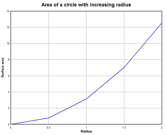
Here’s what we normally see – a linear graph, where all data points have the same weight:
Note that in the HadCRUT4 data shown above in a linear fashion. most of the temperature increase comes after 1950. Hold that thought.
As Spencer pointed out about Lipponen’s circular graph, due to the way surface area increases exponentially with radius, far more surface area is given to the warmer temperatures than the cooler ones.
Anybody who has taken basic geometry in primary school knows this:
As seen in Figure 2, surface area increases exponentially with increasing radius.
To illustrate this with some basic geometry, I decided to take some measurements of Hawkins spiral graph. Since Hawkins spiral graph doesn’t have a reference scale on it, the only way I could get something to measure for radius was to import his graph into a graphics program and apply a pixel scale. I’ve done that in the image below from frame #1 of the animation and listed the values.

Because Hawkins didn’t provide 0.5°C and 1.0°C circle values, and because he offsets zero (to account visually for the possibility of negative anomaly values), it’s a bit different to work out, but I’ve done it in Table 1 below.
From Figure 3, the values are:
| Temp in °C |
Radius (pixels) | Surface area in pixels using πR2 | Note | ||
| 0.0°C | 160 | 80424.7 | (zero value offset is 160 px) | ||
| 0.5°C | 200 | 125663.7 | (interpolated value) | ||
| 1.0°C | 240 | 180955.7 | (interpolated value) | ||
| 1.5°C | 400 | 502654.8 | (we aren’t there yet) | ||
| 2.0°C | 480 | 723822.9 | (we aren’t there yet) |
TABLE 1: Values of temperature, radius, offsets, and surface area from Hawkins spiral plot.
Clearly, as the lines expand and get longer in Hawkins spiral graph, they extend into larger surface areas because the lines themselves are longer. Humans, when viewing the lines all massed together, tend to average them visually, assigning more weight to them because they cover more surface area of the circle.
It’s a visual trick, and one that is peculiar to Hawkins, because nowhere else in climate science do we see a linear graph of temperature turned into an exponential representation. I suspect Lipponen’s representation might be inspired by Hawkins.
To illustrate, for a Hawkins spiral circle, here in Figure 4 is how the linear values and the exponentially increasing surface area value graph out using the pixel values measured, including the 160 pixel offset from zero to handle negative anomaly possibilities. A polynomial curve fit is also added to illustrate the exponential increase in surface area for the values closest to the circumference of the circle.

It looks a lot like a hockey stick, doesn’t it?
When first I plotted Figure 4, and saw that the blue line didn’t follow the plotted path of a pure circle as seen in Figure 2, I thought I had made some sort of mistake. I looked at the data again, couldn’t find any errors in the way I measured it, then threw it out and started over again. I came up with the same result, again and again.
My conclusion? Hawkin’s 0.0, 1.5, and 2.0 reference circles aren’t accurate. I suspect they were some hand generated overlay, because they certainly don’t follow the surface area from increasing radii of a pure circle seen in figure 2. Either that, or he’s used some sort of non-linear scale for temperature that isn’t obvious when trying to reverse engineer his work. Not having his original MatLAB data and plots, I can’t say for sure. If I’ve erred someplace in measuring the original graph, please point it out in comments.
But one thing IS certain: by plotting HadCRUT 4.6 data using the circle/spiral method, he’s weighted post 1950 data far more heavily that data from 1850 to 1950, both in line length, as well as the surface area the pixels that make up those lines cover in the circle. Knowing this now, it is clearly obvious looking at his spiral graph endpoint in 2017:

In figure 5 above, note how the earlier lighter blues and pastel magentas are covered up by the more recent temperatures. Note also how the greenish yellows are the most prominent visual elements, both by color, and by surface area covered.
It’s basically “Mike’s Nature Trick” all over again.
The more recent graphic elements (post 1950) cover up the ones that the really didn’t want you to see. PLUS..the spiral presentation visually weights the more recent temperature data far more heavily than earlier data due to the increased surface area of the lines created by the most recent data. It’s a double-whammy of visualization bias.
Finally, remember earlier I said: “More on the color choice by Hawkins later (which has it’s own set of problems). ”
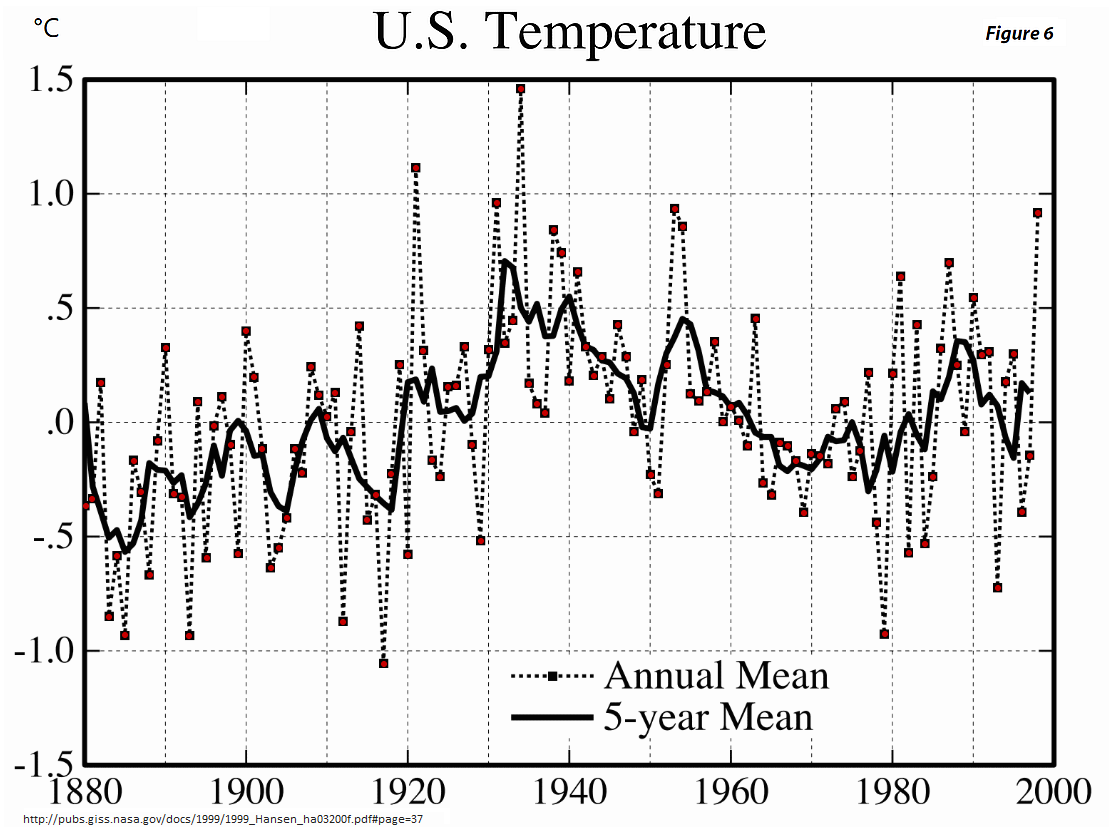
The problem is that the human eye does not perceive colors linearly, as this graph clear illustrates:

More on Figure 6 here: https://www.nde-ed.org/EducationResources/CommunityCollege/PenetrantTest/Introduction/lightresponse.htm
From colors in figure 6, we can clearly see that the end-frame of Hawkin’s spiral graph is mostly in the green to yellow range, and that the cooler blues and magentas aren’t just covered up, they don’t have the same visual color impact.
This is why fire trucks and other emergency vehicles are now painted a yellowish-green; it makes them more visible in traffic and easier to avoid.

The red fire trucks of days past weren’t as easy to see. It’s documented by a study: http://www.apa.org/action/resources/research-in-action/lime.aspx
(Added) Then there’s the longer lines near the edge of the circle. Because they are longer, it makes it appear in the animation as if they are moving faster due to the increased length (accelerating). This is not true, not at all.
So due to the color scale choice, and the faked-up acceleration in the animation, there’s a TRIPLE-WHAMMY QUADRUPLE-WHAMMY of visualization bias in Hawkins graph.
In summary, Ed Hawkins spiral graph does the following.
- It gives post 1950 data far more visual weight due to increased line length and surface area of pixels that make up those lines.
- It it covers up older data with newer data, making it unavailable for visual comparison.
- The color scale choice visually weights the present data far more than the older data, shrinking it’s impact.
- (Added) It occurred to me shortly after publishing, that there’s a 4th bias. there’s the longer lines near the edge of the circle. Because they are longer, it makes it appear in the animation as if they are moving faster due to the increased length (accelerating). Title edited to reflect this.
This isn’t good science, it’s simple visual propaganda, and Ed Hawkins should retract it, in my opinion. As Dr. Spencer said:
I consider this very deceptive.
Dr. Hawkins probably won’t retract it since we’ve learned time and again that climate science often doesn’t care much about accuracy in presentations, it’s more about the messaging, and in that, he’s succeeded in pushing an alarming message. They are also exceedingly stubborn, and don’t like being shown to be wrong.
Even if Hawkins does retract it, it will be impossible to put the genie back in the bottle, since his graph is shared in millions of social media posts and tweets.
But, in the climate skeptic world, this fiasco will live on forevermore known as “Hawkins spiral trick”.
I thought Facebook was going to reform its practice of spreading fake news for profit.
This graph was made well before Facebook made that policy
“But the denialists will invent reasons to ignore it.”
Well, there ya’ go, then!
/sarc
No, only news they don’t agree with. Which they label fake news.
Turn off it’s major income stream? I don’t think so…
Climate Liars will use every trick in the book, and beyond, to deceive people. It’s a cult thing, I guess.
Do “Global Warming Contour Maps” display warming rates in a fair and unbiased manner?
You can see more contour maps at: https://agree-to-disagree.com
Check out the page on Slowdowns.
This plot is a statistical fallacy, since it displays (or compares) ranges with varying populations (not people, data). It shows that any short term statistic ( i.e. the horizontal ends of the triangle) is very different from longterm statistics (the middle values). That is not very surprising in itself. It is also not something anyone would do if they were professional and honest. In advertising, though….
It is not very informative, and it comforts our preconceptions that are being fed to us every day.
I don’t think you understand it, Anders. If you sight across on any horizontal line, the “data population” (regression interval) is constant, not varying.
The regression interval varies as you go up and down. That’s the point: so you can see how varying the regression interval changes the calculated trends.
He explains it here:
https://agree-to-disagree.com/how-to-look-for-slowdowns/
My viewpoint is that these graphs, while novel, aren’t really effective at communicating information to the average layman. They are generally outside the scope of comprehension for about 99% of the population.
It’s too bad, Mr. Walker worked hard on them. Compared to Hawkins spiral graph, these would never go viral due to their complexity.
Anthony, I understand your comment, and agree with you, to a certain extent. But a global warming contour map displays information on a number of different levels, which vary in complexity.
Colour is one of the most basic levels. Anybody looking at the 2 example contour maps above (which happen to be for the northern and southern hemispheres), can see that one shows more warming than the other (one has a lot of red, while the other has a lot of orange). What could be simpler?
Also Anthony, you should see a global warming contour map of the stratosphere (weather balloon data), which shows definite cooling. It has beautiful deep blues and greens. It could definitely go viral!
Hawkins graph has another deceptive element. Plotting countries can fool one about the geographic extent of the graph’s subject. For example, the 30 or so European countries west of Russia collectively span less surface area than Russia. But, on Hawkins graph, the 30 countries span 30x more area than Russia.
About that “Temperature Circle”:
-2.0 to -1.0 is colored blue. OK, so far.
+1.0 to +2.0 is colored red, you might say.
But NO:
You have a +2.0 data point, the previous blue area gets turned red as well as the red area!
These slimes know exactly what they are doing.
A girl I knew in college had as expression for things like this.
“Scum Sucking Rats”
It’s worse than that. The space available for -2 to 0 is much smaller than the space for 0 to +2. Much smaller than pi*r^2 would cause. There is a book on how to do this (I think it’s called “How to lie with statistics”).
Pure propaganda, in my opinion.
Actually, that book is a “what not to do if you’re honest”, since the dishonest will use these tricks to fool people by using things akin to optical illusions.
For any engineer or scientist, I strongly recommend “The Visual Display of Quantitative Information” by Edward Tufte. It is an easy, fun read that thoroughly examines good vs. bad & deceptive graphical techniques. The New York Times, and many others, share the same level of billing as Pravda. It really is a classic as are some of his other books.
I highly recommend Tufte’s book on how-to and how-not-to display good graphics. During the 1980s and 90s when I taught scientific computer applications, this book was a required read for that class.
My favorite from that is the graph of the path and size of Napoleon’s army as it moved through Europe on the way to and from Moscow.
Oh yes very good book.
Everyone should have a copy in their library and consult it regularly.
I purchased this book after someone else here recommended it a year or two ago. Fascinating, and a great coffee table book.
rip
A Hawkins circle made in reverse(starting at the circumference, red ones become smaller.
Would that be a “Reverse Hawkins”? Gotta nice ring to it.
Triple Reverse Hawkins and (s)pike !
“Anybody who has taken basic geometry in primary school knows this:” They maybe should know this, but apparently what we used to teach either didn’t stick or is lost. Surface area/volume (mass/area) ratios are extremely important in biology among other disciplines.
More to the point, Chapter 10 (Color:Attraction and Distraction) in “How to Lie with Maps” by Mark Monmonier (1991, Univ. Chicago Press) states (among many other valid points) –“Advances since 1980 in electronic computing and graphic arts have encouraged a fuller use–and abuse–of color.”
Dr. Hawkins should study cartography, or better yet put him on a boat with a map he made like this (with no GPS). Cartography has a long, rich history of dealing with these problems. There is no excuse for this.
Also, there is a slight issue with the placement of the “Zero degree” Circle. It isn’t centered on the 1950 to 1980 Median as is utilized normally or the median of the satellite era, It is Zeroed at the 1850 temperature set. The first circle drawn (presumably 1850) crosses the Zero degree Limit right out of the chute.
I guess this is part of what you have to do to demonstrate sufficient credentials for IPCC promotion. It’s the new hockey stick motif and it fits on a campaign button.
got it in one
Some possibly useful resources…
Five Ways to Split or Break GIF Animation Into Individual Frames:
https://www.raymond.cc/blog/split-or-break-gif-animation-into-individual-frames/
(Irfan Skiljan’s free IrfanView tool, which Raymond mentioned first, can be obtained from the https://www.irfanview.com/ web site, or from the indispensable Ninite site, http://ninite.com, though Ninite will only install the 32-bit version if IrfanView.)
To digitize data from a graph or other image, I like Ankit Rohatgi’s free WebPlotDigitizer:
https://automeris.io/WebPlotDigitizer/
That this person is going to be a lead author on IPCC AR6 is disturbing.
As for the graph, I think it will turn into an “own goal”. The refutation above is stellar, but for a casual conversation, it is easy to crush with a simple question.
Why do you think they came up with such a complicated way to present the data when a simple line graph tells you much more?
he will meet the ‘needs ‘ of the IPCC very well indeed , for no AGW , no IPCC
It pretty simple. The simple line graph assumes that all increases in temperature are EQAULLY important. However, if it true that impacts are NON Linear with increasing temperature, then the simple chart Anthony proposes is the misleading one.
Mosher writes
Sounds plausible, but is it true? If the majority of the temperature increase is slowed cooling overnight so that the overnight low was a bit higher (ie fewer frosts) rather than increased daytime temperatures then thats important…and not displayed by either method.
In the USA winter days and nights are warming six times faster than summer days.
However, if it true that impacts are NON Linear
1. Show me ANY evidence that impacts are non linear, and;
2. Show me ANY evidence that this depiction in any way depicts said non linear impacts.
Mosher, once again grasping at straws.
The impact of temperature is probably non-linear, each degree of heating has less impact than the last.
Who said anything about “impacts?” We were talking about temperatures.
And why would you think that “impacts” are non-linear with increasing temperature, anyhow?
And it sounds like you’re assuming that impacts are negative. That’s unlikely. So far, they’ve been unambiguously positive:
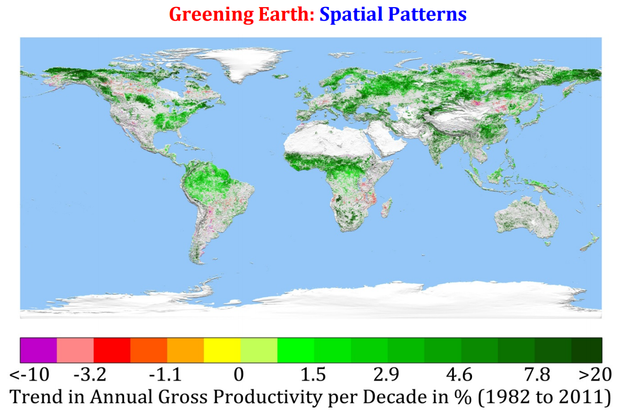
http://sealevel.info/greening_earth_spatial_patterns_Myneni.html
That’s likely to continue to be the case.
For one thing, we know that cold temperatures are far more dangerous to humans than are hot temperatures:
https://www.sciencedaily.com/releases/2015/05/150520193831.htm
For another, we know that, thanks to “polar amplification” (which really should be called “Arctic amplification,” since it doesn’t apply to Antarctica), and thanks to feedbacks which limit warming in the tropics, temperature increases are expected to be disproportionately in places where temperatures are currently well below optimum for humans.
It’s even simpler, Mosher. Presenting a single number for “global temperature” is the most misleading thing of all. Uber fail.
Mr. Mosher appears to believe that climate impacts increase with temperature as the area of a circle. Let’s say the temperature increased 1C since 1850 and this is the radius. In round numbers his impact is 10. Seems high to me.
3. Still seems high.
Anthony: I think there is an error in your Table 1. The distance between 0 and 1.5 is 400-160 = 240 pixels. That’s 80 pixels per 0.50 degrees. So 0.5 would be at radius 160+80=240 p, 1.0 would be at 320 p.
I’m not disagreeing with the argument that the presentations are misleading. In fact they are similar to graphics which use pictures (like oil barrels or polar bears) to compare numbers where both the height and width are doubled to indicate a factor of 2 increase. Of course the area of the pictures is a factor of 4 larger.
Yes, that’s if I subtract a 160 pixel baseline. But since he didn’t start the scale at 0 radius, I have to do it this way, making 0C at a 160 pixels radius. If you will expand the Figure 3, and magnify in your browsers, note the pixel ruler says 1.5C is at 400 pixels from the center.
Since none of the data is displayed at the 0 pixel radius, in order to do an apples to apples comparison, I had to run everything with the 160 pixel offset.
But I’m open to suggestion if you see a better way. Happy to redo it.
From figure 3, we can see that the scale used was not linear. The points given in the scale are: (Degrees, Pixels) 0,160 ; 0.5,200 ; 1.0,240 ; 1.5,400 ; 2.0,480. If evenly spaced, we would expect that, since the degrees increase at a uniform rate, then the pixels also would increase at a uniform rate –> 480 – 160 = 320 ; 4 divisions gives 320 / 4 = 80 each. But, the first two are 40 apart, the third is 160 apart, and the last is 80 apart.
The early data points stay within the first two (0 to 0.5 and 0.5 to 1.0 divisions, so hardly any change in diameter shows up, compared to the later data points which are 4 times as distant for the same temperature change. He has magnified the scale of the most recent data by a factor of four. FILTHY LIAR!!!
There is no 0.5 and 1.0 in figure 3!
Nope, Rick is correct. You can’t just step 40,40,160,80. You only get even steps with 80 pixels.
Model (e.g. characterization, hypotheses) inflation in the scientific community works remarkably similar to asset inflation in the financial community.
That’s a lot of work to explain that you don’t like the way warming is depicted. At least admitting that the earth is warming is a start.
Once again, the troll declares that being dishonest is just a different way of “displaying things”.
And the troll also goes back to the well to declare that we realists don’t believe the earth has warmed.
I’m guessing he gets a bonus every time he works that into a conversation.
[Labeling everyone you disagree with as a troll is counterproductive. The point of these comments is to foster discussion. Your approach does not lead to productive discourse. Please consider this in future replies. -mod]
MOD- I typically agree with most of your inserts, and even a bit with this, but not entirely.
Steven Mosher and Alley have proven themselves to be agitators and intellectually dishonest types who resort to ad hominem. I have never seen them once admit they were wrong. They have demonstrated no desire to shake their religion and constantly inject slanderous, libelous content claiming they have the moral highground. I consider both of them trolls. Trolling to get a reaction but never contributing anything of substance.
zazzy isn’t much better.
that klipstein feller is also troll-ish.
the other two (Nick and Kristi) at least attempt to provide some substance, even if they constantly obfuscate.
And again, why are my comments moderated?
it is random, but typically lengthy posts, and not even with links. I don’t get it.
I’ve been critical of the folks who come in to inject deceit but I Haven’t said anything that was inaccurate.
At some point, almost everyone falls into moderation, the WordPress system does this. You need not take it personally…but the combination of words and phrases you used in the comment that was held was chock-full of abrasive words.
Grousing about it won’t help. The algorithm is what it is.
Ok, I wondered because I know from time to time the intransigence of some commenters gets the better of my patience, and I step out of line. Thanks.
Alley typical alarmist response:
Misrepresent what skeptics are saying, then like nearly all alarmists, demonstrate they are unable to recognize the issue.
We don’t know if “the Earth” is warming. Averaging temperatures from different locations doesn’t give you ANY meaningful information. It’s a made-up number with no relation to reality.
“That’s a lot of work to explain that you don’t like the way warming is depicted”
I appreciate learning new ways to present information. Hiroshima’s weren’t very useful since hardly anyone knows what is a Hiroshima. Pizzas would be a good depiction.
“At least admitting that the earth is warming is a start.”
The Earth is cooling. Has been for the past 4.7 billion years.
The ice huggers have one of these graphs too.
Weeeeeeeeeeeeeeeeee ! — let’s confuse people even more by getting more creative in our visual deceptions.
Never mind that we are just creating bigger and better ways to make mountains out of mole hills. It’s how we disguise the fact that we are doing so that counts. Creative liars make better liars.
Jeez; you can’t even trust these guys playing with Crayons
In short he is a good at graphic design , in fact so good that it is hard to see that the actual facts do not support the ‘pretty picture ‘ There is a bright future in marketing ahead of him should his climate ‘science’ ever justifiably come to an end.
‘it will be impossible to put the genie back in the bottle, since his graph is shared in millions of social media posts and tweets.’ and that is what makes a good climate ‘scientists’ grand claims that get headlines , they can be total BS and still be called a ‘success’ if they achieve that .
You think he’s actually doing any of the work that he is taking credit for doing? I’d guess he has lab rats.
Exponential warming right? In which deep dark basement does AGW dream this garbage up? Unfortunately, a lot of people see it and believe it. In the linear graph I see where temperature started below baseline, ( it’d have to warm up without man made co2 to get to baseline 59 F) where is the current drop from Feb 2016 to 0.2C above baseline? Wouldn’t the yellow/orange dip into those other areas? I don’t see that. The spirals keep expanding outwards.
If temps fall below baseline, then what does the graph look like?
“Hawkins is no garden-variety graphical tinkerer, he’s a climate modeler at the National Centre for Atmospheric Science (NCAS) at the University of Reading and IPCC AR5 Contributing Author, soon to be shepherding IPCC AR6 as lead author.”
With that said, I would not be surprised if AR6 is a climate believers wet dream of nightmarish over-the-top hyperbole written to advance “the cause” of socialism.
“But the fact that a climate researcher would do this is, well, surprising to say the least.”
Not to me… Why?
“the cause” (of socialism).
My understanding is that each chapter has 3 to 4 lead authors. And each lead author may work on 3 or 4 chapters. There appears to be 18 chapters in the next report.
https://unfccc.int/news/ipcc-agrees-outlines-of-sixth-assessment-report
So his total contribution may not be all that significant. It comes down to how much of a bully he is, and how much influence he has in total.
I kind of like the circle with bars, its fascinating to watch. (Never mind its propaganda in the way that it is used).
So if one took Raw U.S. Land Temperature Data, and then calculated the delta from the averaged stations yearly mean temperature for each temperature station (well, for temperature stations that are relatively good ones according to Anthony’s survey), and then plotted them by rural versus urban, I am willing to bet you would see a a fine depiction of the Urban Heat Island Effect growing as population and energy use increases.
I may have to try this out.
Just don’t average data from different locations together. That’s a no-no.
Alarmists have no shame!
An excellent expose’ of Hawkin’s deliberately and carefully crafted deceit, Anthony!
Well Done!
I’m not very happy with the way you have used the term “exponentially” here:
“due to the way surface area increases exponentially with radius”
“As seen in Figure 2, surface area increases exponentially with increasing radius.”
Surface area increases with the square of the linear metric (radius for a circle). This is quite distinct from exponential – parabolic if you have to use such a descriptor.
No, it fits the dictionary definition:
exponential
adjective
1. (of an increase) becoming more and more rapid.
2. Mathematics
of or expressed by a mathematical exponent.
But it doesn’t fit the mathematical description, which is what is of significance here to the argument. As Anthony points out, “climate science often doesn’t care much about accuracy in presentations”. I wouldn’t want to provide ammunition for the same comment to be leveled at WUWT.
Mathematically, squared is identical to raising something to the power of 2.
Which is “exponential”.
If you want to generalize to that degree, linear is also exponential, since it’s something to the power of 1, and unchanging is exponential too since it’s raising something to the power zero. Sort of relegates “exponential” to the category of “meaningless”, wouldn’t you say?
Suggest you look up the mathematical context, which requires the variable itself to be part of the exponent. The OED provides a reasonable starting point:
exponential, a. and n.
2.a Math. Involving the unknown quantity or variable as an exponent, or as part of an exponent. So exponential equation, exponential function, exponential quantity, etc.
I agree, Alan. I realize that the press often uses “exponentially” to mean “rapidly,” or (at best) “more than linear.” But in the sciences we should use the mathematical definition, and 𝓍² doesn’t meet that definition.
http://sealevel.info/x_squared_vs_2_to_the_x.png
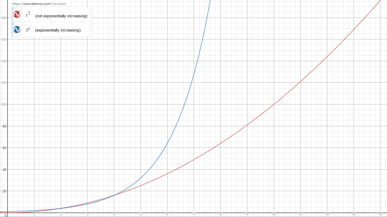
Another way of saying the same thing is that if it is exponentially increasing, then the logarithm of it should be linearly increasing.
Alan is correct. An exponential function of x is b^x, where b is the base. The function x^2 is quadratic. Watts makes a good point about the graphs being misleading; there’s no good reason to weaken it by using the incorrect terminology.
Agreed. There really is no room for distorted layman terminology or poorly/mis interpreted mathematics in a topic which is mathematical in nature or context. The “language” of mathematics evolved to to try to eliminate such erroneous or ambiguous usage.
This lay idea that exponential is very rapid also gives rise to problems, for instance in teaching basic cosmology. Students readily appreciate the “exponential” expansion of space during inflation, where the doubling time is 10^-37 seconds; but they “just can’t see” how it again reverts to “exponential” during the “heat death” of the universe, when the doubling time is 10^15 seconds (or about 10 billion years).
When a simple line graph just doesn’t scare people enough…
Now we need to add some monsters, or create a video that depicts a long-haired woman climbing out of the TV set to kill you, if you say her name, or any part of her name and you don’t believe in human-caused global warming/climate change — call her Carbonicia.
Yeah, that’s right, carbon is one scary bitch — the message that alarmists want to send [DISCLAIMER: no sexism intended]
The proper purpose of visualizations is clarify and reveal insights into data and relationships, so that you can answer questions about it, like: how is some quantity trending, how have those trends changed, when did it peak, are there periodicities or accelerations in the data, are there relationships between different quantities, etc.
You can’t answer questions like those from Hawkins’ visualizations. Their purpose is not to clarify, but to convince, by confusing.
We live in deeply unscientific times. If you don’t think so, then explain how it can be that Hawkins’ visualizations get widespread praise and millions of views, but when you show someone a graph like this you’re derided as a “science denier.”
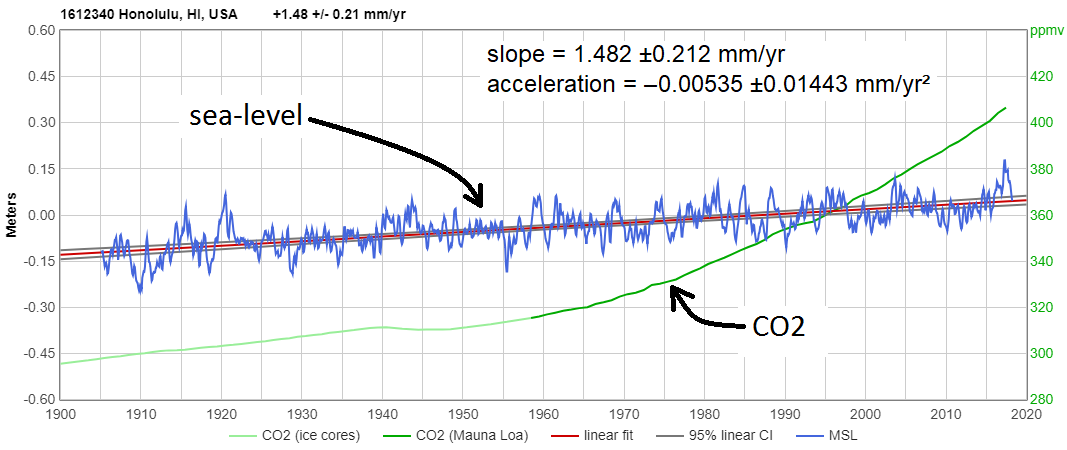
http://www.sealevel.info/MSL_graph.php?id=Honolulu
Here are some more science denying graphs…
Global Average Surface Temperature is currently at 14.9° C — 1/10th of a degree cooler than the long-term, expected average temperature for an “Earth-like planet” — 15°C.
A little more warming and we’ll be up to Normal!
Can you explain what the “long-term, expected average temperature for an “Earth-like planet”” actually means and how you calculated it?
A good question Percy.
To me it is rather like the average colour of a churning fruit salad; whatever that means!! A singular definition of a mass of changing vague definitions is meaningless.
However we do know that at sea level the temperature at which the vapour pressure of water equals the saturated partial pressure is around 30C at equilibrium. What it is at any random point in the atmosphere can be calculated; but where you go from there is the problem if you wish to arrive at a singular conclusion; particularly as it does require the presence of water.
It seems however that the answer appears to be around 15C; but this arrived at by different means. Equating the two to a resolution of 0.1C is quite frankly an absurdity as nature is rarely ever in equilibrium.
Regards
Alasdair
Alasdair,
“However we do know that at sea level the temperature at which the vapour pressure of water equals the saturated partial pressure is around 30C at equilibrium.”
This makes no sense. The vapour pressure of water is the saturated partial pressure, at any temperature.
Yes, by definition, the MAXIMUM vapor pressure of water is the saturated partial pressure, at any temperature.
That partial pressure (a/k/a the “moisture-holding capacity of air”) increases quite dramatically with temperature, and it continues to do so right through the 30°C point.
The increase in the moisture-holding capacity of air with temperature is, arguably, the MOST fundamental cause for “weather” on planet Earth. Pretty much nothing in the Earth’s climate system would “work” without it. It is the reason relative and absolute humidities are different, the reason your hair dryer uses hot air to dry your hair, the reason your breath fogs on a chilly day, and the reason there’s dew on the grass in the morning. It is also central to several important temperature feedback mechanisms, both positive and negative:
● Water vapor feedback (positive)
● Lapse rate feedback (negative)
● Water cycle / evaporative cooling feedback (negative)
● Sea-surface temperature / cloud feedbacks (negative in the tropics)
● Cloud feedbacks (“it’s complicated”)
Please provide reference
But he’s just one “g” away from being “Hawkings”! That means he’s omniscient!
Are you referring to Hawking? Fail.
Anthony Why would you use a fake temperature graph from the Met office to prove your point?
Just a reference example…
It’s the least fake surface temperature record available… 😎
A bit OT but the CAGW scientists and those who support them love to play around with the colors. Sometimes during a cold snap I’ll tune into the weather network and the map shown is depicted in orange. WTF; did these people not watch cartoons when they were children? The cartoon character who was freezing was always shaded in dark blue and when he was too hot he was colored red or orange.
https://www.skepticalscience.com/feb-2013-sea-ice-spiral.html
And just to prove the point, Steven pipes in with more propaganda.
There are many bad web sites out there with false information. Just imagine all the little kids that stumble across them all the time. One particularly galling one to me is
http://www.nightearth.com/?@46.63534,8.727886,5.6640780446988686z&data=$bWVsMg==
Can you spot the glaring mistakes. These mistakes make the whole map suspect.
I give up. Is it a geography error?
Not even a hint, Alan Tomalty?
The outside circle should be at the time of the last ice age working in towards today!
Would you even see the red?
The graph is fine. As long as you have enough maths to understand it. For instance the
area of a circle does not increase “exponentially with increasing radius” rather it increases
quadratically. If you want to complain about a lack of mathematical precision then you should
start by making sure you know what the formula for the area of a circle is. It is also worth noting
that the spiral does not use surface areas.
Alternatively the graph is no more misleading than the one that sceptics like to post here showing
surface temperatures with an expanded vertical scale like for example
https://wattsupwiththat.com/2016/04/07/no-statistically-significant-satellite-warming-for-23-years-now-includes-february-data/#comment-1750808
Expanded! It is even more meaningful if the temperature scale starts at 0 Kelvin. But Percy admires the magnified temperature scale that show almost immeasurably small changes in temperature as mountains rather than molehills.
No, it isn’t. Imagine using your reasoning when recording someones body temperature! Would make for a useless graph. Would you say to a person running a fever “Look at the graph! Can’t see any difference, so you must be fine”
You may think that the amount of warming is too small to matter, but that is no reason to graph it on a scale that makes it impossible to see by eye. You can’t determine anything about how much a change in temperature matters by how it appears on a graph that goes down to absolute zero. They are unrelated.
A reasonable scale, to give casual viewers a “feel” for the significance of the temperature differences, would cover the range of temperatures which people commonly experience.
So a scale that ranges down to absolute zero, or up to the boiling point of water, would deceptive, making practically-significant changes appear insignificant.
But a scale that spans only 2°C is also deceptive, because it makes changes appear much more significant than they really are.
Shouldn’t the scale be chosen based on being able to convey to the reader the exact quantity of the change? Isn’t the importance of such a change a different issue? The importance of the change is certainly not related to whether it’s visible on a scale that goes down to absolute zero, unless how far away from absolute zero it is, is a relevant factor in what you are looking at.
What do you think is more important when looking at climate? Being able to see how much it has changed, or whether that change is visible when looking at a graph scaled to make absolute zero visible?
Philip wrote, “Imagine using your reasoning when recording someones body temperature!…”
and, “Shouldn’t the scale be chosen based on being able to convey to the reader the exact quantity of the change? Isn’t the importance of such a change a different issue? “
It depends on your audience and purpose.
If the graph is of the body temperature of a living person, and the purpose is medical, then you need to distinguish between illness and health, and between degrees of illness. You want to answer questions like, “is his fever coming down?” So your visualization should use a scale which enables you to tell such things.
Hawkins’ purpose had nothing to do with conveying to readers the exact quantity of any change, and everything to do with conveying (an exaggerated impression of) the importance of that change.
Sometimes, especially for a mixed or unknown audience, it makes sense to provide multiple graphs: one with a larger scale, to give a “feel” for significance, perhaps contrasted with other familiar quantities, and another graph with a zoomed-in view to show the fine details and exact quantities, as in these examples:
https://www.google.com/search?q=zoomed+in+graph&tbm=isch
Dave Burton said:
“one with a larger scale, to give a “feel” for significance”
Would you chart body temperature on a larger scale to give a “feel” for significance? Is the “feel” people get from such a scale related to the significance of the change?
Please note that I am not talking about Hawkins. I was responding to this:
Robert Austin said:
“Expanded! It is even more meaningful if the temperature scale starts at 0 Kelvin. But Percy admires the magnified temperature scale that show almost immeasurably small changes in temperature as mountains rather than molehills.”
The honest way is to explain to to people how much of a change actually matters compared to the change observed. The dishonest way is to plot the change on a scale that makes is hard to see, and leave people with the impression that how hard something is to see on a large scale tells them something about how significant it is.
How about plotting temperature on a scale that goes from 0K to 1000000K. Does the larger scale actually help anyone understand anything better?
Oh God Percy give it a rest will ya
I’m sure that the 16-year olds being targeted by the CAGW marketing department run by Hawkins all have advanced mathematical degrees and are not deceived.
And there is absolutely nothing deceiving about a “thermometer chart” showing that the changes in average temperature are trivially small compared to our day-to-day, season-to-season experience with temperature variation.
Do “Global Warming Contour Maps” display warming rates in a fair and unbiased manner?
You can see contour maps at: https://agree-to-disagree.com
Check out the page on Slowdowns.
“This is among the scariest presentations I have ever seen. Yes, I have kids.”
What is scary is that those kids have a parent who is that stupid.
you identify the ones who are directly responsible for global stupid = parents.
stupidity is hereditary in this way.
but darwin comes, eventually.
Yes “Darwin comes” but by killing off the unadapted species. Warmunism is more like a cancer that kills all the cells in the body, not just the cancerous ones.
I know that photosynthesis doesn’t completely use up all the added 0.5 % CO2 into the atmosphere every year. However it is hard to get excited over CO2 increases when it hit 410ppm by volume in May 2018
https://www.bloomberg.com/graphics/carbon-clock/
and is now back down to 408.6 and still dropping on the Bloomberg net CO2 in atmosphere ticker clock. However I have 2 computers with 2 different internet connections running at about the same download speeds. So i went to the above site on both computers and as I am typing this my faster internet connection is showing me an older amount than the other computer even though the totals are going down on both. So it matters when you log in to the site. The total is supposed to be a complicated calculation of the Mauna Loa daily findings but there should not be different totals running in real time on different computers connected to the same web site. Maybe Anthony for all his vast experience running a web site can make sense of this.
The same thing happens on the Guardian CO2 emission site ticker clock; different real time totals on each computer . So this clearly isnt a site problem. Anthonyyyyyyyyyyyyyyyyyyyyyyyyyyyyyyyy???????????????
https://www.theguardian.com/environment/datablog/2017/jan/19/carbon-countdown-clock-how-much-of-the-worlds-carbon-budget-have-we-spent
The Guardian site always shows a steady 1000 tons per second increase. GO China GO. So in the summer months of the Northern hemisphere there isn’t much relation to CO2 emissions (Guardian clock) and net CO2 in the atmosphere (Bloomberg clock). However when the fall and winter comes the Bloomberg CO2 ppm totals will go up again and I will be a happy camper again. The world atmosphere needs MORE CO2 NOT less.
Apparently this amazing ‘Carbon Clock’ can resolve down to 0.01 parts per trillion. And then below the ‘clock’ it says it’s an “estimate of the level of CO2 in the atmosphere”. Metrologists of the world: Unite and shake your fists (or your calculators) at this perversion of your science!
That “carbon budget” nonsense annoys me. I cannot understand how such junk science gets published.
All of the environmental consequences (good and bad) of anthropogenic CO2 depend on the LEVEL (concentration) in the atmosphere. None of the environmental consequences depend on cumulative emissions.
Negative feedbacks (terrestrial greening, dissolution in the oceans, calcifying coccolithophores, etc.) are currently removing the equivalent of about 2.5 ppmv of CO2 from the atmosphere every year. The only reason CO2 levels are still rising, in spite of those removals, as that we’re emitting even more (about twice that).
If CO2 emissions were merely cut in half, CO2 levels would cease rising, even as we blew through the imaginary “carbon budget.”
Now, admittedly, if CO2 emissions were permanently frozen at half the current rate, the atmospheric CO2 concentration would eventually begin to slowly creep up again, as increased biomass (from greening) caused increased CO2 emissions from decaying biomass — but certainly not at a worrisome rate.
We’ll never get anywhere near optimum CO2 levels. The real problem is going to be the consequences of falling CO2 levels, when mankind eventually transitions away from fossil fuels.
I would prefer nice round whole numbers for the axes of the spiral graph. Please start the graph at the year 1000AD or zero. I cannot for the life of me fathom out the reason for starting at year 1850. Oh wait……
Jim Petit did it long before ed hawkins
Actually, there is an updated 2018 version – plus a reversed “target” one furter down in Hawkins’ tweet. Not that it makes it any better:
https://mobile.twitter.com/ed_hawkins/status/994153792433262592?lang=da
”Chartjunk,” Edward R. Tufte.
Correct me if I am wrong but weren’t the 1930s at least as warm as today. If so why does the 1930 “circle” not exceed many of the others until recently.
If CAGW is so “scientifically obvious and supported by the data” why does that crowd have to depend on propaganda methodology to sell it to the public. From early days it has been all about hyperbole and twisted reports blaming global warming for everything from dandruff to the end of all life on earth usually all by the middle of this century .
I have seen this modus operandi on a smaller scale relative to specific endangered species. Even as the species was well on its way to recovery and even a stable population scientists working on the species, and there “friends” in the environmental community, actually increased the hyperbole about immediate extinction. They also made up data and twisted what science that was available.
Exactly:
If the climate catastrophe is so obvious and blatant, why does convincing people to believe involve so much deceptive propaganda by the opinion leaders of the catastrophe?
“Correct me if I am wrong but weren’t the 1930s at least as warm as today. If so why does the 1930 “circle” not exceed many of the others until recently.”
I’m correcting you ….
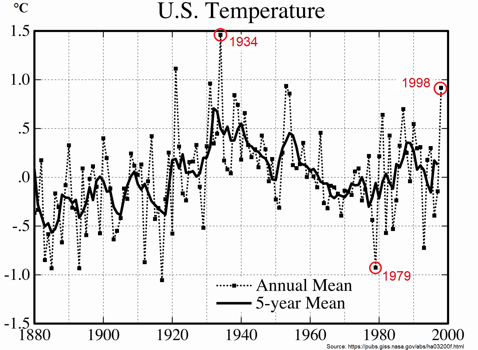
Edwin wrote, “Correct me if I am wrong but weren’t the 1930s at least as warm as today.”
1. That was the U.S. data, not the global data; and,
2. They “fixed” that “problem;” and,
3. The 2016 El Nino spike apparently exceeded 1998, anyhow.
I say “apparently” because I don’t totally trust them. Read on to see why that is so.
NASA used to say that 1934 was the warmest year in U.S. (contiguous 48-State) history. But U.S. surface temperature data has been greatly adjusted, and that the adjustments drastically increased the amount of reported warming in the continental USA during the 20th century, particularly when the 1930s are compared to the 1990s & beyond.
Published papers explain the rationale for only part of those adjustments:
1930s vs 1990s adjustment effects (±0.01°F):
TOBS (area adj & TOB adj): +0.34 °F
MMTS (sensor change adj): + 0.04 °F
SHAP (station history adj): +0.20 °F
FILNET (missing data est): +0.02 °F
FINAL (urban heat island adj): -0.06 °F
sum: +0.52 °F
6½ years ago I asked Prof. Scott Mandia of the CSRRT about the surface temperature record of the 48 contiguous United States, the current annualized and averaged version of which NASA GISS now shows here:

https://data.giss.nasa.gov/gistemp/graphs_v3/Fig.D.txt
…and has graphed here:
http://data.giss.nasa.gov/gistemp/graphs_v3/Fig.D.gif
(Note: for some unknown reason they set the background to “transparent,” and some web browsers show it as black. So if it has a black background, try viewing it in Mozilla FireFox.)
As of ~six years ago it looked like this (scaled to match the graph below):
http://www.sealevel.info/NASA_FigD_2011-12-17_52pctW_41pctH2.gif
But in 1999, their graph of the same(?) temperatures looked very different:
http://www.giss.nasa.gov/research/briefs/hansen_07/fig1x.gif
(scaled to match the graph above)
http://www.sealevel.info/NASA_fig1_2001.gif
If you examine the two versions of the graph, and compare 1930s temperatures with 1990s temperatures, you can see that the newer version adds about 0.7 °C of warming!
I asked the CSRRT:
1. What accounts for the unexplained part of the adjustments, made since 1999, which increased the reported U.S. surface temperature warming?
2. Where’s the data which Hansen et al graphed in their 1999 paper?
They were unable to answer those questions.
A 1999 article by Drs. Hansen, Ruedy, et al, said, “in the U.S. the warmest decade was the 1930s and the warmest year was 1934,” and a longer article by Dr. Hansen in 2000 (which NASA subsequently deleted from their server) said, “it is clear that 1998 did not match the record warmth of 1934.”
But now NASA says just the opposite: that 1998 was warmer than 1934 in the contiguous (lower 48) United States.
So what was “clear” to NASA in 2000 has subsequently been found to be untrue, apparently as the result of the accumulated adjustments/corrections which have been made to the data since 1999 — some of which aren’t even cursorily explained anywhere.
(Note: I imagine that someone will volunteer that the USA is only 2% of planet Earth, so those unexplained adjustments to the U.S. temperature data had little effect on the global average. If you’re that “someone,” please go ahead and tell me which temperature data you think are more trustworthy than the U.S. data.)
w=1000&h=768
https://moyhu.blogspot.com/2012/10/a-necessary-adjustment-time-of.html
Anthony Banton, do you have the U.S. data which Hansen graphed in his 1999 paper (the third of the three graphs in my comment, above)?
Here’s a larger version (I added the red circles and dates):
http://sealevel.info/fig1x_1999_highres_fig6_from_paper4_with_1934_1979_1998_circled.png (click to enlarge)
Note that in 1999 they showed 1934 as much warmer than 1998, in the contiguous United States. From digitizing the graph, it looks like 1934 was 0.54°C WARMER than 1998.
But now — from the same data! — they say that 1934 was 0.0876°C COOLER than 1934. That’s a pretty large difference (about 0.63 °C), all from adjustments.
I’ve been unable to find the data shown in Hansen 1999 (except by digitizing the graph). Do you have it?
BTW, in case anyone needs it, here’s the data that I digitized from that graph in Hansen et al 1999:
https://www.sealevel.info/GISS_FigD/199906——–/FigD_reconstructed.txt
I used WebPlotDigitizer, and laboriously selected and marked each data point, as precisely as I could manage, as shown here (the red dots are the points I selected in WebPlotDigitizer):
(click on graph to enlarge)
Similar to the distortions one gets when projecting a globe onto a flat map. Land masses near polar regions ‘look’ bigger than they really are.
https://en.m.wikipedia.org/wiki/Mercator_projection
Here is a spiral of the last 200,000 years of climate changes !
http://clivebest.com/blog/wp-content/uploads/2016/05/Square-3.gif
Thanks, Clive. I think this format has great visual impact if it is used honestly, as yours is. Hawkins has again formatted his for deceptive purposes. Despicable.
Nice! What tool(s) did you use to make this, Clive?
It’s written in IDL.
You wrote it yourself?
Interesting to watch the MWP follow the same trajectory as the Hollowscene Thermal Maximum, but stall out and settle at a lower shell. Almost quantized? The jumps are way too fast to result from CO2 liberated from the ocean. A big piece of this puzzle is missing.
The corruption of our scientific institutions runs very, very wide and deep. Here’s news of more accolades for Hawkins’
propaganda work“active communication of climate science”:Yup, that’s truly wonderful.
How about calling it the
“Hawkins Hoax”
Skeptics have used reasonable, rational tests of climate consensus claims for many years now. It seems that nearly everytime a skeptical review of climate alarmist claims is performed, sloppy work, unrepeatable results, incorrect conclusions or just plain old deception is uncovered in their claim.
needed – a youtube animation showing how the deception works
In the animation, 1900 appears at about the same temperature as 1985, with the post 1985 warming being well over 1°C. It’s a centennial hockey stick.
The number of years being animated per second declines considerably during the post 1985 period. Subliminally exaggerating the toasting effect.
Use the ice core data from the entire Holocene and you will see there is nothing abnormal about the past 150 years.
This type of graphical presentation does not add any knowledge about the real world processes.
It just makes the green belivers ever more immune to rational thinking.
What’s more shocking is that the Royal Society gives him an award for this type stuff.
https://royalsociety.org/grants-schemes-awards/awards/kavli-medal-lecture/
The Kavli Medal and Lecture 2019 is awarded to Professor Edward Hawkins for his significant contributions to the understanding and quantifying natural climate variability and long-term climate change, and for actively communicating climate science and its various implications with broad audiences.
It’s Whammy^4.