People send me stuff. h/t to WUWT reader “Theyouk”
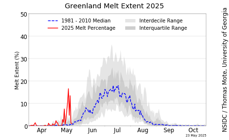
Here we have a graphic from the Danish Meteorological Institute that shows Greenland has increased it’s surface melt dramatically in a very short time.

Source: http://www.dmi.dk/uploads/tx_dmidatastore/webservice/e/n/i/b/m/Melt_combine.png
The question is: is it real, or some measurement artifact or processing error?
The temperature at the Greenland summit station on June 10th was well below freezing, with a daytime high of 17°F, so it doesn’t seem the conditions are conducive for a widespread melt.
We have seen dramatic events before (in 2012) that turned out to be real, but the study behind that event suggests it doesn’t happen except about 100 to 150 years apart and is a special combination of events.

We’ll see what DMI does on the next update. Meanwhile, if anyone has any explanations, feel free to leave a comment.
If I saw a response like that from any instrumentation, I would be giving that instrumentation a very serious look before shouting from the rooftops.
BTW: This site is HORRIBLY slow for me this morning. Other sites appear normal.
Unless such a response was what you had been praying for.
Yes very slow for me. Anyone else?
Yes, I thought I had reverted to a dial-up service.
very slow to post or edit a post for at least 24h now.
DOS?
Ditto …. though that last post was OK. Loading is still slow though.
Ditto for a period of time starting early this morning, around 1 am PDT time.
Just now the site loaded normally.
Very much so, it started yesterday for me. Painfully slow.
How was the ‘melt’ determined? If it was inferred by satellite measurements, perhaps aerosols from the recent volcano are confusing the reconstruction.
I’ve noticed the slow down as well. Is some alarmist script kiddie DOS attacking the site?
Agreed on horribly slow….
The comment formatting seems to have reverted to the old style and now the site is snappy again.
I agree with that. If any of my instruments gave a sudden response like that I would do serious checking out before ever using the data. Irresponsible “science”.
Me, too.
weather can not do that…..somebodies satellite crashed
Anthony said last night his site was under attack again. I’m surprised he can keep his site up during these attacks.
Jim
Got it sorted. Turns out a plugin I installed to improve images within comments was being exploited and slowed down the system terribly. Page loads were averaging 20 to 30 seconds.
Agree on slow site.
Effing hackers. But then I guess the flak is worse when you’re over the target.
Beware the eco-dossers.
(DOS – denia1 of service attack)
They are so certain that what they believe is irrefutable, that they go out of their way to make sure nobody can hear a counter argument.
It isn’t just eco-(d)tossers; all of the attacks are coming from the same camp, just from different tents. Any effective and frequently visited site that espouses a more Conservative point of view is usually under attack, at any given time.
Yep, looks like that “melt-meter’s” batteries are going flat. BTW what is “melt, and how is it measured?
I find it interesting that the warmists belief in the possiblity / probability of massive ice melt in Greenland and Antarctica. Even though the ice core studies show layers of ice still exiting during periods much warmer than current temps.
Why would there be massive melts soon when there periods of much warmer temps that didnt melt?
Perhaps it’s more hope than belief.
Yep … all the $100M+ beachfront properties in Malibu are plummeting in price. Gonna be a LOT of BIG mortgages … underwater … eh?
How is there melt at 17F? It looks like an instrumentation artifact.
BTW: I am not getting any following on comments. Any suggestions?
“I am not getting any following on comments. Any suggestions?” Same here, been that way for about 6 months. Tried going through WordPress but that’s not an option as they don’t reply to questions. A couple forums that use WordPress act this way for me as well.
The two graphical images of Greenland both look identical to me. Are they supposed to show some easily seen difference between June 9th and June 10th 2018?
I also wonder about that.
And both claim 37% ??
David Paul Zimmerman
I’m glad you said that. I thought it was my eyesight.
The left one is 2 days ago while the right one is yesterday, so it’s normal that they look similar (though they’re not identical.)
No. The two images represent a plateau change and not a trend. An earlier date/image would be required to show the change.
“We’ll see what DMI does on the next update. Meanwhile, (I)f anyone has any explanations, feel free to leave a comment.
Anthony …Tiny typo…
You know, sometimes what gets measured has more to do with wishful thinking agendas than instrumentation – and putting summer interns in charge. Like cold fusion’s watts or WMDs or canals and faces on Mars
The Instruments & Measurements
But wait, you say, upwelling LWIR power flux is actually measured.
Well, no it’s not.
IR instruments, e.g. pyrheliometers, radiometers, etc. don’t directly measure power flux. They measure a relative temperature compared to heated/chilled/reference thermistors or thermopiles and INFER a power flux using that comparative temperature and ASSUMING an emissivity of 1.0.
The Apogee instrument instruction book actually warns the owner/operator about this potential error noting that ground/surface ε can be less than 1.0.
That this warning went unheeded explains why SURFRAD upwelling LWIR with an assumed and uncorrected ε of 1.0 measures TWICE as much upwelling LWIR as incoming ISR, a rather egregious breach of energy conservation.
This also explains why USCRN data shows that the IR (SUR_TEMP) parallels the 1.5 m air temperature, (T_HR_AVG) and not the actual ground (SOIL_TEMP_5). The actual ground is warmer than the air temperature with few exceptions, contradicting the RGHE notion that the air warms the ground.
My experience with ground temperature being different from the air temperature is that the ground is cooler than the air most of the night on clear nights. Dew and frost often form when the air temperature a few feet above the ground is well above the dew point.
Can we verify that NASA actually assumes the emissivity is 1 on downwelling LWIR? I could find no documentation on this on the NASA site. The pyrgeometers used to measure the DWIR can be calibrated to set the emissivity but if NASA doesnt do that then they are overestimating the amount by a factor of 3 to 1 , if the actual emissivity of the sky is 0.3128 as calculated by Nahle. That calculation was based on one of Michael Modest’s equations in his textbook on Radiative Heat Transfer. Since Michael Modest is a world authority on the subject it would be hard to question the accuracy of the formula. It is interesting that Modest himself refuses to get dragged into the whole debate. He only mentions in passing in his textbook about the problem but provides no insight. I suspect that he can prove that DWIR is low and that the whole AGW is a scam, but he would be branded a heretic. Since he is still a professor at a university he is laying low on the subject. One hopes that when he retires, he will come out of the closet.
This new comment section is terrible. I can no longer cancel a post?
Cube
just highlight the text and delete it before clicking ‘post comment’. Thereafter you have 15 minutes to edit and/or do the same if you want.
That doesn’t work, it highlights the edit field red and says “Please fill in this field”.
Cube, click Reply again, it’s an on/off switch.
“Like cold fusion’s watts or WMDs or canals and faces on Mars”
That reminds me of one of my favorite quotes by Carl Sagan, “There is no question that the canals on Mars are of intelligent origin, the only question is which side of the telescope the intelligence is on. Where we have strong feelings, we are liable to fool ourselves.”
We did find WMDs which Saddam had neglected to send to Syria, and banned delivery vehicles. But that wasn’t really the point. The danger was that he was close to succeeding in bribing the UN to lift sanctions, at which point he’d have been able rapidly to restart his nuclear program.
What has the Danish Met Inst. got to say about this?
Rapid meltback? Really? What planet are they getting that data from? Seriously!
I just took a gander at the daily EOSDIS image and while Hudson’s Bay is a teensy bit more open, Greenland is not even barely ragged around the edges on the south end, so where are these lab rats getting this info?
The cult of CAGW has been strangely silent concerning the fact that the yearly Greenland accumulated mass was suddenly changed from negative to positive.
Last year of course the Greenland ice sheet accumulated mass set a record for the fifth largest increase in accumulated mass in recorded history.
It is interesting that the current Greenland accumulated mass is again significantly higher than the 20-year average.
https://www.dmi.dk/en/groenland/maalinger/greenland-ice-sheet-surface-mass-budget/
Don’t know how accurate these temperature models are at ‘weather-forecast.com’https://www.weather-forecast.com/maps/Greenland?symbols=none&type=lapse
https://www.weather-forecast.com/maps/Greenland?symbols=none&type=lapse
If you look at the graph immediately above the 3 graphs that are shown on the Danish page you will see the graph that represents the accumulated surface mass balance from September 2017 to June 10 2018. The blue line shows that the mass balance of ice is actually higher than the average for 1981-2010. So if the bottom graph showing melt rate is accurate what this means is that the melt rate has skyrocketed but the new snow and ice has also increased so that overall the mass balance is greater than average. If you go to the site called Polar Portal Monitoring ice and climate in the arctic, you will see that the mass gain is positive. Also on that page if you look at the map graph and hold your mouse on the dark circles you will get the temperature for those sites. Except the circles on the coast you will see that the temperatures are all below Zero. It is interesting that there are no circles in the inland portion. If there were you would see that the temperature would always be way below zero. I dont understand why they dont show any of the inland reporting stations because there certainly are some including one on the highest peak in Greenland.
http://polarportal.dk/en/greenland/surface-conditions/
The follow up comments is working now. For me.
The key to this, in general, is that it represents a “surface melt” “>1mm” Note: “This melt map only shows areas where melt has happened. It does not include evaporation directly from the ice sheet surface or show how much snow and ice has melted. Much of the melt water will refreeze in the surface snow layers rather than running off the ice sheet, this process is included in the calculations of surface mass balance which is why the melt area appears different to the surface mass balance plots above.”
The mass balance images are on this page:
http://www.dmi.dk/en/groenland/maalinger/greenland-ice-sheet-surface-mass-budget/
and show that the Ice Mass balance as of 10 June 2018 is showing more areas gaining mas than losing mass — so even if this represents an unusual surface melt, it does not represent an unusual Ice Mass loss, as of today, at least.
Exactly.
Basically, there only has to be 1.00000000…1mm of melt in that specific grid cell to “activate it” until January and because it displays area melted since then and not volume it’s really only scary looking data, not useful scientific data.
ScottyB ==> Nonetheless, it is an interesting phenomena and should be investigated to see if it is a real physical anomaly or simply a problem with the equipment or interpretative programming.
ScottyB ==> Nonetheless, it is an interesting phenomena and should be investigated to see if it is a real physical anomaly or simply a problem with the equipment or interpretative programming.
ScottyB ==> Nonetheless, it is an interesting phenomena and should be investigated to see if it is a real physical anomaly or simply a problem with the equipment or interpretative programming.
An icicle finally melted enough to fall off of the instruments thermocouple/sensor?
Yea but…It was an acidic icicle !! LOL
Keep in mind that pure water is more acidic than the oceans.
Dear Dawg..I guess I needed to put a “SARC” tag on that !! LOL
http://i.dailymail.co.uk/i/pix/2012/01/05/article-0-0F56287B00000578-847_306x465.jpg
Check out the work of Dr.Jason Box and his over 20 years worth of research on the increasing rate of glacial melt in Greenland: https://www.darksnow.org/author/jason/
earth nullschool has been showing fairly warm temps over Greenland for a while.
https://earth.nullschool.net/#current/wind/isobaric/1000hPa/overlay=temp/orthographic=-44.77,64.75,642/loc=-43.262,69.213
And yes, WUWT was incredibly slow this morning (UK).
I don’t know what that data is, but it is not surface data, which is currently showing -11.2C at the centre.
Meanwhile, we had the 10th of June yesterday, but the graph is still from the end of May. Very unbelievable.
The deviation of the Greenland temperature to the long-term average in May was – 0.98 k
http://www.karstenhaustein.com/reanalysis/gfst62/ANOM2m_monthly/ANOM2m_NCEP_monthly_arctic.php?date=May%A02018&file=ANOM2m_NCEP_1101_monthly_arctic.png
The Reanalisys of the real temeratures of the last 7 days also shows no abnormalities over Greenland, which would justify such a melt:
http://www.esrl.noaa.gov/psd/map/ANIM/sfctmpmer_07.rnl.05.gif
As I said, I’m typing on a graph error.
I suspect more likely an artifact, although this DMI page shows that 37% of the area having melting being only a little above the highest recorded for the time of year: http://www.dmi.dk/en/groenland/maalinger/greenland-ice-sheet-surface-mass-budget/
They did say that when the ice sheet surface melts, it usually refreezes.
I thought of something else to check: A map of projected 2-meter temperature according to the GFS weather model. http://weather.cod.edu/forecast/ I selected GFS, then model run the 12Z June 10 one, sector view being world, surface products, 2m temperature. Then I moved the time scroll button until Greenland looked warmest, which was 6 hours after the nominal initialization time, or at 18Z Sunday June 10. I don’t think what I saw is consistent with the DMI maps showing 37% of the ice sheet as red, having experienced melting around that time. If I’m wrong, someone please say so and how.
Followup: I checked back, and found that the maps for showing melting in the two most recent past days and the graph of percentage of Greenland’s ice sheet experiencing melting have returned to normal. The blue curve in the graph has some appearance of “being walked down to normal” over several days after a few days of looking somewhat like a clipped spike in an audio waveform on an oscilloscope. I think this deserves an investigation, including auditing for a coverup, unless DMI gives a believable explanation for this very quickly.
The larger more detailed map at the top of the page shows nothing remarkable. Also they still haven’t updated the june 11 data at 1930 hrs local time, which is about 12 hours later than usual. It all points to some computer glitch that wasn’t noticed until Monday morning.
A certain Mike would ignore that increase because they are “discordant”.
Hide the undecline is what I say!
It is of course a case of a detector or an algorithm going bonkers.
Ed Zuiderwijk
Which is what the MSM will do when it gets hold of it.
An ‘on-site’ repair: The thermocouple junction fractured and had to be welded again?
It is looking more and more like the global temperature cycles on a basic sine/cosine curve of 40 years or 80 years for the complete cycle. That would be the 1st order cycle. Then there would be much longer cycles and probably an infinite number of increasingly longer cycles. Global temperature is a long term mugs game, impossible to predict exactly and only possible to replicate from the past with very inaccurate proxies. The alarmists have picked one 40 year period which coincided with the upslope from 1979 to 2018 which happens to be a massive increase of mankind CO2 emissions. The whole thing will fall apart when we ride the sine curve to the bottom at around 2060. That has started now and the world will get increasingly colder from here to 2060.
I had a reply here which went missing…
Henry,
Happened earlier today to me as well.
Irritating glitch.
Having the “can’t display this page” again as a result of the improvements. Having to use the trouble shooter to access WUWT. Small inconvenience but it smacks of a Word Press issue.
Alan Tomalty
I watched a couple of convincing youtube lectures on just what you outline here.
Bookmarked them, now can’t find them.
Tragically, sceptics must wish for just want the world doesn’t need, more cold weather, to prove our point. Effing alarmists. Usual pessimists compelled to f**k everything up for everyone else.
Typical.
🙂
The thermister sensor was inadvertently warmed, as the repair technician was complaining volubly about how damn cold his hands and feet were.
It looks like a funding request to me and it’s using symbol language or pictographs to get the point across. Greetings
Alan
Not bad. It is really 43 years for the half cycle and 86.5 for the wavelength of the whole gb cycle.
Never mind the other cyclesm
Oh.
Alan.
Here it is.
Henry
HeHeHe…….I wonder if mine’ll turn up.
Seems consistent with the NSIDC data but not updated for a few days.
Sorry.

Typically a refreeze in mid-June.
Temperature today in Nuuk will hit 49 F, less than two degrees above average. Temperature over the unmelted Northern Dome doesn’t mean much.
Well that’s about 9ºC so that will be above freezing up to ~2km.
Too good. True
Phil.
You are saying the sun is hot. Is it not?
What has melted will soon freeze.
https://earth.nullschool.net/#current/wind/surface/level/overlay=temp/orthographic=-48.65,71.97,1369
https://earth.nullschool.net/#2018/06/14/1500Z/wind/surface/level/overlay=temp/orthographic=-48.65,71.97,1369
There has been a long period of easterly winds which created a Foehn effect warming in western Greenland. That could be the reason
Now. That is some coincidence. Change to easterly wind.
It should be noted that the volume of sea ice in the Arctic has exceeded the average of 2004-2013.

Arctic sea ice minimum extent has been growing since 2012. From 1979 to 2012, there was never a five year interval without a new low, but no year in 2013-17 came close to the record 2012 low, although 2016 about equaled 2007.
Is it warm enough to farm in Greenland now?
Sheepfarming is possible in the southernmost fiords, and potatoes can be grown in favorable locations. No cereals, which were grown during the MWP.
Even so the sheep and few cattle ranchers there still have to import fodder in most if not all years. The amount of native grass severely limits their ability both to graze and make hay.
Importing fodder wasn’t an option for the Norse dairymen during the Medieval WP.
Melt or mass loss? True or untrue? Melting/glacial acceleration, or reduced accumulation? true or untrue?And over what, carefully selected, time period?
I apologize for not having the time and energy to read it all, or all of the comments.
But I have been lied to so often before, and so comprehensively, that it now takes an extra special effort to even read more claims about the liquid-death of Greenland.
The sun is hot
And that old clock is moving slow….
Gee, this NOAA graphic from June 10th, 2018 shows greenland has lost almost no ice since winter:
http://www.natice.noaa.gov/pub/ims/ims_gif/DATA/cursnow_asiaeurope.gif
-JPP
Oh, I guess the white represents snow cover…
Over the last 30 days on average southern Greenland has had below average temps. lts only over the last 7days where temps have been above average.
What l think is of more interest is the fact that Arctic temps are still slightly below there average for the time of year. This despite the fact that there has been a large amount of warm air from northern Russia pushing into the Arctic over the last 2 to 3 days. Which has now been joined with a push of warm air from N America as well. With all this warm air moving into the Arctic it should have pushed temps above the average in the Arctic.
This is a trend l have noticed recently that seems to be linked with increased jet stream activity in the Arctic. lt seems that increased jet stream activity in the Arctic also increases the rate at which heat is lost over the Arctic as well.So l will be watching this summers Arctic temps with interest.
this is when accurate measures of atmospheric moisture content would come in really handy. despite having a long dry spell with lots of sunshine on the east coast of scotland recently it hasn’t been as warm as one would expect in such conditions.
any cloud cover sees a remarkably rapid drop in air temp that suggests to me humidity is low,with the air being unable to store much in the way of heat. time will tell but the winter past has seen a return to late eighties early nineties regimes for things like first buds on trees, snowdrops appearance, the shore crab moulting cycle, the estuary spawning herring and the size of north sea juvenile sandeels for the time of year. all off the back of a sustained change in prevalent wind direction.
around 5 weeks later than last year for all these things. this happened in the space of one year, and people want me to get excited about less than a degree celcius in a century,really !
Not yet.
The sun is hot but globally the air gets cooler.
It is a paradox.
Not too many of us have figured out how it works.
It is like figuring out Trump….
It takes some time but most of the time he is right.
Why have any import taxes at all? On anything,
True. It is a paradox. Local it can be hot but globally the hot sun it causing cooler air.
“The cold content, i.e., the energy required to heat the snow and ice mass to Tf, in each layer is used to freeze liquid water, transferring mass to the ice fraction. Refreezing is assumed to be instantaneous, thereby freezing as much water as is available or as cold content allows within a single time step. The temperature of the layer is raised by latent heat release to conserve energy. Superimposed ice formation occurs when liquid water resides in a temperate layer above an impermeable layer (description below) with a temperature below the freezing point. A downward heat flux at the layer interface is then calculated assuming that the cold, impermeable layer has a linear temperature profile between Tf at the interface and the mean layer temperature at the layer mid-point. This downward heat flux allows superimposed ice to form in the temperate layer and heats the impermeable layer beneath.”

so that’s where all the atmospheric moisture that was floating around the northern hemisphere has gone 🙂
Satellite recalibration, I’d say, which they do at start of summer & winter — and it’s the start of summer now.
According to the DMI page “….this process is included in the calculations of surface mass balance….” any time I get a vertical line on a chart that includes “calculations”, I generally find the calculations are NFG.
Hi Tony – Next door. Back in early April I emailed DMI seeking a response/correction to this:
—
On your web site – the DMI page in the Arctic section, there’s a page headlined, “The Frozen Sea.” It states:
“During the past 10 years the melting of sea ice has accelerated, and especially during the ice extent minimum in September large changes are observed.”
—
I provided a chart plotted from NSIDC’s summer min data – which shows no downward trend over the past decade. Their 2nd, or 3rd communication requested more information as to what I was requesting (can you say dense?) and several since then have sounded apologetic and asked for more time to look into this (how difficult can it be?). Here’s today’s:
Hej Gary
Vi har ikke glemt dig. Der er for øjeblikket lidt længere ekspeditionstid end normalt. Din henvendelse vil blive besvaret så hurtigt som muligt.
Med venlig hilsen
DMI
Kundeservice
—
Just asking for my patience and for more time. Keep an eye on your email – and I’ll forward what the ultimate decision happens to be, if and when it comes around.
Thanks
Arctic sea ice melt hasn’t accelerated over the past ten years. The lustrum 2008-12 averaged lower than 2013-17.
The graph with the apparent vertical line is area of melt, not total melt!
As far as where they observe or measure this melt:
“The model has been updated in 2014”,
“again in 2015”,
“it has been updated again in 2017”.
Apparently, it is a model that is a work in progress. All it would take for spurious results is a minor input error.
My error; I copied the images addresses from the DMI sites. I overlooked changing http:// to https://.
Albedo. How fast does cyano bacteria grow?
What is “melt” actually a measurement of ? What are its units and how is it being measured / estimated ?
Greg,
Fernando L below linked to the explanatory page here. It means the percentage of Greenland’s area that had melting of >1 mm in a day. The melt may not last; it could simply refreeze after percolating through snow. It is a modelled result, so it isn’t just an instrument error. It seems that you could rather easily get spikes. People have commented that it seems the same for several days, but that may just be because they don’t have new information to put into the model.
Talking of seasonal melt, the results for this years NH spring snow extent are now in.
This year’s spring snow extent is slightly higher then 2017. Making it the first time we have had at least 2 years in a row, where the extent has been well above the trend line since around 1980.
This is looking like a early sign from the real world, that for the moment at least. The NH has moved into cooling
How does the smb sharp increase over the last 8 days fit in to this story?
due to the different metrics being displayed as per atheok above , area vs weight of melt ?
This probably shows the area where water appears (due to, for example, rainfall). Only that this water freezes immediately.
It’s probably an artifcial (man-made) ‘adjustment’ gone awry.
Nothing new about rapid melts in Greenland … same happened in 2012
https://nsidc.org/cryosphere/icelights/2012/12/what-caused-last-summer%E2%80%99s-greenland-surface-melt
So far in 2018 … the Greenland melt almost exactly mirrors 2012’s
https://nsidc.org/greenland-today/greenland-surface-melt-extent-interactive-chart/
I believe it is the heat from Scandinavia and North America that has flowed in over Greenland. In Scandinavia we have had unusual warm weather for 3 weeks until now, with over 25 C and that is not normal even though May and the beginning of June is a beautiful time with blue sky normally. It came a heavy snowfall a week ago with the heat over southern Greenland and the mass balance grew rapidly there. But the temperature in the Arctic is below normal so it seems that it was only the south of Greenland that was hotter and started to smelt. But if you look of the map of the daily surface mass balance it has not looked as it is melting more than normal so it is only the arias with melting that have grown large, but the melting is not huge and it is not looking as the area is huge either so the melting there must be minimal. I believe it was very warm winds that made it and the melting started all over the place but very little so there are some water that indicate melting. The mass balance chart is not going down yet but have now stopped growing 10% above the normal level at this time. We will see if it starts to fall now or stay up there a little longer.
http://ocean.dmi.dk/arctic/meant80n.php
Data sources giving inconvenient results are being allowed to decay.
It has been “melting” with the same coverage and pattern for several days in a row. The image for June 10-11 is exactly the same as that for June 9-10 shown above, and for June 7-8 (captured by Tony Heller on his blog.) Looks like a glitch. Think they’ll adjust the graph when they fix the glitch?
This probably shows the area where water appears (due to, for example, rainfall). Only that this water freezes immediately.
It is the area where surface melt is supposedly happening. Not rainfall, melt.
From the dmi.dk surface mass balance page:
It is now (if June 7 was the first appearance) six days straight with surface melt area of 37% in almost the exact same pattern. The graphic for June 12 looks exactly the same as the one for June 10 in this article. Not kinda the same – exactly the same. It has changed only very slightly since June 7. Joe Bastardi noticed it seemed stuck, on June 8.
I’ve been watching the DMI site for years and I don’t recall a melt pattern and percentage sticking for almost a week with no changes. I think it’s a glitch.
The biggest glich-like aspect is the surface melt percentage spiking to 37% and staying at 37% for going on a week.
Here’s the source page. It says the plot shows the area which has undergone some melting. The plot just above says the cumulative mass budget is positive.
https://www.dmi.dk/en/groenland/maalinger/greenland-ice-sheet-surface-mass-budget/
I suppose we can say that about 40% of the total area has undergone some melting (this could have been a tiny fraction of the total ice, and in general the total area has been gaining due to snowfall.
I think a rogue NOAA “adjustment” algorithm must have infected the Danish databases.
Must say. I like the Trump.
Why have ANY tarifs, AT ALL?