It all started with this, a tie design to illustrate global warming:

The source, climate modeler Ed Hawkins, who’s a lead author in IPCC AR6 climate report.
Warming stripes for central England, USA, Toronto and the globe.
Each stripe represents the temperature in a particular year, demonstrating how different locations and the planet has warmed over many decades: https://t.co/H5Hv9YgZ7v #MetsUnite #SummerSolstice pic.twitter.com/boiQFfqHPR
— Ed Hawkins (@ed_hawkins) June 21, 2018
From NBC News:
GOP senators challenge funding for global warming education program
Four Republican senators say a $4 million program to boost climate reporting by meteorologists is not science, but “propagandizing.”
Four Republican senators called Wednesday for an investigation of National Science Foundation grants, saying the federal agency had ventured beyond science and into political advocacy, particularly with its support of a program to encourage TV weathercasters to report on global warming.
The four senators called for the foundation’s inspector general to investigate the $4 million program to increase climate reporting by meteorologists, saying it “is not science — it is propagandizing.”
The senators — Ted Cruz of Texas, Rand Paul of Kentucky and James Lankford and Jim Inhofe, both of Oklahoma — said the program, run by the nonprofit Climate Central, epitomizes National Science Foundation grants that stray beyond their appropriate scope of “basic research.”
The demand for an investigation came the same day that NBC News reported how Climate Central had helped educate more than 500 TV weathercasters across the country on global warming and the impacts it is having on everything from temperatures to the growth of poison ivy to the amount of pollen in the air. The organization’s six-year-old program with TV weather reporters is called “Climate Matters.”
The senators’ objections were made in a letter to science foundation’s inspector general, Allison Lerner. It charged that the foundation had “issued several grants which seek to influence political and social debate rather than conduct scientific research.” That may have violated not only the agency’s mission but the Hatch Act, the federal law that prohibits federal employees from taking public political positions, the senators said.
Ben Strauss, CEO of Climate Central, rejected the contention that his organization engaged in politics. The foundation grants “support informal public science education concerning well-established science,” Strauss said via email. “Climate Central is not an advocacy organization, and the scientific consensus on climate change is not a political viewpoint.” He added that it was well-known that the science foundation supports science education.
Full story here
What got this kicked off? Ed hawkins and his ridiculous graphs trying to show how terrible warming is. One in particular, got turned into a tie, and was offered to TV mets around the world.
BERLIN (AP) — TV weather presenters around the world have teamed up to highlight the impact of climate change by wearing ties, pendants and badges with “warming stripes” while on air.
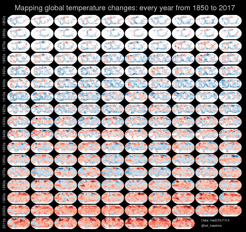
Meteorologists from the United States, Britain, Italy, Spain, Germany, Belgium, Hong Kong and Canada sported the patterns on Thursday while showing annual temperatures compared to the 1850-2017 average.
The patterns show a clear trend, from blue colors in the 19th century indicating lower-than-average temperatures to bright red colors in recent decades showing sharply warmer temperatures.
Ed Hawkins, a climate scientist at the University of Reading, England, said Friday that over 100 ties alone were sold worldwide.
The event, which used the hashtag #MetsUnite on social media, was the brainchild of Jeff Berardelli, a meteorologist with CBS12 in Florida.
You may see this a lot on your feed today. This "warming stripes" design was created @ed_hawkins. It shows the average global temperature from 1850 to 2017. The earth IS getting hotter #MetsUnite @WeatherProf pic.twitter.com/SsH1Pk8bo9
— Lauren Olesky (@LoleskyWX) June 21, 2018
You can see this guy Jeff Berardelli sporting one of those ties.
Amazing response to #MetsUnite – lots of meteorologists discussing climate change today while wearing stripey ties, earrings & necklaces (available here: https://t.co/mcjRLPgyOg).@WeatherProf has done a great job organising! Summary: https://t.co/gGuLKNSP8S pic.twitter.com/xgA0F1jCxT
— Ed Hawkins (@ed_hawkins) June 21, 2018
TV meteorologists made a colorful statement about the impacts of climate change https://t.co/SgAv5sjNvr pic.twitter.com/TrMVNptwjr
— Ed Hawkins (@ed_hawkins) June 26, 2018
Thank you to everyone who participated in #MetsUnite! Special thanks to @ed_hawkins pictured in photo. Amazing work by @JillPeetersWX at @CLIMATEwBORDERS who rallied the World! I'm grateful! Hong Kong, Taiwan, Germany, Brazil, Andorra, Belgium, UK, Canada, S. Africa, Italy, USA! pic.twitter.com/P6F6V1LRbK
— Jeff Berardelli (@WeatherProf) June 22, 2018
And that TV meteorologist campaign, which Climate Central had a hand in promoting,was a step too far.
Congrats Ed Hawkins, you’ve really stepped in it.
Here’s a good design for a tie for TV meteorologists, who report actual temperatures in Fahrenheit to their viewers daily. It’s the plot of global land and sea temperature done of the scale of an actual thermometer, instead of the magnified scale of anomalies covering just 1.5 degrees, seen below it.
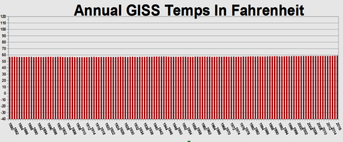
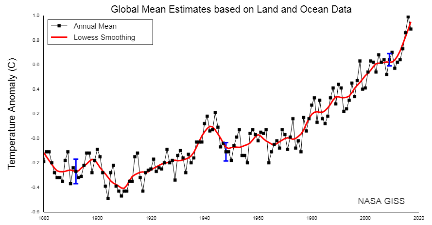
Now THAT’S a difference would tell the TV viewing public a lot.
If it is established Science, why are they needing to ‘educate’ meteorologists OR the public?
Such PR tactics are the hallmark of propaganda, not Science.
Why should the public be expected to know the science, established or not?
The graph of the red lines is just foolish. That, if anything, is propaganda. It should be titled, “Hide the increase.”
The last GISS chart has been stepped on so much it bears little connection to reality. As most of the actual hard data prior to the satellite era is from the US, showing the 1930’s as cooler than the present is pure “adjustment”.
The tie shows what happens when you believe your own adjustments.
George – that is a real problem! When historical data is being ‘adjusted’ all the time, a serious truth seeker cannot determine if temperatures are going up or going down. That applies to me. The original data is not available, and the rationale for the continuous changes is not published in detail. The existing ‘data’ is valueless.
Nevertheless, since CO2 is nowhere near historical highs, nor temperatures at historical highs, I can’t accept the linkage the CAGW people demand is obvious. When statements come from them that more CO2 will kill plants (despite commercial greenhouses pumping CO2 in to promote growth) or that warmer water will absorb more CO2 (despite the evidence of my Soda Stream) – and a hundred more – I know the CAGW group is wrong. They don’t even laugh at these clear examples of stupidity.
Silber,
You said, “Why should the public be expected to know the science, established or not?” That is something that you should ask of the NSF since they are the ones encouraging meteorologists to ‘educate’ the public.
I would say that the thermometer analogy is putting the increase in context. Most people can see that. You might ask yourself why you are context impaired.
They won’t be explaining: Milanković cycles, solar cycles, the Younger Dryas, ocean circulations, global air flow patterns, evapotranspiration, … They only talk about their CO2 hypothesis; despite being unable to give the GHGE any kind of scientific definition, and their rejection of Popperian, and Feynman ideas such as falsification. They are more Lysenkoist than scientist.
A climate modeler will lead AR6. Their apparent leader: Gavin is a mathematician. I noticed the IPCC’s 6th report authors includes Professor Benjamin Sovacool, who had this junk paper retracted in 2016, disccussed here: Pro-nuclear countries making slower progress on climate targets.
“Why should the public be expected to know the science”
Damned good point, and why I totally loathe the idea of Popular Science and feel it’s degraded science enormously over the years..
Why not teach them ‘sport’ or ‘medicine’ or ‘economics’ ? Why is it SO important that every lazy clod in an armchair be fed science factoids ?
I threw up a question to a friend who was utterly convinced that STEM subjects need to be really pushed on girls at school because they’re under-represented in science.. recycling an objective that occurred while I was in high school which produced no increase in numbers but which wasted a lot of people’s time with an idiotic process – rich in process, poor in outcome.
I asked what we were doing about sewage workers? My humble investigations revealed there were almost NO women in this field. I was met with a thin lipped stare.
Kristi are you so unaware of the bias that you cannot see that the tie is unscientific poppycock. The graph is a true representation with no distorted scale. What is so hard to understand about that?
Wrong David. They are both accurate. One in meant to highlight the change, the other to mask it.
[nope, you’re wrong – the graph of annual GISS temperature is actual unaltered data, i.e. not a statistical construct like an anomaly plot is -mod]
So is it accurate or is it “unscientific poppycock”?
[the latter, see this: https://wp.me/p9SOJY-PXs -mod]
Um, no. It accurate alright. As accurate as the “actual thermometer” graph.
Zazove you do realize that the source of your graph is the same Ed Hawkins who created the goofy ties don’t you?
And take a moment to look at the figures on your graph. Do you really believe we have thermometers in all of the areas shown on those pictures?
Your graph is just more BS propaganda.
Ha ha ha,
how many land based thermometers were there in 1900?
there were ZERO sea coverage in 1900, which means 71% of the surface had no coverage, while large areas of the land surface didn’t either.
Your chart is bogus
@zazove: a graph of *global* temperature in 1850? *global*? Does the author of that graph even know what *global* means? Whoever drew that graph up was either inexcusably ignorant or deliberately deceitful. Either way publishing it destroyed his or her credibility.
zazzy doubles down on GISS fakery and prestidigitation flimflammery.
zazzy, actively supports GISS tenths of a °C anomalies that are well within instrument error bounds.
Pure propaganda!
And definitively unscientific poppycock!
Maybe someone with some skill can turn the 10K year chart into the same sort of scale, suitable for ties and such?
ATheoK: Your GISP 2 graph’s most recent temperature is only for the year 1855–only at the start of the industrial revolution. Also, that temperature series is from merely a single site in Greenland, and so is not well representative of the whole globe. A great many scientists have used a great many types of data from a great many sites around the world, to give a much more accurate picture of the past 20,000 years.
And your point regarding the GISP2 Greenland graph is?
Basically, you can not refute the graph, except a vague evasive claim that “great many scientists have used a great many types of data from a great many sites around the world, to give a much more accurate picture of the past 20,000 years.”
Your claim regarding 1855 is absurdly specious. Apparently your chart reading comprehension skill is weak; as the chart clearly defines a “modern warm period”.
That refers to recent temperatures.
Which officially should not be spliced onto the chart, but are included to provide perspective.
Nor does the site you link to provide definitive evidence.
Cherry picking, bafflegab and hand waving does not rebut or invalidate the GISP 2 Greenland core chart, nor is it an accurate response to Dr. Christy.
Bringing us back to the GISP 2 Greenland chart accurately depicts temperatures, as the comparison to the Antarctic Vostok demonstrates.
http://www2.umaine.edu/GISP2/images/bendernsf.gif
Oh Kristi, you’re so adorable. The barchart illustrates that the magnitude of the increase is insignificant. It’s far from being deceptive, especially if the temperature scale ranges from the record low to the record high. It would be deceptive in the same way that CAGW charts are deceptive, if the scale were to go from 0 to 10^6 Kelvin, so that compared to the sun, earth appears to be at about absolute zero.
An improvement on that chart would be to include a line for the high temperature of the year and a line for the low temperature of the year. Then we can see that not only is the increase in average temperatures not significant, but that it is about 1/100th of the annual range that also hasn’t changed significantly.
The graph of the red lines is just foolish. That, if anything, is propaganda. It should be titled, “Hide the increase.”
Do you know what that graph is showing ? Is the graph showing something that is false ?
I think that a graph representing 1.5 degrees as a LARGE interval is “foolish”.
Let’s do a graph of how much my watermelon has grown in a day. Let’s draw the vertical axis in such a way that 0.005 inches in the world is represented by 2 inches on the graph. Note the growth of the melon in the morning, and then note the growth of the melon by sunset. Draw this on the graph. WOW ! That’s a HUGE increase ! … ON PAPER ! … according to the way we have chosen to draw the scales on paper ! In the world, though, it’s still not very much.
To look at the paper representation, then, instead of the world of REAL sensory comparisons, according to REAL sensory intervals, is … “foolish”.
The graph with the BIG intervals on the vertical axis (representing small increments) should be titled, Hide the Intelligence.
That the world has warmed up since the depths of the little ice age was never in doubt.
The claim that CO2 is at fault has never been proven.
Extend the timeline back 5000 years instead of 150, and you get an entirely different and much more accurate picture of climate and temperature.
Yes! What he said.
It’s standard that most Democrats believe in CAGW and most Republicans don’t. link
Anyone who says they think CAGW “education” is not political is deranged, lying, or has been living under a rock.
One could interrupt the tie to mean that since President Trump is MAGA, that Americans are wisely moving to the Red Party (Republican; or more importantly, Conservative).
In rebuttal to their tie I think Melania’s coat is much more stylish.
michael
Maybe it’s relates to IQ.
Climate Central is on Palmer Square in Princeton’s high rent district. The university owns most or all of the buildings. As Princeton has become a liberal mecca, I’m sure that there are many non-profit organizations that will hire the current staff. Perhaps they can join Michael Oppenheimer.
The Tie is a Lie!
If the tie really represented the temperature it would have blue areas alternating with red areas all the way down the tie.
And they ought to put some starch on the tie and curve it into a Hockey Stick shape. That would really stand out while you are reporting the weather.
I think Scott Adams has a trademark… https://www.amazon.com/dp/B018DEYPBY
That’s an even better idea than starching your tie: Printing the tie on a tee-shirt! That way your Hockey Stick never sags. 🙂
How the mighty have fallen. From the original lofty science proclamations of the IPCC to PR gimmicks. The flood of self-serving blatant politically motivated PR outfits – bankrolled by taxpayer-funded grants – is all they have left.
They all should be charged with Crimes against Humility.
That would be the Dilbert model.
NASA GISS-
“At 1.1 dégrées C above the 1951-1980 Average, February 2017 was the second warmest February since modern record keeping began almost 140 years ago.”
I can’t wait for the Report for February 2018.
The two year global cooling of .56 degrees C. since January 2016 might be recorded but I am not holding my breath.
Who can remember six months ago Herbert? When the sheeple are told that February 2018 was the warmest month ever, they will nod and then just keep reading about Kim Kardashian or whatever mindrot is being pushed out at the moment.
Lately I have noticed that the weather app on my iPhone consistently predicts higher temperatures than we actually experience. A couple of weeks ago we had a case where it showed 98F (37) and in reality it reached 89F (32). Back in February it was not uncommon to see the current temperature in the middle of the day be below the predicted low or for all of the hourly temperatures to be far below the predicted high. I thought at the time that it was just a technical problem that for some reason their algorithm estimates the temperature at my house consistently warmer than reality based on whatever weather stations they use. Now I wonder is it UHI effect or is it an artifact of Climate Change (TM) “education”?
What the heck did they spend $4 million on?
hey, “communicating” is a thirsty business.
I don’t think the tie communicates global warming all that well. To someone tuning in for tomorrow’s forecast, all they see is a lot of blue and a little bit of red, so the visual, “Just that little bit of red? That’s it?!?” The ties just don’t send a punch-in-the-gut message.
Now if the tie were to catch fire… maybe that would get the point across, but I don’t expect to see flaming weathermen trending any time soon.
Surely their pants should catch on fire so the great unwashed know the weather forecasters are being economical with the truth?
Careful, they’ll be accusing you of wanting to burn CAGW martyrs at the stake!
err people in data viz dont care what you think.
your opinion is meaningless. sorry.
Yeah well, ya know, that’s just, like uh, your opinion, man.
And I don’t care what you think. So your opinion must be worthless, no?
steven mosher: “err people in data viz dont care what you think.“ (emphasis, mine)
That’s a bug, not a feature if one is trying to communicate with visuals. Feedback, positive or negative, is essential to those who want to know if a message was delivered successfully. You might ask yourself why marketing firms do post-advertising surveys to gauge the effectiveness of their campaigns. Is it because they don’t care what their target audience thinks?
How much of that $4 million was budgeted to measure the success of that data visualization? Probably zero since data viz people don’t care what their intended audience thinks.
Anyhow, wanna bet that people would be more inclined to tune in to a weathercast if there was a chance that the presenter’s tie might burst into flames? An oddly striped tie just isn’t as compelling, IMO, of course.
The jock strap version looks a lot better if you wear it upside down.
HA!
I think the red end of the tie pointing below the belt line is subliminal messaging….
In that case it would be shaped like a bell
The only thing established is that when a problem is too difficult to analyse scientifically a consensus is formed to try and utilize the “wisdom of the crowd”.
The problem with such wisdom is that the earth is flat, there is no light speed barrier, the sun oxidises hydrogen for light and heat, and a host of other beliefs that are faulty but seem to be common sense.
I finally got where the scientists who support global warming are coming from. They have all collectively thrown up their hands and formed a cabal to push the idea that best suits their needs. The scientists realize that weather is too chaotic and the variables too numerous to establish models that are accurate.
It is so nice to finally know why so many supposed scientists can be so wrong yet feel that if they meet the problem “shoulder to shoulder” they will prevail.
LOLOLOLOLOLOL
Lauren needs the stripe dress.
The latest in obtuse ‘virtue signaling’ attire!
The good news: Stains won’t show much……
Gee, I wonder if this “public education” campaign included these meteorologists telling the public that we have been coming out of a Little Age Age since the 19th century. What is the Earth supposed to do when its coming out of an Ice Age (Little or otherwise), get colder?
My tax dollars are being used for this? Jeesh.
“It’s the plot of global land and sea temperature done of the scale of an actual thermometer, instead of the magnified scale of anomalies covering just 1.5 degrees, seen below it.”
A graph like this is only correct if it shows true zero, i.e. 0K or -459.67F. On that scale, the fluctuations of modern climate are truly trivial.
I have always found it most appropriate to graph data using a scale that encompasses the range of the raw data. That way you can plot both the raw data (or min/max, standard deviations, etc.) and the average on the same graph. This gives a clear depiction of the character of the data in terms of both mean and dispersion. The use of anomalies is essentially looking only at the noise while ignoring the variability of the underlying raw data.
No Walter, in that case, it would be deceptive because the scale doesn’t represent the normal range of temperatures.
The whole idea of using the same range as a traditional glass thermometer is that it automatically puts things in perspective to how people experience temperature variation.
Sadly, few people use a glass thermometer any more. We rely on smartphone apps that give us an estimate based on regional measurement stations, or we have electronic devices that give a digital output. Maybe that explains why Kristi doesn’t get it.
err no.
for time seroes with a trend see william clevelands empirical studies on data presentation
“banking to 45 degrees” is a key concept.
of course he did empiric studies.
you only have opinions. nobody who understands data presentation cares about your opinion
I think it might be a better reflection of the populations political leanings with the passing years….?!
Nicely done Anthony! Yabba dabba do!
I prefer this one:
Compare the “thermometer” graph with the US Standard Atmosphere, set in 1958, which sets the standard sea level temperature at 15 degrees Centigrade/59 degrees Fahrenheit (as does the ISA standard….). Used in all aerodynamic studies (well before 1958!).
Ties seem an anachronism. My father wore a suit and tie when he went on an airplane — mid- last century. Now does anyone other than the pilots?
I had a few, once.
Nice colors. Red, White, & Blue
http://www.onlineworld.com/jiffy/productfiles/Jiffy%20Steamer%20Logos/USA%20Flag.jpg
Source: got a 404 error
While the senators are well within their rights to challenge the manner in which public money is being spent, I wish that they’d made an additional point in their criticism.
That graph is not science. Nowhere in math or science is data represented in such a fashion. It has zero value. It is nothing more than a representation of data with no context, no trend line, no error bars, not a single thing we expect from scientific presentation of data. In fact, to turn the tables on Ed Hawkins, can he show us a single instance in peer review literature of data being presented this way? David Appell was screaming in an earlier thread about peer review, well I challenge anyone to show in any peer review journal that this depiction is science.
It is not intended to be science, any more than the silly graph in the article that hides the increase in anomaly.
It’s meant to send a simple message and a true one:
It is getting warmer.
Yes there was an LIA, yes it is warmer now.
That’s the message
Not complete,
Not quantitative
A simple sentence, turned into a picture: It is getting warmer
There are many ways to over complicate that message.
But it is getting warmer.
There was an LIA
The tie doesnt blame humans
The tie doesnt blame c02
The tie doesnt call for tax increases
The tie doesnt promote EVs
the tie merely says
it is getting warmer.
and it is.
There was an LIA unless you want to deny that too.
If your message is “Its getting warmer” and your goal is to spread that message,
you probably DONT want a typical science graph.
But any case, do you own graph, visual, that depicts it is getting colder if that is what you
believe. But climate changes, right? and it is getting warmer, right?
there was an LIA right?
so make a visual that shows this: no words, no numbers, just a visual. that
is what data viz does.
Steven, you know darn well that if the ONLY message that they were trying to spread was that it was getting warmer since the LIA, there was no point in Climate Central providing funds. What sentient person isn’t aware that it gets warmer after a major cold period.
Of course the tie was intended to reinforce the larger, published message of Climate Central about human caused warming and the need for humans to change how they live in this world.
“the tie merely says it is getting warmer”
I only see a tie with red and blue stripes on it. Nothing to indicate what it represents.
You are assuming that everyone will see blue as cooler and red as warmer – the tie does not state that nor should it be assumed that the ‘scientifically untrained’ will see what is intended.
As for what you say the tie does not blame, call for, promote, etc – all of these are implicit in the ‘getting warmer’ message being touted.
You also agree that there was a little ice age and that the Earth has been warming since then. This has been with no help from CO2, at least up to 1950 or so). The tie wearers are not likely to include this in their fear-mongering as it detracts from the CAGW message.
“It’s meant to send a simple message and a true one:
It is getting warmer.”
“the tie merely says
it is getting warmer.
and it is.”
Because the little symbols that humans create to “raise awareness” of this or that, as a direct attempt to produce some sort of action, don’t have an agenda behind them?
E.g., the “Pussyhat Project” that’s become popular lately has no other agenda than to say, “Look at me, here’s a Pussyhat on my head”?
Because “the [hat] merely says,” there’s a p*ssy on my head?
Or the various ribbons that individuals wear upon themselves (reference any number of diseases, social causes, etc.) don’t have any other meaning than to say, e.g., “Look at me, here’s a [x colored] ribbon on my shirt”?
You mean like that?
Because this symbol is completely different from all the other attempts at symbolism to produce action?
“The tie doesnt blame humans
The tie doesnt blame c02
The tie doesnt call for tax increases
The tie doesnt promote EVs”
The tie is accompanied by the meme, Steven.
But you knew that.
What a load of manure mosh.
The goal is to sell the political program and you are totally aware of that fact.
It is getting slightly warmer but that is not the “message”. The message is:
Stop burning fossil fuels, we need more socialism!
Steven,
You lost a lot of credibility with that spew.
The graph depicting the annual temp data is honestly and accurately representing the GISS annual temperature from 1880 to 2016. Nothing more. Nothing less. It is easily understood by anyone who can read a thermometer and illustrates with crystal clarity how meaningless the claims of ‘catastrophic anthropogenic global warming’ are in clear, unequivocal terms.
And then you attempt to defend a silly virtue-signalling tie as anything but just that? Pathetic…
The ‘anomaly’ that should be noted here is how the honest graphical depiction of GISS annual temp data foments such frothing fury amongst the cadres of the CAGW faithful.
It’s meant to send a simple message and a true one:
It is getting warmer.
Bull. Sh*t. It is meant to send a simple message. Bad things are happening! Alarm! Alarm!
The two graphs above are both reasonable representations of the data. In fact, when I showing people that it is getting warmer, I prefer to use BOTH. It prompts a reasonable discussion of how much it is warming and is that significant. This tie just screams alarm and presents data on no quantifiable way for analysis or discussion.
Another poster said you lost a lot of credibility by defending the tie. You did.
It is not intended to be science, any more than the silly graph in the article that hides the increase in anomaly.
Again, how is the graph with the red lines, with sensibly-scaled vertical axis, … “silly” ? Are sensible scales of reality … “silly” ? How is a 1.5-degree anomaly, represented as a huge vertical interval, less silly ? Is it a matter of great seriousness to call an interval of 1.5 degrees an anomaly, in the first place ? THAT’s silly.
An anomaly is something that is a deviation from the normal or from what is expected. The use of the word, “anomaly”, in the context of climate science, is ITSELF an anomaly, because climate science has murdered the term and resurrected it to mean whatever false expectations have been engineered via erroneous concepts and erroneous models. Yeah, if it does not agree with the expected outcome of some erroneous projection, then it is an … “anomaly”, … with respect to that false expectation. But is it, in FACT, an anomaly, compared to the REAL world of REAL-world expectations or REAL-world norms ? — NO.
Climate science has abused the word, “anomaly”, just as climate activists have abused the phrase, “climate change”. These people are just making these words mean whatever they want in their false narratives. They are hijacking language with crappy meanings.
As for the intention of using the tie, think context. The tie exists in a context that has every one of the intentions that you deny. It is a symbol, and a symbol that is presented in a well-defined context is loaded with those intentions that you deny. You KNOW what the intention is in using this tie, and then you try to say that the tie is just a simple statement of unqualified fact making a fashion statement.
Your claim is bull, and you know it. It’s just a desperate attempt at mounting a defense — by reducing the hidden intentions of the symbol to the bare physical representation of the statement. Again, I’d call it Hide the Intelligence.
the red graph is silly because it hides information. for good rules on axis selection when a data series has a trend, see tufte.
or any textbook.
anomalie is a perfectly fine term, its a technical term . not abused at all. but you can do the same thing in kelvin if you like.
as for context and intention, now your mind reading. not very scientific.
if you have a real argument come back and try again.
Oh give us a break Steven. You’re not as obtuse as you pretend to be.
When presenting data in a scientific analysis, of course it makes sense to scale the chart as you say.
But when the objective is to make a political case that the change is dangerous and unprecedented, it is dishonest to present a graph like that without providing any frame of reference.
The two charts shown together would be an honest way to clearly show the increase while preserving the context. But you would oppose that because it would undermine your call for action, right?
Steven,
Are you blind… or just being deliberately silly, in refusing to accept the blunt fact that there is no trend of concern to any reasonable human in the honestly presented GISS annual temp data?
The graph is accurate. The triggered CAGW proponents are silly….
Steven M,
Your final statement in your reply to me was, if you have a real argument come back and try again.
Well, I’m baaaaaaaaaaaak. And my “real argument” is to show how your argument is pretentious. I don’t believe that you believe some of what you say — you use assertion as justification, … repetition as further support of your claims, … and feigned confidence as expertise. I’m not buying it.
Let’s break it down:
the red graph is silly because it hides information. for good rules on axis selection when a data series has a trend, see tufte.
or any textbook.
“Hides information” ? No. You mischaracterize the word, “hide”, … doing exactly what I said some people are doing with the word, “anomaly” and the phrase, “climate change” — namely, you are asserting your own confidence in its use for your own purpose, in such a way that you exaggerate. NOT showing a small increment by adjusting an axis to reasonably represent a sensible interval in the real world is NOT “hiding”, as you say. Rather, it is sensibly representing the real world.
If we measure watermelon growth in a sensible way, say, using inches, rather than 0.005 inches, then showing a graph of growth in inches does NOT hide the 0.005 inch increments — rather it encompasses these small incremental changes within a broader, more sensible context of the real world, rather than on a written page, which exaggerates the small increment into a unreasonable increase (i.e., “making a mountain out of a mole hill”). Mole hills are of no consequence, where the greater concern is REAL mountains.
As for invoking the authority of statistical texts, you assume that the data is significant to apply those texts, and that data is exactly what I am questioning is appropriate for your text applications to it.
We can graph trends anywhere. The point is why do we do it? If the trends are ridiculously small, then the axes should represent this in correspondence with our greater understanding of the world, NOT in correspondence with blind servitude to statistical rules, where we elevate those rules above what the trends actually represent, which, in this case, again, is the proverbial mole hill.
anomalie is a perfectly fine term, its a technical term . not abused at all. but you can do the same thing in kelvin if you like.
Merely reasserting your confidence in the term in how you use it does NOT overcome my objection. You are just repeating yourself, hoping to exhaust my questioning by sheer repetition. Not working. I’m still questioning.
as for context and intention, now your mind reading. not very scientific.
I’m mind reading ? Funny. How is it that YOU are not mind reading, when you assert that the design on the tie has zero intentions behind it, other than representing that things are warming up? Please, give me a break ! If you choose to deny the context, then feel free. The context is quite clear to anyone who is not in severe denial. No mind reading required — it’s right there in your face. And I KNOW that you see the context that I am talking about — you are just denying that it’s there and using your denial as a false definition of my insight — substituting YOUR denial for my insight, and trying to make me believe that your denial is my insight. Not working. Only a blind person cannot see the context. Only a person in denial cannot see the context.
Here’s your context, plain as day:
https://www.climate-lab-book.ac.uk/2018/warming-stripes/
The colour scale represents the change in global temperatures covering 1.35°C
https://www.mediamatters.org/blog/2018/06/25/On-TV-networks-across-the-nation-meteorologists-made-a-colorful-statement-about-the-impact/220533
“On air and on social media, meteorologists donned ties and necklaces and showed off coffee mugs featuring the red, white, and blue stripes. The pattern, created by climate scientist Ed Hawkins, uses a color scale to illustrate rising global temperatures driven by climate change from 1850 to 2017.”
“[Today is] a day where meteorologists across the U.S. are uniting as real scientists to say that climate change is real, it’s happening now, it’s us, we’re causing it, and if we act now, we can actually do something to reverse this.”
“We will continue to enhance the message that we need to act on climate. Climate change is real, it’s us, and it’s serious.”
You see, the phrase, “climate change”, is directly linked to human beings — it’s OUR fault, and WE can do something about it. A bunch of professional meteorologists unite to spread the word about “climate change”, defined as our fault by the IPCC scientists, whose science is put forth to attribute the change to us and to attribute the responsibility to make changes to us, now reinforced by this united message by professionals pushing this so called science into public awareness while collectively sporting these ties, necklaces, and coffee mugs, all symbolizing what the IPCC science says, thus symbolizing the science, thus making the damn tie a symbol of the science that blames us and holds us responsible for making changes.
How is that design not science again? How is that design not blaming us again?
Far from hiding things, the red graph is actually a superb tool of exposure – it puts the temperature change in context and shows the layman that the increase is trivial. It exposes the alarmists’ screaming for what it is: unwarranted hysteria.
But hey, you knew that.
Might want to leave nitpicking apologetics to Nick from now on. He at least makes an effort.
No, they report ACTUAL temperatures. Absolute temperature is scientific reference to the kelvin scale.
Please don’t further muddy the discussion by attempting to correct someone by being incorrect yourself.
I’m no mathematician or scientist, but the anomaly scale doesn’t look right. Judging by the actual temperature it’s measuring, shouldn’t it be about 1/20th as high, if that?
“Climate Central” gets federal funding? That blatant propaganda site! Are you kidding me? That’s outrageous!
And while they’re shutting down gov’t-funded political propaganda sites, they need to also shut down the JPL “Global Climate Change” “Vital Signs” propaganda site, and the propaganda pages at NOAA, too, like this one.
What about npr?
NPR keeps the sheep in line
the Hatch Act, the federal law that prohibits federal employees from taking public political positions,
so why didnt Hansen get done under that act?
or the EPA lisa and friends?
Cool tie!
It exactly points to where the brain of warmistas is located!
/sarc
Ties are sexist
If someone steps outside an hour later and it’s 2 degrees warmer, one doesn’t think, OMGosh it’s gone from blue to hot-red. They probably won’t even notice the difference.
It is NOT about education, it is all about VIRTUE SIGNALLING
Giss is basically fiction. Before 1980, data from weather stations at airports, ect. Thermometers read to the nearest degree F, huge coverage issues. The most generous error bars I would give it is +/-0.5 C. After 1980, UAH, better error bars and much better coverage, is flat to 1998, spike then flat at a couple tenths higher till 2016/17 spike, very slightly higher, that is now coming back down. The “warming” is barely statistically significant, never mind the comparison to temperature variations over the last 10000 years or so.
Oh, and peer review, at best it is only advanced proof reading for glaring logic, math and data errors. It has never had anything to do with verifying scientific accuracy or truth.
Wait, what? How can there be more plant growth when it’s settled science that the temperature 175 years ago at every point on earth was at its optimum for all life on earth?
Oh I get it now, agricultural crops don’t behave the same as POISON ivy, and nuisance levels of pollen only come from undesirable plants. Is that it then?
I see our local weathergirl Jill Peeters (@JillPeetersWX) is involved. She doesn’t even know the difference between weather and climate and ties every extreme event to global warming… A few years ago she made a report about the floods in S.W. England and said that was a result of global warming, while and English professor said that it was just bad weather as the train of rain was following the jet stream, like as it happened before. The mian difference: marshes were meanwhile dried for agriculture and rivers were now above land height…
Jill Peeters is one of these deep green, near religious adepts of global warming, but her CO2 footprint is in ratio to her belief: travelling the whole world to chase twisters…
Ferdinand, shame on you. Weermeisje?
Jill’s a WEATHERWOMAN with a warm heart for the climate.
And by the way, you Flemings are not as advanced socially as you think. Over here on the barbarian side of the Atlantic, we haven’t used gender-specific occupation names for decades. The weatherman has long been the meteorologist, the fireman is the firefighter, the mailman is the letter carrier, the milkman is the…well we don’t have those anymore. On npr you’ll even hear of fishers rather than fishermen.
Rich Davis,
OK, I admit that “girl” in this case was intended negative, must be my own bias against that woman…
But for the rest, not too fast in your conclusions…
We have firemen and firewomen, fishermen and fisherwomen, truck drivers in M/F (vrachtwagen bestuurder/bestuurster in Flemish/Dutch), while nurse still is used as only female in (American) English or you need to specify a male nurse, while in Dutch no problem (M/F is verpleger/verpleegster). We also have a few non-gender specific professions like vissers (fishers), postbode (literally “post carrier”). But also sometimes strange sounding combinations: if they want to hire “metsers” (masons) and do add M/F, but that has the same problem in (American) English…
And BTW, if a woman gets married here, she still can/does use her own maiden name, while in the US she gets only/mostly known as Mrs X, as “attachment” to her husband X, even if she is already 20 years divorced from X…
Of course you knew I was being playful in my chastisement, I hope. Vlaanderen is one of my favorite places to visit, Brugge and Gent especially.
Ferdinand,
The era of Armand Pien is definitely over. I appreciate Frank Deboosere, I figure he isn’t an alarmist. In the Netherlands, the weather forecasts themselves are ‘gender-neutral’ as warm- and cold-fronts no longer exist, too complicated to grasp.
Baseline for the anomaly graph? Bueller? Bueller?
I thought we just had this story here a few days ago.
https://wattsupwiththat.com/2018/06/21/republican-senators-demand-a-probe-of-federal-climate-grants/
“…Each stripe represents the temperature in a particular year, demonstrating how different locations and the planet has warmed over many decades…”
How does the tie represent warming at “different locations?” Lol
… classic illustration of FALSE representation.
Fraud by negligence, or representing as fact that which a reasonable person should know or be responsible enough to learn is false.
This tie could easily be confused for an increase in daily caloric content by mankind, or the decline in poverty since the dawn of the industrial age, or the benefit of energy usage by humans around the planet tied to market forces and global wealth.
No one ever accused leftists and lemmings of being bright.
Why limit agency research funding reviews to the NSF? Far too much government research funding is dominated by “What if” studies. NSF analyses of future global warming threats that assume CAGM is a given even though that premise is demonstrably hypothetical and may is likely just one of many examples of waste of government resources. Spewing out misinformation on global warming on 500 TV stations nationwide should be a crime for fraud and abuse of government grants that warrants investigation by the Office of Inspector General. Reviewing the work of the other 32 agencies under the Inspectors General Office might also be a good thing to do.
https://imgur.com/nvAq9cH
In the graph above, the rate of increase (first derivative) of the global mean temperature trend-line equation has been constant or steadily decreasing since October 2000. The HadCRUT4 temperature anomaly has decreased by nearly 40 percent from March 2016, the El Nino peak, to July 2017. The rate of change of the trend-line will likely become negative within the next 20 years, reaching the lowest global mean trend-line temperature in almost 40 years. (draft ref: An-Analysis-of-the-Mean-Global-Temperature-in-2031 at http://www.uh.edu/nsm/earth-atmospheric/people/faculty/tom-bjorklund/) Lower temperatures could persist for decades.
The adverse consequences of a warming earth are no greater than the adverse consequences of a cooling earth. Policies appropriate for the warming case would be diametrically opposite to those appropriate for the cooling case, e.g., in the high case, CO2 might be reduced in the atmosphere to lower temperatures; in the low case, ice sheets might be covered with carbon black to accelerate melting and increase temperatures. Under these realities, promulgating environmental regulations with too little information could exacerbate a threat instead of reducing it. The likely damage from acting on the wrong premise, a warming or a cooling planet, nullifies arguments for either action until the science is right.
Until science narrows the estimated long-term temperature range such that mitigation measures are appropriate for the entire range, the best choice is to take no action. A good way to prioritize government funding might be to cancel all hypothetical “What if” projects in all agencies and focus on completing the research before prematurely running up an ill-conceived idea on 500 flag poles.
The one thing you can be sure of is they wear the PR crown. Think not for whom the bell tolls, it tolls for thee; unless we do something to stop this suicidal trip. No amount of data will change their mind; but they are nervous, which is why they are upping the ante. Time to nail our thesis on the door.
Shows how bad and misguided the propaganda effort is. It is nearly impossible to watch any kind of a science show, documentary, animal, ocean, mountain, etc on any science, public, children’s channel with the five minute discourse on how mankind is ruining what we are showing you in this presentation. This propaganda is even pushed on shows about the universe and even worse preschool children entertainment and education shows.
Why are valuable resources and energy being wasted to produce these ties in the first place? If he really believed what he was saying, then he wouldn’t be wanting to add to the problem that comes with the production of everything from food to clothing. It’s like Al Gore bemoaning sea level rise and then buying beachfront property. Follow the money, people. Follow the money. Oh! And the hypocrisy.
Rules for Warmists.
Tell them it’s not political. (Anything that changes public policy through government intervention in the economy is by its very definition political. If that intervention involves unnecessarily increasing the cost of energy, a key control knob for any economy, it is highly political. Divert, Divert!)
Baby steps. Mention warming in as many ways as possible as often as possible while taking care not to overdo it. Try to sell the same old story while making it look like something new, so new novel approaches are especially valuable. The tie thing is pure propaganda genius!
Timing. The best time to reinforce the warming meme is at or near the summer solstice as temperatures usually rise then and continue to do so for a while because temperature increases generally lag behind increases in solar insolation. Remember the summer won’t last long, especially during a Solar Minimum, so milk it for all its worth! It’s important to build trust by appearing to be able to predict the future. Later in the year when people can’t get out of their houses because they’re buried in snow it might be wise to lay off the warming meme. Move on to ‘extreme weather’. (It’s amazing that that little CO2 molecule can do!)
Target your audience: Don’t bother trying to convince retired electrical engineers about anthropogenic global warming. They know the difference between a Rankin cycle and a motor cycle and most even understand radiative physics. They also know that even if everything you’re telling them is true (although they know it isn’t) it would take thousands of years to melt the Greenland ice cap due to the limited availability of energy from the Sun. (It would take a very big rock from outer space landing right in the middle, but I digress). The point is they know there is NO CLIMATE CRISIS!
It’s probably best to avoid those with good skills in logic and critical thinking. Many of them realise that if we take the full global human production of carbon dioxide on planet Earth into account the best, most expensive, strident efforts in places like California, the EU (except Germany!) Sweden the UK and Australia are more than made up for by other countries like China etc. who are valiantly doing their very best to keep that CO2 plant-food coming!
Don’t waste energy on most employed people. They won’t rock the lucrative climate boat because they like being employed.
Focus instead on the young because they’re eager to learn and it will take them quite a while to catch on, especially if their brains have been freshly washed at university. Old stupid people or those with mental impairments are also worth a shot.
I could go on but I’m getting bored and there’s a risk that someone might add, getting boring.
Hmmm, and what would that tie look like if you were to take the prevous 177 years before 1850 and make it the year at the bottom?