Guest analysis by Mark Fife
This is the state of the world’s surface temperatures according to NASA’s Goddard Institute for Space Studies from 1880 through 2017. It is indeed a very bleak picture. As I see it, this is showing an exponential rise in temperatures starting at the beginning of the 20th century.

Of course, I am curious as to what this means exactly. As I have said before, looking at an average over time is certainly a valid way to do things, but it often fails to tell the full story.
Fortunately, NASA provides a visualization of the five year average variation of global surface temperatures. It doesn’t show what years you are looking at specifically within the time series, but you get the general idea.


The time series certainly does depict a bleak picture as well, especially for the most northerly areas of the northern hemisphere. Obviously, I don’t know how accurate this truly is or how accurate it is meant to be. However, taken at face value it would appear the US, Canada, and Europe are all facing temperature increases of 2° F to 3° F above the 1951 – 1980 average. Which is fortunate for me, because the long term data I have pulled from the GHCN covers those areas, though mainly the US. A dramatic trend such as this which heavily affects the very area where most of the data originates should be easily discernable.
The following charts cover 490 stations in the GHCN reporting continuously from 1900 through 2011. Most of these stations are in the US, though Canada, Australia, and Europe are represented. This is a substantial sampling of stations which indicate the number of warm days and extremely hot days have been steadily declining since the early 1940’s.


The next charts cover the daily high and low temperatures for the hottest month of the year and the coldest month of the year for 1067 stations reporting continuously from 1920 through 2011. Both charts also show high temperatures steadily declining since the early 1940’s just as the preceding charts. Both charts also show a steady increase in the daily low temperatures.
What is interesting to me is the 1930’s warming shows quite clearly in the chart of the annual warmest month but it does not do so in the chart of the coldest month. It appears that period of extreme high temperatures was accompanied by a series of extremely harsh winters. Winters cold enough to rival the coldest of the 1970’s. Similarly, the 1950’s through the 1970’s cooling period shows quite clearly in the chart of the coldest month but is not apparent in the chart of the warmest month.
One other interesting observation is how the coldest month varies so much more than the warmest month. The amount of year to year variation for the coldest month is nearly double that of the warmest month. I intentionally scaled the two graphs to the same 13° interval to highlight just how different the variation is.


The preceding charts from the GHCN depict data which simply does not accord with the GISS data. They certainly do not accord with the time series representation of the history of the US, Canada and Europe. GISS appears to have mostly done away with the 1930s warming. The 1950s through 1970s cooling appears to be gone. The post 1980s warming has disappeared as an individual trend in time, it has been now become just a portion of a curve proceeding uninterrupted from the mid 1940’s.
The post 1940’s warming shown by GISS is not reflected in the temperatures of the warmest month or the coldest month of the year. The post 1980’s warming trend evident in the coldest month does not follow the exponential pattern in the GISS chart. The rate of warming during this month clearly slowed down past the mid 90’s and appears to show a decided cooling trend since 2006. There has been no increase in warm or hot days.
So how, exactly, have the more northerly latitudes warmed in the exponential and supposedly dangerous fashion depicted by GISS? The indication is the hottest months of summer have become milder instead of hotter. It does appear the number of excessively harsh winters has fallen to practically zero, at least as of 2011. Perhaps, in addition to becoming milder, summer is now lasting longer. Perhaps, since winter has also become milder, spring is arriving sooner. Longer, milder summers and shorter, milder winters would usually be considered good things. If that is indeed the case any resulting increase in annual temperature averages should likewise be considered in the same light.
I am not really seeing good weather as a valid reason to increase taxes, drive up energy costs, degrade economies, cede our sovereignty to some world government, cover huge plots of land with bird and bat shredders, or to forbid the poorest nations on the planet the means to lift their people out of poverty.
Funny how raw data has a way of embarrassing the consensus narrative. No wonder the gravy express has to homogenise, correct, smooth, adjust and generally smear the living daylights out of it. When you see the hot ‘ thirties disappear you just know something dishonest is at work.
They are having to flat out lie now as the real world simply isn’t doing as the computer models dictate and no amount of smoothing is going to hide this much longer.
In any other field this would be compelling prima facie evidence of deliberate, high level fraud and of a culture of cowardly cover up, compliance and connivance in same.
Here in Oz we are watching with open mouths at the degree of similar, self serving, careerist corruption in our ‘big four’ banks.
Of course our media are salivating at every telling moment of cross examination, every admission of gormless ‘I did nothing’ by senior executives.
By comparison, it is quite staggering at the utter lack of comparable interest by the msm in the climate fraud.
Is anyone surprised at the double standard? (and I use the word ‘standard in connection with the media very loosely).
Here in Oz we are watching with open mouths at the degree of similar, self serving, careerist corruption in our……government weather forecaster, the Bureau of Meteorolgy (BOM).
They have failed to calibrate the swap-over of weather stations from mercury and alcohol thermometers to automatic electronic probes during the 1990s; failed to match the time constants of the two measurement methods; continually adjusted measured temperatures and kept adjustment methodology secret; and deliberately excluded the Federation Drought (1895-1902, similar to the 1930s in USA) from temperature records because of “record quality”.
The result of all this is a……..warming trend……. which is different to the raw temperature data.
And no interest in this scandal from the current conservative government or the msm.
I’m not sure that the banking RC is actually worth it. The worst offenses were caught and dealt with before it started. Now, the media are all over a bank losing personal information of 20 million customers. It turns out the mistake was not doing the paperwork to confirm a tape ( how old is the data?) of the information was destroyed.
Mark Fife
Hardly surprising, considering that, by your own admission, you concentrate on US stations but also include data from Australia! What method did you use to select the stations? What stations are used and why are others not used? What method for area-weighting did you use? We are not told.
Furthermore, your charts select for: i) daily high temperatures above a various temperature thresholds and ii) daily highs and lows from selected months in each year over the period; whereas the GISS chart shows the area-weighted global mean temperature for each month over the period.
You’re not remotely comparing like-for like here, so perhaps this is one reason your charts don’t accord with the GISS data?
Mark,
Your point is very well made – like-for-like comparison is not being made appropriately. However, that fact is not enough to explain the extremely significant differences in the swings and trends in the data presented over the 120+ years of study presented. GISS, to coin a phrase, looks like it’s on another planet where trivial issues such as El Ninos and pauses appear not to exist.
Read and you shall find.
“The following charts cover 490 stations in the GHCN reporting continuously from 1900 through 2011. Most of these stations are in the US, though Canada, Australia, and Europe are represented. This is a substantial sampling of stations which indicate the number of warm days and extremely hot days have been steadily declining since the early 1940’s.”
DonK31
And you shall find… that he selects 490 stations from a total of around 6,000 without any explanation as to how these stations were deemed preferable to the others, biases these towards the US but includes some from as far away as Australia, making no mention of any method of area weighting, selects and separates daily min/max either for the whole series or from selected months within it and, to round it all off, he stops everything at 2011 – more than 6 years ago. He then attempts to compare this record against a global, area-weighted and up-to-date monthly mean temperature anomaly series and is surprised to discover that they differ.
If it’s not already obvious, there are several reasons why Mark’s method produces results so dissimilar to the GISS plots. For instance, by stopping the data in 2011 he eliminates the four warmest years in the US GHCN record (2012, 2016, 2017 and 2015 in order of rank). That alone might be enough to explain the discrepancy with the up-to-date GISS charts for the US. The difference would likely be further removed if he compared monthly mean temperatures, which is what GISS show, instead of separating daily highs and lows. If he introduced area weighting, i.e. if he didn’t include Australian temperature data in his calculations, he might be better placed to compare his selected GHCN stations with GISS. Etc….
DWR54:
Criteria: “reporting continuously from 1900 through 2011”.
You might be the only one on the planet to not realises that is how few stations there are that actual have a record that long. Its the closest thing to what the raw data says.
Not comparing like to like is the entire point. There are multiple methods of calculating a value for “Average,” in order to spot trends through comparative analysis; and there can be many reasons, that the arithmetic mean might not be the most enlightening statistic.
So what you are saying is that numbers can be tinkered with?
Yes, everyone knows that.
Why should anyone pay attention to the numbers that are tinkered with eight ways from Sunday so that, with every new look at them, the historical records are altered in a way which just so happens to force the numbers into better agreement with the predetermined story told by the people doing the adjusting?
See, the thing I am noticing is that these graphs, taken together, look to be a close match with what was depicted in every textbook dealing with the subject, prior to them all be rewritten by revisionists after the advent of the CAGW gravy train.
These graphs we see here also jibe with historic accounts of the people who were alive at the time, and had to do such things as abandon a whole state en mass during the hottest time in modern recorded history.
A time when it is well know 100 degree plus temps were common from coast to coast and north to south.
So hot it changed history.
Compare that to the present “hottest period of time in history”, when unusually hot conditions are mostly existing in the childhood memories of people who were around a bunch of decades ago.
As I said, I am using only stations reporting continuously for the time frames covered. The reason I “chose” 490 stations from 1900 to 2011 is there are only 490 stations reporting for the entire time. Same thing for the 1067 stations. The reason I only go to 2011 is that is where the GHCN daily max and min data ends.
By the way, the GHCN daily max min records cover over 27,000 stations.
I also stated that most of the data comes from the US. That would be about 98% of the data.
I am also stated I am using the warmest and coldest month of the year. For the six stations in Australia the hottest month would probably be January. Six stations would clearly not affect the trend to any large degree. But let me ask you folks. If I am looking at summer as a specific time frame, why would I mix winter and summer? If I am looking at what is happening in the winter, why would I mix in summer months?
Obviously I am doing something different from GISS. That is the point of this. If I do exactly what they did I will get their results. Is that not patently obvious? But I don’t know what they have done. As far as I know theirs is a secret process.
And that is the point of this. Since their trend is so overwhelming, how could it not show in the raw data from those areas which, according to their visualization, are among the most heavily affected areas?
It was obvious to me, and it is astonishing that some critics here are so blind.
It is obvious a mostly US chart will look different than a global chart, and there’s no connection between the two. The estimated global rise is very small compared temporal and spatial fluctuations.
I believe though, that some milding has occurred widely and that using an areal yearly average anomaly misleads the public.
OMG the next watchword..
GLOBAL MILDING
Mark
You are correct to only use the stations that have been in continuous use.
That is why a retail based business that is expanding rapidly reports same store sales, by store, compared to total sales.
Otherwise you have orchestrated confusion.
Also look at the colour shift in the video for such a very small change in temperature, it is deceptive.
Regards
According to their visualization the US has warmed by quite a bit. Yet, whatever warming has occurred has not been a matter of simply getting hotter and hotter. Obviously, the hottest period was in the 1930s. It is also obvious the weather in the US has been hugely better for human and animal life in the over the last three decades than the first three decades of the 20th century. Compared to my parents and to my grandparents time we are living in a better period of time right here in the US.
Yet, that is exactly opposite to what GISS is saying about life right here in the US.
So, you are willing to admit they are completely wrong about the US, which just happens to be where the vast majority of information on conditions from those times comes from but are unwilling to entertain the idea they might be completely wrong about all those other places where there is less information? And that doesn’t sound just the tiniest bit spurious to you?
I really do mean no offense, I am a debater at heart. I am being completely honest. I am wondering what you would need to see in order to doubt what you are being told. The land data from the US represents over 90% of the existing long term, continuous, location consistent information we have. Such data just does not exist anywhere else. The ocean data, by its very nature, consists of single point, single moment observations for the vast majority of the time being covered. It isn’t as if there were thousands of buoys anchored at fixed points where daily measurements were taken. Where do we have any continuous, fixed location measurements of ocean temperatures to compare against? If you have access to such a record please let me know.
I am going to make this statement. You absolutely cannot create an accurate time series measurement of anything without first establishing a consistent means of measuring it. I have completed hundreds of time series studies covering a variety of physical measurements in my 30 plus years as a quality engineer in an environment where being right or being wrong is painfully obvious in real world, tangible results. There are basics necessary to that process to ensure accurate results. I see no evidence those basic requirements have been met. Thus any results are suspect, especially if they are so easily contradicted.
Mark,
Thank you for a clear and straightforward essay. I’m a layman and rarely understand the more technical details presented on WUWT.
It’s my understanding that there are considerable concerns regarding to the data used from ground stations. e.g. the urban heat island effect on some but not others; the transition from mercury thermometers to digital recordings; the historic upkeep of Stephenson screens, even to the paint used on them; the vast areas of the planet with no measuring stations which have homogenised (is that the correct term?) data allocated to them; the diligence in data record keeping before the current AGW alarm (e.g the tea boy sent out in the snow and rain to record measurements) etc…………………
Science being what it is, I find it difficult to believe the IPCC and contributing scientists who claim to be able to not only interpret the data down to tenths of a degree over the last 100 years or so, but then project that data out to the next 50 years with any degree of confidence.
analysis by Mark Fife
“YUP”, and a sad, sad, sad state that is, …. as you correctly pointed out in your published commentary.
The creation of the US Surface Temperature Record, circa 1870 to post-1960s, was the primary mission of the National Weather Service, to wit:
The beginning of the National Weather Service
http://www.nws.noaa.gov/pa/history/index.php
For the 1st 100 years of the NWS, the local recording of thrice daily near-surface air temperatures was a haphazard event, ….. using mostly uncalibrated thermometers and civilian volunteers for the recording of daily surface temperatures of +-2 degrees F, …… simply because that was “close-enough” for “government work” for generating 3 to 7 day weather forecasts.
“DUH”, both yesterday’s surface temperatures ….. and yesterday’s weather forecasts …… are not worth as much as yesterday’s newspapers. There are dozens of good uses for old newspapers.
Post-1970 calculated US Average Surface Temperatures have a 50% chance of being reasonably correct, …….. but pre-1970 calculated US Average Surface Temperatures are utterly FUBAR …… regardless of how many modifications that NASA or the NWS make to the US Surface Temperature Record.
Mark Fife – May 2, 2018 at 4:27 am
And here is a published article that supports the claimed dastardly, devious, dishonest, disingenuous actions/activities of NASA employees, to wit:
The Corrupt History Of NASA Temperature History
http://realclimatescience.com/2016/08/the-history-of-temperature-history/
Hot Scot,
Worse yet, NASA and NOAA report global annual averages to the nearest hundredth’s and thounsandth’s of a degree as though it is meaningful for a variable with a probability distribution function with a standard deviation of ten’s of degrees.
Mark Fife,
“The reason I only go to 2011 is that is where the GHCN daily max and min data ends.”
Are you sure about that? I’m looking at some of the station data now and there seems to be TMAX and TMIN values going up to the present.
“As I said, I am using only stations reporting continuously for the time frames covered. The reason I “chose” 490 stations from 1900 to 2011 is there are only 490 stations reporting for the entire time.”
Thank you Mark.
Everyone who is not being either deliberately or inadvertently obtuse was aware of that, having read what you wrote and not hallucinated something they wanted to see but is not actually there.
Between cognitive dissonance and psychological projection, it is quite difficult for some to see and relate a coherent or accurate accounting of reality.
Hope that does not seem too rude to point out.
There are few gentle ways to point out or call out such shenanigans as we see in a steady stream from the warmistas.
The religious intolerance is strong with this one. Mark, how dare you challenge the orthodoxy of the church’s findings.
DWR54,
why are you defending a piss poor GISS data set that almost eliminated the well known cooling from the 1940’s to the 1970’s?
They also do a lot of data creating in large areas that have no active reporting stations in them, why you ignore that?
It is the WORST dataset of the bunch.
In the text it says that he’s looking at stations with full records since either 1900 or 1920.
The highest temperatures officially recorded in Norway are 35,6C (1970), 35,0C (1897,1901,1975). I think we all can see a clear trend here… (or not).
The highest temperature recorded in Sweden is 38,2 C (1947) and 38 C (1933).
Rather odd that this ginormous global warming never, ever seems to result in any new record temperatures. Last year only one single station in Sweden recorded over 30 degrees (30.2 C) on one single day.
I can spot the trend: In nearly every case the fake data put out by the alarmistas was in sharp divergence from what actually was measured.
The further back you go, the more likely to be completely wrong and the further from the truth.
They now publish temperature series’ that are so fake they show, for example, that during the 1920s the earth was near the coldest ever recorded…even though historical accounts and airtight circumstantial evidence, as well as photographic evidence, show the 1920 as a period of warming, with ice rapidly retreating in the Arctic, and alpine glaciers melting back up mountains all over the world.
In the 1970s, ice was known to be advancing rapidly in these places, and yet GISS and NOAA show it as far warmer than the 1920s.
Painted deep into a corner by their own lies and the fact that they are actually less intelligent and far more poorly educated than many of the people they are trying to lie to, all they can do is lie louder and ever more shrilly.
At some point the smarter ones will change their story and leave their true believer stooges holding the bag.
That day draws ever nearer.
My guess is that the approaching trials of the Get Trump criminals, from the jarring spectacle of their ignominious perp walks, and the shocking revelations to be revealed during their trials, to the lengthy sentences in Federal Prison to be handed down to all but the ones who roll over and testify against the ringleaders, will really loosen up some tongues and change some minds and cause more than a few sudden epiphanies of scientific candor.
For a special sneak preview, have a gander at what is happening to Volkswagen Corporate bigwigs, as they are arrested, extradited, tried, and jailed.
Mmm hmm!
The planet is cooling and will continue to cool regardless of graphs, homogenisation, infilling and all the other “tricks that Mike used”. The Sun runs the show and we see all over the planet record cold events that simply should not exist were the unproven theory of AGW actually true.
When you surround yourself with a constant refrain you have a great potential to believe it regardless, christianity or the muslim faith being other fine examples.
I was just reading today the tatty methodology that has been used to measure ocean temps over the years, particularly the bucket and chuck it record, And Gavin at GISS has the audacity to claim in Sept 2016 that the planetary temp was up 0.008 of one degree C. Well maybe, give or take one degree C margins of error.
Garbage in. Garbage out.
Re the ‘bucket and chuck it method’, when steam powered ships became the norm the sea water temperature became a key operating parameter and commercial considerations a key reaqson to falsify same by undertsating. Pressure to make port on schedule meant that in response to adverse weather or currents more speed->power required -> more cooling -. cooler water an advantage or….. if no cooler water and pumps going flat out then just push the engine harder, understate the water temperature and blame the wear and tear on the manufacturer.. simple really.
The current engine manufacturer’s response? Automatic sensors that send data to a microprocessor that is part of the engine monitoring/control system and which then uploads that data via satellite to HQ. Puts a stop to those BS warranty claims. So what does that look like in the data? An uptrend over the last century – century and a half.
How do I know this.? I have designed engine cooling systems, dealing with old marine engineers and engine manufacturers. Got the goss at its source.
The other consideration, Komrade, is that none of the shipboard methods, no more than the airport readings, were intended to furnish data to the nearest one hundredth of a degree for the benefit of “scientific” research backed by a Cray2!
One degree C was good enough and in reality almost certainly still is. When I can vary my temperature reading by half a degree simply by moving the sensor from one end of the kitchen windowsill to the other nobody is ever going to convince me that a change of 1°C in 100 years (allegedly) is going to threaten bird or butterfly species or mankind or the future of the planet.
Yeah, until the advent of the satellites, the balloons and the Argo buoy system, none of the devices or their disposition or siting was ever intended as part of a global system, rather they were only intended for local readings when even UHI was not deemed a quality issue ( as distinct from local HI effects).
The whole thing makes Henny Penny seem simply cautious.
And the rest of us feeling nauseous.
The destruction of data integrity is a scientific crime of the highest order. It attacks the very credibility of science and significantly undermines the ability of science to serve humanity.
The destruction of the integrity of the global temperature record for political purposes, as described in this post and many others, is but one example of the politicization of science that now seems to be common practice in our so-called ‘Western Democracies’.
The death of Science replaced by the “Bribe Science” of Climatology. Humiliating.
This is an extremely important point.
All the conclusions from Scientific Studies carried out using the current Temperature data are not worth the paper they are written on.
It makes a mockery of a great deal of work that other real Scientists are trying to do.
O’ what a tangled web we weave when first we practise to deceive. Walter Scott
Looking at the GISS time series map there does appear to be a simple correlation. The fewer the thermometers on the ground the greater the temperature increase.
A good correlation:
http://i27.tinypic.com/14b6tqo.jpg
A pretty good illustration of why you have to properly weigh the data, and use anomalies.
Brilliant Steve! Seems like Global Temperature depends on where you look.
The slowly rising Mins trend looks to be a classic urban heat island effect signature.
Not exactly urban heat island effect. Higher mins are an artifact of persistent jet exhaust trails, seen nearly every day in my neck of the woods, which spread out and act like clouds to constrain radiative cooling.
OH … GOOD … GRIEF.
Send them to school, buy their books, I-phones and computers …… and they talk science fiction and play video games all day.
@WX …night time temps have been high at many locations around the globe over the years, but that has been slwoing changing over the last 2 years, from what I can see. For example, I live in the mountains so no UHI here, and night time temps were running above average up until recently where it has been a mix of average to above average. I see similar at many locations around the globe, along with a percentage of average to below average temps setting in.
@ goldminor ” … For example, I live in the mountains so no UHI here, and night time temps were running above average up until recently where it has been a mix of average to above average. …”
—-
I don’t see the point of your comment gm, the temp sensors are a subset, mostly US, and almost certainly dominated by urbanisation, not in a remote area, therefore affected by typical surrounding urban UHI eftects to older stations. Anecdotes don’t trump the dataor its known thermal inertia influence on Min trend.
I should look at where they sited the local temp gauge for the area. I suppose that there could be some level of UHI involved in the setting. The town up here is fairly small.
There is some point to what I said though. Over the last 4 years of paying attention to the temp changes the night time temps have moved closer back to the average trend line. Whereas, when I first was paying attention night temps were consistently running 5 to 10 F above the average. So there is that to consider. One of these days I might get my own weather station to pay closer attention.
Sea surface temperature (SST) and SST anomaly maps are generated from NOAA Optimum Interpolation SST version 2 (OISST V2). OISST is a 0.25×0.25 blendend dataset derived from satellite, ship, and buoy measurements. The SST anomaly is based on a 1971-2000 NOAA climatology.
http://pics.tinypic.pl/i/00964/vo0e5r07fnqp.png
“The preceding charts from the GHCN depict data which simply does not accord with the GISS data.”
Of course they don’t. Apart from the fact that you have poor spatial coverage, and don’t do anything to try to get correct spatial weighting, you are comparing with GISS land/ocean. Nearly 70% of the data used by GISS is SST, which your smattering of land stations cannot be expected to measure.
“Nearly 70% of the data used by GISS is SST. ” — does this qualify your observation “Poor spatial coverage”?
Dr. S. Jeevananda Reddy
Mr Stokes do the “GISS Visualisations” show massive warming over the Land Surface of the Northern Hemisphere or not?
Yes or No?
Exactly A C. Touche.
What is really interesting is spatial analytics or spatial statistics is in many ways a relatively modern development. It is amazing to see people saying “you aren’t doing any spatial weighting” as if that in and of itself is sufficient to dismiss hard results from tried and true analytic techniques. It is the fall back bull malarkey to the older “peer reviewed” defense. Oh? but is it “peer reviewed”!
Spatial analytics techniques are rife with potential errors. The biggest error for a subject like this would no doubt be in the dependencies and incorrect auto-correlations which are assumed. Such as assuming one thermometer creates an accurate representation for hundreds or thousands of square miles of a land mass. Or somebody dunking a thermometer off a ship back in 1889 creates an accurate representation for huge swaths of ocean. I am sorry as I can be, but that is exactly what you are talking about. You are invoking a flawed methodology which has not been proven to be accurate, and has in fact proven to be wildly inaccurate as a predictive model, to disprove hard data using solid, classic techniques which are proven.
That is about as good of an example of a circular argument as I have ever seen.
If you do not have a teperature sensor in a region, don’t guess or assume it.
That’s just paint by numbers.
“What is really interesting is spatial analytics or spatial statistics is in many ways a relatively modern development.”
It isn’t. It is just spatial integration, which has been around for well over a century. And if you do it right, you have a good basis for expecting that it will converge to a characteristic underlying number (the integral). If you just add up a random bunch of stations, you’ll get the average of what you choose.
The problem here is that you are not only getting ill-characterised averages, but they are a collection of oddball statistics (days over 80°F etc), which in no way can be expected to match the GISS average anomaly temperature.
What are you babbling about? Spatial integration? Are you talking calculus? As in the integration of an equation over X, Y, and Z instead of just X and Y? You seem to be mixing terms. No no no! Spatial analytics is nothing more than the process of interpolating unknown data from known data. You could say cartographers did that when they made up crap to fill in the maps they made 100 years ago or even further back, but that is ridiculous because they would have had no idea what you are talking about.
If you want to get down to it, the real roots would probably be in Geostatistics from about 1960. Look up Kriging.
What you are saying is what I have put forth has no value because I have made no attempt to estimate unknown data. Exactly! Because the estimated unknown data far outweighs and out numbers the known data. And that is why the output is pure garbage.
“because I have made no attempt to estimate unknown data. Exactly!”
Exactly! The basic problem of just about any analysis of the real world is that you have to infer how things are from a finite set of samples. In this case, you have a few hundred thermometers in boxes. If you want to make an estimate of global temperature, you are making an estimate of what is outside those boxes. You are making inferences about a population (world temperatures) which you have samples. You get an average by numerical integration. This basically requires that you divide the area into subsections that can be estimated from local data, and then add it all up.
It’s just the same if you are estimating the amount of ore in an orebody, or Fe content in a stockpile. Or any of the whole range of scientific properties. You want to use the density of copper? Look it up. What are you looking up? The average of a set of measurements people made of samples of the population that you now have to deal with.
You just have to learn how to do it properly.
Yeah, properly!
What is wrong with you guys?
It is easy, just do it properly…you know, the way that gives you the proper hokey stick-shape.
*smacks forehead with palm^
Duh.
Mr. Stokes, on thread after thread for year after year, you patiently and politely offer long and verbose explanations that amount to steaming piles of pure crap, which is always shown to be s.p.o.p.c. after many hours or days by one or several people here.
Someone ought to compile and keep a file of the exciting climax of each of these so we can just replay them instead of having to continually relive them.
Hey, did you ever make a sticky note to remind yourself for next time: Limestone is a rock and rocks are not soluble in seawater (especially the ones that precipitated from seawater to begin with)?
Nick, SST data? Spatial coverage? Having fed into the data set, SST data may be the least accurate data going. Especially when you combine the various methods feeding the data set today, i.e., ship data, buoy data and satellite data, which is then extrapolated to cover larger portion of the ocean where there are no measurements. SST data gives only a very general view of the ocean surface temperature data where relatively large portions of the ocean surface can change dramatically in a matter of a few days, in some places a few hours.
“SST data may be the least accurate data going”
I don’t believe it is. But in any case, if you want a global average, you have to have some estimate of that 70% of the surface. It’s no use saying, we’ll leave it out because we have better data for somewhere else. You might get a better estimate of something, but it won’t be global average temperature.
Incredible! You are going to weight the ocean data as 70% of the surface, weight the regions about the equator more heavily than other areas because you have chosen to model the earth as a series of stacked slices, then you are going to interpolate 99.9% of the data prior to the 1980’s, extend that estimate back to the 1800’s, and then claim this invalidates 92 or 112 years worth of actual recorded data. No wonder these people are spouting this weighted average and spatial statistics nonsense.
Nick, Mike F’s argument is simple and is not affected by your replies. It is that any claimed global trend to be credible must be reflected in the continuous record stations we have. And he is saying, it is not. The two are inconsistent.
You reply that they are different series. Yes, they are, of course they are. But if you want to claim that the global averages as usually seen are correct, you have to account for why the best documented area of the globe, with the largest number of long track continuous stations, does not show more evidence of the supposed global rising temps.
I don’t know if Mark is right or wrong, but I am sure there is a case to answer here.
“But if you want to claim that the global averages as usually seen are correct, you have to account for why the best documented area of the globe,”
All Mark is showing with his peculiar series of days over 80F etc, is that there was a hot period in ConUS in the 1930’s. We knew that. That is where his station selection comes from. It tells nothing about global.
He also compares GISS to present with his datasets to year 2011. I can’t see any basis for that, except to leave out the warm 2012 year (in US) and subsequent warm years.
Nick, yes. But its a bit more than that. He is really saying that the raw US data as he has looked at it is inconsistent with the GISS account.
If he is correct, the assertion that the GISS series is a proper account implies you should not find the kinds of data he has plotted. He is saying that the straight or declining line in daily mins and maxes, the peak in very hot days in the thirties, all this is inconsistent with the GISS hockey stick.
I am not sure if he is right or wrong, but this is the serious point he is making. He is saying that we have detailed continuous recordings by hundreds of stations in the US going back 100+ years, and there is no trend in max, min, very high temp days…. etc.
But for the theory that world temps are shaped like the GISS hockey stick to be correct, there would surely, he says, have to be some upward trend in some or all of these in the US?
michel,
“If he is correct, the assertion that the GISS series is a proper account implies you should not find the kinds of data he has plotted.”
But again, there is no real attempt to match the circumstances. At least the comparison should be between GISS US and his cherrypicked sets. And over the same time period; not cutting one off in 2011.
But it’s really just another version of what Steven Goddard has been banging on about for years. Yes, there were some very hot days in ConUS in the 1930’s. We don’t really know why. Annual averages in those years were up too, but not nearly as much. Those aren’t shown. Hot days in one location (2% of Earth) do not contradict a history of global average.
Nick Stokes – May 2, 2018 at 7:41 pm
Nick Stokes, ….. GETTA CLUE, …… it is asinine, idiotic and utterly stupid for anyone to be using the recorded data contained in the US Surface Temperature Record, circa 1870 thru 1960, for calculating Average Surface Temperatures for the continental US of A …….. simply because those recorded temperature were never meant to be used for that purpose, ……. nor were they ever used for that purpose …… until the wacko proponents of AGW or CAGW started their calculating of “average temperatures” in their futile attempt to prove justification for their “junk science” claims of human caused global warming/climate change.
No one really cared about “average surface temperatures” until post-1958 when Charles Keeling first determined an accurate atmospheric CO2 ppm quantity and its subsequent daily, weekly, monthly, etc., changes in quantity during each successive year since then.
Thus, technically, Keeling is therefore responsible for the current “climate craziness” of CO2 causing Anthropogenic Global Warming and the utter waste of tens of billions of taxpayer dollars
“You might get a better estimate of something, but it won’t be global average temperature.”
OMG…you said something true!
Correct…it will be a measure of how the temperature has changed over time in the places where people live and crops are grown and economic activity occurs and biomes thrive and flourish.
Measuring the temperature every day in the same places using the same methodology, and doing so over a very long period of time in a great many locations which happen to be the places where it actually matters what is or is not changing will tell you something alrighty, which you will never get by sampling random buckets of water at no place in particular somewhere (but no one knows actually where) out in the ocean someplace.
Yup…no one is going to doubt that.
So what?
We all know you climate chiropractors can massage any data set into tip top global warmista shape…that is no secret. And the data that does not willingly give you the answer you want can be tortured into confessing…we all know that too.
No one cares that you Magic Chefs can make warmista pot pie out of any ingredients you can scrounge out of the closets and cupboards, and it always tastes the same: Warmer!
Just gonna leave this right here, from a very smart guy whom no one has refuted yet.
And if Mr. Stokes can finally explain the amazing linearity of the graph…well, after all these years one might their whole crew could collectively come up with something better than some lame ad hominem regarding the guy who pulled back the curtain.
https://wattsupwiththat.com/2015/08/14/problematic-adjustments-and-divergences-now-includes-june-data/
NS
SST’s should NOT be combined with land-surface air temperatures! The processes controlling heating and cooling are different. The thermal conductivities are different. The thermal masses are different. It is a classic example of “Apples and Oranges,” They should be represented separately. You might as well have a tank of cold water and a tank of hot water next to each other and then report the average temperature of the two of them. Utterly meaningless.
“You might as well have a tank of cold water and a tank of hot water next to each other”
The point is that there is constant exchange and transfer of heat between the two. If the sea gets warm, it heats the land etc. That is why it makes sense to compute a global average. In any case, there is a close association between SST and ocean air temperature.
” If the sea gets warm, it heats the land…”
Not really. When the sea gets hot it warms the air above it. Sometimes sea warmed air blows over land. Sometimes land warmed air blows over the sea. So it is with cooled air.
Land is to the SW spectrum much as the ocean is to LW. They are both opaque, respectively, in an extremely thin section. Another way to look at it is that they goth have very small respective optical depths.
Nick at 3.35 pm –
“You just have to learn how to do it properly.”
When you do these geostatistical type exercises properly, say as in the case of metal deposit grades and tonnes, you monitor the accuracy of your estimations with each step and if you have some blocks with uncertain accuracy you have the theoretical luxury of drilling another hole to reduce the uncertainty. No, you do not have this option with the surface sea temperatures, so you then have two choices. You can scrap the data as too uncertain, or you can accept the irreducible uncertainty and proceed.
If for SST you accept the uncertainty, then it is so large that it should not be used as a basis of policy making. The analogy with mineral grades is that you either scrap the development of the body, or you proceed with a high risk because of the uncertainty and more times than not you go belly up.
It is rare to infill with extrapolations, more common with interpolations. When you move from one rock type to another, you can design a new search shape that assists with knowing how far to interpolate over a distance before you run out of the ability to predict a number. The analogy again with the sea water is that you might not initially treat the bucket and intake temperature sets as the “same rocks”, you might do two separate exercises, then combine them.
In practice with the sea, you should not not combine the bucket and intake sets because the uncertainty in each set is too large to prove that they are compatible and able to be merged.
This sea temperature work is in the category of the mining terms “to be walked away from”. If you applied the SST uncertainties to mining, you would go broke faster than you should if you used the numbers properly.
And Phil Jones admitted that the Southern Hemisphere SST were largely made up. There is no SST data of any scientific value. There never has been and likely never will. Including it prominently in your analysis is rubbish. 70% of nothing is nothing.
“And Phil Jones admitted that the Southern Hemisphere SST were largely made up. “
For the umpteenth time, no he didn’t.
How can global warming be falsifiable, if measured data is always considered inherently unreliable? Surely a rock-solid theory would show up in even Fife’s supposedly fraud approach (taking high quality stations and plotting the trends).
My finding is that both minimum temperatures are dropping:

Concerned to show that man made warming (AGW ) is correct and indeed happening, I thought that here [in Pretoria, South Africa} I could easily prove that. Namely the logic following from AGW theory is that more CO2 would trap heat on earth, hence we should find minimum temperature (T) rising pushing up the mean T. Here, in the winter months, we hardly have any rain but we have many people burning fossil fuels to keep warm at night. On any particular cold winter’s day that results in the town area being covered with a greyish layer of air, viewable on a high hill outside town in the early morning.
I figured that as the population increased over the past 40 years, the results of my analysis of the data [of a Pretoria weather station] must show minimum T rising, particularly in the winter months. Much to my surprise I found that the opposite was happening: minimum T here was falling, any month….I first thought that somebody must have made a mistake: the extra CO2 was cooling the atmosphere, ‘not warming’ it. As a chemist, that made sense to me as I knew that whilst there were absorptions of CO2 in the area of the spectrum where earth emits, there are also the areas of absorption in the 1-2 um and the 4-5 um range where the sun emits. Not convinced either way by my deliberations and discussions as on a number of websites, I first looked at a number of weather stations around me, to give me an indication of what was happening:
The results puzzled me even more. Somebody [God/Nature] was throwing a ball at me…..The speed of cooling followed a certain pattern, best described by a quadratic function.
I carefully looked at my earth globe and decided on a particular sampling procedure to find out what, if any, the global result would be. Here is my final result on that:
Hence, looking at my final Rsquare on that, I figured out that there is no AGW, at least not measurable.
While I don’t debate your ultimate conclusion, you should not let that high R-squared value fool you. You can always perfectly fit a linear curve to two data points, a parabolic curve to three, etc. Actually, your correlation coefficient in your first graph would increase to 1 if you used a third-order polynomial. However, that does not mean either a parabolic or third-order curve fit have more physical significance than a linear fit for the given data unless there is a rigorous explanation for the selection of that polynomial.
Interesting analysis, especially in how all of the SH data are negative, but NH data drives the overall numbers into the positive range in the second graph. I would guess that this is due to more land area disproportionately distributed in the northern hemisphere.
Henry – you state that “I carefully looked at my earth globe and decided on a particular sampling procedure to find out what, if any, the global result would be”
And that sampling procedure was ………………… ?
You have chosen 54 land stations to represent the whole globe. One station per 9 million km² – a bit skimpy if you ask me.
What is your rationale for using rates of change averaged over different time spans but all ending at the “present” – as opposed to (say) using sequential decades? A most unusual way of presenting data.
Sorry, Henry. I’m having a bad day and felt the need to pick on someone.
A better comparison is with unadjusted long term surface stations located in the United States. Figure 3 in This WUWT story “Unadjusted data of long period stations in GISS show a virtually flat century scale trend” makes it clear that there has been no significant warming in the same geographical locations where the visualizations above show significant warming. That’s plenty of evidence to doubt the veracity of the whole thing.
This analysis is just confirmation of the work done by many others in the past.
Tony Heller
Jo Nova
Jennifer Marohasy
Paul Homewood
Clive Best
P Gosselin
Sunshine Hours
To name just a few.
+++
A lot of temperature data is contaminated by UHI effect or jet planes…
So lets look at an area ~twice the size of Austrailia that is not effected in that way…Antarctica & we find
NO change in the mean surface air temperature of the entire region – dispite increasing anthropogenic emissions of CO2
http://scienceandpublicpolicy.org/images/stories/papers/originals/antarctica_trends.pdf
Thanks to Mark et. al. on this most outstanding post. One of the best ever posted on WUWT… and that’s saying a lot! But the logic presented is irrefutable, except by the AGW religious faithful.
This is easy to understand and explain. NASA is playing with the calibration of the sensitivity of the satellites. They can manipulate the data very easily this way. How do I know? I have a background in electronics. These people will stop at nothing to manipulate public opinion and government policy.
Mike
This is ridiculous because the global temperatures are likely to be falling going forward.
It is interesting that GISS seems to find warming where there are very few reporting stations. Perhaps the infill process is resulting in an artifact?
Tom, a very crucial and telling detail: One can look at the temperature series for station after station all day, all night, all week, and all this month, next month, and next year…one by one…and you will be hard pressed to find any of them with a steady warming trend.
But let the global warmista experts mush ’em all together, and…voila!
Warming!
Golly…how ’bout that?
What is particularly disgraceful is that as everybody here should know by now is that more than half of increase in temperature since the industrial revolution started is from the various adjustments and spacial calculations by NCDC, which they freely admit on their website.
GISS add even more changes to the data.
When the various so called scientific bodies, the UN and the MSM go on to describe this as demonstrtaing CAGW it is never mentioned
AC
If you look at the NASA ozonewatch website there is a difference to the ozone that is measured in each hemisphere.
In the NH they report three, minimum, maximum above 40 latitude, and also NH polar cap above 63N.
In the SH they report two. Minimum and ozone hole, no maximum. In the SH their only focus is on reporting reduction or loss to support a chemical narrative.
They have the technique and data for a maximum reading in the SH.
Regards
Water vapor is the factor that relieves temperatures. The drop in ocean surface temperature will increase extreme temperatures both in winter and in summer.
Perhaps I am more analytical than others, but I dont think that even the NASA graph shows a problem. 1.2 degrees warming over the course of 136 years doesnt strike me as a problem, even leaving off the confidence interval that realistically should probably be 2 degrees or more.
how do they manage to know what Africa, one fifth of the worlds land mass, is doing –
WMO-
“Because the data with respect to in-situ surface air temperature across Africa is sparse, a one year regional assessment for Africa could not be based on any of the three standard global surface air temperature data sets from NOAANCDC, NASA-GISS or HadCRUT4. Instead, the combination of the Global Historical Climatology Network and the Climate Anomaly Monitoring System (CAMS GHCN) by NOAA’s Earth System Research Laboratory was used to estimate surface air temperature patterns”
Africa brings up an interesting question. Africa is a warm continent. How has it been averaged into the historical record? Did they guess historical temperatures in Africa into the worldwide records, or just move them into the record as stations were added. If the latter, then new stations in Africa alone could account for much of the warming.
Lots of missing data-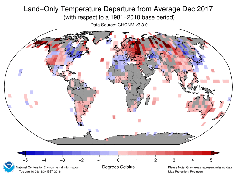
Moreover 27% of the temp data comes from Urban areas which the WMO flag up as not fit for purpose.
The time series certainly does depict a bleak picture as well, especially for the most northerly areas of the northern hemisphere.
Bleak? Really? How so? I think the burden of extreme cold on large northern areas is lessening, from whatever the cause might be.
Not disagreeing with you. Warmth is life, cold is death. That has been the way of it during our time as a species. I think we can agree the entire purpose of the NASA presentation is to portray a bleak, catastrophic picture to instill fear. There is a goal which is more social political than scientific.
Thanks for responding. Sometimes the drumbeat of the main-stream propaganda is so strong, I have to kick myself back into reality, even tho I’ve been aware of the farce since the early 1980s.
Me, I am a weather geek, always have been. More broadly, a science geek…all of them.
I pay attention to things that most people are not paying a bit of attention to.
Such is the case for most of us here commenting, as those running the site.
We KNOW nothing unusual is occurring because we have been paying attention over a long period of time, and being generally headstrong and skeptical types are not easily convinced by malarkey that tells us to believe something which our own senses, observations, and memories tells us is not the case.
But for the rest of the people, our families, friends, acquaintances…the ones who we have spent a lifetime explaining things to even though we know they won’t retain a word of it…those are the people whom, if they are told all day every day by every media source and teacher and even most of the interwebs that some particular thing is happening…how the hell are they gonna know it is hogwash?
And yet…many of them do know it.
The ones who are liberals will never ever admit it though.
Never.
Like they never admit that killing little unborn babies is a bad wrongness.
Never admit that keeping more of the money they earn is a good thing.
Never admit that the MSM that spends all day every day harping on progressive talking points is in any way biased.
Huge numbers of people have zero willingness to be honest and forthright, not if it conflicts with their politics.
Today Bill Gates admitted flat out that an entire generation of children have been miseducated in mathematics, and that common core was Gates’ and Obama’s brainchild, forced and foisted onto the entire country untested, never underwent a pilot program, or testing, or vetting…was never the result of any factual information regarding how children learn math.
It was made up whole, and hundreds of years of tried and true methodology regarding how to teach math to children was discarded without a second thought…thrown away for an idea dreamed up by someone who is not and was never an educator, who had exactly one year of college education in his life!
Bill Gates paid $400 million and had that money, what can only be called a bribe, leveraged into trillions of dollars by the US federal government which forced every school district in the country to teach math using a method which he has now admitted is an awful method, far worse than what it replaced!
Millions of teachers over eight years complained to deaf ears…but now Gates admits it and…BEST OF ALL…has a new improved Common Core he wants to insert in place of the original one!
This is the hubris, the nonsensical and whimsical idiocy pretending to be learned acumen, that we are up against.
Longer milder summer, enhance spring flowers, more people satisfied to happy, less freezing killing cold, more crop production, and less need for wildly dangerous electricity and gas to heat our homes. Hmm…. seems a non-problem.
Mark Fife
Here is a comment that I posted yesterday.
“An earlier spring river breakup does not evidence a warming average climate without other data. It is evidence of an earlier spring warming in that area. As such it is only interesting and mostly to local residents.
It has been quite noticeable to most of us oldtimers that spring has been coming earlier and the growing season has been getting longer in our part of Canada.
We have also noticed less hot days in summer and less cold days in winter which indicates a moderating climate but not necessarily an average warming.
Anecdotal, I know, but as much value as river breakup dates which may have many explanations as do our observations.
None of this indicates that the trends will continue and none shows a connection to CO2, in spite of the ridiculous assertion by some that there is no other possible explanation.”
It is heartening to see my conclusions (drawn from personal observations) so quickly supported by the data you present. It make’s us both that much more believable. You actually found the record for what I observed.
Keep in mind that you’re looking at tampered data in which the 1930s warmest decade of the century has been erased, as well as the 1950 to 1980 cooling. A Climate-gate email confirms that this was done deliberately because it was ’embarrassing.’ Also bear in mind that the warmest areas shown have almost no real data because of lack of weather stations over huge areas (the Arctic, Africa, central South America). The temps in these regions are fiction with no real data to substantiate them.
On his blogsite, Tony Heller has been documenting the NOAA-GISS temperature adjustment fraud for years now. Paul Homewood now too.
One day the corruption at GISS will be exposed by an insider sick of the lies. Let’s hope that person doesn’t end up like Seth Rich.
The Alarmists would have us believe that we are going to boil ourselves in our own pot — based on problematic global average temperature increases. However, there is little to no evidence that the warmest months are getting significantly warmer. Instead, the global average is being increased primarily by increases in the nighttime temperatures and increases in the wintertime temperatures. As pointed out by Fife, that is exacerbated by increases in the length of the warm seasons and a decrease in the length of the cold seasons. All the more reason to not try to simplify the problem to a single number. Averages are a convenient way to lie, especially when dealing with a variable instead of a constant.
I’ve always wondered about the claim of the “modern era”,…”since records began in 1880 etc”,… ‘Global temperatures’ were never measured in the 1880s or 1940s,… or even later. (And at the nadir of the LIA.) Temperature records in the early industrial era were spotty globally and the ‘cutting edge’ technology was mercury temometers and ‘sea bags’ drawn from ships then tested with the same. How accurate was eyeballing little lines in a thermometer? 1/2 or 1/3 a degree? What were he ‘error bars’ for such readings? Since AGW-ists argue about 0.1-0.3 deltas per “decade” it seems like signal to noise confusion. The true “modern era” is measured with hi-tech accuracy using thermistors/radiosondes that are truly accurate and began with measurements in 1979 just after the ‘cooling period’ scare and are the only accurate global records we have. No warming news (beyond natural variation there). Since modern technology intended to measure true warming says there is no ‘there there’ it’s discarded for crappy models that are roundly conflicted and proven erroneous at every run. Some just don’t like true empirical science and revert to ‘social climate hypo-studies’.
GISS = Garbage In, Same, S… out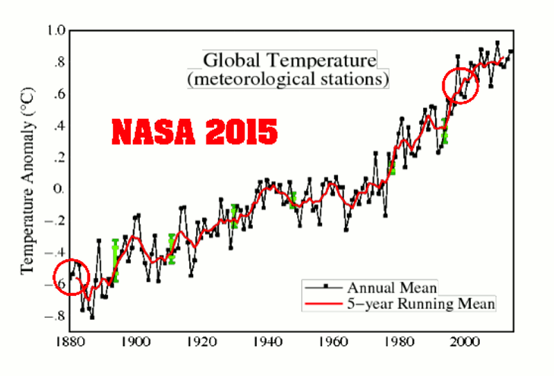
They lost me when they revised the past… and they revised it n-times, always in the same direction: cooling the past, disappearing decades of cooling.
Sorry, I do not think that this ‘temperature index’ is suitable for anything than being alarmist.
The obligatory reminder chart of what they are doing year after year to achieve that hockey stick:
from here:
https://realclimatescience.com/2015/12/a-closer-look-at-giss-temperature-fraud/
Important to note that the 2001 starting position was itself already vastly adjusted.
In 1999 that graph showed that the 1930-1940s spike was higher than the 1998 spike.
And in the late 1980s a careful analysis by Karl showed that there had been NO WARMING as of that date, that was detectable in the historical data.
Hansen admitted the same, in writing, a decade later: It was still true.
It was just around then, just before the turn of the millennium, that the pork barrel gravy train began in earnest.
The adjustments since then are off the scale…literally.
The graphs have on multiple separate occasions been adjust outside of their own error bars.
Think about that and let it sink in nice and deep.
The original graphs had error bars, put there by the people who made the graphs to denote the limitations of the data set used.
Back when it was still possible to refer to these graphs as scientifically derived.
The graph as it is presented now is outside off the boundaries which denote the limitations of the data.
If you are unsure what this means, you can be forgiven for that…it is not clear what it means, beyond the simple fact that it is just a cartoon, bearing no relationship to reality and having nothing to do with any scientific method of compiling and presenting data.
Let’s see that first graph in degrees Kelvin, in scale. ‘Anomolies’ exaggerate change.
‘the average annual temperature for the globe between 1951 and 1980 was around 57.2 degrees Fahrenheit (14 degrees Celsius). In 2015, the hottest year on record, the temperature was about 1.8 degrees F (1 degree C) warmer than the 1951–1980 base period.’ – UCAR
From 287.15 degrees Kelvin (1951-1980*), to 288.15 degrees Kelvin (2015). About 0.35 percent increase. Not very scary.
*Since Man didn’t have the actual ability to measure an average annual temperature from 1951 to 1980 – before the satellite era – I don’t even believe their baseline.
Exactly how have the GISS data been adjusted, aggregated… Exactly how have the GHCN data been adjusted, aggregated… Until then, there are a lot of higher quality SF books I prefer to read…if only because they have far better plots.
Never you mind!
It’s obvious that thermostats are a poor way to measure temperature across the earth. Due to the extremely intermittent coverage over a relatively short period the usefulness of this information is highly suspect. The fact they have to adjust it so radically suggests the underlying data is not very accurate.
The idea of averaging temperature over land areas of a million square miles based on one thermostat shows the ludicrousness of this effort. So much time and energy spent and for what? We have satellites. They measure the bulk of the atmosphere. This should be the primary source used by all researchers. It is unimaginable that given the satellite data so much effort would be placed on 500 or 5000 thermostats.
So, what do we do about data before 1979? Well, first off we shouldn’t be looking much before then anyway. The period of concern is after 1945 since 96% of all the CO2 ever produced by man has occurred since 1945 we should be looking for results after that date. We are pretty sure that averaging it all together that the period 1945-1975 was essentially down by a small amount, maybe 0.2C or something, but it wasn’t up.
Therefore, the total heat reported by the satellites appears to be roughly the total response of the atmosphere to 100ppm of CO2 in the last 70 years. According to the satellites about 0.4C in 70 years (maybe 0.3 if you include the small drop earlier. Let’s assume 0.4C and give the 0.1C as error buffering for the potential it was more.
So, a 30% increase in co2 in 70 years produced 0.4C. This is less than half the amount of change predicted by the models.
The models missing for a decade might be excusable. There might be some explanation for 2 decades of missing. SEVEN decades at half the rate they predict is clearly proof that the sensitivity of the atmosphere to co2 is NO MORE than 1/2 what they predicted.
We also won’t be getting to 1000ppm of co2 as that would require producing another 600ppm of co2 into the atmosphere in the next 80 years which is absurd considering we put in 100 in the last 70+ years. Even if we assume a generous increase in co2 output from current levels there is no way to get beyond 600 or so ppm in the atmosphere which means another 30% increase in CO2 in the next 70 years.
Therefore, for the same input the atmosphere over a long period will produce a similar result. This is the only scientifically justifiable result. Any other prediction would have to be based on the idea of energy storage. No-one has shown where or how energy stored could be released or why. It’s stupid. So, 0.4C is the result for the next 80 years. END OF STORY. CASE CLOSED. ISSUE RESOLVED.
0.4C in the next 80 years will produce no significant environmental impact positive or negative.
This is verified with numerous new studies.
I think it is criminal what the climate community has been doing to the temperature record. This is worse than all the other crap they are spewing. Changing our history to reflect their biases is a sickness our society is suffering. The liberal mind is so filled with guilt it can’t think rationally anymore.
The higher CO2 goes, the more efficiently and rapidly it can be removed by organisms and chemical processes.
Plants are growing far more rapidly at 400 than they did at 350.
By 600 you will be able to stand back and watch some plants grow…to hear them increasing in size if it is quiet.
That is not even an exaggeration.
This is the state of the world’s surface temperatures according to NASA’s Goddard Institute for Space Studies from 1880 through 2017.
In this statement the author makes the mistake of confusing an Index with something that relates to the energy level in Earth’s climate system. Index as used by GISS is an output from a computer algorithm. It has no relationship to the energy of the climate system. It is part of a fairy tale that included radiant energy transfer from a cold body to a hotter body – pure fantasy.
If the chart was ever challenged they could rightly claim they were not referring to Temperature as it relates to energy in the climate system. It should be obvious to anyone who has even a slight understanding of physics that it has no relationship to temperature as a measure of energy level in a system.
I am not sure what you are trying to say. I never mentioned energy. I assume what NASA means by a temperature index is what they say it means.
“This graph illustrates the change in global surface temperature relative to 1951-1980 average temperatures.”
I also assume they mean it when they say “The time series below shows the five-year average variation of global surface temperatures. Dark blue indicates areas cooler than average. Dark red indicates areas warmer than average.”
There is no mention of energy anywhere.
Temperature of matter in a stable state is a measure of its internal energy. An Index is not temperature. If GISS meant temperature they would not call it an Index. It would just be Temperature and it would require a scale. They are using an expanded scale with an arbitrary zero. It is not temperature. Describing it as such is incorrect.
If GISS use shorthand to refer to their Temperature Index as temperature then they are being imprecise and/or deceptive; as you are.
Clearly their Temperature Index bears no relationship to recorded temperate data over the surface of the earth. How could it possibly be representative of the energy in Earth’s climate system with such poor sampling. The only locations consistent with steadily increasing temperature trend over the last 140 years are those subject to urban heat.
Deceptive? Please explain.
I don’t claim to be a scientist. I didn’t even stay at a Holiday Inn Express last night. But as an interested person I always thought that the only way to truly measure warming or cooling is by comparing each location only to itself over the specified time frame.
It seems to me that this experiment is the closest that I’ve seen to what I would like to see measured.
Several commenters have complained that this method is not comparable to the GISS method. It was never was supposed to be but it could be an interesting experiment to see how close the GISS method comes to each data point in this experiment. Just to pick some names out of the air (and I don’t know if this location is one of the 499) how close is the GISSTemp estimate for Goodland, Kansas to the actual thermometer reading for that site. There are 137 warmest months and 137 coolest months with thermometer readings for each of the 499 sites or 136726 total data points that ought to be comperable.
By making those comparisons we ought to be able to see if GISS is close all the way through the 137 years, whether it gets better or worse over time, whether it is better for some parts of the Earth, or whether it is total male bovine excrement.
Thanks to any who either may already have this information or who may be able to find it.
I have made several posts which cover that.
“how close is the GISSTemp estimate for Goodland, Kansas to the actual thermometer reading for that site. “
That is here. You can look up any GHCN-M site via here. GISS doesn’t, despite much talk here, homogenise data. It uses the GHCN homogenisation, which is described on the attached sheet. And the adjustment is slight, about four years around 1970 lowered 0.5°C.
Hmmm. 1884. Why is that year ringing a bell? Oh yeah Giss’s base year was the year after the Krakatoa eruption – so global world temperatures would have been at a freakish unnatural low wouldn’t they. An anomaly just like 1979 in the Arctic. Does Giss think we are all retarded now or do they think they are so untouchable that it doesn’t matter.
Rising temperatures = bleak?????
In most places, especially those northern climes coloured red, rising temperatures = rising food production, more comfortable living, less winter deaths.
Exactly! We are living under the best weather conditions since the medieval warm period. As in all warm periods food is abundant and famine and epidemics are low. These are good times! The worst weather in the modern era was in the early decades of the 20th century. Extreme heat waves and bitter, cold winters.
Isn’t it typical that GISS does not show what has been happening as the most recent El Nino fades. By this time next year, the pause post 2000 will become more obvious and GISS might have to post something that is half way real:
The plot here is Mark Fife’s, from GISS annual data (so no 2018). GISS itself shows this just fine, eg
petroalbion says May 2, 2018 at 10:16 pm :
By this time next year, the pause post 2000 will become more obvious and GISS might have to post something that is half way real:
By this time next year GISS will post an updated chart where the 1998 el Nino max will be 0.1 lower then the 2007 max. 1998 max will be at the same level or even lower then 2010 max.
Make a hard copy of the plot Nick just did as a reply to you and compare it with a new plot 2-3 years later and remember my words.
You can have the same fun looking retroactively any GISS plots.
Again, the data presented is worthless. There are basic requirements for conducting a time series study.
“A time series is a collection of observations of well-defined data items obtained through repeated measurements over time.”
As anyone familiar with conducting a times series study know, the biggest mistake you can make comes from changing the data items mid stream. If you do that, your study is worthless. If you are studying retails sales, you follow the same stores. You do not start off looking at Sears, Dick’s, and Targets then just for kicks throw in Walmart and throw out Sears about halfway through,
Now you could argue you have been creating a model of retail sales using regional based spatial analytics. You could then show highly details charts and graphs. You could even enlist the aid of high powered economists, actuaries, an accountants to pour over your data and your methods. You could formulate a consensus of these people.
And yet, the basic data has been compromised because you changed which stores you were looking at. So when someone shows you the data from Sears, Dick’s, and Targets showing sales have been flat to falling for the past 30 years and the economic outlook isn’t exactly are good as you say it is because no one else is doing nearly as good as Walmart and you threw out the biggest loser what do you say? You are wrong because you didn’t do it like we did.
No. That is using bad data to refute good data. The basics matter.
Typical. Consensus white knights rebutting that the underlying data hasn’t been altered. Has not been altered enough. There is an organic trend somewhere in there, but only discoverable…..after the data has been altered. Because, “raw” aka measured, empirical data is unreliable. Whereas measured data filtered through about half a dozen “justifications” for altering, with the totality being irreducibly complex in that not every change to every station can be accounted for and verified.
Climate consensus defenders are almost offended that someone would seek the best data and simply plot the results.
Almost?
The temperature at the equatorial Pacific falls.
http://images.tinypic.pl/i/00964/53p5j01cskju.png
What does Global Temperature mean? Can it be measured to within 0.1 Deg.C?
Finally: How useful is it if/when you have got it.?
Global land-ocean average known in 1880? Really?
Mr. Fife,
There can be little doubt that within the past fifty years anthropogenic global warming has raised global temperature by nearly one centigrade degree, particularly during the 24-year period 1975 to 1998. Conventional thought attributes this AGW to increasing anthropogenic carbon dioxide in the atmosphere, and there is a pervasive sense within the scientific climate community that consideration of other possible forcing agents is unnecessary.
Nevertheless, there are three considerations that call this general complacency into question. The first of these is the peculiar fact that the peer-reviewed climate literature appears to lack any hard-data-based studies that prove the theoretical link between CO2 and global warming. Even the often-cited “landmark” paper by Feldman, et al., 2015 resorts to theoretical arguments to “prove” that link. There are also a few hard-data-based studies, including one of my own, that actually disprove it.
Second, it is apparent that the link is heavily dependent upon correlation. This works well during the period from 1975 to 1998, mentioned above, but prior to and following this interval, correlation is poor, and of course, correlation cannot be taken as proof of causation. Especially problematical is the so-called “global warming hiatus,” of elevated, but little-increasing temperatures, since 1998. This new trend was interrupted by the strong El Niño weather event of 2015-16, but global temperature appears to have returned, now, to “hiatus” conditions.
Third, the MODTRAN6 database reveals that CO2 absorbs and emits radiation significantly only within the band from 13 to 17 microns with a maximum intensity at 14.95 microns. This is a line spectrum, but if it were to be pressure-broadened into a continuous Planck spectrum, the maximum would correspond to a Wien black body temperature of -79 degrees C, which is well below normal Earth surface temperatures and also well below the minimum tropopause temperature (-36 degrees C) due to the lapse rate. Common experience and the second law of thermodynamics confirm that cooler objects (here, atmospheric CO2) cannot transfer heat to warmer ones (here, Earth’s surface), consequently any back-radiation from atmospheric CO2 is simply reflected away.
It appears, then, that due to these issues, CO2 is unlikely to function as a greenhouse gas in the Earth environment. I thought it would make sense, therefore, to search in the aforementioned interval from 1975 to 1998 during which a sharp increase in global temperature occurred, for some alternative anthropogenic forcing agent.
This was the same period in which chlorofluorocarbons (CFCs) were sprayed and leaked into the atmosphere before the Montreal Protocol was ratified in the 1990s to stop CFC production. It was recognized at the time that the photodissociation of CFCs on polar stratospheric clouds released monatomic chlorine, which depleted Earth’s ozone shield. This is still happening, since 1) the depletion is catalytic and 2) both CFCs and chlorine have long residence times in the atmosphere. A thinned ozone layer allows more solar ultraviolet-B radiation to reach Earth’s surface, where it is known to cause severe sunburn and genetic defects, but clearly something that can cause these can also cause global warming.
In support of this, total atmospheric equivalent chlorine, mainly derived from anthropogenic CFCs, is well correlated with the full temperature record, including the “hiatus” since 1998, which can be seen as being due to ratification of the Montreal Protocol through the ‘90s. Also, non-aerosol-producing basaltic volcanoes, such as Iceland’s Bárðarbunga, which, in 2014-15, underwent the world’s largest basaltic eruption since Laki in 1784, emit chlorine and bromine in the form of HCl and HBr, and these emissions likely also depleted ozone, which would then have led to the great El Niño of 2015-16. This concept, too, conforms well to the record of global temperature.
To my knowledge, ozone depletion is the only credible alternative mechanism to CO2/warming, and it does a far better job than the latter of accounting for the actual behavior of Earth’s recent global temperature record. Consequently, efforts to mitigate CO2 emissions, though well-intentioned, are likely ineffective, and should probably therefore be discontinued and replaced by a concerted effort to mitigate further atmospheric emission of halogen-bearing compounds.
I can send you supporting materials for the above, or they can be found by searching online for “B01N7ZXTID.”
I would welcome your comments.
Respectfully,
David Bennett Laing
I have a different perspective on NASA’S surface temperature graph from 1880 to 2017. I don’t see a “very bleak picture.”
The vertical and horizontal scales on two graphs below, the HadCRUT4 data and the NASA data, are the same and vertically aligned in time. The higher temperature data on the NASA graphs near the El Nino peak dominate the most recent data points on the graph. The rapid decline in temperatures from the peak temperature of the El Nino is conveniently not plotted on the NASA graph of annual temperatures (blue line) and the 5-year running average (red line) because the declining 2018 temperatures are not included in the NASA dataset. The monthly HadCRUT4 data (open circles) show the rapid decline of monthly temperatures into 2018 after the El Nino peak and a 15-year projection of HadCRUT4 temperature trend-line.
The rate of increase (first derivative-green dashed line) of the global mean temperature trend-line (red-dashed curve*) of the HadCrut4 data has been constant or steadily decreasing since October 2000. The HadCRUT4 temperature anomaly has decreased by nearly 40 percent from March 2016, the El Nino peak, to July 2017. The rate of change of the trend-line will likely become negative within the next 20 years, reaching the lowest global mean trend-line temperature in almost 40 years. (draft ref: An-Analysis-of-the-Mean-Global-Temperature-in-2031 at http://www.uh.edu/nsm/earth-atmospheric/people/faculty/tom-bjorklund/)
Lower temperatures could persist for decades. The point of this commentary is that too many climate scientists do not publish all the relevant data. This is sometimes called cherry-picking or leaving out critical data. I call it lying.
* 6th degree polynomial with R2 = .0.80