Guest essay by Mark Fife
There are many times, when dealing with the analysis of real world data, looking at the average alone really doesn’t provide a complete picture of what is happening. Such is my problem with describing what the data contained in the GHCN data represents. If you look at the typical NOAA, NASA, or other graphs, including mine, you get the idea temperatures are all moving up or moving down in unison, as if temperatures everywhere were all moving together under the same set of influences. Nothing could be further from the truth.
It is true, there is some degree of “movement in unison”. However, much of the movement seen falls into one of the two categories below, often involving a combination of the two types shown. As in this illustration, the key factor in determining what is happening is the height at the apex of the curve. Each of these three curves represents the same number of subjects in the underlying population. However, the spread of the distributions is different. If you are familiar with statistics, you will understand the difference is in the standard deviation. The other factor here is the upper bound for the tail remains consistent. All three curves represent populations where 99.8% are below 3. The average does change, but the upper limit never moves.

To illustrate this, let’s look at a few charts. Each of these covers 1067 stations in the GHCN dataset reporting from 1920 to 2011. I have refined each station into 10 year rolling averages, so the charts show the years 1929 to 2011. Understand, this represents the average of ten preceding years.
Here is a video of the GHCN series:
For the complete times series from 1929 to 1911, visit my YouTube channel at the following link:
The decades represented by 1929 and 1996 are two of several which match the 1929 to 1911 average quite well.


The decades represented by 1939 and 2011 represent good examples of that unilateral spread. Notice the curve apexes are lower than the average curve apex. The upper and lower bounds on these curves are not much changed from the average curve. There is very little change in the number of stations falling at 2.25° and -1.75° for the entire period.


Finally, the decade represented by 1968 is a good example of a reduced spread in the data. Again, the lower bound on the curve is still -1.75°, however the upper bound is reduced to about 1.5°.

Understanding what this means requires understanding the basic facts. At all times there are 1067 stations being represented. The “area’ under the curve is exactly the same for each curve. In every 10-year average, 99.7% of the stations fall within 2.25° and -1.75° of their 1920 – 2011 average. These basic facts never change. Likely, all we are seeing are the affects of cold and warm periods within the US due to Atlantic and Pacific oscillations. This is unavoidable because the clear majority of long term data comes from the US. There is just not sufficient long term, unbiased data from anywhere else to make any reasonable estimate.
Below is a table of countries showing the number of stations used in this study along with the average, max, and min annual change in temperatures.
| Row Labels | Stations | Average Annual Slope | Max Annual Slope | Min Annual Slope |
| Australia | 16 | 0.009 | 0.021 | -0.008 |
| Austria | 2 | 0.014 | 0.015 | 0.014 |
| Belgium and Luxemborg | 1 | 0.014 | 0.014 | 0.014 |
| Canada | 33 | 0.021 | 0.198 | -0.080 |
| Czech Republic | 1 | 0.022 | 0.022 | 0.022 |
| Estonia | 1 | 0.009 | 0.009 | 0.009 |
| Finland | 1 | 0.007 | 0.007 | 0.007 |
| Germany | 11 | 0.015 | 0.029 | -0.051 |
| Greenland [Denmark] | 1 | 0.019 | 0.019 | 0.019 |
| Hungary | 1 | 0.007 | 0.007 | 0.007 |
| Kazakhstan | 1 | 0.033 | 0.033 | 0.033 |
| Netherlands | 3 | 0.009 | 0.014 | 0.005 |
| Puerto Rico [United States] | 1 | 0.012 | 0.012 | 0.012 |
| Russia | 10 | 0.000 | 0.015 | -0.015 |
| Spain | 2 | -0.031 | 0.020 | -0.082 |
| Switzerland | 4 | 0.014 | 0.017 | 0.009 |
| Ukraine | 2 | 0.022 | 0.030 | 0.015 |
| United Kingdom | 1 | 0.007 | 0.007 | 0.007 |
| United States | 974 | 0.008 | 0.163 | -0.220 |
| Uzbekistan | 1 | 0.006 | 0.006 | 0.006 |
| Grand Total | 1067 | 0.009 | 0.198 | -0.220 |
Pretty cool.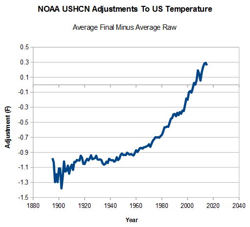
Here’s my favorite graph, from over at the Deplorable Climate Science Blog.
.
I am surprised the adjustments graph hasn’t been made the subject of a lawsuit in the US by at a minimum industries seeking regulatory relief. This is pretty strong evidence that a significant mathematical error exists in the NOAA USHCN data processing software.
Adjustments should not show bias/skew over time. Rather they should show a random distribution because errors are randomly distributed.
Since errors are randomly distributed, the adjustments to these should cluster around zero. But from the graph we see that is not true. Thus there is a very high chance that what we are seeing is not the result of an error in the data. Rather there must be an error in the data processing methods.
ferdberple,
One should also reasonably expect that modern data are superior to historical data and therefore require less adjustment. What’s wrong with this picture?
Or, conveniently, that historical data was skewed HIGH, and modern temperatures are skewed LOW, that’s a statistical winner …..
“What’s wrong with this picture?”
A lot.
https://realclimatescience.com/all-temperature-adjustments-monotonically-increase/
“a significant mathematical error exists in the NOAA USHCN data processing software.”
Error?
Mais,Non, mon ami. There is no error.
Figures don’t lie. Liars figure.
Lies
Damned lies
Statistics
Computer models.
Clyde, there is less adjustment for modern data. For example, 2017 is about +0.3F while 1900 is around -1.3F.
This is not to say that any of the adjustments are valid.
The only legitimate excuse I can think of is a change in the height of the observer. Where a thermometer at a fixed height, read by a shorter person would give a higher reading than a taller person. If humans are getting taller, then the past would be biased high, the present biased low..
I like the way that temperatures need to be adjusted upwards to counter-act the loss of the Urban Heat Islands since towns have shrunk so much recently.
Imagine how much more cooling adjustments there would need to have been in recent years if society hadn’t already collapsed.
You can date when NOAA first detected the zombie apocalypse using that graph. It’s when it arrows upwards in the 1970s.
Somewhere between the release of Night of the Living Dead and the classic Dawn of the Dead.
Error, yes, that’s the ticket. It’s a programming error. We all know how unreliable those computer things are. Nothing nefarious to see here. It was probably a case of the artificial intelligence misconfiguring itself. Nobody would intentionally adjust the data in the opposite direction from what would be expected for an increasing urban heat island effect. Curse that artificial stupidity, it makes the climate scientists look dishonest, when they are obviously pure.
Some crackpots might be inclined to say that this is clear evidence that the data have been systematically adjusted to generate a warming trend where mother nature has negligently failed to provide one.
Fortunately we have no crackpots around here. So you understand that this could only be an honest error.
Which will surely be corrected by next Tuesday, with embarrassed apologies all around.
Yes, and GISSTEMP
https://data.giss.nasa.gov/gistemp/tabledata_v3/GLB.Ts+dSST.txt
has published their latest GLOBAL Land-Ocean Temperature Index to include March 2018 and compared to last month’s issue current to February, a total of 458 changes were made.
Kinda just warms your heart to know that our government scientists are hard at work doesn’t it (-:
I’d put up the link to last month’s issue if there was one. You have to remember to save these things each month if you want to do any sort of comparison. GISSTEMP it seems doesn’t want us to know what they’ve been busy doing. Dunno, maybe they’ve got page somewhere with the history – but if they do, I don’t know where to find it.
Good chart RH. From the above report 91% of the USHCN stations are in the USA. Urban Heat Island anyone? The correction should be reversely inclined. Makes one wonder what is actually happening with the temperture.
Yes, I’ve often thought the same thing. The on time, minuscule and wholly inadequate UHI “adjustment” SHOULD be making those “data” adjustments (an oxymoron to begin with) look quite different.
I also don’t think they should be “adjusting” DATA in the first place since what you’re left with is no longer “DATA” at all – it is a bunch of guesswork, assumptions, and wild guesses, as “educated” as those doing the “adjusting” think they are. DATA is WHAT YOU OBSERVED, period. Whether you believe it to be perfect or flawed, it IS what was observed when the measurement was taken. All the efforts to “correct” it do nothing of the sort, since it is IMPOSSIBLEi to know what the “correct” OBSERVATION *was* in the past. The only thing actually KNOWN is what was actually observed and recorded, nothing more. If they think the data is incorrect, they should simply be applying the appropriate ERROR bars, and let the truth be seen (i.e., BOTH what the “observation” was and what the range of ERROR was).
And since the “climate science” field is such a festering sewer of corruption, groupthink, circular reasoning and confirmation bias, I have exactly ZERO confidence that the “adjustments” are anything more than the “adjusters” seeking to make the so-called “data” match their pre-conceived conclusions (whether consciously or unconsciously).
If you believe you have problems with data you either go out and get new data, or if that is impossible, you adjust the error bars to reflect your misgivings. The thing you NEVER do is twiddle with the data itself.
One of the grotesque aspects of this is that they are adjusting data that cannot be replicated. The “error” being corrrected is imputed. The bias is undocumented and is presumptive. Ideally since the historical data cannot be replicated the thing to is to “adjust” modern data as it collected to match “presumed” biases in the historic data. That should reveal any warming or cooling just as clearly as blind mangling of historic data to suit modern assumptions.
RH
On the global scale, land adjustments may go some way towards explaining why the post-1975 warming on the land was so much greater than the oceans. In the early twentieth century, the warming rates of land and oceans were pretty much in line. Below is my comparison of the Hadley Center data sets.
The reason for the reported global warming in 1975-2014 being greater than the for the period 1910-1944 is due to the land warming. Yet land only covers 30% of the Earth’s surface
I found a similar divergence is in the NOAA data sets.
https://manicbeancounter.com/2018/04/01/hadcrut4-crutem4-and-hadsst3-compared/
Why haven’t they adjusted back to the Little Ice Age? Or the MWP? That way it could look even more ridiculous.
I would like to see how the ‘global’ phenomenon of CO2 forcing has manifested in the temperatures of the Azores.
The Azores have a very stable daily temperature range (10 degrees F) that annually slides within a narrow window. How should we expect an increased CO2 forcing to manifest itself in the Azores’ temperature charts? Does the daily low occur at a later time? Is there a shift in the annual window of temperature ranges?
If no temperature changes can be teased out of the Azores’ records, I propose we use those temperatures as a global proxy. Yes, I understand that the Azores temperatures are completely dependent upon their location in the Atlantic where ocean and humidity are in control.
BINGO !
The average of 49 and 51 is 50 and the average of 1 and 99 is also 50 or as Dixy Lee Ray put it, “Be careful of averages, the average person has one breast and one testicle”
Actually slightly less, especially if you discount the triple breasted whore of Eroticon VI….:-)
http://hitchhikers.wikia.com/wiki/Eccentrica_Gallumbits
Put your head in the oven and your feet in the freezer. On average, you are comfortable.
Does the movement from 0 to +ve numbers or -ve numbers indicate the direction of coming temperatures?
0 to +ve tend to indicate cooling, while 0 to -ve indicating warming?
Perhaps not…
cool tool, but it seems to me you could use it to tell a bigger story. Are there any changes over time in spread. Granted, you give a few examples of how a couple of years demonstrate the average, but what are the curves doing over time.
That is kind of the whole point as I described. Every time the curve apex rises, which it does by a rather large amount, the spread has contracted. Every time the apex drops it has widened. So it is never a case of everything warms up or everything cools down. Even in the warmest decades a decent number of stations are in fact cooling. True also for warming stations during cooling cycles. There is no over all pattern here.
I told my wife this is very much like being at a party in a large room where everyone is moving around more or less at random. Just by the natural interactions of people moving around you would be able to discern seeming patterns. Sometimes people are bunched into the middle of the room, sometimes moving to the edges, shifting left, shifting right, and on and on. Yet, no matter what, at all times the people at the party are in the room. Anywhere in the room is the normal condition.
I must be missing something, but I do not see any explanation of what is actually being measured here. In the video, on the y-axis the units suggest an average between 200 and 250. 200 and 250 what??? I thought we were measuring temperatures. In the table near the bottom, the units are average annual “slope” or change in temperature. For the entire group/period that average is 0.009. Okay, I can fathom that number. But what does it have to do with the distributions shown in the video?
I often assume I know what I am talking about and so everyone should. Yes, the left hand scale is number of stations. That would be out of 1067 total. So what you are seeing is the spread of temperature range in terms of number of stations.
Mark–
How did you select the 1067 stations?
I use only stations continuously reporting for a chosen period of time. I select stations based upon that criteria.
I download all the data into a SQL database and use queries to select, sort, and organize the data. In this case the query inputs are start year and end year. It then calculates the number of years by end year – start year +1. It then creates an index table listing all stations reporting during those years and a count of years reported and out puts a table with only stations meeting the criteria. For example, enter start year as 1900 and end year as 2011 it pulls a list of 490 stations all reporting 112 years starting in 1900.
That index table serves as the selection criteria for additional queries to summarize the data.
The shorter the time frame selected, the more stations you get. Hence I selected 1920 to 2011 and that pulled 1067 stations.
Using an SQL database is why I can devise ways of looking at the data and very quickly process the information accordingly.
I have used this tool to crunch through a number of different data sets. I don’t mix data sets because there is too much duplication of information. However, you find most of the same problems in all data sets. Too few stations run from 1900 to the latest years covered. Even few go back further. The GHCN data has the most I stations meeting that criteria I have seen. It also holds far less junk data. Still, the number of stations covering just 1 year is substantial. Those covering 5 years or less make up 16% of the stations. 10 years or less make up 29%. 20 years or less make up 46%. Most of the short run stations are the newer ones.
Additionally, many stations have huge gaps. Often the gaps are larger than the years covered.
And of course much of the data appears to be bad. But that is hard to call. Stations far to the north will show big downward swings in temperature from time to time. I have run smoothing algorithms to take those questionable numbers out and the bottom line is they do not affect the averages enough to be important. So long as you are looking at 400 or more stations.
Okay, so we are looking an average number of stations, with a distribution. But I must be dense. What does that have to do with temperature. I still do not get what the distribution curves are actually telling us (well, me). So in any year the average number of stations is … say 220. So? You offer this explanation:
“Understanding what this means requires understanding the basic facts. At all times there are 1067 stations being represented. The “area’ under the curve is exactly the same for each curve. In every 10-year average, 99.7% of the stations fall within 2.25° and -1.75° of their 1920 – 2011 average. These basic facts never change. Likely, all we are seeing are the affects of cold and warm periods within the US due to Atlantic and Pacific oscillations.”
Well, what I am seeing is that some years the distribution may be narrower, and with a higher average (peak). Some years the distribution is a little to the left or a little to the right of the average for all years. How would the PDO or AMO explain such differences, and what does this tell us about what people really want to know about whether temperature is rising or falling over the last century or more?
I apologize for being so dense.
Basil
Mark writes
Its an interesting thing you’re graphing here but for public consumption you need to start out describing it in detail because like basil, I felt I had to try waaay too hard to even understand what you were displaying and even now I dont actually know.
I’m assuming the X axis represents the temperature as an anomaly figure for that station(?) or perhaps globally(?) and the Y axis represents the number of stations that measure that figure at any one time?
Can I suggest you flip the positive and negative around on the X axis to make it intuitive. And label all the axis on the graphs with a description of what they’re a measurement of…
Thank you for the constructive criticisms. It is hard for me to understand what things are intuitive and what things are not. And I am used to writing in a blog format where the next piece builds on the previous. I will keep that in mind. I usually run these things by my wife. She is smarter than me in her own way but she is not familiar with this.
The data has been normalized to each station average for the period of 1920 – 2011. By that I mean the station record has been translated to a set of anomalies above and below average for each station.
The overall average is therefore zero for the time period 1920 – 2011.
In this instance, rather than showing the average over time, I constructed a density curve for each year and compared that to the density curve of the average for the complete time interval.
A density curve is the same curve you would associate with a normal distribution which shows the population percentages, except I have rendered that into number of stations instead of percentage. So, by way of example, what you see represented by the area under the curve from 0° to .5° is the number of stations where the average annual temperature was above normal by greater than 0° and less than or equal to 5°.
Here’s another telling graph. It’s an oldie, but goodie:
.
That graph is really not fair….in 1990 they had to eliminate old stations that had a cold bias…….
Did you forget the “sarc” note, or did you believe it was not necessary? 😉
Like the cold reading AGRO floats.
Mac
Ah, the old canard about there being a problem because of a drop out in the number of stations seems to originate from that image produced by Ross McKittrick – which shows a discontinuity in the temperatures that coincides with the scrapping of a number of stations, most of which were apparently in Northerly locations. Looks convincing doesn’t it, until you plot the actual annual surface temperature record for the same period …..
Hey, what happened to the huge leap in 1990?
The answer is simple, the temperature plot used by McKittrick is merely an unweighted average of all of the station data, whereas climatologists use an area weighted average in order to avoid the bias that would otherwise be caused by the fact that there are many more stations in the industrialised north than elsewhere. So although the number of northerly stations was cut in the 80s/90s, it doesn’t introduce a warm bias, because of the way the averaging of stations is done by the climatologists who do actually know about these things.
Unfortunately, you are area weighting based upon areas for which you do not have adequate information. For example, the southern hemisphere where you have virtually no data from the first decades of the 20th century. Even worse, what data you do have represents a kaleidoscope of changing locations. If, as I understand it, reconstructions of temperatures from the end of the 19th century through the mid 20th century are done using a combination of the few hard records available and proxy estimation you have an even more fundamental flaw. To claim anyone has created an accurate spatial model of the history of temperature change from such data is flat out dreaming.
Please explain even the barest outline of how that could be done without having a robust set of representative locations where measurements have been rigorously maintained in terms of location with the proper controls in place to ensure against biases which are not part of the study.
If you were to set out in the year 1800 to measure the trajectory of temperature for the next couple of centuries what would you do? Would you intentionally vary the number of measuring points each year while continuously moving them around? Without maintaining a consistency of gaging methods? Of course not. Any reasonable person would understand the results of that would be garbage.
What you would do is set up a good number of representative data collection points. You would build redundancy into the system not only by having at least paired points within regions where the local conditions were the same, you would build redundancy into each site. You would at least plan ahead for site attrition, understanding some sites would be compromised so the data would become unusable. You would establish rigorous procedures to ensure gage integrity. The list of must do’s would be seriously long. What actually happened is a long way from that.
Yes, comparing temperatures (or any other climatic variable) by quantiles to characterize changes in the entire cumulative distribution (cdf) should be the statistical analysis of choice. Quantile regression should be a tool used by more atmospheric scientists.
It is my honor and pleasure to formally announce a new unequivocal hard Geological observational paradox.
It is an observational fact that there was been an unexplained 200% increase in mid-ocean seismic activity period B for the entire planet as compared to period A.
The earth’s mid-seismic activity has abruptly dropped back down to the lower activity in period B.
Period A: 1979 to 1995
Period B :1996 to 2016 (More than 200% increase in mid-ocean seismic activity)
The observed changes in mid-ocean seismic activity are orders of magnitude too large and too fast for all of the current geological mechanisms to explain. The observations are a hard paradox. (No possible alternatives, the solution is forced from the observations).
The assumed energy input for the mantel and core (radioactivity, material phase change, reactions) cannot physically change in that time scale/entire planet and even if they did change could not appreciably change temperatures to affect mid-ocean seismic activity for the entire planet.
It is physical impossible for the current standard geological model (and its assumptions) to explain the sudden and astonishingly large increase and decrease in mid-ocean seismic activity.
As noted in the paper below, increase in mid-ocean seismic activity closely correlates with ocean temperature changes for the entire period.
It is interesting that there had been a massive increase (200% average) in mid-ocean seismic activity for the entire warming period (1996 -2016) as compared to the cold period (1979 to 1995).
The spikes in mid-ocean seismic activity highly correlate with increased Arctic temperatures and El Niño events.
There has been a sudden drop in mid-ocean seismic activity. Based on analysis of the record, there is a two-year lag in time from when the change in mid-ocean seismic activity occurred and when there was a change in planetary temperatures.
h/t to the NoTricks Zone.
http://notrickszone.com/#sthash.BlxTY2Yc.EpayRG49.dpbs
https://www.omicsonline.org/open-access/have-global-temperatures-reached-a-tipping-point-2573-458X-1000149.pdf
William,
I read the paper and saw no mention of a geological paradox. Instead, they present the hypothesis that global warming is caused by undersea geothermal activity, not CO2.
Is that what you meant to share with us?
I do.
It has been known for some time that convection motion in the earth does not and cannot physically explain plate tectonics motion and plate tectonics does not explain mountain building. The lack of a forcing mechanism explains why the theory of plate tectonics took so long to be accepted.
Based on observations (there are roughly 50 independent observations that support the assertion) plate tectonics is driven by liquid CH4 that is extruded from the liquid core of the planet as it solidifies.
That assertion is consistent with the analysis of wave velocity which shows there must be light elements in the liquid core (roughly 5%, the liquid is roughly the size of the moon) and theoretical analysis for the liquid core that shows CH4 can ‘dissolve’ in the liquid core and would be extruded when a portion of liquid core solidifies.
It is believed the core of the planet started to solidify roughly a billion years ago. At that time there would be a large increase in extruded liquid CH4 which explains why there is a sudden increase in continent crust building at that time. The sudden increase in continental crust building and the increase in water on the planet at that time is the likely explanation for the Cambrian ‘explosion’ of complex life forms.
The continuous release of CH4 up into the mantel and into the biosphere explains why the earth is 70% covered with water even though there is continuous removal of water from the earth’s atmosphere by the solar wind.
Organic metals form in the very, very, high pressure liquid CH4. These organic metals drop at specific pressures.
The forced movement of the super high-pressure liquid CH4 from the liquid core and drop out of the organic metals at specific pressures explains why there is heavy metal concentration in the crust of in some cases a million times more than the mantel.
The same mechanism explains why there is helium in some natural gas fields and oil fields. The helium is produced from radioactive decay of the concentrated Uranium and Thorium that drops out at specific pressures. The super high pressure CH4 that is moving through the mantel provides a path for the helium gas to move up to higher locations where the natural gas and oil are found.
The same mechanism also explains why the tectonic plate movement has double in speed.
http://www.natureworldnews.com/articles/8831/20140902/tectonic-plates-moving-faster-earth-ages.htm
https://www.newgeology.us/presentation21.html
Plate Tectonics: too weak to build mountains
“In 2002 it could be said that: “Although the concept of plates moving on Earth’s surface is universally accepted, it is less clear which forces cause that motion. Understanding the mechanism of plate tectonics is one of the most important problems in the geosciences”8. A 2004 paper noted that “considerable debate remains about the driving forces of the tectonic plates and their relative contribution”40. “Alfred Wegener’s theory of continental drift died in 1926, primarily because no one could suggest an acceptable driving mechanism. In an ironical twist, continental drift (now generalized to plate tectonics) is almost universally accepted, but we still do not understand the driving mechanism in anything other than the most general terms”2.”
“The advent of plate tectonics made the classical mantle convection hypothesis even more untenable. For instance, the supposition that mid-oceanic ridges are the site of upwelling and trenches are that of sinking of the large scale convective flow cannot be valid, because it is now established that actively spreading, oceanic ridges migrate and often collide with trenches”14. “Another difficulty is that if this is currently the main mechanism, the major convection cells would have to have about half the width of the large oceans, with a pattern of motion that would have to be more or less constant over very large areas under the lithosphere. This would fail to explain the relative motion of plates with irregularly shaped margins at the Mid-Atlantic ridge and Carlsberg ridge, and the motion of small plates, such as the Caribbean and the Philippine plates”19.
I have come to believe that temperatures alone mean very little. All the analyses, re-examinations, adjustments, re-adjustments to adjustments, refinements in statistical methods, and so forth also mean very little, if the fundamental input into those methods is ill conceived.
NOTE: Hoping this is not bad manners, I had just posted this elsewhere on WUWT when I saw this essay and its relevance to what I had just posted. So I reposted here. Apologies if any offence was caused, none was intended.
For some months I have been chipping away at writing a paper dealing with UHI. Most historic data gives us mainly the daily Tmax and Tmin, recorded when thermometers designed for the purpose cause maker pegs to stop moving each day when the max or min is reached. For 100 years, that is about all we have to work with.
Now, Tmax and Tmin are rather special temperatures, because they are reached when an interplay of thermal effects reaches a described point. At Tmax, for example, there has been a steady T rise as the sun moves higher in the sky, the rise helped by convection of air with hot packets in it surrounding the site, held back if frost has formed overnight, complicated if there is snow around and water phase change effects need consideration, hindered or lagged by the thermal inertia of the screen surrounding the thermometer as the screen heats up. There can be interruptions when low cloud causes lower T, there can be nearby vegetation that casts a shadow on the screen sometimes, other vegetation effects like when mowed surrounding grass changes the effective height above ground of the thermometer, there can be a burst of rain that cools the surroundings – and so on into the night. The actual Tmax recorded each day is thus subject to some weather effects and some non-weather effects, acting in a way that was not observed and recorded at the time and so lost to us forever.
Tmin has a similar story, with not much in common with Tmax once the sun sets. There is only scientific nonsense in subtracting Tmin from Tmax to give a diurnal temperature range. There is also nonsense in taking their arithmetic average and calling it a mean daily temperature, because the factors that cause Tmax do not have much in common with the Tmin factors and we do not now know the past details of each.
When it comes to UHI, where typically comparisons are made between urban and rural settings, there is again nonsense in interpretations because the factors that caused a certain Tmax in the city need not be acting in a similar way at the rural setting. Sure, one can use a blunt object approach and say look, the measured T is higher in the city than its burbs, so there is a UHI effect. The success of this approach has been poor, with people resorting to measuring night light seen from above as an index of a variable affecting T, or using population density maps likewise, without systematic study of whether each perturbing effect is real and quantifiable. IOW, just guesswork.
Guesswork becomes humour when the effects are trivial, but here we have $$$billions at stake for remediation proposals and that is not funny. It is destructive of Science at a rudimentary level with high cost outcomes. Much pain, no gain.
A colleague and friend, Dr Bill Johnston, has been working for several years with data that relate Tmax and Tmin to rainfall. Rain cools. Years with higher rain will typically show lower Tmax than dry years, Up to 60% of the variation in T data over time can be statistically explained by brainfall. It can be used to find breaks in time series T data and to show what homogenization attempts have been up to. For some major Australian sites like Melbourne Regional and Sydney Observatory, Bill has given good evidence that there has been no temperature change since commencement about 1860, when you delete the effects of cooling rain.
No temperature change, no global warming. Arrived at through thought and observation of the original data and a life spent in relevant scientific fields.
If Bill is correct, UHI is a measurement artefact, as is global warming. Think about it. Like, do cities modify the rainfall effect on Tmax in different ways to rural places? Can anyone answer that? Geoff.
All of what you say is very valid. And as you say, the information left to work with is poor. Tmax and Tmin do behave differently, as I have posted on before. Then there is locational difference. The most fundamental would be the relationship to water. Does the site have lake effect, ocean effect, or river effect? Is it a dry location or a wet location.
I don’t actually see a big difference between looking at max min versus looking at two fixed times relative to absolute time – meaning no day light savings time adjustments.
At a minimum you would need humidity, cloud cover, precipitation, wind speed and direction, pressure, and ground conditions along with basic site information.
It would have been more informative I would think to have placed sealed and well insulated simulated black body collectors in various locations around the world. Using an enclosure which would pass light in the appropriate spectra. By using a receiver element which is consistent in mass, area, and heat capacity you would be looking at energy received vs energy emitted / conducted in a more direct and consistent manner. You don’t care what the local temperature is except as it relates to the rate of energy transfer through surface interaction with the enclosure.
The temperature of an artifact is only a representative of the true temperature and is subject to induced variability based upon the material properties of the artifact.
An interesting post, thank you. Another interesting analysis is to look at the shape of the bell curves. If the warming was even, one would expect the bell to be symmetrical, but offset above zero by 0.02°C or so (below the measurement resolution).
However many years show a distinct bulge on the right hand side of the distribution. I put this down to site changes – air conditioning units installed, new pavement close by, changes in paint on the screen etc.
If you combine the data for all years (I did 1970 – 2000) and subtract the shape of the left of the graph (stations that cooled) from the shape on the right, it appears that most of the warming appears to come from a small number of stations that warmed around 2°C in a year, rather than all stations warming 0.02°C.
It is confounded, however, by the fact that at the peak the graph has zero gradient, and I have yet to isolate the effect this has.