Global climate trend since Nov. 16, 1978: +0.13 C per decade
February temperatures (preliminary)

Global composite temp.: +0.20 C (about 0.36 degrees Fahrenheit) above 30-year average for February.
Northern Hemisphere: +0.24 C (about 0.43 degrees Fahrenheit) above 30-year average for February.
Southern Hemisphere: +0.15 C (about 0.27 degrees Fahrenheit) above 30-year average for February.
Tropics: +0.03 C (about 0.05 degrees Fahrenheit) above 30-year average for February.
January temperatures (revised):
Global Composite: +0.26 C above 30-year average
Northern Hemisphere: +0.46 C above 30-year average
Southern Hemisphere: +0.06 C above 30-year average
Tropics: – 0.26 C below 30-year average
(All temperature anomalies are based on a 30-year average (1981-2010) for the month reported.)
Notes on data released March 2, 2018:
Compared to seasonal norms, the coldest spot on the globe in February was in northern Manitoba, Canada, near the Caribou River Park Reserve. Temperatures there were 5.95 C (about 10.71 degrees Fahrenheit) cooler than seasonal norms.
Compared to seasonal norms, the warmest place on Earth in February was northwest of Wrangel Island, in the East Siberian Sea. Tropospheric temperatures there averaged 6.89 C (about 12.40 degrees Fahrenheit) warmer than seasonal norms.
 As part of an ongoing joint project between UAH, NOAA and NASA, Dr. John Christy, director of the Earth System Science Center at The University of Alabama in Huntsville, and Dr. Roy Spencer, an ESSC principal scientist, use data gathered by advanced microwave sounding units on NOAA and NASA satellites to get accurate temperature readings for almost all regions of the Earth. This includes remote desert, ocean and rain forest areas where reliable climate data are not otherwise available.
The satellite-based instruments measure the temperature of the atmosphere from the surface up to an altitude of about eight kilometers above sea level. Once the monthly temperature data are collected and processed, they are placed in a “public” computer file for immediate access by atmospheric scientists in the U.S. and abroad.
The complete version 6 lower troposphere dataset is available here:
http://www.nsstc.uah.edu/data/msu/v6.0/tlt/uahncdc_lt_6.0.txt
Archived color maps of local temperature anomalies are available on-line at:
Neither Christy nor Spencer receives any research support or funding from oil, coal or industrial companies or organizations, or from any private or special interest groups. All of their climate research funding comes from federal and state grants or contracts.
— 30 —
Dr. Roy Spencer adds from his website:
The Version 6.0 global average lower tropospheric temperature (LT) anomaly for February, 2018 was +0.20 deg. C, down a little from the January value of +0.26 deg. C:

The global, hemispheric, and tropical LT anomalies from the 30-year (1981-2010) average for the last 14 months are:
YEAR MO GLOBE NHEM. SHEM. TROPICS
2017 01 +0.33 +0.31 +0.34 +0.10
2017 02 +0.38 +0.57 +0.19 +0.08
2017 03 +0.23 +0.36 +0.09 +0.06
2017 04 +0.27 +0.28 +0.26 +0.21
2017 05 +0.44 +0.39 +0.49 +0.41
2017 06 +0.21 +0.33 +0.10 +0.39
2017 07 +0.29 +0.30 +0.27 +0.51
2017 08 +0.41 +0.40 +0.42 +0.46
2017 09 +0.54 +0.51 +0.57 +0.54
2017 10 +0.63 +0.66 +0.59 +0.47
2017 11 +0.36 +0.33 +0.38 +0.26
2017 12 +0.41 +0.50 +0.33 +0.26
2018 01 +0.26 +0.46 +0.06 -0.12
2018 02 +0.20 +0.24 +0.15 +0.03
The linear temperature trend of the global average lower tropospheric temperature anomalies from January 1979 through February 2018 remains at +0.13 C/decade.
The UAH LT global anomaly image for February, 2018 should be available in the next few days here.
The new Version 6 files should also be updated in the coming days, and are located here:
Lower Troposphere: http://vortex.nsstc.uah.edu/data/msu/v6.0/tlt/uahncdc_lt_6.0.txt
Mid-Troposphere:http://vortex.nsstc.uah.edu/data/msu/v6.0/tmt/uahncdc_mt_6.0.txt
Tropopause:http://vortex.nsstc.uah.edu/data/msu/v6.0/ttp/uahncdc_tp_6.0.txt
Lower Stratosphere: http://vortex.nsstc.uah.edu/data/msu/v6.0/tls/uahncdc_ls_6.0.txt
Anomalous anomalies. Please show the temperatures. Why are most of the ‘warm’ areas where there are few or no human beings and no ground based temperature recordings? The warmist point ‘on’ Earth was 8km above somewhere in the east siberian sea, why does that sound so convincing ( sarc)?
Satellites dont/cant measure tempreatures, they measure other things which are then stuck into some of those wonderful computer models to produce our favourite anomalous anomalies. It doesn’t matter how clever these guys sound, its still just guesswork.
“Please show the temperatures.”
Temperature where? The satellite scans from near surface to stratosphere. Another reason why satellites are not the answer to a skeptic’s prayer. You just can’t avoid anomalies. Anything else is meaningless.
We ( well at least I am) are human beings. Human beings, animals, plants etc live in a world affected by temperatures. Perhaps in ‘Nicks world’ anomalies mean something. I repeat, show me the temperatures.
I know you can’t, you are a charlatan. And I know satellites can’t which is exactly what I said.
satellites are not the answer to a skeptic’s prayer.
What Nick, do you suppose skeptics are praying for?
Something that will bring back the Pause.
Wrong Mr. Stokes.
That is not what skeptics are praying for.
Trust me, I know, because I am one and we are obviously, as you imply, of one mind.
Not!
However, what many, if not most, of us would really like very much is for the alarmist jackasses to sit down and shut the hell up already with their lying liar lies.
As for you run of the mill warmistas and your gaggles of cronies, shills, sycophants, and sundry collections of lickspittle yes-men, flaks, and lackeys, well…a lot of us are wondering if there are enough jobs flipping burgers and working mini-mart counters for when you are all defunded, proven wrong, discredited and tossed out on your ear.
See…we are not the sort to sit around waiting for the atmosphere to do what it is going to do and pretend it means anything except for some time has passed and the weather changed again.
Not the sort either, to delude ourselves that anything we think or say could possible alter what will happen with the atmosphere, nor dumb enough to believe that it would be a nice thing if the planet got colder, being that it is already in a partially frozen-solid ice age state as it is.
But since it will get colder at some point anyway, inevitably, it might as well be sooner than later, if it means that we can put an end to this insanity before you all manage to scare every child on Earth and dismantle our industrial infrastructure any further.
Nick Stokes;
Something that will bring back the Pause
LOL. You could not be more wrong. Much was made of the Pause because alarmists said it could no happen, warming was too high to be explained by natural variability (which by extension had to be smaller) and then presto, the Pause falsified that and skeptics said hey look at that alarmists, you were wrong. Which has nothing to do with what skeptics pray for.
What we pray for is accurate data and rational decision making instead of trumped up results and hysteria.
The pause stays Nick Stokes
I don’t see the grounds for your insulting comments against Nick Stokes, other than your own blatant ignorance of anything relating to physical science.
Just learn some manners for a start.
http://images.remss.com/data/msu/graphics/TLS/plots/RSS_TS_channel_TLS_Global_Land_And_Sea_v03_3.png
TLS is interesting , it has been essentially flat since about 1997. Why is there as meaningless “trend” on your graph?
“The pause stays Nick Stokes”
Odd choices of graphs to support it. The first obviously finishes in about 2013. And the second is TLS – stratosphere. Which is expected to cool under AGW.
Jim, this is not a contribution to the discussion. Its infantile and unpersuasive. And do you even know what ‘charlatan’ means?
I don’t find Nicks comment helpful either, but consider the endless provocation he is subjected to…
We pray for sense. We pray for evidence. We pray for fewer dogmatic statements. We pray for fewer straw man comments from you.
True skeptics never pray.
To answer some of the points raised;
Satellites measure radiances, all satellites are ‘different’ their instrumentation varies and its accuracy varies.
The radiance information is mathematically converted to a measurement of temperatures, this relies on computer models which themselves rely on many assumptions and starting conditions. There are different ways of doing this which lead to different ‘temperatures’.
I am a physicist, worked expensively in the energy industry, and have formulated and used computer generated statistical models.
A ‘charlatan’ is a fraud. I picked the word carefully as it describes a fraud who tries to give the appearance of someone with special skills. Nick does nothing special, yet puts himself forward as having an expertise that justifies his support for an evil movement that literally kills poor people by working to deprive them of cheap energy to improve their health, sanitation and pull them out of poverty. I do not apologies for using this description.
I fully agree with Greg that calling Nick Stokes a “charlatan”, and labelling agw believers “liars”, is over the top and cheapens this blog. Other skeptics should feel comfortable with calling out this behavior. Nick Stokes makes his points in a non-confrontational way and bloggers here should respond in kind.
“The satellite scans from near surface to stratosphere.”
The UAH website says they scan from the surface to the stratosphere. They don’t say anything about “near” surface.
“I fully agree with Greg that calling Nick Stokes a “charlatan”, and labelling agw believers “liars”, is over the top and cheapens this blog.”
It doesn’t cheapen the blog. The blog didn’t make the over-the-top statements, a person did. Criticize the person, not the blog.
Excuse me, but I do not think that calling a lie a lie is over the top of anything, or in any way a cheap shot or a bad reflection on the person doing so, or on anyone else.
It is called being frank.
Frankly, when people fail to be honest, when they say things that are blatantly, completely and demonstrably untruthful, that is called lying. People in the habit or who make a practice of telling lies are called liars, and when they do when they say these things that are not so, is called lying.
If we were discussing something of little importance, a matter of only curious concern with few or no consequences, I can imagine someone feeling that even calling something what it is, is a breach of some obscure dictums of some obsolete decorum.
That is not the situation. At All.
At all.
AT ALL!
We are in a situation where these lies and distortions and exaggerations and scaremongering are ruining people careers, businesses and entire lives.
Large migratory birds and rare and threatened birds of pray are being needlessly slaughtered in numbers that threaten and in fact my actually promise complete extinction.
Entire industries are being shut down, driven into bankruptcy, or taxed to the brink of ruin.
People have lost jobs, families have been left destitute, in numbers so huge it is shocking. Entire towns and whole counties have been left penniless, jobless and hopeless.
Children are being indoctrinated into a religion of doom and fear, being told they are living on a dying world with little hope for the future, and it is all the fault of their greedy and selfish parents, who should have never had kids in the first place. Suicides have resulted.
People are freezing to death or starving, not having enough money to pay the energy bill and buy enough sustenance for survival.
Tax moneys of hundreds of millions of hard working people are being squandered in unaccountably huge sums to line the pockets of charlatans and crooks and all the rest of the cronies of the heartless politicians and bureaucrats who have, along with and assisted by all-too-willing so-called scientists and their media shills, created and perpetuated this spider web of lies, deceit, and innuendo.
But you go right ahead Mr. Scraft…tell everyone else how to conduct themselves and when any have crossed your haughty standards, when anyone has “cheapened” the discussion.
Sure, why not.
Not like any of this is important or consequential, is it?
Not like anyone is REALLY lying, is it?
Your attitude is the reason, or one of them, that these people have been able to get away with this.
You are worried about manners while you are being cheated and robbed and fed a heaping helping of pure horseshit.
I wonder, do you just gobble it down anyway, since it might be rude not to?
I addressed “jim’s” premise further downthread where I point out (and he eventually admits) that satellites indeed do measure temperature (if they didn’t, there would be no way to calculate the anomalies in the first place. So he discredited himself even before he used the word ch*rl*tan. Which is unfortunate because it nearly jijacked the rest of the thread which was a rebuke of Nick Stokes in regard to what skeptics “want”. But in that context, let’s talk about things we DON’T want. We don’t want:
Tree ring studies biased to a single tree in Siberia.
Tree ring studies that use tortured statistical methods to produce a hockey stick regardless of the data.
People in positions of power keeping papers out of the literature even if the definition of peer review has to be changed to do it.
Using a “trick” to “hide the decline” so that readers don’t notice the wild inaccuracies of the tree ring data.
Scientists quietly discussing the need to “get rid of the MWP”
Glossing over the logarithmic nature of CO2 as if it didn’t matter.
Summaries for Policy Makers that barely resemble the material on which they are based and which are alarmist without cause.
Blaring headlines blaming everything from winter storms to the sex of turtles to refugees from Syria on climate change.
Persons of note insisting that the seas while rise up and drown the coasts, while spending millions of their own money on sea side homes.
Shall I go on Nick Stokes? Frankly, I don’t have the time to do a complete list, it would take months.
So was calling Nick a ch*rlat*n fair? I think not, particularly when the person doing it made a major mistake about the science in the same comment.
But does that word apply to a substantial number of people with major influence in the climate debate? It most certainly does.
And that is what, Mr. Nick Stokes, skeptics pray will stop, leaving behind real science and decisions predicated on facts, not hysteria.
Nick
“Temperature where? The satellite scans from near surface to stratosphere.”
Where, then, is the average earth temperature measured?
It seems to me that, judging by your comment, satellite temperature measurements are useless to anyone because the area they scan is so vast.
Nick Stokes @ March 2, 2018 at 11:41 pm
“And the second is TLS – stratosphere. Which is expected to cool under AGW.”
Only, it obviously hasn’t cooled since before the turn of the century. You can draw a flat line through the data from about 1995 to now and get a very reasonable fit.
Nick,
So whilst temperature anomalies form the bedrock of scientific global temperature measurement, why are temperatures reported in the msm instead, and the alarmist community not up in arms about the distortion of reporting of their findings?
Nick Stokes;
Something that will bring back the Pause
Are you drunk?
We want the climate alarmist to go to hell and to leave real scientists to do their work.
“because the area they scan is so vast”
Here is isn’t area but altitude. It’s a simple question – where? At 0km, 5km, 20km altitude? What sort of number would you expect to see for NY? 10C, -10C, -40C?
UAH used to put absolute global temperatures on their daily plot. It was usually about -26°C. What does that tell you?
“So was calling Nick a ch*rlat*n fair? I think not, particularly when the person doing it made a major mistake about the science in the same comment.
But does that word apply to a substantial number of people with major influence in the climate debate? It most certainly does.”
Well said, David, and I agree.
Nick: What I’d like to see is:
1) Lat/Lon/Elevation of temperature station.
2) Hour/Min/Sec UTC of measurement
3) Temperature in the native units of the station, without and adjustments or “corrections”
4) Uncertainty, if available
What would be even more enlightening is an inclusion of either wet bulb temperature, or relative humidity.
I remember how satellites showed quite a warming in winter 2010, when it was bitter cold. Apparently because all the snow freezing in clouds left all the heat there, which was then measured by the satellites. Only on the surface it was freezing in the same time. After that all the sat measurements are dead for me. Nothing but big fake http://www.drroyspencer.com/2010/02/january-2010-uah-global-temperature-update-0-72-deg-c/
North Hemisphere +0.841, with snow and freezing temps all over the NH.
Michael,
“Nick: What I’d like to see is:
1) Lat/Lon/Elevation of temperature station.
2) Hour/Min/Sec UTC of measurement
3) Temperature in the native units of the station, without and adjustments or “corrections”
4) Uncertainty, if available”
You can get a lot of that here. It’s an active globe plot, rather like Google Earth. It shows each month on a mesh shaded plot, with colors at the site correct for the anomaly, and shaded between. The land temperatures are GHCN unadjusted (yes, no “corrections”). You can click on each station to bring up the name, anomaly and temperature, in °C. That’s native outside the US, and even there I suspect most thermometers at least have a C scale.
The time in UTC isn’t so relevant for a min/max record; in fact before MMTS it wouldn’t have been known. Time of Obs is more important, but is rather theoretical for MMTS.
The static parameters lat/lon etc aren’t given there, but you can get them here. That is a Google Maps plot; clicking a station tag brings up some details, along with a link to a NOAA data sheet which gives you even more. It doesn’t actually give lat/lon but you can get that from the linked datasheet.
All responsible sceptics, (if they believe in prayer) are praying that they are wrong and that temperatures will continue to increase or, at the very least, not fall appreciably. The consequences of the fall in temperatures, which we think at least as probable as the rise predicted by those who “believe in global warming”, would be catastrophic.
Nick, thanks for the link, and kudos on the app. Quite an accomplishment. I do wonder, though, about all of the decimal places on the temperatures. Where do they come from? And do you any humidity or wet bulb temperature data to go along with those stations?
Michael,
Thanks. The data comes from GHCN-M (V3) and ERSST. Both give data to 2 dp. I calculate the normals, which are subtracted to get the anomalies, so I show that work to 2 dp too. The ocean temperatures are of course SST, so certainly no wet bulb or humidity there. But that data is also not readily available for GHCN.
@ jim…that monthly satellite map corresponds perfectly with what earthnullschool showed over the month of February. Those are all warm or cool trends from shifting surface winds over the course of the month.
“Satellites don’t measure temperatures” Neither do mercury thermometers, they measure the thermal coefficient of expansion of mercury.
If you are going to try to be smart , you need to get it right. Thermometers do not measure coefficientof anything.
Try again.
I highly recommend (again) a book by Hasok Chang entitled “Inventing Temperature.” It is an eye-opener for anyone (such as me) who always took the measurement of temperature for granted. The book isn’t an easy read (too many footnotes), but it is a rewarding one. Available on Amazon, FWIW.
Do thermometers measure temperature, or the hight of mercury or alcohol in a tube?
Thermometers and thermistors measure a proxy of temperature. Though it should be said that it is a much closer and well defined proxy than that of satellite microwave soundings.
Satellites give more consistent global coverage than the hotch potch of every changing spot temperature surface readings.
>>
Do thermometers measure temperature . . . .
<<
The Zeroth Law of Thermodynamics says they do measure temperature. Indeed, that’s why it was formulated.
Jim
Liquid-in-glass thermometers use the coefficient of expansion of selected liquids contained within a small, sealed, glass reservoir, part of which consists of a bulb of glass containing the majority of the liquid, from which extends a narrow-bore glass tube from which all other fluids have been evacuated, thus only the selected liquid is in this glass-encased volume. The bore of the tube needs to be large enough for the column of liquid to be easily visible, yet small enough to ensure that the liquid does not flow should the tube be inverted, with the reservoir bulb uppermost. Care has to be taken to ensure that the liquid remains one, cohesive unit within this device for it to be reasonably accurate. These devices are most commonly made small enough to be easily transported by humans without any hindrance of excessive weight or bulk.
The expansion or contraction of the liquid can be seen within the tube; by marking this tube, different temperatures may be deduced. By calibrating against known points (e.g. the freezing and boiling points of water in an atmosphere of a known pressure), these can then be used to measure temperatures to an acceptable tolerance of error.
What we see when we open our eyes is not the world around us, it is a fiction, patched together by our brain using information gathered by some cells in the back of our eyeball.
So what?
Do you think it makes you clever to point out such inanities to people who have, most of us, been schooled and trained in all of the details of how such things work, many decades hence?
BTW, in case it was not clear…my last comment was for all the people who wish to inform us that our conventions of language are merely conventions of language, like “Tape measures do not measure distance, they only give us a number that corresponds to a distance”.
Thermometers measure the temperature of the thermometer, when calibrated. Remote sensing measures the temperature from distance.
But why the alarmists are so skeptical on science (anti-science is the politically incorrect expression of the day) when we talk about satellite measurements of temperature? After all, UAH shows a long term trend!
Greg @ March 2, 2018 at 11:32 pm
“Though it should be said that it is a much closer and well defined proxy than that of satellite microwave soundings.”
How so? I would say the spectra of thermal emissions is closer and better defined than the linearized expansion of some substance in a tube.
Only they don’t measure it on the surface.
“I would say the spectra of thermal emissions is closer and better defined “
Not better defined. The basic problem is you don’t know where it is coming from. You have direction, but depth has to be inferred from tricky calculations.
”Only they don’t measure it on the surface.”
They measure it where the signal is supposed to be strongest.
”You have direction, but depth has to be inferred from tricky calculations.”
Oh, please. This is just innuendo. The calculations are not “tricky”.
‘The calculations are not “tricky”.’
From here is just part of the description of the changes made going from V5.6 to V6
Sounds tricky to me. And if such radical revisions are happening from V5.6 to V6.0, sounds like they are finding it tricky too.
Sounds fairly mundane to me, and the revisions are not radical. The changes to the result are quite small.
Bartemis March 4, 2018 at 11:11 am
Sounds fairly mundane to me, and the revisions are not radical.
Perhaps they should have asked you for help those revisions took the UAH team three years to make! Of course they have a history of making mistakes over the years in those ‘mundane’ computations.
That’s right, surface temperature measurements are far more accurate
Sure, that’s why we spent $billions to loft those satellites into orbit and retrieve and analyze their data. In fact, satellites were and are expected to be far more accurate. But, the former are not as easy to manipulate as the surface data, and so must be disparaged in favor of the arbitrarily “adjusted” latter.
You find temperatures at
http://images.remss.com/msu/msu_data_monthly.html
davidmhoffer, you are not correct, I did not ‘admit’ satellites measure temperatures, indeed I described excatly what they measured, radiance. This is then ‘converted’ into what UAH call ‘temperatures’ by computer models using assumed inputs.
I carefully chose the word ‘charlatan’ . Its meaning describes Mr Stokes completely.
I am very tired of people adopting a ‘superior tone’ when they don’t like a spade being called a spade. The likes of Mr Stokes, and by inference his supporters, are the foot soldiers of an evil movement which literally condemns poor people to death. The world has the capability of giving cheap energy resources to all its citizens, yet this movement deliberately works against that. It takes away the opportunity to raise living standards, including provision of heat, power and sanitation. Too damn right I will call Mr Stokes a charlatan.
Is that clear enough for you?
Oh and I am a physicist who has worked extensively in the energy industry and has had the pleasure of developing wonderful computer models that you could really believe in if you were so minded. So no, Greg,I have a good enough understanding of physical science to know a sow’s ear when I see one.
Jim, how would you suggest we measure the energy content of the atmosphere?
jim;
davidmhoffer, you are not correct, I did not ‘admit’ satellites measure temperatures, indeed I described excatly what they measured, radiance.
Actually they don’t, they measure microwave emissions of oxygen molecules known to vary with temperature. Which means they’re using sensors to provide information that can be used to calculate temperature, no different than a thermometer. Anomalies are then calculated from the temperatures averaged over a period of time. So saying that they do anomalies but not temperatures is ridiculous. If they’re not “doing” temperatures, then there’s no way to calculate the anomalies that you claim they are “doing”.
Is that clear enough for you?
Read my thrashing of Nick upthread, we’re on the same side on that front.
davidmhoffer, why have you just described radiance in trying to prove me wrong?
Thermometers are analogue, you directly read them and record measurements , albeit with degrees of inaccuracy.
Regarding satellite measurements I quote the Wiki passage;
“Satellites do not measure temperature. They measure radiances in various wavelength bands, which must then be mathematically inverted to obtain indirect inferences of temperature. The resulting temperature profiles depend on details of the methods that are used to obtain temperatures from radiances. As a result, different groups that have analyzed the satellite data have produced differing temperature datasets. Among these are the UAH dataset prepared at the University of Alabama in Huntsville and the RSS dataset prepared by Remote Sensing Systems.
The satellite time series is not homogeneous. It is constructed from a series of satellites with similar but not identical sensors. The sensors also deteriorate over time, and corrections are necessary for orbital drift and decay. Particularly large differences between reconstructed temperature series occur at the few times when there is little temporal overlap between successive satellites, making intercalibration difficult”
Wikipedia
They are supposed to be calibrated to weather balloons however;
The radiosonde data, while having the advantage of being a direct measurement of temperature, have two major disadvantages. First, most of the radiosonde stations are located in northern hemisphere land areas, leaving large regions of the world’s oceans and the southern hemisphere essentially unmonitored. Second, there are calibration errors or inhomogeneities in the radiosonde dataset that occur over time as instrumentation is upgraded, observing practices are changed, or processing code is improved. The effects of these inhomogeneities need to be removed before long-term changes in temperature can be analyzed. This process has been performed by a number of groups over the past decade or so, resulting in a number of homogenized datasets.
When you investigate what they actually do to the weather balloon data, you quickly realise its the more or less the same as the ‘hotch potch’ of data from ground stations. In reality the numbers from radiance measurements converted into something they call temperatures is compared to homogenised numbers produced from modelled from innacurate readings from balloons. And then published to decimal places. GIGO!
And the zeroth law of thermodynamics tells us that we can’t really measure temperatures in the atmosphere anyway, as its anything but a stable environment.
jim
davidmhoffer, why have you just described radiance in trying to prove me wrong?
Why do you insist on saying satellites do anomalies but not temperatures, when it is impossible to calculate an anomaly unless you first measure temperature?
Wikipedia is a lousy source of science, suggest you visit http://www.drroyspencer.com/ for some info direct from someone involved in the design and operation. As for analog thermometers, really, who uses those anymore? The thermostat in my home isn’t, nor the one in my car, nor the ones hospitals use to measure patients’ temperature, nor the ones in most weather stations. It doesn’t matter HOW you measure temperature, it only matters how accurate it is. You can quibble with the how and the accuracy but you still have to measure a temperature in order to calculate an anomaly.
davidmhoffer, an anomaly is the difference between one measurement and the average of that measurement, an anomaly doesn’t have to be a temperature. My point, for what its worth, is that UAH produce numbers which they say are anomalies, but they could be the anomalies of the price of baked beans. They say they are temperatures as they define them after converting radiance. You and many commenting here think UAH are correctly stating what these numbers are. I doubt their validity.
Not much point in quoting the very person responsible for the methodology as the means of verifying it.
In these exchanges I have come across as the sort of person I despise; rude, over-bearing, self-opinionated, etc, for that I offer my sincere apologies.
I doubt their validity.
Which is why I suggested you visit Dr Spencer’s site, and find out first hand how they work. I’ve been there, I’ve done that, and I see them as valid. I also see them as limited, because some of the channels have failed, https://ghrc.nsstc.nasa.gov/amsutemps/amsutemps.pl?r=003 , meaning we no longer get near surface and 14,000 ft, which are probably the most important ones for this debate. The OTHER reason I pay attention to UAH is that Dr. Spencer is an outspoken skeptic. He’s not one of the ch*rlat*ns posting an answer and trying to make the data fit.
zazove , we aren’t measuring the energy content of the atmosphere unless we are measuring the atmospheric moisture content everywhere in the atmosphere at all times as well as temperature. we aren’t.
The La Nina cooled waters linger in the Pacific and will favor cooling for a few more months. It will be interesting to see what the oscillation does this year — a threepete La Nina could return the hiatus, or worse.
Looks likely a gradual shift back to neutral this year with a corresponding rise back to .3 or .4 on the temp graph.
http://www.bom.gov.au/climate/enso/wrap-up/archive/20180227.poama_nino34.png
Or not.
Last night it looked like the big cities of the US East coast would get windy rain.
But today…well, the atmosphere did what it was going to do and what we did not know ahead of time, and it snowed like hell on every one of them cities.
What on earth has that got to do with 8 month ENSO projection?
Oh ok, its cold somewhere.
“What on earth has that got to do with 8 month ENSO projection?”
I think it’s the “Or not” part you need to focus on, to grasp the deep implications ; )
No, this isn’t ‘Hurr Durr Skeptics say it’s snowing so Globul Warmin ain’t real’. He pointed out that what was predicted one day turned out to be something else when it happened. Because as the great Yogi Berra said, ‘Predicting is hard. Especially about the future.’
And personally I tend to find prediction graphs that change direction right at the present to be highly suspicious. Not saying it can’t happen, but I’ll be surprised if it does.
Plus we have been treat to a bunch of graph over last few post of how great weather prediction has become over the last 10 years because of modeling, over 90% accurate 3 days out. Ha! What a bunch BS. Prediction is clearly worse at least where i live because of over reliance on models and less on actual hard work.
I would say that La Nina conditions are getting ready to drop. There has been a steady push of cold surface waters being driven to move up the coast of South America. That is cooling a large area of ocean surface along the way. If this recent shift in surface wind patterns continues to hold, then it means that there will be increased cold water/surface air flows moving north up the west coasts of SA, Africa, and Australia. …https://earth.nullschool.net/#current/ocean/primary/waves/overlay=sea_surface_temp/orthographic=-19.84,-51.44,671/loc=-77.817,-37.484
zazove, there will only be a rise is the oceans start to warm up. There is a buildup of warm warmer starting to appear in the equatorial Pacific so you could be right. It will be interesting to watch.
http://www.cpc.ncep.noaa.gov/products/analysis_monitoring/ocean/anim/wkxzteq_anm.gif
“He pointed out that what was predicted one day turned out to be something else when it happened.”
Yes, exactly.
Thank you Schitzree.
That is all I was saying.
This was a major event, an “all hands on deck in the weather centers, run the models overtime, and get it right because that is over 100 million people” type thing.
Completely wrong, not even twelve hours before it happened.
Not a little wrong about the details or a hundred miles one way or the other with the rain/snow line.
They never even mentioned any uncertainty factor and warned it was a tough forecast and the whole NE might get bad windy snow.
As it was, everyone was at work or school, it started snowing, roads were paralyzed, twenty minute drives became four hour nightmares, blacks outs from downed power lines and crews were not on alert.
Complete fail.
Less than twelve hours.
Reckon someone got some parameters wrong.
“What on earth has that got to do with 8 month ENSO projection?” Or the subject of the post for that matter.
I see, absolutely nothing.
Yeah, it is not like they ever get the ENSO predictions wrong is it?
Who said they do?
Menicholas March 2, 2018 at 10:33 pm
Or not.
Last night it looked like the big cities of the US East coast would get windy rain.
But today…well, the atmosphere did what it was going to do and what we did not know ahead of time, and it snowed like hell on every one of them cities.
It certainly didn’t ‘snow like hell’, mostly rain with melting snow mixed in which melted on contact.
It certainly did snow like hell.
You must be an idiot.
Last night it looked like the big cities of the US East coast would get windy rain.
………. and it snowed like hell on every one of them cities.
No I just drove between two of those ‘big cities’ when it was ‘snowing like hell’ according to you. Sloppy rain/snow mix that melts on contact doesn’t constitute ‘snowing like hell’ here.
you want to bet on that projection zazove ?
Is the data presented as anomaly or is that simply the way it has been presented on Roy Spencer’s site?
If you mean the silly straight line and the red and blue colours, that is Dr Spencer. I would prefer to just see the data and let my own eyes see it rather than being forced to see red and blue around some arbitrary mean which has no objective climatic value.
Learn some manners – isn’t that what some clever person says above?
Or are you so marvellous you stand above your own advice?
I see no problem with presenting anomalies when you have the satellite temp graph right under it. I can not help but note that most of the warmer than average areas for Feb are in the NH when we know that much of the Arctic has been running warmer than usual. If I had to bet I would say that map is going to pretty much do a flip flop for March and April. A whole lot of energy is being lost to space over the Arctic right now.
That graph is not temperatures, its anomalies. Satellites dont do temperatures.
Don’t be ridiculous. What do you think the anomalies are calculated from?
Satellites are calibrated against balloon radiosondes and other temperature measurement systems to ensure accurate measurement of temperature, from which anomalies are calculated.
How do you measure an anomaly? Seriously do you not even understand the basics?
satellites measure radiance, which is then ‘converted’ to something called ‘temperature’ by use of formulae. the formulae can change, the starting inputs to the formulae can change. Each satellite has different measurement devices of radiance, they have their own errors. this may not be quite the ‘hotch potch’ of ground based weather stations, but its still a ‘hotch potch’.
Measurement of stuff that affects things within 2 metres of the surface, ie humand, animals, plants etc, it ain’t.
In that case, there is nothing that measures temperature.
Mercury thermometers measure change in volume, and through algorithms convert that to temperature.
Platinum probes measure changes in current and through algorithms convert that to temprature.
jim;
satellites measure radiance, which is then ‘converted’ to something called ‘temperature’ by use of formulae.
Exactly. Accuracy is another issue, but you just falsified your own statement that satellites don’t do temperature, they only do anomalies.
I recall hearing-tell that the way such thermometers are calibrated is by using ice water and boiling water to mark the melting point of ice and the boiling point of water, and then dividing up the distance between these points into the appropriate number of graduations.
I do believe I was informed of this in lab by some professor or another.
Keep the comments coming Jim. They’re hilarious
Not likely. The added warmth is from the ocean waters that are not covered (insulated) by ice. That isn’t going anywhere.
I’m glad I’m not the only one with that thought process – if the historical baseline is from an area that was previously ice covered but is now water, the anomaly is bound to be significant.
Yes it is, it is going to space.
It’s going up, sideways and down.
ragnaar, but mostly out to space.
RAH
Are you referring to the global maps when you say “you have the satellite temp graph right under it”? If so, note that the map is also anomalies.
I have always disliked the word anomaly, when what is really meant is “departure from average.” In the case of the UAH data the “average” is the average temperature of the 30 months from 1981 to 2010 for the month in question. So what is really meant by saying the global Feb anomaly is 0.20, is that the average global temperature for February 2018 is 0.20 degrees C higher than the average of the 30 Februarys from 1981 to 2010.
Or, it could be 0.20 degrees C higher than the average of 30 years from 1981 to 2010.
Which is it, or are both used? Geoff.
Hoping this, the opening line, helps:
Global climate trend since Nov. 16, 1978: +0.13 C per decade
Be aware that UAH is a cool outlier though.
zazove, UAH is the only 100% data satellite data. The reason you consider it an outlier is you obviously prefer surface data. Is that because it provides the answer you want?
Also in the case of the UAH data it’s the weighted average anomaly from the surface to 14 km altitude. In the standard atmosphere that would be a range from 288K to 216K.
I don’t think calling UAH data an “outlier” is right. It’s simply another way to quantify what is happening over the face of the globe, and it’s arguable that it does a better job than thermometers. This discussion heats up every time satellite data is presented. Both methods are subject to many assumptions and adjustments, making them vulnerable to claims of human bias.
Nice one Richard. It was merely an observation, I made no value judgement. But since you mention it did you stop and think why its the dataset of choice here?
I know, I know, its the least fake. Still fake, but a bit less fake than all the others that are more fake.
“Be aware that UAH is a cool outlier though.”
Sure it is, after RSS adjusted their numbers to comply with warmista diktats.
Most of the positive temp anomaly is above the Arctic Circle and is caused by the open water of the Arctic Ocean. This creates a marine climate in the far North instead of the dry , cold climate which prevails when ice extent is greater.
The present state is also a time of high heat loss from the Arctic Ocean. The ice extent is low. This results in surface winds pushing the ice around. As a result the ice is piling up and thicker, multi-year ice and total ice thickness is much higher than the lows around 2008.
The ice thickness has been growing for 10 years, the ocean is losing heat. The ice extent will eventually grow on the base of multi-year ice which is already expanding. As the ocean cools and the ice extent increases North temps will decline and the global “anomaly” will disappear.
The 1940-1970 low temperature was simply the trough of this cycle. The cycle itself is set within a more general warming trend from the trough of the Little Ice Age, cause unknown.
The present fixation with CO2 prevents the field of climate science from advancing in anyway whatsoever. In scientific terms it is a series of bad jokes, all with the same punchline. “Climate change”!
Bravo.
The amount of time and effort being wasted for what amounts to far less than nothing is astounding and galling.
We (human civilization) are now collectively in a state wherein actual information being removed from our brains and replaced by meaningless nonsense.
Care to back up *any* of those claims with a scrap of evidence John?
Hang around a while, and you will see long discussions of each of these.
Or go do some homework for yourself in the meantime.
davidmhoffer, UAH calculate something they call ‘temperatures’. The satellite doesn’t measure temperatures.
UAH then have taken an 30 year average from 1980 of something, and compare the monthly calculation of what they call ‘temperatures’ and publish that as an anomaly. It is completely unclear what the 30 year average is. Add to this the errors involved in the satellite radiance recordings , each satellite having different errors, and you have a ‘hotch potch’.
It appears UAH diagrams may well reflect quite well the movement of warm and cold air around the globe. But extending this to make statements about decimal place accuracy of real temperatures somewhere in the atmosphere is delusional.
I am “curious”.
Why is it that when you write, you “put” seemingly randomly “selected” words in quotation marks?
I can tell you what I think of your explanations to the rest of us regarding why we should not trust satellite data: You have not established one single bit of credibility, so your garbled explanation just sounds like ranting. Most of us who have spent much time here have read (at the very least) detailed explanations of exactly how the satellites measure the temperature (not the “temperature”) of the atmosphere. Long discussions over and over again, over many years, have refined and added nuance to this understanding.
In addition to that, most of recall quite well the fanfare with which the satellites were launched, and the promise of a way to measure accurately the entire atmosphere, not simply a few scattered random spots here and there on or near the surface.
You will find you are going to have to do better if you want to convince anyone in this crowd of anything they did not already believe.
Menicholas, i have put the word ‘temperature’ in quotation marks to emphasise the point that the numbers calculated are just that , numbers calculated using proxies. And yes I know thermometers are just proxies, but they are analogue devices , I would contend that they are very different from a computer model generated series of numbers using the input of a proxy measured by a device several thousand miles away.
The rest of your comment is condescending , just because I am a relative newby on this site gives you no right to adopt such an attitude, as if creating credibility in your eyes has any significance to me.
Satellite measurements and the means of verifying them are summed up below. There is no verification for the latest hot stop over the siberian sea, they don’t send weather balloons there.
Regarding satellite measurements I quote the Wiki passage;
“Satellites do not measure temperature. They measure radiances in various wavelength bands, which must then be mathematically inverted to obtain indirect inferences of temperature. The resulting temperature profiles depend on details of the methods that are used to obtain temperatures from radiances. As a result, different groups that have analyzed the satellite data have produced differing temperature datasets. Among these are the UAH dataset prepared at the University of Alabama in Huntsville and the RSS dataset prepared by Remote Sensing Systems.
The satellite time series is not homogeneous. It is constructed from a series of satellites with similar but not identical sensors. The sensors also deteriorate over time, and corrections are necessary for orbital drift and decay. Particularly large differences between reconstructed temperature series occur at the few times when there is little temporal overlap between successive satellites, making intercalibration difficult”
Wikipedia
They are supposed to be calibrated to weather balloons however;
The radiosonde data, while having the advantage of being a direct measurement of temperature, have two major disadvantages. First, most of the radiosonde stations are located in northern hemisphere land areas, leaving large regions of the world’s oceans and the southern hemisphere essentially unmonitored. Second, there are calibration errors or inhomogeneities in the radiosonde dataset that occur over time as instrumentation is upgraded, observing practices are changed, or processing code is improved. The effects of these inhomogeneities need to be removed before long-term changes in temperature can be analyzed. This process has been performed by a number of groups over the past decade or so, resulting in a number of homogenized datasets.
When you investigate what they actually do to the weather balloon data, you quickly realise its the more or less the same as the ‘hotch potch’ of data from ground stations. In reality the numbers from radiance measurements converted into something they call temperatures is compared to homogenised numbers produced from modelled from innacurate readings from balloons. And then published to decimal places. GIGO!
And the zeroth law of thermodynamics tells us that we can’t really measure temperatures in the atmosphere anyway, as its anything but a stable environment
In all of the years where I have looked at the monthly global map of anomalies it never held much of any meaning to me. Now for the very first time I immediately recognized the warm/neutral/cool patterns as being shaped by the surface winds which I view and save as screenshots on a daily basis. That surface winds form that pattern.
Good thought. Add to that the tropical atmospheric moisture plumes moved by those air currents, and you are onto one of the energy dispersion mechanisms in play.
Yes there is the second part to the wind which is the moisture being moved.
Watching the interactive temp map at Intellicast over the course of the month will fill in the temps. Then use earthnullschool to watch surface winds, and/or surface+temp winds movements, and at the end of the month I can almost draw a picture of the above anomaly map in my thoughts. The above map translate to the surface wind movements over the course of the last month. I can visualize the streams. I have saved daily pics to prove the contention of the wind flows. I also view Intellicast frequently, and I now see how their interactive map set on temps also conforms with the above anomaly map in the profile of warm/cool.
I suppose that I should take one last step and start taking a daily screenshot of the interactive map. It all flows together seamlessly.
I have a feeling we are going to see a sharp rise in northern hemisphere satellite temperatures in march after the stratospheric warming which will cause a change in pattern in the troposphere which will be interpreted as warming but will not be.
I am quite certain you are right, except it will likely be more of a steady rise in temp.
And I think we can safely extrapolate that trend towards warmer northern hemisphere right on through July, and which point some cooling will commence.
I don’t know if you guys are joking or talking about the anomaly. It’s early March and you’re saying it will get warmer? Safe bet.
Well, I was having fun but what I said is the absolute truth.
As for anomalies…who knows?
Mr. Penman did not say anything about anomalies…he said Northern hemisphere will get warmer in March.
A safe bet, as you confirmed.
I merely extrapolated out somewhat further.
Of course, this is only about averages. There are locations north or the Equator that are very hot right now, and will get cooler when the cloudier and rainier months encroach.
Over the next 4 months is when we should see the effect of the last few months of weak La Nina conditions. That would be cooling.
It will be interesting to see what the climatesplainers have to say if the pause is reinstated in a few months: “Global warming leads to global cooling”, perhaps..?; “Fridge door left open too long”, maybe..?; “We don’t say global warming anymore, we say climate change!”, perchance..? Well, we’ll see.
They will say exactly what they have always said…everything and anything but the truth.
They already have their excuses ready. Any cooling will be due to a natural variation, such as reduced solar activity, which is masking the “proven” warming trend.
My first step would be to ask what you mean by “the pause” in this case. It’s difficult to explain anything when the definition keeps changing.
The weather may change but the climate keeps coming back to the pause!!
Except the climate hasn’t returned to anything yet. The climate, measured by 30 or 20 year averages has been increasing at a pretty consistent rate despite the “pause”.
Uh, no.
If it had been, there would be no pauses.
That is what the pause is.
In any case, there is no “The Climate”.
The Earth is subdivided into a great many climatic zones.
Many places have seen no warming at all.
The Antarctic has not warmed. The tropics…nope. The places where all the models say we ought to see a hotspot in the atmosphere? Um…nada.
Strangely, the place where we have the most measurements over the longest period has shown no trend towards warming whatsoever.
It has grown cooler, with less hot weather extremes, in recent decades. Dramatically so.
Of course, if you are taking the say-so of those who do a presto change-o with the measured historical temperature data, you will be misinformed and have a different idea, one that does not correspond to measured reality.
We have seen dramatic warming in places where we had no measurements over the majority of the recent warming period. But “top men” assure us we can trust them.
“The climate, measured by 30 or 20 year averages…”
A completely arbitrary and subjective standard, and just about the worst one can choose when there is a clear ~60 year cyclic pattern readily observable in the data.
@Menicholas
I was responding to John Harmsworth’s claim that “the climate keeps coming back to the pause”. If you insist that there is no such thing as “the climate” could you explain what you mean by “the pause”?
Indeed Menicholas, the US and Central England records are the longest and show next to nothing other than horizontal lines. The only slight increases are night time and winter maximums which are almost entirely balanced by decreases in summer maximums. There is an alarming drift towards ‘mildness’, albeit only a slight drift.
This is apparently worth destroying our economies and leaving the poorest in the world without access to cheap energy, to avert.
What is meant by the pause?
It is a flat lining of the global average temperature number.
Jim, I was speaking of the United States over the past hundred and forty years or so.
I have no real knowledge of the CET, except that is was famously altered by IIRC, Phil Jones, who then discarded the original, so no one has any idea what changes were made and never will.
Sickening and tragic, that data gleaned over such a long period can be destroyed by one fanatic, and he never even served any time for it.
Par for the course in climate science…those entrusted with anything are the least trustworthy people imaginable…altering everything they can to match their own beliefs, and pretending they were really doing us a favor by fixing those old rotten numbers and replacing them with new shiny clean and correct numbers…as if they know better then the people who were in place at the time and whose job it was to take the temperature.
But the US is an entire continent, spanning thousands of miles and bordering two ocean and the Gulf of Mexico, and has just about every sort of landform and terrain there is. Measurements were taken and reliable records were kept all over the country on a regular basis for a very long time.
I am still waiting for Nick Stokes or anyone else to explain to us all how an entire continent can have the opposite trend as the rest of the planet, over not months or year or decades, but over more than a hundred years?
The whole world is burning up and yet the US is getting cooler?
Yeah, sure.
Personally, I am certain that if we had satellites taking temp readings going back a hundred years, there would be no AGW alarum.
The best we can do is look at unaltered data.
Global milding is not very scary.
@Menicholas
It doesn’t. The trend for US temperatures since 1900 is about +0.8C / century. Only slightly less than the trend for global temperatures.
https://www.ncdc.noaa.gov/cag/national/time-series/110/tavg/12/12/1895-2018?base_prd=true&firstbaseyear=1901&lastbaseyear=2000&trend=true&trend_base=10&firsttrendyear=1900&lasttrendyear=2018
Being a realist, I am talking about the actual measured temps, not the garbage that is presented to us after an unknown number of adjustments.
And I am referring to the period in the US since the 1930s, when temps here peaked.
As recently as the late 1990s, even James Hansen admitted that there had been no overall long term warming over that time.
And it has separately been shown that the temps since then have been at best flat.
Is it warmer now than it was at the tail end of the LIA? Mercifully, it seems it is. It was warmer in the 1930s than in 1900 too.
The truth is the adjustments were made because there is no AGW if unadjusted temps are published.
There were warmer years and stronger warming trends long before CO2 had increased appreciably.
I notice no one has answered the question.
Making stuff up and using that to dance around the truth is not science.
I have another question for all of our haughty friends who think that warmistas are not liars and AGW is not a religion of deceit: Is repeating fabricated nonsense and ignoring that it is fabricated nonsense when it can be plainly and obviously shown that it is fabricated nonsense…is that lying? Are people who do that liars?
Are the apologists for the people who do the fabricating of the nonsense accomplices of those doing the fabricating, even if only after the fact?
It was widely reported over many years that during the 1920s the Artic was melting fast, and glaciers all over the world were in rapid retreat mode.
A look at the graphs presented by the likes of NASA of the historical data since the 1880s show that the 1920s was one of the coldest periods on record.
If that was all you knew, it would be clear evidence that the graphs are erroneous.
If one ignores outliers such as the recent El Nino then the pause can be seen to have already been reinstated. Here’s a view of global SSTs that make it a little more clear.
http://www.woodfortrees.org/plot/hadsst3gl/from:2014/to/offset:-0.3/plot/hadsst3gl/from:2001/to:2014/offset:-0.3/plot/hadsst3gl/from:2001/to:2014/trend/offset:-0.3
Already back to the 2000 level and on a downward tragectory. I believe there is quite a lot of evidence that we have seen the heights of the multi-decade cycle. The future holds colder, drier weather with hunger and misery for many more millions in the world. If only the ignorant, Socialist, Warmist, Mannian bastards were among them.
Always worth looking at a longer term picture.
http://www.woodfortrees.org/plot/hadsst3gl/from:2014/to/offset:-0.3/plot/hadsst3gl/from:1970/to:2014/offset:-0.3/plot/hadsst3gl/from:1970/to:2014/trend/offset:-0.3
To me the pause just looks like a few years that were warmer than the trend followed by a few that were cooler. Nothing as yet to indicate any significant change in the trend.
Bellman, everyone accepts that there was warming at the end of the 20th century. However, if the cause of that warming was human emissions, then why did it stop? And, if you want to argue natural variation, then you have to accept that much of the 20th century warming was also due to natural variation.
Finally, since the early 20th century warming was equivalent to the late 20th century warming and must have been mostly natural, where is there any room for more than a trivial amount of warming cause for GHGs?
@richard M
“everyone accepts that there was warming at the end of the 20th century”
Who is this “everyone”?
Not the people who said it was natural variability.
Not the people who kept pointing to the 30s as being very warm.
Not the people who kept saying “but you said in the 70s we were going into an Ice Age”
Did the resident trolls do a shift-change?
Bellman @ March 3, 2018 at 7:46 am
“Nothing as yet to indicate any significant change in the trend.”
True enough. There is no apparent change in the long term trend that was established at the end of the LIA, well before rising CO2 could have been responsible for it. Subtract that natural trend out, and there is very little that could be ascribed to anthropogenic forcing.
@ Bellman… nice job of picking the starting point of two major La Nina’s to show a slope. You should have started from the year 1971 and caught the lowest point for greater effect.
@richard M
You’re asserting that it stopped, but it’s my contention that there is no evidence that it did stop. Here’s what the same sea surface data set look like if you assume your pause period is correct.
http://www.woodfortrees.org/plot/hadsst3gl/from:2014/to/offset:-0.3/plot/hadsst3gl/from:1970/to:2014/offset:-0.3/plot/hadsst3gl/from:1970/to:2001/trend/offset:-0.3/plot/hadsst2gl/from:2001/to:2014/trend/offset:-0.3
To me the continuous trend with natural variability seems more convincing than a sudden jump in temperatures in 2001 followed by a slight short decline.
All that’s needed to produce the 2001-2014 trend to be negative is year to year variability. That sort of natural variability won’t explain the 20th – 21st century warming.
@goldminor
I started in 1970 as a convenient arbitrary point. If I’d wanted to show the strongest trend I’d have started 1975 – but it really doesn’t make much difference when we are looking at a roughly 40 year period.
http://www.woodfortrees.org/plot/hadsst3gl/from:2014/to/offset:-0.3/plot/hadsst3gl/from:1970/to:2014/offset:-0.3/plot/hadsst3gl/from:1970/to:2014/trend/offset:-0.3/plot/hadsst3gl/from:1975/to:2014/trend/offset:-0.3
“I started in 1970 as a convenient arbitrary point. If I’d wanted to show the strongest trend I’d have started 1975”
Translation: I did not use the most egregious possible cherry pick, therefore it is not cherry picking.
@menicholas
So which year would you prefer I start with? Bear in mind the purpose of this trend was to question the proposed pause starting in 2001. If I start too far back, before the current warming period, the trend will be less, which will make the 2001 – 2014 pause appear less significant and even warmer than the trend.
Here’s what the pause looks like if we start in 1950.
http://www.woodfortrees.org/plot/hadsst3gl/from:2014/to/offset:-0.3/plot/hadsst3gl/from:1950/to:2014/offset:-0.3/plot/hadsst3gl/from:1950/to:2001/trend/offset:-0.3/plot/hadsst2gl/from:2001/to:2014/trend/offset:-0.3
As Nick Stokes states “You just can’t avoid anomalies. Anything else is meaningless.”.
Anomalies are used because it is physically and mathematically invalid to average temperatures from different areas, surfaces, areas, altitudes etc.
The big question is, why do they think they can average anomalies from different areas, surfaces, areas, altitudes etc, when an anomaly is just the temperature minus the average temperature over a fixed period?
If it is not valid to average the temperature of a Canadian forest with an Australian desert, how is it valid to convert those temperatures into an anomaly then average them?
It is easy to create a mathematical average of anything you like, just don’t expect the result to mean anything in the real world.
” when an anomaly is just the temperature minus the average temperature over a fixed period”
The issue is sampling and homogeneity. You want the average of a sample to be a good approx to a population average. But if the data is not homogeneous (of one kind) then you have to choose your sample carefully, to be representative. If it is, you don’t.
Anomalies are much more homogeneous, because the expected value is the same in Canada or Australia (zero). So if a Canada point drops out, it doesn’t make the result artificially warmer, as it would with temperature. They aren’t a perfect answer. There are differences in variance, eg land/sea. And the expected value isn’t exactly zero if there are trends, oscillations, etc. But anomalies are hugely more homogeneous than temperatures.
Well yes, but the average global temperature fails your test of a homogeneous population. That’s why it is meaningless and useless. I might as well average the number of taps and bananas in my house.
The reality is that anomalies are used because they have been higher than zero. When cold temperatures manifest they reach into their bag of tricks for jetstream “anomalies”. Whatever satisfies the meme, man..
Nick, you write ( in an upper comment): “And the second is TLS – stratosphere. Which is expected to cool under AGW.” Isn’t a stratospheric cooling also expectetd as a result of every forced warming of the tropsphere as an impact of the higher tropopause under every forced warming? How do you get the certainty that it’s the result of anthropogenic forcing only?
“How do you get the certainty that it’s the result of anthropogenic forcing only?”
How do you get that I said that?
“Well yes, but the average global temperature fails your test of a homogeneous population.”
It would. But the average global anomaly passes.
>>


Nick Stokes
March 3, 2018 at 1:01 am
But anomalies are hugely more homogeneous than temperatures.
<<
Anomalies are useful for some things, but averaging temperatures is not one of them. You can’t average temperatures, so the following is not allowed:
But for some reason you can do the following:
However, with a little math we get:
Which seems to resemble what’s not allowed.
Jim
Nick,
I appreciate your spending time at WUWT and look forward to your comments. I’m a long time lukewarmer visitor to WUWT since its first year. Anthony Watts has provided an important service and deserves our thanks and our effort to be as civil and transparent as he usually is. With all the hate comments and mail he receives (and you’re no stranger to that Nick) I am amazed how well Anthony has held up.
Jim,
“But for some reason you can do the following:”
No, fundamental error. What you can do is
The anomaly is always relative to the site normal, not the global. And then the problem is that you don’t know the last average – of site normals. They incorporate the inhomogeneity. So you don’t know the LHS. But if you drop that problematic average, you are OK. You have the anomaly average.
>>

No, fundamental error. What you can do is . . . .
<<
Which still reduces to:
It’s basically a shell game, isn’t it?
Jim
Jim,

“Which still reduces to:”
No. As I said, you drop the average of normals, getting
In fact, the real issue is t6hat you are approximating an integral, so there are area weights (summing to 1):
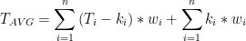
And the resolution you need to integrate depends on the variability of the integrand, because the weights are approximate. T and k are very variable. T-k not only varies with much less amplitude, but is also smoother.
>>
No. As I said, you drop the average of normals, getting . . . .
<<
Pretending that anomalies aren’t just temperatures with the pea hidden under a shell doesn’t remove the fact that eventually you have to get back to temperatures. Once you do, then you’re doing something which is forbidden by equilibrium thermodynamics. Maybe non-equilibrium thermodynamics will come to your rescue, but that’s a way off yet.
You should have stopped while you were behind, Again:
reduces to:
and we’re back to where we started–almost.
We seemed to have lost our 1/n term, but maybe the w terms contain it. If so, then it looks like you’re averaging temperatures and pretending you’re not averaging temperatures. Plus you’re no longer just averaging, but playing with the numbers too. As I’ve said, it’s a shell game–isn’t it?
Jim
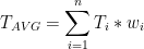
” eventually you have to get back to temperatures”
You don’t have to get back to global average temperature. What is calculated is global average anomaly. That’s it. GISS explains the issue here; NOAA here. As GISS says, if you really must quote an absolute temperature, you should first calculate the average anomaly, and then get an average normal (the second term) from a GCM or some other source. But as they also say (pretty much), don’t! NOAA says the same, but sometimes foolishly wanders from that advice. It’s a big institution.
>>
You don’t have to get back to global average temperature. What is calculated is global average anomaly. That’s it.
<<
And you probably said that with a straight face. Anomalies are pseudo temperatures. They are used as temperatures, and you can always get back to a “real” temperature if you really need to. Pretending they aren’t temperatures only works for those who don’t really understand what’s being done behind the curtain.
From one of your references:
Basically a temperature for all intents and purposes. If they aren’t temperatures, then why does the global warming crowd use them?
Since you can’t average temperatures, then you can’t average anomalies either. The math demonstrates they are essentially the same thing.
It’s interesting that you linked to that first site about SAT. The one thing that climatologists don’t seem to know is that there’s a difference between ST (surface temperatures) and SAT (surface air temperatures). They use them interchangeably in their papers. They aren’t really the same. For one thing, the heat capacities of air are vastly different from solid objects–as are the emissivities.
Jim
Another issue is humidity and thus the actual energy content of the air.
Here in Fort Myers, it has been pretty close to summertime temperatures for the past several weeks. It will remain more or less the same over the coming month, with gradual warming as we move into April and May, by which time it will be downright hot as all get-out.
But the weather we have right now is gorgeous, low humidity and pure sun and breezy.
In summer it is face meltingly humid and the same 85 degrees feels like walking through hot molasses.
The amount of energy in the atmosphere in summer is far higher, although you cannot discern this when looking only at temperature.
What does all that mean regarding global average temp? About the same thing as it means when one notes that the average of the inside and back coils of my refrigerator are the same average temp as my living room.
>>
Steve Richards
March 3, 2018 at 12:03 am
It is easy to create a mathematical average of anything you like, just don’t expect the result to mean anything in the real world.
<<
As Doctors Essex and McKitrick pointed out on page 145 of their book, “Taken By Storm:” You can average the numbers in a phone book, but what does an average phone number mean?
Temperature is an intensive thermodynamic property. It only has meaning if the system being measured is in thermodynamic equilibrium–otherwise you can’t even apply the Zeroth Law. Since the atmosphere is not in equilibrium, then it doesn’t have a temperature–by definition. And you can’t average temperatures to get one.
Ahhh, but you say meteorologists have been measuring temperatures for centuries. Meteorologists sort of bend the rules. The atmosphere is not in equilibrium, but a smaller region (of unspecified size) can be in equilibrium or if it’s not then the values are changing so slowly that equilibrium can be assumed. This is referred to as LTE or local thermodynamic equilibrium.
Jim
One of the problems of using satellite measurements of radiance as a proxy for temperature.
But satellite temperatures are like capitalism…the worst system in the world, except for all the others.
menicholas
In these exchanges I have come across as the sort of person I despise; rude, over-bearing, self-opinionated, etc, for that I offer my sincere apologies.
No sweat Jim, we are big boys. Internet opinionating is not for the thin-skinned, as it turns out.
Nic, you wrote:”And the second is TLS – stratosphere. Which is expected to cool under AGW.” ( This comment: https://wattsupwiththat.com/2018/03/02/uah-global-temperature-report-february-2018/comment-page-1/#comment-2756280 . I’m glad that we agree: The stratosphere will cool with every warming of the troposphere due to the lifted tropopause.
I’ll take these conversations more seriously when I see the same hyperventilation surrounding ground based measurements being expressed as anomalies.
Not to mention the ever so slight disparities that may exist between the many thousands of ground based thermometers. I like the concept of the satellite as it is essentially one thermometer making assessments of the entire globe. That means that the data obtained is always obtained in exactly the same fashion. Thermometer readings can not do that, not can they sense the entirety of the surrounding area.
Another thought is that absolute accuracy of the real temperature is not as important in assessing global/regional temps, as compared to having the exact replication of process made in determining the reading every time the reading is taken. That means that the reading on Day One could be 0.1 C off as compared to reality, but the reading will then accurately record the change on Day Two and for there after.
But there is not just one satellite and the accuracy of measuring radiance varies. Satellites drift , orbits decay. Plus of course there is no such thing as a ‘temperature’ in the atmosphere. To this add the modelling input assumptions to convert radiance to temperature.
What is being measured by UAH then? You say that it is not a temp anomaly, fine. What it is representative of then?
On the surface, there is not just one thermometer and they vary too, as do umpteen other variables.
Drift and decay can be measured and compensated for, as can variance between instruments.
In a lab, everything needs to be calibrated and tested, on a regular and ongoing basis, if the best and most accurate and precise results are desired.
Do you think anyone is calibrating the surface instruments on a regular basis?
Just have a look at the article regarding the surface stations project.
OMG…talk about a mess.
And then the guys keeping the numbers constantly adjust them?
Fuggeddabowditt!
Fact is, the uncertainty is very much higher than they would have us believe.
Once upon a time, no one was in a tizzy over hundredths of a degree.
@goldminor
But the satellites currently used are not the same satellites as were used 20 years ago. They don’t even use the same type of instruments.
Moreover, regardless of how accurate the satellite data is, it still has to be worked into a global temperature set, and that’s obviously not foolproof. If it were there wouldn’t be the major differences between different versions.
I remember when they used to track together. They still show the same basic profile, even if they do not agree on the exact reading. GISS, on the other hand, completely changed the profile of the trend with their many adjustments.
I remember when all 3 of those temp sets plus others had the same basic profile in the trend with only minor differences.
Yes, I need to remember that it is not one satellite.
Why is there a significant double peak in the time period of the 2016/7 El Nino?
It was not present in the previous 2 major El Ninos , 1998 and 2010?
is there any physical significance or just an instrumental / calibration effect?
I have not looked at the original UAH site , but I assume that error bars are reported.I wondered if Dr Stokes would know but I suspect he will tell me not to be lazy and do my own research .
Here is a possible explanation, imo. In both 1997/98 and 2009/10 the the ssn number is barely off of the zero line. Then look at 2016/17 and the second spike in late 2017, and notice that it correlates well with a ssn spike in late July/early August of 2017, as can be seen when viewing Silso’s current ssn graph, …http://www.sidc.be/images/wolfjmms.png
The ENSO regions then respond to that last spike of the Sun.
Actually it is a triple peak if you start in 2014. Here are the SSTs that show it.
http://www.woodfortrees.org/plot/hadsst3gl/from:2014.1/to/offset/plot/hadsst3gl/from:2014.1/to/trend/offset
I believe the difference has to do with Bjerknes feedback. When you get Bjerknes feedback more of the El Nino warmed water is driven back into the Pacific Warm Pool. Without it, the water just floats around and continues to slowly warm the atmosphere.
In addition, there were 3 shots of warm water into the East Pacific as can be seen by the triple peak. Even though 2017 was not an official El Nino we did have El Nino conditions for about 3.5 months.
And 2014 was the solar maximum for SC 24.
Thanks to goldminor and Richard M for comments. There seems to be a lot more to learn even about supposedly thoroughly researched climate events like the El Ninos
*cough* *sputter* Say what?
No, no, heavens to Betsy, no.
Settled, Mike, all settled.
Regarding double peaks and comparing one time period with another…I suspect it is for the same reason as when paint dries on one wall, the patterns that appear and then disappear are sometimes somewhat different than the patterns seen on another wall as the paint dries over there.
Thanks for the compliment. I always enjoyed games, puzzles, etc. This AGW debate is the Grand Puzzle with the added bonus of expanding my understanding of the world. I think that I have come across something of note for the sceptics argument. You have heard many state “It’s the Sun stupid”, but have you ever heard someone say “And here is how”?
Well I have found a well defined connection, imo. …https://wattsupwiththat.com/2018/02/27/study-extremely-stormy-weather-in-california-happened-over-150-years-ago/comment-page-1/#comment-2756320
It looks like the warmest areas are where there are fewest measurements.
Cynically, I wonder if the warming is actually a function of the measurement process or the homogenisation of data process.
And, of course, I wonder what value a single temperature fro an entire hemisphere actually provides.
The AGW crowd and its clowns like Mann and Gore provide many reasons to be distrustful but I live in Canada and anecdotally I can say with confidence that winters are much milder than they were in the 60’s. Is that a bad thing? Absolutely not! Hotter summers? Don’t think so. Probably a little cooler. Drought? Nope! Haven’t lost crops to frost or drought around here for 20 years.
Warmer is better. AGW is some crazy Socialist, Environmentalist attack on Capitalism. It is the brainless devil child of a broken education system and indulgent, innumerate parents.
“Absolutely not! Hotter summers? Don’t think so. Probably a little cooler”
Doesn’t appear to be the case for Ontario.
City Avg Summer Mean Avg Summer Max Avg Summer Min
Ottawa +0.8C -0.4C +2.0C
Oshawa +1.5C -1.0C +2.1C
Hamilton +0.3C +0.4C +0.3C
New Glasgow +1.4C +1.0C +1.6C
Brockville +1.1C +1.3C +1.0C
Sudbury +0.9C +1.1C +0.8C
http://climateontario.ca/doc/publications/HistoricalClimateTrendsForOttawaCDA.pdf
http://www.climateontario.ca/doc/publications/HistoricalClimateTrendsForOshawa.pdf
http://climateontario.ca/doc/publications/datasheet_Hamilton.pdf
http://www.climateontario.ca/doc/publications/HistoricalClimateTrendsForNewGlasgow.pdf
http://www.climateontario.ca/doc/publications/HistoricalClimateTrendsForBrockville.pdf
http://www.climateontario.ca/doc/publications/HistoricalClimateTrends_for_SudburyA-update.pdf
I do not think John’s farm is in a city.
Hey, we oughta have a look and see if looking at city temps as populations rise and paradise is gradually paved over and airports expanded, etc…is a good way to determine long term trends?
OH, wait…hmmm.
You know, someone may have already looked at that.
@Menicholas
“I do not think John’s farm is in a city.
Hey, we oughta have a look and see if looking at city temps as populations rise and paradise is gradually paved over and airports expanded, etc…is a good way to determine long term trends?
OH, wait…hmmm”
hmmm, the people who live in or know Brockville & New Glasgow would be amused by your supposition they’re some paved paradise. And Sudbury’s population has been stagnant for 2 decades.
OK then!
Goodbye blue.

Yes, no possible cyclical signal there….
And thank God for that.
For the sake of my children and theirs, I hope and pray for continued warming. The termination of the Holocene Interglacial would spell the end of civilization.
I am of the opinion that there is a reasonable period of time left before that is going to be a consideration. It would be nice to see proper science take a good look at cool down scenarios. Science shows the cyclic pattern of the last 450 K years. How anyone could think that the simple addition of this small fraction of a gas would prevent the down turn in temps from the Milankovotch cycle is delusional, imo.
Since neither I nor any of or our children are likely to be around for it, it is a hoot to consider what will be going on when people who worship at the church of AGW find their world beginning to ice over.
I am not praying or even hoping for a solid cooling trend like 1940 to mid 1970s, but if one comes along right about now, it will be very interesting.
Will it be hot tar and feathers time?
Pitchforks and lynchin’ ropes?
Run out of town on a rail sorta stuff?
Or trials and hard prison time?
@ Menicholas…all worthy suggestions.
This style of graph is annoying though. It puts all the emphasis on the base value, making a huge distinction between positive and negative, when the base period is arbitrary. If it was possible to use a mid 20th century base period for satellites this graph would be nearly all red. Point graphs are much more useful as they simply illustrate the trend.
But this style is what is “officially” endorsed. The base period for climate is the last 30 years, per the standard-setting groups.
UAH doesn’t go back to the 1950s. That graph covers a 30 year mean from a 39 year data set.
JP
On the other hand, the satellite record for Arctic and Antarctic sea ice ALSO only extends only a few years: 1979 – 2018. Only HALF of the 70 year climate short cycle.
Can you determine the “average” temperature for a year, if you measure from Sept to March? Or from March to Sept? What is the actual “average daily sea ice extents” for either the Arctic or Antarctic?
zazove, the red matches up well with the reduction in Arctic sea ice and the resultant release of a lot of energy into what would otherwise be extremely cold air. The timing also matches up with the positive AMO. If the AMO is the principle driver then the blue will return when the AMO goes negative.
That would still be a 5-8 years away but it could start dropping from the near record values of this past year.
Goodbye cold. Hello mild.
I see a graph that starts in 1978 this Hoosier immediately remembers the blizzard of 78. Lowest pressures ever recorded in Indiana and Ohio. Ma Bell would only allow emergency phone calls. Remember a snow plow trying to go down the street and taking the door handles and side mirrors off of one buried car after another parked along the curb. My cousin had a hopped up and lifted Toyota Land cruiser. Back then the only Toyota Land Cruisers were the jeep type. We could get out on go in it and were delivering needed prescriptions to the people stranded in their homes, rescuing peoples dogs and that kind of thing, and generally just having a ball doing it. But there were plenty of places where even in that thing we dare not try to tread. Drifts in some places 10 ft. high. Hwy 9 between Anderson and Alexandria was buried in 4′ of snow. They called out the National Guard with M-113 APCs to go rescue people and to use front loaders to help clear the roads. Just an awesome experience and the event that made me aware of just how quickly vulnerable and helpless we can become before natures fury.
It looks like the list of monthly temperatures do not match the updated values for January 2018.
It changed from -0.12 to -0.26 after the update.
If the average temperature over one year is “at”; then the average of these averages over n years is “sum at/n”. If the average temperature of an additional year is “ata”; then the new average is: “((at*n)+ ata)/n+1.; which probably doesn’t amount to much of an anomaly, particularly as the original averages were all calculated using different technologies.
I just wonder what all these graphs REALLY mean, if we are expected to get excited about them and reach some sort of conclusion.
The word ‘thermometer’ is a crock.
A ‘therm’ is a unit of energy – about 28kWh
Thermometers do not measure energy – and hence why this global whatevering is such an expletive mess.
Whenever a temperature graph is posted (by anybody) it should tell us *exactly* what is is the temperature of.
No, I don’t want humidity, I want to know what plants are growing there and what is happening inside the top 3 feet of dirt.
Because in a tornado or hurricane, it is the energy of the thing that does the damage.
Similarly with snow, as per the UK right now – it is the lack of energy that is doing the damage. Even though a poisonous melon has killed more people (in Aus) than the weather has in the UK
When you are dealing with water, an increased temperature can indicate a lessening of the energy content of a system simply by virtue of here/there/wherever being drier than it was.
Higher temps can be the result of increasing energy loss.
Not a sustainable or long term thing because without extra energy coming in (from the sun?) – the system will crash into cold. Ice age?
eg If the radiator of your car engine is running hotter than it normally does *and* you’re not putting more petrol/diesel/gas into the engine – are you heading towards a happy place? Does it not say that your engine has lost its water and is actually headed to the breaker’s yard?
Think on……………
PS & btw, February 18 average temp in my garden was 3 degC colder than it was in Feb 17
I’ll see your poxy 0.3 anomaly and raise (lower) it by 3. Where’s that paycheck of yours/mine?
OT…just an interesting set of atmospheric interactions which has resulted in this cyclone to the northeast of Madagascar sucking a large amount of moisture out of Central Africa. That might not be so good for some areas of Africa. This started up as a very hot spot above Madagascar around 2 weeks ago. …https://earth.nullschool.net/#current/wind/isobaric/700hPa/overlay=total_cloud_water/orthographic=-313.59,-10.73,887/loc=51.594,-15.999
I don’t understand how the accuracy and precision of the anomalies is obtained. I’ve seen meteorological thermometers with specified accuracy +/1 0.5 degree. When you compare two temperatures you can not then have an accuracy greater than the initial temperatures. Yet you see anomalies to 1/100th of a degree. This implies and accuracy of +/- 0.005.
Yes Rich. Anomalies are exercises in statistics, wherein someone massages a presentation to favor the agenda they are pushing. To be sure … a “global”anomalies is meaningless. There is no meaningful rationale to average the globe, because the driver of the global temp, that hot spot over Siberia, only effects Siberia . Likewise, the cold spot over Canada only effects Canada. …. until it moves of course.
It’s kinda like the ASCOT trial for cholesterol and heart attack. The trial accurately claims a 36% reduction in heart attack for atovastatin ….. what they don’t present is the real data was a decrease from a 3% chance to a 2% chance. A decrease from 3% to 2% is not near as impressive sounding as a 36% decrease. Bottom line …. 36% decrease resulted in 12 billion a year!
Likewise ,,,, an anomalies graph with a steep axis is much better at pushing for an agenda of taking over the worlds energy supply ….. than showing a graph with a warming from 57.2F to 57.9F.
Smoke and mirrors.
The really significant stat would be all cause mortality changes.
If that has not changed, the stuff is worthless.
Just eyeballing the graph, from 2016 to now we are running a -3C trend per decade. What’s the crisis about global warming. At this rate we will be fighting continental ice sheets in twenty years or so.
So, a little cooler in Feb. as expected.
Coach S: Feb was a little less above the Feb average than January was above the Jan average.
Let’s keep the following in mind.
“Satellites do not measure temperature. They measure radiances in various wavelength bands, which must then be mathematically inverted to obtain indirect inferences of temperature. The resulting temperature profiles depend on details of the methods that are used to obtain temperatures from radiances. As a result, different groups that have analyzed the satellite data have produced differing temperature datasets. Among these are the UAH dataset prepared at the University of Alabama in Huntsville and the RSS dataset prepared by Remote Sensing Systems.
The satellite time series is not homogeneous. It is constructed from a series of satellites with similar but not identical sensors. The sensors also deteriorate over time, and corrections are necessary for orbital drift and decay. Particularly large differences between reconstructed temperature series occur at the few times when there is little temporal overlap between successive satellites, making intercalibration difficult”
Wikipedia
Let’s keep in mind it is even worse with surface stations.
Waiting for the Alarmists to cry “Look how warm it is in the Arctic!!!”, and then running around in circles, pointing and pulling their hair out.
“Waiting for the Alarmists to cry “Look how warm it is in the Arctic!!!”, and then running around in circles, pointing and pulling their hair out”
Cooligans would never make a fuss about cold summers or that a coming Maunder Minimum would send us back into a Little Ice Age, right?
https://www.express.co.uk/news/science/729767/Ice-age-prediction-sun-hibernates-global-cooling-climate-change
http://www.dailymail.co.uk/sciencetech/article-3156594/Is-mini-ICE-AGE-way-Scientists-warn-sun-sleep-2020-cause-temperatures-plummet.html
http://www.climatedepot.com/2017/12/28/7-new-2017-papers-forecast-global-cooling-another-little-ice-age-will-begin-soon/
Me, I just love it when headlines scream about “the Arctic is burning up”, but not mentioning that it is -40 instead of -60.
Leaving out a detail like the fact it is actually bitterly cold while saying it is burning up with an average 20 degrees above normal, is, lets face it…outright lying.
But it is burning up, burning up all of that above average heat which was transported into the Arctic, never to be seen again.
As for anomalies, frozen canals and good skating today in the Westland region, The Netherlands
http://3by4.nl/temp/skating_schipluiden.jpg
The alarmist leaned back and looked up into sky.
-What are you looking for?
-A red herring, said the alarmist.
So jelous… lived in the Netherlands for 4 years. That looks like pristine ice too.
Yes amazing quality, a late-winter-nearly-springtime surprise for the skate lovers. For me nothing beats skating the canals in our flat and open “polderland” with views far and wide.
Indeed Juergen. And here in NZ we have had summer snow again as has Tasmania. Perth WA has had a cold summer and in South America there has been exceptional crop damaging frost.
Record cold temp all across the Northern hemisphere with snow down to the Sahara. And I should mention the growth of a large number of NZ glaciers.
All of the graphs, computer models and conclusions drawn are garbage.
The planet cools, as predicted by so many scientist.
Notice that on the global anomaly map that there are cold spots developing to the west of all of the land masses in the SH. I think that this is significant. It is a herald of a shift in surface wind flows where surface winds will push cold waters north, as well as mixing into warmer air masses. The change in ocean surface temps initiated by the surface winds will be the base for further cooling, imo. …https://earth.nullschool.net/#current/wind/surface/level/overlay=temp/orthographic=261.41,-56.18,672/loc=-79.378,-36.814
The spot marked is where the last bit of southeast moving warmer air is being overwhelmed by colder air masses. Those cold winds will then pour north, unabated for a period of time, up the west coast of SA. This is a key to the change which has taken place over the last 4 years at the South Pole. In prior years warmer surface wind flows through Drake’s Passage was typical of the pattern for the area. That meant that there was a steady flow of warm Pacific waters deposited into the Atlantic through Drake’s Passage during the periods where this wind pattern was the main recurring wind pattern. This flow pattern started to break up in mid 2016, if I remember right. That meant intermittent flows of colder surface winds moving through Drake’s Passage. Now this fairly recent wind pattern where the colder flows are asserting themselves as the primary pattern. I suppose the question is ” How long will this pattern hold?”, among other questions. …https://earth.nullschool.net/#current/ocean/primary/waves/overlay=sea_surface_temp/orthographic=263.82,-53.24,672/loc=-78.156,-43.011
“The planet cools, as predicted by so many scientist.”
Nonsense. Name a few.
Actual fool, or just trolling?
RSS also produced TLT figures for Feb: http://images.remss.com/msu/msu_data_monthly.html
Also down slightly compared to the previous month, but still at a higher overall value than UAH when the figures are set to the same baseline. RSS is 0.35 compared to the 1981-2010 base, whereas UAH is 0.20.
Confusing how folk insist satellite is the better option for assessing global temperature change when two bodies using exactly the same data from exactly the same source consistently come up with such different results for even a single month.
RSS does not use 100% satellite data. They replace some of it with surface data. Anyone using RSS 4 is using garbage.
“RSS does not use 100% satellite data. They replace some of it with surface data. “
That isn’t rue.
This was not always the case.
Do you really not recall how recent the divergence was?
Is it common to see a significant difference between surface temperatures and lower troposphere anomalies? The lower troposphere anomaly map indicates my home state of Oklahoma was +1.5 C to +2.5 above average. A check of the National Weather Service stations around the state indicate the monthly surface temperatures were about equal or slightly below the 1981-2010 average.
Hey, remember when warmistas used to love to bleat and moan about how “nobody lives in the troposphere”.
And remember when they then all cheered like it was New Year’s Eve when whatshisface got rid of the pause by playing a game of abracadabra with the old wooden bucket data from ships and making that the new gold standard for how to correctly get the true temperature of the whole Earth, even though nobody lives out in the middle of the ocean, either?
Good times…good times.
Made seventeen clowns getting out of a golf cart look like a Mensa meeting.
.13 degrees per decade
Let’s assume that will be a stable number. Within 80 years the Earth’s atmosphere will warm 1 degree?
Hmm. Not a crisis. Assuming stability in the development of space industry, we will be able to put solar shields up that will allow us to stabilize or even reverse any warming.
Moving on from this topic unless things radically change.