Foreword by Paul Dreissen
Over and over, we are confronted with claims that last month or last year was “the warmest on record.” Each claim is accompanied by dire warnings that the alleged new records portend “unprecedented” chaos for wildlife, humans and planet.
Virtually never do these scary press releases mention that the supposed change is mere hundredths of a degree higher than previous measurements. Never do they admit that the margin of error in these measurements is far greater than the supposed increase. Never do they suggest that a little more warmth would be infinitely better than a colder world, with less arable land and shorter growing seasons. And most certainly, never do they admit to the massive deficiencies in the system that supposedly tracks Earth’s temperature … and always blames any increases on humans and fossil fuels.
This article by Dr. Tim Ball and Tom Harris points out all these highly relevant but often (deliberately) ignored realities.
Overheated claims on temperature records
It’s time for sober second thoughts on climate alarms
Dr. Tim Ball and Tom Harris
Now that the excitement has died down over the news that Earth’s surface temperature made 2017 one of the hottest years on record, it is time for sober second thoughts.
Did the January 18 announcement by the National Oceanic and Atmospheric Administration (NOAA) that 2017 was our planet’s third-hottest year since 1880, and NASA’s claim that it was the second hottest year, actually mean anything?
Although the Los Angeles Times called 2017 “a top-three scorcher for planet Earth,” neither the NOAA nor the NASA records are significant. One would naturally expect the warmest years to come during the most recent years of a warming trend. And thank goodness we have been in a gradual warming trend since the depths of the Little Ice Age in the late 1600s! Back then, the River Thames was covered by a meter of ice, as Jan Grifier’s 1683 painting “The Great Frost’ illustrates.

Regardless, recent changes have been too small for even most thermometers to notice. More important, they are often less than the government’s estimates of uncertainty in the measurements. In fact, we lack the data to properly and scientifically compare today’s temperatures with the past.
This is because, until the 1960s, surface temperature data was collected using mercury thermometers located at weather stations situated mostly in the United States, Japan, the United Kingdom and eastern Australia. Most of the rest of the planet had very few temperature sensing stations. And none of the Earth’s oceans, which constitute 70 percent of the planet’s surface area, had more than an occasional station separated from its neighbors by thousands of kilometers or miles.
The data collected at the weather stations in this sparse grid had, at best, an accuracy of +/-0.5 degrees Celsius (0.9 degrees Fahrenheit). In most cases, the real-world accuracy was no better than +/-1 deg C (1.8 deg F). Averaging such poor data in an attempt to determine global conditions cannot yield anything meaningful. Displaying average global temperature to tenths or even hundreds of a degree, as is done in the NOAA and NASA graphs, clearly defies common sense.
Modern weather station surface temperature data is now collected using precision thermocouples. But, starting in the 1970s, less and less ground surface temperature data was used for plots such as those by NOAA and NASA. This was done initially because governments believed satellite monitoring could take over from most of the ground surface data collection.
However, the satellites did not show the warming forecast by computer models, which had become so crucial to climate studies and energy policy-making. So bureaucrats closed most of the colder rural surface temperature sensing stations – the ones furthest from much warmer urban areas – thereby yielding the warming desired for political purposes.
Today, virtually no data exist for approximately 85 percent of the earth’s surface.

Note the grey areas in this map from NASA GISS. Other areas are smoothed to a 250km radius.

Indeed, fewer weather stations are in operation now than in 1960.

That means surface temperature computations by NOAA and NASA after about 1980 are meaningless. Combining this with the problems with earlier data renders an unavoidable conclusion: It is not possible to know how Earth’s so-called average surface temperature has varied over the past century and a half.
The data is therefore useless for input to the computer models that form the basis of policy recommendations produced by the United Nations Intergovernmental Panel on Climate Change (IPCC) and used to justify eliminating fossil fuels, and replacing them with renewable energy.
But the lack of adequate surface data is only the start of the problem. The computer models on which the climate scare is based are mathematical constructions that require the input of data above the surface, as well as on it. The models divide the atmosphere into cubes piled on top of each other, ideally with wind, humidity, cloud cover and temperature conditions known for different altitudes. But we currently have even less data above the surface than on it, and there is essentially no historical data at altitude.
Many people think the planet is adequately covered by satellite observations, data that represents global 24/7 coverage and is far more accurate than anything determined at weather stations. But the satellites are unable to collect data from the north and south poles, regions that the IPCC, NOAA and NASA tout as critical to understanding global warming. Besides, space-based temperature data collection did not start until 1979, and 30 years of weather data are required to generate a single data point on a climate graph.
So the satellite record is far too short to allow us to come to useful conclusions about climate change.
In fact, there is insufficient data of any kind – temperature, land and sea ice, glaciers, sea level, extreme weather, ocean pH, and so on – to be able to determine how today’s climate differs from the past. Lacking such fundamental data, climate forecasts cited by climate activists therefore have no connectionwith the real world.
British Professor Hubert Lamb is often identified as the founder of modern climatology. In his comprehensive 1972 treatise, Climate: Past, Present and Future, he clearly showed that it is not possible to understand climate change without having vast amounts of accurate weather data over long time frames. Lamb also noted that funding for improving the weather database was dwarfed by money being spent on computer models and theorizing. He warned that this would result in wild and unsubstantiated theories and assertions, while predictions failed to improve. That is precisely what happened.
Each and every prediction made by the computer models cited by the IPCC have turned out to be incorrect. Indeed, the first predictions they made for the IPCC’s 1990 Assessment Report were so wrong that the panel started to call them “projections” and offered low, medium and high “confidence” ranges for future guesstimates, which journalists, politicians and others nevertheless treated as reliable predictions for future weather and climate.
IPCC members seemed to conclude that, if they provided a broad enough range of forecasts, one was bound to be correct. Yet, even that was too optimistic. All three ranges predicted by the IPCC have turned out to be wrong.
US Environmental Protection Agency (EPA) Administrator Scott Pruitt is right to speak about the need for a full blown public debate among scientists about the causes and consequences of climate change. In his February 6 television interview on KSNV, an NBC affiliate in Las Vegas, Mr. Pruitt explained:
“There are very important questions around the climate issue that folks really don’t get to. And that’s one of the reasons why I’ve talked about having an honest, open, transparent debate about what do we know, and what don’t we know, so the American people can be informed and they can make decisions on their own with respect to these issues.”
On January 30, Pruitt told the Senate Environment and Public Works Committee that a “red team-blue team exercise” (an EPA-sponsored debate between climate scientists holding differing views) is under consideration. It is crucially important that such a debate take place.
The public needs to understand that even the most basic assumptions underlying climate concerns are either in doubt or simply wrong. The campaign to force America, Canada, Europe and the rest of the world to switch from abundant and affordable coal and other fossil fuels – to expensive, unreliable, land intensive alternatives – supposedly to control Earth’s always fluctuating climate, will then finally be exposed for what it really is: the greatest, most damaging hoax in history.
Dr. Tim Ball is an environmental consultant and former climatology professor at the University of Winnipeg in Manitoba. Tom Harris is executive director of the Ottawa, Canada-based International Climate Science Coalition.
Pierwszy, kurwa!
Here is a relevant analysis by Dr Victor Hansen on the Global Warming phenomena. https://www.youtube.com/watch?v=3ok1MG3WxVA at 51.04 (Actually the whole presentation is very good but an economics question at 51.04 brings out in my mind, great analysis of Global Warming in academia.)
Cheers
Roger
http://www.rogerfromnewzealand.wordpress.com
Paul Homewood has this on some of the recent claims of warmth.
https://notalotofpeopleknowthat.wordpress.com/2018/02/17/ghcn-are-even-inflating-current-temperatures-in-new-york/
Where would they be without the ever present adjustments? Maybe they are correct. Maybe they aren’t. But the chances they represent reality, past and present, are infinitesimal. On top of that, as stated in the article, the lack meaningful spatial coverage in the past defies the ability to establish a reliable baseline.
My wife loves reading fiction. She would get a real kick out of this stuff.
The magnitude of the adjustments, in many cases, are larger than the warming being claimed. Amazing.
“Where would they be without the ever present adjustments?”
Have you ever tried to find out? Unadjusted data is published, and you can use that to compute the average too and actually see how much difference it makes. The answer is, very little> Here is a plot of a global land/ocean index calculated using GHCN adjusted, in purple, and unadjusted, in blue (12-month running mean). The time runs from 1900 to 2014.
This from a June 2017 report on GAST. Wallace, D’Aleo, Idso
“sets are not a valid representation of reality. In fact, the magnitude of their historical data adjustments, that removed their cyclical temperature patterns, are totally inconsistent with published and credible U.S. and other temperature data. Thus, it is impossible to conclude from the three published GAST data sets that recent years have been the warmest ever –despite current claims of record setting warming”
Nick, this report says differently
https://thsresearch.files.wordpress.com/2017/05/ef-gast-data-research-report-062717.pdf
“not a valid representation of reality “
Take on the Report
“In fact, the magnitude of their historical data adjustments, that removed their cyclical temperature patterns, are totally inconsistent with published and credible U.S. and other temperature data.”
Do you see any quantification? Numbers? Have they actually tried to show what the ectual effect of including (or not) the adjustments on the average?
Nick
Regarding spatial coverage, I doubt even you would try to defend the pathetic spatial coverage for establishing a baseline pre-1950 for OHC. Not specifically the topic of the day, but pre-1950 doesn’t come close to the technological capabilities of today nor the coverage.
Hi Nick!
Can you help a laymen please?
Compared with USHCN the daily GHCN data is not the raw version. I agree the final adjustments building the monthly data is very minor but how do we know what was done to adjust for TOBS, thermometer change from mercury to electronic etc. In USHCN these adjustments averages to -0.8C for the 1930’s compared with today. Do we have example of historical real raw files from the source available somewhere.
Also I wonder what you think about treating anomalies as perfectly linear when averaging. In reality very little energy is required to block radiation to space and keep a temperature at say -25C instead of -35C vs increase the temperature from +25C to +35C.
RE Nick:
Your denials continue to be a joke. 40 percent of data around the world is fill-in. Here is all I need to show you are off target:
https://realclimatescience.com/100-of-us-warming-is-due-to-noaa-data-tampering/
https://en.wikipedia.org/wiki/Rhetorical_question
Interesting chart Mr Stokes.
Although it doesn’t go back to 1880 it does come close enough. What it does show though is that virtually every year has been warmer than approximately 1910, and the relative rate of increase has been fairly consistent with a gradual slope equivalent to around 1C per century. Looking at it though, I must say it is really difficult (Nye impossible) to determine exactly when natural warming from the cold depths of the LIA subsided and anthropogenic enhanced warming commenced.
Then the million-dollar question becomes: “If it makes so little difference, why do they do it?
The adjustments wouldn’t be made if someone didn’t think they were necessary. Since they are made, someone thinks they are necessary.
What would those reasons be, then?
RE Nick:
**see how much difference it makes. The answer is, very little>**
Your response shows how you flip the facts. Your graph shows about a half a degree difference. Now the AGW crowd calls .05 degree significant if it is warmer. Until about 1999, the 1930’s were the warmest. After NASA/NOAA increased the last 20 years, they are now SLIGHTLY warmer (man-made by computer) and you make a big deal of it. You are still a joke. While you are at it, read my post below.
“Your denials continue to be a joke. 40 percent of data around the world is fill-in. Here is all I need”
Well, there is a joke. To show 40% of data round the world is a fill-in, you show USHCN, which is ConUS only, and as an index hasn’t been used for 4 years.
“Then the million-dollar question becomes: “If it makes so little difference, why do they do it?”
And the answer is, to make sure it is right. We know there are inhomogeneities in the data – station moves etc. You don’t know if the difference is important until you have worked it out. And if you have worked it out, you should tell people. Even when it turned out not to matter.
Oh yeah…combine land and ocean data going back to the 19th century!
Hah!
Your graph is a joke for that reason all by itself.
Re Nick
**Well, there is a joke. To show 40% of data round the world is a fill-in, you show USHCN, which is ConUS only, and as an index hasn’t been used for 4 years.**
No Nick, you are the joke.
I answered multiple questions in a short space.
I pointed you to a site with several graphs showing how temperatures are manipulated for you and the gullible public. At the same time I indicated that 40 % (likely higher) of observations are fill-ins. I did not attribute any of the information to USHCN. I just pointed you to some damning information to which you really have no response other that to divert the discussion a method which you started at Climateaudit, RIGHT? In addition you comment on 4 years is nonsense and a side show. I am simply pointing out how data is manipulated and fake. So do not give me fudgy excuses but just confirm what I said is accurate.
MrZ,
“Compared with USHCN the daily GHCN data is not the raw version. “
Could you substantiate that? In any case, here we are dealing with GHCNM, not daily.
“Also I wonder what you think about treating anomalies as perfectly linear when averaging”
Most heat transport within the atmosphere responds to temperature gradient, so linear makes sense. Radiation responds to T^4, which is itself not so far from linear within terrestrial range. But in fact, radiation to space is predominantly from high in the atmosphere, which is why the effective radiation temperature averages 255K.
“Here is a plot of a global land/ocean index calculated using GHCN adjusted, in purple, and unadjusted, in blue (12-month running mean). The time runs from 1900 to 2014.”
Why pollute the good land data with the pathetic ocean “data” back through 1900?
Good on you Nick, once again shredding a biased post by discredited pundits with common sense and a bit of data. I suspect there are many lurkers here who respect your efforts and your patience.
Nick!
“Compared with USHCN the daily GHCN data is not the raw version. “
Could you substantiate that?
I tried to say:
USHCN RAW is really raw as read from station. They then do adjustments in two steps both available as separate files. The diff between raw and final adjusted is -0.8C for the 1930s and much smaller for resent readings.
GHCN Daily “raw” is as delivered from the sources and NOT as read from the stations. I argued the daily raw is like USHCN adjusted.
On the second point about linear anomalies:
A. In a cold climate you only need some clouds to block the radiation and keep the temp at -25C instead of -35C
B. In a warm climate you need massive amount of radiation to increase temperature.from +25C to +35C
Analyzing data we have much more of A than B happening.Anomalies hides this.
zazove translated: Nick, you say what I want to hear, so you are a god.
MrZ
“and NOT as read from the stations.”
Well, OK, could you substantiate that? I don’t think it is true. And I still don’t understand why you have switched from GHCN monthly to daily.
Nick!
From the README file.
It is important to note that the term “unadjusted” means that the developers of GHCNM have not made any adjustments to these received and/or collected data, but it is entirely possible that the source of these data (generally National Meteorological Services) may have made adjustments to these data prior to their inclusion within the GHCNM.
Why I talk about the Daily is because that is the source for the Monthly. Like I repeated before adjustments is -0.8C for USHCN in the 1930s. Somebody should have compensated for TOBS, thermometer type etc also for GHCN data. Otherwise GHCN methods are inconsistent with USHCN.
I will check the stations marked HCN in GHCN Daily and compare with USHCN if the adjusted- or raw data are fed. This correlation takes a while and I will respond in next thread I see you, because this thread is getting old.
CU there.
Nick,
My memory slipped me. The USHCN daily is only available as part of the GHCN daily set, so its indeed the same raw. So I will compare USHCN final adjusted (FLs52j) with GHCN adjusted (qca) instead.
Nick again…
I did some random comparisons for individual USHCN stations and months:
USHCN raw TAVG == GHCN qcu TAVG
USHCN FLs52j TAVG != GHCN qca TAVG.
Diff I have seen so far is +/- 0.4C.
When I do an anomaly diff analyses what do you recommend for baseline, adjusted average or raw average? I think the latter to compare to a common baseline.
Back in next thread.
MrZ,
“Why I talk about the Daily is because that is the source for the Monthly.”
It isn’t. GHCNM has been around since about 1992, and updated since 1997. GHCND is about six years old. The source for new GHCNM is CLIMAT forms.
USHCN is here a)obsolete and b)irrelevant. There are no “GHCN methods” for qcu (unadjusted). GHCN is a data collection, now just transcribed from CLIMAT. There were “USHCN methods” when NOAA published an index, but that was replaced by ClimDiv about four years ago. GHCN uses the same stations (for ConUS), but does not adjust (for QCU).
Thanks Nick,
If You still have the energy I would appreciate your views on the following.
A. Can I still trust this directory for GHCNM?
http://ftp.ncdc.noaa.gov/pub/data/ghcn/v3
B. Is this still a common/valid GHCND source?
http://ftp.ncdc.noaa.gov/pub/data/ghcn/daily/ghcnd_all.tar.gz
C. How come NOAA still updates this USHCN directory every day (using the above GHCND)?
ftp://ftp.ncdc.noaa.gov/pub/data/ushcn/v2.5
NOAA argued at length to motivate their adjustments. When I compare GHCNM (QCA) and USHCN (FLs.52j) I get a large diff. (GHCNM QCU and USHCN RAW are 100% the same)
D1. Is the original adjustments out the window and replaced by the new?
D2. If yes, Some of their arguments were obviously false then?
D3. Does NOAA keep USHCN updated just to upset/confuse laymen like me? 😉
MrZ
Z? – we’re only up to D 🙁 But:
A. Yes
B. Yes, if the date is current. I prefer KNMI, which sorts it out better
C. I expect they have an automated program which just transfers the data from GHCN, which had a common set of stations
D1. I presume you have now switched topic to US and ClimDiv. I expect trhey use the same methods on the larger set of stations.
D2. Why?
D3. NOAA made very clear that their estimates of US temp are now based on ClimDiv (since 2014). I expect that no-one has touched the USHCN directory or its automatic update process since.
Thanks Nick
The “Z” is from my name Matz. It is normally spelled Mats but my father misspelled it on purpose. It has since then gotten more popular.
Will try to reach Z next time we talk…
Regards
Also this. https://notalotofpeopleknowthat.wordpress.com/2018/02/16/us-big-freeze-is-adjusted-out-of-existence-by-noaa/
Let’s start with a very simple change: require all those publishing “global temperature” to have their operations assessed to an international quality standard like ISO9000.
This doesn’t guarantee accuracy, but it will be a start to a better more systematic mindset.
Clearly NASA & NOAA will be completely against it. So, why doesn’t UAH & Roy Spencer lead by getting ISO9000 accreditation for his own metric?
That way we can say “UAH is the only quality assessed metric”.
Whenever I see that temperature anomaly maps are smoothed to a radius of 250km, I immediately think of how this would apply to England. In approximate terms this would assign the country a single temperature. Yet to those of us who live here, there is almost always such a large variation in temperatures from north to south, east to west as to render the assigned average totally meaningless to our actual experience.
Exactly Peter.
I’m watching a little set of Wunderground PWS which, more by luck than judgement, cover almost exactly the patch of England that is the ‘CET’
They broadcast, in real time so no adjustments are easily possible, a temp reading every 5 minutes. All of them (my little harem) have done so for the last 15 years, some go back 18 years.
By example, they say that 2017 was 9th out of 18 for average temperature.
Yet even Wunderground themselves will produce red-hot visualisations of Earth proclaiming the whole North East corner of the Atlantic as being ‘2nd hottest evah!’ – then go into a debate where outrageous Ad-Homs rule and opposing views are routinely deleted yet constantly bleating how awful humankind is, themselves not included but Mr D Trump esp so.
As Matt Ridley describeshere, we’ve produced an entire generation of children that are ‘censorious’
IOW They are scared sh1tless of almost everything, from CO2, PM10s, VOCs to petrol & diesel but most especially, each other. (the censorious bit)
Our kids are totally paranoid. Our kids – yeah? You get that?
These alarmists have destroyed the minds of an entire generation of people -the Millennials.
An ever increasing bureaucracy has yanked babies off their mothers (to go out to work and hence be ‘equal’) before their brains were even fully formed then introduced them all to sugar (a supposed replacement for mother’s milk and as a method method of carrot/stick control)
In doing so they are destroying minds= intelligence, thinking-ability, memory, self confidence and personality in one fell swoop.
Even before the hapless kids become aware of the various delights to be found via obesity and diabetes.
Even Beelzebub must be gobsmacked by what these muppets have done, and also, the Great Leaps Forward they continue to attempt. And even achieve in varying degree.
What A Mess
“this would assign the country a single temperature”
No, it would assign a single temperature anomaly. That is, for the monthly average (not daily or hourly), if it was warmer than usual in Kent, it was probably warmer than usual in Scotland. That can be checked.
Sorry Nick, that doesn’t stack up.
I regularly fly from Gatwick to Glasgow and indeed back. That is a distance of around 600Km and typically involves an hour in the air or even less. The temperature difference is often 10C in Surrey/Sussex’s favour (I won’t say Gatwick in this context due to its UHI type effect), especially in the summer, but it varies hugely between 0C and 15C in any year, sometimes even in a week! It is thus wholly inappropriate to assign a temperature, or even an anomaly, across distances even as low as 250Km in Britain. Our weather and geography are just too complex for such to be justified or meaningful.
Sorry, but that is nonsense. The temperature in Kent in the far South of England has no bearing on the temperature in Scotland. Similarly within Scotland there can be a huge range of differing temperatures with no set pattern between the variations.
Nick
Thank you for this comment. This conclusively proves to everyone that you don’t have a clue about what you are talking about.
Its just so absolutely stupid that I can’t type for laughing.
Nick Stokes
It is obvious you have never lived in the UK (possibly the real world). The UK can have unusually cold weather in Kent and at the same time as unusually warm weather in Scotland. Even Scotland can have warm/cold anomalies North to South and East to West. Just have a look a the map It’s about 200km Dunnet Head (most northerly point on mainland UK) to Muckle Fugga (most Northerly point in Shetland). It’s a further 400km to the English border. Check where the mountains are, mainly north and west then think Chinook. Scotland is famous for, and has marketed itself as, having four seasons in one day.
It’s why the first topic of conversation, often before health, between British friends and families disbursed across the UK is the weather.
Perhaps limiting yourself to what you can see through your office window would save you causing mirth amongst UK residents reading your comments!
Nick,
Please see the link above from Bloke down the Pub who did check. Apparently there is more accurate information at the pub than there is from NOAA. We know they’ve drunk the kool-ade at NOAA.
Also, as per the main post, comparisons between today’s readings and a vastly different set of past locations are not valid scientifically! You are keeping score with round marbles (they seem to roll around mysteriously) and telling us they are the same as square marbles.
“The UK can have unusually cold weather in Kent and at the same time as unusually warm weather in Scotland.”
It can. But we are talking about monthly averages of anomaly. It’s a different time scale, and a lot of that washes out.
Mr Stokes, you play with the numbers and you play with the words. You play, you are a bit of a joke.
No doubt once upon a time you did some clever modelling that someone liked and asked you to do a bit more, so you did. Then you started to ‘fall in love’ with your own models, and you defended this tweak and that tweak that you had to do to keep your customers satisfied. Before you knew it you had created a ‘Nick’ world with ever so clever stuff that really only you knew how it all hung together.
Now you have to defend it and your own credibility at every turn. The more time goes on the harder it gets, but you can’t fail because your very own ‘being’ depends on this creation.
I actually have some pity for you. Its probably gone past the point of no return, you are forever in ‘Nick’ land.
The Met on their micro climate page flag up a 6C difference between central and outer London.
And heck, what doesn’t “wash out” can be adjusted to make it line up with expectations, eh?
“Nick Stokes February 18, 2018 at 11:30 am
But we are talking about monthly averages of anomaly.”
Averages of anomaly?! Good heavens! It’s no wonder “climate science” (TM) is in such a bad way!
Nick, the replies to your comment betray a total lack of understanding on the part of the other posters of what the climate actually is, as well as monthly averages and the concept of anomalies. I think it’s worthwhile to try to keep explaining.
All, the entire point of an anomaly is that you aren’t comparing absolute temperatures but deviations in temperature. That is, you want to know if the climate is changing, and despite regional differences in weather brought about by topography etc. the climate throughout the British Isles is undeniably linked (let us consider the gulf stream…). Thus using a single anomaly for the region is wholly appropriate.
Now consider the fact that temperature anomalies are further smoothed to a single area of 196.9 million square miles to come up with an average for the whole planet. Not a temperature, anomalous or otherwise, that anyone or anything actually experiences, yet it is supposed to mean something.
Hoyt,
It would mean more if a realistic standard deviation were to accompany the reported average global temperature. And, if the anomalies carried the standard deviations inherited from the raw and averaged temperatures it would be painfully obvious just how inadequate the temperature database is.
I think it undeniably means something – despite regional variations the planet as a whole experiences temperature change related to its heat exchange with space. That whole should be represented in the sum of all changes occurring everywhere on the surface. There may not be physical quantity that is a mean planetary temperature, but it absolutely represents something that is worth quantifying.
Analogously, if I put a hose into a swimming pool and turn it on, the water level of the pool will begin to rise. Despite all the waves sloshing across the surface, or the splashes from the kids at the far end, I think we can agree that if we were to average all of these varying heights together we would come up with a quantity we’d call “average water height” and we would be able to tell if it was going up or down as a result of the hose.
I believe Nick pointed out that he was not speaking of an hourly or even daily average, but a monthly one, did he not? The difference in temp between Glasgow and Gatwick on any given day is not in itself interesting for all analyses. That doesn’t make it any less meaningless in the physical world, but science is very often an approximation of what happens in the “natural” world. It is only by simplifying the immense complexity that some interactions can be identified and explored – it all depends on the scale of inquiry and the nature of the question.
What a complete load of rubbish. What you are saying is that we can make up any numbers we like to ‘prove’ what we want, irrespective of what is actually happening in the real world.
Do you know how ridiculous you sound?
Jim – Hmmm…Well, I looked over my post, and I must have missed the part where I said we can just make up the numbers. I guess saying “less meaningful” would have made more sense, though. Thanks for picking up on that, Jim, your insult was just what I needed today.
The absolute accuracy is irrelevant when you only look at trends. Any constant offset will be removed. Even simple thermometers have often better than 0.1C degree precision and linearity when you look at small temperature ranges, even if the accuracy is very bad.
Of course, if you want to determine global absolute temperature then you need accurate thermometers.
The concept of global absolute temperature is laughably inane.
One might as well report on the “global absolute stock price” on the financial page.
We endlessy talk about large scale stock price averaging on the financial pages.
That Giss globe shows Northern Europe as Boiling at +4 to +8C for January this year.
I don’t think the people living in those areas would agree with that.
It’s an anomaly, the amount the temperature is different from what it was in an average January during 1950 to 1980. E.g. if the temperature averaged -30C during 1950 to 1980 they’re saying it was -26C to -22C in January this year. Cold, but not as cold.
The glories of constructing anomalous anomalies.
Take some teperature readings without account of the error bands of the recording instruments. Ignore the ones you don’t like, make up others you don’t have. Can’t use them together so decide on the best time period to prove what you wanted to prove in the first place, and average the difference between the invented temps and the average temp across this time period.
Then stick this concoction into as complicated looking computer model as you can make , run it for as long as you dare, and hey presto you create a ‘dogs breakfast’ of a forecast ( sorry not allowed to call it that).
This is ‘science’.
I know how anomalies work thank you very much.
Do you really think that Northern Europe was 8 degrees hotter than the baseline this January?
Not a degree or so, 8 Degrees C.
Which is still meaningless since the flora and fauna of that region has adapted to surviving lower temperatures. The -26c to -22c is still in the adaptive range.
The French Met office said that the average temperature in France in January was 3°+ above normal (’80-’10) On the ground, it felt as such.
No, Europe was not boiling, I do not know about Eastern Siberia, but the French Met Office says that the average temperature during the month of February was 3.4° above normal. It is not a very small country, almost as big as Texas actually, with real rivers, real mountains etc. Believe me, 3.4° makes a difference, which we felt, This is where I live, I know what I am talking about.
Francois, I too have my permanent home in France, and often check Meteo-France.
So you will be interested to know the minimum and maximum temperatures recorded across France over the period they have been collected by Meteo-France.
Maximum 31.2C in Saint-Girons in 1960 you no doubt know this little place is in the foothills of the Pyrenees.
Minimum -29C in Clermont-Ferrard in 1929, a city in central France.
Perhaps you should enjoy a minor warmer period this year whilst it lasts, no doubt it will be wet and miserable on my return. Its called WEATHER.
I should have made clear, these max/mins are for the month of February.
Jim… and weather averaged over time and area is called climate.
“That Giss globe shows Northern Europe as Boiling at +4 to +8C for January this year.
I don’t think the people living in those areas would agree with that.”
The usual argument from incredulity. Have you asked them?
St Petersburg was -6.1°C. That is 3.91°C higher than normal. Stuttgart was 1.6°C, 4.1°C higher than usual. Have you actually checked any data?
Average January temperature for Stuttgart is different depending on source, but average average is 0C, not -2.5C as you have stated, in fact no source has it that low. Have YOU checked any data?
The average January temperature ‘near’ to Saint-Petersburg is -6C. Its actually 10 miles outside the city, at the airport. Have YOU checked any data, and where its actually come from?
The normal for GISS anomalies is the 1951-80 average. It is measured relative to that average for that location.
Anomalous anomalies , what a wonderful invention to ‘prove’ anything you want.
Plot a graph of actual real, non-adjusted temperatures for January in Stuttgart and Saint-Petersburg over the last 100 years ( or as far back as unadjusted data goes) including January 2018.
Then tell me they were both +4C hotter than average this year.
“Nick Stokes February 18, 2018 at 3:08 pm
The normal for GISS anomalies is the 1951-80 average. It is measured relative to that average for that location.”
The normal for GISS anomalies is an average? No average anywhere is measured on Earth, unless it’s made up by people like you Nick. What rot!
“No average anywhere is measured on Earth”
It is the average of the 30 monthly average temperatures, 1951-80, at that site for each month. Normal people have no trouble with such a calculation.
“Nick Stokes February 18, 2018 at 8:56 pm
It is the average of the 30 monthly average temperatures,…”
An averaged average? Laughable Nick!
This recent increase in scare stories to me indicates that the the proponents of global warming are getting desperate. Unfortunately for common sense however they are probably successfully reinforcing the SatanicCO2 Meme in many minds, which is the intent.
In fact this whole debate or fetish with complicated statistical analysis of past and predicted climate is a total waste of time for the purpose of proving or otherwise the influence of CO2.
Quite simply: As the the climate is a chaotic system; Chaos Theory precludes the ability to predict. So why are we all so intent in debating the impossible?
None of the above prevents the responsible management of the consequences of the climate as it changes. That is an entirely different matter.
Sadly there is no known effective vaccine to counter this viral CO2 Meme at the moment.
We need to work on that.
There is always someone trying to sell you or tell you something – indeed, the harder the sell, the less credible the product. When media avidly repeat the report headlines they select but
Fail to mention the error bars are greater than the increase itself
Fail to mention the degree of accuracy achievable by the instruments chosen and that the adjusted increases are still less than the degree of accuracy of the instruments themselves
Ignore a slight decrease in temperature but howl loudly when a marginal increase does occur
Report models as ‘truth’ but fail to mention the uncertainty of those models – much less the degree of uncertainty
Use deliberately vague words like ‘may’, ‘could’, ‘might’ or ‘experts believe’ – as if belief has anything to do with the scientific method
Fail to mention other methods of temperature measurement OR the widening discrepancy between them OR the close correllation of satellite and radiosonde data
Fail to recognise the danger of those controlling the data also advocationg an agenda (poacher and gamekeeper)
Fail to redact claims or reports when demonstrated to be false
Fail to mention credible evidence that doesn’t support the hypothesis (read that as agenda)
Fail to acknowledge attempts at character assassination of those who don’t support the agenda – indeed wilfully participate in such assassinations
Fail to mention paleoclimatology that supports the hypothesis that there have been warmer periods in the current interglacial period
Fail to mention that CO2 has been higher in concentration in the past when temperatures have been both higher AND lower than current levels
Fail to mention that the current levels of CO2 are modest by historical levels
Fail to mention the optimal atmosphenic level of CO2 for different plant groups
Fail to mention the media hysteria in the 1970’s for global cooling
Fail to mention newspaper records of the potential for opening of the North West passage during the 1940’s
Fail to mention that most US temp records (not necessarily the whole globe) were set in the 1930’s
Fail to mention the agricultural development of Greenland during the Mediaeval Warm Period on land not currently suitable for agriculture;
I could go on. Even the modestly informed layman like myself starts to smell a big fat rat.
Nice summary, Pump.
Yes, kudos Pumpsump.
Never before have so many believed so much for so little reason.
A good summary with just this not being quite accurate.
‘Fail to mention that the current levels of CO2 are low by historical levels’
Too low CO2 levels are the planets future concerns over millions of years without any human emissions. CO2 levels have deceased for hundreds of millions of years and this continuation without help from humans, would likely risk in the result of CO2 levels falling below the threshold required to support most/or all plant life.
PUMPSUMP,
“… as if belief has anything to do with the scientific method”
I say; It has everything to do with the scientific method, and no one would bother if the method did not cause them to believe things more (or less).
I say; The moment you start thinking/acting like what you believe to be true, is absolute truth, you’ve left the realm of science . . it seem (obvious) to me. We cannot know with certainty what the speed of light is five seconds after the last time we measured it (even if we assume our measurement was giving us the absolute truth then) . . we can BELIEVE for very good reasons, but it’s still belief.
I say; This myth about scientists thinking/operating in the realms of absolute truth, is what’s got us into this (to my mind) swamp of “climate change” crisis . . You’re not going to get us out by hyping that myth some more . . (I say ; )
PS ~ Please excuse the clunky formatting of my comment, I can’t control it, since my comments only appear after a mod approves them . . and sometimes they are stripped of paragraphing and such . .
Looks like you’re trying to imply that I said or inferred something, when I clearly didn’t. If you can demonstrate it does vary – with empirical measurement using a sound method, present valid, replicable evidence, ideally with mathematical support, all subjected to proper critical review, you may override the current understanding. At no point is belief relevant or necessary in this process.
“This is because, until the 1960s, surface temperature data was collected using mercury thermometers located at weather stations situated mostly in the United States, Japan, the United Kingdom and eastern Australia. Most of the rest of the planet had very few temperature sensing stations.”

Just not true. Here (from here) is a Google map of stations that were reporting prior to 1930.
“More important, they are often less than the government’s estimates of uncertainty in the measurements.”
And often not. But the cumulative effect is far greater than any measurement uncertainty. It is 0.6°C since 1980.
“Averaging such poor data in an attempt to determine global conditions cannot yield anything meaningful.”
The variation in the estimate of the mean is far less than the variability of the individual readings. That is just elementary mainstream statistics.
“But, starting in the 1970s, less and less ground surface temperature data was used for plots such as those by NOAA and NASA.”
” So bureaucrats closed most of the colder rural surface temperature sensing stations”
Just nonsense. Bureaucrats did not close stations. From 1997 on, NOAA published punctual monthly data for about 2000 selected stations in GHCN, which is what indices mostly use. Other stations did not close; they just were not included in GHCN. They are used by BEST, ISTI and appear in GHCN Daily.
Closing colder stations does not yield warming. Warming is measured by the average of anomalies. In fact, Arctic regions are responsible for more warming that temperate. HADCRUT has been including more Arctic stations recently, and that had a warming effect.
“Today, virtually no data exist for approximately 85 percent of the earth’s surface.”
Complete nonsense. Indices use weather stations on land and SST at sea. At sea there are vast networks of ships, drifter buoys and ARGO, all collecting data.
“The data is therefore useless for input to the computer models”
The authors have a very strange idea of how computer models work. Global surface temperature indices are not used as input.
“But, starting in the 1970s, less and less ground surface temperature data was used for plots such as those by NOAA and NASA.”
Just not true. NOAA and NASA did not produce regular plots then. But scientists who did used an ever increasing number as data was slowly digitized, culminating in GHCN around 1991.
Nick, do you have a view about the CURRENT number of stations reporting to GHCNM? For example, there are currently only 62 stations reporting in Australia, probably enough to represent the various climates there, but only if the stations have no changes or errors.
I think GHCNM has enough stations. Of course, there are a few areas where we would like more. But I described here an experiment to check. I took just one month (Jan 2014) and worked out the global average anomaly using 4759 “stations”, which is basically about 2000 GHCNM and the rest a subset of ERSST. Then I started taking subsets. These were chosen to be reasonably evenly distributed, but with a strong element of randomness. I did that 100 times, in each case successively culling until only 60 stations remained. You can see in the graph below how this affected the average for the month. The x-axis is logarithmic, so halfway represents 535 nodes in total. Probably less than 200 are GHCN, the rest sea. The mean spread is about 0.1°C, after that drastic reduction. After culling to 1595 (about 500 GHCN), the mean spread was only about 0.03°C.
https://wattsupwiththat.com/2018/02/03/a-possible-compromise-on-global-warming-slowdowns-and-pauses/comment-page-1/#comment-2734232
Repeating re THE PAUSE, for those who have not read my previous post (or do not want to accept the obvious):
“Incidentally, the Nino34 temperature anomaly is absolutely flat over the period from 1982 to present – the only apparent atmospheric warming during this period is due to the natural recovery from two major volcanoes – El Chichon and Mt. Pinatubo.”
The Nino 34 anomaly is a very good predictor of global LT temperatures four months in the future. I predicted the recent atmospheric cooling correctly, as noted below.
I suggest the real Pause extends back at least to 1982 and possibly earlier. Based on Equatorial Pacific SST’s, we should see atmospheric temperatures cool to about the 0.0C anomaly within a few months – which means NO net warming over the 30-year baseline.
I use UAH LT temperatures because there have been too many unjustified “adjustments” in the surface temperature data.
There is no real global warming crisis.
Regards, Allan
https://wattsupwiththat.com/2018/02/01/the-planet-continues-to-cool-after-an-el-nino-induced-string-of-warm-years/comment-page-1/#comment-2732366
As I recently predicted:
https://wattsupwiththat.com/2018/01/01/salmost-half-of-the-contiguous-usa-still-covered-in-snow/comment-page-1/#comment-2707499
[excerpt]
Global Lower Troposphere (LT) temperatures can be accurately predicted ~4 months in the future using the Nino34 temperature anomaly, and ~6 months using the Equatorial Upper Ocean temperature anomaly.
The atmospheric cooling I predicted (4 months in advance) using the Nino34 anomaly has started to materialize in November 2017 – with more cooling to follow. I expect the UAH LT temperature anomaly to decline further to ~0.0C in the next few months.
https://www.facebook.com/photo.php?fbid=1527601687317388&set=a.1012901982120697.1073741826.100002027142240&type=3&theater
Data:
http://www.cpc.ncep.noaa.gov/data/indices/sstoi.indices
Year Month Nino34 Anom dC
2017 6 0.55
2017 7 0.39
2017 8 -0.15
2017 9 -0.43
2017 10 -0.46
2017 11 -0.86
Incidentally, the Nino34 temperature anomaly is absolutely flat over the period from 1982 to present – the only apparent atmospheric warming during this period is due to the natural recovery from two major volcanoes – El Chichon and Mt. Pinatubo.
________________________________________________________
Alan
Perhaps, you don’t wish it Alan but I am with you.
I have a very good fit to all to all the Nino region data. Here is what I have for region 3.4. I use monthly data from 1854 to 1990. I use weekly data from 1990 until 2014. I use daily data after 2014.
For the full range of data I have this.
https://1drv.ms/i/s!AkPliAI0REKhgZZ7VhO5OcDcTs-t3A
Since 1990 it looks like this.
https://1drv.ms/i/s!AkPliAI0REKhgZZ8lZzULHbrw-b3RA
Now, for the daily data and projection.
https://1drv.ms/i/s!AkPliAI0REKhgZZ910V1Y4KsSmKqVQ
BTW, the correlation number for the last figure is 0.947.
It looks like we are about to reach the bottom soon.
I like the UAH data too for the reasons you mention but the record length is insufficient. I use the H4 data and it does parallel what you have suggested. It should reach bottom later this year.
Here is just another reason I gained interest and tt comes from a recent posting by Dr. Spencer.
http://www.drroyspencer.com/wp-content/uploads/Otto-vs-anthro-fraction-ECS.jpg
Look at the next figure and you may find what gets my interest.
https://1drv.ms/i/s!AkPliAI0REKhgZZ-HtF7Rq2d5AdK4Q
Note that the low value of ECS I show seems to work with Dr. Spencer’s chart.
For the projection we have this. It has been holding for some time.
https://1drv.ms/i/s!AkPliAI0REKhgZZ_fz6EKSdqBtxtuw
I have to apologize again for not being able to post my charts without the right kind of link. Javier tried to help me with that but maybe I just haven’t figured it out yet.
I would have only posted the Nino 3.4 projection but Dr. Spencer’s chart has me interested.
Hello Charles and thank you for your post. I have no problem at all that you agree with me, and I must compliment you on your obvious intelligence. 🙂
I must also credit Bill Illis for first alerting me to the close relationship between Nino34 temperature and three-month-later Tropical Tropospheric temperatures. I now understand that John Christy and Richard McNider first wrote about this observation in their 1994 paper.
Regarding Climate Sensitivity, there is an upper-bound estimate of TCS of ~1C/(2xCO2) by Christy and McNider (2017) that I find highly credible, for the satellite period from ~1979 to mid-2017. See my post of 30Jan2018 below.
Christy and McNider (2017) at https://wattsupwiththat.files.wordpress.com/2017/11/2017_christy_mcnider-1.pdf
https://wattsupwiththat.com/2018/01/30/what-are-in-fact-the-grounds-for-concern-about-global-warming/comment-page-1/#comment-2730402
[excerpt]
The maximum sensitivity of climate to increasing atmospheric CO2 (TCS) is about +1C/(2xCO2), which is NOT dangerous. This was proved by Christy and McNider (1994 and 2017), in which (to prove their point) they attributed ALL the global warming since 1979 to increasing atmospheric CO2.
Using the same assumptions for the global cooling period from ~1940 to ~1977, I calculated a TCS of approx. MINUS 1C/(2xCO2), again not dangerous.
[end of excerpt]
Note that these are full-Earth-scale analyses measured over almost 40 years of data, first of global cooling and then of global warming, with none of the scale-up errors typical of other analyses done at molecular scale. These calculations bound TCS at +/-1C/(2xCO2). The actual range of TCS is probably much less, about +/-0.2C/(2xCO2). Either way, there is no real global warming crisis.
ALLAN MACRAE
UAH LT temperatures show statistically significant warming of 0.140 ±0.068 °C/decade (2σ) since 1982:
http://oi68.tinypic.com/2rnwkzr.jpg
From: http://www.ysbl.york.ac.uk/~cowtan/applets/trend/trend.html
How do you get a ‘pause’ since 1982 when the very data set ‘you’ cite shows statistically significant warming since 1982?
DWR54 aka WD40 – see my post on this page at
https://wattsupwiththat.com/2018/02/18/overheated-claims-on-global-temperature-records/comment-page-1/#comment-2746714
The key phrase is this:
“Incidentally, the Nino34 temperature anomaly is absolutely flat over the period from 1982 to present – the only apparent atmospheric warming during this period is due to the natural recovery from two major volcanoes – El Chichon and Mt. Pinatubo.”
The heat content of the oceans is vastly greater than that of the atmosphere – if there is no significant warming in the oceans, you have to look closer. I conclude that \the warming in the atmosphere since 1982 is largely due to the recovery from atmospheric (but not oceanic) cooling caused by these two major volcanoes.
There was probably some minor oceanic warming soon after the Great Pacific Climate Shift of 1977.
The observed atmospheric warming looks almost entirely natural, and increasing atmospheric CO2 plays a very minor role in this warming.
Suggested reading:
Christy and McNider (1994 and 2017):
Conclusion: The upper bound of TCS is ~1C/(2xCO2) = NO cause for alarm!
“Averaging such poor data in an attempt to determine global conditions cannot yield anything meaningful.”
The variation in the estimate of the mean is far less than the variability of the individual readings. That is just elementary mainstream statistics.
Only if the condition of Independent and Identical Distributions is met. Independence is easy to show. Identical Distributions is impossible in relation to the uncertainty levels required by climate theory. The tools (thermometers and stations) were not designed to achieve these uncertainty levels, which is Tim’s point. And other people’s points.
Saying it is elementary mainstream statistics may sound reasonable but have you actually looked at the underlying assumptions behind it? The Met Office describe it in their SST adjustments papers. They assume that all measurements capture the underlying “true measurement and follow a form of normal distribution with offsets (they call these errors). Hence you can then average many measurements and reduce the error in the mean, just like you say.
The problem is that this is a hypothetical case, only useful for hypothetical discussion. In reality the tools were not designed to meet the uncertainty required by theory nor even the signal to noise ratios often desired. That’s elementary scientific method.
micky-
Thank you for making that point about the ‘error’ estimates.
In reality the tools we use to measure are never as accurate as they can be under perfect lab conditions.
The computers don’t know that, the people are supposed to recognize when the output ‘can’t be.’
(Check the ‘error bars’ on some of the sea level stuff).
“The variation in the estimate of the mean is far less than the variability of the individual readings.”
Only if you are measuring the same thing. Which you are not. 100 readings of the length of a metal rod will reduce the noise by a factor of 10. 10,000 readings of temperatures scattered around the globe when averaged reduces nothing. (well you can show numbers – but they are not meaningful).
For the globe – temperature error bars add. Not linearly – but still. And the worst case error does add linearly.
The major problem is, they’re applying the normal distribution to phenomena that display a Power Law. So conventional error theory doesn’t apply. Mandelbrot (1969) showed the Power Law works perfectly.
Nick, it really doesn’t matter what you say from now on, your comments about your glorious ‘anomaly’ of the UK says it all. You have absolutely no idea of reality. Your are just a numbers junky. It means nothing.
I often skim through the comments to see what is Nick Stokes’ take on a particular issue. All too often he seems to be that invaluable voice of reason which keeps an over-heated debate on the straight and narrow. So why do the moderators allow personal attacks of this sort? I’m sure that like all of us he can be wrong – but shouldn’t this be demonstrated by facts, not abuse?
That is not abuse, it is pointing out, as I have done many times that the variability in the UK makes mockery of gridding out to 250km let alone 1200km.
Phil, read my comments above on Mr Stokes description of his anomalous anomaly covering the whole of the UK.
I have read one or two comments like yours defending Mr Stokes. You sound so reasonable. However Mr Stokes is a fraud, a snake oil salesman. It isn’t that he ‘can’ be wrong, he is deliberately wrong and he supports a movement that literally kills by depriving citizens of 3rd world countries and poorer citizens elsewhere of the power and heat they need to live healthy lives.
I am tired of excuses being made for these charlatans, he is a fraudster manipulating numbers to support an evil purpose.
People have long suspected the models have no connection with reality. Nice to see you being honest enough to admit it.
Nick you are really so boring in your continual denial of reality.
That Google map of reporting stations prior to 1930 is beyond laughable at least to any rational human. How is a reporting station defined especially in the great depression? How and to who did they report? Oh I give up.
Yes . And put them in scale to the map and they would be invisible …..
You meant “to whom”?
“How is a reporting station defined especially in the great depression?”
A reporting station is defined as one for which we have data. Actual recorded numbers. And we do.
“Actual recorded numbers. And we do.”
Was any of the data “gun decked” ? What are the qualities of the observers? Are they honest men? It matters. The history of e/m (charge to mass of the electron) is instructive.
Virtually all of this anomaly is due to temperatures North of 60. The Arctic. An area where data from before the satellite era is virtually non-existent and where we use “guesstimates” today. More unscientific nonsense!
Still …
… implication being, where’s the cause for alarm ?
Especially when you deduct the at least Official 0.5C for the Adjustements.
Whereas we know it is much more for some Years.
Robert,
There’s a small problem with the graphic you used.
The 0.8 dev is indicated between two lines that have a low of -0.1 and a high of over 0.95.
It looks like the indicated 0.8 difference is actually a little over 1.05ish
“0.6 C since 1980.”
What was it since 1915? You imply continuous warming, but 1980 was a recent LOW point, so you calculate from there.
Your posts fool only the people Rush Limbaugh describes as “low-information voters,” in other words, FOOLS.
You can stop any time, we won’t miss you…
Not quite how Limbaugh used the term “low information voters”. He referred to people who get their news from Entertainment Tonight or Jimmy Kimmel, who follow news about the Kardashians but don’t follow politics.
Nick,
The large size of the ‘balloons’ makes the coverage appear more dense than it actually is. I nominate this for an illustration on how to lie with maps.
“I nominate this for an illustration on how to lie with maps.”
The statement in the head post was:
“This is because, until the 1960s, surface temperature data was collected using mercury thermometers located at weather stations situated mostly in the United States, Japan, the United Kingdom and eastern Australia. Most of the rest of the planet had very few temperature sensing stations.”
The resolution here is ample to show that that was lying without maps. And it shows stations before 1930, not just 1960.
But the balloon size is just what is standard for Google Maps. And it has the compensation that you can zoom, so the land gets bigger while the balloons stay the same. If you go to the link, you can do that. Here is a map of stations in India for which GHCN has results prior to 1930:
“The lion’s share are in the US with other concentrations in northern Europe, Japan, and Australia. There are fewer elsewhere, mostly very few.”
Well, I suppose you can always argue about “very few”. But it just isn’t so. In that map, which was pre-1931, not pre-1960, there were:
1. 404 in Canada
2. 158 in Africa
3. 145 in Russia
4. 64 in China
5. 42 in India
6. 47 in Germany
That is a strange meaning of “very few”.
Nick, compared to the number needed to create an accurate average, those numbers aren’t just low, they are pathetically low.
You keep trying to use the Law of Large Numbers, but it is inapplicable in this case. The LLN specifically states that the same experiment has to be performed a large number of times. This means that if one measures the length of the same board a hundred times — or takes the temperature at one site a hundred times. Then, and only then, is the Law applicable, because the assumption is that the average will approach the expected result — the true length of the board, or temperature at that site.
The case of global temperature is completely different. It is not performing the same experiment hundreds of times. It is performing one experiment in hundreds of different places, and then pretending the two are equivalent.
Consider the two cases: I have a metal rod whose length I want to determine. I have a meter stick marked in millimeters. I measure the rod 100 times with my meter stick. I can then take those measurements, accurate to ±0.5mm, and using the LLN, get a more precise calculation of the true length of the rod, and a smaller standard deviation.
Now the other case: I have 100 metal rods of different sizes, varying by as much as ±50mm. There is a 101st rod, which is the length we actually want, and we are assuming that the differences of the other measurements are normally distributed around that 101st rod. I measure each one of them once with my meter stick. The mean I calculate from these measurements keeps the original measurement error of ±0.05mm, because they are not converging on the true value, i.e. that 101st bar. We are assuming the error is normally distributed, but we don’t know for sure that it is.
I just went to the web and got the current temps from 428 cities worldwide. The instantaneous temp, not a daily high, low or average. If you want to know the average temperature of a planet half in sun and half in shade, getting the temps at one moment from all over seems to be the most logical way.
Here’s the result: for 428 cities all over the world, the average temperature on Sunday, 18 Feb. 2018 at 2:04 pm EST was 10.9°C, with a standard deviation of 15.8°C. So now we know the mean of those 428 temperatures, but what do we know about the relationship of that mean to the real Earth average temp? We can’t know. The true average is that 101st metal bar, and we don’t know if our measurements are normally distributed around it or not. We pretend they are, but we don’t know. These 428 temps give us a final mean of 10.9°C ±0.5°C with a ±31.6°C 95% confidence interval.
Using numbers not much better than these, we’re supposed to believe that a precision of two significant digits can be obtained for a global mean anomaly. Not likely.
“The LLN specifically states that the same experiment has to be performed a large number of times.”
Quote please. It does not say that.
One place it says it is the first sentence in the Wikipedia entry which reads:
“In probability theory, the law of large numbers (LLN) is a theorem that describes the result of performing the same experiment a large number of times.”
Actually, it does.
Nick is proclaiming that if I take 100 different rods, then use 100 different tape measures, that the average is better than any individual measurement.
Nonsense.
“it says it is the first sentence”
It says that the LLN covers that situation. But it doesn’t say that that is all it covers. Read on to the actual statement.
“Nick is proclaiming that if I take 100 different rods, then use 100 different tape measures, that the average is better than any individual measurement.”
Yes. And the reason is cancellation. Some will err one way, some the other. The average is much more even.
Again, think of polling. You can ask one person what they think, or send out 1000 interviewers to ask 1000 people. Which is more informative?
Nick, I sure hope you are well paid. Making a fool of yourself must be painful.
Let me see if I have this right.
Because polling works, we can randomly sample steel rods and this will tell us all we need to know about the length of all the steel rods in the world.
In that case, all we know is that they think. We don’t know if what they think is correct. Look at the polls for the 2016 US Presidential election for an example of this.
Nick, I truly do appreciate your continuing to engage with the group here. I know from other experiences how trying it is to be one voice among many, and having 20 responses to each reply, and it’s just impossible to answer everybody.
My problem with the LLN in this case is that there is no expected value upon which the mean should converge, which is one of its definitions. You measure a single metal rod 100 times, and you can use the LLN to better determine the precision of your measurement and reduce your measurement error. That’s obviously not this case.
In a different version, you can take a group of 100 people and ask them how much money they have in their wallets, and obviously the more people you ask from the group, the better your calculated average comes to the actual average of all 100 people. That gives you the average of those 100 people, but does it let you claim you know the average amount in the wallets of everyone in the country? Hardly.
I’ve got no problem with trying to come up with a world average anomaly. It’s the fake precision to two decimal points that bugs me. It’s like taking those 100 people and claiming that the average amount in their wallets is $23.4569.
markw , i am taking a screenshot of nicks reply to the steel rod scenario. all you need to prove that any numbers relating to global temperature that come from climate science are nothing more than mathturbation. they certainly bear no relation to the everyday climate we all live in.
James,
The basic statistics involved here is sampling. You define a population, and would like to know its mean. So you sample, get sample averages, and they converge as the sample sizes increase. There are some caveats, but they don’t include “measuring the same rod” or some such. The difficulty of sampling depends on homogeneity. That is why your wallets example seems ridiculous. Contents are very inhomogeneous. The population of wallets is hard to define (when is a purse a wallet?). So it’s hard to get a meaningful average (which eg aspiring pickpockets might want to know).
The issue of sampling is universal. What do we know about the density of copper? All we have is measurement of samples. Are they homogeneous? No, they depend on temperature and air pressure, for example. We can control the sampling for that. But they also depend on metallurgical history, eg electrolytic vs smelted. You can control for aspects of that too. But in the end, there will be statistical sampling error, resolved by just having a large sample.
People can and do analyse all this. Surface temperatures are sampled. As with copper, that is all you can do. But we can improve homogeneity by using anomalies – an essential step. And we know there is spatial correlation, so we can be careful with distribution and area weighting, as we are.
Nick, you love to keep digging in that hole.
Yes of course in your ‘Nick world’ the essential step is to move to anomalies because you have then left the ‘real world’ and moved into ‘Nick’s world’ where everything is then possible. You can use these new wonderful creations to create your homogenous , meaningless, ‘dogs breakfast’ of a universe.
“to move to anomalies because you have then left the ‘real world’ and moved into ‘Nick’s world’”
It’s not “my” world. It’s the real world. WUWT has innumerable articles, plotting, mapping, the global (and US) average anomaly. Even this article has a map of it.
“The lion’s share are in the US with other concentrations in northern Europe, Japan, and Australia. There are fewer elsewhere, mostly very few.”
Well, I suppose you can always argue about “very few”. But it just isn’t so. In that map, which was pre-1931, not pre-1960, there were:
1. 404 in Canada
2. 158 in Africa
3. 145 in Russia
4. 64 in China
5. 42 in India
6. 47 in Germany
That is a strange meaning of “very few”.
[Dupe reply. .mod]
Yes Nick, the number is very low. You need thousands to 10’s of thousands to adequately monitor a country the size of Canada. A few hundred isn’t worth the effort. Especially when those few hundred aren’t even in representative locations.
I get what you’re saying, it is basic population sampling. It’s the error calculation that seems to be ignored that bothers me most. I calculated the anomalies for all the GHCN stations — 728 of them — for Jan 2016. I used the monthly reports. Crunched the numbers and got these:
Mean anomaly for Jan 2016: 0.7°C.
Standard deviation for the values: 3.8°C.
Uncertainty in the mean = θ/ √N
In this case, that’s 3.8°C / √728 =3.8°C / 27.0 = 0.1
The final anomaly value comes out to 0.7°C ±0.1°C.
One can violate the rules of significant digits and show as many places as one wants, but the truth of the math — even allowing the LLN to be applied — still keeps the error at ±0.1°C, and all those “warmest year ever” by 0.01°C “records” are meaningless.
James,
I think you need to check N=728 there. There are 7280 stations in GHCN, 2400 have values for Jan 2016. And I actually get a sd of 1.9°C (did you quote the 95% level?). So that makes the std error about 0.04°C. An area-weighted calc raises this a bit, and the number usually quoted is 0.05-0.1.
That is for one month. Divide error by 3 or so to get the annual. But when you get statistics about a whole sequence, say 30 years, it is smaller again, and really getting quite small.
It’s true that some record years, eg 2014, scraped in, and you could say it wasn’t certain. 2015 and 2016 were prtty clear. But this hardly matters, except for betting. I know people sometimes get emotionally attached to, say, 1998, but really, all that matters is that records are a sign that it’s warming. If 2014 was really a bit lower, then 2015 beat it by an even greater margin. etc.
ps to mod apologies for repetition. It was getting late at night, and I was having trouble finding the head of the subthread.
Nick: I did drop that decimal place. Thanks for the correction.
It is interesting that some stations show no warming, some show cooling, but the overall global trend is a mild warming. The fact that it is not apparent at every station still interests me. Are there hot spots that create the global artifact, while other large areas remain constant? And as always, where’s any evidence that this is tied to atmospheric CO2?
My gut instincts tell me that a more granular look at warming is important to really get the full picture.
Everything below is Nick Stokes comments response to the article I will number them in my response.
““This is because, until the 1960s, surface temperature data was collected using mercury thermometers located at weather stations situated mostly in the United States, Japan, the United Kingdom and eastern Australia. Most of the rest of the planet had very few temperature sensing stations.”
Just not true. Here (from here) is a Google map of stations that were reporting prior to 1930.
“More important, they are often less than the government’s estimates of uncertainty in the measurements.”
And often not. But the cumulative effect is far greater than any measurement uncertainty. It is 0.6°C since 1980.
“Averaging such poor data in an attempt to determine global conditions cannot yield anything meaningful.”
The variation in the estimate of the mean is far less than the variability of the individual readings. That is just elementary mainstream statistics.
“But, starting in the 1970s, less and less ground surface temperature data was used for plots such as those by NOAA and NASA.”
” So bureaucrats closed most of the colder rural surface temperature sensing stations”
Just nonsense. Bureaucrats did not close stations. From 1997 on, NOAA published punctual monthly data for about 2000 selected stations in GHCN, which is what indices mostly use. Other stations did not close; they just were not included in GHCN. They are used by BEST, ISTI and appear in GHCN Daily.
Closing colder stations does not yield warming. Warming is measured by the average of anomalies. In fact, Arctic regions are responsible for more warming that temperate. HADCRUT has been including more Arctic stations recently, and that had a warming effect.
“Today, virtually no data exist for approximately 85 percent of the earth’s surface.”
Complete nonsense. Indices use weather stations on land and SST at sea. At sea there are vast networks of ships, drifter buoys and ARGO, all collecting data.
“The data is therefore useless for input to the computer models”
The authors have a very strange idea of how computer models work. Global surface temperature indices are not used as input.
“But, starting in the 1970s, less and less ground surface temperature data was used for plots such as those by NOAA and NASA.”
Just not true. NOAA and NASA did not produce regular plots then. But scientists who did used an ever increasing number as data was slowly digitized, culminating in GHCN around 1991.”””
*********************************************************My response follows*****************************************
1) The number of stations reporting prior to 1930 as a ratio between the US and Europe and the so called undeveloped world was a lot higher than now.
2) The cumulative effect over a 100 year period doesn’t decrease the inaccuracy of the measurements in relation to the computed result. Nick if you were a statistician you might be dangerous. As it is it is easy to see through your obfuscations.
3) The variation in the estimate of the mean will always be less than the variability of the individual readings no matter which data set you look at. Thanks for educating us about STATS 101 Nick
4) if you take anomalies and then average them you are simply measuring the differences of those temperature changes from those few stations. . Since there is not blanket coverage and since the measuring stations have changed you cannot meaningfully combine data from different sets of measuring stations from different eras. Collecting stats this way allows you to show anything you want to show.
5) The post about 85% of earths surface not being measured is true despite anything you say.
6) If global surface temperature data is not used as input to the models to produce temperature forecasts then what is being inputted. Are the models simply inputting CO2 levels and ouputting temperatures from that? In essence that is exactly what they are doing because of the following:
Dr Pat Frank has shown that a model with the equation: delta T = .42 x 33K x [(Fo + Sum delta Fi)/Fo]
represents exactly the output of the major models that he looked at.
Fo is the initial forcing at the year 1900 with delta F being the change each year. Fi is the individual year forcing. The forcing was calculated directly from changes to CO2. This is a simple equation that exactly duplicates the results of models using super computers with resulting error statistics being comparable.
In that paper (that climate journals are refusing to publish because warmers sit on all the peer review committees) Dr Frank proved that the error due to clouds was so large to make the models useless. Since clouds are local phenomena you would need a computer the size of the universe to accurately measure the precision of the localized cloud forcing or non forcing ( controversy of which it is) .
7) Again Nick you have allowed different data sets from different eras to be combined . just not a scientific way to analyze data.
If you use 100 measuring sticks to measure one hundred rods you better have all those measuring sticks calibrated back to a master stick to a very high degree of accuracy or you measuring does not mean jack sh!t.
NIck’s not smart enough to realize it, but once again the data he presents proves his opponents point.
The WMO flag up that the whole of Africa one fifth of the world’s land mass is estimated.
Nick
**Closing colder stations does not yield warming. Warming is measured by the average of anomalies. In fact, Arctic regions are responsible for more warming that temperate. HADCRUT has been including more Arctic stations recently, and that had a warming effect.**
Canadian Arctic stations are either closed or not used.
GIVE ME A LIST OF THE CANADIAN STATIONS USED IN YOUR “WARMING EFFECT”
Nick:
**Closing colder stations does not yield warming. Warming is measured by the average of anomalies. **
You should do some checking. Rural stations either closed or less are used. The emphasis shifted to urban stations with UHI, then these stations are extrapolated as fill-ins with their higher temperatures.
FYI, Tony Heller has shown there is cooling in most USA stations, but then you would not be interested in facts.
Nick, not impressed with the google map. You just used larger icons to create the illusion of more coverage from the same data used in prior maps. Look, the data IS lousy, but the preponderance of evidence indicates the planet is indeed warming. Well within the bounds of rates indicated by proxies for pre industrial times, and at an inexplicably reduced rate since approximately Y2K.
Why? That’s the real issue…
Nick, did you even look at that station location graphic before you posted it? Contrary to your “just not true” claim, it shows exactly what was said: The lion’s share are in the US with other concentrations in northern Europe, Japan, and Australia. There are fewer elsewhere, mostly very few.
“The lion’s share are in the US with other concentrations in northern Europe, Japan, and Australia. There are fewer elsewhere, mostly very few.”
Well, I suppose you can always argue about “very few”. But it just isn’t so. In that map, which was pre-1931, not pre-1960, there were:
1. 404 in Canada
2. 158 in Africa
3. 145 in Russia
4. 64 in China
5. 42 in India
6. 47 in Germany
That is a strange meaning of “very few”.
[Three repeats, same reply. .mod]
Like most trolls, Nick believes that if he repeats a lie often enough, people will get tired of refuting him.
BUT Mr Stokes, relatively speaking when compared to the coverage of the CONUS those Other listed countries Are sparsely covered.
Considering Africa is comprised of 54 separate countries, 158 stations is just slightly less than 3 stations per country average.
And China, with 22 provinces and 64 stations is around the same number of stations per province
Russia, with almost 80 separate states and 145 stations averages around 1.75 stations per state.
So relatively speaking, when compared to the coverage of the CONUS those other countries are sparsely covered.
Nick
“The variation in the estimate of the mean is far less than the variability of the individual readings. That is just elementary mainstream statistics.”
What are you trying to sell?
“The uncertainty of the estimate of the centre of the range that is likely to include the mean is far less than the variability of the individual readings.”
The uncertainty as to the value of the centre of a range for a given value of uncertainty i.e. 68%, tells us nothing about the size of uncertainty of the value of the true answer! The former, the position of the centre of the range of uncertainty, increases in precision with the number of readings, and the latter, the range that has a 68% or 90% chance (etc) of including the true answer, increases with the number of readings, reflecting the uncertainty for each reading.
You have mislead the readers by claiming that the magnitude of the uncertainty is reduced by increasing the number of readings by pointing out that the value of the centre of that range is known with with greater precision. While it is true, the range size that gives us a 68% chance of being right (one standard deviation) increases with each additional (uncertain) value included in that average. All the input values are uncertain. That is just elementary mainstream statistics. You (once again) pretend that the readings are absolutely accurate and have no uncertainty to propagate.
Your pig in a poke is a cat.
Crispin,
” the latter, the range that has a 68% or 90% chance (etc) of including the true answer, increases with the number of readings, reflecting the uncertainty for each reading”
You never know that range, and you have no basis for saying that it increases, or for assigning a probability to it. It isn’t random, and no statistics can make it better. There is a possibility, for example, that all thermometers are calibrated too low. There is no remedy for that except to fix the calibration. But you can’t estimate that possibility. Any assertions about it are just arm-waving. And it isn’t peculiar to temperature readings, but applies to everything that is measured. Indeed, to anything that anyone ever does. They might have got it wrong. That doesn’t mean you can’t ever do quantitative analysis.
I often use the example of political polling. It’s useful, because it is followed by a test, which can be seen as an accuracy measure. It is a sampling problem, and they know how to solve it. Solving costs money, so compromises are made. But a good sample does give you something like 3% precision. It depends on size.
None of this precludes the possibility that respondents are lying. Or will change their minds, or a candidate implodes. Those are problems with accuracy, and statistics can’t help. But polling (sampling) is still useful. People pay a lot for it.
You repeated first paragraph, deleted it so it reads properly. Mod
Thanks, mod
Following are some pertinent quotations from Robert Oppenheimer.
I suggest that these quotations adequately refute those dogmatic scoundrels and imbeciles who falsely assert that “the science is settled” and therefore we must rush to eliminate fossil fuels and adopt “green energy” schemes – technologies that in fact are not green and produce little useful (dispatchable) energy.
For those who require a more direct observation, note that ALL of the very-scary predictions made by global warming alarmists have failed to materialize – the global warming alarmists have a perfect negative predictive track record – every scary story they have told has turned out to be wrong.
In science, one’s ability to correctly predict is perhaps the only objective measure of one’s true competence – and the global warming alarmists have repeatedly and publicly demonstrated their utter incompetence through their consistent failed predictions of climate catastrophe.
Regards, Allan
The history of science is rich in the example of the fruitfulness of bringing two sets of techniques, two sets of ideas, developed in separate contexts for the pursuit of new truth, into touch with one another.
Science and the Common Understanding (1954); based on 1953 Reith lectures.
The open society, the unrestricted access to knowledge, the unplanned and uninhibited association of men for its furtherance — these are what may make a vast, complex, ever growing, ever changing, ever more specialized and expert technological world, nevertheless a world of human community.
Science and the Common Understanding (1953)
We do not believe any group of men adequate enough or wise enough to operate without scrutiny or without criticism. We know that the only way to avoid error is to detect it, that the only way to detect it is to be free to enquire. We know that the wages of secrecy are corruption. We know that in secrecy error, undetected, will flourish and subvert.
“Encouragement of Science” (Address at Science Talent Institute, 6 Mar 1950), Bulletin of the Atomic Scientists, v.7, #1 (Jan 1951) p. 6-8
There are no secrets about the world of nature. There are secrets about the thoughts and intentions of men.
Interview with Edward R. Murrow, A Conversation with J. Robert Oppenheimer (1955)
There must be no barriers to freedom of inquiry … There is no place for dogma in science. The scientist is free, and must be free to ask any question, to doubt any assertion, to seek for any evidence, to correct any errors. Our political life is also predicated on openness. We know that the only way to avoid error is to detect it and that the only way to detect it is to be free to inquire. And we know that as long as men are free to ask what they must, free to say what they think, free to think what they will, freedom can never be lost, and science can never regress.
As quoted in “J. Robert Oppenheimer” by L. Barnett, in Life, Vol. 7, No. 9, International Edition (24 October 1949), p. 58
– J. Robert Oppenheimer
Nicely explained Dr. Ball and Mr. Harris. Even I get it and I’m a dunderhead layman.
“Earth’s always fluctuating climate, will then finally be exposed for what it really is: the greatest, most damaging hoax in history.”
I would call it a scam instead of a hoax. from Merriam-Webster:
Definition of hoax
transitive verb
: to trick into believing or accepting as genuine something false and often preposterous were hoaxed by the website
Definition of scam
: a fraudulent or deceptive act or operation an insurance scam
NEW! Time Traveler
First Known Use: 1963
I dont get the difference between a hoax or a scam unless a scam is defined as a direct attempt to extort money wheras a hoax is just a big lie with indirect attempt to extort money .
Climate science – so much certainty derived from so much low quality data. There really needs to be an expose of the bogus sea ice extent metric. It’s appalling how much value is applied to such meaningless data.
Here’s an example of how sea ice extent is abused.
Alaska’s Bering Sea Lost a Third of Its Ice in Just 8 Days
https://insideclimatenews.org/news/17022018/arctic-sea-ice-record-low-extent-alaska-bering-hunting-whales
Sea ice extent doesn’t distinguish between the extremes of thick floating slush and meters thick ice. Wind-compacted slush/ice floes and wave-stacked ice can result in reduced sea ice extent, regardless of temperature. Therefore it is meaningless data regarding ice formation/melt.
icisil
Definition of sea ice: A convenient means of cooling a Gin & Tonic to a drinkable temperature.
Does it have any other use?
No.
It is truly miraculous how averaging of different stations accurate to 1C individually produce results accurate to .001C. Truly a leap of faith.
Maybe meaningless for climate assessment in the shorter term but most certainly not for those that must navigate through or around it or live along the shores where it can accumulate.
Who has been flooded out because of a rising sea level?
Tom Halla
Not so much ‘accurate’ as ‘precise’. I randomly produced 500 whole numbers between 8 and 12 on an Excel spreadsheet and averaged these using the spreadsheet’s own averaging tool. It automatically generated a number to 3 decimal places. Not a miracle in sight.
Mathematically accurate, practically meaningless.
Excell could have calculated the average out to 1000 places if you had asked it to, it would still be meaningless.
Throw any two real dice a few tens of thousand times and the mean score when given sufficient precision will betray the subtle differences in score probability between those dice.
This morning on Tampa’s local Fox station, while reporting the weather, the guy showed so far this February was the warmest on record, the second warmest was 1934 and the third warmest was 1949. These are from the actual recorded temperatures, no anomalies, no adjustments just straight forward facts. And by the way, the recent warm temperatures in our area have been due to a strong high pressure system sitting east of the peninsula blocking all the cold fronts from moving this far south and pumping in warm air from the Caribbean. This high pressure system has now moved over us and we will have these warm temperatures for at least another week.
And it is glorious. Be well every one.
Tom, yes here in Fort Myers, its been really lovely, with humidity not that high, and after a not so nice January.
This is what makes the airfare etc worthwhile from north western europe!
And not an anomalous anomalie in sight.
Tom and Jim, the Panhandle is enjoying equally nice weather!
All you Floridians enjoy it while it lasts as will many of us in the Midwest and east that will have warmer than average temps for the next 9 to10 days. But all good things come to an end and come about Feb. 27th the cold will start moving back in, It’s looking like were in for a pattern where we see a good probability for strong winter storms for many of us further north and especially along the east coast. Don’t know if Florida will see it’s third snow of the season or not but it will definitely bring some colder than average days in March to much of the Sunshine state.
Yep, we are good…….until the Hurricane season begins.
About Weather Rescue
Unearthing and digitising historic weather records will help build a legacy of environmental information, contribute to new discoveries and unlock answers to questions about our weather and changing climate.
Without your help, information about weather and climate collected by generations before us will remain undiscovered.
https://www.zooniverse.org/projects/edh/weather-rescue/
I am a little impatient with all this debate about warming and the amount of warming. It should be obvious to anybody that a warming of less than 1 degree K per century, or even more, is totally insignificant and of no consequence to the planet or anyone on it.
The thermometer outside my window often registers changes of tens of degrees over a matter of a few hours.
By our best estimates, the average global temperature for most of Earth’s history has been in a range of about 10 or 11 degrees but actual temperature variations across the globe can, even today, exceed 200 degrees.
There is no evidence of serious harm from even several degrees of warming. Catastrophic results only exist in pessimistic minds and in computer models which are totally incapable of accurate prediction beyond hours or days.
Climate change, on the other hand, can include cooling and changes in precipitation patterns that could lead to major glaciations. Now there lies true catastrophe for life on earth. The worst of it is, if prehistory is any indication, it is almost certain to eventually happen. If AGW and CO2 are actually causing a delay in this progression it follows that we should be extremely thankful.
You should always specify F or C you must have meant F but since everyone in the world talks C and only the US talks F you need to specify if you mean F.
Sorry, switched scales within my comment. As an older Canadian that is not so unusual. Grew up with one and had to get comfortable with the other.
I have little patience with all this debate about warming and the amount of warming. It should be obvious to anybody that a warming of less than 1 degree K per century, or even more, is totally insignificant and of no consequence to the planet or anyone on it.
The thermometer outside my window often registers changes of tens of degrees over a matter of a few hours.
By our best estimates, the average global temperature for most of Earth’s history has been in a range of about 10 or 11 degrees but actual temperature variations across the globe can, even today, exceed 200 degrees.
There is no evidence of serious harm from even several degrees of warming. Catastrophic results only exist in pessimistic minds and in computer models which are totally incapable of accurate prediction beyond hours or days.
Climate change, on the other hand, can include cooling and changes in precipitation patterns that could lead to major glaciations. Now there lies true catastrophe for life on earth. The worst of it is, if prehistory is any indication, it is almost certain to eventually happen. If AGW and CO2 are actually causing a delay in this progression it follows that we should be extremely thankful.
The difference in the mean annual temperature between Kent and Fife is about 1.5 degrees, I don’t think there is much doubt over which is the more comfortable climate to live in, or still less to farm in. Such average temperature changes are far from insignificant. In parts of Britain we might enjoy some aspects of the change but globally huge areas are going to devastated by a further 2 degree increase in average temperature.
[??? .mod]
Nor do they mention that accurate measurements go back less than 40 years.
Prior to that, the error bars on the ground based climate network was 5C, at an absolute minimum.
So …. if it is true that a single climate point requires 30 years of data, then any Global Temerature Climate graph would end at 2002, …. as that would be the last year that has a full 30 year record contributing to the point (2017 final point). All points after that would have to have a disclaimer of incompleteness and tagged as a wild guess.
Wonder what a graph like that would look like. To be sure, all the wiggles would be smoothed out.
Of course you know. Straight line rising lower left to upper right. Pick your angle. Any will do.
“Displaying average global temperature to tenths or even hundreds of a degree, as is done in the NOAA and NASA graphs, clearly defies common sense.”
NO – it’s not defying common sense; it’s defying correct math and science. It is wrong.
It seems to me that a reading from an individual temperature station
is meaningless if we don’t know what area that station ‘represents’.
And I submit that for many such stations, especially in a country like
New Zealand where I live, it is indeed the case that we don’t know
what areas are represented. In any event, there seems to be consternation
in some scientific circles that mean temperatures have been rising for
some time. My question to climate scientists wringing their hands is this:
What do you think should be happening instead? Do you think temps
should be going down? (Gee, thanks.) Do you think they should be staying
the same? When did they ever stay the same???
Anyway, please look at graphs allegedly covering 10 million years of temps
and CO2 levels, and let’s get some historical perspective, sadly lacking !
This obsession about what is happening this year c.f. last year is pathetic.
From the article: “Displaying average global temperature to tenths or even hundreds of a degree, as is done in the NOAA and NASA graphs, clearly defies common sense.”
This should be pointed out more often.
It is often pointed out, but it is the only metric that the climate ‘scientists’ and alarmists have got, so do not expect them to abandon it any time soon. Averaging two point values maximum and minimum on a continually changing variablr as if they describe the average of that variable is illogical; averaging an intensive variable like air temperature is mathematically incorrect; using temperature as a metric for energy content of the atmosphere is incorrect as it disregards the enthalpy of the air which varies considerably with humidity – the correct metric should be kilojoules per kilogram. Terms like warmer, colder and hottest are unscientific meaningless colloquialisms and demonstrate that the climate alarmism is a scam on the general population.
I disagree that the climate change scare is a hoax. A hoax is a harmless falsehood designed to fool people and is actually a jolk. Climate change is a fraud as it is designed to divert massive amount of money for the benefit of the climate change industry and government.
Climate change is by orders of magnitude the largest fraud ever.
My question is: “Is it fraud due to negligence in regard to facts that SHOULD be in view, or fraud due to intent to IGNORE facts that ARE in view, for the purpose, clearly in mind, to deceive?
In other words, is this a case of “soft” fraud or “hard” fraud ? I tend to go with the later, but I get the feeling that many skeptics truly believe that it is the former.
Mark Jordan, do not forget;POWER.
This mass hysteria has allowed some truly “interesting people” to rise way beyond their competency.
All via virtue signalling and emoting so well.
So what is this money being spent on? Fine wines, fast cars and luxury yachts in the world’s flesh pots? No! It’s been spent on careful science, better satellites, more instrumentation, a much greater knowledge and understanding of all sorts of earth and biological science, atmospheric physics, environmental chemistry, incomparably expanding our understanding of the Earth we live on and the dynamics of it’s systems. Perhaps eventually the initial worst fears might turn out to have been excessive, but it is the climate science and scientists and the understanding that they are building that will tell us that that is so and it is climate science that is giving us a better understanding of the risks we face and some of the tools to plan for the future. Silly little ignorant people shouting and screaming like three year olds told that they can’t have a sweetie have no place in this debate.
Nick the “unadjusted” in blue contains the egregious “Karlization” in 2015 to get rid of the Dreaded Pause. Even the unadjusted is adjusted in the predictable direction (oh yeah they have a few adjusted downwards as exhibits for those querying it all).
1930s-40s which were pushed down 2 Celcius because they prevented 1998 from being a record. This massive adjustment didn’t change the longer warming rate, and of course this is one one of the “talking” points. Another talking point is that Oh that was the US which only makes up 3% surface area, but there is no mention that the exact same raw pattern canbe found in Canada, Greenland, Iceland, Europe, Russia, and in the SH, South Africa, Paraguay, Bolivia, Chile….. My friends, had they (basically Hansen) not done this, the Dreaded Pause would have stretched from 2017 back to 1930s.
I’d like to ask a questions of the experts on this stuff….are these temps the *adjusted* measurements obtained via the ‘homogenization’ practices to create model ready data…..or are they actual, unmodified, *empirical* measurements which were the readings of an actual thermometer somewhere?
Since the only measurement which indicates actual energy bumping actual molecules around in an actual location somewhere is the latter, I call BS on reporting the former if that’s what they’re doing. Data fit for a model is NOT the same thing as real temperatures, and only those have any impact on real systems in the real world.
John Adams was a character and one of a group of brilliant men (and, yes, with flaws) that helped pull a struggling land into a country with high ideals. To rally support, he described the Declaration of Independence as an Expression of the American Mind and this article (with several others of late) are brilliant Expression’s of the Skeptic’s Mind. The Science is not Settled.
No Warming and No Consensus:
http://notrickszone.com/2018/02/18/greenland-antarctica-and-dozens-of-areas-worldwide-have-not-seen-any-warming-in-60-years-and-more/#sthash.wN0YqW6I.dpbs
https://youtu.be/Izn7k55bkM0
Spiegel Online slams profiteerimg on climate alarmism as Munich Re admits “No Climate Signal”
Is the wheel Turning?
http://notrickszone.com/2018/02/17/spiegel-online-slams-profiteering-on-climate-alarmism-munich-re-admits-no-climate-signal/#sthash.FrjEqxso.dpbs
Do we have data from only sites that were remote in the past and are still remote today?
More meaningless wiggle watching of AGW anomaly homilies…. meh.
Heavy winds and power outages in the Puget Sound lowlands yesterday, with heavy snowfalls in the Cascade and Olympic mountains. Sun just popped out after a snow squall, here (~550′ altitude, south east of Seattle) in the Great NorthWet. 34F and a light breeze from the east – time for a good looong walk!
Historically, everybody who has ever predicted the end of the world has been wrong. That trend will continue until one day someone will get lucky and get it right. That person’s reward of course will be death. It seems that this is a case where being wrong is a far better thing than being right.
The weather is extremely difficult to predict in the region where I reside. Even the meteorologists that have lived in this area for many years routinely get it wrong. If you cannot accurately predict the weather regionally 10 days out, how can ANYONE predict the climate globally 10-100 years out?
Would I be called a “denier” for saying such a thing?
I prefer to be called a climate-realist.
“Displaying average global temperature to tenths or even hundreds of a degree, as is done in the NOAA and NASA graphs, clearly defies common sense.”
When I put myself through grad school working as a teaching assistant, one of the first labs that we taught dealt with the concept of precision. It’s a shame that NOAA and NASA never learned the lesson that you can’t get tenths and hundredths from measurement devices precise to half a degree. Of course, with a calculator you can get a string of decimal places that aren’t worth warm spit.
http://notrickszone.com/wp-content/uploads/2017/02/NOAA-Data-Manipulation-Altitude-Bias.jpg
http://notrickszone.com/wp-content/uploads/2017/02/NOAA-Data-Manipulation-Urban-Bias-Airport-Temperature.jpg
49% from airports???????????. So do they adjust these downwards to correct for that and what is the formula for adjustment or do they just make it up? How would any formula take into account that not all airports give off the same heat? Do they adjust for increased traffic. Are the adjustments larger than the anomolies? Has science degraded this far?
http://notrickszone.com/wp-content/uploads/2017/02/NASA-vs-RSS-1998-2014-Cooling-to-Warmingjpg.jpg
http://notrickszone.com/wp-content/uploads/2017/02/HadCRUT-3-vs-4-1998-2012.jpg
http://notrickszone.com/wp-content/uploads/2017/02/NASA-Global-Surface-Temps-1987-0.5C-1880-1950-768×751.jpg
http://notrickszone.com/wp-content/uploads/2017/02/NOAA-Data-Manipulation-No-Warming-1880-1950.jpg
Excellent piece! Of course some readers will pick this to death but the essence of it is that a) we really don’t have the data to support the cries of the alarmists and b) even the alleged around of warming would be beneficial.
Keep this kind of stuff coming! We can’t get enough of it out there.
(Above) meant to say, ‘..alleged amount of warming…’
Regarding the statement “30 years of weather data are required to generate a single data point on a climate graph”: This means lack of significance of global warming pauses shorter than 30 years.
Meanwhile, the satellite record of the lower troposphere is longer than 30 years with an obvious warming trend. Dr. Roy Spencer does not argue that it is insignificant or possibly erroneous, but says the debate there is how much of the warming is man-made and how much is natural.
What warming ? &imgrefurl=https://en.wikipedia.org/wiki/Satellite_temperature_measurements&h=795&w=1200&tbnid=nycXpapLS-toIM:&tbnh=139&tbnw=211&usg=__Vo8-Ftupz67vT0QY3RdjlrwDQc0%3D&vet=10ahUKEwj7nuj7hLHZAhVB9IMKHVyTAA0Q9QEIKzAA..i&docid=8Yj2Wjh4vGWCzM&sa=X&ved=0ahUKEwj7nuj7hLHZAhVB9IMKHVyTAA0Q9QEIKzAA
look at graph below?
This is probably the graph that all warmists will point to to say there is warming.
However you can fit all the straight lines you want but it is all bullshit. The anomolies are all over the map. no long term trend can be observed here No statistician would dare risk his job on saying there is a trend here.
As for As
Alan Tomalty at February 18, 2018 7:40 pm posted a link to a graph of mostly satellite measurements of apparently the lower troposphere, and not including the last 9 years. Linear trends are only shown for 1982-2009 even though the satellite record plots start with the beginning of 1979 and the graph also has a surface temperature plot going back to 1975 and correlating well with the satellite plots since they started.
http://www.drroyspencer.com/latest-global-temperatures/
has a graph (replicated by http://woodfortrees.org/plot/uah6)
with a noticeable rising trend over 39 years. I think a statistician would be more likely to be fired for saying a rising trend does not exist there than for saying a rising trend does exist there. Note the plot of this temperature record along with its OLS linear trend at
http://woodfortrees.org/plot/uah6/plot/uah6/trend
The linear trend alone as shown in http://woodfortrees.org/plot/uah6/trend
shows the temperature rising slightly over .5 degree C from the month of December 1978 to the month of January 2018. I figure around .12 degree C of this being natural, leaving about .38-.385 degree C of this being manmade according to a 64-year natural cycle that I found when I tried my hand at doing Fourier analysis on HadCRUT3 annual figures (the ones that are ordinary averages as opposed to “optimized averages” of the 12 monthly figures) back in around 2008. (Cosine only for 2 whole cycles only, which eliminates need for detrending, was maximized by starting with 1877 and ending with 2005, with peak-to-peak amplitude of .218 degree C.) There is the matter that a few hundredths of a degree C of this temperature increase may be from a longer term natural temperature increase due to recovery from the Little Ice Age possibly still having been a work still in progress to a slight extent as of at least some of the recent decades. (Notably, global temperature cooled from the “WWII bump” to the 1970s, even with consideration that some of the “WWII bump” is an artifact from sea surface temperature datasets other than HadSST3 insufficiently considering changes in ship nationality and civilian/military status of ships for the sea surface temperature ~70% component of global temperature. Except according to recent versions of the two main American global surface temperature datasets that use “Karlized” outlier sea surface temperature datasets that exaggerate and make unnaturally steady the warming since 1950 and after 1998 without care for how they show the “WWII bump”.) This means maybe as little as .35, arguably as little as .3 degree C of the warming since the 1970s in the satellite-measured lower troposphere according to UAH v6 is manmade. But even Dr. Roy Spencer says that manmade global warming exists. His arguments there are about how much (or how little, although more than zero) manmade global warming exists, and how little harm that has, and that this has benefits as well as harm.
Oh, that warming. http://woodfortrees.org/plot/uah6/plot/uah6/trend
Uh huh, and that’s a cool outlier?
Right, and this is not *perfect* data, but it’s pretty darn good?
Ok, and the people producing it are honest, experienced scientists like John Christie for example, just doing his best because he loves what he does?
And even he thinks most of the observed warming over the last fifty years is likely to have been due to the increase in CO2 concentrations (http://www.columbia.edu/~jeh1/2007/VermontDecision_20070912.pdf)?
And, even most sceptics would agree with him? that is all settled science and its really just a matter of the sensitivity? Dr. Judith Curry agrees: “…the standard ‘likely’ range of climate sensitivity has remained at 1.5-4.5°C for the last 25 years…” and Mr Watts also agrees? Hang on isn’t that what alarmists think??
Keep up.
In any red/blue climate debate I’d like to see both sides MADE to explain where they think their data could be WRONG.
The positive assumption that what they use as data has been called to account so many times we have to know where they actually stand on what they KNOW (or suspect) to be wrong, rather than what they assume to be correct.
Re: accuracy of historical LST readings
I am not a statistician but will outline a personal mind map based on layman’s logic.
One of my frustrations is getting meaningful feedback on how to locate the actual hand-written records in New Zealand. I have seen but one such record covering one month in 1920. Throughout that month only 2 daily readings were recorded to 0.5 degrees. I suspect that this tendency to record in whole degrees was the norm around the globe up to mid 20’th century – maybe even later.
For the sake of the exercise let’s take one hypothetical rural station throughout the period of 1880 to (say) 1990 when the station becomes automatic. These early readings were taken manually, often by volunteers. Consider:
1. How many individuals took readings?
2. What degree of accuracy was considered important?
3. How did the shroud and surrounding environment change throughout the history?
4. How often was the thermometer changed?
5. How often and by what means was the thermometer calibrated?
6. What percentage of the record is complete? (I am yet to see a NZ manual record up to 1990 that is complete)
1: Throughout a 110 yr record, as many as (say) 30 people took readings – probably more. The reader is busy and askes a family member to take the reading. How much care is taken throughout the history to take a reading to the nearest degree? E.g., Some people are tall, others are short, the increments are closely spaced
2: This is a key issue. Does a degree here or there really matter back in the day? NO! The only time a normal person would take care is when it is abnormally hot or cold. 99 % of the time we are taking a normal old temperature on a normal old day. Who cares about a degree here or there?
The theory being adopted is that if enough inaccuracies are accumulated then: the occasions when readings were higher than the true temperature are balanced by the occasions when readings were too low. Logic says this principle is sound within a reasonable degree of accuracy – but within one degree C throughout the world? That is thin ice on which to tax the community by trillions of dollars.
The record we really need to concentrate on is post 1990. I would put my money on no notable warming throughout the 21st century.
To summarise:
You build the tools to achieve the resolution, accuracy and uncertainty levels you require for your studies. You then maintain the tools to ensure repeatable readings to said specifications.
Temperature sensors were not designed, characterised or maintained to achieve sub 0.1 K uncertainty levels. They were maintained to get 1K uncertainty levels.
And it doesn’t matter if you’re thermometer can read to 0.001K in controlled lab. It matters what the whole apparatus can repeatably measure to.
Metrology 101
Haha. Just noticed the “you’re”
“clearly defies common sense” – yes. But it also defies Science.
Here is an eye-catching compilation from Pierre Gossellin’s NoTricksZone today (18 Feb 18), showing areas of the globe with no warming for 60 years and more. I can’t vouch for the graphs, of course, but they are easy, and fun, to scan.
http://notrickszone.com/#sthash.deq3f8pk.F6XLPsKf.dpbs
“Averaging such poor data in an attempt to determine global conditions cannot yield anything meaningful.”
Averaging such data from different stations IS MEANINGLESS!
A word of caution about London Frost Fairs during the Little Ice Age. In those days the Thames in London was much wider than it is now, and so flowed more slowly. Hence it was more likely to freeze over.
Dr.Ball & Mr.Harris, you’re absolutely right: “there is insufficient data of any kind- …ocean pH and so on”. Only one example of how the conclusion was made about the effect of atmospheric CO2 on the ocean acidity.
https://skepticalscience.com/docs/OA_not_OK_Mackie_McGraw_Hunter.pdf
At Fig.6 (p.27) here one may see the graph pH vs. years. The drop of pH in 20 years is found of 0.035, while in the same year difference can be at least two times greater. Moreover, in Fig.13 (p.32) it is found that surface pH value in Atlantic is about 8.1, in Pacific ~7.8. It’s funny, that the authors didn’t even bother to agree on these two graphs: in Fig.6 the pH value of 8.1 was measured not in the Atlantic, but at the Hawaii station (?!).
Apparently, at such level climate alarmists “prove” many of their assertions.
Fascinating….we guessed that the truth is out there…..somewhere.
Temperature records from Earth Science and empirical data are clearly better than computers and political agendas.
Another source of error during the glass-mercury thermometer days was user input error. How many of the people recording these readings had 20/20 vision? Or cared that their readings were precise to within 0.X degrees? Where were the quality controls?
Science built on bad data will always result in bad science. Real scientists will readily admit this. Pseudo-Scientists have no such ethical or moral qualms.
Average global temperature is as physically meaningful as average global cell-phone number.
Yeah, you can’t even use it to estimate the probability of a given phone number being a valid one.
Face it.
We don’t have anywhere near a “Global” record of past temperature.
We don’t even have a “Global” record of present temperatures. (The closest being satellites.) Need I mention http://www.surfacestations.org/ ?
What numbers we have, have been “adjusted” beyond the reality of what those who looked at the thermometers with their own eyes and wrote it down way back then (or even “way back now”?).
We are basing policy and trillions of dollars on a computerized tree-ring reading.
PS I’m not a spring chicken. I remember winters warmer and I remember winters colder than this one. They all occurred before CAGW inspired a “War on Coal” (and us carbon-based lifeforms).
Politics has “settled the science”.
Not the data and the observations.
The battle between the theorists and empiricists has a new chapter. The Theorists have managed to get one over on Huxley!
“The great tragedy of science – the slaying of a beautiful hypothesis by an ugly fact.”
Not if you ignore the facts!!! And convince most people that your hypotheticals are real.
A damning study has been posted on Realclimatescience:
https://thsresearch.files.wordpress.com/2017/05/ef-gast-data-research-report-062717.pdf1
On the Validity of NOAA, NASA and Hadley CRU Global Average Surface Temperature Data
& The Validity of EPA’s CO2 Endangerment Finding
Abridged Research Report
Dr. James P. Wallace III
Dr. Joseph S. D’Aleo
Dr. Craig D. Idso
June 2017
The link does not work, 404
Quote > old taxpayer, the Globe and Mail.
Climatism is a Collectivist Political movement, like Communism that seeks to radically change society based on pseudo-scientific theories and intimidation. It is a Totalitarian Regime that Will Control All Aspects of Human Life. Totalitarian Climatism [Warmanism] has to be STOPPED!
They are proposing a Meat Tax to supress Animal Agriculture, but are willing to allow the Global Grassland Inventory to rot and decay emitting Co2 and methane with increased grassland wildfires emitting Black Carbon. Oop’s and ignore to discuss that to feed 7 Billion + Peoplekind a Plant Based Diet you have to start at an Iron Mine, Steel Mill, Foundry onto Machine manufacturing to build Pharm Tractors, and Oil Wells, pipelines and Petro-Chemical Plants. Ah’ but for being truthful of Full Cycle Costs of Plant Based monoculture Vs Self Propelled Ruminants nourished by the Sunshine, Rainfall, Grassland Cycle.
Yes The greens have gone too far. This will be a long hard fight to overturn this CO2 madness. I think we should call it CO2 disease ya know like they call fearvof touching public surfaces OCD.
Ya I like it CO2dis short for CO2 disease
In this day and age it has never been cheaper to put in remote surface temp measurement devices.
Yet, no one seems to want to do so.
I think they don’t want real data.
Uncertainty ranges: Dr. Ball and Tom Harris have this bit exactly right “The data collected at the weather stations in this sparse grid had, at best, an accuracy of +/-0.5 degrees Celsius (0.9 degrees Fahrenheit). In most cases, the real-world accuracy was no better than +/-1 deg C (1.8 deg F).”
This was and is true still today — as I have written here many times. It is easily forgotten, intentionally ignored, and simply left off almost every temperature ever produced.
Kip,
HadCRUT4 publishes the lower and upper bounds of the 95% confidence interval of bias uncertainty in their monthly data: https://www.metoffice.gov.uk/hadobs/hadcrut4/data/current/download.html
Unless I’m reading it wrongly, the error margins, whether upper or lower, rarely exceed 60% of the best estimate value across the whole series and rarely over 40% of it in the past 30 years.
DWR54 ==> Translate you comment a bit for me — I have looked at the ascii file, but not the documentation.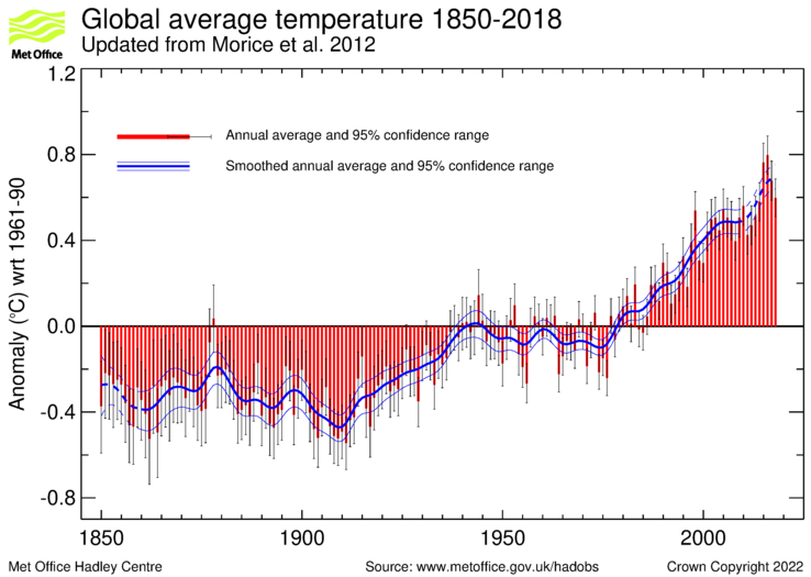
Are these “uncertainty in degrees C”? Simple statistically derived Standard deviations? In the time series, they call it 95% CI:
HADCRUT4 Time Series
To me, that is not the same — not even close — to a realistic approximation of the real physical uncertainty.
Kip,
The HadCRUT4 data are in the above link. They are tabulated in columns as follows:
Column 1 is the date.
Column 2 is the median of the 100 ensemble member time series.
Columns 3 and 4 are the lower and upper bounds of the 95% confidence interval of bias uncertainty computed from the 100 member ensemble.
Columns 5 and 6 are the lower and upper bounds of the 95% confidence interval of measurement and sampling uncertainties around the ensemble median. These are the combination of fully uncorrelated measurement and sampling uncertainties and partially correlated uncertainties described by the HadCRUT4 error covariance matrices.
Columns 7 and 8 are the lower and upper bounds of the 95% confidence interval of coverage uncertainties around the ensemble median.
Columns 9 and 10 are the lower and upper bounds of the 95% confidence interval of the combination of measurement and sampling and bias uncertainties.
Columns 11 and 12 are the lower and upper bounds of the 95% confidence interval of the combined effects of all the uncertainties described in the HadCRUT4 error model (measurement and sampling, bias and coverage uncertainties).
Have a look and see if I’ve misread it, but it seems to me that the monthly uncertainty bias is usually considerably less than 50% of the best estimate in either direction.
Surely, in the interest of openness and to provide some background about Tim Ball, the recent comments about his veracity and reliability from a Canadian judge should be displayed:
“… despite Dr. Ball’s history as an academic and a scientist, the Article is rife with errors and inaccuracies, which suggests a lack of attention to detail on Dr. Ball’s part, if not an indifference to the truth.”
“The Article is poorly written and does not advance credible arguments in favour of Dr. Ball’s theory about the corruption of climate science. Simply put, a reasonably thoughtful and informed person who reads the Article is unlikely to place any stock in Dr. Ball’s views… ”
https://www.desmogblog.com/sites/beta.desmogblog.com/files/Judge%20Skolrood%2C%20re%20Weaver%20v.%20Ball%2C%2002-13.pdf
Unless one has been reading Dr. Ball for a few years. desmogblog as a reference, really?!?!??
Ronald Skolrood is very leftwing with no science training. He knew that he had to dismiss the case but the excuse is a disgrace. It could easily be appealed but will not be because as the case states, Weaver didn’t cross examine witness statements from three distinguished suitable qualified scientists that Ball made a good argument. How can a judge with no scientific training contradict those more highly trained than himself?
“Regardless, recent changes have been too small for even most thermometers to notice. ”
While most post Hockey Stick reconstruction of proxies show a MWP, they are usually 0.2 degree cooler than modern times. That is about the temperature difference between the top and bottom of a 20 m tree on a dry day and a 40 m one on a wet.
Comparing the energy content of your backyard to the entire atmosphere and ocean down to 700m? Flimsy analogy Robert B.
I’m referring to the growing conditions of the proxy.
The entire reason for the authors to object the science of anthropogenic global warming is because those they have sold their souls to industry, can’t face the threat of GOVERNMENT REGULATION being one of the tools by which we address the issue. Regulations are costly, and the business community would bear the burden of the costs, something they profoundly refuse to accept.
Concerning the comment that warming is a positive outcome, while cooling would be terrible; this is unsubstantiated by any data. Cooling would not flood coastal lowlands while warming does. Cooling doesn’t increase the severity of tropical storms while warming does. Cooling doesn’t magnify the intensity of mid latitude thunderstorms, while warming does. Cooling doesn’t increase soil evaporation rates, while warming does. Cooling doesn’t reduce vital snowpack in the southern Rockies and Sierras, while warming does. Cooling doesn’t increase desertification and subsequent crop loses, while warming does.
The authors are simply tools of the vested interests, nothing more.
James, employs the old slime the industry babble, it is old and boring.
Since you offered ZERO counterpoint to the article, you really have nothing to contribute to the debate, which in itself indicative that you are ignorant and careless about the topic since your “cooling” babble is silly and unsupported, just drivel based opinion.
Congratulations!