Guest essay by Dale Leuck
“Fake news” is the process of misleading the public through an inaccurate or incomplete depiction of reality, either deliberately or unintentionally. Often the fake news involves the use of statistics, particularly graphic illustrations of complex processes, as discussed in a February 2017 Forbes article. Such has long been the case with the issue of “global warming”, as, for example, in a January 2018 New York Times article, in which the following graph was presented, showing a 1.2 degree Celsius increase in annual global surface temperature data since a “base” period of 1880-1899. The chart is deceptive both for what it contains, what it hides, and what it excludes. Thus, the New York Times article is fake news.

As NASA, GISS notes at the top of it’s webpage, the data are from “…current data files from NOAA GHCN v3 (meteorological stations), ERSST v5 (ocean areas), and SCAR (Antarctic stations),” where NOAA is the National Oceanic and Atmospheric Administration.
First, for what the above chart contains. Kip Hansen, at “Watts Up With That” notes the Time’s doctoring of the NASA GISS data. The data, updated through December on January 17, are available in both text and csv formats, at the NASA, GISS website under the heading “Tables of Global and Hemispheric Monthly Means and Zonal Annual Means.” Clearly stated under that heading is that the data are “…deviations from the corresponding 1951-80 means. Nowhere on either the NASA, GISS or the NOAA websites are such data presented as deviations from 1880-1899. Kip Hansen explains why, and why the New York Times doctored the data:
“NASA never ever made a graph of global temperature anomaly with a base period of 1880-1899 — two decades, during which Global Average Temperature and its [nearly imaginary] anomaly are based on rough guess-work at best. The NASA standard is 1951-1980, the usual 30-year climatic period. The clever little eager-beavers at the Times have moved the zero point down to the 1880-1899 level thereby increasing the “anomaly” to nearly 1.2 °C.
Apparently, NASA’s official figures of “1.62 degrees Fahrenheit (0.90 degrees Celsius) warmer than the 1951 to 1980 mean, according to scientists at NASA’s Goddard Institute for Space Studies (GISS) in New York” did not seem “hotter” enough, so they felt it necessary to sex-it-up.”
Ed Straker promptly (AT, January 19) identified “adjustments” in raw NOAA data that hide a reality of little or no temperature increases, since 1890, and, as well as periods of temperature declines, including from the late 1990s, until about very recently. The USHCN data, of which the below chart is comprised, is from the U.S. Historical Climatology Network, and quantify “…temperature changes in the contiguous United States,” which is to say that it excludes data from Alaska, Canada, and the entire rest of the world, including the oceans.

Moreover, the percentage of missing station data that is “fabricated” has been rising in recent years, reaching 42 percent in 2016, in an article on Tony Heller’s Real Climate Science website, with discussion starting at the sixth chart down. The remainder of the article is an esoteric discussion of NOAA’s defense of using such data. The important point is that only a small percentage of the public is even aware that data are adjusted at all. And if adjustments of such magnitude occur for the continental United States, how reliable are presented data for the rest of the world at representing temperatures? This is only one of many questions a blue-ribbon appointed congressional committee should investigate.

Annual data itself hides extremely important information. Charting the NASA, GISS monthly data, for example, from 2013 through December 2017 reveals 2016 to have been a record hot year entirely because of a very hot period the first four months early that year, a phenomenon that began in late-2015. Notice in the chart below that temperature anomalies the first four months of 2017 were significantly below those of 2016; that the June anomaly was below those of the previous four years; and anomalies from August through November were below those of 2016. So, nine of the twelve months of 2017 were below those of 2016; one month of 2017 was below those of the previous four years; and one month (September) was below that of three of the previous years (2013, 2014, 2016). One could argue that the real “anomaly” in this data is the aberration of a few months of hot temperatures in late-2015 and early-2016, as 2017 anomalies appear on the same downward trend begun in late-2016.

Indeed, the graphical depiction of alternate facts, hidden by the main stream media such was the New York Times, supports such a more benign conclusion. The below chart depicts monthly anomalies, centered on the NASA, GISS 1951-1980 base period, but only from January 1998 through December 2017, a period some have argued, such as Sheldon Walker (January 17, 2018), has been a hiatus in global warming, and others that warming began again after 2012. While Walker uses an acceptable statistical technique to correct for what is known as “autocorrelation,” this is unnecessary to reach the conclusion of a hiatus if one only removes the “anomalous” data for the months of December 2015 through April 2016, above the red line. Intuitively, the anomalies for the succeeding months appear only marginally above the range of remaining values between January 1998 and November 2015 around the 1998 – 2017 average.

Aside from all of the above, the New York Times, other main stream media, and indeed many climate researchers themselves exclude exculpatory data in their quest to prove global warming. Surface temperatures have only been widely recorded since 1880, the year the NASS, GISS data set begins, and as noted earlier data for the earliest years are considered sufficiently unreliable that NASS, GISS uses an average calculated over 1951-1980 as its base for comparing anomalies. Also noted is the paucity of data from some stations in the continental United States, not to mention the rest of the world and a significant part of the globe that is not covered because there are no measurement stations. Moreover, the some-120 years dubiously reliable data is therefore not sufficient for drawing conclusions over geological time measured in terms of thousands of years.
A September 16, 2017 AT article discussed some of the above issues, starting with the need to show current temperatures setting records since at least early civilization. The 1990 United Nations Intergovernmental Panel on Climate Change (IPCC) published such a chart showing temperatures during the twentieth century below those of the medieval warm period. By the 2001 IPCC report, a “hockey stick” shape showed modern temperatures at a record, largely attributed to the work of Michael Mann and his use of proxy data, itself of dubious reliability, as well as data “adjustments of the sort summarized above, and recounted in the AT article.

With all of the complexity of the topic and potential costs of policies, there need to be more hearings, such as the one chaired by congressman Lamar Smith, of the Committee on Science, Space, and Technology. That hearing featured Judith Curry, John Cristy, Michael Mann, and Richard Pielke, all experts in the field. Appointment of a blue-ribbon commission would also seem advisable.
Dale Leuck retired from over 38 years of research and forecasting for the U.S. Dept of Agriculture in September 2017, having completed his Ph.D. in Agricultural Economics at the University of Tennessee in 1979. He has written some for “American Thinker”, a farm magazine, and to various senators and congressmen.
New York Times?
They INVENTED fake news.
Well after Stalin and Goebbels anyway…
In 1932 the NY Times won a Pulitzer Prize for 13 articles written by Walter Duranty that appeared in the paper in 1931. The Pulitzer Prize Committee has not rescinded this award to date. This is a full two years before Joseph Goebbels became the Propaganda Minister for Germany. Ain’t history wonderful? The NYT was complicit with Stalin and way ahead of Goebbels.
It was Dr. Joseph Goebbels. Never say just Mann; he is Dr. Michael E. Mann, a Nobelist.
@Curious George: “It was Dr. Joseph Goebbels. Never say just Mann; he is Dr. Michael E. Mann, a Nobelist.”
Mann was NEVER a ‘Nobelist’ and was told to stop presenting himself as such.
And for mine, when someone shows they are not competent in proper science or even in statistics by failing to follow the precepts of science and even of normal publishing of papers (provision of data and methods once publication is accepted) it is quite OK to NOT provide the respect a title conveys.
In climatology, to avoid bias, the assess the trend and cyclic pattern, the data is plotted against the average of that data series. WMO’s 30 year average as normal serve the climate relative to other stations but does not serve the long term change. Since 70s, in my climatology studies [trend & cyclic variation] I presented relative average only. To eliminate cyclic part, WMO in 1966 report suggested different methods, one such is moving averages. In the case of global average temperature Academy of Sciences [USA & UK] used moving average using 10, 30 and 60 years. With the 60 years, clear trend is evident [with the 60-year cycle]. My first paper published in 1977 [worked out in 1974-75] on dates of onset of southwest monsoon over Kerala Coast.
Dr. S. Jeevananda Reddy
And they after Lenin, who first said that “a lie repeated becomes the truth.”
And the Times is nothing if not leninist.
This article is a complete mishmash of Goddard-style nonsense. It starts out claiming that the NY Times has somehow “doctored” data by presenting it relative to the 1880-1899 average. There is nothing wrong with simply pointing out how much change there has been since that period. They don’t say it is a “base period”, they are simply plotting the difference. So then, having apparently completely run out of anything to say about the NYT report of global temperature, it revives ancient Goddard whinges about the obsolete USHCN, nothing to do with the 2017 global average. So we have this:
“Moreover, the percentage of missing station data that is “fabricated” has been rising in recent years, reaching 42 percent in 2016”
But NOAA stopped producing the USHCN average in 2014; they now use nClimDiv. The only fabricator is Goddard/Heller. He is reconstructing what he claims the USHCN average would have been, using his erroneous methods.
Then a whole lot of special pleading about how annual averages somehow don’t count, because some months are hotter than others, or something. And then saying there was really a hiatus, if you only remove a few months of 2015/6. How that changes the news about 2017 is not explained.
Climatology is defined as a 30-yr reference period. 1880-1899 isn’t climatology.
https://www.climate.gov/maps-data/primer/comparing-climate-and-weather
It’s fake news.
“1880-1899 isn’t climatology.”
They didn’t say it was. It is the average for the data of the 19th century, and they are making a comparison.
In fact the average anomaly 1880-1889 was -0.228°C and 1880-1909 was -0.261. So if you prefer that 30 year period, just move the x-axis up 0.033°C. But it is a different period.
NY Times headline…
CLIMATE
2017 Was One of the Hottest Years on Record. And That Was Without El Niño
Climatology is a 30-yr or longer reference period. No one uses 1880-1899 or 1880-1909 or 1870-1899 as a climatology reference period… Not NASA, not NOAA, not RSS, not UAH, not Hadley and not the UK Met Office.
The article is not a serious article about climate, climatology or anything relevant to climate change. It’s an intentional exaggeration of the significance of 2017’s status as the third warmest year “on record”… Therefore it’s fake news.
“just move the x-axis up 0.033°C”
Oops, down by that amount. Extending to 1909 actually increases the difference.
So moving the x-axis is OK, but turning an image of a graph sideways makes it fake.
You are being highly disingenuous as always , Nick.
“So moving the x-axis is OK”
You can do whatever you like, as long as you give your own justification, doing it in your own name, and don’t falsely claim that it is someone else’s graph.
” It’s an intentional exaggeration of the significance of 2017’s status”
It doesn’t exaggerate. As I noted, if you chose 1880-1909 as the reference, the numbers would be higher, not lower.
And it says nothing about 2017’s status as thrid warmest. Changing the reference point does not change difference between years.
The graph in the NY Times article is captioned “Source: NASA.” At no point in the article do they explain that they are using a different reference period or why they chose it or why they chose a non-climatology reference period and still claimed that their article was about climate.
It exaggerates it relative to the reference period used by NASA, NOAA, UAH, RSS, Hadley and the UK Met Office. They could have exaggerated it even more by using 1611-1640. The fact that they could have exaggerated more than they did, doesn’t acquit them of exaggeration.
The Stein graph as depicted was Stein’s graph.
In no way was the data changed at all.
You are too pig-headed to admit that fact.
If you turn a page sideways, it doesn’t change what the graph conveys, does it Nick.
“It exaggerates it relative to the reference period”
So are you saying that there is no proper way of showing whether it has warmed since 1880-99?
“So are you saying that there is no proper way of showing whether it has warmed since 1880-99?”
Be VERY glad that it has, Nick (except that in Australia, it was probably the HOTTEST period EVAH)
Just after the coldest period in 10,000 years.
If you don’t like the highly beneficial tiny amount of mostly urban warming, then move to Siberia.
But I guess you would prefer to stay in our cosy warm Australia climate. 🙂
And use the fossil fuel powered air-con in summer (while there is electricity)
Nick,
if adjusting the reference datum isn’t ‘fake news’ then why do it? Cui Bono? If the scientists use 1951 – 1980 then who the hell are the NYT to do such a fiddle? They obviously did it quite deliberately so what is their point? ( As if I need to answer that).
It’s this sort of crap that has put Donald Trump in the White House much to the hysterical conniptions of the idiots who created the crap in the first place, the NYT being in the vanguard of the anti-TRUMPTRUMPTRUMP einzatsgruppen.
BTW, if there actually is CO2 driven global warming and at pretty much the same time a general increase in UHI effects, on what possible basis is there any ‘need’ at all to ‘adjust’ the USHCN or any other data upwards? Again Cui Bono? The only plausible rationale is that there is no discernable CO2 driven effect and that the USHCN location and station specifications are successfully avoiding UHI effects. In other words the ‘adjustments’ a deliberate fraud to cover up the embarassment of the observation not supporting the hypothesis. IMO, as ‘scientists’, these people are down there in the ethical sewers with the RC Church and other organisations who their covered up othe crimes of the paedophiles in their ranks.
I think we are at a stage where if it came out in the msm that the data has been ‘kiddyfiddled’, the public’s reaction would make Hilary Clinton’s ‘deplorables’ sneer at the people of the ‘Rust Belt’ look like a bit of fluff on her lapel.
Call me a ‘denier’ and you basically prove my point that this whole CAGW thing is an ideologically driven fraud whose only real ammunition is personal abuse and whose purpose is at best an ego driven boondoggle.
Why do it? Because either 1880-1899 was the first 20-yr period in GISTEMP, or because it’s just about the coldest 20-yr period in GISTEMP.

I am with Nick on the matter of the reference period. I could pick absolute zero as my reference if I like.
So, it has warmed from the 1880-1899 period. It has warmed even more since a 1880-1910 period, because it cooled after the industrial revolution got going. How about that.
Then it warmed like mad until 1940 after which industrialization really kicked in with lots of AG CO2. With the rise in CO2, it cooled. It seems there is a positive correlation between a rapid increase in CO2 and cooling.
From 1998 until now CO2 emissions have ramped massively and there has been nearly no net change in temperature relative to any baseline. Interesting validation.
The claim that AG CO2 has created a lot of ‘baked in’ global warming is half baked. The missing half is ‘all that warming’. It is a given that CO2 is well distributed and warms everything evenly because of ‘how it works’. Remember ‘physics’? Except it isn’t warming everything nor is it warming evenly. Why has the SE USA been cooling since 1910 if ‘global warming’? ‘Climate disruption’? What the heck is that? Talk about your ‘special pleading’.
Why has Antarctica been cooling in the interior over a vast, continental area for 60 years? CO2 disruption of the ocean currents? Cry me a (frozen) river.
There is no other scientific argument that is so weak, so contradicted by the facts, so misrepresented in the media, so misunderstood by the general public, so ladled with junk and bunk promises of conflagration and eschatological prophecy as the CAGW hypothesis. Even String Theory has more credibility.
Nick, the GISS surface temperature adjustments are a ghastly disservice to science. I for one, will be happy to experience three to five degrees more global warming because when that threshold is reached, the Sahara and Gobi Desert rains will re-start and vast farmlands will once again be available to mankind and antelope alike.
An incidental service to all mankind will be the inundation of the coastal media. It is no longer possible to watch the BBC or CNN without gagging. They put the FU into the fake news cycle. What, there’s no ‘U’ in Fake News? Yes there is. It is interpolated between the N and the W. No problem…
The 30 year period is a fake. It was not meant to be, and is not, useful with respect to climate.
It was established in the mid-1930s as a standard way of reporting and comparing recent weather.
If it were about “climate” the charts here — fake or not — would need show only 30 years, not some dubious concoction going back to 1880.
Besides, a little warming is good, more CO2 in the atmosphere has been good, and there is no reason to think we have passed a tipping point on the way to catastrophe.
30 years may be arbitrary, but it’s not fake. The purpose of a climatology reference period is to relate current weather to expected or normal weather conditions. The current climatology reference period is 1981-2010.
1981-2010 U.S. Climate Normals
https://www.ncdc.noaa.gov/data-access/land-based-station-data/land-based-datasets/climate-normals/1981-2010-normals-data
The fake thing is that there is a normal preindustrial temperature, above which the Earth is doomed
“The purpose of a climatology reference period is to relate current weather to expected or normal weather conditions.”
It isn’t really. The primary purpose is to subtract a normal, to take out variation due to altitude, latitude etc before averaging. For that purpose, it doesn’t matter much what you use, as long as it does take out that variation. For trend stuff, you need to make sure there isn’t trend hidden in the normals, because of them representing different periods, so they use a fixed period. About the only thing remaining is to get the relativity between months right, and that is why thy push it out to 30 years. There is a recommendation to use the most recent period, as otherwise the effect of error between the period usually of interest (now) and the base period can get built into the anomalies.
http://www.cpc.ncep.noaa.gov/products/outreach/glossary.shtml
The current reference period for climate normals is 1981-2010.
It has absolutely warmed since 1880
1880 was warmer than 1830
1830 was warmer than 1780
1780 was likely warmer than 1730
1730 was likely warmer than 1680 the depth of the Little Ice Age.(LIA)
1680 was likely cooler than 1630 cooling into the (LIA)
Temperature has gradually warmed since the depth of the LIA
SOOO, without the minor contribution of CO2 man has made over the last 150 years, what would the temperature be currently and what would the Climate be?
The temperature little bit cooler and the climate would be almost exactly the same.
“It has absolutely warmed since 1880”
Yes. And the NYT is showing by how much. Why shouldn’t we know that? You may have theories as to why, but the first thing is to see what actually happened.
No. The NYT is taking how much GISTEMP estimates we’ve warmed relative to 1951-1980 and bulk shifting that to what GISTEMP estimates that 1880-1899 was relative to 1951-1980. They don’t acknowledged that they did this, they don’t explain how they did this or even explain why NASA GISS chose 1951-1980 rather than 1880-1899 as a reference period or why 1880-1899 should be used rather than 1951-1980.
Nick, “About the only thing remaining is to get the relativity between months right, and that is why thy push it out to 30 years.”
“The 30-year period of reference was set as a standard mainly because only 30 years of data were available for summarization when the recommendation was first made. ”
http://www.wmo.int/pages/prog/wcp/ccl/guide/documents/Normals-Guide-to-Climate-190116_en.pdf
“No one uses 1880-1899 or 1880-1909 or 1870-1899 as a climatology reference period… Not NASA…”

That isn’t true. If you go to the GISS page that generates maps, you can ask it to provide a map relative to any period. Here is the one for 1880-1899:
Nothing of this “fake news” NYT allegation stands up.
That doesn’t mean that NASA or anyone else uses 1880-1899 as a climatology reference period.
lee,
And WMO say below
“A number of studies have found that 30 years is not generally the optimal averaging period for a predictive use of normals. The optimal length of record varies with element, geography and secular trend. For example, the optimal period for temperatures is often substantially shorter than 30 years”
They are talking about predictive use. But this isn’t predictive use. It is a base for anomaly averaging.
And?
Nick Stokes replied to …”“1880-1899 isn’t climatology.” with “They didn’t say it was. It is the average for the data of the 19th century, and they are making a comparison.
In fact the average anomaly 1880-1889 was -0.228°C and 1880-1909 was -0.261. So if you prefer that 30 year period, just move the x-axis up 0.033°C. But it is a different period”.
So what is the reliability of climate data for the period 1880 -1889 ?
What’s the error associated with readings from that time, plus/minus what?
How much of the land and sea surface of planet was covered by recording stations at that time?
Or are we relying on Michael Mann’s bristlecone pines?
GIGO
“How much of the land and sea surface of planet was covered by recording stations at that time?”
You can see that from the gray areas on the plot I showed above. It is of course less than recent. But if you want to know how much temperatures have risen since 1880-1899, a perfectly reasonable question, that is the data we have.
Why is 1880-1899 relevant?
Phil Jones (CRU) admitted that before ARGO basically everything in the SH was “made up”.
Just like all the gaps of grey on the land.
Phil Jones (CRU) admitted that before ARGO basically everything in the SH was “made up”.
A gross lie.
Irrelevant strawman; which well describes Nick’s initial screed defending NYT’s and NOAA abuses of data that are wrongfully presented by NYT.
Note also; Nick’s “Goddard” smear; without reference, definition or any explanation. Nick directly smears Goddard and the article.
Just another red herring fake strawman of Nicks.
Nick,
Will it produce a map relative to 1250 when the Climate had been warm enough in the Arctic that farming in Greenland had been going on for nearly 300 years?
Probably not because all we have to determine the temps then are Low Resolution proxy data and the fact that Norsemen had been living there and farming the land since around 950 CE.
The oft repeated claim is that wsrming must be limited to less than 2 °C above the preindustrial normal temperature?
What was the normal, presumably optimal, preindustrial temperature? The Little Ice Age, the coldest climatic phase of the Holocene? They can’t answer this question without sounding like total fracking (rhymes with petards).
Crispin wrote:
“There is no other scientific argument that is so weak, so contradicted by the facts, so misrepresented in the media, so misunderstood by the general public, so ladled with junk and bunk promises of conflagration and eschatological prophecy as the CAGW hypothesis.”
Well said Sir!
I published this circa 2010, and it still seems relevant, even though the numbers have changed:
Too true! And a trillion dollars of scarce global resources has been squandered on global warming fraud.
A trillion dollars that could have been spent responsibly, easing human hunger and disease all over the world.
We could have used this money to put clean water and sanitation facilities into every village in the world, reducing the under-5 mortality rate by several million per year.
We could have improved food storage and distribution systems to greatly reduce chronic waste and hunger.
Instead, we have a bunch of doctored IPCC reports that over-estimate the possible warming caused by increased CO2, up to a factor of ten.
Instead, we have a forest of useless, bird-killing windmills that we’ll have to tear down, after their utter uselessness finally becomes apparent to all.
The global warming fr@udsters have much to answer for, and in time there will be proper inquiries of the ClimateGate scandal, to replace the creampuff inquiries that have prevailed to date.
Best personal regards, Allan
__________________________________________
And gentlemen in England now a-bed
Shall think themselves accursed they were not here,
And hold their manhoods cheap whiles any speaks
That fought with us upon Saint Crispin’s day”
– Henry V, William Shakespeare
Don’t forget Krakatoa, which exploded 1883, affected temperatures for 5 years of 1880-1899….
So I’m sure if WUWT and others were to start making temperature graphs using unadjusted May 1998 data as the baseline anomaly, he’d think there was nothing wrong with that.
inurl:http://di2.nu/foia/ jones
inurl:http://di2.nu/foia/ jones
“It has absolutely warmed since 1880”
There is no “it”. Some places have warmed, some have cooled, some have remained relatively static. You can’t average all those together and call it something meaningful. The fact that we’re saying “it has warmed” is a GIGANTIC fallacy upon which all this commotion is based. The truth is, WE DON’T KNOW.
I waited to see if anyone else saw this, but…Nick Stokes may want to reconsider his view that the NYT chart is not fake news. If the chart is legitimate for comparison purposes, then please compare thirty years (about 1910-40) and thirty years (about 1970-2000). Each show warming of about .6 (the first goes from -.2 up to +.4; the second, from +.2 up to +.8- both rates .2/decade). I’ve seen Mr. Stokes point to other charts and claim that the “pre- CO2” was a lesser rate of warming than the present CO2 polluted era (my recall is he said the 1910-40 era was 1.3/decade rate, while later period shows 1.6/decade, which he finds statistically significant). The above chart is evidence that our current warming is in fact statistically indistinguishable (is it ok to say “equal”?) from warming trend that was not influenced by CO2. So, is the chart “fake news”, or is the chart debunking one of the pillars of AGW, that the current warming is “unprecedented”? It is evidently not unprecedented, not even in the instrument record. So AGW appears to be NGW (natural). Maybe Mr. Stokes et al should be a bit more skeptical?
Agree, I think it is actually more useful to show the difference relative to 1880 -1900 than to 1950 -1980. The talk about limiting the warming to 1.5 or 2.0 degrees Celsius refer to pre-industrial level, i.e. a level more equal to the former interval.
/Jan
Jan,
the article refer to the relative inaccuracy of the earlier data so any reference based on same is a less reliable reference. In any case it is a trivial bit of arithmetic to calculate the difference between say 1880-1900 say to 2000 – 2010. These graphs should probably include error bars or other visual indication. But then that might not suit the sexing up purposes of the NYT et al.
A degree of HIGHLY BENEFICIAL warming out of the COLDEST period in the whole of the Holocene.
Thank goodness.!!
And you know full well that USHCN 2.5 exists. That has been shown to you.
The amount of missing data in 2014 was around 40%
You are being deliberately disingenuous again, aren’t you.
But I forget, you DON’T CARE about the quality of the data used , do you NIck… just so long as there is lots of it.
All the better if lots of it is marked “E” and has to be fabricated.
‘…There is nothing wrong with simply pointing out how much change there has been since that period. They don’t say it is a “base period”, they are simply plotting the difference…’
Plotting the change/difference with respect to “that period” makes it…ummm…the base period. Good Lord.
“Plotting the change/difference with respect to “that period” makes it…ummm…the base period.”
Actually, it doesn’t. The point of anomaly calculation is that before aggregating temperatures from different sites, you subtract some climate normal. It is conventionally an average of a 30 year base period. Then you get the average anomaly. With GISS it is always 1951-80.
But once you have an average anomaly, you can convert it to be relative to any desired reference period by just subtracting the appropriate average (strictly, by month). That doesn’t change the base period for the original anomaly calculation. And that has to be done first.
“With GISS it is always 1951-80.”
Yep, go back only 5 years you have the coldest 30 years in the AMO.
Great reference period for AGW propaganda, wouldn’t you say, Nick
….. especially when you can adjust everything before it down as far as your like.
And REAL temperature data in Australia pretty much as a smiley face curve from 1900 – 2017, with very warm peaks between 1880 and 1900
Anyone want to make a guess where the bottom of that curve is 😉
correction….
Quite a lot of REAL temperature data in Australia pretty much as a smiley face curve from 1900 – 2017,
Much of it shows no warming or even cooling since the 1970’s
Nick:
“The point of anomaly calculation is that before aggregating temperatures from different sites, you subtract some climate normal.”
What is a ‘normal climate’ on planet Earth? Looking at the last ten thousand years, ‘normal’ is the peak of the Medieval Warm Period. It was decently warm, farming was reliable and sea level not much higher than now. Let’s set that as the new normal and enjoy life instead of pretending that the oceans are going to boil (Ref: Hansen the Nutter).
Crispin,
“What is a ‘normal climate’ on planet Earth”
This is a very simple calculation, and I don’t know why people have such dificulty with it. For each location, you calculate a local climate normal. For the data for that site. Just an average of known numbers. Subtract that, and you have the anomaly. For that site. There is no planet Earth notion required.
“This is a very simple calculation, and I don’t know why people have such dificulty with it. For each location, you calculate a local climate normal. For the data for that site. Just an average of known numbers. Subtract that, and you have the anomaly. For that site. ”
The answer is simple Nick, abuse of the English language. You are calculating the “normal” for that place at that particular time. You and others keep omitting the “at that time” and therefore imply that the calculated temp is somehow the usual “normal” for that place. This is misleading at best and downright deceptive at worst.
Spread across all times, there is no definitive “normal”. That’s why people have trouble with what you are saying, you are talking about something that simply doesn’t exist.
“You and others keep omitting the “at that time””
So what do you think all the argument about 1951-80 and 1981-2010 etc is? The anomaly base periods? Look at the NOAA land only temperature graphs that are flashing everywhere here. Right up at the top – “with respect to a 1981-2010 base period”. This article itself says of GISS
“Clearly stated under that heading is that the data are “…deviations from the corresponding 1951-80 means. “.
Look at any GISS map. The heading says in big type “anomaly vs 1951-80”
“anomaly vs 1951-80”
Yep , go only 5 year back and you have the COLDEST period in the AMO since the 1940’s spike
Which , of course, is why that period is chosen.
Its called PROPAGANDA, Nick, something you prattle endlessly.
Strokes
The true nonsense is your comments here.
The coming climate change catastrophe
is a wild guess theory based on NO science.
That CO2 might cause harmless warming in
the next 100 to 200 years is based on simple
lab experiments, that could be right, or wrong.
Since you believe in a coming climate catastrophe,
and that CO2 controls the average temperature,
as your “religion” , with no real science backing
you up, then you are a fool, and that means
we know you have nothing of value to add here!
The average temperature is always changing,
and half the world’s grids are wild guessed
by religious zealots like you, who WANT to show
MORE global warming … and whose
stolen eMails show they start
with a conclusion and doctor / hide data
to prove their conclusion is “right”.
The change in the average temperature in
the last half of the 20th century is almost
identical to the change in the first half
of the 20th century.
There is no proof that both warming periods
had different causes.
In fact, to believe that, as you do,
means you believe 4.5 billion years
of natural climate change suddenly stopped
in the middle of the 20th century, and from
then on, all climate change was man made !
The explanation:
Because we leftists say so !
Only a fool would believe that fantasy,
and you certainly fit the description well !
And Mann made climate change will be Trumped in 2018
What Nick Stokes cannot deny is that the US temperature has been drastically altered to show much more warming than originally thought. That’s why he continually tries to throw in red herrings to draw attention away.
And why this obsession with using the Little Ice Age as the “norm”. Today’s climate is perfectly fine, so we should use, say, the last 30 yrs as a baseline. This would of course show just how cold it was in the 19thC
Not just US, but MOST places in the NH have had the 1940’s peak in ORIGINAL data, removed in the fabricated load of surface non-data.
The whole GISS temperature record IS A LIE !!!
It is FAKE from the very start.
And, Paul, as I have said on your excellent website, anomalous anomalies are useless lies easily doctored to show whatever is required.
Nick is a confirmed liar. Let him show plots of real , actually measured temperatures , both minimum and maximum from 1880 to 2017 ( no adjustments). Then we can see the terrible, life-threatening risk for real.
He won’t do it, because its pointless showing something which trends almost completely horizontally.
jim is spot on. there is a reason anomalies are used and it ain’t to bring clarity to the debate.
Agree, Jim, et all, we have to use a std point as the reference and cease the “anomaly” stuff.
So use K and it’s easy to convert to C and F, then limit the x-axis to desired period and likewise for the y-axis.
Oh well, the grant and breaking news $$$ still rule what is presented to the paroles and politicksans.
Gums….
I would love someone to explain why Nick Stokes suffers from Obsessive Compulsive Climate Alarmist Disease, commonly known as OCCAD.
That’s easy.
Apparently he worked at CSIRO….. climate division?.
So its actually IN-BUILT into his whole thought process.
Deep-seated brain-washing. 🙂
You don’t bite the hand that feed you
Paul, they simply believe that everyone else got the temperatures wrong before.
Those taking the measurements, the contemporaries summarizing the data, and every other group of scientists who ever reviewed that data up to 100 years layer, including James Hansen and the entire IPCC up until ~2000.
Then suddenly the lights turned on and in the last 15 years, the exact same archival data suddenly started shifting and changing and aligning with the global warming theory, almost like magic.
I’m sure this happens all the time in all the various branches of scientific inquiry. Historic data just change and shimmy into place to join the conga line.
“It starts out claiming that the NY Times has somehow “doctored” data “
The so-called data was “doctored” LONG before the NYT got hold of it and added their manic AGW propaganda twist to it.
It starts out claiming that the NY Times has somehow “doctored” data by presenting it relative to the 1880-1899 average. There is nothing wrong with simply pointing out how much change there has been since that period.
So why not set the baseline to 9,000 years ago, during the Holocene Maximum, for a much better view of our climate. Oh, of course they will not, because it was up to 2 degrees c warmer then….
Ralph
So why not set the baseline to 9,000 years ago, during the Holocene Maximum, for a much better view of our climate. Oh, of course they will not, because it was up to 2 degrees c warmer then….
Ralph
(not sure why the quote html did not work…)
[On the WordPress systems, you need to use blockquote and /blockquote (inside the angled brackets obviously). “Quote” and “endquote” are not recognized by themselves. .mod]
Yep, choose a period pretty much at the end of the COLDEST period in 10,000 years, everything is going to be warmer.
I don’t know who you are or what your beef is with Tony Heller; but, before you start criticizing Heller, you should remember that there are few people who have done more to bring the issue of global warming, and I will use this term, claptrap to the forefront than he. Seems to me that if you are critical of something that Tony has said or written, submit your own guest blog and See if WHWT will publish it. That way, your ideas can be laid out for all to see and it won’t be just gratuitous bashing on Heller. So put up or shut up.
My comment is directed to Nick Stokes.
I engage at WUWT. If you want to defend Heller’s graphs, do so. With some substance. Don’t just say, because Tony told me.
You are the one who said: “. . . complete mishmash of Goddard-style nonsense.” Now, If you’re slinging insults, then how about you do so. With some substance. The gratuitous insults are not what I expect to see on this at WUWT and I’m calling you on it.
“With some substance. “
I explained what is wrong with the graphs here. Your turn.
No, you pushed your own rabid AGW opinion. WORTHLESS.
Heller’s graph of raw/unadjusted us temperatures is essentially reproducing, wiggle by wiggle, Hansen’s graph from 1999.
https://www.giss.nasa.gov/research/briefs/hansen_07/

Since then us temperatures have been adjusted to align with CAGW.
“I don’t know who you are or what your beef is with Tony Heller”
Anthony also has a “beef” with Heller.
He is dishonest.
There are many examples of what has been done to past data, they openly admit to 0.5C increase in trend due to the official “adjustments”.
We have however seen much bigger changes than that to historic data, especially lowering peaks but also in raising some lows to “straighten out” the record to bring it more in line with the increase in CO2.
If you plot Raw Real values you get nothing like the current final output.
The record is full of abrupt increases and gradual decreases, anyone remember Zeke’s graph?
One of the reasons for adding the Sea SurfaceTemps to the Land Air Temps was to smooth the data, as the Sea temps barely move in comparison to the Land.
However they are going to have a problem soon as the Seas are also shedding heat at quite fast rate.
How can you justify combining Air and Water Temperatures
Absolutely!
There is a lot of optimism on this website and a few others by many of those opposed to the disgraceful mis-leading of the general world public about the so-called global warming “crisis”. I really hope that excellent articles like this begin to impinge on the public understanding to expose the maladjustments, deceits and outright frauds committed by the alarmists. However, I see virtually no coverage of much of the recent unraveling of the false claims made by the alarmists in the general MSM, certainly not in the U.K. where the usual abuse and insults continue to be hurled at critics of eco-imperialism.
While the USA gives rise for hope while Trump is President, I am not so sure much progress is being made in Europe or elsewhere.
What more can be done while it is almost impossible to get virtually any sort of a balanced account in the broadcast and press media, let alone halting the sub-standard nonsense being taught in school textbooks and classes by frankly mostly complacent and uninformed teachers most of whom would never dream of challenging the consensus?
Too much money and power is invested in the green monster. We need a big stake to drive through its heart, but what that might be I cannot see.
Moderately Cross of East Anglia
Whilst I share your frustration, I do see some hope. The job of undermining the CO2 fraud is being done rather well by Germany itself. It’s failing badly in its usual pursuit of excellence, and it makes uncomfortable viewing for the establishment when a country as clinical fails its objectives.
And whilst politicians are a slow boat to turn, when the mood takes them, they transform into an eel. As usual, however, British politicians are at the back of the queue when it comes to the initial turn, but adopt an impressive turn of flexibility when momentum is built.
The deciding factor is not, of course, the science of climate change, but what will fill the financial void when taxes from it evaporate.
Give the blighters a credible, financial alternative tomorrow, and tomorrow they will turn.
And a little aside. I heard a historian on the radio the other day stating that Churchill was at least as unpopular as Trump. However, he was the man of the moment; a warrior, not a politician, taking the helm at a time of war. Perhaps Trump is a businessman taking the helm of the entire west, at a time of financial war. Who knows, perhaps he will be remembered as fondly as Winnie.
“So, nine of the twelve months of 2017 were below those of 2016; one month of 2017 was below those of the previous four years; and one month (September) was below that of three of the previous years (2013, 2014, 2016). One could argue that the real “anomaly” in this data is the aberration of a few months of hot temperatures in late-2015 and early-2016, as 2017 anomalies appear on the same downward trend begun in late-2016.”

Here is a plot of the progression of the months of 2014-2017 in GISS. You can see various other indices here. The annual averages of each year are marked with horizontal lines in the appropriate color. You can see that only one month of 2017 dipped below the 2014 average. Now 2014 was a record warm year in its time.
And that data is is created from an ever dwindling number of global weather stations, with similarly dwindling coverage simultaneously, according to NASA, on it’s GISS page.
It is quite safe to suggest that the time may yet come when “global warming” will be verified by NASA by using just one or two strategically located thermometers.
Because that’s the direction we’re going in.

“Because that’s the direction we’re going in.”
No. We never had 5000+ stations reporting temperatures monthly, so that GISS can report by the middle of the next month. What your graph before about 1995 shows is a historical archive, including many stations that did not submit regulatr reports (but kept records). What it shows since is the data that GISS now uses, which is he set of stations that submit monthly CLIMAT data forms. And that has been fairly steady.
Even the MET question the reliability of GISS-
“NASA GISS assumes that temperature anomalies remain coherent out to distances of 1200km from a station”
Assume – to take for granted or without proof:
Factor in Africa, one fifth of the worlds land mass, is mostly estimated- add on the other 70 countries that the WMO flag up having sub-standard temp data and bobs your uncle some clever salaaming upwards of non existent temp data measured to hundredths of a degree.
“Assume – to take for granted or without proof:”
Hansen and Lebedeff demonstrated the coherence in 1987. Here is their diagram. Further evidence has supported that:
The met knows that. It is not questioning their reliability.
***What it shows since is the data that GISS now uses, which is he set of stations that submit monthly CLIMAT data forms. And that has been fairly steady.***
How much data is missing and filled in?
Give us a real answer.
“How much data is missing and filled in?
Give us a real answer.”
You don’t seem to have any recognition of reality. Yet again, the answer is all or nothing. Every sq m that doesn’t have a thermometer on it is “filled in”. There is no choice. But GISS calculates the average exactly on the stations that report. They do not interpolate station values. They, as everyone must, interpolate between.
And as we have already established,
That data is TOTAL GARBAGE.
TGI-TGO !
The Nick way.
That work is rubbish, you know as well as I do you can go just 1km to the other side of a hill and get a different “climate”, 10km to the other side of a mountain etc.
1200km is the difference between Southern England and Scotland, do you honestly believe that you can in any way compare the two?
I now live in South Wales on the Coast, I used to live in Kent, the climate of the two places is completely different and it is only 220 miles away.
Wales get a Climate dominated by the Atlantic Ocean and Kent get’s it predominantly from Europe and Southern Europe in the Summer and in the winter it can get air straight from the great Steps of Russia.
How can they be considered anywhere near the same.
AC Oborn
The MET have an interesting report on Micro Climates. Even the WMO made a comment that what we have been seeing is changes in Microclimates rather than the climate at large.
“If we compare the climate statistics for three locations in Devon, one upland and the other two coastal,
namely Princetown, Plymouth and Teignmouth, each only 20 miles apart, you would think that the climate
of these three locations would be very similar. However, looking at the statistics below, you can see that their
climates are quite different”
“Upland areas have a specific type of climate that is notably different from the surrounding lower levels.
Temperature usually falls with height at a rate of between 5 and 10 °C per 1,000 metres, depending on
the humidity of the air. This means that even quite modest upland regions, such as The Cotswolds, can
be significantly colder on average than somewhere like the nearby Severn Valley in Gloucestershire”
Fig 15 surprised me – the temperature profile of Central London to the outskirts- big difference in temps.
https://www.metoffice.gov.uk/binaries/content/assets/mohippo/pdf/n/9/fact_sheet_no._14.pdf
” you can go just 1km to the other side of a hill and get a different “climate””
Yes. But you don’t get a different anomaly. If it was a hot day on one side, it was a hot day on the other.
Here, from here, is a picture of GHCN anomalies in Europe in December 2017. It is unadjusted data, and some aberrations show up. But broadly there is great consistency over long distance. The British Isles are uniform (Wales, Kent, Scotland, the lot). A belt of cold through S France to Austria. Pretty uniform warmth in E Europe and Russia.

Nick Stokes-
“A belt of cold through S France to Austria. Pretty uniform warmth in E Europe and Russia’
The problem is a temp gauge in the uniform warmth used to cover the belt of cold.
There in a Nutshell is where your understanding breaks down, it may be the same for a 1km space, but not for 100km or 1000kms.
Do you know nothing about the weather, iss where you live so stable and homogeneous with the rest of Australia that what you say is true?
I doubt it very much, it is like Mosher’s claim that with the latitude and the altitude he can tell you what the temperature is. Which is complete nonsense.
The depiction of Europe that you have shown proves beyond any shadow of doubt what a crap system it is.
If you actually think that “The British Isles are uniform (Wales, Kent, Scotland, the lot)” you are completely deluded. Just like BEST final data is also completely crap.
You do understand what Seas are around Scotland, what seas are around Wales and Southern England and that there are no “Seas” around London & Kent.
You have just proved my pint for me.
Should be Point, not pint, but I should have a pint on you.
Strokes:
The average temperature is always increasing or decreasing.
You leftists use current trends to extrapolate 100 years into the future.
Yet another reason you are a fool.
A record year in its time, which is since the 1930s perhaps? The point of this piece is that by not telling us the whole story, the story is biased. When someone says that this is a record, it is pertinent to state how long the previous record was held. it helps us judge whether this is significant or not. Failing to mention that much of the Holocene is thought to have been warmer, based on the proxies, but with lower CO2 is not telling the audience an important part of the story.
“When someone says that this is a record, it is pertinent to state how long the previous record was held.”
It’s obvious from their graph, which starts in 1880. But they have it upfront in their text:
“Scientists at NASA on Thursday ranked last year as the second-warmest year since reliable record-keeping began in 1880, trailing only 2016.”
If you want to see a plot of the progress of record years, it is here:

Pointless using purposely adjusted data, Nick
GET REAL for a change.
Nick
So what?
The planet’s warming, big deal.
It’s a damn site better than it cooling.
Can you please demonstrate to me the problem with a warmer planet?
Empirically of course.
“Pointless using purposely adjusted data, Nick”

OK, here it is using GHCN unadjusted data. It makes no difference:
You know that while it might be GHCN unadjusted. it is NCDC adjusted data.. not RAW data
Its a two stage process.. and you KNOW that.
Stop being so disingenuous, Nick.
Show us a graph of the GHCN data for Amberley Airforce base, Nick.
Nick, why doesn’t your RAW look like Zeke’s RAW GHCN.
What happened to the 1950s Step up and the other step up in the 1990s?
Nick you missed this
“Holocene is thought to have been warmer, based on the proxies, but with lower CO2 is not telling the audience an important part of the story.”
“it might be GHCN unadjusted. it is NCDC adjusted data.. not RAW data”
There is no such thing. NCDC (well, NCEI) data is GHCN data. And it is unadjusted. In modern times, as it comes from CLIMAT, the monthly forms submitted by the met authorities. Before that, the same as GHCN V1, which was taken directly from the records in the early ’90’s.
“Nick, why doesn’t your RAW look like Zeke’s RAW GHCN.”
You give no links, no explanation. But I suspect that what Zeke is telling you, yet again, is that you should never average absolute temperatures. They are too inhomogeneous. Taking anomalies is essential.
“Show us a graph of the GHCN data for Amberley Airforce base, Nick.”
The complete story of Amberley is here.
Nothing there except the LIES and DISTORTIONS of a rabid AGW cultist.
There is no proof the station was moved.
The original data, with DOWNWARD TREND is REAL. anything else is a twisted fabrication.
What a wonderful explanation.
“you should never average absolute temperatures. They are too inhomogeneous.”
Yet they are “THE DATA”. The data is NOT HOMOGENEOUS.
You are forcing it to be something it IS NOT, thus losing all those magnificent steps in the DATA.
They have been homogenised away.
Great use of the El Nino, and North Atlantic Blob, Nick
Now, we KNOW that the transient had NOTHING to do with human CO2.
No human cause behind that, is there.
And there was a LOT of energy released from the oceans to cause that spike.
What happens when you release energy from something ?
Have you seen the La Nina forming ?
You are grasping at straws Nick. I predict that there will be another moderate to strong El Nino starting around July 2019. This will make alarmists like you very happy because their will be a temporary uptick in world temperatures, all be it on long-term slow decline. After 2020, the next significant warming period won’t be until around 2038. Hold on for the ride.
“You are grasping at straws Nick. I predict…”
That’s hardly even a straw.
You attack Nick and then trot out a prediction based on nothing but your gut feel.
Chris its not a gut feeling, Ian Wilson correctly predicted the 2015-16 El Nino.
4th chart down, should that be “Near Surface”, not “Sear Surface”?
Dale Luck
I want you to continue writing about
the fake climate science.
I can’t point out any mistakes in your article,
but you, and many others here, have taken the
bait offered by the global warmunists.
They want ALL the skeptics arguing about
the PAST and PRESENT average temperature —
— tenths of a degree
temperature anomalies,
and arbitrary adjustments,
and infilling,
and their warming bias
in the measurments.
That means our heads are
buried in the minutia
of very tiny measurements
of average temperature,
probably less than
an honest margin of error,
while we ignore the important
REALLY BIG issues:
– The real fake news is that
the climate change cult
is NOT based on
real science at all —
— it is is based on wild guess
(wrong) predictions
of the FUTURE climate.
– Their predictions have been very wrong
for 30 years!
– Most of their old predictions can be found
online, or in old books / magazines, so can be
re-published today as examples of how
their wild guess predictions were not
worth the paper they were printed on.
– Expose their inability
to predict the future
climate over the past 30 years,
and their current predictions
will lose a lot of influence.
After all,
the “coming climate change catastrophe”
is nothing more than a fairy tale —
a scary prediction that has not happened
for 30 years, and will not happen
in the next 200 years.
The only real “science” is simple
closed system lab experiments suggesting
CO2 doubling might raise )or maybe not)
the average temperature by +1 degree
in the next 100 to 200 years
= totally harmless.
There is no other real science —
— just wild guess unproven theories
and wild guess predictions designed
ONLY to scare people … who are
actually living in the best climate
for humans and animals in
hundreds of years — and somewhat
better for green plants too,
with more Co2 in the air,
but they really prefer 800 to
1,200 ppm CO2, not 400 ppm.
that we have now.
The other fake news
is that over half the grids that
make up Earth’s surface
have no measurements
at all.
We actually have goobermint agencies
claiming record heat in areas of Africa
for which they have
NO MEASUREMENTS !
The empty grids are filled in with wild guesses
by government bureaucrats who WANT to show
MORE warming because they predicted more
warming for the past 30 years, and no one wants
to be known for their wrong predictions.
With all the “infilling”, there is no way the real
margin of error could be less than +/- 1.0 degree C.,
which is similar to the accuracy of
land based measurement instruments in
modern times — and they are far better than
the accuracy of 1800’s thermometers and
drunken sailors throwing wood buckets over the sides
of their ships and sticking thermometers in the
sea water they pull up !
The NASA and NOAA claims of margins of error
of +/- 0.1 degree C. are bogus, and even worse,
they ignore their own bogus margins of error
and often claim one year was warmer than the prior
years by several hundredths of a degree C.
My climate change blog:
http://www.elOniomnBloggle.Blogspot.com
Exactly. There is no point debating the exact length of a unicorn’s horn. There is no unicorn.
Richard Greene
Great post.
I have no idea what’s wrong with a warmer planet. No one has even demonstrated, empirically, the problem.
Warm good
cold bad
ask anyone in Michigan.
They go south for the winter,
or to upstate Michigan or Canada
in the summer — those who can afford it,
sometimes have multiple homes.
I live in a cardboard appliance carton
myself..
It’s one degree C. warmer than 1880 —
probably a half a degree excluding
those pesky “adjustments”
and most of the warming is in the
northern half of the northern
hemisphere, at night … where the
few people who live there LOVE IT !
I want more nighttime warming
and more CO2 to green the planet
only a fool would want the opposite,
or a liberal,
but I repeat myself !
I am constantly waiting for the climate catastrophists to start moving, as “climate refugees” to Antarctica or Siberia.
For some reason they all seem to live in MUCH warmer regions.
… and ALL of them seem to rely TOTALLY on fossil fuels for their very existence,
… often with “carbon footprints” the size of a small town.
Quite bizarrely HYPOCRITICAL really 🙂
“drunken sailors” Hey I used to resemble that remark so concur.
**The only fabricator is Goddard/Heller. He is reconstructing what he claims the USHCN average would have been, using his erroneous methods. **
Nick, can you be specific, as Willis says.
Can you tell us exactly what is wrong with the second and third charts above.
Are you saying that 42 percent of observations are not fill-ins?
Be specific, no mishmash.
“Can you tell us exactly what is wrong with the second and third charts above.”
The second chart has two basic problems;
1. He just takes an average of all stations. No area weighting. In particular, this greatly upweights East US,
2. There are not 1218 raw station readings, as he frequentsly complains. The average of raw stations that he quotes are an average of a different set of places than the 1218 adjusted.
“Are you saying that 42 percent of observations are not fill-ins?”
I am saying that NOAA has not published a USHCN average since 2014, so the question makes no sense. The only person who “filled in” since then is Heller.
HE has answered all those questions many time.
Denial is all you have left, Nick
Giss et al have actually altered MOST of the NH data to get rid of the 1940s peak.
Even you cannot continue to DENY that fact.
There was pretty close to 40% missing data in 2014 Do you DENY that as well?
You will try virtually any form of mis-direction, lie or denial to try to support your DYING AGW cult, won’t you Nick.
maybe a degree of HIGHLY BENEFICIAL WARMING out of the COLDEST period in 10,000 years.
Or are you going to continue to DENY that COLDEST of period even existed, and that before that the MWP and earlier was nearly all WARMER than now.
greatly upweights East US,…which gets consistent heat waves and cold fronts….so it doesn’t matter
***“Are you saying that 42 percent of observations are not fill-ins?”
I am saying that NOAA has not published a USHCN average since 2014, so the question makes no sense. ***
Nick, as usual, you did not answer the question.
***The only person who “filled in” since then is Heller.***
You are faking it, Nick.
Nick, can you look at the two global pictures and tell me NOAA is not filling in parts of Africa.
The answer is a “yes’ or “no”. Do not give me artificial quotes.
.
“Do not give me artificial quotes.”
Nothing artificial. You are the one who asked “Are you saying that 42 percent of observations are not fill-ins?”. And the answer is, “fill-in” is only meaningful if you are calculating an average. NOAA did not calculate a USHCN average in 2016.
As to the filling-in parts of Africa, NOAA and anyone who calculates a global average (of anything) fills in everywhere. You have a continuum of data, with a finite number of samples. It’s the same if you are figuring the ore in an ore-body, dissolved substances in a water supply etc. All you ever have is samples. The rest is fill-in, over distances as short as you can make them.
As to Africa, one would like the distances to be shorter. But they aren’t as bad as that map suggests. The date of that map is 16 January, for December. Data from Africa comes in slowly. Here is my current map of GHCN sites reporting December results

Already quite a lot more stations. And here is last August:
Still some gaps, but nothing like the plot shown here.
Tiny specks in the middle of urban settings,,… used to cover a vast open continent. GET REAL!!!
and as you have shown, Nick, you have ZERO idea about the data quality.. and you DON’T CARE.
Nick, your Charts state “5755 Stations Reporting”, are they all used in the calculations?
Come on Nick- The WMO flag up that Africa temps have to be estimated and that it needs 5000 temp stations.
The gaps are huge.
Only North America and Europe have any adequate coverage and this is still not good enough.
147,900,000 square kilometres of land with only 5000ish stations and most of them are in North America and Europe.
It is approximately 29,580 square kilometres per station. This is an area 178.98 kilometres by 178.98 kilometres for one station.
BUT, out of North America and Europe more like 73,950 square kilometres per station. This is an area 271.94 kilometres by 271.94 kilometres.
Since when has one weather station been remotely accurate for hundreds of squares mile? NEVER
The UK covers approximately 241,930 square kilometres so the rest of the world coverage is like only 3.3 stations based here.
That is like one weather station in England, Wales and Scotland, but lets not bother with the one most of the time in Northern Ireland.
This is suppose to be a reliable measurement according to the alarmists.
NONSENSE.
If you accept this then don’t criticize anybody, when their one station in a state or small country is about as accurate as this surface data set.
Mr. Stokes, you seem to be very concerned about the alleged warming since the 1880’s or so. About 130 years. Do you think 130 years is a reliable sample size given that for the last 6-7 million years or so of the glacial-interglacial phases the Earth has been in, that there have been previous interglacials even warmer than the “hot” 2017 year. (including the Medieval and Roman Warming periods of the past 2000 years)
Using 130 years as a sample is like saying, “since the stock market went up 25+% in 2017, we should assume that all future stock market returns should mirror this one year sample!!!”. Of course not, we use the last 130 years of the stock market to try to get a reliable sample size..
So we shouldn’t even be having this conversation. We should be looking at climate over the last 5 million years and try to estimate when the next Ice Age will start, which i fear will be very soon.
Did I read correctly that NOAA and these other Government agencies have conspired to omit data from collection points to manipulate their graphs? That is criminal considering they advocate for more costly and oppressive Government regulations and more funding for their own studies to address these manufactured lies. These people need to be thrown in jail not sit on committees to get to the truth.
Bill Powers, Of course they are doing this. They are government bureaucrats and that’s what bureaucrats do to push their agenda. Now, I’m tired of the leftist purveyors of climate claptrap calling people like me “deniers” when in fact what they are saying is they cannot prove their theory one iota. The name calling begins when such people have failed and failed miserably to prove their theory. Science requires that the hypothesis be proven not that it be disproven. So, let’s start there. As for the bureaucrats conspiring, . . . , do the machinations of DOJ and FBI vis-a-vis the Steele dossier mean anything to you? We live in a very untidy world with some very unscrupulous folks in government. And then there is the New York Times, the pretorian guard of leftist claptrap if ever there was one, in my opinion of course.
Nick-**But NOAA stopped producing the USHCN average in 2014;**
Does that mean there is no raw data? Or is NOAA just withholding data and Heller has found it?
“Does that mean there is no raw data?”
Here is what NOAA says on its
summary data page:
“NCDC builds its current operational contiguous U.S. (CONUS) temperature from a divisional dataset based on 5-km resolution gridded temperature data. This dataset, called nClimDiv, replaced the previous operational dataset, the U.S. Historical Climatology Network (USHCN), in March 2014. Compared to USHCN, nClimDiv uses a much larger set of stations—over 10,000—and a different computational approach known as climatologically aided interpolation, which helps address topographic variability.”
USCHN 2.5 still exists to present.. You have been shown that in the past. Why the DENIAL, Nick.
OK, so what USHCN average did NOAA publish in Jan 2015? And how many stations are they supposed to have “fabricated” in that month?
Why would NOAA need to publish an average…..the numbers are there…anyone can do the average
GHCN provides the station data that is fed into a gridding model which then interpolates or extrapolates to produce “data” where there is no data. The result is a fiction called nClimDiv..
It will come out very close to ClimDiv and USCRN because both ClimDiv and USCHN are adjusted to closely match USCRN
I know lack the mathematical understanding see it , but there is no way that 3 different measurement systems could match this precisely WITHOUT intentional adjustments.

“the numbers are there…anyone can do the average”
Yes, they can, well or badly. Heller does it badly. But the claim here is that NOAA is “fabricating” stations. That means interpolating missing station values in an average. How can they do that when they are not publishing an average?
Interpolating garbage data over huge distances.
Its what you do, Nick.
It was probably part of your job.
now you’re saying nClimDiv is not an average…..they even publish when stations have missing data
“But the claim here is that NOAA is “fabricating” stations.”
I think the cutest part is how they manage to make all the cold blue areas….warm
NE USA , as well Lat, Very cold to “normal”
What I first noticed when I saw that comparison at Tony Heller’s blog were the fake ‘hotspots’ in the Indian Ocean and in the Pacific SW of Baja.
It is so obvious it borders on ridiculous. How anyone can defend this kind of science fiction is beyond me – but then I do not get paid to defend it.
“Pacific SW of Baja.”…they flipped a La Nina into an El Nino
“NE USA , as well Lat, Very cold to “normal””….we all know for a fact there’s been world record cold in the NE and northern Russia all the way down to tropical China…..they show them as normal to warm
Look what they did to Morocco and Spain….
“How anyone can defend this kind of science fiction is beyond me”
Calling Nick.
He is comically great at mindlessly defending the preposterous AGW science-fictions..
““Pacific SW of Baja.”…they flipped a La Nina into an El Nino”
So you see an ocean portion of a land only map, notice that it looks different with ocean temperatures, and say it has flipped?
“So you see an ocean portion of a land only map, notice that it looks different with ocean temperatures, and say it has flipped?”
What I see in the two areas I pointed out are places with NO actual measurements at all. Look at the coverage map right below here.
So they are just making it up. I think the data you present here could be more convincing – to you at least – if you just made stuff up too. In the meantime, enjoy your unicorn ride.
“So they are just making it up. “
Again, just nonsense. Look at the graphs being compared. You have to look – Heller doesn’t care. One is land only, no ocean data. The other is land/ocean, and includes SST data. That’s why it shows different results over the ocean. They include data there.
“now you’re saying nClimDiv is not an average”
Where? It is an average, and replaced the USHCN average.
Nick you responded to something asinine….and totally ignored the beef…. how they changed areas that are 5 degrees below average…and adjust them up 5 degrees…..to near average and even warmer than average…that’s a 5 degree warming adjustment
“That’s why it shows different results over the ocean.”
Well fine….how about we look at Chicago…..that’s far enough away that they can’t smear the ocean data over the land
Chicago goes from “departure from average”….-4C….to white…”near average”
How can including SST’s affect Chicago?….unless they are smearing ocean data hundreds of miles inland
Land only data says Chicago is 4 degrees C below average…..including SST’s says Chicago is near average
“Nick you responded to something asinine….and totally ignored the beef”
Nick’s modu operandi.
deflect, avoid.
***Compared to USHCN, nClimDiv uses a much larger set of stations—over 10,000—and a different computational approach known as climatologically aided interpolation, which helps address topographic variability.”***
How many of the 10,000 stations have thermometers?
Fabricated data.
“climatologically aided interpolation,” otherwise known as fake data.
Staying on land then, there’s most of Africa with no data… and what do you know, it is warmer than average according to these science fiction mappers.
If there’s no data they are making stuff up, period. And, somehow it always, or perhaps only almost always, fits the story.
***“So they are just making it up. “
Again, just nonsense. Look at the graphs being compared. You have to look – Heller doesn’t care. One is land only, no ocean data. The other is land/ocean, and includes SST data. That’s why it shows different results over the ocean. They include data there.***
Nick, look at the grey area in Africa, then look at the colored area in the next map.
Give me the names of the stations used to get the “pink” or “warmer” temperatures. Then tell me it is not fake data.
***That’s why it shows different results over the ocean. They include data there.***
No, the question was how do they get the data over the land. Have another look and answer the question. As usual, you are avoiding the question.
EH, you don’t understand…..Nick emplained it very clearly
When they add the SST data….they are able to interpolate that data over thousands of miles…and that’s not only how they fill in the missing land data…it’s how they get the “real” land data that shows it’s much warmer
(I need more chocolate……)
BTW…that ^ was a totally sarcastic post……
“how they changed areas that are 5 degrees below average…and adjust them up 5 degrees”
No, they don’t do that. Again, Tony Heller specializes in flicker graphs comparing different things. Here one is a plot of land data, with anomalies in °C relative to 1981-2010. The other is a plot of land/ocean data, shown as percentiles (not °C) relative to the 1901-2000 average. So naturally on that base, the percentiles are warmer.
There are no anomalies that I could find, in the unadjusted data, in that E Siberia region that are -5°C.
Latitude – No need for the sarc tag. Sarcasm is entirely appropriate.
As you explained Nick’s ‘explanation’: “When they add the SST data….they are able to interpolate that data over thousands of miles…and that’s not only how they fill in the missing land data…it’s how they get the “real” land data that shows it’s much warmer.”
Yes, there’s a horse in a field on far from town and on main street there’s an ice cream store selling snow cones. If you put them together and quickly take a photo well there’s the unicorn. In this case they don’t even need a real horse or snow cone. They can just adjust a cow, or a pancake, or both. Or they can claim that a cow pie is actually a pancake. Etc.
Why didn’t Bernie Madoff go into the CAGW ‘science’ business?
If that isn’t gobbledegook, I don’t know what is. NOAA has gone off the deep end and they are not to be trusted. In, my opinion of course. Maybe in time, but not now. I’d want to see “climatologically aided interpolation, which helps address topographic variability.” authentication methodology to give it credence. Plus, how do you now draw any conclusions from past data and compare them with the nClimDiv?
” comparing different things.”
Well yeah……..one shows record cold and vast areas of no measurement at all
…and the other changes the record cold to normal or warm and magically fills in measurements where there are none
Check out the amount of gray area on the map, and try to calculate the area it covers.
It’s the area NOT covered by any temperature apparatus.
No data. A bit of a grey area…
If you add the grey to the ocean you see the percentage of the earth with absolutely no temperature records. Of course the anomalous anomalies that show ‘warming’ predominate in those areas. Recently siberian Russia had ‘warming’ of MINUS 16C instead of MINUS 18C to compensate for the freezing temperatures in N America. Its generally ‘warming’ everywhere where you are very unlikely ever to be.
UAH shows what is happing in the NoPol region.

Its a mix of the remnants of the El Nino/Blob and the wonky jet steam.
Actually, the whole map should be gray. They measure the temperature only in points. Everywhere else except those tiny points should be grayed. Assigning a value measured in a point to a whole huge area is data fabrication. It’s also the hasty generalization logical fallacy, and a hypothesis contrary to facts. They know it very well that the area has a temperature field, not a single temperature. They are using the principle of explosion and lots of fallacies in climastrology.
And often those “stations” would be urban and highly tainted.
The measurement might only apply to the small area of the town or city, yet it is taken as for a MUCH larger region. Then SMEARED over huge areas of incompatible terrain using ASSumption driven models.
The whole surface data mess is a load of TOTAL GARBAGE and HOGWASH.
And BECAUSE of the UTTER GARBAGE that goes into the calculation they can come out with whatever result they want, whatever suits the AGW Agenda. TOTAL GARBAGE out.
Then they laughingly claim 0.1C error.. ROFLMAO !!!
TGI-TGO !!
“Actually, the whole map should be gray. They measure the temperature only in points.”
Quite so. Thes emaps are made by coloring 5×5 cells containing data points. That choice is arbitrary. If you choose 1×1, it will be mostly gray. There are 64800 cells and only about 2500 land data points. Conversely, if you choose 20×20, the cells are all colored (over land).
But yes, they measure at points. How else? Can we never know anything about temperature because samples have to be finite? Then we know nothing about any continuum. We don’t know about strength of engineering materials. We don’t know about what we are buying by the tankerload or shipload. We don’t know anything.
But we do.
Nick, your anti-logical rhetorical questions just show how big denialists of logic climastrologers are. And no, the honor by association fallacy won’t make climastrology similar with materials science. Not at all. I could explain you why, but I won’t bother.
Yes, you know something. But what you know, compared with what you don’t know about that huge system, approximates very extremely well with: “you don’t know anything about it”.
Nick’s graph shows lots of warming in the “missing data” areas. Particularly the Yukon and Greenland. Of course, they didn’t fabricate station data. They just extended “between the thermometers, as everyone must”, for thousands of miles from the one pixel they had…
I don’t know which “my” graph you are referring to. But AFAIK, none have Yukon and Greenland as missing data areas.
The NOAA graphic posted by Daisy (to which I replied) shows the missing data. The 19th century baseline graphic you posted above (which I attempted to copy into this reply) shows extensive warming in areas of the Yukon and Greenland greyed out in the NOAA graphic.
This is really the point Tony Heller is making. Bob Tisdale makes the same point in NASA’s (and others) treatment of ocean data. All that red ink is very impressive in the media, but it is based on broad extension of scant data points.
It would be one thing if the rest of the temperature pattern on earth showed thousand mile scale homogeneity; it does not.
Let me remind you of Zekes graph of Plotting Absolute Raw Values.
http://rankexploits.com/musings/wp-content/plugins/BanNasties/imageDiversion.php?uri=/musings/wp-content/uploads/2014/06/Averaged-Absolutes.png
Now tell me if that looks anything like what we see today.
And USA.

Zeke’s graph seems to be showing warming of around 1.5C / century since 1900. That’s a lot faster than all of the usual data sets, so I suspect Zeke’s methodology is wrong.
Of course, it’s also possible that Zeke produced the graph in order to show that taking absolute averages does not work.
The second graph is US only. I’d expect there to be less difference with US only data as there is less variation in temperatures and greater station density than much of the world.
But as you can see there’s a big difference between the global absolute temperatures. They can change by almost 2C in a single year, whereas the US is only changing by about half a degree. You would expect that to be the other way round. There should be much more variance in a single country than there is over the globe as a whole.
Do you really think the annual global average temperature increased by almost 2C in a single year in the 1980s? Or is it more likely that, say, the data set lost some stations from a cold locations or gained some in hotter locations?
You are correct in both answers.
How would anybody try to use a staight line trend fit when the DATA so obviously has STEPS, just as they try to do with current El Nino data. There is no smooth “CO2 Induced” trend, there are Ups & Downs EXACTLY HOW HUMANS EXPERIENCED the CLIMATE that the DATA RECORDED.
As to using Absolutes, as I said Up Post, they are “THE DATA”, What does “THE DATA” show you?
They show you WHAT WAS MEASURED.
Now explain why using WHAT WAS MEASURED is the wrong thing to do.
Note Nick has already said that they are not homogeneous, but that is the WHOLE POINT, the DATA is not homogeneous, so why do you want to force it to be?
In the current Global temperature series are Surface Air Temperatures and Sea Surface Temperatures homogeneous?
Not even close as the Absolute Values in Zekes Charts show.
Are you not the same Mr Bellman that is quite happy to accept changing the Historic values “as long as they are all changed”?
A C Osborn,
I’m sure there are people far better qualified to explain this than I can, but one of the reasons you don’t want to take an average of absolute temperatures is because the distribution of stations is not constant.
If you lose stations from cool parts of the world and gain stations in warmer parts of the world you will get a spurious increase in temperatures.
I suspect that the graph you showed was intended to illustarte the problem. It shows more warming than than gridded anomaly averages, and shows improbably jumps at certain points. If it was correct the graph shows global temperatures jumping up by almost 2C in a single year and staying much warmer for decades at a time.
Mr Bellman says “I suspect Zeke’s methodology is wrong.”.
Do you know who Zeke is and where he works?
As you provided no link to the graph and only refered to the author by a single name, no I don’t know for certain. But after a bit of searching I suspected it’s from Zeke Hausfather who works for BEST. That’s why I suggested the graph might have been produced to illustrate a point.
Maybe you could provide a link to the original so we could check this.
It isn’t clear from your graph, but I suspect this might be a Zeke who works for BEST. That’s why I suggested it might have been produced to illustrate a point.
Mr Bellman says “If you lose stations from cool parts of the world and gain stations in warmer parts of the world you will get a spurious increase in temperatures.”
Which is a good description of the changes made to the stations used by the various Climate Data Analisers, we have the UK MET office issuing “Broken Record” statements for Weather stations with <25 years history.
I am afraid your rexcuses for not using Absolute Raw data is no better than all the others, or did you fail to notice the lower Chart?
It has both Raw Absolutes and Anomalies on it with very little differences, except of course the anomalies lowering the 1900-1920 period by a quarter of a degree in places making the trend much worse.
So that one chart puts a lie to your's and all the other supporters of using massively Adjusted data.
I’m guessing he’s the Zeke who works for BEST. That’s why I suggested he might have been making a point.
Well doner, you are correct, that is the Zeke in question and yes he was trying to make a point.
But he failed miserably, especially with the lower chart, he only showed how to lower the 1900-1910 period.
The rest of the points follow the absolutes quite well enough to show that there was nothing wrong with using them and the Jumps are not an artifact of using Absolutes as the anomaly version has them as well.
So as I asked below in your later post, where have the those jumps gone in the current data?
Sorry about the repeated answers. Messages got stuck in moderation but I thought it was due to my dodgy connection.
A C Osborn
The “jumps” don’t appear in the current data because they don’t exist in reality. You’re comparing a graph of global temperatures with one for US temperatures, but the global one shows far bigger jumps than the for the US.
That does not seem probable. Why would one small part of the world remain relativly stable whilst the rest of the world is changing by almost 2C in a single year? It’s far more likely that this is an artifact of changes in the distribution of stations.
A C Osborn,
I thought I’d investigate these average absolute temperatures for myself, so downloaded the GHCN-M unadjusted data and played about with it for a bit. Hopefully I haven’t made any major mistakes.
One of the big jumps in the average temperatures occurs between 1989 and 1990.
Averaging all stations I get:
1989 = 12.14C
1990 = 14.02C
As I said, almost a 2C warming in a single year.
So what stations changed?
There are 770 stations that have a complete year in 1989 but not in 1990.
There are 340 stations that have a complete year in 1990 but not in 1989.
The average absolute temperature in 1989 of the stations that went missing in 1990 was 7.32C
The average absolute temperature in 1990 of the stations that were missing in 1989 was 16.10C
So on average the stations that were lost in 1990 were quite a bit colder than those that were gained.
Could that have something to do with the big jump in temperatures?
What about those stations that have complete years for both 1989 and 1990?
There were 3,330 of these, and looking at the average absolute of these stations gives:
1989 = 13.26C
1990 = 13.81C
This supports my suspicion that most of the big jump was caused by changes in the distribution of stations, and not because the world actually warmed by 2C in a single year.
Here’s the location of stations active in 1989 and 1990

A lot of station in Canada and Russia disappeared in 1990 and quite a few appeared in the USA and Western Africa.
Here’s an improved version of the above graph, only showing the locations of changed stations.

That is excellent work, thank you.
It is odd though that when asked if warmer stations had replaced Cold stations it was basically denied, yet here your work (like others) has confirmed it.
But of course by using Anomalies it won’t make any difference to any trends will it?
Did you note if those dropped stations are still providing data?
I’m not sure who denied that. What some might have done is try to correct the claim that cold stations had been deliberately removed in order to create a warming trend.
Averaging absolute temperatures is a bad idea if the composition of the network is changing over time, as both those graphs are intended to illustrate. You should use anomalies if you want to accurately measure either US or global temperatures, independent of the choice to use raw or adjusted data. This is quite straightforward and something that folks like Anthony, Steve McIntyre, and other skeptics all agree on.
Goddard’s figures are generally inaccurate because he conflates the two. For more see these posts back in 2014 (from where these figures were taken):
http://rankexploits.com/musings/2014/how-not-to-calculate-temperature/
http://rankexploits.com/musings/2014/how-not-to-calculate-temperatures-part-2/
http://rankexploits.com/musings/2014/how-not-to-calculate-temperatures-part-3/
Do you deny that the Steps shown in both the USA Absolutes and Gridded Anomalies exist in the Raw data?
If they exist in both in the Raw data, why wouldn’t they also exist in both in the Global data as well as per your first chart?
Where have those steps gone in the current Final Data?
The problem that I have with anomalies is that it is too easy to hide changes to the data that should not have been made, so you can justify it as much as you like, but as far as I am concerned it should not be used without showing the original data as well.
Please do not use the official result of Adjustments graph, which we have all seen lots of times as we also know that there have been lots of individual adjustments way over the official 0.5C change shown in that graph.
Speaking about “missing data”
I recently downloaded some data from Bourke AWS (in NSW Australia)
Now the Bourke AWS used in BOM’s ACORN set, is actually a kludge of Bourke PO and Bourke Airport AWS.
Here is the graph of the missing data. AWS was in stalled in 1998

Quite funny if it was so sad. !! 🙂
https://climateaudit.org/2017/11/18/reconciling-model-observation-reconciliations/
https://climateaudit.org/2017/11/18/reconciling-model-observation-reconciliations/boxplot_tas_matcru_20171118-2/
And if we add UAH, RSS onto the graph we get..

Even with the highly corrupted and mal-adjusted so-called temperature set, the massive transient of the El Nino/Blob only just reached the model mean.
If there is cooling over the next few years, as basically every indicator suggests, then it will make the models even more of a point of laughter and derision.
AndyG55 January 21, 2018 at 11:55 am
And if we add UAH, RSS onto the graph we get..
So why didn’t you do that instead of ‘cherry picking’ the versions of the data to fit your agenda?
RSSv4 is a know mal-adjustment to cow-tow to the climate agenda.
But you knew that, didn’t you.
know = known
Here’s a plot of the current versions, not the cherry picked versions.
http://www.realclimate.org/images//cmp_surf_sat.png
RSSV4 is a POLITICAL correct corruption.
Everybody knows that.
And BEST is a PAID fabrication.
Adjustments are ALWAYS one way from the AGW cultists.
No longer data, but adjusted using climate models…… roflmao !!

whoops url didn’t copy

AndyG55 January 21, 2018 at 1:09 pm
RSSv4 is a know mal-adjustment to cow-tow to the climate agenda.
It is nothing of the sort, but either way it’s dishonest of you to claim that you were plotting “UAH, RSS” when you weren’t using a current version. Why didn’t you use the older version of UAH which had been through a similar set of revisions, of course that would have been ~0.15º higher.
“It is nothing of the sort, but either way it’s dishonest of you to claim that you ”
It most CERTAINLY IS.
It is VERY dishonest to say it is not.
UAH 6.0 was “corrected” for KNOWN satellite drift errors,
If you don’t know the difference between physics and maths based “corrections” ..
and agenda based “adjustment”s..
no-one can help you.
AndyG55 January 21, 2018 at 2:05 pm
UAH 6.0 was “corrected” for KNOWN satellite drift errors,
If you don’t know the difference between physics and maths based “corrections” ..
and agenda based “adjustment”s..
What they did was:
” the major changes in processing strategy, including a new method for monthly gridpoint averaging; a new multi-channel (rather than multi-angle) method for computing the lower tropospheric (LT) temperature product; and a new empirical method for diurnal drift correction.”
Similarly what was done to RSS 3.3:
“1. The method used to make adjustments for drifting satellite measurement time was changed. In the new method, the model based diurnal cycle climatology used for these adjustments was optimized so that it more accurately removes intersatellite differences due to drifting local measurement times. This is the most important change, and leads to substantially more warming during the 1999-2005 period when the NOAA-15 satellite was drifting rapidly.
2. Intersatellite offsets are now calculated separately for land and ocean scenes. This prevents errors in the much larger land measurement time adjustments from adversely affecting ocean measurements, where the adjustments for measurement time are much smaller.
3. More fields of view are now included in the dataset. This serves to reduce spatial noise due to gaps between the satellite swaths.
4. Two new satellites, NOAA-19 and METOP-B have been added to the dataset.”
I guess in your view it’s more about who does it than what is done.
Then it was put together USING CLIMATE MODELS. !!
“RSS uses the diurnal cycle from a climate model (CCM3),”
“inclusion of what the evidence will suggest is a spurious warming (calibration drift) in the NOAA-14 MSU instrument that leads to most (maybe 2/3) of the change.”
oops. !!! RSS either goofed intentionally or were incompetent.
You choose which you think it is, seeing Mears is a RABID AGW apostle.
“RSS uses the diurnal cycle from a climate model (CCM3),”
UAH didn’t use one at all until V6.0.
Even Trenberth admits that climate models are “really bad” at diurnal variations.
But I suspect you know that already, don’t you , Nick.
Heck, he even published a paper about HOW BADLY the cope with diurnal patterns.
I’m a weather illiterate, so I understand different temperature/weather/climate from day to night due to Earth rotation(24hours); different T/W/C during a year, due to e revolution around the Sun(365 days). So I wonder from what cosmological or local reasons 30 years are a good time to describe a cyclical T/W/C system?
Thirty years is a good period to use when you have a known cycle of approx. 60 years and want good propaganda.
Especially when you “keepers” of the data and can get rid of things like the large 1940s peak
“30 years are a good time to describe a cyclical T/W/C system”
They don’t describe any system. It’s just a reference point. You could use one year if you wanted. The main reason for using thirty years is to get the relativity between months right. If you took just one year and June was hot, you’d be wondering in future why Junes seemed cool. But after 30 years, there shouldn’t be big discrepancies. There isn’t that much difference between choosing 20, 30 or 40 years.
======
“But after 30 years, there shouldn’t be big discrepancies.”
yet after only a few years there are big discrepancies between models and reality.
“There isn’t that much difference between choosing 20, 30 or 40 years.”
It depends which period you choose, and you know that..
Are you displaying your mathematical ineptitude on purpose?
“If you took just one year and June was hot, you’d be wondering in future why Junes seemed cool”
If you took a period just out of the COLDEST period in 10,000 years as your reference, you would wonder why things had a +ve anomaly……If you were a mathematical cretin.
If you choose a period near the trough of a known cycle as your reference (then destroy the first part of the cycle by data manipulation)….. Then look specifically at a NATURAL transient peak near the peak of the natural cycle……..
…… well , you figure it out, Nick.
What do you mean by “relativity between months”? In my temperature data analyses I avoid the use of “normals” to generate “anomalies”. I simply calculate the average for each month over the period of interest, and subtract from each month’s individual observations (as an ex scientist I generally believe that the data reported by observational scientists is as correct as he/she knows how to measure) giving what I call a “monthly difference”. The result of these calculations is typically a data set of monthly differences that closely mimics the normal distribution, and is thus likely to be reasonably conducive to analysis using standard statistical methods. The “norm” is provided by the data being addressed, not some arbitrarily chosen time period.
What is wrong or illogical about this technique? Climatologists and their hangers-on, such as politicians or the MSM (or is it the other way round?) could forget their squabbles over base periods and concentrate on the /changes/ that seem to have occurred over the period of interest.
According to BoM ‘this 30-year period is the most recent standard reference period as defined by the World Meteorological Organisation (WMO).’
Its half of the 60 year cycle, clearly visible in ice cores and shallow sea cores, so I’m happy with 30 years.
Next up 1990 to 2020, its all down hill from here.
I’m not convinced Gavin and the New York Times are entirely honestly reporting the alleged warming/cooling/change. My concern is over the difference between the GISS homogenized data and the raw data. Arguing about whether or not “adjustments” to the aggregated figures are justified is a waste of time: the adjustments are applied to each individual station on a per-station bsis. So if we pick an individual station (say Dale Enterprise[1]) we can see what adjustments were applied to achieve the desired warming result. At this station, the adjustment applied starts with a cooling of 0.8 K added in to all the raw figures around 1900, which is then reduced steadily till about 1970. This amounts to an effective warming of (0.8/1970-1900), or about one Celsius degree per century. I don’t have enough information to know if the adjustment is justified or not, but since this figure is comparable with or even bigger than even the “natural” rate of recovery from the Little Ice Age (about 0.7 K/cy) then it’s no wonder that people demand some pretty convincing justification for the “adjustment”. If I were being really mischievous, I could point to that data and say that the temperature in 2010 is within 0.1 K of what it was in 1910!. It’s much the same in most of the Texas stations, and there are signs of this all over the US Contiguous temperature data. The rest of the world, notably the sea surface, is another matter altogether, notably in the relative absence of historical sea surface temperatures in the Southern Ocean, and sparse coverage of uninhabited land at all times before around 1979.
The NY Times also talks about the Arctic “warming about twice as fast as other parts of the planet”. I’m not arguing that point, but merely point out that during the cooling decades the Arctic is cooling about the same rate that it warming during the warming decades[2]. The NYT is being deceptive in talking pointing to the warming in the past thirty years without pointing also to the cooling in the thirty years before that.
[1] http://i52.tinypic.com/x6iutd.jpg
[2] https://data.giss.nasa.gov/cgi-bin/gistemp/show_station.cgi?id=431043600000&dt=1&ds=12
The planet is cooling as predicted by many respectable scientists and no amount of discussion, drawing of graphs, crunching of numbers and shouting at each other is going to stop it. Since mid 2015 there have been an extraordinary number of record cold events worldwide that have no place or explanation in AGW.
Last summer my strawberries would not ripen. Strawberries do not do politics, maths, science. They just are. And in failing to ripen they reveal the simple truth.
Yes yes of course it’s cooling…. if you say so.
However…
OK, you don’t believe science, unless coming from Heller.
Do you believe nature is faking as well?
https://www.nps.gov/subjects/climatechange/springonset.htm
“Parks across the U.S. National Park System are already experiencing climate change. Changes in phenology – the timing of seasonal biological events (e.g., leaf-out, flowering, migration, and reproduction) – constitute one of the most immediate and easily observed responses to climate change. Changes in phenology are important to park managers because the timing of many activities depends on the timing of these biological events. Management activities that need to be carefully timed include treating invasive species, operating visitor facilities, and scheduling seasonal events like flower and animal viewing. Studies have shown that most parks have already experienced warming that exceeds that experienced during the 20th century, but we don’t know how this may have affected the timing of flowering and other phenological events.”
http://onlinelibrary.wiley.com/doi/10.1002/ecs2.1465/full
“Climate change is advancing spring onset across the U.S. national park system”
“An overwhelming majority of parks (81%) are already at the extreme warm end of their 1901–2012 historical temperature distributions (Monahan and Fisichelli 2014). Here, we demonstrate an important ecological consequence of ongoing climate change: The timing of spring onset is advancing in about three-quarters of parks (76%), and longer term projections suggest that all regions containing parks will experience advances in the timing of spring onset by mid-century (Allstadt et al. 2015). Furthermore, in 53% of parks, average spring commencement is already earlier than 95% of the historical range of spring onset dates since 1901. Thus, managers who have worked in these parks for the past one to three decades are already working under anomalous conditions.”
I believe the people writing these reports are faking it.
toneb, the next time the amo and pdo are in step on their cool phase i expect the timing of the onset of spring will regress. i don’t know what they are concerned over, this happens from year to year in scotland due to the vagaries of our winters. the coming spring will be later than last year due to increased snow fall (i wonder if dr viner still knows what that is) and cooler temperatures throughout winter so far than the previous year.
Yes, there has been some highly beneficial warming..
warming out of the COLDEST period in 10,000 years. !!
You want it cold.. Move to Siberia. !! But you won’t , will you, tone.. hypocrisy !!
“An overwhelming majority of parks (81%) are already at the extreme warm end of their 1901–2012 historical temperature distributions (Monahan and Fisichelli 2014).”
So what?
How do they compare to the 1000-1200 AD baseline? Some people seem to think the world began twenty years after they were born.
No mention of the fact that for lots of places last year Winter onset was up to 6 Weeks early.
“No mention of the fact that for lots of places last year Winter onset was up to 6 Weeks early.”
And why would they?
Like all stuff climate related it’s the long-term trend we’re interested in … well scientists are anyway – here it’s climate however short the period if it’s a hiatus or local cooling extrapolated to be the globe (eg the recent cold spell in the Central/E US).
“in 53% of parks, average spring commencement is already earlier than 95% of the historical range of spring onset dates since 1901. Thus, managers who have worked in these parks for the past one to three decades are already working under anomalous conditions.”
And so you have answered my question.
No amount of evidence, whether instrumental, proxy or visible nature is acceptable under current warming.
It’s the “d” word all the way down.
“How do they compare to the 1000-1200 AD baseline? Some people seem to think the world began twenty years after they were born.”
And some people think that makes a difference, as they gainsay the evidence anyway.
“toneb, the next time the amo and pdo are in step on their cool phase i expect the timing of the onset of spring will regress.”
The US is in step with the PDO. There was a thread here a while back showing the remarkable correlation ….
https://wattsupwiththat.com/2017/11/02/study-u-s-climate-closely-follows-pacific-ocean-cycle-known-as-the-pdo/
http://research.jisao.washington.edu/pdo/pdo_tsplot_jan2017.png
Plenty of “cool phase” there eh?
Anyway my question is answered.
No amount of evidence will suffice.
No matter, that was/is obvious anyway.
On the other hand anything will do to refute.
re PDO,
people can look at tone’s graph and the actual data from US over the satellite era.


draw their own conclusions
remember that anything before satellite data is probably adjusted GARBAGE.
Parks? really?,… Okay, if you want to go that way,.. what were the parks temps before and after LIA? What were the temps in 1938. And the managers are ‘testifying’ as to the climate science now too? Guess in climate science, everyone get’s a ‘vote’. If we could only ‘freeze time & climate’ with neither changing. …. but what then would the Buddhists say? {Hint: they’s say,.. laughing while they say it — “all is change, and any attempt to hold it fast, unchanging,.. is like a monkey grasping at water from a spigot”. And getting pissed as the monkey can’t figure out how to make it stand still! Hubris of Man with faulty self-deception of contrived logic and false perceptions — based on desire and want.}
The “blade” part of Mann’s hockey stick is correct, and the recent part if it is not proxies but HadCRUT2.
That’s true for all of Mann’s hockey sticks because he just splices instrumental data onto pre-instrumental proxy data. In the private sector, this sort of “trick” gets you fired, probably sued and possibly prosecuted. In academia and government, it gets you promotions and Nobel Prizes.
There may be nothing wrong with actual blade of Mann’s hockey stick – it’s just that his ‘lie’ was wrong, as all lies are.
(familiar with the ‘lie’ on a hockey stick?)
In hockey there are rules about how much you can bend the blade of the stick. And the shaft of the stick is in fact straight. In this game the referees are bribed and the game was supposed to be rigged but the fans are not as stupid as the data molesters hoped.
Excellent article exposing the absolute dishonest, distorted and deceitful garbage of climate alarmism in its purely political and scientifically unsupported propaganda campaign against science.
+97.. Well said , Larry.
There are many people that support and actually CONDONE this sort of propaganda pap.
Some people do it because their life job was involved in data manipulation and they can’t get away from it even in retirement.
Its what they do… its WHO they are… lying with statistics is built-in to their very core.
Others do it because they are totally gullible and are sucked-in to the AGW Agenda because it suits their inner totalitarian left-wing facist ideology.
There was a guy here recently who refused to say he didn’t support the use of the military against AGW realists.. that is how deep it goes. !!
If you adjust a “record” is it still a record? Or is it something else?
Its “Make-Believe”…
… just like climate projections/predictions/doom-saying is make-believe.
I tried that.
The trend from 1998 to the end of 2017, excluding the “anomalous” months was 1.68C / century.
Not statistically different to the long term trend, even without correcting for autocorrelation.
Right through the El Nino transient.. well done.
A very childish anti-everything use of linear trends.
But as illustrated MANY times before……
… El Ninos are responsible for the ONLY warming in the satellite data sets.
Alarmists HAVE to use them.
Once again I can only apologize for using exactly the same dates and data used in the article to make my point.
Yes, you SHOULD apologise for using the El Ninos to FABRICATE a warming trend.
Then trying to pass it off as “climate change”
Very anti-science of you.
Let’s put it down to a genuine lack of understanding, shall we.
AndyG55
Could you clarify something? Are you saying that the 2016 El Niño was a transition to warmer temperatures? Does this mean we should expect to see temperatures staying at the 2017 level until the next strong El Niño?
OMG, the transient give a FAKE trend to the linear calculation
WAKE UP or go back to junior high.
Try doing the calculation between the End of the 1998 El Nino in 2001 and the start of the 2015/16/17 El Nino effects.

One heck of a lot of energy was released by that El Nino and the N.Atlantic Blob. It will take a while to dissipate.
We don’t know yet if the final effect of the 2015/16/17 El Nino will be a tiny step change or not,
but a pretty solid La Nina is forming.
Time will tell.
“One heck of a lot of energy was released by that El Nino and the N.Atlantic Blob. It will take a while to dissipate.”
No it won’t – it’s gone, just like it did after the even bigger EN of ’97/’98 ….
http://www.drroyspencer.com/wp-content/uploads/UAH_LT_1979_thru_December_2017_v6.jpg
If you knew sufficient meteorology it would twig that the heat added to the atmosphere form an EN come from LH release.
That WV has long since evaporated, condensed, releasing it’s LH (now exited to space via LWIR) and that rain returned to the surface.
The climate patently cannot retain an EN’s transferred heat beyond a few days lag of SST.
Look at the above graph at the behaviour of temp after the ’97/’98 peak.
Should be obvious even to you.
There was a pretty solid La Niña after the 97/98 El Niño, but the temperature still hasn’t dissipated.
not possible Tone..the currents are not that fast
The energy from the El Nino comes from one main region of the oceans, some to the atmosphere, some to neighbouring ocean regions.
Its takes a while to dissipate that energy. from the oceans
This time, it looks like the oceans are starting to cool.
NO WARMING for 33 of the 39 years of the satellite data.
ONLY warming coming from El Nino event and after effects
That is just how it is. Should be obvious even to you.
You just have to remove your AGW brain-washing blinkers..
“but the temperature still hasn’t dissipated.”
The oceans always seek a balance between solar and ocean energies.
Solar energy was high for a lot of the latter half of last century and remained high through the start of this century. So of course the ocean sought a slightly higher level.
Nothing to do with CO2.
Solar energy is now dropping down, it will be interesting to see how long the lag takes before the oceans start cooling..
oh wait, that is what an El Nino does. 😉
So hold on. It was increased solar activity that kept the 21st century warmer, not the El Niño?
Can we at least agree that the quote that started this discussion of was wrong – there is no global warming hiatus in GISTEMP data even if you exclude the warmest months?
Sorry for the confused, but what is the linking with solar and el ninos? Do you say el nino cycles lag from sun activity?
Maybe the heat is just missing from somewhere else during an el nino spike? And that place shows a downward spike.
Where else do you think the energy in oceans come from.
SURELY you don’t think it comes from CO2
——
And of course there is no levelling out of warming in GISS, its fabricated to make sure there isn’t. !
That is the WHOLE KRUX of the issue. The models need GISS’S support to be anywhere near so-called surface temperatures.
So the do what they can to push GISS upwards.
All part of the AWG Agenda/ FARCE/ FRORD
SURELY you don’t think it comes from CO2
No of course, energy cannot be created or destroyed. But where does the energy come from for the spikes? Are you say that solar changes are causing them?
From the sun, obviously. But that doesn’t explain where you think the 21st century warming came from.
Originally you said:
which I take to mean you think that all warming in the satellite data was from the El Niño.
But then you said:
which seems to imply you think it was the higher solar energy that was responsible.
But that doesn’t explain where you think the 21st century warming came from.
You really think the HUGE amount of water in the oceans has immediate response to solar energy?
LAGS,probably of the order of 10 -15 or more years. Build-ups, cycles, releases,
Solar energy (and perhaps a very small amount of local volcanic warming) provides the ONLY warming of the oceans, CO2 and its so-called back-radiation (LOL) cannot warm the oceans..
Only light and UV penetrate to warming depths.
When you think of the series of strong solar cycles last century, it is actually remarkable how little warming there has actually been.
A fraction of a degree C in the satellite data. and most of that in high NH latitudes in winter.
. before satellite data, who really knows.,.. data is too sparse and too corrupted. Even Phil Jones admitted that they had basically next to zero coverage of the SH oceans and were just “making it up”, which is a mighty big area.
Even now, with ARGO, the coverage is still probably not much better than the surface station data, and just as mal-manipulated.
btw, North Atlantic is cooling quite quickly, as are the southern and Indian oceans.
La Nina forming , and a sullen sun, so not much ocean energy re-charge.
El Nino is a part of slow charge, quick discharge system.
Oceans can store a lot of energy. Think of it as eating too much, then a good size “burp” to relieve pressure.
So yes, solar provides the charge.
Is there still another El Nino “burp” before the cooling trend starts. (maybe around 2019, as suggested by someone else?)
Time will tell.
LAGS,probably of the order of 10 -15 or more years. Build-ups, cycles, releases,
Are you talking about southern oscillation?
OMG, I give up.
Its like trying to educate a numbat !!
Numbat looks ok. But I think you are unclear because:
“… El Ninos are responsible for the ONLY warming in the satellite data sets.”
El Ninos can only redistribute the heat. Yes? There is not overall gaining of heat – if a surface area in the Pacific warms, somewhere else must indicate to be cooler by an equal amount. More or less reversing in la nina.
So maybe more accurate is: “El Ninos are responsible for some of the higher and lower temperature anomalies visible in the satellite data sets.”
zazove January 22, 2018 at 3:58 am
“There is not overall gaining of heat – if a surface area in the Pacific warms, somewhere else must indicate to be cooler by an equal amount”
Whatever gave you that idea, do you not understand how Clouds work?
Have you seen the Graph of Cloud Cover in the Tropics that shows how TSI can remain the same, but various Oceans or parts of Oceans get hotter and it is Oceans & H2O that control the Global Temperature.
http://www.climate4you.com/images/HadCRUT3%20and%20TropicalCloudCoverISCCP.gif
Yes thank you, I do understand how clouds work.
If “TSI can remain the same, but various Oceans or parts of Oceans get hotter” …then the energy must come from somewhere else other than from increased TSI.
During 1998 super el nino the graph shows a big temperature hike but no significant changes to cloud cover. So increased solar reaching the surface (through reduced cloud cover) can only be a small part of the effect.
‘….as suggested by someone else?’
It was Ian Wilson.
Thereby showing your misunderstanding of El Nino.
The energy could have gone in to the Oceans 1, 5, 10, 20 or even 50 years before the event.
It is the Ocean overturning that exposes it at the time of the El Nino.
We do not have accurate timing for El Nino charging and discharging, if we did we could accurately forecast when they occur and apart from Mr Wilson we do not have that ability.
AndyG55
But none of this explains how the atmosphere can remain at a constant temperature since 2001.
The 1997/98 El Nino released a lot of energy from the oceans into the atmosphere, as shown by the UAH spike.
That energy quickly dissipates into space as indicated by the following two years in the UAH data.
But then the atmosphere jumps back to a higher temperature than before the spike, and stays at that level for 15 years. Why did that heat not dissipate as quickly as it did in 1999?
You say it’s because the sun was more energetic, but before 1997 all the extra energy went into the oceans, but after 2001 it was going into keeping the atmosphere warm. But to me this seems rather contrived. A more parsimonious explanation is that the atmosphere has been warming at a regular underlying rate, but that this is obscured by the large swings caused by natural variance.
You mean la nina is charge and el nino is discharge?
La Nina enables clear skies, so more solar radiation is able to penetrate down to about 100 metres of Pacific ocean. It charges the ocean, but upwelling colder water reaching the surface actually cools the atmosphere and SST’s above it.
El Nino causes cloudy skies so less solar radiation is able to penetrate the ocean as above. It causes significantly less energy to store in the ocean, but with the upwelling gone. Warmer SST’s occur due to an eastward movement of higher energy ocean water.
Both processes of ENSO together are required to remove or add energy to the climate system. Neither on there own have total influence on energy content in the ocean and if they are equal they won’t be any noticeable change. NINO 3.4 won’t detect this because the surface area affected is much larger than the NINO bands.
If more energy from La Nina greater than energy loss from El Nino planet warms like step up shown after 1998.
If less energy from La Nina stored in ocean compared to energy loss from El Nino planet cools.
ENSO is a process that removes excess solar energy from the Pacific ocean to eventually polar regions. A zonal jet stream reduces energy loss and meridional jet stream increases energy loss.
This, although I am not if the clouds come first or second in the process..
Plus add a bit of UV, Solar Wind and Svensmark’s theory and there you have it.
In this order:-
1) Trade winds
2) Ocean current/upwelling
3) Ocean temperatures below surface
4) Ocean SST’s.
5) Clouds
6) Tropics temperatures
7) Global temperatures
IEF and MF have some influence.
https://www.researchgate.net/publication/259903781_Clouds_blown_by_the_solar_wind
Matt, great to see the Electric Fields included in your description, they are totally ignored by the Climate Brigade.
Yet the energy in them is enormous.
The last two decades of the 19th century were a time of recovery from the Civil War and great improvements in cartography, meteorology and other areas of science in the US. Monthly Weather Review was not very old and I would guess that the last two decades were not typical of the century. At least Galveston Bay was reported frozen in 1899 and the ice passing New Orleans allowed measuring the downstream flow speed to the Gulf. Neither has apparently happened since and there is a much less than precise historical record before then. I am looking at an old table of surface ocean temperature which shows no data for all oceans above latitude 70° N and S. Now we are drowning in data.
Thirty years sounds way too short, besides they are missing a decade. Critters have to adapt to longer periods.
In the west it was colder, at least here https://weatherpictureoftheday.com/2017/12/16/rare-snow-in-utah/
The picture was taken on 7/27/2017 and the snow hung around until late August on the South side, on the North side there was snow on the ground when the first snow storm hit.
People are welcome to browse here.
https://www.john-daly.com/stations/stations.htm
And see what the actual UN-ADULTERATED data says.
“This is only one of many questions a blue-ribbon appointed congressional committee should investigate.”
Absolutely not!
Congress should concentrate on matters such as a long term budget, citizenship and immigration, national defense, infrastructure, standardizing voting rights, and such things.
Trying to say what the temperature of Earth’s atmosphere and ocean is, or should be is not why they were elected, paid, and given amazing perks and status.
Thank you, John
Gums…
OT.. OUCH…. Thank goodness Queensland still has some good coal fired power.
Well, I stayed out of this argumentation fest, because arguing data, whether raw or adjusted to fit an agenda, is arguing religion and politics combined. However, the following sentence caught my eye:
“The timing of spring onset is advancing in about three-quarters of parks (76%), and longer term projections suggest that all regions containing parks will experience advances in the timing of spring onset by mid-century….:”
Now, this is a generalized statement applied to ALL parks, which makes it invalid because it fails to take into account that NOT ALL parks in that 76% are experiencing early-onset spring advance, and projecting it to include ALL parks is equally invalid. Local variations such as topography, snow load, rainfall, and wind currents have everything to do with seasonal spring onsets, NOT average mean temperatures. It is hogwash.
I do a lot of photography in the forest preserves in this area, particularly in the spring onset periods. When I find myself on a trail in mid-April with not ONE tree beyond the budding stage, and find that this applies to almost the entire forest preserve district, including those parts NOT heavily forested, it refutes a blanket statement like that, hands down. And yes, I do have pictures, so don’t start with me.
If this happens once, it’s an anomaly. If it happens twice, it’s an odd event, but could simply be an anomaly that happens twice. When it happens four to six years running, and the common birds such as grackles, cowbirds, and redwinged blackbirds appear at my feeding station because there is NO FOOD FOR THEM, for those four to six years in a row, it is NO LONGER an anomaly. It is a trend.
It is also NOT an anomaly when northern birds of prey like snowy owls visit this county repeatedly in the winter. This has also been going on for several years now. These are realities, recorded and measurable.
To ignore this kind of thing in favor of suiting a political agenda, which is what Nick Stokes is arguing for (accept or be flayed), is to ignore reality.
This is not MY problem. It is Nick’s problem and a problem for others like him who think it’s all about a ridiculous averaging of tenths of a degree over a period of XX years, when it is NOT/\.
Nick Stokes, you are utterly ridiculous and out of touch with the real world. A failure to acknowledge real-world reality, something that is easily provided, is an issue that you will have to deal with. Stubbornly arguing about tenths of a degree in an averaging calculation or that someone altered data to suit a political agenda is a denial of the reality that YOU have no control over any of this, period. You don’t have an argument. You only have anger issues, a losing argument, and a desperate need to control everything, which is physically impossible
You and others like you have no control over what this planet does. The sooner you understand that, the better for all concerned.
The BBC assures us that St. Mark of Zuckerberg has got his Facebook angels working to assure us which versions of the temperature adjustments are the truth.
http://www.bbc.co.uk/news/technology-42755832
But whether the old, but previously ‘correct’, data is then labeled as “fake news” after the adjustments, is not made clear. I expect they’re probably going to have to get those feersum A.I. endjinns working on the problem…
OT
Oh dear, seems the FBI can’t find its own emails either (ala Hillary) and is also rife with Trump derangement syndrome.
“was incomplete because the FBI, for technical reasons, had been unable to preserve and retrieve about five months’ worth of communications..”
https://www.yahoo.com/news/more-texts-turned-over-fbi-agent-taken-off-161343170–politics.html
Democrat deep state protects its own….
Here is Cape town Sout Africa’s inadjusted temperature chart, pretty well the same as that of the US. Other similar records can be found for Canada, Greenland, Scandinavia, Siberia, Uraguay, etc. Paul Homewood has some of these.

These corroboratory graphs from both North and South hemispheres supports the unadjusted graphs as real global temperature patterns. Disgusting trickery.
Reykjavik vs AMO

Ireland vs AMO

Bangalore, India (early 20thC peak a bit earlier)
Journal Atmospheric Sciences

Texas raw temps (note the earlier peak like India.

Couple more Alaskan places

Bangalore, India.

http://oi60.tinypic.com/w9h6s3.jpg
Cape Town was dealt with here. The story is very simple and there is no trickery. In 1961 the station moved from Observatory to the airport, which is a cooler place, hene the dip. Unuaually, the Observatory continued as a station with a different ID, so the continuing record is on GHCNM. And if you use the continuous record for that site, as HADCRUT does, there is no dip.
“Cape Town was dealt with here”
Sorry Nick, you will have to do better than a rabid AGW propaganda site.!
Try this one.
Still the same rabid AGW source.
Who know how much the data has been twisted and mal-adjusted.
Its that guy’s speciality.
Nearby Calivina shows the same post 1940s drop as real capetown data
http://climatereason.com/LittleIceAgeThermometers/CapeTown_South_Africa.html
And here is a nice one for y’all
http://oi62.tinypic.com/2drrrs7.jpg
and, funny how these AGW nutters will do everything they can to change real data to a warming trend, regardless of what the real data says.
http://oi60.tinypic.com/w9h6s3.jpg
6 Arctic zone sites


Greenland December temps

Ililissa, Greenland

Tanana, Alaska

US maximum July temperatures

US temps as of 1982
PDO 5 year filtered
http://i29.tinypic.com/1rf8r7.jpg
Tobs grouped USHCN temps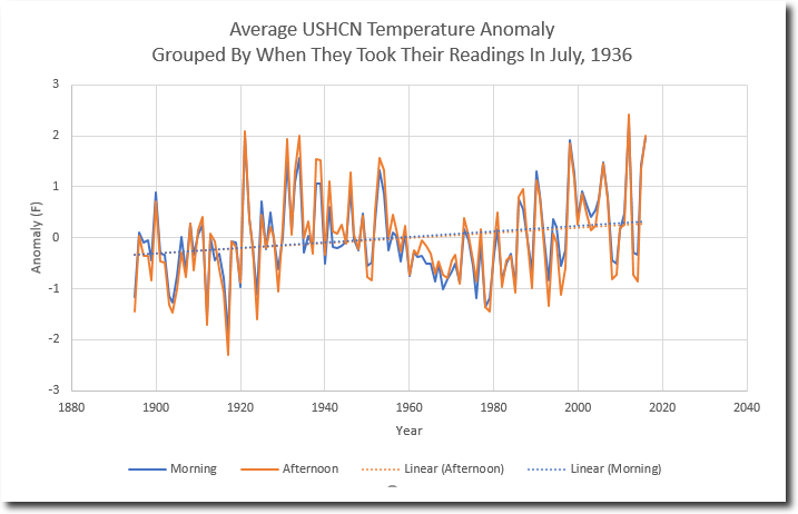
Ellsworth Kansas
http://www.free-the-memes.net/writings/warming2/ellsworth-kansas.gif
last one for now
Arkansas from NOAA.
http://2.bp.blogspot.com/_Lxqre8hMG3M/SxsbBdkfWzI/AAAAAAAAAxw/Fp230JpGyXQ/s400/weatherArkansasTemperature.gif
Here’s another one for you AndyG55. Has a graph in the article.
“In Germany there is one weather station that has be intact and unchanged for some 138 years.
It has never been moved and never been corrupted by the urban heat island (UHI) effect. Moreover it has consistently used the same instrumentation and computation method over the entire period, thus making it rare indeed. Few station can boast having those instrumentation qualities.
That measurement station is one operated at the Klostergarten of the St. Stephan Abbey in Augsburg just northwest of Munich.
44-year veteran German meteorologist Klaus Hager reports the following results of this station…”
http://notrickszone.com/2018/01/19/rare-weather-station-unchanged-over-138-years-data-show-no-co2-impact-on-temperature/#sthash.L9Y6XdIb.dpbs
Clearly somebody needs to apply Mike’s Nature Trick, at least, to this graph.
You might notice in the comments that I have seen that one 🙂
So why to they only show January temperatures?
I will take John daly’s data over anything from that clown.

“I will take John daly’s data over anything from that clown”
So from here we have what the “real data” says
http://oi60.tinypic.com/w9h6s3.jpg
And here we have what the sainted John Daly says

“real data” seems to speak with many voices.
They are somewhat similar. But no sources given. Who actually gathered that data?
Do your own research, petal !!
You are the one trying to pass yourself off as a guru.
And FAILING completely.
Here’s a good example of the real temperature pattern versus the manipulated Hockey Stick/Hotter and Hotter chart that CAGW advocates have created out of whole cloth in an effort to make the temperature profile match the CO2 chart profile: Up, up, up.
The black is the 1999 Hansen chart, and the red is what dishonest CAGW advocates changed it into to promote their cause.
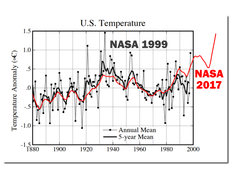
Not just individual weather stations, but global temperatures and Arctic sea ice too, match the AMO hugely significantly.
http://www.woodfortrees.org/plot/nsidc-seaice-n/from:1979/normalise/plot/esrl-amo/from:1979/plot/uah6/from:1979
Any thoughts on this?
“The 2014-2017 El Nino “warm blob” was likely created, maintained, and partially recharged on two separate occasions by massive pulses of super-heated and chemically charged seawater from deep-sea geological features in the western North Pacific Ocean. This strongly supports the theory all El Ninos are naturally occurring and geological in origin. Climate change / global warming had nothing to do with generating, rewarming, intensifying, or increasing the frequency of the 2014-2017 El Nino or any previous El Nino.”
http://climatechangedispatch.com/further-proof-el-ninos-are-fueled-by-deep-sea-geological-heat-flow/
Warm blob quite probably,
El Nino seems too cyclical/semi-regular, so most likely more of a charge and release mechanism.
Certainly All NATURAL, and as noted, the ONLY warming in the satellite data.
Got your point about El Ninos doing all the recent warming. This explanation makes a lot of common sense to me – especially that persistent blob – and things couldn’t be more natural if that was this is the case. Though I suppose somebody will then try to blame fracking or white male capitalism or something like that for these undersea flows…
Ian Wilson predicted the 2015-16 El Nino with his lunar hypothesis, which may tie in with this new development.
The team which accurately predicts ENSO behaviour a couple of years in advance would save agribusiness billions of dollars on a regular basis.
“Ian Wilson predicted”
Link?
There’s your link Nick.
Posted: May 31, 2015 by tallbloke…
“This repost of Ian Wilson’s Jan 1st article at his Astro-Climate-Connection blog continues development of his hypothesis that the Moon triggers El Nino events. This is relevant as we are currently on the cusp of El Nino, which may develop as the year goes on. Ian predicted El Nino for later this year in a comment here last year, based on his investigations.”
https://tallbloke.wordpress.com/2015/05/31/ian-wilson-the-el-ninos-during-new-moon-epoch-5-1963-to-1994/
There’s a lot of text I could not find the meat in. When will the future El Niños be? I guess the next super El Niño comes in 2035. Prove me wrong 🙂
Nick I’m nominating Ian Wilson for my Red Team, along with Stephen Wilde.
““The 2014-2017 El Nino “warm blob” was likely created, maintained, and partially recharged on two separate occasions by massive pulses of super-heated and chemically charged seawater from deep-sea geological features in the western North Pacific Ocean. This strongly supports the theory all El Ninos are naturally occurring and geological in origin.”
My understanding is warm water underneath these high-pressure systems only reached a few meters deep. The high-pressure system caused the heat. From above, not below. I don’t have a link handy.
Christ, this was one of worst foodfights over some global warming art.
I”d like to mention a couple of things.
First, the adjusted vs. unadjusted foodfight is of not much value. The question is do you trust the tobs adjustment which is definitely necessary to reveal any warming in the US post 1950, particularly do you see the assumptions behind the statistical removal of breakpoints valid?
I have had some hard time with this, but I admit people with a lot of intelligence and dedication say that they’re valid. I’m personally conserned with asymmetrical saw teeth signals in station records, could they cause a significant bias. I see a lot of potential in them to find more (or less) warming.
Another thing is the baseline of 1880, which is, in my opinion OK if you visualise the assumed CO2 effect instead of implicitly claiming that 100% of the warming since 1880 is anthropogenic. It is more that 50% since 1950, according to the IPCC. This kind of art is a liar’s tool.
TOBS
Its all they have.. and its EMPTY !!
This looks convincing if you can trust there are no biases hidden. I don’t. There is no information on station count or distribution. Or tobs breakpoint dates. After tobs, the warming doubles or so, and is more pronounced after 1950.
But as I said, the complex statistics is creating so convenient warming as a function of time and CO2, that a confirmation bias is probable. It is just above my paygrade.
There is at the original site. And its all done straight from raw USHCN data
https://realclimatescience.com/2017/05/the-wildly-fraudulent-tobs-temperature-adjustment/
A video you should watch
https://youtu.be/-oxKF6rW-W0
I’m still more concerned on unrecognised, asymmetric signals mixing the automated tobs adjustment statistics tool. Mosher has many times told how he trusts the antitobsed results. The trust makes me just suspicious. A bias sneaks in by unverified assumptions the statistical tool requires in order to not generate new biases. Mosher is not skeptical enough. Neither is Zeke Hausfather who went to great length at Climate Etc in explaining why tobs adjustment is needed in the first place. But, at least Zeke did try explain what it is about in simple terms. Says he’s honestly trying.
My concern in short. Imagine a sawtooth with a positive derivative almost everywhere.
Add that to a large portion of station records. How well breakpoint analysis can avoid detecting breakpoints and keep the anomaly from slowly climbing?
The reason for sawtooth might be site deteriorating, and it can in principle be upwards or downwards, or depend on sites so that rural sites behave differently, or sites with good management have more steps or smaller steps. I don’t know. There are many factors that can cause sawtooth changes, like shelter washing or painting, trees and bushes growing, tobs changing undocumentedly in a pattern caused by, for example, daylight and traffic jam induced ways, you name it.
The assumption is that the record can be spliced without breaking it, there are no jumps that should be included. I challenge this.
Hugs, look at the Charts by Zeke up post that I posted. They attempt to show what is wrong with using What we measure ie RAW Absolute Temperatures in averaging and Charting.
Those RAW Absolute Temperatures are exactly what we as humans experienced at the time, they include your saw tooths BIG style, they show that tempearures have not progressed with a nice CO2 induced trend.
They jump up about 1.5C in the Global Data a few times and 0.75C in the USA over very short periods of time and then slowly decay back to or even lower than when they started, very much like El Nino events.
Why do none of those Step changes show up in the current “adjusted data”?
Because the current data has been smoothed out, especially by adding Sea Temps, so that the data better follows the CO2 trend.
A C Osborn
I’ve tried to answer your question above, but it seems to have been held up in moderation.
I see you are now acknowledging that the graph showing a mean of absolute temperatures was produced to illustrate why it is wrong to use absolute values.
You seem to think this graph is more accurate because it’s closer to human experience, but don’t you think it’s odd that global temperatures are jumping by 1.5C in a year, whereas US only temperatures only change by half that?
I am not acknowledging it now, I new all along where those graphs came from and why Zeke did it, he was trying to debunk the use of Absolutes.
But he shot himself and you in the foot, because he showed that there was very little difference in those Step changes that you are questioning whether you use Absolutes or gridded Anomalies.
So why aren’t those steps in the Current Global Data, when they were in his graph of official data?
Because the current “Adjustment Process” is designed to remove them of course.
Do you now understand why I question what was done to the 1997/98 values in our previous discussion?
No, the assumptions in breakpoint analysis are not valid. The breakpoint methods being used assume non-auto-correlated and non-periodic data, and at the windows used for breakpoint analysis for temperature histories there’s definitely auto-correlation and periodicity.
See this references:
http://www.variation.com/cpa/tech/changepoint.html
http://www.homogenisation.org/files/private/WG1/Bibliography/Method_Description/Climate/lund_et_al.pdf
Several years ago I pinged BEST on this issue but got no response: See comments at:
http://berkeleyearth.org/understanding-adjustments-temperature-data/
But periodic, symmetric signal would decrease, not increase trend-creating breakpoints?
Why not just forget all the surface readings crap. How the hell can you trust ANY of it? More people, bigger cities, more heat from them, easily manipulated data from dodgy weather stations in dodgy places, no coverage over gigantic areas, open to adjusting by countless people (eg BOM in Australia) ….etc etc etc. Go with the satellite data only. It’s a lot easier, more accurate and shows a downward trend. Also does not show 2017 the hottest year at all.
To answer Nick Stokes, “so, why do they only show January temperatures.” question. Well, if the claim is that the globe is heating up, why would it matter which month was graphed in annual succession? Wouldn’t you expect to see a trend line supporting a rise in temp? Or, are the effects of CO2 selective in the months impacted?
Let’s face it C8 is a hoax. What’s that you say? What is C8? It’s my shorthand for Cash Crop Caucasian Caused Catastrophic Carbon Climate Change. A silly name for a silly game. The Cash Crop part is the act of climate scientist farming governments to keep their salaries safe. Now, let’s not have any more of the nonsense unless and until AGW can be proven. So far, there is no proof.
“Well, if the claim is that the globe is heating up, why would it matter which month was graphed in annual succession?”
People cherry-pick you know. It’s a real question. They say they have 137 years of pristine data. So why do we see only January? I can just imagine what folks would say if a met Office did that.
“Yep, like starting Arcticsea ice in 1979 which was the HIGHEST extent since the LIA, and similar in extent to that COLDEST of times in 10,000 years.
The El Nino spike of 1878 never gets a mention, it was the hottest year evah, but BoM has little interest in the 19th century.
Isn’t that the year that “birds fell out of the Air stone dead”?
Setting aside the issue of cherry picking, the question remains, “why would it matter which month was graphed in annual succession? Wouldn’t you expect to see a trend line supporting a rise in temp? Or, are the effects of CO2 selective in the months impacted?”
There has been plenty of cheery picking among the C8 proponents. By the way, even the aborigines recognized the caucasian connection to Climate Change long ago. Tony Heller recognizes that the truest reflections on historical climate data are those written contemporaneously for reasons other than to propagandize.
/Users/pblasz/Downloads/Image730_shadow.png
By the way, even the aborigines recognized the caucasian connection to Climate Change long ago. Tony Heller recognizes that the truest reflections on historical climate data are those written contemporaneously for reasons other than to propagandize.
Tony Heller’s Realclimatescinece.com
From the Maitland Mercury, March 11, 1846. On the Change of Climate
That great changes have taken place in the climate of Australia all testimonies satisfactorily prove. It is evident to any observer, at some period, that country has ben subjected to the mighty action of heavy rains, and of sweeping, deluging floods. The mountains and hills are cut and furrowed into the deep ravines; the parting ridges are at acute angles, and frequently washed bare of vegetable mould; and all so precipitous, that the waters are no sooner showered from the blessed heavens than they run off with rapidity and fury through the gullies into the recipient creeks, . . . the aborigines say that the climate has undergone this change since white-man came in country.
Mike January 22, 2018 at 12:32 am I go along with your comment, we have all this media hype in Australia over tenths of a degree supposed records When large cities mostly have a UHI of between 3 and five degree C due to urban concentration of population – sure we live in cities, but common sense says that old historical temperature records to be “exceeded” is not a tenth of a degree thing, as if we take away the UHI the records under comparison become a better test of cooling or warming.
With The Australian homogenized data that is now automatically produced with old LIG records down graded this is a recipe for gross deception and exploitation. The challenge for the likes of Nick Stokes is to produce a World or Global temperature after removing large cities and airport measuring sites and see if UHI contamination is the only significant factor boosting so called anomalies.
We need strong governance and outside audits to examine this media driven nonsense once and for all.
Nick was part of the problem, so expect him to deny common sense! and his defence of a corruptible science that seems to be challenged by the very extremes of cold weather as John Coleman states.
I beg your pardon for my quite obviously ignorance. But if the choose of 30 years is what Nick said:
It seem to me that the Global Climate is just a probability joke. As someone would guess the 500th number extracted based on the first 30 extractions from a lottery of 90 numbers.
Maybe not the exact number but, saying, number 5 +/- 1!
Is it this that the SuperComputers are doing?
“Maybe not the exact number but, saying, number 5 +/- 1!”
They keep coming up with 150 +/- 40. !!
I see all this arguing over this data and that data and this graph and that graph and how NASA GISS or the NYT or whoever else is manipulating or misrepresenting the global temperature. I prefer to watch the UAH for that.
Though the distortion of manipulation of the data is disturbing in the end it really doesn’t phase this layman much. In the end, if the world was warming to the extent being claimed by so many the rate of SLR would be skyrocketing. The graphs of global SL would show a hockey stick. It isn’t there. The rate of SLR has remained pretty consistent. That is until recently when it seems to have stopped rising completely for a time.
https://climate.nasa.gov/vital-signs/sea-level/
RAH, the only problem I have with UAH is that it is not measuring where we are and quite often does not reflect what is happening “on the surface”.
What it is doing is measuring how much heat is escaping to space, so higher values may not be good news for us down here as there is only so much of it to go around.
Phil Jones has been mentioned regarding producing data where there wasn’t any and adjusting data arbritrarily. Clearly they did and were going to add temperatures to locations where no measurements had ever taken place:
This e-mail from Jones to colleague Alan Kendall describes it:
date: Mon Oct 20 14:09:27 2008
1. The Arctic issue. We’re getting SST data in from ships travelling around in regions where we haven’t had any data from for the 1961-90 base period. We’re still figuring out how to use these. However we do it, it will only raise temperatures.
2. SST is being measured differently now than it was in the 1980s. Before about 1990 it was almost exclusively from ships. Automatic instruments called drifters began to be deployed (by both research and some merchant ships). They do what the name implies – drift around – and send SST an sea-level pressure measurements back to ground stations by satellites. They work for a few years till they pack up or get beached.
The issue is that they now (2008) form about 85% of the SST data coming in. With now about 15 years of overlap, we are learning that their SST measurements are about 0.1 deg C cooler than the ships -probably because on average they measure at slightly different depths than the ships. Any way the 1961-90 base period is a ship-based base period, so when the adjustments have been completed we will likely raise SST values by about 0.1 deg C now, reducing to zero gradually back to the mid-1990s.
This type of adjustment has to be made, and it can only be made in retrospect. How the temperature is measured is as important as the temperature value itself.The drifters are giving us much better spatial coverage – especially the Southern Oceans. We will probably have to revise our 1961-90 averages for these regions, now we have many more observations for them – not just drifters but satellite estimates as well.
The late oceanographer, Dr Robert Stevenson, described how temperatures were measured from ships, in his critique of Levitus et al 2000, http://www.21stcenturysciencetech.com/articles/ocean.html.
It is those already uncertain temperatures that Jones was using to add another 0.1 deg to current Argo data:
“when the adjustments have been completed we will likely raise SST values by about 0.1 deg C now, reducing to zero gradually back to the mid-1990s”.
“Sources of 20th Century Ocean Temperatures” – Stevenson
“The archived data used by Levitus, and a plethora of other oceanographers, were taken by me, and a whole cadre of students, post-docs, and seagoing technicians around the world.
I can’t remember how many bottle casts I made, or how many bathythermographs I deployed. There had to be thousands in the waters off coastal California. Other students and post-docs were doing the same farther offshore in the eastern Pacific, from the E.W. Scripps. In the westernmost Atlantic, a similar cadre worked from the Atlantis.
Many cruises were dedicated to the geophysics of the sea floor, where deep-ocean casts for water and temperatures were few and far between.
Surface water samples were taken routinely, however, with buckets from the deck and the ship’s engine-water intake valve. Most of the thermometers were calibrated into 1/4-degrees Fahrenheit. They came from the U.S. Navy. Galvanized iron buckets were preferred, mainly because they lasted longer than the wood and canvas. But, they had the disadvantage of cooling quickly in the winds, so that the temperature readings needed to be taken quickly.
I would guess that any bucket-temperature measurement that was closer to the actual temperature by better than 0.5° was an accident, or a good guess. But then, no one ever knew whether or not it was good or bad.”
This one is not fake news: “Top climate scientists’ consensus – global warming is a great swindle”
https://www.researchgate.net/publication/237288047_The_Great_Global_Warming_Swindle_a_critique
“Summary The Great Global Warming Swindle does not represent the current state of knowledge in climate science. Scepticism in science is a healthy thing, and the presence of orthodox scientific scepticism in climate change is ubiquitous. Many of the hypotheses presented in the Great Global Warming Swindle have been considered and rejected by due scientific process. This documentary is far from an objective, critical examination of climate science. Instead the Great Global Warming Swindle goes to great lengths to present outdated, incorrect or ambiguous data in such a way as to grossly distort the true understanding of climate change science, and to support a set of extremely controversial views.”
Re Toneb:
**Instead the Great Global Warming Swindle goes to great lengths to present outdated, incorrect or ambiguous data in such a way as to grossly distort the true understanding of climate change science, and to support a set of extremely controversial views.”**
You have not made one point here. Let’s see some facts.
**the true understanding of climate change science**
I understand it. Now when are you going to show me ONE study which MEASURES the amount of temperature change caused by CO2.
Waiting………………………..
“Now when are you going to show me ONE study which MEASURES the amount of temperature change caused by CO2.
Waiting………………………..”
You will be waiting a long time my friend.
Because there is none and what’s more there CAN be none.
So we throw our hands up in the air and walk away?
Splendid.
As you were.
However……
The climate science community I’m sure would appreciate a tip as to how one could if you know one.
The Earth’s a tad to big to put in a lab and study minutely.
Beyond a tad to complicated to model perfectly, even if we had the computing power.
So what do we do (if we dont want to give up and ignore the issue)?
Examine what we can in the lab.
In the field.
Via observation and theory explain those observations > now built-up over ~150 years (called empirical science).
We have.
Everything checks out to the extent that researchers cannot gainsay that empirical science – that GHG’s do what they do in terms of slowing heat loss to space.
We have measurements of increased DWLWIR at the surface – this converted to forcing by atmospheric radiative transfer models.
We have measurements of a TOA imbalance of Solar SW in vs LW out.
We know the OHC is increasing (the 93% of the heat stored in the climate system).
That I know denizens here reject the above you can take as read.
“We have measurements of increased DWLWIR at the surface – this converted to forcing by atmospheric radiative transfer models”
Those models are useless for climate forecasting. Radiation is just one mode of heat transfer in the atmosphere. GCMs cannot model accurately the clouds and fluid dynamics of the Navier-Stokes equations. Ask Chris Essex on how bad the models are.
“We have measurements of a TOA imbalance of Solar SW in vs LW out.”
Have they found the AGW signature – the tropical troposphere hot spot? Ask Lindzen why they can’t find it.
“We know the OHC is increasing (the 93% of the heat stored in the climate system).”
How many degrees is the increase in deep ocean temperature? How come they never tell this in the media? Is it because it’s incredibly small? Ask Carl Wunsch why increasing OHC is not catastrophic.
More on climate model wonderland
toneb, just lost the whole CO2 argument with “We know the OHC is increasing (the 93% of the heat stored in the climate system).”.
Because CO2 can’t do that, only Solar Radiation can do so.
DWIR, can only evaporate a few microns of the surface.
QED
“toneb, just lost the whole CO2 argument with “We know the OHC is increasing (the 93% of the heat stored in the climate system).”.
Because CO2 can’t do that, only Solar Radiation can do so.
DWIR, can only evaporate a few microns of the surface.
QED”
Except it isn’t demonstrated.
One of oft repeated myths surfaces (again) …..
Of course it can.
It is extra energy directed at the ocean surface.
No thermodynamical process is 100% efficient.
It is not all redirected into greater evaporation.
There is turbulence present at the surface (unless you are proposing a glass-like surface over the entirety of oceans).
The extra heat is mixxed down a few mill, which then reduces the deltaT between the warmer waters below by which the oceans heat escapes to space (as LWIR cannot be emitted by the body only at the surface via radiation and sensible/LH exchange). So the flux being reduced (2nd LoT ) less energy is available to escape.
Just basic thermodynamics and not open to pseudo-science sky-dragon slaying. Sorry.
Been observed apart from being common-sense.
This from Nick Stokes
https://moyhu.blogspot.co.uk/2010/10/can-downwelling-infrared-warm-ocean.html
and
http://home.earthlink.net/~drdrapp/ocean.heating.v3.pdf
and
http://onlinelibrary.wiley.com/doi/10.1029/2008JC004825/pdf
This is the “sister” to the “GHE effect is non-existent”.
Do you “deny” that also?
Both work by reduction in cooling and not heating.
“Ask Chris Essex on how bad the models are.”
The science is not the “models”.
The models are a tool to learn with.
Models were not needed when Arrenhius and Tyndal et al did their science. Or as it was developed and proven in the lab following.
The models try to integrate the radiation balance at TOA with the variations due to NV.
It is no surprise that they cannot do so (as a mean) as they are an ensemble of individual iterations and so MUST average out NV.
Focusing on the mean of the models is a convenient straw-man for sceptics, when in fact the error-bounds are the proper metric.
As they bound the NV for each individual model run which, as I say, cannot be projected.
That we do not know the full extent of NV to test a model ensemble is not important to determine that the physics is basically correct in them.
So here we have the latest (and yes it compares with a surface series of GMST) – as that is where we are both interested in and projecting for.
If you are not happy with the obvious constraints on models and you somehow expect the impossible then explain why OHC keeps rising, even through the “Hiatus”. Science can – it was the increased SW absorbed by the equatorial Pacific because of reduced cloud cover/convection in the lower SST’s during that time) IOW the reduced cloud was an effect (feed-back) of the -ve PDO/ENSO regime that largely existed during that time. Just like the GMST has not come fully down after the recent EN. Because the PDO is still +ve.
http://www.realclimate.org/images/cmp_cmip3_sat_ann.png
“You have not made one point here. Let’s see some facts.”
Well tell me something I don’t know.
I know perfectly well that ANY point I make here will not “be accepted”.
It is a self-fulfilling prophecy.
It matters not what replies I get, it is the silent viewers who I post for to give them the alternative of looking to the science and not what passes for (most of it) here.
I am almost certain that the vast majority will not even follow the link and see the criticism – much from people who’s science was actually used to the producers end.
It was certainly not a balanced one.
Just like here.
But….
On the contrary.
You have made another point by that statement BTW.
I made the point that “The Great Global Warming Swindle” cherry-picked data and did not represent the science honestly.
That is very, very big point.
And what do denizens here do?
Lap it up uncritically.
Because the scince is a fraud?
Because they know more than the scientists?
You tell me?
I think the answer is quite obviously neither of those.
I think it boils down the ever increasing polarisation of society on political grounds.
“Instead the “Great Global Warming Swindle” goes to great lengths to present outdated, incorrect or ambiguous data in such a way as to grossly distort the true understanding of climate change science, and to support a set of extremely controversial views.””
toneb January 24, 2018 at 2:29 am
I am not and have not argued that GHGs reduce the speed of cooling, it is patently obvious in day to day and day to night weather.
Let me ask you a few questions about your belief in CO2 as the prime mover of GHG warming.
1. What it the ratio of CO2 molecules compared to H2O?
2. What is height where the main CO2 window is ie no H2O?
3. What is the Time taken to release a photon from an “Excited” CO2 Molecule?
4. What is the Time taken to lose the energy from an “Excited” CO2 Molecule due to a collision with another molecule?
5. What is the Mean Free Path of an IR photon?
6. What is the “Energy” in Electron Volts of an IR Photon?
7. What is the Energy in Electron Volts of Solar Radiation?
There are of course clearer cases of fake news like inventing millions of fraudulent votes out of thin air. Data distortion and manipulation pales by comparison.
Not when Trillions of Dollars are tied up with it.
They are depriving the poor of the world better living standards, better health and longer lives.
Actually,all said i think is right , the theory of Greenland’s ice is restored in the perennial average slightly better, but strange is to take a look at the arctic sea ice, did I want to know is this data being manipulated, why the range of maximum small year by year, and I have a hunch just think this year’s summer will not particularly good, this kind of feeling a little frightening
The NYT graft on earlier data onto a graph, attributed to NASA, clearly for editorial effect.
The second problem is “annual global surface” temperature, which is not a temperature measurement. They are convenient for highlighting small differences between numbers.
Graphs such as the NYT one automatically show a biased result. They do not contain any context for either the rate or magnitude of the change shown. The hump after 1970 could be a continuing rise. It could be a continuing cycle, it could be an artifact of the data used. In any case, it implies an unsubstantiated, continuing increase in temperature into the future, without further explanation.
To put the graph in context would require showing at least 1000 years, preferably 10,000 in light of the interglacial period we are in.
Measuring temperature before about mid20th century was a haphazard process. The first actual temperature standar was 20C, established in 1931 for measuring lengths. It applied to glass thermometers primarily because it allowed standarization of the scale length and uniformity. Measuring any temperature, prior to 1920, was only slightly more accurate that asking groups of people to dip their hands into two water buckets and decide which was hotter- the Fahenheit scale. So going back to 1880 the deviation range(not standard deviation) was several degrees F for a particular lab, and roughly twice that for different labs or measuring station. The measurement error is roughly 5X the anomaly prior to about 1920 increasing to about 10X for 1880 and earlier.
The earth-space-sun-galaxy is a heat engine. The appropriate scale to measure is the Kelvin temperature. It at least approximates the relative heat energy of whatever is being measured. That has some bearing at least on what it means to climate change.
True, only that which has been physically measured can be called “true”. Everything that’s conjured up, adjusted, homogenized etc is NOT true. Unless it matches that which was measured.
Adjusted surface temperatures = fake news = academic impropriety.
And that’s the truth.
I read a few things from the NYT graph.
-from 1880-1910 (30 years), there was a .3 degree C temp drop.
-From 1910-1940 (30 years), there was a .6 degree C temp increase.
-from 1940-1970 (30 years), there was a .00 degree C temp increase.
-From 1970-2000 (30 years), there was a .65 degree C temp increase.
Since we are talking climate and CO2, I see these periods as a good test of CO2 influence.
– In the first Co2 rose a small amount (about 0-5 ppm)
– In the next CO2 rose a small amount (about 2-6 ppm), and temp anomoly rose .6C.
– in the next CO2 rose a touch more (about 12-15 ppm), and temp anomoly didn’t change.
– In the last Co2 rose alot (about 130 ppm) and the temp anomoly rose a touch more at .65C (eyeball readings, could argue up to .7C).
Based on this, the effect of rising CO2 on temp, is small. Since one can have a similar increase in temp with only a small increase of Co2 as one sees from a large one. One can have no change from a slightly larger increase as well, completely negating CO2 as the proabably cause of the first increase.
The only real outliers in that whole graph that went for 137 years and spanned from little Co2 change to large Co2 increases, is the last 4 years. To be fair, there was somewhat similar walk up from 1939-1944, that fell away again. And I suspect we will see a drop here again back down to around 2010-2014 range (assuming that adjustments don’t assume any drop is wrong and a “correct”). If this will be the case, then it will be very little changed from the past temp record events.
Frankly, I see a repeating temp. anomoly history graph, that slowly rose in temp spanning 137 years with very little place for influence from CO2. You can’t have it both ways, if co2 was a big cause in 1910-1940, then why did it’s effect diminish so much in 1970-2000 when CO2 rose so much faster? If CO2 wasn’t a big cause in 1910-1940, then why is the 1970-2000 event so similar to the earlier graph if Co2 is having a big effect now? You will never convince actual science educated sceptics without dealing with this dichotomy. And repeatedly adjusting the past “data” until it no longer looks recognizable only causes more scepticism.
“From 1970-2000 (30 years), there was a .65 degree C temp increase.”
People love to quote this as if it ended in 2000. But it didn’t. It kept rising. Another 0.35°C, and shows no signs of stopping.
“It kept rising.”
Not in any REAL temperature series. GISS is a FABRICATION, and you know it.
No warming from 2001 – 2015.. Then the NON-CO2 El Nino transient, which has all but dissipated.
Even the small rise from 1970 -2000 was mostly an El nino in 1978 and then in 1998
(pity we don’t have any reliable untammpered data before 1979, hey Nick)
There was no warming between 1980 and 1997 in any REAL temperature series.
How can any so called statistician justify calculating or putting a trend line on data that so obviously has dramatic Step Changes in the data.
Nick should hang his head in shame.
That is why I keep bringing up the Zeke charts of the RAW data, where have those Step Changes gone in the historic data?
I wonder by what mechanism CO2 stores up the heat and then releases it bursts of activity.
“Showing temperatures” implies that the IPCC chart is taken from real (proxy) data. In fact it was not and was not presented such. It was presented as a schematic for a general (global?) temperature trend. The above representation of the chart suggests that the IPCC schematic chart is derived from a chart by HH Lamb. This is true in the sense that it is derived from a chart by Lamb for Central England. It is not true that Lamb ever suggested that this trend was global. Indeed, he has other charts suggesting (on a winter severity index) that the medieval warm period was truncated at the same latitude in eastern Europe. Any suggestion that this chart, as an expression of a general (NH or global) trend, is based on real data remains with the IPCC (and the chapter lead author). Thus, if we interpret this as the claim of the 1990 IPCC report then it is a false claim that has no more scientific integrate than the suggestion of the 2001 report that the Hockey Stick graph gives the general trend.
See: https://enthusiasmscepticismscience.wordpress.com/2013/09/22/hubert-lamb-and-the-assimilation-of-legendary-ancient-russian-winters/
Sorry
https://www.google.ca/search?complete=0&source=hp&ei=iIhmWvKWAYTu_Qaz967wCA&q=inurl%3Ahttp%3A%2F%2Fdi2.nu%2Ffoia%2F+jones&oq=inurl%3Ahttp%3A%2F%2Fdi2.nu%2Ffoia%2F+jones&gs_l=psy-ab.12…3211.67286.0.73131.0.0.0.0.0.0.0.0..0.0….0…1c.1.64.psy-ab..0.0.0….0.puid4BwNFYw
[This takes second prize for the most irregularly typed reply. .mod]
I just want to know why the arctic ice cap is getting smaller and smaller and scary?
“I just want to know why the arctic ice cap is getting smaller and smaller and scary?”
It isn’t. Your information is obsolete. It was getting progressively smaller after reaching (recent) peak extent in the 1970s – when most graphs you see start – but that trend is turning now.
If you found that scary you were probably reading too much fake news and/or junk ‘science.’
Spend more time on this site and you’ll learn all about it.
The first question is: just like the temperature in 1880 is without actual measurement, is likely to have been adjusted, I can understand the things, but before 1979 years ago, the arctic ice is not measured, who all don’t know if it“s big or small
In addition, the situation is the condition of the Greenland in changes in these two years, The ice is not lost, and even the South Pole is not lost. but in the arctic ice, the maximum has become more and more small, it is actual measurement,Even in 1998 and 2016 of the el nino phenomenon The arctic ice is not so small as they are now。What happened now?
Extreme Hiatus January 22, 2018 at 9:32 pm
“I just want to know why the arctic ice cap is getting smaller and smaller and scary?”
It isn’t. Your information is obsolete. It was getting progressively smaller after reaching (recent) peak extent in the 1970s – when most graphs you see start – but that trend is turning now.
Actually the Arctic sea ice extent is currently the lowest value for the date and the previous low was last year.
i agree with you If you look at the chart you will know that this year’s point is lower than last year’s.
That depends on who’s chart you look at.
As to your statement ” but before 1979 years ago, the arctic ice is not measured”, you are of course wrong.
It has been “measured” for decades before Satellites started doing so.
But even Satellites started before 1979, but they do not like to show the data, but as usual they did make the mistake of doing so.
Take a look for yourself
https://www.bing.com/images/search?view=detailV2&ccid=5ymqyf7x&id=4C15C8A3E7EFEDDAE82504942728CDE83C7BE15D&thid=OIP.5ymqyf7xBaOTvoGKPuPIXgEsDH&q=original+IPCC+Arctic+Ice+graph&simid=608028678058934672&selectedIndex=0&ajaxhist=0
Or this version
https://www.bing.com/images/search?view=detailV2&ccid=nhqrX84A&id=70100E824942CC909CDE1B6A05AE2A5EAA8F53D1&thid=OIP.nhqrX84A7VkpWK3EEDqp6AHaFb&q=original+IPCC+Arctic+Ice+graph&simid=608044758417801700&selectedIndex=7&ajaxhist=0
Or how about a reconstruction based on known data
https://www.bing.com/images/search?view=detailV2&ccid=WuVkIZ%2bM&id=93219643CA213197D2FC3D0A2516B78E77B9DA03&thid=OIP.WuVkIZ-MifAB43oR6KinzgEnDT&q=original+IPCC+Arctic+Ice+graph&simid=607994520188160556&selectedIndex=30&ajaxhist=0
A C Osborn January 23, 2018 at 4:19 am
That depends on who’s chart you look at.
As to your statement ” but before 1979 years ago, the arctic ice is not measured”, you are of course wrong.
It has been “measured” for decades before Satellites started doing so.
Yes it has, here for example.
Over the last few years the winter max has consistently dropped, currently it is at the lowest value for the date and is ~3 sds below average. There’s a distinct possibility that this year will see the lowest maximum (in ~50 days time).