From the University of Alabama, Huntsville.
Global Temperature Report: December 2017
Global climate trend since Nov. 16, 1978: +0.13 C per decade
December temperatures (preliminary)
Global composite temp.: +0.41 C (about 0.74 degrees Fahrenheit) above 30-year average for December.
Northern Hemisphere: +0.50 C (about 0.90 degrees Fahrenheit) above 30-year average for December.
Southern Hemisphere: +0.33 C (about 0.59 degrees Fahrenheit) above 30-year average for December.
Tropics: +0.26 C (about 0.47 degrees Fahrenheit) above 30-year average for November.

November temperatures (revised):
Global Composite: +0.36 C above 30-year average
Northern Hemisphere: +0.33 C above 30-year average
Southern Hemisphere: +0.38 C above 30-year average
Tropics: +0.26 C above 30-year average
(All temperature anomalies are based on a 30-year average (1981-2010) for the month reported.)
Notes on data released Jan. 3, 2018:
Globally averaged, 2017 was the third warmest year in the 39-year satellite temperature record, according to Dr. John Christy, director of the Earth System Science Center (ESSC) at The University of Alabama in Huntsville. The average temperature in the lower troposphere over the globe in 2017 was 0.375 C (about 0.67 degrees Fahrenheit) warmer than seasonal norms.
Warmest years (global) 1979 to 2017
2016 +0.513 C
1998 +0.484 C
2017 +0.375 C
2010 +0.336 C


Since the satellite-based global temperature record began in November 1978, the fastest warming region on Earth has been around the North Pole. The troposphere over the Arctic Ocean has warmed at the rate of 0.28 C per decade, or more than twice the global rate of warming. By comparison, the Antarctic continent is warming at the rate of about 0.07 C per decade, while the air above the ocean around the Antarctic is cooling about 0.04 C per decade. (The satellite instruments that collect temperature data do not see all the way to the poles. The satellite orbits miss about the top five degrees latitude in both the Arctic and the Antarctic.)
The continental U.S. (both contiguous 48 and the continental 49) have been warming at the rate of about 0.18 C (about 0.32 degrees F) per decade. That means that in the 39 years since satellite instruments started collecting atmospheric temperature data, the air temperature above the U.S. has warmed an average of about 1.25 degrees Fahrenheit.
Compared to seasonal norms, the coldest spot on the globe in December was near Timmins, in eastern Ontario. Temperatures there were 3.51 C (about 6.32 degrees Fahrenheit) cooler than seasonal norms.
Compared to seasonal norms, the warmest place on Earth in December was near Qambo, in the Eastern Tibet autonomous region of China. Tropospheric temperatures there averaged 5.27 C (about 9.49 degrees Fahrenheit) warmer than seasonal norms.
Christy and Dr. Richard McNider, a professor emeritus at UAH, recently published in the Asia-Pacific Journal of Atmospheric Sciences a study that mathematically removed from the satellite temperature record the effects of volcanic eruptions and of El Nino and La Nina Pacific Ocean heating and cooling events. This was done in an attempt to identify that part of the overall warming during the 39-year period that might be attributed to human influences. The 0.155 C per decade trend reported in that study differs from the 0.13 C per decade trend reported here in the Global Temperature Report. That is because this most recent research in the APJAS was done using an earlier version of the satellite microwave sounding unit dataset. That dataset was revised and updated, and the revisions published (Spencer et al., APJAS 2017) while the research looking at the effects of natural climatic events was under peer review.
As part of an ongoing joint project between UAH, NOAA and NASA, Christy and Dr. Roy Spencer, an ESSC principal scientist, use data gathered by advanced microwave sounding units on NOAA and NASA satellites to get accurate temperature readings for almost all regions of the Earth. This includes remote desert, ocean and rain forest areas where reliable climate data are not otherwise available.
The satellite-based instruments measure the temperature of the atmosphere from the surface up to an altitude of about eight kilometers above sea level. Once the monthly temperature data are collected and processed, they are placed in a “public” computer file for immediate access by atmospheric scientists in the U.S. and abroad.
The complete version 6 lower troposphere dataset is available here:
http://www.nsstc.uah.edu/data/msu/v6.0/tlt/uahncdc_lt_6.0.txt
Archived color maps of local temperature anomalies are available on-line at:
Neither Christy nor Spencer receives any research support or funding from oil, coal or industrial companies or organizations, or from any private or special interest groups. All of their climate research funding comes from federal and state grants or contracts.
— 30 —
Thank God it has been warming and not cooling. Will provide that bit of a buffer and insurance policy on some stratovolcanoe popping off, which tends to temporarily lower atmospheric temps a degree or more. Best news all day so far.
here it is the first four days in January and most of north America is freezing. all the way to florida. i am so sick of the nonsense that represents so called climate science.
Well, at last the Alarmist crowd seems to be backing off a bit. Up until now it seems like every year has been THE SECOND WARMEST YEAR EVAHHHH™.
You expect warming since the end of the Little Ice Age. What matters is whether the warming is at the rate of natural warming which is 1/3rd of the rate predicted UN IPCC AGW models (and 1/10th of the warming rate predicted in their earliest models).
We are experiencing slow, natural warming back to temperatures before the Little Ice Age. That is very good for the biosphere.
Maybe but I don’t think there’s been any warming at all.
Look at the 1999 NASA data that showed the US to be hotter in the 1930s than then. This is NASA’s own graph:

Look also at the US data for the hottest temperatures by state: https://www.infoplease.com/science-health/weather/record-highest-temperatures-state
This graph shows the number of US state heat records set per decade:

How many US heat records have been set in the last 2 decades? ZERO. The 1930s were clearly hotter, and with the US having the most extensive and reliable set of thermometer stations you can infer that it’s quite likely that in reality the world temperature history is more likely to reflect the US situation than the spotty and manipulated global data. There’s been no appreciable warming in nearly 100 years.
@ MOA
It is only “slow, natural warming back to temperatures before the Litlle Ice Age ” IF the heavily adjusted temperatures and carefully selected temperature stations are correct and accurate.
Is it actually warmer than the 1930s ? or has there been some slow cooling in recent decades that the many-times adjusted temperature records disguise ?
Winter temperatures in Europe and North America have dropped in recent years and we know that the Australian records are distorted upwards by their Bureau of Meteorology (BOM) having installed chips in electronic stations that prevent temperatures below -10C being recorded. We know that BOM records are almost certainly unfit for purpose as they have admitted to using 1 sec intervals for readings as opposed to averaging over 2 – 10 minutes under WMO and IPCC guidelines – and that mispractice creates artificially High temperature records. We know that NOAA / GISS have dropped a number of very cold stations and now extrapolate temperatures to those areas from much warmer stations ……..
The record temps claimed by UAH seem to be completely in accord with what is expected during El Nino and we must never forget that we have no reference satellite temperature records that show just how hot the troposphere was during the higher temperatures of the 1930s.
How about we bring the graph up to date…..

And without adjustments…..

“How many US heat records have been set in the last 2 decades? ZERO. ”
Oh, OK.
But….
http://mashable.com/2017/06/23/heat-wave-southwest-5-most-impressive-records/#cAx4IBzv5Oqo
https://www.accuweather.com/en/weather-news/late-september-heat-wave-shatters-century-old-records-in-midwest-eastern-us/70002827
http://www.climatecentral.org/news/june-hottest-on-record-contiguous-us-20502
And
And ?imgmax=800
It doesn’t only have to be hot by day. Night minima are important aspect of heat stress, and the temperature attribute that an increased GHE has most effect on (because of the reduced vertical depth of unstable atmosphere to convect away heat. IOW an inversion).
@toneb — The “updated” data is MANIPULATED data! That’s what NASA did to the 1999 data to eliminate the cooling from 1940 to 1975.
Also, you point to city heat records for specific days, which does not compare to all time hot records for the entire state. If we really were warming then you would have seen at least some new statewide heat records over the last 2 decades. But there’s … NONE. So you just put up irrelevant flak.
How about the same record for South Africa before adjustment:

And Canada, Greenland, Scandinavia, Siberia, Paraguay…..
@Gary Young Pearse — Yes. At spot after spot after spot that is the story .. they have adjusted away the fact that the 1930s was hotter than today, in the US, and the globe.
Brian Mannix asked the only relevant question way back in 1985
Seriously, Uncanny X Men!
amazing how the warmest places always seem to be areas with little coverage of proper measuring equipment. never mind as long as we have algoreritms and mathturbation there will always be dangerous warming somewhere, even if no one can actually notice it.
While the settled science is of course settled, they will still like the grants to continue so they can confirm that the science stays settled,
As cicero said so long ago ” who gains”
M.j.elliott
Well, since this is satellite-based measurements, Qambo in the Eastern Tibet autonomous region of China presumably has just as good measurements as Topeka.
” Qambo in the Eastern Tibet autonomous region of China”
It probably doesn’t. One weakness of TLT is that it doesn’t work if land is getting close to the LT layer. That is because the land emits lots of radiation that interferes with the signal. RSS does not show Tibet in its maps.
http://images.remss.com/data/msu/graphics/tlt_v40/medium/global/ch_tlt_2017_11_anom_v04_0.png
I stand corrected, with gratitude!
it depends how good one thinks satellite measurements are.
The redoubtable Christopher Monckton described Roy Spencer as indefatigable. I think that also applies to John Christie. Their tireless work has, for a long time, been an important bulwark against the constant adjustments by the warmists. I say, three cheers for them.
“Their tireless work has, for a long time, been an important bulwark against the constant adjustments by the warmists”

Here (from here) is a comparison of the effects of adjustment on UAH (V5.6 vs V6) compared with GISS, on the same 1981-2010 anomaly base. The then current Dec 2015 version is compared with archived 2011 and 2005 versions. The GISS adjustments are indeed frequent (about 7500 stations) but the effect is small compared with just one version change in UAH.
..not adjusting for the same reason though
I thought GISS’s computer thingy adjusted every time new numbers were put in
I recall a thread where you argued we should NOT compare satellite and surface temperature records, but here you are. Typical Nick, playing Calvinball.
“we should NOT compare satellite and surface temperature records, but here you are”
No, I am comparing the size of adjustments made to the two data sets. I do often point out that surface and troposphere are two different places. It’s fine to compare them, just as you might compare NY and Miami, but not with the expectation that the measurements should be the same. But here I’m just noting that UAH adjustments do happen, and they have a much bigger effect than GISS adjustments in the same years.
But as we know , Nick, the quality of the data for GISS is horrendous.. and no-one cares, least of all you.
Just do the maths, don’t worry about the data 😉
“the quality of the data for GISS is horrendous”
No, it’s quite good, and they have thousands of stations. UAH has very few measurement points, constantly on the move. What do you know about their data quality?
No Nick, you were never able to show any of those stations I asked you for.
You have NO IDEA of the quality of the data.
Nick, you have pointed to the UAH adjustments in previous threads. I’m wondering if you have a specific critique? I have read Spencer’s breakdown on their new method and I can find nothing wrong. They have omitted a particularly drifty instrument set which RSS seams to still use and with seemingly equal weighting; might account for some of the difference
“I’m wondering if you have a specific critique?”
No, I don’t. V6 may be better than V5.6. They give reasons, just as RSS give reasons for their change. I can’t evaluate them. I just note that they do adjust, and the adjustments are large relative to surface adjustments. My take is that the results should be viewed with appropriate scepticism.
Nick, I dont think we need to be skeptical of the the adjustment size; however new methods, in my opinion, need some time to reveal bugs.
I thought we did this already…..unadjusted GHCN is not the problem….when GHCN cherry picks stations with a warming trend
https://wattsupwiththat.com/2012/08/01/a-comparison-of-adjusted-vs-unadjusted-surface-data/
“when GHCN cherry picks stations”
The usual nonsense. First your link is not about global temp, but about US. Second, the criticism isn’t of selection by GHCN, but by HADCRUT. Lansner uses GHCN as the reference. In any case, GHCN doesn’t choose US stations. They use the USHCN set, which doesn’t change.
Nick, the issue with the ‘thoursands’ of GISS land stations is that so many of them are horribly compromised by UHI. While GISS may do lots of small adjustments they seem to be more of a fig leaf over the distended reality that the GISS data has a ‘stiffy’ for CAGW and the ‘adjustments’ are essentially defensive and more to do with giving CAGW proponents like yourself some furniture and other junk to pull down behind you as you run away from reality.
Happy New Year Nick.
It should be a ripper.
[Snip. Unnecessary commentary on another poster. -mod]
In “Nick speak” – It’s fine if I do it my way.
The difference between you and most everybody else is that you consider GISS as gospel, where I and many others consider it garbage.
Go, spread the gospel, Nick
AW, never a more succinct answer to NS. Well done.
Anthony, it’s funny that Nick is defending GISS, in reply to you. That’s all. It’s just funny
“The difference between you and most everybody else is that you consider GISS as gospel”
Another difference is that every month
I calculate and post my own global surface average using unadjusted GHCN data, and compare with the GISS result when it comes out. I have been doing this for six years. The comparison is good.
…and about 5 years ago GHCN was busted for picking stations with a warming trend..eliminating stations with a cooling trend….no wonder they get the results you want
https://wattsupwiththat.com/2012/08/01/a-comparison-of-adjusted-vs-unadjusted-surface-data/
“about 5 years ago GHCN was busted for picking stations with a warming trend”
GHCN has not changed the 7280 stations in its mix. Since it became a regularly updated set, it has used the stations that submit data on CLIMAT forms to the WMO.
“go forth and multiply”?
Nick has shown he has ZERO idea of the quality of the GHCN data..
…. and that he JUST DOESN’T CARE.
Nick, I just downloaded the ghcnd-stations.txt file from ftp://ftp.ncdc.noaa.gov/pub/data/ghcn/daily/. There are 104,126 stations in the file, with 995 of them marked as GSN stations. Which 7280 stations do you use?
“Nick, I just downloaded the ghcnd-stations.txt file “
It gets tedious when people mix stuff up so. You downloaded the GHCN Daily file. GISS and I use GHCN V3 monthly. Quite different.
What Nick or GISS don’t tell you is that the GHCN-M dataset contains over 50% of stations with </= 50-years of data collection – as per Jay H. Lawrimore, Matthew J. Menne, Byron E. Gleason, Claude N. Williams, David B. Wuertz, Russell S. Vose, and Jared Rennie (2011): Global Historical Climatology Network – Monthly (GHCN-M), Version 3:
“there are only around 1500 stations with data in 1900 and observations at many of these stations continue into the 21st century. Approximately 4300 stations have at least 50 years of data and an additional 1500 stations have at least 30 years of data. There are 150 stations with as few as 10 years of data.”
Nick also doesn’t tell you, that of those 7280 stations, only approximately 2300 GHCN-M stations have data which are routinely available.
Isn’t that right Nick? 😉
“What Nick or GISS don’t tell you is that the GHCN-M dataset contains over 50% of stations with </= 50-years of data collection "
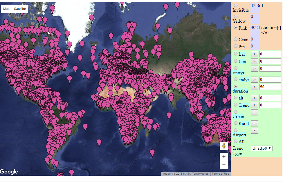
That is the opposite of the truth. I maintain a page here which shows all the stations on a Google Map. You can select with a couple of clicks all kinds of subsets, including various duration ranges. Below is a map of stations that cover a period of less than 50 years. That doesn’t include a few that cover more than 50 years duration, but with less than 50 years data (lots of missing). There are 3024 out of 7280. A reason for the discrepancy is that your quote is from 2011. The gadget is a normal GMap that you can zoom etc. Here is a snapshot of those 3024:
BTW, even on your numbers, 59% have more than 50 years.
Nick, can you say what proportion of the data is estimated rather than
real instrument measurements?.
GHCN unadjusted, which I use, does not include estimated measurements.
I can drive 10 minutes outside of my 200,000 person urban area and watch the temp drop by 4 degrees F any time of day or night — any season.
Any reasonable person would look at a GISS station located between TARMAC runways on an airport and say WTF were they thinking.
The UHI effect hugely (bigly) compromises the GISS records.
“look at a GISS station located between TARMAC runways on an airport and say WTF were they thinking”
GISS doesn’t have stations. Anywhere. They use GHCN data. But GHCN doesn’t have stations either. They use data reported by the various national met services. And those collect data where it is needed for some purpose. The main reason airport data is prominent is that that is where the measurements are best maintained.
Maybe it’s already been done, since I believe this site got kicked off/spun off by evaluating US temperature recording stations, but has anyone done a nationwide analysis of how UHI is handled in the data sets? I’m in the Phoenix area, and it occurs to me that UHI back in the record setting hot years of the 1930s and perhaps 1940s would be nowhere near what it is now. 10X+ the population now, over 10X increase in paved areas and buildings, nearly 100% AC use versus nearly 0% 70 plus years ago, etc., etc.
If the temps from any station within the UHI here, for example, are not being adjusted downward by at least 10 F by now (and maybe 12+ F), they’re not going to show any accurate comparison to older records. Ditto for any other large cities that have seen large growth, and to a lesser extent for cities with smaller growth numbers. Overall energy use and paved areas has still gone up 5 to 10X even if the population stayed the same.
Chris BC: I’m in the Phoenix area, and it occurs to me that UHI back in the record setting hot years of the 1930s and perhaps 1940s would be nowhere near what it is now. 10X+ the population now, over 10X increase in paved areas and buildings, nearly 100% AC use versus nearly 0% 70 plus years ago, etc., etc.
A friend who grew up in Phoenix in the 1930’s told me he remembers Sky Hartbor (KPHX) was a bare dirt runway then surrounded by open desert and airline traffic amounted to maybe 2 or 3 DC-3 per day. One day I was walking across a friends yard near 24st & Thomas (maybe 2 miles max from KPHX airport) and tripped over a concrete emplacement in the yard. Was told it was a left-over chunk of irrigation pipe from when the area was a Dairy Farm back in the 30’s & 40’s. Any records from KPHX are the poster child of UHI effect.
I find the most striking aspect of the full record is the asymmetry between Northern polar warming and Southern polar cooling. Notwithstanding that I have read there are issues with how the satellite algorithms can affect one at the expense of the other, it doesn’t seem consistent with the concept of a greenhouse gas that warms a little bit everywhere.
Indeed. It is almost as if the ‘global climate’ does NOT exist. It is just a manufactured concept.
The global climate actually does exist,
Extreme Hiatus. It is officially recorded as the International Standard Atmosphere.
It was first established by the French in about 1864 because their experience in flight using balloons created need for accurate atmospheric data.
The ISA was established as the calibration, regulatory *and physical Standard globally in 1920 and updated in response to Hansen and others claims of changing climatic conditions
through adoption of the American Standard Atmosphere which also expanded our global
Regulatory Standard to a higher altitude.
The climate is most assuredly not changing
and that is proven through the unaltered Global Atmospheric Standard’s unchanged global Temperature.
That’s a fact that isn’t going away.
The entire claim of ANY climate or global temp change is in outright defiance of International Physical and Regulatory Standards ETCHED in STONE.
Peace on ya
Ocean circulation plays a large part in the climate. The closing of the Isthmus of Panama is thought to have had a big effect on the global distribution of heat and explains the difference between the north and south poles. link
“UAH: 2017 was third warmest year in satellite record”
Surface temperatures, based on NCEP/NCAR reanalysis, were 0.075°C higher in December than November (post here). That is quite close to the 0.05°C shown by UAH TLT. It makes 2017 cooler than 2016, but warmer than 2015, or 2014. I don’t like to go back too far with reanalysis, for lack of long term homogeneity, but 2017 is the second warmest in the record.
The relatively warm December confirms that most surface records will show 2017 as second warmest overall (after 2016 but before 2015).
“The relatively warm December confirms that most surface records will show 2017 as second warmest overall (after 2016 but before 2015).”
What happened to you guys making 2017 the “Hottest Year Evah!”? You “surface temperature” guys are falling down on the job.
If 2017 isn’t the “Hottest Year Evah!, then I guess its cooling off around here after 2016, isn’t it.
Yes. A 12 month Pause.
So far.
I find it interesting that of the 4 warmest years mention, 3 of them were El Nino years. The one that was not (2017) ocured right after the 2016 el nino year. If global warming isoccuring I would not expect to see the warmest years all clustering near el nino years.
TA
Who on earth at the start of the year predicted 2017 would be warmer than 2016? I could almost suspect it was someone trying to put up a straw man.
@ Nick,
You use the term “quite close”, is that like a scientific term I’ve never heard of ?
I gave the numbers, 0.075 and 0.05. Use the descriptor of your choice.
Ok Nick, I accept the challenge. First,you can’t claim something is “quite close” unless there is something to reference it to.
Second, you state,
I’m not as enumerate as you are, but I can do simple percentages. No one else (I hope) on this blog or anywhere else would claim that two estimates that were off by 50% were
“I can do simple percentages”
Percentages only make sense for quantities that can’t change sign. What would you say if the numbers were +0.001°C and -0.001°C? Most people would say that is fairly close.
Phil R,
You could say that 0.075 and 0.05 are both quite close to 0
“I can do simple percentages”
Nothing is “fairly close” unless there is something to compare it to, or some reference point.If these were trends, it would be the difference of a positive trend and a negative trend. The absolute percent difference is .002°C which, ceteris paribus, can be described as close. The relative percent difference (if I haven’t gotten the two backwards) is 200%. Whether that is important or not depends on what you are trying to show.
What does that have to do with reality? And describe /define “most surface records”.
Hey Nick, what is the confidence interval of your 0.075 C change ?
Do you remove the estimate data from your GHCN data ? you know, the injected values that now make up around 45% of your ‘observational’ data.
“you know, the injected values that now make up around 45% “
You’re getting really muddled here. That doesn’t happen.
That precision is impossible with the measurements used.
0,075°C vs. 0,050°C is a 50% error range. It’s like the endless brouhaha we heard a couple years ago about the “hottest year evah!” which eclipsed the previous record by 0,01°C but ignored the 10x greater error range of ±0,09°C.
Not dissing you, just offering perspective. Using your equivalency, I’d personally like for my salary to be as equally close to that of a Fortune 500 CEO.
I think NOAA and HadCRUT are going to be third warmest, below 2015.
BEST and GISTEMP will be 2nd.
The difference being down to the relative strength of 2015 in the NOAA and HadCRUT data.
where was it relatively warm in december ? certainly not the uk.
No surprise there. We’re getting further away from the little ice age with a mega El Niño thrown on top.
The mega El Niño ended in mid 2016. 2017 averaged just about perfectly ENSO-neutral.
http://ggweather.com/enso/oni.png
Right away by looking at the Dec temps map. You can tell that the weather was more static then average in the NH due to blocking. Hence the reason for the banding of “cold” “warm” “cold” “warm”.
Should have added more static during the month.
“the third warmest year”….is was cooler than it was ~20 years ago……1998
““the third warmest year”….is was cooler than it was ~20 years ago……1998”
So the ’98 Nino counts if you want it to cool after it but not if you want it warming up to it.
Splendid …. about sums it up.
well….is it a 1/10th degree cooler or not?..I felt it, didn’t you?
And a lot cooler than the 9000 year period leading to the LIA, ..
… which we are not that far out of……. only a degree or so above the COLDEST period in 10,000 years.
And people with some sort of socialist, anti-science agenda, are trying to pass it off as a problem?
Bizarre !!
“2017 was third warmest year in satellite record”
But unfortunately, all that slight but BENEFICIAL NATURAL WARMING looks like coming to an end.
http://clipartix.com/wp-content/uploads/2016/06/Free-sad-face-clip-art-image-8.jpeg
La Ninas to rule, probably for the next few decades….. not good.
(Andy, he looks nervous)…
He doesn’t like the cold. !!
Well, let’s see, the Climate Change God Hansen (1999) showed the high temperature of the 1930’s as being 0.5C hotter than 1998, which makes the 1930’s 0.6C hotter than 2017.

So we are still in a “longterm” downtrend from the 1930’s, and the temperature will have to increase by 0.6C in order to equal the 1930’s. The current temperatures have a long way to go to match the temperatures of the 1930’s and they appear to be heading down, not up. Despite the best efforts of the temperature manipulators.
+1…
+1 and then some. But, just to make things more topical I call them “data molesters.”
That chart compared to NS current adjustment chart demonstrates that the adjustments graphic from NS is fake news.
Hmmmn.
1/3 of one degree warmer than the thirty year baseline.
Disaster, doom, and gloom, the world is burning up. We must establish policies that kill hundreds of millions of innocent poor and hungry, and harm the lives of billions more. To (possibly) prevent (er, delay) an additional 1/3 of one degree difference in global average temperature.
While making tens of trillions for liberal (socialist) bankers and carbon futures traders.
You forgot to allow for it being logarithmic – the future warming would be less.
” the fastest warming region on Earth has been around the North Pole.”…
well…isn’t that the way it’s supposed to work?
That tropical troposphere hot spot had to go somewhere…….. 🙂
The Arctic is warming faster than any other region, and yet the cold air caused by the polar vortex seems to keep getting colder and more frequent. How does that work?
It is classified/confidential.
Via CO2 of course. In the 1970s it was due to global cooling however.
This discussion about different temperature datasets really doesn’t go anywhere. A small fraction of a degree difference isn’t going to change anything. Essentially they are all saying the same. The world has been warming since there are records (it has been warming for hundreds of years). There is no significant acceleration in the warming rate since 1950 (CO₂ effect not obvious). Warmest point was last big El Niño in early 2016. For the past 22 months the world has been slowly cooling. See? We can agree on most things.
That’s pretty much it. The cooling is expected to continue during most of 2018 since the Pacific is now in La Niña conditions. 2018 should be cooler than 2017, that was cooler than 2016. Going in the right direction for some and in the wrong direction for others, as opinions abound.
As the warming rate is not accelerating, there is no reason to be alarmed. We have been adapting fine to that rate of warming for many decades now.
Fair summary.
http://www.woodfortrees.org/graph/plot/hadcrut4nh/from:2000/plot/hadcrut4sh/from:2000
Hadcrut4 southern hemisphere is currently very cool. Historical the southern hemisphere temps are more stable than the northern hemisphere. AND the two (nh & sh) don’t stay apart for very long. So, we should expect the unstable northern temps to join the stable southern temps as they have done so often in the past. That should make for a very cool globe in the not so distant future. (that is, if the future resembles anything of the past)…
Historical should read Historically
Javier,
You are right, the differences are incredibly small.
Thank goodness the world is only spending $1,500,000,000,000 per year on it with wind and solar stupidity.
This is what irritates me the most. We know from the past that weather
extremes occur anyway – regardless of whether AGW is significant or
not. I’m sure there’d be no controversy if the the research grant monies
and subsidies were pumped into energy research instead.
But, but the maximum is not increasing, the minimum is very slightly increasing, so we are getting an outbreak of mildness. This is all garbage.
+100…..(or should that be +0.05?)
A perfectly sensible interpretation of the facts, Javier! Thanks!
I didn’t see anything about the margin of error here. I am no statistician, but if the trend is up .13C per decade and if most of these years have a 0.5C margin of error, is a ranking of any real informational value?
It is unfortunate that the satellite measurement data starts at the temperature trough at the very end of a 30+ year NH cooling period. Here’s a graph from Hansen et al 1999:
http://sealevel.info/fig1x_1999_highres_fig6_from_paper4_27pct_1979circled.png
(Note: subsequent adjustments have erased much of that 1940s-1970s NH cooling.)
I wish that the satellite temperature indices had started a decade or so earlier, to coincide with when CO2 really took off:
http://sealevel.info/co2_logscale_2017-7.png
During most of the 1970s, when CO2 levels were already sharply rising, NH temperatures were nevertheless falling. So if the satellite temperature data had started a decade or so earlier we’d see a somewhat smaller per-decade trend, and a weaker correlation with rising CO2 levels.
Even so, +0.13 °C / decade is not much to worry about. If it were to continue for another 82 years, it would add 1.066 °C by 2100. That’s roughly the same as the increase which we’ve seen since “pre-industrial” conditions (the Little Ice Age). I think anyone sane would have to agree that that temperature increase has been generally beneficial.
Eyeballing a gardeners’ growing/hardiness zone chart, it appears that, in the United States, +1.066 °C would be roughly equivalent to moving 50 to 100 miles south:
http://sealevel.info/zones-2015-with-scale.png
That’s not a big change, really. I live near Raleigh, NC. Most places 50-100 miles south of here are getting snow tonight, just like we are.
So, how does +0.13 °C / decade compare with alarmists’ predictions?
In 1988 Jim Hansen and seven co-authors wrote a seminal climate modeling paper entitled, “Global Climate Changes as Forecast by Goddard Institute for Space Studies Three-Dimensional Model” (doi:10.1029/JD093iD08p09341). They looked at five GHGs: CO2, CFC11, CFC12, N2O, and CH4.
The predicted “a warming of 0.5°C per decade” if emissions were not curbed. That was their “scenario A,” which they described as follows: “Scenario A assumes that growth rates of trace gas emissions typical of the 1970s and 1980s will continue indefinitely; the assumed annual growth averages about 1.5% of current emissions, so the net greenhouse forcing increases exponentially.”
Now, I would agree that +0.5°C/decade would be something to worry about! Fortunately, it was nonsense.
In fact, it was astonishingly ignorant, eye-rolling nonsense.
In the first place, their claim that an annual 1.5% (i.e., exponential) increase in GHGs causes an exponential “net greenhouse forcing” is… well there’s no polite way to say it, it was idiotic.
Even in 1988 it was common knowledge that the major non-condensing GHG, CO2, has a logarithmically diminishing effect on temperature. So an exponential increase in level can causes only a linear increase in forcing. (That’s why my CO2 graph, above, uses a log scale.)
It boggles my mind that apparently none of those eight illustrious authors noticed that monumental blunder!
Plus, by 1988, CFC (Freon) emissions were already slated to decline, because of the 1985 Vienna Convention for the Protection of the Ozone Layer and the 1987 Montreal Protocol on Substances that Deplete the Ozone Layer.
That left only the forcing from the very minor GHGs N2O and CH4, to “increase exponentially” in their scenario.
(N2O was only increasing about 0.2%/year, which is technically exponential, but with a nearly negligible effect on temperature; CH4 actually plateaued, though I don’t fault them for not predicting that surprising fact.)
Yet they nevertheless irrationally projected an exponential “net greenhouse forcing.”
Emissions of the primary GHG, CO2, went up much faster than their “worst case” “business-as-usual” “scenario A,” yet (obviously) temperatures went up much more slowly.
Under their “scenario A,” emissions would have increased by 1.5% per year, totaling 47% in 26 years. In fact, CO2 emissions increased by an average of 1.97% per year, totaling 66% in 26 years. Yet temperatures did not increase by anything close to Hansen’s 0.5 °C per decade “scenario A” prediction.
In fact, it wasn’t just their temperature projections which were wrong. Despite soaring emissions, even CO2 levels nevertheless rose more slowly than their “scenario A” prediction, because of the strong negative feedbacks which curb CO2 level increases, which Hansen et al obviously did not anticipate.
In other words, Hansen et al were wildly wrong about almost everything.
Of course, 1988 was a long time ago. So do you think maybe they’ve gotten smarter?
I’m being silly, of course. Consider Hansen’s very loud, very public warmings about the threat of “extreme weather” due to anthropogenic climate change. He even published a book in 2009 entitled, Storms of My Grandchildren: The Truth About the Coming Climate Catastrophe and Our Last Chance to Save Humanity.
(The next time some apologist for climate alarmism claims that the “C” in “CAGW” is a straw-man invention of skeptics, show ’em the title of Hansen’s book!)
In his book Hansen claimed (p.250) that global warming would warm higher latitude oceans less than lower latitudes, which would cause stronger storms. Page 250 is not part of the free preview on Amazon, but here’s Hansen on Letterman, plugging his book and making the same claim, starting at 7 minutes 25 seconds:
Hansen said that the “increasing temperature gradient [between high and low latitudes] is going to drive stronger storms,” as lower latitudes warm faster than higher latitudes But it is now known that that prediction was exactly backwards.
His book was completely wrong.
The reality is that in the northern hemisphere “polar amplification” causes extreme latitudes to warm much faster than other places, and stabilizing “negative feedbacks” reduce warming in the tropics. So anthropogenic climate change causes a reduced temperature gradient, rather than increased.
Indeed, contrary to Hansen’s prediction, extreme weather events are not increasing:
http://policlimate.com/tropical/frequency_12months.png
http://policlimate.com/tropical/global_running_ace.png
http://www1.ncdc.noaa.gov/pub/data/cmb/images/tornado/clim/EF3-EF5.png
I hesitate to call the slight decline in tropical cyclones a trend, but there’s no question that severe tornadoes are down. Yet Hansen, and other prominent climate alarmists still are not admitting that a benefit of anthropogenic climate change might be a reduction in extreme weather.
You’ve heard that “no news is good news?” Well, in climate science it’s the converse: “good news is no news!”
Climate alarmists and their allies in the leftist press rarely report the good news, about reduced extreme weather, improved agricultural productivity, and a greening planet, thanks to anthropogenic CO2, and when they do mention the good news, they often avoid giving anthropogenic CO2 emissions the credit.
A useful summary, Dave. Thanks!
“In the first place, their claim that an annual 1.5% (i.e., exponential) increase in GHGs “
No, that isn’t what he said. It was a 1.5% in what he called emission. Emission was measured by the increment of CO2. But it started at about 340 ppm, or whatever it was in the 1970s. So if it was an increase of 1ppm, say, in 1975, then it would be an increase of 1.015 ppm in 1976, etc. So the forcing does increase exponentially, for a while. Eventually the log behaviour starts to have an effect.
Nick, I don’t understand your point.
Emissions are what is emitted. CO2 emissions were increasing an average just over 2% per year (more in prosperous times, much less during recessions). CO2 Emissions, in 1970 are calculated to have been 4053 MMTC; by 2014 they were up to 9855 MMTC. That’s a rate of increase of about 2.04% per year.
CO2 levels, OTOH, were increasing at less than 1/4 that rate.
In that very muddled paper, Hansen et al wrote “emissions” but then discussed level changes, apparently not understanding that the two are quite different.
Either way, the forcing could not increase exponentially. Not even “for a while.”
GH forcing from CO2 is proportional to the logarithm of CO2 level. If you increase the level exponentially, the result is a linear increase in forcing. If you merely add to the level with an addition that increases exponentially, the result is a less than linear increase in forcing.
“If you merely add to the level with an addition that increases exponentially, the result is a less than linear increase in forcing.”
The CO2 ppm formula is something like
b + exp(a*(t-1970)), a= log(1.015), b=ppm(1970)
The resulting forcing would be
c*log(b + exp(a*(t-1970)))=c*log(b)+ (c/b)*exp(a*(t-1970))-1/2 (c/b^2)*exp(2*a*(t-1970))+..
Taylor series. So to first order it is exponential (forcing is the variation from base). It deviates from that when the last term, with b in the denominator, becomes significant.
Hansen identified emissions with the CO2 increment, because that was the only measure he had. We do the same with CH4 now. His language could have been clearer.
I made a spreadsheet and ran the numbers, and verified that I was wrong, and you are right, Nick. Thank you for educating me.
Although the logarithmic effect of an exponential forcing is linear, you are correct that the logarithmic effect of the sum of a baseline CO2 level plus an exponentially increasing increment is, indeed, greater than linear.
Here’s the Excel spreadsheet:
http://sealevel.info/co2_exp_projection.xlsx
Same thing, but exported to HTML:
http://sealevel.info/co2_exp_projection.htm
http://ih.constantcontact.com/fs051/1105007507350/img/319.gif?a=1109940972767
There are number of errors in your interpretation of Hansen’s paper, I suggest you take a closer look at Fig 2 and Fig B2. You’re not alone in this Steve McIntyre made similarly wrong statements and was forced to retract them, in fact his subsequent posts showed how accurate Hansen’s projections of the GHCs were.
Two years earlier (June, 1986), Hansen testified to Congress. Here’s an excerpt from the New York Times article:
So Hansen told Congress that temperatures would rise between 2.5 and 5 °F (1.39 to 2.78 °C) over the twenty year period from 1990 and 2010. The actual increase was about 0.3 °C (0.54 °F). The low end of his prediction was too high by 363%.
Maguire told Congress that over the 44 year period from 1986 to 2030 sea-level would rise 4.5 feet (114 cm), and American agriculture would be devastated. That 44 year period is now 72% complete, and agricultural productivity has soared, and coastal sea-level is on track to rise an average of only about 6.6 cm by 2030, compared to 1986 levels. His sea-level prediction was too high by about 1600%.
The greatest mystery to me is why, with a prognostication track record as miserable as that, anyone listens to these people anymore.
daveburton January 10, 2018 at 12:18 pm
Two years earlier (June, 1986), Hansen testified to Congress. Here’s an excerpt from the New York Times article:
Average global temperatures would rise by one-half a degree to one degree Fahrenheit from 1990 to 2000 if current trends are unchanged, according to Dr. Hansen’s findings. Dr. Hansen said the global temperature would rise by another 2 to 4 degrees in the following decade.
So Hansen told Congress that temperatures would rise between 2.5 and 5 °F (1.39 to 2.78 °C) over the twenty year period from 1990 and 2010.
No if you read the official transcript you’ll find that he made that projection for 2050, I think that the NY Times should have said: “rise by another 2 to 4 degrees in the following decade(s).”
Phil, do you have a link to that transcript?
I found his 1988 Congressional testimony, here:
https://climatechange.procon.org/sourcefiles/1988_Hansen_Senate_Testimony.pdf
In a 1988 Canadian Broadcasting Corp. interview Hansen predicted +5 °C = +9 °F by 2040 (+0.96°C per decade). We’re 57% of the way through that 1988-to-2040 time period, and Hansen’s prediction is on track to be at least 500% too high:
https://stevengoddard.wordpress.com/2011/03/16/hansen-on-tv-1988-9f-warming-by-2040/
But I didn’t find the 1986 transcript. You know what it says, so you must know where to find it, right?
Here is the 1986 testimony. I think the prediction relates to the written testimony, starting p 78. On p 88:
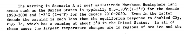
It’s clear from the graphs that he means 2010-20 will be 1-2°C warmer than 1986. That is for US and NH land. So the lower range is probably about right.
Thank you, Nick. Yes, about right, with a bit of help from recent adjustments (h/t Tony Heller):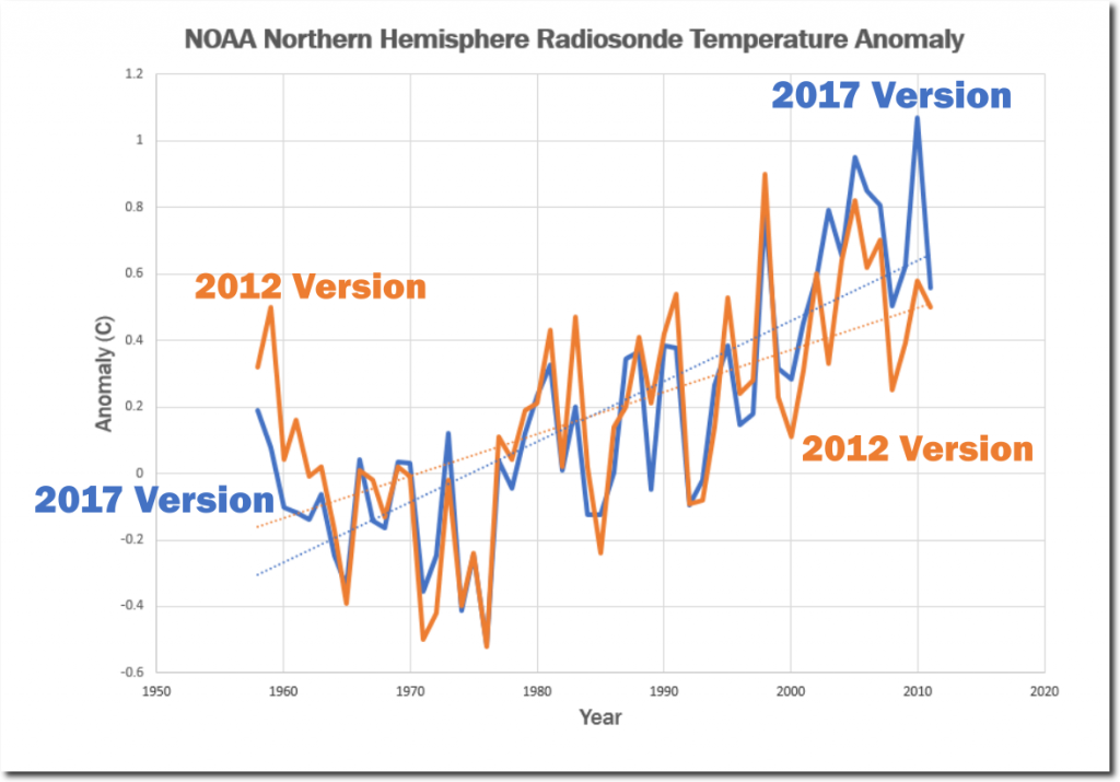
I’m shocked! shocked! to learn that the NY Times completely botched the story.
And in other news, Captain Renault is shocked! shocked! to find that gambling is going on in a casino.
“with a bit of help from recent adjustments”
No help at all. Homogenisation makes very little difference to trend. It raises trend to present slightly if you start before about 1970. But in the period of Hansen’s prediction, it lowers trend to present.
In Tony Heller’s radiosonde graph, the 1980s and early 1990s are not appreciably different between the 2012 version and the 2017 version. But by 2010 they are dramatically different.
Seeing as the majority of us now seem to accept that the climate is warming, especially in the polar regions, can we have a grown up discussion on the impact of that warming? Posters have pointed out that there may well be positive impacts in some regions with regard to agriculture, but others have stated there could be more ‘weather events’ of various types due to warmer air holding more water. We’ve seen warm air invade polar regions and displace cold air south to the US. No doubt these thing have happened before, and will happen again. But what overall changes are we likely to see ?
Since the warming rate is not accelerating, to evaluate the impact we only have to go back to 1950, or 1900, and evaluate the changes due to climate. We can project those changes into the future to get an idea of possible impacts. Anybody that believes in a gloomy climate future will have to explain why we are so much better despite past climate change, and why he thinks the mechanisms we have used in the past to adapt are not going to work in the future.
“Seeing as the majority of us now seem to accept that the climate is warming,”
Well, that depends on where you start. After being in a shortterm cooling trend from 1940, we are now in a presumably shortterm warming trend from 1980 to the present. But overall, we have been in a temperature downtrend since the 1930’s with 2017 being 0.6C cooler than the 1930’s.
How do you explain the cooling trend from 1940 to 1980, when CO2 emissions were increasing during that time period? According to Alarmists, the temperatures should warm with increased CO2, but in this case the temperatures cooled.
The Climate Alarmists obscure the 1940-1980 cooling by making it disappear on the Hockey Stick surface temperature charts. That’s what Climategate was all about: getting rid of the 1940’s “blip”, in order to perpetrate this CAGW Fr@ud..
a timely intervention there ta. warming world temperate zone expands moving the clash of warm and cold air further north ,less “extreme” weather events (whatever they are, no such thing as bad weather, just the wrong clothes) in the areas people tend to live. cooler world temperate zone contracts and the opposite happens. i think most people like a warmer world.
i certainly have no desire to be living in the conditions of the little ice age, though i fear it may take a return to that to make some people see sense in the alarmist nonsense relating to a slightly warmer world.
It seems we have an awful lot of angels dancing on the head of a pin here.
I repeat this point every month the Satelite data is issued.
It is not measuring the Surface Temperature.
It is measuring the Heat leaving the Surface, which the way things are looking Solar/PDO/AMO wise is NOT coming back any time soon.
“A C Osborn January 4, 2018 at 1:39 am
I repeat this point every month the Satelite data is issued.
It is not measuring the Surface Temperature.
It is measuring the Heat leaving the Surface…”
Satellites “measure” light and an algorithm is used to “calculate” a number used to indicate a “temperature”.
+1
Actually it’s measuring the microwaves emitted by oxygen molecules in the lower atmosphere (between surface and 12 km, peaking at 4km). Those microwave emissions are related to the temperature of the atmosphere at that location.
I just downloaded the GHCN non-tedious MONTHLY data set, ghcnm.tmax.latest.qca.tar.gz and ghcnm.tmax.latest.qcu.tar.gz, dated 12/30/2017, from ftp://ftp.ncdc.noaa.gov/pub/data/ghcn/v3/.
After parsing them and loading the data into my Oracle database, I was able to make the following observations about the GHCN monthly file.
First, there are only 5974 distinct station ids in the file.
Second, there are only 3757 stations with more than 30 years of data.
Third, there are only 2625 stations with more than 50 years of data.
I wonder if Nick would be kind enough to point me to the file with 7280 stations with good data, because this file apparently isn’t it, either.
Noticed that a couple of posters have shown that 1999 US temp chart. We know its since been, er, ‘improved’ and if memory is correct around the early 2000s the ’98 record beat the 30s???? It would be great to see an overlay of this US only GISS 1999 chart with the 2017 version. If there is a big difference, it would make the general public perhaps think about it….the modelers would have to explain their reasoning…& it would need to be good in this age of fake news.
Anyone fancy doing it (sorry its beyond my skillset). A global one would be interesting too.
“Noticed that a couple of posters have shown that 1999 US temp chart. We know its since been, er, ‘improved’ and if memory is correct around the early 2000s the ’98 record beat the 30s???? It would be great to see an overlay of this US only GISS 1999 chart with the 2017 version. If there is a big difference, it would make the general public perhaps think about it….the modelers would have to explain their reasoning…& it would need to be good in this age of fake news.”
Ask and you shall recieve, courtesy of Tony Heller:
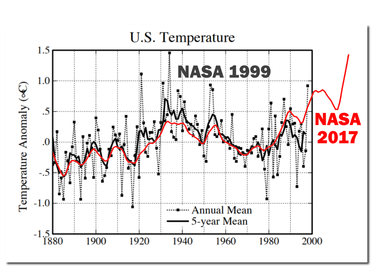
This one makes it pretty easy to see how the Climate Change Gurus altered the surface temperature chart of 1999 into the Hockey Stick chart they try to fool us with today.
https://data.giss.nasa.gov/gistemp/history/
“To summarize, no raw data has changed over the years (except for minor quality control, elimination of duplicate data, etc.), but the GISTEMP analysis has varied because of the addition of more observations and changes in methodology. The GISTEMP analysis does not change the raw observations over time (these are curated by weather services around the world), but rather the estimate of the global mean change varies as we discover and correct for contaminating influences, as well as increasing the amount of raw data used. The differences over time can be helpful in giving an idea of the structural uncertainty in these estimates — particularly in the pre-war years and before 1900.”
tx for that. So eyeballing means GISS ‘interpreted’ the raw data in such a way as to increase the temp slope to 1.2C from 0.8C if the 1999 ‘interpretation’ had stood.
Has the effect of increasing the upward slope trend since that period (when CO2 qty is thought to become a player).
Funny that.
End scale does look odd compared to the satalites though. I guess thats the pausebuster stuff tacked on the end?
I asked this on a previous thread and you ignored it.
So I will try it again.
How much have the Official NASA/NOAA Adjustements added to the Trend before GISS use their gridding technique.
The Minimum is Documented, so can you please tell us what it is?
2018 will be cooler than 2017.
“I gave the numbers, 0.075 and 0.05. Use the descriptor of your choice.”
I need a better weather station, mine only shows tenths of a degree and the sensor is only ± 0.2C.
Out of 11,211 sensors at Mouser only one, Honeywell 590-33AA38-103, has 0.05C Accuracy
Your weather station is not producing a global average.
You cannot average different devices at different locations with different tolerances to reduce the overall tolerance of the measurement. If your devices are accurate to +/- 0.2 deg C, and they are not measuring the same phenomenon (meaning measurements are not co-located in space and time), then your results are only good to two tenths of a degree. Regardless of the number you add together.
Shanghai Dan is correct. Even with say, 100x oversampling of the exact same measurement, you can only increase the confidence level of the reading. Even trying to claim 50 readings at 0.7 and 50 readings at 0.8 means the true value is 0.75 is dubious if your sensor only has 0.1 resolution. If it’s 0.2 the situation is even worse.
And as Dan points out you’re not repeating the exact same measurement. It’s just one more detail that calls these data sets into question.
So, satellites go back how many “hundreds” of years? What a joke!
Only reporters think like that headline. What is the trend?
“But, but … we have to do something!”
The bottom line is the amount of the warming trend remains pretty unspectacular, given the hype on this issue. It’s completely compatible with a net anthropogenic influence of zero. I’m not saying it is zero — only that’s it compatible with zero.
Also, when the amount of the trend can be wiped out by just a month or two of cooling, that’s a clear sign the trend isn’t very big or significant.
Outer space, hot or cold?
Now, the consensus answer is cold, 5 Kelvin or 3 Kelvin.
But there are no molecules in outer space so what do the concepts of hot, cold, heat, energy even mean without the kinetic motion of molecules?
The International Space Station has not one, but a redundant pair of ammonia refrigerant cooling, air conditioning, refrigerating/freezing systems.
Why? If space is cold? Why not just put that ice tray or margarita blender out on the back step and let outer space do its thang?
Well, because when the solar luminosity/irradiance reaches earth’s orbital distance it has a power flux of 1,368 W/m^2 and an equivalent S-B BB temperature of 394 K, 121 C, 250 F. That’s not hot by galactic standards, but it will cook earthly flora and fauna (That’s us – people.) Everything in the path of that irradiance, barring extenuating circumstances, will be heated to 394 K.
In fact, the lit side temperature of the moon actually measures a peak of 390 K.
What does that say about the earth minus an atmosphere?
An S-B BB temperature of 394 K or 21 C is higher than the boiling point of water under sea level atmospheric pressure, which would no longer exist. The oceans would boil away removing the giga-tons of pressure that keeps the molten core in place. The molten core would push through the thin crust flooding the surface with dark magma changing both emissivity and albedo. With no atmosphere a steady rain of meteorites would pulverize the surface to dust same as the moon. The earth would be much like the moon with a similar albedo (0.12) and large swings in surface temperature from lit to dark sides. No clouds, no vegetation, no snow, no ice a completely different albedo, certainly not the current 30%. No atmospheric molecules mean no convection, conduction, latent energy and surface IR absorption/radiation would be anybody’s guess.
Without an atmosphere the earth’s temperature would be similar to the moon’s, say, 390 K or 102 C hotter than the WAG’d average of 288 K and not 33C colder per RGHE theory.
Now before y’all start hatin’ on me about comparing peaks and averages remember what an average is all about. Two scenarios can have widely different ranges and still have the same average. For instance:
Earth w/ atmosphere: max 88 C, 361 K; min -58 C, 215 K; average 288 K, range 73C.
Moon/Earth w/o atmosphere: max 390 K, min 186 K, average 288 , range 204C.
Earth’s atmosphere/albedo moderate both the peak and range temperatures with an overall result of cooling the earth compared to no atmosphere.
One of these scenarios is correct and the other is false. I’ll go with the one that has real, actual, lunar and ISS observations and that would NOT be RGHE theory whose attempted explanations truly violate thermo.
I’m a bit concerned about version 6 of the UAH processing algorithm. They have gone to what is reported as a more accurate direct grid measurement system vs. the older versions that slant angle estimated areas they could not get the claimed resolution to they now say they are getting, but it makes little sense to me that in the current La Nina, the December temperatures do not seem to represent the colder tropics like they did in 2008. I looked at the NOAA/NESDIS December composite for the tropics and the amount of colder than average sea surface area and magnitude between December 2008 comparing December 2017 to is nearly identical.
In Roy Spencer’s tabular results, in December 2008’s La Nina, the tropics weighed in with a -.11 degC anomaly compared to this years + .26 degC, a difference of a rather large . 37 degC. Likewise, the USA lower 48 had an anomaly of -.13 degC in 2008 compared to December of 2017 of + .44 degC, again, a rather large difference of .57 degC.
In light of the severe cold east of the Rockies that was underneath enough of the influence of the polar vortex to avoid a LT inversion, it seems to me that the December anomaly is too warm, maybe significantly compared to surface station reports and low temperature records. In the west, the anomalies make more sense because of a persistent subsidence inversion under a blocking high pressure ridge.
I would like to know what Roy Spencer and John Christy might add to this. Something seems off kilter to me to see global temperatures rise again in December with all of the North American and similar tropical cold sea surface area and magnitude such as in 2008.
Chuck Wiese
Meteorologist