Guest essay by Patrick J. Michaels and Ryan Maue, Center for the Study of Science, Cato Institute
JRA-55—BETTER THAN THE BEST GLOBAL SURFACE TEMPERATURE HISTORY, AND COOLER THAN THE REST.
Let’s face it, global surface temperature histories measured by thermometers are a mess. Recording stations come on-and offline seemingly at random. The time of day when the high and low temperatures for the previous 24 hours are recorded varies, often changing at the same station. Local conditions can bias temperatures. And the “urban heat island” can artificially warm readings with population levels as low as 2500. Neighboring reporting stations can diverge significantly from each other.
The list goes on. Historically, temperatures have been recorded by mercury-in-glass thermometers housed in a ventilated white box. But, especially in poorer countries, there’s little financial incentive to keep these boxes the right white, so they may darken over time. That’s guaranteed to make the thermometers read hotter than it actually is. And the transition from glass to electronic thermometers has hardly been uniform.
Some of these problems are accounted for, resulting in some dramatic alterations of original climate records (see here for the highly cited New York Central Park adjustments), via a process called (love this word) homogenization. Others, like the problem of station darkening are not accounted for, even though there’s pretty good evidence that it is artificially warming temperatures in poor tropical nations.

Figure 1. Difference between satellite-measured and ground-measured trends. Artificial warming is largest in the poor regions of Africa and South America. (Source: Figure 4 in McKitrick and Michaels, 2007).
There are multiple “global” temperature histories out there, but they all look pretty much the same because they all run into the problems noted above, and while the applied solutions may be slightly different, they aren’t enough themselves to make the records look very different. The most recent one, from Berkeley Earth (originally called the Berkeley Earth Science Team (BEST) record) is noteworthy because it was generated from scratch (the raw data), but like all the others (all using the same data) it has a warming since 1979 (the dawn of the satellite-sensed temperature era) of around 0.18⁰C/decade. (Computer models, on average, say it should have been warming at around 0.25⁰C/decade.)
They all have a problem with temperatures over the Arctic Ocean as there’s not much data. A recent fad has been to extend the land-based data out over the ocean, but that’s very problematic as a mixed ice-water ocean should have a boundary temperature of around freezing, while the land stations can heat up way above that. This extension is in no small part responsible for a recent jump in the global surface average.
It would sure be desirable to have a global surface temperature record that suffered from none of the systematic problems noted above, and—to boot—would be measured by electronic thermometers precisely calibrated every time they were read.
Such a dream exists, in the JRA-55 dataset. The acronym refers to the Japan Meteorological Office’s (originally) 55-year “reanalysis” data, and it updates to yesterday.
Here’s how it works. Meteorologists around the world need a simultaneous three-dimensional “snapshot” of the earth’s physical atmosphere, upon which to base the forecast for the next ten to sixteen days. So, twice a day, at 0000 and 1200 Greenwich Mean Time (GMT) (0700 and 1900 EST) weather balloons are released, sensing temperature, pressure, moisture and tracked to determine the wind. There’s also satellite “profile” data in the mix, but obviously that wasn’t the case when JRA-55 begins in 1958. These are then chucked into national (or private) computers that run the various weather forecast models, and the initial “analysis”, which is a three-dimensional map based upon the balloon data, provides a starting point for the weather forecast models.
One the analyzed data had served its forecasting purpose, it was largely forgotten, until it dawned upon people that this was really good data. And so there have been a number of what are now called “reanalysis” datasets. The most recent, and the most scientifically complete one is JRA-55. In a recent paper describing, in incredible detail, how it works, the authors conclude that it is more reliable than any of the previous versions, either designed by the Japan Office or elsewhere.
Remember: the thermistors are calibrated at the release point, they are all launched at the same time, there’s no white box to get dirty, and the launch sites are largely in the same place. They aren’t subject to hokey homogenizations. And the reanalysis data has no gaps, using the laws of physics and a high-resolution numerical weather prediction model that generates physically realistic Arctic temperatures, rather than the statistical machinations used in the land-based histories that inflate warming over the Arctic Ocean.
There is one possible confounding factor in that some of the launch sites are pretty close to built up areas, or are in locations (airports) that tend to attract new infrastructure. That should mean that any warming in them is likely to be a (very slight) overestimate.
And so here is JRA-55 surface temperature departures from the 1981-2010 average:

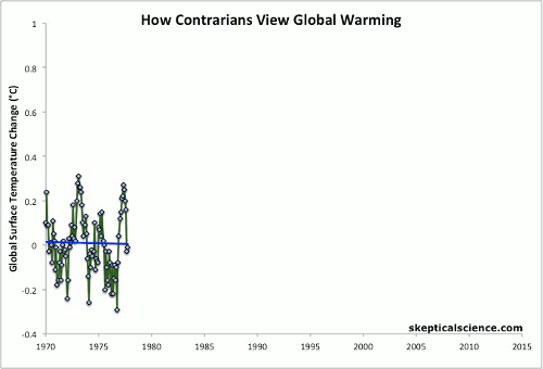
Figure 2. Monthly JRA-55 data beginning in January, 1979, which marks the beginning of the satellite-sensed temperature record. The average warming rate is 0.10⁰C/decade and there’s a clear “pause” between the late 1990s and the beginning of the recent El Niño.
The warming rate in JRA-55 until the 2015-16 El Niño is 0.10⁰C/decade, or about 40% of what has been forecast for the era by the average of the UN’s 106 climate model realizations. There’s no reason to think this is going to change much in coming decades, so it’s time to scale back the forecast warming for this century from the UN’s models—which is around 2.2⁰C using an emissions scenario reflecting the natural gas revolution. Using straight math, that would cut 21st century warming to around 0.9⁰C. Based upon a literature detailed elsewhere, that seems a bit low (and it also depends upon widespread substitution of natural gas for coal-based electricity).
JRA-55 also has a rather obvious “pause” between the late 1990s and 2014, contrary to recent reports.
The fact of the matter is that what should be the most physically realistic measure of global average surface temperature is also our coolest.
The first thing I noticed in this database was the lack of a 1997 peak, which is generally present in other compilations.
Theres’ not actually much sign of that peak in quite a lot of places of the world, either
Makes sense that it was in the satellite data because it was mainly atmospheric and parts of NH.
The step up over 3-4 years is still very evident though
The latest El Nino has had an effect pretty much all over the globe.
On the subject of Global surface Temperatures, I just Bingled the Temperature of volcanic magmas, which likely are the highest surface Temperatures to be found on earth.
1200 deg. C seems typical but 1350 deg. C has been documented for Hawaiian magma lakes., that a whole 1623 kelvin.
So what ??
Well it just occurred to me that the famous carbon dioxide warming experiment conducted by Bill Nye; the Science guy, actually used a source of EM radiation which simply does not exist naturally anywhere on this planet. His Tungsten filament lamp was probably 2800 kelvin; more than double the Temperature of the highest Temperature natural radiation source on this planet.
Not counting Al Gore’s interior which of course is millions of degrees.
So there. Temperatures may not be what they seem.
G
I have often made that point. Why not use a black body radiator at say 250 K (temperature of the mid atmosphere), or perhaps 288 K (the claimed surface temperature of the planet)?
And what is the concentration of CO2 in these experiments? I bet that it is nothing like 260 ppm, 400 ppm, 600 ppm, so it is not modelling what one might expect to see on Earth from a doubling of CO2.
Further, what is the water vapour in these experiments? How dry is the air? Are they measuring the effect of water vapour rather than CO2?
What about pressure? When the bottle is heated, has the pressure inside the bottle risen?
What was the temperature of CO2 injected, if it was the result of an exothermic reaction?
There was no control, and nothing like the real world conditions even before one considers the effect of the convectional open atmosphere that we have on planet Earth. In a supposedly scientific field, it is an embarrassment to even put forward such a silly experiment as informative as to the effect of CO2.
Nye didnt understand his own experiment, heating rates were largely due to lack of convection as the air in a jar or bottle cannot MOVE
Richard,
A simple 12 or 16 ounce bottle of chilled water (59 deg. F or 15 deg. C or 288 K ) is a perfectly good near BB source of 10 micron radiation at 390 W/m^2, because at five to 80 microns, it only takes 50 microns to a mm of water to absorb 100% so it is a pretty good black body source for those wavelengths.
So you hold that bottle of chilled water close to your cheek (you have four of them) and you bask in the radiant warmth of 390 W/m^2 of LWIR near BB radiation just like what the earth’s average surface emits.
You will discover that 10 micron LWIR radiation cannot be heard, it cannot be seen, you cannot smell it, you cannot taste it, and lastly when it falls on your skin you cannot feel it at all.
It is completely non detectable by any of the human senses.
But the 1.0 micron near IR from the solar spectrum, is very detectable on human skin.
It too has no taste.
G
I don’t want to divert this thread away from its origin; it was just a good location to drop an aside, which does relate to earth climate temperatures.
Sorry mods; if it goes pear shaped, just smash it.
G
george wrote: “You will discover that 10 micron LWIR radiation cannot be heard, it cannot be seen, you cannot smell it, you cannot taste it, and lastly when it falls on your skin you cannot feel it at all.
It is completely non detectable by any of the human senses.”
i believe that was the case when they tickled
the dragon’s tail at los alamos, wasn’t it, when
john cusack was killed?
“The latest El Nino has had an effect pretty much all over the globe.”
warmest el
nino on record.
and this la nina will
likely be the warmest
la nina on record.
why do these keep
happening?
george e. smith November 24, 2017 at 2:14 pm: 10 micron infrared radiation surely warms my skin at least as much as 1 micron infrared radiation does. For one thing, skin is more absorbing of 10 micron infrared than of 1 micron infrared. And I have experienced the longer infrared wavelengths from mildly hot thermal radiators. And what would you think of CO2 lasers at 11 microns, which can melt and even vaporize steel?
Also, some of the warmth sensed by skin from sunlight is from wavelengths other than infrared. Absorption of visible light and UV results in heat the same way as absorption of infrared. Human skin typically absorbs visible light and UV more than infrared around 1 micron.
first thing I noticed was all the little red dots on fig 1
According to NOAA, they should all be red, shouldn’t they ?
they certainly paint them all with a broad brush…..even changing green and yellow dots to red
..but what this is showing is that those dots should not have been red in the first place
That is of some concern and needs to be reconciled.
The lack of a 1997 peak is because the temperature anomaly peak from the 1997-1998 El Nino occurred in 1998. Also, El Nino peaks are more prominent in lower and middle troposphere datasets than in surface datasets. The main things I see funny in JRM-55 are a 2002 spike, the 2010 El Nino spike being less than expected considering HadCRUT3 and satellite datasets of the lower troposphere, and the mentioned .1 degree/decade warming rate being less than that of UAHv6 from 1979 to now (CFSv2 matches UAH v6 from 1997 to now at .13 degree C per decade), while Dr. Roy Spencer shows a graph (Figure 7) in http://www.drroyspencer.com/2015/04/version-6-0-of-the-uah-temperature-dataset-released-new-lt-trend-0-11-cdecade/ that indicates radiosonde data showing the surface-adjacent troposphere warming faster than the satellite-measured lower troposphere from 1979 to the time of that article.
Spencer shows CFSv2 from 1997 to now (with UAHv6) in http://www.drroyspencer.com/2017/11/uah-global-temperature-update-for-october-2017-0-63-deg-c He mentions that HadCRUT4 has better short term correlation with UAHv6 than CFSv2 does, but HadCRUT4 has more upward slope. Notably, CFSv2 underreports the 1998 spike in comparison to HadCRUT4 and JMR-55.
As I look at CFSv2, JMA-55 and HadCRUT4, I see HadCRUT4 as underreporting the drop from the 2010 El Nino spike to the following double-dip La Nina but otherwise gets trends right, which has me seeing HadCRUT4 as possibly overreporting temperature anomaly during and after the double-dip La Nina of late 2010 by around .1 degree C.
Some reasons for JMR-55, CFSv2 and other reanalysis indices of global temperature from weather models failing to do well, especially with ENSO events, just occurred to me. The weather models have a lot of their input data from radiosondes, and most of the world does not have radiosondes. And I have heard of recent event-specific radiosonde coverage of tropical weather events in areas where there is no routine radiosonde coverage.
The satellites that measure the temperature in various layers of the atmosphere generate good data for tracking temperature trends in the satellite-measured layers of the atmosphere, but they do not produce good data for inputting to weather models because the vertical resolution of the sensors on these satellites is in the miles.
Some of the world is not covered by jetliners, and most of the world that has jetliner coverage only has it at cruising altitude, typically near the top of the troposphere. Then there is ship coverage of the sea surface and its adjacent atmosphere, not great everywhere on the oceans, along with the fact that ship nationality and civilian/military status and measurement method have their biases, and consideration for these various ship biases may be biased by politics (example ERSSTv4 and Karl) if there is consideration for these at all. Well over 90% of the mass of the troposphere is below cruising jetliners and above the topmost parts of ships.
The two zero-trend periods separated by the 1998 El Nino are really obvious, just like in UAH and RSS
Where will this latest El Nino settle down to, a slight step up, a slight step down, then easing downwards?
Time will tell.
‘Time will tell.’
Temperatures have to fall below the line and stay there for a decade before anyone will be convinced that global warming is over.
A step down can be expected with the approaching La Nina, but if it bounces back to this high plateau then the coolists are sunk and lukewrmers win.
No one “wins”.
It has been ‘lukewarming’ for 150 years since the end of the Little Ice Age. All natural. Does not support the UN IPCC AGW Hypothesis at all. Such a think would be a win for the skeptics/climate realists and a defeat for the climate alarmists.
Have we reached the peak of this lukewarm modern climate optimum?
(depends on what el sol does, el gordo)…
Scafetta seems to have a handle on the situation.
http://notrickszone.com/wp-content/uploads/2017/10/Cooling-vs-Warming-Forecasts-Scafetta-2017.jpg
ironicman – hadcrut3 is out of date; they’re now
on v4.6.
also, rss lt is on v4
It is back on the way down now. Note that the monthly anomaly depends on how the two-week-at-a-time excursions/variability filters into a 31 day month.

la nina vs the el nino.
the decadal trend is very much upward, and
will remain so. because physics.
la nina vs el nino.
= natural fluctuations
will alway occur on top of agw.
yet each decade keeps getting warmer…..
why?
crackers345.
Is it really warmer than the 1930s. Most of the day-time high records are still from the 1930s. Basically, you are falling for the “spin” and selective data adjusting that “they” want you to fall for. Do you like being mislead? Does it make you feel better by acting against climate change? That is all it is you know. Find something else more worthwhile protecting and you will feel even better.
…we have lift off Houston
“there’s a clear “pause” between the late 1990s and the beginning of the recent El Niño”
There is just nothing of the sort.
“Clear”? “Obvious”? No it isn’t. That’s just rubbish, a distraction. Looking at the graph – there is a barely perceptible, noisy wobble on a generally positive trend. Strongly correllated with rising CO2.
Remove your cognitive bias, McClod. !!
Zero correlation to rising CO2, Just El Nino warming

SQUAWK
Your usual insulting behaviour does make you any more right , as usual. It reflects that you feel you are losing the argument rather than giving your ideas any more weight. Learn some manners.
Unless you define mathematical criteria and do some calculations the warming or lack thereof is in the eye of the beholder. You just insert your own mental bias and see what expect to see and then make claims based on your own bias confirmation.
I was also going to point out the dubious claim of an “obvious” pause. I don’t find it at all obvious. As always it requires some mental cherry picking. It is fairly flat with low variability from 2002 to 2012. Outside that it depends which part of the ups and downs you choose to look at.
There is another “clear pause” from 1979 to 1995.
nope….08 brings it down…it’s flat
Thanks.
I know your blinkers will not allow you to see reality.
Maybe this will help

Uh oh, I see another step change coming up.
Andy that is not even close. however what happened between 94 and 98 superheating?
el gordo commented – “Uh oh, I see another step change coming up.”
what’s causing them?
Gabro commented – “GISTEMP is a pack of lies.”
why?
crackers345 November 24, 2017 at 6:42 pm
Clearly, you haven’t been paying attention here.
‘….what’s causing them?’
The AMO and PDO oscillations have a lot to answer for.
ENSO and NAO are also implicated, with the Southern Annular Mode (SAM) a major player.
Clear, obvious? C’mon. Stop kiddin” around. ?w=660
GISTEMP is a pack of lies.
1880-1909 baseline? Cherrypicking. Fifties to seventies? A global cooling period, Cherrypicking a graph to suit an agenda,
since i compared GISSTEMP once with our RMI dataset (which is homogenized and adapted to changes of the equipment) and found a difference of 0.15 degrees colder for january 1963 then the RMI and 0.1 degree hotter then the RMI for record warm september, i lost all credibility in that dataset.
GISSTEMP had to adjust the RMI dataset of belgium and you bet, they now report it average 0.1-0.15 degrees warmer and the past is 0.15-0.2 degrees colder then our RMI reported.
compare this graph
http://www.meteo.be/meteo/download/nl/18534650/image/scaletomax-700-700/photo-17377444-image.png
to this one
So mcleod climate is changing but our RMI show very clearlt these two “step jumps” in just one year time at exactly the same date for temperature, rainfall, snowfall and wind speed changes… that doesn’t match the CO2 curve at all and this is why GISSTEMP became an unbelieveable dataset for me
note also that from 1833 till 1900 (which was still considdered as the LIA at it’s end) temperature was ways more volatile. something the CET record is also showing.
the rise between 1700 and 1740 was a whopping + 4 degrees/century Where were the damn SUV’s and coal fired plants????? they must have hidden them in the early 18th century…
however that ended with a dramatic sudden 2 year drop of 5 degrees.
it shows very clearly that the LIA was a really volatile period, that from year to year the variability is much bigger then the last 100 years of the dataset
They must have had SUV’s in 1700 or was it the methane from the horses that were f*rting???
What projection would the IPCC have made if it were now 1730? that shows that everything we see is just… nature doing it’s thing
When GISSTEMP switched its SST subset from ERSSTv3 to ERSSTv4, that bumped up the then-most-recent year it reported global temperature anomaly for by .06 degree C. And GISSTEMP had its post-1950 graph becoming unnaturally steady and unnaturally steep in comparison to previous versions of GISSTEMP and other datasets such as HadCRUT4 and earlier versions of HadCRUT. The Karlizing in GISSTEMP even increased the WWII bump, while the updated SST dataset in HadCRUT4 (HadSST3) made the WWII bump milder and looking more natural. The manmade part of the WWII bump is an artifact from shifts from ship type/nationality (such as peaceful commerce vs. military) and according measurement methods that accordingly shifted. GISSTEMP nowadays appears to me to have post-1950 warming “overcooked” by about .12 degree C more than HadCRUT4 version 4.5 is, as of the time I tried my mathematical BS filters on all of this earlier this year.
Lately, there is ERSSTv5, and I am under the impression that this is the SST dataset for the latest version of GISSTEMP. As I see things, I see ERSSTv5 as fixing known problems of ERSST as much as possible, with as little fixing of problematically-high post-1998 or post-1999 warming as possible, which leaves ERSSTv5 as a warming outlier among SST datasets. (Which are a somewhat growing team of outlier-warming SST datasets, with the recent “high resolution” version of the Reynolds OIv2 one showing a spuriously higher warming rate than the standard OIv2 one that was the preferred SST dataset by the National Hurricane Center as recently as couple years ago.)
Could you please sumarise your opinions for me Donald?
Frederik Michiels: The noted rise from 1700 to 1740 appears to me as a randomly stronger-than-usual upswing of multidecadal oscillations, and it was quickly followed by a partial reversal of itself. Also, this sharp rise was preceded by a drop. So, the temperature went down a degree C, went up 1.8 degree C, then went down .8 degree C to the somewhat-unusually-steady 1750-1800 average, for zero net change, assuming no actual upward trend from ~1625 being a spike instead of unspiked temperature.
Although I agree that global and especially northern hemisphere climate gets more unstable due cooling (towards average of the past few comings and goings of ice age glaciations), as opposed to warmer times during interglaciations when global climate has been notably more stable. The instability of cooler times appears to me as due to greater (intermittent) coverage of a latitude range of the world where change of ice/snow coverage makes a greater change of absorption/reflection of sunlight, which means greater positive feedback from change of surface albedo.
tony mcleod: My summary of my opinions: In significant part, recent American versions datasets of global ocean temperature and global overall temperature are significantly overcooked. I see HadCRUT4 as overcooked, but a little less than half as much. For overcooking of American determinations of global SST and global temperature, I blame mostly John Holdren, the “white house science advisor” (I don’t remember the official name of this position) picked by then-President Obama, and after that Obama for picking White House Advisors poorly in the modern post-Usenet age (starting roughly or a few years before 2008) of people getting more connected to like-thinkers and more disconnected from their critics.
Thanks Donald
Not discussing GISSTemp in this post.
Baseline 1880- 1909?
You are right: C’mon. Stop kiddin” around.
any data set that has land data smeared over the ocean in arctic is junk for the area in which that is done
and so much of the warm anomalies came from those areas
Then of course there is imaginary records from Africa where there is no data.
#NOAA\GISSmagic
Tom Harley commented – “1880-1909 baseline? Cherrypicking.”
why?
Patrick MJD commented – “And we know CO2 rises follow temperatures rises.”
so are you always waiting
to fill up your gas tank
until the temperature first
increases?
Frederick:
Before 1975 researchers were predicting global cooling. No doubt they thought of themselves as ‘realists’ then too. Contrarians thought then as now that climate goes in cycles and we are likely still recovering from the little ice age with up and down ocean-cycle blips on the way. Only one thing is certain – it is plain stupid to try represent a complex, highly-non-linear system with straight lines. Doing so gives a false expectation that forecasts are possible. When you can explain the little ice-age then you might have a handle on how much natural variation to extract from the noise to give a possible man-made signal.
“tony mcleod November 23, 2017 at 2:36 pm
Strongly correllated with rising CO2.”
So what? Correlation is not causation. And we know CO2 rises follow temperatures rises.
Patrick MJD: We know that CO2 rises followed temperature rises during 399,900 of the past 400,000 years when the sum of carbon in the atmosphere, hydrosphere and biosphere was nearly enough constant. From 400,000 to 100 years ago, atmospheric CO2 concentration was a positive feedback to temperature changes initiated by something else. Temperature change shifted carbon/CO2 to/from the atmosphere to reinforce a temperature change initially caused by something else.
In the past 100 years, especially post-1958, atmospheric CO2 concentration increased in a pattern that is clearly manmade and clearly greatly exceeding what would be accomplished by the global temperature change during the past 100 years or post-1958. Nature has been removing CO2 from the atmosphere during post-1958 and continues to do so now, despite the modern warming. This is a result of human activity taking carbon from the lithosphere (in form of fossil fuels) and burning it to CO2 and adding it to the sum of what’s in in the atmosphere/hydrosphere/biosphere.
Tony Mcleod
Why would anyone discuss anything with you? You are a dishonest person, “facts” from you are meaningless. Heres your dishonesty on display for everyone.
Cut from WUWT on March 3rd, the bet. This bet was discussed and reaffirmed on multiple occasions after with no retraction ever made or implied at any time. Tony lost and then welched.
“UAH Global Temperature Report: February 2017 warmest in 39 years
Bob boder
March 3, 2017 at 3:45 am
Tony
i’ll make a bet with you.
if the geographical North Pole is ice free this year I will never post here on WUWT again. If it isn’t you never post here again.
will you take the bet?
tony mcleod
March 3, 2017 at 3:56 am
Your on Bob.
Bob boder
March 3, 2017 at 8:38 am
Tony
It’s a bet.
Koodos to you for being willing to stand behind your prediction.”
+100000000000000000000000000000000000000000000000000000000000000000000
Baaahahahahahaha
Tony is mentally weak
Greg
There is only a step up at 1998, from the big el Nino.
There might also be one at 2016 – or not – time will tell.
Bob Tisdale explained why big el Nino-La Nina events step up global temps.
In between those – it’s flat-lining.
If global temperature is warmed to above an equilibrium level by an El Nino, then it will cool back down over the following years. The fact that it doesn’t cool between El Ninos, even ones followed by double-dip La Ninas, from the mid 1970s to now, shows that something else is causing warming. Some of the warming from the mid 1970s to the warm times shortly after the 1999-2001 double-dip La Nina (the beginning of those warm times is when The Pause actually began) was from upswing of multidecadal oscillations. During The Pause, the effect of multidecadal oscillations was downward but global temperature held steady, even according to UAH v6 and RSS v3.3 (even before RSS v3.3 had an adjustment that warmed recent years), and according to HadCRUT3, JRA-55 and CFSv2.
DLK – and the last 3 years have
all been top-3 warmest years.
why?
El Nino . We have had 2 of them, as the ONLY warming in the last 39 years.
Energy from the series of strong solar cycles through last half of last century.
Why are you pretending to be so wilfully ignorant ?
Have you seen the La Nina forming.
Should be fun watching your childish antics over the next year or so. 🙂
There is a pause in every data set except the karlized data you joker
Why not pick a “Dow Jones Average” of say 1000 reasonably distributed global {rural land} surface temperatures and stick with it?
After all, we live on land (not on the sea, which is difficult to measure, too). What we’re interested in is whether there is a sustained long-term trend.
… and just show the five-year running average (i.e., smoothed), as did Hansen et al., 1988.
Could we buy options on that, or short it? Maybe Las Vega has a betting odds on future temps, but what data set would they use? And if the books are cooked, how would they know who is winning or losing?
No, we use all data, lets not go down Cherrypick road like the warmunists.
PAGES has become a joke, where series with high medieval values are becoming as rare has overcomb eagles
Once again estimates for the rest of the century fail to note the obvious changes afoot – electric cars and molten salt nuclear reactors. Any estimate that doesn’t include the effects of those two factors is worthless. Actually less than worthless.
Electic cars will not change CO2 emissions. HIgh footprint through batterie production. Not enought renewables availble for reliable charging.
johannes – how much co2 from
battery production?
Mass adoption of EVs will not happen in the next few decades. Grid Infrastructure not there even if the Fiskers Nanotech LIC turns out to be something. If fuel prices rise bigly because of peak oil, the already available solution is full hybridization like Prius. For Fiskers Nanotech LIC and full hybrid explanations, see last year’s guest post Vehicular Decarbonization over at Climate Etc.
the grid infrastructure can be built
up as demand increases. just like
for any other energy infrastructure.
do you think gas stations were all well in
place before gas demand rose? of
course not….
The grid infrastructure is space-constrained, the gas station infrastructure is not.
Look forward to Mosher’s predictably obtuse, meaningless and always convenient spin.
BEST is obviously better because its the BEST. And it came from Berkeley, home of Paul Ehrlich and a mob of SJWs and they have highly trained English Lit experts composing it. Who can question that?
Ehrlich is from Stanford I believe; same difference I guess.
“Look forward to Mosher’s predictably obtuse, meaningless and always convenient spin.
BEST is obviously better because its the BEST. And it came from Berkeley, home of Paul Ehrlich and a mob of SJWs and they have highly trained English Lit experts composing it. Who can question that?”
Err no.
There are many records. None can claim to be the best. A good analyst looks at all the records.
JRA55 has a warmer record over land than we do.
There is one way to test methods. Select surface stations you trust: Like CRN
Anthony calls these the gold standard.
Compare BEST to CRN. perfect match
Compare JRA55 to CRN: OPPS, you didnt think of that now did you.
There is a reason why reanalysis will not match these gold standards.. you know why?
thought not.
Yes Zeke did admit almost all warming comes from adjustments for the US
Adjustments dont actually cause the US to get warmer, just has adding 180c to the record of a cold oven wont cook a cake
bake even 😀
Actually BEST has nothing to do with UC Berkeley.
“Since the founder of Berkeley Earth, Richard A. Muller, is a Professor of Physics at the University of California Berkeley, it is incorrectly believed that Berkeley Earth is affiliated with the University but further research reveals that it is an independent 501C(3) Non-Profit Organization registered to a house in Berkeley California and completely unaffiliated with UC Berkeley.”
http://www.populartechnology.net/2014/06/who-is-steven-mosher.html
EH: if you don’t trust SM from BEST,
who would you trust? only someone
who provides you the
results you want to hear?
Why would I trust a BS artist with a degree in English on a scientific subject?
because all of his team’s work
was published in a good peer
reviewed journal. that
indicates it’s not junk.
and the team included
a nobel laureate.
You didn’t answer the question.
A most fascinating analysis, I’ll have to look into that dataset. I’m interested in comparing it to the CERES data … I’ll report back. Might be a few months, plans in the works, but I definitely want to dig into the data.
Best to you and yours, thanks for the post,
w.
JRA55 land is warmer than berkeley land.
too funny
I think ryan does good work, but in this case he forget to do some basic checking
Why is it “too funny”? When people say funny in this context, they are usually feeling the opposite.
You angry bro?
Willis, there appears to be a rather strong 3 or 4 year cycle in the data that I haven’t seen anyone mention yet. While playing with the data I’d be curious what it actually shows up, or whether my calibrated eyeball is just showing its age.
“Such a dream exists, in the JRA-55 dataset.”
There is plenty of reanalysis data available. I integrate every day the NCEP/NCAR reanalysis data. It is also up to, well, usually day before yesterday. Folks here would probably get excited by a cold snap in the last few days (now probably ending). And I keep the last few months on the site, and a zipfile of back to 1994 online.
But I don’t rely on it for long term series. It is data that was compiled for weather forecasting. They gather everything they can, but don’t care about homogeneity. All kinds of instrumental data flow through the system, and are assimilated, but they don’t try to align them in the long term. So if there is a gradual shift, as with ships to buoys recently, they don’t bother adjusting for that. It doesn’t affect the forecast frame.
And did I mention, it’s based on a model?
“the thermistors are calibrated at the release point, they are all launched at the same time, there’s no white box to get dirty, and the launch sites are largely in the same place. They aren’t subject to hokey homogenizations.”
But they badly need homogenisation. How much is thermistors? How often launched? How much of the mix is satellite? Which?
How many thermistors were there in 1979? None. They actually used white boxes. How did they handle the transition? They didn’t bother. No need, for forecasting.
One clear failing is that past reanalysis data is never changed (it is expensive to compute). You may think that is a plus, but it means that some is calculated with UAH V5.6, some with UAH V6 etc etc. And you are joining all that together.
Nick, very well said. My personal problem with the homogenization is that now even the past is a model. And a model that does not seem to be well defined.
Nick,
why would they need to handle any transition? homogenize ;)?……they are recording the temp right at calibration, right? wouldn’t you record the temp right after calibration before the release? at ground level?
Curious George commented –
“My personal problem with the homogenization is that now even the past is a model”
_everything_ is a model, CG.
“without models, here are no data.”
– george box
The topic is this dataset, Nick. Stop the strawman distraction.
And the consistency and reliability of the data.
(oh, that’s right.. we are not interested in data quality)
” we are not interested in data quality”
Then you’ll be at home with reanalysis. Impossible there to tell where the data came from.
Read the report Nick, They know where the data is coming from
You still haven’t bothered with those 6 African stations, have you.
Quality does NOT concern you, just the pretty maths contouring
(which surveying software has done for decades.)
Nick,
In terms of the data that goes into re analysis. In some cases it is the absolute worst data you
could imagine. Like sensor networks on roads, networks on the tops of buildings, private commerical data they have to purchase
Of course none of the people who tout re analysis actually ever look at the data stream that gets ingested
or the homogenization ( in some cases just smoothing) that they apply to the data before using it.
In the case of JRA55 the most interesting thing is the data they use the VERIFY that they got it correct
They use CRU HADCRUT 4.
Thats right re analysis experts verify using hadcrut
As usual Mosh has no idea what he is talking about and is sharing cut and paste info he solicited from someone else and comes here to post as his own.
#Transparent
You blathered about heller’s code, he offered it to you, and the data, you ran from the offer.
hmmm
you also sanitize your twitter when you get owned in comments I notice
“…I integrate every day…”
Seems more like you’re disintegrating.
just tell me is that not in appropriate behaviour, especially if its in public
The main problem with the ground data is that “the network do not cover the climate system [defined by IPCC in its AR5]” or ecologically diverse zones for which through grid based interpolation and extrapolation is used. In reality such data series present no meaning to infer on global warming theories and thus they don’t have climate sensitivity factor. So models are run in the air.
Dr. S. Jeevananda Reddy
” Folks here would probably get excited by a cold snap in the last few days” says Nick
Sorry pal, it’s the warmunists and liberal media that get hysterical over weather
Really??
“Figure 1. Difference between satellite-measured and ground-measured trends. Artificial warming is largest in the poor regions of Africa and South America.”
It isn’t “artificial warming”. It’s the difference between the temperature in two different places, troposphere and surface, and there is no reason to expect them to be the same. If you look at the map, you could say the difference is greatest in “poor areas”, but equally, and more physically, it is greatest in the tropics. A “tropospheric hotspot”.
roaring laughing……nice try…no cigar
Argentina, Siberia, Alaska, Arctic, Antarctic, Libya, Japan, Canada…..etc etc and on and on
..are not in the tropics
A scattering of locations. Which just reflects non-uniformity in the surface trends (and maybe JRA too).
Nick…there’s more little gold, orange, and red dots that are not in the tropics….than there are in the tropics
You need to area-weight your eyeball. Data in the tropics is sparse, but mostly brown.
…actually almost all of the ground measurements that are really in the tropics are running too hot
which would mean the troposphere is cooler…..which would mean no hot spot
“Argentina, Siberia, Alaska, Arctic, Antarctic, Libya, Japan, Canada”
LOL, none of those are “poor” either. Nick is correct. It’s just arbitrary, spurious correlation.
” It’s the difference between the temperature in two different places,”
no it’s not LOL…….it’s the difference in trends…..exact temps don’t matter….it’s the change
“”Difference between satellite-measured and ground-measured trends.””
Whenever I point out that CO2 radiative theory dictates greater atmospheric warming driving surface warming, all I get is silence. The satellite and radiosonde estimates show just the opposite.
IPCC climate models predict a tropical tropospheric “hot spot” that is missing in all measurements. Will anybody tell me that they believe such models are sufficient to fundamentally alter our society, economy and energy systems?
Come on, you climate blog gunslingers. Man up! Do you or don’t you trust the UN SJW types to plan our futures?
Are the browns/reds indicative that ground measurements are warmer or that satellite measurements are warmer? (the article seems to imply the former)…
above neutral starts with the lightest green
lightest green, yellow, gold, orange, and red, etc……ground measurements are running warmer
light that bright red dot in the arctic…..
Yeah, Lat, i see your 4:07p comment. i think nick may have it backwards (implying the tropospheric hot spot). Although the caption under the graph does say Difference between satellite-measured and ground-measured trends.
i was just about to say i agree with what you are saying on the reanalysis data nick,then you go and spoil the agreement in subsequent posts .oh well, never mind 🙂
If they have balloon data that goes back to 1958 why didn’t they reanilize for the entire time period. Seems to me that the cooling from 1958 into the 1970s would have shown even less warming in the longer term record than from 1978 to present and please don’t tell me I am cherry picking because the world wide balloon record only began in 1958.
“Remember: the thermistors are calibrated at the release point, they are all launched at the same time, there’s no white box to get dirty, and the launch sites are largely in the same place. They aren’t subject to hokey homogenizations.”
How many thermistors where ther in 1979? No white boxes then? How wa sthe transition handled from LiG to thermistors? (Answer, not at all).
Reanalysis needs homogenisation a lot more than surface data does. It has a constantly changing mix of instrumentation. That doesn’t matter for weather forecasting, but is pretty hopeless for long term climate.
“And the reanalysis data has no gaps, using the laws of physics and a high-resolution numerical weather prediction model that generates physically realistic Arctic temperatures”
Interpolation by GCM, rather than direct from data. Probably a good idea, but not the local style.
“It has a constantly changing mix of instrumentation.”
thermistors are calibrated at the release point………won’t matter how many times they change them
Nick, I stopped commenting many years ago, but continued reading. I also seldom respond to trolls such as yourself who are nothing but self-serving. You either have zero reading comprehension skills, or you are a deliberate liar. The entire point of the article is that there is a clean, tightly controlled, and most importantly calibrated system that has 55 years of data that does not require proxies, homogenization, and most importantly the totally reprehensible ship to buoy temp adjustments. I have built all kinds of sensors for over 30 years and I can tell you that the sensors on ships seldom work, are always out of calibration, do not have the accuracy or trueness stated by these awful “research” papers you are relying on for your studies and database. The stated purpose of the article is show there is actually a database that is not “homogenized” and does not require it, comes from a single source system that was tightly controlled and calibrated, and has survived untouched for 55 years — that is actually the Christmas miracle.
Mr. Frizzled
You wrote to Nick Strokes:
“You either have zero reading comprehension skills, or you are a deliberate liar.”
My response:
Did you consider the possibility that Mr. Strokes has zero reading comprehension skills,
AND is also a deliberate liar?
I just wondered.
Also the reason I stopped commenting as I believe this is not a scientific debate and never has been. This is all about money, politics, and economic market control.
Tim
I was just going to comment on this idea but you have covered quite a lot.
However, the main problem with temperature anomalies for me is no matter how well people think things are calibrated is that the tools for collecting temperature measurements in the past were never designed to produce the uncertainty and resolution levels needed for climate theory.
And so a certain number of assumptions are used to get the data to that state. And in doing so negate use of said data from real-world applications, according to the standards of verification and scientific method that are used for all other products used in real-world applications.
That’s it. There is no temperature data set that can be stated to be a national standard if claiming uncertainties of 0.1 degrees like the Met Office version. It’s a scientific hypothetical construction. A sunny day case in the sunniest of days. It’s not failure tested.
This is the basis of the scientific method as well. You cannot state certainty when there is none.
Mr. Frizzled:
You wrote:
“This is all about money, politics, and economic market control.”
My comment:
I completely disagree!!!!!!!!!!!
This is 99% about money, politics, and economic market control,
and 1% about science.
The 1% is because some people involved have science degrees.
You obviously get it on the fake news of a “coming climate catastrophe”.
If you have better things to do with your life,
don’t waste time commenting here — do them.
I’ve spent at least an hour a week reading about global warming,
since 1997, and not much has changed since then
… except the fake stories of doom are getting more bizarre.
But I’ve been retired since 2004, and have spare time
to read … and i started commenting here a few years ago.
Two years ago I started a climate change blog for non-scientists,
as a public service, to refute the coming climate catastrophe nonsense.
I hope I have changed a few minds.
One degree C. of warming since 1880,
probably at least +/- 1 degree C.,
is totally harmless,
and the warming is probably overstated too
1880s thermometers tended to read low
and the people who compile the temperature actuals
since the 1970’s, who infill (wild guess) temperatures on
up to half of our planet’s surface … well I’d expect them
to create some warming out of thin air when they guess the infilled data,
from their confirmation bias.
Don’t their “adjustments” almost always
create more global warming by ‘cooling the past’
or making recent decades warmer?
It would not surprise me if half the warming claimed since 1880
is measurement error, and sometimes deliberate bias.
Wild guess predictions of the future climate are not real science.
“Models” based on a subject where there are more questions
than answers (climate change) are not real models —
they are computer games that make consistently wrong predictions.
Climate modelers are not real scientists — they are computer gamers
wasting the taxpayers’ money.
My free, no ads, blog for non-scientists is at the URL below:
http://www.elOnionBloggle.Blogspot.com
The blog is presented as a public service
with no money for me,
to calm people down about the fake coming climate crisis,
and provide simple facts, data and logic to refute the smarmy warmunists.
@mickey—75. I could not agree more. The only point of my comment was to Nick claiming his work was such a database. The modeling software we used to build flow and heat sensors is basically the same as that for GCMs. In most cases we were down to centimeter or smaller grids and I know the difficulty in getting anything useful even at that resolution; and they claim they can model planet and planetary atmosphere. They all belong in prison under RICO, and we should be ashamed of continuously electing politician who fund these charlatans. The fact that people even believed that ship inflow sensors were even close to the real sea temperature is a travesty.
1. their observational datasets include outputs from other models
2. a brief description of all the stuff they do to data is here
https://www.jstage.jst.go.jp/article/jmsj/93/1/93_2015-001/_pdf
Can we get a URL link to this JRA-55 data set? Some easily assimilated graphs that are up to date?
There is a NCAR link here. Japan here. Looks like you have to be a registered user to get anywhere. Not so with NCEP/NCAR.
But I don’t think you’ll find multi-decade plots like the one presented here. Reanalysis providers are too conscious of the lack of homogeneity to do that.
Why would you homogenize the data? If you’re aware of measure ment changes over the years that result in changing uncertainty, then you provision the data products with varying levels of confidence. The last thing you do is ruin a dataset.
You homogenise the data so you can introduce dubious trends.
have you studied why homogenization
is used?
have you read those papers?
This reanalysis also includes the stratosphere does it not, where we are experiencing cooling so one might expect it to show less warming than surface analyses. Nick, what do you think?
David, I expect they are showing surface trends. The reanalysis is really like a GCM, with a 3D grid, with maybe 40 layers vertically. With NCEP/NCAR I use the sig995 output, which is basically the bottom grid cells. They do also produce what is supposed to be the 2m level.
Anthony,
At the beginning of the 10th paragraph, “One the analyzed data had served its forecasting purpose,…” I think you want that to say, “Once the analyzed…”
Could it be that the reason there is no good standardized data base is deliberate? Is there a single data base that hasn’t been manipulated in more than several fashion, some even lost. A research project I worked on in the later 1970s had a far, far better data set than the federal agency responsible for managing the subject at hand. We had a problem because those providing us the data told us that if we started giving it to the feds they would quit reporting and working with us. Why? They refused to trust the government, especially their scientists after decades of bad experiences. Ultimately we worked out a deal, we would continue to have the data reported to us and we would give it to the feds so long as they agreed not to screw with it. The federal agency just couldn’t help themselves. They started changing data almost as soon as we gave it to them. Why? So it would fit their computer model. Everything they have done to temperature data they did to our data. Why? They had preconceived notions of what was happening, no data to support their hypotheses so they tried to make our data fit their conclusions.
Edwin,
Their distrusting the government with their data has a long history. I have a friend who worked in drug abuse in the Carter White House. When I let her read your comment she just laughed. She said it was common place, even back then, to play with the data a bit to enhance your argument, whether to sell your paper or justify a bit more in your budget. As long as it wasn’t to blatant, no one really cared or bothered to check it. Probably due to both the Executive Branch and Congress, the government has always had a rather loose attitude toward data accuracy. I’m not surprised it has filtered out into the pseudo scientific areas of Academia.
I spent a few years in the Department of Energy fudging budget and appropriations numbers to fit policy demands. Eventually, as is the trend now in climate science, the whole thing blew up. Nobody cared; the Department and Congress just went onto new lies to support politics as usual.
My own 40 year recording of some real data tells much the same story a this record does.
That any warming we have had. Has been slow and steady.
Over the last 40 years here in lowland England my recording of the first snow of the season suggests there has been little if any delay to the onset of winter. With the first snow falling 10 times before Dec 1st in the first 20 years of the record. Compared to falling 9 times in the last 20 years of the record.
jesus! My record of 47 years shows the exact opposite!
maybe we should do science
and how much
warming in 40 yrs?
taxed – is this 40yr of data at
a single location?
your thermometer is
measuring about 1 cm^3
of the atmosphere.
that’s it. basically, nothing.
I would hazard that all so-called “temperature” records to date are … political and sociopath phantasmagoria.
Why bother.
JBom – do you routinely alter data for
the sake of your employer and your
employment?
if not, why do you think others do?
Crackers345, I did: see the above. I had a family to support.
I quit the Federal government as soon a possible; I don’t like liars.
If you want an education on how tacky politicians, researchers and senior bureaucrats are, spend some time lobbying. The lies and money involved in setting renewable energy portfolios for regulated electric utilities are beyond belief.
dave fair – so you’re honest, but no
one else is.
that’s your message, right?
Since you can’t understand plain English, I’m done with you, crackers345.
or, dave f, you were honest
when you worked in the
govt, but no one else there
is
honest, right?
you’re the only honest man
around
dave fair – this discussion is
about science, not
lobbying.
i’m sure lobbyists lie all the time,
on all sides of all issues. they’re
paid to
how does that matter for
scientific debates?
or are you the only honest
man left anymore?
Muchael Crichton’s conjecture before he died was the UHIE was purposefully being under-corrected. It was being corrected for, but nit nearly enough. That allowed the climateers to show they were making the adjustments.
The question is “is/was it enough?”
michael crichton didn’t publish
peer reviewed papers — he purposely
avoided that.
I wish your posts were peer reviewed, clackers,
and absent from this comment section, as a result.
They exhibit a six grade level of intelligence,
with repeated character attacks,
and no science or logic.
Your posts make it embarrassing to read the comments.
You are like a climate dog urin-ating on other’s posts.
“The fact of the matter is that what should be the most physically realistic measure of global average surface temperature is also our coolest.”
That’s pretty funny, and a major contradiction in terms.
The AGW crowd has managed to convince the world that the temperature of Arctic ice is magically above zero … Neat trick …
stop being ridiculous:
http://ocean.dmi.dk/arctic/meant80n.uk.php
That’s just silly.
https://lh3.googleusercontent.com/2agKiX28Cwv6tatFEb6qo47iF_jVtk1iAgfK-IBHa8dHteDCAhBU0Eg2Nz9GCK_IDuu_Nz1z-ekz4_s=w1360-h637-rw
Your link gave an error. Unviewable.
no matter
your comment is wrong
no one is trying to say
the arctic is always above
zero C, and you can’t provide
a quote of anyone who
has or does say that
crackers345 that is an interesting graph you posted. Did you notice that during this last summer the temperature did not go above the 1958 to 2002 mean one time. So much for most of global warming occurring in the high arctic!
adrian, of course you
can’t judge global
warming based on one
summer in the arctic. what’s
the trend over a few decades?
on your graph, did you notice
how warm it was there in winter,
and now?
The great thing is the reanalysis uses AGW theory, but not all GHGs
“d. Long-lived greenhouse gases
It is important to accurately represent radiative
forcing due to the increase in long-lived greenhouse
gases in forecast models. In the forecast model used
for JRA-25, only carbon dioxide was taken into
account, and its concentration was fixed at 375 ppmv.
The forecast model used for JRA-55 takes six species
into account (carbon dioxide, methane, nitrous oxide,
CFC-11, CFC-12, and HCFC-22). Their concentrations
are globally uniform and temporally varied
based on the data sources listed in Table 7.”
of course JRA55 drops out all the data from islands .
opps
The real test is this: When the modelers went to TEST their model, what did they use?
a. Near surface over land
Figure 13 compares monthly mean land-surface air
temperature anomalies from the Climatic Research
Unit (CRU) temperature database (CRUTEM4, Jones
et al. 2012), the NCEP/NCAR reanalysis, ERA-40,
JRA-25, and JRA-55, averaged over the globe.
Reanalyses are sampled with the same spatial and
temporal coverage as CRUTEM4. The screen-level
analysis method used for JRA-55 is basically the
same as the one used for JRA-25, and the low-frequency
variability of 2-m temperature anomalies over
land is fairly similar in the two reanalyses. Compared
with ERA-40, the trend reproduced in JRA-55 is
closer to that in CRUTEM4 but there is a difference
of less than 0.1 K in warming between CRUTEM4
and JRA-55 after the 1990s. The difference might be
related to a difference in how observations are used in
CRUTEM4 and JRA-55. Observations on islands and
the coast are not used in the screen-level analysis of
JRA-55, as mentioned in Subsection 3.2.a, and analysis
in those areas could be affected by observations
in coastal waters such as reports of surface observation
from sea stations (SHIP) and buoy observations
(BUOY), and by SST through background fields.
CRUTEM4 is based on observations over land only,
which include those on islands and on the coast.”
REAL analysts dont merely look for differences and declare a winner.
Real analysts detail all the difference and seek to understand them.
Real analysts don’t claim surface measurements have a 0.1 degree C. margin of error.
Real analysts don’t claim record heat in areas where there are no leasurments,
where they have infilled (wild guessed) the data.
Real analysts don’t completely ignore weather satellite data, with far less infilling,
especially when the surface – satellite gap is widening?
Real analysts don’t claim Co2 will cause any more than 1 degree C. warming (harmless)
from a doubling, because that is all the simple closed system lab experiments suggest.
A real scientist is:
— always skeptical,
— welcomes debate,
— bases conclusions on unbiased data,
— shares his data with other scientists,
— states reasonable margins of error,
— states conclusions that can be ‘falsified’,
— doesn’t expect peer reviewers to agree with him, and
— doesn’t waste time playing computer games and making wild guesses about the future.
Government bureaucrat climate modelers do none of the things
that real scientists should do!
The claim that CO2 controls the climate is nonsense.
The claim that adding CO2 to the atmosphere will cause runaway warming is nonsense.
Since you believe those things Mr. Masher,
your posts focus on collection and analysis
of questionable surface temperature data,
causing meaningless distractions to skeptics,
Debating surface temperature data is not the key climate problem,
which is smarmy leftists like you who are falsely demonizing CO2
and fossil fuels, which hurts the poorest people on our planet,
living without electricity and desperately in need of fossil fuels.
This planet has remained in a narrow 1 degree C. average temperature range
since 1880, even with questionable surface measurements, and that slight warming
since 1880 is completely harmless.
Demonizing fossil fuels is not completely harmless — it is harmful and a total waste
of taxpayers’ money.
“Real analysts don’t claim surface measurements have a 0.1 degree C. margin of error.”
never claimed they do. Our stated error for monthly means is 1.6C
But you fundamentally Misunderstand why the ESTIMATE of global land is given in 1/10th or even 1/100ths
The global average is NOT an average of measurements.
Measurements are used to make a PREDICTION.
the PREDICTION is this.
We predict that the true average of all unsampled locations is 15.23C ( example only)
Statistacllay that is what every “global average” does: it PREDICTS what you would measure at all unsampled locations using a perfect measuring system.
Its not the average of measurements.
A simple example will help you.
Suppose you have a pool and two thermometers that disply whole degrees F
One end of the pool measures 75 F
One end of the pool measures 76 F
The question is PREDICT or ESTIMATE the temperature of the pool Where you did not measure.
Predict for example the temperature you will measure if you move to the center of the pool.
You get that prediction by averaging 75 and 76. And your estimate is 75.5
Note this is not like measureing the same thing twice. You are NOT measuring the same thing. You are measuring the water at one end and the water at the other end, and predicting what you WOULD MEASURE at all the other locations.
Whats that mean? Does that mean we knew the 75 to 1/10th. NO.
It means: We predict if you take a perfect thermometer and place it in the center of the pool you will
measure 75.5.
The goal of the prediction is to reduce the error.
this applies to every scientist
I know. So what’s your POINT?
real scientist is:
— always skeptical,
— welcomes debate,
— bases conclusions on unbiased data,
— shares his data with other scientists,
— states reasonable margins of error,
— states conclusions that can be ‘falsified’,
— doesn’t expect peer reviewers to agree with him, and
— doesn’t waste time playing computer games and making wild guesses about the future.
Richard Greene commented – “Real analysts don’t claim surface measurements have a 0.1 degree C. margin of error.”
why?
this is a cool, calm and polite reply to Masher’s following 10:42am comment
which will not accept a direct reply:
Mr. Masher, I was so surprised you responded to one of my comments, for the first time, I almost fell off my bar stool.
I immediately read your response. And after I stopped laughing, I realized your simple ‘swimming pool example’ was a poorly disguised put down.
Your “example” was fit for a ten-year old child, and has nothing to do with actual surface temperature measurements.
In what passes for climate science these days, I am interested in the forest, and the trees.
Not you, Mr. Masher — you’re busy counting the leaves on the trees … and re-counting them, and re-re-counting them, and “adjusting” your count, and “re-adjusting” your count, and wild guessing the count on trees you can’t get to.
Your simplistic ‘swimming pool example’ response to my serious comment reached a new low, even for you.
Leftists like you choose words very carefully, in an effort to make yourself appear intelligent and virtuous — your attempts fail at this website, however, because too many smart people visit here.
This new Masher statement on the global average surface temperature, grammar errors included, is high comedy:
“Statistacllay that is what every “global average” does: it PREDICTS what you would measure at all unsampled locations using a perfect measuring system.”
new Greene statement in response:
The surface temperature measurements are a large pile of farm animal digestive waste products!
(1) Surface data are mysteriously different than radiosonde and weather satellite data, which happen to be similar to each other.
Surface data are an outlier from the two other measurement methodologies — that would make any real scientist suspicious of the data (not you, of course, but a “real scientist” would be suspicious)!
(2) There are only two basic types of surface data (other than land measurements and sea measurements):
(a) Real measurements, and
(b) Fake measurements.
The fake measurements are the wild guess data placed in the empty grids.
Infilling with no actual data for that grid is a guess.
I call it wild guessing because the people doing the infilling are government bureaucrats who can’t be trusted.
Those bureaucrats can’t be trusted because they were originally hired to play computer games, and make scary global warming predictions.
They WANT to see the warming they predicted with their computer games (i.e; confirmation bias).
So it is no surprise their infilled+real measurements surface data claim significantly more warming than radiosonde and weather satellite temperature data, and the gap is growing.
Government bureaucrat computer games (falsely called “models”) predicted a fast rate of warming.
The bureaucrats want their predictions/projections/simulations to look accurate!
And that’s exactly what they are doing with repeated “adjustments”, and their infilling can not be trusted.
You leftists say “unsampled” locations (grids) are “predicted” (wild guessed).
Your deceptive propaganda words are like putting perfume on a pig.
Infilled data are not real predictions.
A real prediction can eventually be compared with reality.
Your so called “predictions” (infilling) can never be verified.
Your so called “predictions” (infilling) can never be falsified.
No one can ever know if the infilling process is unbiased science, or a biased process to deceptively increase global warming.
That’s why I call infilling “wild guesses” — there is no feedback to find out if the guesses are even ‘in the ballpark’ of reality.
Infilling is only subject to the usual leftist “verification test”: “It’s Right Because We Are Brilliant Scientists, and We Say So !
Leftists use surface data for two reasons, and those reasons have nothing to do with real science:
(1) The Climate Computer Gamers (government bureaucrat climate modelers) own the surface temperature actuals, so can easily “adjust” them to show more warming, and
(2) Surface data, after many “adjustments”, show more warming than satellite data. If the opposite was true, you smarmy leftists would only use satellite temperature data, which happens to have far less infilling than surface data.
prior comment by Mr. Greene:
“Real analysts don’t claim surface measurements have a +/- 0.1 degree C. margin of error.”
The Masher’s response:
“I never claimed they do. Our stated error for monthly means is 1.6C”
new comment by Mr. Greene:
NASA and NOAA both claim their global average temperature estimate has a margin of error of +/- 0.1 degree C., or less, — that’s nonsense, completely unrelated to measuring instrument margins of error, and ignores the huuuuuuuuge percentage of grid infilling!
If your beloved BERKELEY WORST claims a margin of error larger than +/- 0.1 degree C., for their annual average surface temperature estimate, then why don’t you tell us what their claimed margin of error is?
Your words, from your comment: “Our stated error for monthly means is 1.6C” … are a red herring diversion, not what we need to know.
Have a nice day, Mr. Masher.
I look forward to your next comical defense of the indefensible surface temperature data.
Right now I think I’ll look at some real science, the photographs and analyses
from Mr. A. Watts’ brilliant study of US surface weather station siting.
http://www.surfacestations.org/
Richard Greene, Bingham Farms, Michigan
My climate change blog for non-scientists is at the URL below.
http://www.elOnionBloggle.Blogspot.com
In some other branches of science, where a time series or similar has some known to be heterogenos, this error is included in the overall error estimate and carried through to applications.
Alternatively, data can be homgenised by methods often illustrated on WUWT.
After homogensation, the error needs to be estimated?
Now here is an important point.
Should the error envelope surround only the homgenised series, or should it surround both the original and homgenised series, since both are estimates, as sub sets of larger populations?
To continue this point, should not the error envelope around ensembles like CMIP surround the 90% (or fo whatever sigma is chosen) of all of the submitted runs? Or should it be a mahematical combination of the errors of the individual runs?
Depending on this choice of method of error analysis, it might obtain that there is little benefit from homogenisation. Of course, I mean multiple point homogenisation of small bumps and am not arguing about the occasional large, evident, agreed adjustment in a time series. Geoff.
it might obtain??
The next 5 years will be interesting. With the shortwave peak around 2003 in the NCEP RE2 data do we see temperatures holding steady, decreasing, or rising. This will give a good idea of how much is due to CO2.
Meanwhile back in the equatorial Pacific –
Those anchovies are very busy making baby anchovies – high numbers of juveniles.
That spells strong upwelling, which means developing La Nina conditions.
And a cooler Pacific – possibly world.
https://www.undercurrentnews.com/2017/11/24/peruvian-fishmeal-prices-spike-on-lower-than-expected-anchovy-quota/
Hooray for real data!
Interesting, but deja vu.
There is no balance on latitude, never mind longitude and height of measurement.
If you put the wrong results in, how can you expect the right results?
The long term average looks more or less like mine, around + 0.1K/decade, but there has already been a turning point, that you would have picked up if you had looked at minima or maxima. Unfortunately, earth inner core has also been moving, due to the magnetic stirrer effect, which is confusing everyone by showing an unchanging, or even increasing Tmean, due to the unbalanced global reporting.
By me,there has been no warming here where I live, or even in the whole of the SH.
As far as I know there is nothing special about JRA-55, as it uses almost exactly the same real data as ERA (ECMWF) and NCEP/NCAR. Differences come mainly from the model, that in JRA and ERA is 4D, and NCEP/NCAR is 3D. Americans are falling behind in this 😉
I personally prefer reanalysis data to satellite or surface data. I know it is only intended for forecasting, but this is a critical mission as lives depend on it. Deviations over time due to inhomogeneities in the case of reanalysis are most likely going to average out, unlike in methods where a human hand tips the scale. And if there is a drift over time, it is likely to be both much smaller than in adjusted data and self-correcting, as data gathering improves with time.
And interestingly all three reanalysis datasets say essentially the same (see the figures in the article’s linked paper). This is a huge improvement, as we now have two satellite datasets disagreeing, and multiple surface datasets disagreeing.
A lot of climate researchers are moving over to reanalysis data because it has the big advantage of being stable. You don’t want to base your research on a database that is significantly changed every Tuesday, as is the case of GISS. In five years your article and research is worthless, together with its conclusions. GISS has managed to become just a figure provider for alarmist media reports. Too expensive for that. It should be discontinued. The future is in reanalysis. Satellite data is still required for reanalysis.
Javeir said:
“The future is in reanalysis. Satellite data is still required for reanalysis.”
I disagree:
The future is to stop studying tenth of a degree changes in average temperature.
They are harmless and meaningless.
and focus on real environmental issues: Gross land, air and water pollution in China,
India and other Asian nations.
Real pollution is harmful and important.
The time to cut taxpayer funded and counter productive “climate research”
by at least 90%, is NOW !
The warmunists spend their time spinning wild tales of a coming climate crisis,
while skeptics are huddled together, heads down, debating and re-debating
tenths of a degree differences in average temperature data.
The big picture is CO2 does not control the average temperature
and runaway global warming is a fairy tale — skeptics should not get
bogged down in surface data where the “fix” is in — the data are compiled
by smarmy government bureaucrat climate modelers who can’t be trusted
and repeatedly “adjusted” to show more global warming.
Temperature measurements would be important ONLY if there was a real climate problem today.
But there is no climate problem today — the climate is wonderful in 2017, and
has been getting better for humans, animals and green plants for at least 500 years!
has anyone tried a simple cross plot of CO2 data against the JRA 55 data? If there is a strong correlation, it will be obvious. Last time I tried this with published data the correlation coefficient was a bit better than noise.
correlation? wrong approach guy
https://www.nature.com/articles/nclimate2568
if anything, it should be a plot of
ln(CO2) vs GMST….
” Local conditions can bias temperatures. And the “urban heat island” can artificially warm readings with population levels as low as 2500. Neighboring reporting stations can diverge significantly from each other.”
Reanalysis ingests data from a wide variety of sources. Especially sources that we do not use in surface products. Some examples:
1. Networks of sensors located by roads provided by departments of transportation.
2. networks of urban areas – Urbannet. This data is closed to the public.
3. Networks set up by railroads in the US
4. High school networks.
5. Private industry data that is likewise not available to the public
IN climate studies we avoid this data because its not available to the public to be checked. Also,
it is overly urban. In re analysis they dont care about UHI, because they are trying to predict the weather in urban areas. In climate studies we either remove urban stations or we adjust the data to account for detectable UHI influence.
next
“The fact of the matter is that what should be the most physically realistic measure of global average surface temperature is also our coolest.”
1. The way the reanalysis is VERIFIED by the modelers is by comparing it to HADCRUT 4. That is the people who build these systems use actual observations to validate their models. That tells you what they trust.
2. The Reanalysis uses AGW physics. This means if you Accept the output you are logically bound to
accept the inputs and accept the physics used ( radiative transfer) You cannot logically reject AGW science
on one hand and accept the output of re analysis models that use this physics.
3. Over land it is WARMER than Berkeley earth. Over the ocean it is cooler. And the reaosn for that is they
do not make the required adjustments to SST products they ingest.
4. It is not the most physically realistic measure. There are other Re analysis products with comparable physics. A good analyst compares all the products and explains the differences. In the end differences between products are an estimation of the STRUCTURAL uncertainty.
If this is the best the red team has you’ll better go back to school. You see long ago Judith Curry suggested that re analysis was the best source of information. Ya think maybe some of us went off and looked at every re analysis product? ya think? Personally I’ve been studying this re analysis data and other datasets since 2014 for my business. Comparing the Global numbers is just the start. After that you have to dive into the inputs, you have to see where the products differ and explain why.
Or.. you could see a conclusion you like ( JRA is cool) and simply declare it the best because it fits your agenda
Masher:
Average temperature changes a few tenths of a degree from some prior base period are meaningless data, even if the data were perfectly accurate.
No one knows what average temperature is “normal”.
We don’t have real time measurements for 99.999% of Earth’s past.
Measurements before 1940 had little data from the Southern Hemisphere.
Up to half of surface grids even now are filled in with wild guess “infilling”.
Historical data are repeatedly “adjusted”, almost always “cooling the past”
or warming recent decades, in an attempt to create more global warming out of thin air.
Leftist scientists have no idea of the exact causes of climate change,
yet they create “models” of a subject they don’t understand,
simply to make their wrong, scary predictions of the future climate
seem more believable!
30 years of grossly inaccurate computer game predictions
have made government bureaucrat climate modelers
look like the clueless fools they are,
and they have given real science a bad name.
My analysis of the climate for the past 20 years resulted in
the conclusion that today’s climate is wonderful, except for pollution
in Asia that environmentalists ignore, and the best thing humans have
ever done for the climate, although inadvertently, was adding more CO2.
I support a doubling or tripling of todays levels to optimize C3 plant growth.
The optimum climate for our planet is a climate that produces the most food from plants —
our current CO2 level of 400ppm is not far from the bottom of the 200 to 8,000 ppm range
estimated by geologists — are too far below the estimated 1,000 ppm average CO2 when
the C3 plants were evolving.
So Masher, you keep your head down analyzing and re-amalyzing
meaningless surface temperature data, and distracting skeptics from
the big picture — the climate is wonderful and has been getting better for
hundreds of years, helped by adding man made CO2 to the air.
Sorry most of this post is over your head, Masher — get back to your precious surface temperature numbers and ignore the air, water and land pollution in Asia … even though some of the air pollution reached California — I’m assuming you are from California.
I just checked Berkeley Earth for S. Masher and found your picture:
Didn’t your mama ever tell you to comb your hair before they take a picture Masher !
OK. Masher?
Richard Greene commented –
“Average temperature changes a few tenths of a degree from some prior base period are meaningless data, even if the data were perfectly accurate.”
why?
“No one knows what average temperature is “normal”.”
there is no “normal” temperature — only
the temperature
that we and all other
species have adapted to.
readapting can be
difficult, as history
has shown, especially
at the huge current
rate at which
climate is
changing
hair ya go
https://twitter.com/stevenmosher
“Sorry most of this post is over your head, Masher — get back to your precious surface temperature numbers and ignore the air, water and land pollution in Asia … even though some of the air pollution reached California — I’m assuming you are from California.”
Nope: Born in Michigan, Lived in Chicago, LA, Sunnyvale, SF,
Now I live in Beijing and Seoul and visit SF.
“Historical data are repeatedly “adjusted”, almost always “cooling the past”
or warming recent decades, in an attempt to create more global warming out of thin air.”
err no.
the raw data is WARMER before adjustments.
Richard, SM has earned the right
to be called by his real name
Some qualification required to dispel the rank disinformation…
1. They use actual observations to calibrate, not verify. The reconstruction of Hadcrut is not used – only individual temps of known quality ie those that did not need adjustments.
2. Accepting radiative transfer gets you 1 degree of warming per doubling of CO2 which is not scary and more likely to be beneficial. Rejecting any value above that is not rejecting any science – it is rejecting models known to be inadequate.
3. All SSTs have huge error margins and different datasets overlap. No researcher in this area trusts them before 2005 nor is there enough data to trust them below 700m. Ask Josh Willis. After 2005 temps are far from scary and even had to be adjusted so they did not show cooling – because the scary models were believed more than the data.
4. A good analyst would not reject what is likely to give the best data – the satellites. Again this is because they are properly calibrated – unlike surface data – and after such calibration they give the best coverage by far. When your dataset cannot match the satellites therefore it is very likely wrong. Every other measure of climate change, from global greening to sea level relies on satellite data. You don’t get the best answer from averaging reconstructions that all use the same flawed data and usually the similar homogenisations, rather you should you pick the one most likely to be more accurate then to extend it you try to find another that overlaps it in that most trusted period.
All arguments against satellites stem from a belief that there should be more warming seen because inadequate models show there should be more. It is confirmation bias writ large! The model that best shows reality (the Russian) has low CO2 sensitivity and low water vapour feedback. But such a low warming projection is not scary and so would neither affect energy policy nor maintain the huge level of research funding into such a non-event.
JasG commented – “All arguments against satellites stem from a belief that there should be more warming seen because inadequate models show there should be more. It is confirmation bias writ large!”
you’re assuming the “observed” data
are always right. but it comes from a model
too, and the history of science shows
data models are not always right – they
must be scrutinized just as much as
the theoretical models.
even the history of climate science shows
this, with the uah sign-error debacle,
and the large difference
now between uah’s and rss’s model
results for the lower troposphere.
Question ….. given that the reading on a thermometer is NEVER a direct result of all that fancy mathematical radiative physics, but rather is the result of the direction from which the wind blows, how can anyone put any stock into the validity of any of the measurements?
huh. here i thought the reading on
a thermometer i read is the temperature
of the air around it.
no?
The second paragraph is not a quotation and should not be italicized.
So, we don’t really know the global temperature.
The satellites are out best “thermometer” for a global temperature. And the data they can provide us is limited and young.
Surface station, sea data can not give a true reflection of “GLOBAL” temperature no matter how many computer mirrors it is run through.
Satellites are the “BEST” we have for a Global temperature.
Too bad they don’t support the IPCC’s political meme.
Drs’ Roy Spencer and John Christy could be rich!
(And “Climate Science” might not need to be put in quotes anymore.)
Gunga Din commented – “The satellites are out best “thermometer” for a global temperature.”
why do you
think that?
do you know uah and rss are
now trying to calibrate
over about 11 different
satellites (i think it was, last
time I looked – maybe more
now).
GOSH!
Then I guess we don’t know the “Global” temperature at all!
Then what are we acting on?
no
variable can be measured with
perfect accuracy. we can only
do the best we can
with the
data we got.
hence calibrations,
adjustments, homogenization,
etc.
but it’s clear the planet is
warming, because lots of
ice is melting and the
ocean is warming.
Every thermometer is calibrated against known temperatures. That’s how you make it is accurate. Calibration is not homogenization.
the authors wrote – “Let’s face it, global surface temperature histories measured by thermometers are a mess.”
this is a huge claim that belongs in the peer reviewed literature, not a blog. the authors are scientists and know this very
well.
here they are attempting
to skirt the
peer reviewed literature
and make statements about
the science without doing the
hard work
necessary to justify those
statements.
they know this, and they
know professional scientists
are not going to give this blog
post a moment’s notice.
this is only about PR
and preaching to the
choir
OH PLEASE!
If global surface temperature histories measured by thermometers are NOT a mess then why did they need be “adjusted” and “BESTed”?
You and those like you are the PR.
DAMN!
I forgot to mention Treemometers!
(Sorry)
when you mention treemometers you have to credit me since I invented the term.
You dont HAVE to adjust the temperatures.
if you DONT adjust them, there is MORE warming.
if we dont adjust them they are warmer than the gold standard CRN stations
But you’ve picked up
the style.
Gunga Din – the raw data
needs to be adjusted because,
of the course of its
measurement, it has been
measured at different times,
in different places, with different
instruments.
in other words, biases
must be eliminated.
how would you prefer
to eliminate these biases in
the best possible way.
Gunga Din – bias
adjustments reduce the
long-term warming
trend.
would you prefer it to
be higher?
“when you mention treemometers you have to credit me since I invented the term.”
Really you invented the term? Yet I cannot find a reference to you using it that is older than these:
1. https://wattsupwiththat.com/2007/10/27/helio-la-nina-and-bad-winters-now-nuts/
2. http://blogmasterg.com/2007/01/26/0-degrees/
Poptech – are you associated with
the annual conference in Maine? Nice
conference. Do
they know you’re commenting here
under their name?
—
SM did much of the
programming for BEST.
he knows this stuff better
than anyone else here, i’m
almost certain….
Credits to you for a good word to describe the root (I would have said “roots” but only one tree was involved.) of Mann’s Hockey Stick.
crackers, no I have nothing to do with that site and I am commenting under the same name I have been for about ten years now.
BTW, Mosher could not program his way out a paper bag.
Poptech – Mosher was
an integral part of BEST.
you can disagree with him,
ya know,
without denigrating
him
Stating that he is a liberal arts major with no background in science is not denigrating him, it is a fact.
He is such a computer illiterate he does not know elementary differences between Windows operating systems.
http://www.populartechnology.net/2014/07/nasa-and-usgs-does-not-know-difference.html
This planet has been warming for about 20,000 years.
That has been “normal” for 20,000 years.
Why would you leftists suddenly decide that 1 degree C. of warming since 1880 is abnormal?
Why would you want government policy based on assuming the 1975 to 2000 warming trend is permanent?
Why would you expect +3 degrees of average temperature rise for every doubling of CO2 when the simple lab experiments suggest, but don’t prove, a harmless +1 degree C. rise per doubling?
Why would anyone care if the average temperature might go up one degree C. in the next 133 to 200 years, assuming CO2 levels increase +3 ppm or +2 ppm per year?
The flat temperature trend from 2000 to 2015 clearly showed the 1975 to 2000 warming was not permanent — unless you “adjust” the historical data to make the 2000 to 2015 hiatus disappear !
Why would you leftists use EL Nino temperature peaks, unrelated to CO2, to further your cause?
Why would you leftists use measuring instruments with a margin of error of +/- 1 degree C. or more,
wild guess temperatures in grids totally up to half of earth’s surface,
claim a very hard to believe global average temperature margin of error of +/- 0.1 degree C.,
and then use alleged few hundredths of a degree C. difference to claim
one year was “the warmest year evah”?
Because you leftists are extremely dishonest self-serving people, that’s why!
My best guess is you are a global warmunist eager to increase government powers
by falsely claiming a coming climate crisis, that only governments can stop.
That’s just my guess, of course — from reading your inane, science-free comments,
it appears that your only skill is poking skeptics in the eye, throwing mud at their comments
and character attacking them.
I don’t expect you to provide intelligent answers to my questions above,
because I doubt if you could.
Most of the alleged “warming” has “occurred” where there are no actual data.
This genocidal sc@m has cost the world at least tens of millions of human lives (not to mention massacred birds and bats) and tens of trillions of squandered dollars.
Ah no.
However we do find this.
every time we recover old data… the record warms
Mosher did you ever finish your Ph.D. in English?
SM,
Please support that preposterous assertion.
Thanks!
gabro, see karl et al’s famous 2015
paper in Science, fig 2
https://www.zooniverse.org/projects/edh/weather-rescue/
“SM,
Please support that preposterous assertion.
Thanks!”
Gabro November commented – “Most of the alleged “warming” has “occurred” where there are no actual data.”
HadCRUT goes back
to 1850.
GISS and NASA to
1880.
How much more
data do
you need to conclude
warming?
In fact, almost all the
warming has occurred
since 1970.
That the fictionalized “data sets” go back to the 19th century means nothing.
For all the oceans, there are no actual “surface” data, but only made up garbage from below the surface. For much of poorly sampled continents, such as Africa, “data” are made up. Ditto for polar regions.
The so-called “surface data sets” are works of anti-science fantasy.
“That the fictionalized “data sets” go back to the 19th century means nothing.”
why?
“fictionalized?” how?
gabro commented – “The so-called “surface data sets” are works of anti-science fantasy”
why?
gabro – almost all the
warming has occurred
since 1970.
crackers, I know you know better. Pretend you are totally unaware of Tony Heller’s compilation of actual, hard copy records before they were “adjusted”. Pretend the sea surface temperature records are anything but inadequate, but used to justify the adjustments nevertheless. Add in the infill for areas with no actual reporting stations, and you are selling unicorn racing results.
Crackers,
In the real world, warming occurred in the late 19th century, early 20th century and late 20th century, with natural cooling cycles in between the warming phases.
Actually, warming occurred after the PDO flip in 1977, then stopped in the late ’90s, and has stayed flat since then, While CO2 rose rapidly from the 1940s to ’70s, earth cooled dramatically.
Hence, there is no correlation between rising CO2 and temperature. The two trends just happened accidentally to coincide from 1977 to c. 1997 or at most 2007.
Now earth is cooling again. Arctic sea ice has been growing since 2012.
And the early 20th century warming is indistinguishable from the late 20th century warming, supposedly due to more CO2.
But both pale in comparison with the early 18th century warming, coming out of the depths of the LIA during the Maunder Minimum.
There is no detectable human CO2 signal in real temperature records.
“Tony Heller’s compilation of actual, hard copy records before they were “adjusted”. “
Just dumb. Unadjusted data is fully available now. In US, NOAA even provides facsimiles of the handwritten originals. And there is far more unadjusted data known than was available to people 40 years ago.
“And the early 20th century warming is indistinguishable from the late 20th century warming”
Nope
I always love reading Mr. Mosher’s Weed Wandering excursions. The problem for him is that no matter the data set one uses, IPCC climate models run 1.5 to 3 times too hot.
More problems: Global weather is not deteriorating as predicted, Arctic ice is not going away, …. aw hell; you all know the problems with CAGW.
Yes, some gasses have radiative properties that, everything else being equal, should result in some atmospheric warming. Being a water world, evaporation, convection, phase changes, clouds and so on confound making any definitive statements about the overall impacts of CO2 concentrations.
Sorry, totally misplaced comment. Of course it applies to much of the obfuscation going on here.
Dave Fair commented – “I always love reading Mr. Mosher’s Weed Wandering excursions. The problem for him is that no matter the data set one uses, IPCC climate models run 1.5 to 3 times too hot.”
prove it.
finally, someone here prove something.
or retract.
waiting………………………………………………………………………………………………………………………………
If you are unaware of the numerous comparisons, you should not be commenting, crackers345. Paid Troll?
Dave Fair commented – “More problems: …Arctic ice is not going away”
No? discuss:
http://psc.apl.uw.edu/wordpress/wp-content/uploads/schweiger/ice_volume/BPIOMASIceVolumeAnomalyCurrentV2.1.png
So you can’t see that the decline bottomed out over 10 years ago, crackers 345?
What ever happened to our experts’ ice-free predictions?
Dave F – why doesn’t your comment
show up in my Inbox, when I’ve asked
to receive emails about new comments.
is this a known bug in
word press?
@ Nick Stokes
Gee Nick, the second warming is slightly steeper, must be that homicidal anthropogenic CO2! Why, it must be +.25°/century.
http://i65.tinypic.com/34goxt2.jpg
clackers, your comments at this website are even worse
than those from Masher and the Griffter !
I normally ignore surface data because satellite data have far less infilling,
are not affected by economic growth in the vicinity of the thermometers,
and correlate with weather balloon data — surface data are the outlier
that correlate with no other measurement methodologies.
The surface data show warming from 1910 to 1940
and similar warming from 1975 to 2000.
You smarmy leftists want us to believe the
1910 to 1940 warming was natural while the
similar 1975 to 2000 warming was from man made CO2.
Two different causes of warming in the same century?
How can you be so sure of that?
In addition, the unproven leftist claim of two different causes
of 20th century warming means a belief that 4.5 billion years
of natural climate change suddenly ended in 1975,
and man made CO2 took over in 1975
as the average temperature controller,
with no explanation of how or why that could have happened.
If you believe that, clackers, then you can believe in any climate fairy tale.
My climate blog for non-scientists:
Please stay away clacker!
http://www.elOnionBloggle.Blogspot.com
There were very few Southern Hemisphere measurements before 1940.
And almost none before 1900.
Starting point thermometers in the 1800s tended to read low = exaggerating actual warming.
Even today, up to half of earth’s surface has no measurements = infilled grids = wild guess data that can never be verified, or falsified.
Almost all of the warming has not happened since 1970 as you claimed clacker — roughly half the 1880 to 2015 claimed warming was before 1940.
I do not include the 2016 El Nino peak because that happens to be temporary, and could not have been caused by CO2.
richard, as i
wrote, almost
all warming has
occurred since 1970.
if you don’t want
to include the 2016
el nino, can we exclude
the previous la ninas too,
2010-11, 2011-12, and
the weak one going now?
car to explain why el nino
years keep getting
warmer? and la nina
years too? and neutral
years?
richard commented – “You smarmy leftists want us to believe the
1910 to 1940 warming was natural”
please stop insulting me.
i don’t know anybody who thinks
1910-40 warming was all natural. do
you have evidence of scientists
saying that?
dave f – no i don’t see
any bottoming out – just
fluctuations like have
happened
before on that chart.
1981-87 stands out.
note the latest value of
the ice volume is right
on the trend line.
Mr. Clackers, I have no idea why I bother to respond to your mud slinging
but I also have no idea why I slow down to look at accidents
on the other side of a divided highway.
I have to cut and paste some of your words here
from your comments that are actually below this,
but they have no “reply” links for a more direct reply:
Clackers Sez:
“crackers345 November 26, 2017 at 3:46 pm
richard, as i
wrote, almost
all warming has
occurred since 1970.”
REPLY: Clackers you silly boy!
The only way you could even come close
to being right is to use the 2016 El Nino
heat peak as your measurement end point,
knowing that peak is temporary
and not caused by CO2.
In economics that would be like
starting a measurement with the stock market
average in March 2009 (low)
and ending the measurement with the stock market
average now (high) and then claiming
the stock market triples every eight years!
.
Clackers Sez:
“car to explain why el nino
years keep getting
warmer? and la nina
years too? and neutral
years?”
REPLY: Clackers you silly boy!
The last time I looked the strong 2016 El Nino
heat peak was a mere +0.1 degrees C.
warmer than the strong 1998 El Nino heat peak,
and 0.1 degrees C. much smaller
than any reasonable margin of error.
Clackers Sez:
crackers345 November 26, 2017 at 3:49 pm
richard commented – “You smarmy leftists want us to believe the
1910 to 1940 warming was natural”
“i don’t know anybody who thinks
1910-40 warming was all natural. do
you have evidence of scientists
saying that?”
REPLY: Clackers you silly boy!
Scientists claim man made CO2 had
little to do with 1910 to 1940 warming,
therefore the primary cause must be natural
climate variations.
Dear Mr. Clackers:
If you want more respect at this website,
it would help to use your real name
like I do.
And once in a while share a URL
that you consider a good source of climate data,
so we can better understand your biases.
Also, format your comments so they are not
so hard to read — I format many of my comments
with a space between every sentence because of
problems with my eyesight — but that’s easier to read
than your formatting.
Most important,
say something of value
rather than throwing mud every time.
State a fact.
Present data.
State a conclusion, and then back it up.
Refute other comments with data, facts and logic.
The coming global warming catastrophe is “because we say so” leftist nonsense.
The water vapor positive feedback theory is “because we say so” leftist nonsense.
Your claim that almost all warming (since 1880) was after 1970, is nonsense too.
If you stop a measurement at a temporary El Nino peak, to show more warming.
that is bias.
And I do think you leftists are smarmy people — that is my opinion based on
64 years of observations. I am personally a libertarian and an atheist.
My pet peeves are politicians making empty promises, such as Trump,
and people who make make scary predictions and then
tell others how to live (usually leftists and religious leaders).
My climate blog for non-scientists:
No wild guess predictions to the future climate:
It will either get warmer or cooler.
http://www.elOnionBloggle.Blogspot.com
Why does your second red line not LMS the plots properly?
It is plainly not steep enough.
I just assumed, Toneb, that he left out the Super El Nino as an unwarranted end effect.
Actually, Toneb, you could be correct. I took a closer look.
I caught this little detail:
“Historically, temperatures have been recorded by mercury-in-glass thermometers housed in a ventilated white box. But, especially in poorer countries, there’s little financial incentive to keep these boxes the right white, so they may darken over time. ”
Not only could the boxes darken over time, but if they are painted infrequently, the homogenization process could treat each new paint job as a station move to a cooler site while ignoring the gradual warming in between since that was happening to all the stations. Thus the past would get cooled a little bit each time one of the boxes got a new paint job.
Thanks! Glad someone noticed.