Guest essay by Tim Crome
The plots attached here are taken from the MOYHU blog maintained by Nick Stokes here. The software on the blog allows the global temperature anomaly data for each month for the last several years, it also allows the mesh showing the temperature measurement points to be turned on and off.
This is a powerful tool that gives excellent opportunities to plot the temperature anomalies around the globe. Looking at the mesh used in the plotting routines does however raise some questions.

Figure 1 shows the data for the month of October 2017 centred on the East coast of Greenland. It shows that the whole of Greenland has an temperature anomaly that is relatively high. What becomes apparent when the mesh is turned on is that this is purely the result of the density of measurement points and the averaging routines used in generating the plots. This can be seen in Figure 2, zoomed in on Greenland.

Figure 2 shows the same data as Figure 1 but with the addition of the mesh and data points. If we study Greenland it is very apparent that the temperature on the surface of most of the inland ice is, in this model, determined by one measurement point on the East coast of the country and a series of points in the middle of the Baffin Bay between the West coast of the country and North East Canada, no account is taken of the temperatures of the interior of Greenland, often significantly below those occurring along the coastline.
Figure 2 also shows how there is a large part of the Arctic Ocean without any measurement points such that the few points around the circumference are effectively defining the plotted values over the whole area.
Similar effects can also be seen at the Southern extremities of the planet, as shown in Figure 3. There are only two points on the interior of Antarctica and relatively few around the coast. For most of the East Antarctic Peninsula, about which we often hear stories of abnormal warming, there is clearly a situation where the temperature anomaly plots are developed from one point close to the South Pole and two locations some distance out at sea North of the peninsular. This cannot give an accurate impression of the true temperature (anomaly) distribution over this sensitive area.

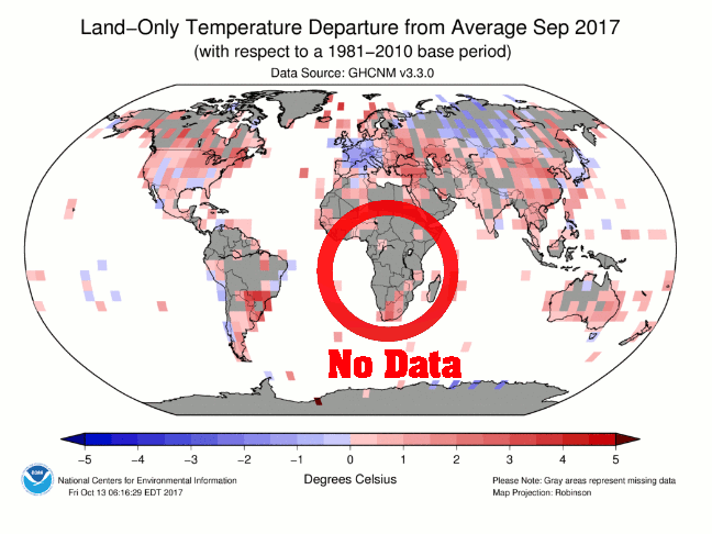
Another geographical region with very few actual measurements, and huge distances over which the data is averaged, is Africa, as shown in Figure 4. There is a wide corridor from Egypt and Libya on the Northern coast to South Africa with absolutely no data points, where the averages are determined from relatively few points in the surrounding areas. The same is also true for most of South America and China (where the only data points appear to be in the heavily populated areas).

Based on this representation of the data it is apparent that there are huge areas where the scarcity of data and the averaging routines will give incorrect results. Often the temperature anomaly distribution in these areas, especially for Greenland and the Eastern Antarctic Peninsula, is used to show that these sensitive areas of the globe are subject to extraordinary warming threatening our very way of life. Such conclusions are invalid, they are purely the result of a scarcity of good data and statistical practices.
What good can there possibly be in extrapolation?
It is the post-modern scientific method to replace missing links through inference, and sometimes simple assertions, that are consistent with.
Much like those 2 warm readings in Sicily and Sardinia that have little effect due to the surrounding cold readings in the surrounding Mediterranean. Without those nearby cool data points, the Mediterranean would have been averaged much warmer. The Scott base reading could be artificially warmer than surrounding areas but due to the simple lack of surrounding data causes the area to read as warmer.
“What good can there possibly be in extrapolation?”
To understand the real world, we have no choice. We never have more than a finite number of samples. We work out the rest by interpolation. It has always been so, in science and in life.
Ok – my discipline is within measurement – we interpolate between points of calibration.
This might be a silly question, however – what is the benefit of interpolating or extrapolating into areas where there are no measurements and have never been any measurements?
It looks no good when Tony Heller points out that record heat is reported in areas in Africa where there are no measurements.
“To understand the real world, we have no choice.”
Sorry Nick it might just be that ‘extrapolating’ or other crude methods simply do not lead us to any acrtual understanding of the real world but rather to a misunderstanding. Garbage in = Garbage out or good data into a garbage bin = garbage out are the same result and no one is the wiser if all we get offered is garbage.
See my post on the Freeman Dyson article ( about 1/4 way down) re mesh size in models turning data into (false solution) garbage
I kept a fastidious record of my older son’s height for the first months of his life. He’s 27 now, and lives near Baltimore, Maryland. I haven’t seen him in a while, but if you’d like to, just go up to the Baltimore area and look around. He’ll be the one who’s about 54 feet tall.
“He’ll be the one who’s about 54 feet tall.”
So what is your height now? You would probably be extrapolating from when you last measured. If that is so bad, you could be 54 ft too. Better check.
We may have no choice, but we can’t use extrapolation. It simply produces wrong answers. If you look at Canberra, it is spread over three valleys. Each valley has different weather, including different temperatures. They can differ by one or two degrees over just 10 kilometers. So to extrapolate that out to hundreds of kilometers away is plainly absurd.
If anybody wants to claim a temperature is valid in point X, they must have a thermometer at point X. There is no other reliable way. The only practical way to measure temperatures over the whole world is by satelite, which is why that is the only temperature record that is worth using.
And since I have brought up the satelite issue, I will simply point out that a satelite “record” that corrupts actual measurements with theory (in the form of model output) no longer constitutes a valid record of what actually happened.
“The only practical way to measure temperatures over the whole world is by satelite”
There is plenty of interpolation involved in satellite measurement. People seem to think you point a camera and get a global monthly average. In fact, the satellite passes over only twice per day. So how do you get an average for the day? Interpolate! And it isn’t easy. You have to know the diurnal pattern. Diurnal drift is one of the major problems.
And there is plenty of spatial processing and interpolation too. Here is just one para from Roy Spencer’s blog post on UAH V6 (my bold):
“The LT retrieval must be done in a harmonious way with the diurnal drift adjustment, necessitating a new way of sampling and averaging the satellite data. To meet that need, we have developed a new method for computing monthly gridpoint averages from the satellite data which involves computing averages of all view angles separately as a pre-processing step. Then, quadratic functions are statistically fit to these averages as a function of Earth-incidence angle, and all further processing is based upon the functional fits rather than the raw angle-dependent averages.”
Yes, but you have to recognise that the extrapolation may well be wrong. You have absolutely no way of knowing if you are right, because the temperature you want to know has now gone forever.
I have no problem with trying to work it out, but the idea that we should spend trillions based on something we cannot know is absurd.
There is a choice to not having data, get it or admit there’s nothing to say.
Do a thought experiment. Look at the mesh sizes in Africa, Some of these areas with no data are bigger than Texas. Imagine estimating the temperature of the western US from data points in Dallas, Denver, and Death Valley, CA. That is how we get global warming. Now further imagine that the climate change cartel falsified the temperatures in Denver by lowering the “bump” in the 1930s and raising the temperatures from 1970 until 2017. This is how we get accelerating and greater global warming. This isn’t science, it is fraud.
Nick Stokes: “To understand the real world…”
Please explain how “real world” and the artifice of extrapolation can be reconciled.
“artifice of extrapolation”
All we ever know about the real world is by inference from a finite number of samples. Even what you see is the product of a finite number of optical receptors. How do we know the sun will come up tomorrow? We extrapolate from a finite number of observations.
Here is a presentation that is honest about some areas where there were no measurements – the grey ones.
https://player
Ref:
https://www.gfdl.noaa.gov/blog_held/7-why-focus-so-much-on-global-mean-temperature/
However, a representative presentation of temperature measurements would have much more grey areas. A map over measurements would have been almost all grey in 1850. There are still many grey areas – even today.
Its easy to test the extrapolation.
It works
Could it fail?
Sometimes yes – sometimes no – we never know when.
Steven
Ok, my discipline is within measurements – we interpolate. I admit that.
At some spatial distance between temperature measurements it can hardly be called interpolation anymore – it is more like extrapolation.
However – can you please explain the rationale behind extrapolation into areas in the south of africa where Tony Heller reports that there are no measurements?
How come that record heat is reported in areas with no measurements – ho can that happen?
@ Mosher,
the numbers are all wrong, but still useful, depending on the constraints necessary.
aka: if it works it wasn’t stupid.
It works? Prove it.
That’s a lie if ever a saw one. You cannot test to see if something you can never know – something that was not measured and will never exist again – was correct.
And to test your methodology would require years of testing and large numbers of test sites with the sort of possible variation that could be encountered in the areas without data.
You have not done that.
Complete rubbish
it’s easy? so why isn’t it be done?
True enough. But what is shown here is a form of interpolation.
I agree interpolation. Your measuring between two known points. Extrapolation is when your outside. Like projecting 6 inches of sea level rise in 2100 from the current rate of rise
REJ,
There comes a point when one should question whether they are simply engaged in number crunching, or if the interpolation makes sense. Some areas should probably just be flagged as not having valid data. As a thought experiment, consider Fig. 2 and think about what the map would look like if the single cold temperature were removed from Canada near Hudson’s Bay.
Many of the color patterns appear to be artifacts of the method of interpolation and the wide spacing of temperature measurements.
Mosher observes that “It works,” However, the question should be, “Does it work properly?”
At what point isn’t it? If I have two known temps on the arctic circle 180 degrees apart, can I interpolate the North Pole temp? It’s between them. Two points on the equator?
Like I pointed out above, per the data presented in figure 4, if your measurements consisted of Sicily and Sardinia with zero measurements of the sea, what would the interpolated temperature of the Mediterranean Sea be?
Clyde,
“As a thought experiment, consider Fig. 2 and think about what the map would look like if the single cold temperature were removed from Canada near Hudson’s Bay.”
That’s an interesting one. The cold place is Nitchequon. It’s notorious because it went off the air in the 1990’s, and when it came back, it was in a different, colder place. But the anomaly base is from the warmer place. That is the sort of thing that would easily be fixed in homogenisation. But I am showing the unadjusted data here. Nitchequon always (since 2000) shows up as cold.
“and when it came back, it was in a different, colder place.”
Or, the temperature had actually gotten colder and somebody decided to homogenise it out. This is the problem with the constant changes to the data. They always seem to create a warming trend. Nobody believes they have any integrity anymore.
“Or, the temperature had actually gotten colder and somebody decided to homogenise it out”
The GHCN data here is not homogenised. But Nitchequon is a good example of why it should be. I wrote about it here. The history is well known; see the comment by oneillp for further information.
NS,
You said, “That’s an interesting one.” You either missed the point, or as you do all too frequently, go off on a tangent to avoid responding appropriately. What I was hoping that you would see, without hitting you over the head with it, was that a single site influenced a very large area that seems to be out of character. Leaving out that point would make the result look VERY different! That is the issue with having sparse data. It may not represent reality, even at a small scale. I’m quite dubious that the site on the east coast of Greenland, which obviously influences the interpolation results in the interior, produces a result that actually simulates the dry, cold interior.
GIGO!
Clyde,
“Leaving out that point would make the result look VERY different!”
You don’t know that until you have tried. In fact Nitchequon’s weight is probably about average, which is to say that it is one of about 5500. And in recent years it is a continuous aberration, so it doesn’t add to trend. Over 3 decades or more, it has a slight cooling effect.
But we can quantify how much difference such aberrations make, because homogenisation takes them out. Folks here don’t like that. But the fact is, it makes very little difference.
I assume that every one of those mesh points is a location where an actual real thermometer exists to take regular temperature measurements.
Otherwise why are those points there and not at some other place ??
I have used finite element analysis to compute values of things (voltages for example), but only in cases where the entire area was bounded by a perimeter of precisely known equi-potential segments, and a probe (electrolytic tank) allowed for plotting equi-potential lines at whatever resolution was desired. I even developed a lumped constant circuit that matched the perimeter potentials of a uniform resistivity layer, which could be subdivided while retaining the match at element boundaries. That allowed for connecting efficiently to large area photo-detectors with low series spreading resistance.
G
“every one of those mesh points is a location where an actual real thermometer exists to take regular temperature measurements”
Each corresponds to a supplied data point. On land it is a station (you can shift-click to bring up details). At sea, it is a point on the ERSST grid.
“the entire area was bounded by a perimeter of precisely known equi-potential segments”
A sphere is better. You don’t need a boundary condition. There is no boundary.
Using anything other than equal area grids is one way to add bias without it becoming readily apparent. This trick has been frequently applied and is a consequence of the bogus homogenization techniques developed by Hansen/Lebedeff.
That was really what led to the problem with the (now debunked) Steig Antarctica paper. It’s hard to tell whether these guys are just stupid, or evil. I tend to lean towards believing a little bit of both.
Mark T,
I’ve had many discussions with well known consensus scientists and others who claim to be experts. From those interactions, it sure seems to me that incompetence and the lack of common sense both caused and is perpetuating the broken science.
The malfeasance comes from the IPCC, UNFCCC and the World Bank which is the political side and which drove the competent people away from participating in IPCC driven (i.e. agenda driven) science.
Unfortunately, the World Bank is indemnified from the harm it wants to cause.
“on a warm, sunny, windless day”
In these analyses, we start with monthly averages. Such differences even out. But we also use anomalies. What counts isn’t whether the south shore is warmer than the north. What matters is whether it is warmer than it usually would be at that point, for that time of year.
“Using anything other than equal area grids is one way to add bias without it becoming readily apparent.”

The grids are area weighted, using the triangle areas. This is just standard finite element integration. But if you really want equal areas, we have them here
The issue is not the area bias, but the data bias introduced by homogenization where missing data is presumed to follow data samples hundreds or even thousands of miles away.
The bottom line is that you need actual data samples in each cell. For example, I do this with satellite data with a grid about the same resolution as the plot you just showed. The difference is that the averages for each cell are across many different measurements from many different points within the cell.
The basic problem is that there’s absolutely no certainty that the average for any of the larger cells is anywhere close to what that average actually is.
then there’s the obvious…..I love Tony’s blinks….makes it very easy to see all the blue that changes to white and red
Asking out of curiosity:
How come that the triangular grid is so regular over oceans?
And
Why is there suddenly a band of larger triangles in around the antarctic?
Watch India and SE Asia as well.
Its a JOKE !
“How come that the triangular grid is so regular over oceans?”
On land, the nodes are the land stations. On sea, SST is supplied as a regular grid (ERSST V5, 2°x 2°)
“Watch India and SE Asia as well.”…one of my favorites
…but all of Europe goes from ‘much cooler’ to just adverage…..size counts
co2isnotevil,
Consider measuring the surface temperature of the water in Lake Michigan in shallow water on the north shore and similarly on the south shore on a warm, sunny, windless day. One would not really expect those measurements to be representative of the water temperature in the middle of the lake. However, the approach demonstrated by Stokes would interpolate between those two distant points and proclaim to have an accurate estimate of everything in between. The only thing one should have any confidence in is the temperature of the shallows. This is the difference between a ‘mathematician’ crunching numbers and a physical scientist examining the data for reasonableness.
Clyde,
Another example are the microclimates in the Bay area. Looking at the above cells, the one near the Bay area spans from SF to Livermore and beyond. On any given summer day, Livermore can be pushing 100F while SF, less than 30 miles away can be in the high 50’s. In the same cell are elevation changes from sea level to a couple of thousand feet in 2 different mountain ranges, the Santa Cruz mountains and the East Bay Hills. Even the same elevation in the different mountain ranges have different temperatures owing to the differences in vegetation and exposure.
”On land, the nodes are the land stations. On sea, SST is supplied as a regular grid (ERSST V5, 2°x 2°)
The sea grids come from a
modelreconstruction that uses sparse SST measurements with spatial completeness enhanced by statistical methods” to generate the uniform grids.https://www.ncdc.noaa.gov/data-access/marineocean-data/extended-reconstructed-sea-surface-temperature-ersst-v5
Its easy to test equal area grids.
It works.
unequal area grids also work.
tested
Steven,
The issue is not so much with unequal grids as such, but with the unequal samples that led to the unequal grids.
Unequal grids can only work if the underlying data was sampled along equal grids equal to the smallest cell size.
I would disagree with that. The smaller the grid the closer it measures the surface area if the sphere. The larger grids have more error to the actual surface area.
How do you test something that’s not measured?…..’works’?…
It gives the answer he wants, therefore it works.
Jamie,
Yes, the larger the grid size, the more the error. Mixing large grids with small grids and assuming the error is limited to that of the small grids is definitely a problem.
What do you mean ‘it works’? I have a broken television that works perfectly as a dust collector, but if I just say that “the TV works”, I am being highly deceptive. Are you being highly deceptive here?
Jclark
the issue at hand is a methodological one.
What is the best way to “grid” data, IF you choose to grid it.
We dont grid, but we can grid afterwards to test the impact of various gridding approaches.
We solve the field continuously. No grids. The approach gives the same answer as most any gridded method you want to choose.
You guy should do what I did when I thought gridding mattered. I wrote code to test various gridding methods
In fact if you go back to the early days when nick first started you can see us discussing various gridding approaches.
In the end the differences are slight. of technical or academic interest only.
The other way you can test the gridding is to generate synthetics data. An idea promoted by skeptics and CA and other places. You use synthetic data that looks ( statistically) like temperature data. You create ginormous numbers of stations. You calculate the average from this complete sampling.
That is your “ground” synthetic truth.
Then you run all the different methods and grid approaches and whatever you like and test the skill.
The bottom line.
The planets warming and you dont need stations everywhere to know this
the LIA was coolder than today. We know this and we dont need thermomters every 2 feet
to know this.
The planet is warming MORE if you just use raw data.
Planet is warming.fact
SM, blind collection procedures are such a royal pain anyone who goes to the trouble stresses that they did it. Running data through a computer program that does “corrections” just moves the potential bias to the programmer.
Sitting this one out, I have too many things on the plate today. You guys have fun with Nick defending the indefensible.
Tony Heller has done maps comparing temperature anomalies and actual data recording points. There is so much infill the surface temperature mapping is FUBAR.
Pretty much the only uselful data on temperature are the various national historical temperatures, if one uses raw data, or satellite data.
https://youtu.be/qQwfe1VkNKQ
“There is so much infill the surface temperature mapping is FUBAR.”
…and for some odd reason it’s always the red that gets expanded…and the blue shrink
The infill and adjustments are being done with a non-blind process, so the expectations and/or biases of the operator (I will not call them researchers) can affect the outcome. One phenomena from psychology and medicine that is fairly reliable is the malign effect of expectations.
I noticed that especially at GISS. Even if winter temperatures in central Europe were far below normal, this map erodes the anomaly. Conversely, at record high temperatures this is not true. Since the hotspot is still clearly visible. The algorithm underlying this would be interesting to see.
wrong Tom.
the processes are blind.
double blind
I once found some data from western central Africa.

that’s no good andy, it appears to be actual data, for real climate science you need ,inter/extrapolation, a product that projects what could have happened even when it didn’t and a pha,there always has to be a pha.
Anomalies assume you have a baseline temperature measurement. Without a measuring station how do you have a baseline? How do you assume an anomaly tens, hundreds or thousands of miles away is similar to your measured stations? What are the scientific assumptions or actual physical investigations that allow this?
On land we have measuring stations. And what is too rarely understood is that it is essential that the anomaly is calculated relative to the historical expectation for that location at that time. At sea we have the grid values, which perform the same role. Exact location is less critical there because of the greater spatial uniformity of SST.
More goop from Nick
Desperately trying to defend the indefensible.
And so how exactly does that lead to unmeasured record heat over the landmass of central Africa?
nick;
“the anomaly is calculated relative to the historical expectation for that location at that time.” But if you don’t have a measuring station, how do you know the historical expectation for that location at that time? Better yet, how do you calculate an anomaly?
And, you didn’t really answer my question. Has any of this been validated by physically checking each inter/extrapolation point? If not, please give a scientific explanation of how you assume it is true, not just a hand waving explanation.
“such conclusions are invalid”
Invalid? How do so many Agencies get so close to each another all using slight variations of their own grids? And Nick himself has tried different approaches…they change the results a little but not much.
I wouldn’t take much notice of Nick trying “different approaches”
He is totally blinkered by the AGW agenda.
They all use the same broken extrapolation techniques. Besides, it really doesn’t require a lot of change in the final result. A 1C difference in the average temperature will arise from less than a 2% error in measuring the energy associated with a specific temperature and temperature sensors respond to energy, not temperature.
Repeatability…..Totally un-feasible and un-testable, but …..What if…..The Earth, the solar system, the galaxy and the entire Universe could be “reset” to 1750 with the exact set of starting conditions in every way that existed in 1750, then the ‘industrial age’ be started over and replayed to today. What do you reckon the chances would be that the average global surface temperature would return to that of the present when the “do-over” reached the present day?
ThomasJK,
The Earth is a causal system that responds to solar energy and this response is readily quantifiable. The chances are 100% that a do-over will end up in the same end state as it is now.
And BTW, even if we rolled back the clock, removed mankind from the planet and ran the system forward the end state would be about the same as it is now. Owing to the lack of additional CO2 and UHI, the average temperature would be imperceptibly cooler, but otherwise, the PDO and all the other natural cycles will be following the same pattern as they do today.
A challenge for totallygullible, or Nick is he can
On the African map, I have circled 6 points.
Provide pictures of the weather stations and surrounds and also the raw data for the stations at those 6 points.

“Provide pictures of the weather stations and surrounds and also the raw data for the stations at those 6 points.”
The gadget lets you show data. Just press shift key and mouse click, and it shows the temperature and anomaly at the point.
So , Nick, you are not the least bit concerned about the quality of the data.
Thanks for confirming that.
Quite prepared to smear data of unknown quality over hundreds of thousands of square km.
Did you say you once worked for CSIRO.., How embarrassing for them.
Still no site pictures?
Nick, where are you Nick ???
“Still no site pictures?”
I analyse the data. I don’t read the thermometers.
Thanks for confirming everything I have said.
You don’t GIVE A STUFF ABOUT THE QUALITY OF THE DATA.
You are almost certainly working with GARBAGE DATA……. You just couldn’t care. !!
Any results you get are thereby TOTALLY and ABSOLUTELY MEANINGLESS
I wouldn’t go so far as to accuse Nick of not caring about quality but I have to say that he worried me when commenting upon one of my WUWT articles, as he wrote, ” …standard science…relies not on auditing but replication”.
Failure to audit is a major reason why we currently have a reproducibility crisis in science.
Link to the online tool?
Sorry John, but Nick has made it patently clear he doesn’t care one tiny bit about the quality of the data he uses.
The one in Malawi looks like it’s at the airport in Chileka, you can see its surroundings on Google Earth at -15.683°, 34.967º
https://airport.airlines-inform.com/Blantyre-Chileka-International.html
How did so many pollsters, using different methodologies, come to the same wrong conclusions in 2016?
Sorry, wrong spot. Meant for ReallySkeptical.
Because the race was close. Many predicted that Trump would win, just not the majority. And I think prediction from polling is quite hard because it is hard to access “enthusiasm”, re the dem wash in VA, which was higher than it should have.
In any case, the results were within the errors in 2016, it’s just the punits who read 75%-25% as 100%-0%.
Mostly because those on the political left and the submissive MSM that supports them seem to ignore or otherwise take exception to facts they find inconvenient. One of those facts was that Trump was reaching out to the people, while HRC was holed up in her little bubble and hoping that a compliant MSM would do the work for her, like they did for Obama. Another was that in the presence of all the Trump bashing, many were embarrassed to admit to pollsters that they supported Trump, but knew better from the anonymity of a polling booth.
That’s what the Warmists have going for them. Enthusiasm! It’s their substitute for accuracy and integrity.
John Harmsworth, when I first saw your comment I read it as “euthanasia.” On second read, I was sad.
“Mostly because those on the political left and the submissive MSM that supports them seem to ignore or otherwise take exception to facts they find inconvenient.”
Really. I sort of remember the same thing only opposite in 2012.
ReallySkeptical,
Yes, both sides of the politics exhibit this kind of tunnel vision. It’s positive feedback from the MSM that amplifies the tunnel vision of the left.
Not that political polling is necessarily relevant to the discussion on the above essay, political polling has had growing problems for decades (use to contract for polling with top operators). Mobile phones, call screening, biased staff at the polling company, both in cutting the sample and actually on the telephone or just a few of the problems. They tried to fix some of the problem with focus groups but it takes a very unbiased, totally objective, skillful operator to get good info from focus groups. Both those operating polls and those paying for polls often hear what they want to hear and tell their client what they think they want to hear. Appreciate there are “public” polls and “internal” polls, those done by the campaign and parties. They are quite different. Throw in the MSM, who once used public polling results but started playing their own games. Today the MSM use whatever polls fit their agenda. Rasmussen was the only polling group that got the game consistently correct. However, they admitted they made mistakes along the way. Political polling even on the best of days gets more and more complicated and substantially less accurate when there are more than two answers to a question.
“come to the same wrong conclusions in 2016”
Actually, they predicted the vote fairly well. The result was something else.
“…Actually, they predicted the vote fairly well. The result was something else…”
Just like how climate models can sort of get the overall temp well (if you squint hard enough) but fail miserably on the smaller levels it is comprised of.
Actually, they predicted the vote fairly well. The result was something else.
I just looked at some post election articles from Pew, NPR, The Hill, Politico, and such. Almost all the polls fell between Nate Silver’s 72% chance for HRC and Princeton’s 99%. The only major to get it right was the LA Times; let’s call that the Russian model.
The headlines are all variations of ‘how did the pols get it so wrong’. It’s almost like the articles are addressing RS’s question directly because they look at sampling bias and herding to explain how all of the models were wrong in the same direction, even though their methods are different.
Polls and climate models are a lot alike – if one outlier is right, they’re all validated.
You’re really really sceptical, I see!!
Really Sceptical (your handle naively protesteth too much like other marxalots eg Peoples Democratic Republic of Korea – yeah, that ought to fool us) Same thermometers, same temperature jujitsu. When Karl at NOAA couldn’t wait for the pause to end after 18 yrs (as long as the warming that all the fuss was being made off), he, just before retirement, changed global SST to erase the warming. Within a week all the ‘independent’ stringers changed their temp trace. Now wattsupwiththat?
Because they all suffer from the same problem, and similarly fail to address it appropriately. It doesn’t matter what “slight variations” are being used, they are essentially the same algorithm with the same data, and produce the same results. Straight out of the Department of Duh.
The answer to your question is elementary and should be self evident; the methods used to “Krig”‘ or infill missing data are agreed upon and vetted by consensus and so consistently produce similar results.
Krigging is EXCATLY WHAT SKEPTICS SUGGESTED as a superior method.
why?
cause it works.
cause its tested
Sorry for the repetition. I see you question has been answered in the same way several times already. I did get a kick out of “the Dept. of Duh!” Though 🙂
RS,
Consider measuring the density of stars in one of the arms of a spiral galaxy, and then doing likewise on the opposite side. Any interpolation from those two points will not only miss the increase in density in the center, but will also miss the sparseness between arms. There has to be a minimum sampling distance to resolve periodicities, such as the distance between arms, and there have to be representative samples from areas that are different from the bulk.
It shouldn’t be a surprise that different agencies using different grids or interpolation techniques get similar results when the temperature sampling density is inadequate for the task.
I give credit to Mr Stokes on the upkeep of his site. I’d like to point out however that if in the mining industry we were to extrapolate data over hundreds if not thousands of kilometers and issue a conclusion of the “grade” or in this case the temperature of the intervening area, we would be laughed out of any professional association we happen to belong to as the inferred anomaly has no validity in a geological or economic sense. Now yes geology and exploration geology is not the same thing as climate research but in a way both have undeniable economic impacts. To infer a warming trend in in this sparse data and then conclude we need to spend literally trillions of dollars to combat climate change is difficult to understand. By just looking at the shape and continuity of the temperature data in areas of better coverage suggest this broad brush approach is inadequate. The argument that “this is the only data we have” does not wash. Including the data and associated anomalies from large, sparsely sampled areas is a no no in exploration geology and should also also be a issue in climate change research. Spend the money on correctly sampling the earths surface, then let us decide if there is an issue actually worth dealing with.
“I’d like to point out however that if in the mining industry we were to extrapolate data over hundreds if not thousands of kilometers and issue a conclusion of the “grade” or in this case the temperature of the intervening area”
What counts is the gridding versus rate of variation. In mining, that happens on a much smaller scale. But you do interpolate in exactly the same way on that scale. You drill a finite number of holes, and infer by interpolation the total amount of ore that you have and its grade. Big money is spent on that.
Someone mentioned Nyquist elsewhere. That is exactly what is happening here. You have to sample on the scale of variation. With mining that is maybe hunderds of metres. With temperature, it is hundreds of kilometers. Air is more mobile than rock.
Nick, you’re so far detached from reality it isn’ even worth arguing with you.
What you’re doing clearly isn’t interpolation, it’s fabrication. When you project that an unmeasured area is either warmer or colder than any surrounding points that were actually measured, you’re not interpolating. That can only be the result of modeling.
nick, it is nothing more than mathturbation. the techniques mosher says work would not work to the nearest degree inside my house, never mind over thousands of miles.
“What you’re doing clearly isn’t interpolation, it’s fabrication.”
It’s sampling. A basic area of statistics. Are you saying that any estimate of a population mean from a sample is fabrication?
The integral of the interpolated function is just an area-weighted mean of the sample values. In fact, the weight can be taken as just the area of the triangles adjacent to a node (or 1/3, to partition the area).
It is a mistake that Kriging in the mining industry is based on the random principle. All sorts of other geological boundary data flow in, which then greatly increase the probability of a find, so that Kriging succeeds. But this does not apply to the areas of the earth with a thin measuring network in climatology. There Kriging is more or less a random product, considering how often close to each other hot and cold spots at measuring stations in higher density measurement. However, should the temperature measured at a station be considered for a huge area in a lower-density area? I say no.
If you violate Nyqyist, i.e., if there is aliasing, no amount of interpolation can get that information back. It is lost, and any assumptions about what was there are indistinguishable from noise.
“Nyqyist”
There is loose talk of Nyquist here. What on earth does it mean? We have a 2D irregular mesh, not equally spaced time sampling. We are calculating a single spatial average, not a time varying signal. Actually I’m not even calculating that here; this article just describes a visual display of basically raw data.
NS,
You said, “We are calculating a single spatial average, not a time varying signal.” The independent variable does not have to be time. There is a concept of spatial frequency. That means, how does the topography (or in this case, temperature anomaly) vary with distance on a two-dimensional surface. For ripples in sand, that means, “What is the distance from crest to crest?” To capture fine detail requires sampling the z-variable at half the distance the x- and y-variables provide change in the z-variable. And, unless you initially oversample, you won’t really know what the optimal sampling distance is to capture (and decompose with Fourier analysis) the changes over distance. It looks to me that the artifacts that are showing up in your ‘interpolations,’ are telling you that you have serious problems with under-sampling. That is, it really doesn’t “work.”
Clyde,
” There is a concept of spatial frequency.”
Nyquist deals with frequencies in signal and sample rate, but not stuff like topography. But what is really wrong headed about the Nyquist talk is that Nyquist is about the ability to characterise high freuencies. Nothing like that is happening here. Averaging is about getting the very lowest frequency. It is the zero point in the spectrum.
Resolution does matter; I did an extensive study here, for example. But it is precisely the high frequencies that contribute least to the average.
ARW,
You said, ” Including the data and associated anomalies from large, sparsely sampled areas is a no no in exploration geology…” It should also be a “no no” in ANY science that is concerned with spatial variations! It is obvious that the sampling frequency in the oceans is much higher than for regions such as Greenland, Africa, and Antarctica. However, the variations over land occur more rapidly than in or over water. The sampling protocol is backwards! To really be comparable, the ocean data should be down-sampled to the same resolution as the land areas.
It should also be noted that for Greenland, Antarctic and African temperatures, the grid corners are on the coast, while all the region is inland.
Nonsense results are absolutely guaranteed. !!
That would be my chief complaint with what I see. North of approx. 60 degrees in the Northern Hemisphere, this will introduce a powerful warming bias to the measurement.
” the grid corners are on the coast”
That is where the stations are. But that is where anomalies come in. They are relative to normal for the point. If you look at areas with better coverage, you don’t see a big distinction between coast and inland.
Sorry that you don’t have the capacity to see the problem.
Not unexpected at all.
” you don’t see a big distinction between coast and inland.”
What Nick is say here is that coastal is the same as inland.
Nick, get out of your bunker, get in a car…… and go for a drive!!
Wake up to REALITY. !!!
“What Nick is say here is that coastal is the same as inland.”
No, coastal anomalies are the same as inland anomalies. If it is warm than usual inland, it is usually warmer on the coast too.
Yes Nick.. Of course they are Nick
When you use a method that intentionally makes them so.
“If it is warm than usual inland, it is usually warmer on the coast too.”
roaring laughing…..nice wordsmithing
I thought you guys were talking about Greenland….cold?……what you just said does not hold true for Greenland…..where when it’s warmer on the coast, it’s not necessarily warmer inland
“…you don’t see a big distinction between coast and inland [temperature anomalies]
Nick, I don’t buy this.
As a resident of the coast of Maine, I can tell you that the variation inland is significantly greater than the variation on the coast, but is not consistent in that regard. Additionally the anomalies don’t track if the wind direction is inconsistent – blowing off the ocean vs. toward the ocean completely fouls up the relationship between inland and coastal sites. Additionally, coastal cooling in summer and inland cooling in the winter further distort anomaly tracking. I just checked Weather Underground, and there’s a 6 degree difference between stations within a 20 mile radius of my house. Granted, those aren’t “official” weather stations, but I think even automatic amateur equipment isn’t more than a degree off of actual.
Taylor,

Here’s is Maine and nearby, October 2017. Do you see a big coastal effect on anomalies?
NS,
You said, “If you look at areas with better coverage, you don’t see a big distinction between coast and inland.” So you are saying that the difference in the climate between Novosibirsk and Kyoto is purely chance and is unrelated to location? I think that you have just demonstrated that your understanding of climate and what affects it is quite wanting! The reason so many tourist localities are on the coasts is not just for the water sports, but because the oceans moderate the temperatures. That is, the temperature anomalies are going to be controlled by the oceans rather than the rocks and vegetation to be found inland.
“I think that you have just demonstrated that your understanding of climate and what affects it is quite wanting! ”
That has been obvious with nick for a LONG, LONG time. !!
Great at fudging numbers to his conformational AGW biases.
Reality.. not so much. !!
Look at the differences between Broome, Broome Port, and West Roebuck, in the Kimberley, the differences are astonishing, and all within a 30 km range. Only Broome, where the instruments are at the airport, is used to extrapolate data. Airport heat Island.
taylor says “nick i don’t buy this” and nick responds with the chart being criticised as evidence that taylor should buy it. roflmao . got to hand it to you nick, i bet you posted that reply to taylor with a straight face.
“nick responds with the chart being criticised as evidence”
It is evidence. People here love hand-waving, but there are real measurements, and the map shows them, colored at the actual stations. It shows coastal locations and interior locations. And you can check whether the anomalies at the coast are systematically different to nodes in the interior.
Not only is the grid full of holes, the measurement values are subjective.
It is the same as saying the Anomalies in the centre of a City are the same as Rural.
Complete Crap.
I suggets that Nick takes a look at the Antarctic Ice Sheets and the coastal seas, if the wind is blowing off the warmer sea they can be quite warm, around the Zero mark but if it blows of the -40C land it can by -29C.
NS,
In looking at your map of the coast of Maine, it appears to me that the impact of the oceans is muted because there are so many more stations on the land (in from the coast) that they dominate the coastal interpolation. That is to say, they are given more weight because of their greater abundance. The ‘mechanical’ interpolation method doesn’t take into account how the atmosphere interacts at the boundary. It is blind number crunching.
Realistically, when dung is mixed with high quality food in a blender, the former degrades the whole. Climate science takes the opposite approach and claims that good data mixed with crap data makes the latter good.
That has got to be the quote of the week !-)
Indeed. +6.0223*10^23
Avagadrosolutely!
Yes, we have no avocados!
Operating theories and computer models that are somewhat similar to those that are being used by the U. S. Federal Reserve? And the ECB?
The collection of points for a specific area is scientifically random which means the collection is worthless. Of course, it is not random from the perspective of the grapher. He undoubtedly ties warmer data points to other warmer points as far afield as reasonably possible, thus creating a pastiche of apparent broad warming. So again the graph is worthless.
Every time there is a display like this, another scientist, meteorologist, mathematician, or statistician becomes skeptical.
The anomalies for Traverse City, Kalamazoo, Lansing, Detroit and Bay City on any one day are within a degree of each another. So all the grid is saying is that such an area can be entered as a single value. Please note that I said anomalies not temperatures (which can be quite different).
I think Moyhu was abused anyway. The grid is what it is, it is not ‘what we know’ but just a simple extrapolation.
What is not noted here is the changing set of stations, or anomalies having asymmetric seesaw changes related to vegetation growth and clearance, development, change of devices etc.
I don’t trust the statistical methods being applied correctly to get rid of biases instead of introducing them. I haven’t for example seen one rebuttal of Heller’s ‘CO2 against adjustments’ in the US which appear to be in perfect correlation. As if some people were not skeptical…
So all we need to do is take temps in Seattle, LA, Chicago Bangor, Savannah and Albuquerque.
Probably should add Denver because it is near the center of CONUS. It is well known that the weather in Denver is quite stable. /sarc
nope, north pole, south pole and two points on the equator diametrically opposed 😉
So you think a cell the size of half of the USA is the same as a cell the size of the Mich LP?
The daily temperature anomalies of Brownsville, Longview, ElPaso and Lubbock are not within one degree Celcius.
Throw Corpus Christi or Galveston into that mix and it may be more like 2 degrees.
but their anomalies are.
Not if a front is moving through.
So that happens ever day? An does it affect the high that day or the low? That matters.
So if the argument is that the error in extrapolating/interpolating gridded anomalies is roughly a degree, then I might buy that. However, we are asked to believe that this technique produces an answer for the whole globe that is within 0.1 of a degree or better (see claims that one month or the other is the “hottest” by .04 degrees). That seems nonsensical, even if we had an accurate thermometer in every 25 sq km over the entire earth, much less with the patchwork we do have. It’s why, for me, the only answer is satellite measurements, and even that can’t claim very high precision.
RS,
The ocean and coastal anomalies should be controlled primarily by the slow heating (thermal inertia) of the water because of the much larger heat capacity of water compared to soil, rocks, and vegetation. If that isn’t shown by the interpolated anomaly maps, then there are even more problems than commonly complained about!
Nick, perhaps it would be useful to describe your interpolation routines, or, if not yours, then whose. Thanks.
John,
The nodes are the stations with measurements. For integration (averaging), the interpolation is linear within each triangle – standard finite element. The end result is a weighted sum, in which each node has the weight of the areas of the adjacent triangles.
There is an overview of the program and its history here, and the code is displayed with annotations here.
GI-GO, immaterial of the code etc.
it would be good if we could see the pictures of the weather stations in the locations andy asked for.i won’t hold my breath.
Quite frankly, I don’t think these guys have the slightest clue about how bad their data could be
We know it had to be left up to Anthony to discover the deplorable state of the USA temperature stations.
and they would be some of the least warst in the world.
One can only guess the UHI, air-conditioning, tarmac, airport and other effects from the junk sites in the rest of the world. !!
Nick, thanks, I really appreciate the response. For my own finite element exercises, I used Chebychev polynomials to stop overshoots, but linear looks as good as can be done here. Non-symmetric mesh.
Well we had better hurry up. Only 600 yrs to go!
https://www.msn.com/en-nz/news/techandscience/professor-stephen-hawking-warns-the-end-of-the-world-is-nigh-and-earth-could-be-engulfed-in-a-ball-of-fire/ar-BBEMHt6?li=AAaeXZz&ocid=spartanntp
Cheers
Roger
http://www.thedemiseofchristchurch.com
I see lots of grid points across the oceans where we don’t have instruments. Where do these come from?
I noticed this as well. Particularly the perfectly symmetrical (or, “regular”) mesh around Antarctica.
Another question is whether this mesh is a true CFD mesh, or is it just being used for calculating temp anomalies?
rip
“Another question is whether this mesh is a true CFD mesh”
The mesh isn’t used for GCMs, with are the CFD application. I use them for calculating average temperature anomaly – no-one else currently does. because the mesh aligns with the measurements, I think that is the mest way. GCM’s use regular grids; I have recommendations on that here.
The grid points are sea surface from ERSST V5, much discussed here. The numbers come nowadays mainly from an armada of drifter buoys, but also from ships – historically important.
“also from ships.”
Yes. cooling inflow and outflow ports.
Notoriously inaccurate.. and certainly liable to agenda driven “adjustments”
Come off it Nick, Even Phil Jones says that before 2003 there was basically nothing in the Southern Pacific.
Just to refresh my memory, the Extended Reconstructed Sea Surface Temperature (ERSTT V5) is based on the International Ocean Atmosphere Data Set (ICOADS) all going back to either 1854 or the 17th Century. ICOADS also being a “reconstructed” data base. Fascinating, I was wonder how there were so many more nodes over the ocean and most places on land. Having at one point in my career during several ocean research cruises help add data to the system I know that accuracy and precision to the level the AGW crowd would have us believe is a bit off. Which brings up a question why so many nodes in the Pacific, Atlantic, etc and so few in the Gulf of Mexico?
“Which brings up a question why so many nodes in the Pacific, Atlantic, etc and so few in the Gulf of Mexico?”

It’s a fairly regular array. Here is a plot of September. The Gulf looks sparse because the US is so dense, but if you check with the ocean pattern, it is just a continuation.
I’m showing September. One thing to remember in this article is that it is showing October, where some results are not yet in. The majors don’t post for a week or so yet. Countries around Colombia tend to be slow.
It’s a very similar problem to binning in particle physics. There are a number of problems with the approach as shown the obvious one of different size areas you highlight but there is another large problem you don’t cover. From the representation it would appear there is a uniform blending from each point to each other point. That is very unnatural and highly unlikely to be even close to accurate 🙂
The points are crossing terrains like oceans, lakes, mountains, snow fields, desserts etc and you have wind movements and cloud cover so there is simply no way that the change from one point to another will be the same or uniform. In fact even between two node sites given different conditions you would get radically different results at different times.
Not sure where Nick is going with that but reminds me of some of the very early particle physics days :-).
You might like to check this post, where I adapt the mesh to coastlines. A close-up is here

but there is a full globe picture too. It doesn’t make much difference to the integrated result.
I have worked with FEM data.
The error produce by a large grid can be ENORMOUS.
Climate science has the same child-minded assumption of linearity, which most certainly DOES NOT EXIST.
Nick is doing a very good job of pointing out that the data and the whole procedure is basically……
NOT FIT FOR ANY PURPOSE !!
Keep going , Nick, we are all watching you destroy the surface temperature procedures. 🙂
Nick I still don’t get where you are going with that it doesn’t help. Just stand on any beach and you will get the problem there is an abrupt change in temperature and the problem is how abrupt depends on local conditions such as wind and water temperature versus land temperature.
So at this basic level only land nodes can be blended with land and water with water but it still doesn’t tell you how much you can blend which rolls on local factors. Then as you start to drill into it you will find you have cold/hot water currents, mountains and terrain behaviours. So then you will find on node x can be blended with node y but not node z. Pretty soon you find you end up with each node carrying a weighting to every adjoining node. At that point you think I have got this but nope you will then find another problem which is time.
At different times of the year the behaviour of each node to every other node will vary so you start factoring that in and at about that point it will hit you in the head that everything in the node grid is running on what we call in particle physics local reality. Here lets state it formally for you as we do in particle physics
In your case we you don’t have particles you are mainly dealing with convection so lets change it
You probably don’t recognize it but you are really building an effective field theory using statistical mechanics.
https://en.wikipedia.org/wiki/Effective_field_theory
If not seen it done on atmospherics but I have seen it done on fluid dynamics.
I strongly suggest you look at this area of study and how they approached it in fluid mechanics.
I guess what I am trying to say is there is a huge arsenal of details on how to create effective field theories use it and stop re-inventing the wheel.
I note that on the sea ice page a graph is provided for “Arctic temperature ” and the mean for a prior, colder period. This chart shows the obvious transition from a largely iced over Arctic ocean to a largely ice-free or marine climate recently. Can someone tell me how these temperatures are arrived at? I think they say something about warming in the Arctic Basin, and by extension, the Northern Hemisphere, which is most of the warming the world has seen from 1980-2000
It now appears to be cooling in the Arctic Basin and the world hasn’t warmed in the last 18 years.
Total combined temperature rise over the last 16 hottest ever years is just 0.33 °C, an average of 0.035 °C for each hottest year (there were a number of tied years) based on NOAA data at https://www.ncdc.noaa.gov/sotc/global/201613
This is far less than daily temperature variations or temperature variation by travelling a few miles distance.
Automated solar and battery powered meteorological reporting stations are very cheap. I propose that these are put into the sparely served areas and used to validate the meshing algorithm. If the meshing algorithm fails the validation then all the metrics based on that method need to be withdrawn as potentially incorrect. This should be an extremely simple and relatively cheap exercise compared with deindustrialization of the first world.
Or perhaps climate scientists do not believe being right in their projections is as important as their egos in supporting their hypotheses?
” I propose that these are put into the sparely served areas and used to validate the meshing algorithm. “
This can be done in various ways. Here I took the approach of going to a much coarser mesh, with far fewer stations, and treating the stations removed as the testers. It is surprising how few stations you need. But also remember, I’m using here the GHCN V3 monthly stations. These have the important asset (for me) in that they report promptly, within a few days of month end. There are many more stations that can be used. BEST, Isti, GHCN daily, have 30-40,000 stations, which take longer to trickle in. But the extra numbers don’t give proportionately better coverage.
I should note that the majors don’t use triangular meshing at all. I think they should (so does Clive Best). But other methods work well too.
NS,
You said, “It is surprising how few stations you need.” I can easily imagine that to be true for the oceans. However, for land, where you have issues of topography and the associated elevation changes (lapse rate) and orographic winds, changes in rock type and vegetation, all leading to microclimates, I’m not convinced.
clyde i don’t think it is correct for the oceans either. variations in upwelling ,both seasonal and weather event driven ,wind direction changes and things like silt suspension in coastal waters along with density of plankton (that varies by a large amount) will all have noticeable effects.
despite some of my flippant comments i understand the reasoning behind the methodology , i just disagree with what the numbers can tell us.
But even those monthly stations are closely spaced compared to the few in Antarctica – the largest continent. Put it another way Nick, if you are claiming that your temperatures for the entire continents of Africa and Antarctica are accurate – to within hundredths of a degree, then huge amounts of money could be saved by closing down all but 4 observation stations in the USA. Just use Seattle, San Diego, Miami and Boston and ‘infill’ the rest I am sure you will be able to provide a temperature for Chicago accurate to 100th of a degree using just those 4. After all that is much better coverage than Antarctica and Africa.
bitchilly.
Point well taken about regional and local changes in the ocean. The question is, how they affect temperature anomalies. For periodic changes, it may well be very important when the baselines are calculated, and how many years are included.
“Automated solar and battery powered meteorological reporting stations are very cheap. I propose that these are put into the sparely served areas and used to validate the meshing algorithm. If the meshing algorithm fails the validation then all the metrics based on that method need to be withdrawn as potentially incorrect. This should be an extremely simple and relatively cheap exercise compared with deindustrialization of the first world.
Or perhaps climate scientists do not believe being right in their projections is as important as their egos in supporting their hypotheses?”
We already do this EXPERIMENT in another way.
Way #1. Hold out: validation. You take 40,000 stations, drop 35,000 of them (hold them out)
calculate your prediction (interpolation) then check the 35K against that prediction.
Repeat this for multiple sub samples of the 40K. This in fact is related to how we calculate
The Uncertainty due to coverage. (lack of data)
Way #2. Data recovery out of sample. Since we did our first estimate more data has been recovered
and digitized. For example, many arctic stations that dont exist in any online databases.
Also, data that is currently being digitized, and data that governments will only release under
non disclosure ( China, Korea and India have large unpublished reserves). So, rather than
going out and collecting new data in areas that have “no records” you can go to fresh archives
of old data that has never been used before.
With one researcher there was a fresh data collection exercise.,
In all cases what do we find?
1. Adding more stations, or subtracting 1000s of stations DOES NOT change the global averge.
2. Adding more stations or subtracting 1000s of stations, WILL change the LOCAL structure
3. While the local structure changes, the global average does not. As Nick notes, warmer here,
colder there, on average no difference.
4. There are two examples where fewer stations matters: The poles. The poles matter because one has tended to warm more than average while the other, in some cases, has warmed less than average.
The impact of this is minor. It is basically the difference between BE and CRU
steven mosher ” 1. Adding more stations, or subtracting 1000s of stations DOES NOT change the global averge.
2. Adding more stations or subtracting 1000s of stations, WILL change the LOCAL structure
3. While the local structure changes, the global average does not. As Nick notes, warmer here,
colder there, on average no difference.”
i am not surprised it doesn’t matter. using a lesser amount of the sparse data points already used in the same process is not likely to change the outcome. i would like to see the selection criteria for the station drop out in the validation tests though.
the spatial coverage is sparse whatever way you look at it, i doubt many people will buy validation by using an even smaller subset of that already sparse data.
As I said in my reply above – you claim 100th of a degree accuracy from extremely sparse data equivalent to 4 coastal observations for the entire USA and then stating that you can tell the temperature in Nebraska to a hundredth of a degree by using Miami and San Diego. You would be laughed at if you said that, but people do not understand what you are doing when you do precisely that for Africa and Antarctica. All your ‘Global Average Temperature’ (sic) figures should have the type of error bars that you would expect from a meteorologist in Denver using his local observations and Miami observations to provide an ‘infill’ temperature in Memphis.
“that you can tell the temperature in Nebraska to a hundredth of a degree by using Miami and San Diego”
No, I don’t. What you can get is an accurate estimate of the global average. Or a slightly less accurate estimate of the US average.
A poll can get an accurate number of how people think on an issue, within a few %. It won’t tell you what your neighbour thinks.
The plots show a combination of the unadjusted GHCN V3 Monthly data with a subset of ERSST V5 stations. There are typically about 5500 points altogether. The mesh is what is called the convex hull. It’s what you would get if you had just the points in space and pulled plastic wrap over. So there isn’t any discretion about where to draw the lines. The mesh has an optimality property called Delaunay.
The problems of sparsity come from the data set. This is just a way of quantifying them. But they also give a good way of seeing the effect. The anomalies are fairly smooth on the scale of the grid, so you see gradual gradation of color. Not always, of course, and it’s worse when the triangles are large. But if you look at the Africa plot, worst case, and look at the underlying color pattern, you should think whether the linear gradation that you see in each triangle is consistent with the broader pattern. Usually it is, and a test of this is that when you look with the mesh not drawn, the triangle pattern does not stand out.
I have done a lot of study on what effect the coverage issues have on the result. I can test by removing many stations and remeshing the rest. It doesn’t make a lot of difference. There is a study here, looking at the long standing aim of using just 60 stations world wide. If you go there, you’ll see a similar active gadget where you can see the reduced meshes, shaded, and the integration is done. Here is an example where the original 4759 nodes have been reduced to 366.

The averaging was done again, with that mesh and just the data for those points. I did that for a variety of degrees of culling, and in 100 randomly different ways. The olot of results is shown here:

It shows the original result of about 0.9C global average for that month, gradually spreading until at 366 the scatter is between 0.8 and 1.0. That is the penalty you pay for interpolating over much larger distances, compared with the result using much more data.
ps sorry to be late to this – it’s about 8am here.
Great for showing JUST HOW BAD it gets with sparse data.
Doing well , Nick 🙂
Check the axes. Yes, you get about 0.2° of spread when the number of nodes (for the whole world) gets below 100. But with only 500 nodes, it is pretty good.
roflmao… you really are deeply brain-washed on the klimate kool-aide aren’t you Nick.
. and 5 nodes?
or 3nodes over HUGE areas of Africa.
You might be fooling yourself.
But you are NOT fooling anyone else.
I’m trying to wrap my head around all the virtual nodes or whatever they are over the ocean. I thought there only something like 1000 primarily coastal buoys, some wholly unreliable drifting buoys, and some shipboard measurements. I thought the bulk of open ocean has sparse and intermittent measurements.
Is satellite data being used?
It’s impossible to say what’s normal for a place 100’s of km away from where normal is defined. Just as it’s impossible to say what the absolute temperature or anomaly is 100’s of km away from where the temperature is measured.
The conceptual flaw in homogenization is the assumption that the magnitude of the anomaly is constant across 100’s or 1000’s of square km. In your plots, the anomaly changes from its maximum to its minimum across very short distances demonstrating that this assumption is clearly invalid.
Look at Greenland, where a warmer sample on the East coast propagated all the way to Canada where suddenly the anomaly flips. Look near the Hudson Bay, where the max and min anomalies are represented by what amounts to be adjacent sample sites.
I see this all as a futile exercise in data manipulation to get around the FACT that a climate sensitivity large enough to have justified the formation of the IPCC had to be far higher than the laws of physics allow. You can’t support your position with the laws of physics, so you resort to massaging data until it suggests what you want it to say.
“The conceptual flaw in homogenization is the assumption that the magnitude of the anomaly is constant across 100’s or 1000’s of square km. In your plots, the anomaly changes from its maximum to its minimum across very short distances demonstrating that this assumption is clearly invalid.”
I’m using unadjusted GHCN. It hasn’t been homogenised. The plots give a good estimate of the cost of interpolation. Yes, sometimes it’s clear that interpolation won’t give the right result at that location. Sometimes that gives an error up, sometimes down. There is a lot of cancellation. It still becomes the main error term in the average. The error isn’t zero, but it is finite. The task is to work out how much.
You’re implicitly homogenizing the data by giving more weight to sparse samples and this error will not cancel out. Another of the assumptions behind homogenization is a normal distribution of data which means samples uniformly distributed in time and space.
Consider that it’s more likely that the warm anomaly on the East coast of Greenland was a consequence of local warming, perhaps by slightly warmer off short waters, yet this anomaly seems to have been applied to the entire country.
“yet this anomaly seems to have been applied to the entire country.”………+1
NS,
Those radiating star patterns around the stations are clearly artifacts that shouldn’t be there! The linear boundaries are highly suspect as well. To quote Mosher, “It works.” But it doesn’t look to me like it works well. It leaves a lot to be desired in simulating reality, which raises the question of whether the results are even reliable. As ARW remarked, your results wouldn’t be acceptable in exploration geology, where people bet a lot of money on being right.
nick stokes “It shows the original result of about 0.9C global average for that month”.
no error bars nick ?
“error bars”
It’s a Monte Carlo analysis. It shows the complete distribution. There is another graph at the link which shows the moments of this (man and sd). It is a study of the effects of reducing nodes on an average.
“Study bolsters theory of heat source under Antarctica”
The mesh showing the temperature measurement points?
_
On land perhaps.
At sea, most of the data, yours or Nick’s show only a grid of equal spaces.
The measurement points, ARGO buoys etc are nowhere near these points.
The data has been accumulated and reworked into them on average.
Amazing how far out the land values are allowed to influence the sea values which surely should be more uniform except for the one grid adjacent to each bit of coastline.
“Amazing how far out the land values are allowed to influence the sea values which surely should be more uniform except for the one grid adjacent to each bit of coastline.”

I have a remedy for that in this post. I refine the mesh using a land mask. On the land side, the extra points have interpolated values using land only, and same with sea. It makes very little difference to the average. In the original land influences sea, but sea influences land too, and it pretty much balances.
The mosh showing the temperature measurement points?
Was a typo I took out.
Not sure whether mush or mesh was the appropriate replacement.
Temperature adjustment anomalies measured in Zekes, not Wadhams.
When one looks at the extent to which guesstimates are made to climate data whether that is by averaging sparse and inhospitable land masses or making assumptions to cover the huge area of the earth covered by seas it is feasible in fact I suspect likely that the true margin of error in global temperature data is as much if not more than the claimed global warming over the last 100 or so years. It is farcical that governments have based trillions of dollars of expenditure on such questionable data. It also makes it more ridiculous when they feel the need to adjust past data to suit their meme.
What ever happened to the Nyquist Sampling Theorem?
It may have been superseded in today’s brave new scientific world, but if so, that has passed me by.
(p.s.: I am aware that integration has a frequency response of 1/frequency so that some of the effects aliasing will besupressed, but the whole of the NST is that a signal is irretrievably corrupted if undersampled, so one can’t really tell what the effects are.)
+1
I always think it’s worth pointing out that when we are shown (hot red) temperature anomalies in the polar regions in the depth of winter…that we are in fact being shown Global Cooling. There is only one way that heat energy could have gotten there; water vapour. The inevitable by-product of Water Vapour arriving in a zone where the temperature is normally minus 20˚C and raising the temperature to say… minus 17˚C is of course snow/ice. So ironically those hot red spots over Greenland are causing massive ice mass gain!
(Gotta watch those Warmists!)
I wo.uld be very interested to know the algorithm used to interpolate the temperatures between two sea-level values over a terrain change of 10K feet, and particularly, what values are used at the points.
All this analysis concerns anomalies. Not the absolute temperature, but the difference from what is normal for that place. As you see from the plots, these do not vary rapidly.
I am sorry but the ultimate basis for anomalies is the actual measured (absolute) temperature. Which is then compared to some mean from a set of years with randomly chosen start and end dates. I fought with NOAA/ NMFS decades ago because they were always “adjusting” start and end years with their SST anomaly data.
All of that would be fine if it was reflected in the uncertainty.
Actually the quoted uncertainty for global anomaly averages is mostly exactly that, the uncertainty resulting from interpolation. Or pu another way, the variation you would expect if you samples a different set of points. It can be quantified.
There’s a lot of uncertainty in the measurements themselves as well as in the average from which anomalies are calculated. If you add up all the uncertainties, it’s likely to be larger than the presumed anomaly. Moreover; a small error in a temperature becomes a large error in the anomaly which when extrapolated across 1000’s of km^2 has an even larger affect on the global average.
I am working on an article about this. When your uncertainty in any given measurement is +- 0.5 deg F, how does an anomaly less than this uncertainty even occur? It seems to me there are mathematicians here, but no experts on measurements and doing calculations on measurements. Significant digits are important in measuring real world events, but apparently not real world climate temperatures!
Jim Gorman,
Amen! Kip Hansen and I are about the only ones concerned with significant figures and the uncertainty implied by them.
“When your uncertainty in any given measurement is +- 0.5 deg F, how does an anomaly less than this uncertainty even occur?”
We’ve been through this endlessly, eg Kip Hansen. The local anomaly is not more certain. But the global anomaly average is, because errors cancel. That is why people go to a lot of trouble to get large samples to estimate population averages. Standard statistics, not climate science.
“Kip Hansen and I are about the only ones concerned with significant figures and the uncertainty implied by them.”
I’m more concerned that Nick doesn’t seem to have a CLUE to the quality of his data,
…. NOR DOES HE SEEM TO CARE.
Forget about significant figures etc…
…any calculations with data of unknown quality are basically MEANINGLESS.
And Nick again shows he doesn’t understand when and where the rules of large samples apply. So sad.
NS,
You said, “But the global anomaly average is, because errors CANCEL.” I have yet to see a rigorous proof of the claim. You have accused commenters on this blog of engaging in “hand waving.” You can’t really hold the moral high ground on this.
Steve once said in this blog that the interpolations HAD to be done, so that he’d have the “data” needed to get the global anomalies. Glad to see this dragged over the coals finally.
Have been studying the surface temperature stuff for several years. There are several unrelated big problems. Microsite issues. Infilling. Homogenization (and regional expectations). Cooling the past. Uncertainty and error bars. These are all readily demonstrable, with multiple examples of each in essay When Data Isn’t. Bottom line, GAST not fit for climate purpose with the exactitude asserted by warmunists. OTH, natural warming out of LIA is indisputable but no cause for alarm.
I think surface temp record since 1900 is not one of the main counters to CAGW. Nitpicking when there are huge ‘pillar shaking’ arguments: Model failures (pause, missing tropical troposphere hot spot), attribution, observational TCR and ECS, lack of sea level rise acceleration, thriving polar bears, cost and intermittency of renewables, and in my opinion a considerable amount of provable blatant scientific misconduct (OLeary, Fabricius, Marcott, …) and ‘tactics’ like Mann and Jacobsen lawsuits. No need for the last if the ‘settled’ climate science was robust. It is anything but, hence the warmunist tactics.
You missed the Australian BOM using their equipment incorrectly measuring spikes and cutting off low temps.
It absurd that the whole premise of CAGW as ‘settled’ science is based on a sensitivity with +/- 50% uncertainty. On top of this is even more uncertainty from the fabricated RCP scenarios. Even worse is the low end of the presumed range isn’t low enough to accommodate the maximum effect as limited by the laws of physics!
The actual limits are readily calculated. The upper limit is the sensitivity of an ideal BB at 255K (about 0.3C per W/m^2) and the lower limit is the sensitivity of an ideal BB at the surface temperature of 288K (about 0.2C per W/m^2). Interestingly enough, the sensitivity of a BB at 255K is almost exactly the same as the sensitivity of a gray body at 288K with an emissivity of 0.61, where the emissivity is the ratio between the emissions at 255K and the emissions at 288K.
The physics clearly supports a sensitivity as large as 0.3C per W/m^2, yet nobody in the warmest camp can articulate what physics enables the sensitivity to be as much as 4 times larger. They always invoke positive feedback, which not only isn’t physics, it assumes an implicit source of Joules powering the gain which is the source of the extra energy they claim arises to increase the temperature by as much as 1.2C per W/m^2.
To illustrate the abject absurdity of the IPCC’s upper limit, a 1.2C increase in the surface temperature increases its emissions by more than 6 W/m^2. If emissions are not replenished with new energy, the surface must cool until total forcing == total emissions. 1 W/m^2 of the 6 W/m^2 is replaced by the W/m^2 of forcing said to affect the increase. The other 5 W/m^2 have no identifiable origin except for the presumed, and missing, power supply. The same analysis shows that even the IPCC’s lower limit is beyond bogus.
Using such a grid results in weighting measurements from remote stations much more heavily in computing the global average. This is illogical in that 1) we would have the least amount of confidence in those site measurements, and 2) these readings are the least important in terms of impact on humanity, due to their remoteness.
It is not a coincidence that these sites seem to show a much higher warming bias. It’s very easy for the modelers or other data fiddlers to adjust these values/assumptions to achieve whatever global average they want. It’s just like Mann and his tree rings.
What I don’t see in any of these models is appropriate factoring in of measurement uncertainty, which could solve this problem, or at least highlight the limitations. Of course we know that will never happen.
‘This cannot give an accurate impression of the true temperature (anomaly) distribution over this sensitive area.”
WRONG.
It is easy to test whether an interpolation works or not.
First you have to understand that ALL spatial statistics uses interpolation.
if I hold two thermometers 1 foot apart and average them and report the average air temperature, the claim
being made is this.
1. Take the temperature BETWEEN the thermometers and it will be close to the average. In other words the average of the two is a PREDICTION of what you will measure in between them
The question isnt CAN you interpolate, the questions are.
1. How far apart can stations be, and still be used to estimate an estimate that performs better than a guess?
2. What, IN FACT, is the estimated error of this interpolation method?
To do this in spatial statistics we create a DECIMATED sample of the whole. For example, we have over 40K stations ( more in Greenland than Nick has) The sample will be around 5K stations.
We then use this sample to Estimate the whole field. This is a prediction.
Then you take the 35K that you left out and test your prediction.
For Greenland, Nick uses a few stations, same with CRU.. just a few
If you want to test how good his interpolation is you can always use More stations, because there are More stations than he uses.
http://berkeleyearth.lbl.gov/regions/greenland
There are 26 ACTIVE stations in Greenland proper, and 41 total historical.
So test the interpolation. ya know the science of spatial stats
Your talking as a mathematician not a scientist dealing with real world measurements. Read the following http://tournas.rice.net/website/documents/SignificantFigureRules1.pdf . Then tell us what is the average temperature between a thermometer reading 50 deg F and one reading 51 deg F. Better yet, then tell us what the average is when these are recorded values with an uncertainty of +- 0.5 deg F.
The following quote is pertinent from the above website “… mathematics does not have the significant figure concept.” Remember you are working with measurements, not just numbers on a page.
Error propagation and uncertainties are inapplicable here according to Stokes and Mosher as the comment section on Pat Frank’s post here shows.
Then add that what they are claiming is that atmospheric temperature is a metric for atmospheric heat content disregarding the enthalpy of the atmosphere. So now one of your thermometers is in New Orleans at close to 100% RH and the other is in Death Valley at close to 0% RH. Then Nick and Mosh are trying to construct the heat content of the air in Austin TX, by infilling its ‘temperature’? Not only that but they then proceed to provide results with a precision that is several orders of magnitude smaller than the errors and uncertainty.
“Your talking as a mathematician not a scientist dealing with real world measurements.”
Calculating a spatial average is a mathematical operation. Despite all the tub-thumping by folks who have read a metrology text, I have not seen any rational account of how they think it should be done differently.
Calculating an average is not the question. How you show the uncertainty of the measurements you are using to calculate the average is the point. Do you ever show the range of uncertainties in the measurements you include? Do you ever examine your calculations to determine the correct number of significant digits in the temperatures you report?
Remember, most folks seeing your data and plots will believe that the temperatures you show are absolute, real, exact values. You are misleading them if you don’t also include an uncertainty range so they can see that temperatures may not be exactly what you say.
“Do you ever examine your calculations to determine the correct number of significant digits in the temperatures you report?”
Yes. I did a series on it earlier this year.
The tub-thumpers don’t have much to say here either, because they take no interest in sampling error, which is what dominates.
Mosher. Avergaing two thermometers assumes there is one true temperature. That is all. Claims about where that true temperture really is is itself a second assumption.
Sounds like you are talking about Bootstrapping which is fundamentally limited by the data itself. It doesn’t remove systematic bias in coverage. It doesn’t conjure up more spatial resolution than is already there. Also, why do the maps neglect to depict the error associated with the estimates?
It looks like Greenland has better coverage than China … or am I missing something? (Very possible 😎
You’re looking at October, which finished just 11 days ago. China results haven’t come in yet. Try looking at September.
I see. Thanks.
Wow. A new way of showing we are in a normal warm period when flora and fauna flourish as they ride the slight warming and cooling stable period between witch tit cold dives.
For Africa… there are hundreds of Active sites
http://berkeleyearth.lbl.gov/regions/africa
People seem to forget WHY berkeley Earth was set up.
The Number one complaint many skeptics had was MISSING DATA, or Poorly sampled regions.
CRU only uses 4-5K stations
NOAA and GISS around 7K
But it was clear that the Available data was Far Larger than this.
before berkeley earth people like gavin argued that with 7K stations the world was Oversampled.
Thats right, he argued that we didnt even need 7K
So what was the skeptical concern and theory.
The theory was that you could not capture the correct global temperature with such a small sample as 7K or 4K. The concern was “maybe its cooling where we dont have measurements” or not warming as fast where we dont have them.
Well we can TEST that theory.
How?
USE MORE DATA.. USE the data that other people cannot. They can use the data becuase they work in anomalies. but we dont have to.
Well, we used more data. More data in Greenland, more in africa, more in China, more in south america.
And we tested..
The answer. Yes you can interpolate over large distances.
The answer No, more stations than 7K will not change the answer.
And WIllis even Proved here at WUWT why this is the case.
Berkely.. doyan of the AGW farce,, tested.
ROFLMAO.
Yes we have seen the results , Mosh !!
GIGO !!! more GI.. even more GO !!
Mosh,
It’s not just the number, but where the stations are located.
The oceans are essentially unsampled, since there are in effect no actual “surface” data comparable to those on land, and older sampling practices even for below the sea surface are incomparable with current sampling methods.
GASTA is a fabrication and fiction, if not indeed a fantasy, meaningless and inadequate for any useful purpose.
Let me remind you what Mr Mosher said on a previous post “if you want know what the actual temperature was look at the RAW DATA, if you want know what WE think it should be look at the BEST final out put” or words to that affect.
I have the exact words on my computer if anyone wants them.
He also said “give me the latitude and elevation and I can tell you the temperature.”
Which is so easily disproved it makes you wonder if he actually lives in the real world.
No further proof would be needed of divorcement from reality than that imbecilic assertion, but wait, there is more!
Jacksonville, FL v. Basra, Iraq, average temperatures, ° F:
July hi: 90 v. 106.3
July lo: 74 v. 61.3
JAX is slightly farther south. Both slightly above sea level.
“July hi: 90 v. 106.3
July lo: 74 v. 61.3”
And that is subtracted out in the anomaly.
Nick, you are talking about anomalies which have absolutely nothing to do with the Temperature at a Latitude and Elevation. The Range of Temps at that Latitude is 16 degrees on the high and 13 degrees on th low, in opposite directions.
You can find that on opposite sides of practically every Continent, let alone across the world.
Try reading what we are actually talking about.
Like Mosher said, there are hundreds of African stations.
After Berekeley Earth gets done with the data, the Raw data of no increase seems to show 1.0C of temperature rise. The stations are chopped into little pieces and adjusted upwards by 1.0C under the biased algorithm.
Berekeley Earth can add to its credibility by showing the actual data rather then turning it into an adjusted only regional trend. Credibility starting at Zero that is, given there only pro-Global warming analysts working with the data.
It probably doesn’t affect results much, but there are clearly spots west of Africa where the meshing algorithm is inconsistent/failing. Lack of QA/QC? Incompetence? Laziness?
The mesh has to be consistent, or various troubles arise. Are you sure you aren’t interpreting the Cape Verde Islands as nodes?
“The mesh has to be consistent,”
roflmao.. foot in mouth disease yet again, hey Nick
Your grid is NOWHERE NEAR consistent…… Africa, Greenland, Antarctica
ie .. it is RUBBISH..by your own words.
And I don’t believe you have consistent ocean data at the regular nodes your grid says you do.
You still haven’t shown us pictures of the “quality” sites at the 6 points I circled on your grid above
Is it that you JUST DON’T CARE about the quality of the data….
….. because you KNOW you are going to bend it to “regional expectations” anyway ??
For example, start at Sierra Leone. Go due south about 5 triangles into the ocean. Instead of triangles in the mesh sharing an east-west line like all of the others out in the open ocean, there’s a pair sharing a north-south running line. Why would the algorithm treat those few triangles differently (happens on the opposite side of Africa in a spot as well), and why would nobody clean them up? They are along the equator, so presumably the north and south points for those triangles are closer than the east and west points. Seems hokey that only happens for a select few and not cleaned-up to be consistent with the others.
If you go fither from that spot 5-6 triangles to the southwest, there’s what appears to be an “open diamond” with blue in it…surrounded by green. The only way this could happen is if there’s a data pont in there. Maybe I can see one very close to one of the mesh endpoints. Regardless, it shouldn’t be an open diamond.
Maybe it’s a problem with graphics, but there are several areas that show as open diamonds and not triangles.
“Why would the algorithm treat those few triangles differently (happens on the opposite side of Africa in a spot as well), and why would nobody clean them up? “
Well, firstly it isn’t a fault. It’s a change of pattern, but it’s still a correct mesh. But it’s true that generally in the ocean the divides go one way. That is because of the Delaunay condition (which is for optimality, not validity). The curvature of the Earth tends to stretch diamonds in the longitude. So why those exceptions?
They both lie on the Equator. The diamond is a square, and the diagonal can go either way.
As to cleaning up, there are about 1400 of these meshes, going back to 1900. They are automatically generated. I don’t check every one by eye. Not that I would intervene here anyway.
“Maybe it’s a problem with graphics, but there are several areas that show as open diamonds and not triangles.”
Yes, it is. I’m using WebGL, which draws 3D lines and triangles. It can happen that the lines are covered by the triangles. I try to avoid that by raising the lines, but it doesn’t always work. They are still there, but underneath the shading.
Not only that, but the points on those big triangles are on opposite side of the continent.
Who in their right mind thinks that they can get anything within ‘cooee’ of reality with that.
Its bizarre that Nick even thinks he can. !!
I really am starting to wonder about his grasp on REALITY !!
Andy just use NuSchool Earth to look at the Variation from one side of an Island or Continent to see how ridiculous that concept is, I started seeing it when I investigated BEST and then when Mosher made his stupid claim about only needing Latitude & Elevation with the season to give the Temperature.
Just take the 250 miles across the UK, currently East Coast 9.7C West Coast 13C.
BEST then Smears these Temperatures with those of Europe for their “Final” temp, absolute rubbish.
Nobody said check all 1400 one-by-one. I saw those within a few seconds, though.
So those are the only two areas on the map where the diamond is a perfect square?
I noted they were along the equator…according to you and the algorithm, it makes more sense to have “nearest neighbors” north and south of the equator rather than running along it. That doesn’t make sense. It may not affect the calcs because so much of that open-water mesh is just an interpolation of data and doesn’t contain any data points, but it’s not a “correct mesh.”
“So those are the only two areas on the map where the diamond is a perfect square?”
The Equator is. In the tropics, one diagonal is 4° of latitude; the other is 4° of longitude. Only on the Equator are those lengths equal.
The question would be, why aren’t there more changes of pattern. I add a tiny amount of fuzz to location so there never is an actual perfect square, which confuses the algorithm. Maybe there is some bias in that process. I’m not going to spend time to find out.
Yes, I understand why they’d be equal on the equator…and hence the mesh is not consistent when most of those have TIN lines going east-west across the equator and a few others opt to go north-south.
“…The question would be, why aren’t there more changes of pattern…”
Well that is one way too look at it, but there SHOULDN’T be any changes of pattern along the equator. TIN lines should logically run east-west. Maybe an algorithm doesn’t know any better, but a user should.
The TIN (triangulated Irregular network) that is here being called the mesh is the standard method of creating contour maps. The assumptions are that the data points are dense enough and arranged such that the desired contour interval will result. Part of that assumption is that each line lies near enough to the surface that linear interpolation is the correct model of the line. In the case of land forms, connecting data points on opposite sides of terrain features erases that feature. The data collection process and data analysis process are both important to the final product. Because the TIN here is being used to model anomalies, I would expect the surface to be rather smooth but widely spread data would require much more attention in processing. Each group of four data points defines two triangles but the configuration of the central line controls the interpolation process.In figure 2 a warm anomaly in eastern Greenland will shrink dramatically if the long east west lines running to it are swapped to the north and south data points. This analysis is needed for every line that connects a two data points that are very unequal.
I suspect the plots in this post and others made using this software to be generally useful for visual analysis but pretty iffy for data extraction. A contour map is checked by collecting new data randomly and testing it against the elevation extracted for those point from the map. These anomaly plots could be made using some of the data points as discussed by Nick above and then checking the unused ones, however in the areas of widely spaced data this is not a meaningful check.
” Each group of four data points defines two triangles but the configuration of the central line controls the interpolation process.”
It can. But that is fixed here, by the convex hull, which in turn satisfies the Delaunay condition. That means that the central line leaves the two opposite angles that add to less than 180° (the total is 360). More importantly, it means that for each point, the nodes of its triangle are in fact the closest nodes.
“in the areas of widely spaced data this is not a meaningful check”
It is if it works. But for the global average, what matters is that interpolation works on average, not exactly every time. That is why I showed above the performance of he integral as nodes are diminished. It holds up well.
The planet is heating up and these maps show it for sure.
Especially if you are colour-blind and see the 70% of the Earth “blue” areas as “red”.
I mean look at all these red-hot hot spots adding up to … well, we don’t know it seems.
“He also said “give me the latitude and elevation and I can tell you the temperature.”
–
We really only need one station at the average elevation of the world at a latitude North or South that lies on the equator for even yearly solar insolation, adjust for the slight bulge of the earth and average the cloudy days and do a one hundred year running average.
Mosh could knock it over before Breakfast.
IIRC, at one point the earth’s surface was divided into 8,000 cells (later 16,000). The vast majority of the cells did not have ANY data. The problem is not focusing on the mean, but on the variance. Estimating the variance is important to properly determine uncertainty. One formula that estimates the standard deviation (the square root of the variance) is:
http://www.nemux.org/content/images/2015/10/devstd.jpg
When using this formula on those thousands of cells that have no data, the denominator becomes -1. Taking the square root of -1 results in imaginary numbers. Ergo, if there is only once cell with no data, the entire averaging exercise results in imaginary numbers. So, the entire exercise of calculating global temperature anomalies results in imaginary numbers. QED. (/sarc)
It is obvious that the global average temperature cannot be known to 0.1 degrees precision. The % of data that is in-filled is simply too large and there must be a large uncertainty attached to those numbers.
Ethical question: it is cheating if he tells you how he did it?
So it appears that most of the nodes in the ocean are not actual data, they have already been processed from whatever buoy or ship data was available. I think it would be informative to show the raw data collected for a day that go into making these nodes that then get further averaged.
Loren, Tony Heller seems to be one of the few who takes raw temp values seriously. You can check out his blog or any of his youtube videos. You can dirch half of the stations on the u.s. and get the same result because the coverage is so dense there. Raw values in the u.s. give anradically different picture of historical temperature. Undeniably cyclical with what is probably a very strong positive correlation with the AMO and PDO. What NOAA and NASA does with the global historical climate network data is a bit of a mystery. But it is based on anonolies. The mainstream view is fixated on anomolies. I’ve never seen a detailed analysis for why anomolies are superior to the raw data or even an analysis of the raw data where coverage is dense and the conclusions limited to those areas. NOAA’s FAQ on “why anomolies?” is really superficial and just plain bad.
Anomalies are used by mathematicians to calculate one value from averages. They need to go back to school and learn how to handle measurements of real world values. An average from recorded values with a range of +- 0.5 deg F still has a range of at least +- 0.5 deg F. All you are getting is an average of recorded values, not what the actual (real world) average temperature was.
Let me say it again, an average from recorded values with a range of +- 0.5 deg F still has a range of at least +- 0.5 deg F. The conclusion is that unless you have an anomaly that is greater than the uncertainty range, you simply don’t have anything. To propagate the idea that these mathematical calculations have any relation to real world temperatures and can be used to develop public policy is unscientific and sorry to say, is approaching unethical science.
YOU CAN NOT DEAL WITH THIS DATA IN A PURE MATHEMATICAL WAY. YOU MUST DEAL WITH THEM AS A PHYSICAL SCIENTIST OR ENGINEER WOULD IN THE REAL WORLD WHILE USING MEASUREMENTS.
Jim. They don’t care.
I agree with you – I am currently reading a text on error analysis. Error propagation is a pretty complex topic, but it should be a required second or third year course for all undergraduate science majors.
Of the few?
Berkeley earth is all done in raw temps. And unlike tony, we use all the data and avoid the crap (USHCN monthly) that he uses.
Great post Tom. I agree that there is a meshing issue in the areas of the world that you highlighted.
This sort of problem happens frequently in structural engineering models and the solution is to use a finer mesh. Additionally, (not mentioned in your post) is that the long thin triangles also give unreliable results. Ideally, these triangles should not have an aspect ratio (length to breadth) of not more than 2 and preferably nearer to 1.
In a climate scenario this would require more weather stations in the areas with too coarse a mesh. Until that happens, the areas should be shaded grey and marked “insufficient data.”
“This sort of problem happens frequently in structural engineering models and the solution is to use a finer mesh.”
Yes, but here the nodes are supplied measurement points. That isn’t an option.
“Additionally, (not mentioned in your post) is that the long thin triangles also give unreliable results.”
That can be true when you are solving a partial diferential equation, as with elasticity, for example. Basically the problem is anisotropic representation of derivatives. But here it is simple integration. Uniform elements would be more efficient, but again, we don’t have a choice. This is a Delaunay mesh. You can’t get a better mesh on those nodes.
“You can’t get a better mesh on those nodes.”
GI-GO !!
If you don’t have regional data, leave it grey.
That way you identify and show others how little data you have to make judgments with.
Anything else is misleading.
Maybe the poor coverage explains the divergent UAH and HadCrut4 data.
Er No.
RSS matches CRUT just fine
UAH is the odd ball.
Great post. I would love to see more posts drilling down on this.
Tony Heller has been pointing out the inadequacy of the global land-surface spatial coverage from land-surface stations for a long time. And i know it’s a known thing among many here on WUWT. But we need a thorough explanation for NOAA’s global heat maps that show intense positive anomolies across masive swaths of land where there are actually no land surface measurements whatsoever. To be fair, NOAA does not ‘hide’ the poor spatial coverage of the ghcn data set. You can find maps depicting cumulative coverage for different time periods. It’s jaw droppingly bad until maybe the 80’s (and still clearly bad in areas as we can all plain well see!) But the ‘polished & smoothed’ heat maps that get released are extremely misleading. They are then immediately broadcast out, amplified by newspaper ‘science’ writers who probably don’t even realize the coverage is as patchy as it is. It blurs the lines between scoence and propaganda, frankly. No real scrutiny done aside from a few sparse bloggers around the internet. Why do anomolies make for such a radical change in the time series trend compared to the raw values?
Do you prefer the satellite lower troposphere coverage? It shows virtually the same pattern as the surface data for October: ?w=720&h=446
Are both wrong?
do you prefer it now it matches the narrative ? mosher has pointed out the problems with the satellite “data” many times. i am afraid i have no faith in any of the “data” sets.
Bitchilly, Satellite Data does NOT reflect the actual temperatures which we experience at the Surface.
Just take a look at IceAgeNow and how many new Cold Temp Records havd been broken this year and how early the Snow has come as well.
We are not talking about the odd isolated incident but all ove the world, including Australia and NZ.
So I am positive that the Satellites are measuring the heat being transported away from the Surface and through the Atmosphere.
“Just take a look at IceAgeNow and how many new Cold Temp Records have been broken this year and how early the Snow has come as well.”
https://phys.org/news/2017-10-hot-weather-worldwide.html
https://www.ncdc.noaa.gov/cdo-web/datatools/records
Why are you showing me a climate activist site reporting 2016 so called records that use Sidney as an example when I am talking about this year?
DWR54 uses the most recent month to compare surface to satellite data and surmises they are in good agreement. I’ll take your word for it. Satellite data exists from 1979 ish onwards and the spatial coverage of NOAA’s GHCN data set is garbage until the 80’s. – and there are many who say it is still not good enough today.
The agreement between a satallite data set and a polished composite from the land surface stations in a recent month make up for the pausity of them >35 years ago. Anomolies aren’t a magic bullet. They don’t solve the problems introduced by breaks in the time series and station changes without a lot of fine grained scrutiny and analysis. Nevermind the terrible spatial coverage. The NOAA site does a terrible job of explaining their methodology.
Tony Heller looks at 1/40th of all the actual data
From the article, which I should have noted earlier:
“The same is also true for most of South America and China (where the only data points appear to be in the heavily populated areas).”
That’s because it’s using October 2017 data. It’s early days. China and much of S America comes in late. Look at September, or any earlier plot.
Hi Nick!
I think why people get upset with anomalies is that they projects something that is not there. While you need to use them to calculate energy circulation laymen reads them as weather maps. A location that appears hot on your map could in realty just have gotten a bit milder. A hot place did not reach anywhere near record temps but cooled down slower during the night due to weather conditions. etc etc.
You sit on all the readings would you agree that even though averages trends upwards the extreme temps are actually less frequent on a global scale compared with what they used to be. When you only think averages and anomalies that fact gets hidden away.
He was in the business of making stuff up.
Maybe I was too late in the thread. I will repeat the question in next discussion…
They haven’t the foggiest idea what is really going on yet except us to spend billions of dollars to change whatever is going on all the while acting like they know everything about what is going on and making all of us feel like fools and idiots if we do so much as raise our hand to ask a simple question.
The Moyhu chart isn’t complete yet for October due to incomplete data as described above by Nick, but for many of those specific areas mentioned in the above article, for instance eastern Greenland and Antarctica, the UAH global chart for October is a good match: ?w=720&h=446
UAH is a satellite based data set of lower troposphere temperatures, but it covers the entire globe (apart from the very top of polar regions) and as such is pretty useful as a rough calibrator for the interpolated surface data.
The unusual warmth over Antarctica and eastern Greenland, also the anomalous cool temperatures across much of central Asia seen in the surface data are clearly duplicated in the satellite data.
That semi match is close, but large areas of the rest of the globe don’t match very well at all.
Exactly how do you explain that?
It is a pity that the first globe of the post does not show the same areas as the Satellites.
A C Osborn
Which areas in particular? I see some variation but not much. Apart from areas previously mentioned, Alaska shows above average warmth in both maps, southern South America and parts of North Africa were colder than average, and Australia and South east Asia were unusually warm.
I think some of the remaining dependencies might be explained by the anomaly base periods used: UAH uses 1981-2010 whereas Nick Stokes uses a (rather complicated) system based on “a weighted linear regression”. But the differences look quite small to me.
Well how about East Africa, the sea of S America and the western UK.
The rest of the world is harder to compare due to the different views.
UAH doesnt cover the entire globe.
They interopolate over satellites gores and have no arctic coverage
Ah the great Anti-Metrology Field.
Also known as meteorology by adding E&O (Errors And Omissions).
This discussion begs a question. Since the data is so scarce and uneven, how do the climate models deal with this lack of data? The answer is the data, the parameters, is created by the computer. The software fills in the blanks. So one temperature is used for an area the size of Los Angeles to Vegas to Death Valley.
This climate modeling technique is often called “Garbage In, Gospel out.”
Would anyone take any US or European temperature data seriously if it were collected from capital cities (state or national) and their suburbs only, and extrapolated for each entire continent? Oh wait…
In the US alone there are 20,000 or more daily stations.
Thousands located in rural and pristine locations.
Drop every city with more than 10000 people and you still have 1000s
select stations with no population and you still have thousands
All of these averages and interpolations are correct. . . .
What they are showing is a regression to the mean and the sample size doesn’t really matter.
The problem is that the methodology is going to produce the mean temperature from 1750 to today, a single data point. A single data point is pretty useless.
That is what the entire climate change debate is all about, a single useless data point.
“A single data point is pretty useless.”
You can choose to reduce to a single point if you like. That’s a choice. There is plenty of information there.
“You can choose to reduce to a single point if you like. That’s a choice. There is plenty of information there.”
No that is the point, all the “information” is lost. The averaging won’t even tell us the average global temperature which is meaningless anyway.
What we want to know is high and low temperature trends and variances (not averages or anomalies) caused by changes in CO2 concentrations, and the natural responses to temperature change like humidity, clouds, albedo, sea surface skin temperatures, etc. NONE of which are included in temperature measurements measuring the other factors in isolation doesn’t tell us much either.
What the climate scientists have been doing is akin to the drunk looking under the street light for his keys, because that is the only place where he can see.
All we really need to do is establish a few discrete setups, probably along the equator that measure all the variables continuously, for ten or twenty years, then it would be easy to measure the effects of increasing CO2 levels.
If memory serves me right, the equivalent has already been done : )
Nick, regarding your statement, “Uniform elements would be more efficient, but again, we don’t have a choice. This is a Delaunay mesh. You can’t get a better mesh on those nodes.”
This is the crux of the problem – we don’t have enough data points in the interiors of many of the large, sparsely covered, areas (such as, Africa, Antarctica and Arctic) Therefore, we require more data points for accurate results. To illustrate this, I have marked up Tom’s Figure 2 with additional data points that would greatly improve the interpolation.
Until we have these additional data points the interpolation is inaccurate. In fact, it is practically an extrapolation because it estimates temperatures from coastal regions (with one type of climate regime) to interior regions (with a different type of climate regime). The temperatures in these interior regions would differ significantly from their respective coastal regions and cannot be estimated by interpolation.
I repeat my contention that those areas with sparse coverage should be shaded grey and marked “insufficient data.” When my engineers produce this sort of data, I call it a guesstimate because the results are nonsense.
“I repeat my contention that those areas with sparse coverage should be shaded grey and marked “insufficient data.” When my engineers produce this sort of data, I call it a guesstimate because the results are nonsense.”
We know that 90+% of the variance in monthly average temps can be explained by Latitude and elevation.
You tell me those two and any missing data can be predicted.
The test is sufficiency is NOT your eyeball. the test is mathematical.
And sparse data works just fine because the change in avergae monthly temperature from place to place is highly predictable.
What statistical method was used to explain the total variance as a function of those variables and can you recall what the other variables were?
There we have it again.
“We know that 90+% of the variance in monthly average temps can be explained by Latitude and elevation.
You tell me those two and any missing data can be predicted.”
Absolute bullshit, that is not even true for the UK, let alone across Continents and from Continent to Continent.
“Absolute bullshit, that is not even true for the UK, let alone across Continents and from Continent to Continent.”
Willis proved it here, *snip* (easy Steven)
“What statistical method was used to explain the total variance as a function of those variables and can you recall what the other variables were?”
Well Willis did it his way look at his post here.
We used regression. This is Actually a very old technic used in physical geography classes, but never mind.
Its a regression that models temperature as a function of latitude ( a spline ), elevation, and Season.
You can even include interaction terms.
Now before you complain that regression wont work, dont forget that this technique was used in a Seminal and highly regarded paper by a famous skeptic.. hehe.
As for the other variables:
If you look at the residual of this regression, you can then say that the residual will contain the following
1. temperature effect due to climate change
2. temperature effect due to land class
3. influence of the ocean
4. influence of cold air drainage,
5. influence of site problems
6. Instrument issues
7. Weather
8. Albedo
“Until we have these additional data points the interpolation is inaccurate.”
As Steven says, that is just eyeballing. You need quantify it. Of course extra points will help, but do they make the difference between accurate and inaccurate. Quantification has been done for a long time. Hansen in 1987 said that up to 1200 km gave enough correlation to interpolate. BEST has studied this, and many others. So have I, eg here, and in the study I showed above where I culled points. The latter showed that you can take out a whole lot of points without much effect on the average. That suggests that putting in more points would not make much difference either.
Hi Nick! Do you have time for this one fro above please?
I think why people get upset with anomalies is that they projects something that is not there. While you need to use them to calculate energy circulation laymen reads them as weather maps. A location that appears hot on your map could in realty just have gotten a bit milder. A hot place did not reach anywhere near record temps but cooled down slower during the night due to weather conditions. etc etc.
You sit on all the readings would you agree that even though averages trends upwards the extreme temps are actually less frequent on a global scale compared with what they used to be. When you only think averages and anomalies that fact gets hidden away.
MrZ,
Anomalies are often misunderstood. They are simply formed at each location by subtracting from the observed temperature some average, or normal, value for that place and time. Usually it is a historical average, often for a fixed period, like 1961-90. So I don’t think they have the properties you attribute to them. They are also usually calculated only for monthly averages or longer; rarely for daily tempeatures.
The basic idea is that the anomaly has the information content of the weather. The trend of temperature is the same as the trend of anomaly, at a location.
Appreciate that but still do you have an opinion on what monthly average trending represents in terms of actual weather. Are we getting more or less extremes? Presenting change as unkommented anomalies alone tells the latter. But is it true?
MrZ,
The default view is that variability is much as before, and climate change just shifts the mean. It could be otherwise, but that would need to be shown.
The mark up of Tom’s Figure 2 with additional data points is here:

The areas measured could be weighted by population density which would remove the dominance of ocean temperature readings over land temperature readings because no one lives in the oceans.
According to Fig 1, the Colour for the UK shows +2 Deg C (maybe a little higher). From daily readings for 27 loactions in the UK for October 2017 the temperature difference from the last 20 years average was 1.2 Deg C.
0.8 Deg C is quite a large margin of error for such a small land area.
Can you explain?
Well, the first thing to note is that it is a different anomaly base. This plot uses 1961-90. The last 20 years would have been considerably warmer, and the present anomalies less.
But the main thing is that this facility is not forming averages. It colours each triangle according to the correct colours for each station reading, and shades in between. It is a device for visualising lical anomalies. If you go to the original, you can zoom in on UK (right button drag upward), and you can shift click on each location to find out details, including name, temperature and anomaly. Here is the expanded picture of UK:

Here you could extend shift click with information like highest and lowest daily temps for the selected station and period including how it ranks among all measurements on that specific station.
If you do that you’ll see that the extreme readings are in the past.
One single station could still be an outlier but you will see that nearby stations will have the same dates for the extremes.
It is a system for displaying the months GHCN and ERSST temperatures, not a climate encyclopedia.
Of course not. It was an example to illustrate the above line of thoughts. Do it offline, and I’m sure you most probably have already done so for other reasons. You’ll see the dramatic temperature events happened in the past.
At least in US. I have not done global
I did my locality here. But I think record temperatures aren’t a very good guide, at least old ones. It only takes one aberrant thermometer (or reader, once) to set a record.
You got it!
It gets more interesting when you group all records by year. Because as you say a record one single station does not say much.
Also plot them graphically and you will see they match weather patters. I think the odd ones disappears in the noise when you group them. Then if you finally color them according to rank with 1st as red and the gradually 10th or worse as white you get a very interesting result when comparing years.
My point was though that anomalies and averages hides the dynamics. I blame it mostly on averages.
WMO suggests when using anomalies, the latest 30 year period should be used, thus 1981-2010 not the colder period 1961-1990, always used when you want to show more warming.
No
NASA uses 1951-1980
CRU uses 1961 -1990
The reason is related to reducing noise in the anomaly calculation
Both NASA and CRU use an anomaly method. So the best period is the period with the most stations.
That way your noise in the monthly base average is reduced.
NASA uses 1951-1980 because the number of stations is at it MAX (globally) during that period
CRU does temperature by HEMISPHERE.. and the period 1961-1990 is a better choice
when you look for the decades with the maximum stations in both the NORTH and the Southern hemisphere.
arrg, flip the years for each series
My feeling is that people seem to forget that what actually matters to us (real people), who live, work and die on the Planet, is not what the “anomalies” happen to be for some sort of selected area but what the /actual/ temperature is or has been for given sites, which is where the real people are. It may be Valencia, or Rekyjavik, or London Heath Row, or De Bilt, or Turin, or Las Palmas, or Prague, or Warsaw, or Moscow, or Krasnoyarsk,or Vladivostock, or Helsinki, or Teheran, or Mumbai, or Singapore or Melbourne, or Santiago or Seattle, or Winnipeg, or Fairbanks, or Kansas City, or Caracas. or Cape Town, or other real places, small and large, where people grow crops, or perhaps harvest fish. The temperatures over central Greenland, the mid and southern Pacific, Antarctica, the North Pole, the Canadian North West, North Central Siberia, the Sahara and Gobi deserts, though they may be “interesting” are hardly of real importance when it comes down to the practicalities of growing coffee, rice, wheat, potatoes, beef, alfalfa, maize and so on – the basic foodstuffs that we need on a daily basis. Actual SITE data with measured temperatures, not anomalies from some cherry-picked base, are what matter in practice.
It these are available on a monthly basis for a substantial number of years we can readily remove “seasonality” and compute how the data are changing for sites where people live and work. We still have the actual measured temperatures that enable us to judge just how dire or otherwise our situations are, and an index of how temperatures have changed in the past. Correctly and efficiently analysed, the presence or otherwise of step changes can be investigated. These important aspects of Climate get smeared over by gridding techniques or by averaging over substantial groups of dispersed sites.
Please think in terms of real temperatures at real sites, not “anomalies”, when contemplating the potential effects of a changing climate on the real world.
“Actual SITE data with measured temperatures, not anomalies from some cherry-picked base”
What is shown here, on land, are actual site monthly data, unadjusted. The anomalies are simply formed by subtracting an average value for that site and month, based on history there.
The thing to look for are the spatial patterns. They are on a large scale. If Prague is warm, it is because the whole of central Europe (and beyond) is warm. And they are linked. It is now well-known that if the Eastern equatorial Pacific gets warm, the rest of the world is likely to (El Nino).
Yes, I understand that, and have verified it for myself countless times. Whole regions respond to whatever drives the temperature changes that we notice. What I do not understand is why climatologists seem to be unable to recognise that many climate changes can and do occur suddenly, punctuating what is an otherwise stable situation with a rise or fall that can happen over a month or two. It happens everywhere, and has done so through the numerical temperature records that we have. I have been aware of it for over twenty years
To Nick Stokes &Steven Mosher
Nick, I have read Hansen and Lebedeff (1987) regarding 1200 km interpolation, however, it deals with global and hemispheric average of temperature. It does not address the problem of interpolating from coastal regions (with one type of climate regime) to interior regions (with a different type of climate regime).
I summarise the problem of requiring interior data by using the NOAA maps for Africa. Figure A shows the temperature data points and Figure B shows the reported temperature data.
Source:
https://www.ncdc.noaa.gov/temp-and-precip/global-maps/
Source:
https://www.ncdc.noaa.gov/temp-and-precip/global-maps/201709?products%5B%5D=map-percentile-mntp#global-maps-select
Steven, are you sure that, “We know that 90+% of the variance in monthly average temps can be explained by Latitude and elevation…any missing data can be predicted”? Are you sure that the algorithm is 90+% accurate when it turns no data in Africa (Figure A) to record heat (Figure B)?
“Are you sure that the algorithm is 90+% accurate when it turns no data in Africa”

Those NOAA maps lowball the amount of data. Your map is dated Oct 13 for September data. But Africa data comes in slowly during the month. That doesn’t mean it doesn’t exist. Even my graph, shown in the article, was made on 9 November for October data. There are certainly gaps, but there is a lot more measurements than the plot you showed indicates. Here is the current map for September, 2017:
Here are Figures A and B.


Here is a paper that WUWT would never cover
https://www.nature.com/articles/sdata2017169
Why?
Now, hadcrut, giss, berkeley were all built without this data.
INTERPOLATION is a PREDICTION of what we would have measured had we had a thermometer in the location.
As we recover new data we test the predections.
[Steve, the option exists for you submit your own story. This seems a worthy candidate. Please refer to the link at the top of the home page for instructions. -mod]