Reposted from Paul Homewood’s Blog, Not A Lot Of People Know That.
By Paul Homewood

The plot thickens!
I mentioned in my previous post that the latest draft climate report, published in June, had seemingly left out a rather embarrassing table from the Executive Summary, one that had previously been written into the Third Draft, published last December.
As the link to the Third Draft had disappeared from the NYT, I could not show it.
However, Michael Bastasch, writing over at WUWT, did have the link, so we can now compare the relevant sections.
First, the latest draft, the Fifth:


Note the emphasis on daily high and low records. As I pointed out earlier, the ratio of hot to cold has more to do with there being less cold records nowadays, rather than more hot ones.
But now compare with the same section on the Third Draft:


The headline box only talks about global extreme heat rather than US, and the next paragraph can only claim that extremely warm days have become warmer since the 1960s.
The maps and graphs that follow on the next page show just why. I’ll zoom in on the right hand map:

Remember that the maps depict the difference between the average for 1986-2015 and the average for 1901-60.
Although they try to blame the much lower temperatures on the dust bowl era, an average for 60 years should make this much less significant.
What this map shows is highly damaging to the global warming alarmism industry. It proves that, regardless of average temperature trends, temperatures at the top end of the scale are not increasing. Note that this applies even in the case of California, until recently the golden child of warmists.
We may be seeing milder winters and warmer nights, but, as far as the US is concerned, we are certainly not seeing hotter days.
Check out the maximum temperature graph as well:

We see that the hottest temperatures, (averaged over the US), were not only much, much higher in the 1930s. They were also higher during the 1920s. Indeed there have been many other years with higher temperatures than most of the recent ones.
And not just in the US. In England, according to the long running CET, the hottest day was recorded long ago in 1976, and equalled in 1990.

http://www.metoffice.gov.uk/hadobs/hadcet/cet_info_mean.html
The US temperature record is extremely important for this Report, both because it is the US, but also because the US has most of the long running, high quality temperature data, along with the likes of the UK.
Claims of higher temperatures in the rest of the world can be easily dismissed because of doubts about the quality of the data, or the length of the record.
Even in the UK for instance, we find that Faversham, which set the supposed record UK temperature in 2003, only has continuous data since 1998., making such claims utterly meaningless.
It would therefore have been extremely embarrassing, and arguably fatal, for the Draft Report to have admitted that maximum temperatures were actually higher than now for much of the 20thC.
It was imperative therefore that this information be suppressed.
This new piece of evidence proves beyond doubt that the purpose of this latest climate report is a purely political one, designed to get across a particular message, regardless of the actual facts.
SOURCE
The Fifth Draft is here:
And the Third Draft:
https://archive.org/details/CSSRTODALL
In fact those awkward graphs showing that maximum temps have declined since the 1930s are still in the report, but they’ve been deleted from the executive summary.
To find them in the 5th draft you need to go to chapter 6, Fig 6.3, page 287.
Not deleted, just hidden in a place where 99% of the people who read these reports will never see them.
Reminds me a bit of how the IPCC writes the executive report first, then edits the sections to match it.
https://nofrakkingconsensus.com/2013/01/08/the-secret-santa-leak/
The hottest day on record (115 f) in my hometown Lewiston, Idaho, was set in .. [drum roll] … 1961.
Proof of global cooling!
Within this critique of the 2009 NCAR study, you can find an animated gif and a dataset for individual state’s monthly record high temperatures going back to the 1800s. The 1930s were far and away the hottest years.
http://hallofrecord.blogspot.com/2009/11/critique-of-october-2009-ncar-study.html
For the left, it is all politics 100% of the time. Science? it is a great void, and has no place in their thinking.
It is worth looking at the review of the report
“Committee to Review the Draft Climate Science Special Report;
Board on Atmospheric Sciences and Climate; Division on Earth and
Life Studies; National Academies of Sciences, Engineering, and
Medicine.”
That is by National Acadenies of Sciences, Engineering and Medicine -note the engineering.
Their purpose:
The Committee was specifically charged with addressing the following Statement of Task
questions (see also Appendix B for the Statement of Task):
• Are the goals, objectives, and intended audience of the product clearly described in the
document? Does the report meet its stated goals?
• Does the report accurately reflect the scientific literature? Are there any critical content
areas missing from the report?
• Are the findings documented in a consistent, transparent, and credible way?
• Are the report’s key messages and graphics clear and appropriate? Specifically, do they
reflect supporting evidence, include an assessment of likelihood, and communicate
effectively?
• Are the data and analyses handled in a competent manner? Are statistical methods applied
appropriately?
• Are the document’s presentation, level of technicality, and organization effective?
• What other significant improvements, if any, might be made in the document?
They find that the report does a good job in all these areas, although with some improvements possible.
They say “The Committee commends the CSSR authors for producing an impressive, timely, and
generally well-written draft report and was impressed with the breadth, accuracy, and rigor of the
draft CSSR.”
“The draft CSSR emphasizes the robust evidence that human emissions of
greenhouse gases (GHGs) have substantially warmed the planet and are causing myriad changes
to the Earth system, some of which are effectively irreversible on human timescales. ”
“The Committee agrees that the draft CSSR is largely accurate and generally represents the
breadth of available literature pertaining to the state of the science at the time of writing, ”
S you can nit-pick some aspects, but know that the report has been assesed by experts including engineers and found to be very good overall.
https://www.nap.edu/catalog/24712/review-of-the-draft-climate-science-special-report
You can download by clicking “download free pdf” and downloading as guest.
The causal validity of the report depends exclusively on the accuracy of climate models. And climate models are predictive garbage.
That whole report is no more than tendentious BS. They’ve picked their conclusions and then argued to them.
Pat Frank. “That whole report is no more than tendentious BS.”
The National Academies of Sciences, Engineering and Medicine all disagree. Who should I believe?
if it’s belief you want, there are myriad varieties available on every street corner.
if it’s knowledge you’re after – that costs. only reason can buy it.
it’s just a matter of do you think you’re worthy of knowledge?
The National Academies of Sciences, Engineering and Medicine is not a person, it is a collection of people of which only a very small subset had any say in the report.
@seaice
I certainly wouldn’t believe anything said on the topic of CAGW by the professional engineering institution to which I belong. Its pronouncements on the topic represent no-one other than the small clique at HQ who control it. If you regard such bodies as founts of infallible wisdom you are being very naive.
It would be interesting to hear form someone who had read the report.
Gnomish: “if it’s belief you want, there are myriad varieties available on every street corner.” Are you saying that the National Academies should be given the same credence as a street corner preacher?
Greg F “The National Academies of Sciences, Engineering and Medicine is not a person, it is a collection of people of which only a very small subset had any say in the report.”
The national academies undertook a review of the report, yes by several individuals, and arrived at a conclusion and produced a detailed report on it. Pat Frank is one individual who has as far as we know not undertaken a review of the report, and had not produced a report on it.
The academies say it is a good report, Pat Frank says it is bullshit. Do you think we should accept Pat Frank’s assesment, with no supporting evidence, over the academies’ assesment, backed up by a comprehensive report?
Occams Razor would lead us to accept the academies’ report. If pat Frank is biased or ignorant of the details we only need one assumption – that Pat Frank is biased or ignorant of the details. If the academies’ report is biased or ignorant of the details we need a huge number of assumptions. That all individual members of the review panels were biased, that the membership of the academies is prepared to tolerate this bias, that each of the three academies is corrupt, etc etc.
Wait, on which report? Because the report we are talking about is still being written. That’s why we are discussing the changes made between the 3rd and 5th draft.
How could anyone produce a detailed report on something which is still changing?
~¿~
Schitzree “Wait, on which report? ”
Follow the link in my post above. This is how drafts become final versions – by getting other people to review and comment on the drafts.
Seaice finds some ” expert opinions” and instead of addressing the post, dismisses it as ” nitpicking” without actually saying anything cogent.
Did you put “expert opinions” in inverted commas because you don’t think these are really experts?
It would be more accurate to say I found some genuine expert opinions from a variety of fields that praised the report and endorsed the main findings, which I think is quite cogent.
You are correct that I was widening the discussion from the narrow point of the article to the report in general, but I think that is reasonable as we are still talking about the same report.
“Did you put ‘expert opinions’ in inverted commas because you don’t think these are really experts?
They aren’t experts. You can’t say someone is an expert if there is no way of demonstrating that expertise. Now if you can research these particular authors (or reviewers) and give concrete examples of them applying their theories in a real-world practical application, that later worked as intended (which would include a proven and extensive track record of accurate quantitative predictions of future climate change) then I’ll concede their expertise. But until you come back with that evidence, all you’ve shown is your own lack of critical reasoning skills in presuming a person is an expert based solely on the letters after their names, or the number of purely theoretical papers they’ve written, and so forth.
David A. is also absolutely correct that you are invoking the mythical expertise of the report’s authors as a fallacious way of avoiding the substantive points of the article, which tend to refute the expertise of the authors. After all, if the authors are silly enough to present a meaningless graph (FIG. ES.5) which hides the relevant information of the absolute trends in records of maximum and minimum temperatures by presenting only the ratio of the two, then these authors are either intellectually dishonest or incompetent.
The logic you are using is the same logic people used to justify their belief in Eugenics.
The Nat’l Academy of Engineers gives-out some nice awards. And it’s an honor to be included (which means being nominated by members). But it is otherwise pretty-much irrelevant in engineering in the US and has an average age of 70. Many are academics. So some of these blokes were on this “Committee.” Great. They’re not sticking their neck out and risking loss of license and career. Doesn’t mean they aren’t far more realistic about climate change issues than the average person or scientist.
I’d love to sit-down with some water resource members of the NAE and discuss the woefully-inept precipitation, runoff, streamflow, etc, results from climate models. It would be big-brain facepalms galore.
So the reviewers were given the review criteria by the people that wrote the report? No surprise then that they got a favorable review! It seems they weren’t tasked with deciding if the executive summary accurately reflected the contents of the report.
Why did ‘human emissions of greenhouse gases (GHGs)” choose to warm the US so much in the 1930’s when we where in Depression, and fail to warm the US after 1950 in an amount that was in direct proportion to our increased emissions? If our emissions cause warming, why did we get warming when our economy was in the tank, but not much when our economy was growing fueled by hydro-carbons? The past was much too warm, and the present is much to cold. How does anyone rationalize that this is science?
The reason for the 1930s Dust Bowl were man-made. Droughts were cyclical in roughly 30 year intervals, but the grass-lands were enduring. Unfortunately the national decision to plow under the grass-lands and plant crops for export was a disaster. The natural grass had six-foot deep roots and would form a dry mat during windy droughts to hold the dirt down. Crops could not do this, so when the drought came the winds simply blew the dirt away forming the 10-year Dust Bowl.
pyeatte,
That may partly explain the “dust bowl” effect, but it does not explain why temperatures in the 30’s were higher *everywhere* in the US.
So Dust in the air creates warming, and that is the source of warming over the course of a decade, across the whole of the U.S.? I think you are mistaken about which occurred first. The warming or the Dust.
“In England, according to the long running CET, the hottest day was recorded long ago in 1976, and equalled in 1990.”
Remember 1976 one can’t remember 1990; is dr. Alzheimer about?
I’ll remember the 1990 one for you, vukcevic. I was at the wedding of my best man’s elder son in Leicestershire. Everyone was in formal day dress — including me except that my formal day dress was a kilt! Wonderful way to keep cool!
I remember ’76 as well though I’m not sure now where I was on the day the record was set.
While 1990 may have had the odd very hot day I don’t recall it being a particularly hot year. Certainly doesn’t stand out in my memory. Many summers through the 80’s were warm and sunny for longer.
’76 stands out because it was extremely hot every day for months. We had severe drought and I remember the army delivering water to our street in water tank trailers. Nothing comes close since then IMHO.
Regarding England’s all time record high of August 10 2003 being set in a place that only started keeping weather records in 1998: There are other weather stations in southern England that also set new all time high temperature records that day and that have been recording temperature since we’ll before 1998, including the one at Heathrow airport. That one on that same day had England’s first ever officially recorded temperature of 37.8 C (100 F) or higher.
I think I misspoke slightly about Heathrow Airport getting England’s first ever officially recorded temperature of 37.8 degrees C or hotter on 8/10/2003. Now I think somewhere in southern England other than Heathrow airport probably took that title shortly earlier that same day.
Ah yes, Heathrow. With all those acres and acres of tarmac taxiway and runway, and concrete hard parking for aircraft. All those hundreds of jet turbines and their exhausts hour after hour, all those thousands of vehicles and their danged internal combustion engines pumping out exhaust gases. Sure on a warm, still summer day it must get hot at Heathrow….
Steven Goddard has been showing this for years
Recently, he has made a number of short videos which communicate the point well.
There is no obvious reason why the contiguous US should be an outlier
It is therefore quite likely that had we better quality data and better sampling we would find the same trend throughout the Northern Hemisphere.
I would not be at all surprised if the Northern Hemisphere is today no warmer than it was in the 1930s/1940.
There are lots of unmodified charts from around the world showing the same temperature profile as the U.S. chart in this post, i.e., the 1930’s shows as hot or hotter than subsequent years.
Here’s an unmodified chart from Finland, halfway around the world from the U.S. that shows the same temperature profile:
Hansen’s 1999 U.S. chart shows the same temperature profile (before it was bastardized and turned into a Hockey Stick in later years):
Some months ago, a commenter from Capetown, S. Africa provided a raw temperature graph that even had wiggles almost the same showing warm 1930s and faithfully reproduced the Pause. Canada, Greenland, Iceland, Siberia all are similar, and Paul Homewood a couple of years ago had Paraguay record before adjustment showing cooling.
Here’s a chart of Yola Nigeria, 427 km southwest of Ndjamena showing the 1930 as being hotter
I was in Yola in 1965(6?). I drove with my wife and son ~2yrs old from Jos. We crossed the mighty Benue R. (km wide?) on a motorless ferry that could carry one Landrover. They pushed vanes down into the water that the current ‘pushed’ to propel us across. Your graph is the average. My trip was made in the height of the hot season 40+ and in the area of the Benue, it became muggy. My son remarkably has a vague memory of the journey and remembers it as a very happy event. He was stripped down to diaper-free cotton btiefs and was covered in red dust sweat streams- you couldn’t roll up the windows.
Yelwa, on the Niger was a two day trip by steamer up river to Timbuktu and one day back with the current. Unfortunately my plans for this trip got postponed by the civil war (we got 12days holiday a year in country). Now this was a lot warmer than Yola!
I’m sorry, but after 30 years absence, I really question whether the recent and historical data are comparable. It’s a good find, and no one will blame blanking out during the world wars, but they really should have started a new station when they started it back up in the 2010s.
Why ought one assume the interrupted data is any less reliable than the uninterrupted date, benofhouston? I don’t (and won’t) until I am provided with a rational explanation for doing so.
The highest local temperature (Annapolis, MD) was 107 deg F recorded in 1937.
Richard, I agree. A major change in the availability of rural station data came in ’89 after the fall of the USSR! Far more rural stations went unreported or silent than urban stations. And that’s why all the fudge factors and total resistance to the truth about the Urban Heat Island effect. Anyone with half a brain knows that steel, concrete and black top hold more heat longer than dirt, fields and forrests!
Excerpted from above commentary by Paul Homewood
Excerpted from above commentary by Paul Homewood
Exactly right, Paul Homewood, ……. Just like I have been preaching to deaf ears for the pat 10+ years, to wit:
The following authored by Sam C, to witt:
If one looks at most any multi-year Annual Average Temperature graph it will show an increase in the Average Temperatures for the specified time frame, …… but how does one know if said increase is due to an increase in the Average Winter Temperatures or an increase in the Average Summer Temperatures?
If the Average Winter Temperatures were steadily getting less cold (warmer) over the past 60 years …. which we know is an observational fact …… and the Average Summer Temperatures remained about the same, ……. then wouldn’t that produce an increase in Average Temperatures over said 60 year time frame?
ABSOLUTELY IT WOULD.
And if so, wouldn’t that rule out the presumed “greenhouse” effect of atmospheric CO2?
ABSOLUTELY IT WOULD.
If the atmospheric CO2 is increasing but the Summer temperatures are not getting hotter then atmospheric CO2 is not affecting near earth temperatures.
If the Average Summer Temperatures had been increasing at the same rate as the Average Winter Temperatures, which they should have been if atmospheric CO2 is the culprit, then 100+ degree F days would now be commonplace throughout the United States during the Summer months.
But they are not commonplace and still only rarely happen except in the desert Southwest where they have always been commonplace.
Now, instead of saying that “the Earth is warming” it is more technically correct to say “the earth has not been cooling off as much during its cold/cool periods or seasons” and it has nothing whatsoever to do with the quantity of CO2 in earth’s atmosphere.
Let’s go farther here. If the Earth were to leave the Ice-Age we are currently in and return to the normal temperature regimes of the Earth for millions of years, summer temperatures would consistently be in the 110s Fahrenheit. As that is the environment most animals on Earth evolved in, WHAT IS THE CRISIS???!!!
It is no coincidence that all the large land animals (feeding off the land) are in warm climes.
Look at our own natural habitat. If it were not for our ability to adapt ourselves and our environment, most of this planet would be uninhabitable for us since it is way too cold. The reason why we wear clothes is because the planet is too cold. Just consider where you could survive in the open without clothes and you get a good impression of how little of this planet is our natural habitat.
The entire premise behind cAGW is misconceived. This planet has too little CO” (plants evolved in a CO2 rich environment) and way too cold (life evolved in warmer conditions).
This planet could do with more CO2 and more warmth such that if by some happy coincidence emitting CO2 leads to some warming that is a WIN WIN scenario.
Not necessarily. According to Dr. Bill Gray this is evidence of negative feedback related to the greenhouse effect. The greenhouse effect leads to enhanced evaporation and convection which will be stronger during the daylight hours.
Absence of evidence is not evidence of absence.
CO2 does have a green house impact, however given the noisy and chaotic nature of climate, and given the difficulty of getting high resolution data prior to the satellite era, the increase can’t be discerned in the data we have.
I thought it had already been demonstrated that the rise in average temperatures was essentially due to increasing minimum temperatures (the blogger Chiefio, for example, having done a lot of analysis on this), so this shouldn’t be any great surprise.
Samuel C
We cannot definitively say that CO2 is not the cause of warming winters. That is a step to far. Please don’t make the same cause-effect or non-cause-effect as the alarmed community.
There could be mechanisms that warm winters (reduce cooling) but which are overcome by other factors in summer.
As for the ‘normal’ conditions, the poles are much warmer but the equator is not. As soon as the oceans warm above 31 C they make clouds blocking a fair % of incoming insolation.
Most of the warming is at the surface. Per CAGW theory the troposphere as a whole, not just the MIA tropical hot spot, must warm 20 percent more then the surface. As observation show the troposphere warming about 30 percent LESS then the surface, the surface warming CANNOT be from additional GHG.
@ Crispin in Waterloo but really in Ulaanbaatar – August 10, 2017 at 6:04 pm
Crispin, …… don’t be “talkin trash” to me.
Instead, provide me with factual proof and/or evidence that the winter temperatures in the desert areas of the world have been “warming up” at an equal or greater pace than the winter temperatures in the high humidity (H2O vapor) non-desert areas/locales on the earth’s surface.
Better yet, Crispin, …… why the ell doesn’t some brilliant climate researcher perform an actual physical experiment that would actually prove or disprove said “CO2 warming” claim?
(And if they don’t know how to “set-up” and monitor such an experiment, …… then I would be happy to tell them.)
Well “DUH”, no one dares to perform such an experiment because they simply FEAR what the results will prove.
Samuel C,
Crispin said:
Crispins position is perfectly reasonable and sensible and your response is quite the opposite. Which part of “you cannot definitely say” and “there could be” do you object to?
Samuel, you claim to be able to design and perform an experiement that would answer once amd for all the question of
life, the universe, and everythingthe role of CO2 in the climate. I’d say that puts the burden of proof on you so, pretend we are all from Missouri and show us.So saidith: Ray in SC – August 11, 2017 at 8:13 am
Ray in SC, ….. I object to learned individuals posting “tripe n’ piffle” commentary when discussing subjects involving the science of the natural world.
And Ray in SC, ….. as far as I am concerned, there is NOTHING “perfectly reasonable and sensible” about Crispin’s statemen of, to wit: “We cannot definitively say that CO2 is not the cause of warming winters”, ………………. any more than it would have been “perfectly reasonable and sensible” iffen Crispin had stated that, to wit: “We cannot definitively say that the Flying Spaghetti Monster is not the cause of warming winters.”
And pardon me, Ray in SC, ….. iffen you are an avid fan an believer in/of the Flying Spaghetti Monster.
Ray in SC also saidith:
Ray, did you get your “jollies” out of posting the above comment? Ya know, some people watch XXX rated videos to satisfy their repressed urges.
Ray in SC also saidith:
Ray, I will tell you and your miseducated peers, … how to, …. but I will not show you how to, to wit:
Ray in SC, …….. the BIG question is, …… why is it that everyone persists in hashing, re-hashing and re-re-re-RE-HASHING the same ole, same ole “Climate Sensitivity to atmospheric CO2” question?
Why is it that no one wants to perform a physical experiment to prove or disprove said …. atmospheric CO2 climate warming “sensitivity” claim?
It wouldn’t take much money, maybe a couple thousand dollars, max.
Just build two (2) identical size frameworks, ……. out of 1/2″ white PVC plastic pipe, ……. with the dimensions of 20 x 10 x 8 feet square, ……. outside in an area where each will be subjected to the same environmental conditions (Sunshine, darkness, rain, wind), ……. and place temperature sensing electronics inside of both structures and connect each one to an external located recording device, ……… then cover both structures “air tight” (top, bottom and sides) with 4 mill clear plastic sheeting …… and when the night time temperatures in both stabilizes and reads the same, …….. say at 3 AM, …. inject enough CO2 in one of the structures to increase its 400+- ppm of CO2 to say 800 ppm of CO2. (or to 1,000 ppm of CO2, iffen you so desire)
Then record the temperatures in each structure …… and again record said temperatures every hour on the hour (or every half hour, or ten minutes) ……. for the next 24 hours. (or the next 48 hours, iffen you so desire)
And if CO2 is the “global warming” gas that all the proponents of AGW claims it is, then when the Sun rises in the morning and starts shining on the structures, …… the temperature in the structure containing 800 ppm CO2 ……. should start increasing sooner and faster and reach a greater temperature than in the other structure ….. and when the Sun starts setting in the afternoon, the temperature inside the structure with 800 ppm CO2 should remain higher than it is in the other structure, ….. up until and past the 3 AM starting point.
And if it doesn’t, …… then the CO2 causing AGW claims are totally FUBAR … and the re-hashing of the “sensitivity” thingy should cease among learned individuals,
Cheers, Samuel C Cogar, …. AB Degree in Biological and Physical Sciences, GSC 63’, …. and ole computer designing/programming dinosaur of the post-63 thru the 80’s era.
Samuel C,
After sorting out the ‘ad hominem’, ‘straw man’, ‘false analogy’, and ‘reductio ad absurdum’ arguments that comprise the majority of your responses to Crispin and myself, what I am left with is this.
– You assert, correctly I might add, that nobody has determined the climate’s sensitivity to CO2 or even proved that a sensitivity exists.
– At the same time, you attack Crispin and myself for supporting the statement “We cannot definitively say that CO2 is not the cause of warming winters. That is a step to [sic] far. Please don’t make the same cause-effect or non-cause-effect as the alarmed community. There could be mechanisms that warm winters (reduce cooling) but which are overcome by other factors in summer.”
Do you see the dichotomy of your position? I gave you some hints but I will be glad to explain if you don’t get it.
Ray in SC – August 11, 2017 at 3:13 pm
Ray in SC, I am far too damn old, educated, experienced and an “original thinker” to be the slightest bit impressed with your mimicry of the aforenoted CYA jargon that is typically uttered by those individuals who are literally forced to attempt the “browbeating” and/or “belittlement” of their opponent simply because they themselves are educationally incapable of defining and/or explaining those things that they have memorized for “talking points” when engaged in conversations with others.
And Ray opines:
YUP, and after forty plus (40+) years, BILLION$ of dollars and tens-of-thousands of highly educated people in physics, mathematics, meteorology, etc., etc., and the newly acclaimed discipline of “climate science”, all performing calculations, investigations and in-depth research …… and they still haven’t produced any evidence or proof that “a CO2 sensitivity exists” that has any effect whatsoever on near-surface air temperatures and/or earth’s climate.
And Ray seeks sympathy:
Ray, why didn’t you cite the Flying Spaghetti Monster in your above statement, rather than CO2? You are supportive of the FSM claim, …….. are you not?
Or better yet, Ray in SC, how’s come you didn’t claim that …. “We cannot definitively say that the God of the Bible is not the cause of warming winters.”
How can you possibly be un-supportive of a “God of the Bible” claim …….. when all those Bible believing Creationists in SC surely know what they are talking about?
Ray, you know what “wishing” in one hand …… is likely to get ya in your other hand, don’tja?
Samuel C Cogar: not to be piling on here, but- Thanks to the UN, the UNFCCC, and the IPCC research into how the climate works came to a virtual standstill. All the money went to studying solely HUMAN causes of climate warming. In other words, assuming the results and trying to justify large, expensive programs for political reasons.
It’s only since about 2000 that we’ve seen an increasing trickle, and now a fairly steady increase in science papers that actually try to measure and understand what the global processes are, and how they work and interact. There have been quite a few convincing papers(I read’em but don’t catalog them) that show that the famous water vapor multiplier used in all the climate models is not nearly as strong as modelled. It’s more like 1deg+/- than the original 3deg, and likely is lower or even negative.
Speculating a bit, I think it’s very likely that even future vastly simplified models that capture most of the systems and interactions would still be too large for even a computer using most of the mass in the universe to make accurate predictions of a complex chaotic system like the climate.
This argument of warming is irrelevant as the true cost is in health. CO and CO2 actual effects on humans is where we need to be looking.
But that’s not what they’ve been peddling for the last 30 years.
It has been highlighted here before.There is many a report done the health of submariners. Probably as good a place as any to check the health affects of CO/2 on humans.
Dude! We are at 400PPM Co2…400……a record equaling LOW along with the Permian-carboniferous border. How do you think humans will be affected?
During the Apollo 13 mission, I seem to recall that CO2 levels reached over 30,000 ppm. Obviously, this was only for a relatively short period, but it gives one some indication especially as the crew were no doubt stressed and had many demanding tasks to perform.
CO2 doesn’t have any affect on humans until you start getting above 10,000 ppm.
MarkW, and your exhaled breath is about 45,000 ppm….
CO and CO2 actual effects on human
================
what?? when did CO enter the conversation? These are two different compounds with very different properties.
CO2 is vital to humans and is used by the body for example to regulate blood chemistry. We cannot survive physically without it. It is not simply a waste gas.
katesisco
Yea, right; and I’ve got a boogey man under my bed.
Go back to your mom’s basement with this crap.
Compare with the USA maximum temperature graph above.
Selective editing Australian way also.
Graphs showing hottest day temperature each year 1910 to 2014 for Sydney and Melbourne, where nearly half of Australians live. Starts 1910 because that is when BOM start their Acorn data set. Ends 2014 when Melbourne regional station closed.
These are raw data from the BOM Climate data online CDO.
There is no significant change over this time in the hottest day temperature. (This presentation includes any UHI that is likely to be present).
http://ww.geoffstuff.com/hottest_sydmelb.jpg
Geoff
Dang
http://www.geoffstuff.com/hottest_sydmelb.jpg
I cannot edit out my own highly embarrassing section, so here is the URL that works:
http://www.geoffstuff.com/highest_sydmelb.jpg
It looks like the 1930’s figures prominently in your graph, too, Geoff. Hotter than subsequent years with one exception.
I notice the Federation Drought (1895-1903) were not covered by this plot.
The next major droughts were the WWII Drought (1939-1944) and the Millennium Drought (2001-2009).
I quote from Don Garden’s excellent book, published in 2010.
‘Droughts, Floods and Cyclones; El Ninos that shaped our colonial past.’
CHAPTER THIRTEEN
THE FEDERATION DROUGHT OF 1895-1903,
EL NIÑO AND SOCIETY IN AUSTRALIA
“The drought that devastated eastern Australia from 1895-1903 (and
even longer in some regions) is the most widely recognised in Australia’s
European history, its importance even meriting three capitalised names –
the Long Drought, the Great Drought and the Federation Drought. The
reputation is deserved since that prolonged period of below-average rain
was the most severe to that point in Australia’s European history, and the
most profound until another sequence surpassed it from the mid 1990s.
One aspect that has generally not been recognised, however, is that the
rainfall deficit and its accompanying heatwaves, dust storms and bushfires,
together with their huge impacts on the environment and human activities,
were the result of three closely following El Niño events. The first stage
ran from 1895-98, with the summer of 1897-98 suffering some of the most
extreme recorded weather in Australia – heatwaves, bushfires and dust
storms in the south-east (New South Wales, Victoria, Tasmania and South
Australia) and cyclones in Queensland. The El Niño then subsided and
switched into a mild La Niña later in 1898 before another El Niño in 1899-
1900. After a short break, there was a profound El Niño from 1901-03
which brought the most severe period of drought to many regions and is
infamous for its dust storms.”
An interactive historical map of annual Australian rainfall (from 1900-2013) can be found at this link:
http://www.abc.net.au/news/2014-02-26/100-years-of-drought/5282030
Unlike rainfall measurements, our Bureau of Meteorology record of historical is fiddled, as has been regularly documented by Jennifer Mahorasy, Jo Nova and Warwick Hughes.
One example of a long temperature record is Adelaide, which is shown here (1887 to 1979):
http://joannenova.com.au/2014/01/forgotten-historic-hot-temperatures-recorded-with-detail-and-care-in-adelaide/
More about the Adelaide record after 1979 can be found here:
http://www.warwickhughes.com/blog/?p=2850
http://jonova.s3.amazonaws.com/guest/silliggy/adelaide-westerrace-max-chart.gif
Geoff,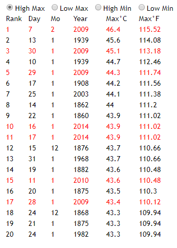
“There is no significant change over this time in the hottest day temperature.”
I disagree. I did a study here, also in 2014. It has an active plot showing summer days in Melbourne going back to 1856. Unfortunately, I can’t show much here without the active features. But I did a summary of the 20 hottest days ever recorded here. Of those, seven were in the last five years, and are shown in red:
40% of the top five were in 1939. Three of the top ten were over a century ago. Looks to me like 2009 had a heat wave at the end of January, and other than that the days are pretty well distributed.
Nick Stokes,
And just what year was it, …… between 1856 and 2014, …… that the temperature recording weatherperson in Melbourne, Australia, first started using calibrated and certified thermometers that were accurate to 1/10th of a degree C, …… or 1/100th of a degree F?
And the 2nd question, ……. exactly for what purpose were they recording those daily temperatures, way back then between 1865 and 1940?
And the 3rd question, …….whatever that purpose was, which I am sure you will tell us, …… did it really matter if those daily recorded temperatures were plus or minus (+/-) 1 or 2 degrees of actual?
I mean like, did they not also have a “heat island” problem with the placement of their thermometers that began in 1865 …… but was not considered a problem until say post-1960 ….. when global, regional and/or local “average temperature increases” became the “HOT topic noted as the CAGW science of the 20th Century”?
“1/100th of a degree F?”
Well, that’s my conversion from C. But before about 1974 they were measured in F. I have since childhood been aware of Black Friday, 1939, when there were terrible bushfires. And the temperature quoted was always 114.1°F.
Q 2. Daily temperatures were reported in the press from way back. For the 1908 event, I looked up the papers of the time. It was part of a six-day heatwave that was front page news.
As tho placement of thermometers, I think that may be a factor in the several nineteenth century values, which are pre-Stevenson screens. On accuracy, the 1908 press reported not only the official numbers, but also various other measures around the town (which did, of course, vary).
IPCC put 1951 as the start of global warming accounting. Prior to 1951 ten years come under the 20 years list but occurred in 9 years [1939 two values] and after 1951 ten years come under the 20 year list but occurred in 6 years [2009 four values, 2014 two values]. Heat is more in many years prior to 1951. India experienced worst droughts in 2002 and 2009 with 81% and 79% of average. As a result recorded higher temperatures over the average by 0.7 and 0.9 oC at all India level.
Rainfall [inches to millimeters] and temperature oF to oC] measurement units changed in 1957!!!
Dr. S. Jeevananda Reddy
Nick Stokes,
you basically ignored all 3 of my questions and responded with tripe n’ piffle comments of little to no value to the discussion of the above commentary published by Paul H.
Now I don’t know anything about Melbourne’s temperature records dating back to 1865 ……. but I am damn sure that they are no more accurate than “+ or – 2 degrees of actual” ….. than is the US temperature record dating back to February 9th, 1870.
“DUH”, for the first 80 years or so, post-1870, near-surface temperatures were measured and recorded for the primary purpose of “short term” (3 to 5 day) weather forecasting …… and were of little to no value after that.
Nick Stokes, …….. please, ….. no more tripe n’ piffle rhetoric, …… just the “facts” as denoted in the following, to wit:
Only some were pre-Stevenson screens. I have seen old photographs showing some with Stevenson screens.
Of course, old measurements should carry greater uncertainty error bounds when compared to that of modern temperatures. However, sometimes the data sets show the very opposite with respect to error bounds.
Cold can be deadly – even during the summer – as exceptionally many Alpinists have discovered this year.
I recall rgbatduke of Duke Uni pointing out that every state record in the US still has 1937(?) as the highest temp recorded. Yellowgrass, Saskatchewan still holds the record high for Canada at 45C in July 1937. And a lot of other cities in Canada had their highest st that time.
Yep, but if you go to that same station in the homogenized product you will find that the high is no where near there because that was inconvenient to the researchers’ future grant requests.
They should also edit out the appeal to their ignorance fallacy with the “there is no other explanation”. It’s a fallacy anyway, but in fact there are other explanations. Here is one: http://eaps4.mit.edu/research/Lorenz/Chaos_spontaneous_greenhouse_1991.pdf ‘spontaneous climatic variation’
Just saying they are not smart enough…to do the things they claim they can do
This temperature profile is the thing that has really been suppressed:
The CAGW charlatans had to get rid of this temperature profile, otherwise they couldn’t say “hotter and hotter” every year, and pretend we were experiencing unprecedented hot weather, to they modified the charts into Hockey Stick charts that made it appear that temperatures have been steadily climbing for decades instead of the real world where temperatures climb for a few decades and then decline for a few decades and then climb again.
The Hockey Stick charts are a big, expensive Lie, and this draft special report confirms it.
In order to tell if you are looking at a Hockey Stick chart just look at the position of the 1930’s and 1998. If the 1930’s do not show to be hotter than 1998, then you are looking at a Hockey Stick chart.
And in the satellite measurement era (1979 to present) look for 1998 again, and if 1998 shows to be cooler than any subsequent year but 2016, then you are looking at a Hockey Stick chart.
Hockey Stick charts have been modified to promote the CAGW narrative. They do not represent reality. They are lies that have caused great harm to humanity and it’s not over yet, but the beginning of the end may be near.
“including” 2016.
TA.
What is the source of the plot.
When was it published, and what is the smoothing?
Is it covering just the US, or the Northern Hemisphere?
I don’t have time today to dig into this, but note that the Y-axis on this graph:

is a ratio of High::low. I recall that in the 1930s, they set many records for both highest and lowest temperatures, sometimes in the same month*. A defensible reason for using a ratio is to accomodate the steady decline in extremes one would expect in a purely random sequence, but the number set in the 1930s exceeded those set in the 1920s. The 1930s were one weird, extreme decade. Whenever I see a temperature graph that leaves them out I wonder what they’re hiding.
*: see my https://wattsupwiththat.com/2015/03/08/1934-2015-a-tale-of-two-februaries/
This shows a 1930s spike: https://wattsupwiththat.com/2012/07/14/newly-found-weather-records-show-1930s-as-being-far-worse-than-the-present-for-extreme-weather/
This leaves out the 1930s (and 1940s): https://www2.ucar.edu/atmosnews/news/1036/record-high-temperatures-far-outpace-record-lows-across-us
Oh! we covered that report: https://wattsupwiththat.com/2009/11/16/why-ncars-meehl-paper-on-highlow-temperature-records-is-bunk/
It has this graph for western states:
Ric,
It seems to me that the ratio plot tends to hide more information than it explains. By what extent are the ‘record highs’ exceeding previous records? If the claims are for a fantastical 0.001 degree F or some other similar indefensible amount, then the ratio is really meaningless!
the ratio means nothing. the weather was more extreme in the 30s, so the ratio was lower. the weather is LESS extreme now, so the ratio is higher. it says nothing about warming or cooling because it was, on average, warmer in the 30s. notice how they say the trend from the 60s because if you say from the 30s the trend would be down..
the people who do those graphs should be ashamed of themselves. it really is pathetic. it really does reinforce the sceptics position of being sceptical of the presenters of global warming. this sort of thing only harms the alarmists cause. because they themselves produce this material, the future cannot be rewritten. it means they WILL fail at making their viewpoint an understanding.
If one were to make these ratios a little more meaningful, they could be weighted by the amount of the increase (or decrease) over previous records.
The people who thought of using ratios on the Y-Axis are probably insufferably pleased with themselves and may have gotten a small bonus and pat on the back from the Director of the Ministry of Truth. They are definitely not ashamed of themselves.
But they should be ashamed of themselves. 🙂
What that ratio shows, when read in the context of the other graphs of max temperatures and min temperatures, is that the max temperatures are steady, while the min temperatures are rising (probably due to urban heat island effect). When the min increases, there are fewer record lows so the ratio of the the max to min goes up, even if there are fewer record max temps today than in the past. The casual reader, however, will look at the graph and conclude that many more max temperature records were set in the last decade than in the 1930’s, which, I suspect, is the point of using the ratios.
Ric
I think one of the factors is that there are less cold records nowadays – hardly surprising as there were some really cold periods in the early 20thC , and later in the 1970s.
That alone would push up the ratio, without needing any extra hot records
Steven Goddard explains this at length.
He has a very good video on this (save for his over colourful language).
“Even in the UK for instance, we find that Faversham, which set the supposed record UK temperature in 2003, only has continuous data since 1998., making such claims utterly meaningless.”
Given the size of the UK and the number of recording stations and the long period of recording, it is completely impossible that Faversham had an earlier higher record, or that one was somehow missed elsewhere in the UK.
Paul has frequently tried this one on – notably dismissing record rainfalls in Cumbria as the stations had not been operating for a long period of time.
The fact is, if it is record rain or temp in the UK, it is a record and this idea length of establishment of the station measuring somehow invalidates it is just nonsense
Rubbish!
There are many more recording sites these days, and it is inevitable that some, like Faversham, will be in hot spots where temperatures tend to be higher than surrouding localities purely due to local factors.
Even NOAA won’t count stations with less than 30 years of data:
https://www.ncdc.noaa.gov/cdo-web/datatools/records
And that is arguably much too short
BTW – re the Cumbria rainfall records – Griff is being rather misleading here. The issue was that the new rainfall measuring site (with just a few years of data) just happened to be halfway up a mountain, where rainfall amounts tend to be much higher than down in the valley where most historical data was collected
It was hot that day nonetheless, I remember it well; some fresh lime plaster at St Peter, Oare cracked leading to an awkward conversation about our decision not to underpin the Saxon foundations. Perhaps Griff is on to something!
It would appear that Faversham is not a well sited station. Not surprising given the density of population in the UK. ?version=
The station webcam suggests that it is located very close to housing so I guess that there there is a large element of UHI which can, in absolute terms, increase temperature by up to 8 degC
It would be much more impressive if that record had been set at a rural located weather station.
I have to agree with Griff on this, a regional record temperature or rainfall is a regional record regardless of how long the station recording it has been in service. In fact, I will take it a step further and say that the idea of requiring a 30 year station length before considering the data valid is ludicrous. I would think that there are few, if any, stations that have had no change in instrumentation, nearby land use ,or urban encroachment over a thirty year period. All a thirty year record indicates is that you are probably not measiuring the same climate that you were thirty years ago. Of course, the fact that land use changes and urban encroachment are inducive to a warming temperature record is but a convenient artifact of this requirement. Go figure.
Yes, but as I note amplified by the effects of UHI. It is sited very close to housing. Lots of concrete radiating heat and curbing wind/air mixing.
It is not an impressive record.
This may be another clear indicatior that UHI is the major culprit. UHI is known to increase night time temperatures more than it affects daytime highs.
Sorry for the pet peeve but “being less cold records nowadays” should be “being fewer cold records nowadays.”
Check the section on Tornadoes. I like how they manage to avoid saying that the overall number of volcanoes have declined and instead turn it into a DAILY INCREASE when they do occur. You have to dig down in the foot notes to find the graphs showing they are on a long term decline.
That segment alone highlights what the report is intended for.
Presume “volanoes” = “tornados”
An interstadial warmer wetter world will be warmer on the cold end but stay about the same on the hotter end. Probably because of an increase in night time cloud cover/water vapor, again an expected event in a warmer wetter greener world. System normal. Enjoy the plant life while it lasts.
“Enjoy the plant life while it lasts and thanks for all the fish.”
Richard Lindzen discusses some of the early temperature data in a lecture available on Youtube. He shows a graph of the data used by Stanley Grotch to illustrate how deeply the signal is buried in noise.
https://geoscienceenvironment.wordpress.com/2016/06/12/temperature-anomalies-1851-1980/
That reference deserves greater attention. It shows how to do a good analysis of temperature anomaly data.
Here are two of the plots of that temperature anomaly data showing the real amount of noise in the data.
https://enthusiasmscepticismscience.wordpress.com/global-temperature-graphs/slgrotchafterlindzen/
Bring in the EEs to do the signal filtering of cycles for AMO, solar, and shorter cycles. No one else seems competent at this cycle stacking problem and its not getting any better.
CO2’ers love to torture statistics until it talks. It is a mistake others use as well on the other side of the debate. However, climate is back of the envelope simple. Look back at the weather for say the past 10 years. If it is warmer and wetter at night, grow lots of food, freeze dry a bunch of it, take trips to see the sights up North, and thank God you live in that world. If it is colder and drier at night, pack the winebago and move South, it’s gonna get nasty.
The CSSR “climate report” is an embarrassment in and of itself.
Bruce,
It is a good thing that it is embargoed and isn’t being shared! /sarc
Rising nightly low temperatures with little increase in daytime highs seems a hallmark of the Urban Heat Island effect. If the Climate Reference Network fails to show the same effect, what we have here is deeply embedded defect in the temperature measurement system. It’s showing a response to land use change, not climate change.
It’s showing a response to land use change, not climate change.
=================
humans have gone from using 4% of the land surface 150 years ago, to using 40% of the land surface today. our cities alone now use 4% of the land surface.
if you have lived in a city for any length of time you know that the climate changes as the city grows. yet this simple fact has mostly escaped climate science.
the correlation between climate change and humans is population size, not CO2. The rate of change in temperatures has not followed the accelerating growth in CO2, rather it has followed the slowing growth in population.
The Pause is a result of changes in population, not changes in CO2.
Most of global warming (temperature rise) is due to Arctic getting warmer.
This is supposedly is due to Arctic’s Ocean release of methane and rise of the anthropogenic CO2.
But is it?
“Methane released from the seafloor and transported to the atmosphere has the potential to amplify global warming. At an arctic site characterized by high methane flux from the seafloor, we measured methane and carbon dioxide (CO2) exchange across the sea−air interface. We found that CO2 uptake in an area of elevated methane efflux was enhanced relative to surrounding waters, such that the negative radiative forcing effect (cooling) resulting from CO2 uptake overwhelmed the positive radiative forcing effect (warming) supported by methane output. …. These areas of methane seepage may be net greenhouse gas sinks.”
http://www.pnas.org/content/114/21/5355.abstract
Science ain’t going to be settled any time soon.
>>Most of global warming (temperature rise) is
>>due to Arctic getting warmer.
Which could also be a product of Arctic albedo reductions, due to European, American and now Chinese industrial soot and dust. Albedo reductions can significantly increase insolation absorption.
Ralph
I don’t know if anyone can say for sure that the Arctic is warming. There are only a few thermometers above the N80th parallel and satellites are only capable of reading temperatures to the 80th parallel. The warming we see in GISS and NOAA is manufactured. Just like the other 40% of estimated temperatures that are input into the climate history.
If you use sea ice as an indicator; then we are at the same temperature we were at in 1975.
More moderate temperatures just doesn’t sound scary enough to keep funding the Apparat.
When I see – ‘DO NOT CITE, QUOTE, OR DISTRIBUTE’, I wonder what has happened to science and why today’s science should invoke secrecy. Surely it should be an open, transparent invitation to discuss, debate and examine.
It’s not secrecy. As noted in another thread, it was on the web for discussion. It’s just a practical measure to ensure that there isn’t a whole lot of stuff being quoted as in the report, when it doesn’t make it to the final version.
Let’s hope the final version is allowed to see the light of day.
“Let’s hope the final version is allowed to see the light of day.”
Don’t worry. Obama is out of office.
“as far as the US is concerned, we are certainly not seeing hotter days.”
We are not seeing hotter maximums on average. But the metric for what year has hotter days versus another year is in most people’s mind the average temperature. And the average temperature has been increasing (if you believe the manipulated data) over the last 50 years in the US so we ARE seeing hotter days according to our temperature record data. What the plot is showing is the maximum temperatures for a year are not increasing, indicating less variation, and more stable weather. So the significance of that plot is more that it is evidence against climate change causing more severe weather than it is about the weather not getting hotter.
I have never understood the assertion that warmer temperatures mean more weather extremes. I get the energy part and warmer air holds more water, but where I live (Southern CA) the summers are extremely stable compared to winters. In winter there are many more storms, bigger swings in daily temperatures and bigger changes in wind speeds than there is in the summer. So it seems to me warmer weather would be more stable, from the vantage point of my little corner of the world.
“I have never understood the assertion that warmer temperatures mean more weather extremes.”
I also have never understood this. Given that energy is radiated in proportion to the fourth power of its temperature, the more temperatures rise, the more that the earth uses radiation to exchange heat internally (and releases it to space). I would think that this would mean that less heat is moved around via convection and conduction, which is where the weather extremes come from. In other words, the higher the temperature, the more efficient the Earth gets at radiating away the energy temporally, and climate is nothing more than the phenomena that occur as the Earth churns heat around before it is radiated to space.
Hurry, hurry read all about it. Winter getting warmer!
Clearly statistics can lie. Only now it is called “Fake News”. Clearly record warm temperatures are fake news, because the warming is in winter, not in summer.
Unfortunately, the graph fails to mention that the record warm temps are in winter. The reader assumes that the graph is talking about record warm temps in summer, because only an idiot would worry about winters getting warmer.
In a sane world, record warm temperatures in winter would be seen as a good thing. However, in the world of climate change, warmth in winter has now become a cause for alarm.
I’d like to see the regional models replicate the temperature graph of the USA 🙂
Like HAL 9000, computer models go insane when asked to lie.
Then IPCC has to be changing computers every ten minutes…
The decrease in daytime highs is especially at odds with the claims made (right in the section that deleted the charts of daytime highs) that rising global trmperatures are accentuated by an increase in extreme events. With average warming being so meager the alarmists need that accentuation claim but it is contradicted on the most fundamental measure of variability: whether highs are getting higher. Not many people USED to know that. Thanks Paul.
most fundamental measure of variability.
===========
climate science is forever using averages, but nowhere do we see variance (standard deviation) quoted. Yet variance is the statistical measure that tells you if climate is becoming more extreme. When we look at variance, climate is not changing. It is not becoming more extreme.
http://www.g-feed.com/2012/08/is-temperature-variance-changing.html
http://4.bp.blogspot.com/-JsqpxZWtlBw/UD0fchlvTYI/AAAAAAAAAF4/tC5wLr9TttE/s400/donat.fig1.jpg
The Left’s tool box contains two tools: lie, and hide the truth. These work quite well with a partially brain-dead public. Thank God for publications such as WUWT, that pull back the curtain and expose the charlatans.
Who edited the report and deleted the graph from the Executive Summary ?
Australia does the opposite they delete colder days in their climate fudge reports .
The new “progressive ” scientific method is delete anything that doesn’t agree with the
directed hypothesis . Hide the decline anyone .
We in Houston had some hot weather in the 1960s. I remember how we anxiously awaited the mid-September break in the heat. For example, according to the KHOU temperature records, August was pretty warm. Vide:
From Aug 5 through 12 (degrees F): 97,98,100, 100,105,102,100, 102.
Us old-timers remember how hot it was before we got global warming.
Don’t forget the EPA’s statistics for Heat Waves. The ratio between 1930’s and now is 2010 is 4x. https://www.epa.gov/climate-indicators/climate-change-indicators-high-and-low-temperatures


EPA also has a graph that show hot daily highs were at their highest in the 30’s though the smoothed version doesn’t and the hot daily lows are much higher.
And changes in Unusually hot Temps
The EPA heat wave index chart deserves greater attention. I’ve seen many references over the years that confirm that the 1930s were the warmest decade of the 20th century.
Downloaded and have now read the whole thing. IPCCish. The attribution section is just awful. (1) The warming from ~1920-1945 is essentially indistinguishable from ~1975-2000. AR4 WG1 SPM figure SPM.4 specifically said the former period was mostly natural; just not enough rise in GHG to be explanatory. Well, natural variation did not magically stop in 1975. See my guest post on ‘Why Models run Hot for details. (2) This century comprises about 35% of the rise in CO2 since 1958 (Keeling curve), yet except for the now cooled 2015-2016 El Nino blip has seen no warming except by Karlization.
Trump should can this entire draft 2018NCA garbage prepared under Obama on those two grounds alone. I sent a similar comment directly to Trump at WH and Pruitt at EPA last evening. Wish he had already filled the OSTP position, because that would have been the most logical place to send the comment.
Or publish a final one, by the Red Team, concluding correctly that there is no evidence for global, man-made “climate change”.
“Who edited the report and deleted the graph from the Executive Summary ?”
Isn’t hiding or concealing data a federal offense? I understand it has no consequence under the lawless Obama’s administration but how the Trump administration still gives a pass to such malpractice ?
We would be much better off without executive summaries.
Paul Homewood, thank you for the essay.
ditto. I have downloaded it to reread at leisure.
I keep going back to this plot of UAH grid temperature data which shows temperature increase distributed by latitude. Consistent with others already presented the Report is flawed or intentionally distorts the data..
Studying it makes it clear that the data shows no significant warming in the Latitudes of the USA and the small warming trend is actually decreasing.
What am I missing?
Are they ignoring UAH?
I should have said USA “mainland”
Catcracking,
Everyone knows that hot air rises so it should come as no suprise that the northern latitudes are warming the most.
/sarc
I apologize if this has already reported elsewhere that the NYT has been forced to issue an embarrassing correction. Delete if already covered.
http://legalinsurrection.com/2017/08/fake-news-alert-new-york-times-issues-epic-climate-change-scoop-correction/
“Now, the newspaper has been forced to issue a very public, and quite embarrassing, correction.
Turns out, the draft report has been publicly available for seven months, meaning the Times “scoop” was no scoop at all.
The Times’s front-page story said that scientists were worried that the Climate Science Special Report — a multi-agency report that lays the blame for climate change on human activity — “would be suppressed” by the Trump administration, as cabinet members have expressed skepticism that humans are causing global warming.
But, as with many reports from federal agencies, there is a period of public comment before a final report is issued. The third order draft, which the Times had falsely hyped as an exclusive of unpublished material, has been publicly available since January on the Internet Archive.
The Internet Archive — also known as The Internet Wayback Machine Archive — is a San Francisco–based nonprofit digital library.
In its correction, the red-faced Gray Lady wrote: “An article on Tuesday about a sweeping federal climate change report referred incorrectly to the availability of the report. While it was not widely publicized, the report was uploaded by the nonprofit Internet Archive in January; it was not first made public by The New York Times.”
The heat of the embarrassment is so hot that I swear I feel it in California!
Robert Kopp, a climate scientist at Rutgers University, is listed on the report as among the lead authors. The story started to unravel when he indicated that the report had already been made public”
Given circumstances like this are coming up all the time it would seem that more and more scientists would start to question their commitment to this effort. How much longer are they willing to come up with bogus reasons or intentionally hide data they know refutes what they are saying? I would like to think we have reached a turning point where integrity will start to kick in.
JohninRedding – can you elucidate what you are talking about? What circumstances? What effort? What hidden data that refutes their public pronouncements? We want to know!
Catcracking: Kopp at Rutgers. Rutgers, huh? Just up the road from NOAA/GFDL. ‘Nuff said?
“Climate Change”. Of course it does. Always has.
But when “they” say that they really mean “Man-Made Climate” change.
If that isn’t what they mean, they why should Government take any action to try to prevent it?
“Everybody complains about the weather but nobody does anything about it.” was a common phrase. Nobdy does anything about it because nobody CAN.
All that can be done is prepare for it.
But, having said that, I do have proof that Man has changed the climate for may little spot on the globe.
Well, at least the “climate” regarding record high an low temperatures for my little spot on the globe.
PS I latter obtained the 2002 list of record highs and lows and compared it with the 2007 list. There were not changes.
Man-made change is REAL!
PS What prompted me, Mr. Layman, to get these record and compare them was all the hype about WARMING generated Al’s original and The Weather Channel. (This was years before i found WUWT.)
Back then TWC on their “Local on the Eights” they would report the record high and low for the day.
Over time I was left with the impression that, if Gore was right, my local record highs should be more recent.
Just an impression.
I got the numbers. They weren’t more recent.
He’s lying … er … just being the Gore I knew but would never vote for or believe because of that.
The maps of the United States in the Draft (cooler highs, warmer lows) seem to be just a reflection of humidity levels. A coast has much more consistent temperatures than a desert.
The 1930’s had the highest temperatures in the US, which is consistent with the low humidity/no rain Dust Bowl. Posters above have also shown this was true in other parts of the world.
Maybe we are just looking at changing weather patterns due to something like ocean circulation.
Once you enact a scheduled timely government report of any nature, its going to present itself in a manner to be rescheduled timely for the future reporting.
The highest official temperature in Norway (35,6 °C) was in 1970, with second Place (35,0 °C) in 1897, 1901 and 1975…..
So if I understand this correctly, we’re not getting warmer, we’re getting less cool, and since the average is calculated as Tmin and Tmax, as Tmin increases, so does the average.
Extrapolating from that, we’re actually have LESS extreme weather. There is less “change” from highs and lows, and we’re converging on an longer-term average. That would seem to go hand-in-hand with the reduction in cyclones/hurricanes and tornadoes. Less extreme weather events.
Given the huge amounts of money and policy implications isn’t it past time certain ‘reports’ were passed under sworn oath in court? Subsequent analysis that discovered material falsehoods (as per the graphs which are simply incorrect and clearly designed to mislead) would lead to perjury charges – with commensurate penalties.
This is a whole world away from speculative or research science. If scientists wish to merely produce a ‘report’ but do not want to swear to its veracity under oath the ‘report’ could be treated as speculation and left at that.
The ‘97%’ papers are perfect examples of activist-driven pre-determined rubbish being accepted as truth, when they’re plainly nothing of the sort.
The problem here is climate ‘science’ treats every last alarmist utterance as gospel even when it’s plainly activist junk, with the questionable main motive of securing more funding. Time to hold those people to account with a veracity reference system that has teeth.
The bastardisation of science is the loser here, the man in the white coat is a joke. Shame.
Are the contributors to this thread getting a bit detached from “Climate”. The postings seem to be exclusively referring to single day events, which in my understanding is “Weather”, and is known to be a bit more variable than multi-day or multi-month observations.
What are we supposed to be writing or reading about?
Have I missed something essential in the early part of this thread?
Not sure if you missed anything or not.
My comment had to do with “changes” made to daily records for one little spot on the globe going back to the 1880’s.
Who knows how many “spots on the globe” have had their records changed.
Who knows if to “old” or the “new” records are being used when the attempt to scare us about (Man-made) “Climate Change”?
Sorry for my density, but can you just say plainly, clearly and briefly what was edited out?
This should be obvious from a quick read, but, for me, it is NOT. Get to the point sooner.
There needs to be accountability and proper open peer review, not pal review. Publications that have denied the rights of other scientists to respond and bring science into disrepute should face a fine that should put them all out of business. Climate Gate is a good place to start, using proven fake data to fit the ill-conceived hypothesis, thereby obtaining funds by deception.