Guest Essay by Kip Hansen

This essay is the third and last in a series of essays about Averages — their use and misuse. My interest is in the logical and scientific errors, the informational errors, that can result from what I have playfully coined “The Laws of Averages”.
Averages
As both the word and the concept “average” are subject to a great deal of confusion and misunderstanding in the general public and both word and concept have seen an overwhelming amount of “loose usage” even in scientific circles, not excluding peer-reviewed journal articles and scientific press releases, I gave a refresher on Averages in Part 1 of this series. If your maths or science background is near the great American average, I suggest you take a quick look at the primer in Part 1 then read Part 2 before proceeding.
Why is it a mathematical sin to average a series of averages?
“Dealing with data can sometimes cause confusion. One common data mistake is averaging averages. This can often be seen when trying to create a regional number from county data.” — Data Don’ts: When You Shouldn’t Average Averages
“Today a client asked me to add an “average of averages” figure to some of his performance reports. I freely admit that a nervous and audible groan escaped my lips as I felt myself at risk of tumbling helplessly into the fifth dimension of “Simpson’s Paradox”– that is, the somewhat confusing statement that averaging the averages of different populations produces the average of the combined population.” — Is an Average of Averages Accurate? (Hint: NO!)
“Simpson’s paradox… is a phenomenon in probability and statistics, in which a trend appears in different groups of data but disappears or reverses when these groups are combined. It is sometimes given the descriptive title reversal paradox or amalgamation paradox.” — the Wiki “Simpson’s Paradox”
Averaging averages is only valid when the sets of data — groups, cohorts, number of measurements — are all exactly equal in size (or very nearly so), contain the same number of elements, represent that same area, same volume, same number of patients, same number of opinions and, as with all averages, the data itself is physically and logically homogenous (not heterogeneous) and physically and logically commensurable (not incommensurable). [if this is unclear, please see Part 1 of this series.]
For example, if one has four 6th Grade classes, each containing exactly 30 pupils, and wished to find the average height of the 6th Grade students, one could go about it two ways: 1) Average each class by summing the heights of the students then finding the average by dividing by 30, then summing the averages and dividing by four to get the overall average – an average of the averages or 2) combine all four classes together in one set of 120 students, sum the heights, and divide by 120. The results will be the same.
The contrary example is four classes of 6th Grade students, each of differing sizes — 30, 40, 20, and 60. Finding four class averages and then averaging the averages gives one answer — quite different from the answer if one summed the height of all 150 students and divided by 150. Why? It is because the individual students in the class with only 20 students and the individual students in the class of 60 students will have differing, unequal effects on the overall average. For the average to be valid, each student should represent 0.66% of the overall average [one divided by 150]. But when averaged by class, each class then accounts for 25% of the overall average. Thus each student in the class of 20 would count for 25%/20 = 1.25% of the overall average whereas each student in the class of 60 each count for only 25%/60 = 0.416% of the overall average. Similarly, students in the classes of 30 and 40 each count as 0.83 % and 0.625%. Each student in the smallest class would affect the overall average twice as much as each student in the largest class — contrary to the ideal of each student having an equal effect on the average.
There are examples of this principle in the first two links for the quotes that prefaced this section. (here and here)
For our readers in Indiana (that’s one of the states in the US), we could look at Per Capita Personal Income of the Indianapolis metro area:

This information is provided by the Indiana Business Research Center in an article titled: “Data Don’ts: When You Shouldn’t Average Averages”.
As you can see, if one averages the averages of the counties, one gets a PCPI of $40,027, however, aggregating first and then averaging gives a truer figure of $40,527. This result has a difference — in this case an error — of 1.36%. Of interest to those in Indiana, only the top three earning counties have PCPI higher than the state average, by either system, and eight counties are below the average.
If this seems trivial to you, consider that various claims of “striking new medical discoveries’ and “hottest year ever” are based on just these sorts of differences in effect sizes that are in the range of single digit, or even a fraction of, percentage points or a tenth or one-hundredths of a degree.
To compare with climatology, the published anomalies from the 30-year climate reference period (1981-2011) for the month of June 2017 range from 0.38 °C (ECMWF) to 0.21°C (UAH) with the Tokyo Climate Center weighing in with a middle value of 0.36°C. The range (0.17°C) is nearly 25% of the total temperature increase for the last century. (0.71°C). Even looking at only the two highest figures, 0.38°C and 0.36°C, the difference of 0.02°C is 5% of the total anomaly.
How exactly these averages are produced matters a very great deal in the final result. It matters not at all whether one is averaging absolute values or anomalies — the magnitude of induced error can be huge
Related, but not identical, is Simpson’s Paradox.
Simpson’s Paradox
Simpson’s Paradox, or more correctly the Simpson-Yule effect, is a phenomenon that occurs in statistics and probabilities (and thus with averages), often seen in medical studies and various branches of social sciences, in which a result (a trend or effect difference, for example) seen when comparing groups of data disappears or reverses itself when the groups (of data) are combined.
Some examples of Simpson’s Paradox are famous. One with implications for today’s hot topics involved claimed bias in admission rations ratios for men and women at UC Berkeley. Here’s how one author explained it:
“In 1973, UC Berkeley was sued for gender bias, because their graduate school admission figures showed obvious bias against women.

Men were much more successful in admissions than women, leading Berkeley to be “one of the first universities to be sued for sexual discrimination”. The lawsuit failed, however, when statisticians examined each department separately. Graduate departments have independent admissions systems, so it makes sense to check them separately—and when you do, there appears to be a bias in favor of women.”

In this instance, the combined (amalgamated) data across all departments gave the less informative view of the situation.
Of course, like many famous examples, the UC Berkeley story is a Scientific Urban Legend – the numbers and mathematical phenomenon are true, but there never was a gender bias lawsuit. Real story here.
Another famous example of Simpson’s Paradox was featured (more or less correctly) on the long-running TV series Numb3rs. (full disclosure: I have watched all episodes of this series over the years, some multiple times). I have heard that some people like sports statistics, so this one is for you. It “involves the batting averages of players in professional baseball. It is possible for one player to have a higher batting average than another player each year for a number of years, but to have a lower batting average across all of those years.”
This chart makes the paradox clear:

Each individual year, Justice has a slightly better batting average, but when the three years are combined, Jeter has the slightly better stat. This is Simpson’s Paradox, results reversing when multiple groups of data are considered separately or aggregated.
Climatology
In climatology, the various groups go to great lengths to avoid the downsides of averaging averages. As we will see in comments, various representatives of the various methodologies will weight weigh in and defend their methods.
One group will claim that they do not average at all — they engage in “spatial prediction” which somehow magically produces a prediction that they then simply label as the Global Average Surface Temperature (all while denying having performed averaging). They do, of course, start with daily, monthly, and annual averages — but not real averages…..more on this later.
Another expert might weigh in and say that they definitely don’t average temperatures….they only average anomalies. That is, they find the anomalies first and then average those. If pressed hard enough, this faction will admit that the averaging has long before been accomplished, the local station data — daily average dry bulb temperature — is averaged repeatedly, to arrive at monthly averages, then annual averages, sometimes multiple stations are averaged to achieve a “cell” average, and then these annual or climatic averages are subtracted from the present absolute temperature average (monthly or annual, depending on the process) to leave a remainder, which is called the “ anomaly” — oh, then the anomalies are averaged. The anomalies may or may not, depending on system, actually represent equal areas of the Earth’s surface. [See the first section for the error involved in averaging averages that do not represent the same fraction of the aggregated whole]. This group, and nearly all others, rely on “not real averages” at the root of their method.
Climatology has an averaging problem but the real one is not so much the one discussed above. In climatology, the daily average temperature used in calculations is not an average of the air temperatures experienced or recorded at the weather station during the last 24 hour period under consideration. It is the arithmetic mean of the lowest and highest recorded temperatures (Lo and Hi, the Min Max) for the 24 hour period. It is not the average of all the hourly temperature records, for instance, even when they are recorded and reported. No matter how many measurements are recorded, the daily average is calculated by summing the Lo and the Hi and dividing by two.
Does this make a difference? That is a tricky question.
Temperatures have been recorded as High and Low (Min-Max) for 150 years or more. That’s just how it was done, and in order to remain consistent, that’s how it is done today.
A data download of temperature records for weather station WBAN:64756, Millbrook, NY, for December 2015 through February 2016 gives temperature readings every five minutes. Data set includes values for “DAILYMaximumDryBulbTemp” and “DAILYMinimumDryBulbTemp” followed by “DAILYAverageDryBulbTemp”, all in degrees F. DAILYAverageDryBulbTemp is the arithmetical mean of the two preceding values (Max and Min). It is this last that is used in climatology as the Daily Average Temperature. A typical December day the recorded values look like this:
Daily Max 43 — Daily Min 34 — Daily Average 38 (the arithmetic mean is really 38.5, however, the algorithm apparently rounds x.5 down to x)
However, the Daily Average of All Recorded Temperatures is: 37.3….
The differences on this one day:
Difference between reported Daily Average of Hi-Lo and actual average of recorded Hi-Lo numbers = 0.5 °F due to rounding algorithm.
Difference between reported Daily Average and the more correct Daily Average Using All Recorded Temps = 0.667 °F
Other days in January and February show a range of difference between the reported Daily Average and the Average of All Recorded Temperatures from 0.1°F through 1.25°F to a high noted at 3.17°F on the January 5, 2016.

This is not a scientific sampling — but it is a quick ground truth case study that shows that the numbers being averaged from the very start — the Daily Average Temperatures officially recorded at surface stations, the unmodified basic data themselves, are not calculated to any degree of accuracy or precision at all — but rather are calculated “the way we always have” — finding the mean between the highest and lowest temperatures in a 24-hour period — that does not even give us what we would normally expect as the “average temperature during that day” — but some other number — a simple Mean between the Daily Lo and the Daily Hi, which the above chart reveals to be quite different. The average distance from zero for the two month sample is 1.3°F. The average of all differences, including the sign, is 0.39°F.
The magnitude of these daily differences? Up to or greater than the commonly reported climatic annual global temperature anomalies. It does not matter one whit whether the differences are up or down — it matters that they imply that the numbers being used to influence policy decisions are not accurate all the way down to basic daily temperature reports from single weather stations. Inaccurate data never ever produces accurate results. Personally, I do not think this problem disappears when using “only anomalies” (which some will claim loudly in comments) — the basic, first-floor data is incorrectly, inaccurately, imprecisely calculated.
But, but, but….I know, I can hear the complaints now. The usual chorus of:
- It all averages out in the end (it does not)
- But what about the Law of Large Numbers? (magical thinking)
- We are not concerned with absolute values, only anomalies.
The first two are specious arguments.
The last I will address. The answer lies in the “why” of the differences described above. The reason for the difference (other than the simple rounding up and down of fractional degrees to whole degrees) is that the air temperature at any given weather station is not distributed normally….that is, graphed minute to minute, or hour to hour, one would not see a “normal distribution”, which would look like this:

If air temperature was normally distributed through the day, then the currently used Daily Average Dry Bulb Temperature — the arithmetic mean between the day’s Hi and Lo — would be correct and would not differ from the Daily Average of All Recorded Temperatures for the Day.
But real air surface temperatures look much more like these three days from January and February 2016 in Millbrook, NY:

Air temperature at a weather station does not start at the Lo climb evenly and steadily to the Hi and then slide back down evenly to the next Lo. That is a myth — any outdoorsman (hunter, sailor, camper, explorer, even jogger) knows this fact. Yet in climatology, Daily Average Temperature — and all subsequent weekly, monthly, yearly averages — are calculated based on this false idea. At first, out of necessity — weather stations used Min-Max recording thermometers and were often checked only once per day, and the recording tabs reset at that time — and now out of respect for convention and consistency. We can’t go back and undo the facts — but need to acknowledge that the Daily Averages from those Min-Max/Hi-Lo readings do not represent the actual Daily Average Temperature — neither in accuracy or precision. This insistence on consistency means that the error ranges represented in the above example affect all Global Average Surface Temperature calculations that use station data as their source.
Note: The example used here is of winter days in a temperate climate. The situation is representative, but not necessarily quantitatively — both the signs and the sizes of the effects will be different for different climates, different stations, different seasons. The effect cannot be obviated through statistical manipulation or reducing the station data to anomalies.
Any anomalies derived by subtracting climatic scale averages from current temperatures will not tell us if the average absolute temperature at any one station is rising or falling (or how much). It will tells us only that the mean between the daily hi-low temperatures is rising or falling — which is an entirely different thing. Days with very low lows for an hour or two in early morning followed by high temps most of the rest of the day have the same hi-low mean as days with very low lows for 12 hours and a short hot spike in the afternoon. These two types of days to not have the same actual average temperature. Anomalies cannot illuminate the difference. A climatic shift from one to the other will not show up in anomalies yet the environment would be greatly affected by such a regime shift.
What can we know from the use of these imprecise “daily averages” (and all the other numbers) derived from them?
There are some who question that there is an actual Global Average Surface Temperature. (see “Does a Global Temperature Exist?”)
On the other hand, Steven Mosher so aptly informed us recently:
“The global temperature exists. It has a precise physical meaning. It’s this meaning that allows us to say…The LIA [Little Ice Age] was cooler than today…it’s the meaning that allows us to say the day side of the planet is warmer than the night side…The same meaning that allows us to say Pluto is cooler than Earth and Mercury is warmer.”
What such global averages based on questionably derived “daily averages” cannot tell us is that this year or that year was warmer or cooler by some fraction of a degree. The calculation error –the measurement error — of commonly used station Daily Average Dry Bulb Temperature is equal in magnitude (or nearly so) to the long-term global temperature change. The historic temperature record cannot be corrected for this fault. And modern digital records would require recalculation of Daily Averages from scratch. Even then, the two data sets would not be comparable quantitatively — possibly not even qualitatively.
So, “Yes, It Matters”
It matters a lot how and what one averages. It matters all the way up and down through the magnificent mathematical wonderland that represents the computer programs that read these basic digital records from thousands of weather stations around the world and transmogrify them into a single number.
It matters especially when that single number is then subsequently used as a club to beat the general public and our political leaders into agreement with certain desired policy solutions that will have major — and many believe negative — repercussions on society.
Bottom Line:
It is not enough to correctly mathematically calculate the average of a data set.
It is not enough to be able to defend the methods your Team uses to calculate the [more-often-abused-than-not] Global Averages of data sets.
Even if these averages are of homogeneous data and objects, physically and logically correct, averages return a single number which can then incorrectly be assumed to be a summary or fair representation of the whole set.
Averages, in any and all cases, by their very nature, give only a very narrow view of the information in a data set — and if accepted as representational of the whole, the average will act as a Beam of Darkness, hiding and obscuring the bulk of the information; thus, instead of leading us to a better understanding, they can act to reduce our understanding of the subject under study.
Averaging averages is fraught with danger and must be viewed cautiously. Averaged averages should be considered suspect until proven otherwise.
In climatology, Daily Average Temperatures have been, and continue to be, calculated inaccurately and imprecisely from daily minimum and maximum temperatures which fact casts doubts on the whole Global Average Surface Temperature enterprise.
Averages are good tools but, like hammers or saws, must be used correctly to produce beneficial and useful results. The misuse of averages reduces rather than betters understanding, confuses rather than clarifies and muddies scientific and policy decisions.
UPDATE:
[July 25, 2016 – 12:15 EDT]
Those wanting more data about the differences between Tmean (the Mean between Daily Min and Daily Max) and Taverage (the arithmetic average of all 24 recorded hourly temps — some use T24 for this) — both quantitatively and in annual trends should refer to Spatiotemporal Divergence of the Warming Hiatus over Land Based on Different Definitions of Mean Temperature by Chunlüe Zhou & Kaicun Wang [Nature Scientific Reports | 6:31789 | DOI: 10.1038/srep31789]. Contrary to assertions in comments that trends of these differently defined “average” temperatures are the same, Zhou and Wang show this figure and cation: (h/t David Fair)

Figure 4. The (a,d) annual, (b,e) cold, and (c,f) warm seasonal temperature trends (unit: °C/decade) from the Global Historical Climatology Network-Daily version 3.2 (GHCN-D, [T2]) and the Integrated Surface Database-Hourly (ISD-H, [T24]) are shown for 1998–2013. The GHCN-D is an integrated database of daily climate summaries from land surface stations across the globe, which provides available Tmax and Tmin at approximately 10,400 stations from 1998 to 2013. The ISD-H consists of global hourly and synoptic observations available at approximately 3400 stations from over 100 original data sources. Regions A1, A2 andA3 (inside the green regions shown in the top left subfigure) are selected in this study.
[click here for full sized image]
# # # # #
Author’s Comment Policy:
I am always anxious to read your ideas, opinions, and to answer your questions about the subject of the essay, which in this case is Averages, their uses and misuses.
If you hope that I will respond or reply to your comment, please address your comment explicitly to me — such as “Kip: I wonder if you could explain…..”
As regular visitors know, I do not respond to Climate Warrior comments from either side of the Great Climate Divide — feel free to leave your mandatory talking points but do not expect a response from me.
The ideas presented in this essay, particularly in the Climatology section, are likely to stir controversy and raise objections. For this reason, it is especially important to remain on-point, on-topic in your comments and try to foster civil discussion.
I understand that opinions may vary.
I am interested in examples of the misuse of averages, the proper use of averages, and I expect that many of you will have lots of varying opinions regarding the use of averages in Climate Science.
# # # # #
I’ll dissent a bit. There are situations where an average of averages are not only allowed, but necessary. In our re-evaluation of the sunspot group numbers with annual time resolution we first compute the average for each month, then the average of the 12 months. This is necessary because number of observations vary greatly from months to month, e.g. is usually much larger during the summer months [better weather].
Yes, but the point contained in your example is that each of the dataset sizes is also nearly constant. Equal weighted, so to say.
If you gave equal weight to the sunspot average of say a 2 week period, and another one that’s 4 months wide, then whatever of the average-of-averages is is nearly meaningless. If instead you use
A = 1/∑(N + M …) • ∑( N an, M am … )
or the WIDTH of the dataset, times the average of that dataset, for each dataset, then divided by the sum of the widths of the datasets …
What you get is exactly what you would get had all the individual data points of all the datasets (each with ‘width = 1’) been added, then divided by their count.
I think that’s what the OP was getting at. In some circumstaces (as per your example), averaging averages is perfectly OK in practice. But it is only OK because the weights of each average are nearly the same.
GoatGuy
What you get is exactly what you would get had all the individual data points of all the datasets (each with ‘width = 1’) been added, then divided by their count.
No, that is exactly not what to do. In each month the number of data points [their width or weight?] varies very much. Take the year 1713 where M.M. Kirch observing from Berlin found the following for each month: 1 (0,-), 2 (0,-), 3 (0,-1), 4 (0,-), 5 (10, 1,1,1,1,1,1,1,1,1,0), 6 (0,-), 7 (1, 0), 8 (1, 0), 9 (1, 0), 10 (2, 0,0), 11 (3, 0,0,0), 12 (1, 0), where m(n, s,s,s,s,…) is month m, number of observations n, and s,s,s,s,… the count of spots for each of the observations. When no observations were made, s was ‘-‘. The 12 monthly averages are now – – – – 0.9 – 0 0 0 0 0 0 and the annual mean is 0.9/12 = 0.075. The average of all observations would be 9/16 = 0.5625, which is not representative for the whole year. In all of this, the underlying basis is that sunspot numbers have very large ‘positive conservation’, or to use a more modern word: high autocorrelation.
lsvalgaard and GoatGuy ==> I’ll re-visit this later in the day…interesting application.
GoatGuy
“What you get is exactly what you would get had all…”
Indeed so. As you say, the answer is weighting, and people know how to do this. Kip doesn’t. He should learn.
The answer to Leif’s problem is proper infilling. I discuss that in some detail here and here.
Leif … we’re STILL arguing essentially the same point:
• when one has a regular, well-spaced (in time) sampling, then the bin-size of smaller averages is that bin’s average weight. Per my comment.
• when one has irregular (in time) sampling, then the small-bin average is itself subject to weighting each sample’s “duration” according to its span.
I’m pretty sure that you and I both actually agree on this, being scientists and respecting statistics. Indeed: I wasn’t really arguing with you, but rather pointing out the underlying weighting assumptions that you didn’t state, that made your premise work.
That’s all.
Weighting. Really important to embrace.
My only significant addition to your comment.
GoatGuy
“The answer to Leif’s problem is proper infilling.”
If, by infilling, you mean making up data, well, that’s been a standard practice in the global warming industry for a long time. How else do you come up with “record hottest year” for so many years in a row?
“The answer to Leif’s problem is proper infilling.”
I shouldn’t have been so nasty. I will say it a different way. I am only aware of two possible types of infilling: interpolation and transposition (my word for it).
Interpolation involves a mathematical curve fitting (usually simple averaging) of data points before and after the missing ones. I don’t believe that this method is used in climate applications. In any case, it is equivalent to averaging and therefore it is not valid to use such data points in an average, because that creates an average of averages.
Transposition involves taking data points from another (but assumed equivalent) series and inserting them into the missing positions. From recollection, the BOM takes data from up to 600 km away and uses it to calculate a substitute value when it doesn’t like the real data. It calls it “homogenisation” and is obviously an invalid thing to do.
This doesn’t seem right. What’s been done is a calculation of the average sunspots per observation per month. Then it’s stated that this “monthly” mean divided by 12 months is an annual mean. I’m hoping that either (1) you explained yourself poorly, or (2) I’ve misread you, rather than the calculations were actually done in that manner.
If one is looking at one year’s worth of sunspot observations, and one has monthly numbers of 0, 0, 0, 0, 9, 0, 0, 0, 0, 0, 0, and 0, then those are your monthly averages. They’re kind of useless since you’ve only one year’s worth of data, but 9 sunspots/June equals a 9 sunspots per June average.
Then, it seems, the error gets compounded by dividing the “monthly” average by 12 months and claiming that to be an annual average. This doesn’t even pass a basic sanity test: how can 9 sunspots be observed in one month, but claim that the annual mean was only 0.075 sunspots that year? What’s actually been calculated here is the average number of sunspots seen per observation for the year — not the annual mean of sunspots.
I did not explain myself clearly enough. The metric we are suing is the number of spots per day. If you observe every day and every day see one spot, the number of spots seen in e.g. January is 31, which when divided by the number of days, 31, gives 1, which is the average number of spots per day for that month. If you observe every day of June and see one spot every day, then the average number of spots per day for June is also 1, and so on for all the other months. The average of the twelve monthly ones is 1, which is the average number of spots per year for the year.. If you do not observe every day, but only, say, every other day, the monthly averages will still be 1, and so will the yearly average. This holds for any number of observations, down to the extreme case where you only observe the one spot on ONE day in the whole year: the yearly average is still 1 spot.
What’s actually been calculated here is the average number of sunspots seen per observation for the year — not the annual mean of sunspots.
The metric we are after is the average number of sunspots per observation. That is: if you take a random day of the year, how many spots would you see on average on the sun for that day. Just like with temperature: if you measure every day and the value is always 30 degrees, then the yearly average is 30 degrees, not 10950 degrees [=30*365]
“The metric we are suing ”
Another infestation of lawyers.
using…
He didn’t say it was NEVER valid:
“Averaging averages is only valid when the sets of data — groups, cohorts, number of measurements — are all exactly equal in size (or very nearly so), contain the same number of elements, represent that same area, same volume, same number of patients, same number of opinions and, as with all averages, the data itself is physically and logically homogenous (not heterogeneous) and physically and logically commensurable (not incommensurable). [if this is unclear, please see Part 1 of this series.]”
Being the Sun-the measurements represent the same area, same volume, same number of patients (1), and the data sets are equal (or very nearly equal) 30/31 days per month except Feb. Right?
Leif,
I think that an important point to be made is that procedures and caveats should be stated clearly. It seems to me that, basically, you are saying that there are practical considerations that make it impossible to state definitively what the actual number of sunspots is and you have to use a ‘best practices’ approach that is really an index that you believe has a high correlation with the actual number of sunspots. As long as you don’t try to claim that you are reporting the number of actual sunspots, which are ambiguous because of shape and resolution limits, and claim a high degree of precision in the average of the count, then no one is going to argue issues of precision. However, your problem of how to count coalescing features, or features that subsequently break apart, is not analogous to reading a temperature.
However, your problem of how to count coalescing features, or features that subsequently break apart, is not analogous to reading a temperature.
Since the result is a simple number for each observation, counting features is exactly analogous to reading a temperature: the result is just a number.
lsvalgaard ,
I respectfully disagree. While reading a temperature with a conventional mercury thermometer may require some subjectivity in assigning precision to a continuous scale, it is nothing like making the subjective decision that one is looking at one or two spots and assigning a discreet count to the decision. One is comparing irrational numbers with discreet integers.
Another reason why error bounds should always be calculated and stated accurately. Geoff
lsvalgaard ==> Now, I’m surprised to read you write that “The metric we are after is the average number of sunspots per observation. ”
That calculation is trivial — sum of all known observations/number if observations. Chop the data set into time intervals desired, same calculation.
So what is all the discussion about?
Personally, I don’t think that gives us much information about the Sun itself or Sunspots — but at least it avoids the perils of infilling unknown data with imagination.
That calculation is trivial — sum of all known observations/number if observations.
I went to some lengths to show that it is not trivial. Let me make an even simpler situation: In one month there are ten observations all of one spot. In the rest of the year there are only one observation per month, all of zero spots. The number we are after is then (1+0+0+0+0+0+0+0+0+0+0+0)/12 = 0.083, not 10/21.
Why is that? Because the 10 observations of the one spot are most likely all of the same spot which may have been the only one during that year. Same thing with temperature: imagine we only measure once a month except in one month (e.g. July) we measure every day and think about what the most representative value would be for the year..
Personally, I don’t think that gives us much information about the Sun itself or Sunspots
It gives us very much information about the sun because of the very high auto-correlation of the sunspot number. Even a single observation for a year is enough to tell us if solar activity is high or low for that year. And in some years that is about all we have.
lsvalgaard ==> I think the problem here is one of language. Your expanded description is something more along the line of:
Number of UNIQUE sunspots, per observation, per time period….
with UNIQUE being carefully defined as New, Never Counted Before, Sunspots.
So you do not really mean “The metric we are after is the average number of sunspots per observation.”
I knew there had to be something else in there, because that calculation is trivial. But that is not the metric you are after at all.
Can the others in this Sunspot thread help lsvalgaard write out a definition of the metric he is after?
It is not a question about language. It is a question about physics and the Sun. Imagine that the 10 observations of one spot in the month were made by 10 different observers, then for every observer the observation was of a UNIQUE sunspot. Many spots only live for a day or two, so we in general don’t know if a spot is new or an old one just living yet another day.
So you do not really mean “The metric we are after is the average number of sunspots per observation.”
No, that is not what we want. What we want is the average number of spots on the sun for a random day in a given year, even if on that days there 100 observers looking at that same spot.
Well, two comments:
1. Sadly disappointed when the Simpson Paradox wasn’t related to Homer or Bart Simpson.
2. It’s all moot when it comes to climate numbers because it’s all modeled/adjusted anyway, complete with experts explaining why this is superior to actual data. You can take data every five minutes all you want but after the algorithms get finished with it, it becomes magic numbers not related to averages, means, averages of averages or anything like it.
It should be intuitively understood that two temperature data points cannot possible contain the data
represented by even three daily data points, much less a hundred or a thousand. If it could, then one should be able to recreate all those missing hourly (or by minute) temp data points by using the average based on two points, a ridiculous notion.
I like electrical analogies for climate. Looks like the old temperature data is like me calculating the kWhr consumption of my washing machine by measuring the highest current and the lowest current taken during the wash cycle and dividing by 2. Clearly stupid but perhaps more relevant to Global Warming than might first appear. If one is interested in the heat balance in the earth and atmosphere then the quantity of interest is the energy itself, i.e. that in the earth, that in the atmosphere, the energy input from the sun, etc. It should be energy we want to measure not just temperature. Furthermore like my washing machine it has an alternating input though at a somewhat lower frequency 0.00027777777777778 Hz and with a square wave component too.
The flow of energy in the various components of the earth-atmosphere system takes place on a second by second basis (or is it pico seconds for CO2 absorption / re-radiation) so a simple measurement of any temperatures taken once a day is not going to get you anywhere near the right answers.
The Reverend Badg.er ==> One point not similar in your analogy is that Temperature does not follow or depend on Energy In — except on very very long time scales — as far as we know to date, anyway. It is simply assumed to be true, but not shown by empirical data.
No, it is not a ridiculous notion. The max-min temperature practice assumes a model. The model is that the daily temperature curve approximates a sine curve, with different beginning and ending points, perhaps, but still roughly a sine curve. If the actual daily temperature curve is close to a sine wave, then the max-min temperature practice will provide a rather good estimate of the average temperature. The problem is that a sine wave is NOT a good model for daily temperature curves, so some information is lost. However, a sine wave is an OK model. It just isn’t good enough, IMHO, to capture the very tiny global warming signal.
Kip,
Thank you for an illuminating and useful post.
I once picked a random temperature chart for Denver to bolster an argument. The chart I chose had a 30 F degree drop in a single hour. Is that the plus/minus error range we should apply to all temperature readings? +/- 30 F
Amusing example, but no. Got me to laugh tho! Thx.
I know it’s anecdotal, but which temperature reading was more representative of Denver on that day?
And, how did that heat escape the ‘trap’ so quickly?
how did heat escape the trap that day? … by being “pushed away” by a passing cold front of substantially colder air. How do you get wet when standing on the beach? When a WAVE gets ya. Water displacing air. Same for cold / warm fronts. Big temperature changes in a matter of minutes are relatively rare, but definitely more prevalent in certain special locations. Denver is one of them. A huge wall of mountains on one side, and an even larger expanse of “the plains” on the other. Even “still air” does weird things near that juncture. Not so much so in Kansas City (short of the tornadoes).
GoatGuy
Actually violent temperature changes ar probably more common in the Midwest than anywhere else in the World. Reason: it is the only place in the World where there is a continuous lowland with no physical obstacles stretching from the Arctic ocean to the Tropics, so very warm and very cold air can come into direct contact. Tornados are also extremely rare everywhere else, for the same reason.
Memory time: One November day in 1961, I, a freshman at Indiana U in Bloomington, was having an outdoor day in ROTC, with summer uniform on because the temperature at class time was 72 degrees F. Soon after class began, while we were marching down the street near old Memorial Stadium, clouds came streaming across the sky, and the wind arose from the northwest. The new breeze was chilly, and got chillier, and by the end of class we were all shivering; it was snowing briskly, blowing straight across our sight. I found out later that the temperature dropped 45 degrees in less than 30 minutes, and we escaped the rain that fell to our south, gaining 2″ of quick snow instead. That was a morning class, so for the first nine hours of the day the temp was between 60 and 72, and the last 14.5 hours of the day it was between 27 and 17, with the remaining half hour being the transition between 72 and 27. What was the average temperature of that day, and what real meaning would that figure have? My main impression is that that was a nasty cold day with a biting wind; I totally forgot about the warm beginning, except I do remember thinking what a waste of cloth that summer uniform was on a day like that (with no time to get to my room until after 4 p.m., I had to walk across campus for several more hours in freezing cold wind).
Actually, that was my sophomore year; I didn’t have both summer and winter uniforms in my freshman year.
Well John, I was in 10 years old that month and about 10 miles west in a school building in Ellettsville. My memory of that event is not with me now. Maybe if I was out in it I would remember it too.
Not unlike my experience of unexpectedly finding myself on an airplane headed for Greenland, wearing my Summer khaki, short-sleeve uniform in 1966. When I arrived at Thule Airbase, it was 32 F and windy.
Not that unusual, no matter where you are. Extremely dry deserts – soon as that Sun goes down (or comes up).
Right now, I am not in an extremely dry desert – monsoon season, you know. As in every year, I have watched my outside thermometer go from close to 105 (F) to upper 70s in less than fifteen minutes. Several times.
In South-East Australia we have what’s known as the Southerly Buster as a cold front sweeps through from the Antarctic after a few days of very hot weather. It almost invariably happens and is a blessed relief. You can see the front coming in the clouds as the prevailing westerly winds die down and drop to nothing and then, literally, BANG, the Buster hits and the temperature plummets in minutes tens of degrees. It’s a wonderful moment after days of suffering!
Not an hour, but I live in SE Virginia, and a few years ago when we had one of those polar vortexes come through in early January the temperature dropped about 52 degrees in less than 24 hours, from a spring-like mid-60s one afternoon to the low teens by the next morning. The average temperature over the two days was probably about…average… for that time of the year. Go figure.
I think it is a good thing to use, and record, as much data as possible. There is a possibility that whatever filtering method one is using could hide the signal one is looking for.
Following the Original Poster’s point tho, while you pine for more data, I must insist that we also never forget sample WEIGHTING.
If “this” temperature represents 150 km² and “that” temperature reading is for 5 km² (because of closer sensor spacing), then it is a poor idea to average them as ½(A + B). Better is ¹/₅₅₀(150 A + 5 B). Much better.
Just saying.
WEIGHTING.
GoatGuy
That should have been ¹/₁₅₅( 150 A + 5 B ). Typed in wrong fraction. Duh.
Well, that SEEMS better, but actually it depends on the reality of the area. If the measurement used for 150km^2 is a poor sample, then its error is propagated through a higher weight. My real world example is using a temperature station near a city/airport in Alaska being used to fill in a vast unmeasured arctic area.
So while weighting is the right approach, one must be aware of the consequences of using just any data. The more weight the value has, the more important it be accurate.
“Just saying.
WEIGHTING.”
Exactly. And that is what they do.
So very true, Robert.
One could make the argument that each measurement should be weighted with the inverse of the uncertainty it introduces to the global value. This would mean that the more area it represents the less weight it would get.
Which actually makes a lot of sense, take the average where you have the data, don’t make up data where you don’t have it.
Weighting only seems applicable if we were trying to determine the average temperature of the Earth per square kilometer. Using a 5 deg X 5 deg cell is doing the same thing, actually, only the number of square kilometers in a cell changes with latitude. What ends up happening is that the weighting factor accounts for that decreasing number of square kilometers.
Consider: a 5X5 deg. cell at the North Pole (from 85N to 90N) represents about 3915 square NM. A 5×5 cell at the Equator is 90,000 square NM. Does it really figure that the North Pole temperature is less or more representative of the nearest 90,000 square NM than the Sahara Desert temperature is of its cell?
Obviously, by careful cherry-picking of locations, one could make the Earth’s “average” temperature anywhere from -40C to 45C. Trying to pick locations that give us a Normal distribution of temperatures around some value is impossible, because we don’t really know the true distribution of temperatures on Earth. All we can do is try to pick locations geographically well-distributed across the planet, and run with those.
No interpolation, no infilling, no homogenization, no weighting — just take the raw data as it is, check it by its quality flags, and run the numbers. I don’t think it can be proven that all the adjustments actually give a “better” number.
James Schrumpf July 25, 2017 at 6:30 am
“All we can do is try to pick locations geographically well-distributed across the planet, and run with those.
No interpolation, no infilling, no homogenization, no weighting — just take the raw data as it is, check it by its quality flags, and run the numbers. I don’t think it can be proven that all the adjustments actually give a “better” number.”
Right on point. What some are trying to find as a ‘Global Temperature’ is really a baseline so they can take the output numbers from a model and say, “see, lookee at what our computer says is going to happen.” The numbers mean nothing. They are not the actual ‘temperature’ of the earth, they are a made up farce. If they were real, you could take the output of a GCM and say here, Kansas City be this temperature, Seoul will be this temperature, and Moscow will be this temperature. As you say, we don’t even know the actual temperature distribution at points on the planet at any given time.
I have said the same thing as you in the past. Pick some well-distributed points on the planet and track them closely. If the ‘earth’ is warming it should become obvious pretty quickly using this method since most sites would show the higher temperatures. No more super-computers and millions of data points needed for tracking global temperatures. Also, a lot less money to the government for financing all this.
If NOAA or other agency wants to use the current method for forecasting go for it. They won’t because they haven’t done the legwork to calculate actual temperatures.
Are there temperature measurements that use a large thermal mass so that there is an integration of temperature over long periods of time without the need of max/min thermometers?
The greater part of GMST is sea surface, which has that property.
Do the adjustments for sea surface temperature have the same property? 😉
Nick and Phil ==> Satellite sea temperatures are not the actual temperatures of the bulk water — thus do NOT have that property. Satellite Sea Surface Temps are skin surface temperatures. They are not the same as, not identical to, bulk sea surface temperature — the temperature of the water 0.5 to 6 or 7 meters below the surface.
The sea itself does have a huge thermal mass — but that thermal mass is not necessarily well represented by skin sea surface temperature — the bulk thermal mass has more to do with El Nino/La Nina, overturning, layer mixing, and other short and long-term ocean movements.
i am coming to the conclusion that satellite sea surface temps are a good indicator of cloudiness and possibly type of cloud and not a lot else. they certainly bear no relation to actual measured temperatures as current north sea temperatures off the east coast of scotland and north east england show.
currently noaa showing around 1 c positive anomaly , actual temp 13.5 c . 13.5 c for this time of year is around 1.5 c below average.
NS – “The greater part of GMST is sea surface, which has that property.”
Nick – regrettably water — being a liquid — has the unfortunate property of moving around and taking its heat content with it. Examples, the Gulf Stream or ENSO. Don’t get me wrong. Including SST in “Global Temperature” is quite likely better than not doing so. But inclusion does have the unhappy result that “global temperatures” rise in El Nino years and (often) fall back when the warm water in the Eastern Pacific moves back to the West. A lot of folks seem to have an inordinate amount of difficulty dealing with both the rise (OMG – warmest temps ever. we’re all gonna die) and the fall (Ulp — We’ve already proved the Earth is burning up — Let’s talk about Polar Bears)..
Malcolm, yes. They’re called large cave systems.
Thank you for the post! A great example of this is the oft-repeated claim that a woman makes 70 cents for every dollar a man makes at the exact same job. First, the original data is for the same job *industry category*, not the same job (a bank president and a bank teller would fall into the same category). Second, the “70 cents” is an average of all categories, exactly the paradox you illustrate. The end result is that, in a gross sense, the “70 cents” figure is close in a gross sense, but not exact, and represents an average for the entire group (men vs. women), not men vs. women in the same job or same industry category.
Yep. Especially since the sampling doesn’t weight the “career path point”. A 50 year old male might be 25 years into his banking career. A 50 year old female on the average might have spent only the last 10 to 15 years in her banking career. She, however, became an expert at juggling home budgets, nurturing kids and their friends, buzzing around town delivering and picking up soccer team players, and interpreting what the pediatrician was saying, endlessly. Should both 50 year olds be branch vice presidents? Maybe so! … but then again, maybe not.
GoatGuy
OK, getting off the main topic, but I just need to add: According to very same data set that the “70 cents” figure comes from, men also work 4 more hours per week to get that extra 30 cents. That alone explains 1/3 of the difference.
Steve and GoatGuy ==> The Gender Wage Gap is an example of improper uses of averaging — in several different ways.
Actually it’s also just a gosh awful abuse of statistics.
If we take into consideration Bill Nye’s view that gender is a spectrum and not merely a matter of being male or female, then all discussion of the gender wage gap issue starts to look like a macro-aggression against all non-cis-gendered and non-binary members of H.sapiens who live outside of gender binary and cisnormativity.
Of course, I don’t suggest that we actually should take into consideration anything Bill says.
http://www.wnd.com/2017/05/bill-nye-now-the-gender-spectrum-guy/#WTHxHQPDi3dCOtfd.99
I remember doing some stats class work (6 sigma quality training bs) and it bored me to tears, that was an interesting read, thanks a bunch Kip
Michael,
Thanks!
At last, someone else who thinks 6-Sigma is pure south-excreted output from a north-facing male bovid.
Quality, of itself, is good.
Much of the (current) ISO 9001 certification is a lark [or a con-job].
My gut feeling is that is also true of many other standards – 14000; OHSAS 18000; 22000; 23000; 27000; etc. etc.
For a decent guide to introducing quality, look at the old BS 5750 of1987, or, at a pinch, BS EN ISO 9001/9002 from 1994.
For a laugh look at the intangibles in ISO 9001 of 2015.
Possibly good things to bear in mind – but as necessities for certification – I think it has been pushed too far.
Auto
Career in certification. Careful colleagues! Creative certification can cause cashflow crises.
re your last sentence, indeed , just ask british nuclear fuels .
Typo—change “weight” to “weigh” in:
“various representatives of the various methodologies will weight in and defend their methods.”
Roger ==> Thanks, as always, for paying close attention to the words used….you are right, of course — they will weigh in. The horrors of auto-spelling correction (and poor editing skills).
Well my comment relates to a more fundamental issue.
“Statistics” is a branch of mathematics; and like ALL mathematics it is pure fiction. We made ALL of it up in our heads; every bit of it.
There not one element of any branch of mathematics that exists in the real physical universe. Mathematics is an Art form, and a very useful one; but it is NOT science. It is a tool of science, and exceedingly powerful as a tool.
When it comes to statistics, there are books and books on statistical mathematics that cover ever more complicated algorithms; all of which can only be applied to sets of already exactly known real numbers.
The are no statistics of variables.
So statistics depends on the algorithms, and if you don’t like the algorithms that are already in the books, you are quite free to make up your on algorithms, to define new combinations of data set of real known numbers.
Nothing in the physical universe is even aware of statistics or can respond to any of it.
the universe responds immediately to the real state of the universe, and doesn’t wait for anything average to come along before acting. If something can happen it will happen and the instant that it can happen it will happen. Nothing will happen before it can happen.
So the usefulness of statistics is entirely dependent on the “meaning” that users assign to whatever algorithm they are using to operate on their data set.
If I want to define the “average” of a data set of “complex numbers” : Ai + jBi I can do that; perhaps as simple as Av(Ai) +j.Av(Bi).
So far as I know. nobody has ever ascribed ANY physical meaning to the “average” of a data set of complex numbers.
There is no intrinsic meaning to any statistical computation: only what meaning that users have ascribed to such results.
So I don’t dispute Dr. S when he says he has a use for the average of averages.
If he says it has useful meaning to him for some circumstance; that is ALL that is needed to justify it.
Other than that, Statistics is numerical Origami; just fold the paper where centuries of tradition say to fold it, and in the correct order, to get a frog that can jump. But it still is just a 100 mm square of paper, which can be recovered by reversing the folding sequence.
Just try if you wish, to recover the raw data of any data set, from the statistical algorithm that somebody applied to it.
G
Another way to state the above: Statistics is (are?) an attempt to ascribe meaning when there is none.
Hey Sage ! ….. I think you done just put my post into a legal Tweet …..
Outstanding ! President Trump may have started a new trend.
G
Statistical manipulations are methods of data compression, for distilling large volumes of data into a few numbers that can be readily grasped based on commonly occurring distributions.
They are not methods for divination. They are not magic. They do not provide comprehensive understanding of the processes at hand, nor do they reveal “truth” that could not otherwise be apprehended by visual inspection.
Great post, beautiful explanation. And its just the basement level math of the tower of fallacies used to justify AGW.
Does this apply to the fact that each of the IPCC climate models in CMIP5
http://cmip-pcmdi.llnl.gov/cmip5/availability.html
produce an average of several average runs. This average result is combined with the output of the other computer models to produce an average result.
Dr. Ball ==> The idea that averaging the results of chaotic processes — the chaotic output of climate models — somehow creates a valid picture of the underlying system is so wrong that words often fail me.
Averaging the output of a thousand runs of a non-linear system will only inform us of the Mean of the BOUNDARIES of those thousands runs. Another thousand runs might add to the boundaries (lie outside of those of the first thousand runs.) It tells us nothing about the underlying system’s future.
So true. Given the nature of chaos, all we can really do is draw boundaries and assign probabilities.
Especially when modelers change the published output to overcome model drift, Kip. Even IPCC AR5 had to “cool off” mid-term “average” projections. Let’s throw another Trillion on the CAGW modelturbation bonfire.
To paraphrase Dr. Curry, IPCC climate models are not fit for the purpose of fundamentally altering our society, economy nor energy systems. IPCC climate models are bunk. Going off to Wander in the Weeds with Mr. Mosher leads one to ignore that fact.
Leo ==> Associated in this problem is that “probabilities are assigned”…..and then taken to be valid true versions of the future. When a chaotic process “predicts” everything from Ice Ball Earth to Fire Ball Earth, one can’t assume the average (exactly in the middle) is the “most likely outcome” — that is not how chaotic processes work.
Well the result of applying any statistics algorithm to any finite data set of finite exactly known numbers, is always valid, and always gives an exact result. It is after all little more than 4-H club arithmetic.
So there is no uncertainty whatsoever about what you get by doing statistics on some data set.
The problems arise when you try to assert that the result means something.
The result as no intrinsic meaning at all. You are just playing around with numbers: ANY numbers (finite real).
But you can assign any meaning or importance you want, to that exact result.
It might even catch on.
G
What the average of a nonlinear system tells you depends on the nonlinear system itself and it’s stability. If the system has a single stable fixed point then all trajectories will converge to it and the average will give you the position of the fixed point. If there is a stable limit cycle then an average will give you the average position of the limit cycle etc. Even a chaotic attractor has a fixed boundary and so taking the average of a trajectory tells you where in phase space the attractor is located. As with any dynamical system what you learn depends on how you choose to study it.
Germinio ==> To do any of those things, one must understand the non-linear system to a very deep degree. We currently have almost no understanding of the climate system in that regard, other than that climate models, despite their tuning and byuilt in constraints, demonstrate unequivocally that the climate system is in fact a complex, complicated chaotic non-linear system.
Kip –> Is there any evidence you can provide that shows that the climate is chaotic? There is none that I am aware of. The weather certainly is but that is not the climate. And more importantly over what time-scale is the climate chaotic? Historically the climate is roughly constant over centuries and very rarely has abrupt shifts. For example I would predict that in 1000 years that the average temperature in July in the USA will be higher than the average temperature in January. And so would almost anyone else. Thus we can probably agree that there are many aspects of the climate that are stable and highly predictable.
Going back over 100’s of thousands of years the evidence seems to suggest that the climate is bi-stable,
either there is a ice-age or not. And these occur roughly periodically due to solar forcing. Again there is nothing that looks chaotic about that. Certainly it is nonlinear with 2 fixed points but the switching between the two is roughly regular.
Germinio ==> Regarding climate and chaos, please read my four part essay that ends with “Chaos & Climate – Part 4: An Attractive Idea“. Links to the first three essays are in thr first paragraph. After reading those four essays, if you still are uncertain, check back with me.
Kip ==> Your essays do not answer the question. Have you calculated the Lyapunov exponents for any climate variable and shown that the largest one is positive and hence that the system is chaotic. Unless you have done so or can point to a published study that does so the claim that the climate is chaotic is unproven.
Germinio ==> It is not my job to supply to you the proof you demand. If the climate were a simple single formula, or even a set or simple related formulas, then one could calculate the Lyapunov exponents for those formulas and their outputs. The formulas for the physics involved in Climate are non-linear and have extreme dependence on initial conditions.
The observation is that “The climate system is a coupled non-linear chaotic system,…….” – IPCC TAR WG1, Working Group I: The Scientific Basis
This has been known for over 50 years — since 1963. Because it comprises coupled non-linear systems (oceans and atmosphere), things re not so simple — yet the truth of the non-linearity of the overall climate system is not in doubt.
Kip ==> There is a large difference between a nonlinear system and a chaotic one. A chaotic system has a precise mathematical definition in terms of sensitivity to initial conditions. All I am asking for is evidence for the assertion that the climate is chaotic. And you have failed to provide any. There are numerous time series for different climate variables going back thousands of years. These can be analysed using the appropriate techniques to look for signs of chaos. Unless you can show that this has been done then the claim that the climate is chaotic is unproven.
Over time scales of hundreds to thousands of years the climate is stable and shown no signs of being chaotic. It is warm in summer and cold in winter. Then over longer time-scales (40,000 to 100,000 years) there are abrupt shifts when the earth enters/leaves an ice-age. These shifts appear to be periodic and due
to oscillations in the earth’s orbit and so again are not signs of chaos – although they do suggest a strong nonlinear element to the climate.
Germinio ==> I appreciate your interest in Chaos and Climate. If you’ve read my four previous essays and the entire comments section for each, you will find that this has already been answered.
If you wish to prove it for yourself, feel free to do so — though I point out that the approach you seem to advocate will not take you there.
I suggest that you re-read my four chaos essays, not for what I say, but for the references to the historic research, the foundational papers referred to and linked. You will find your answer there.
Germinio July 24, 2017 at 9:06 pm
“Over time scales of hundreds to thousands of years the climate is stable and shown no signs of being chaotic. It is warm in summer and cold in winter. ”
You are being obviously obtuse. The problem is not hot/cold, it is HOW hot or HOW cold and what is the deterministic algorithm for determining these values at any given time and any given place.
Think about this one, Tim: The various models differ in absolute base line temperatures of up to 3 degrees C. That being the case, they are describing different worlds; different physics. Try averaging around that one, Gavin.
Dave Fair
The AVERAGE is that committed Climate Scientists need at east $200,000 per year (before tax).
More name begins with, say, M.
You my not like their definition of “committed Climate Scientists”, but hey . . . . .
They get the 200k
Auto
Has always seemed odd that if the science is settled why would you need 100+ climate models. If you are going to use many models why average them, why not pick the single model with the most predictive value?
Back to the old saw that a broken clock is right twice a day.
So what about the average of the times shown on 100 broken clocks. Is that a better estimate of the current time? Or is it still only right twice a day?
Regarding the average of 50 climate models each claiming to be right to within a ridiculously small number and each differing by more than that number, we can at least say at least 49 of them are wrong.
Well If the clock is broken in the sense that it is running backwards at the correct speed, then it would be correct four times per day.
g
Clocks ==> Clocks that do not keep even, regular time, but speed up and slow down due to temperature, voltage, frequency fluctuations or any other reason are only ever accidentally and randomly correct. The stopped clock is only correct for fleetingly small instants — also accidentally.
Science that is only accidentally correct is not useful.
Law of Large Numbers
============
The law of large numbers occurs with a coin toss or a pair of dice, because the coin and dice do not change over time. They have a constant average that does not vary with time.
As a result, as we collect more samples, the sample average can be expected to converge on the true average. This makes a coin toss of roll of the dice somewhat predictable in the long run, which can be used by casinos to make money.
However, we know from the paleo records that climate does not have a constant average temperature. There is no true average for the sample average to converge on, and thus you cannot rely on the law of large numbers to improve the reliability of your long term forecast (average).
As such, the Climate Science practice of using averages to improve the reliability of their forecasts in fact is unlikely work long term. Which explains why the IPCC average of climate model average is not converging on the observed average temperatures.
Since the models used by “Climate Science” presume that all variability is due to the atmospheric concentration of CO2, amplified by a magical “sensitivity” parameter, there is no statistical manipulation that will allow their work product to converge to a physically meaningful “observed average temperature”. In fact, it is painfully obvious that the custodians of our environmental data invest an inordinate amount of their energy correcting the existing “observed average temperature” so that is bears some resemblance to the models’ output. There can be little doubt that our “custodians” are aware of the futility of seeking a true “convergence”. That being the case, the uselessness of the historical temperature records for computing a meaningful average is really of no significance. It is what it is, and it will be modified as needed by the cultists. Your point about the nonstationarity of climate data is really the fundamental problem that dooms the current efforts of the activities of those engaged in “Climate Science”.
ferdberple and Robert ==> Thank you for expanding on the Law of Large Numbers in regards climatology.
The Law of Large Numbers will not save the subject — thousands of poor measurements about thousands of different temperatures in thousands of different places at thousands (or millions) of different times can not be combined to produce accurate, precise answers — by averaging or any other means.
The gambler’s fallacy, also known as the Monte Carlo fallacy or the fallacy of the maturity of chances, is the mistaken belief that, if something happens more frequently than ‘normal’ during some period, it will happen less frequently in the future, or that, if something happens less frequently than ‘normal’ during some period, it will happen more frequently in the future (presumably as a means of balancing nature) (wikipedia)
and i’ll go one step further: the idea that there is a statistical ‘normal distribution’ which nature must obey is a fallacy.
gnomish ==> The coin toss experiment can be done by anyone with infinite patience or with basic programming skills and a random number generator (which, since we only need concern ourselves with odd and even numbers, is close enough to random, since we don’t care about the order). My 12 year old programmer a coin tosser in Basic years ago.
It is not NATURE that determines the outcomes in a coin toss — but simple mathematics and elementary probabilities (which, when it wakes up in the morning, just means possibilities — in this case, only two possibilities each throw.
I have been corrected — it produces a binomial distribution.
Thee is a part of coin tossing that produces a normal distribution –`if I recall correctly – dealing with the number of tosses that produces two heads in a row, two tails in a row, three heads in a row, three tails in a row, etc. Try it out, I’m sure you can find a free coin tosser pgm online.
Kip, no computer can generate random numbers. All algorithms in computers are pseudo-random.
Kip says: “Thee is a part of coin tossing that produces a normal distribution”
and…
.
“dealing with the number of tosses”
…
Kip, please, stop……
…
A normally distributed random variable is a REAL NUMBER.
…
You are confusing discrete variables (integers) with real numbers.
…
Continue and you’ll be just continuing to make a fool of yourself with people that know mathematical statistics.
Luis Anastasia ==> Please take this opportunity to explain this issue to gnomish, I would appreciate it (but only if you can do so politely in a collegial manner).
Kip, I’m not going to discuss this with gnomish. I will discuss it with YOU, because you seem to lack an understanding of statistics.
Luis ==> You will not be discussing it with me, you seem to lack a basic understanding of the basics required for civil discussion and conversation — come back when you taken a few classes in communications and human interaction.
Kip, I’m fully capable of conducting a civil discussion. However, it seems that someone that does not understand the difference between a continuous and a discrete random variable should not be pontificating about anything to do with statistics.
…
Now, for your continuing education…. a binomial distribution of a coin toss cannot be equated to a normally distributed random variable.
…
If you need me to explain the difference between an integer and a real number, I’d be more than happy to do so.
…
If you are unable to discuss these things, and attempt to divert the discussion to irrelevant diversions, I can understand. It’s evidence that you cannot confront someone that knows much more about “statistics’ than you.
” the sample average can be expected to converge on the true average”
why? can you demonstrate any logical principle why that must be?
i dispute it.
any sequence is independent of any previous one
and
any sequence is equally improbable
and
nature’s timeline is infinite
so nope- i don’t believe the premise of the numerologists
and the casinos love you longtime if you do believe it.
A data set which contains say the single integer 22 as its only element, has an average value of 22. A data set containing say the integers 22 and 11 has an average of 16.5, which isn’t even a member of the set, and in this case is not even an integer. The average of a data set is (usually) different for every different data set.
Remember the algorithms of statistical mathematics, are valid for any finite real numbers in a finite data set. Statistics presumes no relationship between any of the members of the set.
The data set containing as its elements all of the numbers printed in today’s issue of the New York Times, yields exact answers to any question or algorithm of statistical mathematics, including having an exact average value.
Statistics does not even know what variables are. It deals only in finite real numbers, each of which must have an exact already known value, otherwise it cannot participate in ANY statistical computation.
Averages are not converging on anything; they have a unique value for any finite data set of known finite real numbers.
G
Try this experiment :
1) Toss a coin and record whether it comes up heads or tails.
The theoretical probability of each outcome is 0.5 but the result will be either one or the other.
2) Repeat the experiment with 10 tosses and record the number of heads and of tails.
The probabilities of each of the theoretical outcomes, 0,10; 1,9; … 10,0 will approximate a normal distribution with a maximum at 5,5.
3) Repeat the experiment with increasing numbers of tosses per trial and the probabilities will converge on the normal distribution.
This is proof that the sample average of heads or tails converges on the theoretical probabilities of 0.5 for an unbiased coin. This is foundational for the theory of statistics. This is why “The house always wins” despite the occasional player who makes a windfall “winnings”
pgtips91
(i like em too- but i like hubei silver tip the most)
the contradictory proof of your conjecture is that you are here and there’s nothing more improbable in the universe.
but that’s the case for every single event or chain of events – a royal straight flush is just as likely as any other hand, i.e. equally improbable.
you have not stated any principle or valid causal relationship between flips and outcomes – you are simply adhering to a supposition. correlation yadda yadda. it is numerology with an academic title.
and you really don’t understand how the casino works, either. they are betting on stupid- that’s why they win.
free drinks at the tables and a hard coded microprocessor in every patchouli scented slot machine.
heh- the more coin flip trials, the more the results converge on any outcome whatsoever. every time they are not 50/50, that is what you must deny in order to persist in the numerology narrative.
and they are not 50/50 most of the time- but will that empirical fact matter to a fine established narrative that is the rationale for ever so many state sponsored witchdoctors? what are the odds of that?
but the underlying false premise is that this is not an ordered universe and that cause & effect do not apply – and that’s not how it works. nothing is random. there is always a cause for every effect.
pretending to be able to enumerate that which one does not know is the hallmark of a religion.
i ching, mon. statistics is the i ching of western witchdoctors.
pgtips91 and gnomish ==> Coin flipping, a random system with only two possible outcomes (assuming fair coin and fair toss) eventually does produce something approaching a normal distribution.
Non-random systems, with infinite or finite outcomes, do not necessarily produce normal distributions — in fact rarely do,
Physical dynamic systems in the real world are almost all non-linear to some extent (many totally at everyday ranges) and are extremely unlikely to produce normal distributions except accidentally.
Daily temperature at any one given weather station generally has a sine-wave-ish look to it, because of the rotation of the Earth exposing to location to varying amounts in isolation. If there were no other factors involved in air temperature, the graph would be wholly dependent on the Sun strength/angle. That is not the case so temperature is NOT normally distributed.
Kip, coin tossing produces a binomial distribution, not a normal distribution. They are very different, even though their shapes look similar. http://staweb.sta.cathedral.org/departments/math/mhansen/public_html/23stat/handouts/normbino.htm
hi Kip.
‘eventually does produce something approaching a normal distribution.’
is simply a restatement of the monte carlo fallacy.
the get.out.of.jail.free word is the ‘eventually’. it’s the no.true.scotsman fallacy.
it makes the proposition unfalsifiable – you know what that means
it’s also unprovable and i know it means the same.
btw- i do value your writings, thanks for all you do.
Well Ferd, whenever you compute the average of a group of numbers, there is only so many numbers you have in that group. And so long as they are finite real numbers, they have one unique exact sum. And the number of them is also a finite real number. It is even an integer.
so if you divide the sum, by the integral count of the numbers in the set, you ALWAYS get an exact real number; and it ALWAYS IS the EXACT average of those numbers. The algorithm NEVER yields an answer that is NOT the average of the numbers in the set; it cannot ever happen. And the average number for any set, may not even be a member of that set. The average of any set of integers, is not always going to even be an integer, but it will be the average for that set.
If you keep on adding new numbers to the set, you now have a different set, and it likely will have a different average; but that will be the exact average for that set.
G
The inevitable response by the CAGW types is: We can’t go back and redo the pre-digital data; we are doing the best we can with the data we have.
My response: Great, you get an “A” for effort. But this does not mean that it is fit for the purpose of analyzing global temperature trends over the last 150 years.
Paul Penrose ==> It is the fact that the Historic Temperature Record should be properly considered a Range — quite wide, at least several degrees F – because the data cannot inform us of anything more precise.
It has to be obvious that the problem (one of the problems at least) with Climate “Science” isn’t that statistical work is misunderstood. It is that the statistical work is deliberately misused. Michael Mann deliberately chose data points that were not representative before he “interpreted” them through his algorithm and then tacked on additional and deceptive information to produce his Hockey Stick. The entire thing was a fit for purpose fabrication of pseudo reality that was intended to fool, not to enlighten. We would be closer to the truth if these charlatans were less adept at statistics!
Kip,
I gather from your paper then that the only way to come up with a global average temperature that is meaningful is through satellites – using technology that tells us that Pluto is colder and Mercury warmer than Earth, to use Steven Mosher’s example.
DHR ==> Satellite data tells us something — but not Surface Air Temperature and not Sea Surface Temperature. It can inform us about the heat content of the atmosphere and the skin surface temperature of bodies of water — which are not the same as Surface Air Temperature and Sea Surface Temperature. The data from satellites is incommensurable with thermometer data (either weather stations or buoys).
Satellite data has a better chance of telling us about changes to the heat content of the atmosphere.
To understand why this is really so nutty, read the GISS page on “The Elusive Absolute Surface Air Temperature (SAT)“. SPOILER: It basically says there is no such thing.
Kip, what about the relationship of satellite vs radiosonde data?
Dave ==> Radiosonde data measures air temperature at differing altitudes. It measures it in one place at one time at one altitude (repeatedly as it ascends). I believe it can be used responsibly to “ground truth” satellite data for that spot at that time at those altitudes, thus offering comparison and validation.
The radiosonde data set is not geographically diverse and nor is it dense enough to allow any reliable kind of wide area insight.
Kip-
Thank you for a great post! It should be required reading for every one who reads WUWT. For me, the most important point is the one you pointed out showing the Gaussian or normal distribution.
I cannot recall a single example in high school or college, in math, science, or engineering, that did not assume a normal distribution of data. When I got out into the real world and started collecting measurements, I found that almost nothing was normally distributed. And some data, such as daily temperature at a individual station, can change its distribution daily.
For normally distributed data it does not matter whether the description of central tendency you are interested in is the arithmetic mean, the median (50% above or 50% below), or the mode (the most common value), since they are all the same. However, for non-Gaussian distributions, the three descriptions have different values. So it matters what you are looking for. For example, for daily temperature, would the median daily temperature be a better indication of the warmth of the atmosphere that day than the mean?
As Kip points out the way we have “always done it” is wrong. Perhaps some of the millions we have been spending on climate research could address how to do it right.
There is some validity to your central point, but it is unfortunate that you chose to overstate it. Yes, it is true that basic statistics courses overemphasize the normal, because it is easy to work with. It does have the nice property that the mean median and bowed are coincident, it is symmetrical, and has been studied to death so there’s a lot of literature on almost anything related to the distribution. That said, most statistical courses will at least introduce alternative distributions. Most basic courses will discuss binomial, lognormal, gamma, exponential and others. I’ve written a paper on the Pareto distribution, which isn’t always covered in all basic courses but the distribution appears in many real life situations.
One minor nit, for non-Gaussian distributions the mean median and mode might be different but not necessarily. For any symmetrical distribution they will be coincident. In fact, one of my quibbles with this article is the suggestion that problems occur when the underlying distribution is not normal. While sort of true, it would’ve been better to say that the problems exist when they distribution is nonsymmetric, as averaging the high and low would be fine for symmetric distributions even if not normal.
the other Phil ==> While you are not wrong, of course, my point is more that “air temperature at any given weather station is not distributed normally….that is, graphed minute to minute, or hour to hour, one would not see a “normal distribution”, which would look like this:” (followed by images of normal distributions). I then show that “real air surface temperatures look much more like these three days from January and February 2016 in Millbrook, NY:” (followed by graphed real temp data).with the clarifying comment that “Air temperature at a weather station does not start at the Lo climb evenly and steadily to the Hi and then slide back down evenly to the next Lo. ”
So, you are probably right, it would be more correct to say that temps would have to have symetrical distributions for the Min-Max average to correctly show “average” temps.
It is not wrong if your local objective is to report the daily high and low in some particular location. Heremin DFW area, the measured high can vary by location easily by 3-5 degrees F.
The Maxwell-Boltzmann distribution for the KE of particles in a gas is NEVER a normal or Gaussian distribution. It is quite asymmetrical in fact.
G
Steven Mosher is absolutely correct.
It’s ok to use the global average surface temperature (from thermometer data) for crude comparisons … and that’s where it ends.
The crude global average temperature will not let us do any useful calculations. The only way, ignoring the tiny amount of energy generated on the planet, the Earth gains and loses heat is by radiation. The amount of heat radiated is based on the fourth power of the temperature (T^4). We can calculate a radiation temperature which is the result of measuring the planet’s radiated energy. The radiation temperature (blackbody temperature) is way different than the average surface temperature. link The reason is that most of the radiation that makes it to outer space doesn’t come from the surface.
So the question arises; what is the use of a global average surface temperature? The answer is; not much.
commie ==> It is actually worse than that. NOAA GISS’s page on Surface Air Temperature will set your thinking even straighter — once you read it, you may well wonder why they publish a GAST .
Then there is Does a Global Temperature Exist?. [access to the gfull paper is possible using the doi ]
Forrest ==> Maybe so, but like Yogi Berra, he gives some great quotable quotes! Mosherisms.
My point exactly, Forrest.
Good to be updated on these “averages”. I have an other concern about anomalies:
It is really smart to work with anomaly for each station, based on its own measurement, but sometimes too smart.
First you miss the real temperature (average or not), secondly stations can change, move appear and disappear without notice. The anomaly wont change much, but it will change, as is seen for every new compilation of the Global anomaly. You can just not see if it is the reference or the actual temperature that has changed. That is why older compilations of anomaly for say 1910 differs from new ones.
The real Global absolute temperature is apparently not known to a better accuracy than 1K.
It is supposed to be between 14C and 16C, as i remember.
Svend Ferdinandsen ==> NOAA GISS says this about Global Average Surface Air Temperature and anomalies:
“Q. What do I do if I need absolute SATs, not anomalies?
A. In 99.9% of the cases you’ll find that anomalies are exactly what you need, not absolute temperatures. In the remaining cases, you have to pick one of the available climatologies and add the anomalies (with respect to the proper base period) to it. For the global mean, the most trusted models produce a value of roughly 14°C, i.e. 57.2°F, but it may easily be anywhere between 56 and 58°F and regionally, let alone locally, the situation is even worse.”
I found the page: http://notrickszone.com/2017/06/17/what-a-mess-spiegel-reveals-scientists-dont-know-real-temperature-of-the-planet/
One K was too much, but the point is that the anomaly method removes knowledge of the absolute temperature for any average over space and time. Do anyone know if the absolute temperatures for the single stations are saved and recorded or their reference temperatures?
@Sverd
It depends entirely on what country you are looking at, and which network. Below is a current view for Barrow, Alaska with hourly temps.
https://www.ncdc.noaa.gov/crn/station.htm?stationId=1007
or here for a broader view
https://www.ncdc.noaa.gov/cdo-web/
but that’s the US; YMMV for other political entities.
Statistics stuff is quite hard to do properly, I first studied it over 40y ago and found it much harder than most of the higher level maths stuff I did. There will obviously be experts in this field, professors of statistics and probably some learned journals. Have any of them ever dared to comment upon the work of the IPCC or others in the AGW area?
The Reverend Badg.er ==> Search WUWT for posts and comments by R.G. Brown, of Duke university. (rgbatduke)
Back when I was a pup, long before we had Mars rovers, I was shown the following:
Somehow it seems like statistics requires more judgement than other branches of mathematics. Matt Briggs thinks we shouldn’t even teach frequentist statistics and should switch to Bayes. link Similarly, I’m beginning to think the love of p-values is the root of all evil. 🙂
Kip — interesting and well done as always. You did sort of gloss over a (the?) major reason for using anomaly temperatures which is not (and never was?) to make the math better. Instead it is to allow comparison of stations that are physically nearby but have different climatology — e.g. LAX, Santa Monica Pier and Mt Wilson or North Conway, NH and the Mt Washington Observatory.
Don K ==> So they say….
However, the anomaly they use is not of the thing they claim — it is not showing rise or fall of average temperature — not at one station and not at stations being compared.
The use of anomalies is a clear sign of manipulation. The behavior of water in a lake is a good example. Fresh water reaches its maximum density at 4C meaning that as a fresh water lake cools, the water at the surface upon reaching 4C will sink. This overturning will mix the lake. Which is to say that focusing on differences in temperature will mask important physical phenomena. The comparison between LAX (sea level) and Mt. Wilson (about 5200 ft elevation) that you mention is another example. It is nonsensical if all you look at is the temperature difference. At the very least, the adiabatic lapse rate should be considered, which implies a knowledge of the water vapor content, and so on. It would be far better to think about the actual temperatures than to constrain your thoughts to processes where only the difference in temperature is significant.
It is not a coincidence that most of the readily available financial reports from the federal government emphasize differences over time, and not their absolute values.
Robert. I’m not a temperature guy, but I’m 98% certain that anomaly temperatures are not Mt Wilson minus LAX. They are observed Mt Wilson high (or low) minus historical average of Mt Wilson High (or low) temp (for the date). The idea being that if it’s a hot (or cold) day in Southern California, all three sites will show similar anomalies. If they don’t … well, that would presumably be unthinkable.
There are some problems with that of course. But at the very least, it should tend to flag defective instruments, transcription errors, etc.
Don, fair enough. But you’ll agree I think that without knowing more about the properties of the atmosphere, a simple comparison of just the difference in temperature between one year an another is of very limited usefulness. In fact, I think the “average” temperature is probably of one of the least useful statistics that could be computed. Our grapes seem to like “degree days”, glaciers probably don’t like maximum temperatures, and the first frost is always of interest to those of us who live in places that enjoy all four seasons. And a lake that sees a temperature change in its surface waters from 6C to 3C will have lost a lot more heat than a lake whose surface water went from 15C to 18C will have gained.
In my opinion, averaging anomalies results in a more fundamental sin. Cold temperatures are much more sensitive to changes in energy flux than warm temperatures are. At -30 C it takes 3.3 w/m2 to raise the temp by 1 degree, at +30 it takes 7.0 w/m2. So averaging anomalies from cold regions with anomalies from warm regions winds up over representing the cold regions in the global temperature calculation. Every physicist I’ve brought this up with agrees, the best defense I’ve heard from any of them is “well, it isn’t a very good measuring stick, but it is the one we have”. Considering we’re hunting for changes in the tenths of degrees (or smaller) the question becomes, is the stick “good enough”. I don’t think so.
My calcs above are at -30 and +40, the sin of not paying attention to detail…
davidmhoffer ==> Now, don’t go trying to confuse us with facts — especially not the laws of physics,,,you’ll just spoil things.
” At -30 C it takes 3.3 w/m2 to raise the temp by 1 degree, at +30 it takes 7.0 w/m2.”
What on earth “Law of Physics” is that? It sounds like you are talking about bodies whose temperature is determined by an energy flux being solely dissipated by black-body radiation to space, with no energy exchange with environment. This does not relate in any way to our terrestrial environment. And has nothing to do with averaging temperatures.
This does not relate in any way to our terrestrial environment.
It relates EXACTLY to our terrestrial environment. The temperature of anything, including a temperature sensor or thermometer is predicated on the sum of the energy flows into and out of it. Cold things being much more sensitive to changes in those energy flows consequently have larger changes in temperature than warm things, no matter they be considered black bodies radiating to space or a body subject to multiple energy flows in and out, it comes out to the same thing. I’m pretty sure you know this, and are simply engaging in misdirection.
If I were to take your statement above at face value, then global temperature itself would have no relationship with our terrestrial environment no matter how calculated. Let the defunding of all attempts to do so begin, remember that it was Nick Stokes who started it.
“The temperature of anything, including a temperature sensor or thermometer is predicated on the sum of the energy flows into and out of it.”
Yes. And radiation into deep space plays little part in that. Bodies on Earth exchange heat with others around at similar temperature, and the flux is proportional to temperature difference. T^4 affects the effective conductivity, but so do many other things. That is why temperature is the thing to measure, and not enthalpy or whatever folks dream up. Temperature is the potential that drives heat flux.
Nick (silly goose) Stokes;
Yes. And radiation into deep space plays little part in that.
AND I NEVER BROUGHT UP DEEP SPACE, THAT WAS YOU, I POINTED OUT THAT IT WAS IMMATERIAL IN THIS DISCUSSION, STOP PUTTING WORDS IN MY MOUTH.
YOU JUST REINFORCED THE THEORY THAT YOU ARE NOTHING BUT A PAID TROLL, SOMETHING I USED TO REJECT OUT OF HAND, NOW I AM RECONSIDERING.
and not enthalpy or whatever folks dream up.
I NEVER SAID ANYTHING ABOUT ENTHALPY EITHER MORE MISDIRECTION FROM STOKES
That is why temperature is the thing to measure
The theory, paid for troll Stokes, is that doubling of CO2 causes a change in energy flux of 3.7 w/m2. That’s the theory to which YOU ascribe Mr. Stokes, a theory with which I AGREE. So, by your own words, since temperature drives energy flux, BUT IT IS THE ENERGY FLUX THAT WE ARE IN FACT TRYING TO MEASURE, NOT TEMPERATURE WHICH IS AN INDIRECT MEASURE OF ENERGY FLUX, BY YOUR OWN REASONING, YOUR OWN STATEMENT IS WRONG.
Yes, I’ll stop yelling now. Just realized that yelling is just as futile as reasoned argument with you.
Temperature has a non-linear relationship to energy flux. If we want to measure the change in energy flux caused by increases in CO2, then averaging temperatures or anomalies in any way shape or form isn’t just bad math, it is bad physics, bad science and outrageous behaviour from someone who clearly has the education to know better.
“AND I NEVER BROUGHT UP DEEP SPACE”
You never answered the question: “What on earth “Law of Physics” is that?”. But it looks a lot like the Stefan-Boltzmann equation for black-body emission into empty space. Am I wrong?
I didn’t say you spoke of enthalpy. But some do. I was giving a general account of why temperature is key.
Nick Stokes;
But it looks a lot like the Stefan-Boltzmann equation for black-body emission into empty space. Am I wrong?
You are wrong because while it is SB Law, you imply that SB Law is only applicable for black body emission into empty space. This is simply the first order implementation of SB Law. A body with multiple energy flows in and out, but with no emission to space at all, with STILL change its temperature such that its radiated energy flux exactly matches that of the net in and out flows from all other sources. So, we come back to what I said in the first place, that if there is a change in any given energy flux, a cold body will be more sensitive to that change than will a warm body. Still SB Law at the heart of the calculation, still has nothing to do with emission to outer space, and still makes temperature a ridiculous metric to average in any way shape or form because changes in temperature mean different things at different ranges. And still you d*mn well know
this but want to play silly goose instead.
Another in the series about how you can make elementary errors with averaging, and so it is all hopeless. It isn’t. People know how to do it properly, and Kip should find out. Take this rule:
“Why is it a mathematical sin to average a series of averages?”
It isn’t. You just have to do it properly. Take the four classes. The rule for properly combining averages is to weight them according to the number in each. The numbers in each were 30,40,20,60. OK, the combined average is
Av=(30*Av1 + 40*Av2 + 20*Av3 + 60*Av4)/(30+40+20+60)
Every Victorian schoolboy knows that.
For the counties, you should weight by county population. Then it comes out exactly right.
So in the conclusion
“It matters a lot how and what one averages.”
Yes, it does. And people know how to do it properly. Scientists, including those who calculate global temperatures, know how to do it.
Scientists, including those who calculate global temperatures, know how to do it.
Per my point above, they average temperatures and/or anomalies from completely different temperature regimes which represent completely different changes in energy balance. Cold latitudes, high altitudes and winter seasons as a consequence are over represented in the result.
Nick Stokes ==> Of course, those who read the essays will know I never say “…and so it is all hopeless.”
Despite the fact that every Victorian schoolboy knows how to properly handle the averaging of multiple sets of data by proper weighting, not doing so is a very common error even in the scientific literature. A fine example is shown in the groups that calculate Global Surface Temperature by long/lat degree grids, ignoring the fact that at the pole, these grids become narrower and narrower and no longer represent anywhere near the same surface area (and, yes, I know, not all groups make this error — but some of the major groups do).
What I do say, in my Bottom Line section is this:
So, Yes, It Matters — exactly What and exactly How averages are calculated.
I’ll leave it to the other readers to agree or disagree with your claim that “Scientists, including those who calculate global temperatures, know how to do it.” and whether or not they actually do do it.
Kip,
” (and, yes, I know, not all groups make this error — but some of the major groups do)”
Not true. Every scientist who handles lat/lon grids adjusts for shrinking area near poles (usually with cos latitude). That is basic.
Nick Stokes ==> “GHCN Gridded Products — Temperature Overview — June 2017 Land Surface Temperature Anomalies
This data set contains gridded mean temperature anomalies from the Global Historical Climatology Network-Monthly (GHCN-M) version 3.3.0 temperature data set. The gridded anomalies were produced from GHCN-M bias corrected data. Each month of data consists of 2,592 gridded data points produced on a 5° by 5° basis for the entire globe (72 longitude by 36 latitude grid boxes). ”
The GHCN gridded product, [producing June 2017 Land Surface Temperature anomalies is specifically noted to be a long-lat gridded set 5° by 5°. That does not produce equal surface area grids.
BEST uses both systems — equal area and long-lat gridded sets, separately.
“Gridded Data — Datasets are also provided in a gridded NetCDF format. Two types of grids are provided, a grid based on dividing the Earth into 15984 equal-area grid cells and a latitude-longitude grid. The equal area grid is the primary data format used in most of our analyses and provides generally smaller files; however, that format may be less convenient for many users.”
If this is still an issue for you, let me know, and I will get a quote from a NOAA page that makes the same claim as I. (Not readily available in my background materials for this essay – misplaced somewhere.)
“Not true. Every scientist who handles lat/lon grids adjusts for shrinking area near poles (usually with cos latitude). That is basic.”
Remember the ”record heat”, “20 degrees warmer than normal” etc in the Arctic there was such a furore about last year. That was based on the DMI Arctic Temperature data:
http://ocean.dmi.dk/arctic/meant80n.uk.php
That data set does NOT correct for grid size differences and consequently violently overemphasizes temperatures near the Pole. They specifically admit that here:
http://ocean.dmi.dk/arctic/documentation/arctic_mean_temp_data_explanation_newest.pdf
I have verified the document linked by tty.. “Index of /arctic/documentation
–
[ ] arctic_mean_temp_data_explanation_newest.pdf 2011-09-20 07:57 17K ”
So, for this one data set, at least in 2011, they were not correcting to equal area.
Kip,
“The GHCN gridded product, [producing June 2017 Land Surface Temperature anomalies is specifically noted to be a long-lat gridded set 5° by 5°.”
Yes, it is. But they don’t calculate a global average. Others use the data to do that, and then they always correct for grid size. It’s only when you average cells that area is an issue. It’s true that it is better to have equal grid area for efficiency. I write a lot about that, eg here.
Likewise BEST. The process with spatial grid averaging is that you get a collection of cells which may vary in area. Then you get the cell averages, and then you make a weighted average of those. You are looking at only the first part, where the cell averages are calculated.
“So, for this one data set, at least in 2011, they were not correcting to equal area.”
Yes. I don’t know why not. I do that here. It isn’t hard. I never had much faith in DMI. But they warn you very loudly that what they do should not be regarded as a spatial average, saying
“Therefore, do NOT use this measure as an actual physical mean temperature of the arctic.”
Nick Stokes,
You said, ” Every scientist who handles lat/lon grids adjusts for shrinking area near poles (usually with cos latitude). That is basic.” That accounts for the changing slope of the geoid. However, it doesn’t account for the converging longitude lines. So much for “basic!”
I think that Plato proved that it is impossible to have more than 20 points equally distributed on a sphere.
There, however, are ways of approximating.
Clyde,
“That accounts for the changing slope of the geoid. However, it doesn’t account for the converging longitude lines.”
No, it doesn’t have anything to do with the geoid. In fact, the assumption is that it is a sphere, with nothing special about the poles. Except for the coordinate system that is used to describe it.
The changing area of cells is exactly due to the converging of longitude lines. That is why they adjust for it. It does get a little tricky actually at the poles, where the cells turn into triangles. I deal with that in some detail here.
Nick,
It seems that you have missed the point. You claimed that all climatologists adequately compensate for the coordinate system using a single cosine correction to achieve equal areas. Yet, you then remark that the fact that the poles are flattened compared to a sphere is ignored, and that the quadrilateral defined by latitude and longitude approaches a triangle at high latitudes, and the shape change can’t be accounted for by a single cosine factor. It is evident that you and others are only doing a ‘first-order’ correction, at best. I don’t want to go to the trouble of looking up the equation for converting a geoid to an equal area projection, but I’m pretty sure it involves something more sophisticated than a cosine.
Nick,
You might find the following to be of interest: http://mathworld.wolfram.com/LambertAzimuthalEqual-AreaProjection.html
It takes more than just a cosine to do it properly!
Clyde,
“You claimed that all climatologists adequately compensate for the coordinate system using a single cosine correction to achieve equal areas. “
You don’t need to achieve equal areas. You just need to do an integration. The formula for a surface integral is
A = ∫ T dS
where the dS that are summed are the areas of little patches that are multiplied by the temperature estimate there. They can vary. Here they are the grid elements. In lat/lon coords, the surface integral is
∫∫ T cos(θ) dθ dψ
That is where the cos comes from, with this grid being equal increments in lat θ and lon ψ.
Still, I am interested in equal area maps, a different and harder problem. Here (from here) is my equal area cubed sphere projection:
Nick,
Perhaps I misunderstood. I thought that you were talking about how to interpolate a lat/long grid so that every temperature used to calculate an average represented an equal area, thus obviating the need for weighting.
Your objection is ultimately a semantic point.
Use the word “average” in a conversation with someone who has mathematical training and they will think about the concept of “weighted-average, where the weights might be but often are not one”
Use the word “average” in a conversation with someone who avioded mathematical training and they will assume you are talking about about the concept we call “weighted-average, where the weights one”.
Thus the question “is it okay to average a series of averages” will be answered yes by those with mathematical knowledge knowing that the correct approach is a weighted-average, and yes by those without mathematical knowledge but incorrectly thinking that a simple average is okay.
“Use the word “average” in a conversation with someone who avoided mathematical training”
Yes. So the answer is that people without mathematical training should get some or listen to those who have. But the issue is the empty assertion that scientists make these elementary errors. I write a lot about ways that averaging could be improved (described here and here, for example). But I have never seen scientists doing temperature averaging showing these elementary confusions.
Nick ==> They are still using the mean between the Min and Max, an elementary-level error — casting the whole enterprise into disarray. Your TOBS example shows that the range of error in simple daily average temps, even using Min-Max, is almost a whole degree C, and all that TOBS is doing is moving some of the mins and maxs from the previous or the next day into the 24-hour period. That is over 1 whole degree difference — and yet no actual temperatures were different.
That whole degree difference is FOUR times the June 2017 temperature anomaly.
Kip,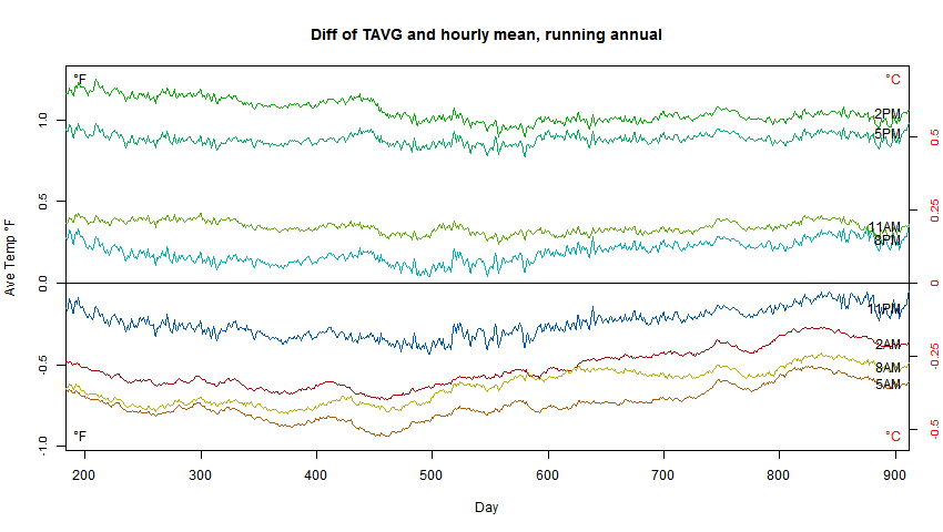
“Your TOBS example shows that the range of error in simple daily average temps, even using Min-Max, is almost a whole degree C”
Here is a difference plot (again, from here, Boulder), in which all the TOBS cases are subtracted from the (black) continuous average:
It makes it clearer that the average fits in the range of TOBS min/max; the difference between OBS times is more significant. And it shows the extent to which the differences are constant, and will disappear on taking anomalies. It’s not complete; morning TOBS in particular seems to drift, although by a smallish fraction of a degree.
But MIN/MAX isn’t an error. The point of global averaging is to find temperatures that are representative of the region. The mode of measuring is just another variable, like say altitude, that you need to take out with anomaly, so as to isolate the climate variations.It only becomes an issue if there is systematic variation that might be mistaken for climate. That is why TOBS adjustment in the US is so important. It isn’t that TOBS makes an absolute change; it’s only matters if there is a change. And even then, not much unless the change makes a bias. It was the combination of many local changes in TOBS in the US, all tending from evening to morning (for reasons) that made TOBS an issue. And even then, not so much. There used to be a fuss about USHCN shifting by about 0.3°F due to TOBS adjustment. That was where everything aligned to make a big difference.
But there is no reason to do it by class at all. The correct answer for “What is the average height of the sixth-grade class?” is to add all the heights and divide by the total number of 6th-graders.
Anything else is a workaround. It might get one the correct answer, but there’s no reason to do it in the first place, unless all the data you had were the average height of each class and the number of students in each class.
It’s the same with getting the average temp of the Earth. Weighting is not needed because we’re not determining the average temperature per square kilometer; we’re getting the average temperature per Earth. Sure, one can get different averages by cherry-picking temps only from the poles, or only from the tropics, or only from the temperate zones — so all we can do is try to get a good sample from each climate zone on Earth, and use the average of those to determine the average temperature.
There’s no “need” for infilling (making up) date for the cells, because the cells aren’t needed.
James Schrumpf ==> In order to fulfill Mosher’s need “It’s this meaning that allows us to say…The LIA [Little Ice Age] was cooler than today…it’s the meaning that allows us to say the day side of the planet is warmer than the night side…The same meaning that allows us to say Pluto is cooler than Earth and Mercury is warmer.”” we don’t need anything better than what we are using today —
If we want to be able to honestly make claims of warmest years, we have to make some big changes in the way temperatures are considered.
For your next posts, please speak to the appropriate use, misuse, and varieties of rate of change statistics. In education this area is frought with misguided practices, refered to as rate of improvement calculations. In climate science we are always faced with rate of change statistics, most of which I can’t read while I am eating something for fear I will blow chunks, upchuck, and otherwise throw up a little in my mouth.
Pamela Gray ==> Rate of Change calculations are fraught with all kinds of dangers and problems. Personally, I do not believe we have adequate data to determine the Rate of Change of any of the climatically important metrics.
Rate of Change requires very accurate and precise data and must be tailored to the exact metric if one hopes for a realistic answer. Plainly put, we don’;t have that kind of data for Surface Air Temperature, Surface Sea Temperature, Sea Level, Ice melt, etc. — not for nay of them, ….yet. maybe some day.
Cost of nuclear accidents is a kind of interesting data set, that I’ve never seen analyzed. I think it’s going to be very hard to tackle with gaussian statistics. Basically, there are probably a lot of low grade problems that cost a few tens of thousands of dollars to sort out.and (based on US data) probably an average of maybe half a dozen a year worldwide that cost a few million to a few tens of millions to sort out. And there ate a few that end up with major facility damage or total write-off of the facility (e.g. TMI). Those can cost a billion dollars or two or three.. But then there are the outliers — Chernobyl — maybe $230B and Fukushima — maybe half a Trillion dollars.
What’s the average cost of a nuclear accident? Can one predict the potential cost from the mean and the variance?
See https://en.wikipedia.org/wiki/Nuclear_reactor_accidents_in_the_United_States
I’m sure the cost of nuclear accidents has been analyzed. I haven’t done so but I have analyzed cost of terror incidents, including specific modeling of nuclear related terror incidents. Of course, we’re happy to report that one of the modeling challenges is the lack of data. I mentioned in a response to another post that I had written a paper on the Pareto distribution, often referred to as a power distribution, which is quite appropriate example such as this. The distribution of cost of insurance claims from fire, hurricanes, and civil lawsuits also are often modeled using the Pareto distribution. One troubling fact is that for many datasets, particularly those related to property losses, the best fitting distribution has an infinite mean. Adjustments can be made but they are ad hoc and troubling.
TOP – infinite mean. That’s interesting, although I expect an actuary might find a word other than “interesting” It seems to me that unless you somehow know the underlying distribution, things like nuclear accident cost are going to be very difficult to deal with. How do you know either the magnitude or frequency of the outliers until you have way more data than you really want to have?
It is important that nuclear damage estimates deal with the strictly nuclear part of general damage, like tsunami damage. Those who oppose nuclear have often been wrong. Activist NGOs on Chernobyl fatalities can be wrong by a couple of orders of magnitude. Post Fukushima, an order of magnitude for $ damage. The defence seems to be “My average is just as good as your average” or similar garbage.
Nick advises to keep non-mathematicians away from mathematics. I say also to keep NGO activists away from nuclear specialist matters. Geoff.
Great post as always.
Typo: “admission rations” should be “admission ratios” I think…
steverichards1984 ==> Good eye, sir! (danged auto-spelling correction!)
The stuff on daily temperatures actually has little to do with averaging averages, and seems to have no point. Yes, the average of max and min does not yield the average that you would get with a time integral. This on its own is not an issue with anomalies. It is, as the post acknowledges, due to the way temperatures were read before digital. We have a long record of min/max temperatures. We have about 25 years of widespread data routinely collected on frequent intervals. You can assemble a record of averages of the 25 year record if you want. People don’t; they prefer the long record, consistently calculated. There may be a small but consistent difference, That is where anomalies come in; the difference will disappear with anomaly.
If you calculated the absolute temperature, it may indeed be that there would be a difference of, say, 0.39°F. Instead of a global average of 57.12F, it would be 57.51F, or whatever. But no sensible person quotes the global average temperature, and it is not an issue with policy. That uses average anomaly. The difference between max/min and time average in each location is a function of the diurnal cycle, and this does not change much over the years. The whole point of taking anomalies is to remove the effect of local consistent variations like this.
On the difference between min/max and continuous averaging, I did a study of three years at Boulder, Colorado, described here. I produced this plot: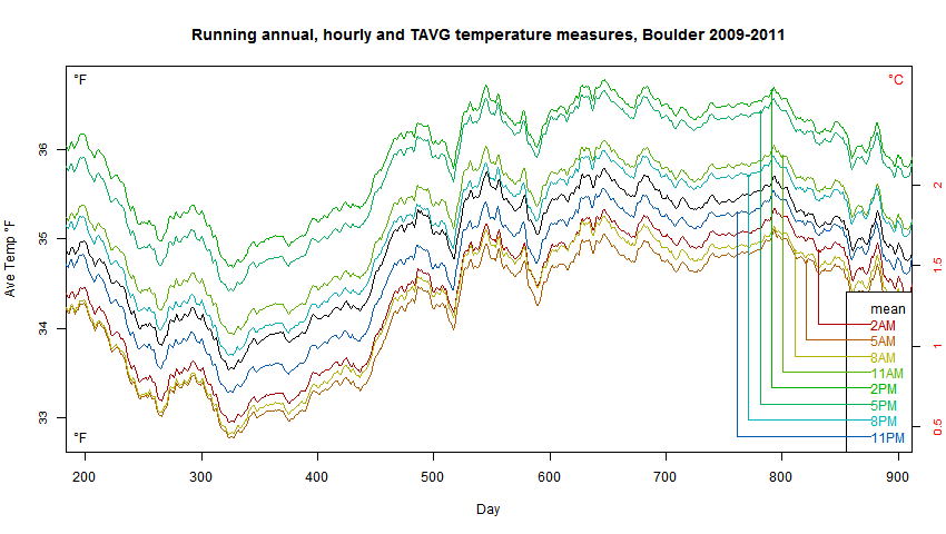
The plack line is what you would get by averaging the 24 hourly readings. The colored lines are what you would get by averaging max and min (hourly) over a 24 hour period. The period ended at different times; I was testing the effect of time of observation (TOBS). In fact changing TOBS has far more effect than the difference between min/max and continuous.
Anyone who thinks this has anything whatever to do with the claim that Mean of Min-Max can be ignored by using anomalies should actually read the description of how the graph was produced at Nick’s link here.
It is a fine demonstration of something — the error I think is that Nick does not slide the 24-hr period for BOTH the Mean of Min-Max and the Average of all Records.
“the error I think is that Nick does not slide the 24-hr period for BOTH the Mean of Min-Max and the Average of all Records.”
Sliding forward the 24-hr period of a 24hr average would have virtually no effect on an annual running mean. The mean for the year is that of the 24*365 hours. That slide would just swap a of those 8760 hours for a few similar ones. There is nothing corresponding to the double counting that is possible with min/max.
Nick ==> So you are just sliding the 24-hr window around for the Min-Max….mushing everything together for years data at a time….nothing to do with my point.
If one uses TMAX and TMIN to produce a daily average, or takes 24 hourly measurements and averages them, how does TOBS ever come into the mix?
Nick Stokes ==> “There may be a small but consistent difference” There is no scientific reason to believe that these differences are consistent — they certainly are not small. To claim so is simply not true. It is no virtue to say that all of our past data is of poor quality, with wide error ranges, in a way that is not linear, is not predictable, and is not subject to correction in present time — so we just ignore this with the magical belief that “it all works out in the end”.
There is no reason to believe that anomalies of this inaccurate and imprecise non-representative data will inform us any better than the raw flawed data. Nothing is corrected or improved by considering anomalies of bad data that does not represent the thing (physical actuality) claimed for it.
The anomalies of the type of average surface temperature currently calculated do not and cannot inform us of the important climatic changes we are interested in.
They tell us not more about how much warmer or cooler the Earth is noi than at some time in the past — except in a very gross way — certainly not in the way claimed by the climate consensus.
Anomalies of the imprecise, inaccurate average temperatures do inform us of changes but only on the scales mentioned by the quote from Steven Mosher.
Kip,
I have a comment above in moderation (all my comments go through moderation lately, for unknown reasons) which demonstrates for Boulder Colorado that for at least three years, the difference is small but consistent.
(They are now all approved) MOD
Nick ==> Your TOBS experiment is interesting but only shows that averages of the Mins and Maxs from day to day by changing the center of the 24-hour period, are consistently related to the changes in averages all all temps when that is done — which is a different issue.
Try comparing DailyAverageDryBulbTemp from a full record (recent) to a real average of all recorded temps as I did. Even within the same month (season) they are wildly different, up and down.
My note in the essay is important as it applies more widely:
Nick Stokes,
You said, “ALL my comments go through moderation lately,…”
It appears that this particular comment did NOT go through moderation. Surely you protest too much!
Nick ==> FYI — I do not moderate my own essays. If you are under constant moderation, and do not know why, you can always address a comment to Charles The Moderator — or just begin with the word Moderator. This will bring your comment to the attention of whomever is moderating.
Kip, I’m waiting on Mr. Mosher’s response to peoples’ use of his statement. From his past discussions of temperature data, I believe he has a greater love affair with it than one would expect from a literal reading of that one comment.
Kip,
” If you are under constant moderation, and do not know why, you can always address a comment to Charles The Moderator”
Thanks. Yes, it’s on all threads, not just this. CTM is aware of the problem, as here. But it seems to be still a mystery.
Clyde
“It appears that this particular comment did NOT go through moderation.”
No, it did. As the MOD says, the comments are all approved and usually very promptly. But they do go through moderation, and so things get out of sequence.
(When you post many comments in a short time, it can cause a short time out getting anything posted,but the Mods have to approve them out of the bin) MOD
Reply: Nick is still moderated. Anthony hasn’t gotten back to me on that yet~ctm
How is this: “…the measure of daily temperature commonly used (Tmax+Tmin)/2 is not exactly what you’d get from integrating the temperature over time. It’s not. But so what? They are both just measures, and you can estimate trends with them.”
Any different from this: “…with the minmax thermometer, if you reset the max when the temperature is falling, it may happen that the temperature may not return to that level for the whole next day.”
Using figures cadged off the chart of Millbrook, NY, for the A line, if one takes the full 24-hr report and averages the temps, one gets 40.0 F. If one takes the TMAX and TMIN and averages those, one gets an average temp of 48.5 F. Looking at the B line, one gets 6.5 F for the TMIN/TMAX average, and 8.5 F if one uses the 24-hr report.
Now it seems to me that if one day can have an average temp difference of 8.5 F depending on whether one uses TMAX and TMIN or the 24-hour average, then trends might be a lot harder to spot than one might think. And surely, if one can handwave that away, then any TOBS difference can be sent packing just as well.
James Schrumpf ==> (threading is getting a bit kooky…) re your at July 25, 2017 at 4:13 pm:
If none of the following matter: accuracy, precision, and correctness of metric for use intended — then we might as well just use random number generators instead of the temp records.
TOBS correctiuons are a work around for using the wrong metric in the first place. Since the late 1990s, digital hourly records were available for almost all stations — to still use min-max is an attempt simply to keep the AGW meme alive and well, really. May be necessary for comparison to historic records — but not for modern climate studies — the historic records have such huge confidence ranges that all the fussing isn;t even really necessary for that — unless one it trying to squeeze out some tiny itty-bitty rise in GAST.
Nick,
“There may be a small but consistent difference, That is where anomalies come in; the difference will disappear with anomaly.”
Those are assumptions that you can’t prove. In my line of work we call that “hand waving”. And Nick, you just created a wind storm with that statement.
Nick Stokes July 24, 2017 at 1:04 pm
“We have about 25 years of widespread data routinely collected on frequent intervals. You can assemble a record of averages of the 25 year record if you want. People don’t; ”
Funny, a lot of CO2 has gone into the air in the last 25 years. I would think this data would be very useful in showing what the temperature rise has been during that time and if there is any correlation or even causation.
I spent 5 years of my career learning the proper way to “average”, and another 20 years trying to get “people who should know” why we have to do it the right way – no shortcuts.
Multiple graphs (of regional data, for example) create new ways for those casually looking at the data (bosses) to be mislead by “best fit of the data to the graph scale” – so good looks bad, and bad goes unnoticed.
A colleague came up with the saying, “You can lead a boss to data, but you can’t make them think”.
Kip,
Warning people about the dangers of taking an average of averages is useful. No one should use tools, like the averaging function, without knowing when they are and are not appropriate (like trying to use a hammer on a screw). But your critique overlooks the most important point–any statistical average carries with it a fundamental uncertainty. It’s not that an average of averages is invalid; it’s that the calculated average is uncertain and would give a different answer if the experiment were run again. The uncertainty of the average is given by the standard deviation of the mean (or standard error) and it does get smaller as the sample size gets bigger: SDM = SD/N^1/2.
Take a look at the examples you gave. Assume the per capita income in those Indiana counties is random. For the SDM of the incomes we get around $2200. That is, the $40,027 number could vary as much as $2200 (actually, there’s a 95% chance it’s +-$4400). The difference between the “average” and the “average of averages” is actually much less than the statistical uncertainty. The flaw is not in taking an average of averages, but in thinking that an average is a precisely determined value. It’s not.
The Berkeley example has the same problem. Taking the “actual” average, as you seem to propose, gives numbers in favor of men: 44.5% versus 30.4%. Taking the averages of averages (by department) appears to favor women slightly: 41.7% to 38.1%. Which one is correct? Neither. And both. Calculating the uncertainties (SDM) for each gives 41.7% +- 11.5% and 38.1% +- 8.9%. See how the 30.4% and 44.5% are both within those uncertainties? More to the point, even the original numbers, based on overall averages only, show no discrepancy. Based on the two SDMs, the total uncertainty (added in quadrature) is 14.5%. The two averages, which look very different, actually agree within 1 SD. There’s no statistical basis for saying the two are different.
In any case, I believe that Simpson’s paradox likely disappears whenever uncertainties are properly used.
Brian,
The calculation of the Standard Error of the Mean is a useful tool for estimating the precision from a large number of measurements of something with a singular value — a constant — by removing the random errors of measurement. However, when measuring a variable, the measurement random errors are swamped by the range of the variable. Only the standard deviation of the data set gives a reasonable estimate of the behavior of the variable.
https://wattsupwiththat.com/2017/04/12/are-claimed-global-record-temperatures-valid/
Clyde,
The calculation of both the mean and the standard deviation for a group of values assumes that some unchanging value can be defined. Of course, we often apply means and standard deviations to things that are changing. In this case, one either applies a model that takes the changes into account, or one assumes that there is in fact an unchanging quantity that can be determined. The SDM is no different than the mean or SD in this regard.
Brian,
You said, “Of course, we often apply means and standard deviations to things that are changing. In this case, one either applies a model that takes the changes into account, or one assumes that there is in fact an unchanging quantity that can be determined.” The $6.4×10^6 question is whether one is justified in doing what is often done.
How did you calculate the uncertainty? To derive that from the standard deviation you must know the distribution function for the data and it doesn’t exactly feel intuitive that university admissions must be normally distributed.
tty,
Since I didn’t have the underlying distribution, I calculated the SD of the sample. The same thing we do whenever the distribution is unknown. Yes, it’s only an estimate, but it gives the right order of magnitude and illustrates the point that all averages must be treated as uncertain.
I guessed as much. SD can of course always be calculated and almost everybody more or less automatically does the “two sigma = 95 % probability” thingy. However this only applies to normally distributed (Gaussian) data which climate data usually is not. Hydrological data for example are usually Hurst-Kolmogorov distributed in which case the 2 SD = 95% will be way off.
Brian,
But they seldom are.
Uncertainty is poorly understood.
Many of the silly concepts like hottest year by 0.01 degrees or whatever have no justification when uncertainty his considered.
Indeed, much of the global temperature data, from daily obs at a site to a world average, remind me of items tossed around in a clothes washer. The drum is the limits of uncertainty, the item you (wrongly) seek can be found if you stick your hand in and grab and grab till you get what you want.
Geoff
I don’t see how one can have uncertainty in the mean when one is counting items and not measuring values. The Berkeley story has a set, finite, perfectly accurate population: 8442 male applicants and 44% admitted, and 4321 female applicants and 35% admitted.
There’s no measurement error here, no instrument with +/- 1mm error. One can calculate the uncertainty in the mean if one so desires, but it has no meaning in this case. It’s not like you’d count them one time and get 8440 males and 4316 females, and so forth.
The actual number of admitted for each gender isn’t given, but 3715/8442 = 0.44006, so that’s probably the actual number of whole human males admitted. 1512/4321 = 0.34991, and is a little closer to .35 than is 1513/4321, so that’s the number of females admitted.
So in this case we do have a clear answer: more men than women were admitted to the graduate programs. Any other answer is just playing with numbers.
James Schrumpf ==> You are right — uncertainty and statistical probabilities have no place in the Berkeley example, and exactly because they are simple counts — there can be no measurement error (only miscounting).
And you are right, ” more men than women were admitted to the graduate programs.”
You are not right that any other view is “just playing with numbers”. The view of gender and admission to each of the departments separately is equally valid — and in may ways, more valid — in an investigation of admission practices to Berkeley’s graduate programs. The precise reason for this is that that subject is “graduate programs” (plural). Now we have to consider that we are not talking about just two numbers in one data set — we are talking about two numbers in multiple data sets — each data set has its own absolutely immutably correct answer to the question at hand.
It is the combining, aggregating these data sets, that can be considered “playing with numbers”, at least equally as well as the reverse.
Of course, my point in the essay is that in all cases involving multiple sets of data, the question arises about aggregation — before averaging? after averaging? average the averages? don’t aggregate at all?
I shouldn’t have said “playing with numbers” but instead, “playing with numbers to indicate that women are more highly represented than they are.”
I have always wondered why the average of T_max and T_min is used. It is worst number to use of the three that were historically recorded. Just looking at T_max by itself would make more sense. However the best number to use is probably T_min which, since it almost always occurs overnight while measurements were taken during the day, requires virtually no Tobs adjustment.
Ian,
In terms of accuracy, T_min is probably better, except in the middle of winter in higher latitudes where values where probably “guesstimated” to avoid going outside to read the thermometer. But in terms of environmental/biological impact (what really affects us), T_max is the more appropriate measurement. If we are all going to fry, it will be from increasing maximum temperatures, not minimums. But they don’t use T_max alone because there’s no real trend there.
Ian H,
A more reasonable approach would be to analyze and report the T_max and T_min separately. They each have a story to tell and averaging them loses information.
Clyde ==> Yes, precisely one of my points. Averaging them also tells you nothing of what went on in-between….
Didn’t I read somewhere that the primary driver for increasing anomalies in urban areas was higher T_mins rather than higher T_maxs? In other words, the trend in T_max is significantly lower than the trend of the average of T_max and T_min.
John,
You are correct.
Ian,
Actually T-min no better than T_max at avoiding TOBS problem. Consider morning observation as was done at many historic sites. If the previous morning was colder than the current day at observation time, even though the minimum for both days may have occurred prior to each observation, reset of the T_min thermometer would have happened at a colder temperature than the low of current day. The previous day’s lower observation time temperature would be recorded for the current day. The same thing happens with T_max with afternoon observation times though, in that case, a previous day’s higher observation time temperature would be recorded for the current day.
Observation times were occasionally often vague and administratively changed. Common observation times were “Morning” (sunrise), “Evening” (sunset), or at some specified time of day. Remember also that time of day in our earlier records was rather fluid. Early in the records, each region and sometimes even each city had their own time zone. Some areas simply set their clocks based upon almanac sunrise and sunset values. Since establishment of the current USA time zones, their boundaries have been shifted several times.
“Temperatures have been recorded as High and Low (Min-Max) for 150 years or more. That’s just how it was done, and in order to remain consistent, that’s how it is done today.”
Not in Sweden. SMHI the Swedish Meteorological Agency has its own home-grown formula for doing this (used since 1947):
Tm=(aT07+bT13+cT19+dTx+eTn)/100
T07, T13 and T19 is the temperature at 7 am, 1 pm and 7 pm. Tx is the maximum temperature and Tn the minimum temperature while a, b, c, d, e is a set of coefficient that is different for each month of the year.
They claim that this gives a more correct average temperature, which is quite probably correct, but it means that data from swedish stations are not comparable with data from the rest of the World.
How does BEST, GISS, HADCRUT etc correct for this I wonder?
tty,
“How does BEST, GISS, HADCRUT etc correct for this I wonder?”
They don’t need to. Sweden, like all countries, reports ave MAX and MIN via CLIMAT forms, as you can see here. That data is what GHCN uses.
Nick ==> Yes, GHCN still uses the average of Min-Max — despite knowing how far off it is. It simply does not represent what is claimed.
I was recently looking at the .dly files for GHCN, specifically those marked GSN, supposedly the “select” stations, based on length of service and positioning for a good distribution across the Earth. One of them, IN020081000.dly, from Kodaikanal, India, has nothing but PRCP records and ends in 1970.
How is this station still listed as part of GSN?
“The uncertainty of the average is given by the standard deviation of the mean (or standard error) and it does get smaller as the sample size gets bigger: SDM = SD/N^1/2.”
That is only correct if the data are iid (Independent and identically distributed random variables), which temperature measurements emphatically are not since they are fairly strongly autocorrelated. So, no, it’s not that simple.
tty,
Yes, I know it’s not quite that simple. The point is meant to be illustrative–any calculation of an average must necessarily be treated as uncertain. Once that is understood, Simpson’s paradox goes away.
I think it could be fun and educating to set up 3 computers to do compilation of the Global anomaly.
The first one works on the stations the usual way making a Global anomaly. The two others copy exactly the steps the first one do with the anomaly but only on the station reference and station temperature.
In that way you would get a Global reference and a Global temperature, and could check if the reference and temperature changes in strange ways.
The anomaly has gone up 1K, but how has the reference changed?
I hope you see how that could resolve some of the doubt about the temporal stability of the anomalies.
Thanks Kip.
I’ve often wondered; even if you could determine the average temperature of a nominal imaginary spheroid shell some 5 feet above the surface, what will it mean. Not with standing the enormity and practical impossibility of the task, it is an arbitrary shell boundary across which energy flows as sensory heat and latent heat with huge chaotic stores each side of the boundary in the form of the earth and oceans on one side and the atmosphere on the other. It is an impossible task to extract meaning from simple minimum and maximum temps. The vexed problem of warming in concept is one of radiation in and out including all the nuances involved.
That should read: the vexed problem of “global warming”…
There is another aspect of this problem that needs to be considered. The mean is a measure of the central tendency of measurement samples. The range and standard deviation are a measure of the variability of the data. Taking an average of a time series of a variable is similar to a bandpass filter. That is, the extreme values are removed. As with a convolution filter, the original data are replaced with calculated values. We then have a distorted view of how the variable changes with time and no longer know what the original values were. That is, they can’t be reconstructed from the averaging results. Filtering is generally an irreversible operation.
I would say that the variation of station or global temperatures over time is of greater importance for understanding the system than is any rationalized attempt to claim high precision in the average(s). Basically, removing the extreme values by two (or more) successive averaging steps loses much information. By focusing on trying to justify knowing the mean to two or three orders of magnitude greater than the precision of the original data, we are creating synthetic data that appears to be better behaved than the real data.
We know that T_max and T_min are behaving differently over time. Might the extreme values be changing? That is, might the range of global temperatures be changing? The way that the data are currently processed and reported, we really don’t know that because of the averaging. The farther one is removed from the original data, the more information that is lost.
Wrong again kip.
I’ll note that you actually did not address the spatial prediction question. We simply produce a spatial prediction. Testing the prediction is in fact a part of the process.
The primary product is a feild. Not a number.
You can go get this feild. It’s what real scientists use.
If you integrate that feild you get the expected value.
This of course is the standard textbook statistics that skeptics like steve mcintyre insisted folks in climate science should use.
Mosher ==> At least you have acted as predicted. You will have to point out exactly what it is you think I am “Wrong again” about.
Don’t make me quote the BEST website and post the BEST graphs again….since they are exactly contrary to your argument here and elsewhere.
If you would like to give us a URL that shows that the BEST process only produces a field — and not anything as gross as a claimed Global Average Surface Temperature — that would be nice. Otherwise we have to accept the BEST does in fact produce a Global Average Surface Temperature product that they compare to other such products from other teams, and that the process used to produce that product is described as
Berkeley Earth Temperature Averaging Process producing the time series graphs shown on the BEST page Summary of Findings.
Note that nothing on the Summary of Findings page indicates that BEST does anything that would not normally be called (by me and, apparently, the rest of the BEST Team) as calculating Global Average Temperature.
Kip: The key problem that you identify is that averaging the high and low temperatures produces a biased estimate of the actual average temperature. Is does not matter how many biased numbers you average, you will not end up with an unbiased result. Biases only average out if they are non-systematic. In other words the average of all biases is zero. You have no way of verifying this if all you have is high and low values to start with.
Walt ==> You have that exactly right if I understand you correctly. There is no way to scientifically assume that the differences between DailyAverageDryBulbTemperature (mean of the Min and Max) and what would be an actual average of all recorded temperatures during the same 24-hr period are 1. consistent, and 2. unbiased or 3. caused by unknown factors even. Certainly the information on the size of the effect, the sign of the effect, and what might be its bias is not contained in the Historic record that shows only Min and Max.
Information about the bias could be found for modern digital records, as I did for my little sample. My sample shows that in the sample 45 days, bias is not consistent even as to sign.
I belive we simply will not be able to know. I also believe that “it all averages out” is utter nonsense.
I haven’t read through all of the comments on this excellent series of reports, so if my comment here has been discussed at any point previously, I’m sorry for piling on . . . but I’m still confused as to whether there is any meaning at all in the concept of “average temperature” or especially “average temperature anomaly”. Temperature, as used in most CAGW arguments, is a proxy for energy. The hypothesis (which seems to be crumbling recently with “the pause”) is that increasing CO2, caused by increasing burning of fossil fuels, is causing an imbalance in the release of radiant energy back to space – which should be easily seen in a gradual worldwide increase in local temperature – if the entire worlds energy distribution picture were completely stagnant. But since it is widely agreed that incoming radiant energy is transferred, phase changed, transported, phase changed and then transferred again and again, is there even such a thing as an “average global temperature”?
Nature does not react to an average temperature at ANY TIME in any specific “climate”. More importantly with respect to “average temperature anomalies”, nature does not react at any time this year to what the “average temperature” was last year or, even worse, what the temperature was at some reference year in the past! The air temperature at any location, any elevation, any pressure, any local wind-speed, and any humidity is a variable that is dependent on these other variables. . . and nature reacts at every temperature, every elevation, and every pressure in completely different ways. The largest green house gas – water – heats up, evaporates, climbs high into the atmosphere, changes phase (absorbing more energy), moves somewhere away from where it originate, may change phase again, or may rain down and cool . . . but in each instance the physics of the energy balance that is fluctuating does NOT respond to an “average temperature” but the exact temperature at that location and instance. When I go out of my house in the heat of summer, I don’t wear my winter coat, snow boots, and warm pants, and there is never snow on the ground when the temperature is between 65 -95 degrees. Likewise I don’t wear shorts, a T-shirt, and sandals in the middle of a snowstorm in the winter.
Natural local climates do not respond to long term “average” temperature changes, but rather to an accumulation of short term changes over very long times. And in many cases it hasn’t been the subtle change in CO2 that has created the dramatic change in local climate, but rather the dramatic change in the local use of water. (Lake Chad, Aral Sea . . . ) Since water evaporates, condenses, freezes, melts and sublimes at well known rates at specific temperatures, (not average temperatures or average temperature anomalies) and specific pressures, I am confused about how the average of a daily high and daily low temperature gives any meaningful information at all from which one can discern energy flow in any given location where “average daily temperature” is recorded in the world. At the very least wouldn’t one have to make an estimate of what the energy of the air mixture was at those two times by measure relative humidity, and pressure and attempting to compute the enthalpy?
https://www.scribd.com/doc/185452956/Carrier-psychrometric-chart-1500m-above-sea-level-pdf
If the measurement were made in the middle of the Sahara on a clear windless day with a constant relative humidity and no change in pressure, then maybe, perhaps the temperature for that day could be “averaged”. But in the vast majority of the rest of the world IMHO, “average temperature” doesn’t come close to approximating local atmospheric energy content. (I’m curious: If the CO2 content of the atmosphere is measured on an hour by hour basis on the top of Mauna Loa, and the local temperature, pressure and RH are also measured at this location, why hasn’t anyone published all four data sets with no “adjustments” from there so we can see just how much of an effect (direct or otherwise) that CO2 and water vapor are having on local temp? Or if they have, could someone please point me to that data?)
It does seem that enthalpy is actually the quantity of interest rather than just temperature. Unfortunately not all air temperature data could be converted to enthalpy because the moisture content of the air is not always measured.
If you regress daily Tmax against daily rainfall at a site, some 10% to 60% of the T variability can be explained by rainfall. Statistically.
So should we use raw Tmax or Tmax corrected for rainfall?
Geoff.
I think there may be a fundamental error in this post that I would like to submit for discussion. When averages are made of static measurements, I think that many of the concepts in this post are very well stated. However, temperatures as used in Climate Science™ are usually a time series. When you average a time series, you are actually applying a filter instead. The math is totally different. You can’t compare the two. In a time series, averaging the max and the min temperature to obtain a “daily” temperature is actually a smoothing operation that tries to eliminate all wavelengths shorter than a day. However, the filter can add wavelengths to the data that are not in the data if the filter is not accurate. I think that is the real issue here. Climate Science™ completely ignores the issue of adding noise to the data by filtering. And when you average the averages, you risk adding noise to the noise.
Another way to think of it is by Fourier Analysis. Any time series can be approximated by a sum of terms consisting of each wavelength multiplied by a corresponding coefficient. I.E.: aλ1 + bλ2 + … +Nλn, where lambda sub n are the various wavelength and a, b, c and so on are the coefficients. A filter ideally just removes (for example) all terms in the equation that are smaller than one day, without adding any other terms that are not in there. However, when the filter (or model) differs from reality, then using that filter (i.e. the assumption that the daily temperature curve is roughly sinusoidal) instead may add noise (terms that don’t belong in the equation). Climate Science™ blithely assumes that all filtering is perfect and reduces uncertainty in the trend (by removing the high amplitude and high frequency terms in the equation that mask the small amplitude but low frequency (i.e. long wavelength) climate signal), without adding any noise whatsoever.
Phil,
I did speak to the idea of averaging being equivalent to a filter (@ July 24, 2017 at 3:52 pm ). However, no one has taken me to task for it. However, you raise an interesting point as to whether or not the averaging process can distort more than just the variance of the time series.
You are correct. I posted before reading the whole thread. It was supposed to be a reply to an earlier comment, but it ended up at the end.
Wrong again kip
”
In climatology, Daily Average Temperatures have been, and continue to be, calculated inaccurately and imprecisely from daily minimum and maximum temperatures which fact casts doubts on the whole Global Average Surface Temperature enterprise.”
In climatology if you have minute by minute or hour by hour you calculate two metrics.
Tmean. This is the integrated temperature
Tavg. Tmax + tmin / 2
You can do this yourself using CRN data.
Then you do a test.
Is Tavg an unbiased estimator of tmean?
Is the trend in tmean over time the same as the trend
In tavg?
Is the monthly and annual average taken both ways the same,
That is integrate minute by minute or hour by hour for a month or year or years..And then also do it using Tavg.
Answer? You could read the literature or do the test yourself with open data.
I did the latter and then the former.
Guess what?
Mosher ==> I would guess that the quantitative answers were different and that the true range represented by the Daily Average of Max-Min was different than the Average of All recorded Data by up to 1 whole degree C.
I would guess that the local or grid averages were not represented as the RANGE that is implied by the differences between actual average of al data and the mean of Min-Max.
I would guess that whatever trend found for Mean Min-Max did not show the result as a range as wide as 1 degree C —
You dodge the issue but not very adroitly.
My point is quantitative —- including the width of uncertainty.
Well, what do you know, Mr. Mosher. Did you happen to see this: https://wattsupwiththat.com/2017/07/24/another-paper-confirms-the-pause/
The Chinese must Wander in a Different Weed Patch. How one calculates T ave. does seem to matter. Please listen to Kip more in the future.
Kip, although not considered in your essay, I think one should start with the idea of what we are really should be trying to investigate in climate science over time. If it is to have an early warning system for dangerous developments that may require serious amelioration then the whole idea of metrics should be different than what we are doing anyway.
To clarify what I’m driving at, let us say we are worried that a sea level rise of more than 3m in a century would present problems that would seriously challenge our normal engineering capabilities in ameliorating the problem within a reasonable length of time or size of budget over time. Running down to the sea with a micrometer every year and hyperventilating about a few mm rise is ridiculous. A review of tide gauge data alone with its ups and downs is fully adequate. If in a decade we see, say, a 10cm rise, we might say we should begin to accumulate a certain budget to ensure timely fortifications to take care of 200cm of protection 50yrs out.
For temperature, if 2C is the worry point a century out, let’s take advantage of Arctic amplification of about 3x the (lousy) average. Set up a dozen 24hr T recorders around the Arctic and if the temperature average increase exceeds 2C by 2040, then we will begin replacing coal with Nuclear over a 20yr period. Moreover, we could begin now improving efficiencies, painting our ropes white, planting more trees and other sensible low budget things. I think the past stuff we let go, set up 24hr recording and relax.
Oops ‘rooves’ not ropes.
Am I suprised that Kip doesnt know we collect Tmean and as well as tavg?
or that he doesnt even know that they are compared?
Jesus I brought this topic up on CA a decade ago. Any way.
If you want to build the longest record you are constrained to use the Lowest common denominator.
monthly Tavg. In the early 1800s we start to get Monthly Max and Monthly Min, and after that records
with Daily Max and Daily Min. Into the 1900s you will start to get hourly.
And of course people test. How many missing days can you have and still estimate the monthly correctly?
How many missing months and still get the year correct? How many missing hours can you have an still get the day correct.
Stuff Kip has never read and never will read.
Data kip could not even find and if he found it wouldnt know what to do with.
Bottom line. If we could find a SYSTEMATIC BIAS ( too high or too low) between Tavg and Tmean,
we could and probably would Adjust Tavg to offset this bias. To date no one i know of ( including me, cause long ago I thought this argument of Kips was KILLER) has indetified a Systematic bias. Tavg is an unbiased estimator of Tmean. yes yes.. like All measurements and estimates it has OMG error and uncertainty!!!!
the horror!
As for records. I thnk during the crter administration we had “record” inflation. Now forget the fact that CPI is only an estimate of actual inflation and its only an index that samples a few things, and those things change over time.. We have no problem whatsoever in
A Choosing a metric
B. Acknowledging the imperfections of the metric OMG Tavg is not the same as Tmean!!!! duh
C. Stating records IN THAT METRIC.
you want records in Tmean? There is hourly data going back some time. there is minute by minute data..
Guess what you will find?
here is a simple example… OMG we are hiding the difference between Tmean and tavg in plain sight!!
quick kip call the fraud police.
https://www.ncdc.noaa.gov/crn/month-summary?station_id=1026&date=2017-07
AS far back as 1845 Kaemtz tried to come up with correction factors for estimating Tmean from Tavg.
Thats how far back this conspiracy goes!
Kaemtz LF. 1845. A Complete Course of Meteorology. Hippolyte Bailli`ere. Publisher, 219 Regent St.; London
One method involves using 3 measures.
The extremes of day 1, and the min of day 2. and sunrise time sunset times.
Then theres the Kaemtz method, the austrian method..
Bottom line?
Its getting warmer.
There was an LIA.
Mosher ==> At last we agree — the current method is adequate for determining that there was a LIA and that it is warmer, generally, today than then.
I even quote you on it in the essay:
.
Credit where credit is due.
And there is zero evidence that humans have had any effect on global average temperature since 1850 or 1950. Indeed all the evidence in the world is against the repeatedly falsified hypothesis that humans have any measurable effect on GASTA.
Mr. Mosher Wanders in the Weeds for decades and produces ….. the obvious!
Mosher ==> Can’t you for a moment quit fighting the Climate Wars. I have not called fraud or any other of your conspiracy-based fantasies. No one thinks that climatology can’t average a set of numbers….its just that the choice of metrics means that they do not use the average. That’s exact;ly what I say — as I’m sure you know.
Your link clearly and succinctly illustrates that Average Temperature is different from Mean temperature (Min-Max), in the month your link leads to 0.8 degrees C. That is equal in size to the entire anomaly since 1950.
My point is that The Mean is used, and not the average — yet the claim is always it somehow represents the Average. Tmean is better represented as a Range, not as a precise figure.
It should not outrage you that I point this out — you seem to know all about it, as any knowledgeable person is.
For Average Temperature or Mean Temperature, the real question should be whether the days are getting hotter or the nights are just not as cool. The former suggests a truly warming world; the latter suggests a UHI artifact in the data that has not been corrected.
Does https://wattsupwiththat.com/2017/07/24/another-paper-confirms-the-pause/ help?
Dave Fair ==> Thank you for that link — exactly the paper I was searching for. (highlighted here at WUWT while I was off sailing for two months this spring…missed it!)
Figure 4 shows exactly what I imply [link to full sized image] about the differences between Taverage and Tmean. In the Zhou and Wang paper, they use T2 for the mean of Min-Max and T24 for the average of hourly temps.
Click link in text for full sized image with original caption.
“If you want to build the longest record you are constrained to use the Lowest common denominator.”
And if you are actually interested in the science of of the Earth’s climate you would discard poor quality data and focus on improving the quantity and quality of the data.
The satellite program was an attempt to do this. But when the data did not match the confirmation bias of climate scientists the data was first ignored then attacked.
When the ARGO floats data showed cooling the data were adjusted to show warming.
USCRN was supposed to be the Gold Standard of surface temperature data. It showed cooling and was ignored.
See a pattern here?
After extensive research I have calculated that the Globally the average height of an adult male is 5 9″ and 3/4 inches.
A very useful thing to know.
I resemble that!
Sure, why not? I promise not to mention that no one seems to know where 2C came from. (I suspect it was someone’s WAG decades ago that the Eemian interglacial peaked 2 degrees C above current). Nor do we know that Arctic Amplification is 3x rather than 0.3x or 30x. And, of course,
Sorry — didn’t mean to post that because I decided the train of thought wasn’t going anywhere useful or meaningful.
I loath WordPress.
Don K ==> In that case, we will ignore it.
Lindzen pointed out it is unwise to reduce climate change to a single metric – global average temperature. The spatial distribution of temperatures is more meaningful than the global average temperature. The polar region is always cold and the equator is always warm. The difference in temperature between the poles and the equator characterizes the glacial and interglacial periods – whether the mid latitudes will be covered by a mile-thick ice or by trees and grasses. Global warming that reduces this temperature difference is a good thing.
None of this post or comments touches on the use of geostatistics to generate an average global temperature from the (very) erratically distributed data points. While statistics deals with populations of numbers, geostatistics deals with populations of numbers, every one of which has a position in space as well as a value. The core of geostatistics is a process called kriging which is used to generate a grid of uniformly spaced points, from which an “average” can be derived. Kriging can be done in 2 or 3 dimensions.
As I understand it, kriging is used by the climate industry, to generate the global average temperatures. I would hazard a guess that most of the users of kriging don’t really understand it, but accept that it’s a better way of filling empty cells in a grid than straight gridding using things like polynomial-fitting or minimum-curvature.
Geostatistics, and its core method of kriging was initially developed (by a guy called Krige) to analyse the distribution of gold grades in South African gold mines It’s very widely used in mining now, mainly to estimate average grades in ore reserve calculations, from erratically distributed data points. Is it suitable for analysing temperature data? I have no idea, but there will be people out there who understand it much better than I do
Anyone interested can Google “kriging” or “geostatistics”.and get a feel for how it works.
In the end Smart, Kriging is just interpolation, a pretty well understood way to guess at the values of some metric between two points you actually measured. Other words for it like “infilling” mean the same thing; the investigator is assuming the thing being measured varies in some linear way between two measured points. It’s a guess.
In the real world of geology and temperature, there are anomalous events; things that just don’t follow a linear relationship. For example, you may find two veins of gold separated by some distance. You have actual measures for those two veins and you decide to interpolate the expected value of gold that might be found between those two points. This wouldn’t consider the possibility there might be a third vein that’s much richer between them, or there might be nothing but solid quartz/granite there. No one really knows. Until you actually go to the Moon and count the cigarette butts at one of the Apollo landing sites, you just don’t know if the astronauts were smoking on company time.
Krigging isn’t data. It’s just a guess.
In oil exploration, one might use Kriging to decide where the bore the next holes. However, if one counted the predictions of Kriging as active wells, one would be out of a job very quickly.
In climate science, Kriging is used to infill data where no actual records exist, and they ARE counted as “active wells.”
A total misuse of the procedure.
Kip:
Thank you so much for your work in sorting out the statistical issues with anomalies. You have a lot of patience.
As regards temperature accuracy, I would like note two problems of a physical chemistry nature: radiation field imbalance and water vapor.
In statistical mechanics “temperature” is a parameter that describes the amount of heat in some particular molecular mode. The temperature of a system can be known only when all modes are at equilibrium, that is 1)free to exchange energy between modes, and 2)free of exchange with external sources long enough to have stopped net heat flow.
For a sample of atmospheric gas we could define a “black body equivalent” (BBE) temperature that would represent the average molecular motion and radiation field density for the sample. In the real atmosphere the instantaneous value of radiation field density is far higher in the daytime, and far lower in the nightime than the BBE temperature. (It would be interesting to calculate how much energy is actually in the black body field.)
We finesse these complicated issues by sticking a thermometer in a wooden box and declaring that it is at equilibrium at the time of daily maximum and daily minimum and therefore a valid representation of the overall system. This method at least eliminates the effect of using different types of thermometers that interact differently with the radiation field. Yes, different thermometers will give different temperatures away from equilibrium, and painting the box black would change the reading and give higher daytime and lower nightime temperatures. It is difficult to assemble these ideas into a useful estimate of overall error of the BBE, but it looks as if the measurement error in temperature for assessment of equatorial heat is on the order of several degrees, not fractions of a degree.
But the worst violation of “temperature” as a measure of heat is not in thermal modes, but that overall something like a third of all heat incident on the planet surface gets turned into water vapor. As Pielke Sr. has shown, the real heat energy in an atmospheric sample can have effective temperature of tens of degrees different from the wood box temperature. This is why Key West has pretty much the same temperature all day, while Denver varies by 60 deg.F or more. It has no water to evaporate.
Temperature does drive temperature change, but it does not accurately represent atmospheric energy. Nick Stokes notwithstanding, enthalpy and its related heat equivalent temperature is the only measure that tells us if the energy content of the atmosphere is increasing or decreasing. Temperature alone however measured does not measure heat; it tells us in what direction the heat to which the thermometer is sensitive is flowing.
While I accept it as a statistic, I have yet to see a precise physical meaning for global temperature.
4kx3 ==> Ah yes, the larger issues. The work of Pielke Sr and others is generally ignored, as are the questions raised by Christopher Essex, Ross McKitrick, Bjarne Andresen (2006) in Does a Global Temperature Exist?
In comments here, we see Mosher saying he has personally invalidated the idea that T24 and Tmean are substantially different, despite recent published work showing precisely the opposite and supporting the final point of my essay. See Spatiotemporal Divergence of the Warming Hiatus over Land Based on Different Definitions of Mean Temperature, Chunlüe Zhou & Kaicun Wang Nature Scientific Reports | 6:31789 | DOI: 10.1038/srep31789.
Kip,
“recent published work showing precisely the opposite a”
It does not show precisely the opposite. It shows a plot of 10,400 stations from GHCN-D using T_24. And it shgows, beside, a plot of 3,400 stations from a different dataset, ISH, which used T_mean. There is no way to know whether differences are due to the method or to the fact of different datasets. They clearly aren’t the same places.
Kip: A note on the accuracy of temperature measures.
CO2 produces little change in heat capacity and no change in heat energy by itself. If we assert that changes in temperature are due to changes arising from CO2, it seems we must then be talking about effects on heat transfer, not temperature changes arising from chemical reactions or volcanoes.
Trenberth and Smith http://journals.ametsoc.org/doi/abs/10.1175/JCLI-3299.1 provide estimates of the amount of water in the atmosphere. Water amounts to (1.8 +/- 1.1) /1000. of the total mass. Using the heat of vaporization of 2257 kj/kg and Cp of 1 kj/kgC suggests that globally the average error in using temperature and not enthalpy as a measure of heat is (4 +/- 2) degrees C. depending on season. Locally the error can easily be ten times this amount. While the “4” part of the error is systemic, some of the (+/- 2) part should show up in calculating the global average prior to “anomalizing”.
From the physical chemistry standpoint, discussions on the significance of various ways of calculating average (T2 or T24) are a waste of time until we define and assess exactly what subset of the various non equilibrium thermal modes we are estimating. While the max/min average method is crude, it is arguably less crude than taking some other time series with thermometers that are not properly equilibrated.
Nick Stokes ==> Read the whole study and the particularly the conclusion which speaks to the point I am making. Quantitative and trend differences — globally, regionally, and seasonally.
Kip,
“Read the whole study”
I have. The whole of it is affected by this basic fallacy. They measure T_mean with one set (ISH) and T_24 with the other (GHCN daily). There is no other relevant data. There is just no way there to separate the effect of T_2/T_24 from the GHCN/ISH difference.
Nick ==> I guess you’ll have to write to the journal and ask for a retraction….better than admitting my point is valid, huh?
Kip it seems you’re essentially telling folks that any average computed from measures of an abnormal distribution are at best misleading. There’s an assumption that averages come from normal distributions and that assumption may not be valid. It should be checked and there are simple ways to do that; methods that haven’t been used in the case of global mean temperature metrics?
I can understand and agree your critique of the 24 hour High/Low averages, but the anomaly metrics are intentionally meant to normalize poorly distributed data over longer time periods. Are you aware of any studies that demonstrate a normal or abnormal distribution in the longer term anomaly data sets?
Kip:
For clarity, I’m looking for anyone who’s presented a percentiles plot of the anomalies over the selected baseline period (population mean). If that plot shows an abnormality I’d be more likely to believe there was a force, other than natural variation, that was effecting global temperature. In the absence of an abnormality, I’d tend to think there was no other force involved and we are just observing natural variation.
Any references you might have would be appreciated.
Bartleby ==> The thrust of this series of three essays is to educate the general readership about the basics of averages and to warn them of the pitfalls that can trip up their understanding when they depend on averages to inform themselves.
“There’s an assumption that averages come from normal distributions and that assumption may not be valid.” Yes, this is one of the points I attempt to make: I say:
As for the climatology issue, using anomalies does not cure the problems of “using the wrong metric” (Tmean instead of T24 — see the Update at end of essay). Anomalies don’t cure using metrics that do not represent the physical thing or property they are subsequently claimed to represent.
Anomalies don’t handle the problems with Surface Air temperature raised by NOAA GISS .
I like Mosher’s bottom line on Global Average Temps quoted near the end of the essay:
I think there is a lot to learn and know about global climate….but these herculean attempts to reduce everything to Single Numbers and Global Averages are both misguided and misleading.
Kip writes: these herculean attempts to reduce everything to Single Numbers and Global Averages are both misguided and misleading.
Certainly you’ll get no argument for me on that.
“using anomalies does not cure the problems of “using the wrong metric” (Tmean instead of T24 — see the Update at end of essay).”
By itself, it doesn’t. But, the “Law of Averages” is based on the idea that error in base metrics will cancel as more measures are made. So an imperfect metric (Tmean) as used may, over time and repeated measures, converge on a true value. Even if the underlying metric is flawed, it will eventually converge on the true value if the error is normally distributed.
What I’m looking for is a percentiles plot of the anomalies around the zed; if the variance is normal that tells us something. I just haven’t seen that anywhere, though it seems so obvious I have a hard time believing no one has ever done it.
Bart ==> To me, this bit “it will eventually converge on the true value if the error is normally distributed.” is part of the Magical Thinking involved in the whole big data movement — including much of CliSci, Epidemiology, etc. Next they will simply advise us that no matter what numbers they start with, it will all work out in the end. There is some belief that all errors are random, and therefore normally distributed and therefore we don’t care if our measurements are accurate or not — we’ll just use more of them and divide by higher divisors and get really really precise answers!
For temperatures, using measurements without acknowledging their true Original Measurement Errors leads to incorrect assumptions of precision that are in fact nothing more then the results of long division.
The ONLY time you can get better results with more measurements is measuring one thing more times with more rulers. THEN the errors will average out — the human errors and the errors in the rulers.
Kip writes: “The ONLY time you can get better results with more measurements is measuring one thing more times with more rulers.”
I might have to disagree with the “more rulers” part, otherwise all I can say is “amen brother!” 🙂
I can’t argue with the idea you present; bad metrics lead to bad policy. I can’t argue with the idea that the 24 hour Tmin+Tmax/2 metric is bogus. You’re right about that.
Over longer periods (I think 30 years is the standard) we may be able to extract some useable information, assuming a normal distribution of error, which is a very big assumption given the case you make against the metric, but it remains “the best we can do”.
Measurement is the foundation of science and in the past I’ve made the argument we lack accuracy and precision in the measures we’ve made of climate. We still make attempts to extract whatever information might be present in those measures, but they’re imprecise at best and flat out wrong at worst (tree rings come to mind). While we may legitimately develop a scientific opinion based on them, it would be beyond reckless to use them to form public policy.
I’ll cite the tragedy of DDT and Rachel Carson; decisions made based on bad data may very well kill millions of people. Thank you for bringing this topic to world attention.
Bartleby ==> Thank you for reading here and engaging in rational conversation.
Kip,
“Anomalies don’t handle the problems with Surface Air temperature raised by NOAA GISS .”
Of course they do. That is what your links are trying to explain. From the last question of GISS:
“In 99.9% of the cases you’ll find that anomalies are exactly what you need, not absolute temperatures”
“There’s an assumption that averages come from normal distributions and that assumption may not be valid.” (Bartleby)
There is no such assumption.
“Bart ==> To me, this bit “it will eventually converge on the true value if the error is normally distributed.” is part of the Magical Thinking involved in the whole big data movement ” I have to disagree with that Kip. I there is noise in the data — and there often is — averaging repeated observations really will tend to reduce the noise components. It works that way in thought experiments and seems to work in the real world as well.
But averaging won’t do anything good (or bad) about biases.
Don K ==> To have the effect you desire, they must be repeated observations of the same thing — not different things. 100 thermometers measuring today’s noon temp at LAX — yeah. 100 measurements by one thermometer of 100 different days noon temps — not so.
Nick Stokes ==> There is a standard answer for “why what you need is anomalies”. It is nonsensical on the NOAA GISS page GISS Surface Temperature Analysis simply asserting that since we can not really know what the surface air temperature is anywhere….
Quoting exactly:
In a word, that is fruit-cakery of the highest order. It asserts that we know SATs are not true, but that we can know if they are UNUSUALLY high or low, and then asserts,,without any justification, “that information (the anomaly) is meaningful for the whole region.” It does not even claim that the anomaly is useful for anything at all about a local station or even to its own long-term average (which is also known not to be true….)
This makes anomalies only useful for regional comparisons and only for the use detailed by Mosher in his famous quote repeated in the essay and in comments many times….we may least know there was a LIA and that it is warmer now.
If you can point to
an excusean explanation that makes more sense, please do so.Yep, Kip; Mr. Mosher, Wandering in his Weed Patch, didn’t stop to think how his supercilious jab at another would be used as more of a jape on him.
Kip,
“In a word, that is fruit-cakery of the highest order.”
For someone who writes frequently and portentously on averages, you seem remarkably resistant to actually learning about the topic. First, for context, the last sentence of the previous Q is relevant:
“To measure the true regional SAT, we would have to use many 50 ft stacks of thermometers distributed evenly over the whole region, an obvious practical impossibility.”
You’re not distinguishing properly between point SAT and spatially averaged SAT. We’re actually not interested in how warm it is in those white boxes. People want a statistic that tells them something about how warm it is where they are. That is, they want GISS, or someone, to estimate by sampling a statistic about a population of which they are part. The white boxes provide population samples. GISS is saying that you can’t usefully aggregate SAT. It is too variable, and in a non-random way. What you can aggregate is anomaly. That 50 ft stack may be measuring varying temperature, but the anomaly is likely to be the same. And an average anomaly is something that you can use for making local predictions. If you learn that the average US temp was 56F, that doesn’t help if you live in Florida or Maine. But if you learn that it was anomaly +1 over the summer, then that does tell you that your chances of being warmer increases.
None of this is high science. Newspapers, TV etc have been reporting temperatures in various white boxes for years. People know how to make use of that. They make an estimate of whether their own environment is likely to be warmer or cooler, based on what they learn.
But yes, if you want more explanations, I have plenty. Here is some quantitative stuff. Here is one of many posts on the spatial consistency of anomalies – and there is regularly updated data here.
Nick ==> I don’t have disagreements with the reasons they state quite clearly as to why they can’t actually measure SAT to any accuracy or precision. That part makes sense — you seem to be trying to skitter away from the absence of any real explanation for the use of anomalies on that page.
You don’t even bother to try to justify their nonsense…and I don’t blame you.
I do agree with you that GAST and anomalies thereof will allow us to know that “it is warmer now than it was 150 years ago.” What they don’t to well is tell us how much very accurately and I am doubtful about the trends they present based on Tmean.
Nick Stokes quoyes: “There’s an assumption that averages come from normal distributions and that assumption may not be valid.” (Bartleby)
And replies: “There is no such assumption.
Of course there is Nick, it’s fundamental to the interpretation. A naked average assumes a normal distribution of the underlying value and a repeated measure of that value assumes an underlying normal distribution of measurement error. These are very fundamental assumptions derived from the “Law of Large Numbers”. That those assumptions are sometimes wrong, or that when they are wrong the assumption is sometimes used to abuse the reader’s understanding, is at the root of many criticisms of statistical methods. It is, nevertheless, a truth, and one we all accept when using those methods.
If you doubt those assumptions you’re arguing with the wrong person. I can refer to to Box, Hunter and Hunter, “Statistics for Experimenters”, which will certainly clear up your misunderstanding of the subject if that is at all possible.
KH – “To have the effect you desire, they must be repeated observations of the same thing — not different things.” Not entirely true. Case in point — satellite observations of sea level rise. There are randomish(?) uncertainties in satellite radial distance from the Earth’s center of one cm. and quite a few other slightly unknown factors — ionospheric delay, atmospheric pressure, satellite attitude, tides, waves etc, etc. On top of which the oceans change a bit over the ten days it takes to scan the oceans (68N-68S). Water moves. Water temperatures change, affecting volume. Water moves to or from land. Ice forms or melts. Scannable area changes a bit due to ice.
Rigorous application of “you can’t average different things” would say we couldn’t measure sea level from orbit more accurately than one or two cm. But clearly averaging does better than that by at least an order of magnitude, probably closer to two. A similar argument with some different error sources would apply to tidal gauges.
Pragmatically – averaging unlikes does work sort of. Sometimes. Although there are certainly constraints. It’s not quite clear what they are.
I don’t think your train of thought goes in the wrong direction, but somehow it doesn’t seem to end up in quite the right place.
Don K ==> “Rigorous application of “you can’t average different things” would say we couldn’t measure sea level from orbit more accurately than one or two cm.”
Don’t get me started on sea level altimetry…. the Jason’s have a hoped for accuracy/precision in the range of 2 -3 cm. NOAA claims measurement precision in fractional mm. The claim is that they accomplish this from a platform (satellite) whose orbit may well be stated correctly to be an unknown distance from the center of the Earth at that scale. There is no reason to believe that Jason 2’s orbit is precise — and does not vary on the scale of feet, no less cm and mm. Likewise, the surface of the sea is not smooth (almost never), not still (constantly moving up and down – tidal movement), uneven (with a surface contour from ripples of several inches to waves of 20 to 30 feet), constantly moving up and down (other rise and fall the causes of which are sometimes not understood, other causes like El Nino, wind direction, etc), and not flat (overall the sea is very lumpy). Quite honestly, It is my opinion that current satellite sea level claims are illusory. With 20 years of corrected data, they may be able to divine a larger movement (multiple inches or single digit feet) and give us some idea of the “average” or trend over that period.
I know the sea — I have lived on it half of my adult life.
Readers ==> Anyone paying close attention (and I have no reason to believe anyone is paying that close attention to this now 24-hour old post) may have noticed that I managed to disappear the entire post while attempting to add an Update. I believe I have everything back in proper order. My apologies.
Kip:
What you’ve presented takes a bit more than 24 hours for most of us to process. It was a good article and thought provoking. Please forgive those of us who’ve taken a few hours to think about it before responding?
Bartleby ==> No worries. WUWT has a “news cycle” all of its own, and posts tend to age out rather quickly at times, being pushed down the home page out of sight. The upside of this is that the angry ‘tweenaged trolls move on to the latest post after a very short time and get out of the way of genuine discussion. Often reading later gives a better experience.
Kip: No Worries cuts both ways 🙂
My “specialty” is design of experiments and in a former life I did this sort of thing for a living too. I respect your opinions and have no intention to argue against them, my only intention is to improve and support your work. If you’d like a brief precis of my opinion, I think just clicking on my handle will take you to the only article I published on this subject back in 2009.
To say the least, I’m a metrics sort of guy and very seriously applaud your efforts.
Best regards.
To whomever said that counting sunspots is not the same as measuring temperatures. In the sense that both results in a single number that is part of a time series, they are exactly equivalent as far as any further manipulation is concerned.You should try to count sunspots. I have counted some 60,000. You can try here: http://www.specola.ch/drawings/2017/loc-d20170715.JPG
To not average averages was taught in basic statistics classes at least when I was a grad student… not anymore?
Averages actually don’t exist in reality. They are just a number: Jim has 1 dollar, Joe has 2 dollars. On average each has $1.5. BS: because neither has 1.5 dollars. One has 1 the other has 2. And that’s all there is to it.
SoulSurfer writes: “BS: because neither has 1.5 dollars. One has 1 the other has 2. And that’s all there is to it.”
That’s not really an example of averaging averages Soul, it’s an example of making repeated measures of two different things (Jim and Joe), then averaging those measures to make assumptions about either one’s financial condition. Kip draws attention to this very significant problem in the opening remarks of his article, where he says:
emphasis mine
The important part WRT your observations about Jim and Joe is emphasized; Jim and Joe aren’t homogeneous. Neither are any two measures of different climate model outputs, or different temperature measurement stations in different locations.
It isn’t valid to take the same measure of two different things and then subsequently pretend they are measures of the same thing, then imply it’s OK to average. It isn’t. Ever.
My point is that If averages don’t exist then certainly averages of averages don’t either.
Soul, I believe that’s called a tautology? 🙂
It would be difficult to accept the idea averages “don’t exist”. Certainly they do and in many examples they convey meaningful (pun intended) information. I’m sorry you disagree with that position, but it’s mine and you’ve done nothing to change it. I think we have reached an impasse.
I have written a longish comment, which would not post, and which has been lost somewhere. Really annoyiing.
Robin ==> I will look for it.
What I tell people — I am a neighborhood tech guru (and was once a real tech guru) — is to always compose long comments or letters in some other program like TextPad, WordPad, or other text editor — and then copy and paste into your browser
Robin ==> Your comment did not post, you are correct — it is not lost somewhere on the server.
See my note above. If your original was in WordPad, you could just cut-and-paste it again.
Can’t say it hasn’t happened to me before, but I try to follow my own advice on longish comments. Sometimes just copying the whole comment to the clipboard just before hitting the Post Comment button can save you.
[snipped]
Moderator — this comment left by someone spoofing the author’s name. Kip
I enjoyed this series. In the future perhaps something on the improbability of improving data via statistical manipulation?