From The GWPF
Dr David Whitehouse, GWPF Science Editor
The China Meteorological Administration (CMA) has recently developed a new global monthly land-surface air temperature data set called CMA GLSAT. Using it researchers from the administration reanalysed the change in global annual mean land-surface air temperature during three time periods (1901–2014, 1979–2014 and 1998–2014) to see if there was any evidence of a hiatus or pause in recent surface global warming.
The CMA GLSAT-v1.0 data has its sources in the three original global data sets (CRUTEM4, GHCN-V3 and BEST), eight national data sets (Canada national climate and weather data archive, Australia high-quality climate change data set, United States Historical Climatology Network (USHCN) data set, Korean exchange data set, Vietnam exchange data set, and the data sets of the CMA, Russian Meteorological Agency and Japan Meteorological Agency), and four regional data sets (South American regional data set, Africa regional data set, European regional data set, and Antarctic climate data)
In preparing the new database Xiubao Sun and colleagues from the CMA say they addressed a number of problems with other surface temperature databases, in particular the relatively poor coverage of stations across Antarctica, Africa, South America, and Asia. They note that the IPCC AR5 report concluded that the warming trends in these regions are associated with a lower confidence level. They also improved the absence of early period stations, especially before 1940.
The researchers find very clear evidence for the recent warming hiatus. Their results show linear trends of 0.104 °C per decade, 0.247 °C per decade and 0.098 °C per decade for the three periods, respectively. The trends were statistically significant except for the period 1998–2014, the period that is also known as the ‘‘warming hiatus”.

Table 1: Sun et al. 2017
The annual mean surface temperature anomaly time series for both hemispheres and the globe over the period 1901–2014 are shown in their Fig 1. The linear trends of annual mean surface temperature for SH, NH and the globe were 0.088 °C per decade, 0.115 °C per decade and 0.104 °C per decade, respectively, all statistically significant at the 5% confidence level. Much of the hemispheric and global warming occurred in two distinct periods, from the 1910s to the late 1930s and from the early 1980s to the mid-2000s. The relatively cool periods or stable periods appeared in the 1900s, 1940s–1970s and between 2005 and 2014.

Read the rest of the article here.
I wonder which versions of the data sets the Chinese were using, as some of the sets have been “corrected”.
…and some of the set get corrected each time current numbers are entered 8-/
Correct!
If they were to use raw (unadjusted data), the trend would have been 0 the last 6 decades. There’s no warming, – at all!
Ref.: Third story on this page: Geologic Forces Fueling West Antarctica’s Larsen Ice Shelf Cracks
http://www.newscats.org/?p=10219
“If they were to use raw (unadjusted data), the trend would have been 0 the last 6 decades. “
I actually do that calculation using unadjusted data. Not just arm-waving. The trend is
virtually the same as with adjusted.
Nick Stokes July 5, 2017 at 6:41 pm
“If they were to use raw (unadjusted data), the trend would have been 0 the last 6 decades. “
I actually do that calculation using unadjusted data. Not just arm-waving. The trend is
virtually the same as with adjusted.
—–
Nonsense, why make adjustments if they make any difference, Why bother?
It makes no common sense and it makes no scientific sense.
Complete and utter rubbish.
“Nonsense, why make adjustments if they make any difference, Why bother?”
Because you have to. If the measurement conditions change, you have to adjust for it, even if the adjustments are small and tend to cancel, as they do.
Nick Stokes July 5, 2017 at 7:09 pm
“Nonsense, why make adjustments if they make any difference, Why bother?”
Because you have to. If the measurement conditions change, you have to adjust for it, even if the adjustments are small and tend to cancel, as they do.
——
What about UHI issues, stations siting problems, and station drop-outs?
Where are the adjustments for these? There are none.
Where are the adjustments documented? Where are the audited? Where are they independently confirmed and verified? Where is the the Science? Where is the Scientific Method?
Sad is the state of Modern Political Climate Science.
Because you have to. If the measurement conditions change, you have to adjust for it, even if the adjustments are small and tend to cancel, as they do.
=============
nonsense. only Stalin and voodoo climate science adjusts the past. Everyone else adjusts the present.
Data Quality 101. The more versions you have of the past, the lower the data quality for the past. Every time you add a new version of the past, you reduce the data quality even further.
The past is the past, warts and all. If the temperature in 1936 was recorded as 136F, that was the temperature. Otherwise, how can we trust anything written today about temperature? If in 20 years today’s temperatures could all be adjusted so they are completely different than what we are being told today.
This is fundamental data processing. You never change the past. Accountants go to jail if they do it. Its called cooking the books. In climate science it is called climate change.
Its called cooking the books. In climate science it is called climate change.
=================
that is why “global warming” had to go. It was too obvious a reference to “cooking the books”.
Nick Stokes :”I actually do that calculation using unadjusted data. Not just arm-waving. The trend is virtually the same as with adjusted.”
So you mean the urban heat island effect which affects nearly all sensors (there is not a single “rural” station in all Africa) has not been corrected ? Or that it doesn’t count ?
There is no such thing as “unadjusted data”, at least not here in Australia. The Bureau of Mendacity has been caught out “adjusting” the supposed “raw data” yet again – by 0.4 degrees of adjusted “warmth” at Goulburn. They’ve been forced to correct that one, but they are refusing to explain what, or how pervasive, their automated “adjustment” settings for “raw” data actually are. I’m no good at links but you can get the story on Jo Nova’s site.
“has not been corrected”
So you want adjustments after all? Just the ones that you like.
RUBBISH!! This assertion is disingenuous, and it is easy to prove that the data sets showing warming do so only because of adjustments.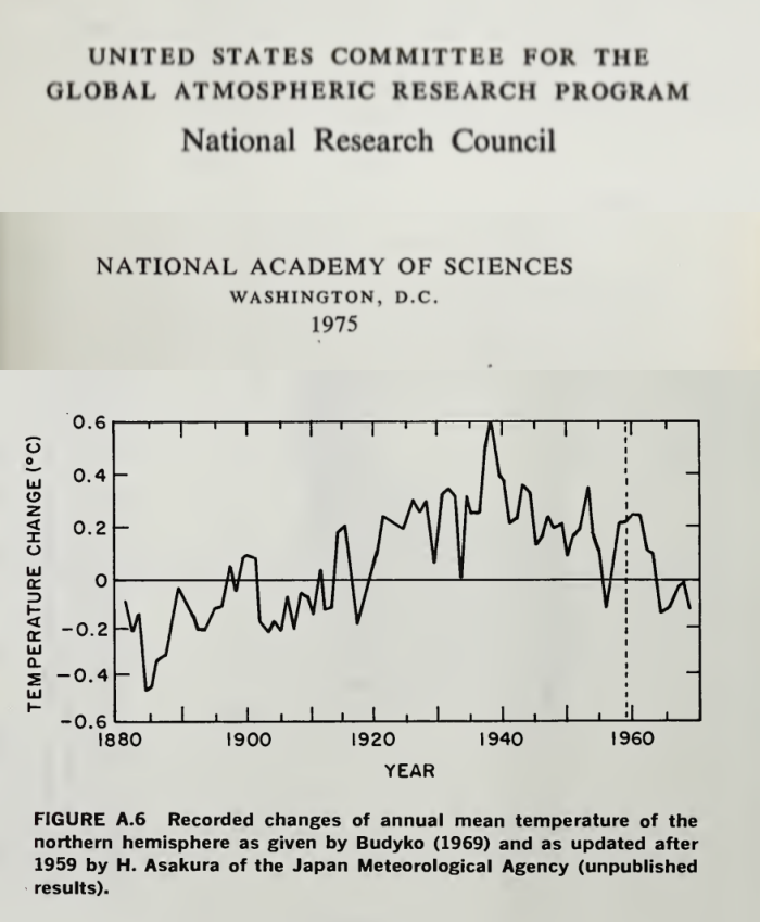
We know that without adjustments, there has been no warming since 1940 Let me explain:
Here is the accepted data as of 1980 for the Northern Hemisphere: Published by the National Academy for Science. NOAA and NASA both produced similar.
It shows that temperatures in the NH peaked in 1940 and that it cooled by about 0.7degC between 1940 and mid 1970s. Both Hansen in his 1981 paper, and Phil Jones in a separate paper also published in 1981 substantially accepted this temperature profile. Hansen in his 1981 paper notes that as at 1980, the NH is about 0.3 degC cooler than it was in 1940. Here is the Hansen 1981 plot:
http://notrickszone.com/wp-content/uploads/2017/01/NASA-NH-Temperatures-Hansen-81.jpg
We know (from the satellite data) that the NH has warmed by about 0.3degC from about 1980 to date such that the temperature today in the NH is about the same as it was in 1940. This is the case notwithstanding that about some 96% of all manmade CO2 has been emitted since 1940!!
The only reason why that is not today considered to be the case is that endless adjustments have been made to the data such that the late1930s/1940s warming has been reduced, and the cooling through to 1970s eradicated from today’s adjusted record. Steven G0ddard has a video clip on these adjustments.
We have no quality data on the Southern Hemisphere and without quality data on the SH, we have no useful global data. Phil Jones notes this in his 1981 paper, and Hansen in his 1981 paper notes what Phil Jones says on the inadequacies of the SH data. In fact, in the Climategate Phil Jones states that SH temperatures are largely made up. Of course, the Climategate emails also discuss the need to get rid of the 1940s warming. This the Team did by adjusting the data.
We only have worthwhile data on the NH, and prior to the adjustments, it is clear that there is no net warming between 1940 to date. There is only multidecadal variation. it is clear that the only reason why in 2017, there are data setts showing net warming is entirely due to adjustments made to those data sets.
@richard Verney 2:34 am: Do you have links for the graphs?
“We know that without adjustments, there has been no warming since 1940”
You don’t know anything of the kind. You have tried to patch together a mess of totally different data, none of it global, and proved nothing. Before Jones and Hansen in the mid 80’s, there were no systematic collections of global data. The data was not digitised. Hansen in 1981 said that the data used was someone’s collection of a few hundred NH stations. They are of course all land only, and do not use an area-weighted average.
And in true Goddard style, you try to string them all together with no consideration of the various anomaly bases.
The data now available is as sourced originally, but in a collection that far exceeds anything available to those early analyses. My calculation is not affected by later GHCN etc adjustments.
“If they were to use raw (unadjusted data), the trend would have been 0 the last 6 decades. “
That’s actually totally wrong…
Adjustments cool the AGW trend the last six decades, but increase the “natural warming” before 1950:
https://twitter.com/rarohde/status/843799201544900608
Climate Audit had a post on this very subject on January 20,2009.
https://climateaudit.org/2009/01/20/realclimate-and-disinformation-on-uhi/
“In a recent CNN interview discussed at RC here, Joe D’Aleo said:
‘Those global data sets are contaminated by the fact that two-thirds of the globe’s stations dropped out in 1990. Most of them rural and they performed no urban adjustment. And, Lou, you know, and the people in your studio know that if they live in the suburbs of New York City, it’s a lot colder in rural areas than in the city. Now we have more urban effect in those numbers reflecting — that show up in that enhanced or exaggerated warming in the global data set’
Gavin Schmidt excoriated this claim as follows:
D’Aleo is misdirecting through his teeth here. … he also knows that urban heat island effects are corrected for in the surface records, and he also knows that this doesn’t effect ocean temperatures, and that the station dropping out doesn’t affect the trends at all (you can do the same analysis with only stations that remained and it makes no difference). Pure disinformation.’
Later in the comments (#167), an RC reader inquired about UHI adjustments, noting the lack of discusison of this point as follows:
#167/ In all of the above posts there is no mention of the urban heat island effect, nor of the effect of rural station drop out nor of the effect the GISS data manipulation has on surface temperature. Why is that?
To which Gavin replied:
[Response: Because each of these ‘issues’ are non-issues, simply brought up to make people like you think there is something wrong. The UHI effect is real enough, but it is corrected for – and in any case cannot effect ocean temperatures, retreating glaciers or phenological changes (all of which confirm significant warming). The station drop out ‘effect’ is just fake, and if you don’t like GISS, then use another analysis – it doesn’t matter. – gavin]
Neither CRU nor NOAA have archived any source code for their calculations, so it is impossible to know for sure exactly what they do. However, I am unaware of any published documents by either of these agencies that indicate that they “correct” their temperature index for UHI effect (as Gavin claims here) and so I’m puzzled as to how Gavin expects D’Aleo to be able to “know” that they carry out such corrections. And as to GISS adjustments, as we’ve discussed here in the past (and I’ll review briefly), outside the US, they have the odd situation where “negative UHI adjustments” are as common as “positive UHI adjustments”, raising serious questions about whether the method accomplishes anything at all, as opposed to simply being a Marvelous Toy.
CRU Urban Adjustments?
The most recent exposition of CRU methodology is Brohan et al 2006, which stated in respect to UHI that they included an allowance of 0.1 deg C/century in the uncertainty, but does not describe any “correction” to the reported average temperature:
The previous analysis of urbanisation effects in the HadCRUT dataset [Folland et al., 2001] recommended a 1 sigma uncertainty which increased from 0 in 1900 to 0.05 deg C in 1990 (linearly extrapolated after 1990) [Jones et al., 1990]. … To make an urbanisation assessment for all the stations used in the HadCRUT dataset would require suitable meta-data for each station for the whole period since 1850. No such complete meta-data are available, so in this analysis the same value for urbanisation uncertainty is used as in the previous analysis [Folland et al., GRL 2001]; that is, a 1 sigma value of 0.0055 deg C/decade, starting in 1900… The same value is used over the whole land surface, and it is one-sided: recent temperatures may be too high due to urbanisation, but they will not be too low.
For greater certainty that CRU makes no “correction” for UHI in the actual temperature (only an allowance in the “uncertainty”), Folland et al (GRL 2001) stated:
We add independent uncertainties due to urbanisation, changing land-based observing practices and SST bias corrections. … The uncertainties given by RSOA due to data gaps and random errors (Figure 1a) were augmented using published estimates of global uncertainties associated with urbanization effects (e.g. Jones et al., 1990),…We assume that the global average LAT uncertainty increased from zero in 1900 to 0.1°C in 1990 (Jones et al, 1990), a value we extrapolate to 0.12°C in 2000 (Figure 1a).”
I question the “significance” of even those low, 1.04 C per century at the 5% level.
I became familiar with the “arcsine” rule by reading this article.
http://wmbriggs.com/post/257/
“New Arcsine Climate Forecast: Hot and Cold!”
Those artificial “forecasts” “looked” like the trends were significant. I tried the same in “R” with running
totals of 50 random coinflips and got ” highly significant” trends.
As Munshi pointed out here,
https://www.researchgate.net/publication/306376553_Spurious_Correlations_in_Time_Series_Data_A_Note
“Unrelated time series data can show spurious correlations by virtue of a shared drift in the long term trend.”
By matching time, which is ALWAYS increasing, to temperature trends, which may be following a random
“arcsine” trend either ending up or down, you’re likely to get a “significant” result either positive or negative, as I did with my coinflip test. The way to correct for this is to “detrend” the series. Rather than measure the relationship for running totals, the significance for year to year changes should be measured.
TH,
Yes. The Australian High Quality data set was disowned by its BOM creators soon after its release and many protests. It was replaced by the adjusted ACORN-SAT set and more protests.
The Climate Data Online, CDO set of the BOM is supposed to be unadjusted. It gives quite different results on a station by station comparison. Commonly, the past is cooled and the present warmed in Acorn compared to CDO. There might be some selected combinations of stations that will give a similar look to Acorn versus CDO, but that is influenced by the choice of the 110 or so stations for Acorn. A different 100 would give a different result. In reality, a few stations in the vast low populated areas of the NT and West Australia have incredibly high weight in national data exercises. If they are adjusted wrongly the picture can change.
Geoff
It is these well known problems with our BOM that may have been a spur to the Chinese hack of the BOM.
http://www.abc.net.au/news/2016-10-12/bureau-of-meteorology-bom-cyber-hacked-by-foreign-spies/7923770
Since then the Chinese have been pouring money into Australian agriculture.
With enough original data mining and better analysis than we appear to be obtaining, they may well have a more accurate idea of our climate future than the official bureau of meteorology
After all, if you honestly believed Australia would be in the grip of extended drought with all the dams drying up, would you invest in Australian agriculture?
The smart money is in China.
We just look like fools.
“corrected” as in not showing an hiatus? The graphs clearly show a fairly steady, close to trend rise. Or are we looking at different graphs?
How about we “correct” by measuring from 1997 or 1999.
“Corrected” as in not showing a marked decline from the 1945 to 1975 time frame in the Northern hemisphere, and showing 1998 as markedly warmer than 1935.
Depends on where you cherry pick….go back 10,000 years..and we’re living in a ice age
Or we could just look at the graph in the post – hiatus written all over it.
We are living in an ice age.
Let’s see now, trends of 0.088C, 0.115C, and 0.104C per decade, … assessed within a minimal margin of error that is about four times as great as the highest “trend”,right? … meaning statistically indistinguishable from zero, … or, in other words, zero trend, or am I missing something?
So the idea of a subtle feature on the graph like a hiatus is total claptrap right?
“or, in other words, zero trend”
No, the estimated trend is what was measured. There is a small probability that you might have observed that if the trend had really been zero. It could equally have been 0.2C/decade (2 C/cen). It is not indistinguishable from zero (or 0.2).
Nick Stokes wrote:
Nick, have you ever tried to establish a trend in the end results of the adjustments? If that trend was very close to the warming trend, would that make you happy or sad? Would you consider that to be de facto evidence for AGW?
Tony McLeod wrote:
… like a hiatus COULD BE total claptrap….
I fixed your rhetorical question for you.
“Nick, have you ever tried to establish a trend in the end results of the adjustments?”
Yes. And that is what I find lacking in all the sceptic criticism. People make sweeping claims about how the adjustments are responsible for all the warming, or some other figure plucked out of the air, and never cite a calculation of just how much difference they make. It can be done, and it isn’t much.
I gave the link above – it is here. The calculation of global average anomaly is done with and without GHCN adjustments. Here is the plot. It shows trend to date (2015 here) for the range of years. Blue unadjusted, reddish adjusted. The variability toward the modern end reflects the shorter trend periods. In fact for trends since the 1960’s adjustment actually reduces the trend.
I see that O R has posted above a tweet from Robert Rohde. It confirms almost exactly what I wrote in 2015, including the 1960 crossover from adjustment increasing to decreasing the trend.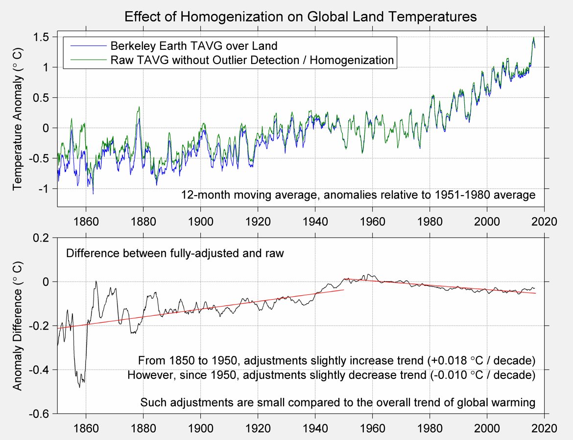
Thanks for the reply, Nick. FYI, your link (…HERE…) just points to the top of this page. I looked at the Robert Rhode plot linked further down. Is your graph that same graph, or did you derive it independently?
One of the reasons I find the NH adjustment claims to be suspicious, is that the actual temperature anomaly graph (David’s second graph, above) shows little evidence of a warm 1930s. I simply don’t think that graph shows the reality that existed at that time. The 1930s was probably the warmest decade of the past century, but looking at this anomaly graph, you’d never know that. In America, this time was called the Dust Bowl, coinciding with very warm temps, extreme drought, crop failures in the middle plains, and massive climate migration from Oklahoma (and other states) to California. I’ve heard some alarmists try to claim that the 30s was a local Western US issue. Balderdash! I recently read the biography of William Dodd, the American Ambassador to Germany from 1933 to 1937, and in it, along with his tepid observations about the evils of National Socialism, he also noted how heat and drought that plagued North America also affected Europe.
Why can’t I just see a series of 10 or 20 representative stations, or hell, I’d even take 20 random stations (so long as they show no urban changes) plotted independently, using raw, original data for daily high temperature, from 1935 to 2015, sans corrections, sans averaging, sans weighting. From those, I think I could judge whether there was a unprecedented global or hemispheric warming trend. That should be easy. And it would be persuasive because it’s simple, honest, and unpolluted by statistical (i.e. editorial) decisions.
“Is your graph that same graph, or did you derive it independently?”
They are independent. I wrote my post in early 2015. Robert Rohde tweeted just recently, using BEST data. AFAIK he had no knowledge of mine.
“plotted independently, using raw, original data for daily high temperature, from 1935 to 2015, sans corrections, sans averaging, sans weighting.”,/i>
There are 29200 days in that period. You can’t do it in a single plot. I did an active plot here for unadjusted summer daily temperatures in Melbourne, Victoria. It uses GHCN Daily, which is a bit of a pain. I experimented with other cities, but the daily data tends to be messy.
Nick Stokes wrote: “There are 29200 days in that period. You can’t do it in a single plot. I did an active plot here for unadjusted summer daily temperatures in Melbourne, Victoria. It uses GHCN Daily,” Thanks, again. That’s a helpful little tool for perusing the max temp records for Melbourne. Do you claim that in those records, the case for AGW or CAGW is being made? I don’t see it, personally. You are apparently having a period of warm summers, similar to those around the turn of the 19th century. But I don’t see that things are so abnormal as to create a panic in the population. I’m not accusing YOU of trying to create a panic, mind you. But some of your compatriots certainly are. Moreover, if you plotted a graph of the change in your price per KwH of electricity in Melbourne (or Adelaide), we might also discuss which graph shows a more imminent threat to human well-being. But I suppose I’m sort of changing the subject, for which I most abjectly apologize. 🙂
You mentioned the word messy in describing lots of daily data. Yes, messy is what it is. That’s why the process of trying to glean some knowledge of actual physical process changes from that data must also get messy, and why it must be done in the most Feynman-esque, transparent way, and why every single correction algorithm must be exposed, doubted, evaluated and judged.
A few ramblings and sidebars on similar topics:
I think the Darwin (Northern Territory) station is one of the more controversial locations in Australia due to some step changes in the record that are apparently (allegedly) due to siting and instrument changes. That would be an interesting city to look at using your web tool. I don’t know if you can simply change a few parameters, or if you need to download and stage a bunch of data. So I ask and expect nothing.
JoNova has a current article up about the BoM recently changing a low temperature record of a very cold night wherein the measured temp was changed to a slightly warmer temp. I don’t really know what to say about such “news.” If this happens, then I suppose the question is, how frequently? And cascading from that, how does this affect the “science” that depends on such information?
I remember hearing about how certain common station thermometers peg at a certain low temperature threshold, and will measure no lower temps. If that’s true, this would automatically skew the record upwards, slightly, any time you saw the low value. And if that happens, given the very limited Arctic and Antarctic data, this error might be skewing all the infill and missing data formulas, too. Since Arctic warming makes up such a predominance of the panic-inducement of the climate alarmists, I would hope that people understand that the official record might be officially slightly skewed to the warm side due to this class of measurement error.
Long ago, one of my high school science teachers related a story I’ve always remembered. When he was a grad student, he worked on an environment or biology research project in the desert outside Tucson Arizona, a place that has normal summer temps in the 110 – 120 f (43 – 48 C) range. One of his tasks was to record the temperature at the average peak max time (2 to 3 pm). He told us how he had performed this measurement. He placed a towel down on the hood (bonnet, to our Aussie and UK friends) of his car, which was already hot from driving to the desert location. Then he laid the thermometer on the towel, exposed to the direct rays of the sun. He told us that he had routinely recorded temperatures between 130 to 140 f degrees (55 – 60 C). I don’t know how is inaccurate measurements changed the research he was doing, but it couldn’t have made it better. He told us the story to reinforce the Feynman ideal, to admit our mistakes, to help his students see that humans are fallible, and that science’s saving grace is that it will ultimately self-correct.
it would seem that the AGW hysterics do not have power over funding for Chinese scientists
From the paper
” The temperature anomaly curves bear a high similarity to those reported in previous studies “
And?
Tom Nelson @tan123 1h1 hour ago
Greenland just set the record for coldest July temperature ever reported in the Northern Hemisphere at -33C https://twitter.com/tan123/status/882794279474786304
IPCC was attacked for comparing trends over different length time periods. Why is it OK for China to do it?
It is *not* OK. The technique is bogus no matter what continent you are on. It was a bad practice when the IPCC did it, it is a bad practice when the Chinese do it.
EVERYBODY still churning mega data sets obsessed over cause/coincidink/correlations between GHGs and temperature when the entire RGHE is bogus. See N & Z’s study.
Is space cold or hot? There are no molecules in space so our common definitions of hot and cold don’t apply.
The temperatures of objects in space, e.g. the earth, moon, space station, mars, venus, etc. are determined by the radiation flowing past them. In the case of the earth, the solar irradiance of 1,368 W/m^2 has a Stefan Boltzmann black body equivalent temperature of 394 K. That’s hot.
But an object’s albedo reflects away that heat and reduces that temperature.
The earth’s albedo reflects away 30% of the sun’s 1,368 W/m^2 energy leaving 70% or 958 W/m^2 to “warm” the earth and at a S-B BB equivalent temperature of 361 K, 33 C colder than the earth with no atmosphere or albedo.
The earth’s albedo/atmosphere doesn’t keep the earth warm, it keeps the earth cool.
Just passed 2,700 views, zero critiques not even WE & FE.
http://writerbeat.com/articles/14306-Greenhouse—We-don-t-need-no-stinkin-greenhouse-Warning-science-ahead-
http://writerbeat.com/articles/15582-To-be-33C-or-not-to-be-33C
http://writerbeat.com/articles/16255-Atmospheric-Layers-and-Thermodynamic-Ping-Pong
Solar irradiance is not 1,368 W/m^2 of total earth surface, but 1/4 of that. It is 1,368 W/m^2 of the sunward surface of something flat and facing the sun. The Earth has 4 times the area as one side of a disc whose diameter is that of Earth.
The temperature associated with 70% of 1/4 of 1,368 W/m^2 is 255 K. The atmosphere warms this to 287 K.
Read my papers. Your model is dumb!
All of the K-T type diagrams that spread the 1368 over the ToA i.e. divide by 4, are total JUNK and should be tossed in the trash!
The solar luminosity in watts spread over the photo-spherical surface at average earth orbit in m^2 is 1,368 W/m^2. It’s math and geometry. (1,415 W/m^2 perihelion, 1,323 W/m^2 aphelion – delta 92 W/m^2)
Because of the enormous size of the photosphere and the miniscule diameter of the earth that power flux (W is power NOT energy, i.e. 3.6 kJ/SI h) arrives as a parallel energy beam spread over the discular cross section of the disc. More math and geometry.
Energy leaves the earth perpendicular to the atmosphere per Q = U A dT until 32 km where 240 +/- W/m^2 – ON AVERAGE – must radiate into space to maintain “the balance.” When/where molecules stop radiation begins. (That’s 32 km not 100 km.) More math and geometry.
And all of this should be worked in kJ/h or kJ/day instead of W/m^2 to wit:
incoming energy kJ/h on the lit side has to equal outgoing energy kJ/h through the atmosphere 24/7 for the temperature to hold steady. More leaves than enters – cooling. Less leaves than enters – warming.
That model actually represents accurately how the earth heats and cools.
Not done.
Go ask those engineers and technicians who install solar thermal and photovoltaic panels how they adjust for various latitudes and longitudes? What are the adjusted W/m^2 because of the oblique angle of that parallel beam on a horizontal surface?
They don’t do any of this nonsense dividing by 4 because: 1) that’s NOT what they actually measure and 2) which makes dividing by 4 WRONG^2!
Here’s another way of looking at the factor of 1/4 that might help to clarify things. The 1368 W/m^2 number (minus the 30% reflected light, etc.) is what you get at high noon, with the sun directly overhead. But the sun isn’t always directly overhead; when it’s lower in the sky, the intensity of the sunlight is less. (Decreases by a factor of the cosine of the zenith angle, if you want to be all technical.) And half the time, it’s night and you don’t get any sunlight at all.
The factor of 1/4 is what you get from averaging out all the variations in the sun’s position over time and location.
Trenberth et al 2011jcli24 Figure 10
This popular balance graphic and assorted variations are based on a power flux, W/m^2. A W is not energy, but energy over time, i.e. 3.4 Btu/eng h or 3.6 kJ/SI h. The 342 W/m^2 ISR is determined by spreading the average discular 1,368 W/m^2 solar irradiance/constant over the spherical ToA surface area. (1,368/4 =342) There is no consideration of the elliptical orbit (perihelion = 1,415 W/m^2 to aphelion = 1,323 W/m^2) or day or night or seasons or tropospheric thickness or energy diffusion due to oblique incidence, etc.
This popular balance models the earth as a ball suspended in a hot fluid with heat/energy/power entering evenly over the entire ToA spherical surface. This is not even close to how the real earth energy balance works. Everybody uses it. Everybody should know better.
An example of a real heat balance based on Btu/h is as follows. Basically (Incoming Solar Radiation spread over the earth’s cross sectional area, Btu/h) = (U*A*dT et. al. leaving the lit side perpendicular to the spherical surface ToA, Btu/h) + (U*A*dT et. al. leaving the dark side perpendicular to spherical surface area ToA, Btu/h)
The atmosphere is just a simple HVAC/heat flow/balance/insulation problem.
Jonathan,
“…factor of 1/4…”
Not Even Close.
It’s interesting that the 1998 El Niño is included in the hiatus but not the 2016. It seems that other wise you lose the hiatus. If I was doing it, I would include both El Niños or neither.
Stop it RS. Treating your readers like 7yo is not helping.
Including neither El Nino, depending on the analysis method and the dataset, the hiatus start time is late 2000 to sometime in 2004, and ends in 2013 or 2014, maybe 2015. A rapidly rising linear trend ends where a nearly flat one begins of the meeting point is 2003-2004. (Using datasets that don’t use ERSSTV4.) A flat linear trend starting after the first El Nino and ending as late as possible starts mostly around 2001 with most datasets that don’t use ERSSTV4, and ends before the second El Nino, by 2014 in some such datasets.
Including the 1998 El Nino also includes the 1999-2001 La Nina. This limits the effect of this noise on the true signal. There is no La Nina (yet) corresponding to the 2014-2016 El Nino which means including it would affect any signal with this noise.
If you include both/neither you are either a science illiterate or a propagandist.
In fact, the key phrases from the paper are
” The temperature anomaly curves bear a high similarity to those reported in previous studies “
“The relatively cool periods or stable periods appeared in the 1900s, 1940s–1970s and between 2005 and 2014. These results are very close to those found in previous studies “
The spin here is that the trend from 1998-2014 was statistically insignificant (ie difference from zero). But that is not mostly due to the trend being small. It is because the period is short. The observed 0.098 C/decade is not very far short of the 0.2 or so expected long-term, and is almost the same as the trend since 1901. And there is nothing new there. HADCRUT 4 gives a trend From end 2000 to July 2014 of 0 078 C/decade, which is right on the edge of significance.
For the rest, they have a large set of data, like BEST. But their method of integration is rather primitive, like HADCRUT.
The BEST data are not actual data, they are homogenized, kreiged, in-filled, AKA manufactured data.
Mosher himself said raw (real) data is crap data.
BEST is not something to hang your hat on on.
Nick writes
Well it’d better speed up again because it doesn’t look good if the trend is back to how it was a hundred years ago before we were emitting lots of CO2. Even your argument of “land use changes is wot done it” goes out the window because there’d have to have been significant land use change in the last 100 years too.
No, the trend for a specific recent period was similar to the total trend since 1901. That was a period dominated by La Nina events – it is much higher now.
“That was a period dominated by La Nina events – it is much higher now.”
Now that its dominated by El Nino events you mean?
“Now that its dominated by El Nino events you mean?”
That’s why you need a longer period … so that there are both Nina and Nino events included. Only then would a none ENSO trend be revealed.
Toneb writes
So you reject the significance of Ben Santer’s recent paper “Tropospheric Warming Over The Past Two Decades” which blatantly uses the latest El Nino to conclude “Satellite temperature measurements do not support the recent claim of a “leveling off of warming” over the past two decades.”
?
“Hiatus, hiatus, hiatus….”
A better caption would be “reality denial”.
http://www.woodfortrees.org/plot/uah6/from:1997/to:2015/plot/uah6/from:1997/to:2015/trend/plot/esrl-co2/from:1997/to:2015/normalise/offset:0.15
Richard, look what happens when you include the most recent data in your plot, and don’t stop at 2015: http://www.woodfortrees.org/plot/uah6/from:1997/plot/uah6/from:1997/trend/plot/esrl-co2/from:1997/normalise/offset:0.15
Rob, what happens is you use ENSO weather noise to influence the trend. You do realize how noise can affect linear trends, right? So, proper science requires avoiding that kind of noise. That is what I did. If you don’t believe it is noise then you need to explain the latest CFSR data. We are right back where we were at the end-point of my graph (actually lower).
No Richard, what you are doing is cherry picking data.
…
Here’s what ALL the UAH data looks like:
…
http://www.woodfortrees.org/plot/uah6/plot/uah6/trend/plot/esrl-co2/normalise/offset:0.15
….
Nothing cut out
Richard
“Rob, what happens is you use ENSO weather noise to influence the trend.”
Um… Richard didn’t you include 1998 ENSO weather noise?
Rob,
Interesting chart. Looks like the warming since 1980 is roughly 0.45c with a term of 47 years (this year) which would extrapolate out to 0.97c – 0.98c per century. Not exactly the 8.5c Business as usual Scare Tactic scenario come to pass for business as usual conditions
It is most unfortunate though that the chart doesn’t also include a scale bar for that red scary CO2 level
Well Rob, if you plot the growth of a normal person from age 0 to 40 you must believe the person is still growing at age 40. But that would be silly, wouldn’t it. Plotting the entire satellite data does show warming but it tells you nothing of what has happened over the past 20 years. It appears you don’t want to know.
The late 20th century warming is over, you seem to think that because it warmed two decades ago that is meaningful today. Laughable.
Oh yeah, Santer et al 2011 told us we need 17 years of data to understand “human effects”. So, your claim of cherry picking is nonsense. You just don’t want to accept what the data is telling you.
Yes Tony I included the 1997-1998 ENSO noise and the 1998-2001 ENSO noise. The first one has a negative influence on the trend and the latter one has a positive influence on the trend.
By including both of these periods the noise cancels out with little to no influence on the trend. Of course, it takes a little thinking to understand this fact. You should try a little thinking one of these days.
I find it hard to believe that any information comes out of China without government approval. China has said that it wants to be a world leader on climate change. How then do we understand them producing a paper that calls CAGW into question?
It seems that China would like CAGW to go away as an issue so they can continue spewing CO2 at a rate greater than any other country, greater than all of North America, greater than all of Europe. link At the same time they want to show that they deeply care about CAGW for political reasons.
I predict that China will allow its scientists to produce papers that chip away at the foundations of CAGW without outright debunking it. How confident am I? Prediction is hard, especially about the future. link Having said that, the Chinese have a long game and they don’t want anyone else to know what it is. They’re kind of like President Trump in that regard.
“How then do we understand them producing a paper that calls CAGW into question?”
It doesn’t call anything into question. Here are those quotes again from their paper:
” The temperature anomaly curves bear a high similarity to those reported in previous studies”
“The relatively cool periods or stable periods appeared in the 1900s, 1940s–1970s and between 2005 and 2014. These results are very close to those found in previous studies”
Werner Brozek chronicled the status of trends at WUWT for years. In August 2014, he said:
“For Hadcrut4: Since December 1996: CI from -0.026 to 1.139
For Hadsst3: Since August 1994: CI from -0.014 to 1.665
For GISS: Since October 1997: CI from -0.002 to 1.249”
There is no news here, except for the endless misunderstanding of statistical significance. It doesn’t mean low trend, it means insufficient information – ie short period.
You nailed it Nick… just like Gavin did…
https://wattsupwiththat.com/2015/06/06/gavin-says-the-funniest-things/
😎
If their competitors wont self destruct or economically implode over it, what use do the Chinese have for it?. We are gonna dodge the interesting times that they had in mind for us all.
Still seems like crap in, carp out, if the margin of error in the actual measurements are multiple times greater than the statistical mathemagic.
GIGO is as GIGO does… to paraphrase Forrest Gump.
Let’s change the subject to coitus.
… since so much of the alarmist reasoning is f***ed up.
Mental masturbation really.
If you have to mental masturbate 40 years on, the glove don’t fit ….
… or something like that.
97% of coitus scientists agree that coitus interruptus (i.e., the pause) is an inconvenient truth.
Coitus scientists are a very confused bunch. They think Donald Trump pulling out means the world is getting screwed.
Want a laugh? I was trying to find a standard greenhouse radiation absorbtion chart to eyeball how much energy CO2 intercepted of the total earth cooling emissions. Unfortunately I went to wikipedia and looked up “greenhouse effect”. It says that a greenhouse gas is caused by “its ability to emit radiation in all directions , ie radiatively active gases”. I was taught that radiative gasses were those that caused distinct radiation effects at certain energy levels like neon or sodium etc, but since when has the greenhouse theory been about anything other than absorption of energy? All gasses radiate in all directions as if certain gasses don’t cool. I’m supposed to believe that hot air in my furnace would last forever if i could just get rid of that pesky CO2 radiating my energy in all directions.
And speaking of greenhouse theory does anybody know what percentage of the theory should be attributed to the conduction of heat from the earth’s surface through the almost all “non CO2” interface called the atmosphere and the back radiation from this (conduction and radiation being the only two cooling options for any substance). The reason I am curious is that when I do a back of napkin calculation that shows less than a 1% energy intercept rate of earth emissions by CO2 and less than 5% of emissions by all green house gasses and then look at the 15% of energy injected into the atmosphere through conduction then maybe the green house gas theory is only 1/4 about greenhouse gasses and 3/4 about the atmosphere. In other words most of the heat gain between our greybody and actual temperature is caused by non greenhouse gasses and much less magic should be given to greenhouse gasses.
tim c: I came here to read about what others have to say about this case. It’s not up yet
Garbage In Garbage Out!
Yes, Mann has nailed himself to the floor. Plenty more to come. Should be a lesson to Mosh and Stokes, if they were capable….
Here is an example about the global temperature data sets: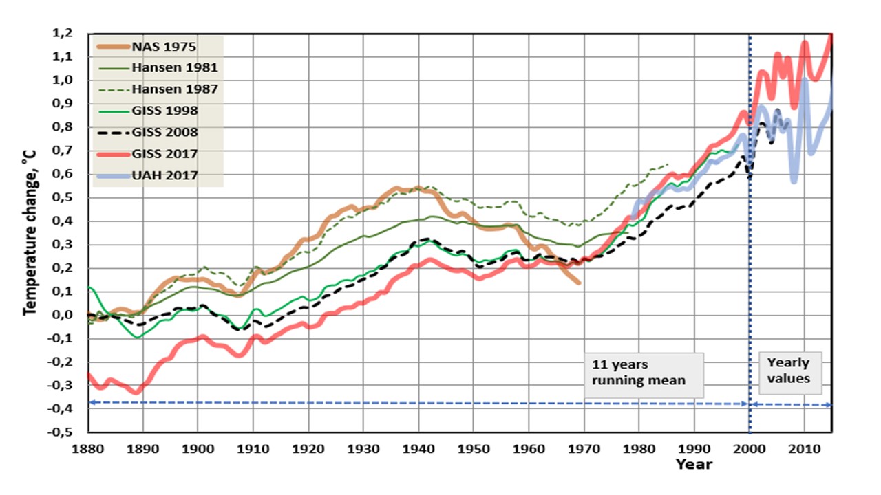 /
/
The last GISS-data set is normalized in the different way by equalizing it to be the same as the GISS-08 in 1970.
Another trial with the figure, I hope:
I keep thinking of THIS article:
https://wattsupwiththat.com/2011/01/20/surface-temperature-uncertainty-quantified/
My earlier comments might have been a bit ignorant about the details, as my statistical savvy is not so great, but this article seems to drive home what I was trying to get at.
This somewhat bolsters my recent point that 20 years of weather is not AGW
Joe Romm, Al Franken et al are parroting what may be the most common falsehood alarmists tout.
https://thinkprogress.org/al-franken-is-right-humans-are-entirely-the-cause-of-recent-warming-ddda0077308a
Romm says:
Here’s the highlighted — and much-quoted finding — from their 2013 assessment of the science: “It is extremely likely that human influence has been the dominant cause of the observed warming since the mid-20th century.” (Emphasis in original, with “extremely likely” defined as 95 to 100 percent likelihood).
Here’e the whopper. ….” warming since the mid-20th century”.
There has not been warming since mid-20th century. Only during the late 70s to late 90s, a 20 year period, or there abouts.
The misrepresentation of “warming since the mid-20th century” is parroted everywhere.
Google it.
Here is a prime example.
https://www.theguardian.com/environment/climate-consensus-97-per-cent/2013/sep/27/global-warming-ipcc-report-humans
“100 percent of the global warming over the past 60 years is human-caused, according to the IPCC’s latest report”
Has there been 60 years of warming? No.
Yet NOAA misrepresents the 20 years of AGW as the much longer 1951-2012 period.
They even do so in a paper with the refuting truth displayed on their own graph.
https://www.climate.gov/news-features/climate-qa/why-did-earth%E2%80%99s-surface-temperature-stop-rising-past-decade
The other offense (and purpose for the first) was for them to deceitfully misrepresent the current weather trend as the same as the pre-pause warming.
This is a blatant lie. .
….”the warming experienced since 1998 is on par with the rate observed in the second half of the 20th century.”
I’m not a scientist. But it doesn’t take a scientist to read and recognize manipulation.
In that same link, in 2015 NOAA and the IPCC acknowledged the pause.
“Using the data that were available at the time (through 2012), the last climate report from the Intergovernmental Panel on Climate Change concluded that there had been no statistically significant increase in global surface temperature from 1998-2012.”
Although there has been some miniscule warming since the 1998-2012 pause the current longer period of 1998 to 2017 has also been statistically insignificant. Meaning there’s been nearly a 20 year period of no significant warming.
“According to a new NOAA analysis, the warming trend during that period was somewhat smaller than the longer-term (1951-2012) trend, but it wasn’t zero. And with the latest data calibrations and the most recent two years of global temperatures added to the series—including record-warm 2014—the warming experienced since 1998 is on par with the rate observed in the second half of the 20th century.”
There was no warming from 1951 to the late 70s. In fact that period was part of a the long cooling trend from the early 40s to late 70s.
Their own graph in the same report displays this.
Again, it’s here:
https://www.climate.gov/news-features/climate-qa/why-did-earth%E2%80%99s-surface-temperature-stop-rising-past-decade
Interestingly, a couple paragraphs later NOAA stumbled out my point.
“The “pause” in global warming observed since 2000 followed a period of rapid acceleration in the late 20th century. Starting in the mid-1970s, global temperatures rose 0.5 °C over a period of 25 years. Since the turn of the century, however, the change in Earth’s global mean surface temperature has been close to zero.”
That period, which is more like only 20 years (late 70s to late 90s) is the entirety of the alarmist’s warming.
It is also much like the early 20s to early 40s warming period which no one attributes to AGW except when they heap 100 years together and pretend it is all AGW.
By NOAA statements in this report AGW is not the later half of the 20th century.
It is only a 20 year period.
So why do they have to stretch the 20 year AGW warming period to include 1951- 2000?
It is to allow them to concoct a fallacious comparison and suggest warming has continued in the same alarming way as the 20 year period .
….”the warming experienced since 1998 is on par with the rate observed in the second half of the 20th century.”
That is a purposefully mendacious assertion.
The 20 years of AGW ended in 1998.
No other AGW occurred before or after that period.
All of the hysteria is based upon a mere 20 year period. That’s not climate. It’s weather.
https://www.climate.gov/news-features/climate-qa/why-did-earth%E2%80%99s-surface-temperature-stop-rising-past-decade
“Why did Earth’s surface temperature stop rising in the past decade?
Author: Caitlyn Kennedy
November 8, 2013
Editor’s note: Updated June 4, 2015”
China has a much longer recorded history than the rest of the world. They learned from that history. China has been through climate change or at least dramatic weather events many times in the past couple of thousand years. They know when the country was divided and poor that it had a hard time adapting, recovering from any perturbation. They know that when country was rich they adapted quickly. If one even cautiously believes the UN-IPCC model predictions then apparently even if we took world greenhouse gas emissions to zero by the end of this year it would not prevent warming. China also knows that one cannot predict what such warming will bring. They also know that cheap energy is required for economic development. I am certain they have reviewed in minute detail all the AGW analysis, data, pontificating. They know well the problems with the data and analysis. They plan and will become a world, if not the world’s dominate, power. One doesn’t do that by developing internal policies based on faulty data.
It’s too bad there are no declared neutral countries in the climate change culture wars that also have the capability to launch satellites for independent measurements and science fact checking.
..and of course you cannot trust China.. They have serious financial interests in the business of solar panels, electronic cars, wind turbines and all the other ‘green technologies’ crap. Especially since it’s mostly western countries that put up the subsidies while China puts up all the manufacturing .. It’s like “Well OK China raise your hand (and tell us what the real climate change is) if you the US/EU govs to stop sending you money into these manufacturing industries that give you guys jobs while us dumbasses in the west go into a black hole of debt.” OK I see no hands, global warming is real and happening now.