Guest Post By Walter Dnes
In continuation of my Temperature Anomaly projections, the following are my June projections, as well as last month’s projections for May, to see how well they fared.
| Data Set | Projected | Actual | Delta |
|---|---|---|---|
| HadCRUT4 2017/05 | +0.770 | +0.665 | -0.105 |
| HadCRUT4 2017/06 | +0.583 | ||
| GISS 2017/05 | +0.93 | +0.88 | -0.05 |
| GISS 2017/06 | +0.81 | ||
| UAHv6 2017/05 | +0.264 | +0.453 | +0.189 |
| UAHv6 2017/06 | +0.384 | ||
| RSS v3.3 2017/05 | +0.402 | +0.482 | +0.080 |
| RSS v3.3 2017/06 | +0.486 | ||
| RSS v4.0 2017/05 | +0.497 | +0.608 | +0.111 |
| RSS v4.0 2017/06 | +0.539 | ||
| NCEI 2017/05 | +0.92 | +0.83 | -0.09 |
| NCEI 2017/06 | +0.76 |
The Data Sources
The latest data can be obtained from the following sources
- HadCRUT4 http://www.metoffice.gov.uk/hadobs/hadcrut4/data/current/time_series/HadCRUT.4.5.0.0.monthly_ns_avg.txt
- GISS https://data.giss.nasa.gov/gistemp/tabledata_v3/GLB.Ts+dSST.txt
- UAH http://vortex.nsstc.uah.edu/data/msu/v6.0/tlt/tltglhmam_6.0.txt
- RSS v3.3 http://data.remss.com/msu/monthly_time_series/RSS_Monthly_MSU_AMSU_Channel_TLT_Anomalies_Land_and_Ocean_v03_3.txt
- RSS v4.0 http://data.remss.com/msu/monthly_time_series/RSS_Monthly_MSU_AMSU_Channel_TTT_Anomalies_Land_and_Ocean_v04_0.txt
- NCEI https://www.ncdc.noaa.gov/cag/time-series/global/globe/land_ocean/p12/12/1880-2017.csv
The Latest 12 Months
The latest 12-month running mean (pseudo-year “9999”, highlighted in blue in the tables below) ranks anywhere from 2nd to 4th, depending on the data set. The June 2017 NCEP/NCAR anomaly is 0.10 to 0.12 lower than for June 2016 (global and satellite data sets). This implies that the June 2017 anomalies will be lower than the corresponding 2016 values, further cementing the decline of the 12-month running mean. This will make it even harder for 2017 to beat 2016 as the warmest year ever. June marks the 9th consecutive month with NCEP/NCAR global and satellite anomalies lower than 12 months ago.
The following table ranks the top 10 warmest years for earch surface data set, as well as a pseudo “year 9999” consisting of the latest available 12-month running mean of anomaly data, i.e. June 2016 to May 2017.
| HadCRUT4 | GISS | NCEI | |||
| Year | Anomaly | Year | Anomaly | Year | Anomaly |
| 2016 | +0.775 | 2016 | +0.985 | 2016 | +0.944 |
| 2015 | +0.761 | 9999 | +0.907 | 2015 | +0.903 |
| 9999 | +0.708 | 2015 | +0.868 | 9999 | +0.873 |
| 2014 | +0.576 | 2014 | +0.749 | 2014 | +0.743 |
| 2010 | +0.558 | 2010 | +0.713 | 2010 | +0.703 |
| 2005 | +0.545 | 2005 | +0.688 | 2013 | +0.671 |
| 1998 | +0.537 | 2007 | +0.658 | 2005 | +0.659 |
| 2013 | +0.513 | 2013 | +0.657 | 2009 | +0.638 |
| 2003 | +0.509 | 2009 | +0.643 | 1998 | +0.637 |
| 2009 | +0.506 | 2012 | +0.634 | 2012 | +0.624 |
| 2006 | +0.505 | 1998 | +0.634 | 2006 | +0.615 |
Similarly, for the satellite data sets…
| UAH | RSS v3.3 | RSS v4.0 | |||
| Year | Anomaly | Year | Anomaly | Year | Anomaly |
| 2016 | +0.503 | 2016 | +0.574 | 2016 | +0.779 |
| 1998 | +0.484 | 1998 | +0.550 | 9999 | +0.629 |
| 9999 | +0.353 | 2010 | +0.474 | 1998 | +0.611 |
| 2010 | +0.333 | 9999 | +0.423 | 2010 | +0.556 |
| 2015 | +0.258 | 2015 | +0.383 | 2015 | +0.514 |
| 2002 | +0.217 | 2005 | +0.336 | 2002 | +0.422 |
| 2005 | +0.199 | 2003 | +0.320 | 2014 | +0.412 |
| 2003 | +0.186 | 2002 | +0.315 | 2005 | +0.401 |
| 2014 | +0.177 | 2014 | +0.273 | 2013 | +0.396 |
| 2007 | +0.160 | 2007 | +0.253 | 2003 | +0.385 |
| 2013 | +0.130 | 2001 | +0.247 | 2007 | +0.334 |
January-through-May of 2017 were all cooler, in all data sets, than the corresponding months in 2016. Therefore, June-through-December 2017 would have to be warmer than the corresponding months in 2016 to beat the 2016 annual values and make 2017 “the warmest year ever”. Here are the numbers…
- HadCRUT4 2016 Jun-Dec was +0.664; 2017 needs to be +0.778
- GISS 2016 Jun-Dec was +0.860; 2017 needs to be +0.995
- UAH 2016 Jun-Dec was +0.384; 2017 needs to be +0.641
- RSS 3.3 2016 Jun-Dec was +0.430; 2017 needs to be +0.688
- RSS 4.0 2016 Jun-Dec was +0.674; 2017 needs to be +0.932
- NCEI 2016 Jun-Dec was +0.837; 2017 needs to be +0.960
The Graphs
The graph immediately below is a plot of recent NCEP/NCAR daily anomalies, versus 1994-2013 base, similar to Nick Stokes’ web page. The second graph is a monthly version, going back to 1997. The trendlines are as follows…
- Black – The longest line with a negative slope in the daily graph goes back to late May, 2015, as noted in the graph legend. On the monthly graph, it’s June 2015. This is slowly growing ever longer but nothing notable yet. Reaching back to 2005 or earlier would be a good start.
- Green – This is the trendline from a local minimum in the slope around late 2004, early 2005. To even BEGIN to work on a “pause back to 2005”, the anomaly has to drop below the green line.
- Pink – This is the trendline from a local minimum in the slope from mid-2001. Again, the anomaly needs to drop below this line to start working back to a pause to that date.
- Red – The trendline back to a local minimum in the slope from late 1997. Again, the anomaly needs to drop below this line to start working back to a pause to that date.
NCEP/NCAR Daily Anomalies:
https://i0.wp.com/wattsupwiththat.files.wordpress.com/2017/06/daily.png
NCEP/NCAR Monthly Anomalies:
https://i2.wp.com/wattsupwiththat.files.wordpress.com/2017/06/monthly.png
Miscellaneous Notes
At the time of posting, the 6 monthly data sets were available through May 2017. The NCEP/NCAR re-analysis data runs 2 days behind real-time. Therefore, real daily data from May 31st through June 28th is used, and June the 29th is assumed to have the same anomaly as the 28th. For RSS and UAH, subsets of global NCEP/NCAR data are used, to match the latitude coverage provided by the satellites.
In search of better results, I’ve tweaked the data set projection algorithm again. The monthly anomaly difference (current month minus previous month) in the corresponding NCEP/NCAR subset anomalies is multiplied by 0.5 and added to the previous month’s anomaly for that data set. This applies to all 6 data sets.
UAHv6 was particularly wide of the mark. Do you have any thoughts on that?
The NCEP/NCAR data is a proxy for surface temperatures, which doesn’t seem to track lower troposphere temperatures very well. I’m looking at using another data set for satellite projections, possibly the air.YYYY.nc files at ftp://ftp.cdc.noaa.gov/Datasets/ncep.reanalysis.dailyavgs/pressure/
That would involve some programming to duplicate what I’ve done with NCEP/NCAR. I should be able to re-use some of my current code.
I’m trying to understand just what is going on here; Just considering your first Chart.
You have six pairs of data sets, from presumably six different data sources.
From those data sets, it would appear that the application of some fixed known algorithm (for each source) yields a result that is called ” Actual ” and always will yield that exact number, from that data source.
Then apparently you have YOUR “projected” result, which apparently you get from some other source of data; such as out of the blue sky.
And the presumed purpose of your projection, would seem to be to get the “correct” global anomaly without needing any of those six data sources.
There’s no reason to believe that the resulting (actual) numbers have anything to do with the global climate (what exactly IS the global climate ??) They are simply products of the several data sets, and the applied algorithms.
So I am trying to understand the purpose in creating/deriving/deducing/projecting/whatever even more origami figures, than are already being created out of thin air.
G
@george e. smith July 2, 2017 at 1:06 pm
The “projected” May values are the projections I made in the post on May 31st. The “actual” May values are the May values, as per the downloads from the various sites, during the month of June. The 6 download URLS are listed right after the first table. This gives a comparison showing how well (or how badly) the projections verified. This can be “a humbling experience” at times. I now know how forecasters feel when things don’t work out.
The “projected” June values are listed by themselves. We won’t know the “actual” June values until the 6 sites report them sometime later this month. The reporting schedule varies, but generally it’s…
* RSS 3rd or 4th day of the following month
* UAH Preliminary (2-significant-digits) report on the 3rd or 4th day of the following month. The final (3-significant-digits) report is approximately the 10th day of the following month.
* GISS the middle of the following month
* NCEI 3rd week of the following month. They’re the only one with a fixed schedule. See “Global” release dates on web page https://www.ncdc.noaa.gov/monitoring-references/dyk/monthly-releases
* HadCRUT near the end of the following month. Sometimes it can be as late as the first few days of the second month following… e.g. May report coming in early July.
post needs a title
added for him…..sigh
Sorry about that. I thought I had done it. Will add it to my checklist next month.
I thought you were on vacation already and I was razzing ctm?
How does Duke of Post or Lord Post or King Post or Queen Post or Admiral sound for a title?
I prefer ‘Post, Esq, PDQ, GISS, NCEI, RSS, Etc.’
One could obtain an Admiral Post simply by contemplating one’s Naval !
g
Looking at the NCEP/NCAR Monthly Anomalies, I’m not sure linear trend lines are appropriate. It sure looks like there was a step change after the 1998 El Nino, and although it’s a bit early to say so, it looks like the same thing developing after the 2016 El Nino. link
Not so sure. We had to wait for 3 La Nina years to pass before the jump in 2001. I suspect all we have is some left over warm water from the El Nino. It appears this has now cooled and the very latest drop could be where we will be for the rest of the summer. Also consider Nino 3.4 is sitting at weak El Nino levels and we are still seeing this drop off.
I prefer ‘Post, Esq, PDQ, GISS, NCEI, RSS, Etc.’
Woops. my reply was to the wrong post here. Could some kind admin type remove this spurious copy of the comment?
I noticed this today. I have three websites with different values.
I get my data here..
http://images.remss.com/data/msu/graphics/TLT_v40/time_series/RSS_TS_channel_TLT_Global_Land_And_Sea_v04_0.txt
I downloaded data on June 3, 2017 and the last five values were these
2017 1 0.4081
2017 2 0.4393
2017 3 0.348
2017 4 0.3914
2017 5 0.4819
I downloaded data today June 30, 2017 and here is what I found.
2017 1 0.5783
2017 2 0.6641
2017 3 0.5647
2017 4 0.5448
2017 5 0.6267
These are profound changes for the same five months of data. Someone help me get this straightened out. I have been using this site for a long time. On June 3 the slope in their graph was 0.135 now it is 0.184 which is explained by the differences you see.
I can see by your links that different values might be in the different sites but how do I explain a third with different values. I am at a loss.
Your earlier numbers are from RSS TLT V3.3, from this file
http://data.remss.com/msu/monthly_time_series/RSS_Monthly_MSU_AMSU_Channel_TLT_Anomalies_Land_and_Ocean_v03_3.txt
Thanks for responding. The site I was using must have transitioned from the earlier version sometime during the month. It sure came as a shock to me to see those dramatic changes.
The “heat-grinders” are still tin action?
As http://www.surfacestations.org/ has shown, we can’t trust the past numbers. The “baseline” is corrupt. Not maliciously, but, well, siting issues and honest mistakes made before “the number” was written down.
Back in 2007, I copy/pasted the record highs and lows for for my little spot on the globe. (About 5 years before I found WUWT.) I did it again for several, varied years afterward. And I compared them. Lots of changes. Up by as much as 5 deg F.
And that was just changes for one little spot on the globe.
Most of you (maybe all of you?) know more, understand more, of what’s going on with “CAGW”.
All I know is that if my little spot on the globe’s numbers have been changed, why should I trust that the numbers for the rest of the globe have ever been accurate and precise?
Throw in politics? (The UN and below.)
“Nature”‘ is in control, not us.
(But some of “us” control the numbers. Who are they?)
Four ‘significant’ figures?
Probably only 1 significant figure, followed by 3 insignificant figures.
I’m guessing the only significant aspect is sign. A quick count shows 30.6553911% of the entries are negative.
Well Steve there is nothing significant about the sign. That is simply a happenstance of a completely arbitrary selection of the co-ordinate axes.
Think where we would be if somebody had decided that electrons were positive charge.
And what if some maroon had decided to call the major surviving species of material in the universe ” Anti-matter “.
g
the authors of RSS published a major revision to the 4.0 series on June 26th. http://journals.ametsoc.org/doi/abs/10.1175/JCLI-D-16-0768.1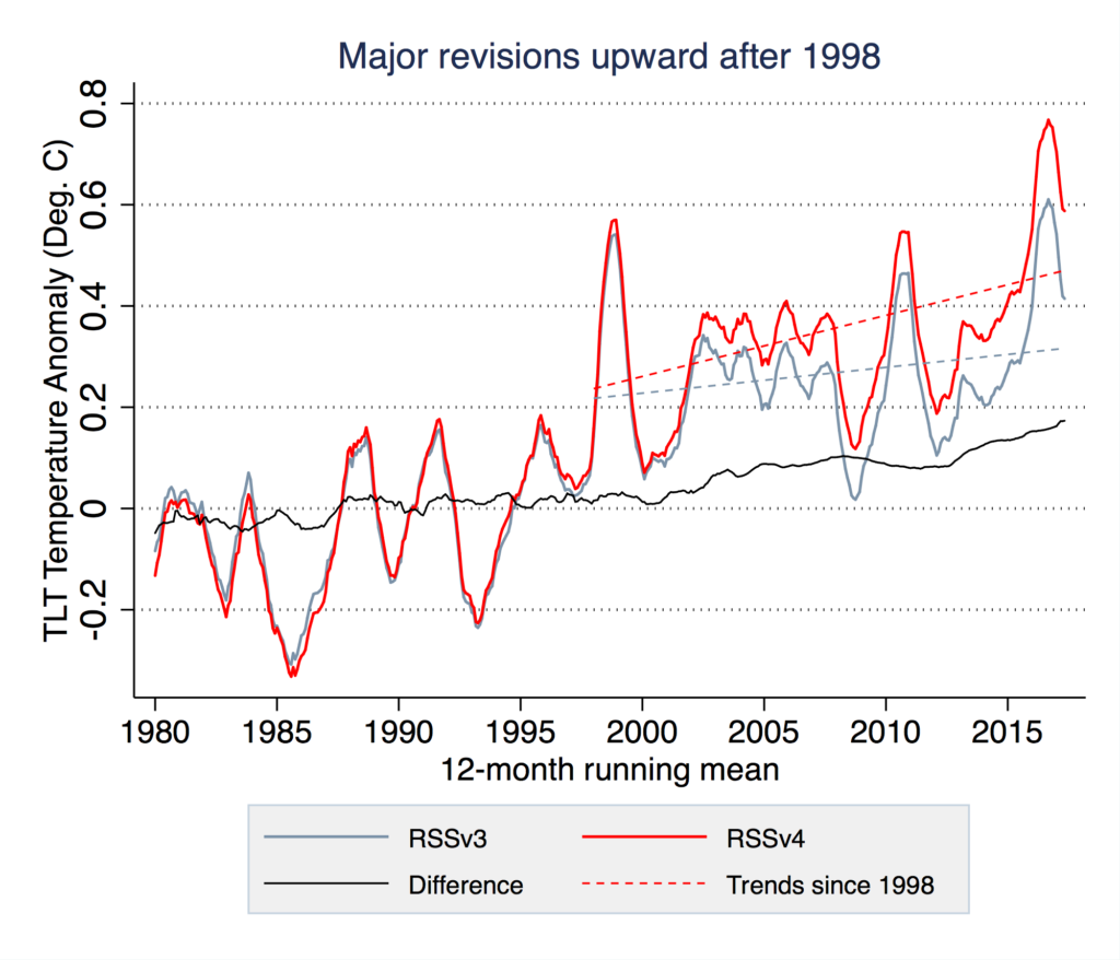
A satellite-derived lower tropospheric atmospheric temperature dataset using an optimized adjustment for diurnal effects
Carl A. Mears and Frank J. Wentz
Remote Sensing Systems, 444 Tenth Street, Santa Rosa, CA, 95401
More on the *Major* revision can be found here: https://www.carbonbrief.org/major-correction-to-satellite-data-shows-140-faster-warming-since-1998
[snip – mod]
It’s worse than we thought!
Goodness, we will soon be informed that the “multiply-awarded” Mikey Mann was right, and the Little Ice Age – and the Medieval Warm Period – were figments of a fevered [sorry] imagination, and temperatures have, in fact, been utterly constant for millions of years, right up to 1950, when, miraculously, humans screwed the planet good-oh, pretty much overnight.
And getting worse!
Faster by the day – if not the hour.
Proven beyond peradventure – let alone a frisson of a saucisson of doubt – by the tree rings in a single, one-inch diameter, broom-handle in the janitor’s department at Penn State.
The broom handle is not available for interview, just now.
Unhappily.
But it is unequivocal.
The unequivocality cannot be over-stressed.
Mods – /Sarc.
[Just in case]
Auto
If folk have skin in the game, there is a temptation to rig the game.
Just sayin’!
Apparently the satellite data has been ‘adjusted’ now to orove the world is really warming
.http://www.independent.co.uk/news/science/climate-change-sceptics-satellite-data-correction-global-warming-140-per-cent-zeke-hausfather-a7816676.html
I’m a bit dubious myself. Apparently as the satellites have been slowing down due to drag from the atmosphere, they are recording temps later in the day. The article claims temps originally taken at 2pm are now taken at 6 or even 8pm.
First off, it seems incredible that this was not noticed before. How can you not notice such a shift? Surely the data contains location info as well as time and temps?
Secondly, if some areas previously recorded at 2pm are now recorded at 8pm, surely other areas that were recorded at 2am are now being recorded at 8am, so it should balance out overall?
Can anyone who understands these things better than me (ie almost everyone) have a look to check this claim?
Jerome,
“First off, it seems incredible that this was not noticed before”
It’s a long-standing issue, and a major difficulty with satellite measures. What varies is how they correct for it. It was a factor in the big change going from UAH 5.6 to V6 as Roy Spencer explains:
” For example, years ago we could use certain AMSU-carrying satellites which minimized the effect of diurnal drift, which we did not explicitly correct for. That is no longer possible, and an explicit correction for diurnal drift is now necessary. The correction for diurnal drift is difficult to do well, and we have been committed to it being empirically–based, partly to provide an alternative to the RSS satellite dataset which uses a climate model for the diurnal drift adjustment.”
It’s just not obvious what to do, and changing from one way to another makes a big difference, which is one reason why satellite measures are less reliable than surface. The new paper where Wentz and Mears explain the V4 TLT is here. The abstract says:
“Previous versions of this dataset used general circulation model output to remove the effects of drifting local measurement time on the measured temperatures. In this paper, we present a method to optimize these adjustments using information from the satellite measurements themselves. The new method finds a global-mean land diurnal cycle that peaks later in the afternoon, leading to improved agreement between measurements made by co-orbiting satellites.”
I used the satellite data along with ground data in my book of 2008 [Climate change: Myths & Realities] and later I found this data was removed from the internet. The current data is above this the older version of data.
Few years back at a tropmet symposium [I along with another scientist edited the proceedings and published by a publisher in 1999] a scientist started presenting his analysis based on the satellite data and at the end a group of scientists who released the satellite data got up and said that the data is not correct. That means the efforts made by the scientist is waste of time and money. Then I asked the group who released the data: if it is so why you did not inform the groups whom you provided the data for analysis. No answer to this.
Dr. S. Jeevananda Reddy
“why satellite measures are less reliable than surface”
I find that hard to believe
WMO-
“Because the data with respect to in-situ surface
air temperature across Africa is sparse, a one year
regional assessment for Africa could not
be based on any of the three standard global
surface air temperature data sets from NOAANCDC,
NASA-GISS or HadCRUT4. Instead, the
combination of the Global Historical Climatology
Network and the Climate Anomaly Monitoring
System (CAMS GHCN) by NOAA’s Earth System
Research Laboratory was used to estimate
surface air temperature patterns”
Africa – one fifth of the world’s land mass.
“It’s just not obvious what to do, and changing from one way to another makes a big difference, which is one reason why satellite measures are less reliable than surface.”
NASA says the satellite data is more reliable than surface.
It’s just not obvious what to do, and changing from one way to another makes a big difference, which is one reason why satellite measures are less reliable than surface.
——–
Surface data sets only cover about 25% of the Earth’s surface at best, are of poor quality due to siting issues and other (well documented) politically motivated manipulations.
Surface temperature data sets are a scientific joke. I’m sure you are well aware of this, Nick. But you continue to press on with this nonsense.
Well it is difficult to imagine how one could get to be less reliable than surface measures, given that there aren’t nearly enough believable measurement sites to obtain a valid sampling of the complete global Temperature map.
Using the Temperature reading of a specific thermometer to represent the Temperature of some place 1200 km away from that thermometer is not my idea of proper sampling. And if you had enough properly located Thermometers, you would still have to read ALL of them at the precise same time, to reflect the true state of the global Temperature at that time.
And just how does one arrange for the sun and the satellite to always be in the same relative positions to some surface position, each time you wanted to take a measurement.
Satellites are at least able to scan the available locations at a sufficiently high resolution.
G
It’s such a shame, because RSS, I think, probably had a slightly better product than UAH prior to this “adjustment”. There is another proxy for global temperature available: the rate of change of atmospheric CO2. The previous RSS matched that proxy extremely well:
http://i1136.photobucket.com/albums/n488/Bartemis/scale%200.22_zpsq4jxp1xy.png
The problem, in a nutshell, is confirmation bias. They wanted the temps to be warmer, so they went looking for “adjustments” that would create warmer readings. Then, when they found some, they stopped looking. They are so sure that the temperatures should be warmer that they throw caution to the wind, and accept whatever agrees with their preconceived outcome.
It’s pretty much a given that reasons can always be found to make adjustments one way or the other within the bounds of uncertainty – after all, we are talking here about 0.1 degC differences. Your own body temperature can vary by +/- 0.6 degC over a day. You could not feel a 0.1 degC difference.
But, if you only look for “adjustments” that will give you increased warming, you will only find “adjustments” that give you increased warming.
This is old news and a non-issue in terms of the question of climate crisis. If the data is sensitive that the well known friction from the atmosphere can mask it or distort significantly ( significantly being very relative) then it is not a crisis. The interesting question is why does media breathlessly “discover” this and then with no critical review compete to make non-news into scary nonsense.
As other indicated this is a well known situation that was already being handled. This new version is simply the latest and typically biased data manipulation that was actually predicted by Dr. Roy Spencer.
RSS did an exercise a few years ago where they compared their data to radiosonde data. They found their results were the same or higher actual temperature measurements. So now they change their results to be even higher????? Sorry, these changes are not believable. Trump needs to defund this kind of anti-science propaganda.
Here’s a quote from Zeke that describes the changes:
“This involves a combination of satellite observations (when different satellites captured temperatures in both morning and evening), the use of climate models to estimate how temperatures change in the atmosphere over the course of the day, and using reanalysis data that incorporates readings from surface observations, weather balloons and other instruments.”
Got it? They use both climate models and surface data to replace some of the satellite measurements. LMAO. Of course they were going to get a increased trend. This is not how real science is done. All they did is contaminate their data. It is no longer true satellite data. Any real scientists will just ignore their version 4 pseudo-data.
OLS linear regression trends in these data should be interpreted with caution because the independence assumption of OLS is violated.
https://papers.ssrn.com/sol3/papers.cfm?abstract_id=2990384
I mentioned in “Miscellaneous notes” that I’m simply using 1/2 of the NCEP/NCAR delta T from the previous month to project this month’s anomaly. The correlations have fallen off a cliff, so I’m not currently using them.
Only the GISS correl() is decent at approx 0.8. HadCRUT4 and NCEI are approximately 0.5. RSS 3 and 4 are even lower, and UAH is actually negative!
This is true for virtually all climate data.
chaamjamal–
Why not redo your paper using the RSS TLT 4.0 data?
It might be even more interesting if you can get the data they use for comparing to the radiosonde datasets. Judging from their Figure 10, the OLS divided into two 20-year periods is very likely to show the OLS 40-year linear approach is unjustified. The figure shows the clearest “pause” after 2000 that I have yet seen.
http://journals.ametsoc.org/doi/10.1175/JCLI-D-16-0768.1
We’re back into the “pause” band after the worst (or best) El Nino of the satellite era. Waiting for a colder, counter-trend year. Thought it was going to be next year, but could it be this year? We’ll see!
Your numbers for June…
HadCRUT4 +0.583
GISS +0.81
UAHv6 +0.384
RSS v3.3 +0.486
Our Numbers
HadCRUT4 +0.70
GISS +1.04
UAHv6 +0.34
RSS v3.3 +0.34
We will see where they fall soon. Consensus is coolest in 2 years
On surface temperatures, I prefer Walter’s estimates.
Hard to say, Nick. The bias in Walter’s estimates seem to be higher for the land (overpredicted) and lower for the satellites (underpredicted).
Mind you that is the way I would expect the results to go as a skeptic.
I am pleasantly surprised that you agree with him on the surface temps this time.
With the current low rebound only of Pacific temps plus the pleading slowdown in PIOMAS loss I am expecting a very sharp fall in UAHv6.
With the usual Zeke adjustments I much more expect Mary to be right but will take any unexpected fall happily.
One of the problems with the adjustments that they have made is that when enough cooling does happen the land adjustment algorithms will quickly lead to big falls when they do occur.
Perhaps Trumps eye over the shoulder is inhibiting Gavin’s little adjustments.
A lot of little whistle blowers out ther now.
“Guest Post By Walter Dnes”
You must be missing a vowel
I’ve heard rumors that you can buy a vowel from Vanna White.
That sounds like some spin.
It is disappointing to see the graphs of anomalies using such a small range. The normal long term range of values for global temperature is about + or – 2 deg C. Any reasonable graph should show that the rate of change is miniscule. I know that the graphing products set the range based on the max range of the data set, but the graphical impression or message is wrong. Plot that same data using a graphic range of 2 C degrees and it will appear almost flat which is what it really is.
The point of these graphs is to show temperature anomalies versus trendlines. In order to avoid all the lines and data being squashed together, I’ve zoomed in as much possible.
So its clear that nothing much 8s happening in terms of the ever predicted climate apocalypse. Yet the number of articles either punishing southerners in the US with “climate change” or claiming that we only have 3 years left to save the planet is spiking. Why? Why now? Except for being able to pretend that Arizona getting hot in the summer is big news nothing much is happening in climate. Why do the alarmists feel so worried? The answer is not found in reality..
They are getting more desperate as the forecasts/projections/predictions/guesses fail to materialize. You’d think with the volume of bogus claims they’d get lucky and have at least one come to pass. There use to be people cataloguing these failures but the lists became too voluminous to keep up with …. and the results were always the same. Every single one.
Last few days in North East UK have been very cool. 16c high for 28-30th June. We had to light wood burner! Last time that happened in June was 2007. Might only be one spot on planet but certainly here the signs are that this year will be cool.
People have short memories though. We had a cooler than average first few months of 2017 but all forgotten because we had two weeks of ‘heatwave’ in early June (funny that, as it was actually summer temps in summer!)
Just had record low minimum of negative 6.9 at the infamous Ruther Glen site . It’s cold this winter in Victoria
I’m not sure what you mean by cooler than average first few months. So far only January was below average (compared with 1981 – 2010) in England, and then only by 0.3C. The rest of the year has all been above average. Often well above average.
@Bellman, I was not referring to fiddled temperature data from UKMO. I was referring to our ACTUAL solid fuel consumption. Our heating, cooking and hot water is entirely from solid fuel, the volume used is directly proportional to outdoor temperature. The first four months fuel consumption for 2017 was 20% higher than our 10 year average and only 2010 was higher.
Considering we have had to light the wood burner in June which has only happened once before in last 10 years then for us, our 2017 fuel consumption is on course to be highest in 10 years.
Generally speaking in a warm year our Rayburn goes out in April and is lit for winter in October. In a cold year it goes out in May and is lit in September. Our average consumption is approx 10kg of anthracite per day in average conditions. Goes up to approx 20Kg a day in very cold weather. So it is very easy to spot the warm years from the cold when reviewing monthly consumption data records.
This has nothing to do with temperature data which can be and is fiddled, adjusted and innacurate. Eg. UKMO temps are often 5c higher than actual temps here in rural NE in winter. They only get close in summer. If you rely on UKMO data then you will believe in GW.
I should also point out that unlike most homes in UK, when we need to ‘turn the heating on’ we have to walk to bottom of garden, load anthracite or logs into a bucket and then cart it back up to the house. We do that in all weather. We are therefore far more attuned to what the actual weather has been like than people living in a thermostatically climate controlled home. I can assure you it is no fun gathering logs or anthracite at 4am in sub zero temps! 🙂
Also all our cooking in summer is done outside on a gas BBQ when the Rayburn is not running for summer. So we are also more in tune with how many times it rains or how cool it is compared to most.
Exactly. According to the Central England Temperature series, June was the second warmest since the record-breaking summer of 1976, and like each of the last 5 months, was more than 1 degree above the 30-year mean. But those were readings from thermometers, rather than wood-burners, so perhaps there is room for doubt??
Getting to 0.583 on HadCrut would be a sweet reversion to normalcy. Massive change in just a few months. I suspect you’ll be close, unlike May’s large overshot.. Btw, the May Hadcrut appears to be 0.655….not 0.665.
“The Sky is falling!” We all remember Chicken Little. How did we get to this modern day equivalent?
Visualize: Typiclal home scene. Little K-12 inoctrinated Johnny asks dad. “Daddy, is the earth getting too hot? Daddy, an average college educated chap worried about imprtoving his 25 golf handicap does what?
HE GOOGLES IT
>>>>The combined average temperature over global land and ocean surfaces for May 2016 was the highest for May in the 137-year period of record, at 0.87°C (1.57°F) above the 20th century average of 14.8°C (58.6°F), besting the previous record set in 2015 by 0.02°C (0.04°F).
Source: Google with ref to=> https://www.ncdc.noaa.gov/sotc/global/201605<<<<<<
Were there abstract concepts like "air density anomolies" that eventually put the matter to rest?
We are not going to win this war arguing "data". Data anomolies only have relevence if you have good data to begin with. Up until reading this article I thought eventually Satellite data would bring sanity back to the table since accurate surface data is a non-starter. Appears you can argue that data also.
Last point. From the movie "Treasure of the Sierra Madre" with Humphry Bogart. Bogart is being confronted by some suspicious characters. They are posing as Authority Officials. He asks to see their "Badges".
They mockingly reply, because they know they have the upper hand: "BADGES!, we don'y need no stinking badges" https://www.youtube.com/watch?v=VqomZQMZQCQ
Now picture today's equivalent; "DATA! we don't need no stinking data."
People making their fortunes as prophets of doom are not actually interested in data. They are selling a narrative to a hungry people for a nice bit of status band money.
It’s more like…
People making their fortunes via profits of doom
Does anyone have a good link to an overview of each the datasets and what they mean?
“Warmest year ever” is such a crock of a statement.
Funny how the “adjustments” always favor the Warmists.
The latest UAH adjustments introduced a much cooler trend. Don’t recall many here complaining about that, even though the UAH data were released long before their method had been published.
Yeah, I’m just not seeing the modeled pseudo data accelerated warming the IPCC predicted !
1988 saw the big wildfires in Yellowstone National Park.
Has anyone compared the rate of exposed political fake news with the rate of AGW fake news? Hmmmm… Me thinks that eventually the trickle down theory predicts an awful lot of research being declared “fake news”. Food for thought.
+1 except AGW fake news gets little to no mention in the MSM.
I do not see the value of forecasting (to 3 decimal-place “accuracy”, no less) massaged climate numbers.
A much more valuable analysis would be a close monthly inspection of climate dada sets so we know when “unannounced” adjustments are made.
You want articles about adjustments? We got articles about adjustments. Wattsupwiththat.com can be queried by tags, one of which is “adjustment”. See the output of the query https://wattsupwiththat.com/?s=adjustment for lots of articles to read on this blog. I have a few posts in that category too.
Walter, I understand you invest significant energy in your monthly analysis. I just fail to see the value. I’m being candid, not intentionally argumentative or disrespectful.
Having expressed my opinion your efforts , I feel obliged to define a monthly process in which I would find value:
Climate scientists responsible for temperature data seem to fiddle the numbers any which way they want, with little or no disclosure or transparency. My suggestion was that a monthly review be performed to identify this monkey-business.
I’m a retired CFO with strong feelings about data quality – it’s also an issue that non-climate-scientists (98% of the population) easily understand. Differential equations, on the other hand, aren’t understood by enough people to matter, but bad data is. You’d be amazed how many people are literally appalled at the thought of moon-walking-NASA fudging data.
One man’s opinion.
Javert Chip
The ‘raw’ monthly station data is available from several sources for anyone to download and peruse. For instance, BEST publishes the raw data alongside the adjusted data and they clearly set out what adjustments have been made and why.
For example, here is the data for Armagh, a long running temperature station located near to where I live: http://berkeleyearth.lbl.gov/stations/25136
At that page you can find graphs of the raw data and links to it. It also describes the process of adjustment (estimated station bias and breakpoint adjustments). The difference between the raw and adjusted trends per station are clearly set out. The methods used are clearly set out in the peer reviewed literature accessible from the BEST site.
It’s hard to see how this process can be described as one of ‘non-disclosure’ or lacking in transparency. Can you suggest anything that would make the process more transparent than it already is?
Some nice work. I too have noted multiple signs for a definite June cooling globally.
Not sure how you are getting such a high UAH prediction given the daily land-based contributions. Of course the UAH data is all over the place so anything is possible, but I am leaning towards a value closer to 0.1.
UAH rose in May compared to April. This when some of the surface data sets were showing drops. UAH came in slightly warmer than both HadCRUT and NOAA last month and equal with GISS (when all are set to the same baseline). This may be the delayed reaction to the up-tick in ENSO 3.4 that began late last year and which appears to be continuing.
Antarctica was cold in June and UAH covers much of that continent, so a drop from May is likely. However, a drop from 0.45C in May to ~0.10C in June would be the biggest month-on-month fall in the UAH data set. There’s nothing to suggest that a global temperature drop of that magnitude has occurred.
It still proved to be a pretty hefty drop of -0.23 degrees.
Not sure why your UAH prediction is so high given the land-based daily contributions. I think it will be closer to 0.1, with little chance it will be over 0.25.
Still no catastrophe?
I was told there would be a catastrophe.
Where the hell is it?
It’s hiding with the LSD flashbacks we were promised.
The satellite data for June is coming in
* RSS3 +0.344
* RSS4 +0.389
* UAH6 (preliminary 2-digit anomaly) +0.21
BTW, if you want to see a drop in temperature check out RSS 4 for the SH from -20 to -82.5. It is over 0.5C
I think this region has the nosiest data.