Guest essay by Leo Goldstein

The MSM is actively promoting a new piece of dubious “climate science”: the article Tropospheric Warming Over The Past Two Decades doi:10.1038/s41598-017-02520-7, https://archive.is/EOXfw by B. Santer et al., published in Nature Scientific Reports on May 24.
For well-known reasons, Santer et al decided to debate not scientists, but Scott Pruitt, the new Administrator of the U.S. Environmental Protection Agency. The authors of the article (SVP for Santer vs. Pruitt) have beef mostly with Pruitt’s statement about warming hiatus in the last two decades:
After a recent Senate confirmation hearing, Scott Pruitt – the new Administrator of the U.S. Environmental Protection Agency – received a written question regarding observed warming estimates. In response, Mr. Pruitt claimed that ‘over the past two decades satellite data indicates there has been a leveling off of warming’.
Dr. Roy Spencer debunked SVP on his blog next day. I can add only a few remarks.
After “remov[ing] the stratospheric cooling contribution,” SVP arrived at an apparent trend of 0.01 degree Celsius per year. Even if this value is statistically significant, 0.01 degrees Celsius per year does mean levelling off. Scott Pruitt was correct. Such apparent trend is in line with non-alarmist computations. But Santer et al. decided to further embarrass themselves by comparing variability from measurements to the “natural variability” from the IPCC models! Unsurprisingly, the IPCC models agreed with themselves. SVP accurately stated that the comparison was done with the computer models, not with the real world. It has not even claimed to refute the statement of the new EPA head. SVP abstract says:” Satellite temperature measurements do not support the recent claim of a ‘leveling off of warming’ over the past two decades.” The WaPo journalist has made an additional step, turning shoddy scientific work into a fake news article “Scientists just published an entire study refuting Scott Pruitt on climate change”. This dynamic, reminiscent of the children’s “telephone game,” has been observed in the putative climate science and its communication for nearly three decades.
SVP would be rejected by any reputable publication. Nevertheless, it passed the supposed peer review by Nature Scientific Reports in a mere 29 days: Received on March 6, Accepted on April 4, Published on May 24; praised and brandished by WaPo and ThinkProgress on the very same day. The publication date might have been selected to influence the G7 meeting. The Nature Group announces median times for its review process (https://archive.is/G3tT4). The median time from submission to acceptance is 124 days. The median time is not very useful metric, so we investigated actual times to acceptance of the last 500+ articles, published in the Nature SRep from May 16. Less than 1% of these articles were accepted within 30 days from submission. All articles in this exclusive club, except for SVP, report experimental research (supporting material is available). This exceptionally quick acceptance, combined with the invalid scientific methodology of the article, suggest that Nature SRep accepted SVP without bona fide peer review, or despite negative recommendations of the reviewers.
Nature Scientific Reports should not be confused with the Nature Climate Science, which does not hide its nature (no pun intended). The Nature Publishing Group (a British corporation) it is owned by the Springer Nature, a German corporation. The latter also owns the Scientific American, a non-academic alarmist mouthpiece. The Springer Nature is owned by the Holtzbrinck Publishing Group, a German corporation, and BC Partners, a British corporation.
Thanks to H.J. for collaborating on this article.
Gee, and this trend of 0.01 degree Celsius per year was probably done with cooked, re-cooked and re-re-cooked data.
Gosh. Wow. Yawn.
Still well below the Per Decade warming trend, the awesome IPCC said, from 1990 on wards.
Santer et al claim that recent warming was withing 10% of what models have been tuned to call natural variability.
Fine, we know that you can tune models to get whatever results you want Hansen 2005 said it is so many words. We also know that they play down natural warming and over-estimate the AGW contribution.
So having stated that they have not levelled off , they state that recent trends are smaller than earlier trends: ie they HAVE levelled off.
Did he just admit (real) warming has been at the rate of 1 C all along?
; )
Hmm. Does that equate to 1 degree Celcius in a hundred years? Gee, that is frightening. Not.
The Climatists are in desparation mode. Their funding (thus their pay checks) are on the line.
Dr Lindzen is so correct when he says Climate Science funding from the US govt must be cut 80% – 90% to clean-out the dishonesty that is so pervasive in the field.
He would know.
IMO however, stopping funding of the insanity isn’t enough.
There must be blood.
The criminal perpetrators, who have cost the world trillions in treasure and millions of lives, at least, must be made to pay for their transgressions.
Hang ’em high!
Put some carcasses out on the fence.
Because of gov complicity, it’s too big to just fail. It will slowly fade and a lot of these doom boomers will be feted for having saved the planet. All this publish on demand to shape the narrative will be used to show windmills blew the heat away, whew, just in the nick of time.
Ever since the “levelling off” of temperatures these jackals have been trying to get out front of a parade not marching in their direction. Only if the Parisite Agreement collapses and things just go on without mitigation will they have to let it go (and we see that there never was anything alarming happening). That’s the main fear that KO’d climate scientists of weaker constitution a few years ago – the dreaded Climate Blues epidemic that permanently retired droves of them. Karlization of temperature stemmed the bleeding temporarily, but they are down to the enduring carp and rat end of the once illustrious cliSci ecology.
I agree with the bloodletting. First, however, there needs to be a 100% cut-off of funding to the U.N. climate bureaucracy and the appointment of a blue ribbon panel to examine the “science”, and call some Menn to account.
That can provide a basis for turning out this political garbage. Until we wake up and recognize that the undeveloped world is attempting to destroy the West, we will not win this war. It is ideological and existential!
Gary Pearse —
“Windmills blew the heat away” — oh! god, that is a line i just got to steal !!!
Eugene WR Gallun
It is not the amount or percentage of funding causing problems. It is the bias in who receives it!
Let’s be clear on this:
Fields like climate science do need public funding! There is no direct way to make money out of the results like in developing a cheaper way to produce fast food e.g.
The government is run by lay men, so they have to rely on what the “experts” suggest. You will never find a work around to the problem “Who decides who is an expert?”.
But the big problem we face now in our age of endarkment, is the fact that funding is not just misallocated once in a while but systematically abused to funnel tax payers money in the troughs of the PC-industrial complex. This is not an honest mistake that eventually happens but strait forward organized crime! We must not confuse these things.
This is the best discussion of this subject I’ve seen.
http://www.drroyspencer.com/2016/12/science-under-president-trump-end-the-bias-in-government-funded-research/
Let those who care fund it.
@MarkW
I basically agree, but here the problem is that many (actually I would bet good money on most) people who should care, because in the long run they will benefit from it, don’t care. Mainly because the benefits are not obvious.
To overcome such a perceived Pareto Optimum public funding can make sense.
“Let those who care fund it.”
Yeah, let’s do the same for our military, for cancer research, for the coast guard.
Zero the funding. That will match the value of the results! In the future, when no one is jiggering the past data and it is obvious that the last hundred years was all natural variability we can start to nibble at a little normal climate science.
Chris,
Money the government threw into the War on Cancer in the 1970s was practically all wasted. Basic science just wasn’t ready yet. Now private research is producing results.
The armed forces are a legitimate function of government and get funding from the taxpayers’ representatives in Congress. By contrast, government grants are handed out by like-minded bureaucrats with little if any oversight. No surprise that mostly bogus, pal-reviewed “climate change research” funding is worse than wasted.
I agree climate science requires continued funding, not at the current level, but it does need to be funded and when it isn’t ideologically corrupted it provides very valuable information.
Funding via the IPCC and UN needs to stop. The problem with the IPCC is it funds research based on an assumed conclusion; that human activity controls climate behavior. It’s very bad when scientific research is directed to prove a specific hypothesis. That has to be stopped.
Santer has a long history of climate shenanigans — elected to the cAGW Hall of Shame.
Jim Lakely of Hartland on Santer
TRUMP and PRUITT get the SCIENCE RIGHT – NATURAL CYCLES DRIVE CLIMATE CHANGE.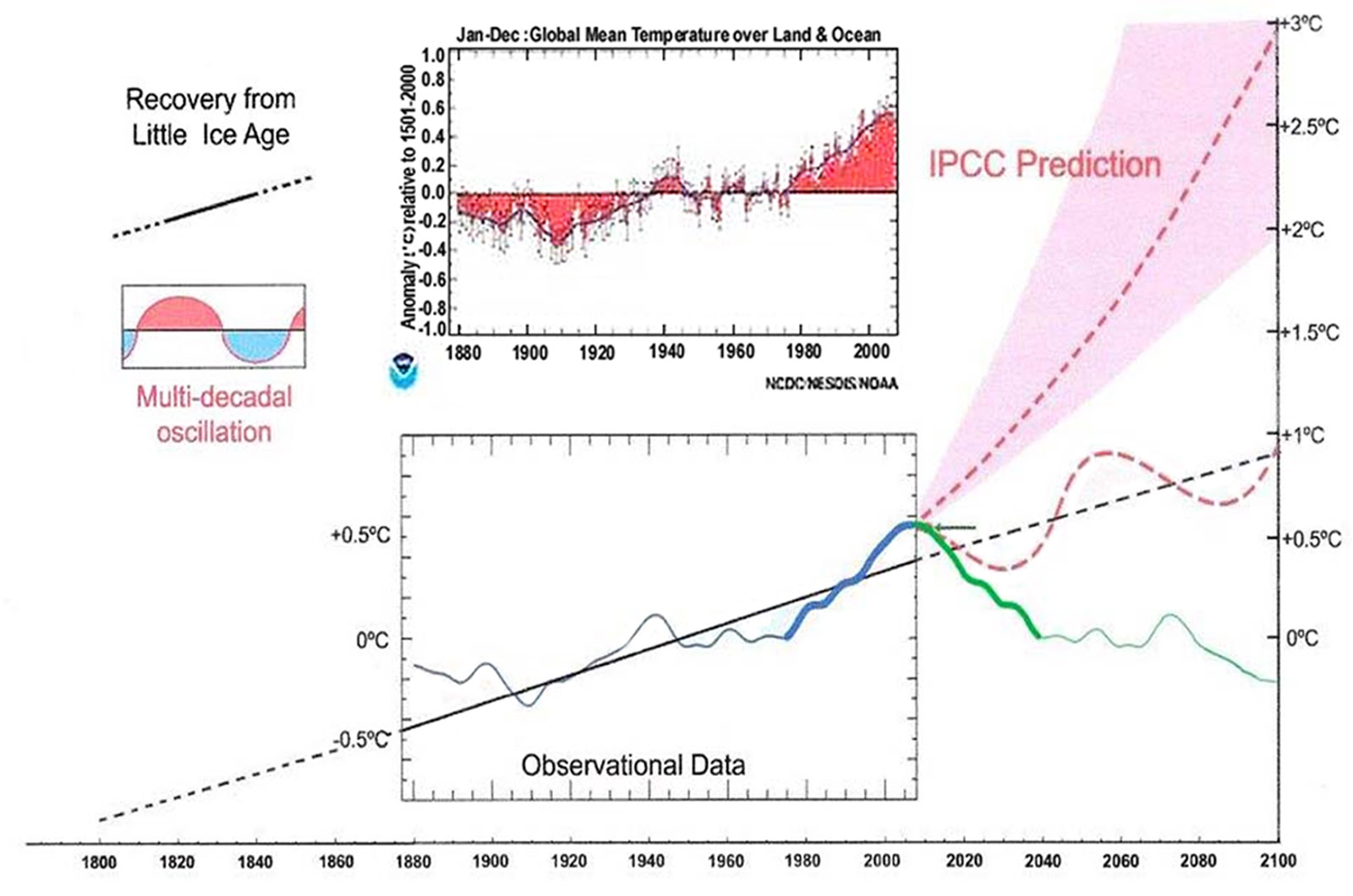
Climate is controlled by natural cycles. Earth is just past the 2004+/- peak of a millennial cycle and the current cooling trend will likely continue until the next Little Ice Age minimum at about 2650.See the Energy and Environment paper at http://journals.sagepub.com/doi/full/10.1177/0958305X16686488
and an earlier accessible blog version at http://climatesense-norpag.blogspot.com/2017/02/the-coming-cooling-usefully-accurate_17.html
Here is the abstract for convenience :
“ABSTRACT
This paper argues that the methods used by the establishment climate science community are not fit for purpose and that a new forecasting paradigm should be adopted. Earth’s climate is the result of resonances and beats between various quasi-cyclic processes of varying wavelengths. It is not possible to forecast the future unless we have a good understanding of where the earth is in time in relation to the current phases of those different interacting natural quasi periodicities. Evidence is presented specifying the timing and amplitude of the natural 60+/- year and, more importantly, 1,000 year periodicities (observed emergent behaviors) that are so obvious in the temperature record. Data related to the solar climate driver is discussed and the solar cycle 22 low in the neutron count (high solar activity) in 1991 is identified as a solar activity millennial peak and correlated with the millennial peak -inversion point – in the RSS temperature trend in about 2004. The cyclic trends are projected forward and predict a probable general temperature decline in the coming decades and centuries. Estimates of the timing and amplitude of the coming cooling are made. If the real climate outcomes follow a trend which approaches the near term forecasts of this working hypothesis, the divergence between the IPCC forecasts and those projected by this paper will be so large by 2021 as to make the current, supposedly actionable, level of confidence in the IPCC forecasts untenable.”
For the forecast to 2100 see Fig 12 in the paper linked above “
Fig. 12. Comparative Temperature Forecasts to 2100.
Fig. 12 compares the IPCC forecast with the Akasofu (31) forecast (red harmonic) and with the simple and most reasonable working hypothesis of this paper (green line) that the “Golden Spike” temperature peak at about 2004 is the most recent peak in the millennial cycle. Akasofu forecasts a further temperature increase to 2100 to be 0.5°C ± 0.2C, rather than 4.0 C +/- 2.0C predicted by the IPCC. but this interpretation ignores the Millennial inflexion point at 2004. Fig. 12 shows that the well documented 60-year temperature cycle coincidentally also peaks at about 2004.Looking at the shorter 60+/- year wavelength modulation of the millennial trend, the most straightforward hypothesis is that the cooling trends from 2004 forward will simply be a mirror image of the recent rising trends. This is illustrated by the green curve in Fig. 12, which shows cooling until 2038, slight warming to 2073 and then cooling to the end of the century, by which time almost all of the 20th century warming will have been reversed.
The entire Anthropogenic Global Warming delusion is in danger of imminent collapse.
With no academic qualifications to call on whatsoever, I think that looks a far more plausible prediction than anything the IPCC and, particularly, Michael Mann has ever produced.
My very unscientific gut instinct suggests to me that observed temperatures, which I understand are currently bumping along the bottom of the IPCC’s lowest estimates, will likely fall below those low projections. At which point, the IPCC will be forced to revise their projections down, again.
My gut (which is an awful lot larger than my brain, sadly) also tells me that will be around the time Mr. Trump runs for POTUS again and British General Election also comes round.
In which case, the whole scam will be over.
#Manchester.
Benindon:
Yesterday I asked you for an apology for your having posted a fabrication about me in this thread. You have still not yet apologised.
I normally ignore fabrications about me on the web because response only draws attention to them. However, in this case there are two reasons which combine to cause me to demand an apology.
1.
You say your falsehood about me is illustrative of a problem with WUWT.
2.
A concern troll is running a campaign demanding that WUWT “get rid” of me because I point out that there is no evidence for discernible man-made global climate change.
In these circumstances I see your fabrication about me as being part of an attack on WUWT.
Richard
It puzzles me why you keep posting that disastrous 2010 forecast of Akasofu (last data 2008). He claimed that would be a maximum (0.54), followed by cooling. The years of that NOAA data have been since
0.64, 0.71, 0.58, 0.63, 0.67, 0.74, 0.90 and 0.94 (2016)
Every year higher than 2008, and many by a lot. Here is the plot with 2016 marked:
The IPCC forecast is looking much better, although exceeded by reality.
Why do you think 2016, the year of peak El Niño warming should be chosen as representative of anthropogenic warming reality? Picking the biggest cherries?
So just to be clear Nick, are you saying that:
A) we are on course for a 3C rise in global temperature by the end of the century?
B) the 2016 mark point leads you to believe that even 3C may be an underestimate?
Presumably if either of these is what you believe will happen we should ignore the long term trend line your own graph shows from about1800 to a roughly 1C rise by the end of the century?
I just want to fully understand which of these possibilities is clearly worrying you.
“representative of anthropogenic warming reality”
No, just saying that it is representative of a very unsuccessful forecast. We have had 8 years since it was made, predicting downturn, and that is where it has come to. Four of those 8 years were hottest ever in their time.
Nick, how can you keep defending those anomaly figures when you know how much of the “data” used isn’t real data at all, but those interpolations of areas where there is no coverage? Regardless of how much one wants a global average, it’s not science to create data where is there none and then use it to create the average.
Nick Stokes May 26, 2017 at 12:09 am
“The IPCC forecast is looking much better, although exceeded by reality.”
It snowed a few days ago in Newfoundland. Also the great plains, Rockies.
Even the MSM is starting to notice the winter that won’t end.
One or two more years off this and “Climate Scientists” are going to have to tie pork chops around their necks just to get the dog to play with them.
Oh and the snow melt in the Tetons, not happening. And it’s still snowing in Russia and other locations.
Yup, “exceeded by reality” it’s getting cold.
michael
James,
“you keep defending those anomaly figures”
I’m just extending the graph that was posted. It said the anomaly was going to go down. It went up. Way up.
I’ve explained many times that a global average necessarily involves interpolation, as does a measure of any continuum variable in science. You have only a finite number of readings. Everywhere else must be estimated. That is how we learn about the world. The option of having an infinite number of readings just isn’t there. All that is required is that you have enough. And we have.
Yep. 2016 is not representative of the trend.
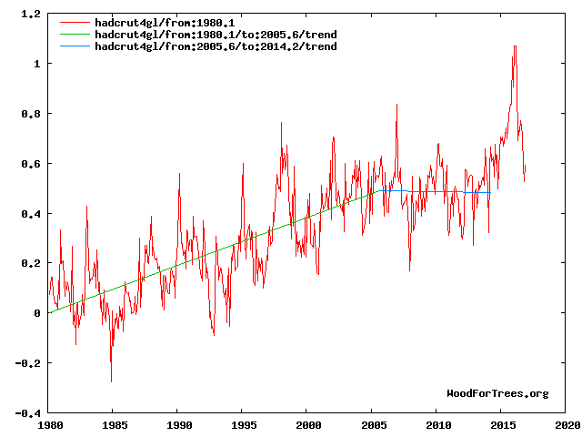
Apart from the 2016 El Niño spike, Akasofu is holding up quite well. Here is HadCRUT4, 1-yr and 5-yr running averages overlaid on the Akasofu-derived plot:


HadCRUT4 was tracking well below the IPCC lower confidence band prior to the El Niño, spiked above the mean and has since dropped back to the mean. The 5-yr average more closely matches the observational data in Akasofu and it is still below the IPCC’s lower confidence band.
My main reason for showing the Akasofu curve was to show an example of an interpretation which at least honors the 60 year cycle which clearly exists over the last century.Here is my paper’s Fig 4 interpretation as of end 2016 which shows the 2016 El Nino as the temporary deviation from the cooling trend which it most likely is.
Fig 4. RSS trends showing the millennial cycle temperature peak at about 2003.6 (14)
Figure 4 illustrates the working hypothesis that for this RSS time series the peak of the Millennial cycle, a very important “golden spike”, can be designated at 2003.6. ………..
The RSS cooling trend in Fig. 4 and the Hadcrut4gl cooling in Fig. 5 were truncated at 2015.3 and 2014.2, respectively, because it makes no sense to start or end the analysis of a time series in the middle of major ENSO events which create ephemeral deviations from the longer term trends. By the end of August 2016, the strong El Nino temperature anomaly had declined rapidly. The cooling trend is likely to be fully restored by the end of 2019.
From Figures 3 and 4 the period of the latest Millennial cycle is from 990 to 2004 – 1,014 years. This is remarkably consistent with the 1,024-year periodicity seen in the solar activity wavelet analysis in Fig. 4 from Steinhilber et al 2012 (16).
Nick writes
But not at the alarmist rate. And why are you insistent on cherry picking the weather event in 2016 as a point to look at? You know better than that and would rightly crucify a skeptic who chose an arbitrary date because it looks good when plotted on a graph.
Nick Stokes May 26, 2017 at 2:31 am
OK, so your result(s) is nothing more than an interpolated “average” of a mixture of actual and estimated quantities …… which has no value whatsoever to the actual factual science of the natural world …… other than “reference information” for directing one’s course of study or research.
Nick Stokes, that was a true statement as far as “estimating” quantities are concerned, …. but it doesn’t have a damn thing to do with the determining of actual factual science of the natural world.
Nick, ….. GETTA CLUE, …… reading about or studying “science fiction” claims and commentary, ……. such as regional or global “Average Surface Temperatures” ….. is not going to learn or teach anyone anything about the actual factual science of the natural world.
But the “readin n’ belevin” of that “science fiction” is really great for public education employees, government employees and the Grant seeking “troughfeeders”.
The roughly 60-yr cycle has been present throughout the Holocene. It’s the peak at 16 cycles/1,000 years on the GISP2 power spectrum:
The dominant ~1,000-yr cycle is Akasofu’s “Recovery from Little Ice Age.”
James Schrumpf on May 26, 2017 at 1:50 am
… how can you keep defending those anomaly figures when you know how much of the “data” used isn’t real data at all, but those interpolations of areas where there is no coverage?
Do you know, James, that this strange refusal of interpolation is one of the most terrible mania in the world of climate skeptics?
Could you tell me for example how else we could manage to send daily billions of Bezier curves to laser recorders, given the number of dots per inch each device is able to represent? And that is, believe me, only one little example among so many…
Please consider the following chart with plots of world averages of
– GHCN unadjusted station data
– GISS data (land-only; land+ocean) obtained from the former using homogenisation, interpolation and infilling techniques whereever possible:
http://fs5.directupload.net/images/170526/xv9p9z8v.jpg
You easily can see that the result of all these steps was not at all to make GISS data “warmer”; the contrary is the case.
The world does not consist at all of exact data: best possible approximation is in many disciplines the standard approach.
David Middleton,
“The 5-yr average more closely matches the observational data in Akasofu and it is still below the IPCC’s lower confidence band.”
What you have plotted is the 10 year average. The 5-year average ending in 2016 is 0.77 °C (cf 2008 below 0.5), and lies right on the IPCC prediction.
Nick writes
No we don’t. If we had enough readings then the datasets would align and C&W would be unnecessary.
Most of what we know is derived and not measured. How many Stevenson screens are there on the wet 70% of the planet?
5-yr average was a typo.


It really is ironic that you keep cherry-picking a single data point and extrapolating it into a pattern.
The 2016 El Niño spiked HadCRUT4 from below the IPCC’s lower confidence band to a point above the IPCC mean. It has since fallen back toward the mean. Barring back-to-back El Niño spikes HadCRUT4 will probably be back below the lower confidence band within a few months.
The 2016 El Niño spike barely pushed HadCRUT4 above the CMIP5 model mean. It has since dropped below the mean on its way back to P95-P100 or below, barring another El Niño spike.
http://comparing%20cmip5%20%26%20observations/
David Middleton,
“The 2016 El Niño spiked HadCRUT4 from below the IPCC’s lower confidence band to a point above the IPCC mean.”
I don’t know why you superimpose HADCRUT4 (base 1961-90) on a plot which clearly uses NOAA data (base 1901-2000).
I trust the Climategate CRU more than I trust NOAA or GISS. Furthermore, the CMIP5 models use HadCRUT as their observational data.
Nick Stokes on May 26, 2017 at 1:07 pm
I don’t know why you superimpose HADCRUT4 (base 1961-90) on a plot which clearly uses NOAA data (base 1901-2000).
David Middleton on May 26, 2017 at 1:10 pm
I trust the Climategate CRU more than I trust NOAA or GISS. Furthermore, the CMIP5 models use HadCRUT as their observational data.
It is here evident that David Middleton did not at all understand Nick’s trivial hint: to present anomalies based on one and the same climatology.
Some weeks ago, a Richard S Courtney was arrogant enough to tell Nick “Go back to school” just because Nick was impertinent enough to present numbers with more than two digits behind the decimal point!
I was told this is a a science site.
David Middleton,
“I trust the Climategate CRU more than I trust NOAA or GISS.”
Well, you may, but the prediction was made relative to NOAA, using their baseline. I notice that when the prediction is to be tested, everyone switches to the dataset that suits. Dr Page now prefers RSS troposphere.
I wasn’t specifically defending Dr. Page’s sound analysis.
I was pointing out your terminally flawed logic in cherry-picking a single data point and extrapolating it into a broad conclusion about Akasofu.
NOAA doesn’t do data. It does adjustments. It cooks the books beyond recognition. Its prevarications aren’t fit for public policy purposes.
Yes, there was warming around the super El Nino just past, but that spike is cooling now.
David,
” cherry-picking a single data point”
I didn’t. I listed each of the 8 years since the prediction, and pointed out that each of them exceeded the 2008 value, four of them being the hottest year to date. This is not consistent with a forecast of cooling.
Straw man. ?w=584
The “forecast of cooling,” to the extent that it is a forecast, hasn’t been tested yet…
“The “forecast of cooling,” to the extent that it is a forecast, hasn’t been tested yet…”
The original post said:
” the most straightforward hypothesis is that the cooling trends from 2004 forward will simply be a mirror image of the recent rising trends. This is illustrated by the green curve in Fig. 12, which shows cooling until 2038,”
It isn’t a mirror image.
Bindidon :
In this thread here you provided plots of
– GHCN unadjusted station data
– GISS data (land-only; land+ocean) obtained from the former using homogenisation, interpolation and infilling techniques whereever possible:
Then you said
Which was true but grossly misleading because the adjustments cooled the past to make the warming trend greater.
I was going to ignore that misrepresentation until I noticed that in this thread here you also wrote
Please link to where you claim I did that or apologise.
The standard of trolls on WUWT is deteriorating.
Richard
TimTheToolMan on May 26, 2017 at 11:26 am
1. Nick writes:
The option of having an infinite number of readings just isn’t there. All that is required is that you have enough. And we have.
2. And Tim The ToolMan replies
No we don’t. If we had enough readings then the datasets would align and C&W would be unnecessary.
Well I don‘t know what toolkit T³M uses. But to its panoply I guess tools analysing temperature series won’t belong. Because otherwise he would have published here another meaning based on a real analysis as is shown below.
A. To simulate the UAH 2.5° grid dataset (9,504 cells) with an amazing accuracy, you need no more than 32 evenly distributed cells out of all the 9,504:
http://fs5.directupload.net/images/170527/ov68tp96.jpg
And the simulation becomes perfect with no more than 512 cells, i.e. about 5% of the total: the linear estimates for 1979-2016 differ by only 0.004 °C / decade!
B. For surface stations the result is a bit different but goes in exactly the same direction. You may for example divide the Globe according to a 5° grid, and allow only one station per grid cell to contribute to the averaging process.
That gives you, for the period 1880-2016, 923 stations instead of the usual 7,280 station total:
http://fs5.directupload.net/images/170527/k9iqpqdz.jpg
The similarity is amazing if we keep in mind the fact that the station selection in each grid cell is completely random. The linear estimates in °C per decade for 1880-2016 are nearly indistinguishible:
– 7,280 stations: 0.232 ± 0.006
– 923 stations: 0.225 ± 0.008
And the 60 month running means look surprisingly similar, especially in the period starting around 1955.
A similar result you obtain for the CONUS, where no more than 51 GHCN stations accurately simulate all 1,842:
http://fs5.directupload.net/images/170527/53p5xf9e.jpg
With the exception of the initial period (1880-1910), the similarity of the 60 month running means is amazing.
Conclusion: T³M is wrong here. We have by far too many stations in the Globe.
And this is well taken into account by all homogeneisation algorithms in use at GISS, NOAA, HadCRUT and JMA: they all let the linear estimates of all stations, about 0.23 °C / decade for 1880-2016, drop down to about 0.10 °C / decade for the Globe’s land data.
The net effect of infilling and interpolation is way lower than what is obtained through outlier elimination and homogeneisation. But it is indispensable.
This is a repost because the first version has appeared in the wrong place.
richardscourtney
May 27, 2017 at 10:57 pm
Benindon:
Yesterday I asked you for an apology for your having posted a fabrication about me in this thread. You have still not yet apologised.
I normally ignore fabrications about me on the web because response only draws attention to them. However, in this case there are two reasons which combine to cause me to demand an apology.
1.
You say your falsehood about me is illustrative of a problem with WUWT.
2.
A concern troll is running a campaign demanding that WUWT “get rid” of me because I point out that there is no evidence for discernible man-made global climate change.
In these circumstances I see your fabrication about me as being part of an attack on WUWT.
Richard
richardscourtney May 27, 2017 at 11:00 pm
Bindidon isn’t criticizing WUWT, he is criticizing you for statements you allegedly made. I copy the pertinent part below to refresh your memory.
Bindidon May 26, 2017 at 1:42 pm
“Some weeks ago, a Richard S Courtney was arrogant enough to tell Nick “Go back to school” just because Nick was impertinent enough to present numbers with more than two digits behind the decimal point!
I was told this is a a science site.”
1. Ron Williams on May 27, 2017 at 11:50 pm
Bindidon isn’t criticizing WUWT, he is criticizing you for statements you allegedly made. I copy the pertinent part below to refresh your memory.
Thank you Ron Williams for you reply to Courtney which however was a bit less founded than you have supposed.
Errare humanum est: I attributed to Courtney what in fact had been written by another Richard (Greene):
https://wattsupwiththat.com/2017/05/04/new-study-confirms-the-warming-pause-is-real-and-revealing/#comment-2494568
But the two persons are, as far as their often somewhat arrogant output is concerned, perfectly interchangeable. So the mistake is at best a half one.
***
2. richardscourtney on May 27, 2017 at 6:18 am
Which was true but grossly misleading because the adjustments cooled the past to make the warming trend greater.
I was going to ignore that misrepresentation…
Here you do nothing else than ignoring a fact which should be visible even to ignorants: namely that if it had been GISS or anybody else’s intention to do what you pretend, they all wouldn’t have had to make their trends by far lower than that of the Globe’s GHCN station average (0.1 °C / decade instead of 0.23).
You are not in science here: that’s at best Cruz or Smith level.
Please link to where you claim I did that or apologise.
As I wrote above in reply to Ron Williams, I made a minuscule mistake in confouding you with another Richard (who imho produces comments of nearly the same vein as yours).
The standard of trolls on WUWT is deteriorating.
On the search for the statement I incorrectly attributed to you, Mr Courtney, I discovered that you call nearly anybody a troll who doesn’t think like you.
I personnaly do not care of all about persons like you naming me a troll! I’m over 65 and look at an interesting scientific past, though nearly disjunct with the mix need3ed to really understand climate matters.
But no one being so respectless merits any apology for whatsoever.
Concern troll who posts as Ron Williams:
I know the falsehood that Bindidon posted: I cited it and quoted it so there could be no misunderstanding of what I was demanding his apology for.
Now, as part of your attack on WUWT you have also quoted it. So I repeat to you what I said to Bindidon
Of course, I don’t anticipate that you will apologise because I know the low-life that you are.
Richard
Bindidon:
You accused me of having done something I would not do, and I requested an apology. Your response says
b> So, you admit you lied, you claim your lie was a mistake, and you don ‘t apologise for the lie but add the unfunded claim that I am “interchangeable” with somebody else. < Well, in response I say you are “interchangeable” with Jack the Ripper. Do you care to prove me wrong?
And then after that you have the gall to claim you are not a troll l!!!
The fact that you are supported by the concern troll who posts as Ron Williams provides all the additional evidence anybody could want. As Bruce Cobb wrote to Ron Williams here
And you provide irrelevant blather in response to my having truthfully written
You could have agreed my point or ignored it instead of posting the irrelevant blather which falsely asserted I “pretend” GISS motivation that I did not mention, suggest or imply.
As I said, The standard of trolls on WUWT is deteriorating.
Richard
Bindidon writes
We have virtually no stations in some regions so whether you add or remove readings from the regions we do know about will make no difference to those unknown areas. The only thing that makes a difference is where assumptions about constructing temperatures for those areas change.
So the assumptions in HADCRUT4 are different to those in C&W and so their trends are different.
richardscourtney on May 29, 2017 at 12:40 am
This is one of the worst reactions I ever experienced at WUWT. It reflects such a level of both aggressivity and mediocrity that an answer makes no sense at all. And there will be none.
[snip – when you use your own name while criticizing Steve McIntyre for lack of integrity (while you use a fake name) that’s when you’ll get comments like this approved. McIntyre has far more integrity than you’ll ever understand. Feel free to be as upset as you wish – Anthony Watts]
The fourth sentence under the ‘Results’ section of the Santer paper actually SUPPORTS Pruitt’s statement:
“Recent 20-year trends are smaller than most of the earlier 20-year trend values.”
No need to write an article or submit it to publication to see that.
Outside air temperature can range over 140 °C at any given time globally and can vary 20 °C within 24 hours in one location alone.
And what now? 0.01 °C in global outside air temperature over a year? Catastrophic Anthropogenic Climate Apocalypse Fan Club Hats must have a bigger impact locally in just few seconds.
“But Santer et al. decided to further embarrass themselves by comparing variability from measurements to the “natural variability” from the IPCC models”
God help us all.
The terms “truth” and “fact” have been removed from the language of all humans.
Cheers
Roger
http://www.rogerfromnewzealand.wordpress.com
“Unsurprisingly, the IPCC models agreed with themselves.”
Well at least they are comparing apples with apples… /sarc
Leo Goldstein:
Thankyou for your article describing the recent paper from Ben Santer who is the ‘piece of work’ who was responsible for the infamous ‘Chapter 8 scandal’. Santer built the road that Mann has also travelled.
You clearly demonstrate the nature of Santer’s recent paper when you write
Again, thankyou.
Richard
I am yet to see any reason why this article should not have been published or is wrong. No-one is
disputing that all possible 20 year trends of the satellite data show a positive trend. Hence there is no
levelling off of warming as suggested.
Also note that all that is required for publication in Scientific Reports is that the work be new and not
false. Importance or significance does not count as a factor in deciding whether or not to publish it. This
paper would appear to fit all the required criteria for publication in Scientific Reports. Scientific Reports is
basically a money generating excerise for Nature so that papers that are not of sufficient quality for the real
nature journals get shunted across to Scientific Reports and as long as they are not wrong and the authors are prepared to pay the publication fees they will be published. Something published there should probably be classified as “correct but insignificant”.
In my opinion there are big leaps of faith within and between your two statements quoted above.
If you are a scientist in any other field that is not alarmist climate science you would have it very, very hard to publish a new paper that:
– Does not have any new evidence or data.
– Does not have any new hypothesis or reinterpretation of evidence
– Appears motivated by a response to a politician’s words.
– Does not advance scientific knowledge in any way.
Getting it published in a relevant journal immediately makes it a political editorial piece. If the article had been labeled as political commentary I would have no problem with it, but a scientific article it is not.
That you don’t see any reason why this article does not deserve being published in a relevant journal only speaks about your ignorance of what scientific articles are for.
Javier,
as stated above Scientific Reports will publish anything provided that (a) it is not wrong and (b) the
authors can pay. It claims to be an “archival” journal rather than one that publishes significant results. I could for example survey insects living in my backyard and get it published in Scientific Reports. Hence I would
not pay much if any attention to any articles published there. Most of them are rejects from other Nature
journals.
That’s what you say. The journal says:
“Scientific Reports is an online, open access journal from the publishers of Nature. We publish scientifically valid primary research from all areas of the natural and clinical sciences.
Scientific Reports publishes original research in all areas of the natural and clinical sciences.”
Under what circumstances can the Santer paper be considered original research?
Javier,
Find me another article that has published 20 year trends of the satellite data and compared them to
the output of climate models. If so then this article should not have been published. Otherwise it counts
as original research. As I said the bar is very low.
Geronimo,
Here:
https://wattsupwiththat.com/2013/04/17/temperature-models-vs-temperature-reality-in-the-lower-troposphere/
Geronimo May 26, 2017 at 2:05 am
Javier is right. Comparing GIGO model outputs with actual tropospheric observations is a function so trivial that many commenters here produce graphs doing so often.
Santer’s “work” should have been presented as a political editorial responding to a statement by a public official, not as original “research”, no matter how low the bar.
Ah, the predetermined selective hearing, and reading comprehension refusal again coupled with obstinate disdain for actual meanings of mathematic and scientific terms.
Again can you point to me where the paper is wrong? Unless you can do so then the manuscript fits the
publication criteria for Scientific Reports. All of the criticisms above are that the conclusions are insignificant not that they are wrong.
More of the classic anti-science “null scenario” reversal.
The paper must prove itself right, which it has not.
As simply summarized by Roy Spencer, their own numbers show “leveling”.
All of the hottentot dancing and handwaving does not change how science is to be followed.
The “null scenario” “natural warming/cooling” cycles must be disproved.
Hottentot hand waving and dancing do not disprove natural variation and completely fail to prove “accelerating temperatures”.
The paper is confirmation bias, twisted into an attempt to float long failed climate predictions. A desperate gasp from “global warming” parasitic scientists dependent on falsifying science.
It is still not too late for climate scientists to move to France.
‘Satellite temperature measurements do not support the recent claim of a “leveling off of warming” over the past two decades …’.
============================
Blimey it must be time to make another appointment with the optometrist:
http://www.woodfortrees.org/graph/rss/from:1997/to:2017/trend/plot/rss/plot/rss/trend
The trend is still positive which is what the authors are claiming and hence there is no levelling off of
the warming. The rate of the warming is currently slower than it was but that is different to a levelling off.
That’s just sophistry, ‘levelling off’ is defined as a process not a state and anyway why are Santer et al. wasting presumably US taxpayer-paid time on such a petty point?
To anyone outside the climate change™ bubble the rate of warming appears to have levelled off over the past two decades.
So, when the ocean becomes a (very) little less alkaline, it is ‘acidifying’: but when the temperature trend decreases to nearly nothing, rampant warming is continuing? I think your special pleading filter needs cleaning.
The rate of warming is so insignificant that it takes armies if highly self interested scientists to ignore the insignificance and keep their lucrative alarmism alive.
“wasting presumably US taxpayer-paid time”
That’s their ACTUAL job description!
When you’re talking 0.1 degree per decade, you need to consider the margin of error. I see no error bars on these graphs. I know these numbers are not precise and the people using this graph to make an argument aren’t telling us how imprecise they are. So what, given these facts, am I to do with this graph?
Geronimo, why are all your posts copy&paste?
Chris Hanley
The paper doesn’t say that the trend over the past 20 years is the same as the long term trend. In fact they state that it’s lower and list possible causes, but that’s not the point they were making.
Temperatures within troposphere fluctuate strongly over shorter periods; much more strongly than surface temperatures. Santer et al. analysed trends over all possible 20 year periods across the full 38 years of each of three TMT data sets (RSS, STAR and UAH). They concluded that the warming rate over the past 20 years, whilst lower than many other 20-year periods, isn’t statistically different from the others. They say it’s within the range expected of any given 20-year period of TMT data, assuming that the long term warming rate is ~0.18C/dec.
Anyone can play that game.
The RSS rate for the past 20 years looks ~0.07/decade which to my lay mind isn’t “statistically different” from zero.
So if the RSS past 20 year rate isn’t statistically different from all other possible 20 year period rates in that record it follows that the rate for the entire 38 years isn’t “statistically different” from zero.
Chris Hanley
“The RSS rate for the past 20 years looks ~0.07/decade which to my lay mind isn’t “statistically different” from zero.”
_________________
I think you may be referring to RSS TLT v3.3, which RSS states contains a known cooling bias. The Santer et al. study uses RSS TMT (not TLT) v4. Avaialable here: http://data.remss.com/msu/graphics/TMT_v40/time_series/RSS_TS_channel_TMT_Global_Land_And_Sea_v04_0.txt
The full monthly trend in RSS TMT v4 from 1979 to 2016 is 0.138 C/dec. The trend for the 20-year period ended Dec 2016 is 0.120 C/dec. If you calculate trends for all possible 20-year periods contained in the series you’ll find that the average of these is 0.153 C/dec and the standard error of that group is 0.041.
The trend for the latest 20-year period is within the standard error; therefore it isn’t statistically different from the average 20-year trend across the data. This is exactly as Santer et al. reported for all the data sets, only in a slightly more sophisticated way.
Therefore it’s not correct to say that the trend in the satellite data over the past 20 years has ‘levelled off’. The best (or worst) that can be said is that the trend over the past 20-years, taken in isolation, is at the low side of average but within the expected range, meaning it remains consistent with long term trend across the full data set, 0.138C/dec.
@ DWR54,
Posting a link to an interminable table of numbers is obscurantism intended to overawe the layman, I guess.
Where did Scott Pruitt specify the TMT channel in his statement?
The most frequently published and reproduced satellite data that the general public would have access to and be familiar with is that of the lower troposphere.
‘Lies damned lies and statistics’ describes the paper IMO, “… the persuasive power of numbers, particularly the use of statistics to bolster weak arguments …” (Wiki).
DWR says, ” …, is at the low side of average but within the expected range”
—- ———–
Actually the expected median of the models, for the troposphere as a whole, is 20 percent greater then the expected surface warming. As the surface is warming faster, then the primary cause of the surface warming PER CAGW THEORY, cannot be GHG induced warming.
Chris Hanley
Another way of describing that table is ‘the actual data from one of the sets used to produce the article’. I could hardly post the numbers and not back them up with a link to the actual data set I used. Using a spreadsheet for trend analysis is simple to do and a skill worth learning.
If Scott Pruit wasn’t asked to specify a particular satellite data set then perhaps we should ask why he chose to ignore TMT? RSS aren’t standing by their TLT data any longer and John Cristy of UAH normally quotes TMT at senate hearings, etc.
Right then Ben.
Not in your own time, in my time here & now, you will explain in your own words, 3 things.
Neither of us are allowed any assumptions, prior knowledge, references to computers, satellites or other people.
1. How does this Green House Gas Effect actually work?
2. How does absolute temperature, as opposed to temperature difference between locations, create climate?
3. Taking Climate is an ‘average’ of weather – what is today’s ‘Climate Average’ and how has it changed from yesterday, last week/month/year/decade?
Let me remind you Ben, it is your job, your chosen vocation for which you are handsomely rewarded to know these things……
These are excellent questions, given that so far as I can tell, present conditions are exactly the same as the mid-1970’s.
Despite of all the chest-banging and artificial enhancing Mann’s social hockey stick construct size and performance fail the reality check. With Obama gone there is no need to reimburse the vanity treatment from public purse.
The “alarming” trend 0.01 degree Celsius / year, even if true, is business as usual. That has been the warming trend in Finland for 200 years. http://www.obp.fi/personnel/ariokkon/haaparannan_lampotila_2014.jpg
Anybody interested in climate history of every description its all in here.
https://archive.org/search.php?query=World%20weather%20records
You can get an idea of what this paper is saying by downloading the UAH TMT data set here:
http://www.nsstc.uah.edu/data/msu/v6.0/tmt/uahncdc_mt_6.0.txt
Note that the absolute numbers differ from Santer et al. because they corrected for stratospheric cooling (Carl Mears of RSS was one of the authors). This doesn’t affect the overall point.
The monthly warming rate in UAH TMT over the period 1979-2016 is 0.085 C/dec (using the LINEST function on Excel). Over the 20 years ending Dec 2016, it’s slightly lower; 0.077 C/dec. If you calculate trends for all possible 20-year periods in the UAH data, the average rate is 0.086 C/dec and the standard deviation is 0.030.
You can see that the warming rate in UAH TMT over the past 20 years is well within the expected range for any given 20-year period within the full period. It’s lower than many but it’s higher than others. As far as I can see, the lowest 20 year rate of warming in that data was between Nov 1994 and Oct 2014 (0.033 C/dec).
You can repeat the exercise using RSS data, which I believe is already corrected for stratospheric cooling. It’s the same story:
http://data.remss.com/msu/graphics/TMT_v40/time_series/RSS_TS_channel_TMT_Global_Land_And_Sea_v04_0.txt
And those rates are less than one-third of that predicted for the troposphere hotspot where the TMT layer is.
Is one-third of global warming going to be a problem?
The increased productivity of plants due to higher CO2 more than offsets any tiny negative impacts due to one-third of global warming.
“The increased productivity of plants due to higher CO2 more than offsets any tiny negative impacts due to one-third of global warming.”
Links to back up that assertion?
-Chris
First of all, show us any, ANY, negative effects so far! Then look up the readily available information on increased crop yields from CO2! Then go away!
“any tiny negative impacts”
I would like to know more about those “tiny negative impacts” that are caused by global warming.
Bill says: “Is one third global warming going to be a problem?” Very nicely put. The standard of measure needs to be more precise, can you please put it in terms of Hiroshima bombs, or how many Manhattans fit in there?
Meanwhile Chris either didn’t get the joke; or got it, laughed, then begged his lord soros for forgiveness, and reverted to form. Will one-third of a link be enough?
DWR, you are obviously in denial. 100% of that warming trend over the past 20 years is due to the recent El Nino. Every bit of it. If you correct for El Nino you end up with no warming at all. You obviously want there to be warming and you are letting that control you. Obviously, you are not a scientist.
Twenty year intervals during postwar rise in CO2:
1998-2017: Slight warming due to two super El Ninos, but flat to slight cooling between them.
1978-1997: Slight warming thanks to PDO flip of 1977, and a building super El Nino.
1958-1977: Dramatic cooling.
1938-1957: Pronounced cooling.
There was also a super El Nino in the 1980s, helping Hansen make his fr@udulent case for man-made global warming in 1988, and a spurious rise from the El Chichon eruption cooling.
If it was GHG warming the troposphere would be leading the way. The expected median of the models, for the troposphere as a whole, is 20 percent greater then the expected surface warming. As the surface is warming faster, then the primary cause of the surface warming PER CAGW THEORY, cannot be GHG induced warming.
Richard M
That’s demonstrably wrong, as the 20-year analysis shows. If you calculate every possible 20-year period within the full 38-year period discussed then you cover all sorts of parameters re El Nino, La Nina, etc. Yet ‘all’ individual 20-year periods within the satellite TMT, in every data set, show warming. You can check that for yourself quite easily using the links above.
As for the most recent 20-year period, yes, this ended with a big El Nino; but as Santer et al. point out in their paper, it could equally be said that one reason for the relatively slow rate of warming over that period is because there was an anomalously large El Nino at the start end too!
Pointing out that the latest 20-year period ended with a big El Nino, while ignoring that it also started with one, is cherry-picking.
DWR54, the fact other 20 year periods exist that show warming does NOT change the fact the only reason the recent 20 year period shows warming is due to the super El Nino. The fact you would ever utter such nonsense once again shows either you lack any ability to understand simple science or you are being intentionally dishonest. Which is it?
All of the 20 year periods in the satellite era are influenced by the positive phases of the PDO and AMO. One would expect to see warming. However, the PDO went negative almost exactly when the AMO started to have it’s largest effect. This is the reason for the hiatus. We are only now getting to the point where the AMO effect should start to dwindle.
David A May 27, 2017 at 12:12 am
Correct. As I’ve been telling people for 30 years now, CACA is falsified by every observation. Among these are the facts that the “surface” has allegedly warmed faster and earlier than the atmosphere. This alone falsifies the hypothesis of man-made global warming, whether catastrophic or not.
Under ACC hypothesis, the troposphere has to warm more and before the “surface”, however defined. Just the opposite has happened, thanks to the cooked to a crisp “surface” temperature books, perpetrated by corrupt criminals.
The “levelling off” in troposphere temperatures the recent 20 years only exist in a single metric, AMSU channel 5 deep-layer brightness temperatures (aka TMT). I doesnt exist in temperatures measured by radiosondes, nearby AMSU-channels, other direct or indirect measures, or reanalyses that tries to make sense of all weather data.
The levelling off is further exaggerated by the UAH group that ignore the large structural uncertainty in TMT, pick satellites with the lowest trends (NOAA-15), and discard the other alternative (NOAA-14) due to alleged drifts (without supporting evidence). In their newest version they also introduce a new drift correction that produce lower trends than that of non-drifting “reference” satellites.
UAH says that the satellite-era TMT-trend is 0.08 C/decade, RSS and STAR both say it is 0.14 C/ decade. If we remove stratospheric cooling (TTT) the figures become 0.12 and 0.18 respectively. In the mean time the producers of surface datasets quibble whether the global trend is 0.18 or 0.19 C/dec.
If what you say is true there would be a peer reviewed paper showing it. Sorry, you are just showing what you wish was true. Try again.
O R, please consider asking Tamino to collaborate with you in writing a paper for submission to a peer reviewed journal.
Figure 5 of this link shows a comparison of the thermometer and satellite records from 1980 to 2015.
The satellites show the hiatus. After 2015, the continued (or not) existence of the hiatus is a matter of argument based on a choice of analysis.
The difference after 1997 between the thermometers and satellites is shocking. Calculating the global thermometer temperatures is much more complicated than calculating the satellite version. There’s more wiggle room to get a desired result. The satellites are much more credible because the analysis is relatively straightforward and relies less on judgement.
It should be uncontroversial that there was a 17 year hiatus.
Because of the recent El Nino, it won’t be obvious whether or not the hiatus is over for a few more years.
commieBob on May 26, 2017 at 2:54 am
… shows a comparison of the thermometer and satellite records from 1980 to 2015.
Your reference to Mearns is correct but Mearns’ work is not. You just need to look at his GISS vs. HadCRUT comparison graph based on wrong yearly data. Here is a correct version using monthly anomalies wrt the same climatology (1981-2010):
http://fs5.directupload.net/images/170526/d5hsabpz.jpg
You clearly can see that his allegations about GISS lying above HadCRUT are wrong.
His comparison of satellite vs. surface is a bit more correct but is too superficial. Please look at the graph below showing monthly anomalies and their 36 month running means.
http://fs5.directupload.net/images/170526/lcizug8j.jpg
You see that with the exception of 2015/16 the troposphere’s reactions to ENSO signals (both El Niño and La Niña) are way higher than those of the surfaces.
So to simply expect from the two measurement levels to have the same trends is near to scientific nonsense. Why should the surfaces behave like the troposphere at some 4 or 5 km altitude?
Moreover it is clear to many people that UAH6.0 and RSS3.3 show TLT data which is far lower than that given by radiosonde balloons measuring at the same atmospheric pressure level as satellites are supposed to do.
Why?
” The satellites are much more credible because the analysis is relatively straightforward and relies less on judgement. ”
NASA says the satellite data is the most accurate.
comiebob,
“The difference after 1997 between the thermometers and satellites is shocking. Calculating the global thermometer temperatures is much more complicated than calculating the satellite version. There’s more wiggle room to get a desired result. The satellites are much more credible because the analysis is relatively straightforward and relies less on judgement.”
“Shocking”? They are, after all, different places. But here is the plot, now based on same average for 1981-2010, which includes UAH5.6. And, shockingly, that tags along nicely with GISS and HADCRUT. So there has been wiggling there, but not by GISS. Sounds like satellite calculation wasn’t so simple. But if it is, a brief description from you would help.
I did use the word ‘relatively’. Here’s a link to get you started. 🙂
The problem with thermometers is that there are a lot of confounding issues to deal with. Sea surface temperature is a good example. We have buckets, engine intakes, and Argo buoys, which disagree. It takes judgement to meld the three into the global temperature calculation. The measurements are not evenly distributed. There are lots of measurements from where the shipping lanes are. There are also places where no ships ever go and hardly any Argo buoys. It takes judgement to infill data so we can create a viable average global temperature.
At least satellites produce a relatively uniform sampling and all the samples are measured the same way. I didn’t say the calculation was simple. It just requires less judgement than do the thermometer calculations.
Why is Ben Santer submitting articles, with results turning on ambiguities in the English language, to a science journal?
Anyway, I thought his preferred location for such discussions was publicly stated to be “a dark alley”.
Saving the climate alarm money train is vital work for those riding it.
Climate “science” has become, if it wasn’t always, something akin to a religion or mass movement, and Santer’s sort of sagecraft offering reasons for the True Believers to stick with the orthodoxy are to be expected.
“[An] apparent trend of 0.01 degree Celsius per year” does sound like a leveling off of an increasing trend, especially in the company of uncertainty. This article points out a need by many to personalize and demonize climate science and to place the casus belli in the personage of Scott Pruitt. Demonization gets in the way of science and accuracy. It is also not convincing as a method of argument.
Even that 0.01C per year is not a uniform increase over the whole day/year. About 2/3 of the warming is in winter/nighttime, and only about 1/3 in summer/daytime. That works out to about 0.007C per year increase for summer days, and about a 0.017C increase for winter nights.
Alan McIntire,
And the Arctic is warming at least 2X faster than the rest of the globe, where most humans, animals, and vegetation reside. Thus, including Arctic warming makes it appear that tropical or mid-latitude warming is greater than what it actually is. Averages can hide a multitude of ‘sins.’
Clyde Spencer on May 26, 2017 at 7:04 am
… Thus, including Arctic warming makes it appear that tropical or mid-latitude warming is greater than what it actually is. Averages can hide a multitude of ‘sins.’
This is correct, no problem to show what you mean.
Below are three so called latitude zone trends calculated out of the UAH6.0 TLT grid data (66 active latitude zones ranging from 82.5S up to 82.5N):
http://fs5.directupload.net/images/170528/9uyoogiy.jpg
Each corresponds to a period:
– 1979-2016
– 1979-1997
– 1998-2016
It is indeed visible that regions inside of the polar latitudes are warming less than the polar ones. I think that’s not necessarily reassuring.
This is simple to understand: complex dynamic systems mostly are attacked at their weakest points. And it is also simple to understand that people get a more and more closer look at all that, even if they know that warming is nothing unprecedented.
Alan McIntire May 26, 2017 at 6:37 am
And would someone please tell me. ….. exactly what is the source of the thermal (heat) energy that causes the aforesaid ……. “2/3 of the winter/nighttime warming”?
Now, approaching Warm Fronts of high water (H2O) vapor content are the source of the thermal (heat) energy that causes slight or minor winter/nighttime warming, but that only occurs locally or regionally, not globally.
Me thinks someone best be trying to figure out why the afore stated “winter/nighttime temperatures” have not been cooling off or decreasing as much during the past 100+- years.
See
https://www.sciencedaily.com/releases/2016/03/160310080530.htm
“Davy and colleagues have shown that part of this more rapid warming at night is innate to the climate system, because the night-time temperatures are inherently more sensitive to climate forcing.
The layer of air just above the ground is known as the boundary-layer, and it is essentially separated from the rest of the atmosphere. At night this layer is very thin, just a few hundred meters, whereas during the day it grows up to a few kilometres. It is this cycle in the boundary-layer depth which makes the night-time temperatures more sensitive to warming than the day.
The build-up of carbon dioxide in the atmosphere from human emissions reduces the amount of radiation released into space, which increases both the night-time and day-time temperatures. However, because at night there is a much smaller volume of air that gets warmed, the extra energy added to the climate system from carbon dioxide leads to a greater warming at night than during the day.”
Sounds too much like science, looking at real questions like that.
The negative feedback (clouds and high elevation reduction in water vapor) to increased downwelling IR is strongest in the day/summer. Hence, the GHE has a little more punch in the night/winter.
@ Alan McIntire May 26, 2017 at 12:22 pm
Alan M, I really don’t know what to tell you about the content/context of your above posting, other than, it is not based in/on any known science that I am knowledgeable of and thus it is my learned opinion that said context is little more than “warminist” agitprop of the FUBAR kind.
The following excerpts from your posted commentary were apparently meant to “bedazzle n’ confuse” any and all miseducated “gullibles” who choose to read it, …. to wit:
1. “part of this more rapid warming at night is innate to the climate system, ”
…….. silly is as silly states ……
2. “night-time temperatures are inherently more sensitive to climate forcing.”
…… whoever heard of the temperatures themselves being sensitive of anything ….
3. “the boundary-layer, and it is essentially separated from the rest of the atmosphere.”
….. ah so, the magical properties of a “moveable” imaginary demarcation within the atmosphere
4. “At night this (boundary) layer is very thin, just a few hundred meters”
…….. HA, a few hundred meters is far above where near-surface temperatures are recorded
5. “during the day it (boundary layer) grows up to a few kilometres.”
……. Why just a few kilometers?
6. “The build-up of carbon dioxide in the atmosphere from human emissions reduces the amount of radiation released into space, ”
……. Two (2) Nobel Prizes iffen factual evidence is presented for verification
7. “The build-up of carbon dioxide in the atmosphere from human emissions ……. increases both the night-time and day-time temperatures.”
……. Again, two (2) Nobel Prizes iffen factual evidence is presented for verification
8. “the extra energy added to the climate system from carbon dioxide leads to a greater warming at night than during the day”
……. Again, only this time, four (4) Nobel Prizes iffen factual evidence is presented for verification
Arguing about the meaning of a 0.01°C temperature difference over a decade with averaged data with a resolution of about 150 miles in a system of unique 30 mile temperature zones leaves a lot to be desired – such as sanity and proof that the advocate passed kindergarten math – but is especially spurious when the accuracy of the measuring equipment is an order of magnitude less accurate than the “result” and the slope of this “warming trend” isn’t indicated. I’ll bet you the math shows a negative slope on his 0.01°C per decade result – contradicting itself and proving forcing.
is a telepathically vain beardlet de rigeur for climate scientists?
WTF? Autocorrect has appeared in my browser
Pathetically of course. Climb it Cyan Tits cant even read their own minds.
I suspect they feel enhanced mojo. Like progressives with their black plastic square-rimmed glasses.
Since they can’t wear pussy hats at work, they want their faces to resemble unshaved Mounts of Venus.
A somewhat simple-minded view on the graph below would be: “Oh I see! By around 2004 the surface people began to manipulate their data:
http://fs5.directupload.net/images/170526/w3ib9xn3.jpg
But… maybe we need to impose us a deeper look at the differences between the two plots.
Your chart clearly shows that even in the lower troposphere the UAH running 20-year trend was never negative and in fact over the past few years has picked up again.
So much for Scott Pruitt’s assertion that the satellite trend has “levelled off” over the last 2 decades!
DWR54 on May 27, 2017 at 1:55 am
Thanks for your answer, but it did not match my point at all.
While you try to make a rather uninteresting point against Pruitt, Goldstein & alii, I asked about reasons for a strange departure of surface trends wrt those of the lower troposphere, what I consider be far more important.
It’s a bit late now here at WUWT+9, otherwise I would have created right now a new chart including these 20 year trends for the RATPAC B radiosondes (at both surface and 500 hPa atmospheric pressure levels), in order to make the problem a bit more visible.
Good night / Gute Nacht / Bonne nuit
“Average Surface Temperatures””
To make it more clear, Nick is specifically saying that they’re not comparing Average Surface Temperatures at all. What they’re doing is comparing “Average **Estimated** Surface Temperatures”
How good is their estimation from year to year? God only knows. What are the error bars on that one??
You’d be better off strictly comparing the stations that you DO know temperatures to from year to year if you’re actually interested in trends. Trends in guestimated numbers are worthless.
kcrucible on May 26, 2017 at 8:50 am
You seem to have a double problem, possibly due to your lack of experience:
– you miss all what people do anyway;
– you claim about things they don’t.
Why don’t you search for information, instead of conveniently supposing what is wrong?
Look e.g. at the station data (believe me, that’s hard work):
https://www1.ncdc.noaa.gov/pub/data/ghcn/v3/
Then download GISS’ land-only data (less work):
https://data.giss.nasa.gov/gistemp/tabledata_v3/GLB.Ts.csv
compare it with the stations’ data, and draw qualified conclusions! Maybe it helps (you).
Bindidon, you seem to also have a problem. You ignore what was said.
Nick specifically said to get a world average temperature they need to “infill” with data. We already knew this. This data was never measured. This is applied via an algorithm that spreads the available data (ie station data) to the unavailable data plots. Maybe you’re not clear on that.
How accurate is the algorithm? Not very. Certainly not enough to guarantee certainty of temperatures to within .1 degrees, which is claimed.
Averaging a bunch of artificially generated data gives you an answer that’s an average of artificial data. It’s not the average world temperature.
And yes, of course the station data matches the GISS land data at those stations… those are the fixed points. It’s the points that are AWAY from the stations that I question.
Bind,
you also have a problem. Probably you don’t understand the infilling method.
Nick specifically mentioned what we already knew… which is that most of the GISS land data is artificial. It’s created by spreading the temperatures out away from the measured stations and guessing what the other points MIGHT be. The further away you get from actual station data, the more and more questionable it becomes.
So yes, OF COURSE, the station data matches the GISS data at those points… the GISS data derives from those points. Those points aren’t the question… the question is how accurate a guess is that’s a thousand miles away from the nearest measurement. It’s certainly not within .1 C certainty.
If you average up a bunch of guesses, you get the average of a bunch of guesses. It’s a number, but its relationship to reality is questionable.
kcrucible on May 27, 2017 at 6:43 am
Probably you don’t understand the infilling method.
Rires dans la salle… Thanks for getting us laughing a bit with a thoroughly redundant answer.
Again, I posit: We are in an interglacial period during which it always warms and warms…until it doesn’t. Then back to another ice age.
And what causes it to stop warming, then go back to an ice age?
Isn’t that akin to asking ……. “what causes your vehicle to slow down and then come to a complete stop in the middle of the highway?””
Me thinks its called “lack of energy”.
Jim,
The Holocene warmed until the end of its Climate Optimum, ~5 Ka. From either then or the end of the Minoan Warm Period, ~3 Ka, our interglacial has been cooling, long term. The Cool Periods have been getting colder and the Warm Periods cooler over those millennia.
The Current WP should be followed by a less Little Ice Age, then probably another, still cooler WP, then maybe by a new Big Ice Age. Or not yet then, but eventually.
Chris,
The warming trend of the first 6000 years of the Holocene ended from three to five thousand years ago. Since then, we’ve been in a long-term cooling trend. What will cause the next ice age glaciation is the same as the prior ones, ie largely the alteration in albedo of the NH, as snow piles up at high latitudes, due to change in the angle of incidence of sunlight from the axial tilt cycle. The colder climate also then affects the SH, as more sea ice forms in the Southern Ocean, further afflicting our planet’s reflectivity.
SVP does prove one thing. The alarmists are not doing science, but politics and religion. The proof is the pal review that was not even close to being a peer review. But they know that.
I forecast, cold, wet, and windy.
The warming in the last 150 years was almost 100% due to changes in the solar cycle.
If that assertion is correct, the IPCC models are 100% incorrect.
It appears the solar cycle has been interrupted.
The majority of the cooling will be in the latitude of 40 to 60 degree.
There is additional cooling in the Southern Atlantic as the geomagnetic field strength is more than 30% reduced in that region.
http://www.ospo.noaa.gov/data/sst/anomaly/2017/anomnight.5.25.2017.gi
Getting back to Pruitt’s comment:
 https://www.merriam-webster.com/dictionary/level%20off

“Over the past two decades satellite data indicates there has been a leveling off of warming.”
— EPA Administrator Scott Pruitt
UAH 6.0, green = linear trend since 1979, blue = linear trend “over the past two decades” (since 1996.25):
http://www.woodfortrees.org/plot/uah6/mean:12/plot/uah6/trend/plot/uah6/from:1996.25/trend
Q-Fracking-ED
Correction: another journal is named Nature Climate Change, not Nature Climate Science.
Some people here whose name might be a hint of English being their native tongue seem to have some difficulties with a proper understanding of what “to level off” really means.
Here is a graphical translation given by one of my british friends:
http://fs5.directupload.net/images/170526/38kyh4vt.png
That would be an accurate depiction of “levelling off. ” Is English not your primary language?
No (German, French).
Who gives a rat’s ass about foreign ignorance of plain Englsh?

In English, this is levelling off:
This is levelled off:
This is the link to my above comment.
The regions in blue area had record snowfall, late cold spring, and are now having high rainfall events.
http://www.ospo.noaa.gov/data/sst/anomaly/2017/anomnight.5.25.2017.gif
In Europe you would be immediately banned off a real climate site when writing such injuries.
In America, you would be institutionalized.
The human fantasy that we are somehow going to fine tune temperature to a degree or two is absolute
unscientific fraud . Drain the Swamp has this over hyped $trillion dollar con game written all over it .
Great if it keeps warming . Let’s hope so .
Looked at Santer et al. in Scientific Reports. They have no idea what to do with a global temperature curve and treat them like random noise. The early part of the century’s temperature does look like it may be almost flat and some have noticed it. It is an illusion because there is slow cooling there that is hard to pick out. I left a comment to his article in Scientific Reports and am attaching a copy below. Pull down na Roy Spencer temperature chart and look at it while reading my comment.
*******************************************************************************************************************
Arno_Arrak • mAY 27, 2017
Somehow, 38 references do not convince me that there has been global warming for two decades. Part of the problem is that the authors do not understand temperature data in front of their eyes. I am now referring to the UAH satellite temperatures that Roy Spencer puts out monthly. They all start with the year 1979 when the satellite system began to function. This gives us a good historical background to compare with today’s measurements. To begin with, this historical record may be divided into subsections where different influences control the observed temperature. None of this is random drift and using amalgamating computer software to wipe out differences is not allowed. To start with, in the beginning years of this period, 1979 to 1997, there was a hiatus. I recorded it in my book in 2010 as figure 15. But would you believe, IPCC would have none of it and transmogrified the official temperature graph into a non-existent warming period. I have a NASA document proving that there was no warming there but these pigheaded IPCC creatures still insist on showing that fake warming to this day. During the hiatus, an ENSO segment was active and planted five El Nino peaks there. The center points of these ENSO oscillations line up horizontally confirming the existence of the underlying hiatus. Next in line is the super El Nino of 1998. It takes up only two years, from 1997 to 1998. It is not a part of ENSO nut interrupts the ENSO sequence preceding it. It is only half as wide as a regular ENSO cycle is but its peak is twice as high. The low point after it leaves is in 1999 is followed immediately by a rapid temperature rise. In three years, it raises global temperature by 0.35 degrees Celsius. If the temperature rise for the entire century is 0.8 degrees we are talking here of the equivalent temperature rise ten times faster than the average rise is for the entire century. After rising, the temperature seems to flatten out and then gradually turn down for a cooling. This behavior can only be explained if the temperature rise was caused by a mass of warm water left behind by the departing super E;l Nino in 1999. The flattened section just after the temperature rise is a slow start for cooling and is the reason for people thinking that there was a hiatus there. What we should expect is for the cooling to continue because the super El Nino is no longer there to replenish the heat. But determining the temperature history beyond what follows becomes a complicated task because of interference by the La Nina of 2008 and the El Nino of 2010. Jointly they cover op the temperature background and you must wait for them to finish. If you do that you find that It is possible to draw a straight line from year 2002 to year 2012 that represents cooling by 0.28 degrees in that ten year segment.rs. Beyond 2012 the temperature curve turns up again in preparation for the El Nino of 2016 that is about to form. In determining these temperatures, you must not include any El Ninos or La Ninas in your measurements because they are temporary features of global temperature. The cooling curve from 2002 to 2012 can be extrapolated to tell us that when the El Nino of 2016 will be finished the likely global temperature floor will be something like it was in the eighties and nineties before IPCC started monkeying with global temperature. And, by the way, there vis no warming now, just cooling today. And don’t try recruiting any El Ninos into your warming fable.
o ***************************************************************************************************************
My earlier comment is worth repeating here for convenience.
“My main reason for showing the Akasofu curve was to show an example of an interpretation which at least honors the 60 year cycle which clearly exists over the last century.Here is my paper’s Fig 4 interpretation as of end 2016 which shows the 2016 El Nino as the temporary deviation from the cooling trend which it most likely is.
Fig 4. RSS trends showing the millennial cycle temperature peak at about 2003.6 (14)
Figure 4 illustrates the working hypothesis that for this RSS time series the peak of the Millennial cycle, a very important “golden spike”, can be designated at 2003.6. ………..
The RSS cooling trend in Fig. 4 and the Hadcrut4gl cooling in Fig. 5 were truncated at 2015.3 and 2014.2, respectively, because it makes no sense to start or end the analysis of a time series in the middle of major ENSO events which create ephemeral deviations from the longer term trends. By the end of August 2016, the strong El Nino temperature anomaly had declined rapidly. The cooling trend is likely to be fully restored by the end of 2019.
From Figures 3 and 4 the period of the latest Millennial cycle is from 990 to 2004 – 1,014 years. This is remarkably consistent with the 1,024-year periodicity seen in the solar activity wavelet analysis in Fig. 4 from Steinhilber et al 2012 (16).
Here is how the millennial inflection point appears in the Hadcrut gl data – Fig 5
And in the temperature /cloud cover relationship.
Ben is desperate to make up for his earlier paper where he falsified the models by suggesting they never (at the 95% level) showed 17 years hiatus in control runs but then 5 years later nature did exactly that in reality.
Now he leaps onto the post El Nino trend to “fix” his faux pas.
So Santer has hid the hiatus by tacking on a weather event to the period. Ben, you’re transparent.
The solution to claims of oh so scary global warming is cash . Cut off the cash and global
warming hysteria will disappear faster than the 1970’s global cooling climate Armageddon .
Here is simple proof … if Time magazine says something then the opposite is true .
Natural variability has a 6 billion year resume of running climate . Prove that is not the case
scientists . The rest of the climate fear mongering frauds can take a hike .
Tax payers aren’t your personal piggy bank .
Charges should be laid against the perpetrators and enablers of the world’s largest fraud .