Temp data in dispute can reverse conclusions about human influence on climate.
Guest essay by Dr. Fred Singer
Exploring some of the intricacies of GW [Global Warming] science can lead to surprising results that have major consequences. In a recent invited talk at the Heartland Institute’s ICCC-12 [Twelfth International Conference on Climate Change], I investigated three important topics:
1. Inconsistencies in the surface temperature record.
2. Their explanation as artifacts arising from the misuse of data.
3. Thereby explaining the failure of IPCC to find credible evidence for anthropogenic global warming (AGW).
A misleading graph
In the iconic picture of the global surface temperature of the 20th century [fig 1, top] one can discern two warming intervals — in the initial decades (1910-42) and in the final decades, 1977 to 2000.

Fig 1 20th century temps; top—global; bottom– US
Although these two trends look similar, they are really quite different: the initial warming is genuine, but the later warming is not. What a surprise! I wouldn’t exactly call it ‘fake,’ but it just does not exist; I try to demonstrate this difference as an artifact of the data-gathering process, by comparing with several independent data sets covering similar time intervals.
The later warming is contradicted by every available dataset, as follows:
**the surface record for the ‘lower 48’ [US] shows a much lower trend; [see fig 1, bottom]; presumably there is better control over the placement of weather-stations and their thermometers;
**the trend of global sea surface temp [SST] is much less; with 1995 temp values nearly equal to those of 1942 [acc to Gouretski and Kennedy, as published in Geophysical Research Letters in 2012];
** likewise, the trend of night-time marine air-temperatures [NMAT], measured with thermometers on ship decks, according to data from J Kennedy, Hadley Centre, UK
** atmospheric temperature trends are uniformly much lower and close to zero (during 1979-1997), whether measured with balloon-borne radiosondes or with microwave sounding units [MSU] aboard weather satellites [see fig 8 in ref 2].
**compatible data on solar activity that show nothing unusual happening. [Interestingly, the solar data had been assembled for a quite different purpose – namely, to disprove the connection between cosmic rays and climate change [see here fig 14 of ref 2], assuming that the late-century warming was real. In the absence of such warming, as I argue here, this attempted critique of the cosmic-ray –climate connection collapses.]
**proxy data also show near-zero trends, whether from tree rings or ice cores, as noted about 20 years ago [see fig 16 in ref 1 and figs 2 and 3 of ref 2; plus those that may have been withheld by Michael Mann]. [If you look carefully at Mann’s original 1998 paper in Nature or subsequent copies, you will note that his proxy temps cease suddenly in 1979 and are replaced by temps from thermometers from CRU-EAU, the Climate Research Unit of East Anglia University. This substitution not only supplies the ‘blade’ of Mann’s ‘hockey-stick’ but enables the claim of IPCC-AR3 [2001] that the 20th century was the warmest in the past 1000 years, surpassing even the high temps of the Medieval Warm Period. In Climategate e-mails this substitution was referred to as “Mike’s Nature trick. I can’t help wondering if Mann’ s original post-1979 proxy data showed warming at all; perhaps that has some bearing on why Mann has withheld these data; it could have killed the blade and spoiled the IPCC claim.]
On the other hand, the early warming [1910-40] is supported by many proxy data – including temps derived from tree rings, ice cores, etc; unfortunately, we could not find any temperature data of the upper troposphere. However, I bet they would have shown an amplified warming trend – a hot spot.
A Digression on Hotspot [HSp] and Hockeystick [HSt]
[Sorry about using these two technical terms.]
‘Hotspot’ refers to an enhanced temp trend in the tropical upper troposphere [UT]; it is produced by convection of latent energy through water vapor [WV] and is the dominant agent for heating the UT. In IPCC-AR2 [1996], BD Santer mistakenly identified the HSp as the fingerprint for GH [greenhouse] warming, which has led to much confusion in the technical literature, fostering the mistaken claim that the HSp owes its existence to tropospheric CO2. But according to textbooks, it is merely an amplification of any temp trend at the surface through the ‘moist’ atmospheric lapse rate. It surely existed during 1910-42 but we lack data to prove it. Virtual absence of the HSp during 1979-97 [see fig 8 of ref 2 ] implies a near-zero surface trend in that interval. This observation also disproves the AGW hypothesis of IPCC-AR2 [1996] that led to the Kyoto Protocol.
Mann’s construction of his hockeystick graph [often referred to as ‘Mike’s Nature trick’] was explained earlier [see above].
This recital of data should suffice to convince alarmists and climate skeptics alike that the late 20th-century global warming does not exist. We should note, however, that both IPCC-AR4 [2007] and AR5 [2013] rely on such (non-existing) warming in trying to prove that its cause is anthropogenic.
Explaining the climate-trend artifact
Now we tackle, using newly available data, what may have caused the fictitious temperature trend in the latter decades of the 20th century:
We first look at Ocean data: as seen from fig 2, there was a great shift in the way Sea Surface Temperatures [SSTs] were measured

Fig 2 Sources of SST data: Note the drastic changes between 1980 and 2000 as global buoys increasingly replaced bucket sampling of SST – with also important geographic changes.
Data from floating buoys increased from zero to 60% between 1980 and 2000. But such buoys are heated directly by the sun, as indicated in the cartoon of fig 3, showing a floating buoy in the solar-heated top layer and unheated engine inlet water in lower ocean layers; this combination leads to a spurious rise in SST when the data are mixed together.

Fig 3 Cartoon showing floating buoy in solar-heated layer and inlet for engine cooling water
In merging them, we must note that buoy data are global, while bucket and inlet temps are perforce confined to [mostly commercial] shipping routes. Nor do we know the ocean depths that buckets sample; inlet depths depend on ship type and degree of loading. Disentangling this mess requires data details that are not available. About all we can demonstrate is a distinct diurnal variation in the buoy temps.
The land data have problems of their own. During the same decades, quite independently, there was a severe reduction in ‘superfluous’ (mostly) rural stations [fig 12 in ref 2] — unless they were located at airports. As seen from fig 4, the number of stations decreased drastically in the 1990’s

Fig 4 Weather stations at airports [Source: NOAA data]
[fig12 of ref 2], but the number at airports declined less sharply, leading to a major rise in the fraction of reporting stations at airports [according to basic NOAA data]
This led to a huge increase, from 35% to 80%, in the fraction of airport weather stations — producing a spurious temperature increase from all the construction of runways and buildings — hard to calculate in detail. About all we can claim is a general increase in air traffic, about 5% per year worldwide [see fig 19 in ref 1].
We have however MSU data for the lower atmosphere over both ocean and land; they show little difference; so we can assume that both land data and ocean data contribute about equally to the fictitious surface trend reported for 1977 to 1997.
The absence of such a warming trend removes all of IPCC’s evidence for AGW. Both IPCC-AR4 [2007] and IPCC-AR5 [2013] rely on the 1979-1997 warming trend to demonstrate anthropogenic global warming [see chapters on ‘Attribution’ in their respective final reports].
Obviously, if there is no warming trend, these demonstrations fail – and so do IPCC’s proofs for AGW.
******************************************************
Ref 1: Singer,S.F. Hot Talk, Cold Science. Independent Institute, Oakland, CA, 1997 and 1999.
Ref 2: Singer,S.F. Nature, Not Human Activity, Rules the Climate. Heartland Inst, Chicago, 2008 http://climatechangereconsidered.org/wp-content/uploads/2016/12/Nature-Not-Human-Activity-Rules-the-Climate-2008.pdf
S. Fred Singer is professor emeritus at the University of Virginia and a founding director of the Science & Environmental Policy Project; in 2014, after 25 years, he stepped down as president of SEPP. His specialty is atmospheric and space physics. An expert in remote sensing and satellites, he served as the founding director of the US Weather Satellite Service and, more recently, as vice chair of the US National Advisory Committee on Oceans & Atmosphere. He is an elected Fellow of several scientific societies and a Senior Fellow of the Heartland Institute and the Independent Institute. He co-authored the NY Times best-seller Unstoppable Global Warming: Every 1500 years. In 2007, he founded and has chaired the NIPCC (Nongovernmental International Panel on Climate Change), which has released several scientific reports [See NIPCCreport.org]. For recent writings see http://www.americanthinker.com/s_fred_singer/ and also Google Scholar.
Good post. Some unknown amount of the “warming” is a measurement artifact, and some of the artifacts are consistent with a bias by the investigators towards finding warming.
It’s always good to hear or read what Prof. Fred Singer himself is “Tweeting”.
When the ” information handlers ” can’t prejust the actually employed characters; it is amazing what truths we can learn. I’m sure that is why President Trump has adopted the ” White House Tweet Conference ” as his mainstream news releasing medium of choice.
As “stretch” Pelosi would put it; we have to send the tweet to find out what is in it.
So Prof Fred’s post here is most welcome.
A useful Reference relating to some SST issues he raises, goes back to around Jan 2001 I believe in Geophysical Letters, or thereabouts; when Prof. John Christy et al reported on about 20 years of simultaneous Ocean water / air Temperatures measured on floating oceanic buoys. As I recall the near surface water Temperatures are from a one metre depth, and the near surface air Temperatures are from about three metre height. I would conjecture that the choice of plus three metre height, instead of the lower typical land measure height, relates to avoiding stormy seas from sloshing all over the sensors.
That’s commonly referred to as a WAG.
Prof. Christy et al, found that the two Temperatures are not equal, and they are not correlated, so you can’t correct random depth bucket numbers to correspond to lower troposphere air Temperatures.
So it’s good to see Fred Singer revisiting the same problem to keep us up to date; and before the adjustment scoundrels get their greasy hands on it.
G
GEOPHYSICAL RESEARCH LETTERS, VOL. 28, NO. 1, PAGES 183-186, JANUARY 1,2001
Title: Differential Trends in Tropical Sea Surface and Atmospheric Temperatures since 1979
The “greasy hand” ist shown here in that Hadcrut Graph und, so I bet, also in GISS-Adjustements :
http://www.metoffice.gov.uk/hadobs/hadcrut4/figures/Figure7.png
I read (about a year ago) an article that stated that in the early 90’s, during the chaos that accompanied the breakup of the Soviet Union, about 150 weather reporting stations in Siberia were shut down. Any global temperature averages after that would be skewed upward, of course. Have no idea of their status today.
There was also a problem that under the soviet system, fuel allowances were based on how cold the previous winter was. This led to a strong bias towards reporting colder winters.
The rebuttal I’ve heard is that higher latitudes warm faster than lower, hence elimination of Siberian stations should actually inject a cooling bias into the data.
That assumes that there actually is enough warming to measure.
Which makes it a circular argument.
It also assumes that the assumptions built into the climate models are correct.
Which makes it a dubious argument.
Difficult to accept that rebuttal.
Comparing 70 degrees latitude to 30 degrees latitude in terms of the effect of the tilt of the earth in relation to the angle of incidence of solar radiation and the differences between the albedo of snow, ice, water and land. Nonetheless heat does flow to cold .., so maybe……
Eureka
http://drtimball.com/wp-content/uploads/2012/02/weather-stations-used-in-canada.jpg
Forgot to include this bit
> I read (about a year ago) an article that stated that in the early 90’s, during the chaos that accompanied the breakup of the Soviet Union, about 150 weather reporting stations in Siberia were shut down. Any global temperature averages after that would be skewed upward, of course.
Do you mean skewed downwards?
The rate of warming near the pole is usually higher than the mean warming. If there are cells that have no data in Siberia, the result would be a slower warming than otherwise.
In reply, I wish I could remember the author of that paper I read that night. The thrust of his essy was that it was during the early 90’s that there was a switch from
proclaiming we all were going to freeze to death to dying from heat strokes
If I add the numbers from 1 to 1000, compute the average,mean then add the numbers 151 to 1000, compute the average, mean……..???. Roughly half of Siberia lies above the artic circle.
Why do people present [subtly] misleading figures? A popular trick is to use different scales to exaggerate a point. And sure enough, the figure in this post does that too. Here is the same figure but with honest scales:
http://www.leif.org/research/Temp-Trends-Since-1880.png
“Why do people present [subtly] misleading figures?”
Indeed. Climate science is full of them.
Why?
Andrew
Giss produced those charts,they are incorrect because of the numerous data manipulations over the years. Plus the 1940’s to 1970’s cooling was almost ereased.
Here is the GISS “hockey stick graph” in degrees F: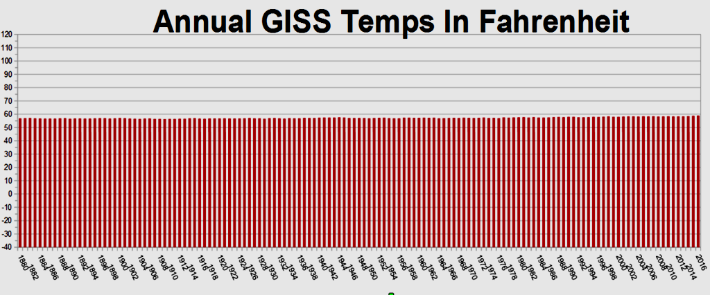
From 1880 – really shocking!
The cooling had to be removed to extend the CO2 temp correlation back to the 1960s because there is only 18 years correlation in the modern record before all the adjustments since about 2002.
CO2 and temp only correlated from 1980 to 1998, so they altered the temp data. The correlation between adjustments and CO2 growth is better than the correlation between CO2 growth and measured temperature
J.Philip Peterson, there is no reason to scale the Y axis more than 100X the range of the variable being plotted unless one is intending to minimize the appearance of change in the variable. It fools no one.
I imagine the temperature chart was done somewhat tongue-in-cheek but the temperature scale covers about the range of temperatures you would see in the state of Colorado in a year, from close to -40F to around 110F.
These are the normal temperatures that average people encounter. I’ve encountered that range in a single year living in Colorado. People aren’t worried about temperature changes of tenths or hundredths of degrees in their real lives.
Thank you for the conversion. It is much more easy to compare visually.
There may be nefarious intent in chartsmanship, but I suspect more probably laziness.
“Never ascribe to malice that which is easily explained by incompetence.”
Autoscaling by the charting software is probably most of the reason. If it’s beneficial to the providers’ narrative, there isn’t any motivation for them to fiddle with it.
Except honesty…
I normally do not oppose you Dr Lief … but on this occasion, your assertion that there is an optical illusion based on scale misses the point. The point is in the numbers. The magnitude of warming period 1 (1880-1940) vs period 2 (1970-2005) For the US graph, the magnitude of the two warming events is similar, 0.75C and ~ 1C. In the global graph, period 2 is twice as big event compared to period 1, ~0.6C vs ~0.3C.
He goes on to mention several other data sets that show the same inconsistency with the global data set.
I think that is the point being made.
The point is in the numbers.
The numbers depend on the start and end points of the interval, and have in any case much less impact than the visual one from the graph. If the point were the numbers, Singer could have made it with just quoting the numbers.
“The numbers depend on the start and end points of the interval, and have in any case much less impact than the visual one from the graph.”
LOL did you just fall off the turnip truck? This is the way climate science presents it’s information, you poor waif.
Andrew
lsvalgaard May 11, 2017 at 12:12 pm
The point is in the numbers.
Indeed it is, Singer says:
The later warming is contradicted by every available dataset, as follows:
**the surface record for the ‘lower 48’ [US] shows a much lower trend; [see fig 1, bottom]; presumably there is better control over the placement of weather-stations and their thermometers;
The later global warming from the graph he shows is 0.45ºC (1975-2000) whereas the US 48 graph shows ~1ºC for the same period! How this is a much lower trend? It would appear that Singer is incapable of reading a graph.
Leif is right, in the main point that he makes. Fred Singer said of the 1977-2000 period: “the surface record for the ‘lower 48’ [US] shows a much lower trend; [see fig 1, bottom]“. To my eye it doesn’t. I see approx US -0.2 -> +0.7 = +0.9, global -0.0 -> +0.4 = +0.4.
I don’t particularly object to the different scales in the graphs, as Fred was using existing graphs with those scales. A while ago, I said of a like pair of graphs “NB. The two panels have different scales on the x-axes (that’s not an issue at all, just be careful to see the panels correctly).“. [https://wattsupwiththat.com/2017/02/18/stokes-and-the-somehow-theory-of-ocean-heat/]. It would have been very helpful if Fred Singer had pointed out that the two graphs he used had different scales. In fact, I think it would have helped him to avoid his mistake – it looks like he missed the decimal point in graph a.
No Phil, you r the one who is getting it wrong. When Singer says a lower trend, he is meaning RELATIVE to the previous trend in the same set. I’ve already pointed this out.
If the CAGW theory is to hold, a warming from a well mixed gas, it would follow that trends within the data set would be relatively consistent. Thus, if the global graph shows that the latter trend is twice that of the former, you would expect the latter trends of all data sets to be at least close to the same ratio. The global graph goes from .3 to .6. Thus the lower 48 graph should look fairly close to .75 to 1.5. But instead, the lower 48 graph, as well as the SST data, while being fairly consistent with each other, are inconsistent with a 2x increase in warming trend, with the lower 48 graph going from .75 to 1
Dr Deanster May 11, 2017 at 6:15 pm
No Phil, you r the one who is getting it wrong. When Singer says a lower trend, he is meaning RELATIVE to the previous trend in the same set. I’ve already pointed this out.
That’s what you think, it’s not what Singer wrote, what he wrote was:
“In the iconic picture of the global surface temperature of the 20th century [fig 1, top] one can discern two warming intervals — in the initial decades (1910-42) and in the final decades, 1977 to 2000.
Although these two trends look similar, they are really quite different: the initial warming is genuine, but the later warming is not. What a surprise! I wouldn’t exactly call it ‘fake,’ but it just does not exist;”
He is clearly not making the comparison you claim.
lsvalgaard
Help!
Singer uses the same 1880-2010 timeline on the same scale for both graphs (as do you in your comment).
Singer uses a -4 to +6 C scale for Global Temps and a different -1.5 to +1.5 C for US Temps; and the scale for 1C steps are not the same for both charts.
I’m not arguing the numbers, I’m just trying to understand why you have further compressed the -4 to +6 (10 C Global spread) to about 1/2 the scale of the -1.5 to +1.5 (3C US Temp spread) – if the Global and US Temp charts were the same scale, shouldn’t the Global chart be 10/3 as tall as the US chart?
What am I missing?
Decimal points?
That the Singer scale is not -4 to 6, but -0.4 to 0.6. Or as he has it: -.4 to .6. You are missing the little decimal point. See, he managed to fool you. Every little trick helps.
global is -0.4 to +0.6 not -4 to +6
Yup. Missed the decimal point. Mea culpa.
The vertical axis is illegible in the top chart.
There is no dishonesty. You just need to read and look at the numbers. Both show about half a degree warming from 1920 to the 40s blip. Then only one shows anything near a 40s to 2000 warming of half a degree.
Physics is done in Kelvin . And the total variation with a
> 33%increase in CO2 concentration is perhaps1 % 288or adT%dCO2of at most about 0.01 ,Way to go on missing the point entirely, Leif!
Singer said
And if you compare the graphs, the scale is irrelevant. The “earlier version” has clear cooling between the two increasing periods such that the second increase starts from a much cooler temperature and mostly makes up for the cooling period. In other words the warming is largely non-existent as “new” warming, its mostly the same warming as the first trend.
Way to go on missing the point entirely, Leif!
The point is that regardless of the scale, the figure show the opposite of what Singer says.
Leif writes
Only your interpretation. And in fact in general if someone says something and you’re pretty sure is completely wrong then it probably means you’re missing something and you should probably pause and consider what it was that they meant.
In this case Singer could have meant the two rates of warming are different when taken from the start, not when taken from the start of each period of warming. As opposed to the “new” graph where the rates of the two periods are the much closer to the same because the second round of warming starts where the first one left off.
Only your interpretation. And in fact in general if someone says something and you’re pretty sure is completely wrong then it probably means you’re missing something and you should probably pause and consider what it was that they meant.
When I see an activist trying to fool people, it is very clear what he meant. In any case, it is the presenter’s job to show the data such that to avoid the possibility of multiple interpretations or ambiguities.
Leif writes
I agree. He very clearly showed the reduced cooling in the later version of the graph making the overall trend greater and more consistent. That’s why I’m mystified about your suggestion he was being dishonest by somehow “manipulating” the trends. The two trend periods themselves and the rates within those trend periods had little to do with the point he was making.
He very clearly showed the reduced cooling in the later version of the graph
“later versions”? there is only one graph, no ‘later version’
The two trend periods themselves and the rates within those trend periods had little to do with the point he was making.
In both trend periods the US trend is the larger, but Singer claims that the Global trends are larger. They are not. By using different scales he hides [makes it harder to see] the fact that the data show the opposite of what he claims.
And I don’t know what point he is trying to make except that he claims “there is no global warming” which is patently absurd.
Surprised to see Leif talking gash, really surprised. Leif read the darn article without your goggles
Is there any such thing as an honest scale? I dunno. A scale is just a reference frame, a field, if you will. The data become gradients in the chosen field.
Often the first visual impression is the one that sticks. Activists know this and play on it. If you mak the scales equal, the slopes and trends become easy to see and it is harder for the activist to fool people.
How does this graph issue affect the reality that only heavily adjusted and estimated data sets show late century warming? Thats the issues here, man made data
Mark — agreed. The point he makes is that the later ‘warming’ is in the chart but doesn’t really exist. He even says so in the accompanying text.
I was not fooled by the vertical scale. The second ‘climb’ appears to have the same slope. So what? It doesn’t speak to the point being made which is that the rise is not real. It is the result of Karlisation, in the correct use of the pejorative.
People here can read graphs. It is the globalwarmongering types who have trouble with anything technical.
Nice catch Dr Svalgaard.
lsvalgaard: A popular trick is to use different scales to exaggerate a point. And sure enough, the figure in this post does that too. Here is the same figure but with honest scales:
Thank you for the replotting. Plain eyeballing with rough rescaling showed that the graphs were not much different, but your graphs are welcome.
Leif: I don’t think you should be picking on a 92-year old man who has been leading the fight against the IPCC consensus for decades. All of this data is at least 15-years out-of-date. Everyone knows that it has warming between 1977 and 2000. (How much warming there has been since the 1940’s peak could be debated, but not warming during this period.)
a) His Figure 1 shows about 0.6 K of warming both globally and in the US. His distinctive Figure 1 is clearly from Hansen and GISS https://data.giss.nasa.gov/gistemp/graphs_v3/.
b) Gouretski and Kennedy (2012) use data from HADSST3 and shows 0.4 K of warming during this period. http://onlinelibrary.wiley.com/doi/10.1029/2012GL052975/fullc)
c) MNAT rose during this period, although the change may not be statistically significant. This record is far less complete than the SST record during this period. https://bobtisdale.wordpress.com/2008/12/30/nighttime-marine-air-temperature/
d) UAH6.0 shows 0.18 K of warming 1979-1997 and a statistically significant trend exists for any period even one year longer than the cherry-picked year of 1997.
What can we do when WUTW and the Heartland Institue chose to publicize such “alternative facts”? The left certainly doesn’t care about “knowing what is true” before deciding what to do about it. Why should we behave any differently? Are you really advocating that we behave as Richard Feynman recommended in Cargo Cult Science? /sarc
All of this data is at least 15-years out-of-date
No, his Figure 1 goes up to 2009 or so…
A distinguished scientist should know not to play tricks with the scales.
And his claim is the opposite of what the Figure he presents says.
For a scientist that is not good.
For an activist it is gold.
Leif wrote: “For an activist it is gold.”
And it allows alarmists to convert “honest skeptics” and lukewarmers into “deniers”. I don’t want any part of that Judas gold. Nor do I want my profession (scientist) corrupted, so that every scientist who appears before Congress is automatically assumed to be a tool of one party or the other.
Does our host think that a few thoughtful skeptical comments a day or two later actually compensate for the “alternative facts” WUWT is spreading?
I tried to find the source of Figure 1, which is clearly formatted like all of the graphs from GISS and Hansen. It looks very much like Plate 6 published in 2001 and probably informally updated for a later presentation. My guess was that the last black data point came from around 2006, but his claims are about the period before 2000.
And this is the lead author of “Climate Change Reconsidered:? I guess I will reconsider looking at it ever again.
[??? .mod]
Singer’s graph is hardly misleading: you chose the same scale; he chose graphs of the same size. Now if he had failed to provide vertical scales you might have a case, but Singer expects the reader to be able to read a graph. –AGF
First visual impact usually wins over scrutinizing the fine print. I found the graph highly misleading, having seen many such over time. The oldest rick in the book.
All the “data sets” reconstructing average global temperature since 1880 or 1850 are totally bogus, anti-scientific packs of lies. The books have been thoroughly cooked to a crisp, so are worse than worthless for any valid scientific or public policy purpose. That includes validating the GIGO models.
I can say from personal experience that summers in my part of the world are no warmer now than since the 1950s, although winters are a bit warmer on average than in the 1960s and ’70s, before the PDO flip of 1977, which winter I well remember, without then knowing the cause of its strangeness.
From the testimony of my parents and grandparents, I can also say that summers were hotter in the 1930s. The heat record for my birthplace remains 1898, although state and federal agencies have tried to send that inconvenient truth down the memory hole.
Being little more scientific
http://woodfortrees.org/graph/hadsst3nh/from:1880/to:1910/plot/hadsst3sh/from:1880/to:1910
The average of the absolute difference is 0.14. Half the data is between ± 0.68 SD (if purely random). It works out to a 1SD error of 0.15 for monthly anomalies if they were different measurements of the same thing.
I checked an older version of this plot of the difference between 2001 version of GISS and 2017, after 5 year smoothing.
It clear shows that the uncertainty is much bigger than 0.15 and then its highly unlikely to have been so I’m sync.
http://woodfortrees.org/graph/hadsst3nh/from:2000/plot/hadsst3sh/from:2000
Excuse the errors. It was done on a phone.
every adjustment increases uncertainty by the amount adjusted, unless you go back in time n measure again, giss is not data its manufactured
Robert B on May 11, 2017 at 3:26 pm
The graph you show us you pretty good might compare with this one:
I have downloaded all the UAH data and obtain exactly the same results. And the differences between UAH5.6 and UAH6.0 for the polar regions look even incredible in comparison with those for the Globe.
-Chimp
I would support your general statement about past weather without knowing where you live. I stated on this site some days back that weather here in Western Canada is very much like I remember the 1970’s. The 1960’s were much colder and stormier in winter and hotter in summer.
I live in your general neck of the woods, in the intermountain Pacific NW.
Aside from hotter summers in the 1960s, I’d agree. Maybe a little, but most years during wheat harvest there will be stretches over 100 degrees F, sometimes spiking up to 115. Without researching the records, I can’t say whether there were more days above 110 degrees in 1961-77 or 2000-2016 here.
The proposition that the 1977-2000 warming does not exist is ridiculous. So glaciers and Arctic sea ice have melted without any warming. Just because they wanted to and they could. This article is absolutely laughable.
IMO there was some late 20th century warming, as shown by satellites, but any connection to glaciers and Arctic sea ice is tenuous at best. Antarctic sea ice and ice sheet mass have tended to grow during that period, so warmer air is not a persuasive cause. Some glaciers have grown, others have retreated and others stayed about the same. Where they have retreated, the extent is less than during prior cyclical warmings of the Holocene. Hence, no human fingerprint is detectable.
Read this article:
Zemp, Michael, et al. “Historically unprecedented global glacier decline in the early 21st century.” Journal of Glaciology 61.228 (2015): 745-762.
http://www.ingentaconnect.com/contentone/igsoc/jog/2015/00000061/00000228/art00011?crawler=true
You are deceiving yourself on this issue.
Javier,
From your paper: “This dataset is not perfect but nevertheless constitutes a unique treasure for the scientific analysis of glacier changes. Direct glaciological measurements are available only for a few hundred glaciers…”
First of all, you have the poetry of “not perfect” and “unique treasure” – yeah, sure. And then you get the wishy wash of “well, we aren’t really measuring, but…”
Andrew
Apparently no one ever taught them technical writing, nor did their science mentors teach them to leave hyperbole out of your scientific writing.
Observations (even some with drawing to back it up) for hundreds of years and then early photographs fully document that glaciers have, in general, retreated since the end of the LIA. Most research and anecdotal evidence I’ve seen suggests that most of this melting was done prior to 1950. Basically similar to this image from a 2005 study:
http://appinsys.com/globalwarming/ArchaeologyMag_files/image023.gif
Javier,
No, Zemp, et al are practicing consensus science.
There. You just waived your hands and made disappear all the evidence you don’t agree with. You are not a scientist, I guess. That doesn’t work in science.
Bad Andrew May 11, 2017 at 10:38 am
Since there has been little or no warming in the 21st century, there must be some other explanation for net glacial retreat since 2001, if that in fact has happened.
Javier,
Not hand waving. Just shorthand. I could compile a list of glaciers showing just the opposite of their result, but no one is paying me to do that.
I’ve been on or seen glaciers on every continent and New Zealand which have grown in this century.
Uhhhh they don’t have every single year’s terminus marked on the map, so how could I do that exactly? Looking at such short periods doesn’t tell us much anyways, in fact you’re only fooling yourself if you do. Look, the glacier hardly retreated from 2006-07, so the melt has slowed. Put higher resolution data on there and pick any trend based on short data that you want, it’s a fool’s errand.
To mention but a few such regions:
Asia: In the Karakoram, home to K2, the second-highest peak on Earth, glaciers aren’t melting. If anything, they’re expanding.
North America: Glaciers in Alaska and the Cascades are growing.
South America: Various glaciers in the Andes, especially Patagonia, are growing.
http://www.worldatlas.com/articles/are-some-of-the-earth-s-glaciers-actually-becoming-larger.html
Oceania: Glaciers growing across New Zealand.
https://www.sott.net/article/343311-Summer-snow-for-Australia-and-58-glaciers-growing-across-New-Zealand
I might add that data for glaciers in some parts of the world, such as Africa, are thin on the ground over the past decade. So, in many cases, “21st century retreat” means 2001-06.
Yes we have your word on that, so we can just dismiss the entire scientific bibliography that says that the great majority of glaciers are experimented a reduction.
Javier
Of course. If the government-paid self-selected “scientists” merely “claim” they are correct (about glacier melt rates” based on biased “so-called” research paid for by their government-paid bureaucrats for additional government-paid grants and salaries and positions while working in government-funded labs to enrich their government-paid supervisors and politicians who can demand 1.3 trillion a year in new government taxes based on their so-called “research” …
/well-funded oil company stooge
“Glaciers in Alaska and the Cascades are growing.”
.
http://www.cbsnews.com/pictures/repeat-photography-of-alaskan-glaciers/
Javier,
Please state what percent of all the glaciers on earth have retreated in this century, and what the total loss or gain of their ice has been. Then please state to what extent, if any, these metrics differ from the rate of retreat and mass loss since the depth of the LIA.
Thanks.
Many whole glaciers disappeared even before the 20th century, let alone the 21st. Hence, the rate of glacier number loss has most likely slowed. So, “unprecedented”, as per your link, is plainly false.
Michael,
Clearly you haven’t spent much time in Alaska in this century. Among others, the Hubbard and Mendenhall glaciers are growing:
https://weather.com/science/environment/news/alaska-hubbard-glacier-growth
Javier,
I cited examples from all around the world. Maybe you missed that comment.
Well Chimp, as you know, one or two may be growing, but the vast majority are shrinking. That is why they invented the word “net” to encompass the sum of the gains and loss… https://climate.nasa.gov/climate_resources/4/
Michael darby
Odd comment. 1/2 are shrinking slightly, 1/3 are expanding, and 1/6 are not changing at all. Hardly a “vast majority” there. Much different than “1 or 2 may be growing” actually.
Michael darby May 11, 2017 at 12:40 pm
It’s a lot more than one or two. That the vast majority is shrinking is not in evidence. It might not even be a majority, but probably is, since glaciers have been retreating for over 300 years now, since the depths of the LIA.
There is no evidence that the rate of retreat has accelerated globally over the average of, say, AD 1701-1950, ie before the period of more rapid CO2 increase.
As you may know, it’s clear in many cases that air temperature change has nothing to do with whatever further retreat might have happened since 1950. This is especially clear in Africa, where tropical mountain glaciers were retreating long before 1950 and any acceleration is due to changes in precipitation associated with people cutting the forests on their slopes. The fact is that temperature hasn’t changed atop Mt. Kilimanjaro, for instance. It probably has cooled, thanks to lowered humidity. In any case, it still averages well below freezing.
Claims of “unprecedented” retreat cannot be supported.
I found this Wiki summary on Kilimanjaro’s ice cap to be surprisingly good:
https://en.wikipedia.org/wiki/Mount_Kilimanjaro#Glaciers
The situation on Mt. Kenya is similar. I know less about the Ruwenzori glaciers, except that there too the retreat predates the interval of supposed man-made global warming. I have also seen overcutting of forests around the Mountains of the Moon.
Other African glaciers from the LIA disappeared even before the 20th century.
“There is no evidence that the rate of retreat has accelerated globally ” That may be true, but using the word “accelerating” is a strawman. If the acceleration rate is zero, the glaciers are still MELTING
..
..
Thank you for acknowledging that your statement: “Glaciers in Alaska and the Cascades are growing.” has now been shown to be false, especially when you post: ” That the vast majority is shrinking is not in evidence. It might not even be a majority, but probably is ” (emphasis added)
Michael,
My statement most certainly has not been shown false. I said that glaciers in the Cascades and Alaska are advancing, which is a fact. My statement that globally they might be retreating on net in no way falsifies my statements regarding glaciers in many parts of the world.
How could “acceleration” be a straw man? Since glaciers have been retreating on balance since c. AD 1690, acceleration is the key issue. If during the late 20th century warming they retreated more slowly than during previous such cycles, then the repeatedly falsified hypothesis of man-made global warming is yet again shown false.
I’d have thought that that would be obvious, but apparently not to the brain-washed.
Same as with sea level rise, the rate of which hasn’t accelerated since 1950, as would be expected if CAGW actually existed.
“the glaciers are still MELTING”
SO WHAT?
Andrew
Here’s a fun exercise, get on Google Earth and use their historical imagery tool. Most of the imagery goes back to 1984 (some earlier some later), and ignore the exact date — they are not all from December. You can see why the Jacobsava glacier is the global warming poster child, it clearly shows retreat since 1984 with the rapid retreat Javier shows between 2004-07. Just about every other glacier hardly shows change since 1984 and most that I’ve looked at are in the exact same spot.
49°14’25.24″ S 73°54’06.28″ W
66°17’15.10″ N 36°40’38.53″ W
71°20’07.54″ N 28°01’23.56″ W
73°27’06.52″ N 26°01’39.40″ W
75°26’18.19″ N 22°18’42.12″ W
65°10’53.02″ N 50°27’07.08″ W
66°57’43.96″ N 49°48’53.07″ W
68°17’28.78″ N 50°51’31.68″ W
70°01’11.25″ N 50°23’40.07″ W
79°19’34.58″ N 17°31’56.79″ E
78°25’44.24″ N 17°33’29.12″ E
43°32’39.92″ S 170°14’07.86″ E
61°16’27.38″ N 147°43’04.05″ W
61°21’24.83″ N 148°31’42.20″ W
61°14’03.83″ N 152°23’42.00″ W
The last four show what seems to be the modal extent of melt since 1984 that can be seen in most glaciers.
Chimp, “acceleration” is a strawman. The fact that glaciers are melting, and sea levels rising both indicate a WARMING world. If the world was not warming, the glaciers would not be melting, and the sea level not rising.
Michael,
What part of “Little Ice Age” do you not get?
Glaciers have been retreating and sea level rising since c. 1690. For there to be a human signature, then, it should be obvious that there would need to be detectable acceleration in those parameters over the 1701-1950 interval. But there is no such acceleration observable in 1951-2017.
RACookPE1978 May 11, 2017 at 1:48 pm
That sounds right. I’ve never actually surveyed all observations, but I visit a lot of glaciers and that comports well with my less than systematic experience.
Javier,
Your cited article makes a good case that, overall, glaciers are in retreat. They even make the case that it is mostly in the Summer that the loss is greatest: “The increased mass loss over the past few decades is driven mainly by summer balances which are dominated in most regions by ablation processes.” But, the problem is that ablation can be a result of higher air temperatures, increased solar insolation (decreased cloudiness), a less rapid replacement of the ablating snout if there is decreased snowfall in the zone of accumulation, or some combination of all factors. Your cited article does not provide information that allows one to unmix the confounding factors. Glaciers make poor ‘coal mine canaries.’
Javier
Here is an updated image including measurements from 2014
http://greatwhitecon.info/wp-content/uploads/2015/02/Jakobshavn-calving1851-2014.jpg
Not sure about the earlier boundaries though as it shows the 1964 limit atop the 2001 limit. 0 melting between 1964 & 2001?
the jakobshavn glacier is the only one directly impacted by the Irminger current as it swallows in the current…
that current is proven to have “warm” and cold episodes and is now still in a warm episode correlated with the AMO signal, which is now at it’s peak.
Chimp, i believe that which is happening on Mt. Kilimanjaro is called “substantiation”…
Darby, i think that you make a valid point. As long as temperatures are above an equilibrium state temperature (last reached around the turn of the century; 1900) then sea levels will continue to rise. Hence a warming world. We could actually see COOLING surface temps while sea levels continue to rise and the world continues to warm. Be careful, though, that you aren’t guilty of projection by calling chimp’s argument a straw man. (if you set up your own straw man, you wind up eating crow… ☺)
Javier, and even those arguing against Javier, when we put on blinders to focus on one little data point, we lose the overall picture. By focusing one one particular glacier in a decidedly localized environment proves absolutely nothing. You’re starting to sound like those focusing on possibly declining Arctic sea ice while ignoring probably expanding Antarctic ice, you have devolved into the ultimate OCD inaction. And furthermore, concurrence does not prove causation, and might be sheer coincidence. Back up and look at everything. Nobody denies global temperatures have risen over the last 300 years, that’s supported by both proxy data and anecdotal evidence, and nobody denies CO2 has risen over the last 60 years. Show me a scientifically provable (so that means specifically disprovable also, or you’re just making it up) connection between global temperatures (which might be impossible in itself, given the manipulation and distortion of the local temperature records) and CO2. So far, I am unaware of any such proof. Secondly, provide absolute proof of how much the rise in CO2 is a result of human activity, of any sort, whether it be more burning of fossil fuels or more exhalations or more flatulence. Yes, I know it can’t be done. And finally, show me conclusive proof that either a rise of temperature or a rise of CO2 (since I’m of a mind the two are nearly unrelated) will have more harmful effects than beneficial effects. Yes, I know, none of my requests can be proven conclusively. That’s why I’m not getting excited about global warming (regardless the cause), rising CO2, or burning of fossil fuels! And even if I take the alarmists claims at face value of how bad it can be, the best way to overcome such problems is make sure everyone, rich and poor alike, has access to cheap energy!
The proposition that a half a degree of warming has caused glaciers and Arctic sea ice to melt is ridiculous. Almost all the ice balance loss is due to other causes like decreases in cloud cover, increases in dry winds, and changes in ocean currents. This is easy to demonstrate: take an ice cube from an environment where the air temp is -2C to one of -1.5C. It won’t melt. But expose the same ice cube to direct sunlight while keeping the air temp at -2C, and it will sublimate away. Add a fan and it will disappear even faster.
Go write a scientific article about that and try to publish it. They are going to love your ice-cube example.
If “global warming” were to blame for alleged glacial retreat, then why hasn’t the East Antarctic Ice Sheet, repository of most of the fresh water on earth, retreated in the 21st century? Instead, its mass has grown.
All the montane glaciers on the planet aren’t a pimple on the posterior of the EAIS.
Folks seem to keep forgetting that a lot of glacier movement is driven by snowfall in the source region. If your glacier isn’t getting replenished, it’s going to retreat.
Paul, good point. It is inconceivable that 0.5 degree warming causes the glaciers to melt faster. Isn’t the measured temperature still well above freezing. Look at the Arctic temp above 80 N, it is still well below 273 absolute.
Sorry ,, should read, “measured temperature well BELOW warming…”
If you look at the history of the glaciers more closely, you can see the main cause. It is soot. Finally, glaciers melted during the eruption of Krakatau. At a time, which was considered the coldest of the small ice age. Glaciers are melting since 1860! http://www.pnas.org/cgi/doi/10.1073/pnas.1302570110
In a time of simplification and leveling, of course, CO2 must be the cause of all.
Paul and others,
Whether some, most, or all glaciers are retreating is a straw man argument. What is important is to answer the question, “What is causing those glaciers that are retreating to do so?” It may not be the same reason in all cases. That is very possible simply because some glaciers are known to be increasing and others are stable. In any event, if the altitude retreat of alpine glaciers is greater than the freezing level predicted by the lapse rate, then it is strongly suggestive that other factors than average global temperatures are responsible.
As a child in the early 60’s I visited the Columbia Icefield in Alberta.They had historical locations for the foot of the glacier staked out along with photographs from the late 1800’s showing the retreat since that time. The topography also clearly showed that the glacier had projected out further in the past than even the oldest photos showed. Say what you want about these theories-then explain why attempting to cover up history is necessary to prove your bogus, politically inspired hypothesis/manifesto.
You speak nonsense. Either you are politically motivated or lack the intellectual ability and/or moral fibre to examine the facts with an unbiased perspective.
Nobody said there was no warming, just that the warming was exaggerated.
Right before this article I would have argued that no skeptic defended that there had been no warming. I was wrong. Fred Singer textually says:
“it just does not exist.”
I know that intellectual honesty is too much to expect from you. But that quote was regarding a single period in time.
And was happening before significant fossil fuel use-
and is minor-
and is beneficial-
Attempting to stop something we didn’t cause and is beneficial is completely idiotic and would impoverish the entire planet.
Laughable indeed since it is known that those glaciers have been there forever and details of human habitation found since the glaciers melted are a bunch of fakes. Greenland producing details of vikings growing not just grain but barley as well are obvious attempts to falsify the well known fact that Greenland has never been warm enough to grow grains. Konungs skuggsjá was carefully inserted into the record around 1250 ad because everyone knew that someday the false evidence would be needed to aid deniers in their false attempt to deny any Globullish warming. Relics found after the retreat of glaciers both in Switzerland and Greenland were obviously secreted there and then “found” by those who put them there as evidence of human activity from the dimly remembered past. Even halfway honest publications such as ScienceNordic have been fooled by fakes trying to prove things that never happened.
http://sciencenordic.com/vikings-grew-barley-greenland
[A /sarcasm tag needed? .mod]
Javier
You’ve cherry picked Arctic ice.
If you claim “Global Warming” (not Arctic warming only) has occurred, you need to explain you comments in light of the increase in Antarctic ice – the net effect being more N+S polar ice (unclear about net change for non-polar glaciers)
Here is an older wattsupwiththat article about a scientist studing glaciers claiming that all were melting. The author then compared old USGS maps and newer maps to show most the glaciers mentioned by the scientist have increased in size since the 1950’s.
https://wattsupwiththat.com/2015/09/13/mt-baker-glaciers-disappearing-a-response-to-the-seattle-times/
Yup. The Cascades, the glaciers upon which I grew up, are the anti-poster child for CACA. Mt. Shasta is especially embarrassing, being in California, with glaciers growing even during the recent drought years.
All this talk of glaciers retreating or advancing is amusing in that everyone seems to be ignoring the fact that glaciers are dynamic systems. The terminus represents the equilibrium point of warm air trying to push back the terminus (retreat) and the forward velocity of the ice pushing downhill ( advance) If you don’t know how the velocity has changed with time you can’t attribute uniquely any advance or retreat to temperature.
Velocity is a function of many things, including variable friction along its path and variable snowfall over time. Remember that the ice melting at the terminus is the oldest ice in the glacier, generally speaking. All the snowfall history from that point to today , which could be hundreds or even thousands of years, will effect current velocity.
Given these variables, this exactly why we see some glaciers retreating & others advancing. Neither observation says anything about temps without also knowing about velocity.
Scenarios for fun to show the folly of relating temps & glacial advance / retreat:
1) a glaciers velocity dramatically drops. Temps also drop but still warm enough to melt the ice. Glacier retreats in spite of falling temps.
2) a glaciers velocity dramatically increases. Temps increase but not fast enough to offset the increased velocity. Glacier advances in spite of increasing temps.
++++
Yup. It is beyond simplistic to imagine that average global temperature is the only factor in glacial advance and retreat.
That said, exceptional cold, suggest as during the depths of the global Little Ice Age, probably does cause average advance, despite drier and windier air.
As above, early industrial soot, as now coming from China and India, was probably a factor in hastening the post-LIA meltback.
Jeff L,
+1 for the sanity and objectivity.
The Arctic has warmed since the global cooling scam. It was widely accepted back then that temperatures had dropped at least half a degree C since the early 40s, at least in the NH and more at high latitudes. You can still see the cooling then warming in the USA graph.
Javier,
The melting ice could be explained by a decrease in cloudiness without the claimed increase in air temperatures. Those of us who live in the mid-latitudes, where it snows, are quite accustomed to seeing snow and ice melting on the ground, when the air temperatures at head level are still well below freezing, when it is sunny out. Without good cloud data, particularly in the sparsely monitored Arctic, it is a possibility that can’t be dismissed out of hand. It is my impression that the most rapid retreat of alpine and valley glaciers is on south-facing slopes, with little change over the last 100 years on slopes in the shade.
Javier, there is an equilibrium state temperature at which ice will melt. Anything above the equilibrium temp will cause melting. The last time temps were at an equilibrium state was around the turn of the century (1900). So, yes, glaciers and sea ice can melt without any warming (or even cooling).
Svalgaard, if you’re reading this, the equilibrium state temperature changes with time. (there is no “magic” equilibrium state temperature) The glacials had a lower equilibrium state temperature…
Javier
Arctic sea ice does not melt because of higher air temperatures.
Glacier retreat, which you called melting, may or may not be caused by higher temperatures. It may be from less precipitation.
No assumptions please. Glacier advances may be caused by higher temperatures, higher precipitation or less melting.
Perhaps you could rephrase your post above taking into consideration the fact that glaciers are a poor metric for temperatures, and that the Arctic ocean is about zero degrees at all times, regardless of the air temperature. If it was a lot colder it would not be an ocean it would be ice. Arctic sea ice is almost all melted from below. What little does melt from above even has its own special name.
Glaciers give a consistent view of Holocene climate variability. See my article at Judith Curry’s blog from April 30. The first part has already been published, the last part will be published soon.
Unless we believe that glaciers have stopped being a climate indicator, we have to consider what the unusual glacier retreat that the world has experienced in the last decades is telling us.
“the surface record for the ‘lower 48’ [US] shows a much lower trend”
According to NOAA the trend for the USA from 1977-2000 was 0.34C per decade.
https://www.ncdc.noaa.gov/cag/time-series/us/110/0/tavg/ytd/12/1977-2000?base_prd=true&firstbaseyear=1901&lastbaseyear=2000&trend=true&trend_base=10&firsttrendyear=1977&lasttrendyear=2000
For global temperatures the trend was 0.14C per decade.
https://www.ncdc.noaa.gov/cag/time-series/global/globe/land_ocean/ytd/12/1977-2000?trend=true&trend_base=10&firsttrendyear=1977&lasttrendyear=2000
How is the US trend lower than the global trend?
“the surface record for the ‘lower 48’ [US] shows a much lower trend”
In fact, NOT.
If you overlay the two parts of the Figure, you can see that the US trend is much larger than the global trend:
http://www.leif.org/research/Temp-Trends-Since-1880-Overlay.png
Singer is just an activist, like the rest.
Bad post.
Nice try Dr. Svalgaard, but the charts produced were from Dr. Hansen.
Here is the old Hansen post from 1999 with the two original charts you whine over:
Whither U.S. Climate?
By James Hansen, Reto Ruedy, Jay Glascoe and Makiko Sato — August 1999
https://www.giss.nasa.gov/research/briefs/hansen_07/
Notice that Hansen states that 1934 was the hottest year,
“How can the absence of clear climate change in the United States be reconciled with continued reports of record global temperature? Part of the “answer” is that U.S. climate has been following a different course than global climate, at least so far. Figure 1 compares the temperature history in the U.S. and the world for the past 120 years. The U.S. has warmed during the past century, but the warming hardly exceeds year-to-year variability. Indeed, in the U.S. the warmest decade was the 1930s and the warmest year was 1934. Global temperature, in contrast, had passed 1930s values by 1980 and the world has warmed at a remarkable rate over the last 25 years.”
He is clearly saying it was cooler in America than with the world.
Here is the old Hansen post from 1999 with the two original charts you whine over:
Regardless, the scales were misleading and the US trends are much larger than the global trends:
http://www.leif.org/research/Temp-Trends-Since-1880-Overlay.png
So my ‘nice try’ is a very good try illustrating my point that Singer is just an activist like the rest.
Dr Svalgaard, you are missing the point. The reported temperatures have artifacts in them, some due to measurement changes, and some due to selection bias by the database compilers. There is bad data, the real question is just how bad, and how to correct that situation.
Dr Svalgaard, you are missing the point
My point is that Singer has no qualms showing the bad data to bolster his view.
The problem is trying to draw conclusions from bad information.
To get somewhat off-topic, the great scandal in psychology when I was in school was Sir Cyril Burt, who did a great deal of work on intelligence testing and the heritability of the same. At some point, Burt started publishing papers with non-existent collaborators. The question became, at what point do you throw out anything Burt did? There are still publications out there, like “The Bell Curve”, that used secondary sources relying on Burt.
Climategate is prima-fascie evidence that at least some of the temperature records are cooked, and Thomas Karl has kept up in that endevour.
The problem is trying to draw conclusions from bad information.
No, the real problem here is that Singer uses what he knows are bad data with a misleading figure to try to make an activist point [“no global warming”]. This is just as bad as the CAGW alarmism [albeit with the opposite sign].
Good clarification. However, one thing that can be drawn from inconsistent evidence is that one or both is wrong.
Activists [like Singer] don’t care whether the data are right or wrong as long as they support the view being pushed.
Funny how that’s only a sin when the other side does it.
Not funny, just sad reality.
lsvalgaard:
You say
Everyone uses the available data to “bolster” any “view” he or she has.
You are clearly missing the point that ALL the data for global average surface temperature anomaly (GASTA) is “bad” but it is the data provided by and used by those who oppose Fred’s “view”.
The reasons that ALL the data for GASTA are pseudoscientific nonsense are
(a)
there is no agreed definition of GASTA so each team that provides values of GASTA uses its own definition and often changes the definition it uses with e.g. this effect, and
(b)
if there were an agreed definition of GASTA then there is no possibility of a calibration standard for GASTA.
For a more full explanation of these matters read this especially its Appendix B.
Either
the different interpretations based on the fallacious GASTA time series should each be assessed
or
they should all be rejected because they are based on the fallacious GASTA time series.
But you have made no comment on such interpretations until the above one from Fred and that implies you have a bias.
Richard
but it is the data provided by and used by those who oppose Fred’s “view”.
If Fred knows the data are bad, he shouldn’t use them. That is my bias: don’t use what you know is bad. Now, if Fred does not know the data are bad, that is another matter, but then he is somewhat incompetent…
Actually you implied that DR. Singer made those charts,when you stated these:
“Why do people present [subtly] misleading figures? A popular trick is to use different scales to exaggerate a point. And sure enough, the figure in this post does that too. Here is the same figure but with honest scales:”
and,
Dr. Singer,
“the surface record for the ‘lower 48’ [US] shows a much lower trend”
Dr. Svalgaard,
In fact, NOT.
If you overlay the two parts of the Figure, you can see that the US trend is much larger than the global trend:”
Lief, shows the scaled chart.
Singer is just an activist, like the rest.
Bad post.”
Never disputed your scaling complaint or supported Fred at all,I was pointing out that the ORIGINAL material came from Dr. Hansen,who stated in 1999 that America was cooler than the world….
You need to chill out…..
You need to chill out
No, one needs to combat disingenuous use of bad data. Clearly you do not agree and you condone the practice. I do not.
So now we’re looking at US lands mass vs Global land & sea anomaly? And the charts are on different temp scales?
Singer is the one comparing apples and oranges…
Take your whining to him.
lsvalgaard:
Your attempt to deflect my complaint is disingenuous.
I wrote
Your reply says
That reply ignores my point that “you have made no comment on such interpretations until the above one from Fred” and thus it confirms your true bias is a personal objection to Fred Singer whose “competence” is much greater than yours.
Richard
That reply ignores my point that “you have made no comment on such interpretations until the above one from Fred” and thus it confirms your true bias is a personal objection to Fred Singer whose “competence” is much greater than yours.
Do I need to comment on everything?
Singer uses his much greater “competence” in a very bad way. He is a very competent activist, and I’m just a regular scientist not taken in by his attempt to mislead. What are you?
Sunsettommy
“Notice that Hansen states that 1934 was the hottest year”
Which has nothing to do with the point Singer was making. His claim is that the reported rise in global temperatures between 1977 and 2000 did not happen, and part of his evidence is that the trend over the same period in US temperatures was less than the global rise.
He argues that the US trend is more reliable than the global one because of better placement of stations.
I pointed to NOAA’s data as showing the trend over the US was more than double that of the global trend, the opposite of what Singer claims.
Singer may be using much older data, but I’ve yet to see any evidence that any data shows this slower rate of warming for US temperature.
Now Dr. Svalgaard going into the twilight zone here, with this silly comment:
“No, one needs to combat disingenuous use of bad data. Clearly you do not agree and you condone the practice. I do not.”
You are really pathetic, since I never said I supported Fred,never disputed your re scaling of two charts. Never said they were accurate or necessary either. All I was pointing out what the original source of the charts was from 18 years ago in a Dr. Hansen post.
You need to stop your misleading replies to me,as you are veering into the region of claiming things that don’t exist and putting a few words into my mouth.
Bellman May 11, 2017 at 1:07 pm
The “global trend” is entirely fictitious.
So it is not good science when Singer bases his argument on “entirely fictitious” data. Would you disagree with that assessment?
All I was pointing out what the original source of the charts was from 18 years ago in a Dr. Hansen post.
What matters is what the chart is today as used by Singer. Why are you so hot under the collar, if all you are doing is to say: “hey looka here, I found an old chart”.
Mr. Bellman where did I say I agreed or supported Dr. Singers post?
“Notice that Hansen states that 1934 was the hottest year”
Which has nothing to do with the point Singer was making. His claim is that the reported rise in global temperatures between 1977 and 2000 did not happen, and part of his evidence is that the trend over the same period in US temperatures was less than the global rise.
He argues that the US trend is more reliable than the global one because of better placement of stations.
I pointed to NOAA’s data as showing the trend over the US was more than double that of the global trend, the opposite of what Singer claims.
Singer may be using much older data, but I’ve yet to see any evidence that any data shows this slower rate of warming for US temperature.”
================================================================
Where did I say I was supporting Dr. Singer?
What I was doing was showing that Dr. HANSEN thought about his charts back in 1999 (which HE created originally), never said anything in support of anything Fred stated.
Didn’t comment on what Dr. Singer said at all.
Didn’t comment on what Dr. Singer said at all.
We have a concept for that: “OT”
It is useful to stay on topic.
Sunsettommy,
“Mr. Bellman where did I say I agreed or supported Dr. Singers post?”
Sorry if I jumped to the wrong conclusion. So do you agree with Dr Singer or not?
Chimp,
“The “global trend” is entirely fictitious.”
Do you mean the concept of a global trend, or just specific parts of it?
Bellman May 11, 2017 at 1:33 pm
The concept is not scientifically valid, due to lack of coverage and quality of “data” that do exist.
But on top of that, the “surface” “series” are also so “adjusted” as to be beyond meaningless. “Data” is simply made up for vast swaths of the planet, especially those expected to warm the most, ie the polar regions, where there is a paucity of real observations. Same goes for the oceans.
The whole endeavor is anti-scientific. In theory, for the land at least, acceptable series could theoretically be created, but it would require starting over. GISS, NOAA, HadCRU and BEST are all worse than worthless, fantasy, pretend cooked books.
While Singer’s presentation leaves much to be desired in terms of clarity, it’s disgraceful to impute a dishonorable motive to his use of GISS’ original charts with different ordinate scales. And it’s incorrect to conclude that the US trend–in the long-term SECULAR, rather than decadal, sense is much larger than the global one. Clearly, the global anomaly is well above it’s previous pre-WWII peak. But the truly egregious lapse e failure to recognize that Singer is questioning the very reliability of GISS’ anomaly indices
Does the global trend include the U.S. data? If so, do you have global less U.S.?
We could always use the graph from NOAA’s Climate at A Glance. What do you mean 1934? 😉
Fred Singer was once a great scientist. I saw him do his presentation in March. This post must have been a tremendous effort for him. Give him the benefit of the doubt that this was an honest mistake.
lsvalgaard:
You write and ask
You “need” to answer the criticism of your behaviour in this thread instead of deflecting it with snark and irrelevance.
Singer is an extremely competent scientist. In your field he worked with Van Allen to detect the radiation belts and he headed the team that put up the first weather satellites: you have achieved nothing comparable and, therefore, your implications about his “competence” are misplaced.
Singer’s “activism” consists of explaining why he thinks the climate change scare is exaggerated. Your “activism” consists of demeaning any suggestion of a significant solar effect on climate variability. Pot meet kettle.
I am a retired scientist who does what little he still can to defend the scientific method against the various forms of Lysenkoism governments are practicing: the UN Intergovernmental Panel on Climate Change (IPCC) is the main form.
I find your behaviour in this thread to be reprehensible.
Richard
you have achieved nothing comparable
What makes you think that? Ignorance?
Just some examples: I have discovered [back in the 1960s] that the Earth’s magnetic field and the Sun’s magnetic field are connected at all times [google Svalgaard-Mansurov effect]. I was a co-discoverer of the Heliospheric Current Sheet and its importance for cosmic ray modulation. Pioneered the measurements of the Solar Polar Magnetic Fields and their use in successful prediction of solar cycles. Back in the 1970s revived the research into the Sun’s influence on weather and climate. Pioneered the use of the Earth’s magnetic field to reconstruct the properties of the solar wind [magnetic field, speed, density]. Instigated the recent revision of the Sunspot Number, etc, etc.
the climate change scare is exaggerated
I agree completely with that, but it should be [and can be] shown without tricks and misleading statements. One does not need to stoop to those levels.
Interesting how Leif has gone from, the scale is deceptive. To the data is entirely fictitious data.
to the data is entirely fictitious data.
Never said that.
Perhaps….but the difference does beg the question as to why U.S. temps run hotter than their global counterparts.
Barring a better explanation, Singer’s point re. Station dropout must have merit.
lsvalgaard May 12, 2017 at 7:16 am
I know that you didn’t say that. I did, then explained why in response to Bellman’s question.
Follow Willis’s admonition: say who your comment is for and what words you are objecting to.
Dr. S.
I did:
Chimp May 11, 2017 at 1:09 pm
Bellman May 11, 2017 at 1:07 pm
The “global trend” is entirely fictitious.
Leif writes
And you lined up the end points to make your point. Pot meet kettle.
The two graphs [upper global and lower US] have the same start and end points. I didn’t do anything except made the vertical scales the same as they should have been.
I don’t know who you are referring to with your pot and kettle. Doesn’t make much sense.
Perhaps you meant the vertical end points? See, you always have to be precise.
But I hope you can see that any vertical displacement will not change the slope, so what is your point?
Mine was that the slopes of the US curves for both the first rise and the second rise are larger than the global ones, contrary to Singer’s claim. Anybody should be able to see that, even you, unless you have an agenda or bias that prevents you from admitting that. Is that the issue?
In case you still cannot see it, I have indicated the approximate trends for the two periods.
Brown arrows for US. Blue arrows for Global. See it now?
http://www.leif.org/research/Temp-Trends-Since-1880-Overlay-Arrows.png
The only logical conclusion I see is that Svalgaard lost a bet with Nick Stokes. Excellent imitation Dr. Svalgaard!
“the trend of global sea surface temp [SST] is much less”
Isn’t that exactly what you’d expect in a warming world? Oceans take longer to warm up.
“compatible data on solar activity that show nothing unusual happening.”
How is that relevant? Do you expect global warming to change solar activity?
I thought the engine intake temperatures were biased upwards, not the buoy data.
That’s not exactly the original US temperature graph.
This is.
Here you go Rob,
https://www.giss.nasa.gov/research/briefs/hansen_07/
Lacking the last 18 years…
Dr. Svalgaard, no one claimed it was an up to date chart, posted the link for the informational background behind the old chart.
You complained too fast here……
Why show an old chart? when a new one is available. That is a valid ‘complaint’.
lsvalgaard:
You ask
It is NOT “a valid complaint” when applied to a time series of global average surface temperature anomaly (GASTA) because almostr every month each of the teams who generate the time series changes its values of past GASTA.
Simply, each time series of GASTA is a transient assertion of the team that published it at the time it was published. The team’s later publications of the time series are not the same thing, again I show this example.
There is no published reason to prefer a more recent assertion of a GASTA time series to any earlier one.
Richard
First of all, I’m not actually complaining, just trying to get you to use a more reasonable figure [I clearly failed in that]. Second Singer used an updated chart, so you should too. Old graphs are not too useful, unless you have a hidden agenda somewhere.
Wow DR. Svalgaard, did you even read this comment at all?
“Nice try Dr. Svalgaard, but the charts produced were from Dr. Hansen.
Here is the old Hansen post from 1999 with the two original charts you whine over:
Whither U.S. Climate?
By James Hansen, Reto Ruedy, Jay Glascoe and Makiko Sato — August 1999
https://www.giss.nasa.gov/research/briefs/hansen_07/
Notice that Hansen states that 1934 was the hottest year,
“How can the absence of clear climate change in the United States be reconciled with continued reports of record global temperature? Part of the “answer” is that U.S. climate has been following a different course than global climate, at least so far. Figure 1 compares the temperature history in the U.S. and the world for the past 120 years. The U.S. has warmed during the past century, but the warming hardly exceeds year-to-year variability. Indeed, in the U.S. the warmest decade was the 1930s and the warmest year was 1934. Global temperature, in contrast, had passed 1930s values by 1980 and the world has warmed at a remarkable rate over the last 25 years.”
==========================================
He is clearly saying it was barely warming at all in America,while it warming quite fast for the world.
Notice that I said they were from Dr. Hanson, who posted those OLD charts way back in 1999,which I pointed that out too. The old charts showed that America was cooler than the world at large.
You were complaining about what Fred said using similar charts in his post. I never supported Fred on it,while you seem to imply that he produced the charts himself in your comments. That is why I pointed out the background history of the flawed charts. You seem grouchy today.
You need to slow down, sir.
He is clearly saying it was barely warming at all in America,while it warming quite fast for the world.
The graphs that shows say that trend in the US is twice as large as the global trend. Do I have to show the Figure again.
lsvalgaard:
You seem to be failing to read answers to your posts even when they are answers to specific questions posed by you.
I explained that the GASTA time series are transient opinions of their compilers so there is no reason to prefer more recent versions to older ones. Your response is to claim
Old graphs are as “useful” as more recent ones compiled from the same available data.
And there is no “hidden agenda” when an old graph is posted to show that before its data was ‘adjusted’ its publisher (i.e. Hansen) stated it showed
Richard
so there is no reason to prefer more recent versions to older ones
What I or you prefer is not important. What Singer presented is. Stay on topic.
lsvalgaard:
You are getting silly.
YOU asked a question and I answered it so YOU tried to misrepresent my answer and I clarified my answer to which YOU have replied
STAY ON TOPIC! YOU RAISED THE QUESTION AND YOU PURSUED IT.
A more clear example of trolling a thread is hard to imagine, and I fail to understand why you are doing it.
Richard
I fail to understand why you are doing it.
To help you understand: I pointed out that Singer’s graph had misleading scales and that his claim “that the Global Trend is much larger than the US trend” is incorrect as clearly seen if you fix the scales of the graph.
Can you understand it know? Otherwise please try to say exactly where your failure lies, and I’ll do my best to help you out.
“What I or you prefer is not important. What Singer presented is. Stay on topic.”
You declared that using an old chart was fraudulent.
A reason for why an older chart could be preferred was given.
Now you retreat to your original claim, completely ignoring the explanation given.
Your descent into political advocacy over actual science is duly noted.
You declared that using an old chart was fraudulent
Nonsense. I commented on the latest chart as used by Singer:
We note that you persistently misrepresent my comments. One wonders why.
Over what time-interval is the US “trend” twice as large as the global in the GISS indices? Certainly not over one long enough to be SECULAR! While the VOLATILITY of the US index is certainly greater, it fails to rise substantially above its pre-WWII highs. Meanwhile, the global index rises ~0.5K above that benchmark.
Evidently, it’s the latter discrepancy to which Singer refers in questioning the “existence” of accelerated global warming. Indeed, much of that post-war rise is an artifact of enormous growth of global urbanization, leading to unrepresentative UHI effects. Sadly enough, none of the widely-touted GAST indices take proper account of that inherent feature of the GHCN data base.
Over what time-interval is the US “trend” twice as large
Over the two time-intervals that Singer is mentioning. Read his post.
I’ve already read Singer’s post–twice. The two “warming intervals” he refers to are merely half-cycles of multi-decadal variability, i.e., volatility, not secular trend. I apparently didn’t make that distinction strong enough to register with you.
Doesn’t matter what you didn’t do. Singer claims that the first rising trend is real while the send rising trend is not, so surprise: no AWG because of no GW.
second rising trend.
Not my day:
should be: “no AGW because of no GW.
Leif:
Both Singer’s and your use of the term “trend” is far from unequivocally clear. Nonetheless, it seems that he distinguishes between the two “warming intervals” seen in both graphs and “the [secular] trend” in a way that you do not. My essential point remains unacknowledged.
Surely, you recognize that volatility, even on a decadal scale, is not the issue here, or anywhere, in connection with AGW. Analytically, in light of Fourier decomposition, it’s simply inappropriate to consider components shorter than the total length of the record as “trends.” They are better termed decadal rates of change. And the point of Singer’s post is to show the patent discrepancy between what the relatively robustly estimated US index and the UHI-corrupted global manifest. That he fails to present his evidence in clear and convincing fashion should not overshadow the stark, secular difference between the two GISS indices. Indeed their global index is somewhat of an outlier even among the tendentious GAST anomaly indices manufactured by other agencies from ill-suited snippets of data. It simply cannot be relied upon as an indicator of physical reality.
it seems that he distinguishes between the two “warming intervals” seen in both graphs and “the [secular] trend” in a way that you do not.
He is not talking about a secular trend. He treats the two periods separately and claims that the later period is garbage [no global warming]. It would make no sense to compute a secular trend if the later half of the data is garbage. I’m sure Singer would know that.
Agreed! But that’s precisely the point that Singer seeks to make–based, indeed, on the patently different secular trends of the US and global indices. A stark trend difference is apparent without any computation and Singer doesn’t make any.
As it turns out, world-wide averages of surface temperature estimated from thoroughly vetted century-long records do NOT show present temperatures substantially elevated above the warmest prewar levels. ( I’m sure that Singer is aware of such UHI-unbiased estimates.} That seems to be the tacit foundation of Singer’s poorly-articulated contention that the “latter warming” [sic!] “does not exist.” There are nuances of English usage here that distinguish that statement from your contention that “[h]e treats the two periods separately and claims that the later period is garbage [no global warming].”
Singer’s poorly-articulated…
It is up to the one making a claim to articulate the claim better, to avoid interpretations such as yours.
Ditto!
Except Singer failed…
Ditto!
Double Fail ! Two wrongs don’t make a right.
Nor do wrongs raised to any power. Enough said!
Indeed !
Too much said, in fact.
It is obvious from this graph that there was no warming in the US between 1920 and 1999. Conversely, the global graph shows considerable warming (0.6 C) in that period. Thus, Singer seems to have a point when comparing this original US graph with the latest global one.
One must not forget that the USA has a “special climate”. This is, above all, the geography of the mountain ranges running from north to south, which are not barriers to arctic air. On the contrary, these mountain ranges carry the winterly cold air far to the south. Therefore, depending on the location of the jet stream in a longer period, the US may have a climate decoupled from the world’s climate. In Europe, too, it is long assumed that, apart from the hyped slowdown or collapse of the golf-stream, global warming causes a cooling down of Europe in the next decades. Simply because Russian frost air could penetrate more easily to the southwest in winter. This has nothing to do with a hurting collapse of the Gulf Stream, but with changes in the position and strength of the Polarjets. To the graphics, one can only notice that it is striking that since the hype around global warming every “adjustment” went into the politically desired direction. The “desired direction” means, warming the last decades and cooling down the earlier periods. The data collectors and graphic artists of earlier epochs must have already been great idiots that they have not understood all the mathematical computing coasts of new population collectors and darlings collectors. Otherwise, they would have produced such new graphs earlier /// sarc.
Rob on May 11, 2017 at 11:13 am
That’s not exactly the original US temperature graph.
This is.
This rather looks like a thoroughly faked graph, based on an intergation of 40 years old data with newer measurements.
Hiere is a graph showing the US temperature based on GHCN unadjusted data, and not on GISS a posteriori homogenisation (whose result anyway is to cool, and no to warm):
http://fs5.directupload.net/images/170513/9jha4xdu.jpg
And in addition, look at th recent decades in comparison with UAH6.0:
http://fs5.directupload.net/images/170513/ufwyuous.jpg
Temperature data generation reminds me of the old joke about “new antiques arriving daily”.
Ha ha ha….
For the period in question 1975-2000 there are 4 radiosonde sets. And from 1979-2000 there are two satellite sets, RSS and UAH. All six show troposphere warming over the period. So the post thesis is observatiinally wrong. However, that warming cannot be attributed to AGW, because the statistically indistinguishable warming from ~1920-1945 was not AGW per IPCC AR4 WG1 SPM figure 8.2. Whatever caused the earlier period warming could have also caused the later period warming. And whatever caused the ‘cooling’ from 1945-1975 may be causing the pause in warming this century. And since this century comprises ~35% of the increase in atmospheric CO2 since 1958, the link between CO2 and warming is at best tenuous.
Separately, the model,generated tropical troposphere hotspot does not exist observationally. Per the post rationale, this strongly suggests climate model water vapor feedback is overstated. That is further supported by observational energy budget sensitivity half of model sensitivity.
It is reasonable to argue about the attribution of the 1950-2010 temperature changes, Rud. But defending that the 1976-2000 warming did not exist is unreasonable. It is sad seeing a scientist like Singer doing just that. It makes other skeptics look bad.
Javier, I agree, and said in my comment that Singer’s post is just observationally wrong. Period. Went on to give some additional other soundbites that some here might find helpful.
Maybe he should have said that part or most of the warming did not exits.
One thing is for sure, the two warming periods are different.
I do not believe that satellites are calibrated against the radiosondes. The satellites have internal calibration methods and don’t need to be calibrated against radiosondes.
FG, no. The satellites are calibrated to the known emissions spectrum of oxygen at various temperatures and pressures. Christy used a series of radiosondes at different latitudes to validate the algorithms. Quite a different thing.
So even with the airport trick the temperature didn’t rise as fast as the models.
Most folks recognize that there’s nothing humans can “do about” climate change, and the current US administration rejects the notion that C02 is a pollutant, or that humans are causing much if any warming. So while it’s fun to debate how climate may be changing and what’s causing any change, it’s simply a “colorful new time-wasting trend” (thank you, Frank Zappa) so why don’t we all just call it a night, drink up, and go home? There might be hand-wringing talking heads on CNN squealing about some new constitutional crisis. Now that’s entertainment!
“BD Santer mistakenly identified the HSp as the fingerprint for GH [greenhouse] warming, which has led to much confusion in the technical literature, fostering the mistaken claim that the HSp owes its existence to tropospheric CO2”
Let’s keep ii mind the basic physical process of the Enhanced Greenhouse Effect. Additional CO2 is supposed to “block” OLR and send an increased fraction back down. But “blocking “means an increase in the internal energy of the atmosphere aloft. And increasing downward radiative flux requires a source from within the atmosphere. Both lead to the conclusion that temperature aloft must increase. By further reasoning (conservation of energy) the change in temperature aloft must exceed the change in the surface layer.
Santer was right: the HSp is a unique signature of the Enhanced Greenhouse Effect. It is a fingerprint which must accompany the CO2=>warming hypothesis.
Whether or not other process could also produce a HSp is irrelevant. The absence of a HSp is the most compelling evidence to falsify this hypothesis.
The useful part of this guest post is figures 2 and 3. Buoys inherently warmer than inlet water. Karl warmed the buoys rather than the inlet water. Logically backwards. Then let figure 2 produce the rise in SST that erased the pause just in time for Paris. The illegitimate machinations of Karlization in two simple figures.
Can somebody tell me why is it called Karlization? I tried to look it up last week, but I could not find anything .
I wrote a guest post at the time. Karl was lead author on the 2015 pause buster paper that occaisioned at least two whistleblowers from within NOAA at the time to complin to Lamar Smith’s oversight committee, and then also Bates after he retired. The paper used dubious means (my comment) to create rising SST. Ross McKitrick did a solid critique about the implicit error bars. The process of fiddling with actual historical data for a plainly political purpose was dubbed Karlization, and has picked up some minor blogosphere traction. Look at the Bates guest post over at Climate Etc for some more examples.
Thanks for your reply.
urederra on May 11, 2017 at 1:34 pm
Can somebody tell me why is it called Karlization? I tried to look it up last week, but I could not find anything .
ristvan is quite a bit superficial here…
1. http://science.sciencemag.org/content/348/6242/1469.full
2. http://www.rossmckitrick.com/uploads/4/8/0/8/4808045/mckitrick_comments_on_karl2015.pdf
3. http://www.realclimate.org/index.php/archives/2016/02/anti-scientists/
and therein
4. http://www.realclimate.org/index.php/archives/2016/02/anti-scientists/#comment-642409
and therein
5. http://michiganssa.blogspot.com.au/2015/06/a-first-look-at-ross-mckitricks-first.html
Build your own meaning!
This is my last reply to you DR. Svalgaard,since you are making increasingly dishonest replies to me:
I wrote,
“All I was pointing out what the original source of the charts was from 18 years ago in a Dr. Hansen post.”
your complaining reply,
“What matters is what the chart is today as used by Singer. Why are you so hot under the collar, if all you are doing is to say: “hey looka here, I found an old chart”.
I am beginning to think you have serious short term memory problems because I made it clear from the start that Dr. Hansen back in 1999 was the creator of the almost identical charts, that Dr. Singer used for his guest essay. You seem to imply that Dr. Singer himself made the charts,which you didn’t dispute later.
https://wattsupwiththat.com/2017/05/11/dr-fred-singer-on-global-warming-surprises/comment-page-1/#comment-2499660
and then this,
https://wattsupwiththat.com/2017/05/11/dr-fred-singer-on-global-warming-surprises/comment-page-1/#comment-2499762
Never once commented on anything Dr. Singer wrote at all.
You need to stop digging that hole you have been working hard in.
[“Dishonest” ??? .mod]
You seem to imply that Dr. Singer himself made the charts,which you didn’t dispute later.
Not at all. It is not important who made the charts. What is important is the use of the misleading charts [regardless of who made them]. Other commenters here have pointed out that the charts show just the opposite of what Fred Singer claims [that the global trend since the 1970s is much larger than the US trend]. That Singer is dishonest [or does not know, even if being much more “competent”] about this is clearly shown when the curves are plotted on the same scale.
please stop calling people ‘dishonest’ just because they disagree with you.
it hinders communication, and it’s blatantly obvious what youre trying to do.
[“Dishonest” ??? .mod]
Suggest that you read all the comments between me and Lief. Then ponder over this comment below he made:
“Didn’t comment on what Dr. Singer said at all.
We have a concept for that: “OT”
It is useful to stay on topic.”
https://wattsupwiththat.com/2017/05/11/dr-fred-singer-on-global-warming-surprises/comment-page-1/#comment-2499817
Pathetic.
Bellman asked,
“Sorry if I jumped to the wrong conclusion. So do you agree with Dr Singer or not?”
agreed with his first two:
“1. Inconsistencies in the surface temperature record.
2. Their explanation as artifacts arising from the misuse of data.”
But he messed up on the Third one,
“3. Thereby explaining the failure of IPCC to find credible evidence for anthropogenic global warming (AGW).”
which doesn’t really matter since the GISS based temperature data is junk, I gave up on it a long time ago as it was the worst of the data sets.
Combining flawed IPCC AGW claims, using junk temperature datasheets,with unverified long into the future temperature models, is self defeating. It is JUNK SCIENCE!
Climateastrology is a dead science.
sunsettommy,
“agreed with his first two:
“1. Inconsistencies in the surface temperature record.
2. Their explanation as artifacts arising from the misuse of data.””
Point 1 was the issue being discussed.
So it’s valid to ask for evidence to back up one of his claimed contradictions, that the US trend post 1977 was less than the global trend.
His main point gets lost when you look at only one spot, his muddled USA versus the world temperature data,which is junk anyway. Why go on and on with it when his main point stands?:
“Although these two trends look similar, they are really quite different: the initial warming is genuine, but the later warming is not. What a surprise! I wouldn’t exactly call it ‘fake,’ but it just does not exist; I try to demonstrate this difference as an artifact of the data-gathering process, by comparing with several independent data sets covering similar time intervals.
The later warming is contradicted by every available dataset, as follows:
**the surface record for the ‘lower 48’ [US] shows a much lower trend; [see fig 1, bottom]; presumably there is better control over the placement of weather-stations and their thermometers;
**the trend of global sea surface temp [SST] is much less; with 1995 temp values nearly equal to those of 1942 [acc to Gouretski and Kennedy, as published in Geophysical Research Letters in 2012];
** likewise, the trend of night-time marine air-temperatures [NMAT], measured with thermometers on ship decks, according to data from J Kennedy, Hadley Centre, UK
** atmospheric temperature trends are uniformly much lower and close to zero (during 1979-1997), whether measured with balloon-borne radiosondes or with microwave sounding units [MSU] aboard weather satellites [see fig 8 in ref 2].
**compatible data on solar activity that show nothing unusual happening. [Interestingly, the solar data had been assembled for a quite different purpose – namely, to disprove the connection between cosmic rays and climate change [see here fig 14 of ref 2], assuming that the late-century warming was real. In the absence of such warming, as I argue here, this attempted critique of the cosmic-ray –climate connection collapses.]
**proxy data also show near-zero trends, whether from tree rings or ice cores, as noted about 20 years ago [see fig 16 in ref 1 and figs 2 and 3 of ref 2; plus those that may have been withheld by Michael Mann]. [If you look carefully at Mann’s original 1998 paper in Nature or subsequent copies, you will note that his proxy temps cease suddenly in 1979 and are replaced by temps from thermometers from CRU-EAU, the Climate Research Unit of East Anglia University. This substitution not only supplies the ‘blade’ of Mann’s ‘hockey-stick’ but enables the claim of IPCC-AR3 [2001] that the 20th century was the warmest in the past 1000 years, surpassing even the high temps of the Medieval Warm Period. In Climategate e-mails this substitution was referred to as “Mike’s Nature trick. I can’t help wondering if Mann’ s original post-1979 proxy data showed warming at all; perhaps that has some bearing on why Mann has withheld these data; it could have killed the blade and spoiled the IPCC claim.]”
doesnt Singer try to publish
his findings in the scientific
literature anymore?
“His main point gets lost when you look at only one spot”
I did ask about a couple of Singers other points. I don’t find any of his points are strong enough to justify a claim that there’s been no global warming since the 40s.
1. (The discrepancy between US and global) We accept this is wrong. But even if it wasn’t, so what? Why would you expect a small part of the globe to be identical to the whole.
2 & 3. (Slower warming in the oceans compared to land) Exactly what you would expect.
4. (Atmospheric temperatures lower than surface and near zero 1977 – 1997) Why stop at 97? Between 77 and 97 satellite data warming at 0.07 – 0.08 C / decade, Surface data around 0.09 – 0.10 C / decade. Hardly a significant difference, and not near zero. (If he’d talked about the 21st century he would have more of a point).
5. (Nothing unusual happening in solar activity) What does that mean? Why would you expect solar activity to change in response to global warming? It’s more normal for people to claim changes in solar activity caused the warming.
6. (proxy data also show near-zero trends) Proxy data is by definition an indirect measure of temperature. If proxies contradict modern thermometer readings, I’m more likely to trust the thermometers. Besides, Singer doesn’t mention any research showing any near-zero trend since 1977. (It might help if there was a link to his figures).
Sorry, re my last point. After posting I realized there are a couple of links to proxy data. A brief look at figs 2 & 3 of Ref 2 do not look promising. One only goes up to 1975, and another up to “present” which usually means 1950.
It looks like many actual scientists are caught up in their own view of what signal shows the truth and what signals don’t. Geologists look at a planet with a protective magnetic field with H2O (or CO2 or CH4 for some planets) accumulating and being partitioned into one of the phases solid, liquid, or gas, as showing paleotemperatures based on rock facies left in the geologic record. All oil/gas exploration in the world is based on Sequence Stratigraphy, basically when the planet is warmer the H2O is more in liquid phase, the sea level is higher, and more black shales accumulate with dead plankton, etc and kerogen-oil-gas forms. When temperatuers are lower and H2O accumulates in solid form on continental masses the sea level is lower and porous rocks develop that become oil etc traps. CO2 is increasing and even accelerating but sea level is increasing steadily since the end of the Little Ice Age, ie, the two are not cause-and-effect related. Some continental areas may have retreating glaciers and others advancing glaciers, but the simple overall view is that the planet earth is in some (final?) stage of recovery from the last ice age and we should enjoy a friendly climate while we can
no about sea level
its rise was about 1 m in the 5000 yrs before the
industrial era, or 0.2 mm/yr.
now it’s about 3.4 mm/yr, or 17 times higher.
and accelerating upward.
MSL rise during the Current Warming Period has been less than during prior WPs. A 5000 year average is meaningless. Over the past 5000 years, since the end of the Holocene Climate Optimum, when sea level was much higher than now, the rate of change has fluctuated greatly, from lowering during cold periods, such as the LIA, to rising faster and higher than now during the Medieval, Roman and Minoan WPs.
Sea level rise has decelerated lately from its rate following the depths of the LIA.
You are correct Chimp. Both the Roman, and the Minoan satellite measurements of sea level rise prove it.
Most assessments of sea level rise indicate 2mm/yr or less and constant since at least 1800.Thus no linkage to CO2 or obvious manmade cause.
Chimp:
“MSL rise during the Current Warming Period has been less than during prior WPs.”
where are those
data?
John Harmsworth:
“Most assessments of sea level rise indicate 2mm/yr or less and constant since at least 1800.”
nope. it’s 3.2-3.4 mm/yr according to the research groups (see box on the left side of this page: http://sealevel.colorado.edu/) and accelerating:
Dieng, H. B., A. Cazenave, B. Meyssignac,
and M. Ablain (2017), New estimate of
the current rate of sea level rise from a
sea level budget approach, Geophys.
Res. Lett., 44, doi:10.1002/
2017GL073308.
The last time I looked at the NOAA web site, which uses tide gauge data, there was no sea level rise acceleration. Some studies using satellite data, and grafting that data onto tide gauge records, show an acceleration, which is almost certainly an instrumentation artifact.
Sea level rise of the past: http://kaltesonne.de/wp-content/uploads/2012/03/Post-Glacial_Sea_Level.png
I see nothing of Acceleration. The time when satellites measure the sea level is much too short to derive a reliable statement. Above all, if you look at the sea level rise of past millennia.
That rate of sea level rise includes the bogus glacial isostatic adjustment (GIA) which is a fudge factor designed to exaggerate sea level rise by about 0.3 mm/year. It appears to predict what the sea level rise would be if the ocean basins were not growing larger over time but the product is not the actual sea level rise. It would be acceptable if they were talking about ocean volume increases but to use the alleged GIA to increase published sea level rise is the act of scoundrels.
Michael and Crackers,
We don’t need satellites to know that sea level was higher during the Minoan, Roman and Medieval WPs. All we have to do is look at the land. The port cities and coastal fortresses of those days are now high and dry, even in areas, like southern England, in which the land is falling as northern Britain rebounds from loss of its ice sheet. There are raised beaches, and marine layers in the soil from those intervals.
In all the geologically stable areas of the earth, ie without the effects of Pleistocene ice sheets, available observations show higher MSL during those intervals and of course the Holocene Climate Optimum. Tide gauges also show that sea level rise hasn’t accelerated during allegedly man-made warmth since AD 1950. In fact, it has slowed down from its late and earlypost-LIA rate.
How can anyone who claims knowledge of “climate change” possibly be unaware of these facts?
Hans-Georg: ha ha. science is not done by wikipedia graphs.
did you read the paper i cited? or any of these?
“A 20th century acceleration in global sea-level rise,” John A. Church and Neil J. White, Geophysical Research Letters, v. 33, L01602, doi:10.1029/2005GL024826, 2006GRL (2006).
http://onlinelibrary.wiley.com/doi/10.1029/2005GL024826/abstract
“Global and regional sea level change during the 20th century,” Manfred Wenzel and Jens Schröter, JGR-Oceans, (7 Nov 2014) doi:10.1002/2014JC009900.
http://onlinelibrary.wiley.com/doi/10.1002/2014JC009900/abstract
“Sea-Level Rise from the Late 19th to the Early 21st Century,” John A. Church and Neil J. White, Surveys in Geophysics, September 2011, Volume 32, Issue 4-5, pp 585-602, doi: 10.1007/s10712-011-9119-1.
http://link.springer.com/article/10.1007%2Fs10712-011-9119-1
Chimp:
“We don’t need satellites to know that sea level was higher during the Minoan, Roman and Medieval WPs. All we have to do is look at the land.”
you still aren’t presenting
any data. you’re just making claims
with nothing whatsoever to support them.
that’s not science.
for that matter, there’s no data i’m aware
of that the Minoan, Roman and Medieval WPs
were global.
what ya got?
crackers345 May 12, 2017 at 2:36 pm
The mountains of paleoclimatic data confirming higher sea level and the global extent of those warm periods have been posted on this blog repeatedly.
It would take you seconds at most to find them. It’s not my claim. It’s objective reality. That the charlantans like Mann have tried to hide those facts along with the decline doesn’t mean they aren’t real phenomena, recognized long before Mann, et al tried to rewrite climate history, like the good Stalinists they are.
But I’ll take pity on you, since apparently you’re incapable of even Googling on your own, being unable to handle the truth, and help you out. Here’s one from January this year:
https://wattsupwiththat.com/2017/01/03/documenting-the-global-extent-of-the-medieval-warm-period/
And last year:
https://wattsupwiththat.com/2016/01/09/evidence-of-the-medieval-warm-period-in-australia-new-zealand-and-oceania/
Sea level:
https://wattsupwiththat.com/2010/02/04/israel-study-shows-variable-sea-level-in-past-2500-years/
Why are the numbers of weather stations declining?
Is the climate research community and all the governments that affect to be concerned about climate, serious about knowing the truth about climate?
(1) If they were serious about knowing the truth, they would pay for and build lots of new weather stations.
(2) But if instead they find that the decline in numbers of weather stations creates an artefact of warming which is useful to their political support network of activists, then they would have reason to do nothing and allow the decline to continue, and not make the trivial investment required to reverse the decline in stations.
Hmmm, hard question, I wonder which of (1) or (2) above is happening?
how many weather stations are needed to get
a good enough measure of global average surface temperature.
i’ve heard it’s only 50-100….
GISS’ Gavin has said 50 stations should suffice, or about one per 10 million sq km on average, including ocean. That would mean just two stations in the Arctic Zone, so the problem remains. That important region wouldn’t be adequately sampled, so “data” for most of it would have to be made up.
Today the Arctic is grossly undersampled. Gavin has elsewhere stated that one station can represent an area with a radius of 1200 km.
crackers345,
It isn’t just the number of stations, but where they are located. Ideally, one would have uniform or random sampling over the globe. However, the urban areas of the globe are oversampled and the low-population areas, such as the Arctic, are woefully undersampled. But, then one should ask just what average temperature means when there is a large standard deviation.
RE crackers 345
**how many weather stations are needed to get
a good enough measure of global average surface temperature.**
The actual number may not matter, but you need a long term from each station to get the trends.
When Gavin said 50 did he mean that is all he would use or did he mean he would “fill-in” the rest as they are doing now. Note that over 40 percent are filled in now which skews temperatures upward.
A number of years ago there were a lot of manned stations. Then they started replacing manned with automatics for economy. However they found that automatics also broke down and there was nobody on site to repair them, so it also got expensive, so they started closing them as well. and which one s closed – the rural ones which were mostly unaffected by urban heating.
Gavin had a reason for that number, I’m sure, with
analysis leading to that conclusion.
50 to 100 would be adequate if the earth was a uniform sphere with very little variance between regions.
The earth isn’t, so the number needs to be much larger.
MarkW: so what does your analysis
conclude for the number of
stations necessary?
@crackers345: how many weather stations are needed to get
a good enough measure of global average surface temperature.
That depends on how accurate a measure one considers good enough, so it’s a personal subjective preference.
CO2 Can’t Cause the Warming Alarmists Claim it Does ?w=900&h=660
What then does this natural control experiment for the impact of atmospheric CO2 tell us? There has been no warming what so ever at the South Pole since records began in 1979. There is absolutely no trend in temperatures. The thick black line in the above chart is the land South Pole reading, and just last year was threatening to fall below the lowest temperature on record, set back in 1979. Land Antarctica temperatures also don’t correlate well with the other temperature charts, proving that something other than CO2 is driving temperature volatility elsewhere on the Globe.
https://co2islife.wordpress.com/2017/05/10/co2-cant-cause-the-warming-alarmists-claim-it-does/
The South Pole is precisely where the effect, if any, of more CO2 should be most felt. Since there is little water vapor in the air there, any GHE from CO2 would not be swamped by abundant H2O, as in more humid regions.
@Flamin’ right on target there, Chimp!
After all, CO2 is supposed to be “well mixed”, and “climate science” relies on Antarctic ice cores to estimate CO2 concentrations from before the Keeling Curve.
So, if not there, then where?
Yep, no Disagreement there.
You may have forgotten about the tropical troposphere,as I’m sure the AGW theorists would like to do because the heat isn’t there either, despite what all their models say is the singular definite result of the CO2 effect. Swing and a miss!
John,
The missing tropical tropospheric hotspot is indeed an important falsification of the CACA hypothesis, but of a different kind from the lack of warming over the Antarctic. Models predict a hotspot, but the CACA hypothesis itself, not just models based upon it, require a warmer South Pole.
And the air should warm first and faster than the surface. But nope!
RSS data show a hot spot.
UAH data don’t.
except the south pole is
at 9,300 ft altitude, with a
continent surrounded by water.
crackers345 May 12, 2017 at 2:40 pm
RSS does not show a tropical tropospheric hotspot.
If you imagine it does, then put up or shut up.
Got data?
What a joke
See figure 4
2011.
GHCN v2 v2!!!!
The current data base V4 has around 24K stations.
Take those 24K
Eliminate all stations by airports
Eliminate all stations in Urban areas
Eliminate all within 25KM of urban areas.
Compute the global average.
The world is still warming.
Mosher: The world is still warming.
I do not see any charts to prove it, especially using real observations and not fill-ins.
And the ONLY possible cause is the overworked dancing electrons in the saturated CO2 molecule…never mind that we can’t explain 95% of the matter and energy in the universe.
Yes, It has been warming since 18000 BC.
Notice how the troll tries to move the goal posts, and hang a strawman from them.
Nobody has said the world isn’t warming. It’s the rate of warming that is being debates, as well as what is causing it.
I remember a study using CA stations from a decade or two back. When they study examined only rural stations, there was no warming.
Nobody has said the world isn’t warming
Singer did: “such (non-existing) warming”
PS: You have to go out a lot further than 25km from the edge of urban areas before you get to truly rural settings. 25km leaves right in the heart of suburbia.
Eliminate all the stations according to Mosher’s list and you’re left with inadequate data to estimate reliably even the datum-level of regional temperatures world-wide, let alone century-long anomaly time-series. The joke is on BEST’s algorithms, which resort to unproven presumptions about spatio-temporal variability and krigging across heterogeneous climate zones.
Earlier on the blog there where a lot of comments about glaciers disappearing and ‘Javier’ posted a map of the Jakob Isbrae glacier that he said proves that man is warming the planet .No one can make such a claim as two thirds of the retreat since 1851 occurred before 1950 before co2 levels started rising . Exactly the same can be observed in Glacier Bay National park in Alaska .This was first discovered in 1794 and there was a mere indentation on the shore line . When explorers returned in 1879 the Ice had retreated 48 miles and by 1916 it was 65 miles from the ocean .Since then it has retreated at a much slower pace.The world was warming up after the little ice age and the warming of the planet since 1980 can not be proven to have been caused by co2 or natural climate rebound from the little ice age .
One can make such a claim. It’s just that such a claim is wrong on its face.
gwan:”….and the warming of the planet since 1980 can not be proven to have been caused by co2 or natural climate rebound from the little ice age .”
i’d like to see the proof
of that claim.
thanks.
Your statement doesn’t even make sense.
gwan made a claim.
i’d like to see its proof.
i guess Singer doesn’t try to publish
anymore, huh?
I’m sure he tries, but his problem is something called “peer-review”
pal review is used mostly to exclude papers that don’t match the consensus.
MarkW: proof of that claim?
crackes345,
Being retired, he doesn’t have ready access to facilities and funds for original research. And, at his advanced age, he apparently is relying on his experience and wisdom to evaluate publications by ‘whipper snappers’ lacking his perspective and under pressure to publish.
oh please. singer was paid something like
$150k for the last NIPCC report.
i’m sure there are several orgs that would be happy to
pay his page charge for publication. because no one in the
mainstream community will pay him the slightest amount
of attention otherwise.
Yup. Trump administration says the arctic is warming
http://abcnews.go.com/Politics/us-signs-multilateral-declaration-climate-change-trumps-past/story?id=47357120
From the link: “The Fairbanks proclamation says that “the Arctic is warming at more than twice the rate of the global average, resulting in widespread social, environmental, and economic impacts,”
Yeah? What impacts?
There is no evidence humans are causing the Earth’s climate to change, so how can pure speculation cause any real-world impacts in the arctic and environs?
Well, come about June 1, we will probably know whether we are going to have to go around President Trump and contact our Congressional represenatives to urge them to take the steps necessary to kill the Paris Agreement, and remove all unsubstantiated references to CO2 being a control knob for the climate from government documents and policy directives.
If Trump gets at odds with Republicans over not killing the Paris Agreement, he is going to make his job much harder. There *will* be a substantial number of Republicans who will oppose Trump if he decides not to kill the Paris Agreement. If Trump puts them in that position, they may get used to opposing Trump on other things, too.
Momentum, President Trump. You are on a roll right now, almost all your Congressional ducks are in a row, and your agenda is moving forward, despite the resistance of the Democrats and the Left, and a couple of RINO’s, but if you don’t kill the Paris Agreement, I have a feeling and a fear that your roll is going to be over.
Right now, you have John McCain and maybe one or two other Republican Senators opposing you fairly regularly. Think about what it would be like if 10 or 20 Republican Senators got used to opposing you. Same for the House, where many more than 20 would end up opposing the Paris Agreement.
Maybe some of those internationalists working for you and advising you are causing you to think you need to please the international elites, but the people you should really be worrying about pleasing are right here at home, and they do NOT favor the Paris Agreement. Don’t disappoint your base.
http://hosted.ap.org/dynamic/stories/U/US_ARCTIC_COUNCIL?SITE=AP&SECTION=HOME&TEMPLATE=DEFAULT&CTIME=2017-05-11-21-45-51
Tillerson says US won’t be rushed on climate change policies
Marine air temperatures are very instructive, with no UHI effect.
Though they’ve been fiddled (height compensation), they still look amazingly flat compared with the land temps.
http://onlinelibrary.wiley.com/doi/10.1002/jgrd.50152/pdf
fig 14, pp1294 possibly shows Dr Singer’s point more clearly – with consistent scales.
The arctic seems to be cooling at present I wonder if it has anything to do with low solar activity
http://www.natice.noaa.gov/ims/images/ims_data.jpg
http://www.natice.noaa.gov/ims/images/sea_ice_only.jpg
http://ocean.dmi.dk/arctic/meant80n.uk.php
the arctic was plenty warm in the
beginning of the year. now it’s on
the cold side. it fluctuates.
http://ocean.dmi.dk/arctic/meant80n.uk.php
The Arctic is not cooling, it’s spring. Losing 360-400,000km2 in one week is not cooling. Volume gives clearer picture and it doesn’t compare current with just the last ten warm years.
…and what’s left is thinner, weaker, warmer and way more vulnerable to a big melt-out.
PIOMAS has a problem and are looking for it. Other ice-graphs show a higher volume in 2017. The thickness-graphs of PIOMAS are inconsistent with other graphs.
Got a link to the “other graphs”?
Arctic Sea Ice is not relevant. If the mechanism of melt was atmospheric, then we would expect to see the same effect in the Antarctic. Further, the melt as I hear it is from the bottom up, not the top down
Pretty much proof positive that the arctic melt is more a product of warmer water circulating into the arctic ocean, Man made influences can’t really influence such. CO2 doesn’t appreciably warm the ocean, thus, the fluctuation is more likely natural than linked to the CAGW.
Arctic sea ice melt continues more slowly than normal this spring. Extent is already higher than at this point in 2016, 2015, 2006 and 2004. Soon it will probably be higher than in 2014, too.
Contrary to Griff’s prediction that it would surely stay lower all year because it started out slightly lower at winter maximum.
Whether it ends up in the normal range or lower will as always depend upon weather events in August and September. If there are yet again cyclones, as in the record low years of 2007, 2012 and 2016, then this season could be low, too. But at this point, that’s not the way to bet. The water remains cooler than usual, and SST, not air temperature rules sea ice melt.
Solar radiation should be melting sea ice now it is arctic summer isn’t it, but so far it seems to be doing that more slowly.
It’s hard to disagree with any of Leif’s objections regarding the two graphs, mainly because he is right.
However I’m not sure it gets to the fundamental question Singer was asking, which is why so many global trends and methods of data collection besides ground based stations do not seem to support the overall asserted trends as seen in both graphs. He’s just restating a discrepancy that has long been noted and has yet to be reconciled.
My question is: If even BAD data can be used to show discrepancies in claims it supposedly supports, then doesn’t this show that the data is even WORSE than we might have thought?
When a claim fails, using its own supporting framework, how does this show this show incompetence in the person pointing this out? It seems, rather, to show incompetence in the people who take such data seriously.
Crap! — duplicate phrase in my previous post. Try to overlook it.
I skied the Chamonix area in 1980. There was a painting of Mer de Glace in a
government building which depicted the glacier about the time the US became
a country. It had marched off Mt.Blanc during the Little Ice Age and stopped
.5 miles from the village of Les Tines.
The painting celebrated the end of the glacier’s advance. It has retreated, in the
mean, since.
In explaining global warming to my grand children, I use the illustration of the glacier
and the Texas Sharpshooter method to explain lying with statistics.
We are recovering from the LIA, period.
The fundamental question, I believe, is “How do we determine whether the Earth has warmed between any two points in time?” I think a lot of the conflicting chatter results from how elusive this determination actually is.
A single temperature measurement at a single location seems fraught with complications and resultant corrections for various circumstances. What is it exactly that we are trying to “measure” at any one temperature-recording site? It seems that we envision some ideal temperature at some ideal point at some ideal time that is free of any complicating issues. Then we multiply this expectation by however many points in space and time that we choose to measure.
We want to eliminate the influence of poor thermometer placement, the influence of human structures or activities, the bias of time of day, the bias of equipment evolution over a period of years, the influence of inconsistencies in strictness of the measuring process from point to point, …
Doesn’t all this involve some best guessing? Aren’t we, by the very nature of all this, creating non-realities, upon which we wish to base decisions about shaping our reality.
Where is the ideal point in space and time to measure an unbiased temperature of a particular location? I think this is illusive, non-existent perhaps, a so called “fools errand” at the most basic conceptual level, from the get go, and all this quibbling over data leads back to this more fundamental truth.
If sea ice can only melt from the bottom then how are melt pools formed on top of thick ice which I have observed by viewing web cam pictures in previous years this requires an explanation.
Sea ice doesn’t always melt only from the bottom, but that’s the main direction.
Meltwater pools atop sea ice often refreeze at night. For example, yesterday’s high at Barrow, Alaska was 23 degrees F, while its low was 18. But it was partly cloudy, so the sun could shine on ice there for some time. Direct sunlight can melt ice even when the air temperature is below freezing.
I’ve been studying climate and glaciers for 5 decades and among the things I’ve learned is that glaciers, like people, vary a great deal in their behavior. All glaciers are natural equilibrium systems, which respond to changes in the variables that drive them. Among these variables are (1) atmospheric temperature, (2) precipitation (snowfall), (3) ice thickness, (4) slope, (5) ice temperature (polar vs temperate), (6) land-based vs tidewater, (7) size—cirque glaciers vs long valley glaciers vs ice sheets, (8) amount of subglacial meltwater, (9) response time of a glacier–time between climate change and result change at the terminus, and other minor variations. So, in attributing glacial behavior to climate changes is not just a matter of measuring terminus advance or retreat of a lot of glaciers, lumping them all together and making conclusions about climate. The devil is in the details.
Some glaciers are especially sensitive to climatic changes, others not so much. For example Long, thick, valley glaciers close to an ocean (like the glaciers on volcanos in the North Cascade Range) accurately reflect climate changes, whereas cirque glaciers nearby do not. So if you lump together changes in a large number of cirque glaciers with a few large valley glaciers, the result is meaningless. But if you look specifically at the more sensitive glaciers, good correlation between terminal changes and climate is much more likely.
What is apparent from studies of such glaciers is that glaciers strongly advanced from about 1880 to 1915 (nearly to Little Ice Age positions), strongly retreated from about 1915 to about 1950, strongly advanced from about 1950 to 1980, and retreated from about 1980 to 2000. These fluctuations correspond remarkably well to global climate changes. The 1915-1945 glacial retreat was stronger than the 1980 to 2000 retreat—glaciers are still a kilometer or so downvalley from their 1952 retreat positions.
Using GISS data as a measure of past climates is a fool’s errand. That data is so badly flawed and tampered with as to be useless. Take a look at Tony Heller’s analyses of these data.
Thanks for that summary, which jibes with my observations in the Cascades and the similar situation in Patagonia.
I haven’t observed the alleged acceleration in glacial retreat in this century. The last time I climbed Mt. Shasta, in 2008, its glaciers were, if anything, larger than during my first ascent in 1970. I gather that some have gotten more rotten, if not retreated since then, but they are hardly rapidly shrinking.
The recent drought had some effect, but this winter’s snow has probably reversed that. After the hot, dry summer of 2014, there was a mud flow in September from a chunk that broke off one glacier, but the biggest mud flood in the past century on Shasta occurred in the same area 90 years earlier, ie in 1924.
We have however MSU data for the lower atmosphere over both ocean and land; they show little difference; so we can assume that both land data and ocean data contribute about equally to the fictitious surface trend reported for 1977 to 1997.
the essay would be enhanced by a graphical display of those data.
Only simple-minded or exaggerated views of AGW are discredited by what is reported here. Temperatures were consistently higher after the 1998 El Nino than before. Step increases in the observed non-linear dissipative systems with continuous input have been demonstrated in experimental and computational systems. For this, I always reference the later chapters of “Modern Thermodynamics” by Kondepudi and Prigogine.
matthewrmarler on May 12, 2017 at 12:24 pm
…the essay would be enhanced by a graphical display of those data.
I didn’t see your comment, sorry. Here is the chart:
http://fs5.directupload.net/images/170516/lu5eatl6.jpg
Mr Singer is obviously “right”, as you can see. But to omit El Niños while keeping the inverse La Niña signals in the trend is not very meaningful.
Whatta load of garbage that would never survive peer review, and likely another example of Singer’s gish galloping that someone will take apart as the idiocy that it is. Gee how many times do you suppose the idiot has pretended that’s never happened before. http://rationalwiki.org/wiki/S._Fred_Singer He’s a [pruned], not a climatologist, as is just about anybody that listens to him besides his corporate masters.
I find him to be the most pragmatic and sensible AND correct of the climate scientists.
‘Gish gallop’? An interesting turn of phrase – what exactly do you mean? Please use standard English.
Your aggressive, arrogant, and sneering attitude isn’t going to win over any converts to your point of view.
What a moron: “corporate masters.” You probably take “Merchants of Doubt” seriously. A more easily falsified book was never written. –AGF
I have not been able to identify any changes from his original work in 2008. Is there any acknowledgement of the last decade? Is there any difference worth noting? Because this was wrong THEN.
The climate in 2017 is wonderful.
It has barely changed in 150 years.
Nights are a little warmer.
Sea level rise is not accelerating.
The Earth is greening from more CO2 in the air.
The ‘average temperature” is a crude, inaccurate measurement that means little or nothing.
If there is any evidence that climate change is hurting the environment, and there is not,
that would be important.
Whether the average temperature rose or fell a degree or two in the past 100 to 200 years is irrelevant — it’s always changing.
If rich liberals were rushing to sell their expensive oceanfront properties because sea level rise was accelerating, that would mean more than tiny changes of the average temperature.
The claim that runaway global warming is coming is the biggest hoax in history.
The claim is made by people who hate the environment — they demonize beneficial CO2, and ignore real air, water and land pollution in China, India and other parts of Asia.
After 30 years of grossly inaccurate climate model predictions I can only wonder how many more decades of wrong predictions will be required before a few liberals begin to doubt the ridiculous prediction of runaway warming?
Fred Singer’s SEPP website is where I go for a list of URLs of interesting climate change articles — every week for the past 20 years.
In his 90’s Mr. Singer is still thinking clearly, which is more than I can say for goobermint payroll climate game “scientists” and their scary predictions … that are always wrong.
Liberals are always so angry, and fearing life on Earth will never be the same because of global warming, that they don’t notice how pleasant the climate is right now !
Liberals are the parrots of climate change — repeating whatever their political leaders tell them without thinking, or doing any independent research — and then they turn vicious when anyone questions their beliefs.
It has to be embarrassing to go though life predicting runaway global warming for decades and never realizing runaway global warming is a false boogeyman used by politicians to control people.
Republicans and conservatives debate their beliefs.
Liberals and socialists hate everyone who disagree with their beliefs.
They do not debate, and will never change their mind about runaway global warming.
When was the last time a liberal you know changed his or her mind?
My climate change website for non-scientists:
http://www.elOnionBloggle.Blogspot.com
You insult parrots, sir!
Mynahs might only mimic speech, but you can actually have a conversation with a parrot, which is capable of understanding the meaning of many words:
https://www.thespruce.com/most-intelligent-bird-species-390533
A very good post. As for no ocean warming, I would again make reference to Dushaw’s analysis comparing acoustic travel time between Perth and Bermuda. Conclusion? “No change in travel time (hence no change in temperature from 1960 to 2004) was observed.”
http://staff.washington.edu/dushaw/
As for glaciers, while more than 90% of them are receding, quite a few of them reveal remnants of MWP forest as they do, and in both hemispheres.
–AGF
agfosterjr: come on. Dushaw’s paper says the 1960 measurement
“is established to about 3-s travel time precision.”
im extremely skeptical that such a method
is going to resolve a time difference
from a temperature change of ~0.1 K or less. can it?
the ARGO system is far
more robust.