Guest Post by Werner Brozek, Extended Comments from Barry and Edited by Just The Facts
UAH (University of Alabama in Huntsville) and RSS (Remote Sensing Systems) are two major satellite groups that provide monthly climate anomalies. From January 1998 to January 2016, the slope was slightly negative, a period which many have referred to as a “pause”, although some prefer other names. Since a huge anomaly spike in February 2016 due to a very strong El Nino, the so called pause is gone.
Last month, Barry wrote about several things that must happen for the pause to return for UAH, which I excerpted in an article titled How Imminent is the UAH Pause? (Now Includes Some January Data) This month, Barry has written about what must happen for the pause to return for RSS, as well as provided additional information with respect to the UAH pause.
Barry’s comments follow:
This RSS analysis leverages the RSSv3 TLT global data set. The following plot contains the full record with 12 month averages for visual accompaniment:
 - 1979 to Present")
Ordinary least squares linear regression, trends in degrees Celsius, the mean trend from January 1998 to:
Feb 2016: 0.019 /decade
Mar 2016: 0.028 /decade
Apr 2016: 0.035 /decade
May 2016: 0.038 /decade
Jun 2016: 0.041 /decade
Jul 2016: 0.043 /decade
Aug 2016: 0.045 /decade
Sep 2016: 0.049 /decade
Oct 2016: 0.049 /decade (higher to 4 decimal places than Sep)
Nov 2016: 0.050 /decade
Dec 2016: 0.048 /decade
Jan 2017: 0.052 /decade
Feb 2017: 0.053 /decade
Unlike UAHv6, there is one month (Dec 2016) that lowered the then warming trend slightly. I’ve plotted monthly data and the trend to Nov 2016, and you can see the Dec 2016 anomaly is below the trend line. That’s why December lowered the then trend slightly:
 - 1979 to Present")
Otherwise, every other month after the peak warm month of Feb 2016 increased the trend, even though they were all cooler than February. The trend rose because subsequent months were warmer than the trend itself, except December 2016. For the ‘pause’ from 1998 to resume next month, the March anomaly would have to be -3.6C. For the pause to resume by December 2017, the annual average anomaly for 2017 would have to be -0.02C. The last time an annual temperature anomaly was this cool or cooler in the RSSv3 TLT dataset was 1993 (-0.118C). However, January and February 2017 have been 0.41 and 0.44 respectively, so for the pause to resume by December, the average of the next 10 months would have to be -0.12C. The last time this happened was in 1992 (-0.19C).
For a pause to resume by 2020 (Dec 2019), the three year averaged anomaly 2017 to 2019 for RSS would have to be -0.04C. The last time a 3 year average was that cool or cooler was 1992 through 1994 (-0.09). For the pause to resume by 2020, we’d need to see temps of the next three years similar to those of the early 1990s. Check the graph above to see what that looks like.
The section below provides some additional updates for UAH.
Next month’s anomaly would have to be lower than 0.2C to reduce the trend slightly. To get a flat or negative trend since 1998, the March anomaly would have to be -3.8C. The decimal point is in the correct place!
For the 1998 trend to return to flat or negative values by the end of this year, the annual average anomaly for 2017 would have to be -0.16C. We have 2 months data already, at around 0.5C warmer than that, so what would the average temperature anomaly for the rest of 2017 have to be to get a flat/negative trend since 1998? -0.26C (Mar-Dec)
The most recent year the annual average anomaly was that cool was in 1985. The annual average then was -0.35C. With 2017 predicted to be an el Nino or ENSO neutral year the chances of a flat trend by December are very slim. As I expect some warming with atmospheric CO2 increase, however one may argue the magnitude, I think it is unlikely we will see a year as cold as 1985, barring a volcanic eruption of greater magnitude than the 1991 Pinatubo eruption. Consequently, I think it is unlikely the ‘pause’ will return at all if 1998 is used as the start date.
In comments last month Werner asked how cool the annual anomalies would have to be to get a flat trend if there were a succession of cool years. For the trend since 1998 to go flat by 2020 (December 2019) the annual average temperature anomaly for the three years Jan 2017 to Dec 2019 would have to be: 0.05C
When did we last have 3 consecutive years as cool or cooler than that?
2007 to 2009: 0.05C However, January and February 2017, being 0.30 and 0.35C respectively, would raise the three year average to 0.6 0.065 if the rest of the months through 2019 were 0.05C. So we have to go further back in time to get a cooler 3-year average. Most recent is: 1994 to 1996: 0.0C
Those predicting imminent cooling from lower solar ebb or ocean-atmosphere oscillations may expect to see annual temperatures like the early 1990s sometime soon. I am less confident of that. Time will tell.
————-
Written by Barry
In the sections below, we will present you with the latest facts. The information will be presented in two sections and an appendix. The first section will show for how long there has been no statistically significant warming on several data sets. The second section will show how 2017 compares with 2016, the warmest year so far, and the warmest months on record so far. The appendix will illustrate sections 1 and 2 in a different way. Graphs and a table will be used to illustrate the data.
Section 1
For this analysis, data was retrieved from Nick Stokes’ Trendviewer available on his website. This analysis indicates for how long there has not been statistically significant warming according to Nick’s criteria. Data go to their latest update for each set. In every case, note that the lower error bar is negative so a slope of 0 cannot be ruled out from the month indicated.
On several different data sets, there has been no statistically significant warming for between 0 and 23 years according to Nick’s criteria. Cl stands for the confidence limits at the 95% level.
The details for several sets are below.
For UAH6.0: Since December 1993: Cl from -0.009 to 1.776
This is 23 years and 3 months.
For RSS: Since October 1994: Cl from -0.006 to 1.768 This is 22 years and 5 months.
For Hadcrut4.5: The warming is statistically significant for all periods above four years.
For Hadsst3: Since May 1997: Cl from -0.031 to 2.083 This is 19 years and 9 months.
For GISS: The warming is statistically significant for all periods above four years.
Section 2
This section shows data about 2017 and other information in the form of a table. The table shows the five data sources along the top and other places so they should be visible at all times. The sources are UAH, RSS, Hadcrut4, Hadsst3, and GISS.
Down the column, are the following:
1. 16ra: This is the final ranking for 2016 on each data set. On all data sets, 2016 set a new record. How statistically significant the records were was covered in an earlier post here: https://wattsupwiththat.com/2017/01/26/warmest-ten-years-on-record-now-includes-all-december-data/
2. 16a: Here I give the average anomaly for 2016.
3. mon: This is the month where that particular data set showed the highest anomaly. The months are identified by the first three letters of the month and the last two numbers of the year.
4. ano: This is the anomaly of the month just above.
5. sig: This the first month for which warming is not statistically significant according to Nick’s criteria. The first three letters of the month are followed by the last two numbers of the year.
6. sy/m: This is the years and months for row 5.
7. Jan: This is the January 2017 anomaly for that particular data set.
8. Feb: This is the February 2017 anomaly for that particular data set if available.
9. ave: This is the average anomaly of all available months with at least two months of data.
10. rnk: This is the 2017 rank for each particular data set assuming the average of the anomalies stay that way all year. Of course they won’t, but think of it as an update 5 minutes into a game.
| Source | UAH | RSS | Had4 | Sst3 | GISS |
|---|---|---|---|---|---|
| 1.16ra | 1st | 1st | 1st | 1st | 1st |
| 2.16a | 0.503 | 0.574 | 0.773 | 0.613 | 0.98 |
| 3.mon | Feb16 | Feb16 | Feb16 | Jan16 | Feb16 |
| 4.ano | 0.829 | 0.996 | 1.070 | 0.732 | 1.30 |
| 5.sig | Dec93 | Oct94 | May97 | ||
| 6.sy/m | 23/3 | 22/5 | 19/9 | ||
| 7.Jan | 0.299 | 0.409 | 0.741 | 0.488 | 0.92 |
| 8.Feb | 0.348 | 0.440 | |||
| 9.ave | 0.324 | 0.425 | |||
| 10.rnk | 4th | 4th | 3rd | 3rd | 2nd |
| Source | UAH | RSS | Had4 | Sst3 | GISS |
If you wish to verify all of the latest anomalies, go to the following:
For UAH, version 6.0beta5 was used.
http://www.nsstc.uah.edu/data/msu/v6.0/tlt/tltglhmam_6.0.txt
For RSS, see: ftp://ftp.ssmi.com/msu/monthly_time_series/rss_monthly_msu_amsu_channel_tlt_anomalies_land_and_ocean_v03_3.txt
For Hadcrut4, see: http://www.metoffice.gov.uk/hadobs/hadcrut4/data/current/time_series/HadCRUT.4.5.0.0.monthly_ns_avg.txt
For Hadsst3, see: https://crudata.uea.ac.uk/cru/data/temperature/HadSST3-gl.dat
For GISS, see:
http://data.giss.nasa.gov/gistemp/tabledata_v3/GLB.Ts+dSST.txt
To see all points since January 2016 in the form of a graph, see the WFT graph below.
 - 1979 to Present")
As you can see, all lines have been offset so they all start at the same place in January 2016. This makes it easy to compare January 2016 with the latest anomaly.
The thick double line is the WTI which shows the average of RSS, UAH, HadCRUT4.5 and GISS.
Appendix
In this part, we are summarizing data for each set separately.
UAH6.0beta5
For UAH: There is no statistically significant warming since December 1993: Cl from -0.009 to 1.776. (This is using version 6.0 according to Nick’s program.)
The UAH average anomaly so far is 0.324. This would rank in fourth place if it stayed this way. 2016 was the warmest year at 0.503. The highest ever monthly anomaly was in February of 2016 when it reached 0.829.
RSS
For RSS: There is no statistically significant warming since October 1994: Cl from -0.006 to 1.768.
The RSS average anomaly so far is 0.425. This would rank in fourth place if it stayed this way. 2016 was the warmest year at 0.574. The highest ever monthly anomaly was in February of 2016 when it reached 0.996.
Hadcrut4.5
For Hadcrut4.5: The warming is significant for all periods above four years.
The Hadcrut4.5 average anomaly for 2016 was 0.773. This set a new record. The highest ever monthly anomaly was in February of 2016 when it reached 1.070. The January anomaly was 0.741 which would rank 2017 in third place if it stayed this way.
Hadsst3
For Hadsst3: There is no statistically significant warming since May 1997: Cl from -0.031 to 2.083.
The Hadsst3 January anomaly is 0.488. This would rank third if it stayed this way. The highest ever monthly anomaly was in January of 2016 when it reached 0.732.
GISS
For GISS: The warming is significant for all periods above four years.
The GISS average anomaly for 2016 was 0.98. This set a new record. The highest ever monthly anomaly was in February of 2016 when it reached 1.30. The January anomaly was 0.92 which would rank 2017 in second place if it stayed this way.
Conclusion
Do you think RSS will ever have a pause of over 18 years again? Why or why not?
Pretty cool…
Who ” Barry ” ??
G
Can you keep a secret? So can I! ☺
Barry Lyndon.!
I post on Dr Roy Spencer’s blog and occasionally here. I’m nobody special.
What we need is a thermometer stuck up Gaia’ rear end. Accuracy from any mouth is unobtainable.
Even 19 years is an abysmally short period of time to draw earth history inferences from.
The best bet is in 18 years time to have a pause going back to the recent El Nino.
In other words, no global warming. Just a flat trend punctuated by El Ninos.
That is one way of looking at it. Or how about:
No global warming, just Arctic warming.
Werner Brozek March 14, 2017 at 12:29 pm
Spot on. All of the ANOMALOUS warming has been in the arctic. My old physics mentor would have thrown me out if I produced anomalous reading of 0.05 with no error margins over thirty years but Werner is merely producing the figures for us to read, eh Werner?
MarkW. You are wrong. A flat trend punctuated with El Nino’s (Los Ninos?) would have a pause going back to the start of the flat trend. If there were no warming the pause would quickly go back to before the 1998 El Nino.
If you want I will talk you through it.
No global warming, just Arctic warming produced by pretend thermometers and homogenisation pulled out of the arses of climate scientists.
seaice1 writes
And if this represents another step increase like we saw around the turn of the millennium then we might expect another period of little to no warming at the new slightly warmer level.
GCMs dont show that behaviour.
I can not understand how anybody can justify calculating thsee numbers to 3 or more decimal places. I understand that satellite measurements have less uncertainty than the majority of surface measurement, but three decimal places? And then commenting about 4 decimal places!
Are you talking about four decimal places; or four significant digits ??
Some things are quoted to 18 decimal places; or even 43.
G
I’m a old Engineer, I tell my Junior Engineers they can use all the digits the computer has BUT never talk to me with more than 3 significant figures! (the rest are just hairs on a nats bum!!)
On a lighter note! (digits added for emphasis!!) 🙂
You are trying to argue the amount of warming from CO2 at about 0.2134665587749984536213255 W/m2 but the overall is actually 0.61230452346789465231 w/m2 ?? wait a minute where did the other 0.41315464976456543623643623612361 W/m2 come from – oh, maybe it’s just caused from the uncertainties of the estimates which are
….. wait for it …….
+/- 17.012455765698892514123324656542554565 W/m2
Yep you read it correct +/- 17.012455765698892514123324656542554565 W/m2 – so the uncertainties of the measurements give you a range of answers -16.21465484156486411586316181445654136 to 17.613221654694368136126123694194695426312398451236 W/m2 !!!!
That’s 10 times (to 20 significant figures!!) what you are trying to measure which clearly makes your numbers USLESS! (to 20 significant figures!!)
……………. hmmmmm, no wonder IPCC are 95% confident!!
And our idiot politicians accept this pigs swill!!
http://notrickszone.com/2017/03/13/uncertainties-errors-in-radiative-forcing-estimates-10-100-times-larger-than-entire-radiative-effect-of-increasing-co2/#sthash.1QuorkfI.dpbs
I use the numbers they provide. It is probably safe to assume all numbers are +/- 0.1. See my recent post here that discusses this to some extent:
https://wattsupwiththat.com/2017/01/26/warmest-ten-years-on-record-now-includes-all-december-data/
Not complaining, just clarifying.
Sometimes it is OK to give more digits, than justified by the experimental accuracy. For example I have seen values stated and the error number is given to three digits.
That simply reflects that the experimental apparatus has the ability to RESOLVE such differences; but not necessarily with that calibration accuracy.
My handbook of Physics gives the uncertainty of the value of G to three significant digits, although the value is not known as accurately as that LSD; it can be measured to that resolution.
G
Thank Barry for the information.
Let us be realistic; land based thermometer anomaly data sets probably nearer +/- 0.6 degC
richard verney March 14, 2017 at 1:14 pm
°Let us be realistic; land based thermometer anomaly data sets probably nearer +/- 0.6 degC”
Yes, for a single Thermometer, but if you use thousands of stations and calculate the average, you will get more decimal places.
One station has a quite up and down during the year in terms of degrees. If you get a global average, you will have only tenths of a degree.
That is based on the errors being properly random. That is a dangerous assumption because the climate is not Linear Time Invariant (LTI).
Johannes Herbst, “if you use thousands of stations and calculate the average, you will get more decimal places.” Only if the measurement error is random.
However, all surface stations, except the new aspirated CRN sensors, have significant systematic measurement errors that do not average away. These errors arise from uncompensated environmental variables, especially solar irradiance and wind speed effects.
I have published on this, open access pdf here (1 MB) and a post the subject on WUWT here.
Richard Verney is quite right. The surface air temperature record is certainly no more accurate than ±0.5 C and likely much worse.
The RSS and UAH satellite records, by the way, are likely no more accurate than about ±0.3 C.
Having taught courses in Measurement Uncertainty for over twenty years in the independent testing industry, I can say that the abuse of significant digits is a very common issue. I taught that you must first do a legitimate MU analysis (typically at 95% confidence) of your data then round your MU estimate to two significant digits. Then report your result to the same level of precision that is indicated by the MU. e.g. if your data result is 1.7523624 and the MU is +/- 0.02573, the result should be reported as 1.752 +/- 0.026. I also try to emphasize that measurement uncertainty itself is only an estimate. There are almost always some unrecognized sources of uncertainty we just can’t account for. We all have a tendency to think our measurements are better than they really are.
Pat Frank wrote: “However, all surface stations, except the new aspirated CRN sensors, have significant systematic measurement errors that do not average away. These errors arise from uncompensated environmental variables, especially solar irradiance and wind speed effects.”
So what? We are interested in temperature CHANGE, not absolute temperature. That is why we usually work with temperature anomalies, not raw temperatures.
If problems at a station cause that station to read +2 degC high on calm sunny days, this doesn’t cause a problem after temperature anomalies have been calculated – as long as number of calm sunny days remains constant over decades. A biased trend is created when problems at the station are fixed and the station no longer reads +2 degC high on calm sunny days. Correction would introduces a cold bias into the station trend.
This also explains why the surface stations project didn’t find a major bias in the trend at poorly- vs properly-sited stations. It is a changing bias – like a GRADUALLY increasing UHI bias – that creates problems with the long-term trend. If New York City had a large UHI bias in 1900, the presence of a similar bias today won’t produce a biased trend. On the other hand, there were only a 100,000 people in Los Angeles in 1900, and about 100-fold as many in its metropolitan area today. That could create a warming bias in the trend.
People making this claim (ie., improved accuracy due to the law of large numbers) overlook that the land based thermometer record is not a true and proper time series.
There are so many problems with the principle underpinning this data set, it is difficult to know where to start, but the fundamental problem is that the constituent components are constantly in flux as stations are added, or drop out, or there are significant station moves, and the changes in these constituent components is far from random. Then you have the problem of how infilling is performed, and homogenisation etc.
If one wanted to know how temperature anomalies have changed over time from say 1880 to date, one would identify the stations that were used and reported data in 1880, and use only those stations (and no others) that have a continuous uninterupted record and are still reporting data today. If there has been significant station moves, the station would be thrown out. If there has been a change in environmental conditions, change of equipment, change in TOB some adjustments would need to be made and each adjustment carries with it a margin of error. If one wanted to know how temperatures have changed as from say 1940, one would compile a new data set adopting a similar approach, ie., using only the 1940 stations, and no others.
In 1880, there were only about 500 stations, and of those, only about 20 in the Southern Hemisphere. In 1960 the number of stations peaked at about 5,900, and since then it has dropped back to about 1400. See:
http://notrickszone.com/wp-content/uploads/2017/02/NOAA-Data-Manipulation-Station-Removal-Small.jpg
But not only does that variation result in in significant problems, the very composition has continually changed such that there has over time been a significant variation in the proportion of rural to urban stations, to the ratio of high latitude to mid latitude stations, the ratio of airport stations to non airport stations etc. The pattern of change is anything but random. Even with airport stations not only has the ratio dramatically changed over time, from about 20% of station data in 1920 to approximately 50% of station data today, but so to has the nature of airports. Many airports in say 1930s were small and may even had a grass runway, but those airports now are very different beasts. Consider;
http://notrickszone.com/wp-content/uploads/2017/02/NOAA-Data-Manipulation-Urban-Bias-Airport-Temperature.jpg
All of these changes in the composition of what is said to be a time series has caused fundamental issues with the data set. The changes are not at all random, and errors are not cancelled out but rather are exacerbating each other. The land based thermometer record is worthless; it is not fit for scientific purpose. The sampling and spatial coverage in the SH is a joke, and realistically, the only worthwhile data is that of the NH, but that data has been bastardised beyond repair and needs reworking from the ground up. Prior ARGO we have no worthwhile data on sea temps.
My tutor said one decimal place rounded to most accurate margin. 1.05 measured accurately becomes 1.1
Frank, the systematic measurement error is hour-by-hour, day-by-day variable, and non-random. It’s not removed by taking anomalies.
The error is caused by uncontrolled environmental variables, and is in both well-sited and poorly sited stations, which is why comparisons remain consistent.
Either the climate scientists involved know nothing whatever about measurement error, or they’re ignoring it on purpose. But in either case, it’s known to be present, it’s not taken into account, and it corrupts the entire surface temperature record.
It doesn’t matter how many stations you have or how many thermometers; each one only measures the Temperature somewhere in its vicinity.
Combining all of those different temperatures to get one single “Temperature” gives you a result that NOBODY ever observed ANYWHERE at ANY time.
The result of applying whatever Statistics text book algorithms you want to use; has ONLY STATISTICAL significance.
It has no relevance to ANYTHING in the physical world; only in the pretentious Academic world of Statisticians.
NOTHING physical in the entire universe pays any heed or is even aware of ANY statistical machinations performed by some totally fictitious numerical Origami algorithm published in some text book.
Well; I guess Stat maths academics do.
If you draw a straight line through ANY global Temperatures graph covering any period of history or geological time scale; at the calculated AVERAGE Temperature for all of the numbers on that graph, it will be immediately obvious, that the Temperature is virtually NEVER at that average value.
Well of course it has to be that value some times, because by definition, the average value must be somewhere within the graphed range, and since any real physical variable is a continuous function, then the value must cross the average line at, at least one point.
But clearly the time spent at the average value is damn near zero.
So the average value is about as unlikely a value for that continuous variable to have, as any other one might choose.
The universe, and the climate ONLY respond to real physical variables. Neither pays ANY attention to some contrived number derived from an algorithm. That number is of significance ONLY to statisticians.
G
While that is true, it is very useful to have average values. For example if I were planning a vacation and did not know where to go, but found out that one place averages 28 C at that time and the other averages -5 C at that time, I know where I want to be. Of course I would not have a right to expect either place to be at its latest 30 year average.
Werner Brozek
March 14, 2017 at 11:46 am
Guest Post by Werner Brozek, Extended Comments from Barry and Edited by Just The Facts.
How Imminent is the RSS Pause? (Now Includes January and February Data)..
———-
Werner…what pause?….there is no pause in the RSS data….
How can you actually consider to evaluate and conclude about the pause and it’s progress by relying in data sets that do not even show or have a pause, is beyond me….
You can not conclude that the pause has ended or when the pause will be resurrected according to your numbers and your maths when all based on a data set that does not even have a pause in the first play….
If you ask me, you do fail with your method in the same way in principle as same as the Karlization, the latest Bekerlye team temp reconstruction or any other brand new fresh method that is trying to deal with the pause……
If you can’t see the principal problem, you can’t understand it…
cheers
I know. Hence my title asks about when it will resume. Did you not see all of Lord Monckton’s blog posts from before February 2016 talking about the length of the pause? Here is the last post with a pause length:
https://wattsupwiththat.com/2016/02/06/the-pause-hangs-on-by-its-fingernails/
Werner Brozek
March 15, 2017 at 1:10 pm
I know. Hence my title asks about when it will resume.
————–
Brozek, I think you entirely missed my point, for some weird reason……
Brozek, when I stated “there is no pause in the RSS data, I meant the whole data set not only the latest part………there is no pause in the whole RSS data set to be found, just some allegations about it….not the such pause that you trying a deal with.
that data set can not be relied on to for evaluation about the pause because does not have one in the first place to consider….
Please follow my comment below at Nick Stokes……maybe it helps and assist you in understanding my point…..
My point may be wrong, but I think you have failed to understand it, or so it seems…..
cheers
Did you read Lord Monckton’s post I referenced above? For now, the pause is gone, but it used to be there.
Werner Brozek
March 15, 2017 at 2:21 pm
I think this is your own quote from the above article:
“UAH (University of Alabama in Huntsville) and RSS (Remote Sensing Systems) are two major satellite groups that provide monthly climate anomalies. From January 1998 to January 2016, the slope was slightly negative, a period which many have referred to as a “pause”, although some prefer other names.”
———-
A slope slightly negative is not the “pause” in question because the one in question is as per other data sets which will not be effected much by a short natural variability, like an El Nino or such…..
So according to the data sets that you rely on there was not a pause either before or after 2016, so how can you use the data of such data sets to evaluate the IPCC pause is still beyond me.
Yes, you can refer for comparison but the data of these two data sets can not be used as per evaluating the pause, these data sets have actually no any pause as you your self state, regardless what Lord Monckton or others may say…..there is not any actual pause established in these data, even where there is no warming shown in these data up to the 2016…….
These data is not stable enough to be taken in account for what you attempting to…
cheers
Did you note the title? It talks about RSS.
As for other data sets, they had pauses long ago and before adjustments got rid of them. For example, see this post of mine from four years ago:
https://wattsupwiththat.com/2013/03/05/has-global-warming-stalled-now-includes-january-data/
Oh sorry Werner,,,,,,silly me.
We being talking past each other because I failed to realize that your Blog post was about your own “pause” and that of Lord Monkton, according to your own definition based in the satellite data.
I do apologize for the misunderstanding…..
Probably I should apologize to Nick too…….gosh every one this days has got their own new brand definitions and their own brand new methods about these things…getting harder and harder to follow.
bye Brozek.
cheers
whiten,
Of course once you include the CI in the analysis, the ‘pause’ becomes quite debatable in the first place. But Werner and I based our analyses for the most part on the metrics given by lord Monkcton and as fairly popular in the debate (particularly among skeptics) – ie, no confidence intervals, only the mean trend. I tend to agree with your view, which could be explored by anyone in a different post.
Pat Frank write: “the systematic measurement error is hour-by-hour, day-by-day variable, and non-random. It’s not removed by taking anomalies”.
Of course. However, when you subtract one anomaly from another (or do a linear regression), constant bias cancel.
If I accidentally recorded temperature in degK instead of degC, I would be making an enormous, but constant, measurement error. However, when I calculate the trend from this data, a warming rate of 1 degC/century is exactly the same as 1 K/century! Now, if I added 273 degrees to readings made in degC and my successor added 273.15 degrees, that CHANGING bias will show up in the trend.
The only biases that are important to the TREND are ones that change with time.
Systematic measurement error is not a constant bias, Frank.
Pat Frank, the problem with “systemic error(s)” is that when they are discovered and corrected for, people complain that the data is “adjusted” and clamor for the raw data. So, you’re screwed both ways.
Did you have anything in particular in mind? Barry, with well over 200 comments in each of our last two posts, WUWT folks obviously greatly appreciate your insights. If you wish to be my guest and come up with something once the March satellite anomalies are in, please let me know.
A thought that occurred to me was to ask what RSS and UAH need to show for the rest of 2017 in order to have a 20 year “pause” of say 0.02/decade from January 1998 to December 2017. I could title it:
“Implications of a New Pause Definition (Now Includes February and March Data)”
DB,
I completely agree with you. I’ve started writing something on this issue of precision. Hopefully, it will soon see the light of day.
@ Clyde, I am warming to that idea and hope it becomes a hot issue :).Don’t keep us in the dark.!
Dick Burkel on March 14, 2017 at 11:17 am
I understand that satellite measurements have less uncertainty than the majority of surface measurement…
This, Dick Burkel, is wrong.
Here are some 2σ trends, in °C / decade, for the satellite era (1979 – 2016), calculated by Dr Kevin Cowtan (http://www.ysbl.york.ac.uk/~cowtan/applets/trend/trend.html):
RSS4.0 TTT: 0.180 ± 0.060
RSS3.3 TLT: 0.135 ± 0.061
UAH 6.0 TLT: 0.123 ± 0.062
BEST: 0.181 ± 0.037
GISSTEMP: 0.173 ± 0.040
HadCRUT: 0.172 ± 0.038
NOAA: 0.163 ± 0.036
The differences are tiny of course! But they all show in the same direction.
I don’t think he meant “uncertainty” in the statistical terminology.
Nevertheless, uncertainty in trend is not the same an uncertainty in measurement.
Michael Jankowski on March 14, 2017 at 6:38 pm
Nevertheless, uncertainty in trend is not the same an uncertainty in measurement.
You are right!
I’m all you want but a fan of Skeptical Science. But Kevin Cowtan published there last year an interesting post:
https://skepticalscience.com/surface_temperature_or_satellite_brightness.html
Hi Dick. I took my cue for anomaly reporting from many places, especially Lord Monckton. I agree that 3 decimal places is a bit much. Most of my figures are to 2 decimal places, like most other analyses.
I didn’t include confidence intervals. That, too, is because Lord Monckton didn’t. Doing so produces a quite different view of the data (and the ‘pause’), but I was interested in examining the possibility of a resumption of the pause according to the metrics that are popular in skeptical discussions (ie, without confidence intervals). This context is not universal among skeptics, but prevalent enough to prompt a simple analysis like the one above.
Ross King, MBA, P.Eng. (ret’d) [trimmed, by another PE, for prudence sake]
“The older I get, the better I was….”
I’ve got a semi-automatically updating site http://isthereaglobalwarmingpause.com that shows the longest periods without “statistically significant” warming in various datasets, using the methodology and data from Skeptical Science’s trend calculator (based on Foster & Rahmstorf 2011). That analysis suggests that only GISTEMP and NOAA land+ocean are the only datasets without a >10 year pause.
That is interesting! Nick’s site gives:
For 16 years, Nick’s site gives
I knew there were some differences, but I had no idea they were that large! Hopefully Barry or Nick will weigh in.
Werner,
“I knew there were some differences, but I had no idea they were that large!”
The trends aren’t different – the 16 years Hadcrut trend is the same. The uncertainty range is about 50% wider. That’s a consequence of using Tamino’s Arma(1,0,1) noise model instead of the more orthodox AR(1) that I use. I compared the methods here, explaining why I think Tamino’s is maybe overly responsing to short-term lags.
But the link shows the fallacy of using edges of confidence intervals as a definition of pause, as Frank explains downthread. The trends that are alleged to show the “pause” are actually quite strongly positive. Berkeley, for example, is 2°C per century. Now that is equal to the warming predicted. It isn’t a deviation from prediction, it’s a very good confirmation. It’s juts a matter of defining how you feel about uncertainty. And as Frank says, failing to reject the null hypothesis doesn’t assert anything. It just means there is a 2.5% probability that you would have observed that even though the trend was really zero or negative (the other 2.5% is the chance tat the trend was very much higher).
In summary, the observed trends in this “pause” are highly positive. There is a very high likelihood that repitition, if that were possible, would produce equally high trends. There is a very small chance that repetition (with different weather) would produce a negative trend. This does not justify the use of the term pause in anyone’s language.
Nick,
What part of “no statistically significant warming” don’t you get? GISS and HadCRU are works of anti-science fantasy, whose corrupt perpetrators should be prosecuted.
I agree with you however that the term “pause” is unjustified, but for a different reason, since there are no grounds to expect whatever warming did occur from c. 1977 to the ’90s will be followed by more warming after the current flat interval.
Extrapolating the down trend in the late 17th century would have had us in a new glaciation by now. There is no more reason to extrapolate the warming trend since c. 1690 indefinitely. The long-term trend (for the past more than 3000 years) remains down.
Very true! I was thinking of the huge differences in time lengths.
Of course the pause, as Lord Monckton defined it, does not exist for any significant length of time now.
Chimp
“What part of “no statistically significant warming” don’t you get?”
I don’t think you know what it means. The first thing to focus on is the warming. Every one of the plots in the link shows strong warming, comparable with what was predicted. The stat sig stuff says that, despite those observations, there is a very small chance that such trends might have arisen by chance in a world that wasn’t warming. Turning the logic around (which isn’t quite right), it says that there is a very small chance (2.5%) that despite appearances, there was a pause in climate, and it just happened by chance that we had a run of warming weather. That is very different to saying that there was a pause. There wasn’t.
Nick where is the modelled warming acceleration?
No statistically significant warming = “strong warming?”
Do you really want to keep making a fool out of yourself?
Who are you addressing? The words
appear 8 other times. They have a certain meaning to people in climate science such as Phil Jones. It does not necessarily mean strong warming but rather there is a small likelihood that the warming could be zero.
Nick Stokes
March 14, 2017 at 1:36 pm
The trends that are alleged to show the “pause” are actually quite strongly positive.
—————
Yes Nick, quasi the truth…..
It was accepted as a sacrifice since the beginning of the adjustments that produced such trends….to prevent us from pulling the guns and shooting at each other any time there was an El Nino, La nina, a strong volcanic eruption , a weird sun spot activity, or any such strong short term natural variabilities effecting the temps and such trends……..
Such trends are a product of adjustments that filter out and reduce considerably the effect of short term natural variability…..and after passing the 15 year mark became mature enough…as according to the godfather of such adjustments and the pause…. the very Mr. P. Jones himself…..
Such trends were immune (up to 2013-14), and hopefully will remain so in the future, to the short term natural variability impact, Nick.
Strange that regardless of the positive biases introduced due to such adjustments, still such trends do not show warming, but a pause…….isn’t it strange Nick!?…upsetting to some yes, but still true about the no warming….and very strange indeed…because the pause happens to be a warmer representation of the actual reality, due to the positive biases..
The RSS data set is not “immune” to short term variability impact, like in the case of an El Nino…..therefor unable to show a steady trend, as the pause…..and we just pulling the guns over it………
The RSS data is a product of adjustments that do not offer stability towards the short term natural variation impact on the temps…..
hopefully this make some sense to you..
cheers
whiten on March 15, 2017 at 1:33 pm
The RSS data is a product of adjustments that do not offer stability towards the short term natural variation impact on the temps….. hopefully this make some sense to you..
I simply love people like you trying to teach a science man like Nick Stokes. Sounds delicious, especially with all these frenchy looking punctuation marks.
Let me teach you something in turn, whiten, with a little hint to what science people obtain when subtracting natural variability from a temperature time series like RSS3.3 TLT:
http://fs5.directupload.net/images/170219/dfeergne.jpg
Do you see the residuals?
P.S. I don’t care about what they come from. This comment is just about showing them.
Ni plus ni moins, n’est-ce pas?
Bindidon
March 15, 2017 at 2:53 pm
Let me teach you something in turn, whiten, with a little hint to what science people obtain when subtracting natural variability from a temperature time series like RSS3.3 TLT:
—————
Thanks for the reply Bindidon.
Trust me I really like to learn from the science people…..even when I have to accept that I may be a bit slow at it..
So let me ask: Why do the science people have to subtract natural variability from the RSS3.3 TLT temperature time series!?
Nick writes
You’ve said “Results
The coefficients are calculated using the R arima() command with the CSS optimisation. The period is from 1980 to June 2013.”
Are you saying there is no pause when looking back to 1980? How does 1980 come into it?
TTTM,
“How does 1980 come into it?”
That isn’t a study about the pause. It is looking at various ways of dealing with autocorrelation, the effect on trend, and the standard error. I chose the period since 1980 since some of the data were satellite sets.
Nick writes
Then what are you saying? This seems pretty clear.
whiten on March 15, 2017 at 4:49 pm
Thank you whiten for the answer to my somewhat sarcastic remark, I was very tired yesterday evening (9 hours difference to WUWT time).
I apologize for having forgotten to give you the link to the paper:
https://dspace.mit.edu/openaccess-disseminate/1721.1/89054
You can read there all you need. In short: the team tried to discover the residual global warming behind natural sources because they suspect it to be of anthropogenic nature.
Some think it’s CO2-based: I have no idea about that. It is by far too complex for me to participate in the discussion in a meaningful way.
For those of you who wish to follow the latest ENSO numbers, you can do so at this site:
http://www.tropicaltidbits.com/analysis/ocean/nino34.png
It gets updated every six hours so if you are reading this after several hours, simply click on the graphic for the latest update.
Werner, do you have an idea at to why the 3.4 got zig-zaggy in feb? In the past few days it has settled down.
If you look at this map, things can vary greatly over very short distances. Then keep in mind that things are constantly shifting by a small amount every day.
http://cci-reanalyzer.org/wx/DailySummary/#T2_anom
(I have no idea why it jumped back to February on me!)
I will try again and hopefully it is up to date this time:
http://www.tropicaltidbits.com/analysis/ocean/nino34.png
The weekly Nino 3.4 Index values shows nothing like these numbers.
Back down to -0.2C in the week of March 8, 2017. +0.3C the week of Feb 22.
http://www.cpc.ncep.noaa.gov/data/indices/wksst8110.for
I would say the week of March 7 to 14 at -0.1 is certainly in the ball park of -0.2.
Bill Illis on March 14, 2017 at 4:35 pm
The weekly Nino 3.4 Index values shows nothing like these numbers.
Back down to -0.2C in the week of March 8, 2017. +0.3C the week of Feb 22.
22FEB2017 28.5 2.3 27.3 0.7 27.1 0.3 28.0-0.1
01MAR2017 28.5 2.2 27.1 0.4 26.9 0.0 28.1-0.1
08MAR2017 28.5 2.1 27.4 0.4 26.8-0.2 27.8-0.3
The graph shows these numbers for 3+4. Maybe you look again…
HadSST3 Update:
HadSST3 for February came in at 0.524, which is a slight increase from the January value of 0.484. This gives an average of 0.504 and it would still rank in third place if it stayed that way.
The pause there it is.
To answer the question if there will be another 18 year long pause is simple: It depends on what ENSO will do.
in the pause ENSO had a pretty neutral state: the La nina’s and el nino’s were balanced and cancelled each other out. this las El nino did actually end this balance (and by result: end the pause)
now what ENSO will do in the future is unknown, but a strong back to banc la nina is even able to make the pause to return, while a new strong el nino would give a new step up.
i find this graph really telling the whole story:
http://s33.postimg.org/e3fkz0m0v/ENSO_1871.png
you see very well how el nino correlates to the rise of 1900-1945 then to the dip till 1975 and the rise till 1998 with then “the pause”
the last strong el nino did “end the pause” though
All huge upward spikes were followed by large La Ninas eventually. I guess we just have to be patient.
Yes. But remember that the satellite data set is less sensitive to La Nina than it is to El Nino. Possibly because with El Nino there is more convection.
I guess in that case we will need La Ninas that are three times longer than the preceding El Nino to equal things out.
So absolutely nothing has happened since 1871.
Downtown Sunnyvale changes three or four times that much in just 24 hours.
And the whole planet hasn’t changed more than 12 degrees C in 650 million years.
G
Frederik Michiels on March 14, 2017 at 12:06 pm
To answer the question if there will be another 18 year long pause is simple: It depends on what ENSO will do.
Maybe! But when writing
i find this graph really telling the whole story:
I’m afraid you are really wrong. You can’t simply guess that by simple eye-balling on a chart; here a true comparison of ENSO with a temperature record is necessary, in order to see how the long-term running means over the two records really behave:
http://fs5.directupload.net/images/170316/d6hexoea.jpg
As you can see, the two 120 month running means show some similarity until 1990 but then begin to strongly diverge: while ENSO is on the decline, HadCRUT is increasing.
P.S. I didn’t add the Sun Spot Number record to the graph presented here; but be sure it behaves quite similar to ENSO…
I just asked my magic 8-ball and it said wait until November 2018.
It is decidedly so.
Don’t count on it.
But all signs point to yes.
What is a “Pause”? As I have noted before, the absence of a statistically significant warming trend does not constitute evidence that there has been no warming or that a “Pause” is underway. It simply means that you failed to reject the null hypothesis that the warming trend is zero or below*.
Over the last 40+ years, statistically significant warming has been observed. For shorter periods, the data is too noisy to draw any conclusion. Ambiguity is ambiguity, not something from which you can draw a meaningful conclusion. Especially when you cherry-pick short periods. The CENTRAL ESTIMATE is the best information we have. The confidence interval tells us how much faith to place in that central estimate.
For a scientist to claim that a Pause in warming is underway, you need to define what a Pause is. For example, a Pause* could be defined as a warming rate of 0.05 K/decade or less, about 20% of what the IPCC has projected. Or less than 0.025 K/decade (10%) or 0.10 K/decade (40%). Then you need to show that the confidence interval for for the trend is less than this value. (Hint: You will fail.)
* What does it mean to fail to reject the null hypothesis? To paraphrase William Briggs Youtube video:
a) Assuming your statistical model (linear? linear AR1?) is correct…
b) And assuming that your temperature data is representative of typical unforced variability
c) And assuming the experiment could be repeated hundreds of time
d) Fewer than 5% of these repeated experiments would be expected to show a trend of zero or less.
Since you fail to reject the null hypothesis, more than 5% are expect to show a warming trend of zero or less. That doesn’t mean 100% (or 50% or 25% or 12.5%) will be less than zero.
I am using the word “pause” in the same way Lord Monckton has always used it. Namely that it is the period of time from the latest month and going backwards to the furthest time until the slope is at least slightly negative. (It is virtually impossible for WFT to have a slope of exactly 0 to 7 decimal places.)
However in saying this, it is of course reasonable to accept other definitions, but those are not how I am using it in the title.
Werner, he uses “statistically different from zero” (or not). Up down doesn’t matter.
(works for me)
G
“I am using the word “pause” in the same way Lord Monckton has always used it”
In other words, the very definition of a Cherry Pick.
In that case, from my section 1:
On several different data sets, there has been no statistically significant warming for between 0 and 23 years according to Nick’s criteria. Cl stands for the confidence limits at the 95% level.
For UAH6.0: Since December 1993: Cl from -0.009 to 1.776
This is 23 years and 3 months.
For RSS: Since October 1994: Cl from -0.006 to 1.768 This is 22 years and 5 months.
For Hadsst3: Since May 1997: Cl from -0.031 to 2.083 This is 19 years and 9 months.
Here is a recent exchange I had with Nick Stokes:
Werner Brozek
January 26, 2017 at 11:53 am
“Would Phil Jones use either your numbers or those of SkS to determine if warming over 15 years was statistically significant or not?”
Nick Stokes
January 26, 2017 at 12:19 pm
“My usage there is the same as SkS and is conventional – 95% chance of being within CI. I think from memory that this is what PJ was using too.”
I do not agree! If you were to ask me between which two months I could get a negative slope for 18 years, I could cherry pick two points on RSS and UAH to give me those two months. But if we have to start from the latest month, we cannot get a negative slope that is longer than 2 years. You simply cannot “cherry pick” your way out of that fact!
Using that definition the pause is about 8 months.
Anomalies have been going down for the last 13 months, so the pause is more or less twice that time.
Monckton’s definition of “pause” was, the farthest back you could go and find a slope that wasn’t positive.
Within Monckton’s “pause” there were always times of both positive and negative slope. Well, actually, there were one or two brief periods of negative slope corresponding to times when the early endpoint was very close to big spikes in temperature due to El Ninos–it was positive almost all the time, because the Earth is warming.
Monckton’s method relied on the beginning of his “pause” being very close to the 1998 super El Nino, and wouldn’t ever have worked without it. Remove the El Nino spikes, and the “pause” vanishes completely. It is an artifact of the 1998 El Nino. Without the El Nino spikes, Mockton’s method is unimpressive.
Lest that seem somehow unfair, one can remove the La Nina dips as well, and the warming trend is even more obvious. El Nino and La Nina don’t contribute anything to the overall trend, because they simply move around the heat that is already here. They neither add heat nor remove it. What they do is cause large noise fluctuations that can be used to mask the overall trend through statistical manipulations such as Monckton used. Various researchers such as Tamino have used a variety of methods for eliminating the noise that ENSO causes in the data record.
We know Monckton was not displaying any actual physical event (i.e., a “pause”) because the starting point of his “pause” kept shifting. If there had been some actual change in climate at some actual moment in time–a change that created a “pause”–then the start point wouldn’t keep shifting. A past event doesn’t alter the date of its occurrence once it has happened. Monckton’s “pause” does not describe any real physical event or process.
Monckton merely highlighted the effects of statistical noise and of the chaotic timing of the fluctuation that is ENSO. El Ninos and La Ninas are semi-random variations up and down around the trendline. The trend is unmistakably up, and has been for decades.
At the same time we had an 18 year pause before the 1998 El Nino, we also had a 15 year pause after the 1998 El Nino. A while ago, I wrote a blog post about that very thing here:
https://wattsupwiththat.com/2015/04/09/rss-shows-no-warming-for-15-years-now-includes-february-data/
Then why did the brightest minds in climate science scramble to find dozens of possible excuses for the pause? See:
https://wattsupwiththat.com/2014/09/11/list-of-excuses-for-the-pause-in-global-warming-is-now-up-to-52/
Lord Monckton’s “pause” requires ONLY a trend slope NOT STATISTICALLY DIFFERENT FROM ZERO. It does not specify a non positive slope.
And naturally the statistically significant slope changes with every change in the trial length, as prescribed by the stat math laws.
ONLY the ending point (NOW) is chosen. The starting point is eventually determined by following the algorithm; it is NOT cherry picked by M of B.
The only reason that NOW is chosen as the starting point, is that we do not yet have the number for TOMORROW; well actually Christopher goes in monthly increments.
If you don’t read his eminently easy to follow instructions; you won’t get his result.
G
You are mistaken here.
From Lord Monckton’s post here:
https://wattsupwiththat.com/2016/02/06/the-pause-hangs-on-by-its-fingernails/
Actually the raw data is by far the best estimate you have.
The value spends almost ZERO time at the value of the “central estimate”.
So it will be almost impossible to ever observe or measure a value equal to the central estimate. Nobody has ever caught any real value right when it is at its average value.
It is pure fiction.
G
Lord M of B defined his algorithm to detect if the trend was statistically different from ZERO or not.
Using just the common rules of statistical mathematics, as defined in the text books. He didn’t write those text books, just uses them like everyone else does.
G
“Lord M of B defined his algorithm to detect if the trend was statistically different from ZERO or not.”
I think you should give a quote or cite. I don’t think it is true.
I thought the pause was defined as as far back from today you could go and not get a positive slope.
Yes, that is the definition Lord Monckton and I have been using.
Least squares linear regression i think it has been called by Mr Monkton.
Lord M of B defined his algorithm to detect if the trend was statistically different from ZERO or not.
News to me. I second the request for a reference.
Frank writes
Perhaps you misunderstand the pause?
There is only one non-cherry picked date in all of climate science and that is “today”. The pause was looking backwards from today to see how far one could look before the trend appeared. It turned out to be nearly 20 years at one point (although after the latest El Nino that’s probably changed). That isn’t exactly a short period.
The entire discussion is fascinating.
Since 1998, the “average temperature anomalies” are within a single degree centigrade, with error bars probably wider, and we’re discussing trends?
I must not be smart enough to see the point.
If I understood you properly, you are in good company! Here is a quote from Richard S. Lindzen:
“It is not about whether CO2 is increasing: it clearly is. It is not about whether the increase in CO2, by itself, will lead to some warming: it should. The debate is simply over the matter of how much warming the increase in CO2 can lead to, and the connection of such warming to the innumerable claimed catastrophes. The evidence is that the increase in CO2 will lead to very little warming, and that the connection of this minimal warming (or even significant warming) to the purported catastrophes is also minimal.”
I found this senstence to be out of place in such a statistical article…” As I expect some warming with atmospheric CO2 increase”,….why “some”, why mention CO2 at all? a genuine expectation ( opinion) might have been better to use water increase as a reason or better still, stick to statistical knowledge rathef than theoretical supposition.
You are free to delete the sentence from your mind and focus on the rest if you like. As Anthony Watts and Roy Spencer agree that, all else being equal, increased CO2 should cause some warming, I didn’t imagine the sentence would be too controversial.
As no one bothered with the error bars much while speaking of the ‘pause’, Werner and I assessed on that convention. Werner has posted links to a WUWT article by Lord Monckton that sets the context on the ‘pause’. If you don’t like the method, take it up with him.
I think MoB may have tried the “not statistically significant” angle once but, as you know, that just doesn’t have the same level of politically useful sizzle. Since useful sizzle is what MoB seeks, he stopped.
I do know that years ago after I had reported that the satellites showed no statistically significant warming for 23 years, that he quoted that and gave me credit for that number even though I said that I used the skeptical science program at the time.
As for “sizzle”, it is much easier to explain “no warming” than “no statically significant warming at the 95% level”.
There was a flat average temperature trend for over a decade as CO2 rose.
That’s more evidence that CO2 is not the “climate controller.”
The use of average temperature data to three decimal places in this article is bad math, and bad science … even if you believe claims of a +/- 0.1 degree margin or error (I assume surface measurements have a
+/- 0.5 degree margin of error until I see proof that I’m wrong.)
The inaccuracy of the source data (with so much wild guess infilling and insufficient global coverage) means anyone using the data to three decimal places is being silly … however I know the website owner accepts three decimal places, and I just wonder why?
The warmunists are brainwashing children in school.
The deniers are seeking pauses with mathematical mass-turbation to three decimal places.
How does that refute them?
It’s a flat trend.
Enjoy it for now — after a few years of “adjustments” it will be gone!
It doesn’t matter if there is a slight rise or slight decline in the average temperature — it is still an unexpected and unpredicted flat trend stretching over a decade … and perhaps not over yet.
Climate blog for non-scientists
http://www.elOnionBloggle.Blogspot.com
What is a Pause? Continued. Some consensus scientists defined a Pause as any period where the Central Estimate for Warming was zero of less. They didn’t include a confidence interval in this definition. Then they looked for periods in AOGCMs where the warming rate was zero or less.
About 25% of five-year periods had a central estimate for the warming trend of zero or less. About 6% of 10-year periods had a central estimate for the warming trend of zero or less. Less than 1% of 20-year periods had a central estimate for the warming trend of zero or less. Elsewhere I read that 15 year trends less than zero occurred less than 5% of the time.
This allows us to approach the question of whether the recent “Pause” was statistically meaningful. Five-year pauses are common. 10-year pauses are much less common. Before Karl (2015), there was a 15-year period with a central estimate for the warming trend of zero or less. The adjustments in Karl (2015) shortened that period.
Frank you can always make up your own statistical algorithm.
We made up all the ones we have, so if you don’t like any of those, make up your own.
G
I’m asking whether your definitions have any useful meaning. The situation that faces us is that a forcing that takes many decades to grow is causing an unknown amount of warming on a planet whose global temperature fluctuates chaotically.
I can prove it isn’t warming by defining warming as the temperature trend last autumn. Or last night! Clearly I’m telling you about temperature trends that aren’t useful for understanding global warming. Neither are you.
According to my understanding of Dr. McKitrick, you cannot give a probability for a slope of 0. You can only give a probability of warming or cooling over a certain time period. Having said this, a slope of 0 automatically means that you have a 50% probability of warming and a 50% probability of cooling.
We had trends of pauses of over 18 years for both RSS and UAH until February 2016.
Werner: I explained that you could chose any sensible range around 0 K/century as your definition of a Pause (neither warming nor cooling). You might argue that anything within +/-0.3 K/century of 0 k/century is effectively a Pause when the IPCC is predicting 10-fold more warming. I wouldn’t complain if you chose +/-0.6 K/century, 1/5th as much warming at the IPCC projects. You could even lump cooling and Pause together and say that less than +0.6 K/century is either a Pause or cooling. However, when you are done, the entire 95% confidence interval needs to meet your criteria.
I am not disagreeing with the different possibilities you present. I just choose to use Lord Monckton’s definition.
Frank writes
The adjustments in Karl (2015) are very unconvincing to me. Based on buoy data that is biased heavily to the coastlines around the US and some other coast lines around the world with very few open ocean measurements, especially in the Southern hemisphere, nothing in the Indian ocean or Southern ocean and only a very few buoys in the Arctic ocean. Its not representative of the earth’s oceans and yet from that they adjusted SSTs by 0.05C per decade.
It was a paper that set out to find a warming trend and surprise, surprise they found it.
http://www.ndbc.noaa.gov/
Frank, a ‘pause’ suggests something going on before it. A pause from what? From warming, in this case. Put another way, it’s a change in the trend – from warming to not warming.
“Statistically meaningful”: A statistically meaningful change in linear trend occurs when the confidence intervals (uncertainty estimates) don’t overlap for the 2 periods. This was never the case for the 1998 ‘pause,’ but is the case for the mid-century flattish trend.
For example, UAHv6.0
1979 – 2017 trend + 95% confidence interval:
0.12 (+/- 0.06) C/decade
Range of uncertainty: 0.06 0.18 C/decade
!979 – 1998:
0.09 (+/- 0.16) C/decade
Range of uncertainty: -0.07 0.25 C/decade
1998 – 2017:
0.05 (+/- 0.18) C/decade
Range of uncertainty: -0.13 0.23 C/decade
The confidence intervals for each trend not only overlap each other, they all also overlap with the mean trends for each. The trends are therefore not statistically distinct.
An analogy is the debate about whether 2016 was the warmest year in the record. Many people pointed out that although 2016 was numerically highest rank, the uncertainty made it statistically indistinct from the top 2 or 3 years. So it is with trends in the last 30 years or so, short and long. They are not statistically different from each other. No statistically significant change in trend.
Whereas,
HadCRUt4
1900 – 2017:
0.08 (+/- 0.01) C/decade
Range of uncertainty: 0.07 0.09 C/decade
1900 – 1940:
0.09 (+/- 0.04) C/decade
Range of uncertainty: 0.05 0.13 C/decade
1940 – 1970
-0.02 (+/- 0.05)
Range of uncertainty: -0.07 0.03
The uncertainty range for the period 1940-1970 does not overlap with that of the previous warming period. It does not overlap with the uncertainty range for the whole record.
This is good statistical evidence of a change in trend: a pause.
Statistically significant changes in trend are hard to find with periods of less than 25 years or so in the instrumental record of global temperature.
There is no pause in global warming.
Fake news.
We sure did get a lot of explanations for something which never occurred.
You can still find out where the pause used to be in the satellite data, but not the surface data sets that have been Karlized.
The surface data sets haven’t been Karlised. The non-Karlised data is still available for use under the headings that don’t include his name at the various trend apps on the web. You can also find his version at most of those places.
You can still find out where the pause used to be in the satellite data, but not the surface data sets that have been Karlized.
IPCC AR5 had the 1998 to 2012 mean trend at 0.05C /decade. HadCRUt4 still has that trend for the period. I think, but am not sure, that IPCC tends to use HadCRUt4 for it’s general global temp trend figures.
The surface data sets tended to run warmer than satellite from 1998, which is why, presumably, the satellite data sets were the reference for pause talk. UAH6.5 also ran warmer than RSS3.3, more closely to the surface data sets from 1998. RSS was the data set du-jour for pause talk (why Monckton used it) until UAHv6 came along.
First, I feel it is important to realize that so many recognize that there was a recent “pause” and pre-satellite data doesn’t eliminate the probability that there have been many pauses in either long term cooling or warming.
“Do you think RSS will ever have a pause of over 18 years again? Why or why not?”
Assuming RSS, or subsequent similar systems, remains operational long enough, there is no reason to assume that it will not record either shorter or longer pauses in either cooling or warming. Our relatively short (not even 40 years) data is too short to make long term assumptions. We won’t have hundreds of years of satellite data for, er, hundreds of years.
But keep in mind the above by Frank:
And we had 18 years and 9 months at one point.
And all while CO2 was rising more rapidly than ever.
Surely a relevant part of the story.
We have a significant difference between the warming at the surface and warming of the lower troposphere as a whole. As I understand it, either our understanding of lapse rate is wrong or one of the two records of warming (surface or satellite) is wrong. Modelers want to believe the satellite trend is wrong. If the satellite record is correct, models have been invalidated. After Karl (2015), the longest “pause” in surface warming is about 10 years, which is somewhat consistent with models.
the element i find farcical is climate science is basically saying the world will never see the global temperature drop again . history would suggest that is nonsense.
Werner: What you say here is somewhat reasonable. However, a zero or less trend without confidence interval is not being used to demonstrate absence of warming; it is being used to determine whether the observed Pause invalidates climate models. We have hundreds of years of climate model output to analyze for Pauses in the midst of AGW, but only a few decades of observations when GHGs are rising quickly (more than 1 ppm/yr).
If we observed a 15-year Pause, I would conclude that models EITHER produce too much warming OR too little unforced variability (noise).
ENSO is unforced variability. Between 1975 and 1995, we experienced an unusually large number of and stronger El Ninos, and strong warming (central estimate). Between 2001 and 2013, we experienced relatively more La Ninas and no warming (central estimate). A climate model that was incapable of producing realistically strong El Ninos and La Ninas might have the overall 1975-2013 trend correct, but it would be unlikely to produce a 13-year Pause.
ENSO causes changes in UAH/RSS twice as big as at the surface. Getting unforced variability is correct is even more important to unforced variability. Pauses in the UAH/RSS record aren’t interchangeable with those at the surface.
Fair enough! There are many legitimate ways of looking at things. Each has advantages and disadvantages. Lord Monckton and I choose to use a very simple straightforward way that is easily explained and that serves our purposes.
the element i find farcical is climate science is basically saying the world will never see the global temperature drop again
I don’t think this is accurate. Year-to-year variation is certainly expected to bring warm years followed by cool years, but as you haven’t specified a time-frame it’s not clear what you mean.
Thank you Werner. I just would like to know when I can buy that northern England land for grape growing, or buy the beef herd to graze on Greenland again.
This whole exercise is in response to bad (junk) science. We are arguing the wrong things. We have accepted the challenge.
It was once commonplace for a “gentleman” to avoid the challenge of a mann (intentional sic) who was not a gentleman. One did not fight an inferior. One did not even consider the challenge from an inferior.
The basic premise is flawed. That has been shown time and time again. It has been shown by statistics, by graphs, by physics. It has even been shown by engineers (who, by their own reckoning are the final arbiters of good science).
I believe it’s time for “our side” to shut up.
It’s time for the warmistas to put up.
The science is indeed settled. Man has not shown the ability to predict long range climate… nor even long-range weather.
Not yet! We in Canada do not have a Trump!
MarkY March 14, 2017 at 1:07 pm
Thank you Werner. I just would like to know when I can buy that northern England land for grape growing,
You could buy it now if you wished, you’d be a bit late though.
The one I’ve linked to below has been in business since 1985.
http://www.leventhorpevineyard.co.uk
Be very afraid my friends. A warming trend of 0.053/decade, or 0.0053/year.
It gets me hot just thinking about this catastrophic global warming. /sarc
I would like to know how much the temperature needs to change to be detectable by our senses. My guess is that if you have two neighboring rooms a degree apart (F or C), most people would not be able to tell which was warmer. The idea that one can actually feel a difference of a twentieth of a degree is laughable.
I drove to the library and then the grocery store today. When I left the house, it was 32 degrees F, and the trees were all silvery from the ice storm that dumped 1.82″ of rain into my gauge. From here to the library is about three miles; about halfway there I noticed far less ice on the trees, and at the library the ice was gone. The library is at the center of town, with the big US highway and the business district; the temp felt the same, but it must have been a degree or two warmer. By the time I got home, the ice on the trees, while mostly still there, had lessened detectably; after another two hours, it was gone. Again, the temperature at home still felt the same. Yet, it must have been at least a degree or two higher at the library; but I couldn’t feel the difference, even though, from the evidence of the ice, I knew it was there. How about that?
Most household thermostats will only respond to temp changes of about two degrees I think.
I think according to the atmospheric lapse rate (~6/5C/km) the air around your head should be around 0.011C cooler than the air around your feet … 😀
I’ll repeat my own definition of a valid trend. Use only ENSO neutral months preferably with a 3-4 month lag. When I looked at this, the trend was less than .01 C/decade since 1997. I think the pause is ongoing as far as a real warming signal is concerned.
Given that AMO driven Arctic warming will push this up during winter months, it is amazing the trend is this low. We will see come June-September where we really are. That is when the Arctic has the smallest impact.
I contemplated an idea a while back that the millennial cycle (i.e. the cause of the Minoan, Roman, Medieval and modern warm periods) is due to the timing of the AMO and PDO. The thought is that when these two lined up so the +AMO followed directly after the +PDO that warming occurs and just the opposite when the AMO leads the PDO.
But even if you include ENSO and get 0.053 /decade since 1998, that is still nothing to be concerned about.
The very lowest slope from before 1999 is actually from December 1997. However the chances are good that if we ever get a negative slope from December 1997, that the slope will also be negative for several months around that time, naturally also including from January 1998 which is a convenient date to work from for now.
And yes Monckton did what you said.
RSS: The negative string goes back to May 2015, unchanged from last month.
UAH: The negative string goes back
to August 2015. This is also unchanged from last month.
Talking about pauses this short just invite ridicule which is why I do not normally mention it.
Perhaps Barry will weigh in here. But my sense is that due to the way the numbers will work out, if you do ever get a 10 year pause, you would be hard pressed to not automatically get both a 16 year and 20 year pause at the same time.
Yes, short “pauses” are as ridiculous as the many short cooling periods we’ve had during this overall warming since the end of the LIA.
As your article discusses alternative scenarios, what would the figures need to do this year to get say a 10 year pause?
I’d guess you’d need even cooler temps in the coming months. Starting in 2007 and ending Dec 2016, the 10-yr trend is 0.17 C/decade, much higher than since Jan 1998.
If you’re interested in a more exacting reply I’ll do the calcs.
Due to the huge La Nina in 2008, a 9 year pause from January 2009 to December 2017 might be closer to being in reach.
“Those predicting imminent cooling from lower solar ebb or ocean-atmosphere oscillations may expect to see annual temperatures like the early 1990s sometime soon. I am less confident of that. ”
Funny that you should say that, and at the same apparently not recognize that the three instances of three year cooling periods you cited were during three solar minimums!
SC22 solar minimum
“We have 2 months data already, at around 0.5C warmer than that, so what would the average temperature anomaly for the rest of 2017 have to be to get a flat/negative trend since 1998? -0.26C (Mar-Dec)
The most recent year the annual average anomaly was that cool was in 1985. The annual average then was -0.35C. ”
SC23 solar minimum
“The last time a 3 year average was that cool or cooler was 1992 through 1994 (-0.09)” [w/Pinatubo]
“So we have to go further back in time to get a cooler 3-year average. Most recent is: 1994 to 1996: 0.0C”
SC24 solar minimum
“When did we last have 3 consecutive years as cool or cooler than that?
2007 to 2009: 0.05C”
So, what is your reason for betting against this solar minimum producing a temp drop-off?
Will it be a roller coaster to the minimum, like it was during SC20, or a big drop-off right at the end of the cycle as in 2007/8?
http://climate4you.com/images/SunspotsMonthlySIDC%20and%20HadSST3%20GlobalMonthlyTempSince1960%20WithSunspotPeriodNumber.gif
So, what is your reason for betting against this solar minimum producing a temp drop-off?
It may produce a drop-off, but unlikely to reach the cool temps of the early 90s. All but one of the 3-yr average temps at solar minimum in your graph was warmer than the last, and all of these have been sequentially warmer since 1975-77.
“Do you think RSS will ever have a pause of over 18 years again?”
Likely not
“Why or why not?”
Climate is generally not stable very long. It is usually either in a cooling or a warming trend. I believe the probability that it remains flat for that long a period is low. More likely climate will change to either a warming or cooling regime.
“I’ve plotted monthly data and the trend to Nov 2016, and you can see the Dec 2016 anomaly is below the trend line.”
That’s the basic arithmetic. New readings above the line pull it up; below they pull it down. You can think of it as a seesaw, with the pivot at about 0.26°C. It was balanced in Jan 2016 at that level. Everything since has been pulling it up, and the cumulative effect is shown by the area under the curve relative to the 0.26 base. To get the pause back, you need an equivalent area below 0.26. Slightly less, because the more recent points have more leverage. But that is a minor effect in a 20 year period.
So December was enough to slightly pull back the present high trend. But it would pull the other way if the trend did drop to zero.
Yes. I wanted to explain how the trend gets pulled about for readers who know even less than I.
Something to watch for is the potential divergence between the troposphere and the AMO. Seems like the heat from this El Nino discharged to space without having the usual accompanying impact on the AMO. Rather unusual…thinking it’s time for the to head negative.
http://woodfortrees.org/plot/esrl-amo/from:1977/plot/uah5/from:1977/offset:-0.0
peak amo .surface temps at a level where additional atmospheric warming not possible ?
The AMO turned positive around 1995. For a full 30 year warm phase we would have to wait until 2025 or so for it to go negative. Now, Pinatubo could have masked a slightly earlier start date but I seriously doubt we will see it go strongly negative for at least another 7-8 years and maybe a little longer.
Keep in mind that we have reached the peak so we are now on the downward half of the positive phase. The problem is the effect on the Arctic sea ice is cumulative which means we won’t necessarily see any Arctic cooling for several more years. Of course, with the coming solar minimum we could see other factors come into play.
Always found it fascinating that the comedian Bill Nye could so confidently bet $ on warming when changes are in fractions of one degree and +/- statistically within a band of error . The guy is obviously a genius or maybe just knew NASA was a safe bet when producing temperature averages for the entire earth and Obama was making his global warming fear mongering claims .
Don’t hear Bill Nye betting now . Gee I wonder why ?
Some think AMO and the sunspots or sun activity has an influence on the earth’s temperature. Just check, if there is any:
http://www.woodfortrees.org/plot/sidc-ssn/last:1200/normalise/mean:25/offset:-0.4/plot/esrl-amo/last:1200/normalise/mean:25/plot/hadcrut4gl/last:1200/mean:25/offset:0.3/scale:0.67
AMO has an influence, and starts now to decline.
Sunspots went already down, but no influence up to now on the temperature.
Possilbly there is a delay of about one solar cycle. So the SC 23 had a steep decline about 2005. Add fourteen years, then we should see the influence of this around 2019. and then the AMO is also declining. Together this could give some influence and going downwards some tenths of degrees. Add about 5 years and we will have a pause of 25-30 years – or the start of a real decline.
How would you test to ensure that AMO is not just aliasing global temps? A first check I’d do is to see if AMO leads or lags global temps. I’d do it with global data and then Southern Hemispheric data. For the latter I’d assume that there would have to be a lag in the Southern Hemisphere to cycles generating from the Northern Hemisphere.
Any chance you’d have a look at that, Nick?
barry on March 15, 2017 at 5:08 pm
How would you test to ensure that AMO is not just aliasing global temps?
That, barry, is a central question. Especially if you consider that
– AMO is by intention a detrended time series (because it is the best way to show it has a cyclic behavior)
but that
– though detrended, AMO still has the same trend as UAH6.0.
Exactly as Richard M, Johannes Herbst does not seem to understand that like ENSO, AMO isn’t an active climate driver: both rather are passive climate companions, mirrors of what happens.
AMO is detrended to remove the global warming trend. Not specifically to expose cyclicity (if any), but rather to isolate AMO behaviour from other trends. The result looks like a cycle, but it also looks like detrended global temperature evolution. Discerning lead/lag would help discover whether there is a true cycle or an alias of global temps.
I would say the AMO is by far the dominant contributor on our timescale. Along with the recovery from the LIA (which is why the AMO index should not be detrended. It has a linear trend behind the 60yr cycle)
http://woodfortrees.org/plot/esrl-amo/offset:-0.1/detrend:-0.4/mean:1/plot/hadcrut4gl
Unless you want to pretend that the AMO is now controlled by man (sulfates from 1950-1977, CO2 from 1977-2008)
Unless you are one of those that thinks that the world is just going to continue warming indefinitely, it is obvious that there will be a new pause of over 18 years. Will there be a RSS when it happens? I wouldn’t bet on that. Carl Mearns might retire, or new satellite measuring techniques developed, or any other one of infinite possibilities. But a pause there will be for sure. Planetary temperatures have been pretty constrained for the past 500 million years and that is not going to change any time soon. At the present rate of warming (about 1°C per century) we would get to the upper limit in about a thousand years. I bet we get a pause before that.
“Will there be a RSS when it happens?”
There won’t be an RSS 3.3. It’s already deprecated, and shouldn’t be used.
Why should RSS not be used. Be specific.
Owen
“Why should RSS not be used.”
RSS says so
“The V3.3 TLT data suffer from the same problems with the adjustment for drifting measurement times that led us to update the TMT dataset. V3.3 TLT data should be used with caution.”
Nick, I dont disagree. Yes RSS should be used with caution. Sat data suffers from poor resolution; and Land and SST data suffer from poor historical resolution and sparse citing. We can pick between poor resolution and poor spacial representation. Im curious as to why you caution against the use of RSS and are suspicious of UAH v6 but do not seem to be bothered in equal measures by ERSST? Could it be you are entertaining a small preference? Something to think about.
The Pause could be back in 3-4 years; after all: LA Niña is back again!
Not according to:
http://www.cpc.ncep.noaa.gov/products/analysis_monitoring/lanina/enso_evolution-status-fcsts-web.pdf
The NCEP CFSv2 rapid temperature measure provides a fairly accurate view of where things are going.
While this has a different base period that all the others and is using different data sources, it tends to be accurate enough of how much temperatures will change from month to month.
March 2017 is coming in cooler than February so far. February was up from January but this is still how the Earth comes down from a super El Nino. There is fits and starts on the way down and I still expect the trend is downward until the end of May – another 0.1C lower yet. This is just what seems to happen.
From Climate Concerns.

https://oz4caster.wordpress.com/cfsr/
From Ryan Maue at WeatherBell.
http://models.weatherbell.com/climate/cdas_v2_hemisphere_2016.png
http://models.weatherbell.com/temperature.php
Meanwhile, back at the ranch, no bear gives damn.
http://www.snopes.com/politics/graphics/anwr15.jpg
clipe on March 14, 2017 at 4:57 pm
Meanwhile, back at the ranch, no bear gives damn.
______________________________________
That pipe is warmer then the wet soil.
Neither do the caribou moms give a damn. They prefer if possible to have their calves as close as possible to the pipeline.
Just one reason why their numbers have exploded since the TAP was built by my buddies.
That’s “bearly” on topic.
Air temperatures are of minimal significance. So much heat has been pulled out of the oceans that it boggles the mind. A column of atmosphere is equivalent to the weight of about 33 feet of water while thousands of feet of ocean underneath are something like 10 degrees C colder than surface air temperatures. What really needs looking at are changes in sea levels. Sea level is the global sized thermometer for Earth.
“Example: [Collected via e-mail, June 2008]”
http://www.snopes.com/politics/gasoline/anwr.asp
I’ve mentioned this in earlier threads on what is going to happen with La Nina/El Nino going forward. I think it is getting obvious that ENSO is going to be less indicative of surface temperatures with the large cold blobs that have replaced the hot blobs, particularly the one in the NE Pacific. Note that a new La Nina string is being developed in the central Equatorial Pacific, eventhough an earlier one came and disappeared several months ago. I see a similar “La Nina” type cooling in the Atlantic equatorial, too. What we will see is SSTs cooling off more rapidly than what we might calculate from the conventional equatorial temps. Watch for a considerable cooling going forward that is decoupled from the goings on in tropical zone.
Here is the map of showing these features I mentioned. You may have to click on it to get it updated to mid March.
http://weather.unisys.com/surface/sst_anom.gif
The cold blob in the west Pacific “warm pool” is a La Nina substitute all by itself. Probably taking the areas of these cold blobs, probably a SST cooling trend can be predicted with some skill.
Gary,
Thanks for that.
It shows that SST accounts for the lower than normal Arctic sea ice this winter, as all honest analysts here already knew. The unusual heat distribution owes to the super El Nino of 2015-16, ie colder in the tropical oceans and warmer in the Arctic and at the sea ice edge in the Antarctic.
But try telling Griffikins that.
Werner Brozek on March 14, 2017 at 5:29 pm
LA Niña is back again!
Not according to:
http://www.cpc.ncep.noaa.gov/products/analysis_monitoring/lanina/enso_evolution-status-fcsts-web.pdf
____________________________________
Shame on
http://www.cpc.ncep.noaa.gov/products/analysis_monitoring/lanina/enso_evolution-status-fcsts-web.pdf !
Okay, this has been irritating me for awhile now, so let me rant a little…
The graphs (and text) presented in this article are meaningless. Whereas I can infer the horizontal axis as years, I can’t infer anything in regards to the vertical axis. LABEL YOUR GRAPHS PROPERLY!
Thank you for your time and attention in this matter.
The sources of all numbers are given in the blog post. For example, for RSS, here are all numbers from 1979 to February 2017:
http://data.remss.com/msu/monthly_time_series/RSS_Monthly_MSU_AMSU_Channel_TLT_Anomalies_Land_and_Ocean_v03_3.txt
The numbers on the left of this table have been plotted in the second graph. However the author has decided to just show from 1998 on and has decided to get the slope line from 1998 as well to illustrate his point. All kinds of things can be plotted. For example on the first graph, the average of 12 numbers was plotted to give a much smoother graph.
Bob Tisdale has an excellent post here that covers the basics. Read this, and if you have further questions, please ask:
https://wattsupwiththat.com/2017/01/23/december-2016-global-surface-landocean-and-lower-troposphere-temperature-anomaly-update-with-a-look-at-the-year-end-annual-results/
So it is shown that the likelihood of returning to ‘pause’ conditions is low, requiring temperature trends that haven’t happened often in the record. It would be valuable to compare this to the flip side of the trend argument.
Given that atmospheric CO2 is still increasing faster than the rate that was fingered as the cause of warming at the end of last century, how much warming is needed for the trend this century to match the IPCC “Best estimate” projection of 0.4 degrees C per decade, or even the bottom end of the likely range at 0.24 deg/dec?
Has such warming ever occurred in the years after an El Nino?
I do not remember the exact details, but Lord Monckton often had posts on this topic. As I recall, the warming over the next 85 years needed to be several times larger than has ever occurred in the past to meet their targets.
Thanks. I knew the likelihood would be less than the chance of another pause, but the claims in some of the other comments that warming was actually comparable to predictions made it sound as if it might be plausible to claim the IPCC predictions were accurate.
I don’t see the point of these articles for now. Once we see RSS <= +0.25 and UAH <= +0.15 for a few consecutive months, then we can think about starting to work on a pause.
Many people may be hoping the pause will return this year. This post makes it clear that we should be realistic in this matter and not get our hopes up.
The articles are testing predictions made within a given context. I don’t necessarily agree with the context, but that doesn’t stop me (or anyone else) running some numbers according to metrics which are fairly popular in the debates.
Calculation error !
The three year average would be 0.07 C (two decimals), 0.065 C (three decimals ) or 0.0653 C ( four decimals) and not 0.6 as stated above. You may take your pick of decimals.
Since January and February 2017, being 0.30 and 0.35 C respectively, to get a three year average to 0.05, the rest of the 34 months through 2019 should be 0.03 C.
Oooops! Thank you! I will take the blame for not proofreading it carefully.
I get some proofreading blame as well, corrected within the article, i.e.:
“However, January and February 2017, being 0.30 and 0.35C respectively, would raise the three year average to
0.60.065 if the rest of the months through 2019 were 0.05C”That’s my mistake. Thanks for fixing it.
In any realistic form of trend calculation the TRANSIENT of the 2015/16 El Nino would be taken out of the calculation.
But the alarmists HAVE to rely on that transient to get any warming trend AT ALL.
Does anyone really PRETEND that the El Nino transient was caused by CO₂ ??
If you want to find a CO₂ signal you need to look between major El Ninos.
The period 1980 – 1997.5 had ZERO warming

And the period from 2001- 2015.5 had zero warming

That means that there is NO CO₂ WARMING SIGNAL in the whole of either satellite data set.
Thank you for illustrating the point so convincingly!
“The period 1980 – 1997.5 had ZERO warming”
No, it had a trend of 0.75 C/Century, and an average of -0.11 for that period. For 2001-2015.5, the trend was slightly negative, (-0.155 C/Cen), but the average was 0.13C
“In any realistic form of trend calculation the TRANSIENT of the 2015/16 El Nino would be taken out of the calculation.”
I didn’t see many “pause” calculations that left out the 1998 El Nino.
It certainly did not look that steep when eyeballing it. Perhaps one should say 0.75 C/Century is not catastrophic even though it is not zero.
Nick: “I didn’t see many “pause” calculations that left out the 1998 El Nino.”
Nor do they leave out the 1998-2000 La Nina which has an even bigger impact on the trend. That impact is to make the trend appear to warm more. That you would even mention something like this shows you aren’t really interested in the truth.
It wasn’t Nick who suggested leaving ENSO events out, and it’s true that most analyses prior to this year in the semi-popular debate included the 1998 Nino. If you disagree that removing el Nino from the equation is necessary, that proposition was put forward by Andy. Take it up with him.
AndyG55 on March 14, 2017 at 8:51 pm
The period 1980 – 1997.5 had ZERO warming
And the period from 2001- 2015.5 had zero warming
As usual, people like AndyG55 confound a guess based on eye-balling with the reality.
Here are some scientifically computed trends, expressed in °C / decade with 2σ interval.
1. For 1980-1997.5:
RSS3.3 TTT: 0.031 ± 0.169
RSS4.0 TTT: 0.067 ± 0.171
RSS3.3 TLT: 0.068 ± 0.178
UAH6.0 TLT: 0.073 ± 0.186
NOAA: 0.095 ± 0.107
GISTEMP: 0.097 ± 0.125
BEST: 0.104 ± 0.114
HadCRUT4: 0.116 ± 0.111
2. For 2001-2015.5:
RSS3.3 TLT: -0.025 ± 0.213
UAH6.0 TLT: -0.015 ± 0.212
RSS3.3 TTT: -0.013 ± 0.210
RSS4.0 TTT: 0.032 ± 0.214
HadCRUT4: 0.057 ± 0.130
BEST: 0.066 ± 0.127
GISTEMP: 0.097 ± 0.136
NOAA: 0.105 ± 0.125
Source: http://www.ysbl.york.ac.uk/~cowtan/applets/trend/trend.html
Conclusion: during 2001-2015, the troposphere shows cooling.
That is what is named “the pause”.
A Tambora like volcanic eruption? Or a series their of?
” We must never ignore the unknown or the unpredictable” R.E. Lee( Gods and Generals)
Aw man this is soooooo lovely. All these twiddly graphs and pretty coloured squiggly lines. Deadly earnest people discussing them.
Fantastic
I know these are trivial questions for such great minds but I’ll ask anyway:
Has the climate changed?
What number/value do we have this morning for the ’30 year average’?
Am I safe to to plant my lettuce seeds out in the garden yet?
As you know Peta, the climate is always changing but there are discernible cycles, which suggests nothing is new under the sun.
In southeast Australia it has been a very hot summer, not equaled since 1939, and now March is warming up to be the hottest since 1939. Coincidence?
Anyway BoM have adjusted temps (lowered the past to raise the future) to the point that nothing can be believed.
http://www.bom.gov.au/climate/change/?ref=ftr#tabs=Tracker&tracker=timeseries&tQ=graph%3Dtmean%26area%3Dseaus%26season%3D0112%26ave_yr%3D0
Summer actually arrived late in Melbourne, with December and January being mostly cool and wet, sometimes requiring the use of heating and winter clothing. We didn’t reach 40C even once. The warm weather in March is therefore welcome.
BoM spins every summer as the hottest ever, no matter what happens.
Welcome in the XXI century where a “butterfly wing beat” cause a “storm” somewhere and a +0.5°C cause the end of the world.
I’m thinking how many “butterfly wing beats” are here around the world?
So plant your lettuce and be confident to fit in the 5% possibility that you will have the harvest as the past man (luckily) ALWAYS had.
The very first plot gives a very reliable key to the global warming: 1° C per century.
Which “pause”??? Where you see “pause”???
Very solid trend since 1980.
The pause that existed earlier but does not exist now is discussed here:
https://wattsupwiththat.com/2016/02/06/the-pause-hangs-on-by-its-fingernails/
The pause is still very clear over the past two decades in ENSO neutral months. Using 1980 is a severe cherry pick as that was near the end of several decades of cooling.
http://www.woodfortrees.org/plot/hadcrut4gl/from:1945/to:1977/plot/hadcrut4gl/from:1945/to:1977/trend
The problem with a simple linear regression line is that it is heavily influenced by the spikes at the end of the series. This is because these measures have high polar moments relative to the rest of the data. There are statistical measures that take into account the polar moment which may be more robust (I forget the method name now – I’ll try and look it up).
To my eye, if the anomaly continued at about +0.3 average going forward then the pause would be continuing. The fact that the linear regression would not have a zero (or statistically insignificant slope) would then be more of a consequence of the choice of the model/method of fitting. Any rational person would see a continuing constant level plus an El Nino spike in 2015/2016. Of course, not all people looking at these graphs are rational and would continue to fit inappropriate linear regression lines and claim increasing temperatures, even though the forward projection of that line would be diverging from reality if the average was continuing at about +0.3.
This is why I looked only at ENSO neutral months. That eliminates any possibility of cherry picking. I get a trend of less than .01 C/decade since 1997 so as far as I am concerned the pause is still in effect.
Your confidence intervals are now way wider with less than 10 years worth of data. The noise (variation) in the data has, accordingly, more influence than any underlying trend. even without ENSO events.
RSS and UAH don’t measure the temp directly, have been multiple times adjusted and don’t include surface temps.
Really, what are they telling us about global temperatures?
Surface thermometers don’t measure temperature directly, have been multiple times adjusted in different directions. They also have extremely poor global coverage that requires significant interpolation – a huge source of error and uncertainty. In addition, the corrections to thermometers actually introduce just under half of the perceived warming trend in the 20th Century. The thermometer adjustments are a black box, and when individual sites are investigated it becomes apparent that the corrections can completely, and for no apparent reason, reverse a local trend. Also, adding new data to the surface thermometer processing in, say, 2017, can cause changes in the apparent temperature decades or more in the past. That makes no physical sense.
On the other hand, satellite measurements are the closest we have to global coverage without interpolation, they are corrected based on a known set of published physical factors and they are in agreement both with each other (RSS and UAH) and with independent radiosonde measurements. It is also worth noting that the UK Hadley Centre HADCRUT4 product is also pretty close to the satellite data and clearly shows a pause. And that the Met Office in the UK accepts that there is a “pause” or “slowdown” or whatever is the current fad in naming that doesn’t upset the global warming reactives and snow-flakes.
Which do think is the better technology Griff – Satellite comms and obs or standing on a hill reading individual thermometers and sending Morse Code?
ThinkingScientist on March 15, 2017 at 6:26 am
1. … and with independent radiosonde measurements.
Well, ThinkingScientist: I nearly never agree with Griff: (s)he is what skeptics call a warmista, and here they are really right.
But are you when you write the statement above I retyped in italic? Absolutely not.
Probably you were influenced by charts like
http://fs5.directupload.net/images/170315/ua2xq5ob.png
This chart is completely flawed, because
– it is made of old data (ending in around 2004)
– the VIZ radiosondes are out of (official) service since years
– these radiosondes were selected according to solely US needs.
A thinking scientist shouldn’t have any problem with interpreting the following chart showing a comparison, for the 1979-2016 satellite era above CONUS land, of two radiosonde records with UAH6.0:
http://fs5.directupload.net/images/170315/aydw7h3s.jpg
In red: all 127 US located radiosondes
In yellow: 31 radiosondes selected by John Christy and William Norris in 2006 (the 2015 testimony’s VIZ/AUS choice is not available)
– In green: UAH6.0.
Maybe you mean these three trends look quite similar? Hmmh, here are the OLS trends in °C/decade for the period 1979-2016:
– IGRA Christy set: 0.051 ± 0.024
– UAH6.0: 0.157 ± 0.031
– IGRA CONUS 127 set: 0.291 ± 0.028
Griff appears to think technology is bad. He probably wants to go back to the horse and buggy days. Get with the times, Griffie. Living in the past is silly.
What do you mean, “don’t measure the temp directly?” The satellites measure a calibrated and demonstrated response to temperature. The same is true of a mercury thermometer.
Or are you complaining because they aren’t located in the same spot as what they are measuring? Do you have problems with measurements of sea ice extent from satellites?
And no, they “don’t include surface temps”…they are free from biases introduced by land-use changes. They are free from site moves. They are free from homogenization.
What are they telling us about global temperatures? Well they give us an upper limit to surface temperature warming, because the lower troposphere is supposed to warm about 20% faster overall than the surface.
Yes, Griff on March 15, 2017 at 4:39 am
RSS and UAH don’t measure the temp directly, have been multiple times adjusted and don’t include surface temps.
Really, what are they telling us about global temperatures?
________________________________________
The first + crucial question is always:
sum of heat energy content of
– atmosphere
– land / soil
– oceans
HERE IS MY CLIMATE FORECAST BASED ON TWO FACTORS
FACTOR NUMBER ONE ALL of the solar conditions must meet my criteria. Thus far all have with the exception of the solar wind /ap index but that should come in line soon ,as sunspots vanish. The coronal holes will dry up which is temporary keeping up the solar wind speed and ap index .
FACTOR TWO The upcoming probable El Nino, but this is very temporary and will last worst case scenario 9 months.
So lets say a moderate El NINO develops and last around 9 months that would take us to the end of 2017 /early 2018.
At that time that is when the global temperatures will fall below the 30 year running normal.
It will be fast not slow when it happens.
Look at the period 1275-1325 the climate changed quickly.
Now if El Nino should fizzle and major volcanic activity picks up this dramatic cooling below the 30 year avg. will come before the end of year 2017.
So my climate outlook is, this is the end of the warm period. It has one year or less to go and when it ends the global temperatures will fall fast and be below the 30 year running normal and stay there.
If my two factors take place and the global temperatures do not fall I will be wrong.
I know two things for sure which are this period of time in the climate is in no way unique and AGW does not exist.
Remember the sun has been way above the solar parameters I have called for in order to have a climate impact until just recently.
If we did a linear trend over the past 800,000 years worth of proxie data would it reveal important information or mask the true nature of natural climate regime shifts? Likewise, this habit of relying on linear trends to prove this, that, or the other thing about weather pattern variations is batty.
I will not say that you are wrong, but for Karl and GISS, this seemed to be a huge area of concern. And billions of dollars are to be spent to reduce this linear trend. THAT is what is batty.
To some extent I agree. Regardless, the metrics are based upon a view that has been fairly popular in skeptic discussions. The primary source for looking at the data this way is Lord Monckton with his many updates based on RSS data and the length of the ‘pause’.
GISS Update:
The February GISS number just came in at 1.10. When averaged with the January anomaly of 0.92, it gives 1.01. If the average stays this way, GISS would set a new record in 2017, beating the 0.98 average for 2016.
In contrast, both satellite data sets would rank in fourth place after two months.
Justified or not, many peer reviewed studies in top journals continue to use this language and claim there has been a “pause” or “hiatus”. They don’t always give a clear definition. Maybe because the concept is thought as self-evident? Many papers mentioning the pause refer to Knight et al. 2009 which notes that “The least squares trend for January 1999 to December 2008 calculated from the HadCRUT3 dataset (Brohan et al. 2006) is +0.07±0.07°C decade^–1”.
Talking about a “highly” or “strongly” positive trend is subjective. A temperature change of 2K/century is practically non-existent to any individual living organism. Without the thousands of thermometers and a lot of calculations and adjustments, we wouldn’t know(?) it’s there. In this century the disagreement (spread) among different global temperature datasets is about the same magnitude as the trends. So we’re talking about changes that are too small to conclusively measure.
In the very first paragraph I gave the definition I am using:
From January 1998 to January 2016, the slope was slightly negative, a period which many have referred to as a “pause”
This is the same definition Lord Monckton has used for years. See:
https://wattsupwiththat.com/2016/02/06/the-pause-hangs-on-by-its-fingernails/
Ilma,
“Talking about a “highly” or “strongly” positive trend is subjective. A temperature change of 2K/century is practically non-existent to any individual living organism.”
You may think it is subjective. But the point is that it is what was predicted, as Knight et al say. If you want to insist that that is a pause, then it is a pause predicted by the IPCC. And it is the climate change that people worry about. After a couple of centuries, it would be a very different world. Your analysis just says that it is happening. It was observed. The uncertainty says that such a warming climate, with different weather, has among all the trends that might happen over that time, a faint chance that some might be negative. But that doesn’t change the fact that the weather that actually happened showed a trend comparable with what was expected.
You may not like the word but it’s being used in many scientific papers. It’s the scientists and publications in journals like Nature and Science who insist there has been a pause. Some of them say it was not predicted, some have tried to predict or explain it afterwards. In fact IPCC AR5 used the word “hiatus” too, noting that observations and models had a “disagreement over the most recent 15-year period”.
I think they look at statistical significance because objectivity is preferred over subjective characterizations like those in your comment. If absence of significant warming confirms a warming prediction, then the prediction obviously didn’t have much value.
ilmastotiede on March 15, 2017 at 1:47 pm
For a scientist to claim that a Pause in warming is underway, you need to define what a Pause is.
ilmastotiede: ain’t that your problem; are you alarmed, depressed, whatsoever?
UAH6.0beta5
For UAH: There is no statistically significant warming since December 1993: Cl from -0.009 to 1.776.
That is significant warming at the p less than 5% level.
My aim here is to give what Phil Jones would agree with. Here is an earlier exchange I had with Nick:
Werner Brozek
January 26, 2017 at 11:53 am
“Would Phil Jones use either your numbers or those of SkS to determine if warming over 15 years was statistically significant or not?”
Nick Stokes
January 26, 2017 at 12:19 pm
“My usage there is the same as SkS and is conventional – 95% chance of being within CI. I think from memory that this is what PJ was using too.”
In every case, note that the lower error bar is negative so a slope of 0 cannot be ruled out from the month indicated.
From the data you show there is ~97% chance that there is warming and ~3% chance that there is cooling.
True. But keep in mind that I did not set the standards that climate scientists deem appropriate.
Werner Brozek March 16, 2017 at 7:52 am
“From the data you show there is ~97% chance that there is warming and ~3% chance that there is cooling.”
True. But keep in mind that I did not set the standards that climate scientists deem appropriate.
It’s nothing to do with ‘climate science’, it’s routine statistical significance testing. When you say ‘warming’ you are explicitly referring to a one tailed test. You’re applying a two tailed test, in the case of the RSS data you quoted: there has been no statistically significant warming for between 0 and 23 years according to Nick’s criteria. Cl stands for the confidence limits at the 95% level.
For UAH6.0: Since December 1993: Cl from -0.009 to 1.776
So there is a 5% possibility that the trend is below -0.009 or above 1.776, the 2.5% above 1.776 is part of the warming, not cooling!
Werner, I don’t appreciate very much this somewhat lochnessy discussion about what is ‘statistically significant’ or not, but I think reading again the discussion following this comment
https://wattsupwiththat.com/2016/11/18/rss-resets-former-pause-length-and-2016-record-race-now-includes-september-and-october-data/comment-page-1/#comment-2346071
might be of some help to you. Commenter dikranmarsupial had a perfect match on the topic.
Speaking for myself, I am fine with what Phil Jones and Lord Monckton would accept for the different parts. If others wish to go deeper or in different directions, that is up to them.
Apologies if it’s been mentioned previously, but the RSS data cited (TLT v.3.3) comes with a very clear caveat from its producers:
“RSS TLT version 3.3 contains a known cooling bias. We are working to eliminate the bias in the new version of TLT.” http://images.remss.com/papers/rsstech/Jan_5_2017_news_release.pdf
I believe the authors of this article should have made this clear at the outset, since it has been the RSS position for several months.
I am told that RSS now have a new TLT version (4.0) and that the paper describing their methods is currently in peer review. Should be interesting to compare the latest RSS TLT series to that recently produced by UAH.
Nick Stokes has mentioned it. We use what they give us and when the new one comes along, we will do comparisons.
Werner: What conclusions do you want readers to draw from data that RSS no longer trusts. In cargo Cult Science, Feynman tell us:
“It’s a kind of scientific integrity, a principle of scientific thought that corresponds to a kind of utter honesty—a kind of leaning over backwards. For example, if you’re doing an experiment, you should report everything that you think might make it invalid—not only what you think is right about it: other causes that could possibly explain your results; and things you thought of that you’ve eliminated by some other experiment, and how they worked—to make sure the other fellow can tell they have been eliminated.
Details that could throw doubt on your interpretation must be given, if you know them. You must do the best you can—if you know anything at all wrong, or possibly wrong—to explain it. If you make a theory, for example, and advertise it, or put it out, then you must also put down all the facts that disagree with it, as well as those that agree with it. There is also a more subtle problem. When you have put a lot of ideas together to make an elaborate theory, you want to make sure, when explaining what it fits, that those things it fits are not just the things that gave you the idea for the theory; but that the finished theory makes something else come out right, in addition.
In summary, the idea is to try to give all of the information to help others to judge the value of your contribution; not just the information that leads to judgment in one particular direction or another.
The easiest way to explain this idea is to contrast it, for example, with advertising…”
Now, the IPCC certainly doesn’t meet this standard for scientific conduct. Their reports contain scientific information, but not presented in a scientific context. Every projection they make should in the SPM should start with the phrase “If AOGCMs are correct, we project …” Then they need to explain in the SPM why the AOGCMs might be wrong – not bury this information in a 1000+ page report that will be released in six months!
Then we have Michael Mann misusing Tiljander proxies that he knows are contaminated in the modern era and dissembling about this problem when M&M wrote a comment.
If RSS were the only satellite data set available, it would be a completely different situation. But now we have a situation where the latest new and improved version of UAH6.0beta5 is presumably trustworthy but RSS is not. Yet both agree with each other more or less! I am not sure what conclusion to draw from this. It bothers me a little bit that the RSS boss has a clear bias and wishes there were a higher warming rate.
Werner Brozek March 16, 2017 at 5:29 am
Werner: What conclusions do you want readers to draw from data that RSS no longer trusts.
If RSS were the only satellite data set available, it would be a completely different situation. But now we have a situation where the latest new and improved version of UAH6.0beta5 is presumably trustworthy but RSS is not. Yet both agree with each other more or less! I am not sure what conclusion to draw from this.
But they are not the same product, as a result of their changes UAH v6.0 no longer covers the same region of the atmosphere (weighting peaks at ~4km compared with the previous ~2km). The confusion arises because UAH still uses the same name (LT). RSS produces a similar product which covers the same altitude range using a similar algorithm for the same reasons (eliminating errors inherent in the TLT product), which they called TTT.
UAHLT v6.0 should be compared with RSS TTT v4 (not with RSS TLT), and they don’t agree. If RSS does produce a corrected version of TLT it will not be comparable with UAH LTv6.0.
In that case, the two groups should get their act together as much as they can to avoid confusion. As well, WFT does not even cover RSS TTT.
Werner Brozek March 16, 2017 at 8:00 am
“UAHLT v6.0 should be compared with RSS TTT v4 (not with RSS TLT), and they don’t agree.”
In that case, the two groups should get their act together as much as they can to avoid confusion. As well, WFT does not even cover RSS TTT.
Well UAH could have helped with that if they had renamed the product rather than use the same name with a new version number, implying that it was the same rather than a completely different one. Interestingly Christy didn’t refer to LT in his House Committee presentation but referred to MT which is used to derive their new version but includes some stratospheric contribution.
UAH LT v6.0 LT = 1.538*MT -0.548*TP +0.01*LS
RSS TTT TTT = 1.1*TMT – 0.1*TLS
Phil. says, March 16, 2017 at 8:28 am:
That makes no sense. Here are the UAHv6.0 atmospheric layers (TLT, TMT, TTP and TLS) from 1997: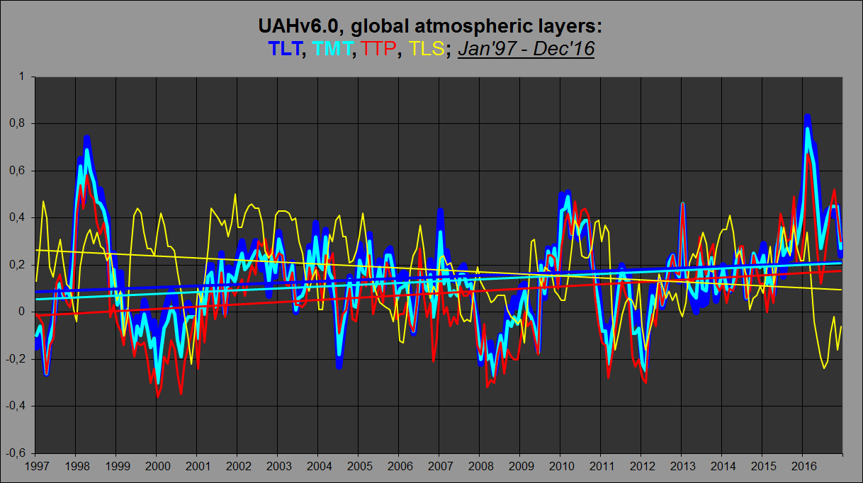
As you can see, the TLS trend is negative, yet the higher up you go from the surface towards the tropopause, the trend gets steeper (TTP > TMT > TLT). So over the last 20 years, the “stratospheric contribution” argument doesn’t work.
BTW, UAHv6.0 TLT agrees very well indeed with NOAA/STAR v3.0 TMT: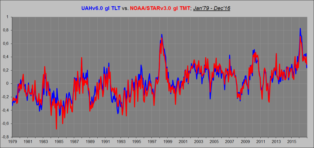
Kristian March 16, 2017 at 10:24 pm
Phil. says, March 16, 2017 at 8:28 am:
Interestingly Christy didn’t refer to LT in his House Committee presentation but referred to MT which is used to derive their new version but includes some stratospheric contribution.
UAH LT v6.0 LT = 1.538*MT -0.548*TP +0.01*LS
That makes no sense. Here are the UAHv6.0 atmospheric layers (TLT, TMT, TTP and TLS) from 1997:
As you can see, the TLS trend is negative, yet the higher up you go from the surface towards the tropopause, the trend gets steeper (TTP > TMT > TLT). So over the last 20 years, the “stratospheric contribution” argument doesn’t work.
MT weighting peaks at 4km but extends up to 22km, in order to remove the contribution from the stratosphere UAH subtracts the TP component (peak weighting ~11km, up to 22km) and a minor adjustment from LS (peak ~17 km, unto 26 km).
Here are the weighting factors:
http://www.drroyspencer.com/wp-content/uploads/MSU2-vs-LT23-vs-LT.gif
Kristian on March 16, 2017 at 10:32 pm
BTW, UAHv6.0 TLT agrees very well indeed with NOAA/STAR v3.0 TMT
Sometimes I ask me wether some people are simply naive or rather malicious.
1. Here is Okulaer’s comparison of NOAA’s STARV3 with UAH6.0 TMT

2. Here is NOAA’s STARV3 TMT graph alone to make it better visible
3. Here is my comparison of UAH6.0 TMT with UAH6.0 TLT
http://fs5.directupload.net/images/170318/nhzysc9n.jpg
Whereas UAH’s TLT record shows for 1979 0.124 °C /decade, TMT shows 0.089 °C, i.e. 30% less; but STAR’s TMT shows 0.128 °C, i.e. the same as UAH6.0 TLT.
Now everybody understands why Okulaer alias Kristian compares STAR TMT with UAH TLT, and not with UAH… TMT which probably is measured a few kilometers higher than STAR’s.
Different time periods are not directly comparable. Especially in short data sets, where a new data point can change the trend by a lot.
That’s Bob Tisdale’s graph in my post, by the way.
In any case, both sets of figures show a previous warming trend followed by a higher warming trend after adjustment. ‘Pause-buster’ is not an accurate term. Neither is ‘Karlised’, unless one is referring to the Karl et al data set.
Sticking with the technical terms and avoiding rhetoric keeps it to justthefacts.
Bindidon on March 17, 2017 at 8:46 pm
1. Here is Okulaer’s comparison of NOAA’s STARV3 with UAH6.0 TMT
Typo error here: of course I meant TLT.
I just wish to point out that I did not come up with those terms, as accurate or as inaccurate as they are. Typing in “pause buster” in the WUWT search bar brings up at least 13 articles with those words in the title itself.
Typing in “karlization” brings two articles with that word in the title but many more blog posts in which that term or some variation of it appears.
Bindidon says, March 17, 2017 at 8:46 pm:
Exactly. And that’s why I compared the UAHv6 TLT product with the NOAA/STARv3 TMT product rather than the UAHv6 TMT product. If I were to start my graph in 1997 rather than in 1979, however, I could include UAHv6 TMT and it would look like this: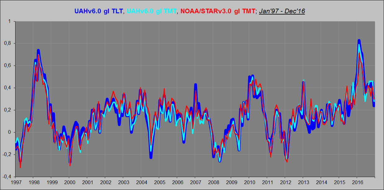
What is interesting here is how the UAHv6 TLT product compares to the NOAA/STARv3 and RSSv4 TMT products, because I at least focus on UAHv6 TLT rather than on UAHv6 TMT (whose “stratospheric contribution” problem becomes evident once we go back all the way to 1979, but not when only moving back to 1997-98). I don’t think UAHv6 TMT shows the correct tropospheric temperature evolution since 1979. It is too cool. I think UAHv6 TLT shows the correct tropospheric temperature evolution since 1979. And I think NOAA/STARv3 TMT is close, but not quite there. Same with RSSv4 TMT. Here’s why:
It is very clear from this plot that NOAA/STARv3 TMT and RSSv4 TMT both trace strangely low compared to UAHv6 TLT between 1983 and 2001. In fact, none of them shows any systematic warming whatsoever from 1979 to the end of 1997 (when the 1997/98 Super-El Niño struck). Which is in direct contradiction to both RSSv3.3 TLT, UAHv6 TLT (seen in the plot), and all surface series!
They simply haven’t fully managed to adjust out the “stratospheric contribution”. There is no such influcence in the TLT products, and so they are much more aligned with the surface series. However, there is no plausible physical reason why the TLT should represent a substantially different temperature evolution over time than the TMT and TUT. It’s all to do with that “stratospheric contribution” component and how you adjust for it. The people at NOAA/STAR and RSS have apparently done a better job than the people at UAH when it comes to their TMT products, but not good enough. There is still a residual to be seen. And it is seen when you compare their TMT products with the UAHv6 TLT product, which is the more correct one …
Finally, here’s UAHv6 gl TLT vs. CERES EBAF Ed4 gl OLR at the ToA: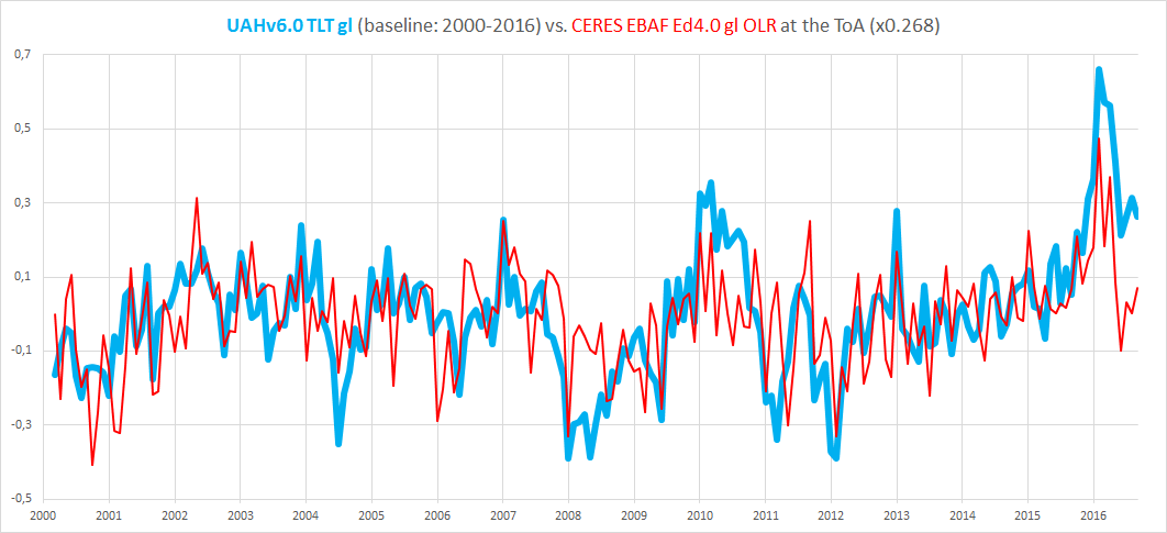
Once again, the overall agreement is impressive, considering these are two fundamentally different (albeit connected) parameters. Coming from two independent sources.
We use the latest data sets. For UAH, we used the v6.0 data set, even though at the time of writing (and last month, too) the methods paper had not been published. The paper was published a week ago, shortly after I had done the calcs. When RSS v4 TLT data becomes available (if they still use TLT), we will use that.
Side note: whenever I look at surface data, I don’t use the Karl data version. But if the main institutes incorporate that to their main data sets, I will apply the same standard as before. Others can argue the merits, but the principle can’t be applied selectively.
Just to be sure there is no confusion here, in my opinion, GISS has been Karlized and that is the only version of GISS that you see. My basis for this statement is by using Bob Tisdale’s article here:
https://wattsupwiththat.com/2017/01/23/december-2016-global-surface-landocean-and-lower-troposphere-temperature-anomaly-update-with-a-look-at-the-year-end-annual-results/
Karl did not author the ERSST.v4 adjustments. He uses the product in the ‘Karlised’ data set. That data set is distinct from the one used by NOAA. You can choose either from the Uni of York trend analyser.
barry March 15, 2017 at 5:28 pm
We use the latest data sets. For UAH, we used the v6.0 data set, even though at the time of writing (and last month, too) the methods paper had not been published. The paper was published a week ago, shortly after I had done the calcs. When RSS v4 TLT data becomes available (if they still use TLT), we will use that.
So why not use TTT, the methodology for which has been available for some time, rather than TLT v3.3 which suffers from similar problems to UAH LT v5.x?
Actually I never did NOAA for the simple reason that it never was on WFT. But I did do GISS and here is a snapshot of what I am talking about:
From:
https://wattsupwiththat.com/2014/05/25/can-giss-and-other-data-sets-set-records-in-2014-now-includes-april-data/#comment-1648290
When I said “flat”, I meant very slightly negative.
However if you plot the same thing today here:
http://www.woodfortrees.org/data/gistemp/from:2001.8/to:2013.25/plot/gistemp/from:2001.8/to:2013.25/trend
You get a positive slope of
By the way, if you wish to check any other pauses over the last four years that I have been having monthly columns of this nature, just type in “now includes” in the WUWT search bar and all of my posts will show up.
Oooops!
Sorry I was off by a year.
See:
http://www.woodfortrees.org/plot/gistemp/from:2001.8/to:2014.25/plot/gistemp/from:2001.8/to:2014.25/trend
However my point still stands, even more so:
#Selected data from 2001.8
#Selected data up to 2014.25
#Least squares trend line; slope = 0.00364774 per year
Werner,
This may be a quibble over the term ‘Karlised.’
ERSSTv4 is not a product co-authored by Karl. He just used it in his paper, and combined it with other data resulting in a data set different from NOAA’s official data set, which also has updated to ERSSTv4.
‘Karlised’ to me refers to his method of data analysis, not to the construction of ERSSTv4, which other people produced. That’s why there are two different data packages, one labeled NOAA, and a different one named Karl (2015).
It’s probably not as sexy for rhetorical purposes to call the NOAA data “ERSSTv4-ised,” but it would be more accurate.
I agree. And his “method of data analysis” led to the pause buster paper.
… which yields a different data set to NOAA’s official temp record. The official set hasn’t been ‘Karlised’, whether the term means ‘using Karl’s data set’, or ‘processed in the same way as Karl et al’.
‘Karlised’, ‘Pause-buster’… these are rhetorical terms, and rhetoric often muddies the waters. For example, the ‘pause-buster’ didn’t bust a pause at all. There was a mild warming trend before, and a higher warming trend after the update to ERSSTv4.
I had an article about the pause buster paper here:
http://wattsupwiththat.com/2015/07/08/is-noaas-hiatus-gone-now-includes-may-data/
One quote:
You show a jump from 0.046 to 0.093 over a slightly different time period. So even using these numbers gives a very clear picture in that 0.113 to 0.093 is virtually no change, but 0.113 to 0.046 is a huge change.
Werner: I admire the calm tone of your replies and will try to suppress my impatience with this subject. Patience is a virtue and deserves patience in return.
When were you impatient? You raised valid points and perspectives that deserved good answers, both for you and any onlookers.
I was certainly frustrated when I was writing and that can leads to trouble. I’m glad you found something useful in my comments. Lord Monckton never did.
Recently, commenter ‘O R’ published a very interesting post concerning the UAH TLT record:
https://wattsupwiththat.com/2017/01/18/berkeley-earth-record-temperature-in-2016-appears-to-come-from-a-strong-el-nino/#comment-2401985
OR showed that an incredibly low amount of measurement points (18) within the UAH grid cell record are sufficient to represent the entire record with some amazing accuracy:

This of course motivated me to repeat the experiment, using the UAH 2.5° grid dataset found in the files
http://www.nsstc.uah.edu/data/msu/v6.0/tlt/tltmonamg.1978_6.0
through
http://www.nsstc.uah.edu/data/msu/v6.0/tlt/tltmonamg.2016_6.0.
Instead of using 18 points however, I selected only 4 evenly distributed points within the useful part of UAH’s 72×144 grid (the latitude zones 82.5S-90S and 82.5N-90N don’t have valuable data).
The 4 points (or better: grid cells) are
– 60S-90W: near Cap Horn and the Antarctic Peninsula;
– 20S-90E: between Madagascar and Australia;
– 20N-90W: in Guatemala;
– 60N-90E: in eastern Siberia near Tula.
A time series over 1979-2016 averaging these 4 cells looks like this when compared with an averaging of 512 cells and all 9,504 respectively:
http://fs5.directupload.net/images/170316/7n2iiukj.jpg
Again, it is amazing to see how good 512 cells fit to the 9,504 of the whole grid (though they sum up to no more than laughable 5% of it), see the yellow plot showing the tiny differences between the two.
{ That wasn’t quite unknown to me: a UAH6.0 time series collected out those 2,100 grid cells encompassing all GHCN surface stations is nearly identical to UAH’s global mean made out of 9,500. }
But the more interesting point is the difference, in the blue 4-point-plot, between 1998 and 2016: while the 4 points are very near to the whole average in 1998, they moved quite a lot above it in 2016.
The reason was quickly found: while in 1998 the 4th cell in Siberia showed a temperature far below that of the 3 others, all 4 cells showed equivalent warmth for 2016.
Whenever something looks warm in a satellite record, you soon hear „That’s El Niño!“. But in 2016, El Niño was weaker than in 1998 and thus hardly could be the difference’s origin.
My humble guess: El Niño itself isn’t the origin of warming. It is rather one of its many sentinels. How else could we explain that four so distant points on Earth show a behavior similar to El Niño?
Pat Frank has several times claimed that “Systematic measurement error is not a constant bias, Frank.” Nevertheless, I have cited several types of systematic measurement error that have a constant bias and therefore do not interfere from calculating an accurate trend: 1) Recording degK in place of degC. 2) Poor ventilation/air circulation. 3) UHI. Pat has cited no examples of “systematic measurement error” that will cause a biased trend. If he does so, his example probably won’t involve a changing error – the only kind of error that can that can interfere with a trend. Increasing UHI, not constant UHI, for example.
I’ll play.
TOBS for the US.
Buckets to ship intake measurements for the global SSTs.
These produced systematic errors.
For there to be a non-warming trend from Jan 2009 to Dec 2017, the remaining months of this year would have to be -0.28C on average. It’s a bigger hurdle than getting a flat trend since 1998. (UAHv6.0 data)
Last time we had temps that cold was in 1992 (-0.28c)
The average temperature anomaly for 2017 would have to be -0.18C.
Last time we had temps that cold were in 1993 (0.20C)
should be 1993 (-0.20C)
Thank you!
So it would appear that in the future we will have pauses of either less than 4 years or more than 20 years, but nothing in between.
Yes, typo from me.
Pauses, so-called, will be of all sorts of different lengths in the future. A 25-year pause (flat or negative mean trend) would be a significant challenge to AGW.
@ Werner Brozek March 16, 2017 at 5:29 am
“If RSS were the only satellite data set available, it would be a completely different situation. But now we have a situation where the latest new and improved version of UAH6.0beta5 is presumably trustworthy but RSS is not. Yet both agree with each other more or less! I am not sure what conclusion to draw from this. It bothers me a little bit that the RSS boss has a clear bias and wishes there were a higher warming rate.”
Werner, Happy St. Patty’s Day! The words “the latest new and improved version” demand to by placed within quotation marks. Here’s what bothers me. A few years back in the comments section on his own site prior V6, Dr. Spencer opined that RSS was running too cool and that there’d have to be some upward adjust/correction made. In the same comment he stated his belief that UAH 5.6 was running a bit to warm and he’d likely have to corrected a bit downward. Then what happened??? Dr. Spencer releases V6 that matches the RSS product he had stated was too cool. That, my friend, is bothersome. I will not be surprised to see an upward adjustment to the UAH product at some point during the next few years.
That reminds me of reading that at one point, only two people understood general relativity, but they disagreed at least on parts of it.
I am certainly not in a position to judge anything here. But it would be nice if both groups agreed on the criteria to use and the numbers they obtained.
If they did exactly the same thing, wouldn’t that make one of them redundant?
To expand on that – it’s better to have teams looking at the same or similar data in different ways, each providing a check on the other.
I would agree providing that unbiased third parties who are knowledgeable in these matter agree that each of the different ways has equal merit.
Which is exactly how RSS, Fu et al., got into it, realizing that the initial UAH MSU T2LT (which controversially was showing a cooling trend due inter alia to orbital decay) needed correcting. The main difference between RSS and UAH appears to be how to deal with the change from MSU to AMSU.
John@EF on March 17, 2017 at 9:50 am
Dr. Spencer releases V6 that matches the RSS product he had stated was too cool. That, my friend, is bothersome.
I agree!
When we carefully read Chrsty’s 2016 Feb testimony, we moreover see that politics, and not science, is the real background of many technical decisions made at UAH.
It is btw so nice to see all the time that RSS4.0 is refuted because having got warmer than revision 3.3, while UAH6.0 is accepted because it is a lot cooler then revision 5.6.
Au royaume des aveugles, le borgne est roi!