Guest Post by Bob Tisdale
This post provides updates of the values for the three primary suppliers of global land+ocean surface temperature reconstructions—GISS, HADCRUT4 and NOAA NCEI (formerly NOAA NCDC)—and of the two suppliers of satellite-based lower troposphere temperature composites—RSS and UAH—all through December 2016. It also includes a few model-data comparisons. Also included is a quick look at the annual data.
This is simply an update, but it includes a good amount of background information for those new to the datasets. Because it is an update, there is no overview or summary for this post. There are, however, simple monthly summaries for the individual datasets. So for those familiar with the datasets, simply fast-forward to the graphs and read the summaries under the headings of “Update”.
ANNUAL DATA WITH YEAR-END 2016 RESULTS
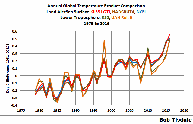
Lots of chatter from the mainstream media about the “record high” annual surface temperatures in 2016, along with the claims of “three in a row”…meaning 2014, 2015 and 2016 were all warmest in sequence. Figure 00 compares the three primary land+ocean surface temperature reconstructions and two primary lower troposphere temperature composites on an annual basis, with the temperature anomalies referenced to a common period of 1981-2010.

Figure 00
Most of the news stories include mention of the record highs in 2016 being caused by the aftereffects of the 2014/15/16 El Niño. Not one that I’ve run across, however, have mentioned that the record high global sea surface temperatures in 2015 were driven primarily by the 2014/15 portion of the 2014/15/16 El Niño and by “The Blob” (a prolonged, naturally occurring, coupled ocean-atmosphere weather event) and that “The Blob” was the primary reason for record high sea surface temperatures in 2014. See General Discussions 2 and 3 of my most recent free ebook On Global Warming and the Illusion of Control (25MB).
For those wanting a brief look at the individual results on an annual basis, see Animation 1. It includes the comparison shown above, followed by the individual surface and lower troposphere temperature results. The final two graphs are separate views of the 3 surface temperature reconstructions and the two lower troposphere temperature composites.
Animation 1
The additional individual graphs that make up the animation:
- GISS LOTI
- HADCRUT4
- NCEI
- RSS TLT
- UAH TLT
- Three Surface Temperature Reconstructions
- Two Lower Troposphere Temperature Composites
Back to your regularly scheduled monthly update.
INITIAL NOTES:
We discussed and illustrated the impacts of the adjustments to surface temperature data in the posts:
- Do the Adjustments to Sea Surface Temperature Data Lower the Global Warming Rate?
- UPDATED: Do the Adjustments to Land Surface Temperature Data Increase the Reported Global Warming Rate?
- Do the Adjustments to the Global Land+Ocean Surface Temperature Data Always Decrease the Reported Global Warming Rate?
The NOAA NCEI product is the new global land+ocean surface reconstruction with the manufactured warming presented in Karl et al. (2015). For summaries of the oddities found in the new NOAA ERSST.v4 “pause-buster” sea surface temperature data see the posts:
- The Oddities in NOAA’s New “Pause-Buster” Sea Surface Temperature Product – An Overview of Past Posts
- On the Monumental Differences in Warming Rates between Global Sea Surface Temperature Datasets during the NOAA-Picked Global-Warming Hiatus Period of 2000 to 2014
Even though the changes to the ERSST reconstruction since 1998 cannot be justified by the night marine air temperature product that was used as a reference for bias adjustments (See comparison graph here), and even though NOAA appears to have manipulated the parameters (tuning knobs) in their sea surface temperature model to produce high warming rates (See the post here), GISS also switched to the new “pause-buster” NCEI ERSST.v4 sea surface temperature reconstruction with their July 2015 update.
The UKMO also recently made adjustments to their HadCRUT4 product, but they are minor compared to the GISS and NCEI adjustments.
We’re using the UAH lower troposphere temperature anomalies Release 6.0 for this post as the paper that documents it has been accepted for publication. And for those who wish to whine about my portrayals of the changes to the UAH and to the GISS and NCEI products, see the post here.
The GISS LOTI surface temperature reconstruction and the two lower troposphere temperature composites are for the most recent month. The HADCRUT4 and NCEI products lag one month.
Much of the following text is boilerplate that has been updated for all products. The boilerplate is intended for those new to the presentation of global surface temperature anomalies.
Most of the graphs in the update start in 1979. That’s a commonly used start year for global temperature products because many of the satellite-based temperature composites start then.
We discussed why the three suppliers of surface temperature products use different base years for anomalies in chapter 1.25 – Many, But Not All, Climate Metrics Are Presented in Anomaly and in Absolute Forms of my free ebook On Global Warming and the Illusion of Control – Part 1 (25MB).
Since the July 2015 update, we’re using the UKMO’s HadCRUT4 reconstruction for the model-data comparisons using 61-month filters.
And I’ve resurrected the model-data 30-year trend comparison using the GISS Land-Ocean Temperature Index (LOTI) data.
For a continued change of pace, let’s start with the lower troposphere temperature data. I’ve left the illustration numbering as it was in the past when we began with the surface-based data.
UAH LOWER TROPOSPHERE TEMPERATURE ANOMALY COMPOSITE (UAH TLT)
Special sensors (microwave sounding units) aboard satellites have orbited the Earth since the late 1970s, allowing scientists to calculate the temperatures of the atmosphere at various heights above sea level (lower troposphere, mid troposphere, tropopause and lower stratosphere). The atmospheric temperature values are calculated from a series of satellites with overlapping operation periods, not from a single satellite. Because the atmospheric temperature products rely on numerous satellites, they are known as composites. The level nearest to the surface of the Earth is the lower troposphere. The lower troposphere temperature composite include the altitudes of zero to about 12,500 meters, but are most heavily weighted to the altitudes of less than 3000 meters. See the left-hand cell of the illustration here.
The monthly UAH lower troposphere temperature composite is the product of the Earth System Science Center of the University of Alabama in Huntsville (UAH). UAH provides the lower troposphere temperature anomalies broken down into numerous subsets. See the webpage here. The UAH lower troposphere temperature composite are supported by Christy et al. (2000) MSU Tropospheric Temperatures: Dataset Construction and Radiosonde Comparisons. Additionally, Dr. Roy Spencer of UAH presents at his blog the monthly UAH TLT anomaly updates a few days before the release at the UAH website. Those posts are also regularly cross posted at WattsUpWithThat. UAH uses the base years of 1981-2010 for anomalies. The UAH lower troposphere temperature product is for the latitudes of 85S to 85N, which represent more than 99% of the surface of the globe.
The UAH lower troposphere data are now at Release 6. The paper that supports the latest release has been accepted for publication (no date yet set for publication), and the Release 6 data are no longer being published with a “beta” identifier. See Dr. Roy Spencer’s post here. Those Release 6.0 enhancements lowered the warming rates of their lower troposphere temperature anomalies. See Dr. Spencer’s blog post Version 6.0 of the UAH Temperature Dataset Released: New LT Trend = +0.11 C/decade and my blog post New UAH Lower Troposphere Temperature Data Show No Global Warming for More Than 18 Years. The UAH lower troposphere anomaly data, Release 6.0, through December 2016 are here.
Update: The December 2016 UAH (Release 6.0) lower troposphere temperature anomaly is +0.24 deg C. It took a nosedive in December (a whopping decrease of about -0.21 deg C).
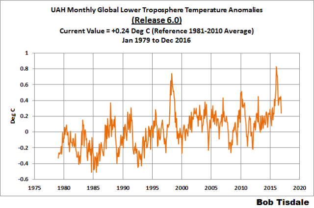
Figure 4 – UAH Lower Troposphere Temperature (TLT) Anomaly Composite – Release 6.0
RSS LOWER TROPOSPHERE TEMPERATURE ANOMALY COMPOSITE (RSS TLT)
Like the UAH lower troposphere temperature product, Remote Sensing Systems (RSS) calculates lower troposphere temperature anomalies from microwave sounding units aboard a series of NOAA satellites. RSS describes their product at the Upper Air Temperature webpage. The RSS product is supported by Mears and Wentz (2009) Construction of the Remote Sensing Systems V3.2 Atmospheric Temperature Records from the MSU and AMSU Microwave Sounders. RSS also presents their lower troposphere temperature composite in various subsets. The land+ocean TLT values are here. Curiously, on that webpage, RSS lists the composite as extending from 82.5S to 82.5N, while on their Upper Air Temperature webpage linked above, they state:
We do not provide monthly means poleward of 82.5 degrees (or south of 70S for TLT) due to difficulties in merging measurements in these regions.
Also see the RSS MSU & AMSU Time Series Trend Browse Tool. RSS uses the base years of 1979 to 1998 for anomalies.
Note: RSS recently release new versions of the mid-troposphere temperature (TMT) and lower stratosphere temperature (TLS) products. So far, their lower troposphere temperature product has not been updated to this new version.
Update: The December 2016 RSS lower troposphere temperature anomaly is +0.23 deg C. It also dropped a good measure (a noticeable downtick of -0.16 deg C) since November 2016.

Figure 5 – RSS Lower Troposphere Temperature (TLT) Anomalies
GISS LAND OCEAN TEMPERATURE INDEX (LOTI)
Introduction: The GISS Land Ocean Temperature Index (LOTI) reconstruction is a product of the Goddard Institute for Space Studies. Starting with the June 2015 update, GISS LOTI uses the new NOAA Extended Reconstructed Sea Surface Temperature version 4 (ERSST.v4), the pause-buster reconstruction, which also infills grids without temperature samples. For land surfaces, GISS adjusts GHCN and other land surface temperature products via a number of methods and infills areas without temperature samples using 1200km smoothing. Refer to the GISS description here. Unlike the UK Met Office and NCEI products, GISS masks sea surface temperature data at the poles, anywhere seasonal sea ice has existed, and they extend land surface temperature data out over the oceans in those locations, regardless of whether or not sea surface temperature observations for the polar oceans are available that month. Refer to the discussions here and here. GISS uses the base years of 1951-1980 as the reference period for anomalies. The values for the GISS product are found here. (I archived the former version here at the WaybackMachine.)
Update: The December 2016 GISS global temperature anomaly is +0.81 deg C. According to the GISS LOTI data, global surface temperature anomalies made a noticeable downtick in December, a -0.12 deg C decrease.

Figure 1 – GISS Land-Ocean Temperature Index
NCEI GLOBAL SURFACE TEMPERATURE ANOMALIES
NOTE: The NCEI only produces the product with the manufactured-warming adjustments presented in the paper Karl et al. (2015). As far as I know, the former version of the reconstruction is no longer available online. For more information on those curious NOAA adjustments, see the posts:
- NOAA/NCDC’s new ‘pause-buster’ paper: a laughable attempt to create warming by adjusting past data
- More Curiosities about NOAA’s New “Pause Busting” Sea Surface Temperature Dataset
- Open Letter to Tom Karl of NOAA/NCEI Regarding “Hiatus Busting” Paper
- NOAA Releases New Pause-Buster Global Surface Temperature Data and Immediately Claims Record-High Temps for June 2015 – What a Surprise!
And recently:
- Pause Buster SST Data: Has NOAA Adjusted Away a Relationship between NMAT and SST that the Consensus of CMIP5 Climate Models Indicate Should Exist?
- The Oddities in NOAA’s New “Pause-Buster” Sea Surface Temperature Product – An Overview of Past Posts
- On the Monumental Differences in Warming Rates between Global Sea Surface Temperature Datasets during the NOAA-Picked Global-Warming Hiatus Period of 2000 to 2014
Introduction: The NOAA Global (Land and Ocean) Surface Temperature Anomaly reconstruction is the product of the National Centers for Environmental Information (NCEI), which was formerly known as the National Climatic Data Center (NCDC). NCEI merges their new “pause buster” Extended Reconstructed Sea Surface Temperature version 4 (ERSST.v4) with the new Global Historical Climatology Network-Monthly (GHCN-M) version 3.3.0 for land surface air temperatures. The ERSST.v4 sea surface temperature reconstruction infills grids without temperature samples in a given month. NCEI also infills land surface grids using statistical methods, but they do not infill over the polar oceans when sea ice exists. When sea ice exists, NCEI leave a polar ocean grid blank.
The source of the NCEI values is through their Global Surface Temperature Anomalies webpage. Click on the link to Anomalies and Index Data.)
Update: The December 2016 NCEI global land plus sea surface temperature anomaly was +0.79 deg C. See Figure 2. It made an uptick (an increase of about +0.04 deg C) since November 2016.

Figure 2 – NCEI Global (Land and Ocean) Surface Temperature Anomalies
UK MET OFFICE HADCRUT4
Introduction: The UK Met Office HADCRUT4 reconstruction merges CRUTEM4 land-surface air temperature product and the HadSST3 sea-surface temperature (SST) reconstruction. CRUTEM4 is the product of the combined efforts of the Met Office Hadley Centre and the Climatic Research Unit at the University of East Anglia. And HadSST3 is a product of the Hadley Centre. Unlike the GISS and NCEI reconstructions, grids without temperature samples for a given month are not infilled in the HADCRUT4 product. That is, if a 5-deg latitude by 5-deg longitude grid does not have a temperature anomaly value in a given month, it is left blank. Blank grids are indirectly assigned the average values for their respective hemispheres before the hemispheric values are merged. The HADCRUT4 reconstruction is described in the Morice et al (2012) paper here. The CRUTEM4 product is described in Jones et al (2012) here. And the HadSST3 reconstruction is presented in the 2-part Kennedy et al (2012) paper here and here. The UKMO uses the base years of 1961-1990 for anomalies. The monthly values of the HADCRUT4 product can be found here.
Update: The December 2016 HADCRUT4 global temperature anomaly is +0.59 deg C. See Figure 3. It also made an uptick from November to December 2016, an increase of about +0.07 deg C.

Figure 3 – HADCRUT4
COMPARISONS
The GISS, HADCRUT4 and NCEI global surface temperature anomalies and the RSS and UAH lower troposphere temperature anomalies are compared in the next three time-series graphs. Figure 6 compares the five global temperature anomaly products starting in 1979. Again, due to the timing of this post, the HADCRUT4 and NCEI updates lag the UAH, RSS, and GISS products by a month. For those wanting a closer look at the more recent wiggles and trends, Figure 7 starts in 1998, which was the start year used by von Storch et al (2013) Can climate models explain the recent stagnation in global warming? They, of course, found that the CMIP3 (IPCC AR4) and CMIP5 (IPCC AR5) models could NOT explain the recent slowdown in warming, but that was before NOAA manufactured warming with their new ERSST.v4 reconstruction…and before the strong El Niño of 2015/16. Figure 8 starts in 2001, which was the year Kevin Trenberth chose for the start of the warming slowdown in his RMS article Has Global Warming Stalled?
Because the suppliers all use different base years for calculating anomalies, I’ve referenced them to a common 30-year period: 1981 to 2010. Referring to their discussion under FAQ 9 here, according to NOAA:
This period is used in order to comply with a recommended World Meteorological Organization (WMO) Policy, which suggests using the latest decade for the 30-year average.
The impacts of the unjustifiable, excessive adjustments to the ERSST.v4 reconstruction are visible in the two shorter-term comparisons, Figures 7 and 8. That is, the short-term warming rates of the new NCEI and GISS reconstructions are noticeably higher than the HADCRUT4 data. See the June 2015 update for the trends before the adjustments.

Figure 6 – Comparison Starting in 1979
#####

Figure 7 – Comparison Starting in 1998
#####

Figure 8 – Comparison Starting in 2001
Note also that the graphs list the trends of the CMIP5 multi-model mean (historic through 2005 and RCP8.5 forcings afterwards), which are the climate models used by the IPCC for their 5th Assessment Report. The metric presented for the models is surface temperature, not lower troposphere.
AVERAGE
Figure 9 presents the average of the GISS, HADCRUT and NCEI land plus sea surface temperature anomaly reconstructions and the average of the RSS and UAH lower troposphere temperature composites. Again because the HADCRUT4 and NCEI products lag one month in this update, the most current monthly average only includes the GISS product.

Figure 9 – Average of Global Land+Sea Surface Temperature Anomaly Products
MODEL-DATA COMPARISON & DIFFERENCE
As noted above, the models in this post are represented by the CMIP5 multi-model mean (historic through 2005 and RCP8.5 forcings afterwards), which are the climate models used by the IPCC for their 5th Assessment Report.
Considering the uptick in surface temperatures in 2014, 2015 and now 2016 (see the posts here and here), government agencies that supply global surface temperature products have been touting “record high” combined global land and ocean surface temperatures. Alarmists happily ignore the fact that it is easy to have record high global temperatures in the midst of a hiatus or slowdown in global warming, and they have been using the recent record highs to draw attention away from the difference between observed global surface temperatures and the IPCC climate model-based projections of them.
There are a number of ways to present how poorly climate models simulate global surface temperatures. Normally they are compared in a time-series graph. See the example in Figure 10. In that example, the UKMO HadCRUT4 land+ocean surface temperature reconstruction is compared to the multi-model mean of the climate models stored in the CMIP5 archive, which was used by the IPCC for their 5th Assessment Report. The reconstruction and model outputs have been smoothed with 61-month running-mean filters to reduce the monthly variations. The climate science community commonly uses a 5-year running-mean filter (basically the same as a 61-month filter) to minimize the impacts of El Niño and La Niña events, as shown on the GISS webpage here. Using a 5-year running mean filter has been commonplace in global temperature-related studies for decades. (See Figure 13 here from Hansen and Lebedeff 1987 Global Trends of Measured Surface Air Temperature.) Also, the anomalies for the reconstruction and model outputs have been referenced to the period of 1880 to 2013 so not to bias the results. That is, by using the almost the full term of the data, no one with the slightest bit of common sense can claim I’ve cherry picked the base years for anomalies with this comparison.

Figure 10
It’s very hard to overlook the fact that, over the past decade, climate models are simulating way too much warming…even with the small recent El Niño-related uptick in the data.
Another way to show how poorly climate models perform is to subtract the observations-based reconstruction from the average of the model outputs (model mean). We first presented and discussed this method using global surface temperatures in absolute form. (See the post On the Elusive Absolute Global Mean Surface Temperature – A Model-Data Comparison.) The graph below shows a model-data difference using anomalies, where the data are represented by the UKMO HadCRUT4 land+ocean surface temperature product and the model simulations of global surface temperature are represented by the multi-model mean of the models stored in the CMIP5 archive. Like Figure 10, to assure that the base years used for anomalies did not bias the graph, the full term of the graph (1880 to 2013) was used as the reference period.
In this example, we’re illustrating the model-data differences smoothed with a 61-month running mean filter. (You’ll notice I’ve eliminated the monthly data from Figure 11. Example here. Alarmists can’t seem to grasp the purpose of the widely used 5-year (61-month) filtering, which as noted above is to minimize the variations due to El Niño and La Niña events and those associated with catastrophic volcanic eruptions.)

Figure 11
The difference now between models and data is almost worst-case, comparable to the difference at about 1910.
There was also a major difference, but of the opposite sign, in the late 1880s. That difference decreases drastically from the 1880s and switches signs by the 1910s. The reason: the models do not properly simulate the observed cooling that takes place at that time. Because the models failed to properly simulate the cooling from the 1880s to the 1910s, they also failed to properly simulate the warming that took place from the 1910s until the 1940s. (See Figure 12 for confirmation.) That explains the long-term decrease in the difference during that period and the switching of signs in the difference once again. The difference cycles back and forth, nearing a zero difference in the 1980s and 90s, indicating the models are tracking observations better (relatively) during that period. And from the 1990s to present, because of the slowdown in warming, the difference has increased to greatest value ever…where the difference indicates the models are showing too much warming.
It’s very easy to see the recent record-high global surface temperatures have had a tiny impact on the difference between models and observations.
See the post On the Use of the Multi-Model Mean for a discussion of its use in model-data comparisons.
MODEL-DATA COMPARISON – 30-YEAR RUNNING TRENDS
Yet another way to show how poorly climate models simulate surface temperatures is to compare 30-year running trends of global surface temperature data and the model-mean of the climate model simulations of it. See Figure 12. In this case, we’re using the global GISS Land-Ocean Temperature Index for the data. For the models, once again we’re using the model-mean of the climate models stored in the CMIP5 archive with historic forcings to 2005 and worst case RCP8.5 forcings since then.
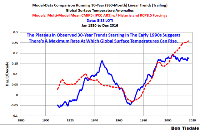
Figure 12
There are numerous things to note in the trend comparison. First, there is a growing divergence between models and data starting in the early 2000s. The continued rise in the model trends indicates global surface warming is supposed to be accelerating, but the data indicate little to no acceleration since then. Second, the plateau in the data warming rates begins in the early 1990s, indicating that there has been very little acceleration of global warming for more than 2 decades. This suggests that there MAY BE a maximum rate at which surface temperatures can warm. Third, note that the observed 30-year trend ending in the mid-1940s is comparable to the recent 30-year trends. (That, of course, is a function of the new NOAA ERSST.v4 data used by GISS.) Fourth, yet that high 30-year warming ending about 1945 occurred without being caused by the forcings that drive the climate models. That is, the climate models indicate that global surface temperatures should have warmed at about a third that fast if global surface temperatures were dictated by the forcings used to drive the models. In other words, if the models can’t explain the observed 30-year warming ending around 1945, then the warming must have occurred naturally. And that, in turns, generates the question: how much of the current warming occurred naturally? Fifth, the agreement between model and data trends for the 30-year periods ending in the 1960s to about 2000 suggests the models were tuned to that period or at least part of it. Sixth, going back further in time, the models can’t explain the cooling seen during the 30-year periods before the 1920s, which is why they fail to properly simulate the warming in the early 20th Century.
One last note, the monumental difference in modeled and observed warming rates at about 1945 confirms my earlier statement that the models can’t simulate the warming that occurred during the early warming period of the 20th Century.
MONTHLY SEA SURFACE TEMPERATURE UPDATE
The most recent sea surface temperature update can be found here. The satellite-enhanced sea surface temperature composite (Reynolds OI.2) are presented in global, hemispheric and ocean-basin bases.
RECENT RECORD HIGHS
We discussed the recent record-high global sea surface temperatures for 2014 and 2015 and the reasons for them in General Discussions 2 and 3 of my most recent free ebook On Global Warming and the Illusion of Control (25MB). (And, of course, the record highs in 2016 are lagged responses to the 2015/16 El Niño.) The book was introduced in the post here (cross post at WattsUpWithThat is here).
Sorry it’s late.
Cheers.
Here is one of my favorite plots, from Tony Heller:
This is why one should ignore the Surface Temperature records – too many false adjustments””,
https://realclimatescience.com/all-temperature-adjustments-monotonically-increase/
https://www.facebook.com/photo.php?fbid=1209281512482742&set=a.1012901982120697.1073741826.100002027142240&type=3&theater
So for the GISS LOTI, which I assume includes both land and ocean Temperatures.
What is the size of the grid spacing for the ocean thermometers that they are reading ??
Well I’m just assuming that they actually have some thermometers out there in the ocean at fixed known locations. If they use a grid system for their Terraflop computer models, I presume they would have a thermometer at each grid location they use in their models.
How else would they expect the models to match the real world ??
G
Bob, have you ever thought of producing a global trend without the Arctic? I think this would be very informative. I suspect most of the “global” warming would disappear without the Arctic. My assertion has been the Arctic warming is mainly due to the AMO positive phase. It would be interesting to see what the data looks like without this influence.
Also, I did a quick look at satellite data for only ENSO neutral months. I got a trend of only .01 C/Decade since 1997 (20 years). Although this throws out around half the data I think it is perhaps more meaningful than data with the massive noise added by ENSO. Have you ever thought of adding a similar chart to your report?
As always, thanks for your continued effort to provide data.
So it’s the same temperature it was in 1980. The same 1980 after a 40 year cooling trend. Can someone please point out what the problem is?
Ignoring the fact it is actually warming?
Look at the arctic and surrounding region – three years of record temps in Alaska, Svalbard with a whole year averaging above freezing…
Griff
Didn’t you get eaten by a polar bear?
You know, it’s called Global for a reason. Stop focusing just on the Arctic. Include the Antarctic and redraw your conclusions.
During the previous glacial advance, much of Alaska was free of ice. A warmer Alaska (if true) would indicate that we are indeed nearing the end of the Holocene inter-glacial.
In the world of the troll, only the data that agrees with your religion counts. All other date isn’t relevant.
Really?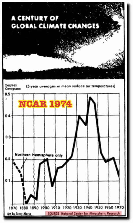
The problem is that one can have no confidence in the data, and hence we just do not know whether it is or is not warming, and if so, by how much.
Below is a plot (black line) of what was in 1980/81 considered to be the temperature anomaly profile of the 20th century, and the red line is the anomaly resulting from endless adjustments to historical records these past 20 or so years.
http://notrickszone.com/wp-content/uploads/2017/01/NASA-NH-Temperatures-1880-2016-trend_edited-1.jpg
Have a look at Hansen’s Fig 3 in his paper published in Science in 1981, and the data plots produced by NAS and NCAR published in the mid 1970s.
It is now RECORD cold in Alaska…..
What else in the universe; besides YOU actually is aware of and pays any attention to either the Average Temperature (over a year), or ANY other Physical variable average value ??
So if Alaska and Svalbard were above freezing for the whole year, then presumably neither of them has any ice any more.
If we didn’t have any CO2 in the atmosphere apparently the whole planet would be frozen solid at 255 K.
Thank goodness for CO2.
G
“Ignoring the fact it is actually warming?”
Making stuff up AKA LYING again, Grifter?
So no change there…
Arctic sea ice is now above the level for the same day in 2006
FACTS, Griff.
No warming since the 1998 El Nino step/
Griff: Yes, its getting warmer in the arctic. But that seems to be a regional effect. Do you think it’s suitable to make a global climate shift out of that?
Thanks for that Hemispheric Temperature Chart, Richard.
This chart demonstrates just how bastardized the current surface temperature charts really are: The black line is the true temperature profile; The red line is the lie perpetrated by climate change advocates.
Tack the satellite record on to the black line, make sure 1934 is hotter than 1998, by 0.5C (according to Hansen), and then you have a realistic temperature profile since 1880. And that profile shows we are in a temperature downtrend from 1934.
http://notrickszone.com/wp-content/uploads/2017/01/NASA-NH-Temperatures-1880-2016-trend_edited-1.jpg
“The black line is the true temperature profile”
Of what? People here seem so indifferent to this elementary question.
In 1981 they had a few hundred land stations. What you are comparing to is the modern land/ocean index. 60% of the NH is ocean.
BS Nick
richard verney Outstanding graphics, especially the first one which can serve as the centerpiece of the argument that the 1930s were hotter than today (worldwide). If the 1930s were hotter than today then … we aren’t warming, period, and AGW is utter indisputable bunk.
First off, the Northern Hemisphere makes up 64% the world’s land, so I’ll take that 1980 graphic from Hansen as representative of the world temperature in 1935 and 1980. The later highly manipulated, partisan data from NASA is absolutely not credible and needs to be tossed out completely. Even the 1980 data must have been afflicted by the Urban Heat effect, as urbanization was going full-throttle throughout the 50s, 60s and 70s. So in reality the cooling since 1935 in the 1980 data should be even greater than the graph portrays. And looking at the satellite data that went online about 1980 I don’t see how the mild warming from 1980 makes up the dramatic cooling from 1935. The clear conclusion: the 1930s were hotter worldwide than today!!.
AndyG55,

“BS Nick”
You have no idea how to follow or put a logical argument. What you have shown, typically without any of the required identifying information, is a plot of station numbers in GHCN. This first came into existence as a major cooperative project in the early 1990’s, digitising and gathering records of recently digitised data. Hansen was writing in 1981. And he said:
The graph is itself a cherry pick. Hansen gave a plot for global as well, and it does not end with a downtrend:
For me, the most impressive adjustment of GMT is between Hansen 1981 (see as posted in this thread by Nick Stokes) and Hansen 1988. Hansen 1981 itself represented a big shift away from cooling alarm, where the new SH data moderated the mid-century cooling that had been generally acknowledged for north since 1961. But still, in Hansen 1981, the graph at 1980 rises to below the 1940 peak and even below a peak in 1960. Now look at Hansen 1988. Here you see that by 1980 the graph line is already above 1940. In both graphs there is a visual confusion between running means of (averaged) data points. Firstly in 1981, how did he establish a running mean for 1980? In the 1988 graph, the result is visually impressive for the sweaty folk in the senate hearing room, as the monthly data to May 1988 makes it seem that it is not only the Washington temperature on that day that is going vertically through the roof, but also the global temperature in that year .
Hansen 1988:
https://enthusiasmscepticismscience.wordpress.com/global-temperature-graphs/1988_hansen_lebedeff_tempgraph/
Another interesting flip in the analysis is not an adjustment as such, but a curious choice of data. On each side of the flip the data is derived from Lamb’s charting of millennium winter severity across Europe from central England to Russia.
This map is his summary as first presented to a UNESCO climate conference in 1961:
https://enthusiasmscepticismscience.wordpress.com/2013/09/22/hubert-lamb-and-the-assimilation-of-legendary-ancient-russian-winters/#jp-carousel-1307
In 1975, US GARP used the Moscow data to produce a graph where the striking westerner Europe MWP is entirely truncated. It seems that Moscow missed out on medieval warming, but through the next few years this graph came to represent the generalized trend in temperatures, as in the 1976 Nat Geo article:
https://enthusiasmscepticismscience.wordpress.com/2013/09/22/hubert-lamb-and-the-assimilation-of-legendary-ancient-russian-winters/#jp-carousel-1255
(Why the US used the Moscow data during the cold war is one unanswered question. The other curiosity is why they used these data, which most accentuation the cooling, in a report that was trying to mollify cooling alarm.)
Then, the flip. It came famously with the late insertion into IPCC FAR of Lamb’s Middle England data to suggest the global trend:
https://enthusiasmscepticismscience.wordpress.com/global-temperature-graphs/1990-ipcc-first-report-working-gp-1-section-7-2-1/
(We now know (via Climate Audit) that this schematic of GMT likely came via Crispin Tickell. The UK author of the chapter (who is still alive) seems never to have been asked to confirm this, nor, otherwise, to recount the circumstances of its insertion.)
Nick
You have posted Hansen’s Fig 3 from his 1981 paper published in Science volume 213, number 4511, The top plot covers the Northern Hemisphere which is shown (eyeballing) to peak in about 1940 at about +0.45degC, and then to then to drop in temperature by about 0.6degC reaching a low of about -0.15degC in about 1970.
Hansen when introducing Fig 3 states:
One of the other analyses he refers to in the footnotes is the NAS plot which I set out below: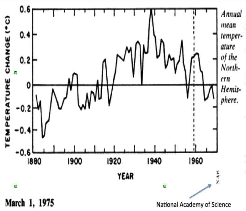
This shows a fall in temperatures of about 0.7deg C between about 1940 and 1970. In my earlier comment, I posted the NCAR analysis that showed a fall of a little under 0.6degC which is more in line with Hansen’s Fig3.
This of course, only covers the Northern Hemisphere, but there is good reason to consider only the Northern Hemisphere since the Southern Hemisphere is too sparsely sampled and is disproportionately ocean and prior to ARGO, we have no reliable SST data (I have studied ship’s data for about 30 years and am therefore well acquainted with how unsatisfactory that data is). Since we have no reliable data on the Southern Hemisphere it follows that we have no worthwhile data on the global position.
In summaryonly the Northern Hemisphere data withstands serious scientific scrutiny, and there are multiple lines of evidence that suggest that as far as the Northern Hemisphere is concerned prior to the recent ENSO cycle which has yet to complete, it may well be the case that today 9say 20140 is no warmer than it was in 1940
If you look at pristine US data it also suggests this, ditto Greenland data, ditto Iceland data, ditto rural non coastal stations.
Also the famous BrIffa/MAnn tree ring data also shows that the 1940s were warmer than the 1970s/1980s and that is why they had to be ditched. Those tree rings bear a much closer similarity to the NCAR/NAS plots that I have set out, and it is because of that they were cut and then the adjusted thermometer record added to hide the decline. See the below plot which compares tree ring data to rural non coastal station data.
http://hidethedecline.eu/media/ARUTI/Coast/fig4.jpg
Hi George,
george e. smith January 23, 2017 at 11:11 am
What else in the universe; besides YOU actually is aware of and pays any attention to either the Average Temperature (over a year), or ANY other Physical variable average value ??
So if Alaska and Svalbard were above freezing for the whole year, then presumably neither of them has any ice any more.
Landslide in Svalbard caused by rain:
http://icepeople.net/2016/10/15/alert-landslide-near-cemetery-closes-road-between-huset-and-the-old-museum-other-areas-being-assessed/
Richard V,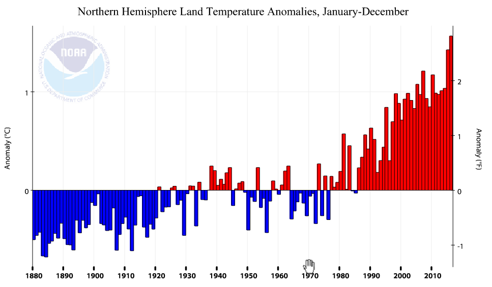
“In summary only the Northern Hemisphere data withstands serious scientific scrutiny”
You’re treading a fine line here. You’re arguing that outside the NH, 1981 data is so sparse that it is worthless, but the NH is so reliable (several hundred stations) that it should be preferred to indices with all the data that has been gathered since. In fact, even that NH shows a considerable rebound from the low point of the NAS data.
But the main objection to your plot is still comparing a land-based 1981 dataset with a land/ocean modern one. They are just different places. It is wrong to attribute the difference to adjustment. Here is the NOAA modern plot of NH land (different anomaly base, and not smoothed). It does show a local peak around 1940.
Berniel,
“For me, the most impressive adjustment of GMT is between Hansen 1981 (see as posted in this thread by Nick Stokes) and Hansen 1988.”
Again, people seem to pay no attention to what the graphs they pluck out are actually plotting. The 1981 plot is based on a few hundred NH land stations. As I showed above, the GMT plot given there is quite different. RV says that we should prefer NH because it is more reliable, but this is the old keys under the lamppost fallacy; it may be more reliable, but it is a different place. The 1998 data has a lot more stations and is weighted (as in Hansen-Lebedeff) to account for ocean as best possible; this was not done in 1981. And of course, it really did warm between 1981 and 1988.
A much more REALISTIC NH land chart since 1979
Note 1998 is well above 2015.. no GISS warming “adjustments™©” (or whatever you want to call them.)
ONLY the El Ninos providing any bumps.
That you can’t read graphs?
Or that you do.
According to every chart above, there is less than 1 degree C difference between 1980 and now. Hard to see in the above graphs, but there was apparently a 0.04 degrees C difference between 1998 and 2016.
If that is the full effect of “catastrophic man-made global warming”, I’m not worried.
All of this graphical statisticating is akin to reading horoscopes.
We marvel at the few items where they nailed us exactly; and then we ignore the many examples where they aren’t even close to what we actually are; but we latched on to the hits.
Go read the other eleven ” signs ” and you’ll see they all have you pegged accurately; well for just some of their statements, but mostly none of them are you; but who cares about the misses.
g
“Ignoring the fact it is actually warming?”
No, Mark is just pointing out that we had the same amount of warming from 1910 to 1940 as we have had from 1979 to 2016. The 1910 to 1940 era had little human-caused CO2 in the atmosphere compared to today, so Mark is asking if the current warming couldn’t be attributed to natural causes, like the warming of 1910 to 1940. Excellent question.
Nick
Thanks your response.
Personally, I do not consider that any of the temperature data sets are fit for purpose; they all have issues including the satellite data sets and ARGO. That said, some are better than others.
The issues with the Southern Hemisphere are so deep rooted and fundamental that for serious scientific study it is worthless. Hansen in your extract acknowledges the fundamental problems with the Southern Hemisphere, and as I pointed out you cannot compile a worthwhile global data set if the Southern Hemisphere is worthless.
The land based Northern hemisphere thermometer data set could be salvageable but it needs a reality check. It badly needs to undergo an experiment to check how representative it is. What is needed is to audit all the stations used, to ascertain the most pristine 10 or 20 stations in say 10 or 15 countries across the Northern Hemisphere which have no siting issues, no station moves, are not encroached by urbanisation, are not sited near to lakes or irrigated agricultural land or have other issues that may contaminate the data, and which have the the best record practices and to retrofit these stations with the same LIG thermometers that were used in the 1930s/1940s (calibrated in Fahrenheit where appropriate) and then observe the temperatures for say the next 5 years using the same practices as were used in the 1930s/1940s (eg., the same TOB) so that there is no need to make any adjustment to raw data. One would not compile a Northern Hemisphere record, but one would simply look at how temperatures have changed, raw data to raw data, at each location. We would then very quickly have a handle upon how representative the current land thermometer records are.
You provide a plot that is supposed to represent NH land thermometer data. However, I am unsure of the relevance of your plot since the NAS, the NCAR and Hansen plots are not land thermometer plots but rather Northern Hemisphere temperature anomaly plots based upon Northern Hemisphere temperature anomalies.
You state:
Richard,
“Hansen plots are not land thermometer plots”
I’m not sure what distinction you mean to make there, but land thermometer data is all they had available. That is why it is innapropriate to compare with land/ocean, which was first used in ’90s.
“today is about +2.7degC”
I think you are reading the °F scale on the right.
“Nick, please identify the countries in the Northern Hemisphere which are said to be more than 2degC warmer than they were in the 1940s.”
Again, it isn’t that warm. But this page gives the overall picture. It’s a trackball shaded sphere, where the shade color is exact for each stations (you can click to see them). I haven’t shown a graduation on the scale, but you can click to show details of the trend at the nearest station. You can choose various start years, including 1934 and 1944. From 1940, the NOAA land trend is 1.66/Cen, so about 1.2°C for the 75 years. That is an orange color – eg Alice Springs. You’ll see that it includes almost all Central Asia, through to N China and E Europe, and also Canada and the Sahel.
Thanks Nick
I have been studying ship’s data since the 1980s so I know that it was available, and of course there was also the bucket data, but you know much more about this than I do, so I will take your word that NCAR, NAS, and Hansen when creating the Northern Hemisphere temperature anomaly profiles were only using land thermometer data, and not also including some element for Northern Hemisphere SST.
My bag, late at night, I did not notice that the right hand axis had been calibrated in Fahrenheit; when I read the plot from left to right, I noticed the left hand axis was calibrated in Centigrade and thought the plot was centigrade anomaly over time.
The site you refer to is interesting, and requires much study. There is a very wide variety of trends since 1934, the US ,Southern Greenland show cooling, most of western/Northern Europe modest warming, but East Europe/North Asia showing considerable warming. India at Poona shows cooling whereas at Jagdalpur shows notable warming and Sri Lanka considerable warming. It is interesting that areas in and around the Red Sea and the Southern Med, show cooling, so to the Balearic Islands, and some areas in and around the Black Sea (Ukraine/Crimea, and Erzurum in Eastern turkey). A very uneven picture is painted.
I consider the quality and reliability of data to be paramount; there are a number of reasons why it is not inappropriate to consider only the Northern Hemisphere (being the best of a bad bunch).
First, in a theory that asserts that CO2 is a well mixed gas and where the assertion is that where CO2 increases there must always be a corresponding increase in temperature, if the theory is valid, it is capable of testing using just the Northern Hemisphere. That is not to say that the Northern Hemisphere and Southern Hemisphere response must be identical, of course they need not because of differences in oceans/land mix, humidity, albedo, currents (both water and atmospheric) etc, but broadly speaking if CO2 warms as claimed, this should show up in the Northern Hemisphere at least over a period of some 70 years (say since 1940) during which time some 95% of all manmade emissions have taken place. So it would be notable <b)IF the temperature today in the Northern Hemisphere is broadly speaking the same as seen in the late 1930s/early 1940s.
Second, the majority of the world’s population lives in the Northern Hemisphere and the wheat, grain, rice basket (the food staples that feed the world) are predominantly sited in the Northern Hemisphere. With apologies to our andipodean cousins down under, it is right to be more concerned about what is happening in the Northern Hemisphere.
That thermometer intercomparison is a great idea. It would put to bed one of the big questions: How much has it warmed since? The second, related, attribution question may be irrelevant.
The land+ocean TLT values are here. Curiously, on that webpage, RSS lists the composite as extending from 82.5S to 82.5N, while on their Upper Air Temperature webpage linked above, they state:
“We do not provide monthly means poleward of 82.5 degrees (or south of 70S for TLT) due to difficulties in merging measurements in these regions.”
You keep posting this despite being repeatedly told it’s not true, as anyone who follows your link can see for themselves. You still keep using the same old boilerplate every time you post about RSS.
Just because your guys have no problem inventing data, don’t expect everyone else to take them seriously.
It’s not a question of taking them seriously or not, it’s continuing to post something as a paraphrase of a statement in the site referred to which is not true. Despite being told about it multiple times.
Bob, I thoroughly recommend looking at as many of the 40 odd chapters Erl Happ has put together here..https://reality348.wordpress.com. I am sure you will appreciate the focus on observations rather than models. Sites like https://earth.nullschool.net are visually great. So joining the dots backwards leads to the link between pressure and temperature – the former driving the latter. And then what drives pressure….polar ozone?… What drives ozone? Cosmic rays… .etc, etc. cheers.
And it snowed TWICE in the Sahara Desert this winter an even that happens extremely rarely and so far, in the 20 th century and to today, happened only twice before and never the same winter twice.
It is snowing heavily in the Middle East, too. Rare snow there, the story this last year is all about unusual snow including in the Southern Hemisphere which saw repeated rare snow events where it usually is quite warm in winter.
Where in the S hemisphere?
Snowed in New Zealand yesterday…in the middle of SH summer?
At what altitude?
emsnews January 23, 2017 at 4:54 am
And it snowed TWICE in the Sahara Desert this winter an even that happens extremely rarely and so far, in the 20 th century and to today, happened only twice before and never the same winter twice.
Wow it snowed in the Atlas mountains where they actually have Ski resorts!
If we are experiencing “catastrophic man-made global warming”, shouldn’t we be closing ski resorts?
Snow has not fallen in Ain Sefra since February 18, 1979.
Ain Sefra is a small Saharan town with a population of about 35,000. Temperatures in the region, which sits at 1078 metres, can drop to below freezing.
This is no where near any ski resorts and is obviously a very dry climate so saying this is misleading. At 32 deg latitude and on the dry side of the Atlas mountains, this is indeed a very rare event. However, it can not be related in anyway to either global warming or cooling. It can be related to weather though. 🙂
http://www.stuff.co.nz/travel/snow/88668519/Freak-weather-leaves-Sahara-Desert-covered-in-one-metre-of-snow
http://www.latlong.net/place/ain-sefra-algeria-7180.html
myNym January 23, 2017 at 6:33 am
If we are experiencing “catastrophic man-made global warming”, shouldn’t we be closing ski resorts?
You mean like these for example:
http://www.nelsap.org/nj/nj.html
Phil your link is a bunch of crap. I am in the Skiing industry and this industry has always been volatile. Closings have nothing to do with global warming and everything to do with mismanagement.
You seem to be confusing the Sahara Desert (a desert) and the Atlas Mountains (a mountain range).
Just for reference, deserts are usually the flat areas with lots of sand, mountain ranges are the high, jagged things. Often the high jagged things catch all the rain, which is why there are then the flat, sandy things.
Well Australia is just about all at sea level so they don’t have snow.
They should import some from the Sahara.
g
It snowed in the VALLEYS where people live, not just in the mountains. Of course, you have to get foreign news to find this out.
One meter deep snow in the actual desert not just the Atlas mountains.
BTW, Tisdale’s last graph in the above article is interesting but also annoying in that it shows the 1930s as cooler than the present warm cycle. I very seriously doubt this and I think all graphs showing temperatures should have several colors to show they are not based on the same incoming information due to huge changes in the infrastructure surrounding temperature gages (cities growing massively, jet airports that are very paved, etc.—pavement was rare back in 1930!).
Mixing apples and oranges is not good here when discussing climate. And using tree rings which is more about water than temperature, is open fraud. We do know civilizations thrive when warmer (based, again, on all sorts of studies of ice cores, how people dressed long ago, all sorts of clues which aren’t data).
Those of us who are angry about government plans to tax us to death to stop it from warming have to point out over and over again, the ‘warm cycles’ all saw the rise of huge empires and populations and all cooling cycles feature the collapse of civilizations and populations collapsing, too.
This data is ignored by the warmists who hate warm weather. That is, the rise and fall of civilizations. As the sun goes into a sun spot quiet cycle, we will have to learn the lessons of the past: this means cold weather.
And it reminds us who is boss: the Sun.
You have probably seen these, but if you have not, there are a couple of good articles well worth a read on No tricks Zone. See:
http://notrickszone.com/2017/01/16/massive-data-tampering-uncovered-at-nasa-warmth-cooling-disappears-due-to-incompatibility-with-models/
and
http://notrickszone.com/2017/01/23/new-paper-14-scientists-affirm-solar-forcing-not-co2-is-dominant-control-for-modern-climate-change/
They contain info on temps prior to the many adjustments made in the past 20 or so years.
DWR:
My answer to you is lost in the ether, so here is a short version:
Nobody should use the surface temperature (ST) datasets unless there is no alternative ,and then one should use an early version, circa year 2000. The later ST versions are corrupted by consistent warming adjustments. Most of all of the alleged global warming is truly manmade (Mannmade?) – with warming adjustments that have negative credibility.
My post above in this same article should be helpful to you. Please see:
https://wattsupwiththat.com/2017/01/23/december-2016-global-surface-landocean-and-lower-troposphere-temperature-anomaly-update-with-a-look-at-the-year-end-annual-results/comment-page-1/#comment-2404915
BTW, there is NO DETRENDING.
Funny you should mention 2000.
Here is a comparison between TOPEX satellite sea level data as presented in 2000 and 2003.
My work suggests that The Pause would extend back to 1982, were it not for two huge volcanoes in 1982 and 1991; Bill Illis’s work suggests The Pause extends back to at least 1958.
Since there was global cooling from about 1940 to 1975, one could conclude that there has been no net global warming since about 1940.
Regards, Allan
https://wattsupwiththat.com/2016/11/16/october-2016-global-surface-landocean-and-lower-troposphere-temperature-anomaly-update/comment-page-1/#comment-2342825
NOT A WHOLE LOTTA GLOBAL WARMING GOIN’ ON!
[excerpt} … Bill Illis has created a temperature model that actually works in the short-term (multi-decades). It shows global temperatures correlate primarily with NIno3.4 area temperatures – an area of the Pacific Ocean that is about 1% of global surface area. There are only four input parameters, with Nino3.4 being the most influential. CO2 has almost no influence. So what drives the Nino3.4 temperatures? Short term, the ENSO. Longer term, probably the integral of solar activity – see Dan Pangburn’s work.
Bill’s post is here.
https://wattsupwiththat.com/2016/09/23/lewandowsky-and-cook-deniers-cannot-provide-a-coherent-alternate-worldview/comment-page-1/#comment-2306066
Bill’s equation is:
Tropics Troposphere Temp = 0.288 * Nino 3.4 Index (of 3 months previous) + 0.499 * AMO Index + -3.22 * Aerosol Optical Depth volcano Index + 0.07 Constant + 0.4395*Ln(CO2) – 2.59 CO2 constant
Bill’s graph is here – since 1958, not a whole lotta global warming goin’ on!
My simpler equation using only the Nino3.4 Index Anomaly is:
UAHLTcalc Global (Anom. in degC, ~four months later) = 0.20*Nino3.4IndexAnom + 0.15
Data: Nino3.4IndexAnom is at: http://www.cpc.ncep.noaa.gov/data/indices/sstoi.indices
It shows that much or all of the apparent warming since ~1982 is a natural recovery from the cooling impact of two major volcanoes – El Chichon and Pinatubo.
Here is the plot of my equation:
https://www.facebook.com/photo.php?fbid=1106756229401938&set=a.1012901982120697.1073741826.100002027142240&type=3&theater
I agree with Bill’s conclusion that
THE IMPACT OF INCREASING ATMOSPHERIC CO2 ON GLOBAL TEMPERATURE IS SO CLOSE TO ZERO AS TO BE MATERIALLY INSIGNIFICANT.
Regards, Allan
_____________________________
https://wattsupwiththat.com/2016/07/01/spectacular-drop-in-global-average-satellite-temperatures/comment-page-1/#comment-2250667
I plotted the same formula back to 1982, which is where I (I think arbitrarily) started my first analysis. Satellite temperature data began in 1979.
That formula is: UAHLT Calc. = 0.20*Nino3.4SST +0.15
It is apparent that UAHLT Calc. is substantially higher than UAH Actual for two periods, each of ~5 years,
BUT that difference could be largely or entirely due to the two major volcanoes, El Chichon in 1982 and Mt. Pinatubo in 1991.
This leads to a startling new hypothesis: First, look at the blue line, which shows NO significant global warming over the entire period from 1982 to 2016. Perhaps the “global warming” observed after the 1997-98 El Nino was not global warming at all; maybe it was just the natural recovery in global temperatures after two of the largest volcanoes in recent history.
Comments?
Regards, Allan
https://www.facebook.com/photo.php?fbid=1030751950335700&set=a.1012901982120697.1073741826.100002027142240&type=3
There are a number of lines of evidence that suggest that today is no warmer than the late 1930s/early 1940s, so it maybe the case that the pause extends right back to around 1940.
That would be significant since about 95% of all manmade CO3 emissions have taken place since 1940, and this would therefore suggest that Climate Sensitivity to CO2 may be zero or close thereto.
Allan MacRae
“Since there was global cooling from about 1940 to 1975, one could conclude that there has been no net global warming since about 1940.”
_________________
Net global warming since 1940 as of December 2016 is 0.8C, according to the WMO metric (average of HadCRUT4, GISS and NOAA). Even the coolest of those data sets, HadCRUT4, which has sparse coverage of the rapidly warming Arctic, shows net warming of 0.7C since 1940 (equivalent to 0.09 C per decade): http://www.woodfortrees.org/graph/hadcrut4gl/from:1940/plot/hadcrut4gl/from:1940/trend
So claiming that there has been no warming since 1940 seems a bit odd.
Wow DWR54,
you completely misunderstood what Allan was talking about!
Read it again,see what you missed that make you look silly with your reply.
Sunsettommy,
“Read it again,see what you missed that make you look silly with your reply.”
________________
Well, I’ve read it again and am none the wiser. It still says global warming has paused since 1940, even though all the global surface temperature sets indicate net warming of 0.7 – 0.8 C over that period.
Anybody can come up with a formula to de-trend a temperature data set then declare that there has been no global warming. That doesn’t mean that there has been no global warming.
DWR:
Nobody should use the surface temperature (ST) datasets unless there is no alternative ,and then one should use an early version, circa year 2000. The later ST versions are corrupted by consistent warming adjustments.
My post above in this same article should be helpful to you. Repeating:
Here is one of my favorite plots, from Tony Heller:
https://realclimatescience.com/all-temperature-adjustments-monotonically-increase/
https://www.facebook.com/photo.php?fbid=1209281512482742&set=a.1012901982120697.1073741826.100002027142240&type=3&theater
DWR5,
It is clear you missed a few things, Quoting Allan:
“My work suggests that The Pause would extend back to 1982, were it not for two huge volcanoes in 1982 and 1991; Bill Illis’s work suggests The Pause extends back to at least 1958.
Since there was global cooling from about 1940 to 1975, one could conclude that there has been no net global warming since about 1940.”
You posted a partial quote,leaving out the critical part,to then make a strawman reply.
You are indeed a silly guy.
DWR:
My answer to you is lost in the ether, so here is a short version:
Nobody should use the surface temperature (ST) datasets unless there is no alternative ,and then one should use an early version, circa year 2000. The later ST versions are corrupted by consistent warming adjustments. Most of all of the alleged global warming is truly manmade (Mannmade?) – with warming adjustments that have negative credibility.
My post above in this same article should be helpful to you. Please see:
https://wattsupwiththat.com/2017/01/23/december-2016-global-surface-landocean-and-lower-troposphere-temperature-anomaly-update-with-a-look-at-the-year-end-annual-results/comment-page-1/#comment-2404915
BTW, there is NO DETRENDING.
IIRC, Gavin Schmidt recently said that only 11% of 2016’s record high was due to El Niño. I guess it’s possible, depending on what he means by that. Does anyone know how he came up with that?
SWAG some wild ass guess
Yes, butt I can’t use the terminology case I offend the readers here.
If it were true, you should see 2017 11% cooler than 2016. However, it looks likely there will be a weak to moderate El Nino in 2017.
How someone can look at 1998 and then 2016, then conclude 11%, seems to be ignoring what the data shows.
Since you need to 11% of what, and it’s impossible to know the what, how he gets the 11% is somewhat irrelevant.
To actually know, you wold need to know the temperature without the El Nino and without any CO2 driven warming, the temperature without the El Nino and with CO2 driven warming and the temperature with both, to a pretty good level of accuracy.
I can’t see that we have any of those three.
We should do a graph that shows the level of alarmism per tenth-of-a-degree temperature anomaly.
The trend line would rise very steeply, as a tiny temperature increase on the x axis corresponded to a huge increase in alarm on the y axis. Now that would be an honest graph.
Usual comment: Bob, whenever using a graph of model results, you should put a vertical line on the year the model was run so a reader can easily determine what was hind-casting and what was forecasting. Otherwise all too often you have inexperienced readers saying “Hmm, looks like the models were correct for many years” instead of understanding that was all tuned hind-casting.
Re the model comparisons: the IPCC AR5 report plotted these as annual anomalies with a 1986-2005 base period: http://www.climatechange2013.org/images/figures/WGI_AR5_Fig11-25.jpg
Ed Hawkins has updated the centre chart to 2016: http://oi66.tinypic.com/34eolg7.jpg
How is it that you take these data sets seriously enough to write this piece? From everything I’ve seen in the last 10 years, especially on this website, these things are useless until their is an actual audit of the data. And yet I see no effort from Bob to push for this? Why?
In the original post it says:
“We’re using the UAH lower troposphere temperature anomalies Release 6.0 for this post as the paper that documents it has been accepted for publication.”
But you continue to show the RSS TLT v3.3 product which is said by RSS themselves to contain a “cooling bias”, rather than the equivalent product to UAH v 6 which is RSS TTT (the paper for which has not just been accepted but actually published). Some consistency would be good.
RSS had a press release surrounding their own analysis of their end of year data:
http://images.remss.com/papers/rsstech/Jan_5_2017_news_release.pdf
where they make it clear that RSS 3.3 is deprecated. To quote from it:
“RSS TLT version 3.3 contains a known cooling bias. We are working to eliminate the bias in the new
version of TLT. Even with these known cooling biases, 2016 was a record warm year in TLT v3.3. In fact,
2016 was a record warm year in all RSS tropospheric temperature products (TLT v3.3, TMT v3.3, TTT
v3.3, TMT v4.0 and TTT v4.0”
A few years ago RSS did an exercise where they compared their data to radiosonde data in places where that data was available. What the found then was their data was equal to or warmer than the radiosonde data. Now out of the blue they are claiming a cooling bias. Sorry, not buying it.
After Mears participated in the unprofessional Yale propaganda video he lost all credibility. Nothing from RSS these days can be trusted. Time of Trump to pull their funding or get and explanation for their actions.
Richard,, Roy’s paper on the CORRECTION in UAHv6 is still being held up by the AGW gatekeepers,
but you can bet that the paper justifying Mears’s artificial warming of RSS, will sail through uninterrupted.
@AndyG55
Actually the paper describing both the methodology for RSS V6.0 and explaining the problems with now deprecated version 3.3 was published in May 2016:
http://dx.doi.org/10.1175/JCLI-D-15-0744.1
Where is Roy’s paper.?
Are you trying to prove me correct.. Thanks. 🙂
AndyG55 January 23, 2017 at 1:34 pm
Where is Roy’s paper.?
It has been approved for publication a few months ago, it was submitted around May 2016 and accepted for publication in Oct 2016, I don’t know in which journal but a year or so to a hard copy version of a paper is not unusual, a little shorter if the journal does an on-line prepublication. Mears’ paper on the RRS changes was submitted in Oct 2015 and was published on-line in May 2016. So Roy’s paper appears to be moving a little faster than Mears but was submitted ~6 months later. Looking at the recent hard copy of the journal of Climate I see papers submitted in June 2015, received in final form May 2016 published in Oct 2016.
Bob, any thoughts as to why the land datasets show a similar decadal trend, where as the satellites basically kept the warming to a statistically insignificant amount since 1998? Considering any changes to the UAH or RSS versions would also ruminate to the past, I can only conclude one of two things. That either the land records are incorrect or the satellite records are, as I really can’t see how there could be such a big deviation from 1998 otherwise.
One other hypothesis would be that pretty much all the warming has been limited to the region 80N (poor polar bears)…..and I think the satellites have issues past then.
For a real comparative dataset, it would be good to see the land datasets without the arctic region in, so as to understand how far away they are then from. Is there actually a way to accomplish this though?
Strong Peruvian anchovy landings – therefore strong upwelling and a likely continuation of La Nina like conditions,
https://www.undercurrentnews.com/2017/01/17/fishmeal-prices-weaken-despite-firm-demand/?utm_source=Undercurrent+News+Alerts&utm_campaign=4f60f644ba-Fisheries_roundup_Jan_23_2017&utm_medium=email&utm_term=0_feb55e2e23-4f60f644ba-92440397
Q: Besides the RSS and UAH plots, which are based on satellite data,
Do these global temperature plots reflect that data which was meticulously measured and recorded by NWS weathermen.
A: No.The actual recorded temperature data have been destroyed. Besides RSS & UAH, that “data” which is presented here is all a fabrication.
“The actual recorded temperature data have been destroyed ”
No they haven’t. The original (unaltered) records are all available. If you want to download and use them instead of the adjusted time series, you are free to do so.
Arguably RSS & UAH are a fabrication (hopefully in a good way), since the MSU/AMSU instruments on board the satellites used to construct these series don’t actually measure atmosphere temperature. It requires a great deal of modeling and post-hoc adjustment of the data from different instruments to construct a series that spans the 38 years of these series.
RSS & UAH are extrapolations not fabrications. NOAA used ideology to “adjust” history.
Funny, No unadjusted history at NOAA or NCDC
Do you hang your hat on this rot
https://youtu.be/-A0VMI6CuKk
RobRoy said:
“No.The actual recorded temperature data have been destroyed. Besides RSS & UAH, that “data” which is presented here is all a fabrication.”
You’ve been told time and time again that the data is available, but when that is put to you, instead of analyzing the data yourself and showing us what you come up with, you instead just make more unsupported statements like:
“RSS & UAH are extrapolations not fabrications. NOAA used ideology to “adjust” history.
Funny, No unadjusted history at NOAA or NCDC
Do you hang your hat on this rot”
Well, please do show us what the results should look like. Oh what’s that? You can’t because of the fictitious lack of data that you rely on to be able to say whatever you want without actually producing any results yourself…..
“The actual recorded temperature data have been destroyed.”
Complete nonsense. GHCN unadjusted hasn’t changed since it was released on CDs in the early 1990s.
If you want raw raw data, the handwritten forms (facsimile) are here.
Even if they could actually conjure up some actual warming there is still no proof that Co2 has anything to do with it. Even if they cut fossil fuel use there is no proof that it would have any effect on global atmospheric Co2 levels. It all seems like a busted flush to me.
Can you come up with a new cataclysmic end-of-the-world scare story? This old potato is getting rather boring.
There is a body of evidence that the zombie apocalypse is looming…………
Bob,
Since when did the 2015/16 El Nino become the “2014/15/16 El Niño ” that you are now referring to?
The Nino 3.4 ERSST.v4 anomaly in 2014 averaged exactly zero for the year and didn’t even cross the El Nino threshold until November. 2014 was about as neutral a year as we’ve had in decades, with 4 months (May to August) having a zero anomaly, and no single month outside the range -0.6 to 0.6 degrees (C), even in the unsmoothed monthly data (the official index is based on a rolling 3 month average). Given the 4-5 month lag between El Nino temperatures and their effect on the atmosphere, I think its safe to assume that this event, which still didn’t go above 0.6 degrees until April 2015 didn’t really impact global temperatures significantly until mid 2015. So perhaps better just to keep calling it the “2015/16” El Nino like you have in most of the posts you made on the subject through that period.
Thank you as always Bob. Wonderful work you do: and the thoughtful comments by many, who are obviously knowledgable and do their homework on the subject of climate are appreciated too. This blog is advancing climate science more than the actual field of climate science, sadly.
The only source of national temperatures in New Zealand is via NIWA. After a study conducted in 1981 it was decided that data from 7 temperature stations throughout the country would give as an accurate a result as including the many more that are available. Given the wide range of micro-climates here they are probably right. Establishing variation from a stable base is more important than absolute temperatures.
The record dates back to 1909. The trend to 2015 inclusive is + 0.92 C +/- 0.26. Records prior to 1909 are discarded on the basis that they are ‘unreliable’. Full marks to them on that count. I don’t believe that NIWA will have cooked the books. This is a small transparent country. However, I still question measurement accuracy prior to 1960.
Once we get the graphed data updated to include 2016 I will post it here. It has some interesting features. The base period is 1981-2010. This is the basis from which we are getting reports from national radio of certain months being ‘above average’ in temperature. That is all the general population gets. There is no other quantitive information associated with these reports.
I am awaiting January 2017 data with interest. We are having the coolest and wettest summer I can recall after farming in the same region for 45 years. Other older farmers are saying the same. Right throughout this month there has been no opportunity to make hay. This is unprecedented in my time. Reports of a cold anomaly are coming in from all over the country. We have had unseasonal snowfall and cold rainstorms in southern regions.
A positive correlation between air flow direction and temperature has been established in NZ. SW-to-W air flow has dominated this summer, yet the northerlies are notably cool as well. It is most odd.
Through the period 1992 – 1998 we went from – 1 C to + 0.75 C: the power of the sea. I am listening to the weather forecast as I write: “Heavy rain and severe gales” for the West Coast South Island. This is the second time they have got slammed this summer. Heavy rain in this region means 100 – 200 mm in 24 hrs. It also means more snow at elevation.
This “aint no normal summer”. What happens next?
Michael Carter
You may well be right about this summer… I consider it the worst in my lifetime, however 2016 was the warmest year on record for NZ…. and it really was warm. Very hot summer with mild winter. And the long term trend in NZ, like the rest of the planet, is ver much up.
Simon – yes, but on the farms cooling appeared to kick in starting October 2016. Lets see what 2017 brings. I wish NIWA would get their A into G and give us the 2016 record so we can see ‘how much warmer’. I have asked them for it and have had no reply.
Nick
If you are still following this post, I have responded to your comment (January 23, 2017 at 5:26 pm), but it has positioned itself a little lower down the page, and my response contains a formatting issue; the first part of the blockquote, is a quote from your comment, and the second part of the blockquote is my response to that.
Richard,
Just back from being out for a while – will respond
Nick
Thanks Nick.
You are right that I misread the scale. I read the plot left to right noting the axis was calibrated in Centigrade, and did not spot that on the right it had been recalibrated in Fahrenheit. My bag.
Actually it burns me up to see all these careful analyses of data we know to be cynically doctored to get rid of the Pause and to engineer the data to make the terminally falsified CO2 /temperature formula and the fantasy models “work”. In Swahili, modern Tanzanian-type hippies had a term: ‘kama kazi’ which means ‘like work’ (not exactly work but something like it!). I never fully understood the term until I saw what is being done in ideological climate science. It isn’t much like work, but maybe with Trump, their role might shift to the old Japanese understanding of the phrase.
Gary Pearce
“Actually it burns me up to see all these careful analyses of data we know to be cynically doctored to get rid of the Pause and to engineer the data to make the terminally falsified CO2 /temperature formula and the fantasy models “work”.”
So Gary here is your challenge. If you really think it is doctored to the level of being falsified, then provide a study that proves what you say. Last I heard the Global Warming Policy Foundation were onto it… but then it all fizzled with no so much as a simple explanation. Who know why, but maybe it was because when they took a good look at the data, it actually all scrubbed up clean. Maybe one of their team can explain why they never took their inquiry any further? I’d love to know.
What we do know is a fact is that almost all the 20th century warming is the product of adjustments to the record. What we do not know is whether these adjustments are valid and have improved the record, or whether they have have c0rrupted the record.
One can see this by comparing the data which was presented in the mid 1970s through to 1981 and compare that with what is now presented as the temperature anomaly profile using the same data but as adjusted/homogenized during the past 20/25 years. Have a look at my posts above where I set out the NCAR 1974 plot, the NAS 1975 plot and Nick’s comment where he sets out Hansen 1981 plot. These are all very different to the current day equivalents. I make no comment on the recent data sets, other than I would suggest that we simply do not know whether the endless adjustments have improved the record, or whether they have rendered it worthless. As I see it, we can no longer have confidence in the data without first subjecting it to a reality check.
You say:
You are correct that no one has undertaken the task that you suggest, but then again, no one is given Government/tax payers money to conduct that task. I bet that there would be many takers who would be prepared to undertake that Herculean task, if they were given tax payer’s money for say the 5 years that it would take to conduct that task. That said, I would suggest that you take a look at RUTI (Rurtal Unadjusted temperature Index) which is informative.
http://hidethedecline.eu/pages/ruti.php
This data is not completely unadjusted, but an attempt has been made to exclude the worse offending data sites. It notes about itself:
It divides data by various characteristics relating to siting, eg, non coastal, similar latitude etc.
It shows little in the way of warming, but as I mentioned in an earlier post, we need to identify the most pristine source data and then retrofit these stations with the same LIG thermometers as were used in 1930/40s and adopt the same practices with respect to data recording, eg the same TOB, and lets have a look at how raw data, with no adjustments, looks in comparison to recently raw data (using the retrofit0 with no adjustments. No attempt being made to create a global or Northern Hemisphere set, just a simple independent site by site set. Just get 10 or 20 pristine stations in 6 to 10 countries across the Northern Hemisphere and have a look at daytime highs, daytime lows, daily averages covering the best and most pristine station in the Northern Hemisphere. It would quickly show whether the current data sets are reliable, or whether there is real reason to be concerned by the adjustments.
Richard,
“What we do know is a fact is that almost all the 20th century warming is the product of adjustments to the record.”
Not true at all. You like showing plots of very old data, which doesn’t match in type and is in any case based on very small samples. Here from the GISS history page is a five-year-smooth plot of all data going back to that 1981 paper of Hansen. There are deviations; the 1981 and 1987 data did not incorporate SST. But it is a gross exaggeration to say that adjustments are responsible for almost all warming. They have very little effect.
Inasmuch as UHI-corruption has never been adequately recognized and eliminated in GISTEMP, your surmise that data adjustments by made by GISS have little effect may have some merit. But that cannot be said of NOAA’s adjustments to the GHCN data base, upon which GISS relies. Nor can small samples of properly vetted, relatively pristine records be dismissed in the face of reasonably high coherence over many hundreds of miles and the panoply of distortions of temperature measurements at the great majority of available stations. Systemically biased data remains biased–quite independent of the sample size.
1sky1,
” But that cannot be said of NOAA’s adjustments to the GHCN data base, upon which GISS relies.”
These are plots of the final GISS output in each year (or Hansen in 1981&7). They include all the effect of NOAA changes, which were only directly used after about 2011 anyway. Maybe there is bias remaining (so more adjustment should be done), but it isn’t adjustments causing the warming.
Don’t be mislead by the strong coherence of high-frequency components in various vintages of GISS’ global average. The adjustments made by NOAA can be seen station-by-station on the GISTEMP website, which offers both Ver.2 and Ver 3 of the GHCN data base. In many cases, there are staggering changes in low-frequency components, including total trend reversal. Along with deletions of entire decades of record, these changes conspire to increase the overall global trend quite significantly relative to earlier estimates. And the failure to discard the copious UHI-corrupted records turns the deep global decline during the 3rd quarter of the past century to a minimum in 1976 seen in pristine records into a mere saddle point, or “pause.”
Mods
Please will you lookout for a comment recently made by me responding to Nick at his January 23, 2017 at 10:31 pm which was addressed to me. I do not know why it has disappeared since I do not consider that I used any words that would have sent it into moderation. please post it once checked.
Many thanks
Moving average is indeed a common way to smooth data, but I understand it does have disadvantages. One of which is it will under-emphasize changes at the ends of the data series. Perhaps someone skilled in the art (Nick Stokes?) could elaborate? Use of a different smooth may give a different picture and may be ,ore appropriate.
You are correct that there can be significant problems in averaging data. the RUTI website gives some illustration of the problem. I have previously linked top that. I will paste some comments from the site, but not all the illustrations since that usually leads to comments being blocked. I would suggest those interested in the averaging issue to have a look at RUTI for some insight.
The site notes:
One of the dangers of averaging different kinds of temperature data is, that the temperature datasets often do not cover same years. Below are examples of how simple temperature averages can go wrong.
http://hidethedecline.eu/media/ARUTI/Intro/ex1a.jpg
EX1a A temperature average taken across two stations with different trends and different years of available data can easily create a significantly incorrect average, see black dotted line.
http://hidethedecline.eu/media/ARUTI/Intro/ex1b.jpg
EX1b – here a typical example of averaging shorter rural series with longer suburban, urban or coastal temperature series. LINKXXXX
http://hidethedecline.eu/media/ARUTI/Intro/ex2a.jpg
EX2a Averaging stations with different temperature variability: The blue temperature series is located where temperatures are rather stable generally, the red shows a near by temperature series with large temperature variation (Ex. Surrounded by icy mountains). Not much temperature trend in either graph.
EX2b But, if the years of data made public available are not the same for the 2 temperature series, an average can very easily create a strong faulty temperature trend. Even without any adjustments done.
EX3 Averaging stations that does not represent similar size of areas: For example, averaging coastal data representing just a thin coast line area with a non-coastal station representing a larger bulk of land will give an incorrect result. – Or averaging an icy mountain peak data representing a small area with a low land station representing a larger bulk of land could give a wrong result. Etc.
EX4 Averaging (typically rural) “graffiti data” with more complete data series (for example Coastal or Urban) will give an incorrect result.
EX4: Here rural “grafitti data” from China.
And so on. After having worked my way through 4-5000 temperature graps, I considder the above situations for “classic” errors. (I can easily imagine, that averaging errors like the above accounts for more heat trend than adjustments themselves.) All such problems of wrong averaging is better avoided by FIRST locate what areas generally has what trends, and THEN you can do averaging. And of course remove really obvious UHI stations before averaging.
This has been done for the RUTI results, and thus, RUTI data has advantages compared to other sources of temperature data.
Richard, thank you for the reply, but I was thinking about the smoothing by using the moving average. For example, from a site about investments (investopedia) “Shorter time frames have more volatility, whereas longer time frames have less volatility, but don’t account for new changes in the market.” It seems that not accounting for recent changes is quite important.
seaice1,
Smoothing does tend to throw away end region knowledge; I wrote about methods for mitigating that here. Commenter greg is a campaigner against moving averaging (MA), as it is not so efficient at suppressing some higher frequencies. Its compact footprint does also deal better with endpoints (if you don’t improve by re-weighting) and it does completely suppress a range of harmonics (seasonal) which may be desirable. In the end, I don’t think choosing MA makes much difference. What investopedia is saying relates to what smoothing is intended to do – reduce volatility, and be less sensitive.
This should always be in the small print at the end of all temp data-
WMO-
“The nature of urban environments makes it impossible to conform to the standard guidance for site selection and exposure of instrumentation required
for establishing a homogeneous record that can be used to describe the larger- scale climate”
v’