The Met Office yesterday confirmed that the warm record of 2016 was mainly driven by a very strong El Nino.
Guest essay by Dr David Whitehouse, GWPF Science Editor
Not that you would have heard this fact in the news. But Peter Stott, Acting Director of the Met Office Hadley Centre, said in no uncertain terms that, “a particularly strong El Nino event contributed about 0.2°C to the annual average for 2016.”
By removing this temporary El Nino contribution from the Met Office’s 2016 data, it becomes obvious that global average temperatures would be essentially identical to where they were in 2014 (see fig 1). Since the El Nino warming is fading and global temperatures are dropping rapidly, they are close to being back to where they were before the latest El Nino started.
There are two ways to look at the just released global temperature of 2016 and press releases from NASA, NOAA and the Met Office work hard to reflect only one of them.
The emphasis is on long-term warming with the press releases stressing that we are living in the warmest decade of the past 150 years (since instrumental records began) concluding that global warming is continuing unabated. This is one way of seeing the data, but it is not the main lesson which comes out of studying what 2016 adds to the picture of recent warmth.
2016 was clearly among the warmest of years, but what distinguishes it from the previous years in this century? Everyone agrees it is the strong El Nino. But how strong was its influence?
The NASA GISS dataset has the global temperature of 2016 at 0.99 +/- 0.1°C compared to 0.87 +/- 0.1°C for 2015, a difference of 0.12°C. However, NASA’s Gavin Schmidt said that their estimate of the boost to global temperatures given by the El Nino in 2016 was 0.12°C, that is the difference between 2015 and 2016.
The press release from the Met Office says that 2016 is one of the warmest two years on record and that according to the HadCRUT4 dataset it was 0.77+/- 0.1°C above what it calls the long-term average, which is actually calculated between 1961-1990. 2015 was 0.76+/- 0.1°C making 2016 and 2015 statistically indistinguishable from one another.
However, Peter Stott, Acting Director of the Met Office Hadley Centre said, “A particularly strong El Nino event contributed about 0.2°C to the annual average for 2016.” This means that without the El Nino 2016 would have had a global temperature of about 0.57+/- 0.1°C which is the same as 2014 and within the errors of 2010 (0.56) and 2005 (0.54). It would also have been in the 95% confidence range of 2013, 2010, 2009, 2007, 2006, 2005, 2003 and 2002. In other words, using the Met Office’s 0.2°C El Nino (ENSO) correction 2016 has not been a record warm year but statistically in the same region as the previous 15 years. Gavin Schmidt of NASA disagrees, saying on Twitter, “Oh my. What tosh. In ENSO corrected data-sets 2016 is still record warm.”
According to NOAA 2016 was 0.07°F warmer than 2015, which is 0.04°C. Considering the error in the annual temperature is +/- 0.1°C this makes 2016 statistically indistinguishable from 2015, making any claim of a record using NOAA data specious.

Fig 1 shows the HadCRUT4 data for the so-called “hiatus” period. The recent El Nino years of 2015-16 are prominent. Also on the graph is the 2016 temperature without the El Nino contribution, as calculated by the Met Office. 2015 – a year with an equally strong El Nino effect – is cautiously interpolated – although the 2016 El Nino estimate is the main datapoint, (NASA Giss says that the correction for 2016 is 0.12°C and 0.05°C for 2015. The Met Office has a figure almost twice as much for 2016 which represents a significant difference of opinion between the Met Office and NASA). However, even with just the 2016 El Nino compensation the data shows that the pause hasn’t gone away. It has simply been interrupted by two very strong El Nino years. Note that there were moderate El Ninos in 2002-3 and 2009-10. Compensating for those El Ninos as well as the one in 1998 would make very little difference to the graph, and certainly would not invalidate the pause in the data. In fact it would make the temperature flatter.
Time will tell how far global temperatures will drop in the next couple of years. But there is a good chance that the pause will be re-established once the El Nino warmth tails off.
The Berkeley Earth team also confirmed that the 2015/2016 El Niño was responsible for a record year – read here
It’s weird how the El Nino years keep getting warmer and warmer, eh?
Observed data shows 2016 El Niño was warmer than the 1998 El Niño by a whole 2 one hundredths of a degree! Although no part of my brain finds one one hundredths of a degree per decade very weird.
Factually false. I mean, hell, you can just look at the chart on the above article and see that the difference between the two years is about 10x as much as you just said.
It doesn’t just get warmer magically. Something happens to cause it to get warmer. Otherwise, it’d stay about the same temperature. And most of the warming has been since 1950.
The AMO doesn’t account for this much warming. It doesn’t carry enough heat, and if you actually check how much it has influenced past cycles, what you’re saying doesn’t make any sense. (The AMO is piddly in comparison to the PDO, too). Natural cycles go up and down; they don’t go up and up.
So it’s not that we just blithely ignore these natural cycles. We’ve looked at them, and it’s been shown that they just don’t explain the current warming.
“It doesn’t just get warmer magically.”
Yes it does. Adjust the numbers and POOF, warmer.
Andrew
I fact, this is Deep Magic that reach back to any point in time and make it warmer Or colder.
Pretty nifty stuff.
Andrew
Windy, so many naked assertions. It’s almost as if you know that you don’t know what you are talking about.
I agree that the world doesn’t warm without reason, however we can both agree that the warming that got us out of the LIA wasn’t from CO2. From that, why is it so impossible to believe that whatever got us out of the LIA is still in operation?
The AMO has been going on for over a decade, in any one year, it’s contribution is small, over time, it is much larger.
Windchasers — few people are arguing that the earth gets warmer “magically”. Most are arguing that the current warming rate is exaggerated by press reports (or they are arguing that it is less significant than is being reported.)
I don’t see a lot of evidence that press reports of our imminent demise are not exaggerated.
As far as how much warmer 2016 was vs. past years — yes, as it says in the beginning of the article,
“It doesn’t just get warmer magically …” (Windchasers).
==============================================
According to the IPCC (2014) up to half the supposed global temperature rise since 1950, viz. ~0.35C, has been due to natural forcings — the other half to “anthropogenic forcings”.
Windchasers says “factually false” to the observation that 2016 El Niño was a mere hundredths warmer than the last El Niño of 1998.
But here is the data right from the satellites mouth!
http://www.nsstc.uah.edu/data/msu/v6.0/tlt/uahncdc_lt_6.0.txt
Do a little research, as I did, before you make declarations that only make you look foolish.
i believe it’s very plausible that when we look for CO2 induced warming, or in other words “greenhouse effect”, we need to look at something that measures the airmass. Surface observations don’t do that, but sattelite global TLT graphs do.
When they measure just an increase of 0.02°C compared to the 1998 el nino. That this 2016 el nino was also a tad warmer then that of 1998, makes it even a “zero” trend
then i don’t even speak of the blob that really helped this el nino to break this record by a whopping 0.02°C….
Dave in Canmore wrote: “Observed data shows 2016 El Niño was warmer than the 1998 El Niño by a whole 2 one hundredths of a degree!”
Windchasers replied: “Factually false. I mean, hell, you can just look at the chart on the above article and see that the difference between the two years is about 10x as much as you just said.”
You are looking at a bastardized surface temperature chart, Windchasers, that is leading you astray.
Below is a UAH satellite chart which shows 1998 in it proper perspective among the years. It’s proper perspective being: 1998 is hotter than any subsequent year except for 2016.
http://www.drroyspencer.com/wp-content/uploads/UAH_LT_1979_thru_December_2016_v6.jpg
http://ossfoundation.us/projects/environment/global-warming/myths/images/mwp/ipcc_6_1_large.jpg
“And most of the warming has been since 1950.”
Not so, windbag, we’ve seen an equivalent amount of warming before and after 1950 since the LIA…
You are missing the point my friend, we all are at times. The surface data are corrupted a number of different ways. Start with this reality each and every time that temp data are discussed, analyzed and interpreted. CI’s do not take this basic FACT into consideration (I’ll leave the reasoning for another day). So…, move on to UAH n RSS when considering similar time frames and then…, Start over from there. EVERY TIME!
Most historical data like pre-1959 SH Temp (raw and associated anomaly data), much historical Russian data, ridiculous infilling algorithms, etc., and you have mostly worthless surface global data!
Just a reality check.
No, because the earth has been warming since the end of the LIA, or since about 1860. Adding a bit of warming to an upward trend makes the combined temperature warmer as we go.
Nothing weird about it at all.
Not in the slightest.
Windchasers, the 2016 El Nino was a 2nd year El Nino which means it started from a higher base. But, the big difference is due to the AMO. The Arctic was is a big part of the difference between 1998 and 2016 which is driven by warm waters from the north Atlantic. I realize most true believers are in denial of the effects from natural climate cycles so I doubt these facts will influence you in the least.
windy, are you asserting that it has warmed 2.o since 1998? That’s what your comment seems to say?
Windchasers: tell me now the name of the law of thermodynamics for solving temperature, in atmospheric air mix.
Don’t tell me about your inner arrogance: you’ve never worked in the chemistry of gases where you metered them, and heated and cooled them, expanded and contracted them. You’ve got less actual hands-on experience with gas chemistry than an air conditioning/furnace man.
How do I know this? Because you are acting like you believe it’s been gettig warmer, and warmer.
If it’s been getting warmer in the atmosphere all these years why isn’t the ground based infrared astronomy field screaming it’s head off? Why are the only people who claim it’s getting warmer,
(1) never working gas chemists
(2) only people who have some interest in the matter politically?
The Ground based astronomy field discovered how to warm mirrors of telescopes and remove artifacts related to night time earth emitted infrared.
By the mid 2000s entire telescopes were being designed based around vibrating not a single large mirror but many together: overlapping their images, removing all but the smallest object in photos,
and through this almost utterly remove all atmospheric artifacting due to night time infrared glow from the surface of the earth. This is known as the stars twinkling over your posing head, Windchasers,
and if it had been getting warmer in that atmosphere, the computer controlled atmospheric infrared artifact removal algorithms would be all the rage, all over the world, all the time – as someone finally showed,
without any politically cat-shit covering data malfeasance, a real artifact of real warming, using real instruments.
You’re a posing fraud and the stars twinkling over your head mock you as you sleep each night. If the sky were warmer at night ground based optical astronomy – which by now has such great control over artifact removal that it’s basically removed the need for space based scopes since modern ground based ones are the size of a city block, and have thousands of mirrors that are all flexed according to computer algorithms-
if the sky were warmer at night these computerized records of ever greater necessity for removing earth emitted infrared artifacts would be the gold standard alongside SIMPLE INFRARED ASTRONOMY ITSELF.
Tell me the name of the law of thermodynamics for solving the temperature of air, gas, and vapor, Windchasers. Tell me the formula and what each of the factors in the equation stand for, if you’re an atmospheric expert.
I say: you’re a posing internet fraud, and that your movement is filled with scurrilous louts like you who can’t even grasp the basics of hotter vs colder much less the nuances of how to check a story about atmospheric temperatures rising and there being not a single field outside ”CLIMASTROLOGY” that says so.
If WHAT you’re saying were TRUE
The INFRARED ASTRONOMY
and the GROUND BASED OPTICAL ASTRONOMY FIELDS
would have the records each and every day to compare to those being made since the beginning of astronomy:
INCLUDING PHOTOGRAPHS of the sky through the years from telescopes.
If the sky were warmer
somebody would have gotten out all the photos of the sky around the world on various days of the year, and pointed out the ever rising earth-emitted infrared signature in ATMOSPHERIC SCINTILLATION.
There’s a DOZEN ways to check a posing, bullshit barking fraud.
You just found out three of them.
Poser.
“CLIMASTROLOGY”
That’s a bit unfair. I’ve never seen an astrologer make ‘adjustments’ to a star chart.
I copped the same spray below by a Pete…remarkable coincidence.
Glad I didn’t mention I’m an Aries.
Hey windy, did you know that RSS has the transient of the El Nino now decayed to below the zero trend line from 1997-2015. (just before the El Nino) ?
Does that mean it was the El Nino effect that caused the brief warming,not CO2?
Shudder……….,CO2 got beaten by Ocean waters,……….. again.
Once the latencies and teleconnections of the many and various ocean cycles are better understood there will be less attribution to CO2 and more to the water in copious amounts which is the true heatsink of the planet. The fact that it can exist in all 3 physical states within the thermal range of the entire planet makes it the primary modulator of the global temp.
Water is how heat makes it to the poles. Hence, the difference between Arctica and Antarctica.
Solar heat stored in the hydrosphere for long periods belching out, as the early solar minimum shrinks and cools the stratosphere?
“Water is how heat makes it to the poles.”
Tell that to the Jet Stream…
Pretty likely PP; wish we really knew what was happening in the deep ocean. It’s a travesty that we don’t.
The undersea volcanos in the arctic add heat as well.
So correct!! It’s not C02, it’s H20 that is the gorilla in the room. But I ask the question;
What if, all of the temp rise is natural??? Would we wreck our economies and disrupt
our lives to “correct” it??Do we dare??? Fact is, we don’t KNOW what the truth is. But
I am suspicious of “scientists” who “adjust” data that is older than the adjusters.
JK,
The Jet Stream, like CO2, is a FOLLOWER of temperature!
Fascinated by the 1/100th degree accuracy obtainable by these people.
Duncan,
Yes, I’d like to see an explanation of how they rationalize such precision.
Measure with a micrometer, mark with a crayon, saw with a chain saw!!
Duncan said “Fascinated by the 1/100th degree accuracy obtainable by these people.”
\begin{sarcasm}Most be the helium gas thermometers the use! \end{sarcasm}
They are claiming 0.02 degrees ±0.1. Obviously anyone can do the mental arithmetic involved in adding or subtracting 0.1 to know that ‘hotter’ is not sustained by the data, only the appearance of accuracy. A classic case on false precision. It difference should be stated as 0.0 ±0.1. They do not know where the true middle of that range is to 0.02 degrees.
That’s a precision of 1/100th, not accuracy.
Also, these should not be called ‘measurements’ as they are the end result of many adjustments/homogenisations/fudges/kludges/splices/WAGs, etc.
Reblogged this on Climatism and commented:
The obvious question now is: When is the record output of human CO2 emissions meant to cause the global warming that 97% of the UN IPCC’s CMIP5 models predicted?
Do we keep spending trillions of taxpayers money on climate schemes and scams based on overheated computer predictions or do we do as science does and re-evaluate the CO2=warming theory based upon real-world observations?
The answer is a simple one, however ideology, jobs and reputations will deny reason and the obvious.
The “warmest year ever” is indistinguishable from many other years when we remember that the temperature records come from thermometers accurate to +- 0.5 C. The argument, “Was this the warmest year ever?” equates to pin-head angels calculations…
Our esteemed host has shown that for many surface station sites, the error is far, far greater, up to maybe +/-5ºC. And with surface temperatures you cannot uses “large number” statistic to claim a Gaussian error using √n.
The actual error of the average, is the average of the individual errors..
so probably somewhere around +/-2ºC or more.
Conveniently released a couple of days before Mr Trump moves into the White House!
Last bets for Climate alarm!
Compensating for those El Ninos as well as the one in 1998 would make very little difference to the graph
Depends what you mean by “very little difference”. A 0.2C correction for the 2015/16 El Nino means a >0.2C correction for the 1997/98 El Nino, which brings anomalies down to about 0.15C and 0.3C. The 1997-2016 trend would then be a little under 0.15C/Decade. Is that a pause?
The 1998 El Nino was followed by a La Nina that compensated for it. We are just getting into the compensation period of the 2016 El Nino. Check again in two years and the trend will have magically fallen. Of course, if you want to play the cherry picking game the trend is going to look like gigantic cooling for the next few years.
Yes, Richard, always like your comments… This period of social nitpicking amongst eggheads will be a moot point in the not so distant future. Either temperature trends will be up or temperature trends will be down. Sooner or later things will be a lot clearer. (and to the victors will come the spoils)…
And if there is a (probably) small step increase following this El Nino into the future, then that will imply that the El Nino was involved and since we cant predict ENSO using the models – they simply dont emerge with anything resembling reality, we cant predict future climate.
Frankly the models are more nail than coffin, these days.
No, see, that’s the trick. If you only apply the corrections to the El Ninos that you don’t like, then it’s much easier to show that the warming has “stopped” =D.
Hey, weren’t we supposed to be going back into another ice age by now? I remember a lot of articles on WUWT from the last decade saying that. Huh.
Well, who needs real-world evidence anyway?
“Well, who needs real-world evidence anyway?”
Right you are! We have computer-generated cartoons! BAM!
Andrew
It really is pathetic how little trolls know about science.
Read up on statistics, then come back and apologize.
MarkW January 19, 2017 at 9:55 am
“It really is pathetic how little trolls know about science.
Read up on statistics, then come back and apologize.”
So predictable. MarkW comes up against a guy who politely explains his perspective that frankly makes a lot of sense, and straight away MW plays the man not the ball. Very sad.
“Hey, weren’t we supposed to be going back into another ice age by now?”
Hey, we haven’t left this one yet or did you not notice the polar ice caps and winter snow and ice-bound NH Continents?
No, MarkW is simply refusing to suffer fools gladly.
Simon, when a person, such as yourself, repeatedly dishes up patent nonsense, he/she/it looses all right to be treated graciously.
Hey windy, I notice that you are whinning about whether or not to remove the blip caused by the El Nino, but you have no problem with the even bigger downward blip caused by La Ninas.
Hypocrite much?
Simon: ‘MW plays the man not the ball. Very sad.’
This is the sort of little-sister, ‘I’m not touching you’ baiting that passes for the ‘adult in the room’. As if insinuating, side-ways insults are not insults.
In the optimistic hope of providing a little self-awareness, YOU just played the man, not the ball.
Windchaser/ “Griff?”
“No, see, that’s the trick. If you only apply the corrections to the El Ninos that you don’t like, then it’s much easier to show that the warming has “stopped” =D.”
Actually no, because all of the other El Nino’s have a corresponding La Nina after them so actually you would show an even larger warming if you removed past El Nino’s.
“Hey, weren’t we supposed to be going back into another ice age by now?”
Yes, windbag, but it was interrupted by an el nino. Now, that the baby boy has come and gone we’ll be heading into that ice age you were talking about. Wait, watch and see (for the “real-world evidence”)…
Mark, keep up the good fight! (looks like you’re getting under their skin)…
You do Windchasers and it had better explain why all the major instrumentation fields on earth aren’t complaining about the ever rising atmospheric temperatures.
Why isn’t the ground based infrared astronomy field screaming daily about how the atmospheric infrared, is going through the roof?
Oh that’s right, NOAA did a decade long test to see if earth-generated, atmospheric night-time infrared was rising and at the end of the study there was less night-time earth-generated infrared.
Sucks to be you.
http://journals.ametsoc.org/doi/pdf/10.1175/2011JCLI4210.1
“Long-Term Trends in Downwelling Spectral Infrared Radiance over the
U.S. Southern Great Plains”
NOAA’s own guys.
NOAA’s own equipment.
NOAA’s own choice of where to look.
NOAA’s own choice of how to do the research.
THERE’S LESS NIGHT TIME DOWNWELLING INFRARED than there WAS when they STARTED nearly FOURTEEN YEARS EARLIER.
You Griff McClod and other noteworthy “stupider than stupids” should all ask yourself why the various instrumentation fields worldwide aren’t also claiming the world being hotter, is being detected on their technologies.
People like the infrared astronomy and infrared detection fields. After all it’s as easy to find as light from a tv remote, it’s the glow of red light off a rock.
Here’s a hint: you’ve been going round the world barking pseudo-scientific SCaMoLoGY.
Have you guys lost your jobs at Renewable WorldCon or something?
Pause or not, 2016 was warmer than 2006, which was warmer than 1996, which was warmer than 1986, which was warmer than 1986, which was warmer than 1986, which was warmer than 1976… Do I detect a trend?
Only if you limit your investigation to the period since the end of the LIA.
Or even worse, limit your investigation to the warm half of the PDO cycle.
On the other hand if you don’t cherry pick your start date and go back 10,000 years, you will find that temperatures have been dropping more or less steadily and that the current warm spell is much smaller than the 5 previous warm periods.
I thought that the “Little Ice Age” had ended some time ago (say, in the 60’s during the ninetieth century). temperatures have been dropping off steadily ever since?
Reading comprehension is your friend. I said that temperatures have been dropping over the last 10K years.
Was your third 1986 warmer than the second and first after the figures were “corrected” ?
Francois, I’m not sure how many 1986’s you think there were, but regardless, keep your trend line going…I think you’ll find that it goes back way before the common use of fossil fuels.
OK, so, ’16 was warmer than ’06, which was warmer than ’06, which was warmer than, ’96, which was warmer than ’86, which was warmer than ’76, which was warmer than ’66, which was… El Nino or not, I still detect a tend.
2017 is going to be way cooler than 2016. So using your logic, the world should die of hypotermia before the decade is out.
(Source: https://wattsupwiththat.com/2013/09/17/dodgy-statistics-and-ipcc-assessment-reports/ )
Lindzen never was intimidated by these fake physics and faked atmospheric calculations scammers. He was calling the entire thing voodoo from the very beginning: referring to the concept of a ‘theory’ as needing sufficient evidence for even that. There’s no ‘theory’ of GHG mediated AGW, there’s a ‘scam’ whose practitioners have been caught foisting on the entire scientific world.
Yes 1986 was some how warmer than itself twice
I did’t get that one, please explain.
See above.
Above — where the other Franco is told you, here: https://wattsupwiththat.com/2017/01/19/2016-global-temperature-the-pause-never-went-away/comment-page-1/#comment-2401310
Don’t go back to 1936. It’ll spoil your narrative altogether.
Franswois,
Yes, there it appears there is a trend, but you don’t get a pat on the back for detecting anything.
There were guys like you (back in the 70’s) that detected a temperature trend from the 1946 to 1976. They thought they should get a big pat on the back and a hearty congratulations for doing their part in warning/saving the world from the coming re-freeze. They were wrong.
I noticed that, today, from 6 am to 3 pm there has been a consistent and increasing warming trend. I am pretty sure that my warming trend is associated with daytime. There is nothing I can do about it (even if I wanted to) so I’m going to roll with it.
If you have a point to make then make it. The trend that you observed is associated with …? And this matters because …?
“Do I detect a trend?”
You are detecting only part of a trend, the part that is warming. You neglect to include the fact that the 1930’s was hotter than today, and there was a temperature downtrend from 1940 to about 1978, and then the uptrend you refer to began.
But the overall trend is down since the 1930’s was hotter than 1998 by about 0.5C, which makes the 1930’s hotter than 2016, too. So we are in a temperature downtrend from the 1930’s to today, if you look at the actual temperature profile representing the historical record, instead of relying on the bastardized surface temperature charts which don’t match the historical record.
The long term trend since 1950 has been a mild and moderate 0.12C/ decade warming.
Fairly insignificant, and there has been a lot of variability around that, making it easy for the alarmists to make scary claims via cherry picking when natural variability presents a warm condition. But it goes both ways. December alone fell more than that from the October numbers.
You are missing the point, we all are at times. The surface data are corrupted a number of different ways. Start with this reality each and every time that temp data are discussed, analyzed and interpreted. CI’s do not take this basic FACT into consideration (I’ll leave the reasoning for another day). So…, move on to UAH n RSS when considering similar time frames and then…, Start over from there. EVERY TIME! Most historical data like pre-1959 SH Temp (raw and associated anomaly data), much historical Russian data, ridiculous infilling algorithms, etc., and you have mostly worthless surface global data!
Just a reality check.
“…2006, which was warmer than 1996…”
Check the graph. 2006 was nothing like as warm as 1996. So, no, you don’t detect a trend. In fact try this graph if you want to see the trend…
https://en.wikipedia.org/wiki/Temperature_record#/media/File:EPICA_temperature_plot.svg
The graph shows that the Earth’s temperature follows a regular saw-tooth trend, and has done so with considerable stability. There is no sign of runaway warming cooking the planet, as predicted by deeply flawed (incompetent, even) IPCC models. It has frequently, completely naturally, been as warm as today. Warmer, even.
There are those who would say the pause never went away because it was never there.
The “pause” was a ruse by some skeptics pulled on people who lack training in statistics.
Say the temperature trend for the last 10 years was 0.1 +/- 0.1 C per decade. It’s positive, but it’s not statistically significantly different from zero. And they’ll tell you that, over and over and over. But they don’t point out that it’s also not statistically different from 0.2 C, that the odds of 0 warming are the same as the odds of 0.2C warming.
In other words, the fact that there’s been a “pause” can just mean that there’s only a 94% chance of surface warming, instead of the 95% chance that scientists commonly and arbitrarily use as the border for “statistically significant”. Oh, but that last 6% though… let’s place all our hope on that.
Some people like hearing that there’s been a pause, so they don’t look too closely. They go with their guts over going with the math.
BreakingWindGuy, if I look at a supposed temp graph of the Holocene, would anything that has happened with the temperature in the last 50 years show up? Why does the high accuracy, high resolution data from the last 50 years even get mentioned in the same universe as long term averaged data?
Griff did you did you change your name?
So you’re saying the hundreds of researchers that studied and published papers on the pause were fooled by a ruse because they lacked statistical training? Is that what they teach at McDonald’s U?
Gee – I guess over a hundred excuses for the Pause, and changing the data was hardly necessary, was it?
SOMEBODY must have thought it was an inconvenient truth.
Yes, Mr. Snider. A good one for François:
Pour dèfendre consiste à admettre.
Windchaser writes
And like so many warming enthusiasts, doesn’t understand the pause. To calculate the pause you take the only non-cherry picked date there is…today… and look back to see how long there is no warming. If the answer is just a few years then its meaningless.
Up until recently one could look back nearly 20 years and see no warming. At that point it starts taking on meaning…meaning the warming enthusiasts felt they needed to “explain” because it wasn’t what their models said should have happened.
Hey, Windy Fartbreath, did you know that RSS has the transient of the El Nino decayed to a point where it is just below the ZERO TREND from 1997 to 2015?
No Much for the El Nino.. all gone !!
This is a confused article. The heading says
“The Pause Never Went Away”
but it concludes
“But there is a good chance that the pause will be re-established once the El Nino warmth tails off.”
“This means that without the El Nino 2016 would have had a global temperature of about 0.57+/- 0.1°C which is the same as 2014 and within the errors of 2010 (0.56) and 2005 (0.54). “
This is really stretching. We’re talking about records, and record years are usually El Nino years. So yes, you can say that if you adjust one year for El Nino, it brings it within the range of the others, provided you don’t adjust them. If you do ENSO adjustment for everything, you get to Foster and Rahmstorf, where there is no sign of a pause.
But the whole “statistical tie” stuff gets tired when for three years temperatures are higher than for preceding years, but supposedly there never was a record set. On that basis, no-one ever won a race either. Think of all the things that might have changed the result.
If you look at the data logically the pause never went away.
http://www.woodfortrees.org/plot/rss/from:1997/to/plot/rss/from:1997/to:2014.75/trend/plot/rss/from:2016.15/to/trend/plot/rss/from:2014.75/to:2016.16/trend
“But the whole “statistical tie” stuff gets tired”
So does the rest of the Global Warming/Climate Change stuff.
You should know.
Andrew
Regarding Foster and Rahmstorf: Looks to me like about .45 degree C rise in 31 years, or about .145 degree/decade from 1979 to 2010. And from 1979 to around 2004-2005, a multidecadal natural cycle with period ~65 years that shows up in surface global temperature datasets accounted for some of the warming, so the manmade part of the warming is less than .145 degree/decade from 1979 to 2010.
Mr. Klip$tein, one small edit to your GROSSLY unsupported, conclusory, statement:
the manmade part of the warmingIF THERE WAS ANY, for this is mere conjecture at this time, for any observed warming is well within the bounds of natural variation; further, whether any potential warming by CO2 was human caused (versus natural) has NOT been shown by any evidence whatsoever, only CONCLUSORILY STATED by mere speculation is less than …
DK,
I did an analysis of trends etc for F&R here. From 1980-2011, I got (C/Cen)
I think this is about as expected. I’m agnostic about the cycle effect.
Foster and Rahmstorf methodology extended backwards from their starting point.
http://s13.postimg.org/u9ciffzqf/Hadcrut4_without_AMO.png
Yes – I am a sceptic but this article is poor, and actually harms the credibility of the sceptic case. Nick is right, if you remove the effect of one El Nino, you need to remove them all.
Lok: You may be a “skeptic,” but you need to do some more reading. You were bamboozled by NickS. The article does NOT advocate removing the effect of an El Nino. It advocates correctly reporting that effect.
and also you need at least a “la nina” event to make things clear.
It’s easy to “trumpet” CAGW with this spiking El nino year, but what will now follow? A double dip la nina is enough to rule it completely out of the charts.
does this mean the chart here is right? nope but it places the record year into a context.
At this moment it’s to early to say the pause is gone or it has resumed. all what this article says to me is that there is a possibility for the pause to resume if (weasel word) a similar la nina event that followed the 1998 el nino would (another weasel word) occur
there is chance it does, there is chance it doesn’t, there is chance it will happen 2-3 years later.
Actually, Monsieur Michiels, one CAN say correctly that the STOP in warming is. The warming from the El Nino is too small to be statistically significant, thus, the STOP never stopped to any statistically meaningful degree. (See Richard Lindzen on this topic)
Janice Moore –
I enjoy your contributions here. FYI both spellings of “sceptic” are correct, and I’ve done my fair share of reading, thanks.
Frankly it’s small beer anyway. Whether we have a “pause” or a small upward trend matters little ultimately. It will come out in the wash. The bigger and more problematic issue is why the surface record shows more warming than the satellite & balloon records. Anthony’s excellent paper on siting issues helps get us closer to the answer. The work from Muller & BEST missed it. I understand that the article above was intended to counter a misrepresented, political characterizaton of the temperature record created by cherry picking an El Nino year as an end date. That bothers me too. I don’t think Nick is here with the intent to bamboozle – he just views things differently than you. He wishes to counter. We are all subject to our personal biases – no one is immune. I think Nick does a service to this blog by being critical of us skeptics. Otherwise we just sit here in an echo chamber and tell each other what we want to hear.
Brent.
No… on this one nick is just milking the “el nino spike hype”. He’s been doing it for quite a while. He’s mature enough to know that, when it comes to el ninos, what goes up must come down. He shouldn’t be going there (but he is)…
Fonz,
Maybe he’s just having a bit of fun.
But his point that one should not just remove one El Nino spike, but all of them, is valid. We should also remove El Nino dips too, I suppose. But honestly who knows how to do it properly? We live in a chaotic world and should be mindful of our own igorance, not just the ignorance of others.
Sorry Fonz – I meant “La Nina” dips. Just to cover my own ignorance a bit:)
Nick writes
Removing the “effects” of ENSO has the underlying assumption that ENSO doesn’t contribute to global warming over the timescales we’ve been observing. Or that we care about.
Its one of the most disingenuous justifications for continued warming there is. And its up against some pretty stiff competition…
There are four basic and intractable problems with the global surface record. First, UHI. Second, microsite issues as the surfacestations project showed. Third, there are large portions of land for which there is no instrument record. These are infilled, often showing ‘invented’ warming. Fourth, prior to Argo there was inadequate SST information. What data there was was trade route biased and compromised by varying ship engine room cooling water intake depth depending on ship loading. The notion that the net result is accurate plus/minus 0.1C is laughable. And the number has provable changed with time, as comparisons of past pronouncements to,present pronouncements about those same years showes. Finally neither satellite record agrees, and the discrepancy grows. Warmunist propaganda.
“Finally neither satellite record agrees”
But which? UAH V6 says a record by 0.02°C, but UAH V5.6 says hottest by 0.17°C. RSS V3.3 TLT also has it by about 0.02, but the RSS 4 TLT version has it hottest by 0.17°C. Their news release starts out:
On the specific matter of V3.3 they say:
“For this work, we used the “ Temperature Total Troposphere” (TTT) dataset instead of the more commonly cited “Temperature Lower Troposphere” (TLT) dataset. TTT measures the temperature of a thick atmospheric layer, extending from the surface to about 8 miles (about 13 km) high. We use TTT because TTT has been updated to version 4.0, while version 4.0 TLT is not yet available.
…
RSS TLT version 3.3 contains a known cooling bias. We are working to eliminate the bias in the new version of TLT. Even with these known cooling biases, 2016 was a record warm year in TLTv3.3. In fact, 2016 was a record warm year in all RSS tropospheric temperature products (TLT v3.3, TMT v3.3, TTT v3.3, TMT v4.0 and TTT v4.0”
Yes, we KNOW the AGW gatekeepers are STILL holding back Roy’s paper explaining UAH V6….
Your point is ???
Those gatekeepers should get out of the way of real science.
nick: tonight with the freezing we got the following very interesting observations at our RMI:
Bierset (airport urban 200km from the coast 300m elevation) -1.5°C (nearby rural station diepenbeek that’s 150m lower and at 15 km from Bierset has -5.1)
Buzenol (semi rural, 400m elevation 300km from the coast) -8.5°C
chievres (rural 150m elevation, 120 km from the coast) -4.3°C
Deurne ( rural 20 m elevation, 50 km from the coast) -6.0°C
Florennes (urban with rural character 80 m elevation, 90 km from the coast) -3.5°C
Kleine Brogel (small airport in rural zone thus classified as semi urban elevation 80m 180 km from the coast) -5.1°C
Melle (rural, 20m elevation, 50 km from the coast) – 5.2°C
Middelkerke ( sea pier, rural 0m elevation at the coast) -3.3°C
saint-hubert (urban 450m elevation 280km from the coast) – 5.6°C
ukkel (urban at brussels 80m elevation, 100km from the coast) -2.0°C
normally in these conditions, the coast should be warmer then uccle and bierset.
however, when there is no wind, the UHI effect is stronger then the sea effect and both urban stations get the “hottest temperature”.
“known cooling bias”
A term which has been used to make all kinds of adjustments without proving what the bias is or where it came from or if it is significant at all.
The instruments are not reporting the heat that the researcher is convinced must be there. After all million dollar models can’t be wrong.
Ergo, cool bias has been proven.
“a cooling bias: – like what happens when warm ships’ engine rooms are compared to buoys. The engine room does not impart a “warming bias”. 😉
You mean the numerous adjustments made to the UAH and RSS datasets in their various versions over recent years? Give the satellite scientists a break: it is not trivial to account for the numerous potential sources of potential errors when compensating or diurnal drift, or orbital decay, or the differences between instrumentation on board different satellites. The fact that the older data set suits your argument better or worse is not a good reason for continuing to use it over the newer (adjusted) dataset when the team producing those analyses tell us in black and white that the old data set contains known errors. The interesting thing here is that the new version of UAH shows less recent warming than the old, while the converse applies to RSS.
The elephant in the room here is that the current RSS and UAH datasets agree rather poorly with one another. They can’t both be right.
““known cooling bias””
And they are working REALLY hard to find it, so that adjust the trend upward slightly.
First, UHI. Second, microsite issues as the surfacestations project showed. Third, there are large portions of land for which there is no instrument record. These are infilled,
UHI: Use just rural Stations. Its still warming.
Microsite; the THREE published papers show there is no microsite effect
Coverage: the earth is OVERSAMPLED given the coherence of the data.. that is WHY
the answer doesnt change if you use 300, 3000, or 30,000 stations.
I’ll have to re check bbut it looks like more stations have been added (non NOAA sources ) and we may be up to 50000 Stations..
I’ll let folks know
the real intractable problems are in the satellite records
A) Contamination from changing surface emissivity
B) Mismatch between MSU and AMSU records
C) Gores that are infilled in undocumented ways.
D) Changing Dirunal range
Using just rural stations the warming is only a tiny fraction of what it is using all stations.
Wow, three whole papers. What about all the papers that show the opposit.
Oversampled? You have got to be kidding.
“OVERSAMPLED”
Mosh, this is a very important point that rarely ever gets broached. This means that global temperature estimates ARE accurate. Your point lays waste to every warmist claim that we can’t tell the temperature of the earth any better than a 30 year average. Thank you for clearing that up. (and thank you Bindy, too, where ever you are out there)…
Mosher writes
Oversampled? The oceans are 70% of the planet and are undersampled with Stevenson screens. The greatest warming supposedly comes from the Arctic where we are most definitely undersampled to the point of being not sampled at all.
Extraordinary results requiring extraordinary evidence doesn’t seem to apply to AGW where long range interpolation is enough justification.
Many Rural stations still have UHI bias.. the method used by the non-profit company run by Elizabeth Muller to identify such bias is a very weak, and non-scientific method.
This company hires non-scientists marketeers to do their face to face scamming to meet regional expectations.
afonzarelli on January 19, 2017 at 6:43 pm
…and thank you Bindy, too, where ever you are out there…
As a person showing sound skepticism you’re always welcome, Fonzi.
Today I had a look back at WUWT’s post about BEST, and discovered a comment posted yesterday in the thread by commenter O R:
https://wattsupwiththat.com/2017/01/18/berkeley-earth-record-temperature-in-2016-appears-to-come-from-a-strong-el-nino/#comment-2401985
He had a genial idea. He seems to have taken UAH’s gridded data and selected out of the 9,504 grid cells no more than 18 (si si, diciotto) evenly distributed points and computed their average trend (like I do with a set of GHCN coordinates to compare land surface and tropospheric trends above):
That’s simply amazing. I’ll do the same for 2, 4, 8, 16, … cells and look at the result by plotting the consecutive time series in Excel.
Of course one could imagine a little addendum: to stop multiplying by 2 when the difference between the trend computed for (n * 2) cells differs from that over all 9,504 cells by no more than e.g. 0.1 % :-))
ristvan on January 19, 2017 at 9:21 am
1. There are four basic and intractable problems with the global surface record. First, UHI.
Could you please manage to show us real, acknowledged data concerning this UHI Loch Ness?
I separated all GHCN V3 stations located in CONUS in two subsets (rural with lowst nightlight, and the rest):
http://fs5.directupload.net/images/170119/dwkkaukn.jpg
and you see the result.
As you can imagine, it is easy to to the job for other regions or zones (I did for e.g. Australia), or for the whole planet. Why should all these rural/nonrural charts look different?
2. Third, there are large portions of land for which there is no instrument record. These are infilled, often showing ‘invented’ warming.
Worldwide, thousands of engineers successfully use such techniques like kriging in their contexts as workaround for missing data.
Either you give us a proof of the correctness of your claim or you lose credibility. Simply because climate skeptics seem to be the one and only species disagreeing about such methods.
There is some strange similarity between the two claims:
– people claiming about UHI errors never talk about “rural cooling islands”;
– people claiming about the incorrectness of kriging and infilling never talk about the inherent deficiency of ignoring grey zones, as still does HadCRUT4.5.
A little addendum: I use only the GHCN V3 unadjusted record, even if the difference between the two is by far less significant than many may imagine.
“Worldwide, thousands of engineers successfully use such techniques like kriging in their contexts as workaround for missing data.”
What engineer makes up 80% of their data? When the quantity and quality of the data is poor, your efforts should be directed at getting good data. Claiming we know the global surface temperature in 1850 to an accuracy of 0.01C is simply absurd and certainly not science.
There are three objections to the data infilling:
1. When you insert new data into a dataset, you have corrupted the dataset. It can no longer be trusted.
2. There is just such a freaking large amount of false data in the official records, as much as 80%.
3. Every time, the false data inserted seems to create a warming trend where the was no warming before.
So, I will give you a bonus reason:
4. WE DON’T TRUST THE WARMIST’S SCIENCE.
In fact, ristvan is being overly kind to ship temperature records. This type of commercial, non-critical temperature reading is off base as a scientific record. No one on these ships cares if the temperature is out 2-3 or more degrees in normal operations. This could easily be wrong that much due to transit through a hot engine room or due to deteriorated insulation. Unless a fine reading is required due to questions about engine operating temperatures it would probably go unnoticed. If it was noticed, most operators would just tag it or only keep it in mind without worrying about spending money for a repair. Most digital read outs for standard commercial applications are not in calibration. The idea that NOAA would use these readings is beyond a joke! They use them because they will always read high!
ristvan on January 19, 2017 at 9:21 am [2]
Third, there are large portions of land for which there is no instrument record.
ristvan, I would like to encourage you to redo a little experiment I did recently.
I collected all 2.5°x2.5° grid cells of the UAH6.0 grid dataset encompassing one or more of the GHCN V3 stations showing activity during the satellite era, created a monthly series out of the roughly 2,100 grid cells’ data, computed the series’ linear OLS trend and finally compared it with UAH’s trend for the Global Land zone in the ncdc 27 zone dataset.
You will love the result:
http://fs5.directupload.net/images/170120/zhgfdekz.jpg
Linear trend estimates for the period 1979-2016, in °C / decade:
– UAH6.0 Globe Land: 0.167 ± 0.011
– UAH6.0 grid cells over GHCN: 0.162 ± 0.010
Steve Mosher is right:
– the Earth is oversampled with thermometric stations;
– you terribly underestimate the problems of satellite microwave readings.
Thanks for proving UAHv6 is essentially correct.
Thanks for showing that GISS is a monumental farce.
Also thanks for showing that the ONLY warming has come from the El Nino steps.
You are doing very well. 🙂
AndyG55 January 20, 2017 at 2:18 pm
Thanks for proving how stubborn and thick-headed skepticism can be. Luckily there are here lots of intelligent skeptics!
UHI, may be the biggest datum that is skewed by human use. The rural temps are flat for
the time period of actual temp measurements( see “what the stations show’ site). I believe
that urban temps ARE higher, and that humans are to blame for that, but the % of surface
area affected is small, overall. I would like to see more honesty in the “science”. The
“adjustments” make me wonder why the actual measurement was “wrong”. When I worked
in R&D, if a datum “needed” adjusting, it was thrown out. But real data is needed to make
costly decisions, in the real world.
richard on January 20, 2017 at 7:39 am
… The rural temps are flat
… I believe that urban temps ARE higher
I show data, and you believe or pretend the contrary.
Come up with real facts and data!
A propos: in what kind of discipline were you doing R&D?
Here is something that I frequently question:
All of these numbers thrown out by the professionals say things like : 0.99 +/- 0.1°C.. thus stating an error margin of +/- 0.1°C … for example:
“The NASA GISS dataset has the global temperature of 2016 at 0.99 +/- 0.1°C compared to 0.87 +/- 0.1°C …”
Yet it is quite clear that historic temperatures (surface temps in particular) have changed far beyond the stated error margin that they claim. How do scientists justify changes to the homogenization process that greatly exceeds their error margins. It is like saying the scientists from 10 20 and 30 years ago were completely incompetent boobs, even if they happen to be exactly the same person. (See Hansen’s 1981 paper for example)
I never figured that one out.
A salient point. By their own adjustments, the true error bars are demonstrated to be much larger than represented.
@ St0kes:
1. Your nonsensical nit-picking of the author’s writing proves only that you are, once again, using mischaracterization of the other side’s argument to deceive.
The clearly intended message of the author, reading the document as a whole, is:
This is obvious to any honest reader.
****************
2. Ironically, you, after warping into literary criticism hyperspace, write complete nonsense: If you do ENSO adjustment for everything, … there is no sign of a pause.
Sure. Just add a blanket UP adjustment to every year with no physical mechanism to justify it. (eye roll)
***************************************
3. Then, at the end, getting desperate, you wildly assert:
… when for three years temperatures are higher .
1. This statement is, to any scientifically meaningful degree: wrong.. That given months within those years had higher temp. anomalies does NOT = “for three years temperatures are higher.”
2. UAH and RSS disagree with you.
*****************************
4. You mock “statistical tie;” your disregard for error bars shows the mockery here is you.
Hm. On the other hand, maybe you really just CAN’T understand. Here. Maybe this will help.
You are walking along a flat plain. You come to a big boulder and step up onto it. You say to your hiking companion, “When I step back down off this boulder, as I am almost certainly going to, I will be walking on the level again.”
Your hiking companion would, no doubt, smile and nod and think (“Poor St0kes. Out in the sun a bit too long. I’ll just let him think he said something amazing. Heh, well, (chuckling) it WOULD be amazing to WindCh, Shy Tot, and Fran Swah.”)
“the pause hasn’t gone away. It has simply been interrupted”
Had to chuckle at this. Reminds me of the dead parrot sketch.
I suspect there will be a lengthy interruption to the interruption.
Dealing with warmists does lead that impression.
No matter how many times you prove them wrong, they keep coming back with the same bogus assertions.
In RSS the temp has El Nino transient has dropped to just below the ZERO trend before the El Nino
I have to LAUGH at anyone that can’t see that. They remind me of dead rotting parrot.
Sort of like someone dropping a cup at a baroque concert. 🙂
I BRIEF transient ……. and the music continues.
Ooo, Andy, very nice analogy. I think it would look EXACTLY like that.
Thanks 🙂
I assume you realised why I used baroque music… ever heard a harpsichord concerto ! 🙂
Yes, Andy. The sound image’s wave amplitudes would look a lot like this: ________. 🙂
“the pause hasn’t gone away. It has simply been interrupted”
When I read these threads, I can’t help humming the chorus
” Will ye no’ come back again?
Will ye no’ come back again?
Better lo’ed ye canna be
Will ye no’ come back again?”
“You mock “statistical tie;” your disregard for error bars shows the mockery here is you.”
I actually know how error bars are calculated and what they are for. And it isn’t this.
Tell me something, Nick. What is your plan for the future?
You know the recent uptick was due to El Nino. You know it is a temporary phenomenon that will not be sustained. You must see the handwriting on the wall. Yet, your arguments all hinge upon it.
It seems like you have decided to milk it for all it is worth, and let tomorrow worry about tomorrow. Where will you be standing when the music stops? How do you plan to go forward when your credibility is in tatters?
It is a mystery to me…
Bartemis,
I simply tell it like it is. I’m always being told my last vestige of credibility has gone, but that’s life I guess. It’s really a lot tougher if you try to maintain such obvious nonsense as the claim that CO2 accumulating in the air has nothing to do with the CO2 we are putting into it.
I’ll remind you of that both of those statements when the time comes.
Bart, i think he’ll just forget he ever said it (and we’ll all forget along with him). And go on to the next argument…
Nick, how do YOU explain the fact that temperature correlates with the carbon growth rate going back to the inception of MLO? Is this consistent with an anthropogenic rise?
Luv ya
Go get um tiger
NASA and NOAA have to be wrested from their partisan hacks and delivered back to the people that fund them…the taxpayers.
if you go to the GISS mapping tool and change the ridiculous 1200km smoothing down to 250km, the anomaly drops by .08C to .92C. if you further change the normals period from the unusually cold and outdated 1951-1980 to the more commonly used 1981-2010, the anomaly drops even further to .52C
https://data.giss.nasa.gov/gistemp/maps/
http://i67.tinypic.com/a4lmh1.png
Something unseen and unappreciated by lay people: Within any observation set, even when the observations reflect a unique underlying system description, there is always some wiggle room. Here, as you have shown, there is a lot.
“there is always some wiggle room”
There isn’t much. Every month, well before GISS appears, I post a spherical harmonics fit to the GHCN/ERSST data for the month. No gridding – it’s quite a different technique to what GISS does. Then when GISS comes out, I post the comparison plot (I use same scale and color scheme). The spherical harmonics fit smooths some of the extremes, but the correspondence is very good. And as described here (near the end) the zero’th order coefficient makes a very good integral, which matches the GISS global average well. Here’s the comparison:
We discussed this years ago, when I suggested it in a post, and you either acted on it or had already done so prior to my mentioning it. It appears you finally got around to writing it up.
One quibble: your 5th order fit is really only 21 functions, not 36, as the result has to be real.
I would be interested in a higher order fit. The IGRF magnetic field model goes up to 12. The latest EGM gravity model goes up to 2160.
BTW: I like it. Kudos for doing it. But, I’d like to see more.
Bart,
The functions are all real. I describe the approach in more detail here, with pictures, and earlier post linked. But I’ve been doing the monthly plots since June 2011 (they have improved). I used 36 functions in that particular test, where I only wanted the integral. But for routine use, I use order 12, or 169 functions. I can’t go much higher because artefacts start to appear in poorly constrained areas, mainly Africa.
There is more description of SH and integration here.
In a real expansion, you have L go from 0:N, and M from 0:L, yielding (N+1)*(N+2)/2 functions. That is because the real values for negative M are the same as those for positive M.
For evaluating the functions, I recommend Cunningham’s recursion, which avoids singularities at the poles. See
https://www.amazon.com/Satellite-Orbits-Models-Methods-Applications/dp/354067280X/ref=sr_1_1?ie=UTF8&qid=1484878447&sr=8-1&keywords=montenbruck
I didn’t expect that. Next time, I’ll use a hyperlink. Sorry about the waste of space.
Is this the Cunningham you meant?
CSci 555: Functional Programming
Evaluation and Efficiency
H. Conrad Cunningham
19 July 2016
3 Evaluation and Efficiency
3.1 Module Introduction
3.2 Evaluation of Functional Programs
3.2.1 Referential transparency
3.2.2 Substitution model
3.2.3 Time and space complexity
3.2.4 Termination
3.2.5 Preconditions and postconditions
3.3 Linear and Nonlinear Recursion
3.3.1 Linear recursion
3.3.2 Nonlinear recursion
3.4 Backward and Forward Recursion
3.4.1 Backward recursion
3.4.2 Forward recursion
3.4.3 Tail recursion
3.5 Logarithmic Recursion
3.5.1 Haskell
3.5.2 Scheme
3.5.3 Elixir
3.5.4 Scala
3.5.5 Lua
3.6 Conclusion
3.7 Exercises
https://john.cs.olemiss.edu/~hcc/csci555/prototype/03EvalEff.html
It’s an L.E. Cunningham. Paper here.
Oops. Thanks for responding.
Bart,
I use the same harmonics as depicted by Wiki here:
I have fancier 3D graphics here against an Earth background. The link I gave earlier showed the recurrence scheme I used, which is probably the same as Cunningham. There is no problem at poles. In that post, I link to a table of coefficients that I store to simplify programming.
You can see how the numbering works from the Wiki plot. 1+3+5+…, ie 1,4,9….
Cunningham’s formulation is quite clever and, in my experience, numerically superior. Check it out at the link I provided. And yes, there are problems at the poles inherent with spherical coordinates. You should not be using complex expansions for a problem involving real quantities. Excess function evaluations are also numerically problematic.
Just suggestions to help. TIOLI.
It seems it is not really AGW, but ENGW. And the latter has not been blamed on Man yet.
If I was president, I would tell all the temperature data managers, GISS, NCDC and whoever else, we are going to publish original raw measured data (not just the data at the last revision) along with the adjusted data. Probably 90% of the public thinks these temperature data sets are just raw measurements. If the data managers think the original raw data is meaningless tough stankers. Everyone should see clearly just how much adjusting is going on. I saw an article on Skeptical Science that claimed there was almost no adjusting going on and articles here and other places showing massive adjustments, so I’d want someone that I can trust as a non-political scientist to be in charge of these data sets to tell the country was has been done to the raw data over the decades.
“we are going to publish original raw measured data… along with the adjusted data”
They do exactly that. In this GHCN Directory you’ll see unadjusted (QCU) and adjusted together, in the same format. I think what you really mean is that the president should direct the scientists on how to calculate the global average from that data.
“If a SCIENTIST talks about releasing the data, they mean ALL of the data.”
No, they mean all the data they dealt with. And that is what GHCN releases. BoM included Rutherglen in ACORN, and I showed you where you could find BoM unadjusted data (it isn’t hard). It is also (unadjusted) in GHCN Daily and ISTI.
As I recall you could not tell me how many thermometers there are north of 80* N.
I don’t remember how often I had to read this somewhat whining claim.
22220046000 80.6200 58.0500 20.0 GMO IM.E.T.
0R -9HIxxCO 1x-9WATER A
40371082000 82.5000 -62.3300 66.0 ALERT,N.W.T.
54R -9HIxxCO 1A-9POLAR DESERT A
43104312000 81.6000 -16.6700 34.0 NORD ADS
13R -9HIxxCO 1x-9ICE A
http://fs5.directupload.net/images/170120/pwq24egp.jpg
In red the averaging of the 3 stations for 1979-2016 out of the unadjusted GHCN V3 record; in green the adjusted data.
The wonderful world of Rutherglen…
50194895001 -36.0500 146.4800 169.0 RUTHERGLEN POST OFFICE
148R -9FLxxno-9x-9WARM CROPS A
A very interesting GHCN station indeed. It began to work in january 1903 but ended a bit later, by november 1921. So short can be life (but Tucumen’s was even shorter).
Here is a recall of this tristesse
http://fs5.directupload.net/images/170120/hq4do9qv.jpg
This is silly. Whether the “pause” ended or was resumed after the el Nino won’t be known with any confidence for another year or so.
Matthew, you’re right (maybe we all just like being silly… ☺)
I can’t see any comments pointing out the blindingly obvious flaw in this article. If you’re going to adjust the temp in 15/16 for El Nino then you’ve got to do the same for 98 and other El Nino years. But if you do that then the ‘pause’ disappears.
You have to do it for both El Nino and La Nina. If you do that pause reappears.
If you were the President, I think you would demand that all the data be published, and then realize that you are stupid, because they all are.
By data, I indeed mean what was actually measured. Then again, you probably never trust anybody, I suppose that does not go for the people who told you that Trump was not chosen by a majority of the American people to be their next President.
With respect to “Trump was not chosen by a majority of the American people”, you are correct.
He was also no chosen by a majority of Canadians, Mexicans, French, or any other national group. And not that it counts for anything except talking points, he did win substantially more individual counties (and geographic region); more that 80%.
None of which matters. He was chosen by winning more States’ delegates.
He was elected per the constitutional provisions on the USA.; Provisions that were included to protect the entirety of the country from being controlled by densely populated areas. This way, the “rural folks” don’t have to resort to getting on their tractors and spraying crap all over the place to get the attention of the urban politicians.
Just goes to show that trump was smarter than hillary. (she went after the wrong votes) Barry did it to her back in the ’08 primary, too. Will she never learn?
TOMORROW AT NOON EASTERN DONALD J TRUMP WILL BECOME THE 45TH PRESIDENT OF THE UNITED STATES OF AMERICA. AND HRC WON’T (get over it, lefty)…
THE USSR HAS BEEN KAPUT FOR A QUARTER OF A CENTURY (get over that, too)…
“…you probably never trust anybody…”
Science isn’t about trust, nor belief. Science is about verifiability, reproducible experiments, valid logic going from input facts to conclusions that can create predictions which can then be verified by experiment or measurement.
This is better, but there is still the persistent problem of headline writing for the masses amounting to semi-fake news and implications. The feelings-oriented personality types are affected the most.
Not being an American, I would be grateful if somebody could provide me with a translation in any civilized language (I am very open-minded) of “the persistent problem of headline writing for the masses amounting to semi-fake news and implications. The feelings-oriented personality types are affected the most”.
Francois- It means emotional. irrational people; who do not deal well with facts or math, will believe any simple thing they are told. It appears to be where you went astray.
The media is engaged in propaganda via biased reporting, with an agenda to advance leftism.
Not to give pause, but if you remove the effect of the 2016 El Niño, seems you are forgetting that you need to remove the effect of the 1998, 2005 and 2010 El Niños to make a realistic comparison.
True but than I guess you should remove the corresponding La Nina’s as well.
that’s what everybody seems to forget. and with that the pause will just be there again.
otherwise it would show a la nina induced cooling trend.
I keep suggesting someone needs to chart out just the ENSO neutral years over time and see what it tells us. I suspect the pause or a very slight warming trend would appear.
“I keep suggesting someone needs to chart out just the ENSO neutral years over time and see what it tells us. ”
It’s not as easy as you might think to do this. One reason is that ENSO itself is an oscillation that tends to alternate between two phases which are not simply normal distributions about a mean, with the EL Nino/La Nina events rare outliers. So depending on how strictly you want to define ‘neutral’ you may have no years left to plot, since strictly neutral conditions may only be maintained for a month or 2 before alternation back to a warm or cool phase. Also, in terms of the calendar year ENSO tends to peak towards the end of one and the start of the next, but then may oscillate rapidly to the other phase. Then there is a lag of around 3-5 months (and follow on effects that may linger for a year or more) after any sharp peak, so you need to define whether you should exclude the year in which a strong ENSO event occurs, or the subsequent year or two that are affected by it, or both. A year with an average ENSO index of zero may actually be a transition from strong El Nino to La NIna: 1998 for example was a record warm year at the time, but the average ENSO that year was in fact neutral.
At the end of the day, El Nino and La Nina are part of (and just one of) the many sources of month to month and year to year fluctuations in global temperature that make it important to consider trends over longer terms. This is why some people prefer to use 5 year (or longer) averages – a long enough time frame that the ENSO events tend to cancel (since they oscillate either side of ‘neutral’. The downside of any such average is that it limits resolution in the time domain and the most recent measurement (i.e. representing the 5 year average around the present date) will not be known for years to come, making it difficult to say where we are now.
Dave, only plotting ENSO neutral years (between -0.5 and +0.5) is not a perfect solution, but is clearly better than including them especially near the end points. I got a trend of .01 C / decade. That is, essentially flat. If there was any underlying warming it should have shown up. No warming means the pause is still ongoing.
Sing with me now:
Frosty the snowman knew the sun was hot that day
So he said, Let’s run and we’ll have some fun
Now before I melt away
Down to the village with a broom stick in his hand
Runnin’ here and there all around the square
Sayin’, Catch me if you can
He led them down the streets of town
Right to the traffic cop
And he only paused a moment when he heard him holler stop or
Frosty the snowman had to hurry on his way
But he waved goodbye sayin’, Don’t you cry
I’ll be back again some day …
Trying to breathe life into the ‘so called pause’ by manufacturing a pause in the pause by trimming the latest EN? Clumsy, amateurish, propaganda from one of the usual suspects.
Once again, tony demonstrates:
1) He didn’t read the article
2) If a lie is worth saying once, it worth repeating a couple of hours later.
3) He never reads the comments refuting his lie the first few times he tells it.
Which, MarkW, tells us that TMc is a:
1. lazy
2. dishonest
3. jerk
WHY DOES HE GET TO BE HERE WHEN POOR OLD M A R C U S CAN’T BE?
🙁
Aaay, Ms. M., up way past this insomniacs bed time (and i want to be well rested for the big, cathartic day tomorrow!). i was so glad to clue you in about the where abouts, or lack there of, of Mister Marcus. Never a good thing when some one endearing just disappears like that without knowing why. i’m one of those people who just so happens to be either the last person to know OR the only person to know. This time i was the latter (and that’s a good thing). i might try to dig up his last comment and anthony’s reply for you. (and use the instructions that you gave me on how to post a comment, thanx…) i’m actually on anthony’s side on this one. Blogs are monarchies not democracies. The sole propriety of the blog owner to do as he or she wishes. If anthony decided tomorrow the he didn’t want any hoods in leather jackets on his site, then i would be o.k. with that. I think Dr Spencer went a long time with the “blogs are democracies” thing with some disasterous results. Nice to see that he’s blocking people more and more. My first comments at his site were actually an effort to “take people out” as the behavior toward the good doctor was so bad. (hence fonzie…) i can imagine the great stress of owning such a nasty thing as a blog. We can always leave. A blogger is stuck with it day in and day out. (not healthy imnsho*)…
Ah, it’s 10 pm, too late for bed! Enjoy the day tomorrow. We get two for the price of one. The end of obama AND a great potus in trump! (this day couldn’t come soon enough and seemed to take forever to get here) ☺
*in my not so humble opinion
Yes, Tony M., it’s an utter travesty how these clumsy, amateurish propagandists “manufacture” such HUGE variations between 0 and 1 degree !
… off to check my body temp now. I think it might have gone up a degree. All that typing, you know.
Enough said
Data again destroys the McClod rants.
Just a thought, Andy. Has anybody calculated the area under the graph for 98 vs. 2016 el Nino’s? I don’t really think even that is an accurate measure of total heat involved as there is no inclusion of humidity but it would be a little interesting. It also highlights another massive issue with all this hooing and hawing over temperatures as RH is another much neglected aspect of total atmospheric heat. Nobody seems to care!
AndyG55: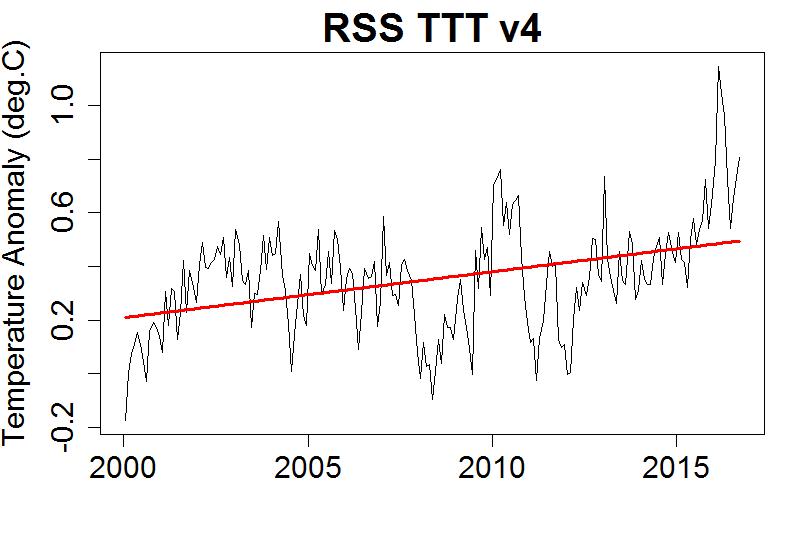
Now you know by now that v3.3 TLT is no longer supported by RSS.
So no excuse for not posting the one that is….
And here are the “pause” period trends for the trop sat temp series and for 4 radiosonde datasets (850-300mb).
http://postmyimage.com/img2/995_Tropospheretrends.png
Isn’t it curious that you pick the one you do?
So all the surface and trop temp datasets that use thermometers are rejected, because of a supposed conspiracy to warm the data – and yet you rely on a product that is multiply “adjusted” and even uses a GCM to model when local noon should be based on climatology (so models are OK then when used in the algorithm of the lowest trending temp dataset?)
http://images.remss.com/papers/rsspubs/Mears_JTECH_2009_TLT_construction.pdf
“Drifts in local measurement time can alias the local diurnal cycle into the long-term time series if correc- tions are not applied. For AMSU measurements, we use the same technique we used for MSU, which is described in a previous paper (Mears et al. 2003). Using 5 yr of hourly output from the CCM3 climate model (Kiehl et al. 1996), we created a diurnal climatology for the MSU2 and AMSU5 frequencies as a function of incidence angle (Mears et al. 2002; Mears and Wentz 2009). This diurnal climatology is used to adjust each measurement so that it corresponds to local noon. For long-lived sat- ellites that suffer substantial drifts in measurement time, such as NOAA-11, NOAA-14, and NOAA-15, this ad- justment can be quite important, and uncertainty in the adjustment can be a major source of uncertainty in the final results.”
Enough said ? … nah, I’m down the rabbit-hole here.
And one where, from past experience, this particular denizen is likely to ignore the site policy……
“Respect is given to those with manners, those without manners that insult others or begin starting flame wars may find their posts deleted.”
For TonyB:
That’s right, let’s delete any data published that doesn’t show the warming. Here, look at this nice shiny new chart that makes it look like you’re all going to fry !
Please, there’s science and there’s propaganda. This is the latter.
[snip]
RatpacA is a NOAA “fabrication”.. nuff said.
And yes the AGW gatekeepers are still holding back Roy’s paper forcing him to keep to INCORRECT v5.6 alive.. like a zombie.
RSS ttt does not represent lower troposphere, but since it has a slightly higher trend than tlt , this shows that CO2 is NOT blocking heat at the surface.
Thanks McClod.. you are doing well for the realist side. 😉
AndyG55 January 20, 2017 at 2:28 pm
RatpacA is a NOAA “fabrication”.. nuff said.
And yes the AGW gatekeepers are still holding back Roy’s paper forcing him to keep to INCORRECT v5.6 alive.. like a zombie.
RSS ttt does not represent lower troposphere, but since it has a slightly higher trend than tlt , this shows that CO2 is NOT blocking heat at the surface.
RSS TTT represents the same part of the atmosphere as UAH LT v6
“Clumsy, amateurish, propaganda from one of the usual suspects”
Yes, McClod, but its all you have..
You have proven time and again that “Clumsy, amateurish, propaganda” is all you are capable of.
Do you guys sit at your computers waiting for me to type something? That’s quite flattering.
Frankly not at all interested what you have to say – especially M&A, the bozo brothers – pair of one-trick ponies. Haven’t given up on you yet Janice, I’ve read some thing you say that are quite interesting.
So I’ll keep posting things as I see them, if you don’t mind.
No… it’s just that we can’t help but notice you as you stick out like a sore thumb. (you know, the squeaky hinge gets the oil, the nail that sticks out gets hammered and all that) No need to inflate your ego on account of us…
I appreciate having a sounding board to stimulate discussion. Otherwise it becomes an echo chamber, too many people agreeing with themselves.
But you do need to recognise that you aren’t among true believers here. Quoting authorities that have already been debunked doesn’t work.
afonzerelli, he sticks out because this site is primarily viewed and commented on by skeptics. that’s why warmist comments stick out and get a stronger reaction.
Quick McClod: I say you’re an UTTER FAKE: What is the name of the law of thermodynamics for solving temperature of a volume of atmospheric air? What is it’s formula, so we can all know you understand atmospheric chemistry well enough to even comment here.
I’m an atmospheric scientist and have been for many, many years. I worked in several different gas related fields, where I was required to understand atmospheric chemistry AND atmospheric radiation inside and out.
Now you either tell me the name of that law, and why atmospheric air, gases, and vapors have their own law of thermodynamics – you tell me the formula and what the factors stand for,
or you’re a complete posing f**k*ng fake.
Poser.
And you a boil on a monkeys bum.
Pete….. I think McClod just told you that he hasn’t got a clue.
How about breathing life into a failed agw theory by milking the el nino spike hype?
David,
You flip-flop back and forth between +- one standard deviation and two standard deviations. In the future, could you either stick to one convention or at least explicitly state the range of your error bars?
The temperature data set wars are fun.
It is only logical that if the world is warming, and very few people deny that, temperatures should be higher, not lower.
It is only logical that temperature records are broken by a bigger margin during strong El Niño years, as it took place in 1998.
So what is the problem? The world has been warming since about 1650 when the Little Ice Age was at its bottom, and more noticeably since 1815. This has been tremendously positive both for the world and humans. The hypothesis that more global warming is going to be so negative as to become dangerous has no support by evidence. 2016 was also the record year for wheat crop.
The hypothesis that global warming should accelerate due to the increase in CO2 has not proven correct, and since 2003 to 2014 the warming rate has been smaller, not higher. Obviously including and ending in El Niño warming will bias the results, but it is clear that after the El Niño, temperatures are going down to where they were before. The rumor that the hiatus has died is premature. Two or three more years of data are needed.
We don’t need more years. Just chart ENSO neutral months.
“Just chart ENSO neutral months.”
You can’t reasonably do that: The interaction between ENSO and global temperature over time is too complex. Just because a given month is ENSO neutral doesn’t mean that the temperature that month isn’t still strongly influenced by ENSO values up to 12 months earlier (or more). To illustrate that look at this chart (fingers crossed this works):
http://imgur.com/a/CE5Qs
Here I have taken a typical satellite global data set (RSS) and done a cross-covariance analysis against the unsmoothed monthly ENSO value for the Nino 3.4 region (from http://www.cpc.ncep.noaa.gov/products/analysis_monitoring/ensostuff/ONI_change.shtml). Because ENSO values are anomalies versus the long term trend (NOAA subtract a sliding 30 year reference period), I subtracted a simple linear fit to the RSS data. This gives the short term (monthly) anomalies relative to any long term trend over the whole data set. I used RSS 4.0 TTT, but you get similar results for other satellite series. Basically what this shows is that the strongest correlation between the tropospheric temperature and the monthly ENSO value will occur with a lag of 5 months. But note that the correlation remains positive and significant (i.e. high ENSO=high temperature and vice versa) for well over a year (the blue lines are 95% confidence intervals). 12 months is a long time in the evolution of ENSO events – they can completely reverse from El Nino to La Nina in that time, so its really not possible to say that the temperature in any given month is ‘due’ to a given El Nino index.
Thanks Dave, good job!
UAH indeed has a 4-5 month lag wrt MEI .
Dave, that is true but the lag works for both El Nino and La Nina and hence tend to cancel each other out. Yes, the lag does introduce a slight influence depending on starting and ending dates.
Just for fun I looked at the trend of all the ENSO neutral months from 1-1997 to 12-2016. The trend came out to an insignificant .01 C / decade which was most likely due to the fact the start date is preceded by a La Nina and the end date by El Nino (the lag effect you mentioned). Still the bottom line is the trend is flat which means according to this type of analysis the pause is still in effect.
Forrest Gardener, you enjoy talking in riddles, and not answering questions which you are asked (I have put a couple to you). I think that the matter of the global temperature anomaly has been explained a hundred times. Check again.
I object to the use of words like anomaly. That suggests that something is wrong. A better word would be index. Better still, just use degrees C, or degrees K. When you plot either of these on a chart from zero, the whole thing stops looking so scary.
For those of you in the Northern Hemisphere monitoring your snow this northern winter, you will be surprised to learn that we here at latitude 40 South in New Zealand have just witnessed a fresh snowfall on the mountains near us down to 4,000ft. In nearly 60 years I have seen only two other January mountain snowfalls and they were in the first week of the Januaries following the last ‘Grand El Nino’ in 1998. Today’s snowfall would be like getting snow in the N.H. on July 20th when normally it is all over by mid May!
Cool! 🙂 (thanks for sharing that — truly intriguing and great observational evidence**!)
**Note to AGWers: I did not say it proved conclusively, it is, nevertheless, UNLIKE YOUR STUPID MODELS (boy, did it feel good to say that, heh), is valid data.
Hey Ian! Your news has been reported to the appropriate U.S. and UN agencies who advise as follows: Do not exit your home and do not attempt to touch the “snow”. This is obviously warm snow which was predicted by several recent computer models ( VERY RECENT!). Teams from NOAA and NASA have been dispatched and it will be gone by morning ( is there somewhere out of sight we can put it?). Please forget we had this conversation and do not discuss this matter with family or neighbours.
Mr. Gardner, I would just like to say (coming from me, I realize it isn’t worth much to you, but, anyway) that it is obvious to us ALL that your fine brandishing of your shining steel sword of truth has UTTERLY vanquished Troll Frank.
Well done!
Too late John, I posted it on FB. It’s gospel now (with pictures of course!)
Mr. Gardner – it is my personal opinion that the only way to determine meaningful temperature trends is by measuring at specific locations, as many as possible all over the globe where accurate measurements can be made. Analysis of data for each location will tell us more than a single “global average.”
What a strange comment!
All specific locations’ data is available on the Net, e.g. in
http://berkeleyearth.lbl.gov/city-list/
or anywhere else: NASA GISTEMP, NOAA (you know, all these manipulators, pause busters etc etc).
You only need to search for information… but my impression is that for many people it is more easy to complain about that information be missing than to look for it.
In the end all one can do is say ‘hey guys, how many of you were around 50 years ago? Is the weather to day noticeably warmer than it was then, or not?’
Its just as cold in the mornings now as it was then, the only difference being I now have central heating and dont have to get up and go to school at 8 a.m.
I would like to see trend lines concerning the current pause originating with the beginning of the pause in 2002 not from an earlier point during the previous warming period. Doing so gives a false picture of the trend during the pause. I also realize that the intent of originating the trend lines before the start of the pause is apparently an attempt to mislead the viewer into believing there is no pause in the warming. Standard alarmist behavior.
William Everett on January 20, 2017 at 6:19 am
http://fs5.directupload.net/images/170120/rhkgs4zm.jpg
William Everett on January 20, 2017 at 6:19 am (bis)
But I suppose what you expected be rather something like this below, isn’t it?
http://fs5.directupload.net/images/170121/yjck4zns.jpg
Because this chart is for so many people a proof of the pause.
This pause undoubtedly existed.
But to discover its real extent requests not only to exclude the two stronger recent El Niños, by placing the chart’s time period inside of them as I did here; you also have to extract all El Niños and La Niñas present within the chart’s period.
For example, by using the R code extracting ENSO and volcano signals, published in 2011/12 by Foster & Rahmstorf. I’m too lazy to do, maybe Bill Illis comes around and does the job 🙂
Dr. Whitehouse: As science editor for the GWPF, you aren’t doing you organization’s credibility (with this reader, at least) by presenting a grap where some cherry-picked points are corrected for ENSO and most others are not (1998 in particular). Even with these adjustments, the last three years are all warmer (or as warm 2010 2005) than any for the past 19 years – and the preceding century.
Every record in the satellite era shows long-term warming. The only important question is how much less warming that the IPCC projected.
Thanks Fonzi… but just a line commenting the plot would be so welcome.
v’
An important effect is being ignored, here. The non-explosive Icelandic volcano Bardarbunga erupted continuously from August 2014 to February, 2015, the largest such eruption since Laki in 1783. This delivered a lot of HCl and HBr into the atmosphere, which would have depleted stratospheric ozone when photodissociated on polar stratospheric clouds in late winter. This would have admitted more solar UV-B. causing global warming, including the recent El Nino. Since both Cl and Br destroy ozone catalytically and thus have a long residence time in the stratosphere, it is unsurprising that global temperatures should remain elevated in the “hiatus.” because it will take a long time for these halogens to clear out. The effects are quite logical, yet in the unfounded hyperbole to blame carbon dioxide for warming, no one talks about this.