By Christopher Monckton of Brenchley
Another year, another failure of global warming to occur at even half the rate originally predicted by IPCC in 1990.
CO2 emissions have increased at a rate somewhat above the high-end prediction made in IPCC’s First Assessment Report. In 2013 our sins of emission totaled 10.8 billion tonnes of carbon; in 2014 the official estimate, in the annual paper published by le Quéré et al., was 10.9 billion tonnes:

It is debatable whether the true rate of emissions growth is anything like as small as 0.1 billion tonnes of carbon per year, given that China and now India are bringing coal-fired power stations onstream at a record rate. But the official storyline is that emissions growth has all but stopped. Nevertheless, emissions remain a very long way above any of IPCC’s CO2-stabilization scenarios.
On the business-as-usual Scenario A, IPCC (1990) predicted that global temperature would rise by 1.0 [0.7, 1.5] Cº to 2025, equivalent to 2.8 [1.9, 4.2] Cº per century. The executive summary asked, “How much confidence do we have in our predictions?” IPCC pointed out some uncertainties (clouds, oceans, etc.), but concluded:
“Nevertheless, … we have substantial confidence that models can predict at least the broad-scale features of climate change. … There are similarities between results from the coupled models using simple representations of the ocean and those using more sophisticated descriptions, and our understanding of such differences as do occur gives us some confidence in the results.”
Yet the rate of global warming since 1990 – the most important of the “broad-scale features of climate change” that the models were supposed to predict – is now below half what the IPCC had then predicted.
In 1990, IPCC said:
“Based on current models we predict:
“under the IPCC Business-as-Usual (Scenario A) emissions of greenhouse gases, a rate of increase of global mean temperature during the next century of about 0.3 Cº per decade (with an uncertainty range of 0.2 Cº to 0.5 Cº per decade), this is greater than that seen over the past 10,000 years. This will result in a likely increase in global mean temperature of about 1 Cº above the present value by 2025 and 3 Cº before the end of the next century. The rise will not be steady because of the influence of other factors” (p. xii).
Later, IPCC said:
“The numbers given below are based on high-resolution models, scaled to be consistent with our best estimate of global mean warming of 1.8 Cº by 2030 [compared with pre-industrial temperatures]. For values consistent with other estimates of global temperature rise, the numbers below should be reduced by 30% for the low estimate or increased by 50% for the high estimate” (p. xxiv).
In 1995 IPCC offered a prediction of the warming rates to be expected in response to various rates of increase in CO2 concentration. The prediction based on the actual rate is highlighted:

The actual increase in CO2 concentration in the two decades since 1995 has been 0.5% per year. So IPCC’s effective central prediction in 1995 was that there should have been 0.36 C° warming since then, equivalent to 1.8 C° century–1.
In the 2001 Third Assessment Report, IPCC, at page 8 of the Summary for Policymakers, says: “For the periods 1990-2025 and 1990 to 2050, the projected increases are 0.4-1.1 C° and 0.8-2.6 C° respectively.” The mid-range estimate was for 0.7 C° warming in the 36 years 1990-2025, equivalent to 1.9 C° century–1.
Table 1 summarizes these medium-term predicted global warming rates from the first three Assessment Reports:

It became rapidly evident that the business-as-usual global-warming predictions made by IPCC in the report that got the climate scare going were childishly wild exaggerations. The reasons for the exaggerations are many. Here are just a few. IPCC somewhat exaggerated the CO2 concentration growth to be expected in response to a given rate of emissions growth; it extravagantly exaggerated the growth of methane concentration; it greatly exaggerated the CO2 forcing; and it very greatly exaggerated the impact of strongly net-positive temperature feedbacks on climate sensitivity.
What, then, has happened to global temperatures in the real world since 1990? The answer, taken as the least-squares linear-regression trend on the mean of the RSS and UAH satellite datasets, is that the rate of global warming is less than half the mid-range rate originally predicted by IPCC in 1990, and well below even the low-end prediction:

The prediction zone in IPCC (1990) is shown in orange, with trend-lines in red. The real-world outturn is in dark blue and the trend on the real-world data is the bright blue line.
As far as I know, no mainstream news medium has reported this continuing and substantial discrepancy between the excitable predictions on the basis of which governments have squandered trillions for decades and the unexciting reality of a warming rate indistinguishable from natural internal variability.
It is worth looking at the entire satellite temperature record since 1979. First, RSS, whose inconvenient data showing far less warming than had been predicted are about to be revised sharply upward to bring the apparent rate of warming into accordance with the Party Line:

Next, UAH, whose dataset used to show a higher warming rate than all other datasets. However, adjustments were made last year when it was discovered that onboard instrumentation was heating the platinum-resistance thermometers, and UAH now shows a lower warming rate than all other datasets:

Taking the mean of the RSS and UAH datasets shows that the long-term rate of warming across the entire 39-year period since 1979 was just 1.3 C° century–1 equivalent, or less than half of IPCC’s mid-range prediction in 1990:

It is essential to the high-climate-sensitivity theory profitably advanced by IPCC that the rate of global warming should not decline as the greenhouse gases in the atmosphere continue to accumulate, particularly where they continue to accumulate at a rate above IPCC’s original business-as-usual prediction.
A simple method of testing whether the rate of global warming has increased since 1979 is to determine the least-squares linear-regression trend on the data from a more recent starting date. I have chosen 1997, because that was just before the 1998 El Niño took hold. The mean of the two satellite datasets shows warming since 1997 at less than two-thirds of a degree per century, or just under half of the warming rate for the entire period since 1979.

Contrary to the high-sensitivity notion that continues to hold the international governing class in thrall (with the commendable exception of the incoming U.S administration), the rate of global warming is not accelerating. It is declining.
Some caution is necessary. At the turn of the millennium the Pacific Decadal Oscillation, an approximately 60-year cycle in ocean behavior which typically manifests itself as about 30 years’ warming followed by 30 years’ cooling, ended an unusually sharp positive (warming) phase and entered its negative (cooling) phase. It is possible, therefore, that some contribution from anthropogenic emissions is overlain upon this natural cycle, giving a false appearance of very rapid manmade warming from 1976-2000 and of little or no warming since.
What is now undeniable, however, is that the contribution of anthropogenic influences to global temperature is considerably less than had originally been predicted. How do I know this? Because IPCC itself has realized it cannot retain what little credibility it has left if it continues to make absurdly exaggerated medium-term predictions. It has all but halved them:

As every opinion poll shows that (as with Brexit and Trump) the people are no longer buying the Party Line, the only way They can now keep the dying climate scare alive is to leave Their long-term predictions unaltered, and to count on their poodles in the mainstream media to fail to report either the growing discrepancy between IPCC’s original medium-term predictions and observed reality or IPCC’s own near-halving of those predictions.
Mark Boslough, one of the few remaining climate extremists who has not yet slunk away into the long night, has provided an intriguing indication of the Party’s increasing desperation by offering $25,000 to anyone who will bet that GISS’ global temperature for 2017 will exceed that for 2016. There may be a la Niña this year, so that would be a bet worth taking – if, that is, one could trust GISS to maintain an honest global-temperature dataset.
It is not for me to cast nasturtiums at Dr Schmidt, so I shall say no more than that I’d happily take that bet if it were based on either the HadCRUT4 dataset now that the extremist Jones has gone or the mean of the RSS and UAH datasets even after Dr sMears has tampered with the RSS dataset to bring it into line with the tampering of the terrestrial datasets. But I shall take no decision based on any climate information from NASA until Mr Trump has reformed those racketeers.
Former rocketeers now racketeers.
Maybe Trump can get NASA back on trajectory.
Trump says no more money for politicized science.
That NASA money ($billions) earmarked for the climate tricksters will be redirected to space exploration.
I hope P.E. Trump announces, a la JFK, in his inaugural speech, a national commitment to send 100 climate scientists to Mars by the end of the decade.
This wouldn’t leave much time to launch. We would have to concentrate on the Earth-Mars leg first and begin work on the return trip after only the spaceship is successfully launched.
The first step would be choosing the scientists. WUWT readers could have that done in less than a week.
“after only” should read “only after”
So NASA’s Muslim outreach AND their tampering with temperature data are on the chopping block? Oh joy, oh rapture…
OT
WWF suspected of abusing or even killing pygmy tribes in the name of conservation.
https://www.rt.com/news/372972-wwf-human-rights-cameroon/
Eric Simpson
January 7, 2017 at 5:07 pm
Trump says no more money for politicized science.
—————-
Eric, you are.commenting in a blog post of Lord Monckton.
With all do respect to Lord Monckton, I have to say, in regard to your comment, that Lord Monkton is a “victim” of politicized science himself…..his science is politicized too, not as much as the main stream “climate science” but never the less politicized enough up to some point….. and he is not alone among the so called sceptics, as far as I can tell an am aware of….
Not trying to upset any one, but that how it seems from my point of view….
And I am sorry for [being] so direct…
cheers
abusing or even killing pygmy tribes
============
REDD+ stealing aboriginal lands in the name of forest conservation. Local populations are driven off their ancestral land to preserve the forests as carbon sinks. Once traditional slash-and-burn is outlawed, small scale agriculture becomes impossible in tropical jungles. Indigenous populations must either move to cities or starve.
“We are at a critical point in time with REDD+. Over the next several years, WWF and others must demonstrate the effectiveness of and demand for REDD+ if we want to ensure long-term political and financial support for this conservation approach.+
http://www.worldwildlife.org/initiatives/saving-forests-with-redd
ferd,
you said: “Once traditional slash-and-burn is outlawed, small scale agriculture becomes impossible in tropical jungles.” In most tropical jungles the top soil is too thin to support any other type of agriculture. The environmental whachos, the same idiots that are pushing sustainability and sustainable agriculture, are trying to outlaw the only agricultural method that is actually sustainable for any length of time.
Sorry Chris, Never happen.
First, according to the true [statistics] behind the 97% meme, there are only 77 true climate scientists and only 74 of those endorse the tenets of CAGW.
But those 74 would be a good start.
They could do some true CO2 science up there
[Though the mods do agree with your spelling of sadtistics … .mod]
No no no.
Send them to the asteroid belt where they can mine fossil fuels for the good of mankind.
Lord Monckton is a scientist and he is a politician.
No big deal.
Lord Monckton even makes a rare error and is gentleman enough to admit error and then seek the correction answer, wherever it lies.
Whiten, now you’ve snuck an “ad hominem” strawman into the thread; without detail, without identification of any error(s). Simply based on your choice to insult without science or merit.
NASA’s Muslim outreach was doomed to failure as the “location” of Muslims is not geographic but temporal. We have yet to figure out how to travel back in time to the 7th century.
Obama thus set NASA on a “Mission Impossible” path. What a waste of money and talent by the bozo.
“””””….. … we have substantial confidence that models can predict at least the broad-scale features of climate change. … …..”””””
I hereby predict that climate will change at least in its broad-scale features. So Temperatures from place to place, can generally be expected to lie between about 179 K and about 333 K taking the broad view of the global variations.
See how easy it is to predict without ANY models at all !
G
ATheoK
January 8, 2017 at 5:50 pm
Whiten, now you’ve snuck an “ad hominem” strawman into the thread; without detail, without identification of any error(s). Simply based on your choice to insult without science or merit.
—————————–
Hello ATheok.
Thanks for your reply to me.
First I am sorry that you consider my comment as an insult, secondly I am not judgemental about the point in question and Lord Monckton or his motives………is not about wrong or right or errors in this context.
I do appreciate a lot and respect what the good Lord has done over the years, his struggles and efforts in the climate issue, but never the less I have to point out how I see the picture..
You basically replied to me in a blog post of Lord Monckton……a blog post which in principle weights the matter of the pause’s “resurrection”, after the good Lord very easily and successfully “killed” and “slayed” it, with no much objection from any side…..
I am not been judgmental again, not saying or claiming this as an error, a wrong or a right for that matter. Only saying that to me it looks very much more like politics than science …..
The pause can not be claimed as gone a way, just because of a very short impact in temps during a short term variability, like El Nino……..Even some die hard AGWers know that very well…
And there is other aspects that show that the Lord’s Monkton science is politicized up to some point…..
As you your self say, he is a politician and a scientist……..and also by his own very admission the good Lord is a Lukewarmer, which regardless of error, right or wrong….still makes his science subject to significant politicizing…………And some times I think it gets the better of him in science.
cheers +
“Whiten”, who publishes here under a furtive and cowardly pseudonym, accuses me of “politicized” science. Yet, when challenged by ATheoK to produce a single instance, it fails to produce one, instead baselessly reproducing the allegation. The satellite datasets are the best we have, and they do not show global warming at anything like the originally-predicted rate, and the surface temperature datasets agreed with them until a couple of years ago, when all three of them were tampered with to increase the apparent rate of global warming.
IPCC itself has accepted that its original predictions were wildly overblown: it has all but halved its medium-term predictions. “Whiten” may find this truth inconvenient, but it is nevertheless true, and whining to the effect that my science is “politicized” will not alter that truth one jot or tittle.
The moving finger writes and, having writ,
Moves on, nor all thy piety nor wit
Shall lure it back to cancel half a line
Nor all thy tears wash out a word of it.
No any [further] comments… 🙂
cheers
Please Sir, WRT ” In 2013 our sins of emission totaled 10.8 billion tonnes of carbon; ” Did we get 28.8 Btonnes of Oxygen along with that carbon ?
Or do we just count the carbon these days ?
Not quibbling MofB; just seeking clarification.
G
George E. Smith asks a sensible question about “tonnes of carbon”. That’s the way the climate extremists like to measure it, so that they can make out that “carbon” is the villain of the piece. Of course, one can apply the standard conversion factor to put all the quantities in tonnes of carbon dioxide.
The ridiculous George Moonbat, in the ridiculous Communist daily rag the Guardian, once wrote that with all that carbon dioxide atmosphere in the atmosphere would soon be used up – perhaps the most risible of all the daft predictions of climate doom trotted out in the name of the Party Line. So I checked. When Joseph Priestley first isolated oxygen he found that its atmospheric concentration was 20.67 %. And today? Wait for it, wait for it …! – er, its, um, 20.67%.
Thank you sir; wanted my mind to remember the proper number just for reference.
G
Well Christopher, somebody has been manufacturing that oxygen stuff behind our backs; because we sure have inhaled a good amount of it since Priestley first found out about it.
And we carbonize it before we exhale it so a lot of it should be gone.
Could be somebody is doing some dumpster diving, and stealing used oxygen out of the trash, and refurbing it for the black market.
Come to think of it; it could be all the carbon they want to get at, to use in place of coal for making energy.
g
97% of funding on Climate Science has been wasted.
I wonder what President Trump will do about it?
Invoke the Holman rule. It allows for the cutting of a government employee’s salary to $1 per year. That could get rid of government workers who don’t do anything besides watch porn or alter climate data.
http://usuncut.com/politics/house-republicans-federal-workers/
Invoke the Holman Rule. It allows for the reduction of a federal employee’s salary to $1 per year. That could get rid of employees who only want to play internet games.
http://usuncut.com/politics/house-republicans-federal-workers/
Tonnes per year is a rate, not a second derivative. A “rate of growth” would be tonnes/(year^2).
I haven’t checked what Lord Monckton has done but I observe simply that if a= b-c then a has the same units as b and c.
“emissions” are simply “tonnes of carbon”. If ‘n we get another 0.1 Btonnes in a year that would be a rate of growth of those emissions of 0.1 Btonnes per year.
Emissions are not rates of emissions.
G
The temperature pause is back! Nineteen year, nine months and counting! A Limerick. (Updated)
La Niña came in with the cold.
Alarmists predictions on hold.
So the eighteen year pause
is now nineteen, because
no sunspots, a sight to behold.
Last month’s drop in global temperatures is the largest on record, ” The pause” is back! No global warming in the last nineteen years! The last El Niño has come to an end and is replaced by a La Niña. The temperature drop from September to October is 0. 6 degrees larger than normal.
Note that the results are from land area only. The worldwide data that include oceans will, like ocean temperatures show a lag. That is why land temperatures only is a leading indicator of climate change.
The sun has been unusually quiet. Much like during the beginning of the little ice age.
How is the winter shaping up so far? Look at the snow cover.
Russia has been snow covered since the beginning of November.
Alaska and most of Canada are now covered.
And it is colder than ever in Siberia for this time of the year.
We can see the polar vortex set up over Siberia and Greenland this year. This bodes for a very cold winter globally. But it is interesting that the area over te Arctic ice is up to 20 degree C warmer than normal. It can only mean one thing: It snows more than normal. Thanks to this snow, the ice accumulation over Greenland is at record levels since the September minimum.
with figures: https://lenbilen.com/2016/11/28/the-nineteen-year-temperature-pause-is-back-a-limerick/
Two feet of snow in Istanbul today!
“Arctic air plunged unusually far south across eastern Europe this week and will continue its rare journey into Turkey through Sunday.”
http://www.accuweather.com/en/weather-news/istanbul-to-face-major-travel-disruptions-as-snow-arctic-air-target-turkey-into-this-weekend/70000474
Just weather. Cold weather though.
Same thing in Constantinople, so t is spreading everywhere.
g
For what it’s worth it’s outrageously hot in China this winter. I’m walking around Shanghai in short sleeves and while last winter they closed the HK schools for excessive and dangerous cold this week it’s 24C.
Yes. Here’s my plot for December.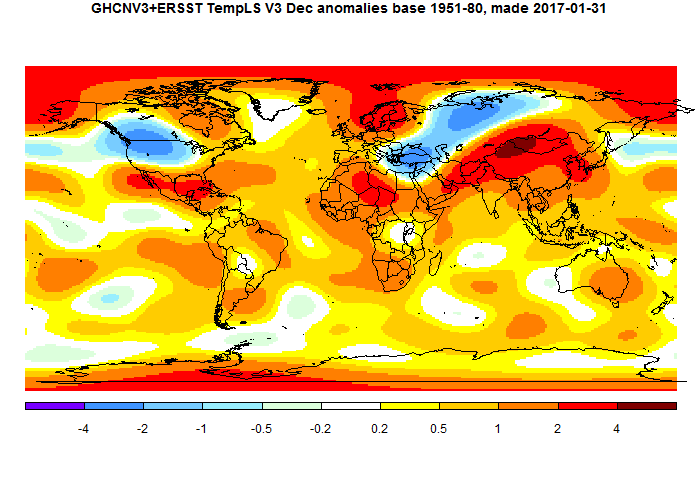
Hot in N China/Mongolia. There was a big spike in daily global temperature since Christmas, now receding. Seems to be associated with this warmth.
here are my observations for December
Record snowfall across Europe, Asia and USA
Baker City, Oregon, closes in on snowfall record
A record-breaking 48 states could drop below freezing
Bismarck, North Dakota, on track to beat snowfall record
Turkey – Heavy snowfall in Ankara and Konya
Heavy snowfall on Island of Crete
Snowfall amounts reported for Quebec
Snow twenty inches deep in Greece
Temps 30 to 50 degrees below normal to grip most of U.S.
Big snow dump continues in Quebec
Rare snowfall in Athens
Snowfall forecast for Libya
Blizzard to dump 1 to 2 ft of snow on New England
“Terrifying” snowstorm forecast for Middle-East
Blizzard causes havoc in North Dakota
Record snowfall in Wyoming
Biting cold in Pakistan
Snowfall amounts for Manitoba and parts of Saskatchewan
Syria – Tents collapse under heavy snow
244 motorists evacuated in Xinjiang blizzard
Strongest blizzard in 80 years to hit Palestine
Record cold in Siberia – A bone-crushing minus 62C
Hokkaido – Heaviest December snowfall in 50 years
Exceptionally harsh Siberian winter
Full-blown blizzard headed for Northern Plains, Canadian Prairie Provinces
Russia – Record snowfall in Krasnaya Polyana
Morocco – “Unprecedented” cold and kills three in Chefchaouen
Syria – Countless numbers of roads closed due to snow
Aleppo Refugees Caught in Rare Snowstorm
Heavy snow turns Jerusalem into a winter wonderland
Camels standing in the snow
Extreme cold in northern Siberia breaking records
Snow in the Sahara desert- Only the second time in living memory
Bitter cold across almost all of the U.S.
Extreme cold alerts in Mexico
Heavy snowfall in Morocco
U.S average temperature colder than any time last winter
Coldest Dec 16 in Yarmouth, Nova Scotia in 135 years
Boston – Coldest December 16 in 133 years
South Korea – Heavy snow blankets Gangwon Province
Record snowfall in Kurdistan
Iran – Heavy snowfall and blizzard closes schools
Australia cherry crop decimated after unseasonably cold weather
Record drop in global temperatures
Unusual snowfall in Chile
Amman, Jordan, prepping for snow
Syria – Snowstorm in Damascus
Chill factor minus 60 degrees in Greenland
China – Heavy snow disrupts air traffic in NE China airport
Turkey – 168 roads closed due to snow
Heavy snow paralyzes Romania
Greenland Ice Sheet growing like crazy
Snowfall stops fighting in Kurdistan
Extreme cold freezes longest river in Turkey
Hawaii now expected to get 3 feet of s
Snow and blizzards for Estonia
Snowstorm paralyzes traffic in Yekaterinburg
Moscow – Forecasts call for heavy snowfall and blizzard
More than 2 feet of snow for Hawaii
Poland – 180,000 households lose power
Poland – 15 people die of frostbite in November -DECEMBER 2, 2016
Turkey – 441 settlements blocked by snow
Unprecedented low temperatures in Lebanon
TEN major highways in northeast China closed or restricted due to snow
Cold anomaly across almost entire USA
Moscow – Coldest November in the 21st century
Is that all?
Nick: Why do you use the base period 1951-1980 and not 1981-2010?
Sheri,
“Nick: Why do you use the base period 1951-1980 and not 1981-2010?”
I publish my month plot when data is available, usually about the 7th of the month. Then when GISS comes out, I most a comparison of mine and theirs, as here. For that to work, I use the same anomaly base as GISS and the same color scheme. But for that plot the base doesn’t matter. To change base you just add a constant offset, and the color scheme would change accordingly. For graphs, I plot all data here adapted to 1981-2010.
I love the African hot spot- all based on sparse data and mostly estimated,
WMO-
“Because the data with respect to in-situ surface
air temperature across Africa is sparse, a oneyear regional assessment for Africa could not
be based on any of the three standard global
surface air temperature data sets from NOAANCDC, NASA-GISS or HadCRUT4 Instead, the
combination of the Global Historical Climatology
Network and the Climate Anomaly Monitoring
System (CAMS GHCN) by NOAA’s Earth System
Research Laboratory was used to estimate surface air temps”
s
@englandrichard
Here are the anomalies for Aus for 2016. http://www.bom.gov.au/jsp/awap/temp/index.jsp?colour=colour&time=latest&step=0&map=maxanom&period=12month&area=nat
Notice how there
…continued – notice how there are 0 to 0.5 areas less than a few hundred kms from 2-2.5 areas.
The dark red areas in the north are interesting. The smaller one just south of Darwin has no stations within it. The larger one just east only has the one (in the SE corner) that has data older than 2002 but only to 1965 and not the start of the base period in 1961 and nothing after 2012. Each year seems to have at least half a dozen days missing. http://www.bom.gov.au/jsp/ncc/cdio/weatherData/av?p_nccObsCode=122&p_display_type=dailyDataFile&p_startYear=2012&p_c=-42695652&p_stn_num=014612
How can a station be homogenised by neighbours over 500km away that don’t have a proper record and how do you get an anomaly when there is not enough data to know the average for the base period to within 1 degree and no 2016 data for the only station with a history??
vicgallus-
Yep, I doubt they have heard of microclimates-
MET UK- ” If we compare the climate statistics for three locations in Devon, one upland and the other two coastal,
namely Princetown, Plymouth and Teignmouth, each only 20 miles apart, you would think that the climate
of these three locations would be very similar. However, looking at the statistics below, you can see that their If we compare the climate statistics for three locations in Devon, one upland and the other two coastal,
namely Princetown, Plymouth and Teignmouth, each only 20 miles apart, you would think that the climate
of these three locations would be very similar. How ever you can see that their climates are quite different.
Whoa, climate change in only areas 20 mile apart.
c
But it is interesting that the area over the Arctic ice is up to 20 degree C warmer than normal. It can only mean one thing:
Al Gore is up there with a giant blowtorch.
No, remember when it is warm in the Arctic, it’s because it snows. Al Gore is just giving us a snow job.
Barrie, Ontario, Canada.
My snow banks are approaching 6 feet! It’s -15C in my backyard and my deck has accumulated close to 4 feet of snow.
Global Warming has apparently bypassed us, and most of Ontario, and we’re just entering the snowy, cold months.. Just sayin’. 🙂
Of course, this is just coincidental with the sun moving into full minimum phase. 🙂
The oddest part…with all the constant “adjustments”…
No one will ever know what the temperature is right now.
…and it really doesn’t matter what temperature or rate anyone says…right now
In a couple of years it will be adjusted differently…and be something else
Lat, if the bottom falls out, then there won’t be any faking it. No amount of adjustments will hide the decline if temps go lower than ’08 at the upcoming solar min. And keep in mind that there will be no bailing the record out with an el nino (as happened in ’10) because we have just had one…
maybe…dunno
I’m sure, after the adjustments…..they will say something to the effect of…it would have been a lot colder
They’ll find some weasel way around it.
” if the bottom falls out, then there won’t be any faking it.”
Oh no. The liars will continue to “fake it” until they go to their grave. These left wing propagandists will never back down. Heck, some communists still claim that communism is “good” for the economy!
And in their favor is the fact that the historical temperature record has been utterly destroyed by the fake-scientists all working on the government payroll in one way or another. How can one ever prove anything if the data is all fake?
afonzarelli: You underestimate human abilities. Plus, there’s always lying with statistics to fall back on.
All real-time surface temperature data should be ignored because they are wrong.
Only after many years of repeated “adjustments” will the data finally be “right”.
For example, there was originally a dust bowl in the 1930s in the US, but In time the data will gradually change until the 1930s will be recorded as a decade-long snow bowl.
These “adjustments” are required because some people have not been scared sufficiently to do everything the smarmy leftist leaders want them to do without question.
So the left-wing leaders get on the phone and tell the their fellow left-wing scientist/bureaucrats — “give me more warming !, give me more warming!”
And then we get more warming (in the data anyway).
I predict we will never see global cooling in our lifetimes because smarmy bureaucrats will make sure that the actuals always show warming … maybe they’ll allow a flat trend too.
I can not recall any subject where leftists have later changed their minds (other than moving further left), based on new, non-“adjusted” data or evidence.
Why should global warming be different?
Collusion between the MSM and the warm mongers won’t stop until someone with authority….like the POTUS…. tells the people they are naked and officially investigates their practices. We probably have a chance of that happening now.
It won’t stop until the lower US gets frozen for a few months and can’t move because of the snow and ice and California gets buried under 15 feet of snow.
Oh. Wait …
http://www.upi.com/Top_News/US/2017/01/07/Major-winter-storm-blasts-southern-US-with-snow-and-ice/1011483802480/
It still won’t stop the MSM until the lights go out.
🙂
IMO the rate of warming is zero. Flat.
And per their models temperatures should be going through the roof.
Tom Nelson Retweeted @tan123
Steve Milloy @Steve Milloy Jan 5
No global warming for 25 years — just a volcano and two El Ninos. http://realclimatescience.com/2017/01/no-global-warming-for-25-years/
Earth is the same temperature as 25 years ago. All temperature variations since then are artifacts of El Nino and volcanic eruptions. Global warming is the biggest fraud in science history. The Earth is not warming.
http://realclimatescience.com/wp-content/uploads/2017/01/Screen2-Shot-2017-01-03-at-11.56.05-PM.gif
I love the quote “… we have substantial confidence that models can predict at least the broad-scale features of climate change. …”. Talk about Captain Obvious – of COURSE the models will predict the broad scale features — they will be ‘adjusted’ until they do just that! Reality will be ignored!
The better question (than Lord Monckton’s article’s title) is:
How Many Years Must Temperatures Steadily Rise Statistically Significantly Before We Can Rationally Say, “Warming Has Resumed”?
*****************
Balancing the end of a plank on the small boulder in the path ahead creates a false impression of an upward slope. At this point, we cannot see the path much beyond that boulder (and temperatures appear to be heading down, more than they appear to be heading up — see recent graphs by Bill Illis, data analysis expert). It may be flat to the horizon. It may be starting to head downward. It is too soon to say, with any meaningful certainty, “the pause has ended.”
Sooner or later we will go from pause or whatever to plummet, followed by the next glaciation. link
What’s with the cat, cB? (Janice said “pause”, not “paws”)…
LOL
The cat shares my sunny and optimistic views on all things
about CAGW.Hi Janice,
You said: “How Many Years Must Temperatures Steadily Rise Statistically Significantly”
Well, that “statistical significance” thing is the problem, is it not? Doing a significance calculation on a trend line is straightforward enough. But the temperature data sets are autocorrelated, and the autocorrelation must be accounted for in the significance calculation. This is not particularly hard, I just have not done it yet.
As we speak, it is snowing like crazy here. So for a day, maybe I have not much to do besides get my autocorrelation calcs. sorted out. I do not dare put forth any calculation which is less than absolutely correct because of the commenters habit around here doing that whole “hungry lions/red meat” thing to your poor self.
So we shall see.
In any event, you are correct about one thing. Without the troposphere warming sharply, whatever warming we are looking at, cannot be greenhouse warming. Which makes everything else sort of a moot point.
Worse, the land data sets, GISS, NOAA, have the land surface warming faster than the atmosphere. This does not make sense, and may not even be possible according to AGW theory.
Cheers.
In actual fact, given that we recently had an uptick in global temperatures associated with the departing el Nino, and there is no mechanism within Global Warming theory that I know of which permits the planet to lose heat once gained via CO2 impedance, any return from el Nino temps. toward mean temperatures seems to me to be inconsistent with the Warmist hypothesis. Should we not start to refer to it as an hypothesis rather than a theory? I can’t see how it rates being called a theory.
John Harmsworth wrote: “there is no mechanism within Global Warming theory that I know of which permits the planet to lose heat once gained via CO2 impedance, any return from el Nino temps.”
While there is an element of truth in this statement, it is highly misleading. The planet doesn’t need to gain or lose heat for surface temperature to change. There is a massive amount of very cold water in the deep ocean that is slowly upwelling and mixing with the surface of the ocean. Fluid flow is chaotic and chaotic fluctuations in overturning can change surface temperature without a radiative imbalance at the TOA. All though El Nino a complex phenomena, one essential element is a slowing of upwelling of cold water off of equatorial South America and of downwelling of warm water in the Western Pacific Warm Pool. The 65-year AMO may represent much slower changes in the Atlantic meridional overturning current. Such chaotic fluctuations are known as unforced or internal variability and it makes simplistic cause-and-effect analysis of chaotic systems extremely dubious.
However, John correctly said “there is no mechanism within Global Warming theory that I know of which permits the planet to lose heat”. The planet is more than just tropospheric or surface temperature. Most heat (allegedly 93%) goes into warming the ocean. That is why the skeptic Roger Pielke Sr. was a big support of the ARGO program to accurately measure uptake of heat by the ocean. Unfortunately, the temperature record before ARGO is full of corrections and unreasonably large short terms shifts. Since the ARGO program began, there has been a gradual warming without the large shifts associated with unforced variability like ENSO. So, if you want to know where the heat gained by CO2 has gone, look there.
http://www.climate4you.com/SeaTemperatures.htm#Global%20ocean%20temperatures%20from%20surface%20to%202000%20m%20depth
Janice and Tony: The longer the record, the narrower the confidence interval around the warming rate. If you want to find statistically significant warming, pick a long period: For example, the full UAH v6.0 record (1979-present) shows:
Jan 1979 to Oct 2016 Full record: CI doesn’t includes zero; therefore significant warming
Rate: 0.833°C/Century;
CI from 0.411 to 1.256;
Jan 1996 to Oct 2016 Last 20 years: CI includes zero; therefore no significant warming
Rate: 0.849°C/Century;
CI from -0.335 to 2.034:
Jan 1979 to Jan 1999 First 20 years: CI includes zero; therefore no significant warming
Rate: 0.884°C/Century;
CI from -0.285 to 2.053;
Notice that the central estimate for the warming rate in all three periods is essentially the SAME. The unforced variability in the tropospheric data makes it impossible to detect “statistically significant” warming in a 20 year period.
Note this data is from Nick Stoke’s trend viewer and includes the correction for autocorrelation. Most other do not and therefore exaggerate the significant of trends.
https://moyhu.blogspot.com.au/p/temperature-trend-viewer.html
Which confidence interval are you quoting? Ninety percent, ninety-five? If what people would demand from such evidence were to increase world poverty what would the prudent confidence interval be? Ninety-nine percent? Ninety-nine point nine?
What confidence interval do you quote? Ninety percent–ninety-five? What is the appropriate interval to use? If the consequences of capitulating to political demands about the warming “problem” were to increase world poverty, should a person use the ninety-nine percent interval?
More importantly, what statistical model do you use? Independent noise? AR(1)? Neither of these is appropriate.
Janice:
Are you comparing NOAA’s 2016 massive anomaly overheating of 0.02°C to a small boulder?
Aren’t boulder’s required to meet minimum size requirements?
Janice, I think Lord MofB’s algorithm detects that the month that it happens. It doesn’t need to grow any feathers, to look well dressed.
The month in which the trend returns to zero +/- nothing much , Christopher will come and tell us all. Well that’s if the numbers work out . MofB is a stickler for pedantic accuracy.
He won’t always parachute in like the leaping Lord; but he will let us know.
G
Also, and this is not to detract from, but to suggest an enhancement to, Monckton’s nicely detailed article,
a suggested clarifying paragraph:
Regardless of whether a slight upward trend in temperatures persists, the fact remains: CO2 emissions rose rapidly for over 18 years while temperatures did not. Further, for AGW to be proven true, the lower troposphere would need to warm significantly and do that for decades — starting immediately.
AGW is dead.
It died about 8 years ago.
No, it cannot be resurrected (short of immediate, dramatic, warming). CO2 UP. WARMING STOPPED is historical fact.
And also not to detract from the “meat” of the article, but to keep things in real perspective, perhaps a complementary post: What Pause? What rise? What decline?
This data ends 1855
1. You missed the most important detail in that, devil: CO2 lags temperature by a quarter cycle or, about 800 years.
*******************************
2. Since you did not have it to show us yourself, devil, and assuming you are rational, thus, that you would care to know (otherwise, why comment at all?) here is a graph which includes the data from 1855 through December 2, 2015
http://www.climate4you.com/images/CentralEnglandTempSince1659%20LARGE.gif
The Central England surface air temperature series is the longest existing meteorological record. Thin lines = annual values. Thick lines = running 11 yr average. …
(Source: http://www.climate4you.com/GlobalTemperatures.htm#Central England air temperature since 1659 )
*********************
So…. what, devil, is the point of your remarkably $teven M0$her-like cryptic comment?
@Janice
I replied to Alans graph. He was asking about rise or decline. It was just a remark.
But I will answer you a swell:
First: You said that the lag between CO2 and temperature is about 800 years. And now you can’t wait any 20 years. See the difference between 20 and 800. Maybe you may note that it is the opposite direction. But why? If CO2 lags temperture in history, it doesn’t mean that temperture can’t also follow CO2. There is your logical problem. If A follows B doesn’t forbid that B follows A. In history temperture was always first, beacause nothing changed CO2 concentration like we do before. Now CO2 will start rising and temperture will follow (and it already does, there is no pause at all, there never have been one, but that is another topic).
Second: I dont care for England temperatures. There is always bad weather. And what is your point? I am talking about climate not weather.
CACA was born falsified. CO2 rose steadily for 32 years after WWII but earth cooled during that interval, until the PDO flipped in 1977.
What mechanism is responsible for a steep drop of temperature following each El Niño? Could we possibly extend it for a couple more months?
Not cold enough yet? 0F here at sunrise.
@ Pop, Since Dec 06 2016 +2 C, we have had 3 days of above freezing temps ( +2 C 2 days with 1 overnight +8 outlier from a warm storm cell that lasted 6 hrs Dec 20-23) SOG since Dec 9 2016 ( 50.03 N 19.24 W Okanagan Valley BC Canada.) Long range 2 weeks is for below freezing. The longest cold period I can see since I started taking readings 26 years ago.
abusing or even killing pygmy tribes
============
REDD+ stealing aboriginal lands in the name of forest conservation. Local populations are driven off their ancestral land to preserve the forests as carbon sinks. Once traditional slash-and-burn is outlawed, small scale agriculture becomes impossible in tropical jungles. Indigenous populations must either move to cities or starve.
“We are at a critical point in time with REDD+. Over the next several years, WWF and others must demonstrate the effectiveness of and demand for REDD+ if we want to ensure long-term political and financial support for this conservation approach.+
http://www.worldwildlife.org/initiatives/saving-forests-with-redd
What mechanism is responsible
=======
cold water up-welling from the deep oceans resumes after being stalled during El Nino.
I guess the “Pause” will resume when Monckton starts publishing ” No global warming at all for XX years Y months” like this: http://www.climatedepot.com/2015/11/04/no-global-warming-at-all-for-18-years-9-months-a-new-record-the-pause-lengthens-again-just-in-time-for-un-summit-in-paris/
So what’s your point? That the Pause wasn’t real? You know, the one that “scientists” tied themselves in knots trying to climatesplain, coming up with over 50 excuses (Ben Santer’s was “volcanoes”) for it? And make no mistake, with the current La Nina underway, it will be back.
RSS should decline by another 0.1C in the next few months before temps stabilize at this 0.1C lower level. There will be an up and down or so before this pattern sets in for good but it won’t go much below this level.
So we are not going to get to the point where one can say a “pause” is demonstratable, as in “flat” temperatures are evident but it will still be far, far below what global warming predicts. Let’s say it will be at about 0.06C per decade which is my estimate.
That is enough of a slow warming trend to call off the panic. That is where the best “message” is because people will get the idea easy enough.
Hello Bill and Lord Monckton,
I wrote the following post last week – so I’m saying UAHLT should decline to about 0.00C in February 2017 before recovering to about +0.07C in April 2017. Similar to your numbers, Bill.
So Question 1 for Lord Monckton (since I’m too lazy to run the numbers) is:
Does this temperature profile re-establish the pause?
Question 2 below.
Best personal regards, Allan
https://wattsupwiththat.com/2017/01/03/2016-edges-1998-as-warmest-year-in-satellite-record-by-0-02c/comment-page-1/#comment-2388202
The Nino3.4 SST Anomaly continued to cool to -0.73C in October 2016 before warming to -0.42C in December 2016.
http://www.cpc.ncep.noaa.gov/data/indices/sstoi.indices
My formula is: UAHLT Anom. Calc. (4 months in the future) = 0.20*Nino3.4SST Anom. +0.15
So “theoretically” (and assuming I can still run a hand calculator), UAHLT should decline to about 0.00C in February 2017 before recovering to about +0.07C in April 2017.
OK, let’s round that to 0.0C in February 2017 and +0.1C in April 2017.
Competing bets are welcomed – Ladies and Germs, faites vos jeux!
Best, Allan 🙂
Allan, you’re probably not only lazy, but you’re COLD, too! (☺) i’m way down here in new orleans and i don’t feel like doin’ nuttin’ cuz it’s so cold. Besides, sunday is a day of rest, no? (and whatever other excuses that i can come up with)…
Well, this looks to be IT(!) The moment we’ve all been waiting for. El Nino is (finally) out of the way and “solar min after weak solar max” is on it’s way. This is uncharted territory. (will this be the “the last leif falling” or will we continue to be lectured to?) Since we haven’t really seen this in a century or two, no one really knows what to expect. Exciting times for climate change junkies, eh? Especially exciting if you happen to live in Canada! (BRRR)…
Aaaay Fonz! Happy New Year!
Not coincidentally, I posted this yesterday.
I (actually we) predicted global cooling starting by 2020-2030 in an article i wrote, published on Sept 1. 2002. Pray God, I hope to be wrong, Warm is good; Cold is bad; Cold kills.
Best, Allan
https://wattsupwiththat.com/2017/01/06/huff-post-focus-on-feelings-before-people-notice-climate-economics-is-a-mess/comment-page-1/#comment-2391575
Focus on Feelings:
I feel, like, y’know, like, really COLD!
Agree re more cooling Bill – the latest (December 2017) UAHLT is 0.24C.
My forecast posted 4Jan2017 reads: “Let’s round that to 0.0C in February 2017 and +0.1C in April 2017.”
I wonder where global temperatures go after that – we have very low solar activity and are nearing the end of very weak SC24. I recall that SC25 is looking very weak as well.
The next decade could provide a good test of the influence of he Sun on climate – I hope to be wrong, but in 2002 we predicted global cooling starting by about 2020-2030.
Thank you for your work and your very informative posts.
Best, Allan
https://wattsupwiththat.com/2017/01/03/2016-edges-1998-as-warmest-year-in-satellite-record-by-0-02c/comment-page-1/#comment-2388202
The Nino3.4 SST Anomaly continued to cool to -0.73C in October 2016 before warming to -0.42C in December 2016.
http://www.cpc.ncep.noaa.gov/data/indices/sstoi.indices
My formula is: UAHLT Anom. Calc. (4 months in the future) = 0.20*Nino3.4SST Anom. +0.15
So “theoretically” (and assuming I can still run a hand calculator), UAHLT should decline to about 0.00C in February 2017 before recovering to about +0.07C in April 2017.
OK, let’s round that to 0.0C in February 2017 and +0.1C in April 2017.
Hello again Bill and Lord Monckton,
Please see my comment below, originally posted in July2016, as follows:
“BUT that difference could be largely or entirely due to the two major volcanoes, El Chichon in 1982 and Mt. Pinatubo in 1991.
This leads to a startling new hypothesis: First, look at the blue line, which shows NO significant global warming over the entire period from 1982 to 2016.
PERHAPS THE “GLOBAL WARMING” OBSERVED AFTER THE 1997-98 EL NINO WAS NOT GLOBAL WARMING AT ALL; MAYBE IT WAS JUST THE NATURAL RECOVERY IN GLOBAL TEMPERATURES AFTER TWO OF THE LARGEST VOLCANOES IN RECENT HISTORY.”
Bill, your model that predicts Tropical UAHLT temperatures 3 months in the future is better than mine – I also suggest it could be modified to predict Global UAH LT temperatures 4 months in the future.
My Question 2, for you Bill and for Lord Monckton, should he choose to comment, is this:
My hypothesis is:
“There has been no significant global warming since about 1982, and the “apparent warming” from ~1982 to ~1996 was the natural recovery from the cooling effect of two major volcanoes, , El Chichon in 1982 and Mt. Pinatubo in 1991.”
Essentially, I am suggesting that The Pause extends from ~1982 to ~April2017.
There was significant natural warming soon after the Great Climate Shift circa 1976 but it was impacted by the atmospheric cooling of these two major volcanoes.
http://ocp.ldeo.columbia.edu/res/div/ocp/arch/climate_shift.shtml
Best personal regards, Allan
_____________
Background information:
https://wattsupwiththat.com/2017/01/03/2016-edges-1998-as-warmest-year-in-satellite-record-by-0-02c/comment-page-1/#comment-2388188
Great work Bill.
Here is my similar post from July 2016, with more recent comments.
The cooling is right on schedule.
Best, Allan
https://wattsupwiththat.com/2016/12/02/climate-advocate-outrage-over-global-cooling-congress-tweet/comment-page-1/#comment-2358088
This drop in temperature was predicted four months ago in July in this post. The Nino3.4 area temperatures continue to fall, so the UAH Global LT temperatures should soon catch up with the LT land temperatures.
Bill Illis did an earlier and more detailed analysis of this subject, with a three-month predictor of Tropical LT temperatures..
Regards, Allan
https://wattsupwiththat.com/2016/07/01/spectacular-drop-in-global-average-satellite-temperatures/comment-page-1/#comment-2250667
I plotted the same formula back to 1982, which is where I (I think arbitrarily) started my first analysis. Satellite temperature data began in 1979.
That formula is: UAHLT Calc. = 0.20*Nino3.4SST +0.15
It is apparent that UAHLT Calc. is substantially higher than UAH Actual for two periods, each of ~5 years,
BUT that difference could be largely or entirely due to the two major volcanoes, El Chichon in 1982 and Mt. Pinatubo in 1991.
This leads to a startling new hypothesis: First, look at the blue line, which shows NO significant global warming over the entire period from 1982 to 2016. Perhaps the “global warming” observed after the 1997-98 El Nino was not global warming at all; maybe it was just the natural recovery in global temperatures after two of the largest volcanoes in recent history.
Comments?
Regards, Allan
https://www.facebook.com/photo.php?fbid=1030751950335700&set=a.1012901982120697.1073741826.100002027142240&type=3
I suspect that if you add in a factor for the AMO index (with lag) you will get an even better prediction. You will probably need to lower your Nino 3.4 multiplier to get a fit to the last 20 years of data. Do you have a link to your code?
Hi Richard,
My equation is above and is very simple – only one parameter:
UAHLT Calc. (4 months in the future) = 0.20*Nino3.4SST +0.15
Nino3.4 SST at
http://www.cpc.ncep.noaa.gov/data/indices/sstoi.indices
Bill Illis’s better model does include the AMO and other parameters and shows a better fit. See:
https://wattsupwiththat.com/2016/09/23/lewandowsky-and-cook-deniers-cannot-provide-a-coherent-alternate-worldview/comment-page-1/#comment-2306066
{Excerpt}
Here is an alternate climate worldview. Monthly tropics troposphere temperatures back to 1958 based on ocean cycles, volcanoes and a very tiny CO2 warming signal.
This is as good as it gets folks (and especially Nick Stokes who has been around this game long enough to understand when he sees a good model).
Tropics Troposphere Temp = 0.288 * Nino 3.4 Index (of 3 months previous) + 0.499 * AMO Index + -3.22 * Aerosol Optical Depth volcano Index + 0.07 Constant + 0.4395*Ln(CO2) – 2.59 CO2 constant,
*****************
Doing an extended forecast out requires two things:
– a good month by month ENSO forecast; and,
– a good month by month AMO index forecast.
But the ENSO is hard to predict.
This last super-El-Nino, well one could see it coming as early as August 2015 and then going by the usual peak-time of December, and then the usual one-year fall-back to ground state that happens with a super-El-Nino, one could have forecasted out pretty well for 18 months from August 2015 what was going to happen.
But that is just a function of this El Nino being of the super variety. They have a more predictable path. They also influence the AMO index with a lag of about 8 months so no one has a good chance of being close for over a year.
The normal ENSO swings are just not that predictable. The upper ocean temperature anomaly in the eastern Pacific gives you some forewarning but not that far ahead.
So if there is a super-El-Nino coming, one can predict up to 18 months out. If there is a normal ENSO cycle, the best one can do is about 5 months out. So that is the best we can do.
Allan MacRae raises a characteristically interesting point, and his curve-fitting is more intriguing than curve-fitting usually is. The reason why it is intriguing is that, apart from the temporary influences of el Chichon and Pinatubo, it nicely fits the global temperature trend, and shows that, in effect, there is little or no trend. Also, I like its muscular simplicity.
In the end, though, all such curve-fitting exercises are of limited value. What is now very badly needed is a uniform, cheap, cheerful, reliable method of automatically reading temperatures from both land and ocean locations in real time, so that a dataset free of the defects of the current datasets can be compiled. Until then, we do not really know how much (or how little) global warming there has been.
The anecdotal evidence is unsatisfactory. For instance, in the U.S. and much of Europe, though not in Britain, there has been an unusually cold winter, with snow in Palestine, and temperatures of -30 C in Poland, and record lows right across the U.S. But in China there has been record warmth. In the end, we need a reliable, independent, properly managed temperature monitoring system. A talented undergraduate at UEA is designing one in his shed at present, using thermocouples inside tennis balls, and is getting some quite reliable results at very low cost. In due course, he will submit a proposal for a worldwide extension of his inexpensive but very highly resolved recording and reporting network.
Monckton of Brenchley,

You can back out the “curve fitting” from the natural influences and check out what the warming really is. For example, the UAH-RSS average looks different to me at least once you back out the influence from the 1982 El Chichon eruptions and the 1991 Mount Pinatubo volcanic eruption. The trend is now only 0.09C per decade. This is supposed to have warming of around 0.24C per decade.
If we take out all of the influences (the AMO being the only one that could really be disputed in some manner) and compare that to the climate models, well now we have basically nothing going on and the warming to come by 2100 is just a measly 0.4C maximum.
Bill, i really like your graph that “backs out” the volcanoes. It makes it much easier to see the influence of the 11 year solar cycle. If we do see the dreaded cooling (as allan rightly fears) in the next few years, sceptics should capitalize on this to silence the “it ain’t the sun” crowd for good. (at the very least on this particular point)…
Hi Bill, I don’t think we can do the usual ENSO calculations for what we have today. ENSO may not decline much from now, but the considerable cold patches in the Pacific above and below the equator where hot spots recently dominated suggests that using the ENSO region for predicting will notably underestimate what the cooling will be. Time will tell I guess.
This for you, too, Allan.
You may be correct Gary – my calcs extend only to 1982;
BUT note that Bill’s model extends back to 1958, which includes almost 2 decades of the last global cooling period that ended circa 1975.
It would be great if Bill would post his model, including his sources of data.
I did post my model on-line in an article on WUWT. Not a single person downloaded it.
My model for the lower troposphere is the following:
Temp C anomaly = 0.1486 * (Nino 3.4 Index of 3 months previous) + 0.0366 * (Nino 3.4 Index of 8 months previous – the AMO lag impact) + 0.4455 * (AMO Index) + 0.0498 (Solar TSI Anomaly) + -3.36 * (Sato Aerosol Optical Depth Volcano Index) + 0.0933 Constant + 0.7888 * Ln(CO2ppm monthly) + -4.658 Constant.
Every month, I re-estimate the coefficients using the actual temperature data but they are not really changing anymore.
Nino 3.4 Index – if you want to go back to 1871 – use these sources.
http://www.cpc.ncep.noaa.gov/data/indices/sstoi.indices
http://www.cpc.ncep.noaa.gov/data/indices/ersst4.nino.mth.81-10.ascii
http://www.cgd.ucar.edu/cas/catalog/climind/TNI_N34/index.html#Sec5
AMO Index:
https://www.esrl.noaa.gov/psd/data/correlation/amon.us.long.data
Solar: Kapp and Lean 2011 updated with SOURCE for each month (you can leave this out if you want since it is not significant.
Sato Aerosol Optical Depth Volcanic Index:
http://data.giss.nasa.gov/modelforce/strataer/
CO2: and Law Dome CO2 for before 1958.
https://www.esrl.noaa.gov/gmd/ccgg/trends/
ftp://ftp.ncdc.noaa.gov/pub/data/paleo/icecore/antarctica/law/law2006.txt
Bill said:
“I did post my model on-line in an article on WUWT. Not a single person downloaded it.”
Sorry I missed it – do you have the wattsup url?
Looks like significant cooling has set-up in early January, 2017. CFSR daily temps as shown on Climateconcerns.
The El Nino impact is also clear enough here.
Re-posted, this time (I hope) in the correct location:
Agree re more cooling Bill – the latest (December 2017) UAHLT is 0.24C.
My forecast posted 4Jan2017 reads: “Let’s round that to 0.0C in February 2017 and +0.1C in April 2017.”
I wonder where global temperatures go after that – we have very low solar activity and are nearing the end of very weak SC24. I recall that SC25 is looking very weak as well.
The next decade could provide a good test of the influence of the Sun on climate – I hope to be wrong, but in 2002 we predicted global cooling starting by about 2020-2030. I’m now leaning towards cooling starting a bit sooner, perhaps as early as 2017 – we’ll see.
Thank you for your work and your very informative posts.
Best, Allan
https://wattsupwiththat.com/2017/01/03/2016-edges-1998-as-warmest-year-in-satellite-record-by-0-02c/comment-page-1/#comment-2388202
The Nino3.4 SST Anomaly continued to cool to -0.73C in October 2016 before warming to -0.42C in December 2016.
http://www.cpc.ncep.noaa.gov/data/indices/sstoi.indices
My formula is: UAHLT Anom. Calc. (4 months in the future) = 0.20*Nino3.4SST Anom. +0.15
So “theoretically” (and assuming I can still run a hand calculator), UAHLT should decline to about 0.00C in February 2017 before recovering to about +0.07C in April 2017.
OK, let’s round that to 0.0C in February 2017 and +0.1C in April 2017.
Hi Bill,
I agree there are limits to forecasting temperature using Nino3.4 SST’s – typically ~4 months, with longer time periods during major El Nino events.
For longer-term forecasting based on a solar model and the PDO, please see Dan Pangburn’s Fig. 10 here:
http://globalclimatedrivers2.blogspot.ca/
I have not independently verified Dan’s work but it looks interesting and credible. I believe other similar models exist.
Regards, Allan
https://wattsupwiththat.com/2016/10/31/watch-global-co2-jump-with-el-nino-over-time-then-look-at-the-whys/comment-page-1/#comment-2334295
[excerpt]
The evidence I have seen suggests that the sensitivity of climate to increasing atmospheric CO2 (from whatever cause) is so close to zero as to be insignificant. Most or all of the warming in the satellite era (since 1979) is natural recovery from two major volcanoes, El Chichon from 1982 and Pinatubo from 1991 (each for about 5 years). For the evidence, see
https://wattsupwiththat.com/2016/10/14/the-divergence-between-surface-and-lower-troposphere-global-temperature-datasets-and-its-implications/comment-page-1/#comment-2320319
Regarding the “long time increase”, one interesting hypo is that of Dan Pangburn, which suggests that long-term global temperatures correlate with the integral of solar activity, moderated primarily by the PDO/ENSO:
http://globalclimatedrivers2.blogspot.ca/
Regards, Allan
“There continues to be the false premise that the problem in politics is too much money, when in fact the problem is too much government for sale.”
Anonymous
+1 to you, too.
So if I read this correctly, the Lord M. is saying that as of 2013 the ipcc predictions are correct and in line with observations? He’ll hath frozen over!
Even a broken clock is right twice a day, big ben…
Haha 🙂
Basically what Lord M is saying is that in the late 80s’, when computers were as fast as a smart watch, they got a better than order of magnitude prediction. Now with supercomputers the models essentially are correct. Pretty good work I’d say.
The science was “settled” then and it’s not settled now.
What color is the sky in your world Ben? Just wondering.
But Bruce, looking at Lord M’s graphs, the climate change models did a better-than-order-of-magnitude prediction in the late 80s’, and as of 2013 the models comply with observations. That is the only possible conclusion. I never thought I’d see that on WUWT. Haha 🙂
Gentlemen,
Have you looked at the model-hindcasting/fabricated-aerosol issue, as described below?
I respectfully suggest that the climate models do not honestly hindcast the global cooling period from ~1940 to ~1975, so their authors fabricated false aerosol data to force hindcasting.
Therefore, the models cannot forecast anything, because they cannot hindcast. except through fraudulent inputs..
Hypothesis:
The climate models cited by the IPCC typically use values of climate sensitivity to atmospheric CO2 (ECS) values that are significantly greater than 1C, which must assume strong positive feedbacks for which there is NO evidence. If anything, feedbacks are negative and ECS is less than 1C. This is one key reason why the climate models cited by the IPCC greatly over-predict global warming.
I reject as false the climate modellers’ claims that manmade aerosols caused the global cooling that occurred from ~1940 to ~1975. This aerosol data was apparently fabricated to force the climate models to hindcast the global cooling that occurred from ~1940 to ~1975, and is used to allow a greatly inflated model input value for ECS.
Some history on this fabricated aerosol data follows:
http://wattsupwiththat.com/2009/06/27/new-paper-global-dimming-and-brightening-a-review/#comment-151040
More from Douglas Hoyt in 2006:
http://wattsupwiththat.com/2009/03/02/cooler-heads-at-noaa-coming-around-to-natural-variability/#comments
Regards, Allan
The cold blob in the northeast Pacific Ocean is giving us above average cold and snow in the Pacific Northwest this year. For example, Boise, Idaho – subzero temps and 18 inches of snow with another foot expected.
I don’t normally comment, mainly because I am more educating myself. However, I had to laugh at the line where Lord Monckton talked about casting nasturtiums! I think he really meant aspersions! But who am I to quibble? Maybe he really wanted to throw flowers at him?
I was wondering about that one, too…. I wondered if it was some quaint British figure of speech! I think you solved the mystery: the digital voice recognition nanny (of COURSE you meant nasturtiums, my poppet) strikes again!
But, then again…..
Take that! You data twister!
http://www.mooseyscountrygarden.com/garden-journal-12/mahogany-nasturtiums.jpg
#(:))
“Rob Leviston on January 7, 2017 at 6:04 pm
I don’t normally comment, mainly because I am more educating myself. However, I had to laugh at the line where Lord Monckton talked about casting nasturtiums! I think he really meant aspersions! But who am I to quibble? Maybe he really wanted to throw flowers at him?”
I think he fully meant to say nasturtiums as that is a quite well-known jokey substitution for aspersions here.
“I wondered if it was some quaint British figure of speech!”
Yes it is. Old Yorkshire origin iirc.
Maybe M’Lord Monckton could tell us the origin of the malapropism.
Janice
Of course it is an old British saying – often used it myself.
ho
Douglas
World Wide Words: Newsletter 885
5 July 2014
A Daily Mail website photo caption on 16 June noted the unhappiness of some older fans of Southampton FC to the appointment of a new football manager and added, “But it doesn’t mean they are casting dispersions”. Barry Prince said he always thought it was nasturtiums that one cast … or an equivalent malapropism such as cast asparagus.
Google “Mrs Malaprop”.
I usually plant nasturtiums in my small garden in the spring. They are colourful and easy to grow. The only downside is they tend to spread quickly and can become entangled with other plants.
“He’s been a long time in the firm and doesn’t like any nasturtiums cast at it.” – Dorothy L. Sayers, Murder Must Advertise (1933)
If Lord Monckton lost the “c” he could cast Cistercians.
😖
The Lord is obviously a nonviolent person. At least in his writings.
lol.. don’t misjudge LCM… his words can shred steel when needed.
Yeah, andy, that’s kind of what i like about the guy. (you might say he’s “edgy”)…
‘He is the very pine-apple of politeness!’
He’s also a guy who parachuted into a UN climate meeting. As a result he’s been banned by the UN from all meetings, IIR.
It’s a common British pun on ‘casting aspersions’.
My original take on “casting nasturtiums” was that the idiom referred to the etymology of the word nasturtium = “nose twister,” and even though this still works for me, I believe the other commentators have it right.
BTW Janice, the “true” botanical genus Nasturtiuim actually belongs to Watercress (Nasturtium officinale, Mustard family), whereas the horticultural flower commonly known by the same name is classified as Tropaeolum majus which is in a completely different family. Although “data twister” is apropos.
On a different topic–but one that similarly leaves my brain a bit puzzled– am not exactly sure what is going on in “figure 2,” but it looks to me like a Sidney Harris cartoon explaining the “science of modelling of CAGW.’
This works for me, too.
Lord M is misunderestimated, yet again.
1976 Daily Mirror 15 Mar. 24/4 (caption) Without wishin’ to cast nasturtiums on your worm—I feel he’s not goin’ to make much mayhem today.
So it has a long history as a pun in the UK.
The WaPo is trumpeting this paper claiming it shows that Karl er al 2015 was right.
http://advances.sciencemag.org/content/3/1/e1601207
We Know.
https://wattsupwiththat.com/2017/01/04/yet-another-study-tries-to-erase-the-pause-but-is-missing-a-whole-year-of-data/
Neo, not only WaPo , but most of the world’s news organisations , according to a list from the commenter “pat” at JoNova.
However none of these journalists seem to realise that their gloating over the “busting of the pause” actually destroys any reason for panic over global warming .
If the trend line for future global warming is similar to that revealed by the latest statistical analysis then for most of the general public , and also some of the most distinguished names in climate science , the rate of global warming for the last 18 years has been virtually indistinguishable from no warming at all .
It means that many of us will go to our graves not having experienced any environmental inconvenience distinguishable from the normal daily and seasonal vagaries of weather.
On this issue we can quote FDR with perfect unanimity and approval : “you have nothing to fear but fear itself”.
When will the pause in global temperature return?
One could claim it never left. Yes, according to the Monckton definition it ended during the El Nino but a slightly different definition has it still present.
Before the recent El Nino NASA satellite data showed no warming since around 1997. While the temperature rose during the El Nino it has now fallen back to almost exactly where it was. NOAA shows the El Nino starting in October 2014. Here is a comparison of then vs. now.
UAH October 2014 0.24 December 2016 0.24
RSS October 2014 0.31 December 2016 0.23
Add this to no warming from 1997 – 2014 and we have now gone without any kind global warming for 20 years.
What I would like to see is a trend line that skips over ENSO active months. That is, if the Nino 3.4 index is over .5 or under -.5 simply skip over that month and restart the trend when it falls back into the range. Might want to add in a lag of 3-4 months to get a more accurate view.
If there is a la Nina this year and next, and if it is anything like the la Nina that followed the 1998 el Nino, then the Pause could return by as early as the autumn of this year, by which time the Pause will be approaching 20 years in length.
The pause is back and currently is about 7 months, give or take. The pause has a very specific definition. It will slowly lengthen and continue to extend back to the recent El Nino. I will be very surprised if it gets back to the 1998 El Nino any time soon. Anyone care to wager when it will do so? I put my money on it not going back that far anytime this year.
“It is debatable whether the true rate of emissions growth is anything like as small as 0.1 billion tonnes of carbon per year, given that China and now India are bringing coal-fired power stations onstream at a record rate. But the official storyline is that emissions growth has all but stopped. Nevertheless, emissions remain a very long way above any of IPCC’s CO2-stabilization scenarios.”
The above was copied from Lord Monckton’s blog – my take on this is that global plant growth with its huge absorbtion of CO2 (i.e.the global greening) is having an enormous effect on the atmospheric content of CO2.
The same dreary juvenile trickery of taking IPCC predictions of surface temperature, and comparing them with observations of troposphere temperatures, and declaring failure. Of course, they should be compared with a measure of what they were actually predicting – surface temperature.
Here is a plot of Hansen’s 1988 predictions of surface temperature vs actual observations of surface temperature. GISS is the actual measure of met station observations that he used for comparison at the time. The scenario that actually unfolded was between B and C, probably closer to B. The prediction has held up well.
I see no answer to the headline question. The El Nino peak has passed, but the relevant trends are positive and still increasing. It will have to cool a lot more before they even start to decrease, and it’s a long way back to zero.
So let’s just check those IPCC projections of Table 1 against actual surface (GISS) temperatures. The rate from 1/1/1990 to now is 1.89 C/century. Comparing with those midrange figures, IPCC (1990) was too warm (2.8), IPCC(1995) was just under (1.8) and IPCC(2001) was spot on (1.9). HADCRUT and NOAA were, respectively, 1.73 and 1.78, still pretty close.
Here is ALL of the major climate model forecasts including Hansen’s against RSS/UAH to December, 2016 and the NCDC to November, 2016 (GISS in November will probably be revised because it is at least 0.25C too high and out-of-whack with all the other land-based adjusted series).
Note that the temperature observation lines are going DOWN at least to the 0.35C level on this chart over the next few months. Rather silly to count ONLY the upswing in the super-El-Nino and not the down-swing (but some people like to do that).
Nick Stokes;
It’s juvenile trickery that is happening before your eyes. I’ve no idea what cherry picking you are referring to
Well I tried to make it plain. So one more crack at it. Whenever there is a super El Nino, people like you cry look! look! temps are within the range of projections! Then, once the El Nino effects have completely petered out, that shouting stops and we get grumbling about heat hiding in oceans, or argo buoys needing to be adjusted up and other such nonsense. Your post is cherry picking because the last El Nino hasn’t petered out yet, and so any analysis versus projections at this time is bogus. We simply don’t know, and we won’t know for months yet. You may well be right in the end, but at this point in time, we just don’t know.
I see you also are comparing projections of surface temperature with results for troposphere. But at least you have one surface reult in there. I think it would help to smooth the observations to a degree comparable to the projections.
http://www.woodfortrees.org/graph/plot/hadcrut4gl/from:1997
The troposphere is supposed to warm faster than the surface – the tropical troposphere hotspot once again. I believe the global troposphere is supposed to warm 20% faster than the surface and the tropics troposphere is predicted to be 27% faster.
The fact that it is lower the climate models surface projections does not help your case Nick Stokes.
Bill Illis,
” I believe the global troposphere is supposed to warm 20% faster than the surface and the tropics troposphere is predicted to be 27% faster. “
OK, that’s your belief. How about some facts? Links? Cites? Troposphere levels?
The fact is that the satellite measures of troposphere are trending upward more slowly that surface. Or at least, some are. UAH5.6 was similar to surface, and RSS V4 is also more in that direction. But to the extent there is a difference, it means either that your “belief” theory is wrong, or the measurements are. Given that variance in satellite measures, the latter is quite possible. None of this has anything to do with whether projections of surface temperatures matched observed surface temperatures.
Nick,
It is not trickery to compare TLT to the controversial surface records.
Furthermore, one advantage in using TLT is demonstrated in your earlier figure:
https://wattsupwiththat.com/2017/01/07/when-will-the-pause-in-global-temperature-return/#comment-2391898
Your figure demonstrates that regional surface weather volatility can be extreme.
TLT data provides a 3D mixing of all that noise in the progressively ascending faster circulation in the LT. An example of its accuracy is seen in the stark prominence of two “Super El Ninos” (As defined by Kevin Trenberth et al). Yet, paradoxically, the 1998 big one has virtually disappeared from the surface record. True, the 1983 “Super El Nino” does not show in TLT, but that is explained by coincidental El Chichon cooling.
Apparently, until the very recent plunge from El Nino, there has been rapid warming over the land in the NH (while during a plateau in global warming), which was very disproportional to elsewhere. Can you elaborate for us what part of CO2 AGW theory explains that?
Nick,
It is not trickery to compare TLT to the controversial surface records. Furthermore, one advantage in using TLT is demonstrated in your earlier figure:
https://wattsupwiththat.com/2017/01/07/when-will-the-pause-in-global-temperature-return/#comment-2391898
Your figure demonstrates that regional surface weather volatility can be extreme.
TLT data provides a 3D mixing of all that noise in the progressively ascending faster circulation in the LT. An example of its accuracy is seen in the stark prominence of two “Super El Ninos” (As defined by Kevin Trenberth et al). Yet, paradoxically, the 1998 big one has virtually disappeared from the surface record. True, the 1983 “Super El Nino” does not show in TLT, but that is explained by coincidental El Chichon cooling.
Apparently, until the very recent plunge from El Nino, there has been rapid warming over the land in the NH (while during a plateau in global warming), which was disproportional to elsewhere. Can you elaborate for us what part of CO2 AGW theory explains that?
This is from Ben Santer 2005 (and all of the usual heavy-weights) published in Science.
http://www.arl.noaa.gov/documents/JournalPDFs/SanterEtal.Science2005.pdf
The right panel is the Tropics 2LT troposphere projection (20N to 20S) versus the surface projections as predicted in all the climate models. The Tropics troposphere level is supposed to warm at 27.2% faster (I have a good memory it seems).
The GISS warming rate since 1 January 1979 is 1.72 K/century equivalent; yet since 1 January 1990 it is 1.89 K/century equivalent. The satellite data show a slowing in global warming; the GISS data show an acceleration, which would not have arisen if GISS had not radically tampered with its data ex post facto to try, desperately, to bring the observed record into line with IPCC’s exaggerated predictions.
“the GISS data show an acceleration, which would not have arisen if GISS had not radically tampered with its data”
GISS does not “tamper with data” except for some minor modifications for UHI. They use GHCN adjusted data from NOAA. I use GHCN unadjusted, and get trend of 1.588°/Cen for 1/1/1979 to now, and a trend of 1.854°C/Cen for 1/9/1990 to now. Similar (in fact greater) acceleration.
Bill Illis,
“This is from Ben Santer 2005 (and all of the usual heavy-weights)”
Well, they don’t say 0.2 difference, but I guess you could get something like that from the graphs. But the point of their article is that they note, in 2005, the discrepancy with some satellite observations, and say much as I did, that the reason could be something the GCMs weren’t getting right, or faulty satellite measure.
“This discrepancy may be an artifact of residual inhomogeneities in the observations ( 13–19 ). Creating homogeneous climate records requires the identification and removal of non- climatic influences from data that were primarily collected for weather forecasting purposes.”
and
“Alternately, there may be a real disparity between modeled and observed lapse-rate changes over the satellite era ( 9–11 , 21 ). This disparity would point toward the existence of fundamental deficiencies in current climate models (and/or in the forcings used in model experiments), thus diminishing our confidence in model predictions of climate change.”
“On decadal time scales, however, only one observed data set (RSS) shows amplification behavior that is generally consistent with model results. “
They generally come down to thinking that RSS got it right. carl Mears was an author, so you might think that figures.
The same dreary juvenile trickery of taking IPCC predictions of surface temperature, and comparing them with observations of troposphere temperatures, and declaring failure.
Would that be the same kind of jeuvenile trickery as declaring the tropospheric hot spot the signature of AGW, then declaring that no, it would be land temps that would lead the way, then oops, the AGW was hiding in the oceans, well uhm no, we think it must be in the places where we aren’t measuring temperature, hey wait, if we take the super expensive super accurate ocean buoys we built and decide by executive fiat that they run cool compared to buckets of water hauled up over the side of a ship…. You mean jeuvenile trickery like that?
“Would that be the same kind of jeuvenile trickery…”
No
No
You’re probably right, sigh. It is more like the jeuvenile trickery of cherry picking your start and end dates to coincide with the ending of a La Nina and the ending of an El Nino repectively. Sorry about that.
It’s juvenile trickery that is happening before your eyes. I’ve no idea what cherry picking you are referring to. I simply calculated surface trends corresponding to the troposphere trend periods cited by the head post.
Yeah, nick, is your giss data up to date?
“is your giss data up to date?”
Yes, to Nov 2016.
And they have yet to see any kind of drop? (even loti?)
“recent drop?”
Here is the plot (loti) of recent months, in blue. No recent drop. I expect a small drop in December. But this has nothing to do with the multi-decade projections and their realisation.
And I’m curious Nick, which scenario are you pretending that the surface temperatures are following? Is model success declared if it simply falls within the range of the three scenarios?
O.K., gotcha… your figures are yearly and i was thinking monthly. If you look at the monthly data temps are close to being back to where they were. (even more so if you use hadcrut4) It’s debatable how useful your graph really is in light of that.
Fonz,
Data is annual, as in Hansen’s original, with 2016 annual to date (which was Oct, sorry, not Nov). More details, are here.
Robert W,
What happened turned out to be Scen B for CO2, but scen C for Ch4 and CFCs. Details in he above link, and more here.
Nick—Did you use exactly the same temperatures used by the IPCC or adjusted ones from current data?
“Did you use exactly the same temperatures used by the IPCC”
Nothing about IPCC here. This is just GISS loti and Ts plotted over Hansen’s predictions.
2nd attempt, put it in the wrong spot the first time.
Nick Stokes;
It’s juvenile trickery that is happening before your eyes. I’ve no idea what cherry picking you are referring to
Well I tried to make it plain. So one more crack at it. Whenever there is a super El Nino, people like you cry look! look! temps are within the range of projections! Then, once the El Nino effects have completely petered out, that shouting stops and we get grumbling about heat hiding in oceans, or argo buoys needing to be adjusted up and other such nonsense. Your post is cherry picking because the last El Nino hasn’t petered out yet, and so any analysis versus projections at this time is bogus. We simply don’t know, and we won’t know for months yet. You may well be right in the end, but at this point in time, we just don’t know.
DMH,
“Whenever there is a super El Nino, people like you cry look!”
You could put that the other way – when there is a La Nina period and the data deviates from the trend, people cry look! The thing is, weather varies, and people try to explain the variation. We have, fairly recently, been able to explain El Nino peaks. I think there is progress with other variability, but yes, there are different theories. But the starting point has to be, look at all the data to date. You can’t just rub out some bits because they have an explanation, and leave the rest.
Nick Stokes;
You could put that the other way – when there is a La Nina period and the data deviates from the trend, people cry look!
Yes, and I am equally critical of that. Which doesn’t change my original point.
better look here Nick:
http://data.giss.nasa.gov/tmp/gistemp/STATIONS/tmp_606064470000_5_0_1/station.txt
the raw data in textfile
odd:
1980 0.8 5.8 5.3 999.9 999.9 999.9 999.9 999.9 999.9 999.9 999.9 999.9
1981 999.9 999.9 999.9 999.9 999.9 999.9 999.9 999.9 999.9 999.9 999.9 999.9
1982 999.9 3.7 5.8 8.5 13.1 17.2 18.9 17.8 17.1 11.1 7.8 3.2
coincidently the summer of 1980 was pretty cool, the winter of 1980-81 dam cold and the same for the whole year 1981..
.here you see the real temperature graph of uccle and note the two “steps” our RMI does highlight (red trendline.
do note that i made a little mistake: it was not 1991 the second step but 1988-1989… sorry for that mistake.
http://www.meteo.be/meteo/download/nl/9502337/image/scaletomax-700-700/photo-9474689-image.png
as addition Nick: each step does fall on the period where the AMO goes up to a new peak. in our region this is paired with prolonged positive NAO episodes. also note: Giss goes to 2016, this one to 2012, if you would continue the graph, with the last 4 years added, it would generate a slight slope up of 0.1 degrees instead of flat, this because 2013-2015 were actually warm years. with 2014 as record year. Actually our warmest decade is just 0.1 degree above the red line of the RMI. (2006-2016 has 10.9°C median) just a year like 2010 would cancel this out
to give another idea i will add it in question mode:
where does the GISS GHCN V3 unadjusted graph come from? that graph doesn’t even exist, even better: our RMI never even brought out such a graph so what are they adjusting here?
why does it all of the sudden show the years with so called “without data” in their final graph?
where did then all that data go?
if GISS GHCN V3 unadjusted for uccle doesn’t exist, what does that graph represent?
i think GISS has a lot of explaining to do here.
you know just like me our RMI does say there is a warming, but at least they say that some things do not add up to say that all of the warming is CO2 induced…
now you see why i don’t believe GISS anymore.
“now you see why i don’t believe GISS anymore.”
No I don’t. I don’t really see what you are complaining about at all. But it has nothing to do with GISS. GISS simply uses, and communicates, GHCN data compiled by NOAA. Here is the GHCN summary for NOAA. You can see that all months of data are there, but for some reason, adjustment failed in 1998/9. If you look in the GHCN adjusted data file, you will find codes that will tell you the reason for that.
None of this really matters in the preparation of a global index. Two years of missing data in one site???
I’m not aware of others. But you could find out.
GISS? How’s their future look?
Apples to apples. Thanks for posting this.
Why rely on surface temp rather than sattelite to make any evaluations of the agw global warming hypothesis? I don’t see “longer time frame” as all that meaningful of an answer, because the sattelite records are approaching year 40 soon enough. 40 years not long enough to evaluate the predictions? (Seems a bit unreasonable to me.)
“to make any evaluations of the agw global warming hypothesis?”
Apples to apples indeed. It is not AGW that is being evaluated here. It is the IPCC projections of surface temperature. And, applewise, they should be compared with measurements of surface temperature.
It’s not a pedantic point. They actually do compare well with surface measurements. There is a discrepancy between observed surface and troposphere trends. It may well be that they are just different, or maybe a measurement issue. But in any case, that doesn’t detract from the projections. What they projected, happened.
Sure. I understand. Do the models NOT stem from the agw hypothesis? From the assumptions (as reasoned out as they are or are not) that underlie the agw hypothesis? If IPCC models make accurate predictions about surface temp then NOT supporting the agw hypothesis? So you suggest that we dissociate IPCC models and the agw hypothesis?
RW,
“So you suggest that we dissociate IPCC models and the agw hypothesis?”
Despite what people here often think, GCMs are not simply mechainsims for reproducing AGW. They are models of the Earth’s weather and climate. And they are not IPCC models; most come from the major numerical weather forecasters. But they can be used to quantify the effect of increasing GHGs. AGW started with Arrhenius in 1896; it is not a creature of GCMs. But they help.
Perfect. So what’s the key difference between the models that run hot and those that get it right?
“those that get it right?”
Get what right? They are models of the Earth – they behave like Earth, but the weather isn’t in sync. That includes ENSO’s and the longer term oscillations like IPO. So you can’t assume that a model that got the last decades weather right, say, is a better model. It was probably just lucky. What the models should do is respond correctly to forcing. So they give the right answer when run for long enough that the unsynchronised weather averages out. That is climate change.
I see – the IPCC predicted numbers very close to GISS.
One question: all this massive warming during the 20th century – why couldn’t they detect it during the 20th century? The CONUS cooled significantly from 1934 to 1999, according to what NASA believed was the data at 1/1/2000. Hansen commented on it. Not even the mega El Niño year got close.
Come the Obama Administration and they find years after the century closed that hey presto – there actually was huge warming after all! They just didn’t notice until now! Turns out 1934 wasn’t really very warm at all, and 1998 was much warmer. (Until very recently, when it was discovered in 2015 that the 1998 El Niño that bleached coral around the world barely existed. Why is that?
Nick quotes:
Didn’t Arrhenius overstate the surface warming effect of CO2 GHG by 5 to 10 times? Flawed from the start really.
Accusations levelled at models are that GCMs are too crude, not fine grained enough to actually simulate anything, miss out important effects such as ocean circulation, oscillations, can’t explain why there’s an oscillation, use averaged rule of thumb calculations instead of doing simulations, get water evaporation and cloud formation wrong. Yet despite all these defects, according to alarmists: the ‘science is settled‘ and criticism of alarmism is a thought crime. Your side look hopelessly vain and conceited from where I sit. Looks to me like the science has hardly begun.
“Didn’t Arrhenius overstate the surface warming effect of CO2 GHG by 5 to 10 times? Flawed from the start really.”
Please answer your question before proceeding. Did he? Not that it’s relevant to what I said.
GISS? How’s their future look?
Those temperatures GISS advertises might become subject to reanalysis. No worries though, reanalysis happens all the time in climate science.
“might become subject to reanalysis”
I suppose it is possible that some politicians might direct GISS to amend their analysis in a way they would prefer. In that case, I would expect that some other institution like Columbia would take up the analysis. It isn’t hard; I do a similar analysis with similar results. And using adjusted or unadjusted data makes very little difference.
It’s possible Republicans might successfully direct someone to come to a different result. But then they would face the task of getting people to believe it. It has always been possible for sceptics to do their own analysis. It’s just that they never seem to want to.
“First, make sure the actual data and the methods they use are in the public domain.”
They use public data, and the code is public. People have run it.
They call their product a temperature analysis.
“trying to produce an alternative “analysis” would be like trying to unscramble an omlette.”
No it’s not. You just go through the same process using unadjusted data. I do it here.
Forrest,
“Just to help me get started where on your web site are the unadjusted figures for Rutherglen?”
You’ll find most of the data that GISS uses in this GHCN directory. But they don’t include Rutherglen Research. Despite what people think, none of the major global indices use that station, and neither do I.
I don’t keep monthly data on my site (too bulky, I use GHCN) but I do have annual, unadjusted or adjusted, which you can get here. Just find which of the 7280 GHCN stations you want, and press the radio button. You’ll find Amberley there.
“Of course, they should be compared with a measure of what they were actually predicting – surface temperature.” No. The perpetual intent of the IPCC is to prove anthropogenic GLOBAL WARMING. Surface temperature is just what the term says: Surface temperature, far from being global temperature of the Earth system.
Unadjusted/raw temperature data for US sure offers paths to alternative analyses. Climate science is not only models all the way down, it is also adjustments all the way down.
“Unadjusted/raw temperature data for US”
Why give USHCN data when talking about a global index? But that looks like a Goddard plot. What he does is subtract the average of absolute temperatures of raw data of stations that report from that of the final data of all 1218 stations. IOW, the averages of two different sets of stations. Totally unsound. The difference is far more affected by climate differences in the stations included in the sets than by any adjustment.
Forrest,
“Ok Nick. Now show me where the justification is explained for Rutherglen to be omitted from calculations?”
GHCN has a dataset including 7280 stations worldwide. They do include Rutherglen Post Office and others nearby including Corowa. They probably figured they had it covered. BoM does not send the WMO CLIMAT forms for RR.
The complete code of my calculation is in three posts, finishing here. See that for links to earlier. The data needed is in GHCN unadjusted and ERSST – URLs given. I run that daily.
Here’s RUTI ( Rural Unadjusted Temperature Index ) for Europe.
http://hidethedecline.eu/media/ARUTI/Europe/fig1small.jpg
http://hidethedecline.eu/pages/ruti.php
‘Sorry Nick. “Probably figured” just doesn’t cut it’
What do you expect? I’m not privy to all their decision making. The important thing for me as user is that the coverage is adequate. And for SE Australia it certainly is.
RUTI for US compared to Hansen 1999 for US.
http://hidethedecline.eu/media/ARUTI/USA/fig5.jpg
http://hidethedecline.eu/pages/ruti/north-america/usa-part-1.php
Forrest,
You guys are amazing. First you holler about terrible things they are supposed to have done to the Rutherglen Research record. Then you holler because the main indices aren’t using it.
GHCN simply archives representative data. It’s up to the compilers of indices to collect an adequate set for integration. GISS has written extensively on this.
Asserting that only Republicans might fiddle the science is a bit misleading and is a cynical way to poison the well against reform of the climate consensus. And implying that the consensus is not political and is above fiddling is at least as cynical. And inaccurate.
Yes, it’s the juveniles against the criminals. The criminals have fraudulently adjusted the temperature record and the juveniles have to grow up and catch up. They can by the way since they are juvenile.
Nick (or anyone else—I just have questions): How does one know the coverage is adequate? How many measurements globally are enough and how widely spread must they be? Temperatures vary widely over 5 mile distances. Is the average actually indicative of anything concerning the local temperatures and if not, why use it? We live locally, not globally.
Nick Stokes
January 8, 2017 at 12:52 am ..
I do a similar analysis with similar results. And using adjusted or unadjusted data makes very little difference.
———————
Hello Nick, again..:)
If I may ask, and provided that you can answer!
Would you not say that any new type of analysis, adjustments, or processing of data, newly introduced, for what ever reason, once that it contradicts and goes contrary to previous adjustments, analysis and data processing in principle, would render the new ones as invalid and unacceptable, and with no any value, for not saying that it may render such attempts as dodgy with only the purpose of deceiving and creating a mess????
Would you not say that new fresh adjustments methods, data processing and analyses that try simply to counteract and render null the effect of previous ones that have being applied for a good long time, like nearly two decades, will render such new methods as tricky and with no value at all??.
cheers
just a little question Nick: the belgian royal institute of meteorology has a full WMO standardized complete temperature record for the giss station “uccle”.
why did i find the following things at giss: missing data for uccle (while at our RMI we find colder the normal months, which are missing at GISS and being homogenized. you guess warmer then the already homogenized RMI data
that’s where GISS lost all credibility for me. unless these datasets compare the same again, i considder GISS as an obselete mindcrafted dataset.
maybe it sounds harsh but untill they correspond again i see any argument that uses giss as reference as obselete as that data set lost all my credibility in it.
why? hat they first explain their “missing data” which is freely available at our RMI site, and why some data is made warmer then it actually was.
oh yes i know why they did that: if they used the real RMI data, they would have found out that all the warming in belgium occured just in 2 very distinctive steps: one in 1920 and one in 1990.
it will show a warming, that for sure, but the reason would then be entirely natural, as it doesn’t follow the CO2 curve at all.
the big issue is not the amount of warming they are at 0.2°C the same but the whole graph in between is flimsy and adjusted at GISS
Frederik,
“why did i find the following things at giss: missing data for uccle”
GISS has UCCLE, continuous from 1880 (their starting point for the index). Here is their plot.
http://www.moyhu.org.s3.amazonaws.com/2017/01/uccle.png
Here’s Hansen 1999 US temperatures graph overlaid over Heller 2016 US raw/final temperatures graph. Something obviously changed between now and 1999 but I am sure it was not the weather predating 1999.
http://www.giss.nasa.gov/research/briefs/hansen_07/
whiten,
Sorry, I didn’t understand that at all. Are you saying that nothing can ever be improved?
sajave
“Something obviously changed between now and 1999”
Yes. In 1999 GISS did not do a TOBS adjustment. When the information became available, that is absolutely required.
Yes. In 1999 GISS did not do a TOBS adjustment. When the information became available
To make it clear. Are you implying that Hansen did not have access to that information in 1999.
“The same dreary juvenile trickery of taking IPCC predictions of surface temperature, and comparing them with observations of troposphere temperatures, and declaring failure. Of course, they should be compared with a measure of what they were actually predicting – surface temperature.”
The problem is that there is no global surface temperature data — more than two thirds of the planet has no surface weather stations, none whatsoever — meaning it is largely fabricated by the same charlatans who are pushing this unscientific propaganda. So yes it agrees with their preconceived outcome. How could it not? What an incredibly ridiculous argument.
The climate models are making predictions for all levels of the atmosphere. The surface temperature estimates are the main public reporting but there are many more variables including the lower troposphere.
“Are you implying that Hansen did not have access to that information in 1999.”
Yes. Data doesn’t just happen. Someone, for TOBS, has to go through all the records and find when times of observations changed, then find a nearby record of hourly data to determine the diurnal cycle. Not much hourly data before MMTS. Hansen doesn’t do that – NOAA manages the USHCN record.
TOBS – very good comment Nick. These adjustments and gridding, though rational and understandable, make Global Temperatures nothing more than a “Construct”. Is it a meaningful construct? I don’t know. But there seems to be a lot of money riding on it.
Meanwhile, just in from feeding at 20 C below and it’s time to put another log on the fire and watch the Packers and Giants.
Enjoy your posts and others but often wonder if the discussion is taking place in an echo chamber.
Have a good day all.
I don’t know the history of US weather observation practices and I don’t intent to plunge deeper into them. Instead I will refer to Icelandic practices.
In Iceland they started making weather observations every three hours already in the 1950s and this is what Trausti Jónsson has said about it:
“… Because of the observing hour changes, values that where published before 1924 in Reykjavík and before 1928 in Akureyri are not compatible with the later calculation practices. For other stations in Iceland values published before 1956 are incompatible with later values except at stations that observed 8 times per day (but the differences are usually small). …”
https://notalotofpeopleknowthat.wordpress.com/2016/11/21/icelandic-met-office-sells-out-to-gavin/
Those changes in US historical temperatures reported between now and 1999 are not small.
In Iceland they have kept records of weather observation times since 1873 at least. Surely in US they have done likewise since long ago so that Hansen/NOAA/GISS/? definitely would have had the information had he/they chosen to use it in 1999. He/they must have considered it irrelevant.
http://timarit.is/view_page_init.jsp?pubId=241&lang=is&navsel=666
Nick Stokes
January 8, 2017 at 11:28 am
whiten,
Sorry, I didn’t understand that at all. Are you saying that nothing can ever be improved?
———————
Of course you may not understand that at all, but adjusting and changing a product that seems good enough because simply you do not like it, and by ways and arbitrary methods that contradict the main principle that resulted such a product, without explanation, is simply messing around at the very least, without any coherence…….is not an improvement at all…….The mentioning of an improvement in this case is just a cover, as the whole thing results as very contradictory…….unacceptable in the principle of methodology….
I my self am pro improvements at all times, but what you are on to and what most adjusters, analysts and data manipulators have been about, at least since Karlization era began, are not after improvements at all…….. are in the same line as the lot before that, which was involved in the “tumult” of the “1001” reasons and causes of explaining the pause and in the same time keeping AGW still intact, were about
What you call improvements are no any better than that, your improvements fail basically at the same point…..short term variability.
You do rely a lot on it with your improved analysis, don’t you?
I bet you would not understand even this one. But hey it may just be not that important after all.:)
cheers
More appropriately scaled version. Heller 2016 uses Fahrenheit.
Thanks for that chart, sajave. I love new charts! Especially when they confirm my bias. 🙂
Your chart below shows most of Europe as being hotter in the 1930’s than today. Like all the other unmodified charts I have seen from all over the world for that time period. Then the CAGW promoters decided to change every damn one of them and turn the temperature record upside down to fit their CAGW narrative.
How does one look at charts like this and then look at a GISS chart and have any confidence at all that the GISS chart represents reality?
How is it that every chart recorded around the world looked like these European charts and then NOAA/NASA got ahold of them and made every one of them look completely different? The logical answer is the modifications were made to make the surface temperature chart conform to the amount of human-produced CO2 going into the atmosphere.
Maybe we will get a better accounting of all this in the near future.
http://hidethedecline.eu/media/ARUTI/Europe/fig1small.jpg
Thanks for that chart, sajave. I love new charts! Especially when they confirm my bias. 🙂
Thanks TA. However, let’s give credit where credit’s due. Frank Lansner has created that graph in his Original Temperatures project. At his webpages, hidethedecline.eu, you can find many more, though those pages seem to be in need of some maintenance.
https://wattsupwiththat.com/2014/01/06/the-original-temperatures-project/
http://hidethedecline.eu/pages/ruti.php
on what planet were the 60’s cooler than the 70’s nick ?
Interestingly, If we take the zero trend line in RSS from 1997 to just before the 2015 El Nino,
The global temperature has now dropped just below that zero trend line
In this graph , the black trend line is calculated on the green data, then manually extended in crimson.
The blue data is the El Nino transient and decay.
We are back to where we started before the El Nino transient..
…… with more cooling to come.
“We are back to where we started before the El Nino transient..”
Well, after the dip in December, which may not last. But for the trend extension to be real, you need a balancing upside down version of that blue curve, or equivalent.
“Well, after the dip in December, which may not last.”
Or it may go down further.
The bottom line , Nick, is that we are back down to the level we were before the El Nino.
That is just how it is. !
No.
As the years pass, the blue uptick will exert less and less slope-increasing-weight on the trend line, until it exerts zero weight on it (when it sits in the middle of a future graph) and then with additional time passing starts weighting the slope negatively as it sits farther and farther to the left of future graphs. The null assumed in that graph says temp will bounce about that zero line more or less cyclically as autocorrelated noise. In fact, periodic spikes like 97/98 and 15/16 that return to baseline right afterwards will never get you a whopping long lasting positive slope. Sorry.
You need either all those points in between the periodic spikes to rise steadily or a sudden and long term failure to return baseline in order to conclude there is an overall warming tend in the future versions of that graph. So you’ll need a step increase in temp or a steady increase in temp between now and the next big el nino.
“As the years pass”
Yes, but a lot of years – 18 years until it is centered.. And without further El Ninos.
Yes, centered. Yes, years. No, still missing an insight: the future big el nino’s will only get you an increase when they happen and for a few years afterwards but it would look odd, because the rate of increase (the slope) would die a little more each year after spiking. So you’d be waving your hands and pointing at a big slope for a year or two until everyone noticed that your slope was decreasing each year slowly but surely towards null before kicking up again with the next el nino. With each successive uptick though, the sudden increase in slope would be weaker and weaker each time as the mass trail of null-trend data points slowly but surely overcame even the weight of the end-of-series uptick.
I could add that one other thing you could hope for is ever bigger and bigger el Nino’s. That would also preserve an overall increase in the future graphs even in the absence of either steady increase or step increase.
You need to wake up and see what is happening BETWEEN the El Nino transients.
ie NOTHING !! No Warming at all.
Sort of like a harpsichord concerto and someone drops a cup.
A transient spike of noise, but it doesn’t affect the overall flat trend of the music.
RW,
“So you’d be waving your hands and pointing at a big slope for a year or two until everyone noticed”
The proper answer to that is contained in the all-trend plots that Sheldon has been recommending, and that I do regularly here. You can see the Ninos on the trend zero line (red-blue dipole), which in my case is the hypotenuse. And as you move away (south-east) the variations fade, and the trends settle to a fairly uniform color, which corresponds to about 1.7 C/Cen (there is a special grey color for that). That doesn’t change much as El Ninos center or slide by. Here is GISS since 1960:
You can get more information with interactive features at the link.
Sorry, I see I linked HADCRUT (same message though). You can get GISS and many others at the link.
Yes, the multi-trend plots are nice. The data includes surface temps. Still not sure why we should care about surface records for evaluating agw hypothesis when we have sattelite records. Still not sure how sattelite period from 98 el nino peak to 16 el nino peak being basically null does not warranting serious attention by proponents of agw hypothesis.
A peak to peak trend line is a valid test. At the 98 outset, it had any one or more of steady increase, step increase, or big peak to peak increase to potentially operate in favour of the agw hypothesis. None of those things are apparently there though. None of those things happened. So what is the explanation that does not 1) swap one data set for another, 2 ) trash the sattelite data set, or 3) claim cherry picking.
” Still not sure how sattelite period from 98 el nino peak to 16 el nino peak being basically null does not warranting serious attention”
The first thing is, why should they be comparable? Why not 98 to 10? Who said 2016 was exactly as strong an El Nino as 1998? I think Bob T was saying that 1998 was stronger.
There is also the version difference. UAH5.6 had 2016 quite a bit higher than 1998. And RSS V4 had it 0.17°C higher.
I think that Nick is broadly right, but we have yet to see the present ENSO cycle complete. The issue is how will it complete? What will happen in 2017/18?
It is dangerous (and unscientific) to read too much into the current position when we know that we have just had a strong El Nino. We need to see the ENSO cycle complete, before saying that the pause has disappeared. It could well make a reappearance in 2017/18, but of course no one knows whether it will or will not.
However, we can speculate on what will happen if the pause does make a reappearance. The fall out from that is somewhat easier to predict.
Richard “We need to see the ENSO cycle complete, before saying that the pause has disappeared. It could well make a reappearance in 2017/18, but of course no one knows whether it will or will not.
However, we can speculate on what will happen if the pause does make a reappearance. ”
The pause has not disappeared, it is about 7 months. The (Monckton) pause has always been defined the same way. You cannot change that now simply because the pause is shorter than you would like.
Bottom line, andy, is that temps are back down where they were before the el nino. (it’s high time that the “nino spike hype” should stop)…
No, they will continue, has Nick has already said, to USE the El Nino spike to show warming.
Just like they invariably use the 1998 EL Nino step to say there was warming.
Yes , there was a step warming , but it was NOTHING to do with CO2
There is actually no CO2 warming signature in the whole of the either satellite record.
None What-so-ever.
Basically no warming from 1980-1997 (except that it cooled first, so a calculated trend exists)
And as you can see from above, a zero trend from 1997 to the start of the 2015 El Nino
The ONLY warming has come from those EL Nino, which are NOT driven by CO2.
“There is actually no CO2 warming signature in the whole of the either satellite record.”
Only since ’98 and on UAH V6 and RSS V3.3.
Nothing else, including sonde data.
http://postmyimage.com/img2/995_Tropospheretrends.png
As for the “the whole of either sat record”.
Try looking at the data instead of the usual ….
http://www.drroyspencer.com/wp-content/uploads/RSSv4-vs-UAH-MT-original-series.jpg
Oh look, now the Mid troposphere, and STILL relying on the 1998 El Ninos step to create a trend
Thanks for proving my point
You do realise that the only difference between UAH MT and RSS MT is the size of the 1998 El Nino step, don’t you ??????
But what mathematician would put a linear straight line through such a data set?
That data set does not look at all like some variability around a linear straight line.
Then stop hyping the 1998 El Nino, if you ignore one then ignore all!
i do ignore the ’98 el nino, phil… (i think the pause started in 2002)
afonzarelli January 11, 2017 at 1:33 pm
i do ignore the ’98 el nino, phil… (i think the pause started in 2002)
Another El Niño year!
Well… when would you like the pause to start phil? (☺)
afonzarelli January 11, 2017 at 5:05 pm
Well… when would you like the pause to start phil? (☺)
Since we’re in one of Monckton’s threads it should start the same way he always starts it. That is, the furthest back you can go from the present while maintaining a zero or negative slope. Judging from the graphs that’s about a year ago.
Christopher Monckton:
Regarding the phrase “UAH, whose dataset used to show a higher warming rate than all other datasets”: I believe this is incorrect, because the versions of UAH that showed high warming rate were mainly the v.5 versions, which included version 5.6. Version 6 had a major change away from this high warming rate. You said “adjustments were made last year”, and UAH 6 was proposed to replace 5.6 in April 2015, so it seems you would say that UAH version 5.6 shows “a higher warming rate than all other datasets”.
Woodfortrees still has UAH 5.6 available among its global temperature datasets. I just compared its warming rate with HadCRUT3, over the narrowest date range that looks to me as barely including the start date for UAH and the end date of HadCRUT3. Results I got are at: http://woodfortrees.org/plot/hadcrut3gl/from:1979/to:2014.34/trend/plot/uah5/from:1979/to:2014.34/trend/offset:0.25
The direct link to the graph I got is: http://woodfortrees.org/graph/hadcrut3gl/from:1979/to:2014.34/trend/plot/uah5/from:1979/to:2014.34/trend/offset:0.25
HadCRUT3 is shown as having a slightly greater warming rate than UAH v. 5.6. Notably, all versions of HadCRUT4 so far (4.0 to 4.5), including versions that existed before UAH version 6 was proposed, showed more warming than HadCRUT3, and therefore more warming than UAH v. 5.6.
All versions of NASA GISS LOTI that I compared against HadCRUT3 since around late 2008 or sometime in 2009 showed more warming than HadCRUT3. Therefore, they also show more warming than UAH v. 5.6.
Christopher Monckton:
Regarding your phrase “However, adjustments were made last year when it was discovered that onboard instrumentation was heating the platinum-resistance thermometers”:
Dr. Roy Spencer gives explanations for the UAH lower troposphere dataset being proposed to be changed from v. 5.6 that has a high warming rate to v.6 that has a much lower warming rate, in http://www.drroyspencer.com/2015/04/version-6-0-of-the-uah-temperature-dataset-released-new-lt-trend-0-11-cdecade/
Spencer’s explanation in the above article are “The 0.026 C/decade reduction in the global LT trend is due to lesser sensitivity of the new LT to land surface skin temperature (est. 0.010 C/decade), with the remainder of the reduction (0.016 C/decade) due to the new diurnal drift adjustment, the more robust method of LT calculation, and other changes in processing procedures”. And, I expect that heating of the platinum resistance thermometers by onboard instrumentation would be constant and not affecting reported warming rates, and Dr. Roy Spencer did not mention this among factors that he named.
The other changes included a different land mask.
Trends in australia went from .17C to .24C
land mask change!
The uncertainites in satellites are YUGE
“However, adjustments were made last year when it was discovered that onboard instrumentation was heating the platinum-resistance thermometers”
If there’s any truth to this claim, then I don’t see how anyone could put confidence in any of the satellite data. As I understand it these thermometers are are used to calibrate the microwave readings. If you know the calibration is spurious how do you adjust that to get the correct calibration?
Chris,
A doubling of CO2 is supposed to amount to a forcing of 3.7 W/m2. We’ve had about a 10% increase in CO2 in the past 50 years, which amounts to around 0.4 W/m2. However, every year, as the Earth moves through its perihelion to aphelion, the radiation reaching the Earth’s surface changes by a whopping 91 W/m2, or about 240 TIMES the change in the supposed effect of CO2.
The effect of this 240 TIMES the CO2 change, is ZERO. It has no impact on temperatures whatsoever.
How on Earth is the mniscule CO2 change supposed to have any effect on temperature?
Tony at 11:09 PM 1/7:
CO2 was about 322 PPMV 50 years ago and it is about 405 PPMV now. That is a 25.8% increase. This is .33 log scale doubling, and that times 3.7 W/m^2 means a 1.22 W/m^2 forcing, a lot more than your “around .4 W/m^2”.
Insolation is about 6.7% more at perigee than at apogee, since Earth’s distance from the sun is .9832687 astronomical unit at perigee and 1.01673 astronomical units at apogee. Yearround global average insolation is 341.5 W/m^2 above the atmosphere, 1/4 of the 1066 W/m^2 on a surface above the atmosphere squarely facing the sun. 6.7% of 341.5 W/m^2 is 23 W/m^2. The Kiehl Trenberth energy budget diagram says that yearround global average absorption of sunlight by Earth and its atmosphere is 235 W/m^2, and 6.7% of that is 15.75 W/m^2. This is a lot less than your 91 W/m^2. It is about 12.9 times the effect of the last 50 year’s worth of CO2 increase, not your 240 times as much.
As for global temperature variation throughout a year: It is about 3.5 degrees C according to Figure 2-1 in https://wattsupwiththat.com/2014/01/26/why-arent-global-surface-temperature-data-produced-in-absolute-form/
That is going up 3.5 degrees C in 6 months and down 3.5 degrees C in 6 months. The oceans take years to fully respond to a change in insolation or a forcing, so a 15.75 W/m^2 forcing would change global temperature a lot more than 3.5 degrees C if sustained for years.
Donald L. Klipstein January 8, 2017 at 8:44 am
Insolation is about 6.7% more at perigee than at apogee, since Earth’s distance from the sun is .9832687 astronomical unit at perigee and 1.01673 astronomical units at apogee. Yearround global average insolation is 341.5 W/m^2 above the atmosphere, 1/4 of the 1066 W/m^2 on a surface above the atmosphere squarely facing the sun. 6.7% of 341.5 W/m^2 is 23 W/m^2.
You’re only telling half the story, when the earth is closer to the sun it orbits faster and the increased rate of insolation is cancelled out. See Kepler’s second law.
Phil:
Increased orbiting speed at perigee does not reduce the peak insolation. The orbital speed variation merely causes the high insolation period to be slightly shorter and the low insolation period to be slightly longer.
Donald, you are using the incorrect term. Insolation is solar irradiance integrated over time. You would be correct to say: “Increased orbiting speed at perigee does not reduce the peak inradiation”
“The effect of this 240 TIMES the CO2 change, is ZERO. It has no impact on temperatures whatsoever.”
You don’t know that. You don’t know how the Earth would vary if it were absent or changed.
Effect means that it makes a difference. But difference to what? We have known nothing else.
There is an annual cycle in global temperature. That is made up of a perihelion effect, land distribution etc. It’s not possible to separate the perihelion effect.
As usual he’s hoping
In fact, variation of perihelion with time of year is one of the Milankovitch cycles, period 23-30 ka, associated with glaciations. So it’s hard to say that no effect has been observed.
Forrest,
I don’t see what is puzzling you. I simply said that we have no observations to base a judgement of the effect of the annually varying solar flux. As an update, I think the Milankovitch cycle which varies time of perihelion through the year does give some basis. And the effect could be quite large.
” the magnitude of annual changes”
There is the misunderstanding. No, it compared with the annual changes due to fluctuating solar flux with distance of earth from sun. And it’s that “due to” for which we have no useful experience (because it has always been there), except maybe on a glacials scale.
“Intemperate”?
I said “You don’t know that”. Just true. You can’t say it has zero impact unless you have something to compare with..
The southern hemisphere gets hit harder by the sun during summer than the northern hemisphere does in its summer. Follow the direct line of incident from the sun to earth as the earth spins each day and every day throughout the year for years and one should notice that the energy is greatest in January and weakest in July, on average across many many years. Does it affect temperature? Consult sattelite data?
But we do know that the trends in climate that matter – dangerous weather – are all flat to trivial. 0.02 this or that is meaningless unless it leads to problems increasing. Not even Nick in his most obscure can honestly show increasing dangerous weather. That’s why the defenders of the climate apocalypse have to defend the tiny irrelevant details.
Given the Null Hypothesis which is that the warming we have seen is a natural occurrence, and that no manmade warming signal to date has been spotted, then the idea that we don’t know if there has perhaps been some small warming effect due to man’s CO2 is moot. The Alarmists have lost, and are left with the laughably illogical Precautionary Principle.
+100
Get a life, Forrest. “Intemperate”?
Forrest there is no effect on total insolation by moving from perihelion to aphelion, so it’s not surprising that it’s not noticed.
Nick not knowing has never stopped the alarmist twisters from declaring they know better than the data and other scientists.
Here is another desperate headline from 5 years ago:

Global Ocean Heat Content Is Still Flat
http://i55.tinypic.com/2i7qn9y.jpg
With Bob’s breathless words beneath:
“HOW MANY MORE YEARS UNTIL GISS MODEL-E CAN BE FOUND TO HAVE FAILED AS A PREDICTOR OF THE IMPACTS OF ANTHROPOGENIC GREENHOUSE GASES ON OCEAN HEAT CONTENT?
As far as I’m concerned, they have already failed…”
It’s an endless shell game, with the fan club cheering on any slight dip on a graph or winter freeze.
Cherry-picked graphs with big meaningless arrows:
Whoops, wrong graph…
http://oi54.tinypic.com/28ix0yc.jpg
Here is what actually happened to that flat-lining ocean heat content:
Gathering heat, hiding in plain view, but only if you look.
And another thing, forelock tugging is contemptible.
tony mcleod, there was nothing “desperate” or “breathless” in the posts that accompanied those graphs. I simply presented data. And as you’ll recall, the NODC had to tweak the 0-700m data to show that flattening, otherwise, the ARGO data showed the global oceans cooling.
Your comment also fails to note is that the NODC 0-2000 meter data based on the ARGO data wasn’t released until after that post.
You’ve also failed to acknowledge that the accumulation of heat in the oceans is roughly half that predicted by climate models, a.k.a. Trenberth’s missing heat. See the post:
https://bobtisdale.wordpress.com/2016/02/28/climate-models-are-not-simulating-earths-climate-part-3/
Have a good day.
“I simply presented data.”
Well, you did a bit more than that. You interpreted is and gave your opinion in UPPER CASE.
I understand why you highlight these little dips, but to shout FAIL each time there is one is disingenuous.
Thanks Bob, I always learn a lot from you.
How much water is there in the ocean? By how much does adding that many joules to the ocean raise its temperature?
RW has asked the right question. The ocean heat content is not measured directly but is calculated from the ocean temperature. For the first 11 years of the ARGO dataset, the oceans warmed at a rate equivalent to 1 Celsius degree every 430 years.
Mmm… I see what you mean.
http://jonova.s3.amazonaws.com/graphs/ocean/global-ocean-temperature-700m-models-argo.gif
Sunsettommy “show a very different picture”
Yes you did. I’m attempting to get an overall trend, not small bits which may be higher or lower. I can post a picture of a higher bit if that would help you.
Meanwhile many brand new research papers show a very different picture,when you look at it long term:
North Atlantic Cooling Has Plunged Below 1950s (And 1800s) Levels – And Scientists Project More Cooling
http://notrickszone.com/2017/01/05/north-atlantic-cooling-has-plunged-below-1950s-and-1800s-levels-and-scientists-project-more-cooling/#sthash.PAvPNr50.dpbs
Forgot to say that North Atlantic waters have been COOLING for many centuries,according to to a number of new published science research.
In the link the show cooling back to the mid 1800’s,cooling back to the MWP and Cooling since the Peak warm period 10,000 years ago.
i look to the pdo, amo and nao (at a glance appears to be a proxy for jet stream patterns) . if these are the indicators for temperature trends in the northern hemisphere that they look to me, well there will be a lot of unemployed climate scientists within the next ten years.
great thing about the peanut gallery is it won’t make a great deal of difference to me unless i am correct as my fishing will get a whole lot better 🙂
Time to leave the UN and reform the League of Nations.
How about we do away with all Globalist organizations. The UN is possibly the most corrupt organization in the Universe. The League of Nations blinked, allowing Hitler to build up a large army in front of their eyes.
Modern communications can allow any national government to talk to any other national government instantaneously. For that matter, any individual can talk to any other government instantaneously. However, some would be shot for doing so.
Sorry. That was off topic for sure.
yes it was, but nice to hear anyway.
Is it really apples to apples comparing the land surface temperatures when those original data have now been adjusted?
Have the models been re-run based on the adjusted starting scenario’s?
“when those original data have now been adjusted?”
The original temperature data has not been adjusted, and is readily available. People calculate indices using homogenised data. But you can use the original; it makes very little difference.
Saying you should use troposphere data rather than surface because of some imgined dounts about surface is like the man looking for his keys under the streetlamp. He actually dropped them in another street, but that was unlit, so he chose to look where there was light. Troposphere data is not more reliable, as you can tell since UAH5.6 tells a different story to V6, and RSS V3.3 to V4. But in any case, it isn’t surface data. That’s what you need to check a surface projection.
I don’t follow your argument here. Isn’t the correlation between UAH and RSS pretty darn high? That suggests they are reliable. Perhaps you meant to critique the validity of the sattelite measurements. They show impressive sensitivity to the two recent large el Nino and suggests validity. I still have never seen an argument for why we shut ignore the sattelite data or weigh it anything other than 100% for editing the agw hypothesis.
The problem is not the surface data and so the solution sn’t there. The problem for agw proponents to address is the sattelite data.
“Isn’t the correlation between UAH and RSS pretty darn high?”
It depends on the versions. I commented on the large change in going from UAH5.6 to UAH6 here. It is exemplified in this plot comparing some trends of surface and UAH:
You can see that V5.6 was agreeing with surface, while V6 shifted into good agreement with RSS V3.3 TLT. But meanwhile RSS has deprecated V3.3 and brought out V4, which behaves more like UAH V5.6.
This is legerdemain. There is not a big difference between UAH versions:
http://woodfortrees.org/plot/uah5/from:2000/plot/uah6/from:2000
All you’ve done is highlight that trend lines are very sensitive to noise over short timelines.
Here is the same plot with trends. They are significantly different. Yes, they are short term. Short term trend is what this head post is about.
Surely the original model runs that for instance UKMO graphically represent to show how good their historical forecasting have been are based on incorrect data as it has been adjusted since the models were run. Thus making the model runs subsequently incorrect and useless. No street lamps involved what so ever.
There appears to be quite some disconnect between the title and the article. Interesting as the article may be, it does not appear to address the question posed. Of course, no one knows the future so that any prediction rests a great deal upon speculation and conjecture. For my two pennyworth;
I do not like using hundredths of a degree. Essentially, during the first period of the record from inception at launch through to the run up of the 1997/98 Super El Nino there is a warming of about 0.1degC. Then following the 1997/98 Super El NIno through to the run up to the latest 2015/16 Strong El Nino there is no statistical warming at all. It is merely that coincident with the Super El Nino of 1997/98 there has been a long lasting step change in temperatures of about 0.3degC, the reason for which is unknown but such a step change cannot be explained by CO2.
The first period is dominated by the two well known volcano events and the recovery from those.
Why anyone would put a linear straight line through this record is beyond me.
It will be interesting to see what happens once the current ENSO completes. This cycle has not yet completed, and for that reason one should not pay much weight to the current uptick brought about by the strong 2015/16 El Nino.
The issue is quite simple. Will the strong 2015/16 El Nino result in a short lived spike as happened with the 2010 strong El Nino? Will the current ENSO cycle complete with a La Nina in 2017 and temperatures return back down to around the +0.2 degC anomaly level (UAH)? Or will there be a long lasting step change coincident with the 2015/16 strong El Nino as there was with the 1997/98 Super El Nino?
If there is no long lasting step change coincident with the strong 2015/16 El Nino that El Nino will be seen to be a dud. In this scenario, the pause is likely to make a reappearance in 2017/18 and will then be over 20 years in duration and cover a period when almost 40% of all manmade emissions of CO2 have taken place all without any signature warming.
The satellite data appears to be more sensitive to El Nino events than it does to La Nina events. This may be because of convection and warmth released by EL NInos. So even IF a La Nina does develop in 2017, unless this is a strong La Nina, or lasts a long time, perhaps a double one, it will take time to cancel out the high peak of 20/15/16, but it is quite conceivable that by the time AR6 comes to be written the pause will have made a reappearance, and there will be papers discussing ever lowering sensitivities for Climate Sensitivity to CO2, model divergence issues, and explaining the pause which did exist, then ceased to exist and once more exists. There could well be a lot of cartwheels, and AR6 could be particularly interesting especially with a sceptical Trump administration.
The article rightly notes:
Materially, one thing that appears clear from the satellite data and that is that there is no first order correlation between CO2 and temperature rise in the satellite data. That is a record of nearly 40 years, and about 60% of all manmade CO2 emissions.
A cold US winter will help the Trump administration. Whilst this is only weather, psychologically, recent weather has an impact upon people’s perception, and the general population are likely to be more receptive to Trump’s sceptism if they have just experienced a hard winter.
As they say, watch this space as 2017/18 could get very interesting.
richard, one explanation for the step up in temperature after the 98 el nino could well be the amo becoming increasingly positive thereafter .
No disrespect to the noble lord, but in my view however odd, the global temperature graphs make no sense, global temperature is an artificial construct with no physical meaning.
At any moment in time global temperatures will have difference of at least 50+ degrees centigrade; averaging such values to obtain precision of the order of 0.01C is no better than meaningless.
No sensible person averages global temperatures. They average anomalies.
“No sensible person averages global temperatures. They average anomalies.”
Yes, the accrual temperatures are not very scary at all when you add a few hundredths of a degree to 78 degrees for example. “the high today will be 78 degrees or the high today will be 78.03 degrees” does not scare enough.
And the graphs! Oh my God can you play with the scale of the y axis to make the graphs look like action is needed when you use anomalies.
If this posts I’ll be surprised, but it shows the horror of using real temperatures for people like Stokes.
http://4.bp.blogspot.com/-lSamQQz9oZ0/WFAvCyImhNI/AAAAAAAABro/N7XtkjWLfJICICeKqOBZKPhMwO3ZrNyzgCK4B/s1600/average%2Bannual%2Bglobal%2Btemp%2Bin%2BF%2BCWN3D6nWUAUmQWW.png
Temperature anomaly is a divergence from a long-term average
It the final analysis it all boils down to the same thing.
We experience temperature not anomalies. And playing with only the anomalies does give an implicit advantage to deceptive and alarmist hype.
Avert your gaze from Mark Stoval’s graph Nick. It’s too horrific to contemplate.
“It the final analysis it all boils down to the same thing.”
No, it’s very different and answers your objection. It’s true that there is a huge variation in absolute temperature, and you’d have to be very careful with sampling. But there is a much smaller variation in anomaly. And it is much less variable from place to place.
Why?
Markstoval,
Thanks for the real temperature chart. As I have previuosly noted, this chart should accompany all the anomaly charts to give some sense to what is being discussed. The .02 F increase 1998 to 2016 also says a great deal about what is actually going on. I find it very unlikely that such an increase can even be measured given instrument sensitivity and statistical significance considerations.
markstoval on January 8, 2017 at 3:52 am (and many other commenters thinking the like)
… are not very scary at all when you add a few hundredths of a degree to 78 degrees for example. “the high today will be 78 degrees or the high today will be 78.03 degrees” does not scare enough.
You are probably the 100th person publishing things like that.
It is bare nonsense. Because professionals and lay(wo)men mostly won’t restrict temperature plots to one series, but rather will compare them.
1. Here is a plot of a monthly temperature record for the USA (GHCN unadjusted, absolute temperatures):
http://fs5.directupload.net/images/170108/r9fz84rf.jpg
2. Here is a plot of a monthly temperature record for the Globe (GHCN unadjusted, absolute temperatures):
http://fs5.directupload.net/images/170108/m9vvcp3z.jpg
3. Now imagine you want to compare the plots by merging them into one chart. Here is what you obtain:
http://fs5.directupload.net/images/170108/tb3f7gs3.jpg
What in the world will you do with such a stuff?
4. And that’s what you obtain if you use data relative to a common level:
http://fs5.directupload.net/images/170108/cjfy9xb9.jpg
NB: this makes few sense for this example, but these two datasets are the only ones I have in absolute form right now. I never use absolute data. What for?
5. Here is a chart with some plots to compare:
http://fs5.directupload.net/images/170108/66qwdpzw.jpg
Imagine they would all be in absolute form, e.g. UAH6.0 TLT. Average absolute temperature at UAH’s measurement altitude is around 264 K, i.e. -9 °C.
How could you ever manage to compare such data with a surface record at over 15 °C?
Or imagine you want to compare temperatures with an El Niño index, or the AMO, or the atmospheric CO2 concentration. What is the sense of ‚absolute‘ here?
That’s one of many reasons to use anomalies you can shift to a common baseline at any time.
Jim G1on January 8, 2017 at 7:48 am
… this chart should accompany all the anomaly charts to give some sense to what is being discussed.
What is this request for? What is the sense of knowing e.g. the absolute temperature measured by a radiosonde at 13 different pressure levels?
What is important is to know what you compare with them, e.g. satellite anomalies originating from the proper altitude fitting to a given radiosonde atmospheric pressure.
We all know that anomalies are nearly infinitesimal compared with the absolute values thy were computed out!
The question is: why do you feel the need to endless repeat that evidence?
Bindidon,
It is the y axis scale which I detest as it exagerates the changes when anomalies are used and a little reminder of the infinitesimal changes which are often used by the mass media to make claims like “warmest year ever” when the difference is .02 degrees F which is not within the significance boundaries of statistics nor instrmental sensitivity. As I pointed out in my last comment.
“It is bare nonsense. Because professionals and lay(wo)men mostly won’t restrict temperature plots to one series, but rather will compare them.”
Sure, professionals use anomalies for the reasons outlined in “How to Lie with Statistics”. A gem of a book. I have taught kids how to use the y-axis to make a graph look “SCARY” for over four decades and it saddens me to see people still not understand how they are being fooled.
But you do have a point. Those working in climate “science” don’t really seem to understand the scientific method at all. They do understand the “political method” though.
Sorry Jim you’ll have to live with that. But detesting a technical detail just because of its misuse by mass media? Wow.
What I detest is all stuff of this kind, and that’s no technical detail at all:
This is attack ad hominem. Disingenuous.
Bindidon,
What’s the “wow”? Sounds like your panties are in a permanent twist. Chill out, partner.
markstoval on January 8, 2017 at 12:44 pm
Don’t ask me why: I anticipated this reply.
Decades ago I had endless discussions with teachers (moreover affiliated to the german communist party, terrible persons).
All discussions ended in the same blind-alley: they answered to all technical points with this strange mix of ideology-based thoughts and of this typical attitude of teachers reducing the world to what they teach to kids.
Thanks for reminding me that!
An interesting statement from the anthropogenically warmed BBC news studio
“Temperatures in parts of Europe are below those in the Arctic !”
Selling the CAGW to the Europeans may not be so easy in the next few months.
I suppose it must be caused by the global warming, or is it that all the excess CO2 got us over tipping point, now CO2 is cooling rather than worming the earth.
Several deaths due to extreme cold reported.
http://www.euronews.com/2017/01/07/glacial-conditions-cause-death-and-disruption-in-europe
http://www.euronews.com/2017/01/07/big-freeze-takes-deadly-toll-on-migrants-in-europe
The ‘Non Existing Migrants’ are also having problems in Greece,but not to worry,it’s only an Anomaly.
http://www.dailymail.co.uk/news/article-4098968/Migrants-filmed-suffering-sub-zero-snow-covered-tents-Greek-island-Lesbos-just-days-politicians-claimed-didn-t-exist.html
The pause in global temperatures has never left, and not only is a pause taking place now but actually lower global temperatures are taking place presently and this will continue.
http://models.weatherbell.com/climate/cdas_v2_hemisphere_2017.png
The data speaks for itself.
Lord Monckton wrote:
“… the rate of global warming since 1990 – the most important of the “broad-scale features of climate change” that the models were supposed to predict – is now below half what the IPCC had then predicted.”
____________________
Using the ‘business as usual’ scenario (A), the IPCC 1990 report predicted warming of ~0.3 C per decade with a lower uncertainty range of ~0.2 C per decade “during the next century”. This would result in warming of “about 1°C above the present value by 2025.”
Using the average monthly anomalies of HadCRUT4, GISS and NOAA (per the WMO method) the total observed warming between Jan 1990 and Nov 2016 is ~0.5 C and the trend over that period has been just fractionally below ~0.2 C per decade. Given that the IPCC report stated that “the rise will not be steady because of the influence of other factors”, and that the 1.0 C figure refers to temperatures by 2025 based on 0.3 C/dec rise, observations so far are quite close to the lower uncertainty range of the 1990 IPCC predictions.
So whilst observations have been on the low side, they have certainly not been “below half” of what was predicted. The only way anyone can claim that is to ignore the stated uncertainty then compare the predictions against satellite lower troposphere data, which wasn’t even in use back then, rather than the global surface data upon which the 1990 IPCC forecasts were based.
December anomolies for the satellite data are .2C below november’s. If the surface data follows suit, that will cut your .5C down to .3C. It’s never good to draw conclusions around the time of an el nino or la nina. (plenty a sceptic is still wiping the egg off their faces from doing just that back in ’08)…
afonzarelli wrote:
“December anomolies for the satellite data are .2C below november’s. If the surface data follows suit, that will cut your .5C down to .3C.”
_______________________
No it won’t. The 0.5 C figure is based on linear regression of 323 monthly anomaly values, starting from Jan 1990 and ending in November 2016. December 2016 will add precisely 1 (one) new datum point to that scale. A month-on-month fall of -0.2 C between November and December 2016 would make practically no difference to the long term trend. It would be completely swallowed up in the noise.
Exactly.
Oh… this reply was to DWR54 on January 8, 2017 at 5:30 am
DWR54 should consider that the world has warmed at half of IPCC’s centrally-predicted rate since 1990; that the warming rate, on all datasets, is below its predicted 2-sigma lower bound; and that the warming rate, far from accelerating as IPCC had predicted, seems to be declining, notwithstanding that one-third of Man’s entire influence on global temperature has occurred over the past couple of decades.
Please read and understand what you’re writing about before doing so. Boslough actually is wagering that the 30 year global average ending 2017 will be higher than any other previous 30 year average. Do the math…it’s a sucker’s bet regardless of the data set.
The dreadful Boslough is, as usual, away from the real point of the debate, which is not whether there has been global warming (there has) but how much of it is attributable to Man and, therefore, how much warming we may expect in future. I had the displeasure of meeting him at the Los Alamos climate conference, where I did not get the impression that he was what Al-Haytham used to call “a seeker after truth”. He is a propagandist, nothing more.
And yes, I see that he is taking 30-year averages. Little rests on that point.
Dr. Tim Ball has an article endorsing the Slayersat Principia.
Global warming is real and it’s increasingly clear man has very little to do with it. Carry on.
Thank you, muchly.
So what is causing it Dr?
Mother Nature, tony. That has to be the assumption until proven otherwise.
Sorry mate but explanations like “God done it” don’t really advance the discussion.
Where to get raw satellite imagery of N. hemisphere? Every time I look for it, it appears impossible to find. I’ve asked here before, but no reply. I guess I’ll ask again. Who has a satellite up there that isn’t affected by AGW funding?
You could try looking around this site,
http://www.eumetsat.int/website/home/index.html
Or this one,
http://www.sat24.com
Thanks
On second thought, these don’t appear to be legitimate options. I don’t see a way to view raw images at any sort of resolution that would allow me to question sea ice measurements.
With the natural heat bump from El Niño 2016 now gone and an honest, common sense President…the entire imaginary crisis is likely to disappear rather quickly.
This winter is going have a negative effect on “public Opinion”. The MSM’s habit
of calling weather “climate” will not serve, as the “Low information public” see
enormous amounts of “climate” falling in California’s mountains with much more
expected.
http://www.latimes.com/local/lanow/la-me-ln-atmospheric-river-prepare-20170105-story.html?14836814709136
Error is what happens when you model and make predictions without regard to medium and long run natural cycles plus differences in El Nino strength over decades of time. Such details got in the way of the mission of the IPCC in providing clear and scary predictions for policymakers in a hurry to run with it. This is a standard tactic of policy overreach by the way in many other areas of government and social spending.
“Yes Nick. Intemperate”
Hasn’t that always been the case with Mr. Nick Stokes. In Nick’s world anyone skeptical of CAGW is just lacking a basic understanding of the words that comprise the science. Essentially skeptics haven’t properly parsed the sentences associated with the science of CAGW.
After you have done it his way it all makes perfect sense.
Not intemperate, succinct and to the point. I don’t blame him, folks here constantly ask him to do analysis they are capable of doing themselves.
What’s the point of discussing atmospheric temperature measurements at a fraction of a degree centigrade over decades? It ranges well over hundred degrees at any point of time.
If we have to bet on something, that’s why I’d bet the whole discussion torturing anyone even remotely familiar with scientific method, statistical significance, metrology and/or Heisenberg’s uncertainty principle. Drawing parallels with Brexit does nothing else than drags respectable scientists into David Cameron’s definition of fruitcakes, loonies and closet raçists.
Exactly. Declaring a crisis over fractions of a degree in a system that naturally varies 50 – 60 degrees regularly, with 10’s of degrees fluctuations around those numbers is non-rational.
Still don’t get the difference between weather and climate? C’mon guys.
When I went out for a walk with the dog this morning, I noted that the weather had changed. On further reflection, I concluded that the climate had not. For 25 years I’ve been waking dogs in this same valley in all sorts of weathers and the climate hasn’t budged an inch. It was Cfa (Humid Subtropical Climate) then and it’s Cfa now. Still no chance of growing avocados or bananas without a greenhouse,
Lord Monckton.
When considering if warming is statistically significant, doesn’t it make a difference what PDF is assumed? For example, is it reasonable to assume that temperature is normally distributed? Could it not be true that temperature is a fractal distribution, a power-law distribution of some kind?
In which case, doesn’t this make it MUCH MORE likely that observed temperature change is simply natural? That the standard deviation based on the assumption of a normal distribution will underestimate the true natural variance? Has climate science underestimated natural variability, under the naive assumption that climate is normally distributed?
From wikibible:
“…this makes it incorrect to apply traditional statistics that are based on variance and standard deviation (such as regression analysis).”
https://en.wikipedia.org/wiki/Power_law
Ferd Berple raises an interesting question. There is a small degree of seasonally-driven auto-correlation; but, aside from that, the fluctuations in global temperature are best described as stochastic rather than normally distributed. The short-term fluctuations are plainly not attributable to CO2, since its rate of concentration increase in the atmosphere is near-monotonic and temperature changes are stochastic.
The truth is that there has not been enough global warming yet to attribute a significant fraction of it to anthropogenic influence. IPCC’s original forecasts were excessive, and that is the main point. It’s not “worse than we thought” – in fact, the global warming trend in the latter half of the period of satellite record is less than the trend throughout the entire record. This slowing of the warming rate is the contrary of what was confidently but misguidedly predicted.
Lord Monckton. Thank you for your reply. It is my understanding that stochastic processes can fit a wide range of PDF’s, including fractal distributions (inverse power-law). Here are some references showing temperature to be a power-law function:
Recent research has shown that some aspects of climate variability are best described by a
“long memory” or “power-law” model. Such a model fits a temporal spectrum to a single
power-law function, which thereby accumulates more power at lower frequencies than an
AR1 fit. Power-law behavior has been observed in globally and hemispherically averaged
surface air temperature (Bloomfield 1992; Gil-Alana 2005), station surface air temperature
(Pelletier 1997), geopotential height at 500 hPa (Tsonis et al. 1999), temperature paleoclimate
proxies (Pelletier 1997; Huybers and Curry 2006), and many other studies (Vyushin and
Kushner, 2009).
https://arxiv.org/ftp/arxiv/papers/1002/1002.3230.pdf
Considering the cold weather happening in a lot of areas, where are the ardent warmers. People like Gore, Suzuki, DiCaprio etc. wonder if they are vacationing in warmer climes? They seem to be rather quiet lately. I guess its hard to make irrational noise while sipping a margarita on an overheated beach somewhere.
“One attribute of power laws is their scale invariance.”
https://en.wikipedia.org/wiki/Power_law
When one looks at graphs of historical temperature data, where the scale has been hidden, the appearance of the graphs is remarkably unchanged, regardless if one is looking at 100, 10000, 1 million, 1 billion years.
Why compare the post post 1997 trend with the trend over the entire data set?
The trend prior to 1997 shows no significant difference with that after 1997. But post ’97 temperatures are around 0.2 C warmer than pre ’97.
The problem with your picture is the first trend ends with a La Nina while the second trend ends with a super El Nino. They are not comparable. If you stop the second trend right before the El Nino, like you did with the first one, it would show no warming at all.
The entire period from 1997-2001 is very ENSO active. This gives the appearance of a step change that actually smooths out if you remove the ENSO effects.
It was Monckton’s decision to start the split just before the 98 El Nino. Here’s what the graph looks like is you split the trends at the start of 1999.
The trend post ’99 is 1.14 C / Century, down from 1.57 C / century pre ’99. This would make a more persuasive case that there had been slightly less warming in some satellite data, but it’s very different to Monckton’s claim that the rate of warming was only half that of the full trend. The warming rate since 99 is only 0.15 C / Century less than the overall trend – statistically the same.
The reason for checking the warming rate in the latter half of the dataset is that an accumulation of greenhouse gases – one-third of Man’s influence since 1750 – has occurred since 1997. Yet the rate of global warming is less than the warming rate for the entire dataset, precisely the contrary of the accelerated warming rate that was predicted.
The dreadful Schellnhumbug has said on the BBC today that there will be 4-6 K global warming by 2100. Yet the actual rate of warming so far this century is equivalent to well below half his low-end estimate.
I wasn’t asking why you chose 1997 as your check point, I was asking why you compared the post ’97 trend with the trend for the entire data set. The point is that arbitrarily cutting the overall trend into two pieces is misleading as you end up with two trends that are both less than the underlying trend.
You could just as easily make the reverse case and say that warming up to 1997 was less than the entire data set and conclude that warming must have accelerated since ’97.
Bellhop may like to learn some elementary differential calculus. IPCC’s curve of predicted global warming is approximately exponential. It is an ineluctable characteristic of an exponential curve that the first derivative as x increases – namely, the slope of the curve at value x – will be greater than at values of x closer to the origin. That is not what is observed. Ergo, there is a discrepancy between prediction and mere reality.
Bellhop is, of course, correct that there is, in effect, a substantial step-change in global temperature coincident with the Great el Nino of 1998. But such step-changes are inconsistent with the greenhouse-gas theory, which predicts that as our enrichment of the atmosphere increases the temperature will do likewise. What mechanism is posited by Bellhop to demonstrate a causative link between these step-changes in temperature and the near-monotonic increase in Man’s theoretical effect on global temperature?
Whichever way one looks at it, the unfolding record of global temperatures is inconsistent with CO2 as the major cause of such little warming as has occurred or will occur. No doubt this is the reason why Cook et al. (2013) marked only 64 papers, or 0.5% of their 11,944-paper sample, as stating that recent warming was mostly manmade. The truth is that we don’t know, but what we do know is that neither the pattern nor the amplitude of recent warming is such as to point an unerring finger at Man.
“What mechanism is posited by Bellhop to demonstrate a causative link between these step-changes in temperature and the near-monotonic increase in Man’s theoretical effect on global temperature?”
My hypothesis is that claiming a point change happened in 1997 is spurious and the discontinuity in the trend lines is evidence of that. It’s unlikely that the world’s climate would instantaneously warm by 0.2 C a year before the Great El Nino and that the extra heat would last for the next two decades. A more plausible model is that warming has been increasing linearly since the 70s and that any apparent change in the rate of warming is a statistical artifact.
It is also possible that there is a slowdown in some of the satellite data, but there is as yet insufficient evidence to conclude one way or the other. It would also need to be established if that slowdown is the result of actual changes in the climate or a problem with the satellite reconstructions.
“Bellhop may like to learn some elementary differential calculus. IPCC’s curve of predicted global warming is approximately exponential. It is an ineluctable characteristic of an exponential curve that the first derivative as x increases – namely, the slope of the curve at value x – will be greater than at values of x closer to the origin.”
I’m not sure why you think the rise in temperature is projected to be exponential, but I have to ask why in that case would you draw all your comparison graphs using linear projections? Here for example.
If the projections are increasing exponentially the curve should be lower down, closer to the observed warming.
“That is not what is observed. Ergo, there is a discrepancy between prediction and mere reality.”
One would expect there to be a discrepancy between prediction and reality over the short term. The real world is noisy and it’s not possible to predict the noise.
This is doubly flawed:
– as many commenters already noted, IPCC was talking about surfaces, so it is simply useless to take tropospheric temperatures into consideration;
– it is useless as well to cut the temperature series into parts, as ENSO events will influence the result, regardless where you cut.
Better is to measure the residual warming without ENSO and volcanoes, as done by Santer, Bonfils & alii in 2014.
They computed, for RSS3.3 TLT from 1979 till 2013, a residual warming of about 0.085 °C / decade, to be compared with the original 0.125 °C at that time (0.135 °C inbetween):
Of course: lots of people criticised the study’s results! But none of them managed to provide for an alternative computation.
Their residual looks awfully like the AMO Index.
Just like if you applied the same methodology using surface records going back to 1850. The Residual IS the AMO Index.
For example, here using Foster and Rahmstorf 2011 methodology extended back to 1871. I note when Grant Foster made his data available on his other personna – Tamino’s website, he actually had the AMO index in his database (which went back to 1950) and he obviously tested it then. But the study does NOT go back to 1950 or use the AMO index (among other problems like using an out-of-date PMOD composite solar index which resulted in the coefficient for the solar cycle being backwards).
http://s13.postimg.org/u9ciffzqf/Hadcrut4_without_AMO.png
The 60 year cycle in temperatures is a real natural cycle (noting it is probably not a strict 60 year cycle but varies some).
Either, the AMO index IS that driver of that 60 year cycle or it is a very good proxy for whatever is driving that 60 year cycle.
So they need to redo their study and put the AMO index in.
Bill Illis on January 10, 2017 at 7:36 am
Their residual looks awfully like the AMO Index.
Well, Bill Illis: I would rather say you think it does because you don‘t see the AMO plot near Santer’s and Bonfils‘ work; that‘s quite different.
Below you see how the AMO index looks like when plotted near some TLT data (UAH, RSS):
http://fs5.directupload.net/images/170111/22igihhj.jpg
And of course the comparison is made here without extraction of any ENSO or volcano signal.
The same holds when comparing AMO with HadCRUT4 over AMO’s whole period starting in 1856:
http://fs5.directupload.net/images/170111/ng4xkqkq.jpg
You easily see that removing AMO’s null sum out of HadCRUT hardly could modify its underlying trend: at best some cyclic 60 year traces would be weakened.
BTW it is interesting to see the temporal and amplitude correlation between AMO and HadCRUT in the near of the 1877/78 El Niño event; but it might be random matter as well.
So they need to redo their study and put the AMO index in.
I guess that is rather your job. You owe us lots of proof here!
*
AMO data used here: https://www.esrl.noaa.gov/psd/data/timeseries/AMO/
HadCRUT4.5, UAH6.0 TLT and RSS3.3 TLT: sources as usual.
Okay, so one thing you should know about the AMO index is that it is detrended.
The Raw data has an upward trend so as to avoid, let’s call it contamination, with the global warming signal, the upward trend is reversed out. Not that hard to do. Just math.
But let’s just compare the Raw AMO index with the trend still in it versus Hadcrut4 (a little out-of-date now but it should serve to illustrate and if one was to bring the Raw AMO index data up-to-date, it would be exactly the same pattern).
Hadcrut4 IS the Raw AMO index.
One thing that is interesting in the AMO index also responds to the ENSO. Like the 1877-78 spike which was the biggest super-El-Nino on record but 8 months later, the AMO index also hit its highest level on record.
http://s8.postimg.org/7vabnd979/Hadcrut4_vs_Raw_AMO_Feb14.png
Okay, so the AMO and Hadcrut4 exhibit the same 60 year cycle in temperatures. The AMO region (0-60N, 0-70W) is actually a part of the Hadcrut4 record. There is some type of auto-correlation in here.
But you know, the AMO index is mostly independent of the ENSO. It spikes when there is a large El Nino but doesn’t for milder events.
There is a cycle here. Either the AMO driven by the Thermohaline Ocean Circulation System is driving this cycle or it is a good proxy for whatever is driving this cycle.
The AMO index is actually just as important (and actually a little bit more) than the ENSO is in terms of a natural climate cycle. It has a longer time-scale than the ENSO but it is just as important.
Just adding that I use the detrended AMO index in my reconstructions. The trend upward is assigned to ln(CO2) warming signal just to avoid the outrage that your side would bring.
But there could actually be an argument made that the Raw undetrended AMO index should be used instead. The argument would be that the AMO hasm over even longer time-scales of let’s say 500 years, even longer up and down cycles and the shorter 60 year cycle is only part of that. There are actually about 10 studies which would be consistent with that rationale.
If one was to use that argument, the global warming signal would fall to ridiculously low levels of something like 0.02 per decade. I can run this reconstruction if you want.
But the pro-warming community does not “WANT” to see factual temperature data. I’ll let it be but it would improve the reconstructions so MUCH, one would have to join the anti camp instead and throw themselves into understanding the long-term trends of the north Atlantic instead.
Just adding that I use the detrended AMO index in my reconstructions. The trend upward is assigned to ln(CO2) warming signal just to avoid the outrage that your side would bring.
Sorry: you seem to be a bit confused here. What you want to show in fact should rather be something like this:
http://fs5.directupload.net/images/170113/mlh5u7jx.jpg
But what it shows is not “HadCRUT is AMO”. It shows: “AMO is HadCRUT”.
The reason why AMO is detrended you see on NOAA’s AMO page: they wanted to show the oscillation independently of the warming.
So if you extract the warming off HadCRUT by detrending it to see how good the results correlates with the detrended AMO, you simply negate the warming present in both original series, whatever this warming is originating from (natural sources, human effects).
That is nonsense.
P.S.: Please keep this boring CO2 off the discussion. We all here know by far not enough about it.
So now you are agreeing with me Bindidon.
The natural AMO cycle (the version on-line which is detrended) should be used in the reconstructions.
Because it reflects the 60 year cycle in temperatures. How can account for natural cycles if you leave out of the two important ones.
I read this blog most every day. I appreciate all the learned people who comment here like Mosher, Stokes, Zeke and a host of others who take the CO2 will kill us side; and many of the others like Lief, Andy May, Vukcevic, and others too numerous to name, each talking about their ideas. Some talk about long term trends and the geological record. But so much discussion is on short time frames that, in my opinion, are so short as to be meaningless. A 30, 60, 70 or 100 year period may give you an idea of whether you can grow a particular crop, tree or flower in a specific “climate zone”. But I honestly don’t those time frames, including the CET, RSS, UAH, or GISS tell us anything about LONG TERM Climate trends. The records are just to short. And we all know that extrapolation of a short series will get you in trouble.
I write notes to file for my children to read after I am dead – which given my age won’t be too long.
It will be interesting to see if my prognostications are anywhere in the ball park.
I have said to them and I say to you – we don’t know what the climate will be.
Here is an example, perhaps not worth the time of the many skilled science, computer, math and industry people on this site – but as an average ordinary reasonably well read person, this is what I think and what I think a whole lot of people like me think.
Climate Alarmism is a tempest in a teapot.
Note to my Children:
January 7, 2017
Note to file for my children:
Here is an interesting history of the determination of Ice Ages. Once it was thought there were only four major glaciations, now it may be that there were dozens or even hundreds. We are now in an “Inter-glacial” period of the current “ICE AGE”. We are in and ICE AGE now. A lot of people don’t know that. We happen to be in an inter glacial where much of the world is ice free. But the existence of Glaciers all around the world means we are still in an ICE AGE and when the current inter glacial wanes, it will get ugly. But that could be thousands of years from now. We are talking about geologic time frames, not a few generations of humans.
And that is the problem with “Climate Science”. The WMO (World Meteorological Organization) has decreed that “Climate” is defined as the average weather of a given 30 year period.
That is a joke. I am 70. The climate hasn’t changed since my great grand parents were wandering around the world 150 years ago. Climate changes slowly relative to human life times.
30 years is just variation in WEATHER. You can call it current climate if you want but large variations should be expected.
On the news and in “Climate Studies” they love using “Averages”. That too is a joke.
(The ice cores, sediment cores and orbital mechanics show periods of 19,000, 23,000, 41,000 and 100,000 years plus or minus – typically rapid warming followed by about 20,000 years of gradual cooling. We are about half way through a typical cooling cycle.)
Today on the weather they said the “AVERAGE” high temperature on this day in Calgary, Alberta was -3 C. Yeah sure. But what is the typical deviation – or even the measured range over the last 100 years or so of Calgary weather? It is from minus 40 to plus 20 or 60 degrees Celsius variation. And it varies tremendously in just 100 km. The mountains have much less variation. The high for today at my weather station is minus 18 with a predicted low of minus 25. Wednesday Calgary has a forecast for a high of minus 14 and a low of minus 29C The average of minus 3 is somewhat meaningless. To give the weather station credit, they also show the recorded minimum and maximum for the date so one can expect anything between these two numbers.
They do the same with Climate stuff.
What I am sure of, is that we really don’t know enough yet to be spending trillions of dollars on “Climate Change”.
When I was in grade school, the concept of tectonic plates and migrating continents was still in its infancy. I always thought it was known for a long time as we were taught it in school as you were most likely as well.
But when I looked up the history, the whole concept of plate tectonics wasn’t broadly accepted and proven until the 1960’s. That blew me away given that we had been taught an unproven theory as fact in school.
Kind of like the monkey trials in the US not so long ago when Darwinism and religion ran up against each other. Most of us accept evolution now. But in my grand parents’ time, it was in dispute.
History will judge how well humans figured out CO2/Temperature/Climate correlations but I will long be dead by then and probably so will your children. Geological/Earth Sciences discoveries take time.
You’ll see. Maybe.
http://history.aip.org/climate/cycles.htm
Quote from paper:
“It seemed that the climate system had two fairly stable modes, brief warmth and more enduring cold, with relatively rapid shifts between them. Warm intervals like the past few thousand years normally did not last long.”
Add another variable. The continents move. 3 million years ago, the isthmus of Panama closed and changed the ocean circulation and the entire climate of the planet. You don’t hear people talk about that much. The best ice cores go back around 800,000 years. A tiny fraction of what is seen and measured so we don’t know all the variables.
People who say they “know” are fooling themselves. They may have a decent approximation, but until we invent time travel, we can’t “know”. Even then there are constraints like confirmation bias.
Consider this:
“They ran a climate model to take account of variations in sunlight and the rise and fall of CO2, then took snapshots from this model and fed them into a model for ice-sheet behaviour and fed the result back into their climate model. The 100,000-year cycle was explained by the slow settling of rock under the colossal weight of the North American ice sheet. After several 23,000-year cycles the Earth’s crust sagged so far that the ice’s surface was at a low enough altitude to melt in summer — but only when orbital conditions brought increased sunlight in northern latitudes.(57a) This was a good start, but more work would be needed before the entire pattern could be well understood.”
“Another important clue came from some especially good Antarctic ice core records that timed precisely the changes in the levels of CO2 and methane. The levels apparently rose or fell a few centuries after a rise or fall in temperature. At first this lag puzzled scientists, but they quickly realized that this was just what they should have expected. For it strongly confirmed that the Milankovitch-cycle orbital changes initiated a powerful feedback loop. The close of an ice age came when a shift in sunlight caused a slight rise of temperature, and that evidently raised the gas levels over the next few centuries. “
People seem to think the climate moves steadily from one state to another. It doesn’t. It makes many swings, sometimes very large ones, in its journey from one state to another. If we think that studying the satellite record or even a couple of hundred years of temperature data will tell us what the future will bring, then we are fooling ourselves. Mother Earth doesn’t care what humans do nor does the sun or the other planets and space bodies that affect orbital mechanics and the wobble of the earth. The immense arrogance of climate scientists in believing they can predict how the universe will unfold is unbelievable… were it not for the political money trough they feed at.
See http://history.aip.org/climate/xcycle.htm
In the last three paragraphs they break with history and suggest that even though CO2 has always lagged temperature, they think that the current release of CO2 will cause a Temperature rise. I can understand why an increase in temperature causes an increase in CO2. But in spite of many people trying to show that CO2 increases from human activity can cause a rise in Temperature, I have trouble with CO2 being anything but a bit player on that side of the debate. I can boil water and create water vapour. But increasing water vapour won’t boil water. (Well, if you reduce the pressure to a vacuum) But that is an externality and that is what climate scientists know but fail to talk about – external forcings. They used to. Milankovitch cycles are still broadly discussed along with other externalities. But they don’t provide for political control. Calling a colourless, odourless, trace gas that is beneficial to plant life on land and in the oceans that some say man has some control over make for better politics and a huge flow of grant moneys and subsidies to GREEN energy. A Politician’s wet dream. What immense control over resources they can have if the dogma is reinforced. What immense control over voters, over industry, over the economy and the population.
Climate Scientists have unwittingly created a monster.
Someday the climate will inexorably get cold and they will look like fools. But these processes take thousands of years and by then, we won’t care as we’ll long be dead.
Meanwhile, burn wood, burn fossil fuels, and enjoy life. Life for us is very good right now but it won’t stay that way.
Love Dad.
Excellent letter.
“I read this blog most every day. I appreciate all the learned people who comment here like Mosher, Stokes, Zeke and a host of others who take the CO2 will kill us side;’
C02 will not kill us.
Here is what we know.
1. C02 is a ghg..
2. GHGs warm the planet they do not cool the planet, ask the man in the moon for proof.
3. Burning FF ads C02 to the amosphere.
4. We are burning FF
Here is what we dont know
A) how much C02 will we ad in the future.. This a partly under our control and partly a consequence of
past decisions. We can sketch out scenarios, but there is a lot of uncertainty
B) How much the planet will warm. Also an unknown, but we can constrain the estimate somewhat
Today, the best science says somewhere between 1.5C and 4.5C per doubling of C02.
This is an ACTIVE area of research and not much is settled beyond the crude boundary. Anyone who claims certainty about low
or high values for ECS is fooling you. Avoid them.
C) How much damage will this cause? Again, lots of uncertainty. Anyone who claims certain benefits
or harms is trying to fool you. Damages could be large or small, global or local or both. Benefits
are equally hard to quantify.
D) What should ‘we” do? depends on who ‘we” is.
Since there is a risk, however uncertain, we should look to first take some no regrets actions. These are actions that will reduce the risk, that we would do regardless.
Examples: We currently subsidize people ( rich democrats) to live in places that would be prone to flooding basically this involves insurance reform ( see the libertarian group called R Street)
Example: We hamstring Nuclear with excessive regulation when it is one of the safest forms of power generation. Stop that.
There are other examples, switching to NG, fighting black soot, land use changes.. all things we should probably do regardless of AGW.
Or you can scream fraud and hoax or write letters.
Thank you Steven. It seems my use of a bit of hyperbole has elicited and excellent response from you which pretty much sums up my views on the subject. The more we know, the more we know we don’t know.
Good comment. Thanks again.
Wayne Delbeke
Or, we can pollute and poison out-of-sight-therefore-out-of-mind regions with silicon tetrachloride and runoff from mining rare Earth minerals to build inefficient wind and solar farms providing intermittent pittances of power, destroying mass areas of habitat, and mincing rare birds and insect-controlling bats, for the enrichment of rent seekers and empire builders, and providing a net negative impact to the common weal, and the planet overall.
Mr Mosher says that today’s interval of climate-sensitivity oredictions is 1.5 to 4.5 K equilibrium warming per CO2 doubling. But that was the Charney report’s estimate 40 years ago. Trillions spent since, and this ridiculously broad interval is still trotted out, when it is known to be nonsense at the high end, where an entrenched but scientifically unwarrantable exaggeration persists.
“Mr Mosher says that today’s interval of climate-sensitivity oredictions is 1.5 to 4.5 K equilibrium warming per CO2 doubling. But that was the Charney report’s estimate 40 years ago. Trillions spent since, and this ridiculously broad interval is still trotted out, when it is known to be nonsense at the high end, where an entrenched but scientifically unwarrantable exaggeration persists.”
Science does not proceed by your schedule.
If you want a real treat look at how long it took to get a good estimate of the speed of light.
OR
How long it took to solve the Solar Neutrino problem where the data was misleading and the model was right.Even Feynman was stumped..
In what other field of science has there been 40 years of research, trillions of dollars spent and no progress whatsoever made on the basic tenet?
Is there a better illustration of abject failure?
Is there a better illustration of government waste?
And when the dust settles, after more than 40 years of having failed to narrow the range, it will probably be established that the true sensitivity is below the bottom of the range!! That will emphasise the failure of the science.
if only the theorists had opted for a range of -0.5 to +4.5degC per doubling they would have been on far firmer ground!
Mr Mosher is entitled to his religious – or, rather, superstitious – belief that the mere data are wrong and the “science-is-settled” models right. And I have long learned that trying to stand between a man and his superstition is a futile exercise.
However, it will soon be apparent to all that the absurdly broad and still unconstrained 3 K interval of estimates of equilibrium sensitivity arises from a mistake inserted into the climate journals a third of a century ago and thereupon incorporated into the model ensembles’ diagnoses of climate sensitivity. Once that error of mathematics – elementary but subtle – is eradicated, the high end of IPCC’s silly interval of predictions vanishes, and the warming that we are likely to see is small, harmless and net-beneficial.
Watch this space.
fantastic post wayne. i only disagree with the single word “unwittingly” and even then in only a small percentage of cases.
The article by Mr Monckton does not answer the titular question.
I am not a firm believer that the Earth’s atmosphere will continue to warm, but if someone tells me a “pause” is epistemologically significant, and the “pause” goes away, then he proceeds to tell me that the “pause” going away is not significant, I’ll call him out.
Contra the “pause” we have the highest data point in the chart being in the last 12 months, that is consistent with data one would see from a warming world and does certainly not falsify the warming hypothesis.
No El Nino and there would be no high point to show.
Afterthought has not perhaps read the earlier posts in ”tis series, where it was made plain that the Pause was unlikely to continue indefinitely, but that its length had had the effect of bringing down the longe-term warming rate.
The warming of the past year is not consistent with anthropogenic greenhouse-gas enrichment, which would not be expected to cause a sudden spike in the graph. It is consistent with a naturally-occurring El Niño southern oscillation. If the El Niño is followed by a La Niña this year and next, the Oause may well return for a time. By then it will be about 20 years in length.
goldminor on January 8, 2017 at 7:49 pm
No El Nino and there would be no high point to show.
Sounds exactly as if you would be an alarmist crowing
No El Chichon, no Pinatubo and there would be moch more warmth.
Same level of nonsense.
No it isn’t as there is a huge difference between a random volcanic eruption, and the different modes of the ENSO regions.
I made that point yesterday, but my comment did not get posted. Yesterday, I tried to comment as follows:
There appears to be quite some disconnect between the title and the article. Interesting as the article may be, it does not appear to address the question posed. Of course, no one knows the future so that any prediction rests a great deal upon speculation and conjecture. For my two pennyworth;
I do not like using hundredths of a degree. Essentially, during the first period of the record from inception at launch through to the run up of the 1997/98 Super El Nino there is a warming of about 0.1degC. Then following the 1997/98 Super El NIno through to the run up to the latest 2015/16 Strong El Nino there is no statistical warming at all. It is merely that coincident with the Super El Nino of 1997/98 there has been a long lasting step change in temperatures of about 0.3degC, the reason for which is unknown but such a step change cannot be explained by CO2.
The first period is dominated by the two well known volcano events and the recovery from those.
Why anyone would put a linear straight line through this record is beyond me.
It will be interesting to see what happens once the current ENSO completes. This cycle has not yet completed, and for that reason one should not pay much weight to the current uptick brought about by the strong 2015/16 El Nino.
The issue is quite simple. Will the strong 2015/16 El Nino result in a short lived spike as happened with the 2010 strong El Nino? Will the current ENSO cycle complete with a La Nina in 2017 and temperatures return back down to around the +0.2 degC anomaly level (UAH)? Or will there be a long lasting step change coincident with the 2015/16 strong El Nino as there was with the 1997/98 Super El Nino?
If there is no long lasting step change coincident with the strong 2015/16 El Nino that El Nino will be seen to be a dud. In this scenario, the pause is likely to make a reappearance in 2017/18 and will then be over 20 years in duration and cover a period when almost 40% of all manmade emissions of CO2 have taken place all without any signature warming.
The satellite data appears to be more sensitive to El Nino events than it does to La Nina events. This may be because of convection and warmth released by EL NInos. So even IF a La Nina does develop in 2017, unless this is a strong La Nina, or lasts a long time, perhaps a double one, it will take time to cancel out the high peak of 20/15/16, but it is quite conceivable that by the time AR6 comes to be written the pause will have made a reappearance, and there will be papers discussing ever lowering sensitivities for Climate Sensitivity to CO2, model divergence issues, and explaining the pause which did exist, then ceased to exist and once more exists. There could well be a lot of cartwheels, and AR6 could be particularly interesting especially with a sceptical Trump administration.
The article rightly notes:
Materially, one thing that appears clear from the satellite data and that is that there is no first order correlation between CO2 and temperature rise in the satellite data. That is a record of nearly 40 years, and about 60% of all manmade CO2 emissions.
A cold US winter will help the Trump administration. Whilst this is only weather, psychologically, recent weather has an impact upon people’s perception, and the general population are likely to be more receptive to Trump’s sceptism if they have just experienced a hard winter.
As they say, watch this space as 2017/18 could get very interesting.
richard says “Will the strong 2015/16 El Nino result in a short lived spike as happened with the 2010 strong El Nino?” In my opinion the reason why we will not see an upward step in temps with the passage of more years after this large El Nino is that the climate pattern shifted back to cool in the mid 2000s. That is why the 2010 El Nino did not lead to an upward step change. When the climate pattern is set on warm, then an El Nino can cause a step up in global temps. This of course is conjecture on my part, but I certainly have some ability at connecting the dots.
My outlook for the ENSO regions is continued negative conditions into 2018, from a prediction I made in early 2014. That plus the upcoming solar minimum will lead to temps steadily dropping.
That final graph, showing 1990 predictions, 2013 predictions, and reality, is 97% easier to understand than the speedometer thingy.
Yes, i found that “thingy” to be really rather unsettling. Can’t wait til Lord M. gets back to his good ol’ fashioned “pause posts”. (simple is better)…
Noted. Some prefer the speedometer, others don’t.
Mods
Yesterday I tried to place 3 comments on this article. None have been posted. I do not know why as no banned words were used. Today, I tried to repost one of these comments and again it has disappeared.
Please will you check the Mod bin and at least post the comment that I have just tried to make.
many thanks
In spite of so many scientific works-made on the basis of models, assumptions, measurement, and who knows what else, to date there is no real evidence of who caused climate change on our planet. Each of these articles carries little hint of the real causes, but it is only one dot in relation to the overall picture of these causes.
Once again I have to, again, draw the attention of everyone involved in this research, that almost all new way to deceive “knowing” the truth, using models and mathematics. Almost no one uses logic and consciousness, which are associated with the “warehouse” of all causes and knowledge of the true causes of any phenomenon.
If using logic and natural law, then it must reject the assertion that climate change and global warming resulting from human factors.
Climate changes are the consequences of interaction between the planet and the sun. But how ? That you should explore !!
Here, my help: change the magnetic fields of the planets and their variations caused by changes in temperature and planets themselves and their wrappers. Again, I should know how and why. If anyone is interested, we can bring about discussion.
If this does not happen, it means that everyone staying in positions for which no truth can get more money than the truth. Why? Therefore, the truth is one and few believed in it. There is much more money on combinatorics unknown quantities, as used by “experts” who have given today and wrote several million “evidence, valued at approximately $ 45 billion in the last 20 years (around 2 billion). Only set, and I submit that millions of not stating the truth, because you will lose profits if the truth wins
When? January 20, 2017
Other than demonstrating the models are imperfect, and, given the complexity of the climate system, it would be a huge surprise if they were not, what real purpose does this article serve? It certainly isn’t science. Does the error demonstrate the climate is not warming? No, it does not. Does the author offer possible improvements to the model being discussed or alternative models which produce more accurate predictions? Again, no.
The climate is a system with innumerable circulations and periodic, near-periodic, and aperiodic oscillations with scales from millimeters to thousands of kilometers and seconds to millenia, many of which are interdependent. Add to thatb inherent non-linearities such as phase changes of water and albedo changes due to cloud formation and precipitation, as well as random signal injections from events such as volcanism. Expecting a linear, or even smooth curve, response over the short or medium term from such a system is just shy of ridiculous. Interestingly, the author invokes one of the stronger of these signals, the PDO, with a period on the order of 60 years, to explain the warming prior to the year 2000, and then ignores the subsequent cold phase. What followed was not a period of cooling, but the so-called “pause”, ending with a “super” El Nino and the highest global temperatures in the modern record. What signal increased to negate the PDO cooling and produce this response? Instead of considering this, the pause is dismissed as insignificant, either from flawed logic or purposeful disingenuousness.
The article isn’t scientific commentary, it’s naysaying in a poorly fitted shirt of mathematics.
[snip – if you want to smear a person’s credentials, put your name to it, rather than hide behind a fake name – otherwise, be silent – Anthony]
interesting that Dipstick (inevitably supported by the tedious Limpalong) is made uncomfortable by the head posting’s straightforward comparison of the published satellite datasets of real-world measured temperature change and the wild exaggerations originally published by IPCC.
These climate extremists do not understand that the first step towards doing true science – rather than trolling for the Party Line – is examining the data. Observation first, conclusion second, and not the other way about.
The observations have been sufficiently adrift from the predictions that two things have happened. First, the HadCRUT, NCEI, GISS and ARGO datasets have all been adjusted after the event, with the effect of greatly increasing the apparent rate of global warming compared with what the original data showed. Secondly, IPCC has become so embarrassed by its original overconfident overprediction that it has all but halved its interval of medium-term predictions – a sufficiently clear admission that its original predictions were wild exaggerations.
It was the original predictions on which the lurid scenarios of 4-6 K global warming by 2100 were based. As it is, even the most tampered-with datasets show that the warming rate so far this millennium has been less than 2 K / century equivalent.
You can be sure that the Trump administration will be paying heed to these real-world observations, noting the systemic tampering with datasets and the very large fraction of “observed” warming that arises solely from that tampering, and consequently greatly reducing the amount it spends on making largely non-existent and harmless global warming go away.
So there’s no point in whining that I should do more research than I do. I have many interests, of which the climate is but one: nevertheless, I have a long track-record of publication in the learned journals, and a forthcoming paper will reveal the major error that accounts for the nonsensically broad official interval of predicted long-term global warming, and for the absurdly overblown high-end climate-sensitivity estimates on the basis of which governments are squandering trillions.
In the end, climate campaigners like the paid trolls who infest these threads will not succeed in preventing the true science from emerging. Propaganda has no place in science: data and sound theory will eventuall prevail over it, whether these two ill-informed and perhaps not well-intentioned campaigners like it or not.
“Observation first, conclusion second, and not the other way about.”
But if we do it that way, we might come to a conclusion we don’t like.
Looking forward to the paper – where is it to be published? Has it been accepted yet?
Well, to my humble laymen’s eye, beyond all the gobbledy-gook about arguing how many angels can dance on the end of a pin – what seems to me a remarkable preoccupation with inconsequential increments – ‘Global Warming’ amounts to two El Ninos , spaced two decades apart, and a lot of rationalizing in between to support an alarmist message – and continued funding – while nothing was going on.
And based on the last few years – somewhere around a hundred excuses for the Pause, which finally culminated in just simply changing all the data sets – the Pause will NEVER be allowed to resume (or continue) while the current institutional positions in media and academia are still filled by those who have a dog in the fight.
Do I dare hope that at least some of this last will change with the new administration?
GISS may go away, but in any case will be redirected from “climate change” modeling to actual “space studies”, as in its name.
That will still leave the usual suspects at NOAA, but maybe they’ll get the message that real science, as opposed to post-modern “climate science”, will once again be rewarded.
And in any case, the federal “climate science” budget will be cut, I hope by 90%, as suggested by Dr. Lindzen. And, ideally, US funding for IPCC zeroed out. The best thing that IPCC could do now would be to issue a final report, stating, “Oops! Sorry. Never mind. But thanks for all the moolah!”
Joel Snider on January 9, 2017 at 1:10 pm & Chimp on January 9, 2017 at 1:24 pm
Two typical comments written by persons I view as a kind of ‘ground zero’ skeptics.
No science, no knowledge, no arguments, no data.
Bare polemics output by people lacking what is intellectually needed for a proper evaluation of this difficult interface between science and politics.
Luckily there are lots of people who are half a galaxy away from all the nonsense told here in this more aggressive than argumentative ‘guest post’ and many comments.
It’s called sound skepticism. I like it. Gimme more of it here!
Yes, Bindidon, I sometimes wish I would have continued on from my humble B.S., to a total B.S., so I could properly engage with stuck-up smart asses such as yourself.
The fact is too many of these shenanigans in the climate industry are patently obvious. You don’t have to be a professional referee to know a foul is committed after someone bites another guy’s ear off.
Careful not to fall off your high horse. What a tragedy if you broke your neck.
Global cooling is here and you don’t need graphs and theories and degrees and arguments to know it. All you need to know is that a large number of scientists have for years been predicting the cooling could begin about 2015. In 2015 there were record low temps all over the planet in both hemispheres and that has continued until today.
There is no prediction or explanation of this within AGW.
Here are a couple of examples from the last two days.
http://dailynewshungary.com/low-temperature-record-28-1-c-hungary/
http://koin.com/2017/01/05/brrr-coldest-morning-in-2-years/
It is my belief that the reason they are falsely claiming that the amount of CO2 we are putting to the atmosphere is falling is because they have access to the raw data and they know cooling is happening. So they are going to provide an explanation for it. Reduced CO2 emissions..
Yes, but atmospheric carbon growth continues unabated…
Using the word “pause” implies the trend before the pause is going to return.
No one knows that.
So the word “pause” is wrong UNTIL it becomes obvious the prior rising trend has resumed — and that could take a decade.
Due to large margins of errors in measurements — far higher than scientists claim, in my opinion, there are only three possible average temperature trends:
Up
Flat
Down
There appears to be a rising trend since 1850.
Given large margins of error in surface measurements, especially prior to 1950,
it’s also possible the trend since 1850 was flat.
In the manmade CO2 era since 1940, I would describe the general trends as:
– Downtrend, from 1940 to 1975
– Flat trend from 1975 to early 1990s low
– Uptrend from early 1990s low to early 2000s high
– Flat trend since early 2000F
My “eyeball” trends ignore the huge 1998 and 2015/2016 El Nino peaks
because they have nothing to do with manmade CO2
and I believe any honest scientist would agree with that.
The way I describe the trends is to look at average temperature charts from a long distance in an attempt to find general trend lines EXCLUDING obvious EL Nino peaks.
Statistical analysis is not appropriate here because the temperature anomalies are too small relative to REASONABLE margins of error (I refuse to believe the false claims of a +/- 0.1 degrees C. margin of error).
Christopher Monckton of Brenchley:
The trend lines you show on charts, with hundredths of a degree C., are false precision.
I doubt if any measurements are accurate to the nearest 0.1 degree C.
More important is your trend lines on the charts capture El Nino peaks that we know have nothing to do with manmade CO2.
Most important is your trend lines obscure what I see with my own eyes:
A rise (step up) from the early 1990s to early 2000s.
It’s hard to see that because there’s a huge 1998 El Nino peak in the middle of the step up.
After that step up, the average temperature has been in a generally flat trend, if you ignore the 2015 / 2016 El Nino peak.
From my point of view, the only time in 4.5 billion years that man made CO2 and average temperature rose significantly at the same time, was from the early 1990s to 2000s
My next question is; Did CO2 cause that rise or not?
Since we had a flat trend from the early 2000s through today, while CO2 rose rapidly (ignoring the 2015 / 2016 El Nino peak), that suggests CO2 is not an important average temperature variable.
Then the mystery is to figure out why average temperature had a step up from the early 1990s to early 2000s, if CO2 was not the cause.
That may remain a mystery for a long time, but one guess would be the heat release from the 1998 EL Nino did not get reversed by the following La Nina — we took a step up in average temperature, followed by a half step down?
There may be other natural or manmade explanations that are better.
Perhaps measurement error?
Perhaps deliberate “adjustments” to raw data from warmunists?
I have noticed the average temperature went up faster when Al Gore was getting lots of face time on TV in the 1990s and early 2000s to scare people about global warming … then he seemed to disappear (to buffet restaurants, it appears) and the average temperature went into a flat trend.
Coincidence?
There are many people can view the average temperature,
and the most important decisions are the start point
and end point of the time period you chose to discuss:
Cooler than when the dinosaurs were here
Warmer than when Canada was last under ice
Warmer than in 1850
Flat since early 2000s, excluding El Nino peak in 2015/2016
Future climate unknown (unless you are a warmunist and can predict the future)
I believe the best time period to study
is from the early 1990 low to the early 2000s peak,
when the average temperature took a significant step up,
but then stayed in a flat trend for a while,
which means CO2 is not a good explanation.
I have a BS degree but have never worked as a scientist.
I just try to observe and apply common sense.
We have some questionable average temperature measurements.
We “infill” missing data, and a lot is missing.
We “adjust” data to show more warming and better match models.
We average data across the entire planet and say that represents the “climate”.
We look at tiny percentages of Earths 4.5 billion year history.
We draw trend lines.
We sometimes show temperature changes in hundredths of a degree C.
We claim the margin of error is +/- 0.1 degree C.
with no explanation of how that margin of error could be possible with the instruments we use.
And we still don’t know why the average temperature took a step up
from the early 1990s to early 2000s. and then stayed in a flat trend for a while.
And we certainly don’t know what causes climate change.
And you Mr. Monckton, want to know when the pause will return, as if anyone really knows?
I don’t get it.
Predicting the future climate is the warmunist’s world.
Skeptics need to deal with real measurements, not predictions.
If you delete the 2015 / 216 El Nino peak,
it’s not yet obvious that the flat trend since the early 2000s
has ever gone away !
A few years from now we may look at a chart and see the flat trend did not end.
But no one knows that now.
Climate Blog for non-scientists:
http://www.elOnionBloggle.Blogspot.com
One agrees that it is not really possible to determine a trend to within 0.1 K/century, given the uncertainties in the underlying data. One also agrees that there has been very little warming since 2000.
But the central point of the head posting was to demonstrate the continuing discrepancy between wild prediction and unexciting observed temperature change since 1990, a discrepancy that suggests the possibility of the Pause resuming if the current el Nino is followed – as about half of them are – by a countervailing la Nina.
If so, then the Pause will be close to 20 years long when it returns, and that will make it very difficult for the usual suspects to maintain the scare.
Thanks much, MoB…
“One agrees that it is not really possible to determine a trend to within 0.1 K/century, given the uncertainties in the underlying data.”
Indeed. Starting at 2000 you cannot determine it significantly to within 1.0 K/century – which makes the claim that there “has been very little warming since 2000” statistically unsupportable.
RSS 3.3 shows warming at the rate of 0.96 C/century since 2000, but with a 2 sigma value of 1.97 C/century. So temperatures could have been dropping by 1 C/century, but could have been warming at almost 3 C/century.
I suppose with a broader definition of “pause”, and a longer time period of observations and proxies, one could say there has been a climate change pause since 1850.
Since 1850, the average temperature stayed within a narrow 1 degree C. range — a trend that is flat compared with what we think we know about Earth’s climate history.
So I contend the pause really started on 1850, and since the climate is wonderful these days, we should hope it never ends.
Without your mathematical “work”, if one just observes the temperature charts and ignores the 1998 and 2015/2016 El Nino peaks not caused by CO2, the pause appears to be still in progress.
Predicting the future climate (and being wrong) is what left-wingers call climate science.
It’s not climate science, it’s climate astrology.
We deniers should stay away from their bad science to differentiate ourselves — that means we should stay away from climate predictions, and presenting temperature data with two or three decimal places.
Lord Monckton:
How can one measure “the rate of global warming since 1990” and why is this rate important?
Read the head posting. Temperature is measured by instruments in the oceans, on the surface, in the atmosphere and in space. The rate of global warming is determined by standard statistical methods. The rate of global warming since 1990 is important because that was when IPCC made its first, wild predictions, because it is half of what IPCC wildly predicted, and because it is slowing when IPCC had predicted it would get faster.
Change the starting and ending points by just a few years and a short-term average temperature trend can change significantly, especially if you cherry-pick the start and end points with bias.
Trend lines are often bad science because they obscure data details.
Temperature data are already obscured by inaccurate measurements.
Data are further obscured by infilling, adjustments, and global averaging.
Data are further obscured by viewing 0.0001% or less of Earth’s entire 4.5 billion year history.
Data can be further obscured by using trend lines for very short time periods, such as from 1979 to 2015, where changing the data start and data end years by just a few years, could turn a rising trend into a flat trend.
Monckton of Brenchley,
Could you provide more details on the statement “onboard instrumentation was heating the platinum-resistance thermometers”, and that this was resulting in spurious satellite data?
Bellman, i know you’re expecting royalty here and are none to happy about getting a hood in a leather jacket in his stead, but i’ve got a little something to add about your question here (as i used to “hang out” over at dr spencer’s blog)… A couple years ago, and months before dr spencer released version 6 of his satellite data set, two commentors at his blog alerted him to the fact that the land data had been showing spurious warming since 2005. Dr spencer said he would check it out and (low and behold), they were right. He said the satellite instrumentation was showing too great a sensitivity to the land signal. The corrections that he made to the data set were then about half from this error and also half from orbital drifting of the satellites. So the small correction that he was anticipating from just the orbital drift had doubled overnight with the additional correction for the land data. (the change from versions 5.6 to 6 thus became a sustantial downward change in temperature instead of his expected minor one)…
Forgive me if this comment is repetitious. I am troubled by trend lines that begin in the 1990’s and extend until the present. Such lines tend to obscure the beginning of the current pause in warming that began in 2002 according to my reading of the temperature graph. If a horizontal line is extended forward from the temperature for 2002 then it becomes obvious that most of the recent temperature activity appears to occur below that line. This is especially true if the temperature entries for years with recognized short term climate events such as El Nino or La Nina are ignored. Thus the pause does not have to return. It never left and if temperature history is any guide it should continue until about 2032.
Spot on, William, that’s my mindset exactly… Temps are right back down where they were in ’02. (not only satellites, but hadcrut4 as well) Until we see otherwise on an extended basis, we’re still in a hiatus. i think everybody is making to much of a fuss over minor changes in the temperature record. Relax (everyone), and see where temps go from here. None of us are going anywhere for a while (we all call earth home)…
While in Monckton’s threads ‘the pause’ has always been defined the same way: “the farthest back one can go in the RSS satellite temperature record and still show a sub-zero trend.”
Monckton’s definition may be consistent, but it ignores margins of error, so is wrong.
Monckton is consistent, but wrong, on four things:
(1) His trend lines obscure important temperature details visible on the charts,
(2) His statistical definition of a “pause” ignories reasonable margins of error,
(3) His use of two and three decimal places for average temperature data is false precision, and
(4) His misleading use of the word “pause” when no one has any idea if the prior trend will resume when the “pause” ends
Just like a “pause” button on a remote control, people know that pressing the play button will end the pause, and then whatever was happening before the pause will resume.
Since no one knows what the future temperature trend will be, it is impossible for anyone to know if the trend before the pause will resume. The warmunists want that trend to resume.
What was the trend before the “pause”.
Using a chart, and my eyes, will no statistics, I see a significant warming trend from the early 1990s low to the early 2000’s peak.
Then there was a flat trend after the early 2000s peak if I ignore the temporary 2015 2016 El Nino spike..
If that flat trend is followed by a continuation of the sharp rise from the early 1990s to early 2000s, then the word “pause”, as used today, would have been correct.
But no one knows that now.
v’