Guest Post By Walter Dnes
In continuation of my Temperature Anomaly projections, the following are my December projections, as well as last month’s projections for November, to see how well they fared.
| Data Set | Projected | Actual | Delta |
|---|---|---|---|
| HadCRUT4 2016/11 | +0.786 (incomplete data) | +0.524 | -0.262 |
| HadCRUT4 2016/12 | +0.648 | ||
| GISS 2016/11 | +0.95 | +0.95 | +0.00 |
| GISS 2016/12 | +0.83 | ||
| UAHv6 2016/11 | +0.421 | +0.371 | -0.050 |
| UAHv6 2016/12 | +0.360 | ||
| RSS 2016/11 | +0.431 | +0.390 | -0.041 |
| RSS 2016/12 | +0.398 | ||
| NCEI 2016/11 | +0.9138 | +0.7289 | -0.1249 |
| NCEI 2016/12 | +0.8028 |
The Data Sources
The latest data can be obtained from the following sources
- HadCRUT4 http://www.metoffice.gov.uk/hadobs/hadcrut4/data/current/time_series/HadCRUT.4.5.0.0.monthly_ns_avg.txt
- GISS http://data.giss.nasa.gov/gistemp/tabledata_v3/GLB.Ts+dSST.txt
- UAH http://vortex.nsstc.uah.edu/data/msu/v6.0/tlt/tltglhmam_6.0.txt
- RSS ftp://ftp.ssmi.com/msu/monthly_time_series/rss_monthly_msu_amsu_channel_tlt_anomalies_land_and_ocean_v03_3.txt
- NCEI https://www.ncdc.noaa.gov/cag/time-series/global/globe/land_ocean/p12/12/1880-2016.csv
Miscellaneous Notes
At the time of posting all 5 monthly data sets were available through November 2016. The NCEP/NCAR re-analysis data runs 2 days behind real-time. Therefore, real daily data through December 29th is used, and the 30th and 31st are assumed to have the same anomaly as the 29th.
The global NCEP/NCAR monthly anomaly for December has fallen to approximately midway between June and July 2016 levels. Both daily and and monthly annual averages set record highs in 2016. The centred 365-day-running-mean daily data peaked in late March 2016. Similarly, the 12-month-running-mean monthly data peaked at March, 2016. The data set started January 1st, 1948.
The graph immediately below is a plot of recent NCEP/NCAR daily anomalies, versus 1994-2013 base, similar to Nick Stokes’ web page. The second graph is a monthly version, going back to 1997. The trendlines are as follows…
- Black – The longest line with a negative slope in the daily graph goes back to early July, 2015, as noted in the graph legend. On the monthly graph, it’s August 2015. This is near the start of the El Nino, and nothing to write home about. Reaching back to 2005 or earlier would be a good start.
- Green – This is the trendline from a local minimum in the slope around late 2004, early 2005. To even BEGIN to work on a “pause back to 2005”, the anomaly has to drop below the green line.
- Pink – This is the trendline from a local minimum in the slope from mid-2001. Again, the anomaly needs to drop below this line to start working back to a pause to that date.
- Red – The trendline back to a local minimum in the slope from late 1997. Again, the anomaly needs to drop below this line to start working back to a pause to that date.
NCEP/NCAR Daily Anomalies:

NCEP/NCAR Monthly Anomalies:

I love you man, BUT you really need to be bold enough to provide straightforward summary conclusions of what you lay out. We all aren’t steeped in this as deeply as you are or as we want to be. Tell us what you are going to tell us, tell us, then tell us what you told us.
Agree with this comment, particularly some commentary as to why the author thinks his predictions were in some cases pretty far off. What was learned? Was some of that factored into the December projections? Stuff like that.
EXACTLY! For those of us that aren’t total temperature measurement nerds … decipher the arcana. I could probably make heads or tails out of what was said in this post, but what about the others?
And this applies especially to the boilerplate temperature updates. They’ll have 75 graphs and 35,000 words, but you can’t figure out … did the temperature rise or fall last month?
So you have to go to comments to try to make sense of it. Tell us in plain English what happened with the temperature! Quit with the gobbledygook!!
Sounds like you gotta beef with “total temperature measurement nerds”…
Gosh–I was so puzzled–I thought, “Am I this stupid that I can’t figure out what he is saying???” I am very grateful to know it isn’t just me.
Why is he sharing his predictions with us anyway? What are we supposed to be learning?
Joe, my thoughts exactly.
Very scholarly work which could be very useful.
The other useful thing would be to comment on the hottest evah year meme with real data. For example and perhaps, 2016 was hottest year evah being 0.5 degrees over the 1880 average and 5/1,000 degree over the previous hottest evah year of 2015. And list measured and adjusted official temperatures and differences for all the 14 other hottest evahs. And adjustments made by NASA.
same here: it’s because i do also follow Bob Tisdale’s work that i do somewhat understand what you are saying…
However i do feel that i am missing some things. Some summary conclusions would be very handy…. Evolution summaries too. It would make your interesting articles more acessible for everybody, including me
Agree with Joe. Please summarise, at top.
I believe it is an open invitation to compare his forecasts with those of the Global warming forecasts.
Was there a typo for UAHv6 in November? I believe it should be 0.452 and not 0.371.
Werner and Donald; you’re right. I goofed. I’ll strive to be more careful next time.
What’s with your November figure for actual UAH v6 being .371? The link you supplied says it was .452.
That 0.371 is for the Tropics for November 2016 while 0.452 is for Global as per the link supplied. Hence 0.452 should have been mentioned for November 2016 and thereby the Delta would be +0.031 instead of -0.050.
I agree with Walter. December 2016 is down between 0.05C and 0.1C from November 2016.
The other issue to keep in mind is that the NCDC and GISS will be thinking about their jobs now and will be less likely to ramp up the adjustments again in December like they have done every month since the 1990s.
http://models.weatherbell.com/climate/cdas_v2_hemisphere_2016.png
Do you really think they are worried about their jobs. I think that as they have “got away” with so much for years that there is a massive arrogance factor to be taken into account. I feel they have already made their mind up that this is a one term presidency and all they have to do ride out a few years and what with all the democrats fillibustering I think they stand a chance. The next four years are vital for science to reclaim some honour.
Sorry to start the new year on such a low note.
Doesn’t look like Ivanka wants that to happen. I hope she finds a real scientist to consult with.
I really don’t understand this article, why it is posted. It shows the actual ground based data showed wide variations among the three methods, namely 0.524, 0.95 & 0.7289; showed little variations among satellite data sets, namely 0.371 & 0.390. The averages of these two sets showed 0.7343 and 0.381, former is nearly double to the later average.
So, what?
Dr. S. Jeevananda Reddy
That’s because each service uses a different base line against which to compare – since they all present the information as anomalies. An average is calculated for the base line time period, and the service uses that value for comparison purposes.
The base period for each data set are as follows:
Both UAH and RSS – 1979 to 1998.
GISS – 1951 to 1980
HadCRUT – 1961 to 1990
NCEI – 1971 to 2000
So, for example, if UAH shows a value of 0.25, it would mean that the temperature is 0.25°C warmer than their dataset temperatures averaged over the 1979 to 1998 time period.
You would expect UAH and RSS to be relatively close because a) they use a common baseline period and b) they use the same raw satellite data on which to base their temperature products.
To compare GISS to HadCRUT, for example, you would need to first normalize them to the same time period baseline (meaning, figure out the difference between their two base line averages and adjust one or the other up or down by that amount).
That was very helpful. Thanks. I don’t think I understood that before.
Sorry Donald, a little correction: UAH’s baseline is 1981-2010.
And NCEI alias NOAA is correct but… they have two datasets, the other one still having as baseline the historical 1901-2000.
That UAH and RSS do not share the baseline for their anomalies you see using WFT:
http://www.woodfortrees.org/plot/uah6/from:1979/mean:12/plot/rss/from:1979/mean:12
but correctly “baselined”
http://www.woodfortrees.org/plot/uah6/from:1979/mean:12/plot/rss/from:1979/mean:12/offset:-0.097
As has been posted before by several of us, all temperature changes and anomaly graphs need to be accompanied by one chart that shows total temperature on the true total y axis to give actual perspective on what is going on. The answer is “not much”.
“The answer is “not much”.”
Eh!
Did you not notice this ? …..
(+0.4C in 20 yrs)
Of course, we can all see the plot.
But Jim G1’s point is to put that on a proper temperature basis, ie., Kelvin starting at 0. On that basis, the change in temps would be nearly imperceptible, as they are.
Further, it is likely that the plot you highlight distorts trends since the present ENSO cycle probably has not yet completed. It is quite conceivable that in 2017 a La Nina will develop thereby offsetting to some extent the high ENSO response in late 2015/mid 2016.
the adjusted data is simply the adjusted data. Is it worth anything? Well everyone will have different views on that and in particular whether it is fit for scientific purpose.
richard verney
“…Jim G1’s point is to put that on a proper temperature basis, ie., Kelvin starting at 0. On that basis, the change in temps would be nearly imperceptible, as they are.”
_________________
If you put a medical thermometer on a Kelvin scale starting at zero the difference between normal human body temperature and a dangerously high fever would also be nearly imperceptible. The fever symptoms would still be there, though.
@DWR54 “….normal human body temperature and a dangerously high fever would also be nearly imperceptible”.
The same could be said for hypothermia, such a silly point to make. Your choice is a warming earth or cooling into the next glaciation, take your pick. I hope you don’t think the earths climate has ever remained stable?
Duncan
“The same could be said for hypothermia, such a silly point to make.”
__________________
I think you may have misunderstood the point, which is that you should use appropriate scales to measure things. You don’t use a weighbridge to weigh a pencil. You don’t use kitchen scales to weigh an elephant. You use suitably calibrated scales for each. Why would you use an absolute Kelvin scale, starting at zero, to portray changes in global surface temperatures that span from 287 to 288 K?
It diminishes the importance of that change, that’s why (to answer my own question). Over the past 10,000 years, surface temperatures for the most part haven’t strayed more than +/- 0.5C from the long term average:
Right now we’re at about +1.0 C on that scale. To see what a huge difference that makes you need to use anomaly values. If you use the absolute temperature scale starting at zero you hide that rapid change completely (which seems to be what some here would prefer to do).
“Your choice is a warming earth or cooling into the next glaciation, take your pick.”
__________________
It’s not an ‘either/or’. Can I have an earth that warms for a while (not much choice now anyway), but within manageable limits, then starts to cool slightly?
DWR54. You’ve moved the goal posts with the link to your second Holocene temperature variations graph. It is not wise/fair to compare 10 years of modern temperature record keeping with that of the previous ~10,000 proxy measured record (like Mann did). Like measuring distance with lasers vs body parts (e.g. foot). The proxy measurements do not have resolution enough to track yearly/decadal ‘extremes’ that sure enough happened.
I agree the use of the absolute zero Kelvin argument is a little silly too. But could you agree, graphing temperature in tenths of a degree is a just as silly? On a hourly basis we see can temperature swings into the double digits. Like having an odometer measured in millimeters. In jest, that is what the zero kelvin argument is about.
Since we are going back further in time, I don’t see what is so abnormal, it has been warmer in the past with no help from man.
http://www.soest.hawaii.edu/mguidry/Unnamed_Site_2/Chapter%201/Figures/AirtemperatureGreenland20000years.gif
Duncan,
“You’ve moved the goal posts with the link to your second Holocene temperature variations graph.”
_______________
I think it was a fair illustration of why it’s silly for global temperature variations to be depicted on an absolute Kelvin scale, as some here have called for. This isn’t ‘moving the goal posts’; it’s underscoring my point.
“…could you agree, graphing temperature in tenths of a degree is a just as silly? On a hourly basis we see can temperature swings into the double digits.”
_______________
It’s not like these data are purporting to show actual temperatures in a particular place; no more than the ‘average house price’ applies to any one actual house in any one place, at any one time. These are long term averages of thousands of different proxy indicators of temperature over time. They are in very good agreement – so much so that we can average their variability down to less than +/- 0.5C over a period spanning ~10,000 years.
I agree with you that, for all we know for sure, this current warm phase may be just a blip; but it’s been going on for some time now.
Re prior temperatures: I don’t think anyone has suggested that current global surface temperatures are higher than they have ever been over the course of human history; certainly not over the history of the earth. They’re just higher than they have ever been over the course of settled human agriculture and what we might like to call ‘civilisation’.
DWR. At least we found some common ground. Just a comment to “They are in very good agreement – so much so that we can average their variability down to less than +/- 0.5C over a period spanning ~10,000 years. Not a such an argumentative point but I do find it interesting how proxies can have such a high accuracy, when it was not until the advent of RTD’s/Thermocouples, the standard meteorological measuring instruments only had accuracies of plus/minus 0.2 to 0.5C degrees. I personally believe the stated 0.5C is largely due to A LOT of smoothing. So this is a false accuracy reference. I am sure the original proxies have ‘raw’ variations much much wider than that.
Anyway, we’ve beat this one to death. I’ll read your reply if you choose to but hope to see you back in the next post. Good day.
The analogy with the human body is not a good one since the variation in temperature, outside extraordinary circumstances, is constrained to only a few degrees, whereas the variations in temperature of this planet covers a range of more than 140 degrees C.
Against this backdrop and given that life inhabits all but the most Antarctic extremes, is a variation of a few tenths of a degree here and there anything to be concerned about?
One thing is sure, this planet is not running a fever. By contrast it is way too cold. We are still in an ice age (fortunately for us within an interglacial period). If it were to warm several degrees, if it were to return to the temperatures seen in the Holocene Optimum when the Arctic was ice free, it would be a god send.
Unfortunately, that appears highly unlikely and within the next 10,000 or so years we will once again be in the deep throes of the ice age from whence we came.
Let us enjoy this all too brief a period of warmth for as long as it lasts.
Jim G1 on December 31, 2016 at 4:06 pm
1. … all temperature changes and anomaly graphs need to be accompanied by one chart that shows total temperature on the true total y axis…
Yes, Jim G1.
That’s exactly what the Berkeley Earth group does in his anomaly file
http://berkeleyearth.lbl.gov/auto/Global/Land_and_Ocean_complete.txt
within which you easily find:
% Estimated Jan 1951-Dec 1980 global mean temperature (C)
% Using air temperature above sea ice: 14.764 +/- 0.045
% Using water temperature below sea ice: 15.302 +/- 0.045
For HadCRUT it is less simple, as you have to use NetCDF stuff to access their absolute data:
https://crudata.uea.ac.uk/cru/data/temperature/absolute.nc
Why, do you think, does Roy Spencer present all his data (even the 2.5° gridded dataset) in anomaly form, instad of solely publishing this below?
http://www.nsstc.uah.edu/data/msu/v6.0/tlt/tltmonacg_6.0
How would we ever manage to compare e.g. UAH and GISS on the base of absolute values if these differ by averaged 24K?
2. The answer is “not much”.
Surprisingly, nobody speaking for example about the Sun “being the one and only climate driver” mentions this “not much” concerning the total solar irradiation, though there the anomalies are even smaller in comparison with the absolute values.
Anomalies in tenths of a degree on an axis abbreviated to accentuate very small changes ignore, can I say hides, the fact that our climate is very stable in spite of the increases in co2 which have been much higher in paleo records and in those records shows even less relationship to temperature. The climate is, indeed, changing and when someone figures out why, I hope to see it presented. If it is continuing to get warmer, as it has for thousands of years now, so much the better for all of God’s creatures, well most all. It’s called an interglacial warming period and has also happened many times before. Sell your beach house. Redistribution of wealth, forcibly, is not a valid scientific principle.
“Anomalies in tenths of a degree on an axis abbreviated to accentuate very small changes ignore, can I say hides, the fact that our climate is very stable in spite of the increases in co2 which have been much higher in paleo records”
Jim, for a start, the lower 180 degrees on the Kelvin scale are completely irrelevant to this debate: Such temperatures are not found anywhere on this planet. Secondly, even the most alarmist predictions are for effects of human emissions of CO2 measured on a scale of tenths of a degree per decade. The various data sets are all currently showing statistically significant long term (>10 year) trends in the range <0.2 degrees per decade. So a scale measured in tenths of a degree is entirely appropriate, given both the data and the hypothesized effect. I'm a trained scientist and don't have a problem with that. What I do have a problem with is the idea that we should only be focused on time scales of our own life time (or even just a few years within that). Past natural climate change has undoubtedly led to global average temperatures swinging by several degrees in both directions (albeit perhaps over longer time scales) and the consequent effects on the global surface and the ecology of the earth have been enormous. Hence the reason people (including scientists sitting on the skeptical side of the fence like Roy Spencer with the UAH data set) show these data on such a Y axis is because a change measured in tenths of a degree per decade translates to degrees over century long time scales. And even a century is a very short time in even the history of modern humanity. If you care anything for the idea that your grandchildren might have their own grandchildren, you you should be interested in tenths of a degree in the short (<40 year) history of the satellite data.
I read these threads for pure entertainment value, but the idea of a global temperature is nonsense. The global temp can be affected by just a relatively small area, and there is no connection to other areas. Case in point, If the arctic melts …. will all the penguins die? If the Sahara gets hotter, what does that mean for the pine trees in Alabama? Then the grand daddy of them all ….. is a 0.5 temp change relevant to an area that sees temp fluctuations over the years of 3-5C? Somehow, I doubt it.
I find no connections, but like I said, it is entertaining.
“If the arctic melts …. will all the penguins die?”
joke, right?
Maybe, he means that the rising sea levels will drown ’em at the south pole… (☺)
I’ve seen the little buggers swimming with my own eyes. They don’t drown easily.
Arctic melting will not impact on sea levels since when the warmists say that the Arctic will be ice free by whatever year they wish to suggest, are referring to sea ice. The melting of sea ice does not raise sea levels.
The penguins in the Southern Hemisphere are safe.
Richard Verney
See levels, if they are to continue rising, will do so not because of Arctic sea ice loss, but due to thermal expansion and the loss of land based glacier ice – Greenland, for instance.
@ Donald January 1, 2017 at 5:02 am
The original comment was discussing Arctic ice loss, not Greenland ice loss.
The vast majority of Greenland ice sits in a basin so even if were to melt it cannot easily find its way to sea. Given the topography of Greenland, there is relatively little in the way of the Greenland ice sheet that can add to ocean sea level rise, and the Greenland raw weather data suggests that it is no warmer today than it was in the 1930s. Greenland has taken exception to the adjustments made to its raw data by the likes of NOAA/GISS. The adjustments have been criticised by the relevant Greenland meteorological institute; they standing by the veracity and accuracy of their raw data.
Whilst land glaciers could add to sea level rise, again if one looks at the raw data of say Svalbard, it is no warmer today than it was in the 1930s.
Sea level rise appears to be very gradual circa 1.7mm per year.
Materially, there is no evidence to suggest any increase in the rate of sea level rise. In fact the rate of rise may well have slowed down in the course of the last 30 to 50 years. Possibly because it becomes ever more difficult to continue to melt the remaining volume of ice which is now left. Eg., the remaining ice is located in ever higher latitudes and/or at ever increasing altitude, which are locally colder, such that it is becoming more and more difficult to melt this ice.
Richard Verney January 1, 2017 at 6:37 am
More than half of Greenland falls within the span of the Arctic Ocean, and even more of the island is encompassed by the Arctic Circle. So if the region known as “the Arctic” were to melt completely, then Greenland ice would also no longer exist.
Which is besides the point – the original post was mostly humorous snark, and not meant to be taken literally,
The point I was making was simply a clarification : nobody serious (not even “warmists”)
think that melting ice on the surface of the oceans will raise sea levels.
As for this: “The vast majority of Greenland ice sits in a basin so even if were to melt it cannot easily find its way to sea. ”
Umm… what? Do you really believe any significant part of the Greenland ice cap rests below sea level, or that there is a ring of rock surrounding the shores of the island such that the melted ice would create some kind of inland sea, with no egress to the surrounding ocean? Because even current glacial runoff is making its way to the shoreline…
Donald,
You said, “…nobody serious (not even “warmists”) think that melting ice on the surface of the oceans will raise sea levels.”
Unfortunately, that isn’t true. I recently saw a recording of renowned physicist Michio Kaku claiming that melting Artic ice would cause sea levels to rise. I guess he has long forgotten Archimedes’s Principle.
richard verney on January 1, 2017 at 6:37 am
The vast majority of Greenland ice sits in a basin so even if were to melt it cannot easily find its way to sea.
That’s really one of the biggest jokes I ever read. How, do you think, does Greenlands inlandsis get yearly rid of actually 250 Gt of melted ice?
Greenland has taken exception to the adjustments made to its raw data by the likes of NOAA/GISS.
Why don’t you cite any source? Mybe you haven’t any one valuable?
Please avoid to mention stuff coming from “Goddard” or similar sites.
BTW I confirm what Donald wrote: sea level rise isn’t the problem here.
Clyde, I said “serious”. But provide a link to the exact wording of what Kaku said, and maybe we will agree that he doesn’t know what he’s talking about.
During the Eocene, when the world was much warmer than now, giant penguins and smaller species lived in the tropics:
http://news.bbc.co.uk/2/hi/science/nature/6239846.stm
Of course they still do, but by riding the frigid Humboldt Current from Antarctica to the Galapagos, where the water is cold even near the Equator.
@ Bindidon January 1, 2017 at 11:36 am
I am pleased that I have made you happy by your having had a good laugh. It is always nice to spread some joy and happiness. I don’t intend to get involved in a slanging match. if you want to discuss the science, you might like to look at my comment set out below at: richard verney January 2, 2017 at 8:35 am
The short answer to your question, is that it does not.
The ice loss that you are referring to is for the main part not coming from the central basin but rather from the coastal regions. This process has been ongoing for as long as we know, at any rate as from coming out of the LIA. It is nothing new. Indeed, it is how the Titanic sank in 1912. A large iceberg being calved off from the coastal glacier some years earlier.
The original penguins from the Artic died off years ago.
3 cups of cake flour
4 tablespoons of baking powder
1 teaspoon of salt
1/2 cup butter
2 cups sugar
6 eggs
You figure out what to do with it, and you figure out what it is.
Really helpful, I hope. You’re welcome.
Pancakes? We’re all now going to die of Pancakes?
This is truly global news and should be added to the other 882 reasons we will all die thanks to climate change.
Pancake armageddon.
What? Oh, it not pancakes, it’s cake.
Well, that’s OK then. 🙂
cookies?
michael
It demonstrates that the world is round – as we all know since Galileo.
Round like a pancake.
Waffle?
It’s the ingredients for a basic yellow cake. (^_^) … It’s relevant to the discussion because it’s something that can be cooked up and iced in various ways to taste however you want it.
I once found a resource here at WUWT discussing temperature data corrections by Roy Spencer, I think, but I cannot seem to find it again. It’s the presentation where he discussed satellite drift error and other things, … an address before congress, I think, … I even posted a link to it once, but I just can’t find it again. I’d appreciate if somebody could direct me to it again, if you have any idea what I’m talking about. At one point, I thought it might be Steve McIntyre, but Spencer is more of a satellite expert, and so I’m thinking it is him. … maybe neither, but I want to find that piece again. Thanks.
Here is a link to the Roy Spencer vids on YouTube
https://www.youtube.com/#/results?q=dr%20roy%20spencer&sm=3
How stupid do you think your audience is?
About pancakes?
to me it’s easy: there will be a new “pause” or slight cooling from now on. it all depends on what the north pacific will do. On his blog i requested Bob Tisdale to keep that “blob” chart a while going, now that it became a huge blue blob.
i think something interesting is going on.
i think something interesting is going on.
Look north young man.
Why not south Tony? Care to explain why your own backyard, Australia, never had a spring and why, as we move into supposedly our hottest time of the year, we are still having cool weather? Our favourite met mob BOM are not making any effort to tell us why it’s so cold when it should be hot. Also care to explain why the cold water are still hanging around in the Bight – they’ve been there since winter. Sheesh.
How far, Tony? Cold spot in Canada is -40. In Siberia it’s -55C.
Big place Australia. I see most of the country is close to average for the last 6 months. ?w=470&h=627
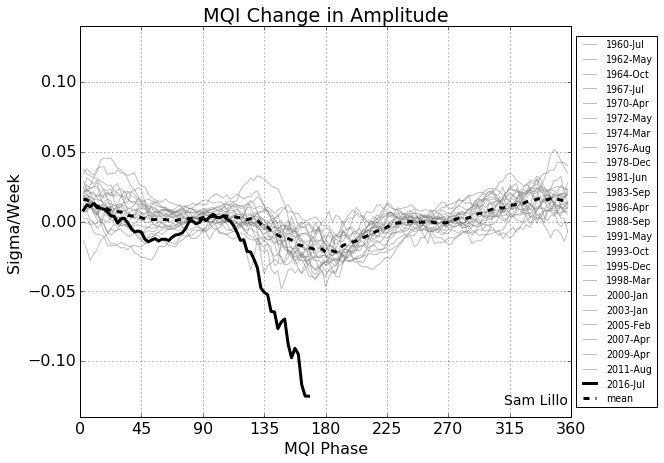
http://www.bom.gov.au/jsp/awap/temp/index.jsp?colour=colour&time=latest&map=meananom&period=6month&step=0&area=nt
Here is where things are interesting –
http://pamola.um.maine.edu/fcst_frames/GFS-025deg/DailySummary/GFS-025deg_NH-SAT1_T2_anom.png
…and
https://forum.arctic-sea-ice.net/index.php?action=dlattach;topic=1611.0;attach=39776;image
and they are leading to –
and
Which means we (or something) has geo-formed the Arctic from a frozen desert into a temperate ocean in the space of a couple of generations. The Arctic has been ice-free in the past but that took a thousand years.
“tony mcleod December 31, 2016 at 11:51 pm”
Too funny! 112 devices to calculate a (Meaningless) national average? About 1 device for every ~68,500 square kilometers?
i’m looking north and see the foolowing: greenland gaining icemass at record rates never recorded since it started, i see a north pacific gigantic blue blob and drops of the ocean surface temps of more then 6 degrees C in some regions in just 3 months time.
Of course the arctic is at “record low, but the hot water that’s now displaced had to go somewhere. it’s only road was: the arctic. However it looks like that “record low” is nearly over.
oh yes and if you know physics well, you should know that record low ice cover means record high heat loss, as sea ice is an insulator.
also if you look north you would know that the arctic ocean is not the real cold spot, but Siberia is. Let it be those coldest spots that turned till now colder then average and that these area’s are a bit bigger then the arctic…
oh yes and finally 8000 till 4000 years ago a lot of regions on greenland’s coast were ice free. don’t worry, it still will take a while to repeat that 🙂
just to show how greenland does:
http://www.dmi.dk/uploads/tx_dmidatastore/webservice/b/m/s/d/e/accumulatedsmb.png
now tell me why is greenland 3 months ahead in ice mass while arctic ice is at record low? oh i know: “weather”.
what i say is part of that same north, just another region….
oh yes when looking the ice charts; did you also notice that the anomaly is entirely accounted to the north atlantic side? oh yes a cold pool south of iceland is diverging storm tracks more northwards then normal.
Patrick:
Does that make the UAH TLT and RSS TTT sat temp data “meaningless” then?
After all that comes from just one instrument…..
For the whole globe.
Measuring brightness via the AMSU sensor above the surface at different times of the day.
Yet the surface data series manages to come up with temps within a few tenths of a deg of each other and in continuity.
How’s that then iif they are “meaningless”.
What I am seeing, according to your pictures, is the the southern hemisphere is .04 degrees warmer than the 1979-2000 summer baseline. That part does not seem horrifying, does it?
The northern hemisphere is 1.04 degrees above its winter baseline….so less cold.
Obviously your point is that the Arctic is 2.41 degrees above its ‘total darkness’ baseline.
I am seeing extreme milding in this image.
I’m trying to figure out what plant and animal species in the arctic can’t handle it if it is 2.5 degrees warmer in winter?
Tony, can you provide a link for us of the non-cognoscenti that explains the significance of the MQI graphic you posted by Sam Lillo?
Fred
Na, i saw the movie once. (“the blob”) Not very interesting…
Frederik Michiels on January 1, 2017 at 4:54 am
… i’m looking north and see the foolowing: greenland gaining icemass at record rates never recorded since it started…
Well this looks like a joke but in fact is none:
https://youtu.be/djpKKTrwB_8
Maybe you read a paper written by danish specialists working at DMI:
https://www.carbonbrief.org/how-greenland-ice-sheet-fared-2016
An extract:
Ice sheet mass balance is a bit more complex than you manifestly like to imagine.
ah yes GRACE…. wasn’t GRACE also measuring ice loss in Antarctica , which a thorough surface study of NASA did contradict finding Antarctica was still gaining ice?
i sure agree the graph does not account for calving, but when inland ice is gaining mass at high rate that will for sure reverse the scales of the balance.
and yes… summer good point, just before this cycle’s anomaly started. Good try.
(note that i am not saying the DMI is wrong, i am saying “we are seeing something different then the years prior to this winter” where greenland did lose ice at an accelerating rate to then suddenly slow down again)
that means if this trend for this year will continue, the summer would be similar to those we had last years (except 2012) the mass balance will get positive for 2017. That’s a small detail
Frederik Michiels on January 1, 2017 at 8:43 am
1. wasn’t GRACE also measuring ice loss in Antarctica , which a thorough surface study of NASA did contradict finding Antarctica was still gaining ice?
Maybe you read this article a bit less diagonally?
https://www.nasa.gov/feature/goddard/nasa-study-mass-gains-of-antarctic-ice-sheet-greater-than-losses/
Especially this:
The GRACE data was 100% correct, sorry. Many skeptics were quite happy to thoroughly “misunderstand” NASA’s hint on Zwally’s work.
2. … and yes… summer good point, just before this cycle’s anomaly started. Good try.
What do you mean here? The danish people clearly wrote
I propose the lecture of
http://cires1.colorado.edu/science/spheres/snow-ice/ice-fast.html
Seems to correspond to what is written at
http://nsidc.org/greenland-today/
Do you have valuable data for the snowfall accumulation on the inlandsis? Or are you simply guessing?
Maybe you know all that by far better than Konrad Steffen & alii… and maybe you consider NSIDC as a kind of warmist hollow.
Wow! I wrote a long reply to Michiels and… forgot to save it before sending. Clever, Bindidon…
Thx mod…
The paper might have been: https://www.researchgate.net/publication/235640619_Mass_balance_of_the_Greenland_Ice_Sheet_from_1958_to_2007
Thus within error margins, in the 1960s the ice sheet may have been losing up to 180 Gt/yr, and in 2007 about 229 Gt/yr. We just do not know. Materially, the 1930s/early 1940s which is the warmest period in the Greenland thermometer record was not examined. One therefore does not know the rate of ice loss for this warm period and how that compares with today..
Whilst these figures sound alarming as a percentage of the ice sheet they are extremely modest.
The Greenland Ice Sheet is not going to disappear any time soon. It is a bit like the notorious IPCC claim with respect to the Himalaya Glaciers that had to be retracted. It is important to keep a proper perspective on things, and the amount of energy required to melt the Greenland ice sheet and the time required to melt it.
There is a contradiction between articles claiming that the mass of the Greenland ice sheet is growing and several claiming it is melting. If we accept the net melt rate as 229 cu km per annum, then it should disappear within 20,000 years, and have only seasonal ice cover like most of the Canadian Arctic..
I find that acceptable. If it happens, it means we will have missed the next ice age that might otherwise have destroyed most of civilisation. One thing that could make it happen is that the Gulf Stream might swing West permanently. Sorry Scandinavia. You lose. But you can sail west and pick up where your forebears left off.
Don’t worry, be happy, and enjoy the fabulous coral reefs of Miami and Orlando.
i thought i did read not long ago a study stating greenland’s ice mass is in a huge valley surrounded by mountains. so it can’t move.
the ice that is moving and calving is the ice that’s on the outside of that mountain range
in short the edge that moves outwards is melting and calving, but that’s not new since the end of the LIA.
it’s the same thing as with antarctca: the edges that move do melt a bit faster, but the edges that are nearly static and unable to move did grow.
i rather would be worried if greenland is gaining ice….
Walter,
I see you got GISS right, but missed on NCEI and HADCRUT. I think there is a pattern here. NCEI and HAD tend to under-rate polar weather; GISS gets it about right, according to the reanalysis. I think it might be interesting to compute a -70:70 latitude index, and use that to predict changes in HAD and NCEI.
Interesting idea. I already do something similar for RSS and UAH, so it should be simple to implement . I can do that in the next week or two, and see if “hindcasting” HadCRUT4 and NCEI produces better results. If so, the next step would be “forecasting” (actually, projecting the current month before the data are officially released).
Would that mean you are predicting the forecast, or forecasting the prediction? Ya, I know you are predicting an observation. ( Are you certain all data bases are obsevational?)
Nick, i hope people treat you better here in the new year. i saw an ugly “piling on” of you recently that was (unwarranted and) uncalled for. It’d be nice if we would all learn to carry ourselves as well as you do in the new year…
the mods will allow unlimited trashing of nick no matter how gentlemanly he is.
the mods could stop it, but they wont..
[I had rather thought that Nick was extremely able to fight his corner, which he does very well . . . mod]
At least Nick gets a proper hearing here. This website would be all the poorer except for Nick. You should try taking a sceptical stance on SkS or RealClimate. Its no better and they’ll even “borehole” or in the case of SkS even edit around your valid, on topic, “within the rules” comments.
I must admit that even though I usually agree with Mr Stokes (so I am in his court), I am always impressed by his polite way of addressing people here, even when the bullies come out of the swamp. I have the greatest admiration for his knowledge and the way he seems to keep his cool and stick to the facts and only the facts.
It’s self inflicted IMO. Alarmist to the core…does not even recognise his organisation, BEFORE it became the CSIRO, helped with the introduction of the cane toad in 1935.
I agree that it would be nice to see a more civil and genteel response made to Nick and others whose views we may not always agree with.
This site would be much poorer if Nick (and others) did not comment. The last thing I want is a talking shop of like minded views. As a sceptic, I am particular interested in what warmists have to say. Nick in particular usually puts forward a cogently argued position which is food for thought. As such he greatly adds to the debate.
I would like to see Mosher change his drive by stance, and to respond in more detail preferably with references. His comments on Climate etc (Judith Curry’s site) are far more interesting and useful than the approach he adopts at this site.
Patrick MJD on January 1, 2017 at 3:18 am
You are often exactly what intelligent and polite skeptics complain about: impolite to the core.
What are people like you in comparison with a Nick Stokes? While he has always science in mind, your comments are regularly a kind of antithesis to science – even when lacking their usual rudeness against people thinking different.
This might be due to the fact that in your opinion, ideology akin to yours always shall supersede what you reject – regardless its intrinsic scientific value.
I recommend you to carefully review the discussion threads Nick Stokes had with many skeptics here alongside several WUWT guest posts: most of them he silently finished as the clear winner.
Many thanks to afonzarelli for the fair comment.
“As a sceptic, I am particular interested in what warmists have to say.”
Me, too.
“CSIRO, helped with the introduction of the cane toad in 1935.”
What, so they’ve had 80 relatively good years?
Nick Stokes December 31, 2016 at 7:57 pm


I think it might be interesting to compute a -70:70 latitude index
————-
Well the three longest running Arctic stations, Svalbard, Godthab Nuuk Greenland, and Malye Nova Zemlya don’t show much warming overall but a warmer period from the 1920s to the late-1950s.
Bill Illis on January 1, 2017 at 5:04 am
I don’t understand why you show us these three GHCN charts when Nick speaks about a 70S-70N index, and moreover probably means one merging land and ocean data.
If you had proposed e.g. the GISS variant with latitude zones
http://data.giss.nasa.gov/gistemp/tabledata_v3/ZonAnn.Ts+dSST.txt
and had averaged 64S-44S, 44S-24S, 24S-24N, 24N-44N and 44N-64N to build a 64S-64N index, I would have understood.
Last not least: is Walter Dnes interested in data anterior to the satellite era? I guess no.
HAPPY NEW YEAR Y’ALL (ya hear?)…
HNY Fonz … y’all y’all 😉
Happy New Year…
For those reviewing 2016 and thinking of some resolutions, please read this and take it to heart: it calls you out on arctic sea ice. Decry it if you will: I think in your hearts you know you are wrong.
https://tamino.wordpress.com/2016/12/28/global-warming-2016-arctic-spin/
Tamino? Scraping the bottom there…
Richard Verney
You do know they surfaced through large cracks in the ice don’t you….so to try to convince people here that that picture says anything about the state of the ice at the time is very misleading.
Personally, I can’t see any harm in the Arctic being ice free.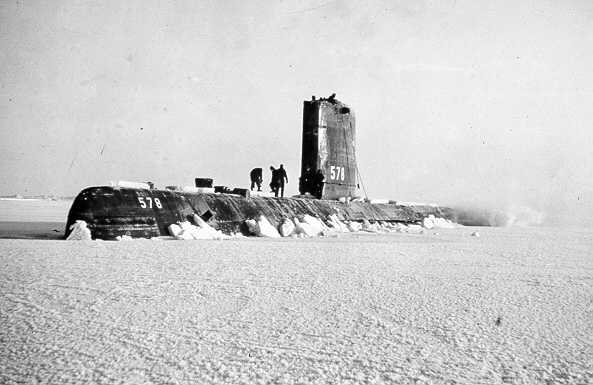
A return to the climate and conditions of the Holocene Optimum would be a god send to nearly all life that inhabits this water world of ours. This planet is way too cold such that I am not at all concerned by Arctic warming.
That said, it does not appear that Arctic ice conditions are significantly different to that seen in the early 1970s or in the late 1950s when the Nautilus and Skate surfaced around the North Pole.
https://tse1.mm.bing.net/th?id=OIP.Mc9b4867260e04368a7d0582922c488dfo0&w=221&h=155&c=7&rs=1&qlt=90&o=4&dpr=15&pid=1.1
http://www.uscs.org/wp-content/uploads/2011/12/uss_nautilus2_cover.jpg
As predicted, Arctic sea ice extent is rapidly gaining and will soon reenter the +/- two SD “normal” zone.
https://nsidc.org/data/seaice_index/
The southern Bering and northern Barents Seas are still below “normal” but freezing up fast. Not that it matters that there is a little more open water in the Arctic than average for early January.
If the lower ice levels since 2007 were to continue indefinitely, that would be a good thing. Neither polar bears nor anyone else needs drift ice at “normal” levels. For most of the Holocene, they have been much lower, and that was a good thing for all concerned. Now that humans can benefit from northern sea trade routes, even lower ice in summer would be better.
PS: And, as noted, Arctic sea ice extent isn’t lower than average for the past 30 years because the region has enjoyed slightly less frigid air temperature so far this winter. It’s still far below freezing there. The aftereffects of El Nino on ocean temperature and circulation are the cause, not the beneficial fourth molecule of CO2 per 10,000 dry air molecules added since AD 1850.
Happy New Year to all…
Best wishes, Allan
St. Roch
St. Roch, wooden schooner powered by sails and an auxiliary engine, launched in North Vancouver in Apr 1928 for ROYAL CANADIAN MOUNTED POLICE operations in the Arctic. Under the command of Sergeant Henry A. LARSEN, it sailed 23 June 1940 from Vancouver to traverse the NORTHWEST PASSAGE.
Taking a treacherous southerly route through the arctic islands, it was trapped in the ice for 2 winters and did not reach Halifax until 11 Oct 1942. It was the second vessel, after Roald AMUNDSEN’s Gjoa, to traverse the Northwest Passage, and the first to make the voyage west to east.
The St. Roch returned to Vancouver by a more northerly route, through LANCASTER SOUND and Barrow Strait, in only 86 days (22 July-16 Oct 1944). This voyage made it the first vessel to negotiate the passage both ways. The exploits of the St. Roch strengthened Canadian ARCTIC SOVEREIGNTY.
In 1950 the St. Roch made a southern voyage and thus became the first ship to circumnavigate North America. It was purchased by the city of Vancouver in 1954 and permanently berthed at the Maritime Museum. The federal government declared the St. Roch a national HISTORIC SITE in 1962.
And no GPS, no satellite ice and weather info and no aerial photography or snow mobile reconnaissance to assist in finding an ice free route/passage. Many modern vessels have far more ice strengthening than did their forerunners.
It is much easier in the late 20th/early 21st century to steam such passage. One should not underestimate the difficulties that were faced in the more historic voyages, and what this suggests about the then prevailing ice conditions.
Good news that HadCrut is almost at Pause average….and at record variance with GISS. Now if we can just get the satellite data to cooperate for Dec., then GISS officially becomes a joke.
Thanks for the article. I like the wonkiness. Need to clean up your HadCrut projections though. Looks like your Dec number is on pace to be as way off as Nov.
I use a simple linear equation with the previous 12 months of data (or 11 months if HadCRUT’s update is late) with NCEP/NCAR anomaly as “x”. From that, I calculate slope() and intercept() in a spreadsheet. Then I use the “y = mx + b” linear equation from high school.
If anything, HadCRUT4 and NCEI seem to be cool outliers. Nick Stokes has already mentioned that they don’t seem to catch polar warming very well. He suggested using a 70N to 70S subset of NCEP/NCAR to project their anomalies.
I have some little impression that when using linest() you would obtain all that stuff in one step 🙂
Outlier no more. RSS for December joined the party and is now below Pause average (and way below your forecast, like HadCrut ). Someone else is the outlier now. .I look forward to your revised forecasts next month.
rgbact on January 1, 2017 at 8:44 am
Good news that HadCrut is almost at Pause average….and at record variance with GISS.
Well rgbact: when I look at the chart below and compare both the monthly data and the running means, I’m wondering a bit… What in the world are you telling us here?
http://fs5.directupload.net/images/170102/qdgayl9b.jpg
Now if we can just get the satellite data to cooperate for Dec., then GISS officially becomes a joke.
I guess we’ll have to wait a bit for that…
What is clearly visible here is
– that GISS and HadCRUT do not differ at all;
– that the troposphere isn’t the surface.
And nobody has ever pretended that the troposphere and the surface shall behave in common.
One thing I find interesting about your plot is that the correlation prior to the Super El Nino of 1997/98 is a far tighter fit, than it is post the 1997/98 Super El Nino.
Just eyeballing but there appears to be a significant shift in mid 2004 onwards. Any idea as to why that should be so?
Really???
Agreed that they are measuring different things, and one should endeavour to compare apples with apples. That said, according to AGW theory, it is a top down effect. It is a warming atmosphere which then causes the surface to warm/lose less heat. That being the case one would expect to see the first signs of AGW in the troposhpere. If the troposhere is not warming then it is difficult to understand why the surface is warming. Accordingly one would expect to see (over a protracted period) a rather close and similar behavoir pattern. Not the same (there are different lags, and different responses to change in ocean temperatures and the air above the oceans), but a general similarity. One would not expect to see (over a long period) a significant divergence in response.
The satellite data is very important to AGW theory given the top down effect. Indeed, it is also very important to the models since the models output projections not of surface temperature, but rather air temperature and the satellites more closely measure what the models are in fact outputting.
richard verney on January 2, 2017 at 2:00 am
… there appears to be a significant shift in mid 2004 onwards.
Exactly. No idea about what this decorrelation between lower (hum, rather say middle) troposphere and surface records is due to. I never read about that anywhere. Maybe Nick Stokes has an idea…
Many climate skeptics might argue about “GISS manipulation”.
But simply replacing, in the chart above, the HadCRUT plot by one of RATPAC B radiosondes’ 700 hPa data shows the need for being a bit more careful when pretending such things:
http://fs5.directupload.net/images/170102/kjtpobrx.jpg
In this chart the plots differ due to the higher RATPAC anomalies and Excel’s automatic scaling; all data is identical.
You see that again in 2004, all running means converge and diverge. A strange effect indeed!
But the divergence is no longer “troposphere >< surface": the radiosonde anomalies, though measured in the (really) lower troposphere, are nearer to those of surface stations than to those measured by microwave sensors.
Is this chart correct? I’m seeing a massive divergence in HadCrut/GISS in recent years. This very article shows a 0.4 (!) degree diff. in Nov…..and somehow the author got his GISS prediction exactly right……but missed HadCrut by a massive amount. That doesn’t sound like two similar data sets..Yet you say they don’t differ at all?
It is a warming atmosphere which then causes the surface to warm/lose less heat.
You are right. Tropospheric and surface temperatures are in correlation. You see that even in the Arctic when comparing the average of little 3 GHCN stations above 80N with the average of the grid cells in UAH’s latitude zone “80N-82.5N”.
But we should keep in mind that a good correlation between two time series, shown by an appropriate choice of running means, cannot hide the fact that between 1979 and 2016, they nevertheless differ in trend by a factor of 50 %:
– UAH: 0.12 °C /decade
– GISS: 0.17 °C / decade
That’s why I mean they behave different.
rgbact on January 2, 2017 at 9:18 am
Is this chart correct? I’m seeing a massive divergence in HadCrut/GISS in recent years.
About cherry picking…
Linear trends in °C/decade (2σ)
1. 1979-2016
– HadCRUT4.5: 0.172 ± 0.038
– GISS land+ocean: 0.172 ± 0.039
2. 1997-2016
– HadCRUT4.5: 0.135 ± 0.102
– GISS land+ocean: 0.173 ± 0.102
3. 2007-2016
– HadCRUT4.5: 0.338 ± 0.288
– GISS land+ocean: 0.347 ± 0.294
Source: http://www.ysbl.york.ac.uk/~cowtan/applets/trend/trend.html
richard verney
January 2, 2017 at 2:14 am
Indeed. Yet another falsification of the repeatedly falsified conjecture of man-mad global warming via GHGs is the fact that the higher troposphere has warmed less than the surface instead of more and later rather than earlier.
GISS, BEST and HadCRU are all garbage, but GISS is the smelliest of the three mendacious works of science fantasy, ie packs of lies.
Yes, the alarmists are now slowly starting to trash HadCrut. Its an “outlier” evidently.
GISS is of course gospel (by record amounts!) But we’ll see if satellites stay warm. They have a longer lag typically. They haven’t run warmer than HadCrut in at least 20 years…..so this new “HadCrut is the crazy cool outlier” would be a big/bizarre switch…..which will lead to faulty projections, I suppose….as David Rose also found out.
HadCRUT is no outlier at all. HadSST3 and CRUTEM4 have a different view on the Arctic regions than do GISS and NOAA, that’s all.
If there was any “crazy cool outlier” to complain about, than warmists probably rather should choose JMA, as it has the coolest trends among all surface records.
Part of the difference is due to methodology: Like it or hate it, GISS uses interpolation to weight areas where there is little or no data available. In mathematical terms this is reasonable on the one hand, but makes assumptions about the infilled area that may or may not be reasonable. CRUTEM4 on the other hand (the land part of HadCRUT) ignores land areas where there is no data. Since these are mainly at high latitudes, and this is precisely where both land and satellite data (which does sample those regions extensively) show the greatest warming, its hardly surprising that it shows a weaker trend overall than data sets that account for a greater part of the land surface.
==================
tony mcleod (December 31, 2016 at 7:02 pm)
i think something interesting is going on.
Look north young man.
===============
Graeme (December 31, 2016 at 7:25 pm)
Why not south Tony? Care to explain why your own backyard, Australia, never had a spring and why, as we move into supposedly our hottest time of the year, we are still having cool weather? Our favourite met mob BOM are not making any effort to tell us why it’s so cold when it should be hot. Also care to explain why the cold water are still hanging around in the Bight – they’ve been there since winter. Sheesh.
===============
tony mcleod (December 31, 2016 at 11:51 pm)
Big place Australia. I see most of the country is close to average for the last 6 months.
[…]
Here is where things are interesting – [look only at the Arctic, repeat ad nauseum]
======================
Big place the planet. I see most of the planet has been close to the arbitrary “average” temperature for the last 6 months. But let’s recall that global warming guru Tim Flannery once stated, “Australia is the harbinger of change,” hence we should ignore the unseasonable warmth at the Arctic and worry instead about the unseasonable cold that has kept a grip on south-east Australia since winter ended.
Perchance I have been studying the weather patterns on our side of the planet since the launch of the Himawari-8 satellite just over a year ago, so I can tell you why sth-east Australia has experience a lot of cold, wet, windy weather, despite the end of winter and the arrival of summer.
The explanation is mid-latitude cyclones. Here’s one from a few days ago traversing the Great Australiant Bight…
2016/12/28 – Midlatitude cyclone moving eastward south of Australia – Geocolor (HTML5 Loop)
summer:
2016, Dec 08 – Midlatitude cyclone moving over Tasmania – Geolcolor
spring:
2016, Oct 24 – A pair of midlatitude cyclones in the south Pacific – Geocolor
2016, Sept 29 – Surface low moves into southern Australia – RGB Airmass
(this cyclone knocked out South Australia’s wind-reliant electricity supply)
2016, Aug 19- Beautiful Cyclone south of Australia – Geocolor
2016, Aug 08 – Low pressure in the Southern Ocean south of Australia – Geocolor
Those are the exactly the kind of weather patterns we didn’t experience during the permanent global warming drought at the start of the century. Alarmists said of that drought, ignoring Australia most famous poetic verses about droughts and flooding ranges:
“Something interesting is going on. Look south“
“. But let’s recall that global warming guru Tim Flannery once stated, “Australia is the harbinger of change,” hence we should ignore the unseasonable warmth at the Arctic and worry instead about the unseasonable cold that has kept a grip on south-east Australia since winter ended.”
Two things:
One, quotes are not science.
Two, the Arctic, as should be obvious in the absence of an ideological bias to AGW theory, is the Pole of cold in the NH winter.
What it does is most certainly FAR more important than what is happening in Australia.
Australia does not have sea-ice that will impact it’s hemisphere when the sun returns, and that is impacting the Arctic currently, driving the extra cold/snowy Siberia and distorting the tropospheric PJS.
FI: the US cold spell is being driven by the NPac/ Aleutian ridge (-ve PNA) a downstream consequence of that Siberian cold.
In turn that ridge/trough pattern is fuelling an Atlantic ridge that has plunged cold Arctic air south into Europe.
IOW: feedbacks are warming the Arctic via the warmer/more open seas and causing circulation changes that are moving the (what should be) resident cold air south and warmer air to replace it.
A near average/slightly colder (Aus continent) spring, does not do that sort of thing in the SH my friend.
Leaving aside the issue that people live in Australia and do not live in the Arctic, I would agree with the general premise that on a planetary perspective what is happening in the Arctic is probably more significant.
The problem is that we have sparse Arctic data (with a short data base on what appears to be subjuct to cycular changes) and we do not understand the complex feedbacks that play out in that area. For example, we do not know how the albedo change due to less ice verses loss of insulation and higher heat loss from the oceans due to less ice pans outs. For example, we do not know whether the oceans receive a net gain of energy, or whether the oceans lose net energy overall as a consequence of the change in ice conditions. That is something that needs a lot of study.
We do not even really understand the albedo impact since solar irradiance is low even in summer and when we talk about ice free oceans, we do not mean that there is no ice, there is still a lot of floating ice it is just that it is broken up. We do not know how much extra energy is being absorbed by the oceans in these circumstances, and one should not forget that minimum ice conditions is not in June when solar irradiance is at its highest and at its longest, but at September. When one looks at the sea ice decline there is little decline in June and the first few weeks of July. The substantial decline begins to open up in the late July through to November
We do not understand how all of this impacts upon weather conditions further afield and the jet streams etc.
There is a lot to investigate and understand before we can even begin to predict the gloom that is so often claimed for the Arctic death spiral.
=====
“One, quotes are not science.”
=====
I didn’t say Tim Flannery was a scientist. He is a high-ranking member of your climate cult, in case you forgot. I quoted his ridiculous statement of fact not as an example of science, but as an example of the kind of absurd claims leaders of your church make on a regular basis without a whisper of complaint from the likes of you.
“this melting of Greenland is very, is of great concern, because it’s non-linear, because once it starts to melt, if the water goes down below the ice sheets, it can take the whole ice sheet out to the ocean.”. – MSM physicist, Lawrence Krauss
I don’t recall a single member of your cult berating Krauss for his preposterous claim.
now, from above:
“The vast majority of Greenland ice sits in a basin so even if were to melt it cannot easily find its way to sea.” – Richard Verney
“That’s really one of the biggest jokes I ever read.” – Bindidon
Only arguments produced by skeptics are subject to scrutiny and ridicule by members of the cult.
That’s how Scientology works too.
=====
Two, the Arctic, as should be obvious in the absence of an ideological bias to AGW theory, is the Pole of cold in the NH winter.
=====
Does that make the north pole “a harbinger for change”, like Australia was during the permanent global warming drought?
If so, why so? Why not the Antarctic?
Your obsession with the Arctic looks like a special pleading built on today’s weather.
Khwarizmi (محمد بن موسی خوارزمی) on January 1, 2017 at 6:54 pm / January 2, 2017 at 3:04 am
Your obsession with
Australiathe Arctic looks like a special pleading built on today’s weather.An obsession? Why an obsession? Observation of temperature changes is interesting.
And the best corner to observe temperature changes when discussing with skeptics is the troposphere: simply because nearly all skeptics are convinced (or better: believe) that surface temperature measurements all are flawed. So what.
The best corner to observe the troposphere temperatures in turn is that one where things getting warmer aren’t averaged together with things getting cooler: it is gridded data, e.g. that of UAH. Here you can process monthly 2.5° data into fine, independent latitude stripes and see that
– of all 66 latitude stripes for which data exists, all five near to the north pole show the warmest trends, especially the nearest one, ’80-82.5N’, with 0.42 °C / decade (compared with 0.24 °C for ’60-82.5N’);
– of all 9,504 grid cells in the dataset, 96 of the 100 with the highest trends are located within ’80-82.5N’ (2 are in Kamchatka, and 2 near the south pole)
– 74% of the 50 highest anomalies, but only 6% of the 50 lowest anomalies measured from dec 1978 till oct 2016 in ’80-82.5N’ were since the year 2000.
Obsession? Pffff.
Why not the Antarctic?
Becauss despite various hot spots here and there, Antarctica is a rock solid corner in comparison to the Arctic. But in fact the Arctic actually should be cooling. And as long as it doesn’t, I’ll observe what happens there.
Please don’t tell me that “the Arctic was warmer in the Thirties”: the plot showing exactly that I have right now on the monitor.
The vast majority of the Greenland ice sheet sits in a basin:
http://www.csmonitor.com/var/ezflow_site/storage/images/media/content/2013/0830-greenland-canyon-topographic/16859445-1-eng-US/0830-Greenland-canyon-topographic_full_600.jpg
Glacial retreat is extremely complex, and we still do not yet properly understand that.
Much of the Greenland central basin ice sheet was added during the Holocene, ie., during this present warm interglacial period which we are lucky enough to live in. It appears that during the Holocene, rather than the ice sheet melting it has gained considerable mass. This is thought to be due to there being more snow during the warmer interglacial period. Thus it is material to note that the Holocene temperatures in Greenland were far higher than those seen today, and yet even though Greenland was far warmer for much of this period the ice shelf was added to rather than it abating away, and it has survived intact through the Holocene Optimum. If the Holocene Optimum did not cause the Greenland Ice sheet to collapse, why should one envisage that it is on the brink of collapse at today’s temperatures which are about 3 to 4 degrees cooler (in and around Greenland) than were the temperatures of the Holocene Optimum.
The Greenland ice core temperature data is as set out below:
https://www.bing.com/images/search?q=greenland+ice+core+temperatures&view=detailv2&qpvt=greenland+ice+core+temperatures&id=11D3E31AB5F378B1100B4A9C1B7A5C70D328A682&selectedIndex=2&ccid=fH1CCftQ&simid=607986432031918926&thid=OIP.M7c7d4209fb50163426c896010af38117o0
It therefore does not automatically follow that some warming will inevitably lead to ice loss in the central basin area of the ice sheet. As a percentage of the whole there has been very little ice loss from Greenland these past 50 years. The ice loss that we are witnessing is presently, for the main part, coming from coastal areas.
Further, much of the ice sheet is extremely old. there still remains ice that formed in the Eemian period. This ice did not disappear during the last warm period when temperatures were some 8 degrees above that of today’s temperatures, and there is no reason to believe that it will disappear this time round.
As mentioned previously, the raw temperature data from Greenland shows the late 1930s/early 1940s to be warmer than today. The year 2010 which was an El Nino year had temperatures equal to, and possibly slightly higher than those seen in the 1930s/early 1940s, but Greenland has been cooling since the 2010 short lived spike. DMI has quite a nice plot of Greenland weather stations showing their relative position and even the DMI data plots show the 1930s/early 1940s to be the warmest sustained period in the modern instrument record (save for the short lived 2010 spike which is equal to, or in some locations possibly very marginally the warmest period).
It is only those who are signed up to the RCP8.5 pathway scenario model who then model the collapse of the Greenland Ice Sheet. With respect, this type of assumption based modelling is not what most would consider sound science.#
As I say, we have a lot to learn and yet understand about the behavoir of the Greenland ice sheet. But the claims regarding ice free Arctic, such as those made by the likes of Al Gore (2014), and by Hansen (latest one being 2018), are not suggesting that the Greenland ice sheet will have by then have disappeared. they pertain to summer sea ice, and it appears that even that is now being qualified by it meaning a reduction to what has been referred to as a Wadham, ie. a residual extent of 1 million square kilometers (so not completely gone).
Perhaps this link will work for the Greenland ice cores:
Sincere apologies for my ridiculous reaction (Bindidon on January 1, 2017 at 11:36 am) to the sentence
The vast majority of the Greenland ice sheet sits in a basin.
Sometimes it becomes too late to carefully process an unexpected information! Mea culpa.
“The explanation is . . . .”
Certainly the plethora of mid latitude cyclones is what is being observed this S.H. “summer” . . . emergent phenomena Willis would say 🙂
The meme amongst NZ dairy farmers , since about October 2016, when it was no longer deniable that the usual spring was not happening, has been something like . . . [“season’s farct. . . . & far kin disaster etc. “] ; that’s how they talk.
It is still like that , a week or two after the solstice when things should be more settled, and the gigantic anti-cyclones should be slow to stationary over Australasia.
But the rain which is normally a blessing at this time , is coming in from the South-West, and it’s cold.
So what is keeping the anti-cyclones too far towards the tropics , allowing the mid -latitude cyclones to persist ? And when will it change?
In other words , where’s me bloody hay-making weather?
( I hope that this is not too agricultural).
It’s just the weather? It doesn’t feel that way.
Appeal to Anthony Watts — appreciate while presenting articles on global temperature referring the anomalies, it may be worthwhile using common base like 1901 to 2000 or covering two 60-year cycles [120 years]. This will avoid the confusion while interpreting the results.
Dr. S. Jeevananda Reddy
This appeal, Dr. Reddy, is not very meaningful: to compute a baseline for anomalies, you need data collected in the baseline’s period. That you hardly could achieve for satellite data between 1991 and 1979.
I do not see that Anthony can do anything about it.
One of the problems is that the data sets are all rather short in duration, and why anyone considers that a period of 30 years is sufficient to get a handle on what Climate is, must be one of the great mysteries of life.
richard verney — 30 year was suggested to compute local met data normals and not to undestand the trend. They were first given for 1930-61 and then second one was from 1961-90. They help the average and extremes occurred during that period.
Dr. S. Jeevananda Reddy
I do not know whether Bindidon considers the collapse of the Greenland ice sheet to be imminent, but he certainly seems concerned about the rate of ice loss, which as a percentage of the whole is extremely modest, but may account for about 0.5mm per year sea level rise.
We have very little knowledge of global temperatures, but we do have quite good information on Greenland temperatures. they are as I have posted above;
The Holocene optimum was approximately 8,000 years ago. For a period of about 6,000 years it has been warmer than today, often a couple of degrees warmer and yet the Greenland Ice Sheet has not disappeared. Mr Bindidon might light to explain why he considers that today’s far cooler temperatures will cause it to melt and over what period of time he considers it will take to melt.
He might also like to ponder on the fact that much of the Greenland Ice Sheet was laid down in the Holocene, even though for the main part it was warmer than today. that in itself suggests that it is unlikely to disappear anytime soon, and as the Holocene pans out, it may be that the ice sheet will in fact be added to, we just do not know. Here is a Nasa presentation of the Greenland Ice Sheet. the amount of ice added during the Holocene is portrayed in green.
http://svs.gsfc.nasa.gov/vis/a000000/a004200/a004249/GIS_periods.06429_print.jpg
richard verney on January 2, 2017 at 8:35 am
I do not know whether Bindidon considers the collapse of the Greenland ice sheet to be imminent…
That I do not at all.
My little knowledge about Greenland is that of the average layman:
– DMI stuff
– http://nsidc.org/greenland-today/
– http://cires1.colorado.edu/science/spheres/snow-ice/ice-fast.html
I solely have problems with people telling us about an unprecedented ice accumulation of Greenland’s inlandsis while dissimulating the fact that it actually loses about 250 Gt/y through melting & calving.
Thanks for the valuable info!
I just checked RSS to see if they had updated with December data. Apparently ftp://ftp.ssmi.com now requires a login and password. Can anybody else confirm? The data URL was ftp://ftp.ssmi.com/msu/monthly_time_series/rss_monthly_msu_amsu_channel_tlt_anomalies_land_and_ocean_v03_3.txt
Why do you use that source?
http://data.remss.com/msu/monthly_time_series/RSS_Monthly_MSU_AMSU_Channel_TLT_Anomalies_Land_and_Ocean_v03_3.txt
Actually, I used that link because it has work for me for a long while. It looks like they’ve switched to unix/linux/bsd, and suddenly uppercase versus lowercase is important. Your version of the URL works. Thanks very much for the post.
Walter, this has nothing to do with whichever Lunix on Earth: ftp://ftp.ssmi.com/ requests authentication before processing any request. That’s all.
Walter, I too got a message requiring a login and password. So I went to the RSS site and there was an announcement that after Dec 12 or so they were requiring everyone to register before using the data. I accordingly registered, received an acknolwedgement that I had registered, but ran into the same requirement for username and password without the possibility of requesting a new password. I have a request in to their tech support now. They certainly are not making it easy to get the data.
I see below that Bindidon has a different link which Glory Hallelujah works! Thank you Bindidon.
However, it still stops at November.
“However, it still stops at November.”
RSS would not normally have December yet.
On the wattsupwiththat website here, why do I now get the following request for authentication?:
The window cannot be “X”ed out, and it cannot be cancelled. Also, once it comes up, it stays up on all screens of the whole website, and so I have to close out the website, and come back in afresh, in order to get rid of this blasted window asking for authentication. Ironically, then, I have to ask, What’s up with THAT ?
I have just given up and reset my password in all WordPress sites ; seems to work.
Not getting it. … Password ? … Who needs a password, simply to get to the WUWT website ?
I get this window, simply by visiting the WUWT website via the WUWT url in my browser, … I get here, … go to the global temperature page, and this window comes up asking for authentication, … and then I cannot get rid of the window, no matter where I navigate to on this website — the window hangs around, … I have to exit the website, … navigate back to the website anew, … and avoid that global temperature page like the plague.
On another note, regarding the question I posed earlier about the paper discussing satellite drift here in the RESEARCH section of the WUWT website, I finally found it again — it was by John Christy:
https://science.house.gov/sites/republicans.science.house.gov/files/documents/HHRG-114-SY-WState-JChristy-20160202.pdf
Nobody answered, but I gave the wrong names anyhow, … so no surprise there — fumbling newbie still. (^_^)
Maybe you have a problem with a little malware introduced within one of your browser plugins…
I’ve posted that link noting that RSS is now asking for a password. Is your browser tring to automatically access the URL?
I fail to understand the purpose of a trend line from anywhere in the period 1974/2002 to 2015 except to hide the pause in temperature rise that began in about 2002. Also shouldn’t we expect that the ice conditions in Greenland by 2350 will be similar to those of 1350.
William Everett on January 3, 2017 at 12:36 pm
1. I fail to understand the purpose of a trend line from anywhere in the period 1974/2002 to 2015 except to hide the pause in temperature rise that began in about 2002.
Cherry picking luckily isn’t forbidden by law 🙂
2. Also shouldn’t we expect that the ice conditions in Greenland by 2350 will be similar to those of 1350.
You seem to belong to these persons who managed to perfectly overlook a minuscule detail:
– how many humans were we in 1350;
– how many of them will we be in 2350.
UHA data for December is in at +0.243 versus my projection of +0.360.
And will the humans in 2350 have any more influence on the temperature than the humans in 1350 or the humans in 2017? Also the fact that there have been two extended pauses in warming since 1880 with a third underway strikes at the heart of the argument for CO2 in the atmosphere being the cause of warming. So there is ample motivation for proponents of the CO2 argument to wish the pauses away.
v’