Guest Post by Bob Tisdale
This post provides updates of the values for the three primary suppliers of global land+ocean surface temperature reconstructions—GISS through November 2016 and HADCRUT4 and NOAA NCEI (formerly NOAA NCDC) through October 2016—and of the two suppliers of satellite-based lower troposphere temperature composites (RSS and UAH) through November 2016. It also includes a few model-data comparisons.
This is simply an update, but it includes a good amount of background information for those new to the datasets. Because it is an update, there is no overview or summary for this post. There are, however, simple monthly summaries for the individual datasets. So for those familiar with the datasets, simply fast-forward to the graphs and read the summaries under the headings of “Update”.
INITIAL NOTES:
We discussed and illustrated the impacts of the adjustments to surface temperature data in the posts:
- Do the Adjustments to Sea Surface Temperature Data Lower the Global Warming Rate?
- UPDATED: Do the Adjustments to Land Surface Temperature Data Increase the Reported Global Warming Rate?
- Do the Adjustments to the Global Land+Ocean Surface Temperature Data Always Decrease the Reported Global Warming Rate?
The NOAA NCEI product is the new global land+ocean surface reconstruction with the manufactured warming presented in Karl et al. (2015). For summaries of the oddities found in the new NOAA ERSST.v4 “pause-buster” sea surface temperature data see the posts:
- The Oddities in NOAA’s New “Pause-Buster” Sea Surface Temperature Product – An Overview of Past Posts
- On the Monumental Differences in Warming Rates between Global Sea Surface Temperature Datasets during the NOAA-Picked Global-Warming Hiatus Period of 2000 to 2014
Even though the changes to the ERSST reconstruction since 1998 cannot be justified by the night marine air temperature product that was used as a reference for bias adjustments (See comparison graph here), and even though NOAA appears to have manipulated the parameters (tuning knobs) in their sea surface temperature model to produce high warming rates (See the post here), GISS also switched to the new “pause-buster” NCEI ERSST.v4 sea surface temperature reconstruction with their July 2015 update.
The UKMO also recently made adjustments to their HadCRUT4 product, but they are minor compared to the GISS and NCEI adjustments.
We’re using the UAH lower troposphere temperature anomalies Release 6.0 for this post as the paper that documents it has been accepted for publication. And for those who wish to whine about my portrayals of the changes to the UAH and to the GISS and NCEI products, see the post here.
The GISS LOTI surface temperature reconstruction and the two lower troposphere temperature composites are for the most recent month. The HADCRUT4 and NCEI products lag one month.
Much of the following text is boilerplate that has been updated for all products. The boilerplate is intended for those new to the presentation of global surface temperature anomalies.
Most of the graphs in the update start in 1979. That’s a commonly used start year for global temperature products because many of the satellite-based temperature composites start then.
We discussed why the three suppliers of surface temperature products use different base years for anomalies in chapter 1.25 – Many, But Not All, Climate Metrics Are Presented in Anomaly and in Absolute Forms of my free ebook On Global Warming and the Illusion of Control – Part 1 (25MB).
Since the July 2015 update, we’re using the UKMO’s HadCRUT4 reconstruction for the model-data comparisons using 61-month filters.
And I’ve resurrected the model-data 30-year trend comparison using the GISS Land-Ocean Temperature Index (LOTI) data.
For a continued change of pace, let’s start with the lower troposphere temperature data. I’ve left the illustration numbering as it was in the past when we began with the surface-based data.
UAH LOWER TROPOSPHERE TEMPERATURE ANOMALY COMPOSITE (UAH TLT)
Special sensors (microwave sounding units) aboard satellites have orbited the Earth since the late 1970s, allowing scientists to calculate the temperatures of the atmosphere at various heights above sea level (lower troposphere, mid troposphere, tropopause and lower stratosphere). The atmospheric temperature values are calculated from a series of satellites with overlapping operation periods, not from a single satellite. Because the atmospheric temperature products rely on numerous satellites, they are known as composites. The level nearest to the surface of the Earth is the lower troposphere. The lower troposphere temperature composite include the altitudes of zero to about 12,500 meters, but are most heavily weighted to the altitudes of less than 3000 meters. See the left-hand cell of the illustration here.
The monthly UAH lower troposphere temperature composite is the product of the Earth System Science Center of the University of Alabama in Huntsville (UAH). UAH provides the lower troposphere temperature anomalies broken down into numerous subsets. See the webpage here. The UAH lower troposphere temperature composite are supported by Christy et al. (2000) MSU Tropospheric Temperatures: Dataset Construction and Radiosonde Comparisons. Additionally, Dr. Roy Spencer of UAH presents at his blog the monthly UAH TLT anomaly updates a few days before the release at the UAH website. Those posts are also regularly cross posted at WattsUpWithThat. UAH uses the base years of 1981-2010 for anomalies. The UAH lower troposphere temperature product is for the latitudes of 85S to 85N, which represent more than 99% of the surface of the globe.
The UAH lower troposphere data are now at Release 6. The paper that supports the latest release has been accepted for publication (no date yet set for publication), and the Release 6 data are no longer being published with a “beta” identifier. See Dr. Roy Spencer’s post here. Those Release 6.0 enhancements lowered the warming rates of their lower troposphere temperature anomalies. See Dr. Spencer’s blog post Version 6.0 of the UAH Temperature Dataset Released: New LT Trend = +0.11 C/decade and my blog post New UAH Lower Troposphere Temperature Data Show No Global Warming for More Than 18 Years. The UAH lower troposphere anomaly data, Release 6.0, through November 2016 are here.
Update: The November 2016 UAH (Release 6.0) lower troposphere temperature anomaly is +0.45 deg C. It rose slightly since October (an increase of about +0.04 deg C).

Figure 4 – UAH Lower Troposphere Temperature (TLT) Anomaly Composite – Release 6.0
RSS LOWER TROPOSPHERE TEMPERATURE ANOMALY COMPOSITE (RSS TLT)
Like the UAH lower troposphere temperature product, Remote Sensing Systems (RSS) calculates lower troposphere temperature anomalies from microwave sounding units aboard a series of NOAA satellites. RSS describes their product at the Upper Air Temperature webpage. The RSS product is supported by Mears and Wentz (2009) Construction of the Remote Sensing Systems V3.2 Atmospheric Temperature Records from the MSU and AMSU Microwave Sounders. RSS also presents their lower troposphere temperature composite in various subsets. The land+ocean TLT values are here. Curiously, on that webpage, RSS lists the composite as extending from 82.5S to 82.5N, while on their Upper Air Temperature webpage linked above, they state:
We do not provide monthly means poleward of 82.5 degrees (or south of 70S for TLT) due to difficulties in merging measurements in these regions.
Also see the RSS MSU & AMSU Time Series Trend Browse Tool. RSS uses the base years of 1979 to 1998 for anomalies.
Note: RSS recently release new versions of the mid-troposphere temperature (TMT) and lower stratosphere temperature (TLS) products. So far, their lower troposphere temperature product has not been updated to this new version.
Update: The November 2016 RSS lower troposphere temperature anomaly is +0.39 deg C. It rose slightly (an uptick of +0.04 deg C) since October 2016.

Figure 5 – RSS Lower Troposphere Temperature (TLT) Anomalies
GISS LAND OCEAN TEMPERATURE INDEX (LOTI)
Introduction: The GISS Land Ocean Temperature Index (LOTI) reconstruction is a product of the Goddard Institute for Space Studies. Starting with the June 2015 update, GISS LOTI uses the new NOAA Extended Reconstructed Sea Surface Temperature version 4 (ERSST.v4), the pause-buster reconstruction, which also infills grids without temperature samples. For land surfaces, GISS adjusts GHCN and other land surface temperature products via a number of methods and infills areas without temperature samples using 1200km smoothing. Refer to the GISS description here. Unlike the UK Met Office and NCEI products, GISS masks sea surface temperature data at the poles, anywhere seasonal sea ice has existed, and they extend land surface temperature data out over the oceans in those locations, regardless of whether or not sea surface temperature observations for the polar oceans are available that month. Refer to the discussions here and here. GISS uses the base years of 1951-1980 as the reference period for anomalies. The values for the GISS product are found here. (I archived the former version here at the WaybackMachine.)
Update: The November 2016 GISS global temperature anomaly is +0.95 deg C. According to the GISS LOTI data, global surface temperature anomalies made an uptick in November, a +0.07 deg C increase.

Figure 1 – GISS Land-Ocean Temperature Index
NCEI GLOBAL SURFACE TEMPERATURE ANOMALIES (LAGS ONE MONTH)
NOTE: The NCEI only produces the product with the manufactured-warming adjustments presented in the paper Karl et al. (2015). As far as I know, the former version of the reconstruction is no longer available online. For more information on those curious NOAA adjustments, see the posts:
- NOAA/NCDC’s new ‘pause-buster’ paper: a laughable attempt to create warming by adjusting past data
- More Curiosities about NOAA’s New “Pause Busting” Sea Surface Temperature Dataset
- Open Letter to Tom Karl of NOAA/NCEI Regarding “Hiatus Busting” Paper
- NOAA Releases New Pause-Buster Global Surface Temperature Data and Immediately Claims Record-High Temps for June 2015 – What a Surprise!
And recently:
- Pause Buster SST Data: Has NOAA Adjusted Away a Relationship between NMAT and SST that the Consensus of CMIP5 Climate Models Indicate Should Exist?
- The Oddities in NOAA’s New “Pause-Buster” Sea Surface Temperature Product – An Overview of Past Posts
- On the Monumental Differences in Warming Rates between Global Sea Surface Temperature Datasets during the NOAA-Picked Global-Warming Hiatus Period of 2000 to 2014
Introduction: The NOAA Global (Land and Ocean) Surface Temperature Anomaly reconstruction is the product of the National Centers for Environmental Information (NCEI), which was formerly known as the National Climatic Data Center (NCDC). NCEI merges their new “pause buster” Extended Reconstructed Sea Surface Temperature version 4 (ERSST.v4) with the new Global Historical Climatology Network-Monthly (GHCN-M) version 3.3.0 for land surface air temperatures. The ERSST.v4 sea surface temperature reconstruction infills grids without temperature samples in a given month. NCEI also infills land surface grids using statistical methods, but they do not infill over the polar oceans when sea ice exists. When sea ice exists, NCEI leave a polar ocean grid blank.
The source of the NCEI values is through their Global Surface Temperature Anomalies webpage. Click on the link to Anomalies and Index Data.)
Update (Lags One Month): The October 2016 NCEI global land plus sea surface temperature anomaly was +0.73 deg C. See Figure 2. It made a very noticeable downtick (a decrease of about -0.14 deg C) since September 2016.

Figure 2 – NCEI Global (Land and Ocean) Surface Temperature Anomalies
UK MET OFFICE HADCRUT4 (LAGS ONE MONTH)
Introduction: The UK Met Office HADCRUT4 reconstruction merges CRUTEM4 land-surface air temperature product and the HadSST3 sea-surface temperature (SST) reconstruction. CRUTEM4 is the product of the combined efforts of the Met Office Hadley Centre and the Climatic Research Unit at the University of East Anglia. And HadSST3 is a product of the Hadley Centre. Unlike the GISS and NCEI reconstructions, grids without temperature samples for a given month are not infilled in the HADCRUT4 product. That is, if a 5-deg latitude by 5-deg longitude grid does not have a temperature anomaly value in a given month, it is left blank. Blank grids are indirectly assigned the average values for their respective hemispheres before the hemispheric values are merged. The HADCRUT4 reconstruction is described in the Morice et al (2012) paper here. The CRUTEM4 product is described in Jones et al (2012) here. And the HadSST3 reconstruction is presented in the 2-part Kennedy et al (2012) paper here and here. The UKMO uses the base years of 1961-1990 for anomalies. The monthly values of the HADCRUT4 product can be found here.
Update (Lags One Month): The October 2016 HADCRUT4 global temperature anomaly is +0.59 deg C. See Figure 3. It also made a very noticeable downtick from September to October 2016, a decrease of about -0.13 deg C.

Figure 3 – HADCRUT4
COMPARISONS
The GISS, HADCRUT4 and NCEI global surface temperature anomalies and the RSS and UAH lower troposphere temperature anomalies are compared in the next three time-series graphs. Figure 6 compares the five global temperature anomaly products starting in 1979. Again, due to the timing of this post, the HADCRUT4 and NCEI updates lag the UAH, RSS, and GISS products by a month. For those wanting a closer look at the more recent wiggles and trends, Figure 7 starts in 1998, which was the start year used by von Storch et al (2013) Can climate models explain the recent stagnation in global warming? They, of course, found that the CMIP3 (IPCC AR4) and CMIP5 (IPCC AR5) models could NOT explain the recent slowdown in warming, but that was before NOAA manufactured warming with their new ERSST.v4 reconstruction…and before the strong El Niño of 2015/16. Figure 8 starts in 2001, which was the year Kevin Trenberth chose for the start of the warming slowdown in his RMS article Has Global Warming Stalled?
Because the suppliers all use different base years for calculating anomalies, I’ve referenced them to a common 30-year period: 1981 to 2010. Referring to their discussion under FAQ 9 here, according to NOAA:
This period is used in order to comply with a recommended World Meteorological Organization (WMO) Policy, which suggests using the latest decade for the 30-year average.
The impacts of the unjustifiable, excessive adjustments to the ERSST.v4 reconstruction are visible in the two shorter-term comparisons, Figures 7 and 8. That is, the short-term warming rates of the new NCEI and GISS reconstructions are noticeably higher than the HADCRUT4 data. See the June 2015 update for the trends before the adjustments.

Figure 6 – Comparison Starting in 1979
#####

Figure 7 – Comparison Starting in 1998
#####
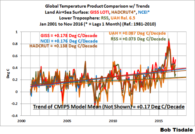
Figure 8 – Comparison Starting in 2001
Note also that the graphs list the trends of the CMIP5 multi-model mean (historic through 2005 and RCP8.5 forcings afterwards), which are the climate models used by the IPCC for their 5th Assessment Report. The metric presented for the models is surface temperature, not lower troposphere.
AVERAGE
Figure 9 presents the average of the GISS, HADCRUT and NCEI land plus sea surface temperature anomaly reconstructions and the average of the RSS and UAH lower troposphere temperature composites. Again because the HADCRUT4 and NCEI products lag one month in this update, the most current monthly average only includes the GISS product.

Figure 9 – Average of Global Land+Sea Surface Temperature Anomaly Products
MODEL-DATA COMPARISON & DIFFERENCE
As noted above, the models in this post are represented by the CMIP5 multi-model mean (historic through 2005 and RCP8.5 forcings afterwards), which are the climate models used by the IPCC for their 5th Assessment Report.
Considering the uptick in surface temperatures in 2014, 2015 and now 2016 (see the posts here and here), government agencies that supply global surface temperature products have been touting “record high” combined global land and ocean surface temperatures. Alarmists happily ignore the fact that it is easy to have record high global temperatures in the midst of a hiatus or slowdown in global warming, and they have been using the recent record highs to draw attention away from the difference between observed global surface temperatures and the IPCC climate model-based projections of them.
There are a number of ways to present how poorly climate models simulate global surface temperatures. Normally they are compared in a time-series graph. See the example in Figure 10. In that example, the UKMO HadCRUT4 land+ocean surface temperature reconstruction is compared to the multi-model mean of the climate models stored in the CMIP5 archive, which was used by the IPCC for their 5th Assessment Report. The reconstruction and model outputs have been smoothed with 61-month running-mean filters to reduce the monthly variations. The climate science community commonly uses a 5-year running-mean filter (basically the same as a 61-month filter) to minimize the impacts of El Niño and La Niña events, as shown on the GISS webpage here. Using a 5-year running mean filter has been commonplace in global temperature-related studies for decades. (See Figure 13 here from Hansen and Lebedeff 1987 Global Trends of Measured Surface Air Temperature.) Also, the anomalies for the reconstruction and model outputs have been referenced to the period of 1880 to 2013 so not to bias the results. That is, by using the almost the full term of the data, no one with the slightest bit of common sense can claim I’ve cherry picked the base years for anomalies with this comparison.

Figure 10
It’s very hard to overlook the fact that, over the past decade, climate models are simulating way too much warming…even with the small recent El Niño-related uptick in the data.
Another way to show how poorly climate models perform is to subtract the observations-based reconstruction from the average of the model outputs (model mean). We first presented and discussed this method using global surface temperatures in absolute form. (See the post On the Elusive Absolute Global Mean Surface Temperature – A Model-Data Comparison.) The graph below shows a model-data difference using anomalies, where the data are represented by the UKMO HadCRUT4 land+ocean surface temperature product and the model simulations of global surface temperature are represented by the multi-model mean of the models stored in the CMIP5 archive. Like Figure 10, to assure that the base years used for anomalies did not bias the graph, the full term of the graph (1880 to 2013) was used as the reference period.
In this example, we’re illustrating the model-data differences smoothed with a 61-month running mean filter. (You’ll notice I’ve eliminated the monthly data from Figure 11. Example here. Alarmists can’t seem to grasp the purpose of the widely used 5-year (61-month) filtering, which as noted above is to minimize the variations due to El Niño and La Niña events and those associated with catastrophic volcanic eruptions.)
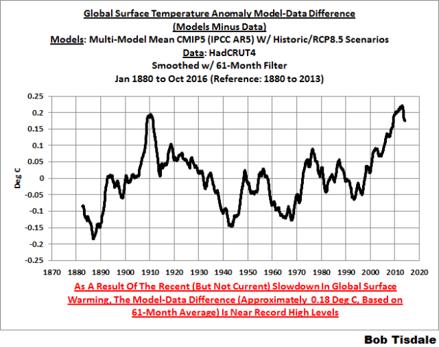
Figure 11
The difference now between models and data is almost worst-case, comparable to the difference at about 1910.
There was also a major difference, but of the opposite sign, in the late 1880s. That difference decreases drastically from the 1880s and switches signs by the 1910s. The reason: the models do not properly simulate the observed cooling that takes place at that time. Because the models failed to properly simulate the cooling from the 1880s to the 1910s, they also failed to properly simulate the warming that took place from the 1910s until the 1940s. (See Figure 12 for confirmation.) That explains the long-term decrease in the difference during that period and the switching of signs in the difference once again. The difference cycles back and forth, nearing a zero difference in the 1980s and 90s, indicating the models are tracking observations better (relatively) during that period. And from the 1990s to present, because of the slowdown in warming, the difference has increased to greatest value ever…where the difference indicates the models are showing too much warming.
It’s very easy to see the recent record-high global surface temperatures have had a tiny impact on the difference between models and observations.
See the post On the Use of the Multi-Model Mean for a discussion of its use in model-data comparisons.
MODEL-DATA COMPARISON – 30-YEAR RUNNING TRENDS
Yet another way to show how poorly climate models simulate surface temperatures is to compare 30-year running trends of global surface temperature data and the model-mean of the climate model simulations of it. See Figure 12. In this case, we’re using the global GISS Land-Ocean Temperature Index for the data. For the models, once again we’re using the model-mean of the climate models stored in the CMIP5 archive with historic forcings to 2005 and worst case RCP8.5 forcings since then.

Figure 12
There are numerous things to note in the trend comparison. First, there is a growing divergence between models and data starting in the early 2000s. The continued rise in the model trends indicates global surface warming is supposed to be accelerating, but the data indicate little to no acceleration since then. Second, the plateau in the data warming rates begins in the early 1990s, indicating that there has been very little acceleration of global warming for more than 2 decades. This suggests that there MAY BE a maximum rate at which surface temperatures can warm. Third, note that the observed 30-year trend ending in the mid-1940s is comparable to the recent 30-year trends. (That, of course, is a function of the new NOAA ERSST.v4 data used by GISS.) Fourth, yet that high 30-year warming ending about 1945 occurred without being caused by the forcings that drive the climate models. That is, the climate models indicate that global surface temperatures should have warmed at about a third that fast if global surface temperatures were dictated by the forcings used to drive the models. In other words, if the models can’t explain the observed 30-year warming ending around 1945, then the warming must have occurred naturally. And that, in turns, generates the question: how much of the current warming occurred naturally? Fifth, the agreement between model and data trends for the 30-year periods ending in the 1960s to about 2000 suggests the models were tuned to that period or at least part of it. Sixth, going back further in time, the models can’t explain the cooling seen during the 30-year periods before the 1920s, which is why they fail to properly simulate the warming in the early 20th Century.
One last note, the monumental difference in modeled and observed warming rates at about 1945 confirms my earlier statement that the models can’t simulate the warming that occurred during the early warming period of the 20th Century.
MONTHLY SEA SURFACE TEMPERATURE UPDATE
The most recent sea surface temperature update can be found here. The satellite-enhanced sea surface temperature composite (Reynolds OI.2) are presented in global, hemispheric and ocean-basin bases.
RECENT RECORD HIGHS
We discussed the recent record-high global sea surface temperatures for 2014 and 2015 and the reasons for them in General Discussions 2 and 3 of my most recent free ebook On Global Warming and the Illusion of Control (25MB). (And, of course, the record highs in 2016 are lagged responses to the 205/16 El Niño.) The book was introduced in the post here (cross post at WattsUpWithThat is here).
PS
This is the last of my regularly scheduled posts for the year, so, just in case I don’t publish any more before 2017, Happy Holidays to you and yours.
Happy Holidays Bob!
To heck with political correctness.
Merry Christmas and Happy New Year.
I’m with you CB. When somebody tells me happy holidays, I ask them if today really is a holiday; then I ask what holidays they are referring to, and tell them I didn’t even know it was the holidays. Then I tell them to have a happy Hanukkah/Ramadam/Quonset/Anzac Day/stonehenging and anything else they want to do.
G
Hear, hear! Happy Christmas and Healthy New Year.
For goodness sake Bob , why do you refuse to correctly label the UAH data. There is no such thing as Release “6.5”.
You have at least corrected your text to say 6.0 now, so credit for that, but your graphs still have “Release 6.5” splashed all over it.
Holiday is a contraction of Holy Day.
Happy Winter Solstice, Bob!
Hot off the griddle. Unfortunately, I have come to view the use of “anomaly” as a poor substitute for truth. It is a difference between the current truth and something else. The behavior of the difference could be little more than noise. It may be all noise. Where does this “something else” come from and why should we believe it is the truth? Or, the truth about what? Give me the actual temperature and I can draw proper physical inferences.
Well said, I’ve been harping on about this for ages. No-one seems capable of giving a value of 0.0 in the graphs,it’s all with reference to X? but no value stated. Totally meanigless rubbish.
Maybe Bob could give us some anwsers to the value of 0.0.
No disrespect intended.
Sure sounds disrespectful.
Anyway:
Download a GISS data set from their website, and you will find this at the bottom of the file, just past the data:
(I cut and paste this directly from a recent data set I downloaded, this is exactly as it appears.)
You have asked several times for the value of the anomaly base, but it has been right there all along, if you had only thought to look there.
Merry Christmas!
To heck with political correctness. screw Christmas it’s a commercial hype that has nothing to do Christ any more.
Bah Humbug !
“Download a GISS data set from their website, and you will find this at the bottom of the file”
It isn’t there in the Current version. But they set out their thoughts at more length here:
“Q. What do I do if I need absolute SATs, not anomalies?
A. In 99.9% of the cases you’ll find that anomalies are exactly what you need, not absolute temperatures. In the remaining cases, you have to pick one of the available climatologies and add the anomalies (with respect to the proper base period) to it. For the global mean, the most trusted models produce a value of roughly 14°C, i.e. 57.2°F, but it may easily be anywhere between 56 and 58°F and regionally, let alone locally, the situation is even worse.”
They could have just said “Don’t do it!”
I don’t mind at all if they use Temperature anomalies, so long as they use the base period when the offset was 273.15 K
Those anomalies are pretty easy to deal with; almost useful one might say.
g
What about BEST? It seems to me that everyone is ignoring it. yes/no? How does it compare with the other datasets? Would it be fair to say that it hasn’t undergone the adjustments suffered by some of the other datasets?
CB, BEST makes similar adjustments in a different way via their regional expectations. To see how bad that is, look at BEST station 100600. Amundsen Scott at the south pole. Arguably the most expensive and best maintained station on the planet. BEST excluded 26 months of record cold on grounds did not meet regional expectations QC. The nearest station from which to derive an expectation is McMurdo, thousands of meters lower and thousands of kilometers away on the Antarctic coast. Thus was measured South pole cooling turned into slight warming. Essay When Data isn’t in ebook Blowing Smoke, footnote 26 if I recall correctly.
Thanks Rud, I was not aware of that one. In view of the sparse coverage that one record will have one of the strongest area weightings in global average too.
One thing is for sure. The steep recent drop in temperatures pointed out by David Rose (original article was RSS land only), triggering a warmunist kerfuffle of ‘aint so’/misleading/cherrypicked, sure does exist– in all the datasets. Rose just kills the 2015 warmest ever from AGW PR.
“Rose just kills the 2015 warmest ever from AGW PR.”
??? It was 2016 that killed it, by being even warmer.
“The steep recent drop in temperatures pointed out by David Rose (original article was RSS land only), triggering a warmunist kerfuffle of ‘aint so’/misleading/cherrypicked, sure does exist– in all the datasets. “
Here is the updated GISS (2016 blue). Pretty hard to see that steep recent drop.
So what temp is 0.0 on your graph?
When you average the entire month to a single dimension then of course it’s difficult to see the changes within that month – especially changes that take place in a month that hasn’t been averaged yet.
Always with the statistical trickery.
… and what do you mean with 2016 being the warmest year ever?
Are you promoting that talking point? Seriously?
Alan, are you suggesting that 2016 is *not* likely going to end having the highest average annual value across all the temperature anomaly products?
“So what temp is 0.0 on your graph?”
1951-1980 average. Standard GISS anomaly base.
“… and what do you mean with 2016 being the warmest year ever?”
I said it was warmer than 2015.
Nick,can’t reply to your reply,so i’ll ask here, what is the value of 0.0.
Don’t fob me off with 1951-1980. State a value for that.
Shouln’t be hard in the realms of Clima-strology.
GISS baseline is 14.0 C, cited as Best Estimate For 1951 -1980. Interesting, though… No error bars on that number,
Nick : “Here is the updated GISS (2016 blue). Pretty hard to see that steep recent drop.”
Perhaps GISS should be calling that the global nocturnal average temperature since everything is “corrected” to match warming in NMAT.
If night times are warming quicker than days times we should be looking at what that tells us about climate, not trying to “homegenise” other datasets to all tell the same story.
Next they will notice that winters have warmed more than summers and thus the summer months need adjusting to agree with the winter months since they are obviously “biased” low.
“since everything is “corrected” to match warming in NMAT. “
That just isn’t true. NMAT is used sometimes to calibrate different kinds of ship-based measures against each other. Those are comparisons of a specific time and place. NMAT, when available with simultaneous SST, is a reference point there. No-one is using the time course of global average NMAT to modify SST readings.
With the ENSO meter bouncing around near the bottom of the neutral zone it appears the anomalies may flatten out at a new higher level, somewhat like the apparent step-function visible after the 1998 event. Time will tell.
So UAH is up. RSS is up. GISS is up. NOAA and HADCRUT dropped a bit (Siberia) in October. Yet just three days ago, we were reading the fourth WUWT post
“New official data issued by the Met Office confirms that world average temperatures have plummeted since the middle of the year at a faster and steeper rate than at any time in the recent past.”
Stories that originated with David Whitehouse at GWPF (“Despite Denial, Data Shows Global Temperatures Are Dropping Fast”), via David Rose, Delingpole at Breitbart, and even the US Congress. Rose originally dug up a rarely cited RSS land only index, because it was supposed to be a “leading indicator”. So what happened?
GISS November was the second warmest in the record. At 0.95°C, it was only just behind 2015 (1.02°C).
Nick,
Have you forgotten that those stories were about land temperatures, not land and ocean? And that they specifically stated that SSTs hadn’t yet cooled as rapidly as the land?
“Have you forgotten that those stories were about land temperatures, not land and ocean?”
I think you have forgotten. No mention of land in that headline I quoted. He showed a graph of HADCRUT 4, but done with his thick lines so you couldn’t see what had happened on a month scale.
Chimp,
Shouldn’t RSS global values in 1998 and 2016, inclusive of SSTs, be as predictive as each other, without ignoring the possible confounding issues of leaving out 70% of the actual global values?
What I’m getting at is that the behaviour of SSTs in 1998 and 2016 must be nearly identical for that argument to be valid. If they are not, then there is a story, possibly a very pertinent one, that is not being told by excluding SSTs.
Rose’s biggest problem, though, is not just accidentally excluding 70% of the temperature record – but actually being impatient. If he had just waited a month, he would have seen that 1998 RSS global had dropped by 0.66C since its peak, whereas 2016 had only dropped by 0.60C.
If anybody had presented a graph considering land temperatures as well, but with some harsh increase instead of some pretty “plummeting”, you would have been the very first person claiming about
“Woaaah! Look, the cherry picker”
But there was a temperature dropdown… and thus everything was OK for Chimp & alii 🙂
This is simply ridiculous.
“Shouldn’t RSS global values in 1998 and 2016, inclusive of SSTs, ”
There’s not SST in RSS, it is tropo air temp data.
Nick, do you have a value for 0.0 in all your referenced graphs?
D.I. Apparently they can not answer that question. So why don’t we guess at it. How about 70 degrees F..
-273.15 Celsius is close enough to 0.0 for most ordinary uses, so that’s what I assume when I see the Temperature (labelled) is zero.
G
“so that’s what I assume when I see the Temperature (labelled) is zero.”
You must find Bob’s posts quite exciting.
“GISS November was the second warmest in the record. At 0.95°C, it was only just behind 2015 (1.02°C).”
——————–
So what? What does it matter? If proxy records can’t be read to those short time scales, then are the temps outliers within the proxy record since the Holocene Optimum?
Were those the warmest Novembers in recorded human history?
Then, so what?
“So what? What does it matter?”
So why did we have a run of stories about “world average temperatures have plummeted since the middle of the year at a faster and steeper rate”? Why was the Science Committee in Congress tweeting about it?
Nice red herring!
Putting aside whether it matters or not Alan, are you conceding the information on these plots is a reasonable record for this period?
tony,
What difference does a decadal scale record of the present interglacial time matter, other than to promote a scary story? What temperature, or sea level, or ice extent hasn’t been extant many times before, during this interglacial period? Simply put, what record would you put forth as being outside the range of what has naturally occurred during man’s history?
I asked first.
tony mcleod-
Your question was nothing but a diversion from what I asked Nick Stokes. It was another Red Herring.
I concede nothing.
It’s make or break time for you and you know it.
Your turn.
Look Alan it was a simple question that I asked for a reason. It was not intended to be a red herring or a diversion. You have answered it.
Given you don’t accept the evidence Bob Tisdale is citing here anything else I say to you is going to be irrelevant.
tony-
You misrepresented what I said. Anyone can see that. The reason you did that and have gone through all of your manipulations is because you know that you can’t honestly answer the questions I asked you.
Notice that I didn’t say that you don’t know the answer.
Just for entertainment,
This point has often been made before: if the warming from late 1970s to late 1990s was mostly due to another reason, other than CO2 RF, then the models will be even more broke. Maybe even more broke than broke is an oxymoron?
Nope but with all respect for what is probably your mother tongue, your comment sounds odd (and that is an understatement).
If you want to know the facts, you can just ignore NCDC/NCEI, GISS, BEST and Hadcrut temperature series from now on.
The people running these series are not trust-worthy. It is like trying to trust a used car salesman. Even Nick Stokes would agree with me. The data is cooked up in a basement office at the NCDC.
Even RSS is trying to get into the game of (funding equals) how much you massage the numbers to make Nick Stokes feel warmer.
Like the SST record discarded all of the satellite measurements and then discarded all of the buoys in the latest methodology. I mean we have spent Billion of dollars on these systems yet they just threw them out. (I will show you how this was done if you believe me).
Whatever number is produced by the NCDC/NCEI, GISS, BEST and Hadcrut, you can take 0.5C off of that number based on just basic unjustified data manipulation.
They have a HUGE conflict of interest. They are running the climate models and obtaining Millions in funding based on the temperature record they are producing. In the common-sense world, they would have to recuse themselves from one or the other. The “board” wold have to record in the Minutes that they recused themselves from decisions because of the conflict of interest. This has never happened in climate science of course. Nick Stokes should declare how much funding he receives for exaggerating the record. .
So who do you trust, Bill?
UAH v5.6 shows about .159C per decade warming since 1979.
UAH v6.0beta shows about .124C per decade warming since 1979.
RSS currently shows .135C per decade warming since 1979.
GISS LOTI shows about .194C per decade for the same period.
Hadcrut4 shows about .178…
They’re all showing a trend of at least 1.25C per century, and the highest is only a 60% increase over the lowest (which is still the beta version BTW) There’s really not a huge disagreement here.
Well, a couple of points:
First, the multi-model mean makes no sense. If you have a model that uses a climate sensitivity equal to 2.0 K and other model that uses a climate sensitivity equal to 4.2 K, one thing is for sure, at least one of the models is wrong. So, why the IPCC is using an ensemble of models, when some of them are wrong? The IPCC should try to find out what is the experimental value for the climate sensitivity to CO2 doubling, and discard the models that use the wrong value.
And second, how old are all those models? Are all of them less than four years old? If the models have been run before 2012 then they cannot be compared to the HadCRUT4 data set. Why? because this data set is only four years old. (published in 2012, if memory serves) If the models are older, HadCRUT4 temperatures couldn´t have been used to calibrate the models. Model output should be compared to the same temperature set used to calibrate the model. Last graph probably uses HadCRUT4.5 temperatures anyway, which may be less than one year old.
For a thing like temperature, that can only go up, down or stay still, there are too many models, and too many mean global temperatures to pick and choose. There is no merit on finding a match. It is like drawing cards from the deck over and over until you get a good hand.
Bill Illis “Whatever number is produced by the NCDC/NCEI, GISS, BEST and Hadcrut, you can take 0.5C off of that number based on just basic unjustified data manipulation.”
Donald above shows more or less the 0.5C between the Satellites and GISS so it will seem as if Bill Illis is just hitting the mark with his comment.
urged era – ignoring that the satellite products rely on models to be generated, those trends are not the result of models but rather of temperature observations.
“urederra” – I hate auto-correct.
John Peter
“0.5” “0.05” – your claim is off by a factor of 10.
Also, the point I was making is that, without taking the uncertainties into account, every dataset shows an increasing temperature trend, the highest being within 60% of the lowest, even though they are measuring different atmospheric depths, and using different sets of tools to acquire their data.
GISS LOTI shows about .194C
Are you sure, Donald?
GISS LOTI: 0.173 ± 0,006 °C / decade according to my actual data (till oct 2016).
0.194 seems to be near to “land only”…
Bindidon,
no, my bad – the numbers were eyeballed from a forest for trees graph – I didn’t bother getting all the different values from each provider.
As to this: “They are running the climate models and obtaining Millions in funding based on the temperature record they are producing”
It’s always humorous to me that people ignore the real elephant in the room – the group of companies with annual revenue in the billions of dollars, who have a direct interest in combatting the science in order to maintain the flow of those billions of dollars. The motivation is literally thousands of times greater for them, yet still they are still not able to skew the actual science to support their market (of course, it hardly matters if you can simply drown out the science with PR – it’s actually a better investment.)
“Even Nick Stokes would agree with me.”
Nope. I do check. I run my own average using unadjusted GHCN data. And it makes very little difference. As to trusting them, I read their code (well, GISS and BEST, at least) and follow the track of the data in detail, and see nothing untoward. I also note that every serious sceptic effort to look into the indices has either verified the result (BEST) or just walked away (GWPF). There is nothing there.
“Like the SST record discarded all of the satellite measurements and then discarded all of the buoys in the latest methodology.”
Just untrue. Some indices use satellite SST – it’s plentiful data but there are issues. Buoys are actually the mainstay of current SST. The recent adjustment was needed because when you compare occasions when ships and buoys are nearby, there is a difference of about 0.12°C. Small, but it’s unmistakeable, and you have to adjust for it when combining the readings. It would be malpractice not to.
If it makes “very little difference” and Nick I trust every word you say; then why do they do something that makes very little difference??
Even Franz Kafka, couldn’t write a tale of endless uselessness, to rival what these public servants are doing.
Ignorance, I can abide, and try to cure; but stupid I have no tolerance for; and doing something that makes very little difference just hurts a bit less than knocking your head against a telephone pole. And doing the latter doesn’t even get you a free call.
G
“then why do they do something that makes very little difference??”
Because you have to. We know there were changes in siting etc. It’s possible they will balance out, or maybe not. You don’t know till you find out. And when you do, even if the change is small, you have to report it. It’s part of the duty to provide a best estimate.
“You say that “you have to”. I disagree entirely. The proper thing to do is to abandon the data. You cannot mix adjusted numbers with data and call it science. You cannot justify using corrupted figures on the basis that it makes no difference.
One day I hope science will prevail.”
You do understand that RSS satellite data – the date that has been used by skeptics to assert that global warming is minimal – is adjusted. Should all of that be tossed out?
Stokes,
But why adjust the state-of-the-art buoy temperatures upwards when there is good reason to believe that the ship intake-water temperatures are biased upwards by proximity to the boiler room?
“But why adjust the state-of-the-art buoy temperatures upwards”
In terms of arithmetic, it makes absolutely no difference. If adjustment is d, whether you add d to buoys or subtract from ships simply makes a constant difference of d to the whole dataset. And that disappears when you take anomalies and subtract the mean.
Bill Illis on December 15, 2016 at 4:49 pm
If you want to know the facts, you can just ignore NCDC/NCEI, GISS, BEST and Hadcrut temperature series from now on.
…
The data is cooked up in a basement office at the NCDC.
How can you pretend that without giving a scientific proof of your pretentious allegations?
You are simply ridiculous.
You recently weren’t able to correctly compare HadAT2 balloon data with that of satellites, a really simple job!
Com’ on with real contradiction Bill Illis! Then we can discuss about the accuracy of your claims.
Donald asked you fine:
So whom do you trust, Bill?
That’s the point.
Do you know why this is the point, Bill Illis?
It’s the point because the only reason for you to trust UAH is that it shows lower temperatures.
If UAH hadn’t engage their huge 5.6->6.0 revision, and RSS hadn’t engaged their huge 3.3->4.0 revision, UAH would show today much higher trends, and therefore you would have banned them out of your childy selection, and would never have written some thing like
Even RSS is trying to get into the game of (funding equals) how much you massage the numbers…
Never and never!
@ Nick Stokes
December 15, 2016 at 4:11 pm
“So what temp is 0.0 on your graph?”
1951-1980 average. Standard GISS anomaly base.
Silly base period, a cooling half-cycle, but with the warmest few years chopped of it. Unless deceit was the purpose? Ah well, we’ll soon know.
It was the most recent 3 decade period when they started the index. And there is no reason to change. All that happens is that you add a constant. Nothing about being a cooling cycle has any effect here,
But the data set is not constant and/or consistent.
The same station data that was used to assess the base period (1951 to 1980) is not the same station data that delivered observational evidence say in the 1880s or the 1920s, or for that matter in the period post 1980.
As a time series with constant changes in the stations being used to compile the data set, the results are meaningless.
It is like trying to evaluate the average height of males as from say the late 19th century to date to see whether males have been growing taller over time, and investigating this by compiling a data set for some periods wherein only the USA is sampled, other periods the USA, Spain and Italy are samples, for other periods the USA drops out and Spain, Italy and Denmark are sampled. etc etc. The sampling (and/or its distribution) never remaining constant.
This approach to compiling a time series data set produces a meaningless data set not fit for scientific purpose. Throughout the entire time series it must consist exclusively of precisely the same station data at all times if it is to inform.
richard verney
“But the data set is not constant and/or consistent”
_____________________________
That’s the reason adjustments are necessary, isn’t it? GISS, and I guess all the other global temperature data producers, would argue that their processing methods produces an array of regularly spaced ‘virtual’ temperature stations. They all use slightly different methods, but all come to more or less the same conclusions.
richard verney on December 16, 2016 at 1:46 am
The same station data that was used to assess the base period (1951 to 1980) is not the same station data that delivered observational evidence say in the 1880s or the 1920s, or for that matter in the period post 1980.
This is bare nonsense. How can data collected in a 1951-1980 period be the same as data collected before or after that period?
What at best would make sense would be to complain, like thousands of people useless did before you, about data outside of the baseline period getting changed due to an a posteriori modification of data inside of the baseline period.
Simply because the latter modification results in a change of the baseline’s mean, and hence of the entire data, as this is in anomaly form, i.e. the difference between the absolute value and, to make as simple as possible, the baseline’s mean.
You have access to all absolute data everywhere, at least upon request where it is not public. But a look at e.g. UAH’s absolute data gives you a good feeling why it is the worst place to look at temperatures.
Even one of UAH’s most detailed datasets (their 2.5° grid data) luckily is in anomaly form: values wrt the mean of the 1981-2010 period. If that data was absolute, every user would have to compute, for each of the 9,504 grid cells, its mean for that period, and to subtract that mean from the absolute cell value. What a stupid work!
And exactly such work you habe to perform when you for example want to process measurement data provided by the IGRA radiosonde network (and here you have to do that job for 13 different atmospheric pressure levels).
@Bindidon December 16, 2016 at 10:26 am
If you had read my comment, you would have understood the point I make. I am commenting on the source.
The stations that are used to source the temperature measurements constantly vary over time. The stations that are used in 1950, are not the same stations as were used in 1880. Hence, one cannot meaningfully compare what changes have taken place between 1880 and 1950, because one is taking measurements from different places.
If one wishes to consider how temperatures have changed since say 1880 to date, one first has to what stations were reporting data in 1880, and then only use those stations and no others. then one has to review which of the stations in 1880 are still reporting today, and have continuous records and use only that sub-set. Then one has to consider whether there has been any significant station change, and if so then eliminate those stations. Once one has the base, this forms the raw data. Form this raw data set, one needs to consider how local environment has changed over time, the impact of equipment changes, the impact of different procedures for taking measurements etc.
If one one wants to see how temperatures have changed since 1920, one performs a similar exercise. `This will have a different composition of stations since more stations were reporting data in 1920 than were reporting data in 1880, especially in the Southern Hemisphere.
At all times it is necessary to compare apples with apples. Presently, our time series data sets do not do that and hence the data is all but meaningless.
Richard Verney,
“Hence, one cannot meaningfully compare what changes have taken place between 1880 and 1950, because one is taking measurements from different places.”
I think there is a misunderstanding here about how anomalies are made. They don’t average and then subtract the mean. They subtract the mean of each station, and then average. That sequence is the very purpose of anomaly.
So the issue is not whether the composition of stations has changes since 1880, but what to do about stations that don’t have data in 1951-1980. That is a long-vexed problem, and the solutions are called first difference method, common anomaly method, etc. In fact Hansen was one of the first to grapple with it. For my part, I think the right approach is to use a linear model with LS fitting, which BEST also uses.
http://i.imgur.com/aFbWQZX.png
This is a comparison of the USCRN monthly temperature anomaly with the the RSS data for the continental US data for the same time period. It’s notable that the global downspike is not evident is either of these datasets.
of course not: we’re talking about global temperatures (land+ocean) not land only or usa only.
Not having a go at Bob but the thing I notice is that the trend lines pertain to data that starts with a comparative ‘trough’ back in ~ 1978 and ends with the recent El Nino ‘spike’ ( although it has just returned to about the ‘trend line’). I would be curious to see the trend lines calculated from data which starts and finishes with ‘pre-qualified’ or pre-filtered cycles.
Imagine if you had data that conformed to a pure sinusoid. If it started at a trough and finished with a peak then there would be an uptrend when you did a linear fit to the data. Unfortunately by definition there should be zero uptrend. This ‘cycle editing’ needs to be done before such data trend is calculated, IMO. I am an engineer by profession and do not give a stuff if statisticians think otherwise. Cycles are there as mechanisms within the greater phenomenon and must be properly considered.
I am much more comfiratble with ‘filtered’ data, 2, 3, 5 year means take a lot of ‘noise’ out and reveal longer cyclical elements and perhaps better imply real trends and their nature. I think this simplistic linear trend stuff just plays into the hands of the alarmists to some degree.
Just thinkin’ out loud folks.
Further to para 2, this is not data from a purely randon source, it contains elements that are driven by cyclical phenomena and the existence of such MUST be taken into account when analysing the data. The real problam is the uncertainty about the cyclical mechanisms but there you go.
Leaving aside all the silly arguments on cherry picking and the nature of the data set and its composition, what this shows is that natural variation is still dominant, at any rate over short intervals of time.
we need to know and understand more about natural variation if we are to make any sensible and/or meaningful predictions as to future climate states.
@Nick
Nick takes some issues with respect to the data set being used and the headline in relation to the data.
Some others suggest that just looking at land is cherry picking, which it is but there are scientific reasons for this (ie., the response time compared to inherent lags in ocean due to different heat capacity) and this is where we all live,
Just to set out some more cherry picking, it appears from the DMI site that a lot of that white powder that we were not meant to see again (it being a thing of the past that our children just would not know) is falling and accumulating in Greenland. here is DMI’s latest data on this:
This is apparently an extra 4 billion tonnes per day. Hey ho, only snow, and only weather but this is one aspect of what the warmest year on record looks like.
The caption under the plot was missing. It should have read:
Nadolig Llawen Llwen i pawb a Blwyddyn Newydd da. Merry Christmas and a Happy new year to all.
With ref to the temperature charts, is the temperature continuing to plummet as outlined in a recent thread“?
You cannot look into the future, you just can look back.
According to Judith curry, up to some years it is still weather (or cycles like ENSO).
What a number of guys stated even here on WUWT – that the El Nino impact on global temperature is over and some even that LA NINA can be seen in it, or that the puase is back – it was wrong. Even on a downward trend of a global Land and sea El Nino spike there are some ups and downs and you cannot be sure if the spike is over.
The statement was that El Nino is over and Land temperatures have dropped by one 1°C. Just not true, as you see in the new data now. To confirm with data that an El Nino global downward trend is over, you need at least one year distance, and for the La Nina even longer.
We are not yet back at the level of 2014, we are missing some tenth of one 1°C.
It doesn’t matter if you use a land only or a global graph – in the long run they have nearly the same trend. Just the up and down spikes are longer, but there is no lag on a monthly base.
http://www.woodfortrees.org/plot/uah6/from:2013/plot/uah6-land/from:2013
It is commonly known, that the temperatures during the last 150 years went up about 1°C, and now you state that the the land temperatures went down one degree. For a lay person this is is misleading, if you not explain, that you are using a quite “exotic” graph. It sounds a if global cooling has started.
And if some guys now talk about cherry picking, and that we skeptics are flat-earthers, it is a problem to convince them that we were completely honest. We just lost some credibility.
If we want to convince others we have to be skeptical even about our thoughts.
Aros i weld Gareth Philips… (Thanks Google – if it was correct.)
Beware of plummeting prophets… thea can be some pretty good absent when their short-living prophecy suddenly vanishes, “comme un château de cartes”.
Shouldn’t the GISS data be “re-adjusted” to remove the distortions caused by the “adjustments” made by GISS?
“Shouldn’t the GISS data be “re-adjusted” to remove the distortions caused by the “adjustments” made by GISS?”
Wot, you men like this?…..
You don’t seem to show the changes post 1970 when your correlation seems to fit….
http://i42.tinypic.com/2luqma8.jpg
stevekeohane on December 16, 2016 at 8:31 am
What about showing us the exact source of this chart? http://i42.tinypic.com/2luqma8.jpg
Yes, the fact that it ends in 1999 is a clue.
I do not have sufficient knowledge of how the various data sets are compiled to voice a precise opinion, but I can’t help wondering about measuring-station density across the globe on ground data or proper accounting for compromised orbits and data exclusion for faulty instruments in satellite data. I have developed a new syndrome — NOT global warming fear but global warming data fear.
In the range of a couple of degrees, especially, I am finding any of it hard to take seriously anymore.
It seems like so much time and money and effort are being spent talking about a slight shift in a flea’s life span [that’s a metaphor].
It’s all a good exercise, I guess, but, in the greater scheme, I wonder does it really make us any better.
Bob has done a great job compiling this information, but I would be a liar, if I said that I truly appreciated its practical impact. It’s more like the art of compiling data, and I can definitely appreciate good art.
Robert Kernodle December 16, 2016 at 7:28 am
You wrote:
“I do not have sufficient knowledge of how the various data sets are compiled to voice a precise opinion, but I can’t help wondering about measuring-station density across the globe on ground data or proper accounting for compromised orbits and data exclusion for faulty instruments in satellite data.”
——————————————
There are some ways to check, if the data are wrong:
– You check it there is an unbelievable jump between an earlier and a present version of the same data set. This applies to GISS, NOOA, and to a certain extend to to Hadcrut 4 compared to Hadcrut3.
– You check if there is a number of graphs from different sources, which coincide. This applies to radio sonde/weather baloon, the old Hadcrut 3, RSS satellite and UAH satellite. All these have about the same trend.
– or you take an average of the most important graphs, which has a certain bias, but not like an extreme re-worked one. The woodfortrees graph includes RSS, UAH, Hadcrut4, and GISSTEMP.
To convince others, the last version seems a good way if you want to discuss with others. Instead of saying: “You believe in a fraud, NASA are cheaters” or something like that, you just can say:
“To avoid cherry picking, I just choose an average or combined graph – like woodfortrees.”
http://www.woodfortrees.org/graph/wti/offset:0.13/plot/wti/trend/offset:0.13/plot/rss/plot/rss/trend
As you can see, the difference to the RSS satellite graph is just 0.1 °C for 37 years – or less than three hundreds of 1°C = 0.03°C per decade.
Johannes Herbst on December 16, 2016 at 8:33 am
This applies to radio sonde/weather baloon, the old Hadcrut 3, RSS satellite and UAH satellite. All these have about the same trend.
Please show us radio sonde data having “about the same trend” as satellite data!
I have the entire IGRA radiosonde dataset on disk, and RATPAC B monthy-combinded data as well.
And there is, with the exception of a HadAT2 dataset explicitely harmonized with satellite data, no trend similarity between radio sonde and satellite data when you select, for the radiosondes, the atmospheric pressure level corresponding to the altitude where satellite measurements are performed.
This the beginning of the end for AGW theory as the global downward temperature trend is alive and well and has a very long way to go.
What will it take to prove that AGW theory is wrong in light of the fact that all of the claims this theory has made have failed to materialize, and the most basic premises this theory was advanced on have all not occurred.
Yet this theory lives on and the pros and cons keep being discussed.
This period in the climate not unique at all.
As I have said global cooling is now in progress and ALBEDO trumps everything when it comes to changing the climate. The smallest change will have a significant climatic impact and that is the basis for my theory as to how a solar /terrestrial items which govern the climate, that connection, will impact the climate if solar conditions are extreme enough.
Solar conditions now in the process of getting extreme in regards to solar quiet.
We shall find out soon as the climate is at a crossroads but the latest global temperature data is encouraging, temperatures still trending down as shown by WEATHER BELL temperature data.
I know ENSO effects must be taken into consideration , but I also know ENSO effects not AGW have ruled the climate over the past 30 years, with volcanic activity and atmospheric circulation changes superimposed on this factor against a back ground of high solar activity.
My bet is by spring global temperatures will be from 0 to +.2c above normal.
If El Nino should come about going forward (which is possible) global temperatures would rise but not as much as they did with the last one or for that matter the one in 1998.
OLR another very big climatic factor seemingly tied to ENSO and not CO2.
It is all going to unfold and we shall see soon.
Salvatore del Prete December 16, 2016 at 7:49 am
“My bet is by spring global temperatures will be from 0 to +.2c above normal”.
It depends what for you is normal. and spring has three months, do you take the average?
My bet is this: the average of UAH 2017 will be the same or less than the average of UAH 2014. This will mean we are sufficiently long at the same level than before the El NINO spike.
One more thing: To prove that the AGW theory is wrong is one thing, To convince a true believer of that faith is another thing.
Even if a Trump Government will openly state that this theory is wrong (what they will not do), this will only result in more opposition.
I believe, that it is best to have space for a free and open discussion. Not to fight against each other, but to find a common ground and to convince the other side without them losing their face. This includes also to agree that not all arguments of the skeptics are true, and some other are rally not convincing.
A difficult matter.
“It is commonly known, that the temperatures during the last 150 years went up about 1°C,”
If I were a wealthy man I would commission a team of statisticians, meteorologists, historians and genuine climate scientists to review the means and accuracy by which temperatures were established during the period 1880 to 1960. I fully suspect that we cannot establish this within 2 C. We may have warmed by 2 C or not have warmed at all! Someone here please give me reason think otherwise. Its a house built with straw!
A good friend who is ‘uneducated’ but wise puts it: “So many scientists get blinded by detail” yes, they look right past the foundations on which theories totally depend. We don’t have a robust baseline!
A rather unscientifc graph, seen in Figue 12 of the head post

Why is it unscientific? Simply because, driven by some obstinate will in demonstrating that all IPCC outputs are wrong, Bob Tisdale seems to be ready to use even the worst arguments.
Second, the plateau in the data warming rates begins in the early 1990s, indicating that there has been very little acceleration of global warming for more than 2 decades. This suggests that there MAY BE a maximum rate at which surface temperatures can warm.
What Bob Tisdale shows in his chart in blue color is all you want but warming rates. It is itself not a trend, but a time series of linear trends, running backwards over 360 months: not less, not more.
Moreover, the choice of a 360 month trend computation was , as shown by the graph below, very likely not accidental but rather deliberate:
http://fs5.directupload.net/images/161216/lgqmf6mf.jpg
The blue line corresponds exactly to the data shown in Bob Tisdale’s chart above (it has been scaled down by the plotter due to the extent of the 120 month trend data).
You easily can see that both the 120 month and the 600 month plots wouldn‘t have been very useful for the „demonstration“ intended by Bob Tisdale, as they both show warming at the plots‘ ends! Only the 360 month plot shows something like a plateau. What a pretty nice coincidence indeed!
If you want to see how the GISS warming rate looks like: see the 360 month running mean in black. That is really a trend.
And if you want to see another view of how models differ from real measurements, look at
The models still are no really perfect forecast, but what Nick Stokes computed is by no means similar to what Roy Spencer did:
http://fs5.directupload.net/images/161216/ti3agoh7.jpg
So who of these two scientists is right?
They are both right – one uses local surface measurements (with a lot of gridding) and the other uses satellite measurement.
They do not agree. So at least one of the measurement sets has a significant bias.
No, that’s not correct. Spencer compared model output with both HadCRUT and UAH TLT data. You should look in both charts at the discrepancy between model mean and observations.
The first reality is there is no AGW and the second reality is the global temperature trend has started down and will be continuing, and the third reality is the basic premises AGW theory was based are all wrong.
You pop up and make these silly claims in every thread Salvatore, unless you can post some evidence – a graph or a link, anything – it’s pretty meaningless.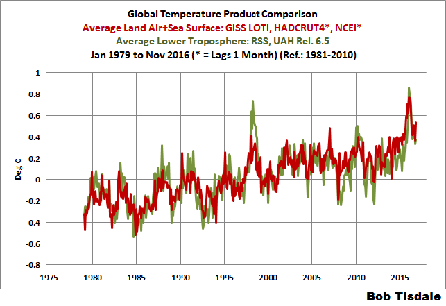
Show us all this downward trend. Like this one?
Oh, I can see, its plummeting.
A point in defense, the period of 30 years, 360 months, is the generally accepted break over between variation caused by weather versus the emergence of a climate trend. https://nsidc.org/cryosphere/arctic-meteorology/climate_vs_weather.html So many arguments could be saved if this generally accepted convention were followed.
That doesn’t change anything to the fact that B. Tisdale’s chart doesn’t show anything about a “maximum rate at which global surface temperatures can rise”.
This is a flawed interpretation of the trend sequence. And the two other plots (120, 600 months) show this accurately.
But I’m sure he will continue to present it as such.
Thanks bindidon. Now I understand what Bill is doing a bit better. I think your post deserves a proper reply.
I think your post deserves a proper reply.
Sorry, I didn’t understand you here.
Bindidon said:
“Sorry, I didn’t understand you here.”
I mean Bob, not Bill, and I was refering to what you said here:
“The blue line corresponds exactly to the data shown in Bob Tisdale’s chart above (it has been scaled down by the plotter due to the extent of the 120 month trend data).
You easily can see that both the 120 month and the 600 month plots wouldn‘t have been very useful for the „demonstration“ intended by Bob Tisdale, as they both show warming at the plots‘ ends! Only the 360 month plot shows something like a plateau. What a pretty nice coincidence indeed!
If you want to see how the GISS warming rate looks like: see the 360 month running mean in black. That is really a trend.”
Opps, Bob, not Bill.
ENSO a natural climatic factor has governed the climate, not AGW.
Now the solar factor is going to come into play.
https://notalotofpeopleknowthat.wordpress.com/2016/12/16/hottest-arctic-hype/
Tony the reality and global temperatures are declining since summer. It is going to continue in my opinion.
http://fs5.directupload.net/images/161218/bgqxmolr.jpg
http://fs5.directupload.net/images/161218/juzsmsuv.jpg
etc etc etc
Not a lot of people know about notalotofpeopleknowthat !
It has nothing to do with AGW since for example Antarctic Sea Ice recently was at record highs and has since declined and yet global temperatures especially around Antarctica are the same when sea ice was at record highs versus now.
Nobody here – you excepted – is speaking about this boring AGW and CO2 syndrome.