From the UNIVERSITY OF EAST ANGLIA and the “We have 25 or so years invested in the work. Why should I make the data available to you, when your aim is to try and find something wrong with it.” department comes this laughable attempt to boost the image of climate science via making graphs “accessible to non-experts”. Yes, it’s the old canard “if only we could just make people understand it the way we do, they’d get behind it”. If they need a graph to make ‘accessible to non-experts’ they should start with “Mike’s Nature Trick“. They should make this required reading: Lies, Damned Lies, Statistics … and Graphs

New guidelines aim to improve understanding of scientific data
Drawing on cognitive and psychological sciences and using climate change data as an example, the team looked at how scientists and other communicators can increase the accessibility of graphics used to present information, while maintaining scientific accuracy and rigor.
Scientific information is one factor that can influence decision-making to achieve change, and visualisation of data through graphics – such as graphs, diagrams and thematic maps – plays an important role in the communication of climate change findings to both expert and non-specialist audiences.
However, graphics created for scientific assessments published by bodies such as the Intergovernmental Panel on Climate Change (IPCC) have been criticised for being inaccessible to non-experts.
The researchers from UEA and Temple University provide guidelines to support climate scientists in developing more accessible graphics. They show how they can be applied in practice and provide recommendations on how the IPCC might use these guidelines in the development of future reports.
The project was conducted in response to the IPCC itself asking how graphics and reports can be made more user-friendly as it looks ahead to the Sixth Assessment Report, due to be released in 2020-2021.
Writing in the journal Nature Climate Change, the researchers suggest that graphics should be tested during their development to understand viewers’ comprehension of them, for example by using eye tracking technology to measure visual attention.
Co-author Prof Kenny Coventry, an expert in the relationship between language and perception and head of UEA’s School of Psychology, said the cognitive and psychological sciences can provide valuable insights into how visualisations of data can be improved.
“Graphics of climate data are integral to scientific assessments of climate change, but only support communication and decision-making if they are understood,” said Prof Coventry.
“Testing graphics and applying insights from the science of human cognition to help overcome comprehension problems offers the potential to make climate science knowledge more accessible to decision-makers in society, while also retaining the integrity of the scientific data and evidence on which they are based.
“The ease of accessibility of graphics of climate science has implications for how society might make best use of scientific knowledge. Graphics of climate data that are accessible to all parties involved could support improved engagement, dialogue and decision-making between scientists, policy-makers, practitioners, communities and the public.
“While the science underpinning graphic comprehension is still developing, the guidelines we present provide a useful reference for climate scientists to apply psychological and cognitive insights when creating graphics of data.”
The researchers say that visual attention when viewing graphics can be limited and selective – visual information in a graphic may or may not be looked at and/or processed by viewers. An excess of visual information can also create visual clutter and impair comprehension, while the visual structure and layout of the data influences the conclusions drawn about it.
Animating a graphic may help or hinder comprehension, and the language used can influence thought about the graphic.
The team used the guidelines to re-design a figure from one of the IPCC’s Summaries for Policy Makers (SPMs), which are primarily aimed at experts working in government. This cognitively inspired version included larger font size to highlight key headings, emphasised important differences using contrast in colour, and reduced visual clutter. When tested with a sample of climate change researchers and non-experts, 80 per cent of them preferred the cognitively inspired version.
The guidelines include:
- Direct viewers’ visual attention to visual features of the graphic that support inferences about the data;
- Include only information for the intended purpose of the graphic; break down the graphic into visual ‘chunks’, each of which should contain enough information for the intended task or message;
- Identify the most important relationships in the data that are to be communicated; consider different ways of structuring the data that enable the viewer to quickly identify these relationships;
- Use text to help direct viewers’ understanding of the graphic, for example by providing key knowledge needed to interpret the graphic.
Jordan Harold, co-author and PhD researcher within UEA’s School of Psychology and the Tyndall Centre for Climate Change Research, said: “Visually representing climate data to inform decision-making can be challenging due to the multi-dimensionality of data, a diversity in users’ needs across different stakeholder groups, and challenges and limitations in the use of software and tools to create graphics.
“As the IPCC prepares for its Sixth Assessment Report, there is an opportunity for it to open up the review process and ask the psychology and cognitive science communities, and those working in associated disciplines, for feedback on drafts of graphics. Similar collaborations have led to improved communication in related scientific fields.”
###
‘Cognitive and psychological science insights to improve climate change data visualisation’, authored by Jordan Harold, Irene Lorenzoni, Thomas Shipley and Kenny Coventry is published in Nature Climate Change.
Duh! guys …. we’re still coming outts the last Mini Ice-Age.
Oh, you mean the mini ice age that didn’t happen because Michael Mann used a limited number of tree ring samples and applied an algorithm (AlGorythm?) that flattened all past temperature variations into a straight, flat line while creating a hockey stick uptick at the present? The mini ice age that didn’t kill millions through starvation and famine, because the hockey stick graph said it never happened? That mini ice age?
How dare you try to cloud a scientific issue with facts! That’s downright inconvenient.
“Oh, you mean the mini ice age that didn’t happen because Michael Mann used a limited number of tree ring samples and applied an algorithm”
No Richard.. according to Mickey Mann, everything before we started using CO2 was a mini ice age. 🙂
Would you care to show some graphs that show anything different since?
Here’s Dr Mann’s hockey stick plotted on the same scale as the average annual day and night temperatures at a small rural town in Illinois. Hockey stick is here extended to 2014.
http://rockyhigh66.org/stuff/hockey_stick_d_galva2.png
“AlGorythm”! I love it!
Richard, that one graph killed reasoned discussion of climate matters for over a decade. I’d say it had the impact its proponents intended, all without the aid of some psychology professors.
That one graph also catapulted an obscure post-doc to the heights of IPCC “climate science.” It took another obscure person, a Canadian no less, to finally drag it down.
Note how they are retreating into psychological trickery and “communication” techniques, since they have totally failed to show a convincing scientific argument.
At least they are now being more open about it being a propaganda mission and not science.
Most people already totally get it: The weather gets warmer, then it gets colder, this has to do with patterns involving the sun interacting with trade winds and ocean currents. DONE!
The rest is crap pushing a world-government, socialist agenda, and I think that ship has sailed off the edge of it’s promoters’ flat earth. They can all go console each other at Castro’s funeral.
Time for everyone who knows the truth to stand up and wash this nonsense away into history with a FIRE HOSE.
You are obviously a denier. I work at the EU, and UN. You may think you can make decisions to govern your life, but you are ignorant. I am an expert. It’s not only that I have two PhDs. Our glorious movement leader Maurice Strong dropped out at 9th grade, but he created the WMO, UNFCC and IPCC. 97% of PhD climate scientists agree that their credentials mean nothing compared to following the genius of a person whose formal education ended at age 14.
I thought about getting a PhD. In ice cream making. But then I decided that since ice cream was well known, there wouldn’t be many jobs open to me.
That’s the way it is with PhDs; you learn more and more, about less and less.
Well that is just great, if you pick the right specialty; like something useful.
Unfortunately too many candidates pick something that absolutely nobody has ever done before, so they can become the world’s leading authority on that subject. Very often it turns out that the reason for that is, that there is nobody but them with any interest in that subject, and certainly nobody wants to actually pay money to somebody for doing it.
PhDs are essential in plenty of job situations, and if you have the right one, you can write your own meal ticket.
But you should ask your PhD mentor: “Why are YOU a teacher, instead of working in your field of expertise ??” So maybe nobody wanted to hire him(er) either.
G
George
You need a PhD in Ice cream making – Blueberry and Turnip flavour.
Not many folk know about that flavour.
Imagine the zests you can research – cappuccino, agave, rose oil . . . .
And your first enquiry would be – ‘You want chips with that?’
Auto
What ” data ” ??
” Scientific data ” is by definition, something that is observable and measured in the real world.
Output from some mathematical model is every bit as fictional as the mathematical model itself and therefore is not scientific; i.e. “observable “.
For those incapable of logical reasoning. A ” mathematical model ” (fiction), may mimic the apparent observable behavior, of something in the real universe, which is why we concoct fictional models in the first place.
The mathematics describes ‘ exactly ‘ what the model can and will do; but that only approximates what the real universe system is actually doing.
G
A “model” that depicts the earth as a stationary sphere that is uniformly illuminated 24/7 by a fictional enveloping spherical sun, that provides a uniform irradiance at TOA of 342 Wm^-2 in no way emulates what happens to the real rotating earth. So far as I know, nothing even approximating that non rotating model is observable ANYWHERE in the known universe.
Well they can increase the understanding of climate data, by actually gathering it by observation of a real physical universe example such as planet earth.
Any abstract cognitive psycho babble representation of a real physical system, is bound to simply obfuscate, and divert attention from what is actually going on in any real physical planetary climate example.
G
I know how about trying the old subliminal brainwashing for a change, this could change the way joe public public see the religion.
It was Senator Moynihan that observe that for some people “only a light rinse” was all it took.
I’m pretty sure this is not about conveying truth to the masses.
It’s about making sure the masses are frightened by their propaganda.
They’re picking up where the soviets left off.
They want PR help convincing the little people by designing graphs and graphics to countermand any move President Trump may make to remove funding.
Follow the money!
“Brainwashing: implies presence of a brain.
I would be nice to see examples of before and after on the graph recommendations.
http://realclimatescience.com/wp-content/uploads/2016/01/2016-01-14-04-18-24.png
@Latitude should that graph not be titled “Proof of Fraud”?
Thanks Marcus….sometimes WordPress will post the image and sometimes just the link…
dunno
Me…it’s mighty damn convenient…isn’t it
Funniest thing is….even with all their adjustments….the models are still whacked
Average is a single number; not a graph.
G
Delete everything in the URL after .png including question mark.
latitude and marcus, this graph of yours is just a way to delete known data (points of much higher Temp with low CO2, points of higher CO2 without higher temp) , by focusing, without telling, on a the very short recent period. Observational bias AKA Streetlight effect AKA Drunkard’s search. To pretend this is science is just … well, on par with “realclimatescience” standards: that is, those of a drunkard.
Sorry for my last sentence, very unpolite. I wish i hadn’t written it.
The data proves their asinine theory is wrong not to mention the basic premise AGW theory is based on is wrong.
Maybe the Trump administration will provide the basic data sans adjustments and let everyone do what they want to it.. with the stipulation any adjustments by users have to be explicitly shown if the data is subsequently published.
subsequent publication of “the data” implies NO adjustments.
g
“University of East Anglia (UEA)” combined with “present information, while maintaining scientific accuracy and rigor” = science fiction
= propaganda
Full disclosure of what they do, and why, would be a start. Then, scrupulous honesty about their uncertainties and limitations. Stop playing dirty tricks to keep those who disagree with you out of the print media and out of the IPCC references. Stop changing data without a full explanation of what and why. Do not lose the raw, basic measurements. Stop censoring embarrassing questions and comments you may not want to have seen. Disclose all e-mails and exchanges. Admit when you are wrong.
Here’s an accessible graphic!
and here’s another one:
Accepssible and apparently unconvincing, if they feel a need to improve their presentation…
FFS, I’m going to run out of ice for my Gin & Tonic, whatever will I do??
Griff, why do both of your graphs use the ’70’s as a metric…when there are records that go back a lot further
…find the ’70’s on that one
I suppose if you’re trying to make the case for “CO2 is going to kill us all”…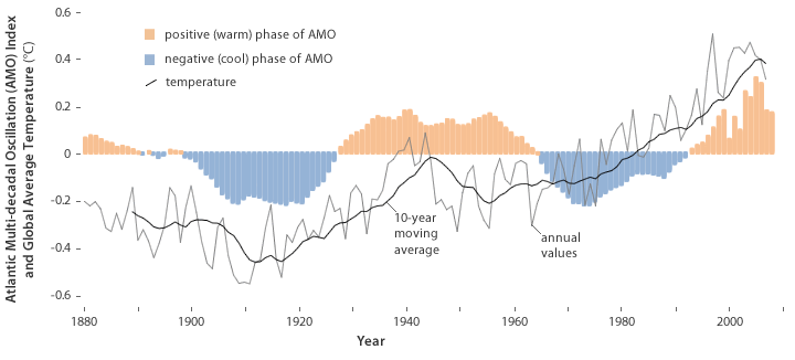
..then you have to ignore the AMO..and ignore the fact that climate didn’t start in the mid 1970’s
But by ignoring the AMO…you are ignoring the one ocean that dumps water directly into the Arctic Ocean
…90% of ice is under water…it’s a whole lot of water, and very deep…the Atlantic current will change it’s temperature a whole lot faster than air and albedo
Funniest thing about this graph….if you take away the “adjustments” they have made to the temperature history
…the AMO and sea ice track almost perfectly
Those Koch brothers get around.
Ah, but the article seems to be suggesting we look at other ways too. For example, is it more accessible to present the top one as a “spiral graph”, with one line going round and round the year, or is that more confusing? I don’t know, and probably nor does anyone else either until we look into it.
I don’t understand the tone of this post. Who is suggesting dumbing down? Why should investigating the way non-experts perceive data presented in different ways be a problem?
Science ABC123 just wants raw data, but that is absurd. Tables and tables of numbers are useless without analysis.
Sorry, image paste fail. The graph can be seen at https://moyhu.blogspot.co.uk/p/latest-ice-and-temperature-data.html
The ever-delusional and cognitive-dissonance impaired Alarmists seem to think the reason the public (particularly Americans) don’t see “climate change” as a problem is that they are too dumb to “understand” it (even though, paradoxically, kids do). Thus, they figure, if they can only dumb it down enough, people will finally “get it”. It fits their motto: “If something hasn’t worked in the past, and continues not to, just double-down until it does”.
Because they are selling the theory, not proving it. This is what one does when trying to market a product—convince people they have a need for it and then through smoke and mirrors, give them a solution. That really is ridiculous when dealing with a complex theory. A graph with a title tells only a tiny part and only the part the seller wants you to know. Kind of like VW, whose cars passed emission standards, but not in the way most people thought they should. A graph there would have told customers they were home free buying a low emissions car—end of story? Graphs and charts tell only what the seller wants you to know.
If there is any question of how marketing affects the quality of science, look at the selling of drugs in America. Marketing changed the field in a huge way. Now, people self-diagnose and demand the doctor give them the drug the commercial said they needed. It’s effective for sales, not so much for medicine.
Bruce, Reality, so to get this straight, you do not want to investigate how people perceive complex data to improve communication? You think you know how best to present data so that the layman can understand? No need to bother with actual research using modern techniques such as attention monitoring and eye tracking, just do what we always did.
So which is better, the spiral or the overlaid one Griff posted? Both present the same information in different ways, which one is easier to understand for people who are not used to examining graphs? I would love to hear your insights into that specific question, since you seem to think that researching into the question is pointless or duplicitous.
Griff you keep posting these same graphs in nearly all threads without even a change in wording. You are totally unwilling to debate them as your re-posts convey. The most you’ve mananged is a few off-the-mark comments then its back to your regularly scheduled re-posts. These cut and paste re-posts point you out as a lazy paid shill. Your are not worth the money your being paid. Get more creative or your likely to get fired.
He’s consistant. And fully illustrates why graphs are useless. His graphs only show warming, not WHY it’s warming. The WHY is the only important part when it comes to AGW—if the “A” is not the cause, then we have no control over things. Natural warming or cooling might be important to future planning if we could accurately predict it, but planning for both is probably the smartest route since predicting the future has been a major fail every time.
Give him a chance, Pierre!
Even climate trolls have to make a living, and if cutting and pasting the same old meaningless drivel is their only marketable skill, then that’s what they end up doing!
Calling that a marketable skill is quite a stretch.
Graphs and a succinct summary of the key issues is very helpful.
There is a reason why there has never been a formal written debate concerning CAGW. The observations do not support CAGW. The observations do support AGW.
1) Latitudinal temperature paradox (Strike 1 against AGW)
The latitudinal temperature anomaly paradox is the fact that the latitudinal pattern of warming in the last 150 years does match the pattern of warming that would occur if the recent increase in planetary temperature was caused by the CO2 mechanism.
The amount of CO2 gas forcing is theoretically logarithmically proportional to the increase in atmospheric CO2 times the amount of long wave radiation that is emitted to space prior to the increase. As gases are evenly distributed in the atmosphere the potential for warming due to the increase in atmospheric CO2 should be the same at all latitudes.
http://arxiv.org/ftp/arxiv/papers/0809/0809.0581.pdf
As the amount of warming is also proportional to amount of long wave radiation that is emitted to space prior to the increase in atmospheric CO2, the greatest amount of warming should have occurred at the equator.
There is in fact almost no warming in the tropical region of the planet. This observational fact supports the assertion that majority of the warming in the last 50 years was not caused by the increase in atmospheric CO2.
http://www.physicalgeography.net/fundamentals/images/rad_balance_ERBE_1987.jpg
2) CAGW Strike 2: The planet cyclically warms and cools with the majority of the temperature change occurring at high latitudes. (See Greenland ice sheet temperature above last 11,000 years).
http://wattsupwiththat.files.wordpress.com/2012/09/davis-and-taylor-wuwt-submission.pdf
Greenland ice temperature, last 11,000 years determined from ice core analysis, Richard Alley’s paper. William: As this graph indicates the Greenland Ice data shows that have been 9 warming and cooling periods in the last 11,000 years.
http://www.climate4you.com/images/GISP2%20TemperatureSince10700%20BP%20with%20CO2%20from%20EPICA%20DomeC.gif
Greenland ice temperature, last 11,000 years
=============
notice that for the past 6000 years, on average CO2 has been going up, while temps have been going down. proof positive that CO2 causes cooling not warming.
this same pattern is repeated if you look back for the past 1/2 million years. When Co2 is high, temperatures decrease. When CO2 is low, temperatures increase. Again this is proof positive that CO2 causes cooling, not warming.
An easy shorthand for the climate con is that they constantly talk about TRENDS, when they should be talking about CYCLES. They talk about the former because they’re trying to sell you something (CAGW), not trying to LEARN something about the CLIMATE. “Trends” = “weather.” CYCLES = “climate,” and until they’re talking about the latter instead of the former, they’re just making a wanton display of their ignorance of what causes “climate change” and a wanton display of their confusion of “weather” with “climate.” Of course their ignorance is willful, because there’s no money, fame, or secular religious guilt reduction associated with natural forces that drive the climate – only with trying to blame humanity for it and sell people on the notion that catastrophe awaits if we don’t do as we’re told.
“The observations do not support CAGW. The observations do support AGW. ”
I beg to differ.
Observations do support some recent GW. Period.
Observations do not rule out AGW. For now.
Observations do rule out CGW (including CAGW). Warming never, ever, was bad
@ferdberple,
Your plot shows a sensitivity constant 13.3 K/doubling of CO2. I got a good fit using 16 K/doubling.
https://diggingintheclay.wordpress.com/2013/05/04/the-dog-that-did-not-bark/
Of course the “Sensitivity Constant” idea makes no sense in this context as temperature leads CO2 by 500 to 800 years.
We should be discussing a sensitivity constant of 13 ppm/Kelvin.
Here is more: http://notrickszone.com/2016/11/28/there-has-been-no-significant-net-change-in-arctic-sea-ice-extent-in-the-last-80-years/
As always, Griff tries to pretend that the world started when it was convenient for him.
Once again Griff shows the nearly perfect correlation of the Arctic sea ice with a lagged AMO warming phase. Oh wait, you must have accidentally left the AMO off your chart.
And here’s another one:
http://notrickszone.com/wp-content/uploads/2016/11/Arctic-Surface-Temps-Since-1920-copy.jpg
Thanks for that graph, Harry.
When you hear people talking about the “warming of the last century, what they are really talking about is the warming from 1979, the beginning of satellite measurements, to the present. As the graph shows, the weather has been warming and cooling and then warming agains for a very long time. The period from 1979 to 2016 is no different than previous warming periods, and is cooler than some of them in the recent past.
I don’t suppose you have a link to the data used for this graph.
I went to “notricks” which referred to me to “climate4you”. Climate4 you simply referred to the CRU Home page. i.e.
blockquote> Mean annual surface air temperature (MAAT) anomaly 70-90oN compared to the WMO normal period 1961-1990, as estimated by Hadley CRUT. HadCRUT4 temperature data from the Climatic Research Unit (CRU) has been used to prepare the diagram.
I’m note totally sure what this means
“as estimated by Hadley CRUT. HadCRUT4 temperature data from the Climatic Research Unit (CRU) has been used to prepare the diagram.”
Griff, Nice cherry-pick. If you aren’t going to stick around and defend your propaganda, why bother posting it. Nobody who frequents this blog is going to fall for your nonsense.
Griff, take a look at the Antarctic Sea Ice Extent graphic. Does it show the same pattern?
No, actually a bit worse than the Arctic at the moment.
From about July to October, sea ice was well above the 2012 line, and that was proof of nothing.
Since October, sea ice has been below the 2012 line, and all of a sudden it’s the only thing that matters, proof that ice in the arctic is in a death spiral and will be gone completely in a couple of weeks.
The “less cold” blob of air is moving away from the Arctic.
In the next few weeks the Arctic sea ice is going to grow very quickly.
It wouldn’t surprise me if it topped out above previous years.
“Since October, sea ice has been below the 2012 line, and all of a sudden it’s the only thing that matters,”
That’s because that is one of the last straws they have to grab. They are running out of ammunition on the alarmist side.
“From about July to October, sea ice was well above the 2012 line, and that was proof of nothing.”
Only just above 2012 – the lowest, don’t you mean to say?
“Since October, sea ice has been below the 2012 line”
Hmm a new low, hmmm the downward trend seems to be accelerating, isn’t that what you actually meant to say?
“less cold” ROFL
Probably caused by all the diesel that ‘Northabout’ used. The graph was looking great before they fired up that monster.
So the only thing missing from your accessible graph is ALL of the data between 1972 and 2010.
So where is your accessible support for the dotted “average” graph ??
G
griff,
How do you know that we are not still warming up from the LIA (which apparently started around 1850) and that the warming we are seeing is mostly natural warming? If the warming started in 1850 and there was virtually no man-made CO2 around, then how do you know CO2 is the cause of the warming since then?
If it was warmer before the LIA than it is now, then why are you trying to say that today’s temps are unusual/potentially catastrophic?
That’s obvious. Because the models predict that CO2 would cause warming, and as everyone knows. Models are never wrong. Especially when they have been tuned to report what you want to see.
79 max ice year. Try starting from 39
Pick your period, pick your trend. You start in a cold period and end in a warm period, which proves absolutely nothing about CAGW. No evidence of causation makes you stupid graphs meaningless, especially since the other pole exhibits an opposite trend. Further, you talk of reduced ice cover like it’s a bad thing. News flash – a warmer world is better for life, a colder one worse. I suppose you’d prefer the crop failures, famine and disease of the Little Ice Age (apparently climate nirvana to Climate Naz!s the world over) to today’s climate, which is about the best we’ve experienced since thermometers were in wide use.
“since the other pole exhibits an opposite trend”
Um no it doesn’t.
“today’s climate, which is about the best we’ve experienced”
And what makes you think 3 or 4 degrees warmer would help people in the tropics?
“And what makes you think 3 or 4 degrees warmer would help people in the tropics?”
Be happy: tropics physically cannot get warmer than they already are (too much oceans and seas around there, taking the heat out). When Earth Temp was much higher than now, tropics were not ; the poles were.
Warming happens at high latitude.
Griff.. how about you check prior experience to gauge climate variability:
“It will without doubt have come to your Lordship’s knowledge that a considerable change of climate, inexplicable at present to us, must have taken place in the Circumpolar Regions, by which the severity of the cold that has for centuries past enclosed the seas in the high northern latitudes in an impenetrable barrier of ice has been during the last two years, greatly abated.
(This) affords ample proof that new sources of warmth have been opened and give us leave to hope that the Arctic Seas may at this time be more accessible than they have been for centuries past, and that discoveries may now be made in them not only interesting to the advancement of science but also to the future intercourse of mankind and the commerce of distant nations.”
President of the Royal Society, London, to the Admiralty, 20th November, 1817 [13]
Arctic and Sub-Arctic expedition chronology:
Including Northwest Passage, Arctic, Scientific, Relief, and Polar Expeditions.
1576 Sir Martin Frobisher (N. W. Passage Expedition)
1587 John Davis Expedition (West Greenland), (Discovered Davis Straight) (73.12N)
1594 William Parents (sometimes listed as Barentz) (Near Cape Nassau N. Z.), (77.20N)
1596 J. C. Ryp and Jacob Heemskerck, (Spitzbergen), (79.49N)
1602 Captains Weymouth and Knight (N. W. Passage Expedition)
1607 Henry Hudson (E. Spitzbergen Sea), (80.23N)
1612 Sir Thomas Bultow, (N. W. Passage Expedition)
1616 William Baffin (Smith Sound), (discovered Baffin Bay) (77.45N)
1632 Foxe Expedition, (N. W. Passage Expedition)
1746 Middleton Expedition, (N. W. Passage Expedition)
1769 John Hearne Expedition
1773 J. W. Phipps (Lord Mulgrave) (Spitzbergen Sea), (80.48N)
1776 Captain James Cook (N. W. Passage Expedition), Ships: Resolution and Discovery
1789 Mackenzie (discovered mouth of Mackenzie River), (N. W. Passage Expedition)
1790 Captain Duncan, (N. W. Passage Expedition)
1793 Captain Vancouver, (N. W. Passage Expedition), Ship: Resolution
1806 Captain Scoresby (whaler, first ship to sail into Polar Sea), (81.30N)
1815 Lieutanant Kotzebue, (N. W. Passage Expedition)
1818 John Ross, ships: Isabella and Alexander
1819 Parry’s First Voyage, Lieutenant Lindon, ships: Hecla and Griper
1819 Franklin’s First Expedition, Captain Buchan, ships: Dorothea and Trent
1821 Parry’s Second Expedition, Captain Lyon, (N. W. Passage Expedition)ships: Hecla and Fury
1824 Parry’s Third Voyage, (82.45N), (N. W. Passage Expedition)ships: Hecla and Fury
1825 Franklin’s Second Expedition, Captain Lyon, (N. W. Passage Expedition)
1827 Parry Expedition (said to have rrived within 435 miles of North Pole) ship: Helca
1829 John Ross Expedition, (N. W. Passage Expedition)ship: Victory
1833 Back’s Expedition, (N. W. Passage Expedition) (explored Great fish River)
1836 Back’s Voyage, ship: Terror
1845 Franklin Expedition, ships: Erebus and Terror
1848 Collison and Sir (Rodrick) McClure, HMS Enterprise, HMS Investgator Franklin Relief Expeditions
1848 More and Maguire, (search for Franklin), ship: Plover
1848 Sir J. Richardson and Dr. Rae, (search for Franklin)
1848 Ross Expedition, (search for Franklin)
1848 Kellett Expedition, (search for Franklin)
1849 Saunders Expediton, (search for Franklin)
1850 Austin and Ommaney Expedition, (search for Franklin)
1850 Penny Expedition, (search for Franklin)
1850 Ross Expedition, (search for Franklin)
1852 E. A. Inglefield, (78.28N)
1852 Belcher Expedition, (search for Franklin)
1852 Osborn Expedition,(search for Franklin)
1853 Dr. Elisha Kent Kane Expedition, (80.10N), ship: Advance, Franklin search expedition
1861 I. I. Hayes Expedition, (80.11N)
1868 Nordenskiold and Otter Expedition, (81.42N)
1871 Hall’s Expedition, (82.11N) ship: Polaris
1874 Yeyprecht and Payer Expedition, (82.05N)
1875 G. S. Nares Expedition, (82.48N)
1876 G.S.Nares Expedition II, (83.20N)
1879 John Muir’s First Alaska Expedition
1879 George W. Delong’s Expedition, ship: Jeannette
1880 John Muir’s Second Alaska Expedition
1881 Greely Expedition, (83.24N), ship: Proteus
1890 John Muir’s Third Alaska Expedition
1892 Robert Peary Greenland Expedition
1893 Fridtjof Nansen’s Expedition, (86.04N), ship: Fram
1895 Fredrick G. Jackson Expedition
1900 R.E. Peary, (83.50N)
1901 Baldwin-Ziegler North Pole Expedition, ships: America, Fithjof, and Belgica
1902 R.E. Peary, (84.17N)
1905 Duke of the Abruzzi, Luigi Amadeo, Polar Expedition (86.34N)
1906 R.E.Peary, (87.06N)
1909 Robert Peary Polar Expedition, (90N), ship: Roosevelt
1909 Frederick Cook Polar Expedition, (90N)
1911 Albatross, Bureau of Fisheries, ship: Albatross
1913 Vilhjalmur Stefansson ships: Karluk, Mary Sachs, and Alaska
1925 Richard Byrd’s Greenland Expedition
Then there is Antarctic sea ice
Record high this time last year, record low it seems this year [not that the records are very long]
So what’s the trend? Maybe no trend at all
http://www.sciencealert.com/early-explorer-logbooks-reveal-antarctic-sea-ice-levels-have-barely-changed-over-100-years
Better yet, just
indoctrinateteach the kiddos climate “science” (“kids, how many of you have ever been in a greenhouse”?), and then have them kidsplain it to the adults. Problem solved.They’ve actually been doing this for the last couple of generations. The problem is that none of the catastrophes the kiddies were taught about actually happened. It’s the old crying wolf problem.
Keep your graphs, charts, and visuals. Just give me the data, but only the raw data. You can keep all the “value added” adjusted data. I don’t want it.
If they where making the data, that they use to make the graphs, available then this would be a good thing. They are not. They are talking about making the graphs available so that the green taliban can astroturf every news outlet with them
You might remind Javier of this when he posts sun nut cyclmania
Remember, they want the graphs to “tell a story.” It’s the “story” that’s the problem.
“IPCC’s Summaries for Policy Makers (SPMs), which are primarily aimed at experts working in government.”
Funny, I thought these were “summaries” for “policy” makers produced by experts!
Evidence based policy become policy based evidence.
How funny this seems to be the only branch of “science ” that needs cognitive research, hoop jumping, used car sales techniques, and a host of other nonsense to “communicate ” to non experts. Here’s an idea maybe what you clowns are trying to “communicate ” isn’t science at all. As a nonexpert, I have no real problems understanding any other areas of science presented, I just have a problem understanding how a theory not verified by reality qualifies as a valid scientific position. Maybe I just need a colorful graph.
All areas of science need this. The amount of data generated today is much greater than in the past. We need ways to convey the meaning in all this data in every area.
Data has a value (a number) it doesn’t have any meaning, which is an exercise of the human mind.
G
George, are you saying that we should not seek to find meaning in data? And if finding that meaning we should not seek to convey this to others? The meaning that you say is the exercise of the human mind is surely the entire point of science. The point is not to generate numbers.
What if Mendel had followed this approach? He would generate numbers but not draw any conclusions and we would not understand genetics. What does this mean, one may ask? Mendel would reply “I don’t know, data are numbers and have no meaning.”
Well seaice1, you have me all wrong.
I didn’t say that the theory, or model if you will doesn’t have meaning. But the numbers themselves are just facts; assuming they were observations of some phenomenon registered by an appropriate sensor.
The beauty of the art form we call mathematics, is that it does exactly predict the behavior of the model (well usually), but that does not mean that it predicts the behavior of any real system.
But hopefully, we craft our models to emulate as closely as we know how, what we appear to observe some real system doing.
The differential equation that yields ‘simple harmonic motion’ as some of its solutions, is describing something that does not, and cannot exist, because it is a steady state solution, and never starts or stops .
But we can make all kinds of damn good oscillators, in a vast array of different disciplines, and we tend to believe they behave exactly as our differential equation predicts. They don’t of course, but good enough for our practical uses.
G
I don’t know what is the most accurate physically measured number, but I think it is something like 14 significant digits or thereabouts. That boggles the imagination.
But GCMs don’t even track reality for even a few minutes, on this revolving planet.
They think that their problem is a communication problem, not that they are lying.
It’s not lying if I do it!
I’m just trying to find balance between honesty and effectiveness!
Amazing how the Climate Faithful try to spin even as blatant a statement as that one into something it wasn’t.
He didn’t really need the /Sarc tag, did he? It was pretty obvious to me.
As in: ” If you like your plan, you can keep your plan. If you like your doctor, you can keep your doctor. The average person will save $2,500 per year in medical costs. ”
I read something like that on the monument to President Obama’s Legacy.
G
The lack of imagination of proponents in politicized science supporting an agenda is striking. This from a paper on Lysenkoism, an early Soviet politicization of science for an agenda needs no explanation. Just substitute in global warming!
“The main point of this paper is that Lysenkoism is not only about intellectual pogrom, destruction of real science by pseudoscience committed in the name of a particular political agenda and more or less openly supported by the ruling party/government officials. It is also (and probably more important) a self-sustainable cult-like system of distortions, omissions, and lies that are designed to support faulty or fraudulent research of the selected “politically correct” pseudo-scientists.”
http://www.softpanorama.org/Skeptics/lysenkoism.shtml
It also answers the question raised by “progressives” on how absurd to think a fraudulent idea could be held by such a large consensus.
From http://www.johndclare.net/China6.htm:
Lysenkoism, 1958
a. Agricultural constitution, 1958
Trofim Lysenko was a Soviet agricultural expert who in 1958 drafted an eight-point agricultural ‘constitution’ for China, which every farmer had to follow.
…
Communes: results
a. Grain and meat production fell
1958-60, grain production fell from 200-143m tonnes, meat production from 4-1m tonnes – whilst terrified officials reported huge increases!
b. Three Bitter Years, 1959-61
The result was widespread famine which killed perhaps 30 million Chinese.
Changing a graph’s resolution to, say, 0 to 100 degrees F makes global warming difficult to appreciate. The line looks like a wet string on a flat surface.
I’d support that – re-scale all those graphs of temperature “rise” into full degrees Celsius – you know, something a thermometer actually measures. Then you can see how there has essentially been no temperature change that can be accurately measured, on average, and how the whole “climate change” meme is all about nothing anyone would have noticed without all the money behind it endlessly promoting it as a human induced end of days.
Even better, use the Kelvin scale.
If you think all graphs should have the axis at zero presumably you think it should apply to graphs of solar irradiance.
http://protonsforbreakfast.files.wordpress.com/2010/12/composite-total-solar-irradiance.gif
That would be honest, but would mean the graph was totally useless.
And tide tables should be measured from the bottom of the sea. After all, the sea is thousands of feet deep, who cares about fluctuations of a few feet at the top?
Our new Executive Director (because we absolutely NEED another layer between our Director and Senior Vice-President) LOVES graphs, or as he calls them, data visualizations. Pretty stuff. And very, very easy to hide bad news with.
As usual, John Brignell is well ahead of the game:
http://www.numberwatch.co.uk/chartmanship.htm
“We have 25 or so years invested in the work. Why should I make the data available to you, when your aim is to try and find something wrong with it.” – Because that is the way science is supposed to work?
Really? Just changing how they tell a lie is going to convince people they are not lying? It worked for Obama, guess it can’t hurt them to try.
“Really? Just changing how they tell a lie is going to convince people they are not lying? It worked for Obama, guess it can’t hurt them to try.”
Yeah, I think that is essentially what the whole effort is all about. They are trying to figure out a better way of brainwashing the peons. That’s why they bring in all those psychologists. They are trying to get in the heads of skeptics.
You see, they have a problem. They think *they* have the correct take on the CAGW subject, and they just cannot understand how others cannot see it their way, so they are trying to understand it, in an effort to help them change people’s minds and make them think the way they do.
Since, in their minds the science is settled, they don’t see the need to actually argue the science. The only need they see is to successfully communicate their version of the science to the rest of us.
Also, they need more money and another “field of study group” (psychologists, etc.) of “experts” in on this new scam at the trough.
+ a gazillion
Historically, all religions start from the premise that they have the correct answer and now their only problem is how many must they torture and kill to ensure the people truly understand.
I only understand things that are made extremely simple . I continue to look for a concise competent explication of how an electro-magnetic , ie : spectral filtering , phenomenon can “trap” kinetic energy causing the bottoms of atmospheres to be hotter than their tops or their effective “radiative surface” temperatures as determined by their spectrum as seen from the outside . And where’s gravitational energy in the equations ?
Only that will dumb it down enough for me .
In terms of graphics , my favorite continues to be :
http://cosy.com/Science/CO2-pineGrowth100120half.jpg
Bob,
It’s pretty simple. Photons from the sun strike the ground and some are absorbed, increasing the kinetic energy of the ground. This causes the ground to emit infrared photons of various frequencies. Some of these are absorbed by the various molecules in the atmosphere, increasing their kinetic energy level (warming up the atmosphere). If they gain enough energy, these molecules will emit an infrared photon of (usually) a lower frequency. Some of these will go up into space, but some will be directed towards the surface. If a particular gas, like CO2, has an IR absorption frequency range that is unique to it (or at least partially unique) in the atmosphere, then potentially it could be absorbing (and re-emitting) IR photons that would otherwise just go into space. Also, if the re-emitted photons are then absorbed by other gas molecules, the overall kinetic energy of the atmosphere (temperature) would be higher than it would otherwise be without the gas. It also follows that this effect would scale with the amount of this gas in the atmosphere, up to the point where all the possible photons in that frequency range are being absorbed, of course. So depending on where you start from, an increase in this gas, could theoretically increase the temperature of the atmosphere near the surface.
Of course, the devil is in the details. The amount of warming relative to any increase depends on the absorption windows of the gas, the starting concentration point (of gas in the atmosphere), and the increase. In the case of CO2 the unique window is small and the response to increases is logarithmic. At the current concentration of 400ppm we are already near saturation with regards to IR absorption, so any additional heating in the future from this effect will be very small.
Hopefully this helps.
And excellent explanation, Paul.
This sentence explaining the difference between CO2 in the atmosphere versus no CO2, stood out for me: “If a particular gas, like CO2, has an IR absorption frequency range that is unique to it (or at least partially unique) in the atmosphere, then potentially it could be absorbing (and re-emitting) IR photons that would otherwise just go into space.”
And in the case of CO2, we know for sure from satellite measurements that most of that special CO2 band from about 13.5 to 16.5 microns survives and makes it to outer space; so nyet on it all being absorbed by CO2, we aren’t even close to near saturation.
And besides, the response IS NOT logarithmic. Not in practice (experimental observations) and NOT in theory. The Beer Lambert Law does not apply. It applies to a one dimensional transport through a dilute non radiative medium. I.E. the absorbed photons have to stay dead, and not be re-emitted at some other (probably) longer wavelength. BL applies only to “absorption” of the incoming species and wavelength. It does not apply to “transmission” of the radiative energy.
G
Rubbish George.
Firstly the atmosphere is 85% opaque at 15 microns. That implies only 15% of Photons make it through, that is as saturated as it gets. Given that CO2 molecules can also get to high vibrations states via collisions with O2 and N2 in fact there is no guarantee at all that the photons are the same photons emitted from the surface, the outgoing flux may be a result of converting kinetic energy to radiant energy and the atmosphere could otherwise be 100% opaque to 15 micron upwelling radiation from the surface, in this scenario the CO2 helps cools the earth via convection then conversion to high CO2 vibrational states then IR emission to space. In any case “Saturation” is NOT at the point of Zero 15 micron emission because of convective cooling fed emission. This is a very basic mistake that people make.
One also has to consider that the climate scientists say the “Width” of the Co2 band will change, oops, No, that defies physics. The Width of the CO2 band depends on the doppler effect frequency difference between the lower frequency of CO2 molecules traveling away from the satellite to the higher frequency of emissions of CO2 molecules traveling toward the satellite. This frequency distribution depends only on the distribution of kinetic energy of the CO2 molecules which depends on TEMPERATURE – Not Density. Venus has a broad CO2 band because it’s HOT, Mars has a narrow CO2 band (in spite of CO2 partial pressure 10 times earth) because it’s COLD.
I only respond to equations .
george e. smith November 29, 2016 at 2:13 pm
And in the case of CO2, we know for sure from satellite measurements that most of that special CO2 band from about 13.5 to 16.5 microns survives and makes it to outer space; so nyet on it all being absorbed by CO2, we aren’t even close to near saturation.
Actually George that’s not correct, the core of the absorption band absorbs all the relevant IR emission from the surface in a few hundred meters, the residual emissions in that band that are seen from space are emitted from much higher (and colder) regions near the troposphere.
And besides, the response IS NOT logarithmic. Not in practice (experimental observations) and NOT in theory. The Beer Lambert Law does not apply.
The response to CO2 is logarithmic because while the core of the band is saturated, the wings are not and due to broadening the response is ~log. For a very weak absorption line the response is linear, for a very strong absorption where the wings dominate the response is square root, at our present atmospheric conditions we have the approximately intermediate logarithmic response. Astronomers have worked with this for a long time and refer to it as ‘the curve of growth’.
It applies to a one dimensional transport through a dilute non radiative medium. I.E. the absorbed photons have to stay dead, and not be re-emitted at some other (probably) longer wavelength. BL applies only to “absorption” of the incoming species and wavelength. It does not apply to “transmission” of the radiative energy.
Reference Griff November 29, 2016 at 8:17 am graph with Arctic Sea Ice Minimum Volumes 1979-2016.
Tony Heller continues to point out that although the satellite measurements started in 1974 NOAA and Mark Serreze of NSIDC continue to start at 1979 as the sea ice anomaly was high then rather than 1974 when the anomaly indicated a low level of sea ice in the Arctic. Unfortunately I don’t know how to upload the graph, but here is a link to it.
http://realclimatescience.com/wp-content/uploads/2016/11/Screen-Shot-2016-11-28-at-1.35.09-AM-down.gif
Apparently Tony Heller has asked NOAA who made it, but so far they have not provided an answer. They probably never will as they will be loath to acknowledge that it is real.
It was in the 1900 First IPCC Report
Other than the red annotations, it comes from Page 224 of the 1990 IPPC Report, working group I accessible here…
https://www.ipcc.ch/ipccreports/far/wg_I/ipcc_far_wg_I_full_report.pdf
The attribution to NOAA is present in the report, under the Southerrn Hemisphere chart.
Have fun!
As to.. Who in NOAA produced it? Chapter 7 was produced bysome of our well-loved favorites.
C.K. FOLLAND, T.R. KARL, K.YA. VINNIKOV
Contributors: J.K. Angell; P. Arkin; R.G. Barry; R. Bradley; D.L. Cadet; M. Chelliah; M. Coughlan; B. Dahlstrom; H.F. Diaz; H Flohn; C. Fu; P. Groisman; A. Gruber; S. Hastenrath; A. Henderson-Sellers; K. Higuchi; P.D. Jones; J. Knox; G. Kukla; S. Levitus; X. Lin; N. Nicholls; B.S. Nyenzi; J.S. Oguntoyinbo; G.B. Pant; D.E. Parker; B. Pittock; R. Reynolds; C.F. Ropelewski; CD. Schonwiese; B. Sevruk; A. Solow; K.E. Trenberth; P. Wadhams; W.C Wang; S. Woodruff; T. Yasunari; Z. Zeng; andX. Zhou.
The text which describes the figure 7.20 is…
‘Especially importantly, satellite observations have been used to map sea-ice extent routinely since the early 1970s. The American Navy Joint Ice Center has produced weekly charts which have been digitised by NOAA. These data are summarized in Figure 7.20 which is based on analyses carried out on a 1° latitude x 2.5° longitude grid. Sea-ice is defined to be present when its concentration exceeds 10% (Ropelewski, 1983).’
Enjoy!
On further digging, the source of the digitizations is described here…
http://nsidc.org/data/docs/noaa/g00917_nmc_seaice_extent/
And C.F. Ropelewski the primary contact.
The dataset is available for download at that site.
Apparently Tony Heller has asked NOAA who made it, but so far they have not provided an answer. They probably never will as they will be loath to acknowledge that it is real.

Heller is not a very reliable source, the origin of that graph is reasonably well documented, he usually doesn’t show the antarctic data either. Here’s the original graph:
Here’s the description of the data:
“Especially importantly, satellite observations have been used to map sea-ice extent routinely since the early 1970s. The American Navy Joint Ice Center has produced weekly charts which have been digitised by NOAA. These data are summarized in Figure 7.20 which is based on analyses carried out on a 1° latitude x 2.5° longitude grid. Sea-ice is defined to be present when its concentration exceeds 10% (Ropelewski, 1983). Since about 1976 the areal extent of sea-ice in the Northern Hemisphere has varied about a constant climatological level but in 1972-1975 sea-ice extent was significantly less.”
Note that unlike present day satellite data the threshold is 10% not 15%.
Here’s a merging together of the graphs:
Heller is a very reliable source and uses NOAA NASA data to form his graphs. You are therefore saying that NOAA NASA data is unreliable.
Reliability is determined by whether his conclusions back the “consensus”.
Note your “a” and “b” showing both hemispheres. Now why do you suppose Griff shows ONLY the northern hemisphere when he (re-)posts his sea ice graphs??
“Heller is not a very reliable source”
“Kill the messenger” is the philosophy of the alarmists when it comes to Tony Heller. His information damages their claims and shows them for the lies they are, and the alarmists have nothing to counter it with, so they try to smear the messenger to try to negate his message.
Phil, since I have you here and Tony Heller is a subject, what do you think about the dishonesty Tony has uncovered in the bastardization of Iceland’s surface temperature charts by NASA?
Here’s a chart of before NASA got hold of the data, and after. Quite a little difference wouldn’t you say? And all unjustified according to the people in Iceland. They have already shot down Gavin’s excuses for making these changes.
http://realclimatescience.com/wp-content/uploads/2016/11/Reykjavik.gif
Phil. November 29, 2016 at 12:13 pm
“Heller is not a very reliable source,”
As vs to who ? You. Forget your graphs instead look at a few pictures from WW2 Iceland. Note the uniforms.
On Iceland I think “Heller” is very reliable.
Bummer ain’t it, that the troops take all those pictures and made all those weather station records.
https://www.ibiblio.org/hyperwar/USMC/USMC-C-Iceland.html
michael
TA November 29, 2016 at 1:52 pm
“Heller is not a very reliable source”
“Kill the messenger” is the philosophy of the alarmists when it comes to Tony Heller. His information damages their claims and shows them for the lies they are, and the alarmists have nothing to counter it with, so they try to smear the messenger to try to negate his message.
The reason Goddard/Heller is banned from this site is because of his behavior in connection with his claims that solid CO2 precipitated in Antarctica and his vicious attacks on anyone who didn’t agree with him.
Phil, since I have you here and Tony Heller is a subject, what do you think about the dishonesty Tony has uncovered in the bastardization of Iceland’s surface temperature charts by NASA?
Being charitable he’s mistaken, the changes in that data which he refers to were made by NOAA in their GHCN v3 product. When GISS used this as their source their homogenization adjustment was rather small and slightly offset the GHCN adjustments.
Here’s a chart of before NASA got hold of the data, and after. Quite a little difference wouldn’t you say? And all unjustified according to the people in Iceland. They have already shot down Gavin’s excuses for making these changes.
The GISS raw data is the same as the Iceland Met office data. Some adjustments to the data are needed because of relocations of the station (see Trausti Jonsson, Iceland Met Office):
http://icelandweather.blog.is/blog/icelandweather/entry/1230185/
Other adjustments are needed to correct for Time of Measurement changes, (Jonsson says mainly before 1924).
The disagreement mainly concerns the way those adjustments were done by NOAA and IMO.
AGW is not Science November 29, 2016 at 12:58 pm
Note your “a” and “b” showing both hemispheres. Now why do you suppose Griff shows ONLY the northern hemisphere when he (re-)posts his sea ice graphs??
It’s not just Griff, the part (b) is rarely posted.
Phil wrote: “The reason Goddard/Heller is banned from this site is because of his behavior in connection with his claims that solid CO2 precipitated in Antarctica and his vicious attacks on anyone who didn’t agree with him.”
Well, I wasn’t reading this website when all that took place and don’t have a dog in that fight, and it’s awfully convenient for you I know, but it doesn’t change the accuracy of the chart that was posted. The accuracy or inaccuracy of the charts and the reason for them being changed is the question to be answered.
Phil: “Being charitable he’s mistaken, the changes in that data which he refers to were made by NOAA in their GHCN v3 product. When GISS used this as their source their homogenization adjustment was rather small and slightly offset the GHCN adjustments.”
Yeah, Gavin tried to blame everything on NOAA, too. You are avoiding the question, Phil. You are confusing the issue with who exactly might have made these alterations and what percentage belongs to whom, but the accuracy or inaccuracy of the charts and whether the changes are justified are the questions, and you are not addressing them.
Phil: “The GISS raw data is the same as the Iceland Met office data. Some adjustments to the data are needed because of relocations of the station (see Trausti Jonsson, Iceland Met Office):
http://icelandweather.blog.is/blog/icelandweather/entry/1230185/
Other adjustments are needed to correct for Time of Measurement changes, (Jonsson says mainly before 1924).
The disagreement mainly concerns the way those adjustments were done by NOAA and IMO.”
Nope, Tony has emails from the people in Iceland who keep the surface temperature data, and they do not agree with the changes that NOAA/NASA made. They said they were “grossly in error”. Who are you going to believe, Gavin, or the people in Iceland? I’ll see if I can dig up that statement.
Well, I dug it up. The money quote is: “The person in charge at the Icelandic Met Office said four years ago : The GHCN “corrections” are grossly in error in the case of Reykjavik.”
http://realclimatescience.com/2016/11/gavin-erasing-the-1940s-warmth-in-iceland/
The thing is the raw data is still available so we can get some independent scientists to try to duplicate Gavin’s, efforts, and see whether his adjustments were gross errors or not. See if they come up with the same chart Gavin produced.
While this doesn’t really prove anything, the graphed Arctic ice extent appeared to be rising during the 1970’s. Wouldn’t it be great to have its extent as it was during the 1950’s, when the AMO was plateaued about where it is now? Was ice extent then plateaued at a minimum, about where it has been plateaued for the last ten years?
The anomaly is current sitting at about -1.5 and with so little thick multi-year ice left almost certain to much lower next northern summer.
Here ya go AGW
TA November 29, 2016 at 4:56 pm
Phil wrote: “The reason Goddard/Heller is banned from this site is because of his behavior in connection with his claims that solid CO2 precipitated in Antarctica and his vicious attacks on anyone who didn’t agree with him.”
Well, I wasn’t reading this website when all that took place and don’t have a dog in that fight, and it’s awfully convenient for you I know, but it doesn’t change the accuracy of the chart that was posted. The accuracy or inaccuracy of the charts and the reason for them being changed is the question to be answered.
Phil: “Being charitable he’s mistaken, the changes in that data which he refers to were made by NOAA in their GHCN v3 product. When GISS used this as their source their homogenization adjustment was rather small and slightly offset the GHCN adjustments.”
Yeah, Gavin tried to blame everything on NOAA, too.
That’s because what’s at issue are the adjustments that NOAA made, for some reason Goddard/Heller wants to make it seem that NASA/Gavin did it.
You are avoiding the question, Phil. You are confusing the issue with who exactly might have made these alterations and what percentage belongs to whom, but the accuracy or inaccuracy of the charts and whether the changes are justified are the questions, and you are not addressing them.
Actually I did, see below:
Phil: “The GISS raw data is the same as the Iceland Met office data. Some adjustments to the data are needed because of relocations of the station (see Trausti Jonsson, Iceland Met Office):
http://icelandweather.blog.is/blog/icelandweather/entry/1230185/
Other adjustments are needed to correct for Time of Measurement changes, (Jonsson says mainly before 1924).
The disagreement mainly concerns the way those adjustments were done by NOAA and IMO.”
Nope, Tony has emails from the people in Iceland who keep the surface temperature data, and they do not agree with the changes that NOAA/NASA made. They said they were “grossly in error”. Who are you going to believe, Gavin, or the people in Iceland? I’ll see if I can dig up that statement.
Well, I dug it up. The money quote is: “The person in charge at the Icelandic Met Office said four years ago : The GHCN “corrections” are grossly in error in the case of Reykjavik.”
The usual very selective, out-of-context ‘quotes’ that one gets from Goddard/Heller.
Paul Homewood emailed the IMO with the following questions:
“I have noticed that in the latest version of the GHCN database, NOAA have made certain adjustments to temperatures at several Icelandic stations, which have the effect of reducing temperatures from around 1940 to 1965, and increasing temperatures since.
For instance in Reykjavik, there is something like an extra degree of warming added by these adjustments, as per the following link. Also affected are Stykkisholmur , Akureyri and Hofn.
ftp://ftp.ncdc.noaa.gov/pub/data/ghcn/v3/products/stnplots/6/62004030000.gif
Can I ask :-
a) Were the Iceland Met Office aware that these adjustments are being made?
b) Has the Met Office been advised of the reasons for them?
c) Does the Met Office accept that their own temperature data is in error, and that the corrections applied by GHCN are both valid and of the correct value? If so, why?
d) Does the Met Office intend to modify their own temperature records in line with GHCN?”
Trausti Jonsson of the Iceland Met Office replied the same day:
“We have sent a questions to the GHCN database regarding this and they will look into the problem. Regarding your questions:
a) Were the Iceland Met Office aware that these adjustments are being made?
No we were not aware of this.
b) Has the Met Office been advised of the reasons for them?
No, but we are asking for the reasons
c) Does the Met Office accept that their own temperature data is in error, and that the corrections applied by
GHCN are both valid and of the correct value? If so, why?
The GHCN “corrections” are grossly in error in the case of Reykjavik but not quite as bad for the other stations. But we will have a better look. We do not accept these “corrections”.
d) Does the Met Office intend to modify their own temperature records in line with GHCN?
No.”
So that was his immediate reaction before talking to NOAA about the adjustments.
He also said:
” the Reykjavík and Akureyri series that I sent you have been slightly adjusted for major relocations and changes in observing hours. Because of the observing hour changes, values that where published before 1924 in Reykjavík and before 1928 in Akureyri are not compatible with the later calculation practices. For other stations in Iceland values published before 1956 are incompatible with later values except at stations that observed 8 times per day (but the differences are usually small).”
He also attached a report by the IMO which outlined systematic changes in the way the data were to be collected after 1957, and which tabulated their own adjustments to their data. So the IMO itself felt that adjustments were necessary to account for the various relocations and procedural changes before 1957.
The same Truasti Jonsoon, said in an email to Senator Roberts recently that the temperature “adjustments” are “quite sound”.
The original data was not from NASA but the Smithsonian publication “World weather records”, he said.
“During this early period there was a large daytime bias in the temperature data from Iceland as presented in this publication,” which accounted for much of the “discrepancy” at Teigarhorn and less so at Vestmannaeyjar, Mr Jonsoon said.
For the latter station, it was relocated in October 1921 to a higher elevation. “Comparative measurements at both sites have shown that the later location is about 0.7 degrees Celsius colder than the former – this relocation has to be ‘adjusted’ for,” he said.
“I assure you that these adjustments are absolutely necessary and well founded although the finer details of the resulting series shown in your letter differ slightly from my own version,”
The thing is the raw data is still available so we can get some independent scientists to try to duplicate Gavin’s, efforts, and see whether his adjustments were gross errors or not. See if they come up with the same chart Gavin produced.
Yes thanks to GISS the unadjusted raw data are available for anyone to with as they please. You still have the Goddard/Heller focus on Gavin though, if you went to duplicate what he did you’d have to start with the NOAA adjusted data because that’s what he used. If you want to actually test the validity of the NOAA adjustments you should start with the unadjusted data and the metadata on the relocations and time of measurement and do that yourself.
Well, Phil, I appreciate your measured response. I, personally, think it is fishy that Mr. Jonsson changed his tune on whether the adjustments were warranted or not, and I don’t think that is the end of the story. And I believe Homewood was taking issue with Jonsson changing his tune, but Homewood’s website doesn’t have a search feature so I couldn’t find what I was looking for. He did address the subject recently. I’ll look some more later.
Tony Heller discusses it here:
http://realclimatescience.com/2016/11/more-icelandgate/
Phil wrote: “Yes thanks to GISS the unadjusted raw data are available for anyone to with as they please. You still have the Goddard/Heller focus on Gavin though, if you went to duplicate what he did you’d have to start with the NOAA adjusted data because that’s what he used. If you want to actually test the validity of the NOAA adjustments you should start with the unadjusted data and the metadata on the relocations and time of measurement and do that yourself.”
What I would like to know is the procedure for making these surface temperature adjustments. Are the reasons for each adjustment recorded somewhere, where someone could follow along with the thinking as to why the change was done? Are records of this activity kept anywhere?
TA November 30, 2016 at 4:40 pm
Well, Phil, I appreciate your measured response. I, personally, think it is fishy that Mr. Jonsson changed his tune on whether the adjustments were warranted or not, and I don’t think that is the end of the story.
Bear in mind that the email response was the same day response when he had no idea what NOAA had done, he’s now had time to study what was done, even then he noted that one of the moves had resulted in a change of 0.7ºC so clearly a change of that magnitude would be warranted.
What I would like to know is the procedure for making these surface temperature adjustments. Are the reasons for each adjustment recorded somewhere, where someone could follow along with the thinking as to why the change was done? Are records of this activity kept anywhere?
I believe NOAA recorded their procedures, as I recall separate records are kept for each location of a particular site with appropriate metadata.
You could try looking here for a start:
https://www.ncdc.noaa.gov/ghcnm/v3.php
Phil. November 30, 2016 at 9:46 pm: “Bear in mind that the email response was the same day response when he had no idea what NOAA had done, he’s now had time to study what was done, even then he noted that one of the moves had resulted in a change of 0.7ºC so clearly a change of that magnitude would be warranted.”
I will await further clarity on the situation.
Phil: “I believe NOAA recorded their procedures, as I recall separate records are kept for each location of a particular site with appropriate metadata.
You could try looking here for a start:
https://www.ncdc.noaa.gov/ghcnm/v3.php”
Thanks for that. So it is possible to review the reasons for making these changes. Maybe President Trump can have all these temperature record changes reviewed for accuracy. That would be a good start because we always want the most accurate data possible in order to make our decisions. Thanks Phil.
So in 1974, just what pre 1979 satellite data was there for Serreze to ignore. ??
g
Life is full of surprises. The actual graph suddenly appeared when I uploaded.
I really like the Simpsons motif!
It would be interesting to see the “before” and “after” of the modified figure mentioned in the press release.
Dataganda is what you get when the end is presumed to justify the means.
If you torture the data enough, eventually it will tell you anything you want to know.
I’m still scratching my head as to why multi-line graphs ever use color to identify the various lines.
Apparently it never occurred to these “cognitive experts” that lots of people are color-blind.
A graph can present a line of data, but the why of that line’s path can be due to many, many things. Graphs can mislead very easily, so I have no idea why these people think that a single line
contains much in the way of information. And the data represented by a graph can be just as selective as any other method of presentation – remember Michael Mann’s ridiculously inaccurate hockey stick? Using that as an example, one might say that graphs are one of the worst possible ways to convey information.
Particularly if some lame brain simply connects the actual sampled data points with straight lines, thus converting what might be a perfectly good data set, into a non band limited continuous function so that even an infinite number of data points would be under-sampled, and hence heavily aliased.
Why don’t the teach theory of sampled data systems in climate “science” courses.
G
If truth were the goal, they would.
Graphs, colored ones, apparently worked on Michael Mann. It’s how he knew how serious this whole thing was. So if a super-smart guy could be convinced by a graph (interesting the data had so little effect—maybe numbers and figuring aren’t really his thing), so can everyone else, right?*
(*This sentence is sarc)
Include only information for the intended purpose of the graphic;
Excellent, let’s reduce science to advertising! This is exactly what got them in trouble in the first place. People looking at representations of the data that failed to stand up to scrutiny. The people who can be fooled by this have already been fooled. The people who can’t will simply be fed an endless supply of new ammunition with which to expose the charade.
The principle is ‘do not create your own distraction.’ Focus the graphic on what you intend to communicate.
That is why Greg only shows the arctic ice coverage, and hides the antarctic ice coverage where in 2014 set the record highest ice coverage and ice volume in recorded history.
It is not what they show us, it is what they hide from us.
There biggest problem is they are selling a product, and people universally buy based on emotions not logic. Right now they are losing the emotive advantage because the people who have bought into the past message are either onboard or they have left “the fold”. Now they have to find a message that resonates, but as the Democrats found out this last election, it’s hard to get people to buy into your position, when you’ve made a career of hurling prejoratives at them.
“Study: Let’s dumb down climate science by making our tortured and warped data ‘accessible to non-experts’”
Would that be the raw data or the data tortured into submission?
Neither. It’s the special, made-up data that shows the warming they want us to buy into.
There was a time, where I live, to get business people to advise arts organizations. What they found was that the arts organizations were already sufficiently sophisticated.
I strongly suspect that these cognitive scientists have little to offer to the climate scientists. Anyone who has taught a first year science, engineering, or math course is probably already pretty good at communicating with the unsophisticated. 🙂
The objective is to excite the masses so they’ll force the government to act.
No sophistication of the truth needed.
Exactly so. When it suits their purposes, our congress critters will use public pressure as an excuse to push through legislation. On the other hand, most of the time, congress literally doesn’t care what the people think. link
“Remember class, and this is crucial, adjust, homogenize, normalize the meticulously recorded temperature histories BEFORE you convert them to a graph.”
Their guidelines are for advertising not communicating or educating.
Bingo!
No make it accessible for our intelligent politicians.
https://youtu.be/cesSRfXqS1Q
or
https://youtu.be/QV7dDSgbaQ0
I don’t have a link to it, but at what point a daring reporter asked Pelosi for the section of the constitution that supported ObamaCare. She just looked down her nose at the reporter, snorted “really”. Then moved on to the next question.
The most interesting part is the extent to which the psychology academy has moved into the climate science space. I realize the monetary lure was out there and the publishing opportunities were wide open to them.
Captain, I cannae dumb her down any further!
For me it was observing the many graphs along with reading related material which convinced me that CO2 was not a primary driver.
But now, they’ll control what graphs and reading material you may look at.
Remember, they’re going to get rid of fake news.
They didn’t say how they’d decide which news was fake, though I’m sure they can tell.
I have a nice library of graphs saved from the last 8 years of reading. That means I also have the correct picture in my mind, in my opinion.
This is something a bit old. The two Scientists were early researchers into climate change. Namely what caused ice ages.
Their theory is based upon natural variation, no CO2 required. You can make what you will of it, but take a careful look at their methodology. They seek out experts in other field and recognize the problem that science is compartmentalized. Oh and yes their theory was/is controversial, but it underwent real peer review rather than pal review.
With the current interest in the arctic this Autumn I feel it is worth reading over to see exactly how unsettled the science really is
There are some who post here convinced of the validity of CAGW who I think would benefit from the knowledge that there were explanation and predictions to all that is believed to be transpiring today. Which recognized that it was all part or natural cycles
So if you have never read the following link enjoy
http://harpers.org/archive/1958/09/the-coming-ice-age/8/
michael
I’m not really sure one should call data presented in an easily understood manner “dumbing-down”. It’s one thing to present your data as columns of numbers. But it’s entirely something different when you can present your data as graphics that can be understood by your audience, and they can come up with cogent comments and questions about the data.
Now if you’re simply trying to hide the data that don’t match your preconceived notions with flashy, distracting animations, then you’re cheating and that’s not acceptable.
Well we all know that that’d be a first in climate science.
Maybe they should consider using the J. Goebbels and Associates advertising agency?
I suggest that the simplest way for UEA to achieve its graph aims is to use the same people who “draw” tourist maps, where all the sights are amazingly close and the local area buzzing with excitement. I always just get a normal map.
The low class climate liars and rent seekers posing as academics are disgusting.
There is only one answer that needs to be thrown their way.
Because I paid for you to do that research pencil dick. It belongs to me, not you. You’re just my public servant doing it.
I’m with you David.
Well said.
“Drawing on cognitive and psychological sciences and using climate change data as an example, the team looked at how scientists and other communicators can increase the accessibility of graphics used to present information..”
For climate science I suggest they use crayons.
Well when leftists began their long march through our sandstones and institutions of integrity and threw open the doors to progressively weaker minds, dumbing them down in the name of equality for all, this is the inevitable outcome.
Climate “science” is already dumbed down … and not science — just climate astrology !
Wild guess predictions of the future climate.
Just personal opinions disguised as “complex climate models”.
No progress in understanding effects of CO2 since 1896.
In fact, climate “science” is going backwards.
The future climate is claimed to be known with precision (runaway warming).
But historical climate data are “so bad” they have to be repeatedly “adjusted”.
The climate in 2016 is the best it has been in 500 or more years.
Normal people are happy – not as cold in the middle of the night..
Animals are happy, even polar bears – not as cold in the middle of the night & Earth is greening too.
Green plants are happy – from more CO2.
Only leftists are miserable.
They’re always miserable.
They can’t even appreciate the wonderful climate we have today.
PS: I have asked Mr. Trump to lock up the climate scaremongers for a year so normal people like us can enjoy the wonderful climate in 2017 — if they are locked up they will leave us alone … until 2018 when they start predicting a coming global cooling catastrophe (like some did in 1975) ! We need a new boogeyman!
Failure to reveal all the movements in temperature and ice by restricting graphical presentation is a well traveled road.
As an undergraduate we were advised never to bring in a whole file of material for cross examination in a court.
Only bring in loose leaf and hand over only the pages asked for.
Otherwise that barrister would ask difficult questions of previous results.
The problem is not the medium or cognition, its the message.
Attempts to manipulate this message must be defunded and science left to honest debate with publicly accessible raw data.
The dominant required improvement is the calculation and presentation of error envelopes on graphs. Not just statistical ‘precision’ type estimates as commonly done but most importantly, inclusion of ‘bias’ or ‘accuracy’ estimates.
In an ideal world, error limits are supposed to convey important, even critical information. In many cases, they are a token effort and they mislead, not inform.
There is well-developed formalism for the estimation and measurement of error and its propagation. It should be mandatory to use the full, formal calculations.
Geoff
These guidelines for improved graphs remind me of what advertising and marketing professionals do to sell products.
But I guess, when the product for sale is AGW catastrophism, trickery and deception are fine.
Flavio Capelli Exactly, show me the data, graphs just get in the way, to the most part I see graphs as something simpletons need to see, to see what the trends are, I can see that in the data without the graph. If you show me the completed data I can see the trends you don’t want me to see.
My favorite graph that visually tells the story is the one of Napoleon’s march on and subsequent retreat from Russia. It even includes some weather data.
https://www.bing.com/images/search?q=graph+of+french+march+on+and+subsequent+retreat+from+russia&view=detailv2&qpvt=graph+of+french+march+on+and+subsequent+retreat+from+russia&id=C8B9EB3B12DD8EDDCF3794382801B8E48ABD7C1E&selectedIndex=6&ccid=RxcbzH4p&simid=608017192542012057&thid=OIP.M47171bcc7e291cd135896ede528af97ao0&ajaxhist=0
More evidence that cold weather is lethal.
Often it is not the graphs that are the problem, but the people failing to interpret them. One of the clearest examples is from the UNFCCC. Last year they globally aggregated all the INDC submissions – the country policy proposals – to see the impact. In total, if fully implemented, the policy proposal would not stop global emissions going up. In the climate alarmist terms to achieve the 1.5C or 2C target global emissions need to fall down. To make it really simple the UNFCCC made the policy impact a thick yellow band in a graph of global projected emissions against time. They then put thick blue arrows for 1.5C and 2C emissions pathways.
http://unfccc.int/files/focus/indc_portal/image/jpeg/fig2exec_syr_update_v27apr2016_905_withlegend.jpg
Despite this very clear statement, rather than declare mitigation policy was useless, they still signed an agreement still believing that the 2C emissions pathway was possible.
Good examples of this blindness to simple graphs is in the reactions to Donald Trump being elected President. Joe Romm claims that Trump will make reaching the 2C limit impossible, forgetting that the US produces less than one seventh of global emissions. Reading the graph will show a 100% reduction in US emissions from January 1st 2017 will not meet the 2C target for 2030. Even worse is the expert scientists at RealClimate. In their calculations they seem to believe that CO2 is the only greenhouse gas.
https://manicbeancounter.com/2016/11/29/the-climate-alarmist-reaction-to-a-trump-presidency/
Putting error bars on their graphs would be a start.
Just a thought.
Asmilwho: “Putting error bars on their graphs would be a start.”
The average climate “scientist” wouldn’t recognise an error bar if you beat them over the head with it.
Joseph Goebbels would be proud of these people…..
… and vice versa.
Sad but true…..
In other words only show graphics of data that backs up your argument for CAGW lest someone may realize the data doesn’t match your conclusion.
In god we trust. All others bring data.
Heller has been providing great graphics all along, n’est pas?
Yes, yes he has. Heller is making Gavin nervous. 🙂
Voodoo science and public relations, need there be more to invalidate the facts?
I pulled down the NOAA NH ice data used to make the 1990 FAR chart 7.20 we were discussing. The data were interestingly derived from the weekly charts produced by the Navy. For the ‘digization’, they put a grid over the map, pole to 50 degrees Lat. with 1 degree Lat. x 2.5 degrees Long. cels, and identified a cel as ‘ice’ if at least 1/2 of the cel had ice in at least 1/8th concentration. In the next pass, the cels were grouped in 10 degree long. Sections, pole to 50 degree latitude, and summed the areas of ‘ice’ for each 10 section, reporting each section in 1000s of sq km, to 2 decimal places. This approach gives 36 numbers per month, and spans from January 1973 through August, 1990.
One thing that makes the data a bit noisy is that they used only the chart from the last week of a month for the digitizing. The lowest month was sept ’79. At 6105.64 x 1000 km sq.
Small correction: …areas of ‘ice’ for each 10 degree latitude section…
One more time: 10 degree LONGITUDE section.
https://petition.parliament.uk/petitions/174557/sponsors/leEDsU5M84uVGdXkkvdk
This petition to parliament request that the university of East Anglia release the data.