Below are the RSS annual averages for 1998 and from 2009 to 2015 and monthly values for 2016. Prior to 2009, the annual average differences varied from -0.001 to + 0.001.
| Year | Oct3 | Oct4 | Diff |
|---|---|---|---|
| 1998 | 0.550 | 0.550 | 0.000 |
| 2009 | 0.217 | 0.223 | 0.006 |
| 2010 | 0.466 | 0.475 | 0.009 |
| 2011 | 0.138 | 0.144 | 0.006 |
| 2012 | 0.182 | 0.188 | 0.006 |
| 2013 | 0.214 | 0.230 | 0.016 |
| 2014 | 0.253 | 0.273 | 0.020 |
| 2015 | 0.358 | 0.381 | 0.023 |
| Jan | 0.665 | 0.679 | 0.014 |
| Feb | 0.977 | 0.989 | 0.012 |
| Mar | 0.841 | 0.866 | 0.025 |
| Apr | 0.756 | 0.783 | 0.027 |
| May | 0.524 | 0.543 | 0.019 |
| Jun | 0.467 | 0.485 | 0.018 |
| Jul | 0.469 | 0.492 | 0.023 |
| Aug | 0.458 | 0.471 | 0.013 |
| Sep | 0.576 | ||
| Oct | 0.350 |
This topic was discussed in an informative article on WUWT in October, which I will build on to explain how the adjustments affect the possibility of a 2016 record in light of the October anomaly.
To begin let us see how the RSS adjustments may effect the comparison between 1998 and 2016. The average value for the first 8 months using the October 3 numbers is 0.6446. The average value for the first 8 months using the October 4 numbers is 0.6635. The difference between these numbers is 0.0189.
The average of all 10 numbers under the October 4 column is 0.6234. Using this number, what would be required for 2016 to tie 1998 is an average of 0.183 for each of the last two months of this year. In other words, the last two months need to drop by an average of 0.167 from the October anomaly which was 0.350.
As I said above, the average difference between the new and old numbers for the first eight months of 2016 was 0.0189. Now let us assume that the old numbers for the first ten months of 2016 were 0.0189 lower than the present numbers. That would give an average of 0.6045. With that number, the average for November and December that would be required for 2016 to set a record is 0.2775. That is an average drop of 0.0725 from the present October anomaly of 0.350. It would be different if we had an older and lower October anomaly.
Of course it is much easier to drop an average of 0.0725 rather than 0.167. When the December numbers are in, we will know the impact of RSS adjustment on 2016 average and whether it may break the 1998 record.
Comparatively, here is what is necessary for UAH to set a record in 2016. After large drops from February to June, the anomalies changed course and rose. The average of the last four months is 0.418, which is 0.08 above the June anomaly of 0.338! Keep in mind that ENSO numbers dropped every month this year. To set a record in 2016, the average anomaly for UAH for the last two months has to be 0.219. This represents a drop of 0.189 from the October anomaly.
It is still possible for the 1998 record to stand after 2016 for both RSS and UAH, however that would require a significant drop in the November anomaly from the October anomaly in each case, but much more significant for RSS, than UAH.
Another impact of the RSS adjustment is on the length of the recent pause. Before, the pause length was 18 years and 9 months. Naturally, with every average anomaly going up since 2009, this prior pause length has now shortened. The longest period of time of over 18 years where the slope is the minimum is from December 1997. Prior to the latest adjustments, the slope from December 1997 to August 2016 was 0.277/century. In order to compare apples to apples, the new slope from December 1997 to August 2016 is 0.396/century. That is an increase of 43%. It is now significantly harder for the pause to return using RSS.
Note: The October 4 numbers utilized for the analysis above may vary slightly from the present RSS numbers by up to 0.002 due to additional minor recent adjustments by. For the latest numbers from RSS, see the table below.
In the sections below, we will present you with the latest facts. The information will be presented in two sections and an appendix. The first section will show for how long there has been no statistically significant warming on several data sets. The second section will show how 2016 so far compares with 2015 and the warmest years and months on record so far. For three of the data sets, 2015 also happens to be the warmest year. The appendix will illustrate sections 1 and 2 in a different way. Graphs and a table will be used to illustrate the data. Only the satellite data go to October.
Section 1
For this analysis, data was retrieved from Nick Stokes’ Trendviewer available on his website. This analysis indicates for how long there has not been statistically significant warming according to Nick’s criteria. Data go to their latest update for each set. In every case, note that the lower error bar is negative so a slope of 0 cannot be ruled out from the month indicated.
On several different data sets, there has been no statistically significant warming for between 0 and 23 years according to Nick’s criteria. Cl stands for the confidence limits at the 95% level.
The details for several sets are below.
For UAH6.0: Since October 1993: Cl from -0.029 to 1.792
This is 23 years and 1 month.
For RSS: Since July 1994: Cl from -0.011 to 1.784 This is 22 years and 4 months.
For Hadcrut4.4: The warming is statistically significant for all periods above three years.
For Hadsst3: Since February 1997: Cl from -0.029 to 2.124 This is 19 years and 8 months.
For GISS: The warming is statistically significant for all periods above three years.
Section 2
This section shows data about 2016 and other information in the form of a table. The table shows the five data sources along the top and other places so they should be visible at all times. The sources are UAH, RSS, Hadcrut4, Hadsst3, and GISS.
Down the column, are the following:
1. 15ra: This is the final ranking for 2015 on each data set.
2. 15a: Here I give the average anomaly for 2015.
3. year: This indicates the warmest year on record so far for that particular data set. Note that the satellite data sets have 1998 as the warmest year and the others have 2015 as the warmest year.
4. ano: This is the average of the monthly anomalies of the warmest year just above.
5. mon: This is the month where that particular data set showed the highest anomaly prior to 2016. The months are identified by the first three letters of the month and the last two numbers of the year.
6. ano: This is the anomaly of the month just above.
7. sig: This the first month for which warming is not statistically significant according to Nick’s criteria. The first three letters of the month are followed by the last two numbers of the year.
8. sy/m: This is the years and months for row 7.
9. Jan: This is the January 2016 anomaly for that particular data set.
10. Feb: This is the February 2016 anomaly for that particular data set, etc.
19. ave: This is the average anomaly of all months to date.
20. rnk: This is the rank that each particular data set would have for 2016 without regards to error bars and assuming no changes to the current average anomaly. Think of it as an update 50 minutes into a game.
| Source | UAH | RSS | Had4 | Sst3 | GISS |
|---|---|---|---|---|---|
| 1.15ra | 3rd | 3rd | 1st | 1st | 1st |
| 2.15a | 0.261 | 0.381 | 0.760 | 0.592 | 0.87 |
| 3.year | 1998 | 1998 | 2015 | 2015 | 2015 |
| 4.ano | 0.484 | 0.550 | 0.760 | 0.592 | 0.87 |
| 5.mon | Apr98 | Apr98 | Dec15 | Sep15 | Dec15 |
| 6.ano | 0.743 | 0.857 | 1.024 | 0.725 | 1.11 |
| 7.sig | Oct93 | Jul94 | Feb97 | ||
| 8.sy/m | 23/1 | 22/4 | 19/8 | ||
| Source | UAH | RSS | Had4 | Sst3 | GISS |
| 9.Jan | 0.540 | 0.679 | 0.906 | 0.732 | 1.16 |
| 10.Feb | 0.831 | 0.991 | 1.068 | 0.611 | 1.34 |
| 11.Mar | 0.733 | 0.868 | 1.069 | 0.690 | 1.30 |
| 12.Apr | 0.714 | 0.784 | 0.915 | 0.654 | 1.09 |
| 13.May | 0.544 | 0.543 | 0.688 | 0.595 | 0.93 |
| 14.Jun | 0.338 | 0.485 | 0.731 | 0.622 | 0.75 |
| 15.Jul | 0.388 | 0.492 | 0.728 | 0.670 | 0.84 |
| 16.Aug | 0.434 | 0.471 | 0.768 | 0.654 | 0.97 |
| 17.Sep | 0.441 | 0.578 | 0.714 | 0.607 | 0.91 |
| 18.Oct | 0.408 | 0.350 | |||
| 19.ave | 0.537 | 0.624 | 0.841 | 0.646 | 1.03 |
| 20.rnk | 1st | 1st | 1st | 1st | 1st |
| Source | UAH | RSS | Had4 | Sst3 | GISS |
If you wish to verify all of the latest anomalies, go to the following:
For UAH, version 6.0beta5 was used.
http://vortex.nsstc.uah.edu/data/msu/v6.0beta/tlt/tltglhmam_6.0beta5.txt
For RSS, see: ftp://ftp.ssmi.com/msu/monthly_time_series/rss_monthly_msu_amsu_channel_tlt_anomalies_land_and_ocean_v03_3.txt
For Hadcrut4, see: http://www.metoffice.gov.uk/hadobs/hadcrut4/data/current/time_series/HadCRUT.4.5.0.0.monthly_ns_avg.txt
For Hadsst3, see: https://crudata.uea.ac.uk/cru/data/temperature/HadSST3-gl.dat
For GISS, see:
http://data.giss.nasa.gov/gistemp/tabledata_v3/GLB.Ts+dSST.txt
To see all points since January 2016 in the form of a graph, see the WFT graph below.

As you can see, all lines have been offset so they all start at the same place in January 2016. This makes it easy to compare January 2016 with the latest anomaly.
The thick double line is the WTI which shows the average of RSS, UAH6.0beta5, HadCRUT4.4 and GISS. Unfortunately, WTI will not be updated until HadCRUT4.5 appears.
Appendix
In this part, we are summarizing data for each set separately.
UAH6.0beta5
For UAH: There is no statistically significant warming since October 1993: Cl from -0.029 to 1.792. (This is using version 6.0 according to Nick’s program.)
The UAH average anomaly so far for 2016 is 0.537. This would set a record if it stayed this way. 1998 was the warmest at 0.484. Prior to 2016, the highest ever monthly anomaly was in April of 1998 when it reached 0.743. The average anomaly in 2015 was 0.261 and it was ranked 3rd.
RSS
Presently, for RSS: There is no statistically significant warming since July 1994: Cl from -0.011 to 1.784.
The RSS average anomaly so far for 2016 is 0.624. This would set a record if it stayed this way. 1998 was the warmest at 0.550. Prior to 2016, the highest ever monthly anomaly was in April of 1998 when it reached 0.857. The average anomaly in 2015 was 0.381 and it was ranked 3rd.
Hadcrut4.5
For Hadcrut4.5: The warming is significant for all periods above three years.
The Hadcrut4.5 average anomaly so far is 0.841. This would set a record if it stayed this way. Prior to 2016, the highest ever monthly anomaly was in December of 2015 when it reached 1.024. The average anomaly in 2015 was 0.760 and this set a new record.
Hadsst3
For Hadsst3: There is no statistically significant warming since February 1997: Cl from -0.029 to 2.124.
The Hadsst3 average anomaly so far for 2016 is 0.646. This would set a record if it stayed this way. Prior to 2016, the highest ever monthly anomaly was in September of 2015 when it reached 0.725. The average anomaly in 2015 was 0.592 and this set a new record.
GISS
For GISS: The warming is significant for all periods above three years.
The GISS average anomaly so far for 2016 is 1.03. This would set a record if it stayed this way. Prior to 2016, the highest ever monthly anomaly was in December of 2015 when it reached 1.11. The average anomaly in 2015 was 0.87 and it set a new record.
Conclusion
Does it surprise you that the RSS adjustment made the pause much more difficult to resume and made it much easier for 2016 to break the 1998 record?
No surprise.
This leaves UAH as the last honest record keeper standing. As long as Trump is president, NASA probably won’t be able to zero UAH out of its budget.
we get no NASA money to support the UAH dataset. I suspect RSS gets a pretty big chunk, though.
Dr. S,
Beg your pardon.
Long may you be funded.
“This leaves UAH as the last honest record keeper standing.”
Here are the corresponding changes made last year to UAH in going to Ver 5.6. A lot bigger than RSS, which has anyway issued a warning that V3.3 is no longer considered reliable. I guess “honest” changes are the ones that go in your preferred direction.
Good Point! Just to be clear, I made no mention in my article as to whether or not the RSS adjustments were justified or not. I cannot judge that. But what I can do is note the changes.
However your point brings up an interesting question. Namely UAH makes changes and decides the most recent years should all be cooled. RSS makes changes and decides the most recent changes should all be warmed. How is a person like myself supposed to know who is right?
I am reminded that I read a long time ago that only two people in the world understood general relativity. Unfortunately they did not agree on something with respect to it.
..”Average so far = 0.073 degrees difference ? OMG, We are doomed !! …. N.U.T.S.
” How is a person like myself supposed to know who is right?”
Indeed so. That is a big weakness in the satellite data. Many judgment calls have to be made before an average is obtained, and no ordinary person can check that wih available data. With surface temperatures, you can discard the adjustments if you want, and still get a very similar answer.
The relativity situation was summed up by JC Squires in the 1920’s. In response to Pope’s couplet:
“Nature and Nature’s Laws lay hid in night
God said ‘Let Newton be!’ and all was light.”
he wrote
“It did not last – the Devil howling ‘Ho!
Let Einstein be’ restored the status quo.”
“Average so far = 0.073 degrees difference ? OMG, We are doomed !! …. N.U.T.S.”
That is a difference due to UAH version, not climate. And the corresponding average 1009-2015 of the RSS differences complained of here was 0.012°C.
UAH 5.6 TLT is more simple and straightforward compared to UAH v6, RSS, or STAR. It doesn’t use diurnal drift correction on AMSUs, instead it only uses nondrifting satellites, and drifting satellites during periods with little drift.
The result is the highest trend of all TLT or TTT datasets (official and unofficial) in the AMSU era.
“With surface temperatures, you can discard the adjustments if you want, and still get a very similar answer.”

Well, I assume that “discarding the adjustments” would be like going from Hadcrut4 back to Hadcrut3. But when you do that you don’t get a similar answer. Instead, you get a chart that looks a lot more like the UAH satellite chart with 1998 being the hottest year on the chart.
Yeah, let’s discard the adjustments.
“Well, I assume that “discarding the adjustments” would be like going from Hadcrut4 back to Hadcrut3.”
No. In fact, Hadcrut doesn’t homogenise, although they use some homogenised data. The change is due to additional stations, improving their formerly weak high latitude coverage:
“Many new data have been added from Russia and countries of the former USSR, greatly increasing the representation of that region in the database. Updated versions of the Canadian data described in [Vincent and Gullett, 1999, Vincent et al., 2002] have been included. Additional data from Greenland, the Faroes and Denmark have been added, obtained from the Danish Meterological Institute [Cappeln et al., 2010, 2011, Vinther et al., 2006]. An additional 107 stations have been included from a Greater Alpine Region (GAR) data set developed by the Austrian Meteorological Service [Auer et al., 2001], with bias adjustments accounting for thermometer exposure applied [Böhm et al., 2010]. In the Arctic, 125 new stations have been added from records described in Bekryaev et al. [2010]. These stations are mainly situated in Alaska, Canada and Russia. See Jones et al. [2012] for a comprehensive list of updates to included station records”
Morice et al
The point is the farther back in time you go, the more the surface temperature chart and the satellite chart resemble each other. At some point they started diverging, and you give the reasons for this, but the divergence sure does look awfully convenient for the promotion of the CAGW theory.
Me, I’ll stick with UAH. I know how that has been fiddled with. I don’t know how the surface temperature data has been fiddled with, despite your explanations. You are working with second-hand, changed data as your baseline, so how accurate can the predictions be?
I’m sticking with the satellite data. It fits *my* narrative.
TA on November 19, 2016 at 5:31 am
I’m sticking with the satellite data. It fits *my* narrative.
Well, TA: I guess you in fact rather mean: I’m sticking with UAH6.0beta5’s data. It fits *my* narrative.
Because I can’t imagine you sticking with RSS4.0 TTT or a fortiori with UAH5.6… and I suppose that even the good old RSS3.3 TLT is now becoming too “warm” for you 🙂
But… does this, TA, fit *your* narrative as well?
http://fs5.directupload.net/images/161028/g25fmuo9.jpg
I’m not quite sure.
What you see above: that’s UAH6.0b5 too, but a rather unusual view on the dataset, a view you obtain when you compute, for different time periods, the linear trend for each of the 66 latitude stripes of UAH’s grid data (the three topmost and the three bottommost stripes are not present in the data).
It is visible that, while the inner latitudes (45S-45N) are slightly cooling, those below 70S and above 70N experience in comparison a stronger warming.
Over 95 of the 100 grid cells showing the highest trends for 1979-2016 are located in the latitude stripe 80N-82.5N.
Nick Stokes said, November 18, 2016 at 3:06 pm:
The thing is, though, and you’ve been told this again and again, Nick, that UAH version 5.6 had an obvious flaw in it which had to be corrected:
https://okulaer.wordpress.com/2015/03/08/uah-need-to-adjust-their-tlt-product/
And with the new version 6, it was.
O R said, November 18, 2016 at 4:32 pm:
Yes, and it’s clearly wrong.
Nick Stokes said, November 18, 2016 at 9:15 pm:
It’s not about coverage at all. No surface dataset has anywhere near decent coverage in the Arctic/Antarctic, so just adding in a few extra stations in the Arctic won’t turn the whole world upside down. If anything, it just skews the overall picture.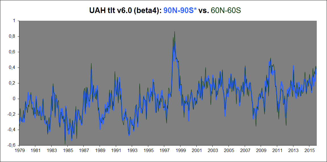
The satellites reporting tropospheric temps, however, do have very good coverage in the Arctic and Antarctic, at least until you get very close to the poles themselves. And what do they show? A significantly higher 90N-90S trend than a 60N-60S trend? Nope.
Here’s UAHv6, 90-90 vs. 60-60:
Notice any systematic rise in trend when adding in the Arctic and Antarctic?
What if we check the new RSSv4.0 TTT data? Any different, you think?
http://images.remss.com/msu/msu_time_series.html
RSSv4.0 TTT global trend (1979-2016), 82.5N-82.5S: +0.179 K/decade.
RSSv4.0 TTT Arctic trend (82.5-60N): +0,270 K/decade.
RSSv4.0 TTT Antarctic trend (60-82.5S): -0.004 K/decade.
RSSv4.0 TTT “polar” trend ((Arctic+Antarctic)/2): +0.133 K/decade.
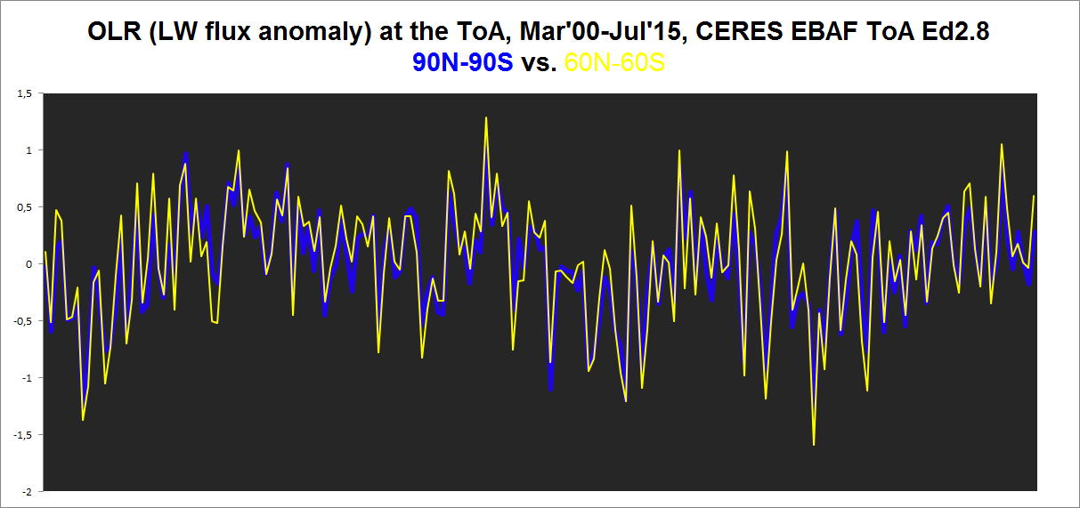
What about the OLR flux through the ToA, which is primarily simply a radiative effect of tropospheric (but near the dry poles also significantly of surface) temps, 90N-90S vs. 60N-60S (CERES EBAF Ed2.8, 2000-2015)?
Not much there either, I fear …
And so we’re left with the GISS-type manipulation of the global surface dataset when including the regions N and S of ~60 degrees of latitude:

https://okulaer.wordpress.com/2015/12/23/why-gistemp-loti-global-mean-is-wrong-and-hadcrut3-gl-is-right/
So going from 60-60, where GISS matches HadCRUt3, with a downward block adjustment from Jan’98 onwards of 0.064K included, almost to a tee, to 90-90, the GISTEMP trend all of a sudden soars upward. And it’s evidently NOT because of anything occurring in the ANTarctic. It’s ALL to do with what is done in the ARCTIC. And what is done? All SST data are replaced by scarce, but massively smoothed out, land data:
Kristian,
“UAH version 5.6 had an obvious flaw in it which had to be corrected”
Well, I think they simply made a different judgment call. But I’m not saying that UAH shouldn’t have corrected. I’m saying that you can’t say UAH is “honest” and RSS not, based on whether you like the direction of the corrections.
The thing is, when you get an estimate from UAH or RSS, you have to rely on their expertise. If they say they have a new estimate, that’s what it is. No use saying you liked the old one better. They aren’t backing it any more. You may have doubts about whether any of their estimates are reliable (I do), but if you want to take notice, it has to be of what they are currently saying.
Nick, maybe you should educate yourself as to the particulars. Why don’t you ask the UAH dataset why it has initiated a rather large adjustment. Then when you’ve accomplished that spoon bending feat, ask RSS why it continues to give equal weighting to corrupt instruments as it gives to well calibrated instruments. Following that you are welcome to comment
“Why don’t you ask the UAH dataset why it has initiated a rather large adjustment.”
Well, thank you genius. Why don’t you? For my part, I have read what they say, and have no strong opinion. I merely note that UAH used to say one thing, and now say another. They are called honest here. RSS, in a much smaller way, did the same. There are strong suggestions made that they are less honest. I see no basis for that except that critics liked the diraction of the UAH changes, and not RSS. For my part, I work on the basis that all involved are trying to do their best, but large changes do create large doubts about reliability (and small changes create small doubts).
Nick, I’ve gone over the UAH changes and they are large changes, I’m not sure why they create large doubts? They have essentially revamped their dataset from rewriting 25 year old code to changing from angles to channels, thus creating better spacial resolution, and less smoothing. Please don’t cast shade, what about the changes cause you to doubt? And from my understanding the Mears team has given equal weighting to certain instruments which have significant drift. Why hasn’t Mears corrected his mistake? MSU 14 and AMSU 15 I think, and the effect of not properly weighting can create a false signal so large a truck could drive through it. Mears is also a bleeding heart alarmist. That doesn’t play well here. I’m sure both datasets are masterfully crafted, and both teams employ the very best human resources, but mistakes are a human property. And I’m waiting to hear which mistakes you feel belong to UAH
Nick,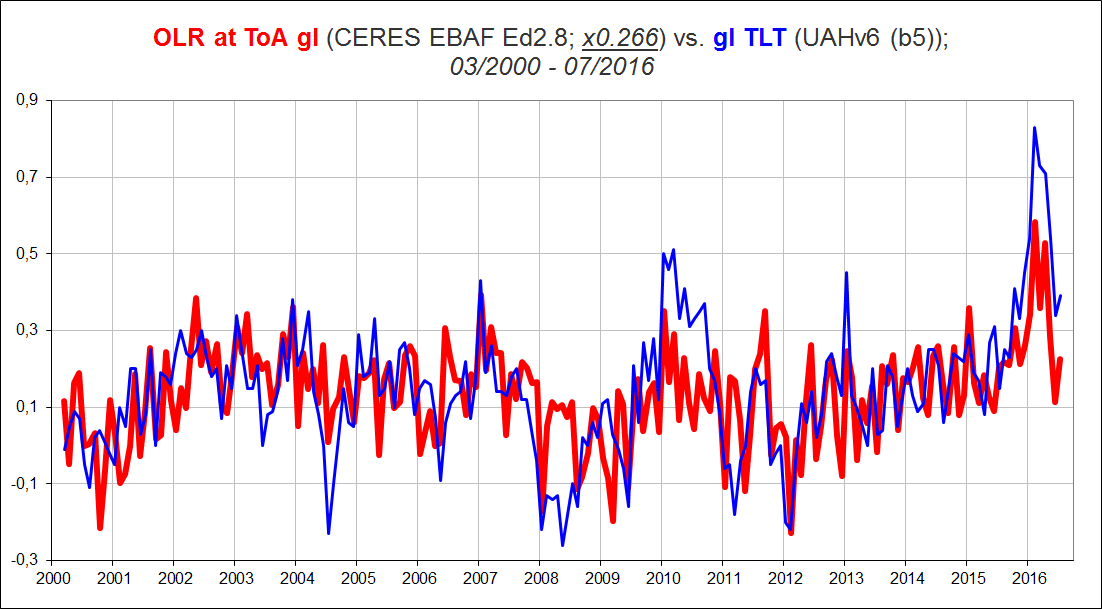
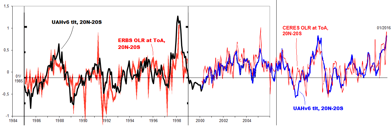
CERES EBAF provides independent evidence supporting the UAHv6 TLT dataset.
This plot of UAHv6 TLT vs. CERES EBAF Ed2.8 ToA OLR (basically a radiative effect of tropospheric temps, only with cloud anomalies perturbing that tight relationship during significant ENSO events) tells me that UAH is definitely on the right track with their version 6; a near-perfect match:
RSSv3.3 TLT, BTW, gives a fit almost as good.
Kristian,
“basically a radiative effect of tropospheric temps”
No, it’s more than that. It is EBAF. Energy balanced and filled. What that means is that the show what is a discrepancy from what would be expected based on a EBM model. It is corrected for heat uptake by the ocean, for example. So it isn’t the case that a warming atmosphere would produce a corresponding warming EBAF. It is corrected for some effects of the warming. It is intended as a boundary condition for GCMs.
Nick Stokes says, November 20, 2016 at 11:46 pm:
Sure. But you know as well as I do that the correction for ocean heat uptake mostly affects the ABSOLUTE flux values and nowhere near as much the ANOMALIES. Here’s CERES SYN1deg observed ToA LW flux anomalies (OLR), global all-sky, vs. CERES EBAF Ed2.8 ToA OLR product:

And here’s how the CERES SYN1deg observed product lines up with the UAHv6 TLT anomaly data:
Kristian,
You say about UAH TLT 5.6; “Yes, and it’s clearly wrong”
It may be wrong, but it is less wrong than UAH 6.0, and least wrong of all TLT or TTT products in the AMSU-era.
If we compare UAH 5.6 and 6.0 TLT trends in the AMSU-era (2000-now)
UAH 5.6 land: 0.22 C/decade
UAH 6.0 land: 0.13 C/decade
UAH 5.6 sea: 0.18 C/decade
UAH.6.0 sea 0.10 C/decade
Is the UAH 5.6 trend falsely high, especially over land, as Kristan claims. Lets compare with surface data:
Land, average of four datasets, 0.26 C/decade
Sea, average of three datasets, 0.15 C/decade
The UAH 5.6 land trend is not too high it is too low, because troposphere should warm faster than surface.
UAH 6.0 is too cool everywhere. It doesnt make sense. It is the lone cool outlier, now when RSS 3.3 is no endorsed for study of long-term changes, due to drifts..
The Ratpac A 850-300 mbar trend is 0.31 C/decade in the AMSU-era. Ratpac is based on a limited subset of radiosonde stations, but it tells the same story as other more comprehensive datasets that are not updated regularly. Kristian doesn’t like radiosondes. Every single one must be wrong. There are two per day flying aloft from up to 1000 sites worldwide. They hardly need adjustments in the AMSU-era. Unadjusted data works equally well.
Olof, your mindless obstinacy on this particular subject knows no bounds, it seems.
On the radiosonde datasets and how we can be pretty sure they’re wrong:
http://www.drroyspencer.com/2016/11/uah-global-temperature-update-for-october-2016-0-41-deg-c/#comment-229597
http://www.drroyspencer.com/2016/11/uah-global-temperature-update-for-october-2016-0-41-deg-c/#comment-229598
http://www.drroyspencer.com/2016/11/uah-global-temperature-update-for-october-2016-0-41-deg-c/#comment-229607
Then you conveniently ‘forget’ that UAHv6 shows a remarkably god fit with both CERES OLR data (up above) and HadCRUt3 surface data (down below):


You’re apparently also not aware of the three most advanced of our major current climate reanalyses (NASA MERRA, ERA Interim and JRA55) and how they estimate the evolution of global temps from 1979 till today. Here’s “Reanalysis Mean” vs. HadCRUt3 (adjusted down 0.064 K from Jan’98), UAHv6 and GISTEMP LOTI respectively:
“UAHv6 shows a remarkably god fit with both CERES OLR data (up above) and HadCRUt3 surface data”
Well, there is a cherry pick. Why not UAH5.6 with HADCRUt4? Or even UAH5.6 with UAH6. That wouldn’t be a great fi either.
On CERES, the EBAF corrections do have a significant effect on decadal trends. But the use of OLR as a temp measure is misconceived anyway. OLR is, apart from ocean effects etc, bound to incoming solar. As the Earth warms with AGW, OLR doesn’t change, except for reductions when heat is flowing temporarily into the oceans.
Owen,
“And I’m waiting to hear which mistakes you feel belong to UAH”
I’ll say again, I’m not particularly concerned to make pronouncements there. It’s an area where I’m not particularly expert, and so I follow what people say, UAH and RSS. I assume V6 is a good faith estimate, and V5.6 was a good faith estimate by the same people. The difference is some measure of the range of good faith estimates possible. And it’s rather large. That’s why I think it adds uncertainty. In fact, the RSS change dwelt on in this head post is small, but I would not be surprised to see a quite large change with V4. That is also uncertainty.
Kristian, please don’t use your usual distraction tactics, ie spamming the discussion with irrelevant comparisons.
The present issue is about the bevaviour of UAH v6 in the troposphere in the AMSU-era. Please compare apples to apples only, not apples to potatoes…
Absolutely no troposphere index corroborates UAH 6.0 TLT except for the unreliable RSS 3.3.
I am familiar with reanalyses, I have checked with pressure level temperatures, pressure level heights, but nothing corroborates UAH 6. The lowest reanalysis i have found is MERRA2, which has an almost perfect match with RSS TTT 4.0, both in the AMSU and MSU-era.
Mears et al validated their new TMT-product with total water vapor over oceans.
You can try that with UAH 6, but you vill be dissappointed. The low trend and divergence from year 2000 is unique for UAH 6. I did this chart almost a year ago
http://postmyimage.com/img2/720_image.png
Nick Stokes says, November 21, 2016 at 3:23 pm:
Er, why would I want to compare 5.6 with anything? It’s obviously flawed. What I want to compare is version 6. And it seems to be a solid dataset.
HadCRUt3 gl (with the downward block adjustment of 0.064 K from Jan’98) agrees well with the gl JMA dataset, and with HadCRUT4 (barring the 1998 adjustment), and with GISTEMP LOTI 60N-60S, and with the “Reanalysis Mean” (MERRA, ERAI, JRA55), and with the satellites (UAHv6 and RSSv3.3), and with the CERES ToA LW flux data.
It is not cherry-picked, Nick. It’s the soundest of the surface datasets (post 1970 and after you’ve adjusted it down by 0.064 K from Jan’98).
Really? You mean like this:
They evidently do NOT have any significant effect on decadal trends, Nick.
Really? So no connection here?

Yes. To the extent that the temperature(s) of the Earth system is. OLR at the ToA is primarily a direct radiative effect of tropospheric temps, Nick.
It doesn’t warm with AGW. The data is clear on this. The SUN (increased ASR) is behind the warming, not an “enhanced GHE”.
No, this is the AGW THEORY, Nick. Not reality. In reality, OLR simply follows tropospheric temps over time (see plots above).
Owen,
“the Mears team has given equal weighting to certain instruments which have significant drift. ”
This is not true. Neither the UAH team, nor the RSS team know for sure which one of the satellites that is right ( NOAA-14 or NOAA-15). They only know that they differ by 0.2 C/decade during the overlap.
But here, the UAH team does scientific misconduct (in good faith but with a blind eye or certain inclination?). They choose NOAA-15 based on an anecdote only, the alleged superior “Cadillac calibration” of AMSU-instruments. They dont check the facts, validate the outcome of the choices, and prove that their choice was right.
The RSS does differently. They make a thorough investigation, but they can still not rule out which one is right, so they choose both satellites. A sign of good scientific practice and objectivity..
IMO it would be possible to validate the NOAA-14 vs 15 choice by use of radiosonde data, which is best done with subsampled/co-located data. This is my attempt:
http://postmyimage.com/img2/792_UAHRatpacvalidation2.png
My conclusion is that NOAA-14 probably is right and NOAA-15 wrong. I don’t think that the 0.2 C/decade satellite difference propagate through the whole AMSU-period, and explain the whole difference from Ratpac. There could be other biases as well, for instance declining sea ice and altered surface emissivity, that disrupts satellite trends.
Another option is to validate the AMSU-5 instrument onboard NOAA-15 vs the adjacent channels AMSU-4 and 6. Already the first assessment of NOAA-15 by Mo (2009) showed that the trend of its AMSU is about 0.1 C/decade too low, compared the neighbour channels.
Also, the merged AMSU-only series by STAR has a much lower trend in AMSU5 (about 50%) than the nearby channels. Since NOAA-15 is the dominating longest serving satellite in the AMSU-series, it may contaminate the AMSU-average significantly.
Another hint, since January 2012, RSS TTT v4 has the highest trend of all global indices, surface or aloft. What happened then? The right answer is that NOAA-15 was discarded..
Check the above with Cowtan’s trend calculator. You may also find that UAH TLT 5.6 has a higher trend than RSS TTT v4, only during the years 2002-2011, a period when UAH 5.6 didnt use NOAA-15, but RSS did.
NOAA-15 AMSU5 is probably the prime “pausemaker” among satellite instruments. Use it uncritically as much as possible and you get a dataset with pause. It is still flying and reporting brightness temperatures…
“HadCRUt3 gl (with the downward block adjustment of 0.064 K from Jan’98) “
So what’s this? Not only does the comparison require that we go back to an obsolete and now not maintained version of Hadcrut, but an unstated Kristian hack had to be made?
And we are supposed to have full faith in UAH V6, even though the V5.6 that the same authors presented for many tears was “obviously flawed”?
Nick Stokes says, November 22, 2016 at 8:34 am:
You apparently are not aware, Nick, of the pretty significant upward step change of 0.09 K in the HadSST2 dataset when compared to other global SST datasets, right at the transition between 1997 and 1998, an obvious calibration artefact resulting from the Hadley Centre (UKMO) switching SST data sources right at this time and thus producing this never-rectified (and never even mentioned!) sudden shift in mean level across the seam:
Globally, including both sea and land, this spurious jump ends up a bit smaller: [0.09*0.71=] +0.064 degrees.
No. We’re supposed to have faith in it because it intercorrelates so well indeed with other independently assembled relevant datasets: HadCRUt3 (and 4) (-0.064K from Jan’98), JMA, GISTEMP LOTI 60N-60S, “Reanalysis Mean” (MERRA+ERAI+JRA55), RSSv3.3 and CERES ASR & OLR fluxes.
“You apparently are not aware, Nick, of the pretty significant upward step change of 0.09 K in the HadSST2 dataset when compared to other global SST datasets, right at the transition between 1997 and 1998, an obvious calibration artefact “
So you not only cherrypick by using an obsolete version, but take it on yourself to “rectify” aspects you don’t like by hacking the numbers?
Olof, you’re one of those types that are hopeless to discuss science with, because you simply refuse to take in what is being said and shown at the opposite end of the argument from your own.
I’ve already explained to you multiple times precisely why we cannot and should not trust the radiosonde datasets – as compiled – and their version of how tropospheric temperature anomalies evolved from the late 70s till today.
But you’ve simply decided not to listen.
You also continue to ignore how well the UAHv6 and RSSv3.3 satellite versions of the same fit with several both surface and ToA datasets, the very same datasets that the radiosonde datasets don’t match at all.
Nick Stokes says,November 22, 2016 at 9:31 am:
Do you see the 1997-98 step, Nick? Or don’t you? Ever heard or read a UKMO explanation of that step in the HadSST2 dataset? So why is it still there …?
“This leaves UAH as the last honest record keeper standing”
I have always questioned whether the “Cadillac calibration” choice is honest, or good scientific practice. It requires more than an anecdote to motivate such a significant choice, for instance validation by independent data..
As a contrast, RSS doesn’t choose, they average the two alternatives..
Nick Stokes November 18, 2016 at 3:35 pm
That must be why the Satellite data runs closer to the balloon data. /sarc
For the last 12 months, the average width of the 95% confidence interval for the global average anomaly in HADCRUT4 is 0.31 degrees C. We are worried about 0.01 degrees why?
Good point! However that 0.01 (actually about 0.02) could make the difference between 2016 beating the 1998 record or not. I will admit that this is more of a psychological point.
Roy Denio on November 18, 2016 at 10:32 pm
That must be why the Satellite data runs closer to the balloon data.
Do you know that, or do you simply suppose it?
According to Roy Spencer, the average absolute TLT temperature measured during 2015 is about 264 K, i.e. 24 K below surface.
You have a lapse rate of about 6.5 K / altitude km, giving a measurement altitude of 3.7 km.
According to
http://www.csgnetwork.com/pressurealtcalc.html
that gives an atmospheric pressure level of about 640 hPa.
If you calculate the trends for the satellite era (from 1979 till now) for the RATPAC B “monthly combined” dataset (85 carefully selected stations out of the IGRA ensemble, with highly homogenised data)
https://www1.ncdc.noaa.gov/pub/data/ratpac/ratpac-b/RATPAC-B-monthly-combined.txt.zip
you see that for pressure levels between 700 hPa and 500 hPa, you obtain 0.167 °C / decade.
That’s indeed the same as for UAH6.0beta5 “Global land” as visible in
http://vortex.nsstc.uah.edu/data/msu/v6.0beta/tlt/uahncdc_lt_6.0beta5.txt
But if you calculate the trend for the entire IGRA ensemble (about 1,000 stations actually), you get at 700 hPa resp. 500 hPa 0.613 resp. 0.674 °C / decade.
So you rather should write
That must be why the Satellite data runs closer to a very small, carefully selected subset of the balloon data.
The goal posts seem to be on wheels now.
Self-propelled, ever receding into the distance.
Turbo charged
Mark,
Yup, definitely accelerating. And spreading to more goalposts, now to include the previously fairly honest RSS.
Maybe ref Trump can move the goalposts back to the 110 yard line.
AGW the basis for the theory is wrong an ever increasing +ao , lower tropospheric hot spot.
This theory is on it’s way out as the global temperature decline is now setting in.
The earth has warmed but it’s not due to greenhouse gases;. It’s due to a 3% reduction in ozone since the ,,50’s.
Why do you say that Tim?
Wah? Post us a graph.
It is illegitimate to include the super El Nino of 1998 in your calculations of your pause length. Its height is in no way related to the normal temperature values that the pause refers to. It is also unrelated to ENSO values since it does not originate from the same source of warm water.
And what do propose we do with the effects of even more super 2015-16 El Nino? What happens if you take those numbers out of the equation? 2016 still warmest evaahhh..? Pause uninterupted?
Let us know.
If you wish to take both El Ninos out of the picture, you can find a negative slope here (from Nick’s site)
Temperature Anomaly trend
Jul 2000 to May 2015
Rate: -0.001°C/Century;
I see no problem with starting prior to the 1998 El Nino and then ending after the 2016 El Nino.
Sorry, there is a problem. The 1999-2001 La Nina is then included at the front of the trend while the coming (2017-) La Nina is not present. This biases the trend upward.
It doesn’t matter if you included the 1998 El Nino because you automatically include the following La Nina which balances the effect on the trend. You cannot include the 2016 El Nino because you don’t have the La Nina to balance it out.
Or, you need to remove the effects of ENSO altogether.
If we wait for the 2017 La Nina, then we would go from the 1998 El Nino to the 2017 La Nina. I believe the 2017 La Nina should be counteracted by the 1996 La Nina.
Werner, as long as the trend is long enough the effects of El Nino – La Nina pairs are minimal. The 2016 El Nino will still be close enough to the end of the trend to limit the effects of a 2017 La Nina. For now the best you can do is stop before the El Nino gets going. Eg.
http://www.woodfortrees.org/plot/rss/from:1997/to:2015/plot/rss/from:1997/to:2015/trend/plot/uah6/from:1997/to:2015/plot/uah6/from:1997/to:2015/trend
It would have looked better if you started in 2001. By starting in 1997, that is too close to the strong El Nino and looks like cherry picking since there is no strong El Nino at the end.
Has anyone attempted to compare individual surface stations with satellite temperature measurements for the same location? It seems like a no-brainer if you want to assess the reliability of the satellites but, as far as I can tell, it hasn’t been done. yes/no?
How about using the US CRN stations?
Keep in mind that satellites take measurements much higher up than the surface numbers at about 2 m. However due to the adiabatic lapse rate, the trends over decades should not be too different. However individual months can greatly vary. This even applies to GISS and HadCRUT. For proof of that, see an old article of mine here:
http://wattsupwiththat.com/2013/12/22/hadcrut4-is-from-venus-giss-is-from-mars-now-includes-november-data/
One would not be looking at absolute figure, only trends.
But of course, weather patterns are different with vertical profile.
Very true. But over a long enough time period, things should average out.
The satellite data corresponds well with the radiosonde data from weather balloons. A much better comparison than with a surface station.
TedM on November 18, 2016 at 2:01 pm
The satellite data corresponds well with the radiosonde data from weather balloons.
This, TedM, is simply wrong. Becauuse what you write solely holds for
– very stable landscapes wrt temperature (e.g. CONUS)
and for
– a very small subset of these balloon radiosondes whose raw data has been homogenised (e.g. the RATPAC A and B datasets).
Taking the average of the data measured by the entire radiosonde dataset of the IGRA network gives, at the altitude (i.e. the atmospheric pressure level) where MSU/AMSU satellites operate, a completely different view.
“Has anyone attempted to compare individual surface stations with satellite temperature measurements for the same location? It seems like a no-brainer if you want to assess the reliability of the satellites but, as far as I can tell, it hasn’t been done. yes/no?”
Ya. I did it.
There are several problems.
1. Surface stations (typically) measure once a day and record a min/max
2. Satillites measure twice a day (ascending orbit/descending orbit) and at a different time
than the surface measurements are taken.
You can get around this is a couple ways but they all involved modelling and adjustments.
One simple way is to just look at the trends over time and assume that the trends should be close.
What you will find
A) Over the Ocean there is no difference to speak of
B) Over Land, the difference is MUCH GREATER after 1998 than before. In 1998 the sat guys
switched sensor types. Depending on the adjustment for AMSU the difference you see between
various sat products is large
C) The Biggest differences between Sats and the Land come at high latitude. The surface
stations show more warming than the satillite
D) The larger warming in the surface record is ANTI CORELATED with population. That is unpopulated
areas at high latitude show more warming on the surface than the satellite record suggests.
If you want to get really detailed you could pick just CRN stations and then calculate the time of satillite
overpass and then compare because CRN has 5 minute data.. BUT the surface measurements are more direct. the satillite measurements rely on assumptions about surface emissitivity and they rely on either physics models or GCM models ( for diurnal corrections )
commieBob,
Well, I have compared UAH v6 TLT with Ratpac A data, apples to apples as far as possible.
This is the latest version where I even included the station dropout:
http://postmyimage.com/img2/792_UAHRatpacvalidation2.png
The result is very robust, subsampling, TLT-weighting and station droput has no major effect.
UAH loses about 0.2 C/decade on Ratpac since the AMSU-instruments were included..
The trend of Ratpac A 850-300 mbar is 0.31 something since year 2000, but I prefer the more balanced period of 1997-2016, which has the trend 0.27 C/ decade, since it has strong Ninos at both ends (as Werner Brozek points out above).
0.27 is almost spot on the CMIP5 average trend for the layer (0.28)
OR, there is no global radiosonde data. Comparing global data to non global data is pretty much meaningless. When regional data is compared, the satellite data compares favorably to radiosonde data. That is the only data we have.
” BUT the surface measurements are more direct.”
How so? At high latitudes, in particular, there are very few surface stations. The majority of the area is simply not covered. You are trying to portray the surface measurements as more reliable by downplaying or omitting information on their crippling weaknesses.
Richard M,
You have obviously not understood the chart and text. It clearly demonstrates that Ratpac A Global has a good global representation and can be directly compared to global satellite data..
And regional satellite data (subsampled) does not compare to radiosondes, just like the “global” data.
Read and watch again and try harder!
Satellites and radiosondes compared well in the early 2000s when MSUs formed the backbone of the TMT and TLT datasets
But that iis obviously history. It is the new AMSUs that doesn’t compare… after 2000 ca.
Richard M on November 18, 2016 at 5:54 pm
OR, there is no global radiosonde data. Comparing global data to non global data is pretty much meaningless.
That is the best I have ever read about radisondes, manifestly Richard M’s science niveau… to think, imagine, suppose, guess, pretend, claim, without knowing anything about what he writes.
Richard M, there are actually round around the globe about 1,000 active radiosondes (ehre were over 1,600 in the seventies), whose measurements are brought together into a common dataset called IGRA.
This is the Integrated Global Radiosonde Archive, whose data is immediately accessible to everybody able to google for “radiosonde data download”:
https://www.ncdc.noaa.gov/data-access/weather-balloon/integrated-global-radiosonde-archive
The general directory is here:
https://www1.ncdc.noaa.gov/pub/data/igra/
and the measurement datasets are here:
https://www1.ncdc.noaa.gov/pub/data/igra/monthly/monthly-por/
Feel free to download and evaluate the data as I did months ago, and to compare it to satellite measurements over land 🙂
Yes I did. UAH has near the traditional 27 zonal/regional series also a 2.5° gridded dataset (72 lat x 144 long).
I lack the time for the moment but I’ll come back here with comparisons I made between e.g. GHCN CONUS or GHCN Australia or GHCN Globe and those UAH grid cells encompassing the station coordinates.
Of course the temperatures in the troposphere and theur trends differ from those measured at the surface; but the comparison nevertheless is interesting.
commieBob on November 18, 2016 at 12:51 pm
Has anyone attempted to compare individual surface stations with satellite temperature measurements for the same location?
Well, if you have the appropriate resolution in the satellite data, it may work.
You can for example process UAH’s 2.5° grid data (a grid is here about 280 x 280 km). The data is located in the directory
http://www.nsstc.uah.edu/data/msu/v6.0beta/tlt/
(files tltmonamg.1978_6.0beta5 through tltmonamg.2016_6.0beta5).
One part of the processing could consist of loading the GHCN station list stored in
ftp://ftp.ncdc.noaa.gov/pub/data/ghcn/v3/ghcnm.tavg.latest.qca.tar.gz
(or different subsets of it) and output the average anomalies of all UAH grids encompassing the station coordinates in the subset considered.
For e.g. CONUS, the subset of all GHCN stations gives 165 UAH grid cells (the rectangle encompassing the whole CONUS has about 240), and the trend computed for them starting with dec 1978 is
UAH grid CONUS: 0.145 °C / decade
what is a good fit to the UAH regional data
USA48: 0.15 °C / decade
found in http://www.nsstc.uah.edu/data/msu/v6.0beta/tlt/uahncdc_lt_6.0beta5 (column 25).
For single locations, I made for example 2 months ago a test with Cairns (Australia).
GHCN station trend 1979-2016: 0.139 °C / decade
UAH grid cell “over” Cairns: 0.108 °C / decade.
UAH regional AUS: 0.16 °C / decade
To get a feeling for the possible accuracy of the approach, it’s best to compare UAH’s Globe land data with the 2.5° grid cell average for all GHCN stations:
http://fs5.directupload.net/images/161121/6nvkpkrl.jpg
UAH Globe land: 0.17 °C / decade
UAH grid cells over all GHCN stations: 0.162 °C / decade.
Be careful, there is no scientific proof for the accuracy: it’s layman’s work after all 🙂
Since the 1880’s or earlier we have been in a warming period. Why wouldn’t we expect to see “records” set? The alarmists keep crowing about warmest month/year in the record. My response is “of course it’s the warmest; the world’s been warming naturally for over 100 years. Now prove that any of this warming is not part of the natural process started long ago.”
And furthermore, even if 2016 sets a record, what is the big deal if a very strong El Nino was the primary cause of it?
El Nino doesnt CAUSE warming.
El Nino is a pattern in warming,
the question is what causes El Nino..
Steven,
Weaker E-W winds along the equator, allowing piled up warm water in the western Pac to flow eastward, lessening the upwelling of cold water off South America.
What causes those usually strong easterlies to weaken in the first place?, you might now ask. Good question, but probably solar activity and atmospheric pressure:
http://www.john-daly.com/sun-enso/sun-enso.htm
Semantics is not my strong point, but I think you knew what I meant. Namely that temperatures spike up when we have an El Nino.
Chimp on November 18, 2016 at 3:07 pm
Looks good, but the very first test for a forecast is not very interesting as there were so many peaks at that time:
http://www.esrl.noaa.gov/psd/enso/mei/ts.gif
http://fs5.directupload.net/images/160718/i5f8mjmw.jpg
Even the comments concerning these assumptions no longer exist:
http://www.john-daly.com/sun-enso/soidebat.htm
returns with a 404.
Your comment is simple but displays great knowledge.
You might want to add some of my thoughts:
ALL real-time average temperature compilations were made DURING a warming period.
New record highs are to be EXPECTED until that warming period ends, and a cooling period begins.
According to ice core data, ALL warming periods in history were followed by cooling periods.
There is no proof the current warming period will NEVER end.
I do appreciate all of the very detailed, technical discussion of the relevance of all of the data sets that exist, this is very good dialogue and I thank all involved for their analyses and opinions. HOWEVER THAT BEING SAID, I do want to compliment Patrick B on the very sensible, logical statement regarding the undeniable fact that we have been warming ever since the LIA that ended in the late 1800’s.
To put the current data set into perspective, let’s have some fun ……
Okay, life has existed on the planet for approximately 3.8 billion years. Maybe tad longer, maybe a tad shorter, but close enough. And we have been recording data for approximately 200 years. Probably less than that, but I don’t want to embellish my “math” too much …..
Therefore, if we put the entire time that life existed into a calendar year (let’s use 365 days to keep it simple), accurate data has existed for the last 1.7 seconds of December 31 of the year in question. Put another way, we would be between “2” and “1” in the countdown to “Happy New Year!” when accurate recorded data began. What about the other 31,535,998.3 seconds??? Why do we focus so much on such an insignificant data set and use this for extrapolation? What about the geological history that clearly shows that we have had glacial events (i.e. ice ages) in the past with significantly higher CO2 concentrations??? At the end of the Ordovician, approximately 450 million years ago, there was a glacial event with atmospheric CO2 concentrations that were TEN TIMES current! How does CO2 drive temperature again??!?!!? Ditto at the end of the Jurassic period, 150 million years ago, another glacial event with atmospheric CO2 concentrations that were FIVE TIMES current!!!
No offense to the detailed evaluation of current data, it is there for the review to be done, but aren’t we missing the forest by focusing too much on a single leaf of a single tree?
I assume that you are a new reader. If so, welcome to WUWT!
You ask a good question and to answer it I would like to point out that over the last 10 years, many of the points you raise have been covered. WUWT covers many diverse topics over the course of each month.
Darrell Demick on November 22, 2016 at 3:34 pm
I’m afraid you are yourself focusing on a single leaf: the fact that temperatures were rising in the past too.
1. What actually bothers a lot of people especially in the domain of (re)insurance is the (possibly associated) fact that an increasing number of increasingly harsh climate events might happen during the next 5 or 6 decades.
And that makes predictions of (re)insurance costs really difficult. Please have some smalltalk with persons working e.g. at Munich Re, and you’ll understand.
2. Moreover, we are, as you perfectly know, no longer a few millions of hunter-gatherers, but are quickly moving to eight billions of humans being highly dependent of complex technical infrastructures as well as of secured food animal and plant growing.
3. Thus to underline the fact that “there were warming periods long time ago” or “there was more CO2 long time ago”: are such truisms so helpful?
IPCC was after all not set up by a horde of crazy climate scientists, but by governments.
The adjustments that are being made all converge on socialistic government policy: more taxation, less liberty, higher costs, fewer options, and bigger government. When new rules force perfectly good equipment to be replaced because repair is too costly or even forbidden, the environmental costs are never counted against what little environmental improvement was mandated. There is never any appreciation for the costs of any new rule. We no longer can afford the luxury of giving in to this madness.
I write this from a location that a mere 20,000 years ago was under hundreds if not thousands of feet of glacial ice. So, of course the climate is always changing. What fool would deny that?
Does that mean that when Trump takes over, that the adjustments will go in the opposite direction?
Hopefully, they’ll begin to go in the correct direction.
Not likely since corrections have gone in both directions
When talking about slopes over the last 18 years, is it not only UAH that has gone down? But 4 others have gone up to bust the pause?
One of the things that is going on in this decades long debate, is control of the language. For some reason we have allowed our selves to be obsessed with the average temperature as if that really means something. When Johnny Carson said, “It was really hot today” and the audience responded, “How Hot Was It?” They weren’t asking about the average. When the media talks about 2016 on track to be the hottest ever, they show us images of cracked earth and dead live stock. It’s the heat of the afternoon that is portrayed and the average that is used to define it. What a crock!
If you are interested in the so-called pause regarding the heat of the day and that’s not in January, then maybe we should find out about the day time temperatures from June 21st to September 21st. If you go to NOAA’s Climate at a Glance and ask it to graph out Maximum temperatures for June through September and fiddle around to find how far back you can go and still find a negative trend? Well, CHECK IT OUT. All the way back to 1930!
Some browsers don’t display the graph, here’s what it looks like:
http://oi63.tinypic.com/156fl8y.jpg
…and obsession with recent satellite data. A means for statistics to display what the maker desires. Earth has no “normal” but is an epic story of change. 🙂
If you start with 1910 to 2010 you have a slightly upward trend ~ 0.8 ° C
And if you started in 1935 and go to 1992 you would have a Yuge downward trend !!!
No Marcus, ho huge downward trend, simply flat (0.05 °/ decade).
highflight56433 1:22 pm
marty at 1:48 pm
Marcus 1:53 pm
All three cherry picks.
Correction, Just Marty and Marcus
..Ummm ..Steve, that was my point….
They do cherry pick, but is that material?
Almost all theories are disproved by cherry picked scenarios, where a universal theory cannot adequately explain a specific occurrence.
Accordingly, in AGW the theory the claim is that with more CO2 temperatures must always go up. Not sometimes go up, sometimes stay level, sometimes go down. The temperatures must always increase when CO2 is increasing.
The problem is that natural variation is supper-imposed. The question then is, how large is natural variation and can it mask (completely or partly) the warming that is brought about by increased CO2. This then begs a second question, for how long can natural variation operate so as to mask warming/ Are there cycles, trends in natural variation. Since we do not understand natural variation, we cannot properly answer that, but do not forget that AGW proponents have long argued that CO2 forcing has overcome natural variation.
Thus the issue raised by Marcus 1:53 pm is whether a 57 year cooling trend is significant when during this period CO2 rose, and after about 1950 rose substantially? At one time, Santer thought that a period of 15 years would be significant since he considered that the effect of natural variation would be wiped out if one were to look at 15 years worth of temperature data.
of course, the US is not the world, but it is not an insignificant part of the land mass where we live. Further, Greenland also shows a similar decline in temperatures post the late 1930s, so falling temperatures is not restricted to just the USA.
.
Marcus November 18, 2016 at 3:28 pm
..Ummm ..Steve, that was my point….
Sorry, as they say, I was shooting from the hip )-:
“Maximum temperatures for June through September and fiddle around to find how far back you can go and still find a negative trend? Well, CHECK IT OUT. All the way back to 1930!”
However AGW is exerting itself mostly in the rise of overnight minima – thus….
AGW??? Where’s the [nonexistent] low-frequency coherence with CO2 levels? What you’re showing is a trend typical of night-time UHI effects in a steadily urbanizing region.
..Hmmm, you seem to be missing the 1998 spike ? Second, it clearly says “June to August”, Third, the graph says and shows… 1895 to 2016…NOT 1930…
Your graph also shows that the minimum temps have increased, since 1890, by 1.25 degrees !! Living in Canada, I consider that a good thing after 125 years…Much better than 2 miles of ice sheets, which would be rather….uncomfortable..?
Toneb, you seem to have missed the point. Steve Case was pointing out the press constantly portrays the warming as increases in the daytime. Even you admit the warming has been at night. Hence, it appears you agree with Steve. The media is producing propaganda to push an agenda that has nothing to do with reality.
That’s right cool days and warm nights, summer weather is becoming milder. The alarmists constantly talk about extreme weather becoming the norm. Maybe they will say summers are becoming extremely mild.
1sky1 on November 18, 2016 at 3:39 pm
What you’re showing is a trend typical of night-time UHI effects in a steadily urbanizing region.
1sky1, if you select out of the GHCN V3 dataset all the “very rural” stations out of the CONUS set (by choosing “R” mode and lowest nightlight level “A”) and compare their data with the rest, you obtain
http://fs5.directupload.net/images/161120/tine4eq9.jpg
You see that the differences exist but are by far not so strong as one imagines, especially when you compare their 37 month running means.
Pure urban (“U” mode, nightlight level “C”) has a higher trend, that’s evident. But it vanishes into the complete data.
Look moreover how they correlate with that of UAH’s CONUS regional data.
Trends in °C per decade for 1979-2016:
– CONUS very rural: 0.138
– CONUS nonrural: 0.104
– CONUS pure urban: 0.182
– CONUS complete: 0.108
– UAH48 (troposphere): 0.149
Bindidon:
GHCN V.3 station records reflect not the actual situation in situ, but the egregiously arbitrary trend adjustments made in “homogenizing” the dataset. One must use properly vetted station records available only in earlier GHCN versions.
Nor can the decades-long satellite data tells us much about UHI-produced SURFACE trends, which are manifest over a century or longer. “Correlating” the magnitude of decadal trends during a period when virtually ALL temperatures were swinging upward due to multi-decadal cycles is a fools errand, because those cycles are of different amplitudes at different locations.
1sky1 on November 19, 2016 at 5:59 pm
GHCN V.3 station records reflect not the actual situation in situ, but the egregiously arbitrary trend adjustments made in “homogenizing” the dataset.
Here again, you don’t seem to really know anything about the GHCN record: you are rather supposing or claiming things.
Did you ever download and evaluate the GHCN data? I have the strange impression you never did.
Because if you had done that, you would know that the GHCN unadjusted data is by no means “homogenised” nor even corrected, and that GHCN adjusted data merely contains corrections.
Homogenisation is made by those people who perform further data processing on the base of GHCN data: e.g. NASA GISTEMP or NOAA, the „dishonest pause busters“.
To give you an idea about how wrong you are, here is a chart with plots of the Antarctica station VOSTOK, conatining nonsense anomalies I discovered by accident more than by intention:
http://fs5.directupload.net/images/161120/xp6sgp6z.jpg
One of the many differences between VOSTOK’s unadjusted and adjusted data you see here:
Unadjusted record:
700896060001984TAVG –320 OW-4730 W-5720 W-6290 W-6100 W-7060 W-6550 W-6820 W-6320 W-5800 W-4200 0-3040 W
Adjusted record:
700896060001984TAVG-9999 QW-4730 W-5720 W-6290 W-6100 W-7060 W-6550 W-6820 W-6320 W-5800 W-4200 0-3040 W
As visible in the chart, january 1984‘s nonsense absolute reading (-3.20 °C instead of -32.00) has not been corrected but was replaced by „-99.99“ (undefined value).
Here is a chart where you can compare plots of GHCN unadjusted, GISS land-only and GISS land+ocean:
http://fs5.directupload.net/images/161120/w5xi9zx4.jpg
Maybe you now understand what „homogenisation“ really means, by comparing the GHCN plot in grey and its tremendous peaks up and down, with GISS land-only (red) and GISS land+ocean (blue).
Trends in °C /decade for 1880-2016:
– GHCN unadjusted: 0.214 ± 0.058
– GISS land-only: 0.097 ± 0.001
– GISS land+ocean: 0.071 ± 0.001
Last not least: here is finally a chart showing the GHCN V3 rural/nonrural/urban split from 1880 till today (only 60 mont running means, the monthly output gives us no more than spaghetti):
http://fs5.directupload.net/images/161120/v5vqzr6z.jpg
Good night from near Berlin, it’s now 3:45 am here.
Bindidon:
GHCN V.3 data contains not only adjustments for evident errors in the records (which would, in the aggregate, alter the power spectrum by introducing noise components characteristic of a zero-mean Poisson process), but quite systematically alters the century-long “trend” of the records. Shortly after V.3 came out, “Smokey” here at WUWT posted scores of flash-animated comparisons showing the egregious trend changes relative to V.2. My own work with hundreds of century-long station records world-wide, which began in the 1970s, repeatedly revealed the patent tendency toward ad hoc adjustments that increase or even reverse the trend of nearly pristine non-urban records in order to conform to UHI-corrupted station records. That’s what I mean by arbitrary “homogenization.”
By working without any apparent field experience, or critical analytic faculty necessary for vetting time-series, you expose yourself to precisely to the misguided conclusions that the GHCN data adjustments are intended to produce.
BTW, here’s the difference between geographically representative century-long urban and non-urban records in CONUS that have been properly vetted, rather than adjusted:
http://s1188.photobucket.com/user/skygram/media/Publication1.jpg.html?o=0
1sky1 on November 21, 2016 at 12:24 pm & 12:41 pm
The difference between us: while I produced charts original GHCN data is the source of, you refer, like do many „climate skeptics“, to unverifiable data, be it that produced somewhere by some „Smokey“ unknown to me, or a chart without any reference to the data it is originating from.
Moreover, you do not seem to really want to understand why the transition from V2 to V3 was done. A typical attitude, the same as that shown by people who are unable to accept the reasons which led to the transition from HadCRUT3 to HadCRUT4 (hundreds of surface stations added, mainly in the Arctic).
By using such completely unreliable and unverifiable methods, and in parallel rejecting any changes you personally do not agree to, you can pretend / claim / refute anything you want to.
I have NO interest in such useless discussions.
Bindidon:
When you use egregiously adjusted GHCN V.3 data–only a small fraction of whose monthly average values correspond to actual measurements–you pass it off as “original” data. But when earlier-version GHCN data–corresponding very much more closely to verifiable measurements–is used by persons “unknown” to you, it becomes “unverifiable data” and “completely unreliable…methods.” Along with your self-serving inclination to project the worst motives upon those who disagree with you, your vapid posture of superior knowledge of the quality of station data is a total hoot..
+10 Steve
Steve Case on November 18, 2016 at 1:11 pm
For some reason we have allowed our selves to be obsessed with the average temperature as if that really means something.
Where is your problem with averages? Dunno wa ye mean!
https://www.ncdc.noaa.gov/cag/time-series/us/110/0/tavg/4/9/1895-2016?base_prd=true&firstbaseyear=1901&lastbaseyear=2000&trend=true&trend_base=10&firsttrendyear=1895&lasttrendyear=2016
But please do not forget that you are inspecting the CONUS during a very small time span… The 1930’s are far far from being the hottest decade for the Globe as a whole.
good chart
All it looks like to me is a tangled web.
Yes, so its a matter of choosing a time period. Or is there a way to decide when to start and to end, to get a plausible result?
marty at 2:07 pm
Yes, so its a matter of choosing a time period.
Start with the current date and work your way back.
You could always try the start of the satellite record and consider going………ummm to the end (like the most recent month). Just a thought.
Either start prior to one strong El Nino and end after a later strong El Nino
OR start prior to one strong La Nina and end after a later strong La Nina
OR start in the middle of an ENSO neutral period and end in the middle of a later ENSO neutral period.
..How about using the entire history of ALL the records of Earths temperature (ice cores) with appropriate error margins… ? Then there can be no accusations of “Cherry Picking” dates …That is the only way we will ever have a chance to understand what is actually happening…
Werner, once again …. you must include El Nino – La Nina pairs especially for the super El Nino events. Don’t break them up. Anything else will bias the results. For example, going from the 1998 El Nino to now includes the 1999-2001 La Nina towards the beginning of the trend but does not include the coming La Nina.
Could also look further afield than just the US too.
GISS Update:
GISS came in at 0.89 for October. It is the second warmest October on record behind 1.07 in 2015. The average for the first 10 months is 1.02 so 2016 is guaranteed to set a record since the previous record was 0.87 in 2015 and there are only 2 more months to go in 2016.
A trend that has quasi-repetitive deviations like ENSO, and random processes such as volcanic events, make short term analysis of trends meaningful unless their effect can be factored out. It must be obvious that the La Nina like conditions following the recent El Nino will cause the trend to again flatten in the next few years, if no new large volcanoes erupt. Actually playing with data sets on a system dominated by bounded chaotic processes is of little use in general unless somehow the physics is fully understood, and this is certainly not true at the present. All we can say for sure is that the models fail.
Meaningful should be meaningless
Leonard Weinstein on November 18, 2016 at 2:51 pm
It must be obvious that the La Nina like conditions following the recent El Nino will cause the trend to again flatten in the next few years…
Nothing is less sure than that: look at the Multivariate ENSO index. It tells you that strong Niños often are followed by weak Niñas and vice-versa.
Actually playing with data sets on a system dominated by bounded chaotic processes is of little use…
Indeed!
But at least two papers (of course heavily disputed, especially by climate skeptics) have shown how to obtain temperature residuals by extraction volcano and ENSO signals using well-known statistical techniques:
Foster / Rahmstorf 2011:
– http://iopscience.iop.org/article/10.1088/1748-9326/6/4/044022/meta;jsessionid=8EBB4F5D414A9B82EE2198CAF049E345.c3.iopscience.cld.iop.org
Santer, Bonfils & alii 2014:
– https://dspace.mit.edu/handle/1721.1/89054
Why all the fuss about RSS 3.3 TLT? It is no longer endorsed by RSS due to insufficient drift correction.
If RSS TTT v4 isn’t good enough, why not make a multilayer TLT with the UAH v6 formula:
LT = 1.538*MT -0.548*TP +0.01*LS
With pure RSS data the trend is 0.21 C/decade from 1987. RSS doesn’t find the TTP channel reliable before 1987, but if we borrow data from UAH and splice it on back to 1979, the full satellite era TLT trend also becomes 0.21..
Are you suggesting that the increases that came with the October 4 report did not fix all of the problems? Should we expect further adjustments?
Yes, isn’t that obvious? Since the old diurnal drift correction model, used by both RSS and STAR, have been found inaccurate, they have both developed new TMT datasets
The new TMT trends of STAR and RSS are 0.14 C/ decade whereas that of UAH is 0.08.
The ratio between TLT and TMT trends is typically 1.4 something.
I don’t know why a new RSS TLT dataset lingers, is a special correction for limb views needed? Or are they abandoning the multiangle TLT concept, which have some inherent problems, in favour of TTT?
It seems likely that TLT will fall by the wayside, the more complicated calculations involved seem to be too much trouble. Christy didn’t use it in his senate hearing presentation he used MT, and its continued use doesn’t seem a priority at RSS.
O R, do you believe everything you’re told to believe? Mears and Wentz lost all credibility when Mears participated in the Yale attack video. Now we can only assume they are activists and whatever they produce is garbage. You reap what you sow. Trump should defund them immediately.
Sorry you are so gullible.
Actually, Spencer and Christy lost credibility when they did the “Cadillac calibration” choice.
You can’t cherry-pick away the largest uncertainty in the satellite series, and go 100% for the lowest trend alternative, without supportive evidence.
Mears has not attacked anyone. He only says that the satellites are uncertain. He knows.. Good scientists are not certain of the uncertain…
Richard M on November 18, 2016 at 6:25 pm
OR so gullible? Hhmmmmh.
Did you ever read the document “HHRG-114-SY-WState-JChristy-20160202.pdf”, containing John Christy’s Senate testimony dated 2016, Feb 2?
Phil. mentioned just that interesting paper above your comment.
On page 4 of the document, you read, not without being surprised a bit:
Well, if that was easily corrected such long time ago: why then not to use it instead of focusing on TMT, a troposphere layer used by a handful of people?
And you get even a bit more surprised when you discover one page above in the document a chart showing so perfect correlation between satellites and radiosondes dated 2004. In a document published 2016!
http://fs5.directupload.net/images/161121/v2yphovu.jpg
And as if that wasn’t enough, Christy moreover refers to radiosondes whose majority (the VIZ) is out of service since a while.
Did you really write “gullible”, Richard M?
The graph looks very similar to the graph of Senate and House races lost by the Democrats over the last 20 years. Political cooling meets global cooling.
Viewers have noticed that Arctic sea ice recovery remains weak this season, while Arctic air temps are atypically around 15K above average, (still well below freezing.) The two phenomenon go hand in hand, as the recently departed El Niño moved a lot of stored heat to northern waters, helping to slow sea ice recovery and now, the ice free open sea releases more of that heat into the atmosphere, which then radiates to space, even more rapidly in cloudless conditions.
The Arctic acts as a sort of stovepipe for Earth’s heat balance. Currently, a lot of stored ocean heat is going up the chimney. Might want to lay up some more firewood for this Winter.
Don’t forget the AMO. It probably is an even bigger factor than El Nino but the two of them together maximize the impact.
If you like to sort out AMO, then you have to work with a 60 years observation. El Nino / la nina doesnt matter much at this time length.
http://www.woodfortrees.org/graph/hadcrut3vgl/last:720/plot/hadcrut3vgl/last:720/trend
0.125 °C warming per decade
or you check 2 amo cyles = 120 years
http://www.woodfortrees.org/graph/hadcrut3vgl/last:1420/plot/hadcrut3vgl/last:1420/trend
0.075°C warming per decade
Possibly there was a little more warminng the last 60 years.
HadSST3 Update:
HadSST3 came in at 0.603 for October. It is the second warmest October on record behind 0.699 in 2015. The average for the first 10 months is 0.641 so 2016 is guaranteed to set a record since the previous record was 0.592 in 2015 and there are only 2 more months to go in 2016.
justthefactswuwt
Regarding: “It is still possible for the 1998 record to stand after 2016 for both RSS and UAH, however that would require a significant drop in the November anomaly from the October anomaly in each case, but much more significant for RSS, than UAH.”
Did you not also say that the required November & December drop to keep the 1998 record standing is .0725 C (using the October 3 numbers and assuming October would have the same change from the Jan-Sep average as in the October 4 numbers) and .167 C (using the October 4th numbers)? And for UAH the required November & December drop is .189 C?
Ooops! Sorry about that! Using the present numbers, the required drops are about the same in each case. However the drop would have been much less for RSS if adjustments had not been made.
justthefactswuwt:
Regarding: “The average of the last four months is 0.418, which is 0.08 above the June anomaly of 0.338! Keep in mind that ENSO numbers dropped every month this year.”
According to the WFT graph set you show, RSS also rose for all three of the months after June that UAH did, although RSS dropped more in October than UAH did. And, UAH had a deeper dip in June than RSS did.
As for global temperatures peaking in February (March according to HadCRUT4) while ENSO indices dropped every month as the year went on and HadSST3 had its highest 2016 month being January: There is a lag in the Nino region of the Pacific (and the ocean in general) warming the troposphere. There is a net heat transfer from ocean to atmosphere, that increases during El Nino and decreases during La Nina. The atmosphere (including clouds) radiates heat to outer space more than it directly absorbs from the sun, so it has to get the difference from the surface – including from the oceans.
Actually RSS dropped from July to August. See the table.
Oops, I misspoke a little. But RSS was still higher in September than in June.
It happens to all of us! ☹
True
Werner,
Re section 1, you state that ‘Data go to their latest update for each set’ and quote HadCRUT3 as having seen no statistically significant warming since February 1997.
Surely you should make it clear that HadCRUT3 stopped being updated in May 2014 – that’s 2-1/2 years ago. HadCRUT3 misses out on all the warming reported by both the surface and satellite data sets over that most recent 2-1/2.
Surely comparing HadCRUT3 trends with those from data sets that end 2-1/2 years later is bound to give a misleading picture of the real situation.
You misread it. It was Hadsst3, the sea surface temperatures.
“For Hadsst3: Since February 1997: Cl from -0.029 to 2.124 This is 19 years and 8 months.”
Sorry Werner, my bad.
The discussion about whether the adjustments were warranted (or not) is important. I can see a world where ALL data is controlled and it is ensured that all information fits the political need and required narrative. This is the Orwellian world of “1984” where Big Brother controls all and the truth is only the truth from above. If there is one last bastion of real truth standing, it must remain so, otherwise we are done. If we do not guard this valiantly, soon there may be none left that remember.
Remember the words of the Gipper ….. freedom is only ever one generation away from extinction,
I agree! However how many of us are in a position to make a meaningful contribution here? I know I am not.
On the other hand, it does look suspicious that UAH went down with their latest revision but RSS went up. So since they are measuring the same planet, they should not go in opposite directions.
https://wattsupwiththat.com/2016/11/18/rss-resets-former-pause-length-and-2016-record-race-now-includes-september-and-october-data/comment-page-1/#comment-2348137
A look there might convince you that comparing plums with plums of course is better than doing with apples and oranges, but also that comparing a sloe with a greengage is not.
“On several different data sets, there has been no statistically significant warming for between 0 and 23 years according to Nick’s criteria.”
it is a misuse of statistics to define a pause as being an interval over which there was no statistically significant warming, because a lack of statistically significance just means we cannot reject the possibility that there has been no warming, rather than evidence that there actually had been no warming. To claim a pause (based solely on the data) you need statistically significant evidence of a change in the rate of warming (and that should include the autocorrelation), or you need to show that the statistical power of the test is high. This sort of misunderstanding of frequentist hypothesis tests is quite common, but that doesn’t mean it isn’t a misundertanding.
Of course it is fine to point out that there has been an unexpectedly long period where the trend is not statistically significant (as long as you don’t claim on that basis that there actually has been a pause). But is it that surprising? No, Easterling and Wehner showed that the observations and model runs quite often have decade or two with little or no warming. The paper by Santer et al suggested that you need at least (note “at least”) 17 years before you would confidently expect to see a significant trend, given the expected trend size and the “weather noise”.
Lord Monckton and I defined a pause as the longest period where the slope is not positive going back from the most recent month. At the present time, no pause is longer than a year or so which is why we do not mention it.
That isn’t a particularly good definition of a pause either (which implies there has been a change in the rate of warming so the test should be one for statistically significant evidence of a change), but at least it has the advantage of not pretending to have a statistical underpinning. As it is a noisy signal, just looking at periods with a non-positive trend is going to be susceptible to noise, so it may might something, but then again it might not (especially if there are spikes at one end or the other or both). The proper test for a change in the rate of warming is robust to that sort of problem (and at the moment there is no statistically significant evidence of a change in the rate of warming, and therefore for the existence of a pause, as far as I can see).
True. Even if the pause were zero for 18 years, it would still have error bars. The only thing is that the chances that the real slope is positive is equal to the chances the real slope is negative. Even though the definition may not be perfect for someone with a doctor’s degree in statistics, it is good enough for our purposes.
Werner, in science you do need to get the statistical methodology right and not overclaim on the observational evidence. The chances being equal that the slope is negative or positive is not a very self-skeptical basis on which to claim there is a pause if that is your hypothesis!
As I said, if you want to show robust statistical evidence for a pause, show there is statistically significant evidence for a change in the rate of warming. If you want to perform intuitive analyses of the data, then that is fine, just don’t claim they are statistically meaningful without performing the appropriate statistical test.
“At the present time, no pause is longer than a year or so which is why we do not mention it.”
perhaps you should, in order to be even-handed with the evidence.
dikran.,
If time periods as short as a year, or Even Santer’s 17 year minimum are meaningless in terms of length of trend, then what time periods become meaningful? Does not any time period then become meaningless if not incorporating max/min of the longest trend?
If Werner Brozek and Lord Monckton, et al, are cherry- picking time periods as long as 18+ years. In the grand scheme of things, It seems that cherry- picking time periods is the alarmist stock in trade and the basis of such statements made by people like Gavin Schmidt, like “Hottest year ever recorded“.
Start at the beginning of the longest temperature trend, i.e. since the Holocene Optimum and tell us what the planet’s temperature trend looks like.
pimf- should have edited what I wrote before posting during a phone call… you can still get the sense of it.
A period as short as 17 years is not meaningless (that is an overstatement) it is just too short a period for a lack of statistically significant warming to be evidence of a pause. That is not the only analysis of the period you might want to do with a trend analysis. Most climatologists use the WMO guidelines of 30 years as a reasonable period for trend analysis, as it is long enough for e.g. ENSO to allow the trend to be reliably estimated, but not too long for the assumption of a linear trend to be reasonable (i.e. changes in forcings).
” Gavin Schmidt, like “Hottest year ever recorded“. is not talking about a *trend* so it is not subject to the limitations in estimating a trend. Re. Holocene this is the reason that Schmidt said ever RECORDED, you can;t ignore the fact the caveat was given.
The problem with climate change is not so much the absolute temperature but the change from the temperature that civilisation has adapted to (and the rate of the change). There will be a cost in adapting to the new climate.
” Gavin Schmidt, like “Hottest year ever recorded“. is not talking about a *trend* so it is not subject to the limitations in estimating a trend. Re. Holocene this is the reason that Schmidt said ever RECORDED, you can;t ignore the fact the caveat was given.”
————————
I also can’t ignore the fact that the phrase is used relentlessly as a talking point by the climate fearosphere. Was it the “hottest year” in recorded human history? Definitely not. If Schmidt, et al, were honest brokers, they would have no need to make such statements. While you’ve rationalized the term “ever recorded” as a qualifier, the propagandists never try to put that qualifier in perspective by alluding to the whole truth; that the “hottest year ever” isn’t even close to being an outlier within the trend of the larger proxy temperature record(s.)
The phrase actually works against the alarmists, once those in the audience become slightly informed about the topic and then, the caveat, “ever recorded”, shines a spotlight on the true nature of the statement as nothing but propaganda.
————————-
“The problem with climate change is not so much the absolute temperature but the change from the temperature that civilisation has adapted to (and the rate of the change). There will be a cost in adapting to the new climate.”
————————-
Civilization has always adapted, or at least survived, an ever- changing climate and has unquestionably thrived during the warmest periods of human history and suffered through the cold spells.
How do the costs of adaptation compare to the costs artificially imposed through the precautionary principle?
What imagined costs to civilization outweigh the costs of implementation of the alarmist agenda of reducing not only individual freedom of movement and standard of living, but also individual lifespans, through heavy taxation and imposed lack of access to cheap and reliable energy and even imposed limits on access to food and other basic necessities of existence?
Dikran,
What “new” climate? We are about to enjoy, one can hope, the “old” climate of the Medieval Warm Period rather than the “new” climate of the Little Ice Age, which ended in the 19th century. It has been warming since the depths of the LIA c. AD 1700, so the temperature trend in our present climate started over 300 years ago. What’s old is new again.
The costs were far worse adapting to the cold climate of the LIA after the balmy MWP. The Modern WP has been highly salubrious for plants, humans and other living things.
Humanity not only survived but thrived the last time it was as warm as now, and we did even better when it was warmer still, during the Holocene Optimum. Sea level is rising at the same rate in this century as it did in the 20th, 19th and 18th, after the Maunder Minimum ended.
The worry should be about the fact that the long-term trend of the past at least 3000 years since the Minoan WP, if not since the end of the Holocene Optimum c. 5000 years ago, has been down.
Any actual warming since the PDO flip of 1977 has been all to the good. Before that the 30+-year trend had been pronounced cooling, despite steadily rising CO2, to such an extent that scientists were concerned about the end of the Holocene interglacial and prompt return of continental ice sheets looming over the northern horizon.
“Was it the “hottest year” in recorded human history? ”
no and clearly that isn’t what Schmidt said (records of GMSTs don’t go back to the start of records of human history). I’m sorry, but if you are going to indulge in that sort of misrepresentation then there isn’t much chance of productive discussion.
“If Schmidt, et al, were honest brokers, they would have no need to make such statements.”
and if he didn’t give the qualification you would be criticising him for that as well.
“How do the costs of adaptation compare to the costs artificially imposed through the precautionary principle?”
Read the IPCC WG2 and WG3 reports.
I disagree. Suppose you plotted temperatures from November 2015 to October 2016 and found you could draw a straight line through the points. What would be the significance of it? Temperatures go up in summer and down in winter. Similarly, anomalies go up with an El Nino and down with a La Nina. In either case, claims of a pause is laughable in my opinion.
I believe the very definition of a pause requires several years of a flat slope.
Werner you can define a pause anyway you like, but if you want to claim that it is statistically meaningful, then you need to support that with an appropriate statistical test. The lack of a statistically significant trend is not an appropriate test for the reasons already given, a test for a statistically significant change in the rate of warming is.
Intuitive/subjective analyses are fine, providing you don’t claim they are anything more than that.
Werner Brozek on November 19, 2016 at 7:17 am (and ff)
Concerning
– your repeated claims of “No statistically significant warming since xy years”
and
– the very important topic mentioned by dikran, a “statistically significant change in the rate of warming”, here are two highly controversial contributions:
– http://www.nature.com/nclimate/journal/v6/n3/full/nclimate2938.html — behind paywall but discussed in
– https://www.climate-lab-book.ac.uk/2016/making-sense/
– https://tamino.wordpress.com/2016/05/21/record-global-warming-or-warming-slowdown/
Please discuss this with Nick Stokes as soon as my next article appears, unless he is still paying attention here.
“Was it the “hottest year” in recorded human history? ”
“no and clearly that isn’t what Schmidt said (records of GMSTs don’t go back to the start of records of human history). I’m sorry, but if you are going to indulge in that sort of misrepresentation then there isn’t much chance of productive discussion.”
———————-
YOU are the one engaging in misrepresentation. I’ve already explained what is wrong with Schmidt’s statement. The statement is pure propaganda. There is no other reason to make that statement. It signifies nothing, but like all good propaganda, contains an element of truth; “hottest year ever recorded” (since the invention of thermometers during the Little Ice Age).
You’re right about you engaging in misrepresentation. You are rapidly proving yourself to be just another propagandist and not worth talking to.
————————–
“How do the costs of adaptation compare to the costs artificially imposed through the precautionary principle?”
“Read the IPCC WG2 and WG3 reports.”
————————–
Really? You offer blather from the chief purveyors of climate propaganda as some sort of meaningful proof?
I’ve read Agenda 21. That tells me all I need to now about you and the ultimate bitter goals which you apparently support.
“How do the costs of adaptation compare to the costs artificially imposed through the precautionary principle?”
“Read the IPCC WG2 and WG3 reports.”
————————–
Really? You offer blather from the chief purveyors of climate propaganda as some sort of meaningful proof?
————————–
But it is INDEED a real good proof. According to these document, we are doomed whatever, because of GHG we have already send in atmosphere. The best you can expect if we right now take the course of action they demand: horrible temperature will be reached in, say, 2051 instead of 2050.
Bottom line : costs of adaptation are incurred anyway, costs of mitigation are just “bonus”.
Agreed 100% Every “hottest year/month/season/decade” “ever” comment is pure propaganda intended to grab headlines and gather the flock of sheep into the AGW Church.
Only in the long run you can sort out natural influences like AMO.
2 AMO Cycles @60 years: 0.075°C warming per decade.
http://www.woodfortrees.org/graph/hadcrut3vgl/last:1420/plot/hadcrut3vgl/last:1420/trend
More blatant manipulation, then. It’s pretty outrageous, isn’t it?
If it’s getting warmer on the long run (next 30-50 years) its a pause, if it’s getting colder its a change oft the trend. In my opinion nobody knows, and nobody can calculate. There are too many different random influences like volcanos or solar changes. So we will have to wait for the ultimate test, the reality.
Great wisdom in your post.
The word “pause” implies the prior trend will be continuing.
Since no one knows that, the word “pause” could be wrong.
It is certainly misleading.
We had a FLAT TREND between the 1998 and 2015/2016 El Nino temperature peaks
(until “adjustments” by goobermint bureaucrats makes it disappear!).
Whether the flat trend is a true pause remains to be seen.
The flat trend is more evidence that CO2 is NOT the climate controller.
The rapid warming from the early 1990s to the early 2000s is the ONLY evidence, in 4.5 billion years of Earth’s climate history, suggesting CO2 MIGHT be an important climate variable.
So of course major government policies are now based on a temperature change over one recent decade extrapolated out 100 years!
That is the current state of climate non-science (nonsense)
If a man of letters like Lord Monckton sees nothing wrong with that word, I will not be concerned about using it.
Richard Greene on November 22, 2016 at 9:32 am
The flat trend is more evidence that CO2 is NOT the climate controller.
There will probably a delay of many decades till the relation between
– CO2 emissions and concentration
and
– any measureable effect on Earth’ climate
really becomes visible.
Simply because the oceans will store most of that pretty good CO2 until saturation. And if there is one matter we ALL know NOTHING about, than that.
With the huge cold anomaly developed in the N Pacific& N Atlantic, as well as broadly across the southern hemisphere, this must dwarf the ENSO effect. Ssts must be much lower than is being reported on. Comments? Because of faults with sensors for sea ice, lack of updates of major indices, etc, this signals more skulduggery on the part of the data manipulators. Ssts definitely have been dropping and I can’t see a record temp for 2016, but I’m sure it will be manufactured as a last chance before Trump takes office. They will use a ‘scientist’ who is slated for retirement like they did for the Karlization felony.
It would make sense to validate the ‘guesstimation’ algorithms used for those areas with missing surface stations. Surface stations with measurements should be guesstimated using the algorithms and the real measures compared with the guesstimate. My hypothesis is that the guesstimates will be found to be wildly inaccurate and ‘unsurprisingly’ all on the high side. Remember the vast majority of surface temperatures are invented by these guesstimates. How many surface stations are measuring the poles where these extreme temperatures are guesstimates? The warmest year evah is that by a mathematically invented few hundredths of a degree – based on these unvalidated guesstimates.
Ian W on November 20, 2016 at 3:51 am
It would make sense to validate the ‘guesstimation’ algorithms used for those areas with missing surface stations.
Even in the arctic regions, you have 251 active GHCN stations within 60N-70N, 44 within 70N-80N, and 3 within 80N-82.5N.
What they measure is by evidence much higher than what satellites measure (a linear trend of 8.6 °C / decade for 60N-70N, and of over 12 °C / decade above). But the average trend for the highest latitudes satellites provide data for (80N-82.5N) is far above 4 °C / decade too.
What wonders me all the time is that:
– the same people who complain so loud about “missing surface stations” are the same people who are fully satisfied of comparisons between satellite measurements and a handful of measurements by radiosondes;
– scientifically approved engineering interpolation methods like kriging, used all around the world by ten thousands of people in their daily work, are incessantly questioned by exactly one category of persons: climate sceptics lacking any really professional knowledge concerning what they doubt about.
Apos for a stoopid mistake: °C / century !
Is that so wonderful that people (self proclaimed “climate scientists”) that repeatedly showed they cannot be trusted and have rather push their political agenda than science, are splashing doubt on everything they touch ? Should they state that 2+2=4, many will begin to doubt that, too.
Climate “science” tremendously damaged science.
And, remember, you’ll find as many “AGW believers lacking any really professional knowledge concerning what they believe in” as you’ll find “climate sceptics lacking any really professional knowledge concerning what they doubt about”.
paqyfelyc: are you a retired teacher? You behave so terribly similar…
Bindidon
Who cares who I am ? what if i were a retired SS, current president-elected, a janitor, a TV-star, or your niece ?
IMO It don’t smell very good when people worry more about who’s talking than about the validity of what is said.
This is the 138th comment on a post debating whether the butcher should rest his thumb on one side of the scale or the other and how hard should he press.
How about Just weigh the meat
To the attention of all those commenters who write about “large modifications” performed this year in the RSS3.3 TLT dataset, here is a comparison of these so-called “large modifications” with the difference between UAH5.6 TLT and UAH6.0beta5 TLT:
http://fs5.directupload.net/images/161121/8m39gno4.jpg
Critique is a good tool indeed, but it must be conveniently used.
The differences between the differences 🙂 are eevn a bit more visible below:
http://fs5.directupload.net/images/161112/2q7jcz25.jpg
so this article is saying that it is now impossible to cherry pick a starting point with this multiply adjusted data which shows a ‘pause’?
Meanwhile arctic sea ice sets a new record low for this time of year, arctic temps have shown a 36 degree F anomaly and the sea ice extent actually decreased over the weekend…
https://ads.nipr.ac.jp/vishop/#/extent
…a clear indicator of warming!
The long pause disappeared in February. However the long pause was expected to return if there was a long and deep La Nina. But these adjustments delayed the return of the pause to a further time into the future or possibly put into question whether it ever will return on RSS.
The point of the pause was, according to AGW theory it could happen for short duration, but not 15 y or more. But it happened nonetheless: the theory is broken, end of story. Even if the pause ended (or not … a random walk can be up for long period, too, you know?).
“…a clear indicator of warming!” . Not so clear. Melting arctic glaciers revealing ancient forests from a few century ago, THAT is indeed a clear indicator of warming! Too bad that also show that Greenland was actually green, that Alaska was, too, all well before GHG hysteria. What you think was the extent of arctic sea ice back in those day ?
“Indicators of warming” does not equate to “indicators of human-induced,” or for that matter, “indicators of CO2-induced,” warming. Since “natural variation” is poorly understood in some mighty significant ways, whether there is some minuscule upward trend in “average” temperature (another relatively meaningless metric) over some relatively short period of time doesn’t support any call to “action” in terms of “policy.” When you can scientifically prove that CO2 is the driver of warming, AND that human fossil fuel burning is the cause of rising CO2 levels, AND that the amount of warming caused thereby will be extreme and catastrophic, in the real world (as opposed to the computer model fantasy world), then come and present it. Until then, there’s ACTUAL problems to use our resources to solve.
All the accounts I have seen of ‘ancient forests’ underneath glaciers have been from at least 1000 years ago, which ones are you referring to?
+1 AGW is not Science
@Phil : those from when Greenland was named, as should be obvious from my full sentence
paqyfelyc November 22, 2016 at 2:18 am
+1 AGW is not Science
@Phil : those from when Greenland was named, as should be obvious from my full sentence
OK but where are these “Melting arctic glaciers revealing ancient forests from a few century ago”
I’m unable to find any reference to them?
Inside the search bar, I typed “ancient arctic forests” and pressed enter, and the first article that came up was:
https://wattsupwiththat.com/2014/02/06/another-hot-model-forest-emissions-wildfires-explain-why-ancient-earth-was-so-hot/
Werner Brozek November 22, 2016 at 10:02 pm
“OK but where are these “Melting arctic glaciers revealing ancient forests from a few century ago”
I’m unable to find any reference to them?”
Inside the search bar, I typed “ancient arctic forests” and pressed enter, and the first article that came up was:
Which doesn’t refer to “Melting arctic glaciers revealing ancient forests from a few century ago”, either!
The sentence that caught my eye was:
But keep looking with the search bar for something that hits the nail on the head in a better way for you.
That WUWT article was about Arctic forests in the Pliocene time, at least 2 million years ago. I think the claims about retreating glaciers refer to the Mendenhall, of which Wiki says:
“The most recent stumps emerging from the Mendenhall are between 1,400 and 1,200 years old. The oldest are around 2,350 years old. Some have dated around 1,870 to 2,000 years old.”
Thank you Nick!
Feel free to comment on
https://wattsupwiththat.com/2016/11/18/rss-resets-former-pause-length-and-2016-record-race-now-includes-september-and-october-data/#comment-2350606
Griff on November 21, 2016 at 5:38 am
…a clear indicator of warming!
You simply discredit at least yourself. As commenter paqyfelyc correctly notes, there are plenty of proofs about that, but your chart does exactly the contrary, and thus your comment is…
… a clear indicator of alarmism.
If you want to show warming, I allow me to propose as source any data showing a trend over some longer period 🙂
It’s 10am.
I just woke up.
Maybe I’m still a little hazy.
This article put me in a bad mood.
It appears that I am looking at average temperature anomaly data in thousandths of a degree Centigrade.
There are no average temperature measurements that support three decimal places!
I doubt if an accuracy of +/- 0.1 degrees Centigrade is possible since the satellite measurements are not of the temperature, they are not made on the surface of the planet, the poles are not covered well, data from many satellites have to be combined, and there are many “adjustments” to the raw data too.
There are also humans involved who may have biases, although Mr. Spencer and his UAH try very hard to avoid any appearance of bias — yet you chose to present mainly RSS data?
I can only come up with two reasons to use three decimal places:
(1) Trying to con people that the data are extremely accurate (as NASA does with two decimal places for their surface average temperature), or the one I believe is true
(2) Mathematical mass-turbation (the author loves to play with numbers).
Presenting average temperature data with three decimal places is bad science.
Don’t we already get enough bad science from the scaremongers?
Author JusttheFactsWUWT must be slapped upside the head and retired until he can come up with an article that refutes some of the climate scaremongers’ false claims.
Playing with thousandths of a degree C. (unintentionally) makes him a “useful i-diot” for the scaremongers, and here’s why:
— The scaremongers look at the FOREST when they claim +2 degrees warming will end life on Earth as we know it
— You probably expected me to say this article looks at the TREES in the forest.
— Wrong.
— This article looks at the LEAVES on the trees in the forest !
— The scaremongers LOVE to have skeptics debating tenths of a degree C. while they spin their +2 degree C. tipping point nonsense.
— Even better for skeptics to be busy discussing thousandths of a degree Centigrade!
Since no one seems to care about data margins of error for the average temperature of the surface of our planet, I’m unofficially declaring the following margins of error based on common sense — I would be happy if there is proof the margins are smaller:
Surface data since 1880 +/- 1 degree C.
Surface data since 1980 +/- 0.5 degree C.
Satellite data since 1979 +/- 0.25 degrees C.
In my opinion claims of a +/- 0.1 degree C. margin of error are unproven bull—-
I’m going back to sleep.
My free climate blog for non-scientists
Covers politics and science of climate
http://www.elOnionBloggle.Blogspot.com
Do not blame JusttheFacts. I wrote the article and he edited it. I accept the full blame for not realizing that my name was missing until late in the first day. I had no intention of mentioning this fact, but with your criticism of JusttheFacts, I had no choice.
Richard Greene on November 22, 2016 at 8:52 am
Your lack of knowledge and experience in the field debated here is horrifying.
The data as downloaded and presented by Wener Brozek very often is subject to further analysis or even combination with other datasets. The more accuracy in the data, the better the further processing.
That’s the reason why e.g. Roy Spencer publishes data with two digits behind the decimal point. Three would even be better.
I’m quite happy about that! So I can compare his data with e.g. GHCN or ERSST4, or compute out of it linear trend estimates which otherwise would degenerate to bare nonsense.
If you don’t like this level of accuracy, so simply manage to ignore it. But please don’t expect from others to do such a stupid job for you.
Character attacks on me do not make YOU seem intelligent.
The article even had some numbers with four decimal places.
This is false precision.
And just a waste of time.
There is no three or two decimal point accuracy in average temperature data.
We were angry when NASA presented the average temperature of our planet with two decimal places while claiming hard to believe accuracy of +/- 0.1 degree C.
Three and four decimal places are even worse.
These data are not accurate to 0.1 tenth of a degree C. — no matter who claims that accuracy — if I’m wrong about that provide evidence that I am wrong.
A character attack is not evidence!
This is statistical mass-tutbation by people who love playing with numbers!
Statistical analysis of inaccurate, rough data to three decimal places is a waste of time
If all skeptics were nasty like you, and in love with meaningless thousandths of a degree false accuracy, the global warmunists will win!
The warmunists look at the forest — the +2 degree rise is the tipping point
The skeptics should refute them.
Instead ,this article looks at the leaves on the trees in the forest.
Anomalies in thousandths of a degree C.???
This is not science.
It is mathematical mass-turbation that does nothing to refute the coming global warming catastrophe fantasy.
This is EXACTLY what the warmunists want the skeptics to spend time on.
They’s be happy if we looked at tenths of a degree.
Hundredths of a degree = even better to occupy our time.
Thousandths of a degree = a total waste of skeptics’ time.
As a retired physics teacher, I completely understand the rules for significant digits. But in these articles, I use the numbers they provide for the various data sets. If I were to round off all numbers to the nearest whole degree, all numbers on my tables would be either a 1 or a 0. How useful would that be? Or sure, I could say +/- 0.1 after each number, but why clutter things up needlessly? Just take all numbers with a grain of salt.
There is no two, three or four decimal place accuracy in average temperature data.
Was it not just a few years ago that NASA claimed the average temperature of our planet set a new record by something like two hundredths of a degree C. ?
And NASA did that while claiming a very hard to believe +/- 0.1 degree C. margin of error.
Bad math and bad science.
If you believe satellite data claims of +/- 0.1 degree C. accuracy, which I don’t, you could round off all data to the nearest one-tenth of a degree C.
I never suggested you must round to the nearest degree — that is a “red herring” you tossed in just to ridicule me.
Your article is a poster child for the false precision logical fallacy.
http://research.omicsgroup.org/index.php/False_precision
Any conclusions are nearly meaningless without reasonable margins of error considered.
I believe you have done similar articles in the past — please stop!
It is time to stop your number games, and write something useful to refute the coming global warming catastrophe myth.
Statistical analyses applied to rough, inaccurate average temperature numbers do not make the numbers more accurate — in fact, false conclusions are possible … but many people can be impressed by three decimal places, and that must be why you love false precision.
Richard Greene on November 27, 2016 at 1:07 pm
There is no two, three or four decimal place accuracy in average temperature data.
I quote the site you linked to:
However, in contrast, it is good practice to retain more significant figures than this in the intermediate stages of a calculation, in order to avoid accumulated rounding errors.
That is, as I told you more than once, exactly the reason why these numbers have so many digits behind the decimal point.
If, instead of having so much time to waste in producing useless comments about data, you had to do daily professional work with that data, you never would write such comments.
So please let people do their job as they need to do.
True! I apologize for that!
However you did say:
So exactly what do you expect me to do? What I will do is use the numbers they give me and at the end of the year I will see if their new record, should it occur, is statistically significant or not. Rounding off all numbers in all intermediate months and subtracting rounded differences may give a totally different number than rounding at the end.
Let me illustrate with an example. Suppose I had a number like 24.746 and decided that I can only go to the nearest 1/100. That would give 24.75. But then I changed my mind and decided I should go only to the nearest 1/10. Then 24.75 becomes 24.8. But if I rounded 24.746 to the nearest 1/10 right away. I would have gotten 24.7.
So wait until the end of the year and I will decide which records are statistically significant or not.
In case you are wondering, all 5 data sets that I am covering may set a record in 2016, but only GISS has a chance of being statistically significant.
Werner: I give you one thumb up!
Do you know where the “tipping point” comes from? It was the German Hans Joachim Schellnhuber who compares the earth with a human body. He determined, when the body has a temperature of +2° = 39 °C it has fever, so does the earth when it has 2 ° more. That’s the scientific basis for the global warming terrorist fraction.
I knew about Hans Joachim Schellnhuber and the 2 degrees, but I did not know he compared it to the human body.
https://www.youtube.com/watch?v=Z7uK92wKInw 4:30 ff (German language)
Danke Schoen!
Go watch “No Certain Doom” video on this site. ALL these temps are irrelevant, as ALL the models have the same plus or minus errors that after a century of calculations equal plus or minus 14 C. Non of the models means ANYTHING!
…to those who simply do not know the difference between actual in situ measurements, powerpoint video numbers, and model projections.