Guest Post by Bob Tisdale
This post provides updates of the values for the three primary suppliers of global land+ocean surface temperature reconstructions—GISS through October 2016 and HADCRUT4 and NOAA NCEI (formerly NOAA NCDC) through September 2016—and of the two suppliers of satellite-based lower troposphere temperature composites (RSS and UAH) through October 2016. It also includes a few model-data comparisons.
This is simply an update, but it includes a good amount of background information for those new to the datasets. Because it is an update, there is no overview or summary for this post. There are, however, summaries for the individual datasets. So for those familiar with the datasets, simply fast-forward to the graphs and read the summaries under the heading of “Update”.
INITIAL NOTES:
We discussed and illustrated the impacts of the adjustments to surface temperature data in the posts:
- Do the Adjustments to Sea Surface Temperature Data Lower the Global Warming Rate?
- UPDATED: Do the Adjustments to Land Surface Temperature Data Increase the Reported Global Warming Rate?
- Do the Adjustments to the Global Land+Ocean Surface Temperature Data Always Decrease the Reported Global Warming Rate?
The NOAA NCEI product is the new global land+ocean surface reconstruction with the manufactured warming presented in Karl et al. (2015). For summaries of the oddities found in the new NOAA ERSST.v4 “pause-buster” sea surface temperature data see the posts:
- The Oddities in NOAA’s New “Pause-Buster” Sea Surface Temperature Product – An Overview of Past Posts
- On the Monumental Differences in Warming Rates between Global Sea Surface Temperature Datasets during the NOAA-Picked Global-Warming Hiatus Period of 2000 to 2014
Even though the changes to the ERSST reconstruction since 1998 cannot be justified by the night marine air temperature product that was used as a reference for bias adjustments (See comparison graph here), and even though NOAA appears to have manipulated the parameters (tuning knobs) in their sea surface temperature model to produce high warming rates (See the post here), GISS also switched to the new “pause-buster” NCEI ERSST.v4 sea surface temperature reconstruction with their July 2015 update.
The UKMO also recently made adjustments to their HadCRUT4 product, but they are minor compared to the GISS and NCEI adjustments.
We’re using the UAH lower troposphere temperature anomalies Release 6.5 for this post even though it’s in beta form. And for those who wish to whine about my portrayals of the changes to the UAH and to the GISS and NCEI products, see the post here.
The GISS LOTI surface temperature reconstruction and the two lower troposphere temperature composites are for the most recent month. The HADCRUT4 and NCEI products lag one month.
Much of the following text is boilerplate that has been updated for all products. The boilerplate is intended for those new to the presentation of global surface temperature anomalies.
Most of the graphs in the update start in 1979. That’s a commonly used start year for global temperature products because many of the satellite-based temperature composites start then.
We discussed why the three suppliers of surface temperature products use different base years for anomalies in chapter 1.25 – Many, But Not All, Climate Metrics Are Presented in Anomaly and in Absolute Forms of my free ebook On Global Warming and the Illusion of Control – Part 1 (25MB).
Since the July 2015 update, we’re using the UKMO’s HadCRUT4 reconstruction for the model-data comparisons using 61-month filters.
And I’ve resurrected the model-data 30-year trend comparison using the GISS Land-Ocean Temperature Index (LOTI) data.
For a continued change of pace, let’s start with the lower troposphere temperature data. I’ve left the illustration numbering as it was in the past when we began with the surface-based data.
UAH LOWER TROPOSPHERE TEMPERATURE ANOMALY COMPOSITE (UAH TLT)
Special sensors (microwave sounding units) aboard satellites have orbited the Earth since the late 1970s, allowing scientists to calculate the temperatures of the atmosphere at various heights above sea level (lower troposphere, mid troposphere, tropopause and lower stratosphere). The atmospheric temperature values are calculated from a series of satellites with overlapping operation periods, not from a single satellite. Because the atmospheric temperature products rely on numerous satellites, they are known as composites. The level nearest to the surface of the Earth is the lower troposphere. The lower troposphere temperature composite include the altitudes of zero to about 12,500 meters, but are most heavily weighted to the altitudes of less than 3000 meters. See the left-hand cell of the illustration here.
The monthly UAH lower troposphere temperature composite is the product of the Earth System Science Center of the University of Alabama in Huntsville (UAH). UAH provides the lower troposphere temperature anomalies broken down into numerous subsets. See the webpage here. The UAH lower troposphere temperature composite are supported by Christy et al. (2000) MSU Tropospheric Temperatures: Dataset Construction and Radiosonde Comparisons. Additionally, Dr. Roy Spencer of UAH presents at his blog the monthly UAH TLT anomaly updates a few days before the release at the UAH website. Those posts are also regularly cross posted at WattsUpWithThat. UAH uses the base years of 1981-2010 for anomalies. The UAH lower troposphere temperature product is for the latitudes of 85S to 85N, which represent more than 99% of the surface of the globe.
UAH recently released a beta version of Release 6.0 of their atmospheric temperature product. Those enhancements lowered the warming rates of their lower troposphere temperature anomalies. See Dr. Roy Spencer’s blog post Version 6.0 of the UAH Temperature Dataset Released: New LT Trend = +0.11 C/decade and my blog post New UAH Lower Troposphere Temperature Data Show No Global Warming for More Than 18 Years. The UAH lower troposphere anomaly data, Release 6.5 beta, through October 2016 are here.
Update: The October 2016 UAH (Release 6.5 beta) lower troposphere temperature anomaly is +0.41 deg C. It dropped slightly since September (a decrease of about -0.03 deg C).
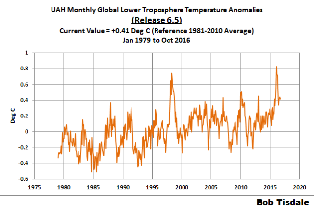
Figure 4 – UAH Lower Troposphere Temperature (TLT) Anomaly Composite – Release 6.5 Beta
RSS LOWER TROPOSPHERE TEMPERATURE ANOMALY COMPOSITE (RSS TLT)
Like the UAH lower troposphere temperature product, Remote Sensing Systems (RSS) calculates lower troposphere temperature anomalies from microwave sounding units aboard a series of NOAA satellites. RSS describes their product at the Upper Air Temperature webpage. The RSS product is supported by Mears and Wentz (2009) Construction of the Remote Sensing Systems V3.2 Atmospheric Temperature Records from the MSU and AMSU Microwave Sounders. RSS also presents their lower troposphere temperature composite in various subsets. The land+ocean TLT values are here. Curiously, on that webpage, RSS lists the composite as extending from 82.5S to 82.5N, while on their Upper Air Temperature webpage linked above, they state:
We do not provide monthly means poleward of 82.5 degrees (or south of 70S for TLT) due to difficulties in merging measurements in these regions.
Also see the RSS MSU & AMSU Time Series Trend Browse Tool. RSS uses the base years of 1979 to 1998 for anomalies.
Note: RSS recently release new versions of the mid-troposphere temperature (TMT) and lower stratosphere temperature (TLS) products. So far, their lower troposphere temperature product has not been updated to this new version.
Update: The October 2016 RSS lower troposphere temperature anomaly is +0.35 deg C. It dropped noticeably (a downtick of +0.23 deg C) since September 2016.
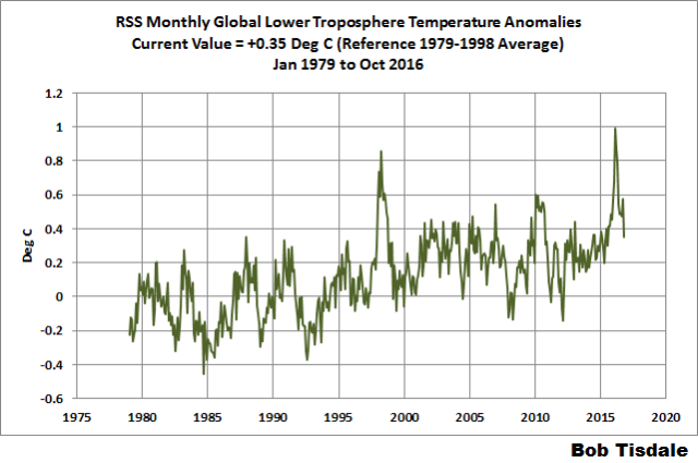
Figure 5 – RSS Lower Troposphere Temperature (TLT) Anomalies
GISS LAND OCEAN TEMPERATURE INDEX (LOTI)
Introduction: The GISS Land Ocean Temperature Index (LOTI) reconstruction is a product of the Goddard Institute for Space Studies. Starting with the June 2015 update, GISS LOTI uses the new NOAA Extended Reconstructed Sea Surface Temperature version 4 (ERSST.v4), the pause-buster reconstruction, which also infills grids without temperature samples. For land surfaces, GISS adjusts GHCN and other land surface temperature products via a number of methods and infills areas without temperature samples using 1200km smoothing. Refer to the GISS description here. Unlike the UK Met Office and NCEI products, GISS masks sea surface temperature data at the poles, anywhere seasonal sea ice has existed, and they extend land surface temperature data out over the oceans in those locations, regardless of whether or not sea surface temperature observations for the polar oceans are available that month. Refer to the discussions here and here. GISS uses the base years of 1951-1980 as the reference period for anomalies. The values for the GISS product are found here. (I archived the former version here at the WaybackMachine.)
Update: The October 2016 GISS global temperature anomaly is +0.89 deg C. According to the GISS LOTI data, global surface temperature anomalies made a slight downtick in October, a -0.01 deg C decrease.

Figure 1 – GISS Land-Ocean Temperature Index
NCEI GLOBAL SURFACE TEMPERATURE ANOMALIES (LAGS ONE MONTH)
NOTE: The NCEI only produces the product with the manufactured-warming adjustments presented in the paper Karl et al. (2015). As far as I know, the former version of the reconstruction is no longer available online. For more information on those curious NOAA adjustments, see the posts:
- NOAA/NCDC’s new ‘pause-buster’ paper: a laughable attempt to create warming by adjusting past data
- More Curiosities about NOAA’s New “Pause Busting” Sea Surface Temperature Dataset
- Open Letter to Tom Karl of NOAA/NCEI Regarding “Hiatus Busting” Paper
- NOAA Releases New Pause-Buster Global Surface Temperature Data and Immediately Claims Record-High Temps for June 2015 – What a Surprise!
And more recently:
- Pause Buster SST Data: Has NOAA Adjusted Away a Relationship between NMAT and SST that the Consensus of CMIP5 Climate Models Indicate Should Exist?
- The Oddities in NOAA’s New “Pause-Buster” Sea Surface Temperature Product – An Overview of Past Posts
- On the Monumental Differences in Warming Rates between Global Sea Surface Temperature Datasets during the NOAA-Picked Global-Warming Hiatus Period of 2000 to 2014
Introduction: The NOAA Global (Land and Ocean) Surface Temperature Anomaly reconstruction is the product of the National Centers for Environmental Information (NCEI), which was formerly known as the National Climatic Data Center (NCDC). NCEI merges their new “pause buster” Extended Reconstructed Sea Surface Temperature version 4 (ERSST.v4) with the new Global Historical Climatology Network-Monthly (GHCN-M) version 3.3.0 for land surface air temperatures. The ERSST.v4 sea surface temperature reconstruction infills grids without temperature samples in a given month. NCEI also infills land surface grids using statistical methods, but they do not infill over the polar oceans when sea ice exists. When sea ice exists, NCEI leave a polar ocean grid blank.
The source of the NCEI values is through their Global Surface Temperature Anomalies webpage. Click on the link to Anomalies and Index Data.)
Update (Lags One Month): The September 2016 NCEI global land plus sea surface temperature anomaly was +0.89 deg C. See Figure 2. It remained relatively flat (a decrease of about -0.01 deg C) since August 2016.

Figure 2 – NCEI Global (Land and Ocean) Surface Temperature Anomalies
UK MET OFFICE HADCRUT4 (LAGS ONE MONTH)
Introduction: The UK Met Office HADCRUT4 reconstruction merges CRUTEM4 land-surface air temperature product and the HadSST3 sea-surface temperature (SST) reconstruction. CRUTEM4 is the product of the combined efforts of the Met Office Hadley Centre and the Climatic Research Unit at the University of East Anglia. And HadSST3 is a product of the Hadley Centre. Unlike the GISS and NCEI reconstructions, grids without temperature samples for a given month are not infilled in the HADCRUT4 product. That is, if a 5-deg latitude by 5-deg longitude grid does not have a temperature anomaly value in a given month, it is left blank. Blank grids are indirectly assigned the average values for their respective hemispheres before the hemispheric values are merged. The HADCRUT4 reconstruction is described in the Morice et al (2012) paper here. The CRUTEM4 product is described in Jones et al (2012) here. And the HadSST3 reconstruction is presented in the 2-part Kennedy et al (2012) paper here and here. The UKMO uses the base years of 1961-1990 for anomalies. The monthly values of the HADCRUT4 product can be found here.
Update (Lags One Month): The September 2016 HADCRUT4 global temperature anomaly is +0.71 deg C. See Figure 3. It had a downtick from August to September 2016, a decrease of about -0.05 deg C.

Figure 3 – HADCRUT4
COMPARISONS
The GISS, HADCRUT4 and NCEI global surface temperature anomalies and the RSS and UAH lower troposphere temperature anomalies are compared in the next three time-series graphs. Figure 6 compares the five global temperature anomaly products starting in 1979. Again, due to the timing of this post, the HADCRUT4 and NCEI updates lag the UAH, RSS, and GISS products by a month. For those wanting a closer look at the more recent wiggles and trends, Figure 7 starts in 1998, which was the start year used by von Storch et al (2013) Can climate models explain the recent stagnation in global warming? They, of course, found that the CMIP3 (IPCC AR4) and CMIP5 (IPCC AR5) models could NOT explain the recent slowdown in warming, but that was before NOAA manufactured warming with their new ERSST.v4 reconstruction…and before the strong El Niño of 2015/16. Figure 8 starts in 2001, which was the year Kevin Trenberth chose for the start of the warming slowdown in his RMS article Has Global Warming Stalled?
Because the suppliers all use different base years for calculating anomalies, I’ve referenced them to a common 30-year period: 1981 to 2010. Referring to their discussion under FAQ 9 here, according to NOAA:
This period is used in order to comply with a recommended World Meteorological Organization (WMO) Policy, which suggests using the latest decade for the 30-year average.
The impacts of the unjustifiable, excessive adjustments to the ERSST.v4 reconstruction are visible in the two shorter-term comparisons, Figures 7 and 8. That is, the short-term warming rates of the new NCEI and GISS reconstructions are noticeably higher than the HADCRUT4 data. See the June 2015 update for the trends before the adjustments.

Figure 6 – Comparison Starting in 1979
#####

Figure 7 – Comparison Starting in 1998
#####

Figure 8 – Comparison Starting in 2001
Note also that the graphs list the trends of the CMIP5 multi-model mean (historic through 2005 and RCP8.5 forcings afterwards), which are the climate models used by the IPCC for their 5th Assessment Report. The metric presented for the models is surface temperature, not lower troposphere.
AVERAGE
Figure 9 presents the average of the GISS, HADCRUT and NCEI land plus sea surface temperature anomaly reconstructions and the average of the RSS and UAH lower troposphere temperature composites. Again because the HADCRUT4 and NCEI products lag one month in this update, the most current monthly average only includes the GISS product.

Figure 9 – Average of Global Land+Sea Surface Temperature Anomaly Products
MODEL-DATA COMPARISON & DIFFERENCE
As noted above, the models in this post are represented by the CMIP5 multi-model mean (historic through 2005 and RCP8.5 forcings afterwards), which are the climate models used by the IPCC for their 5th Assessment Report.
Considering the uptick in surface temperatures in 2014, 2015 and now 2016 (see the posts here and here), government agencies that supply global surface temperature products have been touting “record high” combined global land and ocean surface temperatures. Alarmists happily ignore the fact that it is easy to have record high global temperatures in the midst of a hiatus or slowdown in global warming, and they have been using the recent record highs to draw attention away from the difference between observed global surface temperatures and the IPCC climate model-based projections of them.
There are a number of ways to present how poorly climate models simulate global surface temperatures. Normally they are compared in a time-series graph. See the example in Figure 10. In that example, the UKMO HadCRUT4 land+ocean surface temperature reconstruction is compared to the multi-model mean of the climate models stored in the CMIP5 archive, which was used by the IPCC for their 5th Assessment Report. The reconstruction and model outputs have been smoothed with 61-month running-mean filters to reduce the monthly variations. The climate science community commonly uses a 5-year running-mean filter (basically the same as a 61-month filter) to minimize the impacts of El Niño and La Niña events, as shown on the GISS webpage here. Using a 5-year running mean filter has been commonplace in global temperature-related studies for decades. (See Figure 13 here from Hansen and Lebedeff 1987 Global Trends of Measured Surface Air Temperature.) Also, the anomalies for the reconstruction and model outputs have been referenced to the period of 1880 to 2013 so not to bias the results. That is, by using the almost the full term of the data, no one with the slightest bit of common sense can claim I’ve cherry picked the base years for anomalies with this comparison.

Figure 10
It’s very hard to overlook the fact that, over the past decade, climate models are simulating way too much warming…even with the small recent El Niño-related uptick in the data.
Another way to show how poorly climate models perform is to subtract the observations-based reconstruction from the average of the model outputs (model mean). We first presented and discussed this method using global surface temperatures in absolute form. (See the post On the Elusive Absolute Global Mean Surface Temperature – A Model-Data Comparison.) The graph below shows a model-data difference using anomalies, where the data are represented by the UKMO HadCRUT4 land+ocean surface temperature product and the model simulations of global surface temperature are represented by the multi-model mean of the models stored in the CMIP5 archive. Like Figure 10, to assure that the base years used for anomalies did not bias the graph, the full term of the graph (1880 to 2013) was used as the reference period.
In this example, we’re illustrating the model-data differences smoothed with a 61-month running mean filter. (You’ll notice I’ve eliminated the monthly data from Figure 11. Example here. Alarmists can’t seem to grasp the purpose of the widely used 5-year (61-month) filtering, which as noted above is to minimize the variations due to El Niño and La Niña events and those associated with catastrophic volcanic eruptions.)

Figure 11
The difference now between models and data is almost worst-case, comparable to the difference at about 1910.
There was also a major difference, but of the opposite sign, in the late 1880s. That difference decreases drastically from the 1880s and switches signs by the 1910s. The reason: the models do not properly simulate the observed cooling that takes place at that time. Because the models failed to properly simulate the cooling from the 1880s to the 1910s, they also failed to properly simulate the warming that took place from the 1910s until the 1940s. (See Figure 12 for confirmation.) That explains the long-term decrease in the difference during that period and the switching of signs in the difference once again. The difference cycles back and forth, nearing a zero difference in the 1980s and 90s, indicating the models are tracking observations better (relatively) during that period. And from the 1990s to present, because of the slowdown in warming, the difference has increased to greatest value ever…where the difference indicates the models are showing too much warming.
It’s very easy to see the recent record-high global surface temperatures have had a tiny impact on the difference between models and observations.
See the post On the Use of the Multi-Model Mean for a discussion of its use in model-data comparisons.
MODEL-DATA COMPARISON – 30-YEAR RUNNING TRENDS
Yet another way to show how poorly climate models simulate surface temperatures is to compare 30-year running trends of global surface temperature data and the model-mean of the climate model simulations of it. See Figure 12. In this case, we’re using the global GISS Land-Ocean Temperature Index for the data. For the models, once again we’re using the model-mean of the climate models stored in the CMIP5 archive with historic forcings to 2005 and worst case RCP8.5 forcings since then.

Figure 12
There are numerous things to note in the trend comparison. First, there is a growing divergence between models and data starting in the early 2000s. The continued rise in the model trends indicates global surface warming is supposed to be accelerating, but the data indicate little to no acceleration since then. Second, the plateau in the data warming rates begins in the early 1990s, indicating that there has been very little acceleration of global warming for more than 2 decades. This suggests that there MAY BE a maximum rate at which surface temperatures can warm. Third, note that the observed 30-year trend ending in the mid-1940s is comparable to the recent 30-year trends. (That, of course, is a function of the new NOAA ERSST.v4 data used by GISS.) Fourth, yet that high 30-year warming ending about 1945 occurred without being caused by the forcings that drive the climate models. That is, the climate models indicate that global surface temperatures should have warmed at about a third that fast if global surface temperatures were dictated by the forcings used to drive the models. In other words, if the models can’t explain the observed 30-year warming ending around 1945, then the warming must have occurred naturally. And that, in turns, generates the question: how much of the current warming occurred naturally? Fifth, the agreement between model and data trends for the 30-year periods ending in the 1960s to about 2000 suggests the models were tuned to that period or at least part of it. Sixth, going back further in time, the models can’t explain the cooling seen during the 30-year periods before the 1920s, which is why they fail to properly simulate the warming in the early 20th Century.
One last note, the monumental difference in modeled and observed warming rates at about 1945 confirms my earlier statement that the models can’t simulate the warming that occurred during the early warming period of the 20th Century.
MONTHLY SEA SURFACE TEMPERATURE UPDATE
The most recent sea surface temperature update can be found here. The satellite-enhanced sea surface temperature composite (Reynolds OI.2) are presented in global, hemispheric and ocean-basin bases.
RECENT RECORD HIGHS
We discussed the recent record-high global sea surface temperatures for 2014 and 2015 and the reasons for them in General Discussions 2 and 3 of my recent free ebook On Global Warming and the Illusion of Control (25MB). The book was introduced in the post here (cross post at WattsUpWithThat is here).
It is very interesting that the NCEI and HADCRUT4 databases make the 1997-8 El Niño go away.
Yes it is, Tom Halla. But there is nothing to wonder about, as the surface does not have the same response to ENSO signals as does the troposphere.
So no, they don’t “make the 1997-8 El Niño go away”: they have a different representation of it.
Just as UAH, for example, does not at all show ENSO 1997/98 in the Tropics in the same way as it does for the entire Globe:
http://fs5.directupload.net/images/160922/oayqquai.jpg
Compare the two plots. You see that while UAH Globe lets appear 2015/16 higher than was 1997/98, UAH Tropics doesn’t.
The same holds for RSS3.3 TLT:
http://fs5.directupload.net/images/161116/w23mkali.jpg
and a chart showing RSS4.0 TTT would do as well.
Can you spell AMO?
That problem is easily fixed with some creative adjustments to the temperature record.
Nobody ever seems to mention the multiple adjustments there have been to the UAH and RSS datasets…
and I see cherry picking the start dates for the trend graphs is still in fashion.
Assessing the pauze starts from today and looks back.
How do you cherry-pick today?
And I can see that Griff didn’t bother to read the post, because it explains why those start days were used.
If Griff had read your post, it would have been a first for him.
Griff doesn’t read; he whines and pontificates.
Isn’t it time for him to change his name and troll as someone else?
That would be the intelligent thing to do. Which probably explains why Griff hasn’t done it yet.
And no matter how many times you read the algorithm, it doesn’t sink into what is between your ears. The algorithm has not changed so why would the start date it picks, until the data changes so as to move that ?? Try reading the recipe one more time, and see if you catch on.
G
In response to a closed thread at:
https://wattsupwiththat.com/2016/10/31/watch-global-co2-jump-with-el-nino-over-time-then-look-at-the-whys/comment-page-1/#comment-2339695
Allan wrote:
“Major changes in global temperature are overwhelmingly natural and are not caused by human activities.”
Ferdinand wrote:
“If that is your null hypothesis, you have only proven that the changes over the year by year variability +/- 1.5 ppmv CO2 around the trend is overwhelmingly natural, but you have not proven that the trend of 80 ppmv since Mauna Loa is not caused by human activity and that such an increase has no influence on temperature. Thus the null hypothesis still stands…”
Allan again:
Ferdinand, you are off-topic again; you are back to the CAUSE of increasing atmospheric CO2, which you allege is fossil fuel combustion, and I have repeatedly said I am agnostic on this point – I do not choose to opine at this time.
My above sentence (“in quotations marks”) IS the Null Hypothesis, and it only discusses the cause of temperature changes, NOT the cause of increasing CO2. That is absolutely clear.
Let’s ASSUME for the moment that you are correct, in that fossil fuel combustion is driving the increase in CO2. Then CO2 increased strongly after ~1940 as did fossil fuel combustion, but global temperatures declined significantly until ~1975. That decline has been minimized by numerous false revisions by warmists of the temperature data, as Tony Heller as so capably proved, for example:
Why do you think the data manipulators are doing these false revisions of the temperature data? It is because the cooling period from ~1940 to ~1975, even as CO2 strongly increased, shows that the sensitivity of global temperature to increased atmospheric CO2 is so small as to be insignificant.
Regards, Allan
It’s so small that I doubt anyone alive today will live long enough to detect any CO2 warming amongst the noise.
Yup
Well it is claimed that the first human to live to be 1,000 years old has already been born.
So you might be a little off on your doubt.
But it certainly isn’t Scotch (ish) mist.
G
Toneb – I already wasted too much time on you, so,,, Nope.
Reference:
https://wattsupwiththat.com/2016/10/14/the-divergence-between-surface-and-lower-troposphere-global-temperature-datasets-and-its-implications/comment-page-1/#comment-2320510
Regards, Allan
Hint re Nope: GISTemp = GISS = CRAP DATA [Corrupted Re-Adjusted Phony Data] = GIGO
And this
“Why do you think the data manipulators are doing these false revisions of the temperature data? It is because the cooling period from ~1940 to ~1975, even as CO2 strongly increased, shows that the sensitivity of global temperature to increased atmospheric CO2 is so small as to be insignificant.”
The recent EN has been blamed on here for causing GMT’s to rise, which it did, of course.
The PDO/ENSO cycle is superimposed on top the AGW signal however….
http://2.bp.blogspot.com/-Fkg790Q3b8o/VMRGN17t2oI/AAAAAAAAHwo/GTCVnmku248/s1600/GISTempPDO.gif
So as the EN was an uptick – then so the long -ve PDO/ENSO/LN regime in large part caused the “pause”.
Considering the PDO/ENSO index vs GMT’s…
http://1.bp.blogspot.com/-Xnqp6UW0ExA/U0SZLZNwDKI/AAAAAAAAAjg/BuAMJ2NXM7o/s1600/Rplot.jpg
Secondly CO2 forcing only overcame the -ve forcing of aerosols to a real degree after around 1960…..
http://2.bp.blogspot.com/-Fkg790Q3b8o/VMRGN17t2oI/AAAAAAAAHwo/GTCVnmku248/s1600/GISTempPDO.gif
There was the well-known “Global dimming” in the decades after WW2 when absorbed solar was decreased by aerosol.
“Global dimming is the gradual reduction in the amount of global direct irradiance at the Earth’s surface that was observed for several decades after the start of systematic measurements in the 1950s. The effect varies by location, but worldwide it has been estimated to be of the order of a 4% reduction over the three decades from 1960–1990.”
http://2.bp.blogspot.com/-Fkg790Q3b8o/VMRGN17t2oI/AAAAAAAAHwo/GTCVnmku248/s1600/GISTempPDO.gif
This time!
http://www.drroyspencer.com/wp-content/uploads/GISS-forcings1.gif
Nope
Stop connecting dots. There’s not a snowball’s chance in hell, that ALL of the maxima and minima occur at those exact points and nowhere else. So your graph is phony even if the data points are quite real.
G
“Stop connecting dots. There’s not a snowball’s chance in hell, that ALL of the maxima and minima occur at those exact points and nowhere else. So your graph is phony even if the data points are quite real.
G”
I know but tell that to Allan!
Speaking of same….
“Nope”
Good science (sarc)
Toneb
Yes.
All assuming a underlying null hypothesis of climate stasis.
Only belief in a totally passive climate which changes only in response to external forcings, allows such arguments.
As soon as you have internal variability, all this goes out of the window.
The oceans contain a lot of heat. Plus sharp temperature gradients.
So chaotic variations in ocean mixing can produce centuries or climate change even with a zero sum heat budget to the climate as a whole.
Climate is what happens at the ocean and land surface. Not the total climate heat content which might stay the same even during an ice age.
Bob, for goodness sake, pay attention and get your data references correct. The UAH data that you are using is not version 6.5 or 6.5beta it is not even 6.0
It is version 6 beta5, ie the 5th beta pre-release of version 6.
The current release is called version 6.0 ; version 6.5 is probably many years away.
http://www.drroyspencer.com/2016/11/uah-global-temperature-update-for-october-2016-0-41-deg-c/
I pointed this out last month and you not only failed to correct it, you did the same mistake this month.
It’s really up to the software developers / publishers how they define the versioning.
Here is a snippet for requirements for hardware vendors (firmware) for Microsoft:
Versioning scheme
Create a versioning scheme that includes a four-part version number.
Packages are only updated when the new package number is greater than the old package number. The package numbers must use a hierarchical scheme from left to right, such that version 2.0.0.0 is greater than version 1.9.9.9.
We recommend using the silicon vendor (SV) version number, followed by the OEM version number. Example: SV-Major.SV-Minor.OEM-Major.OEM-Minor. For consistency, consider using build environment variables such as the date when creating your versioning scheme.
With each new update, create a new version number. Provide both the old and new version number when submitting the update. For example:
0001.0001.0001.20140801 -> 0001.0040.0055.20140808
0001.0040.0055.20140808 -> 0001.0040.0077.20140815
0001.0040.0077.20140815 -> 0002.0000.0077.20140822
Come to think of it, I recommend that Roy and team consider dropping the term ‘beta’ altogether and switch to modern versioning notation.
Greg
Ever strike you as odd that UAH has 6 major releases of “data”, with god knows how many beta versions?
Let’s just all agree this isn’t data (i.e.: measurements of the physical world), it’s number-fiddling to make model output look better.
Also:
The land+ocean TLT values are here. Curiously, on that webpage, RSS lists the composite as extending from 82.5S to 82.5N,
They don’t, they explicitly state that it’s from -70 to 82.5.
NOT A WHOLE LOTTA GLOBAL WARMING GOIN’ ON!
Unlike the deeply flawed computer climate models cited above, Bill Illis has created a temperature model that actually works in the short-term (multi-decades). It shows global temperatures correlate primarily with NIno3.4 area temperatures – an area of the Pacific Ocean that is about 1% of global surface area. There are only four input parameters, with Nino3.4 being the most influential. CO2 has almost no influence. So what drives the Nino3.4 temperatures? Short term, the ENSO. Longer term, probably the integral of solar activity – see Dan Pangburn’s work.
Bill’s post is here.
https://wattsupwiththat.com/2016/09/23/lewandowsky-and-cook-deniers-cannot-provide-a-coherent-alternate-worldview/comment-page-1/#comment-2306066
Bill’s equation is:
Tropics Troposphere Temp = 0.288 * Nino 3.4 Index (of 3 months previous) + 0.499 * AMO Index + -3.22 * Aerosol Optical Depth volcano Index + 0.07 Constant + 0.4395*Ln(CO2) – 2.59 CO2 constant
Bill’s graph is here – since 1958, not a whole lotta global warming goin’ on!
My simpler equation using only the Nino3.4 Index Anomaly is:
UAHLTcalc Global (Anom. in degC, ~four months later) = 0.20*Nino3.4IndexAnom + 0.15
Data: Nino3.4IndexAnom is at: http://www.cpc.ncep.noaa.gov/data/indices/sstoi.indices
It shows that much or all of the apparent warming since ~1982 is a natural recovery from the cooling impact of two major volcanoes – El Chichon and Pinatubo.
Here is the plot of my equation:
https://www.facebook.com/photo.php?fbid=1106756229401938&set=a.1012901982120697.1073741826.100002027142240&type=3&theater
I agree with Bill’s conclusion that
THE IMPACT OF INCREASING ATMOSPHERIC CO2 ON GLOBAL TEMPERATURE IS SO CLOSE TO ZERO AS TO BE MATERIALLY INSIGNIFICANT.
Regards, Allan
Bill’s equation is: Tropics Troposphere Temp = 0.288 * Nino 3.4 Index (of 3 months previous) + 0.499 * AMO Index + -3.22 * Aerosol Optical Depth volcano Index + 0.07 Constant + 0.4395*Ln(CO2) – 2.59 CO2 constant [1]
My equation is: Tropics Troposphere Temp = Natural Variation + k.ln(CO2) [2]
Putting [1] into [2] we get:
Natural Variation = 0.288 * Nino 3.4 Index (of 3 months previous) + 0.499 * AMO Index + -3.22 * Aerosol Optical Depth volcano Index (+a weird term with CO2 constant)
And
A doubling of CO2 causes a 0.304C increase in temperature.
I wouldn’t dispute any of that.
These plots show a great fit for the high frequency variability found in temperature records. Unfortunately, it is the low frequency variability that is most important to climate change. That is hard to judge by eye. All of these linear regressions should with a confidence interval around the coefficients. What are they?
Given that both CO2 and the AMO have both been increasing during some periods, the size of the coefficient for both could be highly uncertain. In technical terms, you may be dealing with colinearity – two explanatory variables whose changes are correlated. In some cases with colinearity, statisticians do linear regressions with only one of two correlated variables or a composite of both because of this problem.
You can get a better idea of what coefficient you should use for the AMO by looking at a longer interval when the AMO has risen and fallen at least once, preferably twice. If one fits the last 130 years, the AMO is supposed to contribute about 0.2 C peak to trough.
Then there is the awkward question about what temperature record is being reproduced: UAH/RSS/HadAT is not a homogeneous record over this period and HadAT is from radiosonde data (which may have been adjusted to create a hotspot). Most skeptics think there has been a significant amount of global warming since 1960, but the blue line starts and stops at the same temperature. With all of the noise in the data, it is hard to say how much warming a linear fit would show over this period, but it clearly isn’t the 0.5 K I expected to see! (For example, Lewis and Curry (2014) say warming from 1930–1950 to 1995–2011 was 0.49 (0.35–0.63) K and data for other periods can be found in Otto (2013) which includes Lewis).
It is not surprising the coefficient for log2(CO2) is low when little warming when CO2 was rising. And, if this is tropical temperature data, we expect global data to show much more warming.
Hey, there may be some important lessons to be learned from your curve-fitting exercises. However, they do need to be properly performed and scrutinized skeptically (to avoid confirmation bias). Otherwise, they are no more meaningful than Mann’s Hockey Stick.
Hello Scottish Skeptic
I calculated 0.16C vs your 0.34C for a doubling of CO2 from 280 to 560ppm
Close enough, I guess, and nothing to worry about.
Yours aye, Allan MacRae
Comments re Frank – November 16, 2016 at 2:21 pm
Frank, it is incumbent on YOU to do some work on this question, rather than just “shooting from the hip”. BTW, your last sentence is foolish and offensive.
I have not had the time to duplicate Bill Illis’ plot, but I independently discovered my own work and later learned that Bill had taken this concept further.
Perhaps you could ask Bill to send you his spreadsheet and data sources, and you could answer your own questions. I can answer some of them.
My simpler equation uses only the UAH LT Temperature Anomaly and the Nino3.4 Index Anomaly:
[UAHLTcalc Global (Anom. in degC, ~four months later) = 0.20*Nino3.4IndexAnom + 0.15]
Data: Nino3.4IndexAnom is at: http://www.cpc.ncep.noaa.gov/data/indices/sstoi.indices
There are no AMO or other input parameters as used by Bill.
You can reproduce this plot yourself and calculate the R2 – suggest you do so after 1996 when the impact of the two major volcanoes has dissipated – El Chichon in 1982 and Mt. Pinatubo in 1991.
My plot shows a strong correlation, especially after 1996, between Nino3.4 temperatures, an area of only about 1% of the planet’s surface, and GLOBAL (NOT Tropical) temperature four months later. The mechanism is a warmer ~~Nino3.4 area increases tropical atmospheric humidity and temperature ~3 months later, and global temperature one more month after that.
My plot also shows NO warming since the beginning of 1982 that can be attributed to increasing atmospheric CO2 – there is high probability that the only significant global warming since ~1982 is a natural recovery from the temporary cooling impact of the two major volcanoes.
This is more evidence (there is already ample evidence elsewhere) that the sensitivity of global temperature to atmospheric CO2 is so low as to be materially insignificant. There is no scientific credibility to the alleged global warming crisis.
Here is the plot of my equation:
https://www.facebook.com/photo.php?fbid=1106756229401938&set=a.1012901982120697.1073741826.100002027142240&type=3&theater
Bill’s work and mine (and others) demonstrate what drives short-term (multi-decadal) global temperatures – it is overwhelmingly ENSO, with occasional cooling by major volcanoes, and other factors – not CO2.
There remains the question of what causes longer-term changes in global temperature, in the order of large fractions of centuries. Dan Pangburn’s work (and others) suggests it is the integral of solar activity. Some have predicted imminent global cooling due to lower solar activity. I (we) published in 2002 that global cooling would commence by 2020-2030, and I am now leaning towards sooner, perhaps even by 2017-2020. I hope to be wrong – humanity suffers in a cooling world.
Regards, Allan
Alan: Thank you for taking the time to respond to my somewhat superficial remarks that omitted the differences between your two approaches. Your comment about MY needing to do some calculations hurt, so I downloaded some data – and got bogged down (as usual) in technical issues that won’t get resolved before interest in this post evaporates.
I have, so far, I downloaded NINO3.4 anomalies (optionally lagged by -4 months) (x1), seasonally-adjusted Mauna Loa CO2 data (converted to log2(CO2(t)/CO2(0) (x2) and UAH TLT anomalies (y). Now I need to do the multiple linear regression for y = a1*x1 + a2*x2 + e, and obtain values with confidence intervals for both a1 and a2. Alternatively, I can do y = a1*x1 + e and then look for the influence of CO2 in the residuals, which might be clearer. Unfortunately, the residuals in both cases should contain a signal for volcanic forcing, thereby widening the confidence interval for a2. (I’m also concerned that volcanic forcing has influenced NINO3.4.)
I suspect that when I have done the best analysis that I can do, the confidence interval for a2 will include BOTH zero and a value consistent with current estimates for TCR from energy balance models and GCMs. Consider the central estimate of 1.35 K (and lower limit of about 1 K) from Lewis and Curry (2014). Should a2 = 1.35 K? Of course not. LC14 uses surface temperature data. FWIW, surface temperature has warmed about twice as fast as the lower troposphere (TLT). So a2 should be about 0.7 K or at least above 0.5 K. log2(CO2/CO2_0) is currently 0.25 (a quarter of a doubling in the satellite era). So a2*log2(CO2/CO2_0) will be about 0.15 K of warming expected from CO2 over the period of your plot. A consensus TCR of 2.0 K implies about 0.25 K of warming contributed by CO2. It sure looks to me like there could be a rise of at least 0.15 K due to CO2 over this period. (Better still, look at the residue plot after removing the effect of El Nino.) The goal of the analysis should be to place an upper limit on TCR.
My guess is that this exercise won’t tell us anything useful about a2 and TCR, because the confidence interval will be too wide. To learn about the importance of CO2, we need a confidence interval for a2 that doesn’t include BOTH zero and values consistent with consensus expectations for TCR. If you want narrower confidence intervals, you should use the surface temperature record which offers: more signal – a warming rate that is twice that of TLT, less noise, a longer period, and more relevance to humans. You also introduce questions about homogenization etc, and a longer period means you need to also consider the cooling effect of tropospheric aerosols. (FWIW, Tamino has done such exercises.) Viewed from that perspective, you are looking in the ONE PLACE that will produce the widest confidence interval for a2 and where the effect of CO2 will be hardest to discern.
All of which brings me back to the fundamental problem: Natural and unforced variability, limitations in the data (the conflict between surface and TLT, for example) and the large uncertainties associated with aerosols make it extremely difficult to understand the role of CO2 by making observations of the Earth. If you go into the laboratory, it is trivial to prove that CO2 has an significant impact on outgoing radiative cooling to space and little impact on warming from the sun! These experiments are unambiguous and (combined with conservation of energy) prove that the Earth MUST warm in response to rising CO2. The question is how much and the answer isn’t zero. This is the scientific method: You first study a phenomena (the interaction between radiation and GHGs) under the simplest and most carefully controlled conditions possible – not in an extremely complicated environment like our planet! Those laboratory experiments were done long before the hysteria about CAGW. Then you move to more complex situations to see if the principles from simple situations still apply. When you run into complications and ambiguity in analyzing more complex situations, you don’t discard what you learned in the laboratory (ie radiative forcing). So I’m immediately skeptical of any analysis says CO2 has zero effect, especially without confidence intervals.
Now I’ll look at the Wallace paper cited below and see if it is convincing.
Sincerely, Frank
Frank, you are misquoting me and then basing your argument on your misquote. You wrote:
“So I’m immediately skeptical of any analysis says CO2 has zero effect,,,”
I wrote:
“This is more evidence (there is already ample evidence elsewhere) that the sensitivity of global temperature to atmospheric CO2 is so low as to be materially insignificant.”
There IS a difference.
My analysis is very easy to duplicate, but you have not done so. I even gave you my data sources.
You are just taking pot-shots from the bushes, without even providing your full name.
Let’s end this conversation now.
Allan and Frank:
If you haven’t seen it, I think you gents will be interested in the Wallace, Christy & D’Aleo paper here,
https://thsresearch.files.wordpress.com/2016/10/ef-cpp-sc-2016-data-ths-paper-ex-sum-101416.pdf
They adjust 9 tropical, 3 global and one CONUS temperature time series for cumulative Multivariate Enso Index from 1959 forward, and find a flat trend in all of them.
They explicitly address the collinearity issue.
Regards,
Quinn: At the beginning of the Wallace paper, the authors reasonably assert that current temperature should/could be a function of CO2, SA (solar activity), VA (volcanic aerosols) and unforced variability from ENSO. They have omitted an important (potentially the second biggest) explanatory variable, tropospheric aerosols (TA). IMO, that omission renders the paper worthless.
GAST = F1(CO2, SA, VA, ENSO) eq 1 page 8
Even worse, they have introduced a novel explanatory variable, the cumulative MEI. The change in cumulative MEI could be the result of (a function of) changing temperature, not an explanation for temperature change. In that case, we would have CIRCULAR REASONING: The MEI changes GAST and GAST changes the MEI. If so, all the other explanatory factors would be folded into cumMEI (except current MEI) and therefore appear to be unimportant! Does anyone in their right mind believe that solar and volcanic forcing are unimportant to GAST – that nothing associated with energy imbalances is important???
CO2, SA, VA and TA impact the planet’s energy balance (ie, they are forcings), and energy imbalances are critically important to temperature change. ENSO is a form of unforced variability, redistributing the existing heat between the surface (atmosphere and mixed layer) and the deep ocean. Among other phenomena, El Nino is a slowdown in upwelling of cold water in the Eastern Equatorial Pacific and downwelling of warm water in the Western Pacific Warm Pool. A chaotic fluctuation in fluid flow. The impact of this slowdown takes a few months to travel around the world from the NINO3.4 region and another few months to disappear after the NINO3.4 region returns to normal. It’s impact on the planetary energy imbalance is equally transient. While El Nino exists, it increases radiative cooling to space, and changes clouds, humidity and many other factors important to energy balance. When El Nino is over, its influence our energy balance is also soon gone.
Now let’s look at the analysis I suggested above would be most likely to properly show the impact of rising CO2: global surface temperature. That can be found on pages 52-54. The only explanatory variables in this analysis are MEI and cumMEI. No coefficient with uncertainty range for the impact of CO2 on GMST. Nothing tells us whether TCR is zero, 1 K or 2 K. The ability of a regression model to reproduce high frequency fluctuations associated with ENSO doesn’t tell us anything about the slow, modest (ca 0.2 K) change expected from rising CO2.
Reading on, Table XXIII-I actually ADMITS that there is a statistically significant correlation with CO2 (but they don’t disclose its magnitude, so I can’t compare it to TCR). Next they idiotically say that time is an equally good explanatory variable, which it should be – since the increase in log2(CO2/CO2_0) is linear with time. Then they discuss colinearity. Is the change in cumMEI caused CO2 or does the CO2 can the change in cumMEI. Correlation can’t separate cause and effect.
Global warming has an impact on the calculated MEI. The SOI (which is based on pressure) is a measure of ENSO that is independent of temperature. Surface air pressure can be redistributed during ENSO, but total surface air pressure is a constant that is independent of temperature. It therefore has advantages over other metrics for separating the effects of forcing and unforced variability associated with ENSO. Does cumSOI look anything like cumMEI?
Thank you Quinn.
The Aug2016 paper you cite by Wallace, Christy and d’Aleo concludes, in part:
https://thsresearch.files.wordpress.com/2016/10/ef-cpp-sc-2016-data-ths-paper-ex-sum-101416.pdf
“Also critically important, even on an all-other-things-equal basis, this analysis failed to find that the steadily rising Atmospheric CO2 Concentrations have had a statistically significant impact on any of the 13 critically important temperature time series analyzed.”
The conclusion is entirely consistent with my conclusion cited above. My full paragraph reads:
“This is more evidence (there is already ample evidence elsewhere) that the sensitivity of global temperature to atmospheric CO2 is so low as to be materially insignificant. There is no scientific credibility to the alleged global warming crisis. ”
Best regards, Allan
Thank you Quinn – This may be the paper John Christy referred to when he wrote me in July.
Than you again for bringing it to my attention.
Best, Allan
From: John Christy
Sent: July-05-16 6:19 AM
To: Allan MacRae; Roy Spencer
Subject: Re: Perhaps the “global warming” observed after the 1997-98 El Nino was not global warming at all; maybe it was just the natural recovery in global temperatures after two of the largest volcanoes in recent history.
Allan
The tropical Pacific is very much a player in global temps. Attached is a paper we did in 1994 that used this fact. We’ve updated it using more SST and circulation modes, and hope to see it published later this year.
John C.
On 7/3/16 1:03 AM, Allan MacRae wrote:
FYI and comments please Gentlemen.
https://wattsupwiththat.com/2016/07/01/spectacular-drop-in-global-average-satellite-temperatures/comment-page-1/#comment-2250667
I plotted the same formula back to 1982, which is where I (I think arbitrarily) started my first analysis. Satellite temperature data began in 1979.
That formula is: UAHLT Calc. = 0.20*Nino3.4SST +0.15
It is apparent that UAHLT Calc. is substantially higher than UAH Actual for two periods, each of ~5 years, BUT that difference could be largely or entirely due to the two major volcanoes, El Chichon in 1982 and Mt. Pinatubo in 1991.
This leads to a startling new hypothesis: First, look at the blue line, which shows NO significant global warming over the entire period from 1982 to 2016. Perhaps the “global warming” observed after the 1997-98 El Nino was not global warming at all; maybe it was just the natural recovery in global temperatures after two of the largest volcanoes in recent history.
Comments?
Regards, Allan
https://www.facebook.com/photo.php?fbid=1030751950335700&set=a.1012901982120697.1073741826.100002027142240&type=3&theater
—
John R. Christy
Director Earth System Science Center
Professor, Atmospheric Science
Alabama State Climatologist
The University of Alabama in Huntsville
Allan and Quinn: Even if it were true (it’s not*), what would this conclusion mean?
” …, this analysis failed to find that the steadily rising Atmospheric CO2 Concentrations have had a statistically significant impact on any of the 13 critically important temperature time series analyzed.”
The absence of a statistically significant effect doesn’t mean no effect is present. It means that noise in the limited data (unforced variability plus errors that have led to numerous revisions of every record) and co-linearity prevent us from observing a statistically significant effect – IF any such effect exists.
Take global warming over any one decade. Is that long enough to show a statistically significant effect from CO2 given the variability in warming rate and uncertainty in the data? Given how much the warming/cooling rate varies from decade to decade and the slow rate at which CO2 is accumulating, it is not surprising that the effect of CO2 can’t be detected in a single decade.
Why should 3.5 decades in the satellite era automatically be long enough to detect the effect of CO2? Since signal to noise is obviously an issue, the last place we should look for a robust effect is in the troposphere, where the low heat capacity makes temperature much more variable. (Strong El Ninos produce about twice as much warming in the troposphere as at the surface.) We should also look outside the tropics, which is expected to warm about half as much as the whole planet. However, we can look to the non-existent hot spot in the upper tropical troposphere to discredit GCMs. Its absence is very damaging to the credibility of models with climate sensitivity potentially inflated by unrealistic feedbacks. Nevertheless, the idea that CO2 causes radiative forcing and therefore warming doesn’t depend on the correctness of any GCMs. Radiative transfer calculations plus the law of conservation of energy is all one needs to predict warming from rising CO2!
We have experienced the response to 1/3 of a doubling of CO2 since 1959 (start of Mauno Loa record) and 1/4 of a doubling in a satellite era – WHATEVER that response may be. Multiply any value for TCR (K/doubling) by 1/3 or 1/4 to get the expected warming from CO2 during either period. A TCR of 1 K/doubing is about the lowest response compatible with simple expectations derived from radiative forcing and observed temperature change. Is 1 K/doubling consistent (within the 95% confidence interval) for the CO2 coefficient for a linear regression of temperature vs explanatory variables? If not – don’t conclude that the conventional theory of radiative forcing and AGW is wrong. Be sure correctly deal with any co-linear explanatory variables – and the simplest way to do that is to omit all of the other explanatory variables that are highly co-linear.
Now remember that the lower bound of 1 K/doubling for TCR is derived by assuming that all observed warming has been caused by known factors (GHGs, aerosols, solar). If only 50% of observed warming were due anthropogenic factors (the limit of the IPCCs attribution statement) and 50% were due to some unrecognized form of unforced variability say analogous to AMO), then the lower bound for TCR consistent with observations and radiative forcing would be only 0.5 K/doubling.
Using linear regression, one might be able to place an upper bound on TCR. That upper bound will never be zero!
* Page 59 states: “The Hadley GAST does have a statistically significant regression coefficient [for CO2] of 2.29.” It isn’t clear to me whether this refers to CO2 as a single explanatory variable or in combination with other explanatory variable, but I suspect single.
Then they go on to say: “Table XXIII-2 addresses this issue by showing the ramifications of the CO2 variable’s multicollinearity problems first discussed in the Preface. To anticipate the results of the analysis of this particular situation, it is that it is highly unlikely that the CO2 variable actually had a statistically significant impact on reported GAST over this time period.”
How do they reach that conclusion?
First they try time as a co-linear explanatory variable. That hypothesis is a joke. The earth clearly hasn’t been warming at a constant rate for the millennium before 1960? Why – besides rising CO2 – did it suddenly start warming in 1960?
Then they mention solar. The change in TSI is less than 1 W/m2 and you divide by 4 and correct for albedo to get solar forcing. The forcing from CO2 is more than 2 W/m2 (at least 10X bigger). If only one of these two factors is causing warming, I’m betting on CO2.
Notice they stop referring CO2 as an explanatory variable for Hadley GAST and start asking if CO2 is an explanatory variable for the MEI-adjusted Hadley GAST. That model appears to be in Tables XXI-1 and XXI-2 – corrections for MEI, cumMEI (highly co-linear with CO2) AND an abrupt shift warmer in 1977. Figure XX1-4 shows that temperature vs. time is flat after all of these adjustments based on MEI. When one of the adjustments is co-linear with CO2, it can’t possibly rule out CO2 as a cause.
The issue is not a religious belief about whether CO2 does or does not cause warming. The scientific problem is to use observations to constrain the amount of warming that CO2 can cause: To characterize the probability density function (pdf) for TCR and ECS.
Response to Frank – November 21, 2016 at 1:31 am
Sorry Frank – after reading your comments, I think you are a bullsh!tter.
Regards, Allan
Allan wrote: Sorry Frank – after reading your comments, I think you are a bullsh!tter.
When you don’t have a good answer to someone’s arguments, turn to insults.
I finally completed my linear regression for Global UAH anomaly using NINO3.4 anomaly and log2(CO2/CO2_0) as explanatory variables.
Globe UAH = – 0.18051 + 0.10012 * NINO 3.4 + 1.85932 * log2(CO2/CO2_0) R2 = 52%
Globe UAH = 0.03274 + 0.10248 * NINO 3.4 R2 = 20%
The first equation predicts a TCR of 1.86 K/doubing, consistent with the consensus and above Lewis and Curry’s 1.35. The 95% confidence interval is 1.64-2.08 K/doubling. The results of this regression are consistent with the expectation that CO2 causes warming.
Your equation was:
Globe UAH = 0.20*Nino3.4 + 0.15 R2 = -27%
The negative R2 says that the average temperature anomaly for this period 0.038 is closer to the observed values (when summing of the residuals squared) than the temperatures predicted by your equation. That is because all of the early predictions are too high. When one does a multiple linear regression, the mean for the data and the regression prediction are the same. The average temperature anomaly predicted by your equation is about 0.12 degC too high, which is why the fit is better in later years, but the R2 is negative.
Bill’s equation does have CO2 dependence: 0.4395*Ln(CO2) – 2.59 CO2 constant.
However, conventional theory says that forcing depends on the logarithm of CO2/CO2_0, so I can’t tell if Bill used the right explanatory variables Size of the regression coefficient depends on whether one take log10, log2 or ln. I prefer log2, because then the coefficient is equal to TCR.
CO2_0 is 315 ppm and ln(315) = 5.74.
0.4395*[ln(CO2/CO2_0) = 0.4395*ln(CO2) – 0.4395*ln(CO2_0) = 0.4395*ln(CO2) – 2.54
= 0.304 * log2(CO2) – 2.54
If this is correct, BIll’s coefficient is 1/6 of mine.
Bob you are not including the most accurate read on global temperatures which is the product Weatherbell puts out. Instead you keep giving us some products which are biased and manipulated and are meaningless.
The following graph is a reposting of Bob Tisdale’s …… “Figure 1 – GISS Land-Ocean Temperature Index”, to wit:
The following is excerpted Bi-yearly Maximum to Minimum CO2 ppm data – 1979 thru 2016
Source: NOAA’s Mauna Loa Monthly Mean CO2 data base
@ ftp://aftp.cmdl.noaa.gov/products/trends/co2/co2_mm_mlo.txt
year mth “Max” _ yearly increase ____ mth “Min” ppm
1979 _ 6 _ 339.20 …. + …… __________ 9 … 333.93
1980 _ 5 _ 341.47 …. +2.27 _________ 10 … 336.05
1981 _ 5 _ 343.01 …. +1.54 __________ 9 … 336.92
1982 _ 5 _ 344.67 …. +1.66 __________ 9 … 338.32
1983 _ 5 _ 345.96 …. +1.29 __________ 9 … 340.17
1984 _ 5 _ 347.55 …. +1.59 __________ 9 … 341.35
1985 _ 5 _ 348.92 …. +1.37 _________ 10 … 343.08
1986 _ 5 _ 350.53 …. +1.61 _________ 10 … 344.47
1987 _ 5 _ 352.14 …. +1.61 __________ 9 … 346.52
1988 _ 5 _ 354.18 …. +2.04 __________ 9 … 349.03
1989 _ 5 _ 355.89 …. +1.71 __________ 9 … 350.02
1990 _ 5 _ 357.29 …. +1.40 __________ 9 … 351.28
1991 _ 5 _ 359.09 …. +1.80 __________ 9 … 352.30
1992 _ 5 _ 359.55 …. +0.46 Pinatubo _ 9 … 352.93
1993 _ 5 _ 360.19 …. +0.64 __________ 9 … 354.10
1994 _ 5 _ 361.68 …. +1.49 __________ 9 … 355.63
1995 _ 5 _ 363.77 …. +2.09 _________ 10 … 357.97
1996 _ 5 _ 365.16 …. +1.39 _________ 10 … 359.54
1997 _ 5 _ 366.69 …. +1.53 __________ 9 … 360.31
1998 _ 5 _ 369.49 …. +2.80 El Niño __ 9 … 364.01
1999 _ 4 _ 370.96 …. +1.47 __________ 9 … 364.94
2000 _ 4 _ 371.82 …. +0.86 __________ 9 … 366.91
2001 _ 5 _ 373.82 …. +2.00 __________ 9 … 368.16
2002 _ 5 _ 375.65 …. +1.83 _________ 10 … 370.51
2003 _ 5 _ 378.50 …. +2.85 _________ 10 … 373.10
2004 _ 5 _ 380.63 …. +2.13 __________ 9 … 374.11
2005 _ 5 _ 382.47 …. +1.84 __________ 9 … 376.66
2006 _ 5 _ 384.98 …. +2.51 __________ 9 … 378.92
2007 _ 5 _ 386.58 …. +1.60 __________ 9 … 380.90
2008 _ 5 _ 388.50 …. +1.92 _________ 10 … 382.99
2009 _ 5 _ 390.19 …. +1.65 _________ 10 … 384.39
2010 _ 5 _ 393.04 …. +2.85 __________ 9 … 386.83
2011 _ 5 _ 394.21 …. +1.17 _________ 10 … 388.96
2012 _ 5 _ 396.78 …. +2.58 _________ 10 … 391.01
2013 _ 5 _ 399.76 …. +2.98 __________ 9 … 393.51
2014 _ 5 _ 401.88 …. +2.12 __________ 9 … 395.35
2015 _ 5 _ 403.94 …. +2.06 __________ 9 … 397.63
2016 _ 5 _ 407.70 …. +3.76 El Niño __ 9 …
Now, …… see iffen you can correlate the above noted “boldfaced” CO2 ppm “yearly increases” ……. to the (ocean) “temperature spikes” on Bob’s graph.
And iffen you can correlate the increase/decrease in the temperature of the ocean water …….. to the bi-yearly increases/decreases and/or yearly increases in atmospheric CO2 ppm …… then that is proof-positive of, with a 98% confidence level, ….. that the “temperature” of the ocean water is responsible for the bi-yearly/yearly fluctuations in atmospheric CO2 ppm quantities.
GISS “LOTTERI” is fake data, they have “adjusted” daytime SST to match night time warming. It has been known for years that warming has affected temp minima more than maxima and has warmed nights and winters more.
This is flagrant manipulation of the data to fit the the failed models.
Exactly Greg, and it should not be presented.
Greg, if the GISS LOTI data that was used for plotting on Bob Tisdale’s above graph had been subjected to “flagrant manipulation” …….. then why does it still correlate almost EXACTLY with my above noted CO2 ppm increases?
They probably did “adjust” the amplitude of the temperature data, ….. but they didn’t shift it +/- 2 or 4 years, thus the water temperature data still correlate with the CO2 ppm data.
And ps, I have known for the past 20 years that “warming has affected temp minima more than maxima and has warmed nights and winters more” …… which is what has been screwing up the “fuzzy math” calculated Global Average Temperatures increases, ….. as well as their “fuzzy math” calculated “percentage (%) increases” in Average Surface Temperatures.
“Percentages” and/or “averages” are like boats, they rise and fall with the “changing” tide.
Whenever the summer/winter nighttime temperatures increase ….. and the summer/winter daytime temperatures DON‘T increase, …….. the calculated average temperature WILL increase.
But keep in mind, whenever nighttime temperatures increase from the night before, ……. then there is a high probability that the daytime “high” temperature will increase slightly from the previous day.
Greg, here is commentary that I authored like 10+- years ago or so, …. Which you might find interesting, to wit:
There’s a simple explanation for the failure of the models and it’s this. After the ice-age warming in which there is undoubtedly positive feedbacks, the global temperature “hits the barrier” and is stopped from further warming in the interglacial.
So, we go from a regime of net positive feedbacks to net negative feedbacks. As such, almost all the climate change seen during this interglacial has nothing to do with CO2 or any other forcing, but is instead just natural variation.
Regarding Bob’s
Figure 6 – Comparison Starting in 1979
Seven years ago in January 2009, Wood For Trees data plotted out like this:
http://oi64.tinypic.com/2hykn0j.jpg
RSS, GISS and HADCRUT all trended exactly the same at +0.14°C/Decade
UAH was the outlier trending at +0.12°C/Decade.
What happened? Why does RSS and GISS/HADCRUT no longer agree?
Source: Excel plot from my files.
Because RSS, made adjustments to it’s algorithm.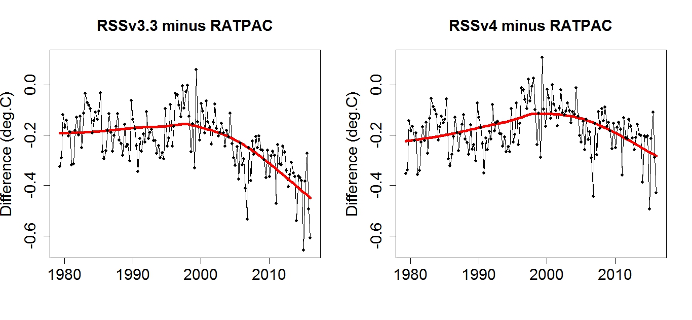
Going from v3.3 to v4.0….
http://www.remss.com/blog/RSS-TMT-updated
Notice how the differences appear post 1998.
That was when the new AMSU sounder onboard NOAA15 took over.
http://www.remss.com/missions/amsu
This is the diff between RSS v3.3 and v4.0 …..
http://images.remss.com/figures/blogs/2016/msu_update_march04_02.png
RSS have corrected for the difference but it still is too cool vs RATPAC radiosonde data…..
The new version warms faster than the old, and by doing so its trend matches that of the balloon data better.
The updated data match the balloon data better, and their difference no longer shows the large downward trend it showed before. But there’s still a significant difference, with RSS v4.0 warming a bit faster than balloon data early, a bit more slowly later.
SO UAH is a far-outlier, but even the newer RSS is still too cold vs radiosondes.
http://www.drroyspencer.com/wp-content/uploads/RSSv4-vs-UAH-MT-original-series.jpg
So if I read the articles figure 4 (UAH Lower Troposphere Temperature) correctly the peak of the 2016 Super El Nino is about 0.05 Deg. Celsius warmer than the 1998 Super El Nino, sooooooo that works out to approximately a 0.025 degree per decade warming, I’m so not alarmed!
Using atmospheric Super El Nino peaks as a bench mark for warming over the last 18 years with about a 35 ppmv increase in CO2 we get about a 0.05 Deg. C Increase in global temperature or 0.025 degree per decade warming or 0.25 degree C per century.
Mosher, I’m just not feeling the model acceleration, I’m just not feeling the warmth and I’m just not feeling alarmed. I’ve just lived through a wonderfully warm 2016 and nothing catastrophic happened, I’m having such a hard time feeling the fear, maybe if someone explained it all to me in a more alarming fashion I could emote the fear so much better?
That’s assuming that the 1998 and 2015 El Nino’s were identical.
MarkW ??
Sunspot,
your quote of 0.25 C per Century much the same as the Central England temp at 0.26 per Century over nearly 350 years. Time for Trumpy to step in and stop this nonsense.
Looks like a whole bunch of graphs confirming that it’s getting warmer. What’s up with that? could the scientific community possibly have been right?????
BOB TISDALE,
Bob, Re your figure 6 onwards. If you use Excel, you can go to the Format drop-down menu and set line thickness say to 1.5 points so that in multiple plots, the lines underneath are not smothered from view by those on top.
?????????????????????????????????????
?????????????????????????????????????
?????????????????????????????????????
Best regards Bob
Jerry, yes the scientific community is absolutely right, it has been getting warmer – since the Little Ice Age. Now the question is what has caused it. Your answer is that of all the possible causes, you believe that CO2 has the caused of the warming. How do you prove that it is CO2 and not say natural variability. You cannot say it has warmed therefore it must be CO2. This error is referred to as Affirming the Consequent. The form of “If P then Q, Q therefore P” is a logical fallacy. A fallacy most of the argument for global warming seems built upon e.g. “it is the hottest year ever”. It proves nothing about CO2, only that an established 150 year trend is still continuing.
Sorry, should have named the fallacy https://en.wikipedia.org/wiki/Affirming_the_consequent
Bob Tisdale, the chart in your Fig 12 representing CMIP5 and GISS Loti data ?w=720
is wrong, and bare nonsense.
Simply because the GISS Loti data does not at all show like you present it. Here is a correct representation out of data I just downloaded from
http://data.giss.nasa.gov/gistemp/tabledata_v3/GLB.Ts+dSST.txt
Neither the peak around 1945 nor a fortiori the plateau starting around 1990 are in the data: your chart is no more than a ridiculous manipulation.
http://fs5.directupload.net/images/161116/jdrwvgwz.jpg
Regardless wether you are technically unable or politically unwilling to accurately represent data, the effect couldn’t be worde in either case: you discredit both the models and the temperature datasets.
Ooh look, you made the “Dust Bowl” in the 30’s disappear ! Wow, aren’t computer games fun !! D’oh !
Hi Bob,
I want to know what counts as a “poor” reconstruction? The current average temperature is about 287K
the maximin difference between the models and the measured temperatures in Fig. 10 is about 0.2 K which
is an error of less than 0.07 %. Firstly this seems like an excellent level of agreement given the complexity of
the climate. Secondly if one were to accept that this was the error in the past why not believe that the error will be the same in the future – e.g. the climate will be 2 degrees warmer plus/minus 0.2 degrees?
Finally what error will you allow between between models and measurements in the past before you would
believe they will be able to accurately predict the climate in the future?
+ 10 !!!
Crickets…….
Making a note. Michael Mann, et. al, in “Making sense of the early-2000s warming slowdown,” paid some respect to the satellite record and to the pause:
Olive trees in Paris, maize in Northern Germany (nothing genetically modified, by the way). Noticed something?
François
Yea. Two things:
1) The little Ice Age ended about 135 years ago and the planet has gotten moderately warmer
2) Precious little empirical evidence the warming is caused by man-made CO2
Bindidon
Clarification please (charts appear to be apples & oranges):
o Your post’s chart is titled “120 month running mean” (i.e. 10 years)
o Tisdale’s chart is titled “…Running 30-Year (360 month) Linear Trends…”
The guy lobbing emotional & technical accusations (…you are technically unable or politically unwilling to accurately represent data…) has the obligation of reconciling the two different data presentations to support your point (10-yr vs 30-yr as well as running mean vs linear trend) or you’ll look like an Excel-enabled fool.
Tisdale has a long history of publishing & explaining his data & analysis, including frequently responding to reasonable questions/criticisms.
Time for you to cowboy up and do the same.
Javert Chip on November 16, 2016 at 3:00 pm
Remark Nr 1
Either you have a linear trend, mostly computed using ordinary least squares, or you have a running mean trend, or a polynomial or an exponential trend. But what you understand under a “360 month running trend” is unknown to me, please present a technical definition of this very interesting concept.
Remark Nr 2
http://fs5.directupload.net/images/161116/y2sj47jr.jpg
OK, cowboy?
Bindidon
I don’t have to explain anything – you’re the one claiming your chart titled “…120 month…” was superior to Tisdale’s chart titled “…360 month…” – all I did was point out the data is apples & oranges, thus requiring an explanation. Which, apparently, you cannot provide.
This is a common phenomena – harsh claims made (you accused Tisdale of being technically unable or politically unwilling to accurately represent data) without being able to back them up.
As a retired CFO, I’m accustomed to blowing the whistle on dirty numbers games, and this smells like a dirty number game.
I forgot to add a little evidence: the longer the running period, the flatter the curve, yeah 😉
Thus there is great evidence that Tisdale’s GISS plot is all but correct…
“I forgot to add a little evidence: the longer the running period, the flatter the curve, yeah ;-)”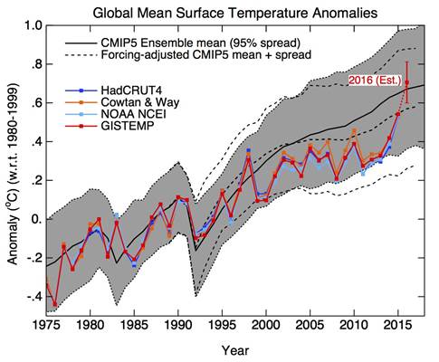
Which is why he uses them … and for recent times masks the surge in GMT’s since the -vePDO/ENSO phase ended.
Thus…..
Correction
… But what you understand under a “360 month
runninglinear trend” is unknown to me…Bindion
Did you even read Tisdale’s chart?
Tisdale’s chart”s title contains the description “…Running 30 Year (360 Month) Linear Trend…”. It frequently helps to read stuff before you say it’s wrong.
It’s the the same MO Monckton uses when he says that the rise in deep water ocean temps is “trivial”
And either Ball or Tisdale chimes in to say that temp is what the average person understands.
Yes – he does but he doesn’t know that there is a factor of 4000 involved before you can equate ocean heat to atmospheric heat when using Celsius rather than Joules.
It seems you didn’t read my correction above. How could I have written it if I wouldn’t have read Tisdale’s head post before?
I’ll come back somewhat later concerning this very special kind of “trend” nearly nobody seems to use (Humlum’s climat4you excepted, doesn’t wonder me).
In these posts, slopes of time/temperature curves are presented and compared. However no standard errors of the slopes are given, so it’s difficult to say whether the differences are significant or not. Could standard errors be given in the future, please?
Maybe a bit OT, but what is going on in the artic where the temperature is way above normal?
Arctic is warming since longer time: not only the actual temperatures in 2016 are “way above normal”.
The trends since 1979 for satellite-based troposphere observations:
– UAH6.0beta5 TLT: 0.2: 0.24 °C / decade;
– RSS3.3 TLT: 0.35 °C / decade.
And the trends in the same period for the northernmost UAH 2.5° grid cells (82.5° N) are good over 4 °C / decade.
I won’t tell you about surface measurements, you wouldn’t believe me.
Javert Chip on November 16, 2016 at 3:00 pm / November 16, 2016 at 5:16 pm etc
Well you seem to be an unconditional fan of Mr Tisdale, even some kind of “Tisdale cheerleader”.
Pretty good!
But let’s get back to serious things. Please look at the chart below:
http://fs5.directupload.net/images/161118/9ean7dt6.jpg?w=720
I guess you’ll recognize the plot again, won’t you?
First remark: this is a monthly time series of linear regressions on GISS temperatures, all over a time interval of 360 months. BUT a time series of trends is itself NOT a trend: it is a time series of trends, not less, not more.
Second remark: as you can easily see, Javert Chip, this is moreover a time series of backward trends. But nearly everybody of course uses forward trends. The one and only use of a backward trend known to me is on Ole Humlum’s climate4you web site:
http://www.climate4you.com/images/HadCRUT4%2050yr%20AnnualTrendSinceDecember1899.gif?w=720
and it is also the one and only reference to it on this web site.
{ A delicate hint inbetween: googling for „month linear trend“ (quotes included) gives you less than 500 links, whereas the keyword „linear trend“ shows over 600,000. Aha. }
Thus my question: why did your chief thinker use backward trends instead, like did Humlum?
The answer you see in the second chart:
http://fs5.directupload.net/images/161118/4o6nrid6.jpg?w=720
Isn’t there some evidence that this chart, while being constructed in a more usual manner, shows a plateau ending around 1985, and therefore is of no interest at all for a person who in fact wants, for rather political reasons, to show a plateau starting about 30 years ago, and keeping pretty flat till now?
But what your chief thinker wanted to show, namely that temperatures won‘t be able to go above a given level: that he didn’t at all. What he showed with his chart ist that the linear trend of temperatures didn‘t grow during that period.
What a luck indeed, imagine not only temperatures would go higher, but their trend would as well!
That would mean exponential temperature increase, no thanks!
Guess what global warming is ending and it will be shown to be a hoax.
This period of time when viewed in the historical climatic record is in no way unique. It is not even close if anything I would say the period from 1850 – present is one of the most stable non changing climatic periods ever.
This has a good chance to change going forward.
I am very bullish on the present temperature distribution in the N.H in that much of the warmth is all concentrated above 70 N latitude where it is below freezing anyway and brutal cold is common between 45 to 70 N, with the exception of N. America but this should change soon.
AO should be very negative going forward.
I always said a warm Arctic leads to global cooling we shall see.
http://models.weatherbell.com/climate/ncep_cfsr_t2m_anom.png
This is not what AGW theory called for not even close. I would say this is the opposite of what they called for. How soon we forget AGW one of their cornerstones was for the AO to become more and more positive as time went on. Guess what the AO is becoming more and more negative and this winter is setting up for a very negative AO.
I have called for a -AO in response to prolonged minimum solar activity which is happening and sea surface temperature to decline which also is starting to happen.
You seem to be ignoring all those red bits.
No I am not.
I want to add the geo magnetic field compounding given solar effects upon the climate.
Global cooling is on the way the question is how much?
The bottom line is AGW theory called for the AO to trend more positive as time went on and the reality is the exact opposite has been and is occurring.
In addition the other cornerstone of the theory the lower tropospheric hot spot is missing in action.
.
When two major calls a theory calls for do not materialize and is the basis for that theory I would say the theory is in serious trouble.
Lots of juvenile anchovies off Peru:
https://www.undercurrentnews.com/2016/11/18/sources-fishing-challenges-could-limit-peru-fishmeal-price-pressure-on-higher-quota
which means lots of upwelling and probably more La Nina ENSO negative conditions ahead.
Oh yes!
http://wermenh.com/wuwt/elninometer-current.gif
neutral
http://www.bom.gov.au/climate/enso/monitoring/soi30.png
neutral
http://www.weatherzone.com.au/climate/indicator_enso.jsp?c=nino34
neutral
Wait & see 🙂
Cache problem on SOI ENSO wrap, click on the graph, you see a negative La Niña value of -5.8
ENSO does not have anything to do with AGW theory being correct.
ENSO is a natural variable shown to be tied in with solar activity. That being El NINO more likely when solar activity is low.
There is no what you call “pause buster” in HadCRUT4,
Let’s forget that the corrections change nothing and that all estimates based on thermometers measurements give similar results, whereas the difference between the old algorithm UAH calculation and the new algorithm UAH calculation, is huge),
If you think that GISS LOTI and NCEI are wrong, why don’t you show HadCRUT4 first (even if HadCRUT4 is less global than GISS and miss some warming over the north poles that warms more) ?