Guest essay by Andy May
In previous posts (here and here), I’ve compared historical events to the Alley and Kobashi
GISP2 Central Greenland Temperature reconstructions for the past 4,000 years. Unfortunately, these two reconstructions are very different. Recently Steve McIntyre has suggested a third reconstruction by Bo Vinther. Vinther’s data can be found here. Unfortunately, Vinther is often significantly different from the other two. The Alley data has been smoothed, but the details of the smoothing algorithm are unknown. So the other datasets have been smoothed so they visually have the same resolution as the Alley dataset. Both datasets (Kobashi and Vinther) were first smoothed with a 100 year moving average filter. Then 20 year averages of the smoothed data were taken from the one year Kobashi dataset to match the Vinther 20 year samples. The Alley data is irregularly sampled, but I manually averaged 20 year averages where the data existed. If a gap greater than 20 years was found that sample was skipped (given a null value).
All three reconstructions are shown in Figure 1. There is no reason to prefer one of the three reconstructions over the other two, so I simply averaged them. The average is the blue line. I’m not presenting this average as a new or better reconstruction, it is merely a vehicle for comparing the three reconstructions to one another and to other temperature reconstructions. This is an attempt to display the variability in common temperature reconstructions for the past 2,000 to 4,000 years.
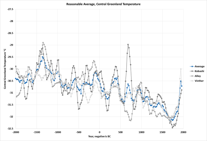
Figure 1
There are some notable outliers apparent in the comparison. In particular, we see the odd 700AD Kobashi spike, the scatter in the interval from 700BC to 100BC, and the Minoan Warm Period is completely missing in the Vinther reconstruction. The estimates agree better from 900 AD to the present than they do prior to 900 AD. Perhaps as the ice gets older accuracy and repeatability are lost. Figure 2 shows the same average and the maximum and minimum value for each 20 year sample.

Figure 2
The average temperature for the 4,000 year period is -30.8°C. The average minimum and maximum suggest this value is plus or minus 0.3°C. Perhaps we are simply seeing the error in these methods and nothing more. For those who want to see the messy details of the average temperature calculation the spreadsheet can be downloaded here. As noted in my previous post, the error in the time axis is probably at least +-50 years. Loehle has suggested a time error of +-100 years based on 14C laboratory errors. These give us some perspective in interpreting the reconstructions. Below is a comparison of the average to the same historical events we have used before.
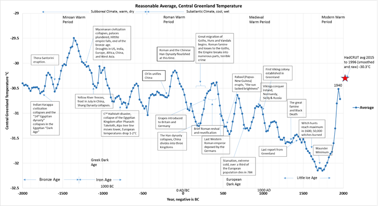
Figure 3, click on the image to download a high resolution pdf
This average temperature reconstruction shows a steady decline in temperature since the Minoan Warm Period, interrupted by +-120 year cycles of warm and cold. Don’t take the apparent 120 year cyclicity too seriously all of the data was smoothed with a 100 year moving average filter. After the end of the coldest period, the Little Ice Age, the Modern Warm Period begins and temperatures rise to those seen in the Roman Warm Period. The Modern Warm Period is equivalent to the Medieval Warm Period within the margin of error. We need to be careful because we are comparing actual measurements to averaged proxies. When proxies are averaged all high and low temperatures are dampened. In particular, the Medieval Warm Period is somewhat smeared and dampened due to the Vinther record. The Vinther Medieval Warm Period peak is earlier than the Kobashi and Alley peaks. Major volcanic eruptions fit this timeline reasonably well. Rabaul is noted at 540AD. Others are Thera-Santorini in 1600 BC and Tambora in 1815. TheHadCRUT 4.4 point shown with a red star is an average of several HADCRUT4 surface temperature grid points in the Greenland area thought to be comparable to the Greenland average temperature.
Comparisons to broader temperature reconstructions
Dr. Craig Loehle published a global composite temperature reconstruction in 2007 and a corrected version of the reconstruction in 2008. This reconstruction has been widely reviewed and appears to have stood the test of time. Subsequent work seems to support the reconstruction. In Figure 4 we show his global reconstruction compared to the Greenland average and the recent reconstruction of temperature in the extratropical (90° to 30°N) northern hemisphere by Ljungqvist. The graph in Figure 4 shows temperatures as anomalies since each line represents a different area.
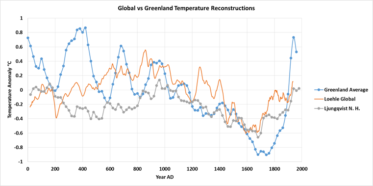
Figure 4
All of the reconstructions show a trend of decreasing temperature to the Little Ice Age, roughly from 1400 to 1880 AD. They also show a temperature peak around 1000 AD. The most striking thing about Figure 4 is that the temperature swings seen in the Greenland Average are larger than in the broader reconstructions. Is this because they average more proxies? Or because temperature changes are amplified in the Arctic and Antarctic as suggested by Flannery, et al? Probably a combination of both. Finally Figure 5 shows the Greenland average compared to two Arctic reconstructions. One is the ice core component of the Arctic reconstruction by Kaufman, 2009 (data here) and the other is the Sunqvist, 2014 “PAGES2K” arctic reconstruction (data can be found here). In Figure 5, the Arctic and PAGES2K temperature anomalies have been shifted to the average central Greenland temperature for the period for comparison purposes.
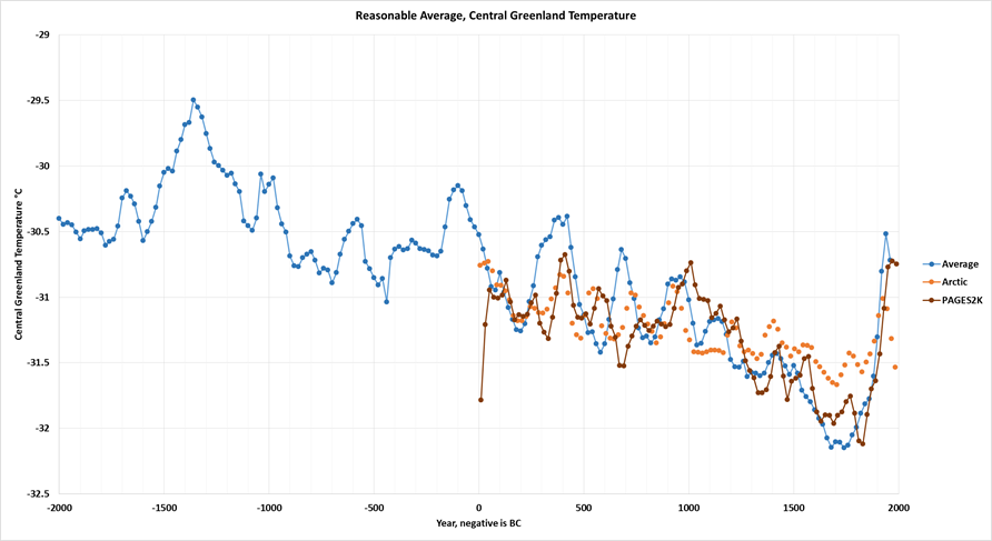
Figure 5
These two multi-proxy Arctic reconstructions agree fairly well with the Greenland average if we assume a +-0.3°C temperature error and +-50 year time error. It is interesting that the peak about 400AD is seen in the Arctic and Greenland reconstructions but not in the global reconstructions plotted in Figure 4. The Sunqvist, 2014 reconstruction was used as presented in his paper, it seemed to be carefully constructed. Sunqvist,et al. did include some tree ring data (fewer than 1% of the proxies), but they used it carefully and his reconstruction was not dominated by tree ring data.
Kaufman’s Arctic reconstruction used a lot of tree ring data (4 of 23 proxy records) as can be seen in his Figure 3 and in his dataset. Tree ring data does provide an accurate chronology, but it provides a poor temperature proxy due primarily to what has been called the “divergence” problem. Tree rings may correlate well to temperatures in a “training” period, but show little correlation to temperature longer term. This is probably because forests adapt to long term climatic changes by adjusting tree density and tree size. Tree ring widths can reflect summer temperatures, precipitation and many other factors, but extracting the average air temperature from them is problematic. Loehle discusses this problem and other problems with tree ring data here and here. For this reason, only the ice core records (seven proxy records of 23) from Kaufman’s reconstruction were used to plot the “Arctic” line in Figure 5. Figure 6 compares Kaufman’s “All proxies” reconstruction to his ice core, sediment (and lake varves) and tree ring proxies. The ice core, sediment and tree ring proxies only agree reasonably well for the last 500 years, before that the tree ring proxies diverge dramatically downwards. The lake and marine sediment proxies (12 of the 23) are lower than the ice core proxies also, but not so dramatically. We all know of another paleoclimatologist who took advantage of this divergence.

Figure 6
When all of the proxies are used the earlier temperatures are much lower and the modern warm period has a higher peak. The recent peak in the graph is the twenty year average around 1945. The proxy reconstruction then drops, the last point is centered on 1985. I didn’t bother to “hide the decline.” Except for the sharp drop from 1945 to 1985 Kaufman’s ice core proxies fit the rest of the reconstructions shown here reasonably well.
Discussion
There are many Greenland area temperature reconstructions, they use ice core data, lake and marine sediment core data and other proxies, mainly tree rings. They are not perfect and contain errors in the temperature estimates and errors on the time scale. The exact error is unknown, but by comparing reconstructions we can see that they generally, except for the tree ring proxies, agree to within 0.3°C and in time to within 50 years or so. Why is this important? Natural climate cycles are poorly understood. Some like the ENSO cycle (La Nina and El Nino) we can identify, but because they are irregular and the cause is unknown we cannot model them. The same is true of the Atlantic Multidecadal Oscillation (AMO) and the Pacific Decadal Oscillation (PDO). These events affect the weather and climate all over the world, but they are not accurately included in the GCM’s (General Circulation Models) used by the IPCC and other organizations to compute man’s influence on climate. Thus, some portion of the Modern Warm Period attributed to man may, in fact, be attributable to these or other natural climate cycles.
During the 1980’s and 1990’s the PDO was mostly positive (warming). From the mid 1990’s to today the AMO has been mostly positive and undoubtedly contributing to warming. There have been numerous attempts to see a pattern in these multidecadal natural climate cycles. Most notably, Wyatt and Curry identified a low-frequency natural climate signal that they call a “stadium wave.” This model is based on a statistical analysis of observed events (especially the AMO) and not on the physical origins of these long term climate cycles. But, it does allow predictions to be made and the veracity and accuracy of the stadium wave hypothesis can and will be tested in the future.
Another recent paper by Craig Loehle discusses how the AMO signal can be removed from recent warming, leaving a residual warming trend that may be related to carbon dioxide. He notes that when the AMO pattern is removed from the Hadley Center HADCRUT4 surface temperature data the oscillations are dampened and a more linear increase in temperature is seen. This trend compares better to the increase in carbon dioxide in the atmosphere and allows the computation of the effect of carbon dioxide on temperature. The calculation results in an increase of 0.83°C per century. This is roughly half of the observed increase of 1.63°C. Loehle suggests that the AMO may be the best indicator of natural trends. If this is true then half of recent warming is natural and half is man-made. It also suggests that the equilibrium climate sensitivity to carbon dioxide is about 1.5°C per doubling of CO2. This is the lower end of the range suggested by the IPCC. This value also compares well to other recent research.
Conclusions
The use of temperature proxies to determine surface air temperatures prior to the instrument era is very important. This is the only way to determine natural long term climate cycles. Currently, in the instrument record, we can see shorter cycles like the PDO, AMO, and ENSO. When these are incorporated into models we see that half or more of recent warming is likely natural, belying the IPCC idea that “most” of recent warming is man-made. Yet, these shorter cycles are clearly not the only cycles. When we look at longer temperature reconstructions we see 100,000 year glacial periods interrupted by brief 20,000 year interglacial periods. These longer periods will probably only be fully understood with more accurate reconstructions. Intermediate ~1500 year cycles, called “Bond events” have also been identified.
Tree ring proxies older than 500 years and younger than 100 years are anomalous. This anomaly is large enough to cast doubt on any temperature reconstruction that uses tree rings. Between lake and marine sediment proxies and ice core proxies it is harder to tell which is more likely to be closer to the truth. They agree well enough to be within expected error. All of the proxies diverge from the mean with age, none appear to be very accurate (or more precisely in good agreement) prior to 1100 AD. It does appear that all of the proxies except the tree ring proxies, could be used for analytical work back to 1100 AD; this is encouraging.
The other very important use for temperature reconstructions is to study the impact of climate changes on man and the Earth at large. Historical events are often known to the day and hour, only when we have reconstructions with more accurate time scales can we properly match them to major events in history. In addition, this work made it clear that combining multiple proxies causes severe dampening of the temperature response because the time scale error causes peaks and valleys in the average record to be reduced. Multiple proxy reconstructions show less temperature variation than actually occurred. Ideally, we need a very accurate time scale on all proxies so they can be combined properly. But, achieving more accuracy than 50-100 years will be difficult given current dating technology. Tree rings are more accurate than this, but they are a poor indicator of temperature. There is a lot of work needed in this area.
Is there the equivalent of a “Nyquist rate” for backward looking reconstruction of physical processes and events?
There’s an upper limit but I wouldn’t call it the Nyquist limit. Note this (from the opening paragraph):
“The Alley data has been smoothed, but the details of the smoothing algorithm are unknown. So the other datasets have been smoothed so they visually have the same resolution as the Alley dataset. Both datasets (Kobashi and Vinther) were first smoothed with a 100 year moving average filter. Then 20 year averages of the smoothed data were taken from the one year Kobashi dataset to match the Vinther 20 year samples. The Alley data is irregularly sampled, but I manually averaged 20 year averages where the data existed. If a gap greater than 20 years was found that sample was skipped (given a null value).”
So, he has an effective sampling rate of one-per-20 years, or 5 per century. That would imply a Nyquist limit of 2.5 cycles per century. Anything above 2.5 cycles per century would have an aliasing problem – but I doubt that’s what you’re worrying about.
The 100 year moving average is the key. Any periodic variation at or above 1 cycle per century would be severely damped. Even variations with a period slightly longer than a century would be significantly reduced.
So, just to give an example some folks might be thinking about, the impact of a once per century dip in the strength of solar cycles could not be seen in this data set. Visually, it looks like a Fourier analysis of this data might show a frequency peak just above 1/2 cycle per century.
If I can get the data into MatLab, I’ll say more in a bit.
Filtering AFTER the data are sampled doesn’t solve any aliasing problems. (See below, where a fundamental sample rate of 1 per year is likely.)
Just to update, a simple FFT on the whole data set (199 samples, one per 20 years) is a mess because the FFT sees the signal as a giant sawtooth with a period near the 3980 years of the whole data set. This spews harmonics all over the place. I’ll have to regress out the overall trend to see the shorter periods above this noise.
Look Andy, there is really no point in distorting the data with crappy running averages and then discussing the squiggles that come out.
If you think you have passed this lot through a 100y ‘filter’ why do you have so much varability which is clearly a lot faster than 100 years !?
If you data processing skills are limited to working with a spread sheet, at least do a triple running average ( three successive running averages of different lengths ).
I’m sure I must have linked this in your previous threads, but here is a explanation of the problem and how to do a triple running average. This can be done in a spreadsheet and will clean up a lot of the fluff you presently have and allow you to properly compare these datasets.
https://climategrog.wordpress.com/2013/05/19/triple-running-mean-filters/
after ‘uplift correction’ , correction for supposed changes in ocean d18O they then “calibrate” the ice d18O data to a reverse engineered guess at past temps from current temperatures in a bore hole. WTF?
I am not surprised that none of these proxies really agree with each other.
The Nyquist frequency is half the sample rate which I presume would be one sample per year. Thus the Nyquist frequency is one sample per two years. Nyquist says that no events with a higher frequency than that are present in the data. High frequency effects can show up “aliased’ to a lower frequency but would generally average to zero if they did not happen at a very precise repetition rate. They would also tend to disappear due to the low pass filtering effect of ice formation. Forward or backwards makes no difference. So I would say there is little chance of this being a factor in the analysis.
I agree, except the spreadsheet linked in the article shows one data set with a one year sampling rate, one with a 20 year rate (after some unknown smoothing process) and one that’s in between and inconsistent (?!)
I also agree that aliasing is very unlikely to be a factor. These things are, after all, glacial.
Eyeballing the graphs, the take home message is a steady decline in Greenland temperatures until recently, then a sharp increase.
“the take home message is a steady decline in Greenland temperatures until recently, then a sharp increase”
Or the take home message is: “none appear to be very accurate (or more precisely in good agreement) prior to 1100 AD.”
Yes, if by “recently” you mean about 1750.
Eyeballing the graphs, the take home message is that Greenland temperatures have been steadily rising since the recovery from the Little Ice Age began. No matter which proxy is used,

no corellation is observed between CO2 levels and the subsequent rise in temperature. This chart makes that clear:
http://jonova.s3.amazonaws.com/guest/de/temp-emissions-1850-web.jpg
The “sharp increase” in temperature reversed in ≈1940, then began to increase again in the ’70’s. Once again, ∆CO2 has no measurable effect. Furthermore, on a longer time frame, atmospheric CO2 has steadily declined:
If more CO2 caused higher temperatures, the long term decline in that harmless, beneficial trace gas would have caused steady global cooling. But CO2 remained steady at or below 300 ppm throughout most of the Holocene, while temperatures fluctuated:
The “take home message” is that any effect CO2 may have on global temperature is simply too small to measure.
Amdy may
Very interesting set of reconstructions, thank you.
I compared CET reconstructed to 1540 to a bariety of spaghetti paleo reconstructions. See in particular figure 2
https://wattsupwiththat.com/2013/08/16/historic-variations-in-temperature-number-four-the-hockey-stick/
Whilst CET as a single northern hemisphere index is gong to be more variable than a global one, it can be readily seen that smoothing and using 50 or 100 year centres miss out on the hugely variable and decadal records. The global paleo reconstrctions even miss out on some extremely variable And dramatic periods of warmth and cold and consequently they should perhaps be viewed as vaguely useful in plotting some sort of very rough temperature trajectory but they are not good enough for governments to base far reaching energy policies on
Tonyb
Indeed Tony. There exists a “climate gate” email that address this. In discussing the proxy studies one of the hockey team said words to this affect, (sorry, computer crashed and burned, so no link)
=============================================================
“even if we do are best reconstruction we will know f-all about less then 100 year resolution”
===========================================================
So, is it not likely that the peaks and valleys were all higher then the transition to the modern T record?
Also, does the resolution change over time prior to the transition to the modern record?
The take-home message seems to be the same in every reconstruction that I read. Be it ice cores, tree rings, sediments, isotopes, thermometers, satellites, whatever; it is that the uncertainties and the noise far exceed the signal. Where the error bars exceed the signal and the adjustments (correct or incorrect) exceed the signal and the noise exceeds the signal then there is no story. No AGW. No CAGW but equally no more is there proof of the converse. i.e that AGW and CAGW do not exist. Ask me again in 500 years when we have some reliable data on a planetary scale to work with.
+ 1000
I always enjoy your work, Andy. Thank you.
Andy, nice post. What the recontructions indisputably show is two things. Interglacials are not constant. Not the Holocene, not the prior Eemian which had sea level several meters above present, only to have sea level recede to present, then rise again, (each change over several millennia) before receding permanently in the most recent glaciation. We can be quite confident about the MWP and LIA from the historical record. And we know from the temperature records that there was a warming from about 1920 to about 1945 indistinguishable from that from about 1975 to about 2000. Yet the first is not attributable to CO2. Attributing the second only or mainly or mostly to AGW is a fundamental logic fail. Anthropogenic Attribution ignoring natural variation is one of the great weaknesses in AGW. Mann’s absurdly wrong hockey stick was more about the falsely straight shaft than the ‘Nature trick’ blade, because it attempted to disappear the attribution question.
Well put, Rud. There are three periods of temperature rise with the same slope, the two you mention and one back in the 19th Century. Phil Jones heself told me so.
===========
Furthermore, there is an approximately 60 year cycle, which seems like the PDO, and would suggest attribution is entirely natural. I used to be more sure of that than I am now, because surely some of the increase is from increased CO2. Even 40% of the way to a doubling with sensitivity @ 1.5 degrees C/doubling would surely show some effect. Surely, surely.
Keep saying it.
=========
Or the Modern Warming Period has peaked and we’re not really keeping up. Gad, I hope this last is wrong.
===============
thanks Andy..
Andy
One quick comment.
You say
“From the mid 1990’s to today the AMO has been mostly positive and undoubtedly contributing to warming”
Positive and negative are simply relative, and therefore irrelevant. It is the direction of travel that matters.
What is important is that the AMO rose from its nadir in the mid 1970s till the late 1990s, which coincided with the rise in global temperatures.
Since the late 1990s, the AMO has been pretty much static, coinciding with the Pause. We are still waiting for the AMO to start heading down.
If this happens when the PDO truly turns negative, we will have decades of cooling.
The first few graphs show just how unreliable the proxies are, with major disagreements as to direction of temperature rise or fall. IMHO the whole endeavor need more work before anyone bases policy on proxies.
I would recommand to replace “review” by “cherry picking” in the title.
No no, you’re welcome.
No, you’re welcome, for once again demonstrating the extraordinarily tiny mind of the Alarmist, and the bizarre arrogance of the not very bright.
I am very sorry, but I don’t feel like an alarmist …
which doesn’t mean that I don’t think human activities are causing a climate change.
Can you get that ?
Excellent post, and great argument at the end. Many thanks.
Andy,
what I find interesting about your graph with the overlaid historical notes is that the absolute temperature seems to be irrelevant to major social disruptions and catastrophes. For instance, you show the Mycenaean civilization collapsing at about the same temperature as the civilizational highpoint for the Romans and the Han dynasty. Also I noted that the peaks of the various warm periods are all lower than the Minoan Warm Period, but that the rising temperatures seem to coincide (cause?) the rise of cultures that were able do more that just survive in the cold. I would also note that we are fortunate that our peak was higher than the slope through the peaks of the periods of adequate food and rising prosperity for the past 3,000+ years. I will be sharing your chart with our dig team (Bronze Age tell).
Thanks,
pbh
I’ve noticed that also. Absolute temperature seems less important than trend. When the trend is up, times are good. When the trend is down, times are bad. Man and nature seem to adapt in time to about anything, but the period of change to cooler temperatures is rough until the adaptation is complete. Less adaptation is required when temperatures rise. Just an observation, no proof.
That’s not surprising. We build upon the achievements of previous upticks – not everything s lost in terms of technology, institutions, infrastructure, ideas when civilisations decline or collapse. And civilisations decline to the level the temperature allows for, so the next warm period increases food and quality of food from that level, allowing an increase in population, fighting men, innovation etc.
The opposite occurs as it gets cooler, less food, more disease (e.g. migrations bringing new diseases/strains and less resistance to disease from a poor diet), So populations decline and people move.
The four horses never trample Parbati’s little critter.
===========
“Unfortunately, Vinther is often significantly different from the other two.”
Well, one likely reason is that it is in a different place. Or rather, six different places, none of which is GISP-2. And Vinther himself comments::
Here is his Fig 1:
http://www.nature.com/nature/journal/v461/n7262/images/nature08355-f1.2.jpg
His data set has these six individually – none seems to correspond to what you have plotted. Is that an average?
I plotted Vinther’s reconstruction, which is at the bottom of the txt file linked in the 4th line of the post. There are several datasets in the txt file including those you show in your comment. He merges those into one reconstruction and that was what I used. I did not do anything with the separate site records. His reconstruction is given as an anomaly from the mean, I shifted that anomaly to the Alley average to compare them.
Remember, this is a real “science.” It doesn’t matter where the ice core was taken, the level of CO2 was the same. If we are trying to point the finger at CO2 we have to explain why temperatures varied with the same level of CO2, and yet CO2 was the cause. How can you have varying temperatures with equal CO2 and blame CO2? If this Voodoo Science? In what real “science” do you explain a variation with a constant? Did I sleep through that class? CO2 can only cause a shift in the curve, it can’t alter the variation or the slope.
One problem is the altitude correction. Renland and Agassiz are altitude corrected, while others are not.
So what’s wrong with Mohberg et al. 2005 northern hemisphere temperature reconstruction? You can only go that far with Arctic temperatures, that are of most interest to polar bears.
1) CO2 is a constant around the globe. CO2’s impact would be to “shift” all temperature graphs up or down, not change the “slope.” Has anyone ever run a regression/correlation study between all ice core data sets? If they all don’t have have high R^2 and Correlation scores, then something other than CO2 must be causing the differences in temperatures.
2) The absorption of CO2 is constant around the globe, so its temperature impact of trapping 1.6W/M^2 should cause a similar temperature difference regardless of the latitude or longitude Do all ice core data sets of the same latitude show similar temperature variation? If not, something other than CO2 must be causing the variation.
3) Combining the ice core data with recent temperature measurements of the same latitude and longitude, does the recent temperature variation from 150 and 50 years ago demonstrate a statistically significant increase in temperature variation? Basically, is the temperature variation over the past 150 and/or 50 years statistically significant when compared to the temperature variation recorded in the ice core data sets?
4) Do all ice core data sets show a Minoan and Roman warming as well as Little Ice Age? Do any ice core data sets resemble the Hockeystick?
WUWT, would you please commission a series of articles to address those above questions? If climate science is a real science, all my challenges should be rejected. If just one of my challenges passes,it is back to the beginning for climate science.
Keen sense of the obvious:
1) All show that we are rebounding from a significant cooling phase.
2) Most show that 3/4 of all temperature points are equal or above current temperatures. BTW, is temperature data used to fill in to the current? Or is ice core data used? How?
3) None, I repeat None, show current temperatures at a peak.
We have temperature measurements for those areas. Do they show such temperature amplification? See graph below.
My bet is Michael Mann relied heavily on tree rings for the older data. That is how you erase the warming and cooling periods in the past. If he did, that is obvious fraud. That kind of stuff is criminal behavior in the financial sector, and results in jail time.
The proxies don’t even come close to the temperature measurements if I an reading this chart right.
http://static.skepticalscience.com/pics/DMI_daily_small_update.JPG
The millennial and 60 year natural temperature cycles peaked more or less simultaneously in 2003/4. For forecasts of the timing and extent of the coming cooling see
http://climatesense-norpag.blogspot.com/2016/03/the-imminent-collapse-of-cagw-delusion.html
The solar “activity” driver peak was in +/-1991 (See Fig 8 in the link)
Because of the thermal inertia of the oceans there is a +/-12 year delay between the solar peak and the corresponding RSS temperature peak. The delay between the solar peak and the arctic sea ice volume minimum is about 12 years.
For more detail see
http://climatesense-norpag.blogspot.com/2014/07/climate-forecasting-methods-and-cooling.html
Sorry – typo the ice minimum delay is about 21 years.
Very interesting!
Tie this back to CO2, how does CO2 cause the oceans to warm? IR between 13 and 18µ won’t arm the oceans. If oceans are the cause of warming, it is due to visible radiation reaching the earth. If the sun is warming the oceans, and the oceans are causing the warming, then CO2 isn’t the cause.
You say “CO2 isn’t the cause” I am at a loss to figure out why this logically impeccable argument is not accepted by the climate establishment. The very idea of an ECS is a figment of the human imagination with no computable correlate in the real world. Actually the IPCC science section group is aware of this.
Section IPCC AR4 WG1 8.6 deals with forcings, feedbacks and climate sensitivity. It recognizes the
shortcomings of the models. The conclusions are in section 8.6.4 which concludes:
“Moreover it is not yet clear which tests are critical for constraining the future projections, consequently a set of model metrics that might be used to narrow the range of plausible climate change feedbacks and climate sensitivity has yet to be developed”
What could be clearer. The IPCC in 2007 said itself that it doesn’t even know what metrics to put into the models to test their reliability (i.e., we don’t know what future temperatures will be and we can’t calculate the climate sensitivity to CO2). This also begs a further question of what erroneous assumptions (e.g., that CO2 is the main climate driver) went into the “plausible” models to be tested any way.
Even the IPCC itself has now given up on estimating CS – the AR5 SPM says ( hidden away in a footnote)
“No best estimate for equilibrium climate sensitivity can now be given because of a lack of agreement on values across assessed lines of evidence and studies”
Paradoxically they still claim that UNFCCC can dial up a desired temperature by controlling CO2 levels .This is cognitive dissonance so extreme as to be irrational.
There is not a single cause for global warming, but an assortment of causes, between which is the increase in CO2. And it is absolutely impossible to correctly quantify the contribution from each factor as warming from different causes cannot be correctly attributed.
But definitely CO2 is producing part of the warming. There is ample evidence of that.
The NYT’s Climate reporters must have overlooked those statements when they concluded that the science was “settled.” The truth is hiding in plane sight, and yet no one is looking.
Javier, according to MODTRAN, the impact of CO2 in the lower 0.1 km of the atmosphere is 0.00 W/M^2. Water-vapor is the only significant greenhouse gas in the lower atmosphere. The CO2 signature is first seen 3km up. There is only 100% to be absorbed, and if H20 is already absorbing 100%, it doesn’t matter how much CO2 there is. Imagine a huge net in the sea catching all the fish, and a small net behind the huge net. No matter how many small nets you have behind the huge net, you won’t catch any more fish. H20 saturates the GHG effect in the lower atmosphere. MODTRAN agrees what statement. You can only capture 100% of something, and H20 does that. CO2 is irrelevant. Imagine a patient with back pain taking a very strong opiate, and then taking an aspirin. The aspirin won’t stop any more pain, no matter how many are taken. Imagine painting a window black. The first 5 coats represent H20 and the 6th represents CO2. Basically CO2 is immaterial whenever H2O is present.
There is a huge gap between the WG1 reports uncertainties and the SPM reports. The latter were put together by the political intergovernmental scientists . Their 95% certainty estimates were dreamed up by a small group of government representatives who thought up a number suitable to their masters, while gathered in a room somewhere. This group then told the WG1 group editors to change their sections to be consistent with the SPMs.
co2islife,
“Basically CO2 is immaterial whenever H2O is present.”
H2O is very irregularly distributed in the atmosphere. When the air is very cold, it is also very dry. That’s one of the reasons the main effect of CO2 is to raise minimum temperatures at night, during the winter, above the Arctic, and over glaciers. This is very well known and according to theory, and most importantly, supported by the evidence. That is one of the main reasons that we know that CO2 is having an effect in warming the planet. We find an increased warming where we should expect it.
That quote alone destroys the myth of this being “settled science.” What a joke. Climate science is like doing a study on weight-loss and forgetting to include caloric intake and exercise in the model, and claiming the resulting model has settled the issue of weight-loss.
Bingo!!!! Bingo!!!! Bingo!!!! I’ve been trying to point out that this is what they are hoping for, but there is no basis in real science for it. I’ve pointed out 1,000x time that they are modeling the level of CO2 when the important factor is the energy absorbed by CO2, not the level of CO2. CO2’s level is linear, its absorption is logarithmic. It is like pouring water into a bucket with increasing large holes in it the higher you go. The measurement that is important is the amount of water “trapped” in the bucket, not how much water is poured into the bucket. Climate science is using a linear variable when it should be logarithmic. The very fact that they are trying to make CO2 level correlate with temperatures proves they have a very very very wrong model. This is econometrics 101, and climate scientists fail on an epic scale.
” Climate science is using a linear variable when it should be logarithmic. ”
There is no such a “linear variable” in radiative transfer models.
Is it a lie or you are just completely dumb ?
The projections of B-movie-dystopia-warming do all have a linear look to them nonetheless.
If there is no “linear term” then linearity creeps in the back door in the form of all those utterly fictitious and falsified B-movie positive feedbacks.
This would be very nice if CO2 were the only player. It is not. It is not even clear that any greenhouse gas is a dominant player. Even according to the IPCC, atmospheric water has been flat through major episodes of warming.
It is pretty clear that CO2 is cooling the stratosphere. What does that portend? We don’t know, but the whole reason the stratosphere is stratified is because it is warmer and creates an inversion cap on the mixed layer below.
Everyone loves to recite the litany that Ozone warms the stratosphere. It does, but only the lower stratosphere near the tropopause, and even there it manages only to stall the lapse rate. Very significant warming in the middle and upper stratosphere occurs well above the Ozone layer. This is where the stratosphere is cooling these days.
That cold air will find its way down.
Very good summary. While I disavow my 2008 paper being “the” correct answer, it was good enough to become part of the AR5 spagetti graph (the gatekeepers must have been snoozing). I saw a talk by Kobashi on his reconstruction and the methods seemed pretty robust. I think a very notable thing evident here is the long-term cooling trend which actually goes back to the peak of this interglacial between 6000 and 8000 BP. Whatever warming we are causing that counteracts the next glacial I would call a good thing.
Key question, CO2 has been stable or rising over the past 6000 to 8000 BP. How would CO2 cause the cooling? What I find so interesting about this “science” is that so many obvious questions are unanswered for this “settled” science. Remember, the Hypothesis is CO2 causes all the warming. The evidence seems to be contrary to that guess. Every observation that favors CO2 is included, everyone that doesn’t just seems to be ignored or never even recognized or considered. WUWT, every article published about CO2 should be required to answer “how does the observation tie back to CO2 trapping IR between 13 and 18µns;. Climate scientists blame everything on CO2, but no one ever forces them to explain the mechanism by which CO2 could cause the observation. The only tool in the CO2 toolbox is trapping outgoing IR between 13 and 18µ. If we are going to blame CO2, it all has to go back to that one tool.
http://media-cache-ak0.pinimg.com/736x/64/2a/8c/642a8ca9d649ec24e6ac923d923e73d9.jpg
Proxies don’t seem to match temperature measurements:


http://static.skepticalscience.com/pics/DMI_daily_small_update.JPG
This chart provides everything a real science would require, and I hope WUWT would ask someone to do the study. The chart has HCRUT temperature measurements tacked on to ice core data. The HCRUT data provided a temperature record for the period of consequential man made CO2. The period before the HCRUT data provides a record of temperatures before man’s consequential CO2 production. The Null Hypothesis is that man does not cause climate change. The Ice Core Data has a mean and standard deviation. The HCRUT data has a mean and standard deviation. The simple question needs to be asked, “does the variation of the temperature from the HCRUT vari significantly from the variation of the ice core. That is a pretty simple scientific test that would be run at the start of any proof. Climate science has been settled before this simple proof was tested. Without even testing the data, a simple eye ball observation leads one to conclude that there is nothing abnormal about the past 100 years as far as temperature goes. ?w=776
BTW, pre-industrial CO2 was 280 ppm, CO2 in 1900 was about 290 ppm and 1940 it was 312 ppm.There is a very rapid increase in temperature for that 32 ppm CO2. Temperatures then take a dive until about 1975, and then rebound. The current temperature is barely above the 1940 peak, and yet we have 88 ppm more CO2. An increase of 88 ppm did very little, but an increase of 12 to 32 seemed to do a great deal. That would be expected with the logarithmic absorption of CO2, but there is no way to explain the decrease in temperatures due to higher CO2. There is also no way to explain how CO2 would end or start an ice age, something that happens on a cyclical pattern. No matter how you look at it, if we are at record levels of CO2 for the Holocene, those record levels did not result in record temperatures There seems to be a fly in the ointment somewhere that no one seems to be willing to accept.
http://stateofthenation2012.com/wp-content/uploads/2014/02/88lbgorilla1-1.jpg
A teensy-weensy point about Fig. 3. I had thought that the witch hysteria peaked in 1650 rather than 1600, but I may well be wrong. I will check my references.
I would say it is continuing. Just look at the recent attempt by the AGs and NGOs to sue Exxon.
50 000 witches burned? Even that many executed might be an overestimate.
A lot of these cases are local lore and not recorded.
The Witch of Monzie” has caused endless discussion and argument; no authentic record of her death appears, but it was impossible in the district of Crieff for the enquirer to go into a house or cottage (even thirty years ago) and ask, “Have you ever heard of the Witch of Monzie,” without receiving the reply in the affirmative; then there is Kate M’Niven’s Cave, where, when haunted from her home in the Kirktown of Monzie, she took refuge, living there comfortably enough while many sought her in secret, for her cures and so-called charms.
Whatever the number of witches it was a lot, and many more than were killed were abused and ostracized. There were gentlemen aptly named “pricks” whose job it was to go around and prick birthmarks. If the pricked birthmark didn’t bleed…men were also witches.
Today Carbon is the witch, and the pricks go around looking for footprints.
I’ve mentioned it before. If you go through the actual documented stories, the reaction might have been wrong but it was a reaction to a drug problem.
More observations from this data:
1) HadCRUT starts about 1870 and goes to the present. CO2 went from about 290 to 400 over that same time period.
2) Temperature increased a full 1.75°C between 1870 and 1940. CO2 went from 290 to 312, an increase of 22 ppm. 75 years 1.75°C 22 ppm.
3) Temperature dropped a full 0.75°C between 1940 and 1970. CO2 increased about 15 ppm. 30 years, 15 ppm, -0.75°C.
4) CO2 increased a full 1.0°C between 1970 and 2015. CO2 went from 330 to 400 ppm, or 70 ppm.
5) Back in 1500 BC, temperatures increased 1.75°C over 250 years, with an assumed no increase in CO2.
6) The 750 year Manoan warming resulted in 2.5°C.
7) Temperatures fell a full 2.5°C in 250 years to end the Minoan warming.
8) Temperatures fell 1.75° in 100 years to end the Roman Warming.
9) After a bit or warming the temperatures fell another 2.00°C over 250 years ending in the bottom of the Dark Ages.
10) The entire cooling period after the Roman Warming resulted in a drop of 2.75°C over almost 1,000 years.
11) The Medieval warming lasted about 200 years and increased 2.0°C.
12) The little ice age dropped 1.5°C in 100 years and stayed low for another 500 years.
13) The eventual warming resulted in the Industrial age, not vise versa. Warmer temperatures freed men up to invent machines to process all the new food and fibers that needed to be processed to feed and cloth the growing population.
Bottom line, the last 150 years are nothing extraordinary when the complete picture is considered, especially considering we are rebounding from the lowest temperatures of the Holocene. Once again, we are at record high CO2 and no where near record high temperatures. Even is CO2 is the cause, there is absolutely nothing we can do to stop the increase in CO2, short of population control, and China’s experiment with that didn’t do anything either to slow the increase in CO2.
https://andymaypetrophysicist.files.wordpress.com/2016/06/central_greenland_temperature_since-4000bp.pdf
This proxy data should be looked at in conjunction with these proxies of ENSO:
https://wattsupwiththat.com/2016/06/10/rainfall-and-el-nino/
In particular the recent very good quality Flores ENSO proxy from Indonesia.
It is not very clear what the post 1950 temperatures are based on. One spike at the end is marked as Hadcru but you simply cannot splice modern data onto ice core data. Even it you compared d18O of recent snow it could not be used because the process by which the ice cores form takes many decades or in Antarctica probably centuries to form.
Let me give you an example from Antarctica. Lake Vanda and the glaciers in the Dry Valleys of Antarctica were intensively studied by Trevor Chin over a period > 20 years. His work showed th at the lake level and the Upper right Glacier dropped by ~300 mm every winter due to sublimation from the surface.
The ice in the ice cores has formed over decades of accretion (water vapour precipitating on cold surfaces) and snowfall on one hand, and ablation on the other. It is a dynamic process of loss and gain until such time as the snow is buried deep enough to become isolated from the daily exchange with the atmosphere.
Any sample from an ice core then is a multi decade measure and for this reason it is simply wrong to compare such data to modern temperature measures taken on shorter time frames.
That is really really really bad news for Michael Mann and the IPCC. Your explanation may explain why all over inter-glacial periods are spikes in Al Gore’s chart, and the recent Holocene period has a plateau. From your explanation, would that also impact the variability of the temperatures. If it does, what good are proxies if they don’t provide any real information regarding the variable they are intended to imitate?
That’s my gut-feeling as a non-scientist, no matter how good the proxy is in faithfully recording the past temperature for say the Holocene, decadal and centurial detail fluctuations are necessarily lost the further back in time one goes, analogous to looking at a landscape through powerful binoculars or space through optical telescopes.
As others have said, the smoothing of the data points that necessarily results because of that lost detail makes splicing of the alleged thermometer record, particularly when carried beyond the formal endpoint, specious.
co2islife
Thanks for your comments and data which correctly describe the essence of this palaeo data. More that anything ekse it is the palaeo climate data that exposes the nakedness of the CAGW emperor.
I agree with your suggestion of a simple test of standard deviation of the temperature record to assess whether or not recent fluctuation is exceptional or not. I would add to that a test of fractal dimension to see if the character and frequency of temperature variation has changed. Or not.
Odd how shy everyone is about such a simple and obvious test.
The CAGW story was invented in the complete absence of any consideration of – or even awareness of the existence of – palaeo climate data from the past. Thus the new field of CAGW palaeo-apologetics is an ungainly bolt-on to the CAGW diatribe. At its heart lies the frequency trick, as exemplified by the likes of Mann, Shakun, Marcott etc. Basically, recent data both palaeo and instrumental is more precise (less blurring with time) and thus represents higher frequency data. With increasing time in the past the precision and frequency decreases. This fact by itself will give the 19-20th century warming exaggerated amplitude and make it look exceptional. A perfect result of course for the CAGW dystopian class-warriors. But fraud nonetheless.
A more correct approach to compensate for this would be to smooth the recent data and / or sharpen the palaeo data (increasing fluctuation amplitude) increasingly with increasing time in the past. This would make palaeo reconstructions running up to the present more realistic. Of course the message such a reconstruction would give about the complete ordinariness of recent warming would not be politically kosher.
“This would make palaeo reconstructions running up to the present more realistic. Of course the message such a reconstruction would give about the complete ordinariness of recent warming would not be politically kosher.”
Yes, a temperature chart that actually represented reality would show the alarmists hockey stick chart to be a false representation. The alarmists have fooled a lot of people with that hockey stick chart.
I want to see a chart based on Climategate.
A chart that puts the 1910’s, the 1930’s, 1998, and 2016 all on an equal level (the same horizontal line on the chart). That kind of temperature profile would show that instead of the world experiencing unusual warming, with the temperature chart steadily heading up at a 45 degree angle, we have really been experincing a series of equal ups and downs during that period, ending up back at the trendline in 2016. And now trending down, at least for the moment. Nothing unusual here. The Hockey Stick chart is a trick meant to scare people. We need a chart we can point to as being more representative of reality.
That’s hard to do when the historic surface temperature data has already been hijacked by the alamists, but we do have the Climate Change Gurus word, in their Climategate emails, that the 1930’s was hotter than 1998, and that ought to be all we need to draw a chart representing a closer version of reality.
And actually, I think the chart should show the 1930’s as hotter than both 1998 and 2016. We don’t know how much hotter the 1930’s was, because the Climate Change Gurus have not given the exact figures to us (are are keeping it the themselves), but I think we have to assume that the 1930’s was at least 1C above today’s temperature and maybe 2C.
The reason I say that is because the alarmists predict extremely adverse weather for us in the future if the temperature goes up about 2C, and the dire consequences they describe sound just like what happened in the 1930’s. Those dire consequences are not happening today (the “hottest year evah!”), so it must have been much hotter then in the 1930’s, than now.
We all know the weather was much more extreme during the 1930’s than it is today. So I think the high temperature of the 1930’s chart should be considerably higher than 1998, or 2016, and that gives the Climategate chart a “longterm” downtrend from the 1930’s to today, which Feb 2016 broke by one-tenth of a degree, but has now fallen below the downtrend line again.
I want to see a chart like that.
So what if the Climategate chart is just dreamed up out of circumstantial evidence, it is still more descriptive of reality than the official Hockey Stick charts.
Look kids, this is what the temperature chart *really* looks like! Nothing to fear here. Throw those Hockey Stick charts in the trash.
Yep. Seems like there is always controversy when Proxy reconstructions are involved.
“Another recent paper by Craig Loehle discusses how the AMO signal can be removed from recent warming, leaving a residual warming trend that may be related to carbon dioxide.”
Rising CO2 according to the IPCC models will increase positive North Atlantic Oscillation conditions, that will cool the AMO (and Arctic).
The increase in negative NAO since the mid 1990’s that drove the AMO warming, shows how little that rising CO2 is forcing the climate.