Guest Post by Bob Tisdale
This post provides updates of the values for the three primary suppliers of global land+ocean surface temperature reconstructions—GISS and NCEI (formerly NCDC) through June 2016 and HADCRUT4 through May 2016—and of the two suppliers of satellite-based lower troposphere temperature composites (RSS and UAH) through June 2016. It also includes a few model-data comparisons.
INITIAL NOTES:
We recently discussed and illustrated the impacts of the adjustments to surface temperature data in the posts:
- Do the Adjustments to Sea Surface Temperature Data Lower the Global Warming Rate?
- UPDATED: Do the Adjustments to Land Surface Temperature Data Increase the Reported Global Warming Rate?
- Do the Adjustments to the Global Land+Ocean Surface Temperature Data Always Decrease the Reported Global Warming Rate?
The NOAA NCEI product is the new global land+ocean surface reconstruction with the manufactured warming presented in Karl et al. (2015). For summaries of the oddities found in the new NOAA ERSST.v4 “pause-buster” sea surface temperature data see the posts:
- The Oddities in NOAA’s New “Pause-Buster” Sea Surface Temperature Product – An Overview of Past Posts
- On the Monumental Differences in Warming Rates between Global Sea Surface Temperature Datasets during the NOAA-Picked Global-Warming Hiatus Period of 2000 to 2014
Even though the changes to the ERSST reconstruction since 1998 cannot be justified by the night marine air temperature product that was used as a reference for bias adjustments (See comparison graph here), and even though NOAA appears to have manipulated the parameters (tuning knobs) in their sea surface temperature model to produce high warming rates (See the post here), GISS also switched to the new “pause-buster” NCEI ERSST.v4 sea surface temperature reconstruction with their July 2015 update.
The UKMO also recently made adjustments to their HadCRUT4 product, but they are minor compared to the GISS and NCEI adjustments.
We’re using the UAH lower troposphere temperature anomalies Release 6.5 for this post even though it’s in beta form. And for those who wish to whine about my portrayals of the changes to the UAH and to the GISS and NCEI products, see the post here.
The GISS LOTI and NCEI surface temperature reconstructions and the two lower troposphere temperature composites are for the most recent month. The HADCRUT4 product lags one month.
Much of the following text is boilerplate that has been updated for all products. The boilerplate is intended for those new to the presentation of global surface temperature anomalies.
Most of the graphs in the update start in 1979. That’s a commonly used start year for global temperature products because many of the satellite-based temperature composites start then.
We discussed why the three suppliers of surface temperature products use different base years for anomalies in chapter 1.25 – Many, But Not All, Climate Metrics Are Presented in Anomaly and in Absolute Forms of my free ebook On Global Warming and the Illusion of Control – Part 1 (25MB).
Since the July 2015 update, we’re using the UKMO’s HadCRUT4 reconstruction for the model-data comparisons using 61-month filters.
And I’ve resurrected the model-data 30-year trend comparison using the GISS Land-Ocean Temperature Index (LOTI) data.
For a change of pace, let’s start with the lower troposphere temperature data. I’ve left the illustration numbering as it was in the past when we began with the surface-based data.
UAH LOWER TROPOSPHERE TEMPERATURE ANOMALY COMPOSITE (UAH TLT)
Special sensors (microwave sounding units) aboard satellites have orbited the Earth since the late 1970s, allowing scientists to calculate the temperatures of the atmosphere at various heights above sea level (lower troposphere, mid troposphere, tropopause and lower stratosphere). The atmospheric temperature values are calculated from a series of satellites with overlapping operation periods, not from a single satellite. Because the atmospheric temperature products rely on numerous satellites, they are known as composites. The level nearest to the surface of the Earth is the lower troposphere. The lower troposphere temperature composite include the altitudes of zero to about 12,500 meters, but are most heavily weighted to the altitudes of less than 3000 meters. See the left-hand cell of the illustration here.
The monthly UAH lower troposphere temperature composite is the product of the Earth System Science Center of the University of Alabama in Huntsville (UAH). UAH provides the lower troposphere temperature anomalies broken down into numerous subsets. See the webpage here. The UAH lower troposphere temperature composite are supported by Christy et al. (2000) MSU Tropospheric Temperatures: Dataset Construction and Radiosonde Comparisons. Additionally, Dr. Roy Spencer of UAH presents at his blog the monthly UAH TLT anomaly updates a few days before the release at the UAH website. Those posts are also regularly cross posted at WattsUpWithThat. UAH uses the base years of 1981-2010 for anomalies. The UAH lower troposphere temperature product is for the latitudes of 85S to 85N, which represent more than 99% of the surface of the globe.
UAH recently released a beta version of Release 6.0 of their atmospheric temperature product. Those enhancements lowered the warming rates of their lower troposphere temperature anomalies. See Dr. Roy Spencer’s blog post Version 6.0 of the UAH Temperature Dataset Released: New LT Trend = +0.11 C/decade and my blog post New UAH Lower Troposphere Temperature Data Show No Global Warming for More Than 18 Years. The UAH lower troposphere anomalies Release 6.5 beta through June 2016 are here.
Update: The June 2016 UAH (Release 6.5 beta) lower troposphere temperature anomaly is +0.34 deg C. It dropped considerably (a decrease of about -0.21 deg C) since May 2016, again a response to the decaying El Niño.

Figure 4 – UAH Lower Troposphere Temperature (TLT) Anomaly Composite – Release 6.5 Beta
RSS LOWER TROPOSPHERE TEMPERATURE ANOMALY COMPOSITE (RSS TLT)
Like the UAH lower troposphere temperature product, Remote Sensing Systems (RSS) calculates lower troposphere temperature anomalies from microwave sounding units aboard a series of NOAA satellites. RSS describes their product at the Upper Air Temperature webpage. The RSS product is supported by Mears and Wentz (2009) Construction of the Remote Sensing Systems V3.2 Atmospheric Temperature Records from the MSU and AMSU Microwave Sounders. RSS also presents their lower troposphere temperature composite in various subsets. The land+ocean TLT values are here. Curiously, on that webpage, RSS lists the composite as extending from 82.5S to 82.5N, while on their Upper Air Temperature webpage linked above, they state:
We do not provide monthly means poleward of 82.5 degrees (or south of 70S for TLT) due to difficulties in merging measurements in these regions.
Also see the RSS MSU & AMSU Time Series Trend Browse Tool. RSS uses the base years of 1979 to 1998 for anomalies.
Note: RSS recently release new versions of the mid-troposphere temperature and lower stratosphere temperature (TLS) products. So far, their lower troposphere temperature product has not been updated to this new version.
Update: The June 2016 RSS lower troposphere temperature anomaly is +0.47 deg C. It deceased since May 2016, about -0.06 deg C.
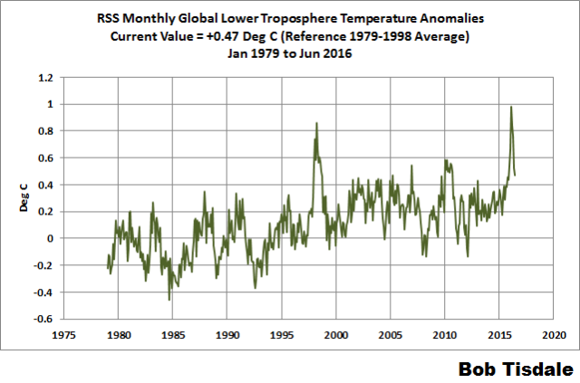
Figure 5 – RSS Lower Troposphere Temperature (TLT) Anomalies
GISS LAND OCEAN TEMPERATURE INDEX (LOTI)
Introduction: The GISS Land Ocean Temperature Index (LOTI) reconstruction is a product of the Goddard Institute for Space Studies. Starting with the June 2015 update, GISS LOTI uses the new NOAA Extended Reconstructed Sea Surface Temperature version 4 (ERSST.v4), the pause-buster reconstruction, which also infills grids without temperature samples. For land surfaces, GISS adjusts GHCN and other land surface temperature products via a number of methods and infills areas without temperature samples using 1200km smoothing. Refer to the GISS description here. Unlike the UK Met Office and NCEI products, GISS masks sea surface temperature data at the poles, anywhere seasonal sea ice has existed, and they extend land surface temperature data out over the oceans in those locations, regardless of whether or not sea surface temperature observations for the polar oceans are available that month. Refer to the discussions here and here. GISS uses the base years of 1951-1980 as the reference period for anomalies. The values for the GISS product are found here. (I archived the former version here at the WaybackMachine.)
Update: The June 2016 GISS global temperature anomaly is +0.79 deg C. It made another relatively large downtick since May 2016, a -0.14 deg C decrease, which should be a response to the decay of the El Niño. According to the GISS LOTI data, global surface temperature anomalies have dropped more than 0.5 deg C since their El Niño-related peak in February 2016.

Figure 1 – GISS Land-Ocean Temperature Index
NCEI GLOBAL SURFACE TEMPERATURE ANOMALIES
NOTE: The NCEI only produces the product with the manufactured-warming adjustments presented in the paper Karl et al. (2015). As far as I know, the former version of the reconstruction is no longer available online. For more information on those curious adjustments, see the posts:
- NOAA/NCDC’s new ‘pause-buster’ paper: a laughable attempt to create warming by adjusting past data
- More Curiosities about NOAA’s New “Pause Busting” Sea Surface Temperature Dataset
- Open Letter to Tom Karl of NOAA/NCEI Regarding “Hiatus Busting” Paper
- NOAA Releases New Pause-Buster Global Surface Temperature Data and Immediately Claims Record-High Temps for June 2015 – What a Surprise!
And recently:
- Pause Buster SST Data: Has NOAA Adjusted Away a Relationship between NMAT and SST that the Consensus of CMIP5 Climate Models Indicate Should Exist?
- The Oddities in NOAA’s New “Pause-Buster” Sea Surface Temperature Product – An Overview of Past Posts
- On the Monumental Differences in Warming Rates between Global Sea Surface Temperature Datasets during the NOAA-Picked Global-Warming Hiatus Period of 2000 to 2014
Introduction: The NOAA Global (Land and Ocean) Surface Temperature Anomaly reconstruction is the product of the National Centers for Environmental Information (NCEI), which was formerly known as the National Climatic Data Center (NCDC). NCEI merges their new “pause buster” Extended Reconstructed Sea Surface Temperature version 4 (ERSST.v4) with the new Global Historical Climatology Network-Monthly (GHCN-M) version 3.3.0 for land surface air temperatures. The ERSST.v4 sea surface temperature reconstruction infills grids without temperature samples in a given month. NCEI also infills land surface grids using statistical methods, but they do not infill over the polar oceans when sea ice exists. When sea ice exists, NCEI leave a polar ocean grid blank.
The source of the NCEI values is through their Global Surface Temperature Anomalies webpage. Click on the link to Anomalies and Index Data.)
Update: The June 2016 NCEI global land plus sea surface temperature anomaly was +0.90 deg C. See Figure 2. It increased slightly (an increase of about +0.02 deg C) since May 2016, opposing the continued decline in the GISS product.

Figure 2 – NCEI Global (Land and Ocean) Surface Temperature Anomalies
UK MET OFFICE HADCRUT4 (LAGS ONE MONTH)
Introduction: The UK Met Office HADCRUT4 reconstruction merges CRUTEM4 land-surface air temperature product and the HadSST3 sea-surface temperature (SST) reconstruction. CRUTEM4 is the product of the combined efforts of the Met Office Hadley Centre and the Climatic Research Unit at the University of East Anglia. And HadSST3 is a product of the Hadley Centre. Unlike the GISS and NCEI reconstructions, grids without temperature samples for a given month are not infilled in the HADCRUT4 product. That is, if a 5-deg latitude by 5-deg longitude grid does not have a temperature anomaly value in a given month, it is left blank. Blank grids are indirectly assigned the average values for their respective hemispheres before the hemispheric values are merged. The HADCRUT4 reconstruction is described in the Morice et al (2012) paper here. The CRUTEM4 product is described in Jones et al (2012) here. And the HadSST3 reconstruction is presented in the 2-part Kennedy et al (2012) paper here and here. The UKMO uses the base years of 1961-1990 for anomalies. The monthly values of the HADCRUT4 product can be found here.
Update (Lags One Month): The May 2016 HADCRUT4 global temperature anomaly is +0.68 deg C. See Figure 3. It dropped another noticeable amount (about -0.25 deg C) from April to May 2016, a response to the decay of the El Niño.

Figure 3 – HADCRUT4
COMPARISONS
The GISS, HADCRUT4 and NCEI global surface temperature anomalies and the RSS and UAH lower troposphere temperature anomalies are compared in the next three time-series graphs. Figure 6 compares the five global temperature anomaly products starting in 1979. Again, due to the timing of this post, the HADCRUT4 updates lag the UAH, RSS, GISS and NCEI products by a month. For those wanting a closer look at the more recent wiggles and trends, Figure 7 starts in 1998, which was the start year used by von Storch et al (2013) Can climate models explain the recent stagnation in global warming? They, of course, found that the CMIP3 (IPCC AR4) and CMIP5 (IPCC AR5) models could NOT explain the recent slowdown in warming, but that was before NOAA manufactured warming with their new ERSST.v4 reconstruction…and before the strong El Niño of 2015/16.
Figure 8 starts in 2001, which was the year Kevin Trenberth chose for the start of the warming slowdown in his RMS article Has Global Warming Stalled?
Because the suppliers all use different base years for calculating anomalies, I’ve referenced them to a common 30-year period: 1981 to 2010. Referring to their discussion under FAQ 9 here, according to NOAA:
This period is used in order to comply with a recommended World Meteorological Organization (WMO) Policy, which suggests using the latest decade for the 30-year average.
The impacts of the unjustifiable adjustments to the ERSST.v4 reconstruction are visible in the two shorter-term comparisons, Figures 7 and 8. That is, the short-term warming rates of the new NCEI and GISS reconstructions are noticeably higher during “the hiatus”. See the June 2015 update for the trends before the adjustments. But the trends of the revised reconstructions still fall short of the modeled warming rates during the hiatus periods.

Figure 6 – Comparison Starting in 1979
#####
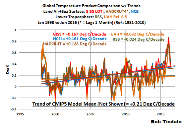
Figure 7 – Comparison Starting in 1998
#####

Figure 8 – Comparison Starting in 2001
Note also that the graphs list the trends of the CMIP5 multi-model mean (historic through 2005 and RCP8.5 forcings afterwards), which are the climate models used by the IPCC for their 5th Assessment Report. The metric presented for the models is surface temperature, not lower troposphere.
AVERAGES
Figure 9 presents the average of the GISS, HADCRUT and NCEI land plus sea surface temperature anomaly reconstructions and the average of the RSS and UAH lower troposphere temperature composites. Again because the HADCRUT4 product lags one month in this update, the most current average only includes the GISS and NCEI products.

Figure 9 – Average of Global Land+Sea Surface Temperature Anomaly Products
MODEL-DATA COMPARISON & DIFFERENCE
Note: The HADCRUT4 reconstruction is now used in this section. [End note.]
As noted above, the models in this post are represented by the CMIP5 multi-model mean (historic through 2005 and RCP8.5 forcings afterwards), which are the climate models used by the IPCC for their 5th Assessment Report.
Considering the uptick in surface temperatures in 2014, 2015 and now 2016 (see the posts here and here), government agencies that supply global surface temperature products have been touting “record high” combined global land and ocean surface temperatures. Alarmists happily ignore the fact that it is easy to have record high global temperatures in the midst of a hiatus or slowdown in global warming, and they have been using the recent record highs to draw attention away from the growing difference between observed global surface temperatures and the IPCC climate model-based projections of them.
There are a number of ways to present how poorly climate models simulate global surface temperatures. Normally they are compared in a time-series graph. See the example in Figure 10. In that example, the UKMO HadCRUT4 land+ocean surface temperature reconstruction is compared to the multi-model mean of the climate models stored in the CMIP5 archive, which was used by the IPCC for their 5th Assessment Report. The reconstruction and model outputs have been smoothed with 61-month running-mean filters to reduce the monthly variations. The climate science community commonly uses a 5-year running-mean filter (basically the same as a 61-month filter) to minimize the impacts of El Niño and La Niña events, as shown on the GISS webpage here. Using a 5-year running mean filter has been commonplace in global temperature-related studies for decades. (See Figure 13 here from Hansen and Lebedeff 1987 Global Trends of Measured Surface Air Temperature.) Also, the anomalies for the reconstruction and model outputs have been referenced to the period of 1880 to 2013 so not to bias the results. That is, by using the almost the full term of the data, no one with the slightest bit of common sense can claim I’ve cherry picked the base years for anomalies with this comparison.

Figure 10
It’s very hard to overlook the fact that, over the past decade, climate models are simulating way too much warming and are diverging rapidly from reality.
Another way to show how poorly climate models perform is to subtract the observations-based reconstruction from the average of the model outputs (model mean). We first presented and discussed this method using global surface temperatures in absolute form. (See the post On the Elusive Absolute Global Mean Surface Temperature – A Model-Data Comparison.) The graph below shows a model-data difference using anomalies, where the data are represented by the UKMO HadCRUT4 land+ocean surface temperature product and the model simulations of global surface temperature are represented by the multi-model mean of the models stored in the CMIP5 archive. Like Figure 10, to assure that the base years used for anomalies did not bias the graph, the full term of the graph (1880 to 2013) was used as the reference period.
In this example, we’re illustrating the model-data differences smoothed with a 61-month running mean filter. (You’ll notice I’ve eliminated the monthly data from Figure 11. Example here. Alarmists can’t seem to grasp the purpose of the widely used 5-year (61-month) filtering, which as noted above is to minimize the variations due to El Niño and La Niña events and those associated with catastrophic volcanic eruptions.)

Figure 11
The difference now between models and data is almost worst-case, comparable to the difference at about 1910.
There was also a major difference, but of the opposite sign, in the late 1880s. That difference decreases drastically from the 1880s and switches signs by the 1910s. The reason: the models do not properly simulate the observed cooling that takes place at that time. Because the models failed to properly simulate the cooling from the 1880s to the 1910s, they also failed to properly simulate the warming that took place from the 1910s until the 1940s. (See Figure 12 for confirmation.) That explains the long-term decrease in the difference during that period and the switching of signs in the difference once again. The difference cycles back and forth, nearing a zero difference in the 1980s and 90s, indicating the models are tracking observations better (relatively) during that period. And from the 1990s to present, because of the slowdown in warming, the difference has increased to greatest value ever…where the difference indicates the models are showing too much warming.
It’s very easy to see the recent record-high global surface temperatures have had a tiny impact on the difference between models and observations.
See the post On the Use of the Multi-Model Mean for a discussion of its use in model-data comparisons.
MODEL-DATA COMPARISON – 30-YEAR RUNNING TRENDS
Yet another way to show how poorly climate models simulate surface temperatures is to compare 30-year running trends of global surface temperature data and the model-mean of the climate model simulations of it. See Figure 12. In this case, we’re using the global GISS Land-Ocean Temperature Index for the data. For the models, once again we’re using the model-mean of the climate models stored in the CMIP5 archive with historic forcings to 2005 and worst case RCP8.5 forcings since then.

Figure 12
There are numerous things to note in the trend comparison. First, there is a growing divergence between models and data starting in the early 2000s. The continued rise in the model trends indicates global surface warming is supposed to be accelerating, but the data indicate little to no acceleration since then. Second, the plateau in the data warming rates begins in the early 1990s, indicating that there has been very little acceleration of global warming for more than 2 decades. This suggests that there MAY BE a maximum rate at which surface temperatures can warm. Third, note that the observed 30-year trend ending in the mid-1940s is comparable to the recent 30-year trends. (That, of course, is a function of the new NOAA ERSST.v4 data used by GISS.) Fourth, yet that high 30-year warming ending about 1945 occurred without being caused by the forcings that drive the climate models. That is, the climate models indicate that global surface temperatures should have warmed at about a third that fast if global surface temperatures were dictated by the forcings used to drive the models. In other words, if the models can’t explain the observed 30-year warming ending around 1945, then the warming must have occurred naturally. And that, in turns, generates the question: how much of the current warming occurred naturally? Fifth, the agreement between model and data trends for the 30-year periods ending in the 1960s to about 2000 suggests the models were tuned to that period or at least part of it. Sixth, going back further in time, the models can’t explain the cooling seen during the 30-year periods before the 1920s, which is why they fail to properly simulate the warming in the early 20th Century.
One last note, the monumental difference in modeled and observed warming rates at about 1945 confirms my earlier statement that the models can’t simulate the warming that occurred during the early warming period of the 20th Century.
MONTHLY SEA SURFACE TEMPERATURE UPDATE
The most recent sea surface temperature update can be found here. The satellite-enhanced sea surface temperature composite (Reynolds OI.2) are presented in global, hemispheric and ocean-basin bases.
RECENT RECORD HIGHS
We discussed the recent record-high global sea surface temperatures for 2014 and 2015 and the reasons for them in General Discussions 2 and 3 of my recent free ebook On Global Warming and the Illusion of Control (25MB). The book was introduced in the post here (cross post at WattsUpWithThat is here).
NASA: 2016 climate trends continue to break records
http://cdn.phys.org/newman/csz/news/800/2016/2016climatet.png
http://phys.org/news/2016-07-climate-trends.html
It is hard to believe that they were once able to put a man on the moon using science. These days science is not in their vocabulary.
They should go into the cherry pie business. Make a fortune.
Yes, and although they bitched & moaned that the world was going to end with the 1998 El Nino super high LOTI readings, now they say, “Just kidding,” as 1998 was adjusted away. So, why exactly should we believe their bitching and moaning now? Will they pledge to NOT adjust away the new El Nino’s high temps?
Interesting that NASA even posted that chart, given the readings for the rest of the year will surely bring that last data point way down If only they could end the year in July..
“given the readings for the rest of the year will surely bring that last data point way down”
The heading has been cut off. What NASA posted is here. It is a plot of Jan-Jun averages over the years. So no, it won’t bring the last point down.
http://www.giss.nasa.gov/research/news/20160719/2016temperature-1.png
What an extraordinarily long and complex posting. For those that follow such things closely this might be great stuff, but the rest of use could use an executive summary.
Killer Marmot ==> this is a regular feature here at WUWT — Tisdale gives all the data, all the comparisons, all the updates, and comments on the changes to databases. It is not meant for the casual observer. Note that “it is a feature, not a bug”.
If you just want the headlines — ‘page down’ repeatedly stopping only at the graphs.
So I didn’t see the plot of the difference between the number of animals per hectare (larger than an ant) and the modeled height of plants growing in the tundra of ANWR.
Seems like that would be as interesting as any other model minus real something else graph.
g
Marmot
Bob’s technical analysis may not be everybody’s cup of tea. However, on WUWT, the majority of readers understand and are interested is exactly this kind of objective analysis (that’s what the site is all about).
With all due respect, if this is not your cup of tea, you won’t have much luck convincing the rest of us to agree with you.
You may be more comfortable elsewhere, or you could simply ask questions of the WUWT readers to help understand the data. As long as the questions are sincere, the readership is usually very accommodating.
I think the high-level point I’d like to see summarised is whether I can believe the now-monthly announcements that the latest month has once again broken all previous records. Or is it a bunch of baloney? For example, see The Guardian, July 20th:
https://www.theguardian.com/environment/2016/jul/20/june-2016-14th-consecutive-month-of-record-breaking-heat-says-us-agencies
* We have data, which I suppose is measured in a consistent fashion such that we’re not comparing apples and oranges;
* We compute an anomaly; seems reasonable provided the baseline is always the same; though not sure why a running average might not do the trick;
* We massage the data for a variety of abstruse reasons; perhaps with the unacknowledged aim of supporting one’s point-of-view; there is evidence which suggests the amount of massaging is increasing with time such that the adjustment is ever more remote from the actual data;
* We plot some graphs which seems to be trending in an upwards direction and everyone gets in a flap.
Javert Chip:
I am, among other things, an expert in technical communication. One of the rules I recommend for writers is this — every conceivable reader should get something out of the article. Everyone should come away a little more informed.
Obviously the more expert you are the more you’ll get out of a complex issue, but the neophyte should be able to easily extract the gist of it. All it takes is a short abstract at the beginning summarizing the results, accompanied by perhaps the most revealing graph (which can be repeated later in the body of the article). This also helps the more experienced reader, for it lets them know where the article is headed before they embark on a long read.
If WUWT wants to maximize its impact, its articles should strive to be accessible to as wide of an audience as possible. Articles such as this one restrict themselves unnecessarily. A few improvements would have open it up.
Meanwhile NOAA’s global land and ocean data for June just released. From their website….
“This was also the 14th consecutive month the monthly global temperature record has been broken—the longest such streak in NOAA’s 137 years of record keeping.”
The land+ocean TLT values are here. Curiously, on that webpage, RSS lists the composite as extending from 82.5S to 82.5N, while on their Upper Air Temperature webpage linked above, they state:
We do not provide monthly means poleward of 82.5 degrees (or south of 70S for TLT) due to difficulties in merging measurements in these regions.
The TLT data is clearly clearly labelled from -70 to 82.5 on the webpage you link to.
Also they clearly say: “The lower tropospheric (TLT) temperatures have not yet been updated at this time and remain V3.3. The V3.3 TLT data suffer from the same problems with the adjustment for drifting measurement times that led us to update the TMT dataset. V3.3 TLT data should be used with caution.”
Bob, please, whenever you use a chart that compares model to data, you must draw a vertical line for the year in which the model is run. This is critical data so that one can immediately see what part of the chart was hindcasting and which part was forecasting. Those charts that show decades of accurate hindcasting imply a reliability that simply isn’t present in the models.
I agree with this. I would prefer to see hindcasting emphasized. It would also help newbies recognize where manipulation is being used to make it seem the models are or have been “mostly accurate” when they are far from it.
I agree.
That is VERY IMPORTANT!
It’s a good point Patrick B.
As far as I know the CMIP5 models are forecast from 2006 onwards. See this latest chart of annual observations versus modelled projections from Ed Hawkins, who adds the vertical line you call for: http://www.climate-lab-book.ac.uk/files/2016/01/fig-nearterm_all_UPDATE_2016.png
Patrick B, as noted in the text, the breakpoint between hindcast and forecast for most models is 2005. But, if memory serves, for others it’s as late as 2012. In other words, there is no common year.
Bob, then put a vertical line at 2005 and add an explanatory footnote that all models were run on or after that date. That information is so basic to understanding the chart, that to fail to provide it on the chart is just poor scientific procedure. (I won’t bother to re-hash the issue of what scientific principles justify mashing a bunch of model runs together much less model runs from different years.)
From the article: “Fourth, yet that high 30-year warming ending about 1945 occurred without being caused by the forcings that drive the climate models. That is, the climate models indicate that global surface temperatures should have warmed at about a third that fast if global surface temperatures were dictated by the forcings used to drive the models. In other words, if the models can’t explain the observed 30-year warming ending around 1945, then the warming must have occurred naturally. And that, in turns, generates the question: how much of the current warming occurred naturally?”
I would say natural warming accounts for all of it.
There was similar warming during both time periods of 1910-1945, and 1980-2016. The earlier period with little human-caused CO2, and the latter time period with a much higher CO2 level in the atmosphere.
If we had a temperature chart with a proper profile (one showing 1936 and 1998 on the same horizontal line), it would be easier to see that the temperatures warmed from 1910 to 1940’s, then cooled to the 1980’s, then warmed from there to today, and now we are right back to where we were in 1936 (based on 1936 being one-tenth of a degree hotter than 1998, which I think is a very low estimate. I think it was a lot hotter, based on the extreme weather of the 1930’s, compared to today).
The temperature profile for this time period goes Up to 1945, down to 1980, then up to 2016. Next phase, I’m guessing, is down.
There was similar warming during both time periods of 1910-1945, and 1980-2016.
Here is a chart with what you wanted: two superposed periods of the GISS temp record, one for 1910-1946, one for 1980-2016. The years 1998 and 1928 you see at position 216:
http://fs5.directupload.net/images/160720/657xxp2j.jpg
Sure: for you, the two GISS series and their linear OLS trends will look perfectly similar; but in fact they aren’t.
The dispacement of the two plots (0.56 °C at begin): that’s a first hint on warming. And their trends differ by a lot too:
– GISS l&o 1910-1946: 0.136 ± 0.006 °C /decade;
– GISS l&o 1980-2016: 0.171 ± 0.006 °C /decade.
Sure: you will tell me it’s due to this and that, to El Niño, to the Karlizing of data, and so on and so forth.
To anticipate, I prepared a second chart with, in addition to GISS, a similar superposition of the same time intervals for the GHCN record (yes, these 7,800 stations which of course all give us wrong data) in its unadjusted variant:
http://fs5.directupload.net/images/160720/mladxc9i.jpg
Having kept the two GISS plots in the chart allows not only to see how much higher the GHCN trend is for 1980-2016 compared with 1910-1946:
– GHCN unadj 1910-1946: 0.097 ± 0.004 °C /decade;
– GHCN unadj 1980-2016: 0.439 ± 0.003 °C /decade.
Yes, TA: this means that while GHCN shows a slightly lower trend than GISS for 1910-1946, its trend for 1980-2016 reaches about 2.5 times as much as that of GISS in the same period.
This double superposition of GISS and GHCN also perfectly shows that it is bare mare to pretend that homogenization of temperature series would make them „warmer“. Look how near to their trend the GISS anomalies lie in comparison with those of the GHCN!
Some interesting points. In the 1970’s the temperature plot showed 0.7C of cooling between 1940 and 1970 (from memory put out by the national academy of science but widely endorsed by the “scientific community”) and this was used to justify claims of global cooling. In the latest global temperature plots that has now utterly disappeared. Global temperature plots from the early 2000’s showed a huge temperature spike due to the 1998 El Nino. That has now disappeared (other then from the satellite data). With each successive land sea temperature update we find the temperatures from early in the 20th century are further lowered so as to suggest a greater rate of warming. All of these strongly suggest the temperature record is being adjusted to better support the current preoccupation.
However, (according to the above plots) whether one uses the 1980-2015, the 1998-2015 or the 2001-2015 data the claimed warming rate from the land sea data is the same 1.7C per century (0.17C/decade) and that includes the not yet resolved current el nino. If that resolves in the same way as the 1998 el nino the average will be lowered Of course if one uses the satellite data the recent warming is far less – almost zero. 1980-2015 is greater than the magical 30 year average period and CO2 rise over that period is quite consistent.
The CAGW proponents have stated repeatedly that >2C rise above current temperatures is the definition for serious or catastrophic global warming. According to their data the warming by 2100 would be 1.4C (85 years at 0.017C per year) so their claim of catastrophic warming by the end of the century is not supported by their own data even ignoring the bias. Why is there a problem?
Then again, given that in the last 100 years we went from the first heavier than air flight, wind up gramophones and horse drawn transport to; landing a man on the moon, putting a space craft into orbit around jupiter, prototyptes of self driving cars, computers, internet, mobile phones digital radio, DVD players etc, what possible justification is there for assuming that there will be no progress in technology relevant to this issue over the next 100 years.
“In the 1970’s the temperature plot showed 0.7C of cooling between 1940 and 1970 (from memory put out by the national academy of science but widely endorsed by the “scientific community”)”
You need a reference. Was it really a global plot? Not NH only? Not land only? No-one was doing global land/ocean averages before about 1990.
Yes Nick it was for the NH only but the more recent Hadley climate center plots for the NH show no such cooling. If I am writing a paper I agree a reference is vital but this is not a paper it is a blog comment. However since you insist on a reference here it is:
https://crudata.uea.ac.uk/cru/data/temperature/HadCRUT4.pdf
As the reference shows they suggest no cooling between 1940 and 1970, not in the NH not in the SH and not globally.
Michael,
you said
“In the 1970’s the temperature plot showed 0.7C of cooling”
That’s what needs a reference. “the temperature plot? Whose? Temperature of what?
Actually the HADCRUT NH land/ocean plot does show cooling 1940-70, as does CRUTEM 4. I doubt if your mystery 1970’s plot was land/ocean.
Yes, Nick – asking for evidence against criminals who get away with forgery:
TA on July 19, 2016 at 6:40 pm
“Global temperature plots from the early 2000’s showed a huge temperature spike due to the 1998 El Nino. That has now disappeared (other then from the satellite data).”
“Global temperature plots from the early 2000’s showed a huge temperature spike due to the 1998 El Nino. That has now disappeared (other then from the satellite data).”
Yeah, NASA and NOAA have been fiddling with the 21st century surface temperatures again, in their efforts to make each successive year after 1998, look hotter than the previous year to bolster their CAGW theory.
The true temperature profile is the satellite data. Just compare the satellite data to NASA and NOAA’s charts and you can easily see where the surface temperature data has been manipulated to make it look like things are getting hotter and hotter. In NASA and NOAA’s charts, 1998 is now an also-ran.
The satellite data shows 1998, as having the hottest month, with the exception of Feb 2016, which was one-tenth of a degree hotter. The bogus NASA-NOAA surface temperature charts show many years after 1998, as being hotter than 1998. NASA and NOAA are falsifying data to fit their CAGW theory. That way they can come out and announce “new High Temperature Records” like they did today. Just keep in mind that all these “new Highs” are ALL cooler than 1998, with the one exception of Feb. 2016. That’s the real story.
The real temperature chart should have 1936, 1998, and 2016, all on the same horizontal line on the chart. Just take the UAH satellite chart and draw a straight line between 2016 and 1998, and extend it back to 1936. That’s what the real chart *should* look like. The real chart trend line is a flatline from the 1930’s to the present. Not a Hockey Stick. That’s the real story.
The El Nino of 2016, barely exceeded this trend line in Feb. 2016, but has now dropped considerably below that figure, and seems to be headed lower. So much for “hottest (put time period here) evah!”. Now, we wait to see which way the temperatures go from here.
NASA and NOAA CAGW Promoters are SO Dishonest. It’s pathetic. And should be illegal.
There is a good example of the RSS satellite temperature chart versus the NASA bogus surface temperature chart at this url:
http://realclimatescience.com/2016/07/nasa-preannounces-record-fraud-for-the-third-straight-year/
The RSS chart represents the real world, and the NASA chart is a fantasy of the CAGW promoters.
As you can see, NASA has manipulated the chart to make the years after 1998, look hotter than 1998, but the satellite chart tells the real story: that NO year after 1998, was hotter than 1998, with the exception of Feb 2016. We are being flim-flammed by the CAGW Alamirsts at NASA.
The url I supplied above is the wrong one.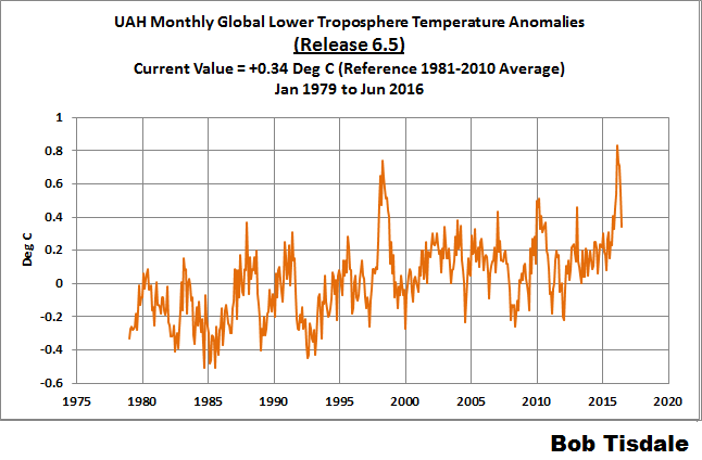

Here are a couple of charts to compare:
As you can see, the NASA chart has several years after 1998, showing to be hotter than 1998, whereas the satellite chart shows 1998 being hotter than any year up to Feb 2016.
If the temperatures continue to drop, the Alarmists will be forced to give up this subterfuge.
Michael Hammer on July 19, 2016 at 2:12 pm
However, (according to the above plots) whether one uses the 1980-2015, the 1998-2015 or the 2001-2015 data the claimed warming rate from the land sea data is the same 1.7C per century (0.17C/decade) and that includes the not yet resolved current el nino.
To be honest, Michael Hammer, I lack any motivation to control the accuracy of all these „above plots“.
Let me show the data I processed from two sources instead, namely UAH6.0beta5 and NASA GISSTEMP.
With rather little experience you can download the data from these sites, transfer it with proper modification to a calculation software like Excel, and compare the results with sites having done the like, what gives you a way to validate your little processing efforts.
Here is a chart with a comparison of troposphere measurements by UAH with surface measurements by GISS, for the periods 1979-2016:
http://fs5.directupload.net/images/160721/vgoq78hw.jpg
Just having a look at the chart makes clear that the periods 1979-2016, 1997-2016 and 2011-2016 never and never can share the same trend!
Here is the trend data in °C par decade, calculated with Excel’s trend function „LINEST“.
1. GISS land + ocean
– 1880-2016: 0.069 ± 0.001
– 1979-2016: 0.170 ± 0.006
– 1997-2016: 0.141 ± 0.015
– 2011-2016: 0.865 ± 0.098
2. UAH6.0beta5 TLT
– 1979-2016: 0.122 ± 0.008
– 1997-2016: 0.056 ± 0.022
– 2011-2016: 0.900 ± 0.110
Well, what about a more serious, more accurate approach to data?
Sources:
– http://data.giss.nasa.gov/gistemp/tabledata_v3/GLB.Ts+dSST.txt
– http://vortex.nsstc.uah.edu/data/msu/v6.0beta/tlt/uahncdc_lt_6.0beta5.txt
Bob,
Thanks for your periodic update, it is helpful.
I wonder why the USCRN data is rarely included in most presentations, realizing that it is limited to US for its siting of stations and limited time. Even so hopefully it is still free from all the adjustments that other data sets “enjoy”.
Studying the changes over time to the GISS series is a science in itself, you could call it Climate Change™ change science.
http://pubadmin2.ostfold.net/data/images/966/Klima/giss/GISS-xxxx-10.png
http://www.knuta.no/GISS_en_studie_i_endringer-10151s.html
Christopher Hanley
Your chart shows changes in absolute temperatures between various GISS versions. They don’t show the long term trends in each data set, which is what the study of climate is really about.
By eye-balling, I would say that the trends in the earlier series aren’t radically different from those in the later ones.
Do you have a link to the source data so that we can quantify the differences in trend, if there are any?
Thanks.
I think a short visit at Nick Stokes’ moyhu science site would be quite helpful to you. It would help you in putting things in more accurate relation to each another…
https://moyhu.blogspot.de/2015/12/big-uah-adjustments.html
Bob,
Re Figure 10 and your comment:
“It’s very hard to overlook the fact that, over the past decade, climate models are simulating way too much warming and are diverging rapidly from reality.”
On the contrary, figure 10 clearly shows that, even according to your selected 61 month smooth, recent observations are pushing temperatures towards the multi-model average, not away from it. At a monthly level they recently surpassed the 8.5 model mean prediction.
Therefore it is incorrect to state that climate models are “rapidly diverging from reality”. The opposite is more correct.
Those who live by El Nino, die by La Nina.
It’s not a coincidence that Bob recently removed the monthly data from those charts.
DWR54:
Yes this fascination with running averages smooths out recent warming to oblivion.
When comparing observations with CMIP5 model run mean then we should also realise that they were run with incorrect forcings (to high).
So this is were we actually are (well a bit past there since EN waned).
So yes the opposite IS correct.
And for all this huffing and puffing about 1/10ths and even 1/100ths of a degree change over some arbitrary time seems to me to be, well…WTF cares? Temps go up, they go down. I prefer when they go up as I live at 45N in the middle of the NAM continent.
Sheesh. If my remark was too cryptic, once the El Nino influence fades, you’re going to be outside the spread. Again.
I’m sure we’ll be treated to more “adjusting” at that time.
Bob,
Your analysis leaves me with a very different impression than what one gets from Bloomberg et al.: http://www.bloomberg.com/news/features/2016-07-19/summer-on-steroids-kicks-off-with-record-global-temperatures?cmpid=yhoo.headline&yptr=yahoo
The major difference is that your graphs show what has been happening in the recent past instead of ‘binning’ anomalies, which gives the erroneous impression of a monotonic increase of temperatures.
“This period is used in order to comply with a recommended World Meteorological Organization (WMO) Policy, which suggests using the latest decade for the 30-year average.”
This may or may not have been science at the time it was adopted.
In my opinion, it was weakly supported then and is now untenable.
“Third, note that the observed 30-year trend ending in the mid-1940s is comparable to the recent 30-year trends. (That, of course, is a function of the new NOAA ERSST.v4 data used by GISS.) ”
Formerly climatology was regional, as defined by Koppen and others, notably Trewartha.
The paper by Belda et Al (2014) shows the climate regions of the world (except Antarctica) for two periods, 1901-1931 and 1975-2005. Between the two periods separated by 75 years, 8% of the cells changed climate type. When you plot a scatter diagram of distributions for the two periods, you will find there is little difference between the two periods. (Slope unity. R-squared 99.5)
The CRU (UK) has revised the climate data to remove wet bias, an adjustment that would indicate even less change than these maps show.
So yes, the Earth has warmed a little and most people worldwide are better off. The people benefiting the most are those on the margins of steppe to desert and those on the margins between ice and tundra.
Reference:
Climate classification revisited from Köppen to Trewartha, Belda, M. et al, Climate Research, 2014
http://www.int-res.com/articles/cr_oa/c059p001.pdf
NCEI GLOBAL SURFACE TEMPERATURE ANOMALIES
NOTE: The NCEI only produces the product with the manufactured-warming adjustments presented in the paper Karl et al. (2015). As far as I know, the former version of the reconstruction is no longer available online.
__________________________
The NOAA NCEI product is the new global land+ocean surface reconstruction with the manufactured warming presented in Karl et al. (2015). For summaries of the oddities found in the new NOAA ERSST.v4 “pause-buster” sea surface temperature data see the posts:
__________________________
The UKMO also recently made adjustments to their HadCRUT4 product, but they are minor compared to the GISS and NCEI adjustments.
__________________________
………….
__________________________
Let me summarize:
While we talk about science we dive ever deeper into confidential sciences criminal behavior.
Swedish state run monopoly, aka “public service” or “big brother” tells us today on the news that this june was the warmest june ever and it is the 14th month in succession with warmest month ever. Also, a tropical fly has been found in an isolated small neighbourhood. BB tells us it has maybe migrated here because of klimate warming. Not migrated with hundreds of thousands refugee migrants and or their imported food.
The good thing about bob T’s blogs/ charts is that its largely based on observations. Sure some reference to models but that is secondary. Another excellent observer lives in Oz. Right near me. erl Happ. At reality.WordPress.com…. Fantastic. I’d like to see bobs version of some upper stratospheric temps to suppliment the lower troposphere and SSTs. Cheers.
The plots look doctored; as though every so often a Ronson gas cigarette lighter torches the satellite sensor.