Guest Post by Bob Tisdale
A quick ENSO update.
Meteorological agencies like NOAA use the sea surface temperature anomalies of the NINO3.4 region (5S-5N, 170W-120W) of the equatorial Pacific to determine if the tropical Pacific is experiencing El Niño, La Niña or ENSO neutral (not El Niño, not La Niña) conditions. Other agencies use the sea surface temperature data for the NINO3 region (5S-5N, 150W-90W). See the map on the NOAA webpage here for those locations.
Based NOAA’s weekly data for the NINO3.4 and NINO3 regions (data here), during the week centered on July 13, 2016, the sea surface temperature anomalies for both regions dropped to -0.6 deg C, which is a tick below the -0.5 deg C threshold of La Niña conditions. See Figures 1 and 2. If the sea surface temperature anomalies of the NINO3.4 region continue to stay depressed for a good number of months, NOAA will declare an “official” La Niña is taking place. Like El Niños, La Niñas typically peak in November through January, so there’s a long way to go.
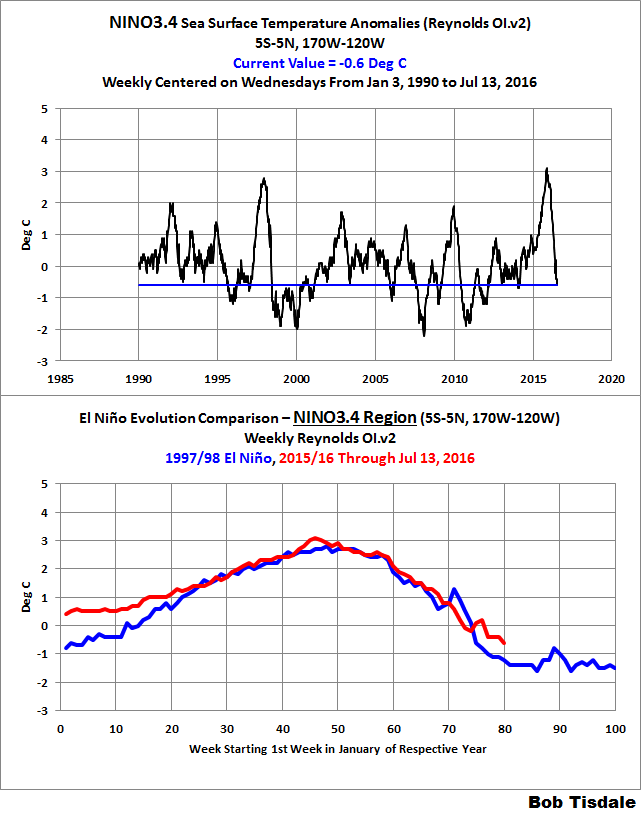
Figure 1 – NINO3.4 Time Series and Evolution Comparison
# # #
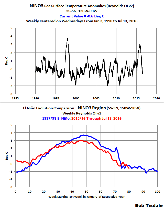
Figure 2 – NINO3 Time Series and Evolution Comparison
The top graphs in Figure 1 and 2 include a time-series graphs of the weekly NINO3.4 region sea surface temperature anomalies from the NOAA/CPC Monthly Atmospheric & SST Indices webpage, specifically the data here. The base years for anomalies for the NOAA/CPC data are referenced to 1981-2010. And in the bottom graphs, the evolution of the NINO3.4 sea surface temperature anomalies in 2015/16 are compared to 1997/98, another very strong El Niño and transition to La Nina.
According to NOAA’s weekly data (based on their Reynolds OI.v2 data), the transition to La Niña conditions in 2016 are lagging slightly behind those in 1998, while in the NINO3 region, they’re more comparable.
NOTE: When looking at any graph of sea surface temperature anomalies of the equatorial Pacific, keep in mind that the uncertainties of the data prevent us from knowing the actual sea surface temperatures. We illustrated and discussed this in the post The Differences between Sea Surface Temperature Datasets Prevent Us from Knowing Which El Niño Was Strongest According NINO3.4 Region Temperature Data.
In the near future I’ll be publishing a post, or a series of them, about how La Niña events are different than El Niño events. Until then…
WANT TO LEARN MORE ABOUT EL NIÑO AND LA NIÑA EVENTS AND THEIR AFTEREFFECTS?
My ebook Who Turned on the Heat? goes into a tremendous amount of detail to explain El Niño and La Niña processes and the long-term aftereffects of strong El Niño events. Who Turned on the Heat? weighs in at a whopping 550+ pages, about 110,000+ words. It contains somewhere in the neighborhood of 380 color illustrations. In pdf form, it’s about 23MB. It includes links to more than a dozen animations, which allow the reader to view ENSO processes and the interactions between variables.
Who Turned on the Heat? – The Unexpected Global Warming Culprit, El Niño-Southern Oscillation IS NOW FREE. Click here for a copy (23MB .pdf).
ALSO ANOTHER FREE EBOOK
I also published On Global Warming and the Illusion of Control (25MB .pdf) back in November 2015. The introductory post is here. It also includes detailed discussions of El Niño events and their aftereffects in Chapter 3.7…though not as detailed as in Who Turned on the Heat?
How many degrees C did the these regions lose in a few months, looks like ~3C, does this not show just how quickly the atm can lose energy to space.
micro6500, the answer to your question is nope. The sea surface temperatures of the eastern equatorial Pacific are dictated by coupled ocean-atmosphere processes, specifically subsurface temperatures of the eastern equatorial Pacific which determines the temperature of the water upwelled there, trade wind strength and direction, the number and strength of westerly wind bursts in the western tropical Pacific, etc.
Bob, are you saying that the Sea Surface Temp change doesn’t indicate what gets lost to space at all?
I accept my question was flawed. SST’s would not represent lost heat in the atm, although I do add the caveat that air temps are strongly influenced by surface temps, and if air temps had been measured in that area they likely would have dropped.
Actually, when we have an El Nino, the normal upwelling of cold water along the coast, and downwelling of warm water, which mixes things, stops. When this happens, it leaves the heat from the sun close to the surface where it does radiate out into space. When the normal upwelling cycle returns and the heat is pushed deep into the ocean. El Nino actually is a net total cooling event, while La Nina is a net warming effect. I know it seems opposite.
What a treat! For more than 2 years I’ve been writing posts about El Ninos. Now I get to write about La Ninas. Yay!
so, the “earth” temperature is not really the atmosphere temperature, isn’t it? seas heat is to be taken into account to see if global temperature is up or down. in the other hand most of sea temperature, down deep the ocean is close to 0 degrees.
we need one better thermometer!!! and I do not guess how to make it from reliable satellite 🙁
Well I for one have never been comfortable accepting numbers emanating from a louvered owl / bat box sitting some 60 inches above the ground, however high the ground sits, as some credible measure of earth’s “global Temperature”, or even its global Temperature anomaly.
Despite multiple repetitions of the thermodynamics admonition that anything that is at a Temperature higher than zero kelvin, emits thermal radiation depending on its Temperature (and generally the fourth power of that Temperature), climate scientists and others keep insisting that normal gases do not. Normal in the sense of mono-atomic gases (like the noble gases) or diatomic like H2, O2, N2.
Well nobody claims they emit black body radiation; nothing does that.
But real bodies at some uniform stable Temperature > 0.000 K can approximate the theoretical BB radiation, along with an emissivity less than 1.000, or more commonly a spectral emissivity < 1.000 that also varies with frequency / wavelength.
But certainly, solids and liquids are more common thermal radiation sources.
Well keep in mind that the definition of a black body, is a body that absorbs 100.000 % of any and all electromagnetic radiation from zero frequency up to zero wavelength.
NO real body absorbs 100% for even one single wavelength, let alone all possible wavelengths.
When was the last time that you observed any gas in the process of absorbing 100% of any radiation. Obviously, gases with their low atomic / molecular density are not strong absorbers, so at Temperature equilibrium with the radiation field, they are also not strong emitters; just very low emissivity emitters.
So bottom line, I prefer to think of the solid or liquid surfaces of the planet, as being the actual radiant emission sources, and it is their Temperature which should be measured; not the air five feet off the ground.
At the hottest SSTs the standard BB spectrum should peak at around 9-10 microns when plotted against wavelength.
Note that wavelength scaled radiation spectra are normally plots of Spectral Radiant Emittance measured in Wm^-2 per micron (m ?) of wavelength increment.
When plotted against frequency or wave number (f or nu) the graph is a plot of wm^-2 per wave number increment (cm^-1).
Remember that there are more microns available at longer wavelength scales, and more wave numbers available at higher frequency scales, so a wavelength spectrum that peaks at say 10 microns wavelength would give a wavenumber plot that peaks closer to 15 microns; which happens to be near the CO2 bending mode band.
Chemists seem to like wave numbers, and physicists seem to like wavelengths. (well this one does).
BUT I also have an aversion to the ground based Temperature anomaly data gathering systems, as opposed to the newer (since 1979 ?) satellite based systems, which apparently measure Temperatures at various atmospheric altitudes. I don't know if the satellites can directly measure ground and SST numbers.
My preference for the satellite numbers, is based on a deep suspicion that the surface station measurements are highly flawed from the point of view of sampled data system theory. The Nyquist gremlin.
The Nyquist sampling theory dates from 1928 (Bell Labs). 1928 and Bell Labs is also the origin of Harley's Law that relates channel capacity and bandwidth of communication systems. The two are intimately related.
Communications Engineers are familiar with the concept of "periodic" sampling of a band limited continuous function (signal), presumably of a bandwidth (B). Well it's a theoretical concept anyway, because no such thing as a "band limited" signal exists.
We know from Fourier theory, that a single frequency signal (sine wave) which has zero bandwidth, also exists for all time. You can't turn it on or off, and have it remain band limited.
Real signals start at some point in time, and end at some later time, perhaps (T1) seconds later, so they cannot be single frequency sine waves.
Nevertheless, standard sampling theory says that a real band limited (to the extent it can be) signal can be sampled at a minimum frequency of (2B), and from those samples, the original continuous signal can be completely recovered. NOTE: the samples are considered to be instantaneous time values, although in practice a finite sampling pulse width is normally used. So a sampled signal can be considered to be an amplitude modulated periodic stream of unit area impulse functions.
So when we consider the ground based sampling in both time and space, of the Temperature anomalies at some selection of station points; it is immediately apparent, that this process is neither strictly periodic in either time or space.
So how can these sparse observations (non satellite) be remotely valid samples of the real global temperature function ??
Well they can't; and they aren't.
Well the practitioners of these aberrant procedures respond that they do not wish to reconstruct and recover the original continuous band limited data signal.
They only wish to generate the response of various and sundry statistical mathematical algorithms to these inadequate sampled observations.
So they want averages or trends, and who knows what else; but they assume they can recover those from the improperly sampled observations.
The average is easy to deal with, because the average value of the original continuous function, is simply the zero frequency component of the continuous band limited signal; the DC component.
Well standard sampled data theory shows us, that if we only sample at a frequency of (B) or less, instead of (2B) or more, then the reconstructed output will contain spurious aliasing noise components at DC (and negative frequencies), so such a sampling regimen, will not even allow us to determine the average value, without error.
Many years ago (1960s) it was found that the requirement for strictly periodic sampling at a frequency (2B) or higher was overly restrictive. Within limits, the samples could be randomly spaced in time.
How do I know this ?? Well because back then, Tektronix manufactured a Random Sampling Oscilloscope, based on that idea. Why ??
Well a conventional sampling oscilloscope, needs to be triggered from the signal or the source of the signal, and trigger circuits can be very tricky, because they tend to have to out perform the vertical amplifier circuits, and too often, trigger circuits failed miserably to do that.
Also, with a triggered system, you then need to delay the signal before applying it to the vertical deflection plates, because you need to get the sweep started sweeping across the screen; so you need a delay line to delay the vertical signal, and that also can limit the bandwidth.
Apparently with random sampling, you let the sampler free run at some mean frequency with some controlled spread, and eventually it will catch the required information in a valid fashion, and somehow the delay line need disappears too.
So evidently strict periodic samples at a spacing of 1/2B, are not necessary.
So surface Temperature monitoring stations, may not be close enough to each other; but how far apart can they be ?
Well Dr. Hansen says they can be 1200 km apart and still work.
A more general statement of the Nyquist sampling theorem reveals the following.
For ANY group of INDEPENDENT samples.
Any 2B samples per second will permit correct recovery of a signal band limited to a frequency (B).
This can be stated another way. To recover an original signal that was T1 seconds long, you need a total of 2BT1 independent samples (or pieces of information).
I presume that the same more general condition is also required to be able to extract any of the statistical mathematical algorithmic bric-a-brac, that one might seek to create out of such observations.
So I don't know if RSS and UAH can actually measure true surface Temperatures (NO I am not bamboozled by arguments that their satellite thermometers are not calibrated; that's a red herring). I just don't know if they do report surface data; but I think their satellite scanning capability is far more important than whatever their restrictions are.
G
This is one of the goals I had when I was developing my methodologies. I value your opinion, have you looked into how I’m addressing many of the uncertainties in the surface record? I would be glad to discuss either here, or over email (mod’s you can pass mine along).
Well…
There are plots of global warming altitude vs temperature which show the effect is strongest in the surface layer, attenuates for 8 km, is back up to the surface level for 8 km then goes rapidly negative.
I interpret this as the atmosphere above 100 meters has only 1/2 the expected influence and half or more of the effect is “throttled”.
The TLT as I understand it is really the 3 km temperature.
The ground stations have strong UHI effects and station aging effects that allow algorithmic gaming to produce artificial warming.
Well Harley is missing a T so it is a Hartley’s Law. Nothing to do with Taft-Hartley. But I seem to remember that Hartley is also famous for some particular circuit; maybe an oscillator, but the clouds are closing in on my memory.
G
It even has it’s own wiki page
https://en.wikipedia.org/wiki/Hartley_oscillator
I remembered the name as well, and had to go look. It’s a LC timed Oscillator.
I felt like I didn’t finish my job.
https://en.wikipedia.org/wiki/Shannon%E2%80%93Hartley_theorem
PA July 18, 2016 at 11:05 pm
Well…
There are plots of global warming altitude vs temperature which show the effect is strongest in the surface layer, attenuates for 8 km, is back up to the surface level for 8 km then goes rapidly negative.
I interpret this as the atmosphere above 100 meters has only 1/2 the expected influence and half or more of the effect is “throttled”.
The TLT as I understand it is really the 3 km temperature.
It rather depends on which TLT you mean.
Spencer doesn’t use the old LT version 5.6 any more but that had a weighting curve unto ~12km peaking at ~2km, whereas the new version 6 goes up to ~14km and peaks about 4km.
RSS TLT had a similar weighting function to the version 5.6 whereas their TTT is similar to version 6. The TLT product proved to be difficult to adjust for drifting measurement times and ‘should only be used with caution’.
I am going to remember this, Bob.
La Nina means a bitter hard winter here in the Northeast US.
Every time I have to dig out my car and shovel off the Global Warming, I am going to think of you.
Whenever I hurt my back and am late for work, you will be on my mind. When the snow piles up, and the sidewalks are impassable, it is you Bob.
When the snow is “Arse High To A Tall Injun”, we know Bob will be cheering us on.
Be careful what you wish for.
My Prediction:
With the latest data from Bob T., the planet continues to cool at the fastest rate (or second fastest) in the modern sat. record. The Pause reappears in 9-12 months. La Nina events are not as intense or dramatic as El Nino events, but they typically last a lot longer. So there we are, 9-12 mo.
“When the gods want to punish you they answer your prayers.”
Any thoughts on how this will affect 2016 being “the hottest year ever”?
I calculate from ***UAH TLT Global***
1998 was 5.79 deg.*months (from the baseline) anomaly.
So far 2016 is 3.70 deg.months, through June.
That means than the remaining 6 months must be +0.35 on average, per month, to tie 1998.
The current UAH value is 0.34, and dropping like a rock. So getting back up to 0.35 and holding there is not plausible.
There is one way that 2016 can be the “warmest year evah”. If the Alien Invasion Fleet arrives next month and uses their hyperblasters to melt our cities and boil the oceans, that would make it warmer. Other than that, not likely.
On the other hand, it may well be above 0.35 as early as the end of July.
Not too long to wait
Any guesstimate on how far or how rapidly global SSTs will decline?
The decline from the 1998 El Nino was about 0.3 °C over the course of a year. I’m rooting for 0.5 °C.
Say Bob,
Izzere a piggy bank box somewhere, that one could deposit some sheckel into.
Seems quite unseemly to be giving away free stuff.
I haven’t downloaded your totally priceless book, but I will as soon as I get to a secure spigot. And I need my beauty sleep, so I would like to shed some metal ware so I feel less guilt as well as gelt.
G
I second that!
“What a treat!….I get to write about La Ninas.”
On the other hand, the people in Texas and other parts of the US Southwest have gotten used to moisture delivered by El Nino. If La Nina persists, those people will be faced with the return of drier conditions, an echo of the droughts of the 1950’s.
OTOH, 2010-2011 was a moderate La Niña, and we had one of the heaviest snowfalls in the Lake Tahoe area on record that winter, roughly twice the average snowfall at Squaw Valley, CA, much of it coming in March:
http://squawalpine.com/skiing-riding/weather-conditions-webcams/squaw-valley-snowfall-tracker/?tab=ui-id-6
@ brians356…The biggest snow fall which I ever witnessed at Lake Tahoe came during a La Nina event in the winter of 1970/71. The snowfall equaled the Donner Party snow levels that year.
Great work Bob! Thanks for your GR8 contribution & look forward to sharing the “adventure” of the unfolding of future climate with you “down the track”! (:-)
Not so fast Bob! In three to four months NOAA will be adjusting these up due to: 1. Poorly calibrated sensors 2. Mr. McGoo incorrectly reading the numbers and most importantly 3. Executive Order by the President
rbabcock
Your point taken – especially your number 3
“Executive Order by the President”
Is that sort of flexible, in case Hilary’s unpopularity should exceed the Donald’s?
At least, by enough to matter?
Auto
Noting how we have had a Brexit, a Coronation – Queenie May; a resignation – Farage – apparently not pronounced like garage; and a defenestration (for now; for ever??) deferred – Jeremy Corbyn, who is, politely, well to the left of Tony Blair, but seemingly doesn’t want to win elections – with power and all that.
can you believe?
All in a month.
Fascinating thing to follow.
As seasons alternate, El Niño, La Niña and neutral conditions alternate in an irregular periodicity of 2-7 years. This is mainly interesting to scientists and weather prediction. On places where La Niña brings increased flooding the level of alert and preventive measures should increase.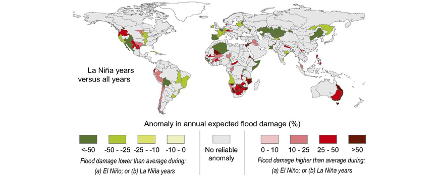
For the rest of us we get a respite from warming alarmist claims of impending doom, but not much really.
El Niño, La Niña are very important to both summers and winters in the Northeastern US. We pay attention.
Particularly, they make a huge difference in winter weather.
Source please. Picking apart the URL of your graphic is useless.
Scripps Institution of Oceanography UC SanDiego. Research highlights. Man, you are L A Z Y.
Correct, thanks D. J.,
https://scripps.ucsd.edu/news/research-highlight-new-study-el-ni%C3%B1ola-ni%C3%B1-flooding-could-aid-disaster-planning-worldwide
Right click?
> “And in the bottom graphs, the evolution of the NINO3.4 sea surface temperature anomalies in 2015/16 are compared to 1997/98, another very strong El Niño and transition to La Nina.”
Should that read NINO3 instead of NINO3.4.
Along with the cooling there is a lot of “the cold is global warming” arguments. People are literally being told the “day after tomorrow” scenario is happening because of CO2.
UN delegates are blaming cold summers on global warming. Mann tried, and failed epically, to blame the US blizzards on global warming.
Now this “oh Europe will be cold because of global warming” paper recently.
They are switching tact, from global warming to climate change finally to global cooling. It’s amazing how dumb people are, literally, most people are literally mouth breathing morons!
Most people really don’t know or care. It is not an issue. They maybe be ignorant of the situation and exactly what CAGW and associates are trying to accomplish. It doesn’t mean they are stupid. Nor is the media, they are actively supporting CAGW agenda to the point of not really caring if CAGW is wrong. The irony is that the media supporting CAGW will do one thing for sure. Silence the media. They will in effect provide the means for their own restricted and controlled press.
“Most people” are not as stupid as you think. I know it is hard not to conclude they are complete morons when they elect the wrong people. But “you can fool some of the people…”
partial blame for this could go to Kim stanley Robinson
his book 50deg below states the severe cooling in the story is all because of warming n co2.
pity cos prior his books were pretty good red.blue /green mars for eg.
It’s amazing how dumb people are
Indeed! The dumest persons in my mind are those who reduce everything in climate matters to the CO2 syndrome, whatever the reason they have to do.
The origin of papers concerning this possible cooling in Europe was the strong decrease of salinity in the north western Atlantic discovered in the 1990ies by NOAA oceanographers.
They compared the salinity level with those detected in Greenland ice cores at the position just before the Younger Dryas period began, a period of abrupt climate change.
They linked that to a retreat of the Gulf Stream down to Africa due to a perturbation of the thermohaline circulation by huge amounts of salt-free water coming from ice melt on the Greenland ice sheet.
What, do you think, did this Greenland ice sheet melt come from? And what, do you think, does the actual Greenland ice sheet melt (200 Gt / year) come from?
Any idea? Sure some huuuuge volcano below Greenland, huh?
I wonder what the half life of the media cheering about the “hottest year ever” will be.
“half life of the media cheering”
t(0.50) = 0.25 yr.
They go from “Hottest year Evah” (in summer) to “Coldest winter Evah” in about 6 months. So I give it about two half-lives, or about three months per half-live. That gives us about 25% of the media is really slow on the uptake, so that seems just about right.
As we transition from El Niño to La Niña, we could measure the phenomena accurately, but I think all of us have better things to do.
I think the next big push will be for low Arctic sea ice extent. If that doesn’t come to pass they will be hoping for a big hurricane or two.
After NOAA and NASA have made all their adjustments to the raw temperature data, we will always see each year in progression as the hottest year evah. Those agencies are like magicians making the past cooler and the present always warmer.
About the same as those who said Brexit was going to be the biggest castrophe evah for the UK. Six months.
http://berkeleyearth.org/temperature-reports/june-2016/
2016 will be interesting. projecting out to the end of the year.
IF we use all the data ( dont account for La Nina ) then a new record looks likely
( psst dont put too much weight on this given the assumptions )
So it will be interesting.. if the record is broken in a La Nina year… interesting
if it;s not broken.. not so interesting.. should be close though we will see
http://berkeleyearth.org/wp-content/uploads/2016/07/Annual_time_series_combined.png
Poor Mosh.. still tasked with selling lemon. !!
Forrest Gardener on July 18, 2016 at 11:47 am
1. I would have thought that the thermal mass of the oceans would cause “Land and Ocean” temperatures to be dominated by ocean temperatures
You are right, Forrest Gardener: they are. I don’t have BEST’s land only data at hand, but the difference between these two will be the same as that for GISSTEMP:
http://fs5.directupload.net/images/160719/2p8gxxkg.jpg
You clearly see that land+ocean’s trend is lower than that of land only:
– GISS land+ocean: 0.68 ± 0.06 °C / century
– GISS land only: 1.01 ± 0.02.
2. Why is it that Bob’s graphs show an overall change of around 0 from 1985 at the same time as your graphs show an increase of about 0.6 from 1985? Why do his graphs have a major peak in 1998 and your graphs do not?
It’s always the same question, always leading to the same answer.
Bob Tisdale’s graphs refer to the Niño 3 and 3.4 regions which behave very different from the rest of the oceans. And the oceans behave very different from the land surfaces, as does the troposphere.
So 2004 peaked above 1998, and then flattened, until it skyrocketed? maybe that’s related to all the extreme anomalies in the Arctic region on your maps – tell me, how many comparable thermometers do you have up there? How far do you extend land temperatures over the ice?
I suggest that you start using some recent data sets with a lower warming bias (RSS, UAH?) and redraw your graphs before discussing impact of La Nina – at least we’ll have decent global coverage to use to determine what’s going on, vs. this modeled (i.e. fictional) account of http://www.majorinfilling.com (no, don’t look it up, it’s a joke…)
“Why is it that Bob’s graphs show an overall change of around 0 from 1985 at the same time as your graphs show an increase of about 0.6 from 1985? Why do his graphs have a major peak in 1998 and your graphs do not?”
This is because the BEST data shows temperature anomalies on an absolute scale (i.e. all years plotted against a common reference period, in this case averaged from 1951 to 1980), whereas the NOAA El Nino data use a sliding reference period to remove any long term trend. Hence when we say that sea surface temperatures in the Nino3.4 region are above or below thresholds for El Nino/Nina we actually mean relative to the recent average for that region. In absolute terms, Nino3.4 temperatures are substantially warmer now than they were in, say, 1996 (where Bob’s graph intersects the blue -0.6 degree line he has put on it).
So, it would seem that Christopher Monkton will soon be confirming the continuation of the pause, if this La Nina counteracts El Nino and averages out to business as usual. I hope so. I miss seeing his monthly updates. Speaking of which…thanks for your updates, Mr. Tisdale.
Dr. Roy Spencer is looking at this, too, and is tracking month-to-month temp trajectory.
Well, the “pause” appeared to end, but that apparent “end” may prove to be only a blip. Either way, sooner or later any pause in either a warming or cooling trend will end. What we don’t know is whether the ultimate end of the “pause” will be further warming or cooling.
While the climate models appear to be of no help in this, my Magic 8-Ball says “Cannot predict now”.
At least the Magic 8-Ball is more honest than many so-called “climate scientists”.
‘my Magic 8-Ball says “Cannot predict now”.’
Then your Magic 8-Ball should make a “projection” instead of a “prediction” and apply for a federal grant.
he gave up for a reason.. it showed the failure of the methodology.
Simple forest.
1. Go find temperature reports that we dont use in our prediction ( interpolation is a prediction)
2. You may have to pay money but these out of sample measurements exist— ISTI has a couple thousand stations for free, go get that data.
3. Compare our prediction to these out of sample measurments.
4. And become famous if we are wrong.
Hint.. Every time I’ve done this the dang prediction works
What exactly do I compare? My average temperature from later today from my weather station? Where do I find next weeks field temp for my backyard? Or my backyard from last year?
Apparently most datasets don’t show significant warming for ~ 15 years per Foster & Rahmstorf’s methodology. NOAA seems the outlier in that analysis. I’ve been working on setting up an automatically updating collation of pause length calculations at http://isthereaglobalwarmingpause.com. Data selection and calculation code are from Skeptical Science. Constructive feedback welcome.
The only constructive criticism I could give you is to not base anything on data selection and calculation code from Skeptical Science.
Well…
GISS extends land temperatures over the Arctic 1200 miles.
The SST of the Arctic Ocean surface is -2 °C about six months out of the year so the GISS approach doesn’t make sense.
The NOAA “Karl” adjustment causes an upward ramp in SST when you transition from ships to buoys. Since buoys are now over 90% of readings there shouldn’t be a future “Karl” trend.
ilmastotiede, I have all data at home.
Linear OLS trend between jan 1993 and jun 2016, in °C / decade:
RSS3.3 TLT: 0.111 ± 0.016
RSS4.0 TTT: 0.171 ± 0.018
GISS land & ocean: 0.184 ± 0.012
etc etc
No warming?
Do you want raw, absolute GHCN data for the Arctic ?
You can check the numbers presented on my site with the SKS trend calculator. F&R methodology gives RSSv3.3 TLT +0.111 ± 0.130 °C/decade since January 1993.
I din’t understand your reply ( ilmastotiede on July 19, 2016 at 4:19 pm). It’s not so very important.
But I guess you should switch to Kevin Cowtan’s York page, that way you will avoid these incredibly dumb comments like that of JohnWhoo on July 18, 2016 at 10:50 am.
http://www.ysbl.york.ac.uk/~cowtan/applets/trend/trend.html
Hola La Nina. Que pasa?
“Hello” La Niña!
Thank you Bob for keeping us appraised of what is really happening.
Dare I say, you are a “model” scientist.
+1
SST are a bit different then on same day in 1998.
Pesky low Backside Declining very low solar.cycle.
https://mobile.twitter.com/NJSnowFan/status/755042828288401408
Not so fast, Bob. I wouldn’t fcst till August is over.
Bob is not forecasting – he’s simply showing current actual data trends (with uncertainty disclosure) used to classify yes/no La Nina, and comparing that with previous events.
He specifically states: “Like El Niños, La Niñas typically peak in November through January, so there’s a long way to go”. To me, this implies Bob does not intend to “forecast”, instead he’ll wait to look at the data in Nov-Jan time period.
ya if you wait for the future you dont have to make predictions..
model scientist
“Say Hello to La Nina Condit\ions”
Steven Mosher
Anybody can make predictions; don’t even need a model.
The trick is accurate predictions/forecasts (whatever term of art we’re using at the moment).
Do warmists dudes have a model (…read the entire sentance before responding…) that WILL ACCURATELY FORECAST NOV-JAN?
My prediction is for La Nina conditions of around 1.5C to 1.75C by November, which will be followed by a bounce in December/January.
“Like El Niños, La Niñas typically peak in November through January, so there’s a long way to go.”
Quite possibly a pedant alert, but shouldn’t it be “trough” rather than “peak”?
Nop. That would be a double negative!
Eh? How’s it double ?
more of less, is the double negative.
Right. The reason I brought it up was because in other fields, for example drug kinetics, the nadir levels are referred to as trough levels and the y-axis for temperatures is never inverted, so it’s never a peak when T goes down, rather an upside down peak.
…. but don’t confuse pedantry with criticism Bob. Excellent post as always.
The strength of a La Nina typically peaks in Nov-Jan, just like the strength of an El Nino.
To be more pedant, “El Niños” and “La Niñas” is incorrect. You can say “Los Niños” and “Las Niñas” or use a plural word afterwards, like “El Niño” phenomena.
Bob – how does this affect the Tropical Cyclone Heat Potential in the Atlantic?
I only ask because for my weekly round of self inflicted abuse and confusion, I wandered over to the hurricane/tropical page on wunderground and they are touting – Record Ocean Heat Energy in the Atlantic using the above metric. As a lay person, it just seems like a new metric, a new scale and out of the blue, a new record.
Thanks!
Um, so how will this year’s El Nina affect Bill Nye’s $20,000 bet that 2016 will be in the top 10 hottest years on record?
Will Joe Bastardi be picking up that big cheque after all?
…LOL…liberals never pay up !
top 10?
interesting bet..
From what I can tell, Bastardi didn’t take the bet.
Whether 2016 is in the Top Ten warmest on record or not, does nothing to prove that any change in the climate is being caused by human CO2 emissions.
I’m not sure, but possibly 2016 could be in that Top Ten and still be part of a long term cooling, or it could be in the Top Ten and be part of a continuation of “the pause”.
Wait and see.
Not good for Bastardi. 1997/1998 was a period like 2015/2016; a big El Nino starting in 1997/2015 and continuing through about June of the next year. In 1998, a La Nina came hard on the heels of the El Nino, but 1998 still set records for hottest year quite handily.
2015 was quite a bit warmer than 1997, and 2016 has thus far been quite a bit warmer than the equivalent months of 1998. So, 2016 will probably set a new record for hottest year ever among all the surface temperature series as well as for one of the satellite series.
It’s a very good bet for Nye.
Hmmm, a $20k bet that a year sharing an El Nino is going to be warm. Gutsy bet.
So with all the increased CO2 around, surely Nye would make the same bet for 2017.
Here’s a better bet:
Professor Peter Wadhams, head of the Polar Ocean Physics Group at Cambridge University, and considered “The World’s Leading Expert on Arctic Sea Ice”, says the Arctic is on track to be free of sea ice this year or next for the first time in more than 100,000 years.
Quote: “My prediction remains that the Arctic ice may well disappear, that is, have an area of less than one million square kilometres for September of this year.” … “It is very likely that this will be a record low year. I’m convinced it will be less than 3.4 million square kilometres [the current record low]. I think there’s a reasonable chance it could get down to a million this year and if it doesn’t do it this year, it will do it next year”
I’ll wager anyone LOT of money that the Arctic does not become “ice free” (i.e. sea ice drop below 1M square kilometers) before 2020. And I’ll wager a lot more that it will not drop below 3.4 square kilometers (i.e. set a new low “record”) this year.
Money for old rope, man! My word against the World’s Leading Expert – how can someone lose?
I think even Roy Spencer would be taking that bet if it was offered: Even his UAH 6.0 satellite data is showing that 2016 is almost certainly going to end up warmer than 2015, and if not #1 then at least a close second to 1998 (the current #1). And every surface temperature set to May/June 2016 so far looks so much warmer than 2015 (the current record) that another record seems likely.
Oh hell yeah. 1999 was a La Nina year, and it was still easily within the top 10 warmest years to date. So I’d be pretty comfortable betting that 2017 will also be, even though it’s quite unlikely to be as warm as 2016.
The thing is, the La Nina years keep getting warmer. As do the El Nino years. As do the neutral years. You can only really claim a ‘pause’ in the surface records by drawing a line from a big El Nino year to a soon-following La Nina year. But that’s just short-term variability, overwhelming the warming.
The last moderate La Nina period, 2010-2011, was nearly as warm as the humongous El Nino period of ’97-98. And this year’s big El Nino is quite a bit warmer than ’97-98.
Betting anything (colder, hotter, the same…) at the top of an interstadial period is a sucker’s bet on either side. It speaks loudly of those who see climate only past their nose but not further.
Bill Nye is a scientist in much the same way Lois Lerner is an accountant. He’s offering a straight-up bet on the Superbowl at halftime with his team up 37 points — the outcome of which vindicates his football expertise. Beyond dumb.
Bill Nye’s $20,000 bet that 2016
Given that that year started in during what is arguably the biggest El Nino on record, Nye is making a fairly safe bet.
2017 or 2018 is a different story. One or both of the years should be outside the top 10. I’d bet both years with Nye for 5:1 odds. It does depend on the data set. With GISS or one of the other paint-by-numbers data sets you have to subtract the increase in adjustments after the bet was made.
Meteorological agencies like NOAA use the sea surface temperature anomalies of the NINO3.4 region (5S-5N, 170W-120W) of the equatorial Pacific to determine if the tropical Pacific is experiencing El Niño, La Niña or ENSO neutral (not El Niño, not La Niña) conditions.
Well, to be honest, I’m not quite sure that NOAA solely relies on 3.4 SST.
Simply because one of their scientists
http://www.esrl.noaa.gov/psd/people/klaus.wolter/
developed quite a while ago a much more complex tool to survey them: it’s called the MEI index:
http://www.esrl.noaa.gov/psd/enso/mei/table.html
A negaitive MEI index is a rather sure indicator for an incoming La Niña.
Here is a plot of that index, comparing the three last powerful El Niños (1982/83, 1997/98k, 2015/16):
http://fs5.directupload.net/images/160718/2gc3nc6b.jpg
The plot has been designed such that all three El Niños were “superposed” through a renormalization.
It ends in may 2016, but the june delta shows the same trend downwards.
It seems to be clear that the 2015/16 edition, though announced as “stronger than 1997/98”, in fact is even quite a bit weaker than even 1982/83.
..Quite interesting, that is not what has been reported…anywhere !
Bob, have you considered that the build-up of the El Nino warm pool may be related to the larger than expected Antarctic sea ice extent in the last few years, and that perhaps the rapid break-up of the El Nino event coincides with a drop in the Antarctic sea ice extent? Do you think that variability in the rate of Antarctica driven cold currents, causing up-welling of the cold water along the west coast of South America, might be a major factor in all phases of ENSO? I’d be curious to hear your thoughts about this.
“Do you think that variability in the rate of Antarctica driven cold currents, causing up-welling of the cold water along the west coast of South America, might be a major factor in all phases of ENSO? I’d be curious to hear your thoughts about this”
Mickey – according to my university training 15 years ago the answer is yes. The southern ocean and Antarctica are the big sink. The Nth Atlantic and the Arctic Ocean are just a puddle
Back at the end of October of last year a strong flow of cold water made it’s way up the eastern coast of SA. That steadily reduced the southern Blob which had held in place for several years prior to the change last year. That change looks like it was set in motion by the rapid melting of the record sea ice extent back to the average trend line. That melt started from a high point in April/May 2015 of around 1.8 million sq/km, and then plunged to 0.6 mil/km2 below the average trend line by Sept/Oct of 2015. That was when I noticed a change in the ssta at Drakes Passage. That sea trend has continued on since then.
Personally I’m worried about the next two hurricane seasons. The post Niño years are often bad hurricane years. Bob, maybe you could take a peek at post Niño hurricane seasons and see how the this year and next might stack up?
Researchers create means to monitor anthropogenic global warming in real time
“A research team including a Scripps Institution of Oceanography at the University of California San Diego climate scientist simulated in a computer model, for the first time, the realistic evolution of global mean surface temperature since 1900.
In doing so, the researchers also created a new method by which researchers can measure and monitor the pace of anthropogenic global warming, finding that the contribution of human activities to warming in the surface waters of the Pacific Ocean can be distinguished from natural variability.”
http://cdn.phys.org/newman/csz/news/800/2016/31-researchersc.jpg
There it is, now we know, the humans are anthropogenic creatures.
http://phys.org/news/2016-07-anthropogenic-global-real.html
You do know that chart is hysterical don’t you?
The pre-1980 AGW contribution in 1908 was as low (-0.65°C) as the current contribution is high (0.65°C).
What caused negative AGW? Gynopogenic or paedopogenic global cooling?
The chart is nonsense. If humans are responsible for the highest GHG forcing in millions of years the concept that we were responsible for an equal amount of cooling just over a century ago is deluded.
A hugely negative influence in 1908 is hard to defend. The extensive land clearing prior to 1900 should have had a slight warming effect. So the 1900 level should be fractionally above zero.
Perhaps there is some subtlety to the chart I am missing. But on inspection it looks BSC.
Looking at the graphs, as mentioned above, the system appears asymmetric: el niño’s appear more extreme. For example, in area niño 3.4, 1998 el niño went to 2.8, 2016 hits 3.1, whereas la niña’s go to around -2. In area niño 3, 1998 el niño went to 3.7, 2016 went to 3, but la niña’s max at around -2. What is the background to that?
As ever, super interesting post.
The imho best indicator for El Niño / La Niña constellations and transitions is the Multivariate ENSO Index, the MEI:
http://www.esrl.noaa.gov/psd/enso/mei/ts.gif
It is based on the correlation and combination of six different observations:
– sea-level pressure;
– zonal and
– meridional components of the surface wind;
– sea surface temperature;
– surface air temperature;
– total cloudiness fraction of the sky.
Though global temperatures by no means are a relevant tool to measure El Niño / La Niña events, it is nevertheless interesting to put the MEI data in relation with measurements of troposphere temperatures above the ocean in the Tropics, as provided by e.g. the UAH6.0beta5 dataset:
http://fs5.directupload.net/images/160718/yizu67qf.jpg
You see here two 12 month running means in the period 1979-2016:
– in red UAH’s Tropics ocean split;
– in green the MEI with a 0.3 scaling factor.
If sea surface and air temperature are part of the MEI, I would assume the corresponding UAH temperature graph would follow it since it they both contain the same temperatures. Just say’in.
No, rbabcock, not necessarily. Simply because Klaus Wolter’s
http://www.esrl.noaa.gov/psd/enso/mei/table.html
is based on temperatures localized within the ENSO region, whereas UAH’s Tropics ocean record covers the entire latitude stripe (25N-25S if I well do remember).
The difference between the two you best see when you repeat the exercise with now the global UAH record. You then suddenly see that UAH’s response to the 1982/83 El Niño was nearly zero, though that edition was stronger than is 2015/16.
Yes, I also prefer MEI. I believe it to be more consistent and better for comparisons.
When I look at NOAA’s MEI plot, I ask me what is more important when considering the impact of an El Niño / La Niña phenomenon.
Is it
– the peak’s value
or the surface below it
– ∫ mei dt
It was also interesting to see that a strong Niño does not at all imply a strong Niña following it, and vice versa. In fact, the contrary mostly is the case: the best example is the 1954 edition of La Niña.
It was also interesting to see that a strong Niño does not at all imply a strong Niña following it
Not sure what you are looking at.
A 2.0+ El Nino is followed by a 1.1+ 3 year La Nina. 1973 La Nina peaked at -1.9, the 1988 La Nina peaked at -1.1, and the 1998 La Nina peaked at -1.6.
I’m cautiously optimist we are going to hit -2.0 and perhaps even go lower. And 3+ years duration looks to be in the cards.
This would set the record for the strongest La Nina.
PA on July 19, 2016 at 2:29 am
Not sure what you are looking at.
Do we live on the same planet, PA? Here is an Excel plot of the MEI
http://www.esrl.noaa.gov/psd/enso/mei/table.html
from 1950 till today:
http://fs5.directupload.net/images/160719/7rchlt8t.jpg
– The 1953 event peaked below 1.0 and was followed by the strongest La Niñas of the last 70 years (-2.3);
– The 1969 event peaked below 1.0 and was followed by a La Niña peaking at -1.9;
– The 1982/83 event peaked near 3.0 and was followed by one of the weakest La Niñas of the last 70 years (-0.7);
etc etc.
Aren’t you gazing in the crystal ball ?
“Say Hello to La Niña Conditions….”
Hello La Nina. Did human’s cause you as well? It’s all the rage these days Humans cause everything. It’s magic.
Thanks, Bob for the outstanding update.
Bob Tisdale, you’re a National Living Treasure. The Japanese actually award that title to those who have demonstrated excellence in their fields.
Bob for UN La Nina czar. I would also make him responsible for the last El Nino as well taking that away from Mary Robinson.
(see the most recent post about the UN, they actually have an envoy responsible for climate change and El Nino now).
https://wattsupwiththat.com/2016/07/18/un-accuses-germany-britain-of-betraying-the-paris-climate-accord/
Bill,
You deserve that post as well.
You are one of the few people here that knows what they are talking about.
Your recent point of view was than the La Nina will be quite weak – any updates on that?
The La Nina is not going to get much stronger. We’re going back to neutral within a few months.
So, extrapolating this trend, how long until the Earth will be a frozen tomb? Should I bother buying new socks?
Stay away from solar or any green energy stocks, those installations will be useless when/if the climate changes in those areas.
Damn: “Who Turned on the Heat?” now free. If i’d just waited for a couple of years I could have saved six Ozzie $.
If you haven’t downloaded it then get it. It’s worth a lot more than six Ozzie $.
The latest Australian Bureau of Meteorology (BOM) El Nino wrap up is now out. Their most recent aggregation of weekly sea surface temperatures (to 17 July) shows little recent change in recent weeks for the Nino3, Nino3.4 and Nino4 regions. See: http://www.bom.gov.au/climate/enso/#tabs=Sea-surface
Their outlook analysis now states that “If La Niña does form, models suggest it will be weak, and well below the strength of the significant 2010–12 event.” See http://www.bom.gov.au/climate/enso/#tabs=Outlooks
Many thanks Dave for this:
http://www.bom.gov.au/climate/enso/wrap-up/archive/20160719.poama_nino34.png
Good info.
Whatever Nature is doing it’s making fools of the predictions of the climastrologists and their equally ignorant acolytes as Andrew Bolt reminds them-
http://blogs.news.com.au/heraldsun/andrewbolt/index.php/heraldsun/comments/flannerys_flop_shames_the_media_class_which_made_him_a_guru/
In the 1950’s a big El Nino was followed by neutral conditions, an El Nada (or La Nada) rather than a La Nina.
Much depends on the Easterlies. If some factor (the “Quiet Sun”?) slows them, there is less upwelling of cold water.
It is hard for a La Nina to get big with the PDO to the north still spiking warm. (I think this also happened in the 1950’s).
In the 1950’s a big El Nino ???
Could you please show me the guy in the picture visible in this comment, showing the Multivariate ENSO Index?
https://wattsupwiththat.com/2016/07/18/say-hello-to-la-nina-conditions/comment-page-1/#comment-2260242
What we see is exactly the inverse: a huge La Niña followed in 1954 a weak El Niño.
The 57-58 El Nino was followed by basically neutral conditions, until the weak 63-64 El Nino, according to this particular chart (which I hope works).
http://p931z2nb6eo1jytzj2ufrzyoiz.wpengine.netdna-cdn.com/science/wp-content/uploads/sites/35/2014/08/oni.jpg
Thanks for making me look it up. Keeps me on my toes.
OK now I understand, we rely on two different sources (ONI >< MEI). MEI is quite a bit more complex, and thus might produce different outputs:
http://www.esrl.noaa.gov/psd/enso/mei/ts.gif
Global Temperature Report: June 2016
http://nsstc.uah.edu/climate/2016/june/1998v2016_temps.jpg
http://nsstc.uah.edu/climate/index.html
And what, do you think, does that UAH plot mean?
I do not think I see.
I also see this:
https://weather.gc.ca/saisons/animation_e.html?id=year&bc=sea
Bob. there is no la nina yet. You need 3 months of such conditions for it to be a la nina. The fact is the SOI shows no such thing in the running 90 day total ( still within +/- .8) and the lack of a sustained positive SOI has been a real problem with linking this.. The statement that the evolution toward a forecasted La Nina, whether it be me, you, or the man on the moon, appears to be continuing in a still less than convincing manner ( I believe its coming on ,but to less an extent than I thought for various reasons I have covered on weatherbell.com) appears to be an accurate statement. But a cool ribbon of water, unless it is there for more than 3 months at less than -.5C is not a la Nina In addition the SOI should be considered as its a practical indicator of what the atmosphere in a vital source region of the planetary weather is up too. Keep up the great work, as this is just pointing out a difference in opinion and certainly does not intend to take away from the fantastic info you share with us.
“Bob. there is no la nina yet. You need 3 months of such conditions for it to be a la nina.”
I don’t get your point, Mr Bastardi . . the title is ‘Say Hello to La Niña Conditions’, not *Say Hello to La Niña.* This is just Bob’s version of being playful, it seems to me . .
Recent data from BoM, which is what I use to update WUWT’s ENSO meter, has a different baseline than other sources. So while we can bicker over whether we’re in La Niña conditions now, it looks like things aren’t heading there very quickly:
From http://www.bom.gov.au/climate/enso/nino_3.4.txt :