Guest Post By Walter Dnes
In continuation of my Temperature Anomaly projections for April and May, the following are my June projections, as well as my previous projections for May, to see how well they fared.
| Data Set | Projected | Actual | Delta |
|---|---|---|---|
| HadCRUT4 2016/05 | +0.834 | ||
| HadCRUT4 2016/06 | +0.777 (based on incomplete data) | ||
| GISS 2016/05 | +0.96 | +0.93 | -0.03 |
| GISS 2016/06 | +0.86 | ||
| UAHv6 2016/05 | +0.299 | +0.545 | +0.246 |
| UAHv6 2016/06 | +0.302 | ||
| RSS 2016/05 | +0.414 | +0.525 | +0.111 |
| RSS 2016/06 | +0.485 | ||
| NCEI 2016/05 | +1.0005 | +0.8733 | -0.1272 |
| NCEI 2016/06 | +0.9390 |
The Data Sources
The latest data can be obtained from the following sources
- HadCRUT4 http://www.metoffice.gov.uk/hadobs/hadcrut4/data/current/time_series/HadCRUT.4.4.0.0.monthly_ns_avg.txt
- GISS http://data.giss.nasa.gov/gistemp/tabledata_v3/GLB.Ts+dSST.txt
- UAH http://vortex.nsstc.uah.edu/data/msu/v6.0beta/tlt/tltglhmam_6.0beta5.txt
- RSS ftp://ftp.ssmi.com/msu/monthly_time_series/rss_monthly_msu_amsu_channel_tlt_anomalies_land_and_ocean_v03_3.txt
- NCEI https://www.ncdc.noaa.gov/cag/time-series/global/globe/land_ocean/p12/12/1880-2016.csv
When this post was submitted, HadCRUT4 was only available through April 2016. The other 4 data sets were available through May 2016.
About the Data Sets
There’s no nice way of putting it. While my projections for 4 of the data sets (HadCRUT4/GISS/RSS/NCEI) were reasonably close, the UAH data set projections have busted badly. Looking into the situation, I noted that RSS data covers 82.5°N to 70°S and that UAH data covers 85°N to 85°S. I was using NCEP/NCAR data for 90°N to 90°S to correlate with all 5 data sets. That worked for HadCRUT4, GISS, and NCEI, and somehow for RSS. But not for UAH. Except for the latitude bands 90°N-88.75°N and 90°S-88.75°S, NCEP/NCAR data is done in 2.5 degree grids. I’ve modified my “global average” calculation program to generate 3 sets of anomalies…
- global 90°N to 90°S
- RSS 81.25°N to 68.75°S
- UAH 83.75°N to 83.75°S
This is as close a match as possible for the satellite sets. It may not be a perfect match, but it’s a much better “apples-to-apples” comparison than using 90°N to 90°S. How much better? We’ll find out in the next few days.
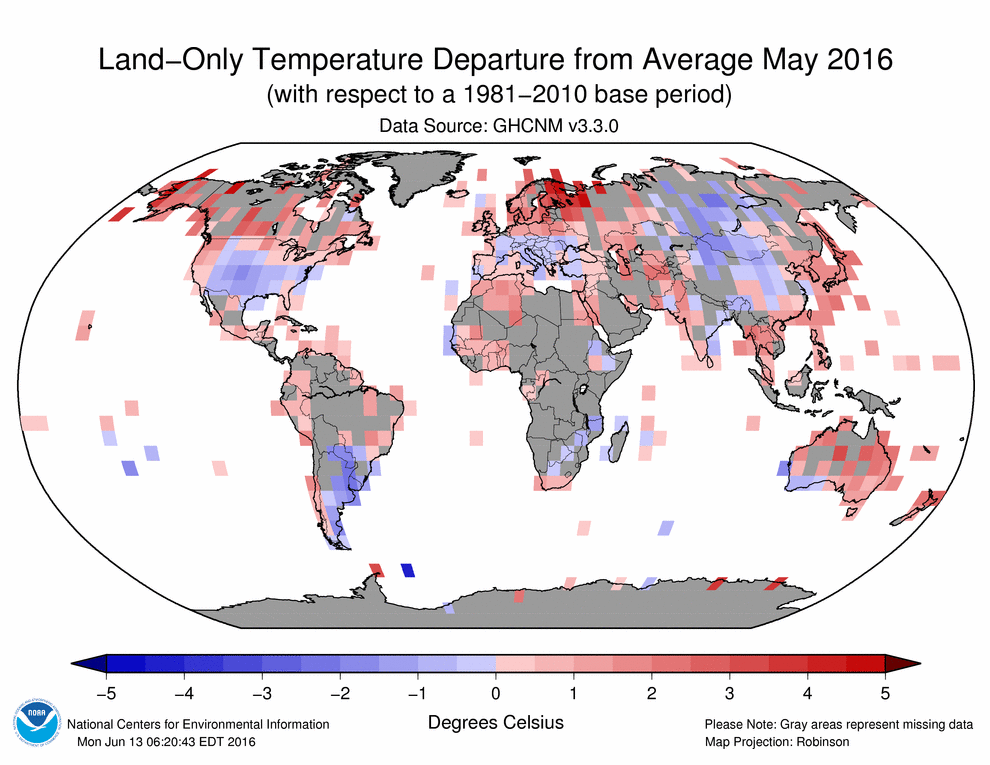
Here’s one qualitative prediction. I’ve been following various sources that show major cooling in Antarctica in June. Because it only covers down to 70°S, RSS will miss that cooling. Net result will be that RSS will show less cooling May-to-June than UAH. The surface data sets may miss it as well, due to their poor coverage of Antarctica, as indicated in the images below. My RSS-specific anomaly projects a minimal drop for June. But the surface data sets are assumed to cover the entire globe. This implies that the surface data sets (HadCRUT4/GISS/NCEI) may come in a bit warmer than my projections.
Global coverage (or lack thereof)
UAHv6, which covers 85°N to 85°S looks like the best data set as far as global coverage is concerned, followed by RSS with coverage 82.5°N to 70°S. The other surface and sea data sets are no better, and arguably worse. For example, from the GISS site:

Looks great? But select ocean data “none” and smoothing radius 250 km for May 2016 and click on “Make Map”. Try “Robinson” and “Polar Orthographic” projections. Land areas in grey are missing. Not only is GISS missing a lot of the polar regions, but also most of Africa and the Arabian Peninsula, plus chunks of South America and Australia.


NCEI is no better. May land data is available here.

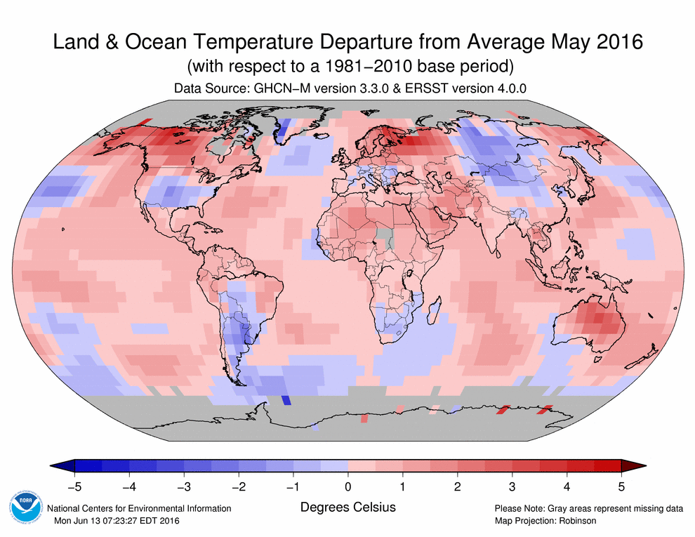
When combined with ocean data, that somehow translates into this:

HadCRUT4 has similar coverage as shown on their website. They use 5 degree grid squares, which are squares 556 km on each side at the equator. The larger grid squares give the illusion of better coverage, but don’t affect the reality

There are holes in the data regardless of which data set is used. The only question is how much data is missing. It would also be interesting to see the data points and smoothing used for sea surface temperature anomalies.
So the anomalies are differential quantities (Real Temperature differentials), a process guaranteed to increase the random noise level.
And based on that you guess what the future noisy differential Temperature changes are going to be.
And that is supposed to be useful information.
There is no statistical process that can predict the value of any number that is not already an exactly known member of the data set used for the statistical manipulations.
But it evidently keeps you busy.
G
worse than the holes….is the changes….the two Giss maps aren’t the same
blue is changed to white….orange is changed to red….etc
When they fill in what’s missing….they warm it up
Walter has presented GISS maps using different averaging radiuses.
You’re perception that they are warmed up is, I think, entirely confirmation bias.
Here is the LOTI with the 250 km averaging radius (corresponding to the land only map above):
http://data.giss.nasa.gov/tmp/gistemp/NMAPS/tmp_GHCN_GISS_ERSSTv4_250km_Anom5_2016_2016_1951_1980_100__180_90_0__2_/amaps.png
And here is the Land only map with the 1200km averaging radius (corresponding to the LOTI map above):
http://data.giss.nasa.gov/tmp/gistemp/NMAPS/tmp_GHCN_GISS_1200km_Anom5_2016_2016_1951_1980_9999__180_90_0__2_/amaps.png
…As a Northern Canadian from Blind River/Sue St.Marie area, I find it hilarious/sad that any Northern Canadian citizen would believe that “Glo.Bull Warming” is a bad thing !…I love my 40 acres in Blind River…But only in the summer ! The winters where I grew up were brutal (6 feet of snow in one week) and no Hydro…but the fishing was beyond compare !
The University of Maine Climate Change Institute preliminary GFS based daily average global temperature anomaly estimates for June show an average of +0.32C referenced to 1979-2000 and this corresponds to +0.23C referenced to 1981-2010. The June +0.23C is down from +0.42C for May and down from the peak of +0.72C in February, referenced to 1981-2010. WeatherBELL is currently showing a June month-to-date average of +0.266C through 0600 UTC on June 30, referenced to 1981-2010.
I only consider Weatherbell temperature data and Dr. Spencer’s as being anywhere near accurate and non biased.
The rest I ignore.
And why is that?
Stickj to kissing your masters butt, it’s the only thing your good at !
I think Salvatore appreciates the personal choices of Spencer & Christy, when they handle uncertainties in their dataset.
When merging the last MSU and first AMSU satellite (at about year 2000), they chose the extreme low end alternative, and look what happened:
http://i.imgur.com/0OpXRPh.png
there’s one thing i would comment to why Salvatore might think this (as well as i do): at this moment only UAH and RSS temperature maps are able to put Belgium right in the same temperature anomaly range as our Royal institute of meteorology is measuring at the surface.
Both RSS and UAH doe have an error varying between -0.2°C/+0.2°C but the sum of errors average out quite correctly.
like in the map of the NCEI belgium is colord in the +1.5°C anomaly cell, while our RMI only measured an anomaly of +0.6°C (according to the WMO standard of 1981-2010)
the worse was April 2016 here’s the NOAA official report and look at the color coded maps where Belgium is gridded as “warmer then average Noaa’s april 2016 report
now to compare: i will put the RMI april month report in the next link it’s in dutch but just look at the first row of the table in the article starting with “gemiddelde temperatuur” (dutch for mean temperature) with the mean of 1981-2010 next to it (column “norm.”. RMI april 2016 report (in Dutch)
is an anomaly on -1.4°C warmer then average? this was not only for belgium, but for the netherlands and central germany the case: april 2016 was colder then normal in opposite of what NOAA says
yes in april both GISS and NCEI did break a record: putting Belgium in a grid that was nearly 2°C warmer then it actually was. (usualy it varies between +0.8/+1.4 degrees)
both UAH and RSS did color belgium correctly.
for a year i do this check on a monthly basis and see this error occur, where it actually never gets coded to cold then it was. This is the flagrant example with proof why i don’t believe GISS NOAA and NCEI anymore. if a month that is 1.4 degrees colder then normal gets labeled there as “warmer then normal, something is off the hook… like i say with a dose of sarcasm: “i think they can’t read thermometers anymore at our RMI”….
I can’t speak for anywhere else in the world, but there is no way the UK will come in above average. I call BS.
As of June 29th, the mean CET (Central England Temperature) was running +1.3 C degree above normal. http://www.metoffice.gov.uk/hadobs/hadcet/cet_info_mean.html
I protest your application of the term “normal.”
Is it normal to speak of an undefined “normal” instead of an undefined “average”?
Reply to Curious George;
The word “normals” has a very specific meaning in climatology. It’s not the same as in ordinary normal (sorry about that) conversational English. See http://www.aos.wisc.edu/~sco/normals.html
Vs the AVERAGE for the base period 1961 to 1990
“Is it normal to speak of an undefined “normal” instead of an undefined “average”?”
https://en.wikipedia.org/wiki/Normalization_(statistics)
In statistics and applications of statistics, normalization can have a range of meanings.[1] In the simplest cases, normalization of ratings means adjusting values measured on different scales to a notionally common scale, often prior to averaging. In more complicated cases, normalization may refer to more sophisticated adjustments where the intention is to bring the entire probability distributions of adjusted values into alignment. In the case of normalization of scores in educational assessment, there may be an intention to align distributions to a normal distribution. A different approach to normalization of probability distributions is quantile normalization, where the quantiles of the different measures are brought into alignment.
In another usage in statistics, normalization refers to the creation of shifted and scaled versions of statistics, where the intention is that these normalized values allow the comparison of corresponding normalized values for different datasets in a way that eliminates the effects of certain gross influences, as in an anomaly time series. Some types of normalization involve only a rescaling, to arrive at values relative to some size variable. In terms of levels of measurement, such ratios only make sense for ratio measurements (where ratios of measurements are meaningful), not interval measurements (where only distances are meaningful, but not ratios).
and well in geometry you all know that Normal means something completely different.
Interesting and extremely difficult to believe. June here has been mostly very cloudy and very, very wet.
CET came in at 15.2C for June, which is 1.0C above the June average. That’s using the 1961-90 base, per the UKMO for that series. It works out as 0.7C above the 1981-2010 June average: http://www.metoffice.gov.uk/hadobs/hadcet/data/download.html
It’s been one of the coldest June’s in my recent memory here in the UK. I laughingly told my friends it would be ‘warmer then average’ according to the ‘data’.
Don’t know what part of the UK you’re in David, but the Central England region was 1.0C warmer than the long term average for June. This was mostly due to above average temperatures from 4th – 17th: http://www.metoffice.gov.uk/hadobs/hadcet/graphs/HadCET_act_graphEX.gif
I think DWR54, what JonA and some other people who live in the CET area are trying to say is that their observation is that the CET appears to be out of kilter with reality on the ground
I keep a CET spreadsheet. June 2016 was 15.2 deg C. The average for the last 30 Junes 87-16 was 14.5 deg C. So June 16 was 0.7 deg C warmer than normal compared to recent climate. There have been plenty of recent colder Junes. Last year was 14.0, 2011-13 had 13.8, 13.5, 13.6 respectively. So a lot cooler than this year. Finally 23 of the last 30 Junes were cooler than this year.
I think sometimes wet weather is thought of a cold weather, but you can have wet weather with warm air which seems to be the case this time around apart from the odd colder outbreak which is entirely normal yet seems to get attention every May or June.
Sadly the forecasters on the BBC were already calling that this morning. If ever people were to begin to see through the charade it must be now.
June 2016 was the warmest June in the Central England Temperature (CET) series since 2010, with which it tied at 15.2C. You have to go back to 2006 to find a warmer June in CET: http://www.metoffice.gov.uk/hadobs/hadcet/data/download.html
Therefore it is surprising if the BBC is calling June 2016 one of the coldest in living memory.
+1 I was tempted to put my heating on last night – on the last day of June?!
I don’t believe the GISS L-OTI (whatever that means) map; for instance a temperature average 1951-1980 for the Antarctic including the peninsular doesn’t exist, the same I suspect applies to the Sahara, Alaska, Kamchatka, central-southern Asia and so on.
At a quick glance, the land-based NCEI has two blue grid squares in Ethiopia. When the SSTs are added, they become red. Inexplicable.
Steady natural global cooling continues.
And will through 2017(at least).
NCEP CFSR has it .267C against its 35 year record. 4th warmest
here you go.
full globe
http://berkeleyearth.org/wp-content/uploads/2016/01/Month_anomaly_map4.png
I thought the Atlantic was cooling, but the anomaly there is positive. WUWT?
It’s the BEST they can do…
guess you thought wrong.
From the article:
…
Recent temperature trends in the Atlantic Ocean
The comparison chart (above) of SST anomalies between August 2014 (top) and today (bottom) shows a big drop in temperatures across much of the northern Atlantic Ocean. The rather limited colder-than-normal (blue) patches from August 2014 have increased noticeably in areal extent when compared to the most recent measurements. Also, the well above-normal waters (orange) of August 2014 that existed east and south of Greenland have cooled off dramatically during this time period and there has even been a switch from well above-normal (orange) to below-normal (blue) in sections.
…
http://www.vencoreweather.com/blog/2016/4/28/215-pm-atlantic-ocean-showing-signs-of-a-significant-long-term-shift-in-temperatures-from-warm-to-cold
http://www.ospo.noaa.gov/data/sst/contour/natlanti.cf.gif
Walter,
Do you have numbers that say X% of variation in the sets is noise and Y% systematic and suitable for projection?
Geoff
I try to use the 12 most recent months of applicable data, where available. There was a recent stretch of 8 months which look like a separate population. I had to replace them with 8 months earlier on, going back to November 2014. The spreadsheet correl() function (correlation) for the data sets in this article is as follows…
* HadCRUT4 +0.747
* GISS +0.682
* NCEI +0.886
* RSS +0.819
* UAH +0.785
Notes:
1) HadCRUT4/GISS/NCEI were correlated against the global NCEP/NCAR data as per Nick Stokes at https://moyhu.blogspot.ca/p/latest-ice-and-temperature-data.html#NCAR
2) As noted in my post, I’ve switched to separate RSS and UAH subsets of the NCEP/NCAR data to accomadate the fact that the satellites do not cover the entire globe.
3) UAH was correlated against less than 12 months of data. June’s data for UAH appears to be part of the “blade of the hockey stick”, i.e. the separate population that I mentioned earlier.
Is it possible that there is little room for improvement while critical regions like those around the poles have such sketchy data and will do for decades to come?
Geoff
Reply to Geoff Sherrington July 1, 2016 at 4:49 am
Actually, GISS (and others?) seem to have discarded a bunch perfectly valid stations along the way. This is known as “the great dying of themometers”. See https://wattsupwiththat.com/2011/07/24/the-great-dying-of-thermometers-helping-giss-find-the-undead-thermometers-complete-with-code/
Covering vast uninhabited stretches of the planet is a challenge. The problem for satellites is one of cost. I’ll skip the physics lecture, but it takes a lot more fuel/money to put the same weight/payload into a polar orbit, versus an equatorial orbit. That’s why we have gaps at the poles in satellite data.
“Is it possible that there is little room for improvement while critical regions like those around the poles have such sketchy data and will do for decades to come?
There is actually more data than people think. One issue is getting the data into the Standard inventories.
for example, some arctic researhers sit on piles and piles of station data that they havent published or are publishing slowly as they write new papers.
The other thing people forget is that area wise the arctic is small.
Of course since it is warming much much faster than the rest of the globe it’s important to understand that most estimates of the warming at the pole will underestimate the actual warming.
if you want a lower bound the answer is simple..
“…Of course since it is warming much much faster than the rest of the globe it’s important to understand that most estimates of the warming at the pole will underestimate the actual warming…”
Priceless.
I think the “noise” in the temp series is about +/- 0.3C (but mostly within +/- 0.2C)

My model of UAH – RSS – HadAt temps back to 1958 based on the ENSO, AMO, Volcanoes and a Ln (CO2) warming trend.
And then the error or white noises left over.
Similar models for Hadcrut, NCEI or GISS have the same noise signature.
This was a very interesting blog to stumble upon. Never would have guessed it would be listed on the top blogs of all of wordpress.
The subject must be one many people find incredibly interesting outside of the news and such.
UAH v6 doesn’t go from 85 N to 85 S. It is only 82.5 N to 82.5 S according to the gridded data, e g:
http://vortex.nsstc.uah.edu/data/msu/v6.0beta/tlt/tltmonamg.2016_6.0beta5 , or the netcdf at Knmi climate explorer.
Also, RSS v3.3 TLT is no longer endorsed by its producers due to unchecked drifts:
“The lower tropospheric (TLT) temperatures have not yet been updated at this time and remain V3.3. The V3.3 TLT data suffer from the same problems with the adjustment for drifting measurement times that led us to update the TMT dataset. V3.3 TLT data should be used with caution.”
Try RSS TTT v4 instead, which also has a better coverage, 82.5 N- 82.5 S. TTT and TLT products are relatively similar in global temps and trends.
Satellite data may have better spatial coverage than surface data, but the temporal coverage is not very good. There are not many near nadir readings per month in each gridcell. To increase the number of readings UAH also include limb views which represent higher profiles in the atmosphere with lower brightness temperatures. All readings, with a span of more than 10 K, are adjusted together by use of a polynomial fit:
http://www.drroyspencer.com/wp-content/uploads/AMSU5-gridpoint-polynomial-fit-example.gif
Thanks, I’ll take a look at using the RSS TTT data. If nothing else, it’ll cut down from 3 separate sets of daily/monthly temperatures/means/anomalies to 2. I now have separate sets for RSS and UAH, as well as the global data. This way, I’ll be able to use the same 82.5N-to-82.5S data for correlating to both UAH and RSS.
Re the projections table: HadCRUT4 came in at +0.680 for May, which is -0.154 short of the projection: http://www.metoffice.gov.uk/hadobs/hadcrut4/
The projection for UAH was better:- UAH came in at +0.34 for June, which is just +0.04 above the projection: http://www.drroyspencer.com/2016/07/uah-global-temperature-update-for-june-2016-0-34-deg-c/
Will 2016 set a new record for UAH? There are many similarities between 1998 and 2016. There was an extremely strong El Nino which caused records to be set in the beginning of each year. Then there was a drop in 1998 and so far, there is a similar drop in 2016.
However there are important difference between 1998 and 2016. In 1998, the highest anomaly was in April of 1998 and therefore not surprisingly, the second quarter of 1998 was the quarter with the highest anomaly. In contrast, the highest anomaly in 2016 was in February making the first quarter of 2016 the one with the highest anomaly.
The difference between quarters 2 and 3 for 1998 for UAH6.0beta5 was 0.165. The difference between quarters 1 and 2 in 2016 was 0.169. Very close!
There are several different approaches one can use to arrive at the best guess as to whether or not 2016 will set a record. I have decided to give the averages for each of the four quarters in 1998 and the first quarter of 1999 as well as the four quarters of 2016. The first quarter of 1998 will be called 98(1), and so on.
Here are the numbers we know:
98(1): 0.536
98(2): 0.654
98(3): 0.489
98(4): 0.257
99(1): 0.048
16(1): 0.712
16(2): 0.533
And here are my estimates for what we do not know.
16(3): (0.301)
16(4): (0.092)
This gives an average of 0.407 for 2016 putting it into second place between the 0.484 of 1998 and 0.338 from 2010.
Obviously, I could only give the first two quarters of 2016 and I had to estimate the last two. Feel free to comment on whether you think my methods are good or whether you think they are out to lunch. I took the difference between the following quarters: 4 and 3 of 1998, and 1 of 1999 versus 4 of 1998. Then I applied those differences to quarters 3 and 4 of 2016 and put those numbers in ( ) above for 16(3) and 16(4).
Then I calculated the average for 2016 based on those numbers and compared that to the 1998 and 2010 averages.
On Roy’s page he shows the trend that would be needed for the 2nd half of this year for it to be “the warmest heffa”
This month is well below that trend.
Another steep drop in UAH global.
from +0.55C in May to +0.34 in June
Northern Hemisphere drops from +0.65C to +0.51C
Southern hemisphere drops from +0.44C to +0.17C
Tropics drops from +0.72C to +0.38C
If Lucia was still running the betting, Walter could have made good money on June UAH.
HadCRUT4 has come in for May at +0.680… my projection of +0.820 was off by 0.140 degree. HadCRUT4 is the only one of the 5 data sets to have the May 2016 anomaly lower than the May 2015 anomaly. I’m not complaining, but it seems like an outlier.
The whole process has so much made up data it’s laughable. The data making up the reference period is even more made up than the current missing data.
There is no long term data trend for the SH, all made up. Most of the SH is still made up.
The uncertainty in SST is huge too, and unreliable.
Only liars and self delusional people would claim otherwise
RSS for June came in at +0.467 versus my projection of +0.485