Alternate Title: Just in Case You Thought Sea Surface Temperatures around the Globe Responded Similarly to Strong El Niños
Guest Post by Bob Tisdale
This is an update of the post here published back in March. It will illustrate quite clearly that the responses of ocean surface temperatures differ noticeably with strong El Niño events—those in 1997/98 and 2015/16.
INTRODUCTION
Climate scientists use statistical tools to determine how global surface temperatures and precipitation typically respond to El Niño events. A classic example of such a paper is Trenberth et al. (2002) Evolution of El Niño–Southern Oscillation and global atmospheric surface temperatures. As you shall see, however, there are noticeable differences in the responses of the sea surface temperatures of many of the individual ocean basins to the comparably sized El Niño events of 1997/98 and 2015/16.
Please note that this post is in no way intended to contradict studies like Trenberth et al. (2002). The results of those papers basically tell us how weather around the globe typically responds to ENSO events, not how it will actually respond in any given month or year to an El Niño.
Additionally, of course, we now understand that the “ENSO residuals” mentioned in Trenberth et al. (2002) contribute to long-term global warming. See the discussion under the heading of BIG JUMPS in the post Open Letter to Kevin Trenberth – UCAR. But I’m digressing from the intent of the post, which is to show that the responses of surface temperatures of the oceans can differ noticeably from one strong El Niño to the next.
The sea surface temperature anomalies of the NINO3.4 region of the east-central equatorial Pacific are a commonly used reference for the strength, frequency and duration of El Niño events. In fact, they were used by Trenberth et al. (2002) for their analyses (referred to as N3.4). Figure 1 includes the sea surface temperature anomaly data for the NINO3.4 region from various datasets, all using the same base years for the anomalies (1981-2010). It compares the evolutions of the 1997/98 and 2015/16 El Niño events. Due to the differences between sea surface temperature datasets and their uncertainties (not illustrated), we don’t know exactly which El Niño may have been stronger based on the NINO34 data. All we can say is that they were comparably strong events…based on the sea surface temperature anomalies of the NINO3.4 region.

Figure 1
Because the 1997/98 and 2015/16 El Niños were of comparable strength according to the NINO3.4 data, we might expect the responses of the sea surface temperatures around the globe to be similar. But as you’ll see, there can be great differences.
Note: We’ve noted in numerous ENSO updates that there are other metrics…Warm Water Volume (WWV) and Depth-Averaged Temperatures to 300 Meters (T300) in the eastern equatorial Pacific, NINO3 and NINO1+2 sea surface temperature anomalies, the Multivariate ENSO Index (MEI), the Southern Oscillation Index (SOI)…that indicate the 1997/98 El Niño was a stronger El Niño. See the most recent ENSO update here. This post also suggests the 2015/16 El Niño was weaker than the 1997/98 El Niño. [End note.]
SEA SURFACE TEMPERATURE DATASETS
Due to the noticeable differences between sea surface temperature datasets over the short-term periods discussed in this post, I’ve included 5 sea surface temperature products, and then averaged them. Three are from NOAA and two are from the UK Met Office.
ERSST.v4 – Also known as the NOAA “pause buster” sea surface temperature dataset. It has had its parameters (tuning knobs) tweaked so that its short-term (2000-2014) trend is at the high end (not mid-range) of the parameterization uncertainties. See the posts The Oddities in NOAA’s New “Pause-Buster” Sea Surface Temperature Product – An Overview of Past Posts and On the Monumental Differences in Warming Rates between Global Sea Surface Temperature Datasets during the NOAA-Picked Global-Warming Hiatus Period of 2000 to 2014. NOAA’s ERSST.v4 “pause buster” data is presently used in the NOAA/NCEI and GISS global land+ocean surface temperature products.
ERSST.v3b – This is the predecessor to the ERSST.v4 “pause buster” data. Oddly, NOAA is still updating it even though NOAA replaced it in mid-2015. The ERSST.v3b data is still an option for the sea surface temperature portion of the GISS Land-Ocean Temperature Index.
Reynolds OI.v2 (Original version) – This is the original version of the satellite-enhanced NOAA Optimum Interpolation sea surface temperature (a.k.a. Reynolds OI.v2). The Reynolds OI.v2 data was called “a good estimate of the truth” by Smith and Reynolds in their (2004) paper Improved Extended Reconstruction of SST (1854-1997). It was originally used by GISS for their Land-Ocean Temperature Index from 1982 to present, and it is still an option for that GISS product.
Note: The Reynolds OI.v2 data used in this post is NOT the higher resolution version of the Reynolds OI.v2 data, because the high resolution version has been tweaked so much by NOAA that its short-term (2000-2014) trend is far higher than the maximum of the parametric uncertainty range of the NOAA’s ERSST.v4 “pause buster” data. See the discussion of Figure 6 in the post On the Monumental Differences in Warming Rates between Global Sea Surface Temperature Datasets during the NOAA-Picked Global-Warming Hiatus Period of 2000 to 2014. [End note.]
HADSST3 – This is the sea surface temperature dataset used in the UKMO HADCRUT4 global land+ocean surface temperature product. It is the only sea surface temperature dataset included in this post that has not been infilled. That is, a 5-degree latitude by 5-degree longitude grid without observations-based data in a month remains without data, while the other datasets use statistical methods (or satellite-based measurements) to infill those data-free grids.
HADISST – This is the infilled long-term dataset from the UK Met Office, using satellite-enhanced observations since 1982. In the first version of the Land-Ocean Temperature Index, GISS used HADISST sea surface temperature data prior to 1982, and it, combined with the Reynolds OI.v2 data, is still an option for the GISS LOTI data.
DATA SOURCE: All sea surface temperature data presented in this post are available at the KNMI Climate Explorer.
IMPORTANT NOTES:
Only Figure 1 presents the anomalies referenced to the period of 1981 to 2010. For the remaining illustrations, the data were downloaded using the WMO-preferred base years of 1981 to 2010. Then the data were normalized by zeroing the anomalies to the averages of the first 3-months of the respective 2-year periods. Yes, the sea surface temperatures in all ocean basins presented in this post have risen from 1997/98 to 2015/16. I’m not hiding that fact. See the most recent monthly sea surface temperature update. (And, of course, global sea surfaces have not warmed as predicted by climate models, as shown in the most recent model-data comparison.) The intent of this post, however, is to compare, for two comparably sized El Niño events, the evolutions of the responses of the sea surface temperature anomalies globally and for the ocean basins. Thus the data have been normalized for comparison purposes.
Because the datasets can account for sea ice differently, the polar oceans have been excluded. That is, data are limited to the latitudes of 60S-60N, which is commonly done in scientific studies.
The top graphs present the monthly data, and the bottom graphs present the monthly data smoothed with 3-month running-mean filters to reduce any monthly volatility.
Above, I linked the post On the Monumental Differences in Warming Rates between Global Sea Surface Temperature Datasets during the NOAA-Picked Global-Warming Hiatus Period of 2000 to 2014. While that problem exists, we’re only examining data over, at most, a 2-year period in this post. Those differences do not likely have noticeable impacts on the results presented in the following.
As of this writing, with the exceptions of the HADISST data, the 2015/16 data run through May 2016. The HADISST data lag by 1 months (to April 2016).
There are seasonal components to the curves that depend on the base years used for anomalies. I’ve used the WMO-preferred base years on 1981-2010. If you were to use different base years, the curves would differ from what’s shown but the disparities between the 1997/98 and 2015/16 curves would be similar. See Animation 1 here (Not updated), which compares the illustrations for the North Atlantic with the base years of 1981-2010 in one cell and 1997-2015 in the other.
My narrative will focus on the averages of the sea surface temperature datasets, but as you’ll see, there can be large differences between the datasets for each ocean basin over these short-term periods.
Let’s start with the data globally…get your feet wet, so to speak.
GLOBAL SEA SURFACE TEMPERATURE ANOMALY RESPONSES TO THE EL NIÑO EVENTS OF 1997/98 AND 2015/16
Using the five sea surface temperature datasets discussed above, Figure 2 presents the global (60S-60N) sea surface temperature anomaly responses to the 1997/98 and 2015/16 El Niño events. The warming of the surfaces of the global oceans in response to the 2015/16 El Niño is noticeably lagging behind the response to the 1997/98 event. We’ll discuss possible reasons for that later in the post. Also note the unexpected drop-off from January to February 2016 and the early decay in 2016 compared to 1998.

Figure 2
If you believed the climate science community knows in any given month what global sea surface temperatures are, see Animation 2. Each cell includes the individual sea surface temperature datasets used in Figure 2. That will also give you an idea of why I presented the average and used it for the narrative.

Animation 2
So let’s take a look at the individual ocean basins to see where the shortfalls lie and where the early decay originates.
PACIFIC OCEAN RESPONSES
So far, compared to the 1997/98 event, the El Niño of 2015/16 has had less of an effect on the sea surface temperatures of the Pacific Ocean (60S-60N, 120E-80W). See Figure 3. The response in 2015 was slower than in 1997, and the peak response was noticeably less for the 2015/16 event. The decay this year, however, is now in line with 1998. El Niño events take place in the Pacific, so these results suggest that the 2015/16 El Niño was weaker than the event in 1997/98.

Figure 3
For the North Pacific (0-60N, 100E-90W), Figure 4, the sea surface temperatures responded similarly during the first 6 months of 1997 and 2015. The sea surface temperatures of the North Pacific peaked later and higher in 2015/16, but they are also dropping much more rapidly in recent months. So the North Pacific is one of the basins that are primarily responsible for the noticeable early decline in global sea surface temperatures. That drop off there could be attributed to the dissipation of The Blob in the eastern extratropical North Pacific. (Then again, there have been recent upticks in the sea surface temperature anomalies of The Blog region, as shown in Figure 16 from the latest sea surface temperature anomaly update here.)

Figure 4
On the other hand, in the South Pacific (60S-0, 120E-70W), sea surface temperatures initially responded slower in 2015 than they did in 1997, and they peaked later at a lower value than in 1998. See Figure 5.

Figure 5
INDIAN OCEAN RESPONSES
As shown in Figure 6, the sea surface temperature anomalies of the Indian Ocean (60S-30N, 20E-120E) responded sooner and peaked earlier than they did in 1997. However, the lower graph shows the 3-month averages peaking slightly less in 2015/16 than in 1997/98. Then again, the differences between the datasets and their uncertainties (not shown) really prevent us from knowing how high they peaked.

Figure 6
There was a major decline in the sea surface temperature anomalies of the Indian Ocean from January to February 2016, but then a rebound a month later.
ATLANTIC OCEAN RESPONSES
Figure 7 presents the evolutions of the Atlantic Ocean (60S-60N, 70W-20E) sea surface temperatures in response to the El Niño events of 1997/98 and 2015/16. So far, the response in 2015/16 has lagged far behind those in 1997/98, and the sea surface temperature response is decaying much earlier this year.

Figure 7
Some of you are likely thinking, as did I initially, the Atlantic Multidecadal Oscillation has something to do with that. However, the Atlantic Multidecadal Oscillation impacts, primarily, the sea surface temperatures of the North Atlantic. And as we can see in Figure 8, the North Atlantic (0-60N, 80W-0) responded sooner to the El Niño in 2015 than it did in 1997, and in 2016, it also is lagging behind the response in 1998.

Figure 8
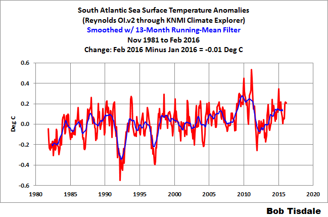
It’s the South Atlantic that’s causing the noticeable shortfall in 2015 for the Atlantic basin. As shown in Figure 9, the sea surface temperatures of the South Atlantic (60S-0, 70W-20E) have not warmed (so far) in response to the 2015/16 El Niño, while they warmed quite a bit for the 1997/98 El Niño.

Figure 9
HEMISPHERIC OCEAN RESPONSES
The following are the comparisons for the Northern and Southern Hemispheres. As shown in Figure 10, the response of the Northern Hemisphere (0-60N) peaked higher in 2015/16 than in 1997/98. On the other hand, it is, so far, decaying much more quickly in recent months…but has made a recent uptick.

Figure 10
Conversely, the sea surface temperatures of the Southern Hemisphere (60S-0) in 2015/16 have lagged well behind those in 1997/98. See Figure 11. But they too are decaying earlier this year than in 1998.

Figure 11
If we assume hemispheric land surface temperatures vary in response to hemispheric sea surface temperature changes, then the higher peak in the Northern Hemisphere sea surfaces may result in greater global land surface temperature responses to the current El Niño…especially when we consider that the land surface area of the Northern Hemisphere (approximately 100 million km^2) doubles that of the Southern Hemisphere (about 49 million km^2). Reference for surface areas here.
WHY ARE GLOBAL SEA SURFACE TEMPERATURES IN 2015/16 LAGGING BEHIND THOSE IN 1997/98?
Refer to Figure 1 again, please. I suspect one reason is that the tropical Pacific started at the threshold of weak La Niña conditions in 1997/98, while in 2015/16, the tropical Pacific started at the threshold of weak El Niño conditions. So, even though the sea surface temperature anomalies for the NINO3.4 region peaked at comparable values, the change in the sea surface temperatures of the equatorial Pacific was greater in 1997/98 because it started near La Niña conditions. We can help to show this by normalizing the NINO3.4 region to the averages of the first three months of the respective periods. See Figure 12. The change in the sea surface temperatures of the east-central equatorial Pacific was noticeably greater in 1997/98 than in 2015/16.

Figure 12
Another way to consider that: In 2015, the global atmospheric conditions were already in weak El Niño conditions, so globally the atmosphere was already primed toward El Niño circulation. On the other hand, in 1997/98, the atmospheric conditions began in weak La Niña conditions, so there were greater changes then in atmospheric circulation, which caused the greater increases in sea surface temperatures outside of the tropical Pacific.
Another reason: The 1997/98 El Niño was a strong East Pacific El Niño, while the 2015/16 El Niño was a strong Central Pacific El Niño. That is, the sea surfaces east of the NINO3.4 region were warmer in 1997/98 than in 2015/16. As noted [earlier], we’ve been illustrating this fact in the 2015/16 ENSO updates. See the most recent update here. We also discussed and illustrated it using the El Niño Modoki Index in the post Is the 2015/16 El Niño an El Niño Modoki?
EAST PACIFIC VERSUS THE REST-OF-THE-WORLD’S OCEANS
Another logical way to divide the global oceans when studying ENSO is to break them down into the East Pacific (60S-60N, 180-80W) versus the rest of the global oceans, where the rest is the Atlantic, Indian and West Pacific oceans (60S-60N, 80W-180). The surface temperatures of the East Pacific are directly impacted by the El Niño, while the surface temperatures of the rest of the oceans vary due to the aftereffects of the El Niño and due to changes in atmospheric circulation caused by the El Niño.
During an El Niño, warm water, mostly from below the surface of the western tropical Pacific, migrates eastward into the eastern tropical Pacific, primarily along the equator. Ocean processes cause much of the additional warm subsurface waters to be upwelled to the surface of the eastern tropical Pacific during an El Nino. Because the surface and subsurface waters in the western tropical Pacific are warmer (in absolute terms) than those in the eastern tropical Pacific, the surfaces of the eastern tropical Pacific warm. Additionally, prior to the El Niño, the warm water was below the surface of the western tropical Pacific (excluded from the surface temperature record), and the warm water is on the surface during and after the El Niño (included in the surface temperature record). As a result, the surface temperatures of the eastern tropical Pacific warm in response to an El Niño.
Ocean dynamics such as coastally trapped Kelvin waves and changes in atmospheric circulation caused by the El Niño also cause portions of the surfaces of the eastern Pacific to warm outside of the tropics.
The result is the East Pacific (60S-60N, 180-80W) as a whole warms in response to the El Niño. See Figure 13. Clearly, the East Pacific warmed much more during the 1997/98 El Niño than during the recent event. For the East Pacific, the 2015/16 El Niño has peaked a few months later than in 1997/98.

Figure 13
The sea surfaces of the rest of the world—the Atlantic, Indian and West Pacific Oceans—warm in response to changes in atmospheric circulation and as a result of the leftover warm waters from the El Niño, both surface and subsurface. (See Chapter 3.7 of my free ebook On Global Warming and the Illusion of Control – Part 1.) All of the warm water released by the El Niño doesn’t simply disappear at its end, which is what the climate science community would like you to believe. Those leftover warm waters are relocated initially to the West Pacific and East Indian Oceans, then, over time, carried throughout the rest of the oceans by ocean currents.
Figure 14 presents the sea surface temperature responses to the 1997/98 and 2015/16 El Niños for the Atlantic, Indian and West Pacific Oceans (60S-60N, 80W-180), a.k.a. the Rest of the World. Until recently, the sea surface temperature response of the Rest of the World to the 2015/16 El Niño basically tracked that of the 1997/98 El Niño…may have responded a little earlier in the first few months. The surface temperatures there then dropped noticeably from January to February 2016 and are continuing to lag behind those in 1998.

Figure 14
There should be a monumental amount of leftover warm water from the 2015/16 El Niño (and The Blob) and those leftovers should once again find their way initially to the East Indian and West Pacific over the next year.
CLOSING
Every El Niño is different. We’ve shown that fact in many of the posts presented in the 2014/15 El Niño series and those about the 2015/16 El Niño. Weather around the globe is chaotic, so the background state globally in which each El Niño forms will be different. As a result, the responses of ocean basin surface temperatures to El Niños will vary from event to event, even strong El Niños.
The sea surface temperature anomalies of the NINO3.4 region are a commonly used indicator of the strength, frequency and duration of ENSO events. But they only reflect the impacts of an El Niño on that small portion of the globe. They cannot tell us if the El Niño was an East Pacific event or a Central Pacific El Niño (a.k.a. El Niño Modoki). The sea surface temperatures of the NINO3.4 region also do not tell us the background state of the weather in the tropical Pacific or around the globe or how regional weather will impact the responses. As noted in the most recent ENSO update, many other indices show the 2015/16 El Niño to be weaker than the event in 1997/98. And, of course, the sea surface temperatures of the NINO3.4 region cannot tell us what happened to the warm water after the El Niño.
So far, the responses of global sea surface temperatures to the 2015/16 El Niño have fallen short of those experienced during the 1997/98 El Niño. See Figure 2. The decay in many basins is also occurring sooner in 2016 than in 1998. However, the 2015/16 El Niño released a tremendous about of warm water from below the surface of the western tropical Pacific, and all of that warm water is going to end up somewhere. Time will tell.
For this El Nino, the most unusual response, or lack thereof, has occurred in the South Atlantic. The South Atlantic covers about 11% of the surface of the global oceans, according to the NOAA/NCEI webpage here. The surfaces of the South Atlantic warmed noticeably in response to the 1997/98 El Niño, but show no warming in 2015/16. Why? Dunno. Compared to the rest of the ocean basins, there is very little scientific literature about the causes of the variations in the surface temperatures of the South Atlantic. In fact, I have yet to find a paper that provides an explanation for the temporary 2+ year uptick in the surface temperatures of the South Atlantic starting in 2009 after decades of no warming.
NOTE
At the close of the earlier post, I promised a comparison using land surface air temperature anomalies. I have yet to finish the graphs. Figure 15 is a preview. That’s quite a drop from April to May 2016 in the GISS and NCEI data. Will the decline continue, or will land surface air temperature anomalies rebound next month?

Figure 15
Many thanks for showing the graphs for the entire planet’s oceans minus, of course, the waters around the South Pole. Antarctic waters are colder than usual for the last year, nearly, unlike the famous earlier el Nino.
“Only Figure 1 presents the anomalies referenced to the period of 1981 to 2010. For the remaining illustrations, the data were downloaded using the WMO-preferred base years of 1981 to 2010. ”
I’m confused…Aren’t these the same base years ? do I need more coffee ??
“typo…” As noted erlier, we’ve been illustrating this fact in the 2015/16 ENSO updates. See the most recent update here. We also discussed and illustrated it using the El Niño Modoki Index in the post Is the 2015/16 El Niño an El Niño Modoki?… erlier = earlier ?
You know, there’s such a thing as too much information. Where’s the Abstract?
Good point. All posts should have an abstract.
I agree…too long.
Bob,
Is there clarity about the west Pacific/Indonesian source region of the excess warm water if I can put it that way? Notably, is it mostly held that this water is an expression of a redistribution with other places becoming colder for a zero sum ,,– or is it established that this extra warm water is created from an external event, such as a change in local cloud cover or part of global warming or whatever?
Sorry for more questions, but do you know of any papers that use UAH type atmospheric data to seek evidence of the start of an El Nino in time and place, then its 3D movement with time as it propagates? Or is it a globally simultaneous change with local variations in rate and pattern of change as you have described here for SST?
Geoff
Thanks Bob. Maybe next time you could add more graphs? 😉
The numbers here:
http://www.moyhu.blogspot.com.au/p/latest-ice-and-temperature-data.html#NCAR
indicate that to June 21, there will be a further drop of about 0.14 in June compared to May.
In my thought experiment related to epic ages of fast ups and jagged downs global temperature extremes, I wonder what oceans look like when most of the heat is now in the atmosphere. Do they randomly begin turning into net energy absorbers? Do they do it all together or separate from one another? Do they suddenly change or slowly, almost imperceptively change to net absorbers? The reconstructions don’t tell us much about land, sea and air separately. And the ice core smoothed scale with all its issues I have referred to elsewhere is too course to tell us much in any kind of fine detail. What comes to mind though is this: At the scale we can see now, trade wind and equatorial processes demonstrate the intrinsic components needed to work as the drivers of energy recharge and discharge functions on smaller scales. So why not larger scales?
Now I hazard a guess. The systems (atmosphere and oceans) and their components (ENSO parameters) seem chaotic in fine detail, each little cycle different, something this post shows us, but with longer term scales (anywhere from 10 to 100 years or so) we have all recognized and is reported in the literature. Now in my mind I look at much longer and larger epic cycles. I can guess that any knee at the top of a warm epic may seem like heat is building and building in the atmosphere because oceans are in net chaotic discharge. However it is likely a sign of oceans completing their long term epic cycle of being net dischargers, and not the result of humans driving cars or sunspots fading away. If small scale is any measure, the knee will be chaotic but could possibly show decreasing ocean warmth here and there, or decreasing discharge. The oceans may still be discharging, but not to the extent of previous episodes, and diminishing as time goes by, while the expelled heat warms us. But the knee is eventually traversed and the oceans have no more heat to give. Over hundreds and thousands of years, the world gets colder because the once depleted oceans are now in net recharge till they can hold no more heat. At the bottom of the recharge epic taking thousands and thousands of years to fully recharge such a vast ocean, discharge begins once again, and for whatever reason discharge happens more smoothly, the rise being quicker, while recharge progresses in fits and starts. That difference may be explained by the thermodynamics of ocean liquid combined with a finicky atmosphere but my thought experiment is now in an area I need more study on.
So where are we on the knee (and aren’t we lucky to be there)? Just sayin.
Pamela,
“…epic ages of fast ups and jagged downs…” is how the retail pricing of gasoline is done in Ohio.
Pamela
How can heat “building” in the atmosphere have any effect on the ocean?
That source of heat is coming out of the oceans, much like it does on an evening next to the Pacific Coast, or any coast for that matter.
Of note:
Solar activity parameters (active region count, F10.7, TSI) were higher and increasing in the first 6 months of 1998 than they are so far this year 2016 (and still heading downward, esp F10.7).
Bob Tisdale, thank you again.
The extra rise in global temp at the end of this El Niño could suggest that this was stronger than the previous one or that the world has been warming more than we thought to start from a higher base.
What seems to be unmentioned is the length of time in 2015 in pre El Niño conditions, that is the sea temperature was higher than average for nearly a year leading up to the real El Niño .
Obviously this background heat was building the temperature base up for the ElNino to hang on and the extra temperature spike we witnessed .
Fingers crossed there is a decent temp fall due.
This was an el Nino “Modoki”.
Meaning that while the mid equatorial Pacific SSTs warmed in a way resembling an el Nino, there was no engagement of the Bjerknes feedback and no cut-off in Peruvian upwelling.
(Thus for example there was no decline in the anchovy fishery – biomass currently above 20 uear mean – despite endless alarmist driven and market-distorting claims that there would be.)
So, there wont be a La Nina counter-stroke either pumping warm water round the world.
So no post Nino step up in global temperatures. Possibly the reverse.
that is a hell of a lot of work there bob. thanks for taking the time to do that.
Werner Brozek June 23, 2016 at 7:30 am
http://www.moyhu.blogspot.com.au/p/latest-ice-and-temperature-data.html#NCAR
Thank you, thank you, Thank you,
and especial thanks to Nick, fantastic up to date information