Guest Post by Bob Tisdale
This post provides an update of the values for the three primary suppliers of global land+ocean surface temperature reconstructions—GISS through April 2016 and HADCRUT4 and NCEI (formerly NCDC) through March 2016—and of the two suppliers of satellite-based lower troposphere temperature composites (RSS and UAH) through April 2016. It also includes a model-data comparison.
INITIAL NOTES:
We recently discussed and illustrated the impacts of the adjustments to surface temperature data in the posts:
- Do the Adjustments to Sea Surface Temperature Data Lower the Global Warming Rate?
- UPDATED: Do the Adjustments to Land Surface Temperature Data Increase the Reported Global Warming Rate?
- Do the Adjustments to the Global Land+Ocean Surface Temperature Data Always Decrease the Reported Global Warming Rate?
The NOAA NCEI product is the new global land+ocean surface reconstruction with the manufactured warming presented in Karl et al. (2015). For summaries of the oddities found in the new NOAA ERSST.v4 “pause-buster” sea surface temperature data see the posts:
- The Oddities in NOAA’s New “Pause-Buster” Sea Surface Temperature Product – An Overview of Past Posts
- On the Monumental Differences in Warming Rates between Global Sea Surface Temperature Datasets during the NOAA-Picked Global-Warming Hiatus Period of 2000 to 2014
Even though the changes to the ERSST reconstruction since 1998 cannot be justified by the night marine air temperature product that was used as a reference for bias adjustments (See comparison graph here), and even though NOAA appears to have manipulated the parameters (tuning knobs) in their sea surface temperature model to produce high warming rates (See the post here), GISS also switched to the new “pause-buster” NCEI ERSST.v4 sea surface temperature reconstruction with their July 2015 update.
The UKMO also recently made adjustments to their HadCRUT4 product, but they are minor compared to the GISS and NCEI adjustments.
We’re using the UAH lower troposphere temperature anomalies Release 6.5 for this post even though it’s in beta form. And for those who wish to whine about my portrayals of the changes to the UAH and to the GISS and NCEI products, see the post here.
The GISS LOTI surface temperature reconstruction and the two lower troposphere temperature composites are for the most recent month. The HADCRUT4 and NCEI products lag one month.
Much of the following text is boilerplate that has been updated for all products. The boilerplate is intended for those new to the presentation of global surface temperature anomalies.
Most of the graphs in the update start in 1979. That’s a commonly used start year for global temperature products because many of the satellite-based temperature composites start then.
We discussed why the three suppliers of surface temperature products use different base years for anomalies in chapter 1.25 – Many, But Not All, Climate Metrics Are Presented in Anomaly and in Absolute Forms of my free ebook On Global Warming and the Illusion of Control – Part 1 (25MB).
Since the July 2015 update, we’re using the UKMO’s HadCRUT4 reconstruction for the model-data comparisons.
GISS LAND OCEAN TEMPERATURE INDEX (LOTI)
Introduction: The GISS Land Ocean Temperature Index (LOTI) reconstruction is a product of the Goddard Institute for Space Studies. Starting with the June 2015 update, GISS LOTI uses the new NOAA Extended Reconstructed Sea Surface Temperature version 4 (ERSST.v4), the pause-buster reconstruction, which also infills grids without temperature samples. For land surfaces, GISS adjusts GHCN and other land surface temperature products via a number of methods and infills areas without temperature samples using 1200km smoothing. Refer to the GISS description here. Unlike the UK Met Office and NCEI products, GISS masks sea surface temperature data at the poles, anywhere seasonal sea ice has existed, and they extend land surface temperature data out over the oceans in those locations, regardless of whether or not sea surface temperature observations for the polar oceans are available that month. Refer to the discussions here and here. GISS uses the base years of 1951-1980 as the reference period for anomalies. The values for the GISS product are found here. (I archived the former version here at the WaybackMachine.)
Update: The April 2016 GISS global temperature anomaly is +1.11 deg C. It made a relatively large downtick since March 2016, a -0.18 deg C decrease, which should be a response to the decay of the El Niño.

Figure 1 – GISS Land-Ocean Temperature Index
NCEI GLOBAL SURFACE TEMPERATURE ANOMALIES (LAGS ONE MONTH)
NOTE: The NCEI only produces the product with the manufactured-warming adjustments presented in the paper Karl et al. (2015). As far as I know, the former version of the reconstruction is no longer available online. For more information on those curious adjustments, see the posts:
- NOAA/NCDC’s new ‘pause-buster’ paper: a laughable attempt to create warming by adjusting past data
- More Curiosities about NOAA’s New “Pause Busting” Sea Surface Temperature Dataset
- Open Letter to Tom Karl of NOAA/NCEI Regarding “Hiatus Busting” Paper
- NOAA Releases New Pause-Buster Global Surface Temperature Data and Immediately Claims Record-High Temps for June 2015 – What a Surprise!
And recently:
- Pause Buster SST Data: Has NOAA Adjusted Away a Relationship between NMAT and SST that the Consensus of CMIP5 Climate Models Indicate Should Exist?
- The Oddities in NOAA’s New “Pause-Buster” Sea Surface Temperature Product – An Overview of Past Posts
- On the Monumental Differences in Warming Rates between Global Sea Surface Temperature Datasets during the NOAA-Picked Global-Warming Hiatus Period of 2000 to 2014
Introduction: The NOAA Global (Land and Ocean) Surface Temperature Anomaly reconstruction is the product of the National Centers for Environmental Information (NCEI), which was formerly known as the National Climatic Data Center (NCDC). NCEI merges their new “pause buster” Extended Reconstructed Sea Surface Temperature version 4 (ERSST.v4) with the new Global Historical Climatology Network-Monthly (GHCN-M) version 3.3.0 for land surface air temperatures. The ERSST.v4 sea surface temperature reconstruction infills grids without temperature samples in a given month. NCEI also infills land surface grids using statistical methods, but they do not infill over the polar oceans when sea ice exists. When sea ice exists, NCEI leave a polar ocean grid blank.
The source of the NCEI values is through their Global Surface Temperature Anomalies webpage. Click on the link to Anomalies and Index Data.)
Update (Lags One Month): The March 2016 NCEI global land plus sea surface temperature anomaly was +1.22 deg C. See Figure 2. It rose slightly (an increase of +0.03 deg C) since February 2016.

Figure 2 – NCEI Global (Land and Ocean) Surface Temperature Anomalies
UK MET OFFICE HADCRUT4 (LAGS ONE MONTH)
Introduction: The UK Met Office HADCRUT4 reconstruction merges CRUTEM4 land-surface air temperature product and the HadSST3 sea-surface temperature (SST) reconstruction. CRUTEM4 is the product of the combined efforts of the Met Office Hadley Centre and the Climatic Research Unit at the University of East Anglia. And HadSST3 is a product of the Hadley Centre. Unlike the GISS and NCEI reconstructions, grids without temperature samples for a given month are not infilled in the HADCRUT4 product. That is, if a 5-deg latitude by 5-deg longitude grid does not have a temperature anomaly value in a given month, it is left blank. Blank grids are indirectly assigned the average values for their respective hemispheres before the hemispheric values are merged. The HADCRUT4 reconstruction is described in the Morice et al (2012) paper here. The CRUTEM4 product is described in Jones et al (2012) here. And the HadSST3 reconstruction is presented in the 2-part Kennedy et al (2012) paper here and here. The UKMO uses the base years of 1961-1990 for anomalies. The monthly values of the HADCRUT4 product can be found here.
Update (Lags One Month): The March 2016 HADCRUT4 global temperature anomaly is +1.06 deg C. See Figure 3. It’s unchanged since February 2016.
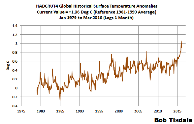
Figure 3 – HADCRUT4
UAH LOWER TROPOSPHERE TEMPERATURE ANOMALY COMPOSITE (UAH TLT)
Special sensors (microwave sounding units) aboard satellites have orbited the Earth since the late 1970s, allowing scientists to calculate the temperatures of the atmosphere at various heights above sea level (lower troposphere, mid troposphere, tropopause and lower stratosphere). The atmospheric temperature values are calculated from a series of satellites with overlapping operation periods, not from a single satellite. Because the atmospheric temperature products rely on numerous satellites, they are known as composites. The level nearest to the surface of the Earth is the lower troposphere. The lower troposphere temperature composite include the altitudes of zero to about 12,500 meters, but are most heavily weighted to the altitudes of less than 3000 meters. See the left-hand cell of the illustration here.
The monthly UAH lower troposphere temperature composite is the product of the Earth System Science Center of the University of Alabama in Huntsville (UAH). UAH provides the lower troposphere temperature anomalies broken down into numerous subsets. See the webpage here. The UAH lower troposphere temperature composite are supported by Christy et al. (2000) MSU Tropospheric Temperatures: Dataset Construction and Radiosonde Comparisons. Additionally, Dr. Roy Spencer of UAH presents at his blog the monthly UAH TLT anomaly updates a few days before the release at the UAH website. Those posts are also regularly cross posted at WattsUpWithThat. UAH uses the base years of 1981-2010 for anomalies. The UAH lower troposphere temperature product is for the latitudes of 85S to 85N, which represent more than 99% of the surface of the globe.
UAH recently released a beta version of Release 6.0 of their atmospheric temperature product. Those enhancements lowered the warming rates of their lower troposphere temperature anomalies. See Dr. Roy Spencer’s blog post Version 6.0 of the UAH Temperature Dataset Released: New LT Trend = +0.11 C/decade and my blog post New UAH Lower Troposphere Temperature Data Show No Global Warming for More Than 18 Years. The UAH lower troposphere anomalies Release 6.5 beta through April 2016 are here.
Update: The April 2016 UAH (Release 6.5 beta) lower troposphere temperature anomaly is +0.71 deg C. It dropped slightly (a decrease of about -0.02 deg C) since March 2016.

Figure 4 – UAH Lower Troposphere Temperature (TLT) Anomaly Composite – Release 6.5 Beta
RSS LOWER TROPOSPHERE TEMPERATURE ANOMALY COMPOSITE (RSS TLT)
Like the UAH lower troposphere temperature product, Remote Sensing Systems (RSS) calculates lower troposphere temperature anomalies from microwave sounding units aboard a series of NOAA satellites. RSS describes their product at the Upper Air Temperature webpage. The RSS product is supported by Mears and Wentz (2009) Construction of the Remote Sensing Systems V3.2 Atmospheric Temperature Records from the MSU and AMSU Microwave Sounders. RSS also presents their lower troposphere temperature composite in various subsets. The land+ocean TLT values are here. Curiously, on that webpage, RSS lists the composite as extending from 82.5S to 82.5N, while on their Upper Air Temperature webpage linked above, they state:
We do not provide monthly means poleward of 82.5 degrees (or south of 70S for TLT) due to difficulties in merging measurements in these regions.
Also see the RSS MSU & AMSU Time Series Trend Browse Tool. RSS uses the base years of 1979 to 1998 for anomalies.
Note: RSS recently release new versions of the mid-troposphere temperature and lower stratosphere temperature (TLS) products. So far, their lower troposphere temperature product has not been updated to this new version.
Update: The April 2016 RSS lower troposphere temperature anomaly is +0.76 deg C. It dropped (a decrease of about -0.09 deg C) since March 2016.

Figure 5 – RSS Lower Troposphere Temperature (TLT) Anomalies
COMPARISONS
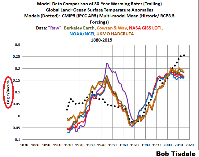
The GISS, HADCRUT4 and NCEI global surface temperature anomalies and the RSS and UAH lower troposphere temperature anomalies are compared in the next three time-series graphs. Figure 6 compares the five global temperature anomaly products starting in 1979. Again, due to the timing of this post, the HADCRUT4 and NCEI updates lag the UAH, RSS and GISS products by a month. For those wanting a closer look at the more recent wiggles and trends, Figure 7 starts in 1998, which was the start year used by von Storch et al (2013) Can climate models explain the recent stagnation in global warming? They, of course, found that the CMIP3 (IPCC AR4) and CMIP5 (IPCC AR5) models could NOT explain the recent slowdown in warming, but that was before NOAA manufactured warming with their new ERSST.v4 reconstruction…and before the strong El Niño of 2015/16.
Figure 8 starts in 2001, which was the year Kevin Trenberth chose for the start of the warming slowdown in his RMS article Has Global Warming Stalled?
Because the suppliers all use different base years for calculating anomalies, I’ve referenced them to a common 30-year period: 1981 to 2010. Referring to their discussion under FAQ 9 here, according to NOAA:
This period is used in order to comply with a recommended World Meteorological Organization (WMO) Policy, which suggests using the latest decade for the 30-year average.
The impacts of the unjustifiable adjustments to the ERSST.v4 reconstruction are visible in the two shorter-term comparisons, Figures 7 and 8. That is, the short-term warming rates of the new NCEI and GISS reconstructions are noticeably higher during “the hiatus”. See the June 2015 update for the trends before the adjustments. But the trends of the revised reconstructions still fall short of the modeled warming rates during the hiatus periods.
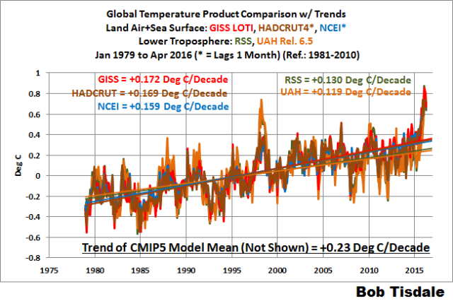
Figure 6 – Comparison Starting in 1979
#####
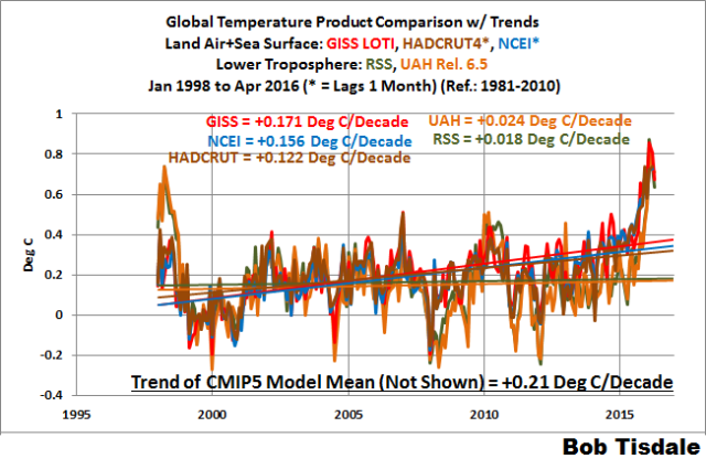
Figure 7 – Comparison Starting in 1998
#####
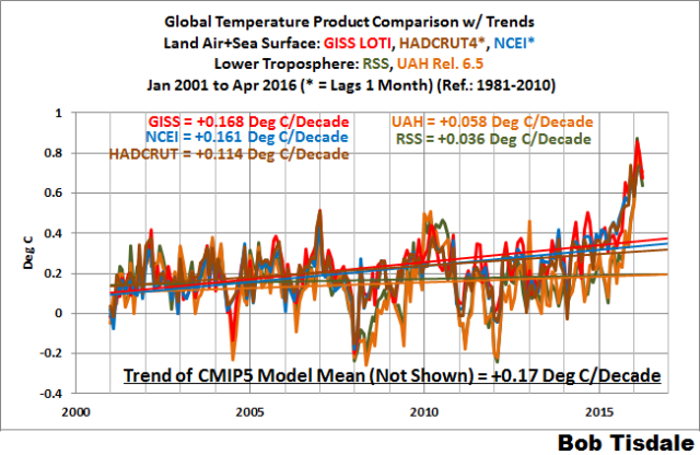
Figure 8 – Comparison Starting in 2001
Note also that the graphs list the trends of the CMIP5 multi-model mean (historic and RCP8.5 forcings), which are the climate models used by the IPCC for their 5th Assessment Report.
AVERAGE
Figure 9 presents the average of the GISS, HADCRUT and NCEI land plus sea surface temperature anomaly reconstructions and the average of the RSS and UAH lower troposphere temperature composites. Again because the HADCRUT4 and NCEI products lag one month in this update, the most current average only includes the GISS product.

Figure 9 – Average of Global Land+Sea Surface Temperature Anomaly Products
MODEL-DATA COMPARISON & DIFFERENCE
Note: The HADCRUT4 reconstruction is now used in this section. [End note.]
Considering the uptick in surface temperatures in 2014, 2015 and now 2016 (see the posts here and here), government agencies that supply global surface temperature products have been touting “record high” combined global land and ocean surface temperatures. Alarmists happily ignore the fact that it is easy to have record high global temperatures in the midst of a hiatus or slowdown in global warming, and they have been using the recent record highs to draw attention away from the growing difference between observed global surface temperatures and the IPCC climate model-based projections of them.
There are a number of ways to present how poorly climate models simulate global surface temperatures. Normally they are compared in a time-series graph. See the example in Figure 10. In that example, the UKMO HadCRUT4 land+ocean surface temperature reconstruction is compared to the multi-model mean of the climate models stored in the CMIP5 archive, which was used by the IPCC for their 5th Assessment Report. The reconstruction and model outputs have been smoothed with 61-month running-mean filters to reduce the monthly variations. The climate science community commonly uses a 5-year running-mean filter (basically the same as a 61-month filter) to minimize the impacts of El Niño and La Niña events, as shown on the GISS webpage here. Also, the anomalies for the reconstruction and model outputs have been referenced to the period of 1880 to 2013 so not to bias the results. That is, by using the almost the full term of the data, no one with any sense of reality can claim I’ve cherry picked the base years for anomalies with this comparison.

Figure 10
It’s very hard to overlook the fact that, over the past decade, climate models are simulating way too much warming and are diverging rapidly from reality.
Another way to show how poorly climate models perform is to subtract the observations-based reconstruction from the average of the model outputs (model mean). We first presented and discussed this method using global surface temperatures in absolute form. (See the post On the Elusive Absolute Global Mean Surface Temperature – A Model-Data Comparison.) The graph below shows a model-data difference using anomalies, where the data are represented by the UKMO HadCRUT4 land+ocean surface temperature product and the model simulations of global surface temperature are represented by the multi-model mean of the models stored in the CMIP5 archive. Like Figure 10, to assure that the base years used for anomalies did not bias the graph, the full term of the graph (1880 to 2013) was used as the reference period.
In this example, we’re illustrating the model-data differences in the monthly surface temperature anomalies. Also included in red is the difference smoothed with a 61-month running mean filter.

Figure 11
The difference now between models and data is worst-case, comparable to the difference at about 1910.
There was also a major difference, but of the opposite sign, in the late 1880s. That difference decreases drastically from the 1880s and switches signs by the 1910s. The reason: the models do not properly simulate the observed cooling that takes place at that time. Because the models failed to properly simulate the cooling from the 1880s to the 1910s, they also failed to properly simulate the warming that took place from the 1910s until 1940. (Just in case you’re having trouble seeing the difference in the warming rates during the early warming period, see the model-data comparison using 30-year trends here.) That explains the long-term decrease in the difference during that period and the switching of signs in the difference once again. The difference cycles back and forth, nearing a zero difference in the 1980s and 90s, indicating the models are tracking observations better (relatively) during that period. And from the 1990s to present, because of the slowdown in warming, the difference has increased to greatest value ever…where the difference indicates the models are showing too much warming.
It’s very easy to see the recent record-high global surface temperatures have had a tiny impact on the difference between models and observations.
See the post On the Use of the Multi-Model Mean for a discussion of its use in model-data comparisons.
MONTHLY SEA SURFACE TEMPERATURE UPDATE
The most recent sea surface temperature update can be found here. The satellite-enhanced sea surface temperature composite (Reynolds OI.2) are presented in global, hemispheric and ocean-basin bases.
RECENT RECORD HIGHS
We discussed the recent record-high global sea surface temperatures for 2014 and 2015 and the reasons for them in General Discussions 2 and 3 of my recent free ebook On Global Warming and the Illusion of Control (25MB). The book was introduced in the post here (cross post at WattsUpWithThat is here).
Very interesting article as always with whattsupwiththat. This is perhaps my favorite on WordPress. They always have interesting stories with facts & of course credits to news links etc.
As for climate, I’ve done study since I was actually 8 years old. I attended College & was going to become a meteorologist but I ended up as forming a Corp & becoming a CEO instead. I still kept study going on climate. I’ve learned there are many cycles of climate. About every 30 years it cools then it warms. Then every few hundred years very cold or very warm. We are due now for a very cold time. Last was early 1800s and it comes every 200 years or so. Larger warming and cooling is 500-1000 years then there are huge changes over tens of thousands of years where an Ice Age or warming so harsh that Great Lakes form, Palm Trees grow on a year round Canadian open Ocean Coast. The only thing caused by humans from my experience is City Heat Island which is reversible. Humans do cause pollution though. I always find these climate articles interesting though from this part of WordPress. They do a great job over here.
YOU WRITE:
“I’ve done study since I was actually 8 years old.”
MY COMMENT:
No eight-year old studies the climate, other than looking out the window to see if it’s raining.
I suppose you were reading the Wall Street Journal at four years old?
Day trading at six years-old?
YOU WROTE:
“I’ve learned there are many cycles of climate. About every 30 years it cools then it warms.”
MY COMMENT:
You are wrong !
You must be talking about the pre-manmade CO2 era.
It only warms now.
No cooling is allowed.
Sometimes it seems like there’s a flat temperature trend, or some cooling, but that is only because of faulty data, which will be adjusted to show warming when the climate scientists sober up, and notice it (they do most of their “research” on bar stools).
The people who said there would be warming own the historical data, and they will make the ‘actuals’ say exactly what they had predicted.
YOU WRITE:
“I attended College”
Ha Ha Ha — “attended” means you didn’t finish!
“& was going to become a meteorologist”
Ha Ha Ha — “going to become”
” but I ended up as forming a Corp & becoming a CEO instead”
Ha Ha Ha — everyone knows corporations are evil money grubbers, and CEO’s are even worse.
Everyone also knows unless you have a science PhD, and a huge SuperComputer, you can’t possibly know anything about the climate.
PhD’s with SuperComputers can predict the climate 100 years into the future … with 95% accuracy, or is that 95% confidence? Doesn’t matter, it’s 95% something, and that’s close enough to 100% for me.
These extremely intelligent scientists do not have to stoop so low as to “debate” their predictions with ordinary common riff raff (people without science PhD’s).
You, who “attended” college, and “was going to become a meteorologist”, might be able to predict the climate next week, with 9.5% confidence, but certainly not 100 years into the future with 95% confidence.
In reading your comment about how the climate changes, I noticed you left out the most important fact about the climate that every REAL climate scientist knows backwards and forwards:
— The world average climate was absolutely perfect on June 6, 1750 — any change from that date is bad news — a +1 degree change is really bad news … and a +2 degree change would be a climate disaster … and +3 degree change would be so hot, people walking on city streets would randomly go up in flames — spontaneous combustion.
Data Source: The internet
Why is the 1998 El Nino spike so muted in the present graphs, such as figure 1?
Yes, what is about GISS and HADCRUT that minimise the spike for the 1997-98 El Niño that the satellite records, RSS and UAH, show?
One group measures temperatures at surface, the other averages over the lower troposphere. Different places.
Hmm Nicky, I always thought that heat rises ! LOL
and Surface temperatures are useless in looking for a signal re AGW.
obviously if AGW is valid then the Troposphere should reflect the warming the surface exhibits. Are Aerosols fudge has been used to play down this inconvenient fact of course.
There we have guesses taking precedence over measurement and they call it science.
What’s next, calling for models over observatio… never mind 😀
It used to be the “great” El Nino of 1998. They have now disappeared it into the surface temperature noise. While the past has already occurred, it is ever evolving.
“One group measures temperatures at surface, the other averages over the lower troposphere”
Yep, like over the USA., right Nick 😉
http://s19.postimg.org/kqrzeig4z/USA_Feb.png
“Yep, like over the USA.”
Not sure what your point is. The surface temp there is the blue one, and it does look different. Particularly re the original query, which is why the spike heights were different. In the USA plot, they are a lot different. It goes the other way, because while the LT responds more than land/ocean (because ocean), the land responds even more. But it’s the same issue. Different places do it differently.
Andy’s chart appears to be a much better match over the US, and there is no recent divergence (Prior to the strong El Nino) between the data sets as exists in the global data sets. T
Tom Halla was talking about the fact that with the current El Nino, the surface spike is much closer to matching the Satellite data sets, unlike in the 98 El Nino, where AS EXPECTED, the satellites were more sensitive to El Nino? It is a god question, and there has not been a responsive answer. I would rephrase to ask why do GISS and HADCRUT appear to match the satellite amplitude response to El Nino in 2015-16, when, as expected, they did not in 1998?
Also it is very valid to state that per CAGW theory the troposphere as a whole is predicted to warm 20 percent faster then the surface, and, contrary to that, it is warming considerably less, with the 98 peak in a virtual tie for the 2015-16 peak.
Bob T, when you show the model mean forecast, are you showing the model forecast for the troposphere, or the surface?
“with the current El Nino, the surface spike is much closer to matching the Satellite data sets, unlike in the 98 El Nino, where AS EXPECTED, the satellites were more sensitive to El Nino?”
Here are the two plots, set with anomaly base in the year before (1996 and 2014). They seem similar, except that in 1998 there was a LT peak in April, not seen in 2016.
http://www.moyhu.org.s3.amazonaws.com/2016/5/enso1.png
http://www.moyhu.org.s3.amazonaws.com/2016/5/enso2.png
David A asks, “Bob T, when you show the model mean forecast, are you showing the model forecast for the troposphere, or the surface?”
Surface. I’ll clarify that in the next update. Thanks for pointing it out.
Nick, I see that in the 98 graphic the spread from the mean of RSS and UAH vs the mean of the two surface sets to be about .35 degrees vs. .15 in the 2016 chart. (So less then 1/2 the spread) Prior to the 2016 the divergence between the data sets was growing. (The surface showing far more warming) So for some time now the relationship between the troposphere and the surface has changed according to the typical spread, with the surface being warmer then in the past compared to the prior relationship. Either the relationship has changed, or the charts are wrongly adjusted.
David A,
The adjustment is just tht for all curves the mean for the first year shown is zero. I think the main difference between the plots is that in 1997/8 the satellite measures were a lot more volatile, notably the April peak. The surface measures are fairly similar in both graphs.
from my own measurements and observations, as reported here, there is no measurable man made global warming.
Just noting that temps appear to have peaked around mid-late-February. The Nino 3.4 index peaked in mid-November so that makes for a 3 month lag once again. I guess I have been pushing this lag period idea for years now but this is just another data point to add to the broken record. And this lag period never stops. There is always a 3 month lag to whatever the ENSO conditions are on a continuous on-going basis.
When we get a moderate La Nina later this year, temps will be down by about 0.4C/0.5C by this time next year.
Bill
Thanks. If an el Nino is a “Modoki”, i.e. does not engage the Bjerknes feedback, will the following La Nina also be “Modoki”? Does such a thing exist?
Modoki is a cool sounding word.
But the same processes happen regardless of the Modoki-ness.
Just use the Nino 3.4 Index because it has the best correlation to weather impacts of all the ENSO measurements. It is simply 10 times better than the others.
Is there a convincing explanation for the fact that the 1997/98 shows a large temp spike in the LT compared to the surface (as would be expected) but in 2015/16, there is no such large difference between the spikes in surface and LT measurements? Just curious.
Good question Jamie, Tom Halla asked that above and the answer Nick S offered was non responsive. I rephrased the question much as you did in a post just above here… https://wattsupwiththat.com/2016/05/15/april-2016-global-surface-landocean-and-lower-troposphere-temperature-anomaly-update/comment-page-1/#comment-2215806
I also commented on the US only chart Andy posted, showing well sited surface US stations, and satellites, which does not support GISS US only. I note that although the amplitude ratio between the surface and satellite is different then for global, it appears consistent throughout the record.
I’ve queried this a few times David and the best anybody could come up with was that the surface sets adjusted 1997/98 down, which they may have, but I don’t think they actually adjusted the magnitude of the peak. One would expect more pronounced warming in the lower troposphere, especially during a very powerful El Nino event, compared to warming at the surface, on account of the huge amounts of extra water vapour which are transported into the atmosphere via evaporation in the tropics. A delay in warming in the troposphere is also expected, such that the surface and LT peaks are not in phase. So shall we expect LT temperatures to climb higher in the following few months? They might, but they are slipping downwards at the moment and we are already into May, with the Eastern Pacific showing pronounced cooling.
This site has been pretty good for prediction GISS values:
http://moyhu.blogspot.ca/p/latest-ice-and-temperature-data.html#NCAR
The March average was 0.783. April averaged 0.636 where GISS dropped by 0.18 last month. Up to May 13, the May average is 0.517 and the May 13 number is 0.415. We do not know what will happen for the rest of May, but present indications are for a drop of at least a further drop of 0.18 in May from 1.11 thereby putting it below 1.00 for the first time since September.
I think we are looking at a huge drop in Temps for May. Here in South America temps have been way way below average for the past 3 weeks. Huge masses of Antarctic air seem to penetrating much further north this year. Maybe the increased ice volume there is finally bearing fruit LOL! BTW the CT graph for Antarctic ice seems to be completely of kilter lately. CT = Cryosphere today
It’s a little chilly in the central U.S., too!
..Canada too !
If it is cold where you live, you can bet that there will be some place on earth without thermometers where there will be blazing positive anomaly.
That’s about the size of it, with record high averages should come record highs temps. There just aren’t any or there is a maximum ceilimg for the averages that is being bounced off of after the 60 years of max TSI cycles
On the eastern seaboard of the Atlantic where I am, temperatures fell in March after a mild January-February. Although they began to rise a bit in May, it was still chilly until a few days ago. I was also dismayed to find that when I visited the NE U.S. in early May (windward side of the cold North Atlantic), it was also noticeably cold, although it warmed up the following week. So unless things are really cooking elsewhere I’m very dubious about these high surface temperature anomalies for March and April. (In view of this, the lack of a difference between the surface and trophosphere temperatures during this El Nino spike in contrast to the one in 1997-8 also strikes me as suspicious.)
@rw
there is no warming
it is only getting cooler
but it is not by that much?
https://wattsupwiththat.com/2016/05/15/april-2016-global-surface-landocean-and-lower-troposphere-temperature-anomaly-update/#comment-2215317
Just a few questions.
Is the “pause buster” analysis going to be the official NOAA/NCEI data?
I thought that the Karl et al paper was only claiming to propose “POSSIBLE artifacts of data biases in the recent global surface warming hiatus”.
Surely, if a proposition is claimed to be “possible”, then it is also possible that it is not the case.
When did they decide that these were definite artifacts? Or even probable artifacts?
I am struggling to keep up with the past. Since it keeps changing.
At this rate, within a few years, the 1997/98 El Nino will have disappeared into the background noise.
They’ll have to go back and scrub all references to it from the official archives.
And people who claim to remember it will have to be sent for psychiatric readjustment.
How does Karl explain the vast difference between the notable 97/98 spike in UAH & RSS (only 0.1deg below the 2015/16), and the steadily disappearing non-event in his surface temps concoction?
Sorry that I only have questions. It’s not easy to keep abreast of all this tweaking.
Indefatigablefrog wrote: “I am struggling to keep up with the past. Since it keeps changing.”
Isn’t that the truth! The past usually stays the same, but not so much lately.
“At this rate, within a few years, the 1997/98 El Nino will have disappeared into the background noise.”
It pretty much already has. Note that just about every year since 2010 has been proclaimed as the “hottest year evah!” which means everyone of them are supposedly hotter than 1998, the previous champion. Although, ironically, Feb 2016 is the only time they have actually claimed to have exceeded 1998.
“They’ll have to go back and scrub all references to it from the official archives.
And people who claim to remember it will have to be sent for psychiatric readjustment.
How does Karl explain the vast difference between the notable 97/98 spike in UAH & RSS (only 0.1deg below the 2015/16), and the steadily disappearing non-event in his surface temps concoction?”
We should consider only the satellite records as being legitimate. All the other data has been so bastardized as to be useless for serious conversation, other than debunking.
I don’t really relish having my worst fears confirmed.
I wouldn’t mind accepting that the world happens to have warmed by 0.2degrees over a decade and a half.
That wouldn’t bother me.
But, it does bother me to think that the scientific process has been abandoned, in favor of creating a result to conveniently fit a hypothesis.
That we haven’t really progressed from the bad old days of climategate, when temperature data was controlled by desperate fools who privately declared, “it would be good to remove at least part of the 1940s blip, but we are still left with ‘why the blip?'”- Tom Wigley to Phil Jones.
So, I wonder, did someone, at some point say – “it would be good to remove at least part of the 97/98 spike, but we are still left with the question – ‘why the blip have we abandoned science?'”
That would bother me.
Global Warming – not a problem.
Global Stupidification – problem.
there really is no global warming. It is cooling.
Well, I wouldn’t go that far!! 🙂
“I am struggling to keep up with the past. Since it keeps changing.”
No the past raw data is still there.
The past raw data still shows MORE warming over long periods than adjusted data.
When you adjust data for known problems you have only one choice: change the past.
You cant change future data.
A simple example:
You weigh yourself for 1 year.
For the first six months you weigh 100 lbs
For the last six months you weigh 102 lbs
Then I ask you? Was that with or without shoes?
And you say.. oh crap.. the last six months I wore shoes.
Now I want to build a consistent record
I can
A) adjust the first 6 months to 102
B) adjust the last six months to 100.
In both cases I change the past.
Typically we would adjust the FAR past to 102 and then tell you to keep on weighing yourself with shoes
On.
But suppose after another year.. We see your weight staying level at 102 for 6 months and then dropping to 100. We look into the matter and … yup.. you started to weigh yourself barefoot again.
So, I decide to just re adjust everything to a shoeless weight.. Now.. if you just look at the charts
you will have no clue what is going going on
Thats why… you have to get the data. read the papers, and verify for yourself.
Its not rocket science.
The again you could just use raw data and conclude that the weight went up and down. ha.
by looking at the rate of change as shown by me you eliminate the problem of the change in like
1) un-calibrated thermometers – show me a calibration certificate of a thermometer before 1948?
2) change in recording – manual versus automatic (computers)
As it stands the anomaly record is not to be trusted as any yard stick, most certainly not as proof for AGW
Unless your salary depends on AGW you won’t look at the past (ice) and learn from it…
https://wattsupwiththat.com/2009/12/09/hockey-stick-observed-in-noaa-ice-core-data/
The past raw data still shows MORE warming over long periods than adjusted data.
=============================================
Nonsense, unless you ignore the majority of the changes. Also simply not true for the period from 1950 onwards, (where the your SUV done it theory applies) even ignoring most of the changes.
Apologies Steven, for inducing you to explain all of that.
Clearly, if we are to attempt to assemble a global temperature record from data collected by buckets and engine intakes then a significant amount of adjustment of the raw data is necessary in order to iron out some of the known artifacts.
So, that being true, I think that this comes down to confidence and trust.
Both confidence in whether a usefully accurate assessment of past global average temperatures ever could be constructed from measurements not taken for that purpose or with any intention of providing that degree of accuracy.
And secondly, a matter of trust in the honesty of those who are charged with this task.
In particular, I feel that the many layers of potential error are essentially concealed in the final presentation – when these graphs land in the laptops of MSM and policy makers.
Deception by omission – essentially.
Comparing this problem to my height with or without shoes is a neat example – but oversimplifies the real issue.
As you and I know, a vast amount of analysis over several decades has gone into converting say 19th century bucket measurements into a global average dataset.
Has BEST ever reconstructed the ocean component from raw data – with no cheating? i.e. no stealing the methods, analysis or adjustments of the Hadley boffins.
Realistically could the same series be constructed again from scratch by a team of scientists who knew nothing of the methods employed by Captain Phil Jones and his motley crew?
Would such a thing look anything like HadSST?
That’s a genuine question – if BEST have redone the entire ocean temps from scratch – then wow!!! And please direct me to where that work is described, if that is the case.
Don’t trust BEST
indefatigablefrog asks, “Is the ‘pause buster’ analysis going to be the official NOAA/NCEI data?”
The “pause buster” sea surface temperatures data has been used in the “official” NOAA/NCEI and GISS data since last July.
Cheers
Thanks Bob, clearly it was not just “possible” then. Also “preferable”.
Step by step towards a “perfect fit” with CO2 – just as ordered.
He who controls the ocean temperature products, controls the world – it seems.
like I always say, start looking at the derivative of anomaly, namely the rate of change in K/ annum and then you see the truth emerging
http://oi62.tinypic.com/33kd6k2.jpg
Dear author. The 61 months filter sounds reasonable, but you could also consider, the PDO (Pacific Decadal Oscillation) which has phases that last 25-30 years. If you see figure 10, the 19th century (1900) till around 1920, then 1947-1978, and 2000-till 2030 are the cold phases of the PDO, the periods in between are warm PDO; where more intense-frequent La NIña and El NIño occurred respectively. In the Atlantic we have the AMO (lagging behind PDO). Both are being associated to sun spot activity (Hale Cycle). Undoubtedly, if there was a climate warming this could be associated to both natural and anthropogenic causes, being the later the leading one.
To my humble opinion, one big problem is Data Mining and its use; scientist are forgetting to evaluate in a critical way the data; concepts about precision and certainty are often overlooked. Filling data where there blanks is terrible, it is a bad invention….
I will keep looking at this page.
http://virtualacademia.com/pdf/cli267_293.pdf
look at table II and III
then figure out where we are in history
2016-87=1929
“Because the suppliers all use different base years for calculating anomalies,…”
Yet another reason to not use anomalies unless there is a clear and compelling reason, such as for simplifying calculations in analysis. Re-scaling of actual temperatures is usually more informative when making historical comparisons or assessing the consequences of the temperature changes.
“The difference now between models and data is worst-case, comparable to the difference at about 1910.”
So dishonest. It looks like the model-data difference is about zero for this month.
I spent a couple of hours (due to my steam-powered computer’s “speed”) looking back at temperatures for this time in May. I live in northern Virginia, and it has seemed unusually cool for this time of year. Indeed, the daily mean temperature is 10 F below any year since 1992. That’s a bunch. Is there any similar data for elsewhere in the country?
Here (from here) is a plot of N America, 1-12 May average taken from NCEP/NCAR reanalysis. The NE US is a rather cool spot.
http://www.moyhu.org.s3.amazonaws.com/2016/5/USmay.png
Nick.
that graphic is a good example of why people shouldn’t dismiss AGW by looking outside their window.
there is no man made global warming
it is all natural
http://www.woodfortrees.org/graph/sidc-ssn/from:1972/to:2016/offset:10/trend/plot/sidc-ssn/from:1927/to:2016/plot/sidc-ssn/from:1927/to:1972/trend/plot/sidc-ssn/from:1927/to:2016/trend
it is globally cooling, as evident from the arctic and Antarctic ice extent
I think that graphic is a perfect reason why people should dismiss global warming, in 100 years the spectrum of colors has remained.
HenryP wrote it is globally cooling, as evident from the arctic and Antarctic ice extent.
It’s not obvious why sea ice extent would be a better proxy for warming than temperature, but I think you’re mistaken about what the sea ice extents show.
http://nsidc.org/arcticseaicenews/files/2016/04/Figure31.png
http://nsidc.org/arcticseaicenews/files/2015/03/Figure6b.png
Seth, bad start point, like Nick Stokes and his starting at la Nina.
http://1.bp.blogspot.com/-ep-lpkcQIFs/Ui5REtiqi7I/AAAAAAAAaM4/7HVu2fhMQfQ/s1600/arcticICEGraphstarted1975viaStGoddardSept92013.jpg
1978 79 start year is a cheery pick
Now how on earth did Arctic ice got that low when CO2 was not so much an issue.. huh.
Your story doesn’t add up.
Heller makes another good point about open sea up there too
Alarmists are currently hysterical about ice melting in the Beaufort Sea. Only problem is that it isn’t melting. A high pressure system created winds which blew the ice offshore – but facts don’t matter to alarmists.
http://realclimatescience.com/wp-content/uploads/2016/05/2016-05-12101712.png
The satellite animation shows what happened. Note that the satellites are pretty messed up right now, and the images are losing some colors – but it is still easy to see what happened to the ice.
http://realclimatescience.com/wp-content/uploads/2016/05/ArcticSeaIce-April-May-1.gif
That is not “melting” is it.
Simon
May 15, 2016 at 9:21 pm
Nick.
that graphic is a good example of why people shouldn’t dismiss AGW by looking outside their window.
_______________________
Logic fail, you cant see AGW by looking at Nick’s map either. Temperature is not = to AGW, you seem to have skipped over actually validating the AGW hypothesis.
In case you seemed to miss it, the debate is still very much open on whether AGW to the extent it is claimed, is a valid hypothesis. You cant say it is a theory because almost all evidence has equally valid hypothesized explanations
You cant fix stupid
Mark Wrote: S1978 79 start year is a cheery pick
No Mark. Cherry picking is when you select the data to show what you want.
Sea Ice extent is measured from satellite photography, and the data set goes back to 78-9. The reason that is the start year is not because of cherry picking but because I have used all the data.
No Seth, it goes back to 1972 using the previous satellite that also covered the same area.The IPCC knew that when they used the data from year one.
For Sunsettommy: have a look at
http://ocean.dmi.dk/arctic/icecover_30y.uk.php
and associated pages, especially those concerning Greenland. Maybe it helps…
Weekly ENSO3.4 SST index just announced: 0.59C, a drop of 0.19C in just one week, and will likely enter ENSO neutral territory (<0.5C) from next week.
Looks like the coming La Nina (perhaps starting as early as the end of this year) could be similar to the one following the 97/98 Super El Nino:
http://www.bom.gov.au/climate/enso/monitoring/nino3_4.png
NOTE: must click on the graph to get current reading.
The decadal averages show increasing warming, with the 90s to 00s the largest step on record so far.
It looks like the 10s will be above the 00s by another large step.
After the ’98 El Nino, the temperatures were about 0.2°C warmer than before it. If the same happens after the 2016 El Nino, after a few years the mean trend will be pretty close to the CIMP5 mean.
Similarly, if you exclude runs for the CIMP5 models that don’t have a 14 year run of a lower than 0.096 °C per decade trend, the long term warming is nearly unchanged.
Even using the peak of 2015-16, (certainly a foolish thing to do), we are well below the model mean estimate for the atmosphere, and well below any dangerous T rise. If your .2 step up does not happen, due to the blob dissipating, the coming La Nina, and the AMO just now turning down off it decade long peak, along with a weakening Sun, then the 38 year record (1979 to 2017) will have produced just over .2 degrees of warming since the ice age scare.
BTW, for the reasons mentioned, the warming could potentially disappear for the entire 40 year satellite record by 2019 for the reasons mentioned IF the AMO continues it down turn and maintains its relationship to global T change. (Why would it not?)
David wrote: Even using the peak of 2015-16, (certainly a foolish thing to do), we are well below the model mean estimate for the atmosphere, and well below any dangerous T rise.
This is an interesting claim of “well below and dangerous T rise.”
A well known estimate of the deaths due to the anthropogenic part of climate change for 2000 was 160,000.
What are you using for your definition of “dangerous”?
that decadal average is bogus though and you know it.
That data has been adjusted out of reality, and there is proof TOBs is nonsense. Heller makes a good point as to why TOBs is cack
The USHCN Time Of Observation BIAS (TOBS) adjustment is based on the idea that thermometers reset in the afternoon tend to double count hot days and thus produce a warm bias. For example, Warrenton, MO reset their thermometer at 5PM from 1923 to 1976, so NOAA deducted about 1.5 degrees to compensate.
http://realclimatescience.com/wp-content/uploads/2016/05/2016-05-14030824-1024×510.png
This theory is easy to test by comparing vs. a nearby morning station. According to theory, the morning station should be cooler. Farmington, MO is close to Warrenton and reset their thermometer at 7 AM from 1931 to 1950, so they should be cooler than Warrenton during that period.
http://realclimatescience.com/wp-content/uploads/2016/05/2016-05-14025747.png
The theory doesn’t work. Farmington summer maximum temperatures (red below) are nearly identical to Warrenton temperatures (blue below.) Only exception is 1935, which is missing data at Warrenton.
http://realclimatescience.com/wp-content/uploads/2016/05/2016-05-14031811-1-1024×525.gif
Likewise, the number of hot afternoons is nearly identical at the two stations – again Farmington in red and Warrenton in blue. If double counting was occurring, Warrenton would have more hot afternoons than Farmington during the 1930’s – but it doesn’t.
http://realclimatescience.com/wp-content/uploads/2016/05/2016-05-14024359-1.gif
TOBS theory simply does not work in practice.
One data set has 1.5c slashed off for no good reason, a lot of warming has been the subject of political revisionism. That’s the bottom line here.
Mark wrote: that decadal average is bogus though and you know it.
That’s not true, and I’m not going to comment on whether you know it or not.
But why try to make baseless accusations of bad faith?
One reason is that you know that you can’t win an argument based on facts, and so you try to drag the argument down to one of name calling.
Total effect of adjustments is negligible in the last 5 decades. Over the temperature history they reduce the rate of warming.
http://4.bp.blogspot.com/-opy7LoBO__w/VNoo9u5ynhI/AAAAAAAAAg4/_DCE5Rzm9Fw/s700/land%2Bocean%2Braw%2Badj.png
So while your argument that we should look at two stations that you have picked to analyse the effect of TOB adjustments over the entire globe is obviously inadequate, we don’t have to discuss how wrong that statement is, because the decadal average is only imperceptibly affected by the adjustments.
Seth
“If the same happens after the 2016 El Nino, after a few years the mean trend will be pretty close to the CIMP5 mean.”
_________________
On a monthly scale global surface temperatures are currently warmer than the CMIP5 multi model mean and have been since December 2015. (Using the same data Bob Tisdale used to make fig. 10 above: CMIP5 mean, Rep. 8.5 and HadCRUT4.4.)
Bob uses a 61 month smooth which dampens the impact of the recent El Nino warming by integrating it with relatively lower temperatures from 2011 – 2013. If you use a shorter smooth then observations are starting to come pretty close to the multi model average.
For instance, if you use a 13 month smooth (as Roy Spencer uses in his monthly UAH updates) then it’s currently very close (models are 0.91 and HadCRUT4 is 0.89 for the past 13 months, using Bob’s 1880-2013 base): http://s32.postimg.org/ctaz4asyd/CMIP5_update.png
Seth– There hasn’t been a significant global warming trend since 1996…
The 2015/16 warming spike was totally due to a strong El Niño, which will soon be negated by a strong La Niña cycle.
We’ve enjoyed 0.82C of warming recovery since the end of the Little Ice Age in 1850, of which, CO2 perhaps contributed 0.2C of this total beneficial warming. ThE CO2 rise also increased crop yields and forest growth 25% since 1850, and increased global greening by 25%~50% just since 1980…
Most of the beneficial warming since 1850 was likely from simple LIA recovery, strong solar cycles from 1933~1996, PDO/AMO 30-yr warm cycles, El Niño spikes and natural variation.
Unfortunately, sunspot activity is collapsing with the next solar cycle being the weakest since 1820, and a possible Grand Solar Minimum starting from 2035 and lasting 50~100 years… The PDO and AMO will also both be in their 30-yr cool cycles from around 2020 and global have ALWAYS fallen during 30-yr cool cycles..
CAGW projections are already off from reality by 2+ standard deviations and in 5~7 years they’ll likely be off by 3+ SDs..
CAGW is dead.
SAMURAI
“There hasn’t been a significant global warming trend since 1996…”
______________
All 3 main global surface temperature data sets show statistically significant warming since Jan 1996, as follows (°C/decade at 2σ):
HadCRUT4: 0.146 ±0.100
NOAA: 0.169 ±0.093
GISTEMP: 0.185 ±0.102
Source: http://www.ysbl.york.ac.uk/~cowtan/applets/trend/trend.html
In fact, the rate of warming in both NOAA and GISTEMP in the 244 months since Jan 1996 is faster than it was in the 244 months leading up to it: http://www.woodfortrees.org/graph/gistemp/from:1975.66/to:1996/trend/plot/gistemp/from:1975/mean:12/plot/gistemp/from:1996/trend
“CAGW projections are already off from reality by 2+ standard deviations and in 5~7 years they’ll likely be off by 3+ SDs..”
______________
Not sure where you’re getting these figures from. On a monthly basis observations are currently ‘warmer’ than the multi-model mean in RCP 8.5, which is the pathway Bob Tisdale uses for his charts above. You can even see this in Bob’s fig. 11. The black line shows monthly values. It’s counter-intuitive, but negative values mean that values are running warmer than the models (because the line shows ‘models minus data’).
It’s easier to see this using unfiltered monthly values: http://postimg.org/image/bjf3679qp/
@Seth
seems to me your graphs on ice extent show that total ice extent (arctic + antarctic) is not much different than what it was in 1979. i ca. -0.5 at a total of more than 20 square km?
the ice extent decline/incline is non-linear. As per Gleisberg it will get smaller for 43 years and then grow for 43 years. What makes you think that ice extent is now smaller then it was 87 years ago?
https://wattsupwiththat.com/2008/03/16/you-ask-i-provide-november-2nd-1922-arctic-ocean-getting-warm-seals-vanish-and-icebergs-melt/
Three cheers for the increasing warmth. You gotta be a knucklehead to want the Earth to cool down.
This^^, the current alarmist human condition frets every time there is good weather.
They feel AGW in the turbulence when flying.
We used to beg for good weather. What is wrong with these people
this is the result I got, when looking at the rate of change in T of results of one station in Anchorage, Alaska
http://oi60.tinypic.com/2d7ja79.jpg
since publishing these results on official sites it seems some people have changed / removed some data….
but I do still have the original data!
Best wishes to you all
i slowly start more and more to wonder how they make their temperature record. i see the following out of “logic” things
UAH and RSS always showed a very high “El nino peak”, this is logical
the surface data suddenly mimics the sattelite data when compared to all other el nino years this peak was not existing. At least not at such a high level.
when i look at the weather and GISStemp i see a record: for the first time GISS colored for april Belgium in the + 0.5 – +1 °C anomaly range while in truth the april temperature was 1.5°C BELOW average with even snow at the end of april (which is uncommon and only happens every 20 years or so) The last 10 days of april were even 4 to 5 degrees below normal. We have to go back to 1985 to have a similar cold april and it’s not very far from the record cold last 10 days of april of 1913….
this was not only in Belgium, but also in large parts of western and central europe.
in short weather did it’s thing as it always does and it seems not to bother about climate change….
oh yes to avoid a misunderstanding: It’s not on what you bring Bob, it’s about the source that provides the data you use. but that can be a long debate but i just wonder if you don’t notice that this time the el nino spike is really strikingly big compared to all other el nino’s in the data of surface temperature….
@ Frederik
locally, at some places on earth
you might find that it IS getting cooler
for example it never got any cooler here in southern Africa
oops
henry said
it never got any cooler here…..
henry says
I meant to say:
it never got any warmer here….