Climate researchers have a problem. A degree or two of global warming simply isn’t scary. When Hollywood created “The Day After Tomorrow”, the cold snap allegedly triggered by global warming was by far the most deadly threat faced by the heroes.
So Ed Hawkins, a professor at University of Reading, has ditched boring old graphs, and created an animated graphic which attempts to maximise the emotional impact of global warming data.
Spiralling global temperatures from 1850-2016 (full animation) https://t.co/YETC5HkmTr pic.twitter.com/Ypci717AHq
— Ed Hawkins (@ed_hawkins) May 9, 2016
A good artistic effort – the scary spiral thing seems to leap straight out of the page at you. But is the choice of data range reasonable? I would suggest not – most people would be hard pressed to tell whether temperature in a room had changed by one or two degrees.
So how does it look when you represent temperature change on a more reasonable scale, say 10c, a magnitude of change which most people could actually feel?
It will look mostly like a little squiggly dot at that scale.
It’s funny lol. We have no idea what the global average temperature was in 1850, that data is massively uncertain. The data into the early 1900s is also useless for a global average, it’s all guess gobbeldygook.
Someone should make a counter one starting from 50 million years ago 😀
But remember, global average temperature has no real meaning, especially due to the way they come up with it.
Even if they measured it exactly, it is the enthalpy of the earth’s surface and atmosphere that matters.
Maybe that measurement is “homeopathic.”
…..”But remember, global average temperature has no real meaning”,…
like the global average telephone number..!
Oh I know, it’s all I ever talk about 😀
“…..”But remember, global average temperature has no real meaning”,…
like the global average telephone number..!”
Then Alabama has no average temperature.
Then your back yard has no average temperature.
Then the sun has no average temperature. Who can say whether it is warmer or not?
The key to the mystery is not that hard to understand.
The average temperature is not really an average. Moreover we dont actually average temperatures!!
What is the “average temperature?”
It helps to start with an understanding of what ‘spatial statistics” is exactly.
I will do that with an example.
Suppose you have a pool in your back yard. You stick a thermometer in one end of the pool
and it reads 72F.
You stick a thermometer in the other end. It read 72F
In spatial statistics we are interested in one thing: What is the temperature… in those locations
where we HAVE NO DATA.
Suppose you have a pool in your back yard. You stick a thermometer in one end of the pool
and it reads 200F.
You stick a thermometer in the other end. It read 200F
Now you ask yourself the question.. is it safe to jump into the middle of the pool? is it?
Based on what I know ( 200F at one end, 200F at the other end) can I PREDICT the temperature
where I have no measurement.? Yup I can predict that. with error of course.
That is why spatial stats is also referred to more generically as INTERPOLATING or infilling
we are PREDICTING the temperature where we have no measures. And if you think about it
every time you use a thermometer you are extrapolating.
So, how do we predict?
There are a few basic methods.
1. Average all the data. And predict that the unmeasured locations will have the same temperature
as the average. The only person who uses this approach is Steve Goddard. It doesnt work
because you lose the spatial dependency of the data. Read that again.. The folks
who produce global averages.. dont average the temperatures..
2. Gridding and area weighting. GISS and CRU do this. You grid data. You average in the grid
and then you Iintegrate to get an global metric.. we call it “an average”
3. Splines..
4. Krigging
2-4 all rely on modelling the unsampled areas on the spatial characteristics of the data. In the end
you integrate the entire surface.
We refer to that integrated value as the “average” What’s that mean.?? what is it really? what is it in PRACTICE or in USE.
lets go back to the pool example:
Suppose you have a pool in your back yard. You stick a thermometer in one end of the pool
and it reads 74F.
You stick a thermometer in the other end. It read 72F
You stick a thermometer in the middle. It read 73F
next I grid the data into three grids. 1/3,1/3,1.3. One grid will have the value 72, one will be 73
and one will be 74.
I then integrate these areas and I come up with 73.
So I have 2 metrics in reality: A “global” metric and a gridded field. everyone forgets this.
Now comes the prediction part.
here is the challenge: I am thinking of a spot in the pool. X feet from one end
Guess the temperature? predict the temperature at any random location?
Well spatial stats tells us that IF WE DONT KNOW the location, the best estimate is the
value of the integrated fields. or 73F. That doesnt mean every location is 73F
It means, that we can minimize our error by guessing 73. and we can test that.
Now I tell you to guess the temperature in 1/3 of the pool closest to the 72 degree end
You’d guess 72. So the grid is likewise a prediction..
But suppose you wanted to get fancier than gridding. You know one end is 72, the middle is 73
and the other end is 74 and you know something about water, so you propose a model where the temperature changes as a function of the distance from one end of the pool to the other.
Gradually warming from 72 to 73 and 74.. Here you have a continuous field. This is basically
what we do in Splining or Kriging. we interpolate based on what we know about the physics of temperature.
And if you integrate that field you get 73. but now if you want to predict what the temperature is
13 feet from one end you’ll get a better prediction.
In fact making these predictions IS HOW WE TEST OUR FIELDS.
Suppose you had 1000 thermometers in your pool. You do the same thing, except this time
you “hold out” 300 of the thermometers. then you build your prediction field.. then you test
using the hold outs. there are other ways to do this.. but thats the basic idea.
spatial stats is about making predictions and testing them. Its not averaging all the temperatures, only steve goddard does that. Its about using the data we have to build a prediction field.
Let return then to the Little ice age
When we say that the global temperature in the LIA was cooler than today, we mean this
1. Pick a spot where you have a measurment ( or proxy) in the LIA.. look at the temp
2. Pick the same spot today. take a temp
#1 will be less than #2
You can also predict. For example. You have a spot today. Its average is 71F.
you can predict that proxys for temperature at that location will show cooler temps.
if you are lucky you can find a proxy and test your prediction.
Its pretty simple. When the thermometer at the end of the runway says the temperature
is X, the guy in the control tower uses that to predict that nearby temperatures will be the same.
he extrapolates. he uses that extrapolation to inform the pilot about conditions. That works.
When you are are in michigan in the winter and the state is cold, and you look at a few readings
in Florida, you conclude that the average temp in florida is higher. You decide to fly there.
You dont question whether you can average Miami and fort lauderdale, you look at that and conclude the area is warmer.
When you say the LIA was cooler that today you are accepting the notion of areas having “average” temperatures.
But if you think that the idea is meaningless you can tell it to the judge.
and I’ll predict that you would lose the court case
…and during all this processing to find the average global temp, the methods that yield the highest values are the preferred bias.
Here the problem with Spatial statistics or any statistics. Without knowing all the variables, It’s only good for good for guestimation For example the pool has a shade umbrella over the water at one end with the temperature was taken. The next day someone closed the umbrella and put a heat lamp over the end of the pool making the yesterday’s reading useless to predict future reading.
Steven Mosher:
Pretty poor analogy, that pool example. Let’s see, a contained, small, essentially homogenous sample. Contrast that with the atmospheric sampling over huge areas, non-homogenous zones, significant differences in microclimates, etc. It is a very different situation.
Additionally, few of the alleged “climate” scares are actually climatic. Rather, they are claims about specific weather events: hurricanes, floods, tornadoes, etc. All very much local in nature. Averaging across the globe makes little sense in such a case. Divide your swimming pool up into lots of tiny pools. Scatter them across the globe in different climatic zones, at different elevations, and so on. Then measure the little pools and try to convince us that the “average” temperature of the little pools has meaning.
Furthermore, no-one is talking about jumping into a 200F pool. Of course no-one would take that risk. Again a bad analogy. We’re talking about a degree or two — over the course of decades. Tenths of a degree in the meantime. The entire difference between our current pleasant state of affairs and the allegedly disastrous unmitigated consequences of anthropogenic global warming being the equivalent of driving from my house to the beach a couple of hours south. Something we often like to do for a nice weekend anyway. Hardly a crisis.
See my new post Does Ed Hawkins’s Spirally Global Temperature Animation Defeat Its Purpose? I’ll post it here at WUWT later today.
Nice one, expect some skin shedding in an attempt to slither out of this one by the usual suspects.
My main issues with the graphic presentation is that it is misleading to the point of dishonesty. There are the meaningless colour changes (time based, not temperature), but the worst offender is the inconsistent scale. Lines close to the outside perimeter are larger than those closer to the middle giving a visual bias towards the former. The same could be said for large month-on-month changes resulting in oversized line segments. Then there is the lack of error bars… all in all, a graphic for political effect and otherwise useless.
Highly creative way to lie with graphs and statistics. E.B. Strunk would be proud. On several levels the graph lies. A proper, informative graph uses scales that visually show the effect of one variable on another. So with the radius being temperature the divisions should show equal areas lf the circle with the radius for each degree increasing by the square root of two, Second, the supposed cause of global warming is a radiative effect- a T^4 change. The radius should also be proportional to1/t^4 also. Finally the scale should give some rational relation to possible temperatures, not an arbitrary 2degC. The overall radius should be roughly 10degC to represent the know variation of temperature during an interglacial of about 10 deg C.
An honest graph would then show a circle with a modestly large center circle of 1 degC, a 2degC circle of radius ~1.5, and the rest of the circles with narrower and narrower spacings out to the 10degC outer circle. Then the scary temperature wiggle would appropriately bounce around the inner circle and end slightly past it, leaving 90+% of the circle empty.
Don’t you mean Darrell Huff ?
My initial thought was that while plotting the year on a circle can be quite appropriate , the way this is done changes in radius are perceived as their squared changes in area .
Agreed. The display magnitude (number of pixels “on”) is proportional to circumference, which is proportional to radius. So why is a 0.5 deg increase twice as bright as a zero increase? Why would a 0.5 deg decrease disappear altogether?
Completely arbitrary.
Speaking of misrepresentation…
Here’s the text that accompanies the image below:
“Our beautiful World through the lens of the Hubble telescope.”
Image:
http://www.snopes.com/wordpress/wp-content/uploads/2016/02/earth-hubble.jpg
tell it to the judge
http://www.theguardian.com/environment/climate-consensus-97-per-cent/2016/may/11/coal-made-its-best-case-against-climate-change-and-lost
There is a Consequence to relying on weak arguments for skepticism.
We have no idea what the temperature was in 1850?
No idea?
Then surely we cannot say whether it was warmer or colder.
The same would go for the Little ice age
or for the MWP
we have no idea.
it could have been warmer or colder.
Gosh you just denied the LIA and MWP and climate change itself.
Good job.
Mosher, are you really defending presenting a single number to represent the temperature of the surface of a spheroid? You’re in deeper than I thought.
Just do all US National Weather Service reporting stations beginning January 1, 1926.
Alarmists will have a hard time denying the data and Hanson used the observational data in 1999.
Watching the graphic, and seeing the ebb and flow of temperature change as Gaia emerged from the LIA, my immediate reaction was, “Why the panic about 1.5C of gentle warming over 116 years?” That graphic is a Godsend for sceptics the world over.
“…the panic about 1.5C of gentle warming over 116 years”
Wouldn’t that be alleged 1.5C of warming?
I’d be confident saying 1C. We don’t have the accuracy to include a second significant digit
That should be less than 1.5C over 166 years. Less than 1C per century. Gentle warming indeed.
And since we evolved to suit the African tropical and sub-tropical forests and savannahs of Africa, who cares? 2 degrees hotter? Bring it on!
Surely, since we did evolve to suit the African tropical and sub-tropical forests and savannahs of Africa, isn’t the increase in temp just Mother Gaia’s way of making us feel more at home in a world polluted by hot air from politicians? Regardless of how they try to destroy our Gaia-given humanity, we will restore our Earth to the way we found it, at least 2 degrees hotter. If the Fates are kind and Mother Gaia wills it, it will be a lot more, so much more suited to our genetic, hard-wired, well-being.
The Gaia-hating Greenies will not win!
Yeah. I’d rather wear a bikini than a snowsuit ANY DAY!
Goldrider
May I venture ‘A Mankini’ for me . . .
Auto – agreeing that warmer is so VERY much better. Cold kills.
Auto —
“May I venture ‘A Mankini’ for me.”
No, don’t go there.
Eugene WR Gallun
Greenland warming 1866-2013 could be pretty scary for people like Hawkins
http://papers.ssrn.com/sol3/papers.cfm?abstract_id=2776867
The problem with Greenland “warming” is that as long as the temperature remains below 0 Centigrade the ice does not melt.
True, but chaamjamal was being ironic. The cited paper concludes:
We conclude that no credible evidence of a warming trend exists in the Nuuk monthly mean
temperature series from 1866-2013.
As a Canadian with 6 decades of experience watching all manner of winter weather I would like to point out an additional salient fact. When it is extremely cold out- -30C is not uncommon where I live- it very rarely snows. Temperatures between 0C and approximately -25C are where we usually see snow. I assume that this is because colder air holds very little moisture. This is important to recognize when contemplating areas of permanent ice or snow cover because if they warm, they get additional snow. If they get colder, they lose less ice/snow. Ice caps are very resistant to disappearing for this reason. I suspect the same is true for glaciers but to a lesser extent. Here, altitude substitutes for latitude and they are smaller and do not create their own weather to the same extent as glaciers. Also, much has been made of the fact that disappearing glaciers mean no snow melt and run off in spring and summer but one would expect that at medium latitudes where snow presently falls, rain will fall if warming is present. This will mean a regular, more modest feed to rivers and lakes downstream. Perhaps hydro dams and irrigation reservoirs would not be so badly effected as the panic squad tells us.
I wonder why it doesn’t show 0.5 & 1.0 on the scale?
It is no wonder why he does not show the uncertainty envelope.
I’ve wondered that too. My guess is that it would provide a visual clue that temperature differences are related to the radius and not the area, which the graphic seems to do.
Very counter productive, makes it too easy to see that temperature changed before a lot of CO2 was emitted, lol.
Ha Ha, yes, a brilliant own goal.
brilliant observation. thank you.
no empirical evidence to relate warming to fossil fuel emissions
http://papers.ssrn.com/sol3/papers.cfm?abstract_id=2725743
Reminds me of the trolls yesterday demanding that temperature increases prior to 1940 be used to help calculate climates sensitivity to CO2. Despite the fact that the big increases in CO2 didn’t start until after 1940.
MarkW, you must stop drinking the IPCC coolaid.
The CO2 observatory at Mauna Loa only commenced operation in 1958, and its output is the standard against which atmospheric CO2 concentration is measured today. However, there were hundreds of scientific papers published before 1958 that produced over 90000 results on atmospheric CO2 measurements. But the two primary initiators of today’s CO2 measurements, Callendar and Keeling, arbitrarily ignored the vast majority of published CO2 findings prior to about 1950 that didn’t fit their preconceived notion of a smooth increase from 280ppm around 1850 to start of measurements at Mauna Loa (around 315ppm in 1958)
This diagram shows some of the published results that were acknowledged in 1954, and where the curve was “fitted” to the results:
http://www.acs.org/content/acs/en/education/whatischemistry/landmarks/keeling-curve/jcr:content/articleContent/columnsbootstrap_0/column1/image.scale.medium.jpg/1429556699794.jpg
A more critical assessment on the 180 published historical CO2 papers can be found here:
http://www.geocraft.com/WVFossils/Reference_Docs/180_yrs_Atmos_CO2_Analysis_by_chemical_methods_Beck_2007.pdf
‘ Callendar and Keeling, arbitrarily ignored the vast majority of published CO2 findings prior to about 1950’
Gawd gimme some strength.
Could it be the early CO2 measurements were not very good by today’s standards? we are talking about parts per million, not the easiest to measure. I think we can safely ignore wha Callendar ignored.
Why not make a similar presentation of a random city’s temperature circle?
A variation of 40 degrees!
Is it just me, or do the dates speed up towards the end to make it seem like the warming is speeding up?
The segments are posted at the same rate, as far as I can tell. However, as the temperature has warmed each segment length gets longer as you move radially outward so the inches per second is going up as a result. Your brain interprets this as a speed increase.
Data visualisation trick basically planned to lie to your eye.
It’s the fake color shift that grabs attention
And what appears to be a slightly logarithmic scale. Distance between 0 and 1.5 is not equal to 3x distance between 1.5 and 2.
I suggest you measure it again as you appear to have a wonky ruler.
By mine it is exactly “equal to 3x distance between 1.5 and 2”.
Even on a linear (radial) scale, the con job is really that the higher the temp goes, the larger the annular area enveloped by the change. So a 0.5°C rise at lower (1850s) temp will look much less “out of control” than the same rise in the 2000s. A pretty amateur and transparent scare attempt really – about as scary as the haunted house here https://www.youtube.com/watch?v=78cnkV9j-so
Maybe global warming causes the earth to expand.
Perhaps a similar chart showing crop growth increasing, and water efficiency improving, and land available for agricultural expanding would be helpful as well.
I thought so too, but my ruler said it was okay. However, there are other issues involving it, I touch on a couple below (wait a minute….)
Alan Ranger
Good spot. We need a circle chart where the warmer temperatures are at the center. Oh, so unthreatening that would be!
Eugene WR Gallun
Ed Hawkins is spiraling out of control, not convincing for the average skeptic who follows the climate agenda of big hawk and company.
You can try the same trick on Arctic sea ice, but it just bounces around like watching a skein of wool being wound.
So unimpressed.
Anyone notice the less than 1.5 degree temp change since 1850 ? Nah didn’t think so .
I’d be staggered if they had – as they would be 166 yo !
Some really old woman in the depths of Siberia who has eaten yogurt all her life is probably laughing at that one 😉
No, GISS can go back in time and re measure 1850. :p
“So how does it look when you represent temperature change on a more reasonable scale, say 10c, a magnitude of change which most people could actually feel?”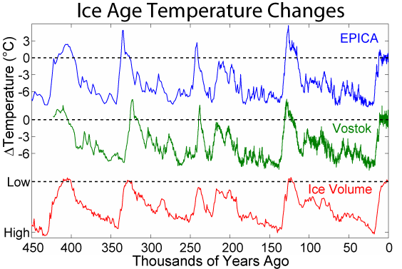
____________________
Depends what is meant by ‘reasonable’. The changes that occur over time in global mean surface temperature (GMST) are relatively small compared to diurnal or seasonal changes at a single location. For instance, GMST at the last glacial maximum is typically estimated to have been at most just ~ 6.0 C cooler than in 1950 (‘before present’):
That being the case, then perhaps a more appropriate analogy than daily or seasonal temperature changes at a single location might be average human body temperature. This fluctuates less than ambient temperature and even minor changes can have important implications for health.
Ed Hawkins’s chart shows a total change in GMST of +0.9 C since the start of the 20th century (HadCRUT4). Taking the ‘pre-industrial’ mean as 14.0 C, then a temperature rise of +0.9 C represents an increase of 6.4% above the base.
Translating this to body temperature, an increase of 6.4% would result in a temperature rise of 2.4 C from the base of 37 C, resulting in a new average body temperature of 39.4 C. A sustained average body temperature of 39.4 C is borderline ‘hyperpyrexia’ and would probably land most people in hospital.
I’m not saying that sustained change in body temperature is the best analogy for sustained change in GMST. Just that change that seems trivial in one context may be critical in another.
DWR54,
Indeed it is a matter of context, but in this case a global change of 2°C is on regional scale a shift of about 700 km polewards. That is all and quite beneficial for agriculture in the NH. Maybe some countries will have more losses by extra desertification, but that is mostly based on climate models which are not performing that good in predicting rain patterns, to say the least…
No. Desertification is not occurring. Increased CO2 is greening the Earth, including the Sahara.
@DWR54
lol
(You are joking, right?)
DWR54: the numbers on the Celsius scale are “interval” cardinal numbers. The division to calculate percentages is mathematically illegitimate, and it makes your comparisons meaningless. If you repeat with the Kelvin scale, comprising “ratio” cardinal numbers, you will notice a considerable difference.
Richard,
Exactly my thoughts, only an uninformed person would be impressed by a misleading attempt to use any temperature scale other than an absolute scale to present % changes.
Absolutely correct.
Which raises the question about using the Celsius scale to compute averages, which are of course rational?
Richard Bond
It doesn’t matter to my point whether we use Celsius, Fahrenheit or Kelvin. My point is that the ‘steadier’ a system, in this case GMST, the more we should pay attention to small changes. In a system where the ‘steady state’ was ~14 C, a sustained increase of 0.9 C (6.4%) is not insignificant.
At a single location we’d expect there to be wide changes in temperature over a 24 hr period. We can smooth this somewhat by taking the mean of Tmax and Tmin to obtain a daily average. Likewise, at a single location we’d also expect daily average temperature in winter will be significantly different from that in summer, etc. We can smooth this by averaging temperature across all months to get an annual average.
It’s clear that we should expect there to be much less variation between a series of annual average temperatures *even at a single location* than we would see across the daily or seasonal temperature range in that place. It follows that the more locations we include, across an entire region or even globally, the less variation we would expect there to be among consecutive values, be they monthly (comparing consecutive Aprils, etc) or annual (consecutive years).
It is precisely this ‘steadiness’ in the GMST record, certainly when compared to daily or seasonal fluctuations at a single location, that lends what might appear to be a relatively minor temperature change its potential significance.
Hmmmm. 14 C = 57.2 F, and 0.9 C = 1.6 F Soooo
Change = 2.8%
Is my calculator broken?
No, Mr. Hawkins is.
Point taken, TonyL. But bear in mind that using the Kelvin scale instead of C or F, as suggested by Richard Bond above, then the difference in GMST between the peak of the last glaciation and ~ 1950 is just 2.1%!
DW, as for % change. That’s only valid when comparing it to a maximal range or to absolute zero. Since we aren’t talking thermodynamics, absolute zero isn’t really relevant, let’s talk maximum range.
Your biology has a heavily regulated temperature with massive internal feedbacks because you cannot work outside of 97F to 100F. A 2F change in temperature on a maximum scale of 4F is huge. That is a 70% increase in your temperature scale.
To compare, the planet is less well regulated because the majority of life can do just fine at 50F or 90F. In fact, in a single day, the range can swing 30 F. On this scale, a 2F rise is small to meaningless. Roughly 8% of the daily swing and 3% of the annual swing (Give or take a huge variation from spot to spot). As warming happens mostly at the poles due to the effects of water vapor, this means the areas with the greatest effects will also be the ones with the greatest natural swings.
Please explain to me why you would use the former scale instead of the latter when scant glance indicates that the first is non-applicable while the second is most relevant. Using a deliberately wrong scale to exaggerate the change is precisely the complaint of the initial post.
Ben of Houston
I accept that if we use absolute temperatures then the % change is much smaller. In Kelvin a 0.9 increase is just 0.3%, for example. 2.8% in F as TonyL points out above.
But there’s a reason why we use the Celsius scale for both GMST and body temperature. It fits well to the circumstances we find ourselves in, in each case. To that extent small change in body temperature is still a reasonable analogy for small change in GMST; though as I said initially, it’s certainly not meant to be an exact one.
The idea I’m trying to get across is that small changes in GMST are a bigger deal than large changes in daily or seasonal temperatures at any one location.
What in the world does a temperature increase of 6.4% mean? Why not use the Kelvin scale, and say a 6.4% increase over the base of 310 K would be 330 K and the person would be long dead?
Oh gawd gimme more strength!
..Well, that was a pretty lame “video”…
Actually, this is a great idea, IF you start at the medieval warm period..Even better if you start at 1,100 BC, so people can see all the temperature changes that the Earth goes through NATURALLY !
Looking at this graph – my immediate reaction was, like many others – he’s used a log scale. On checking, no it is a linear scale. But there is still a degree of dishonesty in this graph. By mapping the graph into a circle the visual impact goes up with area rather than distance. So the visual impact is the square of the actual data.
I suppose if climate science were a real science this would be a bad thing. But since climate science is a branch of rhetoric – specifically designing scary visuals based on not-scary data – this must be thought of as an ingenious and promising development. Presumably lots of climate science students will now be trying to dream up all sorts of ways of plotting the square or the cube of some dataset to make it look scarier.
Yes I thought the same thing. Adjusted Temp = 3.14 x T^2 (i.e. area of a circle)
Oh, pretty circle pattern. Except ALL the lines inside 2°C should be pale blue for COLD. !!
Now could someone draw on that goes out far enough to show the temperatures from the start of the Holocene !
I would like to see more of these graphs. I would like to see one with a reference ring for the Holocene climatic optimum. I would also like to see one that graphs both the raw data and the ‘adjusted’ data on it. Just for laughs, I would like to see one with error bars on it.
What would the graph look like if it were in absolute temperature instead of anomalies?
I would also like to see one that graphs both the raw data and the ‘adjusted’ data on it.
Stormy, you’re the first person to notice its all based on fake data! The past has been cooled and the present warmed, mainly to ‘get rid of the 1940’s blip’.
There is a subtle systemic falsity to this particular circular depiction, in that there is a polygonal aspect owing to the monthly data “points”. That ought to be “smoothed” so as to more correctly display the adjusted temps relative to the circular scale, it seems to me.
Well they can’t agree what the temperature was 50 years ago otherwise they wouldn’t keep adjusting the recent historical record … but at 150 years ago no problem!
Still using highly questionable adjusted data with no error bars.
Woo! It may actually be warming enough to be measurable, as most records are good only to one or two degrees C. I am utterly, totally terrified! /sarc
Meh. Al Gore, master of fakery, bogus graphs, misdirection, and dramatization showed how to do this with his famous scissors-lift OMG CO2 10 years ago (premier date, May 24th, 2006).
expecting a 42 degree F temp range today in Vermont
It would be interesting to add a cities from different latitudes to represent the temperature changes at various radii and then ask people how they would feel driving or flying between those cities
Hawkins’ misdirection of course is the cherry-picked start date of 1850, when we were still in the LIA, and way before the “alarming” manmade CO2 contributions of over a century later. Adding that to the patently misleading and deliberately alarming aspect of a linear-type of rise being portrayed in logarithmic fashion, and you have a person easily seen as both a liar and a f*aud.
+ 1000
The real misdirection is the fact that prior warming intervals lay down segments that obscure periods of cooling or even the recent pause. It would be more interesting if it showed only the last 3 or 5 years of segments. Then you could see the temperatures marching in and out.
Another aspect of this graph is that when temperatures go DOWN it simply overwrites the previous spirals and you don’t perceive it as change. Only when the spirals expand and the ave. temp. goes UP do you see a marked change. Run it again and watch for intervals where the spirals don’t expand and even contract. You have to be very perceptive to catch them.
Interesting animation. Now, can I please see the same animation using the “unadjusted” data?
Two teachers that I have enjoyed are J.W. Turkey and his Honestly Significant Difference Test, and Edward R. Tufte, author of Visual Display of Quantitative Information.
A sister-in-law posted this on FaceBook commenting I was sure to have something to say about it. Indeed I did. I posted the following over several comments:
Ric Werme I saw a couple other references to this but haven’t checked them out. My initial reaction includes:
1) the starting 0.0C temperature is not a typical average, but the start of the temperature data displayed. Yes, the Earth’s temperature has gone up since 1850. The question is why. It appears that climate models give CO2 credit for 2X to 3X more impact than it deserves.
2) The dynamic display is cute, but hides some very important features, like the warming in the late 1930s or the cooling in the 1970s. By using a circle, it implies the effect of temperature change is proportional to area – it’s not, it’s proportional to the radius or diameter, both which are a little tough to read. A center point or starting the display at 0 would have helped.
3) Ending at the peak of the 2105/2016 El Nino plays to the tactic that CRU and others have been milking for the last couple of years. The ENSO sea surface temperatures that drive El Nino are crashing and it looks like we’ll be in a severe La Nina by the end of the year. It’s going to be interesting. Don’t assume you can grow southern plants next year.
4) There is an increasing disparity between the ground level temperature and the satellite record. Some of the adjustments made to the ground record are questionable, some made last year are reprehensible. Keep an eye on both – I’ll post a couple.
Other people probably have more criticisms, I might post some of those too.
Ric Werme – Some of this is harder to hunt down than it should be – most graphs only cover the period from the late 70s because the previous data is doesn’t follow the script.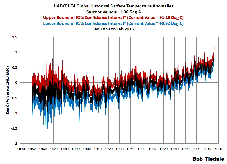
The rise from 1910 to 1945 is similar to 1975 to 2005. Did you see the decline from 1945 to 1975 in the GIF? No? They didn’t want you to notice. The GIF is cute, the graph is informative.
Ric Werme – The satellite record starts in 1979. It samples the “lower troposphere”, which is pretty high up, about Pikes Peak level. That has both positive and negative features. El Nino/La Ninas affect those temperatures with a few months delay, for the same reason a teapot doesn’t boil the instant you put it on the stove.
The temperature scale is based on the WMO recommended 30 year period for “climate normals”, very different from the HadCRUT starting point, the 20th century average that some people like, etc.
Ric Werme – One more – this shows how quickly El Nino is fading. SST is the sea surface temperature anomaly, greater than +0.5 is “El Nino Conditions” (the actual declaration depends on several months of data) and less than -0.5 is La Nina conditions.
http://www.cpc.ncep.noaa.gov/products/people/wwang/cfsv2fcst/images3/nino34MonadjPDFSPRDC.gif
The problem is that “Global” warming is not “Global”.
What we see is an increase in nighttime temperatures, mostly in the Northern Hemisphere, towards the Pole. We do not see a matching rise in summer temperatures, nor do we see a rise in Southern Hemisphere temperatures.
This pattern of warming CANNOT be due to CO2, because we are told that CO2 is WELL MIXED globally. The warming should be global as a result, but it is not global. This represents one of many failed predictions of the CO2 theory of Global Warming.
In Science, when a theory gets a prediction wrong, that is PROOF, not simply evidence, but PROOF that the theory is wrong.
The CO2 theory of Global Warming predicts that the warming will be Global. However, the observed warming is not global, it is concentrated in nighttime temperatures in the Northern Hemisphere. This is not and was not predicted by the CO2 theory, which is conclusive proof that the theory is wrong.
The most likely cause of the observed Hemispheric Warming is something specific about the Northern Hemisphere. This cannot be CO2, because CO2 is well mixed.
If humans are the cause, and this is a big if, because we have no idea what caused the Little Ice Age, nor why things are warming up since the LIA, it would seem most likely it is due to land use changes. There is much more land in the Northern Hemisphere than the Southern Hemisphere, and over the past 150 years humans have gone from using 4% of the land surface to using 40%.
This huge increase in the amount of land used by humans is largely ignored as the cause of climate change. Yet it is a much closer fit to temperature than CO2.
Why is it so hard to imagine that cutting down millions of square miles pf forests and replacing them with blacktop, concrete, crops and irrigation does not change the local climate? And when repeated time and time again over the globe, why is it so hard to imagine that this will result in a global change?
The answer is simple. We know we cannot do anything about land use change. We imagine we can do something about energy usage.
“If humans are the cause, and this is a big if, because we have no idea what caused the Little Ice Age, nor why things are warming up since the LIA, it would seem most likely it is due to land use changes. ”
So there was an LIA?
That means we know, for certain, that temperatures were cooler back then?
Like 1.5C cooler.. Nobody can feel that. It wasnt real
when the last ice age scraped canada to bedrock and deposited 180 ft of topsoil across the great plains of the usa, yeah, it was a little bit colder then.
if somebody didn’t feel it, maybe he homogenized himself and infilled his temperature with that of the average temperature of humans in deserts and tropical islands.
or maybe people weren’t that stupid back then – after all, there were no universities.
As a matter of fact, we do know that there was an LIA.
You cherry pick your posts to respond to, to get your whit in.
Naughty boy.
You like consensus, the consensus is there was an LIA and MWP
The consensus is there was a pause.
Denier
😛
During LIA sea level fell [though also had periods [decades] of rising sea level.
Main noticeable effect of LIA was advancing glaciers in Temperate Zone, or end of LIA
is marked by the majority of glacier retreating and start of continuous rise in sea levels- with only short term and minor dips in global the long term sea level rise- which is about 8 inches per century.
“nor do we see a rise in Southern Hemisphere temperatures.”
Really?
and
http://www.bom.gov.au/climate/current/annual/aus/2015/20150106_SSTa_plot.png
“This pattern of warming CANNOT be due to CO2, because we are told that CO2 is WELL MIXED globally. The warming should be global as a result, but it is not global. This represents one of many failed predictions of the CO2 theory of Global Warming.”
No.
The warming is global – there are obvious differences in the geography of the hemisphere that prevent equal warming in both hemispheres…
The Northern Hemisphere has a much larger proportion of land relative to the oceans – the oceans representing about 85% of the Southern Hemisphere and thus the dominating influence on the climate there, causing a dampening of any large swings. There is a cooling effect on the SH with heat transport via ocean currents into the NH (this increasing the deltaT between them even more).
“it is concentrated in night-time temperatures in the Northern Hemisphere. This is not and was not predicted by the CO2 theory, which is conclusive proof that the theory is wrong.”
No.
For the reason above – the SH is mostly ocean and as such the LWIR absorption has less warming effect at night than over land.
Land has a greater diurnal deltaT and thus the small raising of nigh-time minima will be much smaller in comparison with land when a diurnal temps range may cover ~20C (or more over desert).
http://media.bom.gov.au/upload/images/Media%20Statement1.jpg
Also
“On the Origin of the Surface Air Temperature Difference between the Hemispheres
in Earth’s Present-Day Climate”
http://journals.ametsoc.org/doi/pdf/10.1175/JCLI-D-12-00636.1
About the fire in Fort McMurray, here we go the doomsayers are coming out
http://www.msn.com/en-ca/news/world/the-arsonists-of-fort-mcmurray-have-a-name/ar-BBsY6qb?ocid=spartandhp
Just use this graph – more demonstrative:
http://4.bp.blogspot.com/-lPGChYUUeuc/VLhzJqwRhtI/AAAAAAAAAS4/ehDtihKNKIw/s1600/GISTemp%2BKelvin%2B01.png
Demonstrative but nearly devoid of information. Go read Edward Tufte.
“Just use this graph – more demonstrative:”
It is (very) …. but not of what you allude.
It just shows that there is no alarming global warming…
“Introducing the global warming speedometer”
Love it. That one’s going on the fridge.
I’m going to make a button with that on it….if I can snag it that is.
Back on topic:
Has anyone else noticed the reference point of 0 disappeared so you couldn’t really see the years that flew by that went below zero?
Facebook suspended my account. Had to prove I wasn’t a spambot and agree to play nicey, nicey.
Former Facebook employees recently admitted to spiking stories favorable to conservatives on their “Trending” page.
Anonymous former Facebook contract workers said that.
Predictably the wild fire in Alberta has been unofficially blamed on the fossil fuel companies and global warming.
Dude !!! Watch that graphic with the blacklight turned on and listening to Black Sabbath !!
Dude !!!!!!
A fine work of self mockery.
If there was the “unprecedented” steady warming claimed the spiral pattern would be so much cleaner.
Instead so much in-crossing that its the blob.
Another home goal by “The Team” ™ IPCC.
I think this boils down the genuine skeptic viewpoint in a nutshell. There’s an effect. Just not a scary one – certainly not worth billions, and certainly not worth rolling back western civilization.
Sorry Ed
My underwear remains undampened.
Just saw a poster on a bus here in Toronto that had the requisite toddler and the the phrase: “When she what you did about climate change, what do you tell her”.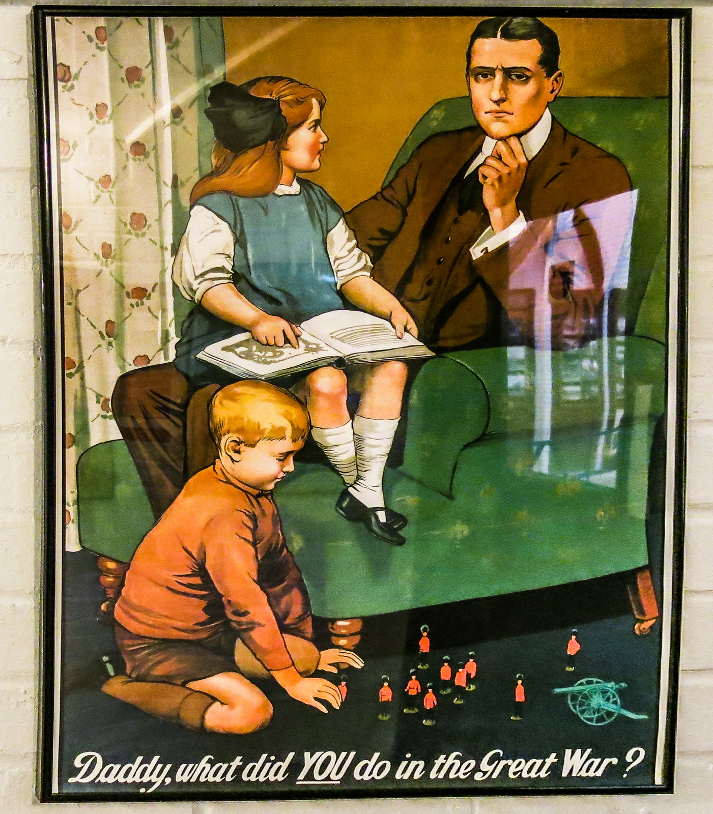
Reminds me of this poster:
Truly, these people are despicable.
Er, should read, in English: “Just saw a poster on a bus here in Toronto that had the requisite toddler and the phrase: “When she asks what you did about climate change, what do you tell her”?”
“I didn’t shovel shiit in Louisiana.”
This triggers fond memories of placid hours of meditative relaxation spent playing with my Spirograph. Thank you Ed.
all is good with the Spirograph as long as you had colored pens
“So how does it look when you represent temperature change on a more reasonable scale, say 10c, a magnitude of change which most people could actually feel?”
The LIA was approximately 1.5C lower than today.
I guess it didnt exist because nobody could feel the difference
The benefits of the warming from the LIA must be an illusion since no one could feel 1.5C
Today the world is about 15C
Last time it was 20C there alligators at the north pole. But hey, nobody can feel 5C
Its a cool chart. Charts are not science. dont get your panties all twisted up
Have you taken your meds today, steve? You seem more-than-the- usual pissy.
Maybe check your own shorts.
Still having trouble selling his lemons , is my guess.
Dodgy !!!
oh, i can’t wait to see alligators pole dancing!
alligators should be the poster pets of global warming, no?
forget about polar bears- they only say ‘not cold’
alligators say ‘hot hot hot!’
our children just won’t know from polie bears
beside, reptiles ruled the earth for 150 million years- they can do it again.
Will someone please twist up Mosher’s panties?
Steven; I believe it was named the “Little Ice Age” because it was, well, “Little”. Temperatures have since risen approximately 1.5 C according to some reconstructions, most estimate between 1 and 1.5, but the uncertainty in that number is absurdly high given it is a reconstruction, what with thermometers being so rare at the beginning. Your comparison of the Carboniferous to current climate is even more speculative since neither thermometers nor qualified operators were around at the time. I understand Mann extrapolates from tree rings, or is it chicken bones?
It never ceases to amaze me when alarmists just blithely rattle off numbers like that. It’s right up there with Hawkins’ chart, with 0.1 C resolution going all the way back to 1880. Ludicrous really, some might say “arrogant and stupid”, I prefer less obnoxious terms more along the lines “ignorant and mentally challenged” myself.
Posting a graphic of my recent weight gain is a low blow 😉
It works for hypnotizing my cat.
Do NOT let your cat see that graph.
That graph makes humans look stupid.
It’s important that we humans do not completely humiliate ourselves in the eyes of other more intelligent species.
Too late … typical cat response …
Well, Ed Hawkins has been struggling for some time, to master the art of propaganda.
Here’s a previous attempt to construct a scary narrative:
“To summarise, if you had measured temperatures in your back garden for the last 150 years you would probably be able to see the signal of global temperature change emerging from the noise of local fluctuations. ” – Ed Hawkins October 2015.
Holy shit – that sounds so really scary. I’m so startled right now!!!
(That’s apart from the fact that I do not believe that he is correct. And certainly not unless this mythical 150 year old meteorologist had accounted for time of observation, station movement, sheltering by buildings and trees, urban heat island effects, instrumentation changes – etc etc etc)
http://www.climate-lab-book.ac.uk/2015/what-have-global-temperatures-ever-done-for-us/
Nice spiraling graphic but totally meaningless. However, I suppose, if a simple-minded CAGW parishioner of the global warming faith was to replay and stare at the spiraling graphic over and over again, I would surmise that he / she would encounter nirvana by getting hypnotized.
Now it seems past civilization demise has an answer!!!!
http://www.mnn.com/earth-matters/climate-weather/blogs/5-ancient-civilizations-were-destroyed-climate-change
Sorry to go off topic. Is it confirmed that Peter Glieck resigned as President of Pacific Institute?
Maybe they shall use this gadget in a tesla car displaying energy consumption against battery capacaty.
The last Thames Ice Fair 1814, just over 200 years ago less than 100 years before my mother was born. Hopefully there won’t be another in the lifetime of my grandchildren.
Apparently changes to the London Bridge have made the chance of freeze over much lower. I’ve forgotten the details, maybe a Brit can fill them in.
“During the Great Frost of 1683–84, the worst frost recorded in England, the Thames was completely frozen for two months, with the ice reaching a thickness of 11 inches (28 cm) in London. Solid ice was reported extending for miles off the coasts of the southern North Sea (England, France and the Low Countries), causing severe problems for shipping and preventing the use of many harbours.” source wikipedia.
Alarmists like to emphasize the role played by the now removed Old London Bridge. Even on the wikipedia page from which the above was taken.
I would invite anyone to explain quite how a bridge contributed to the above events.
The bridge happened to have been demolished in 1831 – i.e. after a few centuries during which the Thames froze (to some degree) on 26 occasions.
If we suppose that the bridge had nothing to do with this – then the only alternative explanation is that it was formerly colder and that by 1831, it had already started warming.
However, since warming can only be caused by industrial CO2 – we must necessarily hold the bridge to be the dominant factor. #blamethebridge
Ric – The river was wider and a lot shallower then. Since the construction of various embankments over the years it is now narrower and consequently more fast flowing. Of course, there is a good chance that the reconstruction of the bridge was necessitated by that narrowing. It seems inconceivable to me that changes to the bridge could, by themselves, cause a lessening of the likelihood of a total freeze.
I wonder how low the middle class can slide before they start connecting the dots of the climate con job with societal outcomes.
What a silly article. One or two degrees change in global temperature is actually a lot. Only about five degrees separate the Last Glacial Maximum from the Holocene Climate Optimum, and the entire Holocene variability probably fits in less than 2 degrees. One degree below LIA temperatures probably means a return to glacial conditions. Ignorance is no excuse for comparing global average changes to temperature changes in a room.
Javier –
My specialty is unfortunately much more boring than that of a climateologist, I dabble in metrics and measurement theory. Mostly metrics. One of the things that’s always puzzled me as a metrics guy, is how anyone has been able to recover temperature measures from times before the thermometer with any real accuracy? Or measures of atmospheric carbon dioxide to “parts per million”. For that matter, how have periods of time been assigned to these data with resolution on the order of +/- 50 years?
All of my research so far has led to an understanding that temporal measures based on carbon dating of samples 5, 6 even 7 million years old are on the order of 1000 times less precise than contemporary instrument data (you know, stuff we collect from clocks, thermometers, gas analyzers) , yet they’ve been used to argue the increase in temperature and CO2 over the past 100 years is unprecedented, and to predict changes in temperature over the next 100 years. This astonishes me since we obviously have no data with 100 year resolution spanning even the past million years. How can this be?
I’m fairly certain that the uncertainty of atmospheric CO2 estimates based on an analysis of boron isotopes in the shells of fossilized foramanifera, or temperature estimates based on extrapolation from tree rings, completely eliminates them from a discussion of the possible effect of rising CO2 levels on temperature of the next 80 years. I’d go so far as to say I’m dead certain of that.
What are your thoughts?
Oh dear, so we have almost reached the IPCC’s catastrophic 1.5-2.0 degrees warming since pre-industrial times. And everyone can see how much worse off the world is – more crops, more population. And the world seems to cope very well with temperature fluctuations of 10 degrees in one day.
Interesting that Javier resorts to arguments about a return to glacial conditions rather then the implications of living in a hot house that is just 1 degree warmer.
Well considering that the maximum range of temperature on this day, the 13/May/2016, here in Cairns Queensland Australia, can range between 30C and 13C, while its average range for this day is 20c to 28c…..It has a 7 degree propensity of being cooler and only 2 degree propensity of being warmer judging by those figures….
1.5 degrees of supposed warming is neither here nor there in the scheme of things is it.
Not to mention the fact that the surface temperature data set is so “adjusted” and corrupted that it no longer represents science….. Whereas the 40 year Satellite temp data shows no significant warming. Indeed it shows a flat line for nearly 20 years.
You call that a good artistic effort? THIS is a good artistic effort-
http://blogs.news.com.au/dailytelegraph/timblair/index.php/dailytelegraph/comments/screw_nature/
Either that or the touchy feely warmies are getting a tad sexually frustrated, although perhaps that’s a climatologist with the ipad getting his rocks off.