Guest Post by Bob Tisdale
If you’ve read the first two posts in this series you might already believe you know the answer to the title question. Those two posts were:
- Do the Adjustments to Sea Surface Temperature Data Lower the Global Warming Rate? (WattsUpWithThat cross post is here.)
- UPDATED: Do the Adjustments to Land Surface Temperature Data Increase the Reported Global Warming Rate? (WattsUpWithThat cross post is here.)
In this post, we’ll compare “raw” global land+ocean surface temperature data and the end products available from Berkeley Earth, Cowtan and Way, NASA GISS, NOAA NCEI and UK Met Office.
END PRODUCTS
Berkeley Earth – This land+ocean dataset is made up of the infilled land surface air temperature data created by the Berkeley Earth team and their infilled version of the HADSST3 sea surface temperature product from the UK Met Office (UKMO). For their merged land+ocean product, Berkeley Earth also infills data missing from the polar oceans, anywhere sea ice exists. They accomplish this infilling two ways, creating separate datasets: First, using sea surface temperature data from adjacent ice-free oceans. Second, using land surface air temperature data from adjacent high-latitude land masses. For this post, we’re using the data with the land-based infilling of the polar oceans to agree with the Cowtan and Way and the GISS Land-Ocean Temperature Index, both of which rely on land-surface temperature data for infilling. The annual Berkeley Earth Land+Ocean data can be found here.
Cowtan and Way – The land+ocean surface temperature data from Cowtan and Way is an infilled version of the UKMO HADCRUT4 data. (Infilled by kriging.) As noted above, Cowtan and Way also infill areas of the polar oceans containing sea ice using land-based surface air temperature data. The annual Cowtan and Way data are here.
NASA GISS – The Land-Ocean Temperature Index (LOTI) from the Goddard Institute of Space Studies (GISS) is made up of GISS-adjusted GHCN data from NOAA for land surfaces and NOAA’s ERSST.v4 “pause buster” sea surface temperature data for the oceans, the latter of which has already been infilled by NOAA. GISS infills missing data for land surfaces by extending data up to 1200km. GISS also masks sea surface temperature data in the polar oceans (anywhere sea ice has existed) and extends land surface air temperature data out over the polar oceans. The GISS LOTI data are here.
NOTES – For summaries of the oddities found in the new NOAA ERSST.v4 “pause-buster” sea surface temperature data see the posts:
- The Oddities in NOAA’s New “Pause-Buster” Sea Surface Temperature Product – An Overview of Past Posts
- On the Monumental Differences in Warming Rates between Global Sea Surface Temperature Datasets during the NOAA-Picked Global-Warming Hiatus Period of 2000 to 2014
Even though the changes to the ERSST reconstruction since 1998 cannot be justified by the night marine air temperature product that was used as a reference for bias adjustments (See comparison graph here), and even though NOAA appears to have manipulated the parameters (tuning knobs) in their sea surface temperature model to produce high warming rates (See the post here), GISS also switched to the new “pause-buster” NCEI ERSST.v4 sea surface temperature reconstruction with their July 2015 update. [End notes.]
NOAA NCEI – The NOAA Global (Land and Ocean) Surface Temperature Anomaly reconstruction is the product of the National Centers for Environmental Information (NCEI). NCEI merges their new “pause buster” Extended Reconstructed Sea Surface Temperature version 4 (ERSST.v4) (see notes above) with the new Global Historical Climatology Network-Monthly (GHCN-M) version 3.3.0 for land surface air temperatures. The ERSST.v4 sea surface temperature reconstruction infills grids without temperature samples in a given month. NCEI also infills land surface grids using statistical methods, but they do not infill over the polar oceans when sea ice exists. When sea ice exists, NCEI leave a polar ocean grid blank. The source of the NCEI values is here. Click on the link to Anomalies and Index Data.
UK Met Office – The UK Met Office HADCRUT4 reconstruction merges CRUTEM4 land-surface air temperature product and the HadSST3 sea-surface temperature (SST) reconstruction. CRUTEM4 is the product of the combined efforts of the Met Office Hadley Centre and the Climatic Research Unit at the University of East Anglia. And HadSST3 is a product of the Hadley Centre. Unlike the other reconstructions, grids without temperature samples for a given month are not infilled in the HADCRUT4 product. That is, if a 5-deg latitude by 5-deg longitude grid does not have a temperature anomaly value in a given month, it is left blank. Blank grids are indirectly assigned the average values for their respective hemispheres before the hemispheric values are merged. The annual HADCRUT4 data are here, per the format here.
“RAW” DATA
For the “raw” global land+ocean surface temperature data, we’re using a weighted average of the global (90S-90N) ICOADS sea surface temperature data (71%) and the global “unadjusted” GHCN data from Zeke Hausfather (29%). (To confirm the percentage of Earth’s ocean area, see the NOAA webpage here.)
ICOADS – This is the source sea surface temperature data used by NOAA and UKMO for their sea surface temperature reconstructions. The source of the ICOADS data is the KNMI Climate Explorer. Also see the post Do the Adjustments to Sea Surface Temperature Data Lower the Global Warming Rate?
For the unadjusted land surface air temperature data, Zeke Hausfather (a member of the Berkeley Earth team) has graciously updated his monthly unadjusted global GHCN land surface temperature data through March 2016, using the current version of the GHCN data. (Thank you, Zeke.) See Zeke’s comment here on the cross post at WattsUpWithThat of the original land surface air temperature post. The link to that current version of the “raw” data is here. Also see the post UPDATED: Do the Adjustments to Land Surface Temperature Data Increase the Reported Global Warming Rate?
GENERAL NOTES
The WMO-preferred base years of 1981-2010 are used for anomalies for the ten comparison graphs.
We excluded the polar oceans in the post Do the Adjustments to Sea Surface Temperature Data Lower the Global Warming Rate?. That is, we limited the latitudes to 60S-60N because the sea surface temperature reconstructions account for sea ice differently. We’re taking a different tack in this post: because the suppliers of the end products handle sea ice differently (Some manufacturers infill data when and where sea ice exists, others don’t infill. Infilling is another form of adjustment.), I’m including the polar oceans in the “raw” sea surface temperature product, including the data for the latitudes of 90S-90N and comparing that to the global end products.
For the “raw” data from ICOADS, if a 2.5-deg latitude by 2.5-deg longitude grid does not contain observations-based data, it is left blank. This means there are no temperature measurements in the polar oceans when sea ice exists…like the UKMO HADCRUT4 data and the NOAA/NCEI data.
In past posts I have mentioned one of the problems with infilling the temperature data for the polar oceans by extending land surface air temperature data out over sea ice. That problem: the method fails to consider that polar sea ice during the summer likely has a different albedo than surface station locations where snow has melted and exposed underlying land surfaces. That is, sea ice will tend to reflect sunlight while exposed land surfaces would absorb it. That problem is compounded in the Arctic Ocean when ice-free ocean exists between land and sea ice. The ice-free ocean has yet another albedo, which is not the same as the ice surface or the snow-free land mass. Those problems do not exist in winter when snow covers both sea ice and land surfaces and when the sea ice covers the Arctic Ocean to the shoreline, so the problem is seasonal.
Regardless of the season, any polar temperature data created by infilling is make-believe data.
Let’s start with the long-term data.
LONG-TERM TREND COMPARISON
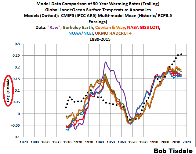
This comparison starts in 1880 because the GISS and NOAA/NCEI data begin then. See Figure 1. Because the adjustments to the sea surface temperature data reduce the amount of warming during the early 20th Century, the “raw” data have the highest long-term warming rate. Or phrased differently, the adjustments have reduced the reported global warming since 1880.

Figure 1
Note: The excessive warming of the “raw” surface temperature data from the early 1900s to the mid-1940s (due to the sea surface temperature component) presented a problem for climate models. Most of the warming then was not caused by man-made greenhouse gases (according to the models), but the warming trend of the “raw” data from the early 1900s to the mid-1940s was much higher than their recent warming rates. For confirmation, see the graph of 30-year running trends here. The bias corrections for the data prior to 1940 reduced those problems for the models, but did not eliminate them. That is, the models still cannot explain the initial cooling of global sea surface temperatures from 1880 to about 1910, and, as a result, the models cannot explain the warming from about 1910 to the mid-1940s. [End note.]
TREND COMPARISONS FOR 1950 TO 2015
1950 was one of the mid-20th Century start points used by NOAA in their study Karl et al (2015) Possible artifacts of data biases in the recent global surface warming hiatus…the “pause buster” paper. As shown in Figure 2, for the period of 1950 to 2015, the GISS and NCEI data have noticeably higher warming rates that the other datasets. As you’ll recall, both GISS and NCEI use NOAA’s ERSST.v4 “pause-buster” sea surface temperature data, which have not been corrected for the 1945 discontinuity and trailing biases presented in Thompson et al. (2008) A large discontinuity in the mid-twentieth century in observed global-mean surface temperature. On the other hand, the other datasets (Berkeley Earth, Cowtan and Way, and HADCRUT4) use the UKMO HADSST3 data, which have been corrected for those mid-20th Century biases.
 Figure 2
For a more-detailed discussion of NOAA’s failure to account for those biases with their ERSST.v4 “pause-buster” data, see the post Busting (or not) the mid-20th century global-warming hiatus, which was also cross posted at Judith Curry’s ClimateEtc here and at WattsUpWithThat here.
TREND COMPARISONS FOR 1975 TO 2015
1975 is a commonly used breakpoint for the transition from the mid-20th Century cooling or slowdown (depends on the dataset) and the recent warming period. Figure 3 compares the “raw” and “adjusted” global warming rates from 1975 to 2015. There is a 0.019 deg C/decade spread in the trends, with the Cowtan and Way data having the highest warming rate and the NOAA/NCEI data having the lowest…even lower than the “raw” data.

Figure 3
TREND COMPARISONS FOR 1998 TO 2015
Figure 4 compares the “raw” and “adjusted” global surface temperature anomalies starting in 1998, which is often used as the start year of the slowdown in global warming. The GISS LOTI and NOAA/NCEI data have the highest warming rate, a result of NOAA’s excessive tweaking of the parameters (tuning knobs) in the model that manufactures NOAA’s “pause buster” ERSST.v4 sea surface temperature data, creating a trend near the high end of the parametric uncertainty range. At the other end of the spectrum, the UKMO HADCRUT4 data has a trend that’s very similar to the “raw” data. Keep in mind that the HADSST3 sea surface temperature data (used in the HADCRUT4 combined land+ocean data) have been adjusted for ship-buoy biases.

Figure 4
Both the Berkeley Earth and the Cowtan and Way land+ocean data rely on and infill HADSST3 data for the ocean portion, yet the Cowtan and Way data have noticeably higher warming rate than the Berkeley Earth data during this period. (Maybe Kevin Cowtan or Robert Way will stop by and explain that for us.)
As a reference, based on the model-mean of the climate models stored in the CMIP5 archive, which represents the consensus of the modeling groups, the expected warming rate during the period of 1998 to 2015 is 0.233 deg C/decade with the worst-case RCP8.5 scenario, and that’s about 0.1 deg C/decade to 0.13 deg C/decade higher than observed…thus my use of the term “slowdown”.
WAS THERE A “HIATUS” IN GLOBAL WARMING?
For this heading, I’m going to borrow and update the text from the post Do the Adjustments to Sea Surface Temperature Data Lower the Global Warming Rate?
Of course there was a hiatus, but the extent of the slowdown depends on the global land+ocean temperature dataset and the period to which the slowdown is compared. Figure 5 includes the “raw” and “adjusted” global sea surface temperature anomalies for the period of 1998 to 2013. We ended the data in 2013, because:
- 2013 was an ENSO neutral year…that is there no El Niño or La Niña. (See NOAA’s Oceanic NINO Index here.)
- The Blob and the weak El Niño conditions were the primary causes of the naturally occurring uptick in global surface temperatures in 2014 and,
- The continuation of The Blob and the strong El Niño conditions were the primary causes of the naturally occurring uptick in global surface temperatures in 2015.
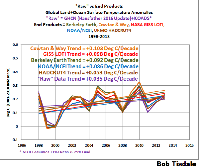
Figure 5
Note 1: To confirm the second and third bullet points, we discussed and illustrated the natural causes of the 2014 “record high” surface temperatures in General Discussion 2 of my free ebook On Global Warming and the Illusion of Control (25 MB). And we discussed the naturally caused reasons for the record highs in 2015 in General Discussion 3.
Note 2: Some may claim the start year of 1998 is cherry-picked because it’s an El Niño decay year. That’s easily countered by noting that the 1997/98 El Niño was followed by the 1998 to 2001 La Niña. (Once again, see NOAA’s Oceanic NINO Index here.) Also, 1998 was used as a start year by Karl et al. (2015) and the period of 1998 to 2013 is also one year longer than the period of 1998 to 2012 used by NOAA in that paper.
[End notes.]
Karl et al. (2015) also used a sleight of hand in their trend comparisons by using 1950 as the start year of the recent warming period. The IPCC did the same thing in their analyses of it in Chapter 9 of their Fifth Assessment Report (See their Box 9.2). Both groups referenced the hiatus warming rates to periods starting in 1950 or 1951. Why does that indicate they were using smoke and mirrors? The trends from those 1950 or 1951 start dates include the slowdown or cooling of global surfaces that occurred from the mid-1940s to about 1975. So let’s present the trends from the start of the recent warming period (1975) to the end of the 20th Century (1999). See Figure 6. As you’ll recall, the year 1999 was used by NOAA in Karl et al. (2015). (Again refer to Figure 1 from Karl et al. (2015).)

Figure 6
Only the UKMO’s HADSST3 data have a higher warming rate than the “raw” data during this period. Some readers might believe the other data suppliers have reduced the reported global warming during the period of 1975 to 1999 to suppress the extent of the slowdown that followed.
Now let’s compare the trends for the periods of 1975 to 1999 (Figure 6) and 1998 to 2013 (Figure 5). The slowdowns (1975-1999 trends minus 1998-2013 trends) are:
- HADCRUT4 slowdown = 0.137 deg C/decade (compared to +0.190 deg C/decade for 1975-1999)
- NOAA/NCEI slowdown = 0.087 deg C/decade (compared to +0.173 deg C/decade for 1975-1999)
- Berkeley Earth = 0.086 deg C/decade (compared to +0.178 deg C/decade for 1975-1999)
- GISS LOTI = 0.080 deg C/decade (compared to +0.178 deg C/decade for 1975-1999)
- Cowtan and Way = 0.079 deg C/decade (compared to +0.182 deg C/decade for 1975-1999)
Not too surprisingly, the “adjusted” dataset with the no infilling (HADCRUT4) shows the greatest slowdown.
The “raw” data show a slowdown of about 0.148 deg C (compared to +0.183 deg C/decade for 1975-1999), a slightly greater slowdown than the HADCRUT4 data.
And for those of you wondering about climate models, the model mean (the model consensus) of the CMIP5-archived models (with historic and RCP8.5 forcings) shows a higher warming rate (+0.223 deg C/decade) during 1998 to 2013 than during 1975 to 1999 (+0.154 deg C/decade). That is, according to the models, global warming should have accelerated in 1998 to 2013 compared to the period of 1975 to 1999. Instead, the data show a deceleration of global warming.
But other start years have been used for the recent “hiatus” in global warming. NCAR’s Kevin Trenberth used 2001 in his 2013 article Has Global Warming Stalled? for the Royal Meteorological Society. (My comments on Trenberth’s article are here.) Figure 7 compares the trends for the “raw” global land+ocean surface temperature data and the end products for the period of 2001 to 2013. The “raw” data show a slight cooling over this short time period. The trend of the UKMO HADCRUT4 data is basically flat at 0.001 deg C/decade. At the high end are the GISS LOTI and NOAA/NCEI data, which should result from NOAA’s excessive parameter tweaking.
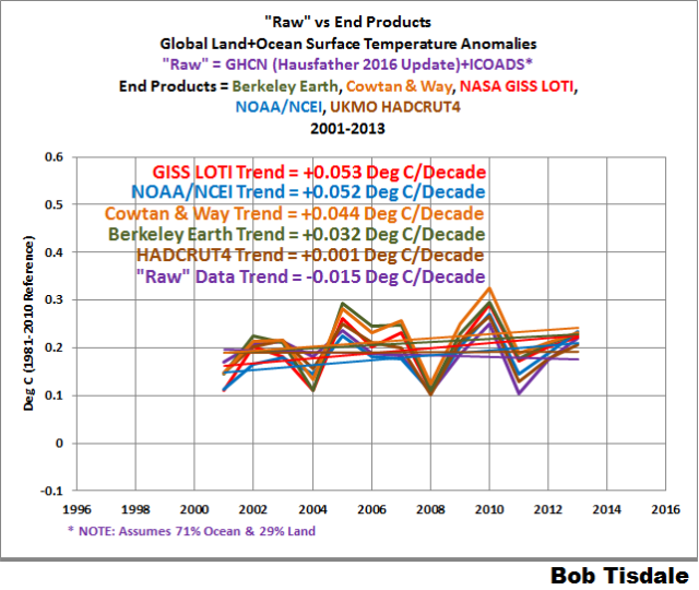
Figure 7
The slowdowns (1975-1999 trends minus 2001-2013 trends) are:
- HADCRUT4 slowdown = 0.189 deg C/decade (compared to +0.190 deg C/decade for 1975-1999)
- Berkeley Earth = 0.146 deg C/decade (compared to +0.178 deg C/decade for 1975-1999)
- Cowtan and Way = 0.138 deg C/decade (compared to +0.182 deg C/decade for 1975-1999)
- GISS LOTI = 0.125 deg C/decade (compared to +0.178 deg C/decade for 1975-1999)
- NOAA/NCEI slowdown = 0.121 deg C/decade (compared to +0.173 deg C/decade for 1975-1999)
Because the “raw” data trend is negative over this timeframe, the slowdown is greater than the trend for 1975 to 1999.
And once again, the climate models shows a higher warming rate (+0.184 deg C/decade) from 2001 to 2013 than for the period of 1975 to 1999 (+0.154 deg C/decade).
LET’S LOOK AT THE TRENDS FOR THE EARLY COOLING PERIOD, THE EARLY 20TH-CENTURY WARMING PERIOD AND THE MID 20TH-CENTURY SLOWDOWN/COOLING PERIOD
In past posts and in my book Climate Models Fail, I used the breakpoints of 1914, 1945 and 1975 when dividing the data prior to the recent warming period. The years 1914 and 1945 were determined through breakpoint analysis by Dr. Leif Svalgaard of a former GISS LOTI dataset (the version that used ERSST.v3b data). See his April 20, 2013 at 2:20 pm and April 20, 2013 at 4:21 pm comments on a WattsUpWithThat post here. And for 1975, I referred to the breakpoint analysis performed by statistician Tamino (a.k.a. Grant Foster). With the inclusion of the NOAA ERSST.v4 “pause-buster” sea surface temperature data in the GISS LOTI data, I suspect there may be new breakpoints for that dataset (and that the breakpoints may be slightly different for the other datasets), but I’ll continue to use 1914, 1945 and 1975 for consistency with past posts and that book.
Specifically, 1880 to 1914 is used for the early cooling period (Figure 8), 1914 to 1945 is used for the early 20th-Century warming period (Figure 9), and the mid-20th Century slowdown/cooling period is captured in the years of 1945 to 1975 (Figure 10).
During the early cooling period of 1880 to 1914, Figure 8, most of the end products have cooling trends that are lesser negative value than the cooling trend of the “raw” data. Curiously, the trend of the NOAA/NCEI data is the same as the “raw” data. The spread in the cooling rates of the end products is about 0.04 deg C/decade. As a reference, the model mean of the CMIP5-archived model (historic/RCP8.5) show a slight warming trend (+0.032 deg C/decade) for this cooling period. Models wrong again.

Figure 8
In Figure 9, we can see that the “raw” data have the highest warming rate for the early 20th Century warming period of 1914 to 1945. The adjustments during this time period are primarily to the sea surface temperature data…an effort to account for biases resulting from the transition in temperature-sampling methods, from buckets to ship inlets. Regardless, the spread in the warming rates is about 0.02 deg C/decade for the end products.

Figure 9
Of course, since the models do not simulate the cooling from 1880 to 1914, they fail to properly simulate the warming from 1914 to 1945. The model consensus only shows a simulated warming rate of +0.057 deg C/decade during this period. Because the models can’t explain the extent of the warming that took place in the early part of the 20th Century, apparently natural variability is capable of warming Earth’s surfaces at a rate of 0.07 to 0.09 Deg C/decade above that hindcast by the models. That of course makes one wonder how much of the recent warming was caused naturally.
The mid-20th-Century slowdown/cooling period of 1945 to 1975 is last, Figure 10. The “raw” data and those datasets that are based on the HADSST3 data sea surface temperature data (Berkeley Earth, Cowtan and Way, UKMO HADCRUT4) show slight cooling trends during this period. Once again, they have been adjusted for the 1945 discontinuity and trailing biases that were determined in Thompson et al. (2008). On the other hand, the two datasets that rely on NOAA’s very odd ERSST.v4 “pause buster” sea surface temperature data (GISS LOTI and NOAA/NCEI) show a slight warming trend for 1945 to 1975. And once again, the reason those two differ from the others is that the ERSST.v4 “pause-buster” data were not corrected for the 1945 discontinuity and trailing biases.

Figure 10
How awkward is NOAA’s failure to correct for the 1945 discontinuity and trailing biases? Even the consensus of the climate models (CMIP5 model mean with historic and RCP8.5 forcings) shows a cooling trend (-0.014 deg C/decade, slightly more than observed) during the mid-20th-Century period of 1945 to 1975.
THE SPREADS BETWEEN ANNUAL AND MONTHLY GLOBAL LAND+OCEAN SURFACE TEMPERATURE END PRODUCTS
Since we’re discussing global temperature products, I thought I’d illustrate something else…the extents of the disagreements between annual and monthly global surface temperature anomalies.
Figure 11 (annual) and Figure 12 (monthly) show the spreads between the 5 global land+ocean surface temperature end-products. (Please note the differences in the scales of the y-axis.) The anomalies are all referenced to the full term of the data (1880 to 2015) so not to bias the results. The minimum and maximum values for the 5 datasets were first determined. Then the spread was calculated by subtracting the minimums from the maximums.

Figure 11
# # #

Figure 12
Curiously, referring to the annual data because it’s easier to see, the spread in the early 1900s is less than the spread for much of the mid-20th Century. Again, the anomalies are all referenced to the full term of the data (1880 to 2015) so not to bias the results.
CLOSING
We often hear people state that the adjustments to global land+ocean surface temperature data have decreased the global warming rate. That’s very true for the long-term data (1880 to 2015) but not necessarily true for the periods after the mid-1940s.
For the post-1998 or post-2001 slowdown in global warming, the adjustments have increased the global warming rates in all datasets, with the UKMO HADCRUT4 adjustments having the least impacts.
NOAA’s failure to correct for the 1945-discontinuity and trailing biases causes the GISS LOTI and NOAA/NCEI to have relatively high warming rates for the period of 1950 to 2015. That failure on NOAA’s part also shows up during the mid-20th-Century period of 1945 to 1975…the GISS LOTI and NOAA/NCEI show a light warming during this period, while the datasets that have been corrected for the 1945-discontinuity and trailing biases show a slight cooling.
Some persons believe the adjustments to the global temperature record are unjustified, while others believe the seemingly continuous changes are not only justified, they’re signs of advances in our understanding. What are your thoughts?
Does this exercize contribute to science in real terms or serve the time pass by filling the pages? Some time back USA raw data and adjust data series were presented, wherein earlier part the series were lowered and in later part the series were raised. That means, the trend of adjusted data is far higher than the raw data series that clearly presented a 60-year cyclic pattern.
Recently, when media talking on heat waves, IMD Hyderabad office reported the raise in Hyderabad temperature was only 0.01 oC in 100 years. In some parts of the city with heat-island effect the temperature raised by 3 to 5 oC.
Dr. S. Jeevananda Reddy
This exercise combats misinformation about adjustments to the global temperature record. The US temperature adjustments are a totally different topic.
Sorry Bob Tisdale — in all your exercizes you have not taken into account the 60-year cycle factor. In fact in the sine curve by 2016 it reached peak and also El Nino. So also Sea temperature cycles over different parts of the oceans. Simply linear regression will not provide or serve the science.
If you really wanted to help science and educate common man to scientific community, you do some thing like raw data over different parts of the globe including oceans.
Dr. S. Jeevananda Reddy
Dr. S. Jeevananda Reddy
What equation are you using for that assumed 60 year short cycle? (Obviously: the zero point, the period, the assumed amplitude. Anything else?)
How do you account for the semi-sine wave of the 1000 year long cycle rising since 1650’s minimum? Should that curve not be added to the short cycle?
Also, the adjustments affect on trend will be realistically seen when we use full data series [downward & upward adjusted] only truncated data series trend has no meaning. As the natural variability component automatically change the trend and not reflecting the real scenario.
Dr. S. Jeevananda Reddy
This global warming debate has been ongoing for 20-30 years or more and yet as a novice and non-specialist the debate still seems to be bogged down at the level of arguing the equivalent of how many angels can sit on the point of a needle and even that contaminated by ya boo inputs. There is nor even any agreement on the basic data supposedly available, let alone what mechanisms are in place, what changes will occur and over what time frame!
The UN is a global organisation, with all countries being members. The IPCC is a UN based organisation with disproportionate influence and control of this debate. If this topic is so critical for mankind’s future why haven’t our leaders not insisted that the UN set up a firm and agreed basis for obtaining and maintaining the raw data needed for the required scientific assessments world-wide – to some agreed frequency, by some agreed standard method/instrumentation and with measuring stations having the same “independent” environment not affected by local external influences other than natural causes, mainly solar inputs.
If this quite obvious and sensible action had been taken from the outset, at least the world would by now have had an ongoing agreed raw temperature, raw CO2 data record which various agencies around the world could use as the basis of a proper scientific investigation and research project designed to determine what, if any problems exist and how best they can be managed/accommodated. This would be to the benefit of all, except possibly or even probably, those who have jumped on the academic CAGW gravy train or have entered the renewable energy market.
£billions of unaffordable money has been wasted and much needed scientific resources have been diverted away from real problems affecting the world, and yet we seem no closer to any properly agreed and ratified outcome/policy on this matter. If man-made CO2 is the driver of some near future apocalypse then practically, nothing is in place to manage and/or avoid it; effectively 75% of the world’s countries is ignoring it, and will be so doing for many years, following their own separate agendas!
The UN, yet again, is only conspicuous by its own ineffectiveness and incompetence! When, as still now, politics gets in the way of proper and adequate science and technology then the scientists and engineers of this world should have been kicking in doors and organising protests and not, as too often is now the case, simply jumping with avaricious politicians onto the passing CAGW gravy train!
Dr. S. Jeevananda Reddy says, “Sorry Bob Tisdale — in all your exercizes you have not taken into account the 60-year cycle factor…”
This was a post about adjustments to the global land+ocean temperature record, not about any cycles it might contain.
I leave posts about “cycles” to others. Feel free to write one.
Bob Tisdale – You rarely like to respond positively on comments. When we raise cyclic variation, you tell us write a separate article but this is not correct approach on comments. Let me present two practical example: On global temperature anomaly in 2015 US Academy of Sciences & British Royal Society jointly brought out a report wherein they presented 10, 30 and 60 year moving average of the this data. The 60-year moving average pattern showed the trend. That means in this data series, if we use a truncated series, depending upon the series is decreasing arm and increasing arm of the sine curve [through these columns sometime back somebody presented a figure to explain this] the trend shows different type. This is obvious.
[1] In the case of Indian Southwest Monsoon data series from 1871, IITM/Pune Scientists [they are part of IPCC reports] briefed the Central minister [which was later briefed the members of parliament in parliament session in 2013/2014] that the precipitation is decreasing. They have chosen the data of descending arm of the sine curve. This has dangerous consequences on water resources and agriculture. This I brought to the notice of ministry of environment & forestry.
[2] In the case of Krishna River water sharing among the riparian states, central government appointed a tribunal [retired judges] to decide on this in 1970s. The tribunal used the data available to them at that time on year-wise water availability [1894 to 1971] for 78 years and then computed 75% probability value for distribution among the riparian states. Probability values were derived from graphical estimates [lowest to highest] and using the incomplete gamma model or other models nor tested for its normality.
Now, the central government appointed a new tribunal [three retired judges] to look in to the past award and give their award on this issue. Though this tribunal has the data for 114 years, chosen a period of 47 years [1961 to 2007] and decided the distribution. The mean of the 47 years series is higher than 47 years series by 185 TMC. This 47 years series positively skewed and far from normality. The 114 years data series showed normality [mean is at 48% probability which is very close to 50% probability] and as well the precipitation data series showed a 132 year cycle.
Prior to 1935 the series presented 24 years drought conditions and 12 years flood conditions; from 1935 to 2000 the data series presented 12 years drought condition and 24 years flood condition; since 2001 on majority of years drought conditions were seen similar to prior to 1935. With the new tribunal award the downstream riparian state s the major casualty. This I called it as “technical fraud” to favour upstream states. This I brought to the notice of the Chief Justice of the Supreme Court, Respected President of India and Respected Prime Minister of India but they did little as per the constitution the powers of the tribunal beyond question even if they commit fraud. Now the downstream state approached the Supreme Court. Here the discussion goes on legality but not on technicality.
In science we should not do the same mistake.
Dr. S. Jeevananda Reddy
Thanks Bob Tisdale, after having read this in a first, inevitably “ultradiagonal” pass, I think this is a carefully written guest post, very informative, and above all free of unnecessary, destructive polemics. Great job.
Bob, as you’ve studied this issue in several blogs post and have the ‘raw data’. Would you be able to make your own corrections? This might be more useful to compare this to the existing temperature datasets.
Comparing temperature datasets to the raw data over different time periods is a bit repetitive and doesn’t really answer the question ‘are the corrections valid’ and ‘if not what should they be’. Do you think there is a possibility to do some sort of crowd sourced project and come up with a set of corrections you are happy with?
John asks, ‘are the corrections valid’ and ‘if not what should they be’?
Those are very valid questions, but beyond my capabilities. Weren’t those a few of the underlying questions behind the Berkeley Earth project?
Cheers.
I believe our SST data (anything about ocean temps) is too short, to wide spread, too subject to position movement we couldn’t track to be of use.
If we limit our concern to terra firma we can go back to about 1880 in the US and 1700 in the Central England. Other places have credible records covering decades. From all these data sets we can reconstruct trends. We can integrate the trends into a knowledge base that will give us a pretty good answer to the existence (or not) of a CO2 effect.
Ice cores are great but we just don’t know what changes occur in air bubbles. We can date snowfall/melting balances, volcanism depositions and isotope ratios. They just don’t tell us much about temps. If we KNEW what the trapped air means cores would answer our questions but we DON’T.
Alcohol and mercury thermometers are terrible. They are still better than anything ELSE. People, some drunks, some liars, some lazy read them and wrote down numbers. They are STILL the best we have.
“Note 2: Some may claim the start year of 1998 is cherry-picked because it’s an El Niño decay year.”
Yes, indeed. Inevitably here, because you also said:
“We ended the data in 2013, because:…”
The reasons given for this cutoff are that subsequent warming was El Niño (and Blob) related. You say that 1998 is different, because it was followed by a La Nina. But that is hand-waving without the arithmetic. What happens if you don’t start with the El Niño peak of 1998? As it is, you’ve explicitly excluded an El Niño peak at one end, and included it at the other.
If you are not going to use the 1998 start point, you start from a La Nina which is the same thing.
If you are going to start after the La Nina then the second half of 2015 and start of 2016 should also be left out Nick.
You claim cheery pick and offer another cherry pick :p
I’m sure the value of Nick’s contribution to this discussion will be discussed in replies to his comment.
My reply focuses on Nick’e comment as it illustrates the “settled science” aspect of warming: in addition to disagreement about the actual temp data, it’s pretty obvious there’s no general agreement about how to analyze the data.
How ya call that science (let alone settled science) is beyond me.
http://www.esrl.noaa.gov/psd/enso/mei/ts.gif
If you start after 1998 nick it looks nice doesn’t it if you want to see warming.
But, if you want to take out 1998 you cant leave 2015\16 in can you if you want to be honest.
Take out 1998 hot spike, and 2015\16 and there is no trend really in ENSO warming but there is a trend in ENSO cooling even if you take out the la nino cooling after 98, or leave it in. same result
Th really shamfull thing from NOAA was trying to separate land surface temps from El Nino effects.
Really shameful dishonesty, political garbage, almost as bad as Schmidt’s record temp in 2014 that was an order of magnitude smaller than the margin of error.
Nick Stokes complained about Fig. 5, “you’ve explicitly excluded an El Niño peak at one end [the right], and included it at the other” [the left].
That’s incorrect. By starting with January 1, 1998, Bob has included only about 3/4 of the 1997-1998 El Niño, but all of the subsequent 1999-2000 La Niña, as you can see here:
http://ggweather.com/enso/oni.jpg
That gives a modest cool bias to the left end of the graphs which start with 1998, and thus somewhat exaggerates the warming during “the pause.”
Here’s a wood-for-trees graph of several temperature indices, starting four months earlier (8/1/1997), to pick up the full 1997-1998 El Niño:
http://www.woodfortrees.org/plot/hadcrut3vgl/from:1997.6667/plot/hadcrut4gl/from:1997.6667/offset:0.4/plot/rss/from:1997.6667/offset:1.2/plot/uah/from:1997.6667/offset:1.9/plot/hadcrut4gl/from:1997.6667/offset:0.4/trend/plot/hadcrut3vgl/from:1997.6667/offset/trend/plot/rss/from:1997.6667/offset:1.2/trend/plot/uah/from:1997.6667/offset:1.9/trend
Over the last 50 years, strong El Niños have always been followed by strong La Niñas. They come in pairs: a strong El Niño, then a La Niña of similar overall magnitude. (El Niño tends to be shorter and sharper, La Niña tends to be longer but not as sharp.)
Bob’s graph of 2001 to 2013 is most instructive, because it excludes both El Niño/La Niña pairs: the 1997-2000 pair at the left end, and the 2014-2018 pair at the right end.
Climate activists usually do the opposite. They like to start their graphs with 1999, so they can pick up the 1999-2000 La Niña at the left end, without the preceding 1997-98 El Niño, thus cool-biasing the start of the graph, to exaggerate the warming trend.
Likewise, they currently prefer to end their graphs right now, because the current El Niño is ending right now.
Over the next 2-3 years, as the commencing La Niña progresses, many climate activists will be tardier and tardier updating the data used in their analyses, conveniently holding onto that warm bias at the right end of their graphs for as long as they can.
If you “subtract out” the effects of ENSO (El Niño / La Niña) and the biggest volcanoes, you find that “The Pause” is now well over two decades long. A 2014 paper by MIT’s Ben Santor (with many co-authors, including NASA’s Gavin Schmidt) did that interesting exercise. They tried to subtract out the effects of ENSO (El Niño / La Niña) and the Pinatubo (1991) and El Chichón (1982) volcanic aerosols, from measured (satellite) temperature data, to find the underlying temperature trends. Here’s their paper:
http://dspace.mit.edu/handle/1721.1/89054
This graph is from that paper:
http://www.sealevel.info/Santor_2014-02_fig2_graphC.png
Two things stand out:
1. The models run hot. The CMIP5 models (the black line) show a lot more warming than the satellites. The models show about 0.65°C warming over the 35-year period, and the satellites show about half that. And,
2. The “pause” began around 1993. The measured warming is all in the first 14 years (1979-1993). Their graph (with corrections to compensate for both ENSO and volcanic forcings) shows no noticeable warming since then.
Note, too, that although the Santor graph still shows an average of almost 0.1°C/decade of warming, that’s partially because it starts in 1979. The late 1970s were the frigid end of an extended cooling period in the northern hemisphere. Here’s a graph of U.S. temperatures, from a 1999 Hansen/NASA paper:
http://www.sealevel.info/fig1x_1999_highres_fig6_from_paper4_27pct_1979circled.png
The fact that when volcanic aerosols & ENSO are accounted for the models run hot by about a factor of two is more evidence that the IPCC’s estimates of climate sensitivity are high by about a factor of two, suggesting that about half the warming since the mid-1800s was natural, rather than anthropogenic.
Oops, I used an obsolete (.jpg) link for that that GGWeather ENSO graph. The current (.png) link is:
http://ggweather.com/enso/oni.png
I would add that there is a 3rd element that stands out. That would be that the shifts in the ENSO regions are major players in the climate patterns of Earth. It always puzzled me how the IPCC and similar minded types thought that the ENSO regions could be disregarded as non important to the global warming story.
Thanks daveburton for the link to Santer & alii (Volcanic Contribution to Decadal Changes in Tropospheric Temperatures, 2014).
That paper I didn’t know about. But years ago I read a paper written by Grant Foster and Michael Rahmstorf, in which the two operated in a similar manner:
http://iopscience.iop.org/article/10.1088/1748-9326/6/4/044022/meta
The paper was target of some critique, but I found it was at that time an excellent contribution to the discussion.
Bob Tisdale for example did not accept their idea of considering ENSO be an exogenous factor that might simply be extracted off a temperature record.
daveburton, very good comment, and I was not aware of the paper removing ENSO affects. Curious how that paper is not promoted by alarmists. One suggestion, instead of using the US chart show this one, https://stevengoddard.wordpress.com/1970s-ice-age-scare/#comment-235495
You will find that the 1979 to 1995 warming almost precisely recovers from the .3 plus of global cooling in the 1945 to 1975 period.
Nick asked, “What happens if you don’t start with the El Niño peak of 1998?”

Compare the trends of Figure 5…
…and Figure 7.
Cheers
Easy refutation. Thanks Bob. Nick strikes out. Again.
OUCH! That’s gonna leave a mark. I’m sure Nick Stokes now wishes he hadn’t asked.
2010 was also a strong El Nino. The proper comparison with be where we end up in La Nada years after we go to a negative AMO and PDO.
According to the ENSO index it was average but La Nina cooling was significant afterwards, this balances the 1998 significant spike followed by a smaller dip into cooling thereafter.
Starting at 1998 is valid if you are going to use the data through to 2016. OR you exclude both and La Nina post 1998 if you want to see the slowdown in what is absolutely ENSO driven warming. (not CO2)
Mark, what was average? The AMO is just coming down from the peak, yet still quite high. 1979 to 2000 was positive PDO, and dominant El Nino’s to go with it, positive AMO and a very high correlation just from that to GMT, matching RSS almost perfectly.
From Steven Goddard, amo / rss graphic.
http://realclimatescience.com/wp-content/uploads/2016/05/2016-05-08110456.png
We have not had the oceans in sync in a comparable downward cycle yet, but that looks to be coming. The step up after 1998 MAY have been due to all up cycles working in harmony and, as Bob T’s detailed posts illustrate the after affects of those warm waters moving from the equator region.
Remember the 1940s blip they wanted to remove? Biffa’s trees also showed the decline to the late 1970s, as did information on rapid arctic sea ice growth, which was also verified by the early satellite record prior to 1979.
Bob:
Figure 10 above shows 2010 (as 1998 was earlier) as El Nino years. There is a very evident spike in temeprature when averaged over all 12 months. 2015-2016 is, obviously, also an El Nino year. But while El Nino’s are associated with warmer waters off of South America at Christmas, they are not really a “yearly thing” with explicit start and stop dates that are tied to any human’s calendar.
Nevertheless, El Nino’s (and La Nina’s) do begin and end.
If I am looking for co-relations between other information (other measurements of various values taken over months (not just yearly averages), what are considered “El Nino” times since 1980?
For example, 2010 was an El Nino year.
Would the value are Antarctic sea in January, 2011 still be considered within the 2010 El Nino, or had it “returned to normal” by January 2011? Would a June 2011 value be considered inside the 2010 El Nino?
Today is early May 2016. Is the 2015 El Nino considered to have begun Sept 2015 and lasted until March 2016?
RACookPE1978, I typically refer to NOAA’s Oceanic NINO Index to avoid arguments:
http://www.cpc.ncep.noaa.gov/products/analysis_monitoring/ensostuff/ensoyears.shtml
RACookPE1978 asked, “Is the 2015 El Nino considered to have begun Sept 2015 and lasted until March 2016?”
I think you mean Sept 2014, not 2015, for the beginning date.
It’s not clear whether or not it has quite ended, yet. But if not yet, then probably June or July.
daveburton
My question was phrased that way (assuming a Sept 2015 start) exactly because I did not have access to the ENSO table Bob Tisdale linked above.
For one project, for example, I clearly want to use his “black months” (months where the ENSO index is between -0.5 and +0.5) and specifically exclude both very high (red) and very low (blue) months if I want to look at ice under “normal” ENSO conditions. That would drop a few months in early 2012, and most of 2015. But the rest of 2012, all of 2013, 2014, and the first months of 2015 might be informative. Or might not be – We don’t know yet.
Sept 2015 through Feb 2016 are the ONLY recent months since early 2012 that the Antarctic sea ice anomaly has been negative.
Since 1992, Antarctic sea ice extents have been increasing, and are lately been at substantial, record-breaking maximums. –
Do the dips and changes between 1992 and early 2011 also correspond the ENSO peaks and dips?
Don’t know yet.
Do the rapid but irregular peaks and dips in Antarctic sea ice satellite record since 1979 lead, coincide, or lag the ENSO index?
Don’t know yet.
But it is a very good track in recent years.
Has to be from neutral to neutral, peak to peak or trough to trough. Never sure why anyone on any side of the debate would do anything else.
This is oh so obvious. But cherry picking is the “mode du jour” at both sides.
UAH shows a +0.1°K increase between the peak of the 1997-98 El Niño and the peak of the 2015-16 El Niño
http://www.drroyspencer.com/wp-content/uploads/UAH_LT_1979_thru_April_2016_v6.png
This simple approximation suggests a warming of 0.1°K for 18 years, or about 0.056°K/decade for the pause. This value is lower than what everybody is showing for the period in Bob’s figure 4.
Notice that by comparison, from the El Niño peak of 1987 to the El Niño peak of 1998 the warming was +0.35°K, or 0.32°K/decade, The warming was over 5 times higher.
Javier, good comments, except I do not think Bob D cherry picked.
Define neutral. Are you including the PDO and the AMO?
David S wrote, “Has to be from neutral to neutral, peak to peak or trough to trough.”
Yes, but even that isn’t necessarily sufficient to avoid biasing the trend. If you measure peak-to-peak, or trough-to-trough then you need to choose peaks or troughs of similar magnitude. Or, if you measure from neutral-to-neutral It matters very much which neutral points you choose.
Over the last half-century, major ENSO cycles have generally begun with a very strong El Niño, followed by a prolonged, strong La Niña (often with a double peak), not the other way around. So if you do a linear regression which starts and ends at the the brief neutral periods between very strong El Niños and the subsequent long, strong La Niñas, e.g., 1999 to 2017, it amounts to a perfect pair of cherry-picks to maximally exaggerate the trend. Your graph will start with a couple of years of La Niña (while excluding the adjacent El Niño), and ending with a year or more of El Niño (and exclude the adjacent La Niña),
So to avoid biasing the trend, you need endpoints in the neutral period either preceding a strong El Niño / La Niña pair, or following it. You should not use endpoints during the brief
[oops, accidentally truncated, sorry]
…neutral period in the middle of an El Niño / La Niña pair.
daveb, you have to include the AMO and the PDO at a minimum.
You’re right, David A., in principle. But the AMO & PDO are 50-60 years duration, which makes it very difficult, if not impossible, to distinguish those cyclical factors from the effects of GHG forcings.
You can only do what you can do. ENSO is short enough that one can easily pick endpoints for trend analysis which minimize (or maximize) ENSO bias. Unfortunately, that isn’t true for PDO & AMO.
BTW, there seems to be some problem with Dr. Spencer’s server at the moment, so that graph that Javier posted isn’t showing up. But The Wayback Machine has a copy of it, here:
http://web.archive.org/web/20160502230728/http://www.drroyspencer.com/wp-content/uploads/UAH_LT_1979_thru_April_2016_v6.png
DaveB, how does this look?
http://realclimatescience.com/wp-content/uploads/2016/05/2016-05-08110456.png
It is compelling, David A.
OTOH, http://www.sealevel.info/resources.html#secretofclimate
I used to think the same thing, but it isn’t valid. As daveburton mentioned above we generally have strong El Nino events paired with following La Nina events. If you go peak-peak you include the La Nina on the front side but not on the back side, Same for trough-trough as you miss the El Nino on the front side.
What this means is you need to make sure you get both pairs in any trend (or neither). If you don’t, you always get a warm bias. In fact, it is almost impossible for skeptics to get a cold bias due to this feature of ENSO.
David S, the debate on start and end dates for trend analysis has been covered many times before on this site. The following article shows a global warming contour map that shows the results of every possible trend interval.
https://wattsupwiththat.com/2016/03/12/investigating-global-warming-using-a-new-graph-style/
You will note in the comments that several readers pointed out their own versions of an “all trend” approach.
But that is not the point of Bob’s article here. He is showing the amount of variance in the temperature reconstructions that are made from supposedly the same raw data. Which makes me wonder why we still call them data sets.
In 2001 the IPCC made a prediction of at least 1.4C warming from 1990 to 2100 (in the then current metrics).
As such I would recommend using 2001 as the start year for any future comparisons. And any trend less than 0.14/decade is a “pause”. This means all dataset show a “pause” – or warming less than the lowest predicted.
To attempt to ‘measure’ Global Average Temperature is folly.
To argue over whether it is fluctuating by 0.1˚C 1/10th of ONE degree, is laughable.
We seem to be playing the Warmist game by ‘their’ rules.
+1
-1, charles nelson…
Simply because plus minus a tenth of a degree means, accumulated over a century, a huge quantity of energy which the planet will be able to evacuate to space – or won’t.
Yes: the Earth did the like 1,000 or 2,000 or 3,000 years ago.
But at these times there were no 7.5 billions of humans, no infrastructures, no industry, no trade, no stock exchanges, no (re)insurances.
So feel free to speak about Warmists if you love to do… but you won’t see the essentials: lots of people want to know what’s really going on, and other people try to create tools making their answers more and more accurate. Some underestimate, some overestimate.
Bob Tisdale gives us here a pretty good view on all that stuff.
Check the ‘adjustments’ being made to the data you are so carefully considering.
And there were 30 million buffalo trampling and eating plants as well across N. America. How much methane did that produce?
These Malthusian self-aggrandizing views of humans role on the planet are tiresome. The entire human population would fit in Texas. 90% of the earth is either water or uninhabitable.
Man can’t heat the ocean, and the ocean (see arguments on El Niño) drives the climate. As soon as you recognize how unimportant man is, your concerns will fade away.
FTOP_T “As soon as you recognize how unimportant man is, your concerns will fade away.”
BRILLIANT. Every alarmist should have that on a plaque over their bed.
FTOP-T your comparison between buffalo and people would get you slapped down with the crowd I debate with. If comparing buffalo and people farts, okay, but they would bring up the issue of people created infrastructure.
FTOP_T,
Totally agree. While I find this subject interesting I am certainly not worried in the least about future warming, sea level rise, lower ocean alkalinity, coral bleaching, sea ice conditions, polar bear extinction, glacier retreat, and the list goes on.
What I try to do is understand the mechanisms that cause cooling events such as the little ice age. Cooling events that have the potential to cause famine especially when coupled with major volcanic eruptions are very concerning to me. History tells us prosperity occurs during warm periods, famine occurs during cold periods. I would like the intelligence to stock up on dry beans and rice for times of famine that the bitterly cold brings.
@nc
Agreed that man has built roads and dams and cities and re routed rivers, but we are also erased abruptly by significant natural events like the current fires in Ft. McMurray. One wave wiped out Eastern Japan and a few years earlier Thailand. One quake can change the West coast. Mt. Vesuvius erased an entire city.
Nature dwarfs our influence on the planet. Archeology validates that man’s footprint is tertiary. You can watch nature devour houses in Detroit in 20 short years.
This in no way minimizes the ingenuity of the human race, but we are like a gnat on an elephant and nature’s tail can swat us away as casually as we brush a few grains of sand off our hands.
This is why we must develop our fossil fuels and leverage highly dense energy sources like coal. If she (nature) decides to blow a frigid wind across the Northern Hemisphere for a few decades, we must fend for ourselves. Nature is not uncaring, just completely unconcerned.
Aye, we are arguing over statistical artifacts made from very uncertain data, and besides, Global average is a residue, NOT a metric of anything. It is no more use than measuring an average attendance of a football game and trying to use the data to tell you why each person went to the game and what they did.
Okay Mark, pick up your toys, and go home.
This here website is for scientific debates on 0.1 C. degree changes in a VERY IMPORTANT statistic called average temperature, a temperature that not one person on Earth lives in.
“statistical artifacts” ?
“very uncertain data” ?
“a residue” ?
Are you mocking SCIENCE ?
How can you so casually dismiss these average temperature data, which NASA reports to the nearest one hundredth of a degree C. ?
NASA has sent men to the moon.
Have you?
NASA hires scientists with advanced degrees.
Do you have a PhD ?
NASA has really BIG computers.
Do you have a really BIG computer?
So, if you haven’t sent a man to the moon, don’t have a PhD, and don’t have a really BIG computer, what could YOU possibly know about the climate?
This morning I went out side at 9am, as I always do, to check the temperature, and it was 0.5 degrees C. warmer than Monday 9am one week ago.
This is proof we are moving toward summer, and that will make almost everyone in Michigan, where I live, happy.
I called three local TV channels, and they would not report this good news.
A global warmunist scientist also says the temperature has increased 0.5 degrees C.,
but he claims and that’s proof life on Earth will end as we know it,
and NYC subways will be filled with water and submarines in the future.
He called the local TV channels and all three sent reporters and cameramen to his office.
If you want a happy life and want to enjoy the best climate in at least 500 years, you have to be logical about climate data — the climate in 2016 is GREAT for people and animals, and the plants are happy about more CO2 !
If you want to be miserable, fear the future, and not appreciate our wonderful climate, be a warmunist.
In my opinion, the only good news about getting old — that affects everyone — is the climate keeps getting better!
The leftists keep telling us the climate is getting worse.
So who are you going to believe?
Climate blog for non-scientists
No ads. No money for me.
A public service.
http://www.elOnionBloggle.Blogspot.com
But I don’t need to check them, charles nelson.
Because I did quite a while ago. Did you ever?
Did you ever download any of these datasets for a sound comparison?
RACookPE1978 May 7, 2016 at 2:23 am
Here is a comparison plot for 3 El Niños since 1980 (anomalies from: GISS / UAH6.0beta5 / RSS3.3):
http://fs5.directupload.net/images/160507/yu22yeo6.jpg
Bottommonst is 1982/83, in the middle 1997/98 and topmost the actual one.
I think we can conclude that
– 1997/98 was, as far as the lower troposphere is concerned, the heviest event of that kind since longer time;
– 2015/16 might well have shot its last bullets in february: look at the UAH/RSS anomalies for april 1998 in comparison with this april (GISS april data not published yet).
Ooops! I forgot to mention that these three event anomaly records each start with the first year’s january and end with the second year’s april. Mea culpa.
Baseline: 1981-2010.
Well, you asked.
Besides the obvious observation that the people who think continuous
cheatingchanges are “advances in our understanding” are always government paid propagandists, one wonders why modern climate “scientists” can not determine what temperature it was on a given day in the 1930s but must change that temperature every day. Mindless heifer dust!If the globe were truly “the hottest it has ever been” we would not need all the confirmation bias and cheating out of the government paid shills to
scare the publicshow it. And we would be able to model the planet as a 3 dimensional sphere with day and night conditions. Oh, and blatant disregard for the laws of physics and thermodynamics would not be needed either.By all indications, we are close to a new ice age. The interglacial is nearly over and all warming periods in this interglacial have been cooler than what came before. I wish that the warmists were right and CO2 had some magical warming property — then we could burn the heck out of carbon fuels and perhaps delay the coming ice. But the magic of CO2 is only in their propaganda.
~ Mark
Too many people confuse science the institution with science the method Mark
“But the magic of CO2 is only in their propaganda.”
The Magic of CO2 is that it greens the planet, with no known costs.
I favor a 2,000 PPM CO2 level, with the goal of growing enough food (plants) to eliminate malnutrition and starvation on our planet.
The warmunists want to deny fossil fuels, and more food from more CO2 in the air, to the poorest people on our planet.
Bob another good overall post, and IMV shows much of the current manipulation, and refutes (perhaps properly defines would be better) claims about the raw producing less warming.
I am however curious about how GMT graphics used to be produced in about 1980, as the “raw” data used then, is clearly not the same “raw” data used now. Those graphics showed a .6 degree drop in NH from about 1945 to 1978 or so, and a .3 plus degree drop in global over the same period. Over that time there was rapid increases in NH sea ice, supportive of the graphics at the time, and of course the well documented ice-age scare. As large as the spread is in you 2001 to 2013 chart, (.013 raw vs. .053 GISS) it pales in comparison to the removal of the blip, and other evidence and time frames from the global charts of the 1980s.
Do you know about the composition or formation of the 1980 time frame GMT graphics, and the difference in “raw” then, vs “raw” now?
Is it true that the current IPCC models cannot produce a GMT anywhere close to what we think it to be, and this is also part of the reason to use anomalies? I understand, but have not confirmed, that the models produce a GMT that is far lower then what is observed?
Thanks again for all your hard work.
Over the longest records..Over the entire stretch of the record..The raw shows more warming.
Why is this important.
1. We care about the long trends…not the short trends.
2. ECS can only be calculated over long periods.
So. From day one we told you to look at long trends.
From day one we told you the most important variable
Is ECS..and that can only be calculated over long periods.
So. We care most about the long records and the long trends.
Yet some people. .Continue to think that there is some sort of fraud going on. That is hilarious.
People clamor for raw data. Raw is warmer.
A smart skeptic will drop the stupid arguments and look for better ones.
Only use raw data. Stupid
Never adjust data. Stupid.
The adjustmen’s are a fraud. Stupid.
Global temperature has no meaning. Stupid.
Infilling Is bad. Stupid.
Do you see what all those stupid arguments share?
Now look at all the charts Bob did
Those charts represent a tiny fraction of all the various attempts to estimate the temperature of the planet. All those
Other variants… urban only, rural only, only coastal stations, different methods. .etc they all fall in the same space.
In other words the structural uncertainty in surface temperature estimates isn’t that great.
If you believe in an LIA you believe that areal estimates of temperature have meaning. When we say Florida is warmer than Michigan that has meaning. When we say the planet was colder in the LIA that has meaning. How much warming has there been since the LIA? Or how much since 1850? Good question. Here is a clue. Adjustments are not a big part of those most important questions.
Are there good skeptical arguments left?
On the temperature record? No. There are technical issues like uhi and microsite. But no skeptical argument can vanish the warming since 1850 or vanish the warming since the LIA ended. The world is warming .
Are there good arguments for skeptics left?
Ya.
1. How much of the warming is natural
2. How much will it warm in the future
3. Is warming bad.
1. All of it.
2. Don’t know. Trends points to cooling.
3. No.
Mosher, there is nothing “wrong” with the work you guys do, what is irritating is the silence from you guys when the result of these analysis are misused. Misrepresented.
This is the same across the board, silence when Obama talks absolute garbage, which is primarily based off of the data sets you types produce.
There are plenty of good skeptical arguments, the foremost being there is no actual data that confirms AGW is a valid theory, data now, not magic.
It appears ye are all quite content to sit by and watch bogus science and misuse of scientific studies and statistical analysis hype up this nonsense.
My argument is you don’t know AGW is valid, and neither does anyone else.
All else is irrelevant as are these “products” you produce because temperature residuals are collected after the climatic horse has left the barn, you are measuring a residue and a global average has no meaning whatsoever.
Because rising temperatures have more than one explanation, no one explanation can cite it as evidence exclusively supporting a theory.
When I see you types shooting down the hysteria, I will believe you have integrity. Otherwise you are just parasites on the global warming gravy train and any defense that is not empirical science is questionable.
The fact you refer to “skeptics” says you “believe” in AGW, belief… funny that, and you have to believe because you have no evidence.
You can’t step outside of your own concept of what is true, hence some of the awful arguments you put forward that are easily deconstructed
“Over the longest records..Over the entire stretch of the record..The raw shows more warming.”
^^ is meaningless.
It actually points out the fallacy of a global average, it tells you nothing of individual values, and ^^ tells you nothing of the overall manipulation of data.
Lack of integrity leads to much skepticism and do you think that is because “exxon” caused this lack of faith? Do you really think that? If you do, then there is no hope for you
OK, let’s look at the long term trend.
Since there is no difference between what’s observed now and what was observed before CO2 began to rise, the climate Null Hypothesis is not falsified.
That means what we’re observing now is natural, not man-made.
ECS vs precision. The most precise study in the survey was less than 1 and not shown. The top of confidence interval for the most precise measurement is around 0.5.
This graph should be a pyramid. The shape of the graph would indicate several thumbs on the scales for low precision ECS estimates..
This is bad news for global warming claims. If CO2 ECS is low, we are discussing the wrong warming cause.
Steven Mosher wrote: “Over the longest records..Over the entire stretch of the record..The raw shows more warming.”
Really?
http://www.sealevel.info/fig1x_1999_highres_fig6_from_paper4_27pct_1979circled.png
Looks like cooling to me from the 1930’s to the present. A Hansen chart, that goes into the satellite era, and shows the 1930’s as hotter than 1998, which is hotter than any subsequent year except for Feb. 2016.
We are in a cooling trend currently. We happen to be right at a point where this “longterm” cooling trend could be broken, and was broken in Feb. 2016, but now the temperature has dropped back down to the trend line.
You might get a little crowing in, if the trendline is broken in the near future, but not yet because it may very well go lower.
In the meantime, we have been in a “longterm” cooling trend since at least the 1930’s. We have not been getting hotter.
The “hotter” years of the 21st century are all within the margin of error, so they are really a flatline, not a trend.
Well, yeah. The Obama era adjustments (and just the Obama era adjustments):

The effect of the adjustments is to roll about 1/4 C of warming from the pre-1950s to the post 1975 period.
This takes what was a relatively equal pre-CO2, post-CO2 warming increase and makes it look mostly due to CO2.
If you back out the adjustments as indicated to the “Pre-Obama” state::
Now there are two relatively equal warming periods separated by a cooling period. Post 1975 there was a little more warming than the pre-1940 period but the weak less than 1C ECS explains that.
Steven;
Raw shows more warming in the early part of the last century, adjusted shows later in the century, got it. That couldn’t possibly effect CAGW theory right, so it’s meaningless? Thanks your help.
1. all of it ?
2.will it warm or cool in the future ?
3. no
they say it is global. look at winter cet then try and convince people billions of tax payer dollars have been spent wisely.
Steven Mosher, perhaps you missed the evidence presented here. To take your argument about trends over the longest record, those trends show 0.065-0.078degC rise per decade, if you start at 1880. Every data set presented here falls within that range.
The IPCC and all the supporters of CAGW make the point that temperature increases due to atmospheric CO2 levels increasing will result in 2-4degC rise per century. However, there is no evidence that such temperature increases are going to occur. As Bob’s charts show, the warmest trend comes from HADCRUT4 from 1975 to 2000, and that managed to reach 0.19degC per decade.
As the skeptics keep pointing out, the “science” behind CAGW is flawed. And the fundamental scientific flaw is the IPCC’s presumption that atmospheric CO2 levels have a causal relationship to surface temperature. Once that one piece of bad science is removed from the discussion, climate science reverts to a study of the many complex natural factors that influence temperature.
The problem is that climate science has spent 25 years chasing a chimera, with very few scientists studying those natural factors. The primary result is that we have no good models of how climate works on our planet, and so we have no valid method of predicting where our planet’s climate will go. The secondary result is that continual generation of bad science by IPCC supporting climate scientists brings disrepute to the entire field of climate science.
You are pointing the finger at the wrong people, because skeptics don’t have a problem with good science.
Self contradiction Stephen?
Yeah, every one of those arguments are a data engineer’s worst nightmare for how data is collected, kept, manipulated and presented.
Only in climate anti-science is ‘data’ adjusted without explicit meta data for exactly why the datum required adjustment.
That adjustment is direct evidence of a minimal error range and should be tracked as such.
Only in climate anti-science is ‘data’ collected from unverified likely uncertified unique individual instrumentation and circumstances and treated as equal in cause, meaning and quality.
Only in climate anti-science is ‘data’ collected at a pitiful number of illogically located and often worst installation sites; simply summed and averaged, then presented as a ‘global’ representation, without true error ranges for the data and result.
Only in climate anti-science is ‘data’ ‘in-filled’ and the in-filled data is treated as actual observational data! Which goes a long way to explaining why the climateers lover their non-performing models.
In-filling is a sloppy lazy method to ease an extremely gross approximation calculation that is far less accurate and representative than using data without in-fills.
Raw data is historically accurate for each implementation and temperature data collection operation.
Raw may be warmer long term, in pitiful and very tepid temperature increases. Raw may also be cooler for many locations.
What raw data at unique individual temperature data collection implementations does indicate is a near complete lack of direct CO2 temperature effects.
From Anthony’s Surface Stations Project through the various Temperature Data Quality discussions held here on WUWT makes obvious the terrible quality and maintenance of temperature data.
What is perhaps worse, there is no apparent intentions of climateers to correct the multiple deficiencies in temperature data nor to truly determine realistic documented error ranges.
A smart warmist, luke or otherwise, would wring every bit of useful information from actual raw data rather than maul, adjust, overwrite and disguise the pitiful few temperature datums they do have.
S MOSHER WROTE:
“Over the longest records..Over the entire stretch of the record..The raw shows more warming.
Why is this important.
1. We care about the long trends…not the short trends.”
MY COMMENT:
You appear clueless about what “long trends” are.
– On a planet that is 4.5 billion years old, a few hundred years are likely to be meaningless short-term random variations.
You appear clueless about normal climate change.
– On a planet where the climate is always changing, a change of a degree over one or two hundred years is a short-term trend, and can not be extrapolated into a long-term trend.
You appear clueless about climate scaremongering.
– Since the warmunist propaganda is to focus on tiny temperature anomalies — in tenths of a degree C. — and many skeptics foolishly join that focus — tiny “adjustments” become much more important than they should be.
You appear clueless about science.
– A good scientist must be skeptical about everything, and not only what YOU say they should be skeptical of.
They should be skeptical about “adjustments”, skeptical about “infilling”, skeptical about the usefulness of the global average temperature statistic when 99.999% of historical data are unknown.
They should be more skeptical because the predictors of the future climate, also own the “actuals”, and consider spewing character attacks, ridicule, and bellowing “the science is settled”, as their primary form of “debate”.
And most important, scientists (and everyone else) must be extremely skeptical about predictions of the future — the future climate, or the future anything else, since predictions of the future are usually wrong … as almost all climate predictions have been in the past 40 years.
YOU WROTE:
“The world is warming”
MY COMMENT:
So what ? The world is always warming or cooling.
Many scientists believe the “world” has been warmer than it is today.
With a different starting point, they would say the world is cooling.
YOU WROTE:
“But no skeptical argument can vanish the warming since 1850”
MY COMMENT:
– Would you have us believe sailors with buckets could measure 70% of the planet accurately?
– Would you have us believe 1800s thermometers were accurate, when those that survived tend to read low ?
– Would you have us believe in the 1800s and early 1900s people could measure average sea temperature with an accuracy better than +/- 1 degree C. ?
If you claim the average temperature has increased about +1 degree C. since 1850, using very rough non-global data, and apply a very conservative +/- 1 degree C. margin of error, it’s possible the average temperature at the end of 2015 was about the same as the average temperature in 1850.
YOU WROTE:
“Are there good arguments for skeptics left?
Ya.
1. How much of the warming is natural
2. How much will it warm in the future
3. Is warming bad.”
MY COMMENT:
The answer to 1 is not known, and there is no indication it will ever be known.
The answer to 2 is not known, and there is no indication it will ever be known.
The answer to 3 depends on the starting point:
— Let’s say we start with the coldest point in the late 1600s during the Maunder Minimum, and end in February 2016, during the current El Nino peak — I’d say the average temperature had increased at least +2 degree C. between those two points — perhaps even +3 degrees. Do you think that warming was bad?
I think it was great news.
YOU WROTE:
“Yet some people. .Continue to think that there is some sort of fraud going on. That is hilarious”
MY COMMENT:
Al Gore’s movie was not fraud?
Mann’s Hockey Stock was not fraud?
The ClimateGate e-mails did not show that politics had infected government employee scientists?
The entire Coming Climate Change Catastrophe prediction is a fraud !
No one knows whet the future climate will be.
No one has any scientific evidence that after 4.5 billion years of natural climate change, CO2 suddenly took over as the “climate controller” after World War II.
There is no scientific evidence that the change in average temperature since 1880, even if you assume the data are 100% accurate, is anything abnormal for our planet, or even bad news.
You used the word “stupid” quite a few times in your meandering comment, intending to insult climate science skeptics for not going after the “right” things (and exactly who appointed you the Grand High Exalted Mystic Ruler of Skeptics?)
After reading your misguided comment, I will use the word stupid one more time.
Stephen Mosher. Stupid (on the subject of climate change skepticism).
Steve M, first of all you are incorrect as far as CAGW is concerned only about 1950 onwards counts per the IPCC. (From this period your claim is incorrect)
Also, I am however curious about how GMT graphics used to be produced in about 1980, as the “raw” data used then, is clearly not the same “raw” data used now. Those graphics showed a .6 degree drop in NH from about 1945 to 1978 or so, and a .3 plus degree drop in global over the same period. Over that time there was rapid increases in NH sea ice, supportive of the graphics at the time, and of course the well documented ice-age scare. As large as the spread is in you 2001 to 2013 chart, (.013 raw vs. .053 GISS) it pales in comparison to the removal of the blip, and other evidence and time frames from the global charts of the 1980s.
Do you know about the composition or formation of the 1980 time frame GMT graphics, and the difference in “raw” then, vs “raw” now?
“Also, I am however curious about how GMT graphics used to be produced in about 1980, as the “raw” data used then, is clearly not the same “raw” data used now.”
No, it isn’t. It’s a very different set of stations. There was a huge effort in late ’70s and ’80s to digitise the records, which before that were only in print (or hand-writing). That was gathered in the GHCN compilation of early ’90s. Before then, you either needed access to the GISS or Phil Jones collections, from mid 80’s on. In 1981 when Hansen plotted climate averages, he used a collection of “several hundred stations” made by Jenne. And most significantly, none of the global averages published before the ’90s combined land and SST.
Nick S, thank you for your reply. The fact that it was not in digital form means little to me, as that simply means it took more time to compile the data. Data that did not exist then essentially does not exist now.
Nick, you also stated, “It is a very different set of stations.” Why? What was excluded before, but included later, and vice versa, and WHY, and WHO made those decisions WHEN??? Also, yes, I know Phil Jones lost some of the original records. Were those ever recovered?
Nick you stated this, “And most significantly, none of the global averages published before the ’90s combined land and SST. Why not? Are the SSTs from prior to 1980 to sparse to be meaningful? How were they then LATER determined, and where is the HISTORY of those changes??? Do not land Ts follow ocean Ts quite consistently? Are the ocean events not the dog that wags the tail of the land trends? Excluding UHI of course? (You know they are looking at correlations to ENSO) Did the relationship of land to ocean T change somehow?
Bob T, thank you for your reply, and on my way to read them now. (-;
“The fact that it was not in digital form means little to me”
It means a lot to the people who analyse it. It means that they have to type each number in, and check it. That’s not just a matter of time – it’s an absolute limitation. When Hansen says that he used several hundred stations, with maybe 1000 months of max and min, that is maybe a million numbers. Ever typed a 10000 word essay? GHCN V3 has 7280 stations.
“What was excluded before”
People didn’t “exclude”. They used what they could get. It’s not a matter of clicking on the internet, there wasn’t one. Jones spent years in the mid 1980’s tracking down data world-wide. It doesn’t appear by magic. And no, Jones didn’t lose original data. He never had any; he had copies. The original data sits with the many met offices around the world, from which it was collected (after 1990) into GHCN and other repositories.
“none of the global averages published before the ’90s combined land and SST. Why not?”
Again, just armchair criticism from 2016. The fact is, someone has to do it. SST data sits in ship’s logs, naval records etc. It’s a huge world effort to gather it, match times and locations, type into computer, check, and then start worrying about homogeneity. It didn’t happen overnight.
Sorry Nick, but you appear to be sidestepping. Phil Jones, over a two decade period gather the original raw data as you describe Hansen doing. He lost the raw copies of original records he gathered. (This is not controversial) His efforts obtaining those records were not, AFAICT, duplicated, but his results became part of the global data base common to the global data sets used today.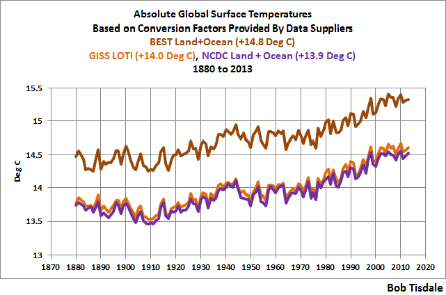

Nick, you only partially quoted this paragraph of mine…
=====
” The fact that it was not in digital form means little to me, as that simply means The fact that it was not in digital form means little to me, as that simply means it took more time to compile the data. Data that did not exist then essentially does not exist now.. Data that did not exist then essentially does not exist now.”
===========
You then refute this by explaining how “it took more time to compile the data”, which was my point. Your complaint about the amount of data being “an absolute limitation” is not valid in my view. There were decades to do this, with more than one person, and your broad based answers to only a few of my questions, (and not the most pertinent ones) are wholly unacceptable for a theory that wants to claim global disaster, spend trillions of dollars of other people’s money, and fundamentally change social and political structure on a global basis. Yet you admit that the what was raw GMT data in the 1980s is different then raw now.
AFAIKT, we (the public) still do not know…
1. What raw records from the 1980s were and are still being used.
2. Exactly how and why and when those original records were changed. (They are still being changed monthly by computer algorithms… )
3. How much all changes to those records changed the GMT by date over the last 40 years.
4. If the original recorders of those records had already made quality control changes to the raw data. (Such as was done in Iceland, but later nonsensical changes were made regardless)
5. What additional records were later added and why, and how much did they change the absolute GMT estimates from that time.
6. What, if any, of the original records were no longer used when new records were added?
7. If they were no longer used, why those decisions were made.
8. What trend we would get using 1. only those original stations comprising the raw data of the 1980 ish studies, and 2. Continuously active true raw data from the best sited stations for the duration of the study, with the raw displayed next to any adjustments with UHI adjustments made by actually comparing real rural trends to each specific nearby well sited urban record.
My question regarding the use, or lack thereof, of SST to compile a GMT was not criticism or armchair quarterbacking, it was just a question. My more cogent questions about land vs. sea GMT demonstrate this. I would have hoped that with every major climate organization and the CIA endorsing the ice age scare, they would have found the budget to compile what records they could, or there may be a more rational reason they choose not to compile a SST record; they realized the error bars of SST data (for many reasons) would simply make the data less then useful and that the surface land record likely had a reasonably consistent correlation to the SST record. Computers, once data is complied, simply allow one to manipulate data in almost unlimited mathematical means. The fact that all the numbers add up, means little. IMV you and Mosher cannot see the forest for the trees due to this.
Regarding SSTs you claimed those records just sat in ships logs and needed to be compiled. Yet they had been compiled and gathered as early as 1981, and the reason they were not used support my guess regarding quality issues, not gathering or compiling; From Hansen and Lebedeff 1987…
====================================================
“Analysis of ocean surface temperature change has
Also been made [Palttidgea nd Woodruff,1 981;B arnett,1 984;
Folland et al., 1984] on the basis of ship data. Because the
land and ocean data sets each have their own problems
concerning data quality and uniformity over long periods
(see previously cited references above, especially Barnett
[1984] and Jones et al. [1986a]), it seems better to analyze
the two data sets separately, rather than lumping them
togetherp prior to analysis A. another valuable source of global
temperature data is provided by the radiosonde stations
[Angell and Korshover, 1983]. This source includes data
through the troposphere and lower stratosphere but is restricted to the period from 1958 to the present.”
“Jones et al. [1986c] recently published an estimate of
global near-surface temperature change obtained by combining
the surface air temperature measurements of meteorological
stations with marine surface air and surface water
temperature measurements We compare their results with
ours at the end of this paper; our global mean and hemispheric
mean results are generally in good agreement with
theirs. “
“The 1981 peak in the northern hemisphere is
0.1øC greater than any previous year in the record, but the five year smoothed peak in 1981 is the same as the fiver year smoothed in 1940.”
The long-term global trends illustrated in Figure 6,
i.e., the 1880-1940 warming, 1940-1965 cooling, and
1965-1985 warming, are much larger than the estimated
errors.”
================================================================
Nick, Bob Tisdale’s answer to my questions about past data and absolute GMT vs. anomalies estimates is far more informative. Bob asked GISS, “What do I do if I need absolute SATs, not anomalies?” Their answer was highly informative about their ignorance.
I can see good reasons for using both anomalies and absolute GMT. However if you cannot do both, then both are suspect. In an ever changing data base, which the surface record is, of radical changing of the number and location of stations, and radical environmental changing conditions of stations which both have and have not physically moved, and changing methods of measuring and technology of instruments, and ever and continual different adjustments, and incomplete information on the original compilers of the data and any changes they made from raw, it is necessary to have a complete and documented datelined history of all changes and when and why they were made, and both an anomaly chart and an absolute chart.
Absolute T trend is certainly relevant, as CAGW theory is dependent on the GMT rising to the point of actually producing all the scary projections in the literature. If two different methods produce similar trend patterns, but very different absolute GMT over the same period, then it is only an indication of false precision and wider error bars, as every possible trend within both methods of the surface record could be correct. It turns out that this is the case.
As it turns out the answer to Bod Tisdale’s question to GISS, “What do I do if I need absolute SATs, not anomalies?” is very informative of these problems. The paraphrased version of their answer is..
==============================================
“Hey Bob, we cannot imagine why you want absolute GMT, you do not need absolute T, but if you want it, get it from our trusted models which produce this answer, which is accurate to within 70 years of our predicted warming, or 1.2 degrees C .
===============================================
Here is their actual answer…
============================
“In 99.9% of the cases you’ll find that anomalies are exactly what you need, not absolute temperatures. In the remaining cases, you have to pick one of the available climatologies and add the anomalies (with respect to the proper base period) to it. For the global mean, the most trusted models produce a value of roughly 14°C, i.e. 57.2°F, but it may easily be anywhere between 56 and 58°F and regionally, let alone locally, the situation is even worse.
===============================
As it turns out this “most trusted models” are based on the GISS data which run a little warmer than the NCDC data; 13.9 vs. 14 C 20th century average. They are both however very different then the Berkley Earth (BEST) product. For land the 20th century GMT BEST gives a value of 9.35 ± 1.45°C, which is very different then the 8.5°C provided by Peterson.
So the BEST range of 1.45 C is about 200 years of warming at the observed trend for the last 18 years, and maybe 400 years of never if the pause returns with a strong la Nina and a negative AMO.
Bob gives The BEST, GISS and NCDC annual global mean surface temperatures in absolute form from their start year of 1880 to 2013 as shown in Figure 3 of his excellent paper on absolute trends…
Ok, wow, the GMT in the current pause period 1998 to 2013 as shown by GISS loti and NCDC is pretty much the same as the GMT in the BEST product from 1880 to 1890!
Who is correct? BEST claims a range of plus or minus 1.45 C. GISS loti and NCDC run consistently cooler then the negative side of that range, or about .85 C cooler for most of the record. Let us see if the models shed any light on this…
Ok wow, that is quite the range. It consistently shows results averaging over 3. C degrees different. At any period from 1880 to 2013 we could have been rushing into catastrophic warming and disaster, or fully leaving the current interglacial and freezing.
It is very plain that we have no idea what the absolute MT was throughout the 130 plus year period, and using all the different ways of potentially justifying our data, we could produce any chart we wish. Massive data, combined with modern computers and confirmation bias, along with peer pressure monetary reward could easily generate an incredibly wide range of trends within the period.
It is, IMV, not wise to claim that anomalies are much better as they are produced by using 1200km extrapolation for infilling land surface areas and areas with sea ice where there are no observations based data, and where we are constantly changing which stations we use, the number of stations used, and where we are constantly changing the past records based on infilling from areas 1200 km distant, and where we are increasing how much infilling we do, vs. using actual data in our network, and we are claiming accuracy of two or three hundredth of a degree, but claiming at the same time that the absolute GMT is not known within 1.5 C and the climate models clearly do not have a clue.
Steven Goddard shows excellent documentation of the historic changes to the global record here…
http://realclimatescience.com/2016/05/alterations-to-surface-temperatures-since-1974/
Please note that Steven Mosher’s claims about changes in degree and direction are strongly falsified when the historic record since 1974 is considered.
Correct URL to show changes to GMT record since 1974.
Shoot, here is the correct address.
http://realclimatescience.com/2016/05/alterations-to-surface-temperatures-since-1974/
David A, about a year and a half ago, I prepared a post with model-data comparisons of global temperatures in absolute form :
https://bobtisdale.wordpress.com/2014/11/09/on-the-elusive-absolute-global-mean-surface-temperature-a-model-data-comparison/
Not long thereafter, Gavin Schmidt published a post at RealClimate about that topic:
http://www.realclimate.org/index.php/archives/2014/12/absolute-temperatures-and-relative-anomalies/
I followed up by quoting a few very curious statements Gavin made in that post. See:
https://bobtisdale.wordpress.com/2014/12/24/interesting-post-at-realclimate-about-modeled-absolute-global-surface-temperatures/
Cheers.
that appears worthy of a blog post all on its own bob. very surprised more wasn’t made of gavins comments at the time.
Thanks, Bob. You are wonderful to share your knowledge with us. Rather heroic of you to explain and re-explain while furnishing ammunition to question your posts. Proves you have nothing hide but much to share.
Enough Tisdales and humans get useful answers.
Your advanced understanding cannot go back 100 years to create data you dont have
If you understand scientific method, apply it to Tom Kal’s pause buster, and see what you come up with.
Go look up reasons for adjusting temperatures 120 years ago, look at the reasons for re writing Iceland and other countries’ historical data.
Then tell me if logic and scientific method apply, the devil’s in the details and your post was very general. Look into it, decide for yourself
I think the first thing people should be asking is how CO2 warms the oceans. MODTRAN clearly shows the impact of CO2 near the surface is immeasurable. IR between 13 and 18µ also doesn’t warm H20. How are the oceans warming due to CO2? That is the question that needs to be answered. It is clear that the oceans drive atmospheric temperatures as El Nino demonstrates. Warming oceans proves something other than CO2 is causing the warming. Until you can prove CO2 can warm the oceans, you can’t prove the AGW theory is valid.
The obvious and simple answer is the sun, direct input that drives long and short term cycles.
El Nino is probably the excess heat the oceans cant do work with, and a purging of ocean heat would be followed by an opposite effect La Nina, then things level out.
Until we know what causes El Nino we cant say that something is not driving other changes.
Satellite measurement of the Troposphere show it is not CO2 warming the oceans.
Yes, it is the local star doing this to us. Minus this star, our planet would be a frozen little ball.
You are of course assuming that Zeke’s “raw GHCN data” is in fact what he says it is, and that such data is worth any more than a spit into the wind.
A valid point, a logical deconstruction how what the data is and how it was collected and adjusted all matters.
If the process to create a raw GHCN data set is illogical, then the data is bunk.
personally I do not know the ins and outs of GHCN raw so I have no idea.
Andy, I mentioned that earlier in the thread.
“I am however curious about how GMT graphics used to be produced in about 1980, as the “raw” data used then, is clearly not the same “raw” data used now. Those graphics showed a .6 degree drop in NH from about 1945 to 1978 or so, and a .3 plus degree drop in global over the same period.
Over that time there was rapid increases in NH sea ice, supportive of the graphics at the time, and of course the well documented ice-age scare. As large as the spread is in Bob’s 2001 to 2013 chart, (.013 raw vs. .053 GISS) it pales in comparison to the removal of the blip, and other evidence and time frames from the global charts of the 1980s.
Does anyone know about the composition or formation of the 1980 time frame GMT graphics, and the difference in “raw” then, vs “raw” now?
How can you possibly justify the criminal mislabeling of Hausfather’s data as “Raw”? It’s about as raw as a charcoal-black roast, cooked for 3 days at 450 degrees.
To expand: the GHCN supposed “raw” contains massive amounts of “in-filled” (ie. “completely made-up”) data where stations have either missed months, or have stopped reporting altogether. The in-filling comes from algorithms just making stuff up, based on “neighbouring” stations, which can be hundreds of miles away, both in latitude and longditude.
Bob, I just cannot agree with you on this one. Even the use of “Raw” in inverted commas is too much for me. Hausfather’s data is no different from the rest (highly manipulated), and it shouldn’t be mislabeled in the fashion that you have.
Yeah, if the raw data does not show the 1930’s as being hotter than 1998, then it is bogus data.
… cooked for three months at 1 Gigaflop in an algorithm
“the models still cannot explain the initial cooling of global sea surface temperatures from 1880 to about 1910, and, as a result, the models cannot explain the warming from about 1910 to the mid-1940s“. But that means that the models also cannot explain any warming or cooling before or since, especially if temperature changes before or since were of similar (or lesser) magnitude over similar time scales. The reason that they cannot explain them is logically very straightforward : if the models don’t know what factors operated 1880-1910 or 1910-1940 then they don’t know if the same factors operated in other periods, hence they cannot know what caused any temperature changes (or non-changes) over any other periods of comparable duration.
Bob Tisdale does say it in this article, but it is worth repeating. And repeating.
What historical events models cannot reproduce, are attacked by the revisionism of Mann Schmidt and Karl
MWP LIA, 1940s 1970s and the last 16 or so years have all been revised.
This is making data match models, or as most people would call it. fr4ud
As we cannot measure ocean temperatures to an accuracy of 1/1000, 1/100 or even 1/10th of a degree, then all these temperatures are essentially the same. There is a lot of false precision here.
Pretend precision… arbitrary accuracy… contrived certainty.
When the public loses interest:
(1) Increase the data decimal places (was tenths of a degree, now hundredths, per NASA),
(2) Increase the confidence level (was 95%, and will be 105% in next IPCC Report), and
(3) Increase the consensus (was 97%, soon to be 99.9%).
This is not false precision — false precision only a[plies to science.
Climate change is politics, not science.
Perpetually adjusting squiggly lines. Is this really a scientific endeavor?
Andrew
Even the Raw data has been changed from what it was before.
There is also the issue of station changes in the GHCN database. They are only using about 1/3 of the stations they could use. Basically, they have switched out the “flat” trend stations for those that show an increase and they seem to carry out this renewed station-selection process every month.
Is Zeke really the best source for the Raw data? He has not been open enough in the past to have gained my trust.
I would do it myself if the databases were in any way usable but one has to spend only months of work to find out later that Zeke says you did it wrong.
There is lots of climate data available. But all the important stuff is held in databases which are deliberately set-up to be unusable so that you need help from the pro-global warming professional scientists in order to use it. They get to ensure you don’t get to the truth.
Bill, Hausfather’s data is as far from “Raw” as Mickey Mouse is from a real mouse. It’s just not right to give that creation the title of “Raw”. It’s not.
When you take raw data, every adjustment to the data adds uncertainty. That accumulation of uncertainty never makes it to the final product, only the uncertainty as defined by the statistical methods. They are not real uncertainties, they are artifact defined uncertainties
Same for the IPCC’s high confidence in the models. The confidence is high in the confines of the models, but given observation, uncertainly is at times 100%, especially the further back in time you go.
What was “raw”, in 1980 is very different then “raw” now. The changes never stop. The base periods themselves never stop changing. The past has been adjusted outside of the published error bars at the time, comparing 1980 data to current GMT graphics. At this point it is FUBAR.
Scientific method requires a scientific reason for altering old data. As such empirical proof is needed to justify such changes. No, they have been using assumptions to correct the data and also assume that the Icelandic met didn’t know how to read thermometers for the last 100 years, or the Irish met, and other places around the world.
Assumptions used to support an argument do not make great foundations upon which to build anything.
As such, most of AGW theory dissolves the minute it comes into contact with logical examination of every step in the process.
using surface temps as a metric of AGW, is the same as counting car crashes as a method of determining what caused the crashes and laughably that is without even getting into the fact the “data” is not “data”, measurements are data, statistical products are made by man, they are not real things, they are mathematical artifacts creates to show statistical trends, they still mean nothing to the individual events in our chaotic system and have NO predictive power of the future.
The whole global average temperature is a huge waste of time. What can the average temperature of your home tell you about any one room? Nothing.
What can averages tell you about the cause of temperature rises? Nothing
Mark May 7, 2016 at 5:24 am
“What can averages tell you about the cause of temperature rises? Nothing”
But it can tell you if the temperature is rising….. and if it wasn’t rising, you and I wouldn’t be here.
Agreed Mark! Well stated.
Bob Tisdale included this simple statement:
Combining arbitrary adjustments to arbitrary infilling and all temperature records are make-believe data.
Inventing phantasmal anomalies and averages, especially when the climate teams arbitrarily change which stations get included, yet the lazy climate teams avoid improved data systems.
Aand there is the simple Simon who manages to miss the entire article Bob posted above, plus ignores most of the comments while pretending to rebut Mark with already falsified rationale.
All that is needed to complete the picture is Simon’s doughnut and doh!
“The whole global average temperature is a huge waste of time.”
Tell that to people making money in the $1.5 trillion “green” industry.
When real science argues misinformation and data adjustments, the climate alarmists win. When real science gets distracted arguing how many angles can dance on the head of a pin, the climate alarmists win. This is all smoke and mirrors, slight of hand, to keep real science distracted and chasing their tails.
What is AGW all about? Stay focused on that. The only defined contribution of CO2 to the AGW theory is trapping IR radiation between 13 and 18µ, that is it. Every article should answer the basic question as to how CO2 can or cannot cause the observation. That is basic science, and those basic questions are never asked of the climate alarmists. Instead we get led around by our noses chasing what ever nonsense the climate alarmists throw in front of us. Trust me, they can produce far far far more nonsense than we could ever debunk, and they will, and have.
This is science, real science, we only need one experiment to prove the alarmists wrong. We only need one experiment to reject the null. The climate alarmists produce warming oceans as proof that CO2 is warming the globe. How? Ask that simple question. How does CO2 and trapping IR radiation between 13 and 18µ warm the oceans? Ask that simple question and you win, argue the data adjustments and you lose. Have them demonstrate it in a lab and using MODTRAN. They can’t. What they can do is produce nonsense to distract people from asking the relevant questions.
Once again, how does CO2 cause the warming of the oceans? If the warmists can’t explain that, and they can’t, they can’t claim CO2 is the cause of the warming.
One other important question is how does CO2 increase before temperatures to drive us out of an ice age? How does CO2 fall to pull us into an ice age. Those are the problems faced by the climate alarmists, and on one is asking them those questions.
https://youtu.be/QowL2BiGK7o?t=16m44s
Bob,
Instead of gridding and infilling, has anyone tried random sampling the raw data to produce a temperature series?
For example, pick a random point on the earth and a random time between 1850 and now. Choose the raw temperature sample that is closest geographically and temporally to your random choice.
Continue this process and what should result is a scatter plot with an underlying normal distribution of temperatures from 1850 to now for the entire earths surface, that can be reliably analyzed for average, standard deviation and error, etc.
This would eliminate much of the current problems that result from trying to “trend” stations. Instead, the process assumes that stations change over time in ways that cannot be reliably corrected, so don’t try. Instead assume that over time the random errors will balance out if they are sampled randomly.
This would seem to be the key element that is missing in the data corrections. They have ignored the power of large numbers to correct errors when sampling is random.
Trillion spent, I repeat, TRILLIONS OF $s spent on this green energy nonsense and the impact of Atmospheric CO2 is IMEASURABLE, it anything, CO2 is accelerating. Ask a climate alarmists if spending trillions of dollars to achieve no impact on atmospheric CO2 is money well spent? Someone needs to create a chart showing $ spent combating climate change vs atmospheric CO2, they chats will be positively correlated, meaning the more spent on fighting CO2, the higher it goes. That says it all right there.
http://celebrating200years.noaa.gov/datasets/mauna/image3_full.jpg
http://dailysignal.com//wp-content/uploads/2009/04/cap-and-trade-budget1.jpg
Bob. Your work shows the importance of picking start and end dates when analyzing data. These should be picked to illustrate an empirically based working hypothesis as seen in Fig 1 at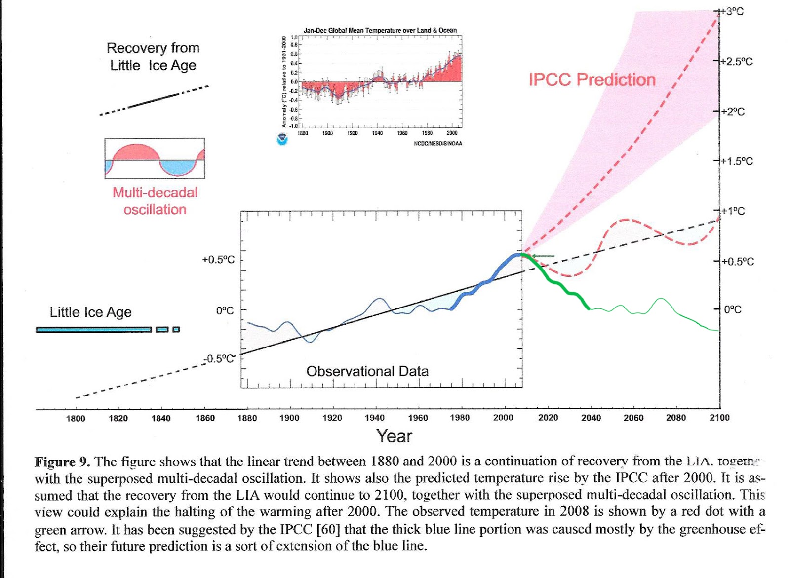

http://climatesense-norpag.blogspot.com/2016/03/the-imminent-collapse-of-cagw-delusion.html
Figure 1 above compares the IPCC forecast with the Akasofu paper forecast and with the simple but most economic working hypothesis of this post (green line) that the peak at about 2003 is the most recent peak in the millennial cycle so obvious in the temperature data. The data also shows that the well documented 60 year temperature cycle coincidentally peaks at about the same time.
The RSS and Hadrut 4 trends are shown below
The RSS data and the Hadcrut 4 data show a small difference in the timing of the millennial peak between the data sets. The trends are truncated to avoid the temporary effect of the current powerful El Nino on illustrating the working hypothesis.
Well, Dr Norman: what did you want to show us with this wonderful cherry-picking example?
Please allow me to modify it a bit in order
– to have everything baselined at 1981-2010;
– to cut this horrible RSS peak in 2016 you seem to have forgotten, what made your plot a bit less convincing than expected.
http://www.woodfortrees.org/graph/rss/from:1980.1/to:2014.2/offset:-0.083/mean:12/plot/rss/from:1980.1/to:2003.6/offset:-0.083/trend/plot/rss/from:2003.6/to:2014.2/offset:-0.083/trend/plot/hadcrut4gl/from:1980.1/to:2014.2/offset:-0.294/mean:12/plot/hadcrut4gl/from:1980.1/to:2003.6/offset:-0.294/trend/plot/hadcrut4gl/from:2003.6/to:2014.2/offset:-0.294/trend
But… there still is a little problem.
Namely that while yor trends were truncated to avoid the temporary effect of the current powerful El Nino on illustrating the working hypothesis, you seem to have forgotten to eliminate the temporary effect of this much more powerful El Nino in 1997/98…
And eliminating that good guy for the same reason gives you the following:
http://www.woodfortrees.org/graph/rss/from:1980.1/to:2014.2/offset:-0.083/mean:12/plot/rss/from:1980.1/to:1997/offset:-0.083/trend/plot/rss/from:1999/to:2014.2/offset:-0.083/trend/plot/hadcrut4gl/from:1980.1/to:2014.2/offset:-0.294/mean:12/plot/hadcrut4gl/from:1980.1/to:1997/offset:-0.294/trend/plot/hadcrut4gl/from:1999/to:2014.2/offset:-0.294/trend
All data sets are cherry picked to illustrate the authors interpretation Science is a competition to see who is the best cherry picker. Whatever effect the 1998 event had is included in the trendlines. Here is a later comment I made to Pamela Gray
“Pamela I am not saying remove the Enso events from the data .The 1998 and 2010 El Ninos are obvious in the RSS data above. You simply don’t use the middle of one as an end point. You wouldn’t start a trend from the 1998 peak e.g. As you can see 4 or 5 years past the peak it doesn’t affect the trend much.
You need to keep in mind that the IPCC specifically stated it was supposed to warm at least .20C for EACH of the first two decades of the new century,with additional emission scenarios included another .10C warming is expected,which adds up to .30 C per decade.
Reality is that it is a near ZERO trend after 15 years. AGW conjecture fails once again.
bindidon says:
…what did you want to show us with this wonderful cherry-picking example?
…as bindidon cherry-picks his own factoids.
That’s called hypocrisy, Mr. B.
Bindodon, says..
==============
Namely that while your trends were truncated to avoid the temporary effect of the current powerful El Nino on illustrating the working hypothesis, you seem to have forgotten to eliminate the temporary effect of this much more powerful El Nino in 1997/98
====================
Wrong on several counts. The 97 El Nino was not much more powerful. They are very comparable. Two, the 2010 El Nino is in the data set. Wait until we settle out after this coming La Nina into a La Nada. Then we will see. I do not think we will have the step up we got from 98..
Bindobon, how is 1980 a cherry pick?
Wrong on several counts, David A? Aha.
Look at this plot published above:
and you see the difference between. Look at UAH/RSS in april 1998 or march 1983 compared with april 2016…
But that’s not the point. I’m sometimes simply sad of reading comments eliminating chosen events but keeping their inverse… forget it!
I see nothing comparing the relative strength of each El Nino as Bob T has done in detail. Those look like T anomaly data sets for air T. I still do not know why you called 1980 a cherry pick.
Surely the key point is that changing the data does not change anything in the real world.
You can arbitrarily change the ARGO data, but unless you actually believe that there is something wrong with all the thermometers and that they are systematically under recording actual ocean temperatures then the idea that the actual ocean temperatures adjacent to each ARGO buoy suddenly jumped is fatuous.
Solar energy, once it enters Earth’s systems, isn’t easy to measure. It gets stored up where we can’t easily measure it here and there, and also directly heats things where we can easily measure it here and there. Just because we have a bunch of sensors all over the place, does not mean we have accurately measured all the incoming energy that Earth receives.
Energy gets stored, and moved around. A lot. The thing with moving heat from one part of Earth (say, the oceans) to another part of Earth (say, the atmosphere), is that we don’t know how long it takes for that heat to move to another part of Earth, or to leave Earth all together. Those that advocate for removing ENSO or atmospheric temperature spikes from the record are not taking into account this lack of knowledge about where energy goes or how long transferred heat stays around in the atmosphere. Furthermore, AGW’s may be attributing a source of additional atmospheric heat to a human source but in reality this heat is coming from a natural source that had stored it up earlier.
Pamela I am not saying remove the Enso events from the data .The 1998 and 2010 El Ninos are obvious in the RSS data above. You simply don’t use the middle of one as an end point. You wouldn’t start a trend from the 1998 peak e.g. As you can see 4 or 5 years past the peak it doesn’t affect the trend much.
None of this two and three decimal point data, graphs, and trends are real measured data, it’s all statistical manipulations and hallucinations.
+10
1) Per IPCC AR5 Figure 6.1 prior to year 1750 CO2 represented about 1.26% of the total biosphere carbon balance (589/46,713). After mankind’s contributions, 67 % fossil fuel and cement – 33% land use changes, atmospheric CO2 increased to about 1.77% of the total biosphere carbon balance (829/46,713). This represents a shift of 0.51% from all the collected stores, ocean outgassing, carbonates, carbohydrates, etc. not just mankind, to the atmosphere. A 0.51% rearrangement of 46,713 Gt of stores and 100s of Gt annual fluxes doesn’t impress me as measurable let alone actionable, attributable, or significant.
2) Figure 10 in the Trenberth paper (Atmospheric Moisture Transports…), in addition to substantial differences of opinion, i.e. uncertainties, 7 of the 8 balances showed more energy leaving ToA than entering, i.e. cooling.
3) Even IPCC AR5 expresses serious doubts about the value of their AOGCMs.
Three simple points seek three simple rebuttals. All the rest, sea levels, ice caps, polar bears, SST/LTT/ST trends, etc. don’t matter, nothing but sound and fury.
1 Is very easy, look into how those numbers are produced and you have your rebuttal to that. clue: the total biosphere carbon balance is a fictional number, they have no idea, this is a guesstimate.
2 Water vapor appears to be on a slight downward trend, very slight, not fitting for Trenberth’s warmer wetter world. More evaporation will cool the surface more but it will also increase water vapor, where is all Trenberth’s water vapor? also hiding in the iceans?
http://clivebest.com/blog/wp-content/uploads/2013/01/fig4c_tpw.jpg
3 The models are bunk, even fudged they cannot mirror the observed climate. End of story.
Research what the models cannot do, what they are bad at, and which complicated natural processes are fudged with simplistic equations rather than modeling the actual physics. Poor resolution and if you run them for long enough they will turn the earth into Venus
http://www.climate4you.com/images/NOAA%20ESRL%20AtmospericSpecificHumidity%20GlobalMonthlyTempSince1948%20With37monthRunningAverage.gif
Well, that’s not a rebuttal!
Not disagreeing Mark, just restating.
The total biosphere carbon balance is worse than ‘a guesstimate’. It is a sum of multiple simple guesstimates! All of which are untested and unverified for global use.
The Earth is a globe with an average diameter of 12,742 km (7,926 miles).
Carbon sourced from the biosphere is known to be found at a depth of 650 km (403.9 miles); subduction zones of the upper mantle, to the limits of atmosphere on our planet.
There may be Earth bio-sourced carbon beyond these rough limits.
Anyone claiming to rationally know biosphere carbon storage amounts is practicing self stimulation instead of science.
Especially when they barely understand the carbon biosphere basics.
Nicholas Schroeder says:
All the rest, sea levels, ice caps, polar bears, SST/LTT/ST trends, etc. don’t matter, nothing but sound and fury
…signifying nothing, as the Bard would say.
It’s not a rebuttal, it’s pointing out the obvious. The point being that the IPCC are not dealing in anything other than guesses when talking carbon balance. Trenberth’s science is based on assumptions as are all if then studies and the models are not validated, not representative of actual climate, and have proven to be totally unreliable even with fudge factors and they run in a linear fashion where as the system they are trying to replicate is non linear and they are all based on one than one assumption, or more acurately mathematics in lieu of scientific results.
If you want to argue guesses and science based on assumptions with no solid scientific basis to support them, go ahead, you cant fix a broken game by playing it.
Bickering over sea levels, ice sheets/caps, 0.xx C trends over decades/centuries, ToBs, UHI, etc. is the very epitome of the broken game. The point is to hoist the alarmists by their own fundamental petards.
Bottom line Nicholas.. no one can actually prove anything. So everyone can argue until the cows come home meanwhile little real progress is made. That’s where we’re at. After 30 years there is still nothing solid for AGW or the cause of rising temperature or CO2 growth.
“…no one can actually prove anything..”
Yes, they can and have – except in the Matrix.
Nicholas:
When the NULL hypothesis remains and the many proposed CO2 hypotheses are either still unproved or have been multiply falsified, what remains?
Use of confirmation bias science;
— guesstimates,
— tailored algorithms,
— incomplete experiment implementations,
— preferred selected data,
— preferred adjusted data,
— terrible data collection processes and procedures,
— Horrendous data manipulation processes and procedures,
— ignored errors,
— expunged contrary data and information,
— and so on, and so on…
are all the mainstays of climate science.
Rebuttal of the NULL hypothesis still remains to be proven by climate science.
Shrill claims and protestations coupled with many manifold wrong predictions are/is today’s climate science methods.
Bob, interesting graphs.
I would be really interested to see one of these reasonable and hyperbole-free posts on what adjustments are, in your view, valid. It’s clear that some adjustments for changes in measurement technologies etc. are necessary. It’s also clear that you don’t trust the adjustments as made by the scientists compiling the data. So how would you adjust the data, and how would that compare to the data you present here?
Cheers,
Ben
benben, I see you are again sniping your betters for the sake of sniping.
Bob was (and has been in the past) clear in his statements about certain adjustments. NOAA adjustments based on invalid use of extreme end of statistical range adjustment factors, inappropriate use of night marine air temperatures and failure to adjust for known data problems centered on the 1940’s. He has never, to my knowledge, stated that he did not “…trust the adjustments as made by the scientists compiling the data.” Crawl back in your hole.
Here’s adolescent benjibenji again harping on straw men and demanding that others work harder so benji can blindly ignore proofs and nitpick findings.
benjibenji; if you trust the adjustments, then prove them to us. Generic mass adjustments serve no purpose other than to obfuscate or obliterate.
Legitimate scientists would prove their claims with actual unadjusted data first, then indicate what increased error ranges exist because of possible systemic data collection, transmission, storage and manipulation procedures or circumstances.
Without proof from actual original data, climate scientists are just using self satisfaction exercise in lieu of science or scientific method.
I did not write that I trust the adjustments, and I’m certainly not going to say anything about them myself since it’s not my field of expertise by a long shot. But mr. Tisdale seems quite good at it, so how is it offensive that I ask for his opinion? Oh I know, because I’m different than you and therefore everything I say can be derided with nasty comments (‘crawl back into your hole’? Really?).
Well, if ever you wonder why most people don’t give you guys a second thought, your evidence is above. Beyond a very narrow demographic (hello Trump supporters!), people tend to ignore those who can’t deal with others without getting unpleasant.
Cheers,
Ben
It’s not just past scientific data that’s being rolled.
The Weather Channel sends out local 7 day forecasts to
every city in the country. Where I live, the forecast is consistently
3 degrees higher 3 to 7 days out, 2 degrees higher for tomorrow’s
and too many times 1 degree higher than the actual high for the day
(indicating a bias in their rounding method).
There’s a widespread belief that contaminating all future data is
a good thing as long as they are saving the world. I think they are criminals.
What was the reason for wiping out the 1940’s warming from data?
Is that a trick question, Mark?
Bob, thanks again for another very useful post. I have benefited greatly from your various posts and books.
I learned a long time ago that if one is to move forward and accomplish things the way you do, one must ignore the nitpickers and naysayers. Alternatively, one can gain useful insights from constructive critics, as you have acknowledged in the past. It is an art form to differentiate the two. It also tries one’s patience and temper and it is a credit to you that you handle it with such grace.
In order to make any sense of the world around us we have to take information as is available; denying that it is valid is a dead-end. All of your work has served to inform reasoned conclusions as to the evolution over time of land and, more importantly, ocean-basin temperature TRENDS. You have shown that models do not reconstruct the past and cannot predict the future. Based on the available data, you show that CO2 is not the primary driver of climate metrics. The puppies nipping at your heels haven’t a clue.
Steven Mosher actually got close to making a good point. Arguing about the details of past warming will get you nowhere in policy discussions. Proving the drivers of such warming is fair game. He is wrong, however, in stating that the world is warming. Speculating about future warming or cooling is also fair game. PROVING causation is essential in forecasting.
Dave Fair
Wiping out the 40’s data was an attempt to undermine
the argument that climate is cyclical.
Cooling the past and warming the present rolls the data
to give us an endless stream of hottest moments ever.
Back in the real world, cool waters signaling La Nina conditions are having an impact on the Peruvian anchovy fishery
Bob, you write:
in your explanation of how you chose the endpoints for Figure 5, then reference a NOAA chart showing 2013 was, according their measures, indeed a “neutral” ENSO year, but hte same chart confirms the other endpoint (1998) was not.
Why have you chosen 1998 to begin this series? My suspicion is the “hiatus” looks much less pronounced when it’s begun on the other side of the step rise in temperature observed following the 1998 ENSO. It seems less theoretical and more to the empirical point to begin and end the interval as Monkton has proposed; you start from now and go back until a trend is observed. There’s no hypothetical in this method. It brooks no argument concerning the global effects of ENSO, it simply observes there has been no significant warming over some period of time.
I think complicating the analysis by using “partial” ENSO criteria doesn’t improve the argument or the presentation, it just opens the door to discussing the relevance of the ENSO and your criteria will be criticized for not being uniform.
Monckton’s approach is not particularly meaningful. For how to pick useful endpoints see above
https://wattsupwiththat.com/2016/05/07/do-the-adjustments-to-the-global-landocean-surface-temperature-data-always-decrease-the-reported-global-warming-rate/#comment-2209238
Dr. Norman Page:
“Monckton’s approach is not particularly meaningful”
Well, that is clear as mud. Perhaps you mean to indicate that, Monckton’s approach for calculating the pause is not particularly applicable in calculating periods of warming or cooling?
Lord Monckton’s pause calculation method is applicable to calculating statistically significant periods of null data slope. Which is not what Bob Tisdale accomplishes above.
If the period includes an inflection point “statistical significance ” has no meaningful physical correlate in the real world..
Dr. Page:
That is an arbitrary claim.
The obverse is; ‘inflection points, as a portions of cycles, cause determining rising or falling slopes to be unnecessary exercise’.
Questions of the effect of various data adjustments should not obscure much more fundamental concerns about the geographic coverage and integrity of the extant data bases.
With historical SST observations from ships of opportunity we not only have vast empty spaces between well-traveled sea-lanes, but total lack of control of measurement location and method (buckets, engine intakes) in monitoring perpetually moving water masses. With station records, we have only partial control of location, which is overwhelmingly urban in the global aggregate, and only rarely extends over the entire 20th century, let alone over the intervals shown from stitched-together shorter records. The unconscionable elision of long trendless records, mentioned earlier by Bill Illis, only exacerbates the lack representativeness in the GHCN database.
Those are the real elephants in the room, whose shadow obscures the fact that the 20th century global average air temperature–as best as can estimated from long, vetted UHI-uncorrupted station records and high-quality marine observations, experienced its minimum in 1976, as did the SST.
There should be a dash, instead of a comma, between “observations” and “experienced” in my last sentence.
Alarmist Questioner: You claim the 1930’s is hotter than subsequent years (see chart below) but you seem to be misguided because the 1930’s temperature data you are pointing to in the chart is U.S. temperature data, not a “global” temperature.
http://www.sealevel.info/fig1x_1999_highres_fig6_from_paper4_27pct_1979circled.png
My reply: Yes, I see that argument all the time when this subject is brought up. The question implies that what I am doing is comparing apples to oranges when comparing the 1930’s U.S. temperature to the “global” 1998, temperature, thus, the comparson is invalid, so the argument goes.
This is the standard rebuttal to the claim the 1930’s was hotter than subsequent years.
But I don’t think we are comparing apples to oranges.
The Climate Change Charlatans conspired together to change the historic surface temperature data because they said among themselves that the 1930’s, was hotter than 1998, and they felt the need to modify this temperature profile so that instead of showing a cooling trend, it would show a warming trend, to fit in with their CAGW theory.
Now, if the Climate Change Charlatans were only comparing apples to oranges, then they would have no need to modify the temperature record, because they could just make the same argument make and say the data was irrelevant because one was a local temperature and one was a “global” temperature. But they didn’t make that argument.
What really happened is the Climate Change Charlatans looked at all the historic temperature data available to them, such as the UK, Iceland, etc., and saw that in all cases, the 1930’s showed as hotter than subsequent years (with minor differences), so the Climate Change Charlatans were basing their claim about the 1930’s on all the available global data they had, not just on the U.S. temperature data. That’s why they were panicked and conspired to change the data.
They were comparing apples to apples, and if they left the apples in their historic form, then the 1930’s would show as hotter than subsequent years. They didn’t want that.
There are many historic, unmodified charts from around the world that show a similar temperature profile to the chart above. Even Cape Town South Africa has a similar chart.
Any chart you look at in the future should look like the one above, with the years after 2000, added on to the end. That is the REAL temperature profile we have been living under all these years.
Any chart that does not have the 1930’s hotter than subsequent years is false and is bad data meant to fool people into thinking we are in an unrelenting warming trend, when the exact opposite is the case. This is a costly, stressful false reality created by conniving Climate Change Charlatans.
I think Trump’s Attorney General (Christy?) should prosecute these Climate Change Charlatans for defrauding the taxpayers of the United States.
They wouldn’t want me on their jury. 🙂
Nicholas Schroeder wrote on May 7, 2016 at 7:37: None of this two and three decimal point data, graphs, and trends are real measured data, it’s all statistical manipulations and hallucinations.
I love such comments!
Here you see a collective result of lots of wonderful ‘statistical manipulations and hallucinations’:
http://fs5.directupload.net/images/160507/hspmb7lq.jpg
This is a plot showing, for the time interval between 1979 and 2015, the work of several teams responsible for 9 datasets: 1 radiosonde measurement set for the middle troposphere, 3 satellite measurement sets for the lower troposphere, and 5 surface measurement sets.
They partly share raw data, that all we know, but they all have very different evaluation schemes.
Over a span of 37 years, the trends vary, in °C par decade with 2σ CI, from 0.114 ± 0.08 (UAH6.0 beta5) up to 0.172 ± 0.06 (Berkeley Earth).
The difference between the two extremes above should not wonder anybody: troposphere and surfaces are different places, with different reactions to what drives temperature changes.
What imho is much more interesting is the convergence among all these datasets.
You plot repeats the gross schoolboy error of the climate establishment , the IPCC the whole UNFCCC circus,Monckton and most commentators here by projecting the trend in a straight line when there is clearly an inflection point in the millennial and 60 years trends at about 2003 . see above
https://wattsupwiththat.com/2016/05/07/do-the-adjustments-to-the-global-landocean-surface-temperature-data-always-decrease-the-reported-global-warming-rate/comment-page-1/#comment-2209238
Any discussion which does not address, accept or refute this in some way is a waste of time.
Add an r to the first word.
Ooops?! One more Owner Of The Very Truth, I guess? Thanks anyway for your fruitful hint, Dr…
Whether it is is the truth or not only time will tell. I do think it is the simplest and most obvious working hypothesis.It can be understood by any high school graduate or average non scientist who may have heard of the Roman, Medieval and Current warming periods It wouldn’t result in many publications jobs, grants, honors etc for the eco-left academic establishment and NGO.s in the US and UK nor opportunity
for profit by the corporate feeders at the public trough and the politicians who aid and abet them.
The “convergence” of datasets over the recent decades is hardly unanticipated, inasmuch as there has been a sharp upward swing in temperatures since 1976 and global satellite results are made publically available early each month. Prior to advent of the satellite era, however, there is great divergence between the various versions of the ouvre of cherry-picking archivists and tendentious index-makers, and even greater divergence relative to long, thoroughly vetted station records. The most egregious divergence is the creation of bogus long-term historical trends.
Thanks for this very intelligent explanation… but I could well live without it.
Maybe you explain all the world what it does wrong, e.g. by publishing your thoughts in a scientific journal?
My “thoughts” about the development during the last few decades of stunning inconsistencies in the archived data and attendant indices have been noted by numerous others who have delved deeply into the data bases. Some have even displayed their findings as flash images here at WUWT. That common knowledge scarcely provides fodder for publishing a research paper, especially in the era of academic pal review. Glad to hear that you can well live without it.
Thanks for this very intelligent explanation… but I could well live without it.
Because it doesn’t fit the narrative…
Bindidon, what IM(not so)HO is vastly more interesting is the divergence of the post-1998 radiosonde and satellite trends from surface measurements.
Another “innocent” discrepancy!
It’s about 2:50 am here, so this for short.
It’s a bit hard to see, but in the plot above with all the 9 records between 1979 and now, there is this RATPAC B in the version “monthly combined”, for the pressure level “300 hPa”.
According to one of Roy Spencer’s posts, the average absolute temperature in the LT where UAH measurements take place was in 2015 about 264 K, i.e. -9 °C and thus 24 °C less than at Earth’s surface.
If we assume a loss of about 6 °C per km upwards in the atmosphere, that would mean the LT level where these -9 °C were measured should be at 4 km above surface.
That in turn means an atmospheric pressure somewhere between 700 and 500 hPa.
But the UAH6.0beta5 record is even below the temperatures measured by RATPAC A and B radiosondes at 300 hPa.
The only satellite record with a good fit to the RATPACs is… RSS4.0 TTT !
I have all that data on disk, and can plot all you want about that stuff.
trends, trends, trends
dogdaddyblog, on May 7, 2016 at 6:34 pm : trends, trends, trends
Wow! Somebody disturbed by trends at WUWT! That’s new indeed.
Until now I solely had to deal with these specialists of
http://www.woodfortrees.org/plot/rss/from:1997/to:2012/trend/plot/rss/from:1979/mean:12
Glad to read another meaning.
However, I don’t know how to show “the divergence of the post-1998 radiosonde and satellite trends from surface measurements” other than by comparing estimations computed using some least square method 🙁
Hope I understood you well as you wrote:
Bindidon, what IM(not so)HO is vastly more interesting is the divergence of the post-1998 radiosonde and satellite trends from surface measurements.
I plotted, from 1999 till today, some of the RATPAC B pressure records together with UAH6.0beta5 TLT, RSS4.0 TTT, and GISS:
http://fs5.directupload.net/images/160508/r6f4eto7.jpg
You see that
– GISS is far below radiosonde’s surface measurement;
– UAH6.0 is even below 250 hPa;
– the new RSS for the entire troposphere is near GISS…
Feel free to explain what you mean with these divergences. I have no idea…
Excellent graph, Bindidon! Thank you very much. I would have had to learn some new programs.
Looking at the data it is not apparent to me they start at 1998. From a visual standpoint, it would help if each of the trend lines began in 1998, as a common reference date (zeroed). Additionally, the slopes of the trends in degrees C per decade would be very meaningful to me as an old engineer. I do not, however, know if your program(s) have such capabilities.
Dave Fair
“…from 0.114 ± 0.08…”
What type of instrument measures to that resolution & from space, yet.
The best for you would be to read
http://www.remss.com/measurements/upper-air-temperature
from top to bottom; you then will understand what happens if you try to do the job using one fractional digit.
Bindidon
Ok. Now what.
Skimmed it, saw nothing about primary instrumentation, precision, accuracy, resolution, uncertainties. Tons of statistical manipulations. The pretty colored globe has a scale of 230 to 290 K w/ 1 K tick marks. How does one get 0.xxx C / decade out of xx1. C measured inputs?
http://images.remss.com/papers/rsspubs/Mears_JTECH_2009_MSU_AMSU_construction.pdf
http://images.remss.com/papers/rsspubs/Mears_JTECH_2009_TLT_construction.pdf
etc etc etc etc
But I think you aren’t that much interested in discovering what these people really do… because if you did, I wouldn’t have to write such comments.
A perfect example of how the climateers believe adding in more data without clarifying metadata or error ranges presents an image of precision, without any honest accuracy.
If data “evaluation schemes” result in different data ranges, that is additional errors injected by the evaluation scheme that should be explicitly explained in detail.
Simple source evaluation scheme names are not explanations!
Wow! Great precision, terrible to zero accuracy.
Multiple disparate temperature stations in varying degrees of disrepair and often infested with living organisms have huge error ranges greater than tenths of a degree.
Accuracy claims for data error ranges in the hundredths of a degree using data that originates with tenths of a degree error is impossible; but not uncommon for climatism science.
One more of these perfectly redundant and thus superfluous comments.
Firstly, ATheoK: do you really think that I didn’t see that detail? Do you really think me wasting my time in adding, for my hundreds of Excel Linest trend blocks, a computation automatically checking wether or not the 2 sigma has less precision than its trend, so all these ATheoK’s don’t need to add useless comments?
Secondly: there is NOTHING wrong in a confidence interval being even greater as the trend. I’m afraid you don’t understand what this CI is intended to.
Thirdly: such a comment as yours I NEVER have seen in the context of spurious trends like e.g. those of RSS3.3 for a ridiculous time interval of say 17 years, giving sometimes CI’s ten times bigger as their trend.
On the contrary: I then was told only the trend would be relevant.
‘Standard errors for flat trends are meaningless’, you suddenly get to read…
Bindidon:
Excuse me your omnipotence, Thank you for confirming your ignorance of handlings errors.
Your immediate reliance to ad hominem insults, deprecations and condescension is the giveaway that you can not speak to the science.
You sure don’t mind wasting our time with your claims of reaching 2-sigma precision.
Confidence interval? Straw man argument along with childish ad hominems?
A confidence interval is pure smoke if one is unable to state accurate all error ranges contained within that CI. An error range presented in a final graph should accuratly represent the total of all error ranges from data origination through presentation.
Is that an attempt to insult the RSS data? A small admission that there is a 17+ year pause in rising temperatures?
What is ridiculous is that the warmists and revisionists are unable to explain the pause.
Given that La Nina is coming quickly and looking to be a strong La Nina; it will only take a year or so before the decline in temperatures resuscitates the pause right back to the beginning.
Again, Confidence Intervals are bogus without all factors, i.e. errors, contributing to the trend are included.
Alleged increasing temperature trends are useless if the actual range of error is well above/below the alleged increases/decreases.
I see in a comment written by PA (May 7, 2016 at 10:44 am) a plot available at climate4you, describing well-known changes of the GISS temperature record.
Maybe PA should have a look at this:
http://www.moyhu.org.s3.amazonaws.com/2015/12/uahadj1.png
That’s a plot made by Nick Stokes to compare the two main GISS adjustments with the difference between the revisions UAH5.6 and UAH6.0beta (dated april 2015).
I never searched for older GISS datasets (what would that be good for?) and thus can’t verify Nick‘s comparison as such. I don’t have any reason not to trust him, however!
But these two UAH revisions I have downloaded, and it was easy to let good ol’ Excel compute the diffs between the two and plot them:
http://fs5.directupload.net/images/160508/wxdjwt5b.jpg
Looks nice, huh? But what about this?
http://fs5.directupload.net/images/160508/eth49vwp.jpg
Here we suddenly see that the UAH diffs in the first diff plot (concerning the globe) vanish to nearly zero in comparison with the diffs at the northern and southern poles in the second diff plot!
You are welcome to verify by doing the same job: many of the differences between anomalies are bigger than the anomalies themselves.
I trust in Roy Spencers work: his integrity is for me beyond any suspicion. If some people don’t trust in the work of Gavin Schmidt, Carl Mears or anybody else: that’s their problem. Basta!
Apologies: I’m too lazy to use Gnuplot 🙁
To answer the question at the end of the post, I think that adjusting the raw data is pointless because there is no way of objectively evaluating whether the adjusted data is more accurate than the raw data. Say I design a filter for a video signal that I think is going to eliminate noise (which is essentially an adjustment process on data). I can test the filter by using it and visually verifying whether picture quality improves, under what circumstances, etc. But we have no practical use for the temperature data to determine whether the new data sets are, in fact, more accurate quantitatively than the old data sets. This is not to say that there aren’t biases in the data. But just identifying sources of potential bias doesn’t mean that you should try to correct for them unless you have some way of testing whether the corrections improve the data. Absent that ability, the “corrections” are just an above-board way of fabricating data.
Bob Tisdale – You rarely like to respond positively on comments. When we raise cyclic variation, you tell us write a separate article but this is not correct approach on comments. Let me present two practical example: On global temperature anomaly in 2015 US Academy of Sciences & British Royal Society jointly brought out a report wherein they presented 10, 30 and 60 year moving average of the this data. The 60-year moving average pattern showed the trend. That means in this data series, if we use a truncated series, depending upon the series is decreasing arm and increasing arm of the sine curve [through these columns sometime back somebody presented a figure to explain this] the trend shows different type. This is obvious.
[1] In the case of Indian Southwest Monsoon data series from 1871, IITM/Pune Scientists [they are part of IPCC reports] briefed the Central minister [which was later briefed the members of parliament in parliament session in 2013/2014] that the precipitation is decreasing. They have chosen the data of descending arm of the sine curve. This has dangerous consequences on water resources and agriculture. This I brought to the notice of ministry of environment & forestry.
[2] In the case of Krishna River water sharing among the riparian states, central government appointed a tribunal [retired judges] to decide on this in 1970s. The tribunal used the data available to them at that time on year-wise water availability [1894 to 1971] for 78 years and then computed 75% probability value for distribution among the riparian states. Probability values were derived from graphical estimates [lowest to highest] and using the incomplete gamma model or any other model nor tested for its normality. Now, the central government appointed a new tribunal [three retired judges] to look in to the past award and give their award on this issue. Though this tribunal has the data for 114 years, chosen a period of 47 years [1961 to 2007] and decided the distribution.
The mean of the 47 years series is higher than 47 years series by 185 TMC. This 47 years series positively skewed and far from normality. The 114 years data series showed normality [mean is at 48% probability which is very close to 50% probability] and as well the precipitation data series showed a 132 year cycle. Prior to 1935 the series presented 24 years drought conditions and 12 years flood conditions; from 1935 to 2000 the data series presented 12 years drought condition and 24 years flood condition; since 2001 on majority of years drought conditions were seen similar to prior to 1935.
With the new tribunal award the downstream riparian state is the major casualty. This I called it as “technical fraud” to favour upstream states. This I brought to the notice of the Chief Justice of the Supreme Court, Respected President of India and Respected Prime Minister of India but they did little as per the constitution the powers of the tribunal beyond question even if they commit fraud. Now the downstream state approached the Supreme Court. Here the discussion goes on legality but not on technicality. We should not do the same mistake as scientists have no unfettered powers.
Dr. S. Jeevananda Reddy
Bob Tisdale – You rarely like to respond positively on comments. When we raise cyclic variation, you tell us write a separate article but this is not correct approach on comments. Let me present two practical example: On global temperature anomaly in 2015 US Academy of Sciences & British Royal Society jointly brought out a report wherein they presented 10, 30 and 60 year moving average of the this data. The 60-year moving average pattern showed the trend. That means in this data series, if we use a truncated series, depending upon the series is decreasing arm and increasing arm of the sine curve [through these columns sometime back somebody presented a figure to explain this] the trend shows different type. This is obvious.
[1] In the case of Indian Southwest Monsoon data series from 1871, IITM/Pune Scientists [they are part of IPCC reports] briefed the Central minister [which was later briefed the members of parliament in parliament session in 2013/2014] that the precipitation is decreasing. They have chosen the data of descending arm of the sine curve. This has dangerous consequences on water resources and agriculture. This I brought to the notice of ministry of environment & forestry.
[2] In the case of Krishna River water sharing among the riparian states, central government appointed a tribunal [retired judges] to decide on this in 1970s. The tribunal used the data available to them at that time on year-wise water availability [1894 to 1971] for 78 years and then computed 75% probability value for distribution among the riparian states. Probability values were derived from graphical estimates [lowest to highest] and using the incomplete gamma model or any other model nor tested for its normality. Now, the central government appointed a new tribunal [three retired judges] to look in to the past award and give their award on this issue. Though this tribunal has the data for 114 years, chosen a period of 47 years [1961 to 2007] and decided the distribution. The mean of the 47 years series is higher than 47 years series by 185 TMC. This 47 years series positively skewed and far from normality. The 114 years data series showed normality [mean is at 48% probability which is very close to 50% probability] and as well the precipitation data series showed a 132 year cycle. Prior to 1935 the series presented 24 years drought conditions and 12 years flood conditions; from 1935 to 2000 the data series presented 12 years drought condition and 24 years flood condition; since 2001 on majority of years drought conditions were seen similar to prior to 1935. With the new tribunal award the downstream riparian state s the major casualty. This I called it as “technical fraud” to favour upstream states. This I brought to the notice of the Chief Justice of the Supreme Court, Respected President of India and Respected Prime Minister of India but they did little as per the constitution the powers of the tribunal beyond question even if they commit fraud. Now the downstream state approached the Supreme Court. Here the discussion goes on legality but not on technicality.
In science we should not follow this.
Dr. S. Jeevananda Reddy
“Some persons believe the adjustments to the global temperature record are unjustified, while others believe the seemingly continuous changes are not only justified, they’re signs of advances in our understanding. What are your thoughts?”
They need no justification at all. Science is two parts: Imagination and Observation. Theory, models, adjustments, and all that rot are purely Imagination. And the Imagination requires nothing in the way of justification beyond that it was imagined.
Observation simply is. It is what was recorded from reality, no more nor less. You can take reality, put it through a sausage grinder with Imagination, and get Imagination out the other end. But you cannot get Observation back out of such an exercise.
However, misrepresenting Imagination as Observation is the domain of the ignorant and hucksters. And what is sorely missing in all of this is the scientific method. Proclaiming your imagination loudly and proudly. Then waiting for the Observations to roll at you in refutation.
It’s pretty clear even from figure 1 that there is no significant difference between raw and adjusted land and sea surface data over the long term. In a 5 year smooth they’d be practically identical.
The raw data tell us just as clearly as the adjusted data that there has been considerable global warming since 1880 and that the rate of warming has considerably increased since the mid 1970s.
Adjustments are proof the original raw data were no good.
Adjusting the adjustments means the first adjustments were no good.
When the adjustments pause, only then will the data be perfect.
Of course the “adjustment pause” must extend for at least 15 years before one can declare adjustments have ended.
Will someone please revive this thread after 15 years with no adjustments?
Only then will the data be perfect, and worthy of our skilled debate.
Perhaps after all the adjustments, we will be back to the original raw data again?
PS:
No adult beverages were consumed during the development of this logical post.
Sorry, but I personally see the work with this data as more or less futile.
The “raw” data says it all. It is no raw data.
Having spent some time reading and learning about the climate debate I came to the conclusion that the “raw” data is not raw at all, but already wildly contaminated and selected. In my view unfortunately there is no usable science to be done with such contaminated data.
In addition to this, the whole UHI issue is not properly handled, the population more then doubled since the 1950’s and is 7 times more since the start of the climate charts.
The cities grew, which resulted in increased values for UHI of a respective city. There is one value for a city of 5.000 inhabitants a different one for 50.000 and a different one for 500.000 with a great deal of measurements done around cities. But climate charts consider UHI a constant.
All the measured warming, including the “plateau” could be explained simply by the fact that overall population increased, increase that has slowed in the last decades significantly, especially in the Northern Hemisphere where cities are in a colder climate and UHI is more significant.
All this over a cyclical variation in the background.
There are also other influences to the measured temperature and all these adjustments are more or less guesstimates to try to correct for them.
What becomes more and more clear is that the CO2 influence to the climate is benign, in reality we cannot yet measure it.
The greening of the planet through the CO2 effect is real and could be measured, but that is anathema. Only this point alone clarifies that we do not talk science in climate but new religion. Meanwhile we can enjoy the greener woods where they are allowed to grow.
http://www.nature.com/nclimate/journal/vaop/ncurrent/full/nclimate3004.html
http://www.co2science.org/data/plant_growth/plantgrowth.php
The models are a catastrophic failure. Using weather models to try to estimate climate is from the starting point wrong, climate models need proper energy balance which is not included, as it would be too complex to build in. Not even the atmosphere lapse rate is properly calculated by such models and they want to measure long term trends?
The only logical step is to start new measurement with a clearly defined methodology and tools, define a 30 years observing period and postpone any conclusion for after the analysis of this period. There is no urgency as the influence is shown to be benign on temperature and good on plant growth.
My thoughts: impugning the work of any of the global data compilers is speculative, ideologically based and ignorant. That goes for impugning Spencer and Christy as well as the other compilers. It’s lazy bile.
All are the best estimates available at the time, data and methods available to the public (waiting on S&C to publish their latest revision methodology): fairly transparent compared to other sciences.
The trend differences between the surface data sets are minimal – a few hundredths of a degree per decade over climatic periods and longer. Uncertainty is larger nearer the beginning of the record, of course, due to sparser coverage. Very short time periods, of course, can have greater discrepancies – but then you’re not estimating climate.
The difference between satellite and surface are also fairly minimal for the full satellite period, despite different properties being measured at different altitude. Between the highest trend (HadCRU krig v2) and RSS 3.3, the difference is 6 hundredths of a degree per decade, or 0.6C/century.
Of course, the shorter the time period the greater potential for more discrepancy. And this is where critics love to dwell. But if the uncertainty (which is larger for shorter time periods) is taken into account, the difference between them all is vanishingly small. Indeed, the uncertainties for all the data sets overlap for pretty much all time periods. All the estimates are ‘wrong,’ but all share a common uncertainty value, even satellite/surface. They’re not wildly wrong.
One more thought. Bob Tisdale should include uncertainty estimates for the trends. Ie, X (+/- Y). With a brief explanation of what this means, the uncertainty intervals would provide some clarity. Using mean trend estimates alone suggests that they are the absolute result for trends, when they are not. Readers of posts like this should be educated on that.