Guest Post by Bob Tisdale
Quick Answer: Over the long term, the answer is yes, and the differences between datasets are noticeable. Over shorter terms, the answer depends on the data supplier.
INTRODUCTION
This is the second in a 2-part series of blog posts. We examined the impacts of the adjustments to global sea surface temperature data in the post here. Where the adjustments to sea surface temperature data decreased the long-term warming rate, the adjustments to the land surface temperature data increase the long-term trend.
But, as you’ll see, the adjustments to land surface temperatures have different impacts over shorter time periods.
PRELIMINARY NOTE
If you’re expecting the adjustments to the land surface temperature data to be something similar to those presented by Steve Goddard at RealScience, you’re going to be disappointed. Steve Goddard often compares older presentations of global land+ocean data to new presentations so that we see the change in data from a decade or two ago to now. Example here from the April 8, 2016 post here. But, in this post, we’re comparing recent “raw” land surface temperature data to the current “adjusted” data, which is another topic entirely.
“ADJUSTED” DATA
There are 4 adjusted datasets presented in the post:
Berkeley Earth – This is the recently created near-land surface air temperature data from the team headed by Richard Muller. The Berkeley Earth data are adjusted for numerous biases and they are infilled. Data here.
NASA GISS – This is the land surface air temperature portion of the Land-Ocean Temperature Index (LOTI) from the NASA Goddard Institute of Space Studies (GISS). GISS does not publish their land-only portion of the LOTI data in easy-to-use form (See note below), so I used the ocean-masking feature at the KNMI Climate Explorer to capture the land-only portion of the GISS data. The GISS land surface air temperature data are adjusted for biases and infilled with 1200km smoothing. The 1200km smoothing does not infill continental land masses completely. This is especially true in the early portions of the data, where sampling is poor.
Note: This is NOT the land-only temperature data from GISS (referred to as their Meteorological Station Data, dTs data) where they exclude sea surface temperature data and extend land surface temperature data out over the oceans for 1200km. [End note.]
NOAA NCEI – The land surface air temperature portion of the NOAA global land+ocean surface temperature data is available from the NOAA webpage here. NOAA adjusts the data for biases. I am unsure if the land surface temperature data NOAA supplies on that webpage have been infilled. The reason: The land surface temperature anomaly map here from the NOAA/NCEI Global Temperature and Precipitation Maps webpage does not appear to be infilled, while the corresponding map here of their combined land+ocean data shows infilling.
UK Met Office – The UKMO uses the CRUTEM4 land surface air temperature data for their combined land+ocean data. The CRUTEM4 data are adjusted for biases but they are not infilled. That is, if a land surface grid is without data in a given month, that grid remains blank. Annual CRUTEM4 data are available here, in this format.
“RAW” DATA
As far as I know, NOAA has not presented their unadjusted GHCN land surface air temperature data as a global dataset in easy-to-use form. However, a number of independent researchers have prepared comparison graphs of the unadjusted and adjusted global land surface air temperature data. One such comparison was prepared by Zeke Hausfather for the post How not to calculate temperatures, part2 at Lucia Liljegren’s blog The Blackboard. Zeke is now a scientist working as part of the Berkeley Earth Surface Temperature (BEST) team. On the thread of that post, I asked Zeke for the values of the “Zeke GHCN raw” dataset in his third graph from that post. (Refer to my comment here.) Zeke Hausfather kindly posted the “GHCN raw” data as part of a spreadsheet available here. (See Zeke’s comment on that thread at The Blackboard here.) It runs through June 2014, so the annual data in this post ends in 2013.
NOTE: This should be an older version of the GHCN data. NOAA has since revised it, adding new stations. Maybe in response to this post, Zeke will provide a link to a more current version of the “raw” global GHCN data and end the data in more recent times. I would be more than happy to update this post then. [End note.]
Base Years: The first 4 series of graphs are referenced to the WMO-preferred base years of 1981-2010.
IMPORTANT NOTE: This post compares land surface temperature data only. As a result, it does not include any additional warming present in the GISS Land-Ocean Temperature data associated with their masking sea surface temperature data in the polar oceans (anywhere sea ice has existed) and replacing that sea surface temperature data with land surface temperature data extended out over the polar oceans.
LONG-TERM TREND COMPARISON
Figure 1 includes the four “adjusted” land surface air temperature anomaly datasets compared to the “raw” GHCN data. The adjustments to the GISS and NCEI data create a long-term warming that is about 0.02 deg C/decade higher than the “raw” data for the period of 1880 to 2013, and slightly in excess of 0.02 deg C/decade in the case of the Berkeley Earth data. The adjustments to the UKMO CRUTEM4 data only add about 0.01 deg C/decade to the land surface air warming over the long term.

Figure 1
TREND COMPARISONS FOR 1950 TO 2013
For the period of 1950 to 2013, trend differences are very small between the “raw” GHCN data and the Berkeley Earth and UKMO CRUTEM4 data…less than 0.01 deg C/decade. See Figure 2. The adjustments to the GISS data show a slightly higher impact, roughly 0.02 deg C/decade. Not too surprisingly, the adjustments to the NOAA/NCEI land surface temperature data show the greatest change in warming rates from 1950 to 2013, almost 0.03 deg C/decade.

Figure 2
NOTE: Keep in mind that NOAA failed to correct for the 1945 discontinuity and trailing biases in their new “pause-buster” ERSST.v4 sea surface temperature data. That failure on NOAA’s part drastically increases the warming rate of that dataset since 1950 compared to the sea surface temperature data that have been adjusted for the discontinuity and trailing biases, the HADSST3 data. See the discussion of Figure 2 in the post here and the post Busting (or not) the mid-20th century global-warming hiatus, which was also cross posted at Judith Curry’s ClimateEtc here and at WattsUpWithThat here. It appears as though NOAA is trying to minimize the mid-20th Century slowdown in global warming with land surface temperature data as well, so they can claim global warming was continuous since 1950. [End note.]
TREND COMPARISONS FOR 1975 TO 2013
1975 is a commonly used breakpoint between the mid-20th Century slowdown and the recent warming period in global land+ocean data. So we’ll use that as the start of our next period for the “raw” versus “adjusted” land surface air temperature comparisons. See Figure 3. The differences between the “raw” GHCN data and all four of the “adjusted” datasets are very small for the period of 1975 to 2013.

Figure 3
TREND COMPARISONS FOR 1998 TO 2013
1998 is commonly used as the start year for the slowdown in global warming. And again, the last full year of the “raw” GHCN data from Zeke Hausfather is 2013. Figure 4 compares the “raw” and “adjusted” global land surface air temperature trends during this short-term period. The UKMO CRUTEM4 data shows basically the same warming rate as the “raw” data. The adjustments to the GISS and NOAA/NCEI data show only minor increases. The exception during the period of 1998 to 2013 is the Berkeley Earth data, which shows the adjustments added about 0.05 deg C/decade to the warming rate.

Figure 4
LONG-TERM DIFFERENCES BETWEEN THE “RAW” AND “ADJUSTED” DATA
For those interested, Figure 5 presents the differences between the “raw” GHCN data and the “adjusted” data from Berkeley Earth, GISS, NOAA and UKMO. For this presentation, the data were referenced to the base years of 1880-1909 before the “raw” data were subtracted from the “adjusted” data. The early base years were used to provide a clearer illustration of the extent of the adjustments to the long-term data. The top graph includes the annual differences, and the bottom graph shows the annual differences smoothed with 5-year running-mean filters to reduce the annual volatility.

Figure 5
IMPACTS OF ADJUSTMENTS ON LONG-TERM GLOBAL WARMING
It has recently become fashionable for alarmists to shift the data so that they can show how much global warming has occurred since “preindustrial” times. Unfortunately, most land surface air temperature datasets start well after “preindustrial” times, which, logically, are said to exist prior to the industrial revolution starting in the mid-1700s. So the best we can do is shift the data so that their linear trends align with zero at 1880. This also allows us to compare the “raw” and “adjusted” increases in global land surface air temperatures based on the linear trends. See Figure 6.

Figure 6
At the bottom of the illustration, I’ve listed the linear-trend-based changes in global land surface air temperatures from 1880 to 2013. The adjustments to the Berkeley Earth added about 0.3 deg C to the warming. For the GISS and NOAA/NCEI data, the adjustments increased the warming by roughly 0.25 deg C. The adjustments to the UKMO CRUTEM4 data only increased the warming since 1880 about 0.14 deg C.
As a reminder, we illustrated the decreases in long-term global warming that resulted from the adjustments to sea surface temperature data in the post here. In Figure 7, I’ve shifted the “raw” ICOADS sea surface temperature data and the data used in the global land+ocean datasets so that their trend lines zero at 1880. Because the ocean surfaces on Earth cover more than twice the land surfaces (roughly 70% ocean versus 30% land), the upward trend adjustments to the land-based surface temperature data only offset a portion of the downward trend adjustments to the ocean surface temperature data.

Figure 7
Curiously, the trends of the “raw” sea surface temperature data (Figure 7) and “raw” land surface air temperature data (Figure 6) are the same for the period of 1880 to 2013.
CLOSING
The title question of the post was Do the Adjustments to Land Surface Temperature Data Increase the Global Warming Rate?
As illustrated and discussed in this post, the answer is yes for the long-term land surface air temperature data.
For shorter-term periods (starting in 1950, 1975 and 1998), whether or not the adjustments have noticeable impacts land surface air temperature trends depends on the dataset. Then again, as shown in the post here, the adjustments to the sea surface temperature data over those shorter timespans can increase the warming rates noticeably.
What goes up must come down;
Sell the farm for a toot on the town.
==========================
Curiously, the trends of the “raw” sea surface temperature data (Figure 7) and “raw” land surface air temperature data (Figure 6) are the same for the period of 1880 to 2013.
====================
You would expect them to be the same over the long term. Which supports the idea that no adjustments to the “raw” data are required, as the true “error” in the raw data will be normally distributed around zero.
Any adjustment that changes the trend is likely to be statistically incorrect, because the sum of all adjustments should also be normally distributed around zero in the long term.
Figure 6 and 7 are one of the strongest arguments I’ve seen that the adjustments are statistically incorrect, because in aggregate they should not and must not change the raw trend. To argue otherwise is to argue that the error term is not distributed normally around zero, which is a nonsense.
The central limit theorem requires the error term to be distributed around zero, which means that the net of all adjustments must also be centered around zero, or there is an error in the adjustments. Clearly there is an error in the long term adjustments. Time for climate science to take a course in basic statistics.
ferdberple,
Thanks for the comment. I sometimes get to the point where I despair that anyone in the debate really understands any statistics. That comment was a pick-me-up. 🙂
That would be correct if the purpose of adjustments was to correct for random errors. But if they are correcting for systematic changes then you would expect to see a non-normal distribution and changes to the trend.
Only true if there is no systemic bias in the raw data – something which we know to be false. Surface Temperature Station siting is known to be biased in favor of higher population density regions, which are more strongly affected by the Urban Heat Island than are areas of lower population density. Thus, one would expect the true warming rate to be lower than that reflected in the raw data (how much lower is a more difficult question to answer).
That the temperature adjustments show exactly the opposite is quite telling.
Bellman,
An example of a systematic error with a non-normal correction would be for UHI. In that example, the present would be warmer due urban encroachment effects on station data. Thus the present and near past should be systematically cooled to account for UHI. In actual fact, the present and near past adjustments to Raw have warmed the data and the adjustments to distant past (pre 1940) have cooled relative to Raw station data. This is of course just the opposite of what was actually done.
This observations of the corrections deployed to the data argues that the land warming seen in the Raw is due to UHI. And the adjusted data further compounds that systematic. The motivations on the part of NASA,NOAA, UKMO, and BEST for such adjustments is likely part and parcel of the most massive scientific fraud ever perpetrated.
This fraud is further in evidence by NOAA’s pause buster ocean data adjustments where they used less reliable (accuracy) ship water intake temp data to correct the more accurate buoy data, then apply the higher confidence statistics of the buoy data to the entire record. Also the use of NMAT data to correct the data is dubious and much discussed by Bob Tisdale in past posts. In sum total what NOAA/NCEI did is nuts. The only reason to have made their corrections like that was to contrive a desired result, for a political narrative going into Paris COP21.
The realization that the Raw warming is likely just UHI is further strengthened by the failure to find the significant upper Tropospheric faster Warming (the upper tropo hot spot) in the the tropics, as predicted by the models (theory).
The conclusion:
The adjustment themselves to the Raw are merely a massive fraud to make the adjusted temps follow the MLO CO2 record.
Some confusion going on here. Berple has the gist of it correct in that if there is a systemic bias in the measurement equipement, the correction to that bias can not alter the trend *between* samples with the same bias in any material manner. This is far different than stating that there will be a normal distribution in the absolute corrected values for such a systemic bias. And, indeed, such a notion of a valid trend arising from shoddy equipment is routinely talked about by all sides in this debate.
But UHI is a different animal entirely. It is not a systemic bias in any sense. It is simply the data. Isolating the a causal portion of UHI from a single data point, or correcting the overall trend of UHI based on such causal notions is not a matter of ‘bias’ at all. It’s the difference between stating we have a bad instrument situated in a good location and a good instrument situated in a bad location. That doesn’t mean a bad location has systemic bias, it means it is tainted with things you want to control for, but can’t or don’t. It’s simply a bad experimental construction.
Geistmas,
The bias is not the UHI itself. The bias is in the distribution of surface stations, which are concentrated in areas with greater UHI. This leads to an exaggeration of the effect of the UHI on the global temperature trends. Since UHI increases proportional to population density, and since population density has been growing in Urban and Suburban areas, the net result of this oversampling is to bias the temperature trend upwards.
joelobryan
That might be true if UHI was the only bias being corrected for.
If you also have to correct for relocation and changes to stations and recording practices, you might well get a cooling bias.
Are you saying that all the waring seen in unadjusted land temperatures are due to UHI?
I’d like to see adjusted data that confirmed that.
Given how little difference all the adjusted data sets make to the raw rate of warming,
an adjustment that changed the warming rate by that much would be impressive.
“The motivations on the part of NASA,NOAA, UKMO, and BEST for such adjustments is likely part and parcel of the most massive scientific fraud ever perpetrated.”
The thing I love about WUWT is that folks can just fling the word fraud around without any evidence.
WRT UHI.
We tested UHI. We used only rural stations.
No difference.
1. Skeptics complained that not all the data was being used. So we used all the data.
2. Skeptics suggested that when stations MOVE or change instruments, we should not try to
adjust, we should just call it a new station ( Thanks Willis GREAT IDEA)
3. Skeptics suggested that we use KNOWN methods.. Krigging was always hurled around at Climate audit
so we used that.
4. Skeptics said. get a REAL statistican on board. So we did that. And, we spent a bunch of time
looking at the methods of RomanM and JeffId.
5. Skeptics questioned the Motives of adjusters. So we developed a method that is Data driven.
No human thumbs on the scale.
6. Skeptics demanded that adjustment codes be validated. So we did a double blind study.
Passed.
The fraud argument gets you no where. because it is wrong. People forget that the FIRST independent
replication of the land temps was done by JeffID and RomanM. yes, skeptics. And they found that
Hadcrut was biased low. of course no one accuses them of fraud and people forget. The internet doesnt forget.
As the years go on we will continue to collect data from the WUWT approved CRN stations. We almost
have 15 years of data… Those Gold standard stations MATCH all the “bad” stations. Thats right
The So called bad stations, give the same answer as the gold standard stations.
10 years from now.. that will still be the case..
“The thing I love about WUWT is that folks can just fling the word fraud around without any evidence.”
I have seen plenty of evidence, twerp.
Great article.
“Do the adjustments…..increase the global warming rate?”
Yes. Of course. That is their purpose.
“Do the adjustments…..increase the global warming rate?”
To paraphrase a response by Col. Jessup to Lt. Kaffee:
“Would there be any other kind?”
I’m alarmed, alarmed I tell you, to find that adjusting is going on here.
============
With the “pausebuster” data, there is no doubt in my mind that they let their biases get the better of them and adjusted SPECIFICALLY to get the warming rate that fit their expectations.
HOWEVER, I’m fairly certain that until the around 2010 or so, many of the biases were simply caused by the idiotic preoccupation with forcing station data into artificially long, seamless records (which is where most of the homogenization errors seem to arise. The whole idea of using virtual stations and re-aligning break-points when they might not really align was likely because they thought they could achieve some sort of magical accuracy. Sadly, this accuracy was pure delusion.
In reality what they should have done is use the stations they had for each day and calculate the temperature. This would have resulted in a wider distribution of temperatures…and more accurately reflected how much natural variation there really is.
Maybe the other question is why are you adjusting the data to begin with? Ryan Maue at WeatherBell publishes a temp anomaly chart based on the global initialization temps for the various weather models every 6 hrs (not the temps the models spit out), and I would think if it is a requirement to have accurate temperatures for the model starting points, these should be the ones used for historical charts.
It is behind their paid site so I can’t put up the most recent, but he does put it out on his twitter account occasionally. Regardless of the El Niño, it has been hovering around +.5C for all of 2015 (S Hemi down, N Hemi up). And the temperatures were trending down from 2005 to 2013 before moving up with the Pacific warming. And with La Niña on our doorstep, I would assume it will come back down.
What people need to focus on is “how can CO2 causes that temperature pattern.” Whether we are warming is irrelevant, the key question is whether or not we are warming due to CO2. CO2 over that time period has a linear increase in trend, has a non-linear decaying rate of energy absorption, and fixed IR absorption band. The fraud is so obvious is the way they are “adjusting” the data. The reason they need a linear increase in temperature is because CO2 increases in a linear manner. Plug in non-linear temperature as the dependent variable and linear CO2 and you have real problems with your model, as the IPCC Model Results prove. They then have to make temperature more linear to match the CO2 variability to the temperature variability, and that will boost the model’s R^2. Problem is the nit-wits lack a basic understanding of modeling. The critical factor isn’t the level of CO2, the critical factor is the change in energy absorbed by CO2, and that is non-linear and decays. If they keep trying to make temperature linear, it won’t match reality. CO2’s impact on temperature declines per unit as its level increases (in economics it is called the law of diminishing returns). The very fact that they are clearly manipulating the data in a manner to make CO2 match temperature demonstrates that they are manipulating the data to make the model spit out a higher R^2, but the way they are doing it exposes that it is fraud. There is no way for CO2 to explain the variability of temperature, there is no way for CO2 to cause spikes in temperature, and there is no way to CO2 to result in cooling. Those are the key questions people need to start asking. Don’t debate if we are warming or not, that is irrelevant. The key question to ask is how does CO2 cause that much variability? It can’t. The smoking gun is that they are trying to match temperature to CO2’s linear increase, whey they should be tying it to its marginal energy absorption. They have a misspecified model. It shouldn’t be ΔT = ΔCO2, it should be ΔT = ΔEnergy Absorbed by CO2
May I suggest this edit?
“the key question is whether or not we are warming due to Man’s CO2.”
If it is not proven but only theorized that Man’s CO2 is causing an unnatural problem then there is no excuse for the crippling restrictions being put into place.
Even if all these temperature adjustments are (somehow) justified, there is no justification for putting things like “The War on Coal” to restrict CO2 emissions under the tattered umbrella of “Going Green”.
The result of doing that is that our “green” is gone for no good reason.
I must say that I admire Bob Tisdale for his tireless work to provide some real evidence of what is being done to global temperature datasets by GISS, Berkeley and UKMO. I just hope that the next US President and Congress will establish an INDEPENDENT commission to investigate what is being done by tax payer funded organizations and provide evidence of the “adjustments” that add unwarranted warming to the records. Personally I am quite convinced that people like Bob Tisdale and Goddard/Heller are on to something very important.
that the next US President
=================
Hillary will give the adjusters a medal for proving global warming is real.
She’ll offer them a swipe at the town server with her begrimed common cloth.
===================
OLS trends of temperature are spurious and easily manipulated
http://papers.ssrn.com/sol3/papers.cfm?abstract_id=2763358
best to use robust tests to validate OLS trends
http://papers.ssrn.com/sol3/papers.cfm?abstract_id=2631298
Here is the problem. CO2 increases in a linear fashion.
http://alanbetts.com/image/1/1200/0/uploads/co2_data_mlo2015-565b415052348.jpg
Energy absorption by CO2 has a logarithmic decay.
http://s4.postimg.org/pi837i4b1/Logarithmic_Warming_3_C_per_doubling.png
The model they are adjusting the data to fit is ;Delta&Temperature is a function of ;Delta&CO2. The fact that they are “adjusting” temperature in a linear fashion proves they are using CO2, not energy absorbed by CO2 as the dependent variable. The real model is ;Delta&Temperature is a function of ;Delta&Energy Absorbed by CO2. IMHO, the manipulations prove they are committing a fraud, or are ignorant on a biblical scale when it comes to multi-variable modeling and the cause and effect relationships. The ΔCO2 is irrelevant, it is the ΔEnergy Absorbed that is relevant, They are using the wrong dependent variable.
I found an alternative view of your energy absorption chart here:
http://www.hindawi.com/journals/ijas/2013/503727.fig.0023.jpg
The paper that it comes from makes the point that the calculated values of radiative forcing for doubling of CO2 concentrations is about 30% less than used by the IPCC. As the chart above shows, doubling of CO2 (from 380ppm to 760ppm) will increase energy absorbed by 1.2%.
Here is the link to that paper by Hermann Harde:
http://www.hindawi.com/journals/ijas/2013/503727/
Pauly,
I’m puzzled as to why your chart shows an 80.7% absorption rate for ZERO ppm of CO2.
Here is the description of the graphic you are referring to:
That study does not include feed-backs.
The IPCC’s does.
That is why there is such a wide range in uncertainty
Also the IPCC uses a doubling of CO2 of 280 to 560 ppm.
Ie from the level before industrialisation.
NOT 380 to 760 – which would be lower (IPCC higher)
Another reason why that “paper” by Herman Harte is a poor one is….
That there are only two levels in his model. The greenhouse effect is driven by the increase in the height of the atmosphere from which radiation that can be absorbed or emitted by CO2 can reach space. This cannot be captured in a two level model, which, of necessity has to crudely average over a lot of parameters.
Tony Heller at “Real Science” has already demonstrated that the best correlation there is in climate science, by linear regression, is between CO2 level in the atmosphere and the temperature adjustments that GISS makes to their temperature data.
Slacko, the chart is of based on the two layer climate model that Hermann Harde developed. His paper can be found here:
http://www.scipublish.com/journals/ACC/papers/846
The chart highlights that the most powerful “greenhouse” gas is water vapour, which accounts for 80.7% of the total total energy absorption of atmospheric gases. The detail of the paper in my first post shows that water vapour also has significant absorption around the frequencies attributed to CO2, which is why the energy absorption is about 30% less, with doubling of CO2 concentration.
Most pro-global warming papers that delve into physics tend to ignore water vapour, or otherwise tend to incorrectly calculate CO2 emissivity as concentration increases. CO2 emissivity was worked out by Hoyt C Hottel in 1954, and the following texts provide more detailed information:
Hottel, H. C. Radiant Heat Transmission-3rd Edition. 1954. McGraw-Hill, NY.
Leckner, B. The Spectral and Total Emissivity of Water Vapor and Carbon Dioxide. Combustion and Flame. Volume 17; Issue 1; August 1971, Pages 37-44.
Modest, Michael F. Radiative Heat Transfer-Second Edition. 2003. Elsevier Science, USA and Academic Press, UK.
I have yet to see a pro-global warming paper cite any of these references when calculating radiative forcing for CO2.
Bingo!!!!! That is my point. They are manipulating the data in a fashion to produce a higher R^2. In the field that I work, finance, that is considered a criminal activity. Basically we have a bunch of Bernie Maydoffs staffing our climate “science” departments. Once again, as I pointed out in another post, I am no climate scientist, but I can identify flaws, and find someone that has already thought of the issue and proven it correct. When a complete novice can identify the flaws and outline a better theory, that pretty much proves there is no real science backing AGW. AGW is a con game designed to push a very expensive and misguided agenda.
Since 1975 the increase in warming over land caused by these adjustments seems to be around 0.01 C per decade, and it’s impact on global rates should only be a third of that. Am I understanding this correctly?
Skeptics need to stop playing the game of semantics that the alarmists have created. To accept the term “adjusted data” helps the alarmists to sell the alarm by disguising the fact that adjustments are based on interpretations and that “adjusted data” is just a semantic trick to hide that fact that were are talking about interpretations not data. If the public were asked to spend trillions of dollars/euros/etc. on fighting the CAGW based on the ever changing interpretations of scientists, they would be skeptical but when they are asked to do it because of data, or adjusted data, the public is more willing since after all data, even if it is adjusted data, says so.
… “adjusted data” is just a semantic trick to hide that fact that were are talking about interpretations not data.
Agreed.
But the semantic trick is more than just a “trick”. It is blatant deception (wanted to use the “F” word there) to call the “adjusted” numbers “data”. Trillions wasted and millions dead, dying, or will die due to sky high energy costs because of this sc@m. This deception needs to be stopped.
You ain’t seen nuthin’ yet.
==========
As I’ve said countless times, we need an SEC type commission to oversee this “science.” In my field you go to jail for doing what the climate “scienctists” are doing. Everyone in the finance field knows the rules, and we know the consequences for breaking them. Bernie Maydoff is well known in the Finance field. Everyone knows the tricks he used. There is no SEC in the field of climate science, so there is no one to expose the crime, no one is looking for the crime, no one will prosecute the crime. IMHO sooner or later it will be exposed as the crime that it is, and all those who knew it was going on and said nothing will rue the day for remaining silent. Everyone, the math, stats, economics, physics departments will all suffer when the field of climate “science” gets exposed.
https://youtu.be/EH_Izul6J5M
In the future, it is Bernie Madoff (Note: ‘mad’ vs ‘may’)
“Do the Adjustments to Land Surface Temperature Data Increase the Global Warming Rate?”
No.
The actual rate of change of the global temperatures remains the same.
The adjustments increase the “reported” global warming rate.
Skeptical scientists, like Pethefin above, appear to understand the difference.
+1
Good post.
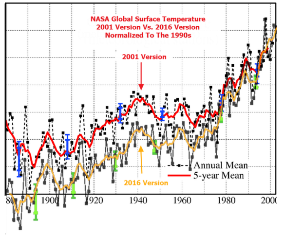
“Steve Goddard often compares older presentations of global land+ocean data to new presentations so that we see the change in data from a decade or two ago to now.”
Yes, he does and the link given in the essay shows an unbelievable deception on the part of the government funded agencies. This quote gobsmacked me, “NASA has altered their own data by 0.5C since 2001, yet claims that everyone agrees within about 0.05C.”
Everyone agrees because they are all tampering with the temperature data and making sure their stories match like any smart criminal gang would do when the police interrogate them.
It’s time for another email dump.
clearly the adjustments are statistical nonsense. The “raw” global temperature records are a huge statistical sample. In this sample are errors. In any sample this large, there are known errors and there are unknown errors. However, what we can say about these errors is that they will behave like a coin toss. Some will be heads and increase the warming rate. Some will be tails and decrease the warming rate. And over the long term, just like a coin toss, the heads and tails will balance out.
However, if you start adjusting the errors you need to be very careful about introducing bias. Just because you identify one type of error and correct for it, doesn’t mean that the error you are correcting is also balanced heads and tails. There is no statistical guarantee that specific errors are distributed around zero, only that the aggregate of all errors known and unknown are most likely centered on zero.
So when correcting a specific error, this correction must first be bias corrected so that the trend remains the same before and after the adjustment. It would appear looking at the results Bob has presented that climate science has ignored the bias correction, under the assumption that each specific adjustment is also normally distributed and centered on zero.
But this assumption is clearly wrong. A specific error is not zero centered because it is not random.
I note that La Nina clear-sky conditions are diminishing according to the slope of thermocline diminution. My interpretation is that we are edging closer and closer to the condition whereby recharge becomes less and less effective in recharging ocean heat, regardless of air temperatures. What should be of interest is the amount of heat available to continue the upward trend demonstrated in all those traces. And I don’t see much capacity building up in the oceans. My interpretation is that I see less and less capacity building that could lead to continued land warming. If this continues, we will eventually experience a knee in this interstadial warm period, followed by a jagged slope down to colder stadial temperatures. The tiny parts-per-million change in CO2 caused by humans would not be able to keep us in an interstadial indefinitely compared to ocean strength in driving land temperatures.
http://www.cpc.ncep.noaa.gov/products/analysis_monitoring/lanina/enso_evolution-status-fcsts-web.pdf slide 10
Gad, I hope you’re wrong.
====
Hi Bob,
You can find all the latest raw GHCN station data here to make a global land reconstruction yourself (using the qcu files): ftp://ftp.ncdc.noaa.gov/pub/data/ghcn/v3/
Technically if you want the most accurate comparisons between the raw and final data products you should use the same method for each. Some products use more or less stations (only NOAA NCEI uses only GHCN data), and Berkeley uses a lot more (~30k stations vs. the ~7k stations in GHCN). They also have different approaches to spatial interpolation, grid cell sizes, and common anomaly periods (or other methods of anomaly calculation). Right now you are somewhat conflating differences in methodologies with the effects of homogenization, and they are separate issues.
Also, NOAA does have a raw land (and ocean) series that they published along with the Karl et al paper. You can find it here: ftp://ftp.ncdc.noaa.gov/pub/data/scpub201506/WithoutCorrections/
Surely there is something hemidemisemispherically wrong with it.
====================
Or perhaps oblate-spheroidally (of a half-pi revolution) even …
Hi Zeke. Thanks for all of the links.
Curiously, the data from Karl et al identified as “WithoutCorrections/NewUncorr.aravg.ann.land_ocean.90S.90N.asc”…
ftp://ftp.ncdc.noaa.gov/pub/data/scpub201506/WithoutCorrections/NewUncorr.aravg.ann.land_ocean.90S.90N.asc
…has a much higher warming rate than the “raw” data you had provided in the post at Lucia’s.
Comments?
The Karl et al. “without corrections” data have a higher long-term rate than the CRUTEM4 data shown above in Figure 1. In other words, it doesn’t appear to be “uncorrected”.
Zeke, PS: I suspect the Karl et al. “without corrections” data is simply the former version of the “adjusted” GHCN data.
Interesting; might also be because the “uncorrected” NOAA dataset is using all the land stations used in Karl et al (e.g. the full ISTI dataset) and not just GHCN v3. I’ll see what I can figure out.
The raw curve (GHCN Hausfather) do not give the evolution of raw temperatures for two reasons:
1. As the assembly is done on the basis of anomalies and not temperatures, each series leads to an adjustment. So there are as many adjustments as series. The GHCN series are short on average, the adjustments are therefore numerous.
2. GHCN raw is not systematically raw. Some series are actually already homogenized. This is for example the case of French stations which are previously homogenized by Météo France.
Scientists are only human, and subject to wishful thinking, temptation to cheat for their own gain, and to outright lying to keep their grant money flowing toward them. The Guardians of Climate Data have done so well (since the cooling episodes of the 1970s) by changing everything that doesn’t fit the current requirement for Global Warming.
I imagine people who, in the past had warm days, being told by the pointy-headed Data Doctors, “Oh no! You only thought it was warm back then. You were actually cold, very cold.” It is repeated continuously by the Media until the masses are brain-washed into submission.
It is sad to see the Climate Scientist success at data falsification take hold in other arenas. I wonder if the current Brinkmanship seen in American Politics was inspired by Climate Scientists getting away with “fudging” the data. I’m appalled at the European Press and Politicians telling everyone that all of the rape and brutality are not happening there at all. It’s just wide-spread hysteria imagining the atrocities.
Truth is now fiction and “Leaders” get to pronounce “FACTS” with certainty, proclaiming all sorts of things to have happened (or not happened) despite the actual events of the time.
I look forward to the Climate Scientists’ hysteria that will happen as we descend into a 30+ year cold spell (Natural Cycles do return) and how desperate and shrill they will get as they attempt to force us to believe it is still getting hotter.
“Curiously, the trends of the “raw” sea surface temperature data (Figure 7) and “raw” land surface air temperature data (Figure 6) are the same for the period of 1880 to 2013.”
From the perspective of thermodynamics, this makes perfect sense. Having surface temperatures for land and sea on long term divergent trends requires a mechanism that effectively works as a heat engine to maintain the difference. Given that atmospheric CO2 mixing doesn’t pay much attention to the distinction between land and sea, I wonder how climate scientists will explain this one.
Bob,
I did a study of this question here, with an analysis of rgions and subsets here. I’m using my index calculator TempLS mesh, which follows GISS fairly closely. I looked at the effect of using GHCN V3.3 adjustments, which is basically what both GISS and NCEI use. I’m looking primarily at the effects on global (ie land/ocean with SST, which dilutes the effect). This is, after all, what we mainly follow. My result in terms of trend to date, was similar to yours. Trends starting before about 1960 are increased by adjustment; trends starting since are somewhat decreased. I showed it in the form of a backtrend plot, showing the trend to date as a function of start date. Adjusted is purple, unadjusted blue.
http://www.moyhu.org.s3.amazonaws.com/2016/4/adjustback.png
Lawrimore et al, from NOAA in 2011, looked at land only effect. Here is their table (their units vary)
http://www.moyhu.org.s3.amazonaws.com/2016/4/lawrimore.png
Here is my corresponding backtrend plot for the land average. y-axis is in °C/Century. Black is all stations, and there is breakdown for rural/urban.
http://www.moyhu.org.s3.amazonaws.com/2016/4/landtrend.png
Bob,
I have a post in moderation, which is basically agreeing with your results. Just some extra points:
1. NASA GISS now do little homogenising on their own – for land, they basically use the GHCN V3 adjusted data, as does NCEI.
2. CRUTEM 4 also do little adjusting on their own; they use some data that has been adjusted at source.
Thanks, Nick.
Cheers.
Various ad hoc adjustments, along with serial infilling and spatial extrapolation are by no means the sole sources of systematic bias in the overwhelmingly urban global data base. Without any screening to identify and remove UHI-corrupted records, “raw” data series simply cannot provide unbiased estimates of surface temperatures on a global basis. Nor can the fitting of linear trends to the various global indices provide a physically meaningful indication of the truly long-term evolution of global average temperatures in the face of strong multidecadal and longer oscillations.
It’s high time to stop relying upon deeply flawed data bases, no matter how large, and stop looking for secular trends on the basis of simplistic preconceptions of surface temperature variability.
And down in OZ we have our BOM (bureau of manipulation) following the lead of all the others but their excuses for the fiddling are very obvious bad attempts at lies .
Zeke and Nick are here to justify and downplay the adjustments as would be expected. They are full-fledged “believers” after all.
The actual adjustment to the global temperature trend is about 0.5C and I would not rely on any Raw data supplied by the NOAA NCEI or Zeke.
There is really only one adjustment which is justified and that is the “bucket” adjustment for sea surface temperatures pre-1944. The rational for this adjustment was very carefully, scientifically measured all over the world by the UK Met Office and they found that when a bucket or canvas bag was brought on board a ship pre-1940/44, the air temperature cooled off the ocean water by about 0.5C before the temperature could be measured (the ocean was warmer than the air temperature in most places these measurements were taken at sea from 1820 to 1944). So, the pre-1944 sea surface temperature were 0.5C cooler than they really were and they were corrected for this issue.
All the other adjustments are the pro-global warming advocates stretching the algorithms as much as they dare to increase the warming trend to justify their global warming belief.
Even the latest adjustment from Karl et al 2015 is so sketchy that no scientist in their right mind should have accepted it (throwing out the trends and measurements from buoys and Argo floats – the accurate scientific measurements – in exchange for using the ridiculously inaccurately ship engine intakes instead – and even the actual ship engine intakes didn’t have the trend increase that Karl et al 2015 adjusted for. It is an immoral if not criminal adjustment.
Nick and Zeke should have condemned this paper from the start and so should have the entire climate science community, but instead they all jumped on board enthusiastically because it adjusted to produce more global warming.
Use 0.5C as the unjustified adjustment to the global temperature record because that is the REAL number.
“They are full-fledged “believers” after all.”
Well, let’s see the non-believer’s calculation. Actually, Bob T has given what seems to be a good account, and I think we are pretty much in agreement.
“throwing out the trends and measurements from buoys and Argo floats – the accurate scientific measurements – in exchange for using the ridiculously inaccurately ship engine intakes instead”
No, that is completely garbled. The adjustment was required so that buoys, which are an increasing and now large proportion, can be averaged with ships on the same basis. The evidence is clear-cut, and is in papers by Kennedy and Karl et al, for example. Millions of instances have now occurred where ship and buoy readings are available from about the same place and time. Ships tended to be higher, with a difference of about 0.12°C. You have to adjust for that, otherwise you get a spurious trend as the mix alters.
Bill Illis says:
Zeke and Nick are here to justify and downplay the adjustments as would be expected. They are full-fledged “believers” after all.
That short list includes Toneb, barry, Saul from Montreal, D. Horne, and a few others, among the literally thousands of real skeptics who visit this site. Skeptics of “dangerous man-made global warming” scare are the real ‘consensus’.
I don’t mind Nick or Zeke, because they can’t help themselves. But at least they’re constrained by the numbers they use, and they can’t go completely overboard like many others do because the numbers won’t let them.
Bill is right. Using ≈0.5ºC is as close to the real number as we can currently get. But using that number deflates the entire alarmist case because that minuscule warming is entirely beneficial, with no downside. Like the rise in methane and CO2, there has never been any global damage, or harm that resulted — just plenty of benefits.
Regarding Karl et al adjustments, the best approach is to look at what you get from only buoys. Turns out it agrees quite well with the new NOAA record, but not the old one:
https://judithcurry.com/2015/11/22/a-buoy-only-sea-surface-temperature-record/
Also, if you don’t trust my raw data reconstruction download the raw data file and do your own analysis. Or trust Jeff Id’s reconstruction: https://noconsensus.wordpress.com/2010/03/24/thermal-hammer/ Or all the other various folks who did it back in 2010/2011 when we were first playing around with our own global temperature reconstruction codes: http://rankexploits.com/musings/2011/comparing-land-temperature-reconstructions-revisited/
I think the recent adjustments place the metric well above .5 degrees. 3.5 degrees by 1970 alone…
http://realclimatescience.com/wp-content/uploads/2016/04/2016-04-16031015.png
Nick,
Why are we measuring water temperature instead of the atmosphere over the oceans?
Why don’t we use soil readings, say a meter below the surface, to establish temperature trends on land?
In other words, why are we mixing apples with sardines?
SST is used because there are historically few reliable air temperature readings. If you think of the fuss made here about land station quality, then think about measuring on a ship’s deck. No Stevenson screens, for a start. Daytime is hopeless because of deck warming, and night is of some use for cross-checking with SST, but too patchy to make a global average.
SST has the merit that it is stable – not much diurnal variation, and is also generally fairly smooth in space. Microclimates are not usually an issue, though there is vertical gradient. With land+SST, you can compile an index, and track its variation. Another merit of SST is that now we can measure it in different ways – by satellite observation directly, with ships, buoys and ARGO, which gives good cross confirmation.
Let me get this straight, SST stands for Sea Surface Temperature and is not the measurement of the atmosphere while Land temperature measurements are measuring the temperature of the atmosphere.
Has anyone taken a SST and then the atmosphere temperature a meter over it for comparison?
JohnWho asks: “Has anyone taken a SST and then the atmosphere temperature a meter over it for comparison?”
Both the “raw” sea surface temperature and marine air temperature data are available from the ICOADS database. Unfortunately, ship heights have changed with time, so the marine air temperature data is not from a constant height. There have been numerous studies comparing the two. And if you’re interested in comparing them yourself, they are both available in relatively easy-to-use form through the KNMI Climate Explorer.
http://climexp.knmi.nl/selectfield_obs.cgi?someone@somewhere
Nice post, Bob. It more-or-less mirrors the results of our studies of the temperature records of New Zealand. The NZ Climate Science Coalition applied the correction/adjustment methodology allegedly applied by NIWA (the National Institute of Water and Atmospheric Studies) and found half the increase in temperature over a century shown by NIWA. NIWA subsequently stated that they used a different methodology (audited, would you believe, by the BOM Australia) but have steadfastly refused to release either the methodology or the audit.
My particular studies of the NZ records raises queries in my mind about relevant statistics and the use thereof. Particularly as the NIWA methodology requires the use of “nearby” stations to supplement or complement treatment of the data for a particular station (they use data from seven stations from around NZ to form their “NZ Record”, which they state is not an “official” record, but which has attained a de facto status as such). The statistical treatments used are based on normal, Gaussian distributions, and for a direct “in-fill” or complementary comparisons to be made, surely the statistics would have to be very similar, if not identical in character. However, my studies indicate that temperature distributions of temperatures, even when “smoothed” to as much as monthly averages, are not normal (unimodal) in shape. They are, at the very least, bimodal, and often multimodal. It has been suggested that temperature distributions should be bimodal because of diurnal variation, but some records I have looked at show multimodal distributions for both daily maxima and minima. On that basis, in my opinion, a comparison for the purpose of complementing the data from “nearby” stations, is only valid if the modality of the distributions is similar. Curiously, some of the comparisons were with data from two geographically dissimilar stations: one, for example, being on a relatively flat isthmus between two oceans (Auckland), while the other (Te Aroha) is at the foot of an abrupt 3,000ft range which separates the west of the North Island south of Auckland from the East Coast. The weather conditions tend to be remarkably different!
These considerations of the statistics also have caused me to be concerned about claims as to the “significance” of conclusions drawn by the proponents of AGW. I am not at all certain that their statistics are valid—but then, I’m a chemical engineer, not a statistician (although my Masters thesis was on the stochastic nature of the processes involved in the flow of two-phase fluid mixtures). Whatever may be the case, though, as others have stated, I would have expected that adjustments to cope with instrument relocation or errors should balance out over time. That does not appear to be the case and either no account has been made for UHI (likely!) and/or instrument makers aren’t very good at their game.
Finally, call me a pedant if you will (“Not so loudly you fool”—with apologies to “The Goon Show”), but I need to take issue over your title. Adjustment does not increase global warming: it only makes it look that way!
My personal thanks for the work you have undertaken. I appreciate it and use it to assist me to promulgate the truth regarding this fraught subject to those who will listen to me.
“Gary Kerkin April 16, 2016 at 7:14 pm”
If my memory serves, NIWA use only 3 stations to calculate a national average, one for the entire south island, and 2 for the north. Having contracted at NIWA and have seen how they do “work” I am confident their methods are very very shonky, and adding insult to injury, NIWA get BoM to audit their work? Blind leading the blind.
Patrick, I was referring to the Seven Station Series which is the one they use for their long-term assessment. There was a previous 11-station series which they seem to have abandoned, although I think the data is still on their web site. I have no knowledge of a 3-station series but that’s not to say you are incorrect.
I wonder how the Aus. BOM feel now, now that CSIRO is closing out a lot of climate related positions? More arrogant, perhaps?
Bob,
Here is a global land temperature estimate from the raw GHCN data through present (annual values through 2015 in the graph below). Ran their latest qcu file through my code.
http://s22.postimg.org/wv4o9dij5/GHCNM_Raw_1880_2015.png
Data file: https://www.dropbox.com/s/oyjia6dsbh146uy/GHCN%20v3%20qcu%201880-March%202016.xlsx?dl=0
It’s really Version M 3.3.0
Why does the Raw data file need to have 10 different versions so far (noting that we need to use decimal points to designate the versions and there is even an Alphabetical designation). Version 4.0.1 is now in beta testing and will be out soon.
What does version 0.0 show? I imagine that should be available somewhere.
If this is the “annual” data, why is March 2016 the end-point. Where does Feb 1998 appear.
The graph is annual data ending with 2015. The data file linked is monthly.
This is what GHCN Unadjusted Version 1.0 used to look like.
Version 1.0 1880 was at +0.25C. In Version 3.3.0, 1880 is now -0.28C.
Version 1.0 1990 was at +0.42C. In Version 3.3.0, 1990 is now +0.54C
Just the change in the Raw Unadjusted data has added 0.6C to the Land Temp trend !!!!
Version 1.0 unadjusted from 1850 to 1990 is the Blue bars here.
http://clivebest.com/blog/wp-content/uploads/2015/04/Global-compare.png
Bill,
Each version tends to add more stations. GHCN v3 has a lot more stations included than version 1, for example. The raw data file is the data NOAA has prior to any adjustments or homogenization, beyond a basic quality control (e.g. min is higher than max, or values are clearly wrong due to decimal point misplacement in the observer log or similar issues). If you don’t trust the rawest climate data we have, well, I don’t know what to say, as there is no other data to use.
Also, I have no idea what you are doing in your GHCN v1 vs v3 chart, but its not correct. The two are effectively the same, as discussed in this WUWT post back in 2012: https://wattsupwiththat.com/2012/06/22/comparing-ghcn-v1-and-v3/
Zeke,
“…there is no other data to use.”
Wrong. GHCN raw data are already partially adjusted.
If you want to produce a real curve of raw temperatures, you must use data before processing by national offices and only long time series (eg covering the entire twentieth century).
We know the magnitude of the effect of adjustments on regional temperatures and it is +0.5 ° C over the twentieth century.
This argument is specifically why Tony Hellers research is so vital.
You say that many stations were added over the years. But there are dozens of articles where the world’s most eminent climate scientists had reviewed all the data available to them back in the 70s 80s or 90s and concluded that there was either global cooling, or there was zero evidence of any warming since the turn off the century.
Even the first ipcc report states that there was no evidence of global warming since the turn off the century. This was the first global consensus document, yet now everyone agrees that there is clear evidence of warming during these same time periods.
If the raw data showed warming, how could past scientists get it so wrong, so often?
Has anyone compiled a list or better yet, a graphic of what stations are included in each version. I do not think the station count always goes up as Zeke implies.
Zeke, thank you much for the updated unadjusted data. I’ll redo this post and publish the update in a few days.
These aren’t climate scientists, they are magicians.
Not only did they manage to make the adjustments inflate the temperature of every different time period rather than have a 50/50 mix of positive and negative adjustments, they also managed to get global land and air temperatures from 1880 to 2013 to perfectly agree to one hundredth of a degree!
What are the odds? !
Sea and air, doh!
No… fiddling with the data does not change reality = wearing cop shoes does not make you a cop.
Regarding: “Unfortunately, most land surface air temperature datasets start well after “preindustrial” times, which, logically, are said to exist prior to the industrial revolution starting in the mid-1700s.”:
The impact of industrialization on atmospheric CO2 was mainly after the first commercial oil well in North America went into production service in 1858, and after the first one in the US struck oil in 1859.
From the article:
Look at those four charts. Every one of them now shows at least four years that are hotter than 1998. Where just recently, 1998, was always refered to as the hottest year in the satellite record, and was only exceeded by the decade of the 1930’s (see Climategate emails). Now, 1998, is an “also-ran”, and the decade of the 1930’s is nowhere to be seen, thanks to global warming advocates’ manipulation of the temperature record.
Yet, the official claim is that only in 2016, for one month, did the temperature exceed the 1998 record.
How do those charts square with that?
How can you have a serious conversation about surface temperatures when you are using data this distorted? You can’t.
These distortionist are the boldest people I have ever seen. They change the surface temperature records right before our eyes, and then expect us to start the discussion from there. NO! Let’s discuss these distortions you have introduced into the record first. Without good data we are wasting our time and money.
TA claimed “Where just recently, 1998, was always refered to as the hottest year in the satellite record, and was only exceeded by the decade of the 1930’s (see Climategate emails).”
That statement is nonsensical, because there is no satellite record of the 1930s.
It makes sense to me, Tom . . but your accusation seems nonsensical . .
I think that if we get either Trump or Cruz as the next US President, people like Watts, Tisdale and Heller to mention a few will surely be in the forefront when it comes to bringing the US temperature records nearer to reality and establishing the real degree of uncertainty. I cannot understand how the CAGW proponents can claim so much certain warming since 1880 as the uncertainty around older temperature records in particular must be so wide that the so-called global warming must be within in a wide envelope so as to be almost meaningless. Never mind UHI and its influence on recent land surface temperatures. This has been one of the best articles of recent times in my humble opinion. Most contributions have been serious in contents. Bob Tisdale has developed into a first class contributor.
The only legitimate temperature chart that should be used in the discussion is a chart that has the 1930’s temperature spike, and the 1998 temperature spike on the same line. That’s what the REAL temperature profile looks like.
Exactly, you cannot infill data if you do it not data, you cannot homogenize data if you do it is no longer data, data is what was measured at one point and time anything else is not data. Funny people against waterboarding terrorists have no problem waterboarding data. Funny they have no problem believing that the terrorists might give you the answers you expect when you torture him but somehow data may not do the same. AS Ron White put is “you can’t fix stupid”
if it was global warming then no adjustments should be necessary. Statistically a random sample of data from any site should show the same warming level as the average or it is actually regional not global. The distribution should be plotted for individual sites and any extreme deviant should be tested to check there are no measurement flaws causing the deviation before inclusion in the data set.
Of course this is the requirement for an engineering project testing a product exclusively for sale in a well known pound chain shop so it is unreasonable to expect such high standards. Unfortunately science no longer seem to have to meet any standards at all.
^^This ^^ . . . (post by David Cage)
I wish when people reported global temperatures, they would report the actual temperature rather than the difference between the actual temperature and some idiosyncratic temperature defined as the baseline for that particular study or graph.
The rationale for reporting anomalies in local temperatures make sense in a lot of contexts, but absolute global temperatures have a lot more value in terms of relating them to the physical world and how humans actually experience the data, not to mention intercomparability/replication with other studies and graphs that may define their own idiosyncratic baseline.